Key Terms. Symbology. Categorical attributes. Style. Layer file
|
|
|
- Anthony Newman
- 6 years ago
- Views:
Transcription
1 Key Terms Symbology Categorical attributes Style Layer file
2 Review Questions POP-RANGE is a string field of the Cities feature class with the following entries: 0-9,999, 10,000-49,999, 50,000-99,000 This is an example of categorical/qualitative/descriptive attribute. True/False? You can symbolize the Cities features above by selecting POP- RANGE in the Value Field list under Properties\Symbology/Categories (first right-click the Cities feature class in the Table of Content)
3 Review Questions 3. POP_2000 is a numeric field of the Cities feature class, which ranges from to This is an example of quantitative data. True/False 4. A layer file with an extension of.lyr can have different name from its source data. True/False
4 Lect 4 Classifying Features Classifying features by standard methods Mapping density Using graduated and chart symbols
5 Quantitative Maps Show numeric values in relation to one another on a continuous scale Group or classify these values to separate data visually and understand data easily Examples: population of a county, area of a city block, length of a water distribution line
6 Quantitative Map 1: Graduated Color Map Graduated color map: uses a change in color to represent data classification Color ramp Light color for small values, dark color for larger values
7 Quantitative Map 2: Graduated Symbol Map Graduated-symbol map uses a symbol that varies in size to represent numeric attributes values Generally 3 to 7 graduated colors used Example: Points that increase in size can present a city s growing population.
8 Quantitative Map 3: Proportional Symbol Map Similar to a graduated-symbol map, except that the symbols are drawn proportionally in size These symbols are most appropriate for data that has a relatively narrow range of values Example: A county with a population of five million people would have a symbol five times larger than a county with a population of 1 million people.
9 Quantitative Map 4: Dot Density Map Represents quantities using randomly placed dots to form a density pattern inside a polygon Each dot is equal to a predetermined attribute value The more dots, the greater is the value of the polygon
10 Quantitative Map 5: Chart Map Used to represent multiple attributes for a single feature Pie, bar, stacked charts Charts that can be similar in size or vary based on proportionality
11 Quantitative Map 1: Graduated Color Map

12 Quantitative Map 2: Graduated Symbol Map

13 Quantitative Map 3: Proportional Symbol Map
14 Quantitative Map 4: Dot Density Map

15 Quantitative Map 5: Chart Map
16 Standard Method 1: Manual Set class breaks manually By typing them Or by adjusting the histogram break bars in ArcMap
17 Standard Method 2: Equal Interval The entire range is equally divided by the number of classes you choose Example: range , 5 classes: 1-200, , , , Useful for highlighting changes in the extremes and most appropriate for familiar data ranges, such as temperatures
18 Standard Method 3: Defined Interval Similar to an equal interval But you get to define the interval size to determine how many classes there are Example: range of test score from 50 to 90, interval size is 10: 50-60, 61-70,71-80, 81-90
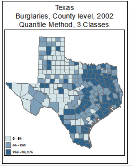
19 Standard Method 4: Quantile All classes have the same number of features Best for those linearly distributed data Create a balanced-looking map: no classes have too many, too few or no values
20 Standard Method 5: Natural Breaks (Jenks) Based on natural groupings inherent in the data Boundaries are set where there are relatively large gaps between values Best for unevenly distributed data, such as population
21 Standard Method 6: Geometrical Interval Class breaks based on class intervals that have a geometrical series, such as a logarithmic distribution. Best for continuous data with dramatic range
22 Standard Method 7: Standard Deviation Best for normally distributed data (Bell-shaped curve) Create classes based on a specified number of standard deviation from the mean value A divergent color scheme is recommended

23 EX 8a Standard Methods

24 Histogram: Frequency Distribution Chart X-axis: range of values in the BURG02 field Y-axis: count of features Vertical blue lines: class breaks Gray columns: number of features that fall within a specific span of the total range of values (100 columns drawn, each column represents 1%)
25 Ex 8b Mapping Density Area units, dot size, dot value, dot placement Random distribution of dots can be misleading: e.g., the majority of the population is centered on urban areas Experiment until producing good results: usually choose mediumsize dots
26 Ex 8c Lab assignment 4: Complete Ex 8c Display the map in Layout View as shown on Page 297 Export the map as PDF it to the instructor

27 Lab Assignment 4: Ex 8c
28 Key Terms Graduated color map Graduated symbol map Proportional symbol map Dot density map Manual Classification Histogram Defined interval Quantile Natural Breaks Standard deviation
Geography 281 Map Making with GIS Project Three: Viewing Data Spatially
 Geography 281 Map Making with GIS Project Three: Viewing Data Spatially This activity introduces three of the most common thematic maps: Choropleth maps Dot density maps Graduated symbol maps You will
Exercise Producing Thematic Maps for Dissemination
 Exercise Producing Thematic Maps for Dissemination 2007 In this exercise you will work with an existing file geodatabase which contains administrative boundaries (named wards) feature class and population
Session 3: Cartography in ArcGIS. Mapping population data
 Exercise 3: Cartography in ArcGIS Mapping population data Background GIS is well known for its ability to produce high quality maps. ArcGIS provides useful tools that allow you to do this. It is important
Introduction to Geospatial Analysis
 Introduction to Geospatial Analysis Introduction to Geospatial Analysis 1 Descriptive Statistics Descriptive statistics. 2 What and Why? Descriptive Statistics Quantitative description of data Why? Allow
Add to the ArcMap layout the Census dataset which are located in your Census folder.
 Building Your Map To begin building your map, open ArcMap. Add to the ArcMap layout the Census dataset which are located in your Census folder. Right Click on the Labour_Occupation_Education shapefile
Step by Step GIS. Section 1
 Step by Step GIS Section 1 Contact the web page given below for the data required to do the exercises (http://www.pasda.psu.edu/default.asp) Before beginning the tutorials please visit the Preparation
Atmospheric Sciences
 GIS Tutorial for Atmospheric Sciences J. Greg Dobson, University of North Carolina at Asheville Jennifer Boehnert, National Center for Atmospheric Research 2015 UCAR and UNC-Asheville. This is an open
Probability and Statistics. Copyright Cengage Learning. All rights reserved.
 Probability and Statistics Copyright Cengage Learning. All rights reserved. 14.6 Descriptive Statistics (Graphical) Copyright Cengage Learning. All rights reserved. Objectives Data in Categories Histograms
Choropleth Mapping with GIS
 Choropleth Mapping with GIS In this lab you will be making 4 choropleth maps of the data you downloaded and processed last week. You will make your maps in ArcGIS using three different methods of classing
ArcGIS 10.x Basic Exercise GMU Libraries
 ArcGIS 10.x Basic Exercise GMU Libraries Goals of this exercise To introduce basic functions available in ArcGIS 10.x to create a simple thematic map You are going to create a thematic map using VA county
Data Classification 1
 Data Classification 1 Data Classification The idea of classification is to group together items that are alike The objective of classification is to group data in such a manner that not only are the observations
Section 2-2 Frequency Distributions. Copyright 2010, 2007, 2004 Pearson Education, Inc
 Section 2-2 Frequency Distributions Copyright 2010, 2007, 2004 Pearson Education, Inc. 2.1-1 Frequency Distribution Frequency Distribution (or Frequency Table) It shows how a data set is partitioned among
Introduction to GIS & Mapping: ArcGIS Desktop
 Introduction to GIS & Mapping: ArcGIS Desktop Your task in this exercise is to determine the best place to build a mixed use facility in Hudson County, NJ. In order to revitalize the community and take
Using Spatial Data in a Desktop GIS; QGIS 2.8 Practical 2
 Using Spatial Data in a Desktop GIS; QGIS 2.8 Practical 2 Practical 2 Learning objectives: To work with a vector base map within a GIS and overlay point data. To practise using Ordnance Survey mapping
Lecture 2 Map design. Dr. Zhang Spring, 2017
 Lecture 2 Map design Dr. Zhang Spring, 2017 Model of the course Using and making maps Navigating GIS maps Map design Working with spatial data Geoprocessing Spatial data infrastructure Digitizing File
Exercise 6: Symbolizing your data
 The Scenario After your presentation of the school age students in the county based on the results of your map created in the previous exercise, the county would like to see all of the major schools also
Ms Nurazrin Jupri. Frequency Distributions
 Frequency Distributions Frequency Distributions After collecting data, the first task for a researcher is to organize and simplify the data so that it is possible to get a general overview of the results.
Announcements. Data Sources a list of data files and their sources, an example of what I am looking for:
 Data Announcements Data Sources a list of data files and their sources, an example of what I am looking for: Source Map of Bangor MEGIS NG911 road file for Bangor MEGIS Tax maps for Bangor City Hall, may
Table of Contents. Krista White GIS Support Specialist x 3926 Office HS 104 T, Th 8:00AM-12:00PM, 1:00PM-4:00PM F 8:00-11:30AM
 1 Create Visually Stunning Maps with the Cartograms Tool Cartograms are a method of displaying geospatial data as totals, wherein data are displayed with both color and area as a function of their values.
Univariate Statistics Summary
 Further Maths Univariate Statistics Summary Types of Data Data can be classified as categorical or numerical. Categorical data are observations or records that are arranged according to category. For example:
Lecture Slides. Elementary Statistics Twelfth Edition. by Mario F. Triola. and the Triola Statistics Series. Section 2.1- #
 Lecture Slides Elementary Statistics Twelfth Edition and the Triola Statistics Series by Mario F. Triola Chapter 2 Summarizing and Graphing Data 2-1 Review and Preview 2-2 Frequency Distributions 2-3 Histograms
2.1: Frequency Distributions
 2.1: Frequency Distributions Frequency Distribution: organization of data into groups called. A: Categorical Frequency Distribution used for and level qualitative data that can be put into categories.
Chapter 2: Understanding Data Distributions with Tables and Graphs
 Test Bank Chapter 2: Understanding Data with Tables and Graphs Multiple Choice 1. Which of the following would best depict nominal level data? a. pie chart b. line graph c. histogram d. polygon Ans: A
GEOGRAPHY 426 LAB 4: Choropleth Maps
 GEOGRAPHY 426 LAB 4: Choropleth Maps The purpose of this exercise is to explore several different classification methods that can be used to display geographic data sets, and also to cover how to make
Descriptive Statistics, Standard Deviation and Standard Error
 AP Biology Calculations: Descriptive Statistics, Standard Deviation and Standard Error SBI4UP The Scientific Method & Experimental Design Scientific method is used to explore observations and answer questions.
Chapter 2 - Graphical Summaries of Data
 Chapter 2 - Graphical Summaries of Data Data recorded in the sequence in which they are collected and before they are processed or ranked are called raw data. Raw data is often difficult to make sense
1. Start ArcMap by going to the Start menu > All Programs > ArcGIS > ArcMap.
 Learning ArcGIS: Introduction to ArcMap 10.1 The Map Document Feature Manipulation Navigating ArcMap Map Documents, Layers, and Features Shapes, Location, and Attribute Data Symbology Zoom, Pan and Map
Newaygo County Web Map
 Newaygo County Web Map Address/Parcel/Parcel Owner Search Map Overview Zoom Back to default extent Use your current location if allowable Widget Panel At the top of the map is a search function used for
Chapter 1. Looking at Data-Distribution
 Chapter 1. Looking at Data-Distribution Statistics is the scientific discipline that provides methods to draw right conclusions: 1)Collecting the data 2)Describing the data 3)Drawing the conclusions Raw
Geographical Information Systems Institute. Center for Geographic Analysis, Harvard University. LAB EXERCISE 1: Basic Mapping in ArcMap
 Harvard University Introduction to ArcMap Geographical Information Systems Institute Center for Geographic Analysis, Harvard University LAB EXERCISE 1: Basic Mapping in ArcMap Individual files (lab instructions,
SYMBOLISATION. Generalisation: which / how many features we display.. Symbolisation: how to display them?
 Generalisation: which / how many features we display.. Symbolisation: how to display them? SYMBOLISATION General Goal: easy and effective communication based on design principles and common sense as much
This guide covers 3 functions you can perform with DataPlace: o Mapping, o Creating Tables, and o Creating Rankings. Registering with DataPlace
 Guide for Using DataPlace DataPlace is one-stop source for housing and demographic data about communities, the region, and the nation. The site assembles a variety of data sets from multiple sources, and
Map Making Tutorial Jennifer Ailshire June 25, Adding Data to the Map and Saving the Map
 Map Making Tutorial Jennifer Ailshire June 25, 2008 Adding Data to the Map and Saving the Map Click on the Add Data button, browse to the appropriate directory and select the desired file(s). After you
SYMBOLISATION. Generalisation: which / how many features we display.. Symbolisation: how to display them?
 Generalisation: which / how many features we display.. Symbolisation: how to display them? SYMBOLISATION General Goal: easy and effective communication based on design principles and common sense as much
CHAPTER 2 Modeling Distributions of Data
 CHAPTER 2 Modeling Distributions of Data 2.2 Density Curves and Normal Distributions The Practice of Statistics, 5th Edition Starnes, Tabor, Yates, Moore Bedford Freeman Worth Publishers Density Curves
CHAPTER 1. Introduction. Statistics: Statistics is the science of collecting, organizing, analyzing, presenting and interpreting data.
 1 CHAPTER 1 Introduction Statistics: Statistics is the science of collecting, organizing, analyzing, presenting and interpreting data. Variable: Any characteristic of a person or thing that can be expressed
Lecture Series on Statistics -HSTC. Frequency Graphs " Dr. Bijaya Bhusan Nanda, Ph. D. (Stat.)
") Lecture Series on Statistics -HSTC Frequency Graphs " By Dr. Bijaya Bhusan Nanda, Ph. D. (Stat.) CONTENT Histogram Frequency polygon Smoothed frequency curve Cumulative frequency curve or ogives Learning
Lecture Series on Statistics -HSTC Frequency Graphs " By Dr. Bijaya Bhusan Nanda, Ph. D. (Stat.) CONTENT Histogram Frequency polygon Smoothed frequency curve Cumulative frequency curve or ogives Learning
Chapter 2 Organizing and Graphing Data. 2.1 Organizing and Graphing Qualitative Data
 Chapter 2 Organizing and Graphing Data 2.1 Organizing and Graphing Qualitative Data 2.2 Organizing and Graphing Quantitative Data 2.3 Stem-and-leaf Displays 2.4 Dotplots 2.1 Organizing and Graphing Qualitative
Frequency Distributions
 Displaying Data Frequency Distributions After collecting data, the first task for a researcher is to organize and summarize the data so that it is possible to get a general overview of the results. Remember,
Lecture 6: Chapter 6 Summary
 1 Lecture 6: Chapter 6 Summary Z-score: Is the distance of each data value from the mean in standard deviation Standardizes data values Standardization changes the mean and the standard deviation: o Z
Exercise 1: An Overview of ArcMap and ArcCatalog
 Exercise 1: An Overview of ArcMap and ArcCatalog Introduction: ArcGIS is an integrated collection of GIS software products for building a complete GIS. ArcGIS enables users to deploy GIS functionality
Slide 1. Advanced Cartography in ArcGIS. Robert Jensen Edie Punt. Technical Workshops
 Slide 1 Technical Workshops Advanced Cartography in ArcGIS Robert Jensen Edie Punt Slide 2 Overview Using representations to manage symbology Solving graphic conflicts Geoprocessing for cartography in
Name Date Types of Graphs and Creating Graphs Notes
 Name Date Types of Graphs and Creating Graphs Notes Graphs are helpful visual representations of data. Different graphs display data in different ways. Some graphs show individual data, but many do not.
Geog 459: Geographic Information Systems. Lesson 2 Laboratory Exercise
 Exercise Description Mapping and interpreting metropolitan growth and decline patterns between 1990 and 2000. Course Concepts Presented Sunbelt region, population redistribution, and metropolitan areas.
Using Census Data to Calculate Social Inequality in Colombia
 Using Census Data to Calculate Social Inequality in Colombia Written by Carolyn Talmadge, February 8, 2017 What is Social Inequality?... 1 Accessing the Data... 2 Understanding the Metadata & Attribute
QGIS LAB SERIES GST 102: Spatial Analysis Lab 2: Introduction to Geospatial Analysis
 QGIS LAB SERIES GST 102: Spatial Analysis Lab 2: Introduction to Geospatial Analysis Objective Understand Attribute Table Joins and Data Classification Document Version: 2014-06-16 (Beta) Contents Introduction...2
City of La Crosse Online Mapping Website Help Document
 City of La Crosse Online Mapping Website Help Document This document was created to assist in using the new City of La Crosse online mapping sites. When the website is first opened, a map showing the City
Part I, Chapters 4 & 5. Data Tables and Data Analysis Statistics and Figures
 Part I, Chapters 4 & 5 Data Tables and Data Analysis Statistics and Figures Descriptive Statistics 1 Are data points clumped? (order variable / exp. variable) Concentrated around one value? Concentrated
At the end of the chapter, you will learn to: Present data in textual form. Construct different types of table and graphs
 DATA PRESENTATION At the end of the chapter, you will learn to: Present data in textual form Construct different types of table and graphs Identify the characteristics of a good table and graph Identify
Chapter 2: The Normal Distributions
 Chapter 2: The Normal Distributions Measures of Relative Standing & Density Curves Z-scores (Measures of Relative Standing) Suppose there is one spot left in the University of Michigan class of 2014 and
CHAPTER 6. The Normal Probability Distribution
 The Normal Probability Distribution CHAPTER 6 The normal probability distribution is the most widely used distribution in statistics as many statistical procedures are built around it. The central limit
Chapter 2 Modeling Distributions of Data
 Chapter 2 Modeling Distributions of Data Section 2.1 Describing Location in a Distribution Describing Location in a Distribution Learning Objectives After this section, you should be able to: FIND and
QGIS Workshop Su Zhang and Laura Gleasner 11/15/2018. QGIS Workshop
 1. Introduction to QGIS QGIS Workshop QGIS is a free and open source Geographic Information System (GIS). QGIS can help users create, edit, visualize, analyze, and publish geospatial information on various
Geography 222 Quantitative Color for GIS Mike Pesses, Antelope Valley College
 Geography 222 Quantitative Color for GIS Mike Pesses, Antelope Valley College Introduction Building off of the previous color theory work, a cartographer must also understand how to tell a story with data
Elementary Statistics
 1 Elementary Statistics Introduction Statistics is the collection of methods for planning experiments, obtaining data, and then organizing, summarizing, presenting, analyzing, interpreting, and drawing
+ Statistical Methods in
 + Statistical Methods in Practice STA/MTH 3379 + Dr. A. B. W. Manage Associate Professor of Statistics Department of Mathematics & Statistics Sam Houston State University Discovering Statistics 2nd Edition
1. Classification Map
 GEO 426 : Choropleth Maps Tanita Suepa 1. Classification Map All of my classification maps use red sequential scheme because the intensity of red can identify the severity of breast cancer in each area
Chapter 2 Describing, Exploring, and Comparing Data
 Slide 1 Chapter 2 Describing, Exploring, and Comparing Data Slide 2 2-1 Overview 2-2 Frequency Distributions 2-3 Visualizing Data 2-4 Measures of Center 2-5 Measures of Variation 2-6 Measures of Relative
The basic arrangement of numeric data is called an ARRAY. Array is the derived data from fundamental data Example :- To store marks of 50 student
 Organizing data Learning Outcome 1. make an array 2. divide the array into class intervals 3. describe the characteristics of a table 4. construct a frequency distribution table 5. constructing a composite
Chapter 2: The Normal Distribution
 Chapter 2: The Normal Distribution 2.1 Density Curves and the Normal Distributions 2.2 Standard Normal Calculations 1 2 Histogram for Strength of Yarn Bobbins 15.60 16.10 16.60 17.10 17.60 18.10 18.60
Raw Data is data before it has been arranged in a useful manner or analyzed using statistical techniques.
 Section 2.1 - Introduction Graphs are commonly used to organize, summarize, and analyze collections of data. Using a graph to visually present a data set makes it easy to comprehend and to describe the
Overview. Frequency Distributions. Chapter 2 Summarizing & Graphing Data. Descriptive Statistics. Inferential Statistics. Frequency Distribution
 Chapter 2 Summarizing & Graphing Data Slide 1 Overview Descriptive Statistics Slide 2 A) Overview B) Frequency Distributions C) Visualizing Data summarize or describe the important characteristics of a
Lecture 7 Attribute-based Operations
 Lecture 7 Attribute-based Operations Learning Objectives 7.1 What is meant by reduce information content using an attribute-based operation? Why would one want to reduce information? 7.2 What is meant
8 Organizing and Displaying
 CHAPTER 8 Organizing and Displaying Data for Comparison Chapter Outline 8.1 BASIC GRAPH TYPES 8.2 DOUBLE LINE GRAPHS 8.3 TWO-SIDED STEM-AND-LEAF PLOTS 8.4 DOUBLE BAR GRAPHS 8.5 DOUBLE BOX-AND-WHISKER PLOTS
Create a Color-Shaded Map
 GIS Techniques for Monitoring and Evaluation of HIV/AIDS and Related Programs Exercise 3.2 Create a Color-Shaded Map *This training was developed as part of a joint effort between MEASURE Evaluation and
QGIS Workshop Su Zhang and Laura Gleasner 11/10/2016. QGIS Workshop
 1. Introduction to Quantum GIS (QGIS) QGIS Workshop QGIS is a free and open source Geographic Information System (GIS). QGIS can help you create, edit, visualize, and publish geospatial information on
Raw Data. Statistics 1/8/2016. Relative Frequency Distribution. Frequency Distributions for Qualitative Data
 Statistics Raw Data Raw data is random and unranked data. Organizing Data Frequency distributions list all the categories and the numbers of elements that belong to each category Frequency Distributions
Hot Spot / Kernel Density Analysis: Calculating the Change in Uganda Conflict Zones
 Hot Spot / Kernel Density Analysis: Calculating the Change in Uganda Conflict Zones Created by Patrick Florance. Revised on 10/22/18 for 10.6.1 OVERVIEW... 1 SETTING UP... 1 ENABLING THE SPATIAL ANALYST
Combo Charts. Chapter 145. Introduction. Data Structure. Procedure Options
 Chapter 145 Introduction When analyzing data, you often need to study the characteristics of a single group of numbers, observations, or measurements. You might want to know the center and the spread about
Vocabulary. 5-number summary Rule. Area principle. Bar chart. Boxplot. Categorical data condition. Categorical variable.
 5-number summary 68-95-99.7 Rule Area principle Bar chart Bimodal Boxplot Case Categorical data Categorical variable Center Changing center and spread Conditional distribution Context Contingency table
Mapping 2001 Census Data Using ArcView 3.3
 Mapping 2001 Census Data Using ArcView 3.3 These procedures outline: 1. Mapping a theme (making a map) 2. Preparing the layout for printing and exporting the map into various file formats. In order to
Statistical Graphs & Charts
 Statistical Graphs & Charts CS 4460 Intro. to Information Visualization August 30, 2017 John Stasko Learning Objectives Learn different statistical data graphs Line graph, Bar Graph, Scatterplot, Trellis,
LAB EXERCISE #1 (25pts)
") Grossmont College Introduction to Geographic Information Science Name: Instructors: Judd Curran & Mark Goodman 1 LAB EXERCISE #1 (25pts) ArcGIS Map Projection on the Fly: Working with: U.S. Map illustrating
Grossmont College Introduction to Geographic Information Science Name: Instructors: Judd Curran & Mark Goodman 1 LAB EXERCISE #1 (25pts) ArcGIS Map Projection on the Fly: Working with: U.S. Map illustrating
2.1: Frequency Distributions and Their Graphs
 2.1: Frequency Distributions and Their Graphs Frequency Distribution - way to display data that has many entries - table that shows classes or intervals of data entries and the number of entries in each
Fathom Dynamic Data TM Version 2 Specifications
 Data Sources Fathom Dynamic Data TM Version 2 Specifications Use data from one of the many sample documents that come with Fathom. Enter your own data by typing into a case table. Paste data from other
Chapter 2: Frequency Distributions
 Chapter 2: Frequency Distributions Chapter Outline 2.1 Introduction to Frequency Distributions 2.2 Frequency Distribution Tables Obtaining ΣX from a Frequency Distribution Table Proportions and Percentages
UNIT 1A EXPLORING UNIVARIATE DATA
 A.P. STATISTICS E. Villarreal Lincoln HS Math Department UNIT 1A EXPLORING UNIVARIATE DATA LESSON 1: TYPES OF DATA Here is a list of important terms that we must understand as we begin our study of statistics
Density Curve (p52) Density curve is a curve that - is always on or above the horizontal axis.
 Density curve is a curve that - is always on or above the horizontal axis.") 1.3 Density curves p50 Some times the overall pattern of a large number of observations is so regular that we can describe it by a smooth curve. It is easier to work with a smooth curve, because the histogram
1.3 Density curves p50 Some times the overall pattern of a large number of observations is so regular that we can describe it by a smooth curve. It is easier to work with a smooth curve, because the histogram
STAT STATISTICAL METHODS. Statistics: The science of using data to make decisions and draw conclusions
 STAT 515 --- STATISTICAL METHODS Statistics: The science of using data to make decisions and draw conclusions Two branches: Descriptive Statistics: The collection and presentation (through graphical and
Table of Contents (As covered from textbook)
") Table of Contents (As covered from textbook) Ch 1 Data and Decisions Ch 2 Displaying and Describing Categorical Data Ch 3 Displaying and Describing Quantitative Data Ch 4 Correlation and Linear Regression
Table of Contents (As covered from textbook) Ch 1 Data and Decisions Ch 2 Displaying and Describing Categorical Data Ch 3 Displaying and Describing Quantitative Data Ch 4 Correlation and Linear Regression
LAB 1 INSTRUCTIONS DESCRIBING AND DISPLAYING DATA
 LAB 1 INSTRUCTIONS DESCRIBING AND DISPLAYING DATA This lab will assist you in learning how to summarize and display categorical and quantitative data in StatCrunch. In particular, you will learn how to
Graphing with Microsoft Excel
 Graphing with Microsoft Excel As an AP Physics 1 student, you must be prepared to interpret and construct relationships found in physical laws and experimental data. This exercise is meant to familiarize
Statistics Lecture 6. Looking at data one variable
 Statistics 111 - Lecture 6 Looking at data one variable Chapter 1.1 Moore, McCabe and Craig Probability vs. Statistics Probability 1. We know the distribution of the random variable (Normal, Binomial)
Chapter 2: Descriptive Statistics
 Chapter 2: Descriptive Statistics Student Learning Outcomes By the end of this chapter, you should be able to: Display data graphically and interpret graphs: stemplots, histograms and boxplots. Recognize,
ArcView QuickStart Guide. Contents. The ArcView Screen. Elements of an ArcView Project. Creating an ArcView Project. Adding Themes to Views
 ArcView QuickStart Guide Page 1 ArcView QuickStart Guide Contents The ArcView Screen Elements of an ArcView Project Creating an ArcView Project Adding Themes to Views Zoom and Pan Tools Querying Themes
CompetitiveAccess Training Guide
 www.strenuus.com CONTENTS Introduction Introduction to Competitive Access...3 Using Competitive Access Using Competitive Access...4 Accessibility Specification...5 Census File...6 Network Selection...8
Use of GeoGebra in teaching about central tendency and spread variability
 CREAT. MATH. INFORM. 21 (2012), No. 1, 57-64 Online version at http://creative-mathematics.ubm.ro/ Print Edition: ISSN 1584-286X Online Edition: ISSN 1843-441X Use of GeoGebra in teaching about central
You will begin by exploring the locations of the long term care facilities in Massachusetts using descriptive statistics.
 Getting Started 1. Create a folder on the desktop and call it your last name. 2. Copy and paste the data you will need to your folder from the folder specified by the instructor. Exercise 1: Explore the
Math 227 EXCEL / MEGASTAT Guide
 Math 227 EXCEL / MEGASTAT Guide Introduction Introduction: Ch2: Frequency Distributions and Graphs Construct Frequency Distributions and various types of graphs: Histograms, Polygons, Pie Charts, Stem-and-Leaf
Topic (3) SUMMARIZING DATA - TABLES AND GRAPHICS
 SUMMARIZING DATA - TABLES AND GRAPHICS") Topic (3) SUMMARIZING DATA - TABLES AND GRAPHICS 3- Topic (3) SUMMARIZING DATA - TABLES AND GRAPHICS A) Frequency Distributions For Samples Defn: A FREQUENCY DISTRIBUTION is a tabular or graphical display
Topic (3) SUMMARIZING DATA - TABLES AND GRAPHICS 3- Topic (3) SUMMARIZING DATA - TABLES AND GRAPHICS A) Frequency Distributions For Samples Defn: A FREQUENCY DISTRIBUTION is a tabular or graphical display
Watershed Sciences 4930 & 6920 ADVANCED GIS
 Slides by Wheaton et al. (2009-2014) are licensed under a Creative Commons Attribution-NonCommercial-ShareAlike 3.0 Unported License Watershed Sciences 4930 & 6920 ADVANCED GIS VECTOR ANALYSES Joe Wheaton
Statistics: Normal Distribution, Sampling, Function Fitting & Regression Analysis (Grade 12) *
 *") OpenStax-CNX module: m39305 1 Statistics: Normal Distribution, Sampling, Function Fitting & Regression Analysis (Grade 12) * Free High School Science Texts Project This work is produced by OpenStax-CNX
OpenStax-CNX module: m39305 1 Statistics: Normal Distribution, Sampling, Function Fitting & Regression Analysis (Grade 12) * Free High School Science Texts Project This work is produced by OpenStax-CNX
Normal Data ID1050 Quantitative & Qualitative Reasoning
 Normal Data ID1050 Quantitative & Qualitative Reasoning Histogram for Different Sample Sizes For a small sample, the choice of class (group) size dramatically affects how the histogram appears. Say we
The ArcMap Interface and Using Basic ArcMap Analysis Tools to Create a Map
 The ArcMap Interface and Using Basic ArcMap Analysis Tools to Create a Map *You will need a computer with ESRI ArcGIS Desktop version 9.3 or higher installed* Data Download 1. Save the zipped folder with
Chapter 5: The standard deviation as a ruler and the normal model p131
 Chapter 5: The standard deviation as a ruler and the normal model p131 Which is the better exam score? 67 on an exam with mean 50 and SD 10 62 on an exam with mean 40 and SD 12? Is it fair to say: 67 is
Great Lakes Maritime Information Delivery System Data-Viewer User s Guide
 Data-Viewer User s Guide Compiled By Samir Dhar Introduction The Midwest FreightView DataViewer uses GIS technology to display a variety of spatially referenced data including ports, docks, weather information,
Visualizing Data: Freq. Tables, Histograms
 Visualizing Data: Freq. Tables, Histograms Engineering Statistics Section 1.2 Josh Engwer TTU 25 January 2016 Josh Engwer (TTU) Visualizing Data: Freq. Tables, Histograms 25 January 2016 1 / 23 Descriptive
Lab Exercise 1: ArcGIS Basics
 Massachusetts Institute of Technology Department of Urban Studies and Planning 11.520: A Workshop on Geographic Information Systems 11.188: Urban Planning and Social Science Laboratory Lab Exercise 1:
2.1 Objectives. Math Chapter 2. Chapter 2. Variable. Categorical Variable EXPLORING DATA WITH GRAPHS AND NUMERICAL SUMMARIES
 EXPLORING DATA WITH GRAPHS AND NUMERICAL SUMMARIES Chapter 2 2.1 Objectives 2.1 What Are the Types of Data? www.managementscientist.org 1. Know the definitions of a. Variable b. Categorical versus quantitative
Practical guidance on mapping and visualisation of crime and social data in QGIS
 Practical guidance on mapping and visualisation of crime and social data in QGIS Lesson 4: Mapping of aggregated crime data in QGIS This work is licensed under a Creative Commons Attribution-NonCommercial-ShareAlike