CHAPTER 2: SAMPLING AND DATA
|
|
|
- Hugo Morrison
- 6 years ago
- Views:
Transcription
1 CHAPTER 2: SAMPLING AND DATA This presentation is based on material and graphs from Open Stax and is copyrighted by Open Stax and Georgia Highlands College.
2 OUTLINE 2.1 Stem-and-Leaf Graphs (Stemplots), Line Graphs, and Bar Graphs 2.2 Histograms, Frequency Polygons, and Time Series Graphs 2.3 Measures of Locations 2.4 Box Plots 2.5 Measures of Center of the Data
3 IMPORTANT CHARACTERISTICS OF DATA Center: a representative or average value that indicates where the middle of the data set is located Variation: a measure of the amount that the values vary among themselves Distribution: the nature or shape of the distribution of data (such as bell-shaped, uniform, or skewed) Outliers: Sample values that lie very far away from the majority of other sample values Time: Changing characteristics of data over time Computer Viruses Destroy Or Terminate
4 SECTION 2.1 STEM-AND-LEAF GRAPHS (STEMPLOTS), LINE GRAPHS, AND BAR GRAPHS
5 STEM-AND-LEAF GRAPH OR STEMPLOT One simple graph, the stem-and-leaf graph or stem plot, comes from the field of exploratory data analysis. It is a good choice when the data sets are small. To create the plot, divide each observation of data into a stem and a leaf. The leaf consists of a final significant digit.
6 PRACTICE For the Park City basketball team, scores for the last 30 games were as follows (smallest to largest): 32; 32; 33; 34; 38; 40; 42; 42; 43; 44; 46; 47; 47; 48; 48; 48; 49; 50; 50; 51; 52; 52; 52; 53; 54; 56; 57; 57; 60; 61 Construct a stem plot for the data.
7 SIDE BY SIDE STEM-AND-LEAF GRAPH A side-by-side stem-and-leaf plot allows a comparison of the two data sets in two columns. In a side-by-side stem-and-leaf plot, two sets of leaves share the same stem. The leaves are to the left and the right of the stems. Construct a side by-side stem-and-leaf plot using this data.
8 LINE GRAPHS Another type of graph that is useful for specific data values is a line graph. In the particular line graph shown above, the x-axis (horizontal axis) consists of data values and the y-axis (vertical axis) consists of frequency points. The frequency points are connected using line segments.
, and they can be vertical or horizontal.")
9 BAR GRAPHS Bar graphs consist of bars that are separated from each other. The bars can be rectangles or they can be rectangular boxes (used in three-dimensional plots), and they can be vertical or horizontal. The bar graph shown above has age groups represented on the x-axis and proportions on the y-axis.
10 SECTION 2.2 HISTOGRAMS, FREQUENCY POLYGONS, AND TIME SERIES GRAPHS
11 HISTOGRAM A histogram consists of contiguous (adjoining) boxes. It has both a horizontal axis and a vertical axis. The horizontal axis is labeled with what the data represents (for instance, distance from your home to school). The vertical axis is labeled either frequency or relative frequency (or percent frequency or probability). The graph will have the same shape with either label. The histogram (like the stemplot) can give you the shape of the data the center the spread of the data
12 RELATIVE FREQUENCY The relative frequency is equal to the frequency for an observed value of the data divided by the total number of data values in the sample. (Remember, frequency is defined as the number of times an answer occurs.) f = frequency n = total number of data values (or the sum of the individual frequencies) RF = relative frequency, then: RF = f n For example, if three students in Mr. Ahab's English class of 40 students received from 90% to 100%, then, f = 3, n = 40, and RF = f n = 3 40 = % of the students received % % are quantitative measures.
13 CONSTRUCT A HISTOGRAM To construct a histogram, first decide how many bars or intervals, also called classes, represent the data. Many histograms consist of five to 15 bars or classes for clarity. The number of bars needs to be chosen. Choose a starting point for the first interval to be less than the smallest data value. A convenient starting point is a lower value carried out to one more decimal place than the value with the most decimal places.
14 CONSTRUCT A HISTOGRAM For example, if the value with the most decimal places is 6.1 and this is the smallest value, a convenient starting point is 6.05 ( = 6.05). We say that 6.05 has more precision. If the value with the most decimal places is 2.23 and the lowest value is 1.5, a convenient starting point is ( = 1.495). If the value with the most decimal places is and the lowest value is 1.0, a convenient starting point is ( = ). If all the data happen to be integers and the smallest value is two, then a convenient starting point is 1.5 (2 0.5 = 1.5). Also, when the starting point and other boundaries are carried to one additional decimal place, no data value will fall on a boundary. The next two examples go into detail about how to construct a histogram using continuous data and how to create a histogram using discrete data.

15 EXAMPLE OF HISTOGRAM
16 ENTERING DATA AND MAKING HISTOGRAMS USING THE TI-83/84 CALCULATOR
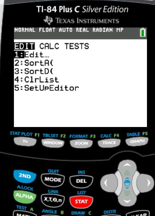
17 ONE VARIABLE DATA ENTRY Go to Choose Option 1: Edit
18 ENTER DATA INTO COLUMN (AKA LIST ) EXAMPLE: Number of Employees in various New York City restaurants Type in each individual data value, enter, repeat until all data values are entered
19 TWO VARIABLE DATA ENTRY Go to Choose Option 1: Edit
 and enter Variable 2 (y) into second column (L2) EXAMPLE:")
20 TWO VARIABLE DATA ENTRY Enter Variable 1 (x) into first column (L1) and enter Variable 2 (y) into second column (L2) EXAMPLE:

21 CLEAR DATA FROM LISTS Go to Choose Option 4: ClrList

22 Identify which list to clear Click Press To identify multiple list at one time, separate list names by commas
23 TO CREATE A HISTOGRAM USING A TI-83 PLUS OR EQUIVALENT CALCULATOR, YOU MUST CREATE A GROUPED FREQUENCY DISTRIBUTION FIRST. EXAMPLE: Number of employees at various Atlanta restaurants Number of Employees Class Midpoint Frequency

24 GO TO STAT MENU
25 OPTION 1: EDIT ENTER MIDPOINT FOR EACH CLASS IN L1 & FREQUENCY IN L2 Example:
26 Go to STAT PLOT --Press Turn on Plot 1 choose option 1, arrow to left highlight On

= L1 (default) Freq = L2")
27 CONTINUE SETUP OF HISTOGRAM Select type of graph arrow down to type, arrow right 3 times Indicate location of data--- Xlist (midpoint)= L1 (default) Freq = L2 Press

28 SETUP WINDOW SCALES FOR X- & Y- AXIS Press EXAMPLE: GENERIC WINDOW xmin= first lower class limit Xmax = last upper class limit Xscl= class width Ymin = 0 Ymax = at least high frequency Yscl 1
29 GRAPH Press to see histogram on screen
30 FREQUENCY POLYGONS Frequency polygons are analogous to line graphs, and just as line graphs make continuous data visually easy to interpret, so too do frequency polygons. To construct a frequency polygon, first examine the data and decide on the number of intervals, or class intervals, to use on the x-axis and y-axis. After choosing the appropriate ranges, begin plotting the data points. To plot the points, you need to find the midpoints of the classes. For the beginning data point, you need a frequency of 0 and a lower midpoint. For the ending data point, you need a frequency of 0 and an upper bound above the higher midpoint. After all the points are plotted, draw line segments to connect them.
31 FREQUENCY POLYGON EXAMPLE Frequency Distribution for Calculus Final Test Scores Lower Bound Upper Bound Midpoint Frequency Cumulative Frequency
32 EXAMPLE OF FREQUENCY POLYGON
33 TIME SERIES GRAPH To construct a time series graph, we must look at both pieces of our paired data set. We start with a standard Cartesian coordinate system. The horizontal axis is used to plot the date or time increments, and the vertical axis is used to plot the values of the variable that we are measuring. By doing this, we make each point on the graph correspond to a date and a measured quantity. The points on the graph are typically connected by straight lines in the order in which they occur.
34 TIME SERIES GRAPH
35 DESCRIPTIVE STATISTICS USING THE TI- 83/84 CALCULATOR

36 DATA ENTRY Go to Choose Option 1: Edit

37 ENTER DATA INTO COLUMN (AKA LIST ) EXAMPLE: Number of Employees in various New York City restaurants Type in each individual data value, enter, repeat until all data values are entered

38 DESCRIPTIVE STATISTICS Go to Arrow right to CALC Choose option 1: 1-Var Stats


39 Indicate which list contains data Click number of list Arrow down twice to calculate Enter
40 RESULTS ARE DISPLAYED IN THE WINDOW x ҧ = Sample mean σ x = sum of the data values, x σ x 2 = sum of the square of the data values, x 2 s x = Sample standard deviation σ x = Population standard deviation n = Sample size (number of data values) minx = minimum data value Q 1 = Quartile 1 (25 th Percentile) med = median (middle value) of the data values (50 th Percentile) Q 3 = Quartile 3 (75 th Percentile) maxx = maximum data value


41 EXAMPLE Scroll down to see all the results
42 TI-83/84 CALCULATOR DOES NOT CALCULATE, BUT GIVES YOU THE INFORMATION SO YOU CAN DETERMINE THE FOLLOWING: Mode = data value that occurs most often Sample Variance = square of sample standard deviation = (s x ) 2 Population Variance = square of population standard deviation = (σ x ) 2 Range = maximum data value minimum data value = maxx minx Interquartile Range (IQR) = Q 3 Q 1
43 SECTION 2.3 MEASURES OF THE LOCATION OF THE DATA
44 QUARTILES AND INTERQUARTILE RANGE Quartiles are special percentiles. The first quartile, Q1, is the same as the 25th percentile The third quartile, Q3, is the same as the 75th percentile. The median, M, is called both the second quartile and the 50th percentile To calculate quartiles, the data must be ordered from smallest to largest. Quartiles divide ordered data into quarters. Interquartile range is found by subtracting the first quartile from the third quartile.
45 OUTLIERS Outliers is a value that is considerably larger or considerably smaller than most of the values in a data set. Method for finding Outliers: Find the first quartile Q1, and the third quartile Q3. Compute the interquartile range: IQR = Q3 Q1. Compute the outlier boundaries. These boundaries are the cutoff points for determining outliers: Lower Outlier Boundary = Q1 1.5(IQR) Upper Outlier Boundary = Q (IQR) Any data value that is less than the lower outlier boundary or greater than the upper outlier boundary is considered to be an outlier.
46 USING THE CALCULATOR TO SOLVE FOR QUARTILES To find the quartiles, I will need to first look at the data below. 1,2,2,3,3,3,4,4,4,5,6,6,6,7,7 To use the calculator, follow these directions: Press the STAT button Press Enter (The first list on the far left Is L1. If it is not, then you need to reset your calculator. Directions are the bottom of this sheet) In L1, Put the following data going down (NOT ACROSS): Press the STAT button Press the Right arrow button (It moves the prompt from EDIT to CALC) Press ENTER Twice
47 USING THE CALCULATOR TO SOLVE FOR QUARTILES From the calculator results, we can determine the following information: Q1 is the first quartile of the data is 3 Med is the median of the data is 4 Q3 is the third quartile of the data is 6 My IQR is 6 (Q3) 3 (Q1) = 3 There are no outliers because none of the data values are lower than -1.5 or greater than Lower Outlier Boundary = 3 1.5(3) = -1.5 Upper Outlier Boundary = (3) = 10.5
48 FINDING PERCENTILES IN DATA Arrange the data in order from smallest to largest Use the formula where p is the percentile and n is the number of values in the data L = P 100 (n + 1) L means the location of the data value for that percentile If L is a whole number, go to the location and get the actual value and the actual value to the right of it. Then find the average of the two actual values (not L). That is the value for that percentile. If L is not a whole number, round it up to the next highest whole number. The pth percentile is the number in the position corresponding to the rounded-up value.
49 EXAMPLE OF PERCENTILE IN DATA Find the 28 th percentile of the data set 2,3,4,5,6,7,7,8,9,10,11 L = P 28 (n + 1) = (11 + 1) = 3.36 round up to 4 so 5 is the 28th L means the location of the data value for that percentile If L is a whole number, go to the location and get the actual value and the actual value to the right of it. Then find the average of the two actual values (not L). That is the value for that percentile. If L is not a whole number, round it up to the next highest whole number. The pth percentile is the number in the position corresponding to the rounded-up value.
50 PROCEDURE FOR COMPUTING THE PERCENTILE CORRESPONDING TO A GIVEN DATA VALUE Arrange the data in order from smallest to largest x = the number of data values counting from the bottom of the data list up to but not including the data value for which you want to find the percentile y= the number of data values equal to the data value for which you want to find the percentile. n= the total number of data. Percentile = (x+0.5y) (n) (100) Round the result to the nearest whole number
51 EXAMPLE OF COMPUTING THE PERCENTILE CORRESPONDING TO A GIVEN DATA VALUE Find what percentile 9 is in the data set 2,3,4,5,6,7,7,8,9,10,11 Percentile = (x+0.5y) (n) (100) = (8+0.5(1)) (11) The answer is and round to 77 9 is at the 77 th percentile (100)
52 FIVE NUMBER SUMMARY (Use the calculator to solve these problems) The five number summary is the following numbers in a data set. Minimum (smallest value in data) First Quartile (25 th percentile in data) Median (50 th percentile in data) Third Quartile (75 th percentile in data) Maximum (largest value in data)
53 2.4 BOX PLOTS
54 BOX PLOTS OR (BOX-AND-WHISKER PLOTS) A box plot is constructed from five values: Minimum First Quartile Median Third Quartile Maximum We use these values to compare how close other data values are to them. You may encounter box-and-whisker plots that have dots marking outlier values. In those cases, the whiskers are not extending to the minimum and maximum values.
55 BOX PLOTS To construct a box plot, use a horizontal or vertical number line and a rectangular box. The smallest and largest data values label the endpoints of the axis. The first quartile marks one end of the box and the third quartile marks the other end of the box. Approximately the middle 50 percent of the data fall inside the box. The "whiskers" extend from the ends of the box to the smallest and largest data values. The median or second quartile can be between the first and third quartiles, or it can be one, or the other, or both.
56 EXAMPLE OF BOX PLOT Consider, again, this dataset. 1; 1; 2; 2; 4; 6; 6.8; 7.2; 8; 8.3; 9; 10; 10; 11.5 The first quartile is two, the median is seven, and the third quartile is nine. The smallest value is one, and the largest value is The following image shows the constructed box plot.
57 EXAMPLE Test scores for a college statistics class held during the day are: 99; 56; 78; 55.5; 32; 90; 80; 81; 56; 59; 45; 77; 84.5; 84; 70; 72; 68; 32; 79; 90 Test scores for a college statistics class held during the evening are: 98; 78; 68; 83; 81; 89; 88; 76; 65; 45; 98; 90; 80; 84.5; 85; 79; 78; 98; 90; 79; 81; 25.5 Make two box plots (one for day and one for night)
58 EXAMPLE CONTINUED a. Find the smallest and largest values, the median, and the first and third quartile for the day class. b. Find the smallest and largest values, the median, and the first and third quartile for the night class. c. For each data set, what percentage of the data is between the smallest value and the first quartile? the first quartile and the median? the median and the third quartile? the third quartile and the largest value? What percentage of the data is between the first quartile and the largest value? Which box plot has the widest spread for the middle 50% of the data (the data between the first and third quartiles)?
59 2.5 MEASURES OF CENTER OF THE DATA
60 MEASURES OF CENTER The "center" of a data set is also a way of describing location. The two most widely used measures of the "center" of the data are the mean (average) and the median. To calculate the mean weight of 50 people, add the 50 weights together and divide by 50. To find the median weight of the 50 people, order the data and find the number that splits the data into two equal parts. The median is generally a better measure of the center when there are extreme values or outliers because it is not affected by the precise numerical values of the outliers. The mean is the most common measure of the center.
61 MEAN (AVERAGE) Sample mean The letter used to represent the sample mean is an x with a bar over it (pronounced xbar ): ഥx Population mean The Greek letter μ (pronounced "mew") represents the population mean To get the sample mean, you add all your sample numbers together and divide by your sample size (n). x x n To get the population mean, you add all your population numbers together and divide by your population size (N). x N
62 EXAMPLE OF MEAN Find the average age of students in Math 2200; 18, 18, 17, 16, 19, 24, 22, 37, 19, 21, 20, 18
63 FIND THE MEAN USING THE CALCULATOR To find the mean: Press STAT 1:EDIT. Put the data values into list L1. Press STAT and Arrow to CALC. Press 1:1-VarStats. Press 2nd 1 for L1 and then ENTER. Press the down and up arrow keys to scroll. Look for ഥx for the sample and population mean
64 MEDIAN (M) You can quickly find the location of the median by using the expression (n+1) 2 The letter n is the total number of data values in the sample. If n is an odd number, the median is the middle value of the ordered data (ordered smallest to largest). If n is an even number, the median is equal to the two middle values added together and divided by two after the data has been ordered.
65 MEDIAN (M) For example, if the total number of data values is 97, then n = 49. The median is the 49th value in the ordered data. If the total number of data values is 100, then n+1 2 = = The median occurs midway between the 50th and 51st values. 2 = The location of the median and the value of the median are not the same.
66 EXAMPLE OF MEDIAN Find the median age of students in Math 2200; 18, 18, 17, 16, 19, 24, 22, 37, 19, 21, 20, 18
67 FIND THE MEDIAN USING THE CALCULATOR To find the median: Press STAT 1:EDIT. Put the data values into list L1. Press STAT and Arrow to CALC. Press 1:1-VarStats. Press 2nd 1 for L1 and then ENTER. Press the down and up arrow keys to scroll. Look for Med for the median
68 MEAN VERSUS MEDIAN Suppose that in a small town of 50 people, one person earns $5,000,000 per year and the other 49 each earn $30,000. Which is the better measure of the "center": the mean or the median?
69 MODE Another measure of the center is the mode. The mode is the most frequent value. There can be more than one mode in a data set as long as those values have the same frequency and that frequency is the highest. A data set with two modes is called bimodal.
70 EXAMPLE OF MODE Statistics exam scores for 20 students are as follows: 50; 53; 59; 59; 63; 63; 72; 72; 72; 72; 72; 76; 78; 81; 83; 84; 84; 84; 90; 93 Find the mode the mode is
71 THE LAW OF LARGE NUMBERS AND THE MEAN The Law of Large Numbers says that if you take samples of larger and larger size from any population, then the mean ഥx of the sample is very likely to get closer and closer to µ of the population
72 SAMPLING DISTRIBUTIONS AND STATISTIC OF A SAMPLING DISTRIBUTION You can think of a sampling distribution as a relative frequency distribution with a great many samples. If you let the number of samples get very large (say, 300 million or more), the relative frequency table becomes a relative frequency distribution.
73 CALCULATING THE MEAN OF GROUPED FREQUENCY TABLES 1.) Find the midpoint (or midrange) of each class: MR highestvalue lowestvalue 2 2.) Mean of Frequency Table= σ(f m) σ(f) f= the frequency of the interval m= the midpoint of the interval.
74 FIND THE BEST ESTIMATE OF THE CLASS MEAN. A frequency table of Grade Interval Number of Students Find the midpoints for each class
75 FIND THE BEST ESTIMATE OF THE CLASS MEAN. Calculate the sum of the product of each interval frequency and midpoint. (f*m) = 53.25(1)+59.5(0)+65.5(4)+71.5(4)+77.5(2)+83.5(3)+89.5(4)+95.5 (1)= µ = σ(f m) = / 19 =76.86 σ(f)
76 USING THE CALCULATOR You can use the calculator to solve for the mean of grouped frequency tables. Press STAT and 1. In L1, list the midpoints for the classes In L2, list the frequencies for each of the classes. The frequency should match the class midpoint Press STAT and scroll over to CALC. Press 2: 2-Var STATS and ENTER again The mean is listed. ( x) ҧ
77 2.6 SKEWNESS AND THE MEAN, MEDIAN, AND MODE
78 SYMMETRIC SHAPE The histogram displays a symmetrical distribution of data. A distribution is symmetrical if a vertical line can be drawn at some point in the histogram such that the shape to the left and the right of the vertical line are mirror images of each other. In a symmetrical distribution that has two modes (bimodal), the two modes would be different from the mean and median.

79 SYMMETRIC HISTOGRAM
80 SKEWED TO THE LEFT The histogram for the data: 4; 5; 6; 6; 6; 7; 7; 7; 7; 8 is not symmetrical. The right-hand side seems "chopped off compared to the left side. A distribution of this type is called skewed to the left because it is pulled out to the left. The mean is 6.3, the median is 6.5, and the mode is seven. Notice that the mean is less than the median, and they are both less than the mode. The mean and the median both reflect the skewing, but the mean reflects it more so. To summarize, generally if the distribution of data is skewed to the left, the mean is less than the median,which is often less than the mode.

81 SKEWED TO THE LEFT
82 SKEWED TO THE RIGHT The histogram for the data: 6; 7; 7; 7; 7; 8; 8; 8; 9; 10, is also not symmetrical. It is skewed to the right. The mean is 7.7, the median is 7.5, and the mode is seven. Of the three statistics, the mean is the largest, while the mode is the smallest. Again, the mean reflects the skewing the most. If the distribution of data is skewed to the right, the mode is often less than the median, which is less than the mean.

83 SKEWED TO THE RIGHT
84 2.7 MEASURES OF THE SPREAD OF THE DATA
85 STANDARD DEVIATION An important characteristic of any set of data is the variation in the data. In some data sets, the data values are concentrated closely near the mean; in other data sets, the data values are more widely spread out from the mean. The most common measure of variation, or spread, is the standard deviation. The standard deviation is a number that measures how far data values are from their mean. The standard deviation provides a numerical measure of the overall amount of variation in a data set can be used to determine whether a particular data value is close to or far from the mean.
86 STANDARD DEVIATION The standard deviation provides a measure of the overall variation in a data set The standard deviation is always positive or zero. The standard deviation is small when the data are all concentrated close to the mean, exhibiting little variation or spread. The standard deviation is larger when the data values are more spread out from the mean, exhibiting more variation. The standard deviation can be used to determine whether a data value is close to or far from the mean.
87 EXAMPLE Suppose that Rosa and Binh both shop at supermarket A. Rosa waits at the checkout counter for seven minutes and Binh waits for one minute. At supermarket A, the mean waiting time is five minutes and the standard deviation is two minutes. So the mean is 5 and the standard deviation is 2 The standard deviation can be used to determine whether a data value is close to or far from the mean.
88 EXAMPLE OF ROSA So the mean is 5 and the standard deviation is 2 Rosa waits for 7 minutes so I am going to compare it to the mean. 7 5 = 2 I know that 2 is the same as the standard deviation so 2 minutes is equal to 1 standard deviation. Rosa's wait time of 7 minutes is 2 minutes longer than the average of 5 minutes. Rosa's wait time of 7 minutes is 1 standard deviation above the average of 5 minutes..
89 EXAMPLE OF BINH Again the mean is 5 and the standard deviation is 2 Binh waits for 1 minute So 1 5 = -4 1 is 4 minutes less than the average of 5; 4 minutes is equal to 2 standard deviations. Binh's wait time of 1 minute is 4 minutes less than the average of 5 minutes. Binh's wait time of 1 minute is 2 standard deviations below the average of 5 minutes.
90 LOOKING AT IT AGAIN The mean is 5 and the standard deviation is 2 2 standard deviations above mean = 5+ (2x2) = 9 minutes 1 standard deviation above mean = 5+ (1x2) = 7 minutes Mean = 5 minutes 1 standard deviation below mean = 5- (1x2) = 3 minutes 2 standard deviations below mean = 5 (2x2) = 1 minute
91 STANDARD DEVIATION A data value that is two standard deviations from the average is just on the borderline for what many statisticians would consider to be far from the average. Considering data to be far from the mean if it is more than two standard deviations away is more of an approximate "rule of thumb" than a rigid rule. In general, the shape of the distribution of the data affects how much of the data is further away than two standard deviations. (You will learn more about this in later chapters.)
92 STANDARD DEVIATION AND MEANS The equation value = mean + (# of STDEVs)(standard deviation) can be expressed for a sample and for a population. Sample: x = x ҧ + (# of STDEV)(s) xҧ is the sample mean and s is the sample standard deviation. Population: x = µ+(# of STDEV)(σ) µ is the population mean and σ is the population standard deviation.
93 STANDARD DEVIATION If x is a number, then the difference "x mean" is called its deviation. In a data set, there are as many deviations as there are items in the data set. The deviations are used to calculate the standard deviation. If the numbers belong to a population, in symbols a deviation is x μ. For sample data, in symbols a deviation is x xҧ
94 STANDARD DEVIATION Sample Standard Deviation Population Standard Deviation s = σ(x n 1 ҧ x)² xҧ is the sample mean n is the sample size σ = σ(x µ)² N µ is the population mean N is the population
95 VARIANCE Sample Variance s² = σ (x x)² ҧ n 1 Population Variance σ² = σ (x µ)² N xҧ is the sample mean n is the sample size µ is the population mean N is the population
96 STANDARD DEVIATION Your concentration should be on what the standard deviation tells us about the data. The standard deviation is a number which measures how far the data are spread from the mean. Let a calculator or computer do the arithmetic. The standard deviation, s or σ,is either zero or larger than zero. When the standard deviation is zero, there is no spread; that is, the all the data values are equal to each other. The standard deviation is small when the data are all concentrated close to the mean, and is larger when the data values show more variation from the mean. When the standard deviation is a lot larger than zero, the data values are very spread out about the mean; outliers can make s or σ very large.
97 EXAMPLE OF STANDARD DEVIATION AND VARIANCE Find the average age of students in Math 2200; 18, 18, 17, 16, 19, 24, 22, 37, 19, 21, 20, 18
98 FIND THE STANDARD DEVIATION AND VARIANCE USING THE CALCULATOR Press STAT 1:EDIT. Put the data values into list L1. Press STAT and Arrow to CALC. Press 1:1-VarStats. Press 2nd 1 for L1 and then ENTER. Press the down and up arrow keys to scroll.
99 FIND THE STANDARD DEVIATION AND VARIANCE USING THE CALCULATOR Sx = the sample standard deviation which is or 5.6 To get the sample variance (s²), you need to square the Sx value. (5.6)² = or 31.4 σx = the population standard deviation which is or 5.3 To get the population variance (σ²), you need to square the σx value. (5.3)² = or 28.1
100 USING THE CALCULATOR FOR GROUPED FREQUENCY TABLES You can use the calculator to solve for the standard deviation and variance of grouped frequency tables. Press STAT and 1. In L1, list the midpoints for the classes In L2, list the frequencies for each of the classes. The frequency should match the class midpoint Press STAT and scroll over to CALC. Press 2: 2-Var STATS and ENTER again Sx = the sample standard deviation σx = the population standard deviation The variance is found the same way as noted before.
101 ҧ COMPARING VALUES FROM DIFFERENT DATA SETS (Z-SCORES) Number of standard deviations = Z scores for sample X = x ҧ + (z*s) Z = (x x) ҧ s x is sample mean S is sample standard deviation X is a data value Z is z-score (value mean) standard deviation
102 COMPARING VALUES FROM DIFFERENT DATA SETS (Z-SCORES) Number of standard deviations = Z scores for populations X = μ+ (z*σ) Z = (x µ) σ µ is population mean σ is population standard deviation X is a data value Z is z-score (value mean) standard deviation
Descriptive Statistics
 Chapter 2 Descriptive Statistics 2.1 Descriptive Statistics 1 2.1.1 Student Learning Objectives By the end of this chapter, the student should be able to: Display data graphically and interpret graphs:
Prepare a stem-and-leaf graph for the following data. In your final display, you should arrange the leaves for each stem in increasing order.
 Chapter 2 2.1 Descriptive Statistics A stem-and-leaf graph, also called a stemplot, allows for a nice overview of quantitative data without losing information on individual observations. It can be a good
Chapter 2 Describing, Exploring, and Comparing Data
 Slide 1 Chapter 2 Describing, Exploring, and Comparing Data Slide 2 2-1 Overview 2-2 Frequency Distributions 2-3 Visualizing Data 2-4 Measures of Center 2-5 Measures of Variation 2-6 Measures of Relative
Chapter 2. Descriptive Statistics: Organizing, Displaying and Summarizing Data
 Chapter 2 Descriptive Statistics: Organizing, Displaying and Summarizing Data Objectives Student should be able to Organize data Tabulate data into frequency/relative frequency tables Display data graphically
Averages and Variation
 Averages and Variation 3 Copyright Cengage Learning. All rights reserved. 3.1-1 Section 3.1 Measures of Central Tendency: Mode, Median, and Mean Copyright Cengage Learning. All rights reserved. 3.1-2 Focus
Chapter 3 - Displaying and Summarizing Quantitative Data
 Chapter 3 - Displaying and Summarizing Quantitative Data 3.1 Graphs for Quantitative Data (LABEL GRAPHS) August 25, 2014 Histogram (p. 44) - Graph that uses bars to represent different frequencies or relative
CHAPTER 2 DESCRIPTIVE STATISTICS
 CHAPTER 2 DESCRIPTIVE STATISTICS 1. Stem-and-Leaf Graphs, Line Graphs, and Bar Graphs The distribution of data is how the data is spread or distributed over the range of the data values. This is one of
Descriptive Statistics: Box Plot
 Connexions module: m16296 1 Descriptive Statistics: Box Plot Susan Dean Barbara Illowsky, Ph.D. This work is produced by The Connexions Project and licensed under the Creative Commons Attribution License
15 Wyner Statistics Fall 2013
 15 Wyner Statistics Fall 2013 CHAPTER THREE: CENTRAL TENDENCY AND VARIATION Summary, Terms, and Objectives The two most important aspects of a numerical data set are its central tendencies and its variation.
Math 120 Introduction to Statistics Mr. Toner s Lecture Notes 3.1 Measures of Central Tendency
 Math 1 Introduction to Statistics Mr. Toner s Lecture Notes 3.1 Measures of Central Tendency lowest value + highest value midrange The word average: is very ambiguous and can actually refer to the mean,
Box Plots. OpenStax College
 Connexions module: m46920 1 Box Plots OpenStax College This work is produced by The Connexions Project and licensed under the Creative Commons Attribution License 3.0 Box plots (also called box-and-whisker
Descriptive Statistics
 Chapter 2 Descriptive Statistics 2.1 Descriptive Statistics 1 2.1.1 Student Learning Objectives By the end of this chapter, the student should be able to: Display data graphically and interpret graphs:
a. divided by the. 1) Always round!! a) Even if class width comes out to a, go up one.
 Always round!! a) Even if class width comes out to a, go up one.") Probability and Statistics Chapter 2 Notes I Section 2-1 A Steps to Constructing Frequency Distributions 1 Determine number of (may be given to you) a Should be between and classes 2 Find the Range a The
Probability and Statistics Chapter 2 Notes I Section 2-1 A Steps to Constructing Frequency Distributions 1 Determine number of (may be given to you) a Should be between and classes 2 Find the Range a The
CHAPTER 2: DESCRIPTIVE STATISTICS Lecture Notes for Introductory Statistics 1. Daphne Skipper, Augusta University (2016)
") CHAPTER 2: DESCRIPTIVE STATISTICS Lecture Notes for Introductory Statistics 1 Daphne Skipper, Augusta University (2016) 1. Stem-and-Leaf Graphs, Line Graphs, and Bar Graphs The distribution of data is
CHAPTER 2: DESCRIPTIVE STATISTICS Lecture Notes for Introductory Statistics 1 Daphne Skipper, Augusta University (2016) 1. Stem-and-Leaf Graphs, Line Graphs, and Bar Graphs The distribution of data is
Unit 7 Statistics. AFM Mrs. Valentine. 7.1 Samples and Surveys
 Unit 7 Statistics AFM Mrs. Valentine 7.1 Samples and Surveys v Obj.: I will understand the different methods of sampling and studying data. I will be able to determine the type used in an example, and
UNIT 1A EXPLORING UNIVARIATE DATA
 A.P. STATISTICS E. Villarreal Lincoln HS Math Department UNIT 1A EXPLORING UNIVARIATE DATA LESSON 1: TYPES OF DATA Here is a list of important terms that we must understand as we begin our study of statistics
2.1: Frequency Distributions and Their Graphs
 2.1: Frequency Distributions and Their Graphs Frequency Distribution - way to display data that has many entries - table that shows classes or intervals of data entries and the number of entries in each
CHAPTER 3: Data Description
 CHAPTER 3: Data Description You ve tabulated and made pretty pictures. Now what numbers do you use to summarize your data? Ch3: Data Description Santorico Page 68 You ll find a link on our website to a
Chapter 6: DESCRIPTIVE STATISTICS
 Chapter 6: DESCRIPTIVE STATISTICS Random Sampling Numerical Summaries Stem-n-Leaf plots Histograms, and Box plots Time Sequence Plots Normal Probability Plots Sections 6-1 to 6-5, and 6-7 Random Sampling
Chpt 3. Data Description. 3-2 Measures of Central Tendency /40
 Chpt 3 Data Description 3-2 Measures of Central Tendency 1 /40 Chpt 3 Homework 3-2 Read pages 96-109 p109 Applying the Concepts p110 1, 8, 11, 15, 27, 33 2 /40 Chpt 3 3.2 Objectives l Summarize data using
MATH NATION SECTION 9 H.M.H. RESOURCES
 MATH NATION SECTION 9 H.M.H. RESOURCES SPECIAL NOTE: These resources were assembled to assist in student readiness for their upcoming Algebra 1 EOC. Although these resources have been compiled for your
Chapter 2: Descriptive Statistics
 Chapter 2: Descriptive Statistics Student Learning Outcomes By the end of this chapter, you should be able to: Display data graphically and interpret graphs: stemplots, histograms and boxplots. Recognize,
STP 226 ELEMENTARY STATISTICS NOTES PART 2 - DESCRIPTIVE STATISTICS CHAPTER 3 DESCRIPTIVE MEASURES
 STP 6 ELEMENTARY STATISTICS NOTES PART - DESCRIPTIVE STATISTICS CHAPTER 3 DESCRIPTIVE MEASURES Chapter covered organizing data into tables, and summarizing data with graphical displays. We will now use
Univariate Statistics Summary
 Further Maths Univariate Statistics Summary Types of Data Data can be classified as categorical or numerical. Categorical data are observations or records that are arranged according to category. For example:
DAY 52 BOX-AND-WHISKER
 DAY 52 BOX-AND-WHISKER VOCABULARY The Median is the middle number of a set of data when the numbers are arranged in numerical order. The Range of a set of data is the difference between the highest and
1. Descriptive Statistics
 1.1 Descriptive statistics 1. Descriptive Statistics A Data management Before starting any statistics analysis with a graphics calculator, you need to enter the data. We will illustrate the process by
Name: Date: Period: Chapter 2. Section 1: Describing Location in a Distribution
 Name: Date: Period: Chapter 2 Section 1: Describing Location in a Distribution Suppose you earned an 86 on a statistics quiz. The question is: should you be satisfied with this score? What if it is the
STA Rev. F Learning Objectives. Learning Objectives (Cont.) Module 3 Descriptive Measures
 Module 3 Descriptive Measures") STA 2023 Module 3 Descriptive Measures Learning Objectives Upon completing this module, you should be able to: 1. Explain the purpose of a measure of center. 2. Obtain and interpret the mean, median, and
STA 2023 Module 3 Descriptive Measures Learning Objectives Upon completing this module, you should be able to: 1. Explain the purpose of a measure of center. 2. Obtain and interpret the mean, median, and
Chapter 1. Looking at Data-Distribution
 Chapter 1. Looking at Data-Distribution Statistics is the scientific discipline that provides methods to draw right conclusions: 1)Collecting the data 2)Describing the data 3)Drawing the conclusions Raw
Measures of Position
 Measures of Position In this section, we will learn to use fractiles. Fractiles are numbers that partition, or divide, an ordered data set into equal parts (each part has the same number of data entries).
Data can be in the form of numbers, words, measurements, observations or even just descriptions of things.
 + What is Data? Data is a collection of facts. Data can be in the form of numbers, words, measurements, observations or even just descriptions of things. In most cases, data needs to be interpreted and
MAT 142 College Mathematics. Module ST. Statistics. Terri Miller revised July 14, 2015
 MAT 142 College Mathematics Statistics Module ST Terri Miller revised July 14, 2015 2 Statistics Data Organization and Visualization Basic Terms. A population is the set of all objects under study, a sample
Measures of Position. 1. Determine which student did better
 Measures of Position z-score (standard score) = number of standard deviations that a given value is above or below the mean (Round z to two decimal places) Sample z -score x x z = s Population z - score
Overview. Frequency Distributions. Chapter 2 Summarizing & Graphing Data. Descriptive Statistics. Inferential Statistics. Frequency Distribution
 Chapter 2 Summarizing & Graphing Data Slide 1 Overview Descriptive Statistics Slide 2 A) Overview B) Frequency Distributions C) Visualizing Data summarize or describe the important characteristics of a
Measures of Central Tendency
 Page of 6 Measures of Central Tendency A measure of central tendency is a value used to represent the typical or average value in a data set. The Mean The sum of all data values divided by the number of
Chapter 5snow year.notebook March 15, 2018
 Chapter 5: Statistical Reasoning Section 5.1 Exploring Data Measures of central tendency (Mean, Median and Mode) attempt to describe a set of data by identifying the central position within a set of data
2.1 Objectives. Math Chapter 2. Chapter 2. Variable. Categorical Variable EXPLORING DATA WITH GRAPHS AND NUMERICAL SUMMARIES
 EXPLORING DATA WITH GRAPHS AND NUMERICAL SUMMARIES Chapter 2 2.1 Objectives 2.1 What Are the Types of Data? www.managementscientist.org 1. Know the definitions of a. Variable b. Categorical versus quantitative
Measures of Central Tendency. A measure of central tendency is a value used to represent the typical or average value in a data set.
 Measures of Central Tendency A measure of central tendency is a value used to represent the typical or average value in a data set. The Mean the sum of all data values divided by the number of values in
Slide Copyright 2005 Pearson Education, Inc. SEVENTH EDITION and EXPANDED SEVENTH EDITION. Chapter 13. Statistics Sampling Techniques
 SEVENTH EDITION and EXPANDED SEVENTH EDITION Slide - Chapter Statistics. Sampling Techniques Statistics Statistics is the art and science of gathering, analyzing, and making inferences from numerical information
Chapter 3: Describing, Exploring & Comparing Data
 Chapter 3: Describing, Exploring & Comparing Data Section Title Notes Pages 1 Overview 1 2 Measures of Center 2 5 3 Measures of Variation 6 12 4 Measures of Relative Standing & Boxplots 13 16 3.1 Overview
Chapter 1 Histograms, Scatterplots, and Graphs of Functions
 Chapter 1 Histograms, Scatterplots, and Graphs of Functions 1.1 Using Lists for Data Entry To enter data into the calculator you use the statistics menu. You can store data into lists labeled L1 through
No. of blue jelly beans No. of bags
 Math 167 Ch5 Review 1 (c) Janice Epstein CHAPTER 5 EXPLORING DATA DISTRIBUTIONS A sample of jelly bean bags is chosen and the number of blue jelly beans in each bag is counted. The results are shown in
Raw Data is data before it has been arranged in a useful manner or analyzed using statistical techniques.
 Section 2.1 - Introduction Graphs are commonly used to organize, summarize, and analyze collections of data. Using a graph to visually present a data set makes it easy to comprehend and to describe the
Name Date Types of Graphs and Creating Graphs Notes
 Name Date Types of Graphs and Creating Graphs Notes Graphs are helpful visual representations of data. Different graphs display data in different ways. Some graphs show individual data, but many do not.
Learning Log Title: CHAPTER 7: PROPORTIONS AND PERCENTS. Date: Lesson: Chapter 7: Proportions and Percents
 Chapter 7: Proportions and Percents CHAPTER 7: PROPORTIONS AND PERCENTS Date: Lesson: Learning Log Title: Date: Lesson: Learning Log Title: Chapter 7: Proportions and Percents Date: Lesson: Learning Log
CHAPTER 1. Introduction. Statistics: Statistics is the science of collecting, organizing, analyzing, presenting and interpreting data.
 1 CHAPTER 1 Introduction Statistics: Statistics is the science of collecting, organizing, analyzing, presenting and interpreting data. Variable: Any characteristic of a person or thing that can be expressed
10.4 Measures of Central Tendency and Variation
 10.4 Measures of Central Tendency and Variation Mode-->The number that occurs most frequently; there can be more than one mode ; if each number appears equally often, then there is no mode at all. (mode
10.4 Measures of Central Tendency and Variation
 10.4 Measures of Central Tendency and Variation Mode-->The number that occurs most frequently; there can be more than one mode ; if each number appears equally often, then there is no mode at all. (mode
1.3 Graphical Summaries of Data
 Arkansas Tech University MATH 3513: Applied Statistics I Dr. Marcel B. Finan 1.3 Graphical Summaries of Data In the previous section we discussed numerical summaries of either a sample or a data. In this
Name Geometry Intro to Stats. Find the mean, median, and mode of the data set. 1. 1,6,3,9,6,8,4,4,4. Mean = Median = Mode = 2.
 Name Geometry Intro to Stats Statistics are numerical values used to summarize and compare sets of data. Two important types of statistics are measures of central tendency and measures of dispersion. A
Calculator Notes for the TI-83 and TI-83/84 Plus
 CHAPTER 2 Calculator Notes for the Note 2A Naming Lists In addition to the six standard lists L1 through L6, you can create more lists as needed. You can also give the standard lists meaningful names (of
STA Module 2B Organizing Data and Comparing Distributions (Part II)
") STA 2023 Module 2B Organizing Data and Comparing Distributions (Part II) Learning Objectives Upon completing this module, you should be able to 1 Explain the purpose of a measure of center 2 Obtain and
STA 2023 Module 2B Organizing Data and Comparing Distributions (Part II) Learning Objectives Upon completing this module, you should be able to 1 Explain the purpose of a measure of center 2 Obtain and
STA Learning Objectives. Learning Objectives (cont.) Module 2B Organizing Data and Comparing Distributions (Part II)
 Module 2B Organizing Data and Comparing Distributions (Part II)") STA 2023 Module 2B Organizing Data and Comparing Distributions (Part II) Learning Objectives Upon completing this module, you should be able to 1 Explain the purpose of a measure of center 2 Obtain and
STA 2023 Module 2B Organizing Data and Comparing Distributions (Part II) Learning Objectives Upon completing this module, you should be able to 1 Explain the purpose of a measure of center 2 Obtain and
AND NUMERICAL SUMMARIES. Chapter 2
 EXPLORING DATA WITH GRAPHS AND NUMERICAL SUMMARIES Chapter 2 2.1 What Are the Types of Data? 2.1 Objectives www.managementscientist.org 1. Know the definitions of a. Variable b. Categorical versus quantitative
Vocabulary. 5-number summary Rule. Area principle. Bar chart. Boxplot. Categorical data condition. Categorical variable.
 5-number summary 68-95-99.7 Rule Area principle Bar chart Bimodal Boxplot Case Categorical data Categorical variable Center Changing center and spread Conditional distribution Context Contingency table
September 11, Unit 2 Day 1 Notes Measures of Central Tendency.notebook
 Measures of Central Tendency: Mean, Median, Mode and Midrange A Measure of Central Tendency is a value that represents a typical or central entry of a data set. Four most commonly used measures of central
AP Statistics Summer Assignment:
 AP Statistics Summer Assignment: Read the following and use the information to help answer your summer assignment questions. You will be responsible for knowing all of the information contained in this
Chapter 3 Analyzing Normal Quantitative Data
 Chapter 3 Analyzing Normal Quantitative Data Introduction: In chapters 1 and 2, we focused on analyzing categorical data and exploring relationships between categorical data sets. We will now be doing
Chapter 2 Modeling Distributions of Data
 Chapter 2 Modeling Distributions of Data Section 2.1 Describing Location in a Distribution Describing Location in a Distribution Learning Objectives After this section, you should be able to: FIND and
Section 2-2 Frequency Distributions. Copyright 2010, 2007, 2004 Pearson Education, Inc
 Section 2-2 Frequency Distributions Copyright 2010, 2007, 2004 Pearson Education, Inc. 2.1-1 Frequency Distribution Frequency Distribution (or Frequency Table) It shows how a data set is partitioned among
Calculator Notes for the TI-83 Plus and TI-84 Plus
 CHAPTER 2 Calculator Notes for the Note 2A Basic Statistics You can get several standard statistics for a data set stored in a list. Press STAT CALC 1:1-Var Stats, enter the name of the list, and press
Lecture Slides. Elementary Statistics Tenth Edition. by Mario F. Triola. and the Triola Statistics Series. Slide 1
 Lecture Slides Elementary Statistics Tenth Edition and the Triola Statistics Series by Mario F. Triola Slide 1 Chapter 2 Summarizing and Graphing Data 2-1 Overview 2-2 Frequency Distributions 2-3 Histograms
Section 3.2 Measures of Central Tendency MDM4U Jensen
 Section 3.2 Measures of Central Tendency MDM4U Jensen Part 1: Video This video will review shape of distributions and introduce measures of central tendency. Answer the following questions while watching.
Chapter 2 Organizing and Graphing Data. 2.1 Organizing and Graphing Qualitative Data
 Chapter 2 Organizing and Graphing Data 2.1 Organizing and Graphing Qualitative Data 2.2 Organizing and Graphing Quantitative Data 2.3 Stem-and-leaf Displays 2.4 Dotplots 2.1 Organizing and Graphing Qualitative
The first few questions on this worksheet will deal with measures of central tendency. These data types tell us where the center of the data set lies.
 Instructions: You are given the following data below these instructions. Your client (Courtney) wants you to statistically analyze the data to help her reach conclusions about how well she is teaching.
Measures of Dispersion
 Measures of Dispersion 6-3 I Will... Find measures of dispersion of sets of data. Find standard deviation and analyze normal distribution. Day 1: Dispersion Vocabulary Measures of Variation (Dispersion
STA 570 Spring Lecture 5 Tuesday, Feb 1
 STA 570 Spring 2011 Lecture 5 Tuesday, Feb 1 Descriptive Statistics Summarizing Univariate Data o Standard Deviation, Empirical Rule, IQR o Boxplots Summarizing Bivariate Data o Contingency Tables o Row
GRAPHING CALCULATOR REFERENCE BOOK
 John T. Baker Middle School GRAPHING CALCULATOR REFERENCE BOOK Name: Teacher: - 1 - To Graph an Equation: Graphing Linear Equations 1.) Press Y= and enter the equation into Y 1. 2.) To see the graph in
MATH& 146 Lesson 10. Section 1.6 Graphing Numerical Data
 MATH& 146 Lesson 10 Section 1.6 Graphing Numerical Data 1 Graphs of Numerical Data One major reason for constructing a graph of numerical data is to display its distribution, or the pattern of variability
Chapter 2 - Graphical Summaries of Data
 Chapter 2 - Graphical Summaries of Data Data recorded in the sequence in which they are collected and before they are processed or ranked are called raw data. Raw data is often difficult to make sense
Learning Log Title: CHAPTER 8: STATISTICS AND MULTIPLICATION EQUATIONS. Date: Lesson: Chapter 8: Statistics and Multiplication Equations
 Chapter 8: Statistics and Multiplication Equations CHAPTER 8: STATISTICS AND MULTIPLICATION EQUATIONS Date: Lesson: Learning Log Title: Date: Lesson: Learning Log Title: Chapter 8: Statistics and Multiplication
Sharp EL-9900 Graphing Calculator
 Sharp EL-9900 Graphing Calculator Basic Keyboard Activities General Mathematics Algebra Programming Advanced Keyboard Activities Algebra Calculus Statistics Trigonometry Programming Sharp EL-9900 Graphing
WHOLE NUMBER AND DECIMAL OPERATIONS
 WHOLE NUMBER AND DECIMAL OPERATIONS Whole Number Place Value : 5,854,902 = Ten thousands thousands millions Hundred thousands Ten thousands Adding & Subtracting Decimals : Line up the decimals vertically.
Chapter 3: Data Description - Part 3. Homework: Exercises 1-21 odd, odd, odd, 107, 109, 118, 119, 120, odd
 Chapter 3: Data Description - Part 3 Read: Sections 1 through 5 pp 92-149 Work the following text examples: Section 3.2, 3-1 through 3-17 Section 3.3, 3-22 through 3.28, 3-42 through 3.82 Section 3.4,
Frequency Distributions
 Displaying Data Frequency Distributions After collecting data, the first task for a researcher is to organize and summarize the data so that it is possible to get a general overview of the results. Remember,
Basic Statistical Terms and Definitions
 I. Basics Basic Statistical Terms and Definitions Statistics is a collection of methods for planning experiments, and obtaining data. The data is then organized and summarized so that professionals can
Mean,Median, Mode Teacher Twins 2015
 Mean,Median, Mode Teacher Twins 2015 Warm Up How can you change the non-statistical question below to make it a statistical question? How many pets do you have? Possible answer: What is your favorite type
How individual data points are positioned within a data set.
 Section 3.4 Measures of Position Percentiles How individual data points are positioned within a data set. P k is the value such that k% of a data set is less than or equal to P k. For example if we said
1.3 Box and Whisker Plot
 1.3 Box and Whisker Plot 1 Box and Whisker Plot = a type of graph used to display data. It shows how data are dispersed around a median, but does not show specific items in the data. How to form one: Example:
This chapter will show how to organize data and then construct appropriate graphs to represent the data in a concise, easy-to-understand form.
 CHAPTER 2 Frequency Distributions and Graphs Objectives Organize data using frequency distributions. Represent data in frequency distributions graphically using histograms, frequency polygons, and ogives.
TMTH 3360 NOTES ON COMMON GRAPHS AND CHARTS
 To Describe Data, consider: Symmetry Skewness TMTH 3360 NOTES ON COMMON GRAPHS AND CHARTS Unimodal or bimodal or uniform Extreme values Range of Values and mid-range Most frequently occurring values In
The main issue is that the mean and standard deviations are not accurate and should not be used in the analysis. Then what statistics should we use?
 Chapter 4 Analyzing Skewed Quantitative Data Introduction: In chapter 3, we focused on analyzing bell shaped (normal) data, but many data sets are not bell shaped. How do we analyze quantitative data when
Basic Commands. Consider the data set: {15, 22, 32, 31, 52, 41, 11}
 Entering Data: Basic Commands Consider the data set: {15, 22, 32, 31, 52, 41, 11} Data is stored in Lists on the calculator. Locate and press the STAT button on the calculator. Choose EDIT. The calculator
Lecture Slides. Elementary Statistics Twelfth Edition. by Mario F. Triola. and the Triola Statistics Series. Section 2.1- #
 Lecture Slides Elementary Statistics Twelfth Edition and the Triola Statistics Series by Mario F. Triola Chapter 2 Summarizing and Graphing Data 2-1 Review and Preview 2-2 Frequency Distributions 2-3 Histograms
Understanding Statistical Questions
 Unit 6: Statistics Standards, Checklist and Concept Map Common Core Georgia Performance Standards (CCGPS): MCC6.SP.1: Recognize a statistical question as one that anticipates variability in the data related
Descriptive Statistics
 Descriptive Statistics Library, Teaching & Learning 014 Summary of Basic data Analysis DATA Qualitative Quantitative Counted Measured Discrete Continuous 3 Main Measures of Interest Central Tendency Dispersion
STANDARDS OF LEARNING CONTENT REVIEW NOTES ALGEBRA I. 4 th Nine Weeks,
 STANDARDS OF LEARNING CONTENT REVIEW NOTES ALGEBRA I 4 th Nine Weeks, 2016-2017 1 OVERVIEW Algebra I Content Review Notes are designed by the High School Mathematics Steering Committee as a resource for
Section 1.2. Displaying Quantitative Data with Graphs. Mrs. Daniel AP Stats 8/22/2013. Dotplots. How to Make a Dotplot. Mrs. Daniel AP Statistics
 Section. Displaying Quantitative Data with Graphs Mrs. Daniel AP Statistics Section. Displaying Quantitative Data with Graphs After this section, you should be able to CONSTRUCT and INTERPRET dotplots,
STANDARDS OF LEARNING CONTENT REVIEW NOTES. ALGEBRA I Part II. 3 rd Nine Weeks,
 STANDARDS OF LEARNING CONTENT REVIEW NOTES ALGEBRA I Part II 3 rd Nine Weeks, 2016-2017 1 OVERVIEW Algebra I Content Review Notes are designed by the High School Mathematics Steering Committee as a resource
Organizing and Summarizing Data
 1 Organizing and Summarizing Data Key Definitions Frequency Distribution: This lists each category of data and how often they occur. : The percent of observations within the one of the categories. This
Unit I Supplement OpenIntro Statistics 3rd ed., Ch. 1
 Unit I Supplement OpenIntro Statistics 3rd ed., Ch. 1 KEY SKILLS: Organize a data set into a frequency distribution. Construct a histogram to summarize a data set. Compute the percentile for a particular
Key: 5 9 represents a team with 59 wins. (c) The Kansas City Royals and Cleveland Indians, who both won 65 games.
 The Kansas City Royals and Cleveland Indians, who both won 65 games.") AP statistics Chapter 2 Notes Name Modeling Distributions of Data Per Date 2.1A Distribution of a variable is the a variable takes and it takes that value. When working with quantitative data we can calculate
AP statistics Chapter 2 Notes Name Modeling Distributions of Data Per Date 2.1A Distribution of a variable is the a variable takes and it takes that value. When working with quantitative data we can calculate
MATH 1070 Introductory Statistics Lecture notes Descriptive Statistics and Graphical Representation
 MATH 1070 Introductory Statistics Lecture notes Descriptive Statistics and Graphical Representation Objectives: 1. Learn the meaning of descriptive versus inferential statistics 2. Identify bar graphs,
Further Maths Notes. Common Mistakes. Read the bold words in the exam! Always check data entry. Write equations in terms of variables
 Further Maths Notes Common Mistakes Read the bold words in the exam! Always check data entry Remember to interpret data with the multipliers specified (e.g. in thousands) Write equations in terms of variables
Using a percent or a letter grade allows us a very easy way to analyze our performance. Not a big deal, just something we do regularly.
 GRAPHING We have used statistics all our lives, what we intend to do now is formalize that knowledge. Statistics can best be defined as a collection and analysis of numerical information. Often times we
6th Grade Vocabulary Mathematics Unit 2
 6 th GRADE UNIT 2 6th Grade Vocabulary Mathematics Unit 2 VOCABULARY area triangle right triangle equilateral triangle isosceles triangle scalene triangle quadrilaterals polygons irregular polygons rectangles
Chapter 2 Exploring Data with Graphs and Numerical Summaries
 Chapter 2 Exploring Data with Graphs and Numerical Summaries Constructing a Histogram on the TI-83 Suppose we have a small class with the following scores on a quiz: 4.5, 5, 5, 6, 6, 7, 8, 8, 8, 8, 9,
Bar Graphs and Dot Plots
 CONDENSED LESSON 1.1 Bar Graphs and Dot Plots In this lesson you will interpret and create a variety of graphs find some summary values for a data set draw conclusions about a data set based on graphs
Statistical Methods. Instructor: Lingsong Zhang. Any questions, ask me during the office hour, or me, I will answer promptly.
 Statistical Methods Instructor: Lingsong Zhang 1 Issues before Class Statistical Methods Lingsong Zhang Office: Math 544 Email: lingsong@purdue.edu Phone: 765-494-7913 Office Hour: Monday 1:00 pm - 2:00
Applied Statistics for the Behavioral Sciences
 Applied Statistics for the Behavioral Sciences Chapter 2 Frequency Distributions and Graphs Chapter 2 Outline Organization of Data Simple Frequency Distributions Grouped Frequency Distributions Graphs