A Stand-Alone SAS Annotate System for Figure Generation Brian Fairfield-Carter, PRA International, Victoria, BC
|
|
|
- Alexandrina Hopkins
- 6 years ago
- Views:
Transcription
1 Paper A Stand-Alone SAS Annotate System for Figure Generation Brian Fairfield-Carter, PRA International, Victoria, BC ABSTRACT Much of the work in developing output-generating tools involves striking a balance between encapsulation (the process of creating generalized instructions) and flexibility. In some cases a paradox seems to exist, where the more functionality you build into a system, the less usable it becomes, simply because of the inflexibility associated with greater encapsulation, and because of the prohibitive knowledge base required for correct usage. Because of this, we continue to see data _null_ - based output drivers despite the advent of Proc Report and ODS. This paper offers something analogous to data _null_ on the SAS/GRAPH side a simple stand-alone Annotate system as an alternative to PROCs GCHART and GPLOT. Based on very simple components namely Annotate functions and variables and some generalized relationships in the scaling and placement of graphical features, this system captures a fair amount of functionality in a few lines of code, but preserves flexibility in that the Annotate datasets produced can be edited with the simplest of data step programs. As a secondary objective, this paper also introduces the use of the Windows Scripting Host as a means of automating the production of word-processor-ready documents from SAS/GRAPH output. INTRODUCTION Anyone who has had to create SAS/GRAPH figures knows they can be difficult to program, tend to show far greater variability in format and style than do tables and listings, and generally seem to take a disproportionate investment of time and effort. Most people working on figures will eventually discover the Annotate facility, as they discover limitations of PROCs GPLOT and GCHART (for example, problems in creating error bars when using PROC GCHART with subgroups). Although fluency in Annotate takes time to develop, it provides a powerful, intuitive, and flexible means of building a figure to virtually any specification. Familiarity with Annotate also offers an effective safety net against last-minute revisions to figure specifications, since it allows you to add graphical features virtually 1 pixel at a time if necessary. Stand-alone use of the Annotate facility is somewhat analogous to building a report with data _null_: in data _null_, you specify output positions by means of column numbers and, in some cases, specify text attributes by means of RTF, post-script, or HTML code/tags; in Annotate, you specify positions of graphical features by means of x- and y- coordinates, specify graphical features themselves by means of Annotate functions, and specify attributes (color, weight) by means of Annotate variables. Both data _null_ and the Annotate facility can be used to build highly generalized systems that handle a wide range of possible cases. Examples in this paper derive from two general concepts: 1. Determining generalized relationships for distributing data points along continuous or discrete axis systems 2. Efficiently implementing these relationships in re-usable code, by defining repeating units that can be created through looping structures, and by using macro functions and annotate macros. As an adjunct, this paper also introduces Visual Basic Scripting Edition and the Windows Scripting Host as a versatile alternative to both Dynamic Data Exchange and Visual Basic for Applications for automating the task of importing SAS/GRAPH output into MS Word documents. THE ANNOTATE FACILITY The Annotate facility can be described simply as a means of using data step processing to create drawing instructions, which are then rendered as graphical output through SAS/GRAPH procedures. Output file types, page orientation, color, font style, and font size are controlled through a combination of GOPTIONS selections (DEVICE, ROTATE, etc.) and Annotate attribute variables (COLOR, SIZE, STYLE, etc.), while Annotate functions and x- and y-coordinates describe the type and dimensions of each object. Annotate functions are very intuitive. The most basic include: MOVE (move to the new x,y coordinates) DRAW (draw a line from the last pair of x,y coordinates to the current ones) BAR (draw a fillable rectangle from the last pair of x,y coordinates to the current ones) LABEL (places text at the current x,y coordinates) These functions are essentially qualified by the associated variable values present on the same record. For instance, if an attribute variable such as COLOR is RETAINed, then its last initialization will determine the color value for each subsequent DRAW, BAR (etc.) function. 1
2 The power of Annotate largely resides in its use of both data step and data-driven processing; data step processing allows large numbers of drawing instructions to be generated by very few lines of code, while data-driven processing allows graphical attributes to be set dynamically by data values. For example, the color attribute can be set for extreme data values in the following way: if value > 100 then color= RED ; ANNOTATE MACROS Annotate macros (i.e. %label, %line, %bar) are supplied as part of the Annotate facility, and are typically stored at 'C:\Program Files\SAS Institute\SAS\V8\core\sasmacro'. They can greatly reduce the code required to create an annotate data set, since they set attribute variables and capture repetitive MOVE and DRAW function calls, and because they effectively eliminate the need for the programmer to keep track of the position of the drawing tool before and after each instruction. For example, the following macro call %line(10,10,90,10,black,1,.20); resolves to the following data step statements, as viewed using OPTIONS MPRINT: IF "black" =: '*' THEN ;ELSE color = "black" ; X = 10;Y = 10;FUNCTION = "MOVE ";output;; X = 90;Y = 10;LINE = 1;SIZE =.20; IF "black" =: '*' THEN ;ELSE color = "black" ; FUNCTION = "DRAW ";output;; Annotate macros are compiled and made available to the current SAS session through an %annomac; macro call, and are called within a data step: %annomac; data anno_;%line(10,10,90,10,black,1,.20); SCALING CONCEPTS AND SPATIAL RELATIONSHIPS In graphical representations, scaling can be thought of as the relative placement of objects within a common frame of reference. To illustrate, if you wanted to graph the mean pulse of two subjects, one with a value of 65 and the other 72, and you wanted to do this on an axis system ranging between 0 and 120 on the vertical axis, with the vertical axis taking up 80% of the page, then within the vertical axis, the points 65 and 72 fall at (65/120)*100%=54.17%, and (72/120)*100%=60%, respectively. Within the page, you would additionally have to consider that the axis takes up 80% of the page, and that if the axis is centered in the vertical dimension of the page, zero falls at 10% of page height, and 120 falls at 90% of page height, so the two points would actually be plotted at 10+(65/120)(100)(0.8)=53.33% and 10+(72/120)(100)(0.8)=58% of page height, respectively. This relationship can be generalized as: Yi P = (100-a)/2 + Yi/Ymax(a), where Yi P refers to data point Yi relative to page height Yi is the value of an individual data point Ymax is the maximum value on the Y axis a is the proportion (represented as a percent between 0 and 100, rather than a decimal between 0 and 1) of page height taken up by the Y axis (the term (100-a)/2 divides the remaining space evenly above and below the graph, centering the graph within the page s vertical dimension). For continuous x-axis variables, data points can be distributed in exactly the same way as described above. However, x-axis variables are often discrete, or are treated as discrete when plotted (for example, visits may be represented via dates (continuous), or visit number (discrete)). The placement of discrete points (or evenly distributing X-axis space among N data points ) can be described by: Xi P = _N_(a/N) + (100-a)/2, where Xi P refers to discrete data point Xi relative to page width _N_ is SAS s automatic data step variable for observation number a is the proportion of page width taken up by the X axis (again, the term (100-a)/2 centers the graph within the page s horizontal dimension) N is the total number of (Xi) observations. These relationships do not suffice on their own to meet all the requirements for drawing a figure, but must rather be modified by means of constants and/or increments (for example, to offset plotted lines so that error bars don t overlap, to control width and grouping of histogram bars, or to offset the value zero from the axis origin). 2
3 REPEATING UNITS WITHIN A FIGURE Determining in advance the repeating units in graphical output will greatly increase your ability to program efficiently, since this will maximize the use of looping structures. In the simple axis system created by the %axis macro, major axis divisions provide one repeating unit, while minor axis divisions provide another. In a simple line plot, the combination of labels/markers, error bars, and lines that comprise one segment of the plot (between 2 contiguous data points) provides one repeating unit, and another is provided at a higher level in the complete set of labels/makers, error bars, and lines associated with a single treatment group. Similarly, in the case of a bar chart, the collection of markers, bars, fill, and lines making up a single histogram bar and error bar provide one repeating unit, and each complete set is repeated for each treatment group. MACRO FUNCTIONS Macro functions can provide a way of isolating complex and repetitive code, making a macro easier to read and maintain. The challenge of course is to capture both the generalized relationship as well as the requisite flexibility to meet all possible cases. An example, taken from the %axis macro, is: %macro func1(axis,arbitrary); &arbitrary ((i*&&&axis._major)/&&&axis._max)*&pg_scale %mend func1;, where &arbitrary is an arbitrary constant added to the basic scaling relationship, and which can be applied to either the x- or y-axis. VISUAL BASIC SCRIPTING EDITION AND THE WINDOWS SCRIPTING HOST SAS programmers are often confronted with tasks peripheral to the more common ones of data manipulation and summarization. Common examples include file system and operating system operations, and the instantiation and automation of Windows applications (for example, to insert.cgm files into Word documents). The DDE (Dynamic Data Exchange) interface is popular for launching and automating MS Word from SAS, either by passing a complete set of commands through DDE, or by running a VBA (Visual Basic for Applications) macro in the target application by way of DDE. This approach is not entirely transportable between operating systems, as a hard-coded reference to MS Word s executable file is required. An attractive alternative is in the use of Visual Basic Scripting Edition (VBScript) run on the Windows Scripting Host. VBScript is a light form of Visual Basic for Applications, and the Windows Scripting Host is a feature of Windows Operating Systems that allows VBScript and Jscript to run natively, as stand-alone applications, on the host operating system. The main advantages to this are (1) the Windows Scripting Host is ubiquitous across Windows operating systems, since the release of Windows 95, (2) the precise syntax being employed can be tested externally to SAS, which is impossible with the DDE interface, (3) Word is instantiated via a Word.Application COM reference, rather than a hard-coded file reference, and (4) VBScript applications can often be allowed to run as invisible processes, removing the risk that accidental key-strokes will corrupt output. VBScript programs can either be written as stand-alone applications that accept arguments, or can be generated dynamically in a data _null_, where variables (such as path\file names) are inserted as macro variables. In either case, the scripts are called from SAS via an x command, as in x c:\wutemp\test.vbs _argument_; SAMPLE APPLICATIONS Full source code for the macros described below is provided in Appendix 1, and a summary of the major steps in each macro is given here. %AXIS This macro generates an annotate dataset called AXIS_ to create a simple axis system, with major and minor tick marks and axis labels. Note that while this macro allows for any major and minor divisions, the output is more readable if the minor divisions are within 1 order of magnitude of the major divisions. For simplicity s sake, certain values (i.e. starting positions at 10% of page height, arbitrary lengths assigned to major and minor tick marks) have been hard-coded into the macro rather than being passed as parameters. Major steps in this macro are as follows: 1. Define scaling functions %macro func1(axis,arbitrary); &arbitrary ((i*&&&axis._major)/&&&axis._max)*&pg_scale %mend func1; (Refer to Appendix 1 for the remaining function definitions) 3
4 2. Draw axis baselines %line(10,10,90,10,black,1,0.2); %line(10,10,10,90,black,1,0.2); 3. For each axis, loop through major and minor axis divisions do i=0 to &y_max/&y_major by 1; do j=0 to &y_major; 4. Call annotate macros to generate drawing and label instructions for tick marks and labels %line(10,%func1(y,10+)+%func2(y),9.6,%func1(y,10+)+%func2(y),black,1,0.2); %label(7,%func1(y,10.5+),compress(i*&y_major),black,0,0,2,swiss,); 5. Assign x- and y-axis labels %label(2,50,"&y_lab",black,90,0,2,swiss); %label(50,2,"&x_lab",black,0,0,2,swiss); %PLOT, %CHART These macros take calculated data (for example, PROC UNIVARIATE output), and use them to build Annotate datasets (called ANNO_ in both cases) to create bar charts and line plots, respectively. Various sample features are built in, to illustrate (1) adjustment of bar widths depending on the number of bars being created, (2) grouping of histogram bars, and (3) horizontal off-setting of lines in plots (to keep error bars from overlapping). Again, some flexibility is sacrificed (through hard-coding) for the sake of simplicity. Major steps in the %chart macro are as follows: 1. Determine number of groups and subgroups (if any) proc sql noprint; select count(unique &subgrp_) %if &grp_ ne '' %then %do;,count(unique &grp_) into :nsubgrp %if &grp_ ne '' %then %do;,:ngrp from &data_; quit; 2. Define scaling functions %let xscale1=space+12+((gr_strt-1)*(barspc+barwidth)); %let xscale2=space+12+((gr_end-1)*(barspc+barwidth)+barwidth); (Refer to Appendix 1 for the remaining functions) 3. Create Annotate data set to draw bars, error bars, and x-axis labels; a new bar fill type is assigned to each subgroup level, and axis space allocated to bars, and space between groups and subgroups is set via arbitrary constants, such that bar widths are adjusted depending on the number of groups and subgroups. %bar(&xscale3, 10, &xscale4, &yscale1, black, 0, ); %line(&xscale5, &yscale3, &xscale5, &yscale2, red, 1,.2); %label(&xscale5, 9, compress(&subgrp_), black, 0, 0, 2, swiss,); if function="bar" then style=scan("&style_list",&subgrp_); Major steps in the %plot macro are as follows: 1. Determine number of groups and subgroups (if any) proc sql noprint; select count(unique &subgrp_) %if &grp_ ne '' %then %do;,count(unique &grp_) into :nsubgrp %if &grp_ ne '' %then %do;,:ngrp from &data_; quit; 2. For each record on the input data set, capture the y-axis value on the next record (so that the ending x,y coordinates can be set for each line segment) proc sql; create table &data_ as select l.*, r.next from (select *, rec_ as rec_l from &data_) as l left join (select &var_ as next, rec_ as rec_r from &data_) as r on rec_r-rec_l=1 order by %if &grp_ ne '' %then %do; &grp_, &subgrp_; 3. Define scaling functions %macro func3(operator); 10+(&var_&operator&e_bar)*&pg_scale/&ymax %mend func3; (Refer to Appendix 1 for the remaining functions) 4
5 4. For each group, create an annotate dataset to draw line segments and error bars %do i = 1 %to &ngrp; data anno_&i; %line(%func1(),%func3(+),%func1(),%func3(-),black,&i,.1); %line(%func1(),%func4(&var_),%func2,%func4(next),black,&i,0.4); 5. Stack by-group data sets data anno_; set %do i = 1 %to &ngrp; anno_&i ; SAMPLE USAGE In the sample output, titles and footnotes are provided externally to SAS/GRAPH, by writing them to a text file and then inserting the SAS/GRAPH.cgm output between the titles and footnotes. A typical sequence of events would be: 1. Create a text file containing titles and footnotes data _null_; file c:\wutemp\test summary stats.doc ; put SPONSOR PROTOCOL ; 2. Calculate summary stats on source data proc univariate data=test noprint; var val_; output out=statout n=n mean=mean stdmean=sem_mean std=sd; by trt visit; 3. Make Annotate macros available to the current SAS session and create Annotate datasets %annomac; %axis(pg_scale=80,y_lab=mean Value +/- 1 SEM,y_max=1000,y_major=200,y_minor=100,x_lab=Treatment / Visit,x_max=,x_major=,x_minor=); %chart(data_=statout,grp_=visit,subgrp_=trt,var_=mean,e_bar=sem_mean, bar_labl=1,pg_scale=80,ymax=1000,format_=grptype); 4. Stack Annotate datasets (AXIS_ is created by the %axis macro call, and ANNO_ by the %chart call) data final; set axis_ anno_; 5. Set graphics options (note the CGM device) goptions device=cgmmw6c gsfname=grafout gsfmode=replace ftext=centb rotate=landscape; 6. Set SAS/GRAPH output file reference filename grafout "c:\sas\sasuser\temp.cgm"; 7. Create CGM output proc gslide annotate=final gout=grafout; quit; 8. Call a VBScript application to insert the.cgm file into the text file, and save as a Word document (see below) x 'c:\winnt\system32\wscript.exe c:\wutemp\word_arg.vbs "c:\wutemp\test summary stats.doc" 4'; VBSCRIPT APPLICATION TO INSERT.CGM FILES The following example is a stand-alone VBScript application (though it could be generated through data _null_, substituting arguments as macro variables). This script would be saved as a text file under the path/name c:\wutemp\word_arg.vbs. The.vbs file extension associates the file with the Windows Scripting Host, so it appears with the following icon: The MoveDn argument assigns to the MoveDown method the number of lines for the cursor to move down before the command to insert the.cgm file is issued. This places the graphic between the titles and footnotes. 5
6 Dim objwd, InFile, MoveDn, WshShell InFile=WScript.Arguments(0) MoveDn=WScript.Arguments(1) Set objwd = WScript.CreateObject("Word.Application") objwd.documents.add(infile) objwd.visible=true With objwd.selection.movedown, MoveDn.InlineShapes.AddPicture("C:\SAS\SASUSER\TEMP.cgm").Select.InlineShapes(1).Height = 360.InlineShapes(1).Width = 580 End With With objwd.selection.font.name = "Courier New".Size = 9.Bold = 0 End With With objwd.activedocument.pagesetup.orientation = 1.TopMargin = 85.BottomMargin = 73.RightMargin = 57.LeftMargin = 58 End With objwd.activedocument.saveas(infile) set WshShell = WScript.CreateObject("WScript.Shell") WScript.Sleep 2000 objwd.documents.close objwd.application.quit To call this script from SAS, you would use an x command (or equivalent), listing any text arguments (in quotations) and/or numeric arguments after the script name: x 'c:\winnt\system32\wscript.exe c:\wutemp\word_arg.vbs "c:\wutemp\test summary stats.doc" 4'; It is useful to set OPTIONS XSYNC (synchronous execution), so that SAS stalls until the automation process is complete (this prevents process timing problems that might arise especially from re-using the same temporary file name). For a more comprehensive discussion of SAS applications of Windows Scripting Technologies, refer to Hunt et al, 2004 (in press) and Fairfield-Carter et al, 2004 (in press). 6


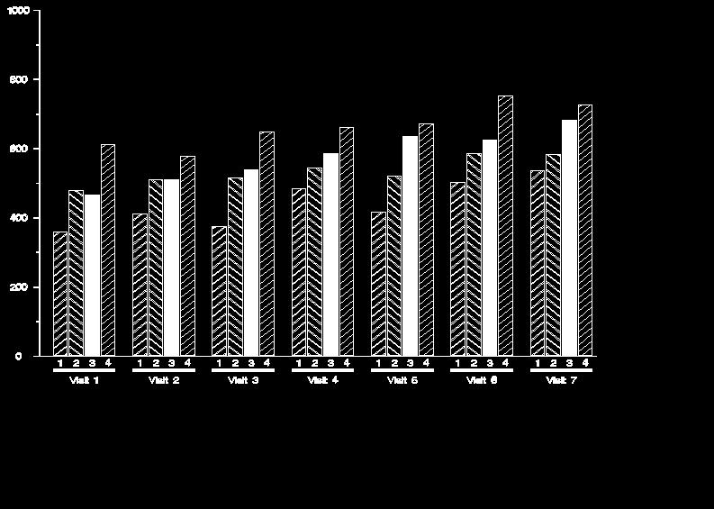
7 SAMPLE OUTPUT Figures 1 to 4 show how bar widths are automatically adjusted to utilize a consistent proportion of x-axis space, and how default bar fill types are automatically assigned: Figure 1 Figure 2 Figure 3 Figure 4 Figure 5 shows a bar chart produced by the following macro calls: %axis(pg_scale=80,y_lab=mean Value +/- 1 SEM,y_max=1000,y_major=200,y_minor=100,x_lab=Treatment / Visit,x_max=,x_major=,x_minor=); %chart(data_=statout,grp_=visit,subgrp_=trt,var_=mean,e_bar=sem_mean,bar_labl=1,pg_s cale=80,ymax=1000,format_=grptype); %legend; (source code not shown) Figure 5 7
8 Figure 6 shows a line plot below produced using the same %axis macro call, and the following %plot macro call: %plot(data_=statout,grp_=trt,subgrp_=visit,var_=mean,e_bar=sem_mean,bar_labl=1,pg_sc ale=80,ymax=1000); Figure 6 One of the convenient things about working with the Annotate facility is that graphical features can be added on the fly simply by generating additional Annotate data sets. This was done to produce the legend in figures 5 and 6. In addition, as figure 7 shows, bar charts and line plots can easily be placed on the same set of axes: %plot(data_=statout,grp_=trt,subgrp_=visit,var_=mean,e_bar=sem_mean,bar_labl=1,pg_sc ale=80,ymax=1000); %chart(data_=statout,grp_=visit,subgrp_=trt,var_=mean,e_bar='',bar_labl=1,pg_scale=8 0,ymax=1000,format_=grptype); Figure 7 CONCLUSION By defining a generalized set of spatial relationships applicable to discrete and continuous data, and by making effective use of looping structures, macro functions and annotate macros in the creation of Annotate datasets, it is possible to create powerful and intuitive figure-generating code with relatively little programming. The ease with which Annotate data sets can be processed and augmented helps maintain flexibility which might otherwise be lost in a generalized system. Visual Basic Scripting Edition, run on the Windows Scripting Host, shows considerable promise and several advantages over what are perhaps more typical methods for automating the production of word-processor-ready output, including the DDE interface, and VBA executed within a host application such as Word. 8
9 For the sake of simplicity, the macros presented in this paper made various assumptions about figure specifications, which may not be reasonable in a lot of cases. Enhancements might include: increased flexibility in axis starting values, offsets, and positive/negative values allowing for left and right y-axes, and for logarithmic axes sub-grouping of histogram bars, and allowing for a choice of horizontal or vertical orientation REFERENCES Hunt, Stephen, Sherman, Tracy and Fairfield-Carter, Brian (2004), An Introduction to SAS Applications of the Windows Scripting Host, Proceedings of the 2004 Pharmaceutical Industry SAS Users Group Conference. Fairfield-Carter, Brian, Sherman, Tracy and Hunt, Stephen (2004), Instant SAS Applications with VBScript, Jscript, and dhtml, Proceedings of the 2004 Pharmaceutical Industry SAS Users Group Conference. ACKNOWLEDGMENTS Thanks to PJ and Nicholas, and to the Biostatistical Services group at PRA International, for their encouragement and support. Special thanks to Jeff Carter of Equinox Software Design ( for bringing to light the possibilities offered by the Windows Scripting Host, and for many valuable comments and programming tips. CONTACT INFORMATION Your comments and questions are valued and encouraged. Contact the author at: Brian Fairfield-Carter PRA International View Street Victoria, BC, Canada V8W 3Y7 Work Phone: (250) Fax: (250) FairfieldCarterBrian@PRAIntl.com Web: SAS and all other SAS Institute Inc. product or service names are registered trademarks or trademarks of SAS Institute Inc. in the USA and other countries. indicates USA registration. Other brand and product names are trademarks of their respective companies. APPENDIX 1: COMPLETE SOURCE CODE %AXIS %macro axis(pg_scale=,y_lab=,y_max=,y_major=,y_minor=, x_lab=,x_max=,x_major=,x_minor=); %*declare scaling functions; %macro func1(axis,arbitrary); &arbitrary ((i*&&&axis._major)/&&&axis._max)*&pg_scale %mend func1; %macro func2(axis); ((j*&&&axis._minor)/&&&axis._max)*&pg_scale %mend func2; %*build annotate dataset; data axis_; %*(set up Annotate variable attributes); length function color style $8. text $50.; retain xsys '2' ysys '2' when 'a' line 1 function 'label' hsys '3' size.2; %*(create x-axis baseline); %line(10,10,90,10,black,1,0.2); %*(create y-axis baseline); %line(10,10,10,90,black,1,0.2); %*(create major y-axis tick marks - unit increments from 0 to maximum number of increments); %if &y_max > 0 %then %do; do i=0 to &y_max/&y_major by 1; %line(10,%func1(y,10+),9.2,%func1(y,10+),black,1,0.2); %*(create minor y-axis tick marks - unit increments from 0 to size of major 9
10 divisions); do j=0 to &y_major; if (%func1(y,10+) + %func2(y)) < (10+(((&y_max/&y_major)* &y_major)/&y_max)*&pg_scale) then do; %line(10,%func1(y,10+)+%func2(y),9.6, %func1(y,10+)+%func2(y),black,1,0.2); end;end; %*(label major y-axis tick marks); %label(7,%func1(y,10.5+),compress(i*&y_major),black,0,0,2,swiss,); end; %*(create major x-axis tick marks - unit increments from 0 to maximum number of increments); %if &x_max > 0 %then %do; do i=0 to &x_max/&x_major by 1; %line(%func1(x,10+),10,%func1(x,10+),9.2,black,1,0.2); %*(create minor x-axis tick marks - unit increments from 0 to size of major divisions); do j=0 to &x_major; if (%func1(x,10+) + %func2(x)) < (10+(((&x_max/&x_major)* &x_major)/&x_max)*&pg_scale) then do; %line(%func1(x,10+),10, %func1(x,10+),9.6,black,1,0.2); end;end; %*(label major x-axis tick marks); %label(%func1(x,10.5+),7,compress(i*&x_major),black,0,0,2,swiss,); end; %*(create x- and y-axis labels; %label(2,50,"&y_lab",black,90,0,2,swiss); %label(50,2,"&x_lab",black,0,0,2,swiss); %mend axis; %CHART %macro chart(data_=,grp_=,subgrp_=,var_=,e_bar=,bar_labl=,pg_scale=,ymax=,format_=8); %let style_list=r3 L3 S R1 L1 R2 L2;%*list of bar fill styles to be assigned to subgroups; %*get number of groups and subgroups; %*note that only a single record is expected per subgroup within each group; %local ngrp nsubgrp; proc sql noprint; select count(&subgrp_) %if &grp_ ne '' %then %do;, count(unique &grp_) into :nsubgrp %if &grp_ ne '' %then %do;,:ngrp from &data_; quit; %put number of groups= &ngrp number of subgroups= &nsubgrp; proc sort data=&data_; by %if &grp_ ne '' %then %do; &grp_ &subgrp_; %*Declare scaling functions such that x and y coordinates are scaled according to the number of groups and subgroups, and to the proportion of the page taken up by the axis; %let xscale1=space+12+((gr_strt-1)*(barspc+barwidth)); %let xscale2=space+12+((gr_end-1)*(barspc+barwidth)+barwidth); %let xscale3=space+12+((_n_-1)*(barspc+barwidth)); %let xscale4=space+12+((_n_-1)*(barspc+barwidth)+barwidth); %let xscale5=space+12+barwidth/2+((_n_-1)*(barspc+barwidth)); %let xscale6=space+12+barwidth/2+((gr_strt-1+gr_end-1)/2*(barspc+barwidth)); %let xscale7=space barwidth/2+((_n_-1)*(barspc+barwidth)); %let xscale8=space barwidth/2+((_n_-1)*(barspc+barwidth)); %let yscale1=10+&var_*&pg_scale/&ymax; %let yscale2=10+(&var_-&e_bar)*&pg_scale/&ymax; 10
11 %let yscale3=10+(&var_+&e_bar)*&pg_scale/&ymax; %*Build Annotate dataset; data anno_; set &data_; by %if &grp_ ne '' %then %do; &grp_ &subgrp_; length function color style $8. text $50.; retain xsys '2' ysys '2' when 'a' line 1 function 'label' hsys '3' size.2; retain space 0;%*(for extra space between groups of bars); retain gr_strt gr_end 0;%*(for group label and underline on x-axis); %if &grp_ ne '' %then %do; lgroup=lag(&grp_); spcwidth=(0.20*&pg_scale)/&ngrp;%*(divide 20 pct of axis among group breaks); barwidth=(0.70*&pg_scale)/&nsubgrp;%*(divide 70 pct of axis among bars); barspc=(0.10*&pg_scale)/&nsubgrp;%*(divide 10 pct of axis among bar breaks); %if &grp_ = '' %then %do; barwidth=(0.76*&pg_scale)/&nsubgrp;%*(divide 76 pct of axis among bars); barspc=(0.20*&pg_scale)/&nsubgrp;%*(divide 20 pct of axis among bar breaks); if barwidth > 12 then barwidth=12;%*(set a constraint on the maximum bar width); %if &grp_ ne '' %then %do; %*(increment group break); if _n_ ne 1 and &grp_ ne lgroup then space+spcwidth; if first.&grp_ then gr_strt=_n_; if last.&grp_ then do; %*(create x-axis group labels and underlines); gr_end=_n_; %line(&xscale1, 6.7, &xscale2, 6.7,black,1,.6); %label(&xscale6, 5, left(trim(put(&grp_,&format_..))),black,0,0,2,swiss,); end; %*(create histogram bars); %bar(&xscale3, 10, &xscale4, &yscale1, black, 0, ); %if &e_bar ne '' %then %do; %*(create error bars); %line(&xscale5, &yscale3, &xscale5, &yscale2, red, 1,.2); %*(and error bar caps); %line(&xscale7, &yscale3, &xscale8, &yscale3, red, 1,.2); %line(&xscale7, &yscale2, &xscale8, &yscale2, red, 1,.2); %*(create bar labels); %if &bar_labl=1 %then %do; %label(&xscale5, 9, compress(&subgrp_), black, 0, 0, 2, swiss,); %*because bar fill style can only be passed as a literal, specific bar style for each subgroup must be set in an additional step; data anno_; set anno_; if function="bar" then style=scan("&style_list",&subgrp_); %mend chart; %PLOT %macro plot(data_=,grp_=,subgrp_=,var_=,e_bar=,bar_labl=,pg_scale=,ymax=); %let offset=0.75;%*to set horizontal offset between lines; %*get number of groups and subgroups; %local ngrp nsubgrp; proc sql noprint; select count(unique &subgrp_) %if &grp_ ne '' %then %do;,count(unique &grp_) into :nsubgrp %if &grp_ ne '' %then %do;,:ngrp 11
12 from &data_; quit; %put number of groups= &ngrp number of subgroups= &nsubgrp; %*for each record, capture the value on the next record; proc sql; create table &data_ as select *, 1 as dummy from &data_ order by %if &grp_ ne '' %then %do; &grp_, &subgrp_; create table &data_ as select *, monotonic(&var_) as rec_ from &data_; create table &data_ as select l.*, r.next from (select *, rec_ as rec_l from &data_) as l left join (select &var_ as next, rec_ as rec_r from &data_) as r on rec_r-rec_l=1 order by %if &grp_ ne '' %then %do; &grp_, &subgrp_; quit; %*declare scaling functions; %macro func1(arbitrary); &i*&offset+12+((_n_-1)*spcwidth)&arbitrary %mend func1; %macro func2; &i*&offset+12+((_n_)*spcwidth); %mend func2; %macro func3(operator); 10+(&var_&operator&e_bar)*&pg_scale/&ymax %mend func3; %macro func4(vr); 10+(&vr)*&pg_scale/&ymax %mend func4; %do i = 1 %to &ngrp; %*(create one output dataset per group); data anno_&i; set &data_; %if &grp_ ne '' %then %do; if &grp_ = &i; data anno_&i; set anno_&i; by dummy; length function color style $8. text $50.; retain xsys '2' ysys '2' when 'a' line 1 function 'label' hsys '3' size.2; %*(divide 95 pct of axis among subgroup divisions); spcwidth=0.95*&pg_scale/(&nsubgrp-1); %*(create error bars); %if &e_bar ne '' %then %do; %line(%func1(),%func3(+),%func1(),%func3(-),black,&i,.1); %*(and error bar caps); %line(%func1(-0.4),%func3(+),%func1(+0.4),%func3(+),black,1,.1); %line(%func1(-0.4),%func3(-),%func1(+0.4),%func3(-),black,1,.1); if not last.dummy then do; %*(create lines between data values); %line(%func1(),%func4(&var_),%func2,%func4(next),black,&i,0.4); end; %if &i=1 %then %do; %*(create x-axis group labels); %label(%func1,9,compress(&subgrp_),black,0,0,2,swiss,); %*stack by-group data sets; data anno_; set %do i = 1 %to &ngrp; anno_&i ; %mend plot; 12
Create Flowcharts Using Annotate Facility. Priya Saradha & Gurubaran Veeravel
 Create Flowcharts Using Annotate Facility Priya Saradha & Gurubaran Veeravel Abstract With mounting significance to the graphical presentation of data in different forms in the pharmaceutical industry,
INTRODUCTION TO THE SAS ANNOTATE FACILITY
 Improving Your Graphics Using SAS/GRAPH Annotate Facility David J. Pasta, Ovation Research Group, San Francisco, CA David Mink, Ovation Research Group, San Francisco, CA ABSTRACT Have you ever created
It s Not All Relative: SAS/Graph Annotate Coordinate Systems
 Paper TU05 It s Not All Relative: SAS/Graph Annotate Coordinate Systems Rick Edwards, PPD Inc, Wilmington, NC ABSTRACT This paper discusses the SAS/Graph Annotation coordinate systems and how a combination
Creating Forest Plots Using SAS/GRAPH and the Annotate Facility
 PharmaSUG2011 Paper TT12 Creating Forest Plots Using SAS/GRAPH and the Annotate Facility Amanda Tweed, Millennium: The Takeda Oncology Company, Cambridge, MA ABSTRACT Forest plots have become common in
Data Annotations in Clinical Trial Graphs Sudhir Singh, i3 Statprobe, Cary, NC
 PharmaSUG2010 - Paper TT16 Data Annotations in Clinical Trial Graphs Sudhir Singh, i3 Statprobe, Cary, NC ABSTRACT Graphical representation of clinical data is used for concise visual presentations of
The GANNO Procedure. Overview CHAPTER 12
 503 CHAPTER 12 The GANNO Procedure Overview 503 Procedure Syntax 504 PROC GANNO Statement 504 Examples 507 Example 1: Scaling Data-Dependent Output 507 Example 2: Storing Annotate Graphics 509 Example
Using ANNOTATE MACROS as Shortcuts
 Using ANNOTATE MACROS as Shortcuts Arthur L. Carpenter California Occidental Consultants Abstract ANNOTATE macros can provide a shortcut when creating an ANNOTATE data set using assignment statements.
Something for Nothing! Converting Plots from SAS/GRAPH to ODS Graphics
 ABSTRACT Paper 1610-2014 Something for Nothing! Converting Plots from SAS/GRAPH to ODS Graphics Philip R Holland, Holland Numerics Limited, UK All the documentation about the creation of graphs with SAS
Effective Forecast Visualization With SAS/GRAPH Samuel T. Croker, Lexington, SC
 DP01 Effective Forecast Visualization With SAS/GRAPH Samuel T. Croker, Lexington, SC ABSTRACT A statistical forecast is useless without sharp, attractive and informative graphics to present it. It is really
PharmaSUG 2012 Paper CC13
 PharmaSUG 2012 Paper CC13 Techniques for Improvising the Standard Error Bar Graph and Axis Values Completely Through SAS Annotation Sunil Kumar Ganeshna, PharmaNet/i3, Pune, India Venkateswara Rao, PharmaNet/i3,
Making Presentations More Fun with DATA Step Graphics Interface (DSGI) Hui-Ping Chen, Eli Lilly and Company, Indianapolis, Indiana
 Hui-Ping Chen, Eli Lilly and Company, Indianapolis, Indiana") Paper CC03 Making Presentations More Fun with DATA Step Graphics Interface (DSGI) Hui-Ping Chen, Eli Lilly and Company, Indianapolis, Indiana ABSTRACT Microsoft PowerPoint is powerful and most popular
Paper CC03 Making Presentations More Fun with DATA Step Graphics Interface (DSGI) Hui-Ping Chen, Eli Lilly and Company, Indianapolis, Indiana ABSTRACT Microsoft PowerPoint is powerful and most popular
Tips for Producing Customized Graphs with SAS/GRAPH Software. Perry Watts, Fox Chase Cancer Center, Philadelphia, PA
 Tips for Producing Customized Graphs with SAS/GRAPH Software Perry Watts, Fox Chase Cancer Center, Philadelphia, PA Abstract * SAS software is used to produce customized graphics displays by solving a
Tips to Customize SAS/GRAPH... for Reluctant Beginners et al. Claudine Lougee, Dualenic, LLC, Glen Allen, VA
 Paper SIB-109 Tips to Customize SAS/GRAPH... for Reluctant Beginners et al. Claudine Lougee, Dualenic, LLC, Glen Allen, VA ABSTRACT SAS graphs do not have to be difficult or created by SAS/GRAPH experts.
Customized Flowcharts Using SAS Annotation Abhinav Srivastva, PaxVax Inc., Redwood City, CA
 ABSTRACT Customized Flowcharts Using SAS Annotation Abhinav Srivastva, PaxVax Inc., Redwood City, CA Data visualization is becoming a trend in all sectors where critical business decisions or assessments
Displaying Multiple Graphs to Quickly Assess Patient Data Trends
 Paper AD11 Displaying Multiple Graphs to Quickly Assess Patient Data Trends Hui Ping Chen and Eugene Johnson, Eli Lilly and Company, Indianapolis, IN ABSTRACT Populating multiple graphs, up to 15, on a
Multiple Forest Plots and the SAS System
 Multiple Forest Plots and the SAS System Poster 10 Anne Barfield, Quanticate, Manchester, United Kingdom ABSTRACT This paper is the accompanying paper to the poster entitled Multiple Forest Plots and the
Converting Annotate to ODS Graphics. Is It Possible?
 ABSTRACT Paper 2686-2015 Converting Annotate to ODS Graphics. Is It Possible? Philip R Holland, Holland Numerics Limited In the previous chapter I described how many standard SAS/GRAPH plots can be converted
Data Driven Annotations: An Introduction to SAS/GRAPH s Annotate Facility
 Paper HW03 Data Driven Annotations: An Introduction to SAS/GRAPH s Annotate Facility Arthur L. Carpenter California Occidental Consultants ABSTRACT When SAS/GRAPH was first introduced, it was the only
Innovative Graph for Comparing Central Tendencies and Spread at a Glance
 Paper 140-28 Innovative Graph for Comparing Central Tendencies and Spread at a Glance Varsha C. Shah, CSCC, Dept. of Biostatistics, UNC-CH, Chapel Hill, NC Ravi M. Mathew, CSCC,Dept. of Biostatistics,
SAS/GRAPH : Using the Annotate Facility
 SAS/GRAPH : Using the Annotate Facility Jack S. Nyberg, ClinTrials Research, Inc., Lexington, KY. Stuart D. Nichols, ClinTrials Research, Inc., Lexington, KY. ABSTRACT The annotate facility in SAS/GRAPH
Paper S Data Presentation 101: An Analyst s Perspective
 Paper S1-12-2013 Data Presentation 101: An Analyst s Perspective Deanna Chyn, University of Michigan, Ann Arbor, MI Anca Tilea, University of Michigan, Ann Arbor, MI ABSTRACT You are done with the tedious
Multiple Graphical and Tabular Reports on One Page, Multiple Ways to Do It Niraj J Pandya, CT, USA
 Paper TT11 Multiple Graphical and Tabular Reports on One Page, Multiple Ways to Do It Niraj J Pandya, CT, USA ABSTRACT Creating different kind of reports for the presentation of same data sounds a normal
Coders' Corner. Paper ABSTRACT GLOBAL STATEMENTS INTRODUCTION
 Paper 70-26 Data Visualization of Outliers from a Health Research Perspective Using SAS/GRAPH and the Annotate Facility Nadia Redmond Kaiser Permanente Center for Health Research, Portland, Oregon ABSTRACT
Figure 1. Paper Ring Charts. David Corliss, Marketing Associates, Bloomfield Hills, MI
 Paper 16828 Ring Charts David Corliss, Marketing Associates, Bloomfield Hills, MI Abstract Ring Charts are presented as a new, graphical technique for analyzing complex relationships between tables in
Easing into Data Exploration, Reporting, and Analytics Using SAS Enterprise Guide
 Paper 809-2017 Easing into Data Exploration, Reporting, and Analytics Using SAS Enterprise Guide ABSTRACT Marje Fecht, Prowerk Consulting Whether you have been programming in SAS for years, are new to
PharmaSUG Paper TT10 Creating a Customized Graph for Adverse Event Incidence and Duration Sanjiv Ramalingam, Octagon Research Solutions Inc.
 Abstract PharmaSUG 2011 - Paper TT10 Creating a Customized Graph for Adverse Event Incidence and Duration Sanjiv Ramalingam, Octagon Research Solutions Inc. Adverse event (AE) analysis is a critical part
PharmaSUG 2013 CC26 Automating the Labeling of X- Axis Sanjiv Ramalingam, Vertex Pharmaceuticals, Inc., Cambridge, MA
 PharmaSUG 2013 CC26 Automating the Labeling of X- Axis Sanjiv Ramalingam, Vertex Pharmaceuticals, Inc., Cambridge, MA ABSTRACT Labeling of the X-axis usually involves a tedious axis statement specifying
A SAS Macro to Generate Caterpillar Plots. Guochen Song, i3 Statprobe, Cary, NC
 PharmaSUG2010 - Paper CC21 A SAS Macro to Generate Caterpillar Plots Guochen Song, i3 Statprobe, Cary, NC ABSTRACT Caterpillar plots are widely used in meta-analysis and it only requires a click in software
Top Award and First Place Best Presentation of Data Lan Tran-La. Scios Nova, Inc. BLOOD PRESSURE AND HEART RATE vs TIME
 Top Award and First Place Best Presentation of Data Lan Tran-La Scios Nova, Inc. BLOOD PRESSURE AND HEART RATE vs TIME Vital signs were collected before, during, and after the infusion of Drug A. At the
SAS Macro Dynamics - From Simple Basics to Powerful Invocations Rick Andrews, Office of the Actuary, CMS, Baltimore, MD
 Paper BB-7 SAS Macro Dynamics - From Simple Basics to Powerful Invocations Rick Andrews, Office of the Actuary, CMS, Baltimore, MD ABSTRACT The SAS Macro Facility offers a mechanism for expanding and customizing
Annotate Dictionary CHAPTER 11
 427 CHAPTER 11 Annotate Dictionary Overview 428 Annotate Functions 429 BAR Function 431 CNTL2TXT Function 432 COMMENT Function 434 DEBUG Function 435 DRAW Function 435 DRAW2TXT Function 436 FRAME Function
ODS LAYOUT is Like an Onion
 Paper DP03_05 ODS LAYOUT is Like an Onion Rich Mays, University of Rochester Medical Center, Rochester, NY Abstract ODS LAYOUT is like an onion. They both make you cry? No! They both have layers! In version
Information Visualization
 Paper 166-25 Presenting Your Data Easily with Graph-N-Go Curtis A. Smith, Defense Contract Audit Agency, La Mirada, CA ABSTRACT Visualizing and presenting data effectively using reports and listings can
Paper ###-YYYY. SAS Enterprise Guide: A Revolutionary Tool! Jennifer First, Systems Seminar Consultants, Madison, WI
 Paper ###-YYYY SAS Enterprise Guide: A Revolutionary Tool! Jennifer First, Systems Seminar Consultants, Madison, WI ABSTRACT Whether you are a novice or a pro with SAS, Enterprise Guide has something for
SparkLines Using SAS and JMP
 SparkLines Using SAS and JMP Kate Davis, International Center for Finance at Yale, New Haven, CT ABSTRACT Sparklines are intense word-sized graphics for use inline text or on a dashboard that condense
SAS Macro Dynamics: from Simple Basics to Powerful Invocations Rick Andrews, Office of Research, Development, and Information, Baltimore, MD
 ABSTRACT CODERS CORNER SAS Macro Dynamics: from Simple Basics to Powerful Invocations Rick Andrews, Office of Research, Development, and Information, Baltimore, MD The SAS Macro Facility offers a mechanism
Using MACRO and SAS/GRAPH to Efficiently Assess Distributions. Paul Walker, Capital One
 Using MACRO and SAS/GRAPH to Efficiently Assess Distributions Paul Walker, Capital One INTRODUCTION A common task in data analysis is assessing the distribution of variables by means of univariate statistics,
Presentation Quality Graphics with SAS/GRAPH
 Presentation Quality Graphics with SAS/GRAPH Keith Cranford, Marquee Associates, LLC Abstract The SASI GRAP~ Annotate Facilily along with hardware fonts can be used to produce presentation qualily graphics
Using SAS/GRAPH Software to Create Graphs on the Web Himesh Patel, SAS Institute Inc., Cary, NC Revised by David Caira, SAS Institute Inc.
 Paper 189 Using SAS/GRAPH Software to Create Graphs on the Web Himesh Patel, SAS Institute Inc., Cary, NC Revised by David Caira, SAS Institute Inc., Cary, NC ABSTRACT This paper highlights some ways of
Post-Processing.LST files to get what you want
 Paper CC04 Post-Processing.LST files to get what you want Edward Foster, Oxford Pharmaceutical Sciences, UK ABSTRACT SAS has a range of procedures you can use to create table and listing output. These
ABC Macro and Performance Chart with Benchmarks Annotation
 Paper CC09 ABC Macro and Performance Chart with Benchmarks Annotation Jing Li, AQAF, Birmingham, AL ABSTRACT The achievable benchmark of care (ABC TM ) approach identifies the performance of the top 10%
SAS/GRAPH and ANNOTATE Facility More Than Just a Bunch of Labels and Lines
 2015 Paper AD-48 SAS/GRAPH and ANNOTATE Facility More Than Just a Bunch of Labels and Lines Mike Hunsucker, 14th Weather Squadron (USAF), Asheville, NC ABSTRACT SAS/GRAPH procedures enhanced with the ANNOTATE
Fly over, drill down, and explore
 ABSTRACT Paper 79-2013 Fly over, drill down, and explore Suzanne Brown, HealthInsight New Mexico, Albuquerque, NM Data often have a spatial dimension, whether it is a five-year financial plan and annual
Chapter 1 Introduction. Chapter Contents
 Chapter 1 Introduction Chapter Contents OVERVIEW OF SAS/STAT SOFTWARE................... 17 ABOUT THIS BOOK.............................. 17 Chapter Organization............................. 17 Typographical
Developing Graphical Standards: A Collaborative, Cross-Functional Approach Mayur Uttarwar, Seattle Genetics, Inc., Bothell, WA
 PharmaSUG 2014 - DG03 Developing Graphical Standards: A Collaborative, Cross-Functional Approach Mayur Uttarwar, Seattle Genetics, Inc., Bothell, WA ABSTRACT Murali Kanakenahalli, Seattle Genetics, Inc.,
Using Graph-N-Go With ODS to Easily Present Your Data and Web-Enable Your Graphs Curtis A. Smith, Defense Contract Audit Agency, La Mirada, CA
 Paper 160-26 Using Graph-N-Go With ODS to Easily Present Your Data and Web-Enable Your Graphs Curtis A. Smith, Defense Contract Audit Agency, La Mirada, CA ABSTRACT Visualizing and presenting data effectively
Pete Lund Looking Glass Analytics, Olympia, WA
 Paper 3496-2015 Something Old, Something New... Flexible Reporting with DATA Step-based Tools Pete Lund Looking Glass Analytics, Olympia, WA Abstract The report looks simple enough a bar chart and a table,
A Dynamic Imagemap Generator Carol Martell, Highway Safety Research Center, Chapel Hill, NC
 A Dynamic Imagemap Generator Carol Martell, Highway Safety Research Center, Chapel Hill, NC ABSTRACT We learned that our web developers were turning a picture of the state of North Carolina with its one
SAS CLINICAL SYLLABUS. DURATION: - 60 Hours
 SAS CLINICAL SYLLABUS DURATION: - 60 Hours BASE SAS PART - I Introduction To Sas System & Architecture History And Various Modules Features Variables & Sas Syntax Rules Sas Data Sets Data Set Options Operators
Reverse-engineer a Reference Curve: Capturing Tabular Data from Graphical Output Brian Fairfield-Carter, ICON Clinical Research, Redwood City, CA
 Paper CC23 Reverse-engineer a Reference Curve: Capturing Tabular Data from Graphical Output Brian Fairfield-Carter, ICON Clinical Research, Redwood City, CA ABSTRACT The pharmaceutical industry is a competitive
Internet, Intranets, and The Web
 Paper 186-25 Producing Interactive Internet Presentations in SAS Software Iza Peszek, Merck & Co., Inc., Rahway, NJ ABSTRACT The ODS in SAS v.7 and higher allows users to create HTML files with drill-down
IMPROVING A GRAPH USING PROC GPLOT AND THE GOPTIONS STATEMENT
 SESUG Paper 33-2017 IMPROVING A GRAPH USING PROC GPLOT AND THE GOPTIONS STATEMENT Wendi Wright, Questar Assessment, Inc. ABSTRACT Starting with a SAS PLOT program, we will transfer this plot into PROC
PharmaSUG China. Systematically Reordering Axis Major Tick Values in SAS Graph Brian Shen, PPDI, ShangHai
 PharmaSUG China Systematically Reordering Axis Major Tick Values in SAS Graph Brian Shen, PPDI, ShangHai ABSTRACT Once generating SAS graphs, it is a headache to programmers to reorder the axis tick values
Exercise 1: Introduction to MapInfo
 Geog 578 Exercise 1: Introduction to MapInfo Page: 1/22 Geog 578: GIS Applications Exercise 1: Introduction to MapInfo Assigned on January 25 th, 2006 Due on February 1 st, 2006 Total Points: 10 0. Convention
Move =(+0,+5): Making SAS/GRAPH Work For You
: Making SAS/GRAPH Work For You") Move =(+0,+5): Making SAS/GRAPH Work For You Deb Cassidy, Computer Horizons Corporation, ndianapolis, N 've often been asked "Can SAS/GRAPH do...?" SAS/GRAPH can do almost anything - if you are willing
Move =(+0,+5): Making SAS/GRAPH Work For You Deb Cassidy, Computer Horizons Corporation, ndianapolis, N 've often been asked "Can SAS/GRAPH do...?" SAS/GRAPH can do almost anything - if you are willing
An Introduction to the DATA Step Graphics Interface Earl Westerlund, Eastman Kodak Company, Rochester, NY
 n Introduction to the DT Step Graphics Interface Earl Westerlund, Eastman Kodak Company, Rochester, NY INTRODUCTION The DT Step Graphics Interface (DSGI) is a component of SS/GRPH software that enables
Microsoft Excel 2007
 Microsoft Excel 2007 1 Excel is Microsoft s Spreadsheet program. Spreadsheets are often used as a method of displaying and manipulating groups of data in an effective manner. It was originally created
Contents of SAS Programming Techniques
 Contents of SAS Programming Techniques Chapter 1 About SAS 1.1 Introduction 1.1.1 SAS modules 1.1.2 SAS module classification 1.1.3 SAS features 1.1.4 Three levels of SAS techniques 1.1.5 Chapter goal
A Macro that can Search and Replace String in your SAS Programs
 ABSTRACT MWSUG 2016 - Paper BB27 A Macro that can Search and Replace String in your SAS Programs Ting Sa, Cincinnati Children s Hospital Medical Center, Cincinnati, OH In this paper, a SAS macro is introduced
Information Visualization
 Paper 158-25 Graphs In a Minute Harry J. Maxwell Jr., SAS Institute Inc, Cary, NC ABSTRACT Software from SAS Institute provides multiple ways of producing attractive graphics quickly using simple and intuitive
The Plot Thickens from PLOT to GPLOT
 Paper HOW-069 The Plot Thickens from PLOT to GPLOT Wendi L. Wright, CTB/McGraw-Hill, Harrisburg, PA ABSTRACT This paper starts with a look at basic plotting using PROC PLOT. A dataset with the daily number
SAS/GRAPH Introduction. Winfried Jakob, SAS Administrator Canadian Institute for Health Information
 SAS/GRAPH Introduction Winfried Jakob, SAS Administrator Canadian Institute for Health Information 1 Agenda Overview Components of SAS/GRAPH Software Device-Based vs. Template-Based Graphics Graph Types
Creating Maps in SAS/GRAPH
 Creating Maps in SAS/GRAPH By Jeffery D. Gilbert, Trilogy Consulting Corporation, Kalamazoo, MI Abstract This paper will give an introduction to creating graphs using the PROC GMAP procedure in SAS/GRAPH.
How Managers and Executives Can Leverage SAS Enterprise Guide
 Paper 8820-2016 How Managers and Executives Can Leverage SAS Enterprise Guide ABSTRACT Steven First and Jennifer First-Kluge, Systems Seminar Consultants, Inc. SAS Enterprise Guide is an extremely valuable
Quick. Efficient. Versatile. Graphing Software for Scientists and Engineers.
 Quick. GrapherTM 3 Efficient. Versatile. Graphing Discover the easy-to-use and powerful capabilities of Grapher 3! Your graphs are too important not to use the most superior graphing program available.
A Plot & a Table per Page Times Hundreds in a Single PDF file
 A Plot & a Table per Page Times Hundreds in a Single PDF file Daniel Leprince DIEM Computing Services, Inc. Elizabeth Li DIEM Computing Services, Inc. SAS is a registered trademark or trademark of SAS
The Evolution of a SAS/GRAPH Application Jenine Eason, AutoTrader.com, Atlanta, GA
 Paper P05-04 The Evolution of a SAS/GRAPH Application Jenine Eason, AutoTrader.com, Atlanta, GA INTRODUCTION Graphs are an excellent way to represent any activity. The author is using web server errors
Taming the Box Plot. Sanjiv Ramalingam, Octagon Research Solutions, Inc., Wayne, PA
 Taming the Box Plot Sanjiv Ramalingam, Octagon Research Solutions, Inc., Wayne, PA ABSTRACT Box plots are used to portray the range, quartiles and outliers if any in the data. PROC BOXPLOT can be used
SAS Visual Analytics 8.2: Working with Report Content
 SAS Visual Analytics 8.2: Working with Report Content About Objects After selecting your data source and data items, add one or more objects to display the results. SAS Visual Analytics provides objects
Streamline Table Lookup by Embedding HASH in FCMP Qing Liu, Eli Lilly & Company, Shanghai, China
 ABSTRACT PharmaSUG China 2017 - Paper 19 Streamline Table Lookup by Embedding HASH in FCMP Qing Liu, Eli Lilly & Company, Shanghai, China SAS provides many methods to perform a table lookup like Merge
A Juxtaposition of Tables and Graphs Using SAS /GRAPH Procedures
 A Juxtaposition of Tables and Graphs Using SAS /GRAPH Procedures Suhas R. Sanjee, MaxisIT Inc., Edison, NJ Sheng Zhang, Merck and Co., Upper Gwynedd, PA ABSTRACT Graphs provide high-impact visuals that
Statistics, Data Analysis & Econometrics
 ST009 PROC MI as the Basis for a Macro for the Study of Patterns of Missing Data Carl E. Pierchala, National Highway Traffic Safety Administration, Washington ABSTRACT The study of missing data patterns
Applications Development. Paper 24-27
 Paper 24-27 Optimizing SAS Version 8 in a Windows Environment from the User Interface to Automated Document Production Roger D. Muller, Ph.D., Elanco Animal Health, Indianapolis, IN ABSTRACT The Microsoft
THE IMPACT OF DATA VISUALIZATION IN A STUDY OF CHRONIC DISEASE
 THE IMPACT OF DATA VISUALIZATION IN A STUDY OF CHRONIC DISEASE South Central SAS Users Group SAS Educational Forum 2007 Austin, TX Gabe Cano, Altarum Institute Brad Smith, Altarum Institute Paul Cuddihy,
Tales from the Help Desk 6: Solutions to Common SAS Tasks
 SESUG 2015 ABSTRACT Paper BB-72 Tales from the Help Desk 6: Solutions to Common SAS Tasks Bruce Gilsen, Federal Reserve Board, Washington, DC In 30 years as a SAS consultant at the Federal Reserve Board,
Paper Time Contour Plots. David J. Corliss, Wayne State University / Physics and Astronomy
 ABSTRACT Paper 1311-2014 Time Contour Plots David J. Corliss, Wayne State University / Physics and Astronomy This new SAS tool is two-dimensional color chart for visualizing changes in a population or
Run your reports through that last loop to standardize the presentation attributes
 PharmaSUG2011 - Paper TT14 Run your reports through that last loop to standardize the presentation attributes Niraj J. Pandya, Element Technologies Inc., NJ ABSTRACT Post Processing of the report could
How to Make Graphs with Excel 2007
 Appendix A How to Make Graphs with Excel 2007 A.1 Introduction This is a quick-and-dirty tutorial to teach you the basics of graph creation and formatting in Microsoft Excel. Many of the tasks that you
Regaining Some Control Over ODS RTF Pagination When Using Proc Report Gary E. Moore, Moore Computing Services, Inc., Little Rock, Arkansas
 PharmaSUG 2015 - Paper QT40 Regaining Some Control Over ODS RTF Pagination When Using Proc Report Gary E. Moore, Moore Computing Services, Inc., Little Rock, Arkansas ABSTRACT When creating RTF files using
ABSTRACT. The SAS/Graph Scatterplot Object. Introduction
 Use of SAS/AF and the SAS/GRAPH Output Class Object to Develop Applications That Can Return Scatterplot Information Michael Hartman, Schering-Plough Corporation, Union, New Jersey ABSTRACT In today s time
A Generalized Procedure to Create SAS /Graph Error Bar Plots
 Generalized Procedure to Create SS /Graph Error Bar Plots Sanjiv Ramalingam, Consultant, Octagon Research Solutions, Inc. BSTRCT Different methodologies exist to create error bar related plots. Procedures
Tips and Tricks in Creating Graphs Using PROC GPLOT
 Paper CC15 Tips and Tricks in Creating Graphs Using PROC GPLOT Qin Lin, Applied Clinical Intelligence, LLC, Bala Cynwyd, PA ABSTRACT SAS/GRAPH is a very powerful data analysis and presentation tool. Creating
SAS Graphs in Small Multiples Andrea Wainwright-Zimmerman, Capital One, Richmond, VA
 Paper SIB-113 SAS Graphs in Small Multiples Andrea Wainwright-Zimmerman, Capital One, Richmond, VA ABSTRACT Edward Tufte has championed the idea of using "small multiples" as an effective way to present
* builds the RGB color string from the color. * reads the red, green; and blue values for. * constructs an ANNOTATE dataset by
 IMPORTING X WINDOW SYSTEMTM RASTER IMAGES INTO SAS/GRAPHR SOFIWARE OUTPUT Bernadette Johnson Wendy D. Johnson Pharmaceutical Product Development, Inc. SAS Institute Inc. Introduction Under the UNIXR operating
ODS/RTF Pagination Revisit
 PharmaSUG 2018 - Paper QT-01 ODS/RTF Pagination Revisit Ya Huang, Halozyme Therapeutics, Inc. Bryan Callahan, Halozyme Therapeutics, Inc. ABSTRACT ODS/RTF combined with PROC REPORT has been used to generate
SyncFirst Standard. Quick Start Guide User Guide Step-By-Step Guide
 SyncFirst Standard Quick Start Guide Step-By-Step Guide How to Use This Manual This manual contains the complete documentation set for the SyncFirst system. The SyncFirst documentation set consists of
Using SAS/GRAPH Software to Analyze Student Study Habits. Bill Wallace Computing Services University of Saskatchewan
 Using SAS/GRAPH Software to Analyze Student Study Habits Bill Wallace Computing Services University of Saskatchewan Abstract This paper describes the steps taken to create unusual vertical bar charts for
SUGI 29 Posters. Paper A Group Scatter Plot with Clustering Xiaoli Hu, Wyeth Consumer Healthcare., Madison, NJ
 Paper 146-29 A Group Scatter Plot with Clustering Xiaoli Hu, Wyeth Consumer Healthcare., Madison, NJ ABSTRACT In pharmacokinetic studies, abnormally high values of maximum plasma concentration Cmax of
2997 Yarmouth Greenway Drive, Madison, WI Phone: (608) Web:
 Web:") Getting the Most Out of SAS Enterprise Guide 2997 Yarmouth Greenway Drive, Madison, WI 53711 Phone: (608) 278-9964 Web: www.sys-seminar.com 1 Questions, Comments Technical Difficulties: Call 1-800-263-6317
Getting the Most Out of SAS Enterprise Guide 2997 Yarmouth Greenway Drive, Madison, WI 53711 Phone: (608) 278-9964 Web: www.sys-seminar.com 1 Questions, Comments Technical Difficulties: Call 1-800-263-6317
The Dataset Diet How to transform short and fat into long and thin
 Paper TU06 The Dataset Diet How to transform short and fat into long and thin Kathryn Wright, Oxford Pharmaceutical Sciences, UK ABSTRACT What do you do when you are given a dataset with one observation
How to annotate graphics
 Paper TU05 How to annotate graphics Sandrine STEPIEN, Quintiles, Strasbourg, France ABSTRACT Graphs can be annotated using different functions that add graphics elements to the output. Amongst other things,
A Breeze through SAS options to Enter a Zero-filled row Kajal Tahiliani, ICON Clinical Research, Warrington, PA
 ABSTRACT: A Breeze through SAS options to Enter a Zero-filled row Kajal Tahiliani, ICON Clinical Research, Warrington, PA Programmers often need to summarize data into tables as per template. But study
Select Cases. Select Cases GRAPHS. The Select Cases command excludes from further. selection criteria. Select Use filter variables
 Select Cases GRAPHS The Select Cases command excludes from further analysis all those cases that do not meet specified selection criteria. Select Cases For a subset of the datafile, use Select Cases. In
Creating Complex Graphics for Survival Analyses with the SAS System
 Creating Complex Graphics for Survival Analyses with the SAS System Steven E. Elkin, MBH Consulting, Inc., New York, NY William Mietlowski, Novartis Pharmaceuticals Corp., East Hanover, NJ Kevin McCague,
footnote1 height=8pt j=l "(Rev. &sysdate)" j=c "{\b\ Page}{\field{\*\fldinst {\b\i PAGE}}}";
 j=c {\b\ Page}{\field{\*\fldinst {\b\i PAGE}}};") Producing an Automated Data Dictionary as an RTF File (or a Topic to Bring Up at a Party If You Want to Be Left Alone) Cyndi Williamson, SRI International, Menlo Park, CA ABSTRACT Data dictionaries are
Producing an Automated Data Dictionary as an RTF File (or a Topic to Bring Up at a Party If You Want to Be Left Alone) Cyndi Williamson, SRI International, Menlo Park, CA ABSTRACT Data dictionaries are
CC13 An Automatic Process to Compare Files. Simon Lin, Merck & Co., Inc., Rahway, NJ Huei-Ling Chen, Merck & Co., Inc., Rahway, NJ
 CC13 An Automatic Process to Compare Files Simon Lin, Merck & Co., Inc., Rahway, NJ Huei-Ling Chen, Merck & Co., Inc., Rahway, NJ ABSTRACT Comparing different versions of output files is often performed
Reading in Data Directly from Microsoft Word Questionnaire Forms
 Paper 1401-2014 Reading in Data Directly from Microsoft Word Questionnaire Forms Sijian Zhang, VA Pittsburgh Healthcare System ABSTRACT If someone comes to you with hundreds of questionnaire forms in Microsoft
The GSLIDE Procedure. Overview. About Text Slides CHAPTER 27
 959 CHAPTER 27 The GSLIDE Procedure Overview 959 About Text Slides 959 About Annotate Output 960 Procedure Syntax 960 PROC GSLIDE Statement 961 Examples 963 Example 1: Producing Text Slides 963 Example
CHAPTER 1 Introduction to SAS/GRAPH Software
 3 CHAPTER 1 Introduction to SAS/GRAPH Software Overview 4 Components of SAS/GRAPH Software 4 Device-Based Graphics and Template-Based Graphics 6 Graph Types 6 Charts 7 Block charts 7 Horizontal bar charts
Chapter 13 Introduction to Graphics Using SAS/GRAPH (Self-Study)
") Chapter 13 Introduction to Graphics Using SAS/GRAPH (Self-Study) 13.1 Introduction... 2 13.2 Creating Bar and Pie Charts... 8 13.3 Creating Plots... 20 13-2 Chapter 13 Introduction to Graphics Using SAS/GRAPH
Chapter 13 Introduction to Graphics Using SAS/GRAPH (Self-Study) 13.1 Introduction... 2 13.2 Creating Bar and Pie Charts... 8 13.3 Creating Plots... 20 13-2 Chapter 13 Introduction to Graphics Using SAS/GRAPH