History of Typography. (History of Digital Font)
|
|
|
- Andrew Parks
- 6 years ago
- Views:
Transcription

1 History of Typography (History of Digital Font) 1

2 What is Typography? The art and technique of printing The study and process of typefaces Study Legibility or readability of typefaces and their layout Attractiveness of typefaces and their layout Functionality and effectiveness of typefaces and their layout How a typeface/layout combo enhances or honors content Process Artistic composition of individual type Setting and arrangement of type Basic elements of desktop publishing Typeface A full set of type made to a particular design (size and 2 style) A font
3 Some Typeface Examples Quick brown foxes jump - Times New Roman Quick brown foxes jump - Bookman Old Style Quick brown foxes jump - Courier New Quick brown foxes jump - Trebuchet MS Quick brown foxes jump - Comic Sans MS - Webdings 3
4 Typography and Print Typography is defined in relation to print History of (Western) printing Johannes Gutenberg Europe s first printer (42-line Bible, 1455) First designer of typeface Gothic type: modeled after German script Goal: To replicate the look of a manuscript Bible Aldus Manutius Designed Italic type ( of Italy ) in the 1490s Modeled on handwriting of Venetian clerks Compact form allowed for printing of smaller books 4

5 Typography and Print German Script Gothic Type 5
6 Typography and Print: Creating Type Basic letterform for capital letters Stone Engravers Style: As few curves as possible 6

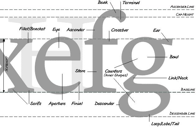
7 Typography and Print: Creating Type Geofroy Tory 16th Century French Designer Influenced by architecture and the work of Leonardo da Vinci Designed his typeface on the proportions of the human body Anatomy of a letter - Some terms eventually associated with the 7 potential features of type design

8 Creating Type 8
9 9
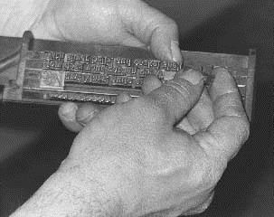
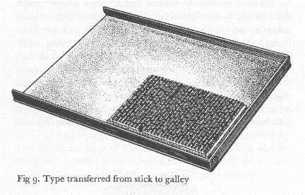
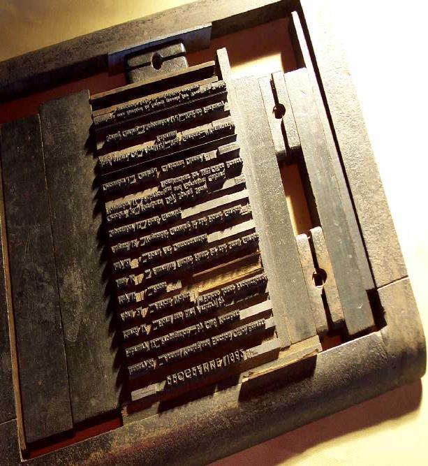
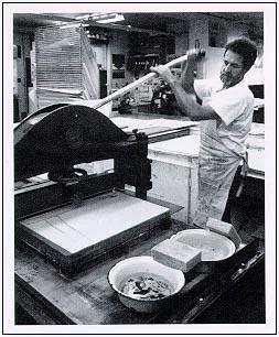
10 Typography and Print: Creating Type Design of the typeface Creation of physical type Type: (n.) piece of metal in which letter(s) are cast Gutenberg s innovation: movable, reusable type From physical type to printed page The composing sticks: words formed, placed into The { form sticks The galley: sticks placed together, spaced apart The chase: galley placed inside, wedges add margins The form: inked, then placed in the printing press 10
11 Typography and Print: Creating Type 11
12 Typography and Print: The Power of Typography Theory: Typography honors content Related theory: typography honors industry and content Italics example: designed to fit business innovation Modernist theory: Typography as functional with content Modernist era: late 19th - early 20th century Political potential of (experimental) typography Different rules of typographic design - to encourage and discourage certain values in the reading public Some political artistic groups of the time Futurist writers (Italy) - destruction is beautiful and necessary! Imagist poets (England) - the image itself is speech! Constructivists (Russia) - modernism is functionality! 12

13 Power of Typography Typography takes an active role in the content Helped inspire later modernist typographers to use strong contrasts in type sizes and design, and new angles of type Visible as well as audible poetic element 13
14 Typography and Print: The Power of Typography El Lissitzky Russian constructivist and major artist of new typography Topgraphy of Typography, from the magazine Merz, 1922 On the printed page words are seen, not heard. Economy of Expression - visual, not phonetic. The new book demands the new writer. Ink-pots and goosequills are dead. The printed page transcends time and space. The printed page, the infinity of the book, must be transcended. THE ELECTRO- LIBRARY. Distinct break from old typography: total discarding of decorative concepts and a turn to functional design 14

15 Power of Typography Sans-serif Bold, basic colors Use of photography (new-ish technology) 15
16 Typography and Print: The Power of Typography Importance of new typography today A case where the form of printing adapted to fit the conditions of modern life Declares that form is not independent, but grows out of function (purpose), out of the materials used (organic or technical), and out of how they are used. * Declares that clarity and not beauty is the essence of typography Declares that asymmetry is generally more optically effective than symmetry * Jan Tschichold 16
17 Typography and Print: The Power of Typography Importance of new typography today Considered blank space to be as much as a formal element of typography as black type Continued to encourage standardization Blurred the line between high art and mass media Blurred the distinction between image and language Predicted the future importance of typographic design to advertising 17
18 Typography Today Typography in the digital environment New process of typeface design computer programs vs. hand design and casting New possibilities for layout with the screen computer programs vs. galleys, etc. New elements of expression text and images sound and animation screen brightness and contrast 18
19 Digital Typography Some digitally adopted typefaces Times New Roman 1932, The Times of London Newspaper Bookman Old Style 1858, A.C. Phemister in Edinburgh, Scotland Courier New 1955, Howard Kettler Designed as a typewriter face Commissioned by IBM Design as a monospaced font (hence easy to align as columns of text) makes it a valuable typeface for coding 19
20 Digital Typography Some digitally created typefaces Trebuchet MS 1996, Microsoft typeface designed to be readable at small sizes and at low resolutions Based on humanist sans serif typeface designs of the 1920s and 30s Comic Sans MS 1994 (developed), released as part of Windows 95 Plus! Pack Based on the generic lettering style of comic strips (Webdings) 1997, designed in response to web designers need for easy method of incorporating graphics in their pages 20
21 Conclusion: Online Reading Practices Lesson from early history of print Typographic design is an essential issue in the printing revolution and print culture Lesson from modernist typography Form is not independent, but grows out of function (purpose), out of the materials used (organic or technical), and out of how they are used - i.e. new reading practices Lesson from the development of digital fonts As the webpage borrows from the printed page, so digital font has borrowed heavily from printed typefaces As the webpage develops further uses distinct from the page, so grows the need to revisit typography, its history, and its future 21
22 Type Serif: stroke at the ends of a letter Sans Serif: without serifs Leading: vertical space between baselines Kerning: horizontal space between letters
23 Serif vs. Sans-Serif Serifs: small features at the edges of glyphs. Originally used in stone carvings to stop dirt accumulating in letters corners. Most printed text uses serif fonts. We learn to read using serifs. Serif font Sans-serif font
24 Serif vs. Sans-Serif Serif: traditionally for printed text. Sans-serif: traditionally for text on a screen. LCD screens have high resolution, so serifs are acceptable again.
25 Typefaces
26 Typography for the web Legibility: good typography depends on visual contrast between fonts, text blocks, headlines, space Alignment: margins unity; white space visual relief Line length: columns, invisible tables Typefaces: Georgia & Verdana for screen Case: upper + lower Emphasis: italics, bold Consistency: create harmonic structure, predictable Accessibility: Size: use relative units, offer text-only version Color: contrast
27 Aoccdrnig to rscheearch at Cmabrigde uinervtisy, it deosn't mttaer waht oredr the ltteers in a wrod are, the olny iprmoetnt tihng is taht the frist and lsat ltteres are at the rghit pclae. The rset can be a tatol mses and you can sitll raed it wouthit a porbelm. Tihs is bcuseae we do not raed ervey lteter by it slef but the wrod as a wlohe.
Semi-Lossless Text Compression: a Case Study
 Semi-Lossless Text Compression: a Case Study BRUNO CARPENTIERI Dipartimento di Informatica Università di Salerno Italy bc@dia.unisa.it Abstract: - Text compression is generally considered only as lossless
CNT4406/5412 Network Security
 CNT4406/5412 Network Security Introduction to Cryptography Zhi Wang Florida State University Fall 2014 Zhi Wang (FSU) CNT4406/5412 Network Security Fall 2014 1 / 18 Introduction What is Cryptography Mangling
understanding typography
 understanding typography What is typography?! it is what language looks like! it is the art and technique of modifying type and arranging it on a page What does the arrangement of type mean? the arrangement
TYPOGRAPHY. The art of type
 Typography TYPOGRAPHY The art of type TYPE All the letters (abc), Numbers (123) & characters (;? @) of the alphabet. MONOTYPE Trade name for hot metal composition system Monotype Corporation Machine Shop
User-Centered Website Development: A Human- Computer Interaction Approach
 User-Centered Website Development: A Human- Computer Interaction Approach Daniel D. McCracken City College of New York Rosalee J. Wolfe DePaul University With a foreword by: Jared M. Spool, Founding Principal,
Putting type on a page without incorporating typographic principles is merely word processing. Terry Rydberg, Author Exploring InDesign 3
 Putting type on a page without incorporating typographic principles is merely word processing. Terry Rydberg, Author Exploring InDesign 3 Typography The study of all elements of type as a means of visual
CSSE SEMESTER 1, 2017 EXAMINATIONS. CITS1001 Object-oriented Programming and Software Engineering FAMILY NAME: GIVEN NAMES:
 CSSE SEMESTER 1, 2017 EXAMINATIONS CITS1001 Object-oriented Programming and Software Engineering FAMILY NAME: GIVEN NAMES: STUDENT ID: SIGNATURE: This Paper Contains: 20 pages (including title page) Time
THINGS YOU NEED TO KNOW
 TYPOGRAPHY THINGS YOU NEED TO KNOW to prevent your work from appearing amateurish. (p. 151) Only one space after punctuation (p. 152) What is monospaced type? (p. 152) Correct Quotation Marks (as soon
TYPE BASICS Cartographic Design & Principles Winter 2016
 TYPE BASICS Cartographic Design & Principles Winter 2016 Words on a Map Everything on the Earth has a name Names on a map, make it a map Otherwise it is a picture, photograph or design Assigning names
Reading and Typography. Contributions from Bill Cowan, Byron Weber Becker, Michael Terry, and Designing with the Mind in Mind.
 Reading and Typography Contributions from Bill Cowan, Byron Weber Becker, Michael Terry, and Designing with the Mind in Mind. Reading 2 We re Wired for Language; not Reading Children exposed to spoken
Einführung in die Programmierung Introduction to Programming
 Chair of Software Engineering Einführung in die Programmierung Introduction to Programming Prof. Dr. Bertrand Meyer Michela Pedroni Lecture 11: Describing the Syntax Goals of today s lecture Learn about
TYPE ANATOMY jtittle
 TYPE ANATOMY TYPE ANATOMY TITTLE j Serif Typefaces Tt HUMANIST (a.k.a. Old Style ) - Modeled after the roman typefaces of 15 th & 16 th centuries - Closely related to calligraphy and hand movement CLASSIC
Digital Typography and Hypermedia
 Digital Typography and Hypermedia 1 Typography Typography exists to honor content Rober Bringhurst Typography is a means to an end, and not an end in itself, and it is subject to certain restraints Hebert
Alphabet. elemental visual signs 26 characters frozen sounds
 Alphabet elemental visual signs 26 characters frozen sounds Evolution Handwriting > minimum number of strokes Engraving > lowercase > minimum number of curved lines > capitals Letterforms Appearance of
An example (1) - Conditional. An example (2) - Conditional. An example (3) Nested conditional
 - Conditional. An example (2) - Conditional. An example (3) Nested conditional") Chair of Software Engineering Einführung in die Programmierung Introduction to Programming Prof. Dr. Bertrand Meyer Michela Pedroni October 2006 February 2007 Lecture 8: Describing the Syntax Intro. to
Chair of Software Engineering Einführung in die Programmierung Introduction to Programming Prof. Dr. Bertrand Meyer Michela Pedroni October 2006 February 2007 Lecture 8: Describing the Syntax Intro. to
Graphic Design. shawacademy LESSON 5. summarynotes INTRODUCTION TO TYPOGRAPHY. For further questions visit us online at:
 shawacademy Graphic Design LESSON 5 INTRODUCTION TO TYPOGRAPHY summarynotes The Diploma in Graphic Design Toolkit For further questions visit us online at: www.shawacademy.com Lesson 5 S shawacademy Lesson
VOICE OF TYPE LECTURE 1
 VOICE OF TYPE LECTURE 1 TYPOGRAPHY II COUNTY COLLEGE OF MORRIS PROFESSOR GAYLE REMBOLD FURBERT VOICE OF TYPE As you look at typefaces, analyze their forms, learn their history and learn how to use them
Typography 2! HCC 710 2/1 /13. Human&Centered,Compu/ng,at,University,of,Maryland,,Bal/more,County
 Typography 2! HCC 710 2/1 /13 1, Human&Centered,Compu/ng,at,University,of,Maryland,,Bal/more,County Letterform Critiques! 25-30 minutes 2, Wordpress Questions / " Graphic Design Inspirations! 3, Human&Centered,Compu/ng,at,University,of,Maryland,,Bal/more,County
TYPOGRAPHY. ascender arm (as on the capital T) descender bar (as on the capital H) counter ear (as on the lower case g and r)
 descender bar (as on the capital H) counter ear (as on the lower case g and r)") TYPOGRAPHY Parts of letters: base line x-height ascender arm (as on the capital T) descender bar (as on the capital H) extenders bowl counter ear (as on the lower case g and r) serif stroke tail (as on
TYPOGRAPHY Parts of letters: base line x-height ascender arm (as on the capital T) descender bar (as on the capital H) extenders bowl counter ear (as on the lower case g and r) serif stroke tail (as on
BASIC ABOUT TYPE TYPO GRAPHY
 BASIC ABOUT TYPE TYPO GRAPHY TYPOGRAPHY BASIC DESIGN Relative & Absolute measurements Absolute measurements Inche : Millimetres : Points : Pica 3 Inches 76.2 mm 216 Points 18 Picas 1 Inches = 3 Picas A
Guiding Principles for PowerPoint Presentations
 Guiding Principles for PowerPoint Presentations Karen Fujii Media Services Manager Center for Instructional Support Office Faculty Development & Academic Support October 12, 2017 History Developed 30 years
Unit 4. Multimedia Element: Text. Introduction to Multimedia Semester 2
 Unit 4 Multimedia Element: Text 2017-18 Semester 2 Unit Outline In this unit, we will learn Fonts Typography Serif, Sans Serif, Decorative Monospaced vs. Proportional Style Size Spacing Color Alignment
The impossible patent: an introduction to lossless data compression. Carlo Mazza
 The impossible patent: an introduction to lossless data compression Carlo Mazza Plan Introduction Formalization Theorem A couple of good ideas Introduction What is data compression? Data compression is
Multimedia for the Web: Creating Digital Excitement. Multimedia Element Text
 : Creating Digital Excitement Multimedia Element Text Chapter Concepts Discuss Fonts Understand Fonts Define Cascading Style Sheets (CSS) Explain Additional Options for Implementing Text on the Web Chapter
Synopsis This module introduces calligraphy, the basic principles of typography, and applications of typography.
 8. Typography Synopsis This module introduces calligraphy, the basic principles of typography, and applications of typography. Lectures 8.1 Calligraphy 8.2 Basic Principles of Typography 8.3 Typography
Name: Class: Teacher:..
 Name: Class: Teacher:.. Introduction Desktop publishing (DTP) is the process of designing newspapers, magazines, books, leaflets, booklets and reports on a computer. The industry that produces these items
Font Basics. Descender. Serif. With strokes on the extremities of the letters. T Script. Sans-Serif. No strokes on the end of the letters
 Font Basics Ascender Font Size d p x A X-height Cap height Counter The white space within letters Descender Bar A Serif With strokes on the extremities of the letters. T A Sans-Serif No strokes on the
OUR TYPOGRAPHY APPROVED UNIVERS FONTS. Univers 65 Bold Univers 65 Bold Oblique Univers 75 Black Univers 75 Black Oblique
 BRAND TYPOGRAPHY For Internal Use Only Not For Use With The Public. For help and guidance on our brand standards, contact marketinginbox@firstcommand.com. 63 OUR TYPOGRAPHY Typography is a powerful extension
BRAND. For Internal Use Only Not For Use With The Public. For help and guidance on our brand standards, contact
 BRAND TYPOGRAPHY. 1 OUR TYPOGRAPHY. Typography is a powerful extension of our brand s personality. It plays an important role in creating a consistent look for First Command across all communications and
Pre-Venetian or Ancient Humanist or Venetian Transitional Didone Slab Serifs
 Pre-Venetian or Ancient Humanist or Venetian Transitional Didone Slab Serifs 1400 1500 1700 1800 Humanist Sans Serif Transitional Sans Serif Geometric Sans Serif Display Typefaces 1900 2000 Pre-Venetian
Font classification review
 Font classification review Taken from Lettering & Type by Bruce Willen Nolen Strals Old Style Transitional Modern Slab Serif Garamond ag Baskerville ag Bodoni ag Cowboys ab Sans Serif Gill Sans ag Decorative
Baskerville. abcdefghijk For fun I like to jump cars while reading a quote by Albert Einstein.
 serif Baskerville page 2 Baskerville page 3 Baskerville Baskerville Regular 26/28 while reading a quote by Baskerville italic 26/28 quote by Baskerville Semi bold 24/30 quote by Baskerville bold 24/26
Adobe Photoshop CS Design Professional PLACING TYPE IN AN IMAGE
 Adobe Photoshop CS Design Professional PLACING TYPE IN AN IMAGE Chapter Lessons Learn about type and how it is created Change spacing and adjust baseline shift Use the Drop Shadow style Apply anti-aliasing
DESIGNING THE PAGE FOUNDATIONS OF DIGITAL DESIGN. Layout composition, the grid and typography. Prof. Eva Machauf
 DESIGNING THE PAGE Layout composition, the grid and typography FOUNDATIONS OF DIGITAL DESIGN Prof. Eva Machauf prof.machauf@gmail.com THE GRID The grid is the foundation of all design. Creating and working
Font, Typeface, Typeface Family. Selected Typographical Variables
 Font, Typeface, Typeface Family Font: A font is a set of printable or displayable text character in a specific style, weight, and size. E.g. Helvetica Italic 10 Point. Typeface: The type design for a set
5. Text CHAPTER HIGHLIGHTS 10/12/2016 CHAPTER. Text tradition. Codes for computer text. t. Font technologies. Multimedia text.
 CHAPTER 5. Text CHAPTER HIGHLIGHTS Text tradition. Codes for computer text. t Font technologies. Multimedia text. Guidelines for use of text in multimedia. 2 1 POWERS OF TEXT Multimedia developers value
the streamlining of typography rene koszerowski
 the streamlining of typography 1920 1929 rene koszerowski poster for sixtieth-birthday exhibition of kandinsky herbert bayer 1926 the streamlining of typography 1920 1929 contents pages 1900 1909 1
jasonjuwono twentyfifteen TYPEDIA _ Typography Encyclopedia
 TYPEDIA _ Typography Encyclopedia ANATOMY_ Anatomy of a typeface Anatomy of a typeface What is a Font & Typeface? A design for a set of characters. A font is the combination of typeface and other qualities,
Typefaces are character sets based on distinct design characteristics.
 Level 3 WGHS VISUAL ARTS 2011 ART DESIGN Typography An Introduction to Type Type Design Since the first recordings of letterforms the concept of the typographic form has evolved into a seemingly endless
Friendly Fonts for your Design
 Friendly Fonts for your Design Choosing the right typeface for your website copy is important, since it will affect the way your readers perceive your page (serious and formal, or friendly and casual).
Principles of Typography
 Principles of Typography Different fonts send a different message to the reader. Categories: Sans serif Serif Script Decorative Fonts Sans-serif Fonts Easy to read, especially online Modern and clean Good
EnvSci360 Computer and Analytical Cartography
 EnvSci360 Computer and Analytical Cartography Lecture 5 Working with Type and Labels Key Points Labels are text that locate and identify features on a map Important for readability & communication EnvSci
JABRA CORPORATION GRAPHIC STANDARDS MANUAL
 JABRA CORPORATION GRAPHIC STANDARDS MANUAL A simple reference guide for how to use the JABRA Corporation logo in real-world communications applications. INTRODUCTION Corporate image is a valuable asset,
A Brief Illustrated History of Desktop Publishing
 A Brief Illustrated History of Desktop Publishing Bonnie Barrett, M FA The light which has been shed on mankind by the art of printing has eminently changed the condition of the world... And while printing
MODULE CM 2004 / STAGE 2 / SEMESTER 2 / SESSION Module title Design Principles and Context
 MODULE CM 2004 / STAGE 2 / SEMESTER 2 / SESSION 06-07 Module title Design Principles and Context Typography Fonts are classified under the following headings. Old Face fonts make use of contrasting wide
Writing and Document Design Lecture 6 Typography
 Writing and Document Design Lecture 6 Typography Last week We looked at Kress and van Leeuwen s work on composition/layout and considered its usefulness as both an analytic tool (a way of analysing and
8/19/2018. Web Development & Design Foundations with HTML5. Learning Objectives (1 of 2) Learning Objectives (2 of 2)
 Learning Objectives (2 of 2)") Web Development & Design Foundations with HTML5 Ninth Edition Chapter 3 Configuring Color and Text with CSS Slides in this presentation contain hyperlinks. JAWS users should be able to get a list of links
Web Development & Design Foundations with HTML5 Ninth Edition Chapter 3 Configuring Color and Text with CSS Slides in this presentation contain hyperlinks. JAWS users should be able to get a list of links
Designing Research Posters. College of Art and Design Chris Jackson, Associate Dean Keli DiRisio, Assistant Professor
 Designing Research Posters College of Art and Design Chris Jackson, Associate Dean Keli DiRisio, Assistant Professor Size and Orientation If you are NOT using the poster template: Start is with a 48"
Knightswood Secondary School. Graphic Communication. Desktop Publishing otes. Auto Tracing
 Auto Tracing The process of converting a bit mapped image into a vector image. In a bit-mapped image, each object is represented by a pattern of dots, while in a vector image every object is defined geometrically.
Department of Image Processing and Computer Graphics University of Szeged. Fuzzy Techniques for Image Segmentation. Outline.
 László G. Nyúl systems sets image László G. Nyúl Department of Processing and Computer Graphics University of Szeged 2009-07-07 systems sets image 1 systems 2 sets 3 image thresholding clustering 4 Dealing
SUCCESSFUL TYPE? Interface Aesthetics
 TYPO GR AP HY SUCCESSFUL TYPE? SUCCESSFUL TYPE? TYPOGRAPHY 1 2 TYPOGRAPHY /t 'p gr fi/ n. The art or process of setting and arranging types and printing from them. The style and appearance of printed
Typographic. Alphabet. Book. Interactive PDF of typographic rules & terms YOU NEED TO KNOW. Home. Table of Contents
 Typographic Alphabet Table of Contents > Rules That Every Typographer Should Know... 2-3 Book Interactive PDF of typographic rules & terms YOU NEED TO KNOW > Baseline... > Gutter... > Hierarchy... > Kerning...
Ariyaka The early typeface leads modern industrialization of letterpress printing in Thailand.
 Typography in Publication Design Ariyaka The early typeface leads modern industrialization of letterpress printing in Thailand. Chitchai Kuandachakupt, Kyoto Institute of Technology, chitchai.k@gmail.com
Ocr: A Statistical Model Of Multi-engine Ocr Systems
 University of Central Florida Electronic Theses and Dissertations Masters Thesis (Open Access) Ocr: A Statistical Model Of Multi-engine Ocr Systems 2004 Mercedes Terre McDonald University of Central Florida
Computer Security & Privacy. Why Computer Security Matters. Privacy threats abound (identity fraud, etc.) Multi-disciplinary solutions
 Multi-disciplinary solutions") Computer Security & Privacy slides adopted from F. Monrose 1 Why Computer Security Matters Computers/Internet play a vital role in our daily lives Social Networks and Online Communities facebook, flickr,
Computer Security & Privacy slides adopted from F. Monrose 1 Why Computer Security Matters Computers/Internet play a vital role in our daily lives Social Networks and Online Communities facebook, flickr,
art 118: intro to communication design // FALL 2011
 t y p e specimen Due: Wednesday, November 30 ov e r v i e w A type specimen is a publication, that shows the range of a particular typeface in use. Printers and typographers have produced type specimens
Typography. is the foundation of good web design
 Typography is the foundation of good web design my name is Samantha Warren I am a web designer for Viget Labs I teach web & graphic design at the Center for Digital Imaging Arts at Boston University &
FauxCrypt - A Method of Text Obfuscation
 FauxCrypt - A Method of Text Obfuscation Devlin M. Gualtieri Consulting Scientist Ledgewood, New Jersey gualtieri@ieee.org Abstract Warnings have been raised about the steady diminution of privacy. More
Typesetting Tips. Put your best type forward.
 Typesetting Tips Put your best type forward. Do you want your audience to read your document? Improve your chances by making your article easy to read. Make the document difficult to read and To learn
LESSON 7 Introduction to Typography
 FOUNDATION IN GRAPHIC DESIGN with ADOBE APPLICATIONS LESSON 7 Introduction to Typography Summary Notes WHAT IS TYPOGRAPHY? Typography is, quite simply, the art and technique of arranging type. Typography
INTRODUCTION TO TYPOGRAPHY DESIGN
 INTRODUCTION TO TYPOGRAPHY DESIGN Goals of typographic design Typography plays an important role in how audiences perceive your document and its information. Good design is about capturing your audience
WCSD Graphic Standards and Logo Use Guide
 SM WCSD Graphic Standards and Logo Use Guide WCSD Logo WCSD logo with slogan SM The WCSD logo should be used on all school district signage and every District-generated publication, website or webpage,
Visual Design. Gestalt Principles Creating Organization and Structure Typography. Visual Design 1
 Visual Design Gestalt Principles Creating Organization and Structure Typography Visual Design 1 UI Visual Design Objectives 1. Information communication - Enforce desired relationships (and avoid undesired
The Evolution of Type. Movable Type: Johannes Gutenberg Early 15th Century
 The Evolution of Type Movable Type: Johannes Gutenberg Early 15th Century Studio on Fire: Minneapolis Anatomy of Type cap height cross bar Anatomy n bowl describes g counter ascender finial stem type eye
Chapter 12: FORMATTING TEXT
 Disclaimer: All words, pictures are adopted from Learning Web Design (3 rd eds.) by Jennifer Niederst Robbins, published by O Reilly 2007. PART III: CSS FOR PRESENTATION Chapter 12: FORMATTING TEXT CSc2320
LOGO & BRAND STANDARDS GUIDE
 LOGO & BRAND STANDARDS GUIDE INTRODUCTION The SparkPost Brand Standards Guide provides key information needed to accurately and consistently produce external and internal documents and communications.
Professional Communication
 1 Professional Communication 1 3 Agenda Communication Analyze the writing situation Personal Business E-mail, Memos, Letters Editing your work 4 Analyze the Writing Situation Consider the following Subject
Chapter 8: Rococo Graphic Design 18 th century
 Chapter 8: Rococo Graphic Design 18 th century Romain du Roi (French for King s Roman) The first printing of the Romain du Roi at the beginning of the eighteenth century signified a shift to transitional
Unit 3--Alignment, Formatting Font--Size, Color, Style [Bold, Italic, and Underline] Block
![Unit 3--Alignment, Formatting Font--Size, Color, Style [Bold, Italic, and Underline] Block](/thumbs/88/117283008.jpg "Unit 3--Alignment, Formatting Font--Size, Color, Style [Bold, Italic, and Underline] Block") Unit 3--Alignment, Formatting Font--Size, Color, Style [Bold, Italic, and Underline] Block Use the mouse pointer to select the text (or put a blue highlight behind it). Then, make the changes you need.
Unit 3--Alignment, Formatting Font--Size, Color, Style [Bold, Italic, and Underline] Block Use the mouse pointer to select the text (or put a blue highlight behind it). Then, make the changes you need.
B R A N D GUIDELINES
 BRAND GUIDELINES You never get a second chance to make a first impression. 01 02 03 INTRODUCTION About the City of New Bedford s brand 5 THE LOGO The Logo and usage 7 Color & variations 7 Clearspace &
How Typography Determines Readability: Serif vs. Sans Serif, and How To Combine Fonts.
 18/03/2018 How Typography Determines Readability: Serif vs. Sans Serif, and How To Combine Fonts. Harshita Arora Follow 16 y/o entrepreneur & programmer. Formerly at Salesforce and MIT Launch. Creator
Before & After. Use the Principles Cheatsheet! From The Non-Designer s Design Book, Robin Williams Non-Designer s Design 8
 Before & After Use the Principles Cheatsheet! From The Non-Designer s Design Book, Robin Williams Non-Designer s Design 8 Before & After From The Non-Designer s Design Book, Robin Williams Non-Designer
> what is a font? Times New Roman [10 pts] Times New Roman [12 pts] Times New Roman [14 pts] Times New Roman [18 pts] Times New Roman [24 pts]
![> what is a font? Times New Roman [10 pts] Times New Roman [12 pts] Times New Roman [14 pts] Times New Roman [18 pts] Times New Roman [24 pts]](/thumbs/88/117283063.jpg "> what is a font? Times New Roman [10 pts] Times New Roman [12 pts] Times New Roman [14 pts] Times New Roman [18 pts] Times New Roman [24 pts]") > what is a font? > what is a font? A font is set of glyphs (or images) that represent a complete series of alphabetic and numeric characters, punctuations and symbols in a particular size and style (or
> what is a font? > what is a font? A font is set of glyphs (or images) that represent a complete series of alphabetic and numeric characters, punctuations and symbols in a particular size and style (or
LECTURE 4 THE USES OF TEXT IN MULTIMEDIA
 LECTURE 4 THE USES OF TEXT IN MULTIMEDIA 1 Objective Media Types What text is How text is created and stored in the computer How text is used in Multimedia Systems Advantages and Disadvantages of using
Typography/ Layout and Design
 Typography/ Layout and Design What is typography? It s the study and science of fonts. Using typography is almost an art, and it takes practice to learn to use it correctly. Type is not just text that
COPY/PASTE: Allows any item within a document to be copied and pasted within the same document or within compatible software applications.
 You will need to understand basic terms and techniques used in DTP, as well as file types used within DTP and their advantages and disadvantages. This is separate from Elements and Principles of DTP which
Typography Main typography EC Square Sans Pro
 1.4 Typography 33 Main typography EC Square Sans Pro EC Square Sans Pro is the mandatory font for the Commission s logo, images incorporating texts and for professional publications. Three main weights
BRAND. To access logos in various formats, please visit northforge.ca/media
 GRAPHIC STANDARDS BRAND North Forge Technology Exchange accelerates innovation and commercialization, promotes entrepreneurship and stimulates access to capital through mentorship, training, events and
Using Text in Photoshop
 Using Text in Photoshop So, we re going to take a break for a while from talking about photographs and how to manipulate them, and instead focus on some design elements! We re going to spend a while talking
BBN ANG 183 Typography Text colour: vertical and horizontal spacing
 BBN ANG 183 Typography Text colour: vertical and horizontal spacing Zoltán G. Kiss & Péter Szigetvári Dept of English Linguistics, Eötvös Loránd University gkz & szp (delg) typo/spacing 1 / 43 outline
Introduction to Multimedia. MMP100 Spring 2016 thiserichagan.com/mmp100
 Introduction to Multimedia MMP100 Spring 2016 profehagan@gmail.com thiserichagan.com/mmp100 Troubleshooting Check your tags! Do you have a start AND end tags? Does everything match? Check your syntax!
STYLE GUIDE UPDATED AUGUST 2017
 STYLE GUIDE UPDATED AUGUST 2017 GENERAL GUIDELINES Purpose of the guide.... 3 Brenau University logo usage guidelines.... 4 Typography guidelines.... 12 Color palette and usage guidelines.... 13 Stationery
TYPE. Design Process
 TYPE Design Process 01 Vocabulary 02 Classification 03 Six Classic Typefaces 04 Readability 05 Ten Type Commandments 06 Inspiration 07 Assignment 01 Vocabulary 02 Classification 03 Six Classic Typefaces
section four typography contents introduction...44 helvetica neue...45 bodoni...46 examples of type usage...47 body text examples...
 section four typography 43 contents introduction...44 helvetica neue...45 bodoni...46 examples of type usage...47 body text examples...48 introduction Consistent application of type fonts and styles allows
Type on the Web: Dos, Don ts and Maybes Ilene Strizver
 Type on the Web: Dos, Don ts and Maybes Ilene Strizver What exactly is Type on the Web? How does it differ from print? Type in print Fixed Predictable Controllable Appearance varies depending on: Operating
Elements of typographic design
 Type Terminology Serif fonts Sans serif fonts Elements of typographic design Times News Roman Ariel Verdana Calligrapher 24 pt 20 pt 14 pt 10 pt Univers 45 Light Univers 45 condensed light Univers 55 Univers
Objective 203 Apply production methods to plan and create advanced digital media graphics projects. Course Weight : 25%
 Objective 203 Apply production methods to plan and create advanced digital media graphics projects. Course Weight : 25% Objective 203 - Graphics Objectives are broken down into three sub-objectives : pre-production,
Symphonic Distribution Brand Identity Guidelines Brand Guidelines 2019
 Brand Guidelines 2019 INTRODUCTION Brand Identity Guidelines and Standards The powerful Symphonic Distribution (Symphonic for short) brand is one of the company s most valuable assets. To maintain the
HURME GEOMETRIC SANS
 No.1 SHARP No.2 ALTERNATIVE HURME TYPEFACE SPECIMEN PRINT SAMPLES No.3 BLUNT No.4 SWASH Hurme Geometric Sans Typeface Specimen 03/20/2013 2 Page heading: Black. 30pt/30pt. Byline: Regular/Bold SmallCaps.
TEMPLATE ORDER GUIDE /
 TEMPLATE ORDER GUIDE / Our template order guide is filled with guidelines to help you complete the template order form. We want this to be a super easy and fun process for you! In order to prevent any
OTTER TAIL COUNTY - MINNESOTA LOGO USAGE POLICY
 OTTER TAIL COUNTY - MINNESOTA LOGO USAGE POLICY Prepared By: The Branding Task Force as directed by the Division Directors and the Otter Tail County Board of Commissioners. Manual Version Control Version
Identification Style Guide
 Identification Style Guide This manual outlines the proper uses for the new logo and wordmark and should serve as a guide as you help us present the school. While it is impossible to identify every situation
Cartographic Principles: Map design
 MSc GIS: GIS Algorithms and Data Structures Cartographic Principles: Map design Martin Dodge (m.dodge@ucl.ac.uk) With Changes by Dan Ryan http://www.casa.ucl.ac.uk/martin/msc_gis/ some (scientific) rules
Project 2 reminders: Hand in your typed book summary/response at end of class today. Make sure to include your name and section.
 Project 2 reminders: Hand in your typed book summary/response at end of class today. Make sure to include your name and section. Project 2 reminders: First book cover critique this Friday. Bring 3 book
Document and Web design has five goals:
 Document and Web design has five goals: to make a good impression on readers to help readers understand the structure and hierarchy of the information to help readers find the information they need to
STATEWIDE CAREER/TECHNICAL EDUCATION COURSE ARTICULATION REVIEW DOCUMENT
 STATEWIDE CAREER/TECHNICAL EDUCATION COURSE ARTICULATION REVIEW DOCUMENT Articulation Agreement Identifier: _GRD 101 (2009-1) Identifier is the postsecondary course prefix followed by Plan-of-Instruction
Introduction A global icon needs an iconic logo. Fashion has evolved since 1969, when Gap opened its first store. Our logo has changed with the
 Introduction A global icon needs an iconic logo. Fashion has evolved since 1969, when Gap opened its first store. Our logo has changed with the times, too. One thing that hasn t changed is our mission
Typography One typeface classification
 Typography One typeface classification Why classify? Classification helps us describe and navigate type choices Typeface classification helps to: 1. sort type (scholars, historians, type manufacturers),
GRAPHIC STANDARDS MANUAL
 GRAPHIC STANDARDS MANUAL INTRODUCTION AND GENERAL STANDARDS The purpose of this Graphic Standards Manual is to set forth guidelines that will assist in applying the Active Aerogels Logo to all communications.
DMD DIAMOND, BRAND GUIDE ISSUE 01: DESIGN MANUAL CREATED FOR: DMD DIAMOND DESIGN AND BRAND GUIDELINE BOOK
 DMD DIAMOND, BRAND GUIDE ISSUE 01: DESIGN MANUAL CREATED FOR: DMD DIAMOND DESIGN AND BRAND GUIDELINE BOOK CREATION DATE: FEBRUARY 2018 ISSUE 01: BRAND GUIDELINE CREATED FOR: DMD Diamond www.bit.diamonds