the streamlining of typography rene koszerowski
|
|
|
- Briana Porter
- 6 years ago
- Views:
Transcription

1 the streamlining of typography rene koszerowski
2

3

4 poster for sixtieth-birthday exhibition of kandinsky herbert bayer 1926
5 the streamlining of typography
6
7 contents pages

8 27 the woman without a name, part two jan tschichold 1927

9 etoile du nord a.m. cassandre 1927 art deco movement typography, in the decade of underwent a dramatic change. the constructivist movement took hold with the goal of creating a new technological society. the movement promoted a scientific language of design which was popularized in the new decorative movement called art deco. power and speed became the themes of this machine age. shapes were streamlined and simplified, curved letterforms were replaced with angular, sleek ones. typographic designers eschewed serifs and created new type-faces which according to herbert bayer, reflected the notion of beauty in utility. these new fonts were highly legible and especially served the commercial world. art deco posters became the most successful means of advertising during the 1920 s. they employed bold design and the new utilitarian type-faces. the art deco poster embodied the machine age, the steam age. 28

10 staatliches bauhaus, weimar, herbert bayer


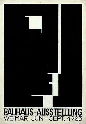
11 photogram sketch for the title page of broom lászló moholy-nagy 1922 bauhaus movement the bauhaus movement, founded by walter gropius in germany in 1919, was a school of architecture, art and design. it was characterized by respect for practical material, geometric design and its severely economic sensibilities. in his school, gropius stressed to his students functional craftsmanship and designs that could be mass produced. sans-serif types and strong vertical and horizontal rules were typical of bauhaus style design. the bauhaus elementary principles of typography stressed function, communication in the simplest, shortest, most penetrating form and to serve social ends. that is, its ingredients should have external organization (the typographic material be properly related) and internal organization (ordered content.) these principles were the beginnings of a new style termed the new typography. poster for the 1923 bauhaus exhibition in weimar joost schmidt


12 design for a newspaper kiosk herbert bayer 1924 kiosk for selling and advertising cigarette brand p herbert bayer

13 why do we write and print with two different alphabets simultaneously? we do not speak a capital A and a small a. herbert bayer 1925 bauhaus magazine cover herbert bayer


14 herbert bayer herbert bayer, ( ), an austrian born graphic designer, typographer, architect, photographer and painter was one of the most influential contributors to the bauhaus movement. bayer had studied for four years at the bauhaus under such teachers as lászló moholy-nagy and wassily kandinsky. he was then appointed the schools director of advertising and printing by the schools founder, walter gropius. for this appointment, bayer developed a concise visual style. he embraced an all-lowercase and sans serif typeface. bayer is recognized with designing the custom geometric sans serif font, universal. universal type herbert bayer 1925 to quote herbert bayer: in designing the universal type i asked myself, is this pretense of the handwritten alphabet still justified at a time when almost all that is written is either printed on typewriters or on printing presses? when handwriting plays a very minor role? some of the requirements of a new machine alphabet, i concluded, should be: a) simplification of form for the sake of legibility (the simpler the optical appearance the easier its comprehension); b) clean proportions for each letter, designed with basic geometric elements to produce a harmonious character of the alphabet; c) renunciation of serifs, up- and down-strokes and of a handwritten character; d) adaptation for the typewriter, for handwriting, etc., to be developed from the basic design of the universal type for machine printing. but why do we write and print with two different alphabets simultaneously? we do not speak a capital A and a small a. to convey one sound we do not need large and small letter symbols. (sic) self portrait herbert bayer 1932/5 33
15
16
VOICE OF TYPE LECTURE 1
 VOICE OF TYPE LECTURE 1 TYPOGRAPHY II COUNTY COLLEGE OF MORRIS PROFESSOR GAYLE REMBOLD FURBERT VOICE OF TYPE As you look at typefaces, analyze their forms, learn their history and learn how to use them
art 118: intro to communication design // FALL 2011
 t y p e specimen Due: Wednesday, November 30 ov e r v i e w A type specimen is a publication, that shows the range of a particular typeface in use. Printers and typographers have produced type specimens
understanding typography
 understanding typography What is typography?! it is what language looks like! it is the art and technique of modifying type and arranging it on a page What does the arrangement of type mean? the arrangement
Pre-Venetian or Ancient Humanist or Venetian Transitional Didone Slab Serifs
 Pre-Venetian or Ancient Humanist or Venetian Transitional Didone Slab Serifs 1400 1500 1700 1800 Humanist Sans Serif Transitional Sans Serif Geometric Sans Serif Display Typefaces 1900 2000 Pre-Venetian
SUCCESSFUL TYPE? Interface Aesthetics
 TYPO GR AP HY SUCCESSFUL TYPE? SUCCESSFUL TYPE? TYPOGRAPHY 1 2 TYPOGRAPHY /t 'p gr fi/ n. The art or process of setting and arranging types and printing from them. The style and appearance of printed
UNIVERSITY HOUSING COMMU- NICATION GUIDE TO DESIGN
 UNIVERSITY HOUSING COMMU- NICATION GUIDE TO DESIGN INTRODUCTION Hello and welcome to the University Housing Communication Guide to Design! In this book, you will find various guides to help you enhance
Chapter 18: The International Typographic Style
 Chapter 18: The International Typographic Style International Typographic Style A graphic design style emphasizing cleanliness, readability and objectivity developed in Switzerland in the 1950s. Specifics
Designing Research Posters. College of Art and Design Chris Jackson, Associate Dean Keli DiRisio, Assistant Professor
 Designing Research Posters College of Art and Design Chris Jackson, Associate Dean Keli DiRisio, Assistant Professor Size and Orientation If you are NOT using the poster template: Start is with a 48"
Putting type on a page without incorporating typographic principles is merely word processing. Terry Rydberg, Author Exploring InDesign 3
 Putting type on a page without incorporating typographic principles is merely word processing. Terry Rydberg, Author Exploring InDesign 3 Typography The study of all elements of type as a means of visual
Commercial and Promotional uses of Washington Campus Compact s Marks and Verbiage
 Graphic Identity Guidelines The Washington Campus Compact Identity Guidelines in this Style Guide are central to our communication and marketing strategies. They provide a road map for presenting the organization
The Ohio State University, Paul Nini, Instructor
 Typeface Poster: Shaina Meyers (undergraduate) The Ohio State University, Paul Nini, Instructor I always have students prepare a written rationale statement for their projects, along with a process document
David Glen Smith. Fonts of Influence
 David Glen Smith Fonts of Influence Charlesworth {Charlemagne}. (THERE ARE NO LOWERCASE CHARACTERS) Poster Bodini Helvetica Neue Gill Sans My intentions are to merge a thick poster font with a thinner
THINGS YOU NEED TO KNOW
 TYPOGRAPHY THINGS YOU NEED TO KNOW to prevent your work from appearing amateurish. (p. 151) Only one space after punctuation (p. 152) What is monospaced type? (p. 152) Correct Quotation Marks (as soon
Font Basics. Descender. Serif. With strokes on the extremities of the letters. T Script. Sans-Serif. No strokes on the end of the letters
 Font Basics Ascender Font Size d p x A X-height Cap height Counter The white space within letters Descender Bar A Serif With strokes on the extremities of the letters. T A Sans-Serif No strokes on the
Baskerville. abcdefghijk For fun I like to jump cars while reading a quote by Albert Einstein.
 serif Baskerville page 2 Baskerville page 3 Baskerville Baskerville Regular 26/28 while reading a quote by Baskerville italic 26/28 quote by Baskerville Semi bold 24/30 quote by Baskerville bold 24/26
Alphabet. elemental visual signs 26 characters frozen sounds
 Alphabet elemental visual signs 26 characters frozen sounds Evolution Handwriting > minimum number of strokes Engraving > lowercase > minimum number of curved lines > capitals Letterforms Appearance of
Name: Class: Teacher:..
 Name: Class: Teacher:.. Introduction Desktop publishing (DTP) is the process of designing newspapers, magazines, books, leaflets, booklets and reports on a computer. The industry that produces these items
3/20/16. International Typographic Style. International Typographic Style. International Typographic Style ARTH 4573 HISTORY OF GRAPHIC DESIGN
 ARTH 4573 HISTORY OF GRAPHIC DESIGN Section 9a international typographic style (swiss style) } American Modernism } 1913 } 1930s } The Depression } World War 2 } After the War } } Basel and Zurich, Switzerland
TYPE ANATOMY jtittle
 TYPE ANATOMY TYPE ANATOMY TITTLE j Serif Typefaces Tt HUMANIST (a.k.a. Old Style ) - Modeled after the roman typefaces of 15 th & 16 th centuries - Closely related to calligraphy and hand movement CLASSIC
The making of Beautiful A method for designing type for Jordanian students
 Beauty, Form and Function in Typography http://www.typoday.in The making of Beautiful A method for designing type for Jordanian students Rejan, Ashour, School of Architecture and Built Environment, German
IDENTITIES ARE THE BEGINNING OF EVERYTHING. THEY ARE HOW SOMETHING IS RECOGNIZED AND UNDERSTOOD. WHAT COULD BE BETTER THAN THAT?
 BRAND GUIDELINES IDENTITIES ARE THE BEGINNING OF EVERYTHING. THEY ARE HOW SOMETHING IS RECOGNIZED AND UNDERSTOOD. WHAT COULD BE BETTER THAN THAT? Paula Scher Paula Scher is an American graphic designer,
JABRA CORPORATION GRAPHIC STANDARDS MANUAL
 JABRA CORPORATION GRAPHIC STANDARDS MANUAL A simple reference guide for how to use the JABRA Corporation logo in real-world communications applications. INTRODUCTION Corporate image is a valuable asset,
Multimedia for the Web: Creating Digital Excitement. Multimedia Element Text
 : Creating Digital Excitement Multimedia Element Text Chapter Concepts Discuss Fonts Understand Fonts Define Cascading Style Sheets (CSS) Explain Additional Options for Implementing Text on the Web Chapter
FontForum. FontForum Designer Profile: Hellmut G. Bomm URW++ DESIGN & DEVELOPMENT GMBH. Poppenbütteler Bogen Hamburg Germany
 FontForum FontForum Designer Profile: Hellmut G. Bomm URW++ DESIGN & DEVELOPMENT GMBH Poppenbütteler Bogen 36 22399 Hamburg Germany TEL +49 (0) 40 60605 0 FAX +49 (0) 40 60605 111 info@urwpp.de www.urwpp.com
Graphic Design. shawacademy LESSON 5. summarynotes INTRODUCTION TO TYPOGRAPHY. For further questions visit us online at:
 shawacademy Graphic Design LESSON 5 INTRODUCTION TO TYPOGRAPHY summarynotes The Diploma in Graphic Design Toolkit For further questions visit us online at: www.shawacademy.com Lesson 5 S shawacademy Lesson
Font classification review
 Font classification review Taken from Lettering & Type by Bruce Willen Nolen Strals Old Style Transitional Modern Slab Serif Garamond ag Baskerville ag Bodoni ag Cowboys ab Sans Serif Gill Sans ag Decorative
TYPOGRAPHY. The art of type
 Typography TYPOGRAPHY The art of type TYPE All the letters (abc), Numbers (123) & characters (;? @) of the alphabet. MONOTYPE Trade name for hot metal composition system Monotype Corporation Machine Shop
jasonjuwono twentyfifteen TYPEDIA _ Typography Encyclopedia
 TYPEDIA _ Typography Encyclopedia ANATOMY_ Anatomy of a typeface Anatomy of a typeface What is a Font & Typeface? A design for a set of characters. A font is the combination of typeface and other qualities,
Bardax. Process GD350 ADVANCED TYPOGRAPHY REFLECTION ON PRACTICE ERSAN ÇELİKTAŞ
 1 1. Turkish tea glass is called ince belli bardak in Turkish, which means thin waisted glass. 2. Adobe Illustrator is a computer software that enables users to design, modify and edit vector graphics
The International Typographic Style
 The International Typographic Style Ernst Keller was one of the pioneers of Swiss design. His work used symbolic imagery, simplified geometric forms and vibrant contrasting color. Poster for the Rietberg
SEAN REES PORTFOLIO This is a selection of my recent professional and personal design pieces.
 SEAN REES PORTFOLIO This is a selection of my recent professional and personal design pieces. WEB / UI - Volume Integration I m in the middle of a redesign right now for Volume Integration; a company in
INTRODUCTION TO TYPOGRAPHY DESIGN
 INTRODUCTION TO TYPOGRAPHY DESIGN Goals of typographic design Typography plays an important role in how audiences perceive your document and its information. Good design is about capturing your audience
The typography. of order EMIL RUDER
 The typography of order EMIL RUDER 1914-1970 Swiss typographer, born in Zurich He was professor in basel school of design He founded the international center for the typographic arts in New York in 1962
Typefaces are character sets based on distinct design characteristics.
 Level 3 WGHS VISUAL ARTS 2011 ART DESIGN Typography An Introduction to Type Type Design Since the first recordings of letterforms the concept of the typographic form has evolved into a seemingly endless
History of Typography. (History of Digital Font)
") History of Typography (History of Digital Font) 1 What is Typography? The art and technique of printing The study and process of typefaces Study Legibility or readability of typefaces and their layout
History of Typography (History of Digital Font) 1 What is Typography? The art and technique of printing The study and process of typefaces Study Legibility or readability of typefaces and their layout
Our Look Book. BRAND GUIDELINES VERSION 1.0
 Our Look Book. BRAND GUIDELINES VERSION 1.0 SIMPLICITY IS THE ULTIMATE FORM OF SOPHISTICATION. Leonardo da Vinci 2 BRAND GUIDELINES THIS IS A GUIDE TO THE BASIC ELEMENTS THAT MAKE UP OUR BRAND. IT WILL
BRAND GUIDE L I N E S
 BRAND GUIDE LINES NETWORK OF COMMUNITY MINISTRIES SIMPLICITY IS THE ULTIMATE FORM OF SOPHISTICATION. Leonardo da Vinci 2 BRAND GUIDELINES THIS IS A GUIDE TO THE BASIC ELEMENTS THAT MAKE UP OUR BRAND. IT
Typography One typeface classification
 Typography One typeface classification Why classify? Classification helps us describe and navigate type choices Typeface classification helps to: 1. sort type (scholars, historians, type manufacturers),
Multimedia Design Principles. Darnell Chance August 2005
 Multimedia Design Principles Darnell Chance August 2005 Home Page Things To Consider Organization Story Board Organization The 3 C s Alignment Proximity Tips/ Techs White Space Contrast Rule of Thumb Typography
The Evolution of Type. Movable Type: Johannes Gutenberg Early 15th Century
 The Evolution of Type Movable Type: Johannes Gutenberg Early 15th Century Studio on Fire: Minneapolis Anatomy of Type cap height cross bar Anatomy n bowl describes g counter ascender finial stem type eye
Products At Home for Skin, Hair & Body Care: A Step by Step Guide & 70 Simple Recipes for Any Skin Type and Hair Type Designing Type Lettering &
 Designing Type PDF One of the most essential tools of graphic design, typography influences the appearance of visual print materials perhaps more than any other component. This essential book explains
section four typography contents introduction...44 helvetica neue...45 bodoni...46 examples of type usage...47 body text examples...
 section four typography 43 contents introduction...44 helvetica neue...45 bodoni...46 examples of type usage...47 body text examples...48 introduction Consistent application of type fonts and styles allows
TYPOGRAPHY. ascender arm (as on the capital T) descender bar (as on the capital H) counter ear (as on the lower case g and r)
 descender bar (as on the capital H) counter ear (as on the lower case g and r)") TYPOGRAPHY Parts of letters: base line x-height ascender arm (as on the capital T) descender bar (as on the capital H) extenders bowl counter ear (as on the lower case g and r) serif stroke tail (as on
TYPOGRAPHY Parts of letters: base line x-height ascender arm (as on the capital T) descender bar (as on the capital H) extenders bowl counter ear (as on the lower case g and r) serif stroke tail (as on
Lumin Lumin Sans Lumin Sans Condensed Lumin Display
 Typotheque type specimen & OpenType feature specification. Please read before using the fonts. Lumin Lumin Sans Lumin Sans Condensed Lumin Display OpenType font family supporting Latin based languages
BASIC ABOUT TYPE TYPO GRAPHY
 BASIC ABOUT TYPE TYPO GRAPHY TYPOGRAPHY BASIC DESIGN Relative & Absolute measurements Absolute measurements Inche : Millimetres : Points : Pica 3 Inches 76.2 mm 216 Points 18 Picas 1 Inches = 3 Picas A
Typography in Design The principles of design describe the ways that artists use the elements of art in a work of art.
 Typography in Design The principles of design describe the ways that artists use the elements of art in a work of art. Aims & Outcomes: Aims: to understand typeface categories and how they are used in
Unit 4. Multimedia Element: Text. Introduction to Multimedia Semester 2
 Unit 4 Multimedia Element: Text 2017-18 Semester 2 Unit Outline In this unit, we will learn Fonts Typography Serif, Sans Serif, Decorative Monospaced vs. Proportional Style Size Spacing Color Alignment
How we look. Brand Guidelines version 1.1
 How we look. Brand Guidelines version 1.1 TOUCHTUNES Simplicity is the ultimate form of sophistication. Leonardo da Vinci 2 BRAND GUIDELINES This is a guide to the basic elements that make up our brand.
BRAND & LOGO GUIDELINES SOCKET MOBILE. - Logos - Social Media - Web
 BRAND & LOGO GUIDELINES - Logos - Social Media - Web SIMPLICITY IS THE ULTIMATE FORM OF SOPHISTICATION. 2 BRAND GUIDELINES THIS IS A GUIDE TO THE BASIC ELEMENTS THAT MAKE UP OUR BRAND. IT WILL LET YOU
OTTER TAIL COUNTY - MINNESOTA LOGO USAGE POLICY
 OTTER TAIL COUNTY - MINNESOTA LOGO USAGE POLICY Prepared By: The Branding Task Force as directed by the Division Directors and the Otter Tail County Board of Commissioners. Manual Version Control Version
BRAND GUIDE JANUARY 2013 PREPARED BY JULIE ZACK GRAPHIC DESIGNER
 BRAND GUIDE JANUARY 2013 PREPARED BY JULIE ZACK GRAPHIC DESIGNER 716.517.6298 BRIEF AERIS Latin word meaning air, atmosphere, ether, or weather. SPECIFICS Asbestos abatement Lead hazard control Mold mitigation
Design Style Guide. Tips & Tricks for Designing Outstanding Yearbook Pages.
 Design Style Guide. Tips & Tricks for Designing Outstanding Yearbook Pages. TIPS & TRICKS FOR DESIGNING OUTSTANDING YEARBOOK PAGES INFOGRAPHIC GUIDE Designing your yearbook with YBLive should be fun and
Multimedia Design Principles
 Multimedia By Tansa Ayazgok February 2018 Multimedia Things To Your Audience Time Cost Skill level Equipment Click here to view a link to the Best Portable Projectors for Presentations Click the image
B R A N D GUIDELINES
 BRAND GUIDELINES You never get a second chance to make a first impression. 01 02 03 INTRODUCTION About the City of New Bedford s brand 5 THE LOGO The Logo and usage 7 Color & variations 7 Clearspace &
Introduction A global icon needs an iconic logo. Fashion has evolved since 1969, when Gap opened its first store. Our logo has changed with the
 Introduction A global icon needs an iconic logo. Fashion has evolved since 1969, when Gap opened its first store. Our logo has changed with the times, too. One thing that hasn t changed is our mission
Brand Identity Guide. September 2017
 Brand Identity Guide September 2017 Welcome At Canada Drives our goal is to be the number one consumer lending company in Canada by making financing simple and accessible to every Canadian while maintaining
Edea IDENTITY STYLE GUIDE
 Edea IDENTITY STYLE GUIDE 00 Introduction 01 02 Typography 03Colour Usage The primary goal of this guide is to help ensure that the Edea identity is consistent throughout all communications. Consistency
GRAPHIC DESIGN BY ASHLEY BELMER. Get In Touch Located in Toronto, Ontario
 GRAPHIC DESIGN P O R T F O L I O BY ASHLEY BELMER Get In Touch. www.ashleybelmer.com ashley@ashleybelmer.com 514-627-5151 Located in Toronto, Ontario A PACKAGE DESIGN / BRANDING The idea of Banane Chocolates
LOGO & BRAND STANDARDS GUIDE
 LOGO & BRAND STANDARDS GUIDE INTRODUCTION The SparkPost Brand Standards Guide provides key information needed to accurately and consistently produce external and internal documents and communications.
Product Information Optima nova
 General The idea for Optima occurred to Hermann Zapf on a trip to Italy in 1950. There he noticed the lettering of grave inscriptions on the floor of Basilica Santa Croce in Florence. He wanted to make
Modifying Type: effects of a letter change COLDS
 Modifying Type Modifying Type The goal of good typography is like fabric. It should be evenly woven together where all facets and all parts of the letter forms work together. Sometimes if you have one
Be very aware of dates! A lot of what we are - and have been - talking about is happening consecutively. Hence, your Timeline Project J
 ARTH 4573 HISTORY OF GRAPHIC DESIGN Section 8b the new typography, intro to american modernism } Bauhaus } } Intro to American Modernism Be very aware of dates! A lot of what we are - and have been - talking
5. Text CHAPTER HIGHLIGHTS 10/12/2016 CHAPTER. Text tradition. Codes for computer text. t. Font technologies. Multimedia text.
 CHAPTER 5. Text CHAPTER HIGHLIGHTS Text tradition. Codes for computer text. t Font technologies. Multimedia text. Guidelines for use of text in multimedia. 2 1 POWERS OF TEXT Multimedia developers value
Tribunal. ewjduhiz tvnsgfq. Typotheque type specimen & OpenType feature specification. Please read before using the fonts.
 Typotheque type specimen & OpenType feature specification. Please read before using the fonts. Tribunal OpenType font family supporting Latin based languages with their own small caps, with extensive typographic
The use of eye-tracker technology to evaluate typefaces, Greek fonts and publication design for screen.
 Typography in Publication Design The use of eye-tracker technology to evaluate typefaces, Greek fonts and publication design for screen. Evripides Zantides, Cyprus University of Technology, Lemesos, Cyprus,
A Brief History of Fontesque. By Nick Shinn Druk Fall 2001
 A Brief History of Fontesque By Nick Shinn Druk Fall 2001 A Brief History of Fontesque With the release of his new Fontesque Sans, Nick Shinn surveys the Fontesque years 1618 This wobbly type, which wasn
CALLUM MCMURRAY DESIGN PORTFOLIO
 CALLUM MCMURRAY DESIGN PORTFOLIO Contents 02 About Me: A short description about who I am, what I can do and what I enjoy. Self-Branding: Logo and Brand: My project to create a brand to represent myself
Cursive Letters Guide READ ONLINE
 Cursive Letters Guide READ ONLINE Printable Cursive Alphabets Printable Cursive Handwriting - These cursive alphabet pages can be downloaded for FREE and used for your own personal home or classroom use.
OUR TYPOGRAPHY APPROVED UNIVERS FONTS. Univers 65 Bold Univers 65 Bold Oblique Univers 75 Black Univers 75 Black Oblique
 BRAND TYPOGRAPHY For Internal Use Only Not For Use With The Public. For help and guidance on our brand standards, contact marketinginbox@firstcommand.com. 63 OUR TYPOGRAPHY Typography is a powerful extension
Assignment 1~ ICONS Grading Assessment
 Assignment 1~ ICONS W18 Section: 10013 9:00 am-11:25 am MW 24 23 22 21 20 19 18 16 15 14 13 12 11 09 08 07 06 05 04 03 02 01 0 17 10 Ability to Design Icon Likeness Images in a Theme as a Stylistic Series
Structure of Text. Creating Memory Aids through Typography
 Structure of Text Creating Memory Aids through Typography Edward Rushton MFA Donald Armel PhD Legibility Readability Definitions Legibility Legibility is dependent on the design of the typeface, the letterforms
New Vintage Type: Classic Fonts For The Digital Age By Gail Anderson, Steven Heller READ ONLINE
 New Vintage Type: Classic Fonts For The Digital Age By Gail Anderson, Steven Heller READ ONLINE Vintage style typography is classic and remains popular still today. Fonts You have to put in the time to
Unit 3--Alignment, Formatting Font--Size, Color, Style [Bold, Italic, and Underline] Block
![Unit 3--Alignment, Formatting Font--Size, Color, Style [Bold, Italic, and Underline] Block](/thumbs/88/117283008.jpg "Unit 3--Alignment, Formatting Font--Size, Color, Style [Bold, Italic, and Underline] Block") Unit 3--Alignment, Formatting Font--Size, Color, Style [Bold, Italic, and Underline] Block Use the mouse pointer to select the text (or put a blue highlight behind it). Then, make the changes you need.
Unit 3--Alignment, Formatting Font--Size, Color, Style [Bold, Italic, and Underline] Block Use the mouse pointer to select the text (or put a blue highlight behind it). Then, make the changes you need.
BRAND. For Internal Use Only Not For Use With The Public. For help and guidance on our brand standards, contact
 BRAND TYPOGRAPHY. 1 OUR TYPOGRAPHY. Typography is a powerful extension of our brand s personality. It plays an important role in creating a consistent look for First Command across all communications and
serif: the short strokes that finish off the major strokes of the letterform. bracket: a curving joint between the serif and the stroke
 PARTS OF THE LETTER Typography evolved from handwriting, which is created by making a series of marks by hand; therefore, the fundamental element constructing a letterform is the linear stroke (stem).
E M I G R E G R A P H I C S DIGITAL FONTS
 G G P H C S DGL FONS G G Z N F O N S Described here is the ever continuing evolution of typefaces designed by Zuzana Licko for migre agazine. hese range from the coarse resolution bitmaps to high resolution
Navis Pack & Ship Style Guide
 Navis Pack & Ship Style Guide * The following booklet contains the style guide for the Navis Pack & Ship brand only. If you have questions regarding style guides for the PostalAnnex+, Handle With Care
BRAND GUIDE Indianapolis Classical Schools
 Indianapolis Classical Schools This guide is designed to assist with the general appearance and application of the Indianapolis Classical Schools (ICS) brand logomark and its related branding elements.
Typographic. Alphabet. Book. Interactive PDF of typographic rules & terms YOU NEED TO KNOW. Home. Table of Contents
 Typographic Alphabet Table of Contents > Rules That Every Typographer Should Know... 2-3 Book Interactive PDF of typographic rules & terms YOU NEED TO KNOW > Baseline... > Gutter... > Hierarchy... > Kerning...
VIVO Identity Guidelines
 VIVO Identity Guidelines May 2010 Version 1.0 00 Contents 01 02 03 04 05 06 Introduction About VIVO VIVO Identity Elements Space Size Color System (web and print) Identity Colors Primary Color Palette
O M. O M logo specs. O M O M O M O M
 overview. The useum of odern Art, or oa, is an art museum in anhattan that holds and displays a wide range of modern and contemporary art. oa is considrered to be one of the most influential museums in
Goudy Old Style & Garamond. A Type Comparison Book by Brittany Hansard
 Goudy Old Style & Garamond A Type Comparison Book by Brittany Hansard Frederic W. Goudy created this old style typeface in the late 1920s and it is known as one of his most adored typeface alphabets within
Subject: 7 th Grade Computer Grade: 7th Mr. Holmes Unit Lesson Layer Duration Unit 1 Word Processing
 Subject: 7 th Grade Computer Grade: 7th Mr. Holmes Unit Lesson Layer Duration Unit 1 Word Processing PROJECT 2: SAILING INTO EDO BAY WITH COMMODORE PERRY Applied (do) 10/1/12-10/11/12 Essential Questions
Before & After. Use the Principles Cheatsheet! From The Non-Designer s Design Book, Robin Williams Non-Designer s Design 8
 Before & After Use the Principles Cheatsheet! From The Non-Designer s Design Book, Robin Williams Non-Designer s Design 8 Before & After From The Non-Designer s Design Book, Robin Williams Non-Designer
PLANNING. CAEL Networked Worlds WEEK 2
 PLANNING CAEL5045 - Networked Worlds WEEK 2 WEEK 2 CHOOSING COLOURS CHOOSING FONTS COLLECTING CONTENT PLANNING STRUCTURE WIREFRAMES + MOCKUPS Every colour, including black and white, has implications for
The Poster Presentation
 Posters Joan M. Lakoski, Ph.D. University of Pittsburgh The Poster Presentation Presenting Data at a Scientific Meeting Characteristics of effective presentations: Organized Rehearsed Visual appeal Relevant
Font, Typeface, Typeface Family. Selected Typographical Variables
 Font, Typeface, Typeface Family Font: A font is a set of printable or displayable text character in a specific style, weight, and size. E.g. Helvetica Italic 10 Point. Typeface: The type design for a set
Visual Identity Standards
 Visual Identity Standards 12.0 Presentations Information and inquiries: University Relations brand@ucalgary.ca Visual Identity Standards 2 12.0 Presentations 12.01 Introduction 12.01 Introduction 12.02
BRAND IDENTITY STANDARDS GUIDE
 BRAND IDENTITY STANDARDS GUIDE JANUARY 2015 TABLE OF CONTENTS This brand identity standards guide was created to help establish the BCIU s visual brand image and bring consistency to all visual representations
RIPE NCC Brand Guidelines Communications Department
 1 2015 Brand Guidelines 2 We serve our members by delivering a high quality registry and supporting the core Internet infrastructure. Connecting people within and beyond the technical community through
Chapter 8: Rococo Graphic Design 18 th century
 Chapter 8: Rococo Graphic Design 18 th century Romain du Roi (French for King s Roman) The first printing of the Romain du Roi at the beginning of the eighteenth century signified a shift to transitional
Type on the Web: Dos, Don ts and Maybes Ilene Strizver
 Type on the Web: Dos, Don ts and Maybes Ilene Strizver What exactly is Type on the Web? How does it differ from print? Type in print Fixed Predictable Controllable Appearance varies depending on: Operating
A LPHABET S OUP T YPE F OUNDERS.
 If you've just purchased Orion or are thinking about it Thank You! This brochure will try to explain a little about some of the historical precedents for this font (which will help put it into proper perspective)
AW Conqueror. PRO STD FREE Sans Light Didot Light Inline Regular Slab Regular Carved Regular Carved One Carved Two Carved Three Carved Four
 PRO STD FREE Sans Light Didot Light Inline Regular Slab Regular Carved Regular Carved One Carved Two Carved Three Carved Four available on this format not available on this format aa Sans Light Didot Light
COPY/PASTE: Allows any item within a document to be copied and pasted within the same document or within compatible software applications.
 You will need to understand basic terms and techniques used in DTP, as well as file types used within DTP and their advantages and disadvantages. This is separate from Elements and Principles of DTP which
Synopsis This module introduces calligraphy, the basic principles of typography, and applications of typography.
 8. Typography Synopsis This module introduces calligraphy, the basic principles of typography, and applications of typography. Lectures 8.1 Calligraphy 8.2 Basic Principles of Typography 8.3 Typography
OUR IDENTITY AND ITS COMPONENTS. Logo Logo usage policy 03 Official logo 05 Dimensions 06 Improper usage 07
 VISUAL GUIDELINES TABLE OF CONTENT This document is intended for all those who use the ISPE visual identity in communications and supporting documents. Instructions provided in this guide will ensure consistency
Typography 2! HCC 710 2/1 /13. Human&Centered,Compu/ng,at,University,of,Maryland,,Bal/more,County
 Typography 2! HCC 710 2/1 /13 1, Human&Centered,Compu/ng,at,University,of,Maryland,,Bal/more,County Letterform Critiques! 25-30 minutes 2, Wordpress Questions / " Graphic Design Inspirations! 3, Human&Centered,Compu/ng,at,University,of,Maryland,,Bal/more,County
Knightswood Secondary School. Graphic Communication. Desktop Publishing otes. Auto Tracing
 Auto Tracing The process of converting a bit mapped image into a vector image. In a bit-mapped image, each object is represented by a pattern of dots, while in a vector image every object is defined geometrically.
TYPE. Design Process
 TYPE Design Process 01 Vocabulary 02 Classification 03 Six Classic Typefaces 04 Readability 05 Ten Type Commandments 06 Inspiration 07 Assignment 01 Vocabulary 02 Classification 03 Six Classic Typefaces