ClearOne Style Guide 1
|
|
|
- Ethan Preston
- 6 years ago
- Views:
Transcription
1 1
2 Contents Overview 3 Brand Personality/Tone Specifics 4 Logo 5 Logo Sizing and Color 6 Logo with Taglines 7 Incorrect Logo Usage 8 Color Palette 9 Typography Style 10 Illustration Style 11 Logo - with Tagline 12 Typography Incorporated 13 Photography 14 Photography Sample Usage 16 Photography Sample Usage 17 CONTENTS 2

3 Where did it all begin? Did it all start with the first company to eliminate their three-piece suit requirement? Or the first company to relax their necktie policy? Or did it begin with the very first Hawaiian shirt day? One thing is for sure, we all seem to do business a little differently these days. And it s summed up in a two-word phrase: business casual It s more than a dress policy. It s become a corporate philosophy. Today it implies a place of trust. It implies place where ideas and innovation can flow freely without the traditional encumbrances of, well, stodgy traditional encumbrances. It s who we are. It s what we re all about. This is what makes us a little different. Not that we re the only ones that embrace a more informal working environment. But that mentality is a big part of our identity. Why? It s simple, really. We have a chance to be more innovative because we feel a little more freedom. More productive because we re a little more relaxed. A little more trustworthy because we can be just as personable as we are professional. It s the DNA of who we are and what we re all about. In the simplest terms: we embody a spirit of innovation. The point is, because we re a little different, the message we send to our customers should be a little different, too. Our corporate culture should be reflected in the language we speak. Everything we say should help reinforce what our DNA is and what we re all about. OVERVIEW 3
4 Brand personality/tone specifics Because we re evolving as a business, our communication should take that next step forward too. It should be reflected in the language we publicly speak. This evolution isn t a radical step forward, or a giant sidestep. It s a simple move forward. And because we re speaking both visually and verbally, we can afford to be a little more causal. The focus of the language is to find a nice balance with the visuals and a genuine launching pad of communication. The sweet spot is: Genuine Sometimes funny Intelligent Likeable Professional Al ways sincere Fun Contemporary Credible Personable BRAND PERSONALITY/TONE SPECIFICS 4
5 ClearOne Logo Preferred logo The most important element of the identity system is the logo. The preferred logo should be used on all print and electronic media for a consistent identity. Always use approved electronic art when using the logo. The standard ClearOne logo is one-color; Dark Grey PMS 432. The logotype is a modified mixed sanserif typeface, do not attempt to recreate the logotype by typing it. Always use approved electronic artwork for the logotype, as it has been modified and properly letterspaced. Several versions of the logotype have been supplied, for usage over a variety of sizes. When typing the name ClearOne, always capitalize C and O in a one-word treatment for the rest of the name. LOGO 5
6 Option 1 Pantone 432 Option 2 Black 1" (72px) Logo sizing A variety of applications will require flexibility in the size and proportions of the logo. Option 1 and option 2 provide that flexibility. Option 1 is the primary treatment and will work in most applications. Option 2 has been refined to work in minimum size of one inch or 72 pixels. One color Where circumstances require the use of a one-color logo, use the appropriate artwork. There are two one-color variations available. The logo may be printed in Pantone 432 or Black. LOGO SIZING AND COLOR 6
7 Logo with taglines Logo with Background Color Logo usage guidelines Where circumstances require printing the logo over a dark background, use the appropriate artwork. The ClearOne logotype changes to white and the background may be printed in Black, Pantone 432 or Pantone 551. Taglines may use secondary colors. LOGO WITH TAGLINES 7

8 Example 1 - Don t combine other graphic or typographic elements with the ClearOne logo Communications Example 2 - Don t apply special visual effects (i.e., blurs, bevels, or drop shadows) to the Clear One Logo Example 3 - Don t distort or change the proportions of the ClearOne Example 4 - Don t place the ClearOne logo over patterned backgrounds Incorrect logo usage These restrictions apply to all ClearOne logo instances, across all media, including electronic and print. INCORRECT LOGO USAGE 8
9 Main CMYK RGB PANTONE WEB SAFE C 23 M 2 Y 0 K 77 R 46 G 53 B U #2E3538 CMYK RGB PANTONE WEB SAFE C 27 M 3 Y 0 K 13 R 46 G 53 B U #A2C1CD Accent CMYK RGB PANTONE WEB SAFE C 0 M 61 Y 97 K 0 R 255 G 99 B U #FF6306 CMYK RGB PANTONE WEB SAFE C 0 M 0 Y 0 K 11 R 227 G 227 B U #E3E3E3 CMYK RGB PANTONE WEB SAFE C 1 M 88 Y 0 K 0 R 235 G 68 B U #FF3399 Color palette usage guideline Pantone, CMYK, WEB, and RGB values have been defined for ClearOne primary and accent colors. Apply them correctly to the appropriate media. The standard or base for any colormatching in any medium is the Pantone color swatch on the UNCOATED chips. The ClearOne color palette is composed of a main color palette and an accent color palette. Accent colors are intended only for smaller areas of color and as an enhancement to not a replacement for the colors in the main palette. Pink and Orange may NEVER be used together on a design. COLOR PALETTE 9
10 Body Copy Font Swiss Light ABCDEFGHIJKLMNOPQRSTUVWXYZ abcdefghijklmnopqrstuvwxyz Font Usage Examples Incorrrect Font Usage Examples New CHAT 70 New CHAT 70 Headline Fonts Swiss Roman ABCDEFGHIJKLMNOPQRSTUVWXYZ abcdefghijklmnopqrstuvwxyz Swiss Bold ABCDEFGHIJKLMNOPQRSTUVWXYZ abcdefghijklmnopqrstuvwxyz Desirel ABCDEFGHIJKLMNOPQRSTUVWXYZ abcdefghijklmnopqrstuvwxyz Web Font Arial ABCDEFGHIJKLMNOPQRSTUVWXYZ abcdefghijklmnopqrstuvwxyz Sounds good to me Headline ClearOne uses the Swiss721 font family for headlines and copy in all printed corporate documents Headline ClearOne uses the Swiss721 font family for headlines and copy in all printed corporate documents Headline ClearOne uses the Swiss721 font family for headlines and copy in all printed corporate documents Headline ClearOne uses the Swiss721 font family for headlines and copy in all printed corporate documents Font usage guideline ClearOne uses the Swiss721 font family for headlines and copy in all printed corporate documents. For web use, Arial is an acceptable substitute for Swiss 721 which may not show clearly in all browsers. Designers may use headline fonts, in moderation, to emphasize important ideas. Product Names and Trademark terms should NEVER use headline fonts. TYPOGRAPHY STYLE 10
11 Illustration Style Illustration usage guideline Integrating illustration can also enhance designs. It s important to use sparingly as not to distract from the products and information. Illustrations can be used in conjunction with photos to add extra info/direction for consumers in a fun way. ILLUSTRATION STYLE 11
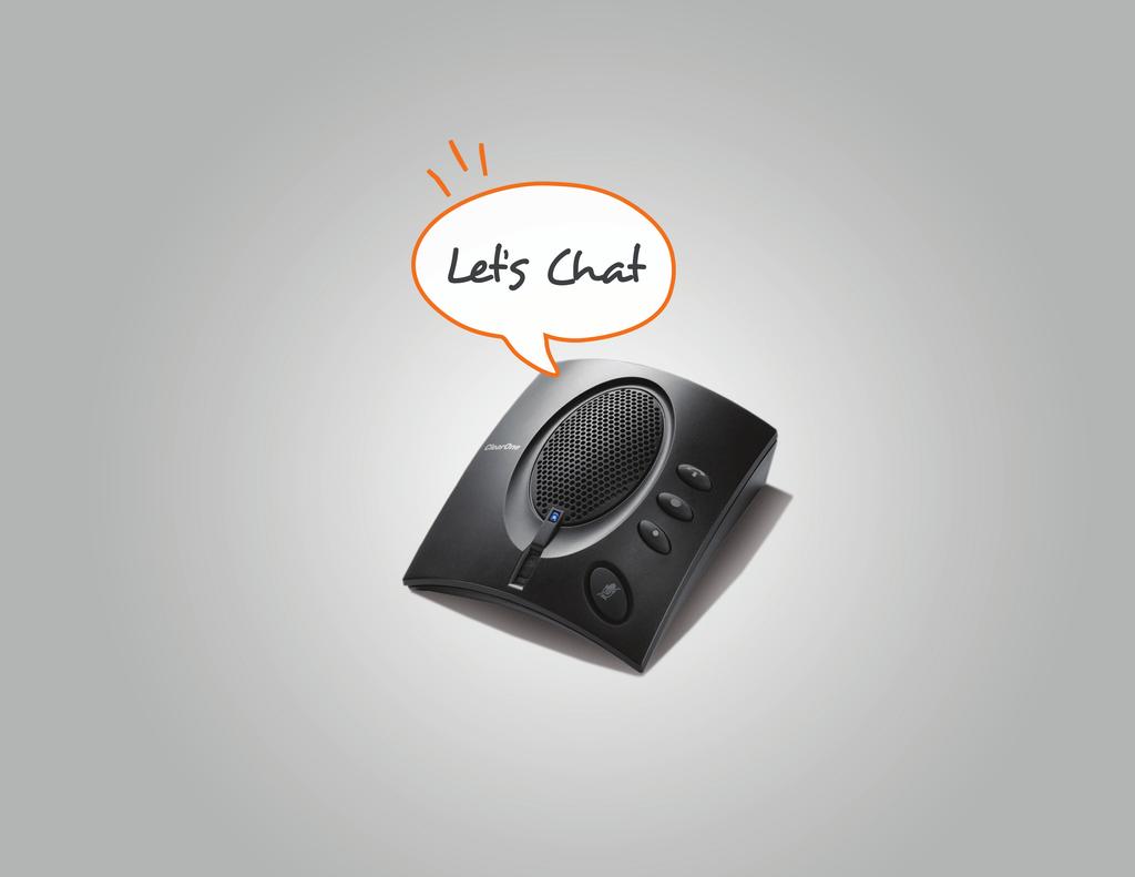
12 Example taglines that can be used with the logo Sounds good to me Imagine what it s like to really connect Let s chat Great ideas need to be heard We put the world on speaking terms We provide audio and video conferencing products to the world Sounds good to me Great ideas need to be heard Logo - with tagline Headlines emphasize ClearOne s business casual attitude. A friendly intro of what consumers can can expect when interacting with the ClearOne brand. + Taglines should mostly utilize the accent color palette. + It s important that taglines have an impact, but not overpower the logo. + Taglines may as well be used independent of the logo when appropriate. LOGO - WITH TAGLINE 12

13 Typography Incorporated Great ideas need to be heard Sounds good to me Let s Chat Sounds good to me Imagine what it s like to really connect We put the on speaking terms We provide audio conferencing products to the TYPOGRAPHY INCORPORATED 13


14 Photography Usage Guidelines Photography should be complementary to the primary and accent colors of ClearOne. Photography should be simple and clean in its usage. When selecting stock photography it is important that images do not appear too staged. Photography should NEVER contain competitive equipment. 14 PHOTOGRAPHY


15 Photography Usage Guidelines PHOTOGRAPHY 15

16 Example Usage Product Example Usage Let s Chat Sounds good to me PHOTOGRAPHY SAMPLE USAGE 16


17 Literature Example Usage Web Example Usage Your Challenge We need something now AV budgets are tight, but our AV needs are very real in our new facility. We need an immediate solution for the first 2 floors; but we will eventually be expanding into all 5 floors and the adjacent building. Printed Displays Example Usage Budgets are tight, our outlook isn t Meeting our business objectives today means time and budget are running low. However, future growth means our solution must be scalable. We can t have a solution that limits our communications it must grow with us. VIEW is the solution Our Solution VIEW provides full functionality today, with the ability to grow; virtually infinite scalability. No need to remove or replace costly network pieces or limited-function networks. Use your existing infrastructure network or create a new platform for your future. PHOTOGRAPHY SAMPLE USAGE 17
This document describes the basic elements of our identity system and provides guidelines for their correct use.
 STYLE GUIDE CONTENT 3 INTRODUCTION 4 APPROVED PRIMARY LOGO 5 USE OF THE PRIMARY LOGO 10 APPROVED BRAND LOGOS 11 CLEAR SPACE 13 INCORRECT LOGO USAGE 14 FONTS 15 WEBSITE 16 SUMMARY Welcome to the EPIC style
Brand Guidelines March
 Brand Guidelines March 2016 1 Contents Intro Our Mission... 4 Brand Promise... 5 Brand Values... 6 Guide Importance... 7 Identity Logo... 10 Logo Space...11 Logo Colors... 12 Logo Misuses... 13 Color Palettes...
Visual Style Guide. April 2016
 Visual Style Guide April 2016 Page 2 Contents Introduction to the Logo 3 Safe Area and Size 4 Incorrect Usage 5 Color Palette 6 Typography 7 Tone and Style of Photography 9 Print Examples 10 Screen Examples
Brand Guidelines Solano County Transit (SolTrans)
") Brand Guidelines Solano County Transit (SolTrans) May 2018 Table of Contents The SolTrans Story... 1 Brand Elements... 2 Logo Usage... 3 Color Palette... 7 Typography.... 8 Photography.... 9 The SolTrans
Brand Guidelines Solano County Transit (SolTrans) May 2018 Table of Contents The SolTrans Story... 1 Brand Elements... 2 Logo Usage... 3 Color Palette... 7 Typography.... 8 Photography.... 9 The SolTrans
corporate identity guidelines
 Seilevel Corporate Identity Guidelines Introduction 1 Preferred Signature and Components Logo Space and Minimum Size Signature Variations Color Palette Typography Signature Misuse 2 3 4 5 6 7 corporate
INTRODUCTION. Please respect the integrity of the brand and the careful thought and craft that has gone into it.
 BRAND STANDARDS MAY 2017 INTRODUCTION The Intelligent Office brand is more than a name. It is a complete system of color, typography and artwork that reflects the true spirit of the organization. Using
GRAPHIC STANDARDS MANUAL. Appalachian Trail Conservancy Version 1.0
 GRAPHIC STANDARDS MANUAL Appalachian Trail Conservancy 2011 - Version 1.0 THE BRAND LOGO Brand Identity Our logo incorporates colors, typeface and graphic treatments to help solidify this program s brand
Our brand guidelines. Our photography
 1 brand guidelines photography Hello. We re the Motor Ombudsman. Please give this document your full attention. It should help you get to know more about us and our corporate guidelines. 2 This section
LOGO USE GUIDELINES BRAND GUIDELINES PUBLISHED ON FEBRUARY 17,
 LOGO USE GUIDELINES BRAND GUIDELINES PUBLISHED ON FEBRUARY 17, 2014 1 LOGO USE GUIDELINES LOGO USAGE GUIDELINES 13 LOGO USAGE GUIDELINES The Gardner-Webb logo is the centerpiece of the University's visual
2 December NCFE Corporate Guidelines. Introduction
 Introduction Introduction How we connect with people through our brand is essential to who we are, and plays a big part in the NCFE experience. We created this document (which is simpler than it looks)
BRAND. To access logos in various formats, please visit northforge.ca/media
 GRAPHIC STANDARDS BRAND North Forge Technology Exchange accelerates innovation and commercialization, promotes entrepreneurship and stimulates access to capital through mentorship, training, events and
ATHLETICS LOGOTYPE STYLE GUIDE
 ATHLETICS LOGOTYPE STYLE GUIDE CONTENTS INTRODUCTION 3 COLOR PALETTE 4 PRIMARY LOGO 5 MONOGRAM LOGO 10 WORDMARK 15 ADDITIONAL TYPOGRAPHY ELEMENTS 17 LOGO USAGE RULES 18 WESTMONT ATHLETICS FONT 20 CREATING
VISUAL IDENTITY GUIDE 2017
 01 VISUAL IDENTITY GUIDE 2017 TABLE OF CONTENTS THE LOGO 03 MINIMUM SIZE / SPACE 05 INCORRECT USAGE 06 COLOR PALETTES 07 GRAPHIC ELEMENTS 08 TYPOGRAPHY 09 03 THE LOGO Primary Logo The bold, clean look
IDENTITY GRAPHIC STANDARDS MANUAL
 IDENTITY GRAPHIC STANDARDS MANUAL TABLE OF CONTENTS Identity Graphic standards manual v1.0 Table of Contents 1 Introduction and Importance of Graphic Standards 2 Logo System 3 Primary Logo and Variations
FLEET LOGO USAGE AND STANDARDS INNOVA BRANDING STANDARDS 2015 GUIDE
 FLEET LOGO USAGE AND STANDARDS INNOVA BRANDING STANDARDS 2015 GUIDE INNOVA BRANDING STANDARDS 2015 GUIDE 2 TABLE OF CONTENTS The Innova Brand 3 Branding Elements Logo Colors Typography 4 8 10 INNOVA BRANDING
Identity Guidelines: How to use our logo. Version 1.0 April 2014
 Identity Guidelines: How to use our logo Version 1.0 April 2014 Contents 2 3 Introduction and Who to Contact 4 Writing the Company Name 5 The Fortune Brands Logo 6 Approved Logo Color Variations 7 Color
ETSI Brand Guidelines
 ETSI Brand Guidelines January 2011 ETSI LEGAL The ETSI logo is a trademark of ETSI. The ETSI logo shall only be used in accordance with the ETSI Brand Guidelines. In case of any questions with regards
Visual Style Guide. February 2014
 Visual Style Guide February 2014 Contents Introduction to the MC&FP Logo 3 Safe Area and Size 4 Incorrect Usage 5 Color Palette 6 Typography 7 Tone and Style of Photography 8 Print Examples 9 Screen Examples
DESIGN GUIDELINES. Davis Technical College. DAVIS TECHNICAL COLLEGE 550 East 300 South Kaysville, UT Phone: Web: davistech.
 DESIGN GUIDELINES Davis Technical College DAVIS TECHNICAL COLLEGE 550 East 300 South Kaysville, UT 84037 Phone: 801.593.2500 Web: davistech.edu About this brand This identity guideline is a tool designed
GÉANT CORPORATE IDENTITY GUIDELINES FOR USE. connect communicate collaborate
 GÉANT CORPORATE IDENTITY GUIDELINES FOR USE connect communicate collaborate THE LOGO The GÉANT logo is the core element within the brand. From printed brochures and datasheets through PowerPoint presentations
Trican Visual Identity Guidelines 2015
 Trican Visual Identity Guidelines 2015 Media Kit Version 2.1 Trican Well Service Ltd. 2900, 645 7 th Avenue SW Calgary, Alberta Canada T2P 4G8 P 403.266.0202 F 403.237.7716 TricanWellService.com TABLE
BRAND & STYLE GUIDELINES SECTION TITLE 1
 BRAND & STYLE GUIDELINES SECTION TITLE 1 2 SECTION TITLE Table of Contents Intro... 4 Company Name and Usage.... 5 Primary Logo and Usage... 6 Secondary Logo and Usage.... 12 Product Branding.... 13 Color
MARMOL BRAND GUIDELINES APRIL Powered by TECKpert.com
 MARMOL BRAND GUIDELINES Powered by TECKpert.com 2 3 4 5 6 7 8 9 10 11 CONTENTS LOGO ICON CLEAR SPACE PROPORTION MINIMUM SIZE DON TS BACKGROUND COLOR COLOR TYPOGRAPHY 2 LOGO This is the primary Marmol logo.
Brand Identity Guide. September 2017
 Brand Identity Guide September 2017 Welcome At Canada Drives our goal is to be the number one consumer lending company in Canada by making financing simple and accessible to every Canadian while maintaining
Third Party Identity Guidelines
 Third Party Identity Guidelines Introduction Introduction This document has been developed to provide anyone using The Wolfson Foundation logotype with clear guidelines on how the brand identity can be
VIVO Identity Guidelines
 VIVO Identity Guidelines May 2010 Version 1.0 00 Contents 01 02 03 04 05 06 Introduction About VIVO VIVO Identity Elements Space Size Color System (web and print) Identity Colors Primary Color Palette
Visual Identity Guidelines
 Guidelines VERSION 1: APRIL 2017 One City One Team Guidelines Table of Contents Introduction to logo 4 Safe Area / Minimum Size 5 Logo Usage 6 Incorrect Uses 7 Typography 8 Logo Colour Palette 9 Graphic
RecordQuest. All rights reserved.
 2017-2018 RecordQuest. All rights reserved. Table of Contents 1. The RecordQuest Brand What is a Brand? Our Brand 2. Mission Statement 3. Style & Tone 4. Tagline 5. Logo 5.1 Primary Logo 5.2 Logo with
SECTION 1: LOGO USAGE...4-7
 GRAPHIC Standards TABLE OF CONTENTS SECTION 1: LOGO USAGE...4-7 a. Primary Logo Signature... 4 b. Logo Signature Sizes and Proportions... 4 c. Clear Zone... 5 d. Color Options... 5 e. Co-branding... 6
Introduction. ThinManager - A Rockwell Automation Technology
 1220 Old Alpharetta Road, Suite 390 Alpharetta, Georgia 30005 www.thinmanager.com info@thinmanager.com OFFICE 678-990-0945 Introduction... 1 Logo... 2 Clear space and minimum size... 3 Primary color palette...
Corporate Identity Guidelines
 Corporate Identity Guidelines CONTENTS 1.0 TRADEMARK Watco Companies Logo Logo Clear Space Logo Variations Project Logos Proper Logo Use 03 04 05 06 07 08 2.0 TYPOGRAPHY Type Family 3.0 COLOR Brand Color
BRAND GUIDELINES January 2017 leanconstruction.org
 BRAND GUIDELINES January 2017 leanconstruction.org The Lean Construction Institute (LCI) is a non-profit organization, founded in 1997. The Institute operates as a catalyst to transform the industry through
Brand Guidelines FEBRUARY 2018
 Brand Guidelines FEBRUARY 2018 Contents 1. Logo 1.1. Clear Space 1.2. Logo Variations 1.3. Minimum Size 2. Brand Elements 2.1. Tagline 2.2. Message and Separator 2.3. Frame 5. Imagery 5.1. Illustration
GRAPHIC STANDARDS BOOK
 BOOK PURPOSE A uniformly applied visual identity program is essential to building a strong brand. It helps to immediately establish recognition for The Innevation Center University of Nevada, Reno, expresses
FSS CORPORATE LOGO USAGE/GUIDELINES
 FSS CORPORATE LOGO USAGE/GUIDELINES INTRODUCTION Our brand has an impact on almost everything we do. It affects how we present ourselves and how we are perceived by others. These guidelines should be used
BRAND IDENTITY GUIDELINES FEBRUARY 2014 GIVE. ADVOCATE. VOLUNTEER. UnitedWay.org
 UNITED WAY BRAND IDENTITY GUIDELINES FEBRUARY 2014 GIVE. ADVOCATE. VOLUNTEER. UnitedWay.org OUR MASTER BRANDMARK PRIMARY BRANDMARK The most fundamental visual element of a brand identity is its brandmark.
Visual Identity Guidelines
 Visual Identity Guidelines 2017 Building Our Brand The Nasdaq brand is one of our most important assets. It embodies who we are and what we value. Taken together, all the elements of our visual identity
Brand Guidelines. MAY London-Digital-Security-Centre
 Brand Guidelines MAY 2017 @LondonDSC London-Digital-Security-Centre Introduction The brand guidelines presented in this document have been created to ensure harmonious use of the London Digital Security
General Reproduction and Usage Guidelines Bizrate Insights Updated 13 Aug, 2018
 General Reproduction and Usage Guidelines Bizrate Insights Updated 13 Aug, 2018 Table of Contents Introduction Logo Fonts Color Geometry Web -Responsive -Navigation -Buttons -Contact Forms -Footer 3 4
Brand Overview COLORS / FONTS / LOGOS rd Street, Suite 210 Denver, CO communityengineeringcorps.org
 Brand Overview COLORS / FONTS / LOGOS 1031 33rd Street, Suite 210 Denver, CO 80205 720 204-3194 Color Palette PRIMARY COLORS PRIMARY PALETTE For most situations, it is important to utilize the two main
VISUAL IDENTITY GUIDE 2016
 VISUAL IDENTITY GUIDE 2016 TABLE OF CONTENTS THE LOGO 02 MINIMUM SIZE / SPACE 04 INCORRECT USAGE 05 COLOR PALETTES 06 GRAPHIC ELEMENTS 07 TYPOGRAPHY 08 02 THE LOGO Primary Logo The bold, clean look of
IDENTITIES ARE THE BEGINNING OF EVERYTHING. THEY ARE HOW SOMETHING IS RECOGNIZED AND UNDERSTOOD. WHAT COULD BE BETTER THAN THAT?
 BRAND GUIDELINES IDENTITIES ARE THE BEGINNING OF EVERYTHING. THEY ARE HOW SOMETHING IS RECOGNIZED AND UNDERSTOOD. WHAT COULD BE BETTER THAN THAT? Paula Scher Paula Scher is an American graphic designer,
GRAPHIC STANDARDS BRANDING GUIDELINES 2
 BRANDING GUIDELINES VERSION 1 OCTOBER 2016 GRAPHIC STANDARDS A brand is more than just a logo. It is a consistent look. It is a consistent feel. It is a consistent voice. And behind every successful brand
Edea IDENTITY STYLE GUIDE
 Edea IDENTITY STYLE GUIDE 00 Introduction 01 02 Typography 03Colour Usage The primary goal of this guide is to help ensure that the Edea identity is consistent throughout all communications. Consistency
Fun for everyone. Share. Live. Go.
 Fun for everyone. Share. Live. Go. Index Please note this is an interactive (so clickable) guideline. Visual identity Logo Visual elements Imagery Visual identity Visual identity Logo Visual elements Imagery
BRAND & LOGO GUIDELINES SOCKET MOBILE. - Logos - Social Media - Web
 BRAND & LOGO GUIDELINES - Logos - Social Media - Web SIMPLICITY IS THE ULTIMATE FORM OF SOPHISTICATION. 2 BRAND GUIDELINES THIS IS A GUIDE TO THE BASIC ELEMENTS THAT MAKE UP OUR BRAND. IT WILL LET YOU
Marketing Guidelines. Parallels International GmbH. All rights reserved. Terms of Use Privacy Policy
 Marketing Guidelines Parallels International GmbH. All rights reserved. Terms of Use Privacy Policy Parallels Story Parallels Inc., a global leader in cross-platform solutions, makes it simple for customers
2016 Marketing Guidelines Parallels International GmbH. All rights reserved. Terms of Use Privacy Policy
 2016 Marketing Guidelines 2016 Parallels International GmbH. All rights reserved. Terms of Use Privacy Policy Master Brand Components The Parallels logo is the cornerstone of the Parallels brand. Please
Brand Standards & Style Guide
 Brand Standards & Style Guide Table of Contents 3 About This Guide 4 Color Palette Specifications 5 Logo - Correct Usage 7 Logo - Surrounding Space 8 Logo - Size Restrictions 9 Logo - Incorrect Usage 10
01: The Digital Explorer Identity
 Brand Guidelines Brand Guidelines 01: The Digital Explorer Identity 02: Use of the Identity 03: Color Palette 04: Logo Colour Usage 05: Use of the Digital Graphic 06: Typeface 07: File Formats 08: Sample
INTRODUCTION. Your brand guidelines detail exactly how to format all of your company s materials for every single person who works with your business.
 BRAND GUIDELINES INTRODUCTION Your brand guidelines detail exactly how to format all of your company s materials for every single person who works with your business. Refer back to these guidelines whenever
Marketing Guidelines. Parallels International GmbH. All rights reserved. Terms of Use Privacy Policy
 Marketing Guidelines Parallels International GmbH. All rights reserved. Terms of Use Privacy Policy Master Brand Components The Parallels logo is the cornerstone of the Parallels brand. Please use it correctly
Corporate Identity Guidelines
 Corporate Identity Guidelines - CONTENTS 1.0 TRADEMARK Watco Companies Logo Logo Clear Space Logo Variations Project Logos Proper Logo Use 03 04 05 06 07 08 2.0 TYPOGRAPHY Type Family 3.0 COLOR Brand Color
IDENTITY SYSTEM GUIDELINES
 IDENTITY SYSTEM GUIDELINES Whether you re starting out, moving up or starting again WE RE READY WHEN YOU ARE August 2014. Version 1.5 Contents 02 CONTENTS 03 Our brand 04 Our Identity 04 Our logo 05 Logo
Brand Identity Guide. Raise Your Hand Texas Brand Identity Guide Standards and Practices
 Brand Identity Guide Raise Your Hand Texas Brand Identity Guide Standards and Practices August 2016 Primary Logo The Raise Your Hand Texas primary logo uses the letterforms from our name to present an
Brand stylebook. Version 2.0 updated
 Brand stylebook Version 2.0 updated 08.01.12 Contents 2 LOGO USAGE 3 Logo Implementation Approved Color Applications Logo Staging (Clear Space) Minimum Size Restrictions Approved Configurations Web Applications
LMP Style Guide. Logo and design elements
 LMP Style Guide Logo and design elements 2 SECTION 1 _ INTRODUCTION LMP 2015 BRAND GUIDELINES 01 Introduction WHAT IS THE LABOR MANAGEMENT PARTNERSHIP? The Labor Management Partnership (LMP) is an agreement
IDENTITY STANDARDS VERSION 2.0 / FALL 2014
 IDENTITY STANDARDS VERSION 2.0 / FALL 2014 2 3 IDENTITY STANDARDS VERSION 2.0 / FALL 2014 This manual outlines the standards for the University Union. Please direct any comments or suggestions to the
Brand Identity Standards
 Brand Identity Standards A strong organization identity is an important element in building a positive, globally recognized and respected brand. This identity standards guide will be your key resource
The Fresno EOC logo includes the box symbol and wordmarks
 Brand Guidelines box symbol wordmarks The Fresno EOC logo includes the box symbol and wordmarks Introduction The foundation of our graphic identity system, the Fresno EOC logo, represents the most concise
How we look. Brand Guidelines version 1.1
 How we look. Brand Guidelines version 1.1 TOUCHTUNES Simplicity is the ultimate form of sophistication. Leonardo da Vinci 2 BRAND GUIDELINES This is a guide to the basic elements that make up our brand.
LMP Style Guide. Logo and design elements
 LMP Style Guide Logo and design elements 2 SECTION 1 _ INTRODUCTION LMP 2015 BRAND GUIDELINES 01 Introduction WHAT IS THE LABOR MANAGEMENT PARTNERSHIP? The Labor Management Partnership (LMP) is an agreement
BRAND GUIDE L I N E S
 BRAND GUIDE LINES NETWORK OF COMMUNITY MINISTRIES SIMPLICITY IS THE ULTIMATE FORM OF SOPHISTICATION. Leonardo da Vinci 2 BRAND GUIDELINES THIS IS A GUIDE TO THE BASIC ELEMENTS THAT MAKE UP OUR BRAND. IT
Association of Power Producers of Ontario Graphic Standards Guide
 Association of Power Producers of Ontario Graphic Standards Guide SEPTEMBER, 2003 Association of Power Producers of Ontario Graphic Standards Guide CONTENT AND PURPOSE OF THIS GUIDE This Standards Guide
Visual style guidance
 Visual style guidance H 36 H Introduction to the Logo Visual style guidance outlines how to use the program logo, color palette, typography and imagery in print and electronic communication products. The
Contents. 3 About These Guidelines. 4 Why is a Brand Important? 5 Overview. 6 Resources. 7 Logo/Signature. 8 Clear Space. 9 Color Variations
 Brand Guidelines Contents 3 About These Guidelines 4 Why is a Brand Important? 5 Overview 6 Resources 7 Logo/Signature 8 Clear Space 9 Color Variations 10 Logo Misuse Examples 11 Background Control 12
brandguidelines v 1.0
 brandguidelines v 1.0 welcome As members, volunteers, staff and partners, each of us plays a key role in expressing our brand. By strongly communicating our brand identity the way we look, what we say
BRAND IDENTITY GUIDELINES
 BRAND IDENTITY GUIDELINES table of contents Mechanics of the Logo 3 Correct Usage - Full Color Logo 4 Correct Usage - Grayscale Logo 5 Correct Usage - Black Only Logo 6 Reversed Identity 7 Clear Zone Requirements
Logo. Logo. Symbol. Wordmark
 1725 Windward Concourse, Suite 300 Alpharetta, Georgia 30005 www.thinmanager.com info@thinmanager.com OFFICE 678-990-0945 FAX 678-990-0951 Introduction... 1 Logo... 2 Clear space and minimum size... 3
nexdimension Corporate Style Guide
 Powering A New Perspective On Information SM Contents 1. Introduction Corporate Mission 2. Corporate Logo 3. Design Elements 4. Color Palette Corporate Colors 5. Business Cards Email Signatures Letterhead
BRAND & STYLE GUIDELINES
 BRAND & STYLE GUIDELINES OCTOBER 2018 VERSION 1.0 CREATING BRAND IDENTITY This guide is developed to help establish our new brand identity and ensure we communicate a consistent message to our audience.
SOLES4SOULS BRAND BOOK
 SOLES4SOULS BRAND BOOK Brand Guidelines-Summer, 2018 YOUR COMPANY NAME SOLES4SOULS BRAND BOOK Soles4Souls brand book was built to help our donors, partners, supporters and advocates accurately represent
Branding Guidelines - gather, grow, go
 Branding Guidelines - gather, grow, go Heartland Community Church, June 2008 Brand Attributes 1 2 The Heartland gather, grow, go logos are made up of 2 different elements 1. Symbol - Each g logo has a
RIPE NCC Brand Guidelines Communications Department
 1 2015 Brand Guidelines 2 We serve our members by delivering a high quality registry and supporting the core Internet infrastructure. Connecting people within and beyond the technical community through
Introduction A global icon needs an iconic logo. Fashion has evolved since 1969, when Gap opened its first store. Our logo has changed with the
 Introduction A global icon needs an iconic logo. Fashion has evolved since 1969, when Gap opened its first store. Our logo has changed with the times, too. One thing that hasn t changed is our mission
Branding Policy 2015
 Branding Policy November 2015 Archery NZ Inc. Style Guide Table of Contents Use of the Archery NZ Inc. Brand...4 The Archery NZ Inc. Logo - General Use...5 The Archery NZ Inc. Logo - Reverse Use...6 The
Brand Mark Specifications and Usage Guidelines
 Brand Mark Specifications and Usage Guidelines Notes: 1. s (a) Pantone is a colour system of exact colours for commercial hard-copy printing, when a company s colours in a brand mark need to be exact,
Our Look Book. BRAND GUIDELINES VERSION 1.0
 Our Look Book. BRAND GUIDELINES VERSION 1.0 SIMPLICITY IS THE ULTIMATE FORM OF SOPHISTICATION. Leonardo da Vinci 2 BRAND GUIDELINES THIS IS A GUIDE TO THE BASIC ELEMENTS THAT MAKE UP OUR BRAND. IT WILL
STYLE GUIDE LIVING INTO THE BELOVED COMMUNITY APRIL 2017
 STYLE GUIDE LIVING INTO THE BELOVED COMMUNITY APRIL 2017 WELCOME The purpose of this document is to provide guidance on use of the Living into the Beloved Community logo by staff and authorized users who
Graphic Standards Manual. Version 1.3 February 2015
 Graphic Standards Manual Version 1.3 February 2015 2 introduction The Importance of Graphic Standards The way we identify ourselves in all types of communications is the way we tell the world who we are.
Brand Book. SEPA 2016 BRAND BOOK Copyright 2016 Smart Electric Power Alliance. All rights reserved.
 Brand Book SEPA 2016 BRAND BOOK 1.0 4.0 Overview of the Brand 1.0 Overview of the Brand 1.1 Brand Positioning 1.2 Brand Voice 1.3 Messaging Typography 4.1 Typography 4.2 Print Application 4.3 Web Application
Our identity. Primary logo
 OUR BRAND BOOK. Our identity. Our identity is more than just our logo. It incorporates our fonts, colors, and photography. When they re used all together, we create our own unique look and feel that reflects
STYLE GUIDE MOUNTAIN SKY LOGO AUGUST 2018
 STYLE GUIDE MOUNTAIN SKY LOGO AUGUST 2018 WELCOME The purpose of this document is to provide guidance on use of the MOUNTAIN SKY logo by staff and authorized users who are developing branded marketing
THE ORIGINAL HOME IMPROVEMENT SPECIALISTS SM STANDARDS OF USE GUIDELINES
 THE ORIGINAL HOME IMPROVEMENT SPECIALISTS SM STANDARDS OF USE GUIDELINES LOGO INTRODUCTION The Handyman Connection logo is a marketing communication property owned by Handyman Connection. To strengthen
General Reproduction and Usage Guidelines Bizrate Insights Updated 23 Oct, 2017
 General Reproduction and Usage Guidelines Bizrate Insights Updated 23 Oct, 2017 Table of Contents Introduction Logo Fonts Color Geometry Web -Responsive -Navigation -Buttons -Contact Forms -Footer 3 4
Table of Contents. Logo. Colour
 Brand Guidelines (Eternal) June 2018 Table of Contents Logo 1.0 Logo 1.1 Logo Versions 1.2 Tagline Lockup 1.3 Clear Space and Minimum Size 1.4 Relation to Other Logos 1.5 Logo Don ts Colour 2.0 Brand Palette
Brand Guidelines
 Brand Guidelines 2017 11.22 Logo Logo Our company logo is the core of our identity and should be used on all communication materials. When used consistently and thoughtfully it will strengthen recognition
Brand Guidelines HOAR PROGRAM MANAGEMENT. All rights reserved. Copyright 2014.
 Brand Guidelines 2014 0.1 Table of Contents Table of Contents 0.1 Contact Information Hoar Program Management Andi Sims Marketing Director asims@ (205) 423-2395 (office) (205) 213-7955 (cell) 1.0 Introduction
TABLE OF CONTENTS. About OASIS. Branding. Typography. Colors. Brand Guidelines for OASIS Inc., First Edition 2015 OASIS Inc. All rights reserved.
 Brand Guidelines TABLE OF CONTENTS About OASIS 3 Mission, work and structure Branding 4 Primary logo 6 Alternate logos 8 Logo clear space & minimum size 10 Incorrect use of the logo Typography 12 Preferred
A Graphic Standards Guide for Southlake Regional Health Centre
 Connecting with the Southlake Brand A Graphic Standards Guide for Southlake Regional Health Centre 1.0 A Special Message from the President and CEO 2.0 Logo Overview 2.1 Logo Variations (Standard) 2.2
What is zspace Manifesto Brand Asset Usage Brand Voice zspace Name & Usage Brand Marks zspace Wordmark zspace Portal Mark Primary Logo Horizontal
 3 4 6 7 8 9 10 11 12 13 14 15 16 18 20 22 23 What is zspace Manifesto Brand Asset Usage Brand Voice zspace Name & Usage Brand Marks zspace Wordmark zspace Portal Mark Primary Logo Horizontal Version Primary
Somerston Estate Identity Guidelines
 Somerston Estate Identity Guidelines MARCH 2016 Somerston Estate Introduction Your brand identity is an extremely valuable and important asset. Its use, distribution, and implementation must be carefully
EMCORE Brand and Logo Use Guidelines
 Mixed-Signal Optics EMCORE Brand and Logo Use Guidelines Joel Counter Director, Corporate & Marketing Communications FEBRUARY 12, 2018 www.emcore.com Overview of EMCORE Brand Update/Refresh Why the update
BRAND & LOGO STYLE GUIDE
 BRAND & LOGO STYLE GUIDE 2015 StopWaste is the Alameda County Waste Management Authority, the Alameda County Source Reduction and Recycling Board, and the Energy Council operating as one public agency.
OTTER TAIL COUNTY - MINNESOTA LOGO USAGE POLICY
 OTTER TAIL COUNTY - MINNESOTA LOGO USAGE POLICY Prepared By: The Branding Task Force as directed by the Division Directors and the Otter Tail County Board of Commissioners. Manual Version Control Version
INSIDE THE BRAND. Our Mission. Our Vision. Brand Essence. Brand Personality. Trademarks & Licensing. Graphic Standards
 BRAND GUIDELINES INSIDE THE BRAND WELCOME! About Us Our Mission Our Vision Brand Essence Brand Personality Trademarks & Licensing Graphic Standards Visual Identity Logo Typography Color Palette Guide to
UNITED WAY FOR GREATER AUSTIN PARTNER BRAND GUIDELINES
 Version 1.0 UNITED WAY FOR GREATER AUSTIN PARTNER BRAND GUIDELINES LETTER FROM THE PRESIDENT Dear Partner, As an important business partner for, we want to be sure you are equipped with all the necessary
NEW BEGINNINGS. Our Visual Identity Version 1: July 2015
 NEW BEGINNINGS Our Visual Identity Version 1: July 2015 1 hello The National Opera House is Ireland s first purpose-built opera house, an award-winning building situated in the historic heart of Wexford.
The Secret World Gases
 The Secret World Gases of Brand Guidelines 1 Contents Our Logo 3 Our Fonts 9 Our Colours 11 Our Look & Feel 14 Contact us 18 2 Our Logo 3 Our Logo Main Logo All components of the logo are precisely defined.
2 3 4 & & PEG LAMA
 Contents 2 Introduction 3 Concept Overview 4 TrueClear Pro Advanced Screen Care Logo & Logo Lockup 5 Color Palette 6 Using Color 8 Logo & Pip Placement 9 Typography 10 Layout Copy 11 Tagline 12 Retail