Alphabet. elemental visual signs 26 characters frozen sounds
|
|
|
- Leslie Garrett
- 5 years ago
- Views:
Transcription

1 Alphabet elemental visual signs 26 characters frozen sounds


2 Evolution Handwriting > minimum number of strokes Engraving > lowercase > minimum number of curved lines > capitals
3 Letterforms Appearance of the individual letter: Form White space around: Counterform

4 Typography II Logotype Forms

5 Typography II Logotype Forms

6 Typography II Logotype Forms Combination Letterforms: Deconstruction and reconstruction creates new and potentially meaningful solutions. Shape of exterior form very important.

7 Typography II Logotype Forms
8 Letter Height The point system, used to measure the height of a letter as well as the space between lines (leading), is the standard measurement for type. One point equals 1/72 inch or.35 millimeters. Twelve points equal one pica, the unit commonly used to measure column widths.
9 Height Typography also can be measured in inches, millimeters, or pixels. (A point is roughly equivalent to a pixel.) Most software applications let the designer choose a preferred unit of measure; picas and points are a standard default.
10 Width The horizontal dimension of a letter is its set width. The set width is the body of the letter plus a sliver of space that protects it from other letters. The width of a letter is intrinsic to the proportion of the typeface. Some typefaces have a narrow set width, and some have a wide one.
11 Width You can change the set width of a letter by fiddling with its horizontal or vertical scale. This distorts the proportion of the typeface, forcing heavy elements to become thin, and thin elements to become thick. Instead of torturing a letterform, choose a typeface with the proportions you need, such as condensed, compressed, or extended. Type families such as Helvetica, Univers, and Interstate include a variety of widths.
12 Anatomy of Typography
13 The cap height is the distance from the top of the capital letter to its bottom. Some vertical elements (ascenders) may extend slightly above the cap height.
14 The x-height is the height of the main body of the lowercase letter (or the height of a lowercase x ), excluding its ascenders and descenders. The bigger the x-height is in relation to the cap height, the bigger the letters will look.
15
16 X-height When two typefaces are set in the same point size, one often looks bigger than the other. Bigger x-heights, introduced in the twentieth century, make a typeface appear larger. Differences in line weight and character width also affect the letters' apparent scale. Mrs Eaves, designed by Zuzana Licko in 1996, rejects the modern appetite for supersized x-heights. The font is inspired by the eighteenth-century designs of John Baskerville.
17 The baseline Letters sit on baseline It is the most stable axis along a line of text. The curves at the bottom of letters such as a or c hang slightly below the baseline. Commas and semicolons also cross the baseline. If a typeface were not positioned this way, it would appear to teeter precariously, lacking a sense of physical grounding.

18 Two blocks of text are often aligned on a shared baseline. Example 14/18 Scala and 7/9 Scala (= 14pt letter size on 18 pt leading / line spacing)
19 When creating letters consider their optical relationships pointed & curved extend beyond baseline and capline OV 2-storied: center bar raised higher than math. center, top narrower: E horizontal strokes thinner H
20 tight junctions opened M NK width and angles adjusted to look right Q smaller than H, curved strokes thinner
21 Typeface x Font Typeface: The distinctive, design of an alphabet (and accompanying numbers and punctuation). All point sizes of that typeface. Font: All the letters, numbers and punctuation of a single size of a single typeface (12-point Helvetica)
22 Font Set of characters of the same size and style containing all the letters, numbers and marks needed for typesetting For example, the complete set of all the characters for 9-point Bulmer is called a font the 10-point Bulmer would be another separate font, but part of parts of the same font family Whereas 9-point Bulmer boldface would be another font in a different font family of the same typeface. One individual font character might be referred to as a piece of font or a piece of type.
23 Font consists of UPPERCASE/CAPITALS lowercase Small caps Lining Figures: Old-style Figures Fractions 1/2 Ligatures fl fi Punctuation,.?!;: {}[]
24 Visual features of typefaces Serifs Weight Width (expanded, condensed) Posture (Italic, oblique, script) Thick/thin contrast x-height x-height Ascenders & descenders length Stress (axis)


25 Proportions of the letterforms in different typefaces stroke to height ratio contrast in stroke weight expanded x condensed style x-height & proportion


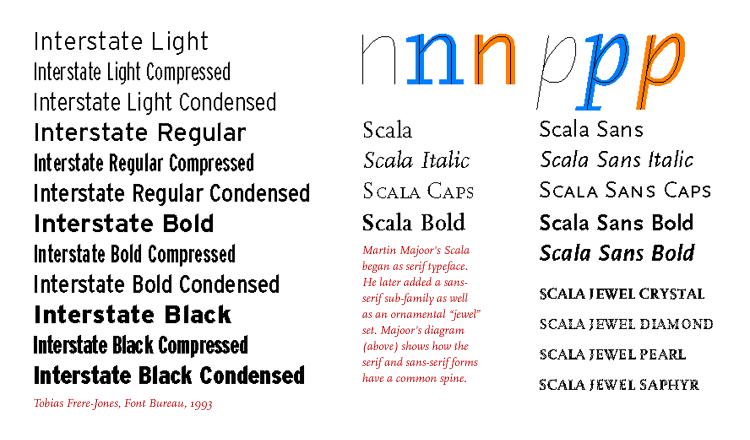
26 Serif x Sans Serif A traditional roman book face typically has a small family-- a "nuclear" group consisting of roman, italic, small caps, and possibly bold and semibold (each with an italic variant). Sans-serif families often come in many more weights and sizes, such as thin, light, black, compressed, and condensed.
27
28 In the 1990s, many type designers created families that include both serif and sans-serif versions. Small capitals and non-lining numerals (a courtesy traditionally reserved for serif fonts) are included in the sans-serif versions of Thesis, Scala, Quadraat, and many other big contemporary families.
29
30
31
32 : Anatomy

33 : Anatomy Typefaces Manufactured images designed for infinite repetition Hand x machine Organic x geometric
Adjust the point size
 Adjust the point size create contrast small and dark Strive for contrast rather than harmony. Mixing typefaces on the same line, designers usually adjust the point size so the x-heights align. Placing
VOICE OF TYPE LECTURE 1
 VOICE OF TYPE LECTURE 1 TYPOGRAPHY II COUNTY COLLEGE OF MORRIS PROFESSOR GAYLE REMBOLD FURBERT VOICE OF TYPE As you look at typefaces, analyze their forms, learn their history and learn how to use them
anatomy cap height x-height baseline descender ligature finial terminal ascender spine small capital uppercase counter cross bar lowercase
 Type Anatomy anatomy cap height x-height baseline stem bowl serif descender ligature ascender finial terminal ascender spine uppercase small capital cross bar counter lowercase 36 thinking with type cap
Typefaces are character sets based on distinct design characteristics.
 Level 3 WGHS VISUAL ARTS 2011 ART DESIGN Typography An Introduction to Type Type Design Since the first recordings of letterforms the concept of the typographic form has evolved into a seemingly endless
TYPE ANATOMY jtittle
 TYPE ANATOMY TYPE ANATOMY TITTLE j Serif Typefaces Tt HUMANIST (a.k.a. Old Style ) - Modeled after the roman typefaces of 15 th & 16 th centuries - Closely related to calligraphy and hand movement CLASSIC
TYPOGRAPHY. ascender arm (as on the capital T) descender bar (as on the capital H) counter ear (as on the lower case g and r)
 descender bar (as on the capital H) counter ear (as on the lower case g and r)") TYPOGRAPHY Parts of letters: base line x-height ascender arm (as on the capital T) descender bar (as on the capital H) extenders bowl counter ear (as on the lower case g and r) serif stroke tail (as on
TYPOGRAPHY Parts of letters: base line x-height ascender arm (as on the capital T) descender bar (as on the capital H) extenders bowl counter ear (as on the lower case g and r) serif stroke tail (as on
MODULE CM 2004 / STAGE 2 / SEMESTER 2 / SESSION Module title Design Principles and Context
 MODULE CM 2004 / STAGE 2 / SEMESTER 2 / SESSION 06-07 Module title Design Principles and Context Typography Fonts are classified under the following headings. Old Face fonts make use of contrasting wide
Font classification review
 Font classification review Taken from Lettering & Type by Bruce Willen Nolen Strals Old Style Transitional Modern Slab Serif Garamond ag Baskerville ag Bodoni ag Cowboys ab Sans Serif Gill Sans ag Decorative
jasonjuwono twentyfifteen TYPEDIA _ Typography Encyclopedia
 TYPEDIA _ Typography Encyclopedia ANATOMY_ Anatomy of a typeface Anatomy of a typeface What is a Font & Typeface? A design for a set of characters. A font is the combination of typeface and other qualities,
understanding typography
 understanding typography What is typography?! it is what language looks like! it is the art and technique of modifying type and arranging it on a page What does the arrangement of type mean? the arrangement
Font Basics. Descender. Serif. With strokes on the extremities of the letters. T Script. Sans-Serif. No strokes on the end of the letters
 Font Basics Ascender Font Size d p x A X-height Cap height Counter The white space within letters Descender Bar A Serif With strokes on the extremities of the letters. T A Sans-Serif No strokes on the
BASIC ABOUT TYPE TYPO GRAPHY
 BASIC ABOUT TYPE TYPO GRAPHY TYPOGRAPHY BASIC DESIGN Relative & Absolute measurements Absolute measurements Inche : Millimetres : Points : Pica 3 Inches 76.2 mm 216 Points 18 Picas 1 Inches = 3 Picas A
LESSON 7 Introduction to Typography
 FOUNDATION IN GRAPHIC DESIGN with ADOBE APPLICATIONS LESSON 7 Introduction to Typography Summary Notes WHAT IS TYPOGRAPHY? Typography is, quite simply, the art and technique of arranging type. Typography
Putting type on a page without incorporating typographic principles is merely word processing. Terry Rydberg, Author Exploring InDesign 3
 Putting type on a page without incorporating typographic principles is merely word processing. Terry Rydberg, Author Exploring InDesign 3 Typography The study of all elements of type as a means of visual
a e yp fi Letterform Anatomy Ascender Shoulder Tittle Bowl Crossbar Stem or Main Stroke Terminal Leg Ascent Line Cap Line Mean Line Baseline
 Letterform Anatomy Tittle Ascender Shoulder Ascent Line Cap Line Mean Line Baseline Crossbar Bowl Stem or Main Stroke HtiQfgxR Terminal Ear Counter Leg Descent Line Crossbar Serif Tail Loop or Bowl Juncture
Pre-Venetian or Ancient Humanist or Venetian Transitional Didone Slab Serifs
 Pre-Venetian or Ancient Humanist or Venetian Transitional Didone Slab Serifs 1400 1500 1700 1800 Humanist Sans Serif Transitional Sans Serif Geometric Sans Serif Display Typefaces 1900 2000 Pre-Venetian
Graphic Design. shawacademy LESSON 5. summarynotes INTRODUCTION TO TYPOGRAPHY. For further questions visit us online at:
 shawacademy Graphic Design LESSON 5 INTRODUCTION TO TYPOGRAPHY summarynotes The Diploma in Graphic Design Toolkit For further questions visit us online at: www.shawacademy.com Lesson 5 S shawacademy Lesson
LOGO & BRAND STANDARDS GUIDE
 LOGO & BRAND STANDARDS GUIDE INTRODUCTION The SparkPost Brand Standards Guide provides key information needed to accurately and consistently produce external and internal documents and communications.
Project 2 reminders: Hand in your typed book summary/response at end of class today. Make sure to include your name and section.
 Project 2 reminders: Hand in your typed book summary/response at end of class today. Make sure to include your name and section. Project 2 reminders: First book cover critique this Friday. Bring 3 book
> what is a font? Times New Roman [10 pts] Times New Roman [12 pts] Times New Roman [14 pts] Times New Roman [18 pts] Times New Roman [24 pts]
![> what is a font? Times New Roman [10 pts] Times New Roman [12 pts] Times New Roman [14 pts] Times New Roman [18 pts] Times New Roman [24 pts]](/thumbs/88/117283063.jpg "> what is a font? Times New Roman [10 pts] Times New Roman [12 pts] Times New Roman [14 pts] Times New Roman [18 pts] Times New Roman [24 pts]") > what is a font? > what is a font? A font is set of glyphs (or images) that represent a complete series of alphabetic and numeric characters, punctuations and symbols in a particular size and style (or
> what is a font? > what is a font? A font is set of glyphs (or images) that represent a complete series of alphabetic and numeric characters, punctuations and symbols in a particular size and style (or
STYLE AND USAGE GUIDELINES
 STYLE AND USAGE GUIDELINES Meet. Play. Celebrate. Syracuse Logo OFFICIAL LOGO FOR The Oncenter logo must always be presented as above, with the icon placed at left and with equidistant spacing between
Typographic. Alphabet. Book. Interactive PDF of typographic rules & terms YOU NEED TO KNOW. Home. Table of Contents
 Typographic Alphabet Table of Contents > Rules That Every Typographer Should Know... 2-3 Book Interactive PDF of typographic rules & terms YOU NEED TO KNOW > Baseline... > Gutter... > Hierarchy... > Kerning...
The Evolution of Type. Movable Type: Johannes Gutenberg Early 15th Century
 The Evolution of Type Movable Type: Johannes Gutenberg Early 15th Century Studio on Fire: Minneapolis Anatomy of Type cap height cross bar Anatomy n bowl describes g counter ascender finial stem type eye
User-Centered Website Development: A Human- Computer Interaction Approach
 User-Centered Website Development: A Human- Computer Interaction Approach Daniel D. McCracken City College of New York Rosalee J. Wolfe DePaul University With a foreword by: Jared M. Spool, Founding Principal,
Modifying Type: effects of a letter change COLDS
 Modifying Type Modifying Type The goal of good typography is like fabric. It should be evenly woven together where all facets and all parts of the letter forms work together. Sometimes if you have one
INTRODUCING THE Transition family
 INTRODUCING THE Transition family A TYPFACE DESIGNED BY JAN ERASMUS CIRCA 2006 INFORMATION GUIDE RELEASED AND DISTRIBUTED BY: Cybergraphics.bz ALSO DISTRIBUTED BY: Fonts.com Linotype.com ITC.com Transition
This file includes FILLABLE FORM FIELDS. Enter your answers and then save the form as a PDF with your name to submit. Ex: 4CChrisJohnson.pdf.
 BASIC SKILLS: TYPOGRAPHY This file includes FILLABLE FORM FIELDS. Enter your answers and then save the form as a PDF with your name to submit. Ex: 4CChrisJohnson.pdf Kristy Ryan Name: Overview Complete
HEL HEL HEL HEL VETIC HEL VETIC HEL HEL VETICA HEL HEL ETICA ETIC VETIC HEL VETIC HEL HEL C VETICA ETI- HEL HEL VETI HEL VETICA VETIC HEL HEL VETICA
 CA C C CA C C CA Max Miedinger with Eduard Hoffmann C C CA C CA ETI- ETI- L istory elvetica was developed in 1957 by Max Miedinger with Eduard Hoffmann at the Haas sche Schriftgiesserei of Münchenstein,
section four typography contents introduction...44 helvetica neue...45 bodoni...46 examples of type usage...47 body text examples...
 section four typography 43 contents introduction...44 helvetica neue...45 bodoni...46 examples of type usage...47 body text examples...48 introduction Consistent application of type fonts and styles allows
Typography guidelines
 University of Alberta Sign Systems Guidelines Typopgraphy guidelines Typography guidelines Introduction Consistency and legibility are key components of an effective sign system. This section defines:
5. Text CHAPTER HIGHLIGHTS 10/12/2016 CHAPTER. Text tradition. Codes for computer text. t. Font technologies. Multimedia text.
 CHAPTER 5. Text CHAPTER HIGHLIGHTS Text tradition. Codes for computer text. t Font technologies. Multimedia text. Guidelines for use of text in multimedia. 2 1 POWERS OF TEXT Multimedia developers value
SUCCESSFUL TYPE? Interface Aesthetics
 TYPO GR AP HY SUCCESSFUL TYPE? SUCCESSFUL TYPE? TYPOGRAPHY 1 2 TYPOGRAPHY /t 'p gr fi/ n. The art or process of setting and arranging types and printing from them. The style and appearance of printed
The building block of a CSS stylesheet. A rule consists of a selector and a declaration block (one or more declarations).
.") WDI Fundamentals Unit 4 CSS Cheat Sheet Rule The building block of a CSS stylesheet. A rule consists of a selector and a declaration block (one or more declarations). Declaration A declaration is made
WDI Fundamentals Unit 4 CSS Cheat Sheet Rule The building block of a CSS stylesheet. A rule consists of a selector and a declaration block (one or more declarations). Declaration A declaration is made
Goudy Old Style & Garamond. A Type Comparison Book by Brittany Hansard
 Goudy Old Style & Garamond A Type Comparison Book by Brittany Hansard Frederic W. Goudy created this old style typeface in the late 1920s and it is known as one of his most adored typeface alphabets within
serif: the short strokes that finish off the major strokes of the letterform. bracket: a curving joint between the serif and the stroke
 PARTS OF THE LETTER Typography evolved from handwriting, which is created by making a series of marks by hand; therefore, the fundamental element constructing a letterform is the linear stroke (stem).
OUR TYPOGRAPHY APPROVED UNIVERS FONTS. Univers 65 Bold Univers 65 Bold Oblique Univers 75 Black Univers 75 Black Oblique
 BRAND TYPOGRAPHY For Internal Use Only Not For Use With The Public. For help and guidance on our brand standards, contact marketinginbox@firstcommand.com. 63 OUR TYPOGRAPHY Typography is a powerful extension
BRAND. For Internal Use Only Not For Use With The Public. For help and guidance on our brand standards, contact
 BRAND TYPOGRAPHY. 1 OUR TYPOGRAPHY. Typography is a powerful extension of our brand s personality. It plays an important role in creating a consistent look for First Command across all communications and
Style guide.
 Style guide www.nam.org Logo Orientation The orientation of the Manufacturing Institute logo is shown below. The base line of the logo mark and typography should be aligned. The logo mark and typography
Introduction A global icon needs an iconic logo. Fashion has evolved since 1969, when Gap opened its first store. Our logo has changed with the
 Introduction A global icon needs an iconic logo. Fashion has evolved since 1969, when Gap opened its first store. Our logo has changed with the times, too. One thing that hasn t changed is our mission
JABRA CORPORATION GRAPHIC STANDARDS MANUAL
 JABRA CORPORATION GRAPHIC STANDARDS MANUAL A simple reference guide for how to use the JABRA Corporation logo in real-world communications applications. INTRODUCTION Corporate image is a valuable asset,
TYPOGRAPHY. The art of type
 Typography TYPOGRAPHY The art of type TYPE All the letters (abc), Numbers (123) & characters (;? @) of the alphabet. MONOTYPE Trade name for hot metal composition system Monotype Corporation Machine Shop
Font, Typeface, Typeface Family. Selected Typographical Variables
 Font, Typeface, Typeface Family Font: A font is a set of printable or displayable text character in a specific style, weight, and size. E.g. Helvetica Italic 10 Point. Typeface: The type design for a set
Web Site Design and Development Lecture 6
 Web Site Design and Development Lecture 6 CS 0134 Fall 2018 Tues and Thurs 1:00 2:15PM Inheritance Before we talk about font properties, it needs to be known that font properties are inherited by the descendants
Typography One typeface classification
 Typography One typeface classification Why classify? Classification helps us describe and navigate type choices Typeface classification helps to: 1. sort type (scholars, historians, type manufacturers),
QUICK GUIDE. Graphics Standards & Guidelines University of Nebraska at Kearney
 QUICK GUIDE Graphics Standards & Guidelines University of Nebraska at Kearney 08 2016 Summary The visual identity for the University of Nebraska Kearney is the face the school shows the public. It is representative
Elements of typographic design
 Type Terminology Serif fonts Sans serif fonts Elements of typographic design Times News Roman Ariel Verdana Calligrapher 24 pt 20 pt 14 pt 10 pt Univers 45 Light Univers 45 condensed light Univers 55 Univers
THINGS YOU NEED TO KNOW
 TYPOGRAPHY THINGS YOU NEED TO KNOW to prevent your work from appearing amateurish. (p. 151) Only one space after punctuation (p. 152) What is monospaced type? (p. 152) Correct Quotation Marks (as soon
Corporate Identity Guidelines
 Corporate Identity Guidelines CONTENTS 1.0 TRADEMARK Watco Companies Logo Logo Clear Space Logo Variations Project Logos Proper Logo Use 03 04 05 06 07 08 2.0 TYPOGRAPHY Type Family 3.0 COLOR Brand Color
Chapter 12: FORMATTING TEXT
 Disclaimer: All words, pictures are adopted from Learning Web Design (3 rd eds.) by Jennifer Niederst Robbins, published by O Reilly 2007. PART III: CSS FOR PRESENTATION Chapter 12: FORMATTING TEXT CSc2320
Keyboarding Basics - Teacher Notes
 Directions: Fill in the blanks. Keyboarding Basics - Teacher Notes 1. Keyboarding Is the act of entering data into a computer through the use of a keyboard Is a valuable skill for anyone to learn Is commonly
GRAPHIC STANDARDS MANUAL
 GRAPHIC STANDARDS MANUAL INTRODUCTION AND GENERAL STANDARDS The purpose of this Graphic Standards Manual is to set forth guidelines that will assist in applying the Active Aerogels Logo to all communications.
HURME GEOMETRIC SANS
 No.1 SHARP No.2 ALTERNATIVE HURME TYPEFACE SPECIMEN PRINT SAMPLES No.3 BLUNT No.4 SWASH Hurme Geometric Sans Typeface Specimen 03/20/2013 2 Page heading: Black. 30pt/30pt. Byline: Regular/Bold SmallCaps.
ASerif. AfbcyE TYPE AND LETTERS
 TYPE AND LETTERS Before 1455 books were made by hand. Only the wealthy could afford a book. A book could cost as much as an acre of land. Say! you bought two books for this class that will be $800,000
GRAPHIC IDENTITY DESIGN GUIDELINES
 GRAPHIC IDENTITY DESIGN GUIDELINES Basic guidelines and the reproduction materials necessary for the consistent and successful implementation of the new graphic identity for the Denver Performing Arts
Adobe Photoshop CS Design Professional PLACING TYPE IN AN IMAGE
 Adobe Photoshop CS Design Professional PLACING TYPE IN AN IMAGE Chapter Lessons Learn about type and how it is created Change spacing and adjust baseline shift Use the Drop Shadow style Apply anti-aliasing
Chapter 8: Rococo Graphic Design 18 th century
 Chapter 8: Rococo Graphic Design 18 th century Romain du Roi (French for King s Roman) The first printing of the Romain du Roi at the beginning of the eighteenth century signified a shift to transitional
Lost & FOUNDRY ABCDEFGHIJKLMNOPQR STUVWXYZ #$ % _ '".,:;!? &(){}[]/\* ABCDEF GHIJKLMNOPQRSTUV
![Lost & FOUNDRY ABCDEFGHIJKLMNOPQR STUVWXYZ #$ % _ '.,:;!? &(){}[]/\* ABCDEF GHIJKLMNOPQRSTUV](/thumbs/85/92616360.jpg "Lost & FOUNDRY ABCDEFGHIJKLMNOPQR STUVWXYZ #$ % _ '.,:;!? &(){}[]/\* ABCDEF GHIJKLMNOPQRSTUV") Information Guide Volume 1.0 ABCDEFGHIJKLMNOPQR STUVWXYZ0123456789#$ % _ '".,:;!? &(){}[]/\* ABCDEF GHIJKLMNOPQRSTUV Lost & FOUNDRY WXYZ0123456789 ABCDEFGHIJKLMNOPQRSTUV WXYZ0123456789#$ % _ - '".,:;!?
Information Guide Volume 1.0 ABCDEFGHIJKLMNOPQR STUVWXYZ0123456789#$ % _ '".,:;!? &(){}[]/\* ABCDEF GHIJKLMNOPQRSTUV Lost & FOUNDRY WXYZ0123456789 ABCDEFGHIJKLMNOPQRSTUV WXYZ0123456789#$ % _ - '".,:;!?
Brand Guidelines. version
 Brand Guidelines version 2017.1 Primary Logo The OPSWAT logo is a universal signature spanning all of our communications. Because it is such a recognizable and highly visible asset, it s important that
Review Question 1. Which tag is used to create a link to another page? 1. <p> 2. <li> 3. <a> 4. <em>
 Introduction to CSS Review Question 1 Which tag is used to create a link to another page? 1. 2. 3. 4. Review Question 1 Which tag is used to create a link to another page? 1. 2.
TYPO GRA PHY THE ANATOMY OF TYPE A BRIEF HISTORY OF TYPOGRAPHY WHAT IS YOUR TYPE ACTUALLY SAYING? OPEN FONT DISCUSSION
 THE ANATOMY OF TYPE A BRIEF HISTORY OF TYPO WHAT IS YOUR TYPE ACTUALLY SAYING? OPEN FONT DISCUSSION THE ANATOMY OF TYPE Typeface Anatomy The upward vertical stem on some lowercase letters, such as h and
TYPE BASICS Cartographic Design & Principles Winter 2016
 TYPE BASICS Cartographic Design & Principles Winter 2016 Words on a Map Everything on the Earth has a name Names on a map, make it a map Otherwise it is a picture, photograph or design Assigning names
Unit 4. Multimedia Element: Text. Introduction to Multimedia Semester 2
 Unit 4 Multimedia Element: Text 2017-18 Semester 2 Unit Outline In this unit, we will learn Fonts Typography Serif, Sans Serif, Decorative Monospaced vs. Proportional Style Size Spacing Color Alignment
Writing and Document Design Lecture 6 Typography
 Writing and Document Design Lecture 6 Typography Last week We looked at Kress and van Leeuwen s work on composition/layout and considered its usefulness as both an analytic tool (a way of analysing and
Center for Genome Engineering
 Center for Genome Engineering Contents: Direction 1: Abstract Crop Concept/Inspiration Typography Selection Logo Design Color Palette Application Direction 2: Changing Pattern Concept/Inspiration Typography
Primary Logo. Corporate logo - primary. The centered logo is only to be used when the length of the common logo is problematic for an application.
 Primary Logo Corporate logo - primary The elements of the logo may be arranged in two predetermined configurations: the primary logo (which also has a small version and the centered logo. The centered
Appendix D CSS Properties and Values
 HTML Appendix D CSS Properties and Values This appendix provides a brief review of Cascading Style Sheets (CSS) concepts and terminology, and lists CSS level 1 and 2 properties and values supported by
DIGITAL PRINT DESIGN (568 )
") DESCRIPTION Create and produce digital print projects that communicates and promotes graphic communication. Develop knowledge and skills relative to the graphic design & printing industries. Includes:
DESCRIPTION Create and produce digital print projects that communicates and promotes graphic communication. Develop knowledge and skills relative to the graphic design & printing industries. Includes:
Chapter 7 Typography, Style Sheets, and Color. Mrs. Johnson
 Chapter 7 Typography, Style Sheets, and Color Mrs. Johnson Typography Typography refers to the arrangement, shape, size, style, and weight of text. Affects the navigation and usability of a web site and
ACSC 231 Internet Technologies
 ACSC 231 Internet Technologies Lecture 7 Web Typography Efthyvoulos Kyriacou - Assoc. Prof. Frederick University Resources: C. Markides (Frederick University) Slide 1 ACSC 231: Internet Technologies 23/12/2008
Reading 2.2 Cascading Style Sheets
 Reading 2.2 Cascading Style Sheets By Multiple authors, see citation after each section What is Cascading Style Sheets (CSS)? Cascading Style Sheets (CSS) is a style sheet language used for describing
O M. O M logo specs. O M O M O M O M
 overview. The useum of odern Art, or oa, is an art museum in anhattan that holds and displays a wide range of modern and contemporary art. oa is considrered to be one of the most influential museums in
IT82: Mul timedia. Practical Graphics Issues 20th Feb Overview. Anti-aliasing. Fonts. What is it How to do it? History Anatomy of a Font
 IT82: Mul timedia Practical Graphics Issues 20th Feb 2003 1 Anti-aliasing What is it How to do it? Lines Shapes Fonts History Anatomy of a Font Overview Types of Fonts ( which do I choose? ) How to make
Character Formatting. Formatting the Text in Text Frames
 FIGURE 4-1 Formatting the Text in Text Frames CHAPTER 4. TYPE 199 Use the Selection tool to select the text frames you want to format and apply formatting. InDesign applies the formatting to all of the
Corporate Identity Guidelines
 Corporate Identity Guidelines - CONTENTS 1.0 TRADEMARK Watco Companies Logo Logo Clear Space Logo Variations Project Logos Proper Logo Use 03 04 05 06 07 08 2.0 TYPOGRAPHY Type Family 3.0 COLOR Brand Color
WCSD Graphic Standards and Logo Use Guide
 SM WCSD Graphic Standards and Logo Use Guide WCSD Logo WCSD logo with slogan SM The WCSD logo should be used on all school district signage and every District-generated publication, website or webpage,
Typography One typeface classification
 Typography One typeface classification Why classify? Classification helps us describe and navigate type choices Typeface classification helps to: 1. sort type (scholars, historians, type manufacturers),
Graphics Standards Manual
 Graphics Standards Manual October 2007 City Manager s Message October 2007 The organization-wide identity graphic represents the City of Lawrence as the entire municipal government, as well as its departments.
WATER (No kerning) WATER (Automatic Kerning) WATER (Manual Kerning).
 WATER (Automatic Kerning) WATER (Manual Kerning).") Styles Learning to use styles is a very effective way to save time and improve the consistency of publications. A style is a group of attributes that can be applied at once, to one or more paragraphs,
Styles Learning to use styles is a very effective way to save time and improve the consistency of publications. A style is a group of attributes that can be applied at once, to one or more paragraphs,
BBN ANG 183 Typography Text colour: vertical and horizontal spacing
 BBN ANG 183 Typography Text colour: vertical and horizontal spacing Zoltán G. Kiss & Péter Szigetvári Dept of English Linguistics, Eötvös Loránd University gkz & szp (delg) typo/spacing 1 / 43 outline
Typesetting Tips. Put your best type forward.
 Typesetting Tips Put your best type forward. Do you want your audience to read your document? Improve your chances by making your article easy to read. Make the document difficult to read and To learn
LOGO USE GUIDELINES BRAND GUIDELINES PUBLISHED ON FEBRUARY 17,
 LOGO USE GUIDELINES BRAND GUIDELINES PUBLISHED ON FEBRUARY 17, 2014 1 LOGO USE GUIDELINES LOGO USAGE GUIDELINES 13 LOGO USAGE GUIDELINES The Gardner-Webb logo is the centerpiece of the University's visual
Franklin Gothic. Seniors: Use larger text that is clear and legible. (Souvenir, Times, Garamond, Helvetica)
") one TYPOGRAPHY LECTURE: Do s and Don t s in Typography Do Build a basic library first. Find out who your audience is. Use appropriate type sizes. Celebrate white space. Use correct alignment. Use correct
one TYPOGRAPHY LECTURE: Do s and Don t s in Typography Do Build a basic library first. Find out who your audience is. Use appropriate type sizes. Celebrate white space. Use correct alignment. Use correct
8/19/2018. Web Development & Design Foundations with HTML5. Learning Objectives (1 of 2) Learning Objectives (2 of 2)
 Learning Objectives (2 of 2)") Web Development & Design Foundations with HTML5 Ninth Edition Chapter 3 Configuring Color and Text with CSS Slides in this presentation contain hyperlinks. JAWS users should be able to get a list of links
Web Development & Design Foundations with HTML5 Ninth Edition Chapter 3 Configuring Color and Text with CSS Slides in this presentation contain hyperlinks. JAWS users should be able to get a list of links
FLEET LOGO USAGE AND STANDARDS INNOVA BRANDING STANDARDS 2015 GUIDE
 FLEET LOGO USAGE AND STANDARDS INNOVA BRANDING STANDARDS 2015 GUIDE INNOVA BRANDING STANDARDS 2015 GUIDE 2 TABLE OF CONTENTS The Innova Brand 3 Branding Elements Logo Colors Typography 4 8 10 INNOVA BRANDING
art 118: intro to communication design // FALL 2011
 t y p e specimen Due: Wednesday, November 30 ov e r v i e w A type specimen is a publication, that shows the range of a particular typeface in use. Printers and typographers have produced type specimens
Brand Standard Guidelines
 1 Brand Standard Guidelines 1 Logo Guidelines As Saladmaster grows in national and global stature, the need to ensure accurate brand presentation becomes critical. The logo and typeface are the foremost
Brand Identity Guide
 Brand Identity Guide Logos Preferred Logo The official logo for St. Vrain Valley Schools. Use the full-color version of the logo when possible. Logos can be downloaded at http://www.svvsd.org/logos FULL
LoremTM. Identity Guidelines (Date)
") Identity Guidelines (Date) This example was created to help inspire your conservation advocacy / nature organization to develop identity guidelines and use them consistently across outreach campaigns.
Identity Guidelines (Date) This example was created to help inspire your conservation advocacy / nature organization to develop identity guidelines and use them consistently across outreach campaigns.
GO Transit type treatments report
 GO Transit type treatments report Prepared for Russell McGorman Signage Services Engineering GO Transit 81 Middlefield Rd. Scarborough M1S 5A9 2002.08.15 Project overview As an adjunct to the May 2002
WEB TYPOGRAPHY FOR WEB DEVELOPERS. Matej Latin Lead UX/UI Designer at Autotrader.co.uk
 WEB TYPOGRAPHY FOR WEB DEVELOPERS Matej Latin Lead UX/UI Designer at Autotrader.co.uk 1 A MEANINGFUL WEB TYPOGRAPHY STARTER KIT 2 Most people think typography is about fonts. Most designers think typography
Script for Interview about LATEX and Friends
 Script for Interview about LATEX and Friends M. R. C. van Dongen July 13, 2012 Contents 1 Introduction 2 2 Typography 3 2.1 Typeface Selection................................. 3 2.2 Kerning.......................................
Basic Elements > Typeface. Contents
 Contents At a glance: DB Head DB Sans DB Sans Condensed DB Sans Compressed DB Office DB Serif DB News DB Plan Corporate design guidelines: Font families and font styles Basic typographical principles File
pokemon starters and the Classification of Type By: Sarah Cornell
 pokemon starters and the Classification of Type By: Sarah Cornell Table of Contents Old Style Type Kanto Starters... 4-7 Transitoinal Type Hoenn Starters... 8-11 Modern Type Alola Starters... 12-15 Slab
OTTER TAIL COUNTY - MINNESOTA LOGO USAGE POLICY
 OTTER TAIL COUNTY - MINNESOTA LOGO USAGE POLICY Prepared By: The Branding Task Force as directed by the Division Directors and the Otter Tail County Board of Commissioners. Manual Version Control Version
BRAND GUIDELINES January 2017 leanconstruction.org
 BRAND GUIDELINES January 2017 leanconstruction.org The Lean Construction Institute (LCI) is a non-profit organization, founded in 1997. The Institute operates as a catalyst to transform the industry through
CHAPTER 2 Information processing (Units 3 and 4)
") CHAPTER 2 Information processing (Units 3 and 4) Information-processing steps (page 54) a For each of the following information-processing steps, state its purpose and provide two examples of technology
CHAPTER 2 Information processing (Units 3 and 4) Information-processing steps (page 54) a For each of the following information-processing steps, state its purpose and provide two examples of technology
Identity Standards The College of New Jersey Exterior Signage and Wayfinding Master Plan
 10.1 Identity Standards 10.2 F1 Myriad Pro Regular F2 Myriad Pro Regular Italic F3 Myriad Pro Semibold 10.3 F4 Myriad Pro Semibold Italic F5 Palatino Small Caps Typefaces Notes No substitute typefaces
Brand Standards 2014
 Logo The logomark consists of the Texas state seal and the logotype. There is a vertical and horizontal version both utilize a two-color palette and a black and white palette. The horizontal format is
Adding CSS to your HTML
 Adding CSS to your HTML Lecture 3 CGS 3066 Fall 2016 September 27, 2016 Making your document pretty CSS is used to add presentation to the HTML document. We have seen 3 ways of adding CSS. In this lecture,
Trust runs deep. Brand Communications Guidelines. Version 12.1,
 Trust runs deep Brand Communications Guidelines Version 12.1, 08.25.2017 Flint & Walling logo lockup Flint & Walling logo script (includes the Zoeller Meatball) Flint & Walling logo name bar Flint & Walling