Clear language and design. Joan Acosta
|
|
|
- Winifred Wilson
- 5 years ago
- Views:
Transcription
1 Clear language and design Joan Acosta
2 What is clear writing? Clear writing involves thinking about your readers and writing for them. It does not mean simply replacing difficult words with easier words and making sentences shorter. It is an approach to writing that will help you communicate more clearly with everyone.
3 Who benefits from clear writing? Writing that is easy to read and understand benefits everyone. However, clear writing is especially important for these groups: people with lower levels of education and literacy people who are new to Canada and are still learning English older people who may have special reading needs people with learning disabilities people who are scared or upset about an illness
4 Follow these steps Step 1: Identify your readers. Step 2: Write your first draft. Step 3: Edit your draft using clear language principles. Step 4: Design the layout using clear design principles. Step 5: Get feedback from readers. Step 6: Revise and edit.
5 Step 1: Find out about your readers Who are your readers? What do they want and need to know? Are your readers familiar with the topic or is it totally new? Do your readers include people who have learned English as a second or additional language? Do your readers include people with limited literacy skills?
6 Step 2: Write your first draft Gather all your notes and ideas together. Write freely. Don t worry about spelling, grammar or format. Write the way you talk. Include all your ideas. You can eliminate some of them later if necessary.
7 Step 3: Edit your draft Edit your draft using clear language principles. Ask someone to read your draft and provide feedback. Make changes until you are satisfied with the content, readability, and clarity. It takes time and effort to write clearly. Be prepared to go through several drafts.
8 Making it easy to read
9 Use short, simple sentences Before In our endeavor to ensure patient safety at all times, please note that fire alarm testing is carried out every Monday at 9.30 am. After We test the fire alarm every Monday at 9.30 a.m. Long sentences over 25 words are usually complex sentences. Try to keep sentences to 10 to 15 words.
10 Use common everyday words Before The importance of a high-fiber diet is not to be underestimated. After It is important to eat food with fiber. Fruits, vegetables, nuts, and whole-grain breads and cereals have lots of fiber.
11 Use the active voice Using the passive voice can make your writing seem vague and formal. Before It was decided that medical fees would be raised. After The government of British Columbia decided to raise medical fees. Tell readers who does what. Try to follow the usual English word order subject, verb, object.
12 Use a relaxed conversational tone Use you to speak directly to your readers. Use we as the voice of the material. Exam ple We want to make sure you get help if you need it. After your baby is born, your doctor or nurse will ask you a list of questions about your feelings. This list of question is called the Edinburgh Postnatal Depression Score or EPDS for short. Your answers will help your doctor or nurse decide if you need extra help with your feelings. Postpartum Depression brochure
13 Write from the reader s point of view Before Employees are requested to sign in and out when taking lunch breaks. After Please sign in and out when you go for lunch.
14 Explain acronyms and abbreviations Abbreviations, initials or short forms can be confusing to many readers. Write the words in full the first time you use them. Exam ple Here is a checklist of things to do right away: Apply for a Social Insurance Number (SIN). Register for the Medical Services Plan (MSP). British Columbia Newcomers Guide
15 Limit the use of English idioms English idioms can be confusing for people who speak English as a second language. Although idioms often use common words and phrases, they always have a more complex meaning, for example: catch a cold or draw blood. Exam ple Clean every nook and cranny of the bed frame. You ll feel better down the road.
16 Explain a less familiar or technical term the first time you use it Before A summons is a court order requiring the accused to appear in court to answer a charge. After What if you get a summons in the mail? It means someone is taking you to court. Look at the summons carefully. It says what court it is, who is taking you to court, when, and why. Learning about the Law

17 Get feedback on your writing Ask a group of readers to review a draft of your writing. You can use a small focus group. You can conduct one-on-one interviews.
18 Take time to revise and edit Have a checklist for your final revision. For example: Does the content meet the needs of the readers? Did you make revisions based on feedback from readers? Do you use concrete and familiar words? Can you make any sentences shorter and clearer? Did you correct all typos?
19 Use clear layout and design
20 Layout and design What is layout and design? Layout and design is the way you arrange text and graphics on a page. Why is clear layout and design important? Good page design organizes information and helps with comprehension.

21 Avoid dense text Dense text can discourage readers even before they begin. Dense text gives readers two messages: This is going to be hard. This is going to be boring.

22 Use white space White space provides rest for the eye and draws attention to key points on the page.
23 Choose a font that is easy to read There are two types of fonts serif and sans serif. Serif fonts are often easier to read on paper. Sans serif fonts are often easier to read on a computer screen.
24 Serif fonts Serifs are tiny strokes and lines on the ends of letters. These help to distinguish letters that are similar for example, lowercase l or capital I. Serifs also help the reader s eyes move along lines of type. Sans serif fonts Sans serif fonts have no strokes on the ends of letters. They may be easier to read on a computer screen because there is more space between letters. Times New Roman is a serif font. Verdana is a sans serif font
25 Use decorative fonts sparingly Fancy, artistic or cute fonts are distracting. They call attention to themselves rather than to the message. They are also often hard to read. Limit the number of different fonts Too many different fonts on the same page can make a document look cluttered and create visual noise. Use a serif font for the text and a sans serif font for the headings.
26 Be careful not to overuse highlighting You may want to use boldface type or italics to highlight an important word or phrase. But be careful not overuse these techniques. Large blocks of boldface or italics are hard to read. The purpose of our code of conduct is to inform all members of the hospital community of our shared obligations and responsibilities. The purpose of our code of conduct is to inform all members of the hospital community of our shared obligations and responsibilities.
27 Avoid underlining Underlined text often cuts off the stems of fonts that go below the lines. This can make letters hard to identify. The meeting will begin promptly at eight thirty. Underlining also has a familiar usage: It is used to indicate Internet websites er/emotional/default.htm
28 Select a comfortable type size The size of letters is measured in a unit called points. The larger the point size, the larger the letter. The point size you choose affects readability. Most people can read 12-point type easily. As the print gets smaller, reading becomes more difficult. 18-point font Wash your hands with soap and water. 14-point font Wash your hands with soap and water. 12-point font Wash your hands with soap and water. 9-point font Wash your hands with soap and water.
29 Use upper and lower case letters Try reading each block of text. Which one is easier to read, A or B? Why? A WHEN A WHOLE BLOCK OF TEXT IS PRINTED IN ALL CAPS, IT TAKES UP MORE SPACE AND TAKES LONGER TO READ. B When a whole block of text is printed in all caps, it takes up more space and takes longer to read.
30 Avoid justified type Justified type has a straight left and right edge. This format can create big spaces between words.
31 Avoid hyphenation Reading hyphenated text is especially hard for literacy-level readers. Words that are hyphenated over two lines force readers to remember part of the word at the same time as they may be trying to sound out the word. Hyphenating also breaks up word boundaries where a word begins and ends. Recognizing word boundaries is an important reading skill. Follow instructions carefully when you use hazardous materials at home or at work. Make sure you understand the meaning of all warning labels.
32 Use unjustified type Unjustified type is aligned on the left and has a ragged right-hand side. The spaces between letters and words is the same, and there is no need to hyphenate. Follow instructions carefully when you use hazardous materials at home or at work. Make sure you understand the meaning of all warning labels. Even spacing of words improves readability by allowing readers to see groups of words.
33 Avoid long lines of text If lines are too long, readers often lose their place or read the same line twice. Readers with limited literacy skills read words one at a time. If lines are too long, these readers often have difficulty remembering the beginning of the sentence. Contrary to what many people think, the eye does not read individual words one at a time, but scans the line pausing momentarily to read groups of three or four words. Too long a line tends to tire the eye and makes it difficult to locate the beginning of the line that follows. Try to keep lines of text between 7 and 10 words.
34 Avoid short lines of text Short lines disrupt sentence structure. They also require the eye to change lines too often. Contrary to what many people think, the eye does not read individual words one at a time, but scans the line pausing momentarily to read groups of three or four words. Lines that are too short disrupt sentence structure and require the eye to change lines too often.

35 Avoid centered text Centered text doesn t show readers where sentences begin and end.


36 Break up text into chunks Use headings, bullets or boxes to break up text into manageable chunks.

37 Use colours to provide good contrast Black type on white or light-coloured paper is the easiest to read. For headlines, use dark colours that show up well when printed. Too little contrast will make your text difficult to read. Older readers in particular, need high contrast for readability.
38 Background colours Black type on a dark-coloured background is hard to read. White type on a light-coloured background is hard to read. A document that you create in colour, may be printed in black and white by people who do not have colour printers.

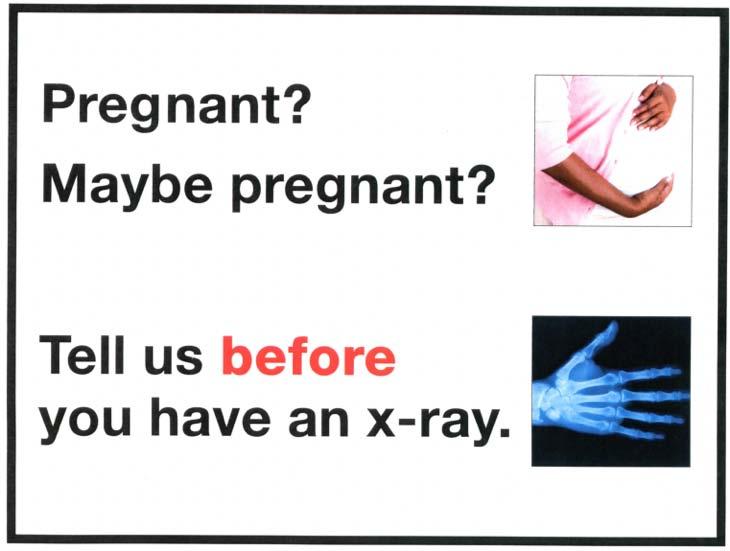
39 Use photos to encourage reading


40 Use clear charts, maps, and diagrams Graphics can often reinforce or replace written information. They can also break up dense text on a page.

41 Get feedback before you print Ask a group of readers to review your document before you print it. You can use a small focus group. You can conduct one-on-one interviews.
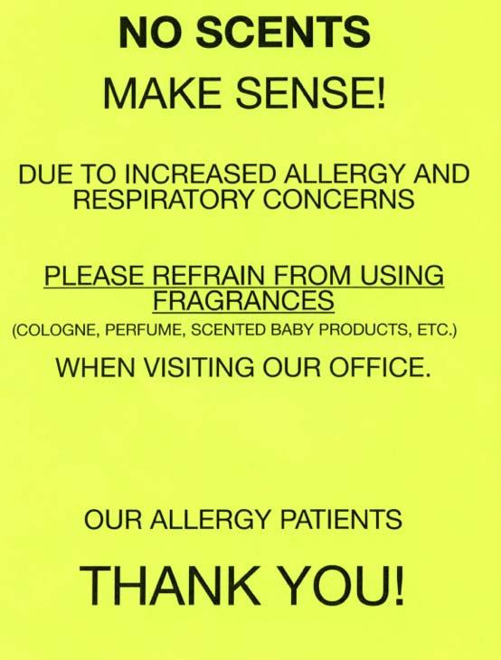
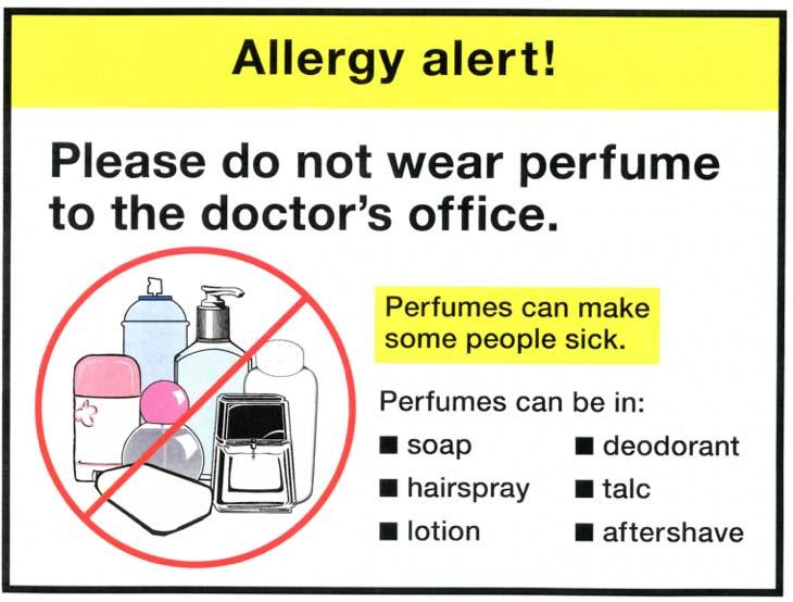
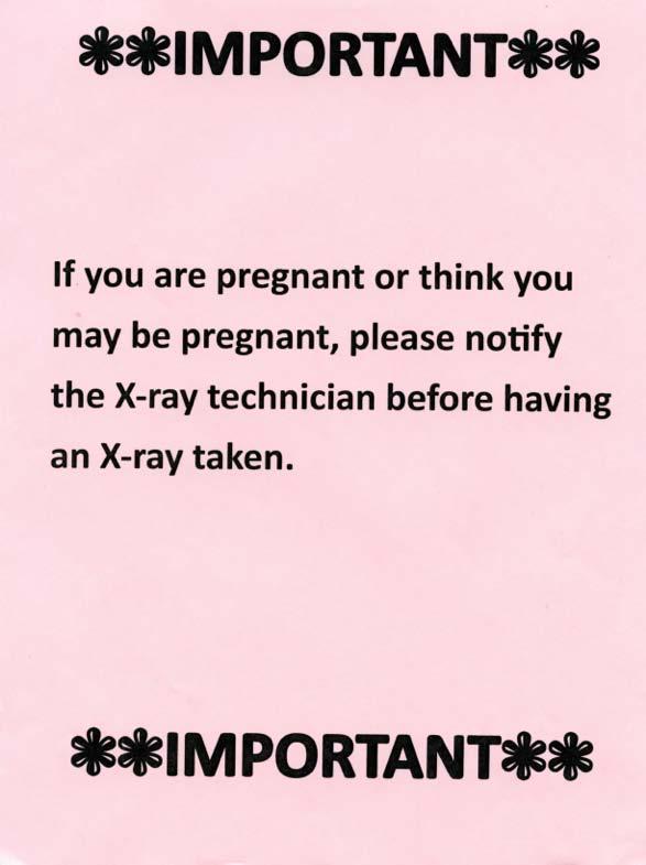
42 Signs at a doctor s office: Before and After
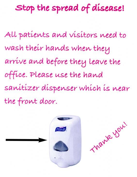
43

44 Northeast Edmonton Literacy Network
45
46
47
48
49
50
Design that Enhances Readability
 Working to ensure that all Americans get enrolled and stay enrolled in our nation s health care system Design that Enhances Readability By Eva Anderson Nicole Donnelly Joan Winchester Penny Lane MAXIMUS
BDA Dyslexia Style Guide
 BDA Dyslexia Style Guide This Guide is in three parts: 1. Dyslexia Friendly Text 2. Accessible Formats 3. Website design 1. Dyslexia Friendly Text. The aim is to ensure that written material takes into
Making a Great Poster. A Great Poster is:
 Making a Great Poster Marilee P. Ogren PhD Ogren@mit.edu Readable A Great Poster is: Unreadable = grammatical problems, complex, passive sentences, misspellings Legible Illegible = small font, fancy font,
Helping Clients with Public Legal Education and Information
 Helping Clients with Public Legal Education and Information Welcome to the PLE Toolbox! What is PLE? Public legal education and information (PLE) covers a wide range of activities aimed at improving knowledge
Mega International Commercial bank (Canada)
") Mega International Commercial bank (Canada) Policy and Procedures for Clear Language and Presentation Est. Sep. 12, 2013 I. Purposes: The Mega ICB (C) distributes a limited range of retail banking services,
Mega International Commercial bank (Canada) Policy and Procedures for Clear Language and Presentation Est. Sep. 12, 2013 I. Purposes: The Mega ICB (C) distributes a limited range of retail banking services,
Make It Clear Introduction
 Make It Clear Introduction The National Council for the Blind of Ireland (NCBI), the National Association for Deaf People (NAD) and the National Adult Literacy Agency (NALA) have created common guidelines
Table of contents. TOOLKIT for Making Written Material Clear and Effective
 TOOLKIT for Making Written Material Clear and Effective Table of contents U.S. Department of Health & Human Services Centers for Medicare & Medicaid Services Table of contents Overview of the Toolkit The
Typesetting Tips. Put your best type forward.
 Typesetting Tips Put your best type forward. Do you want your audience to read your document? Improve your chances by making your article easy to read. Make the document difficult to read and To learn
Universal Design Principles Checklist
 Universal Design Principles Checklist February 2012 The concept of Universal Design was developed by people who worked on designing equipment and environments for people with a disability. They saw that
Assessment of Informational Materials (AIM) Tool. Funded by Alberta Enterprise and Education
 Tool. Funded by Alberta Enterprise and Education") Assessment of Informational Materials (AIM) Tool Funded by Alberta Enterprise and Education AIM Tool Factor to be Rated 1. Content a. Purpose b. Scope c. Summary and Review 2. Word and Sentence Complexity
Assessment of Informational Materials (AIM) Tool Funded by Alberta Enterprise and Education AIM Tool Factor to be Rated 1. Content a. Purpose b. Scope c. Summary and Review 2. Word and Sentence Complexity
WHY EFFECTIVE WEB WRITING MATTERS Web users read differently on the web. They rarely read entire pages, word for word.
 Web Writing 101 WHY EFFECTIVE WEB WRITING MATTERS Web users read differently on the web. They rarely read entire pages, word for word. Instead, users: Scan pages Pick out key words and phrases Read in
Chapter 6 Revising Business Messages
 Chapter 6 Revising Business Messages Topics in This Chapter Revising Tips Designing Documents for Readability How to Proofread Documents Proofreading Marks for Digital and Hard-Copy Documents How to Evaluate
BETTER LOOKING S
 BETTER LOOKING EMAILS First impressions matter. So if you want a positive response to your email campaign you need to make a positive first impression. Here are some simple design strategies to help you
Designing Posters TIDI Development Research Week
 Designing Posters TIDI Development Research Week Derina Johnson PhD Candidate, School of Social Work and Social Policy DSAI Steering Committee Postgraduate Representative Date 1 st November 2017 Today
CREATING A STYLE GUIDE FOR YOUR ORGANISATION
 CIPR SKILLS GUIDE CREATING A STYLE GUIDE FOR YOUR ORGANISATION #CIPR @CIPR_UK WHY HAVE A STYLE GUIDE? Sloppy writing, jargon, long sentences and incomprehensible waffle ironically communicates one thing
How to make your neighbourhood newsletter look good
 6 Tilbury Place, Brighton, BN2 0GY 01273 606160 www.resourcecentre.org.uk How to make your neighbourhood newsletter look good Tips on designing neighbourhood newsletters that are attractive and easy to
Improving Readability by Design toolkit. Questions
 Improving Readability by Design toolkit Questions 1. Most patient education managers do readability assessments that determine the reading level of text as well as a review of the page layout. Usually
What is Accessibility?
 Email Accessibility What is Accessibility? 1. Extent to which a consumer or user can obtain a good or service at the time it is needed. 2. Ease with which a facility or location can be reached from other
Designing Research Posters. College of Art and Design Chris Jackson, Associate Dean Keli DiRisio, Assistant Professor
 Designing Research Posters College of Art and Design Chris Jackson, Associate Dean Keli DiRisio, Assistant Professor Size and Orientation If you are NOT using the poster template: Start is with a 48"
MULTIMEDIA TRAINING KIT INTRODUCTION TO OPENOFFICE.ORG WRITER HANDOUT
 MULTIMEDIA TRAINING KIT INTRODUCTION TO OPENOFFICE.ORG WRITER HANDOUT Developed by: Anna Feldman for the Association for Progressive Communications (APC) MULTIMEDIA TRAINING KIT...1 INTRODUCTION TO OPENOFFICE.ORG
The 12 most common newsletter design mistakes
 The 12 most common newsletter design mistakes www.targetmarketingnetwork.com By: Roger C. Parker Your newsletter s success depends on its design. An attractive, easy to read newsletter encourages readers
Designing and Creating an Academic Poster using PowerPoint
 Designing and Creating an Academic Poster using PowerPoint About your poster and the presentation Poster presentations are used at professional conferences to communicate information about your project
Beyond Captioning: Tips and Tricks for Accessible Course Design
 Minnesota elearning Summit 2017 Aug 2nd, 3:00 PM - 4:00 PM Beyond Captioning: Tips and Tricks for Accessible Course Design Jenessa L. Gerling Hennepin Technical College, JGerling@hennepintech.edu Karen
Static Visual Displays: Flight Deck Documentation
 Static Visual Displays: Flight Deck Documentation Source: Degani, A. (1992). On the Typography of Flight-Deck Documentation, NASA Contractor Report #177605. Moffett Field, CA: NASA Ames Research Center,
Perfect Presentations Hop-around Cards
 Perfect Presentations Hop-around Cards Visit us online at HOP-AROUND CARDS Instructions for use. Preparation Print the cards out using a high quality colour printer Laminate each sheet and then cut out
Accessible Documents & Presentations. By Amy Maes, DNOM
 Accessible Documents & Presentations By Amy Maes, DNOM 1 Overview Accessibility: What am I required to do? Disability Characteristics Creating an Accessible Word Document & PowerPoint Presentation v2010
KISS!!! Chapter 6 Phase 3: Revising Business Messages. OST 2336 Agenda: June 11, Revise for. Guffey s 3-x-3 Writing Process
 OST 2336 Agenda: June 11, 2012 Collect Homework/Review Tests & Grades. Ch. 6: Revising Business Messages Analyzing a Poorly Written Letter Taco Bell Case Study BREAK Ch. 7 Handouts Project Research PR
Montgomery College. Writing for the Web. Created by Paula Carrasquillo, Web Editor
 Montgomery College Writing for the Web Created by Paula Carrasquillo, Web Editor Plain Language at a Glance... 3 Plain Language and Web Content... 4 Task-Oriented Writing... 5 Practice Exercises... 8 Plain
Gian Maria Greco. Guidelines for an Accessible Presentation
 Gian Maria Greco Guidelines for an Accessible Presentation Version update: version 3.1 Release date: 19 March 2018 Summary Introduction Release versions General Tips Layout Colours Colours: General Layout...
INTRODUCTION TO TYPOGRAPHY DESIGN
 INTRODUCTION TO TYPOGRAPHY DESIGN Goals of typographic design Typography plays an important role in how audiences perceive your document and its information. Good design is about capturing your audience
Guiding Principles for PowerPoint Presentations
 Guiding Principles for PowerPoint Presentations Karen Fujii Media Services Manager Center for Instructional Support Office Faculty Development & Academic Support October 12, 2017 History Developed 30 years
Typographic hierarchy: How to prioritize information
 New York City College of Technology, CUNY Department of Communication Design Typographic Design III Instructor: Professor Childers pchilders1@mac.com Typographic hierarchy: How to prioritize information
Effective Print Document Design
 35c 460 CHAPTER 35 Effective Print Document Design 35a What is document design? Document design refers to the visual appearance of a print document (how it looks), as opposed to the content of the document
Document Design Chunking Similar Information Together
 Document Design Dieter Rams, a famous German designer whose work has influenced Apple s design aesthetic, is noted for his formula: Good design is as little design as possible (Rams). As a document designer,
Student Guide for Usage of Criterion
 Student Guide for Usage of Criterion Criterion is an Online Writing Evaluation service offered by ETS. It is a computer-based scoring program designed to help you think about your writing process and communicate
Readers are wary of out of date content, so it's important to actively manage the information you publish.
 Web Style Guide Important tips for writing for the web People don t usually read for pleasure on the website. They are looking for a specific piece of information, and they don't want extraneous junk to
Written Communication
 Module 2: Written Communication 1 Your Passport to Professionalism: Module 2 Written Communication Step 1 Learn Introduction Sooner or later, you will need to communicate in writing. You will write down
View and Submit an Assignment in Criterion
 View and Submit an Assignment in Criterion Criterion is an Online Writing Evaluation service offered by ETS. It is a computer-based scoring program designed to help you think about your writing process
It is written in plain language: no jargon, nor formality. Information gets across faster when it s written in words that our users actually use.
 Web Style Guide A style guide for use for writing on Tufts Library Websites and LibGuides. Contents: 1. Web style guides for online content 2. LibGuides 2-specific style guide 3. Tisch s website-specific
Web-One Infographics
 Web-One Infographics Goals Understand Accessibility best practices Where to get more information Be able to Conduct a four-point accessibility evaluation Communicate Provide equal access to information
Creating Great Visual Aids
 Creating Great Visual Aids How to create and use visual aids well! l Keep it simple, Stern! l Use message titles l Ensure readability l Be consistent l Think visually Follow design guidelines 1. Keep it
MICROSOFT WORD. Table of Contents. What is MSWord? Features LINC TWO
 Table of Contents What is MSWord? MS Word is a word-processing program that allows users to create, edit, and enhance text in a variety of formats. Word is a powerful word-processor with sophisticated
WRITING FOR THE WEB. UIUC Web Governance
 WRITING FOR THE WEB UIUC Web Governance HOW USERS READ ON THE WEB UIUC Web Governance Scan text instead of reading word by word Often hurried, looking for something specific or wanting to complete a task
Creating an Accessible Microsoft Word document
 Creating an Accessible Microsoft Word document Use Built-in Formatting Styles Using built-in formatting styles could be the single most important step in making documents accessible. Built-in formatting
ABCs of Direct Mail. Tips for More Effective Marketing Publications
 ABCs of Direct Mail Tips for More Effective Marketing Publications ABCs of Direct Mail 2 Introduction Direct mail is a growing business and everyone is eager and excited to jump on board. The problem is
9/17/2018. Source: etiquette-important. Source:
 Email Etiquette A company needs to implement etiquette rules for the following three reasons: Professionalism: by using proper email language your company will convey a professional image. Efficiency:
CHAPTER 9: PRESENTATTIONAL AIDS. A presentational aid is any visual, audio, audio visual, or other sensory material used by the speaker in a speech.
 : PRESENTATTIONAL AIDS A presentational aid is any visual, audio, audio visual, or other sensory material used by the speaker in a speech. A visual aid allows the audience to see as well as hear the speaker
InDesign. your. Resumé. a how-to guide for creating a professional resumé using InDesign
 InDesign your Resumé a how-to guide for creating a professional resumé using InDesign Table of Contents p4. Glossary p5. The Importance of Good Design p6. Setting up the Document p10. Creating a Grid p12.
Multimedia Design Principles
 Multimedia By Tansa Ayazgok February 2018 Multimedia Things To Your Audience Time Cost Skill level Equipment Click here to view a link to the Best Portable Projectors for Presentations Click the image
USE OF AUDIO VISUAL AIDS. Shital Moktan
 1 USE OF AUDIO VISUAL AIDS Shital Moktan 2 I hear, I forget I see, I remember I do, I understand Audio Visual Aids 3 Any device which can be used to make the learning more effective more concrete more
TASC CONFERENCES & TRAINING EVENTS
 TASC is sponsored by the Administration on Developmental Disabilities (ADD), the Center for Mental Health Services (CMHS), the Rehabilitation Services Administration (RSA), the Social Security Administration
OUTLINE. Advanced Technical Communication & Writing Skills. What is technical communication? Technical communication skills
 Advanced Technical Communication & Writing Skills What is technical communication? Technical communication skills Principles of technical writing Technical writing is interpreting Planning is crucial Technical
Welcome to Getting it read not deleted: The secrets of a good e-newsletter. Nick Day
 Welcome to Getting it read not deleted: The secrets of a good e-newsletter Nick Day Today s approximate timings 10.00 Start 11.30-11.45 Tea break 13.00-13.45 Lunch 15.00-15.15 Tea break 16.30 Finish By
Notes For Making an NTI Toolkit revised
 Notes For Making an NTI Toolkit 1.29.2007 revised General Style Notes NTI terms Use acronym NTI; not NTICCHC, and do not include the before NTI Refer to graduates and those in training as NTI Trainers
CREATE AN EFFECTIVE POSTER
 CREATE AN EFFECTIVE POSTER Will G. Hopkins 1997 [This document was created originally as a multi-panel poster. The text under each heading and the figures were on separate panels, as illustrated in this
The Visual Scientist Presents Poster Design
 The Visual Scientist Presents Poster Design layout fonts science! Hailpern & Danilevsky www.thevisualscientist.com Topics Covered This is a how-to-guide for effectively presenting scientific work in the
TASC CONFERENCES & TRAINING EVENTS
 TASC is sponsored by the Administration on Developmental Disabilities (ADD), the Center for Mental Health Services (CMHS), the Rehabilitation Services Administration (RSA), the Social Security Administration
Magnetize Your. Website. A step-by-step action guide to attracting your perfect clients. Crystal Pina. StreamlineYourMarketing.com
 Magnetize Your Website A step-by-step action guide to attracting your perfect clients Crystal Pina StreamlineYourMarketing.com 2016 StreamlineYourMarketing.com All Rights Reserved. Published by Streamline
We asked the following questions about having fun at TESOL (24 point, Arial)
") Preparation Guidelines for Poster Sessions TESOL Convention Your poster session is scheduled for 1 hour and 15 minutes. During that time, attendees will come and go, but they should be able to understand
Preparation Guidelines for Poster Sessions TESOL Convention Your poster session is scheduled for 1 hour and 15 minutes. During that time, attendees will come and go, but they should be able to understand
The first time you open Word
 Microsoft Word 2010 The first time you open Word When you open Word, you see two things, or main parts: The ribbon, which sits above the document, and includes a set of buttons and commands that you use
Easy English fact sheet
 Easy English fact sheet Fact sheet brought to you by Scope s Accessible Information Service Introduction At Scope, we re often asked whether a document should be written in plain language, Easy English
Word Processing Basics Using Microsoft Word
 Word Processing Basics Using Microsoft Word lab 3 Objectives: Upon successful completion of Lab 3, you will be able to Use Word to create a simple word processing document Understand the concept of word
TOOLKIT for Making Written Material Clear and Effective. SECTION 2: Detailed guidelines for writing and design
 TOOLKIT for Making Written Material Clear and Effective SECTION 2: Detailed guidelines for writing and design PART 5 Understanding and using the Toolkit Guidelines for Graphic Design Chapter 4 Guidelines
contextual. Also include information about the artist, if known.
 AP HISTORY OF ART/Dr. Schiller PowerPoint Project; Winter Break 2015-2016: 200 DUE FIRST CLASS AFTER WINTER BREAK 1. You must create a PowerPoint presentation meeting all the criteria below: i. Make a
Teaching with Primary Sources
 Teaching with Primary Sources Joining Educators and Students with Library of Congress Resources Creating a Presentation with PowerPoint 2007 Benefits of using PowerPoint in lectures: PowerPoint encourages
CREATING A POWERPOINT PRESENTATION BASIC INSTRUCTIONS
 CREATING A POWERPOINT PRESENTATION BASIC INSTRUCTIONS By Carolyn H. Brown This document is created with PowerPoint 2013/15 which includes a number of differences from earlier versions of PowerPoint. GETTING
ECC Style Guide. ECC Style Guide
 ECC Style Guide ECC Style Guide 23 November 2011 Page 2 0 EXECUTIVE SUMMARY This document provides guidance to introduce consistency across all Electronic Communications Committee (ECC) communications
CHAPTER 2 Information processing (Units 3 and 4)
") CHAPTER 2 Information processing (Units 3 and 4) Information-processing steps (page 54) a For each of the following information-processing steps, state its purpose and provide two examples of technology
CHAPTER 2 Information processing (Units 3 and 4) Information-processing steps (page 54) a For each of the following information-processing steps, state its purpose and provide two examples of technology
Accessible Document Guidelines
 Accessible Document Guidelines A good way to think of document accessibility is to treat it in the same way we consider spelling and grammar. It should be built into a document, not added on afterwards.
Guidelines to Creating a PowerPoint Presentation. Things you should and should not do!
 Guidelines to Creating a PowerPoint Presentation. Things you should and should not do! Colors Text should stand out from the background, but not contrast too highly. Colors should fit together in a recognizable
Knowing how to use white space can be an effective tool in your design arsenal.
 Knowing how to use white space can be an effective tool in your design arsenal. Let s start by addressing the elephant in the room white space (also known as negative space) isn t actually white. Don t
Developing successful posters using Microsoft PowerPoint
 Developing successful posters using Microsoft PowerPoint PRESENTED BY ACADEMIC TECHNOLOGY SERVICES University of San Diego Goals of a successful poster A poster is a visual presentation of your research,
Putting type on a page without incorporating typographic principles is merely word processing. Terry Rydberg, Author Exploring InDesign 3
 Putting type on a page without incorporating typographic principles is merely word processing. Terry Rydberg, Author Exploring InDesign 3 Typography The study of all elements of type as a means of visual
115 Tips to Raise More Money By Mail
 115 Tips to Raise More Money By Mail Direct mail is by far the source of most gifts to nonprofits. And it s one of the most important communications vehicles your organization has. Raise all the money
Multimedia Design Principles. Darnell Chance August 2005
 Multimedia Design Principles Darnell Chance August 2005 Home Page Things To Consider Organization Story Board Organization The 3 C s Alignment Proximity Tips/ Techs White Space Contrast Rule of Thumb Typography
Network Concepts Web Marketing Basics NCI Web Development
 Web Marketing Basics NCI Web Development www.nciwd.com www.ncihosting.com Corporate Office 326 N. Main Street Souderton, PA 18964 Phone 215-723-3495 Service & Training Center 1250 Bethlehem Pike Ste E
Establishing the FRG Newsletter
 Handout #11 Establishing the FRG Newsletter Reasons for Using a Newsletter # Reach a small audience # Communicate to a specific group with common interests # Save meeting time # Provide recognition # Introduce
Publisher 2007 Creating Flyers and Brochures
 MS Publisher 2007 User Guide Publisher 2007 Creating Flyers and Brochures THE NATURE OF DESKTOP PUBLISHING - INTRODUCTION Publisher is a desktop publishing program. You can create publications that
Publisher 2007 Creating Flyers and Brochures
 MS Publisher 2007 User Guide Publisher 2007 Creating Flyers and Brochures THE NATURE OF DESKTOP PUBLISHING - INTRODUCTION Publisher is a desktop publishing program. You can create publications that use
How to Write a Technical Manual that Users Can Actually Use
 How to Write a Technical Manual that Users Can Actually Use Robert Klimas Senior Engineer City of Toronto 2009 APWA International Public Works Congress & Exposition Wednesday, September 16, 2009 Columbus,
Instructions for Presenting & Preparing PowerPoint Presentations
 Instructions for Presenting & Preparing PowerPoint Presentations Every speaker must visit the Speaker Ready Room to upload and/or check his or her presentation at least 24 hours prior to the start of the
15 NEUROMARKETING. Mind Hacks. You Need To Be Using
 15 NEUROMARKETING Mind Hacks You Need To Be Using Research suggests that there are definite behavioral patterns that most people follow almost automatically, and understanding those patterns gives you
6. RESEARCH POSTERS II
 Geomorphology 6. Research Posters II 6. RESEARCH POSTERS II 100 Points As explained in lab exercise two, communication of scientific experimental results is a critical part of the scientific method. As
University of Wisconsin - Stout
 University of Wisconsin - Stout http://www.uwstout.edu/soe/profdev/pptrubric.html This rubric may be used for self-assessment and peer feedback. project grade will be based upon the following evaluation
Essentials for Text and Graphic Layout
 5. Essentials for Text and Graphic Layout This section provides specific text and graphic guidelines that will help create a unified series of interpretive signs around Humboldt Bay. Text refers to the
Enhancing Presentations with Slides and Other Visuals. Prentice Hall, 2008 Business Communication Today, 9e Chapter 17-1
 Enhancing Presentations with Slides and Other Visuals Prentice Hall, 2008 Business Communication Today, 9e Chapter 17-1 Structure of Presentation 1. Role of Visuals 2. Steps to Write Content 3. Design
Principles of Visual Design
 Principles of Visual Design Lucia Terrenghi Page 1 Talk about rules in design No fixed rules Just guidelines, principles Where do they come from? How can I apply them? Page 2 Outline Origins of the principles
Interdisciplinary Journal of Best Practices in Global Development Final Manuscript Preparation Guidelines
 Interdisciplinary Journal of Best Practices in Global Development Final Manuscript Preparation Guidelines This document provides details on typesetting and layout requirements pertaining to final manuscript
Font Basics. Descender. Serif. With strokes on the extremities of the letters. T Script. Sans-Serif. No strokes on the end of the letters
 Font Basics Ascender Font Size d p x A X-height Cap height Counter The white space within letters Descender Bar A Serif With strokes on the extremities of the letters. T A Sans-Serif No strokes on the
Information Mapping. Designing course notes that students learn from. Jackie Hoffman NMIT 2009
 Information Mapping Designing course notes that students learn from Jackie Hoffman NMIT 2009 Think about the purpose of the document What is the document s purpose? What is the medium (paper/web/powerpoint)
Content Design. Jason Withrow
 Content Design Overview Reading Online Writing for the Web Guidelines Presenting Text Content Graphical Text Text Links PDF Documents Printer-Friendly Format Reading Online 1. Reading from computer screens
Using Word to Create a Resume
 Using Word to Create a Resume Table of Contents Typing... 2 Typing Master - http://www.typingmaster.com/index.asp?go=itutor_start... 2 Using Word... 4 Screen Layout... 4 Formatting Text... 5 Selecting
Microsoft Word 2007 Essential Skills
 The "Anatomy" of the Word Window The typical program window will look similar to that shown below. It is possible to customize your own display, but that is a topic for discussion later on. OFFICE BUTTON
Workshop with ROCKWOOL editors. Helle Jensen, Senior ux consultant
 Workshop with ROCKWOOL editors Helle Jensen, Senior ux consultant Agenda 1. Intro to UX and customer journeys 2. Intro to web content 3. Intro to blocks in EpiServer 4. Content guidelines 5. Exercise:
6. How many employees will you need? You must have at least 3. What specific positions will these employees hold?
 Assignment 1: Business Proposal (24 pts.) Write a business proposal in unbound report format. It must be a minimum of one page. It must contain all of the information listed below. Every item needs a detailed
Writing for the web. Updated Writing for the web 1
 Writing for the web Updated 2013 Writing for the web 1 Table of contents 1 Introduction 3 1.1 Scannability 3 1.2 Why users scan 3 1.3 F-shaped pattern for reading web content 3 1.4 Implications of the
Images for Easy English
 Images for Easy English Developed by Communication Resource Centre A service of Scope www.scopevic.org.au Contact Details For more information Address: Communication Resource Centre Scope 830 Whitehorse
Introduction to MS Word XP 2002: An Overview
 Introduction to MS Word XP 2002: An Overview Sources Used: http://www.fgcu.edu/support/office2000/word/files.html Florida Gulf Coast University Technology Skills Orientation Word 2000 Tutorial The Computer
Catering for everyone
 Catering for everyone Food menus and people with a vision impairment Western Australia Table of Contents 1 Acknowledgements... 1 2 What is vision impairment... 2 3 What the law says... 2 4 Menus for the
TYPOGRAPHY. ascender arm (as on the capital T) descender bar (as on the capital H) counter ear (as on the lower case g and r)
 descender bar (as on the capital H) counter ear (as on the lower case g and r)") TYPOGRAPHY Parts of letters: base line x-height ascender arm (as on the capital T) descender bar (as on the capital H) extenders bowl counter ear (as on the lower case g and r) serif stroke tail (as on
TYPOGRAPHY Parts of letters: base line x-height ascender arm (as on the capital T) descender bar (as on the capital H) extenders bowl counter ear (as on the lower case g and r) serif stroke tail (as on