LECTURE NOTES ON MOBILE APPLICATION DEVELOPMENT
|
|
|
- Jean Haynes
- 5 years ago
- Views:
Transcription
 Ms. A.")
1 LECTURE NOTES ON MOBILE APPLICATION DEVELOPMENT IV B. Tech I Semester (JNTUA-R15) Ms. A.Ragini, Assistant Professor CHADALAWADA RAMANAMMA ENGINEERING COLLEGE (AUTONOMOUS) Chadalawada Nagar, Renigunta Road, Tirupati Department of Computer Science and Engineering Chadalawada Ramanamma Engineering college
2 SYLLABUS Unit 1: Introduction to Android: The Android 4.1 jelly Bean SDK, Understanding the Android Software Stack, installing the Android SDK, Creating Android Virtual Devices, Creating the First Android Project, Using the Text view Control, Using the Android Emulator, The Android Debug Bridge(ADB), Launching Android Applications on a Handset. Unit 2: Basic Widgets: Understanding the Role of Android Application Components, Understanding the Utility of Android API, Overview of the Android Project Files, Understanding Activities, Role of the Android Manifest File, Creating the User Interface, Commonly Used Layouts and Controls, Event Handling, Displaying Messages Through Toast, Creating and Starting an Activity, Using the Edit Text Control, Choosing Options with Checkbox, Choosing Mutually Exclusive Items Using Radio Buttons Unit 3: Building Blocks for Android Application Design: Introduction to Layouts, Linear Layout, Relative Layout, Absolute Layout, Using Image View, Frame Layout, Table Layout, Grid Layout, Adapting to Screen orientation. Utilizing Resources and Media Resources, Creating Values Resources, Using Drawable Resources, Switching States with Toggle Buttons, Creating an Images Switcher Application, Scrolling Through Scroll View, playing Audio, Playing Video, Displaying Progress with Progress Bar, Using Assets. Unit 4: Using Selection widgets and Debugging: Using List View, Using the Spinner control, Using the GridView Control, Creating an Image Gallery Using the ViewPager Control, Using the Debugging Tool: Dalvik Debug Monitor Service(DDMS), Debugging Application, Using the Debug Perspective. Displaying And Fetching Information Using Dialogs and Fragments: What Are Dialogs?, Selecting the Date and Time in One Application, Fragments, Creating Fragments with java Code, Creating Special Fragments Unit 5: Building Menus and Storing Data: Creating Interface Menus and Action Bars, Menus and Their Types, Creating Menus Through XML, Creating Menus Through Coding, Applying a Context Menu to a List View, Using the Action Bar, Replacing a Menu with the Action Bar, Creating a Tabbed Action Bar, Creating a Drop-Down List Action Bar Using Databases: Using the SQLiteOpenHelperclasss, Accessing Databases with the ADB, Creating a Data Entry Form, Communicating with SMS and s: Understanding Broadcast Receivers, Using the Notification System, Sending SMS Messages with Java Code, Receiving SMS Messages, Sending , Working With Telephony Manager. Chadalawada Ramanamma Engineering college
3 Chapter 1. Introduction to Android In This Chapter Installing Android SDK Starter Package Adding Platforms and Other Components Installing Eclipse Installing the Android Developer Tools (ADT) Plug-in Making the ADT Plug-in Functional Creating Android Virtual Devices Creating the First Android Project Laying Out the Application Understanding the XML Version of the Layout File Defining Action Code Through Java Understanding Dalvik Virtual Machine (Dalvik VM) and the Application Package (APK) file Using the TextView Control Applying Dimensions to Controls Aligning Content Through the Gravity Attribute Understanding Commonly Used Attributes Using the Android Emulator Understanding the Android Debug Bridge (ADB) Launching Android Applications on a Handset Android is Google s open source and free Java-based platform for mobile development. It enables developers to build real-world mobile applications using the Android software development kit (SDK) and publish them to the Android market. Android comes with several application programming interfaces (APIs) that make the task of developing full-featured applications easy. You can even use a camera, accelerometer, or GPS in an Android application. Moreover, Android is cross-compatible it can run on Android phone/tablet/devices of different screen sizes and resolutions. Using Android, you can develop applications for a wide variety of devices, including phones, e-book readers, netbooks, and GPS units. Android was initially developed by Android, Inc., a small Palo Alto, California, company. Google bought this company in July 2005 and released the Android SDK in November Periodically, Google releases Android SDK updates. At the time of this writing, the latest version is 4.1. Note Android offers support for Bluetooth, EDGE, 3G, WiFi, Camera, GPS, compass, and accelerometer. The Android 4.1 Jelly Bean SDK The Android 4.1 Jelly Bean SDK was released with new features for developers in July It improves the beauty and simplicity of Android 4.0 and is a major platform release that adds a variety of new features for users and app developers. A few of the big features of this release include the following: Project Butter Makes the Jelly Bean UI faster and more responsive. Also CPU Touch Responsiveness is added, which increases CPU performance whenever the screen is touched. It uses the finger s speed and direction to predict where it will be located after some milliseconds, hence making the navigation faster.
4 Faster speech recognition Speech recognition is now faster and doesn t require any network to convert voice into text. That is, users can dictate to the device without an Internet connection. Improved notification system Besides text, the notifications include pictures and lists too. Notifications can be expanded or collapsed through a variety of gestures, and users can block notifications if desired. The notifications also include action buttons that enable users to call directly from the notification menu rather replying to . Supports new languages Jelly Bean includes support for several languages including Arabic, Hebrew, Hindi, and Thai. It also supports bidirectional text. Predictive keyboard On the basis of the current context, the next word of the message is automatically predicted. Auto-arranging Home screen Icons and widgets automatically resize and realign as per the existing space. Helpful for visually impaired users The Gesture Mode combined with voice helps visually impaired users to easily navigate the user interface. Improved Camera app The Jelly Bean Camera app includes a new review mode of the captured photos. Users can swipe in from the right of the screen to quickly view the captured photos. Also, users can pinch to switch to a new film strip view, where they can swipe to delete photos. Better communication in Jelly Bean Two devices can communicate with Near Field Communication (NFC); that is, two NFC-enabled Android devices can be tapped to share data. Also, Android devices can be paired to Bluetooth devices that support the Simple Secure Pairing standard by just tapping them together. Improved Google Voice search Jelly Bean is equipped with a question and answer search method that helps in solving users queries similar to Apple s popular Siri. Face Unlock Unlocks the device when the user looks at it. It also prevents the screen from blacking out. Optionally blink can be used to confirm that a live person is unlocking the device instead of a photo. Google Now Provides users just the right information at just the right time. It displays cards to show desired information automatically. For example, the Places card displays nearby restaurants and shops while moving; the Transit card displays information on the next train or bus when the user is near a bus stop or railway station; the Sports card displays live scores or upcoming game events; the Weather card displays the weather conditions at a user s current location, and so on. Google Play Widgets Provides quick and easy access to movies, games, magazines, and other media on the device. It also suggests new purchases on Google Play. Faster Google Search Google Search can be opened quickly, from the lock screen and from the system bar by swiping up and also by tapping a hardware search key if it is available on the device. Supports antipiracy This feature supports developers in the sense that the applications are encrypted with a device-specific key making it difficult to copy and upload them to the Internet. Understanding the Android Software Stack The Android software stack consists of a Linux kernel and a collection of C/C++ libraries that are exposed through an application framework for application development. The Android software stack consists of four main layers, as shown in Figure 1.1.

5 Figure 1.1. Android software stack The following list gives a brief description of each of the layers in the software stack: Linux kernel The kernel on which Android is based contains device drivers for various hardware components of an Android device, including Display, Camera, Keypad, Wi-Fi, Flash Memory, and Audio. Libraries The next layer on top of the Linux kernel is the libraries that implement different Android features. A few of these libraries are listed here: WebKit library Responsible for browser support. FreeType library Responsible for font support. SQLite library Provides database support. Media libraries Responsible for recording and playback of audio and video formats. Surface Manager library Provides graphics libraries that include SGL and OpenGL for 2D and 3D graphics support. Android runtime The engine at the same layer as the libraries. It provides a set of core Android libraries and a Dalvik virtual machine that enable developers to write Android applications using Java. The core Android libraries provide most of the functionality available in the core Java libraries, as well as the Android-specific libraries. Dalvik VM is explained in detail later in this chapter. Application framework Provides the classes that enable application developers to develop Android applications. It manages the user interface, application resources, and abstraction for hardware access. Application layer Displays the application developed and downloaded by users, along with the built-in applications provided with the Android device itself. Installing the Android SDK For developing native Android applications that you can publish on the Google Play marketplace, you need to install the following four applications: The Java Development Kit (JDK) can be downloaded from The Eclipse IDE can be downloaded from The Android Platform SDK Starter Package can be download from

6 The Android Development Tools (ADT) Plug-in can be downloaded from The plug-in contains project templates and Eclipse tools that help in creating and managing Android projects. The Android SDK is not a full development environment and includes only the core SDK Tools, which are used to download the rest of the SDK components. This means that after installing the Android SDK Tools, you need to install Android platform tools and the other components required for developing Android applications. Go to and download the package by selecting the link for your operating system. For Windows users, the provided.exe file is named installer_r18-windows.exe. After downloading the file, double-click it to initiate the installation process. The Android SDK Manager window opens. The dialog boxes that you see from now on are from the Windows installer, and the screens may vary from other operating systems installers. The first screen is a Welcome screen. Select the Next button to move to the next screen. Because the Android SDK requires the Java SE Development Kit for its operation, it checks for the presence of JDK on your computer. If JDK is already installed, you see the screen shown later in Figure 1.4. If the JDK is not found, it displays a button with the caption Visit java.oracle.com, which you can use to download and install JDK. On selecting the button, you are taken to This site shows links to download Java Platform, Standard Edition, Java SE Development Kit (JDK) bundles, and additional resources. The latest version of Java available at the time of this writing is JDK version 1.7. Select the JDK link that suits your platform (Windows, Linux, or Mac) and double-click the downloaded file to begin JDK installation. You will probably see a Security Warning dialog box, asking whether you want to run or cancel the execution of the file. Select the Run button to initiate JDK installation. The first screen that you see is a Java Setup Wizard Welcome screen. Select the Next button to see the Custom Setup dialog box for selecting optional JDK features that you want to install, as shown in Figure 1.2. Figure 1.2. The Custom Setup dialog box Three categories of features (Development Tools, Source Code, and Public JRE) are displayed, and

7 you can select from the respective drop-down lists to choose the list of features in the category you want to install. The dialog box also asks for a drive location where you want to install the JDK. The default location displayed is C:\Program Files\Java\jdk1.7.0_04\, but you can use the Change button to select another location. Keep the default settings and click the Next button to continue. The selected program features are installed, followed by a dialog box that prompts for the destination folder to install the Java runtime environment (JRE), as shown in Figure 1.3. Figure 1.3. Dialog box prompting for the JRE installation location The dialog box displays the default location for installing the JRE (C:\Program Files\Java\jre7). Use the Change button to place the program elsewhere. Keep the default location and select the Next button to continue. The Java files are copied and installed on your machine. If the installation is successful, a confirming dialog box is displayed. Select Finish to exit the wizard. After Java installation, the Android SDK Tools Setup Wizard automatically resumes. If Java is already installed on your computer before beginning with Android SDK installation, the wizard detects its presence and displays the version number of the JDK found on the machine, as shown in Figure 1.4.


8 Figure 1.4. Dialog box informing you that the JDK is already installed on the computer Select the Next button. You get a dialog box asking you to choose the users for which Android SDK is being installed. The following two options are displayed in the dialog box: Install for anyone using this computer Install just for me Select the Install for anyone using this computer option and click Next. The next dialog prompts you for the location to install the Android SDK Tools, as shown in Figure 1.5. The dialog also displays the default directory location for installing Android SDK Tools as C:\Program Files (x86)\android\android-sdk, which you can change by selecting the Browse button. Keep the default directory for installing Android SDK Tools unchanged; then select the Next button to continue. Figure 1.5. Dialog box to specify the Android SDK Tools installation location


9 The next dialog box asks you to specify the Start Menu folder where you want the program s shortcuts to appear, as shown in Figure 1.6. Figure 1.6. Dialog box to select the Start menu shortcut folder A default folder name appears called Android SDK Tools. If you do not want to make a Start Menu folder, select the Do not create shortcuts check box. Let s create the Start Menu folder by keeping the default folder name and selecting the Install button to begin the installation of the Android SDK Tools. After all the files have been downloaded and installed on the computer, select the Next button. The next dialog box tells you that the Android SDK Tools Setup Wizard is complete and the Android SDK Tools have successfully installed on the computer. Select Finish to exit the wizard, as shown in Figure 1.7. Figure 1.7. Successful installation of the Android SDK Tools dialog box
10 Note that the check box Start SDK Manager (to download system images) is checked by default. It means that after the Finish button is clicked, the Android SDK Manager, one of the tools in the Android SDK Tools package, will be launched. Android SDK is installed in two phases. The first phase is the installation of the SDK, which installs the Android SDK Tools, and the second phase is installation of the Android platforms and other components. Adding Platforms and Other Components In this step you see how to use the Android SDK Manager to download and install the important SDK packages required for the development environment. The Android SDK Manager (see Figure 1.8) that opens up shows the list of all the packages and their installation status. The dialog box shows that the Android SDK Tools package is already installed on the machine. To install any other package, you just need to check its check box. The Android SDK Manager recommends a platform by checking the Android 4.1 (API 16) and Google USB Driver package by default, which means the six components beneath the node will also be checked.

11 Figure 1.8. Android SDK Manager showing the list of packages and their current status You can check more packages and uncheck existing packages to determine which API you want to install. Because you want to work with the latest Android API, leave the default selected. Select all the packages listed under the Extras node as well, and choose the Install 7 packages button at the bottom to initiate installation. The next dialog box you see shows the list of the packages that you have selected to install, the package description, and license terms. You need to select the Accept All option, followed by the Install button to begin installation, as shown in Figure 1.9.

. Select the Yes button in the dialog to restart ADB. Figure 1.10. Android SDK Manager Log showing the status of different packages (left), and the ADB Restart dialog box, prompting you to restart ADB (right) You learn about ADB in detail later in this chapter.")
12 Figure 1.9. Dialog box to accept the license terms for the selected packages and to begin installation An Android SDK Manager Log window appears showing the downloading and installation progress. It also shows the list of packages that have been loaded, Android SDK Platform tools that have been downloaded and installed on the machine, and the ones that are still being downloaded (see Figure 1.10 left). After you select the Close button, the next dialog window is the ADB Restart window that provides information about updates and asks whether you want to restart ADB, as shown in Figure 1.10 (right). Select the Yes button in the dialog to restart ADB. Figure Android SDK Manager Log showing the status of different packages (left), and the ADB Restart dialog box, prompting you to restart ADB (right) You learn about ADB in detail later in this chapter. For now, it s enough to know that ADB (Android Debug Bridge) is a command-line tool popularly used to communicate with emulator and Android devices. The next dialog box is the Android SDK Manager, as shown in Figure The dialog box confirms that the Android SDK Platform tools, Android 4.1 (API16), and its components have been successfully installed on your machine.

13 Figure Android SDK Manager showing that all the desired packages have been successfully installed on the machine You don t need the Android SDK Manager window for now, so you can go ahead and close it. An Android application is a combination of several small components that include Java files, XML resource and layout files, manifest files, and much more. It would be very time-consuming to create all these components manually. So, you can use the following applications to help you: Eclipse IDE An IDE that makes the task of creating Java applications easy. It provides a complete platform for developing Java applications with compiling, debugging, and testing support. Android Development Tools (ADT) plug-in A plug-in that s added to the Eclipse IDE and automatically creates the necessary Android files so you can concentrate on the process of application development. Before you begin the installation of Eclipse IDE, first set the path of the JDK that you installed, as it

14 will be required for compiling the applications. To set the JDK path on Windows, right-click on My Computer and select the Properties option. From the System Properties dialog box that appears, select the Advanced tab, followed by the Environment Variables button. A dialog box, Environment Variables, pops up. In the System variables section, double-click on the Path variable. Add the full path of the JDK (C:\Program Files\Java\jdk1.7.0_04\bin\java.exe) to the path variable and select OK to close the windows. Installing Eclipse Eclipse IDE is a multilanguage software development platform commonly used for developing Java applications. You can add plug-ins to extend its features for developing applications in other languages. Eclipse can be downloaded from the following URL: The Eclipse Classic and the Eclipse IDE for Java Developers are recommended. Just remember that both the JDK and Eclipse must be for the same version, either 32 bit or 64 bit. The latest version, Eclipse Classic 3.7, is available at the time of this writing. Note To develop Android applications with Eclipse IDE, you need to extend its features by adding the Android Development Tools (ADT) plug-in to it. Eclipse is a self-contained executable file that is, all you need to do to install Eclipse is to unzip the downloaded file to any desired folder. To launch Eclipse, run the Eclipse.exe file. Eclipse IDE starts by displaying its logo, followed by a Workspace Launcher dialog box, as shown in Figure The Workspace Launcher dialog prompts for the location of the workspace folder where the Eclipse project files will be stored. A default location is displayed that you can change by selecting the Browse button. Figure The first screen you see after launching Eclipse IDE, asking for the Workspace location to save applications The Use this as the default and do not ask again box can be checked if you don t want Eclipse to prompt for the workspace every time it is launched. I recommend not checking this box, as it is better to have a separate workspace for each project to keep them organized. Select the OK button to continue. When Eclipse finishes loading, an Eclipse Welcome screen is displayed, as shown in Figure 1.13.

15 Figure Eclipse Welcome screen Select the curved-arrow icon at the top right of the screen to go to the Workbench, as shown in Figure 1.14.
, are blank at the moment.")
16 Figure The Eclipse Workbench, showing windows and panels You can see that all the windows in the Workbench (Package Explorer, Editor window, Debug window, and Task List), are blank at the moment. These windows update their content as you develop Android applications. One more step is needed before you begin Android application development: installing the Android Development Tools (ADT) plug-in. Installing the Android Development Tools (ADT) Plug-in Android Development Tools (ADT) is a plug-in for the Eclipse IDE that provides a powerful, integrated environment to build Android applications. It makes the task of developing Android applications easy. It integrates with Eclipse to add functionality for creating, testing, debugging, and deploying Android applications. Note The ADT plug-in creates all the necessary base files required by the application. To install the ADT plug-in, select the Help, Install New Software... option from the Eclipse IDE. You see a dialog box asking for the location of the website from which you want to install new software, as shown in Figure 1.15 (left). Select the Add button to add a website or repository location. An Add Repository dialog box appears, as shown in Figure 1.15 (right). Enter the name of the repository in the Name text box. Specify the name of the repository as ADT Plug-in, although it can be any other address. In the Location box, specify the location of the repository as and click OK.
, and the dialog box to add the new repository information (right) Eclipse accesses the list of developer tools")
17 Figure The dialog box prompting for the location of the software installation website (left), and the dialog box to add the new repository information (right) Eclipse accesses the list of developer tools available at the specified site and displays it, as shown in Figure In the figure, you can see that an entry named Developer Tools is displayed, along with four child nodes: Android DDMS, Android Development Tools, Android Hierarchy Viewer, and Android Traceview. You need to install all four tools, so select the parent node, Developer Tools (its child nodes will be auto-selected), and select the Next button.

18 Figure Dialog box displaying the list of developer tools available in the added repository You see a dialog box to Review Licenses for the ADT. Read the License Agreement, select the I accept the terms of the license agreements radio button if you agree with the terms and conditions, and select the Finish button, as shown in Figure 1.17.

19 Figure Dialog box to review and accept/reject the license agreement The ADT plug-in is then downloaded and installed in Eclipse. After installation of the ADT plug-in, you get a Software Updates dialog box asking to restart Eclipse. To make the ADT plug-in show up in the IDE, you need to restart Eclipse. Select the Restart Now button from the Software Updates dialog box to make the installation changes take effect. Note If an older version of ADT is already installed in Eclipse, then instead of reinstalling, you just need to update it. Select Help, Check for Updates option. A new version of ADT is displayed, and you can update the ADT plug-in by copying and installing the new version. Making the ADT Plug-in Functional To make the ADT plug-in functional inside Eclipse, the plug-in needs to point to the Android SDK. Launch the Eclipse IDE and select the Window, Preferences option. In the Preferences dialog box, select the Android node (see Figure 1.18 left) and set the SDK Location field to specify the path where the Android SDK is installed on your disk (see Figure 1.18 right).
 The Preferences window to specify the location of Android SDK installation, and (right) the list of supportable platforms displayed after specifying the location of the Android SDK")

20 Figure (left) The Preferences window to specify the location of Android SDK installation, and (right) the list of supportable platforms displayed after specifying the location of the Android SDK installation On specifying the path of the Android SDK, a list of SDK Targets is displayed. You can now develop and test Android applications against any of the displayed targets. You need to select the Apply button and click OK to reload the SDK Targets and close the Preferences window. Eclipse now has the ADT plug-ins attached. The Android applications that you develop need to be tested and debugged before they are loaded on the actual Android device. The Android SDK provides several virtual devices that you can use to test and debug your applications. Creating Android Virtual Devices An Android Virtual Device (AVD) represents a device configuration. There are many Android devices, each with different configuration. To test whether the Android application is compatible with a set of Android devices, you can create AVDs that represent their configuration. For example, you can create an AVD that represents an Android device running version 4.1 of the SDK with a 64MB SD card. After creating AVDs, you point the emulator to each one when developing and testing the application. AVDs are the easiest way of testing the application with various configurations. To create AVDs in Eclipse, select the Window, AVD Manager option. An Android Virtual Device Manager dialog opens, as shown in Figure The dialog box displays a list of existing AVDs, letting you create new AVDs and manage existing AVDs. Because you haven t yet defined an AVD, an empty list is displayed.

21 Figure The AVD Manager dialog Select the New button to define a new AVD. A Create new Android Virtual Device (AVD) dialog box, appears (see Figure 1.20 left). The fields are as follows: Name Used to specify the name of the AVD. Target Used to specify the target API level. Our application will be tested against the specified API level. CPU/ABI Determines the processor that we want to emulate on our device. SD Card Used for extending the storage capacity of the device. Large data files such as audio and video for which the built-in flash memory is insufficient are stored on the SD card. Snapshot Enable this option to avoid booting of the emulator and start it from the last saved snapshot. Hence, this option is used to start the Android emulator quickly. Skin Used for setting the screen size. Each built-in skin represents a specific screen size. You can try multiple skins to see if your application works across different devices. Hardware Used to set properties representing various optional hardware that may be present in the target device. Figure (left) Dialog to create new AVD, and (right) specifications of new AVD, demoavd In the AVD, set the Name of the AVD to demoavd, choose Android 4.1 API Level 16 for the Target, set SD Card to 64 MiB, and leave the Default (WVGA800) for Skin. In the Hardware section, three

22 properties are already set for you depending on the selected target. The Abstracted LCD density is set to 240; the Max VM application heap size is set to 48, and the Device RAM size is set to 512. You can select these properties and edit their values, delete them, and add new properties by selecting the New button. New properties can include Abstracted LCD density, DPad support, Accelerometer, Maximum horizontal camera pixels, Cache partition size, Audio playback support, and Trackball support, among others. Finally, select the Create AVD button (see Figure 1.20 right) to see how to create the virtual device called demoavd. Note You learn about the API and its different levels in Chapter 2, Basic Widgets. The new AVD, demoavd, is created and displayed in the list of existing AVDs, as shown in Figure Figure The newly created AVD listed in the AVD Manager Note The larger the allocated SD Card space, the longer it takes to create the AVD. Unless it is really required, keep the SD Card space as low as possible. I would recommend keeping this small, like 64MiB. You now have everything ready for developing Android applications the Android SDK, the Android platform, the Eclipse IDE, the ADT plug-in, and an AVD for testing Android applications. You can now create your first Android application. Creating the First Android Project To create an application, open Eclipse and choose File, New, Android Application Project or click the Android Project Creator icon on the Eclipse toolbar, or select the File, New, Other option. A dialog box appears asking you to select the wizard you want to use for the new application. Select Android Application Project and click Next. You see a dialog box asking for information about the new Android application, as shown in Figure 1.22 (left). In the Application Name box, enter the name of the application. Let s name the application HelloWorldApp. The Project Name box shows the name of the project automatically by default. The project name assigned is the same as the application name, that is, HelloWorldApp. You can change the project name if desired. The Package Name box shows the default package name, com.example.helloworldapp. Let us enter the package name as com.androidunleashed.helloworldapp. The package name serves as a unique identifier for the application. A package name may contain uppercase or lowercase letters, numbers, and

23 underscores. The parts of the package name may only begin with letters. The package name must be unique across all packages installed on the Android system. We use the syntax com.androidunleashed.project_name for the package names assigned to all the applications in this book. Remember, once an application is published, you cannot change the package name. If you change the application name, then it is considered to be a different application. Figure Dialog box to specify the new project information (left), and configuring the launcher icon (right) From the Build SDK drop-down, select the version of Android that represents the device most commonly used by your target audience. Let s select the Android 4.1 (API 16) as the target platform. From the Minimum Required SDK select the minimum version of the Android platform that is required by the application to run. That is, the application will not run if the device s API level is lower than the API level specified through this drop-down list. Select API 8: Android 2.2 (Froyo) from the Minimum Required SDK drop-down. It also means the application requires at least API 8 to run. Because this is a new project, select the Create Project in Workspace check box. By default, the Location where the application is stored on our disk drive is set to the workspace specified when opening Eclipse for the first time. Click Next to move further. The next dialog, Configure Launcher Icon (see Figure 1.22 right), is used for configuring the icon for the application. The dialog shows three options Image, Clipart, and Text to define the icon for our application. The Clipart option is selected by default showing one of the built-in clipart. Select the Choose button to open the list of available clipart and then select one of them as our application s icon. We can also select the Image option to specify the custom image to be used as our application s icon. The Text option, when selected, displays a text box where we can enter text to represent our application. Select the Font button to change the font of the text and also to specify the font size and style. The dialog box also shows a Trim Surrounding Blank Space check box that we can select to remove the extra blank space around the chosen image, clipart, or text. A scrollbar is also provided to specify the padding around the icon. The icon can be set to appear at the center of the assigned space or can be cropped to accommodate the assigned space. The dialog also shows buttons to make the icon appear in a square or circle shape. Also, two buttons, Background Color and Foreground Color, are provided that display different colors that can be used as the foreground and background color of the icon. After defining the icon, click Next to move further.
.")
24 Note The Android Project Wizard automatically creates all the required files for the Android application. The next dialog prompts us to select whether we want to create an activity. If we want to create an activity, the dialog box asks whether we want to create a BlankActivity or MasterDetailFlow activity (see Figure 1.23 left). The BlankActivity option creates a new blank activity, whereas the MasterDetailFlow option creates two master and detail fragments and two activities. We discuss activities and fragments later. To keep things simple, we go for blank activity for this application. Because, we want to create a blank activity, select the Create Activity check box and the BlankActivity option from the list and then click Next. The next dialog confirms the creation of the activity. The Android SDK assigns the default name MainActivity to the newly created activity. Also, the layout file is assigned the default name as activity_main. The Title assigned to the activity by default is MainActivity (see Figure 1.23 right). Let s name the activity HelloWorldAppActivity. The layout filename and title name automatically change to reflect the newly assigned activity name. The layout name becomes activity_hello_world_app, and the Title of the application also changes to HelloWorldAppActivity. We can always change the auto-assigned layout filename and title of the application. Keeping the auto-assigned layout filename and the title unchanged, create the application by clicking Finish. Figure Dialog box to select the type of activity to create (left), and specifying information of the newly created activity (right) Note The AVDs with newer SDKs can run applications that require older SDKs. The opposite is not true; that is, an application that requires a newer SDK will not run on an AVD with an older SDK. The application is created, and the Package Explorer shows the files automatically created by the ADT plug-in, as shown in Figure 1.24.
25 Figure The Package Explorer displaying all the directories, subdirectories, and files automatically created for the application HelloWorldApp by ADT You learn about the role of the different folders and their respective content in the next chapter. For now, we concentrate on the two files that play important roles in almost all Android applications: The XML file, activity_hello_world_app.xml, found in the res/layout folder The file that defines the user interface of the application. It contains controls such as TextView, Button, EditText, and CheckBox that are arranged on the display. The definitions in this file control how the user interacts with the application.

26 The Java file, HelloWorldAppActivity.java, found in the src folder The file where action code of the controls defined in the layout file activity_hello_world_app.xml is written. Different events that occur via the controls in the layout file are handled with Java code. The data entered by the user is fetched and processed with this Java file. The idea of separating the user interface from the action code is to isolate the presentation layer from the business logic, allowing developers to change the user interface without rewriting the code itself. As I talk about the XML and Java files, I will frequently use several terms described in Table 1.1. Table 1.1. Common Terms Laying Out the Application The screen of the application is defined by an XML file. The controls through which the desired information is displayed to the user and through which the user interacts with the application are defined in XML code. To define a screen of an application, you open the activity_hello_world_app.xml file, which is automatically created by the ADT plug-in in the res/layout folder. You can create more layout files to represent different screens of an application. All layout files are stored in the res/layout directory of the Android project. When you double-click on the activity_hello_world_app.xml file, you see the graphical layout of the application in the center window, as shown in Figure The layout that you see is the default created by the ADT plug-in. There are two tabs at the bottom of the panel: Graphical Layout and activity_hello_world_app.xml. The Graphical Layout tab shows the layout in the Eclipse's Visual Designer, and the activity_hello_world_app.xml tab shows the XML code of the layout file.

27 Figure The layout file activity_hello_world_app.xml in the Visual Designer Using the Visual Designer The Visual Designer provided by Eclipse displays the layout file graphically. On the left side of the display, the designer shows a list of controls categorized in different categories. Through these controls, you can quickly design a screen. All you need to do is drag the desired control from the left side and drop it on the layout file. You can also configure the controls by settings their properties. The Properties panel is hidden by default. To make the Properties panel visible, select the Window, Show View, Other, General, Properties option. After you select a control, all its properties are displayed in the Properties panel. Understanding the XML Version of the Layout File The XML code of the layout file activity_hello_world_app.xml can be seen by selecting the activity_hello_world_app.xml tab at the bottom of the panel. The default code is shown in Listing 1.1. Listing 1.1. Default Code in the Layout File activity_hello_world_app.xml <RelativeLayout #1 xmlns:android=" xmlns:tools=" #3 android:layout_height="match_parent"> <TextView #4
28 android:layout_width="wrap_content" android:layout_height="wrap_content" android:layout_centerhorizontal="true" android:layout_centervertical="true" #5 tools:context=".helloworldappactivity" /> </RelativeLayout> Statement #1 declares that all the controls are laid out in RelativeLayout. The RelativeLayout is the default layout and arranges the controls in relation to the existing controls. Layouts are also known as containers, as they hold and arrange the controls within them. You learn about the layouts in detail in Chapter 3, Laying Out Controls in Containers. Statement #2 defines the Android namespace. This attribute should always be set to Namespaces are for assigning unique identifications to application elements, thus avoiding any collisions between element names. Even if you define another element in an XML schema with a name already in use in the Android API (to define its elements), collision will not occur, as they are defined in their respective namespaces. Statement #4 defines the most basic UI control, TextView, which is commonly used for displaying information. In Android, the control that shows up on the screen and is used for displaying information and handling events is known as a View. The TextView that you see in the layout file (see Listing 1.1) is one of the most common views. You learn about more Views later in this book. All the Views are placed inside a container. The most common attributes required for laying out a screen view are layout_width and layout_height. These attributes are also known as LayoutParams in the Android SDK. The layout_width and layout_height attributes specify the width and height that a View can have. The two most common values for layout_width and layout_height are match_parent and wrap_content constants. The match_parent value in statement #3 tells the Android system to fill as much space as possible on the screen based on the available space of the parent layout. The wrap_content value tells the Android system to take up only as much space as needed to show the View. As the view s content grows, the View s viewable space also grows. Remember, the layout_width and layout_height attributes are essential attributes, and if you don t provide values for these attributes, the Android application will crash when rendering the view. The value of the attributes android:layout_centerhorizontal and android:layout_centervertical are set to "true" to make the TextView control s text appear at the horizontal and vertical center of the view. Statement #5 requires that the text to be displayed via the TextView control must be fetched from the strings resource file, strings.xml, defined in res/values folder. The text defined in the hello resource in the strings.xml file is assigned to the TextView for display. For now, let s leave the resource files alone and talk about action code. Note For Android 2.2 and lower versions, match_parent was used as fill_parent. The option fill_parent is deprecated but is still supported for backward compatibility. Defining Action Code Through Java Recall that the Android application Java file is the Activity automatically created in the src folder by the ADT plug-in. An Activity represents a screen of the application and enables user interaction. While creating the application, you defined the Activity name as HelloWorldAppActivity; hence the Java file is named HelloWorldAppActivity.java. The default code in the Java activity file HelloWorldAppActivity.java is shown in Listing 1.2.
29 Listing 1.2. Default Code in the Java Activity File HelloWorldAppActivity.java package com.androidunleashed.helloworldapp; import android.os.bundle; import android.app.activity; import android.view.menu; public class HelloWorldAppActivity extends Activity public void oncreate(bundle savedinstancestate) { #1 super.oncreate(savedinstancestate); #2 setcontentview(r.layout.activity_hello_world_app); public boolean oncreateoptionsmenu(menu menu) { #4 getmenuinflater().inflate(r.menu.activity_hello_world_app menu); return true; The Java file is created and maintained in the package com.androidunleashed.helloworldapp that you defined at the time of application creation. The first statement of the code in Listing 1.2 confirms it. The file imports the desired class files and also inherits the Activity class. The oncreate() method is invoked when the Activity is started. It calls the oncreate() method of the super class (the Activity class) for initializing an activity. In statement #1, the parameter Bundle savedinstancestate refers to a bundle used to pass information between different activities. Statement #2 is essential for activity initialization. If you don t write this statement into the Java file, you get a runtime exception. Statement #3 defines the screen (user interface) of the activity HelloWorldAppActivity. Basically, the user interface defined in the layout file activity_hello_world_app.xml is set as the content of an activity file. The parameter R.layout.activity_hello_world_app in the setcontent() method refers to the activity_hello_world_app.xml file of the project s res/layout folder. The character R in the parameter refers to the auto-generated R.java class file, which we discuss in the next chapter. Statement #4 defines the oncreateoptionsmenu() method that is meant for dealing with menus. We learn about the menus in detail in Chapter 7, Creating Interactive Menus and ActionBars. Let s keep the existing default code of activity_hello_world_app.xml and HelloWordlAppActivity.java and run the application to see the output. To run the application, you need to create an Eclipse launch configuration and choose a virtual device on which to run the application. The Android ADT provides two options for creating launch configurations: Run configuration Used to run an application on a given device Debug configuration Used to debug an application while it s running on a given device To create an Eclipse launch configuration, select the Run, Debug Configurations option. A Debug
. Figure 1.26. (left) The Debug Configurations window, and (right) defining a new configuration through the Debug Configurations window Let s rename the configuration to HelloWorldApp_configuration.")

30 Configurations dialog box opens. Double-click the Android Application in the left pane (see Figure 1.26 left). The wizard inserts a new configuration named New_configuration, as shown in Figure 1.26 (right). Figure (left) The Debug Configurations window, and (right) defining a new configuration through the Debug Configurations window Let s rename the configuration to HelloWorldApp_configuration. You need to specify the Android project name that you want to launch in the Project box. So, click the Browse button and choose the Android project HelloWorldApp. From the Launch drop-down list in the Launch Action section, select the Activity file com.androidunleashed.helloworldapp.helloworldappactivity option, followed by the Apply button (see Figure 1.27 left). Next, you need to define a device on which to run the application. Select the Target tab in the same dialog box. You get the screen shown in Figure 1.27 (right). Figure (left) Creating a new configuration called HelloWorldApp_configuration, and (right) defining the target AVD for the new configuration The Deployment Target Selection Mode displays the following three options: Always prompt to pick device Allows you to choose the device or AVD to connect to when using this launch configuration. Launch on all compatible devices/avds Deploys the application automatically on all the compatible AVDs or devices available.

31 Automatically pick compatible device Deploys the application on the AVDs that are selected. If none of the AVDs are selected, the application is launched on the compatible AVDs or devices available. Select the third option, Automatically pick compatible device, followed by selecting the demoavd that we created earlier to deploy the application automatically on this virtual device (see Figure 1.27 right). We select the demoavd check box because we want to test the application against the Android 4.1 target. You can create more AVDs targeting other platforms from the AVD Manager window, and all the defined AVDs automatically appear in this dialog box, allowing you to select the desired target to test the application. After selecting the AVD, select the Apply button, followed by Close button, to save the launch configuration file. Running the Application Once the launch configuration file has been made, you can run the Android application by either selecting the Run icon from the Eclipse IDE toolbar, selecting the Run option from the Run menu, or pressing the Ctrl+F11 keys. Before displaying the application output, the emulator displays several boot screens. The first is shown in Figure 1.28 (left). The window s title bar contains the port number of your computer on which the emulator is running (5554) and the AVD name (demoavd). The second screen shows the Android logo, which is the same logo Android OS users see when they boot their phones. The second screen shows that the loading phase is complete and then displays the default locked Home screen, as shown in Figure 1.28 (right). Figure (left) The first boot screen after running an application showing the Android logo, and (right) the second boot screen showing the default locked Home screen To unlock the Home screen, either select the Menu button on the emulator, press the F2 key on your computer, or drag the lock to the right side and drop it over the other lock that appears there, as shown in Figure 1.29 (left). After the emulator is unlocked, the Home screen appears (see Figure 1.29 middle), followed by the output of the application, as shown in Figure 1.29 (right).
 Dragging the lock to the right to unlock the Home screen, (middle) the emulator showing the Home screen, and (right) the output of the HelloWorldApp application You can see that the")

32 Figure (left) Dragging the lock to the right to unlock the Home screen, (middle) the emulator showing the Home screen, and (right) the output of the HelloWorldApp application You can see that the application s title, HelloWorldAppActivity, appears in the title bar of the emulator, and a text message, Hello world!, is displayed via the TextView control. The text to the TextView is assigned via the strings resource file, strings.xml. The output of the application confirms that the Activity is running correctly in the emulator. If you feel that the screen shown by the emulator is too big, you can reduce it to the actual device size by selecting the Window, AVD Manager option. From the Android Virtual Device Manager dialog box that opens up (see Figure 1.30 left), select demoavd and click the Start button. Select the Scale display to real size check box (see Figure 1.30 right) and then click the Launch button to start the emulator. Figure (left) Select the AVD to scale to the real device size, and (right) setting options in the Launch Options dialog.
33 Don t close the emulator screen; let it stay active to save the emulator s loading time for running other applications. Whenever you run an application, the ADT checks for a running emulator and deploys it if found. The Dalvik Virtual Machine (Dalvik VM) While running Android applications, the Android runtime provides the Dalvik virtual machine that provides an environment to deploy and run Android applications. Dalvik VM is the Android platform s virtual machine written by Dan Bornstein, who named it after a town in Iceland. Android applications run under this virtual machine. It is a specialized virtual machine designed specifically for Android and optimized for mobile devices with limited battery, memory, and computation capability. When you run an application, the Android SDK accesses all the layout and variable information in the XML files, converts it into Java source code, and places it in the R.java file. The Java code in the R.java class file is compiled into the Java byte code files (.class files), which, with the help of a tool named dx (included in the Android SDK), is converted into Dalvik byte code and stored in.dex format. The Dalvik Executable (.dex) format is optimized for efficient storage and low memory consumption. Android applications are not deployed in dex format. Instead, the dex code is bundled into an APK file. The Application Package (APK) File The dex code that you get after converting the Java files is bundled with other required data and resources, including the manifest file AndroidManifest.xml into an Application Package (APK) file, which has an.apk extension. An APK file usually represents a single application and is used to distribute an Android application and install it on a mobile device or emulator. Each APK installed on an Android device is given its own unique ID that remains unchanged for as long as the APK resides on that device. An APK must be signed with a certificate whose private key is held by its developer. Note The Android Manifest file is an essential Android application configuration file. It contains the application startup information and its different components. You learn about the Android Manifest file and its content in detail in Chapter 2. Using the TextView Control So far, our HelloWorldApp contains default code. We simply ran the application whose default structure and code was created for us by the ADT plug-in. Now we learn to use the TextView control, removing the default text and entering our own. You can assign text to the TextView in two ways: Direct assignment to the TextView control as defined in the layout file activity_hello_world_app.xml Indirectly through the Java Activity file HelloWorldAppActivity.java Assigning the Text Directly in the Layout File The text that you want to be displayed through the TextView control can be assigned to it in its XML definition in the layout file activity_hello_world_app.xml. From the Package Explorer window, open activity_hello_world_app.xml by double-clicking it in the res/layout folder. Modify activity_hello_world_app.xml to appear as shown in Listing 1.3. Listing 1.3. Code Written in the Layout File activity_hello_world_app.xml <RelativeLayout xmlns:android="
34 xmlns:tools=" android:layout_height="match_parent"> <TextView android:layout_width="wrap_content" android:layout_height="wrap_content" android:layout_centerhorizontal="true" android:layout_centervertical="true" android:text="hello World!" tools:context=".helloworldappactivity" /> </RelativeLayout> Notice that only the statement in bold has been modified. In the statement, android:text="hello World!", the android:text is an attribute that is used for assigning a text to the given control. The text Hello World! is assigned to the TextView control through the android:text attribute. You learn about more attributes later in this chapter. Let s run the application to see the impact of changing the TextView control s text. You get the output shown in Figure 1.31 (left). The output displays the text, Hello World!, that you assigned to the TextView control. To make the message Hello World! appear at the top-left corner of the screen (see Figure 1.31 right), remove the two attributes android:layout_centerhorizontal and android:layout_centervertical from the <TextView> tag in the preceding layout file followed by running the application.

35 Figure (left) Text message Hello World! displayed at the center of the screen by setting an attribute in the XML definition, and (right) text message Hello World! appears at the topleft corner of the screen. Let s now try out the alternate method of assigning text to the TextView control by using the Java Activity file. Assigning Text Through the Activity File To assign text to the TextView control through the Java Activity file HelloWorldAppActivity.java you need to do the following two things: Remove the text from XML definition The first thing that you need to do is to remove the text that was assigned to the TextView control in the layout file activity_hello_world_app.xml. Open the activity_hello_world_app.xml file and remove the statement android:text="hello World!". The TextView control will appear blank and will not display anything on execution. Assign an ID to the TextView control To access the TextView control in the Activity file, you have to uniquely identify it by assigning it an ID. To assign an ID to a control, use the android:id attribute. Add the following statement to the TextView tag in the activity_hello_world_app.xml file: android:id="@+id/message" This statement declares that a constant called message is assigned as an ID to the TextView
36 control and will be used to uniquely identify it from other Views. The plus sign (+) means that the ID, message, must be created if it doesn t already exist. After you remove the android:text and add the android:id attribute to the TextView tag, the layout file activity_hello_world_app.xml appears as shown in Listing 1.4. Listing 1.4. Code Written in the Layout File activity_hello_world_app.xml <RelativeLayout xmlns:android=" xmlns:tools=" android:layout_height="match_parent" > <TextView android:id="@+id/message" android:layout_width="wrap_content" android:layout_height="wrap_content" tools:context=".helloworldappactivity" /> </RelativeLayout> After you assign an ID to the TextView control, it will be accessible in the Activity file. To assign text to the TextView control through HelloWorldAppActivity.java, modify it to appear as shown in Listing 1.5. Listing 1.5. Code Written in the Java Activity File HelloWorldAppActivity.java package com.androidunleashed.helloworldapp; import android.app.activity; import android.os.bundle; import android.widget.textview; public class HelloWorldAppActivity extends Activity public void oncreate(bundle savedinstancestate) { super.oncreate(savedinstancestate); setcontentview(r.layout.main); TextView mesg = (TextView)findViewById(R.id.message); #1 mesg.settext("hello World!"); #2 Statement #1 locates the control with the message ID in the layout file by using the findviewbyid method of the Activity class and maps it to the TextView object, mesg. It means the mesg object now represents the TextView control with the message ID in the layout file. Statement #2 assigns the text Hello World! to mesg object and hence to the TextView control. Because we are not dealing with any menu, we erased the oncreateoptionsmenu() method from the preceding activity file, which was provided by default.
37 On running the application, you see the same output shown in Figure 1.31 (right). Let s assign a few more attributes to the TextView control and change its height, width, color, style, background, and alignment. Android provides several units of measurement for specifying the dimension when setting the size of controls. Before you begin applying different attributes to the TextView control, let s have a brief look at the allowable units of measurements used in dimensioning controls. Applying Dimensions to Controls Dimensions are commonly used to specify the size and other properties for the controls and layouts. As you design the user interface, you often specify a dimension for a control or layout. The following units of measurements are used: px (pixels) Corresponds to the actual pixels on the screen. in (inches) Based on the actual size of the screen. mm (millimeters) Based on actual size of the screen. pts (points) Points are a fixed dimension 1/72 of an inch. dip or dp (device-independent pixels) Based on the physical density of the screen. This unit is relative to a 160 dpi screen, so one dp is one pixel on a 160 dpi screen. The ratio of dp to pixel changes with the screen density. For example, on a 240 dpi screen, 1 dp is equal to 1.5 pixels. sp (scale independent pixels) Similar to the dp unit, but also depends on the user s font size settings. Hence this unit is preferred while specifying font sizes. Note Using the px unit is not recommended, as the UI may not render correctly on a device with a different screen resolution. To align the content within the control, the gravity attribute is used. Let s go ahead and discuss it. Aligning Content with the Gravity Attribute The gravity attribute is used for aligning the content within a control or its container. For example, to align the text of the TextView control to the center, you set the value of its android:gravity attribute to center. Some of the valid values for the android:gravity attribute are shown in Table 1.2. Table 1.2. Values Used in the Gravity Attribute You can combine two or more values of any attribute using the ' ' (pipe character). For example, the following example centrally aligns the text horizontally as well as vertically within a control:
38 android:gravity="center_horizontal center_vertical" If you want to apply the gravity attribute to any control through the Java activity file, the Java method used for this purpose is setgravity(). Commonly Used Attributes Table 1.3 lists the attributes commonly applied to configure the controls. Table 1.3. List of Commonly Used Attributes
39 Let s apply some of the attributes shown in the Table 1.3 to the TextView control (in activity_hello_world_app.xml) of the HelloWorldApp application, as shown in the following example: <TextView
40 android:layout_height="wrap_content" tools:context=".helloworldappactivity" android:typeface="serif" android:textcolor="#0f0" android:textsize="25dp" android:textstyle="italic" android:gravity="center_horizontal" /> This code makes the text of the TextView control appear in serif font, green color, 25dp size, italic, and at the horizontal center of the container, as shown in Figure 1.32 (left). Figure (left) Text message formatted with different attributes and displayed via TextView control, and (right) the text of TextView wrapped to the next line Note The dp unit represents density-independent pixels based on a 160-dpi (pixel density per inch) screen. We learn more about units in Chapter 4. Let s apply a few more attributes to the TextView control here: <TextView android:id="@+id/message" android:layout_width="wrap_content" android:layout_height="wrap_content" tools:context=".helloworldappactivity" android:gravity="center" android:height="200dp" android:width="150dp" android:typeface="serif" android:textcolor="#0f0" android:textsize="25dp" android:textstyle="bold" /> This code makes the content of the TextView wrap move to the next line if the width assigned to it is insufficient. The TextView control is assigned the height and width of 200dp and 150dp, respectively, and its text is set to appear at the center of its assigned size. The text appears in serif
41 font, green color, 25dp font size, and bold. The text in the TextView appears as shown in Figure 1.32 (right). Using the Android Emulator The Android emulator is used for testing and debugging applications before they are loaded onto a real handset. The Android emulator is integrated into Eclipse through the ADT plug-in. Limitations of the Android Emulator The Android emulator is useful to test Android applications for compatibility with devices of different configurations. But still, it is a piece of software and not an actual device and has several limitations: Emulators no doubt help in knowing how an application may operate within a given environment, but they still don t provide the actual environment to an application. For example, an actual device has memory, CPU, or other physical limitations that an emulator doesn t reveal. Emulators just simulate certain handset behavior. Features such as GPS, sensors, battery, power settings, and network connectivity can be easily simulated on a computer. SMS messages are also simulated and do not use a real network. Phone calls cannot be placed or received but are simulated. No support for device-attached headphones is available. Peripherals such as camera/video capture are not fully functional. No USB or Bluetooth support is available. The emulator provides some facilities too. You can use the mouse and keyboard to interact with the emulator when it is running. For example, you can use your computer mouse to click, scroll, and drag items on the emulator. You can also use it to simulate finger touch on the soft keyboard or a physical emulator keyboard. You can use your computer keyboard to input text into UI controls and to execute specific emulator commands. Some of the most commonly used commands are Back [ESC button] Call [F3] End [F4] Volume Up [KEYPAD_PLUS, Ctrl-5] Volume down [KEYPAD_MINUS, Ctrl-F6] Switching orientations [KEYPAD_7, Ctrl-F11/KEYPAD_9, Ctrl-F12] You can also interact with an emulator from within the DDMS tool. Eclipse IDE provides three perspectives to work with: Java perspective, Debug perspective, and DDMS perspective. The Java perspective is the default and the one with which you have been working up to now. You can switch between perspectives by choosing the appropriate icon in the top-right corner of the Eclipse environment. The three perspectives are as follows: The Java perspective It s the default perspective in Eclipse where you spend most of the time. It shows the panes where you can write code and navigate around the project. The Debug perspective Enables application debugging. You can set breakpoints; step through the code; view LogCat logging information, threads, and so on. The Dalvik Debug Monitor Service (DDMS) perspective Enables you to monitor and manipulate emulator and device status. It also provides screen capture and simulates incoming phone calls, SMS sending, and GPS coordinates. The Debug perspective and DDMS are discussed in detail in Chapter 5, Using Selection Widgets and Debugging. To manage content in the device or emulator, you can use the ADB (Android Debug
42 Bridge). The Android Debug Bridge (ADB) The Android Debug Bridge (ADB) is a client-server program that is part of the Android SDK. It is used to communicate with, control, and manage the Android device and emulator. It consists of three components: Client Runs on a computer machine. It can be invoked from the command prompt using the adb command. Daemon Runs as a background process in either an emulator instance or in the device itself. Server Runs in a computer machine in the background. It manages the communication between the client and the daemon. When you install the Android SDK, the Android Debug Bridge is also automatically installed along with it. When the Android Debug Bridge is active, you can issue adb commands to interact with one or more emulator instances. You can install applications, push and pull files, and run shell commands on the target device. Using the shell commands, you can perform several tasks such as listing existing applications, deleting applications, and querying or modifying SQLite databases available on the device. To access ADB through Windows, open the command prompt and navigate to the folder where adb.exe is located by using the cd command. By default, adb.exe is installed in C:\Program Files (x86)\android\android-sdk\platform-tools. When you are in the folder where adb is found, you can issue the following commands to interact with the device or emulator: adb devices Displays the list of devices attached to the computer. Figure 1.33 shows the currently running emulator on your computer, emulator-5554.
43 Figure Output of different commands issued through ADB adb push Copies files from your computer to the device/emulator. Syntax: adb push source destination where source refers to the file along with its path that you want to copy, and destination refers to the place in the device or emulator where you want to copy the file. Figure 1.33 copies the mp3 file, song1.mp3, from local disk drive D: to the sdcard folder of the running emulator. adb pull Copies files from the device/emulator to your computer. Syntax: adb pull source [destination] Figure 1.33 shows how the song1.mp3 file can be copied from the sdcard of the emulator to the android folder on local disk drive E:. adb shell Displays the shell prompt where you can issue Unix commands. You can see the names of different files and folders of the emulator after issuing an ls command (see Figure 1.33). You can issue the commands to list, rename, and delete applications from the emulator. For example, to delete the file song1.mp3 that you pushed into the emulator, you issue the rm command, as shown in Figure Leave the shell; press Ctrl+D.
44 adb install Installs an application from your computer to the device/emulator. Syntax: adb install appname.apk This code C:\Program Files (x86)\android\android-sdk\platform-tools>adb install D:\ androidunleashed\loginapp.apk installs the application package file loginapp.apk into the emulator. Let s conclude the chapter by understanding how an Android application is launched on a physical device. Launching Android Applications on a Handset To load an application onto a real handset, you need to plug a handset into your computer, using the USB data cable. You first confirm whether the configurations for debugging your application are correct and then launch the application as described here: 1. In Eclipse, choose the Run, Debug Configurations option. 2. Select the configuration HelloWorldApp_configuration, which you created for the HelloWorldApp application. 3. Select the Target tab, set the Deployment Target Selection Mode to Manual. The Manual option allows us to choose the device or AVD to connect to when using this launch configuration. 4. Apply the changes to the configuration file by clicking the Apply button. 5. Plug an Android device into your computer, using a USB cable. 6. Select Run, Debug in Eclipse or press the F11 key. A dialog box appears, showing all available configurations for running and debugging your application. The physical device(s) connected to the computer are also listed. Double-click the running Android device. Eclipse now installs the Android application on the handset, attaches a debugger, and runs the application. Summary In this chapter, you saw how to install the Android SDK Starter Package, add platforms and other components, and install Eclipse and the Android Development Tools (ADT) plug-in. You made the ADT plug-in functional and created Android Virtual Devices to run and deploy Android applications. You learned how to create a First Android Project and set the layout of the application. The XML version of the layout file was described, and you learned how to define action code through Java. You were introduced to the concept and usage of different tools such as Dalvik VM, APK, ADB, and the Android Emulator. You learned to use the TextView control in the application and assign text to it via the layout and activity files. You also learned about the usage of commonly used attributes of controls, including the gravity attribute. Finally, you learned the steps to launch an application on a handset. The next chapter focuses on the basic widgets used in an Android application. You learn about Folders and files that are automatically created by the ADT plug-in Activities, the Android Activity life cycle, usage of Android Manifest file, commonly used layouts and controls, and how event handling is performed How to create an anonymous inner class, implement the OnClickListener interface, and declare the event handler in the XML definition of the control How to create and start your own Activity, Intent, create your own layout file, create a new
45 Activity, register the new Activity, and start the Activity How to use three controls EditText, CheckBox, and RadioButton and develop Android applications using these controls
46 Chapter 2. Basic Widgets In This Chapter The Role of Android Application Components The Utility of the Android API An Overview of Android Project Files An Introduction to Activities and the Android Activity Life Cycle The Role of Android Manifest Files How to Create the User Interface Commonly Used Layouts and Controls How to Create an Anonymous Inner Class The Activity Implementing the OnClickListener interface How to Display Messages Through Toast How to Declare the Event Handler in the XML Definition of the Control Operations Through Intent How to Create Your Own Layout File How to Create, Register, and Start a New Activity How to Use the EditText, Checkbox, and RadioButton Controls Almost all popular applications are interactive. These applications interact with the user, and, depending on the data supplied by the user, desired actions and/or processing are performed. The user interface controls thus play a major role in getting feedback from the user. In this chapter, we learn about the basic widgets supplied by the Android SDK for creating simple user interfaces. In later chapters, we learn about complex widgets for creating sophisticated user interfaces. Also, for better understanding of the Android application, we discuss different Android Project files and Activities that are automatically created for us by the Android Eclipse plug-in to reduce the work needed to develop an Android application. Understanding the Role of Android Application Components To gain an understanding of the role and functionality of different components that make up an Android application, you create a new Android application and study each of its components. Let s start by creating an application that prompts the user to enter a name and displays a Welcome message in return. The Android Project Wizard creates all the required files for an Android application. To create an application, open Eclipse and choose, File, New, Android Application Project or click the Android Project Creator icon on the Eclipse toolbar. You see a dialog box, as shown in Figure 2.1 (left).

47 Figure 2.1. Specifying the project name (left), and specifying the application target (right) In the Application Name box, enter the name of the Android project. Let s name the application WelcomeMsg. The Project Name is automatically assigned, which is the same as the application name by default. Being a unique identifier, the Package Name is com.androidunleashed.welcomemsg. From the Build SDK drop-down, select Android 4.1 (API 16) as the target platform as we expect it to be the version commonly used by your target audience. Select API 8: Android 2.2 (Froyo) from the Minimum Required SDK drop-down to indicate that the application requires at least API level 8 to run. Because this is a new project, select the Create Project in Workspace check box to create the project files at the Workspace location specified when opening Eclipse for the first time. The Create custom launcher icon check box is selected by default and enables us to define the icon of our application. Click the Next button to move to the next dialog box. The next dialog is Configure Launcher Icon, which is meant for configuring the icon for the application. Because we want to have a default icon for our application, keeping the default options selected in the dialog box, click the Next button to move further. The next dialog prompts us to select whether we want to create an activity. Also, it prompts for the type of activity. Because we want to create a blank activity, select the Create Activity check box and the BlankActivity option from the list and then click Next. The next dialog (see Figure 2.1 right) asks us to enter information about the newly created activity. Name the activity WelcomeMsgActivity. The layout filename and title name automatically change to reflect the newly assigned activity name. The layout name becomes activity_welcome_msg, and the Title of the application also changes to WelcomeMsgActivity. We can always change the auto-assigned layout filename and title of the application. Keeping the auto-assigned layout filename and the title unchanged, click the Finish button after supplying the required information. The application is created by ADT, along with all the necessary files. Understanding the Utility of Android API The Android platform provides a framework API that applications can use to interact with the underlying Android system. The framework API consists of a core set of packages and classes; XML elements for declaring layouts, resources, and so on; a manifest file to configure applications;
48 permissions that applications might require; intents; and much more. The framework API is specified through an integer called API level, and each Android platform version supports exactly one API level, although backward compatibility is there; that is, earlier API levels are supported. The initial release of the Android platform provided API Level 1, and subsequent releases have incremented the API level. Table 2.1 shows the API level supported by each version of the Android platform. Table 2.1. The Android Platform and Corresponding API Levels Each Android API level shows the maximum framework API revision that the Android platform supports. You need to select the Target Name, and hence the API level for the application, as doing so helps the application specify the framework API revision it requires to operate. Remember that to enable applications to run on a maximum number of platforms, you can set the applications to target the lowest platform, Android 1.0. Because of backward compatibility, the application that supports the Android 1.0 platform can easily run on all the devices, even on the devices with the Android 4.0 platform. However, the opposite is not true. There is a cost to selecting the lowest platform too: you cannot use features supported in higher platforms. Thus, all the applications that you create in this book target platform 4.1 to exploit the latest features added to the API. After creating the new Android application by name, WelcomeMsg, the ADT creates a WelcomeMsg directory in the default Eclipse workspace for the project. It also creates subdirectories for keeping source files, compiled or generated files, resource files, and so on. Certain default content is also created in these subdirectories that are required in an Android application. Several files, such as AndroidManifest.xml and project.properties, are also automatically created to make the job of configuring the Android application easier. You can have a look at the files and directories created
49 by ADT if you expand the project tree in the Package Explorer window (see Figure 2.2). Figure 2.2. Package Explorer window showing different directories, subdirectories, and files automatically created by ADT Let s take a quick look at the different folders and files created by ADT. Overview of the Android Project Files
50 The following files and directories are created for the Android application. The list below is just an overview of the files and directories. We will talk about these files and directories in detail as we move further in the book: /src folder The folder that contains the entire Java source file of the application. The folder contains a directory structure corresponding to the package name supplied in the application. The folder contains the project s default package: com.androidunleashed.welcomemsg. On expanding the package, you find the Activity of the application, the WelcomeMsgActivity.java file, within it. /src/com.androidunleashed.welcomemsg Refers to the package name of the application. To avoid any collision among the class names, variable names, and so on used in the application with those of other Android applications, each application has to be packaged in a unique container. /src/com.androidunleashed.welcomemsg/welcomemsgactivity.java The default Activity file of the application. Recall that each application has at least one Activity that acts as the main entry point to the application. The Activity file is automatically defined as the default launch Activity in the Android Manifest file. /gen folder Contains Java files generated by ADT on compiling the application. That is, the gen folder will come into existence after compiling the application for the first time. The folder contains an R.java file that contains references for all the resources defined in the res directory. It also contains a BuildConfig.java file that is used to run code only in debug mode. It contains a DEBUG constant that helps in running debug-only functions. /gen/com.androidunleashed.welcomemsg/r.java All the layout and other resource information that is coded in the XML files is converted into Java source code and placed in the R.java file. It also means that the file contains the ID of all the resources of the application. The R.java file is compiled into the Java byte code files and then converted into.dex format. You should never edit this file by hand, as it is automatically overwritten when you add or edit resources. Android SDK jar file The jar file for the target platform. /assets folder The assets folder is empty by default. It stores raw asset files that may be required in the application. It may contain fonts, external JAR files, and so on to be used in the application. The assets folder is like a resource folder where uncompiled resources of the project are kept and no IDs are generated for the resources kept here. /bin folder The folder that stores the compiled version of the application. /res folder The folder where all application resources (images, layout files, and string files) are kept. Instead of hard coding an image or string in an application, a better approach is to create a respective resource in the res folder and include its reference in the application. This way, you can change the image or string or any other resource anytime without disturbing the code. Each resource is assigned a unique resource ID, which automatically appears in the R.java file and thus in the R class after compilation, enabling us to refer to the resource in the code. To categorize and arrange the resources, three subdirectories are created by default: drawable, layout, and values. /res/drawable-xhdpi, /res/drawable-hdpi, /res/drawable-mdpi, /res/drawable-ldpi the application s icon and graphic resources are kept in these folders. Because devices have screens of different densities, the graphics of different resolutions are kept in these folders. Usually, graphics of 320dpi, 240dpi, 160dpi, and 120dpi are used in Android applications. The
51 graphics with 320dpi, 240dpi, 160dpi, and 120dpi are stored in the res/drawable-xhdpi, res/drawable-hdpi/, res/drawable-mdpi, and res/drawable-ldpi folders, respectively. The application picks up the graphic from the correct folder after determining the density of the current device. /res/layout Stores the layout file(s) in XML format. /res/values Stores all the values resources. The values resources include many types such as string resource, dimension resource, and color resource. /res/layout/activity_welcome_msg.xml The layout file used by WelcomeMsgActivity to draw views on the screen. The views or controls are laid in the specified layout. /res/values/strings.xml Contains the string resources. String resources contain the text matter to be assigned to different controls of the applications. This file also defines string arrays. AndroidManifest.xml The central configuration file for the application. proguard.cfg Defines how ProGuard optimizes the application s code. ProGuard is a tool that removes unused code from the Android application and optimizes it, which increases performance. It is also used to obfuscate the code to help protect it from decompilation. project.properties A build file used by Eclipse and the Android ADT plug-in. It contains project settings such as the build target. You can use this file to change various properties of the project. If required, the file should not be edited directly but through editors available in Eclipse. Other folders that may become the part of an Android application include bin, libs, and referenced libraries. The bin folder is hidden. The libs and referenced libraries folders don t appear until a third-party library and reference are added to the project. It s clear that the Java Activity file is the main file that drives the entire Android application. The default content of the Activity file WelcomeMsgActivity.java is shown in Listing 2.1. Listing 2.1. Default Code in the WelcomeMsgActivity.java File package com.androidunleashed.welcomemsg; import android.os.bundle; import android.app.activity; import android.view.menu; public class WelcomeMsgActivity extends Activity public void oncreate(bundle savedinstancestate) { super.oncreate(savedinstancestate); public boolean oncreateoptionsmenu(menu menu) { getmenuinflater().inflate(r.menu.activity_welcome_msg,
52 menu); return true; Understanding Activities Every unique screen the user interacts with in an application is displayed through an Activity one Activity for each screen. Users can interact with an application by performing different actions with the visual controls found in the Activity. A simple application may consist of just one Activity, whereas large applications contain several Activities. Each Activity of an application operates independently of the others. A stack of Activities is maintained while running an application, and the Activity at the top of the stack is the one currently being displayed. When the Back button is pressed, the Activity is popped from the stack, making the previous Activity the current Activity, which therefore displays the previous screen. The transition from one Activity to another is accomplished through the use of asynchronous messages called intents. Intents can be used to pass data from one Activity to another. All of the Activities in the application must be defined in the Application s manifest file, an XML file that keeps track of all the components and permissions of the application. Each Activity in an Android application is either a direct subclass of the Activity base class or a subclass of an Activity subclass. Activities have life cycles and inherit a set of life cycle methods from the Activity base class that are executed when the corresponding life cycle state of the Activity is reached. Understanding the Android Activity Life Cycle The Android Activity life cycle defines the states or events that an Activity goes through from the time it is created until it finishes running. The Activity monitors and reacts to these events by executing methods that override the Activity class methods for each event. Table 2.2 lists the methods executed during the different events that occur during an Android Activity life cycle. Table 2.2. List of Methods Instantiated During Different Events of an Android Activity Life Cycle

53 All the activities of an application, permissions, and intents are defined through the XML-structured manifest file AndroidManifest.xml. For each Activity, there needs to be an entry in the AndroidManifest.xml file, where you can define labels, permissions, and so on. In fact, the manifest file is the configuration file where all the different components of the application are defined. Role of the Android Manifest File The configuration file AndroidManifest.xml is created by ADT when creating a new Android project and is kept in the project s root directory. It s an XML file that defines the overall structure and information about the application, for example, the activities, services, and intents used in the application. It also contains the permissions that the application might need to run. The manifest also defines metadata of the application such as its icon and label. Besides this, the file also contains the information required in building and packaging the application for installing and deploying it on an Android device or the emulator. To sum up, the application manifest file contains all the essential information required by the Android system to run the application. Note Services refers to the processes that run in the background with no visual user interface. Services are used for the tasks that you want to run quietly in the background
54 without user action and that supply some data or information to other applications. Services start when an Activity starts or when a device boots up, keeps running in the background, and stops automatically on finishing its task. Music playing in the background, a program displaying stock market figures, and a GPS tracking program that monitors the location of the device are few examples of services. Listing 2.2 shows the manifest file for the application that you just created. Listing 2.2. Default Code in the Android Manifest File <manifest xmlns:android=" package="com.androidunleashed.welcomemsg" android:versioncode="1" android:versionname="1.0" > <uses-sdk android:minsdkversion="8" android:targetsdkversion="15" /> <application android:icon="@drawable/ic_launcher" android:label="@string/app_name" android:theme="@style/apptheme" > <activity android:name=".welcomemsgactivity" android:label="@string/title_activity_welcome_msg" > <intent-filter> <action android:name="android.intent.action.main" /> <category android:name="android.intent.category.launcher" /> </intent-filter> </activity> </application> </manifest> The <manifest> tag, is the root element of this XML document and contains several attributes: android Identifies the Android namespace used to provide several system attributes used within the application. package Its value is set to the application s Java package. The name of the application package acts as the unique identifier for the application in the Android device. versioncode/versionname The versioncode attribute is used to define the current application version. The version is used internally to compare application versions. The versionname attribute is used to specify a version number that is displayed to users. <uses-sdk> This tag is optional and is used to specify the maximum, minimum, and preferred API level required for the application to operate. Three attributes are used with this tag as follows: android:minsdkversion Used to specify the minimum API level required for this application to run. The default value is 1. For example, the following attribute says that the
55 minimum API level required by the application is 15: android:minsdkversion="15" Hence, the application will run on API Level 15 and above, but will not run on API Level 14 or below. android:targetsdkversion Used to specify the preferred API level on which the application is designed to run. android:maxsdkversion Used to specify the maximum API level supportable by the application; that is, the application cannot run on an API level higher than the one specified in this attribute. While installing the application, the Android system checks the <uses-sdk> attributes defined in the application s manifest files and compares it with its own internal API level. The application can be installed only if The value of the android:minsdkversion attribute of the application must be less than or equal to the system s API level. If the android:minsdkversion attribute is not declared, it is assumed that the application requires API Level 1. The value of the android:maxsdkversion attribute of the application (if it is declared) must be equal to, or greater than, the system s API level. <application> tag Nested within <manifest> is <application>, which is the parent of application control tags. The icon and label attributes of the application tag refer to icon and label resources that will be displayed in Android devices to represent the application. In Chapter 4, Utilizing Resources and Media, you learn about the resources in detail. For the time being, it is enough to understand refer to the strings and drawable resources, respectively. The term "@drawable/icon" refers to the image file icon.png in the res/drawable folder, and "@string/app_name" refers to the control resource with ID app_name in the strings.xml file that is stored in the res/values folder of the application. <activity> tag Nested within <application> is the <activity> tag, which describes an Activity component. This tag s name attribute identifies a class that is an Activity, WelcomeMsgActivity. This name begins with a period character to show that it s relative to the com.androidunleashed.welcomemsg package. That is, the WelcomeMsgActivity is relative to <manifest> s package value, com.androidunleashed.welcomemsg. Remember that on creating the new Android project WelcomeMsg, an Activity named WelcomeMsgActivity was automatically created for us in the specified package com.androidunleashed.welcomemsg by the ADT. <intent- filter> Nested within <activity> is the <intent-filter>. The intents are used to interact with the applications and services. By default, the intent specifies the action as MAIN and the category as LAUNCHER; that is, it makes this Activity available from the application launcher, allowing it to launch when the application starts. Basically, the <intentfilter> tag declares the capabilities of different components through the nested <action> and <category> tags. Besides the preceding default tags used in the manifest file, the following are some of the most commonly used tags: <service> tags Used for declaring services. Services refer to the processes that run in the background without a user interface. They perform required processing and handle events silently without user interaction. <receiver> tags Used for declaring broadcast receivers. Broadcast receivers are used to listen and respond to broadcast announcements. Applications initiate broadcasts for the interested applications when some event occurs that requires attention; for example, essential
56 information or confirmation is required from the user before taking some destructive action. An application can have any number of broadcast receivers. A broadcast receiver responds by taking a specific action. <provider> tags Used for declaring content providers. Content providers provide content, that is, data to applications. They help in handling, storing, and sharing data such as audio, images, video, and contact lists with other applications. Android ships with a number of content providers that the applications can use to access and share data with other applications. <uses-permission> tags Used for declaring the permissions that the application needs. Example: <uses-permission android:name="android.permission.camera" /> Used for the application that needs to use the camera. <uses-permission android:name="android.permission.internet"/> Used for the application that needs to access the Internet Note The <uses-permission> tags are nested within <manifest> tags. They appear at the same level as the <application> tag. Using the Manifest Editor To configure the application, you don t have to manipulate the XML code of the AndroidManifest.xml file manually; instead you can take the help of the Manifest Editor provided by the Android Development Tools (ADT) plug-in. To use the Manifest Editor in Eclipse, right-click the AndroidManifest.xml file in the Package Explorer window, and select Open With, Android Manifest Editor. This presents the Android Manifest Overview screen, as shown in Figure 2.3.

57 Figure 2.3. Manifest Editor The screen provides a user-friendly interface to configure the application, enabling you to set the application version information and root-level manifest nodes, including uses-sdk and usespermission, for example. It also provides shortcut links to the Application, Permissions, Instrumentation, and raw XML screens. In short, the task of managing the application setting icons, setting the theme, applying security, testing settings, and so on becomes easy through Manifest Editor. Creating the User Interface There are three approaches to creating user interfaces in Android. You can create user interfaces entirely in Java code or entirely in XML or in both (defining the user interface in XML and then referring and modifying it through Java code). The third approach, the combined approach, is highly preferred and is the one used in this book. The XML file in which you create the user interface is activity_welcome_msg.xml found in the res/layout folder. In the activity_welcome_msg.xml file, different controls or views that you want to interact with the user are defined. The controls or views in activity_welcome_msg.xml have to be laid out in some way. The default layout in which the controls or views are usually arranged is RelativeLayout. The activity_welcome_msg.xml file is also referred to as the Activity layout file. Listing 2.3 shows the original content of the layout file activity_welcome_msg.xml. Listing 2.3. Default Code in the activity_welcome_msg.xml File <RelativeLayout
58 xmlns:android=" xmlns:tools=" android:layout_height="match_parent" > <TextView android:layout_width="wrap_content" android:layout_height="wrap_content" android:layout_centerhorizontal="true" android:layout_centervertical="true" tools:context=".welcomemsgactivity" /> </RelativeLayout> Recall that in this application you want to prompt the user to enter a name, and in return the application displays a welcome message along with the entered name. So, if the name entered is Kelly, the application displays Welcome Kelly! For the current application, you only need to work with two files: activity_welcome_msg.xml and the Activity file WelcomeMsgActivity.java. Let s begin with the activity_welcome_msg.xml file. Double-click the activity_welcome_msg.xml file and overwrite its default content with the code shown in Listing 2.4. Listing 2.4. Code Written in the activity_welcome_msg.xml File <LinearLayout xmlns:android=" android:orientation="vertical" android:layout_height="match_parent"> <TextView android:layout_height="wrap_content" android:text="enter your name:"/> <EditText android:layout_height="wrap_content" android:id="@+id/user_name"/> <Button android:layout_height="wrap_content" android:id="@+id/click_btn" android:text="click Me"/> <TextView android:layout_height="wrap_content" android:id="@+id/response"/> </LinearLayout> In the preceding XML file, four controls are used: two TextViews, one EditText, and one Button control. The first TextView prompts the user to enter a name by displaying the message Enter your name: and the second TextView is used to display the Welcome message to the user. The EditText
59 control provides a blank text box, allowing the user to enter a name. The Button control is for generating an event; that is, only when the user selects the Button control will a welcome message be displayed through the second TextView control. The EditText, Button, and one of the TextView controls are assigned the IDs user_name, click_btn, and response, respectively. These IDs are used to access these controls in the Java Activity file. The Button control is assigned the caption Click Me. The four controls are laid out in LinearLayout a placement that arranges the controls contained in it either horizontally or vertically. Commonly Used Layouts and Controls The views or the controls that we want to display in an application are arranged in an order or sequence by placing them in the desired layout. The layouts also known as Containers or ViewGroups are used for organizing the views or controls in the required format. Examples of layouts are LinearLayout, FrameLayout, and so on. A brief description of layouts follows: LinearLayout In this layout, all elements are arranged in a descending column from top to bottom or left to right. Each element contains properties to specify how much of the screen space it will consume. Depending on the orientation parameter, elements are either arranged in row or column format. RelativeLayout In this layout, each child element is laid out in relation to other child elements. That is, a child element appears in relation to the previous child. Also, the elements are laid out in relation to the parent. AbsoluteLayout In this layout, each child is given a specific location within the bounds of the parent layout object. This layout is not suitable for devices with different screen sizes and hence is deprecated. FrameLayout This is a layout used to display a single view. Views added to this are always placed at the top left of the layout. Any other view that is added to the FrameLayout overlaps the previous view; that is, each view stacks on top of the previous one. TableLayout In this layout, the screen is assumed to be divided in table rows, and each of the child elements is arranged in a specific row and column. GridLayout In this layout, child views are arranged in a grid format, that is, in the rows and columns pattern. The views can be placed at the specified row and column location. Also, more than one view can be placed at the given row and column position. Note The three terms used to represent user interface elements are view, widget, and control. They are used interchangeably in this book. The following list highlights some of the controls commonly used in Android applications: TextView A read-only text label. It supports multiline display, string formatting, and automatic word wrapping. EditText An editable text box that also accepts multiline entry and word-wrapping. ListView A ViewGroup that creates and manages a vertical list of views, displaying them as rows within the list. Spinner A TextView and an associated list of items that allows us to select an item from the list to display in the text box. Button A standard command button. CheckBox A button allowing a user to select (check) or unselect (uncheck). RadioButton A mutually exclusive button, which, when selected, unselects all other
60 buttons in the group. Event Handling In our sample application, you want the user to enter a name in the EditText control. After the user has entered the name and clicks the Button control, a welcome message displays on the screen. The action of clicking a Button, pressing the Enter key, or performing any action on any control is considered an event. The reaction to the event, that is, the action to be taken when the event occurs, is called event handling. To handle an event, you use the listeners that wait for an event occurrence. When an event occurs, the listeners detect it and direct the program to the appropriate routine. An event listener is an interface in the View class that contains a single callback method, called an event occurrence. For example the callback method onclick() is called when the user clicks on a button. For event handling, the event listener is either implemented in the Activity class or is defined as an anonymous class. Thereafter, an instance of the implementation is passed to the respective control through the setonclicklistener() method. Note Click is just one type of an event. In this chapter we discuss three ways of event handling: Creating an anonymous inner class Implementing the OnClickListener interface Declaring the event handler in the XML definition of the control Creating an Anonymous Inner Class In this method of event handling, you implement a listener inline; that is, an anonymous class is defined with an OnClickListener interface, and an onclick(view v) method is implemented in it. The anonymous inner class is passed to the listener through the setonclicklistener() method. To implement the concept of anonymous inner class for event handling, the Java activity file WelcomeMsgActivity.java is modified to appear as shown in Listing 2.5. Listing 2.5. Code Written in the WelcomeMsgActivity.java File package com.androidunleashed.welcomemsg; import android.app.activity; import android.os.bundle; import android.widget.textview; import android.widget.edittext; import android.widget.button; import android.view.view; public class WelcomeMsgActivity extends Activity public void oncreate(bundle savedinstancestate) { super.oncreate(savedinstancestate); setcontentview(r.layout.activity_welcome_msg); Button b = (Button)this.findViewById(R.id.click_btn); b.setonclicklistener(new Button.OnClickListener(){ public void onclick(view v) { TextView resp = (TextView)
61 findviewbyid(r.id.response); EditText name = (EditText) findviewbyid(r.id.user_name); String str = "Welcome " + name.gettext().tostring() + "!"; resp.settext(str); ); You can see that a listener is implemented inline through an anonymous class with an onclicklistener interface. A callback method onclick(view v) is implemented in the class, and, finally, the anonymous class is associated with the Button object b. Now, whenever the Button control is clicked in the application, the onclick() method is invoked. In the onclick() method, you fetch the TextView and the EditText controls defined in the layout file with the IDs response and user_name, and then map them to the TextView and EditText objects resp and name, respectively. That is, the objects resp and name represent the TextView and EditText controls defined in the layout file. The name entered by the user in the EditText control is accessed, and, after it is prefixed with a Welcome message, is assigned to a String object, str. Finally, the str object is assigned to the TextView object, resp, to display the Welcome message, along with the user s name on the screen. Note The class method oncreate() is called when the Activity is first created. It is used to initialize the Activity and to create views of the application. The application is complete. Let s run it to see its output. Running the Application To run the application, you can create an Eclipse launch configuration as described in Chapter 1, Introduction to Android. If you run the application without creating a launch configuration, you see the Run As dialog box shown in Figure 2.4. Choose Android Application, and a launch configuration is automatically created.

62 Figure 2.4. Run As dialog box asking the way to run the current application The ADT compiles the application and then deploys it to the emulator with the default launch configuration. The Android emulator is loaded showing the output of the application. You can see in the emulator that a prompt message Enter your name: appears via the TextView control. In addition, a blank text box appears via the EditText control where you will enter a name, and a button appears via Button control (see Figure 2.5 top). After you enter the user name Kelly and select the Click Me button, a welcome message, Welcome Kelly!, appears via the TextView control (see Figure 2.5 bottom). Recall that you defined all these controls in the file activity_welcome_msg.xml.

63 Figure 2.5. (top) Application asking for the username, and (bottom) Welcome message displayed along with the username You have seen the use of the anonymous inner class in event handling. Next, you try another method of event handling, the Activity Implementing OnClickListener interface. Activity Implementing the OnClickListener Interface In this method of event handling, the Activity class implements the OnClickListener interface, which requires us to implement the onclick() method in this class. The onclick() method is declared inside the class, and the listener is set by passing a reference to the class by the following statement: b.setonclicklistener(this); To implement the OnClickListener interface, the activity file WelcomeMsgActivity.java is modified to appear as shown in Listing 2.6. Listing 2.6. Implementing the OnClickListener Interface in the WelcomeMsgActivity.java File package com.androidunleashed.welcomemsg;
64 import android.app.activity; import android.os.bundle; import android.widget.textview; import android.widget.edittext; import android.widget.button; import android.view.view; import android.view.view.onclicklistener; public class WelcomeMsgActivity extends Activity implements OnClickListener public void oncreate(bundle savedinstancestate) { super.oncreate(savedinstancestate); setcontentview(r.layout.activity_welcome_msg); Button b = (Button)this.findViewById(R.id.click_btn); b.setonclicklistener(this); public void onclick(view v) { TextView resp = (TextView)this.findViewById(R.id.response); EditText name = (EditText)this.findViewById(R.id.user_name); String str = "Welcome " + name.gettext().tostring() + "!"; resp.settext(str); This code locates the Button control that you created in the activity_welcome_msg.xml file (with the ID click_btn), assigns it to the instance b, and attaches an event listener to it. When the event occurs via a button click, the onclick() method is executed. The TextView and EditText controls of activity_welcome_msg.xml are located and accessed via the resp and name objects, respectively. The username entered in the EditText control is fetched and displayed along with a welcome message via the TextView control; that is, we get the same output as shown previously in Figure 2.5. In the WelcomeMsg application, an event such as Click occurs via the Button control, which, in turn invokes the respective event handler that does the desired action. Besides the Java code, you can define the event handler in the XML file too. That is, you can declare the event handler in the XML definition of the control and define the event handler in the Activity class. Let s discuss this process in detail. Declaring the Event Handler in the XML Control Definition Since Android SDK 1.6, there has been another way to set up a click handler for the Button controls. In the XML definition of a Button in the layout file activity_welcome_msg.xml, you can add an android:onclick attribute. This attribute is used to represent the method you want to execute when a click event occurs via the Button control. For example, the following statement declares the dispmessage() method as the event handler for the button when a click event occurs:
65 android:onclick="dispmessage" All you need to do is define the dispmessage() in the Activity class to perform the desired action. Remember, to try out this method of event handling, you need to modify the layout file activity_welcome_msg.xml of the application. The code that we write in the activity_welcome_msg.xml file is as shown in Listing 2.7. The statement in bold is the newly added code; the rest is the same as Listing 2.4. Listing 2.7. Declaring an Event Handler in the activity_welcome_msg.xml File <LinearLayout xmlns:android=" android:orientation="vertical" android:layout_height="match_parent"> <TextView android:layout_height="wrap_content" android:text="enter your name:"/> <EditText android:layout_height="wrap_content" <Button android:layout_height="wrap_content" android:text="click Me" android:onclick="dispmessage" /> <TextView android:layout_height="wrap_content" </LinearLayout> In this code block, the attribute android:onclick means that the dispmessage() method must be invoked when the button is clicked. Note that you can declare the same event handler for several controls; that is, you can declare the dispmessage() method as the event handler for multiple buttons. In the Java Activity file WelcomeMsgActivity.java, the method dispmessage() is defined. This method performs the task of accessing the name entered in the EditText control and displaying a welcome message along with the entered name. After you add the method dispmessage(), the Activity file WelcomeMsgActivity.java appears as shown in Listing 2.8. Listing 2.8. Adding the dispmessage() Method to the WelcomeMsgActivity.java File package com.androidunleashed.welcomemsg; import android.app.activity; import android.os.bundle;
66 import android.view.view; import android.widget.textview; import android.widget.edittext; public class WelcomeMsgActivity extends Activity public void oncreate(bundle savedinstancestate) { super.oncreate(savedinstancestate); setcontentview(r.layout.activity_welcome_msg); public void dispmessage(view v) { TextView resp = (TextView) findviewbyid(r.id.response); EditText name = (EditText) findviewbyid(r.id.user_name); String str = "Welcome " + name.gettext().tostring() + "!"; resp.settext(str); You can see in the dispmessage() method that the TextView and EditText controls with the IDs response and user_name are accessed from the layout file, activity_welcome_msg.xml and mapped to the TextView and EditText objects resp and name, respectively. The username entered in the EditText control is accessed through the name object (EditText control) and is assigned to the resp object (TextView control) along with the welcome message for display. On running the application, you get the same output shown previously in Figure 2.5 (top and bottom). Can you define the same event handler method in more than one Button control? The answer is yes. But you might think that if the same event handler, dispmessage, is declared in more than one Button control, then how does the application know which control has invoked it? The solution is the View object; that is, the control on which the event has occurred is also passed to the event handler. In the event handler, the getid() method of the View object can be used to discover the button from which the event has occurred and an appropriate action can be taken, as shown in the following code snippet: public void dispmessage(view v) { if (v.getid()==r.id.id1) { if (v.getid()==r.id.id2) { id1 and id2 are the IDs of the button controls that declare the same event handler. Previously in Listing 2.7, notice that we used two TextView controls. The first TextView control is used for displaying the text Enter your name. The second TextView does the task of displaying a welcome message to the user. Is there any other way of displaying a response in an Android application besides using the TextView
67 control? Yes, you can use Toast class for displaying output. Displaying Messages Through Toast A Toast is a transient message that automatically disappears after a while without user interaction. It is usually used to inform the user about happenings that are not very important and does not create a problem if they go unnoticed. A Toast is created by calling the static method, maketext(), of the Toast class. The syntax of the maketext() method is shown here: Toast.makeText(activity_context, string_to_display, duration) The method needs the Activity (Context) String to display, as well as the duration for which the message is displayed on the screen. You can also supply the ID of the String resource that you want to display. The duration is expressed in the form of constants, such as Toast.LENGTH_SHORT or Toast.LENGTH_LONG, to determine the duration for which the string s message remains on the screen. The method returns a Toast instance. You call the show() method on the returned Toast instance to display the containing string or message. You learn about string resources in Chapter 4. To display the welcome message through Toast, modify the Java activity file WelcomeMsgActivity.java as shown in Listing 2.9. Only the code in bold is new. Listing 2.9. WelcomeMsgActivity.java File for Displaying a Message Through Toast package com.androidunleashed.welcomemsg; import android.app.activity; import android.os.bundle; import android.widget.edittext; import android.view.view; import android.widget.toast; public class WelcomeMsgActivity extends Activity public void oncreate(bundle savedinstancestate) { super.oncreate(savedinstancestate); setcontentview(r.layout.activity_welcome_msg); public void dispmessage(view v) { EditText name = (EditText) findviewbyid(r.id.user_name); String str = "Welcome " + name.gettext().tostring() + "!"; Toast.makeText(WelcomeMsgActivity.this, str, Toast.LENGTH_SHORT).show(); You can see that a String object, str, is defined, which contains a Welcome message and the name entered by the user in the EditText control with the ID user_name. The text in the String object, str, is displayed via Toast, as shown in Figure 2.6. The message Welcome Kelly! automatically disappears after a while.
68 Figure 2.6. Displaying a Welcome message through Toast Since a Toast is transient, it is not visible for an extensive period, and you don t receive any confirmation that the user actually saw it. Therefore, we continue to use the TextView control in Android applications to display information to the user. In Listing 2.9, you saw that the Activity of the application is automatically created by the ADT that drives the application. Can we create our own activity? Let s see how in the next section. Creating and Starting an Activity The structure that is used to start, stop, and transition between Activities within an application is called an Intent. Describing Operations Through Intent An intent is a data structure that describes operations to perform in an Android application. It consists of an action that the application needs to perform, data to operate on, and other information helpful in executing the operation. Intent can be explicit or implicit as follows: Explicit Intent In an explicit intent, you specify the Activity required to respond to the intent; that is, you explicitly designate the target component. Because the developers of other applications have no idea of the component names in your application, an explicit intent is limited to be used within an application for example, transferring internal messages. Implicit Intent In an implicit intent, you just declare intent and leave it to the platform to find an Activity that can respond to the intent. That is, you don t specify the target component that should respond to the intent. This type of intent is used for activating components of other applications. It is the job of the Android platform to search for the most suitable component to handle the implicit intent. Method Used to Start an Activity The method used to start an activity is startactivity(). First create an implicit or explicit intent object and pass it to the startactivity() method in the format shown here: startactivity(my_intent);
69 where my_intent refers to the intent that is passed to the method as a parameter. The startactivity() method finds and starts the single Activity that best matches the given intent. To explicitly specify the Activity that you want to start through an intent, create a new intent specifying the current application context and the class name of the activity you want to launch and pass this Intent to the startactivity() method, as shown here: startactivity(new Intent(this, Welcome.class)); In the preceding statement, you created an explicit intent and initialized it by passing the Activity context, this and the Welcome s class instance, which is the activity that you want to launch. The Intent object is passed to the startactivity() method, which launches the activity described by Welcome.class. If startactivity() is unable to find the specified activity, an android.content.activitynotfoundexception is thrown. Let s explore the concept of creating and starting your own activity using an example. You create an application similar to the WelcomeMsg application but with the following two differences: Instead of using the default Activity automatically created by the ADT, you create your own Activity in this application. You create and use your own layout file instead of the default layout file. Launch Eclipse and create a new Android Project called WelcomeApp with the following settings: Select Android 4.1 as the Target platform. Let the application name be the default, which is WelcomeApp. Let the package name be com.androidunleashed.welcomeapp. Let the Activity name be the default, which is WelcomeAppActivity. From now on, we call the settings shown here the default settings. Almost all applications in this book will be created with these default settings unless otherwise specified. In any new Android project that you create, ADT creates a layout file activity_welcome_app.xml by default. But as mentioned earlier, in this application you learn to create and use your own layout file. Creating Your Own Layout File To create a new layout file, from the Package Explorer window, right click the res/layout folder and select the New, Android XML File option. A dialog box appears asking for information about the new Android XML File. In the File text box, enter the filename as welcome (no need to add the.xml extension). Select the option LinearLayout from the Root Element, which denotes that you want to create a linear layout file, and finally, select the Finish button. The layout file, welcome.xml, is created in the res/layout folder. The initial content of the file is shown in Listing Listing Default Code in the welcome.xml File <?xml version="1.0" encoding="utf-8"?> <LinearLayout xmlns:android=" android:layout_height="match_parent" android:orientation="vertical" > </LinearLayout> Let s add two TextView controls, an EditText and a Button control, to the layout file (the same controls as in the WelcomeMsg application). After you add these controls, the contents of the welcome.xml file will be as shown in Listing Listing Code Written in the welcome.xml File
70 <?xml version="1.0" encoding="utf-8"?> <LinearLayout xmlns:android=" android:orientation="vertical" android:layout_height="match_parent"> <TextView android:layout_height="wrap_content" android:text="enter your name:"/> <EditText android:layout_height="wrap_content" <Button android:layout_height="wrap_content" android:text="click Me"/> <TextView android:layout_height="wrap_content" </LinearLayout> After the layout file is completed, it s time to create a new Activity. Creating a New Activity You know that an Activity file is in the form of a Java file. So, you need to add a Java file to the package com.androidunleashed.welcomeapp that s inside the src folder of the application. Click the src node in the Package Explorer window to expand it. The package com.androidprogrs.welcomeapp is displayed, showing the default Activity file WelcomeAppActivity.java inside it. To create an Activity, right-click the package com.androidunleashed.welcomeapp and select the New, Class option. A New Java Class dialog box appears, requesting you to enter the name of the Java file. In the Name text box, enter the name of the Activity file, Welcome (no need to add the.java extension). Keeping all the default options selected, select the Finish button to create the Java file. The Activity Welcome.java is added to the package with the default content, as shown here: package com.androidunleashed.welcomeapp; public class Welcome { Let s add some action to the Activity file. Recall that this application is similar to the WelcomeMsg application that you created before; that is, it prompts the user to enter a name and prints a welcome message when the Button control is selected. So, let s add the code shown in Listing 2.12 to the newly created Activity file. Listing Code Written in the Welcome.java File
71 package com.androidunleashed.welcomeapp; import android.app.activity; import android.os.bundle; import android.widget.textview; import android.widget.edittext; import android.widget.button; import android.view.view; public class Welcome extends Activity protected void oncreate(bundle savedinstancestate) { super.oncreate(savedinstancestate); setcontentview(r.layout.welcome); Button b = (Button)this.findViewById(R.id.click_btn); b.setonclicklistener(new Button.OnClickListener() { public void onclick(view v) { TextView resp = (TextView) findviewbyid(r.id.response); EditText name = (EditText) findviewbyid(r.id.user_name); String str = "Welcome " + name.gettext().tostring() + "!"; resp.settext(str); ); Registering the New Activity Only the components declared in the application s manifest file AndroidManifest.xml are visible to Android and hence can be used to run the application. This means that the new Activity Welcome.java must be declared in the AndroidManifest.xml file to make it visible to Android and start it. The AndroidManifest.xml file is shown in Listing The statement in bold is added to register the newly created activity, Welcome.java. Listing The AndroidManifest.xml File <manifest xmlns:android=" package="com.androidunleashed.welcomeapp" android:versioncode="1" android:versionname="1.0" > <uses-sdk android:minsdkversion="8" android:targetsdkversion="15" /> <application android:icon="@drawable/ic_launcher"
72 > <activity android:name=".welcomeappactivity" > <intent-filter> <action android:name="android.intent.action.main" /> <category android:name="android.intent.category.launcher" /> </intent-filter> </activity> <activity android:name=".welcome" /> </application> </manifest> Starting the Activity After registering the Activity Welcome.java in the AndroidManifest.xml file, you can now start it by using the startactivity() method discussed at the beginning of the section. Because the new Activity is started from the default activity file of the application WelcomeAppActivity.java, the startactivity() method needs to be added to the same file. The code in the default Activity file WelcomeAppActivity.java, after adding the startactivity() method, appears as shown in Listing Listing The WelcomeAppActivity.java File package com.androidunleashed.welcomeapp; import android.app.activity; import android.os.bundle; import android.content.intent; public class WelcomeAppActivity extends Activity public void oncreate(bundle savedinstancestate) { super.oncreate(savedinstancestate); setcontentview(r.layout.activity_welcome_app); startactivity(new Intent(this, Welcome.class)); The statements in bold are the statements just added to the file; the remainder is the default code provided by ADT. The startactivity() method creates an explicit intent, which explicitly specifies that the Activity file Welcome.java is to be run at the start. When the application is run, you see the same output as that of the WelcomeMsg application (see Figure 2.5, left and right). Before we move on to the next application, let s have a quick look at the attributes that can be used in XML definitions of the EditText and Button controls to configure them.
73 Using the EditText Control The EditText control is a subclass of TextView and is used for getting input from the user. You can use several attributes to configure the EditText control to suit your requirements. For example, you can implement the scrolling feature to scroll the text when the user types beyond the width of the control or the auto text feature to correct common spelling mistakes while the user types. The default behavior of the EditText control is to display text as a single line and run over to the next line when the user types beyond the width of the control. By applying attributes, you can constrain the EditText control to remain on a single line only and let the text scroll to the left. You can also hide the characters typed by the user for security purposes, that is, convert the characters into dots, which you usually see while typing passwords. Example: <EditText android:layout_height="wrap_content" android:hint="enter your name" android:singleline="false" android:id="@+id/user_name" /> The preceding example sets the EditText control to expand to multiple lines when the user types beyond the width of the control. Also, the control displays the hint text Enter your name, which is automatically erased as the user types data. The list of attributes that can be used to configure EditText control are discussed in the following section. Attributes Used to Configure the EditText Control The following is a list of attributes that can be used to configure the EditText control: android:layout_width Used to set the width of the EditText control. The two valid values are wrap_content and match_parent. The value wrap_content sets the width of the EditText control to accept only a single character. When the user types text, the width of the EditText control automatically increases to accommodate the new content. Also, the cursor moves to the next line when the boundary of the container is reached. No text scrolling takes place unless the android:scrollhorizontally attribute is set to "true". In this case, instead of moving to the next line, the text scrolls left to accommodate the newly typed content. If the value of the android:layout_width attribute is set to match_parent, the width of the EditText control is set equal to the width of its container. When the user types the text beyond the available width, the cursor moves to the next line. android:layout_height Used to set the height of the EditText control. Valid values are wrap_content and match_parent. When the value wrap_content is assigned to the control, the height of the EditText control increases when typing text beyond the width of the control. If the value match_parent is assigned to the control, text expands the height of the control to fill up the height of the container. android:singleline When set to true, forces the EditText control to remain on a single line. That is, on reaching the end of the available width, the text that is typed in scrolls to the left. If the value is set to false, the cursor moves to the next line when the end of the available width of the control is reached. android:hint Displays helpful text in the EditText control to guide user entry. The text automatically disappears when the user enters data. For example, android:hint="enter your
74 name" displays the text Enter your name in the EditText control to indicate that a name has to be entered in this EditText control. android:lines Sets the height of the EditText control to accommodate the specified number of lines. For example, android:lines="5" sets the height of EditText control to accommodate five lines. Typing text beyond the fifth line causes the text to scroll up to accommodate input. android:textsize Sets the size of the text typed in the EditText control. You can specify the size in any of the following units of measurement: px, in, mm, pts, dip, and sp. For example, android:textsize="15px" sets the size of text typed in the EditText control to 15 pixels. The recommended unit for text size is sp as it works correctly across different screen sizes and densities. android:autotext When set to true enables the EditText control to correct common spelling mistakes. android:capitalize Automatically converts typed text into capital letters. The valid values are none, characters, words, and sentences. The value none does not capitalize anything. The value characters capitalizes every character. The value words capitalizes the first character of every word. The value sentences capitalizes the first character of the first word of each sentence. android:password When set to true, the attribute converts the typed characters into dots to hide entered text. android:minwidth Used to specify the minimum width of the control. android:maxwidth Used to specify the maximum width of the control. Text typed beyond the maximum width scrolls if the android:scrollhorizontally attribute is set to true; otherwise, it moves onto the next line. android:minheight Used to specify the minimum height of the control. android:maxheight Used to specify the maximum height of the control. android:scrollhorizontally When set to true, makes the text scroll horizontally if typed beyond the specified width of the control. android:inputtype Specifies the type of data that will be typed in the EditText control. This attribute configures the onscreen keyboard too. There are many possible values that include number, phone, text, textcapcharacters, textcapwords, text address, datetime, date, time, textautocorrect, textmultiline, and textpassword. Figure 2.7 (first through fifth image) shows how the onscreen keyboard changes when the values number, phone, text, textcap Characters, and text address are assigned to this attribute, respectively. This single attribute actually replaces many attributes such as android:password, android:singleline, android:numeric, android:phonenumber, android:capitalize, and android:autotext.
 Keyboard when inputtype is number, (second) keyboard when inputtype is phone, (third) keyboard when inputtype is text, (fourth) keyboard when inputtype is textcapcharacters, and (fifth)")
75 Figure 2.7. (first) Keyboard when inputtype is number, (second) keyboard when inputtype is phone, (third) keyboard when inputtype is text, (fourth) keyboard when inputtype is textcapcharacters, and (fifth) keyboard when inputtype is text address In the WelcomeMsg application that you created earlier, you saw that an event listener was associated with the Button control; that is, the application performs an action when the user performs an event (clicks) on the Button control. Is it essential to have a Button control to initiate action? Can t you initiate an action by pressing the Enter key on the EditText control? In other words, can you add an event listener to the EditText control? The answer is yes! Let s see how. Adding an Event Listener to the EditText Control In this section, you learn how to add an event listener to the EditText control that checks for the occurrence of an event in the EditText control and executes the callback method accordingly. You use a practical approach by creating a new Android application to perform this action. In this application, an EditText control is displayed on the screen asking the user to enter a name. After the user enters a name and presses the Enter key, a welcome message displays via the TextView control. First launch Eclipse and create a new Android project called EditTextApp, and modify activity_edit_text_app.xml as shown in Listing Listing The activity_edit_text_app.xml File <LinearLayout xmlns:android=" android:orientation="vertical" android:layout_height="match_parent"> <EditText android:layout_height="wrap_content" android:hint="enter your name" android:id="@+id/user_name"/> <TextView
76 android:layout_height="wrap_content" </LinearLayout> You can see that the layout contains two controls: EditText for getting the name from the user and TextView for displaying a welcome message. The EditText and TextView controls are assigned the user_name and response IDs, respectively. The EditText control displays hint text, Enter your name, to indicate that a name must be entered in the EditText control. To add an action, that is, to display the welcome message when the user presses the Enter key after entering a name, we need to write code in the Activity file. Let s put the code shown in Listing 2.16 into the Activity file EditTextAppActivity.java. Listing The EditTextAppActivity.java File package com.androidunleashed.edittextapp; import android.app.activity; import android.os.bundle; import android.widget.edittext; import android.widget.textview; import android.view.view; import android.view.view.onkeylistener; import android.view.keyevent; public class EditTextAppActivity extends Activity public void oncreate(bundle savedinstancestate) { super.oncreate(savedinstancestate); setcontentview(r.layout.activity_edit_text_app); final TextView resp = (TextView)this.findViewById(R.id.response); final EditText username = (EditText) findviewbyid(r.id.user_name); username.setonkeylistener(new OnKeyListener() { public boolean onkey(view v, int keycode, KeyEvent event) { if ((event.getaction() == KeyEvent.ACTION_UP) && (keycode == KeyEvent.KEYCODE_ENTER)) { resp.settext("welcome "+username.gettext()+"!"); return true; return false; );

77 In Listing 2.16, the EditText control from the layout is captured and mapped to the username EditText object. To display the welcome message to the user, the TextView control with the response ID is captured from the layout and assigned to the TextView object resp. An event listener, OnKeyListener, is added to the EditText object username so that the callback method onkey() is invoked whenever a key is pressed. The onkey() method is implemented, and it checks whether the Enter key is pressed. When the Enter key is pressed, a welcome message is displayed to the user through the TextView object, resp. The onkey() method is set to return false until the Enter key is pressed. The onkey() method is set to return true when the Enter key is pressed by the user. Note The onkey() method is set to return true if the event is handled and you want no other handler to listen to the events. You set this method to return false if the event is not handled and you want the method to listen for more key presses and to continue handling events. You see the output shown in Figure 2.8 (top). You can see the hint text Enter your name in the EditText control. After the user has entered a name and pressed the Enter key, the username and the welcome message appear, as shown in Figure 2.8 (bottom). Figure 2.8. EditTextApp displaying the hint text Enter your name (top), and welcome message displayed when the Enter key is pressed (bottom) While developing applications, you may encounter a situation where you want to display certain options for the user to select. The two controls that enable you to do this are CheckBox and
78 RadioButton. Choosing Options with CheckBox A checkbox control has two states: checked and unchecked. When the check box is selected, it toggles its state from checked to unchecked and vice versa. A check box is created via an instance of android.widget.checkbox. In Java, the following methods can be used with Checkbox controls: ischecked() Determines whether the check box is checked setchecked() Sets or changes the state of the check box toggle() Toggles the state of the check box from checked to unchecked or vice versa To add an event listener, you can implement the OnCheckedChangeListener interface that invokes the callback method oncheckedchanged() when the state of the check box changes. In addition, you can also use the traditional implementation, the OnClickListener interface, that invokes the onclick() method when any of the CheckBox controls are clicked. Example: <CheckBox android:id="@+id/purchase" android:layout_height="wrap_content" android:text="purchase" /> The preceding example shows a Purchase check box that the user can select to indicate that he or she wants to purchase an item. To learn the concept of CheckBox, let s create an Android application based on these controls. In this application, you create three CheckBox controls, each representing a food item along with its price (see Figure 2.9 left). When the food items are selected, the total price is displayed. The application shows us how CheckBox controls are displayed, how event listeners are attached to them, and whether the CheckBox is in a checked or unchecked state. Let s start with the application. Figure 2.9. CheckBox controls displayed on application startup (left), price displayed when the first and last CheckBox controls are selected (middle), and price displayed when the last two CheckBox controls are selected (right) Launch Eclipse, create a new Android project called CheckBoxApp, and add three CheckBox controls to the Activity layout file activity_check_box_app.xml, as shown in Listing Listing The activity_check_box_app.xml File <LinearLayout
79 xmlns:android=" android:orientation="vertical" android:layout_height="match_parent"> <TextView android:layout_height="wrap_content" android:text="select Items you want"/> <CheckBox android:layout_height="wrap_content" android:text="pizza $15" /> <CheckBox android:layout_height="wrap_content" android:text="hot Dog $5" /> <CheckBox android:layout_height="wrap_content" android:text="burger $10" /> <Button android:layout_height="wrap_content" android:text="calculate Bill"/> <TextView android:layout_height="wrap_content" </LinearLayout> You can see that two TextViews, three CheckBoxes, and a Button control are defined in Listing The first TextView is for displaying a message, Select Items you want, asking the user to select the food items using the CheckBox controls. The three CheckBoxes are assigned unique IDs checkbox_pizza, checkbox_hotdog, and checkbox_burger and they represent the food items, Pizza, HotDog, and Burger, respectively. The caption and ID assigned to the Button control are bill_btn and Calculate Bill, respectively. The second TextView is assigned the ID amount and is meant for displaying the total price of the food items selected by the user. To add an action to the application, that is, to check the status of each of the CheckBox controls and to print the sum of the food items selected, you need to write some Java code in the Activity file. Let s write the code shown in Listing 2.18 in the Activity file CheckBoxAppActivity.java. Listing The CheckBoxAppActivity.java File package com.androidunleashed.checkboxapp;
80 import android.app.activity; import android.os.bundle; import android.widget.button; import android.widget.textview; import android.widget.checkbox; import android.view.view; import android.view.view.onclicklistener; public class CheckBoxAppActivity extends Activity implements OnClickListener { CheckBox c1,c2,c3; TextView public void oncreate(bundle savedinstancestate) { super.oncreate(savedinstancestate); setcontentview(r.layout.activity_check_box_app); Button b = (Button)this.findViewById(R.id.bill_btn); resp = (TextView)this.findViewById(R.id.amount); c1 = (CheckBox)findViewById(R.id.checkbox_pizza); c2 = (CheckBox)findViewById(R.id.checkbox_hotdog); c3 = (CheckBox)findViewById(R.id.checkbox_burger); b.setonclicklistener(this); public void onclick(view v) { int amt=0; if (c1.ischecked()) { amt=amt+15; if (c2.ischecked()) { amt=amt+5; if (c3.ischecked()) { amt=amt+10; resp.settext("bill is " +Integer.toString(amt)); The Button control with the ID bill_btn is accessed from the layout file and is mapped to the Button object b. The TextView control with the ID amount is accessed from the layout file and is mapped to the TextView object resp. Similarly, the three CheckBoxes with the IDs checkbox_pizza, checkbox_hotdog, and checkbox_burger are accessed from the layout file and mapped to the CheckBox objects c1, c2, and c3, respectively. An event handler, setonclicklistener, is attached to the button. Hence, whenever the button is clicked, the onclick() method is called. In the onclick() method, an integer variable amt is initialized to 0. The state of each check box is checked through the
81 ischecked() method. The ischecked() method returns the Boolean value true if the check box is checked; otherwise, it returns false. The three check boxes represent the food items Pizza, HotDog, and Burger, respectively. The state of each check box is checked, and if any of them is selected, the amount associated with that food item is added to the amt variable. That is, the total amount of the selected food item is computed and stored in the amt variable. The total in the amt variable is displayed on the screen by assigning it to the TextView object resp. When the application is run, you get the screen shown in Figure 2.9 (left). No total is displayed, as no food item has been selected. When a check box is selected, the total price of the selected food items is displayed, as shown in Figure 2.9 (middle and right). What if you want users to select only a single option from a group? The solution is using the RadioButton control. Choosing Mutually Exclusive Items Using RadioButtons RadioButton controls are two-state widgets that can be in either a checked or unchecked state. The difference between check boxes and radio buttons is that you can select more than one check box in a set, whereas radio buttons are mutually exclusive only one radio button can be selected in a group. Selecting a radio button automatically deselects other radio buttons in the group. To make them mutually exclusive, RadioButton controls are grouped together into the RadioGroup element so that no more than one can be selected at a time. To create a group of radio buttons, first create a RadioGroup and then populate the group with few RadioButton controls, as shown in the following example: <RadioGroup android:id="@+id/group_hotel" android:layout_height="wrap_content" android:orientation="vertical" > <RadioButton android:id="@+id/radio_fivestar" android:layout_width="wrap_content" android:layout_height="wrap_content" android:text="five Star " /> <RadioButton android:id="@+id/radio_threestar" android:layout_width="wrap_content" android:layout_height="wrap_content" android:text="three Star" /> </RadioGroup> In the preceding code block, a RadioGroup with the group_hotel ID is defined, which contains two RadioButton controls with the IDs radio_fivestar and radio_threestar, respectively. Because only a single radio button in a group can be in a checked state, checking a radio button automatically unchecks the other radio button in the group. In Java, the following methods can be applied to RadioButtons: ischecked() Detects whether the RadioButton control is selected. toggle() Toggles the state of the RadioButton from selected to unselected and vice versa. check() Checks a specific RadioButton whose ID is supplied in the method. getcheckedradiobuttonid() Gets the ID of the currently selected RadioButton control. It returns 1 if no RadioButton control is checked.
82 Let s create an application using the concept of radio buttons. In this application, you define two RadioButton controls in a RadioGroup. Each RadioButton represents a hotel type, and whenever a RadioButton is selected, the hotel type represented by it will be displayed through a TextView control (see Figure 2.9 middle). It is obvious that when a RadioButton representing a hotel type is selected, any other previously selected RadioButton is automatically unselected. The application shows how RadioButton controls are defined, how they are nested in RadioGroup controls, and how an event listener is attached to them. Let s start with the application. Launch Eclipse, create a new Android project called RadioButtonApp, and add two RadioButton controls to the Activity layout file activity_radio_button_app.xml, as shown in Listing Listing The activity_radio_button_app.xml File <LinearLayout xmlns:android=" android:orientation="vertical" android:layout_height="match_parent"> <TextView android:layout_height="wrap_content" android:text="select the type of hotel"/> <RadioGroup android:layout_height="wrap_content" android:orientation="vertical"> <RadioButton android:id="@+id/radio_fivestar" android:layout_width="wrap_content" android:layout_height="wrap_content" android:text="five Star " /> <RadioButton android:id="@+id/radio_threestar" android:layout_width="wrap_content" android:layout_height="wrap_content" android:text="three Star" /> </RadioGroup> <TextView android:layout_height="wrap_content" android:id="@+id/hoteltype"/> </LinearLayout> In Listing 2.19, you can see that two RadioButton controls with the radio_fivestar and radio_threestar IDs are grouped inside a RadioGroup. This means that the two radio buttons have become mutually exclusive selecting one radio button automatically deselects the other radio button. To add an event listener action to the two RadioButton controls, you need to write some Java code in the Activity file. Let s write the code shown in Listing 2.20 in the Activity file RadioButtonAppActivity.java. Listing The RadioButtonAppActivity.java File
83 package com.androidunleashed.radiobuttonapp; import android.app.activity; import android.os.bundle; import android.widget.textview; import android.widget.radiobutton; import android.view.view; import android.view.view.onclicklistener; public class RadioButtonAppActivity extends Activity public void oncreate(bundle savedinstancestate) { super.oncreate(savedinstancestate); setcontentview(r.layout.activity_radio_button_app); RadioButton radiofivestar = (RadioButton) findviewbyid(r.id.radio_fivestar); RadioButton radiothreestar = (RadioButton) findviewbyid(r.id.radio_threestar); radiofivestar.setonclicklistener(radiolistener); radiothreestar.setonclicklistener(radiolistener); private OnClickListener radiolistener = new OnClickListener() { public void onclick(view v) { TextView selectedhotel = (TextView) findviewbyid(r.id.hoteltype); RadioButton rb = (RadioButton) v; selectedhotel.settext("the hotel type selected is: " +rb.gettext()); ; The two RadioButton controls are captured from the layout and mapped to the RadioButton objects radiofivestar and radiothreestar. The View.OnClickListener interface is implemented to listen to the click events on the RadioButton controls. The onclick() callback method is implemented. This is the method that is executed when any of the RadioButton controls are selected. In the onclick() callback method, the TextView control from the layout is captured and mapped to the TextView object selectedhotel. Also, the text content of the RadioButton control that is selected by the user is fetched through the gettext() method and is displayed through the TextView object selectedhotel. On execution of the application, you see two RadioButton controls on the startup screen, as shown in Figure 2.10 (left). When the user selects the five star RadioButton, the TextView displays the message The hotel type selected is: Five Star (see Figure 2.10 middle). Similarly, when the user selects the three star RadioButton, the TextView displays the message The hotel type selected is: Three Star (see Figure 2.10 right).
84 Figure RadioButton controls displayed on application startup (left), TextView displaying the message when the Five Star RadioButton is selected (middle), and TextView displaying the message when the Three Star RadioButton is selected (right) In the preceding application you have a single set of RadioButton controls nested inside a RadioGroup. What if you want to display two sets of RadioButton controls, asking the user to select a RadioButton from both sets? For example, the user needs to select the type of the hotel, as well as the type of room. In that case, you need to create two RadioGroup controls: one to represent hotel types and the other to represent room types. The RadioGroup that represents hotel types will have two RadioButton controls showing the text Five Star and Three Star. Similarly, the other RadioGroup that represents room types will have three RadioButton controls to show three options: Ordinary Room, Luxury Room, and Grand Suite. The layout file with two RadioGroup controls appears as shown in Listing Listing The activity_radio_button_app.xml File with Two RadioGroup Controls <LinearLayout xmlns:android=" android:orientation="vertical" android:layout_height="match_parent"> <TextView android:layout_height="wrap_content" android:text="select the type of hotel"/> <RadioGroup android:id="@+id/group_hotel" android:layout_height="wrap_content" android:orientation="vertical"> <RadioButton android:id="@+id/radio_fivestar" android:layout_width="wrap_content" android:layout_height="wrap_content" android:text="five Star " /> <RadioButton android:id="@+id/radio_threestar" android:layout_width="wrap_content" android:layout_height="wrap_content" android:text="three Star" /> </RadioGroup> <TextView
85 android:layout_height="wrap_content" android:text="select the type of room"/> <RadioGroup android:layout_height="wrap_content" android:orientation="vertical"> <RadioButton android:layout_width="wrap_content" android:layout_height="wrap_content" android:text="grand Suite " /> <RadioButton android:layout_width="wrap_content" android:layout_height="wrap_content" android:text="luxury Room" /> <RadioButton android:layout_width="wrap_content" android:layout_height="wrap_content" android:text="ordinary Room" /> </RadioGroup> <TextView android:layout_height="wrap_content" /> </LinearLayout> To make two independent sets of radio buttons, one to represent hotel types and another to represent room types, you create two RadioGroup controls with the group_hotel and group_room IDs. The first RadioGroup, group_hotel, contains two RadioButton controls with the radio_fivestar and radio_threestar IDs to represent five star and three star hotels. Similarly, the next RadioGroup, group_room, contains three RadioButton controls with the radio_suite, radio_luxury, and radio_ordinary IDs to represent the suite, luxury, and ordinary room types. The two TextView controls are used to display the messages Select the type of hotel and Select the type of room, asking the user to select the type of hotel and room. The third TextView with the hoteltype ID is used to display the options selected by the user. To make the two RadioGroups functional and to display the hotel and room type selected by the user, write the code shown in Listing 2.22 in the Java activity file RadioButtonAppActivity.java. Listing The RadioButtonAppActivity.java File package com.androidunleashed.radiobuttonapp; import android.app.activity; import android.os.bundle; import android.widget.textview; import android.widget.radiobutton; import android.view.view; import android.view.view.onclicklistener;
86 public class RadioButtonAppActivity extends Activity { String str1=""; String public void oncreate(bundle savedinstancestate) { super.oncreate(savedinstancestate); setcontentview(r.layout.activity_radio_button_app); RadioButton radiofivestar = (RadioButton) findviewbyid(r.id.radio_fivestar); RadioButton radiothreestar = (RadioButton) findviewbyid(r.id.radio_threestar); RadioButton radiosuite = (RadioButton) findviewbyid(r.id.radio_suite); RadioButton radioluxury = (RadioButton) findviewbyid(r.id.radio_luxury); RadioButton radioordinary = (RadioButton) findviewbyid(r.id.radio_ordinary); radiofivestar.setonclicklistener(radiolistener1); radiothreestar.setonclicklistener(radiolistener1); radiosuite.setonclicklistener(radiolistener2); radioluxury.setonclicklistener(radiolistener2); radioordinary.setonclicklistener(radiolistener2); private OnClickListener radiolistener1 = new OnClickListener() { public void onclick(view v) { TextView selectedoptions = (TextView) findviewbyid(r.id.hoteltype); RadioButton rb = (RadioButton) v; str1="the hotel type selected is: " +rb.gettext(); selectedoptions.settext(str1+"\n"+str2); ; private OnClickListener radiolistener2 = new OnClickListener() { public void onclick(view v) { TextView selectedoptions = (TextView) findviewbyid(r.id.hoteltype); RadioButton rb = (RadioButton) v; str2="room type selected is: " +rb.gettext(); selectedoptions.settext(str1+"\n"+str2); ;
87 The RadioButton controls with IDs radio_fivestar, radio_threestar, radio_suite, radio_luxury, and radio_ordinary are captured from the layout file and mapped to the RadioButton objects radiofivestar, radiothreestar, radiosuite, radioluxury, and radioordinary, respectively. Two event listener interfaces are created, radiolistener1 and radiolistener2. One checks for event occurrences in the RadioButton controls in group_hotel, and the other checks for the occurrence of events in the RadioButton controls in group_room. Both the interfaces have the callback method onclick() implemented in them. When any of the RadioButton controls in the first RadioGroup, group_hotel, is selected, the callback method onclick() of radiolistener1 is executed and text is assigned to the string str1 to represent the RadioButton selected in that radio group. Similarly, when any RadioButton control from the second RadioGroup, group_room, is selected, the callback method onclick() of radiolistener2 is executed. This assigns text to the string str2 to represent the RadioButton selected in that radio group. The TextView with the hoteltype ID is captured from the layout file and is mapped to the TextView object selected Options. The text messages in both the str1 and str2 strings are assigned to the TextView control selectedoptions for display. On running the application, you see two sets of RadioButton controls in their respective RadioGroups (see Figure 2.11 left). When the five star RadioButton from the RadioGroup group_hotel and the RadioButton luxury room from the RadioGroup group_room are selected, the TextView displays the message The hotel type selected is: Five Star Room; Type selected is: Luxury Room (see Figure 2.11 middle). Similarly, when the three star RadioButton control from the RadioGroup group_hotel and the grand suite RadioButton from the RadioGroup group_room are selected, the TextView displays the message The hotel type selected is: Three Star and Room type selected is: Grand Suite (see Figure 2.11 right). Figure RadioButton controls in two RadioGroups (left), TextView informing that the Five Star RadioButton and the Grand Suite Room RadioButton are selected (middle), and TextView informing that the Three Star RadioButton and the Grand Suite RadioButton are selected (right) Summary The main focus of this chapter was to understand the working of basic widgets such as EditText, CheckBox, and RadioButton, and to develop Android applications using these controls. You also learned the role of the folders and files automatically created by the ADT plug-in. You learned about Activities, the Android Activity life cycle, the usage of the Android Manifest file, commonly used
88 layouts and controls, and how events are handled in Android applications. To respond to different events, you learned to create anonymous inner classes, implement the OnClickListener interface, and declare the event handler in the XML definition of the control. You also saw how to describe operations through Intent, create your own layout file, create a new Activity, register the new Activity, and finally, the steps needed to start the Activity. In the next chapter, you learn about containers the different types of layouts used to organize and arrange the controls of an application. You learn to use LinearLayout, RelativeLayout, AbsoluteLayout, FrameLayout, and TableLayout. Also you learn to adapt to the screen orientation. In addition, you learn the usage of different attributes that help in laying out controls in different layouts. You learn to apply different attributes in the layouts such as the Orientation attribute, Height and Width attributes, Padding attribute, Weight attribute, and Gravity attribute.
89 Part II: Building Blocks for Android Application Design CHAPTER 3 Laying Out Controls in Containers CHAPTER 4 Utilizing Resources and Media CHAPTER 5 Using Selection Widgets and Debugging CHAPTER 6 Displaying and Fetching Information Using Dialogs and Fragments
90 Chapter 3. Laying Out Controls in Containers In This Chapter Introduction to Layouts LinearLayout Applying the Orientation Attribute Applying Height and Width Attributes Applying the Padding Attribute Applying the Weight attribute Applying the Gravity Attribute Using the android:layout_gravity Attribute RelativeLayout Relative Layout Control Attributes AbsoluteLayout FrameLayout TableLayout TableLayout Operations GridLayout Screen Orientation Adaptations A container is a view used to contain other views. Android offers a collection of view classes that act as containers for views. These container classes are called layouts, and as the name suggests, they decide the organization, size, and position of their children views. Let s start the chapter with an introduction to different layouts used in Android applications. Introduction to Layouts Layouts are basically containers for other items known as Views, which are displayed on the screen. Layouts help manage and arrange views as well. Layouts are defined in the form of XML files that cannot be changed by our code during runtime. Table 3.1 shows the layout managers provided by the Android SDK. Table 3.1. Android Layout Managers
91 The containers or layouts listed in Table 3.1 are also known as ViewGroups as one or more Views are grouped and arranged in a desired manner through them. Besides the ViewGroups shown here Android supports one more ViewGroup known as ScrollView, which is discussed in Chapter 4, Utilizing Resources and Media. LinearLayout The LinearLayout is the most basic layout, and it arranges its elements sequentially, either horizontally or vertically. To arrange controls within a linear layout, the following attributes are used: android:orientation Used for arranging the controls in the container in horizontal or vertical order android:layout_width Used for defining the width of a control android:layout_height Used for defining the height of a control android:padding Used for increasing the whitespace between the boundaries of the control and its actual content android:layout_weight Used for shrinking or expanding the size of the control to consume the extra space relative to the other controls in the container android:gravity Used for aligning content within a control android:layout_gravity Used for aligning the control within the container Applying the orientation Attribute The orientation attribute is used to arrange its children either in horizontal or vertical order. The valid values for this attribute are horizontal and vertical. If the value of the android:orientation attribute is set to vertical, the children in the linear layout are arranged in a column layout, one below the other. Similarly, if the value of the android:orientation attribute is set to horizontal, the controls in the linear layout are arranged in a row format, side by side. The orientation can be modified at runtime through the setorientation() method. That is, by supplying the values HORIZONTAL or VERTICAL to the setorientation() method, we can arrange the children of the LinearLayout in row or column format, respectively. Applying the height and width Attributes The default height and width of a control are decided on the basis of the text or content that is displayed through it. To specify a certain height and width to the control, we use the android:layout_width and android:layout_height attributes. We can specify the values for the height and width attributes in the following three ways: By supplying specific dimension values for the control in terms of px (pixels), dip/dp (device independent pixels), sp (scaled pixels), pts (points), in (inches), and mm (millimeters). For example, the android:layout_width="20px" attribute sets the width of the control to 20 pixels. By providing the value as wrap_content. When assigned to the control s height or width, this attribute resizes the control to expand to fit its contents. For example, when this value is applied to the width of the TextView, it expands so that its complete text is visible. By providing the value as match_parent. When assigned to the control s height or width, this attribute forces the size of the control to expand to fill up all the available space of the enclosing container. Note For layout elements, the value wrap_content resizes the layout to fit the controls added as its children. The value match_parent makes the layout expand to take up all the
92 space in the parent layout. Applying the padding Attribute The padding attribute is used to increase the whitespace between the boundaries of the control and its actual content. Through the android:padding attribute, we can set the same amount of padding or spacing on all four sides of the control. Similarly, by using the android:paddingleft, android:paddingright, android:paddingtop, and android:paddingbottom attributes, we can specify the individual spacing on the left, right, top, and bottom of the control, respectively. The following example sets the spacing on all four sides of the control to 5 pixels: android:padding="5dip" Similarly, the following example sets the spacing on the left side of the control to 5 pixels: android:paddingleft="5dip" Note To set the padding at runtime, we can call the setpadding() method. Let s see how the controls are laid out in the LinearLayout layout using an example. Create a new Android Project called LinearLayoutApp. The original default content of the layout file activity_linear_layout_app.xml appears as shown in Listing 3.1. Listing 3.1. Default Code in the Layout File activity_linear_layout_app.xml <RelativeLayout xmlns:android=" xmlns:tools=" android:layout_height="match_parent" > <TextView android:layout_width="wrap_content" android:layout_height="wrap_content" android:layout_centerhorizontal="true" android:layout_centervertical="true" android:text="@string/hello_world" tools:context=".linearlayoutappactivity" /> </RelativeLayout> Let s apply the LinearLayout and add three Button controls to the layout. Modify the activity_linear_layout_app.xml to appear as shown in Listing 3.2. Listing 3.2. The activity_linear_layout_app.xml File on Adding Three Button Controls <LinearLayout xmlns:android=" android:layout_height="match_parent" android:orientation="vertical" > <Button android:id="@+id/apple" android:text="apple"

93 android:layout_height="wrap_content" /> <Button android:text="mango" android:layout_height="wrap_content" /> <Button android:text="banana" android:layout_height="wrap_content" /> </LinearLayout> The orientation of LinearLayout is set to vertical, declaring that we want to arrange its child elements vertically, one below the other. The height and width of the layout are set to expand to fill up all the available space of the enclosing container, that is, the device screen. Three Button controls are added to the layout, which appear one below the other. The IDs and text assigned to the three Button controls are Apple, Mango, and Banana, respectively. The height of the three controls is set to wrap_content, which is enough to accommodate the text. Finally, the width of the three controls is set to match_parent, so that the width of the three controls expands to fill up the available space of the LinearLayout container. We see the output shown in Figure 3.1. Figure 3.1. Three Button controls arranged vertically in LinearLayout To see the controls appear horizontally, set the orientation attribute of the LinearLayout to horizontal. We also need to set the layout_width attribute of the three controls to wrap_content; otherwise, we will be able to see only the first Button control, the one with the Apple ID. If the layout_width attribute of any control is set to match_parent, it takes up all the available space of the container, hiding the rest of the controls behind it. By setting the values of the layout_width attributes to wrap_content, we make sure that the width of the control expands just to fit its content and does not take up all the available space. Let s modify the activity_linear_layout_app.xml to appear as shown in Listing 3.3. Listing 3.3. The activity_linear_layout_app.xml File on Setting Horizontal
94 Orientation to the Button Controls <LinearLayout xmlns:android=" android:layout_height="match_parent" android:orientation="horizontal" > <Button android:text="apple" android:layout_width="wrap_content" android:layout_height="wrap_content" /> <Button android:text="mango" android:layout_width="wrap_content" android:layout_height="wrap_content" /> <Button android:text="banana" android:layout_width="wrap_content" android:layout_height="wrap_content" /> </LinearLayout> The controls are arranged horizontally, as shown in Figure 3.2. Figure 3.2. Three Button controls arranged horizontally in LinearLayout Applying the weight Attribute The weight attribute affects the size of the control. That is, we use weight to assign the capability to expand or shrink and consume extra space relative to the other controls in the container. The values of the weight attribute range from 0.0 to 1.0, where 1.0 is the highest value. Let s suppose a container has two controls and one of them is assigned the weight of 1. In that case, the control assigned the weight of 1 consumes all the empty space in the container, whereas the other control remains at its current size. If we assign a weight of 0.0 to both the controls, nothing happens and the controls maintain their original size. If both the attributes are assigned the same value above 0.0, both the controls consume the extra space equally. Hence, weight lets us apply a size expansion ratio to the controls. To make the middle Button control, Mango, take up all the available space of the container,

95 let s assign a weight attribute to the three controls. Modify the activity_linear_layout_app.xml file to appear as shown in Listing 3.4. Listing 3.4. The activity_linear_layout_app.xml File on Applying the weight Attribute to the Button Controls <LinearLayout xmlns:android=" android:orientation="horizontal" android:layout_height="match_parent"> <Button android:id="@+id/apple" android:text="apple" android:layout_width="wrap_content" android:layout_height="wrap_content" android:layout_weight="0.0" /> <Button android:id="@+id/mango" android:text="mango" android:layout_width="wrap_content" android:layout_height="wrap_content" android:layout_weight="1.0" /> <Button android:id="@+id/banana" android:text="banana" android:layout_width="wrap_content" android:layout_height="wrap_content" android:layout_weight="0.0" /> </LinearLayout> By setting the layout_weight attributes of Apple, Mango, and Banana to 0.0, 1.0, and 0.0, respectively, we allow the Mango button control to take up all the available space of the container, as shown in Figure 3.3 (left). If we set the value of layout_weight of the Banana button control to 1.0 and that of Mango back to 0.0, then all the available space of the container is consumed by the Banana button control, as shown in Figure 3.3 (middle). Similarly if we set the layout_weight of all controls to 1.0, the entire container space will be equally consumed by the three controls, as shown in Figure 3.3 (right). Figure 3.3. (left) The weight attribute of the Mango Button control set to 1.0, (middle) the weight attribute of the Banana Button control set to 1.0, and (right) all three Button controls set to the same weight attribute Similarly if we set the weight of Apple, Mango, and Banana to 0.0, 1.0, and 0.5, respectively, we get
96 the output shown in Figure 3.4. Figure 3.4. The weight attribute of the Apple, Mango, and Banana Button controls set to 0.0, 1.0, and 0.5 We can see that the text of the three controls is center-aligned. To align the content of a control, we use the Gravity attribute. Applying the Gravity Attribute The Gravity attribute is for aligning the content within a control. For example, to align the text of a control to the center, we set the value of its android:gravity attribute to center. The valid options for android:gravity include left, center, right, top, bottom, center_horizontal, center_vertical, fill_horizontal, and fill_vertical. The task performed by few of the said options is as follows: center_vertical Places the object in the vertical center of its container, without changing its size fill_vertical Grows the vertical size of the object, if needed, so it completely fills its container center_horizontal Places the object in the horizontal center of its container, without changing its size fill_horizontal Grows the horizontal size of the object, if needed, so it completely fills its container center Places the object in the center of its container in both the vertical and horizontal axis, without changing its size We can make the text of a control appear at the center by using the android:gravity attribute, as shown in this example: android:gravity="center" We can also combine two or more values of any attribute using the operator. The following example centrally aligns the text horizontally and vertically within a control: android:gravity="center_horizontal center_vertical" Figure 3.5 shows the android:gravity attribute set to left and right for the Button controls Mango and Banana.
97 Figure 3.5. The text in the Mango and Banana Button controls aligned to the left and right, respectively, through the android:gravity attribute Besides the android:gravity attribute, Android provides one more similar attribute, android:layout_gravity. Let s explore the difference between the two. Using the android:layout_gravity Attribute Where android:gravity is a setting used by the View, the android:layout_gravity is used by the container. That is, this attribute is used to align the control within the container. For example, to align the text within a Button control, we use the android:gravity attribute; to align the Button control itself in the LinearLayout (the container), we use the android:layout_gravity attribute. Let s add the android:layout_gravity attribute to align the Button controls themselves. To see the impact of using the android:layout_gravity attribute to align the Button controls in the LinearLayout, let s first arrange them vertically. So, let s modify activity_linear_layout_app.xml to make the Button controls appear vertically, one below the other as shown in Listing 3.5. Listing 3.5. The activity_linear_layout_app.xml File on Arranging the Button Controls Vertically <LinearLayout xmlns:android=" android:orientation="vertical" android:layout_height="match_parent"> <Button android:id="@+id/apple" android:text="apple" android:layout_width="wrap_content" android:layout_height="wrap_content" /> <Button android:id="@+id/mango" android:text="mango" android:layout_width="wrap_content" android:layout_height="wrap_content" /> <Button android:id="@+id/banana" android:text="banana" android:layout_width="wrap_content"

98 android:layout_height="wrap_content" /> </LinearLayout> The preceding code arranges the Button controls vertically, as shown in Figure 3.6 (left). To align the Button controls Mango and Banana to the center and to the right of the LinearLayout container, add the following statements to the respective tags in the activity_linear_layout_app.xml layout file: android:layout_gravity="center" and android:layout_gravity="right" The two Button controls, Mango and Banana, are aligned at the center and to the right in the container, as shown in Figure 3.6 (middle). Figure 3.6. (left) The three Button controls vertically aligned with the width attribute set to wrap_content, (middle) the Mango and Banana Button controls aligned to the center and right of container, and (right) the width of the three Button controls expanded to take up all the available space At the moment, the layout_width attribute of the three controls is set to wrap_content. The width of the three controls is just enough to accommodate their content. If we now set the value of the android:layout_width attribute for all three controls to match_parent, we find that all three Button controls expand in width to take up all the available space of the container, as shown in Figure 3.6 (right). Now we can apply the android:gravity attribute to align the text within the controls. Let s add the following three attributes to the Button controls Apple, Mango, and Banana: android:gravity="left" android:gravity="center" and android:gravity="right" These lines of code align the content of the three Button controls to the left, to the center, and to the right within the control, as shown in Figure 3.7 (left). Because the three Button controls are arranged vertically in the layout (the orientation of the LinearLayout is set to vertical), the application of the weight attribute makes the controls expand vertically instead of horizontally as we saw earlier. To see the effect, let s add the following statement to the tags of all three Button controls: android:layout_weight="0.0"
 The three Button controls with their text aligned to the left, center, and right, (middle) the vertical available space of the container apportioned equally among the three Button controls,")
99 Figure 3.7. (left) The three Button controls with their text aligned to the left, center, and right, (middle) the vertical available space of the container apportioned equally among the three Button controls, and (right) the text of the three Button controls vertically aligned to the center As expected, there will be no change in the height of any control, as the weight value assigned is 0.0. Setting an equal value above 0.0 for all three controls results in equal division of empty space among them. For example, assigning the android:layout_weight="1.0" to all three controls results in expanding their height, as shown in Figure 3.7 (middle). In the middle image of Figure 3.7, we see that the text in the Apple and Banana controls is not at the vertical center, so let s modify their android:gravity value, as shown here: android:gravity="center_vertical" for the Apple control android:gravity="center_vertical right" for the Banana control The center_vertical value aligns the content vertically to the center of the control, and the right value aligns the content to the right of the control. We can combine the values of the attribute using the operator. After applying the values as shown in the preceding two code lines, we get the output shown in Figure 3.7 (right). RelativeLayout In RelativeLayout, each child element is laid out in relation to other child elements; that is, the location of a child element is specified in terms of the desired distance from the existing children. To understand the concept of relative layout practically, let s create a new Android project called RelativeLayoutApp. Modify its layout file activity_relative_layout_app.xml to appear as shown in Listing 3.6. Listing 3.6. The activity_relative_layout_app.xml File on Arranging the Button Controls in the RelativeLayout Container <RelativeLayout xmlns:android="
100 android:orientation="vertical" android:layout_height="match_parent"> <Button android:text="apple" android:layout_width="wrap_content" android:layout_height="wrap_content" android:layout_margintop="15dip" android:layout_marginleft="20dip" /> <Button android:text="mango" android:layout_height="wrap_content" android:padding="28dip" android:layout_marginleft="15dip" android:layout_marginright="10dip" android:layout_alignparenttop="true" /> <Button android:text="banana" android:layout_width="200dip" android:layout_height="50dip" android:layout_margintop="15dip" android:layout_alignparentleft="true" /> <Button android:text="grapes" android:layout_width="wrap_content" android:layout_height="match_parent" android:minwidth="100dp" android:layout_alignparentright="true" /> <Button android:text="kiwi" android:layout_width="100dip" android:layout_height="wrap_content" android:paddingtop="15dip" android:paddingleft="25dip" android:paddingright="25dip" /> </RelativeLayout> Before we understand how the controls in the previous code block are placed, let s have a quick look
101 at different attributes used to set the positions of the layout controls. Layout Control Attributes The attributes used to set the location of the control relative to a container are android:layout_alignparenttop The top of the control is set to align with the top of the container. android:layout_alignparentbottom The bottom of the control is set to align with the bottom of the container. android:layout_alignparentleft The left side of the control is set to align with the left side of the container. android:layout_alignparentright The right side of the control is set to align with the right side of the container. android:layout_centerhorizontal The control is placed horizontally at the center of the container. android:layout_centervertical The control is placed vertically at the center of the container. android:layout_centerinparent The control is placed horizontally and vertically at the center of the container. The attributes to control the position of a control in relation to other controls are android:layout_above The control is placed above the referenced control. android:layout_below The control is placed below the referenced control. android:layout_toleftof The control is placed to the left of the referenced control. android:layout_torightof The control is placed to the right of the referenced control. The attributes that control the alignment of a control in relation to other controls are android:layout_aligntop The top of the control is set to align with the top of the referenced control. android:layout_alignbottom The bottom of the control is set to align with the bottom of the referenced control. android:layout_alignleft The left side of the control is set to align with the left side of the referenced control. android:layout_alignright The right side of the control is set to align with the right side of the referenced control. android:layout_alignbaseline The baseline of the two controls will be aligned. For spacing, Android defines two attributes: android:layout_margin and android:padding. The android:layout_margin attribute defines spacing for the container, while android:padding defines the spacing for the view. Let s begin with padding. android:padding Defines the spacing of the content on all four sides of the control. To define padding for each side individually, use android:paddingleft, android:paddingright, android:paddingtop, and android:paddingbottom. android:paddingtop Defines the spacing between the content and the top of the control. android:paddingbottom Defines the spacing between the content and the bottom of the control. android:paddingleft Defines the spacing between the content and the left side of the control.
102 android:paddingright Defines the spacing between the content and the right side of the control. Here are the attributes that define the spacing between the control and the container: android:layout_margin Defines the spacing of the control in relation to the controls or the container on all four sides. To define spacing for each side individually, we use the android:layout_marginleft, android:layout_marginright, android:layout_margintop, and android:layout_marginbottom options. android:layout_margintop Defines the spacing between the top of the control and the related control or container. android:layout_marginbottom Defines the spacing between the bottom of the control and the related control or container. android:layout_marginright Defines the spacing between the right side of the control and the related control or container. android:layout_marginleft Defines the spacing between the left side of the control and the related control or container. The layout file activity_relative_layout_app.xml arranges the controls as follows: The Apple button control is set to appear at a distance of 15dip from the top and 20dip from the left side of the RelativeLayout container. The width of the Mango button control is set to consume the available horizontal space. The text Mango appears at a distance of 28dip from all sides of the control. The Mango control is set to appear to the right of the Apple control. The control is set to appear at a distance of 15dip from the control on the left and 10dip from the right side of the relative layout container. Also, the top of the Button control is set to align with the top of the container. The Banana button control is assigned the width and height of 200dip and 50dip, respectively. The control is set to appear 15dip below the Apple control. The left side of the control is set to align with the left side of the container. The Grapes button control is set to appear below the Banana button control, and its width is set to expand just enough to accommodate its content. The height of the control is set to take up all available vertical space. The text Grapes is automatically aligned vertically; that is, it appears at the center of the vertical height when the height attribute is set to match_parent. The minimum width of the control is set to 100dip. The right side of the control is set to align with the right side of the container. The Kiwi Button control is set to appear below the Banana control. Its width is set to 100dip, and the height is set to just accommodate its content. The text Kiwi is set to appear at the distance of 15dip, 25dip, and 25dip from the top, left, and right boundary of the control. We don t need to make any changes to the RelativeLayoutAppActivity.java file. Its original content is as shown in Listing 3.7. Listing 3.7. The Default Code in the Activity File RelativeLayoutAppActivity.java package com.androidunleashed.relativelayoutapp; import android.app.activity; import android.os.bundle; public class RelativeLayoutDemoActivity extends Activity {
103 @Override public void oncreate(bundle savedinstancestate) { super.oncreate(savedinstancestate); setcontentview(r.layout.activity_relative_layout_app); When the application is run, we see the output shown in Figure 3.8. Figure 3.8. The five Button controls layout relative to each other We can make the text Grapes appear centrally at the top row by adding the following line: android:gravity="center_horizontal" So, its tag appears as follows: <Button

104 android:text="grapes" android:layout_width="wrap_content" android:layout_height="match_parent" android:minwidth="100dp" android:layout_alignparentright="true" android:gravity="center_horizontal" /> The output is modified to appear as shown in Figure 3.9. Figure 3.9. The Grapes Button control aligned horizontally at the center Let s explore the concept of laying out controls in the RelativeLayout container by writing an application. The application that we are going to create is a simple Login Form application that asks the user to enter a User ID and Password. The TextView, EditText, and Button controls in the

105 application are laid out in a RelativeLayout container (see Figure 3.10 left). If either the User ID or Password is left blank, the message The User ID or password is left blank. Please Try Again is displayed. If the correct User ID and Password, in this case, guest, are entered, then a welcome message is displayed. Otherwise, the message The User ID or password is incorrect. Please Try Again is displayed. Figure (left) The Login Form displays an error if fields are left blank, (middle) the Password Incorrect message displays if the user ID or password is incorrect, and (right) the Welcome message displays when the correct user ID and password are entered. So, let s create the application. Launch the Eclipse IDE and create a new Android application called LoginForm. Arrange four TextView controls, two EditText controls, and a Button control in RelativeLayout, as shown in the layout file activity_login_form.xml displayed in Listing 3.8. Listing 3.8. The activity_login_form.xml on Laying Out the TextView, EditText, and Button Controls in the RelativeLayout Container <RelativeLayout xmlns:android=" android:orientation="horizontal" android:layout_height="match_parent" > <TextView android:id="@+id/sign_msg" android:text = "Sign In" android:layout_width="wrap_content" android:layout_height="wrap_content" android:typeface="serif" android:textsize="25dip" android:textstyle="bold" android:padding="10dip" android:layout_centerhorizontal="true"/> <TextView android:id="@+id/user_msg" android:text = "User ID:" android:layout_width="wrap_content" android:layout_height="wrap_content" android:layout_margin="10dip"
106 /> <EditText android:layout_height="wrap_content" android:layout_width="250dip" android:singleline="true" /> <TextView android:text = "Password:" android:layout_width="wrap_content" android:layout_height="wrap_content" android:layout_below="@+id/user_msg" android:layout_margin="10dip" android:paddingtop="10dip"/> <EditText android:id="@+id/password" android:layout_height="wrap_content" android:layout_width="250dp" android:singleline="true" android:layout_below="@+id/user_id" android:layout_torightof="@+id/password_msg" android:password="true" /> <Button android:id="@+id/login_button" android:text="sign In" android:layout_width="wrap_content" android:layout_height="wrap_content" android:layout_centerhorizontal="true" android:layout_margintop="10dip" android:layout_below="@+id/password_msg"/> <TextView android:layout_height="wrap_content" android:id="@+id/response" android:layout_below="@+id/login_button"/> </RelativeLayout> The controls in the application are arranged in the RelativeLayout, as explained here: Through the TextView control sign_msg, the text Sign In is displayed horizontally centered at the top. It is displayed in bold serif font, 25 dip in size. The text is padded with a space of 10dip on all four sides of its container. Another TextView control, user_msg, displays the text User ID below the TextView sign_msg. The TextView is placed 10dip from all four sides. An EditText control user_id is displayed below sign_msg and to the right of user_msg. The width assigned to the TextView control is 250 dip and is set to single-line mode, so if the user
107 types beyond the given width, the text scrolls to accommodate extra text but does not run over to the second line. A TextView password_msg control displaying the text Password: is displayed below the TextView user_msg. The TextView control is placed at a spacing of 10dip from all four sides, and the text Password: is displayed at 10dip from the control s top boundary. An EditText control password is displayed below the EditText user_id and to the right of the TextView password_msg. The width assigned to the TextView control is 250 dip and is set to single-line mode. In addition, the typed characters are converted into dots for security. A Button control login_button with the caption Sign In is displayed below the TextView password_msg. The button is horizontally centered and is set to appear at 10dip distance from the EditText control password. A TextView control response is placed below the Button login_button. It is used to display messages to the user when the Sign In button is pressed after entering User ID and Password. To authenticate the user, we need to access the User ID and Password that is entered and match these values against the valid User ID and Password. In addition, we want to validate the EditText controls to confirm that none of them is blank. We also want to welcome the user if he or she is authorized. To do all this, we write the code in the activity file LoginFormActivity.java as shown in Listing 3.9. Listing 3.9. Code Written in the Java Activity File LoginFormActivity.java package com.androidunleashed.loginform; import android.app.activity; import android.os.bundle; import android.view.view.onclicklistener; import android.widget.button; import android.widget.edittext; import android.view.view; import android.widget.textview; public class LoginFormActivity extends Activity implements OnClickListener public void oncreate(bundle savedinstancestate) { super.oncreate(savedinstancestate); setcontentview(r.layout.activity_login_form); Button b = (Button)this.findViewById(R.id.login_button); b.setonclicklistener(this); public void onclick(view v) { EditText userid = (EditText) findviewbyid(r.id.user_id); EditText password = (EditText) findviewbyid(r.id.password); TextView resp = (TextView)this.findViewById(R.id.response); String usr = userid.gettext().tostring();
108 String pswd = password.gettext().tostring(); if(usr.trim().length() == 0 pswd.trim().length() == 0){ String str = "The User ID or password is left blank \nplease Try Again"; resp.settext(str); else{ if(usr.equals("guest") && pswd.equals("guest")) resp.settext("welcome " + usr+ "! "); else resp.settext("the User ID or password is incorrect \nplease Try Again"); The Button control is accessed from the layout file and is mapped to the Button object b. This activity implements the OnClickListener interface. Hence, the class implements the callback method onclick(), which is invoked when a click event occurs on the Button control. In the onclick() method, the user_id and password EditText controls are accessed from the layout file and mapped to the EditText objects userid and password. Also, the TextView control response is accessed from the layout file and is mapped to the TextView object resp. The User ID and password entered by the user in the two EditText controls are accessed through the objects userid and password and assigned to the two Strings usr and pswd, respectively. The data in the usr and pswd strings is checked for authentication. If the user has left any of the EditText controls blank, the message The User ID or password is left blank. Please Try Again is displayed, as shown in Figure 3.10 (left). If the User ID and password are correct, then a welcome message is displayed (see Figure 3.10 right). Otherwise, the message The User ID or password is incorrect. Please Try Again is displayed, as shown in Figure 3.10 (middle). AbsoluteLayout Each child in an AbsoluteLayout is given a specific location within the bounds of the container. Such fixed locations make AbsoluteLayout incompatible with devices of different screen size and resolution. The controls in AbsoluteLayout are laid out by specifying their exact X and Y positions. The coordinate 0,0 is the origin and is located at the top-left corner of the screen. Let s write an application to see how controls are positioned in AbsoluteLayout. Create a new Android Project called AbsoluteLayoutApp. Modify its layout file, activity_absolute_layout_app.xml, as shown in Listing Listing The Layout File activity_absolute_layout_app.xml on Arranging Controls in the AbsoluteLayout Container <AbsoluteLayout xmlns:android=" android:orientation="vertical" android:layout_height="match_parent">
109 <TextView android:layout_width="wrap_content" android:layout_height="wrap_content" android:text="new Product Form" android:textsize="20sp" android.textstyle="bold" android:layout_x="90dip" android:layout_y="2dip"/> <TextView android:layout_width="wrap_content" android:layout_height="wrap_content" android:text="product Code:" android:layout_x="5dip" android:layout_y="40dip" /> <EditText android:layout_width="wrap_content" android:layout_height="wrap_content" android:minwidth="100dip" android:layout_x="110dip" android:layout_y="30dip" /> <TextView android:layout_width="wrap_content" android:layout_height="wrap_content" android:text="product Name:" android:layout_x="5dip" android:layout_y="90dip"/> <EditText android:layout_width="200dip" android:layout_height="wrap_content" android:minwidth="200dip" android:layout_x="110dip" android:layout_y="80dip" android:scrollhorizontally="true" /> <TextView android:layout_width="wrap_content" android:layout_height="wrap_content" android:text="product Price:" android:layout_x="5dip" android:layout_y="140dip" /> <EditText android:layout_width="wrap_content" android:layout_height="wrap_content" android:minwidth="100dip" android:layout_x="110dip"
110 android:layout_y="130dip" /> <Button android:layout_width="wrap_content" android:layout_height="wrap_content" android:text="add New Product" android:layout_x="80dip" android:layout_y="190dip" /> </AbsoluteLayout> The controls in activity_absolute_layout_app.xml are as follows: The New Product Form TextView is set to appear 90dip from the left and 2dip from the top side of the container. The size of the text is set to 20sp, and its style is set to bold. The Product Code TextView is set to appear 5dip from the left and 40dip from the top side of the container. The product_code EditText control is set to appear 110dip from the left and 30dip from the top side of the container. The minimum width of the control is set to 100dp. The ProductName TextView control is set to appear 5dip from the left and 90dip from the top side of the container. The product_name EditText control is set to appear 110dip from the left and 80dip from the top side of the container. The minimum width of the control is set to 200dip, and its text is set to scroll horizontally when the user types beyond its width. The Product Price TextView is set to appear 5dip from the left and 140dip from the top side of the container. The product_price EditText control is set to appear 110dip from the left and 130dip from the top side of the container. The minimum width of the control is set to 100dip. The click_btn Button, Add New Product, is set to appear 80dip from the left and 190dip from the top side of the container. If we don t specify the x, y coordinates of a control in AbsoluteLayout, it is placed in the origin point, that is, at location 0,0. If the value of the x and y coordinates is too large, the control does not appear on the screen. The values of the x and y coordinates are specified in any units, such as sp, in, mm, and pt. After specifying the locations of controls in the layout file activity_absolute_layout_app.xml, we can run the application. There is no need to make any changes in the file AbsoluteLayoutAppActivity.java. When the application is run, we get the output shown in Figure 3.11.
111 Figure Different controls laid out in AbsoluteLayout The AbsoluteLayout class is not used often, as it is not compatible with Android phones of different screen sizes and resolutions. The next layout we are going to discuss is FrameLayout. Because we will learn to display images in FrameLayout, let s first take a look at the ImageView control that is often used to display images in Android applications. Using ImageView An ImageView control is used to display images in Android applications. An image can be displayed by assigning it to the ImageView control and including the android:src attribute in the XML definition of the control. Images can also be dynamically assigned to the ImageView control through Java code. A sample ImageView tag when used in the layout file is shown here: <ImageView android:id="@+id/first_image" android:src = "@drawable/bintupic" android:layout_width="wrap_content" android:layout_height="wrap_content" android:scaletype="fitxy" android:adjustviewbounds="true" android:maxheight="100dip" android:maxwidth="250dip" android:minheight="100dip" android:minwidth="250dip" android:resizemode="horizontal vertical" /> Almost all attributes that we see in this XML definition should be familiar, with the exception of the
112 following ones: android:src Used to assign the image from drawable resources. We discuss drawable resources in detail in Chapter 4. For now, assume that the image in the res/drawable folder is set to display through the ImageView control via this attribute. Example: android:src = "@drawable/bintupic" You do not need to specify the image file extension. JPG and GIF files are supported, but the preferred image format is PNG. android:scaletype Used to scale an image to fit its container. The valid values for this attribute include fitxy, center, centerinside, and fitcenter. The value fitxy independently scales the image around the X and Y axes without maintaining the aspect ratio to match the size of container. The value center centers the image in the container without scaling it. The value centerinside scales the image uniformly, maintaining the aspect ratio so that the width and height of the image fit the size of its container. The value fitcenter scales the image while maintaining the aspect ratio, so that one of its X or Y axes fits the container. android:adjustviewbounds If set to true, the attribute adjusts the bounds of the ImageView control to maintain the aspect ratio of the image displayed through it. android:resizemode The resizemode attribute is used to make a control resizable so we can resize it horizontally, vertically, or around both axes. We need to click and hold the control to display its resize handles. The resize handles can be dragged in the desired direction to resize the control. The available values for the resizemode attribute include horizontal, vertical, and none. The horizontal value resizes the control around the horizontal axis, the vertical value resizes around the vertical axis, the both value resizes around both the horizontal and vertical axes, and the value none prevents resizing. FrameLayout FrameLayout is used to display a single View. The View added to a FrameLayout is placed at the topleft edge of the layout. Any other View added to the FrameLayout overlaps the previous View; that is, each View stacks on top of the previous one. Let s create an application to see how controls can be laid out using FrameLayout. In the application we are going to create, we will place two ImageView controls in the FrameLayout container. As expected, only one ImageView will be visible, as one ImageView will overlap the other ImageView, assuming both ImageView controls are of the same size. We will also display a button on the ImageView, which, when selected, displays the hidden ImageView underneath. Let s start with the application. Create a new Android project called FrameLayoutApp. To display images in Android applications, the image is first copied into the res/drawable folder and from there, it is referred to in the layout and other XML files. We look at the procedure for displaying images, as well as the concept of drawable resources, in detail in Chapter 4. For the time being, it is enough to know that to enable the image(s) to be referred to in the layout files placed in the res/drawable folder, the image needs to exist in the res/drawable folder. There are four types of drawable folders: drawable-xhdpi, drawable-hdpi, /res/drawable-mdpi, and /res/drawable-ldpi. We have to place images of different resolutions and sizes in these folders. The graphics with the resolutions 320 dpi, 240dpi, 160 dpi, and 120dpi (96 96 px, px, px, and px), are stored in the res/drawable-xhdpi, res/drawable-hdpi, res/drawable-mdpi, and res/drawable-ldpi folders, respectively. The application picks up the appropriate graphic from the correct folder. So, if we copy two images called bintupic.png and bintupic2.png of the preceding size and resolution and paste

113 them into the four res/drawable folders, the Package Explorer resembles Figure Figure The Package Explorer window showing the two images, bintupic.png and bintupic2.png, dropped into the res/drawable folders To display two ImageViews and a TextView in the application, let s write the code in the layout file activity_frame_layout_app.xml as shown in Listing Listing The Layout File activity_frame_layout_app.xml on Arranging the ImageView and TextView Controls in the FrameLayout Container <FrameLayout xmlns:android=" android:orientation="vertical" android:layout_height="match_parent"> <ImageView
114 android:src = "@drawable/bintupic" android:layout_height="match_parent" android:scaletype="fitxy" /> <ImageView android:id="@+id/second_image" android:src = "@drawable/bintupic2" android:layout_height="match_parent" android:scaletype="fitxy" /> <TextView android:layout_width="wrap_content" android:layout_height="wrap_content" android:text="click the image to switch" android:layout_gravity="center_horizontal bottom" android:padding="5dip" android:textcolor="#ffffff" android:textstyle="bold" android:background="#333333" android:layout_marginbottom="10dip" /> </FrameLayout> The first_image and second_image ImageView controls are set to display the images bintupic.png and bintupic2.png, respectively. To make the two images stretch to cover the entire screen, the scaletype attribute in the ImageView tag is set to fitxy. A TextView, Click the image to switch, is set to display at the horizontally centered position and at a distance of 10dip from the bottom of the container. The spacing between the text and the boundary of the TextView control is set to 5dip. The background of the text is set to a dark color, the foreground color is set to white, and its style is set to bold. When a user selects the current image on the screen, the image should switch to show the hidden image. For this to occur, we need to write code in the activity file as shown in Listing Listing Code Written in the Java Activity File FrameLayoutAppActivity.java package com.androidunleashed.framelayoutapp; import android.app.activity; import android.os.bundle; import android.widget.imageview; import android.view.view.onclicklistener; import android.view.view; public class FrameLayoutAppActivity extends Activity public void oncreate(bundle savedinstancestate) { super.oncreate(savedinstancestate); setcontentview(r.layout.activity_frame_layout_app); final ImageView first_image =
115 (ImageView)this.findViewById(R.id.first_image); final ImageView second_image = (ImageView)this.findViewById(R.id.second_image); first_image.setonclicklistener(new OnClickListener(){ public void onclick(view view) { second_image.setvisibility(view.visible); view.setvisibility(view.gone); ); second_image.setonclicklistener(new OnClickListener(){ public void onclick(view view) { first_image.setvisibility(view.visible); view.setvisibility(view.gone); ); The two first_image and second_image ImageView controls are located through the findviewbyid method of the Activity class and assigned to the two ImageView objects, first_image and second_image, respectively. We register the click event by calling the setonclicklistener() method with an OnClickListener. An anonymous listener is created on the fly to handle click events for the ImageView. When the ImageView is clicked, the onclick() method of the listener is called. In the onclick() method, we switch the images; that is, we make the current ImageView invisible and the hidden ImageView visible. When the application runs, we see the output shown in Figure 3.13 (left). The application shows an image, and the other image is hidden behind it because in FrameLayout one View overlaps the other. When the user clicks the image, the images are switched, as shown in Figure 3.13 (right).
 An image and a TextView laid out in FrameLayout, and (right) the images switch when clicked TableLayout The TableLayout is used for arranging the enclosed controls into rows and columns.")
116 Figure (left) An image and a TextView laid out in FrameLayout, and (right) the images switch when clicked TableLayout The TableLayout is used for arranging the enclosed controls into rows and columns. Each new row in the TableLayout is defined through a TableRow object. A row can have zero or more controls, where each control is called a cell. The number of columns in a TableLayout is determined by the maximum number of cells in any row. The width of a column is equal to the widest cell in that column. All elements are aligned in a column; that is, the width of all the controls increases if the width of any control in the column is increased. Note We can nest another TableLayout within a table cell, as well. Operations Applicable to TableLayout We can perform several operations on TableLayout columns, including stretching, shrinking, collapsing, and spanning columns. Stretching Columns The default width of a column is set equal to the width of the widest column, but we can stretch the column(s) to take up available free space using the android:stretchcolumns attribute in the TableLayout. The value assigned to this attribute can be a single column number or a comma-
117 delimited list of column numbers. The specified columns are stretched to take up any available space on the row. Examples: android:stretchcolumns="1" The second column (because the column numbers are zero-based) is stretched to take up any available space in the row. android:stretchcolumns="0,1" Both the first and second columns are stretched to take up the available space in the row. android:stretchcolumns="*" All columns are stretched to take up the available space. Shrinking Columns We can shrink or reduce the width of the column(s) using the android:shrinkcolumns attribute in the TableLayout. We can specify either a single column or a comma-delimited list of column numbers for this attribute. The content in the specified columns word-wraps to reduce their width. Note By default, the controls are not word-wrapped. Examples: android:shrinkcolumns="0" The first column s width shrinks or reduces by wordwrapping its content. android:shrinkcolumns="*" The content of all columns is word-wrapped to shrink their widths. Collapsing Columns We can make the column(s) collapse or become invisible through the android:collapsecolumns attribute in the TableLayout. We can specify one or more comma-delimited columns for this attribute. These columns are part of the table information but are invisible. We can also make column(s) visible and invisible through coding by passing the Boolean values false and true, respectively, to the setcolumncollapsed() method in the TableLayout. For example: android:collapsecolumns="0" The first column appears collapsed; that is, it is part of the table but is invisible. It can be made visible through coding by using the setcolumncollapsed() method. Spanning Columns We can make a column span or take up the space of one or more columns by using the android:layout_span attribute. The value assigned to this attribute must be >=1. For example, the following value makes the control take or span up to two columns: android:layout_span="2" Let s try arranging controls in a TableLayout with an example. Create a new Android project called TableLayoutApp. Make its layout file activity_table_layout_app.xml appear as shown in Listing Listing The Layout File activity_table_layout_app.xml on Arranging Controls in a TableLayout Container <TableLayout xmlns:android=" android:orientation="vertical" android:layout_height="match_parent"
118 android:stretchcolumns="1"> <TableRow android:padding="5dip"> <TextView android:layout_height="wrap_content" android:text="new Product Form" android:typeface="serif" android:layout_span="2" android:gravity="center_horizontal" android:textsize="20dip" /> </TableRow> <TableRow> <TextView android:layout_height="wrap_content" android:text="product Code:" android:layout_column="0"/> <EditText android:layout_height="wrap_content" android:layout_column="1"/> </TableRow> <TableRow> <TextView android:layout_height="wrap_content" android:text="product Name:" android:layout_column="0"/> <EditText android:layout_height="wrap_content" android:scrollhorizontally="true" /> </TableRow> <TableRow> <TextView android:layout_height="wrap_content" android:text="product Price:" /> <EditText android:layout_height="wrap_content" /> </TableRow> <TableRow> <Button android:text="add Product" android:layout_height="wrap_content" /> <Button android:text="cancel" android:layout_height="wrap_content" />
119 </TableRow> </TableLayout> We cannot specify the layout_width attribute for the controls enclosed within the TableLayout, as their width will be always set to match_parent by default. We can specify the layout_height attribute for the enclosed controls (the default value is wrap_content). The layout_height attribute of the TableRow is always wrap_content. Cells are added to a row in increasing column order. Column numbers are zero-based. If we don t specify a column number for any cell, it is considered to be the next available column. If we skip a column number, it is considered an empty cell in that row. We can make a cell span columns. Besides TableRow, we can use any View subclass as a direct child of TableLayout. The View is displayed as a single row that spans all the table columns. Note TableLayout does not display border lines for rows, columns, or cells. In Listing 3.13, we specify that the second column of each row should be stretched to take up any available space in the row. The row contents are The first row of the table has a single control, New Product Form TextView. The TextView is set to span two columns and is set to appear at the center of the horizontal space. The font of the text displayed through TextView is set to serif, 20dip in size. In the second row, a TextView and an EditText control are displayed. The TextView control with text Product Code is set to appear at the column 0 location (the first column), and the EditText control is set to appear at column 1 (the second column). In the third row, again two controls, TextView and EditText, are displayed. The TextView control with the text Product Name is set to appear in column 0. If the user types text beyond the width of the EditText control, the content scrolls horizontally. In the fourth row, the TextView control with the text Product Price is displayed in the first column, and the EditText control is displayed in the second column. In the fifth row, a Button control with the caption Add Product is displayed in the first column, and a Button control with the caption Cancel is displayed in the second column. When the application is run, the controls are laid out in rows and columns, as shown in Figure 3.14.
120 Figure Different controls arranged in TableLayout GridLayout Layout GridLayout lays out views in a two-dimensional grid pattern, that is, in a series of rows and columns. The intersection of row and column is known as a grid cell, and it is the place where child views are placed. It is easier to use GridLayout when compared to TableLayout. Without specifying intermediate views, we can flexibly place the views randomly in the grid by specifying their row and column positions. More than one view can be placed in a grid cell. Besides this, views can span multiple grid cells too. Note No need to specify layout_height and layout_width for the GridLayout child views as they default to WRAP_CONTENT. Specifying Row and Column Position The two attributes that are used to specify the row and column position of the grid cell for inserting views are android:layout_row and android:layout_column. Together, they specify the exact location of the grid cell for placing the view. For example, the following statements place the view at the first row and column position of the grid: android:layout_row="0" android:layout_column="0" When either or both of the preceding attributes are not specified, GridLayout uses the next grid cell by default for placing the view. Spanning Rows and Columns Views can span rows or columns if desired. The attributes used for doing so are android:layout_rowspan and android:layout_columnspan. For example, the following statement spans the view to two rows: android:layout_rowspan="2" Similarly, the following statement spans the view to three columns:
121 android:layout_columnspan="3" Inserting Spaces in the GridLayout For inserting spaces, a spacing view called Space is used. That is, to insert spaces, the Space view is inserted as a child view. For example, the following statements insert a space at the second row in the GridLayout. The width and height of the blank space are 50dp and 10dp: <Space android:layout_row="1" android:layout_column="0" android:layout_width="50dp" android:layout_height="10dp" /> Similarly, the following statements insert a space at the third row in the GridLayout that spans three columns: <Space android:layout_row="3" android:layout_column="0" android:layout_columnspan="3" android:layout_gravity="fill" /> Let s apply the knowledge gained so far in arranging controls in a GridLayout. The application has controls arranged in the same way as we saw in TableLayout (see Figure 3.14) but in GridLayout instead. So, let s create a new Android project called GridLayoutLayoutApp. Make its layout file, activity_grid_layout_app.xml, appear as shown in Listing Listing The Layout File activity_grid_layout_app.xml on Arranging Controls in a GridLayout Container <GridLayout xmlns:android=" xmlns:tools=" android:layout_height="match_parent" android:orientation="horizontal" android:rowcount="7" android:columncount="2" > <TextView android:layout_row="0" android:layout_column="0" android:text="new Product Form" android:typeface="serif" android:layout_columnspan="2" android:layout_gravity="center_horizontal" android:textsize="20dip" /> <Space android:layout_row="1" android:layout_column="0" android:layout_width="50dp" android:layout_height="10dp" /> <TextView
122 android:layout_row="2" android:layout_column="0" android:text="product Code:" /> <EditText android:layout_width="100dip" /> <TextView android:text="product Name:" /> <EditText android:layout_row="3" android:layout_column="1" android:layout_width="200dip" /> <TextView android:layout_row="4" android:layout_column="0" android:text="product Price:" /> <EditText android:layout_row="4" android:layout_column="1" android:layout_width="100dip" /> <Space android:layout_row="5" android:layout_column="0" android:layout_width="50dp" android:layout_height="20dp" /> <Button android:layout_row="6" android:layout_column="0" android:text="add Product" /> <Button android:text="cancel" /> </GridLayout> In the preceding code, the GridLayout is defined as consisting of seven rows and two columns. The orientation of GridLayout is set to horizontal; that is, controls are placed in rows. It means that while specifying the grid location of a view, if we don t specify the column number, the next available column is assigned to it. As said earlier, the layout_width and layout_height attributes are not specified for any of the views laid in GridLayout because the default value wrap_content is considered for them. Remember, the row and column numbers are zero-based. In Listing 3.14, the controls are positioned in the grid as follows: A TextView with the text New Product Form is set to appear at the first row and column position of the grid. The text appears in serif font and in 20dip size. The text spans two columns and appears at the center of the row.
123 A blank space is inserted at the second row and first column position. The width and height of the blank space are 50dp and 10dp, respectively. A TextView with the text Product Code: is set to appear at the third row and first column position of the grid. An EditText control with the ID prod_code of width 100dip is set to appear at the third row and second column position of the grid, that is, to the right of the text Product Code:. The question is even though we didn t specify row and column position for the EditText control, how it will appear at the third row and second column position? The answer is because the orientation of the GridLayout is horizontal, the current row (if it is not full) and the next column (if available) are considered the default location for the control to be inserted. A TextView with the text Product Name: is set to appear at the fourth row and first column position of the grid. Because both columns of the third row are full, the fourth row is considered the location for this view. An EditText control with the ID prod_name of width 200dip is set to appear at the fourth row and second column of the grid, that is, to the right of the text Product Name:. A TextView with the text Product Price: is set to appear at the fifth row and first column of the grid. An EditText control with the ID prod_price of width 100dip is set to appear at the fifth row and second column position of the grid, that is, to the right of the text Product Price:. A blank space is inserted at the sixth row and first column position. The width and height of the blank space are 50dp and 20dp, respectively. A Button control with the caption "Add Product" is set to appear at the seventh row and first column of the grid. A Button control with the caption "Cancel" is set to appear at the seventh row and second column of the grid. There is no need to write any code in the Java activity file GridLayoutAppActivity.java. When the application is run, the controls are laid out in the grid pattern as shown in Figure 3.15.
124 Figure Controls organized in the GridLayout Adapting to Screen Orientation As with almost all smartphones, Android supports two screen orientations: portrait and landscape. When the screen orientation of an Android device is changed, the current activity being displayed is destroyed and re-created automatically to redraw its content in the new orientation. In other words, the oncreate() method of the activity is fired whenever there is a change in screen orientation. Portrait mode is longer in height and smaller in width, whereas landscape mode is wider but smaller in height. Being wider, landscape mode has more empty space on the right side of the screen. At the same time, some of the controls don t appear because of the smaller height. Thus, controls need to be laid out differently in the two screen orientations because of the difference in the height and width of the two orientations. There are two ways to handle changes in screen orientation: Anchoring controls Set the controls to appear at the places relative to the four edges of the screen. When the screen orientation changes, the controls do not disappear but are rearranged relative to the four edges. Defining layout for each mode A new layout file is defined for each of the two screen orientations. One has the controls arranged to suit the Portrait mode, and the other has the controls arranged to suit the Landscape mode. Anchoring Controls For anchoring controls relative to the four edges of the screen, we use a RelativeLayout container. Let s examine this method by creating an Android project called ScreenOrientationApp. To lay out the controls at locations relative to the four edges of the screen, write the code in the layout file activity_screen_orientation_app.xml as shown in Listing Listing The Layout file activity_screen_orientation_app.xml on Laying Out Controls Relative to the Four Edges of the Screen
125 <RelativeLayout xmlns:android=" android:orientation="vertical" android:layout_height="match_parent"> <Button android:text="apple" android:layout_width="wrap_content" android:layout_height="wrap_content" android:layout_margintop="15dip" android:layout_marginleft="20dip" /> <Button android:text="mango" android:layout_height="wrap_content" android:padding="28dip" android:layout_marginleft="15dip" android:layout_marginright="10dip" android:layout_alignparenttop="true" /> <Button android:text="banana" android:layout_width="200dip" android:layout_height="50dip" android:layout_margintop="15dip" android:layout_alignparentleft="true" /> <Button android:text="grapes" android:layout_width="wrap_content" android:layout_height="match_parent" android:minwidth="100dp" android:layout_alignparentright="true" /> <Button android:text="kiwi" android:layout_width="100dip" android:layout_height="wrap_content" android:paddingtop="15dip" android:paddingleft="25dip"
126 android:paddingright="25dip" /> </RelativeLayout> Listing 3.15 shows five Button controls arranged in a RelativeLayout container. The controls are aligned relative to the edges of the container or in relation to each other. Let s keep the activity file ScreenOrientationAppActivity.java unchanged with the default code, as shown in Listing Listing Default Code in the Java Activity File ScreenOrientationAppActivity.java package com.androidunleashed.screenorientationapp; import android.app.activity; import android.os.bundle; public class ScreenOrientationAppActivity extends Activity public void oncreate(bundle savedinstancestate) { super.oncreate(savedinstancestate); setcontentview(r.layout.activity_screen_orientation_app); When the application is run while in the default portrait mode, the controls appear as shown in Figure 3.16 (left). Because the five Button controls are placed in relation to the four edges of the container and in relation to each other, none of the Button controls disappear if the screen is rotated to landscape mode, as shown in Figure 3.16 (right). To switch between portrait mode and landscape mode on the device emulator, press the Ctrl+F11 keys.
 Controls in portrait mode, and (right) the controls in landscape mode Now that we understand the concept of adapting to screen orientation through anchoring controls, let s have a look at")
127 Figure (left) Controls in portrait mode, and (right) the controls in landscape mode Now that we understand the concept of adapting to screen orientation through anchoring controls, let s have a look at another approach. Defining Layout for Each Mode In this method, we define two layouts. One arranges the controls in the default portrait mode, and the other arranges the controls in landscape mode. To understand this, let s write code as shown in Listing 3.17 for laying out the controls for portrait mode in the default layout file activity_screen_orientation_app.xml (found in the res/layout folder). Listing The Layout File activity_screen_orientation_app.xml on Laying Out Controls in portrait Mode <LinearLayout xmlns:android=" android:orientation="vertical" android:layout_height="match_parent"> <Button android:id="@+id/apple" android:text="apple" android:layout_width="300dp" android:layout_height="wrap_content" android:padding="20dip" android:layout_margintop="20dip" /> <Button android:id="@+id/mango"
128 android:text="mango" android:layout_width="300dp" android:layout_height="wrap_content" android:padding="20dip" android:layout_margintop="20dip" /> <Button android:text="banana" android:layout_width="300dip" android:layout_height="wrap_content" android:padding="20dip" android:layout_margintop="20dip" /> <Button android:text="grapes" android:layout_width="300dip" android:layout_height="wrap_content" android:padding="20dip" android:layout_margintop="20dip" /> <Button android:text="kiwi" android:layout_width="300dip" android:layout_height="wrap_content" android:padding="20dip" android:layout_margintop="20dip" /> </LinearLayout> In Listing 3.17, we can see that five Button controls are vertically arranged in a LinearLayout container, one below the other. This vertical arrangement makes a few of the Button controls disappear when the screen is in landscape mode. If we run the application without defining the layout for the landscape mode, we find the controls arranged in portrait mode, as shown in Figure 3.17 (left). But when we switch the screen orientation to landscape, we find the last two Button controls have disappeared, as shown in Figure 3.17 (right). This is because in landscape mode, the screen becomes wider but shorter in height.

129 Figure (left) Controls in portrait mode, and (right) some controls disappear in landscape mode. To use the blank space on the right side of the screen in landscape mode, we need to define another layout file, activity_screen_orientation_app.xml, created in the res/layout-land folder. The layout-land folder has to be created manually inside the res folder. Right-click on the res folder in the Package Explorer window and select the New, Folder option. A dialog box opens, asking for the name for the new folder. Assign the name layout-land to the new folder, and click the Finish button. Copy the activity_screen_orientation_app.xml file from the res/layout folder and paste it into res/layout-land folder. Modify the activity_screen_orientation_app.xml file in the res/layoutland folder so as to arrange the controls in landscape mode. The code in the newly created activity_screen_orientation_app.xml is modified as shown in Listing Listing The Layout File activity_screen_orientation_app.xml in the res/layout-land Folder <RelativeLayout xmlns:android=" android:orientation="vertical" android:layout_height="match_parent"> <Button android:id="@+id/apple" android:text="apple" android:layout_width="250dp" android:layout_height="wrap_content" android:padding="20dip" android:layout_margintop="20dip" />
130 <Button android:text="mango" android:layout_width="250dp" android:layout_height="wrap_content" android:padding="20dip" android:layout_margintop="20dip" /> <Button android:text="banana" android:layout_width="250dip" android:layout_height="wrap_content" android:padding="20dip" android:layout_margintop="20dip" /> <Button android:text="grapes" android:layout_width="250dip" android:layout_height="wrap_content" android:padding="20dip" android:layout_margintop="20dip" /> <Button android:text="kiwi" android:layout_width="250dip" android:layout_height="wrap_content" android:padding="20dip" android:layout_margintop="20dip" /> </RelativeLayout> In this code block, we can see that, to fill up the blank space on the right side of the screen, the Mango and Grapes button controls are set to appear to the right of the Apple and Banana button controls. We can also detect the screen orientation via Java code. Let s modify the activity file ScreenOrientationAppActivity.java to display a toast message when the screen switches between landscape mode and portrait mode. The code written in the Java activity file ScreenOrientationappActivity.java is shown in Listing Listing Code Written in the Java Activity File ScreenOrientationappActivity.java package com.androidunleashed.screenorientationapp; import android.app.activity;
131 import android.os.bundle; import android.widget.toast; public class ScreenOrientationAppActivity extends Activity public void oncreate(bundle savedinstancestate) { super.oncreate(savedinstancestate); setcontentview(r.layout.activity_screen_orientation_app); if(getresources().getdisplaymetrics().widthpixels>getresources heightpixels) { Toast.makeText(this,"Screen switched to Landscape mode",toast.length_short). show(); else { Toast.makeText(this,"Screen switched to Portrait mode",toast.length_short). show(); Now, when we run the application, the controls appear in portrait mode as shown in Figure 3.18 (left) and in landscape mode as shown in Figure 3.18 (right). We can see that none of the Button controls are now hidden in landscape mode.

132 Figure (left) Controls in portrait mode, and (right) all controls are visible in landscape mode. Summary In this chapter, you learned how to lay out controls for different orientations. You also learned to apply attributes such as Orientation, Height, Width, Padding, Weight, and Gravity to arrange the controls and their content. You saw how to create individual Android applications dedicated to each layout, LinearLayout, RelativeLayout, AbsoluteLayout, FrameLayout, and TableLayout. In the next chapter, you learn about different types of resources and the procedures to apply them in Android applications. You learn to apply Dimension resources, Color resources, Styles, and Themes and also learn to use String and Integer arrays. To display images in the Android application, you learn to use Drawable resources and create an Image Switcher application using the ToggleButton control.
133 Chapter 4. Utilizing Resources and Media In This Chapter Resources Types of Resources Values Resources Dimension Resources Color Resources Styles and Themes Arrays, String Arrays, and Integer Arrays Drawable Resources The Toggle Button Creating an Image Switcher Application Scrolling Through ScrollView Playing Audio Playing Video Displaying Progress with ProgressBar Using Assets Resources include text data, bitmaps, audio, videos, and other items used by the Android application. Most commonly resources are kept separately in XML files and accessed in Java code through the IDs assigned to them. In this chapter you learn to access media too, that is, access and use images, audio, and video in Android applications. Resources Resources in Android refer to the external files that hold the information, such as strings, images, layouts, and audio, to be supplied to an Android application. Because resources are external, we can maintain and modify them whenever we want without disturbing the code. For example, the strings resource keeps the strings used in an Android application. Changing the string content in the resource file is easier when compared to applying changes to hard-coded strings that are scattered in the application code. Also, by creating several resource files, each supporting different hardware, we can make our applications applicable to diverse hardware systems. For example, we can have several layouts for screen size and orientation and use them dynamically when we want. Resources are broadly divided into three categories values, drawable, and layout and are stored in the res folder of our project hierarchy. The values resources in turn represent resources such as strings, colors, dimensions, styles, and string or integer arrays. All resource types have a respective subfolder in the res folder. The ADT Wizard automatically creates a res folder that contains subfolders for the values, drawable, and layout resources, as shown in Figure 4.1.
 layouts and values folders and their content Types of Resources A brief outline of the three folders is")
134 Figure 4.1. The res folder showing the nested drawable (drawable-hdpi, drawableldpi, drawable-mdpi) layouts and values folders and their content Types of Resources A brief outline of the three folders is provided here: drawable folder Depending on the target platform chosen, our application can have either a single directory, drawable, or four directories, drawable-ldpi, drawable-mdpi, drawable-hdpi, and drawable-xhdpi, where we can store the images used in our application. If our application has a single directory, drawable, then the images to be used in our application, regardless of resolution, are stored in it. If our application has four directories, then the images with different screen resolutions are stored in the respective directories. That is, the images of low, medium, high, and extra high resolutions are stored in the drawable-ldpi, drawable-mdpi, drawablehdpi, and drawable-xhdpi directories, respectively. Android chooses the image(s) from the respective directory, depending on the density of the device used to run the application. layout folder This folder contains a layout file automatically created for us. The default name assigned to this file is activity_main.xml, but we can assign any name to it. In Chapter 3, Laying Out Controls in Containers, we saw how to use this file to lay out Views in the desired format. menu folder This folder contains XML file(s) that represent application menus. Again, the default name assigned to the menu file that is automatically created for us is activity_main.xml, but we can change the name if we want. values folder This folder by default contains a strings.xml file that we can use to define values resources that include strings, colors, dimensions, styles, and string or integer arrays. We can also create individual XML files for each of these resources instead. The folder also contains the styles.xml file that declares the standard platform s default light theme. The following is a list of some XML files that we can create in the values folder: arrays.xml For defining arrays resources
135 colors.xml For defining color resources that define color values dimens.xml For defining dimension resources to standardize certain application measurements strings.xml For defining string resources styles.xml For defining styles resources to format or change the appearance of our views and application There are many Android devices with different Android versions, and managing themes across them is a critical task. To manage themes for different Android versions, different values folders in the /res folder containing individual themes are maintained. The idea is that on the basis of the platform version, the desired theme will be automatically selected from the respective folder. values-v11 The folder contains the styles.xml file that declares the holographic theme, which is used when the application runs on Android 3.0 (API Level 11) or higher. That is, if the API level of the device is 11 or higher, the styles.xml file present in this folder overrides the styles.xml file present in the res/values folder. values-v14 The folder contains the styles.xml file that declares the DeviceDefault theme, which is used when the application runs on Android 4.0 (API Level 14) or higher. Besides these default subdirectories automatically created by ADT, there are several subdirectories that we can manually create in the res folder to categorize and keep our resources tidy. Table 4.1 shows the list of supported subdirectories in the res folder. Table 4.1. Supported Subdirectories of the res Folder When our application is built, all resources are compiled and included in our application package. On compilation, an R class file is created that contains references to all the resources created and hence enables us to reference them in the Java code. For each of the resource types, the R class contains static subclasses for string, drawable, and layout resource types. The subclasses created are R.string, R.drawable, and R.layout, respectively. Through these subclasses, we can access their associated resources in Java code. Note Don t edit the R.java file, as it is regenerated every time something gets changed,
136 added, or deleted in the /res/* subdirectory. Creating Values Resources The resources in the values directory include different types, such as strings, colors, dimensions, and string or integer arrays. All the values are stored in XML files in the res/values folder. It is preferred to have a separate XML file for each type of resource in the values directory. The filename can be anything, but most commonly, the string resources file is named strings.xml. Remember, the resource filenames should contain only lowercase letters, numbers, period (.), and underscore (_) symbols. Note We can have any number of XML files to represent resources, provided they reside in the /res/values subdirectory. Never save resource files directly inside the res/ folder it will cause a compiler error. To create Values resources, let s create an Android project called ValuesResourcesApp. The strings.xml file that is automatically created for us by the ADT Wizard contains the default content shown in Listing 4.1. Listing 4.1. Default Code in the strings.xml File <resources> <string name="app_name">valuesresourcesapp</string> <string name="hello_world">hello world!</string> <string name="menu_settings">settings</string> <string name="title_activity_values_resources_app">valuesresourcesappacti </resources> The two string resources with the name attributes hello and app_name are assigned to the TextView (in main.xml) and label attribute of the Activity tag (in AndroidManifest.xml) to display the name of the activity and the application name, respectively, while running the project. Let s modify the strings.xml file to appear as shown in Listing 4.2. Listing 4.2. Code Written in the strings.xml File <resources> <string name="app_name">valuesresourcesapp</string> <string name="menu_settings">settings</string> <string name="title_activity_values_resources_app">valuesresourcesappacti <string name="str_name">xyz Restaurant</string> <string name="str_address">11, Hill View Street, New York</string> <string name="str_message"><b>welcome</b></string> </resources> We can see that the string resources file has a root element, <resources>, followed by one or more child elements, <string>. Each <string> element represents one string resource. Besides the text for the string resource, it contains a name property used to assign a unique resource ID to the string. That is, the names assigned to the four string resources, app_name, str_name, str_address, and
137 str_message, are the resource IDs of the respective strings, and we can use these resource IDs in other resource files or the Java code for accessing the respective string resources. We can use the string resources of the preceding XML file in other resource files by using the following For example, to access the string resource with the resource ID str_address in another resource file, we use the following All the string resources mentioned in the preceding string resource file will be compiled and placed in the R.java file. In the Java code, we can access the resources from the R.java file, using the following syntax: R.string.resource_ID In preceding syntax, the string refers to the resource type; that is, every resource ID needs to be prefixed by the resource type. Likewise, to access the drawable and layout resources, we prefix the resource ID by R.drawable and R.layout, respectively. There is no need to add any prefix while accessing any control from the layout. The resource ID is enough. The syntax is R.id.resource_ID Hence, to access the string resource with the resource ID str_address in the Java code, we use the following statement: R.string.str_name We use the getstring() method and pass the resource ID of the concerned string resource to access it in Java code. Hence, the complete command to access the string resource with the resource ID str_address is getstring(r.string.str_address); In the strings.xml file shown in Listing 4.2, we can also use HTML tags <b>, <i>, and <u> to make a string appear bold, italicized, or underlined. To access the string resources defined in the file strings.xml and to apply them to the TextView controls, the layout file activity_values_resources_app.xml may be modified to appear as shown in Listing 4.3. Listing 4.3. Code Written in the Layout File activity_values_resources_app.xml <LinearLayout xmlns:android=" android:orientation="vertical" android:layout_height="match_parent" > <TextView android:id="@+id/name_view" android:layout_height="wrap_content" android:text="@string/str_name" /> <TextView android:id="@+id/address_view" android:layout_height="wrap_content" /> <TextView android:id="@+id/message_view"
138 android:layout_height="wrap_content" /> </LinearLayout> In this code block, the statement accesses a string resource from a resource file res/values/strings.xml, whose name property is str_name. The text in the string resource str_name is assigned to the TextView for display. Similarly, the string resource str_message is accessed and assigned to the TextView message_view. Hence, the text XYZ Restaurant and the Welcome message appear on the screen through the first and third TextView controls, name_view and message_view, respectively. But the middle TextView, address_view, does not display any text, as it is not assigned any string resource. Why? The answer is that we will learn to assign a string resource to this TextView through Java code. The code written in the Java file ValuesResourcesAppActivity.java may appear as shown in Listing 4.4. Listing 4.4. Code Written in the Java Activity File ValuesResourcesAppActivity.java package com.androidunleashed.valuesresourcesapp; import android.app.activity; import android.os.bundle; import android.widget.textview; public class ValuesResourcesAppActivity extends Activity public void oncreate(bundle savedinstancestate) { super.oncreate(savedinstancestate); setcontentview(r.layout.activity_values_resources_app); String straddress=getstring(r.string.str_address); TextView addressview= (TextView)findViewById(R.id.address_view); addressview.settext(straddress); The string resource with the resource ID str_address is accessed and assigned to the String object straddress. The TextView with the ID addressview is accessed from the layout and is mapped to the TextView object addressview. The content of the string resource that is saved in the straddress object is assigned to the TextView to display. That is, the content of the string resource str_address is assigned to a TextView so it will be displayed on the screen. We get the output shown in Figure 4.2.

139 Figure 4.2. The three TextViews displaying the text assigned to them via String resource and Java code Let s change the size of the text in these TextView controls via dimension resources. Dimension Resources Dimension resources are used for standardizing certain application measurements. These resources can be used to specify the sizes for fonts, layouts, and widgets. Also, we can modify the size of any control in the application without changing the code. Besides this, we can define dimensions for different screen resolutions and densities to support different hardware. To try out dimension resources, let s open the application ValuesResourcesApp and add an XML file called dimens.xml to the values folder. To the dimens.xml file, add the code as shown in Listing 4.5. Listing 4.5. Code Written in the dimens.xml File <?xml version="1.0" encoding="utf-8"?> <resources> <dimen name="small_size">15dp</dimen> <dimen name="medium_size">15sp</dimen> <dimen name="large_size">20pt</dimen> </resources> We can see that the dimension resource is defined through the dimen element. The dimen element contains a numerical value followed by unit of measurement. Like other resources, it includes the name property to specify the ID of the resource. We can use any of the following units of measurement: px Pixels in Inches mm Millimeters pt Points dp Density-independent pixels based on a 160-dpi (pixel density per inch) screen sp Scale-independent pixels In the strings.xml file, we have defined three dimension resources: 15dp, 15sp, and 20pt, represented by the three resource IDs small_size, medium_size, and large_size, respectively. Let s apply the dimension resources to our TextView controls name_view, address_view, and message_view. First, we learn to apply dimension resources through the layout file followed by Java code. To apply dimension resources to the TextView controls, modify activity_values_resources_app.xml to appear as shown in Listing 4.6.
140 Listing 4.6. The Layout File activity_values_resources_app.xml on Applying Dimension Resources to TextView Controls <LinearLayout xmlns:android=" android:orientation="vertical" android:layout_height="match_parent" > <TextView android:layout_height="wrap_content" /> <TextView android:layout_height="wrap_content" /> <TextView android:layout_height="wrap_content" /> </LinearLayout> In the preceding code block, the two statements and access the two dimension resources small_size and large_size and apply to the two TextViews with the IDs name_view and message_view, respectively. Their text size is set to 15px and 20sp, respectively. Now let s see how to apply dimension resources to a View via Java code. To apply the dimension resource medium_size to our TextView address_view, add these statements to the Java file ValuesResourcesAppActivity.java: float addresssize= this.getresources().getdimension(r.dimen.medium_size); addressview.settextsize(addresssize); The TextView to which we want to apply the dimension resource is accessed from the layout file and mapped to the TextView object addressview. Thereafter, we access our Resources object by calling the getresources() method on our activity object. Then, through the Resources object, we access the dimension by supplying its resource ID to the getdimension() method. The dimension accessed is then applied to the TextView using the settextsize() method. After the application is run, we find that the three TextView controls appear in the sizes defined in the dimension resources, as shown in Figure 4.3.
141 Figure 4.3. Different dimensions applied to the three TextViews via dimension resources Let s now see how to apply colors to our Views via color resources. Color Resources To define a color resource, we use the color element. The color value is specified in the form of hexadecimal RGB values preceded by an optional Alpha channel. The Alpha channel represents the transparency. We can specify the color either through single-character hex values or double-character hex values formats, as shown here: #RGB For example, #F00 for a Red color. #RRGGBB For example, #FF0000 for a Red color #ARGB For example, #5F00 for a Red color with an Alpha of 5. #AARRGGBB For example, #50FF0000 for a Red color with an Alpha of 50. To apply color resources to our application ValuesResourcesApp, let s add an XML file called colors.xml to the values folder. In the colors.xml file, define a few color resources by writing the following lines of code in it: <?xml version="1.0" encoding="utf-8"?> <resources> <color name="red_color">#f00</color> <color name="green_color">#00ff00</color> <color name="blue_alpha_color">#500000ff</color> </resources> This code block defines three color resources that represent the three colors red, green, and blue (bit transparent) through the resource IDs red_color, green_color, and blue_alpha_color, respectively. Again, we learn to apply color resources to our Views with two methods: via the layout file and Java code. To apply color resources via the layout file activity_values_resources_app.xml, let s modify it to appear as shown in Listing 4.7. Listing 4.7. The Layout File activity_values_resources_app.xml on Applying Color Resources <LinearLayout xmlns:android="
142 android:orientation="vertical" android:layout_height="match_parent" > <TextView android:layout_height="wrap_content" <TextView android:layout_height="wrap_content" /> <TextView android:layout_height="wrap_content" </LinearLayout> In the preceding code block, the two statements and access the color resources with the IDs red_color and bluealpha_color, from the resource file and assign them to the text of the two TextViews, name_view and message_view. This changes their color to red and blue, respectively. To apply the color resource to the TextView address_view, we use Java code. Add the following lines of code to the Java file ValuesResourcesAppActivity.java to access the color resource and apply it to the desired View: int addresscolor=this.getresources().getcolor(r.color.green_color); addressview.settextcolor(addresscolor); Here, the Resources object is accessed by calling the getresources() method. The Resources object, the getcolor() method, is called to access the color resource by supplying its resource ID. The color accessed is then applied to the addressview TextView by using the settextcolor() method. The complete code in ValuesResourcesAppActivity.java is shown in Listing 4.8. Listing 4.8. The Code Written in the Java Activity File ValuesResourcesAppActivity.java package com.androidunleashed.valuesresourcesapp; import android.app.activity;
; setcontentview(r.layout.activity_values_resources_app); String straddress=getstring(r.string.str_address); TextView addressview= (TextView)findViewById(R.id.")
143 import android.os.bundle; import android.widget.textview; public class ValuesResourcesAppActivity extends Activity public void oncreate(bundle savedinstancestate) { super.oncreate(savedinstancestate); setcontentview(r.layout.activity_values_resources_app); String straddress=getstring(r.string.str_address); TextView addressview= (TextView)findViewById(R.id.address_view); addressview.settext(straddress); float addresssize= this.getresources().getdimension(r.dimen.medium_size); addressview.settextsize(addresssize); int addresscolor=this.getresources().getcolor(r.color.green_color); addressview.settextcolor(addresscolor); When the application is run, we see the three TextView controls appearing in the colors defined in the color resources, as shown in Figure 4.4. Because the print book is in black and white, the TextView controls are distinguished through different sizes. Figure 4.4. The three TextViews displayed in different colors applied via the Color Resource. The TextView controls are distinguished through different sizes. Styles and Themes A style is a collection of attributes such as color, font, margin, and padding that we can apply collectively to our Views, Activity, or an entire application. That is, instead of applying attributes individually to the components of our application, we can create a style incorporating all these attributes and quickly apply it instead. Through styles, we can apply a consistent dynamic look to our Views, Activity, and to the overall application. Also, we can easily change the appearance of our Views and application by simply specifying a different style or modifying the properties of the existing
144 style, all without disturbing the Java code. A style is created by using a style element with one or more item child elements. The style element includes a name property to specify the resource ID. Each item element includes a name property to define the attributes such as color, font, and so on. An item element defines an attribute and its value shown in this syntax: <resources> <style name="resource_id"> <item name="attribute_name">value </item> </style> </resources> Styles support inheritance; that is, the attributes of any existing style can be accessed and included in the current style by using the parent property of the style element. For example, the attributes defined in a style named style1 can be included in the style named style2 by making use of the parent property in style2 as shown here: <style name="style2" parent="style1" > To apply styles to the individual Views in the layout file, open the styles.xml file that already exists in the values folder. In the styles.xml file, define the styles as shown in Listing 4.9. Listing 4.9. The Code Written in the styles.xml File <resources> <style name="apptheme" parent="android:theme.light" /> <style name="style1"> <item name="android:textcolor">#00ff00 </item> <item name="android:typeface">serif</item> <item name="android:textsize">30sp </item> </style> <style name="style2" parent="style1" > <item name="android:textcolor">#0000ff</item> <item name="android:typeface">sans</item> <item name="android:background">#ff0000</item> <item name="android:padding">10dip</item> </style> <style name="style3" parent="style2" > <item name="android:textcolor">#00ff00</item> <item name="android:background"># </item> <item name="android:typeface">monospace</item> <item name="android:gravity">center</item> </style> </resources> We can see that three styles are defined with IDs: style1, style2, and style3, respectively. The style1 defines three attributes that Set the text color to green Set the font (typeface) to serif Set the font size to 30sp The style2 inherits style1; hence it automatically gets the preceding three attributes. The style2
145 overrides the font and text color, changing them to sans and blue, respectively. Also, style2 includes the attributes to set the background color of the text to red and the text spacing to 10dip from all four sides of the container. Thus, it also means that style 2 now has the attributes that Set the font size to 30sp (inherited from style1) Set the text color to blue Set the font (typeface) to sans Set the text background color to red Set the padding (text spacing from all four sides of the container) to 10dip The style3 inherits style2, which means it receives all these attributes. It overrides certain attributes redefining the text color, background color, and the font to green, black, and monospace, respectively. Also, style3 includes the gravity attribute set to center that makes the content of a View appear at the center. Hence, the style3 has the following attributes that Set the font size to 30sp Set the text color to green Set the background color of the text to black Set the font (typeface) to monospace Set the padding (text spacing from all four sides of the container) to 10dip Make the content appear at the center of the View Let s apply the three styles to the three TextView controls. Modify activity_values_resources_app.xml to appear as shown in Listing Listing The Layout File activity_values_resources_app.xml on Applying Styles to TextView Controls <LinearLayout xmlns:android=" android:orientation="vertical" android:layout_height="match_parent"> <TextView android:id="@+id/name_view" style="@style/style1" android:layout_height="wrap_content" android:text="@string/str_name"/> <TextView android:id="@+id/address_view" style="@style/style2" android:layout_height="wrap_content" android:text="@string/str_address" /> <TextView android:id="@+id/message_view" style="@style/style3" android:layout_height="wrap_content" android:text="@string/str_message" />
146 </LinearLayout> We can see that style1, style2, and style3 are applied to the three TextView controls name_view, address_view, and message_view, respectively. Hence, the content of the first TextView appears in green, serif font and 30sp in size. Similarly, the content of the second TextView appears in a blue foreground color, red background color, sans font, 30sp in size, and the spacing (padding) between the text and the TextView on all four sides is 10dip. The content in the third TextView appears in monospace font, green foreground color, black background color, size 30sp in and the text appears at the center of the TextView. Note The padding attribute value will be overridden by the gravity attribute, making the text appear at the center of the TextView. We don t need any code in the Java activity file. So remove all the code that we have been adding to it. That is, modify the Java file ValuesResourcesAppActivity.java to appear as shown in Listing Listing Code in the Java Activity File ValuesResourcesAppActivity.java package com.androidunleashed.valuesresourcesapp; import android.app.activity; import android.os.bundle; public class ValuesResourcesAppActivity extends Activity public void oncreate(bundle savedinstancestate) { super.oncreate(savedinstancestate); setcontentview(r.layout.activity_values_resources_app); When the application is run, we get the output as shown in Figure 4.5.

147 Figure 4.5. The three TextViews with different styles applied to them Applying Themes We can apply the style element to an entire Activity or application by adding the android:theme attribute to the Android manifest. For example, after we add the android:theme attribute to the <activity> element in the Android manifest, all the attributes of the style are applied to every View within the Activity. Similarly, after we add the android:theme attribute to the <application> element in the Android manifest, all the attributes of the style are applied to all the activities in the application. The AndroidManifest.xml file of our application ValuesResourcesApp originally appears as shown in Listing Listing Default Code in the AndroidManifest.xml File <manifest xmlns:android=" package="com.androidunleashed.valuesresourcesapp" android:versioncode="1" android:versionname="1.0" > <uses-sdk android:minsdkversion="8" android:targetsdkversion="15" /> <application > <activity android:name=".valuesresourcesappactivity" >
148 <intent-filter> <action android:name="android.intent.action.main" /> <category android:name="android.intent.category.launcher" /> </intent-filter> </activity> </application> </manifest> Let s apply style3, which we defined in the styles.xml file, to the entire application by modifying the android:theme attribute in AndroidManifest.xml file, as shown in bold in Listing Listing Code in the AndroidManifest.xml File on Modifying the android:theme Attribute <manifest xmlns:android=" package="com.androidunleashed.valuesresourcesapp" android:versioncode="1" android:versionname="1.0" > <uses-sdk android:minsdkversion="8" android:targetsdkversion="15" /> <application android:icon="@drawable/ic_launcher" android:label="@string/app_name" android:theme="@style/style3" > <activity android:name=".valuesresourcesappactivity" android:label="@string/title_activity_values_resource > <intent-filter> <action android:name="android.intent.action.main" /> <category android:name="android.intent.category.launcher" /> </intent-filter> </activity> </application> </manifest> To see the impact of applying the style to the entire application, we need to remove the styles in the layout file that were applied to the individual TextView controls. So, modify activity_values_resources_app.xml to appear as shown in Listing Listing The Layout file activity_values_resources_app.xml on Removing Styles
149 <LinearLayout xmlns:android=" android:orientation="vertical" android:layout_height="match_parent"> <TextView android:layout_height="wrap_content" /> <TextView android:layout_height="wrap_content" /> <TextView android:layout_height="wrap_content" /> </LinearLayout> After the application is run, we find that the content of all three Views appears in monospace font, green foreground color, black background color, 30sp in size, and the text appears at the center of the container, as shown in Figure 4.6.

150 Figure 4.6. The three TextViews styled by the application of a theme We now know how to deal with values resources. Before we move onto drawable resources, let s have a quick look at one more form of string resources, known as the string array. Arrays Arrays refer to a collection of values or elements. Arrays are known for their capability of direct reference; that is, any element in an array can be referenced directly by specifying its index/subscription value. Arrays are considered to be one of the most flexible data sources for an application. Arrays can be in the form of strings or integers and are used for storing the data of their respective data type. Using String Arrays As the name suggests, the string array provides an array of strings. Such a resource is popularly used with selection widgets such as ListView and Spinner that need to display a collection of selectable items to the user. To define a string array, we use the following syntax: <string-array name="array_name">
151 <item>text1</item> <item>text2</item> </string-array> The name property acts as the resource ID and text1, text2, and so on represent the elements of the string. The syntax for defining an integer array is shown here: <integer-array name="array_name"> <item>number1</item> <item>number2</item> </integer-array> First we learn to use string-array in an Android application, and then we learn to use integerarray. To understand how string-array is defined and how it can be used to display a list of items, let s create a new Android project called StringArrayApp. In the strings resource file strings.xml, define a string-array called fruits and assign a few strings to it. After we add a string-array, the strings.xml file appears as shown in Listing Listing Code in the strings.xml File on Adding a String Array <resources> <string name="app_name">stringarrayapp</string> <string name="menu_settings">settings</string> <string name="title_activity_string_array_app">stringarrayappactivity</st <string-array name="fruits"> <item>apple</item> <item>mango</item> <item>orange</item> <item>grapes</item> <item>banana</item> </string-array> </resources> We can see that the string array fruits consists of five string elements, namely Apple, Mango, Orange, Grapes, and Banana. Let s make these string elements appear in a TextView. Add a TextView to the layout file. The code appears as shown in Listing Listing Code in the Layout File activity_string_array_app.xml on Adding the TextView Control <LinearLayout xmlns:android=" xmlns:tools=" android:orientation="vertical" android:layout_height="match_parent"> <TextView
152 android:layout_height="wrap_content" /> </LinearLayout> A TextView with an ID fruits_view is added to the layout file activity_string_array_app.xml. To access the elements of the string array and to display them via the TextView, we write the code in the Java file StringArrayAppActivity.java as shown in Listing Listing Code Written in the Java Activity File StringArrayAppActivity.java package com.androidunleashed.stringarrayapp; import android.app.activity; import android.os.bundle; import android.widget.textview; public class StringArrayAppActivity extends Activity public void oncreate(bundle savedinstancestate) { super.oncreate(savedinstancestate); setcontentview(r.layout.activity_string_array_app); TextView fruitsview = (TextView)findViewById(R.id.fruits_view); String[] fruitsarray = getresources().getstringarray(r.array.fruits); String str = ""; for(int i = 0; i < fruitsarray.length; i++){ str += fruitsarray[i] + "\n"; fruitsview.settext(str); The fruitsview TextView is accessed from the layout file main.xml and is assigned to the TextView object fruitsview. Also, the string array fruits from the layout file is accessed and assigned to the string array fruitsarray. That is, we can now access the string elements of the string array from the layout file in the Java code via the string array fruitsarray. An empty string, str, is created. When we use a for loop, each element of fruitsarray is accessed and appended to the string str. A newline character, \n, is added between every string element to display them on separate lines. The string elements collected in the str element are assigned to the TextView fruitsview for display. After the application is run, all the string elements are displayed in the TextView, as shown in Figure 4.7.
153 Figure 4.7. The content of the string array displayed through a TextView Let s now take a look at creating and displaying integer array elements. Using Integer Arrays Creating an integer array is similar to creating a string array; the only difference is that the tag string-array, which we used for creating the string array, is replaced by integer-array. The elements of the integer array are defined with the help of the child tag items, the same as those used for string arrays. Let s define an integer array consisting of a few elements in the resource file strings.xml file. After we define an integer array, the strings.xml file appears as shown in Listing Listing The strings.xml File on Defining an Integer Array <resources> <string name="app_name">stringarrayapp</string> <string name="menu_settings">settings</string> <string name="title_activity_string_array_app">stringarrayappactivity</st <integer-array name="oddnumbers"> <item>1</item> <item>3</item> <item>5</item> <item>7</item> <item>9</item> </integer-array> </resources> We display the integer array elements through a TextView. Since the integer array is representing odd numbers, let s change the resource ID of the TextView in main.xml to oddnums_view. The activity_string_array_app.xml file now appears as shown in Listing Listing The Layout File activity_string_array_app.xml on Changing the Resource ID of the TextView Control <LinearLayout xmlns:android=" xmlns:tools=" android:orientation="vertical"
154 android:layout_height="match_parent"> <TextView android:layout_height="wrap_content" /> </LinearLayout> The code that we write in the activity file StringArrayAppActivity.java to access the elements of the integer array and to display them via TextView is shown in Listing Listing Code Written in the Java Activity File StringArrayAppActivity.java to Access Array Elements package com.androidunleashed.stringarrayapp; import android.app.activity; import android.os.bundle; import android.widget.textview; public class StringArrayAppActivity extends Activity public void oncreate(bundle savedinstancestate) { super.oncreate(savedinstancestate); setcontentview(r.layout.activity_string_array_app); TextView oddnumsview = (TextView)findViewById(R.id.oddnums_view); int[] oddnumsarray = getresources().getintarray(r.array.oddnumbers); String str = ""; for(int i = 0; i < oddnumsarray.length; i++){ str += oddnumsarray[i] + "\n"; oddnumsview.settext(str); The oddnumsview TextView from the layout file is accessed and mapped to the TextView object oddnumsview. Also, the OddNumbers integer array that we defined in the resource file strings.xml is accessed and mapped to the integer array oddnumsarray. Through a for loop, all the array elements are accessed and appended to an empty string, str. Between each array element, a line feed character, \n, is inserted to make them appear on separate lines. The content of the string str is then assigned to the TextView, oddnumsview for display. After the application is run, we get the output shown in Figure 4.8.
155 Figure 4.8. The content of a numeric array displayed through a TextView We have learned to use values resources. The next resource, drawable, is helpful in displaying images in an Android application. Using Drawable Resources When it comes to displaying images, Android supports three common image formats: PNG, JPG, and GIF. The images for the Android application are stored in the directory res/drawable. Depending on the target platform chosen while creating a new application, ADT either creates a single directory, res/drawable, or several: drawable-ldpi, drawable-mdpi, drawable-hdpi, and drawable-xhdpi. Each directory is meant for storing images of different screen resolutions. To support devices of different densities, we can store the images of low, medium, high, and extra high resolutions in the drawableldpi, drawable-mdpi, drawable-hdpi, and drawable-xhdpi directories, respectively. The images with resolutions of 320dpi, 240dpi, 160dpi, and 120dpi and sizes 96x96px, 72x72px, 48x48px, and 36x36px are usually stored in the res/drawable-xhdpi, res/drawable-hdpi, res/drawable-mdpi, and res/drawable-ldpi folders, respectively. At runtime, depending on the density of the device on which the application is run, Android automatically chooses the correct resolution image. For example, if the application is running on a high-density device and the requested drawable resource is available in the drawable-hdpi folder, Android uses it in the application. If Android doesn t find the image in the drawable-hdpi folder, it searches for the image in other directories to find the closest match. Displaying images is easy. We just put our image in the res/drawable folders and then refer to it in the code. In this section, we learn to display images in an Android application. Let s create a new Android project called DispImageApp. As we said earlier, to display an image in an application, the file needs to be added to the res/drawable folder. Android supports images of almost all formats, but it prefers to use the PNG format. Copy a few images, for example, bintupic.png of 96x96px, 72x72px, 48x48px, and 36x36px in size and resolutions of 320dpi, 240dpi, 160dpi, and 120dpi, respectively, into the res/drawable-xhdpi, res/drawable-hdpi, res/drawablemdpi, and res/drawable-ldpi folders, respectively. Remember, all image filenames should be lowercase and contain only letters, numbers, and underscores. After we add images to the res/drawable folders, the gen folder is regenerated where the R.java file resides. The R.java file includes a reference to the newly added image and hence can be used in the layout file or other Java code. The syntax for referencing the image in the layout file In Java code, the image can be referenced using the following syntax: R.drawable.image_filename
156 Remember, the image_filename in the syntax shown refers to the base name of the file, that is, the filename without the extension. For example, the image file, bintupic.png, that we just added to the res/drawable folder is accessed in the layout file and other resources and as R.drawable.bintupic in the Java code. The extension of the image file,.png is never used when referencing it. Note Any subdirectories inside /res/drawable are ignored. To display the image, let s add an ImageView control to the layout file. Write the code in the layout file activity_disp_image_app.xml as shown in Listing Listing The Layout File activity_disp_image_app.xml on Adding the ImageView Control <LinearLayout xmlns:android=" xmlns:tools=" android:orientation="vertical" android:layout_height="match_parent"> <ImageView android:id="@+id/image_toview" android:src="@drawable/bintupic" android:layout_height="match_parent"/> </LinearLayout> We can see that an ImageView control is defined with the ID image_toview. To make our image display through an ImageView control, we reference it via its src attribute. That is, we use the following statement to assign or refer the image in the res/drawable folder: android:src="@drawable/bintupic" This statement loads the image bintupic.png, which we pasted into the res/drawable folder. We don t need to write any Java code for displaying the image. After the application is run, the image is displayed, as shown in the Figure 4.9.

157 Figure 4.9. The image displayed through an ImageView control using a drawable resource We can also specify the image for the ImageView control through Java code. To try this, let s remove the reference to the bintupic image in the ImageView control that we made through the src attribute: android:src="@drawable/bintupic" After we remove the image reference from the ImageView control, the layout file, activity_disp_image_app.xml, appears as shown in Listing Listing The Layout file activity_disp_image_app.xml on Removing the Image Reference from the ImageView Control <LinearLayout xmlns:android=" xmlns:tools=" android:orientation="vertical"
158 android:layout_height="match_parent"> <ImageView android:layout_height="match_parent"/> </LinearLayout> If we run the application now, nothing appears on the screen, as no image has been referenced by the ImageView control. Let s write the code in the Java activity file DispImageAppActivity.java to assign an image to the ImageView control as shown in Listing Listing The Java Activity File DispImageAppActivity.java package com.androidunleashed.dispimageapp; import android.app.activity; import android.os.bundle; import android.widget.imageview; public class DispImageAppActivity extends Activity public void oncreate(bundle savedinstancestate) { super.oncreate(savedinstancestate); setcontentview(r.layout.activity_disp_image_app); ImageView image = (ImageView) findviewbyid(r.id.image_toview); image.setimageresource(r.drawable.bintupic); In the preceding Java file, the statement ImageView image = (ImageView) findviewbyid(r.id.image_toview); gets the ImageView control from the layout file and stores it in an ImageView object called image. That is, the image is an ImageView object that now refers to the ImageView control placed in the layout file. Via the setimageresource() method used in this statement image.setimageresource(r.drawable.bintupic); the image bintupic.png stored in the res/drawable folder is assigned to the ImageView control for display. After the application is run, we get the same output as shown previously in Figure 4.9. We have now learned that the setimageresource() method can be used to change the image of the ImageView control dynamically at runtime. Let s use this method to modify our application so that it switches images when a button is clicked. When the button is clicked again, the previous image is redisplayed in the ImageView control. The button that is most suitable for this type of application is a ToggleButton, which flips between two states. Switching States with Toggle Buttons As the name suggests, the ToggleButton toggles between the two states, something like a radio button. A ToggleButton can only be in one state out of two mutually exclusive states, for example, On and Off. To display a ToggleButton, we use the <ToggleButton> tag in the layout file. To set the text for
159 the button, the two attributes android:texton and android:textoff are used. The default values for the two attributes are ON and OFF, respectively. The following code shows how to create a toggle button using the ToggleButton tag: <ToggleButton android:layout_width="wrap_content" android:layout_height="wrap_content" android:texton="play" android:textoff="stop" /> This code block defines a toggle button that shows the text Play in the On state and shows Stop in the Off state. Let s create a new Android project called ToggleButtonApp. This project consists of a TextView and a ToggleButton. The TextView initially displays some text on startup. After we select the ToggleButton, the text displayed through TextView changes, and after we select the ToggleButton again, the previous text is redisplayed in the TextView control. So in all, we need to define two controls in the layout file, TextView and a ToggleButton. After we define the two controls, the code in the layout file activity_toggle_button_app.xml appears as shown in Listing Listing Code in Layout File activity_toggle_button_app.xml on Adding the TextView and ToggleButton Controls <LinearLayout xmlns:android=" xmlns:tools=" android:orientation="vertical" android:layout_height="match_parent"> <TextView android:layout_height="wrap_content" android:text="select the Play button" android:id="@+id/response"/> <ToggleButton android:id="@+id/playstop_btn" android:layout_width="wrap_content" android:layout_height="wrap_content" android:texton="play" android:textoff="stop"/> </LinearLayout> We can see that the TextView control is assigned the ID response and is set to display the default text: Select the Play button. The ToggleButton is assigned the ID playstop_btn and is set to display Play and Stop in the On and Off states, respectively. We want the text of the TextView control to change on the click of the ToggleButton. To enable the ToggleButton to switch text via the TextView control when it is clicked, we need to write some Java code in the ToggleButtonAppActivity.java file as shown in Listing Listing Code Written in the Java Activity File ToggleButtonAppActivity.java package com.androidunleashed.togglebuttonapp;
160 import android.app.activity; import android.os.bundle; import android.widget.textview; import android.widget.togglebutton; import android.view.view.onclicklistener; import android.view.view; public class ToggleButtonAppActivity extends Activity public void oncreate(bundle savedinstancestate) { super.oncreate(savedinstancestate); setcontentview(r.layout.activity_toggle_button_app); final TextView resp = (TextView)this.findViewById(R.id.response); final ToggleButton playstopbutton = (ToggleButton) findviewbyid(r.id.playstop_btn); playstopbutton.setchecked(true); playstopbutton.setonclicklistener(new OnClickListener() { public void onclick(view v) { if (playstopbutton.ischecked()) { resp.settext("stop button is toggled to Play button"); else { resp.settext("play button is toggled to Stop button"); ); In the preceding code, we can see that the response TextView and playstop_btn ToggleButton are accessed from the layout file and are mapped to the TextView object resp and to the ToggleButton object playstopbutton, respectively. The ToggleButton is initially set to the checked (On) state on startup. An event handler OnClickListener is added to the ToggleButton playstopbutton. Its callback method, onclick(), is implemented, which executes when the ToggleButton is clicked. In the onclick() method, we check the state of the ToggleButton and change the text displayed through the TextView control accordingly. That is, when the ToggleButton is in the On state, the text displayed through the TextView control is set to Stop button is toggled to Play button. Similarly, when the ToggleButton is in the Off state, the text displayed through the TextView is set to Play button is toggled to Stop button. The state of the ToggleButton changes between the checked (On) and unchecked (Off) state on every click. After the application is run, we get the output shown in Figure 4.10 (left). We can see that the
.")
161 TextView control displays the default text Select the Play button, and the caption displayed in the ToggleButton is Play. When the ToggleButton is selected, its caption changes to Stop, and the text in the TextView changes to Play button is toggled to Stop button, as shown in Figure 4.10 (middle). When the ToggleButton is selecte again, the caption in the ToggleButton changes back to Play, and the text in the TextView control changes to Stop button is toggled to Play button, as shown in Figure 4.10 (right). That is, the caption in the ToggleButton, as well as the text in the TextView controls, changes on every click of the ToggleButton. Figure (left) The ToggleButton and TextView on application startup, (middle) the text on ToggleButton and TextView changes on selecting the ToggleButton, and (right) the original text on ToggleButton reappears on clicking the ToggleButton again. We can add the android:gravity and android:layout_gravity attributes to the <TextView> and <ToggleButton> tags in the layout file to center the text in the TextView control and to align the ToggleButton at the center position in respect to its container. The following statement centrally aligns the text in the TextView control: android:gravity="center" The following statement makes the ToggleButton appear at the center of the LinearLayout container: android:layout_gravity="center" We can also add a background image to the ToggleButton by adding the android:background attribute to the <ToggleButton> tag in the layout file. The following statement sets the ic_launcher.png image as the background image of the ToggleButton: android:background="@drawable/ic_launcher" The ic_launcher.png image is the built-in image resource provided by ADT that can be seen in the res/drawable folder. After we add the android:layout_gravity and android:background attributes, the ToggleButton appears with a background image and at the center of the LinearLayout container, as shown in Figure 4.11 (left). Figure 4.11 (middle and right) shows how the ToggleButton s text and TextView s text change with a click of the ToggleButton. Figure (left) The ToggleButton with background image applied and a TextView on application startup, (middle) the text on the ToggleButton and TextView changes on selecting the ToggleButton the background image remains the same, and (right) the original text on the ToggleButton reappears on clicking the ToggleButton again. In Figure 4.11, we notice that, although the ToggleButton s text changes on every click, its background image remains the same. This is so because we defined the common background of the ToggleButton (for both of its states) through the android:background attribute. To display different
162 background images for the On and Off states of the ToggleButton, we need to add two images to the application. Let s paste two images called, play.png and stop.png, into the res/drawable folders (res/drawable-xhdpi, res/drawable-hdpi, res/drawable-mdpi, and res/drawable-ldpi). To make these pasted images display as background images in the ToggleButton control s On and Off states, let s add some Java code to our ToggleButtonAppActivity.java file as shown in Listing Only the statements in bold are newly added code; the rest of the code is the same as we saw in Listing Listing Code in the Java Activity File ToggleButtonAppActivity.java package com.androidunleashed.togglebuttonapp; import android.app.activity; import android.os.bundle; import android.widget.textview; import android.widget.togglebutton; import android.view.view.onclicklistener; import android.view.view; public class ToggleButtonAppActivity extends Activity public void oncreate(bundle savedinstancestate) { super.oncreate(savedinstancestate); setcontentview(r.layout.activity_toggle_button_app); final TextView resp = (TextView)this.findViewById(R.id.response); final ToggleButton playstopbutton = (ToggleButton) findviewbyid(r.id.playstop_btn); playstopbutton.setchecked(true); playstopbutton.setonclicklistener(new OnClickListener() { public void onclick(view v) { if (playstopbutton.ischecked()) { playstopbutton.setbackgrounddrawable(getresou drawable.play)); resp.settext("stop button is toggled to Play button"); else { playstopbutton.setbackgrounddrawable(getresou drawable.stop)); resp.settext("play button is toggled to Stop button"); );
163 We can see that the newly added code accesses the Resources object through the getresources() method, and the Drawable resources are accessed by supplying the resource ID of the play.png and stop.png images to the getdrawable() method. The images accessed are then applied as the background of the ToggleButton s On and Off states, respectively. Because we don t want any text to appear on top of the images of the ToggleButton, let s remove the text of the On and Off states. Modify the android:texton and android:textoff attributes in the <ToggleButton> tag of the layout file main.xml. We make the two attributes appear as shown here: android:texton="" android:textoff="" These statements prevent the default text from appearing on the ToggleButton in its On and Off states. Now we replace the ic_launcher.png image with the play.png image by setting the following attribute: android:background="@drawable/play" This attribute displays the play.png image on application startup. The layout file main.xml on applying these changes appears as shown in Listing Listing Code Written in the Layout File main.xml <?xml version="1.0" encoding="utf-8"?> <LinearLayout xmlns:android=" android:orientation="vertical" android:layout_height="match_parent"> <TextView android:layout_height="wrap_content" android:text="select the Play button" android:id="@+id/response" android:gravity="center" /> <ToggleButton android:id="@+id/playstop_btn" android:layout_width="wrap_content" android:layout_height="wrap_content" android:layout_gravity="center" android:texton="" android:textoff="" android:background="@drawable/play"/> </LinearLayout> After the application is run, we find the play.png image appears in the ToggleButton (see Figure 4.12 left). After we select the Play button, the stop.png image appears to represent the ToggleButton s Off state. Figure 4.12 (middle and right) shows how the text displays when the TextView changes after clicking the ToggleButton.
164 Figure (left) The ToggleButton with a background image (no text) and the TextView on application startup, (middle) the background image of the ToggleButton and TextView changes on selecting the ToggleButton, and (right) the original background image reappears on the ToggleButton on clicking the ToggleButton again. Creating an Image Switcher Application We just learned how the ToggleButton works, so let s use it to modify our earlier application, DispImageApp, into an Image Switcher application. On startup, this application initially displays an image through an ImageView control with a ToggleButton at the bottom of the screen. When the ToggleButton is clicked, the image displayed in the ImageView control changes. After we click the ToggleButton again, the previous image is redisplayed in the ImageView control. Because we want the application to switch images, we need to add one more image to the application. Recall that we have already added an image, bintupic.png, in the res/drawable folders of our application. Let s add one more image called bintupic2.png by dragging it to the res/drawable folders (res/drawable-xhdpi, res/drawable-hdpi, res/drawable-mdpi, and res/drawable-ldpi). Again, as expected, after we add image(s) to the res/drawable folder(s), the Java class R.java is regenerated, allowing us to refer to the newly added image in the layout file, as well as in Java code. After we add the two images, the application Package Explorer appears as shown in Figure 4.13.
 through the ImageView control, along with a ToggleButton at the bottom of the display. We need to modify our layout file, main.xml, to do the following two things: Assign the bintupic.")
165 Figure The Package Explorer window, showing the images dropped in the res/drawable folders We want the application to show an image on startup (bintupic.png) through the ImageView control, along with a ToggleButton at the bottom of the display. We need to modify our layout file, main.xml, to do the following two things: Assign the bintupic.png image to an ImageView control to be displayed on startup. Add a ToggleButton to initiate image switching. After we implement these tasks, our activity_disp_image_app.xml file appears as shown in Listing Listing Code in the Layout File activity_disp_image_app.xml on Adding a ToggleButton and Assigning an Image to the ImageView Control <LinearLayout xmlns:android="
166 xmlns:tools=" android:orientation="vertical" android:layout_height="wrap_content"> <ImageView android:layout_width="wrap_content" android:layout_height="wrap_content" android:adjustviewbounds="true" /> <ToggleButton android:layout_width="wrap_content" android:layout_height="wrap_content" android:texton="previous Image" android:textoff="next Image" android:layout_gravity="center" android:layout_margintop="10dip" /> </LinearLayout> We can see that the image_toview ImageView control is set to display bintupic.png. Below the ImageView control, a change_image ToggleButton is displayed at the center. The ToggleButton is set to appear at a distance of 10dip from the ImageView control. The text of the ToggleButton for its On and Off states is set to Previous Image and Next Image, respectively. Now that we have all the Views set, it s time to add some actions to them. To enable the ToggleButton to switch images, we need to write some Java code in the DispImageAppActivity.java file as shown in Listing Listing Code Written in the Java Activity File DispImageAppActivity.java package com.androidunleashed.dispimageapp; import android.app.activity; import android.os.bundle; import android.widget.imageview; import android.widget.togglebutton; import android.view.view; import android.view.view.onclicklistener; public class DispImageAppActivity extends Activity public void oncreate(bundle savedinstancestate) { super.oncreate(savedinstancestate); setcontentview(r.layout.activity_disp_image_app); final ImageView image = (ImageView) findviewbyid(r.id.image_toview); final ToggleButton changebutton= (ToggleButton)findViewById(R.id.change_image); changebutton.setonclicklistener(new OnClickListener(){ public void onclick(view v){

167 if (changebutton.ischecked()) { image.setimageresource(r.drawable.bintupic2); else { image.setimageresource(r.drawable.bintupic); ); The image_toview ImageView control is accessed from the layout file and is mapped to the ImageView object image. Similarly, the ToggleButton control is accessed from the layout file and is mapped to the ToggleButton object changebutton. An event handler, OnClickListener, is added to the ToggleButton. Its callback method, onclick(), is implemented, which is executed when the ToggleButton is clicked. In the onclick() method, we check the state of the ToggleButton and accordingly change the image being displayed through the ImageView object. The state of the ToggleButton changes between checked and unchecked on every click. After the application is run, we find that the first image, bintupic.png, is displayed through the ImageView control along with the ToggleButton, and the text Next Image is displayed at the bottom (see Figure 4.14 left). When the ToggleButton is clicked, the image displayed through the ImageView control switches to bintupic2.png, and the button text of the ToggleButton changes to Previous Image, as shown in Figure 4.14 (right).
168 Figure (left) An image displayed through the ImageView control with a ToggleButton below it, and (right) the image in the ImageView switches when the ToggleButton is selected. When the Previous Image button is clicked, the earlier image is redisplayed in the ImageView control. What if the images being viewed are too long to accommodate in a single screen? The solution is to apply the ScrollView control to scroll the images. Let s learn more. Scrolling Through ScrollView A ScrollView is a special type of control that sets up a vertical scrollbar in a View container. This control is used when we try to display Views that are too long to be accommodated in a single screen. The ScrollView can have only one child view, so usually a View container layout is used as a child, which in turn contains other child controls that we want to scroll through. All the child controls in the layout have one continuous scrollbar. Let s create a new Android project called ScrollViewApp. In this application, we place three images, one below the other. It is obvious that all the three images cannot fit into a single screen, so we use the ScrollView control to scroll them vertically. First copy the three images, bm1.png, bm2.png, and bm3.png, that we want to display in the res/drawable folders. To display the three images on low, medium, high, and extra high resolution devices, copy their low, medium, high, and extra high resolution versions into the res/drawable-ldpi, res/drawable-mdpi, res/drawable-hdpi, and res/drawable-xhdpi folders, respectively. Note To display images on devices of different sizes and resolutions and to ensure that your app looks great on any device, the 96x96px, 72x72px, 48x48px, and 36x36px images with resolutions of 320dpi, 240dpi, 160dpi, and 120dpi, respectively, are copied into the res/drawable-xhdpi, res/drawable-hdpi/, res/drawable-mdpi, and res/drawableldpi folders, respectively. To display images in the application, we use the ImageView control and set the android:src attribute of each of them to refer to the files bm1.png, bm2.png, and bm3.png that we copied into the res/drawable folder. The layout file activity_scroll_view_app.xml with the three ImageView controls appears as shown in Listing Listing Code in the Layout File activity_scroll_view_app.xml on Defining Three ImageView Controls <LinearLayout xmlns:android=" xmlns:tools=" android:layout_height="match_parent" android:orientation="vertical" > <ImageView android:id="@+id/image_toview" android:src="@drawable/bm1" android:layout_width="200dip" android:layout_height="250dip" android:layout_gravity="center" />
169 <ImageView android:layout_width="200dip" android:layout_height="250dip" android:layout_gravity="center" android:layout_margintop="10dip" /> <ImageView android:layout_width="200dip" android:layout_height="250dip" android:layout_gravity="center" android:layout_margintop="10dip" /> </LinearLayout> We didn t use the ScrollView control in this code block, so you could see how images appear without it. We will, however, add it later. We don t have to write any code into the activity file ScrollViewAppActivity.java. The default code is shown in Listing Listing Default Code in the Java Activity File ScrollViewAppActivity.java package com.androidunleashed.scrollviewapp; import android.app.activity; import android.os.bundle; public class ScrollViewAppActivity extends Activity public void oncreate(bundle savedinstancestate) { super.oncreate(savedinstancestate); setcontentview(r.layout.activity_scroll_view_app); After the application is run, we see the output shown in Figure 4.15 (left). The first two images are visible, and the third one is hidden. The application does not scroll, so there is no way to see the hidden image. To add scrolling to the application, we add the ScrollView control to the layout file and make it the parent of the existing LinearLayout container. The ScrollView is set to wrap the LinearLayout, which contains the three ImageView controls on which we want to apply the scrolling effect. After we add the ScrollView control, the layout file activity_scroll_view_app.xml appears as shown in Listing 4.32.

170 Figure (left) Two fixed images are displayed, and (right) scrolling images are displayed. Listing The Layout File activity_scroll_view_app.xml on Adding the ScrollView Control <ScrollView xmlns:android=" android:layout_height="match_parent" android:fillviewport="true" android:orientation="vertical" > <LinearLayout xmlns:android=" xmlns:tools=" android:layout_height="match_parent" android:orientation="vertical" > <ImageView
171 android:layout_width="200dip" android:layout_height="250dip" android:layout_gravity="center" /> <ImageView android:layout_width="200dip" android:layout_height="250dip" android:layout_gravity="center" android:layout_margintop="10dip" /> <ImageView android:layout_width="200dip" android:layout_height="250dip" android:layout_gravity="center" android:layout_margintop="10dip" /> </LinearLayout> </ScrollView> In the preceding code block, the attribute android:fillviewport used in the ScrollView control needs an explanation. Use of the android:fillviewport Attribute When the size of the child control(s) is larger than the display, the ScrollView behaves naturally by applying a scrolling effect to the child controls. However, if the size of the child control(s) is smaller than the display, the ScrollView automatically shrinks to match the size of its content and take as much space as the size of its content. When set to true, the android:fillviewport attribute makes the child control(s) of the ScrollView expand to the size of the display. If the size of child control(s) is already larger than the display, the attribute has no effect. We can see that in the main.xml file, the LinearLayout container holding the three ImageView controls is made child of a ScrollView control. The vertical scroller therefore appears on the right side of the images, as shown in Figure 4.15 (right). The ScrollView control is used for vertical scrolling. For horizontal scrolling, HorizontalScrollView is used. The HorizontalScrollView acts the same as the ScrollView except that it scrolls child controls horizontally. Note You shouldn t put a ListView inside a ScrollView because the ListView class implements its own scrolling and is optimized for dealing with large lists. The gestures on ListView will not be received by ListView, but by the parent ScrollView. We just learned how to display images in Android applications. Next we see how to play audio files. Playing Audio In this section, we learn to play audio in Android applications. We also learn the methods used to pause and resume the audio. Let s make a new Android project called PlayAudioApp. The audio that we want to play needs to be added to this application. Adding Audio to the Application

172 The audio file that we want to play must be located in the res/raw folder of our application. The raw folder isn t created automatically, so we need to create it manually. The raw folder is a special folder that is not processed at all; hence the content of the files copied in this folder is retained. Right-click the res folder in the Package Explorer window and select New, Folder. In the dialog box that opens, enter the name of the new folder as raw and click the Finish button. In the raw folder, let s copy an audio file called song1.mp3. The Java class R.java file is automatically regenerated after the audio file is added to the application allowing us to access it. The res folder looks like Figure Figure The newly added raw folder showing the audio, song1.mp3, which was added to it In this application, we want to display a TextView and a Button control. TextView displays instruction(s), and the Button control initiates an action. To add the two controls, write the code in the layout file activity_play_audio_app.xml as shown in Listing Listing The Layout File activity_play_audio_app.xml on Adding the TextView and Button Controls <LinearLayout xmlns:android=" xmlns:tools=" android:orientation="vertical"
173 android:layout_height="match_parent"> <TextView android:layout_height="wrap_content" android:text="playing Audio" /> <Button android:layout_height="wrap_content" android:text="play" /> </LinearLayout> The TextView is set to display the text Playing Audio. The ID and the caption assigned to the Button control are playbtn and Play, respectively. To play the audio when the button is clicked, write the code as shown in Listing 4.34 into the activity file PlayAudioAppActivity.java. Listing Code Written in the Java Activity File PlayAudioAppActivity.java package com.androidunleashed.playaudioapp; import android.app.activity; import android.os.bundle; import android.widget.button; import android.view.view; import android.media.mediaplayer; public class PlayAudioAppActivity extends Activity public void oncreate(bundle savedinstancestate) { super.oncreate(savedinstancestate); setcontentview(r.layout.activity_play_audio_app); Button playbutton = (Button) findviewbyid(r.id.playbtn); playbutton.setonclicklistener(new Button.OnClickListener() { public void onclick(view v) { MediaPlayer mp = MediaPlayer.create(PlayAudioAppActivity.this, mp.start(); ); The playbtn Button control is captured from the layout and mapped to the Button object playbutton. An event handler, OnClickListener, is added to the playbutton object. Its callback method, onclick(), is implemented, which is executed when the playbutton is clicked. In the onclick() method, we create an instance, mp, of the MediaPlayer by calling the MediaPlayer.create() method. To the MediaPlayer instance mp, we pass the reference of our MP3 song, song1.mp3, that we placed in the raw folder. Finally, we call the MediaPlayer s start() method to play the song. After the application is run, we get a TextView showing the text Playing Audio and a Button control with the

.")
174 text Play, as shown in Figure When the Play button is clicked, the audio, song1.mp3, is played. Figure The TextView and a Play Button control on application startup We can control the volume of the audio with the volume switches on the side of the Android emulator. And we can also display an image on the Button control by adding the following attributes to the <Button> element: android:drawabletop The image is displayed above the button text. Example: android:drawabletop="@drawable/ic_launcher" This statement displays the ic_launcher.png image above the button text, as shown in Figure 4.18 (upper-left). android:drawablebottom The image is displayed below the button text as seen in Figure 4.18 (upper-right). android:drawableleft The image is displayed to the left of the button text as shown in Figure 4.18 (bottom-left). android:drawableright The image is displayed to the right of the button text as shown in Figure 4.18 (bottom-right). Figure (upper-left) The image drawn above the button text, (upper-right) the image drawn below the button text, (bottom-left) the image drawn to the left of the button text, and (bottomright) the image drawn to the right of the button text PlayAudioApp works fine, but it doesn t have a Stop or Pause button to stop and resume playing the audio. To switch the status of the audio from play to stop and vice versa, we replace the Button control with the ToggleButton control. The layout file activity_play_audio_app.xml now appears as shown in Listing Listing The Layout File activity_play_audio_app.xml on Replacing Button with the ToggleButton Control
175 <LinearLayout xmlns:android=" xmlns:tools=" android:orientation="vertical" android:layout_height="match_parent"> <TextView android:layout_height="wrap_content" android:gravity="center" <ToggleButton android:layout_width="wrap_content" android:layout_height="wrap_content" android:texton="stop" android:textoff="play" android:layout_gravity="center" /> </LinearLayout> We can see that a playstop_btn ToggleButton is defined and assigned the text Stop and Play for its On and Off states. The ToggleButton is set to appear at the center of the LinearLayout container through the android:layout_gravity="center" attribute. Similarly, the text in the TextView control is aligned at the center through the android:gravity="center" attribute. Also, an ID response is assigned to the TextView so that we can access it and can change its text dynamically at runtime. To stop and resume the audio with a click of the ToggleButton, we write the Java code as shown in Listing 4.36 in the PlayAudioAppActivity.java file. Listing Code Written in the Java Activity File PlayAudioAppActivity.java package com.androidunleashed.playaudioapp; import android.app.activity; import android.os.bundle; import android.widget.togglebutton; import android.view.view; import android.widget.textview; import android.media.mediaplayer; import android.view.view.onclicklistener; public class PlayAudioAppActivity extends Activity public void oncreate(bundle savedinstancestate) { super.oncreate(savedinstancestate); setcontentview(r.layout.activity_play_audio_app); final TextView response = (TextView)this.findViewById(R.id.response); response.settext("select Play button to play audio"); final MediaPlayer mp =
176 MediaPlayer.create(PlayAudioAppActivity.this,R.raw.song1); final ToggleButton playstopbutton = (ToggleButton) findviewbyid(r.id.playstop_btn); playstopbutton.setonclicklistener(new OnClickListener() { public void onclick(view v) { if (playstopbutton.ischecked()) { response.settext("select Stop button to stop audio"); mp.start(); else { response.settext("select Play button to play audio"); mp.pause(); ); The TextView and ToggleButton controls with the IDs response and playstop_button are accessed from the layout file and mapped to the TextView and ToggleButton objects response and playstopbutton, respectively. The TextView is set to display the text Select Play button to play audio. An instance, mp, of the MediaPlayer is created by calling MediaPlayer s create() method. To the create() method, the reference of the MP3 song, song1.mp3, which we stored in the raw folder, is passed. An event handler, OnClickListener, is added to the ToggleButton object. Whenever, the ToggleButton is clicked, its callback method, onclick(), is executed. In the onclick() method, we check the status of the ToggleButton. If the ToggleButton is in the On state, we call the MediaPlayer s start() method to play the audio and set the text of the TextView to Select Stop button to stop audio to inform the user that if the ToggleButton is clicked, the audio is stopped. If the ToggleButton is in the Off state, the MediaPlayer s pause() method is called to stop the audio. The text of the TextView is set to Select Play button to play audio to inform the user that if the ToggleButton is clicked again, the audio resumes. After the application is run, we get a TextView and a ToggleButton shown in Figure 4.19 (left). The text on the ToggleButton, Play, and the text shown through the TextView, Select Play button to play audio, directs the user to click the ToggleButton if she wants to play the audio. After we select the ToggleButton, the audio begins playing, the text on the ToggleButton changes to Stop, and the text displayed through the TextView is changed to Select Stop button to stop audio, as shown in Figure 4.19 (right). If we select the ToggleButton again, the audio stops and the text on the ToggleButton and that of TextView changes to that shown in Figure 4.19 (left).
177 Figure (left) The TextView and a Play Toggle Button control audio plays on selecting the ToggleButton, and (right) the text on the ToggleButton and TextView changes on selecting the ToggleButton. The preceding application is almost perfect, but let s change it so that it displays Play and Stop images in the ToggleButton instead of plain text. It s easy to do. We need to add two images, play.png and stop.png, to the four res/drawable folders of this project. After we add the two images, the Java class, R.java, is regenerated containing the reference to the two images, so we can access them through code. Because we want only the play and stop images to appear in the ToggleButton without text, we need to reset the android:texton and android:textoff attributes of the <ToggleButton> tag in the layout file main.xml, as shown here: android:texton="" android:textoff="" These statements remove any text in the ToggleButton that is displayed in its On and Off states. Also, we need to use the android:background attribute to display the play.png image in the ToggleButton on startup. To do this, we need to add the following statement in the <ToggleButton> tag: android:background="@drawable/play" After we apply these modifications, the layout file activity_play_audio_app.xml appears as shown in Listing Only the code in bold is modified; the rest is the same as we saw in Listing Listing Code in the Layout File activity_play_audio_app.xml on Adding the Background Image to the ToggleButton <LinearLayout xmlns:android=" xmlns:tools=" android:orientation="vertical" android:layout_height="match_parent"> <TextView android:layout_height="wrap_content" android:gravity="center" android:id="@+id/response"/> <ToggleButton android:id="@+id/playstop_btn" android:layout_width="wrap_content" android:layout_height="wrap_content"
178 android:texton="" android:textoff="" android:layout_gravity="center" /> </LinearLayout> To change the background image of the ToggleButton from play.png to stop.png when clicked, we need to add two statements to the Java activity file PlayAudioAppActivity.java, as shown in Listing Only the statements shown in bold are the newly added code; the rest of the code is the same as we saw in Listing Listing Code in the Java Activity File PlayAudioAppActivity.java package com.androidunleashed.playaudioapp; import android.app.activity; import android.os.bundle; import android.widget.togglebutton; import android.view.view; import android.widget.textview; import android.media.mediaplayer; import android.view.view.onclicklistener; public class PlayAudioAppActivity extends Activity public void oncreate(bundle savedinstancestate) { super.oncreate(savedinstancestate); setcontentview(r.layout.activity_play_audio_app); final TextView response = (TextView)this.findViewById(R.id.response); response.settext("select Play button to play audio"); final MediaPlayer mp = MediaPlayer.create(PlayAudioAppActivity.this,R.raw.song1); final ToggleButton playstopbutton = (ToggleButton) findviewbyid(r.id.playstop_btn); playstopbutton.setonclicklistener(new OnClickListener() { public void onclick(view v) { if (playstopbutton.ischecked()) { response.settext("select Stop button to stop audio"); playstopbutton.setbackgrounddrawable(getreso drawable.stop)); mp.start(); else { response.settext("select Play button to play audio");
 method of the Resources object.")
179 playstopbutton.setbackgrounddrawable(getreso drawable.play)); mp.pause(); ); We can see that the newly added code allows access to the stop.png and play.png images from the drawable resources by supplying the image filenames to the getdrawable() method of the Resources object. Depending on the current state of the ToggleButton (On or Off), the accessed images are assigned to appear as its background. After the application is run, we see the TextView and a ToggleButton showing the play.png image (Figure 4.20 left). The text in the TextView control tells the user that when the Play button is clicked, an audio file is played. The audio begins playing, and the ToggleButton s background changes from play.png to stop.png. The text in TextView also changes to tell the user that the Stop button can be pressed to stop the audio, as shown in Figure 4.20 (right). Figure (left) The TextView and a Toggle Button control representing an audio play button audio plays when selecting the ToggleButton, and (right) the ToggleButton s image changes to a Stop button when selected, informing the user that audio stops if selected again. Note If we want to play a song available on the Internet, we can use its URI. Let s now see how video can be run in an Android application. Playing Video To play video in an application, Android provides a VideoView control, which, along with the MediaController, provides several buttons for controlling video play. These buttons allow us to play, pause, rewind, and fast-forward the video content displayed via the VideoView control. To understand the steps for playing a video, let s create a new Android project called PlayVideoApp. We can play a video that is available on the Internet or one that is loaded onto an SD card of our device or emulator. Note Unlike audio, the video doesn t play when placed in the raw folder. Instead it needs to be placed in the SDCARD folder. Loading Video onto an SD Card An emulator must be running while loading video onto an SD Card. Switch on the emulator by

180 selecting the Window, AVD Manager option. Select the demoavd virtual device the one we created in Chapter 1, Introduction to Android and select the Start button. We get a dialog box showing the Launch Options of the emulator. Select the Launch button to run the emulator. Remember, only the emulator with an sdcard option should be run. After you select the Launch button, the emulator starts. Close the AVD Manager dialog. To load a video onto an SD card, follow these steps: 1. Open the DDMS perspective by selecting the Window, Open Perspective, DDMS option. 2. In the DDMS perspective, open the File Explorer by selecting Window, Show View, File Explorer. 3. If you can t see the running emulator anywhere, open the Devices view by selecting Window, Show View, Devices option. We are able to see all the running emulators, and we can select the one that we want to use for playing the video. 4. In the File Explorer view, we see different folders and files in the emulator (see Figure 4.21). Figure The DDMS showing different folders in the emulator through the File Explorer Navigate the tree and expand the mnt node. In the mnt node, select the sdcard node. If you hover your mouse over the two buttons on the top right side of File Explorer, you see the messages Pull a file from the device and Push a file onto the device. Figure 4.22 (left) shows these marked with ellipses.

181 Figure (left) The folders in the emulator along with the buttons to pull video from and push it to the sdcard, and (right) the File Explorer displaying the video, video.mp4, inserted onto the sdcard of the emulator Click the button Push a file onto the device. We see a dialog box for choosing a video from the disk drive. After selecting a video, select the OK button to load the selected video onto the SD Card. Figure 4.22 (right) shows the File Explorer after video.pm4 has been loaded onto the SD card. Now we can go ahead and add a VideoView control to our layout file to view the loaded video. After we define the VideoView and Button controls in activity_play_video_app.xml, it appear as shown in Listing Listing Code in the Layout File activity_play_video_app.xml on Adding VideoView and Button Controls <LinearLayout xmlns:android=" xmlns:tools=" android:orientation="vertical" android:layout_height="match_parent" > <VideoView android:id="@+id/video" android:layout_width="320dip" android:layout_height="240dip"/> <Button android:id="@+id/playvideo"
182 android:text="play Video" android:layout_height="wrap_content" /> </LinearLayout> We can see that a VideoView and a Button control have been added to the application, where the VideoView widget is used for displaying video, and the Button control plays the video when selected. To assign the video to the VideoView control, which is used to perform a variety of functions, write the code as shown in Listing 4.40 in the Java activity file PlayVideoAppActivity.java. Listing Code in the Java Activity File PlayAudioAppActivity.java package com.androidunleashed.playvideoapp; import android.app.activity; import android.os.bundle; import android.widget.button; import android.view.view.onclicklistener; import android.view.view; import android.widget.mediacontroller; import android.widget.videoview; public class PlayVideoAppActivity extends Activity public void oncreate(bundle savedinstancestate) { super.oncreate(savedinstancestate); setcontentview(r.layout.activity_play_video_app); Button playvideobutton= (Button)findViewById(R.id.playvideo); playvideobutton.setonclicklistener(new OnClickListener() { public void onclick(view view){ VideoView videoview= (VideoView)findViewById(R.id.video); videoview.setmediacontroller(new MediaController(PlayVideoAppActivity.this)); videoview.setvideopath("sdcard/video.mp4"); videoview.requestfocus(); videoview.start(); ); We capture the VideoView control from the layout and map it to the videoview object. Then we use a MediaController and set it the media controller of the videoview object. The videoview object is used for displaying video content and the button controls that enable us to perform play, pause, rewind, or fast-forward actions on the video. A MediaController provides these buttons. Hence the VideoView s media controller is set by calling setmediacontroller() to display
 method to access the video from the Internet.")
183 the different button controls. Then, we use the setvideopath() method of the VideoView object to refer to an SD card (sdcard) for the video.mp4 file. We can also use setvideouri() method to access the video from the Internet. After setting the focus to the VideoView control through requestfocus() method, we use its start() method to start the video. Run the application. We get the output showing a button, Play Video, as shown in Figure 4.23 (left). After we select the Play Video button, the video is displayed in the VideoView control, along with the button controls displayed via the MediaController, as shown in Figure 4.23 (right). The buttons enable stop, resume, rewind, and fast-forward. The progress bar at the bottom shows our location in the video. Figure (left) The button control with the caption, Play Video, displayed on application startup, and (right) the video displayed in the VideoView control on selecting the Play Video button. Video control buttons appear at the bottom via the MediaController. Displaying Progress with ProgressBar Certain tasks, such as downloading a file, installing software, executing complex queries, and playing audio and video, take time to execute. While executing such tasks, we need to continually inform the user about the task progress by displaying a progress indicator. The ProgressBar is a control commonly used for displaying the progress of execution of tasks. The default mode of the ProgressBar view is a circular indicator that animates to show that a task is active but doesn t show
.")
184 actual progress. This icon is used when there is no specific duration for completion of the task. A more informative solution is a horizontal progress bar that displays an indicator showing the amount of a task that is completed (or is left to complete). To make the ProgressBar display in the form of a horizontal bar, set its style attribute as shown in this example: <ProgressBar android:id="@+id/progressbar" android:layout_height="wrap_content" style="@android:style/widget.progressbar.horizontal" /> The following styles can be applied to the ProgressBar: Widget.ProgressBar.Horizontal Widget.ProgressBar.Small Widget.ProgressBar.Large Widget.ProgressBar.Inverse Widget.ProgressBar.Small.Inverse Widget.ProgressBar.Large.Inverse The ProgressBar for Widget.ProgressBar.Horizontal, Widget.ProgressBar.Small, and Widget.ProgressBar appears as shown in Figure 4.24 (left, middle, and right, respectively). Figure (left) Horizontal style ProgressBar, (middle) small style ProgressBar, and (right) large style ProgressBar The inverse style is used when our application uses a light-colored theme, such as a white background. The minimum value of the ProgressBar is by default 0. The maximum value of the ProgressBar is set by the android:max attribute. For example, the following statement, when applied to the ProgressBar control in the layout file, sets the maximum value of the ProgressBar to 100: android:max="100" We can also set the maximum value of the ProgressBar through a setmax() Java method. The following code sets the maximum value of the ProgressBar to 100: progressbar.setmax(100); To display progress through an indicator in the ProgressBar control, we call the setprogress() method of the ProgressBar class, passing in an integer value to indicate the progress. For example, the following statement sets the progress to 60, making the indicator appear at the 60 percent complete mark: progressbar.setprogress(60); where progressbar is an object that represents the ProgressBar control. Let s create an Android project to understand the ProgressBar. Name the new Android project ProgressBarApp. In this application, we play an audio, and the ProgressBar displays the progress of the audio, showing how much has been played and how much is left. For this application, we use a TextView, a ToggleButton, and a ProgressBar control. The TextView control is used to have the user

185 select the ToggleButton to play or stop the audio. The ToggleButton plays and stops the audio, and a horizontal bar ProgressBar displays the audio s progress. After we add the ToggleButton and ProgressBar controls, the layout file activity_progress_bar_app.xml appears as shown in Listing Listing Code Written in Layout File activity_progress_bar_app.xml on Adding the ToggleButton and ProgressBar Controls <LinearLayout xmlns:android=" xmlns:tools=" android:layout_height="match_parent" android:orientation="vertical" > <TextView android:layout_height="wrap_content" android:gravity="center" android:id="@+id/response"/> <ToggleButton android:id="@+id/playstop_btn" android:layout_width="wrap_content" android:layout_height="wrap_content" android:texton="" android:textoff="" android:layout_gravity="center" android:background="@drawable/play" /> <ProgressBar android:id="@+id/progressbar" android:layout_height="wrap_content" style="@android:style/widget.progressbar.horizontal" android:layout_margintop="20dip" /> </LinearLayout> To display Play and Stop images in the ToggleButton (see Figure 4.25), we copy the images play.png and stop.png to the res/drawable folders. For playing audio, create a folder called raw in the res folder and then copy the audio file song1.mp3 into it.
186 Figure (left) ProgressBar on application startup, and (right) ProgressBar showing the duration of audio played To play and stop the audio with the ToggleButton control and to display the progress of the audio in the ProgressBar control, write the code as shown in Listing 4.42 in the activity file ProgressBarAppActivity.java. Listing Code Written in the Activity File ProgressBarAppActivity.java package com.androidunleashed.progressbarapp; import android.app.activity; import android.os.bundle; import android.widget.togglebutton; import android.view.view; import android.widget.textview; import android.media.mediaplayer; import android.view.view.onclicklistener; import android.widget.progressbar; import android.os.handler; public class ProgressBarAppActivity extends Activity { MediaPlayer mp; ProgressBar progressbar; private final Handler handler = new public void oncreate(bundle savedinstancestate) { super.oncreate(savedinstancestate); setcontentview(r.layout.activity_progress_bar_app); final TextView response = (TextView)this.findViewById(R.id.response); response.settext("select Play button to play audio"); progressbar=(progressbar)findviewbyid(r.id.progressbar); mp = MediaPlayer.create(ProgressBarAppActivity.this,R.raw.song1); final ToggleButton playstopbutton = (ToggleButton) findviewbyid(r.id.playstop_btn); progressbar.setprogress(0); progressbar.setmax(mp.getduration()); { audio"); playstopbutton.setonclicklistener(new OnClickListener() public void onclick(view v) { if (playstopbutton.ischecked()) { response.settext("select Stop button to stop playstopbutton.setbackgrounddrawable(
187 audio"); ); getresources().getdrawable(r.drawable.sto mp.start(); updateprogressbar(); else { response.settext("select Play button to play playstopbutton.setbackgrounddrawable( getresources().getdrawable(r.drawable.pla mp.pause(); private void updateprogressbar() { progressbar.setprogress(mp.getcurrentposition()); if (mp.isplaying()) { Runnable notification = new Runnable() { public void run() { updateprogressbar(); ; handler.postdelayed(notification,1000); In this code block, we can see that the TextView, ProgressBar, and ToggleButton controls with the IDs response, progressbar, and playstop_btn are accessed from the layout file main.xml and assigned to their respective button objects (response, progressbar, and playstopbutton). The TextView is initially set to display Select Play button to play audio to tell the user what is supposed to be done. An instance (mp of the MediaPlayer) is created by calling the MediaPlayer s create() method. The MP3 song reference, song1.mp3, which we stored in the raw folder, is passed to the create() method. The minimum value of the ProgressBar control is set to 0, and its maximum value is set equal to the duration of the audio. An object handler of the Handler class is made, as we use it to send and process a Runnable object. Handler is the preferred threading technique used to perform tasks in the background. We talk about the threading technique in detail in Chapter 13, Creating and Consuming Services. A Handler object processes Message and Runnable objects associated with the current thread s MessageQueue. A MessageQueue is a queue of messages (in FIFO order) where each message is a task that we want to be performed. When a message or runnable object is passed to the Handler, it is saved into the message queue. The UI thread pulls the message or runnable object from the queue and executes it. The UI thread is the main thread that is automatically created when an application is launched and is the one that handles events related to the widgets or controls used in the application. An event handler, OnClickListener, is added to the ToggleButton object playstopbutton. Whenever the ToggleButton is clicked, its callback method, onclick(), is executed.
188 In the onclick() method, we check the status of the ToggleButton. If the ToggleButton is set to the On state, we call the MediaPlayer s start() method to play the audio and set the TextView to display the text Select Stop button to stop audio to tell the user that if the ToggleButton is pressed again, the audio will be stopped. The image stop.png from drawable resources is accessed and displayed as the background image of the ToggleButton playstopbutton. The updateprogressbar() method is called to update the ProgressBar indicator. In the updateprogressbar() method, we update the progress bar indicator to set it at the location decided by the MediaPlayer instance, mp. That is, the duration of audio played is displayed by updating the progress bar indicator periodically. For periodic execution of the updateprogressbar() method, we use threading. A Runnable object notification is created and added to the message queue through the postdelayed() method of the handler object. The runnable object is scheduled to run after 1000 milliseconds. The runnable object is run on the thread to which this handler is attached the main UI thread. The run() method, which is executed after every 1000 milliseconds, calls the updateprogressbar() method to update the progress bar indicator periodically. If the ToggleButton is in the Off state, the MediaPlayer's pause() method is called to stop the audio. The text of the TextView is set to display the message Select Play button to play audio to tell the user that, on clicking the ToggleButton again, the audio resumes playing. The image, play.png, from drawable resources is accessed and displayed as the background image of the ToggleButton playstopbutton. After the application is run, we get a TextView, a ToggleButton, and a ProgressBar, as shown in Figure 4.25 (left). The text message shown through TextView, Select Play button to play audio, directs the user to click the ToggleButton to play the audio. After the user selects the ToggleButton, the audio begins playing, and the image on the ToggleButton changes to display the stop.png file, and the text displayed through the TextView changes to Select Stop button to stop audio. The indicator in the ProgressBar shows the duration of the audio played, as shown in Figure 4.25 (right). Using Assets We have already seen how resources are used in Android applications. The external files containing information such as strings, images, and audio that reside in the res/ folder are considered resources. Besides the res/ directory, Android provides another directory, assets/, where we can keep asset files to be included in our application. The difference between resources and assets is that the resources are accessible in an Android application through the resource IDs generated in the R.java file. Android automatically generates an R.java file that contains the IDs of the resources found in res/ folder, making it possible to access them through Java code. Content placed in the assets/ directory is maintained in raw file format, and no IDs are generated for these files. To read the content from the assets/ folder in an Android application, we use the AssetManager, which reads the content from the external files in the form of a stream of bytes. In the application that we are going to create as an example, we add a text file asset. The content in the text file added to the assets folder is accessed using the AssetManager and is displayed in a TextView. Launch the Eclipse IDE and create a new Android project called AssetsApp. Add a file called info.txt (it should obviously contain some text) to the project by copying and pasting it into the assets folder in the Package Explorer window. Because we want the content of info.txt be displayed through a TextView, let s modify the layout file activity_assets_app.xml to appear as shown in Listing Listing Code in Layout File activity_assets_app.xml on Adding the TextView
189 Control <LinearLayout xmlns:android=" xmlns:tools=" android:layout_height="match_parent" android:orientation="vertical" > <TextView android:layout_height="wrap_content" android:textsize="15dip" android:textstyle="bold" /> </LinearLayout> We can see that the layout file activity_assets_app.xml contains a file_view TextView control. The content to be displayed via TextView is set to appear in bold, 15dip text. To read the content from the file, info.txt is placed in the assets folder and is displayed via the TextView control. Code shown in Listing 4.44 is written in the Java activity file AssetsAppActivity.java for reading the content from the file placed in the assets folder and displaying it through the TextView control. Listing Code in the Java Activity File AssetsAppActivity.java package com.androidunleashed.assetsapp; import android.app.activity; import android.os.bundle; import android.widget.textview; import java.io.inputstream; import android.content.res.assetmanager; import java.io.ioexception; public class AssetsAppActivity extends Activity public void oncreate(bundle savedinstancestate) { super.oncreate(savedinstancestate); setcontentview(r.layout.activity_assets_app); TextView fileview= (TextView)findViewById(R.id.file_view); InputStream input; AssetManager assetmanager = getassets(); try { input = assetmanager.open("info.txt"); int filesize = input.available(); byte[] buffer = new byte[filesize]; input.read(buffer); input.close();
190 String textform = new String(buffer); fileview.settext(textform); catch (IOException e) { fileview.settext("some exception has occurred"); We can see in this code block that the TextView is accessed from the layout file and is mapped to the TextView object fileview. Because the assets are read using an AssetManager, we get a reference to the AssetManager instance by calling the getassets() method. Basically, the getassets() method opens the Assets folder and returns a handle to this folder. To read content from a file, we need an InputStream object, so the open() method of the AssetManager class is called, passing the filename info.txt to it as the parameter. The open() method opens the file info.txt in the assets folder and returns it in the form of the InputStream, which is assigned to the InputStream instance input. The size of the file is computed by calling an available() method on the InputStream class. A buffer equal to the file size is defined, and the file content is read via the InputStream object into the buffer. The InputStream object is closed. The file content in the form of bytes stored in the buffer is converted into a string and is assigned to the TextView control for display. After the application is run, we find the content of the file info.txt is displayed through TextView, as shown in Figure 4.26.

191 Figure The content of the file in the assets folder displayed via TextView Summary In this chapter, you learned about different types of resources, such as Dimension, Color, Styles, and Themes, and also applied them in Android applications. You learned to create and use string and integer arrays. You learned to use Drawable resources and created an Image Switcher application using the ToggleButton control. You saw how to play audio and video in an Android application, as well as learned how to load video onto a device/emulator SD card. You learned how to use ScrollView to display views that don t fit in a single screen, how to create a ProgressBar, and how raw files in the assets folder are accessed. The next chapter focuses on Selection Widgets. You learn to use the ListView, Spinner, AutoComplete, and GridView controls in Android applications. You learn how to use display options in selection widgets through string arrays and the Array Adapter. You also see how to extend ListActivity and use styling for the standard ListAdapters. You learn to create an Image Gallery using Gallery Control and the procedure to use the Debugging Tool, Dalvik Debug Monitor Service (DDMS). You also see the procedure involved in debugging applications, placing breakpoints in an application, and using Debug perspective. Finally, you learn to add logging support to Android applications.
192 Chapter 5. Using Selection Widgets and Debugging In This Chapter Using ListView Populating ListView Through String Resources and ArrayAdapters Creating ListView by Extending ListActivity Styling the Standard ListAdapters Using the Spinner Control and Populating Spinner Through Resources and ArrayAdapter Using AutoCompleteTextView Using the GridView Control and Its Properties Using the GridView Control and Displaying Images in GridView Creating an Image Gallery Using the ViewPager Control Using the Debugging Tool: Dalvik Debug Monitor Service (DDMS) Debugging Applications, Placing Breakpoints in an Application, and Using Debug Perspective Adding Logging Support to Android Applications As the name suggests, selection widgets refers to the group controls that display a list of choices from which users select items. To constrain users to enter the correct data type or within a specific range and also to show the valid values, lists and drop-down lists are commonly used in applications. Lists and drop-down lists are called ListView and Spinner controls in Android. Besides ListView and Spinner, we discuss two more selection widgets in this chapter: AutoCompleteTextView and GridView. Let s begin our journey with the first selection widget, the ListView. Using ListView A ListView is used to display a list of vertically scrolling items, allowing users to select one or more of them. Several attributes can be used to configure this control. Some of them are listed in Table 5.1. Table 5.1. List of Attributes Used to Configure the ListView Control
193 A sample ListView control may appear as follows: <ListView android:layout_height="match_parent" android:choicemode="singlechoice" android:drawselectorontop="false" android:transcriptmode="normal" /> This sample defines a ListView with the ID list, whose items are populated by the string array fruits. Only one item is selectable from the ListView. No selector appears on the top of the ListView, and it also scrolls to the bottom when a new item is added to the data source. For creating ListView controls, we can use either of the following methods: The regular Activity base class An activity that extends android.app.listactivity Note The ListActivity class already contains a ListView; hence while extending this class,
194 we don t need to define the ListView control in the layout file. Let s begin with creating a ListView through a regular Activity base class. Creating a ListView with an Activity Base Class In both cases, whether we are creating a ListView by extending the Activity class or the ListActivity class, the ListView can be populated by one of the following two methods: By ListView through a string resource By ListView through Adapter Populating ListView Through String Resource To understand how a ListView is populated through string resources, let s create a new Android project called ListViewApp. In this application, we use two controls: ListView and TextView. ListView is populated through string resources to display a list of items for the user to select from. The item or option selected from the ListView is displayed via the TextView control. Open the string resource file /res/values/strings.xml, and add a string-array structure called fruits that lists various fruits that we want to display via the ListView control. After we add a string-array, the strings.xml file appears as shown in Listing 5.1. Listing 5.1. The strings.xml File After Adding the Strings Array <resources> <string name="app_name">listviewapp</string> <string name="menu_settings">settings</string> <string name="title_activity_list_view_app">listviewappactivity</string> <string-array name="fruits"> <item>apple</item> <item>mango</item> <item>orange</item> <item>grapes</item> <item>banana</item> </string-array> </resources> The string resource app_name is the default string resource meant for displaying the application name in the title bar while running the application. The string-array fruits is the one that defines the array elements that we use to populate the ListView control. After we define fruits, the next step is to define the two controls, ListView and TextView, in the layout file. Open the layout file main.xml and define ListView and TextView. The code written into activity_list_view_app.xml appears as shown in Listing 5.2. Listing 5.2. The Layout File activity_list_view_app.xml After Defining the ListView and TextView Controls <LinearLayout xmlns:android=" xmlns:tools=" android:orientation="vertical" android:layout_height="wrap_content">
195 <ListView android:layout_height="match_parent" android:drawselectorontop="false"/> <TextView android:layout_height="wrap_content" /> </LinearLayout> We can see that the ListView and TextView controls are assigned the resource IDs fruits_list and selectedopt, respectively. To populate the ListView, the string-array fruits is assigned to the ListView through the android:entries attribute. That is, the android:entries attribute in the layout XML file is used for populating ListView from the string resource. The android:drawselectorontop attribute is set to false, because we don t want the selector to be drawn over the selected item. To display the option selected from the ListView in the TextView control, we need to access the string-array TextView and attach an event listener to the ListView to sense for the occurrence of an event on it. To do this, we write the code shown in Listing 5.3 into the Java activity file ListViewAppActivity.java. Listing 5.3. Code Written into the Java Activity File ListViewAppActivity.java package com.androidunleashed.listviewapp; import android.app.activity; import android.os.bundle; import android.widget.textview; import android.widget.listview; import android.widget.adapterview; import android.widget.adapterview.onitemclicklistener; import android.view.view; public class ListViewAppActivity extends Activity public void oncreate(bundle savedinstancestate) { super.oncreate(savedinstancestate); setcontentview(r.layout.activity_list_view_app); final String[] fruitsarray = getresources().getstringarray(r.array.fruits); final TextView selectedopt= (TextView)findViewById(R.id.selectedopt); ListView fruitslist = (ListView)findViewById(R.id.fruits_list); fruitslist.setonitemclicklistener(new
; ); The string-array fruits from the resource file strings.xml is accessed and assigned to the string array fruitsarray.")
196 public void onitemclick(adapterview<?> parent, View v, int position, long id) { selectedopt.settext("you have selected "+fruitsarray[position]); ); The string-array fruits from the resource file strings.xml is accessed and assigned to the string array fruitsarray. Similarly, the TextView selectedopt and the ListView fruits_list are captured from the layout file and assigned to the objects selectedopt and fruitslist, respectively. To take an action when an item is selected from the ListView, the setonitemclicklistener() method is passed a new AdapterView.OnItemClickListener. This anonymous instance implements the onitemclick() callback method, which is executed when an item is selected from the ListView. In the onitemclick() method, we find the index location (position) of the selected item, use it to access the array element from the string array fruitsarray, and display it through the TextView object selectedopt. When the application is run, we see the list of fruits defined in the string-array fruits is displayed in the ListView control as shown in Figure 5.1 (left). When an item is selected from the ListView, it is displayed through the TextView, as shown in Figure 5.1 (right). Figure 5.1. Options displayed via the string array (string resource) in the ListView control (left) and the selected option from ListView (right) displayed via the TextView control As mentioned earlier, another way to display items through ListView is to use Adapters, which are the easiest and most flexible way of binding data to a control. Adapters Android provides a framework of adapters (also known as data adapters) that are used to provide a
197 data source for displaying content in the form of choices in selection widgets; that is, they help create child elements for the selection widgets. The data source refers to the content, including elements in arrays and data in database tables. The Adapters serve two purposes. First, they provide the data source for a selection widget, and second, they convert individual elements of data into specific Views to be displayed inside the selection widget. The second purpose is important, as it casts the data to suit the selection widget environment, overriding its default behavior, and also enables us to format the data in the available formats. Android provides many basic Adapters such as ListAdapter, ArrayAdapter, and CursorAdapter. We can also create our own Adapter. In this chapter, we use the ArrayAdapter for populating selection widgets, as described in the next section. Populating ListView Through the ArrayAdapter The ArrayAdapter is one of the adapters provided by Android that provides data sources (child elements) to selection widgets and also casts the data into specific view(s) to be displayed inside the selection widgets. In this section, we learn to create an ArrayAdapter and use it to populate the ListView control. An ArrayAdapter can be created through string resource, as well as through string arrays defined in Java code. We try the latter method in this section. Create a new Android project called ListViewDemo1. Again, in this application, we use two controls, ListView and TextView, where ListView displays the items assigned to it through ArrayAdapter and the TextView displays the item that is selected by the user from the ListView. Define the two controls by writing the code shown in Listing 5.4 into the layout file activity_list_view_demo1.xml. Listing 5.4. The Layout File activity_list_view_demo1.xml After Adding the ListView and TextView Controls <LinearLayout xmlns:android=" xmlns:tools=" android:orientation="vertical" android:layout_height="wrap_content"> <ListView android:id="@+id/fruits_list" android:layout_height="match_parent" android:drawselectorontop="false"/> <TextView android:id="@+id/selectedopt" android:layout_height="wrap_content" /> </LinearLayout> Next, we need to write code into the Java activity file ListViewDemo1Activity.java to serve the following purposes: Create an ArrayAdapter through a string array and assign it to the ListView for displaying items Display the item selected from the ListView in the TextView The code written into the activity file ListViewDemo1Activity.java is shown in Listing 5.5. Listing 5.5. Code Written into the Java Activity File ListViewDemo1Activity.java
198 package com.androidunleashed.listviewdemo1; import android.app.activity; import android.os.bundle; import android.widget.adapterview.onitemclicklistener; import android.widget.textview; import android.widget.listview; import android.widget.arrayadapter; import android.widget.adapterview; import android.view.view; public class ListViewDemo1Activity extends Activity public void oncreate(bundle savedinstancestate) { super.oncreate(savedinstancestate); setcontentview(r.layout.activity_list_view_demo1); final String[] fruits={"apple", "Mango", "Orange", "Grapes", "Banana"; final TextView selectedopt= (TextView)findViewById(R.id.selectedopt); ListView fruitslist = (ListView)findViewById(R.id.fruits_list); final ArrayAdapter<String> arrayadpt= new ArrayAdapter<String>(this, android.r.layout.simple_list_item_1, fruits); fruitslist.setadapter(arrayadpt); fruitslist.setonitemclicklistener(new public void onitemclick(adapterview<?> parent, View v, int position, long id){ selectedopt.settext("you have selected "+fruits[position]); ); An ArrayAdapter is the simplest of the adapters and acts as the data source for the selection widgets ListView, GridView, and so on. An ArrayAdapter makes use of the TextView control to represent the child Views in a View. In the code shown in Listing 5.5, an ArrayAdapter is created through the following code: ArrayAdapter<String> arrayadpt=new ArrayAdapter<String> (this, android.r.layout.simple_list_item_1, fruits); This constructor creates an ArrayAdapter called arrayadpt that can display the elements of the
 As the Activity is an extension of the Context class, we use the current instance as the context. android.r.layout.")
199 specified array, fruits, via the TextView control. The ArrayAdapter constructor consists of the following: this (the current context) As the Activity is an extension of the Context class, we use the current instance as the context. android.r.layout.simple_list_item_1 Points to a TextView defined by the Android SDK that will be used for displaying each item in the ListView. The elements of the array that is specified next needs to be wrapped or cast in a view before being assigned to any selection widget for display. So, the android.r.layout.simple_list_item_1 simply turns the strings defined in the string array into a TextView for displaying them in a ListView. array The data source an array of strings for the ListView. We can see that the ListView and TextView controls from the layout files are accessed and mapped to the objects fruitslist and selectedopt, respectively. The arrayadpt ArrayAdapter containing the elements of the fruits array in TextView form is assigned to the ListView control for displaying choices to the user. The OnItemClickListener interface is implemented via an anonymous class that implements a callback method, onitemclick(). The reference of an anonymous class is passed to the fruitslist ListView to invoke the callback method onitemclick() when any of the items in ListView is clicked. In the onitemclick() method, the item selected in the ListView is displayed via the TextView control selectedopt. When we run the application, the list of items is displayed via ListView, and the item selected from the ListView is displayed via the TextView control, as shown in Figure 5.2. Figure 5.2. Options displayed through Java code in the ListView control and the selected option from ListView displayed through the TextView control Now that we understand how to create a ListView through an Activity base class, let s create
200 ListView by extending the ListActivity class. Creating ListView by Extending ListActivity The ListActivity already contains a ListView, and we just need to populate it by calling the setlistadapter() method. If we just want to display a ListView and no other control in our application, then there is no need of defining any View in the layout file main.xml, as ListActivity automatically constructs a full-screen list for us. Also there is no need of using the oncreate() method for defining the content view of the activity for the simple reason that ListActivity already contains a ListView control. If we want to display some other controls along with ListView, we need to define the ListView and other desired controls in the layout file main.xml. Let s create a new application to examine the creation of ListView by extending the ListActivity class. Name the new application ListViewDemo2. Because we want to display ListView and TextView controls in our application, we need to use the layout file activity_list_view_demo2.xml and write the code as shown in Listing 5.6. Listing 5.6. The Layout File activity_list_view_demo2.xml After Adding ListView and TextView Controls <LinearLayout xmlns:android=" xmlns:tools=" android:orientation="vertical" android:layout_height="wrap_content"> <ListView android:id="@android:id/list" android:layout_height="match_parent" android:drawselectorontop="false" /> <TextView android:id="@+id/selectedopt" android:layout_height="wrap_content" /> </LinearLayout> Note that the ID assigned to the ListView control defined in activity_list_view_demo2.xml must otherwise, ListActivity will not be able to identify it. To populate ListView and to display the item selected from it through the TextView control, write the code into ListViewDemo2Activity.java as shown in Listing 5.7. Listing 5.7. Code Written into the Java Activity File ListViewDemo2Activity.java package com.androidunleashed.listviewdemo2; import android.os.bundle; import android.app.listactivity; import android.widget.textview; import android.widget.arrayadapter; import android.widget.listview;
201 import android.view.view; public class ListViewDemo2Activity extends ListActivity { TextView selectedopt; String[] fruits={"apple", "Mango", "Orange", "Grapes", public void oncreate(bundle savedinstancestate) { super.oncreate(savedinstancestate); setcontentview(r.layout.activity_list_view_demo2); selectedopt=(textview)findviewbyid(r.id.selectedopt); ArrayAdapter<String> arrayadpt = new ArrayAdapter<String>(this, android.r.layout.simple_list_item_single_choice,fruit getlistview().setchoicemode(listview.choice_mode_single); public void onlistitemclick(listview parent, View v, int position, long id) { super.onlistitemclick(parent, v, position, id); selectedopt.settext("you have selected "+fruits[position]); We can see that an ArrayAdapter, arrayadpt, is wrapping an array of strings. The ListView is populated by assigning arrayadpt to it via the setlistadapter() method. The onlistitemclick() method is overridden to define the action that we want to take place when any item in the ListView is clicked. The onlistitemclick() method is executed when an item from the ListView is selected. In the onlistitemclick() method, the item selected by the user from the ListView is displayed through the TextView selected-opt. The simple_list_item_single_choice term in statement #1 and the ListView.CHOICE_MODE_SINGLE in statement #2 allow us to select a single item from the ListView. On running the application, we see that items in the ListView control appear in the form of a RadioButton control, allowing us to select only a single item at a time (see Figure 5.3 (left). The chosen item is displayed through the TextView control.
202 Figure 5.3. The ListView control with the choice mode set to single (left). and the ListView control with the choice mode set to multiple (right) To enable users to select multiple items from the ListView, replace simple_list_item_single_choice with simple_list_item_multiple_choice in statement #1 and change the choice mode in statement #2 from ListView.CHOICE_MODE_SINGLE to ListView.CHOICE_MODE_MULTIPLE. After we make these two changes, the statements appear as shown here: ArrayAdapter<String> arrayadpt = new ArrayAdapter<String>(this, android.r.layout.simple_list_item_multiple_choice,fruits); getlistview().setchoicemode(listview.choice_mode_multiple); On running the application, we find that the items in the ListView control appear as CheckBoxes, allowing us to select more than one item at a time, as shown in Figure 5.3 (right). Using the Spinner Control The Spinner is akin to a drop-down list that displays a list of items, allowing the user to select the desired item. After the user touches a Spinner or presses the center button of the D-pad, a list of items is displayed, allowing the user to select an item from the list. To populate the Spinner control, we use two methods: one via the string resource and the other via the ArrayAdapter that acts as a data source. Create a new Android project and name it as SpinnerApp. First, we populate the Spinner control via the string resource and then by ArrayAdapter. Populating a Spinner Through Resources We define two resources, one to display a prompt in the Spinner control and the other to display a list of choices. To display a prompt in the Spinner control, we define a string resource. Open the strings.xml file from the res/values folder and define a string resource in it. The code is shown in Listing 5.8. The new code is shown in bold. Listing 5.8. String Resource Defined in the strings.xml File
203 <resources> <string name="app_name">spinnerapp</string> <string name="menu_settings">settings</string> <string name="title_activity_spinner_app">spinnerappactivity</string> <string name="choose_msg">choose a fruit</string> </resources> We can see that a string resource called choose_msg is defined to represent the text Choose a fruit. Next, we need to define the resource for displaying options in the Spinner control. We use a string-array to do this. To add a new xml file to the res/values folder, right-click on the res/values folder in the Package Explorer window and select the New, Android XML File option. Call the file arrays (without the extension.xml) and then click the Finish button. The code written in arrays.xml is shown in Listing 5.9. Listing 5.9. String Array Defined in the arrays.xml File <?xml version="1.0" encoding="utf-8"?> <resources> <string-array name="fruits"> <item>apple</item> <item>mango</item> <item>orange</item> <item>grapes</item> <item>banana</item> </string-array> </resources> We can see that a string-array called fruits is defined, consisting of five elements, Apple, Mango, Orange, Grapes, and Banana. These array elements are used to display options in the Spinner control. To display the Spinner control in the application, let s define it in the layout file activity_spinner_app.xml, as shown in Listing Listing The activity_spinner_app.xml File with a Defined Spinner Control <LinearLayout xmlns:android=" xmlns:tools=" android:orientation="vertical" android:layout_height="match_parent"> <Spinner android:id="@+id/spinner" android:layout_height="wrap_content" android:prompt="@string/choose_msg" android:entries="@array/fruits"/> <TextView
204 android:layout_height="wrap_content" /> </LinearLayout> We can see that a Spinner control and a TextView control are defined. The Spinner control displays a list of choices, and the TextView displays the choice selected by the user from the Spinner control. The prompt attribute is a string that appears at the top of the Spinner control to guide the user. The choose_msg string resource, representing the string Choose a fruit is set to appear as a Spinner control prompt. The entries attribute is used to specify the data source to populate the Spinner control. We set the entries attribute to the string array fruits that we just defined in arrays.xml. We want the item selected from the Spinner control by the user to appear in the TextView. To do so, write the code shown in Listing 5.11 into the Java activity file SpinnerAppActivity.java. Listing The Code Written into the Java Activity File SpinnerAppActivity.java package com.androidunleashed.spinnerapp; import android.app.activity; import android.os.bundle; import android.widget.textview; import android.widget.spinner; import android.widget.adapterview; import android.view.view; import android.widget.adapterview.onitemselectedlistener; public class SpinnerAppActivity extends Activity public void oncreate(bundle savedinstancestate) { super.oncreate(savedinstancestate); setcontentview(r.layout.activity_spinner_app); final TextView selectedopt= (TextView)findViewById(R.id.selectedopt); Spinner spin=(spinner)findviewbyid(r.id.spinner); final String[] fruitsarray = getresources().getstringarray(r.array.fruits); spin.setonitemselectedlistener(new OnItemSelectedListener() { public void onitemselected(adapterview<?> parent, View v, int position, long id) { selectedopt.settext("you have selected " +fruitsarray[position]); public void onnothingselected(adapterview<?> parent) { selectedopt.settext("");
205 ); The Spinner control is captured from the layout file and is mapped to the Spinner object spin. Similarly, the TextView is captured and mapped to the TextView object selectedopt. The selectedopt object is used to display the item selected from the Spinner control. An event listener, setonitemselectedlistener, is attached to the Spinner control. When an item from the Spinner is selected, the onitemselected() callback method that was specified in the anonymous class passed to the Spinner s setonitemselectedlistener is called. The onitemselected() callback method retrieves the item that was selected in the Spinner and displays it through the TextView. The item selected in the Spinner is retrieved from the fruits array by specifying its index location the position of the item selected from the Spinner control. The onnothingselected() method is implemented to make the selectedopt TextView blank; that is, it removes any previous message being displayed through TextView control that was selected earlier from the Spinner control. When we run the application, the Spinner and TextView control appear as shown in Figure 5.4 (left). After we select the drop-down arrow of the Spinner control, the items listed in the spinner control are displayed as shown in Figure 5.4 (middle). After we select an item from the Spinner control, its name is displayed via the TextView control, as shown in Figure 5.4 (right). Figure 5.4. Spinner control with a drop-down arrow (left), options displayed through an Arrays Resource in the Spinner control (middle), and the option selected in the Spinner displayed through TextView (right) Let s now have a look at populating the Spinner control by using ArrayAdapter. Populating a Spinner Through ArrayAdapter Before populating the Spinner control with ArrayAdapter, we make it empty by removing the android:entries="@array/fruits" attribute from the XML definition of the Spinner control in the layout file main.xml. After we remove the entries attribute, the elements of the fruits string array no longer are displayed in the Spinner control. After we remove the entries attribute from the Spinner control, the layout file appears as shown in Listing Listing The Layout File main.xml After Removing the entries Attribute from the Spinner Control
206 <LinearLayout xmlns:android=" xmlns:tools=" android:orientation="vertical" android:layout_height="match_parent" > <Spinner android:layout_height="wrap_content" <TextView android:layout_height="wrap_content"/> </LinearLayout> There is no need to make any changes to strings.xml, the resource file, and we don t need the arrays.xml file either. To create an ArrayAdapter and to assign it to the Spinner control for populating it, the code shown in Listing 5.13 is written into the Java activity file SpinnerAppActivity.java. The code shown in bold is the modified code; the remainder is the same as Listing Listing Code Written into SpinnerAppActivity.java package com.androidunleashed.spinnerapp; import android.app.activity; import android.os.bundle; import android.widget.textview; import android.widget.spinner; import android.widget.arrayadapter; import android.widget.adapterview; import android.view.view; import android.widget.adapterview.onitemselectedlistener; public class SpinnerAppActivity extends Activity public void oncreate(bundle savedinstancestate) { super.oncreate(savedinstancestate); setcontentview(r.layout.activity_spinner_app); final TextView selectedopt= (TextView)findViewById(R.id.selectedopt); final String[] fruits={"apple", "Mango", "Orange", "Grapes", "Banana"; Spinner spin=(spinner)findviewbyid(r.id.spinner); ArrayAdapter<String> arrayadpt=new ArrayAdapter<String>
 { selectedopt.settext(\"you have selected \" +fruits[position]); public void onnothingselected(adapterview<?> parent) { selectedopt.")
207 (this, android.r.layout.simple_spinner_item, fruits); spin.setadapter(arrayadpt); spin.setonitemselectedlistener(new OnItemSelectedListener() { public void onitemselected(adapterview<?> parent, View v, int position, long id) { selectedopt.settext("you have selected " +fruits[position]); public void onnothingselected(adapterview<?> parent) { selectedopt.settext(""); ); An ArrayAdapter<String> object called arrayadpt is created from the string array fruits, and a standard simple_spinner_item view is used to display each bound element in the Spinner control. The arrayadpt ArrayAdapter is assigned to the Spinner control for populating it. After we select an item in the Spinner control, the onitemselected() callback method is executed to display the selected item through the TextView control. After we run the application, the Spinner and TextView control appears as shown in Figure 5.5 (left). After we select the drop-down arrow of the Spinner control, the items listed in the Spinner control are displayed as shown in Figure 5.5 (middle). After we select an item from the Spinner control, its name is displayed via the TextView control, as shown in Figure 5.5 (right). Figure 5.5. Spinner control with a drop-down arrow (left), options displayed in the Spinner control via Java code (middle), and the selected option displayed through the TextView (right) AutoCompleteTextView The AutoCompleteTextView control is an EditText control with auto-complete functionality. As the user types, suggestions based on the entered characters appear. The user can select any of the displayed suggestions to fill in the EditText control. To implement the auto-complete facility, we create an ArrayAdapter and set it to display items or suggestions from a data source, preferably an array, and wrap them in a View, called something like simple_list_item_1 or simple_dropdown_item_1. To understand how AutoCompleteTextView works, let s create a new application called AutoCompleteApp. Define two controls, TextView and AutoCompleteTextView, in the
208 layout file activity_auto_complete_app.xml, as shown in Listing Listing The Layout File activity_auto_complete_app.xml After Defining the TextView and AutoCompleteTextView Controls <LinearLayout xmlns:android=" xmlns:tools=" android:orientation="vertical" android:layout_height="match_parent" > <TextView android:text="enter product name: " android:layout_height="wrap_content" /> <AutoCompleteTextView android:layout_height="wrap_content"/> </LinearLayout> To display a list of suggestions, we need to create an ArrayAdapter and associate it with AutoCompleteTextView. To do so, the code shown in Listing 5.15 is written into the AutoCompleteAppActivity.java Java activity file. Listing Code Written into the Java Activity File AutoCompleteAppActivity.java package com.androidunleashed.autocompleteapp; import android.app.activity; import android.os.bundle; import android.widget.arrayadapter; import android.widget.autocompletetextview; public class AutoCompleteAppActivity extends Activity public void oncreate(bundle savedinstancestate) { String[] products ={"Camera","Handi Cam","Cell phone","laptop","car"; super.oncreate(savedinstancestate); setcontentview(r.layout.activity_auto_complete_app); ArrayAdapter<String> arrayadapt = new ArrayAdapter<String>(this, android.r.layout.simple_dropdown_item_1line, products); AutoCompleteTextView productnames = (AutoCompleteTextView) findviewbyid(r.id.product_names); productnames.setthreshold(1); productnames.setadapter(arrayadapt);
209 We can see that an ArrayAdapter called arrayadapt, is created and the array elements of the products string array are set to display in it. The array elements are wrapped in a simple_dropdown_item_1line View to show the suggestions. The arrayadapt ArrayAdapter is then associated with the AutoCompleteTextView, using the setadapter() method. The setthreshold() method is used to indicate the minimum number of characters that a user must enter before the suggestions are displayed. We have set it to value 1 to display suggestions when the user has typed even a single character. Note AutoCompleteTextView is a subclass of the EditText class. On running the application, we get a TextView and an AutoCompleteTextView control on startup. The TextView displays a message, Enter product name:, asking the user to type the product name in the AutoCompleteTextView control. Figure 5.6 (left) displays the suggestions after typing c in the AutoCompleteTextView, and Figure 5.6 (middle) displays available options based on the characters cam typed in the AutoCompleteTextView control. Similarly, Figure 5.6 (right) displays the suggestions after typing l in the AutoCompleteTextView. As we type more characters in the AutoCompleteTextView, suggestions become more specific. Figure 5.6. The TextView and the AutoCompleteTextView displayed on application startup (left), possible options displayed (middle) based on the characters that are typed, and available result after l is entered (right) Using the GridView Control The GridView control is a ViewGroup used to display text and image data in the form of a rectangular, scrollable grid. To display data in the grid, we first define a GridView control in the XML layout, and then bind the data that we want to be displayed to it using the ArrayAdapter. Note As the name suggests, ViewGroup is a view that contains other views known as child views. The ViewGroup class is a base class for layout managers that are used to contain and arrange several views. ListView, GridView, and other container controls are good examples of ViewGroups. Let s create a new Android project called GridViewApp. In this application, we display certain strings arranged in a rectangular grid. When a user selects any of the strings, its name is displayed. That is,
210 we require two controls in this application: a GridView control for arranging strings and a TextView control for displaying the string selected by the user. We write the code shown in Listing 5.16 into the activity_grid_view_app.xml layout file to define a TextView and GridView control. Listing The Layout File activity_grid_view_app.xml After Defining the TextView and GridView Controls <LinearLayout xmlns:android=" xmlns:tools=" android:orientation="vertical" android:layout_height="match_parent"> <TextView android:id="@+id/selectedopt" android:layout_height="wrap_content" android:text="select a fruit " /> <GridView android:id="@+id/grid" android:layout_height="match_parent" android:verticalspacing="2dip" android:horizontalspacing="5dip" android:numcolumns="auto_fit" android:columnwidth="130dip" android:stretchmode="columnwidth" android:gravity="center" /> </LinearLayout> Let s take a look at the different attributes used in GridView. GridView Attributes The number of rows displayed through GridView is dependent on the number of elements supplied by the attached adapter. The size and number of columns is controlled through the following attributes: android:numcolumns Defines the number of columns. If we supply a value, auto_fit, Android computes the number of columns based on available space. android:verticalspacing and android:horizontalspacing Define the amount of whitespace between the items in the grid. android:columnwidth Defines the width of each column. android:stretchmode The attribute determines whether the column can stretch or expand to take up the available space. The valid values for this attribute are none Does not allow columns to stretch or expand columnwidth Makes the columns take up all available space spacingwidth Makes the whitespace between columns take up all available space Listing 5.16 defines TextView and GridView controls with the IDs selectedopt and grid, respectively. The GridView displays items or data in a rectangular grid, and TextView displays the item selected by the user from the GridView. The horizontal and vertical spacing among items in the GridView is set to 5dip and 2dip. The width of a column in GridView is set to 130dip. The number of columns in the GridView is determined by the number of columns of 130dip that can be accommodated in the
211 available space. The columns are set to stretch to take up the available space, if any. The GridView appears at the center of the LinearLayout container. To display content in the GridView and to display the item selected from the GridView in TextView, write the code shown in Listing 5.17 into the Java activity file GridViewAppActivity.java. Listing Code Written into the Java Activity File GridViewAppActivity.java package com.androidunleashed.gridviewapp; import android.app.activity; import android.os.bundle; import android.widget.textview; import android.widget.gridview; import android.widget.arrayadapter; import android.widget.adapterview; import android.view.view; public class GridViewAppActivity extends Activity implements AdapterView.OnItemClickListener { TextView selectedopt; String[] fruits={"apple", "Mango", "Banana", "Grapes", "Orange", "Pineapple", "Strawberry", "Papaya", "Guava", "Pomegranate", "Watermelon", "Chickoo", "Dates", "Plum", "Cherry", public void oncreate(bundle savedinstancestate) { super.oncreate(savedinstancestate); setcontentview(r.layout.activity_grid_view_app); selectedopt=(textview) findviewbyid(r.id.selectedopt); GridView g=(gridview) findviewbyid(r.id.grid); ArrayAdapter<String> arrayadpt=new ArrayAdapter<String> (this, android.r.layout.simple_list_item_1, fruits); g.setadapter(arrayadpt); g.setonitemclicklistener(this); public void onitemclick(adapterview<?> parent, View v, int position, long id) { selectedopt.settext("you have selected "+fruits[position]); public void onnothingselected(adapterview<?> parent) { selectedopt.settext("");

212 We access the TextView with the selectedopt ID from the layout and map it to the selectedopt TextView object. We use the selectedopt object to display the item selected by the user in the GridView. An array of strings called fruits is created. It is the strings in this array that we want to display in the GridView. We create an ArrayAdapter called arrayadpt that makes the elements in the string array fruits appear in the TextView form. The ArrayAdapter is set to the GridView via the setadapter() method to display its content via GridView. By attaching ItemClickListener to the GridView, we are assured that when any item displayed through GridView is clicked, the onitemclick() callback method is invoked. Through the onitemclick() method, we display the item selected by the user in the GridView via the TextView selectedopt. On running the application, we find that all items are displayed in the GridView, as shown in Figure 5.7 (left). The item selected in the GridView is displayed through the TextView control at the top. If we reduce the size of the column width in the GridView definition, we can accommodate more columns. For example, modifying the attribute shown in main.xml accommodates three columns in the GridView: android:columnwidth="100dip" Figure 5.7. Items displayed in two columns in GridView (left), and items displayed in three columns in GridView (right) After we set the column width to 100dip, three columns appear in the GridView control, as shown in Figure 5.7 (right). We have just seen the procedure for displaying text in a tabular format via the GridView control. Let s
213 move one step further and try displaying images in a GridView control. Displaying Images in GridView To display content in the GridView control, we use Adapters, which provide the content to display to the controls. The content can be fetched from the sources such as arrays, databases, or other data sources. In the previous example, we displayed text in the GridView control through an ArrayAdapter. In this section, we learn to create our own custom adapter and subsequently use it to display images in the GridView control. Let s create a new application called GridImageApp. Assuming the image filenames that we want to display through the GridView control are prod1.png, prod2.png, prod3.png, prod4.png, and prod5.png, copy them into the four res/drawable folders. Our project in the Package Explorer window appears as shown in Figure 5.8.

214 Figure 5.8. The Package Explorer window showing the images copied to the res/drawable folders In this application, we want a message to be displayed showing the image number of the picture displayed via the GridView control. Our application is therefore going to have two controls: a
215 TextView control for displaying the selected image number and a GridView control for displaying images in a grid. After we add the TextView and GridView controls, activity_grid_image_app.xml appears as shown in Listing Listing The Layout File activity_grid_image_app.xml After Adding the TextView and GridView Controls <LinearLayout xmlns:android=" xmlns:tools=" android:layout_height="match_parent" android:orientation="vertical" > <TextView android:id="@+id/selectedopt" android:layout_height="wrap_content" android:text="list of Products " /> <GridView android:id="@+id/grid" android:layout_height="match_parent" android:verticalspacing="2dip" android:horizontalspacing="2dip" android:numcolumns="auto_fit" android:columnwidth="100dip" android:stretchmode="columnwidth" android:gravity="center" /> </LinearLayout> We can see that the TextView and GridView controls are assigned the IDs selectedopt and grid, respectively. The width of GridView columns is set to 100dip, and the horizontal and vertical spacing between columns is set to 2dip. To display images in the GridView control and also tell us which image is selected by the user, write the code shown in Listing 5.19 into the activity file GridImageAppActivity.java. Listing Code Written into the Java Activity File GridImageAppActivity.java package com.androidunleashed.gridimageapp; import android.app.activity; import android.os.bundle; import android.widget.gridview; import android.view.view; import android.widget.imageview; import android.content.context; import android.widget.baseadapter; import android.widget.adapterview; import android.widget.textview; import android.view.viewgroup;
216 public class GridImageAppActivity extends Activity implements AdapterView.OnItemClickListener { TextView public void oncreate(bundle savedinstancestate) { super.oncreate(savedinstancestate); setcontentview(r.layout.activity_grid_image_app); selectedopt=(textview) findviewbyid(r.id.selectedopt); GridView g=(gridview) findviewbyid(r.id.grid); g.setadapter(new ImageAdapter(this)); g.setonitemclicklistener(this); public void onitemclick(adapterview<?> parent, View v, int position, long id) { int p=position+1; selectedopt.settext("you have selected the image number "+p); public class ImageAdapter extends BaseAdapter { private Context contxt; Integer[] images = { R.drawable.prod1, R.drawable.prod2, R.drawable.prod3, R.drawable.prod4, R.drawable.prod5 ; public ImageAdapter(Context c) { contxt = c; public int getcount() { return images.length; public Object getitem(int position) { return position; public long getitemid(int position) { return position;
217 public View getview(int position, View convertview, ViewGroup parent) { ImageView imageview = new ImageView(contxt); imageview.setimageresource(images[position]); imageview.setlayoutparams(new GridView.LayoutParams(100, 120)); return imageview; The TextView and GridView controls defined in activity_grid_image_app.xml with the IDs selectedopt and grid, respectively, are fetched and mapped to the objects selectedopt and g, respectively. To create our custom adapter, ImageAdapter, we extend the BaseAdapter abstract class that is provided by Android. To display the adapter s content (images) via GridView, ImageAdapter is set to the GridView object, g, via the setadapter() method. We instantiate our ImageAdapter, passing it the application context. An array called images is defined containing the resource IDs of the images that we copied into res/drawable folders. The images array acts as a data source, providing the images that we want to display. Because ImageAdapter is set to the GridView control, it can access the adapter methods to display content. The adapter s methods getcount(), getitem(), and getitemid() are used to determine the number of images to be displayed and the unique identifier of the specified image. The getview() method is used to retrieve the appropriate View, that is, the image at the specified position. In the getview() method, the member Context is used to create a new ImageView. The ImageView is assigned an image from the images array that we defined earlier. The height and width of the image are set by setting the GridView.LayoutParams() method. An AdapterView.OnItemClickListener event handler is attached to the GridView, so that when any image displayed through GridView is clicked, the callback onitemclick() method is invoked. In the onitemclick() method, we return the position of the clicked View; that is, the image is returned. The position is zero based, so it is incremented by 1 before displaying the image number via the selectedopt TextView. On running the application, we see that all images are displayed in GridView, as shown in Figure 5.9 (left). The image selected in the GridView is displayed through the TextView control at the top, as shown in Figure 5.9 (right).
218 Figure 5.9. Images displayed in a GridView control (left), and the selected image number displayed via a TextView (right) Creating an Image Gallery Using the ViewPager Control The ViewPager control (android.support.v4.view.viewpager) helps in showing data, which may be text, image, and so on, in the form of pages with the horizontal swiping behavior. That is, the pages of data being displayed can be flipped left and right. To identify and to keep track of the pages being displayed through ViewPager, a key object is associated with each of them. The ViewPager needs a data adapter to define and load the data for each page. The data adapter that is used to define the data for each page to be displayed through the ViewPager control is the PagerAdapter (android.support.v4.view.pageradapter) class. While implementing the PagerAdapter, we must override the following methods: instantiateitem(view container, int position) Used for creating and instantiating the page and adding it to the container. Using the LayoutInflater service, the method also inflates the appropriate layout and adds it to the specified container. Syntax: public ObjectinstantiateItem(View container, int position) container Represents the container in which the page has to be displayed. position Represents the position of the page to be instantiated. destroyitem(view container, int position, Object object) Used for removing the page of the specified position from the container. isviewfromobject(view view, Object object) Determines whether the specified page is associated with a specific key object. getcount() Defines the size of the paging range, that is, the count of the number of the pages. The position of the pages is zero based by default; that is, the first page to the left is in position 0, the next page to the right is position 1, and so on. We can also set the initial position of the pager through the setcurrentitem() method. To listen to the change in state of the selected page, we need to define a class that extends SimpleOnPageChangeListener. When a page from the ViewPager is selected, the callback method onpageselected() is called. Let s apply all the knowledge gained so far in creating an application that displays a scrollable image
219 gallery, and when an image is selected from the gallery, the selected image number is displayed. Let s name this application ViewPagerApp. The first step is to copy the images that we want to display through the gallery into the res/drawable folders of the application. Assuming we have the files named prod1.png, prod2.png, prod3.png, prod4.png, and prod5.png on our local disk drive, copy them into the res/drawable folders of our project. Note To support devices of different resolutions, the images of different resolution and size must be copied to the res/drawable-xhdpi, res/drawable-hdpi, res/drawable-mdpi, and res/drawable-ldpi folders. After copying the images, we define two controls, TextView and ViewPager, in the layout file activity_view_pager_app.xml. The TextView control displays a message with the image number selected from the image gallery. The ViewPager control displays the images in a horizontally scrolling list. After we define the TextView and ViewPager control, activity_view_pager_app.xml appears as shown in Listing Listing The Layout File activity_view_pager_app.xml After Defining the TextView and ViewPager Controls <LinearLayout xmlns:android=" xmlns:tools=" android:layout_height="match_parent" android:orientation="vertical" > <TextView android:id="@+id/selectedopt" android:layout_height="wrap_content" android:text="image Gallery " android:gravity="center" android:textstyle="bold" /> <android.support.v4.view.viewpager android:id="@+id/viewpager" android:layout_height="100dip" android:layout_margintop="25dip" /> </LinearLayout> We can see that the TextView and ViewPager controls are assigned the IDs selectedopt and viewpager, respectively. To make the image gallery appear at a distance of 25dip from the top of the LinearLayout container, the android:layout_margintop attribute is set to 25dip. To constrain the height of the images being displayed to 100dip, the android:layout_height is set to 100dip. To display images in the ViewPager control and to display the image number selected by the user, write the code shown in Listing 5.21 into the activity file ViewPagerAppActivity.java. Listing Code Written into the Java Activity File ViewPagerAppActivity.java package com.androidunleashed.viewpagerapp;
220 import android.os.bundle; import android.app.activity; import android.support.v4.view.viewpager; import android.support.v4.view.pageradapter; import android.widget.textview; import android.view.view; import android.widget.imageview; import android.support.v4.view.viewpager.simpleonpagechangelistener; public class ViewPagerAppActivity extends Activity { public TextView public void oncreate(bundle savedinstancestate) { super.oncreate(savedinstancestate); setcontentview(r.layout.activity_view_pager_app); selectedopt=(textview) findviewbyid(r.id.selectedopt); ViewPager viewpager = (ViewPager) findviewbyid(r.id.viewpager); viewpager.setadapter(new ImageAdapter()); viewpager.setonpagechangelistener(new PageListener()); public class ImageAdapter extends PagerAdapter { Integer[] images = { R.drawable.prod1, R.drawable.prod2, R.drawable.prod3, R.drawable.prod4, R.drawable.prod5 ; public Object instantiateitem(view container, int position) { ImageView view = new ImageView(ViewPagerAppActivity.this); view.setimageresource(images[position]); ((ViewPager) container).addview(view, 0); return public int getcount() { return images.length;
 arg2); @Override public boolean isviewfromobject(view arg0, Object arg1) return arg0 == ((View) arg1); private class PageListener extends SimpleOnPageChangeListener{ public void")
221 arg2) { public void destroyitem(view arg0, int arg1, Object ((ViewPager) arg0).removeview((view) public boolean isviewfromobject(view arg0, Object arg1) return arg0 == ((View) arg1); private class PageListener extends SimpleOnPageChangeListener{ public void onpageselected(int position) { selectedopt.settext("you have selected the page number "+position); The TextView and ViewPager controls defined in activity_view_pager_app.xml with the IDs selectedopt and viewpager, respectively, are fetched and mapped to the respective objects selectedopt and viewpager. We create our custom adapter, ImageAdapter, by extending the PagerAdapter class. The ImageAdapter is set to the ViewPager object, viewpager, to display the adapter s content the images via the ViewPager control. An array called images is defined, containing the resource IDs of the images that we copied into the res/drawable folders. The images array acts as a source of images that we want to display. The instantiateitem(), getcount(), destroyitem(), and isviewfromobject() methods define the pages, determine the number of images to be displayed via ViewPager, and define the respective unique identifier of the selected image. A setonpagechangelistener is attached to the ViewPager so that when any image is selected from it, the onpageselected() callback method is invoked, which in turn displays the position of the clicked image through the TextView control. On running the application, we find that all images are displayed through the ViewPager, as shown in Figure 5.10 (left). When we select an image from the gallery, its position is displayed on the screen as seen in Figure 5.10 (middle). Figure 5.10 (right) shows the text message when the fourth image is selected in the gallery. Figure Image displayed in the gallery control on application startup (left), hidden images
222 displayed on scrolling the gallery (middle), and the selected image number displayed via a TextView (right) We have now created enough applications, but we don t yet know how to fix coding problems. Fortunately, Android supplies debugging tools, so let s take a look at them. Using the Debugging Tool: Dalvik Debug Monitor Service (DDMS) The DDMS is a powerful debugging tool that is downloaded as part of the Android SDK. DDMS can be run either by selecting the DDMS icon on the top-right corner of the Eclipse IDE or by selecting the Window, Open Perspective, DDMS option. When we run DDMS, it automatically connects to the attached Android device or any running emulator. DDMS helps with a variety of tasks, including Finding bugs in applications running either on an emulator or on the physical device. Providing several services such as port forwarding, on-device screen capture, incoming call, SMS, and location data spoofing. Showing the status of active processes, viewing the stack and heap, viewing the status of active threads, and exploring the file system of any active emulator. Providing the logs generated by LogCat, so we can see log messages about the state of the application and the device. LogCat displays the line number on which the error(s) occurred. Simulating different types of networks, such as GPRS and EDGE. Figure 5.11 shows the DDMS tool window.

223 Figure The DDMS tool window In the upper-left pane of the DDMS window, we see a Devices tab that displays the list of Android devices connected to your PC, along with the running AVDs (if any). The VMs associated with each device or AVD also is displayed. Selecting a VM displays its information in the right pane. In the Devices tab, you see some icons, described here: Debug Used to debug the selected process. Update Heap Enables heap information of the process. After clicking this icon, use the Heap icon on the right pane to get heap information. Dump HPROF file Shows the HPROF file that can be used for detecting memory leaks. Cause GC Invokes Garbage Collection. Update Threads Enables fetching the thread information of the selected process. After clicking this icon, we need to click the Threads icon in the right pane to display information about the threads that are created and destroyed in the selected process. Start Method Profiling Used to find the number of times different methods are called in an

224 application and the time consumed in each of them. Click the Start Method Profiling icon, interact with the application, and click the Stop Method Profiling icon to obtain information related to the different methods called in the application. Stop Process Stops the selected process. Screen Capture Captures our device/emulator screen. If the application is running and its output is being displayed through the device/emulator, clicking the Screen Capture icon displays the Device Screen Capture dialog box, as shown in Figure 5.12 (left). The text, Capturing, tells us that the output of the application or image being displayed in the device/emulator is in the process of being captured. Once the image is captured, it is displayed as shown in Figure 5.12 (right). Figure Image shown in the device/emulator is being captured (left), and the captured image of the device/emulator displayed (right) The meaning of the buttons shown at the top in the Device Screen Capture dialog box is shown here: Refresh Updates the captured image. Rotate With each click of this button, the captured image rotates 90 degrees in the counterclockwise direction. Save Saves the captured image as a.png file. Copy Copies the captured image to the clipboard. Done Closes the Device Screen Capture dialog. Back to DDMS, on the right pane (refer to Figure 5.11), we find the following tabs: Threads Displays information about the threads within each process, as shown in Figure 5.13 (left). The following information about the threads is displayed: Thread ID Displays the unique ID assigned to each thread Status Displays the current status of the thread whether it is in running, sleeping, starting, waiting, native, monitor, or zombie state utime Indicates the cumulative time spent executing user code stime Indicates the cumulative time spent executing system code Name Displays the name of the thread

. Figure 5.13.")
225 Heap Displays the heap information of the process (provided the Update Heap button from the Devices tab has been clicked). Select the Cause GC button to begin the garbage collection process. The object types and the size of memory allocated to them are displayed. After we select an object type, a bar graph is displayed, showing the number of objects allocated for a particular memory size in bytes (see Figure 5.13 right). Figure The Threads tab, displaying information about running threads (left), and the Heap tab displaying heap information of the current process (right) Allocation Tracker Tracks the objects allocated to an application. Click the Start Tracking button, interact with the application, and then click Get Allocations to see the list of objects allocated to the application (see Figure 5.14 left). After we click the Get Allocations button again, the newly allocated objects are added to the earlier displayed list of allocated objects. We can also click the Stop Tracking button to clear the data and restart. Figure The Allocation Tracker tab, which tracks objects allocated to the application (left) and the File Explorer tab, displaying the file system on the device/emulator (right) Network Statistics Helps us in getting information regarding network usage of our

226 application, that is, when our app made network requests, speed of data transfer and other related information. File Explorer Displays the file system on the device, as shown in Figure 5.14 (right). We can view and delete files on the device/emulator through this tab. We can even push or pull files from the device using the two icons, Pull a file from the device and Push a file onto the device, that are shown at the top. To copy a file from the device, select the file in the File Explorer and click the Pull a file from the device button. The Get Device File dialog box opens up, prompting us to specify the path and filename where we want to store the pulled device file. Similarly, to copy a file to the device, click the Push file onto the device button in the File Explorer tab. The Put File on Device dialog box opens up, letting us browse the local disk drive. Select the file we want to copy to the device and click Open button to copy it to the device. Right of the File Explorer tab is the Emulator Control tab that can be used to simulate incoming phone calls, SMS messages, or GPS coordinates. To simulate an incoming phone call, select the Voice option, provide the incoming phone number, and click the Call button, as shown in Figure 5.15 (left). In the emulator, an incoming call appears, prompting the user to answer the call in Figure 5.15 (right). The incoming call can be ended either by clicking the End button in the emulator or by clicking the Hang Up button in the Emulator Control tab. Figure Simulating an incoming phone call through the Emulator Control tab (left), and an incoming phone call appears on the Android emulator (right). To simulate an SMS message, select the SMS option in the Emulator Control tab, provide the phone number, write the message, and click the Send button, as shown in Figure 5.16 (left). In the emulator, an incoming SMS notification appears at the top (see Figure 5.16 right). We can simulate GPS
, and incoming SMS notification displayed at the top in the Android emulator (right) The bottom pane of the DDMS is used to show the log of the")
227 coordinates (longitude and latitude values) manually, via the GPX file or KML file through the Emulator Control tab. Remember, only GPX 1.1 files are supported. Figure Simulating SMS via the Emulator Control tab (left), and incoming SMS notification displayed at the top in the Android emulator (right) The bottom pane of the DDMS is used to show the log of the processes on the selected device or AVD. The pane is meant for performing debugging and tracing tasks. The LogCat tab shows all messages of the device, including exceptions and those placed in the application to see the intermediate results. We can also set up filters to watch filtered log information. The Console tab displays the messages related to the starting of the activity. Let s move ahead and examine the most critical and essential task in software development debugging. Debugging Applications The two most common ways of debugging an application and finding out what went wrong are placing breakpoints and displaying log messages. Placing Breakpoints in an Application Breakpoints are used to temporarily pause the execution of the application, allowing us to examine the content of variables and objects. To place a breakpoint in an application, select the line of code where you want to place a breakpoint and either press Ctrl+Shift+B, select Run, Toggle Breakpoint, or double-click in the marker bar to the left of the line in the Eclipse code editor. You can place as many breakpoints as you want in our application. Let s return to the Android project, HelloWorldApp, that we created in Chapter 1, Introduction to Android. Add a few statements to its activity file, as shown in Listing The statements just perform simple multiplication and display log messages. Only the statements in bold are newly added; the rest of the code is the same as the code in Listing 1.5. Listing Code Added to the Java Activity File HelloWorldAppActivity.java package com.androidunleashed.helloworldapp; import android.app.activity;
228 import android.os.bundle; import android.widget.textview; import android.util.log; public class HelloWorldAppActivity extends Activity public void oncreate(bundle savedinstancestate) { super.oncreate(savedinstancestate); setcontentview(r.layout.activity_hello_world_app); TextView mesg = (TextView)findViewById(R.id.message); mesg.settext("hello World!"); int a,b,c; a=10; b=5; c=a*b; Log.v("CheckValue1", "a = " + a); Log.v("CheckValue2", "b = " + b); Log.v("CheckValue3", "c = " + c); Log.i("InfoTag", "Program is working correctly up till here"); Log.e("ErrorTag", "Error--Some error has occurred here"); Let s place breakpoints at the following three statements in the activity file: c=a*b; Log.v("CheckValue1", "a = " + a); Log.v("CheckValue3", "c = " + c); When we place these breakpoints, a blue dot appears on the left, indicating that the breakpoints were successfully inserted (see Figure 5.17).


229 Figure Activity file displaying the statements where breakpoints are inserted To stop execution at the breakpoints, don t run the application; instead debug it by either pressing F11, selecting Run, Debug, or right-clicking the project in Package Explorer and selecting Debug As, Android Application. During debugging, the application pauses when the first breakpoint is reached. At the breakpoints, we can highlight variables to see their values and execute certain expressions. When the application reaches a breakpoint for the first time, a window pops up asking whether we want to switch to the Debug perspective, as shown in Figure To prevent this window from appearing again, check the Remember my decision check box and click Yes. Figure Dialog prompting to switch to the Debug perspective Using the Debug Perspective When the application switches from the Java to the Debug perspective, you see the callback stack, console, code view, and variables, as shown in Figure 5.19.

230 Figure The Debug perspective window showing different panes The following panes are visible by default in Debug perspective: Debug On the top left, this pane displays the application being debugged, along with its currently running threads. Variables Displays values of the variables at the specific breakpoints. Breakpoints Lists all the breakpoints inserted in the code. Editor At the middle left, this pane displays the application code pointing to the breakpoint where the application is currently suspended. Outline At the center right, this pane lists the imports, classes, methods, and variables used in the application. When we select an item in the Outline pane, the matching source code in the Editor pane is highlighted. Console At the bottom left, the pane displays the status of emulator/device activity, such as the launching of activities. LogCat At the bottom right, this pane displays the system log messages. Debug Pane
231 The Debug pane displays debug session information in a tree hierarchy. In Figure 5.19, you notice that in the Debug pane the call stack starts with a line, Thread [<1> main] (Suspended (breakpoint at line 19)), telling us that the application is suspended at the breakpoint on line 19. On selecting the top stack frame icon (horizontal blue bars), in the Variables window, you see several gray circles labeled with the variables used in the application and showing their values at the breakpoint. A call stack is a data structure that keeps the sequence or order of different functions or subroutines called in an application. It stores the return address of the subroutines that are called in an application so that when the subroutine is over, the execution resumes from the statement following where the subroutine was called. The following buttons appear starting from the left, at the top of this pane: Remove All Terminated Launches Clears all terminated processes from the display. Resume (F8) Resumes execution of the currently suspended debugging session. Suspend Pauses the selected debugging session. Terminate (Ctrl+F2) Ends the selected debugging session. Disconnect Disconnects the debugger from the selected debug target. The disconnected process can be relaunched by right-clicking it in the Debug pane and selecting the Relaunch option. Step Into (F5) Executes the current statement or method and proceeds to the next method call/statement. Step Over (F6) Steps over the next method call/statement. On every Step-Over, we can examine the values of the variables and output. The value of the variables can be examined in the Variables pane and the output in the Console pane. To see the value of any variable, hover over it with the mouse and its content is displayed. Step Return (F7) Returns from the method that has been stepped into. Drop To Frame Used to rerun a part of an application. Select a stack frame in the call stack and select this option to rerun the application from there. Use Step Filters Ensures that all step functions apply step filters. The step filters are used to filter out the classes that we don t want to step into. To specify the classes that we want to filter out while stepping, select Window, Preferences. In the Preferences window that opens, navigate to Java, Debug, Step Filtering. We see the list of packages and classes and can select the ones we want to be filtered out (see Figure 5.20).

232 Figure Dialog box for applying and managing step filters After selecting the classes/packages to be filtered out, click OK to close the Preferences window. The selected classes/packages are filtered while stepping through the code, provided the Use Step Filters toggle button in the Debug view is On. The Debug pane also displays a Debug view menu to perform tasks, such as changing the layout of debug view (tree, breadcrumb, and so on), controlling view management, and activating or deactivating the child elements shown in the Debug pane. Expressions Pane We can also open an Expressions pane that we can use to compute expressions with different variables of the application. The Expressions pane is not visible by default. To open it, select Window, Show View, Expressions. The Expressions pane appears, as shown in Figure 5.21 (left). We can add our own expressions by clicking the + Add new expression button shown in the last row of the Expressions pane. Write the expression in the text entry box. Remember that the variables (if any) used in the expression must exist in the application. After writing an expression, press the Enter key to see the result, which is displayed in the Value column, as shown in Figure 5.21 (right).
, and Expressions pane with several expressions and their respective values (right) Breakpoints Pane The Breakpoints pane displays all the")

233 Figure Expressions pane showing the default expression (left), and Expressions pane with several expressions and their respective values (right) Breakpoints Pane The Breakpoints pane displays all the inserted breakpoints in the application, as shown in Figure This pane helps in enabling, disabling, skipping, and removing breakpoints. It also helps in suspending the breakpoint on specific conditions. Figure The Breakpoints pane showing applications breakpoints At the bottom of the Breakpoints pane, we find two check boxes: Hit count and Conditional. The Hit count is for specifying the number of times we want the breakpoint to occur before suspending the thread execution. The Conditional check box is for specifying a condition when we want to suspend a thread. From the Editor pane, right-click the breakpoint (blue dot) in the marker bar and select Breakpoint Properties from the context menu that opens. A dialog box appears, as shown in Figure 5.23.

234 Figure The Breakpoint Properties dialog box The check boxes are as follows: Enabled This check box is selected by default, indicating the breakpoint is active. When it is unchecked, the breakpoint is disabled and the breakpoint image, which was a solid blue dot, becomes a white hollow dot. Hit Count When a breakpoint is applied to a statement within a loop, the application suspends for the number of times equal to the iteration of the loop. We can select the Hit count check box and add a numerical value into the text field, for example, 10. In this case, the breakpoint is ignored 10 times before being suspended again. Conditional Used to suspend a breakpoint when a specific condition occurs. To write a condition, select the Conditional check box and write a Boolean statement in the box below it. For example, the Boolean statement a >=10 suspends the breakpoint only if the value of the variable, a, is greater than or equal to 10 (see Figure 5.24 left). To suspend the breakpoint every time the specified condition evaluates to true, select the Suspend when 'true' radio button. The Suspend when value changes radio button causes the breakpoint to suspend when the result of the condition changes. Click OK to apply the conditional breakpoint. A question mark (?) appears on the breakpoint in the Breakpoints pane to which the condition is applied, as shown in Figure 5.24 (right).
 displayed on the conditional (right) The following buttons appear at the top of the Breakpoints pane, from left to right: Remove Selected Breakpoints Removes the selected breakpoint.")
235 Figure Applying a condition for suspending a breakpoint (left) and a question mark (?) displayed on the conditional (right) The following buttons appear at the top of the Breakpoints pane, from left to right: Remove Selected Breakpoints Removes the selected breakpoint. You can also remove a breakpoint from the Editor pane by double-clicking on the blue dot that represents the breakpoint in the marker bar. You also can right-click on the blue dot and select Toggle Breakpoint from the context menu that opens. Remove All Breakpoints Removes all breakpoints from the application. Show Breakpoints Supported by Selected Target Displays the breakpoints that are supported by the currently selected debug target. Go to File for Breakpoint Highlights the statement in the Editor pane where the breakpoint is suspended. Skip All Breakpoints Ignores all breakpoints. Expand All Expands all the collapsed elements in the view. Collapse All Collapses all the expanded elements in the view. Link with Debug View Highlights the selected breakpoint when the application moves from one breakpoint to another in the Debug view. Add a Java Exception Breakpoint Lets you set breakpoints that are suspended when exceptions are thrown. A thread can be suspended when the specified exception occurs, whether it is uncaught, caught, or both. To understand this concept, we need to add some statements, shown in Listing 5.23, to the HelloWorldApp application activity file that throws an exception. Only the statements in bold are newly added code; the remainder is the same as the code in Listing Listing Code Added to the Java Activity File HelloWorldAppActivity.java package com.androidunleashed.helloworldapp; import android.app.activity; import android.os.bundle; import android.widget.textview; import android.util.log;
; TextView mesg = (TextView)findViewById(R.id.message); mesg.settext(\"hello World!\"); int a,b,c; a=10; b=5; c=a*b; callexcep(); Log.v(\"CheckValue1\", \"a = \" + a); Log.")
236 public class HelloWorldAppActivity extends Activity public void oncreate(bundle savedinstancestate) { super.oncreate(savedinstancestate); setcontentview(r.layout.activity_hello_world_app); TextView mesg = (TextView)findViewById(R.id.message); mesg.settext("hello World!"); int a,b,c; a=10; b=5; c=a*b; callexcep(); Log.v("CheckValue1", "a = " + a); Log.v("CheckValue2", "b = " + b); Log.v("CheckValue3", "c = " + c); Log.i("InfoTag", "Program is working correctly up till here"); Log.e("ErrorTag", "Error--Some error has occurred here"); public void callexcep() { throw new RuntimeException("RuntimeException testing"); We see that a method, callexcep(), that throws a RuntimeException is defined. When we don t insert Java Exception Breakpoint, if the application is run, it simply crashes when the exception is thrown. To suspend the thread execution when the exception occurs, select the Add a Java Exception Breakpoint button from the Breakpoints pane. We can then examine the variables and logging messages that might have thrown the exception. After we select the Java Exception Breakpoint button, a dialog box showing all of the available exceptions is displayed, as shown in Figure 5.25 (left).
, and the Breakpoints pane showing the RuntimeException (right) Type the name of the exception you want to catch or select it from the list.")
237 Figure Dialog box for adding a Java Exception Breakpoint (left), and the Breakpoints pane showing the RuntimeException (right) Type the name of the exception you want to catch or select it from the list. Two check boxes are displayed at the bottom so you can choose whether you want to suspend the thread execution on caught or uncaught exceptions. Select Suspend on caught exceptions to suspend the thread execution at locations where the exception is thrown and is caught by a catch clause. Similarly, select Suspend on uncaught exception if you want to suspend thread execution at locations where the exception is thrown but is uncaught. Let s select RuntimeException from the list of available exceptions. Keep the two check boxes selected (by default) and select OK to add an Exception Breakpoint to the application. An exception, RuntimeException caught and uncaught, is added and displayed in the Breakpoints pane, as shown in Figure 5.25 (right). Now the thread is suspended on the statement that throws the exception, allowing us to examine the variables and the LogCat logging pane to see what went wrong. Variables Pane The Variables pane displays values of the variables associated with the stack frame selected in the Debug pane, as shown in Figure 5.26 (left). As we step into the application, new variables may be added and the values of the existing variables display their current value, as shown in Figure 5.26 (right). To see the values of the variables up to a particular statement, you can place the cursor on a particular statement in the Editor pane and select Run-To-Line from the Run menu or press Ctrl+R to continue execution up to the selected statement. Figure The Variables pane showing the values of the variables at a stack frame (left), and the Variables pane displaying variable values after stepping all the breakpoints (right) Adding Logging Support to Android Applications LogCat is commonly used for debugging an application. This utility is provided through the Log class of the android.util package and displays the log messages, exceptions, warnings, System.out.println, and intermediate results that occur during runtime. The methods in the android.util.log class are shown in Table 5.2. Table 5.2. Methods Used in the Log Class These methods display log messages of different severity levels. To add logging support to our
; Examples: Log.i(\"InfoTag\", \"Program is working correctly up till here\"); Log.")

238 application, add the following import statement to the Activity file for the Log class: import android.util.log; The logging messages need to be tagged as follows: Log.i("debug_tag", "Message to display"); Examples: Log.i("InfoTag", "Program is working correctly up till here"); Log.e("ErrorTag", "Error--Some error has occurred here"); In these examples, we re logging an Info message and then an Error message, which shows up in Logcat in green and red, respectively. To keep the tags consistent, it is better to create static final String constants, as shown in the following statements: private static final String INFO_TAG = "InfoTag"; Log.i(INFO_TAG, "a = " + a); Log.i(INFO_TAG, "This is info tag "); We can see that the two logging messages are assigned a consistent tag, INFO_TAG. This consistency in tags helps in filtering out the desired log messages. By default, the LogCat pane shows log messages related to the entire application, as shown in Figure Figure LogCat showing all the log messages of the application To see only the desired log messages, we can set up a filter by clicking the green plus sign in the LogCat pane. We see a dialog box, Logcat Message Filter Settings, as shown in Figure 5.28 (left). Here we have to specify the Filter Name, the Log Tag whose messages we want to see, the application name if we want to see log messages related to the entire application, and Log Level to filter the log messages on the basis of severity level. Figure Dialog box for adding LogCat filters (left), and filtered log messages displayed after selecting the filter (right) Let s specify the filter name as checkfilter and Log Tag as CheckValue1, as we wish to see the log messages related to this tag only. Specify the application name as
239 com.androidunleashed.helloworldapp to focus only on the application s logs. After we select OK, a filter called checkfilter is added and appears as a new tab in LogCat. After we select the checkfilter tab, only the log messages that satisfy the specified criteria are displayed, as shown in Figure 5.28 (right). Summary In this chapter, we learned to use different selection widgets ListView, Spinner, AutoComplete TextView, and GridView controls. We learned how to display options in selection widgets via string resources and ArrayAdapters and how to extend ListActivity and styles with the standard ListAdapters. We also saw how to use the debugging tool, Dalvik Debug Monitor Service (DDMS), and learned the techniques of debugging applications, placing breakpoints in an application, and adding logging support to Android applications. In the next chapter, we learn to use different dialogs in Android applications, including the AlertDialog to display important messages to the user, as well as to receive input from the user. We also learn how to display and select dates and times with the DatePicker and TimePicker dialog boxes, and we learn about fragments, their life cycles, and the procedure of creating fragments through XML and with Java code. Finally, we learn about specialized fragments, ListFragment, DialogFragment, and PreferenceFragment.
240 Chapter 6. Displaying and Fetching Information Using Dialogs and Fragments In This Chapter AlertDialogs Getting Input via Dialog Boxes Understanding DatePickerDialogs Understanding TimePickerDialogs Selecting Date and Time in One Application Understanding Fragments and Their Life Cycles Creating Fragments Through XML and Java Code Understanding Specialized Fragments, ListFragment, DialogFragment, and PreferenceFragment A dialog is a smaller window that pops up to interact with the user. It can display important messages and can even prompt for some data. Once the interaction with the dialog is over, the dialog disappears, allowing the user to continue with the application. Fragments, as the name suggests, enable us to fragment or divide our Activities into encapsulated reusable modules, each with its own user interface, making our application suitable to different screen sizes. That is, depending on the available screen size, we can add or remove fragments in our application. What Are Dialogs? We usually create a new activity or screen for interacting with users, but when we want only a little information, or want to display an essential message, dialogs are preferred. Dialogs are also used to guide users in providing requested information, confirming certain actions, and displaying warnings or error messages. The following is an outline of different dialog window types provided by the Android SDK: Dialog The basic class for all dialog types. AlertDialog A dialog with one, two, or three Button controls. CharacterPickerDialog A dialog that enables you to select an accented character associated with a regular character source. DatePickerDialog A dialog that enables you to set and select a date with a DatePicker control. ProgressDialog A dialog that displays a ProgressBar control showing the progress of a designated operation. We learned to work with the ProgressBar control in Chapter 4, Utilizing Resources and Media. TimePickerDialog A dialog that enables you to set and select a time with a TimePicker control. A dialog is created by creating an instance of the Dialog class. The Dialog class creates a dialog in the form of a floating window containing messages and controls for user interaction. In Android, the dialogs are called asynchronously; that is, the dialogs are displayed and the main thread that invokes the dialogs returns and continues executing the rest of the application. The rest of the code continues to execute in the background and also allows users to simultaneously interact with the dialog. That means the dialogs in Android are modal in nature. If the dialog is open, users can interact only with the options and controls in the dialog until it is closed. While the user interacts with the dialog, the parent activity resumes its normal execution for efficiency. Each dialog window is defined within the activity where it will be used. A dialog window can be
241 created once and displayed several times. It can also be updated dynamically. The following is a list of the Activity class dialog methods: showdialog() Displays a dialog and creates a dialog if one does not exist. Each dialog has a special dialog identifier that is passed to this method as a parameter. oncreatedialog() The callback method that executes when the dialog is created for the first time. It returns the dialog of the specified type. onpreparedialog() The callback method used for updating a dialog. dismissdialog() Closes the dialog whose dialog identifier is supplied to this method. The dialog can be displayed again through the showdialog() method. removedialog() The dismissdialog() method doesn t destroy a dialog. The dismissed dialog can be redisplayed from the cache. If we do not want to display a dialog, we can remove it from the activity dialog pool by passing its dialog identifier to the removedialog() method. All these methods are deprecated, with the new preferred way being to use the DialogFragment with the FragmentManager (explained later in the chapter). Older platforms should use the compatibility library to use DialogFragment and the FragmentManager. The oncreatedialog() method is called only once while creating the dialog for the first time, whereas the onpreparedialog() method is called each time the showdialog() method is called, allowing the activity to update the dialog before displaying it to the user. Basically, instead of creating new instances of a dialog each time, oncreatedialog() and onpreparedialog() persist and manage dialog box instances. When these methods persist the state information within dialogs, any option selected or data entered in any of its text fields will remain and will be lost while displaying different dialog instances. By overriding the oncreatedialog method, we specify dialogs that will be created when showdialog() is called. Several dialog window types are available in the Android SDK, such as AlertDialog, DatePickerDialog, and TimePickerDialog, that we can readily use in an application. All the dialog windows are created by extending the Dialog class. Let s begin with AlertDialog. AlertDialog An AlertDialog is a popular method of getting feedback from the user. This pop-up dialog remains there until closed by the user and hence is used for showing critical messages that need immediate attention or to get essential feedback before proceeding further. The simplest way to construct an AlertDialog is to use the static inner class AlertDialog.Builder that offers a series of methods to configure an AlertDialog. This example creates a new AlertDialog.Builder object called alertdialog: AlertDialog.Builder alertdialog = new AlertDialog.Builder(this); In this example, this refers to the context, that is, the current activity created here. We can add a title, icon, and message to the alertdialog object that we want to display in the dialog. We can define buttons and controls for user interaction to display in the dialog. We can also register event listeners with the dialog buttons for handling events. All these tasks can be easily accomplished through the methods provided by the AlertDialog.Builder subclass. Let s have a quick look at the methods provided. Methods of the AlertDialog.Builder Subclass The methods of the AlertDialog.Builder subclass that we can use to configure the AlertDialog box are settitle() and seticon() For specifying the text and icon to appear in the title bar of the dialog box.
242 setmessage() For displaying a text message in the dialog box. setpositivebutton(), setneutralbutton(), and setnegativebutton() For configuring the following three buttons: Positive button Represents the OK button. Negative button Represents the Cancel button. Neutral button Represents a button to perform a function other than OK or Cancel. Through these three methods, we can set the three buttons to appear in the dialog and also define their location in the dialog box. We can also define the captions and actions of these buttons. Note The AlertDialog can display up to three buttons, and all three buttons cause the Alertdialog to be dismissed. Let s create an Android application to see how AlertDialog is displayed. Name the project AlertDialogApp. In this application, we want to display a Button control that, when clicked, displays the AlertDialog. So, first we need to define a Button control in the layout file activity_alert_dialog_app.xml, which appears as shown in Listing 6.1. Listing 6.1. The Layout File activity_alert_dialog_app.xml After Adding the Button Control <LinearLayout xmlns:android=" xmlns:tools=" android:orientation="vertical" android:layout_height="match_parent"> <Button android:layout_height="wrap_content" android:id="@+id/click_btn" android:text="click for Alert Dialog" /> </LinearLayout> To display an AlertDialog, we use the AlertDialog.Builder subclass to create a Builder object. Thereafter, we configure the dialog with a title, message, and buttons with the Builder object. We then define actions for the respective buttons, if any. Finally, the dialog is built and shown on the screen through the Builder object. To do all this, the code into the AlertDialogAppActivity.java Java activity file is as shown in Listing 6.2. Listing 6.2. Code Written into the Java Activity File AlertDialogAppActivity.java package com.androidunleashed.alertdialogapp; import android.app.activity; import android.os.bundle; import android.view.view.onclicklistener; import android.widget.button; import android.view.view;
243 import android.app.alertdialog; import android.content.dialoginterface; public class AlertDialogAppActivity extends Activity implements OnClickListener public void oncreate(bundle savedinstancestate) { super.oncreate(savedinstancestate); setcontentview(r.layout.activity_alert_dialog_app); Button b = (Button)this.findViewById(R.id.click_btn); public void onclick(view v) { AlertDialog.Builder alertdialog = new AlertDialog.Builder(this); alertdialog.settitle("alert window"); alertdialog.seticon(r.drawable.ic_launcher); alertdialog.setmessage("this is an alert"); alertdialog.setpositivebutton("ok", new DialogInterface.OnClickListener() { public void onclick(dialoginterface dialog, int buttonid) { return; ); alertdialog.show(); Here we see that the click_btn Button control in the layout file is assigned the caption Click for Alert Dialog. The Button control is captured from the layout file and is mapped to the Button object, b. We want the AlertDialog to appear when the click_btn button is clicked; hence an event listener, setonclicklistener, is associated with it. When click_btn is clicked, the onclick() callback method is executed. In onclick() a Builder called alertdialog is created. To display the alert dialog on the screen, we provide the Context the current activity to the builder object. We then set the icon and title for the dialog box. The title and text of the dialog are set to Alert window and This is an alert, respectively. A positive button is configured in the dialog with the caption OK. In the button s click handler, we simply do nothing and return. The AlertDialog is made visible on the screen through the show() method. After running the application, we see a Button control with the caption Click for Alert Dialog, as shown in Figure 6.1 (left). When we select the Button control, an AlertDialog is displayed with the title Alert window showing the message This is an alert, as shown in Figure 6.1 (right).
, and the AlertDialog appears on selecting the Button control (right) Besides showing essential or critical")
244 Figure 6.1. Button with the caption Click for Alert Dialog displayed on application startup (left), and the AlertDialog appears on selecting the Button control (right) Besides showing essential or critical messages to the user that require immediate action, the AlertDialog can also be used for getting input from the user. Let s see how. Getting Input via the Dialog Box We modify our current Android project AlertDialogApp to get input from the user. We make the following changes to the application: Dynamically create an EditText control and set it as part of the AlertDialog to prompt the user for input. Add a TextView control to the layout file to display the data entered by the user in AlertDialog. To make it more specific, our application asks the user to input a name through AlertDialog, and when the user selects the OK button after entering a name, a welcome message is displayed through the TextView control defined in the layout file. We also add a Cancel button to the AlertDialog, allowing the user to cancel the operation, which terminates the dialog. We don t have to worry about defining the EditText control in the layout file, as it will be created dynamically with Java code in the activity file. The only thing that we need to define in main.xml is a TextView control that will be used for displaying a Welcome message on the screen. The code shown in Listing 6.3 is added to the layout file for defining the TextView control. Only the code in bold is newly added; the rest is the same as we saw in Listing 6.1. Listing 6.3. The Layout File activity_alert_dialog_app.xml After Adding the TextView Control <LinearLayout xmlns:android=" xmlns:tools="
245 android:orientation="vertical" android:layout_height="match_parent" > <Button android:layout_height="wrap_content" android:text="click for Alert Dialog"/> <TextView android:layout_height="wrap_content" </LinearLayout> We can see that the newly added code defines a response TextView control in the layout file. Next we add code to the Java Activity file AlertDialogAppActivity.java to do the following tasks: Dynamically create an EditText control and set it as the content of the AlertDialog. Access the TextView control from the layout file main.xml and map it to a TextView object. Fetch the name entered by the user in the EditText control and assign it to the TextView object for displaying a welcome message. Register an event listener for the Cancel button. Recall that the purpose of the Cancel button is to cancel the operation and terminate the AlertDialog. To perform all these tasks, the code shown in Listing 6.4 is added to AlertDialogAppActivity.java. Only the code in bold is newly added; the rest is the same as we saw in Listing 6.2. Listing 6.4. Code Written into the Java Activity File AlertDialogAppActivity.java package com.androidunleashed.alertdialogapp; import android.app.activity; import android.os.bundle; import android.view.view.onclicklistener; import android.widget.button; import android.widget.edittext; import android.widget.textview; import android.view.view; import android.app.alertdialog; import android.content.dialoginterface; public class AlertDialogAppActivity extends Activity implements OnClickListener { TextView public void oncreate(bundle savedinstancestate) { super.oncreate(savedinstancestate); setcontentview(r.layout.activity_alert_dialog_app); resp = (TextView)this.findViewById(R.id.response);
246 Button b = (Button)this.findViewById(R.id.click_btn); public void onclick(view v) { AlertDialog.Builder alertdialog = new AlertDialog.Builder(this); alertdialog.settitle("alert window"); alertdialog.seticon(r.drawable.ic_launcher); alertdialog.setmessage("enter your name "); final EditText username = new EditText(this); alertdialog.setview(username); alertdialog.setpositivebutton("ok", new DialogInterface.OnClickListener() { public void onclick(dialoginterface dialog, int buttonid) { String str = username.gettext().tostring(); resp.settext("welcome "+str+ "!"); return; ); alertdialog.setnegativebutton("cancel", new DialogInterface.OnClickListener() { public void onclick(dialoginterface dialog, int buttonid) { return; ); alertdialog.show(); We can see here that the TextView control from the layout file is mapped to the TextView object resp. The message set in the AlertDialog is Enter your name. The dynamically created EditText control username is set to appear as content in the AlertDialog, allowing users to enter a name. When a user selects the OK button after entering a name, a Welcome message is displayed, along with the entered name via the TextView object resp. No action is performed when Cancel is clicked; we simply terminate the AlertDialog by returning back to the main activity. After running the application, we see a Button control with the caption Click for Alert Dialog. When clicked, it displays an AlertDialog with the title Alert window that shows the message Enter your name. There is also an EditText control prompting the user to enter a name, as shown in Figure 6.2 (left). After the user enters a name in EditText and click the OK button, a welcome message is displayed via the TextView control, as shown in Figure 6.2 (right).
247 Figure 6.2. Getting input from the user via the AlertDialog (left), and the data entered by the user displayed through TextView (right) The next dialog we are going to discuss is DatePickerDialog, which is used to set the system date. DatePickerDialog DatePickerDialog is used to see and modify the date. We can supply the day, month, and year values to its constructor to initialize the date initially displayed through this dialog. The constructor includes a callback listener to inform the current Context when the date has been set or changed. To initialize the current date to the dialog, we use a Calendar instance. To try DatePickerDialog, let s create a new Android project and name it DatePickerApp. The application contains a TextView and a Button control. When clicked, the Button control displays the DatePickerDialog, and the TextView control displays the date set by the user. To define the Button and TextView control, let s write the code shown in Listing 6.5 into the layout file activity_date_picker_app.xml. Listing 6.5. The Layout File activity_date_picker_app.xml After Adding the TextView and Button Controls <LinearLayout xmlns:android=" xmlns:tools=" android:orientation="vertical" android:layout_height="match_parent"> <TextView android:id="@+id/datevw" android:layout_width="wrap_content" android:layout_height="wrap_content" />
248 <Button android:layout_width="wrap_content" android:layout_height="wrap_content" android:text="set the Date" /> </LinearLayout> We can see that a TextView and a Button control with the IDs datevw and date_button, respectively, are defined in the layout file. The caption Set the Date is set to display in the Button control. To add action to the application, we need to write some Java code into the activity file DatePickerAppActivity.java. The code in the activity file does the following: Access the system s current date through the Calendar instance. Display the current system date in the TextView control. Display the DatePickerDialog, initialized to display the current system date when the Button control is clicked. Access the date set by the user in the DatePickerDialog when its Set button is clicked and display it through the TextView control. To perform all the preceding tasks, the code shown in Listing 6.6 is written into the Java activity file DatePickerAppActivity.java. Listing 6.6. Code Written into the Java Activity File DatePickerAppActivity.java package com.androidunleashed.datepickerapp; import android.app.activity; import android.os.bundle; import android.widget.textview; import android.widget.button; import java.util.calendar; import android.app.datepickerdialog; import android.view.view.onclicklistener; import android.view.view; import android.widget.datepicker; public class DatePickerAppActivity extends Activity { private TextView dispdate; private int yr, mon, public void oncreate(bundle savedinstancestate) { super.oncreate(savedinstancestate); setcontentview(r.layout.activity_date_picker_app); dispdate = (TextView) findviewbyid(r.id.datevw); Button datebutton = (Button) findviewbyid(r.id.date_button); final Calendar c = Calendar.getInstance(); yr = c.get(calendar.year); mon = c.get(calendar.month); dy = c.get(calendar.day_of_month);
249 dispdate.settext("current date is: "+(mon+1)+"-"+dy+"- "+yr); datebutton.setonclicklistener(new OnClickListener() { public void onclick(view v) { new DatePickerDialog(DatePickerAppActivity.this, datelistener, yr, mon, dy).show(); ); private DatePickerDialog.OnDateSetListener datelistener = new DatePickerDialog.OnDateSetListener() { public void ondateset(datepicker view, int year, int monthofyear, int dayof- Month){ yr = year; mon = monthofyear; dy = dayofmonth; dispdate.settext("current date is: "+(mon+1)+"- "+dy+"-"+yr); ; When a user clicks a button, we want the DatePickerDialog to be invoked so a date can be selected. A date_button Button is captured from the layout and mapped to a Button object datebutton. A setonclicklistener event listener is associated with the Button so that when it is clicked, the event handler, that is, the callback method, onclick(), is invoked. In the onclick() method, a new instance of a DatePickerDialog is created using the DatePickerDialog constructor and is displayed on the screen. We want to initialize the DatePickerDialog to today s date, so we use the Calendar class to set the DatePickerDialog control to today s date each time the dialog is shown. An instance of Calendar is then created, initially set to the current date. The current year, month, and day are fetched from the Calendar instance and passed to the DatePickerDialog constructor to initialize it to display the current date. The constructor also includes a callback listener to inform the current Context when the date is set or changed. The DatePickerDialog provides a callback listener, OnDateChangedListener or OnDateSetListener, that listens for when the user has finished setting the date. This occurs when the user clicks the Set button in the DatePickerDialog. The ondateset() method is called when the date is set or changed, and we use it to display the set date through the TextView. Note that the month value is zero-based. January is considered month 0 and December month 11. To display the correct month, the mon variable, which carries the month number of the selected month, is incremented by 1 before being displayed through the TextView. After running the application, we see a Button control with the caption Set the Date (see Figure 6.3 top left). When clicked, it displays a DatePickerDialog showing today s date, as shown in
250 Figure 6.3 (top right). We can change the day, month, and year as desired by scrolling them in an up or down direction (see Figure 6.3 bottom left). After we set the date in the DatePickerDialog, when the Done button is clicked, the currently set date is displayed via the TextView control, as shown in Figure 6.3 (bottom right).
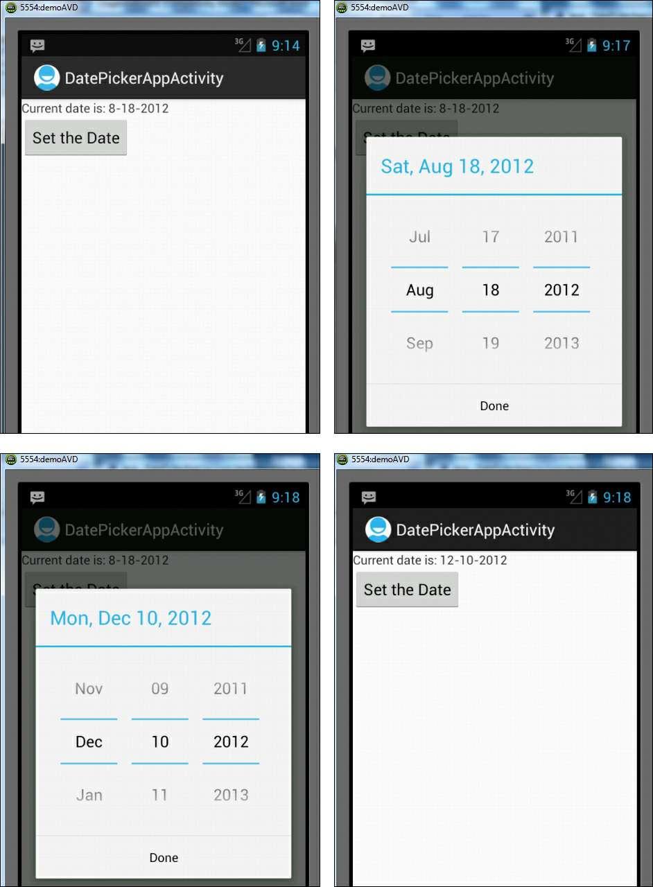
251
252 Figure 6.3. A TextView displaying the current date with a Button control (top left); the DatePicker dialog after clicking the Button control (top right); changing the day, month, and year displayed through the DatePicker dialog (bottom left); and displaying the date selected from the DatePicker dialog in the TextView control (bottom right) Let s now see how system time can be accessed and set via TimePickerDialog. TimePickerDialog The TimePickerDialog allows us to set or select time through the built-in Android TimePicker view. We can set the values of hour and minute with values of hour ranging from 0 through 23 and minutes from 0 through 59. The dialog provides a callback listener, OnTimeChangedListener or OnTimeSetListener, which tells us when a time is changed or set by the user. Again, we create a new Android project, called TimePickerApp, to see how TimePickerDialog works. In this application, we use two controls, TextView and a Button, where the TextView control displays the current system time and the new time set by the user. The Button control is used to invoke the TimePickerDialog; when the Button control is clicked, the TimePickerDialog appears. To define TextView and Button, write the code shown in Listing 6.7 into the layout file activity_time_picker_app.xml. Listing 6.7. The Layout File activity_time_picker_app.xml After Adding the TextView and Button Controls <LinearLayout xmlns:android=" xmlns:tools=" android:orientation="vertical" android:layout_height="match_parent"> <TextView android:id="@+id/timevw" android:layout_width="wrap_content" android:layout_height="wrap_content" /> <Button android:id="@+id/time_button" android:layout_width="wrap_content" android:layout_height="wrap_content" android:text="set the Time" /> </LinearLayout> We can see here that the TextView and Button controls are defined with the IDs timevw and time_button, respectively. The caption on the Button control is Set the Time. Next, we need to write code into the Java activity file TimePickerAppActivity.java to perform the following tasks: Invoke the TimePickerDialog when the Button control is clicked. Display the current system time in the TextView control. Use the Calendar instance to initialize TimePickerDialog to display the current system time. Display the newly set time in the TextView control. To perform these tasks, the code shown in Listing 6.8 is written into the TimePickerAppActivity.java file. Listing 6.8. Code Written into the Java Activity File TimePickerAppActivity.java
253 package com.androidunleashed.timepickerapp; import android.app.activity; import android.os.bundle; import android.widget.textview; import android.widget.button; import java.util.calendar; import android.app.timepickerdialog; import android.view.view.onclicklistener; import android.view.view; import android.widget.timepicker; public class TimePickerAppActivity extends Activity { private TextView disptime; private int h, public void oncreate(bundle savedinstancestate) { super.oncreate(savedinstancestate); setcontentview(r.layout.activity_time_picker_app); disptime = (TextView) findviewbyid(r.id.timevw); Button timebutton = (Button) findviewbyid(r.id.time_button); final Calendar c = Calendar.getInstance(); h = c.get(calendar.hour_of_day); m = c.get(calendar.minute); disptime.settext("current time is: "+h+":"+m); timebutton.setonclicklistener(new OnClickListener() { public void onclick(view v) { new TimePickerDialog(TimePickerAppActivity.this, timelistener, h,m,true).show(); ); private TimePickerDialog.OnTimeSetListener timelistener = new TimePickerDialog.OnTimeSetListener() { public void ontimeset(timepicker view, int hour, int minute) { h = hour; m = minute; disptime.settext("current time is: "+h+":"+m); ;
254 In this application, the timepickerdialog is displayed when the Button is selected. The Button with the text Set the Time and the ID time_button is captured from the layout and mapped to a Button object timebutton. A setonclicklistener event listener is attached to the button so that when it is clicked, the event handler callback method onclick() is invoked. In onclick(), a new instance of a TimePickerDialog is created using the TimePickerDialog constructor and is displayed on the screen. To initialize the TimePickerDialog so it displays the current system time, we use the Calendar class. An instance of Calendar class is created that is initially set to be the current system time. The current hour and minute values are fetched from the Calendar instance and passed to the TimePickerDialog constructor to initialize it, which sets it to display current system time. We also pass a Boolean value, true, to the constructor to indicate that we want to display the 24-hour clock and not the 12-hour clock that displays AM/PM. The constructor also includes a callback listener to inform the current Context (i.e., the current activity) when the time is set or changed in the TimePickerDialog. Note If the Boolean value false is passed to the TimePickerDialog constructor, the hour appears in the 12-hour format with an AM/PM button displayed. The TimePickerDialog provides a callback listener, OnTimeChangedListener or OnTimeSetListener, that listens for when the user is finished setting the time by selecting the Done button. The ontimeset() method is called when the time is set or changed and we use it to display the selected time through the TextView. After running the application, we see a Button control with the caption Set the Time (see Figure 6.4 top left), which, when clicked, displays a TimePickerDialog showing the current time, as shown in Figure 6.4 (top right). The current hour and minute are displayed, and by scrolling them in an up or down direction, we can change them as desired (see Figure 6.4 bottom left). After we set the desired time in the TimePickerDialog and select the Done button, the currently set time is displayed via the TextView control, as shown in Figure 6.4 (bottom right).
255
256 Figure 6.4. The TextView displaying the current time with a Button control (top left), the TimePicker dialog appears after selecting the Button control (top right), changing the hour and minutes displayed via the TimePicker dialog (bottom left), and displaying the time selected from the TimePicker dialog in the TextView control (bottom right) How about combining the two controls DatePickerDialog and TimePickerDialog in one application? This is covered in the next section. Selecting the Date and Time in One Application To see how the system date and time can be set in an application, let s create a new Android application and name it DateTimePickerApp. In this application, we use a TextView and two Button controls. The TextView control displays the current system date and time, and the two Button controls, Set Date and Set Time, are used to invoke the respective dialogs. When the Set Date button is selected, the DatePickerDialog is invoked, and when the Set Time button is selected, the TimePickerDialog is invoked. So, let s write the code shown in Listing 6.9 into the layout file activity_date_time_picker_app.xml to define a TextView and two Button controls. Listing 6.9. The Layout File activity_date_time_picker_app.xml After Adding the TextView and Button controls <LinearLayout xmlns:android=" xmlns:tools=" android:orientation="vertical" android:layout_height="match_parent" > <TextView android:id="@+id/datetimevw" android:layout_width="wrap_content" android:layout_height="wrap_content" /> <Button android:id="@+id/date_button" android:layout_height="wrap_content" android:text="set Date" /> <Button android:id="@+id/time_button" android:layout_height="wrap_content" android:text="set Time" /> </LinearLayout> We can see here that the TextView and the two Button controls are defined with the IDs datetimevw, date_button, and time_button, respectively. The captions for the two Button controls are Set Date and Set Time, respectively. After defining the controls in the layout file, we write Java code into the DateTimePickerAppActivity.java activity file to perform the following tasks: Display the current system date and time in the TextView control. Invoke DatePickerDialog and TimePickerDialog when the Set Date and Set Time Button controls are clicked. Initialize DatePickerDialog and TimePickerDialog to display the current system date and time
257 via the Calendar instance. Display the modified date and time set by the user via the DatePickerDialog and TimePickerDialog through the TextView control. To perform these tasks, the code shown in Listing 6.10 is written into DateTimePickerAppActivity.java. Listing Code Written into the Java Activity File DateTimePickerAppActivity.java package com.androidunleashed.datetimepickerapp; import android.app.activity; import android.os.bundle; import android.widget.textview; import android.widget.button; import java.util.calendar; import android.app.timepickerdialog; import android.app.datepickerdialog; import android.view.view.onclicklistener; import android.view.view; import android.widget.timepicker; import android.widget.datepicker; public class DateTimePickerAppActivity extends Activity { private TextView datetimeview; private Calendar c; private int h, public void oncreate(bundle savedinstancestate) { super.oncreate(savedinstancestate); setcontentview(r.layout.activity_date_time_picker_app); datetimeview = (TextView) findviewbyid(r.id.datetimevw); Button timebutton = (Button) findviewbyid(r.id.time_button); Button datebutton = (Button) findviewbyid(r.id.date_button); c = Calendar.getInstance(); h = c.get(calendar.hour_of_day); m = c.get(calendar.minute); yr = c.get(calendar.year); mon = c.get(calendar.month); dy = c.get(calendar.day_of_month); datetimeview.settext("current date is "+ (mon+1)+"- "+dy+"-"+yr+" and current time is: "+h+":"+m); datebutton.setonclicklistener(new OnClickListener() { public void onclick(view v) {
258 new DatePickerDialog(DateTimePickerAppActivity.this, datelistener, yr, mon, dy).show(); ); timebutton.setonclicklistener(new OnClickListener() { public void onclick(view v) { new TimePickerDialog(DateTimePickerAppActivity.this, timelistener, h,m,true).show(); ); private DatePickerDialog.OnDateSetListener datelistener = new DatePickerDialog. OnDateSetListener() { public void ondateset(datepicker view, int year, int monthofyear, int dayof- Month) { yr = year; mon = monthofyear; dy = dayofmonth; datetimeview.settext("current date is "+ (mon+1)+"- "+dy+"-"+yr+" and current time is: "+h+":"+m); ; private TimePickerDialog.OnTimeSetListener timelistener = new TimePickerDialog. OnTimeSetListener() { public void ontimeset(timepicker view, int hour, int minute) { h = hour; m = minute; datetimeview.settext("current date is "+ (mon+1)+"- "+dy+"-"+yr+" and current time is: "+h+":"+m); ; The respective listeners, OnDateSetListener and OnTimeSetListener, invoke their callback methods, ondateset() and ontimeset(), when the Done button in the DatePickerDialog or TimePickerDialog is selected by the user. The two callback methods access the newly set date and time and display them through the TextView control.
. When the Set Date button is clicked, the DatePickerDialog showing the system s current date is displayed, as shown in Figure 6.5 (middle).")
259 After we run the application, the system s current date and time are displayed through the TextView control. Two Button controls with the captions Set Date and Set Time are displayed in Figure 6.5 (left). When the Set Date button is clicked, the DatePickerDialog showing the system s current date is displayed, as shown in Figure 6.5 (middle). If we scroll in an up or down direction, the day, month, and year can be changed as desired. After we set the desired date, the currently set date and time are displayed via the TextView control, as shown in Figure 6.5 (right). Figure 6.5. The TextView displaying the current date and time and two Button controls (left), the DatePicker dialog appears when the Set Date button is clicked (middle), and the date selected from the DatePicker dialog displayed in the TextView (right) Similarly, when the Set Time button is clicked, the TimePickerDialog initialized to the system s current time is displayed, as shown in Figure 6.6 (left). If we scroll in an up or down direction, the hour and minute can be changed as desired, as shown in Figure 6.6 (middle). After we set the desired time in the TimePickerDialog, the currently set date and time are displayed via the TextView control, as shown in Figure 6.6 (right). Figure 6.6. The TimePicker dialog appears when the Set Time button is clicked (left),
260 changing the hour and minutes in the TimePicker dialog (middle), and the time selected from the TimePicker dialog displayed in the TextView (right) We can also format the date and time. Let s modify the DateTimePickerAppActivity.java file to appear as shown in Listing Only the code in bold is modified; the rest is the same as we saw in Listing Listing Code in the Java Activity File DateTimePickerAppActivity.java package com.androidunleashed.datetimepickerapp; import android.app.activity; import android.os.bundle; import android.widget.textview; import android.widget.button; import java.util.calendar; import android.app.timepickerdialog; import android.app.datepickerdialog; import android.view.view.onclicklistener; import android.view.view; import android.widget.timepicker; import android.widget.datepicker; import java.text.dateformat; public class DateTimePickerAppActivity extends Activity { private TextView datetimeview; private Calendar c; DateFormat DateTimeFormat = public void oncreate(bundle savedinstancestate) { super.oncreate(savedinstancestate); setcontentview(r.layout.activity_date_time_picker_app); datetimeview = (TextView) findviewbyid(r.id.datetimevw); Button timebutton = (Button) findviewbyid(r.id.time_button); Button datebutton = (Button) findviewbyid(r.id.date_button); c = Calendar.getInstance(); datetimeview.settext(datetimeformat.format(c.gettime())); datebutton.setonclicklistener(new OnClickListener() { public void onclick(view v) { new DatePickerDialog(DateTimePickerAppActivity.this, datelistener,c. get(calendar.year), c.get(calendar.month), c.get(calendar.day_of_month)).show();
261 ); timebutton.setonclicklistener(new OnClickListener() { public void onclick(view v) { new TimePickerDialog(DateTimePickerAppActivity.this, timelistener, c.get(calendar.hour_of_day), c.get(calendar.minute),true).show(); ); private DatePickerDialog.OnDateSetListener datelistener = new DatePickerDialog. OnDateSetListener() { public void ondateset(datepicker view, int year, int monthofyear, int dayof- Month) { c.set(calendar.year,year); c.set(calendar.month,monthofyear); c.set(calendar.day_of_month,dayofmonth); datetimeview.settext(datetimeformat.format(c.gettime( ; private TimePickerDialog.OnTimeSetListener timelistener = new TimePickerDialog.OnTimeSetListener() { public void ontimeset(timepicker view, int hour, int minute) { c.set(calendar.hour_of_day, hour); c.set(calendar.minute, minute); datetimeview.settext(datetimeformat.format(c.gettime( ; After we run the application, the formatted date and time are displayed, as shown in Figure 6.7.

262 Figure 6.7. The formatted date and time Let s now move ahead to understand the concept called fragments. Fragments The size of the screen changes when a device is oriented from portrait to landscape mode. In landscape mode, the screen becomes wider and shows empty space on the right. The height becomes smaller and hides the controls on the bottom of the display. There is a difference in screen sizes between the Android phone and Android tablet, as well. Android tablets have a 7 10 inch display, whereas Android phones are in the range of 3 5 inches. When developing an application, we need to arrange Views in such a way that the user can view everything in both landscape and portrait mode. If we don t organize the Views with this in mind, problems arise if the user switches modes while running an application. One solution to this problem is one we have already seen designing an individual layout for each device or screen mode. This solution is time consuming. Another solution is implementing fragments in the application. The Structure of a Fragment A fragment is a combination of an activity and a layout and contains a set of views that make up an independent and atomic user interface. For example, one or more fragments can be embedded in the activity to fill up the blank space that appears on the right when switching from portrait to landscape. Similarly, the fragments can be dynamically removed if the screen size is unable to accommodate the Views. That is, the fragments make it possible for us to manage the Views depending on the target
263 device. Let s assume that we have two fragments, Fragment1 and Fragment2, each having its own set of Views. If the screen size is small, we can create two activities, each having a single fragment, and display one activity at a time. If the device screen is able to accommodate views of both Fragment1 and Fragment2, these can be embedded into a single activity to fill up the screen. A fragment is like a subactivity with its own life cycle and view hierarchy. We can add or remove fragments while the activity is running. Remember that the fragments exist within the context of an activity, and so cannot be used without one. Tip Fragments are self-contained and can be used in multiple activities. To create a fragment, we need to extend the Fragment class and implement several life cycle callback methods, similar to an activity. The Life Cycle of a Fragment The life cycle of a fragments is affected by the activity s life cycle in which it is embedded. That is, when the activity is paused, all the fragments in it are paused. Similarly, if an activity is destroyed, all of its fragments are destroyed, as well. The life cycle of a fragment includes several callback methods, as listed here: onattach() Called when the fragment is attached to the activity. oncreate() Called when creating the fragment. The method is used to initialize the items of the fragment that we want to retain when the fragment is resumed after it is paused or stopped. For example, a fragment can save the state into a Bundle object that the activity can use in the oncreate() callback while re-creating the fragment. oncreateview() Called to create the view for the fragment. onactivitycreated() Called when the activity s oncreate() method is returned. onstart() Called when the fragment is visible to the user. This method is associated with the activity s onstart(). onresume() Called when the fragment is visible and is running. The method is associated with the activity s onresume(). onpause() Called when the fragment is visible but does not have focus. The method is attached to the activity s onpause(). onstop() Called when fragment is not visible. The method is associated with the activity s onstop(). ondestroyview() Called when the fragment is supposed to be saved or destroyed. The view hierarchy is removed from the fragment. ondestroy() Called when the fragment is no longer in use. No view hierarchy is associated with the fragment, but the fragment is still attached to the activity. ondetach() Called when the fragment is detached from the activity and resources allocated to the fragment are released. A fragment also has a bundle associated with it that serves as its initialization arguments. Like an activity, a fragment can be saved and later automatically restored by the system. To understand the concept of fragments, let s create an Android project called FragmentsApp. In this application, we are going to create two fragments: Fragment1 and Fragment2. Fragment1 contains a selection widget, ListView, that displays a couple of fruits to choose from. Fragment2 contains a TextView control to display the fruit selected from the ListView of Fragment1. The fragments use
264 individual XML layout files to define their Views, so for the two fragments, let s add two XML files called fragment1.xml and fragment2.xml to the res/layout folder. To define a ListView control in the first fragment, the code shown in Listing 6.12 is written into the XML file, fragment1.xml. Listing Code Written into the XML File fragment1.xml <?xml version="1.0" encoding="utf-8"?> <LinearLayout xmlns:android=" android:layout_height="match_parent" android:orientation="vertical" android:background="#0000ff" > <ListView android:id="@+id/fruits_list" android:layout_height="match_parent" android:drawselectorontop="false"/> </LinearLayout> We can see here that a ListView selection widget is defined with the ID fruits_list. For distinguishing the two fragments, the background of this fragment is set to blue. To define a TextView control for the second fragment, the code shown in Listing 6.13 is written into the XML file fragment2.xml. Listing Code Written into the XML File fragment2.xml <?xml version="1.0" encoding="utf-8"?> <LinearLayout xmlns:android=" android:layout_height="match_parent" android:orientation="vertical" > <TextView android:id="@+id/selectedopt" android:layout_height="wrap_content" android:text="please select a fruit" /> </LinearLayout> We can see that a selectedopt TextView control is defined and is set to display Please select a fruit. Each fragment has a Java class that loads its UI from the XML file, so for the two fragments, we need to add two Java classes to our application. Add Fragment1Activity.java and Fragment2Activity.java to the com.androidunleashed.fragmentsapp package of the application. The code shown in Listing 6.14 is written into the Java class file of the first fragment, Fragment1Activity.java. Listing Code Written into the Java Class File Fragment1Activity.java
265 package com.androidunleashed.fragmentsapp; import android.app.fragment; import android.os.bundle; import android.view.viewgroup; import android.view.view; import android.view.layoutinflater; import android.widget.listview; import android.widget.arrayadapter; import android.content.context; import android.widget.adapterview; import android.widget.adapterview.onitemclicklistener; import android.widget.textview; public class Fragment1Activity extends Fragment public View oncreateview(layoutinflater inflater, ViewGroup container, Bundle savedinstancestate) { Context c = getactivity().getapplicationcontext(); View vw = inflater.inflate(r.layout.fragment1, container, false); final String[] fruits={"apple", "Mango", "Orange", "Grapes", "Banana"; ListView fruitslist = (ListView) vw.findviewbyid(r.id.fruits_list); ArrayAdapter<String> arrayadpt= new ArrayAdapter<String> (c, android.r.layout.simple_list_item_1, fruits); fruitslist.setadapter(arrayadpt); fruitslist.setonitemclicklistener(new public void onitemclick(adapterview<?> parent, View v, int position, long id) { TextView selectedopt = (TextView) getactivity().findviewbyid(r. id.selectedopt); selectedopt.settext("you have selected "+ ((TextView) v).gettext(). tostring()); ); return vw;
266 We can see that the Java class for the fragment extends the Fragment base class. To access and draw the UI for the fragment, the oncreateview() method is overridden. In the oncreateview() method, a LayoutInflater object is used to inflate the UI the ListView control we defined in the fragment1.xml file. The ListView and TextView controls are accessed from the layout files and mapped to the objects fruitslist and selectedopt, respectively. The arrayadpt Array Adapter containing the elements of the array, fruits in TextView form, is assigned to the ListView control for displaying choices to the user. The OnItemClickListener interface is implemented via an anonymous class that implements a callback method, onitemclick(). The reference to the anonymous class is passed to the ListView, fruitslist, to invoke the callback method onitemclick() when any item in the ListView is clicked. In the onitemclick() method, the item selected in the ListView is displayed via the TextView control selectedopt. Note Besides the Fragment base class, a fragment can also extend a few other subclasses of the Fragment class, such as DialogFragment, ListFragment, and PreferenceFragment, as we see later in this chapter. To load the UI of the second fragment from the XML file fragment2.xml, write the code shown in Listing 6.15 into the Java class file of the second fragment Fragment2-Activity.java. Listing Code Written into the Java Class File Fragment2Activity.java package com.androidunleashed.fragmentsapp; import android.app.fragment; import android.os.bundle; import android.view.viewgroup; import android.view.view; import android.view.layoutinflater; public class Fragment2Activity extends Fragment public View oncreateview(layoutinflater inflater, ViewGroup container, Bundle savedinstancestate) { return inflater.inflate(r.layout.fragment2, container, false); Like the Java class of the first fragment, this class also extends the Fragment base class. The oncreateview() method is overridden where a LayoutInflater object is used to inflate the TextView control we defined in the fragment2.xml file. To accommodate both the fragments in the application, the code shown in Listing 6.16 is written into the layout file activity_fragments_app.xml. Listing The Layout File activity_fragments_app.xml After Adding the Two Fragments
267 <LinearLayout xmlns:android=" xmlns:tools=" android:layout_height="match_parent" android:orientation="horizontal" > <fragment android:name="com.androidunleashed.fragmentsapp.fragment1 android:layout_weight="1" android:layout_width="wrap_content" android:layout_height="match_parent" /> <fragment android:name="com.androidunleashed.fragmentsapp.fragment2 android:layout_weight="0" android:layout_width="wrap_content" android:layout_height="match_parent" /> </LinearLayout> Here we can see that the two fragments are added to the activity through the <fragment> elements. The fragments are assigned the IDs fragment1 and fragment2, respectively. The fragments are set to refer to their respective Java class through the android:name attribute. The first fragment refers to its Java class file Fragment1Activity, which was placed in the com.androidunleashed.fragmentsapp package. The orientation of the container LinearLayout, was set to horizontal, so both the fragments appear beside each other. We don t have to write any code into FragmentsAppActivity.java. We can leave the default code unchanged, as shown in Listing Listing Code Written into the Java Activity File FragmentsAppActivity.java package com.androidunleashed.fragmentsapp; import android.app.activity; import android.os.bundle; public class FragmentsAppActivity extends Activity public void oncreate(bundle savedinstancestate) { super.oncreate(savedinstancestate); setcontentview(r.layout.activity_fragments_app); After we run the application, the two UIs defined in Fragment1 and Fragment2 appear side by side. The ListView of Fragment1 displays the list of items, and Fragment2 displays the TextView asking the user to Please select a fruit, as shown in Figure 6.8 (left). After a fruit has been selected from the ListView, its name is displayed through the TextView, as shown in Figure 6.8 (right).
, and the TextView of the second fragment, showing the item selected from the ListView of the first fragment (right) In the preceding")
268 Figure 6.8. ListView and TextView controls displayed via two fragments (left), and the TextView of the second fragment, showing the item selected from the ListView of the first fragment (right) In the preceding example, we saw how two fragments were included in an activity. But the main benefit of using fragments lies in the fact that it provides the freedom to add fragments to the activity when a device is switched to landscape mode or when it has empty space on the right. It s also easier to remove fragments when the device switches to portrait mode. So, let s modify our application FragmentsApp in such a way that when the device is in portrait mode, only one fragment is made visible, and when the device switches to landscape mode, two fragments are made visible to fill up the empty space on the right. To be more precise, we want only the ListView control to appear when the device is in portrait mode. When an item is selected from the ListView, the TextView should appear on the next screen in another activity. We also require that when the device is in landscape mode, both controls, the ListView and the TextView, should appear beside each other, as there will be enough space on the right. Traditionally, the layout file activity_fragments_app.xml contains the UI to display when the device is in portrait mode. Because we want only Fragment1 to be visible when the device is in portrait mode, let s remove Fragment2 from the layout file. After we remove the Fragment2, the layout file activity_fragments_app.xml appears as shown in Listing Listing The Layout File activity_fragments_app.xml with a Single Fragment <LinearLayout xmlns:android=" android:layout_height="match_parent" android:orientation="horizontal" > <fragment android:name="com.androidunleashed.fragmentsapp.fragment1
269 android:layout_weight="1" android:layout_width="wrap_content" android:layout_height="match_parent" /> </LinearLayout> We can see that Fragment1 with the ID fragment1 is added to the layout file, which means only the ListView control of Fragment1 is displayed when the device is in portrait mode. Because we want the UI of Fragment1 and Fragment2 to appear when the device is in landscape mode, create a folder called layout-land in the res folder and copy the XML file activity_fragments_app.xml from the res/layout folder to the res/layout-land folder. Note If you recall from Chapter 3, Laying Out Controls in Containers, when a device switches to the landscape mode, the layout file from the res/layout-land folder is used to display Views on the screen. When the device switches to portrait mode, the layout file from the res/layout folder is used for displaying Views on the screen. To the activity_fragments_app.xml file in res/layout-land folder, add the two fragments, Fragment1 and Fragment2. After we add these two fragments, the file appears as shown in Listing Listing The Layout File activity_fragments_app.xml with Two Fragments <LinearLayout xmlns:android=" android:layout_height="match_parent" android:orientation="horizontal" > <fragment android:name="com.androidunleashed.fragmentsapp.fragment1 android:id="@+id/fragment1" android:layout_weight="1" android:layout_width="wrap_content" android:layout_height="match_parent" /> <fragment android:name="com.androidunleashed.fragmentsapp.fragment2 android:id="@+id/fragment2" android:layout_weight="0" android:layout_width="wrap_content" android:layout_height="match_parent" /> </LinearLayout> We can see that Fragment1 and Fragment2 were added to the layout file. Next, we need to modify the Java class of the Fragment1, Fragment1Activity to appear as shown in Listing Only the code in bold is newly added; the rest is the same as we saw in Listing Listing Code Written into the Java Class Fragment1Activity.java package com.androidunleashed.fragmentsapp;
270 import android.app.fragment; import android.os.bundle; import android.view.viewgroup; import android.view.view; import android.view.layoutinflater; import android.widget.listview; import android.widget.arrayadapter; import android.content.context; import android.widget.adapterview; import android.widget.adapterview.onitemclicklistener; import android.widget.textview; import android.content.intent; import android.content.res.configuration; public class Fragment1Activity extends Fragment public View oncreateview(layoutinflater inflater, ViewGroup container, Bundle savedinstancestate) { Context c = getactivity().getapplicationcontext(); View vw = inflater.inflate(r.layout.fragment1, container, false); final String[] fruits={"apple", "Mango", "Orange", "Grapes", "Banana"; ListView fruitslist = (ListView) vw.findviewbyid(r.id.fruits_list); ArrayAdapter<String> arrayadpt= new ArrayAdapter<String> (c, android.r.layout.simple_list_item_1, fruits); fruitslist.setadapter(arrayadpt); fruitslist.setonitemclicklistener(new public void onitemclick(adapterview<?> parent, View v, int position, long id) { if (getresources().getconfiguration().orientation == Configuration. ORIENTATION_LANDSCAPE){ TextView selectedopt = (TextView) getactivity().findviewbyid(r. id.selectedopt); selectedopt.settext("you have selected "+ ((TextView)
271 v).gettext().tostring()); else { Intent intent = new Intent(getActivity().getApplicationContext(), ShowItemActivity.class); intent.putextra("item", ((TextView) v).gettext().tostring()); startactivity(intent); ); return vw; Take a look at the onitemclick() method in Listing 6.20 that s called when any item in the ListView shown through Fragment1 is selected. In the method, we first check to see whether the device is in landscape mode. We know that the fragment2 is available when the device is in landscape mode. So, if the device is in landscape mode, the TextView UI control defined in fragment2.xml is accessed and assigned to the TextView object selectedopt. The item selected from the ListView is displayed through the TextView. If the fragment2 is not available, it means that the device is in portrait mode. However, we want to display the TextView of the item selected from the ListView in another screen. Recall from Chapter 2, Basic Widgets, that to start an activity, we need to first create a new Intent specifying the current application context and the class name of the activity that we want to launch, and pass this Intent to the startactivity() method. Let s specify the class name of the new activity as ShowItemActivity, and specify it while creating a new intent. In the new activity screen, we want to display the item selected from the ListView, so we put the selected item in the intent under the key item. In the ShowItemActivity, we retrieve the selected item using this key. Let s add a Java class called ShowItemActivity.java and write the content as shown in Listing Listing Code Written into the Activity File for the Second Fragment ShowItemActivity.java package com.androidunleashed.fragmentsapp; import android.app.activity; import android.content.res.configuration; import android.os.bundle; import android.widget.textview; public class ShowItemActivity extends protected void oncreate(bundle savedinstancestate) { super.oncreate(savedinstancestate); if (getresources().getconfiguration().orientation == Configuration.
272 ORIENTATION_LANDSCAPE) { finish(); return; setcontentview(r.layout.fragment2); Bundle extras = getintent().getextras(); if (extras!= null) { String selecteditem = extras.getstring("item"); TextView textview = (TextView) findviewbyid(r.id.selectedopt); textview.settext("you have selected "+selecteditem); Here we check to see whether the device is in landscape mode. If so, then we finish the activity (terminate the screen), as it s not required the Views of both the fragments can be accommodated in a single screen. If the device is in portrait mode, the getextras() method is called to see whether anything is passed to it. If any Bundle is passed to the intent, the value stored in it under the item key is accessed. The TextView from fragment2.xml is accessed and mapped to a TextView object, textview, and the value passed to the intent (the name of the item selected from the ListView) is displayed via the TextView control. Recall that only the components declared in the application s manifest file AndroidManifest.xml are visible to Android. Hence, the newly added activity ShowItemActivity.java must be declared in AndroidManifest.xml to make it visible to Android and hence to start it. The AndroidManifest.xml file is shown in Listing The statements in bold are added to register the newly created activity ShowItemActivity.java. Listing Code in the AndroidManifest.xml File <?xml version="1.0" encoding="utf-8"?> <manifest xmlns:android=" package="com.androidunleashed.fragmentsapp" android:versioncode="1" android:versionname="1.0" > <uses-sdk android:minsdkversion="15" /> <application android:icon="@drawable/ic_launcher" android:label="@string/app_name" > <activity android:name=".fragmentsappactivity" android:label="@string/app_name" > <intent-filter> <action android:name="android.intent.action.main" /> <category android:name="android.intent.category.launcher" />

.")
273 </intent-filter> </activity> <activity android:name=".showitemactivity" /> </application> </manifest> After we run the application, if the device is in portrait mode, only the UI of fragment1 is visible, as shown in Figure 6.9 (left). When an item from the ListView is selected, the selected fruit name is displayed via TextView on the new screen or activity, as shown in Figure 6.9 (right). Figure 6.9. In portrait mode, only the UI of the first fragment, ListView, is displayed (left), and the item selected from the ListView is displayed via another activity (right). When the device is switched to landscape mode, the UI of both the fragments, ListView and TextView, is visible side-by-side, as shown in Figure 6.10 (left). The selected item from the ListView is shown via the TextView on the same screen, as shown in Figure 6.10 (right). Figure In Landscape mode, the UI of both fragments, ListView and TextView, is displayed (left); and the item selected from the ListView is displayed via the TextView of the second fragment (right).
274 Creating Fragments with Java Code Until now, we have been defining fragments statically by using <fragment> elements in the layout file of the application. Let s now learn how to add fragments to the activity during runtime. For creating, adding, and replacing fragments to an activity dynamically, we use the FragmentManager. FragmentManager As the name suggests, the FragmentManager is used to manage fragments in an activity. It provides the methods to access the fragments that are available in the activity. It also enables us to perform the FragmentTransaction required to add, remove, and replace fragments. To access the FragmentManager, the method used is getfragmentmanager(), as shown here: FragmentManager fragmentmanager = getfragmentmanager(); To perform fragment transactions, we use the instance of the FragmentTransaction as shown here: FragmentTransaction fragmenttransaction = fragmentmanager.begintransaction(); A new FragmentTransaction is created using the begintransaction() method of the FragmentManager. The following code shows how to add a fragment: FragmentManager fragmentmanager = getfragmentmanager() FragmentTransaction fragmenttransaction = fragmentmanager.begintransaction(); Fragment1Activity fragment = new Fragment1Activity(); fragmenttransaction.add(r.id.fragment_container, fragment, "TAG1"); fragmenttransaction.commit(); Here the Fragment1Activity is the Java class of the fragment, which is also used to load the UI of the fragment from its XML file. We assume that the fragment_container is the ID of the container that exists in the layout file where we want to put our fragment. Usually LinearLayout or FrameLayout is used as the fragment_container. The TAG1 refers to the unique ID to identify and access the fragment. The commit() method is used to apply the changes. Note To add fragments dynamically, a container View must exist in the layout in which the Views of the fragment are displayed. Before we add a fragment, it is a wise idea to check whether it already exists by modifying the code as shown here: FragmentManager fragmentmanager = getfragmentmanager() FragmentTransaction fragmenttransaction = fragmentmanager.begintransaction(); if(null==fragmentmanager.findfragmentbytag(tag1)){ Fragment1Activity fragment = new Fragment1Activity(); fragmenttransaction.add(r.id.fragment_container, fragment, "TAG1"); fragmenttransaction.commit(); We can see that the findfragmentbytag() method of the FragmentManager checks to see whether any fragment with the given tag exists. One more method that can be used to identify a fragment is
275 findfragmentbyid(). The findfragmentbyid() method is used to identify the fragment that is added to the Activity layout. Otherwise, findfragmentbytag() is preferred. The Fragment1Activity is a Java class meant for loading the Views defined in the fragment s layout file. To replace the fragment or content being displayed in the fragment_container with the View from another fragment, we use the replace() method of the FragmentTransaction as shown here: fragmenttransact.replace(r.id.fragment_container, fragment2, "TAG2"); In this statement, the Views of fragment2 replace the content being displayed in the fragment_container of the Activity layout. To remove a fragment, we identify it either through the findfragmentbyid() or findfragmentbytag() methods and then use the remove() method of FragmentTransaction. The following code identifies the fragment via the findfragmentbyid() method and then removes it: FragmentTransaction fragmenttransaction = fragmentmanager.begintransaction(); Fragment fragment = fragmentmanager.findfragmentbyid(r.id.fragment); fragmenttransaction.remove(fragment); fragmenttransaction.commit(); Here we assume that a fragment with the ID fragment exists in the Activity. To identify the fragment through the findfragmentbytag() method, the statement can be replaced by the following: Fragment fragment = fragmentmanager.findfragmentbytag(tag1); Communicating Between Fragments We can also pass information among the fragments. The two methods provided by the Fragment class to enable communication between fragments are setarguments() and getarguments(). The setarguments() method stores a Bundle in the fragment, whereas the getarguments() method retrieves the Bundle to fetch the passed information. The following code passes information from fragment 1 to fragment 2. We assume that fragment is the ID of the fragment container that exists in the layout file where we want to display fragment 2. final Fragment2Activity frag2 = new Fragment2Activity(); #1 final Bundle args = new Bundle(); #2 String selecteditem="text to send to fragment 2"; #3 if(null==fragmentmanager.findfragmentbytag(frag2)){ #4 args.putstring("item", selecteditem); #5 frag2.setarguments(args); #6 fragmenttransaction.replace(r.id.fragment, frag2); #7 String tag = null; #8 fragmenttransaction.addtobackstack(tag); #9 fragmenttransaction.commit(); Statement #1, Fragment2Activity, represents the Java class of the fragment 2. A Java class instance called frag2 is created. Statement #2 creates a Bundle object called args, and a string, selecteditem, is defined in #3 that we want to pass to fragment 2. Statement #4 checks to see whether fragment 2 doesn t already exist in the layout. The selecteditem variable is saved in the Bundle object args under the key item in #5. The Bundle object args is stored in fragment 2 in #6. Through statement #7,
276 fragment 2 replaces the View in the fragment container of the layout file. The statements #8 and #9 are meant for navigating to the previous fragment as discussed next. Navigating to Previous Fragments The Activity stack keeps track of previous Activities. When we press the back button, the Activities in the Activity stack pop up, making their Views visible. In other words, the Activity stack enables us to navigate back to previous screens by using the back button. The same concept is applicable to fragments as well. To add the FragmentTransaction to the back stack, we need to call the addtobackstack() method of FragmentTransaction before calling the commit() method. In the code shown previously, fragment 2 replaces fragment 1, which was being displayed in the fragment container of the layout file. fragment 1 is added to the back stack, making its Views invisible. Pressing the back button then reverses the previous FragmentTransaction and returns the View of the earlier fragment, fragment 1. Retrieving Content Passed Through Bundle We can access the content passed to the fragment via the Bundle that was saved through the setarguments() method. The getarguments() method accesses the Bundle that may be passed to the fragment. The following code accesses the Bundle object passed to the fragment. It also accesses the content passed under the item key and assigns it to the String selecteditem: String public void oncreate(bundle state) { super.oncreate(state); if (null == state) state = getarguments(); if (null!= state){ selecteditem = state.getstring("item"); Saving and Restoring the State of Fragments Fragments can also save their state to be restored later, just like Activities. The callback methods meant for this purpose are onsaveinstancestate() and onrestoreinstancestate(). The onsaveinstancestate() Callback The onsaveinstancestate() callback is used for saving the status of the fragment into a Bundle object, which is then used while restoring the fragment. The following code saves the status of the fragment. It saves the value of the selecteditem variable into the Bundle under the selectedfruit public void onsaveinstancestate(bundle savedinstancestate) { super.onsaveinstancestate(savedinstancestate); savedinstancestate.putstring("selectedfruit", selecteditem); The onrestoreinstancestate() Callback The onrestoreinstancestate() callback is for restoring the fragment to its earlier saved state. It uses the content in the Bundle that was used in the onsaveinstancestate() for getting the previously saved content of the fragment. The following code restores the fragment status. It retrieves the value under
277 the selectedfruit key from the Bundle that was saved while calling public void onrestoreinstancestate(bundle savedinstancestate){ super.onrestoreinstancestate(savedinstancestate); selecteditem = savedinstancestate.getstring("selectedfruit"); To understand how fragments are created programmatically, we create an application similar to our FragmentsApp application showing a ListView and TextView in landscape mode and only a ListView in portrait mode. When an item from the ListView is selected, its name is displayed through a TextView. Let s create a new Android project called FragmentCodeApp. Add two layout files, fragment1.xml and fragment2.xml, to the res/layout folder. The fragment1.xml file contains the code to display a ListView control, and fragment2.xml contains code to display a TextView control. The code in fragment1.xml is the same as that as shown in Listing Similarly, the code written into fragment2.xml is the same as that shown in Listing Write the code shown in Listing 6.23 into the main layout file of the application, activity_fragment_code_app.xml. Listing Code in the Layout File activity_fragment_code_app.xml <LinearLayout xmlns:android=" android:layout_height="match_parent" android:orientation="horizontal" > <LinearLayout android:id="@+id/fragment1" android:layout_weight="1" android:layout_width="wrap_content" android:layout_height="match_parent" /> <LinearLayout android:id="@+id/fragment2" android:layout_weight="0" android:layout_width="wrap_content" android:layout_height="match_parent" /> </LinearLayout> We can see that two LinearLayout elements are added to the layout file instead of the fragments. This is because we are adding fragments dynamically through code. The Views of the desired fragments are displayed through these LinearLayout containers. The LinearLayout elements are assigned the IDs fragment1 and fragment2, respectively, to identify them in the Java code. To load the Views of the two layout files defined in fragment1.xml and fragment2.xml, add two Java class files called Fragment1Activity.java and Fragment2Activity.java to the com.androidunleashed.fragmentcodeapp package of the application. To load the Views defined in fragment2.xml, the code that is written into Fragment2Activity.java is the same as that shown in Listing To load the Views defined in fragment1.xml, write the code shown in Listing 6.24 into the Java class
278 file Fragment1Activity.java. Only the code shown in bold is new; the rest of the code is the same as Listing Listing Code Written into the Java Class File Fragment1Activity.java package com.androidunleashed.fragmentcodeapp; import android.view.view; import android.view.layoutinflater; import android.app.fragment; import android.os.bundle; import android.view.viewgroup; import android.widget.listview; import android.widget.arrayadapter; import android.content.context; import android.widget.adapterview; import android.widget.adapterview.onitemclicklistener; import android.widget.textview; import android.content.intent; import android.app.fragmentmanager; public class Fragment1Activity extends Fragment{ protected static final String FRAG2 = "2"; public View oncreateview(layoutinflater inflater, ViewGroup container, Bundle savedinstancestate) { Context c = getactivity().getapplicationcontext(); View vw = inflater.inflate(r.layout.fragment1, container, false); final String[] fruits={"apple", "Mango", "Orange", "Grapes", "Banana"; ListView fruitslist = (ListView) vw.findviewbyid(r.id.fruits_list); ArrayAdapter<String> arrayadpt= new ArrayAdapter<String> (c, android.r.layout.simple_list_item_1, fruits); fruitslist.setadapter(arrayadpt); final FragmentManager fragmentmanager = getfragmentmanager(); fruitslist.setonitemclicklistener(new public void onitemclick(adapterview<?> parent, View v, int position, long id){ if(null!=fragmentmanager.findfragmentbytag(frag2) {
279 TextView selectedopt = (TextView) getactivity().findviewbyid(r. id.selectedopt); selectedopt.settext("you have selected "+ ((TextView) v).gettext().tostring()); else { Intent intent = new Intent(getActivity().getApplicationContext(), ShowItemActivity.class); intent.putextra("item", ((TextView) v).gettext().tostring()); startactivity(intent); ); return vw; We want only the View of the first fragment, ListView, displayed in portrait mode, and when an item from the ListView is selected, the name of the selected item is displayed on the next screen. The new screen is created through a new activity. So, add a Java class file called ShowItemActivity.java to the com.androidunleashed.fragmentcodeapp package of the application. In the ShowItemActivity.java file, write the code as shown in Listing As said earlier, to inform about the newly added activity file to the application, we need to write a statement as shown in Listing 6.22 in the AndroidManifest.xml file. To the main activity file of the application FragmentCodeAppActivity.java, write the code as shown in Listing Listing Code Written into the Java Activity File FragmentCodeAppActivity.java package com.androidunleashed.fragmentcodeapp; import android.app.activity; import android.os.bundle; import android.app.fragmentmanager; import android.app.fragmenttransaction; import android.content.res.configuration; public class FragmentCodeAppActivity extends Activity { private static final String FRAG1 = "1"; private static final String FRAG2 = "2"; public void oncreate(bundle savedinstancestate) { super.oncreate(savedinstancestate); setcontentview(r.layout.activity_fragment_code_app); FragmentManager fragmentmanager = getfragmentmanager(); FragmentTransaction fragmenttransaction
280 =fragmentmanager.begintransaction(); if (getresources().getconfiguration().orientation == Configuration.ORIENTA- TION_LANDSCAPE) { fragmenttransaction.add(r.id.fragment1, new Fragment1Activity(), FRAG1); fragmenttransaction.add(r.id.fragment2, new Fragment2Activity(), FRAG2); else { if(null!=fragmentmanager.findfragmentbytag(frag2)) fragmenttransaction.remove(fragmentmanager.findfr fragmenttransaction.add(r.id.fragment1, new Fragment1Activity(), FRAG1); fragmenttransaction.commit(); After we run the application, the output of the application is the same as that shown earlier in Figures 6.9 and Tip Besides making a class extend a Fragment base class, the fragments are also created by making the class extend certain subclasses of the Fragment base class. Such fragments are known as specialized fragments. Creating Special Fragments After understanding the procedure to create simple fragments, we learn to create specialized fragments such as list fragments, dialog fragments, and preference fragments. To create these, we extend from the following subclasses of the Fragment base class: ListFragment DialogFragment PreferenceFragment Creating a ListFragment A ListFragment is a fragment that contains a built-in ListView that can be set to display items from a specified data source. The data source can be an array or a cursor. To understand ListFragments, let s create an application consisting of a ListView and a TextView. The ListView displays some items to choose from. The item selected from the ListView is displayed through a TextView. In this application, the ListView is displayed via a ListFragment, and the TextView is displayed via a simple fragment. The item selected from the ListView in the ListFragment is displayed through the TextView in the simple fragment. Let s name the new Android project ListFragApp. We first create a fragment to hold the TextView control. So, let s add an XML file called fragment2.xml to the res/layout folder of our project. Listing 6.26 shows how to define a TextView control in fragment2.xml. Listing Code in the XML File fragment2.xml
281 <?xml version="1.0" encoding="utf-8"?> <LinearLayout xmlns:android=" android:layout_height="match_parent" android:orientation="vertical" > <TextView android:layout_height="wrap_content" android:text="please select a fruit" /> </LinearLayout> We can see that a TextView control with the ID selectedopt is defined in a LinearLayout container. The initial text assigned to the TextView control is Please select a fruit. This TextView control is assigned text through Java code to indicate the item selected from the ListView. To load the UI of the fragment from fragment2.xml, we need to create a Java class file. So, add a Java class file called Fragment2Activity.java under the com.androidunleashed.listfragapp package. Write the code as shown in Listing 6.27 into the Java class file, Fragment2Activity.java. Listing Code Written into the Java Class File of the Second Fragment Fragment2Activity package com.androidunleashed.listfragapp; import android.app.fragment; import android.os.bundle; import android.view.viewgroup; import android.view.view; import android.view.layoutinflater; public class Fragment2Activity extends Fragment { public View oncreateview(layoutinflater inflater, ViewGroup container, Bundle savedinstancestate) { return inflater.inflate(r.layout.fragment2, container, false); We can see that the Java class extends the Fragment base class. The oncreateview() method is overridden when a LayoutInflater object is used to inflate the TextView control UI that we defined in the fragment2.xml file. We use ListFragment to display the ListView control. As I said earlier, the ListFragment already contains a ListView so we don t need to define a UI for this fragment. We can directly add a Java class file that extends the ListFragment class. In this Java class file, we write code to define the items to be displayed through the ListView of the ListFragment and also to display the item selected from the ListView through the TextView of the Fragment2. So, add a Java class called Fragment1Activity.java to the project and write the code shown in Listing 6.28 into it.
282 Listing Code Written into the Java Class for the First Fragment Fragment1Activity.java package com.androidunleashed.listfragapp; import android.app.listfragment; import android.os.bundle; import android.widget.arrayadapter; import android.view.view; import android.widget.listview; import android.widget.textview; public class Fragment1Activity extends ListFragment { final String[] fruits={"apple", "Mango", "Orange", "Grapes", public void oncreate(bundle savedinstancestate) { super.oncreate(savedinstancestate); ArrayAdapter<String> arrayadpt = new ArrayAdapter<String>(getActivity(), android.r.layout.simple_list_item_1, fruits); public void onlistitemclick(listview l, View v, int position, long id) { TextView selectedopt = (TextView) getactivity().findviewbyid(r. id.selectedopt); selectedopt.settext("you have selected "+((TextView) v).gettext(). tostring()); As expected, the Java class extends the ListFragment base class to create a ListFragment. To display content through the ListView of the ListFragment, an array called fruits is defined and fruit names are assigned to it. In the oncreate() method, an ArrayAdapter object called arrayadpt is defined to display the elements of the fruits array in the simple_list_item_1 mode. When we use the setlistadapter() method, the content in the ArrayAdapter object, arrayadpt, is assigned to the ListView for display. As expected, the onlistitemclick() method is invoked when any of the fruits displayed through the ListView control is selected. In this method, we display the name of the selected fruit through the TextView control that we defined in fragment2.xml. To accommodate both the fragments in the application, code is written into activity_list_frag_app.xml as shown in Listing 6.29.
283 Listing The activity_list_frag_app.xml Layout File After Adding Two Fragments <LinearLayout xmlns:android=" android:layout_height="match_parent" android:orientation="horizontal" > <fragment android:name="com.androidunleashed.listfragapp.fragment1a android:layout_weight="1" android:layout_width="wrap_content" android:layout_height="match_parent" /> <fragment android:name="com.androidunleashed.listfragapp.fragment2a android:layout_weight="0" android:layout_width="wrap_content" android:layout_height="match_parent" /> </LinearLayout> We can see that the fragment1 and fragment2 fragments are added to the activity through the <fragment> elements. The fragments are set to refer to their respective Java classes through the android:name attribute. We don t have to write any code into the Java activity file of the application ListFragAppActivity.java. We leave the default code in the activity file unchanged, as shown in Listing Listing Default Code in the Java Activity File ListFragAppActivity.java package com.androidunleashed.listfragapp; import android.app.activity; import android.os.bundle; import android.view.menu; public class ListFragAppActivity extends Activity public void oncreate(bundle savedinstancestate) { super.oncreate(savedinstancestate); public boolean oncreateoptionsmenu(menu menu) { getmenuinflater().inflate(r.menu.activity_list_frag_app, menu); return true;

284 After running the application, we see the two fragments side-by-side, as shown in Figure 6.11 (left). The ListView on the left side appears through the ListFragment. The content in the ListView is displayed via the Java class file of the ListFragment, Fragment1Activity.java. The item selected from the ListView is displayed through the TextView defined in Fragment2, as shown in Figure 6.11 (right). Figure The ListView displayed via ListFragment (left), and the Item selected from the ListView of ListFragment, displayed via the TextView of the second fragment (right) Using a DialogFragment In Android, dialogs are asynchronous. Synchronous dialogs are those in which the activity suspends its execution until a dialog is dismissed. While the user is interacting with the dialog, no further execution takes place. Asynchronous dialogs are those in which activity continues its normal execution, and at the same time users can interact with the dialog. The activity accesses user interaction with the dialog by implementing callback methods. The dialogs in Android are modal in nature; while a dialog is open, users cannot access any other part of the application. The benefit of calling dialogs asynchronously is that it not only increases code efficiency, but also provides us with the capability to dismiss the dialog through code. We can display a DialogFragment by extending the DialogFragment base class, which in turn is derived from the Fragment class. To demonstrate DialogFragment, let s create a new Android project called DialogFragApp. In this project, we use two fragments. One is used to show a DialogFragment, and the other displays a TextView. The user s interaction with the DialogFragment is conveyed through the TextView control in the second fragment. The selected button in the DialogFragment is displayed via the TextView control in the second fragment. Before beginning the creation of DisplayFragment, let s first define the UI of the simple fragment that consists of a TextView. To do so, add an XML file called fragment2.xml to the res/layout folder. Write the code shown in Listing 6.31 into the fragment2.xml file.
285 Listing Code Written into the XML File fragment2.xml <?xml version="1.0" encoding="utf-8"?> <LinearLayout xmlns:android=" android:layout_height="match_parent" android:orientation="vertical" > <TextView android:layout_height="wrap_content" android:text="select Open Dialog Button" /> </LinearLayout> We can see that a TextView control is defined inside a LinearLayout container. The TextView is assigned the selectedopt ID and is initialized to display the text Select Open Dialog Button. This TextView is used to display the option selected by the user in the DialogFragment. To load the UI of the fragment from fragment2.xml, a Java class file called Fragment2Activity.java is added to the project. Write the code shown in Listing 6.32 into the Java file Fragment2Activity.java. Listing Code Written into the Java Class for the Second Fragment Fragment2Activity.java package com.androidunleashed.dialogfragapp; import android.app.fragment; import android.os.bundle; import android.view.viewgroup; import android.view.view; import android.view.layoutinflater; public class Fragment2Activity extends Fragment public View oncreateview(layoutinflater inflater, ViewGroup container, Bundle savedinstancestate) { return inflater.inflate(r.layout.fragment2, container, false); The Java class extends the Fragment base class. The oncreateview() method is overridden when a LayoutInflater object is used to inflate the TextView control UI that we defined in the fragment2.xml file. To accommodate the fragment defined in fragment2.xml, we need to write code into the layout file activity_dialog_frag_app.xml, as shown in Listing 6.33.
286 Listing The Layout File activity_dialog_frag_app.xml After Adding a Fragment and a Button <LinearLayout xmlns:android=" android:layout_height="match_parent" android:orientation="horizontal" > <fragment android:name="com.androidunleashed.dialogfragapp.fragment android:id="@+id/fragment2" android:layout_weight="0" android:layout_width="wrap_content" android:layout_height="match_parent" /> <Button android:id="@+id/dialog_button" android:layout_height="wrap_content" android:text="open Dialog" /> </LinearLayout> A Button control is defined because we want the DialogFragment to appear only when a button is selected in the application. Both the Fragment and Button controls are nested inside the LinearLayout container. The Fragment is assigned the ID fragment2 and is set to refer to its Java class through the android:name attribute. The Button control is assigned the ID dialog_button, and the caption as Open Dialog. fragment2 is meant to display a TextView to show the option selected by the user in the DialogFragment. Now it s time to write code to show a DialogFragment. As stated earlier, to show DialogFragment, a Java class needs to extend the DialogFragment class. Let s add a Java class called Fragment1Activity.java under the package com.androidunleashed.dialogfragapp. To display a DialogFragment, write the code shown in Listing 6.34 into the Fragment1Activity.java file. Listing Code Written into the Java Class File of the First Fragment Fragment1Activity.java package com.androidunleashed.dialogfragapp; import android.app.dialogfragment; import android.app.fragment; import android.os.bundle; import android.app.dialog; import android.app.alertdialog; import android.content.dialoginterface; public class Fragment1Activity extends DialogFragment{ static Fragment1Activity newinstance(string title) { Fragment1Activity fragment = new Fragment1Activity(); Bundle args = new Bundle();
287 args.putstring("title", title); fragment.setarguments(args); return public Dialog oncreatedialog(bundle savedinstancestate) { String title = getarguments().getstring("title"); Dialog diag = new AlertDialog.Builder(getActivity()).setIcon(R.drawable.ic_launcher).setTitle(title).setPositiveButton("OK", new DialogInterface.OnClickListener() { public void onclick(dialoginterface dialog, int whichbutton) { ((DialogFragAppActivity) getactivity()).positivebutton(); ).setnegativebutton("cancel", new DialogInterface.OnClickListener() { public void onclick(dialoginterface dialog, int whichbutton) { ((DialogFragAppActivity) getactivity()).negativebutton(); ).create(); return diag; We can see that to create the DialogFragment, the Java class extends the DialogFragment class. The newinstance() method is used to create a new instance of the fragment. The title of the DialogFragment is passed to this method as an argument, which in turn is stored in the Bundle object and is associated with the fragment that is returned by this method. To create the view hierarchy of the DialogFragment, the oncreatedialog() method of the DialogFragment class is overridden, and a Bundle object carrying the title of the fragment and other information, if any, is passed to it. In the oncreatedialog() method, an alert dialog builder is used to create a dialog object. In the beginning of this chapter, we learned that AlertDialog is a dialog window that displays a message with optional buttons. In the oncreatedialog() method, an AlertDialog with two buttons, OK and Cancel, is created, and the title that has to be displayed in the fragment is obtained from the title argument saved in the Bundle object. An onclicklistener() is associated with the two buttons OK and Cancel, which results in invoking the respective onclick() method when the respective button is clicked. When OK is selected, the PositiveButton() method from the activity is called. Similarly, when Cancel is selected, the NegativeButton() method from the activity is called. The method returns the created AlertDialog. In the Java activity file, we need to write code to invoke the DialogFragment. The code must be
288 written to take the necessary action when OK or Cancel is selected from the DialogFragment. The code written into the Java activity file DialogFragAppActivity.java is shown in Listing Listing Code Written into the Java Activity File DialogFragAppActivity.java package com.androidunleashed.dialogfragapp; import android.app.activity; import android.os.bundle; import android.widget.button; import android.view.view; import android.widget.textview; public class DialogFragAppActivity extends Activity public void oncreate(bundle savedinstancestate) { super.oncreate(savedinstancestate); setcontentview(r.layout.activity_dialog_frag_app); Button dialogbutton = (Button)findViewById(R.id.dialog_button); dialogbutton.setonclicklistener(new public void onclick(view arg0) { Fragment1Activity dialogfragment = Fragment1Activity. newinstance("continue Processing?"); dialogfragment.show(getfragmentmanager(), "Dialog Fragment Example"); ); public void PositiveButton() { TextView selectedopt = (TextView)findViewById(R.id.selectedopt); selectedopt.settext("you have selected OK button"); public void NegativeButton() { TextView selectedopt = (TextView) findviewbyid(r.id.selectedopt); selectedopt.settext("you have selected Cancel button"); We want the DialogFragment to appear when the Button is selected from the application. So, we see that the dialogbutton Button control is captured from the layout file and is mapped to the Button
289 object dialogbutton. An OnClickListener is associated with the Button control, and the onclick() callback method is called if the Button control is selected from the application. In the onclick() method, the DialogFragment is created by creating a dialogfragment instance of the Fragment1Activity Java class file, and the title of the DialogFragment is passed to it as Continue processing. The DialogFragment is made visible by calling its show() method. The show() method adds the fragment to the given FragmentManager. The code also defines the two methods, PositiveButton() and NegativeButton(), which are invoked when OK and Cancel from the DialogFragment are selected. In both the PositiveButton() and NegativeButton() methods, the selectedopt TextView control that we defined in fragment2.xml is accessed and mapped to the TextView object selectedopt. When OK is selected, a message, You have selected OK button, appears in the TextView through the selectedopt instance. Similarly, when Cancel from the DialogFragment is selected, a message, You have selected Cancel button, appears in the TextView of the second fragment. After we run the application, a TextView and a Button control are displayed, as shown in Figure 6.12 (left). The TextView is displayed through fragment2.xml. The TextView displays the initial text Select the Open Dialog Button, directing the user to select the Open Dialog button. After we click the Open Dialog button, a dialog fragment with the title Continue Processing opens, showing two buttons, OK and Cancel, as shown in Figure 6.12 (middle). After we click the OK button from the DialogFragment, a message, You have selected OK button, is shown through the TextView control, as shown in Figure 6.12 (right). Figure The TextView and Button displayed on application startup (left), the DialogFragment appears after clicking the button (middle), and the TextView showing that the DialogFragment OK button was clicked (right) After we click the Open Dialog button again, the DialogFragment opens up once more. This time, if we select Cancel from the DialogFragment, the TextView displays the message You have selected Cancel button, as shown in Figure 6.13.
290 Figure The TextView showing that the DialogFragment Cancel button was clicked Using PreferenceFragment PreferenceFragment is a fragment that enables users to configure and personalize an application. The PreferenceFragment can contain several Preference Views that help in uniformly setting application preferences with minimum effort. Table 6.1 shows the list of Preference Views that can be displayed via a PreferenceFragment. Table 6.1. Preference Views That Can Be Displayed in PreferenceFragments To understand how application preferences are set, let s create a new Android project called PreferenceFragApp. There are two ways of displaying Preference Views in a PreferenceFragment: through an XML file and through code. We prefer the XML approach, so we first add a folder called xml to the res folder. Inside the res/xml folder, we add an XML file called preferences.xml. This file contains the Preference Views we want to display to the user to configure the application. The options selected by the user in Preference Views persist in the application. The code written into the preferences.xml file is shown in Listing Listing Code Written into XML File preferences.xml <?xml version="1.0" encoding="utf-8"?> <PreferenceScreen xmlns:android=" >
291 <PreferenceCategory android:title="category 1"> <CheckBoxPreference android:title="pizza" android:defaultvalue="false" android:key="pizzakey" /> <EditTextPreference android:key="namekey" android:title="enter your name: " android:dialogtitle="enter your information"> </EditTextPreference> </PreferenceCategory> <PreferenceCategory android:title="category 2"> <RingtonePreference android:showdefault="true" android:key="audio" android:title="select sound" android:ringtonetype="notification"> </RingtonePreference> <ListPreference android:title="fruits List " android:key="fruits_list" android:dialogtitle="choose a fruit"> </ListPreference> </PreferenceCategory> <Preference android:title="submit" android:key="submitpref" /> </PreferenceScreen> We can see that the Preference Views are shown in two categories: Category 1 and Category 2. Category 1 includes two Preference Views: a CheckBoxPreference and an EditTextPreference. Category 2 includes the RingtonePreference and ListPreference. Every Preference View needs to have an android:key value that is used to identify and access its value. The android:title attribute is used to assign initial text to the Preference View, and the android:defaultvalue attribute is used to assign a default value to the Preference View. The CheckBoxPreference displays a check box as its UI element, and it stores a value in Boolean form either true or false. The value true is stored when the check box in CheckBoxPreference is selected, and false when the check box is not selected. The default value false is assigned to the CheckBoxPreference using the android:defaultvalue attribute. The EditTextPreference is assigned the Namekey key, and the title Enter your name: appears as the text of the Preference View. When the EditTextPreference is selected, a dialog titled Enter your information is displayed, asking the user to enter information. When the user clicks OK, the entered information is saved to the preference store. The RingtonePreference opens a dialog box showing the list of ringtones, allowing the user to select a default ringtone or silent mode. The key assigned to the RingtonePreference is Audio, and the dialog box is assigned the title Select sound. The android:ringtonetype attribute helps in determining the list of ringtones to be displayed. Valid values for android:ringtonetype attribute are ringtone, notification, alarm, and all. The ListPreference shows a dialog box listing a set of preferences in the form of radio buttons,
292 allowing the user to select one of them. The dialog box is titled Choose a fruit and is assigned the key fruits_list. The android:entries attribute assigns a string array named fruits to the ListPreference to show the list of preferences. That is, the elements in the fruits array display text for the radio buttons displayed via the ListPreference. The android:entryvalues attribute defines another array, fruitselected, to hold the values of the elements defined in the fruits array. The android:entryvalues attribute represents an array that stores the values corresponding to the radio button selected by the user. The <Preference> elements display a Submit button in the PreferenceFragment that users click after selecting the desired preferences from Preference Views to either store the preferences or perform another action. The Submit button is assigned the key submitpref, which is used to identify it in the Java code. Next, we need to define two arrays in the strings.xml resource file: one to display text for the radio button in the ListPreference and the second to store the values of the corresponding elements in the first array. After we define the two arrays, the strings.xml file appears as shown in Listing Listing The Strings Resource File strings.xml After Defining the Two Arrays <resources> <string name="app_name">preferencefragapp</string> <string name="menu_settings">settings</string> <string name="title_activity_preference_frag_app">preferencefragappactivi <string-array name="fruits"> <item>apple</item> <item>mango</item> <item>orange</item> <item>grapes</item> <item>banana</item> </string-array> <string-array name="fruitselected"> <item>you have selected Apple</item> <item>you have selected Mango</item> <item>you have selected Orange</item> <item>you have selected Grapes</item> <item>you have selected Banana</item> </string-array> </resources> The elements in the fruits array are used to display text for the radio buttons shown in the ListPreference, and the elements in the fruitsselected array show the values that are returned if the corresponding elements in the fruits array are selected. To load the Preference Views defined in preferences.xml, a Java class file called PrefActivity.java is added to the project. Write the code shown in Listing 6.38 into the Java class file PrefActivity.java. Listing Code Written into PreferenceFragment PrefActivity.java package com.androidunleashed.preferencefragapp;
293 import android.os.bundle; import android.app.activity; import android.preference.preference; import android.preference.preference.onpreferenceclicklistener; import android.preference.preferencefragment; public class PrefActivity extends Activity { public void oncreate(bundle savedinstancestate) { super.oncreate(savedinstancestate); getfragmentmanager().begintransaction().replace(android.r new PrefsFragment()).commit(); public static class PrefsFragment extends PreferenceFragment public void oncreate(bundle savedinstancestate) { super.oncreate(savedinstancestate); addpreferencesfromresource(r.xml.preferences); Preference submitpref = (Preference) findpreference("submitpref"); submitpref.setonpreferenceclicklistener(new OnPreferenceClickListener() { public boolean onpreferenceclick(preference preference) { getactivity().finish(); return true; ); To create the PreferenceFragment, a Java class called PrefsFragment is defined that extends the PreferenceFragment class. The addpreferencesfromresource() method is called to load the Preference Views in the PreferenceFragment from the XML file preferences.xml. The Submit button defined in the preferences.xml file through the <Preference> element is accessed and mapped to the Preference object submitpref. An OnPreferenceClickListener event handler is added to the submitpref object. Its callback method, onpreferenceclick(), is implemented, which executes when the submitpref Button is clicked. In the onpreferenceclick() method, we finish by closing the PreferenceFragment and returning to PreferenceFragActivity.java to take necessary action on the selected preferences. Through the Java activity file PreferenceFragAppActivity.java, we display the preferences selected by the user via TextView controls. To display the options selected from the Preference Views shown in the PreferenceFragment, we
294 need to define four TextView controls in the layout file activity_preference_frag.xml. After defining the four TextView controls activity_preference_frag_app.xml appears as shown in Listing Listing The Layout File activity_preference_frag_app.xml After Adding the Four TextView Controls <LinearLayout xmlns:android=" android:layout_height="match_parent" android:orientation="vertical" > <TextView android:layout_height="wrap_content" <TextView android:layout_height="wrap_content" <TextView android:layout_height="wrap_content" <TextView android:layout_height="wrap_content" </LinearLayout> We can see that the four TextView controls are assigned the IDs pizza, name, ringtone, and fruit. The TextView controls are vertically arranged inside the LinearLayout container. The pizza TextView is used to indicate whether the user has checked the check box in the CheckBoxPreference. The name TextView is used to display the name entered by the user in the EditTextPreference. The ringtone TextView is used to display the type of ring tone selected by the user in the RingtonePreference. The fruit TextView is used to display the fruit selected by the user in the ListPreference. To display the PreferenceFragment and show the preferences selected by the user, we need to write the code shown in Listing 6.40 into the main activity file PreferenceFragAppActivity.java. Listing Code Written into the Main Activity File PreferenceFragAppActivity.java package com.androidunleashed.preferencefragapp; import android.app.activity; import android.os.bundle; import android.content.intent;
295 import android.preference.preferencemanager; import android.content.sharedpreferences; import android.widget.textview; public class PreferenceFragAppActivity extends Activity public void oncreate(bundle savedinstancestate) { super.oncreate(savedinstancestate); setcontentview(r.layout.activity_preference_frag_app); startactivity(new Intent(this, public void onresume() { super.onresume(); SharedPreferences prefs=preferencemanager.getdefaultsharedpreferences(this); TextView pizza=(textview)findviewbyid(r.id.pizza); TextView name=(textview)findviewbyid(r.id.name); TextView ringtone=(textview)findviewbyid(r.id.ringtone); TextView fruit=(textview)findviewbyid(r.id.fruit); if(boolean.valueof(prefs.getboolean("pizzakey", false))) pizza.settext("you have selected Pizza"); else pizza.settext(""); ringtone.settext("the ringtone selected is "+prefs.getstring("audio", "Silent")); name.settext("the name entered is "+prefs.getstring("namekey","")); String selectedfruit = prefs.getstring("fruits_list", "Apple"); fruit.settext(selectedfruit); To display the PreferenceFragment, its activity class, PrefActivity.class, is started. To show the preferences selected by the user in the PreferenceFragment, the TextView controls defined in the layout file main.xml are accessed and mapped to the TextView objects. The pizza, name, ringtone, and fruit TextViews are mapped to the TextView objects pizza, name, ringtone, and fruit, respectively. To find the options selected in the Preference Views, a SharedPreferences object called prefs is created. To read the value of CheckBoxPreference, we access the shared preferences and call the getboolean() method, passing the key of the CheckBoxPreference to it. When the CheckBoxPreference Pizzakey key is passed to the getboolean() method of the SharedPreference instance, it returns true or false, indicating whether the check box in CheckBoxPreference is checked. Thereafter, EditTextPreference is accessed by passing its Namekey key to the getstring() method of
 method of The preferences selected by the user in the Preference")
296 the SharedPreference instance. Similarly, the RingtonePreference and ListPreference are accessed by passing their keys, Audio and fruits_list, to the getstring() method of the SharedPreference instance. The preferences selected by the user in the Preference Views are displayed via TextView controls. To make the newly added activity PrefActivity.java visible to Android, it is declared in AndroidManifest.xml by adding the following statement in it: <activity android:name=".prefactivity" /> After running the application, we see the Preference Views defined in Category 1 and Category 2. The CheckBoxPreference check box is unchecked by default. When the check box is selected, it is checked, as shown in Figure 6.14 (left). When the EditTextPreference with the text Enter your name: is selected, a dialog box titled Enter your information pops up. We can enter a name or cancel the operation by selecting Cancel. Let s enter Troy as shown in Figure 6.14 (middle), then click OK to go back to the PreferenceFragment. When Select sound is clicked and which represents RingtonePreference, a dialog box prompting the user to select a ringtone type is opened, as shown in Figure 6.14 (right). Figure A PreferenceFragment showing different Preference Views (left), the EditTextPreference prompting for information (middle), and the RingtonePreference prompting to select a ringtone type (right) Let s select a Default ringtone followed by clicking the OK button to return to the PreferenceFragment. After we select the ListPreference represented by Fruits List, a dialog box titled Choose a fruit opens up showing several fruits in the form of radio buttons, as shown in Figure 6.15 (left). Let s select Orange. On selecting a fruit, we automatically return to the PreferenceFragment. Finally, we click the Submit button at the bottom of the PreferenceFragment to close the fragment and display the selected preferences. All the selected preferences are shown through the TextView controls, as shown in Figure 6.15 (right).
 and all the selected preferences displayed via TextView controls (right) Summary In this chapter, we learned about")
297 Figure The ListPreference showing selectable fruits in the form of radio buttons (left) and all the selected preferences displayed via TextView controls (right) Summary In this chapter, we learned about dialogs and their different methods. We learned to use AlertDialog for displaying important messages to the user and getting input from the user. We saw how to display and select date and time through the DatePicker and TimePicker dialogs. We learned about fragments, their role in Android applications, their life cycle, and the procedure for adding them to an activity. We learned about the specialized fragments ListFragment, DialogFragment, and PreferenceFragment. In the next chapter, we learn about different types of menus and how to create Options Menus, Expanded Menus, Submenus, and Context Menus with XML as well as Java code. We learn to handle menu selections, add shortcut keys, and assign icons to menu items. We also learn to use ActionBar, display Action Items, and create a Tabbed ActionBar and a DropDownList ActionBar.
298 Part III: Building Menus and Storing Data CHAPTER 7 Creating Interactive Menus and ActionBars CHAPTER 8 Using Databases
299 Chapter 7. Creating Interactive Menus and ActionBars In This Chapter Menus and Their Types Creating Options Menus with XML Creating Menus with Coding Handling Menu Selections Using Check Boxes/Radio Buttons in Menus Adding Shortcut Keys Using the ActionBar Displaying Action Items Creating Tabbed ActionBar Creating Drop-Down List ActionBar In almost all applications we encounter menus that display options in the form of menu items. Choosing a menu item results in the initiation of the desired task. Menus are therefore the preferred way of indicating the possible actions in an application. The ActionBar is a widget that replaces the title bar at the top of an Activity displaying navigation and important functionality of an application. It provides a consistent UI of an application. It also displays the key actions that are commonly used in an application and that are constantly visible on the screen. ActionBar is also commonly used to provide a quick link to an application s home. Menus and Their Types Android SDK supports three types of menus: Options, Submenu, and Context, as detailed in the following list: Options Menu Also known as the Activity menu, this menu is displayed when a MENU button is clicked. In an Options Menu, the menu items are displayed in the form of text, check box, or radio buttons. It can display shortcut keys but does not display icons. In older Android API levels (Levels 10 and below), there were two types of Options Menus: Icon Menu The Icon Menu appears when the user presses the MENU button on the device. The Icon Menu shows the first six menu items of the menu in the form of large, finger-friendly buttons arranged in a grid at the bottom of the screen. The menu items in the Icon Menu can display icons as well as text. The Icon Menu does not display check boxes, radio buttons, or the shortcut keys for menu items. It is not mandatory to have icons for Icon Menu items; text will also do for the Icon Menu. Expanded Menu If the menu has more than six menu items, the first five items are displayed as an Icon Menu and the sixth option appears as a More button. Clicking the More button displays the Expanded Menu that shows the scrollable list of the rest of the menu items that could not be accommodated in the Icon Menu. The Expanded Menu can display menu items in the form of text, check boxes, or radio buttons. Also, it can display shortcut keys but does not display icons. Pressing the Back button from the Expanded Menu takes you back to the Activity the menu was launched from. Note The Icon Menu and Expanded Menu are not supported in Android API levels 11 and higher. Submenu Submenu refers to the menu that displays more detailed or specific menu options
300 when a menu item is selected. A submenu is displayed as a floating window showing all of its menu options. The name of the submenu is shown in the header bar, and each menu option is displayed with its full text, check box, radio button (if any), and shortcut key. Icons are not displayed in the submenu options. We cannot add a submenu to any menu option of a submenu as Android does not support nested submenus. Pressing the Back button closes the floating window without navigating back to the Expanded or Icon menus. Context Menu The Context Menu is displayed when we tap-and-hold on the concerned View or when a user holds the middle D-pad button or presses the trackball. Context Menus support submenus, check boxes, radio buttons, and shortcuts, but we cannot display icons in a Context Menu. In the Context Menu s header bar, we can display a title and icon. Creating Menus Through XML Besides through Java code, in Android, menus can be created through Resources too. We can define a menu in the form of an XML file, which is then loaded by the Android SDK. As usual, Android generates resource IDs for each of the loaded menu items. The XML file for the menu has to be kept in a specific, designated folder that does not exist by default; we need to create it manually. To understand the procedure of creating menus practically, let s create a new Android application called MenuApp. We see that a folder called menu already exists in our res/ directory. The menu folder also contains a file activity_menu_app.xml by default. We learn to create all three types of menus: Options Menu, Submenu, and Context Menu. Let s begin with the Options Menu. Creating an Options Menu An Options Menu is the menu displayed when the MENU button on the device is clicked. It shows menu items in the form of text, check boxes, and radio buttons. Also, the shortcut keys can be assigned to the menu items. An Options Menu is defined through an XML file in the res/menu folder of the application. That is, the menu items of the Options Menu are defined in that XML file. The activity_menu_app.xml file, which is automatically created for us, contains the following data: <menu xmlns:android=" <item android:id="@+id/menu_settings" android:title="@string/menu_settings" android:orderincategory="100" android:showasaction="never" /> </menu> We can see that the root node of our menu in the XML file is <menu>. The default menu item with the ID menu_settings shows the text that is defined in the strings.xml file. Let s define certain <item> nodes to display certain menu items. The code written in the activity_menu_app.xml file is as shown in Listing 7.1. Note Each <item> node represents a menu item in the menu file. Listing 7.1. The Menu Items Defined in the File activity_menu_app.xml <menu xmlns:android=" <item android:id="@+id/create_datab"
301 android:title="create Database" /> <item android:title="insert Rows" /> <item android:title="list Rows" /> <item android:title="search" <item android:title="delete" /> <item android:title="update" /> </menu> We can see that we have defined six menu items in the preceding menu, and a unique ID is assigned to each of them. The android:title and android:icon attribute defines the text and icon for the menu item. The menu items defined in our menu file are Create Database, Insert Rows, List Rows, Search, Delete, and Update. The six menu items are assigned the IDs as create_datab, insert_rows, list_rows, search_row, delete_row, and update_row, respectively. In the application, we want to display a message that asks the user to select the MENU button on the device or emulator for displaying the Icon Menu. We use the TextView control to display messages. To define TextView, we write the code as shown in Listing 7.2 in the layout file activity_menu_app.xml. Listing 7.2. The Layout File activity_menu_app.xml on Adding the TextView Control <LinearLayout xmlns:android=" android:orientation="vertical" android:layout_height="match_parent"> <TextView android:layout_height="wrap_content" android:id="@+id/selectedopt" /> </LinearLayout> We added a TextView with the ID selectedopt to the default layout LinearLayout that we use to display desired text messages to the user. The TextView also is used to inform which menu item is selected by the user. To inflate or merge the menu that we defined in the mymenu.xml file in our application and also to inform which menu item is selected by the user, we write the Java code as shown in Listing 7.3 in our Activity file MenuAppActivity.java. Listing 7.3. Code Written in the Java Activity File MenuAppActivity.java package com.androidunleashed.menuapp;
302 import android.app.activity; import android.os.bundle; import android.view.menu; import android.view.menuitem; import android.view.menuinflater; import android.widget.textview; public class MenuAppActivity extends Activity { private TextView public void oncreate(bundle savedinstancestate) { super.oncreate(savedinstancestate); setcontentview(r.layout.activity_menu_app); selectedopt=(textview)findviewbyid(r.id.selectedopt); selectedopt.settext("please select MENU button to display public boolean oncreateoptionsmenu(menu menu) { MenuInflater inflater = getmenuinflater(); inflater.inflate(r.menu.activity_menu_app, menu); return public boolean onoptionsitemselected(menuitem item) { switch (item.getitemid()) { case R.id.create_datab: selectedopt.settext("you have selected Create Database option"); break; case R.id.insert_rows: selectedopt.settext("you have selected Insert Rows option"); break; case R.id.list_rows: selectedopt.settext("you have selected List Rows option"); break; case R.id.search_row: selectedopt.settext("you have selected Search Row option"); break;
303 case R.id.delete_row: selectedopt.settext("you have selected Delete Row option"); break; case R.id.update_row: selectedopt.settext("you have selected Update Row option"); break; return true; We capture the TextView defined in the layout and assign it to a TextView object named selectedopt. We use this TextView for displaying an initial message and for informing which menu item is selected by the user. The oncreateoptionsmenu() method of the Activity is called when the user clicks the MENU button of the device. So, we override this method to display our Icon Menu. To display our Icon Menu, we need to inflate or merge our menu that we defined in the activity_menu_app.xml file in the menu provided as a parameter to this method. Initially, there is no menu item defined in the menu parameter. To inflate the menu that we defined in the activity_menu_app.xml file, we get the MenuInflater from the Activity class. An object, inflater, is created of the MenuInflater class and the inflater s inflate method is called to inflate, or merge, our own menu defined in the activity_menu_app.xml file to the menu given as a parameter to this method. The oncreateoptionsmenu() method is set to return the Boolean value true to allow Android to display the menu. By now, we have learned to display an Options Menu consisting of six menu items. But the menu is of no use if no action takes place on selecting its menu items. We have not yet assigned any task to the menu items of our Options Menu. Hence, the next step for us is to define the action to take place when the user selects any of the menu items. Handling Menu Selections All the menu items selected in the Activity s menu are handled through the onoptionsitemselected() method. The selected menu item is passed to this method as the MenuItem parameter. We override this method in the Activity to write the code that we want to execute when a menu item is selected. In the method, we extract the Menu Item ID of the menu item selected for identifying it and then can take the respective action. The getitemid() method helps in knowing the ID of the selected menu item. The following code is part of the previous application and explains how the action is taken when a menu item is selected: public boolean onoptionsitemselected(menuitem item) { switch (item.getitemid()) { case R.id.create_datab: selectedopt.settext("you have selected Create Database option"); break;
 method is called to know the ID of the selected menu item, and through the switch statement respective action is taken on the selected menu item.")
304 return true; The preceding method is automatically invoked when a menu item is selected from the menu. The selected menu item is passed to this method and assigned to the MenuItem object item. In preceding code example, getitemid() method is called to know the ID of the selected menu item, and through the switch statement respective action is taken on the selected menu item. In this code, we are setting a text message through the TextView object selectedopt to inform the user which of the menu items is selected. On running the application, we get a TextView showing the message Please select MENU button to display menu (see Figure 7.1 left). When we select the MENU button of the device or emulator, the Options Menu is displayed showing the respective menu items. When we select a menu item, say Create Database, the TextView responds by showing the message You have selected Create Database option, as shown in Figure 7.1 (right). Figure 7.1. A TextView directing the user to select the MENU button to invoke a menu (left), and the TextView displays the option selected from the Options menu (right). Similarly, when we select the Delete menu item, the TextView responds by showing the message You have selected Delete Row option, as shown in Figure 7.2.

305 Figure 7.2. The message displayed through the TextView control changes on selecting another option from the Icon menu. By now, we know how to display simple text as menu items and also how the menu selections are handled. We can also define check boxes, shortcuts, and radio buttons in menu items. Let s learn how. Defining Check Boxes and Shortcuts In this section, we learn how to define checkable menu items and shortcuts for them. We add more menu items to the menu in our application MenuApp. One of the newly added menu items will be checkable, and the other will be invoked with assigned shortcut keys. The menu file activity_menu_app.xml is modified to appear as shown in Listing 7.4. Only the code in bold is newly added; the rest of the code is the same as Listing 7.1. Listing 7.4. The Menu File activity_menu_app.xml After Defining Checkable Menu Items and Shortcuts
306 <menu xmlns:android=" <item android:title="create Database" /> <item android:title="insert Rows" /> <item android:title="list Rows" /> <item android:title="search" <item android:title="delete" /> <item android:title="update" /> <item android:title="sort Table" android:checkable="true" android:checked="true"/> <item android:title="merge Rows" android:alphabeticshortcut="m" android:numericshortcut="4"/> </menu> We can see that the code now has eight menu items. The seventh menu item, sort_rows, is set to appear in the form of a check box via the android:checkable attribute. When we set the value of the android:checkable property to true, the menu item appears as a check box. The check box can be initially set to appear in either a checked or unchecked state by the android:checked attribute. When we set android:checked= true, the menu item appears as checked by default. Shortcut keys are assigned to the last menu item, Merge Rows (merge_row). When we set the android:alphabeticshortcut= m attribute, the shortcut key m for the full keyboard is assigned to the menu item. Similarly, the android:numericshortcut= 4 attribute assigns the shortcut key 4 from the numeric keypad. The shortcut keys are displayed below the menu item text. When the menu is open (or while holding the MENU key), if we press the m key from the full keyboard or 4 from the numeric keypad, the menu item Merge Rows is selected. On running the application, we get a TextView showing the message Please select MENU button to display menu. When the MENU button of the device or emulator is selected, the Options Menu is displayed, showing respective menu items (see Figure 7.3). We can see that the menu item Sort Table appears as a checkable menu item. When we select any menu item, the respective text message is displayed on the screen. For example, if Sort Table is selected, the TextView responds by showing the message You have selected Sort Table option. If we press the m or 4 key while holding the MENU key, the menu item Merge Rows is selected (as shortcut keys are assigned to this menu item).

307 Figure 7.3. The Options Menu showing the text and checkable menu items Note Android API Level 10 and below categorize the Options Menu as an Icon Menu and an Expanded menu. If the menu items are less than or equal to six, the menu is called an Icon Menu; otherwise it is an Expanded Menu. An Icon Menu displays menu items in the form of icons and text, whereas the Expanded Menu displays menu items in the form of a scrollable list and shows only the menu items that could not fit in the Icon Menu. An Expanded Menu automatically appears when more than six menu items are defined in the Options Menu. When an Icon Menu with more than six menu items is displayed, a More button appears as a sixth menu item. When we select the More button, the rest of the menu items appear in the Expanded Menu. In the Expanded Menu, when we click the Back button we return to the Activity the Icon Menu was launched from. Expanded Menu items support check boxes, radio buttons, or shortcut keys; Icon Menu items do not.
308 While creating menu items, we may need a menu item with submenu items. Let s see how submenus are added. Adding Submenus A submenu is a collection of menu items invoked when a regular menu item is selected. Usually, a submenu represents more detailed options for the selected menu item. The submenu can be associated with any menu item. A submenu is created by enclosing <item> nodes within the <menu> node, where <item> nodes represent the submenu options and the <menu> node acts as the root node of the submenu. To associate a submenu with any menu item, just put the <menu> node of the submenu along with its nested <item> nodes inside the <item> node of the menu item to which we want to assign the submenu. Let s add a submenu consisting of three menu items Search on Code, Search on Name, and Search on Price to the Search menu. To add a submenu to the Search menu item, activity_menu_app.xml is modified to appear as shown in Listing 7.5. The code in bold is newly added; the rest is the same as Listing 7.4. Listing 7.5. The Code in the Menu File activity_menu_app.xml After Adding a Submenu <menu xmlns:android=" <item android:id="@+id/create_datab" android:title="create Database" android:icon="@drawable/ic_launcher" /> <item android:id="@+id/insert_rows" android:title="insert Rows" android:icon="@drawable/ic_launcher" /> <item android:id="@+id/list_rows" android:title="list Rows" /> <item android:id="@+id/search_row" android:title="search" android:icon="@drawable/ic_launcher"> <menu> <group android:checkablebehavior="single"> <item android:id="@+id/search_code" android:title="search on Code" android:checked="true" /> <item android:id="@+id/search_name" android:title="search on Name" android:alphabeticshortcut="n" android:numericshortcut="6" /> <item android:id="@+id/search_price" android:title="search on Price" /> </group> </menu> </item> <item android:id="@+id/delete_row" android:title="delete" /> <item android:id="@+id/update_row"
309 android:title="update" /> <item android:title="sort Table" android:checkable="true" android:checked="true" /> <item android:title="merge Rows" android:alphabeticshortcut="m" android:numericshortcut="4" /> </menu> We can see that a submenu has been created, consisting of three menu items, Search on Code, Search on Name, and Search on Price, with the IDs search_code, search_name, and search_price, respectively. The submenu is assigned to the Search menu item by nesting its <menu> node within the <item> node of the Search menu item. If we want the menu items to appear as radio buttons, we need to nest them within the <group> node, as we have done with the menu items of our submenu. The <group> node is used to collect certain nodes and for collectively applying attributes to all the nested nodes. The android:checkablebehavior attribute determines whether to make the menu items nested within the <group> node appear as radio buttons, check boxes, or as simple menu items. The attribute can take three values: single Only one item can be checked at a time, producing radio buttons. all Any item can be checked, producing check boxes. none The item appears as simple text, without a check box or radio button. We have defined an Expanded Menu and a Submenu for the Search menu item of our Icon Menu with the menu file mymenu.xml. Next, we need to write some Java code to add actions to the menu items defined in the submenu. So, in the MenuAppActivity.java Java Activity file, we add statements to the onoptionsitemselected() method. These statements display messages showing which menu item from the Expanded Menu or Submenu has been selected. The Activity file appears as shown in Listing 7.6. Only the code in bold is newly added; the rest is the same as Listing 7.3. Listing 7.6. Code Written into the Java Activity File MenuAppActivity.java package com.androidunleashed.menuapp; import android.app.activity; import android.os.bundle; import android.view.menu; import android.view.menuitem; import android.view.menuinflater; import android.widget.textview; public class MenuAppActivity extends Activity { private TextView public void oncreate(bundle savedinstancestate) {
310 super.oncreate(savedinstancestate); setcontentview(r.layout.main); selectedopt=(textview)findviewbyid(r.id.selectedopt); selectedopt.settext("please select MENU button to display public boolean oncreateoptionsmenu(menu menu) { MenuInflater inflater = getmenuinflater(); inflater.inflate(r.menu.mymenu, menu); return public boolean onoptionsitemselected(menuitem item) { switch (item.getitemid()) { case R.id.create_datab: selectedopt.settext("you have selected Create Database option"); break; case R.id.insert_rows: selectedopt.settext("you have selected Insert Rows option"); break; case R.id.list_rows: selectedopt.settext("you have selected List Rows option"); break; case R.id.search_row: selectedopt.settext("you have selected Search Row option"); break; case R.id.delete_row: selectedopt.settext("you have selected Delete Row option"); break; case R.id.update_row: selectedopt.settext("you have selected Update Row option"); break; case R.id.sort_rows: selectedopt.settext("you have selected Sort Table option"); item.setchecked(!item.ischecked()); break; case R.id.merge_row:
; break; case R.id.search_price: selectedopt.")
311 selectedopt.settext("you have selected Merge Rows option"); break; case R.id.search_code: selectedopt.settext("you have selected Search on Code option"); break; case R.id.search_name: selectedopt.settext("you have selected Search on Name option"); break; case R.id.search_price: selectedopt.settext("you have selected Search on Price option"); break; return true; When the application is run, we see a TextView prompting us to select a MENU button, after which the Icon Menu is displayed. After we select the Search menu item from the Icon Menu, the Search submenu is displayed (see Figure 7.4 left). We can select a menu item from the submenu by either clicking it or using its shortcut key (if any). For example, if we select Search on Code as shown in Figure 7.4 (middle), the TextView responds showing the message, You have selected Search on Code option, as shown in Figure 7.4 (right). Figure 7.4. A submenu appears after selecting a Search menu item from the Icon Menu (left), selecting a menu item from the submenu (middle), and the text message displayed via TextView informs the menu item that was selected (right). So, we created both an Icon and Expanded Menu and also defined a submenu. Let s create the last menu type, the Context Menu. Creating a Context Menu
312 A context menu appears as a floating window and is displayed when the user taps and holds on a widget, holds the middle D-pad button, or presses the trackball. The difference between an options menu and a context menu is that the options menu is invoked when the MENU button is pressed. A context menu appears when we press and hold a View. An Activity can have multiple views, and each view can have its own context menu. An Activity can have only a single options menu but many context menus. Context menus are removed from memory when closed. Let s define two context menus that we associate with two different TextView controls. For each context menu, we need to add a separate file to the menu folder of our project. Right-click on the res/menu folder and add two XML files called mycontext_menu1.xml and mycontext_menu2.xml. Let s define three menu items Cut, Copy, and Find in the first context menu. The code in mycontext_menu1.xml is shown in Listing 7.7. Listing 7.7. Code Written into the Context Menu mycontext_menu1.xml file <?xml version="1.0" encoding="utf-8"?> <menu xmlns:android=" <group android:checkablebehavior="all"> <item android:id="@+id/cut_item" android:title="cut" /> <item android:id="@+id/copy_item" android:title="copy" /> </group> <item android:id="@+id/find_item" android:title="find"> <menu> <item android:id="@+id/find_next" android:title="find Next" /> </menu> </item> </menu> The file shows that three menu items are added to the context menu. The first two are set to appear as check boxes by nesting them within the <group> node and applying the android:checkablebehavior attribute to them. We just learned that applying the value all to the android:checkablebehavior attribute makes the menu items nested in the <group> node appear as check boxes. A submenu consisting of a single menu item, Find Next (Find), is attached to the third menu item. Let s define two menu items in the second context menu. The menu file of the second context menu, mycontext_menu2.xml, appears as shown in Listing 7.8. Listing 7.8. Code Written into the Context Menu mycontext_menu2.xml file <?xml version="1.0" encoding="utf-8"?> <menu xmlns:android=" <item android:id="@+id/open_item" android:title="open" android:alphabeticshortcut="o"
313 android:numericshortcut="5" /> <item android:title="close" android:checkable="true" /> </menu> This context menu consists of two menu items titled Open and Close, respectively. To invoke the Open menu item, the shortcut keys o (full keyboard) and 5 (numeric keypad) can be used. The second menu item, Close, is set to appear as a check box by setting the android:checkable attribute to true. If we want to assign these two context menus to two TextView controls so that the respective context menu appears when we press and hold a TextView control, we have to write some code. Let s modify the layout file activity_menu_app.xml to add these two TextView controls, as shown in Listing 7.9. The newly added code is shown in bold; the rest is the same as in Listing 7.2. Listing 7.9. The Layout File activity_menu_app.xml After Adding Two TextView Controls <LinearLayout xmlns:android=" android:orientation="vertical" android:layout_height="match_parent" > <TextView android:layout_height="wrap_content" android:id="@+id/selectedopt" /> <TextView android:text="view to invoke first context menu" android:layout_height="wrap_content" android:id="@+id/contxt1_view" /> <TextView android:text="view to invoke second context menu" android:layout_height="wrap_content" android:id="@+id/contxt2_view"/> </LinearLayout> We can see that two TextView controls were initialized to View to invoke first context menu and View to invoke second context menu. The IDs assigned to these TextView controls are contxt1_view and contxt2_view, respectively. Next, we need to write some Java code into the Activity file MenuAppActivity.java. To create context menus, we need to override the oncreatecontextmenu method for registering the Views that are supposed to use it. The option to register a context menu to View(s) enables us to associate context menus for certain selected Views. A context menu is registered to a View through the registerforcontextmenu() method (in the Activity file MenuAppActivity.java), as shown in the following code:
314 @Override public void oncreate(bundle savedinstancestate) { super.oncreate(savedinstancestate); setcontentview(r.layout.main); selectedopt=(textview)findviewbyid(r.id.selectedopt); selectedopt.settext("please select MENU button to display menu"); TextView contxt1view= (TextView)findViewById(R.id.contxt1_view); TextView contxt2view= (TextView)findViewById(R.id.contxt2_view); registerforcontextmenu(contxt1view); registerforcontextmenu(contxt2view); We can see that the two TextView controls with the contxt1_view and contxt2_view IDs are captured from the layout file activity_menu_app.xml and mapped to the TextView objects contxt1view and contxt2view, respectively. The two TextView objects are passed to the registerforcontextmenu() method, as we want to associate them with the two context menu just defined. Once a View is registered, the oncreatecontextmenu() method is invoked whenever we tap and hold on the registered View. The method also receives a Menu object as a parameter that we use to add menu items to it. To add menu items to a menu, the add() method is used. We need to override the oncreatecontextmenu() method for displaying the context menu. The method receives the menu object as a parameter to which we add the menu items for the context menu. Besides the menu object, the method also receives the View object that initiated the context menu and a ContextMenuInfo object. ContextMenuInfo is an interface that belongs to ContextMenu and acts as an adapter for passing any other information about menu inflation. The following code snippet is part of the application that creates the context menu. The oncreatecontextmenu() method appears as shown public void oncreatecontextmenu(contextmenu menu, View v, ContextMenu.ContextMenu- Info menuinfo) { super.oncreatecontextmenu(menu, v, menuinfo); if (v.getid()==r.id.contxt1_view) { MenuInflater inflater = getmenuinflater(); inflater.inflate(r.menu.mycontext_menu1, menu); menu.setheadertitle("sample Context Menu1"); menu.setheadericon(r.drawable.ic_launcher); if (v.getid()==r.id.contxt2_view) { MenuInflater inflater = getmenuinflater(); inflater.inflate(r.menu.mycontext_menu2, menu); menu.setheadertitle("sample Context Menu2"); menu.setheadericon(r.drawable.ic_launcher);
315 We can see that we first identify which View has initiated the context menu, and accordingly we inflate or merge the menu that we defined in mycontext_menu1.xml or mycontext_menu2.xml in the menu provided as the parameter to the oncreatecontextmenu() method. To inflate the menu that we defined in the mycontext_menu1.xml and mycontext_menu2.xml files, we get the MenuInflater from the Activity class. A MenuInflater class object, inflater, is created and its inflate method is invoked to inflate, or merge, our own menu, defined in the respective XML file, with the menu parameter of this method. Recall that the context menu supports check boxes, radio buttons, submenus, and shortcut keys, but not the icons. Two context menus are being created in the preceding code. One is created if the user taps and holds the contxt1view TextView, and the other is created if the user taps and holds the contxt2view TextView. The View.getID() method is used to identify the View that is tapped and held. The first context menu displays two check boxes and a submenu. The second context menu displays two menu items; one is displayed with a shortcut key, and the other is displayed as a check box. The title and icon are set to appear in the context menu s header bar via setheadertitle and setheader- Icon, respectively. Note Certain Android widgets provide their own default context menus containing various menu items. Hence, we call oncreatecontextmenu() on its super class to handle menu items provided by the default context menu. Handling Context Menu Selections The preferred approach to handling menu items selected in context menus is to override the oncontextitemselected() method in the Activity that is automatically invoked whenever a Context Menu Item is selected. The menu item that is selected is passed to the method as a parameter, as shown in the following public boolean oncontextitemselected(menuitem item) { switch (item.getitemid()) { case R.id.cut_item: selectedopt.settext("you have selected the Cut option"); item.setchecked(!item.ischecked()); break; return true; The Menu Item ID of the selected menu item is extracted through the getitemid() method, and accordingly the message is displayed through the TextView to display which context menu item is selected. We toggle the state of the checkable item through the MenuItem.isChecked() method. The method returns true if the menu item is checked; otherwise it returns false. We change the state of the menu item by passing a Boolean value that represents the reverse of the existing state. The MenuAppActivity.java appears as shown in Listing Only the code in bold is modified; the
316 rest of the code is the same as we saw in Listing 7.6. Listing Code Written into the Java Activity File MenuAppActivity.java package com.androidunleashed.menuapp; import android.app.activity; import android.os.bundle; import android.view.menu; import android.view.menuitem; import android.view.menuinflater; import android.widget.textview; import android.view.contextmenu.contextmenuinfo; import android.view.view; import android.view.contextmenu; public class MenuAppActivity extends Activity { private TextView public void oncreate(bundle savedinstancestate) { super.oncreate(savedinstancestate); setcontentview(r.layout.main); selectedopt=(textview)findviewbyid(r.id.selectedopt); selectedopt.settext("please select MENU button to display menu"); TextView contxt1view= (TextView)findViewById(R.id.contxt1_view); TextView contxt2view= (TextView)findViewById(R.id.contxt2_view); registerforcontextmenu(contxt1view); public boolean oncreateoptionsmenu(menu menu) { MenuInflater inflater = getmenuinflater(); inflater.inflate(r.menu.mymenu, menu); return public boolean onoptionsitemselected(menuitem item) { switch (item.getitemid()) { case R.id.create_datab: selectedopt.settext("you have selected Create Database option");
317 break; case R.id.insert_rows: selectedopt.settext("you have selected Insert Rows option"); break; case R.id.list_rows: selectedopt.settext("you have selected List Rows option"); break; case R.id.search_row: selectedopt.settext("you have selected Search Row option"); break; case R.id.delete_row: selectedopt.settext("you have selected Delete Row option"); break; case R.id.update_row: selectedopt.settext("you have selected Update Row option"); break; case R.id.sort_rows: selectedopt.settext("you have selected Sort Table option"); item.setchecked(!item.ischecked()); break; case R.id.merge_row: selectedopt.settext("you have selected Merge Rows option"); break; case R.id.search_code: selectedopt.settext("you have selected Search on Code option"); break; case R.id.search_name: selectedopt.settext("you have selected Search on Name option"); break; case R.id.search_price: selectedopt.settext("you have selected Search on Price option"); break; return
318 public void oncreatecontextmenu(contextmenu menu, View v, ContextMenuInfo menuinfo) { super.oncreatecontextmenu(menu, v, menuinfo); if (v.getid()==r.id.contxt1_view) { MenuInflater inflater = getmenuinflater(); inflater.inflate(r.menu.mycontext_menu1, menu); menu.setheadertitle("sample Context Menu1"); menu.setheadericon(r.drawable.ic_launcher); if (v.getid()==r.id.contxt2_view) { MenuInflater inflater = getmenuinflater(); inflater.inflate(r.menu.mycontext_menu2, menu); menu.setheadertitle("sample Context Menu2"); public boolean oncontextitemselected(menuitem item) { switch (item.getitemid()) { case R.id.cut_item: selectedopt.settext("you have selected the Cut option"); item.setchecked(!item.ischecked()); break; case R.id.copy_item: selectedopt.settext("you have selected the Copy option"); item.setchecked(!item.ischecked()); break; case R.id.find_item: selectedopt.settext("you have selected the Find Submenu"); break; case R.id.find_next: selectedopt.settext("you have selected the Find Next option"); break; case R.id.open_item: selectedopt.settext("you have selected the Open option"); break;

319 option"); case R.id.close_item: selectedopt.settext("you have selected the Close item.setchecked(!item.ischecked()); break; return true; On running the application, we get three TextView controls. The first one is to tell the user to click the MENU button to display the menu. The second and third TextView controls are meant for invoking context menus. When the TextView controls are tapped and held, the respective Context Menu is displayed (see Figure 7.5 left). After we tap and hold the second TextView, a context menu titled Sample Context Menu1 is displayed, as shown in Figure 7.5 (middle). After we select the Find menu item from the context menu, a submenu, the Find SubMenu, is displayed, as shown in Figure 7.5 (right). Figure 7.5. Three TextView controls showing different messages (left), the first Context Menu containing two check boxes that appear after pressing and holding the second TextView (middle), and a Find submenu appears after selecting a Find menu item (right). After we tap and hold the third TextView that shows the text View to invoke second context menu (see Figure 7.6 left), a context menu, Sample Context Menu2, is displayed, as shown in Figure 7.6 (middle). After we select the Open item or press its shortcut key, the first TextView responds by displaying the message You have selected the Open option, as shown in Figure 7.6 (right).
320 Figure 7.6. The first TextView shows that the Find Next option was selected from the Find submenu (left), the second context menu containing a menu item and a check box that appear after pressing and holding the third TextView (middle), and the first TextView shows that the Open menu option was selected from the context menu (right). Let s create an application that demonstrates the creation of Submenus and context menus through coding instead of by using XML files. But before we do that, let s first look at the different methods that we will encounter. Creating Menus Through Coding As stated earlier, besides using XML resources, we can create the menus through Java code too. In this next section, we learn to create the three types of menus, Options Menu, Submenu, and Context Menu, with Java coding. We begin by defining Options Menus. Defining Options Menus To define an Options or Activity menu, we override the oncreateoptionsmenu method in the Java Activity file MenuAppCodeActivity.java. The method receives a menu object as a parameter, which is used to add menu items to it. To add menu items to the menu object, the add() method is used. Here is the syntax: add(group ID, Menu Item ID, Sort order ID, Menu text) The add() method requires following four parameters: Group ID An integer used for grouping a collection of menu items. Menu Item ID A unique identifier assigned to each menu item to identify it. Usually a private static variable within the Activity class is assigned to the menu item as a unique identifier. We can also use the Menu.FIRST static constant and simply increment that value for successive menu items. Sort order ID Defines the order in which the menu items are to be displayed. Menu text Text to appear in the menu item. Tip The group ID, Menu Item ID, and Sort Order ID parameters in the add() method are all optional, and we can use Menu.NONE in place of them if we don t want to specify any of them. The following code adds a single menu item, Create Database, to the Options Menu: private static final int CREATE_DATAB = Menu.FIRST;
321 menu.add(0,create_datab,0,"create Database").setIcon(R.drawable.ic_launcher); We can see that the CREATE_DATAB is assigned a static constant, Menu.FIRST, and is used as a Menu Item ID in the add() method. In the add() method, we can see that Group ID is assigned the value 0. All the menu items that we want to be a part of this group are assigned the Group ID of 0. The CREATE_DATAB is assigned to Menu Item ID; the Sort order ID is 0; and the string Create Database is the menu item text. The seticon() method assigns the ic_launcher.png image to the menu item from the drawable resource (the res/drawable directory). Note We can avoid the seticon() method if we want only a menu item text without an icon. Assigning Icons We can assign icons to the menu items in the Icon Menu using the seticon() method. Here is the syntax: menuitem.seticon(r.drawable.icon_filename); where icon_filename is a drawable resource identifier for the icon to be assigned to the menu item. Icons are only displayed in the Icon Menu and not visible in Extended, Submenu, and Context menus. After we add all the menu and submenu items to the menu, the oncreateoptionsmenu() method is set to return the Boolean value true to allow Android to display the menu. Creating Submenus Submenus appear as single floating windows displaying all of their menu items. A submenu is attached to a regular menu item that, when selected, invokes the submenu, hence displaying all the menu items in it. A submenu is added through the addsubmenu() method. It supports the same parameters as the add() method used to add menu items in the Options Menu: Group ID, Menu Item ID, Sort order ID, and Menu Text. We can also use the setheadericon method to specify an icon to display in the submenu s header bar and the seticon() method to display the icon for the menu item to which this submenu is associated. Note Android does not support nested submenus. The following code adds a submenu to a regular menu item, Search: private static final int SEARCH_ROW = Menu.FIRST + 3; SubMenu searchsub = menu.addsubmenu(0, SEARCH_ROW, 3, "Search"); searchsub.setheadericon(r.drawable.ic_launcher); searchsub.seticon(r.drawable.ic_launcher); searchsub.add(1, SEARCH_CODE, Menu.NONE, "Search on Code"); We can see that a submenu called searchsub is created for the regular menu item Search. The menu item Search to which the submenu searchsub is associated is assigned a group ID of 0. SEARCH_ROW, which is assigned the value of the static constant Menu.FIRST+3, is assigned as the Menu Item ID; 3 is assigned as the Sort order ID; and Search is assigned as the menu item text. The ic_launcher.png file in Resources is set to display in the submenu s header bar. The image ic_launcher.png is set to display as an icon in the Search menu item, to which the submenu searchsub is associated. A menu item, Search on Code, is added to the submenu through the add() method. Using Check Boxes/Radio Buttons in Menus Android supports check boxes and radio buttons in menu items. To set a menu item as a check box, we use the setcheckable() method.
322 Here is the syntax: setcheckable(boolean); The menu item appears as a check box when the Boolean value true is passed to the setcheckable() method. The following code makes a menu item appear as a check box: menu.add(3, CLOSE_ITEM, Menu.NONE, "Close").setCheckable(true); By default, the check box is unchecked. To make the check box checked by default, we use the setchecked() method. By passing the Boolean value true to the setchecked() method, we can make the check box appear checked by default. The following code makes a menu item appear as a checked check box by default: menu.add(3, CLOSE_ITEM, Menu.NONE, "Close").setCheckable(true).setChecked(true); Radio buttons are mutually exclusive menu items displayed as a circles; only one menu item can be selected in a group at any time. Selecting a radio button menu item unselects any other previously selected menu items in the same group. To create radio buttons, we need to make them part of the same group; hence we assign the same group identifier to all of them; then we call the setgroupcheckable() method. Here is the syntax: setgroupcheckable(int GroupID, boolean Checkable, boolean Exclusive) where the GroupID refers to the group whose menu items we want to appear as radio buttons or check boxes. The second parameter, Checkable, should be set to true to make the check box or radio button appear as checkable. If we pass a false value to the Checkable parameter, then the menu items appear neither as check boxes nor radio buttons. The third parameter, Exclusive, determines whether we want the menu items to be mutually exclusive. If the Exclusive parameter is set to true, it means the menu items are mutually exclusive and only one can be selected at a time. So we set the parameter Exclusive to true if we want the menu items to appear as radio buttons. Passing the value false to the Exclusive parameter makes all the menu items in the group appear as check boxes. The following code makes all the menu items of a submenu appear as radio buttons: SubMenu searchsub = menu.addsubmenu(0, SEARCH_ROW, 3, "Search"); searchsub.add(1, SEARCH_CODE, Menu.NONE, "Search on Code").setChecked(true); searchsub.add(1, SEARCH_NAME, Menu.NONE, "Search on Name"); searchsub.add(1, SEARCH_PRICE, Menu.NONE, "Search on Price"); searchsub.setgroupcheckable(1, true, true); We can see that a submenu called searchsub is created and is associated with a menu item, Search. The searchsub submenu contains three menu items: Search on Code, Search on Name, and Search on Price. All three menu items are assigned the Group ID 1. All the menu items appear as checkable radio buttons, because the Checkable and Exclusive parameters in the setgroupcheckable() method are passed as true. The first menu item in the group, Search on Code, is set to appear as checked by default by passing the value true to the setchecked() method. We can also assign shortcut keys to the menu items. Let s see how. Assigning Shortcut Keys The methods used to assign shortcut keys are setshortcut, setalphabeticshortcut, and setnumericshortcut. Let s begin with setshortcut method: In the setshortcut() method, we can assign two shortcut keys through this method. One of the
323 shortcut keys is used with the numeric keypad and the second with the full keyboard. Neither key is case sensitive. Example: menu.add(0,merge_row,7,"merge Rows").setShortcut('4', 'm'); This code assigns shortcut keys for both modes to the menu item Merge Rows. The number 4 is used as the numeric keypad shortcut, and m acts as the shortcut key while using the full keyboard. This shortcut key also is displayed below the menu item text. The setalphabeticshortcut() and setnumericshortcut() methods can be used to define the shortcut keys for the numeric keypad and full keyboard separately, as shown here: menu.add(0,merge_row,7,"merge Rows").setAlphabeticShortcut('m').setNumeric- Shortcut('4'); We have seen all the methods required to define the Options menu, assign icons to the menu items, create submenus, make menu items appear as check boxes and radio buttons, and assign shortcut keys to the menu items. Let s apply all these methods to create a menu with Java code. Trying It Out We have seen all the methods required for defining Options Menus, Submenus, and Context Menus. Also, we have seen the methods required in assigning Icons, using check boxes/radio buttons in menus and assigning shortcut keys to the menu items. It s now time to try out all the knowledge that we have gained. Let s do it. Create a new Android project called MenuAppCode. We want to display three Text View controls in the menu in the same way as we saw earlier in Figure 7.4 (left). The first TextView directs the user to click the MENU button to display the menu. The second and third TextView controls are used for displaying Context Menus. When the user taps and holds on either TextView control, a Context Menu appears on the screen. To display the three TextView controls, modify the layout file activity_menu_app_code.xml to appear as shown in Listing Listing The Layout File activity_menu_app_code.xml After Adding Three TextView Controls <LinearLayout xmlns:android=" android:orientation="vertical" android:layout_height="match_parent"> <TextView android:layout_height="wrap_content" android:id="@+id/selectedopt" /> <TextView android:text="view to invoke first context menu" android:layout_height="wrap_content" android:id="@+id/contxt1_view" /> <TextView
324 android:text="view to invoke second context menu" android:layout_height="wrap_content" </LinearLayout> In the code, we can see that the three TextView controls are assigned the IDs selectedopt, contxt1_view, and contxt2_view, respectively. To tell the user which Views are meant for displaying Context Menus, the TextView controls are set to display the text View to invoke first context menu and View to invoke second context menu, respectively. To display the menu items in the Options menu, Submenu, and Context Menu, the Activity file MenuAppCodeActivity.java is modified as shown in Listing Listing Code Written into the Java Activity File MenuAppCodeActivity.java package com.androidunleashed.menuappcode; import android.app.activity; import android.os.bundle; import android.view.menu; import android.view.menuitem; import android.widget.textview; import android.view.submenu; import android.view.view; import android.view.contextmenu; public class MenuAppCodeActivity extends Activity { private static final int CREATE_DATAB = Menu.FIRST; private static final int INSERT_ROWS = Menu.FIRST + 1; private static final int LIST_ROWS = Menu.FIRST+2; private static final int SEARCH_ROW = Menu.FIRST + 3; private static final int DELETE_ROW = Menu.FIRST+4; private static final int UPDATE_ROW = Menu.FIRST + 5; private static final int SORT_ROWS = Menu.FIRST+6; private static final int MERGE_ROW = Menu.FIRST + 7; private static final int SEARCH_CODE = Menu.FIRST + 8; private static final int SEARCH_NAME = Menu.FIRST + 9; private static final int SEARCH_PRICE = Menu.FIRST + 10; private static final int CUT_ITEM = Menu.FIRST + 11; private static final int COPY_ITEM = Menu.FIRST + 12; private static final int OPEN_ITEM = Menu.FIRST + 13; private static final int CLOSE_ITEM = Menu.FIRST + 14; private static final int FIND_ITEM = Menu.FIRST + 15; private static final int FIND_NEXT = Menu.FIRST + 16; private TextView public void oncreate(bundle savedinstancestate) {
325 super.oncreate(savedinstancestate); setcontentview(r.layout.activity_menu_app_code); selectedopt=(textview)findviewbyid(r.id.selectedopt); selectedopt.settext("please select MENU button to display menu"); TextView contxt1view= (TextView)findViewById(R.id.contxt1_view); TextView contxt2view= (TextView)findViewById(R.id.contxt2_view); registerforcontextmenu(contxt1view); public boolean oncreateoptionsmenu(menu menu) { menu.add(0,create_datab,0,"create Database").setIcon(R.drawable.ic_ launcher); menu.add(0,insert_rows,1,"insert Rows").setIcon(R.drawable.ic_launcher); menu.add(0,list_rows,2,"list Rows"); SubMenu searchsub = menu.addsubmenu(0, SEARCH_ROW, 3, "Search"); menu.add(0,delete_row,4,"delete"); menu.add(0,update_row,5,"update"); menu.add(0,sort_rows,6,"sort Table").setCheckable(true).setChecked(true); menu.add(0,merge_row,7,"merge Rows").setAlphabeticShortcut('m').setNumeric- Shortcut('4'); searchsub.setheadericon(r.drawable.ic_launcher); searchsub.seticon(r.drawable.ic_launcher); searchsub.add(1, SEARCH_CODE, Menu.NONE, "Search on Code").setChecked(true); searchsub.add(1, SEARCH_NAME, Menu.NONE, "Search on Name").setShortcut('6', 'n'); searchsub.add(1, SEARCH_PRICE, Menu.NONE, "Search on Price"); searchsub.setgroupcheckable(1, true, true); return public boolean onoptionsitemselected(menuitem item) { switch (item.getitemid()) { case CREATE_DATAB:
326 selectedopt.settext("you have selected Create Database option"); break; case INSERT_ROWS: selectedopt.settext("you have selected Insert Rows option"); break; case LIST_ROWS: selectedopt.settext("you have selected List Rows option"); break; case SEARCH_ROW: selectedopt.settext("you have selected Search Submenu option"); break; case DELETE_ROW: selectedopt.settext("you have selected Delete Row option"); break; case UPDATE_ROW: selectedopt.settext("you have selected Update Row option"); break; case SORT_ROWS: selectedopt.settext("you have selected Sort Table option"); item.setchecked(!item.ischecked()); break; case MERGE_ROW: selectedopt.settext("you have selected Merge Rows option"); break; case SEARCH_CODE: selectedopt.settext("you have selected Search on Code option"); break; case SEARCH_NAME: selectedopt.settext("you have selected Search on Name option"); break; case SEARCH_PRICE: selectedopt.settext("you have selected Search on Price option"); return true;
327 @Override public void oncreatecontextmenu(contextmenu menu, View v, ContextMenu.Context- MenuInfo menuinfo) { super.oncreatecontextmenu(menu, v, menuinfo); if (v.getid()==r.id.contxt1_view) { menu.setheadertitle("sample Context Menu1"); menu.setheadericon(r.drawable.ic_launcher); menu.add(2, CUT_ITEM, Menu.NONE,"Cut"); menu.add(2, COPY_ITEM, Menu.NONE, "Copy"); menu.setgroupcheckable(2, true, false); SubMenu subcont = menu.addsubmenu(2, FIND_ITEM, Menu.NONE, "Find"); subcont.add(3, FIND_NEXT, Menu.NONE, "Find Next"); if (v.getid()==r.id.contxt2_view) { menu.setheadertitle("sample Context Menu2"); menu.setheadericon(r.drawable.ic_launcher); menu.add(3, OPEN_ITEM, Menu.NONE, "Open").setShortcut('5', 'o'); menu.add(3, CLOSE_ITEM, Menu.NONE, public boolean oncontextitemselected(menuitem item) { switch (item.getitemid()) { case CUT_ITEM: selectedopt.settext("you have selected the Cut option"); item.setchecked(!item.ischecked()); break; case COPY_ITEM: selectedopt.settext("you have selected the Copy option"); item.setchecked(!item.ischecked()); break; case FIND_ITEM: selectedopt.settext("you have selected the Find Submenu"); break; case FIND_NEXT: selectedopt.settext("you have selected the Find Next option"); break;
328 option"); option"); case OPEN_ITEM: selectedopt.settext("you have selected the Open break; case CLOSE_ITEM: selectedopt.settext("you have selected the Close item.setchecked(!item.ischecked()); break; return true; In the oncreate() method shown in the preceding code, we can see that the TextView with the ID selectedopt is accessed from the layout file and is mapped to the TextView object selectedopt. It is set to display the text Please select MENU button to display menu. The two TextView controls with the IDs contxt1_view and contxt2_view are registered for displaying a Context Menu. The oncreateoptionsmenu() method defines the menu items for the Options Menu as well as for the Search SubMenu. The menu items defined for the Options Menu are Create Database, Insert Rows, List Rows, Delete, Update, Sort Table, and Merge Rows. The menu items defined for the Search SubMenu are Search on Code, Search on Name, and Search on Price. Shortcut keys are assigned for the Merge Rows menu item and the Search on Name menu item of the Search SubMenu. The Sort Table menu item is set as a checkable menu item. All the menu items of the Search SubMenu are set to appear as radio buttons. The onoptionsitemselected() method informs the menu item that is selected by the user. It displays the text message through the TextView selectedopt to inform which of the menu options is selected by the user. The oncreatecontextmenu() method displays the two Context Menus. When the user taps and holds on any of the TextView controls with the IDs contxt1_view and contxt2_view the method displays the corresponding Context Menu on the screen. The oncontextitemselected() method does the job of informing us which menu item of the Context Menu is selected by the user. The output of this application is the same as that shown earlier in Figures 7.2 through 7.5. We have learned that we can display different types of menus via XML files and Java coding too. Applying a Context Menu to a ListView We have seen the implementation of Context Menus to the two TextView controls (refer to Figures 7.4 and 7.5). Instead of having two TextView controls, let s try creating a Context Menu for a ListView control so that when the user taps and holds on any ListView item, information about that item is displayed. To apply Context Menus to ListView controls, let s create a new Android application called ContextMenuApp. To display the Context Menu for the item selected from the ListView, let s add Context Menu files to the menu folder. Right-click on the res/menu folder in the Package Explorer window and select the New, Android XML File option. Enter the filename as mycontext_menu1 (without the extension.xml). Keeping the Root Element: as menu (default), click the Finish button to create the context file mycontext_menu1.xml. Repeat the procedure to add one more context file called mycontext_menu2.xml to our menu folder. Write the code as shown in Listing 7.13 in the
329 mycontext_menu1.xml file. Listing Code Written into the Context Menu mycontext_menu1.xml <?xml version="1.0" encoding="utf-8"?> <menu xmlns:android=" <item android:title="cut" /> <item android:title="copy" /> </menu> The code in the second context menu file, mycontext_menu2.xml, appears as shown in Listing Listing Code Written into the Second Context Menu mycontext_menu2.xml <?xml version="1.0" encoding="utf-8"?> <menu xmlns:android=" <item android:title="open" /> <item android:title="close" /> </menu> We want to display a TextView and a ListView in our application. The TextView directs the user to take a desired action and tells the user which item from the ListView is selected by the user. The ListView control is used to display different items on the screen, which the user can tap and hold to invoke the related Context Menu. To display the TextView and ListView in our application, modify activity_context_menu_app.xml to appear as shown in Listing Listing The Layout File activity_context_menu_app.xml After Adding the TextView and ListView Controls <LinearLayout xmlns:android=" android:orientation="vertical" android:layout_height="match_parent" > <TextView android:layout_height="wrap_content" android:id="@+id/selectedopt" /> <ListView android:id="@+id/listvw" android:layout_height="match_parent" android:drawselectorontop="false"/> </LinearLayout>
330 To add an action, for example, to display the related Context Menu and information about the selected item, let s add the code shown in Listing 7.16 to the Activity file ContextMenuAppActivity.java. Listing Code Written into the Java Activity File ContextMenuAppActivity.java package com.androidunleashed.contextmenuapp; import android.app.activity; import android.os.bundle; import android.view.menuitem; import android.view.menuinflater; import android.widget.textview; import android.view.contextmenu.contextmenuinfo; import android.view.view; import android.view.contextmenu; import android.widget.adapterview; import android.widget.listview; import android.widget.arrayadapter; public class ContextMenuAppActivity extends Activity { private TextView selectedopt; String[] fruits={"apple", "Mango", "Orange", "Grapes", public void oncreate(bundle savedinstancestate) { super.oncreate(savedinstancestate); setcontentview(r.layout.activity_context_menu_app); selectedopt=(textview)findviewbyid(r.id.selectedopt); selectedopt.settext("tap and hold a menu item to display its context menu"); ListView mylistview = (ListView)findViewById(R.id.listvw); final ArrayAdapter<String> arrayadpt= new ArrayAdapter<String>(this, android.r.layout.simple_list_item_1, fruits); mylistview.setadapter(arrayadpt); public void oncreatecontextmenu(contextmenu menu, View v, ContextMenuInfo menu- Info) { super.oncreatecontextmenu(menu, v, menuinfo); if(v.getid()==r.id.listvw) { AdapterView.AdapterContextMenuInfo info =
331 (AdapterView.AdapterContext- MenuInfo)menuInfo; if(fruits[info.position]=="apple"){ menu.setheadertitle(fruits[info.position]); MenuInflater inflater = getmenuinflater(); inflater.inflate(r.menu.mycontext_menu1, menu); if(fruits[info.position]=="mango") { menu.setheadertitle(fruits[info.position]); MenuInflater inflater = getmenuinflater(); inflater.inflate(r.menu.mycontext_menu2, public boolean oncontextitemselected(menuitem item) { AdapterView.AdapterContextMenuInfo info= (AdapterView.AdapterContextMenuInfo) item.getmenuinfo(); switch (item.getitemid()) { case R.id.cut_item: selectedopt.settext("you have selected the Cut option of " + fruits[info.position]+" menu"); break; case R.id.copy_item: selectedopt.settext("you have selected the Copy option of " + fruits[info.position]+" menu"); break; case R.id.open_item: selectedopt.settext("you have selected the Open option of " + fruits[info.position]+" menu"); break; case R.id.close_item: selectedopt.settext("you have selected the Close option of the " + fruits[info.position]+" menu"); break; return true; When we run the application, a TextView and a ListView are displayed as shown in Figure 7.7 (left). When we tap and hold a list item, the related Context Menu appears. For example, when we tap and

. Figure 7.7. Items displayed through a ListView and on pressing and holding the Apple item (left), an Apple Context Menu appears and on selecting the Cut menu item (middle), and the")
332 hold Apple, the Context Menu titled Apple appears with the menu items Cut and Copy, as shown in Figure 7.7 (middle). When we select a Context Menu Item, a corresponding message is displayed via a TextView. For example, when we select the Cut menu item from the Apple Context Menu, the TextView displays the message You have selected the Cut option of Apple menu, as shown in Figure 7.7 (right). Figure 7.7. Items displayed through a ListView and on pressing and holding the Apple item (left), an Apple Context Menu appears and on selecting the Cut menu item (middle), and the TextView tells the user that the Cut menu item is selected from the Apple context menu (right). Similarly, when we tap and hold Mango from the ListView, the Context Menu titled Mango appears with its menu items, Open and Close, as shown in Figure 7.8 (left). When we select the Close menu item from the context menu, the TextView displays the message You have selected the Close option of the Mango menu, as shown in Figure 7.8 (right).
333 Figure 7.8. The Mango Context Menu appears on pressing and holding the Mango item in the ListView (left), and the TextView above the ListView tells the user that the Close menu item is selected from the Mango Context Menu (right). We have learned the procedure of creating menus and their role in initiating different tasks. We have also learned the purpose of different menu types including the Options Menu, SubMenu, and Context Menu. The only drawback you might have observed while working with menus is that they are displayed or invoked on pressing the Menu button on the AVD or device. Now, the problem is that many Android devices no longer have a dedicated Menu button. The solution to this problem is using the ActionBar. Making the menu items appear in the ActionBar not only make them instantly accessible but also removes the need of pressing the Menu button to invoke them. Let s learn more about the ActionBar. Using the ActionBar The ActionBar is a widget that replaces the title bar at the top of every Activity displaying navigation and important functionality of an application. By default, the ActionBar includes the application logo on the left side, followed by the Activity title, and menu items (if any) on the right side. The ActionBar provides a consistent UI of an application. It helps in displaying the key actions commonly used in an application that we want to be visible on the screen while running the application. The ActionBar is also commonly used to provide a quick link to an application s home. The application s logo acts as a link to the application s home; that is, wherever we are in the application, if we tap the application logo displayed through the ActionBar, we navigate to the application s home. Note On Android 3.0 and higher, items from the Options Menu are presented by the ActionBar. It also means that beginning with Android 3.0, the Menu button is deprecated. The ActionBar provides the following features: Customizes the title bar of an Activity. Follows its own life cycle. Consistently displays frequently used actions of an application. The menu items from the Options Menu are displayed in the ActionBar to be accessed instantly. The menu items displayed in the ActionBar are also called action items. The menu items that could not be accommodated in the ActionBar appear in the Overflow Menu. The menu items of the Overflow Menu can be seen by selecting the Menu button on the device or the Overflow Menu button in the ActionBar. Appears in three forms: standard, tabbed, and list. Makes it possible to use the application s icon or logo for navigation. Through the ActionBar we can even display Action Views, that is, custom views in the Activity s title bar. For example, we can display the search widget in the ActionBar. The ActionBar includes the components as shown in Figure 7.9. Application s Icon/Logo Displayed at the upper left on the ActionBar. Activity Title Displays the title for the ActionBar. Tabs Displays the tabs of the ActionBar if the navigation mode set is tabs. Drop-Down List Displays the action items in the form of a drop-down list if the navigation mode set is list navigation. We learn about navigation mode soon. ActionItems Displays the menu items of the Options menu in the ActionBar.

334 ActionViews Displays Custom Views in the ActionBar. Overflow Menu Displays menu items that could not be accommodated in the ActionBar. Figure 7.9. Different components displayed in an ActionBar Enabling the ActionBar The ActionBar is enabled if an application uses the default Theme.Holo theme and whose target (or minimum) SDK version is 11 or higher. Example: <uses-sdk android:targetsdkversion="15" /> To toggle the visibility of an ActionBar at runtime, we can use its show and hide methods as follows: ActionBar actionbar = getactionbar(); actionbar.hide(); // It hides the actionbar actionbar.show(); // Makes the actionbar visible In the preceding code, the getactionbar() method is called to get an ActionBar object, and its hide() and show() methods are for hiding and showing the ActionBar, respectively. To hide the ActionBar in an Activity, we can also apply a theme that doesn t support it. In the AndroidManifest.xml file, set the theme for the Activity to Theme.Holo.NoActionBar as shown in the following code: <activity android:label="@string/app_name" android:name=".actionbarapp" android:theme="@android:style/theme.holo.noactionbar"> The icon or logo displayed in the ActionBar can be modified through the android:icon attribute in the
335 configuration file AndroidManifest.xml. We can also use the android:logo attribute in the same file for the same purpose. The visibility of the icon or logo in the ActionBar is controlled by passing a Boolean value to the setdisplayshowhomeenabled() method. The following statement hides the logo or icon in the ActionBar: actionbar.setdisplayshowhomeenabled(false); The following statement makes the logo or icon visible in the ActionBar: actionbar.setdisplayshowhomeenabled(true); Similarly, the visibility of the title in the ActionBar can be controlled by passing a Boolean value to the setdisplayshowtitleenabled() method. The following statement hides the title in the ActionBar: actionbar.setdisplayshowtitleenabled(false); The following statement shows the title in the ActionBar: actionbar.setdisplayshowtitleenabled(true); Using an Application s Icon for Navigation The logo or icon displayed in an ActionBar if clicked navigates you to the home of the application. Home of the application here means the application s main Activity, that is, the root of our Activity stack. By default, the logo or icon displayed in the ActionBar is nonclickable. To make the logo or icon clickable, we must call the ActionBar s sethomebuttonenabled() method, passing the Boolean value true to it as shown here: actionbar.sethomebuttonenabled(true); Clicking the logo or icon is considered a Menu Item click. Like Menu Item clicks are handled by the onoptionsitemselected handler of our Activity; the logo or icon clicks too are handled by the same method. When the logo or icon is clicked, it is considered that a Menu Item with the ID android.r.id.home is clicked. In other words, when we click the logo or icon, the onoptionitemselected() method is called passing the Menu Item with the ID android.r.id.home to it as a parameter as shown public boolean onoptionsitemselected(menuitem item) { switch (item.getitemid()) { case (android.r.id.home) : Intent intent = new Intent(this, DemoActionBarActivity.class); intent.addflags(intent.flag_activity_clear_top); startactivity(intent); break; default: return super.onoptionsitemselected(item); return true; For navigating to the home Activity, we use an intent flag, FLAG_ACTIVITY_CLEAR_TOP, that clears the stack of all activities on top of the home Activity as shown in the preceding code. Displaying Action Items
336 To display menu items in the ActionBar as action items, we need to add an android:showasaction attribute to the menu items while defining them in the menu file. The showasaction attribute determines how to display the action item. The value of the showasaction attribute can be any one of the following: always Makes the action item appear on the ActionBar. ifroom Makes the action item appear in the ActionBar, but only if there is room available on the ActionBar. If there s not enough room, the item appears in the Overflow Menu. never Makes the menu item appear in the Overflow Menu. To display the Overflow Menu, press the Menu button on the AVD or a soft options menu button that appears as three vertical dots on the physical device. We need to understand the concept of the ActionBar through a running application. So, let s create a new Android project called DemoActionBar. In this application, we create six Button controls that are used to show/hide the ActionBar, the application s logo, and Activity s title bar. Besides this, the application displays an action item called Create, which when selected navigates us to a new Activity, CreateActivity. From the new Activity, when we select the application s logo, we are navigated back to the main Activity. The application also displays an ActionView in the form of a search widget. After we create the project, the first thing we do is to define six Button controls in the layout file activity_demo_action_bar.xml. These six Button controls are used to show/hide the ActionBar, the application s logo, and the Activity s title bar, respectively. The code written in the layout file activity_demo_action_bar.xml is as shown in Listing Listing Code Written into the Layout File activity_demo_action_bar.xml <LinearLayout xmlns:android=" android:layout_height="match_parent" android:orientation="vertical" > <Button android:layout_height="wrap_content" android:id="@+id/show_action" android:text="show ActionBar"/> <Button android:layout_height="wrap_content" android:id="@+id/hide_action" android:text="hide ActionBar"/> <Button android:layout_height="wrap_content" android:id="@+id/show_title" android:text="show Title"/> <Button android:layout_height="wrap_content"
337 android:text="hide Title"/> <Button android:layout_height="wrap_content" android:text="show Logo"/> <Button android:layout_height="wrap_content" android:text="hide Logo"/> </LinearLayout> We can see that the Button controls are assigned the IDs show_action, hide_action, show_title, hide_title, show_logo, and hide_logo. Also, the caption assigned to the Button controls signifies the task they are supposed to perform. The captions assigned to the Button controls are Show ActionBar, Hide ActionBar, Show Title, Hide Title, Show Logo, and Hide Logo. Next, we need to define an action item, Create, in our application. This action item when selected navigates us to the new Activity in the application. The action item is nothing but the menu item from the Options Menu that is displayed in the ActionBar to be accessed instantly. We can define action items in the menu file activity_demo_action_bar.xml that is provided by default in the res/menu folder of our application. In the menu file, we define two menu items, Create and Search, where Create is displayed in the ActionBar as an action item, and Search is used to display a search widget in the form of ActionView. The activity_demo_action_bar.xml file, after defining the two menu items in an Options Menu, appears as shown in Listing Listing Code Written into the Menu File activity_demo_action_bar.xml <menu xmlns:android=" > <item android:id="@+id/create_datab" android:title="create" android:icon="@drawable/create" android:orderincategory="0" android:showasaction="ifroom withtext" /> <item android:id="@+id/menu_search" android:title="search" android:showasaction="always" android:actionviewclass="android.widget.searchview"/> </menu> Because we want to represent the action item Create via an icon, an image file, create.png, should be copied to the res/drawable folders of the application. On selecting the Create action item, we want to navigate to a new Activity. To define Views for the new Activity, we need to add an XML file to the res/layout folder. So, right-click the layout folder in the Package Explorer window and select the New, Android XML File option. In the dialog box that pops up, specify the filename as create and select the Root Element as LinearLayout as we want the
338 container of this XML file to be LinearLayout. Finally, select the Finish button to create the XML file called create.xml. When we navigate to the new Activity, we want to display a text message informing that we have navigated to the new Activity. For displaying a text message, we define a TextView control in the new Activity s layout file, create.xml. The layout file create.xml, after defining the TextView control, appears as shown in Listing Listing Code Written into the Layout File create.xml <?xml version="1.0" encoding="utf-8"?> <LinearLayout xmlns:android=" android:layout_height="match_parent" android:orientation="vertical" > <TextView android:layout_height="wrap_content" android:text="this is Create Activity" android:textstyle="bold" />" </LinearLayout> We can see that the preceding layout file defines a TextView control with the initial text, "This is Create Activity". The text message is displayed when we navigate to the new Activity. After defining the layout file create.xml for the new Activity, we need a Java class file to load the Views defined in the layout file. So, add a Java class file called CreateActivity.java to the package com.androidunleashed.demoactionbar of our application. In the CreateActivity.java file, we need to write code to perform the following tasks: Load the Views defined in the create.xml file. Make the application s logo clickable. Remember, we want the user to be taken to the main Activity of the application on selecting the application s logo. Navigate to the main Activity file, DemoActionBarActivity.class, of the application. For performing all these tasks, we write the code as shown in Listing 7.20 in the file CreateActivity.java. Listing Code Written into the New Activity File CreateActivity.java package com.androidunleashed.demoactionbar; import android.app.actionbar; import android.app.activity; import android.content.intent; import android.os.bundle; import android.view.menuitem; public class CreateActivity extends Activity
339 protected void oncreate(bundle savedinstancestate){ super.oncreate(savedinstancestate); setcontentview(r.layout.create); ActionBar actionbar = getactionbar(); public boolean onoptionsitemselected(menuitem item) { switch (item.getitemid()) { case (android.r.id.home) : Intent intent = new Intent(this, DemoActionBarActivity.class); intent.addflags(intent.flag_activity_clear_top); startactivity(intent); break; default: return super.onoptionsitemselected(item); return true; In the preceding code, we can see that an ActionBar object, actionbar, is accessed by calling the getactionbar() method and then the Boolean value true is passed to the sethomebuttonenabled() method to make the application s logo clickable. Clicking the application s logo generates a click event on a menu item with the ID android.r.id.home. In the handler method onoptionsitemselected(), we check whether the menu item with the ID android.r.id.home is clicked, that is, whether the application s logo is clicked. If the application s logo is found to be clicked, we navigate back to the main Activity of the application, DemoActionBarActivity.class, by clearing all the activities (if any) on the top of the stack. For clearing all the top activities, we use an intent flag, FLAG_ACTIVITY_CLEAR_TOP. We know that no Activity is visible to the Android application until it is mentioned in the configuration file AndroidManifest.xml. To make the newly added Activity CreateActivity.java visible to the Android project, a statement is written in the AndroidManifest.xml file. Also, to replace the default application s logo with a new logo, we need to write code as shown in Listing 7.21 in the AndroidManifest.xml file. Only the statements in bold are added; the rest is the default code. Listing Code Written into the Configuration File AndroidManifest.xml <manifest xmlns:android=" package="com.androidunleashed.demoactionbar" android:versioncode="1" android:versionname="1.0" > <uses-sdk android:minsdkversion="11"
340 android:targetsdkversion="15" /> <application > <activity android:name=".demoactionbaractivity" > <intent-filter> <action android:name="android.intent.action.main" /> <category android:name="android.intent.category.launcher" /> </intent-filter> </activity> <activity android:name=".createactivity" /> </application> </manifest> To display our application s logo, we need to copy an image, home.png, to the res/drawable folders of our application. The statements added to the AndroidManifest.xml file replace the default application s logo with the image home.png supplied by us. Also the code makes the newly added Activity, CreateActivity.class, visible to the rest of the application. To enable the ActionBar, the minimum SDK version, that is, the value of the android:minsdkversion attribute, is set to 11 or higher. Finally, it s time to write code in the main Activity file of the application DemoActionBarActivity.java. We need to perform the following tasks through the main Activity file: Access the six Button controls from the layout file activity_demo_action_bar.xml and map them to the respective Button objects. Make the three Button controls hide the ActionBar, Activity s title, and application s logo. Also make the hidden components visible through the rest of the three Button controls. When the user selects the ActionView, Search widget in the ActionBar, a text box should pop up prompting for the text to search for. Navigate to the new Activity CreateActivity.class when the action item Create is selected from the ActionBar. To perform all these tasks, the code as shown in Listing 7.22 is written in the main Activity file DemoActionBarActivity.java. Listing Code Written into the Java Activity File DemoActionBarActivity.java package com.androidunleashed.demoactionbar; import android.app.activity; import android.os.bundle; import android.view.view; import android.widget.button; import android.app.actionbar;
341 import android.view.menu; import android.view.menuinflater; import android.view.menuitem; import android.content.intent; public class DemoActionBarActivity extends Activity { Intent intent; public void oncreate(bundle savedinstancestate) { super.oncreate(savedinstancestate); setcontentview(r.layout.activity_demo_action_bar); final ActionBar actionbar = getactionbar(); Button showaction = (Button) this.findviewbyid(r.id.show_action); Button hideaction = (Button) this.findviewbyid(r.id.hide_action); Button showtitle = (Button) this.findviewbyid(r.id.show_title); Button hidetitle = (Button) this.findviewbyid(r.id.hide_title); Button showlogo = (Button) this.findviewbyid(r.id.show_logo); Button hidelogo = (Button) this.findviewbyid(r.id.hide_logo); showaction.setonclicklistener(new Button.OnClickListener(){ public void onclick(view v) { actionbar.show(); ); hideaction.setonclicklistener(new Button.OnClickListener(){ public void onclick(view v) { actionbar.hide(); ); showtitle.setonclicklistener(new Button.OnClickListener(){ public void onclick(view v) { actionbar.setdisplayshowtitleenabled(true); ); hidetitle.setonclicklistener(new Button.OnClickListener(){ public void onclick(view v) { actionbar.setdisplayshowtitleenabled(false); showlogo.setonclicklistener(new Button.OnClickListener() { public void onclick(view v) { actionbar.setdisplayshowhomeenabled(true); ); hidelogo.setonclicklistener(new Button.OnClickListener()
; return true; @Override public boolean onoptionsitemselected(menuitem item) { switch (item.getitemid()) { case R.id.create_datab: intent = new Intent(this, CreateActivity.")
342 { ); public void onclick(view v) { public boolean oncreateoptionsmenu(menu menu) { MenuInflater inflater = getmenuinflater(); inflater.inflate(r.menu.mymenu, menu); return public boolean onoptionsitemselected(menuitem item) { switch (item.getitemid()) { case R.id.create_datab: intent = new Intent(this, CreateActivity.class); startactivity(intent); break; default: return super.onoptionsitemselected(item); return true; On running the application, we find six Button controls, the action item Create, the ActionView Search widget, and the application s logo on the screen as shown in Figure 7.10 (left). On selecting the action item Create, we navigate to the Activity CreateActivity. The text message "This is Create Activity" displayed via the TextView defined in the layout file create.xml confirms that we have navigated to the Activity CreateActivity (see Figure 7.10 middle). After we select the Button Hide ActionBar, the ActionBar becomes invisible as shown in Figure 7.10 (right). Figure Screen on startup (left), message displayed in the Create activity (middle), and
343 the screen on hiding the ActionBar (right) When we select the Button Hide Title, the title of the Activity, DemoActionBar, becomes invisible as shown in Figure 7.11 (left). Similarly, when we select the Button Hide Logo, the application s logo, displayed via home.png file becomes invisible as shown in Figure 7.11 (middle). When we select the Search widget in the ActionBar, a text box appears prompting us to enter the text we want to search for as shown in Figure 7.11 (right). Figure Activity title is hidden (left), logo is hidden (middle), and a text box opens on selecting the Search widget (right). Replacing a Menu with the ActionBar We know by now that menus created in the application MenuApp at the beginning of this chapter are useful in initiation of different tasks in an application but need pressing a Menu button for invoking it. If we make the menu items of the menu created in that application appear in the ActionBar, it not only makes the menu items appear consistently throughout the application but also relieves the user from pressing the Menu button. To understand how a menu can be replaced by ActionBar, let s create a new Android project called ActionBarApp. This application displays the simple menu items, checkable menu items, submenu, and so on everything that we created in the MenuApp application but this time in the ActionBar. In the menu that we are going to make, we use icon images for a few menu items. So, let s copy and paste four icon images, namely, create.png, insert.png, search.png, and update.png, into the res/drawable folders. The resolution and size of the icons should be as follows: For ldpi Resolution should be 120dpi and size 18 18px For mdpi Resolution should be 160dpi and size 24 24px For hdpi Resolution should be 240dpi and size 36 36px For xhdpi Resolution should be 320dpi and size 48 48px Note The term dpi stands for dots per inch. After copying the images, define the menu items in the menu file activity_action_bar_app.xml as shown in Listing On comparing the code in Listing 7.23 with the code in Listing 7.1, which we used for creating menus, you will find that only the statements in bold are newly added; the rest is the same as in Listing 7.1. Listing Code Written into the Menu File activity_action_bar_app.xml
344 <menu xmlns:android=" > <item android:title="create Database" android:orderincategory="0" android:showasaction="ifroom withtext" /> <item android:title="insert Rows" android:showasaction="ifroom" /> <item android:title="list Rows" android:showasaction="ifroom" /> <item android:title="search" android:showasaction="ifroom withtext" /> <item android:title="delete" android:showasaction="never" /> <item android:title="update" android:showasaction="always" /> </menu> In the preceding code, we see that the showasaction attribute is applied to different menu items to determine whether they should appear in the ActionBar or in the Overflow menu. To inflate or merge the menu that we defined in the activity_action_bar_app.xml file in our application, we write the Java code as shown in Listing 7.24 in our Activity file ActionBarAppActivity.java. Listing Code Written into the Java Activity File ActionBarAppActivity.java package com.androidunleashed.actionbarapp; import android.app.activity; import android.os.bundle; import android.view.menu; import android.view.menuinflater; public class ActionBarAppActivity extends Activity public void oncreate(bundle savedinstancestate) { super.oncreate(savedinstancestate); setcontentview(r.layout.activity_action_bar_app);
345 @Override public boolean oncreateoptionsmenu(menu menu) { MenuInflater inflater = getmenuinflater(); inflater.inflate(r.menu.activity_action_bar_app, menu); return true; To display the menu or menu items in the ActionBar, we need to inflate or merge our menu defined in the mymenu.xml file in the menu provided as a parameter to the oncreateoptionsmenu() method. Initially, there is no menu item defined in the menu parameter. To inflate the menu that we defined in the activity_action_bar_app.xml file, we get the MenuInflater from the Activity class. An object, inflater, is created of the MenuInflater class, and its inflate method is called to inflate, or merge, our own menu defined in the activity_action_bar_app.xml file with the menu parameter of this method. On running the application, we find that the two menu items, Create and Update, appear in the ActionBar. We can see in the Figure 7.12 (left) that the icons of the menu items appear without pressing the Menu button. The rest of the menu items that could not be accommodated in the ActionBar are displayed in the Overflow Menu as shown in Figure 7.12 (right). No text of the action items appears but only the icons in the ActionBar, as there is not enough space when the device is in portrait mode. We can also compare the output of the ActionBar with the menu by comparing Figure 7.1 with Figure 7.12.
, and hidden actions, that is, Overflow Menu displayed (right) On switching the device to landscape mode,")
.")
346 Figure Screen on startup in portrait mode (left), and hidden actions, that is, Overflow Menu displayed (right) On switching the device to landscape mode, we find that instead of two, four menu items appear in the ActionBar. Also, because there is enough space, the text of the menu items also appears along with the icons as shown in Figure 7.13 (left). Only two menu items of our menu could not be accommodated in the ActionBar, and hence they appear in the Overflow Menu as shown in Figure 7.13 (right). Figure ActionBar in landscape mode (left), and Overflow Menu displayed (right)
347 To display checkable menu items and submenus, and to apply shortcuts to the menu items in the same way as we did in the MenuApp application, we write the code as shown in Listing 7.25 in the activity_action_bar_app.xml. When compared with the code in Listing 7.5, only the code in bold is new; the rest is the same as in Listing 7.5. Listing Code Written into the Menu File activity_action_bar_app.xml <menu xmlns:android=" > <item android:title="create Database" android:showasaction="ifroom withtext" /> <item android:title="insert Rows" android:showasaction="ifroom" /> <item android:title="list Rows" android:showasaction="ifroom" /> <item android:title="search" android:showasaction="ifroom withtext" > <menu> <group android:checkablebehavior="single"> <item android:title="search on Code" android:checked="true" /> <item android:title="search on Name" android:alphabeticshortcut="n" android:numericshortcut="6" /> <item android:title="search on Price" /> </group> </menu> </item> <item android:title="delete" android:showasaction="never" android:alphabeticshortcut="d" android:checkable="true" /> <item android:title="update" android:showasaction="always"
348 android:alphabeticshortcut="u" android:numericshortcut="4" /> </menu> We can see that the preceding code includes the android:showasaction attribute to display the menu items in the ActionBar if the space permits. Also the <menu> element defined inside the Search menu item defines the submenu consisting of three menu items: Search on Code, Search on Name, and Search on Price. The Delete menu item appears as a checkable menu item, as the android:checkable attribute is set to the Boolean value true for this menu item. The android:alphabeticshortcut and the android:numericshortcut define shortcut keys of the menu items. The android:alphabeticshortcut attribute defines the shortcut key for the full keyboard, whereas the android:numericshortcut attribute defines the shortcut key from the numeric keypad. To show a response when a menu item is selected, we need to define a TextView control in the layout file activity_action_bar_app.xml. After we define the TextView control, the layout file activity_action_bar_app.xml appears as shown in Listing Listing Code Written into the Layout File activity_action_bar_app.xml <LinearLayout xmlns:android=" android:layout_height="match_parent" android:orientation="vertical" > <TextView android:layout_height="wrap_content" android:id="@+id/selectedopt" /> </LinearLayout> To identify the TextView in Java code, it is assigned the ID selectedopt. To display the response when a menu item is selected, modify the file ActionBarAppActivity.java to appear as shown in Listing Listing Code Written into the Java Activity File ActionBarAppActivity.java package com.androidunleashed.actionbarapp; import android.app.activity; import android.os.bundle; import android.view.menu; import android.view.menuinflater; import android.view.menuitem; import android.widget.textview; public class ActionBarAppActivity extends Activity { private TextView public void oncreate(bundle savedinstancestate) {
349 super.oncreate(savedinstancestate); setcontentview(r.layout.activity_action_bar_app); public boolean oncreateoptionsmenu(menu menu) { MenuInflater inflater = getmenuinflater(); inflater.inflate(r.menu.activity_action_bar_app, menu); return public boolean onoptionsitemselected(menuitem item) { switch (item.getitemid()) { case R.id.create_datab: selectedopt.settext("you have selected Create Database option"); break; case R.id.insert_rows: selectedopt.settext("you have selected Insert Rows option"); break; case R.id.list_rows: selectedopt.settext("you have selected List Rows option"); break; case R.id.search_row: selectedopt.settext("you have selected Search Row option"); break; case R.id.delete_row: selectedopt.settext("you have selected Delete Row option"); break; case R.id.update_row: selectedopt.settext("you have selected Update Row option"); break; case R.id.search_code: selectedopt.settext("you have selected Search on Code option"); break; case R.id.search_name: selectedopt.settext("you have selected Search on Name option"); break;
.")
350 case R.id.search_price: selectedopt.settext("you have selected Search on Price option"); break; return true; Notice that the code shown in Listing 7.27 is the same as we saw in Listing 7.6 of the MenuApp application. On running the application, we find the two menu items Create and Update appear as action items in the ActionBar (see Figure 7.14 left). When we select the Create action item, the TextView displays the message, You have selected Create Database option. The Overflow Menu appears as shown in Figure 7.14 (middle). You can observe that the Delete menu item appears as a checkable menu item. Again, when we select any menu item from the Overflow Menu, the respective text message appears through the TextView. When we select the Search menu item from the Overflow Menu, a Search submenu appears as shown in Figure 7.14 (right). The TextView confirms selection of the Search menu item by displaying the message You have selected Search Row option. Figure Message displayed on selecting the Create icon (left), message displayed on selecting the List Rows option (middle), and a submenu opens on selecting the Search menu item (right). We know that the ActionBar appears in three forms: standard, tabbed, and list. The ActionBars that we have been working with until now are the standard form. Let s now learn about the tabbed ActionBar. Creating a Tabbed ActionBar Tabbed and drop-down list ActionBars display menu items in the form of tabs and drop-down lists, respectively. They are popularly used for fragment transitions within an Activity. In tabbed and drop-
351 down ActionBars, only one type of navigation can be enabled at a time. To display navigation tabs in an ActionBar, its setnavigationmode() method is called, passing the value ActionBar.NAVIGATION_MODE_TABS as a parameter as follows: actionbar.setnavigationmode(actionbar.navigation_mode_tabs); After we determine the navigation mode, we add the tabs to the ActionBar by calling its addtab() method: actionbar.addtab(actionbar.newtab().settext("create").settabliste The preceding code creates a new tab, sets its text to Create, attaches a TabListener to it, and finally adds the newly created tab to the ActionBar. Just as the settext() method used in the preceding code sets the text of the tab, we can also call the seticon() method to define an image for the tab. Besides this, we can also call the setcontentdescription() method to supply more detailed information of the tab. Example: Tab tab1 = actionbar.newtab(); tabone.settext("create").seticon(r.drawable.ic_launcher).setcontentdescription("creating the Database").setTabListener(this)); actionbar.addtab(tab1); The preceding code adds a tab with the text Create to the tabbed ActionBar. The icon assigned to the tab is the default icon ic_launcher, and a detailed description assigned is Creating the Database to inform the user about the purpose of the tab. When we click a tab, the event is handled by the TabListener that performs the desired task. We can better understand the concept of the tabbed ActionBar by a running example. So, create a new Android project called TabbedActionBarApp. In this application, we create two tabs, Create and Update. When either tab is selected, a respective log message is displayed. In the Java Activity file of the application, TabbedActionBarAppActivity.java, write the code as shown in Listing Listing Code Written into the Java Activity File TabbedActionBarAppActivity.java package com.androidunleashed.tabbedactionbarapp; import android.app.activity; import android.os.bundle; import android.app.actionbar; import android.app.actionbar.tab; import android.app.fragmenttransaction; import android.util.log; public class TabbedActionBarAppActivity extends Activity implements ActionBar.Tab- Listener public void oncreate(bundle savedinstancestate) { super.oncreate(savedinstancestate);
352 final ActionBar actionbar = getactionbar(); actionbar.setnavigationmode(actionbar.navigation_mode_tab actionbar.setdisplayshowtitleenabled(false); actionbar.addtab(actionbar.newtab().settext("create").set public void ontabreselected(tab tab, FragmentTransaction ft) { Log.d("Tab", String.valueOf(tab.getPosition()) + " public void ontabselected(tab tab, FragmentTransaction ft) { Log.d("Tab", String.valueOf(tab.getPosition()) + " public void ontabunselected(tab tab, FragmentTransaction ft) { Log.d("Tab", String.valueOf(tab.getPosition()) + " Unselected"); In the preceding code, we can see that an ActionBar object, actionbar, is created by calling the getactionbar() method. To make the ActionBar appear in the form of tabs, its navigation mode is set to ActionBar.NAVIGATION_MODE_TABS. The Activity title is made invisible by passing the Boolean value false to the setdisplayshowtitleenabled() method. Thereafter, two tabs with the text Create and Update are respectively created and added to the ActionBar. The event listener TabListener is associated with both the tabs. When either tab is selected, the ontabselected() method is invoked, and the selected tab is passed to it as a parameter. The ontabselected() method displays the log message informing the position of the selected tab. The position of the tab is zero numbered; that is, the first tab is considered to have the position 0, the second tab has the position 1, and so on. When a tab is selected, the ontabunselected() method is also called, and the other tab that is not selected is passed to it as the parameter. The ontabunselected() method displays the position of the other tab that is not selected. On running the application, we find the tabbed ActionBar showing two tabs as shown in Figure 7.15 (left). When we select the first tab, Create, the log messages 1 Unselected and 0 selected are displayed confirming that the first tab, Create, is selected and the second tab, Update, is unselected. Similarly, when we select the second tab, Update, the log messages 0 Unselected and 1 selected are displayed as shown in Figure 7.15 (right).
, and log messages displayed on selecting the action tabs (right) After understanding the tabbed ActionBar, let s learn how the drop-down list")
353 Figure Screen showing two tabs in the tabbed ActionBar (left), and log messages displayed on selecting the action tabs (right) After understanding the tabbed ActionBar, let s learn how the drop-down list ActionBar is created. Creating a Drop-Down List ActionBar In a drop-down list ActionBar, the menu items are displayed in the form of a drop-down list. It is popularly used for displaying the content within an Activity on the basis of the selection made by the user. To display a drop-down list in an ActionBar, its setnavigationmode() method is called, passing the value ActionBar.NAVIGATION_MODE_LIST as a parameter to it as shown here: actionbar.setnavigationmode(actionbar.navigation_mode_list); The drop-down list as expected appears like a spinner, displaying a list of available options, allowing us to select one of them. For displaying options in the drop-down list, we use the Adapter that implements the SpinnerAdapter interface, like an ArrayAdapter or SimpleCursorAdapter. We use an ArrayAdapter in this application. Remember that an ArrayAdapter is the simplest of the adapters and acts as the data source for the selection widgets ListView, GridView, and so on. First, we define a string array containing the strings that we want to be displayed in the drop-down list. Thereafter, we create an ArrayAdapter that displays the elements of the array in the form of drop-down items. That is, the elements of the array are wrapped or cast into the spinner drop-down items. Finally, the ArrayAdapter is assigned to the ActionBar for displaying the menu items, that is, array elements in the form of drop-down menu items. To assign the ArrayAdapter to the ActionBar and to attach the event listener to the drop-down items that are displayed, the setlistnavigationcallbacks() method is called, passing the adapter and OnNavigationListener to it as parameters as shown in the following code: String[] items = new String[] { "Create", "Insert", "Update", "Search" ; ArrayAdapter<String> adapter = new ArrayAdapter<String>(this, android.r.layout.simple_spinner_dropdown_item, items); ActionBar actionbar = getactionbar(); actionbar.setnavigationmode(actionbar.navigation_mode_list); actionbar.setlistnavigationcallbacks(adapter, onnavigationitemselected); In the preceding code, the string array items is defined consisting of the strings that we want to display in the drop-down list ActionBar. An ArrayAdapter called adapter is created comprising the string array items and casting the array elements in the spinner drop-down items. An ActionBar object actionbar is created and its navigation mode is set to ActionBar.NAVIGATION_MODE_LIST. The
354 setlistnavigationcallbacks() method is called on the actionbar passing the ArrayAdapter, adapter, and the listener, onnavigationselected, to it as parameters. That is, we assign the callbacks to handle drop-down selections. When a user selects an item from the drop-down list, the onnavigationitemselected handler is called where we can write the code to perform the desired action. Let s create a drop-down list ActionBar in an Android project. Create a new Android project called ListActionBarApp. In this application, we display a few menu items in the form of a drop-down list, and when any menu item is selected, a respective log message is displayed. In the Java Activity file of the application ListActionBarAppActivity.java, write the code as shown in Listing Listing Code Written into the Java Activity File ListActionBarAppActivity.java package com.androidunleashed.listactionbarapp; import android.app.activity; import android.os.bundle; import android.app.actionbar.onnavigationlistener; import android.app.actionbar; import android.widget.arrayadapter; import android.util.log; public class ListActionBarAppActivity extends Activity public void oncreate(bundle savedinstancestate) { super.oncreate(savedinstancestate); String[] items = new String[] { "Create", "Insert", "Update", "Search" ; ArrayAdapter<String> adapter = new ArrayAdapter<String> (this, android.r.layout.simple_spinner_dropdown_item, items); ActionBar actionbar = getactionbar(); actionbar.setnavigationmode(actionbar.navigation_mode_lis actionbar.setlistnavigationcallbacks(adapter, onnavigationitemselected); OnNavigationListener onnavigationitemselected = new OnNavigationListener() public boolean onnavigationitemselected(int itemposition, long itemid) { Log.d("Option ", String.valueOf(itemId) + " is selected"); return true; ;
 method contain the information about the position and ID of the selected item.")
355 In the preceding code, we notice that when an item from the drop-down list is selected, the onnavigationitemselected() method is called. The parameters itemposition and itemid in the onnavigationitemselected() method contain the information about the position and ID of the selected item. A log message is displayed in this method displaying the ID of the selected item. The IDs are sequentially assigned to the items in the drop-down list beginning with 0. To enable the ActionBar, don t forget to set the value of the android:minsdkversion attribute to 11 or higher in the AndroidManifest.xml file. On running the application, we get a Spinner as shown in Figure 7.16 (top left). The Spinner shows the first item of the drop-down list, Create. The default style shows the first item in a dark color, which is almost invisible in the dark background color. Open the styles.xml file from the res/values folder and add a custom style called MyActionBar to it through the following statement: <style name="myactionbar" parent="@android:style/widget.holo.light.actionbar" /> Figure First Item of the spinner almost invisible (top left), first item of the spinner, Create, becomes visible (top right), all actions displayed on selecting the list (bottom left), and selected list item displayed at the header of the list (bottom right) After we add this style, the styles.xml file appears as shown in Listing Listing Code Written into the styles.xml File

356 <resources xmlns:android=" <style name="apptheme" parent="android:theme.light" /> <style name="myactionbar" /> </resources> To implement the preceding style to our application, open the AndroidManifest.xml file and set the value of android:theme attribute as shown here: The preceding statement applies the MyActionBar style to our application. The output now appears as shown in Figure 7.16 (top right). When we select the Spinner, the drop-down list opens showing all the available items as shown in Figure 7.16 (bottom left). When we select an item, Update, it appears as the Spinner s header as shown in Figure 7.16 (bottom right), informing that it was selected in the previous selection. Figure 7.17 shows the log messages displayed on selecting the two items Update and Create from the drop-down list. The ID of the selected drop-down item is displayed using the itemid parameter in the onnavigationitemselected() method. Figure Log messages displayed on selecting the actions from the list ActionBar Summary In this chapter, we learned about different types of menus and saw how to create menus through XML, as well as by coding. We learned to create Options Menus, define Icon Menus, and handle menu selections. We saw how to define Expanded Menus, add Submenus, create Context Menus, and handle Context Menu selections. We learned to use check boxes and radio buttons in menus, add shortcut keys, and apply Context Menus to ListViews. We learned to create instant access menu items through ActionBars and also saw the procedure of creating tabbed and drop-down ActionBars. In the next chapter we learn to use databases in Android applications. We use the SQLite SQLiteOpenHelper, fetching desired rows from the table and using cursors. We also learn to access databases through ADB and menus, creating data entry forms and displaying table rows through ListViews.
357 Chapter 8. Using Databases In This Chapter Using SQLiteOpenHelper Fetching Desired Rows from Data Tables Using Cursors Accessing Databases Through the ADB Accessing Databases Through Menus Creating Data Entry Forms Displaying Table Rows Via ListView User-entered data needs to be saved somewhere so that it can be accessed at a later time. Android offers the SQLite relational database library for persisting data. It s an open-source, lightweight, and powerful database available in the form of a C library. It uses SQL (Structured Query Language) for storing and retrieving information and performing database maintenance. SQLite is extremely reliable and is popularly used in devices with restricted computing power. Through SQLite, we can create individual databases for each application and store and manage application-related data. Using the SQLiteOpenHelper Class Android databases are stored in the /data/data/<package_name>/databases folder on devices or emulators. To create an Android application that stores, accesses, and manipulates user information in a SQLiterelational database, we use the SQLiteOpenHelper class. The SQLiteOpenHelper class is an abstract class that provides a way to get read or write access to a database. The SQLiteOpenHelper class thus makes our task of manipulating the data stored in the database easy. The SQLiteOpenHelper class is an abstract class used to create, open, and upgrade databases. It provides several methods including getwritabledatabase(), getreadabledatabase(), and close() that returns an SQLiteDatabase object that lets the calling code do the reading, writing, and closing of the database, respectively. The SQLiteDatabase class also provides methods including insert() and query(), which are used to insert rows in the database table and execute different SQLite queries on the database table. The query() method accepts several parameters such as the database table to query, columns, and criteria, and returns a Cursor representing the rows that satisfy the supplied criteria. The Cursor class provides several methods to traverse the result set and move to the desired row and column position in the result set. To understand how the information in an Android application can be stored and accessed from an SQLite database, let s create a new Android application. Building an SQLite Project Launch Eclipse IDE and create a new Android project called DatabaseApp. In this application, we create a database called shopping, and in it we create a table called products. The products table consists of three columns: code, product_name, and price to store the code, product name, and price, respectively. To the products table, we add a couple of rows. Also, we access the rows in the products table and display them via the TextView control. To take advantage of the SQLiteOpenHelper class and its method, we need to extend it. That is, we add a Java class to our application and make it inherit the SQLiteOpenHelper class. The SQLiteOpenHelper class makes the task of maintaining the SQLite database easier by hiding the complexities of maintaining the database. To add a Java class to our application, right-click the com.androidunleashed.database-app package

358 in the Package Explorer window and select New, Class option. We see a New Java Class dialog box used to enter the new Java class information (see Figure 8.1). Enter the Java class name as DatabaseManager. The two boxes, Source folder and Package, appear automatically filled with the src folder location and the application package name, respectively. In the Modifiers options, public is selected by default. Keeping all the default information, click Finish to create the new Java file DatabaseManager.java. Figure 8.1. Creating a new Java file called DatabaseManager.java The newly added DatabaseManager.java file has the initial contents shown here: package com.androidunleashed.databaseapp; public class DatabaseManager { We write code in DatabaseManager.java to perform the following tasks: Inherit from the SQLiteOpenHelper class to access and take advantage of the methods defined in it. Open and return the writable and readable database file instance to perform writing and reading operations on the database, respectively. Create a database table, products, consisting of three columns: code, product_name, and price. Add rows to the products table. The information for the new product is supplied by the activity
359 file DatabaseAppActivity.java. Fetch rows from the products table and return them to the activity file DatabaseAppActivity.java for displaying on the screen. Note The Java file is accessed and executed from the Java activity file of our application DatabaseAppActivity.java. To perform these tasks, the code shown in Listing 8.1 is written into the Java file DatabaseManager.java. Listing 8.1. Code Written into the Java Class DatabaseManager.java package com.androidunleashed.databaseapp; import android.database.sqlite.sqlitedatabase; import android.content.context; import android.content.contentvalues; import android.database.cursor; import android.database.sqlite.sqliteopenhelper; import android.util.log; public class DatabaseManager { public static final String DB_NAME = "shopping"; public static final String DB_TABLE = "products"; public static final int DB_VERSION = 1; private static final String CREATE_TABLE = "CREATE TABLE " + DB_TABLE + " (code INTEGER PRIMARY KEY, product_name TEXT, price FLOAT);"; private SQLHelper helper; private SQLiteDatabase db; private Context context; public DatabaseManager(Context c){ this.context = c; helper=new SQLHelper(c); this.db = helper.getwritabledatabase(); public DatabaseManager openreadable() throws android.database.sqlexception { helper=new SQLHelper(context); db = helper.getreadabledatabase(); return this; public void close(){ helper.close();
360 public void addrow(integer c, String n, Float p){ ContentValues newproduct = new ContentValues(); newproduct.put("code", c); newproduct.put("product_name", n); newproduct.put("price", p); try{db.insertorthrow(db_table, null, newproduct); catch(exception e) { Log.e("Error in inserting rows ", e.tostring()); e.printstacktrace(); public String retrieverows(){ String[] columns = new String[]{"code", "product_name", "price"; Cursor cursor = db.query(db_table, columns, null, null, null, null, null); String tablerows = ""; cursor.movetofirst(); while (cursor.isafterlast() == false) { tablerows = tablerows + cursor.getint(0) + ", "+cursor.getstring(1)+", " + cursor.getfloat(2)+ "\n"; cursor.movetonext(); if (cursor!= null &&!cursor.isclosed()) { cursor.close(); return tablerows; public class SQLHelper extends SQLiteOpenHelper { public SQLHelper(Context c){ super(c, DB_NAME, null, public void oncreate(sqlitedatabase db) { public void onupgrade(sqlitedatabase db, int oldversion, int newversion) { Log.w("Products table","upgrading database i.e.
361 dropping table and recreating it"); db.execsql("drop TABLE IF EXISTS " + DB_TABLE); oncreate(db); Before we look at the code in detail, let s examine what the code is doing. The DatabaseManager is a class where we write all the methods related to database maintenance such as creating databases and tables, upgrading tables, and adding and retrieving rows to and from the database table. To make our task easier, the DatabaseManager class includes a SQLHelper class, which inherits the SQLiteOpenHelper class. In this code, we see that an SQLHelper class is defined in the DatabaseManager class, which inherits the SQLiteOpenHelper class. The SQLHelper class instance, helper, is created by passing the context to its constructor. The SQLHelper s constructor in turn invokes the constructor of the SQLiteOpenHelper class passing the context database name (shopping) and its version number (1) to it. The helper instance is set to refer to version 1 of the database, shopping. The SQLiteOpenHelper class provides two methods, getwritabledatabase() and getreadabledatabase(), that are used to open and return the writable and readable instance of the referred database. We can see that the getwritabledatabase() method is called on by the helper instance to get an SQLiteDatabase object called db. The SQLiteDatabase object, db, now refers to the shopping database that is opened in write mode, and we can perform write operations on the database. The SQLiteOpenHelper oncreate and onupgrade class methods are overridden in the SQLHelper class to create a new database and to upgrade it to a new version. The oncreate() method creates a products table in the shopping database by calling the execsql()sqlitedatabase method through its object, db. The products database table consists of three columns: code, product_name, and price, where code is the primary key in the products table. In the onupgrade method, the existing table, products, is dropped and re-created. The openreadable() method calls the getreadabledatabase() on the helper object to get the SQLiteDatabase object db that refers to the readable instance of the shopping database. The close() method calls the close() method on the helper class to close it. The addrow() method accepts the values for the new row of the products table as parameters and inserts them in the products table by calling the SQLiteDatabase insert-orthrow() method through its object db. The ContentValues is used to insert rows in the products table. Each ContentValues object represents a single table row as a map of column names to values. A ContentValues object, newproduct, is created, and through its put() methods, we supply the code, product_name, and price columns values. Thereafter, the insertorthrow() method is called, and the ContentValues object, newproduct, is passed to it to insert a new row in the table, supplying the content specified in the ContentValues object. An exception is thrown in case an error occurs while inserting the row. The retrieverows() method fetches all the rows from the products table by executing the query() method of the SQLiteDatabase object and returns in the form of a Cursor object. The query() method helps in running the query with the specified criteria to get the desired number of rows. Fetching the Desired Rows from Tables To fetch the desired rows from a database table, we execute queries containing a criterion against the given database. The queries are executed through the query() method provided by the
362 SQLiteDatabase class. The parameters that are passed to the query() method are shown here: db.query(bool_uniq, db_table, array_columns, where_clause, select_arg, group_by, having_clause, order);. Table 8.1 shows the meaning of these parameters. Table 8.1. Parameters Used in the query() Method Examples: The following two queries return all the products table rows for the code, product_name, and price columns. The first query confirms that only unique rows should be fetched: public static final String DB_TABLE = "products"; String[] columns = new String[]{"code", "product_name", "price"; Cursor cursor = db.query(true, DB_TABLE, columns, null, null, null, null, null); Cursor cursor = db.query(db_table, columns, null, null, null, null, null); The following query returns the rows with the product name Camera and the result set is sorted on the product code: String whereclause="product_name=camera"; String order="code"; Cursor cursor = db.query(db_table, columns, whereclause, null, null, null, order); The returned rows from the query() method are in the form of Cursor objects. A Cursor object does not create a separate result set of the extracted rows, but points at the result set that is part of a database table. When we call the movetofirst() method on the Cursor object, the cursor is moved to the first row in the result set. Thereafter, all the products table rows that exist in the Cursor object are fetched one by one by calling the moveto-next() method and returned. The Cursor is closed when
363 all the rows pointed at in its result set are traversed. Using Cursors Cursors are pointers pointing at the result set of the underlying data and can be set to traverse the rows and retrieve column data of the result set. The Cursor class provides several methods that can be used to set the pointer at the desired row and column position of the result set. Table 8.2 lists the methods provided by a Cursor object to set the pointer at the desired location in the result set. Table 8.2. The Cursor Class Methods Used to Set the Pointer at the Desired Location The DatabaseManager class is accessed through an instance created in our Activity file. Let s write the code for it. Modify the DatabaseAppActivity.java file to appear as shown in Listing 8.2. Listing 8.2. Code Written into the Java Activity File DatabaseAppActivity.java package com.androidunleashed.databaseapp; import android.app.activity; import android.os.bundle; import android.widget.textview; public class DatabaseAppActivity extends Activity { private DatabaseManager mydmanager; private TextView response; private TextView public void oncreate(bundle savedinstancestate) { super.oncreate(savedinstancestate); setcontentview(r.layout.activity_database_app); response=(textview)findviewbyid(r.id.response); productrec=(textview)findviewbyid(r.id.prodrec); mydmanager = new DatabaseManager(this); mydmanager.addrow(101, "Camera", Float.parseFloat("15"));
364 mydmanager.addrow(102, "Laptop", Float.parseFloat(" ")); mydmanager.close(); mydmanager = new DatabaseManager(this); mydmanager.openreadable(); String tablecontent = mydmanager.retrieverows(); response.settext("the rows in the products table are:"); productrec.settext(tablecontent); mydmanager.close(); We can see that TextView controls with the response and prodrec IDs are captured from the layout file activity_database_app.xml and mapped to the TextView objects, response and productrec, respectively. To access different methods defined in the DatabaseManager Java class that we just created above, its instance is created called mydmanager. Through the mydmanager instance, we access the addrow() method of DatabaseManager to add two rows to the products table of our shopping database. After we insert the rows in the products table, mydmanager is closed so that it can be recreated to open the database in read mode. The readable database instance is obtained by calling the openreadable() method of the DatabaseManager class through its instance mydmanager. The text in the response TextView control is set to The rows in the products table are:. The text is a header for the products rows that are displayed through another TextView control. All the rows in the products table are accessed by calling the retrieverows() method and displayed via the TextView object productrec. It s clear that we need to define two TextView controls in our applications, one to display the rows in the products table and the other as the header or title for the rows being displayed. To define two TextView controls in activity_database_app.xml, use the code shown in Listing 8.3. Listing 8.3. Code Written into the Layout File activity_database_app.xml <LinearLayout xmlns:android=" android:orientation="vertical" android:layout_height="match_parent"> <TextView android:layout_height="wrap_content" android:id="@+id/response" /> <TextView android:id="@+id/prodrec" android:layout_height="wrap_content" /> </LinearLayout> Our application is complete, and we can run it. The rows in the products database table are displayed, as shown in Figure 8.2.
365 Figure 8.2. The rows in the products table displayed via the TextView control To confirm whether the two rows we inserted with the previous application were actually inserted into the products table of our shopping SQLite database, let s learn how to access the database through ADB. Accessing Databases with the ADB Recall from Chapter 1, Introduction to Android, that the ADB (Android Debug Bridge) is a client/server program that is part of the Android SDK and is used to communicate with, control, and manage Android devices and emulators. We can perform several tasks via adb commands, including viewing applications, deleting them, installing new applications, and executing shell commands. To access the ADB through the Windows operating system, open the command prompt and navigate to the folder where adb.exe is located. By default, the file, adb.exe is installed in C:\Program Files (x86)\android\android-sdk\platform-tools. We can issue the following commands to interact with a device or emulator. The adb devices command shows the list of currently running emulator(s) and devices: C:\Program Files (x86)\android\android-sdk\platform-tools>adb devices List of devices attached emulator-5554 offline The adb shell command activates the shell, where we can issue Unix-like commands: C:\Program Files (x86)\android\android-sdk\platform-tools>adb shell # The ls -l long listing command shows the list of directories in the emulator/device: # ls -l ls -l drwxrwxrwt root root :14 sqlite_stmt_journals drwxrwx--- system cache :14 cache d---rwxrwx system system :30 sdcard lrwxrwxrwx root root :14 etc -> /system/etc drwxr-xr-x root root :54 system
366 drwxr-xr-x root root :30 sys drwxr-x--- root root :30 sbin dr-xr-xr-x root root :30 proc -rwxr-x--- root root :30 init.rc -rwxr-x--- root root :30 init.goldfish.rc -rwxr-x--- root root :30 init -rw-r--r-- root root :30 default.prop drwxrwx--x system system :54 data drwx root root :30 root drwxr-xr-x root root :14 dev The ls /data/data command shows the list of files and directories in the subdirectory of the data directory. We see the list of all installed applications in the emulator. The installed application s package names are also displayed: # ls /data/data ls /data/data com.android.mms com.android.googlesearch com.android.launcher ::::::::::: ::::::::::: com.androidunleashed.databaseapp The following command shows the content of the application package s databases directory: # ls /data/data/com.androidunleashed.databaseapp/databases ls /data/data/com.androidunleashed.databaseapp/databases shopping The output, shopping, confirms that the shopping database has been created in our application package com.androidunleashed.databaseapp. Let s go into the databases directory of our application package: # cd /data/data/com.androidunleashed.databaseapp/databases cd /data/data/com.androidunleashed.databaseapp/databases On executing the ls command, we see the list of files and directories in the databases subdirectory. As expected, the name of our shopping database is displayed: # ls ls shopping Then, we make the shopping database active by using the sqlite3 shopping command: # sqlite3 shopping sqlite3 shopping SQLite version Enter ".help" for instructions The SQLite version information is displayed with the directive to type the.help command to see help
367 instructions. We also see an sqlite> prompt to issue database-related commands. The.tables command displays the tables that exist in the currently active database: sqlite>.tables.tables android_metadata products The.schema command displays the structure (field names, their types, width, and so on) of all the tables that exist in the currently active database: sqlite>.schema.schema CREATE TABLE android_metadata (locale TEXT); CREATE TABLE products (code INTEGER PRIMARY KEY, product_name TEXT, price FLOAT) ; The SQL SELECT command can be used to see the number of rows in the products table of our shopping database: sqlite> select * from products; select * from products; 101 Camera Laptop This output confirms that our DatabaseApp application successfully inserted two rows into the products table. We can also issue an SQL DELETE command to delete a row. The following command deletes a row from the products table that has a product code equal to 102. sqlite> delete from products where code=102; delete from products where code=102; To confirm that the row was really deleted, we can give a SQL SELECT command as shown here: sqlite> select * from products; select * from products; 101 Camera 15.0 This output shows only one row in the products table, confirming that one of the two rows was deleted. Similarly we can give an SQL UPDATE command to update or modify the information of any row. The following SQL UPDATE command updates the product name to Handy Cam, whose code is equal to 101. sqlite> update products set product_name='handy Cam' where code=101; update products set product_name='handy Cam' where code=101; We can confirm whether the row was successfully updated by issuing an SQL SELECT command: sqlite> select * from products; select * from products; 101 Handy Cam 15.0 The preceding output confirms that the product name was updated. Similarly, we can give a different SQL command at the sqlite> prompt to manipulate our database. When finished, we can leave the sqlite> prompt by giving an.exit command:
368 sqlite>.exit Note An alternative to viewing all this data is to transfer the database file to the developer machine and then use many of the free SQLite utilities to view the data in a simple GUI-like fashion. Remember, the preceding commands work only on emulators or rooted devices. Accessing the Database Through Menus To make our DatabaseApp application accessible through menus, we need to define a few menu items in the menu file activity_database_app available in the res/menu folder. In the menu file, we define a menu consisting of two menu items called Insert Rows and List Rows. These are used to initiate the tasks of inserting and accessing rows from the products table. The activity_database_app.xml file with the two menu items appears as shown in Listing 8.4. Listing 8.4. Code Written into the Menu File activity_database_app.xml <menu xmlns:android=" <item android:id="@+id/insert_rows" android:title="insert Rows" android:icon="@drawable/ic_launcher" /> <item android:id="@+id/list_rows" android:title="list Rows" android:icon="@drawable/ic_launcher" /> </menu> We can see that the IDs assigned to the two menu items of the menu are insert_rows and list_rows, respectively. In addition, the ic_launcher image from the res/drawable folder is displayed in the menu items. To insert and fetch rows from the database table when a menu item is selected, we need to write some Java code into the DatabaseAppActivity.java activity file. Note, there is no need to change the Java file DatabaseManager.java. The Java code we adds performs the following tasks: Display the menu on the screen. Recall from the previous chapter that the oncreateoptionsmenu() method is called when a user clicks the Menu button on the device or emulator. So, in the activity file, we need to override this method to inflate the menu defined in the mymenu.xml file. Enclose the commands for inserting and fetching rows from the database table into two separate methods so that they can be invoked when the respective menu item is selected. Handle menu item selections and direct them to the respective methods for performing desired tasks. To do all these tasks, the code shown in Listing 8.5 is written into the Java activity file DatabaseAppActivity.java. Only the code in bold is added or modified code; the rest of the code is the same as we saw in Listing 8.2. Listing 8.5. Code in the DatabaseAppActivity.java Activity File package com.androidunleashed.databaseapp;
369 import android.app.activity; import android.os.bundle; import android.widget.textview; import android.view.menu; import android.view.menuinflater; import android.view.menuitem; public class DatabaseAppActivity extends Activity { private DatabaseManager mydmanager; private TextView response; private TextView public void oncreate(bundle savedinstancestate) { super.oncreate(savedinstancestate); setcontentview(r.layout.activity_database_app); response=(textview)findviewbyid(r.id.response); productrec=(textview)findviewbyid(r.id.prodrec); response.settext("press MENU button to display public boolean oncreateoptionsmenu(menu menu) { MenuInflater inflater = getmenuinflater(); inflater.inflate(r.menu.activity_database_app, menu); return public boolean onoptionsitemselected(menuitem item) { switch (item.getitemid()) { case R.id.insert_rows: insertrec(); break; case R.id.list_rows: showrec(); break; return true; public boolean insertrec(){ mydmanager = new DatabaseManager(this); mydmanager.addrow(101, "Camera", Float.parseFloat("15")); mydmanager.addrow(102, "Laptop", Float.parseFloat(" ")); response.settext("the rows in the products table are inserted");
370 productrec.settext(""); mydmanager.close(); return true; public boolean showrec(){ mydmanager = new DatabaseManager(this); mydmanager.openreadable(); String tablecontent = mydmanager.retrieverows(); response.settext("the rows in the products table are:"); productrec.settext(tablecontent); mydmanager.close(); return true; We can see that the response TextView object is set to display the text Press MENU button to display menu. The Activity class s oncreateoptionsmenu() method is overridden to display the menu defined in the mymenu.xml file. Initially, there is no menu defined in the menu parameter of the oncreateoptionsmenu() method. To inflate the menu that we defined in mymenu.xml, we get the MenuInflater from the Activity class and invoke its inflate method to inflate, or merge, our own menu defined in mymenu.xml to the menu parameter of this method. The oncreateoptionsmenu() method is set to return the boolean value, true, to allow Android to display the menu. Two methods, insertrec() and showrec(), are defined that contain the code to insert and fetch rows from the database table. In the insertrec() method, a DatabaseManager class instance is created called mydmanager, and through this instance, the addrow() method is invoked to insert two rows in the products table. On successful insertion of the rows, the TextView response displays the text: The rows in the products table are inserted. In the showrec() method, the DatabaseManager class instance called mydmanager is created. It obtains the read-only reference of the database and invokes the DatabaseManager class s retrieverows() method that fetches all the rows in the products table and returns a string. The rows returned as a string by retrieverows() are assigned to the product-rec TextView for display. To display the header above the displayed rows, the response TextView object is set to The rows in the products table are:. The onoptionitemselected() method handles the menu item selections. It calls the insertrec() and showrec() methods when the menu items with the ID insert_rows and list_rows are selected by the user. After running the application, we get the initial screen shown in Figure 8.3 (left), where the TextView control prompts to call the menu. The menu appears with two menu items, Insert Rows and List Rows. After we select Insert Rows, the activity class method insert-rec() is executed, which inserts two rows in the products table and displays the message The rows in the products table are inserted (see Figure 8.3 middle). After we select List Rows, the rows in the products database table are accessed and displayed on the screen through the TextView control, as shown in Figure 8.3 (right).
, the menu is displayed and the TextView shows that the Insert Rows menu item was selected (middle), and")
371 Figure 8.3. The TextView asking the user to press the MENU button to invoke the application s menu (left), the menu is displayed and the TextView shows that the Insert Rows menu item was selected (middle), and the rows in the products table displayed after selecting the List Rows menu item (right) Our application looks pretty good, but there seems to be a limitation. It doesn t ask the user to provide information for adding new products to the products table. Instead the two rows to be added are hard-coded. To add more user interaction, we need to allow the user to enter new product information to the products table. Let s see how it can be done. Creating a Data Entry Form To create a form for entering new product information (see Figure 8.5 left), three TextViews, three EditText controls, and two Button controls are arranged in tabular format in the TableLayout. The layout file activity_database_app.xml is modified to appear as shown in Listing 8.6. Only the code in bold is the newly added code; the rest is the same as we saw in Listing 8.3. Listing 8.6. Code Written into the Layout File activity_database_app.xml <LinearLayout xmlns:android=" android:orientation="vertical" android:layout_height="match_parent" > <TextView android:layout_height="wrap_content" android:id="@+id/response" /> <TextView android:id="@+id/prodrec"
372 android:layout_height="wrap_content" /> <TableLayout android:layout_height="wrap_content" > <TableRow > <TextView android:text="product Code:" android:padding="3dip" /> <EditText android:layout_height="wrap_content"/> </TableRow> <TableRow > <TextView android:text="product Name:" android:padding="3dip" /> <EditText android:layout_width="wrap_content" android:layout_height="wrap_content" android:minwidth="150dip" /> </TableRow> <TableRow > <TextView android:text="product Price:" android:padding="3dip" /> <EditText android:layout_width="wrap_content" android:layout_height="wrap_content" android:minwidth="50dip" /> </TableRow> <TableRow > <Button android:text="add Product" android:layout_width="wrap_content" android:layout_height="wrap_content" android:padding="3dip" /> <Button android:text="cancel" android:layout_width="wrap_content"
373 android:layout_height="wrap_content" android:padding="3dip" /> </TableRow> </TableLayout> </LinearLayout> We can see that the three TextView controls are set to display the text Product Code:, Product Name:, and Product Price:. The captions in the two Button controls are set to Add Product and Cancel. The IDs assigned to the three EditText controls are prod_code, prod_name, and prod_price. The Button controls are assigned the IDs add_button and cancel_button. There are no major changes to the Java file DatabaseManager.java. Only three statements are modified, as shown in bold in Listing 8.7. Listing 8.7. Code Written into the Java Class DatabaseManager.java package com.androidunleashed.databaseapp; import android.database.sqlite.sqlitedatabase; import android.content.context; import android.content.contentvalues; import android.database.cursor; import android.database.sqlite.sqliteopenhelper; import android.util.log; public class DatabaseManager { public static final String DB_NAME = "shopping"; public static final String DB_TABLE = "products"; public static final int DB_VERSION = 1; private static final String CREATE_TABLE = "CREATE TABLE " + DB_TABLE + " (code INTEGER PRIMARY KEY, product_name TEXT, price FLOAT);"; private SQLHelper helper; private SQLiteDatabase db; private Context context; public DatabaseManager(Context c){ this.context = c; helper=new SQLHelper(c); this.db = helper.getwritabledatabase(); public DatabaseManager openreadable() throws android.database.sqlexception { helper=new SQLHelper(context); db = helper.getreadabledatabase(); return this; public void close(){
374 helper.close(); public boolean addrow(int c, String n, float p){ ContentValues newproduct = new ContentValues(); newproduct.put("code", c); newproduct.put("product_name", n); newproduct.put("price", p); try{db.insertorthrow(db_table, null, newproduct); catch(exception e) { Log.e("Error in inserting rows ", e.tostring()); e.printstacktrace(); return false; db.close(); return true; public String retrieverows(){ String[] columns = new String[]{"code", "product_name", "price"; Cursor cursor = db.query(db_table, columns, null, null, null, null, null); String tablerows = ""; cursor.movetofirst(); while (cursor.isafterlast() == false) { tablerows = tablerows + cursor.getint(0) + ", "+cursor.getstring(1)+", "+ cursor.getfloat(2)+ "\n"; cursor.movetonext(); if (cursor!= null &&!cursor.isclosed()) { cursor.close(); return tablerows; public class SQLHelper extends SQLiteOpenHelper { public SQLHelper(Context c){ super(c, DB_NAME, null, public void oncreate(sqlitedatabase db) {
375 public void onupgrade(sqlitedatabase db, int oldversion, int newversion) { Log.w("Products table","upgrading database i.e. dropping table and recreating it"); db.execsql("drop TABLE IF EXISTS " + DB_TABLE); oncreate(db); We can see that the addrow() method is set to return a boolean value instead of void, as it was before. The reason is that we use the returned boolean value to see whether the row was successfully inserted into the products table. The database is closed after the row insertion in the products table. In the activity file, we need to write Java code to perform the following tasks: Access the TableLayout container and make it visible when the Insert Rows menu item is selected. Also make it invisible when the List Rows menu item is selected. Map the EditText and Button controls defined in the TableLayout to the EditText and Button objects, respectively. Associate ClickListener to the Add Product button defined in the TableLayout to listen for the click event occurrence on the Button control. Through the callback event of the ClickListener, onclick(), access the new product information entered by the user and send it to the addrow() method defined in DatabaseManager.java as parameters to insert them in the products table. Hide the soft keyboard when the user is finished entering new product information. To perform these tasks, add the code shown in Listing 8.8 into the DatabaseAppActivity.java activity file. Only the code in bold is the newly added code; the rest is the same as we saw in Listing 8.5. Listing 8.8. Code Written into the DatabaseAppActivity.java Java Activity File package com.androidunleashed.databaseapp; import android.app.activity; import android.content.context; import android.os.bundle; import android.widget.textview; import android.view.menu; import android.view.menuinflater; import android.view.menuitem; import android.view.view; import android.widget.button; import android.widget.edittext; import android.widget.tablelayout; import android.view.view.onclicklistener; import android.view.inputmethod.inputmethodmanager; public class DatabaseAppActivity extends Activity {
376 private DatabaseManager mydmanager; private TextView response; private TextView productrec; EditText pcode, pname, price; Button addbutton; private TableLayout addlayout; private boolean public void oncreate(bundle savedinstancestate) { super.oncreate(savedinstancestate); setcontentview(r.layout.activity_database_app); response=(textview)findviewbyid(r.id.response); productrec=(textview)findviewbyid(r.id.prodrec); addlayout=(tablelayout)findviewbyid(r.id.add_table); addlayout.setvisibility(view.gone); response.settext("press MENU button to display menu"); Button addbutton = (Button) findviewbyid(r.id.add_button); addbutton.setonclicklistener(new OnClickListener() { public void onclick(view v) { mydmanager = new DatabaseManager(DatabaseAppActivity.this); pcode=(edittext)findviewbyid(r.id.prod_code); pname=(edittext)findviewbyid(r.id.prod_name); price=(edittext)findviewbyid(r.id.prod_price); recinserted=mydmanager.addrow(integer.parseint(pc tostring()), pname.gettext().tostring(), Float.parseFloat (price.gettext().tostring())); addlayout.setvisibility(view.gone); if(recinserted) response.settext("the row in the products table is inserted"); else response.settext("sorry, some errors occurred while inserting the row in the products table"); InputMethodManager imm = (InputMethodManager) getsystemservice(context.input_method_service); imm.hidesoftinputfromwindow(price.getwindowtoken( InputMethodManager.HIDE_NOT_ALWAYS); mydmanager.close(); pcode.settext(""); pname.settext("");
377 ); price.settext(""); public boolean oncreateoptionsmenu(menu menu) { MenuInflater inflater = getmenuinflater(); inflater.inflate(r.menu.activity_database_app, menu); return public boolean onoptionsitemselected(menuitem item) { switch (item.getitemid()) { case R.id.insert_rows: addlayout.setvisibility(view.visible); response.settext("enter information of the new product"); productrec.settext(""); break; case R.id.list_rows: showrec(); break; return true; public boolean showrec(){ addlayout.setvisibility(view.gone); mydmanager = new DatabaseManager(this); mydmanager.openreadable(); String tablecontent = mydmanager.retrieverows(); response.settext("the rows in the products table are:"); productrec.settext(tablecontent); mydmanager.close(); return true; We can see that the TableLayout container is captured from the layout file and mapped to the TableLayout object addlayout. It is initially set to the GONE mode and is be displayed only when the InsertRows menu item is selected by the user. The TableLayout contains controls to enter new product information. The Button control defined in the TableLayout with the ID add_button, is accessed and mapped to the Button object add_button. A ClickListener is associated with the add_button object so that the callback method, onclick(), is executed when the Button with the caption Add Button is selected by the user.
378 In the onclick() method, the information entered by the user in the three EditText controls, prod_code, prod_name, and prod_price, is accessed, converted into a string data type, and passed as arguments to the addrow() method defined in DatabaseManager.java. To add a new row in the products table, the addrow() method accepts three parameters of the string data type. The boolean value returned by addrow() is checked to see whether the new row was successfully inserted in the products table. If the boolean value returned by addrow() is true, it means that the new row was successfully inserted and the message The row in the products table is inserted is displayed. If not, the message Sorry, some errors occurred while inserting the row in the products table is shown instead. Finally, the soft keyboard that appeared while inserting new product information is hidden. Note, there is no need to make any changes to the menu file mymenu.xml. Our application is complete and is ready to accept new product information from the user. After we run the application, the first screen that we see on startup is shown in Figure 8.4 (left). The screen displays a message via a TextView control asking the user to select the MENU button. Two menu items, Insert Rows and List Rows, are displayed. After we select the List Rows menu item, the information stored in the products table is displayed, as shown in Figure 8.4 (right). Figure 8.4. The TextView asking the user to press the MENU button to invoke application s menu (left), and the rows in the products table displayed after selecting the List Rows menu item (right)
379 After we select the Insert Rows menu item, a form is displayed for entering new product information. A TextView at the top displays the text Enter information of the new product. The user can enter the new product information, as shown in the Figure 8.5 (left), and then click the Add Product button to add a new row into the products table. If the row is successfully inserted, the message The row in the products table is inserted appears on the screen, as shown in Figure 8.5 (middle). After we select the List Rows menu item, the newly added row is displayed on the screen, as shown in Figure 8.5 (right). Figure 8.5. The form filled with the new product information (left), the confirmation message, indicating the row was successfully inserted (middle), and the newly added rows (right) If, for any reason, the row could not be added to the products table, the error message Sorry, some errors occurred while inserting the row in the products table appears on the screen. We can make our application more attractive and interactive by displaying the products table rows via the ListView control, shown in Figure 8.6, instead of through the TextView control shown in Figure 8.5 (right).
380 Figure 8.6. The products table rows displayed via the ListView control Displaying Table Rows Via ListView To display the information fetched from the database table with the ListView control instead of the TextView control, the first step is to replace the response TextView that we used to display products table rows with a ListView control. After we replace the TextView control with a ListView control, activity_database_app.xml appears as shown in Listing 8.9. Only the code in bold is modified; the rest of the code is the same as we saw in Listing 8.6. Listing 8.9. Code Written into the Layout File activity_database_app.xml <LinearLayout xmlns:android=" android:orientation="vertical" android:layout_height="match_parent"> <TextView android:layout_height="wrap_content" android:id="@+id/response" /> <ListView android:id="@+id/prodrec" android:layout_height="match_parent" android:drawselectorontop="false"/> <TableLayout android:id="@+id/add_table" android:layout_height="wrap_content" > <TableRow > <TextView
381 android:text="product Code:" android:padding="3dip" /> <EditText android:layout_height="wrap_content"/> </TableRow> <TableRow > <TextView android:text="product Name:" android:padding="3dip" /> <EditText android:layout_width="wrap_content" android:layout_height="wrap_content" android:minwidth="150dip" /> </TableRow> <TableRow > <TextView android:text="product Price:" android:padding="3dip" /> <EditText android:layout_width="wrap_content" android:layout_height="wrap_content" android:minwidth="50dip"/> </TableRow> <TableRow > <Button android:text="add Product" android:layout_width="wrap_content" android:layout_height="wrap_content" android:padding="3dip"/> <Button android:text="cancel" android:layout_width="wrap_content" android:layout_height="wrap_content" android:padding="3dip" /> </TableRow> </TableLayout> </LinearLayout> In the Java file, DatabaseManager.java, we need to modify the retrieverows() method that returns the products table rows in string data format. Currently, the retrieverows() method is set to return a data of type String, as the information returned by it was displayed via a TextView control. Now, because we want to display the data via a ListView control, we must modify the method return type to
382 ArrayList<String>. A productrows of ArrayList<String> variable data type is defined, and every row fetched from the products table is added to it. The method returns the variable productrows, containing the products table rows in the ArrayList format. The Java file DatabaseManager.java is modified to appear as shown in Listing Only the statements shown in bold are modified; the rest of the code is the same as we saw in Listing 8.7. Listing Code Written into the Java Class DatabaseManager.java package com.androidunleashed.databaseapp; import android.database.sqlite.sqlitedatabase; import android.content.context; import android.content.contentvalues; import android.database.cursor; import android.database.sqlite.sqliteopenhelper; import android.util.log; import java.util.arraylist; public class DatabaseManager { public static final String DB_NAME = "shopping"; public static final String DB_TABLE = "products"; public static final int DB_VERSION = 1; private static final String CREATE_TABLE = "CREATE TABLE " + DB_TABLE + " (code INTEGER PRIMARY KEY, product_name TEXT, price FLOAT);"; private SQLHelper helper; private SQLiteDatabase db; private Context context; public DatabaseManager(Context c){ this.context = c; helper=new SQLHelper(c); this.db = helper.getwritabledatabase(); public DatabaseManager openreadable() throws android.database.sqlexception { helper=new SQLHelper(context); db = helper.getreadabledatabase(); return this; public void close(){ helper.close(); public boolean addrow(int c, String n, float p){
383 ContentValues newproduct = new ContentValues(); newproduct.put("code", c); newproduct.put("product_name", n); newproduct.put("price", p); try{db.insertorthrow(db_table, null, newproduct); catch(exception e) { Log.e("Error in inserting rows ", e.tostring()); e.printstacktrace(); return false; db.close(); return true; public ArrayList<String> retrieverows(){ ArrayList<String> productrows=new ArrayList<String>(); String[] columns = new String[]{"code", "product_name", "price"; Cursor cursor = db.query(db_table, columns, null, null, null, null, null); cursor.movetofirst(); while (cursor.isafterlast() == false) { productrows.add(integer.tostring(cursor.getint(0)) + ", "+cursor.get- String(1)+", "+Float.toString(cursor.getFloat(2))); cursor.movetonext(); if (cursor!= null &&!cursor.isclosed()) { cursor.close(); return productrows; public class SQLHelper extends SQLiteOpenHelper { public SQLHelper(Context c){ super(c, DB_NAME, null, public void oncreate(sqlitedatabase db) { public void onupgrade(sqlitedatabase db, int oldversion,
384 int newversion) { Log.w("Products table","upgrading database i.e. dropping table and recreating it"); db.execsql("drop TABLE IF EXISTS " + DB_TABLE); oncreate(db); Again, a small modification is required in DatabaseAppActivity.java. In its showrec() method, we write the code to access the ListView control from the layout file and map it to the ListView object, productrec. The rows returned by calling the retrieverows() method of DatabaseManager in the ArrayList<String> format are temporarily stored in the variable tablecontent. An ArrayAdapter called arrayadpt is created through the tablecontent array. Finally, the ArrayAdapter, arrayadpt, is set to the ListView control productrec to display the products table rows in the ListView control. The activity file DatabaseAppActivity.java is modified to appear as shown in Listing Only the code in bold is modified; the rest of the code is exactly the same as we saw in Listing 8.8. Listing Code Written into the DatabaseAppActivity.java Java Activity File package com.androidunleashed.databaseapp; import android.app.activity; import android.content.context; import android.os.bundle; import android.widget.textview; import android.view.menu; import android.view.menuinflater; import android.view.menuitem; import android.view.view; import android.widget.button; import android.widget.edittext; import android.widget.tablelayout; import android.view.view.onclicklistener; import android.view.inputmethod.inputmethodmanager; import android.widget.listview; import android.widget.arrayadapter; import java.util.arraylist; public class DatabaseAppActivity extends Activity { private DatabaseManager mydmanager; private TextView response; private ListView productrec; EditText pcode, pname, price; Button addbutton; private TableLayout addlayout; private Boolean recinserted;
385 ArrayList<String> public void oncreate(bundle savedinstancestate) { super.oncreate(savedinstancestate); setcontentview(r.layout.activity_database_app); response=(textview)findviewbyid(r.id.response); productrec=(listview)findviewbyid(r.id.prodrec); addlayout=(tablelayout)findviewbyid(r.id.add_table); addlayout.setvisibility(view.gone); response.settext("press MENU button to display menu"); Button add_button = (Button) findviewbyid(r.id.add_button); add_button.setonclicklistener(new OnClickListener() { public void onclick(view v) { mydmanager = new DatabaseManager(DatabaseAppActivity.this); pcode=(edittext)findviewbyid(r.id.prod_code); pname=(edittext)findviewbyid(r.id.prod_name); price=(edittext)findviewbyid(r.id.prod_price); recinserted=mydmanager.addrow(integer.parseint (pcode.get- Text().toString()), pname.gettext().tostring(),float.parsefloat(price.gettext(). tostring())); addlayout.setvisibility(view.gone); if(recinserted) response.settext("the row in the products table is inserted"); else response.settext("sorry, some errors occurred while inserting the row in the products table"); InputMethodManager imm = (InputMethodManager) getsystemservice(context.input_method_service); imm.hidesoftinputfromwindow(price.getwindowtoken InputMethodManager.HIDE_NOT_ALWAYS); mydmanager.close(); pcode.settext(""); pname.settext(""); price.settext(""); productrec.setvisibility(view.gone); );
386 @Override public boolean oncreateoptionsmenu(menu menu) { MenuInflater inflater = getmenuinflater(); inflater.inflate(r.menu.activity_database_app, menu); return public boolean onoptionsitemselected(menuitem item) { switch (item.getitemid()) { case R.id.insert_rows: addlayout.setvisibility(view.visible); response.settext("enter information of the new product"); productrec.setvisibility(view.gone); break; case R.id.list_rows: showrec(); break; return true; public boolean showrec(){ addlayout.setvisibility(view.gone); mydmanager = new DatabaseManager(this); mydmanager.openreadable(); tablecontent = mydmanager.retrieverows(); response.settext("the rows in the products table are:"); productrec = (ListView)findViewById(R.id.prodrec); ArrayAdapter<String> arrayadpt=new ArrayAdapter<String> (this, android.r.layout.simple_list_item_1, tablecontent); productrec.setadapter(arrayadpt); productrec.setvisibility(view.visible); mydmanager.close(); return true; Our application is updated to show the database table rows via a ListView control. After running the application, we get the usual startup screen (as you saw earlier in Figure 8.4 left), asking the user to bring up the menu. The menu shows two menu items, Insert Rows and List Rows, as shown earlier in Figure 8.4 (right). After we select the List Rows menu item, the rows in the products table are fetched and displayed via the ListView control, as shown in Figure 8.6. Summary In this chapter we learned to use databases in Android applications. We saw how to use SQLiteOpenHelper and cursors, as well as how to fetch desired rows from the table. We learned to
387 access a database through the ADB and menus. Finally, we learned to create data entry forms and display database table rows via ListView. The next chapter focuses on understanding animation. We learn to use Canvas and Paints, measure screen coordinates, and apply frame-by-frame animation. We also learn about tweening animation and the use of interpolators.
388 Chapter 11. Communicating with SMS and s In This Chapter Understanding Broadcast Receivers Broadcasting and Receiving Intents Using the Notification System Notification via the Status Bar Creating Notifications, PendingIntent, and using NotificationManagers and Notification.Builder Sending SMS Messages via Java Code Receiving SMS Messages Sending Working with the Telephony Manager Making Outgoing Calls and Listening for Phone State Changes Communication with text messages is a popular way to send and receive information via cellular phones. Communicating through text messages not only consumes fewer network resources but also reduces network congestion, making it an inexpensive mode of communication. Moreover, users can respond to such messages at their leisure. We can make our application send and receive text messages via SMS (Short Message Service) automatically at periodic intervals or when a specific event occurs, such as when a button is clicked or when a task is complete. All, three communication mediums SMS, , and voice calls use the concept of broadcast receivers and notifications. So let s first examine them. Understanding Broadcast Receivers A broadcast receiver is a component that responds to different messages that are broadcast by the system or other applications. Messages such as new mail, low battery, captured photo, or completed download require attention. Such messages are broadcast as an Intent object that is waiting for broadcast receivers to respond. The broadcast receiver responds to such broadcasted Intents and takes the necessary actions. The broadcast receivers can, for example, create a status bar notification to alert the user when a broadcast occurs. Note A broadcast Intent can invoke more than one receiver. We cover two separate aspects of broadcast receivers: Broadcasting an Intent Receiving the broadcast Intent Broadcasting an Intent To broadcast an Intent, we first create an Intent object, assign a specific action to it, attach data or a message to the broadcast receiver, and finally broadcast it. We can optionally put an extra message or data on the Intent. Table 11.1 lists the methods involved in broadcasting an Intent. Table Methods Involved in Broadcasting an Intent
389 The following code broadcasts an Intent: public static String BROADCAST_STRING = "com.androidunleashed.testingbroadcast"; Intent broadcastintent = new Intent(); broadcastintent.putextra("message", "New arrived"); broadcastintent.setaction(broadcast_string); sendbroadcast(broadcastintent); We can see that an Intent object called broadcastintent is created. The data or message to be passed along with the Intent is "New arrived", and the name or key assigned to this message is message. The action string is made unique by using a namespace similar to a Java class. We can see that the com.androidunleashed.testingbroadcast is assigned as an action to the Intent. Finally, the broadcastintent is sent or broadcasted and received by the broadcast receivers. Receiving the Broadcast Intent A broadcast receiver is a class that extends the BroadcastReceiver. It also needs to be registered as a receiver in an Android application via the AndroidManifest.xml file or through code at runtime. The broadcast receiver class needs to implement the onreceive() method. The following is sample code of an onreceive() method: public void onreceive(context context, Intent intent) { String actionname = intent.getaction(); if(actionname!= null && actionname.equals("com.androidunleashed.testingbroadcast")) { String msg = intent.getstringextra("message"); Log.d("Received Message: ",msg);
390 The getaction() and getstringextra() methods used here need some explanation: getaction() Retrieves the action to be performed from the Intent object. It is the action that indicates what task has to be performed on the data passed along with the Intent. Syntax: getaction() getstringextra() Retrieves the extended data from the Intent. Syntax: getstringextra(string name) where name represents the key or the name assigned to the value while adding data to the Intent through the putextra() method. In the onreceive() method, we access the Intent object passed as a parameter. From the Intent object, we retrieve the action that is supposed to be performed. If the action to be performed is not null and matches the one that is sent by the sender activity, the message or data passed along with the Intent is extracted from the Intent and is logged. Let s create an Android project called BroadcastApp. In this application, a Button is displayed with the caption Send Broadcast. After we click the Button, an Intent with a message is broadcast. The broadcasted Intent is then received through a broadcast receiver, and the message sent with the Intent is extracted and logged. To define a Button control, write the code shown in Listing 11.1 into the activity_broadcast_app.xml layout file. Listing Code Written into activity_broadcast_app.xml <LinearLayout xmlns:android=" android:layout_height="match_parent" android:orientation="vertical" > <Button android:id="@+id/broadcast_button" android:text="send Broadcast" android:layout_width="wrap_content" android:layout_height="wrap_content" android:layout_gravity="center" /> </LinearLayout> We can see that the Button control is assigned the broadcast_button ID, which is used to identify it in the Java code. The caption assigned to the Button control is Send Broadcast. Next, we need to write code in the Java activity file to define an Intent object, assign action and add data to it, and then broadcast it. To do so, the code shown in Listing 11.2 is written into BroadcastAppActivity.java. Listing Code Written into BroadcastAppActivity.java package com.androidunleashed.broadcastapp; import android.app.activity; import android.os.bundle;
391 import android.content.intent; import android.widget.button; import android.view.view; public class BroadcastAppActivity extends Activity { public static String BROADCAST_STRING = public void oncreate(bundle savedinstancestate) { super.oncreate(savedinstancestate); setcontentview(r.layout.activity_broadcast_app); Button broadcastbutton = (Button) this.findviewbyid(r.id.broadcast_button); broadcastbutton.setonclicklistener(new Button.OnClickListener(){ public void onclick(view v) { Intent broadcastintent = new Intent(); broadcastintent.putextra("message", "New arrived"); broadcastintent.setaction(broadcast_string); sendbroadcast(broadcastintent); ); Here we can see that the Button control with the broadcast_button ID is accessed from the layout file and is mapped to the Button object broadcastbutton. A ClickListener is associated with the Button control. When the Button control is clicked, the callback method onclick() is invoked. In the onclick() method, an Intent object called broadcastintent is defined. A message, New arrived, is added to the broadcastintent object with the key message. With the help of a static string, BROADCAST_STRING, a unique action, com.androidunleashed.testingbroadcast is assigned to the Intent object, broadcastintent. Finally, the Intent is broadcasted by calling the sendbroadcast() method. The next step is defining an Activity that acts as a broadcast receiver. So, to the package com.androidunleashed.broadcastapp of our application, add a Java file, ReceiveBroadcastActivity.java. To respond to the broadcasted Intent and to access the data passed along with it, write the code shown in Listing 11.3 in the Java file ReceiveBroadcastActivity.java. Listing Code Written into ReceiveBroadcastActivity.java package com.androidunleashed.broadcastapp; import android.content.broadcastreceiver; import android.content.intent; import android.content.context; import android.util.log;
392 public class ReceiveBroadcastActivity extends BroadcastReceiver public void onreceive(context context, Intent intent) { String actionname = intent.getaction(); if(actionname!= null && actionname.equals("com.androidunleashed.testingbroadcast")) { String msg = intent.getstringextra("message"); Log.d("Received Message: ",msg); As mentioned earlier, to receive the broadcasted Intent, the Java class needs to extend the BroadcastReceiver class. The class also overrides the onreceive() method. In the onreceive() method, we use the Intent parameter, which represents the received Intent object. From the Intent object, we access the action that needs to be performed on the data passed along with the Intent. We check to see whether the action is not null and match the action with the one that was supplied while broadcasting the Intent. Thereafter, the data from the Intent object is accessed and logged. The ReceiveBroadcastActivity.java file, which is the broadcast receiver, has to be registered in the manifest file. The code for registering the activity is as follows: <receiver android:name=".receivebroadcastactivity"> <intent-filter> <action android:name="com.androidunleashed.testingbroadcast"></action> </intent-filter> </receiver> We can see that the <receiver> tag is used in the manifest file to register the broadcast receiver. The tag also designates the ReceiveBroadcastActivity.class as the recipient of the Intent whose action is com.androidunleashed.testingbroadcast. Listing 11.4 shows the code in the AndroidManifest.xml file. Only the code in bold is added; the rest is the default code that is autogenerated by the Android SDK. Listing Code in the AndroidManifest.xml File <?xml version="1.0" encoding="utf-8"?> <manifest xmlns:android=" package="com.androidunleashed.broadcastapp" android:versioncode="1" android:versionname="1.0" > <uses-sdk android:minsdkversion="8" android:targetsdkversion="15" /> <application android:icon="@drawable/ic_launcher" android:label="@string/app_name"

393 > <activity android:name=".broadcastappactivity" > <intent-filter> <action android:name="android.intent.action.main" /> <category android:name="android.intent.category.launcher" /> </intent-filter> </activity> <receiver android:name=".receivebroadcastactivity"> <intent-filter> <action android:name="com.androidunleashed.testingbroadcast"></ action> </intent-filter> </receiver> </application> </manifest> After running the application, we see a Button with the caption Send Broadcast displayed on the screen, as shown in Figure 11.1 (left). After we click Send Broadcast, an Intent with the message New arrived is broadcast. The ReceiveBroadcastActivity.class receives the broadcasted Intent and extracts the message, New arrives from it and logs it. The logged message appears in the LogCat window, as shown in Figure 11.1 (right). Figure Application showing the Send Broadcast button on startup (left), and logged messages displayed in the LogCat window (right) Note We can have more than one receiver receive the broadcasted Intent. Using the Notification System The Android notification system provides us with several ways of alerting users. For example, the user can be notified with text, vibration, blinking lights, and sound indicators. Notifications are usually displayed on the status bar at the top of the screen. Note Not all notifications are supported by all devices. Notification via the Status Bar The simplest type of notification is status, which appears in the status bar as an icon along with some
394 optional ticker text. Users can pull down the status bar to see the notification list and clear the notification by clicking the Clear button. After tapping the notification, the user navigates to the Intent defined by the notification. The status notification never launches an activity automatically, but simply notifies the user and launches the activity only when the notification is selected. Besides an icon and ticker text, the notification can have a title and body text displayed when the full notification is being displayed. Note The ticker text is briefly displayed in the status bar when the notification fires. For creating notifications, the following two classes are used: Notification The object that defines the information to be displayed, which can be text to be displayed on the status/expanded status bar, an icon displayed with the text, the number of times the notification is triggered, and so on. NotificationManager The base object with which notifications are handled. It displays the information encapsulated in the Notification object, which is displayed via the notify() method. Creating Notifications The first step is to create a Notification object and configure it by defining notification properties. The following code shows how to do so: Notification notification = new Notification(); notification.icon = R.drawable.ic_launcher; notification.tickertext = "There is a new notification"; notification.when = System.currentTimeMillis(); notification.flags = Notification.FLAG_AUTO_CANCEL; Here, we see that a Notification object called notification is created and thereafter its public members are used to configure it: icon Assigns the notification icon. tickertext Assigns the small notification text. when Assigns the time when the notification occurred. We use the system time to specify the time the notification occurred. flag Assigns the constant that determines the subsequent action when the notification is selected from the notification window. We usually assign the FLAG_AUTO_CANCEL constant to this public variable, which specifies that the notification be automatically canceled after it is selected from the notifications. We can also assign a notification icon, ticker text, and time of occurrence through the Notification object constructor, as shown here: Notification notification = new Notification(R.drawable.ic_launcher, "There is a new notification", System.currentTimeMillis()); Creating PendingIntent After receiving the notification, we may choose to take a necessary action. We use the PendingIntent class to switch to the desired Intent when the notification is tapped. The PendingIntent class enables us to create Intents that can be triggered by our application when an event occurs. The following code creates a PendingIntent called pendintent:
395 Intent intent = new Intent(getBaseContext(), TargetActivity.class); PendingIntent pendintent = PendingIntent.getActivity(getBaseContext(), 0, intent, 0); We can see that we create an Intent object by supplying the current application context and the activity name TargetActivity.class the one that we want to launch. Thereafter, a PendingIntent object called pendintent is created by supplying the following four parameters to the getactivity() method: The current application context in which the PendingIntent starts the activity. A request code for the sender. Because it is not used, we supply a value of 0 for this parameter. The Intent of the activity to be launched. We supply the Intent object for this parameter. Flags to specify the unspecified parts of the Intent to be sent. We supply a value of 0 for this parameter, as there is no unspecified part. To display text after expanding the notification, and to specify the pending Intent that we want to launch, the setlatesteventinfo() method of the Notification class is used. The method is now deprecated. The syntax of the method is setlatesteventinfo(application_context, title, text, pending_intent); where application_context represents the current application context, title represents the title of the notification, and text represents the notification text displayed after expanding the status bar. The pending_intent represents the PendingIntent object to supply the activity information we want to launch when a notification is tapped. Example: notification.setlatesteventinfo(getbasecontext(), "New ", "You have one unread message.", pendinent); The setlatesteventinfo() method is deprecated. The task of configuring a notification is done through Notification.Builder. Instead of using the method shown here, we can use the Notification.Builder. Using Notification.Builder Notification.Builder is the Builder class for Notification objects and provides several methods to configure notification, as shown in Table Table Notification.Builder Class Methods
396 The following code shows how to use the Notification.Builder methods shown in Table 11.2 to configure the notification: Notification.Builder builder = new Notification.Builder(getBaseContext()).setSmallIcon(R.drawable.ic_launcher).setAutoCancel(true).setTicker("There is a new notification").setwhen(system.currenttimemillis()).setcontenttitle("new ").setContentText("You have one unread message.").setcontentintent(pendintent); notification = builder.getnotification(); The preceding code configures a notification as shown here: Sets the ic_launcher.png image as the notification icon Makes the notification invisible when tapped Assigns the text There is a new notification as the ticker text of the notification Sets the current time as the time of occurrence of the notification Sets the title of the notification as New Sets the body text of the notification as You have one unread message
397 Fires the specified pending Intent, pendintent, when the notification is tapped The configuration notification created through the Notification.Builder object is assigned to the Notification object called notification. Obtaining a NotificationManager The NotificationManager class executes and manages all status notifications. To obtain a valid NotificationManager, we use the getsystemservice() method: NotificationManager notificationmanager = (NotificationManager) getsystemservice(notification_service); After obtaining the NotificationManager object, we can invoke its notify() method to notify the user by displaying the notification. Syntax: notify(uniqueid, notficationobject) where the uniqueid parameter represents the application unique identifier, and the notificationobject parameter represents the Notification object that we want to display. Example: notificationmanager.notify(0, notification); Let s apply what you ve learned so far and create an application that sends notifications to the user. Create a new Android project called NotificationApp. In this application, we create a Button with the caption Create Notification. When clicked, the Button creates a notification that displays ticker text in the status bar. When the user expands the status bar, the notification s title and body text are displayed. After we tap the notification, the program jumps to an activity that displays a message indicating that a new activity is launched. To define a Button control, write the code shown in Listing 11.5 into the activity_notification_app.xml layout file. Listing Code Written into activity_notification_app.xml <LinearLayout xmlns:android=" android:layout_height="match_parent" android:orientation="vertical" > <Button android:id="@+id/createbutton" android:layout_width="wrap_content" android:layout_height="wrap_content" android:text="create Notification" android:layout_gravity="center" /> </LinearLayout> We can see that the Button control is assigned the createbutton ID and a caption called Create Notification. The ID of the Button control identifies it in the Java code. Because we want to launch an activity when the notification is tapped, let s define the layout file for the new activity. Add an XML file called target.xml to the res/layout folder. Through the activity that is launched, we need to display a text message through the TextView control. To define the TextView control in a LinearLayout container, write the code shown in Listing 11.6 into the
398 target.xml file. Listing Code Written into target.xml <?xml version="1.0" encoding="utf-8"?> <LinearLayout xmlns:android=" android:layout_height="match_parent" android:orientation="vertical" > <TextView android:layout_width="wrap_content" android:layout_height="wrap_content" android:text="this is target activity" android:layout_gravity="center" /> </LinearLayout> We can see that the TextView control is assigned the messageview ID, set to display This is target activity, and aligned to appear at the center of the View. For the new Activity, add a Java file to the com.androidunleashed.notificationapp package of our project. Assign the name TargetActivity.java to the newly added Java file. The new Activity has nothing to do but display the TextView defined in its layout file target.xml. Write the code shown in Listing 11.7 into the Java file TargetActivity.java. Listing Code Written into TargetActivity.java package com.androidunleashed.notificationapp; import android.app.activity; import android.os.bundle; public class TargetActivity extends Activity protected void oncreate(bundle savedinstancestate) { super.oncreate(savedinstancestate); setcontentview(r.layout.target); We can see that target.xml is set as the ContentView of the new Activity TargetActivity.java. Next, we need to write the code in the NotificationAppActivity.java main activity file to perform the following tasks: Create a Notification object and configure it to display an icon, title, and text. Create a PendingIntent to launch the activity when the notification is tapped. Create a NotificationManager object to display and manage the notification. To perform these tasks, write the code shown in Listing 11.8 into the NotificationAppActivity.java main activity file. Listing Code Written into NotificationAppActivity.java
399 package com.androidunleashed.notificationapp; import android.app.activity; import android.os.bundle; import android.view.view; import android.app.notificationmanager; import android.app.pendingintent; import android.content.intent; import android.app.notification; import android.widget.button; import android.view.view.onclicklistener; public class NotificationAppActivity extends Activity public void oncreate(bundle savedinstancestate) { super.oncreate(savedinstancestate); setcontentview(r.layout.activity_notification_app); Button createbutton = (Button) findviewbyid(r.id.createbutton); createbutton.setonclicklistener(new OnClickListener() public void onclick(view arg0) { Intent intent = new Intent(getBaseContext(), TargetActivity.class); PendingIntent pendintent = PendingIntent. getactivity(getbasecontext(), 0, intent, 0); NotificationManager notificationmanager = (NotificationManager) getsystemservice(notification_service); Notification notification = new Notification(); Notification.Builder builder = new Notification. Builder(getBaseContext()).setSmallIcon(R.drawable.ic_launcher).setAutoCancel(true).setTicker("There is a new notification").setwhen(system.currenttimemillis()).setcontenttitle("new ").setContentText("You have one unread message").setcontentintent(pendintent); notification = builder.getnotification(); notificationmanager.notify(0, notification); ); The Android application never recognizes the newly added activity until it is mentioned in the AndroidManifest.xml configuration file. So, add the statement shown in bold to AndroidManifest.xml
400 (see Listing 11.9). Listing Code Written into AndroidManifest.xml <?xml version="1.0" encoding="utf-8"?> <manifest xmlns:android=" package="com.androidunleashed.notificationapp" android:versioncode="1" android:versionname="1.0" > <uses-sdk android:minsdkversion="8" android:targetsdkversion="15" /> <application > <activity android:name=".notificationappactivity" > <intent-filter> <action android:name="android.intent.action.main" /> <category android:name="android.intent.category.launcher" /> </intent-filter> </activity> <activity android:name=".targetactivity" /> </application> </manifest> The Android project now can recognize the TargetActivity.java activity file. After we run the application, a Button control with the caption Create Notification is displayed (see Figure 11.2 top left). After we click the Create Notification button, a notification is created and its ticker text, There is a new notification, is displayed at the top of the screen in the status bar (Figure 11.2 top right). After we pull down the status bar, the title of the notification and its body text are displayed, as shown in Figure 11.2 (bottom left). We can see that the title of the notification is New E- mail, and the text reads You have one unread message. After we select the notification, a new activity is launched and is confirmed by the message This is target activity displayed via its TextView control (see Figure 11.2 bottom right).
, the ticker text of the notification (top right), the notification title and text displayed after expanding the status bar")
401 Figure The application showing the Create Notification button on startup (top left), the ticker text of the notification (top right), the notification title and text displayed after expanding the status bar (bottom left), and the new activity launched after selecting the notification (bottom right) Sending SMS Messages with Java Code Sending and receiving SMS messages is considered as one of the most economical and popular modes of communication. To implement the SMS Messaging facility in our application, Android provides a built-in class known as SmsManager, which we can use to send and receive SMS messages. For testing SMS messaging, we don t need a real device but can easily test it on the Android emulator. To understand the concept, let s create a new Android project called SendSMSApp. The first step is to design the user interface for sending messages via SMS. The user interface consists of three TextView, two EditText, and two Button controls. One of the TextView controls is for displaying the title of the screen, Message Sending Form. The other two TextView controls are used on the left of the EditText controls to display text that tells the user what has to be entered in the EditText controls. These two TextView controls are used to display To: and Message:. The two EditText controls are used to enter the phone number of the recipient and the message to be sent. To define this interface, let s modify the code of the activity_send_smsapp.xml layout file to appear as shown in Listing Listing Code Written into activity_send_smsapp.xml <LinearLayout xmlns:android="
402 android:layout_height="match_parent" android:orientation="vertical" > <TextView android:layout_height="wrap_content" android:text="message Sending Form" android:textstyle="bold" android:textsize="18sp" android:gravity="center_horizontal"/> <TextView android:layout_width="wrap_content" android:layout_height="wrap_content" android:text="to:" /> <EditText android:layout_height="wrap_content" /> <TextView android:layout_width="wrap_content" android:layout_height="wrap_content" android:text="message:" /> <EditText android:layout_height="150dp" /> <RelativeLayout android:layout_height="match_parent" android:orientation="horizontal"> <Button android:text="send SMS" android:layout_width="wrap_content" android:layout_height="wrap_content" android:layout_marginleft="40dip" android:paddingleft="20dip" android:paddingright="20dip" /> <Button android:text="cancel" android:layout_width="wrap_content" android:layout_height="wrap_content" android:layout_marginleft="15dip" android:paddingleft="20dip" android:paddingright="20dip" /> </RelativeLayout>

403 </LinearLayout> The two EditText controls are to be used to enter the phone number of the recipient and the text message; hence the IDs assigned to them are recvr_no and txt_msg. Because a text message can be long, the layout_height attribute of the txt_msg EditText control is set to 150dp. The height is large enough to enter long messages. Moreover, the text scrolls vertically within the given height to accommodate longer messages. The two Button controls are assigned the text Send SMS and Cancel to show the kind of task they perform when clicked. The Send SMS button is assigned to the send_button ID, and the Cancel button is assigned to the cancel_button ID. The code defined in the activity_send_smsapp.xml layout file makes the user interface screen appear as shown in Figure Figure The screen to enter information about the new SMS Getting Permission to Send SMS Messages To send and receive SMS messages in an application, we need to use permissions. All the permissions our application uses are defined in the AndroidManifest.xml file, so that when the application is installed on a device, the user is informed of the access permissions that the application uses. We need to add permissions to the <manifest> element of our AndroidManifest.xml file: <uses-permission android:name="android.permission.send_sms"/> Listing shows the code in the AndroidManifest.xml file. The statement in bold is the added code; the rest is the default code. Listing Code Written into AndroidManifest.xml
404 <?xml version="1.0" encoding="utf-8"?> <manifest xmlns:android=" package="com.androidunleashed.sendsmsapp" android:versioncode="1" android:versionname="1.0" > <uses-sdk android:minsdkversion="8" android:targetsdkversion="15" /> <uses-permission android:name="android.permission.send_sms"/> <application > <activity android:name=".sendsmsappactivity" > <intent-filter> <action android:name="android.intent.action.main" /> <category android:name="android.intent.category.launcher" /> </intent-filter> </activity> </application> </manifest> Writing Java Code To add an action to the send_button and cancel_button, we need to write Java code into the SendSMSAppActivity.java activity file. Before we write code, let s define what we want the two buttons to do. We want the button with the send_button ID to do the following tasks: Validate the content of the recvr_no and txt_msg EditText controls. Recall that the two EditText controls are meant for entering the phone number of the recipient and text message of the SMS. If either of the two EditText controls is empty, we want to suspend the process and prompt the user to enter data into both the controls. Send an SMS message to the recipient. Inform the user whether the SMS message was successfully sent and delivered. The difference between SMS Sent and SMS Delivered status is that the former means the SMS message was received by the server or SMSC (Short Message Service Center). The latter means that the SMS message was received by the recipient from the server. Remember that if the recipient is out of range or offline the SMS message still can be Sent. When the recipient actually receives the message, it is then successfully delivered. As far as the cancel_button is concerned, we want it to cancel the operation and delete the content, if any, in the two EditText controls. To perform these tasks, write the code shown in Listing into the SendSMSAppActivity.java activity file.
405 Listing Code Written into SendSMSAppActivity.java package com.androidunleashed.sendsmsapp; import android.app.activity; import android.os.bundle; import android.telephony.smsmanager; import android.widget.button; import android.view.view; import android.widget.edittext; import android.widget.toast; import android.app.pendingintent; import android.content.broadcastreceiver; import android.content.intent; import android.content.context; import android.content.intentfilter; public class SendSMSAppActivity extends Activity { EditText phonenumber, message; BroadcastReceiver sentreceiver, deliveredreceiver; String SENT = "SMS_SENT"; String DELIVERED = public void oncreate(bundle savedinstancestate) { super.oncreate(savedinstancestate); setcontentview(r.layout.activity_send_smsapp); final PendingIntent sentpendintent = PendingIntent.getBroadcast(this, 0, new Intent(SENT), 0); final PendingIntent delivered_pendintnet = PendingIntent.getBroadcast(this, 0, new Intent(DELIVERED), 0); sentreceiver = new public void onreceive(context arg0, Intent arg1) { switch (getresultcode()) { case Activity.RESULT_OK: Toast.makeText(getBaseContext(), "SMS sent", Toast.LENGTH_ SHORT).show(); break; case SmsManager.RESULT_ERROR_GENERIC_FAILURE: Toast.makeText(getBaseContext(), "Generic failure", Toast. LENGTH_SHORT).show();
406 service", Toast. LENGTH_SHORT).show(); PDU", Toast.LENGTH_ SHORT).show(); break; case SmsManager.RESULT_ERROR_NO_SERVICE: Toast.makeText(getBaseContext(), "No break; case SmsManager.RESULT_ERROR_NULL_PDU: Toast.makeText(getBaseContext(), "Null break; case SmsManager.RESULT_ERROR_RADIO_OFF: Toast.makeText(getBaseContext(), "Radio off", Toast.LENGTH_ SHORT).show(); break; ; deliveredreceiver = new public void onreceive(context arg0, Intent arg1) { switch (getresultcode()) { case Activity.RESULT_OK: Toast.makeText(getBaseContext(), "SMS successfully delivered", Toast.LENGTH_SHORT).show(); break; case Activity.RESULT_CANCELED: Toast.makeText(getBaseContext(), "Failure SMS not delivered", Toast.LENGTH_SHORT).show(); break; ; registerreceiver(sentreceiver, new IntentFilter(SENT)); registerreceiver(deliveredreceiver, new IntentFilter(DELIVERED)); Button sendbtn = (Button) this.findviewbyid(r.id.send_button); sendbtn.setonclicklistener(new Button.OnClickListener(){ public void onclick(view v) { phonenumber = (EditText) findviewbyid(r.id.recvr_no); message = (EditText) findviewbyid(r.id.txt_msg); if(phonenumber.gettext().tostring().trim().length
407 >0 && message. gettext().tostring().trim().length() >0) { SmsManager sms = SmsManager.getDefault(); sms.sendtextmessage(phonenumber.gettext().tos null, message.gettext().tostring(), sentpendintent, delivered_pendintnet); else { Toast.makeText(SendSMSAppActivity.this, "Either phone number or text is missing", Toast.LENGTH_SHORT).show(); ); Button cancelbtn = (Button) this.findviewbyid(r.id.cancel_button); cancelbtn.setonclicklistener(new Button.OnClickListener(){ public void onclick(view v) { phonenumber.settext(""); message.settext(""); ); To send an SMS message with Java code, we use the SmsManager class. We cannot instantiate this class directly and must call the getdefault() static method to create its object. The method provided by the SmsManager class for sending SMS messages is the sendtextmessage() method. The syntax for the sendtextmessage() method is sendtextmessage(recipient_phoneno, service_centadd, sms_msg, sent_intent, delivery_intent) where recipient_phoneno is the recipient s phone number, and service_centadd is the Service center address. We use the value null for the default SMSC (Short Message Service Center). The sms_msg is the text message of the SMS, sentintent is the pending Intent to invoke when the message is sent, and delivery_intent is the pending Intent to invoke when the message is delivered. To monitor the status of the SMS message and confirm if it was sent correctly, we create two PendingIntent objects that are then passed as arguments to the sendtextmessage() method. The two PendingIntent objects are created with the following statements: String SENT = "SMS_SENT"; String DELIVERED = "SMS_DELIVERED"; final PendingIntent sentpendintent =
408 PendingIntent.getBroadcast(this, 0, new Intent(SENT), 0); final PendingIntent delivered_pendintnet = PendingIntent.getBroadcast(this, 0, new Intent(DELIVERED), 0); The two PendingIntent objects are passed into the last two arguments of the sendtextmessage() method: SmsManager sms = SmsManager.getDefault(); sms.sendtextmessage(phonenumber.gettext().tostring(), null, message.gettext(). tostring(), sentpendintent, delivered_pendintnet); We are informed, via the two PendingIntent objects, whether the message was successfully sent, delivered, or failed. The SmsManager fires SENT and DELIVERED when the SMS messages are sent and delivered. The two PendingIntent objects are used to send broadcasts when an SMS message is sent or delivered. We also create and register two BroadcastReceivers, which listen for Intents that match SENT and DELIVERED as shown by the following statements: registerreceiver(sentreceiver, new IntentFilter(SENT)); registerreceiver(deliveredreceiver, new IntentFilter(DELIVERED)); In the earlier section we saw how to define the BroadcastReceiver in the AndroidManifest.xml file, but here we are doing it dynamically. Within each BroadcastReceiver we override the onreceive() method and get the current result code via the getresultcode() method. Depending on the value of the result code, we display a successfully sent or failed message. Note On the Android emulator, only the sentpendintent PendingIntent object is fired, but not the deliveredpendintent PendingIntent object. On a real device, both PendingIntent objects fire. To run the application and watch its output, we need to have two AVDs (Android Virtual Devices) running. From one AVD, we send the message. We use the other AVD for receiving the message. We already have one AVD created called demoavd, which we have been using to watch application results. We only need to create one more AVD. Select the Window, AVD Manager option to open the AVD Manager dialog box. Select New to create a new AVD. A dialog box opens, prompting for the name and other configuration settings. Assign the name testsmsavd with the configuration settings shown in Figure 11.4.

409 Figure A dialog box showing configuration settings for the new AVD Let s designate the SD Card size as 64MB. The Skin and Hardware attributes are set by default. Keeping the default values, click the Create AVD button to create the AVD. To test the SMS application, both the demoavd and the testsmsavd must be running. From the AVD Manager window, select each AVD, followed by the Start button (see Figure 11.5 left). We see a Launch Options dialog box displaying the Skin and Density values of the respective AVD (see Figure 11.5 right). The dialog box also asks whether we want to scale the AVD to real size or wipe user data. Click Launch to launch the AVD. Close the AVD Manager dialog box.


410 Figure The AVD Manager window showing existing AVDs (left), and the Launch Options window showing different options (right) Both the AVDs run in their respective windows. Android automatically assigns a unique number to each running AVD. For example, the first AVD has the title, 5554:demoAVD, and the other title displays 5556:testSMSAVD, as shown in Figure 11.6 (left and right). The numbers 5554 and 5556 are the unique numbers assigned to each running emulator. The numbers keep incrementing with every additional emulator that is run. Figure (left) An AVD with the title 5554:demoAVD, and (right) an AVD with the title 5556:testSMSAVD Let s select the Run icon from the Eclipse toolbar (or press Ctrl+F11) to run our SMS application. We see the Android Device Chooser dialog box, asking us to select one of the running AVDs on which we want to run our SMS application. Let s select the 5554, that is, the demoavd emulator, followed by the OK button. Our SMS application executes on the selected AVD, as shown in Figure 11.7 (left). The title bar of the AVD 5554:demoAVD confirms that our SMS application is running on the selected emulator. We have applied validation checks on the two EditText controls that accept the phone number of the recipient and the SMS message. If either of the EditText controls is left empty, an error message, Either phone number or text is missing, is displayed. When we click the Send SMS button after supplying the recipient phone number and a text message, the SMS message is sent to the specified phone number, and a message, SMS sent, is displayed, as shown in Figure 11.7 (middle).
411 The SMS message is delivered to the 5556:testSMSAVD emulator, as shown in Figure 11.7 (right). Figure The error displayed when a field is missing, (left), an SMS message successfully delivered after delivery of the SMS message (middle), and notification of an SMS message being received (right) Receiving SMS Messages To understand the concept of receiving SMS messages, let s create a new Android project called ReceiveSMSApp. When a device receives a new SMS message, a new broadcast Intent is fired with the android.provider.telephony.sms_received action. To listen for this action, our application must register a BroadcastReceiver. That is, we need to create a receiver a class that extends the BroadcastReceiver and then registers it in the manifest file. After we register the receiver, our application is notified whenever an SMS message is received. We see to the process of registering the receiver after creating it. To create a receiver, add a class file in ReceiveSMSApp by right-clicking the src/com.androidunleashed.receivesmsapp folder in the Package Explorer window and select the New, Class option. Assign the name ReceiverSMS to the class file followed by clicking the Finish button. A Java file named ReceiverSMS.java is added to our project. To receive the incoming SMS message and display its details, write the code shown in Listing into the Java file ReceiverSMS.java. Listing Code Written into ReceiverSMS.java package com.androidunleashed.receivesmsapp; import android.content.broadcastreceiver; import android.content.intent; import android.content.context; import android.os.bundle; import android.telephony.smsmessage; import android.widget.toast;
412 public class ReceiverSMS extends BroadcastReceiver public void onreceive(context context, Intent intent) { Bundle bundle = intent.getextras(); SmsMessage[] msg = null; String str = ""; if (bundle!= null) { Object[] pdus = (Object[]) bundle.get("pdus"); msg = new SmsMessage[pdus.length]; for (int i=0; i<msg.length; i++){ msg[i] = SmsMessage.createFromPdu((byte[])pdus[i]); str += "SMS Received from: " + msg[i].getoriginatingaddress(); str += ":"; str += msg[i].getmessagebody().tostring(); str += "\n"; Toast.makeText(context, str, Toast.LENGTH_SHORT).show(); The broadcast Intent that is fired after receiving a new SMS message includes a bundle containing information about the received message. The information exists in the bundle in the form of an array of SMS PDUs. PDU stands for Protocol Data Unit and is used to encapsulate the SMS message. Hence, the PDU key is used to extract the array of SMS PDUs from the bundle. The array of SMS PDUs is thereafter converted into an array of SmsMessage objects. To convert each PDU byte array into an SMS Message object, the SmsMessage.createFromPdu() method is called, passing in each byte array. This code snippet shows how it is done: Bundle bundle = intent.getextras(); SmsMessage[] msg = null; if (bundle!= null) { Object[] pdus = (Object[]) bundle.get("pdus"); msg = new SmsMessage[pdus.length]; for (int i=0; i<msg.length; i++){ msg[i] = SmsMessage.createFromPdu((byte[])pdus[i]); We can see that the information of all received messages is gathered in the SmsMessage array msg. Each array element represents the complete information of a single received SMS that includes the originating address the phone number, timestamp, and the message body. The following methods are used to fetch the SMS information from the SmsMessage array elements: getoriginatingaddress() Fetches the phone number of the SMS recipient
413 gettimestampmillis() Fetches the time at which the SMS is received getmessagebody() Fetches the message body The code in Listing receives the SMS message and uses the getoriginatingaddress() and getmessagebody() methods to fetch the phone number and message body of the received message. The phone number and message body are then displayed on the screen. To listen for incoming messages, we need to register our ReceiverSMS Broadcast Receiver class using an Intent Filter that listens for the android.provider.telephony.sms_received action String. To do so, the following code is added in the AndroidManifest.xml file: <receiver android:name=".receiversms"> <intent-filter> <action android:name="android.provider.telephony.sms_received" /> </intent-filter> </receiver> Besides registering a receiver, our application has to seek permission to receive incoming SMS messages. To do this, add the android.permission.receive_sms permission to the manifest file: <uses-permission android:name="android.permission.receive_sms" /> After we add the preceding code, the code in the AndroidManifest.xml file appears as shown in Listing Listing Code Written into AndroidManifest.xml <manifest xmlns:android=" package="com.androidunleashed.receivesmsapp" android:versioncode="1" android:versionname="1.0" > <uses-sdk android:minsdkversion="8" android:targetsdkversion="15" /> <uses-permission android:name="android.permission.receive_sms" /> <application android:icon="@drawable/ic_launcher" android:label="@string/app_name" android:theme="@style/apptheme" > <activity android:name=".receivesmsappactivity" android:label="@string/title_activity_receive_smsapp" > <intent-filter> <action android:name="android.intent.action.main" /> <category android:name="android.intent.category.launcher" /> </intent-filter>

414 </activity> <receiver android:name=".receiversms"> <intent-filter> <action android:name="android.provider.telephony.sms_received" /> </intent-filter> </receiver> </application> </manifest> After running the application, we see the output shown in Figure Figure The output displayed on application startup To see how an SMS message is received by this application, we need to first send a message using the SendSMSApp we just created. To run the SendSMSApp, let s run one more AVD. Select the Window, AVD Manager option. From the AVD Manager dialog box that pops up, select the testsmsavd AVD and

. Figure 11.9.")
415 click the Start button. A dialog box showing Launch Options opens; click the Launch button to start the AVD with the default options. The AVD runs, as shown in Figure 11.9 (left). Close the AVD Manager window. Select SendSMSApp from the Project Explorer window and select the Run icon from the toolbar at the top. An Android Device Chooser dialog box opens, asking in which AVD we want to run the SentSMSApp, as shown in Figure 11.9 (right). Figure (left) A running AVD with the title 5556:testSMSAVD, and (right) the Android Device Chooser to select an AVD The SendSMSApp application is launched in the 5556 AVD, as shown in Figure (left). In the To box, write the ID of the AVD through which our ReceiveSMSApp is running, that is, Write some text in the multiline message box and click the Send SMS button. The SMS message is sent from the application and received by the 5554 AVD, as is confirmed by the Toast message displaying the originating phone number and its message body (see Figure middle). The SMS message is received and displayed in the 5554 AVD (see Figure right). Figure (left) Screen sending an SMS message, (middle) Toast displaying the sender information and received SMS body, and (right) the SMS message received by the receiver Sending
416 To send an with Android, we use the following Intent: Intent.ACTION_SEND The Intent.ACTION_SEND calls an existing client to send an . So, for sending through the Android emulator, we need to first configure the client. If the client is not configured, the emulator does not respond to the Intent. Through the ACTION_SEND Intent, messages of different types, such as text or image, can be sent. The only thing we need to do is to set the type of the Intent through the settype() method. For example, the following statement declares that the text data type will be sent through the Intent: intent.settype("plain/text"); The intent is the Intent.ACTION_SEND object. After we launch this Intent, any application on the device that supports plain text messaging may handle this request. To let a user choose the client to handle the Intent, we call startactivity() with the createchooser() method. As the name suggests, the createchooser() method prompts the user to choose the application to handle the Intent. This statement shows how to call startactivity() with the createchooser() method: startactivity(intent.createchooser( intent, "Sending ")); This statement displays all the applications that are eligible to handle the Intent, allowing the user to choose the application to launch. If there is only one application able to handle the Intent, it is launched automatically without prompting the user. To supply data for the message fields, we set certain standard extras for the Intent. For example, we can set the following: EXTRA_ Sets the To: address ( address of the receiver) EXTRA_CC Sets the Cc: address ( address of the carbon copy receiver) EXTRA_BCC Sets the Bcc: address ( address of the blind carbon copy receiver) EXTRA_SUBJECT Sets the Subject of the EXTRA_TEXT Sets the body of the After setting the desired Intent s extras, launch the activity to initiate the sending task. Before we go ahead and create an application for sending , let s configure the client of the Android emulator in these steps: Start the emulator and then click on the Menu button. Click on the System settings option. From the Accounts section, click on the Add account button (see Figure left). From the two options, Corporate and (see Figure middle), click the option. We get the Account setup form where we need to enter our existing ID and password (see Figure right) followed by clicking the Next button.
 Settings options in the Android emulator, (middle) two options of adding an account, and (right) account setup form to enter")
. Select the required check boxes and then click the Next button.")
417 Figure (left) Settings options in the Android emulator, (middle) two options of adding an account, and (right) account setup form to enter ID and password The emulator checks for the incoming and outgoing servers and on finding them displays Account settings as shown in Figure (left). Select the required check boxes and then click the Next button. Our client is set up, and we are prompted to enter the name to be displayed on the outgoing messages (see Figure right). Click the Next button to finish configuring the client.
418 Figure (left) The Account settings form, and (right) the Account setup form Now the client is successfully configured in the emulator, and we can go ahead and send mail. Let s create an application to send an . Create a new Android project called Send App. In this application, we provide a user interface to enter the To, Cc, and Bcc addresses of the receivers; a Subject; and the body of the . After we enter the required information, when the user clicks the Send button, the client on the device is invoked. The client page is autofilled with the information entered through the application, and the is sent after clicking the Send button from the client. To create the UI for entering information, we need to use six TextView controls, five EditText controls, and a Button control. To define these controls, write the code shown in Listing into the activity_send_ _app.xml layout file. Listing Code Written into activity_send_ _app.xml <RelativeLayout xmlns:android=" android:layout_height="match_parent" > <TextView android:id="@+id/ _form" android:text = " Form" android:layout_width="wrap_content" android:layout_height="wrap_content" android:typeface="serif" android:textsize="18sp" android:textstyle="bold" android:padding="10dip" android:layout_centerhorizontal="true"/> <TextView android:id="@+id/to_addressview" android:text = "To:" android:layout_width="wrap_content" android:layout_height="wrap_content" android:layout_margin="10dip" android:layout_below="@id/ _form" /> <EditText android:id="@+id/toaddresses" android:layout_height="wrap_content" android:layout_below="@id/ _form" android:layout_torightof="@id/to_addressview" android:singleline="true" /> <TextView android:id="@+id/cc_addressview" android:text = "Cc:" android:layout_width="wrap_content" android:layout_height="wrap_content"
419 android:layout_margin="10dip" /> <EditText android:layout_height="wrap_content" android:singleline="true" /> <TextView android:text = "Bcc:" android:layout_width="wrap_content" android:layout_height="wrap_content" android:layout_below="@id/cc_addressview" android:layout_margin="10dip" /> <EditText android:id="@+id/bccaddresses" android:layout_height="wrap_content" android:singleline="true" android:layout_below="@id/ccaddresses" android:layout_torightof="@id/bcc_addressview" /> <TextView android:id="@+id/subjectview" android:text = "Subject:" android:layout_width="wrap_content" android:layout_height="wrap_content" android:layout_below="@id/bcc_addressview" android:layout_margin="10dip" android:paddingtop="10dip"/> <EditText android:id="@+id/ subject" android:layout_height="wrap_content" android:singleline="true" android:layout_below="@id/bccaddresses" android:layout_torightof="@id/subjectview" android:layout_margintop="10dip" /> <TextView android:id="@+id/ textview" android:text = "Message:" android:layout_width="wrap_content" android:layout_height="wrap_content" android:layout_below="@id/subjectview" android:layout_margin="10dip" /> <EditText
420 android:layout_height="wrap_content" android:lines="5" /> <Button android:text="send" android:layout_width="wrap_content" android:layout_height="wrap_content" android:layout_centerhorizontal="true" android:paddingleft="25dip" android:paddingright="25dip" android:layout_margintop="10dip" /> </RelativeLayout> We can see that the six TextView controls are set to display Form, To:, Cc:, Bcc:, Subject:, and Message. To identify these in the Java code, the five EditText controls are assigned the IDs toaddresses, ccaddresses, bccaddresses, subject, and text. The Button control is assigned the Send caption and is assigned the ID send_button. To read the addresses, subject, and body entered by the user, and to use Intent.ACTION_SEND for sending , write the code shown in Listing into the Send AppActivity.java Java activity file. Listing Code Written into Send AppActivity.java package com.androidunleashed.send app; import android.app.activity; import android.os.bundle; import android.view.view; import android.content.intent; import android.view.view.onclicklistener; import android.widget.button; import android.widget.edittext; public class Send AppActivity extends Activity { Button sendbutton; EditText toaddress, ccaddress, bccaddress, subject, message; String toadds, ccadds, public void oncreate(bundle savedinstancestate) { super.oncreate(savedinstancestate); setcontentview(r.layout.activity_send_ _app); sendbutton=(button) findviewbyid(r.id.send_button);
421 toaddress=(edittext) findviewbyid(r.id.toaddresses); ccaddress=(edittext) findviewbyid(r.id.ccaddresses); bccaddress=(edittext) findviewbyid(r.id.bccaddresses); subject=(edittext) findviewbyid(r.id. subject); message=(edittext) findviewbyid(r.id. text); sendbutton.setonclicklistener(new public void onclick(view v) { final Intent intent = new Intent(Intent.ACTION_SEND); if(toaddress.gettext().length() >0) { toadds = '"'+toaddress.gettext().tostring()+'"'; intent.putextra(intent.extra_ , new String[]{ toadds); if(ccaddress.gettext().length() >0) { ccadds = '"'+ccaddress.gettext().tostring()+'"'; intent.putextra(intent.extra_cc, new String[]{ ccadds); if(bccaddress.gettext().length() >0) { bccadds = '"'+bccaddress.gettext().tostring()+'"'; intent.putextra(intent.extra_bcc, new String[]{ bccadds); intent.putextra(intent.extra_subject, subject.gettext(). tostring()); intent.putextra(intent.extra_text, message.gettext()); intent.settype("plain/text"); startactivity(intent.createchooser( intent, "Sending ")); ); Here, the toaddresses, ccaddresses, bccaddresses, subject, and text EditText controls are accessed and mapped to their respective EditText objects. Similarly, the Button control with the send_button ID is accessed and assigned to the sendbutton Button object. The ClickListener event listener is associated with the Button control. After we click the Button, the onclick() callback method is invoked. In the onclick() method, an Intent object called intent is created, with its action set to Intent.ACTION_SEND. Also, to auto-fill the client s fields, the Intent extras, EXTRA_ , EXTRA_CC, EXTRA_BCC, EXTRA_SUBJECT, and EXTRA_TEXT, are initialized with the data
, subject, and email body, as shown in Figure 11.13 (top left).")
422 entered by the user in the EditText controls. Finally, the is sent by launching the client installed on the device. After running the application, we see a user interface to enter addresses of the receiver(s), subject, and body, as shown in Figure (top left). When the user clicks the Send button, the client is invoked. The fields of the client are automatically filled with data entered in the EditText controls, as shown in Figure (top right). The is sent to the recipient after it pipes through the client, as shown in Figure (bottom). Figure (top left) Information entered into the Form, (top right) information entered into the Form appears in the client fields, and (bottom) received by the recipient Working with the Telephony Manager The Android telephony APIs include the Telephony Manager that accesses the telephony services on
423 the device and enables us to Provide a user interface for entering or modifying the phone number to dial. Implement call handling in the application. Register and monitor telephony state changes. Get subscriber information. Making the Outgoing Call The simplest way to make an outgoing call is to invoke the Dialer application by using the Intent.ACTION_CALL action. The sample code for doing so follows: Intent callintent = new Intent(Intent.ACTION_CALL); callintent.setdata(uri.parse("tel: ")); startactivity(callintent); The preceding code initiates a phone call to using the system in-call Activity. For making the phone call, the application must have the permission to invoke the Dialer application. That is, to use this action, the application must request the CALL_PHONE uses-permission by adding the following statement to the manifest file: <uses-permission android:name="android.permission.call_phone"/> Listening for Phone State Changes To listen for phone state changes, that is, to see when the phone state is changed from idle to ringing, off-hook, and so on, we have to implement a broadcast receiver on android.intent.action.phone_state. That is, we need to implement a PhoneStateListener and call the listen() method of the TelephonyManager to receive notification whenever there is a change in the phone state. When a phone state changes, the oncallstatechanged() method of PhoneStateListener is called with the new phone state. The phone state is represented by the constants shown here: CALL_STATE_IDLE The phone is in an idle state. CALL_STATE_RINGING A phone call has arrived. CALL_STATE_OFFHOOK The phone is off-hook. To access the phone state information, the application must have permission for doing so. To ask permission, add following statement to the manifest file: <uses-permission android:name="android.permission.read_phone_state" /> Let s see how to make a phone call and listen to the phone state. Create a new Android project called PhoneCallApp. In this application, there are two controls: Button and TextView. The Button control places the phone call, and the TextView displays the phone state. To define the Button and TextView controls, write the code shown in Listing into the activity_phone_call_app.xml layout file. Listing Code Written into activity_phone_call_app.xml <LinearLayout xmlns:android=" android:layout_height="match_parent" android:orientation="vertical" > <Button android:id="@+id/callbutton" android:layout_width="wrap_content"
424 android:layout_height="wrap_content" android:text="make Phone Call" android:layout_gravity="center" /> <TextView android:layout_width="wrap_content" android:layout_height="match_parent" android:layout_gravity="center" /> </LinearLayout> We can see that the Button control is assigned the caption Make Phone Call and assigned the ID callbutton. The TextView is assigned the ID messageview. The IDs are used to access these controls in the Java code. To make the outgoing call and listen to the phone state changes, write the code shown in Listing into PhoneCallAppActivity.java. Listing Code Written into PhoneCallAppActivity.java package com.androidunleashed.phonecallapp; import android.app.activity; import android.os.bundle; import android.content.context; import android.content.intent; import android.net.uri; import android.telephony.phonestatelistener; import android.telephony.telephonymanager; import android.view.view; import android.widget.textview; import android.widget.button; import android.view.view.onclicklistener; import android.util.log; public class PhoneCallAppActivity extends Activity public void oncreate(bundle savedinstancestate) { super.oncreate(savedinstancestate); setcontentview(r.layout.activity_phone_call_app); MyPhoneCallListener phonelistener = new MyPhoneCallListener(); TelephonyManager telephonymanager = (TelephonyManager) getsystemservice(context.telephony_service); telephonymanager.listen(phonelistener,phonestatelistener. Button callbutton = (Button) findviewbyid(r.id.callbutton); callbutton.setonclicklistener(new OnClickListener() public void onclick(view arg0) {
425 Intent callintent = new Intent(Intent.ACTION_CALL); callintent.setdata(uri.parse("tel: ")); startactivity(callintent); ); class MyPhoneCallListener extends PhoneStateListener { TextView messageview = (TextView)findViewById(R.id.messageview); String public void oncallstatechanged(int state, String incomingnumber) { super.oncallstatechanged(state, incomingnumber); switch(state){ case TelephonyManager.CALL_STATE_IDLE: msg= "Call state is idle"; Log.d("idle", msg); break; case TelephonyManager.CALL_STATE_RINGING: msg = "Call state is Ringing. Number is "+ incomingnumber; Log.d("ringing", msg); break; case TelephonyManager.CALL_STATE_OFFHOOK: msg = "Call state is OFFHOOK"; Log.d("offhook", msg); break; default: msg = "Call state is" + state + ". Number is " + incomingnumber; Log.d("state", msg); break; messageview.settext(msg); We can see that to make an outgoing call, an Intent object called callintent is created with an Intent.ACTION_CALL action. The phone number to call is set to The PhoneStateListener class is implemented to listen for the phone state changes. When the phone state changes, the oncallstatechanged() method is called, which displays the phone state through the TextView control. Before running the application, we need to add two permissions to the application. The first permission is for making phone calls, and the second is for accessing the phone state information.
426 After we add the two permissions, AndroidManifest.xml appears as shown in Listing Only the code in bold is added; the rest is the default code. Listing Code in AndroidManifest.xml <manifest xmlns:android=" package="com.androidunleashed.phonecallapp" android:versioncode="1" android:versionname="1.0" > <uses-sdk android:minsdkversion="8" android:targetsdkversion="15" /> <uses-permission android:name="android.permission.call_phone" /> <uses-permission android:name="android.permission.read_phone_state" /> <application > <activity android:name=".phonecallappactivity" > <intent-filter> <action android:name="android.intent.action.main" /> <category android:name="android.intent.category.launcher" /> </intent-filter> </activity> </application> </manifest> After running the application, we see the Button and TextView controls on the screen. Because no phone call has been made, the TextView shows the text Call state is idle (see Figure top left). After we click the Make Phone Call button, the phone call is made to the phone number specified in the activity file, as shown in Figure (top right). The log messages showing the phone state are displayed in Figure (bottom).
, screen when a phone call is made (top right), and log messages displayed (bottom) Summary In this chapter,")
427 Figure Screen displaying the Button and TextView showing that the phone state is idle (top left), screen when a phone call is made (top right), and log messages displayed (bottom) Summary In this chapter, we learned about broadcast receivers. We saw how to broadcast and receive the broadcasted Intent. We saw how the notification system is used, and how the notification is created, configured, and displayed in the status bar. We saw the procedure for sending and receiving SMS messages using Java code. Finally, we saw how to send and use the Telephony Manager in making phone calls. In the next chapter, we learn how to define, create, use, and register content providers. We also learn how to define a database, content URI, and MIME types. Also we learn to implement the gettype,
Introduction To Android
 Introduction To Android Mobile Technologies Symbian OS ios BlackBerry OS Windows Android Introduction to Android Android is an operating system for mobile devices such as smart phones and tablet computers.
Android Development Tools = Eclipse + ADT + SDK
 Lesson 2 Android Development Tools = Eclipse + ADT + SDK Victor Matos Cleveland State University Portions of this page are reproduced from work created and shared by Google and used according to terms
BCA 6. Question Bank
 BCA 6 030010601 : Introduction to Mobile Application Development Question Bank Unit 1: Introduction to Android and Development tools Short questions 1. What kind of tool is used to simulate Android application?
Fig. 2.2 New Android Application dialog. 2.3 Creating an App 41
 AndroidHTP_02.fm Page 41 Wednesday, April 30, 2014 3:00 PM 2.3 Creating an App 41 the Welcome app s TextView and the ImageViews accessibility strings, then shows how to test the app on an AVD configured
Lecture 1 Introduction to Android. App Development for Mobile Devices. App Development for Mobile Devices. Announcement.
 CSCE 315: Android Lectures (1/2) Dr. Jaerock Kwon App Development for Mobile Devices Jaerock Kwon, Ph.D. Assistant Professor in Computer Engineering App Development for Mobile Devices Jaerock Kwon, Ph.D.
ANDROID SYLLABUS. Advanced Android
 Advanced Android 1) Introduction To Mobile Apps I. Why we Need Mobile Apps II. Different Kinds of Mobile Apps III. Briefly about Android 2) Introduction Android I. History Behind Android Development II.
Chapter 2 Welcome App
 2.8 Internationalizing Your App 1 Chapter 2 Welcome App 2.1 Introduction a. Android Studio s layout editor enables you to build GUIs using drag-and-drop techniques. b. You can edit the GUI s XML directly.
Android Software Development Kit (Part I)
") Android Software Development Kit (Part I) Gustavo Alberto Rovelo Ruiz October 29th, 2010 Look & Touch Group 2 Presentation index What is Android? Android History Stats Why Andriod? Android Architecture
Android Software Development Kit (Part I) Gustavo Alberto Rovelo Ruiz October 29th, 2010 Look & Touch Group 2 Presentation index What is Android? Android History Stats Why Andriod? Android Architecture
Android App Development
 Android App Development Course Contents: Android app development Course Benefit: You will learn how to Use Advance Features of Android with LIVE PROJECTS Original Fees: 15000 per student. Corporate Discount
Group B: Assignment No 8. Title of Assignment: To verify the operating system name and version of Mobile devices.
 Group B: Assignment No 8 Regularity (2) Performance(5) Oral(3) Total (10) Dated Sign Title of Assignment: To verify the operating system name and version of Mobile devices. Problem Definition: Write a
COMP4521 EMBEDDED SYSTEMS SOFTWARE
 COMP4521 EMBEDDED SYSTEMS SOFTWARE LAB 1: DEVELOPING SIMPLE APPLICATIONS FOR ANDROID INTRODUCTION Android is a mobile platform/os that uses a modified version of the Linux kernel. It was initially developed
Lab Android Development Environment
 Lab Android Development Environment Setting up the ADT, Creating, Running and Debugging Your First Application Objectives: Familiarize yourself with the Android Development Environment Important Note:
Installing and configuring an Android device emulator. EntwicklerCamp 2012
 Installing and configuring an Android device emulator EntwicklerCamp 2012 Page 1 of 29 Table of Contents Lab objectives...3 Time estimate...3 Prerequisites...3 Getting started...3 Setting up the device
Android Application Development
 Android Application Development Octav Chipara What is Android A free, open source mobile platform A Linux-based, multiprocess, multithreaded OS Android is not a device or a product It s not even limited
CS 4518 Mobile and Ubiquitous Computing Lecture 2: Introduction to Android Programming. Emmanuel Agu
 CS 4518 Mobile and Ubiquitous Computing Lecture 2: Introduction to Android Programming Emmanuel Agu Android Apps: Big Picture UI Design using XML UI design code (XML) separate from the program (Java) Why?
Android. Lesson 1. Introduction. Android Developer Fundamentals. Android Developer Fundamentals. to Android 1
 Android Lesson 1 1 1 1.0 to Android 2 Contents Android is an ecosystem Android platform architecture Android Versions Challenges of Android app development App fundamentals 3 Android Ecosystem 4 What is
Tutorial on Basic Android Setup
 Tutorial on Basic Android Setup EE368/CS232 Digital Image Processing, Spring 2015 Linux Version Introduction In this tutorial, we will learn how to set up the Android software development environment and
UNIT:2 Introduction to Android
 UNIT:2 Introduction to Android 1 Syllabus 2.1 Overview of Android 2.2 What does Android run On Android Internals? 2.3 Android for mobile apps development 2.5 Environment setup for Android apps Development
Mobile and Wireless Systems Programming
 to Android Android is a software stack for mobile devices that includes : an operating system middleware key applications Open source project based on Linux kernel 2.6 Open Handset Alliance (Google, HTC,
CS 528 Mobile and Ubiquitous Computing Lecture 2a: Introduction to Android Programming. Emmanuel Agu
 CS 528 Mobile and Ubiquitous Computing Lecture 2a: Introduction to Android Programming Emmanuel Agu Editting in Android Studio Recall: Editting Android Can edit apps in: Text View: edit XML directly Design
Lab 3. Accessing GSM Functions on an Android Smartphone
 Lab 3 Accessing GSM Functions on an Android Smartphone 1 Lab Overview 1.1 Goals The objective of this practical exercise is to create an application for a smartphone with the Android mobile operating system,
RTMS - Software Setup
 RTMS - Software Setup These instructions are for setting up the RTMS (Robot Tracking & Management System) software. This software will run on your PC/MAC and will be used for various labs in order to allow
CS 403X Mobile and Ubiquitous Computing Lecture 3: Introduction to Android Programming Emmanuel Agu
 CS 403X Mobile and Ubiquitous Computing Lecture 3: Introduction to Android Programming Emmanuel Agu Android UI Tour Home Screen First screen, includes favorites tray (e.g phone, mail, messaging, web, etc)
Installation Guide - Windows
 Kony Visualizer Enterprise Installation Guide - Windows Release V8 SP3 Document Relevance and Accuracy This document is considered relevant to the Release stated on this title page and the document version
ANDROID APPS (NOW WITH JELLY BEANS!) Jordan Jozwiak November 11, 2012
 Jordan Jozwiak November 11, 2012") ANDROID APPS (NOW WITH JELLY BEANS!) Jordan Jozwiak November 11, 2012 AGENDA Android v. ios Design Paradigms Setup Application Framework Demo Libraries Distribution ANDROID V. IOS Android $25 one-time
ANDROID APPS (NOW WITH JELLY BEANS!) Jordan Jozwiak November 11, 2012 AGENDA Android v. ios Design Paradigms Setup Application Framework Demo Libraries Distribution ANDROID V. IOS Android $25 one-time
Configuring the Android Manifest File
 Configuring the Android Manifest File Author : userone What You ll Learn in This Hour:. Exploring the Android manifest file. Configuring basic application settings. Defining activities. Managing application
Android Development Tutorial. Yi Huang
 Android Development Tutorial Yi Huang Contents What s Android Android architecture Android software development Hello World on Android More 2 3 What s Android Android Phones Sony X10 HTC G1 Samsung i7500
ECOM 5341 Mobile Computing(Android) Eng.Ruba A. Salamah
 Eng.Ruba A. Salamah") ECOM 5341 Mobile Computing(Android) 1 Eng.Ruba A. Salamah Lecture # 2 Android Tools Objectives Understand Android Tools Setup Android Development Environment Create HelloWorld Application Understand HelloWorld
ECOM 5341 Mobile Computing(Android) 1 Eng.Ruba A. Salamah Lecture # 2 Android Tools Objectives Understand Android Tools Setup Android Development Environment Create HelloWorld Application Understand HelloWorld
Programming Concepts and Skills. Creating an Android Project
 Programming Concepts and Skills Creating an Android Project Getting Started An Android project contains all the files that comprise the source code for your Android app. The Android SDK tools make it easy
Android App Development
 Android App Development Outline Introduction Android Fundamentals Android Studio Tutorials Introduction What is Android? A software platform and operating system for mobile devices Based on the Linux kernel
CS 528 Mobile and Ubiquitous Computing Lecture 1b: Introduction to Android. Emmanuel Agu
 CS 528 Mobile and Ubiquitous Computing Lecture 1b: Introduction to Android Emmanuel Agu What is Android? Android is world s leading mobile operating system Open source (https://source.android.com/setup/)
Android for Ubiquitous Computing Researchers. Andrew Rice University of Cambridge 17-Sep-2011
 Android for Ubiquitous Computing Researchers Andrew Rice University of Cambridge 17-Sep-2011 Getting started Website for the tutorial: http://www.cl.cam.ac.uk/~acr31/ubicomp/ Contains links to downloads
SHWETANK KUMAR GUPTA Only For Education Purpose
 Introduction Android: INTERVIEW QUESTION AND ANSWER Android is an operating system for mobile devices that includes middleware and key applications, and uses a modified version of the Linux kernel. It
COLLEGE OF ENGINEERING, NASHIK-4
 Pune Vidyarthi Griha s COLLEGE OF ENGINEERING, NASHIK-4 DEPARTMENT OF COMPUTER ENGINEERING 1) What is Android? Important Android Questions It is an open-sourced operating system that is used primarily
Produced by. Mobile Application Development. Eamonn de Leastar
 Mobile Application Development Produced by Eamonn de Leastar (edeleastar@wit.ie) Department of Computing, Maths & Physics Waterford Institute of Technology http://www.wit.ie http://elearning.wit.ie A First
Android" Application Development SAMS. Sams Teach Yourself. Shane Conder. Lauren Darcey. Second Edition
 Lauren Darcey Shane Conder Sams Teach Yourself Android" Application Development Second Edition SAMS 800 East 96th Street, Indianapolis, Indiana, 46240 USA Table of Contents Introduction 1 Who Should Read
MC Android Programming
 MC1921 - Android Programming Duration: 5 days Course Price: $3,395 Course Description Android is an open source platform for mobile computing. Applications are developed using familiar Java and Eclipse
University of Stirling Computing Science Telecommunications Systems and Services CSCU9YH: Android Practical 1 Hello World
 University of Stirling Computing Science Telecommunications Systems and Services CSCU9YH: Android Practical 1 Hello World Before you do anything read all of the following red paragraph! For this lab you
How to Set up Eclipse and Android SDK Manager Environment You need to download the following
 How to Set up Eclipse and Android SDK Manager Environment You need to download the following 1. Android Software development Kit (SDK) 2. Eclipse Package 3. Java JDK (if it is not installed on your Windows)
Getting Started with Android Development Zebra Android Link-OS SDK Android Studio
 Getting Started with Android Development Zebra Android Link-OS SDK Android Studio Overview This Application Note describes the end-to-end process of designing, packaging, deploying and running an Android
1. Introduction P Package Contents 1.
 1 Contents 1. Introduction ------------------------------------------------------------------------------- P. 3-5 1.1 Package Contents 1.2 Tablet Overview 2. Using the Tablet for the first time ---------------------------------------------------
Getting Started with Eclipse/Java
 Getting Started with Eclipse/Java Overview The Java programming language is based on the Java Virtual Machine. This is a piece of software that Java source code is run through to produce executables. The
CS 528 Mobile and Ubiquitous Computing Lecture 2a: Android UI Design in XML + Examples. Emmanuel Agu
 CS 528 Mobile and Ubiquitous Computing Lecture 2a: Android UI Design in XML + Examples Emmanuel Agu Android UI Design in XML Recall: Files Hello World Android Project XML file used to design Android UI
User s Guide. Attainment s. GTN v4.11
 Attainment s User s Guide A printable PDF of this user guide is available from the Attainment Company website: https://www.attainmentcompany.com/gotalk-now Contents 1 Getting Started with GoTalk NOW 1
Android Application Development. By : Shibaji Debnath
 Android Application Development By : Shibaji Debnath About Me I have over 10 years experience in IT Industry. I have started my career as Java Software Developer. I worked in various multinational company.
IJRDTM Kailash ISBN No Vol.17 Issue
 ABSTRACT ANDROID OPERATING SYSTEM : A CASE STUDY by Pankaj Research Associate, GGSIP University Android is a software stack for mobile devices that includes an operating system, middleware and key applications.
CS 4518 Mobile and Ubiquitous Computing Lecture 2: Introduction to Android. Emmanuel Agu
 CS 4518 Mobile and Ubiquitous Computing Lecture 2: Introduction to Android Emmanuel Agu What is Android? Android is world s leading mobile operating system Open source Google: Owns Android, maintains it,
Android Programming in Bluetooth Cochlea Group
 Android Programming in Bluetooth Cochlea Group Zijian Zhao Abstract: My project is mainly android programming work in the Bluetooth Cochlea Group. In this report I will first introduce the background of
Android. Operating System and Architecture. Android. Screens. Main features
 Android Android Operating System and Architecture Operating System and development system from Google and Open Handset Alliance since 2008 At the lower level is based on the Linux kernel and in a higher
How to lay out a web page with CSS
 Activity 2.6 guide How to lay out a web page with CSS You can use table design features in Adobe Dreamweaver CS4 to create a simple page layout. However, a more powerful technique is to use Cascading Style
Tegra 250 Development Kit Android Setup Experience
 Tegra 250 Development Kit Android Setup Experience Version 20110301 February 2011-1 - Contents WELCOME TO TEGRA... 3 STEP 1: SETUP AND FLASH THE DEVKIT HARDWARE... 4 STEP 2: INSTALL THE JAVA DEVELOPMENT
(Refer Slide Time: 1:12)
") Mobile Computing Professor Pushpendra Singh Indraprastha Institute of Information Technology Delhi Lecture 06 Android Studio Setup Hello, today s lecture is your first lecture to watch android development.
Mobile Computing Professor Pushpendra Singh Indraprastha Institute of Information Technology Delhi Lecture 06 Android Studio Setup Hello, today s lecture is your first lecture to watch android development.
PDF Expert for ipad User guide
 PDF Expert for ipad User guide 2011 Readdle Inc. 2 Contents Introduction Chapter 1: Copying documents to PDF Expert USB file transfer using itunes File Sharing Saving attachments from Mail and other ipad
Course Syllabus. Course Title. Who should attend? Course Description. Android ( Level 1 )
") Course Title Android ( Level 1 ) Course Description Android is a Free and open source operating system designed primarily for smart phones and tablets and can be used for TVs, cars and others. It is based
Course Title Android ( Level 1 ) Course Description Android is a Free and open source operating system designed primarily for smart phones and tablets and can be used for TVs, cars and others. It is based
(Refer Slide Time: 0:48)
") Mobile Computing Professor Pushpendra Singh Indraprastha Institute of Information Technology Delhi Lecture 10 Android Studio Last week gave you a quick introduction to android program. You develop a simple
Mobile Computing Professor Pushpendra Singh Indraprastha Institute of Information Technology Delhi Lecture 10 Android Studio Last week gave you a quick introduction to android program. You develop a simple
Choose OS and click on it
 1. Installation: 1.1. Install Node.js. Cordova runs on the Node.js platform, which needs to be installed as the first step. Download installer from: https://nodejs.org/en/download/ 1.1.1. Choose LTS version,
Chapter 2: Android Device Basics
 Chapter 2: Android Device Basics 1 Chapter 2: Android Device Basics Android devices have a ton of cool features and are really fun to play with, but they have a very practical side as well. We ll touch
ORACLE UNIVERSITY AUTHORISED EDUCATION PARTNER (WDP)
") Android Syllabus Pre-requisite: C, C++, Java Programming SQL & PL SQL Chapter 1: Introduction to Android Introduction to android operating system History of android operating system Features of Android
Android Syllabus Pre-requisite: C, C++, Java Programming SQL & PL SQL Chapter 1: Introduction to Android Introduction to android operating system History of android operating system Features of Android
SD Module- Android Programming
 Assignment No. 1 SD Module- Android Programming R (2) C (4) V (2) T (2) Total (10) Dated Sign Title: Download Install and Configure Android Studio on Linux /windows platform. Problem Definition: Install
POOSL IDE Installation Manual
 Embedded Systems Innovation by TNO POOSL IDE Installation Manual Tool version 4.1.0 7 th November 2017 1 POOSL IDE Installation Manual 1 Installation... 4 1.1 Minimal system requirements... 4 1.2 Installing
Android Programming (5 Days)
") www.peaklearningllc.com Android Programming (5 Days) Course Description Android is an open source platform for mobile computing. Applications are developed using familiar Java and Eclipse tools. This Android
www.peaklearningllc.com Android Programming (5 Days) Course Description Android is an open source platform for mobile computing. Applications are developed using familiar Java and Eclipse tools. This Android
Slide 1 CS 170 Java Programming 1 Duration: 00:00:49 Advance mode: Auto
 CS 170 Java Programming 1 Eclipse@Home Downloading, Installing and Customizing Eclipse at Home Slide 1 CS 170 Java Programming 1 Eclipse@Home Duration: 00:00:49 What is Eclipse? A full-featured professional
Basic Android Setup for Machine Vision Fall 2015
 Basic Android Setup for Machine Vision 6.870 Fall 2015 Introduction Here we will learn how to set up the Android software development environment and how to implement machine vision operations on an Android
Applications. Marco Ronchetti Università degli Studi di Trento
 Applications Marco Ronchetti Università degli Studi di Trento Android Applications An Android application typically consists of one or more related, loosely bound activities for the user to interact with.
KODAK Software User s Guide
 KODAK Create@Home Software User s Guide Table of Contents 1 Welcome to KODAK Create@Home Software Features... 1-1 Supported File Formats... 1-1 System Requirements... 1-1 Software Updates...1-2 Automatic
Code::Blocks Student Manual
 Code::Blocks Student Manual Lawrence Goetz, Network Administrator Yedidyah Langsam, Professor and Theodore Raphan, Distinguished Professor Dept. of Computer and Information Science Brooklyn College of
STUDIO 7.0 USER MANUAL
 STUDIO 7.0 USER MANUAL 1 Table of Contents Safety Information... 3 Appearance and Key Functions... 4 Introduction... 5 Call Functions... 6 Notifications Bar... 7 Contacts... 8 Messaging... 9 Internet Browser...
Android - open source mobile platform
 Android - open source mobile platform Alexander Schreiber http://www.thangorodrim.de/ Chemnitzer Linux-Tage 2009 Alexander Schreiber Android - open source mobile
INTRODUCTION TO ANDROID
 INTRODUCTION TO ANDROID 1 Niv Voskoboynik Ben-Gurion University Electrical and Computer Engineering Advanced computer lab 2015 2 Contents Introduction Prior learning Download and install Thread Android
Introduction to Android
 Introduction to Android http://myphonedeals.co.uk/blog/33-the-smartphone-os-complete-comparison-chart www.techradar.com/news/phone-and-communications/mobile-phones/ios7-vs-android-jelly-bean-vs-windows-phone-8-vs-bb10-1159893
Eventually, you'll be returned to the AVD Manager. From there, you'll see your new device.
 Let's get started! Start Studio We might have a bit of work to do here Create new project Let's give it a useful name Note the traditional convention for company/package names We don't need C++ support
Developing Android applications in Windows
 Developing Android applications in Windows Below you will find information about the components needed for developing Android applications and other (optional) software needed to connect to the institution
Android Overview. Most of the material in this section comes from
 Android Overview Most of the material in this section comes from http://developer.android.com/guide/ Android Overview A software stack for mobile devices Developed and managed by Open Handset Alliance
Mobile OS. Symbian. BlackBerry. ios. Window mobile. Android
 Ing. Elton Domnori December 7, 2011 Mobile OS Symbian BlackBerry Window mobile Android ios Mobile OS OS First release Last release Owner Android Android 1.0 September 2008 Android 4.0 May 2011 Open Handset
Mobile Application Development - Android
 Mobile Application Development - Android MTAT.03.262 Satish Srirama satish.srirama@ut.ee Goal Give you an idea of how to start developing Android applications Introduce major Android application concepts
Installation Guide - Mac
 Kony Visualizer Enterprise Installation Guide - Mac Release V8 SP3 Document Relevance and Accuracy This document is considered relevant to the Release stated on this title page and the document version
Using Eclipse for Android Development
 3 Using Eclipse for Android Development This chapter is an introduction to building a complete Android app. The chapter includes creating a new app project, exploring the components of an Android app,
1. Introduction P Package Contents 1.
 1 Contents 1. Introduction ------------------------------------------------------------------------------- P. 3-5 1.1 Package Contents 1.2 Tablet Overview 2. Using the Tablet for the first time ---------------------------------------------------
User Manual. pdoc Forms Designer. Version 3.7 Last Update: May 25, Copyright 2018 Topaz Systems Inc. All rights reserved.
 User Manual pdoc Forms Designer Version 3.7 Last Update: May 25, 2018 Copyright 2018 Topaz Systems Inc. All rights reserved. For Topaz Systems, Inc. trademarks and patents, visit www.topazsystems.com/legal.
Android App Development Workshop
 Android App Development Workshop Android powers hundreds of millions of mobile devices in more than 190 countries around the world. It s the largest installed base of any mobile platform and growing fast
Introduction to Android Android Smartphone Programming. Outline University of Freiburg. What is Android? Background University of Freiburg.
 Introduction to Android Android Smartphone Programming Matthias Keil Institute for Computer Science Faculty of Engineering October 19, 2015 Outline 1 What is Android? 2 3 Applications: A Quick Glimpse
Windows 10. Page 1 of 15
 Windows 10 Microsoft Windows Microsoft makes the Windows operating system used in many computers. The operating system is a set of instructions that tells your computer how to run and how to manage the
Android App Development. Muhammad Sharjeel COMSATS Institute of Information Technology, Lahore
 Android App Development Muhammad Sharjeel COMSATS Institute of Information Technology, Lahore Mobile devices (e.g., smartphone, tablet PCs, etc.) are increasingly becoming an essential part of human life
CommCare for Android Smartphones
 CommCare for Android Smartphones The information on this page reflects the old design of CommCare This page is primarily useful for programs using older versions of CommCare. A page directed at the newer
Syllabus- Java + Android. Java Fundamentals
 Introducing the Java Technology Syllabus- Java + Android Java Fundamentals Key features of the technology and the advantages of using Java Using an Integrated Development Environment (IDE) Introducing
Introduction to Android
 Introduction to Android Ambient intelligence Teodoro Montanaro Politecnico di Torino, 2016/2017 Disclaimer This is only a fast introduction: It is not complete (only scrapes the surface) Only superficial
COPYRIGHTED MATERIAL. Using Adobe Bridge. Lesson 1
 Lesson Using Adobe Bridge What you ll learn in this lesson: Navigating Adobe Bridge Using folders in Bridge Making a Favorite Creating metadata Using automated tools Adobe Bridge is the command center
SD Module-1 Android Dvelopment
 SD Module-1 Android Dvelopment Experiment No: 05 1.1 Aim: Download Install and Configure Android Studio on Linux/windows platform. 1.2 Prerequisites: Microsoft Windows 10/8/7/Vista/2003 32 or 64 bit Java
Android Pre-Release Deployment Release Notes (R2)
") Android Pre-Release Deployment Release Notes (R2) Table of Contents Overview...2 Bug reports and feedback...2 Getting Started...3 Prerequisites...3 The Android Deployment Plugin...3 Configuring an emulated
Android Pre-Release Deployment Release Notes (R2) Table of Contents Overview...2 Bug reports and feedback...2 Getting Started...3 Prerequisites...3 The Android Deployment Plugin...3 Configuring an emulated
Eclipse Environment Setup
 Eclipse Environment Setup Adapted from a document from Jeffrey Miller and the CS201 team by Shiyuan Sheng. Introduction This lab document will go over the steps to install and set up Eclipse, which is
Android Online Training
 Android Online Training IQ training facility offers Android Online Training. Our Android trainers come with vast work experience and teaching skills. Our Android training online is regarded as the one
An Introduction to Android. Jason Chen Developer Advocate Google I/O 2008
 An Introduction to Android Jason Chen Developer Advocate Google I/O 2008 Background What is Android? Latest News 4,000,000,000 Internet and Mobile Phone Users, Worldwide 3,000,000,000 2,000,000,000 1,000,000,000
MARS AREA SCHOOL DISTRICT Curriculum TECHNOLOGY EDUCATION
 Course Title: Java Technologies Grades: 10-12 Prepared by: Rob Case Course Unit: What is Java? Learn about the history of Java. Learn about compilation & Syntax. Discuss the principles of Java. Discuss
Mobile Application Development
 Android Native Application Development Mobile Application Development 1. Android Framework and Android Studio b. Android Software Layers c. Android Libraries d. Components of an Android Application e.
CS 234/334 Lab 1: Android Jump Start
 CS 234/334 Lab 1: Android Jump Start Distributed: January 7, 2014 Due: Friday, January 10 or Monday, January 13 (in-person check off in Mobile Lab, Ry 167). No late assignments. Introduction The goal of
Android. (XKE Mars 2009) Erwan Alliaume.
 Erwan Alliaume.") Android (XKE Mars 2009) Erwan Alliaume ealliaume(*at*)xebia(*dot*)fr http://www.xebia.fr http://blog.xebia.fr History August 2005 Google acquires Android November 2007 Open Handset Alliance announcement
Android (XKE Mars 2009) Erwan Alliaume ealliaume(*at*)xebia(*dot*)fr http://www.xebia.fr http://blog.xebia.fr History August 2005 Google acquires Android November 2007 Open Handset Alliance announcement
VEGA. Operation Manual T A B L E T P C. advent vega operation manaul_new.indd 1
 VEGA T A B L E T P C Operation Manual advent vega operation manaul_new.indd 1 advent vega operation manaul_new.indd 2 CONTENTS SETTING UP YOUR TABLET FOR THE FIRST TIME... 4 USING THE DEVICE S BUTTONS
COSC 3P97 Mobile Computing
 COSC 3P97 Mobile Computing Mobile Computing 1.1 COSC 3P97 Prerequisites COSC 2P13, 3P32 Staff instructor: Me! teaching assistant: Steve Tkachuk Lectures (MCD205) Web COSC: http://www.cosc.brocku.ca/ COSC
Mobile Application Development
 Mobile Application Development The principal goal of education is to create men and women who are capable of doing new things, not simply repeating what other generations have done. -Jean Piaget Mobile
FAQ for KULT Basic. Connections. Settings. Calls. Apps. Media
 FAQ for KULT Basic 1. What do the Icons mean that can be found in notifications bar at the top of my screen? 2. How can I move an item on the home screen? 3. How can I switch between home screens? 4. How