MPLAB Harmony Graphics Composer User's Guide
|
|
|
- Amanda Silvia Williams
- 6 years ago
- Views:
Transcription

1 MPLAB Harmony Graphics Composer User's Guide MPLAB Harmony Integrated Software Framework All rights reserved.
2 Guide This section provides user information about using the MPLAB Harmony Graphics Composer (MHGC). 2
3 Introduction Introduction This user's guide provides information on the MPLAB Harmony Graphics Composer (MHGC), also referred to as the graphics composer, which is included in your installation of MPLAB Harmony. The MPLAB Harmony Graphics Composer (MHGC), also referred to as the graphics composer, is a graphics user interface design tool that is integrated as part of the MPLAB Harmony Configurator (MHC). The tool provides a "What you see is what you get" environment for users to design the graphics interface for their application, layout, widgets, image resources on the screen design offered by MHGC. The tool allows you to do the following: Easily configure and visually design for the MPLAB Harmony Graphics Primitive Library and the MPLAB Harmony Graphics Object Layer. Interact through the tools provided with input touch events, as well as external events triggering different graphical responses all through the MHGC tool-set. MHGC generates C code and automatically includes it in the user application, for the graphical design, events, call backs configured by the user using the Composer interface and tools. The overall development flow of Composer consists of: Import image and font assets Create screens and color schemes Add widgets to screens Design the widgets for appearance, functionality, and events. Generate MHC configuration Glossary of Terms Throughout this user's guide the following terms are used: Acronym or Term Action A specific task to perform when an event occurs. Asset An image, font, or binary data blob that is used by a user interface. Event A notification that a specific occurrence has taken place. Resolution The size of the target device screen in pixels. Screen A discreet presentation of organized objects. Tool An interface used to create objects. UI Abbreviation for. Widget A graphical object that resides on the user interface screen. 3


4 Getting Started Getting Started This section walks you through the quick steps of how to launch MHGC and introduces you to the different windows and tools available through MHGC. To learn how to use the Graphics Composer, it is best to start with an existing graphics application, such as aria_quickstart, located under the /apps/gfx folder. To learn more about this demonstration, go to Volume 1: Graphics Demonstrations>Demonstrations>aria_quickstart. After you have loaded aria_quickstart, or a similar Aria application demonstration into MPLAB.X, you will see the typical IDE windows: Upper Left Corner: Projects / Files Lower Left Corner: Dashboard / Navigator Upper Center Screen: Start Page / MPLAB X Store Lower Center Screen: Output Next, open launch the MPLAB Harmony Configurator from the Tools/Embedded menu. This will display these additional windows: Upper Left Hand Corner: Services added Lower Left Hand Corner: Nothing New Upper Center Screen: Harmony Configurator Tab, including Options, Clock Diagram, Pin Diagram, and Pin Settngs Lower Center Screen: Harmony Configurator Output and Pin Table under the MPLAB Harmony Configurator tab. 4
 4: Export")
 To select the Graphics Composer, go to the Launch Utility")
5 Getting Started Under the Harmony Configurator tab a new toolbar appears that contains the following tools: Tool Icons: 1: Open Configuration 2: Save Configuration 3: Import (Configuration) 4: Export (Configuration) 5: Generate Code 6: Harmony Framework Configuration 7: Launch Utility Pull-Down Menu 8: Option Tree View (Full or Active Only) To select the Graphics Composer, go to the Launch Utility pull-down menu. 5

6 Graphics Composer Asset Manager This section describes the layout of the different windows and tool panels available through MHGC. Graphics Composer Screen Designer Provides information on the screen designer. This section describes the layout of the different windows and tool panels available through MHGC. The Graphics Composer Screen Designer is launched from the MHC toolbar Launch Utility pull-down menu. Launching the Graphics Composer adds new screens: For each screen defined in the application there is a daughter tab at the bottom of the Graphics Composer Screen Designer window. In the example shown above, the application has only one screen, known as default. The upper left corner window has two new tabs: Graphics Composer Management and Graphics Composer Tool Box. Both tabs are discussed below. Graphics Screen Designer Toolbar Controls The Screen Designer adds six additional tool icons to the MPLAB Harmony Configurator window toolbar: Magnet Enable line snapping while moving objects or points. Grid Enables a visual grid that objects can snap to. When selected, the user can adjust the grid size and color. X and Y Grid Size Adjust the X and Y grid spacing, in pixels. Grid Color Select the color of grid lines. Object Clipping Turns object clipping on/off. Screen Info Toggle the display of screen information, such as X,Y axes, on/off. ABC icon Selects text preview language. Graphics Composer Asset Manager This section describes the Graphics Composer Asset Manager. This tool allows you to bring in images, fonts, and other resources into the MHGC environment, and manage these resources as to how their size and memory are organized. 6


7 Graphics Composer Asset Manager Different tabs in the Graphics Composer Asset Manager allow you to manage memory locations for assets, as well as the images, fonts, and strings being used in the project and binaries if used by the applications. Memory Locations Tab The Memory Locations tab lets you enter new the target memory locations for storing the graphical resources used for the project. The default memory locations is the on-chip memory location referred to as Internal. You can get an idea of how much memory is used on each memory space through this interface. Images Tab Provides information on the Images tab. The Images tab lets you import images, select different color formats per image, select compression methods (for example, RLE) per image, and displays the memory footprint of each image for the format of storage selected. Images can be imported as a GIF, JPEG, and PNG (but not TIFF). Images can be stored as Raw (GIF), JPEG, and PNG. The images can be decoded on the fly for the supported image formats and rendered on the screen, which provides a user with considerable flexibility to import and store resources while exploring and maximizing the best memory utilization for their application and hardware. Note: The PNG format should only be used for small (64x64 pixels or less) icons needing alpha blending. For larger images, use the JPEG format. Test images are available from many sites on the internet. One of the best is found at the USC-SIPI Image Database ( There are many canonical test images, such as Lena, The Mandrill (Baboon), and other favorites, all in the TIFF format. This format is not supported by the Graphics Composer, but you can easily convert from TIFF to GIF, JPEG, or PNG using the export feature found in the GNU Image Manipulation Program (GIMP), which is available for free download at GIMP also allows you to change the pixel size of these images, usually 512x512, to something that will fit on the MEB2 display (either 256x256 or smaller). The following image show the Graphics Composer Screen Designer for the pic32mz_da_sk_meb2 configuration of the Aria Quick Start project after adding three images. 7


8 Graphics Composer Asset Manager The Graphics Composer Asset Manager, Images tab for these images is: The following four images provide the image details. 8


9 Note: Graphics Composer Asset Manager The GIF format is the default in the RGB_565 color mode, but for Baboon_GIF2 this was derated from 16 bits/pixel to 8 bits/pixel by using the RGB_332 mode. The difference in the images is hardly noticeable on the Graphics Composer Screen Designer display and nearly invisible on the display hardware. Importing Images Open the Import Image dialog by clicking Image. 9


10 Graphics Composer Asset Manager Click the Path: Browse icon and navigate to an image. The graphics composer supports sourcing from all image formats that are natively supported by Java. To be specific, all formats will convert to 16-bpp BMP with the exception of JPEG, which is supported by the JPEG decoder at runtime, and therefore, do not require conversion. Auto-Configuration The graphics composer will detect that a JPEG asset has been added and automatically configure the MHC Tree with the JPEG decoder. To inspect or change this in the MHC Tree, see Harmony Framework Configuration > Graphics Library > Harmony Graphics Library > Use Graphics Library? > Use Images? > Enable JPEG Support After selecting an image the dialog will display a preview of the image and asset size. The name field shows the asset name and must be unique. The Bits Per Pixel and Compression settings can be changed to see how the image and asset size change. 10

11 Note: Graphics Composer Asset Manager These values are only for previewing. The current Graphics Library only supports a global BPP setting. The compression setting can be toggled in the asset management table. Upon selecting Import, the asset table will update to reflect the change. At this point, the asset can be renamed or compression can be enabled. Selecting the asset and clicking View will show the image asset preview dialog. Fonts Tab The Fonts tab allows the user to enter fonts that exist in the Windows system. The fonts can be stored on any of the memory locations entered by the user to make the optimum use of the available memory. When using created/custom fonts those will have to entered into the system tray 11


12 Graphics Composer Asset Manager before being available to the Fonts manager in MHGC. License restrictions for any used fonts apply as with any customer application. Importing Font Files Clicking Font File opens the Import Font File dialog. Use the File: Browse icon to locate a font file to import. 12
13 Graphics Composer Asset Manager Upon selecting a font, the dialog will enable all of the options and display a preview of the font. Again, the asset name must be unique. Font Option s The following selections are available in Import Font File dialog: Bold Renders the font as Bold type Italic Italicizes the font Anti-aliasing Enables anti-aliasing for this font in the Graphics Library Extended Glyph Expands the range of imported characters After finalizing your selections, click Import. Font Range Selection The font range dialog provides the method by which users can select multiple font glyph ranges from an imported font file. Only the selected glyph ranges will be converted into program data. To open the font range configuration dialog click Font Range. 13

 2.")
14 Graphics Composer Asset Manager By default, the standard ASCII character range is added for every imported font. Users can either edit this range directly through the table or click Add to add a new range. The Add Font Range dialog allows the user to add a glyph import range to the associated font file. The process for adding a new range is: 1. Provide a glyph range name (if desired) 2. Select an overall Unicode glyph range 14

. Editing a Font Asset Font assets can be changed after import.")
15 Graphics Composer Asset Manager 3. Choose a starting and ending glyph for this range. 4. Click OK. The new range will appear in the font range list. 16-bit Unicode Character Support The GRC also supports 16-bit Unicode characters. To guarantee 16-bit Unicode support, be sure to set the Font Character Size to GFX_FONT_SIZE_16 in the MPLAB Harmony Configurator options (Harmony Framework Configuration > Graphics Library > Harmony Graphics Library > Use Graphics Library? > Use Fonts? > Font Character Size). Editing a Font Asset Font assets can be changed after import. Select the desired font to be changed and click View to open the Font Edit dialog. Importing System Fonts Click System Font to open the Import System Font dialog. Importing system fonts works similarly to font files with the exception that instead of browsing for a physical file, the user selects from a list of installed fonts. Strings Tab Provides information on the Strings tab in the Asset Manager. 15


16 Graphics Composer Asset Manager The Strings tab allows users to enter the different strings used in the project on all screens. Any new string to be used anywhere on the screens will need to be entered here. Strings can be displayed in multiple languages as required by the project. The corresponding language font package would need to be imported using the Fonts Tab. MHGC automatically filters the font so that specific glyphs are selected for inclusion into memory based on the strings in the graphics. The Font tab will give a count of number of unique glyphs and associated memory for these. Strings in the string table correlate to use of language and specific objects in the screen designer. the following figure shows the strings defined in the Aria Coffee Maker demonstration, which uses four languages, English, French, Italian, and German: The following figure shows the strings defined in the Aria Showcase demonstration, which uses two languages, English and Chinese: There are four tool icons within the Strings tab: Create New String adds a new string to the graphics application. In the case of this project, each new string will require the entry of four text strings, one for each language. Delete Selected Strings deletes selected string definitions Language Configuration Dialog Manages the languages defined for this graphics application. See below for more details Character Encoding Format Selection Dialog Selects character encoding for the string. Choices are: { ASCII UTF-8 UTF 16 }. 16


17 Graphics Composer Asset Manager Selecting the Language Configuration Dialog icon opens up: This supports adding or removing a language. To add a language, press the Add button and type in the name of the new language to be added to the graphics application: You may also need to import another font into the graphics application using the Fonts tab to support the new language. After you add a new language a new text line will appear for all of the strings defined: Then for every string defined, you will need to enter the required text and select the font. There are three choices for how the characters in each string are encoded: 17


18 Graphics Composer Event Manager Note that this is string-specific, and can vary from string to string. Chinese text should be encoded in UTF-16, but English-only text can be encoded in ASCII or UTF-8 to save memory. Binaries Tab The Binaries Tab supports managing binary data as a C array within the application. Importing Binary Data To import binary data, click Binary Data, which opens the Import Binary Data Dialog. Select a file from using the Path: Browse icon and give it a unique name. The compression flags allows the user to preview if compression provides a size reduction benefit when storing this binary data. Graphics Composer Event Manager This section describes the Graphics Composer Event Manager. The Graphics Composer Event Manager provides a GUI interface to manage all the events associated with a graphics application. In a general sense, an event is an action or occurrence that is processed by software using an event handler. Button pushes or keystrokes are widely recognized and handled events. Events related to a touch screen are commonly called gestures. This GUI allows the assignment of actions to events associated with graphics widgets and to events outside of the graphics library. Under the Graphics Composer Event Manager tab there are two sub-tabs, one for Events and a second for Macros : Events under the first tab are generated from within graphics widgets and can manipulate the properties of screen widgets or set semaphores that engage with the rest of the application. Macros are executed outside of graphics widgets by other parts of the application. Macros allow the 18


19 Graphics Composer Event Manager application to change widget properties or behavior. Both Events and Macros event handlers can be built using collections of Template actions or using Custom developer-provided code. Most widget properties have an associated Template action that can be used to manipulate that property in an event handler (either Event or Macro ). For more information on properties and related actions, see the discussion on the Properties Window below. To explore these capabilities, let s look at the Aria Quickstart project after the completion of the Quick Start Adding an Event to the Aria Quickstart Demonstration. Graphic Composer Events The Graphics Composer Screen Designer shows that there is one layer and three widgets in this demonstration: Of the three widgets shown above, only ButtonWidget1 can have events associated with it, one for button pressed and a second for button released. This can be seen in the Graphics Composer Event Manager, which is a tab under the MPLAB Harmony Configurator window: The events shown under ButtonWidget1 are mirrored in the widget s properties. Selecting or deselecting an event in one window does the same in the other window, thus enabling (selecting) or disabling (deselecting) the corresponding event. We can add a Check Box widget to the applications display and then use the Event Manager to assign actions to the widget s events. A Check Box widget has two events, one for being checked and another for being unchecked. Enabling the Checked event then allows the selection of the action or actions for that event. 19
 open the Action Edit Dialog window: If")


20 Graphics Composer Event Manager The Actions: sub-window has five tool icons for managing the actions associated with an event: Selecting the Create New Action icon ( ) open the Action Edit Dialog window: If you select Custom and click Next, you will see this window. Unfortunately, there is no C code error checking with this window. It just copies the code into libaria.c and.h. If there is a problem with the code you won t know about it until you try to build your application. An alternative is just to type a comment such as /*My event goes here*/, generate the code, and then find out where this comment landed in the code. (Typically, inside libaria_events.c, or libaria_macros.c) You can then write the action routine from within the MPLAB X IDE editor and compile just that file to debug the code written. If you select Template, the next screen is: 20


21 Graphics Composer Event Manager Here we have selected ButtonWidget1. As shown previously, you next need to select the widget that you want to manipulate with this action. Note that the event originated with CheckBoxWidget1, but the event s action can manipulate any of the existing widgets. In this case,buttonwidget1 has been selected. Clicking Next will then bring up a list of the actions available in manipulating a button widget: You can select the Set Text action, which will then change the button s text property: 21
 and hidden (On Hide).")

22 Graphics Composer Event Manager You can then select from the available (already defined) strings which text to use for the button s text field. Screen Events As shown previously, the Graphics Composer Event Manager, Events sub-tab supports screen events when the screen is visible (On Show) and hidden (On Hide). These events can define event handlers based on Template actions or Custom, user-defined code. Widget Events Not all widgets can generate an event. For example, a Label Widget has nothing to generate, it just sits there on the screen, labeling. Here is a list of the widgets that can generate an event: Button Pressed and Released events Check Box Checked and Unchecked events Draw Surface Draw Notification event Image Sequence Image Changed event Key Pad Key Click event List Wheel Select Item Changed event List Selection Changed event Progress Bar Value Changed event Radio Button Selected and Deselected event Scroll Bar Value Changed event Slider Widget Value Changed event Text Field Text Changed event Touch Test Point Added event Graphic Composer Macros Macros implement event handlers for events that originate outside of graphics primitives such as widgets and are designed to change or manipulate widgets inside of the graphics part of an application. (Events that originate outside of graphics and don t touch the graphics part of the application are outside of the scope of the Graphics Event Manager and are not discussed here.) Here is a simple example of a macro: The toolbar for Macros has three icons: Creating a new macro and selecting its actions is just like that of a widget event: 1. Create a new macro using the Create New Macro tool. The checkbox to the left of the new macro s name enables/disables the macro. Clearing it removes the macro from the next code generation. 2. Select the new macro and edit it using the second icon (shown above). 3. In the Actions: window, select Create New Action. An optional name can be provided in the Name: box. You can then choose to use a Template and select a predefined action or Custom to create a customized action. 22


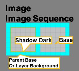
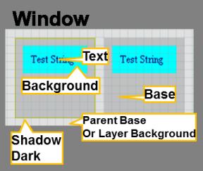
23 Graphics Composer Widget Tree 4. If you chose a Custom action, proceed as discussed above under Graphic Composer Events. When using templates the next step is to choose the target widget for the action. This choice is limited to those only the widgets in the currently active screen. If your application has multiple screens and the widget you are targeting is not part of the currently active screen you need to change the active screen. Changing the active screen can be done by selecting the corresponding screen tab at the bottom of the Graphics Composer Screen Designer: Alternately, you can switch using the Graphics Composer Management : Screens window: 5. After selecting the target widget for this macro, click Next button to select an action related to this widget. (Just as with template-based widget events.) The macro can contain more than one action, targeting more than one widget. Graphics Composer Widget Tree This section explains the organization of the z-order or layered painting of different widgets on the screen. The Graphics Composer Widget Tree allows you to organize the widgets per screen in the desired drawing order (z-order). It also allows for the user to organize the widgets into parent child hierarchies to allow for the paint algorithm to draw the groups together in event of motion or re-draw. Please note that this does not associate or group the widgets by functionality. For a group of radio buttons might not belong to a common parent on the screen. This parent-child relationship is limited to the widgets location on the screen, motion on the screen and the drawing order on the screen. (Exceptions to this general rule are the Editor:Hidden, Alpha Blending properties, and layer single versus double buffering. These apply to the parent and all the parent's children.) The following diagram shows the tree structure for a single screen with a single layer. 23
 to foreground (top of z-order) as we go from top to bottom in the list of widgets, i.e., ImageWidget1, is the widget at the bottom of the z-order and the PanelWidget1 is the topmost widget on the z-order.")
24 Graphics Composer Widget Tree The tree is traversed depth-first. This means that the z-order goes background (bottom of z-order) to foreground (top of z-order) as we go from top to bottom in the list of widgets, i.e., ImageWidget1, is the widget at the bottom of the z-order and the PanelWidget1 is the topmost widget on the z-order. The tree structure can be arranged and modified by dragging the widgets and releasing it under the desired parent/child. Also, the list can be modified by using the up/down arrows provided at the header of the Composer Widget tree window to traverse the tree. Editor:Hidden Property for Layers Setting Editor:Hidden hides the layer and all its children from the Graphics Composer Screen Designer but does not affect how the layer and its children are displayed when the application is running. This can be useful when designing complex screens with overlapping layers. Alpha Blending Property for Layers Enabling Alpha Blending allows you to control the transparency of a layer and all its children. You can experiment with Alpha Blending in the Aria Coffee Maker demonstration. Load the project, launch MHC, and then start the Graphics Composer Screen Designer. There are three layers (Layer0, Layer1, Layer2) in this demonstration. Layer1 (the drag panel on the right) and Layer2 (the drag panel on the left) have Alpha Blending enabled with Alpha Amount = 225. Setting the Alpha Amount to 255 is the same as disabling Alpha Blending (255 = no transparency). Setting the Alpha Amount to 0 makes the layer invisible (0 = full transparency, i.e., invisible). Here is the main screen with Alpha Blending = 225: Here is the main screen with Layer 2 s Alpha Blending = 255: 24

25 Graphics Composer Widget Tree Double Buffering for Layers Graphics double buffering for the LCC driver is enabled in the Display Manager s Display Setting screen when the application is changed to use external memory instead of internal. Click on the Configure button to bring up the LCC Driver Configuration Settings Window. Configure the memory according to whether double buffering is to be enabled for the display s layer or layers: 25


26 Graphics Composer Management Increasing the Buffer Count of a layer from 1 to 2 enables double buffering for the layer and all its child widgets. To prevent tearing on the display when switching from one buffer to the other, VSync Enabled should also be selected. 26


27 Graphics Composer Management Graphics Composer Management This section describes the Graphics Composer Management interface. In the upper left corner of the screen, with the Project / Files / Services screens, is the MPLAB Harmony Configurator tab, with the Graphics Composer Management and Graphics Composer Tool Box tabs. The Management tab has three daughter tabs: Screen Tab This section describes the features of the Screen tab. The Screens daughter tab manages all the application s screens: Note: These screens are examples from the Aria Showcase demonstration project. The underlined screen name identifies the primary screen. The bolded screen name identifies the currently active screen in the Graphics Composer Screen Designer window. Scheme Tab This section describes the features of the Scheme tab. Color schemes for the application s graphics are managed using the Schemes daughter tab: 27


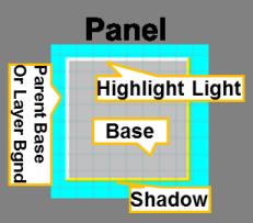
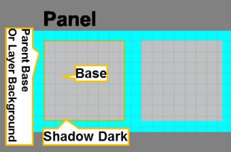
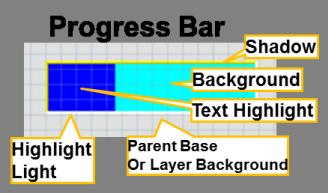
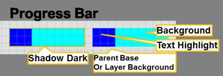
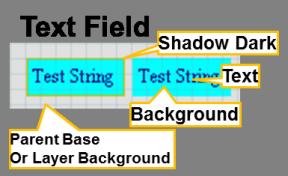
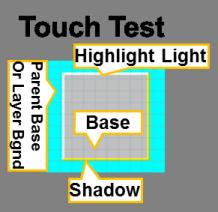
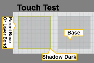
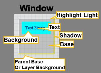
28 Graphics Composer Management Editing a Scheme To edit an existing scheme, select the scheme from the list and click Edit. The Edit Scheme dialog appears, which allows the user to change various options associated with graphics display schemes. Color Picker Dialog Box The Color Picker dialog box allows the user to easily select a color by providing a color wheel, brightness gauge, and some common predefined color choices. The user can change the individual color values or input a number in Hexadecimal format. The end result is displayed in the top right corner. Widget Colors Provides information on widgets are colored. Widget Colors Widget coloring can be customized by creating additional color schemes and assigning these customized schemes to a subset of the widgets uses. For example, a ButtonColorScheme could be customized and used only for Button Widgets. To help highlight the different colors available for each widget, a CrazyScheme, with extreme contrast among the 16 available colors, was used 28


29 Graphics Composer Management as the color scheme for each widget: Use this color scheme to help identify the relevant colors for the widgets listed below. The left column shows the coloring assignments for a Bezel boarder. The right side shows Line/No Border color assignments. Widget With Bezel Border Widget With Line or No Borders 29

30 Graphics Composer Management 30

31 Graphics Composer Management 31

32 Graphics Composer Management 32

33 Graphics Composer Management Options Tab Provides information on the Options tab. The Options sub-tab manages three aspects of the project. Project Color Mode - how colors are managed 33

34 Preemption Level allows for sharing of the device s cycles with other parts of the application. Hardware Acceleration Is graphics hardware accelerator enabled in software? Graphics Composer Management The Options tab manages the Project Color Mode. The choices for Project Color Mode are: GS_8-8 bit gray scale RGB_332 - Red/Green/Blue, 3 bits Red/Green, 2 bits Blue RGB_565 - Red/Green/Blue, 5 bits Red, 6 bits Green, 5 bits Blue RGBA_ Red/Green/Blue/Alpha, 5 bits Red/ Green/Blue, 1 bit for Alpha Blending RGB_888 - Red/Green/Blue, 8 bits Red/Green/Blue RGBA_ Red/Green/Blue/Alpha, 8 bits Red/Green/Blue/Alpha Blending ARGB_ Alpha/Red/Green/Blue, 8 bits Alpha Blending/Red/Green/Blue Be sure that the Project Color Mode chosen is compatible with the display hardware you are using; otherwise the colors shown on the display will not match those shown on the Graphics Composer Screen Designer. If no scheme is specified for a layer or widget, then the built-in default color scheme is applied. These default values are also copied to create a new scheme. Note: Not all colors are currently used. See the list below, which specifies which scheme colors apply to each widget. When the Pre-emption Level is set to zero, all dirty graphics objects are refreshed before the graphics process relinquishes control of the device. (Dirty means needing a redraw.) With the level set to two, graphics provides maximum sharing with the rest of the application, at the cost of slower display refreshes. A level of one provides an intermediate level of sharing. The Hardware Acceleration check box determines whether graphics uses the device s built-in graphics hardware accelerator in software. Note: You must also specify the graphics hardware accelerator in the MPLAB Harmony Framework Configuration under the MHC Options tab. If the host device lacks a graphics processor, you will see a warning message when you try to select a processor that does not exist on your device. 34

35 Graphics Composer Toolbox Graphics Composer Toolbox This section describes the available widgets offered by the Graphics Library, their properties, and how to use them in the screen design. The Graphics Composer Toolbox is the interface by which users add widgets into the screen representation. There are two primary methods for creating new objects: clicking and dragging. 35
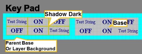
36 Properties Window Automatic Code Optimization MPLAB Harmony Graphics Composer keeps track of the types of widgets that are used and updates the MHC Tree constantly to ensure that only the Graphics Library code necessary for your design is included in the project. Click Method The following actions can be performed by using the Click method: Clicking an item selects it as active. Users can then move the cursor into the screen window and view a representation of the object about to be added. Left-clicking confirms the placement of the new object Right-clicking aborts object creation Clicking the active item again deactivates it. Drag Method Dragging and dropping a tool item into the Screen Designer Window creates a new instance of an object. When dragging a tool item, releasing the cursor outside of the Screen Designer Window cancels the drag operation. Widget List Widgets can be configured by using the Properties Window on the right side of the MHGC interface. Each widget has multiple properties to manage their appearance as well as their functioning. Most properties related to appearance are common between widgets, though some widgets require specific property entries. Button - A binary On and Off control with events generation for Press and Release state. Check Box - A selection box with Checked and Unchecked states, and associated events. Circle - A graphical object in the shape of a circle. Draw Surface - A container with a callback from its paint loop. a draw surface lets the application have a chance to make draw calls directly to the HAL during LibAria's paint loop. Gradient - A draw window that can be associated with a gradient color scheme. This allows for color variation on the window. Group Box - A container with a border and a text title. With respect to functionality, a group box is similar to a window. Image Sequence - A special widget that allows image display on screen to be scheduled and sequenced. You can select the images to be displayed, the order for display, and the durations. Image - Allows an image to be displayed on screen. The size and shape of the widget decides the visible part of the image, as scaling is not enabled for images at this time. Key Pad - A key entry widget that can can be designed for the number of entries divided as specified number of rows and column entries. The widget has a key click event that can be customized. Label - A text display widget. This does not have any input at runtime capability. A Text Field widget serves that purpose. Line - A graphical object in the shape of a line. List Wheel - Allows multiple radial selections that were usually touch-based selections and browsing. List - Allows making lists of text and image items. The list contents, number of items, and the sequence can be managed through a List Configuration dialog box in the Properties box. Panel - A container widget that is a simpler alternative to DrawSurface as it does not have the DrawSurface callback feature. Progress Bar - Displays the progress pointer for an event being monitored through the "Value Changed" event in the Properties Window. Radio Button - A set of button widgets that are selected out of the group one at a time. The group is specified by the Group property in the Properties Window. Note: The radio buttons in the same group must have the same group number specified in their properties. Rectangle - A graphical object in the shape of a rectangle. Scroll Bar - Intended to be used with another relevant widget such as the List Wheel to scroll up and down. It has a callback each time the value is changed. The callback allows users to trigger actions to be handled on the scroll value change event. Slider - Can change values with an external input such as touch. Event callbacks on value change are also available through the Properties Window. Text Field - Text input can be accepted into the text field from an external input or from a widget such as keypad. Event 'Text Changed' in the Properties Window is used for accepting the input. Touch Test - Allows tracking of touch inputs. Each new touch input is added to the list of displayed touch coordinates. The input is accepted through the 'Point Added' event callback in the Properties Window. Window - A container widget similar to the Panel but has the customizable title bar. 36

37 Properties Window Properties Window This topic describes the features of the Properties Window. The Properties Window displays options for the currently selected object, or the options for the active screen if no objects are selected. To edit an option, you left-click the value in the right column and change the value. Some values have an ellipsis that will provide additional options. In the previous case, the ellipsis button will display the Color Picker dialog. Some properties, like the screen width and height, are locked and cannot be edited. Other properties offer check boxes and combo-type drop-down box choices. Some properties are grouped together like the Position and Size entries. Individual values of the group can be edited by expanding the group using the plus symbol. For example, the following figure shows properties for a Button Widget. Notice that the bottom panel provides help text for each property, which provides the type of data expected and a description of what the property represents. Some properties are configured to reject invalid settings. Widget Properties Provides information on widget properties. Widget Properties and Event Actions Each widget has a structured tree of properties, visible under the MPLAB Harmony Configurator window on the right of the standard window setup within MPLAB.X. Most widget properties have a Related Event action that can be use in an event or macro to change or set a property from the application. Each widget has 3-4 property sets: Editor Controls behavior of widgets under the MPLAB Harmony Graphics Composer Suite Editor. Property Name Type Locked Boolean Locks the object (widget), preventing changes by the designer. N/A Only affects the object (widget) in the editor. Related Event Actions 37
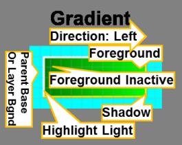
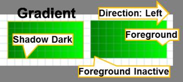
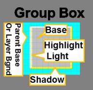
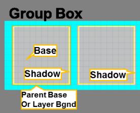
38 Properties Window Hidden Boolean Hides the widget and its children in the designer window. Only N/A affects the appearance of the widget in the editor. Active Boolean For layers only. Sets the layer as active. Any objects (widgets) N/A added to the screen will be added to this layer. Locked to Screen Size Boolean For layers only. Locks the layer size to the size of the display s N/A screen. Property Name Type Name String Editable name for each widget. By default, NameWidget1, N/A,NameWidgetN. Example: ButtonWidget1, ButtonWidget2,. Position [X,Y] Pair Integers of Location on the screen of the upper left corner of the widget. Adjust Position, Set Measured in display pixels. X is measured from left-to-right and Position, Set Y Position Y is measured from up-to-down from the upper left corner of the parent object (typically a Layer or Panel). Size [X,Y] Pair Integers of X: Width, Y: Height of object, in display pixels. Enabled Boolean Is the object enabled? Disabled objects are not built into the Set Enabled display s firmware. Visible Boolean Is the object visible by default? Object visibility can be Set Visible manipulated in firmware using lawidget_getvisible and lawidget_setvisible. Border Widget Border Choices are: { None Line Bevel }. Margin Integer Four integers ([Left,Top,Right,Bottom]) defining the widget s Set Margins margins on the display, in display pixels. Widget Scheme Related Event Actions X Adjust Size, Set Size, Set Width, Set Height Set Border Type Color scheme assigned to the widget. Blank implies the default Set Scheme color scheme. Draw Background Boolean Whether the widget s background is drawn. Set Draw Background Alpha Blending Boolean Is alpha blending for this widget and all its children enabled? N/A Property Name Type Related Event Actions Local Redraw Boolean Provides a hint to the widget s renderer that the widget is N/A responsible for removing old pixel data. This can avoid unnecessary redrawing. Widget Advanced Note: Use Local Redraw only if you know what you re doing! Widget Name Optional properties tied to each widget. See Dedicated Widget Properties and Event Actions. Events Associates widget events with event call-backs. For example, you can enable and specify a button pressed event and button release event for the Button widget. For each event you specify: Enabled/Disabled Check box To enable or disable (default) the event. Event Callback Selected from the Event Editor Action List. There are additional Event actions that don t correspond to any specific property: Set Parent Set the parent of the object, including no parent. Dedicated Widget Properties and Event Actions Button Property Name Type Related Event Actions Toggleable Boolean Is button toggle enabled? Set Toggleable Pressed Boolean If Toggleable is enabled, provide default state of the button. Set Press State This can be used to see the colors of an asserted button. Text String Select widget s text string from the Select String Dialog. Set Text 38
39 Properties Window Alignment Text string alignment within the button object. * Horizontal Horizontal alignment. Choices are: { Left Center Right }. Set Horizontal Alignment * Vertical Vertical alignment. Choices are: { Top Middle Bottom }. Set Vertical Alignment Pressed Image Select image used for pressed state. Default: no image. Set Pressed Image Released Image Select image used for pressed state. Default: no image. Set Released Image Image Position Position of image relative to button text. Choices are: { LeftOf Set Image Position Above RightOf Below Bottom }. Pressed Offset Integer Offset of button contents when pressed. In Pixels. Set Pressed Offset The X and Y position of the button contents is offset by this amount. Check Box Property Name Related Event Actions Text String Select widget s text string from the Select String Dialog. Set Text Alignment Text string alignment within the button object. * Horizontal Horizontal alignment. Choices are: { Left Center Right }. Set Horizontal Alignment * Vertical Vertical alignment. Choices are: { Top Middle Bottom }. Set Vertical Alignment Default state of the check box. Set Check State Checked Type Boolean Unchecked Image Select image used for widget s unchecked state. Default: no Set Unchecked Image image. Checked Image Select image used for the widget s checked state. Default: no Set Checked Image image. Image Position Position of image relative to check box text. Choices are: : { Set Image Position LeftOf Above RightOf Below Bottom }. Image Margin Integer Space between image and text. In Pixels. Set Image Margin Property Name Type Related Event Actions X Integer X offset of circle s center, from widget s upper left hand corner, N/A in pixels. Y Integer Y offset of circle s center, from widget s upper left hand corner, N/A in pixels. Radius Integer Circle s radius, in pixels. Set Radius Related Event Actions Circle Draw Surface No additional properties. Gradient Property Name Type Direction Gradient draw direction. Choices are: { Right Down Left Up }. Set Direction Group Box Property Name Type Related Event Actions Text String Select widget s text string from the Select String Dialog. Set Text Alignment Text string alignment within the widget. Choices are: { Set Alignment Left Center Right }. Image Sequence Property Name Sequence Dialog Type Configuration Related Event Actions Specify image sequence by using the Image Sequence Set Entry Image, Set Entry Configuration Dialog window. Horizontal Alignment, Set Entry Vertical Alignment, Set Entry Duration, Set Image Count 39
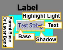
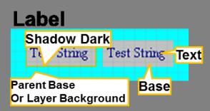
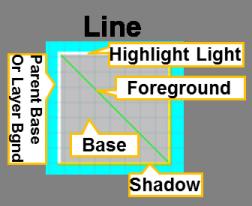
40 Properties Window Starting Image Integer Selects the first image to be shown. Set Active Image Play By Default Boolean Will image sequence play automatically? N/A Repeat Boolean Should the image sequence repeat? Set Repeat Additional related event actions:, Show Next, Start Playing, Stop Playing. Image Widget Property Name Type Related Event Actions Image Select image used. Set Image Alignment Image alignment within the image object. * Horizontal Horizontal alignment. Choices are: { Left Center Right }. Set Horizontal Alignment * Vertical Vertical alignment. Choices are: { Top Middle Bottom }. Set Vertical Alignment Key Pad (No Event Actions are currently available for this widget.) Property Name Type Related Event Actions Row Count Integer Number of key rows. None. Column Count Integer Number of key columns. None. This dialog window has the following: None. Key Pad Dialog Configuration (see ) Width Integer. Width of each key, in pixels. Height Integer. Height of each key, in pixels. Rows Integer. Number of key rows. A duplicate of Row Count. Columns Integer. Number of key columns. A duplicate of Column Count. Selecting one of the keys on the key pad diagram displays the Cell Properties for that key: Enabled Boolean. Disabled cells (keys) are made invisible. Text String Select key s text string from the Select String Dialog. Pressed Image Select image used for pressed state. Default: no image. Released Image Select image used for released state. Default: no image. Image Position Position of image relative to key text. Choices are: { LeftOf Above RightOf Below Behind }. Image Margin Integer. Space between image and text. In Pixels. Draw Background Boolean. Controls whether the key should fill its background rectangle. Editor Action Select the generic editor action that fires when the key is clicked. Choices are: { None Accept Append Label Property Name Type Related Event Actions Text String Select widget s text string from the Select String Dialog. Set Text Alignment Text string alignment within the widget. * Horizontal Horizontal alignment. Choices are: { Left Center Right }. Set Horizontal Alignment * Vertical Vertical alignment. Choices are: { Top Middle Bottom }. Set Vertical Alignment Related Event Actions Line Property Name Type Start X Integer X start of line, in pixels, from upper left hand corner of the Set Start Point Position widget. 40
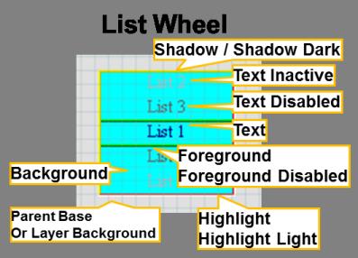
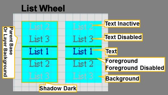
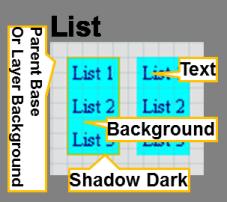
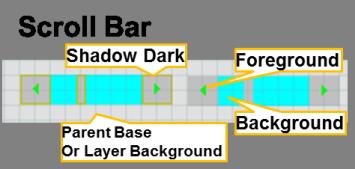
41 Properties Window Start Y Integer Y start of line, in pixels, from upper left hand corner of the Set Start Point Position widget. End X Integer X end of line, in pixels, from upper left hand corner of the widget. Set End Point Position. End Y Integer Y end of line, in pixels, from upper left hand corner of the widget. Set End Point Position. Type List Property Name Selection Mode Allow Empty Selection Select list selection {Single Multiple Contiguous}. Boolean Related Event Actions mode. Choices are: Set Selection Mode Is a list selection allowed to be empty? Set Allow Empty Selection Alignment Horizontal text alignment. Choices are: { Left Center Right }. Set Item Alignment Icon Position Position of list icons relative to list text. Choices are: { LeftOf Set Icon Position RightOf }. Icon Margin Space between icon and text, in pixels. Set Icon Margin List Configuration Dialog Defines the string and icon image for each entry in the list. Set Item Icon, Set Item Icon (actually sets item text). Additional Related Event Actions: Deselect All Items, Insert Item, Remove All Items, Remove Item, Select All Items, Set Item Selected, Toggle Item Select(ed). List Wheel Property Name Type Related Event Actions Alignment Sets horizontal text alignment. Choices are: { Left Center Set Item Alignment Right }. Icon Position Position of icons relative to text. Choices are: { LeftOf RightOf Set Icon Position }. Icon Margin Integer Sets the space between icon and text. In pixels. Set Icon Margin Selected Index Integer Selects the default list item. Set Selected Index Defines the image/text for each entry in the list. Set Item Icon, Set Item Icon (actually sets item text) List Configuration Dialog Additional Related Event Actions: Append Item, Insert Item, Remove All Items, Remove Item, Select Next Item, Select Previous Item. Panel No additional properties. Progress Bar Property Name Type Related Event Actions Direction Direction of progress bar. Choices are: { Right Down Left Up Set Direction }. Value Default value of the progress bar. laprogressbarwidget_getvalue laprogressbarwidget_getvalue can manipulate the widget s value during run time. The be primitives Set Value and used to Radio Button 41
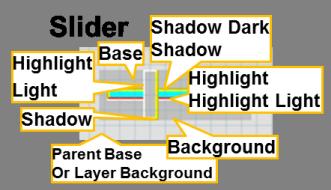
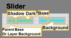
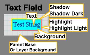
42 Property Name Type Properties Window Related Event Actions Text String Select widget s text string from the Select String Dialog. Set Text Alignment Text string alignment within the widget. * Horizontal Horizontal alignment. Choices are: { Left Center Right }. Set Horizontal Alignment * Vertical Vertical alignment. Choices are: { Top Middle Bottom }. Set Vertical Alignment Group Integer Radio Button Group Number. Default is -1, indicating no group. N/A Only one radio button in a group can have a default selected value of On. All others in the group are Off Selected Boolean If selected, the button has a default value of On. All other Select buttons in the group have a Selected value of Off. Selected Image Select image used for selected state. Default: no image. Set Selected Image Unselected Image Select image used for unselected state. Default: no image. Set Unselected Image Image Position Position of image relative to widget text. Choices are: { LeftOf Set Image Position Above RightOf Below Behind }. Image Margin Space between radio button image and text, in pixels. Set Image Margin Rectangle Property Name Type Related Event Actions Thickness Integer Line thickness in pixels. Set Thickness Type Related Event Actions Scroll Bar Property Name Orientation Scroll bar orientation. Choices are: { Vertical Horizontal }. Set Orientation Maximum Integer Maximum scroll value (minimum = 0.) Set Maximum Value Extent Integer Length of scroll bar slider, re scroll bar maximum value. Set Extent Indicates the number of lines or size of window visible at each scroll setting. Value Integer Initial scroll bar value. Step Size Integer Step size value of scroll bar arrow buttons. ( Min = 1, Max = Set Step Size 9999 ). Additional Related Event Actions: Step Backward, Step Forward Type Set Value, Percentage Set Value Slider Property Name Related Event Actions Orientation Orientation of the slider. Choices are: { Vertical Horizontal }. Set Orientation Minimum Minimum slider value. Set Minimum Value Maximum Maximum slider value. Set Maximum Value Value Initial slider value. Set Value, Percentage Grip Size Grip size of slider, from 10 to 9999, in pixels. Set Grip Size Set Value Additional Related Event Actions: Step Text Field Property Name Related Event Actions Text String Type Select widget s text string from the Select String Dialog. Clear Text followed Append Text Alignment Horizontal alignment. Choices are: { Left Center Right }. Set Alignment Cursor Enable Boolean. Show blinking cursor while editing. Set Cursor Enabled by 42
43 Cursor Delay Cursor delay in milliseconds. From 1 to 999,999. Properties Window Set Cursor Delay Additional Related Event Actions: Accept Text, Append Text, Backspace, Clear Text, Start Editing. Touch Test No dedicated properties. Window Property Name Related Event Actions Title String Select widget s title string from the Select String Dialog. Set Title Icon Image Select image used. Default: no image. Set Icon Space between icon and title, in pixels. N/A Image Margin Type Integer Layer Properties and Event Actions The property list for a graphic layer is close in look and feel to that of a widget. Each Layer has three property sets: Editor (see above), Widget (see above), and Layer (see below). Layer Properties Property Name Type Buffer Count Integer Integer number of frame buffers associated with this layer, N/A either 1 or 2. Buffer N Related Event Actions For each buffer you can specify the frame buffer allocation None for each buffer and method. the daughter properties. Allocation Method - Choices are: { Auto Address Variable Name }. Auto Automatically allocate frame buffer space Address Specify a memory address Memory Address Hexadecimal Integer. Raw (physical?) memory address location for the buffer. Variable Name Use variable name as buffer location Variable Name String. Variable name. Transparency Enabled Boolean. Automatically mask out pixels with a specified Color. If enabled, specify: Mask Color, either as (R,G,B) color or as a color scheme VSync Enabled Boolean. Layer should swap only during a vertical sync. 43
44 Code Generation Code Generation This topic describes using the graphics composer to generate code. MPLAB Harmony Graphics Composer data is generated the same way as the rest of the project within MHC through the Generate button. libaria_harmony.h/c These files provide the interface that binds libaria to the overall MPLAB Harmony framework. They contain the implementations for the standard state management, variable storage, and initialization and tasks functions. If the touch functionality is enabled then the touch bindings are also generated in libaria_harmony.c. libaria_init.h/c - These files contain the main initialization functions for the library state and screens. The header file contains all predefined information for the library state including screen IDs, schemes, and widget pointers. The main initialization function initializes all schemes and screens, creates all screen objects, and sets the initial state of the library context. As each screen must be capable of being created at any time, each screen has a unique create function that can be called at any time by the library. libaria_init.c contains these create functions. libaria_event.h/c The event files contain the definitions and implementations of all enabled MHGC events. Each event implementation will contain all generated actions for that event. libaria_macro.h/c The macro files contain the definitions and implementations of all defined MHGC screen macros. A macro is similar to an event in that it can contain actions. However, it is meant to be called from an external source such as the main application. libaria_config.h This file contains configuration values for the library. These are controlled through settings defined in the MHC settings tree. 44
45 Saving and Loading Data Saving and Loading Data This topic describes using the graphics composer to save and load data. The graphics composer saves and loads its data into the configuration.xml file of the MHC configuration. This file is always located within <install-dir>\apps\<feature>\<demonstration_name>\firmware\src\system_config\$configuration_name. The saved data is loaded when MHC starts and is saved when the configuration is saved through the Save or Save As dialog boxes. 45

46 Importing and Exporting Data Importing and Exporting Data This topic provides information on importing and exporting graphics composer-related data. The MPLAB Harmony Graphics Composer provides the capability for users to import and export graphics composer-related data. The user can export the state of an existing graphics composer configuration, import another graphics composer configuration, and import projects from the Graphics Display Designer X (GDD X) utility. The import and export interfaces are located in the Configuration dialog of the MPLAB Harmony Configurator, which is accessible from the Options tab. Importing Data To import data into graphics composer, click Import from the main window toolbar. The Import dialog box is displayed. The user can choose to import either GDD X or graphics composer data. Upon selecting a format and clicking Import, a path dialog will appear and the user can browse to either a graphics composer XML file or a GDD X project file. Importing data will remove all currently existing graphics composer data. Warning Exporting Data To export a Composer configuration: 1. Click Export. 2. Select MPLAB Harmony Graphics Composer from the list and click Export. 3. Select the file path where the exported data should be placed and click Open. The current graphics composer data will be written into this file. 46

47 Importing and Exporting Data 47
MPLAB Harmony Help - MPLAB Harmony Graphics Composer User's Guide
 MPLAB Harmony Help - MPLAB Harmony Graphics Composer User's Guide MPLAB Harmony Integrated Software Framework v1.11 2013-2017 Microchip Technology Inc. All rights reserved. MPLAB Harmony Graphics Composer
MPLAB Harmony Graphics Libraries Help
 MPLAB Harmony Graphics Libraries Help MPLAB Harmony Integrated Software Framework 2013-2017 Microchip Technology Inc. All rights reserved. Graphics Libraries Help Graphics Libraries Help This topic provides
Graphics Demonstrations
 MPLAB Harmony Integrated Software Framework Copyright (c) 2013-2017 Microchip Technology Inc. All rights reserved. This section provides descriptions of the Graphics demonstrations. MPLAB Harmony is available
Layout and display. STILOG IST, all rights reserved
 2 Table of Contents I. Main Window... 1 1. DEFINITION... 1 2. LIST OF WINDOW ELEMENTS... 1 Quick Access Bar... 1 Menu Bar... 1 Windows... 2 Status bar... 2 Pop-up menu... 4 II. Menu Bar... 5 1. DEFINITION...
ezimagex2 User s Guide Version 1.0
 ezimagex2 User s Guide Version 1.0 Copyright and Trademark Information The products described in this document are copyrighted works of AVEN, Inc. 2015 AVEN, Inc. 4595 Platt Rd Ann Arbor, MI 48108 All
Matrox MuraControl for Windows
 Matrox MuraControl for Windows User Guide (for software version 6.00) 20179-301-0600 2017.09.25 Contents About this user guide... 6 Using this guide... 6 More information... 6 Overview... 7 Supported Matrox
Quick Reference Card Business Objects Toolbar Design Mode
 Icon Description Open in a new window Pin/Unpin this tab Close this tab File Toolbar New create a new document Open Open a document Select a Folder Select a Document Select Open Save Click the button to
How to create interactive documents
 Adobe InDesign Guide How to create interactive documents You can use Adobe InDesign to create dynamic web content or interactive documents. InDesign supports export to web-ready HTML or interactive PDF.
Tree and Data Grid for Micro Charts User Guide
 COMPONENTS FOR XCELSIUS Tree and Data Grid for Micro Charts User Guide Version 1.1 Inovista Copyright 2009 All Rights Reserved Page 1 TABLE OF CONTENTS Components for Xcelsius... 1 Introduction... 4 Data
To use the keyboard emulation, you must activate it in the tray icon menu (see 2.6 Enable keyboard emulation)
") LEA USER GUIDE Notice: To use LEA you have to buy the client and download the free server at: https://www.leaextendedinput.com/download.php The Client is available in the App Store for IOS and Android
LEA USER GUIDE Notice: To use LEA you have to buy the client and download the free server at: https://www.leaextendedinput.com/download.php The Client is available in the App Store for IOS and Android
How to...create a Video VBOX Gauge in Inkscape. So you want to create your own gauge? How about a transparent background for those text elements?
 BASIC GAUGE CREATION The Video VBox setup software is capable of using many different image formats for gauge backgrounds, static images, or logos, including Bitmaps, JPEGs, or PNG s. When the software
Creating Buttons and Pop-up Menus
 Using Fireworks CHAPTER 12 Creating Buttons and Pop-up Menus 12 In Macromedia Fireworks 8 you can create a variety of JavaScript buttons and CSS or JavaScript pop-up menus, even if you know nothing about
Sending image(s) to report Click Send Snapshot on any screen in Dolphin3D and choose the Send to Report option
 to report Click Send Snapshot on any screen in Dolphin3D and choose the Send to Report option") Dolphin 3D Reports Sending image(s) to report Click Send Snapshot on any screen in Dolphin3D and choose the Send to Report option Creating a report step by step 1. Generate the desired images in Dolphin3D
Dolphin 3D Reports Sending image(s) to report Click Send Snapshot on any screen in Dolphin3D and choose the Send to Report option Creating a report step by step 1. Generate the desired images in Dolphin3D
Customisation and production of Badges. Getting started with I-Color System Basic Light
 Customisation and production of Badges Getting started with I-Color System Basic Light Table of contents 1 Creating a Badge Model 1.1 Configuration of Badge Format 1.2 Designing your Badge Model 1.2.1
SlickEdit Gadgets. SlickEdit Gadgets
 SlickEdit Gadgets As a programmer, one of the best feelings in the world is writing something that makes you want to call your programming buddies over and say, This is cool! Check this out. Sometimes
OpenForms360 Validation User Guide Notable Solutions Inc.
 OpenForms360 Validation User Guide 2011 Notable Solutions Inc. 1 T A B L E O F C O N T EN T S Introduction...5 What is OpenForms360 Validation?... 5 Using OpenForms360 Validation... 5 Features at a glance...
User Manual Version 1.1 January 2015
 User Manual Version 1.1 January 2015 - 2 / 112 - V1.1 Variegator... 7 Variegator Features... 7 1. Variable elements... 7 2. Static elements... 7 3. Element Manipulation... 7 4. Document Formats... 7 5.
Solo 4.6 Release Notes
 June9, 2017 (Updated to include Solo 4.6.4 changes) Solo 4.6 Release Notes This release contains a number of new features, as well as enhancements to the user interface and overall performance. Together
Rich Text Editor Quick Reference
 Rich Text Editor Quick Reference Introduction Using the rich text editor is similar to using a word processing application such as Microsoft Word. After data is typed into the editing area it can be formatted
BASICS OF MOTIONSTUDIO
 EXPERIMENT NO: 1 BASICS OF MOTIONSTUDIO User Interface MotionStudio combines draw, paint and animation in one easy easy-to-use program gram to save time and make work easy. Main Window Main Window is the
Designer Reference 1
 Designer Reference 1 Table of Contents USE OF THE DESIGNER...4 KEYBOARD SHORTCUTS...5 Shortcuts...5 Keyboard Hints...5 MENUS...7 File Menu...7 Edit Menu...8 Favorites Menu...9 Document Menu...10 Item Menu...12
The figure below shows the Dreamweaver Interface.
 Dreamweaver Interface Dreamweaver Interface In this section you will learn about the interface of Dreamweaver. You will also learn about the various panels and properties of Dreamweaver. The Macromedia
ArcGIS. ArcGIS Desktop. Tips and Shortcuts
 ArcGIS ArcGIS Desktop Tips and Shortcuts Map Navigation Refresh and redraw the display. F5 9.1, Suspend the map s drawing. F9 9.1, Zoom in and out. Center map. Roll the mouse wheel backward and forward.
Using Inspiration 7 I. How Inspiration Looks SYMBOL PALETTE
 Using Inspiration 7 Inspiration is a graphic organizer application for grades 6 through adult providing visual thinking tools used to brainstorm, plan, organize, outline, diagram, and write. I. How Inspiration
ASIC-200 Version 5.0. integrated industrial control software. HMI Guide
 ASIC-200 Version 5.0 integrated industrial control software HMI Guide Revision Description Date C Name change, correct where applicable with document 4/07 HMI Guide: 139168(C) Published by: Pro-face 750
SmartView. User Guide - Analysis. Version 2.0
 SmartView User Guide - Analysis Version 2.0 Table of Contents Page i Table of Contents Table Of Contents I Introduction 1 Dashboard Layouts 2 Dashboard Mode 2 Story Mode 3 Dashboard Controls 4 Dashboards
SPARK. User Manual Ver ITLAQ Technologies
 SPARK Forms Builder for Office 365 User Manual Ver. 3.5.50.102 0 ITLAQ Technologies www.itlaq.com Table of Contents 1 The Form Designer Workspace... 3 1.1 Form Toolbox... 3 1.1.1 Hiding/ Unhiding/ Minimizing
In this exercise you will be creating the graphics for the index page of a Website for children about reptiles.
 LESSON 2: CREATING AND MANIPULATING IMAGES OBJECTIVES By the end of this lesson, you will be able to: create and import graphics use the text tool attach text to a path create shapes create curved and
How to set up a local root folder and site structure
 Activity 2.1 guide How to set up a local root folder and site structure The first thing to do when creating a new website with Adobe Dreamweaver CS3 is to define a site and identify a root folder where
P3e REPORT WRITER CREATING A BLANK REPORT
 P3e REPORT WRITER CREATING A BLANK REPORT 1. On the Reports window, select a report, then click Copy. 2. Click Paste. 3. Click Modify. 4. Click the New Report icon. The report will look like the following
3D PDF Plug-ins for Autodesk products Version 2.0
 Axes 3D PDF Plug-ins for Autodesk products Version 2.0 User Guide This end user manual provides instructions for the tetra4d - 3D PDF Plug-ins for Autodesk 203/204 applications. It includes a getting started
Nauticom NetEditor: A How-to Guide
 Nauticom NetEditor: A How-to Guide Table of Contents 1. Getting Started 2. The Editor Full Screen Preview Search Check Spelling Clipboard: Cut, Copy, and Paste Undo / Redo Foreground Color Background Color
Learn more about Pages, Keynote & Numbers
 Learn more about Pages, Keynote & Numbers HCPS Instructional Technology May 2012 Adapted from Apple Help Guides CHAPTER ONE: PAGES Part 1: Get to Know Pages Opening and Creating Documents Opening a Pages
Specification Manager
 Enterprise Architect User Guide Series Specification Manager Author: Sparx Systems Date: 30/06/2017 Version: 1.0 CREATED WITH Table of Contents The Specification Manager 3 Specification Manager - Overview
Guide to WB Annotations
 Guide to WB Annotations 04 May 2016 Annotations are a powerful new feature added to Workbench v1.2.0 (Released May 2016) for placing text and symbols within wb_view tabs and windows. They enable generation
Chapter 6 Formatting Graphic Objects
 Impress Guide Chapter 6 OpenOffice.org Copyright This document is Copyright 2007 by its contributors as listed in the section titled Authors. You can distribute it and/or modify it under the terms of either
W-E
 Signage Suite V2.20 User Guide 605220-02-01-W-E-051613-02 Trademarks Windows XP, Windows Vista, Windows 7, and Microsoft are registered trademarks of Microsoft Corporation. All other trademarks are the
Creating Web Pages with SeaMonkey Composer
 1 of 26 6/13/2011 11:26 PM Creating Web Pages with SeaMonkey Composer SeaMonkey Composer lets you create your own web pages and publish them on the web. You don't have to know HTML to use Composer; it
Adding Dynamics. Introduction
 M-Graphic s User s Manual 11-1 Chapter 11 Adding Dynamics Introduction This chapter explains how to make single or multiple dynamic connections from display objects to points from OPC data servers. This
Motic Images Plus 3.0 ML Software. Windows OS User Manual
 Motic Images Plus 3.0 ML Software Windows OS User Manual Motic Images Plus 3.0 ML Software Windows OS User Manual CONTENTS (Linked) Introduction 05 Menus and tools 05 File 06 New 06 Open 07 Save 07 Save
Report Designer Report Types Table Report Multi-Column Report Label Report Parameterized Report Cross-Tab Report Drill-Down Report Chart with Static
 Table of Contents Report Designer Report Types Table Report Multi-Column Report Label Report Parameterized Report Cross-Tab Report Drill-Down Report Chart with Static Series Chart with Dynamic Series Master-Detail
Bombardier Business Aircraft Customer Services. Technical Publications. SmartPubs Viewer 3.0 User Guide. Updated January 2013 [2013]
![Bombardier Business Aircraft Customer Services. Technical Publications. SmartPubs Viewer 3.0 User Guide. Updated January 2013 [2013]](/thumbs/90/103657167.jpg "Bombardier Business Aircraft Customer Services. Technical Publications. SmartPubs Viewer 3.0 User Guide. Updated January 2013 [2013]") Bombardier Business Aircraft Customer Services Technical Publications SmartPubs Viewer 3.0 User Guide Updated January 2013 [2013] Table of Contents Application Views... 5 Collection View... 5 Manual View...
Bombardier Business Aircraft Customer Services Technical Publications SmartPubs Viewer 3.0 User Guide Updated January 2013 [2013] Table of Contents Application Views... 5 Collection View... 5 Manual View...
ENGL 323: Writing for New Media Repurposing Content for the Web Part Two
 ENGL 323: Writing for New Media Repurposing Content for the Web Part Two Dr. Michael Little michaellittle@kings.edu Hafey-Marian 418 x5917 Using Color to Establish Visual Hierarchies Color is useful in
Desktop Studio: Charts. Version: 7.3
 Desktop Studio: Charts Version: 7.3 Copyright 2015 Intellicus Technologies This document and its content is copyrighted material of Intellicus Technologies. The content may not be copied or derived from,
User Guide. Web Intelligence Rich Client. Business Objects 4.1
 User Guide Web Intelligence Rich Client Business Objects 4.1 2 P a g e Web Intelligence 4.1 User Guide Web Intelligence 4.1 User Guide Contents Getting Started in Web Intelligence 4.1... 5 Log into EDDIE...
Using SymPrint to Make Overlays, Templates & More...
 Welcome to SymPrint SymPrint is an easy-to-use tool for creating communication overlays, worksheets, classroom activities and more using a modern toolbar and common-sense interface modeled after the programs
Keynote 08 Basics Website:
 Website: http://etc.usf.edu/te/ Keynote is Apple's presentation application. Keynote is installed as part of the iwork suite, which also includes the word processing program Pages and the spreadsheet program
IS2000. Administrative Operator s Guide
 IS2000 Administrative Operator s Guide Table of Contents Logging Off... 7 Event Manager... 7 HARDWARE MANAGER... 8 Maneuvering the Hardware Tree... 8 Unlocking the Module... 8 Viewing the Hardware Tree...
Table Basics. The structure of an table
 TABLE -FRAMESET Table Basics A table is a grid of rows and columns that intersect to form cells. Two different types of cells exist: Table cell that contains data, is created with the A cell that
FactoryLink 7. Version 7.0. Client Builder Reference Manual
 FactoryLink 7 Version 7.0 Client Builder Reference Manual Copyright 2000 United States Data Corporation. All rights reserved. NOTICE: The information contained in this document (and other media provided
Matrox MuraControl for Windows
 Matrox MuraControl for Windows User Guide (for software version 7.00) 20179-301-0700 2018.06.12 Contents About this user guide... 6 Using this guide... 6 More information... 6 Overview... 7 Supported Matrox
Adding Objects Creating Shapes Adding. Text Printing and Exporting Getting Started Creating a. Creating Shapes Adding Text Printing and Exporting
 Getting Started Creating a Workspace Pages, Masters and Guides Adding Objects Creating Shapes Adding Text Printing and Exporting Getting Started Creating a Workspace Pages, Masters and Guides Adding Objects
HydroOffice Diagrams
 Hydro Office Software for Water Sciences HydroOffice Diagrams User Manual for Ternary 1.0, Piper 2.0 and Durov 1.0 tool HydroOffice.org Citation: Gregor M. 2013. HydroOffice Diagrams user manual for Ternary1.0,
For more tips on using this workbook, press F1 and click More information about this template.
 Excel: Menu to ribbon reference To view Office 2003 menu and toolbar commands and their Office 2010 equivalents, click a worksheet tab at the bottom of the window. If you don't see the tab you want, right-click
Drawing shapes and lines
 Fine F Fi i Handmade H d d Ch Chocolates l Hours Mon Sat 10am 6pm In this demonstration of Adobe Illustrator CS6, you will be introduced to new and exciting application features, like gradients on a stroke
Specification Manager
 Enterprise Architect User Guide Series Specification Manager How to define model elements simply? In Sparx Systems Enterprise Architect, use the document-based Specification Manager to create elements
ORGANIZING YOUR ARTWORK WITH LAYERS
 9 ORGANIZING YOUR ARTWORK WITH LAYERS Lesson overview In this lesson, you ll learn how to do the following: Work with the Layers panel. Create, rearrange, and lock layers and sublayers. Move objects between
Unit 21 - Creating a Navigation Bar in Macromedia Fireworks
 Unit 21 - Creating a Navigation Bar in Macromedia Fireworks Items needed to complete the Navigation Bar: Unit 21 - House Style Unit 21 - Graphics Sketch Diagrams Document ------------------------------------------------------------------------------------------------
Desktop Studio: Charts
 Desktop Studio: Charts Intellicus Enterprise Reporting and BI Platform Intellicus Technologies info@intellicus.com www.intellicus.com Working with Charts i Copyright 2011 Intellicus Technologies This document
Code Finix Label Designer V 1.0 User Guide
 Code Finix Label Designer V 1.0 User Guide Introduction Welcome, Code Finix Label Designer is a family of professional labeling software products that brings a complete barcode printing solution for desktop
MotionGraphix. User Guide. Quick Start. Overview
 MotionGraphix User Guide Quick Start Create a Project Add Elements Position, scale and rotate the elements Change the time and reposition, scale and rotate the elements Change the time again, etc. Double
Impress Guide. Chapter 11 Setting Up and Customizing Impress
 Impress Guide Chapter 11 Setting Up and Customizing Impress Copyright This document is Copyright 2007 2013 by its contributors as listed below. You may distribute it and/or modify it under the terms of
imos Drawing Output The following document includes the topics borders and viewsets.
 imos Drawing Output The following document includes the topics borders and viewsets. We have attempted to keep the content of the document complete, accurate and under permanent review. However, due to
File: SiteExecutive 2013 Core Modules User Guide.docx Printed September 30, 2013
 File: SiteExecutive 2013 Core Modules User Guide.docx Printed September 30, 2013 Page i Contact: Systems Alliance, Inc. Executive Plaza III 11350 McCormick Road, Suite 1203 Hunt Valley, Maryland 21031
Contents. Launching Word
 Using Microsoft Office 2007 Introduction to Word Handout INFORMATION TECHNOLOGY SERVICES California State University, Los Angeles Version 1.0 Winter 2009 Contents Launching Word 2007... 3 Working with
Microsoft Office Publisher
 Microsoft Office 2007- Publisher Opening Microsoft Publisher Using the Start Menu, click on All Programs and navigate to the Microsoft Office folder. Click on Microsoft Office Publisher 2007. Choosing
IHS Enerdeq Desktop International Training Guide
 IHS > Decision Support Tool IHS Enerdeq Desktop International Training Guide May 2009 Version 1.5.2 2009 IHS, All Rights Reserved. All trademarks belong to IHS or its affiliated and subsidiary companies,
GIMP WEB 2.0 ICONS. GIMP is all about IT (Images and Text) OPEN GIMP
 OPEN GIMP") GIMP WEB 2.0 ICONS Web 2.0 Banners: Download E-Book WEB 2.0 ICONS: DOWNLOAD E-BOOK OPEN GIMP GIMP is all about IT (Images and Text) Step 1: To begin a new GIMP project, from the Menu Bar, select File New.
GIMP WEB 2.0 ICONS Web 2.0 Banners: Download E-Book WEB 2.0 ICONS: DOWNLOAD E-BOOK OPEN GIMP GIMP is all about IT (Images and Text) Step 1: To begin a new GIMP project, from the Menu Bar, select File New.
Working with Charts Stratum.Viewer 6
 Working with Charts Stratum.Viewer 6 Getting Started Tasks Additional Information Access to Charts Introduction to Charts Overview of Chart Types Quick Start - Adding a Chart to a View Create a Chart with
PowerPoint 2016 Building a Presentation
 PowerPoint 2016 Building a Presentation What is PowerPoint? PowerPoint is presentation software that helps users quickly and efficiently create dynamic, professional-looking presentations through the use
Introduction to the Visual Studio.NET Integrated Development Environment IDE. CSC 211 Intermediate Programming
 Introduction to the Visual Studio.NET Integrated Development Environment IDE CSC 211 Intermediate Programming Visual Studio.NET Integrated Development Environment (IDE) The Start Page(Fig. 1) Helpful links
KODAK Software User s Guide
 KODAK Create@Home Software User s Guide Table of Contents 1 Welcome to KODAK Create@Home Software Features... 1-1 Supported File Formats... 1-1 System Requirements... 1-1 Software Updates...1-2 Automatic
VisualPST 2.4. Visual object report editor for PowerSchool. Copyright Park Bench Software, LLC All Rights Reserved
 VisualPST 2.4 Visual object report editor for PowerSchool Copyright 2004-2015 Park Bench Software, LLC All Rights Reserved www.parkbenchsoftware.com This software is not free - if you use it, you must
Understanding Acrobat Form Tools
 CHAPTER Understanding Acrobat Form Tools A Adobe Acrobat X PDF Bible PDF Forms Using Adobe Acrobat and LiveCycle Designer Bible Adobe Acrobat X PDF Bible PDF Forms Using Adobe Acrobat and LiveCycle Designer
CONTASign Pro User Manual
 CONTASign Pro User Manual CONTASign PRO MANUAL v3.5 rev01 Page 1 of 51 CONTA-CLIP Contents Page No. 1. Main Window Layout 4 - Window Layout Customisation 5 - Window Configuration 6 2. Start Menu & Quick
ArcGIS. for Desktop. Tips and Shortcuts 10.1
 ArcGIS 10.1 for Desktop Tips and Shortcuts Map Navigation Refresh and redraw the display. F5 Suspend the map s drawing. F9 Zoom in and out. Center map. Roll the mouse wheel backward and forward. Hold down
Impress Guide Chapter 11 Setting Up and Customizing Impress
 Impress Guide Chapter 11 Setting Up and Customizing Impress This PDF is designed to be read onscreen, two pages at a time. If you want to print a copy, your PDF viewer should have an option for printing
User Manual. pdoc Forms Designer. Version 3.7 Last Update: May 25, Copyright 2018 Topaz Systems Inc. All rights reserved.
 User Manual pdoc Forms Designer Version 3.7 Last Update: May 25, 2018 Copyright 2018 Topaz Systems Inc. All rights reserved. For Topaz Systems, Inc. trademarks and patents, visit www.topazsystems.com/legal.
Overview of Adobe Fireworks
 Adobe Fireworks Overview of Adobe Fireworks In this guide, you ll learn how to do the following: Work with the Adobe Fireworks workspace: tools, Document windows, menus, and panels. Customize the workspace.
WINDOWS NT BASICS
 WINDOWS NT BASICS 9.30.99 Windows NT Basics ABOUT UNIVERSITY TECHNOLOGY TRAINING CENTER The University Technology Training Center (UTTC) provides computer training services with a focus on helping University
Numbers Basics Website:
 Website: http://etc.usf.edu/te/ Numbers is Apple's new spreadsheet application. It is installed as part of the iwork suite, which also includes the word processing program Pages and the presentation program
CounselLink Reporting. Designer
 CounselLink Reporting Designer Contents Overview... 1 Introduction to the Document Editor... 2 Create a new document:... 2 Document Templates... 3 Datasets... 3 Document Structure... 3 Layout Area... 4
Session 7 MS Word. Graphics. Inserting Clipart, and Graphics Modify graphics Position graphics
 Session 7 MS Word Graphics Inserting Clipart, and Graphics Modify graphics Position graphics Table of Contents Session 7 Working with Graphics... 1 The Toolbar... 1 Drawing Toolbar... 1 Picture Toolbar...
Plotting. Documentation. DDBSP - Dortmund Data Bank Software Package
 Plotting Documentation DDBSP - Dortmund Data Bank Software Package DDBST Software & Separation Technology GmbH Marie-Curie-Straße 10 D-26129 Oldenburg Tel.: +49 441 361819 0 Fax: +49 441 361819 10 E-Mail:
KODAK Software User s Guide. Software Version 9.0
 KODAK Create@Home Software User s Guide Software Version 9.0 Table of Contents 1 Welcome to KODAK Create@Home Software Features... 1-1 Supported File Formats... 1-1 System Requirements... 1-1 Software
v Overview SMS Tutorials Prerequisites Requirements Time Objectives
 v. 12.2 SMS 12.2 Tutorial Overview Objectives This tutorial describes the major components of the SMS interface and gives a brief introduction to the different SMS modules. Ideally, this tutorial should
Basic Concepts. Launching MultiAd Creator. To Create an Alias. file://c:\documents and Settings\Gary Horrie\Local Settings\Temp\~hh81F9.
 Page 1 of 71 This section describes several common tasks that you'll need to know in order to use Creator successfully. Examples include launching Creator and opening, saving and closing Creator documents.
Table of Contents. Page 2 of 72. High Impact 4.0 User Manual
 Table of Contents Introduction 5 Installing High Impact email 6 Installation Location 6 Select Mail Client 6 Create a ReadyShare Account 6 Create a Default Profile 6 Outlook Configuration Message 6 Complete
Sedao Ltd. QuickChange PROject. User Manual for QuickChange PROject version 2.1.5
 Sedao Ltd QuickChange PROject User Manual for QuickChange PROject version 2.1.5 Contents What is QuickChange PROject?... 2 Simple Artwork Creation... 5 Creating a project... 7 QuickChange PROject Template
Libraries. Multi-Touch. Aero Peek. Sema Foundation 10 Classes 2 nd Exam Review ICT Department 5/22/ Lesson - 15
 10 Classes 2 nd Exam Review Lesson - 15 Introduction Windows 7, previous version of the latest version (Windows 8.1) of Microsoft Windows, was produced for use on personal computers, including home and
Using Adobe Contribute 4 A guide for new website authors
 Using Adobe Contribute 4 A guide for new website authors Adobe Contribute allows you to easily update websites without any knowledge of HTML. This handout will provide an introduction to Adobe Contribute
Enterprise Architect. User Guide Series. Wireframe Models
 Enterprise Architect User Guide Series Wireframe Models What Wireframe Modeling tool to use? Sparx Systems Enterprise Architect provides patterns and icons to help create Wireframe models of application
Dive Into Visual C# 2008 Express
 1 2 2 Dive Into Visual C# 2008 Express OBJECTIVES In this chapter you will learn: The basics of the Visual Studio Integrated Development Environment (IDE) that assists you in writing, running and debugging
Part 1: Basics. Page Sorter:
 Part 1: Basics Page Sorter: The Page Sorter displays all the pages in an open file as thumbnails and automatically updates as you add content. The page sorter can do the following. Display Pages Create
14. Using Illustrator CC with Other Adobe Applications
 14. Using Illustrator CC with Other Adobe Applications Lesson overview In this lesson, you ll learn how to do the following: Place linked and embedded graphics in an Illustrator file. Place multiple images
A Step-by-step guide to creating a Professional PowerPoint Presentation
 Quick introduction to Microsoft PowerPoint A Step-by-step guide to creating a Professional PowerPoint Presentation Created by Cruse Control creative services Tel +44 (0) 1923 842 295 training@crusecontrol.com
CS Multimedia and Communications REMEMBER TO BRING YOUR MEMORY STICK TO EVERY LAB! Lab 02: Introduction to Photoshop Part 1
 CS 1033 Multimedia and Communications REMEMBER TO BRING YOUR MEMORY STICK TO EVERY LAB! Lab 02: Introduction to Photoshop Part 1 Upon completion of this lab, you should be able to: Open, create new, save
Learning to use the drawing tools
 Create a blank slide This module was developed for Office 2000 and 2001, but although there are cosmetic changes in the appearance of some of the tools, the basic functionality is the same in Powerpoint
Tutorials. Lesson 3 Work with Text
 In this lesson you will learn how to: Add a border and shadow to the title. Add a block of freeform text. Customize freeform text. Tutorials Display dates with symbols. Annotate a symbol using symbol text.
Enterprise Architect. User Guide Series. Wireframe Models. Author: Sparx Systems Date: 15/07/2016 Version: 1.0 CREATED WITH
 Enterprise Architect User Guide Series Wireframe Models Author: Sparx Systems Date: 15/07/2016 Version: 1.0 CREATED WITH Table of Contents Wireframe Models 3 Android Wireframe Toolbox 4 Apple iphone/tablet