TePe Graphic Guidelines
|
|
|
- Philip Page
- 6 years ago
- Views:
Transcription

1 TePe Graphic Guidelines

2 Why do we need graphic guidelines? Why do we need graphic guidelines? Everything we do, from business cards to advertisements and catalogues, should follow TePe s visual identity and amplify our values. Consistent visual identity ensures that TePe is always communicated in the same way, also on the international market. Sharing material among our TePe companies also leads to internal efficiency. So, how can we make sure that we keep in line with our identity and stay consistent? The answer is our graphic guidelines, which explain how to implement TePe s visual identity. Useful examples and templates are included.
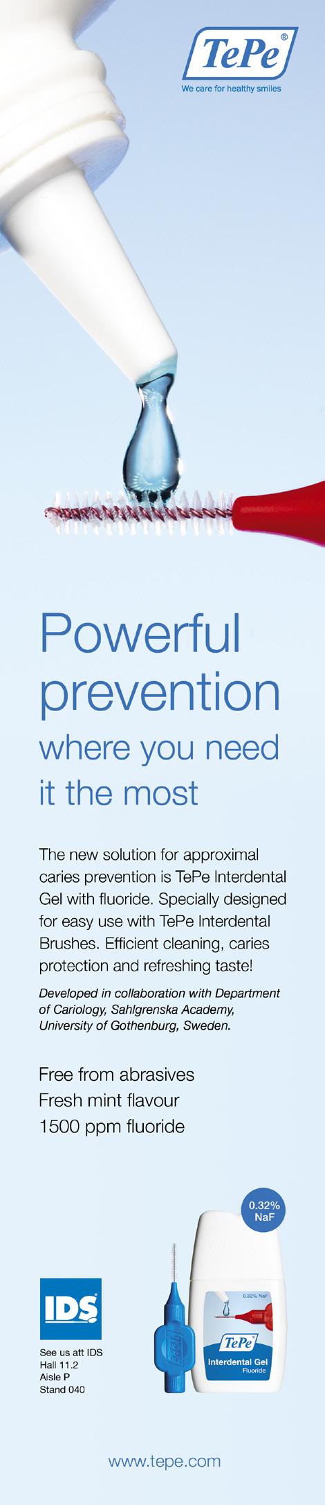
3 Colour TePe colour space The TePe brand is supported with a colour palette designed to be modern, fresh and distinctive. Different combinations of colours may change the appearance of a design, so to maintain the brand recognition it is important that the colour palette is applied consistenly. Use solid color where applicable and steps of 60% and 40% if needed. Pantone Magenta C Pantone 355 C Pantone 2905 C % 60% Pantone Black C % Pantone 300 C
4 Logotype TePe logotype The logotype is an important asset to TePe and should serve as a foundation for all visual communication. To maintain a strong visual brand it is important that the logotype is always applied consistently wherever it appears. It should never be altered or manipulated; size and position is specified within this document. Elements of the logotype The TePe logotype includes two elements; the logotype (TePe and the frame) and the tagline (We care for healthy smiles). Both elements represent the logotype, our brand and the base of our identity. The logotype may not be altered in any way. It should not be complemented with other symbols or similar and it cannot be used as part of a text. The tagline may not be translated into any other language. Logotype clear zone To ensure the visibility of the logotype there must always be a specified space around the logotype a clear zone. The clear zone shall be as large as ½ the size (x) of the logotype (without tagline). No text or graphical elements are allowed in the clear zone. The examples on the next show correct and incorrect use of the clear zone. 1/2 x Logotype x Tagline 1/2 x 1/2 x Appropriate size for paper formats <A5 A5 A4 A3 25 mm 32 mm 40 mm 52 mm

5 Logotype The logotype with and without tagline If the logotype is wider than 20 mm, the tagline should always be included. If the width of the logotype is less than 20 mm, the tagline should not be included. This is to ensure that the tagline is always clear and readable. All measurements are in millimetres. Incorrect use of the logotype 20 mm It is of utmost importance that all elements of the TePe identity are used in accordance with the rules in these guidelines. No alterations of any kind may be made to the supplied artwork, including creating home-made versions of the logotype. For your guidance, some typical examples of incorrect use of the TePe logotype are illustrated below. They contain letterform, colour and format errors. Do not expand. Do not change the colour. Do not re-compose the logotype and tagline. Do not compress. Do not invert. Do not place on a similarly coloured background. Do not angle. Do not add visual effects. Do not place on a sharp coloured background.


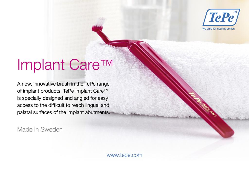
6 Imagery Imagery We have an extensive media bank which is continuously updated and supplemented. It includes photos of products, people using TePe products and lifestyle photos.! Photos and illustrations can be downloaded from TePe s Media Bank at

7 Imagery
8 Typography Typography Helvetica Neue is our corporate font and it should be used where the font is available. It is a clean and modern typeface that complements TePe s logotype and is a key element to TePe s visual communication. Where Helvetica Neue is not available, we recommend using Arial which is our secondary typeface. Arial is usable for the web and powerpoint presentations. Primary typeface: Helvetica Neue AaBbCcDeEeFfGg %&?!# $@+ Helvetica Neue Thin: Helvetica Neue Light: Helvetica Neue Medium: Helvetica Neue Bold: Helvetica Neue Roman: Helvetica Italic:
9 Typography Secondary typeface: Arial AaBbCcDeEeFfGg %&?!# Arial Regular: Arial Italic: Arial Bold: Arial Bold Italic:
10 Additional Visual Objects Additional Visual Objects Presented below are additional objects which can be used for price, news or product information. News/Price Tags The primary function of a price or news tag is to be informative, hence the simple round form with a text. For better visual impact the text should be written horisontal in Helvetica Neue Bold. Choose the appropriate tag colour according to the overall color scheme of the artwork. New! 15% 10 BUY 10 GET 1 FREE! New! Numbering Numbering can be used to differentiate products in a collection. The numbering is often connected to a numbered list or table with further information. Choose the appropriate colour according to the overall colour scheme of the artwork
11 Additional Visual Objects Tables A table gives a clear overview of product details. The main purpose is to inform, so the number of colours should be kept to a minimum. The base for all tables is a header and a text for each product. Use Helvetica Neue Bold for the header and Helvetica Neue Roman for the rows. There is a thicker delimiter between the header and the first row and a thinner delimiter between the other rows. Some examples: A basic table, you can adjust the text sizes and row height to fit your specific artwork. Product Item No. Pcs/Carton Information TePe Mini Soft Mixed colours TePe Select Compact Soft Mixed colours TePe Supreme Mixed colours TePe Classic Soft Mixed colours A table with colour dots to distinguish different sizes where colour coding is important. Product Item No. Pcs/Pack Information TePe IDB Pink 0,4 mm ISO 0 TePe IDB Orange 0,45 mm ISO 1 TePe IDB Red 0,5 mm ISO 2 TePe IDB Blue 0,6 mm ISO 3 TePe IDB Yellow 0,7 mm ISO 4 TePe IDB Green 0,8 mm ISO 5 Tepe IDB Purple 1,1 mm ISO 6 TePe IDB Grey 1,3 mm ISO 7 TePe IDB Black 1,5 mm ISO 7 A table can also be placed on a coloured background, with numbering. Product Item No. Pcs/Pack Information TePe Small Stand TePe IDB Orange 0,45 mm TePe IDB Red 0,5 mm
 1 1.")
12 Putting it all together Putting it all together Here are some tips and examples on how to implement the most important text and visual objects available for communicating our brand and products. Keep in mind that although some elements are mandatory, there is room for market adaption. Advertisement (A4 format) 1 1. The base for all TePe graphic production; the TePe logotype and the sender, in this case the web address. Make sure that the logotype has the right colour and the correct placement (top right corner with the appropriate clear zone) The tone of the background makes it easy to use a coloured header. It also puts TePes products in front with vibrant colors. The photograph is simple with the product as the hero. 3. The header and subheader should always be the same color. To enhance the light feeling, use Helvetica Neue Thin or Light. With this font the header can be large without seeming heavy. 4. The body text should be clear and easy to read with appropriate leading. Helvetica Neue Roman/Book is a good choice News tag with corresponding colour. 4 1
. 2 2.")
13 Putting it all together Advertisement (A4 format) 1 1. The base for all TePe graphic production; the TePe logotype and the sender, in this case the web address. Make sure the logotype has the right colour and correct placement (top right corner with the appropiate clear zone) This is a two-tone photograph, used when there is a need to add some background color. Make sure the background is light enough to make the text legible. The photograph is simple with the TePe products as the hero, in strong and vibrant colours. 3. Always use the same colour for the header and subheader. To enhance the light feeling, use Helvetica Neue Thin or Light. With this font the header can be large without seeming heavy The body text should be clear and easy to read with appropriate leading. Helvetica Neue Roman/Book is a good choice Our Swedish heritage is represented through the text Made in Sweden written in Helvetica Neue Light in 60% black. 1

14 Putting it all together Advertisements (Collection)
. 1 2 2 3 2.")
15 Putting it all together Product Sheet (A4 format) 1. The base for all TePe graphic production, the TePe logotype and the sender, in this case the web address. Make sure that the logotype has the right colour and correct placement (top right corner with the appropriate clear zone) A two-tone photograph can be used if there is a need for some background colour. Make sure the background is light enough to make the text legible. The photograph is simple with the TePe products as the hero, in strong and vibrant colours. 3. Price tag with corresponding colour To enhance the light feeling, use Helvetica Neue Thin or Light. With this font the header can be large without getting heavy The body text should be clear and easy to read with appropriate leading. Helvetica Neue Roman/Book is a good choice Complementary product/pack shot to emphasise which product the offer is about Table with all necessary information.
16 Contact Contact Task requests Tel: +46 (0) Osvaldo Rivero Tel: +46 (0) Benny Nielsen Tel: +46 (0) Jenny Sjöö Tel: +46 (0) Last modifed: OT120090TP
17
01: The Digital Explorer Identity
 Brand Guidelines Brand Guidelines 01: The Digital Explorer Identity 02: Use of the Identity 03: Color Palette 04: Logo Colour Usage 05: Use of the Digital Graphic 06: Typeface 07: File Formats 08: Sample
Visual Style Guide. April 2016
 Visual Style Guide April 2016 Page 2 Contents Introduction to the Logo 3 Safe Area and Size 4 Incorrect Usage 5 Color Palette 6 Typography 7 Tone and Style of Photography 9 Print Examples 10 Screen Examples
FLEET LOGO USAGE AND STANDARDS INNOVA BRANDING STANDARDS 2015 GUIDE
 FLEET LOGO USAGE AND STANDARDS INNOVA BRANDING STANDARDS 2015 GUIDE INNOVA BRANDING STANDARDS 2015 GUIDE 2 TABLE OF CONTENTS The Innova Brand 3 Branding Elements Logo Colors Typography 4 8 10 INNOVA BRANDING
2 December NCFE Corporate Guidelines. Introduction
 Introduction Introduction How we connect with people through our brand is essential to who we are, and plays a big part in the NCFE experience. We created this document (which is simpler than it looks)
Brand Guidelines. version
 Brand Guidelines version 2017.1 Primary Logo The OPSWAT logo is a universal signature spanning all of our communications. Because it is such a recognizable and highly visible asset, it s important that
GCU Students Association Brand Guidelines
 GCU Students Association Brand Guidelines December 2014 Our Identity It is essential for our organisation to deliver its corporate identity in a coherent manner at all times. The brand is the focal point
corporate identity guidelines
 Seilevel Corporate Identity Guidelines Introduction 1 Preferred Signature and Components Logo Space and Minimum Size Signature Variations Color Palette Typography Signature Misuse 2 3 4 5 6 7 corporate
VISUAL IDENTITY GUIDE 2017
 01 VISUAL IDENTITY GUIDE 2017 TABLE OF CONTENTS THE LOGO 03 MINIMUM SIZE / SPACE 05 INCORRECT USAGE 06 COLOR PALETTES 07 GRAPHIC ELEMENTS 08 TYPOGRAPHY 09 03 THE LOGO Primary Logo The bold, clean look
Ooma & Ooma Telo Style Guide
 Ooma & Ooma Telo Style Guide This document provides basic guidelines for the Ooma, Ooma Telo, and Ooma Office brands. 2-3 Ooma Signature 4 Ooma Telo Logotype 5 Ooma Office Logotype 6 Color Palette 7 Typography
VISUAL IDENTITY GUIDE 2016
 VISUAL IDENTITY GUIDE 2016 TABLE OF CONTENTS THE LOGO 02 MINIMUM SIZE / SPACE 04 INCORRECT USAGE 05 COLOR PALETTES 06 GRAPHIC ELEMENTS 07 TYPOGRAPHY 08 02 THE LOGO Primary Logo The bold, clean look of
Brand stylebook. Version 2.0 updated
 Brand stylebook Version 2.0 updated 08.01.12 Contents 2 LOGO USAGE 3 Logo Implementation Approved Color Applications Logo Staging (Clear Space) Minimum Size Restrictions Approved Configurations Web Applications
Brand Guidelines
 Brand Guidelines 2017 11.22 Logo Logo Our company logo is the core of our identity and should be used on all communication materials. When used consistently and thoughtfully it will strengthen recognition
ETSI Brand Guidelines
 ETSI Brand Guidelines January 2011 ETSI LEGAL The ETSI logo is a trademark of ETSI. The ETSI logo shall only be used in accordance with the ETSI Brand Guidelines. In case of any questions with regards
Visual Style Guide. February 2014
 Visual Style Guide February 2014 Contents Introduction to the MC&FP Logo 3 Safe Area and Size 4 Incorrect Usage 5 Color Palette 6 Typography 7 Tone and Style of Photography 8 Print Examples 9 Screen Examples
Visual Identity Guidelines
 Visual Identity Guidelines Contents 1.00 Introduction 2.00 Corporate Master Brand 2.01 Corporate Master Brand 2.03 Corporate Master Brand Logo Placement 2.04 Master Brand with Tagline Horizontal Format
Brand Guidelines HOAR PROGRAM MANAGEMENT. All rights reserved. Copyright 2014.
 Brand Guidelines 2014 0.1 Table of Contents Table of Contents 0.1 Contact Information Hoar Program Management Andi Sims Marketing Director asims@ (205) 423-2395 (office) (205) 213-7955 (cell) 1.0 Introduction
Introduction A global icon needs an iconic logo. Fashion has evolved since 1969, when Gap opened its first store. Our logo has changed with the
 Introduction A global icon needs an iconic logo. Fashion has evolved since 1969, when Gap opened its first store. Our logo has changed with the times, too. One thing that hasn t changed is our mission
AFerry Brand Guidelines
 2 Contents Introduction 3 The AFerry Logo 4 Protecting Our Master Logo 5 Incorrect Master Logo Application 6 AFerry Family Logos 7 Typography 8 Print Typography 9 Digital Typography 10 Colour 11 Responsive
Introduction. ThinManager - A Rockwell Automation Technology
 1220 Old Alpharetta Road, Suite 390 Alpharetta, Georgia 30005 www.thinmanager.com info@thinmanager.com OFFICE 678-990-0945 Introduction... 1 Logo... 2 Clear space and minimum size... 3 Primary color palette...
Corporate identity guidelines. Use of the Corporate Mark and colours
 Corporate identity guidelines Use of the Corporate Mark and colours 1 1. Introduction and background This guide is intended for anyone producing communications using the Ordnance Survey Corporate Mark
BRAND BURNER DESIGN AND CONTROL GUIDELINES
 BRAND BURNER DESIGN AND CONTROL GUIDELINES prepared by gobrandgo! Oct. 2016 version 1.0 CONTENTS LOGO IDENTITY All Allowed Logo Versions BRAND COLORS Primary & Secondary Color Variations 03 05 BRAND TYPE
INTRODUCTION. These guidelines consists of colour palettes, typographic style and graphic elements which combine to create a distinctive framework.
 BRAND GUIDELINES INTRODUCTION These guidelines explain how to use the elements of the identity correctly and with confidence. They have been designed to ensure consistency within whilst developing strong,
BRAND & LOGO GUIDELINES SOCKET MOBILE. - Logos - Social Media - Web
 BRAND & LOGO GUIDELINES - Logos - Social Media - Web SIMPLICITY IS THE ULTIMATE FORM OF SOPHISTICATION. 2 BRAND GUIDELINES THIS IS A GUIDE TO THE BASIC ELEMENTS THAT MAKE UP OUR BRAND. IT WILL LET YOU
Third Party Identity Guidelines
 Third Party Identity Guidelines Introduction Introduction This document has been developed to provide anyone using The Wolfson Foundation logotype with clear guidelines on how the brand identity can be
GÉANT CORPORATE IDENTITY GUIDELINES FOR USE. connect communicate collaborate
 GÉANT CORPORATE IDENTITY GUIDELINES FOR USE connect communicate collaborate THE LOGO The GÉANT logo is the core element within the brand. From printed brochures and datasheets through PowerPoint presentations
Brand Guidelines 2012
 Brand Guidelines 2012 Contents Introduction 3 General Guidelines 4 Proportions 5 Variations of the SendGrid logo 6 Protected Area 8 Minimum Size 9 Unacceptable Usage 10 Primary Corporate Colors 12 Secondary
Visual style guidance
 Visual style guidance H 36 H Introduction to the Logo Visual style guidance outlines how to use the program logo, color palette, typography and imagery in print and electronic communication products. The
CNOOC Nexen Employer Brand Guidelines. A New Energy
 CNOOC Nexen Employer Brand Guidelines A New Energy Corporate Colours The primary colour palette is used in the logo. The extended colour palette is built with a range of blues to create a spectrum that
BRAND & IDENTITY GUIDELINES. Tony Musiol Munster Vales
 BRAND & IDENTITY GUIDELINES Tony Musiol Munster Vales 2 OUR MOTIF We have chosen a crown as the motif in our identity as it is an ancient and iconic symbol of Munster. An elegant but simple Celtic knot
B R AN D GU IDELIN ES
 BRAND GUIDELINES Contents 1.0 OVERVIEW 2 2.0 LOGO COMPOSITION 3 2.1 CLEARANCE ZONE 4 2.2 REVERSE IDENTITY 5 2.3 MONOTONE IDENTITY 6 2.4 MINIMUM SIZE 7 2.5 INCORRECT USAGE 8 3.0 TYPOGRAPHY 9 4.0 COLOUR
IDENTITY GRAPHIC STANDARDS MANUAL
 IDENTITY GRAPHIC STANDARDS MANUAL TABLE OF CONTENTS Identity Graphic standards manual v1.0 Table of Contents 1 Introduction and Importance of Graphic Standards 2 Logo System 3 Primary Logo and Variations
Brand Guidelines Overview
 Brand Guidelines Overview May 2012 1.2 The Signature Colour version Black Colour reverse Shield alone Reverse Colour reverse on red Our signature system is comprised of two elements; the MUHC wordmark
DESIGN GUIDELINES. Davis Technical College. DAVIS TECHNICAL COLLEGE 550 East 300 South Kaysville, UT Phone: Web: davistech.
 DESIGN GUIDELINES Davis Technical College DAVIS TECHNICAL COLLEGE 550 East 300 South Kaysville, UT 84037 Phone: 801.593.2500 Web: davistech.edu About this brand This identity guideline is a tool designed
Ferrysavers Brand Guidelines
 2 Contents 3 4 5 6 7 8 9 10 11 12 13 Introduction The Ferrysavers Logo Protecting Our Master Logo Incorrect Master Logo Application Ferrysavers Family Logos Typography Print Typography Digital Typography
Corporate Identity Guidelines
 Corporate Identity Guidelines CONTENTS 1.0 TRADEMARK Watco Companies Logo Logo Clear Space Logo Variations Project Logos Proper Logo Use 03 04 05 06 07 08 2.0 TYPOGRAPHY Type Family 3.0 COLOR Brand Color
The Fresno EOC logo includes the box symbol and wordmarks
 Brand Guidelines box symbol wordmarks The Fresno EOC logo includes the box symbol and wordmarks Introduction The foundation of our graphic identity system, the Fresno EOC logo, represents the most concise
LOGO & BRAND STANDARDS GUIDE
 LOGO & BRAND STANDARDS GUIDE INTRODUCTION The SparkPost Brand Standards Guide provides key information needed to accurately and consistently produce external and internal documents and communications.
Brand Identity Guide. September 2017
 Brand Identity Guide September 2017 Welcome At Canada Drives our goal is to be the number one consumer lending company in Canada by making financing simple and accessible to every Canadian while maintaining
Contents. 3 About These Guidelines. 4 Why is a Brand Important? 5 Overview. 6 Resources. 7 Logo/Signature. 8 Clear Space. 9 Color Variations
 Brand Guidelines Contents 3 About These Guidelines 4 Why is a Brand Important? 5 Overview 6 Resources 7 Logo/Signature 8 Clear Space 9 Color Variations 10 Logo Misuse Examples 11 Background Control 12
Identity Guidelines: How to use our logo. Version 1.0 April 2014
 Identity Guidelines: How to use our logo Version 1.0 April 2014 Contents 2 3 Introduction and Who to Contact 4 Writing the Company Name 5 The Fortune Brands Logo 6 Approved Logo Color Variations 7 Color
LOGO CONFIGURATION. The tag line Because Nutrition Matters TM. shall only be alinged to the right hand size of the logo.
 BRAND USAGE GUIDE LOGO CONFIGURATION The Jaylor word mark is the most visible component of the overall brand identity. The primary lockup consists of two parts: the Jaylor word mark set in the type family
Corporate Identity At-A-Glance. Abbreviated Version
 Corporate Identity At-A-Glance Abbreviated Version Corporate Signature The Corporate Signature is the key component of s visual identity. It s the primary expression that graphically represents across
GRAPHIC STANDARDS MANUAL
 GRAPHIC STANDARDS MANUAL INTRODUCTION AND GENERAL STANDARDS The purpose of this Graphic Standards Manual is to set forth guidelines that will assist in applying the Active Aerogels Logo to all communications.
Brand Guidelines 2016
 Brand Guidelines 2016 Introduction to the Guide The purpose of this guide is to provide Food Bank representatives and network member organizations an outline to the proper use of Northern Illinois Food
Logo. Logo. Symbol. Wordmark
 1725 Windward Concourse, Suite 300 Alpharetta, Georgia 30005 www.thinmanager.com info@thinmanager.com OFFICE 678-990-0945 FAX 678-990-0951 Introduction... 1 Logo... 2 Clear space and minimum size... 3
Brand Identity Guide. Raise Your Hand Texas Brand Identity Guide Standards and Practices
 Brand Identity Guide Raise Your Hand Texas Brand Identity Guide Standards and Practices August 2016 Primary Logo The Raise Your Hand Texas primary logo uses the letterforms from our name to present an
Corporate Branding Guidelines
 Corporate Branding Guidelines ZADARA BRANDING GUIDELINES 1 zero-risk enterprise cloud storage 2 ZADARA BRANDING GUIDELINES The Zadara Brand The Zadara corporate brand guidelines were developed with one
BRAND GUIDE L I N E S
 BRAND GUIDE LINES NETWORK OF COMMUNITY MINISTRIES SIMPLICITY IS THE ULTIMATE FORM OF SOPHISTICATION. Leonardo da Vinci 2 BRAND GUIDELINES THIS IS A GUIDE TO THE BASIC ELEMENTS THAT MAKE UP OUR BRAND. IT
Brand Guidelines Solano County Transit (SolTrans)
") Brand Guidelines Solano County Transit (SolTrans) May 2018 Table of Contents The SolTrans Story... 1 Brand Elements... 2 Logo Usage... 3 Color Palette... 7 Typography.... 8 Photography.... 9 The SolTrans
Brand Guidelines Solano County Transit (SolTrans) May 2018 Table of Contents The SolTrans Story... 1 Brand Elements... 2 Logo Usage... 3 Color Palette... 7 Typography.... 8 Photography.... 9 The SolTrans
Guidelines for using National Heritage Week logo. April 2017
 Guidelines for using National Heritage Week logo April 2017 www.heritagecouncil.ie These guidelines introduce The National Heritage Week logo 2017. They have been compiled with the Heritage Council to
ARAP corporate and visual identity guidelines
 APPENDIX 3 ARAP corporate and visual identity guidelines edited by Ilaria Vescovo / www.iaiastudio.com in collaboration with Riccardo D Emidio 1 ARAP corporate and visual identity guidelines manual INDEX
GRAPHIC STANDARDS MANUAL. Appalachian Trail Conservancy Version 1.0
 GRAPHIC STANDARDS MANUAL Appalachian Trail Conservancy 2011 - Version 1.0 THE BRAND LOGO Brand Identity Our logo incorporates colors, typeface and graphic treatments to help solidify this program s brand
Corporate Identity Guidelines
 Corporate Identity Guidelines - CONTENTS 1.0 TRADEMARK Watco Companies Logo Logo Clear Space Logo Variations Project Logos Proper Logo Use 03 04 05 06 07 08 2.0 TYPOGRAPHY Type Family 3.0 COLOR Brand Color
CANES COMMUNITIES REGIONAL VISUAL IDENTITY MANUAL. March 2015
 CANES COMMUNITIES REGIONAL VISUAL IDENTITY MANUAL March 2015 Table of Contents Identity Introduction................................................. 1.0 Using This Manual... 1.1 Identity Policy.........................................................
Brand Identity Guidelines
 1st - 7th November 2018 Brand Identity Guidelines Introduction Week is taking place from 1st-7th November 2018 and is a national, cross-industry initiative to promote responsible gambling. To create a
BRAND & LOGO STYLE GUIDE
 BRAND & LOGO STYLE GUIDE 2015 StopWaste is the Alameda County Waste Management Authority, the Alameda County Source Reduction and Recycling Board, and the Energy Council operating as one public agency.
A Graphic Standards Guide for Southlake Regional Health Centre
 Connecting with the Southlake Brand A Graphic Standards Guide for Southlake Regional Health Centre 1.0 A Special Message from the President and CEO 2.0 Logo Overview 2.1 Logo Variations (Standard) 2.2
Brand Overview COLORS / FONTS / LOGOS rd Street, Suite 210 Denver, CO communityengineeringcorps.org
 Brand Overview COLORS / FONTS / LOGOS 1031 33rd Street, Suite 210 Denver, CO 80205 720 204-3194 Color Palette PRIMARY COLORS PRIMARY PALETTE For most situations, it is important to utilize the two main
Brand Standard Guidelines
 1 Brand Standard Guidelines 1 Logo Guidelines As Saladmaster grows in national and global stature, the need to ensure accurate brand presentation becomes critical. The logo and typeface are the foremost
JABRA CORPORATION GRAPHIC STANDARDS MANUAL
 JABRA CORPORATION GRAPHIC STANDARDS MANUAL A simple reference guide for how to use the JABRA Corporation logo in real-world communications applications. INTRODUCTION Corporate image is a valuable asset,
AHSN North East & North Cumbria. Identity Guidelines
 AHSN North East & North Cumbria Version 2.1 1 Identity Guidelines Guidelines / Contents Version 2.1 2 Page No. 3 4 5 6 7 8 9-13 Contents Introduction Logo Colours Usage & Positioning What Not to Do Typefaces
Brand Standards 2014
 Logo The logomark consists of the Texas state seal and the logotype. There is a vertical and horizontal version both utilize a two-color palette and a black and white palette. The horizontal format is
Logo & Brand Identity Guidelines. Media Sonar Technologies
 Technologies Logo & Brand Identity Guidelines 0 Contents 1.0 Logo Specifics 2.0 Typeface Details 3.0 Icons 4.0 Colour Specifications 5.0 Logo Styles (lock-ups) 5.1 Logo Best Practices Logo Construction
BRAND STANDARDS PAGE 1
 2018 BRAND STANDARDS PAGE 1 LOGO PRIMARY PRIMARY / FULL-COLOR Use the primary, full-color logo whenever possible when production allows. This version of the logo should always be on white or 10% gray.
BRAND & STYLE GUIDELINES
 BRAND & STYLE GUIDELINES OCTOBER 2018 VERSION 1.0 CREATING BRAND IDENTITY This guide is developed to help establish our new brand identity and ensure we communicate a consistent message to our audience.
Brand Guidelines FEBRUARY 2018
 Brand Guidelines FEBRUARY 2018 Contents 1. Logo 1.1. Clear Space 1.2. Logo Variations 1.3. Minimum Size 2. Brand Elements 2.1. Tagline 2.2. Message and Separator 2.3. Frame 5. Imagery 5.1. Illustration
onem2m Standards Certification Logo Usage Guidelines
 Logo Usage Guidelines December 2016 Logo Design Explanation Requirements of Use onem2m Logo shall only be used in relation to products that have undergone and completed the onem2m certification process
2 Sidra basic elements. Corporate identity manual
 2 Sidra basic elements Corporate identity manual 2 Sidra basic elements Contents 2.1 2.2 2.3 2.4 2.5 2.6 2.7 2.9 2.10 2.11 2.12 The Sidra mark Protecting the Sidra mark Standard use sizes Colour versions
brandguidelines v 1.0
 brandguidelines v 1.0 welcome As members, volunteers, staff and partners, each of us plays a key role in expressing our brand. By strongly communicating our brand identity the way we look, what we say
BRAND GUIDELINES January 2017 leanconstruction.org
 BRAND GUIDELINES January 2017 leanconstruction.org The Lean Construction Institute (LCI) is a non-profit organization, founded in 1997. The Institute operates as a catalyst to transform the industry through
Visual Identity Guidelines
 Visual Identity Guidelines 2017 Building Our Brand The Nasdaq brand is one of our most important assets. It embodies who we are and what we value. Taken together, all the elements of our visual identity
Introducing the T-REX Brand
 Brand Identity and Logo Usage Guidelines / May 2001 Introducing the T-REX Brand The Value of the Brand Brand identity is the most valuable asset an organization or company can possess.the T-REX brand will
Graphic Standards Guide. September 2014 PREPARED BY:
 Graphic Standards Guide September 2014 PREPARED BY: Graphic Standards Guide Visual communications play an important role in how an organization is perceived. An organization s promotional materials, stationery,
Our Brand THIS BOOK SERVES AS A GUIDE TO THE BASIC ELEMENTS THAT MAKE UP LERO. IT WILL HELP YOU TO GET TO KNOW US BETTER.
 Brand Assets & Guidelines 2015 Our Brand THIS BOOK SERVES AS A GUIDE TO THE BASIC ELEMENTS THAT MAKE UP LERO. IT WILL HELP YOU TO GET TO KNOW US BETTER. These guidelines have been designed to show our
EPPF Corporate Identity Manual. August 2016
 EPPF Corporate Identity Manual August 2016 Contents Signature Isolation Area Colour Palette Corporate Typeface Style Style of Generic Communication Items Stationery Summary of the Corporate Identity Policy
April 2017 STYLE GUIDE
 April 2017 STYLE GUIDE WHY IS VISUAL IDENTITY IMPORTANT? The Occidental College logo is a symbol of the Oxy community and our set of shared values of excellence, equity, access and service. The logo serves
Logo. Primary. Secondary
 Logo The logomark consists of the Texas state seal and the logotype. There is a vertical and horizontal version both utilize a two-color palette and a black and white palette. The horizontal format is
LMP Style Guide. Logo and design elements
 LMP Style Guide Logo and design elements 2 SECTION 1 _ INTRODUCTION LMP 2015 BRAND GUIDELINES 01 Introduction WHAT IS THE LABOR MANAGEMENT PARTNERSHIP? The Labor Management Partnership (LMP) is an agreement
MoviePlex Graphic Standards 02.06
 MoviePlex Graphic Standards 02.06 Contents Logo Elements Unnacceptable Logo Usage Clear Space & Sizing Color Variations Background Control File Structure 3 4 5 6 7 9 Color Specifications Typography 10
Corporate Identity Manual. May, 2017.
 Corporate Identity Manual May, 2017. Corporate Identity Manual Table of Contents 1.0 Signature, color, typeface, photography, backgrounds 1.0 1.1 Introduction 1.2 Modular Network 1.3 Protective Space 1.4
Marketing Guidelines. Parallels International GmbH. All rights reserved. Terms of Use Privacy Policy
 Marketing Guidelines Parallels International GmbH. All rights reserved. Terms of Use Privacy Policy Master Brand Components The Parallels logo is the cornerstone of the Parallels brand. Please use it correctly
Brand Guidelines March
 Brand Guidelines March 2016 1 Contents Intro Our Mission... 4 Brand Promise... 5 Brand Values... 6 Guide Importance... 7 Identity Logo... 10 Logo Space...11 Logo Colors... 12 Logo Misuses... 13 Color Palettes...
Styleguide Stage One - Brand Identity Brand Logo, Colour, Font and Pattern JUNE 2017
 Styleguide 2017 Stage One - Brand Identity Brand Logo, Colour, Font and Pattern JUNE 2017 Contents 2 Capital Chemist Introduction 2 Contents 3 Introduction Brand Logo and Guidelines 4 Brand Logo 5 Coloured
Brand Guidelines. Version 1 / May 2016
 Brand Guidelines Brand Guidelines 02 Contents 01 Introduction 03 02 Identity 04 02.1 The Hadrian s Wall World Heritage Site logo 04 02.2 Exclusion zone 05 02.3 Separated logo 06 02.4 Non UNESCO logo 07
GRAPHIC STANDARDS BOOK
 BOOK PURPOSE A uniformly applied visual identity program is essential to building a strong brand. It helps to immediately establish recognition for The Innevation Center University of Nevada, Reno, expresses
Style guide.
 Style guide www.nam.org Logo Orientation The orientation of the Manufacturing Institute logo is shown below. The base line of the logo mark and typography should be aligned. The logo mark and typography
BRAND GUIDELINES USES
 1 Brand Guidelines TABLE OF CONTENTS 3 BRAND GUIDELINES USES 4 HORSEWARE IRELAND 5 LOGO 6 - Primary version 7 - Clear space 8 - Minimum size 9 - Correct uses 10 - Incorrect uses 11 - Co-branded 12 CORPORATE
REEM READYMIX Brand Guideline
 REEM READYMIX Brand Guideline Implementing Reem Readymix brand in communications V.I - February 2018 Introduction Reem Readymix is a leading supplier of all types of readymix concrete and cementbased plastering
KELLY CARES FOUNDATION
 KELLY CARES FOUNDATION Brand Standards A PLAYBOOK FOR HOPE. Version 1.0-2017 KELLY CARES FOUNDATION :: BRAND STANDARDS v1 Address: KELLY CARES FOUNDATION Eddy Street Commons at Notre Dame 1251 N. Eddy
LMP Style Guide. Logo and design elements
 LMP Style Guide Logo and design elements 2 SECTION 1 _ INTRODUCTION LMP 2015 BRAND GUIDELINES 01 Introduction WHAT IS THE LABOR MANAGEMENT PARTNERSHIP? The Labor Management Partnership (LMP) is an agreement
Connect with Your Most Valued Asset Your Employees. Dynamic Signal
 Connect with Your Most Valued Asset Your Employees Primary Logo Mark & Lockups Primary Monogram The most prominent brand element of the logo is the iconic lightning bolt monogram. This mark is simple yet
How we look. Brand Guidelines version 1.1
 How we look. Brand Guidelines version 1.1 TOUCHTUNES Simplicity is the ultimate form of sophistication. Leonardo da Vinci 2 BRAND GUIDELINES This is a guide to the basic elements that make up our brand.
LOGO USE GUIDELINES BRAND GUIDELINES PUBLISHED ON FEBRUARY 17,
 LOGO USE GUIDELINES BRAND GUIDELINES PUBLISHED ON FEBRUARY 17, 2014 1 LOGO USE GUIDELINES LOGO USAGE GUIDELINES 13 LOGO USAGE GUIDELINES The Gardner-Webb logo is the centerpiece of the University's visual
Raspberry Pi. Visual identity guidelines. Version
 Raspberry Pi Visual identity guidelines Version 3.1 2018-02-20 Contents... Logo 1... Minimum height 2... Spacing 2... Restrictions 3 Colour... 4... Core palette 4... Alternative palette 5... Decorative
BBHCSD STYLE GUIDELINES BRECKSVILLE-BROADVIEW HTS. CITY SCHOOL DISTRICT
 BBHCSD STYLE GUIDELINES where ine education is a heritage The BBHCSD Brand Signature Contents The BBHCSD Brand Signature 1.1 - Brand Elements 1.2 - Subsidiary Branding Brand Assets Usage 2.1 - Minimum
Visual Identity Guidelines
 Guidelines VERSION 1: APRIL 2017 One City One Team Guidelines Table of Contents Introduction to logo 4 Safe Area / Minimum Size 5 Logo Usage 6 Incorrect Uses 7 Typography 8 Logo Colour Palette 9 Graphic
Maintaining the integrity of our brand. Brand guidelines. August Version 1.
 Maintaining the integrity of our brand. This document is designed to be straightforward and cover any questions you might have when using the AoC Sport brand. By following this guide, we ll have a brand
This document describes the basic elements of our identity system and provides guidelines for their correct use.
 STYLE GUIDE CONTENT 3 INTRODUCTION 4 APPROVED PRIMARY LOGO 5 USE OF THE PRIMARY LOGO 10 APPROVED BRAND LOGOS 11 CLEAR SPACE 13 INCORRECT LOGO USAGE 14 FONTS 15 WEBSITE 16 SUMMARY Welcome to the EPIC style
Marketing Guidelines. Parallels International GmbH. All rights reserved. Terms of Use Privacy Policy
 Marketing Guidelines Parallels International GmbH. All rights reserved. Terms of Use Privacy Policy Parallels Story Parallels Inc., a global leader in cross-platform solutions, makes it simple for customers
Styleguide Stage One - Brand Identity Brand Logo, Colour, Font and Pattern
 Styleguide 2016 Stage One - Brand Identity Brand Logo, Colour, Font and Pattern Contents 2 Capital Chemist Introduction 2 Contents 3 Introduction Brand Logo and Guidelines 4 Brand Logo 5 Coloured Brand