Reviewing and Evaluating your Website
|
|
|
- Tobias Nathaniel Clarke
- 6 years ago
- Views:
Transcription
1 Reviewing and Evaluating your Website Introduction In the following review, I will be evaluating the website that I have produced for my client. I will make sure I have made the website appropriate for my target audience and then confirm that the website meets its purpose. Next I will discuss how my website is suitable for the target audience, how my website meets its purpose, how the website meets the client requirements, I will assess any changes I had to make during the development process of it, the strengths and weaknesses of the website, how my peers reacted to the website and finally, any improvements that could be made. Is the website suitable for the target audience The target audience for my website is teenage girls and young adults. I have met this target audience by designing the website in a way so that it looks appealing to young people. I have done this by keeping the colour scheme neutral yet still attractive, the house style is consistent on each page making the website look organised and professional. The layout of the website is also consistent and reoccurs on each page again giving the website a more organised feel. The products I have selected for the websites pages are suitable and reach the requirements of the teenage buyers. The products featured on the website are modern and attractive keeping shoppers engaged and interested in the website. How it meets the website purpose The purpose of my website is to allow shoppers to purchase items from my shop from the comfort of their own home. My website also allows the buyer to find the shops whereabouts and they have access to the directions to the store. The website viewers are also permitted to send feedback about the website directly to me, thanks to the user form featured on the contact page. Many different factors contribute to the purpose of my website. The layout; makes the website look like an online, retail shop, the colour scheme; makes the website look attractive, organized and professional and finally the images which are the main indicator of the website s purpose. How does the website meet the client needs? (Content to be included, Usability, Interactive features) My websites client needs included many different interactive features. Before creating my website, I had planned to include a user form, Google Map, Google search bar, animated banner and a pop up box. In addition to these interactive features I also hoped that my website would have clear navigation and a fast download speed. I have included a Google Map because online customers may wish to shop in the actual store and including a map will direct them to where they desire.
2 I have included a user form because it allows me to communicate with customers and gain their honest feedback, enabling me to improve my website further. I have ensured that my website has a clear and easy navigation by displaying navigation buttons on the left side of each page. All the buttons have stayed in the original position and are identical on each page, decreasing confusion amongst customers. Evaluate any changes made to the website during its development During the development of my website, I had to sacrifice and edit a few of my original plans. One of these changes was the layout of the homepage. The original layout of the homepage looked messy and I thought it lacked professionalism so I added a small description underneath the image and title so the customer gains extra information about the website and to simply add more to the page. Original design: This navigation system is identical on each page and the buttons are all the same width apart from each other making viewing and clicking the buttons easier.

3 Final design: The layout of the homepage does vary from the other pages because I wanted to add a small description about the store and wanted to add in an image. Also, on the finished homepage, I added a pop up box which only appears when you first open the homepage. The box displays a message directed to the customer. It s currently advertising the existing offer. On the other pages, I changed the layout of the products so I could fit them all on one page. I begun with having 3 images going across and 2 going down but changed it to 2 down and 3 across. I believe this change makes the webpage look more organised and easier to view.

4 Original: Finished: Strengths of the Website Looking over the final website, I have identified a few strengths contained within the website. One of these strengths is the layout.
5 I have made sure each webpage is identical by spending extra time adjusting and editing the widths and lengths of the pictures and other details which are featured on the website. The pages that feature products all have the same layout. On each one, there are two images across and three going down. This elongates the webpage and makes it look more professional. The navigation is also the same on each page. Keeping the positioning of it the same makes viewing the webpage easier and more enjoyable for the customer. The buttons are positioned neatly and are separate from each other. When the mouse is hovered over a button, it glows a different colour which helps the viewer to differentiate between the buttons they have clicked and the ones they haven t. But the layout of the homepage does differ from the other pages because the homepage doesn t advertise the products but it advertises the store. Homepage:
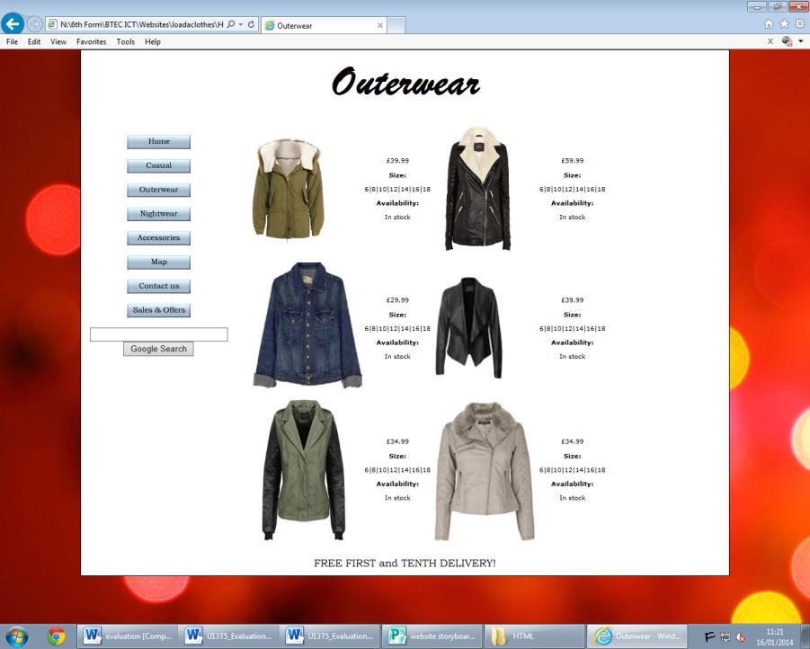
6 Casual: Outerwear:
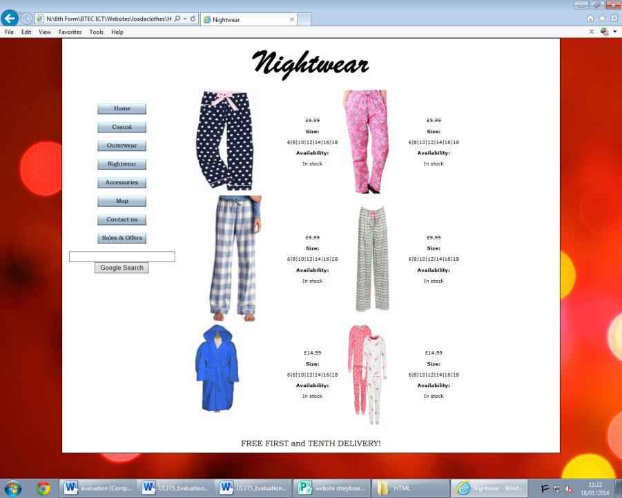

7 Nightwear: Accessories:

8 But the pages Map and Contact Us and Sales and Offers have different layouts because there is less content on these pages and more writing. I have tried to keep these 3 pages as professional looking as I could by limiting what is displayed on them and only showing what is necessary. The second strength of my website is the range of interactive features. On the homepage, I made a banner which displays information about the store and what it offers. It also advertises the website. I created the banner on FlashVortex.com and it sits at the bottom of the website on a continual loop so the messages will always be shown and you can see it whenever you return to the homepage. Also on the homepage is a pop up box which opens when the website is opened. Currently, the pop up box is displaying information about an offer. But the information will change when the offers and sales change or end. Another strength of the website is the background. At the moment, the background is still a Christmas inspired design but I can change it according to either the seasons or to preference.
9 Adding a background makes the website appear more sophisticated. It also gives the website a more personalized feel and can relate to the customer more because it looks and feels more casual. Even though it goes against the monochrome colour scheme, the background adds a bit of originality and makes the website stand out to the customer. The final strength of my website is the overall colour scheme. Making the website monochrome themed makes it look more sophisticated than lots of bright, vivid colours. It s also easy on the eye and attractive. Before I added in the background, the whole website was purely monochrome. Even though this does look professional and attractive, the background makes it look more appealing. Before:

10 After: Weaknesses of the Website I have also identified some weaknesses within my website. One of these weaknesses is how each webpage differs in length. Some webpages are longer than others, ones with content are longer than ones without. That could cause some confusion amongst the customers. This is the homepage compared to the Casual page. As you can see, the content elongates the casual page but the homepage stays shorter.


11 Another weakness is the font on the buttons is too small. I think some customers could struggle to see the writing if they don t zoom in on the buttons but I have tried readjusting the font size and that is the only size that fits and looks nice. The third weakness of my website is the user form. Looking back on it, I think it is lacking questions and I would appreciate some more feedback. To solve this I could add some more rating selections.
12 The final weakness is the positioning of the Google search bar on the homepage. On the homepage, it is underneath the title whereas on every other page. This could confuse the customer and it makes the website look unprofessional. Comments from peer questionnaires In question 1 I asked if the website loads fast and 7/7 agreed that it did, in question 2 I asked if the website is easy to navigate and 7/7 agreed, in question 3 I asked if the colour scheme is attractive and appealing 7/7 people agreed and added the following comments about why they liked or disliked the colours. Because there s not too much going on and it s nice and clean, Simple and clean Neutral and simple All the colours go together Simple Pretty colours. In question 4 I asked if the images were good quality and 6/7 people agreed, question 5 I asked is the images load quickly and 7/7 agreed. In question 6 I asked if the user from works and if there any extra questions that the customer would like to see. 7/7 agreed that it worked. In question 7 I asked is the Google map feature helped to find the store and 7/7 agreed. In question 8 I asked if the pop up box was relevant and 7/7 agreed. Question 9 was if the pop up box was an annoyance and all disagreed, I then asked if my website could be improved and received the following results. Possibly add a logo Centralize top table in Contact Us page Background around middle white box Bigger writing More writing Add a shopping basket feature From reviewing my peer feedback, I believe I have made a successful website which can be enjoyed by all ages. Three suggested improvements that could be made After finishing creating my website I think I could have improved it by having a more unique website name. Loadsaclothes lacks originality and could divert the customer s attention because some could see it as boring and doesn t pull them in very much.
13 Another way to improve it would be creating and adding a logo. This would improve my website because a logo would add innovation and sophistication. If I were to create a logo, I could position it on one or both of the top corners and it would be featured on each page. I could add a logo in these corners Finally, the last area of improvement could be to add more writing about the store and more descriptions about both the products and the store. I could add these bits of writing to the homepage or maybe on the Contact Us page. I think under the image on the homepage would be a good place to add extra information because that is the first webpage the customer sees when they view the website. In conclusion I think the development of my website was effective and that it lead to a strong, successful website. I enjoyed making this website because I learnt how to create and include interactive features which I believe makes the website more enjoyable and look more substantial. However, if I were to make it again I would include more things like a logo, maybe offer a larger range of products, include more descriptions about the website and what it offers the customer.
 User Interfaces Assignment 3: Heuristic Re-Design of Craigslist (English) Completed by Group 5 November 10, 2015 Phase 1: Analysis of Usability Issues Homepage Error 1: Overall the page is overwhelming
Exemplar for Internal Achievement Standard. Technology Level 1
 Exemplar for Internal Achievement Standard Technology Level 1 This exemplar supports assessment against: Achievement Standard 91046 (B) Use design ideas to produce a conceptual design for an outcome to
Hershey Park. By: Alicia Danenhower. English 3880 Section 10. Deborah Welsh.
 Hershey Park http://www.themeparkpage.com/images/hershey-web/dsc00263000.jpg By: Alicia Danenhower English 3880 Section 10 Deborah Welsh 11/8/2011 Hershey Park 1 Introduction This report analyzes the ways
Conrad Freeman Unit 6
 Graphics Assessment. First graphical product: The first product is a picture of the website for Doritos. This product is probably designed for teenagers and adults, and is not for younger audiences (probably
Home. Video. Paint Balling. Quad Biking. Website Report. Archery. Contact. Target Audience. Navigation Structure
 Website Report Target Audience The target audience for my website is for families or people who like outdoor activities. This place would be for people who like to have fun and who would also like to keep
Hyacinth Macaws for Seniors Survey Report
 Hyacinth Macaws for Seniors Survey Report http://stevenmoskowitz24.com/hyacinth_macaw/ Steven Moskowitz IM30930 Usability Testing Spring, 2015 March 24, 2015 TABLE OF CONTENTS Introduction...1 Executive
Table of Contents. I) Project Planning. User Analysis. III) Tasks Analysis. IV) Storyboard. V) Function Design. VI) Scenario Design.
 Project Planning. User Analysis. III) Tasks Analysis. IV) Storyboard. V) Function Design. VI) Scenario Design.") FINAL REPORT Table of Contents I) Project Planning II) User Analysis III) Tasks Analysis IV) Storyboard V) Function Design VI) Scenario Design VII) Database VIII) Usability Questionnaire IX) System Version
FINAL REPORT Table of Contents I) Project Planning II) User Analysis III) Tasks Analysis IV) Storyboard V) Function Design VI) Scenario Design VII) Database VIII) Usability Questionnaire IX) System Version
WEBSITE DESIGN BRIEF AND QUESTIONNAIRE
 WEBSITE DESIGN BRIEF AND QUESTIONNAIRE ABN: 85 121 534 950 IPS.Version 1.1 Thank you for the opportunity to take your business on line. Before we can start providing you with the right solutions, we would
BBT ( Broad Based Technology ) Leo Hayes High School Fredericton, NB
 Leo Hayes High School Fredericton, NB") BBT ( Broad Based Technology ) Leo Hayes High School Fredericton, NB Table of Contents Welcome to Publisher Publisher Interface Basics Starting up Publisher Module Activities Business Card Banner Advertisement
BBT ( Broad Based Technology ) Leo Hayes High School Fredericton, NB Table of Contents Welcome to Publisher Publisher Interface Basics Starting up Publisher Module Activities Business Card Banner Advertisement
Rosa Rawlings BTEC Level 2 Extended Certificate in Information and Creative Technology Unit 3: A Digital Portfolio Assignment 3: Review Your Portfolio
 How The Final Portfolio Is Suitable For The Intended Audience: My portfolio of PDF files of my work which showcases my work to the company. I have created a range of written documents, images and videos
PROJECT SUMMARY Our group has chosen to conduct a usability study over
 LS 560 GROUP 2 Edmund Balzer Michelle Eisele Beth Keene Christine Remenih Usability Study PAGE 4 - CONSENT FORM: REMOTE USABILITY TEST PAGE 5 - SURVEY: QUESTIONS AND GRAPHED RESULTS PAGE 10 - REPORT: OBSERVATIONS,
DIRECTV Message Board
 DIRECTV Message Board DIRECTV Message Board is an exciting new product for commercial customers. It is being shown at DIRECTV Revolution 2012 for the first time, but the Solid Signal team were lucky enough
IMPORTANCE OF A MINISTRY WEBSITE
 SUMMARY In 2018, the internet is everything, even our appliances are starting to connect. People today are more comfortable emailing or texting than calling and face time. Although, I hate to admit it,
EDGE, MICROSOFT S BROWSER
 EDGE, MICROSOFT S BROWSER To launch Microsoft Edge, click the Microsoft Edge button (it s the solid blue E) on the Windows Taskbar. Edge Replaces Internet Explorer Internet Explorer is no longer the default
Basic Internet Skills
 The Internet might seem intimidating at first - a vast global communications network with billions of webpages. But in this lesson, we simplify and explain the basics about the Internet using a conversational
INTERFACE DESIGN FOR A MILITARY TRAINING TOOL. While designing the mockup of OrMiS (a military based application) tablet and
 tablet and") INTERFACE DESIGN FOR A MILITARY TRAINING TOOL CHAPTER 1: FULL DETAIL MOCKUP Design Decision: While designing the mockup of OrMiS (a military based application) tablet and digital tabletop interface the
INTERFACE DESIGN FOR A MILITARY TRAINING TOOL CHAPTER 1: FULL DETAIL MOCKUP Design Decision: While designing the mockup of OrMiS (a military based application) tablet and digital tabletop interface the
THE SET AND FORGET SYSTEM
 THE SET AND FORGET SYSTEM MODULE II SQUEEZE PAGES & SUBSCRIPTION LAYOUT MAKE MONEY WHILE YOU SLEEP! Table Of Contents Introduction Important Steps Squeeze Page Layout & Opt In 5 Essential Build Tips Squeeze
MARKETING STRATEGIES
 MARKETING STRATEGIES DISCOVER OUR FORMULA MARKETING STRATEGIES Designing a website is never that easy, it take a lot of patience and hard work. From appearance to functionality Leap has a few techniques
Assignment 3 User Research Report Document
 Assignment 3 User Research Report Document Online Clothing Store By Chris Kazanjian, Loren Smith, Jess Hartig, and Jeremiah Lyons DESCRIPTION OF USERS User Audience Male and Female Ages typically ranging
AMERICAN EAGLE. Usability Testing. Page 1 Cover Page 2 Survey Pages 3-4 Sonja Pages 5-6 Danijela. Group 2 12/5/13
 AMERICAN EAGLE Usability Testing Page 1 Cover Page 2 Survey Pages 3-4 Sonja Pages 5-6 Danijela Group 2 12/5/13 Rachel Powell, Sarah Wheeler, Tasha Mowery, William McDowell Survey: (Results after 10 people
Introduction To Inkscape Creating Custom Graphics For Websites, Displays & Lessons
 Introduction To Inkscape Creating Custom Graphics For Websites, Displays & Lessons The Inkscape Program Inkscape is a free, but very powerful vector graphics program. Available for all computer formats
Essential Question: What Is Good User Interface Design?
 UNDERSTANDING USER INTERFACE DESIGN Essential Question: What Is Good User Interface Design? Learning Targets: Students will: Define key criteria of user interface design. Understand the basics of wire
Module 9: WayBackMachine Redesign
 Module 9: WayBackMachine Redesign Written by Sydney Landon, Bernie Belcher, and Deron Ferrell Reflection When recreating MSU Writing Department's home page we wanted to make specific elements stand out.
Assignment front sheet
 Assignment front sheet Learning Outcome LO 2 Learning Outcome Be able to design interactive websites Assessment Criteria In this assessment you will have the opportunity to present evidence that shows
Websites of different companies
 Websites of different companies In this presentation I aim to present two competing companies websites for the client. The client s company is Lightning games, and the two competing sites will also be
VIDEO 1: WHY IS THE USER EXPERIENCE CRITICAL TO CONTEXTUAL MARKETING?
 VIDEO 1: WHY IS THE USER EXPERIENCE CRITICAL TO CONTEXTUAL MARKETING? Hello again! I m Angela with HubSpot Academy. In this class, you re going to learn about the user experience. Why is the user experience
POWERPOINT BASICS: MICROSOFT OFFICE 2010
 POWERPOINT BASICS: MICROSOFT OFFICE 2010 GETTING STARTED PAGE 02 Prerequisites What You Will Learn USING MICROSOFT POWERPOINT PAGE 03 Microsoft PowerPoint Components SIMPLE TASKS IN MICROSOFT POWERPOINT
Welcome Back! Without further delay, let s get started! First Things First. If you haven t done it already, download Turbo Lister from ebay.
 Welcome Back! Now that we ve covered the basics on how to use templates and how to customise them, it s time to learn some more advanced techniques that will help you create outstanding ebay listings!
THE 18 POINT CHECKLIST TO BUILDING THE PERFECT LANDING PAGE
 THE 18 POINT CHECKLIST TO BUILDING THE PERFECT LANDING PAGE The 18 point checklist to building the Perfect landing page Landing pages come in all shapes and sizes. They re your metaphorical shop front
Synthesis Paper CEP 416 Erica Lewis. variations of innovations within technology. Each technology has both strengths and
 Synthesis Paper CEP 416 Erica Lewis Today technology is very important to our everyday lives. Yet, there are many variations of innovations within technology. Each technology has both strengths and weaknesses.
CREATING PRESENTATION
 Getting Started 7 CREATING PRESENTATION Select a Slide Layout (Format Menu) Choose a Slide Design (Format Menu) Apply a Design Template Select a Color Scheme Create a Master Slide (View Menu) Copyleft
Usability Analysis of website Craigslist Wenjuan Zou(Joerica)
") Usability Analysis of website - - - Craigslist ------ Wenjuan Zou(Joerica) Introduction of Craigslist Craigslist is a classified advertisements website with sections devoted to jobs, housing, personals,
Usability Analysis of website - - - Craigslist ------ Wenjuan Zou(Joerica) Introduction of Craigslist Craigslist is a classified advertisements website with sections devoted to jobs, housing, personals,
Criteria B Developing Ideas
 INTERACTIVE TOURISM INFORMATION ON INDONESIA SCRATCH Criteria B Developing Ideas DESIGN SPECIFICATION As mentioned in the design brief, my creation will be called JTI, which stands for Journey to Indonesia.
Process. Interface Design Introduction. Purpose and Goals of your Website. Module 2. Introduction
 Module 2 Introduction Before one can start building a website, the person must have a clear understanding of the mission, goals, and objectives of the site. Important questions to ask are why are you making
Microsoft PowerPoint: Creating Academic Posters
 Microsoft PowerPoint: Creating Academic Posters Why a poster? Posters are widely used in the academic community, and most conferences include poster presentations in their program. Research posters summarize
The Website. Teaching Thoughts. Usability Report. By Jon Morris
 The Website Teaching Thoughts Usability Report By Jon Morris Original November 13 th, 2009 Modified on November 21 st 2009 Table of Contents 1. Introduction... 3 2. Executive Summary...3-4 3. Methodology...5-6
Usability Report for Love and Robots.com
 Usability Report for Love and Robots.com Fiona Brady, Aoibhίn Hassett, Louise Grant & Hannah O Sheehan N00147351, N00144119, N00144786 & N00147667 Usability C.A. Applied Psychology Table of Contents Introduction...1
Library Website Migration and Chat Functionality/Aesthetics Study February 2013
 Library Website Migration and Chat Functionality/Aesthetics Study February 2013 Summary of Study and Results Georgia State University is in the process of migrating its website from RedDot to WordPress
Calisphere UI Testing Findings and Recommendations
 Calisphere UI Testing Findings and Recommendations Chico High School, 14-15 September 2005 Prepared for: Calisphere Redesign Team Author: Jane Lee Contributor: Felicia Poe Last modified: 25 October 2005
Fast Company Homepage This ad is very distracting and grabs the viewer attention more than the logo and navigation. It could cause the user to overloo
 Competitive Review Fast Company Homepage Doing well: It has a bold and modern feel that appeals to the internet audience. Doing poorly: The layout is confusing as to which elements match up and it's unclear
Unit 13 Investigating Websites 09/10/16. By Sarah Ameer
 Unit 13 Investigating Websites 09/10/16 By Sarah Ameer Intended Use of Both Websites Vh1.com The use of Vh1 is for media sharing because many people use internet most of the time rather than Tv. so this
BBT ( Broad Based Technology ) Leo Hayes High School Fredericton, NB
 Leo Hayes High School Fredericton, NB") BBT ( Broad Based Technology ) Leo Hayes High School Fredericton, NB Table of Contents Welcome to Publisher Publisher Interface Basics Starting up Publisher Module Activities Business Card Banner Advertisement
BBT ( Broad Based Technology ) Leo Hayes High School Fredericton, NB Table of Contents Welcome to Publisher Publisher Interface Basics Starting up Publisher Module Activities Business Card Banner Advertisement
How to Make Your RooFolio
 How to Make Your RooFolio Table of Contents Contents Bar.1 Pages..3 Text Box 4 Slides. 4 Uploads... 5 Backgrounds...7 Publish & Share.8 Group Work.8 Publish 9 Contents bar The contents bar allows you to
Usability Test Plan for Blogger Mobile Application
 Usability Test Plan for Blogger Mobile Application Prepared For: Kevin McGowan, Project Sponsor Luke Bjerring, Software Engineer Completed By: Alanna Lewis B l o g g e r. c o m 7 / 2 0 / 2 0 1 5 Table
Edexcel CiDA Course Overview
 Edexcel CiDA Course Overview Level 2 Certificate in Digital Applications: Graded A*-C 2 units Coursework & examination Assessment objectives: Applying creative processes to design digital products Selecting
Strong signs your website needs a professional redesign
 Strong signs your website needs a professional redesign Think - when was the last time that your business website was updated? Better yet, when was the last time you looked at your website? When the Internet
WHITE PAPER. Attract shoppers in less than 10 seconds or lose them.
 WHITE PAPER Attract shoppers in less than 10 seconds or lose them. OVERVIEW Executive Summary 3 Content 3 Design 5 Conclusion 8 2 Executive Summary You have less than 10 seconds to grab a shopper s attention
Campus Sandbox Testing Feedback
 Campus Sandbox Testing Feedback Qualitative Feedback Summary April 21st 2017 Why did you prefer the selected LMS? After identifying their preferred LMS, testers were given an opportunity to explain their
Trevor Easton. CopyC. Online PC Learning.com
 Trevor Easton CopyC Online PC Learning.com 5/16/2013 Forward Design Posters like a Pro - The Easy Method Join the thousands who have enjoyed these tutorials I have put together a resource to help you create
OCA Graphic Design: Core Concepts 1 Assignment 5 - Penguin Books Jane Braybrook Jane511794
 OCA Graphic Design: Core Concepts 1 Assignment 5 - Penguin Books Jane Braybrook Jane511794 Supporting Blog Post: https://jane511794.wordpress.com/category/assignments/assignment-5/ Critical Evaluation
Brakebuddy.com Homepage
 UI Insight, Inc. Steven Chalmers, President (303) 840-6272 steven@uiinsight.com Heuristic Evaluation and Proposed Redesign for Brakebuddy.com Homepage 23 August 2002 Steven Chalmers www.uiinsight.com Table
Design Development Documentation
 Design Development Documentation Preliminary Logo One For the first logo design in which I created I started off with a clipart image of a clenched fist in which I traced within Photoshop. I chose this
REQUEST FOR PROPOSALS (RFP) WEBSITE REDESIGN AND LAUNCH. About the New Brunswick Anti-Tobacco Coalition (NBATC)
 WEBSITE REDESIGN AND LAUNCH. About the New Brunswick Anti-Tobacco Coalition (NBATC)") Page 1 of 10 REQUEST FOR PROPOSALS (RFP) WEBSITE REDESIGN AND LAUNCH The New Brunswick Anti-Tobacco Coalition (NBATC) invites vendors to prepare and submit a proposal for the redesign of its current, bilingual
Page 1 of 10 REQUEST FOR PROPOSALS (RFP) WEBSITE REDESIGN AND LAUNCH The New Brunswick Anti-Tobacco Coalition (NBATC) invites vendors to prepare and submit a proposal for the redesign of its current, bilingual
Raritan Valley Community College: Evelyn S. Field Library Homepage Usability Study. Alyssa M. Valenti, MS, MLIS
 Raritan Valley Community College: Evelyn S. Field Library Homepage Usability Study Alyssa M. Valenti, MS, MLIS HISTORY & IMPORTANCE Why redo the website? Why usability testing? If you want to do it right,
2 Adding Contacts, Sending Attachment s and Sending s to More Than 1 Person.
 E-Mail 2 Adding Contacts, Sending Attachment s and Sending E-Mail s to More Than 1 Person. 1 The first thing we are going to do is check our inbox for any unread e-mails. To do this we need to go on Internet
Team : Let s Do This CS147 Assignment 7 (Low-fi Prototype) Report
 Report") Team : Let s Do This CS147 Assignment 7 (Low-fi Prototype) Report 1. Title, each team member s name & role Title: Let s Do This Roles: Divya - Developer. Eric - Developer, manager. Sami - User testing,
Team : Let s Do This CS147 Assignment 7 (Low-fi Prototype) Report 1. Title, each team member s name & role Title: Let s Do This Roles: Divya - Developer. Eric - Developer, manager. Sami - User testing,
Topic 2: Website Usability. 1. Make the Site s Purpose Clear: Explain Who You Are and What You Do
 Felix Davila III INFO 202 16 March 2016 Topic 2: Website Usability Website: JackThreads Website URL: https://www.jackthreads.com/ 1. Make the Site s Purpose Clear: Explain Who You Are and What You Do JackThreads
This presentation will show you how to create a page in a group eportfolio.
 This presentation will show you how to create a page in a group eportfolio. 1 If you are using your eportfolio for presenting group work, you will need to create a group eportfolio page, which all the
Rocket Theme. User Guide
 Rocket Theme User Guide This user guide explains all main features and tricks of multifunctional Rocket WordPress Theme. This information will make your work with the theme even easier and more effective.
Search Box Usability Testing Report November 5, 2007
 Search Box Usability Testing Report November 5, 2007 Charge: To gather user feedback on two different styles of search boxes for the new library website. The Web Re-Design Group is looking to assess the
Multimedia Design Principles. Darnell Chance August 2005
 Multimedia Design Principles Darnell Chance August 2005 Home Page Things To Consider Organization Story Board Organization The 3 C s Alignment Proximity Tips/ Techs White Space Contrast Rule of Thumb Typography
General Reproduction and Usage Guidelines Bizrate Insights Updated 23 Oct, 2017
 General Reproduction and Usage Guidelines Bizrate Insights Updated 23 Oct, 2017 Table of Contents Introduction Logo Fonts Color Geometry Web -Responsive -Navigation -Buttons -Contact Forms -Footer 3 4
Process Book - Project 2 Cause Social Networking Site
 Process Book - Project 2 Cause Social Networking Site brittany Hampton art 341 Process Book - Project 2 Cause Social Networking Site section 1 competitive research Competitive Research - 1.1 Cause Social
You can also search online templates which can be picked based on background themes or based on content needs. Page eleven will explain more.
 Microsoft PowerPoint 2016 Part 1: The Basics Opening PowerPoint Double click on the PowerPoint icon on the desktop. When you first open PowerPoint you will see a list of new presentation themes. You can
Notes. SeniorNet Warkworth Microsoft Sway Symposium Notes May 2018 Author Brian Oakes
 Notes Office Sway is a presentation program and is part of the Microsoft Office family of products. Generally released by Microsoft in August 2015, Sway allows users who have a Microsoft account to combine
ONE K CREATIVE. tools for social impact storytelling: CREATING A CONSISTENT BRand
 ONE K CREATIVE tools for social impact storytelling: CREATING A CONSISTENT BRand key elements to define for brand consistency DEFINING THE BASIC ELEMENTS OF YOUR BRAND ALLOWS YOUR TEAM - STAFF, BOARD MEMBERS,
Many of the changes are under the hood making the office suite more powerful but does not change the way you use it. Cloud and online locations.
 Office 2016 What has changed?... Not too much Not as much has changed as you might think. If you are comfortable using office 2007, then the change to office 2016 should pose few challenges. The look of
Chat Reference Assignment
 REFERENCE & INFORMATION RESOURCES & SERVICES ILS 504-70 Fall Dr. Clara Ogbaa Chat Reference Assignment Lucinda D. Mazza CHAT REFERENCE ASSIGNMENT 2 Chat Reference Assignment When first starting this assignment,
PLANNING. CAEL Networked Worlds WEEK 2
 PLANNING CAEL5045 - Networked Worlds WEEK 2 WEEK 2 CHOOSING COLOURS CHOOSING FONTS COLLECTING CONTENT PLANNING STRUCTURE WIREFRAMES + MOCKUPS Every colour, including black and white, has implications for
Teacher name: Mrs. Gramiak Names. CATEGORY Excellent Good Satisfactory Needs Improvement
 Teacher name: Mrs. Gramiak Names CATEGORY Excellent Good Satisfactory Needs Improvement Requirements Learning of Material All information accurate all the requirements of the assignment In other words,
Group #5. Checkpoint #4. Page Grids:
 David Lademan, Marshall Thompson, and Caleb Miller 12 March, 2015 IT 502 - Intermediate Web Design University of New Hampshire Durham, NH 03824 Group #5 Checkpoint #4 Page Grids: Homepage The homepage
TEAM FOCUS POCUS JOCELYN HICKCOX DANIEL MELENDEZ ASHLEY MILLS
 TEAM FOCUS POCUS 12.05.2015 JOCELYN HICKCOX DANIEL MELENDEZ ASHLEY MILLS 1 OVERVIEW In this day and age, our lives are full of distractions. It s hard to focus on just one thing with so many others competing
Website Self-Assessment
 Leading the way in web creations the-pixel.com Website Self-Assessment Created by: the-pixel.com INTRODUCTION Is your website the best it can be? The assessment is based on the three essential components
PowerPoint Introduction. Video: Slide Basics. Understanding slides and slide layouts. Slide Basics
 PowerPoint 2013 Slide Basics Introduction PowerPoint presentations are made up of a series of slides. Slides contain the information you will present to your audience. This might include text, pictures,
ABCs of Direct Mail. Tips for More Effective Marketing Publications
 ABCs of Direct Mail Tips for More Effective Marketing Publications ABCs of Direct Mail 2 Introduction Direct mail is a growing business and everyone is eager and excited to jump on board. The problem is
MANAGE YOUR CONSTRUCTION21 COMMUNITY
 MANAGE YOUR CONSTRUCTION21 COMMUNITY Online communities are spaces dedicated to exchanges, news watch and sharing of documents. By creating your community on a specific topic, you stand out as a national
Business and Communication Systems
 General Certificate of Secondary Education June 2013 Business and Communication Systems 413009 Unit 9 Using ICT in Business Controlled Test To be conducted between 6 May 2013 and 10 May 2013 For this paper
Fireplace Mantel in Google SketchUp
 Creating the fireplace itself is quite easy: it s just a box with a hole. But creating the mantel around the top requires the fun-to-use Follow Me tool. This project was created in SketchUp 8, but will
CBAC / WJEC Tasg Asesu wedi ei Rheoli / Controlled Assessment Task
 CBAC / WJEC Tasg Asesu wedi ei Rheoli / Controlled Assessment Task Myfyriwr / Student 9 Gradd / Grade A 20th Sept 2010 21 rd September 2010 1 hr 30 mins 90 mins Brief 3 Electronics/Electrical Product
Creating a Presentation
 Creating a Presentation You will need to create a basic presentation before you can work with the advanced features of PowerPoint. 1 Exercise #1 Creating the Basic Presentation (1) Open Microsoft PowerPoint
mobile friendly? Google s survey shows there are three key points to a mobile-friendly site:
 1. Is your site mobile friendly? Now more than ever before it is important for your website to be mobile-friendly. According to a July 2012 Google survey of the more than 1,000 smartphone users people
Travello app: design process report
 Travello app: design process report AND S The Problem While travelling in itself is a great experience and most people have positive memories from their trips, the planning and logistics can cause a lot
Module 9 Kelsie Donaldson Casey Boland Nitish Pahwa. IMDb, August 13th, 2002
 Module 9 Kelsie Donaldson Casey Boland Nitish Pahwa IMDb, August 13th, 2002 IMDb.com Sitemap Landing Page Navigation bar News Forums Awards Movies TV Box office Search bar Header Site title logo Footer
Prezi - online presentation editor
 Prezi - online presentation editor Prezi is not based, such as e.g. PowerPoint on typical series. Instead, the user fills objects and blocks a large array of content type. This may be an image or a series
Building a website. Should you build your own website?
 Building a website As discussed in the previous module, your website is the online shop window for your business and you will only get one chance to make a good first impression. It is worthwhile investing
COMSC-032 Web Site Development- Web Design. Part-Time Instructor: Joenil Mistal
 COMSC-032 Web Site Development- Web Design Part-Time Instructor: Joenil Mistal Lecture 4 4 Web Site Planning & Design Guide Five Phases of a Web Site Project Planning Design Build Test Launch Lecture 4
Introduction. Using Styles. Word 2010 Styles and Themes. To Select a Style: Page 1
 Word 2010 Styles and Themes Introduction Page 1 Styles and themes are powerful tools in Word that can help you easily create professional looking documents. A style is a predefined combination of font
6. How many employees will you need? You must have at least 3. What specific positions will these employees hold?
 Assignment 1: Business Proposal (24 pts.) Write a business proposal in unbound report format. It must be a minimum of one page. It must contain all of the information listed below. Every item needs a detailed
Buddhist Symbols Style Guide
 Formative evaluation of the V&A s Buddhist Symbols Style Guide Prepared by Yvonne Harris Consulting Yvonne Harris Consulting 44 Grovelands Way Grays, Essex, RM17 5YG Tel: 07766 256532 email: yvonneharris_consulting@hotmail.co.uk
After looking through references and professional examples, I started to design and develop the Icons for the App.
 After looking through references and professional examples, I started to design and develop the Icons for the App. I started by looking at the most popular type of food, fast food. I wanted to create an
Designing Posters TIDI Development Research Week
 Designing Posters TIDI Development Research Week Derina Johnson PhD Candidate, School of Social Work and Social Policy DSAI Steering Committee Postgraduate Representative Date 1 st November 2017 Today
World Lit. Weebly Web Design 101
 World Lit. Weebly Web Design 101 To begin using Weebly, go to weebly.com, and click on the Log in button in the top right corner. Use the Google+ button to login using your school gmail address and password.
Activity 1 evaluation
 Activity 1 evaluation Over the past few months in ICT we had been doing our GCSE coursework which was based on the CAB. In this evaluation I will be telling you about the 3 main activities I did and telling
Introduction to the Weebly Toolkit for Building Websites
 Introduction to the Weebly Toolkit for Building Websites Maureen Pratchett July 2015 1 Objective The purpose of this workshop is not to teach you how to design or even build a website, but rather to introduce
Unit 28 Website Production
 24 April 2015 Unit 28 Website Production User Requirements Website Purpose Lesson 5 Objectives Define website purpose Understand how to define website requirements Building towards assignment 2 Assignment
Usability Testing Report of College of Liberal Arts & Sciences (CLAS) Website
 Website") Usability Testing Report of College of Liberal Arts & Sciences (CLAS) Website Submitted to: Ceily Hamilton, Director of Information Technology Alex Chapin, Executive Director of Academic Technology Compiled
Usability Testing Report of College of Liberal Arts & Sciences (CLAS) Website Submitted to: Ceily Hamilton, Director of Information Technology Alex Chapin, Executive Director of Academic Technology Compiled
Full Website Audit. Conducted by Mathew McCorry. Digimush.co.uk
 Full Website Audit Conducted by Mathew McCorry Digimush.co.uk 1 Table of Contents Full Website Audit 1 Conducted by Mathew McCorry... 1 1. Overview... 3 2. Technical Issues... 4 2.1 URL Structure... 4
205CDE: Developing the Modern Web. Assignment 1: Designing a Website. Scenario: D Bookshop
 205CDE: Developing the Modern Web Assignment 1: Designing a Website Scenario: D Bookshop Introduction I decided to make a second hand bookshop website. There are some reasons why I made this choice. Mainly
User Guide-Store Builder
 User Guide-Store Builder 1. Introduction 2. User Guide Overview Page Template Category Banner Video Product 3. My Pages 4. Analytics 2 Example of a decorated store page on Lazada Store builder is a self
COMPANY BRANDING guidelines. colors styles fonts usage
 COMPANY BRANDING 2014 guidelines colors styles fonts usage TABLE OF CONTENTS I Premier Pools and Spas Logo II Our Font - Open Sans III Color Scheme IV The Tiles THE LOGO The Premier Pools and Spas logo