Excel 2016 Charts and Graphs
|
|
|
- Winfred Spencer
- 6 years ago
- Views:
Transcription


1 Excel 2016 Charts and Graphs
2 Excel 2016: Charts and Graphs 2.0 hours This workshop assumes prior experience with Excel, Basics I recommended. Topics include data groupings; creating and modifying charts; chart types; source data; chart options; chart locations; formatting; adding trend lines and error bars. Charts... 1 Creating a Chart... 2 Chart Tools... 3 Chart Tool Tabs... 4 Format Pane... 6 How do I?... 7 Change Axis Numbers... 7 Change Distance Between Columns... 7 Explode a Pie Chart... 7 Add Trendlines and Error Bars... 7 Make Charts the Same Size... 7 Changing the Data Source... 8 From the Worksheet... 8 From the Select Data Source Window... 8 Removing data... 8 Types of Charts... 9 Column and Bar Charts... 9 Line and Area Charts Pie and Donut Charts Hierarchy Chart Statistic Charts Scatter (X,Y) and Bubble Charts Radar and Surface Charts Class Exercise Pandora Rose Cowart Education/Training Specialist UF Health IT Training C3 013 Communicore (352) PO Box prcowart@ufl.edu Gainesville, FL Updated: 02/07/2017

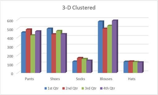
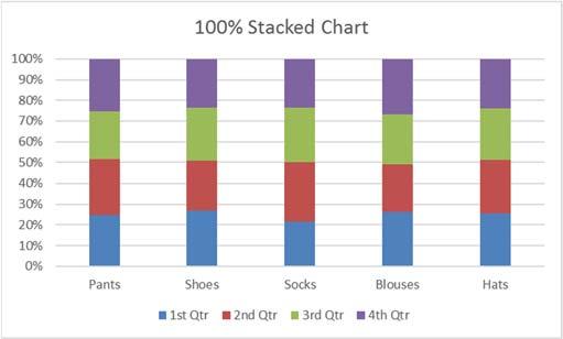
3 Charts A chart helps you display your data into a graphical representation. There are many types of charts, but in this class we'll focus on simple column, line, and pie charts. There are examples of other charts near the end of this handouts. The first thing to know is the data has to be organized so Excel can understand what you are trying to chart. Excel will chart your data selection or your connected data range. As long as there are no blank columns and no blank rows within your dataset, you can skip selecting the cells. Chart Title Value Axis Category Axis Legend Here is a dataset we will use in class: Item 1st Qtr 2nd Qtr 3rd Qtr 4th Qtr Pants Shoes Socks Blouses Hats This is a structured collection of related data set in a table format. When plotted onto a clustered column chart, like the one shown above, the titles in the first column of the dataset appear along our category axis. The titles in the first row appear within the legend. The values are represented by the height of each column. Line charts are usually set up to go across a period of time, think Time Line. For this chart I've used the Switch Row Column tool so we can see the trend of the sales through the year. In this case our first column titles appear in the legend, and the first row of titles appears in our category axis. Pie charts are usually created to display the breakdown of the total values within the whole. Pie charts can only be based on one set of data. When you try to create one with the above dataset, you will only see the first value set appear within the chart. If you want to go to an extreme and have all four quarters show, try using a Doughnut chart. Page 1


4 Creating a Chart To create a chart make sure your cursor is in the dataset you would like to plot. If you want a subset of the dataset, select that portion. You can use your Ctrl key to add to a current selection. You will find the Charts group on the Insert tab. Click on any small chart button to see a list of possible charts. If you are unsure of the best chart option for your data use the Recommend Charts button. It will open the Insert Chart window shown here. Page 2


5 Chart Tools When you select a chart, three buttons appear along the right side of the selection. The plus sign is the Add Chart Element button. This option is used to add and remove different pieces of your chart. The list of options will vary depending on the type of chart. For example, a pie chart will not have a set of category axis titles. As you hover your mouse over each option, you will see a small arrow head pointing to the right. This will open another menu with more detailed choices. Each menu also has a "More Options " button which will open a Format Pane on to customize each chart element. There is a Chart Style Gallery and a Colors menu on the Design tab, but the Chart Styles button, the paint brush next to the chart, offers the same options. If you are patient while you hover over each option, Excel will provide you with a Live Preview of the result. The Color options are available at the top of the menu. The third button is a funnel. This is a Chart Filters button. The Values group allows you to add and remove data points from the chart. The Names page allows you to change the labels that appear in the legend (series) and axis titles (category). The Select Data option at the bottom of the window opens the same window as the Select Data button on the Design tab. From there you can change or adjust the range of cells used to create this chart. Page 3


6 Chart Tool Tabs When a chart is selected two chart tool tabs appear at the end of the ribbon, Design and Format. Design Tab Add Chart Element A menu of chart elements that can be added or removed to the chart. Each option will have a expand arrow at the end of the element name that will provide specifics and a More Options button to open the Format Pane. This is the same as the Add Chart Element button that appears next to the selected chart. 2. Quick Layout A variety of layouts that offer suggested views and choices that adjust the chart elements such as adding a title, varying the space between columns, and moving the legend. 3. Change Colors Different color that can be applied to your chart. Changing the Theme on the Page Layout tab will give you a different sets of colors. 4. Chart Style Gallery Different chart styles that can be applied to your chart. Because Excel automatically adjusts the Ribbon to fit on your screen, your copy of Excel may show less options than the picture above. Use the scroll arrows and open menu buttons at the right side of the gallery for more. 5. Switch Row/Column Changes the direction the chart looks at the data. In our column chart, each column is plotted on the chart, when we Switch each row is plotted. We are swapping the category labels with the legend labels. Item 1st Qtr 2nd Qtr 3rd Qtr 4th Qtr Pants Shoes Socks Blouses Hats Select Data Opens a Select Data Source window where you can customize the source of the chart data, even edit the labels. Use this window to reorder your legend and change how Line charts deal with blank cell values. 7. Change Chart Type Opens Insert Chart window where you can change to other chart types. If you have multiple series you can change each to be different chart type by choosing the Combo chart type from the bottom of the left pane. 8. Move Chart By default when you create a chart it is placed on the same worksheet as your data set. You can move the chart to its own worksheet or to any existing worksheet with the workbook. Page 4


7 Format Tab 1. Current Selection a. Chart Elements This box shows the currently selected Chart Element, and the menu provides a list of the major chart elements. Choose an item from this list to select that element. b. Format Selection Opens the Format Pane based on the current selection shown in the Chart Elements box. c. Reset to Match Style Changes the current selection to match the original style of the chart. 2. Insert Shape a. Shape Gallery Use this gallery to find a shape such as a block arrow to add to your chart. b. Change Shape Use this tool to change the current shape to a different one, perhaps a rectangle into a rounded rectangle. 3. Shape Styles a. Style Gallery Different shape styles, options will vary based on the current selection. b. Shape Fill Menu of the most common fill colors and options, such as pictures and textures. For more options, open the Format Pane. c. Shape Outline Menu of the most common outline colors and options, such as dashes and arrows. For more options open the Format Pane. d. Shape Effects Menu of the most common shape effects, such as shadows. For more options open the Format Pane. 4. WordArt Styles a. WordArt Gallery Different WordArt styles b. Text Fill Menu of the most common fill colors and options, such as pictures and textures. c. Text Outline Menu of the most common outline colors and options, such as dashes and line weight. d. Text Effects Menu of the most common Text effects, such as shadows. For more options open the Format Pane. 5. Arrange Change the alignment and arrangement of multiple charts. Use the Shift key to select more than one chart at a time. 6. Size Change the height and width of the chart. Page 5


8 Format Pane There are multiple ways to open the Format Pane. Click on the Format Selection button in the Format tab Click on More option from any menu Right click on a chart element and choose Format Double click on a chart element The format pane can remain open for as long as you need it. The properties shown change depending on the current selection. The current selection is shown on the Format tab and in the title of the Format Pane. The pane can be pulled free from the side by dragging the title toward the middle of the window. To return the pane to the side of the window drag it back into place or double click the title of the Format Pane. To close the pane, click on the X in the upper right hand corner. If you accidentally close the pane, use any method above to reopen it. Within the Format Pane, click on each icon to see the subset of properties. Click on the expand arrow in front of the options to see the relevant properties. Fill & Line Effects Size & Properties Options Text Fill & Outline Text Effects Text Box Options The Fill & Line and Effects options are the same for all the of the chart elements. If an option cannot be applied to that chart element, Excel will disable (grey out) that option. Below are the fill options for a Chart Element. Each Fill choice provides a new set of options. Page 6
9 How do I? Change Axis Numbers Select the Axis by clicking on a number in the area. Open the Format pane, be sure the title says Format Axis. Click on the Options button. From here you can: Change the Minimum and Maximum numbers shown. These can be greater than the minimum and less than the maximum if you want. Change the Major unit, this is how the displayed number is chosen. If the major unit is 100 the chart axis will read 100, 200, 300. If it's 25 the chart will show 25, 50, 75. Change the Display Units to Thousands, Millions, Billions. This will change the unit shown in the labels and data tables as well. Change the Format of the numbers; number of decimals, include a dollar sign, etc. Change Distance Between Columns Select any column. Open the Format pane, be sure the title says Format Data Series. Click on the Options button. From here you can: Change the selected series to be on a secondary axis Change the distance the series overlap Change the width between the each category grouping Explode a Pie Chart In the chart: Hover over a pie wedge. Click and drag the piece away from the center. To move one piece at a time, select the single pie wedge first, and then move it from the middle. In the properties: Select a pie wedge. Open the Format pane, be sure the title says Format Data Series. Click on the Options button. From here you can: Change the rotation without changing the order of the data Change the explosion, how close the wedges are to each other Add Trendlines and Error Bars Select the chart. Click on the Add Chart Element button in the Design tab, or on the button next to the chart. You can add your own custom error bars, if needed, from the error bar options. You do have to format one series of error bars at a time. Make Charts the Same Size Use the Height and Width properties found on the Format tab in the ribbon, or on the Format Pane for the Chart Area's Size & Options. You can use the alignment options on the format tab to make the charts line up. Page 7

10 Changing the Data Source From the Worksheet When you select a chart you will see the Chart Tool tabs in the ribbon, and the three options buttons along the right side of the chart. If you can see the cells in the worksheet used for the chart you will also be able to see the data is selected and each section is shaded. If you hover your mouse over the bottom right hand corner of the data grouping you will get the two way sizing arrow. If you click and drag the selection you can manually change the chart data source. If you know you will have more categories and series you can grow the data area beyond what's showing and Excel will assign new colors and make room in the chart for the new values. From the Select Data Source Window From the Chart Tools Design tab choose Select Data. The Chart data range option can be a bit finicky so I recommend deleting the current range and selecting the new set from the worksheet. The chart is initially arranged to follow the order of the data, but if you would like the legend in a different order, you can rearrange the Legend Entries using the up and down arrows. Removing data Both of the above options will help you add and remove data. You can manually adjust the range in the worksheet or you can select a different range from the Select Data Source window. Both are great as long as you are using a consecutive range of data. The Select Data Source window also had a Remove button to delete a series from the chart. Notice there is not one for the Category/Axis labels. To be able to remove one you will need to first Switch Row/Column. Once you've removed the categories, Switch Row/Column again. From the chart itself you can click on the series you want to remove and press Delete on the keyboard. You can only delete the series, so the same actions apply in order to remove a category you will need to switch the row/columns first. However, we now have a Filters button along the side of the selected chart. From here we can uncheck any of the values we do not want on the chart; Series and Categories. You must click the Apply button at the bottom of the menu for the filter to take effect. Page 8


11 Types of Charts Column and Bar Charts Page 9


12 Line and Area Charts Page 10

13 Page 11


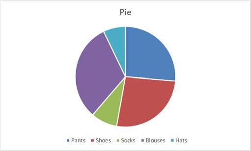


14 Pie and Donut Charts Page 12


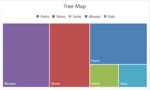
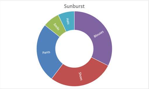
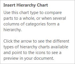


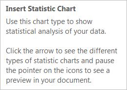
15 Hierarchy Chart Statistic Charts Page 13

16 Scatter (X,Y) and Bubble Charts Page 14


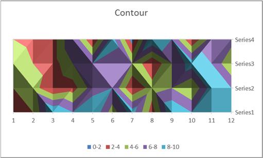
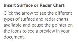
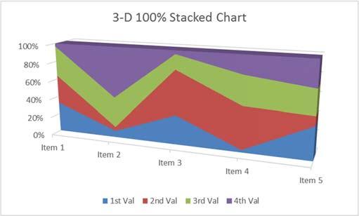
17 Radar and Surface Charts Page 15
18 Class Exercise Explore workbook - Open ChartData.xlsx - View each worksheet - Discuss 'consistent' range of data COLUMN TITLE COLUMN TITLE ROW TITLE DATA DATA ROW TITLE DATA DATA Create Chart - Turn to Sheet 'Sales by Quarter' - Turn to the Insert Tab - Click on Recommended Charts o Click on each suggestion to see a preview of our dataset o Click on the ALL CHARTS page at the top of the window and explore the options o Choose first Column Chart - Chart Tool tabs Design and Format - Click outside of chart to deselect o Tabs disappear Design Tab - Add Chart Element o Add: Data Labels on the Outside End o Remove: Chart Title o Move: Legend to the top - Explore different Quick Layouts o Choose first layout (title above, legend on right) - Explore different Chart Colors - Explore different Chart Styles o Notice it changes the Chart Layout o Return to the Quick Layout menu and choose the first one again - Switch Row/Column o Notice it's switching the legend with the category axis o Leave the chart with quarter in the legend - Select Data o Rearrange legend 4 th Qtr 1 st Qtr o Cancel the window - Change Chart Type to different options o Reset it back to the original, first column chart - Move chart to its own sheet Page 16

19 Format Tab Current Selection - Select Legend from Current Selection dropdown - Click Format Selection button o Legend Options Move legend to different positions Try it with overlapping the chart o Fill Solid Fill Gradient Fill Preset Colors Picture or Texture Fill Textures Insert a file o Border Solid line Increase width Gradient o Effects Add a Shadow Add a Glow - In the Format tab in the ribbon, click Reset to Match Style Layout Tab Insert - Insert Shapes o Insert Block Arrow o Uses yellow diamond to modify arrow o Use green circle to rotate o Delete - Insert Text Box o Type inside o Move around o Delete Delete Chart - Right click on Chart 1 Sheet name - Select Delete - Confirm deletion Page 17
20 Create Chart - Turn to Sheet 'Sales by Year - Insert Tab, Chart Group, Column o Choose first Column Chart - Move to a new worksheet - Change Font o Right click on Category Axis (pants, shoes ) o Choose Font, sent size to 14 o Undo o Right click in Chart Area (blank space) o Choose Font, sent size to 14 - Change Title to read "Yearly Sales - Add Minor Horizontal Gridlines o So you have Major and Minor lines Format Tab Styles - Select Major Gridlines - Change Shape Styles o Use Preset options o Use Shape Outline o Use Shape Effects - Select a column - Change Shape Styles o Use Preset options o Use Shape Fill o Use Shape Outline o Use Shape Effects - Format o Fill, Outline, and Effects for each column, independently o Fill for Plot Area o Fill for Chart Area - Format Chart Title o Change font size to 40 o See Shape Styles, don't change it o See WordArt Styles Text Fill Text Outline Text Effects Page 18
21 Save as Template Saving the template then closing the file without saving it. - Right click on the chart - Save as Template o 'Chart1' is fine - Exit the file o Don't save Use Template - Reopen the Charts file - Turn to Sheet 'Sales by Year' - Insert Tab, Chart Group, Column, First chart - Design Tab > Change Chart Type - Templates o First option in pane on left - Choose Chart1, Click OK - Delete Chart Default Chart - In Sheet 'Sales by year' Press F11 Modify Default Chart - In new chart, Design Tab > Change Chart Type - Right click on the Template - Set as Default Chart o Click OK - Return to sheet 'Sales by year' - Press F11 - In Sheet 'Sales by Quarter' Press F11 o Note only the first column was formatted - Close but don't save the file Manually Changing Data Ranges - Insert a column chart on Sheet 'Sales by Quarter' - Notice color Coding around original data - Use fill handle to change the selection o If the colors go away, click inside the chart again. o Adjust the chart to include only the data Page 19

22 Remove Data - Click on a column for 4 th Quarter o Press Delete on the keyboard - Click on a column for 2 th Quarter o Press Delete on the keyboard - Notice the color grouping around our dataset is gone - Switch row/columns to remove your shoes - Switch row/columns back - Open the filters button. There is only the first and third quarter, and no shoes - Delete Chart - Insert a column chart - Use the Filter to remove second and fourth quarter, and remove your shoes - Use the Filter to add them back in Chart Specific Data - Select Items through 3 rd Quarter, A1:D6 - Insert a column chart - Delete 2 th Quarter - Delete Chart - Select Items through 1 st Quarter, A1:B6 - Use Ctrl key to select 3 rd Quarter, D1:D6 - Insert a Column chart - Delete Chart Pie Chart - Turn to Sheet 'Sales by Year - Insert Tab, Chart Group, Pie, First chart - Remove Title & Legend - Add labels for %, Delete labels - Explode Pie - Rotate Pie (in the options) - Pull individual pieces - Delete Chart Page 20
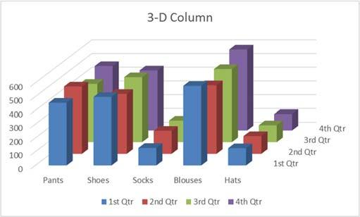
23 3 D Pie Chart - Insert a 3 D Pie chart - Explode Pie o Re connect/implode - Select Plot Area from the Format Pane - View the effects, 3 D Rotations - Change X & Y rotations o Use little scroll up and down arrows - Uncheck Autoscale - Change Height (% of base) - Delete Chart 3 D Column Chart - In Sheet 'Sales by Quarter' - Insert Tab, Chart Group, Column, Last 3 D option - Delete Legend - Design tab Switch Row/Columns - Design tab Select Data o Rearrange Legend so smaller values are in the front - Delete Chart Line Chart - In Sheet 'Sales by Quarter' - Insert Tab, Chart Group, Line, First option - Design tab Switch Row/Columns - Remove Smaller Values - Move to new sheet - Format Axis Options o Minimum 400 o Maximum 600 o Major Unit 25 Layout Tab Analysis - Trend Line - Error Bars o More Error Bar Options o Fixed Value 5 - Delete Chart Page 21
Microsoft Excel 2010 Linking Worksheets & Workbooks
 Microsoft Excel 2010 Linking Worksheets & Workbooks Email: training@health.ufl.edu Web Page: http://training.health.ufl.edu Microsoft Excel 2010: Linking Worksheets & Workbooks 1.5 hour Topics include
Information Technology and Media Services. Office Excel. Charts
 Information Technology and Media Services Office 2010 Excel Charts August 2014 Information Technology and Media Services CONTENTS INTRODUCTION... 1 CHART TYPES... 3 CHOOSING A CHART... 4 CREATING A COLUMN
Microsoft Office Excel
 Microsoft Office 2007 - Excel Help Click on the Microsoft Office Excel Help button in the top right corner. Type the desired word in the search box and then press the Enter key. Choose the desired topic
Office Excel. Charts
 Office 2007 Excel Charts October 2007 CONTENTS INTRODUCTION... 1 Bold text... 2 CHART TYPES... 3 CHOOSING A CHART... 4 CREATING A COLUMN CHART... 5 FORMATTING A COLUMN CHART... 8 Changing the chart style...
Gloucester County Library System EXCEL 2007
 Gloucester County Library System EXCEL 2007 Introduction What is Excel? Microsoft E x c e l is an electronic s preadsheet program. I t is capable o f performing many diff e r e n t t y p e s o f c a l
Creating a Basic Chart in Excel 2007
 Creating a Basic Chart in Excel 2007 A chart is a pictorial representation of the data you enter in a worksheet. Often, a chart can be a more descriptive way of representing your data. As a result, those
Microsoft Excel 2002 M O D U L E 2
 THE COMPLETE Excel 2002 M O D U L E 2 CompleteVISUAL TM Step-by-step Series Computer Training Manual www.computertrainingmanual.com Copyright Notice Copyright 2002 EBook Publishing. All rights reserved.
Excel 2013 Intermediate
 Instructor s Excel 2013 Tutorial 2 - Charts Excel 2013 Intermediate 103-124 Unit 2 - Charts Quick Links Chart Concepts Page EX197 EX199 EX200 Selecting Source Data Pages EX198 EX234 EX237 Creating a Chart
Microsoft Excel for Beginners
 Microsoft Excel for Beginners training@health.ufl.edu Basic Computing 4 Microsoft Excel 2.0 hours This is a basic computer workshop. Microsoft Excel is a spreadsheet program. We use it to create reports
MICROSOFT EXCEL Working with Charts
 MICROSOFT EXCEL 2010 Working with Charts Introduction to charts WORKING WITH CHARTS Charts basically represent your data graphically. The data here refers to numbers. In Excel, you have various types of
Excel 2010 Charts - Intermediate Excel 2010 Series The University of Akron. Table of Contents COURSE OVERVIEW... 2
 Table of Contents COURSE OVERVIEW... 2 DISCUSSION... 2 COURSE OBJECTIVES... 2 COURSE TOPICS... 2 LESSON 1: MODIFY CHART ELEMENTS... 3 DISCUSSION... 3 FORMAT A CHART ELEMENT... 4 WORK WITH DATA SERIES...
Creating and Modifying Charts
 Creating and Modifying Charts Introduction When you re ready to share data with others, a worksheet might not be the most effective way to present the information. A page full of numbers, even if formatted
Word 2013 Quick Start Guide
 Getting Started File Tab: Click to access actions like Print, Save As, and Word Options. Ribbon: Logically organize actions onto Tabs, Groups, and Buttons to facilitate finding commands. Active Document
Excel. Excel Options click the Microsoft Office Button. Go to Excel Options
 Excel Excel Options click the Microsoft Office Button. Go to Excel Options Templates click the Microsoft Office Button. Go to New Installed Templates Exercise 1: Enter text 1. Open a blank spreadsheet.
1. Click in cell A2, and then drag to cell D5 to select the data in those four rows and columns.
 Training Chart work EXERCISE 1: CREATE A CHART 1. Click in cell A2, and then drag to cell D5 to select the data in those four rows and columns. 2. On the ribbon, click the Insert tab. In the Charts group,
4. In the Change Chart Type dialog box, click the type of chart to which you want to change. 5. Click the chart style. 6. Click OK.
 PROCEDURES LESSON 21: BUILDING BASIC CHARTS Creating a Chart 1 Select the range of data you want to chart 2 Click the INSERT tab Charts Group 3 Click the desired chart category button 4 In the gallery,
SmartArt Office 2007
 SmartArt Office 2007 This is not an official training handout of the, Davis School District SmartArt... 2 Inserting SmartArt... 2 Entering the Text... 2 Adding a Shape... 2 Deleting a Shape... 2 Adding
Excel 2013 Intermediate
 Excel 2013 Intermediate Quick Access Toolbar... 1 Customizing Excel... 2 Keyboard Shortcuts... 2 Navigating the Spreadsheet... 2 Status Bar... 3 Worksheets... 3 Group Column/Row Adjusments... 4 Hiding
Excel Core Certification
 Microsoft Office Specialist 2010 Microsoft Excel Core Certification 2010 Lesson 6: Working with Charts Lesson Objectives This lesson introduces you to working with charts. You will look at how to create
Gloucester County Library System. Excel 2010
 Gloucester County Library System Excel 2010 Introduction What is Excel? Microsoft Excel is an electronic spreadsheet program. It is capable of performing many different types of calculations and can organize
WORD Creating Objects: Tables, Charts and More
 WORD 2007 Creating Objects: Tables, Charts and More Microsoft Office 2007 TABLE OF CONTENTS TABLES... 1 TABLE LAYOUT... 1 TABLE DESIGN... 2 CHARTS... 4 PICTURES AND DRAWINGS... 8 USING DRAWINGS... 8 Drawing
Spreadsheet Concepts: Creating Charts in Microsoft Excel
 Spreadsheet Concepts: Creating Charts in Microsoft Excel lab 6 Objectives: Upon successful completion of Lab 6, you will be able to Create a simple chart on a separate chart sheet and embed it in the worksheet
A cell is highlighted when a thick black border appears around it. Use TAB to move to the next cell to the LEFT. Use SHIFT-TAB to move to the RIGHT.
 Instructional Center for Educational Technologies EXCEL 2010 BASICS Things to Know Before You Start The cursor in Excel looks like a plus sign. When you click in a cell, the column and row headings will
HOUR 12. Adding a Chart
 HOUR 12 Adding a Chart The highlights of this hour are as follows: Reasons for using a chart The chart elements The chart types How to create charts with the Chart Wizard How to work with charts How to
ADD A 3-D PIE CHART TO THE WORKBOOK
 ADD A 3-D PIE CHART TO THE WORKBOOK A pie chart is an easy way to show the relationship of items to the whole. In this exercise, you will be creating a Pie Chart that will show the relationship between
Using Charts in a Presentation 6
 Using Charts in a Presentation 6 LESSON SKILL MATRIX Skill Exam Objective Objective Number Building Charts Create a chart. Import a chart. Modifying the Chart Type and Data Change the Chart Type. 3.2.3
Creating Charts in Office 2007 Table of Contents
 Table of Contents Microsoft Charts... 1 Inserting a Chart in Excel... 1 Tip Shortcut Key to Create a Default Chart in Excel... 2 Activating Your Chart... 2 Resizing an Embedded Chart... 2 Moving a Chart...
NUMERICAL COMPUTING For Finance Using Excel. Sorting and Displaying Data
 NUMERICAL COMPUTING For Finance Using Excel Sorting and Displaying Data Outline 1 Sorting data Excel Sort tool (sort data in ascending or descending order) Simple filter (by ROW, COLUMN, apply a custom
EXCEL 2010 PROCEDURES
 EXCEL 2010 PROCEDURES Starting Excel 1 Click the Start 2 Click All Programs 3 Click the Microsoft Office folder icon 4 Click Microsoft Excel 2010 Naming and Saving (Ctrl+S) a Workbook 1 Click File 2 Click
Creating Charts and PivotTables
 10 Creating Charts and PivotTables LESSON SKILL MATRIX Skill Exam Objective Objective Number Building Charts Create charts based on worksheet data. 6.1 Formatting a Chart with a Quick Style Formatting
Excel 2007 New Features Table of Contents
 Table of Contents Excel 2007 New Interface... 1 Quick Access Toolbar... 1 Minimizing the Ribbon... 1 The Office Button... 2 Format as Table Filters and Sorting... 2 Table Tools... 4 Filtering Data... 4
Excel 2013 Charts and Graphs
 Excel 2013 Charts and Graphs Copyright 2016 Faculty and Staff Training, West Chester University. A member of the Pennsylvania State System of Higher Education. No portion of this document may be reproduced
for secondary school teachers & administrators
 for secondary school teachers & administrators 2b: presenting worksheets effectively Contents Page Workshop 2B: Presenting Worksheets Effectively 1 2.1 The Formatting Toolbar 2.1.1 The Format Cells Dialogue
Application of Skills: Microsoft Excel 2013 Tutorial
 Application of Skills: Microsoft Excel 2013 Tutorial Throughout this module, you will progress through a series of steps to create a spreadsheet for sales of a club or organization. You will continue to
WEEK NO. 12 MICROSOFT EXCEL 2007
 WEEK NO. 12 MICROSOFT EXCEL 2007 LESSONS OVERVIEW: GOODBYE CALCULATORS, HELLO SPREADSHEET! 1. The Excel Environment 2. Starting A Workbook 3. Modifying Columns, Rows, & Cells 4. Working with Worksheets
Microsoft Excel 2000 Charts
 You see graphs everywhere, in textbooks, in newspapers, magazines, and on television. The ability to create, read, and analyze graphs are essential parts of a student s education. Creating graphs by hand
Microsoft Excel 2007
 Microsoft Excel 2007 1 Excel is Microsoft s Spreadsheet program. Spreadsheets are often used as a method of displaying and manipulating groups of data in an effective manner. It was originally created
Beginning PowerPoint XP for Windows
 Beginning PowerPoint XP for Windows Tutorial Description This course introduces you to the PowerPoint program basics for creating a simple on-screen presentation. Intended Audience Individuals interested
Excel 2016: Basics 1 Navigating and Formatting
 Excel 2016: Basics 1 Navigating and Formatting training@health.ufl.edu Microsoft Excel: Basics 1 Navigating and Formatting 2.0 hours In this workshop, we will learn keyboard and mouse shortcuts to quickly
Understand and plan a chart Create a chart Move and resize charts and chart objects Apply chart layouts and styles
 Working with Charts Objectives Understand and plan a chart Create a chart Move and resize charts and chart objects Apply chart layouts and styles 2 Objectives Customize chart elements Enhance a chart Create
Excel 2. Module 3 Advanced Charts
 Excel 2 Module 3 Advanced Charts Revised 1/1/17 People s Resource Center Module Overview This module is part of the Excel 2 course which is for advancing your knowledge of Excel. During this lesson we
Microsoft PowerPoint 2003 Beyond The Basics United States Coast Guard Computer Training
 Microsoft PowerPoint 2003 Beyond The Basics United States Coast Guard Computer Training Level Two Microsoft PowerPoint 2003 Beyond The Basics Written and Edited by Kendra Lebel and James Sharpe September
You can also search online templates which can be picked based on background themes or based on content needs. Page eleven will explain more.
 Microsoft PowerPoint 2016 Part 1: The Basics Opening PowerPoint Double click on the PowerPoint icon on the desktop. When you first open PowerPoint you will see a list of new presentation themes. You can
Technology Assignment: Scatter Plots
 The goal of this assignment is to create a scatter plot of a set of data. You could do this with any two columns of data, but for demonstration purposes we ll work with the data in the table below. You
Designed by Jason Wagner, Course Web Programmer, Office of e-learning NOTE ABOUT CELL REFERENCES IN THIS DOCUMENT... 1
 Excel Essentials Designed by Jason Wagner, Course Web Programmer, Office of e-learning NOTE ABOUT CELL REFERENCES IN THIS DOCUMENT... 1 FREQUENTLY USED KEYBOARD SHORTCUTS... 1 FORMATTING CELLS WITH PRESET
Subject: Computer Applications Grade: 9th Mr. Holmes Unit Lesson Layer Duration MS Excel Chapter: 7 - Creating a Chart in Excel
 Subject: Computer Applications Grade: 9th Mr. Holmes Unit Lesson Layer Duration MS Excel Chapter: 7 - Creating a Chart in Excel Applied (do) 3/11/13 3/2/13 Essential Questions What do you think about,
Excel 2013 PivotTables and PivotCharts
 Excel 2013 PivotTables and PivotCharts PivotTables... 1 PivotTable Wizard... 1 Creating a PivotTable... 2 Groups... 2 Rows Group... 3 Values Group... 3 Columns Group... 4 Filters Group... 5 Field Settings...
Objectives. Objectives. Plan Ahead. Starting Excel 3/9/2010. Excel Chapter 3. Microsoft Office 2007
 Objectives Microsoft Office 2007 Excel Chapter 3 What-If Analysis, Charting, and Working with Large Worksheets Rotate text in a cell Create a series of month names Copy, paste, insert, and delete cells
Excel FDLRS Sunrise
 Excel 2010 FDLRS Sunrise Within 2 weeks participants will submit a project: Create an Excel spreadsheet with a chart include the completed and signed ARROW form Send to: Lourdes Day FDLRS (Bartow Airport)
To be able to create charts that graphically represent your worksheet data, you will: Create column charts on chart sheets by using the F11 key.
 L E S S O N 1 Creating charts Suggested teaching time 55-65 minutes Lesson objectives To be able to create charts that graphically represent your worksheet data, you will: a b c Create column charts on
Microsoft Access 2016 Intro to Forms and Reports
 Microsoft Access 2016 Intro to Forms and Reports training@health.ufl.edu Access 2016: Intro to Forms and Reports 2.0 hours Topics include using the AutoForm/AutoReport tool, and the Form and Report Wizards.
Excel 2003 Tutorial II
 This tutorial was adapted from a tutorial by see its complete version at http://www.fgcu.edu/support/office2000/excel/index.html Excel 2003 Tutorial II Charts Chart Wizard Chart toolbar Resizing a chart
Microsoft Excel 2010 Part 2: Intermediate Excel
 CALIFORNIA STATE UNIVERSITY, LOS ANGELES INFORMATION TECHNOLOGY SERVICES Microsoft Excel 2010 Part 2: Intermediate Excel Spring 2014, Version 1.0 Table of Contents Introduction...3 Working with Rows and
Introduction to Microsoft Excel 2010
 Introduction to Microsoft Excel 2010 This class is designed to cover the following basics: What you can do with Excel Excel Ribbon Moving and selecting cells Formatting cells Adding Worksheets, Rows and
Scientific Graphing in Excel 2013
 Scientific Graphing in Excel 2013 When you start Excel, you will see the screen below. Various parts of the display are labelled in red, with arrows, to define the terms used in the remainder of this overview.
Excel Select a template category in the Office.com Templates section. 5. Click the Download button.
 Microsoft QUICK Excel 2010 Source Getting Started The Excel Window u v w z Creating a New Blank Workbook 2. Select New in the left pane. 3. Select the Blank workbook template in the Available Templates
Introduction to Excel Workshop
 Introduction to Excel Workshop Empirical Reasoning Center June 6, 2016 1 Important Terminology 1. Rows are identified by numbers. 2. Columns are identified by letters. 3. Cells are identified by the row-column
Getting Started with. Office 2008
 Getting Started with Office 2008 Copyright 2010 - Information Technology Services Kennesaw State University This document may be downloaded, printed, or copied, for educational use, without further permission
Introduction to MS Office Somy Kuriakose Principal Scientist, FRAD, CMFRI
 Introduction to MS Office Somy Kuriakose Principal Scientist, FRAD, CMFRI Email: somycmfri@gmail.com 29 Word, Excel and Power Point Microsoft Office is a productivity suite which integrates office tools
Microsoft. Creating Custom Visual Elements
 Excel Microsoft Creating Custom Visual Elements 2015 The Continuing Education Center, Inc., d/b/a National Seminars Training. All rights reserved, including the right to reproduce this material or any
EXCEL 2013 FDLRS SUNRISE
 EXCEL 2013 FDLRS SUNRISE Goal: Participants will create a spreadsheet and graph to document student progress. Objectives: Participants will create a spreadsheet which includes basic formulas. Participants
DOING MORE WITH POWERPOINT: MICROSOFT OFFICE 2013
 DOING MORE WITH POWERPOINT: MICROSOFT OFFICE 2013 GETTING STARTED PAGE 02 Prerequisites What You Will Learn USING MICROSOFT POWERPOINT PAGE 03 Slide Views MORE TASKS IN MICROSOFT POWERPOINT PAGE 05 Formatting
How to use Excel Spreadsheets for Graphing
 How to use Excel Spreadsheets for Graphing 1. Click on the Excel Program on the Desktop 2. You will notice that a screen similar to the above screen comes up. A spreadsheet is divided into Columns (A,
Section 33: Advanced Charts
 Section 33 Advanced Charts By the end of this Section you should be able to: Use Chart Options Add Moving Averages to Charts Change a 3D Chart View Use Data Labels and Markers Create Stacked Bar Charts
EXCEL 2007 TIP SHEET. Dialog Box Launcher these allow you to access additional features associated with a specific Group of buttons within a Ribbon.
 EXCEL 2007 TIP SHEET GLOSSARY AutoSum a function in Excel that adds the contents of a specified range of Cells; the AutoSum button appears on the Home ribbon as a. Dialog Box Launcher these allow you to
PowerPoint XP Advanced Techniques
 PowerPoint XP Advanced Techniques Tutorial will cover: 1. Statistical Chart (using PowerPoint with Excel) 2. Organization Chart 3. Table 4. Drawing 5. Clip Art 6. Custom Animation 7. Sound and movies 1.
Introduction to Microsoft Office PowerPoint 2010
 Introduction to Microsoft Office PowerPoint 2010 TABLE OF CONTENTS Open PowerPoint 2010... 1 About the Editing Screen... 1 Create a Title Slide... 6 Save Your Presentation... 6 Create a New Slide... 7
Status Bar: Right click on the Status Bar to add or remove features.
 Excel 2013 Quick Start Guide The Excel Window File Tab: Click to access actions like Print, Save As, etc. Also to set Excel options. Ribbon: Logically organizes actions onto Tabs, Groups, and Buttons to
Changing Worksheet Views
 PROCEDURES LESSON 1: TOURING EXCEL Starting Excel 1 Click the Start button 2 Click All Programs 3 Click the Microsoft Office folder icon 4 Click Microsoft Excel 2010 Naming and Saving (Ctrl+S) a Workbook
Microsoft Excel 2010 Tutorial
 1 Microsoft Excel 2010 Tutorial Excel is a spreadsheet program in the Microsoft Office system. You can use Excel to create and format workbooks (a collection of spreadsheets) in order to analyze data and
Microsoft Excel 2016 / 2013 Basic & Intermediate
 Microsoft Excel 2016 / 2013 Basic & Intermediate Duration: 2 Days Introduction Basic Level This course covers the very basics of the Excel spreadsheet. It is suitable for complete beginners without prior
Printing spreadsheets is easy. Microsoft Excel has lots of options available so you can print exactly what you want.
 Page Setup and Print Chapter 4 Printing spreadsheets is easy. Microsoft Excel has lots of options available so you can print exactly what you want. Print Preview is available so that you can check how
Enhancing Char ts OBJECTIVES
 UNIT F Files You Will Need: PPT F-1.pptx PPT F-2.xlsx PPT F-3.xlsx PPT F-4.pptx PPT F-5.xlsx PPT F-6.xlsx PPT F-7.pptx PPT F-8.pptx PPT F-9.pptx PPT F-10.xlsx PPT F-11.xlsx PPT F-12.pptx PPT F-13.xlsx
Introduction to Excel Workshop
 Introduction to Excel Workshop Empirical Reasoning Center September 9, 2016 1 Important Terminology 1. Rows are identified by numbers. 2. Columns are identified by letters. 3. Cells are identified by the
Computer Applications Information Processing 1
 Computer Applications Information Processing 1 Lesson 8: Organize and Arrange Content Microsoft Word 2016 IN THIS CHAPTER, YOU WILL LEARN HOW TO Reorganize document outlines. Arrange objects on the page.
Scientific Graphing in Excel 2007
 Scientific Graphing in Excel 2007 When you start Excel, you will see the screen below. Various parts of the display are labelled in red, with arrows, to define the terms used in the remainder of this overview.
MICROSOFT POWERPOINT BASIC WORKBOOK. Empower and invest in yourself
 MICROSOFT POWERPOINT BASIC WORKBOOK Empower and invest in yourself 2 Workbook Microsoft PowerPoint Basic onlineacademy.co.za MODULE 01 GETTING STARTED WITH POWERPOINT 1. Launch a blank PowerPoint presentation.
Introduction to Microsoft Excel 2010
 Introduction to Microsoft Excel 2010 THE BASICS PAGE 02! What is Microsoft Excel?! Important Microsoft Excel Terms! Opening Microsoft Excel 2010! The Title Bar! Page View, Zoom, and Sheets MENUS...PAGE
Chapter 13. Creating Business Diagrams with SmartArt. Creating SmartArt Diagrams
 Chapter 13 Creating Business Diagrams with SmartArt Office 2007 adds support for 80 different types of business diagrams. These diagrams include list charts, process charts, cycle charts, hierarchy and
Microsoft PowerPoint 2016
 เพ มภาพตามเน อหาของแต ละบท Microsoft PowerPoint 2016 by Dr. Matinee Kiewkanya Adapted into English by Dr. Prakarn Unachak 204100 IT AND MODERN LIFE 1. Creating a Presentation 2. User Interface of PowerPoint
Draw Me a Picture: Creating Advanced Shapes
 Draw Me a Picture: Creating Advanced Shapes Insert WordArt After adding lines and shapes to your workbook, you may find that your spreadsheet needs to be more dynamic. You could then add visual emphasis
Word 3 Microsoft Word 2013
 Word 3 Microsoft Word 2013 Mercer County Library System Brian M. Hughes, County Executive Action Technique 1. Insert a Text Box 1. Click the Insert tab on the Ribbon. 2. Then click on Text Box in the Text
MICROSOFT EXCEL. VERSIONS 2007 & 2010 Level 2
 MICROSOFT EXCEL VERSIONS 2007 & 2010 Level 2 Welcome! Thank you for choosing WWP as your learning and development provider. We hope that your programme today will be a stimulating, informative and rewarding
Formatting Values. 1. Click the cell(s) with the value(s) to format.
 with the value(s) to format.") Formatting Values Applying number formatting changes how values are displayed it doesn t change the actual information. Excel is often smart enough to apply some number formatting automatically. For example,
Formatting Values Applying number formatting changes how values are displayed it doesn t change the actual information. Excel is often smart enough to apply some number formatting automatically. For example,
Starting Excel application
 MICROSOFT EXCEL 1 2 Microsoft Excel: is a special office program used to apply mathematical operations according to reading a cell automatically, just click on it. It is called electronic tables Starting
Introduction to Microsoft Excel 2010
 Introduction to Microsoft Excel 2010 This class is designed to cover the following basics: What you can do with Excel Excel Ribbon Moving and selecting cells Formatting cells Adding Worksheets, Rows and
PowerPoint 2016 Building a Presentation
 PowerPoint 2016 Building a Presentation What is PowerPoint? PowerPoint is presentation software that helps users quickly and efficiently create dynamic, professional-looking presentations through the use
Excel 2016 Charting. Course objectives: Student Training and Support. Staff Training (Bookings)
") Excel 2016 Charting Course objectives: Distinguish between Charts and Graphs Creating a basic chart and template Format and configure chart output Represent Time, Frequency and Proportions Combining Charts
Excel 2016 Charting Course objectives: Distinguish between Charts and Graphs Creating a basic chart and template Format and configure chart output Represent Time, Frequency and Proportions Combining Charts
Excel 2010: Getting Started with Excel
 Excel 2010: Getting Started with Excel Excel 2010 Getting Started with Excel Introduction Page 1 Excel is a spreadsheet program that allows you to store, organize, and analyze information. In this lesson,
Ms excel. The Microsoft Office Button. The Quick Access Toolbar
 Ms excel MS Excel is electronic spreadsheet software. In This software we can do any type of Calculation & inserting any table, data and making chart and graphs etc. the File of excel is called workbook.
Microsoft Excel 2010 Basic
 Microsoft Excel 2010 Basic Introduction to MS Excel 2010 Microsoft Excel 2010 is a spreadsheet software in the new Microsoft 2010 Office Suite. Excel allows you to store, manipulate and analyze data in
Week 5 Creating a Calendar. About Tables. Making a Calendar From a Table Template. Week 5 Word 2010
 Week 5 Creating a Calendar About Tables Tables are a good way to organize information. They can consist of only a few cells, or many cells that cover several pages. You can arrange boxes or cells vertically
Tricking it Out: Tricks to personalize and customize your graphs.
 Tricking it Out: Tricks to personalize and customize your graphs. Graphing templates may be used online without downloading them onto your own computer. However, if you would like to use the templates
Beginning PowerPoint: 2010 A Presentation Software
 Beginning PowerPoint: 2010 A Presentation Software Objective 1: Review Screen Layout PowerPoint 2010 offers a similar user interface as 2007. The top portion of the window has a new structure for PowerPoint
1 Introducing Charts in Excel Customizing Charts. 3 Creating Charts That Show Trends. 4 Creating Charts That Show Differences
 Introduction: Using Excel 2010 to Create Charts 1 Introducing Charts in Excel 2010 2 Customizing Charts 3 Creating Charts That Show Trends 4 Creating Charts That Show Differences MrExcel LIBRARY 5 Creating
MS Word 2007: Graphics. Lesson Notes Author: Pamela Schmidt. The Drawing Tools Format Ribbon appears when the object is selected.
 AutoShapes MS Word 2007: Graphics Lesson Notes Author: Pamela Schmidt To insert a shape, on the Insert Ribbon choose the Shapes control. When a shape tool is selected, a cross hair will appear when the
The HOME Tab: Cut Copy Vertical Alignments
 The HOME Tab: Cut Copy Vertical Alignments Text Direction Wrap Text Paste Format Painter Borders Cell Color Text Color Horizontal Alignments Merge and Center Highlighting a cell, a column, a row, or the
Computer Applications Final Exam Study Guide
 Name: Computer Applications Final Exam Study Guide Microsoft Word 1. To use -and-, position the pointer on top of the selected text, and then drag the selected text to the new location. 2. The Clipboard
Creating a Text Frame. Create a Table and Type Text. Pointer Tool Text Tool Table Tool Word Art Tool
 Pointer Tool Text Tool Table Tool Word Art Tool Picture Tool Clipart Tool Creating a Text Frame Select the Text Tool with the Pointer Tool. Position the mouse pointer where you want one corner of the text
Open a new Excel workbook and look for the Standard Toolbar.
 This activity shows how to use a spreadsheet to draw line graphs. Open a new Excel workbook and look for the Standard Toolbar. If it is not there, left click on View then Toolbars, then Standard to make