Putting type on a page without incorporating typographic principles is merely word processing. Terry Rydberg, Author Exploring InDesign 3
|
|
|
- Carmella Priscilla Nash
- 5 years ago
- Views:
Transcription
1 Putting type on a page without incorporating typographic principles is merely word processing. Terry Rydberg, Author Exploring InDesign 3
2 Typography The study of all elements of type as a means of visual communication from calligraphy to the use of digital type; includes the shape, size, and spacing of characters.
3 The Right Choice Choosing the right font is about readability and legibility Readability how easily words, phrases, and blocks of text can be read Always consider your audience when selecting typefaces for your publication Legibility the ease with which individual letters can be distinguished
4 Type Anatomy Baseline Descender x-height Caps height Ascender
5 Type Anatomy ASCENDER Edwardian Script --Z X-HEIGHT BASELINE Century CAPS HEIGHT DESCENDER Bradley Cooper Mistral--j
6 Definitions Baseline An imaginary horizontal line along which the base of a letter sets Descender The part of any character (g, j, p, q, y, and sometimes J) that falls below the baseline. x-height The height of lowercase letters, specifically the lowercase x, not including ascenders and descenders Caps Height The height of capital letters from the baseline to the top of caps, most accurately measured on a character with a flat bottom (E, H, I, etc.) Ascender The part of a lowercase character (b, d, f, h, k, l, t) that extends above the x height.
7 Typeface Typeface A family of alphabetic characters, numbers, punctuation marks and other symbols that share a consistent design Example: Times New Roman, Arial, etc. Note: the term character is often used to refer to any individual letter, punctuation, numeral, or symbol.
8 The Point System Fonts are measured by a system called points. In the United States, one point = 1/72 Other parts of the world use varying systems; example: parts of Europe use a point system, but the point is slightly smaller than an American point Some use a metric system, but because of the United States dominance in the marketing of typographic software, the concept has not taken hold worldwide.
9 Measuring Font Size If one point is 1/72 of an inch, then 72 points should equal one inch but it is not an exact measurement Font size is measured from the height of the highest ascender to the bottom of the lowest descender within the entire typeface. Arial Black: Q g h j $ () Mistral: Q b f g k x $
10 Point Sizes Body text size should range from 9 to 12 point. Start with 10 and make adjustments. Match point size to readership Example:14 point for young children and over 65. Heading size should be approximately 2 points greater than the body text size (or bigger) remember contrast is important.
11 Typeface Classifications Serif Sans Serif Display/Decorative Script
12 Serif A serif is the little extra stroke found at the end of main vertical and horizontal strokes of some letterforms. Serif typefaces are typically easier to read; usually used for large bodies of text. Examples: Times New Roman Garamond TSA
13 Sans Serif Type which does not have serifs Sans is French for without Used for displays, special emphasis and small bodies of text--is difficult to read in large bodies of text Example: Arial Black Verdana TSA


14 Display & Decorative Designs are unusual and unique and are designed to attract attention One of the newest categories of decorative fonts is grunge type, which typically has a rough, coarse look. Used in limited situations in larger sizes like headlines, titles, and advertisements Not appropriate for body text Example: Gigi Curlz
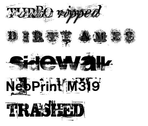
15 Grunge
16 Script Designed to resemble handwriting, with styles ranging from formal to whimsical Should NEVER be set in all capital letters Generally reserved for invitations, greetings, advertisements Examples: Magneto Vladimir Script
17 Dingbats In addition to the primary categories, there are several sets of decorative elements (dingbats) available in font format ornaments, shapes, pictures, symbols, etc. Examples: Desktop Publi shing Standard dingbat font sets are symbol, wingdings, and webdings
18 Font Selection Consider the audience when selecting typefaces and point size Consider the type of paper and method of printing when choosing typeface and point size. Match the personality of the typeface with the publication. Limit typefaces between one and three. Be consistent in the use of fonts all headlines the same, all body text the same, etc.

19 Font Styles Style special formatting applied to text; the most common styles are: Bold appears darker than the surrounding text Italics slopes to the right Underline Other effects that are commonly available are: Shadow adds depth to text or other objects, making them appear more three-dimensional SMALL CAP lowercase letters display in a smaller size than the regular uppercase letters, typically the height of lowercase letters in that font --creating the illusion of depth


20 Special Formats Text that follows an outline in a curved or irregular pattern Reverse type Drop cap Light color text on a dark background typefaces with heavier letters and/or serifs are easier to read The first letter in a story is enlarged and lowered below the normal baseline so the top of the letter is even with the first line of text The illusion of actual textures such as wood, metal, objects in nature, etc. Text Wrap Color Text flows around a graphic image Self-explanatory
21 Spacing Techniques Altering the amount of space between characters, words, lines of text, and blocks of text can help in fitting more text on the page, making pages visually lighter or heavier, and improving readability. * Leading Kerning Tracking Widows/Orphans Spacing after punctuation Indents Hanging Indents *desktoppub.about.com/cs/basic/a/textcomposition.htm

22 Leading Leading the space between lines of text; sometimes known as line spacing Pronounced ledding Leading is measured from baseline to baseline, typically two points greater than the point size some software calculates leading as 120% of the point size
23 Kerning Kerning the adjustment of space between pairs of letters to improve its appearance or alter its fit The spacing between letters is determined by the font; some fonts will automatically kern, or adjust the spacing between letters to make them fit together. Too little space can cause the letters to run together and appear as one making it difficult to read Too much space between letters can create rivers which make it difficult for the reader s eye to flow through the text. Some software uses the expression character spacing. Bradley Bradley KERNING


24 Tracking Tracking Adjusting the spacing between words, phrases, and extended blocks of text N O R M A L T I G H T L O O S E V E R Y L O O S E
25 Alignment Definition: lining up text or graphic elements to the top, bottom, sides, or middle of a page or box Center Justified (Full) Left (Ragged right) Right (Ragged left)
26 Alignment Center Justified Left Right Located where the Ozarks meet the Delta, the Bald Knob School District covers approximately 178 square miles and is located in north central Arkansas, about 60 miles from Little Rock. With a school population of just over 1300, the district services its students in a K-4, 5-8, 9-12 environment. Located where the Ozarks meet the Delta, the Bald Knob School District covers approximately 178 square miles and is located in north central Arkansas, about 60 miles from Little Rock. With a school population of just over 1300, the district services its students in a K-4, 5-8, 9-12 environment. Located where the Ozarks meet the Delta, the Bald Knob School District covers approximately 178 square miles and is located in north central Arkansas, about 60 miles from Little Rock. With a school population of just over 1300, the district services its students in a K-4, 5-8, 9-12 environment. Located where the Ozarks meet the Delta, the Bald Knob School District covers approximately 178 square miles and is located in north central Arkansas, about 60 miles from Little Rock. With a school population of just over 1300, the district services its students in a K-4, 5-8, 9-12 environment. Full Ragged Right Ragged Left
27 Center Alignment Used primarily with invitations, announcements, plaques, certificates, etc. Hard to read full paragraphs or long lines of text Frequently used for headlines over columns Do not center-align numbered or bulleted lists
28 Justified Alignment (Full) Standard format for newspaper columns, magazine articles, books, etc. Requires attention to detail since rivers can occur easily due to spacing and hyphenation Considered very formal
29 Left Alignment Creates a less formal, friendlier layout Watch for hyphenation problems Typically is easier to format requires less time, attention, etc. Ragged right creates white space
30 Right Alignment Used to catch the reader s attention Typically used in advertisements, magazine layouts, etc.
31 Hyphenation Definition: To divide or connect (syllables, word elements, or names) with a hyphen. Allows for more words to fit saving space. The last word on a page should never be divided. No more than two consecutive end-of-line hyphens are recommended. At least two letters must appear on the line before a hyphen, and at least three letters must appear on the line following. If hyphenating manually, check the right edge for any obvious holes, sloping edges or words that stick out.

32 Adding text to images Type consists of mathematically defined shapes that describe the letters, numbers, and symbols of a typeface. Use the Type Tool to create text in Photoshop. For the Web you ll be using type to label buttons and as elements of typographic design. The two buttons in the first group toggle between creating a new type layer, and creating a type mask. The two buttons in the second group toggle between horizontal text and vertical text. Select the Type Tool and bring your mouse onto the Image Window. Photoshop creates a new Text Layer (indicated in the Layers Palette by a capital T at the edge of the Layer).
33 Typographic terminology: Adding text to images A typeface is a full set of characters (uppercase, lowercase, numerals, special characters, etc.) designed in a specific Style. The Baseline in text is an imaginary line that the characters effectively sit upon. Kerning is the space between a particular pair of characters. Tracking is the space between characters in a line of text.


34 Adding text to images Below is the options bar for text Below is the character palette and its options Character palette


35 Adding text to images Below is the Paragraph palette and its options The Paragraph Palette allows you to modify Paragraph Text. Paragraph text is that which occupies a pre-defined Paragraph Block. To create a Paragraph Block you must Click and drag in the Image Window with the Text Tool.

36 Adding text to images Text Warp: Text Warping allows the user to customize the appearance of text and still maintain the ability to edit it at all times. Ex: A text a scenic beach has been given a warp effect.
37 Working with Type layers: Adding text to images Some commands and tools--such as filter effects and painting tools-- are not available for type layers. You must rasterize the type prior to applying the command or using the tool. Rasterizing converts the type layer to a normal layer and makes its contents uneditable as text. To convert a type layer to a normal layer: 1. Select the type layer in the Layers palette. 2. Choose Layer > Rasterize > Type.
Font Basics. Descender. Serif. With strokes on the extremities of the letters. T Script. Sans-Serif. No strokes on the end of the letters
 Font Basics Ascender Font Size d p x A X-height Cap height Counter The white space within letters Descender Bar A Serif With strokes on the extremities of the letters. T A Sans-Serif No strokes on the
TYPE BASICS Cartographic Design & Principles Winter 2016
 TYPE BASICS Cartographic Design & Principles Winter 2016 Words on a Map Everything on the Earth has a name Names on a map, make it a map Otherwise it is a picture, photograph or design Assigning names
understanding typography
 understanding typography What is typography?! it is what language looks like! it is the art and technique of modifying type and arranging it on a page What does the arrangement of type mean? the arrangement
Principles of Typography
 Principles of Typography Different fonts send a different message to the reader. Categories: Sans serif Serif Script Decorative Fonts Sans-serif Fonts Easy to read, especially online Modern and clean Good
MODULE CM 2004 / STAGE 2 / SEMESTER 2 / SESSION Module title Design Principles and Context
 MODULE CM 2004 / STAGE 2 / SEMESTER 2 / SESSION 06-07 Module title Design Principles and Context Typography Fonts are classified under the following headings. Old Face fonts make use of contrasting wide
TYPOGRAPHY. ascender arm (as on the capital T) descender bar (as on the capital H) counter ear (as on the lower case g and r)
 descender bar (as on the capital H) counter ear (as on the lower case g and r)") TYPOGRAPHY Parts of letters: base line x-height ascender arm (as on the capital T) descender bar (as on the capital H) extenders bowl counter ear (as on the lower case g and r) serif stroke tail (as on
TYPOGRAPHY Parts of letters: base line x-height ascender arm (as on the capital T) descender bar (as on the capital H) extenders bowl counter ear (as on the lower case g and r) serif stroke tail (as on
Using Text in Photoshop
 Using Text in Photoshop So, we re going to take a break for a while from talking about photographs and how to manipulate them, and instead focus on some design elements! We re going to spend a while talking
VOICE OF TYPE LECTURE 1
 VOICE OF TYPE LECTURE 1 TYPOGRAPHY II COUNTY COLLEGE OF MORRIS PROFESSOR GAYLE REMBOLD FURBERT VOICE OF TYPE As you look at typefaces, analyze their forms, learn their history and learn how to use them
Unit 3--Alignment, Formatting Font--Size, Color, Style [Bold, Italic, and Underline] Block
![Unit 3--Alignment, Formatting Font--Size, Color, Style [Bold, Italic, and Underline] Block](/thumbs/88/117283008.jpg "Unit 3--Alignment, Formatting Font--Size, Color, Style [Bold, Italic, and Underline] Block") Unit 3--Alignment, Formatting Font--Size, Color, Style [Bold, Italic, and Underline] Block Use the mouse pointer to select the text (or put a blue highlight behind it). Then, make the changes you need.
Unit 3--Alignment, Formatting Font--Size, Color, Style [Bold, Italic, and Underline] Block Use the mouse pointer to select the text (or put a blue highlight behind it). Then, make the changes you need.
Typesetting Tips. Put your best type forward.
 Typesetting Tips Put your best type forward. Do you want your audience to read your document? Improve your chances by making your article easy to read. Make the document difficult to read and To learn
Knightswood Secondary School. Graphic Communication. Desktop Publishing otes. Auto Tracing
 Auto Tracing The process of converting a bit mapped image into a vector image. In a bit-mapped image, each object is represented by a pattern of dots, while in a vector image every object is defined geometrically.
Unit 4. Multimedia Element: Text. Introduction to Multimedia Semester 2
 Unit 4 Multimedia Element: Text 2017-18 Semester 2 Unit Outline In this unit, we will learn Fonts Typography Serif, Sans Serif, Decorative Monospaced vs. Proportional Style Size Spacing Color Alignment
Font classification review
 Font classification review Taken from Lettering & Type by Bruce Willen Nolen Strals Old Style Transitional Modern Slab Serif Garamond ag Baskerville ag Bodoni ag Cowboys ab Sans Serif Gill Sans ag Decorative
TYPE ANATOMY jtittle
 TYPE ANATOMY TYPE ANATOMY TITTLE j Serif Typefaces Tt HUMANIST (a.k.a. Old Style ) - Modeled after the roman typefaces of 15 th & 16 th centuries - Closely related to calligraphy and hand movement CLASSIC
Name: Class: Teacher:..
 Name: Class: Teacher:.. Introduction Desktop publishing (DTP) is the process of designing newspapers, magazines, books, leaflets, booklets and reports on a computer. The industry that produces these items
Typographic. Alphabet. Book. Interactive PDF of typographic rules & terms YOU NEED TO KNOW. Home. Table of Contents
 Typographic Alphabet Table of Contents > Rules That Every Typographer Should Know... 2-3 Book Interactive PDF of typographic rules & terms YOU NEED TO KNOW > Baseline... > Gutter... > Hierarchy... > Kerning...
H A-Z of DTP Features
 A-Z of DTP Features H Alignment One of the principles of design, alignment refers to lining up the top, bottom, sides, or middle of text or graphic elements on a page. See also Text Alignment. Ascender
Typography/ Layout and Design
 Typography/ Layout and Design What is typography? It s the study and science of fonts. Using typography is almost an art, and it takes practice to learn to use it correctly. Type is not just text that
5. Text CHAPTER HIGHLIGHTS 10/12/2016 CHAPTER. Text tradition. Codes for computer text. t. Font technologies. Multimedia text.
 CHAPTER 5. Text CHAPTER HIGHLIGHTS Text tradition. Codes for computer text. t Font technologies. Multimedia text. Guidelines for use of text in multimedia. 2 1 POWERS OF TEXT Multimedia developers value
Typefaces are character sets based on distinct design characteristics.
 Level 3 WGHS VISUAL ARTS 2011 ART DESIGN Typography An Introduction to Type Type Design Since the first recordings of letterforms the concept of the typographic form has evolved into a seemingly endless
8/19/2018. Web Development & Design Foundations with HTML5. Learning Objectives (1 of 2) Learning Objectives (2 of 2)
 Learning Objectives (2 of 2)") Web Development & Design Foundations with HTML5 Ninth Edition Chapter 3 Configuring Color and Text with CSS Slides in this presentation contain hyperlinks. JAWS users should be able to get a list of links
Web Development & Design Foundations with HTML5 Ninth Edition Chapter 3 Configuring Color and Text with CSS Slides in this presentation contain hyperlinks. JAWS users should be able to get a list of links
Type on the Web: Dos, Don ts and Maybes Ilene Strizver
 Type on the Web: Dos, Don ts and Maybes Ilene Strizver What exactly is Type on the Web? How does it differ from print? Type in print Fixed Predictable Controllable Appearance varies depending on: Operating
Alphabet. elemental visual signs 26 characters frozen sounds
 Alphabet elemental visual signs 26 characters frozen sounds Evolution Handwriting > minimum number of strokes Engraving > lowercase > minimum number of curved lines > capitals Letterforms Appearance of
SAMPLE PAGES. Syllabus coverage chart. viii Syllabus coverage chart
 viii Syllabus coverage chart Syllabus coverage chart The chart below shows how each Unit and Topic relates to the ICT syllabus and the Computer Studies syllabus. Computer Unit 11.1 Computer Fundamentals
Franklin Gothic. Seniors: Use larger text that is clear and legible. (Souvenir, Times, Garamond, Helvetica)
") one TYPOGRAPHY LECTURE: Do s and Don t s in Typography Do Build a basic library first. Find out who your audience is. Use appropriate type sizes. Celebrate white space. Use correct alignment. Use correct
one TYPOGRAPHY LECTURE: Do s and Don t s in Typography Do Build a basic library first. Find out who your audience is. Use appropriate type sizes. Celebrate white space. Use correct alignment. Use correct
jasonjuwono twentyfifteen TYPEDIA _ Typography Encyclopedia
 TYPEDIA _ Typography Encyclopedia ANATOMY_ Anatomy of a typeface Anatomy of a typeface What is a Font & Typeface? A design for a set of characters. A font is the combination of typeface and other qualities,
> objective(s): Students will create a text-only design in either Adobe Illustrator or Photoshop
: Students will create a text-only design in either Adobe Illustrator or Photoshop") > word art > objective(s): Students will create a text-only design in either Adobe Illustrator or Photoshop > curricular focus: This lesson emphasizes the creative use of typography as the dominant artistic
> word art > objective(s): Students will create a text-only design in either Adobe Illustrator or Photoshop > curricular focus: This lesson emphasizes the creative use of typography as the dominant artistic
laurengregory laurengregorydesign.com
 THSPA November 25, 2013 Topic: Basic Design Tips and Photoshop Helps 1. Layout Page layout is one of the most important graphic design disciplines. laurengregory lauren@briererows.com laurengregorydesign.com
User-Centered Website Development: A Human- Computer Interaction Approach
 User-Centered Website Development: A Human- Computer Interaction Approach Daniel D. McCracken City College of New York Rosalee J. Wolfe DePaul University With a foreword by: Jared M. Spool, Founding Principal,
BASIC ABOUT TYPE TYPO GRAPHY
 BASIC ABOUT TYPE TYPO GRAPHY TYPOGRAPHY BASIC DESIGN Relative & Absolute measurements Absolute measurements Inche : Millimetres : Points : Pica 3 Inches 76.2 mm 216 Points 18 Picas 1 Inches = 3 Picas A
> what is a font? Times New Roman [10 pts] Times New Roman [12 pts] Times New Roman [14 pts] Times New Roman [18 pts] Times New Roman [24 pts]
![> what is a font? Times New Roman [10 pts] Times New Roman [12 pts] Times New Roman [14 pts] Times New Roman [18 pts] Times New Roman [24 pts]](/thumbs/88/117283063.jpg "> what is a font? Times New Roman [10 pts] Times New Roman [12 pts] Times New Roman [14 pts] Times New Roman [18 pts] Times New Roman [24 pts]") > what is a font? > what is a font? A font is set of glyphs (or images) that represent a complete series of alphabetic and numeric characters, punctuations and symbols in a particular size and style (or
> what is a font? > what is a font? A font is set of glyphs (or images) that represent a complete series of alphabetic and numeric characters, punctuations and symbols in a particular size and style (or
LOGO & BRAND STANDARDS GUIDE
 LOGO & BRAND STANDARDS GUIDE INTRODUCTION The SparkPost Brand Standards Guide provides key information needed to accurately and consistently produce external and internal documents and communications.
Document Design Chunking Similar Information Together
 Document Design Dieter Rams, a famous German designer whose work has influenced Apple s design aesthetic, is noted for his formula: Good design is as little design as possible (Rams). As a document designer,
Designing Research Posters. College of Art and Design Chris Jackson, Associate Dean Keli DiRisio, Assistant Professor
 Designing Research Posters College of Art and Design Chris Jackson, Associate Dean Keli DiRisio, Assistant Professor Size and Orientation If you are NOT using the poster template: Start is with a 48"
DIGITAL PRINT DESIGN (568 )
") DESCRIPTION Create and produce digital print projects that communicates and promotes graphic communication. Develop knowledge and skills relative to the graphic design & printing industries. Includes:
DESCRIPTION Create and produce digital print projects that communicates and promotes graphic communication. Develop knowledge and skills relative to the graphic design & printing industries. Includes:
COPY/PASTE: Allows any item within a document to be copied and pasted within the same document or within compatible software applications.
 You will need to understand basic terms and techniques used in DTP, as well as file types used within DTP and their advantages and disadvantages. This is separate from Elements and Principles of DTP which
The same can also be achieved by clicking on Format Character and then selecting an option from the Typeface list box.
 CHAPTER 2 TEXT FORMATTING A text without any special formatting can have a monotonous appearance. To outline text, to highlight individual words, quotations, or references, or to separate certain parts
LESSON 7 Introduction to Typography
 FOUNDATION IN GRAPHIC DESIGN with ADOBE APPLICATIONS LESSON 7 Introduction to Typography Summary Notes WHAT IS TYPOGRAPHY? Typography is, quite simply, the art and technique of arranging type. Typography
TEXT MEDIA AND INFORMATION
 TEXT MEDIA AND INFORMATION Objectives Identify the basic elements in creating a text-based presentation. Evaluate the text-based presentation through the design principles and elements. But we know, irl,
Chapter 7 Typography, Style Sheets, and Color. Mrs. Johnson
 Chapter 7 Typography, Style Sheets, and Color Mrs. Johnson Typography Typography refers to the arrangement, shape, size, style, and weight of text. Affects the navigation and usability of a web site and
Step by Step: Scientific Poster Making Using PowerPoint 2010
 Step by Step: Scientific Poster Making Using PowerPoint 2010 Nursing Research Office 1161 21 st Avenue South S-2413 MCN Nashville, TN 37232-2424 Telephone: 615.343.2992 www.vanderbiltnursingebp.com Table
Web Site Design and Development Lecture 6
 Web Site Design and Development Lecture 6 CS 0134 Fall 2018 Tues and Thurs 1:00 2:15PM Inheritance Before we talk about font properties, it needs to be known that font properties are inherited by the descendants
In your lifetime you ve seen billions of letters and millions of words, yet you might never have consciously noticed the typefaces you read.
 In your lifetime you ve seen billions of letters and millions of words, yet you might never have consciously noticed the typefaces you read. Type is important because it is an unconscious persuader. It
anatomy cap height x-height baseline descender ligature finial terminal ascender spine small capital uppercase counter cross bar lowercase
 Type Anatomy anatomy cap height x-height baseline stem bowl serif descender ligature ascender finial terminal ascender spine uppercase small capital cross bar counter lowercase 36 thinking with type cap
INTRODUCTION TO TYPOGRAPHY DESIGN
 INTRODUCTION TO TYPOGRAPHY DESIGN Goals of typographic design Typography plays an important role in how audiences perceive your document and its information. Good design is about capturing your audience
OUR TYPOGRAPHY APPROVED UNIVERS FONTS. Univers 65 Bold Univers 65 Bold Oblique Univers 75 Black Univers 75 Black Oblique
 BRAND TYPOGRAPHY For Internal Use Only Not For Use With The Public. For help and guidance on our brand standards, contact marketinginbox@firstcommand.com. 63 OUR TYPOGRAPHY Typography is a powerful extension
BRAND. For Internal Use Only Not For Use With The Public. For help and guidance on our brand standards, contact
 BRAND TYPOGRAPHY. 1 OUR TYPOGRAPHY. Typography is a powerful extension of our brand s personality. It plays an important role in creating a consistent look for First Command across all communications and
Graphic Design. shawacademy LESSON 5. summarynotes INTRODUCTION TO TYPOGRAPHY. For further questions visit us online at:
 shawacademy Graphic Design LESSON 5 INTRODUCTION TO TYPOGRAPHY summarynotes The Diploma in Graphic Design Toolkit For further questions visit us online at: www.shawacademy.com Lesson 5 S shawacademy Lesson
In your lifetime you ve seen billions of letters and millions of words, yet you might never have consciously noticed the typefaces you read.
 In your lifetime you ve seen billions of letters and millions of words, yet you might never have consciously noticed the typefaces you read. Type is important because it is an unconscious persuader. It
Font, Typeface, Typeface Family. Selected Typographical Variables
 Font, Typeface, Typeface Family Font: A font is a set of printable or displayable text character in a specific style, weight, and size. E.g. Helvetica Italic 10 Point. Typeface: The type design for a set
Part II: Creating Visio Drawings
 128 Part II: Creating Visio Drawings Figure 5-3: Use any of five alignment styles where appropriate. Figure 5-4: Vertical alignment places your text at the top, bottom, or middle of a text block. You could
Understanding PowerPoint s Text Capabilities
 Page 1 of 14 Chapter 3: Working with Text In this chapter z Understanding PowerPoint s Text Capabilities z Adding Text z Formatting Text z Using Bullets z Using Numbered Lists z Checking Spelling and Style
Writing and Document Design Lecture 6 Typography
 Writing and Document Design Lecture 6 Typography Last week We looked at Kress and van Leeuwen s work on composition/layout and considered its usefulness as both an analytic tool (a way of analysing and
WORD XP/2002 USER GUIDE. Task- Formatting a Document in Word 2002
 University of Arizona Information Commons Training Page 1 of 21 WORD XP/2002 USER GUIDE Task- Formatting a Document in Word 2002 OBJECTIVES: At the end of this course students will have a basic understanding
Design Principles. Advanced Higher Graphic Presentation. Professional Graphic Presentations by kind permission of
 Design Principles Advanced Higher Graphic Presentation Professional Graphic Presentations by kind permission of Design Principles:- Balance Balance in Composition Three different types of balance :- *
The 12 most common newsletter design mistakes
 The 12 most common newsletter design mistakes www.targetmarketingnetwork.com By: Roger C. Parker Your newsletter s success depends on its design. An attractive, easy to read newsletter encourages readers
Reading 2.2 Cascading Style Sheets
 Reading 2.2 Cascading Style Sheets By Multiple authors, see citation after each section What is Cascading Style Sheets (CSS)? Cascading Style Sheets (CSS) is a style sheet language used for describing
Bold, Italic and Underline formatting.
 Using Microsoft Word Character Formatting You may be wondering why we have taken so long to move on to formatting a document (changing the way it looks). In part, it has been to emphasise the fact that
How to work with text
 How to work with text Adobe Flash Professional lets you add text to a Flash application in two formats: You can add Text Layout Framework (TLF) text. You can add Classic text. Using the Text Layout Framework
Illustrator. Project Workbook
 Project Workbook 2 Contents Illustrator Illustrator Examples... 4 Pen Tool and Image Trace... 4 Illustrator Tour Project... 5 Type and Logos... 14 Designing with Symbols Project... 20 Illustrator Special
InDesign Tools Overview
 InDesign Tools Overview REFERENCE If your palettes aren t visible you can activate them by selecting: Window > Tools Transform Color Tool Box A Use the selection tool to select, move, and resize objects.
How to use text. Adding a text frame
 How to use text Because Adobe InDesign CS6 is a page layout tool, working with text is an important skill. With InDesign, you add all text (and all content) into frames. Frames are shapes (called paths)
Microsoft PowerPoint 2013 Module
 Microsoft PowerPoint 2013 Module Signing your name below means the work you are turning in is your own work and you haven t given your work to anyone else. Name Period Seat Completed Activity Points Poss.
Formatting Text. 05_Format rd July 2000
 05_Format 1.00 23rd July 2000 5 Formatting Text 5.1... Applying Format Effects................................. 52 5.2... Alignment............................................ 53 5.3... Leading..............................................
Adobe Photoshop CS Design Professional PLACING TYPE IN AN IMAGE
 Adobe Photoshop CS Design Professional PLACING TYPE IN AN IMAGE Chapter Lessons Learn about type and how it is created Change spacing and adjust baseline shift Use the Drop Shadow style Apply anti-aliasing
Written Language Production
 Hamburg School K 8 Handwriting & Keyboarding astery Indicators Based on 2012 Handwriting in the 21st Century- An Educational Summit Written Language Production Key: B = Beginning to explore concept/skill
JABRA CORPORATION GRAPHIC STANDARDS MANUAL
 JABRA CORPORATION GRAPHIC STANDARDS MANUAL A simple reference guide for how to use the JABRA Corporation logo in real-world communications applications. INTRODUCTION Corporate image is a valuable asset,
Multimedia for the Web: Creating Digital Excitement. Multimedia Element Text
 : Creating Digital Excitement Multimedia Element Text Chapter Concepts Discuss Fonts Understand Fonts Define Cascading Style Sheets (CSS) Explain Additional Options for Implementing Text on the Web Chapter
DTP Theory Notes. Arbroath Academy - Technology Department - National 5 Graphic Communication
 DTP Theory Notes What is Desktop Publishing? Desktop Publishing (DTP) is the process of using software to create different publications, e.g, magazines, brochures, posters, booklets,newspapers. Who makes
WATER (No kerning) WATER (Automatic Kerning) WATER (Manual Kerning).
 WATER (Automatic Kerning) WATER (Manual Kerning).") Styles Learning to use styles is a very effective way to save time and improve the consistency of publications. A style is a group of attributes that can be applied at once, to one or more paragraphs,
Styles Learning to use styles is a very effective way to save time and improve the consistency of publications. A style is a group of attributes that can be applied at once, to one or more paragraphs,
19. Bulleted and Numbered Lists
 Kennesaw State University DigitalCommons@Kennesaw State University Sexy Technical Communications Open Educational Resources 3-1-2016 19. Bulleted and Numbered Lists David McMurray Follow this and additional
Objec&ve % Select and u&lize tools for digital imaging and design produc&on.
 Objec&ve 203.02 5% Select and u&lize tools for digital imaging and design produc&on. Panels in InDesign Workspace q Control Panel q Document Panel q Tools Panel q Styles Panel q Text Wrap Panel Control
ACSC 231 Internet Technologies
 ACSC 231 Internet Technologies Lecture 7 Web Typography Efthyvoulos Kyriacou - Assoc. Prof. Frederick University Resources: C. Markides (Frederick University) Slide 1 ACSC 231: Internet Technologies 23/12/2008
CSS. Text & Font Properties. Copyright DevelopIntelligence LLC
 CSS Text & Font Properties 1 text-indent - sets amount of indentation for first line of text value: length measurement inherit default: 0 applies to: block-level elements and table cells inherits: yes
WCSD Graphic Standards and Logo Use Guide
 SM WCSD Graphic Standards and Logo Use Guide WCSD Logo WCSD logo with slogan SM The WCSD logo should be used on all school district signage and every District-generated publication, website or webpage,
Character Formatting. Formatting the Text in Text Frames
 FIGURE 4-1 Formatting the Text in Text Frames CHAPTER 4. TYPE 199 Use the Selection tool to select the text frames you want to format and apply formatting. InDesign applies the formatting to all of the
Microsoft Publisher 2007
 Microsoft Publisher 2007 Creating Newsletters Training Manual College of Lake County Staff Computer Training Table of Contents Creating a Newsletter... 3 How to Open Publisher... 3 Basics of Design...
LECTURE 4 THE USES OF TEXT IN MULTIMEDIA
 LECTURE 4 THE USES OF TEXT IN MULTIMEDIA 1 Objective Media Types What text is How text is created and stored in the computer How text is used in Multimedia Systems Advantages and Disadvantages of using
This file includes FILLABLE FORM FIELDS. Enter your answers and then save the form as a PDF with your name to submit. Ex: 4CChrisJohnson.pdf.
 BASIC SKILLS: TYPOGRAPHY This file includes FILLABLE FORM FIELDS. Enter your answers and then save the form as a PDF with your name to submit. Ex: 4CChrisJohnson.pdf Kristy Ryan Name: Overview Complete
Subject: 7 th Grade Computer Grade: 7th Mr. Holmes Unit Lesson Layer Duration Unit 1 Word Processing
 Subject: 7 th Grade Computer Grade: 7th Mr. Holmes Unit Lesson Layer Duration Unit 1 Word Processing PROJECT 2: SAILING INTO EDO BAY WITH COMMODORE PERRY Applied (do) 10/1/12-10/11/12 Essential Questions
PowerPoint Unit 1 Getting Started
 Beginning a presentation PowerPoint Unit 1 Getting Started PowerPoint is commonly used by presenters as a digital aid when presenting their topic to an audience. Many presenters often forget that they
Computer Applications Info Processing
 Lesson 2: Modify the Structure and Appearance of Text Microsoft Word 2016 IN THIS CHAPTER, YOU WILL LEARN HOW TO: Apply styles to text. Change a document s theme. Manually change the look of characters
Before & After. Use the Principles Cheatsheet! From The Non-Designer s Design Book, Robin Williams Non-Designer s Design 8
 Before & After Use the Principles Cheatsheet! From The Non-Designer s Design Book, Robin Williams Non-Designer s Design 8 Before & After From The Non-Designer s Design Book, Robin Williams Non-Designer
Developing successful posters using Microsoft PowerPoint
 Developing successful posters using Microsoft PowerPoint PRESENTED BY ACADEMIC TECHNOLOGY SERVICES University of San Diego Goals of a successful poster A poster is a visual presentation of your research,
Word Tutorial 3. Creating a Multiple- Page Report COMPREHENSIVE
 Word Tutorial 3 Creating a Multiple- Page Report COMPREHENSIVE Objectives Format headings with Quick Styles Insert a manual page break Create and edit a table Sort rows in a table Modify a table s structure
Paragraph Formatting 4
 Paragraph Formatting 4 LESSON SKILL MATRIX Skill Exam Objective Objective Number Formatting Paragraphs Set indentation. 2.2.7 Setting Line Spacing in Text and Between Paragraphs Set line spacing. Modify
BRAND GUIDELINES + UPDATED
 + UPDATED NOVEMBER 2015 Primary Mark Guidelines Vertical Lockup is the primary style and should be used across all applications. Do not change the color unless using one of the alternate logos provided
Detailed Format Instructions for Authors of the SPB Encyclopedia
 Detailed Format Instructions for Authors of the SPB Encyclopedia General Formatting: When preparing the manuscript, the author should limit the use of control characters or special formatting. Use italics
Teach Yourself Microsoft Word Topic 2 Selection and Formatting Techniques
 Teach Yourself Microsoft Word Topic 2 Selection and Formatting Techniques http://www.gerrykruyer.com In this lesson you will revise last week s work and learn a few new tricks whilst completing this exercise.
Typography One typeface classification
 Typography One typeface classification Why classify? Classification helps us describe and navigate type choices Typeface classification helps to: 1. sort type (scholars, historians, type manufacturers),
IN DESIGN. A review of the overview
 IN DESIGN A review of the overview InDesign Review GETTING STARTED: Start by clicking the InDesign icon in your dock. Wait for InDesign to load. Click on Create New Document If resuming work, find your
Web Development & Design Foundations with HTML5
 1 Web Development & Design Foundations with HTML5 CHAPTER 3 CSS BASICS Copyright Terry Felke-Morris 2 Learning Outcomes In this chapter, you will learn how to... Describe the evolution of style sheets
> album art. > objective(s): Students will create a album art design for an existing artist's "next" release that utilizes imagery and text
: Students will create a album art design for an existing artist's next release that utilizes imagery and text") > album art > objective(s): Students will create a album art design for an existing artist's "next" release that utilizes imagery and text > curricular focus: This lesson emphasizes thematic design (design
> album art > objective(s): Students will create a album art design for an existing artist's "next" release that utilizes imagery and text > curricular focus: This lesson emphasizes thematic design (design
DESIGNING THE PAGE FOUNDATIONS OF DIGITAL DESIGN. Layout composition, the grid and typography. Prof. Eva Machauf
 DESIGNING THE PAGE Layout composition, the grid and typography FOUNDATIONS OF DIGITAL DESIGN Prof. Eva Machauf prof.machauf@gmail.com THE GRID The grid is the foundation of all design. Creating and working
Objective 203 Apply production methods to plan and create advanced digital media graphics projects. Course Weight : 25%
 Objective 203 Apply production methods to plan and create advanced digital media graphics projects. Course Weight : 25% Objective 203 - Graphics Objectives are broken down into three sub-objectives : pre-production,
What is Accessibility?
 Email Accessibility What is Accessibility? 1. Extent to which a consumer or user can obtain a good or service at the time it is needed. 2. Ease with which a facility or location can be reached from other
Crimes Against Typography. Shela Vang 13 images Collaborative Partner: Daha Lee 12 images
 13 images Collaborative Partner: Daha Lee 12 images Table of Contents 1 Alignment 3 Dashes 4 Hierarchy 5 Kerning 6 Line Spacing 7 Scale 8 Tracking 9 Widow 10 Thumbnail Images alignment alignment Poorly
BBN ANG 183 Typography Text colour: vertical and horizontal spacing
 BBN ANG 183 Typography Text colour: vertical and horizontal spacing Zoltán G. Kiss & Péter Szigetvári Dept of English Linguistics, Eötvös Loránd University gkz & szp (delg) typo/spacing 1 / 43 outline
LECTURE 08B: EXPLORING MS OFFICE WORD 2010
 LECTURE 08B: EXPLORING MS OFFICE WORD 2010 Insert Drop down This lecture is designed to prepare students for IC³ Certification STRUCTURED TASK 1. English Presentation Every student has Presentation to
STONELAW HIGH GRAPHIC
 GRAPHIC COMMUNICATION Technical Education THE A to Z of DTP Your knowledge of desktop publishing terminology will be expanded as you progress within the subject THE A to Z of DTP ALIGNMENT positions of