Getting Started with Minitab 17
|
|
|
- Leslie Preston
- 6 years ago
- Views:
Transcription
1
2 2014, 2016 by Minitab Inc. All rights reserved. Minitab, Quality. Analysis. Results. and the Minitab logo are all registered trademarks of Minitab, Inc., in the United States and other countries. See minitab.com/legal/trademarks for more information. All other marks referenced remain the property of their respective owners. Release
3 Contents 1 Introduction... 5 Objectives... 5 Overview... 5 The story... 5 The Minitab user interface... 6 Projects and worksheets... 6 Data types... 7 Open and examine a worksheet... 7 In the next chapter Graphing Data Objectives Overview Explore the data Examine relationships between two variables Arrange multiple graphs on one page Save a Minitab project In the next chapter Analyzing Data Objectives Overview Summarize the data Compare two or more means Use Minitab s Project Manager In the next chapter Assessing Quality Objectives Overview Assess process stability Assess process capability In the next chapter Designing an Experiment Objectives Overview Create a designed experiment View the design Enter data into the worksheet Analyze the design Use the stored model for additional analyses Save the project
4 Contents In the next chapter Using Session Commands Objectives Overview Enable and enter session commands Re-execute a series of commands Repeat analyses with exec files In the next chapter Generating a Report Objectives Overview Use the ReportPad Save the report Copy the report to a word processor Send output to Microsoft PowerPoint In the next chapter Preparing a Worksheet Objectives Overview Get data from different sources Prepare the worksheet for analysis In the next chapter Customizing Minitab Objectives Overview Set options Create a custom toolbar Assign a shortcut key Restore Minitab's default options Save the project Index
5 1 Introduction Objectives Learn about the Minitab user interface on page 6 Open and examine a worksheet on page 7 Overview Getting Started with Minitab 17 introduces you to some of the most commonly used features and tasks in Minitab. Most statistical analyses require that you follow a series of steps, often directed by background knowledge or by the subject area that you are investigating. Chapters 2 through 5 illustrate the following steps: Explore data with graphs Conduct statistical analyses Assess quality Design an experiment In chapters 6 through 10, you learn to do the following: Use shortcuts to automate future analyses Generate a report Prepare worksheets Customize Minitab The story A company that sells books online has three regional shipping centers. Each shipping center uses a different computer system to enter and process orders. The company wants to identify the most efficient computer system and to use that computer system at each shipping center. Throughout Getting Started with Minitab 17, you analyze data from the shipping centers as you learn to use Minitab. You create graphs and perform statistical analyses to identify the shipping center that has the most efficient computer system. You then concentrate on the data from this shipping center. First, you create control charts to test whether the shipping center s process is in control. Then, you perform a capability analysis to test whether the process is operating within specification limits. Finally, you perform a designed experiment to determine ways to improve those processes. You also learn about session commands, and how to generate a report, prepare a worksheet, and customize Minitab. 5

6 Introduction The Minitab user interface Before you start your analysis, open Minitab and examine the Minitab user interface. From the Windows taskbar, choose Start > All Programs > Minitab > Minitab 17 Statistical Software. By default, Minitab opens with two windows visible and one window minimized. Session window The Session window displays the results of your analyses in text format. Also, in this window, you can enter session commands instead of using Minitab s menus. Worksheet The worksheet, which is similar to a spreadsheet, is where you enter and arrange your data. You can open multiple worksheets. Project Manager The third window, the Project Manager, is minimized below the worksheet. Session window Worksheet Columns Rows Cells Project Manager Projects and worksheets In a project, you can manipulate data, perform analyses, and generate graphs. Projects contain one or more worksheets. Project (.MPJ) files store the following items: Worksheets Graphs Session window output Session command history Dialog box settings Window layout Options Worksheet (.MTW) files store the following items: Columns of data 6
7 Introduction Constants Matrices Design objects Column descriptions Worksheet descriptions Save your work as a project file to keep all of your data, graphs, dialog box settings, and options together. Save your work as a worksheet file to save only the data. A worksheet file can be used in multiple projects. Worksheets can have up to 4,000 columns. The number of worksheets that a project can have is limited only by your computer's memory. Data types A worksheet can contain the following types of data. Numeric data Numbers, such as 264 or Text data Letters, numbers, spaces, and special characters, such as Test #4 or North America. Date/time data Dates, such as Mar , 17-Mar-2013, 3/17/13, or 17/03/13. Times, such as 08:25:22 AM. Date/time, such as 3/17/13 08:25:22 AM or 17/03/13 08:25:22. Elapsed time, such as [12]:22:14. Open and examine a worksheet You can open a new, empty worksheet at any time. You can also open one or more files that contain data, such as a Microsoft Excel file. When you open a file, you copy the contents of the file into the current Minitab project. Any changes that you make to the worksheet while you are in the project do not affect the original file. The data for the three shipping centers are stored in the worksheet ShippingData.MTW. Note In some cases, you need to prepare your worksheet before you begin an analysis. For more information, go to Preparing a Worksheet on page Choose Help > Sample Data. 7


8 Introduction 2. Double-click the Getting Started folder, then double-click ShippingData.MTW. The data are arranged in columns, which are also called variables. The column number and name are at the top of each column. Column with date/time data Column with numeric data Column with text data Column name Row number In the worksheet, each row represents a single book order. The columns contain the following information: Center: shipping center name Order: order date and time Arrival: delivery date and time Days: delivery time in days Status: delivery status On time indicates that the book shipment was received on time. Back order indicates that the book cannot be shipped yet because it is not currently in stock. Late indicates that the book shipment was received six or more days after the order was placed. Distance: distance from the shipping center to the delivery location 8
9 Introduction In the next chapter Now that you have a worksheet open, you are ready to start using Minitab. In the next chapter, you use graphs to check the data for normality and examine the relationships between variables. 9
10 2 Graphing Data Objectives Create, interpret, and edit histograms on page 10 Create and interpret scatterplots with the Minitab Assistant on page 15 Arrange multiple graphs on one page on page 18 Save a project on page 20 Overview Before you perform a statistical analysis, you can use graphs to explore data and assess relationships between the variables. Also, you can use graphs to summarize data and to help interpret statistical results. You can access Minitab s graphs from the Graph and Stat menus. Built-in graphs, which help you interpret results and assess the validity of statistical assumptions, are also available with many statistical commands. Minitab graphs include the following features: Pictorial galleries to help you choose a graph type Flexibility in customizing graphs Graph elements that you can change Option to be automatically updated This chapter explores the shipping data worksheet that you opened in the previous chapter. You use graphs to check normality, compare means, explore variability, and examine the relationships between variables. Tip For more information about Minitab graphs, go to Graphs in the Minitab Help index. To access the Minitab Help index, open Minitab, choose Help > Help, then click the Index tab in the left pane. Explore the data Before you perform a statistical analysis, first create graphs that display important characteristics of the data. For the shipping data, you want to know the mean delivery time for each shipping center and how the data vary within each shipping center. You also want to determine whether the shipping data follow a normal distribution, so that you can use standard statistical methods for testing the equality of means. Create a paneled histogram To determine whether the shipping data follow a normal distribution, create a paneled histogram of the time lapse between order date and delivery date. 1. If you are continuing from the previous chapter, go to step 4. If not, start Minitab. 2. Choose Help > Sample Data. 3. Double-click the Getting Started folder, then double-click ShippingData.MTW. 10


11 Graphing Data 4. Choose Graph > Histogram. 5. Click With Fit, then click OK. 6. In Graph variables, enter Days. 7. Click Multiple Graphs. 8. On the By Variables tab, in By variables with groups in separate panels, enter Center. 11

12 Graphing Data 9. Click OK in each dialog box. Note To select variables in most Minitab dialog boxes, use one of the following methods: Double-click the variables in the variables list box. Highlight the variables in the list box, and then click Select. Type the variables names or column numbers. Histogram with groups in separate panels Interpret the results The histograms seem to be approximately bell-shaped and symmetric about the means, which indicates that the delivery times for each center are approximately normally distributed. Rearrange the paneled histogram For the graph that you created, you want to rearrange the three panels so that comparing the means and variation is easier. 1. Right-click the histogram, then choose Panel. 12


13 Graphing Data 2. On the Arrangement tab, in Rows and Columns, select Custom. In Rows, enter 3. In Columns, enter Click OK. Histogram with panels arranged in one column Interpret the results The mean delivery times for each shipping center are different: Central: days Eastern: days Western: days The histogram shows that the Central and Eastern centers are similar in both mean delivery time and spread of delivery time. In contrast, the mean delivery time for the Western center is shorter and the distribution is less spread out. Analyzing Data on page 22 shows how to detect statistically significant differences between means using ANOVA (analysis of variance). Tip If your data change, Minitab can automatically update graphs. For more information, go to Updating graphs in the Minitab Help index. To access the Minitab Help index, open Minitab, choose Help > Help, then click the Index tab in the left pane. 13


14 Graphing Data Edit the title and add a footnote To help your supervisor quickly interpret the histogram, you want to change the title and add a footnote. 1. Double-click the title, Histogram of Days. 2. In Text, enter Histogram of Delivery Time. 3. Click OK. 4. Right-click the histogram, then choose Add > Footnote. 5. In Footnote, enter Western center: fastest delivery time, lowest variability. 6. Click OK. 14

15 Graphing Data Histogram with edited title and new footnote Interpret the results The paneled histogram now has a more descriptive title and a footnote that provides a brief interpretation of the results. Examine relationships between two variables Graphs can help you identify whether relationships exist between variables, and the strength of any relationships. Knowing the relationship between variables can help you determine which variables are important to analyze and which additional analyses to choose. Because each shipping center serves a region, you suspect that distance to delivery location does not greatly affect delivery time. To verify this suspicion and to eliminate distance as a potentially important factor, you examine the relationship between delivery time and delivery distance for each center. Create a scatterplot with groups To examine the relationship between two variables, you use a scatterplot. You can choose a scatterplot from the Graph menu or you can use the Minitab Assistant. The Assistant guides you through your analyses and helps you interpret the results with confidence. The Assistant can be used for most basic statistical tests, graphs, quality analyses, and DOE (design of experiments). Use the Assistant in the following situations: You need assistance to choose the correct tool for an analysis. You want dialog boxes that have less technical terminology and that are easier to complete. You want Minitab to check the analysis assumptions for you. You want output that is more graphical and explains in detail how to interpret your results. 1. Choose Assistant > Graphical Analysis. 2. Under Graph relationships between variables, click Scatterplot (groups). 3. In Y column, enter Days. 4. In X column, enter Distance. 15


16 Graphing Data 5. From Number of X columns, select In X1, enter Center. 7. Click OK. Summary report The summary report contains scatterplots of days versus distance by shipping center overlaid on the same graph. This report also provides smaller scatterplots for each shipping center. Diagnostic report The diagnostic report provides guidance on possible patterns in your data. The points on the scatterplot show no apparent relationship between days and distance. The fitted regression line for each center is relatively flat, which indicates that the proximity of a delivery location to a shipping center does not affect the delivery time. 16


17 Graphing Data Descriptive statistics report The descriptive statistics report contains descriptive statistics for each shipping center. Report card The report card provides information on how to check for unusual data. The report card also indicates that there appears to be a relationship between the Y variable and the X variables. The Y variable is Days and the X variables are Distance and Center. Recall that the scatterplot indicated that there does not appear to be a relationship between days and distance. However, there may be a relationship between days and shipping center, which you will explore further in the next chapter, Analyzing Data on page


18 Graphing Data Arrange multiple graphs on one page Use Minitab s graph layout tool to arrange multiple graphs on one page. You can add annotations to the layout and edit the individual graphs within the layout. To show your supervisor the preliminary results of the graphical analysis of the shipping data, arrange the summary report and the paneled histogram on one page. Create a graph layout 1. Ensure that the scatterplot summary report is active, then choose Editor > Layout Tool. A list of all open graphs Buttons used to move graphs to and from the layout The next graph to be moved to the layout The scatterplot summary report is already included in the layout. 2. To arrange two graphs on one page, in Rows, enter 1. 18

19 Graphing Data 3. Click the summary report and drag it to the right side of the layout. 4. Click the right arrow button to place the paneled histogram in the left side of the layout. 5. Click Finish. Graph layout with the paneled histogram and the scatterplot Note If you edit the data in the worksheet after you create a layout, Minitab cannot automatically update the graphs in the layout. You must recreate the layout with the new graphs. Annotate the graph layout You want to add a descriptive title to the graph layout. 1. To ensure that you have the entire graph layout selected, choose Editor > Select Item > Graph Region. 2. Choose Editor > Add > Title. 3. In Title, enter Graphical Analysis of Shipping Data. 4. Click OK. 19

20 Graphing Data Graph layout with a new title Print the graph layout You can print any Minitab window, including a graph or a layout. 1. Choose Window > Layout, and then choose File > Print Graph. 2. Click OK. Save a Minitab project Minitab data are saved in worksheets. You can also save Minitab projects, which contain all of your work, including worksheets, Session window output, graphs, history of your session, and dialog box settings. 1. Choose File > Save Project As. 2. Browse to the folder that you want to save your files in. 20
 to test whether the differences among the shipping centers are statistically significant.")
21 Graphing Data 3. In File name, enter MyGraphs. 4. Click Save. In the next chapter The graphical output indicates that the three shipping centers have different delivery times for book orders. In the next chapter, you display descriptive statistics and perform an ANOVA (analysis of variance) to test whether the differences among the shipping centers are statistically significant. 21
22 3 Analyzing Data Objectives Summarize the data on page 22 Compare means on page 24 Access StatGuide on page 30 Use the Project Manager on page 30 Overview The field of statistics provides principles and methods for collecting, summarizing, and analyzing data, and for interpreting the results. You use statistics to describe data and make inferences. Then, you use the inferences to improve processes and products. Minitab provides many statistical analyses, such as regression, ANOVA, quality tools, and time series. Built-in graphs help you visualize your data and validate your results. In Minitab, you can also display and store statistics and diagnostic measures. In this chapter, you assess the number of late orders and back orders, and test whether the differences in delivery times between the three shipping centers are statistically significant. Summarize the data Descriptive statistics summarize and describe the prominent features of data. Use Display Descriptive Statistics to determine how many book orders were delivered on time, how many were late, and how many were initially back ordered for each shipping center. Display descriptive statistics 1. If you are continuing from the previous chapter, choose File > New > Project. If not, start Minitab. 2. Choose Help > Sample Data. 3. Double-click the Getting Started folder, then double-click ShippingData.MTW. 4. Choose Stat > Basic Statistics > Display Descriptive Statistics. 5. In Variables, enter Days. 22


23 Analyzing Data 6. In By variables (optional), enter Center Status. For most Minitab commands, you only need to complete the main dialog box to execute the command. Often, you use sub-dialog boxes to modify the analysis or to display additional output, such as graphs. 7. Click Statistics. 8. Deselect First quartile, Median, Third quartile, N nonmissing, and N missing. 9. Select N total. 10. Click OK in each dialog box. Note Changes that you make in the Statistics sub-dialog box affect the current session only. To change the default options for future sessions, choose Tools > Options. Expand Individual Commands and select Display Descriptive Statistics. Select the statistics that you want to be selected by default. When you open the Statistics sub-dialog box again, it displays your new options. Descriptive Statistics: Days Results for Center = Central Total Variable Status Count Mean SE Mean StDev Minimum Maximum Days Back order 6 * * * * * Late On time Results for Center = Eastern Total Variable Status Count Mean SE Mean StDev Minimum Maximum 23
24 Analyzing Data Days Back order 8 * * * * * Late On time Results for Center = Western Total Variable Status Count Mean SE Mean StDev Minimum Maximum Days Back order 3 * * * * * On time Note The Session window displays text output, which you can edit, add to the ReportPad, and print. For more information about the ReportPad, go to Generating a Report on page 61. Interpret the results The Session window displays each center s results separately. Within each center, you can see the number of back orders, late orders, and on-time orders in the Total Count column: The Eastern shipping center has the most back orders (8) and late orders (9). The Central shipping center has the next most back orders (6) and late orders (6). The Western shipping center has the fewest back orders (3) and no late orders. The Session window output also includes the mean, standard error of the mean, standard deviation, minimum, and maximum of delivery time in days for each center. These statistics do not exist for back orders. Compare two or more means One of the most common methods used in statistical analysis is hypothesis testing. Minitab offers many hypothesis tests, including t-tests and ANOVA (analysis of variance). Usually, when you perform a hypothesis test, you assume an initial claim to be true, and then test this claim using sample data. Hypothesis tests include two hypotheses (claims), the null hypothesis (H 0 ) and the alternative hypothesis (H 1 ). The null hypothesis is the initial claim and is often specified based on previous research or common knowledge. The alternative hypothesis is what you believe might be true. Given the graphical analysis in the previous chapter and the descriptive analysis above, you suspect that the difference in the average number of delivery days across shipping centers is statistically significant. To verify this, you perform a one-way ANOVA, which tests the equality of two or more means. You also perform a Tukey s multiple comparison test to see which shipping center means are different. For this one-way ANOVA, delivery days is the response, and shipping center is the factor. Perform an ANOVA 1. Choose Stat > ANOVA > One-Way. 2. Select Response data are in one column for all factor levels. 24


25 Analyzing Data 3. In Response, enter Days. In Factor, enter Center. 4. Click Comparisons. 5. Under Comparison procedures assuming equal variances, select Tukey. 6. Click OK. 7. Click Graphs. For many statistical commands, Minitab includes graphs that help you interpret the results and assess the validity of statistical assumptions. These graphs are called built-in graphs. 8. Under Data plots, select Interval plot, Individual value plot, and Boxplot of data. 25

26 Analyzing Data 9. Under Residual plots, select Four in one. 10. Click OK in each dialog box. One-way ANOVA: Days versus Center Method Null hypothesis All means are equal Alternative hypothesis At least one mean is different Significance level α = 0.05 Rows unused 17 Equal variances were assumed for the analysis. Factor Information Factor Levels Values Center 3 Central, Eastern, Western Analysis of Variance Source DF Adj SS Adj MS F-Value P-Value Center Error Total Model Summary S R-sq R-sq(adj) R-sq(pred) % 20.24% 19.17% Means Center N Mean StDev 95% CI Central (3.745, 4.223) 26

27 Analyzing Data Eastern (4.215, 4.689) Western (2.746, 3.217) Pooled StDev = Tukey Pairwise Comparisons Grouping Information Using the Tukey Method and 95% Confidence Center N Mean Grouping Eastern A Central B Western C Means that do not share a letter are significantly different. Interpret the Session window output The decision-making process for a hypothesis test is based on the p-value, which indicates the probability of falsely rejecting the null hypothesis when it is really true. If the p-value is less than or equal to a predetermined significance level (denoted by α or alpha), then you reject the null hypothesis and claim support for the alternative hypothesis. If the p-value is greater than α, then you fail to reject the null hypothesis and cannot claim support for the alternative hypothesis. With an α of 0.05, the p-value (0.000) in the Analysis of Variance table provides enough evidence to conclude that the average delivery times for at least two of the shipping centers are significantly different. The results of the Tukey's test are included in the grouping information table, which highlights the significant and non-significant comparisons. Because each shipping center is in a different group, all shipping centers have average delivery times that are significantly different from each other. ANOVA graphs 27

28 Analyzing Data 28
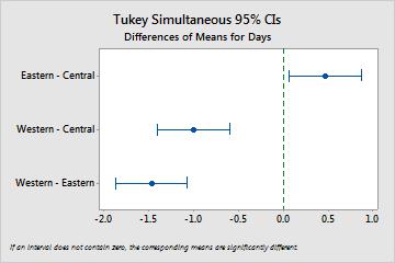
29 Analyzing Data Interpret the ANOVA graphs Minitab produced the following graphs: Four-in-one residual plot Interval plot Individual value plot Boxplot Tukey 95% confidence interval plot You examine the residual plots first. Then, you examine the interval plot, individual value plot, and boxplot together to assess the equality of the means. Finally, you examine the Tukey 95% confidence interval plot to determine statistical significance. Interpret the residual plots Use residual plots, which are available with many statistical commands, to verify statistical assumptions. Normal Probability Plot Use this plot to detect nonnormality. Points that approximately follow a straight line indicate that the residuals are normally distributed. Histogram Use this plot to detect multiple peaks, outliers, and nonnormality. Look for a normal histogram, which is approximately symmetric and bell-shaped. Versus Fits Use this plot to detect nonconstant variance, missing higher-order terms, and outliers. Look for residuals that are scattered randomly around zero. Versus Order Use this plot to detect the time dependence of the residuals. Inspect the plot to ensure that the residuals display no obvious pattern. For the shipping data, the four-in-one residual plots indicate no violations of statistical assumptions. The one-way ANOVA model fits the data relatively well. Note In Minitab, you can display each of the residual plots on a separate page. Interpret the interval plot, individual value plot, and boxplot Examine the interval plot, individual value plot, and boxplot. Each graph indicates that the delivery time varies by shipping center, which is consistent with the histograms from the previous chapter. The boxplot for the Eastern shipping center has an asterisk. The asterisk identifies an outlier, which is an order that has an unusually long delivery time. Examine the interval plot again. The interval plot displays 95% confidence intervals for each mean. Hold the pointer over the points on the graph to view the means. Hold the pointer over the interval bars to view the 95% confidence intervals. The interval plot shows that the Western shipping center has the fastest mean delivery time (2.981 days) and a confidence interval of 2.75 to 3.22 days. Interpret the Tukey 95% confidence interval plot The Tukey 95% confidence interval plot is the best graph to use to determine the likely ranges for the differences and to assess the practical significance of those differences. The Tukey confidence intervals show the following pairwise comparisons: 29
30 Analyzing Data Eastern shipping center mean minus Central shipping center mean Western shipping center mean minus Central shipping center mean Western shipping center mean minus Eastern shipping center mean Hold the pointer over the points on the graph to view the middle, upper, and lower estimates. The interval for the Eastern minus Central comparison is to That is, the mean delivery time of the Eastern shipping center minus the mean delivery time of the Central shipping center is between and days. The Eastern shipping center's deliveries take significantly longer than the Central shipping center's deliveries. You interpret the other Tukey confidence intervals similarly. Also, notice the dashed line at zero. If an interval does not contain zero, the corresponding means are significantly different. Therefore, all the shipping centers have significantly different average delivery times. Access StatGuide Suppose you want more information about how to interpret a one-way ANOVA, specifically Tukey s multiple comparison method. Minitab StatGuide provides detailed information about the Session window output and graphs for most statistical commands. 1. Put your cursor anywhere in the one-way ANOVA Session window output. 2. On the Standard toolbar, click the StatGuide button. 3. In the Contents pane, choose ANOVA > One-Way > Tukey s method. Save the project Save all your work in a Minitab project. 1. Choose File > Save Project As. 2. Navigate to the folder that you want to save your files in. 3. In File name, enter MyStats. 4. Click Save. Use Minitab s Project Manager Now you have a Minitab project that contains a worksheet, several graphs, and Session window output from your analyses. The Project Manager helps you navigate, view, and manipulate parts of your Minitab project. Use the Project Manager to view the statistical analyses that you just performed. View the Session window output Use the Project Manager to review the one-way ANOVA Session window output. 1. On the Project Manager toolbar, click the Show Session Folder button. 30


31 Analyzing Data 2. In the left pane, double-click One-way ANOVA: Days versus Center. The Project Manager displays the one-way ANOVA session window output in the right pane. View the graphs You want to view the boxplot again. You can double-click Boxplot of Days in the Session folder or use the Show Graphs Folder button on the toolbar. 1. On the Project Manager toolbar, click the Show Graphs Folder button. 2. In the left pane, double-click Boxplot of Days. The Project Manager displays the boxplot in the Graph window. In the next chapter The descriptive statistics and ANOVA results indicate that the Western shipping center has the fewest late orders and back orders, and has the shortest delivery time. In the next chapter, you create a control chart and perform a capability 31
32 Analyzing Data analysis to investigate whether the Western shipping center s process is stable over time and is capable of operating within specifications. 32
33 4 Assessing Quality Objectives Create and interpret control charts on page 34 Add stages to a control chart on page 35 Update a control chart on page 36 Add date/time labels to a control chart on page 38 Perform and interpret a capability analysis on page 39 Overview Quality is the degree to which products or services meet the needs of customers. Common goals for quality professionals include reducing defect rates, manufacturing products within specifications, and standardizing delivery time. Minitab offers many methods to help you assess quality in an objective, quantitative way. These methods include control charts, quality planning tools, measurement systems analysis (gage R&R studies), process capability, and reliability/survival analysis. This chapter focuses on control charts and process capability. You can customize Minitab's control charts in the following ways: Automatically update the chart after you add or change data. Choose how to estimate parameters and control limits. Display tests for special causes and historical stages. Customize the chart, such as adding a reference line, changing the scale, and modifying titles. You can customize control charts when you create them or later. With Minitab's capability analysis, you can do the following: Analyze process data from many different distributions, including normal, exponential, Weibull, gamma, Poisson, and binomial. Display charts to verify that the process is in control and that the data follow the chosen distribution. The graphical and statistical analyses that you performed in the previous chapter show that the Western shipping center has the fastest delivery time. In this chapter, you determine whether the Western shipping center s process is in control and is capable of operating within specifications. Assess process stability Unusual patterns in your data indicate the presence of special-cause variation, that is, variation that is not a normal part of the process. Use control charts to detect special-cause variation and to assess process stability over time. Minitab control charts display process statistics. Process statistics include subgroup means, individual observations, weighted statistics, and numbers of defects. Minitab control charts also display a center line and control limits. The center line is the average value of the quality statistic that you choose to assess. If a process is in control, the points will vary randomly around the center line. The control limits are calculated based on the expected random variation 33

34 Assessing Quality in the process. The upper control limit (UCL) is 3 standard deviations above the center line. The lower control limit (LCL) is 3 standard deviations below the center line. If a process is in control, all points on the control chart are between the upper and lower control limits. For all control charts, you can modify Minitab s default chart specifications. For example, you can define the estimation method for the process standard deviation, specify the tests for special causes, and display historical stages. Create an Xbar-S chart Create an Xbar-S chart to assess both the mean and variability of the process. This control chart displays an Xbar chart and an S chart on the same graph. Use an Xbar-S chart when your subgroups contain 9 or more observations. To determine whether the delivery process is stable over time, the manager of the Western shipping center randomly selected 10 samples for 20 days. 1. If you are continuing from the previous chapter, choose File > New > Project. If not, start Minitab. 2. Choose Help > Sample Data. 3. Double-click the Getting Started folder, then double-click Quality.MTW. 4. Choose Stat > Control Charts > Variables Charts for Subgroups > Xbar-S. 5. From the drop-down list, select All observations for a chart are in one column, then enter Days. 6. In Subgroup sizes, enter Date. To create a control chart, you only need to complete the main dialog box. However, you can click any button to select options to customize your chart. 7. Click OK. 34


35 Assessing Quality Xbar-S chart Tip Hold the pointer over points on a control chart or graph to view information about the data. Interpret the Xbar-S chart All of the points on the control chart are within the control limits. Thus, the process mean and process standard deviation appear to be stable or in control. The process mean (X) is The average standard deviation (S) is Add stages to the control chart You can use stages on a control chart to show how a process changes over specific periods of time. At each stage, Minitab recalculates the center line and control limits. The manager of the Western shipping center made a process change on March 15. You want to determine whether the process was stable before and after this process change. 1. Press Ctrl+E to open the last dialog box, or choose Stat > Control Charts > Variables Charts for Subgroups > Xbar-S. Tip Minitab saves your dialog box settings with your project. To reset a dialog box, press F3. 2. Click Xbar-S Options. 3. On the Stages tab, in Define stages (historical groups) with this variable, enter Date. 4. Under When to start a new stage, select With the first occurrence of these values, and enter 3/15/ Click OK in each dialog box. 35
 is 2.935 and the average standard deviation (S) is 0.627.")
36 Assessing Quality Xbar-S chart with stages Interpret the results All the points on the control chart are within the control limits before and after the process change. For the second stage, the process mean (X) is and the average standard deviation (S) is Note By default, Minitab displays the control limits and center line labels for the most recent stage. To display labels for all stages, click Xbar-S Options. On the Display tab, under Other, select Display control limit / center line labels for all stages. Add more data and update the control chart When your data change, you can update any control chart or graph (except stem-and-leaf plot) without re-creating the graph. After you create the Xbar-S chart, the manager of the Western shipping center gives you more data, which was collected on 3/24/2013. Add the data to the worksheet and update the control chart. Add more data to the worksheet You need to add date/time data to C1 and numeric data to C2. 1. Click the worksheet to make it active. 2. Click any cell in C1, and then press End to go to the bottom of the worksheet. 36

.")
37 Assessing Quality 3. To add the date, 3/24/2013, to rows : a. Enter 3/24/2013 in row 201 in C1. b. Select the cell that contains 3/24/2013, and point to the Autofill handle in the lower-right corner of the cell. When the pointer becomes a cross symbol ( + ), press Ctrl and drag the pointer to row 210 to fill the cells with the repeated date value. When you press and hold Ctrl, a superscript cross appears above the Autofill cross symbol ( + + ). The superscript cross indicates that repeated values, instead of sequential values, will be added to the cells. 4. Add the following data to C2, starting in row 201: As you enter data, press Enter to move to the next cell down. If the data-entry direction arrow points to the right, click the arrow so that it points down. Data-entry direction arrow 5. Verify that you entered the data correctly. Update the control chart 1. Right-click the Xbar-S chart, then choose Update Graph Now. 37
 changed slightly, but the process still appears to be in control. Note To update all graphs and control charts automatically, choose Tools > Options.")
38 Assessing Quality Updated Xbar-S chart showing the new subgroup The Xbar-S chart now includes the new subgroup. The mean (X = 2.926) and standard deviation (S = 0.607) changed slightly, but the process still appears to be in control. Note To update all graphs and control charts automatically, choose Tools > Options. Expand Graphics, then select Other Graphics Options. Select On creation, set graph to update automatically when data change. Change the x-axis labels to dates By default, the subgroups on Xbar-S charts are labeled in consecutive numeric order. You can edit the x-axis to display dates instead. 1. Double-click the x-axis on the Xbar chart (the top chart). 2. On the Time tab, under Time Scale, select Stamp. In Stamp columns (1-3, innermost first), enter Date. 3. Click OK. 4. Repeat for the x-axis on the S chart. 38
39 Assessing Quality Xbar-S chart with edited x-axes Interpret the results The x-axis for each chart now shows the dates instead of the subgroup numbers. Assess process capability After you determine that a process is in statistical control, you want to know whether that process is capable. A process is capable if it meets specifications and produces good parts or results. You assess process capability by comparing the spread of the process variation to the width of the specification limits. Important Do not assess the capability of a process that is not in control because the estimates of process capability might be incorrect. Capability indices, or statistics, are a simple way of assessing process capability. Because capability indices reduce process information to single numbers, comparing one process to another is easy. Perform a capability analysis Now that you know that the delivery process is in control, perform a capability analysis to determine whether the delivery process is within specification limits and produces acceptable delivery times. The upper specification limit (USL) is 6 because the manager of the Western shipping center considers an order to be late if it is delivered after 6 days. The manager does not specify a lower specification limit (LSL). The distribution is approximately normal, so you can use a normal capability analysis. 1. Choose Stat > Quality Tools > Capability Analysis > Normal. 2. Under Data are arranged as, select Single column. Enter Days. 3. In Subgroup size, enter Date. 39

40 Assessing Quality 4. In Upper spec, enter Click OK. Capability analysis of the delivery process Interpret the results Cpk is a measure of potential process capability. Ppk is a measure of overall process capability. Both Cpk and Ppk are greater than 1.33, which is a generally accepted minimum value. These statistics indicate that the Western shipping center s process is capable and that the shipping center delivers orders in an acceptable amount of time. Save the project Save all your work in a Minitab project. 40
41 Assessing Quality 1. Choose File > Save Project As. 2. Browse to the folder that you want to save your files in. 3. In File name, enter MyQuality. 4. Click Save. In the next chapter The quality analysis indicates that the Western shipping center s process is in control and is capable of meeting specification limits. In the next chapter, you design an experiment and analyze the results to investigate ways to further improve the delivery process at the Western shipping center. 41
42 5 Designing an Experiment Objectives Learn about designed experiments in Minitab on page 42 Create a factorial design on page 42 View a design and enter data in the worksheet on page 45 Analyze a design and interpret the results on page 46 Use a stored model to create factorial plots and predict a response on page 50 Overview DOE (design of experiments) helps you investigate the effects of input variables (factors) on an output variable (response) at the same time. These experiments consist of a series of runs, or tests, in which purposeful changes are made to the input variables. Data are collected at each run. You use DOE to identify the process conditions and product components that affect quality, and then determine the factor settings that optimize results. Minitab offers four types of designs: factorial designs, response surface designs, mixture designs, and Taguchi designs (also called Taguchi robust designs). The steps you follow in Minitab to create, analyze, and visualize a designed experiment are similar for all types. After you perform the experiment and enter the results, Minitab provides several analytical tools and graph tools to help you understand the results. This chapter demonstrates the typical steps to create and analyze a factorial design. You can apply these steps to any design that you create in Minitab. Minitab DOE commands include the following features: Catalogs of designed experiments to help you create a design Automatic creation and storage of your design after you specify its properties Display and storage of diagnostic statistics to help you interpret the results Graphs to help you interpret and present the results In this chapter, you investigate two factors that might decrease the time that is needed to prepare an order for shipment: the order-processing system and the packing procedure. The Western center has a new order-processing system. You want to determine whether the new system decreases the time that is needed to prepare an order. The center also has two different packing procedures. You want to determine which procedure is more efficient. You decide to perform a factorial experiment to test which combination of factors enables the shortest time that is needed to prepare an order for shipment. Create a designed experiment Before you can enter or analyze DOE data in Minitab, you must first create a designed experiment in the worksheet. Minitab offers a variety of designs. Factorial Includes 2-level full designs, 2-level fractional designs, split-plot designs, and Plackett-Burman designs. 42


43 Designing an Experiment Response surface Includes central composite designs and Box-Behnken designs. Mixture Includes simplex centroid designs, simplex lattice designs, and extreme vertices designs. Taguchi Includes 2-level designs, 3-level designs, 4-level designs, 5-level designs, and mixed-level designs. You choose the appropriate design based on the requirements of your experiment. Choose the design from the Stat > DOE menu. You can also open the appropriate toolbar by choosing Tools > Toolbars. After you choose the design and its features, Minitab creates the design and stores it in the worksheet. Select a design You want to create a factorial design to examine the relationship between two factors, order-processing system and packing procedure, and the time that is needed to prepare an order for shipping. 1. Choose File > New > Project. 2. Choose Stat > DOE > Factorial > Create Factorial Design. When you create a design in Minitab, only two buttons are enabled, Display Available Designs and Designs. The other buttons are enabled after you complete the Designs sub-dialog box. 3. Click Display Available Designs. For most design types, Minitab displays all the possible designs and the number of required experimental runs in the Display Available Designs dialog box. 43

 possible factor combinations. 8. From Number of replicates for corner points, selecting 3. 9. Click OK to return to the main dialog box.")
44 Designing an Experiment 4. Click OK to return to the main dialog box. 5. Under Type of Design, select 2-level factorial (default generators). 6. From Number of factors, select Click Designs. The area at the top of the sub-dialog box shows available designs for the design type and the number of factors that you chose. In this example, because you are performing a factorial design with two factors, you have only one option, a full factorial design with four experimental runs. A 2-level design with two factors has 2 2 (four) possible factor combinations. 8. From Number of replicates for corner points, selecting Click OK to return to the main dialog box. All the buttons are now enabled. Enter the factor names and set the factor levels Minitab uses the factor names as the labels for the factors on the analysis output and graphs. If you do not enter factor levels, Minitab sets the low level at 1 and the high level at Click Factors. 2. In the row for Factor A, under Name, enter OrderSystem. Under Type, select Text. Under Low, enter New. Under High, enter Current. 3. In the row for Factor B, under Name, enter Pack. Under Type, select Text. Under Low, enter A. Under High, enter B. 4. Click OK to return to the main dialog box. Randomize and store the design By default, Minitab randomizes the run order of all design types, except Taguchi designs. Randomization helps ensure that the model meets certain statistical assumptions. Randomization can also help reduce the effects of factors that are not included in the study. 44

 indicates the order to collect data.")
45 Designing an Experiment Setting the base for the random data generator ensures that you obtain the same run order each time you create the design. 1. Click Options. 2. In Base for random data generator, enter Verify that Store design in worksheet is selected. 4. Click OK in each dialog box. View the design Each time you create a design, Minitab stores design information and factors in worksheet columns. 1. Maximize the worksheet to see the structure of a typical design. You can also open the worksheet DOE.MTW in the Getting Started folder. DOE.MTW includes the design and the response data. The RunOrder column (C2) indicates the order to collect data. If you do not randomize the design, the StdOrder and RunOrder columns are the same. In this example, because you did not add center points or put runs into blocks, Minitab sets all the values in C3 and C4 to 1. The factors that you entered are stored in columns C5 (OrderSystem) and C6 (Pack). Note You can use Stat > DOE > Display Design to switch between a random display and a standard-order display, and between a coded display and an uncoded display. To change the factor settings or names, use Stat > DOE > Modify Design. If you need to change only the factor names, you can enter them directly in the worksheet. 45
46 Designing an Experiment Enter data into the worksheet After you perform the experiment and collect the data, you can enter the data into the worksheet. The characteristic that you measure is called a response. In this example, the response that you measure is the number of hours that are needed to prepare an order for shipment. You obtain the following data from the experiment: In the worksheet, click the column name cell of C7 and enter Hours. 2. In the Hours column, enter the data as shown below. You can enter data in any columns except in columns that contain design information. You can also enter multiple responses for an experiment, one response per column. Note To print a data collection form, click in the worksheet and choose File > Print Worksheet. Verify that Print Grid Lines is selected. Use the form to record measurements during the experiment. Analyze the design After you create a design and enter the response data, you can fit a model to the data and generate graphs to assess the effects. Use the results from the fitted model and graphs to determine which factors are important to reduce the number of hours that are needed to prepare an order for shipment. Fit a model Because the worksheet contains a factorial design, Minitab enables the DOE > Factorial menu commands, Analyze Factorial Design and Factorial Plots. In this example, you fit the model first. 1. Choose Stat > DOE > Factorial > Analyze Factorial Design. 46


47 Designing an Experiment 2. In Responses, enter Hours. 3. Click Terms. Verify that A:OrderSystem, B:Pack, and AB are in the Selected Terms box. When you analyze a design, always use the Terms sub-dialog box to select the terms to include in the model. You can add or remove factors and interactions by using the arrow buttons. Use the check boxes to include blocks and center points in the model. 4. Click OK. 5. Click Graphs. 47

48 Designing an Experiment 6. Under Effects Plots, select Pareto and Normal. Effects plots are available only in factorial designs. Residual plots, which you use to verify model assumptions, can be displayed for all design types. 7. Click OK in each dialog box. Minitab fits the model that you defined in the Terms sub-dialog box, displays the results in the Session window, and stores the model in the worksheet file. After you identify an acceptable model, you can use the stored model to perform subsequent analyses. Identify important effects You use the Session window output and the two effects plots to determine which effects are important to your process. First, look at the Session window output. Factorial Regression: Hours versus OrderSystem, Pack Analysis of Variance Source DF Adj SS Adj MS F-Value P-Value Model Linear OrderSystem Pack Way Interactions OrderSystem*Pack Error Total Model Summary S R-sq R-sq(adj) R-sq(pred) % 91.46% 86.02% Coded Coefficients Term Effect Coef SE Coef T-Value P-Value VIF Constant

49 Designing an Experiment OrderSystem Pack OrderSystem*Pack Regression Equation in Uncoded Units Hours = OrderSystem Pack OrderSystem*Pack Alias Structure Factor A B Name OrderSystem Pack Aliases I A B AB You fit the full model, which includes the two main effects and the 2-way interaction. Effects are statistically significant when their p-values in the Coded Coefficients table are less than α. At the default α of 0.05, the following effects are significant: The main effects for the order-processing system (OrderSystem) and the packing procedure (Pack) The interaction effect of the order-processing system and the packing procedure (OrderSystem*Pack) Interpret the effects plots You can also evaluate the normal probability plot and the Pareto chart of the standardized effects to see which effects influence the response, Hours. 1. To view the normal probability plot, choose Window > Effects Plot for Hours. Square symbols identify significant terms. OrderSystem (A), Pack (B), and OrderSystem*Pack (AB) are significant because their p-values are less than the α of
, Pack (B), and OrderSystem*Pack (AB) are all significant.")

50 Designing an Experiment 2. To view the Pareto chart, choose Window > Effects Pareto for Hours. Minitab displays the absolute value of the effects on the Pareto chart. Any effects that extend beyond the reference line are significant. OrderSystem (A), Pack (B), and OrderSystem*Pack (AB) are all significant. Use the stored model for additional analyses You identified a model that includes the significant effects, and Minitab stored the model in the worksheet. A check mark in the heading of the response column indicates that a model is stored and it is up to date. Hold the pointer over the check mark to view a summary of the model. You can use the stored model to perform additional analyses to better understand your results. Next, you create factorial plots to identify the best factor settings, and you use Minitab's Predict analysis to predict the number of hours for those settings. Create factorial plots You use the stored model to create a main effects plot and an interaction plot to visualize the effects. 1. Choose Stat > DOE > Factorial > Factorial Plots. 50


51 Designing an Experiment 2. Verify that the variables, OrderSystem and Pack, are in the Selected box. 3. Click OK. Interpret the factorial plots The factorial plots include the main effects plot and the interaction plot. A main effect is the difference in the mean response between two levels of a factor. The main effects plot shows the means for Hours using both order-processing systems and the means for Hours using both packing procedures. The interaction plot shows the impact of both factors, order-processing system and packing procedure, on the response. Because an interaction means that the effect of one factor depends on the level of the other factor, assessing interactions is important. 1. To view the main effects plot, choose Window > Main Effects Plot for Hours. This point shows the mean for all runs that used the current orderprocessing system. This line shows the mean for all runs in the experiment. This point shows the mean for all runs that used the new orderprocessing system. Each point represents the mean processing time for one level of a factor. The horizontal center line shows the mean processing time for all runs. The left panel of the plot indicates that orders that were processed using the new order-processing system took less time than orders that were processed using the current order-processing system. The right panel of the plot indicates that orders that were processed using packing procedure B took less time than orders that were processed using packing procedure A. If there were no significant interactions between the factors, a main effects plot would adequately describe the relationship between each factor and the response. However, because the interaction is significant, you should also examine the interaction plot. A significant interaction between two factors can affect the interpretation of the main effects. 51

52 Designing an Experiment 2. Choose Window > Interaction Plot for Hours to make the interaction plot active. The vertical scale (y-axis) is in units of the response (Hours). This point is the mean time needed to prepare packages using the new order-processing system and packing procedure A. The legend displays the levels of the factor, Pack. The horizontal scale (x-axis) shows the levels of the factor, OrderSystem. Each point in the interaction plot shows the mean processing time at different combinations of factor levels. If the lines are not parallel, the plot indicates that there is an interaction between the two factors. The interaction plot indicates that book orders that were processed using the new order-processing system and packing procedure B took the fewest hours to prepare (9 hours). Orders that were processed using the current order-processing system and packing procedure A took the most hours to prepare (approximately 14.5 hours). Because the slope of the line for packing procedure B is steeper, you conclude that the new order-processing system has a greater effect when packing procedure B is used instead of packing procedure A. Based on the results of the experiment, you recommend that the Western shipping center use the new order-processing system and packing procedure B to decrease the time to deliver orders. Predict the response You determined the best settings, which are stored in the DOE model in the worksheet. You can use the stored model to predict the processing time for these settings. 1. Choose Stat > DOE > Factorial > Predict. 2. Under OrderSystem, select New. 52
 (7.22110, 10.")
53 Designing an Experiment 3. Under Pack, select B. 4. Click OK. Prediction for Hours Regression Equation in Uncoded Units Hours = OrderSystem Pack OrderSystem*Pack Variable OrderSystem Pack Setting New B Fit SE Fit 95% CI 95% PI ( , ) ( , ) Interpret the results The Session window output displays the model equation and the variable settings. The fitted value (also called predicted value) for these settings is 9 hours. However, all estimates contain uncertainty because they use sample data. The 95% confidence interval is the range of likely values for the mean preparation time. If you use the new order-processing system and packing procedure B, you can be 95% confident that the mean preparation time for all orders will be between 8.11 and 9.89 hours. Save the project 1. Choose File > Save Project As. 2. Browse to the folder that you want to save your files in. 3. In File name, enter MyDOE. 4. Click Save. 53
54 Designing an Experiment In the next chapter The factorial experiment indicates that you can decrease the time that is needed to prepare orders at the Western shipping center by using the new order-processing system and packing procedure B. In the next chapter, you learn how to use command language and create and run exec files to quickly re-run an analysis when new data are collected. 54
55 6 Using Session Commands Objectives Enable and enter session commands on page 55 Perform an analysis using session commands on page 56 Re-execute a series of session commands with the Command Line Editor on page 57 Create and run an exec file on page 58 Overview Each menu command has a corresponding session command. Session commands consist of a main command and, usually, one or more subcommands. Main commands and subcommands can be followed by a series of arguments, which can be columns, constants, matrices, text strings, or numbers. You can use session commands to quickly re-run an analysis in current or future sessions, or as an alternative to menu commands. Minitab provides three ways to use session commands: Type session commands into the Session window or the Command Line Editor. Copy session commands from the History folder to the Command Line Editor. Copy and save session commands in an exec file. When you enable session commands, and then execute a command from a menu, the corresponding session commands are displayed in the Session window along with your text output. This technique is a convenient way to learn session commands. The Western shipping center continuously collects and analyzes delivery time when new data are available. In Assessing Quality on page 33, you conducted a capability analysis on data from March. In this chapter, you use session commands to perform a capability analysis on data from April. Enable and enter session commands One way to use session commands is to enter them at the command prompt in the Session window. Minitab does not display the command prompt in the Session window by default, so you must enable it. Enable session commands 1. If you are continuing from the previous chapter, choose File > New > Project. If not, start Minitab. 2. Choose Help > Sample Data. 3. Double-click the Getting Started folder, then double-click SessionCommands.MTW. 4. Click the Session window to make it active. 55
56 Using Session Commands 5. Choose Editor > Enable Commands. The MTB> prompt is displayed in the Session window. 6. (Optional) Enable session commands by default for all Minitab sessions. a. Choose Tools > Options. Expand Session Window, then select Submitting Commands. b. Under Command Language, click Enable. Perform an analysis using session commands In Assessing Quality on page 33, you performed a capability analysis to determine whether delivery times were within specifications (less than 6 delivery days). To perform this analysis, you used Stat > Quality Tools > Capability Analysis > Normal. Then, you entered the data column, the subgroup column, and the upper specification limit. To continue assessing the delivery times at the Western shipping center, you plan to repeat this analysis at regular intervals. When you collect new data, you can repeat this analysis using a few session commands. 1. In the Session window, at the MTB > prompt, enter CAPABILITY 'Days' 'Date'; The semicolon indicates that you want to enter a subcommand. 2. Press Enter. Notice that MTB > becomes SUBC>. Use the SUBC> prompt to add subcommands for the options from the earlier capability analysis. 3. At the SUBC> prompt, enter USPEC 6. The period indicates the end of a command sequence. 4. Press Enter. 56

57 Using Session Commands Capability analysis for the April shipping data Tip For more information about specific session commands, at the command prompt, enter Help and the first four letters of the command name. Re-execute a series of commands Minitab generates session commands for most menu commands and stores them in the History folder. You can re-execute these commands by selecting them and choosing Edit > Command Line Editor. Use the History folder and the Command Line Editor to re-run the capability analysis. 1. Choose Window > Project Manager. 2. Click the History folder. 3. Click CAPABILITY 'Days' 'Date';, press and hold Shift, and then click USPEC 6. 57

58 Using Session Commands 4. Choose Edit > Command Line Editor. 5. Click Submit Commands. Capability analysis for the April shipping data You have re-created the capability analysis in a few simple steps. Repeat analyses with exec files An exec file is a text file that contains a series of Minitab commands. To repeat an analysis without using menu commands or session commands, save the commands as an exec file and then run the exec file. Tip For more information about exec files and other more complex macros, choose Help > Help. Under References, click Macros. Create an exec file from the History folder Save the session commands for the capability analysis as an exec file. 58
.")
59 Using Session Commands 1. Choose Window > Project Manager. 2. Click the History folder. 3. Click CAPABILITY 'Days' 'Date';, press Shift, then click USPEC Right-click the selected text, then choose Save As. 5. Browse to the folder that you want to save your files in. 6. In File name, enter ShippingGraphs. 7. From Save as type, select Exec (*.MTB). Click Save. Re-execute commands You can repeat this analysis by running the exec file. 1. Choose Tools > Run an Exec. 2. Click Select File. 3. Select the file, ShippingGraphs.MTB, then click Open. Capability analysis for the April shipping data Minitab executes the commands in the exec file to generate the capability analysis. 59
60 Using Session Commands You can run an exec file using any worksheet if the column names match. Therefore, you can share an exec file with other Minitab users who need to perform the same analysis. For example, the manager of the Western shipping center can share ShippingGraphs.MTB with the managers of the other shipping centers so that they can perform the same analysis on their own data. If you want to use an exec file with a different worksheet or with different columns, edit the exec file using a text editor such as Notepad. Save the project Save all your work in a Minitab project. 1. Choose File > Save Project As. 2. Browse to the folder that you want to save your files in. 3. In File name, enter MySessionCommands. 4. Click Save. In the next chapter You learned how to use session commands as an alternative to menu commands and as a way to quickly repeat an analysis. In the next chapter, you create a report to show the results of your analysis to your colleagues. 60
61 7 Generating a Report Objectives Add a graph to the ReportPad on page 61 Add Session window output to the ReportPad on page 62 Edit a report on page 64 Save a report on page 65 Copy the ReportPad contents to a word processor on page 66 Send output to Microsoft PowerPoint on page 66 Overview You can create reports that include your Minitab results in the following ways: Add results to the ReportPad. Use Copy to Word Processor to copy content from the ReportPad to a word processor. Send Session window output and graphs directly to Microsoft Word or PowerPoint. To show your colleagues the results of the shipping data analysis, you want to prepare a report that includes results from your Minitab sessions. Use the ReportPad You performed several analyses, and you want to share the results with colleagues. Minitab s Project Manager contains a folder, called the ReportPad, in which you can create simple reports. In ReportPad, you can do the following: Store results in a single document Rearrange your results Add comments and headings Change font sizes Save results as an.rtf file or an.html file Print the entire output from an analysis Add a graph to the ReportPad You can add results to ReportPad by right-clicking on a graph or Session window output and then choosing Append Section to Report. You can also copy and paste text and graphs from other applications into ReportPad. Add the paneled histogram, which you created in Graphing Data on page 10, to the ReportPad. 1. Choose File > Open. 61
 3. Double-click Reports.MPJ. 4. Choose Window > Histogram of Days. 5.")
62 Generating a Report 2. Browse to C:\Program Files (x86)\minitab\minitab 17\English\Sample Data\Getting Started. (Adjust this filepath if you chose to install Minitab to a location other than the default.) 3. Double-click Reports.MPJ. 4. Choose Window > Histogram of Days. 5. Right-click the graph, then choose Append Graph to Report. 6. Choose Window > Project Manager. 7. Click the ReportPad folder. The histogram is added to the ReportPad. Add Session window output to the ReportPad In Analyzing Data on page 22, you displayed descriptive statistics for the three regional shipping centers. Add the Session window output for the three shipping centers to the ReportPad. 1. Choose Window > Session. 62

63 Generating a Report 2. In the Session window, click in the output for Results for Center = Central, right-click, then choose Append Section to Report. Sections of Session window output are separated by titles, which are in bold text. 3. Repeat the steps above for Results for Center = Eastern and Results for Center = Western. 4. Choose Window > Project Manager, then click the ReportPad folder. Maximize the window to see more of your report. 63


64 Generating a Report Note To add multiple sections of Session window output to the ReportPad at the same time, do the following: 1. Select the Session window output that you want to add. 2. Right-click in the Session window, then choose Append Selected Lines to Report. Edit the report Customize the report by replacing the default title and adding a short comment to the graphical output. 1. Select the title, Minitab Project Report. Enter Report on Shipping Data. Press Enter. 2. Below Report on Shipping Data, enter Histogram of delivery time by center. 3. Select the text, Histogram of delivery time by center, right-click the text, then choose Font. 4. From Color, select Maroon. 64
65 Generating a Report 5. Click OK. You now have a simple report that illustrates some of your results. Minitab saves the ReportPad contents as part of the project. Save the report You can save the contents of the ReportPad, as well as Session window output and worksheets, either as an.rtf file or an.html file. Save your report as an.rtf file. 65
. Click Save.")
66 Generating a Report 1. In the Project Manager, right-click the ReportPad folder, then choose Save Report As. 2. Browse to the folder that you want to save your files in. 3. In File name, enter ShippingReport1. 4. From Save as type, select Rich Text Format (*.RTF). Click Save. Copy the report to a word processor Word processors provide more extensive format and layout options than ReportPad. The following tools in ReportPad let you transfer the contents of the ReportPad to your word processor without copying and pasting: Move to Word Processor Transfers the ReportPad contents to a word processor and deletes the contents of the ReportPad. Copy to Word Processor Copies the ReportPad contents into a word processor while leaving the original contents in the ReportPad. 1. In the Project Manager, right-click the ReportPad folder, then choose Copy to Word Processor. 2. In File name, enter ShippingReport2. You do not need to choose a file type because.rtf is the only option available. 3. Click Save. Minitab saves the report and opens it in your default word processor. Send output to Microsoft PowerPoint You can also create reports or presentations by sending graphs and Session window output directly to Microsoft Word or Microsoft PowerPoint. Add the histogram and descriptive statistics results to Microsoft PowerPoint. 1. Choose Window > Histogram of Days. 66

67 Generating a Report 2. Right-click the graph, then choose Send Graph to Microsoft PowerPoint. A new Microsoft PowerPoint file opens with the histogram on the first slide. 3. In Minitab, choose Window > Session. 4. In the Session window, click in the output for Results for Center = Central. Right-click, then choose Send Section to Microsoft PowerPoint. 5. Repeat step 4 for Results for Center = Eastern and Results for Center = Western. 67

68 Generating a Report The Microsoft PowerPoint presentation contains the histogram and each part of the Session window output on separate slides. Note To add multiple sections of Session window output to Microsoft Word or Microsoft PowerPoint: 1. Select the Session window output. 2. Right-click in the Session window, then choose either Send Selected Lines to Microsoft Word or Send Selected Lines to Microsoft PowerPoint. In the next chapter In the next chapter, you learn to prepare a Minitab worksheet. You enter data in a worksheet from multiple sources. Also, to prepare the data and simplify the analysis, you edit the data and reorganize columns and rows. 68
69 8 Preparing a Worksheet Objectives Open a worksheet on page 70 Open an Excel file on page 70 Open a text file on page 70 Combine the data into one worksheet on page 71 Move and rename a column on page 72 Recode the data on page 72 Insert and name a new data column on page 73 Assign a formula to a column on page 73 Overview Frequently, you use worksheets that are already created for you. However, sometimes you must enter or import data into a Minitab worksheet before you start an analysis. You can enter data in a Minitab worksheet in the following ways: Type the data directly into the worksheet. Copy and paste the data from other applications. Import the data from Microsoft Excel files or text files. After your data are in Minitab, you might need to edit cells or reorganize columns and rows to prepare the data for analysis. Some common manipulations are stacking, subsetting, specifying column names, and editing data values. In this chapter, you import data into Minitab from different sources. You also learn how ShippingData.MTW was prepared for analysis. Get data from different sources For the initial analyses in Getting Started with Minitab 17, the worksheet ShippingData.MTW, which contains data from three shipping centers, is already set up. However, the three shipping centers originally stored the shipping data in the following ways: The Eastern shipping center stored data in a Minitab worksheet. The Central shipping center stored data in a Microsoft Excel file. The Western shipping center stored data in a text file. To analyze all the shipping data, open each file in Minitab, then stack the files into one worksheet. 69

70 Preparing a Worksheet Open a worksheet Start with the data from the Eastern shipping center. 1. If you are continuing from the previous chapter, choose File > New > Project. If not, start Minitab. 2. Choose Help > Sample Data. 3. Double-click the Getting Started folder, then double-click Eastern.MTW. Open an Excel file The Central shipping center data are in an Excel spreadsheet. You can open Excel files in Minitab. 1. Choose File > Open. 2. Double-click Central.xlsx. 3. Click OK. Open a text file The Western shipping center data was in a text file. You can open text files in Minitab. 1. Choose File > Open. 70


71 Preparing a Worksheet 2. Double-click Western.txt. 3. Click OK. Combine the data into one worksheet Notice that the worksheets for the shipping centers have the same column names. To make the data easier to analyze, you need to combine the data into one worksheet by stacking columns that have the same names. You can move data by copying and pasting or by using commands on the Data menu. 1. Choose Data > Stack Worksheets. 2. From Stack option, select Stack worksheets in a new worksheet. 3. Use the arrow buttons to move the three worksheets from Available worksheets to Worksheets to stack. 71
72 Preparing a Worksheet 4. In New worksheet name, enter MyShippingData. 5. Click OK. Move and rename a column The Source column contains the labels that identify data from the shipping centers. Move the Source column to C1, and rename the column Center. 1. Click in the Source column, then choose Editor > Move Columns. 2. Under Move Selected Columns, select Before column C1. 3. Click OK. 4. Click in the column name cell Source, type Center, and press Enter. Prepare the worksheet for analysis The data are now in a single worksheet, but you still need to manipulate the data in the following ways: Recode data Add a new column Create a column of calculated values Tip For a complete list of the data manipulations that are available in Minitab, go to Data menu in the Minitab Help index. To access the Minitab Help index, open Minitab, choose Help > Help, then click the Index tab in the left pane. Recode the data Some of the labels in the Center column include a file extension. Recode the labels to remove the file extension. 1. Choose Data > Recode > To Text. 2. In Recode values in the following columns, enter Center. 3. From Method, select Recode individual values. 4. Under Recoded value, replace Eastern.MTW with Eastern. 5. Under Recoded value, replace Western.txt with Western. 72

73 Preparing a Worksheet 6. From Storage location for the recoded columns, select In the original columns. 7. Click OK. The labels in the Source column are now Eastern, Central, and Western. Calculate difference values Before you save your new worksheet and perform analyses, you need to calculate the number of days that elapsed between order dates and delivery dates. You can use Minitab s Calculator to assign a formula to a column to calculate these values. If you change or add data, the calculated values are automatically updated. Insert a column Insert a column between Arrival and Status. 1. Click any cell in C4 to make that column active. 2. Right-click, then choose Insert Columns. 3. Click in the name cell of C4. Type Days, then press Enter. Assign a formula to a column Use Minitab s Calculator to perform basic arithmetic or mathematical functions. Minitab stores the results in a column or a constant. You can assign a formula to a column so that the calculated values update automatically if the data change. Calculate the delivery time and store the values in the Days column. 73


74 Preparing a Worksheet 1. Choose Calc > Calculator. 2. In Store result in variable, enter Days. 3. In Expression, enter Arrival - Order. 4. Select Assign as a formula. 5. Click OK. Note You can also add a formula to a column by selecting the column and choosing Editor > Formulas > Assign Formula to Column. Tip For more information on formulas in columns, go to Formulas in the Minitab Help index. For more information on Minitab s Calculator and the available operations and functions, go to Calculator in the Minitab Help index. To access the Minitab Help index, open Minitab, choose Help > Help, then click the Index tab in the left pane. Examine the worksheet The Days column contains the calculated values that represent delivery time. These values are expressed in number of days. When you assign a formula to a column, a status indicator appears in the upper right corner of the column heading on the worksheet. This indicator specifies whether the formula is properly defined and whether the data need to be updated by re-calculating the values. A green check mark indicates the data are up-to-date. Tip Hold the pointer over the status indicator to view the formula assigned to the column. Double-click the status indicator to edit the formula. Update the worksheet Suppose you learn that the arrival date for a shipment in the Central shipping region is incorrect. If you correct the date in the worksheet, Minitab automatically updates the Days column. 74

75 Preparing a Worksheet Update the arrival date in row In the Arrival column, double-click row 127 to put it into edit mode. Change 3/7/2013 to 3/8/ Press Enter. Minitab automatically updates the value in the Days column from to Original worksheet Updated worksheet Note If you prefer to update formulas manually, then choose Editor > Formulas > Calculate All Formulas Automatically to deselect this option. If values in the worksheet change and cause the formula in a column to be out of date, the status indicator for that column changes to a yellow triangle. Choose Editor > Formulas > Calculate All Formulas Now to update all formulas in the project. Save the worksheet Save all your work in a Minitab worksheet. 1. Click in the worksheet, then choose File > Save Worksheet As. 2. Browse to the folder that you want to save your files in. 3. In File name, enter MyShippingData. 4. From Save as type, select Minitab. 5. Click Save. In the next chapter The shipping center data from several sources are in Minitab and are set up properly for analysis. In the next chapter, you adjust Minitab default settings to make future analyses easier. 75
76 9 Customizing Minitab Objectives Change default options for graphs on page 76 Create a custom toolbar on page 78 Add commands to a custom toolbar on page 79 Assign shortcut keys for a menu command on page 80 Restore Minitab's default options on page 81 Overview Minitab has several tools for changing default options or creating custom toolbars and keyboard shortcuts. Use Tools > Options to change the default options for many Minitab features such as the following: Program settings (such as memory usage, initial directory, window layout, and dialog boxes) Worksheets and the Session window Statistical commands Graphs Use Tools > Customize to do the following: Assign a shortcut key to a menu item. Set options for how Minitab displays toolbars. Create custom icons for menu items or toolbar buttons. You finished your first analysis and generated a report. You now decide to use Tools > Options and Tools > Customize to customize the Minitab interface to make future analyses quicker and easier. Set options You can change many options during a Minitab session, such as changing graph display options or enabling the session command prompt. However, when you close Minitab, these options revert to the default settings. If you want an option to be a default option for all Minitab sessions, use Tools > Options. Options that you change remain active until you change them again. Note below. You can restore Minitab s default options at any time. For more information, see the section "Restore Minitab's default options" 76

77 Customizing Minitab Add an automatic footnote Because you will create the same graphs with similar data in the future, you need a way to distinguish the results of each analysis. You decide to add an automatic footnote to your graphs to include the worksheet name and the modification date. 1. If you are continuing from the previous chapter, choose File > New > Project. If not, start Minitab. 2. Choose Help > Sample Data. 3. Double-click the Getting Started folder, then double-click ShippingData.MTW. 4. Choose Tools > Options. Expand Graphics, expand Annotation, then select My Footnote. 5. Under Information to include in my footnote, select Worksheet name and Date the graph was last modified. 6. In Custom text, enter Shipping center efficiency. 7. Click OK. With these options, each time you create a graph, Minitab adds the footnote. Create a histogram to view the footnote To see an example of the automatic footnote, create a histogram. 1. Choose Graph > Histogram. 2. Click With Fit, then click OK. 3. In Graph variables, enter Days. 4. Click Multiple Graphs. 5. On the By Variables tab, in By variables with groups in separate panels, enter Center. 6. Click OK in each dialog box. 77

78 Customizing Minitab Create a custom toolbar Use Tools > Customize to create new menus and toolbars that contain the commands that you use frequently. Create a toolbar During some analyses, you return to the same menu items many times. You can simplify future analyses if you add these items to a custom toolbar. Create a custom toolbar that includes some of the commands that you used in the shipping data analysis. 1. Choose Tools > Customize. 2. On the Toolbars tab, click New. 3. In Toolbar Name, enter Shipping Data. 4. Click OK. 78
.")

79 Customizing Minitab Minitab creates the blank toolbar, and the new toolbar is displayed in the toolbar list. Add commands to the toolbar In the shipping data analysis, you used Graph > Histogram and Assistant > Graphical Analysis > Scatterplot (Groups). Add these commands to the blank toolbar. 1. Drag the blank toolbar to dock it beside an existing Minitab toolbar. 2. On the Commands tab, under Categories, select Graph. 3. Under Commands, select Histogram. 4. Drag Histogram to the new toolbar. 5. Under Categories, select Assistant. 6. Under Commands, select Scatterplot (Groups). 7. Drag Scatterplot (Groups) to the new toolbar. Histogram Scatterplot 79

80 Customizing Minitab 8. Click Close. Tip You can also create a custom menu. For more information about Tools > Customize, go to Customize in the Minitab Help index. To access the Minitab Help index, open Minitab, choose Help > Help, then click the Index tab in the left pane. Assign a shortcut key Minitab contains many shortcut keys for frequently used functions. You can also assign shortcut keys for the commands that you use often. To assign shortcut keys, use Tools > Customize > Keyboard. Because you often create histograms for your shipping data analysis, you want to assign a shortcut key for this command. 1. Choose Tools > Customize. 2. On the Keyboard tab, from Category, select Graph. 3. Under Commands, select Histogram. 4. Click in Press New Shortcut Key. 5. Press Ctrl+Shift+H. Under Press New Shortcut Key, the Assigned to text displays the current status of the selected shortcut key combination. In this case, the text is [Unassigned]. Keys or key combinations that are already assigned to a command are displayed here. You must remove any existing key combination that conflicts with your choice before that key combination can be assigned to a new command. 80
Getting Started with Minitab 18
 2017 by Minitab Inc. All rights reserved. Minitab, Quality. Analysis. Results. and the Minitab logo are registered trademarks of Minitab, Inc., in the United States and other countries. Additional trademarks
Meet MINITAB. Student Release 14. for Windows
 Meet MINITAB Student Release 14 for Windows 2003, 2004 by Minitab Inc. All rights reserved. MINITAB and the MINITAB logo are registered trademarks of Minitab Inc. All other marks referenced remain the
2010 by Minitab, Inc. All rights reserved. Release Minitab, the Minitab logo, Quality Companion by Minitab and Quality Trainer by Minitab are
 2010 by Minitab, Inc. All rights reserved. Release 16.1.0 Minitab, the Minitab logo, Quality Companion by Minitab and Quality Trainer by Minitab are registered trademarks of Minitab, Inc. in the United
And the benefits are immediate minimal changes to the interface allow you and your teams to access these
 Find Out What s New >> With nearly 50 enhancements that increase functionality and ease-of-use, Minitab 15 has something for everyone. And the benefits are immediate minimal changes to the interface allow
Minitab detailed
 Minitab 18.1 - detailed ------------------------------------- ADDITIVE contact sales: 06172-5905-30 or minitab@additive-net.de ADDITIVE contact Technik/ Support/ Installation: 06172-5905-20 or support@additive-net.de
GETTING STARTED WITH MINITAB INTRODUCTION TO MINITAB STATISTICAL SOFTWARE
 Six Sigma Quality Concepts & Cases Volume I STATISTICAL TOOLS IN SIX SIGMA DMAIC PROCESS WITH MINITAB APPLICATIONS CHAPTER 2 GETTING STARTED WITH MINITAB INTRODUCTION TO MINITAB STATISTICAL SOFTWARE Amar
Technical Support Minitab Version Student Free technical support for eligible products
 Technical Support Free technical support for eligible products All registered users (including students) All registered users (including students) Registered instructors Not eligible Worksheet Size Number
Learn What s New. Statistical Software
 Statistical Software Learn What s New Upgrade now to access new and improved statistical features and other enhancements that make it even easier to analyze your data. The Assistant Data Customization
Table Of Contents. Table Of Contents
 Statistics Table Of Contents Table Of Contents Basic Statistics... 7 Basic Statistics Overview... 7 Descriptive Statistics Available for Display or Storage... 8 Display Descriptive Statistics... 9 Store
Statistics with a Hemacytometer
 Statistics with a Hemacytometer Overview This exercise incorporates several different statistical analyses. Data gathered from cell counts with a hemacytometer is used to explore frequency distributions
Chapter 3: Data Description Calculate Mean, Median, Mode, Range, Variation, Standard Deviation, Quartiles, standard scores; construct Boxplots.
 MINITAB Guide PREFACE Preface This guide is used as part of the Elementary Statistics class (Course Number 227) offered at Los Angeles Mission College. It is structured to follow the contents of the textbook
Minitab 17 commands Prepared by Jeffrey S. Simonoff
 Minitab 17 commands Prepared by Jeffrey S. Simonoff Data entry and manipulation To enter data by hand, click on the Worksheet window, and enter the values in as you would in any spreadsheet. To then save
Page 1. Graphical and Numerical Statistics
 TOPIC: Description Statistics In this tutorial, we show how to use MINITAB to produce descriptive statistics, both graphical and numerical, for an existing MINITAB dataset. The example data come from Exercise
Math 227 EXCEL / MEGASTAT Guide
 Math 227 EXCEL / MEGASTAT Guide Introduction Introduction: Ch2: Frequency Distributions and Graphs Construct Frequency Distributions and various types of graphs: Histograms, Polygons, Pie Charts, Stem-and-Leaf
8. MINITAB COMMANDS WEEK-BY-WEEK
 8. MINITAB COMMANDS WEEK-BY-WEEK In this section of the Study Guide, we give brief information about the Minitab commands that are needed to apply the statistical methods in each week s study. They are
MINITAB Release Comparison Chart Release 14, Release 13, and Student Versions
 Technical Support Free technical support Worksheet Size All registered users, including students Registered instructors Number of worksheets Limited only by system resources 5 5 Number of cells per worksheet
Statistics 528: Minitab Handout 1
 Statistics 528: Minitab Handout 1 Throughout the STAT 528-530 sequence, you will be asked to perform numerous statistical calculations with the aid of the Minitab software package. This handout will get
Quality and Six Sigma Tools using MINITAB Statistical Software: A complete Guide to Six Sigma DMAIC Tools using MINITAB
 Samples from MINITAB Book Quality and Six Sigma Tools using MINITAB Statistical Software A complete Guide to Six Sigma DMAIC Tools using MINITAB Prof. Amar Sahay, Ph.D. One of the major objectives of this
Bluman & Mayer, Elementary Statistics, A Step by Step Approach, Canadian Edition
 Bluman & Mayer, Elementary Statistics, A Step by Step Approach, Canadian Edition Online Learning Centre Technology Step-by-Step - Minitab Minitab is a statistical software application originally created
Applied Regression Modeling: A Business Approach
 i Applied Regression Modeling: A Business Approach Computer software help: SAS SAS (originally Statistical Analysis Software ) is a commercial statistical software package based on a powerful programming
Minitab Notes for Activity 1
 Minitab Notes for Activity 1 Creating the Worksheet 1. Label the columns as team, heat, and time. 2. Have Minitab automatically enter the team data for you. a. Choose Calc / Make Patterned Data / Simple
In Minitab interface has two windows named Session window and Worksheet window.
 Minitab Minitab is a statistics package. It was developed at the Pennsylvania State University by researchers Barbara F. Ryan, Thomas A. Ryan, Jr., and Brian L. Joiner in 1972. Minitab began as a light
For Additional Information...
 For Additional Information... The materials in this handbook were developed by Master Black Belts at General Electric Medical Systems to assist Black Belts and Green Belts in completing Minitab Analyses.
2009 by Minitab Inc. All rights reserved. Release 3.1, January 2009 Minitab, Quality Companion by Minitab, the Minitab logo, and Quality Trainer by
 2009 by Minitab Inc. All rights reserved. Release 3.1, January 2009 Minitab, Quality Companion by Minitab, the Minitab logo, and Quality Trainer by Minitab are registered trademarks of Minitab, Inc. in
SigmaXL Feature List Summary, What s New in Versions 6.0, 6.1 & 6.2, Installation Notes, System Requirements and Getting Help
 SigmaXL Feature List Summary, What s New in Versions 6.0, 6.1 & 6.2, Installation Notes, System Requirements and Getting Help Copyright 2004-2013, SigmaXL Inc. SigmaXL Version 6.2 Feature List Summary
Minitab Study Card J ENNIFER L EWIS P RIESTLEY, PH.D.
 Minitab Study Card J ENNIFER L EWIS P RIESTLEY, PH.D. Introduction to Minitab The interface for Minitab is very user-friendly, with a spreadsheet orientation. When you first launch Minitab, you will see
What s New in Oracle Crystal Ball? What s New in Version Browse to:
 What s New in Oracle Crystal Ball? Browse to: - What s new in version 11.1.1.0.00 - What s new in version 7.3 - What s new in version 7.2 - What s new in version 7.1 - What s new in version 7.0 - What
Your Name: Section: INTRODUCTION TO STATISTICAL REASONING Computer Lab #4 Scatterplots and Regression
 Your Name: Section: 36-201 INTRODUCTION TO STATISTICAL REASONING Computer Lab #4 Scatterplots and Regression Objectives: 1. To learn how to interpret scatterplots. Specifically you will investigate, using
What s new in MINITAB English R14
 What s new in MINITAB English R14 Overview Graphics Interface enhancements Statistical Enhancements Graphics Enhanced appearance Easy to create Easy to edit Easy to layout Paneling Automatic updating Rotating
Session One: MINITAB Basics
 8 Session One: MINITAB Basics, 8-2 Start MINITAB, 8-3 Open a Worksheet, 8-3 Enter Data from the Keyboard, 8-4 Enter Patterned Data, 8-4 Save Your Project, 8-5 Compute Descriptive Statistics, 8-6 Perform
= = P. IE 434 Homework 2 Process Capability. Kate Gilland 10/2/13. Figure 1: Capability Analysis
 Kate Gilland 10/2/13 IE 434 Homework 2 Process Capability 1. Figure 1: Capability Analysis σ = R = 4.642857 = 1.996069 P d 2 2.326 p = 1.80 C p = 2.17 These results are according to Method 2 in Minitab.
STATGRAPHICS PLUS for WINDOWS
 TUTORIALS FOR Quality Control Analyses STATGRAPHICS PLUS for WINDOWS SEPTEMBER 1999 MANUGISTICS, INC 2115 East Jefferson Street Rockville, Maryland 20852 Introduction This manual contains tutorials for
Table of Contents (As covered from textbook)
") Table of Contents (As covered from textbook) Ch 1 Data and Decisions Ch 2 Displaying and Describing Categorical Data Ch 3 Displaying and Describing Quantitative Data Ch 4 Correlation and Linear Regression
Table of Contents (As covered from textbook) Ch 1 Data and Decisions Ch 2 Displaying and Describing Categorical Data Ch 3 Displaying and Describing Quantitative Data Ch 4 Correlation and Linear Regression
Design of Experiments
 Seite 1 von 1 Design of Experiments Module Overview In this module, you learn how to create design matrices, screen factors, and perform regression analysis and Monte Carlo simulation using Mathcad. Objectives
Getting started with Minitab 14 for Windows
 INFORMATION SYSTEMS SERVICES Getting started with Minitab 14 for Windows This document provides an introduction to the Minitab (Version 14) statistical package. AUTHOR: Information Systems Services, University
3 Graphical Displays of Data
 3 Graphical Displays of Data Reading: SW Chapter 2, Sections 1-6 Summarizing and Displaying Qualitative Data The data below are from a study of thyroid cancer, using NMTR data. The investigators looked
CHAPTER 2 DESIGN DEFINITION
 CHAPTER 2 DESIGN DEFINITION Wizard Option The Wizard is a powerful tool available in DOE Wisdom to help with the set-up and analysis of your Screening or Modeling experiment. The Wizard walks you through
QUEEN MARY, UNIVERSITY OF LONDON. Introduction to Statistics
 QUEEN MARY, UNIVERSITY OF LONDON MTH 4106 Introduction to Statistics Practical 1 10 January 2012 In this practical you will be introduced to the statistical computing package called Minitab. You will use
STAT 311 (3 CREDITS) VARIANCE AND REGRESSION ANALYSIS ELECTIVE: ALL STUDENTS. CONTENT Introduction to Computer application of variance and regression
 VARIANCE AND REGRESSION ANALYSIS ELECTIVE: ALL STUDENTS. CONTENT Introduction to Computer application of variance and regression") STAT 311 (3 CREDITS) VARIANCE AND REGRESSION ANALYSIS ELECTIVE: ALL STUDENTS. CONTENT Introduction to Computer application of variance and regression analysis. Analysis of Variance: one way classification,
STAT 311 (3 CREDITS) VARIANCE AND REGRESSION ANALYSIS ELECTIVE: ALL STUDENTS. CONTENT Introduction to Computer application of variance and regression analysis. Analysis of Variance: one way classification,
MINITAB 17 BASICS REFERENCE GUIDE
 MINITAB 17 BASICS REFERENCE GUIDE Dr. Nancy Pfenning September 2013 After starting MINITAB, you'll see a Session window above and a worksheet below. The Session window displays non-graphical output such
THE L.L. THURSTONE PSYCHOMETRIC LABORATORY UNIVERSITY OF NORTH CAROLINA. Forrest W. Young & Carla M. Bann
 Forrest W. Young & Carla M. Bann THE L.L. THURSTONE PSYCHOMETRIC LABORATORY UNIVERSITY OF NORTH CAROLINA CB 3270 DAVIE HALL, CHAPEL HILL N.C., USA 27599-3270 VISUAL STATISTICS PROJECT WWW.VISUALSTATS.ORG
Contents. CRITERION Vantage 3 Analysis Training Manual. Introduction 1. Basic Functionality of CRITERION Analysis 5. Charts and Reports 17
 CRITERION Vantage 3 Analysis Training Manual Contents Introduction 1 Basic Functionality of CRITERION Analysis 5 Charts and Reports 17 Preferences and Defaults 53 2 Contents 1 Introduction 4 Application
An Introduction to Minitab Statistics 529
 An Introduction to Minitab Statistics 529 1 Introduction MINITAB is a computing package for performing simple statistical analyses. The current version on the PC is 15. MINITAB is no longer made for the
A QUICK INTRODUCTION TO MINITAB
 A QUICK INTRODUCTION TO MINITAB The Stern School Statistics Group uses Minitab Release 14 for Windows as its course software. This program was chosen specifically for use with courses B01.1305, C22.0103,
Creating Charts in Office 2007 Table of Contents
 Table of Contents Microsoft Charts... 1 Inserting a Chart in Excel... 1 Tip Shortcut Key to Create a Default Chart in Excel... 2 Activating Your Chart... 2 Resizing an Embedded Chart... 2 Moving a Chart...
Copyright 2015 by Sean Connolly
 1 Copyright 2015 by Sean Connolly All rights reserved. No part of this publication may be reproduced, distributed, or transmitted in any form or by any means, including photocopying, recording, or other
Applied Regression Modeling: A Business Approach
 i Applied Regression Modeling: A Business Approach Computer software help: SPSS SPSS (originally Statistical Package for the Social Sciences ) is a commercial statistical software package with an easy-to-use
CHAPTER 1 GETTING STARTED
 CHAPTER 1 GETTING STARTED Configuration Requirements This design of experiment software package is written for the Windows 2000, XP and Vista environment. The following system requirements are necessary
1. Basic Steps for Data Analysis Data Editor. 2.4.To create a new SPSS file
 1 SPSS Guide 2009 Content 1. Basic Steps for Data Analysis. 3 2. Data Editor. 2.4.To create a new SPSS file 3 4 3. Data Analysis/ Frequencies. 5 4. Recoding the variable into classes.. 5 5. Data Analysis/
Control Charts. An Introduction to Statistical Process Control
 An Introduction to Statistical Process Control Course Content Prerequisites Course Objectives What is SPC? Control Chart Basics Out of Control Conditions SPC vs. SQC Individuals and Moving Range Chart
SPSS QM II. SPSS Manual Quantitative methods II (7.5hp) SHORT INSTRUCTIONS BE CAREFUL
 SHORT INSTRUCTIONS BE CAREFUL") SPSS QM II SHORT INSTRUCTIONS This presentation contains only relatively short instructions on how to perform some statistical analyses in SPSS. Details around a certain function/analysis method not covered
SPSS QM II SHORT INSTRUCTIONS This presentation contains only relatively short instructions on how to perform some statistical analyses in SPSS. Details around a certain function/analysis method not covered
MegaStat User s Guide
 MegaStat User s Guide for Mac Excel 2016 Copyright 2017 by J. B. Orris Table of Contents 1. Basic Procedures... 2 Buttons... 4 Data Selection... 5 Entering values... 6 Data Labels... 6 Output... 7 Repeat
LAB 1 INSTRUCTIONS DESCRIBING AND DISPLAYING DATA
 LAB 1 INSTRUCTIONS DESCRIBING AND DISPLAYING DATA This lab will assist you in learning how to summarize and display categorical and quantitative data in StatCrunch. In particular, you will learn how to
Bar Charts and Frequency Distributions
 Bar Charts and Frequency Distributions Use to display the distribution of categorical (nominal or ordinal) variables. For the continuous (numeric) variables, see the page Histograms, Descriptive Stats
Fathom Dynamic Data TM Version 2 Specifications
 Data Sources Fathom Dynamic Data TM Version 2 Specifications Use data from one of the many sample documents that come with Fathom. Enter your own data by typing into a case table. Paste data from other
Table of Contents. Help/Information Help System System Information About MegaStat... 11
 MegaStat User s Guide Windows version Copyright 2017 by J. B. Orris Table of Contents 1. Basic Procedures... 2 Buttons... 4 Data Selection... 5 Entering values... 6 Data Labels... 6 Output... 7 Repeat
Minitab 18 Feature List
 Minitab 18 Feature List * New or Improved Assistant Measurement systems analysis * Capability analysis Graphical analysis Hypothesis tests Regression DOE Control charts * Graphics Scatterplots, matrix
Excel 2010 with XLSTAT
 Excel 2010 with XLSTAT J E N N I F E R LE W I S PR I E S T L E Y, PH.D. Introduction to Excel 2010 with XLSTAT The layout for Excel 2010 is slightly different from the layout for Excel 2007. However, with
Using Large Data Sets Workbook Version A (MEI)
") Using Large Data Sets Workbook Version A (MEI) 1 Index Key Skills Page 3 Becoming familiar with the dataset Page 3 Sorting and filtering the dataset Page 4 Producing a table of summary statistics with
Using Large Data Sets Workbook Version A (MEI) 1 Index Key Skills Page 3 Becoming familiar with the dataset Page 3 Sorting and filtering the dataset Page 4 Producing a table of summary statistics with
Numerical Descriptive Measures
 Chapter 3 Numerical Descriptive Measures 1 Numerical Descriptive Measures Chapter 3 Measures of Central Tendency and Measures of Dispersion A sample of 40 students at a university was randomly selected,
NCSS Statistical Software
 Chapter 245 Introduction This procedure generates R control charts for variables. The format of the control charts is fully customizable. The data for the subgroups can be in a single column or in multiple
Excel Select a template category in the Office.com Templates section. 5. Click the Download button.
 Microsoft QUICK Excel 2010 Source Getting Started The Excel Window u v w z Creating a New Blank Workbook 2. Select New in the left pane. 3. Select the Blank workbook template in the Available Templates
Survey of Math: Excel Spreadsheet Guide (for Excel 2016) Page 1 of 9
 Page 1 of 9") Survey of Math: Excel Spreadsheet Guide (for Excel 2016) Page 1 of 9 Contents 1 Introduction to Using Excel Spreadsheets 2 1.1 A Serious Note About Data Security.................................... 2 1.2
Survey of Math: Excel Spreadsheet Guide (for Excel 2016) Page 1 of 9 Contents 1 Introduction to Using Excel Spreadsheets 2 1.1 A Serious Note About Data Security.................................... 2 1.2
QstatLab: software for statistical process control and robust engineering
 QstatLab: software for statistical process control and robust engineering I.N.Vuchkov Iniversity of Chemical Technology and Metallurgy 1756 Sofia, Bulgaria qstat@dir.bg Abstract A software for quality
Scottish Improvement Skills
 Scottish Improvement Skills Creating a run chart on MS Excel 2007 Create and save a new Excel worksheet. Some of the details of steps given below may vary slightly depending on how Excel has been used
Experiment 1 CH Fall 2004 INTRODUCTION TO SPREADSHEETS
 Experiment 1 CH 222 - Fall 2004 INTRODUCTION TO SPREADSHEETS Introduction Spreadsheets are valuable tools utilized in a variety of fields. They can be used for tasks as simple as adding or subtracting
Probabilistic Analysis Tutorial
 Probabilistic Analysis Tutorial 2-1 Probabilistic Analysis Tutorial This tutorial will familiarize the user with the Probabilistic Analysis features of Swedge. In a Probabilistic Analysis, you can define
Excel Core Certification
 Microsoft Office Specialist 2010 Microsoft Excel Core Certification 2010 Lesson 6: Working with Charts Lesson Objectives This lesson introduces you to working with charts. You will look at how to create
Continuous Improvement Toolkit. Normal Distribution. Continuous Improvement Toolkit.
 Continuous Improvement Toolkit Normal Distribution The Continuous Improvement Map Managing Risk FMEA Understanding Performance** Check Sheets Data Collection PDPC RAID Log* Risk Analysis* Benchmarking***
Table Of Contents. Table Of Contents
 Windows and Files Table Of Contents Table Of Contents Minitab Windows... 5 Windows... 5 Rename Graph... 5 Rename Worksheet... 5 Data Window... 7 Data Window Overview... 7 General information on working
Practical 2: Using Minitab (not assessed, for practice only!)
") Practical 2: Using Minitab (not assessed, for practice only!) Instructions 1. Read through the instructions below for Accessing Minitab. 2. Work through all of the exercises on this handout. If you need
Practical 2: Using Minitab (not assessed, for practice only!) Instructions 1. Read through the instructions below for Accessing Minitab. 2. Work through all of the exercises on this handout. If you need
MegaStat User s Guide
 MegaStat User s Guide J. B. Orris Butler University Copyright 2015 by J. B. Orris Table of Contents 1. Basic Procedures... 2 Buttons... 4 Data Selection... 5 Entering values... 6 Data Labels... 6 Output...
Descriptive Statistics, Standard Deviation and Standard Error
 AP Biology Calculations: Descriptive Statistics, Standard Deviation and Standard Error SBI4UP The Scientific Method & Experimental Design Scientific method is used to explore observations and answer questions.
Data Analysis Guidelines
 Data Analysis Guidelines DESCRIPTIVE STATISTICS Standard Deviation Standard deviation is a calculated value that describes the variation (or spread) of values in a data set. It is calculated using a formula
Selected Introductory Statistical and Data Manipulation Procedures. Gordon & Johnson 2002 Minitab version 13.
 Minitab@Oneonta.Manual: Selected Introductory Statistical and Data Manipulation Procedures Gordon & Johnson 2002 Minitab version 13.0 Minitab@Oneonta.Manual: Selected Introductory Statistical and Data
CRITERION Vantage 3 Admin Training Manual Contents Introduction 5
 CRITERION Vantage 3 Admin Training Manual Contents Introduction 5 Running Admin 6 Understanding the Admin Display 7 Using the System Viewer 11 Variables Characteristic Setup Window 19 Using the List Viewer
SUM - This says to add together cells F28 through F35. Notice that it will show your result is
 COUNTA - The COUNTA function will examine a set of cells and tell you how many cells are not empty. In this example, Excel analyzed 19 cells and found that only 18 were not empty. COUNTBLANK - The COUNTBLANK
Getting Started with MegaStat
 Getting Started with MegaStat J. B. Orris Butler University Copyright 2005 by J. B. Orris Table of Contents 1. Basic Procedures... 2 Buttons... 3 Data Selection... 3 Data Labels... 5 Output... 5 Repeat
Excel Tips and FAQs - MS 2010
 BIOL 211D Excel Tips and FAQs - MS 2010 Remember to save frequently! Part I. Managing and Summarizing Data NOTE IN EXCEL 2010, THERE ARE A NUMBER OF WAYS TO DO THE CORRECT THING! FAQ1: How do I sort my
Homework 1 Excel Basics
 Homework 1 Excel Basics Excel is a software program that is used to organize information, perform calculations, and create visual displays of the information. When you start up Excel, you will see the
MICROSOFT OFFICE. Courseware: Exam: Sample Only EXCEL 2016 CORE. Certification Guide
 MICROSOFT OFFICE Courseware: 3263 2 Exam: 77 727 EXCEL 2016 CORE Certification Guide Microsoft Office Specialist 2016 Series Microsoft Excel 2016 Core Certification Guide Lesson 1: Introducing Excel Lesson
STATS PAD USER MANUAL
 STATS PAD USER MANUAL For Version 2.0 Manual Version 2.0 1 Table of Contents Basic Navigation! 3 Settings! 7 Entering Data! 7 Sharing Data! 8 Managing Files! 10 Running Tests! 11 Interpreting Output! 11
SPSS. (Statistical Packages for the Social Sciences)
") Inger Persson SPSS (Statistical Packages for the Social Sciences) SHORT INSTRUCTIONS This presentation contains only relatively short instructions on how to perform basic statistical calculations in SPSS.
Inger Persson SPSS (Statistical Packages for the Social Sciences) SHORT INSTRUCTIONS This presentation contains only relatively short instructions on how to perform basic statistical calculations in SPSS.
Minitab on the Math OWL Computers (Windows NT)
") STAT 100, Spring 2001 Minitab on the Math OWL Computers (Windows NT) (This is an incomplete revision by Mike Boyle of the Spring 1999 Brief Introduction of Benjamin Kedem) Department of Mathematics, UMCP
STAT 100, Spring 2001 Minitab on the Math OWL Computers (Windows NT) (This is an incomplete revision by Mike Boyle of the Spring 1999 Brief Introduction of Benjamin Kedem) Department of Mathematics, UMCP
Vocabulary. 5-number summary Rule. Area principle. Bar chart. Boxplot. Categorical data condition. Categorical variable.
 5-number summary 68-95-99.7 Rule Area principle Bar chart Bimodal Boxplot Case Categorical data Categorical variable Center Changing center and spread Conditional distribution Context Contingency table
Quantitative - One Population
 Quantitative - One Population The Quantitative One Population VISA procedures allow the user to perform descriptive and inferential procedures for problems involving one population with quantitative (interval)
Cpk: What is its Capability? By: Rick Haynes, Master Black Belt Smarter Solutions, Inc.
 C: What is its Capability? By: Rick Haynes, Master Black Belt Smarter Solutions, Inc. C is one of many capability metrics that are available. When capability metrics are used, organizations typically provide
Statistical Good Practice Guidelines. 1. Introduction. Contents. SSC home Using Excel for Statistics - Tips and Warnings
 Statistical Good Practice Guidelines SSC home Using Excel for Statistics - Tips and Warnings On-line version 2 - March 2001 This is one in a series of guides for research and support staff involved in
Microsoft Excel 2010 Handout
 Microsoft Excel 2010 Handout Excel is an electronic spreadsheet program you can use to enter and organize data, and perform a wide variety of number crunching tasks. Excel helps you organize and track
Introduction to the workbook and spreadsheet
 Excel Tutorial To make the most of this tutorial I suggest you follow through it while sitting in front of a computer with Microsoft Excel running. This will allow you to try things out as you follow along.
Section 1. Introduction. Section 2. Getting Started
 Section 1. Introduction This Statit Express QC primer is only for Statistical Process Control applications and covers three main areas: entering, saving and printing data basic graphs control charts Once
Microsoft Excel 2010 Part 2: Intermediate Excel
 CALIFORNIA STATE UNIVERSITY, LOS ANGELES INFORMATION TECHNOLOGY SERVICES Microsoft Excel 2010 Part 2: Intermediate Excel Spring 2014, Version 1.0 Table of Contents Introduction...3 Working with Rows and
1 Introduction to Using Excel Spreadsheets
 Survey of Math: Excel Spreadsheet Guide (for Excel 2007) Page 1 of 6 1 Introduction to Using Excel Spreadsheets This section of the guide is based on the file (a faux grade sheet created for messing with)
Basic tasks in Excel 2013
 Basic tasks in Excel 2013 Excel is an incredibly powerful tool for getting meaning out of vast amounts of data. But it also works really well for simple calculations and tracking almost any kind of information.
WINKS SDA Windows KwikStat Statistical Data Analysis and Graphs Getting Started Guide
 WINKS SDA Windows KwikStat Statistical Data Analysis and Graphs Getting Started Guide 2011 Version 6A Do these tutorials first This series of tutorials provides a quick start to using WINKS. Feel free
SAS Publishing SAS. Forecast Studio 1.4. User s Guide
 SAS Publishing SAS User s Guide Forecast Studio 1.4 The correct bibliographic citation for this manual is as follows: SAS Institute Inc. 2006. SAS Forecast Studio 1.4: User s Guide. Cary, NC: SAS Institute
3 Graphical Displays of Data
 3 Graphical Displays of Data Reading: SW Chapter 2, Sections 1-6 Summarizing and Displaying Qualitative Data The data below are from a study of thyroid cancer, using NMTR data. The investigators looked
JMP 12.1 Quick Reference Windows and Macintosh Keyboard Shortcuts
 Data Table Actions JMP 12.1 Quick Reference and Keyboard s Select the left or right cell. If a blinking cursor is inserted in a cell, move one character left or right through the cell contents. Select
Getting Started Guide. ProClarity Analytics Platform 6. ProClarity Professional
 ProClarity Analytics Platform 6 ProClarity Professional Note about printing this PDF manual: For best quality printing results, please print from the version 6.0 Adobe Reader. Getting Started Guide Acknowledgements
Chapter 2. Descriptive Statistics: Organizing, Displaying and Summarizing Data
 Chapter 2 Descriptive Statistics: Organizing, Displaying and Summarizing Data Objectives Student should be able to Organize data Tabulate data into frequency/relative frequency tables Display data graphically