Welcome to the JReport Tutorial
|
|
|
- Diane Singleton
- 5 years ago
- Views:
Transcription
1 Next Page Welcome to the JReport Tutorial Thank you for your interest in JReport, the leading Embedded Reporting Solution for Java Applications. With JReport, intuitive and sophisticated reporting can be customized and integrated as a natural extension of any application. This guide is intended to provide an overview of the JReport solution, embedded reporting concepts, and detailed step-by-step lessons on using JReport. To allow for lessons to be completed in a reasonable time frame, not all of the features of JReport are covered. This guide contains three parts: Part I: JReport Overview and Setup This part briefly introduces reports and JReport. Part II: Quick Start This part introduces the most powerful yet easy-to-use web tools of JReport: JDashboard, Visual Analysis and Web Report Studio. Part III: Advanced Reporting This part talks about some advanced reporting features of JReport: how to use JReport Designer to create data resources and use the resources to build reports; how the
2 resources are published to JReport Server and managed on the server, and so on. This version of the JReport Tutorial is developed and written for Windows. File names and paths, sample JSP code, and screen shots in this guide are based on the Windows operating system. However, you can get a Unix version of the JReport Tutorial by changing the paths to the Unix format. If you encounter any technical issues that prevent completion of the tasks outlined in this guide, please do one of the following: Contact our technical support department via at contact-support/, available 24 hours a day, seven days a week. This service is available free of charge to registered evaluators for up to 30 days after you receive the JReport Evaluation package. Search the JReport Knowledge Base in the Customer Care Portal at jinfonet.com for issue resolution. You will need to create a user account as described on the main page of the Customer Care Portal. Click the right arrow ( ) below to begin reading the first track. Next Page
3 Previous Page Next Page Part I: JReport Overview and Setup This chapter provides an overview of JReport. It contains the following sections: Who uses JReport? What is a report? Lifecycle of a report JReport product overview JReport sample reports Setting up JReport on your system Click the right arrow ( ) below to begin reading the chapter. Previous Page Next Page
4 Previous Page Next Page Who uses JReport? JReport delivers an enterprise-wide solution. Therefore different types of users throughout your organization will use JReport. Each type of user will be able to understand the features and find value in JReport as it relates to their job function or reporting requirements. There are five general types of JReport users. Each type of user can focus on specific areas of this tutorial as described below: Business Analyst If you are a business analyst, you should understand how JReport Page Report Studio and Web Report Studio allow you to create a special category of reports called ad hoc reports. Unlike the predefined reports in JReport Designer, you build these reports in the runtime environment based on a data model built and published by a report developer. You can also create a user portal interface rather than a web report or page report, using predefined data components with JDashboard, or use the WYSIWYG product JReport Visual Analysis to visualize the result of every step of your work. Focus on tracks in Part II. Report Developer
5 If you are a report developer, you will use JReport Designer, JReport's visual design environment. This intuitive desktop design tool uses familiar conventions such as property panels, toolbars, style sheets, and drag and drop placement to support every aspect of the report design process. You will quickly become proficient in using the design environment and be able to create professional reports. Focus on Track 1, Track 2 and Track 3 in Part III. Application Developer If you are a Java application developer, you should understand that both JReport Designer and JReport Server are 100% Java-based tools that run on almost any platform. By offering a robust set of Java APIs, JReport can be seamlessly embedded as a natural extension of your application. In addition to being directly accessed from any Java program via APIs, all reports and functionality can be accessed through HTTP. Focus on Track 1 and then Track 5 in Part III. Systems Analyst or Application Server Administrator If you are a systems analyst or application server administrator, you should know that the JReport solution is managed from a single access point, a web-based console. The JReport solution offers many different deployment options, enabling existing architecture to be leveraged. It can be embedded in a web application via a selfcontained WAR/EAR file to provide a reporting service or it can operate as a standalone
6 server. See Publishing, running and administering resources. End User If you are an end user of reports, you should understand the many different presentation strategies that are available. You can decide which format best delivers the information that you need to make timely and critical business decisions. With JReport, reports can be viewed and exported to a variety of formats including Applet, HTML, PDF, Excel, XML, RTF, CSV, PostScript, Page Report Result and Web Report Result. JReport's Page Report Result and Web Report Result outputs enable you to interact with and customize report views to obtain exactly the information needed. See JReport sample reports and Creating and analyzing ad hoc reports. Previous Page Next Page
7 Previous Page Next Page What is a report? A report is comprised of a report layout and a dataset. JReport Designer is used to create report templates that JReport Server combines with the data retrieved from the data source to render report results at runtime. Reports can be classified into three categories: Predefined - Report results that cannot be modified by the end user. The layout and data to be included can only be defined at report design time. The dataset used to populate the report can change each time the report is run. Dynamic - Report results that can be modified by the end user. The layout and data to be included is defined at report design time but can also be modified at runtime. Dynamic reports can be modified using parameters, web controls, or in Page Report Studio or Web Report Studio. Ad Hoc - Reports are built and can be modified at runtime by the end user. Other than building the business views to be used as the data source for ad hoc reports, no design work is required. Ad hoc reports can be built from scratch using a wizard or drag & drop. Report template A report template contains static text and graphics as well as placeholders for data. When a report is in the runtime environment, it connects to the data source associated with the report, executes the query, and applies the fetched data to the template thereby creating a report result file:

8 Therefore, each report result represents a unique data set; the one that exists at the time the query is run. Data sources and datasets Reports pull data from data sources via queries, and then expose the query results to the report designer. JReport supports the following types of data sources: Relational databases through JDBC connections Data warehouses Java objects XML data Metadata layers User-defined data sources Hierarchical data sources Web service data sources MongoDB data sources A dataset is the data that the JReport Server returns at runtime from a JReport query. A JReport query is comprised of one of the following: Imported SQL query file JReport defined query
9 Stored Procedure call User-defined data source query Hierarchical data source query Multiple data source connections can be used to generate multiple datasets. A report can use one or more datasets. Datasets can be used at design time, or at runtime for ad hoc report creation. Previous Page Next Page
10 Previous Page Next Page Lifecycle of a report Just like an application, a report has a distinct life cycle. The life cycle contains the following phases: Phase 1: Determine requirements (report developer) The first fundamental requirement comes from the intended end users of the report. First, determine who will be the end user of the report and then identify the general purpose of the report. Ask what decisions those users need to make and how often they need to make them (daily, monthly, or other). Second, you should determine the specific pieces of data that need to be presented in the report and how the pieces map to the data source. Look for common data elements that span multiple reports these are candidates for subreports. Third, you need to determine the security implications associated with the report. Are there pieces of data that need restricted access? Are there regulatory drivers of the report? Fourth, determine the expected demand of the report result. Will on-demand report results be necessary or can the report be scheduled? Will report results need to be saved, and for how long? Fifth, determine the desired report output format. For most Java applications delivery via the Web is the preferred method to present information. However, there may be other end users who don't need or want Web-based information. Perhaps they require the report be delivered in a standard business format or printed.
11 Phase 2: Develop report template (report developer) A template can be thought of as a report blueprint that contains static text and graphical objects as well as placeholders to display the data pieces needed on the report. The template definition includes the query that needs to execute to provide the data, as well as the database connection on which to execute it. Share a report prototype that includes sample data with the end users to see if it meets their requirements and also to obtain feedback on the scope and layout of the report. Phase 3: Publish report results (system administrator) Publishing a report template executes the query and merges the resulting data set with the template. The result is a report instance that is available in the context of JReport Server. Report results can be saved to other locations, and in various formats such as HTML, PDF, RTF, and others. Communicate with the end users regarding how they can access the report and then provide training, as needed. Include a way for the end users to provide feedback; acknowledge feedback and build release schedule. As report production scales up, the system administrator should monitor performance and apply the appropriate load balancing and security measures. Phase 4: Access report results (end user and business analyst) and administer (system administrator) After a report is generated, end users can access it in a variety of ways. A report can be viewed through the JReport Console, through a Java application, or routed to a delivery target such as an address, printer, or Web site. The business analyst can also build ad hoc reports as needed.
12 The system administer monitors the report access environment through the JReport Administration Console. Phase 5: Update report template (report developer) Collect feedback from the end users to determine any needed improvements to the layout or behavior of the report. Also, modify security as needed (add/drop users) and update data source connections. Previous Page Next Page
13 Previous Page Next Page JReport product overview JReport delivers operational business intelligence to enterprise applications through powerful embedded reporting. JReport is a complete Java reporting solution that provides sophisticated enterprise reporting, ad hoc reporting, and data analysis. A 100% Java EE architecture and a rich set of APIs allow JReport to be seamlessly embedded into any application, providing end users with a transparent interface to easily generate reports, share information, and analyze data. With JReport, any report can be made interactive, extending the "life" of a report by allowing users to easily sort, group, navigate, and filter via the Web. This wide range of functionality, including the ability to drill down on data, enables users to quickly derive value from their business intelligence. JReport's architecture takes advantage of the portability, scalability, and ease of integration associated with Java EE technology to provide a powerful, flexible reporting solution that fits perfectly within any application architecture.

14 JReport Designer is a Swing-based Integrated Development Environment (IDE) that enables sophisticated report design and presentation of critical business data. It provides an intuitive interface, reusable report components, flexible layout, and a toolset for designing and testing reports. With JReport Designer, you can build reports using simple drag and drop techniques or by using the Report Wizard. Data can be accessed from any data source to design and preview reports in order to deliver information to end users in the most relevant and intuitive
15 manner. Rapid creation and modification of reports is accomplished by toggling between design mode and view mode where the report will be displayed with the actual dataset. Once report design is complete, the report is published to JReport Server for generation, delivery, and management. JReport Server is a 100% Java report generation and management tool. It enables efficient management, sharing, scheduling, versioning, and delivery of reports and enables reporting to be integrated into the workflow of any Java application. The high-performance engine can scale to any workload. Report results can be saved to a versioning system, sent to enterprise/workgroup printers, or ed. With JReport, reports can be viewed in any modern enterprise format including Page Report and Web Report using any standard browser, HTML, TEXT and standard business documents, such as PDF, Excel, and RTF. JDashboard delivers information using a user portal user interface rather than a report. Users can freely choose the objects they want to display in the dashboard, without having to know how these objects were created, what data sources to use, what styles to set, etc. A dashboard can hold multiple data components so that when browsing the dashboard users are able to see multiple data aspects. Within a dashboard, data components are able to communicate with each other via the message mechanism. This allows actions such as common filters to be applied to all the components of a dashboard even when coming from different data sources. Page Report Studio and Web Report Studio enable reports to be accessed through a web browser via Dynamic HTML, or AJAX. With Page Report Studio and Web Report Studio, reports can be modified using dynamic filter, sort, and drill capabilities. Using Page Report Studio and Web Report Studio's advanced capabilities, users can drag and drop columns to and from an existing report, dynamically change chart types, pivot crosstabs, add groups, convert report components or create an entirely new report. Visual Analysis is a WYSIWYG product to visualize the result of every work step. Simply by dragging and dropping data fields onto a layout
16 module, users are able to visually create crosstabs and charts step by step. The use of colors, sizes, shapes, and pie slices demonstrates the data in rich aspects. Previous Page Next Page
17 Previous Page Next Page JReport sample reports JReport comes with many pre-built sample reports. This document describes a few of the sample reports, so that you can see how your own reports may look. The reports that you will be building in this tutorial are simpler than the sample reports. Report sample 1: Invoice report This is a typical invoice report, on which end users can perform the filtering, sorting and going functions on key columns by right-click functionality:
18 Report sample 2: Stock chart End users can use this report to track performance indices over time. By using the mouse over, end users can instantly view specific metrics for a designated point in time: Report sample 3: Shipment details report By using web controls in the report, end users can dynamically change the results of the report.
19 To see more sample reports, visit Previous Page Next Page
20 Previous Page Next Page Setting up JReport on your system The JReport Tutorial assumes that you have downloaded and installed both JReport Designer and JReport Server on a Windows 7 machine. The JReport Tutorial also assumes that you are performing the lessons on a Windows 7 machine and therefore operating system specific commands and screen shots reflect this. However JReport can run on multiple platforms. JReport Designer has the following system requirements: JReport Designer System Requirements Recommended Requirements Minimum Requirements OS: Windows x64, Unix x64 and Linux x64 Windows, Unix, Linux CPU: Intel Core 2 Intel P4 Xeon 3.0GHz Free 4 GB 2 GB Memory: Free Disk: 2 GB 1 GB JDK: 7 or above 7 or above
21 Recommended Browsers Internet Explorer 9 and higher versions, Firefox 20 and higher versions, Google Chrome 23, Safari and higher versions. JReport Server has the following system requirements: JReport Server System Requirements Recommended Requirements OS: Windows x64, Unix x64, Linux x64, z/linux64 Minimum Requirements Windows, Unix, Linux, z/ Linux CPU: Intel Core 2 Intel P4 Xeon 3.0GHz Free 8 GB 4 GB Memory: Free Disk: 10 GB 1 GB JDK: 7 or above 7 or above Recommended Browsers Internet Explorer 9 and higher versions, Firefox 20 and higher versions, Google Chrome 23, Safari and higher versions. You can download a JDK version at downloads/index.html. Notes:
22 JReport supports Java VMs from Sun and IBM. You can try using other Java VMs, but their compatibility cannot be guaranteed. Jinfonet technical support welcomes any feedback on the use of other Java VMs. If you want to use JReport Server on a z/linux system, you must download the JDK specially used for IBM from java/ and the version should be at least V7. You are not recommended to run JReport in the Internet Explorer Compatibility View mode. Previous Page Next Page
23 Previous Page Next Page Part II: Quick Start In this part, we will introduce the most powerful yet easy-to-use web tools of JReport. JDashboard enables displaying multiple predefined library components created from different data sources in one dashboard freely and conveniently. Report components and Visual Analysis components can also be inserted in dashboards. Visual Analysis is simply used for analyzing data step by step visually by combining text or graphics display type and color/size/pie slice/shape customization. Web Report Studio aims at faster and simpler design and creation of multi-component reports or table reports, easier customization, and better presentation style. Jump to the corresponding tracks to view detailed lessons: Track 1: Self-service dashboard with JReport Track 2: Performing visual analysis Track 3: Creating and analyzing ad hoc reports Before starting this part, make sure your JReport Server is started and the JReport Start Page is opened (for details, refer to Starting JReport Server).
24 Click the right arrow ( ) below to begin reading the part. Previous Page Next Page
25 Previous Page Next Page Track 1: Self-service dashboard with JReport JDashboard is a new way of information delivery, using a user portal user interface rather than a web report or page report. Users can create, edit and browse dashboards from the JReport Console using JDashboard. With pre-built library components, users can freely choose the objects they want to display in the dashboard, without having to know how these objects were created, what data sources to use, what styles to set, etc. Report components and Visual Analysis components can also be inserted in dashboards directly. A dashboard can hold multiple library components so that when browsing the dashboard users are able to see multiple data aspects. Within a dashboard, library components are able to communicate with each other via the message mechanism. This allows actions such as common filters to be applied to all the components of a dashboard even when coming from different data sources. Task 1: Create a dashboard and insert library components Task 2: Insert a report component into dashboard Task 3: Synchronize the components Task 4: Use a slider to filter on Quantity Task 5: Insert a third party gadget (stock widget) Task 6: Export the library components Task 7: Use the configuration panel to change parameters Task 8: Share parameters among components Task 9: Insert a Visual Analysis component into dashboard
26 Task 10: Run a report in JDashboard Task 11: Set a dashboard as the server home page Note: A JDashboard license for JReport Server is required in order to perform this track. If you do not have the license, please contact your Jinfonet Software account manager to obtain it first. Task 1: Create a dashboard and insert library components 1. On the JReport Server Start Page, click Dashboards in the Create category. The JDashboard window is displayed with a blank dashboard created. 2. Click on the toolbar to display the Resources panel which lists all the data resources and components that can be inserted in dashboards, then go to Component Library > Public Components > SampleReports and drag Sales by Category.lc to the dashboard body.

27 3. Drag Crosstab.lc in the same folder to the right of the first component. 4. Click on the top right of the Resources panel to hide the panel. 5. Click the Arrange button on the toolbar to align the two library components. 6. Click the Save button on the toolbar to save the dashboard. In the Save As dialog, replace the File Name Dashboard 1 with Products in the File Name text box, and click OK. Task 2: Insert a report component into dashboard Report components created from business views can be inserted in dashboards directly. 1. Click on the toolbar to display the Resources panel, then go to Reports > Public Reports > SampleReports, expand ShipmentStatus.wls and drag TableComp to the dashboard body below the existing components. Hide the Resources panel. 2. Click on the toolbar to align the three library components.

28 3. Save the dashboard.

29 Task 3: Synchronize the components In this task, we will click on the values of the Category field in the crosstab to automatically update the chart. This is achieved by delivering a filter message between the two library components. 1. Right-click on any value of the Category field in the crosstab, Blends for example, and select Send Sync > Filter from the shortcut menu. This allows a filter message to be sent by clicking a category value. 2. A sync filter message is automatically defined for the chart to receive the filter message sent by the crosstab since the chart is created based on the same business view as the crosstab and contains the field Category too. To view details of the message, right-click the chart and select Receive Sync, then you can see the message in the Receive Sync dialog.


30 3. Click OK to close the dialog and return to the dashboard. 4. Click on any value of the Category field in the crosstab, for example Bold. Now you can see that the chart is synchronized to show data of the Bold category only.
31 You can find that the crosstab is also filtered. This is because a filter message was predefined for it to receive in JReport Designer. You can right-click on the crosstab and select Receive Sync to view details of the message if you like. 5. We will remove the filters from the components. Click the Clear Filters button on the toolbar. 6. Click on the toolbar to save the dashboard. Task 4: Use a slider to filter on Quantity 1. Click on the toolbar to display the Resources panel. From the Toolbox node, drag Filter Control to the dashboard body below the table. 2. In the Insert Filter Control dialog, input Sales Quantity in the Title text box. Select Range Slider as the control type. 3. In the Select Fields drop-down list, you will see two business views that are used by the three inserted data components. The WorldWideSalesBV has the Quantity field while the other doesn't. We will select the Quantity field so that the data components using the WorldWideSalesBV will be able to respond to the slider. Then click OK.
, on the slider component, remove the checkmark from the All checkbox.")
32 4. Hide the Resources panel. 5. In order to filter a range of records using a slider component ( ), on the slider component, remove the checkmark from the All checkbox. Drag the left arrow to set a minimum range (5000). Additionally, drag the right arrow to set a maximum range (8000).
33
34 6. Save the dashboard. Task 5: Insert a third party gadget (stock widget) 1. Click on the toolbar to display the Resources panel, scroll down and drag a URL Frame component from Toolbox to the dashboard body on the right of the slider. 2. The Insert URL Frame dialog is displayed. In the Title text field, input My Stocks. 3. In the URL text box, type in the URL Then click OK. 4. The specified web page will be inserted into the dashboard.

35 5. Hide the Resources panel and save the dashboard. Task 6: Export the library components 1. Click the Export button on the toolbar to access the Export dialog. Then select Customize Layout from the Layout drop-down list. By default, all the exportable library components are arranged using a tabular style according to their positions in the dashboard in the Design panel (right hand side). Each tabular cell can hold no more than one component. Sliders and gadgets cannot be exported so they are not available here. We will remove the crosstab on the right of the chart and add it below the table. 2. In the design panel, scroll to the right. The Sales by Category chart will appear. Right-click anywhere in the cell containing the crosstab, select Remove from the shortcut menu. The crosstab library component will be removed.

36 3. There is a blank cell below the table. Drag Crosstab from the Resources box and drop to the cell.
37 4. By default tables and crosstabs are limited to show only the data displayed in the dashboard. If you want the full table data to be exported, right-click in the cell holding the table, select Filter from the shortcut menu, then choose the All option and click OK. 5. Click the View tab to preview the layout.

38 6. You can save the layout if you are going to reuse it. Click on the toolbar, in the Save As dialog, type Layout1 in the Name text box and click OK. You will see that Layout1 is added in the Layout drop-down list and selected as the value. 7. Click on the toolbar to do final setting and then start exporting. In the Export dialog, click OK. The exporting process will begin. 8. When finished, close the Export dialog by clicking in the upper right corner. Task 7: Use the configuration panel to change parameters When a component uses parameters, you can make use of the configuration panel to change the parameter values. 1. On the table, TableComp, place your mouse anywhere on the title bar, click the Options button that appears on the title bar, select Edit Setting from the drop-down list to display the parameters.

39 2. We will change the Shipper parameter. Click to display the Enter Values dialog. Check the Custom radio button, select UBS Uniform Logistics and click to add it to the right box, then click OK.

40 3. Click OK in the configuration panel. The table result is then changed based on the parameter value. 4. Save the dashboard. Task 8: Share parameters among components
41 When two or more library components in a dashboard contain parameters that meet the following cases, the parameters can be shared among components. After sharing parameters, we just need to provide values to one group of the parameters and all related components will be able to receive them. The numbers of the parameters in each library component are the same. According to the parameter order in each library component, the orders of the parameter data types are the same. For example, the parameter data types in a component are String, Number, and Boolean. If there is another component in which the parameter data types are also String, Number, and Boolean, the two components fulfill the condition of the same parameter data types. It is up to users to make sure the to-be-shared parameters contain some common values. The following example illustrates two components sharing similar parameters. 1. Click on the dashboard title bar to add a new dashboard. A new tab will be created, labeled Dashboard Click on the toolbar to display the Resources panel, expand Component Library > Public Components > SampleReports and drag Count Shipment by Ship Type.lc and Count Shipment by Territory.lc one by one to the dashboard body. Hide the Resources panel. Click the Arrange button on the toolbar to align the two library components.

42 3. Click on the toolbar and select Share Parameter. The displayed dialog shows that the two library components have shared parameters. Then click OK.
43 4. Click on the toolbar to display the Enter Parameter Values dialog. The Count Shipment by Ship Type and Count Shipment by Territory components match parameters. Both components share the same number of parameters and both share the same data type of parameters. Parameter 1 and 2: Start Date/End Date (parameter) = Date (data type) for both components. Parameter 3: Territory/Shipper (parameter) = Text (data type) for both components. If the number of parameters are the same and the data types are the same, two different components can share the same parameters. Exit the Enter Parameter Values dialog.

44 5. We will unshare the parameters between the two components to see how many parameters we need to specify. Click on the toolbar and select Share Parameter. In the displayed dialog, select either component and click the Cancel Share button, then click OK. 6. Click on the toolbar to access the Enter Parameter Values dialog again. Now it lists separate pairs of the Start Date, End Date, and Territory/Shipper parameters used by the two library components. Click Cancel to exit the dialog.
45 7. Click on the toolbar to save the dashboard. In the Save As dialog, change the file name from Dashboard 2 to Shipment and click OK. Task 9: Insert a Visual Analysis component into dashboard 1. Keep the Shipment dashboard active. 2. Click on the toolbar to display the Resources panel, then go to Reports > Public Reports > SampleReports, expand VA Analysis.va and you can find a VCTObject under it. Drag the VCTObject into the dashboard body.
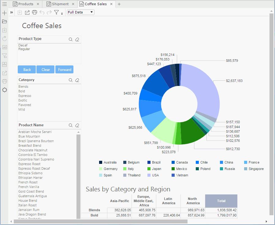
46 3. Save the dashboard. Task 10: Run a report in JDashboard 1. Keep the Shipment dashboard active. 2. Click on the toolbar to display the Resources panel, then go to Reports > Public Reports > SampleReports and drag Coffee Sales.wls to the dashboard body. Hide the Resources panel. 3. The report will be loaded into a separate tab, labeled Coffee Sales. Coffee Sales appears the same in JDashboard as it would appear in Web Report Studio.
47
48 Task 11: Set a dashboard as the server home page There is currently a browser session open from JReport Server console and a popup window containing JDashboard. 1. In your browser, change from the JDashboard popup or floating window back to the JReport Server Console (ALT + tab in your browser window). 2. On the JReport Console page, click Profile on the system toolbar, then Customize Server Preferences on the task bar. 3. In the General tab check the Use a Dashboard checkbox for the option Home Page, then click OK. Click OK in the prompt message. 4. Click Resources on the system toolbar, then go to the My Reports folder. 5. Click Shipment.dsh in the folder to open the dashboard which will be loaded into a new JDashboard window so that the setting in step 3 can take effect in JDashboard. 6. In the new JDashboard window, click on the toolbar and you can see Set as Server Home is enabled on the menu list. Click the option to set the Shipment dashboard as the server home page. 7. Refresh the JReport Console page and a Home tab is available beside the Resources tab on the system toolbar. Click the Home tab and you can access the Shipment dashboard immediately. Track 1 summary In this track, we first created a dashboard by inserting two library components, a report component, a slider, a third party gadget, and a Visual Analysis component, and performed operations in the dashboard such as delivering the filtering message predefined between two library components, filtering the data using the slider, exporting the library components, changing parameter values via the configuration panel, sharing component parameters, setting a dashboard as the server home for easier access, and running a report in JDashboard. Previous Page Next Page
49 Previous Page Next Page Track 2: Performing visual analysis Visual Analysis is a WYSIWYG product to visualize the result of every step of your work. Simply by dragging and dropping data fields onto a layout module, you are able to visually create crosstabs and charts step by step. Business views are the data sources used in Visual Analysis. Task 1: Select a business view Task 2: Adding data fields Task 3: Saving the template Task 4: Filtering the data Note: A Visual Analysis license is required in order to perform this track. If you do not have the license, please contact your Jinfonet Software account manager to obtain one first. Task 1: Select a business view 1. On the JReport Server Start Page, click Analysis in the Create category. 2. The Select Data Source dialog lists all catalogs in the current folder and the business views in the catalogs. Go to Public Reports > SampleReport.cat > Data Source 1 and click WorldWideSalesBV, then click OK.
50 3. The Visual Analysis window will be displayed.
51 Task 2: Adding data fields This section demonstrates how to drag data fields to the data presentation area and how to use the legend buttons. 1. In the Visual Analysis, click the Display Type button and then select Bar from the drop-down list. 2. Drag Total Sales from the resources panel on the left to the row control box. The Total Sales field is used to draw the axis in the row header.

52 3. Drag Category to the column control box as the column header.

53 4. Drag Sales Year right to Category: when an arrow appears on the right, drop the field. You can also make use of the button to add a field from its drop-down resource list.

54 5. To replace Sales Year with Sales Quarter, drag Sales Quarter over Sales Year. An arrow will appear above Sales Year (in the center), then drop Sales Quarter. 6. To Remove Category, right-click on it and select Delete from the drop-down menu. Or you can simply drag the Category label out of its position to remove it. 7. To mark different regions by color, drag Region to the Color button in the legend section.


55 8. We will sort sales quarters. Right-click Sales Quarter and select Sort. 9. In the Sort dialog, check the Sort Using Another Field option, and then select Total Sales from the drop-down list. Click OK.
56 10. Here is the sort result.

57 11. Hover the cursor on a bar and you will see related information.

58 12. Drag Sales Month after Sales Quarter.

59 13. The scrollbar shows and we cannot see the whole chart. Widen the presentation area and select Fit Visible from the drop-down list of Normal View on the toolbar so that the bar is fully displayed according to the current space.

60 14. Next we will use the Pie type to demonstrate the slice-by feature. Since a pie does not need as much space as the above bar, we will change Fit Visible back to Normal View on the toolbar. 15. Click and then select from the drop-down list. Then remove Sales Quarter and Sales Month from the column header by dragging them out of their positions.

61 16. Move Total Sales from the row header to be the slice-by field by moving it to the button in the legend section on the right. Slice-by decides the angle for the total sales in each region. Task 3: Saving the template The current data state can be saved as a template. Click on the toolbar. In the Save As dialog, leave the save location be the My Reports folder, type in ProductSales in the File Name text box, and click OK. Next time we will be able to open the template in the My Reports folder in the server resource tree. Task 4: Filtering the data We will use the Text display type to show the filter feature. 1. Click and then select New from the drop-down menu to start a new Visual Analysis session. 2. In the Select Data Source dialog, select WorldWideSalesBV and click OK. 3. From the resources panel, drag Country to the row header, Category to the column header, and Total Sales

62 to the button in the legend section. 4. From the resources panel drag Region to the Filters panel below. By default all the values are selected.

63 5. To view the data in Asia-Pacific, uncheck <All> and then select Asia-Pacific. The data will be refreshed to show the countries in Asia-Pacific. 6. Save the template as Sales-text in the My Reports folder.
64 Track 2 summary In this track, we used Visual Analysis to add data dimensions step by step visually, saved the current data status as a template and filtered the data. Previous Page Next Page
65 Previous Page Next Page Track 3: Creating and analyzing ad hoc reports JReport features a powerful ad hoc reporting capability, which allows end users and business analysts to create and manipulate ad hoc reports in the JReport Server-powered runtime environment. There are two types of ad hoc reports in JReport, Web Report and Page Report. Both are created from a business view in a catalog. Business views have the capability of providing multiple hierarchies allowing for automatic drill down and drill up for detailed analysis and slicing and dicing data which is especially powerful using a crosstab component. Web Report Studio provides the user a very high quality Web 2.0 Rich Internet Application (RIA) view of the report with component level navigation commands. It has two ways for creating and working with web reports: standard way and quick start way. In the standard way, reports are created using the Web Report Wizard which allows creating complex reports with multiple components in a tabular style layout, and also allows for company logo and titles to be placed on the top of the page for more formal presentation. Using Web Report Wizard the user can easily in a single pass create a multicomponent web report, for example, a single pass through the wizard can create a tabular style report with a chart and crosstab followed by the detail information in a
66 table. In the quick start way, a table report is created quickly based on the data fields you selected a business view. Go through the following lessons to learn about the report types: Lesson 1: Creating a web report the quick start way Lesson 2: Creating a web report using the web report wizard Lesson 3: Creating and performing data analysis on page reports Note: A JReport Live license for JReport Server is required in order to perform this track. If you do not have the license, please contact your Jinfonet Software account manager to obtain one first. Click the right arrow ( ) below to begin reading this track. Previous Page Next Page
67 Previous Page Next Page Lesson 1: Creating a web report the quick start way In this lesson, we will create a web report the quick start way and learn about the visualization toolbar which is also available in the standard way. A second way to create a web report is using the Web Report Wizard. This lesson contains the following tasks: Task 1: Create a web report Task 2: Convert the table to a crosstab Task 3: Convert the crosstab to a chart Task 1: Create a web report 1. On the JReport Server Start Page, click Web Reports in the Create category.
68 2. In the Select Data Source dialog, select WorldWideSalesBV from the Resources panel and the data fields Region, Sales Year, Total Sales, and Category from the business view to display in the table report. Click OK.

69 3. A table is generated.

70 Task 2: Convert the table to a crosstab 1. Click on the visualization toolbar on the left to convert the table to a crosstab:

71 2. We will adjust the fields using the wizard to build a better looking report. Click on the visualization toolbar and the Crosstab Wizard is displayed. 3. In the Rows box, select Sales Year and then click the x button at the top right of the box to remove it.

72 4. Also remove Category from the Columns box. 5. In the Resources box, browse to the Products category at the bottom and select Category. Then click to add it to the Rows box.

73 6. Click OK to confirm the changes. A message dialog is displayed asking for your confirmation of the change. Click OK in the dialog. Here we get a new crosstab. Task 3: Convert the crosstab to a chart 1. There are many chart types available to the crosstab on the visualization toolbar. Click to convert the crosstab to a bar chart:

74 2. If you'd like to view the data in a different chart type, click another chart type button on the visualization toolbar. Here, we click to change it to a gauge chart.

75 Lesson 1 summary In this lesson, we created a table web report quickly from the view of an end user on JReport Server, made several conversions among different component types using the visualization toolbar. Previous Page Next Page
76 Previous Page Next Page Lesson 2: Creating a web report using the wizard In this lesson, we will create a web report using the Web Report Wizard. The report will contain a table, a crosstab, and a chart. This lesson contains the following tasks: Task 1: Create a web report using the wizard Task 2: Operate on the crosstab Task 3: Perform on the chart Task 4: Work with the table Task 5: Apply a filter Task 1: Create a web report using the wizard 1. On the JReport Server Start Page, click Profile in the Manage category. 2. In the Profile > Customize Server Preferences > General tab, select the Yes checkbox for Use Wizard for Web Report Studio. Click OK to save the setting. Then in the prompt message box, click OK.

77 3. Click Resources on the system toolbar to switch to the page, then go to the Public Reports > SampleReports folder. 4. Click New > Web Report on the task bar. 5. The Web Report Wizard appears. In the Page screen of the wizard, select Template2, which allows for company logo, company name, and report titles to be defined and added in the report's page header panel. We will keep the current company logo and titles, and just change the report titles. In the Report Title text

78 field, input Sales Performance. Leave the Sub Title text field blank. Then click Next. 6. In the Layout screen, select the T-Style layout. In the first tabular row, click the Click here to select component link in the left cell, select Crosstab from the dropdown menu, select Chart for the right cell. For the bottom cell, select Table from the drop-down menu.

79 7. Click Next to go to the Bind Data screen to define data for the three components one by one. We will make the three components use the same business view. From the Data Source drop-down list, select WorldWideSalesBV in Data Source First define the crosstab. Add Region to the Columns box, Sales Month to the Rows box, and Total Sales to the Summaries box.

80 9. Click Next to define the chart. The default chart type is Clustered Bar 2-D, you can change it by selecting another type from the drop-down list. Here we use the default type.

81 Add Total Sales to the Bar Length box and Country to the X-Axis box.
82 10. Click Next to define the table. In the Details tab, add these fields: Customer Name, Product Name, Order Date, and Total. In the Group tab, add Country as the group by field.

83 11. Click Next to display the Style screen and select Neutral as the style.

84 12. Click Run and the report is opened in Web Report Studio. 13. Click the Save button on the toolbar.


85 14. In the Save As dialog, type SalesPerformance.wls in the File Name text field, then click OK to save the web report. In the prompt message box, click OK. Task 2: Operate on the crosstab 1. First we want to change the style of the crosstab. Place the cursor in the crosstab, when the icon appears at its upper top left, right-click the icon, then select Apply Style > JReportDemo from the shortcut menu. 2. We will change the data view from Sales Month to Sales Quarter in the row headers. Right-click the row header which displays months, select Switch Row > Sales Quarter from the shortcut menu. The row header now displays quarters. 3. To further view information about the product category in the first quarter of 2015, right-click 2015-Q1 in the row header, select Go to by Value > Category from


86 the shortcut menu. The crosstab now shows the total sales of the product categories in the first quarter of 2015 in different regions. 4. The row and column headers can be switched. Click the Rotate Crosstab button on the toolbar. 5. Click on the toolbar to undo the rotation. A crosstab can be converted to a chart and vice versa. Next we want to convert the crosstab to a chart to view and analyze data from different aspects with different focuses. 6. Place the cursor in the crosstab, when the icon appears at its upper top left, right-click the icon, then select To Chart from the shortcut menu. 7. In the To Chart dialog, the data fields used in the crosstab are listed. We need to define our chart based on these fields. Clustered Bar 2-D is the default chart type. Add the data fields as follows:

87 8. Click OK. Here is the chart:


88 9. To switch the category and the series values, click the Swap Chart Groups button on the toolbar. Resize the chart and it displays as follows: 10. Click on the toolbar to save the report. Task 3: Perform on the chart 1. Point to any bar in the chart and a tip shows up. From the tip we can easily get the data information each bar stands for.

89 We want to link the chart values to a table which contains detailed information about the values. 2. Right-click on a bar, select Edit Detail Table from the shortcut menu. 3. In the Edit Detail Table dialog, add these fields to the right panel concerning the total sales in the countries: Country, Product Name, Quantity, Unit Price, Discount, and Total, then click OK.

90 Now we can view the details about the chart values. 4. Right-click on the highest bar which represents USA and click Go to Detail on the shortcut menu. The following table is displayed showing information about USA.
91 5. Click on the toolbar to return to the main report. Since the business view has a defined hierarchy, we can go through data upward and downward directly.


92 6. Right-click any country name on the X axis and select Go Up > Region. The chart now displays as follows: Next we want to go down from Region to Country, however it is not a reversed process of going up from Country to Region, but applying an additional filter. 7. Right-click Asia-Pacific on the X axis and select Go Down > Country. The chart shows the countries in the Asia-Pacific instead of all the countries. 8. Click on the toolbar to save the report.

93 Task 4: Work with the table 1. We first sort the table based on the Total column in descending order. Right-click any value in the Total column and then select Sort > Descend from the shortcut menu. Next, we want to summarize the total sales for each country group. 2. Right-click any value in the Total column, then select Aggregate On from the shortcut menu. 3. In the Aggregate On dialog, set the function to Sum, then click OK. We can see the total sales for each country group is added in the group header. The sum of total for Australia:


94 This operation also creates a dynamic aggregation which is given a default name Sum_Total. You can find it in the Dynamic Resource > Aggregations list in the Resources panel and you can use it again in the report. Now we want to make the table linked with another report. 4. Right-click on any Product Name value and select Link from the shortcut menu. 5. In the Insert Link dialog, click Browse to select Link.wls in the SampleReports folder. Click OK.

95 6. Click the More button to show more settings. 7. In the Filter tab, click above the Components box. In the Choose Component dialog, select Bar Chart in the linked report as the link target and click OK.
 and")
96 8. Repeat the above step to add TableComp to the Components box. 9. Select Bar Chart in the Components box, click the button above the Field Conditions box to add a condition row, then select the Product Name field from the Fields (Primary) and Fields (Linked) drop-down lists to set up the filter condition between the table and the target chart based on the field.

97 10. Select TableComp in the Components box, check Pass on-screen filters to the linked components and click OK to apply the settings.
98 11. Select View Mode from the mode drop-down menu on the toolbar. 12. Click Mexico Organic in the Product Name column of the table. The link.wls report is displayed with the chart filtered to show only data about Mexico Organic.
99 The following is the original link.wls for comparison:
100 13. Click on the toolbar to return to the primary report. 14. Click on the toolbar to save the report. Task 5: Apply a filter
101 The three data components in the report use the same business view, therefore we can apply filters to them at the same time. Even if they used different business views, as long as they had the same field values from different business views you can still filter all components with a single filter. We can use the Filter panel and filter controls to filter report data and the filters created via the two are referred to as on-screen filters. For the usage of filter controls, you can learn from Creating a web report using JReport Designer. Here we focus on using the Filter panel to dynamically filter report data. When we define the linked report in Task 4, we have enabled the on-screen filters to be passed from primary report to the table component in the linked report, so the filter condition specified via the Filter panel in the primary report will be applied in the linked report when we trigger the link. We would like to filter data with product names, so we need to add the Product Name field to the Filter panel. 1. Switch Web Report Studio to Edit Mode. 2. Click + on the title bar of the Filter panel on the left, then in the Select Field dialog, select Product Name and click OK. The Product Name field is now added in the Filter panel with its values.

102 3. Click Mexico Organic in the Product Name box. The report comes out as follows:

103 4. Switch to View Mode. Click Mexico Organic in the Product Name column of the table to open the linked report. This time the table in the linked report is also filtered to show only data about Mexico Organic as the on-screen filter defined in the Filter panel of the primary report is passed to it.
104 5. Click on the toolbar to return to the primary report. 6. Click on the toolbar to save the report. Lesson 2 summary In this lesson, we created a web report containing a table, a crosstab, and a chart from the view of an end user on JReport Server, performed several actions on the data components, and used the Filter panel to filter the report data. The report template was then saved in the server version system and can be uploaded to JReport Designer
105 to make more advanced changes to it if desired. Previous Page Next Page
106 Previous Page Next Page Lesson 3: Creating and performing data analysis on page reports Using Page Report Wizard the user can create a single component page report which is viewed in Page Report Studio. Page Report Studio provides the user a page mode view of the report very similar to a printed report. There are several types of reports in the Page Report Wizard which collect information for you: blank (no component), banded, crosstab, table, and chart. You can add components to or remove them from the report after it is generated by the wizard. In this lesson, we will create a page report that contains three report tabs, and then perform data analysis on them to look at the data in other ways. Data analysis is a process of evaluating data using analytical/logical reasoning. In JReport, business view elements can be added to existing data components. Business views greatly enhance your ability to discover useful information, draw conclusions and support the decision making process. This lesson contains the following tasks: Task 1: Create a banded report Task 2: Create a table report Task 3: Create a crosstab report Task 4: Insert a chart Task 5: Analyze data of a banded object Task 6: Analyze data of a table Task 7: Analyze data of a crosstab Task 8: Analyze data of a chart Task 1: Create a banded report 1. On the JReport Server Start Page, click Page Reports in the Create category. 2. In the displayed page, select the SampleReports folder and SampleReports.cat catalog file, then click OK.

107 3. In the New Page Report dialog, type Customer Orders Report in the Report Title text field, select Banded in the layout box, then click OK. The Banded Wizard appears. 4. In the Data screen, select WorldWideSalesBV in Data Source 1 from the Available Data Resources list. Click Next. A page layout ad hoc report is supported by only one business view. The definition of a business view determines what can be done on a report. Typically this information is communicated to the business analyst who builds the report.

108 5. In the Display screen, expand the Orders Detail category in the Resources box, add Order Date and Total in it as detail fields one by one by clicking. Click Next. 6. In the Group screen, select Country in the Customers category and click to add it as a group by field, keep Ascend as the sort manner, and then click Next. 7. Skip the Summary screen and click Next, the same to the Query Filter screen. 8. In the Style screen, set the style to ClassicBlue, and then click Finish to create the report. The report appears as follows in Page Report Studio:

109 9. Click Menu > File > Rename Report Tab. 10. In the Rename Report Tab dialog, enter CustomerOrders as the report tab name, then click OK. 11. Click the Save button on the toolbar. 12. In the Save As dialog, type CustomerOrders.cls in the File Name text field, then click OK. In the Confirm dialog, click OK. Task 2: Create a table report 1. In the current open report window, click the New Report Tab button on the toolbar. 2. In the New Report Tab dialog, enter Current Customers in the Report Title text field, select Table (Group Above) in the layout box, then click OK. The Table Wizard appears. 3. In the Data screen of the wizard, select WorldWideSalesBV in Data Source 1, then click Next.

110 4. In the Display screen, add Customer Name, Phone and CustomerCityStateZip (change its display name to Zip) from the Customers category as the detail fields. Click Next. 5. In the Group screen, add Country from the Customers category as the group by field, keep Ascend as the sort manner, then click Next. 6. Skip the Summary screen and click Next to access the Query Filter screen. As we would like to focus on customers not in USA, we will apply a filter to the business view. However, we find that there is no predefined filter in the business view, so we will define one. 7. In the Query Filter screen, define the filter as Country!= 'USA', then click Next.
111 8. In the Style screen, set the style to ClassicBlue, and then click Finish to create the table report. The table report appears as follows:

112 9. Click Menu > File > Rename Report Tab. In the Rename Report Tab dialog, enter CurrentCustomers as the report tab name, then click OK. 10. Click the Save button on the toolbar. In the Save Report Template dialog, click Yes to save the report, then click OK in the prompt message window. Task 3: Create a crosstab report 1. In the current open report window, click the New Report Tab button on the toolbar. 2. In the New Report Tab dialog, type Sales Report in the Report Title text field, select Crosstab in the layout box, then click OK. The Crosstab Wizard appears. 3. In the Data screen, select WorldWideSalesBV in Data Source 1 and then click Next. 4. In the Display screen, add Country from the Customers category in the Resources box as the row field and Category from the Products category as the column field (keep Ascend as the sort manner for both columns and rows), then add Total Sales from the

113 Orders Detail category as the summary field. Click Next. 5. Skip the Query Filter screen. Click Next. 6. In the Style screen, set the crosstab style as ClassicBlue, then click Finish to create the crosstab report. The crosstab report appears as follows:

114 7. Click Menu > File > Rename Report Tab. In the Rename Report Tab dialog, enter Sales as the report tab name, then click OK. 8. Click the Save button on the toolbar. In the Save Report Template dialog, click Yes to save the report, then click OK in the prompt message window. Task 4: Insert a chart In this task, we insert a chart into the Sales report created in Task In the current report window, click Menu > View > Toolbox to display the Toolbox panel. 2. Drag Chart to place it under the last row of the crosstab.

115 The Chart Wizard appears. 3. In the Data screen, select WorldWideSalesBV in Data Source 1, then click Next. 4. In the Type screen, keep the default chart type Clustered Bar 2-D and click Next. 5. In the Display screen, add Sales Quarter from the Orders Detail category to the Category box and Product Type in the Products category to the Series box, then add Total Sales in the Orders Detail category to the Show Values box.


116 6. Click Finish to create the chart. The chart appears as follows: 7. Click the Save button on the toolbar. In the Save Report Template dialog, click Yes to save the report, then click OK in the prompt message window.

117 Task 5: Analyze data of a banded object 1. In the current report window, click CustomerOrders from the Go To drop-down list on the toolbar to switch to this report tab. Now, we want to make the records in each Country group further grouped in product category, and to know the discount. 2. On the left side, close the Toolbox panel by clicking X on the Toolbox title bar, then click Menu > View > Resource View to display the Resource View panel. 3. In the panel, expand the Products category, drag Category to the banded object and drop it as the mouse pointer moves below the Country group header and a tip Group Header appears. The report tab appears as follows:

118 4. Drag the Discount field in the Orders Detail category to the detail panel of the banded object: Now the report tab looks as follows:

119 Next, we will do some adjustments to improve the appearance of the report tab. 5. Right-click the label Customer Orders Report and select Properties from the shortcut menu. Then in the Label Properties dialog, go to the Font tab, check the Bold option and then click OK. 6. Right-click any value of the Order Date field and select Properties from the shortcut menu. 7. In the General tab of the Data Field Properties dialog, set the Format property to MM/dd/yyyy and click OK. There are two group levels in the banded object, so we will change the background color of the Category group in order to distinguish the two levels. 8. Right-click the group header panel of the Category group and click Properties on the shortcut menu. 9. In the General tab of the Banded Panel Properties dialog, set the Background property to #668cb2, and then click OK to confirm. Click the Next button on the toolbar (or just simply scroll down the mouse wheel) to navigate to the next page (page 2). Repeat this to navigate to the following pages. There is a large space or gap before each new Category begins. This is caused by a blank Group Footer panel at the end of each category. We will remove the Group Footer panel. Return to the first page. 10. Right-click the footer panel of the Category group and select Hide from the shortcut menu.


120 11. Now the report tab looks as follows: Next, we will sort and filter records. The totals will be sorted in ascending order for each group. The records will be filtered by discount. The report will only display orders in which the discount is Click the Sort button on the toolbar to open the Sort dialog. 13. In the Sort dialog, choose Total from the field drop-down list, keep the sorting manner as Ascend, and then click OK to apply the settings.

121 14. Right-click any value of the Discount field, and on the shortcut menu, click Filter > After doing the sorting and filtering, the report tab looks as follows:

122 In the above two steps, we used two ways to sort and filter the report results: one by dialog and the other by right-click menu command. In fact, both sorting and filtering can be achieved by either way. We have defined two grouping levels in the banded report: one by Country and the other by Category. Next, we will change one of the grouping criteria: grouping the banded object by Product Type instead of Category. 15. Right-click any of the Category value ("Bold" for example) and click Drill To > Product Type on the shortcut menu.

123 The report result finally changes to:


124 16. Click the Save button on the toolbar. In the Save Report Template dialog, click Yes to save the report, then click OK in the prompt message window. Task 6: Analyze data of a table 1. Select CurrentCustomers from the Go To drop-down list on the toolbar to switch to this report tab. First, we want to remove the zip information from the table as we think it is not required. 2. Right-click the Zip label and select Remove Column from the shortcut menu to delete the Zip label and its corresponding DBField. Next, we will add a group Region, and make its level higher than the existing Country group. 3. From the Resource View panel, drag Region from the Customers category to above the Country group header and drop it when a horizontal blue line appears above the Country group header.


125 Next we want to add some detail fields to the table. We can do this either by dragging or using the dialog. 4. Drag State from the Resource View panel to the top right boundary of the Phone column. Hover over the right boundary of the Phone table header and drop it when a vertical blue line appears to the right of Phone. This requires careful mouse movements and a steady hand. Click OK in the prompt message. The report tab appears as follows:


126 5. Click blank area in the table, when the icon appears at its upper left corner, right-click the icon and select Insert > Detail Column from the shortcut menu. 6. In the Insert Detail Column dialog, select Address 1 from the Customers category and click OK. A detail column, Address 1, will be added to the right of the State column.


127 However, we now consider the state information is not very useful because we will care more about the city information. So we can overwrite State with City. 7. Drag City in the Customers category from the Resource View panel to the State column label and drop it: The report result becomes:


128 8. Resize the Customer Name column by dragging the boundary to the right of the column to make all the customer names in the column displayed entirely. 9. Repeat the resizing step for the Phone and Address 1 columns. The report result finally changes to:


129 10. Click the Save button on the toolbar. In the Save Report Template dialog, click Yes to save the report, then click OK in the prompt message window. Task 7: Analyze data of a crosstab 1. Select Sales from the Go To drop-down list on the toolbar to switch to the Sales report tab, which contains a crosstab and a chart. Since Country is a middle level predefined in the hierarchy Geography of WorldWideSalesBV, we can drill it up or down to the adjacent level. 2. Right-click any country in the row header, and click Drill Up > Region. Next we want to go down from Region to Country, however it is not a reversed process of going up from Country to Region, but applying an additional filter.


130 3. Right-click Asia-Pacific in the row header, and select Drill Down > Country from the shortcut menu. Now, only data of countries in Asia-Pacific is displayed: We can further drill Country down to State and then to City in this way if necessary. Here, let's leave the crosstab as it is. 4. Right-click China in the row header, and select Drill to by Value > Customer Name. The crosstab is regenerated to show data of customers in China: 5. Next, we want to pivot the crosstab, namely interchange the rows and columns. Click the Rotate button on the toolbar and the crosstab finally changes to: 6. Click the Save button on the toolbar. In the Save Report Template dialog, click Yes to save the report, then click OK in the prompt message window. Task 8: Analyze data of a chart Now let's focus on the chart at the lower part of the Sales report tab. In JReport, a chart can be converted to a crosstab, and vice versa. So we will convert the chart to a crosstab first. 1. Right-click anywhere on the chart and select To Crosstab from the shortcut menu.

131 2. In the Display tab of the To Crosstab dialog, add Product Type to the Columns box, Sales Quarter to the Rows box, and Total Sales to the Summaries box, then click Next. 3. In the Style tab, set the crosstab style as ClassicBlue, and then click OK. The chart is successfully converted to a crosstab. Now, we want to return the crosstab to a chart, and change the chart type to line chart. 4. Click the Undo button on the toolbar to cancel the operation of converting chart to crosstab. 5. Right-click anywhere on the chart, and on the shortcut menu, click Chart Type > Line > Line 2-D. The chart appears as follows:
132 Next, we will format the chart. 6. Right-click the platform of the chart and select Format Chart from the shortcut menu. 7. In the Chart Type tab of Chart Definition dialog, select Bench from the Chart Type box, and select the Clustered Bench 2-D thumbnail. 8. Click the Display tab, select Sales Quarter in the Category box and click to remove it, then expand the Products category in the Resources box and add Product Type to the Category box. Remove Product Type from the Series box and add Sales Quarter in the Orders Detail category to the box. Add Total Sales in the Orders Detail category to the Show Values box. Then click OK.

133 9. The chart now appears as follows: 10. Right-click the chart and select Format Platform on the shortcut menu. 11. In the Format Platform dialog, click the Border tab, set Border Type to solid and Color to #0000FF, then click the Data tab, set Sort Category to descend and Sort Series to descend. Click OK to confirm.

134 Finally the chart looks as follows: Next, we want to apply a filter to the business view the chart uses to show the data of North America. 14. Right-click anywhere on the chart and click Query Filter on the shortcut menu. 15. In the Query Filter dialog, specify the filter condition as follows. Click OK to apply the changes.

135 We can find that the filter is then saved as a user defined filter in the business view. The chart now becomes: 16. Click the Save button on the toolbar. In the Save Report Template dialog, click Yes to save the report, then click OK in the prompt message window. Lesson 3 summary In this lesson, we created three report tabs in a page report. The first report tab is a banded report, the second contains a table. In the third report tab, we created two components: a crosstab and a chart. Then, we performed data analysis tasks on the four data components. We applied sorting and filtering conditions on the banded object, added and removed columns in the table, drilled through the crosstab, and converted the chart into a crosstab and changed the chart type. Previous Page Next Page
136 Previous Page Next Page Part III: Advanced Reporting In this part, we will focus on some advanced reporting features of JReport: how to use JReport Designer to create data resources and use the resources to build reports and library components; how the resources are published to JReport Server and managed on the server, etc.. The reports we build in this part are related to a fictional, mid-size retail coffee chain named Jinfonet Gourmet Java. All documents needed to run the business and drive decision-making are reports generated by JReport. The business questions that our reports can answer include: What were the Sales totals last month? Last year? Which regions had the highest sales? Which sales representative? Which product was the best selling last month? Last year? Reports deliver real-time data By integrating sophisticated reporting functionality in enterprise applications, organizations can access, analyze and deliver real-time data as well as unlock critical business data hidden within applications.

137 The reports access the same data storage as the applications of Jinfonet Gourmet Java: Data sources used in the tracks The data store for the company is an RDBMS and XML files. The applications of the company inventory management system, store operations, supply chain management, and order tracking access and update the data store. For the reports that you will be creating and managing in this part, the data sources are
138 predefined in a built-in HyperSonic DBMS database and an XML data source. The table below shows the tables in the DBMS and XML data sources. The DBMS Name/XML Name is the name of the table as it is known in the DBMS or XML data itself; the Table Name is the table name that is shown in the JReport Designer: DBMS database DBMS Name Table Name Table Description ACCOUNTMANAGERS Account Managers Jinfonet Gourmet Coffee employees CONTACTS Contacts Customer contact information CUSTOMERS Customers Customer name, contact, and address ORDERS Orders Customer orders ORDERSDETAIL Orders Detail Orders line items PRODUCTS Products Product information STOCKMARKET Stock Market Stock information XML data source XML Name Table Name Table Description _Jinfonet Jinfonet
139 _Jinfonet_Employee Employee Jinfonet Gourmet Coffee employees _Jinfonet_CompanyInfo CompanyInfo Company information _Jinfonet_StockMarket StockMarket Stock information _Jinfonet_Customer Customer Customer name, contact, and address _Jinfonet_Customer_Order Order Customer orders _Jinfonet_Customer_Order_OrderDetail OrdersDetail Orders line items _Jinfonet_Catalog Catalog Product number and description for catalog _Jinfonet_Catalog_Product Product Product information By mapping the actual data source names to JReport Designer names, report designers can work with more intuitive or customized names. This part contains the following tracks: Track 1: Creating reports in JReport Designer Track 2: Creating business views and web reports Track 3: Creating library components Track 4: Publishing, running and administering resources
140 Track 5: Integrating reports and dashboards Click the right arrow ( ) below to begin reading the part. Previous Page Next Page
141 Previous Page Next Page Track 1: Creating reports in JReport Designer In this track, assume that you are a report developer working for the Jinfonet Gourmet Java (JGJ) company. You have been asked to write a set of reports based on the data in the company's existing database. For a description of the tables in this database, see Data sources used in the tracks. JReport reports can pull data from any type of JDBC-accessible database, including Oracle, Sybase and Informix, or other data sources such as XML and HIVE. To simplify the lessons, we'll use the built-in Hypersonic database and XML files which contain the sample data we need. This track introduces JReport Designer, a Swing-based Integrated Development Environment (IDE), for designing and testing of reports. This track contains a lesson for each type of predefined report: Lesson 1: Creating a standard banded report Lesson 2: Creating a horizontal banded report Lesson 3: Creating a mailing label report Lesson 4: Creating a chart report
142 Lesson 5: Creating a table report Lesson 6: Creating a crosstab report Lesson 7: Creating a tabular report Lesson 8: Creating a report that contains a subreport Lesson 9: Creating a parameter-based report You will be developing a set of new reports based on the procedures in this track. JReport provides finished versions of these reports if you would like to reference them. See the note at the end of each lesson for information about how to access the JReport-provided tutorial reports. Click the right arrow ( ) below to begin reading the track. Previous Page Next Page
143 Previous Page Next Page Lesson 1: Creating a standard banded report A report of monthly sales from 2015 to 2016 has been requested by the Vice President of Sales at Jinfonet Gourmet Java. In this report, totals for sales need to be broken down by each order and each month, as well as presented for a grand total of all months. Here's a draft of the report the vice president has given to you:
144 You immediately recognize the repetitive, columnar data in the center of the report and associated subtotals as a candidate for a standard banded report. This type of report has horizontal "bands" or panels that are geared for either detailed record display or calculations, such as subtotals, that apply to a preceding group or the entire report. Follow the tasks below to finish creating the report: Task 1: Create the initial report and query to populate it
145 Task 2: Add summaries and a print date to the report Task 3: Fine tune the report layout Task 1: Create the initial report and query to populate it In this task, the report wizard collects the necessary information and then creates the standard banded report as well as the OrderListbyDate query. 1. Click Start > All Programs > JReport 14.5 > Report Designer to start JReport Designer. The JReport Designer window with the Start Page appears. Close the Start Page.
146

147 2. On the JReport Designer menu bar, click File > Catalog Management > Open Catalog. The Open Catalog File dialog appears. 3. Browse to select the JinfonetGourmetJava.cat catalog file in <install_root>\demo\reports\jinfonetgourmetjava, click the Open button, and then click Yes in the Warning dialog. 4. Choose File > New > Page Report on the menu bar, or click the New Page Report button on the Standard toolbar. 5. In the New Page Report dialog, clear the text in the Report Title text box, select Banded from the layout, then click OK.

148 In all lessons in this track, we will create the report titles in other ways, so in the New Page Report dialog, we need to clear the report title first, otherwise, a default report title will be added. A page report is a container which holds multiple report tabs. Report tabs in the same report can share the same parameters and dataset, and generally, have been designed for the same purpose, or related purposes. You can design, maintain and schedule them together. A page report file has a.cls extension.
149 6. In the Data screen of the Banded Wizard, click <Add Query...> in the Queries node of Data Source 1, enter OrderListbyDate in the Input Query Name dialog and then click OK.

150 7. In the Add Table/View/Query dialog, expand the JDBC connection node and then the Tables node, then select the tables Orders, Orders Detail and Products and click to add them to the query. Click OK to close the dialog. 8. In the Query Editor window, select all the columns in the three tables by selecting the * checkbox, then uncheck the Inventory and Reorder Level columns in the Products table:

151 By default, the auto join options for queries are enabled (you can find the options on the sub menu of Query > Auto Join in the Query Editor), which means tables will be automatically joined in queries based on the join criteria. So, the three tables are automatically joined because JReport Designer recognizes the matching rows in each table. You can modify the join if desired or customize a different join for set of tables. JReport creates the SQL SELECT statement based on the columns, tables, and joins you specify. Click the SQL button to see the SQL SELECT
152 statement if necessary. 9. Click OK at the bottom of the Query Editor window to create the query. 10. Click Next button in the Banded Wizard to show the Display screen. The Display screen determines which fields returned by the dataset are visible in the report. 11. From the Resources box, select the following fields in the Products table and click button to add them to the right-hand box one by one: Product Type Name, Products_Product ID, Product Name and Category, then change the display name of Products_Product ID to Product ID.

153 12. Click Next to display the Group screen. The Group screen specifies the grouping criteria to be applied to the selected records.
154 There are two levels of grouping in this report: first by Order Date and second by Orders_Order ID. 13. From the Resources box, select the fields Order Date and Orders_Order ID in the Orders table and click to add them as the group by fields one by one. You can choose the sorting sequence of the groups in the Sort column. Specify it in descending order (c,b,a), ascending order (a,b,c) or a special ordering criteria. By default the order is Ascend. 14. Select For each month from the Special Function drop-down list for the Order Date group.
155 By selecting the for each month special function, the records, of which the field values are in the same month, will be grouped together.

156 15. Switch to the Style screen and select Simple from the Style list. The Summary, Chart, and Filter screens are skipped. By default, when you create a banded, table, crosstab or chart report via the report wizard, a default style Basic will be applied to it. However, in this lesson, we want to customize the report style by ourselves, so here we select the Simple style which has very little formatting. 16. Click Finish to create the report. The report with banded object is created. The panels in the banded object are identified on the left side by their abbreviations: a BandedHeader (BH) panel, a BandedPageHeader (BPH) panel, a Detail (DT) panel, a BandedPageFooter (BPF) panel, a BandedFooter (BF) panel, and two GroupHeader (GH) and GroupFooter (GF) panels for the two levels of grouping: 17. Click the View tab to run the report and view it. Task 2: Add summaries and a print date to the report As it is described in the first paragraph of this lesson, you need to calculate the totals of sales per order and per month, and then the total of all

157 months. These types of calculations are accomplished by defining a formula that performs the computation and then placing the formula in the group footer panel directly. Summary is a special type formula that uses the built-in Sum function of JReport. A print date is a predefined field that is calculated at runtime by JReport. To add the summaries to the report, follow these steps: 1. From the Resource View panel, drag the Total formula in the Formulas node and drop it next to the Category DBField. The label of the formula is then placed in the second GroupHeader panel as follows: Next, we will create a dynamic summary based on the Total formula, so as to compute total of product sales by order, by month and also to calculate the grand total. 2. In the Resource View panel, select <Add Summary...> in the Summaries node. 3. In the New Summary dialog, choose Sum from the Aggregate Function drop-down list, select the Total formula in the Formulas node of the Resource panel and click to add it to the Summary On field, check the Dynamic Summary radio button and keep its default settings, then click OK.

158 4. Enter Sum_ProductSales_DynamicSummary in the Summary Name dialog and click OK to create the summary. Then when we insert this summary into a group, JReport will do the calculation based on the group. If the summary is inserted into the BandedHeader or BandedFooter panel, it will compute based on the whole banded report. 5. Drag the summary Sum_ProductSales_DynamicSummary from the Summaries node of the Resource View panel to both of the two GroupFooter panels as well as the BandedFooter panel:

159 6. Resize the BandedPageHeader panel and then click Insert > Label to add a label in it. 7. Resize the newly-added label and double-click it to edit its text to Order List by Date. 8. Click Insert > Special Fields > Date-time > Print Date and then place the special field in the BandedPageHeader Panel, next to the Order List by Date label. 9. Insert the Print Time special field in the same way. 10. Double-click the Print Date and Print Time labels and edit their text to Date and Time, respectively.

160 11. Adjust the position of the two groups by fields, add two labels ahead of them for identification by clicking Insert > Label and edit their text as Order Date and Order ID as follows: Task 3: Fine tune the report layout To make the report easier to read, we need to make some adjustments to the report layout. 1. Resize the second GroupHeader panel. Select the Product Type Name, Product ID, Product Name and Category name labels in the BandedPageHeader panel by holding the Ctrl key on the keyboard and move them to the second GroupHeader panel, so that they can be closer to the actual data they describe. 2. Resize the Product Type Name, Product ID, Product Name, Category and Total name labels, as well as their corresponding DBFields, manually drag and align them as follows, so that it can be shown more clearly:

161 3. Select the DBField Product ID in the Detail panel and its name label by holding the Ctrl key on the keyboard, then set their Horizontal Alignment property in the Report Inspector to left so as to improve the report layout. 4. Select the five labels Product Type Name, Product ID, Product Name, Category and Total by holding the Ctrl key on the keyboard, then in the Report Inspector, set their properties Background and Foreground to Lightgray and White. 5. Select the three summaries and their name labels in the two GroupFooter panels and the BandedFooter panel by holding the Ctrl key on the keyboard and make them right aligned with the Total formula, then double-click the summary labels to edit their text to Total by Order, Total by Month and Grand Total respectively. 6. Select the Total by Order and Total by Month summaries as well as their name labels by holding the Ctrl key on the keyboard, then change their Foreground property to Gray in the Report Inspector. 7. Select the Grand Total summary and its name label in the BandedFooter panel by holding the Ctrl key on the keyboard, then change the Foreground property to Red in the Report Inspector. 8. Select the Order ID group by field and its name label in the second GroupHeader panel by holding the Ctrl key on the keyboard and change
162 their Foreground property to Red in the Report Inspector. 9. Select the Date and Time special fields in the BandedPageHeader panel and the Order Date group by field in the first GroupHeader panel with their name labels by holding the Ctrl key on the keyboard, then change their Foreground property to Gray in the Report Inspector. 10. Resize the Order List by Date label, change its Font Size property to 18, and Foreground property to Red in the Report Inspector. 11. Resize the Date and Time special fields and their name labels and change their position in the BandedPageHeader panel to make them look tidy in the report. 12. In the Report Inspector, select the two GroupFooter panels and the BandedFooter panel by holding the Ctrl key on the keyboard, then set their Background property to Transparent. 13. Right-click the BandedHeader panel and select Hide from the shortcut menu to hide it from view. Repeat to hide the BandedPageFooter panel in the same way. After editing, the report looks somewhat like below in design view:


163 Next, we will give the report tab a meaningful name and save the report. 14. On the report tab bar, right-click the report tab and select Rename from the shortcut menu. 15. In the Input Report Tab Name dialog, enter OrderDetails and click OK. 16. Click File > Save in the menu bar to save the report as OrderListbyDate.cls. 17. Click the View tab to run the report and view it. The report should look similar to the following one:

164 Note: If the report does not look correct, you can compare it to the final version of the report provided by JReport. To do so, you will need to save and close this catalog and then open the JinfonetGourmetJava.cat catalog file located at <install_root>\demo\reports \TutorialReports.
165 Lesson 1 summary In this lesson, we created a standard banded report to build a simple yet very effective sales report. The detail area of the banded object displays a line for every sales order; the group and report footers are used to display the respective cumulative sales totals. We used a single dynamic summary to present three different totals: total by order, total by month and also a grand total. Previous Page Next Page
166 Previous Page Next Page Lesson 2: Creating a horizontal banded report Your new reporting assignment is to create a summary of each Jinfonet Gourmet Java employee. The report will also need to communicate the ranking of the employee's salary, that is, whether it is on the upper or lower end, or somewhere in between, relative to all employees. The following prototype of the report has been given to you: Follow the tasks below to finish creating the report: Task 1: Create the initial report Task 2: Adjust the layout of the report and add the Photo DBField Task 3: Rank the employees Task 4: Fine tune the report layout Task 1: Create the initial report Again the report has repeated rows of information, but this time they are repeated left to right instead of top down. A horizontal banded report is offered to support this format. To create the initial report with a horizontal banded object, follow these steps: 1. From the JReport Designer toolbar, click the New Page Report button. 2. In the New Page Report dialog, clear the text in the Report Title text box, select Horizontal Banded from the layout box, then click OK. Be sure that JinfonetGourmetJava.cat is specified as the current catalog because it is the catalog we use in this track. For
167 information about specifying this catalog, see Task 1, Step 2 and 3 of Lesson In the Data screen of the Horizontal Banded Wizard, click <Add Query...> in the Queries node of Data Source 1, enter EmployeeInformation in the Input Query Name dialog and click OK. 4. In the Add Table/View/Query dialog, expand the JDBC connection node and then the Tables node, then select the table Account Managers and click to add it to the query. Click OK to close the dialog. 5. In the Query Editor, select * in the Account Managers table to add all the columns in it to the query and then click OK at the bottom of the Query Editor to create the query. 6. Click Next in the Horizontal Banded Wizard to go to the Display screen. 7. From the Resources box, select the following DBFields in the Account Managers table and click button to add them to the right-hand box one by one: Name, Employee Position, Notes, HireDate, Birthday and Home Phone, edit the display names HireDate and Birthday to Hire Date and Birth Date, then click Next.


168 8. In the Group screen, select Account Manager ID and click to add it as the group by field. 9. Switch to the Style screen and select Simple as the report style. Click Finish to create the report and the report appears as follows: Task 2: Adjust the layout of the report and add the Photo DBField To improve the appearance of the report, we will do some adjustments to the report's layout. In addition, we will add a Photo field to the report which allows the report to be used to identify the employee. 1. Widen the Detail panel, then resize the Employee Position and Notes DBFields horizontally so that the data won't get truncated. 2. Select the Name, Employee Position and Notes labels in the BandedPageHeader panel by holding the Ctrl key on the keyboard and press the Delete button on the keyboard to remove them from the report. 3. Adjust the space between fields in the Detail panel, move the Hire Date, Birth Date, and Home Phone name labels from the
169 BandedPageHeader panel and place them above their fields as follows: 4. Hide the BandedHeader, BandedPageHeader, GroupFooter, BandedPageFooter, BandedFooter panels that don't hold any data by right-clicking the panel and select Hide from the shortcut menu. 5. Resize the GroupHeader panel, click Insert > Label to add a label before the group field in the panel, edit its text as "Employee ID:", resize the group field and the label, and adjust the position like the following: 6. From the Resource View panel, drag the Photo DBField in the Account Managers table to the GroupHeader panel. 7. Remove the name label of the Photo DBField by right-clicking it and selecting Delete from the shortcut menu, then resize the
170 field as follows: 8. Click Insert > Drawing Object to insert a Line object above the Employee Position DBField, and insert a Box object in the same way to enclose all the objects in the reports.

171 Task 3: Rank the employees As required at the beginning of the report design, the manager wants to rank the employees by their salaries, so we will add a rank object to the report. 1. Select the Detail panel of the report and click Insert > Rank on the menu to display the Rank Expert dialog. 2. In the Rank Expert dialog, first select Salary from the Rank Resources box. 3. Click the Browse button, choose Rank5.gif in the JinfonetGourmetJava folder and click Open to select it as the default image for all value ranges. 4. In the Value Range box, input in the Minimum cell, in the Maximum cell, then click the Image cell and select <Browse...> to choose Rank3.gif as the image of this range. 5. Click the add button twice to add two ranges and define them as follows: 6. Click the Insert button to insert the rank to the Detail panel, below the Home Phone field. 7. Move the name label of the rank from the bottom of GroupHeader panel and place it above the rank, then edit its text to Salary Ranking and resize the label to full display the text.
172 Task 4: Fine tune the report layout 1. Select the Employee ID label and the group by field in the GroupHeader panel by holding the Ctrl key on the keyboard, then change their Font Size property to 10 in the Report Inspector. 2. Select the Salary Ranking label and the rank by holding the Ctrl key on the keyboard, then change their Horizontal Alignment property to left so as to make them aligned the same with other objects in the detail panel. 3. Select the Name DBField, change its properties in the Report Inspector as follows, then resize it to make sure the names can be fully displayed. Font Size: 12 Bold: true Foreground: 0xcc Right-click the Photo DBField and select Display Type from the shortcut menu. 5. In the Display Type dialog, select Image in the Display As box, choose GIF or JPG from the Decode Type drop-down list, then click OK.


173 6. In the Report Inspector, select the Line object and change its Line Color property to Lightgray, Line Thickness to Select the Box object and change its Border Color property to Lightgray too. Next, we will add a title to the report.
174 8. Click View > Page Header to display the page header. 9. In the Report Inspector, select the PageHeaderPanel node and change its Height property to Drag Label from the Toolbox panel and drop it in the PageHeader panel. 11. Resize the label, double-click it to modify its text as Employee Information List, and change its Font Face property to Arial, Font Size to 14, Foreground to 0xcc0000 in the Report Inspector. After editing, the report looks somewhat like below in design view: 12. On the report tab bar, right-click the report tab and select Rename from the shortcut menu, then enter EmployeeDetails in the Input Report Tab Name dialog and click OK. 13. Click File > Save to save the report as EmployeeInformation.cls. 14. Click the View tab to preview the report. The report appears similar to the below one:

175 Note: If the report does not look correct, you can compare it to the final version of the report provided by JReport. To do so, you will need to save and close this catalog and then open the JinfonetGourmetJava.cat catalog file located at <install_root>\demo\reports\tutorialreports. Lesson 2 summary In this lesson, we created a horizontal banded report to present a summary of each employee. We added drawing objects to improve the readability, and a rank graphic to communicate the relative salaries of the employees. Previous Page Next Page
176 Previous Page Next Page Lesson 3: Creating a mailing label report In this lesson, we develop a Customer Contact Card report using the mailing label layout. This report can be used to print rolodex cards as well as mailing labels. On each card, the following information needs to be shown: The data source for this report is our built-in XML data, predefined as Data Source 2 in the catalog. Follow the tasks below to finish creating the report: Task 1: Define the query that the report uses Task 2: Add objects to the report Task 3: Edit object properties and print the report Task 1: Define the query that the report uses 1. From the JReport Designer toolbar, click the New Page Report button. 2. In the New Page Report dialog, clear the text in the Report Title text box, select Mailing Label from the layout box, then click OK. Be sure that JinfonetGourmetJava.cat is specified as the current catalog because it is the catalog we use in this track. For information about specifying this catalog, see Task 1, Step 2 and 3 of Lesson In the Data screen of the Mailing Label Wizard, click <Add Query...> in the Queries node of Data Source 2, enter CustomerContactCard in the Input Query Name dialog and then click OK.

177 4. In the Add Table/View/Query dialog, expand the XML connection node and then the Tables node, then select the table Customer and click to add it to the query. Click OK to close the dialog. 5. In the Query Editor, select all columns in the Customer table by choosing * and then uncheck the NodePrimaryKey and NodeForeignKey columns.

178 6. Click OK at the bottom of the Query Editor to create the query. 7. Switch to the Style screen in the Mailing Label Wizard and select Simple as the report style, then click Finish to create the report. The wizard is dismissed and the empty report with an empty banded object appears. Task 2: Add objects to the report 1. Select and resize the Detail panel of the banded object, to make it similar to the one below:

, click File > Save to save")
179 We will use a simple formula to create a single value out of the customer's last and first names, and similarly to the address. 2. In the Resource View panel, select <Add Formula...> in the Formulas node. 3. Enter the formula name as CustomerContactName in the Input Formula Name dialog, click OK, define the formula in the Formula Editor + " " (you can copy the formula to the formula editing area directly), click File > Save to save the formula, and then click File > Close to close the dialog.


180 4. Create another formula named CustomerContactAddress using the same way and define it as + ", " + ", " + " " Now we will use one of the JReport Designer's customizations that can simplify the creation of this report. 5. Click File > Options on the menu bar. 6. In the Options dialog, select Component, remove the checkmark from the Insert field name label with field checkbox and click OK. We don't want to show the name labels of the DBFields in this report. Now we can add our formulas and DBFields to the report. 7. From the Resource View panel, drag the CustomerContactName formula in the Formulas node to the Detail panel of the banded object, and then the ContactPosition DBField in the Customer table to the right of it.


181 8. Use the same way to add the following fields: 9. Add two labels to identify the Phone and Fax DBFields by selecting the detail panel and clicking Insert > Label, resize the labels and edit their text to "Phone:" and "Fax:" respectively, select the two labels by holding the Ctrl key on the keyboard and change their Bold property to false in the Report Inspector, then the report displays as follows. 10. Insert a Line drawing object just above the CustomerName DBField by clicking Insert > Drawing Objects > Line.
182 11. Select the Detail panel of the banded object and add a Box drawing object to enclose all the objects in the panel by clicking Insert > Drawing Objects > Box. 12. Resize the BandedPageHeader panel, add a label to it by clicking Insert > Label, then resize the label and edit its text to Customer Contact Card as the title of the report. Task 3: Edit object properties and print the report 1. Select the label in the BandedPageHeader panel and change its properties in the Report Inspector as follows: Bold: false Font Size: 14 Foreground: Red 2. Select all the objects in the Detail panel except the Line and the Box drawing objects by holding the Ctrl key on the keyboard, change their Font Size to 10 in the Report Inspector. 3. Select the CustomerContactName formula and set its Bold property to true in the Report Inspector. 4. In the Report Inspector, select the Box object and change its Border Color property to Lightgray.


183 5. Select the Line object and edit its Line Color property to Lightgray and Line Thickness to Resize the fields horizontally if data is truncated. 7. Hide the BandedHeader, BandedPageFooter and BandedFooter panels that don't hold any data by right-clicking the panel and select Hide from the shortcut menu. 8. On the report tab bar, right-click the report tab and select Rename from the shortcut menu, then enter CustomerInformation in the Input Report Tab Name dialog and click OK. 9. Click File > Save to save the report as CustomerContactCard.cls. 10. Click the View tab to preview the report. The report appears similar as follows:
184 Now, the report is ready to be printed. 11. Click File > Print and then specify the settings in the Print dialog according to your requirements. Notes: It is recommended that you click File > Options again to enable the Insert field name label with field option in the Component category, so that later when you add fields to reports, their name labels will be added automatically. If the report does not look correct, you can compare it to the final version of the report provided by JReport. To do so, you will need to save and close this catalog and then open the JinfonetGourmetJava.cat catalog file located at <install_root>\demo\reports\tutorialreports.
185 Lesson 3 summary In this lesson, we created a customer information report with the mailing label layout. In the report, customer's information is enclosed in boxes so that later we can print the report and make contact cards out of it. Previous Page Next Page
186 Previous Page Next Page Lesson 4: Creating a chart report The fourth quarter of the year has just ended, and you have been asked to produce a chart that shows product annual sales for each sales region. The sales manager wants to compare the historical sales data with the current data. Here's a sketch of the report that the sales manager has given to you: You recognize that this is a bar chart. JReport supports more than 10 general chart types, and most of them have many subtypes or variations. After showing the sales manager the available bar chart types, he chooses the 2-dimensional clustered bar chart. Additionally, the sales manager requests that the report output format should be Microsoft Excel. This is not a problem, because all pre-defined reports in JReport can be exported to HTML, PDF, Excel, RTF, XML, Text, Postscript, Mail and Fax. Follow the tasks below to finish creating the report: Task 1: Create the chart Task 2: Format the chart Task 3: Export the report to an Excel file
187 Task 1: Create the chart 1. From the JReport Designer toolbar, click the New Page Report button. 2. In the New Page Report dialog, clear the text in the Report Title text box, select Chart from the layout box, then click OK. Be sure that JinfonetGourmetJava.cat is specified as the current catalog because it is the catalog we use in this track. For information about specifying this catalog, see Task 1, Step 2 and 3 of Lesson In the Data screen of the Chart Wizard, select the query AnnualSalesbyRegion from the Queries node of Data Source 1 and then click Next. 4. In the Type screen, keep the default chart type Clustered Bar 2-D, then click Next. In this chart, we want to display the region name in the Category(X) axis, and annual sales of each region in the Value(Y) axis. However, as the region names are too long to be displayed completely in the Category(X) axis, we will create a formula here to just get the abbreviations of the region names. 5. In the Display screen, scroll down to the Formulas node in the Resources panel, and then select <Add Formula...>. 6. Enter the formula name Region_AbbreviationName in the Input Formula Name dialog, click OK, define the formula in the Formula Editor window as follows (you can copy the formula to the formula editing area directly), click File > Save to save the formula, and then click File > Close to close the dialog and finish editing. if (@Customers_REGION == "Asia-Pacific") "APAC" else if (@Customers_REGION == "Europe, Middle East, Africa") "EMEA" else if (@Customers_REGION == "Latin America") "LATAM" else if (@Customers_REGION == "North America") "NA" 7. Add the formula Region_AbbreviationName to the Category box, and YearofOrderDate to the Series box by selecting them and clicking button one by one. In the Show Values box, a numerical value is required.
188 In this lesson, we need to show the annual sales of each region, so a summary which is created on the column Annual Sales, and grouped by the formula Region_AbbreviationName is needed. 8. Scroll down to the Summaries node in the Resources panel of the Display screen and then select <Add Summary...>. 9. In the New Summary dialog, specify the aggregate function as Sum, add the field Annual Sales from the Customers table to the Summary On field, check the Static Summary radio button, specify the Group By field as Region_AbbreviationName from the Formulas node, then click OK. 10. Enter Sum_AnnualSalesbyRegion_AbbreviationName in the Summary Name dialog and click OK to create the summary. 11. Add the newly-created summary to the Show Values box by selecting it and clicking button. The Display screen appears as follows:

189 12. Click Layout to switch to the Layout screen, select Title from the Options box, and then enter Annual Sales by Region as the Chart Title and Regions as Category(X) Axis Title. JReport provides a set of CSS styles that can be applied to reports to easily change the format and appearance of the report. We will apply the Classic style to the chart. 13. Click Next to go to the Style screen and select Classic from the style list. 14. Click Finish to create the chart report and the report shows as follows in the design view:


190 15. Click the View tab to view this chart, and it appears as follows: Task 2: Format the chart The chart is accurate, but a little simple. We can add some polish to it by setting some of the chart properties. 1. Click the Design tab to return to the design mode to do the adjustments. 2. Double-click a bar of the chart, and the Format Bar dialog appears. 3. In the General tab of the Format Bar dialog, set the Use Depth option to true, and specify Depth as 10px and Direction as

191 45deg. In the Format Bar dialog, you could also choose another sub-type for the chart in the Layout box if desired. In this lesson, we will continue using Clustered - 2D. 4. Switch to the Data Label tab, specify Font as Arial and Font Size to 10 pt. The Data labels that charts contain can be either static or dynamic. You can check the Show Static Data Label option and specify the Position for data labels according to your requirements, so that the labels are displayed statically in the chart. But in this lesson, we will just use the labels as dynamic ones, which will appear when the cursor is placed on bars. 5. Click OK to apply these property settings to bars of the chart. 6. Right-click the legend and then select Format Legend from the shortcut menu.

192 7. In the Format Legend dialog, click the Font tab, set Font as Arial and Font Size to 10 pt. 8. Switch to the Mark tab, select Item 0 from the Mark Items list, and select circle from the mark drop-down list. 9. Select Item 1, and apply upward triangle to it in the same way. 10. Click OK in the Format Legend dialog to apply these changes. 11. Right-click the chart and then select Format Axes > Format Value (Y) Axis from the shortcut menu. 12. In the Format tab of the Format Value (Y) Axis dialog, select $#,##0 in the Number category, and then click Add.

193 13. Click OK in the Format Value (Y) Axis dialog. 14. Double-click the Regions label. In the Format Label dialog, switch to the Font tab, specify Font as Arial and Font Size to 10 pt, and then click OK. 15. On the report tab bar, right-click the report tab and select Rename from the shortcut menu, then enter AnnualSales in the Input Report Tab Name dialog and click OK. 16. Click File > Save to save the report as AnnualSalesbyRegion.cls. 17. Click the View tab to preview the report and it looks somewhat as follows:

194 Note: If the report does not look correct, you can compare it to the final version of the report provided by JReport. To do so, you will need to save and close this catalog and then open the JinfonetGourmetJava.cat catalog file located at <install_root>\demo\reports\tutorialreports. Task 3: Export the report to an Excel file Now we can export the report to different formats as required. In this lesson, we will export it to an Excel file. 1. Click File > Export To > Excel on the menu bar. 2. In the Export to Excel dialog, check Report Format and keep the default settings of other options. Then click OK.


195 3. Open the file AnnualSalesbyRegion_AnnualSales.xls saved in <install_root>\demo\reports \JinfonetGourmetJava. It appears as follows: Lesson 4 summary In this lesson, we created a chart report to represent the annual sales of four regions in both 2015 and 2016, formatted the chart by setting properties and then made a quick and effective change to its appearance by applying a CSS. Finally, we exported the
196 chart to an Excel file, where the report layout and format are accurately represented. By reviewing the chart, the sales manager can easily compare the sales per region over a two-year period. Previous Page Next Page
197 Previous Page Next Page Lesson 5: Creating a table report The Jinfonet Gourmet Java company receives orders from customers in different territories around the world, and by reviewing this shipping information the Shipping department can receive bids from various shipping vendors. You are assigned the task of creating a shipment information report. In the report, the shipment details, including order ID, order date, ship date, shipping cost, whether the payment has been received, and the shipping vendor, need to be reported for each territory. The following prototype of the report has been given to you: This report will be run online, so an interactive report will work well. Interactive reports allow the end user to change the view of the report.
198 They can filter the data on the report or change the sort order, as well as search the report. Follow the tasks below to finish creating the report: Task 1: Create the table Task 2: Add a web control to the report Task 3: Add objects and edit their properties Task 1: Create the report Before taking this task, make sure you have enabled the Insert field name label with field option in the Options dialog as noted at the end of Lesson 3. Otherwise, the name labels will not be inserted together with the fields when you add fields to the table. 1. From the JReport Designer toolbar, click the New Page Report button. 2. In the New Page Report dialog, clear the text in the Report Title text box, select Table (Group Above) from the layout box, then click OK. Be sure that JinfonetGourmetJava.cat is specified as the current catalog because it is the catalog we use in this track. For information about specifying this catalog, see Task 1, Step 2 and 3 of Lesson In the Data screen of the Table Wizard, click <Add Query...> in the Queries node of Data Source 1, enter ShipmentDetailsbyCustomer in the Input Query Name dialog and click OK.

199 4. In the Add Table/View/Query dialog, expand the JDBC connection node and then the Tables node, then select the tables Customers and Orders and click to add them to the query. Click OK to close the dialog. 5. In the Query Editor, the two tables are then joined together automatically on the Customers_Customer ID and CustomerID_FK1 columns. 6. Check all the columns in the Orders table by selecting the * checkbox. For the Customers table, check the following columns: Customer
200 Name, Customers_State, Customers_Country, Customers_Territory and Customers_Region. 7. Click OK at the bottom of the Query Editor to create the query. Then click Next in the Table Wizard. 8. In the Display screen, add the fields Orders_Order ID, Order Date, Ship Date, Ship Via, Payment Received and Shipping Cost to the table by selecting them and clicking button one by one. By default, the records in a table are displayed randomly; they are displayed in the order they are returned from the fetch operation. You can specify that JReport sort the records in a table, and also within the groups in table if any, according to your requirement. In this lesson, we will make the records in the table sorted by order ID ascendingly. 9. Click the Sort Fields By button at the right bottom corner of the Display screen. In the Sort Fields By dialog, add the DBField Orders_Order ID as the sort by field by selecting it and clicking button, then click OK to return back to the table wizard.

201 10. Click Next in the Table Wizard to display the Group screen. Since the report is required to display shipment details of each customer in specific territory, we will add two groups to it: first group the report by territory and then by customer name.
202 11. In the Group screen, add the DBFields Customers_Territory as the first group by field and Customer Name the second one by selecting them and clicking button one by one.

203 12. Switch to the Style screen and select to display the report in the Classic style vertically. 13. Click Finish to create the report. 14. Click the View tab to preview the report and it appears as follows:
204 The required report has been created, but it is cumbersome to locate the shipment details of specific territories. So our next task is to add web controls to the report so that the end user can easily filter the results of the report. Task 2: Add a web control to the report Web controls empower end users of interactive reports to easily modify the report results they are viewing, and are defined by a trigger event, such as click, and a resulting web action. In this task, we add a Drop-down List web control to the PageHeader panel of the report. It will be used to filter the report records by territory. 1. Click View > Page Header to display the PageHeader panel. 2. In the Report Inspector, select the PageHeaderPanel node and change its Height property to Click Insert > Web Controls > Drop-down List to insert a web control into the PageHeader panel. 4. Right-click the web control and select Display Type from the shortcut menu. 5. In the Display Type dialog, click the Value cell and then click in it to display the Insert Fields dialog. 6. Select Customers_Territory in the Customers table in the DBField List box and click the Insert button to add it as value of the dropdown list. 7. In the Web Behaviors box, click the Events cell and select Data Change from the drop-down list, then click in the Actions cell.

205 8. In the Web Action List dialog, select the *Filter action and click OK. 9. In the Filter - Web Action Builder dialog, specify to apply the action to TableComp, click the Filter On cell and select CUSTOMERS_TERRITORY from the drop-down list, then click the Value cell and select MultiValueContainer. Click OK to apply the settings.
206 10. Click OK in the Display Type dialog to confirm the settings. 11. Resize the drop-down list horizontally to make sure the territory name can be displayed completely. By now, we have finished defining values of the web control. Next we will add a label ahead of it for identification, and a report title to the report. Task 3: Add objects and edit their properties 1. Drag and drop two Label objects from the Toolbox panel to the PageHeader panel. Resize them and edit their text as follows:

207 2. Select the two labels by holding the Ctrl key on the keyboard and set their Bold property to true in the Report Inspector. 3. Resize the Shipment Details by Customer label, set its Font Size property to 18 and Foreground property to Red in the Report Inspector. 4. Select the Order Date and the Ship Date DBFields by holding the Ctrl key on the keyboard and set their Format property to M/d/yyyy in the Report Inspector. 5. Resize the two group by fields, add two labels ahead of them and edit the text of the labels as "Territory:" for the first group by field and "Customer Name:" for the second. 6. Select the four objects in the two GroupHeader panels by holding the Ctrl key on the keyboard, set their Foreground property to 0xcc0000.


208 7. Double-click the Orders_Order ID label in the TableHeader panel and edit its text to Order ID. 8. Select the Ship Via DBField and resize it to make sure no data get truncated. Do the same to the Payment Received label. Next, we will apply a different background color to the GroupHeader panels to make them distinguished from the TableHeader panel and hide the second GroupFooter panel to improve the layout of the report. 9. Select the two TableGroupHeader panels in the Report Inspector by holding the Ctrl key on the keyboard and set their Background property to 0xf3f3f Right-click on the second GroupFooter panel header and select Hide from the shortcut menu to hide the panel. 11. On the report tab bar, right-click the report tab and select Rename from the shortcut menu, then enter ShipmentDetails in the Input
209 Report Tab Name dialog and click OK. 12. Click File > Save to save the report as ShipmentDetailsbyCustomer.cls. 13. Click the View tab to preview the report and it appears as follows:

210 Note: If the report does not look correct, you can compare it to the final version of the report provided by JReport. To do so, you will need to save and close this catalog and then open the JinfonetGourmetJava.cat catalog file located at <install_root>\demo \Reports\TutorialReports. The web controls are powered by Page Report Studio and therefore cannot be previewed in JReport Designer. We can use the Preview as Page Report Result command of JReport Designer to preview this report, however, this command is enabled only if the option Server for Previewing Reports was specified when installing JReport Designer. Click View > Preview As > Page Report Result. The report will then be opened in a web browser. Now we can select values from the dropdown list to dynamically change the report results. In the report below, we choose to view records in the Mexico territory.

211 Lesson 5 summary In this lesson, we created a shipment details report in the table report layout. In the report, we used a table container to format the data, and a web control to dynamically change the report results. Previous Page Next Page
212 Previous Page Next Page Lesson 6: Creating a crosstab report A report with quantities of different products that are sold in different regions and their sales totals is needed. You are required to create a report that can clearly represent the necessary information, which allows the sales manager to easily compare the sales of different products in different regions. Here is the sketch that is given to you: In this lesson, we learn to create a crosstab report from the following tasks: Task 1: Create the crosstab Task 2: Format the crosstab Task 3: Change the page layout of the report Task 4: Save the report style as a CSS file Task 1: Create the crosstab Before taking this task, make sure you have enabled the Insert field name label with field option in the Options dialog as noted at the end of Lesson 3. Otherwise, the name labels will not be inserted together with the fields when you add fields to the crosstab.

213 1. From the JReport Designer toolbar, click the New Page Report button. 2. In the New Page Report dialog, clear the text in the Report Title text box, select Crosstab from the layout box, then click OK. Be sure that JinfonetGourmetJava.cat is specified as the current catalog because it is the catalog we use in this track. For information about specifying this catalog, see Task 1, Step 2 and 3 of Lesson In the Data screen of the Crosstab Wizard, click <Add Query...> in the Queries node of Data Source 1, enter ProductSalesAnalysis in the Input Query Name dialog and click OK. 4. In the Add Table/View/Query dialog, expand the JDBC connection node and then the Tables node, then select the Customers, Orders, Orders Detail and Products tables and click to add them to the query. Click OK to close the dialog. 5. In the Query Editor, the tables are joined together automatically based on the auto join criteria. 6. Check all the columns in the Orders Detail table by selecting the * checkbox. For the Customers table, check the
214 following columns: Customer Name, Customers_City, Customers_State, Customers_Country, Customers_Territory and Customers_Region, and for the Products table, the following columns: Products_Product ID, Product Name, Category, Product Type Name and Price. You may notice that here we do not check any columns in the Orders table, that is because in this report, columns in this table are not needed but we need this table to create joins between tables in the query. 7. Click OK at the bottom of the Query Editor to create the query. 8. In the Display screen, add the DBField Category to the Columns box by selecting it and clicking, add Customers_Country to the Rows box by selecting it and clicking, add the Quantity DBField and Total formula to the Summaries box by selecting them and clicking one by one, and then specify their aggregate function to Sum from the Aggregate drop-down list.


215 9. Switch to the Style screen and select Simple from the Style list, then click Finish to create the crosstab report. Task 2: Format the crosstab In this task, we will format the crosstab to make it look more professional. 1. Select the crosstab and change its Position property to absolute in the Report Inspector, then drag it to the following position: By setting the Position property of an object to absolute, the object will be located at the position specified by dragging and dropping or by setting its X and Y coordinate property values. Meanwhile, when objects in a flow layout container have their Position property value set to absolute and are overlapped, we can set the display order of the objects by right-clicking the object and then selecting an item from the Move submenu. 2. From the Toolbox panel, drag three labels to the report, edit their text respectively to Product Sales Analysis, Units and Sales, then resize and adjust the crosstab and the three labels to align them as follows:


216 Next, we will edit properties of the crosstab report objects in the Report Inspector to improve the appearance of the report. 3. Select the Units label and edit its Bold property to true, Background property to Gray and Foreground property to White. 4. Select the Sales label and edit its Bold property to true, Background property to 0x99ccff and Foreground property to White. 5. Select the Category field and edit its Background property to 0x99ccff and Foreground property to White. 6. Select the two Total cells, the Customers_Country field and the four ##### cells in the crosstab by holding the Ctrl key on the keyboard, and then specify their Foreground property to Gray.


217 7. Select the four #,###.00 cells by holding the Ctrl key on the keyboard, change their Foreground property to 0x99ccff, Bold property to true and Format property to $#,### Select the Product Sales Analysis label, set its Bold property to true, Font Size property to 18, and Foreground property to Red, then resize it to make its text not be truncated. 9. On the report tab bar, right-click the report tab and select Rename from the shortcut menu, then enter ProductSales in the Input Report Tab Name dialog and click OK. 10. Click File > Save to save the report as ProductSalesAnalysis.cls. 11. Click the View tab, and the crosstab report appears somewhat like the following one:

218 Note: If the report does not look correct, you can compare it to the final version of the report provided by JReport. To do so, you will need to save and close this catalog and then open the JinfonetGourmetJava.cat catalog file located at <install_root>\demo\reports\tutorialreports. Task 3: Change the page layout of the report When previewing the report, we can see that the crosstab is displayed in two pages. However, with JReport's page mode feature, we can decide how to view a report: in pagination mode or continuous mode. In pagination mode, the page shape and size can be specified in the page panel settings. In continuous mode, the whole report is laid out in a single page, and has no specific shape and size. 1. Uncheck Page Layout on the View menu. 2. Click the View tab to view the report again. Now, the crosstab is displayed in a single page. We can drag the scroll bar to

219 have a complete view of the crosstab. For a crosstab component, when it is in continuous page mode, we can further set another two properties to determine how many rows and columns we would like to view. 3. Select the crosstab, and set its Items per Row Block and Items per Column Block property values to 3 in the Report Inspector. 4. View the report. Now only three items are displayed in the row and column blocks. 5. Check Page Layout on the View menu to switch back to the pagination mode, then the two properties will not take effect. 6. Click File > Save to save the report again. Task 4: Save the report style as a CSS file After formatting the report step by step in the Task 2, we can then save the report style as a CSS file, which can be applied to


220 other crosstab reports directly. 1. Right-click the crosstab and select Save Style from the shortcut menu. 2. Keep the default settings in the New CSS Style dialog and click OK. 3. In the Save CSS As dialog, enter Crosstab.css in the File Name field, then click Save to save the file to the default directory <install_root>\style. The CSS Style Definition for CTCrosstab dialog appears. 4. Add all the properties of the crosstab from the All Properties box to the Selected Properties box by clicking the button, then click Save to save these properties in the crosstab.css file. Now, the style of the crosstab report has been saved as a CSS file. Properties in the file can be applied to corresponding
221 components of other reports directly by selecting the CSS file in the <Import CSS File...> drop-down list on the Format toolbar of JReport Designer. Lesson 6 summary In this lesson, we created a crosstab report to represent the product sales analysis of different regions, and then formatted it to improve its appearance. Then, we used the page mode feature to preview the report and edited some properties to reduce the records on the row and column blocks. And finally, we saved the style of the crosstab report as a CSS file so that the styles we defined here can easily be applied to another report. Previous Page Next Page
222 Previous Page Next Page Lesson 7: Creating a tabular report A report about performance of products is needed, in which the product ID is less than or equals to 10. The report includes annual sales of every product in every region, their unit price, the quantities that are sold, and the total of their annual sales of every product. The report should contain a crosstab, which is to represent annual sales of ten products in every region, a chart object, which is to represent quantities and total annual sales of these specified products, and a banded object, which is to represent the unit price and quantities. Here is a sketch of the report that you can refer to: In this lesson, we will create a tabular report and insert crosstab object, chart object and banded object respectively into different tabular cells, so that components in the report can be arranged easily with the tabular layout. Meanwhile, all the data resources we need for creating the report have been predefined in the JinfonetGourmetJava.cat catalog file, so in this lesson, we do not need to create them ourselves. Follow the tasks below to finish creating the report: Task 1: Create the tabular report
223 Task 2: Add components to the tabular report Task 3: Format the report Task 1: Create the tabular report 1. From the File menu in JReport Designer, select New > Page Report. 2. In the New Page Report dialog, clear the text in the Report Title text box, select Tabular from the layout box, then click OK. Be sure that JinfonetGourmetJava.cat is specified as the current catalog because it is the catalog we use in this track. For information about specifying this catalog, see Task 1, Step 2 and 3 of Lesson In the Tabular Wizard, keep the default settings and then click Finish to create a 2*2 tabular.

224 4. A message dialog appears prompting you to drag and drop data fields and components to the blank report. Click OK in the message dialog to close it. Now a blank report with a 2*2 tabular is generated. In the Report Inspector, they are respectively named TabularCell and TabularCell1 (the two cells in the first row of the tabular); TabularCell2 and TabularCell3 (the two cells in the second row of the tabular). We can then insert different components into the cells, so that they can be easily aligned just by adjusting the tabular cells. The tabular fills the whole page panel, we can resize it by just dragging its cell borders. In this lesson, in order to make screen captures, we zoom out the tabular first. Task 2: Add components to the tabular report Before taking this task, make sure you have enabled the Insert field name label with field option in the Options dialog as noted at the end of Lesson 3. Otherwise, the name labels will not be inserted together with the fields when you add fields to the report. In this task, we will add three components - a crosstab, a chart and a banded object respectively to TabularCell, TabularCell2 and TabularCell3 and make them share the same dataset so as to improve performance. 1. Select TabularCell and TabularCell1 (the two cells in the first row of the tabular) by holding the Ctrl key on the keyboard, right-click and then select Merge from the shortcut menu. 2. Select the merged tabular cell and click Insert > Crosstab. The Create Crosstab wizard appears.

225 3. In the Data screen of the wizard, select the query ProductPerformance from the Queries node of Data Source 1, then click Next. 4. In the Display screen, add the Products_Product ID DBField to the Columns box by selecting it and clicking button, add the Region_AbbreviationName formula to the Rows box by selecting it and clicking button (for information about creating the formula, see Task 1, Step 5 and 6 of Lesson 4), add the Total formula to the Summaries box by selecting it and clicking button, and specify its aggregate function as Sum from the Aggregate drop-down list. 5. Switch to the Style screen and apply the Classic style to the crosstab, then click Finish to close the Create Crosstab wizard and place the crosstab in the first tabular cell row. Next, we will insert the chart object to TabularCell2: 6. Select TabularCell2 (the left cell in the second row of the tabular) and click Insert > Chart. The Create Chart wizard appears. 7. In the Data screen of the wizard, check the Existing radio button, select the dataset ProductPerformance, then click Next. 8. In the Type screen, select the Bubble 2-D type and click Next. 9. In the Display screen, add the two summaries Count_QuantitybyProductID and Sum_ProductSalesbyProductID to the Y Axis and Radius respectively in the Show Values box. Then the DBField ProductID_FK1 will be added to the Category box automatically. Leave the Series box empty.

226 10. Switch to the Layout screen, select Title in the Options box, then specify Category(X) Axis Title as Product ID, and Value(Y) Axis Title as Quantity. Click Next. 11. In the Style screen, select Classic from the Style list. Click Finish to close the Create Chart wizard and drop the chart in TabularCell2. Next, we will insert the banded object to TabularCell3: 12. Select TabularCell3 (the right cell in the second row of the tabular), and then click Insert > Banded Object. The Create Banded Object wizard appears. 13. In the Data screen of the wizard, check the Existing radio button, select the dataset ProductPerformance. 14. Switch to the Group screen and add the DBField ProductID_FK1 as the group by field by selecting it and clicking button. 15. Go to the Style screen and select the Classic style for the banded object. Click Finish to close the Create Banded Object

227 wizard and then click in TabularCell3 to place the banded object in it. Now, the three objects look as follows in the tabular: 16. Delete the group by field in the GroupHeader panel of the banded object by right-clicking it and selecting Delete from the shortcut menu. 17. Drag the DBFields ProductID_FK1, Unit Price and the summary Count_QuantitybyProduct ID from the Resource View panel and drop them in the GroupHeader panel. 18. Adjust the added fields, move the three name labels to the BandedPageHeader panel, and then change the names of ProductID_FK1 and Count_QuantitybyProduct ID to Product ID and Quantity respectively. 19. Right-click in the BandedHeader panel and select Hide from the shortcut menu to hide it from view. Repeat this to hide all panels that do not hold data. Now the report shows as follows:


228 Next, we need a report title for the tabular report to make the report look professional. 20. Right-click the tabular cell that holds the crosstab, and then select Insert Row Above from the shortcut menu, and then resize the rows to a suitable height. 21. Double-click the newly-created tabular row, and enter the text Product Performance by Product ID as the report title, then select the text, right-click on it and select Font from the shortcut menu. 22. In the Font tab of the Format Text dialog, set Font to Arial, Font Size to 18, Font Color to Red and Bold to true, then click OK. The title appears as follows: In this lesson, we will use the Filter feature to limit data selected from the dataset to view the products performance from the Product ID 1 to 10. Since all the components in the report share the same dataset, the filter will be applied to all of them.

229 23. Click the Dataset Filter button on the toolbar of the Resource View panel. 24. In the Dataset Filter dialog, click the Add Condition button to add a filter line, select ProductID_FK1 from the field dropdown list, <= from the operator drop-down list, and enter 10 in the value text field to specify the filter condition as ProductID_FK1 <= 10, then click OK. Task 3: Format the report To improve the report appearance, we need to do some adjustments to the report, as well as the components in it: 1. Resize the tabular cells according to the components' sizes in every cell, so that they will not be truncated by the tabular and can display well. Next, we will further format to improve the appearances of the components. First, we will format the crosstab. 2. Select the four DBFields in the crosstab, and specify their Height to 0.25, Width property to 0.59, and Format to #,###.# in the Report Inspector, so that their data can be displayed completely in the cells.
230 Next, let's format the chart. 3. Double-click the label Quantity in the chart, then in the Font tab of the Format Label dialog, set Font Size to 10pt and Font Color to Click OK to accept the settings. 4. Use the same way to format the label Product ID in the chart. 5. Right-click the chart and then click Hide Legend on the shortcut menu to hide the legend. Then, we will format the banded object. 6. Select the three DBFields in the GroupHeader panel by holding the Ctrl key on the keyboard, set their Foreground property to Black and Bold to false in the Report Inspector. 7. Select the Unit Price DBField and then specify its Format property to $#,###.00 in the Report Inspector. After doing the adjustments, the report appears somewhat like follows in design view:

231 According to the sketch, a line needs to be added below the report title. We can do this just by setting tabular cell properties. 8. Select the tabular cell holding the report title, then in the Report Inspector, specify its Top Line, Left Line and Right Line properties to none, Border Color to Gray and Border Thickness to When viewing the report, the crosstab object displays much closer to the line we just customized and the other two components look too clumsy. We need to do some adjustments, which can be done easily by using the function of a tabular. 9. Right-click the tabular cell holding the crosstab, and then select Insert Row Above from the shortcut menu. Right-click the cell again and select Insert Row Below. Two rows are now added above and below the crosstab. 10. Resize the tabular rows to adjust the distances between the crosstab and the other components.

232 11. On the report tab bar, right-click the report tab and select Rename from the shortcut menu, then enter ProductPerformance in the Input Report Tab Name dialog and click OK. 12. Click File > Save to save the report as ProductPerformancebyProductID.cls. 13. Click the View tab, and the report appears as follows, depending on what formatting you have done to the components. Note: If the report does not look correct, you can compare it to the final version of the report provided by JReport. To do so, you will need to save and close this catalog and then open the JinfonetGourmetJava.cat catalog file located at <install_root>\demo\reports\tutorialreports. Lesson 7 summary
233 In this lesson, we created a tabular report that contains a crosstab object, a chart object and a banded object. It represented the unit price, quantity and annual sales, and sales total in every region about the products, of which the product ID is less than or equals to 10. The category(x) axis of the chart showed the product ID, value(y) axis showed the quantities, and the size of bubbles showed the annual sales. Previous Page Next Page
234 Previous Page Next Page Lesson 8: Creating a report that contains a subreport Here we need to create a report that contains a subreport to show the order detail information, the related customers and employees information. This lesson shows a report combined with another report. When adding report A into report B, the report A is referred to as a subreport, while report B is considered as a primary report. We will first create a page report that contains two report tabs - one is about orders detail information, and the other is about a tabular report with two charts of different types. In this lesson, we take the first report tab in the page report as the primary report, and the second one as the subreport. So that we can insert the second report tab to the first one to show the sales total by orders in different order ID groups. Follow the tasks below to finish creating the report: Task 1: Create a page report that contains two report tabs Task 2: Insert a subreport to the report Task 1: Create a page report that contains two report tabs Before taking this task, make sure you have enabled the Insert field name label with field option in the Options dialog as noted at the end of Lesson 3. Otherwise, the name labels will not be inserted together with the fields when you add fields to the report. 1. Click File > New > Page Report on the menu bar. 2. In the New Page Report dialog, clear the text in the Report Title text box, select Banded from the layout box, then click OK. Be sure that JinfonetGourmetJava.cat is specified as the current catalog because this is the catalog we use in this track. For information about specifying this catalog, see Task 1, Step 2 and 3 of Lesson In the Data screen of the Banded Wizard, select OrdersReport from the Imported SQLs node of Data Source 1.


235 4. Switch to the Style screen and select the Simple style for the report, then click Finish. A report with a blank standard banded object is created as follows:

236 For users who wish to write their own SQL statement, JReport enables them to put the SQL statement into a file and then load them from this file. SQL files can work like queries in JReport. In this lesson, we need to group data by Order IDs, so we will add a group to the banded object. 5. Right-click the banded object and then select Banded Wizard from the shortcut menu. 6. In the Group screen of the Banded Wizard, add the DBField Orders_OrderID as the group by field by selecting it and clicking button, then click Finish. 7. Resize the GroupHeader panel of the banded object, drag the fields Customer_Name, Orders_OrderDate, Contact_LastName and Orders_PaymentReceived from the Resource View panel and drop them into it. 8. Double-click and edit the Customer_Name, Orders_OrderDate, Contact_LastName and Orders_PaymentReceived name labels to Customer Name, Order Date, Employee Last Name and Payment Received one by one.


237 9. Align the newly-added objects and resize them in the GroupHeader panel as follows: 10. Resize the group by field in the GroupHeader panel, click Insert > Label to add a label ahead of it and edit its text to "Order ID:". 11. Select the Order Date DBField and set its Format property to M/d/yyyy in the Report Inspector. 12. Select the BandedPageHeader panel, click Insert > Label to add a label in it and edit its text to Order Details. The label will then be shown in every page as the report title. 13. Hide the BandedHeader, Detail, GroupFooter, BandedPageFooter and BandedFooter panels one by one by right-clicking the panel and selecting Hide from the shortcut menu. 14. Format labels and DBFields in the report to improve their appearance. Here, we will not describe the formatting process in detail, you can refer to Task 3 of Lesson 1 for assistance. Then the first report tab in the report is created to show the order detail information as follows in design mode: And the report looks as follows in view mode:

238 15. On the report tab bar, right-click the report tab and select Rename from the shortcut menu, then enter OrderDetailInformation in the Input Report Tab Name dialog and click OK. Next, we will create the second report tab in the report. 16. Click File > New > Page Report Tab. 17. In the New Page Report Tab dialog, clear the text in the Report Title text box, select Tabular from the layout box, then click OK. 18. In the Tabular Wizard, keep the default settings and click Finish. A report tab with a blank 2*2 tabular is created. 19. Merge the tabular cells into two rows by selecting two cells in a row when holding the Ctrl key on the keyboard, right-

239 clicking on them and selecting Merge from the shortcut menu, then adjust them in order to place the bar chart and pie chart vertically in the report tab. Next, we will insert the two charts into the tabular cells and have them share the same dataset as the OrdersDetailInformation report tab. 20. Select the first tabular cell and click Insert > Chart on the menu bar. 21. In the Data screen of the Create Chart wizard, check the Existing radio button, select OrdersReport from the DataSets node, then click Next. 22. In the Type screen, keep the default chart type Clustered Bar 2-D and click Next. 23. In the Display screen, add the summary Sum_SQLProductSalesbyOrderID to the Show Values box by selecting it and clicking the button, Orders_OrderID will then be added automatically to the Category box. 24. Switch to the Style screen and select Basic from the Style list. Click Finish to create the chart. 25. When a box attached to your mouse cursor, click the tabular cell to place the chart there. 26. Select the second tabular cell and insert a pie chart in it which uses the same dataset and displays the same data in the same style with the bar chart. 27. Right-click the bar chart and select Add Label from the shortcut menu. A label is then added to the chart.

240 28. Move the label to the top of the chart, then right-click it and choose Format Label from the shortcut menu to display the Format Label dialog. 29. In the General tab, change the label text to Current Orders for This Customer. 30. Switch to the Font tab, change Font to Arial, set Font Size to 12pt, Font Color to and click OK. 31. Add a label to the pie chart and format it using the same way and edit its text to Current Orders for This Employee. 32. Select ChartObject and ChartObject1 in the Report Inspector by holding the Ctrl key on the keyboard and change their Border Type properties to None; change the property Border Type to None for ChartLegendObject and ChartLegendObject1 as well. 33. Further format the two charts to improve their appearance if desired. For details about formatting chart, you can refer to Task 2 of Lesson 4. Now the second report tab in the report is created to show the sales total by orders.

241 34. On the report tab bar, right-click the report tab containing the charts and select Rename from the shortcut menu, then enter Sub_OrderDetails in the Input Report Tab Name dialog and click OK. 35. Click File > Save to save the report as OrdersReport.cls. Task 2: Insert a subreport to the report After creating the report, we can insert the subreport to the primary report by specifying relationships between them. In this lesson, we can specify different relationships between the primary report (the first one) and the two chart components in the second report tab by setting up different links between them. Then JReport will build a subreport for every order with the
242 conditions, so that it is convenient to see the corresponding customer and employee information of every order. We want this subreport to be at the end of the existing reports, thus we need to add a second group header and add the subreport to the new header. 1. Click OrderDetailInformation on the report tab bar to switch to the report tab. 2. Right-click in the GroupHeader panel of the banded object and choose Insert Panel After from the shortcut menu. 3. Select the newly-added panel and click Insert > Subreport. 4. When a box attached to the mouse cursor, click the newly-added panel to place the subreport into it, and the Subreport dialog appears. 5. Click the Browse button, select OrdersReport.cls and then click Open. 6. Select Sub_OrderDetails from the Report Tab drop-down list. 7. Click the Add button beside the Component in Report Tab box in the Field tab, choose ChartObject in the Choose Component dialog, then click OK.


243 8. Build the relationship between the primary report and the selected chart object on the Orders_CustomerID field by selecting the field and clicking. 9. Click the Add button again, this time, choose ChartObject1 in the Choose Component dialog, then click OK. 10. Build the relationship between the primary report and the second chart object on the Orders_EmployeeID field. 11. Click OK in the Subreport dialog and the report tab will be inserted in the OrderDetails report tab as follows:

244 Next, we will filter the dataset used by report tabs in the report so as to enhance the performance when running the report. 12. Click Report > Dataset Management on the menu bar to display the Dataset Management dialog. The Dataset Management dialog lists all the dataset used in the current report. In our report, all the components share the same dataset, so here only one dataset is shown. 13. Click the Filter tab, click the Add Condition button to add a filter line, select Orders_OrderID from the field drop-down list, <= from the operator drop-down list, and enter 3050 in the value text field to specify the filter condition as Orders_OrderID <= 3050, then click OK.

245 14. Click File > Save to save the report. 15. Click the View tab, the report tab that contains a subreport is displayed as follows: the primary report shows the orders detail information grouped by order ID, and the subreport shows the orders information by different customers and different employees respectively in the two charts.

246 Note: If the report does not look correct, you can compare it to the final version of the report provided by JReport. To do so, you will need to save and close this catalog and then open the JinfonetGourmetJava.cat catalog file located at <install_root>\demo\reports\tutorialreports. Lesson 8 summary In this lesson, we created a report that contains a subreport. First we created a page report with two report tabs and the second report tab with two charts of different types. Then we inserted the second report tab as a subreport to the first report tab by
247 setting up different links between them, so that we can see clearly how many orders the customer and the employee have respectively made. As you learned in this lesson, it is very convenient to build up a library of reports that act as components that you can add to various primary reports. Properly designed and used, subreports save a lot of time and effort in rapidly adapting your applications to changing user requirements and needs. Previous Page Next Page

248 Previous Page Next Page Lesson 9: Creating a parameter-based report In Lesson 1 of this track we created a page report that contains an order list report tab to show order lists of every month from 2015 to Now, the sales manager is asking for this same report but with different orders during a specified time. Instead of building a new report about orders in each order date, we will save the page report as a new one and then modify the dataset used by its report to meet the requirements. Follow the tasks below to finish creating the report: Task 1: Create the parameters Task 2: Modify the dataset of the report to use the parameters Task 3: Preview and test the report Task 1: Create the parameters 1. Click File > Open to open the report OrderListbyDate.cls created in Lesson 1 in the JinfonetGourmetJava.cat catalog file. 2. Click File > Save As to save the report as OrderListbyDate_Parameter.cls. Then we begin to modify this report instead of the former one. 3. In the Resource View panel, click the <Add Parameter...> item in the Parameters node. 4. In the Create Parameter dialog, enter pstartdate in the Parameter Name field, specify Value Setting as Type-in

249 Parameter and Value Type as DateTime, click the Add button to add a Value List field, enter "May 1, :00:00 AM" as the prompting value, and "Please input start date:" as the prompting text. Then click OK. 5. Repeat steps 3 to 4 to create another parameter with the following values: Parameter Name: penddate Value Setting: Type-in Parameter Value Type: DateTime Prompting Values: June 1, :00:00 AM Prompting Text: Please input end date: Task 2: Modify the dataset of the report to use the parameters In this task, we will apply the parameters created above to filter the dataset which is used by the report. Then when we view the new report, a message will prompt for us to specify the parameter values. In this way, we can get data that we need.

250 1. On the Resource View panel toolbar, click the Dataset Filter button. 2. In the Dataset Filter dialog, click the Add Condition button to add a filter line, select ORDER DATE from the field dropdown list, set >= as the operator, then click. 3. In the Expressions dialog, double-click the pstartdate parameter to use it as value of the filter condition. Then close the Expressions dialog. 4. Click Add Condition button to add another filter line. The relationship between the two filters will be And. 5. Specify condition of the newly added filter as follows:

251 6. Click OK in the dialog to apply the settings. Parameters can also be used to filter queries to limit their data. However, in this task, we cannot set the filter on the report's query. If we do that, all datasets based on the query will be affected, that is to say, the filter will also be applied to the report created in Lesson 1. Task 3: Preview and test the report After the steps above, the parameters will take effect when viewing the report by entering values in the Enter Parameter Values dialog. 1. Click the View tab to preview the report. JReport recognizes that the query is based on the value of two parameters, and therefore prompts for them as follows:

252 2. Specify the start date and end date as required in the combo boxes or click the calendar button to select the date. 3. Click the Default button to generate the report output based on the default values for the parameters. The report is displayed as follows, showing information for orders from May 1, :00:00 AM to June 1, :00:00 AM only:

253 Note: If the report does not look correct, you can compare it to the final version of the report provided by JReport. To do so, you will need to save and close this catalog and then open the JinfonetGourmetJava.cat catalog file located at <install_root>\demo\reports\tutorialreports. Readers of this report can now input any date to get orders with the time they need by using the parameters. Lesson 9 summary In this lesson we learned how to use parameters to change the dataset of a report dynamically. Parameters collected at runtime determine which records are selected and ultimately displayed in the report results. Previous Page Next Page
254 Previous Page Next Page Track 2: Creating business views and web reports JReport provides the web reporting solution that is aimed at easier and faster report creation and design, faster report execution, easier customization, and better presentation style using a newer Rich Internet Application (RIA) Web 2.0 interface. Web reports are viewed using a new interactive viewer called Web Report Studio. Web Report Studio provides a much nicer end user experience with many powerful features for interfacing with a report such as changing parameters without re-running the report. The data sources that can be used to create web reports are business views that are resources built on top of queries. In JReport Designer, report developers can create, open and edit web reports. Web reports created on JReport Server can also be downloaded to JReport Designer for further editing. In this track we will create a business view and a web report based on the business view. Lesson 1: Creating a business view Lesson 2: Creating a web report using JReport Designer Note: A JReport Live license for JReport Designer is required in order to perform this track. If
255 you do not have the license, please contact your Jinfonet Software account manager to obtain it first. Click the right arrow ( ) below to begin reading the track. Previous Page Next Page
256 Previous Page Next Page Lesson 1: Creating a business view Business views are created and managed in JReport Designer. A business view is built from four kinds of elements: Group objects are typically DBFields and formulas by which you want to group data. They present the availability and key performance of data, and characteristically return text data or dates, and answer the following question: who, when, what, where and which. Aggregation objects are typically numeric DBFields and formulas to which an aggregate function, such as Sum, is applied or they can be an existing aggregation from the catalog. Detail objects can be any DBField or formula, typically they are values that you would want to display in the Detail section of a table. They can not be used in charts and crosstabs. Categories are simply folders for organizing the other three elements. In this lesson, we will create a business view based on data in Data Source 1 of the JinfonetGourmetJava.cat catalog. This lesson contains the following tasks: Task 1: Create the business view Task 2: Add elements to the business view
257 Task 3: Define hierarchies in the business view Task 1: Create the business view In this lesson we will create a business view which provides data information about customers, orders, orders detail, and products, therefore we will make a business view containing these tables and set up relationships among the tables. 1. Click Start > All Programs > JReport 14.5 > Report Designer to start JReport Designer. The JReport Designer window with the Start Page appears. Close the Start Page. 2. On the JReport Designer menu bar, click File > Catalog Management > Open Catalog to bring out the Open Catalog File dialog. 3. Browse to select the JinfonetGourmetJava.cat catalog file in <install_root>\demo\reports\jinfonetgourmetjava, then click the Open button. The Catalog Browser is displayed. 4. In the Data tab of the Catalog Browser, expand the Data Source 1 node, then right-click the Business View node and click Add Business View on the shortcut menu.

258 5. Type in WorldWideSalesBV in the Input Business View Name dialog and click OK. 6. In the Add Table/View/Query dialog, select these tables under the JDBC connection: Customers, Orders, Orders Detail and Products, click to add them to the right box, then click OK.

259 7. The four added tables are displayed with their columns and automatically joined based on the auto join criteria in the Query Editor.

260 8. In the Customers table, check the * checkbox to select all columns in the table, then uncheck these columns: Address2, Customers_Fax, and Annual Sales. In the Orders table, select Orders_Order ID, Order Date, and Payment Received. In the Orders Detail table, select Unit Price, Quantity, and Discount. In the Products table, select all its columns first by checking *, then unselect Inventory and Reorder Level.

261 9. Click OK at the bottom of the Query Editor to create the Business View. 10. The Business View Editor is displayed. Task 2: Add elements to the business view We will create three categories in the business view to hold customer, order and product information respectively. 1. In the Business View panel of the Business View Editor, select WorldWideSalesBV and right-click, then select Add Category from the shortcut menu. 2. In the Category Property dialog, input Customers as the Display Name, then click OK. 3. Expand the Customers table in the Resource Objects panel, select the fields Customer Name, Customers_City, Customers_Country, Customers_Region, Customers_State, and Customers_Territory in the table, then drag them into the Customers category in the Business View panel.

262 4. Change their display names using the shortcut menu option Rename to City, Country, Region, State, and Territory, by removing "Customers_". Then select the Customer Name object and click twice to move it below Country to make the objects displayed in alphabetical order.
263 5. Create a sub category Address in the Customers category to hold address information. Move it above the City group object by using the button.
264 6. From the Customers table in the Resource Objects panel, select Address1, Customers_Country, Customer Name, and Customers_Phone and drag them into the Address category. 7. Select Customers_Country, right-click it and select Edit on the shortcut menu. In the Edit View Element dialog, edit its display name to Country and type to Detail, then click OK. Edit the display name of Customers_Phone to Phone and type to Detail using the same way. Also edit the type of Address1 and Customer Name to Detail.
265 By now the Customers category is finished. Next, we are going to create the Orders Detail category. 8. Create a category Orders Detail in WorldWideSalesBV. Add these fields from the Resource Objects panel into the category: all the fields from the Orders and Orders Detail tables, and Cost from the Products table. Modify the display name of Orders_Order ID to Order ID. Change the type of Cost, Discount, Order Date, Quantity and Unit Price to Detail. Arrange the order of the view elements: move Cost to the top, move Discount below Cost. See the result:
266 View elements can also be added into a business view by using a dialog instead of dragging and dropping. Next, we are going to add more objects to the Order Detail category using a dialog. 9. Select the Orders Detail category, right-click it and select Add View Element from the shortcut menu.
267 10. In the Add View Element dialog, type Total Cost in the Display Name text field, click next to the Mapping Name text field to select Cost from the Products table, set Type to Aggregation, select Sum from the Aggregate Function drop-down list, then click OK.
268 11. Create another two aggregation objects Total Quantity which sums on Quantity and Total Sales which sums on the formula Total, and a detail object Total which is mapped to the formula Total using the same way. 12. Arrange the objects in the Orders Detail category in alphabetical order:

269 Next, we will create the Products category to hold product related information. 13. Create a category Products in WorldWideSalesBV, add Category, Product Name, Product Type Name, and Products_Product ID from the Products table in the Resource Objects panel to it, modify the display names of Product Type Name to Product Type and Products_Product ID to Product ID, then arrange the objects in alphabetical order. 14. Click File > Save on the menu bar of the Business View Editor window to save the business view. Task 3: Define hierarchies in the business view In this task, we define some hierarchies in the business view. Hierarchies enable drilling up and down through report data.
270 1. In the Business View Editor, select the root node of the business view in the Business View panel, then click Insert > Hierarchy on the menu bar. 2. In the Add Hierarchy dialog, input Geography and click OK. The Geography hierarchy node will be added at the bottom under the business view root node. 3. In the Business View panel, drag these objects Region, Territory, Country, State and City from the Customers category one by one following this order to the Geography hierarchy node. Region will be the highest level and City the lowest. 4. Follow steps 1 to 3 to create another hierarchy named Product, then add Product Type, Category and Product Name to the hierarchy. Now, two hierarchies have been defined in the business view.

271 5. Save the business view to save the hierarchies. Lesson 1 summary
272 In this lesson, we created a business view based on four tables, added fields and defined hierarchies in it. Previous Page Next Page
273 Previous Page Next Page Lesson 2: Creating a web report using JReport Designer In this lesson we will create a web report as the role of a report developer, based on the business view WorldWideSalesBV created in the previous lesson. The report will show each product's sales information, including order ID, order date, quantity, unit price, discount, and the total sales for each order. We will use a table to display the information, plus a chart to demonstrate the total sales of each product. In order for end users to see sales information within a specific range, such as region, country, category, product name, or product type, we will add filter controls for dynamically filtering the data according to their requirements. This lesson contains the following tasks: Task 1: Create the initial report Task 2: Format the web report Task 3: Preview the web report Task 1: Create the initial report 1. On the JReport Designer menu bar, click File > New > Web Report. A blank report is created. Be sure that JinfonetGourmetJava.cat is the current catalog because it is the catalog where WorldWideSalesBV is created. Click here for information about specifying this catalog. 2. Right-click the report body, select Split from the shortcut menu.

274 3. In the Split Cell dialog, set both numbers to 2, then click OK. The report body will be hosted by four tabular cells. We will put the filter controls in the left cells, a chart and a table in the right cells. First we create a chart to demonstrate the total sales of each product. 4. Drag Chart from the Toolbox panel to the right cell in the first tabular row. The Create Chart wizard appears. 5. In the Data screen, select WorldWideSalesBV in Data Source 1. Click Next. 6. In the Type screen, keep the default chart type Clustered Bar 2-D, then click Next. 7. In the Display Screen, add Product Name to the X-Axis box and Total Sales to the Bar Length box. 8. Switch to the Style Screen, select ClassicBlue as the chart style, then click Finish to create the chart. Next, we will create a table to display the sales information just below the chart. 9. Drag Table from the Toolbox panel to the right cell in the second tabular row. The Table Type dialog appears.

275 10. Keep the default selection in the Table Type dialog and click OK. The Create Table wizard is displayed. 11. In the Data screen of the wizard, select WorldWideSalesBV in Data Source 1, then click Next. 12. In the Display Screen, add the following fields to be displayed in the table: Order ID, Order Date, Quantity, Unit Price, Discount, and Total. Click Next. 13. In the Group screen, add Product Name as the group by field. 14. Switch to the Style Screen, then select Neutral as the table style. 15. Click Finish to create the table. 16. Resize the cell the table is in to make all columns in the table shown. The report displays as follows:

276 We will add two filter controls for end users to dynamically filter data according to their requirements. 17. Drag Filter Control from the Toolbox panel to the first tabular cell, then in the Insert Filter Control dialog, select Country from the Select Fields drop-down list and click OK.

277 The filter control will be inserted. End users will be able to select one or more countries in it, the selected values will be applied to the previously created table and chart to show data based on the values. 18. Insert another filter control in the below tabular cell, based on the field Product Type using the same way. We will add a navigation control which helps end users deal with the filter applying status in all the filter controls in the report: go back to the previous filter applying status, go forward to the next, or clear all the filter applying histories. We will create the navigation control above the chart in the report. 19. Select the cell the chart is in, right-click and select Insert Row Above from the shortcut menu. 20. Select the right cell in the newly added tabular row, then in the Report Inspector, set its Height property to Drag Navigation Control from the Toolbox panel to the right cell in the newly added tabular row, that is the cell above the chart. Lastly, we will insert an image to show the title of the report in the report page header. 22. Select the tabular cell in the report page header, in the Report Inspector, set its Height property to 1.

278 23. Drag Image from the Toolbox panel to the page header, in the Select an Image dialog, select ProductSalesHeader.gif, then click Open. Then select PageHeaderPanel in the Report Inspector to move the focus out of the image so as to cancel the scrollbars around the image. The report now appears as follows in design view: Task 2: Format the web report To improve the report appearance, we need to do some adjustments to the components in the report. First, we will format the chart.
279 1. Select the chart, or the Chart Object node in the Report Inspector, then resize it to make it fully occupy the cell that holds it. 2. Keep the chart selected, in the Report Inspector, set the Show Legend property in the Platform category to false. 3. Right-click on the chart, select Format Axes > Format Category(X) Axis from the shortcut menu. 4. In the Format Category(X) Axis dialog, switch to the Orientation tab, check the Angle radio button, set the value to -35 deg, then click OK. By doing this, we can make the tick mark labels on the category axis displayed completely. 5. Right-click on the chart again and click Format Axes > Format Value(Y) Axis on the shortcut menu. 6. In the Format Value(Y) Axis dialog, go to the Format tab, select Number from the Category box, select $#,##0 from the Format box, then click Add to add the format in the Stack box. Click OK to exit the dialog. Next, we will format the table: 7. Select the table header (TH) row, then in the Report Inspector, set its Background property to 0x7da1d1. 8. Select the group header (GH) row and set its Background property to 0xeeeeee. 9. Select the group by field in the group header, resize it horizontally to make sure the product names won't get truncated, then in the Report Inspector, set its Foreground property to 0x7da1d Select the Order Date DBField in the detail row, set its Format property in the Text Format category to MM/dd/yyyy. 11. Select the Unit Price and Total DBFields in the detail row and set their Format property to $#,###.00. Modify Discount's Format property to #,##0.00. The chart and table now look as follows:

280 Next, we will format the two filter controls and the navigation control: 12. Select the Country filter control, resize it to make it the same size as the tabular cell that holds it. Resize the other filter control too. 13. Select the nodes that represent the two filter controls in the Report Inspector, then set their Border Color property in the Border category to 0x7ca2cf, and Background in the Title category to 0x7ca2cf. 14. Select the three buttons in the navigation control, then in the Report Inspector, set their Bold property to true, Background to 0x7ca2cf, and Foreground to White. The cell above the Country filter control is empty, to improve the report layout, we will make the cell merged with the cell that holds the Country filter control. 15. Select the empty cell and the cell the Country filter control is in by pressing the Ctrl button, right-click and select Merge from the shortcut menu. If you find it difficult to select the cell that holds the Country filter control, you can first select the filter control, then go to the Report Inspector, select the parent node of the filter control which represents the tabular cell.

281 16. Resize the Country filter control once again to make it fully occupies the merged cell. After doing the adjustments, the report appears somewhat like follows: 17. Click File > Save to save the report as Products.wls. Task 3: Preview the web report In this task we will preview the web report and perform some operations on it in JReport Designer. End users can also do the same thing on the web report after it is published to JReport Server. 1. Click View > Preview As > Web Report Result on the menu bar. The report is opened in Web Report Studio.

282 First, we will change the chart type to area. 2. Click Edit Mode on the toolbar to switch Web Report Studio to the edit mode. 3. Select the chart platform, you will find the button available on the toolbar. Click the button, go to select Area > Area 2-D from the drop-down menu.

283 The chart now looks as follows: The table contains a lot of data. However, we would like to view data about total orders larger than $5000. So next, we will apply a filter to the table to narrow down data displayed on it. 4. Click the Filter button on the toolbar. 5. In the Filter dialog, select TableComp from the Apply to drop-down list, compose the condition as Total >= 5000, then click OK. The table is now displays as follows:


284 Next, we will apply a conditional formatting to the table to highlight the order IDs with the order quantity more than Right-click in the Order ID column, and select Conditional Formatting from the shortcut menu. 7. In the Conditional Formatting dialog, click to open the Edit Conditions dialog, set the filter condition to Quantity >= 1000, then click OK to return to the Conditional Formatting dialog. In the Format box, set Background Color to #ffcc00, then click OK. The order IDs meeting the condition will be highlighted:

285 Now, we want to use the filter controls to dynamically change data displayed in the report. Return to the view mode. Since the chart and table are based on the same business view, the filters created via the filter controls will be applied to them both at the same time. First, we want to view the sales in Canada. 8. Click Canada in the Country filter control, then the chart and table is refreshed to display the data for Canada only. 9. To further view the product type Regular's sales in Canada, select Regular in the Product Type filter control. The report will be refreshed to show the corresponding data:

286 10. Now we would like to see Decaf's sales in all of the countries. Since the current report data is for Canada, we need to remove the Canada filter. There are two methods to do this: in the navigation control above the chart, click Back twice to undo what we have just done in steps 8 and 9, or click Clear to simply remove the filter conditions added via the filter controls in steps 8 and 9. After back to the full data, click Decaf in the Product Type filter control, and you will see the desired data.

287 11. Exit Web Report Studio. Lesson 2 summary In this lesson, we created a web report from the view of a report developer in JReport Designer and previewed it. Filter controls and navigation control are applied so that end users can view data within various specific ranges. Previous Page Next Page
288 Previous Page Next Page Track 3: Creating library components Library components are used by end users to build dashboards using JDashboard. JDashboard is a separately licensed product in JReport Server. Library components are created and edited in JReport Designer, and then published along with their catalog to the component library in JReport Server for use in dashboards. The data sources that can be used to create library components are business views that are resources built on top of queries, imported SQLs, stored procedures and all other data sources. Business views are created and managed in JReport Designer. For how to create a business view, see Creating a business view. In this track, we will create two library components in JReport Designer as the role of a report developer, based on the business view WorldWideSalesBV created in the previous track. One library component contains a table that shows each product's order details, including order ID, quantity, unit price, and the total sales for each order. Another library component contains a chart that demonstrates the total sales of each product. In order for end users to see sales information by order ID in the table, we will define to deliver a built-in message 0002-Sort between the two library components. We will also add a text field in the configuration panel of the table library component and use it to change the background color of the Quantity field in the table. In addition, we will add a slider to dynamically filter the data. Note: A JDashboard license for JReport Designer is required in order to perform this track. If you do not have the license, please contact your Jinfonet Software account manager to obtain it first. This track contains the following tasks: Task 1: Create two library components
289 Task 2: Deliver a message between the library components Task 3: Insert a slider to filter data Task 4: Use text field to change property value Task 1: Create two library components We will create two library components, including a table and a chart, then we can filter, sort, or change properties of them. 1. Click Start > All Programs > JReport 14.5 > Report Designer to start JReport Designer. The JReport Designer window with the Start Page appears. Close the Start Page. 2. On the JReport Designer menu bar, click File > Catalog Management > Open Catalog to bring out the Open Catalog File dialog. 3. Browse to select the JinfonetGourmetJava.cat catalog file in <install_root>\demo \Reports\JinfonetGourmetJava, then click the Open button. 4. On the menu bar, click File > New > Library Component to display the New Library Component dialog. 5. Input Product Order Details in the Library Component Title text field, select the Table (Group Above) component type, then click OK.

290 6. The Table Wizard appears. In the Data screen of the wizard, select WorldWideSalesBV in Data Source 1, then click Next. 7. In the Display Screen, add the following fields to be displayed in the table: Order ID, Quantity, Unit Price, and Total. Click Next. 8. In the Group screen, add Product Name as the group by field. 9. Switch to the Style screen and select Commercial from the style list, then click Finish to create the table. 10. Resize the group by field to make sure all the product names can be shown completely. The table

291 displays as follows: 11. Click File > Save to display the Save Library Component As dialog, then input ProductOrderDetails.lc into the Report Name text field and click Save. Next, we will create the second library component that contains the chart. 12. On the menu bar, click File > New > Library Component to display the New Library Component dialog. 13. Input Product Sales in the Library Component Title text field, select Chart from the component type box and click OK. The Chart Wizard is displayed. 14. In the Data screen of the wizard, select WorldWideSalesBV in Data Source 1, then click Next. 15. Keep the default selections in the Type screen, then click Next. 16. In the Display Screen, add Product Name to the X-Axis box and Total Sales to the Bar Length box. 17. Switch to the Style Screen, select ClassicBlue as the chart style. 18. Click Finish to create the chart. The chart displays as follows.

292 19. Click File > Save. In the Save Library Component As dialog, input ProductSales.lc into the Report Name text field and click Save. Task 2: Deliver a message between the library components In this task, we will define a sort message to be delivered between the two library components. We will use the chart to send the message, and the table to receive the message. 1. Right-click a bar in the chart and select Format 2D Bar from the shortcut menu to display the Format Bar dialog. 2. Switch to the Behaviors tab, select Click from the drop-down list in the Events column, then click in the Actions column.
293 3. In the Web Action List dialog, select the *SendMessage action and click OK. 4. In the Send Message - Web Action Builder dialog, select the built in message Sort from the drop-down list, then in the Value column, select Descending from the drop-down list for the sort order.

294 5. Click OK to close the Send Message - Web Action Builder dialog. 6. Click OK in the Format Bar dialog to finish defining the message. 7. Click File > Save to save the library component. Next, we will define to make the table receive the sort message that will be sent out from the chart once the click action is triggered on the chart bars. 8. Click Window > ProductOrderDetails.lc on the menu bar to switch to the table library component. 9. Right-click the table and select Receive Message from the shortcut menu to display the Receive Message dialog. 10. In the dialog, click to add a message line, select the built-in message Sort from the dropdown list of the Message ID column, then click in the Actions column.

295 11. In the Sort dialog, select Order ID from the Sort On column and Descending from the Sort Value column, then click OK to close the dialog.
296 12. Click OK in the Receive Message dialog to finish defining the message. 13. Click File > Save to save the library component. By now, the message between the chart and table is created and it is defined as follows: when any bar on the chart is clicked at runtime, the built-in message Sort will be sent out from the chart to the table, and when the table receives the message, it will make the order IDs sort descending as a response to the message. Task 3: Insert a slider to filter data To see which products sell well, we can insert a slider to filter on the Quantity field for the table. 1. Drag Filter Control from the Toolbox panel to the blank area in the table library component. 2. In the Insert Filter Control dialog, select Range Slider as the control type and Quantity from the

297 Select Fields drop-down list, then click OK. You can also select Customize Initial Values to customize the values you want to show on the slider. Here, we will use all the values in the Quantity field on the slider. The slider displays as follows in the library component:

298 3. Click File > Save to save the library component. Task 4: Use text field to change property value In this task, we will insert a text field into the configuration panel of the table library component and use it to change the background color of the Quantity field in the table. 1. Check the Display Configuration Panel checkbox on the top-right corner to display the panel. 2. Drag Text Field from the Toolbox panel and drop it in the configuration panel. 3. Right-click the text field and select Web Behaviors > Change Property from the shortcut menu to display the Change Property - Web Behavior dialog. 4. In the dialog, select Quantity from the Apply Action To drop-down list, Background from the Properties drop-down list, and TextField from the Value drop-down list, then click OK.

299 Then at runtime, end users can input a hexadecimal RGB value in the text field to change the background color of the Quantity field in JDashboard. Next we will add a label ahead of the text field to help end users identify what it is used for. 5. Drag Label from the Toolbox panel and place it ahead of the text field. 6. Double-click the label and edit its text to Background Color of Quantity. Resize the label to make the whole text in it shown. The label and text field display as follows in the configuration panel:

300 7. Click File > Save to save the library component. Track 3 summary In this track, we created two library components, defined a sort message to be delivered between the library components, added a slider to help end users filter data dynamically and used a web control to change object properties at runtime. Previous Page Next Page
301 Previous Page Next Page Track 4: Publishing, running and administering resources In this track it is assumed that you are a report administrator. You need to receive the reports and library components which are designed in JReport Designer from the report developers and publish them to JReport Server so the end users can access them and view them. In this track you perform the following lessons: Lesson 1: Starting JReport Server Lesson 2: Publishing resources Lesson 3: Running reports Lesson 4: Scheduling reports Lesson 5: Administration of resources Lesson 6: Security Click the right arrow ( ) below to begin reading the track. Previous Page Next Page
302 Previous Page Next Page Lesson 1: Starting JReport Server In this lesson, you will learn how to start JReport Server, open the JReport Console, run a public report, and learn the other report control commands available on the JReport Console. JReport Console page is an easy-to-use web-based interface of JReport Server for selecting, viewing and scheduling reports. Internet Explorer, Firefox, Google Chrome, Edge, and Safari are browsers that have been certified to work with JReport products. However other browsers should also work fine. The lesson assumes that you have installed JReport Server with its default configuration. If you changed the default locations or port numbers using Custom Installation, then you will need to adjust the instructions in this lesson accordingly. To start JReport Server and access the JReport Console page locally, follow these steps: 1. Click Start > All Programs > JReport 14.5 > Start Server to start JReport Server. 2. The Welcome to JReport page is automatically displayed on your default web browser. Enter admin for the user name and admin for the password, then click Login. These are the initial user credentials built in to JReport Server. One of the first things an administrator should do is to set up the correct user credentials so that appropriate reports can be accessed by each user. 3. The JReport Server Start Page is displayed which provides quick entries to some key functions of JReport Server.
303

304 4. Click Public Reports in the Open category to go to the JReport Console page. By default, the User Directory panel is hidden on the left showing the folders of published reports that are available to this user (admin in our case).

305 5. Click SampleReports. The report list, along with pertinent information, is displayed. 6. Focus on any of the report rows, a floating toolbar is then displayed, which contains the following commands in the order from left to right: Run
306 Runs the report, dashboard, or Visual Analysis template immediately using the default format. When Page Report Studio, Web Report Studio, or JDashboard is opened, the view mode is available. Advanced Run Runs the report immediately after collecting additional specifications from you, including which report tab to run for a page report, what output format to use, which style group to apply, and any encoding options. Edit Runs the report or dashboard immediately using the default format. When Page Report Studio, Web Report Studio, or JDashboard is opened, the edit mode is available. Schedule Runs the report based on a schedule. When you use Schedule to run a report, the request is placed into a queue and processed in the order submitted. The size of the queue and priority of the queue can be configured to make the most efficient use of resources. Lesson 4 describes scheduled reports. Version Views the resource version and scheduled/advanced run result version information. Properties Does not run the report, but allows you to define the archive policy, security, and a description associated with the report. Lesson 6 describes security. Parameter Settings Customizes the default parameter values for the report.
307 Delete Deletes the report. Previous Page Next Page
308 Previous Page Next Page Lesson 2: Publishing resources JReport Server is only able to run reports and use library components that have been published to it. As you saw in the previous lesson, some reports have automatically been published to JReport Server in the Public Reports folder. In this lesson, we publish the reports and library components in the JinfonetGourmetJava.cat catalog. A report or library component must initially be published along with its catalog. Updates to the resource can be published independently, as long as the catalog associated with the resource remains published and has not changed. This allows you to quickly and easily install a change to a resource in the runtime environment. In this lesson, you can publish the catalog, reports and library components that you developed in previous tracks. If you haven't completed those tracks or do not want to use your own, you can use the version of the JinfonetGourmetJava catalog offered by JReport Server, which is located at <install_root>\help\samples\jinfonetgourmetjava. This lesson contains the following tasks: Task 1: Publish reports Task 2: Publish library components
309 Task 1: Publish reports 1. On the JReport Console > Resources page, open the Public Reports folder. 2. Click Publish > To Local Server on the task bar of the Resources page. The Publish to Local Server page is displayed:
310 3. From the Resource Type drop-down list, select Folder with Contents if it is not already selected.
311 The Resource Type list allows you to specify the resource, the catalog, report, or folder with these objects, to be published to the My Reports or Public Reports folder of JReport Server. 4. Click the Browse button next to the From Folder field, and then browse to select the <install_root>\help\samples \JinfonetGourmetJava directory. 5. In the Resource Node Name field enter JinfonetGourmetJava. 6. In the Resource Description field enter Jinfonet Gourmet Java catalog and reports. 7. Click OK to publish the resources. After the resources have been successfully published, the JinfonetGourmetJava folder is displayed in the resource tree. 8. Click the folder name JinfonetGourmetJava and the reports in the folder are listed:

312 Task 2: Publish library components 1. On the JReport Console > Resources page, open the My Components folder. 2. Click Publish > To Local Server on the task bar of the Resources page. The Publish to Local Server dialog will be displayed. From the Resource Type drop-down list, select Folder with Contents if it is not already selected. This type allows for a folder with library components, a catalog, and sub folders containing these objects to be published.

313 3. Click the Browse button next to the From Folder field, and then browse to select the <install_root>\help\samples \JinfonetGourmetJava directory. 4. In the Resource Node Name field enter JinfonetGourmetJava. 5. In the Resource Description field enter Jinfonet Gourmet Java catalog and library components. 6. Click OK to publish the resources. After the resources have been successfully published, the JinfonetGourmetJava folder is displayed in the resource tree. 7. Click the folder name JinfonetGourmetJava and the library components in the folder will be listed. Previous Page Next Page
314 Previous Page Next Page Lesson 3: Running reports This lesson describes how to run reports from the JReport Console. This lesson represents one way that end users could access and run published reports. Reports that are embedded in a Java application would not be accessed from JReport Console, but instead from the Java application. The interaction with the report itself however would be the same as described here. The reports you view in this lesson are in the JinfonetGourmetJava folder, which is the folder you published them to in Lesson 2 > Task 1 of this track. Before you can view the reports, make sure you have the Execute and/or Edit permissions on them. Task 1: Directly run a report Task 2: Run a parameter-based report Task 3: Run a report in Advanced mode Task 1: Directly run a report Direct running of reports is to use the default format setting to view the report result. By default, page reports (.cls) are opened in Page Report Studio and web reports (.wls) in Web Report Studio. In this task, we will run a page report in the JinfonetGourmetJava folder as an example: 1. On the JReport Console page, go to the Public Reports > JinfonetGourmetJava folder. 2. Click the ShipmentDetailsbyCustomer.cls link to run the report. A separate web browser window opens, with the report result for the ShipmentDetails report tab in the page report:

315 When you directly run a report, if the report contains parameters, you will be asked to specify the parameter values. See the next task for details. Task 2: Run a parameter-based report As you saw in the Creating a parameter-based report lesson, parameter-driven reports are another way to have a dynamic report. They allow the end users to specify the data that they want to see before the query is issued to the database. By only selecting the data that the report needs, the query is more efficient. When a parameter-based report is run, JReport Server automatically generates an HTML page to prompt the user for the expected values. Default values, if included in the report template definition, are also displayed. To run the parameter-based report:

316 1. In the JinfonetGourmetJava folder, click the OrderListbyDate_Parameter.cls link. A new web browser window opens for you to enter the parameter values. The report template includes start date of May 1, 2015 and end date of June 1, 2015 as default. You can click Submit button to admit these defaults, or you can type new values to view the report. 2. The requested report is displayed showing only order details from May 1, :00:00 AM to June 1, :00:00 AM. The Page Report Studio toolbar is included, and the toolbar commands can again be used as they were in the previous task.
, XML and Page Report. In this lesson we will run the report as PDF format. 1.")
317 Task 3: Run a report in Advanced mode The Advanced Run command allows you to specify additional properties when running a report, for example you can specify a different report format instead of the default one. Options available include Applet, HTML, PDF, Text, Excel, Postscript, Rich Text Format (RTF), XML and Page Report. In this lesson we will run the report as PDF format. 1. In the JinfonetGourmetJava folder, click in the CustomerContactCard.cls row, right-click in the row and then select Advanced Run from the shortcut menu. 2. Click the Format tab and select PDF from the Select Format drop-down list, as shown below:
318 For this lesson, the additional options in the Advanced Run page are not used. However these options can be quite useful in real reporting scenarios. For example, you can specify database credentials under which the query should execute, or apply a style group so that the report has a different look and feel. 3. Click the Finish button. The report is displayed as a PDF file in your web browser. You can now browse the report, print it, it to a co-worker, or save it to your local disk using the Adobe Reader commands.

319 The PDF file is assigned a unique name and saved in \temp; by default is C:\JReport\Server. Previous Page Next Page
320 Previous Page Next Page Lesson 4: Scheduling reports In Lesson 3 of this track we ran published reports by using the Run and Advanced Run commands in the JReport Console page. Reports run in this way are on-demand reports. By contrast, JReport Server allows reports to be scheduled, that is, automatically run at one or more designated dates and times. Scheduled reports can greatly improve the performance of the reporting service in an organization. For example, reports can be run during low network traffic times. Scheduled reports can capture a time period exactly, for example the last day of the quarter. A scheduled report is not delivered to an end user in the same way an on-demand report is. There are six destinations for scheduled reports: Publish to Versioning System Publish to File System Publish to Publish to Printer Publish to Fax Publish to FTP In this lesson, we explore three of these: Example 1: Publish a report to the versioning system Example 2: Publish a report to the file system
321 Example 3: Publish a report to the printer Example 1: Publish a report to the versioning system The built-in JReport Server Versioning System is a virtual file system maintained by JReport Server. In this example, we will set up a schedule to run a report immediately and specify that the generated result be kept for 30 days. Even though we run the task immediately, the result is scheduled to run through the JReport Server scheduling system. This has two advantages, the user does not need to wait for the report to finish to continue using their system and the report is run in the background so does not impact other users who are running interactive reports. Another advantage of scheduling a report is that it can be saved in the versioning system while normally on-demand reports will not be saved unless explicitly saved by the user. 1. On the JReport Console page, go to the Public Reports > JinfonetGourmetJava folder. 2. Select the row with the OrderListbyDate_Parameter.cls report, right-click in the row and then select Schedule from the shortcut menu. The General tab of the Schedule page appears. The report tab OrderDetails is selected by default to be scheduled. 3. Enter ToVersion in the Schedule Name text field.
322 4. Expand the Report Information section. From both the Report Version and Catalog Version drop-down lists, choose the most recent report and catalog versions. 5. Expand the Advanced section, and select Use the DB user and password defined in catalog option if it is not selected. 6. Click Next to go to the Parameter tab. If desired, you can enter new parameter values or keep the default values. 7. Click Next to go to the Publish tab. 8. In the Publish tab, click To Version and then check Publish to Versioning System. The publishing options appear.
323 9. Select the Page Report Result format, check the Result Auto-delete checkbox and set Result Expires in 30 Days. 10. Switch to the Conditions tab to continue. 11. In the Time sub tab, choose Run this task immediately from the Time Type drop-down list. The Time Zone field should represent your current time zone. 12. Click Finish to submit the task. You can monitor the status of the report by viewing the My Tasks page (to access this page, click My Tasks on the system toolbar). Reports that are running are listed in the Running tab; when complete they will be moved to the Completed tab. Reports which are scheduled but have not yet run are listed in the Scheduled tab. Once you see that the report you scheduled is listed in the Completed tab, you can view the report results as follows: 1. Select the row that the report is in, right-click in the row and select Version from the shortcut menu. 2. In the Report Result Versions tab, click the Page Report Result link in the Result column. The full page report result file is displayed. Example 2: Publish a report to the file system In this example, we set up a schedule to output a weekly sales report to the file system. The report is run every Sunday night so it will be available first thing on
324 Monday morning. 1. On the JReport Console > Resources page, go to the Public Reports > JinfonetGourmetJava folder. 2. Select the row with the CustomerContactCard.cls report, right-click in the row and select Schedule from the shortcut menu. 3. In the General tab, enter ToPDF as the schedule name and select the report tab CustomerInformation in the report. 4. Click the Publish > To Disk tab, and then check Publish to Disk. 5. Check PDF. The PDF options appear.
325 6. From the drop-down list, choose Publish to Server Resource Tree and directly below the list enter /CustomerContactCard.pdf. This publishes the report to the server resource tree under the name /CustomerContactCard.pdf. The Server Disk Path is set by default to <install_root>\jreports, thus if we want to place the output file in this folder the path must start with a "/". Alternatively we can enter a full disk path if we want the file to be created outside of the server resource tree, for example, C:\temp \CustomerContactCard.pdf. 7. Select the Conditions tab to specify the time when the task is to be performed. 8. In the Time sub-tab, choose Run this task periodically from the Time Type drop-down list. Select Weekly from the Date drop-down list and define to repeat every one week on Sunday. Select At from the Time drop-down list and specify the time as 9:00 PM.
326 Although we won't use it in this lesson, the Notification tab allows you to specify notifications to be sent automatically when the report is finished or if it was unable to complete successfully. 9. Click Finish to submit the scheduled report request. Since it isn't practical to wait until Sunday night to see the report in our lesson, we're going to cheat a bit and request an early version of the report. 1. Click My Tasks on the system toolbar. The report we requested above should appear as a scheduled task.

327 2. Select the task and click Run on the task bar of the My Tasks page to immediately schedule the report. Now we can find the report using Windows Explorer in <install_root>\jreports\customercontactcard.pdf. Example 3: Publish a report to the printer In this example, we set up a schedule to output a form letter report to the printer on a monthly basis. The form letter is to be sent to delinquent customers. 1. On the JReport Console > Resources page, go to the Public Reports > JinfonetGourmetJava folder. 2. Select the row with the ProductSalesAnalysis.cls report, right-click in the row and select Schedule from the shortcut menu. 3. In the General tab, enter ToPrinter as the schedule name and select the report tab ProductSales in the report. 4. Click the Publish > To Printer tab, then check Publish to Printer. 5. Fill out the tab according to your requirements and the printer settings.
328 6. Click the Conditions tab, and then click the Time sub tab to specify the time when the task is to be performed. 7. From the Time Type drop-down list, choose Run this task periodically, select Monthly from the Date drop-down list and select to run the task on The 1st day of every 2 months at 7:00 AM.
329 8. Click Finish to enter the scheduled report request. 9. Click My Tasks on the system toolbar. When the task is running, you can see the record of this task in the Running table and it will be put into the Completed table when the task is finished by the server. You probably want to go to the Scheduled tab and delete this entry so it does not print to your printer every month! 10. Exit the JReport Console page by clicking the Logout link. Previous Page Next Page
330 Previous Page Next Page Lesson 5: Administration of resources JReport Server provides Administration pages that allow the system analyst, report administrator, or application server administrator to manage the resources and operations of JReport Server. This lesson describes the administrative tasks that you can perform through the Administrative pages. Task 1: Access the JReport Administration page Task 2: Review the Resources page Task 3: Review the Configuration page Task 4: Understand the Monitor page Task 5: Review the remaining pages Task 1: Access the JReport Administration page 1. Click Start > All Programs > JReport 14.5 > System Admin. 2. A browser window with the Sign in dialog is displayed. Enter admin for the user name and admin for the password, then click Login. These are the initial administrative user credentials built in to JReport Server. One of the first things an administrator should do is to set up the correct user credentials so that appropriate access to the reports is granted. The JReport Administration page is displayed:

331 Task 2: Review the Resources page The Resources panel of JReport Administration lists the resources that have been published to JReport Server. The User Directory is hidden on the left showing the folders of published resources. By default, the root folder is open when you first log onto JReport Administration page. The resource list shown in the Resources panel is similar to that in the JReport Console; however, the report name is not a link and there isn't an interface to run a report. The Properties button allows you to set the maximum number of versions of report templates and report results to keep in the JReport Version library. When reports are run, either in Advanced mode or scheduled, the report results are stored in the Version library. The report administrator can control how many versions to maintain for each report. Also, when new versions of a report and catalog are published, the administrator can specify how many versions of the report template and catalog to keep in the version system. By default the number of versions is set to 0 which means all version will be kept so it is important to change this on production systems. The Versions button allows you to see each version of the catalog, report template or report result and delete them as needed. If
332 you delete the newest version you can revert back to the previous version when the report is requested to be run again. The NLS Editor button allows you to translate a report into a different language from the original one. Another other button, Delete, is the same as described in Lesson 1 of this track. Task 3: Review the Configuration page The Configuration page allows you to control the operation of JReport Server as follows: The Service panel is used for setting attributes of the HTTP connection. The Log panel gives you fine grained control of what information is logged. The Performance panel allows you to specify preloading particular catalogs and reports in cache so they will be faster to access the first time they are used. The Advanced panel is a miscellaneous set of options and settings. The LDAP panel allows you to configure LDAP as a security provider for JReport Server. A large number of different LDAP products are supported. In order to use them, a detailed knowledge of how to talk to your LDAP product is required. The Export panel allows you to configure the default settings for exporting report results to , to configure your FAX hardware and software settings, and to define the precision level with which the report result will be exported. You cannot distribute reports via or fax until these settings are configured. The Connection panel allows you to reload the connection settings after datasource.xml file is modified when JReport Server is running. The Connection Pool panel is used to keep cached connection for reuse. The Upload panel allows you to specify the allowed image size and types for the images which are uploaded from the local file system when end users insert images into reports in Page Report Studio. The Custom Field panel allows you to define and manage user defined fields which can be used as resource properties in JReport Server. The Dashboard Listener panel is used for managing implementations of the Dashboard Listener API. The Dynamic Connections panel is used for managing dynamic connections. The Dynamic Display Names panel is used for managing dynamic display names for business view elements.
333 The Organizations panel is used for organizing users into different groups. The Server panel allows you to set up the linkage to your SMTP server to enable sending report results and notifications via s. Task 4: Understand the Monitor page JReport Server Monitor allows system administrators to log, monitor and report on real-time system status and the performance of the JReport Server. It can be accessed via any web browser, enabling administrators to remotely monitor and manage JReport Servers. JReport Server Monitor allows you to track the status of JReport Server, see what reports are running or have run as well as which users are accessing the system. JReport Server Monitor is downloaded separately from JReport Server, and must be installed before this page can be used. Task 5: Review the remaining pages Security Allows you to create and manage realms, users, groups, roles, privileges, and alias. This is required if you are going to use My Reports so that users will only see their own reports in the My Reports folder. For more details about security, see Lesson 6 in this track. Profile Allows you to customize general settings of JReport Server, Page Report Studio, Web Report Studio and JDashboard. The Customize Profile panel is particularly useful to control the options that are displayed when users view reports in Page Report Studio or Web Report Studio, or dashboards in JDashboard. Cluster Allows you to set up groups of servers in a clustered environment. Triggers Allows you to create and manage triggers. Data JReport Server needs to read and write to a DBMS system to store information about the server and the available reports and report version. By default the DBMS is the 100% Java Apache Derby DBMS embedded in JReport. This can easily be changed to use your preferred DBMS such as Oracle or MySQL. You should not use Derby for a production JReport Server database as it can easily become corrupted and you will lose access to the system. It is provided only for testing and evaluation purposes.
334 Cube Creates and manages in-memory cubes for business views. Cache Allows you to cache data, reports, security objects, and images. These settings affect how quickly resources can be accessed; however, the more resources that are cached, the more memory is used and thus would harm performance rather than increase performance. Exit JReport Administration pages by clicking the Logout link in the upper right corner of the page. Previous Page Next Page
335 Previous Page Next Page Lesson 6: Security JReport Server provides a security system that protects the resources on the server from inappropriate access by users. In addition to controlling resource-level access, the security system can control access to certain fields or certain information based on the user's role or group level information. As an alternative to the built-in security system, an LDAP Server can be used for JReport Security. JReport provides interfaces to synchronize with a variety of LDAP servers as well as directly authenticate to an LDAP directory. Conversely, a Security token can be passed to JReport for authentication. JReport provides an interface for authentication. Task 1: Create a new user Task 2: Enable auditing for the user Task 3: Assign permissions to the user, group, or role Task 1: Create a new user To use JReport Server, you must have a user account, which consists of a unique user name and a password. JReport Server verifies your identity when you type your user name and your password and then log on. If your user account has been disabled or deleted, JReport Server prevents you from accessing the web services that JReport Server provides, in order to ensure that only valid users can access the resources that they have permission to see. JReport Server comes with two built-in user accounts, which are admin and guest. The built-in user accounts cannot be deleted. The admin user account can neither be deleted nor disabled. To create a user account: 1. On the JReport Administration page, click Security on the system toolbar, and then select User from the drop-down menu.


336 2. Click the Create a New User link. 3. Complete the New User fields with any user information you would like to use and click OK to create the user. Although it doesn't matter for this lesson, the Publish privilege is an important aspect of user definition. Users can either be granted or denied the ability to publish resources to the JReport Server based on the checkbox. Make a note of the user credentials you specified in this step so that you can access them in the remainder of this lesson. 4. The newly-created user is listed in the User panel. Users can be grouped. Often a set of users require the same security privileges. That is, everyone in the Sales organization can view the Sales reports. By creating a named group, you can efficiently manage the security of a set of users. This saves a lot of time when setting permissions. By setting permissions to the Sales group you don't need to change anything as users are deleted and added into the sales organization. Roles are very similar to groups, you can assign users to groups and assign groups to roles then apply permission just to the roles.
337 Task 2: Enable auditing for the user JReport Server can record user access and management information in the log files by auditing the user. To audit the user: 1. Locate the user you created in Task 1, and click the corresponding Auditing link in the Control column of the user table. 2. In the Auditing dialog, click the OK button to accept the supplied defaults. Events are recorded in the log file. Task 3: Assign permissions to the user, group or role Permissions, associated with resources and folders which locate in the Public Reports or Public Components folder, are the rules that are granted to users, groups, and roles to control their access to resources and folders. The permissions include: Visible, Read, Write, Execute, Edit, Schedule, Delete, Grant, and Update Status. After you set permissions on a parent folder, new resources and sub folders created in the folder inherit these permissions. If you do not want them to inherit permissions, enable their user permissions and set their permissions separately. The resources and folders will inherit permission from their parent folder if their user permissions are not enabled. To set, view, change, or remove resource permissions: 1. On the JReport Administration page click Resources > Resources on the system toolbar. 2. In the Resources panel, browser to the resource on which you want to set permissions. 3. Click the Properties button in the Control column of the resource. 4. In the Properties dialog, click the Set Permissions link. 5. In the Set Permissions dialog, set the permissions according to your own requirements, then click OK to confirm. Users must have certain user rights and permissions to perform tasks on certain resources. Roles help you efficiently assign those user rights and permissions to users. Assigning one or more roles to users gives the users all of the user rights and permissions the roles have to perform their jobs with. A role can also be assigned to other groups or roles, and hence the groups or roles will inherit the resource and folder permissions that the roles have. JReport Server comes with two built-in roles, which are administrators and everyone. The built-in roles cannot be deleted.
338 Previous Page Next Page
339 Previous Page Track 5: Integrating reports and dashboards JReport reports and dashboards can be integrated into user applications by using JavaScript API or URL. Page reports can also be embedded via JSP. You can then work on the integrated reports and dashboards as you do in JReport Server. In this track, we will integrate some sample reports and dashboards in the /Public Reports/SampleReports folder into an application portal using all the above three ways. The application portal allows users to easily request the reports they need as well as access the applications they use. For this track, the application portal is built using frames. The links to the integrated reports and dashboards are added in the application menu and appear on the same page that is the entry point to the application. However in most corporate settings there would be an application portal which would be used to launch the application and common reports. The techniques and code required to call the reports are identical whether it is a portal or a simple menu so the sample code can be utilized in either situation. Task 1: View the source for the application menu Task 2: View the application menu Task 1: View the source for the application menu This track includes HTML which creates a menu on the left frame and displays the requested HTML and reports in the right side frame. 1. Create a folder jag in the directory <install_root>\public_html. 2. Copy the contents in <install_root>\help\samples\jspsamples\jinfonetgourmetjavademo to <install_root>\public_html\jag. 3. Open index.htm in the jag directory in your favorite editor. This HTML file simply creates two frames, namely leftframe which displays left.htm and rightframeset which by default has introduction.htm in <install_root>\public_html\jag \application displayed. 4. Open left.htm in your editor. You will see it is a table with the menu items we want to present to the user. Task 2: View the application menu 1. Start JReport Server and open a web browser to The page is something like this:

340 2. Click the links in the left frame to view the introduction or integrated reports/dashboards. The following details the samples each link is associated with and the JSP and HTML files that the samples call: Reporting Introduction Displays the introduction of the integrated reports and dashboards in the application by calling introduction.htm in <install_root>\public_html\jag\application. You can also access it by application/introduction.htm. JavaScript API Demo for Report Embeds a page report and a web report in the application using JavaScript APIs by calling jreportapi-demo-rpt.html in <install_root>\public_html\jag\jsapi. The demo file uses an outside JavaScript file demo-rpt.js located in the same folder which shows how to use JReport JavaScript APIs. You can also access it by jsapi/jreportapi-demo-rpt.html. JavaScript API Demo for Dashboard Embeds dashboards in the application using JavaScript APIs by calling jreportapi-demo-rpt.html in <install_root> \public_html\jag\jsapi. The demo file uses an outside JavaScript file demo-dsb.js located in the same folder which shows how to use JReport JavaScript APIs. You can also access it by
Welcome to the JReport Tutorial
 Next Page Welcome to the JReport Tutorial Thank you for your interest in JReport, the leading Embedded Reporting Solution for Java Applications. With JReport, intuitive and sophisticated reporting can
Welcome to the JReport Tutorial
 Welcome to the JReport Tutorial Thank you for your interest in JReport, the leading Embedded Reporting Solution for Java Applications. With JReport, intuitive and sophisticated reporting can be customized
Welcome to the JReport Tutorial
 Next Page Welcome to the JReport Tutorial Thank you for your interest in JReport, the leading Embedded Reporting Solution for Java Applications. With JReport, intuitive and sophisticated reporting can
Business Insight Authoring
 Business Insight Authoring Getting Started Guide ImageNow Version: 6.7.x Written by: Product Documentation, R&D Date: August 2016 2014 Perceptive Software. All rights reserved CaptureNow, ImageNow, Interact,
Building reports using the Web Intelligence HTML Report Panel
 Building reports using the Web Intelligence HTML Report Panel Building reports using the Web Intelligence HTML Report Panel Copyright 2008 Business Objects. All rights reserved. Business Objects owns the
Style Report Enterprise Edition
 INTRODUCTION Style Report Enterprise Edition Welcome to Style Report Enterprise Edition! Style Report is a report design and interactive analysis package that allows you to explore, analyze, monitor, report,
Query Studio Training Guide Cognos 8 February 2010 DRAFT. Arkansas Public School Computer Network 101 East Capitol, Suite 101 Little Rock, AR 72201
 Query Studio Training Guide Cognos 8 February 2010 DRAFT Arkansas Public School Computer Network 101 East Capitol, Suite 101 Little Rock, AR 72201 2 Table of Contents Accessing Cognos Query Studio... 5
OBIEE. Oracle Business Intelligence Enterprise Edition. Rensselaer Business Intelligence Finance Author Training
 OBIEE Oracle Business Intelligence Enterprise Edition Rensselaer Business Intelligence Finance Author Training TABLE OF CONTENTS INTRODUCTION... 1 USER INTERFACE... 1 HOW TO LAUNCH OBIEE... 1 TERMINOLOGY...
Eloqua Insight Intro Analyzer User Guide
 Eloqua Insight Intro Analyzer User Guide Table of Contents About the Course Materials... 4 Introduction to Eloqua Insight for Analyzer Users... 13 Introduction to Eloqua Insight... 13 Eloqua Insight Home
Business Intelligence and Reporting Tools
 Business Intelligence and Reporting Tools Release 1.0 Requirements Document Version 1.0 November 8, 2004 Contents Eclipse Business Intelligence and Reporting Tools Project Requirements...2 Project Overview...2
Creating Reports in Access 2007 Table of Contents GUIDE TO DESIGNING REPORTS... 3 DECIDE HOW TO LAY OUT YOUR REPORT... 3 MAKE A SKETCH OF YOUR
 Creating Reports in Access 2007 Table of Contents GUIDE TO DESIGNING REPORTS... 3 DECIDE HOW TO LAY OUT YOUR REPORT... 3 MAKE A SKETCH OF YOUR REPORT... 3 DECIDE WHICH DATA TO PUT IN EACH REPORT SECTION...
SyncFirst Standard. Quick Start Guide User Guide Step-By-Step Guide
 SyncFirst Standard Quick Start Guide Step-By-Step Guide How to Use This Manual This manual contains the complete documentation set for the SyncFirst system. The SyncFirst documentation set consists of
Freestyle Reports DW DIG Crosstabs, Hotspots and Exporting
 Exporting a Report You can export a report into other file formats. Acrobat (.pdf) Before exporting a report to.pdf format, make sure the columns in your report provide ample space for their contents.
Performing on-report analysis with Web Intelligence
 Performing on-report analysis with Web Intelligence BusinessObjects Enterprise XI 3.0 Copyright 2008 Business Objects. All rights reserved. Business Objects owns the following U.S. patents, which may cover
ScholarOne Manuscripts. COGNOS Reports User Guide
 ScholarOne Manuscripts COGNOS Reports User Guide 1-May-2018 Clarivate Analytics ScholarOne Manuscripts COGNOS Reports User Guide Page i TABLE OF CONTENTS USE GET HELP NOW & FAQS... 1 SYSTEM REQUIREMENTS...
The following topics describe how to work with reports in the Firepower System:
 The following topics describe how to work with reports in the Firepower System: Introduction to Reports Introduction to Reports, on page 1 Risk Reports, on page 1 Standard Reports, on page 2 About Working
eschoolplus+ Cognos Query Studio Training Guide Version 2.4
 + Training Guide Version 2.4 May 2015 Arkansas Public School Computer Network This page was intentionally left blank Page 2 of 68 Table of Contents... 5 Accessing... 5 Working in Query Studio... 8 Query
ZENworks Reporting System Reference. January 2017
 ZENworks Reporting System Reference January 2017 Legal Notices For information about legal notices, trademarks, disclaimers, warranties, export and other use restrictions, U.S. Government rights, patent
User Manual instantolap
 User Manual instantolap Version 2.7.0 15.12.2010 Page 2 / 213 instantolap User Manual 2.7.0 instantolap User Manual 2.7.0 Page 3 / 213 Copyright Copyright (C) 2002-2010 Thomas Behrends Softwareentwicklung
NovaBACKUP CMon v19.0
 June 2017 NovaBACKUP CMon v19.0 User Manual Features and specifications are subject to change without notice. The information provided herein is provided for informational and planning purposes only. 2017
User Guide. Version Exago Inc. All rights reserved.
 User Guide Version 2016.2 2016 Exago Inc. All rights reserved. Exago Reporting is a registered trademark of Exago, Inc. Windows is a registered trademark of Microsoft Corporation in the United States and
User Guide. Web Intelligence Rich Client. Business Objects 4.1
 User Guide Web Intelligence Rich Client Business Objects 4.1 2 P a g e Web Intelligence 4.1 User Guide Web Intelligence 4.1 User Guide Contents Getting Started in Web Intelligence 4.1... 5 Log into EDDIE...
User Guide. Visualizer
 User Guide Visualizer Copyright 2018 Upland Software. All rights reserved. Information in this document is subject to change without notice. The software described in this document is furnished under a
Numbers Basics Website:
 Website: http://etc.usf.edu/te/ Numbers is Apple's new spreadsheet application. It is installed as part of the iwork suite, which also includes the word processing program Pages and the presentation program
MicroStrategy Analytics Desktop
 MicroStrategy Analytics Desktop Quick Start Guide MicroStrategy Analytics Desktop is designed to enable business professionals like you to explore data, simply and without needing direct support from IT.
Index COPYRIGHTED MATERIAL. Symbols and Numerics
 Symbols and Numerics ( ) (parentheses), in functions, 173... (double quotes), enclosing character strings, 183 #...# (pound signs), enclosing datetime literals, 184... (single quotes), enclosing character
Working with Reports
 The following topics describe how to work with reports in the Firepower System: Introduction to Reports, page 1 Risk Reports, page 1 Standard Reports, page 2 About Working with Generated Reports, page
Intellicus Enterprise Reporting and BI Platform
 Designing Adhoc Reports Intellicus Enterprise Reporting and BI Platform Intellicus Technologies info@intellicus.com www.intellicus.com Designing Adhoc Reports i Copyright 2012 Intellicus Technologies This
[ Getting Started with Analyzer, Interactive Reports, and Dashboards ] ]
![[ Getting Started with Analyzer, Interactive Reports, and Dashboards ] ]](/thumbs/88/117545107.jpg "[ Getting Started with Analyzer, Interactive Reports, and Dashboards ] ]") Version 5.3 [ Getting Started with Analyzer, Interactive Reports, and Dashboards ] ] https://help.pentaho.com/draft_content/version_5.3 1/30 Copyright Page This document supports Pentaho Business Analytics
Version 5.3 [ Getting Started with Analyzer, Interactive Reports, and Dashboards ] ] https://help.pentaho.com/draft_content/version_5.3 1/30 Copyright Page This document supports Pentaho Business Analytics
Admissions & Intro to Report Editing Participants Guide
 IBM Cognos Analytics Admissions & Intro to Report Editing Participants Guide Welcome to Cognos - Admissions and Introduction to Report Editing! Today s objectives include: Gain a Basic Understanding of
Spreadsheet definition: Starting a New Excel Worksheet: Navigating Through an Excel Worksheet
 Copyright 1 99 Spreadsheet definition: A spreadsheet stores and manipulates data that lends itself to being stored in a table type format (e.g. Accounts, Science Experiments, Mathematical Trends, Statistics,
INTRODUCTION. InetSoft Mobile App
 INTRODUCTION InetSoft Mobile App Welcome to the InetSoft mobile app! The mobile app allows you to easily access your dashboards on your tablet or phone. This document explains how to configure and use
COGNOS (R) ENTERPRISE BI SERIES COGNOS REPORTNET (TM)
 ENTERPRISE BI SERIES COGNOS REPORTNET (TM)") COGNOS (R) ENTERPRISE BI SERIES COGNOS REPORTNET (TM) GETTING STARTED Cognos ReportNet Getting Started 07-05-2004 Cognos ReportNet 1.1MR1 Type the text for the HTML TOC entry Type the text for the HTML
COGNOS (R) ENTERPRISE BI SERIES COGNOS REPORTNET (TM) GETTING STARTED Cognos ReportNet Getting Started 07-05-2004 Cognos ReportNet 1.1MR1 Type the text for the HTML TOC entry Type the text for the HTML
Report Designer Report Types Table Report Multi-Column Report Label Report Parameterized Report Cross-Tab Report Drill-Down Report Chart with Static
 Table of Contents Report Designer Report Types Table Report Multi-Column Report Label Report Parameterized Report Cross-Tab Report Drill-Down Report Chart with Static Series Chart with Dynamic Series Master-Detail
ActiveReports 12 Server 1
 ActiveReports 12 Server 1 Table of Contents Table of Contents 1-2 ActiveReports 12 Server Designer User Guide 3 Report Portal 3-7 Mobile Report Portal 7-11 Get Started with ActiveReports Web Designer 11-12
My Sysco Reporting Job Aid for CMU Customers. My Sysco Reporting. For CMU Customers (Serviced by Program Sales)
") My Sysco Reporting For CMU Customers (Serviced by Program Sales) 1 Accessing My Sysco Reporting... 2 Logging In... 2 The Reporting Dashboard... 3 My Sysco Reporting Process... 6 Generating a Report...
My Sysco Reporting For CMU Customers (Serviced by Program Sales) 1 Accessing My Sysco Reporting... 2 Logging In... 2 The Reporting Dashboard... 3 My Sysco Reporting Process... 6 Generating a Report...
Specification Manager
 Enterprise Architect User Guide Series Specification Manager How to define model elements simply? In Sparx Systems Enterprise Architect, use the document-based Specification Manager to create elements
Specification Manager
 Enterprise Architect User Guide Series Specification Manager Author: Sparx Systems Date: 30/06/2017 Version: 1.0 CREATED WITH Table of Contents The Specification Manager 3 Specification Manager - Overview
Management Reports Centre. User Guide. Emmanuel Amekuedi
 Management Reports Centre User Guide Emmanuel Amekuedi Table of Contents Introduction... 3 Overview... 3 Key features... 4 Authentication methods... 4 System requirements... 5 Deployment options... 5 Getting
Hyperion Interactive Reporting Reports & Dashboards Essentials
 Oracle University Contact Us: +27 (0)11 319-4111 Hyperion Interactive Reporting 11.1.1 Reports & Dashboards Essentials Duration: 5 Days What you will learn The first part of this course focuses on two
Creating Dashboard. Version: 7.3
 Creating Dashboard Version: 7.3 Copyright 2015 Intellicus Technologies This document and its content is copyrighted material of Intellicus Technologies. The content may not be copied or derived from, through
Using the Style Scope App
 Using the Style Scope App The following sections explain how to use dashboards on an Android device. 1 of 1269 Installing the Style Scope App To install the Style Scope app on your Android tablet, follow
Creating Dashboard Widgets. Version: 16.0
 Creating Dashboard Widgets Version: 16.0 Copyright 2017 Intellicus Technologies This document and its content is copyrighted material of Intellicus Technologies. The content may not be copied or derived
CCRS Quick Start Guide for Program Administrators. September Bank Handlowy w Warszawie S.A.
 CCRS Quick Start Guide for Program Administrators September 2017 www.citihandlowy.pl Bank Handlowy w Warszawie S.A. CitiManager Quick Start Guide for Program Administrators Table of Contents Table of Contents
Hands-On Lab. Lab: Developing BI Applications. Lab version: Last updated: 2/23/2011
 Hands-On Lab Lab: Developing BI Applications Lab version: 1.0.0 Last updated: 2/23/2011 CONTENTS OVERVIEW... 3 EXERCISE 1: USING THE CHARTING WEB PARTS... 5 EXERCISE 2: PERFORMING ANALYSIS WITH EXCEL AND
UP L11 Using IT Analytics as an Alternative Reporting Platform Hands-On Lab
 UP L11 Using IT Analytics as an Alternative Reporting Platform Hands-On Lab Description IT Analytics has a diverse and powerful way of displaying data to your users. In this lab, you will learn how to
Nintex Reporting 2008 Help
 Nintex Reporting 2008 Help Last updated: Thursday, 24 December 2009 1 Using Nintex Reporting 2008 1.1 Chart Viewer Web Part 1.2 Importing and Exporting Reports 1.3 Import Nintex report page 1.4 Item Level
BusinessObjects Frequently Asked Questions
 BusinessObjects Frequently Asked Questions Contents Is there a quick way of printing together several reports from the same document?... 2 Is there a way of controlling the text wrap of a cell?... 2 How
Sitecore Experience Platform 8.0 Rev: September 13, Sitecore Experience Platform 8.0
 Sitecore Experience Platform 8.0 Rev: September 13, 2018 Sitecore Experience Platform 8.0 All the official Sitecore documentation. Page 1 of 455 Experience Analytics glossary This topic contains a glossary
Press the Plus + key to zoom in. Press the Minus - key to zoom out. Scroll the mouse wheel away from you to zoom in; towards you to zoom out.
 Navigate Around the Map Interactive maps provide many choices for displaying information, searching for more details, and moving around the map. Most navigation uses the mouse, but at times you may also
IBM DB2 Web Query for IBM i. Version 2 Release 2
 IBM DB2 Web Query for IBM i Version 2 Release 2 Active Technologies, EDA, EDA/SQL, FIDEL, FOCUS, Information Builders, the Information Builders logo, iway, iway Software, Parlay, PC/FOCUS, RStat, Table
SAS Web Report Studio 3.1
 SAS Web Report Studio 3.1 User s Guide SAS Documentation The correct bibliographic citation for this manual is as follows: SAS Institute Inc. 2006. SAS Web Report Studio 3.1: User s Guide. Cary, NC: SAS
SAS Visual Analytics 8.2: Working with Report Content
 SAS Visual Analytics 8.2: Working with Report Content About Objects After selecting your data source and data items, add one or more objects to display the results. SAS Visual Analytics provides objects
Reporter Tutorial: Intermediate
 Reporter Tutorial: Intermediate Refer to the following sections for guidance on using these features of the Reporter: Lesson 1 Data Relationships in Reports Lesson 2 Create Tutorial Training Report Lesson
A Guide to Quark Author Web Edition 2015
 A Guide to Quark Author Web Edition 2015 CONTENTS Contents Getting Started...4 About Quark Author - Web Edition...4 Smart documents...4 Introduction to the Quark Author - Web Edition User Guide...4 Quark
Visual Customizations
 Create a Grid View, on page 1 Create a Gauge View, on page 2 Create a Chart View, on page 3 Grouping, on page 5 Set Threshold Indicators for Fields, on page 6 Create a Grid View Grids are tabular presentations
MicroStrategy Desktop
 MicroStrategy Desktop Quick Start Guide MicroStrategy Desktop is designed to enable business professionals like you to explore data, simply and without needing direct support from IT. 1 Import data from
Sage Getting Started Guide. September 2017
 Sage 100 2018 Getting Started Guide September 2017 2017 The Sage Group plc or its licensors. All rights reserved. Sage, Sage logos, and Sage product and service names mentioned herein are the trademarks
Table of Contents Chapter 1: Getting Started System requirements and specifications Setting up an IBM Cognos portal Chapter 2: Roambi Publisher
 Table of Contents Chapter 1: Getting Started 7 Roambi workflow 7 System requirements and specifications 8 Supported versions of IBM Cognos 8 Single sign-on support 8 Setting up an IBM Cognos portal 8 Chapter
Day 1 Agenda. Brio 101 Training. Course Presentation and Reference Material
 Data Warehouse www.rpi.edu/datawarehouse Brio 101 Training Course Presentation and Reference Material Day 1 Agenda Training Overview Data Warehouse and Business Intelligence Basics The Brio Environment
User Manual. Administrator s guide for mass managing VirtueMart products. using. VM Mass Update 1.0
 User Manual Administrator s guide for mass managing VirtueMart products using VM Mass Update 1.0 The ultimate product management solution for VirtueMart! Contents Product Overview... 3 Feature List...
Introduction to Cognos Participants Guide. Table of Contents: Guided Instruction Overview of Welcome Screen 2
 IBM Cognos Analytics Welcome to Introduction to Cognos! Today s objectives include: Gain a Basic Understanding of Cognos View a Report Modify a Report View a Dashboard Request Access to Cognos Table of
IBM DB2 Web Query for IBM i. Version 2 Release 2
 IBM DB2 Web Query for IBM i Version 2 Release 2 Active Technologies, EDA, EDA/SQL, FIDEL, FOCUS, Information Builders, the Information Builders logo, iway, iway Software, Parlay, PC/FOCUS, RStat, Table
Excel Tables & PivotTables
 Excel Tables & PivotTables A PivotTable is a tool that is used to summarize and reorganize data from an Excel spreadsheet. PivotTables are very useful where there is a lot of data that to analyze. PivotTables
Table of Contents 1-4. User Guide 5. Getting Started 6. Report Portal 6. Creating Your First Report Previewing Reports 11-13
 Table of Contents Table of Contents 1-4 User Guide 5 Getting Started 6 Report Portal 6 Creating Your First Report 6-11 Previewing Reports 11-13 Previewing Reports in HTML5 Viewer 13-18 Report Concepts
Microsoft Excel 2013/2016 Pivot Tables
 Microsoft Excel 2013/2016 Pivot Tables Creating PivotTables PivotTables are powerful data analysis tools. They let you summarize data in various ways and instantly change the view you use. A PivotTable
SmartView. User Guide - Analysis. Version 2.0
 SmartView User Guide - Analysis Version 2.0 Table of Contents Page i Table of Contents Table Of Contents I Introduction 1 Dashboard Layouts 2 Dashboard Mode 2 Story Mode 3 Dashboard Controls 4 Dashboards
Introduction to IBM Rational HATS For IBM System i (5250)
") Introduction to IBM Rational HATS For IBM System i (5250) Introduction to IBM Rational HATS 1 Lab instructions This lab teaches you how to use IBM Rational HATS to create a Web application capable of transforming
Introduction to IBM Rational HATS For IBM System i (5250) Introduction to IBM Rational HATS 1 Lab instructions This lab teaches you how to use IBM Rational HATS to create a Web application capable of transforming
University of Rochester
 University of Rochester User s Guide to URGEMS Ad- Hoc Reporting Guide Using IBM Cognos Workspace Advanced, Version 10.2.1 Version 1.0 April, 2016 Updated 12/16/16 1 P age Table of Contents University
Data Explorer: User Guide 1. Data Explorer User Guide
 Data Explorer: User Guide 1 Data Explorer User Guide Data Explorer: User Guide 2 Contents About this User Guide.. 4 System Requirements. 4 Browser Requirements... 4 Important Terminology.. 5 Getting Started
To be able to create charts that graphically represent your worksheet data, you will: Create column charts on chart sheets by using the F11 key.
 L E S S O N 1 Creating charts Suggested teaching time 55-65 minutes Lesson objectives To be able to create charts that graphically represent your worksheet data, you will: a b c Create column charts on
UTAS CMS. Easy Edit Suite Workshop V3 UNIVERSITY OF TASMANIA. Web Services Service Delivery & Support
 Web Services Service Delivery & Support UNIVERSITY OF TASMANIA UTAS CMS Easy Edit Suite Workshop V3 Web Service, Service Delivery & Support UWCMS Easy Edit Suite Workshop: v3 Contents What is Easy Edit
The Domino Designer QuickStart Tutorial
 The Domino Designer QuickStart Tutorial 1. Welcome The Domino Designer QuickStart Tutorial You've installed Domino Designer, you've taken the Designer Guided Tour, and maybe you've even read some of the
Getting Started Guide. ProClarity Analytics Platform 6. ProClarity Professional
 ProClarity Analytics Platform 6 ProClarity Professional Note about printing this PDF manual: For best quality printing results, please print from the version 6.0 Adobe Reader. Getting Started Guide Acknowledgements
Business Edition Basic License User Guide
 Business Edition Basic License User Guide Table of Contents 1. Dashboard-----------------------------------------------------------------------------------------3 2. Catalog Search-----------------------------------------------------------------------------------4
sforce Web Services Enterprise API sforce Object Query Language sforce Custom Objects... 40
 Release Notes Winter 04 Major Announcements Dashboards... 2 Workflow Automation... 8 Advanced Page Layout Wizard... 12 Dynamic Page Layouts and Field-Level Security... 14 Team-Based Account Management...
Table of Contents. Table of Contents
 Powered by 1 Table of Contents Table of Contents Dashboard for Windows... 4 Dashboard Designer... 5 Creating Dashboards... 5 Printing and Exporting... 5 Dashboard Items... 5 UI Elements... 5 Providing
Excel. Excel Options click the Microsoft Office Button. Go to Excel Options
 Excel Excel Options click the Microsoft Office Button. Go to Excel Options Templates click the Microsoft Office Button. Go to New Installed Templates Exercise 1: Enter text 1. Open a blank spreadsheet.
Excel 2003 Tutorial II
 This tutorial was adapted from a tutorial by see its complete version at http://www.fgcu.edu/support/office2000/excel/index.html Excel 2003 Tutorial II Charts Chart Wizard Chart toolbar Resizing a chart
WINDEV 23 - WEBDEV 23 - WINDEV Mobile 23 Documentation version
 WINDEV 23 - WEBDEV 23 - WINDEV Mobile 23 Documentation version 23-1 - 04-18 Summary Part 1 - Report editor 1. Introduction... 13 2. How to create a report... 23 3. Data sources of a report... 43 4. Describing
3.2 Circle Charts Line Charts Gantt Chart Inserting Gantt charts Adjusting the date section...
 / / / Page 0 Contents Installation, updates & troubleshooting... 1 1.1 System requirements... 2 1.2 Initial installation... 2 1.3 Installation of an update... 2 1.4 Troubleshooting... 2 empower charts...
ER/Studio Enterprise Portal User Guide
 ER/Studio Enterprise Portal 1.1.1 User Guide Copyright 1994-2009 Embarcadero Technologies, Inc. Embarcadero Technologies, Inc. 100 California Street, 12th Floor San Francisco, CA 94111 U.S.A. All rights
User Guide. v7.5. September 4, For the most recent version of this document, visit kcura's Documentation Site.
 User Guide v7.5 September 4, 2013 For the most recent version of this document, visit kcura's Documentation Site. Table of Contents 1 User guide overview 4 2 Relativity objects 4 3 Workspace 6 3.1 Workspaces
To access BuckIQ, you must first be granted access. Send requests for permission to
 BuckIQ User s Guide Job Aid What is BuckIQ? Several years ago, Oracle took a look at the state of the Business Intelligence industry in terms of the different processes and applications that were required
ER/Studio Enterprise Portal Evaluation Guide. Published: March 6, 2009
 ER/Studio Enterprise Portal 1.0.3 Evaluation Guide Published: March 6, 2009 Contents Introduction to ER/Studio Enterprise Portal 1.0... 3 Session 1: Getting Started with the Enterprise Portal... 4 Session
Flip-Q. Version 2.4. Overview
 Flip-Q Version 2.4 Overview Welcome to Flip-Q, a powerful Teleprompter Application that offers must-have features including dual screen support. Dual screen support means that the operator's display is
Customizing and Administering Project Server Access
 WEB Customizing and Administering Project Server Access In this chapter Creating and Deleting Users from Project Server 2 Managing User Groups Project Server User Security 4 Using Categories to Control
Create Your First Print-Quality Reports
 Create Your First Print-Quality Reports This document supports Pentaho Business Analytics Suite 5.0 GA and Pentaho Data Integration 5.0 GA, documentation revision August 28, 2013, copyright 2013 Pentaho
Calendar & Buttons Dashboard Menu Features My Profile My Favorites Watch List Adding a New Request...
 remitview User Guide 1 TABLE OF CONTENTS INTRODUCTION... 3 Calendar & Buttons... 3 GETTING STARTED.... 5 Dashboard.... 7 Menu Features... 8 PROFILE.... 10 My Profile... 10 My Favorites... 12 Watch List...
Code Finix Label Designer V 1.0 User Guide
 Code Finix Label Designer V 1.0 User Guide Introduction Welcome, Code Finix Label Designer is a family of professional labeling software products that brings a complete barcode printing solution for desktop
GraphWorX64 Productivity Tips
 Description: Overview of the most important productivity tools in GraphWorX64 General Requirement: Basic knowledge of GraphWorX64. Introduction GraphWorX64 has a very powerful development environment in
The main differences with other open source reporting solutions such as JasperReports or mondrian are:
 WYSIWYG Reporting Including Introduction: Content at a glance. Create A New Report: Steps to start the creation of a new report. Manage Data Blocks: Add, edit or remove data blocks in a report. General
A Tutorial for Excel 2002 for Windows
 INFORMATION SYSTEMS SERVICES Data Manipulation with Microsoft Excel 2002 A Tutorial for Excel 2002 for Windows AUTHOR: Information Systems Services DATE: August 2004 EDITION: 1.0 TUT 130 UNIVERSITY OF
Installation 3. PerTrac Reporting Studio Overview 4. The Report Design Window Overview 8. Designing the Report (an example) 13
 13") Contents Installation 3 PerTrac Reporting Studio Overview 4 The Report Design Window Overview 8 Designing the Report (an example) 13 PerTrac Reporting Studio Charts 14 Chart Editing/Formatting 17 PerTrac
Contents Installation 3 PerTrac Reporting Studio Overview 4 The Report Design Window Overview 8 Designing the Report (an example) 13 PerTrac Reporting Studio Charts 14 Chart Editing/Formatting 17 PerTrac
This document contains information that will help you to create and send graphically-rich and compelling HTML s through the Create Wizard.
 This document contains information that will help you to create and send graphically-rich and compelling HTML emails through the Create Email Wizard. or warranty by AT&T and is subject to change. 1 Contents
Elixir Ambience Evaluators Guide Table of Contents
 Elixir Ambience Evaluators Guide Table of Contents About Elixir Ambience...2 Ambience Features...2 Open Architecture...2 Open Interoperability...2 Platform Independence...3 Scalability And Extensibility...3
Salient Dashboard Designer 6.x. Training Guide
 Salient Dashboard Designer 6.x Training Guide Salient Dashboard Designer Salient Dashboard Designer enables your team to create interactive consolidated visualizations of decision support intelligence,
Business Intelligence Launch Pad User Guide SAP BusinessObjects Business Intelligence Platform 4.1 Support Package 1
 Business Intelligence Launch Pad User Guide SAP BusinessObjects Business Intelligence Platform 4.1 Support Package 1 Copyright 2013 SAP AG or an SAP affiliate company. All rights reserved. No part of this
ASTRA USER GUIDE. 1. Introducing Astra Schedule. 2. Understanding the Data in Astra Schedule. Notes:
 ASTRA USER GUIDE 1. Introducing Astra Schedule Astra Schedule is the application used by Academic Space Scheduling & Utilization to schedule rooms for classes and by academic colleges, schools, and departments
VERINT EFM 15.1 Release Overview
 VERINT EFM 15.1 Release Overview In September of 2015 Verint will release version 15.1 of the Enterprise Feedback Management (EFM) solution. Verint hosted SaaS customers will receive this update as part