Graphical critique & theory. Hadley Wickham
|
|
|
- Anis Armstrong
- 5 years ago
- Views:
Transcription
1 Graphical critique & theory Hadley Wickham
2 Exploratory graphics Are for you (not others). Need to be able to create rapidly because your first attempt will never be the most revealing. Iteration is crucial for developing the best display of your data. Gives rise to two key questions:
3 What should I plot? How can I plot it?
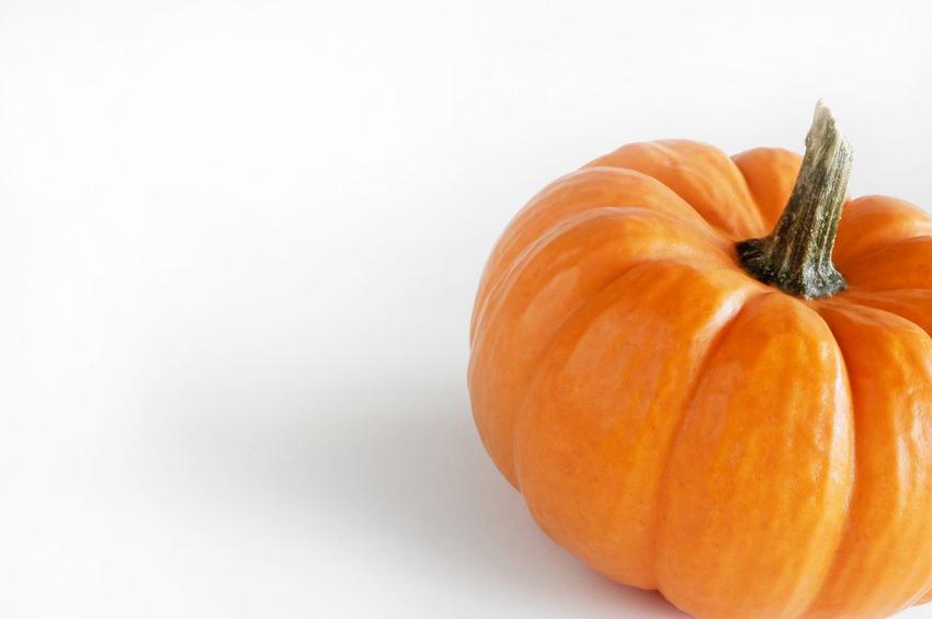
4 Two general tools Plot critique toolkit: graphics are like pumpkin pie Theory behind ggplot2: A layered grammar of graphics plus lots of practice...
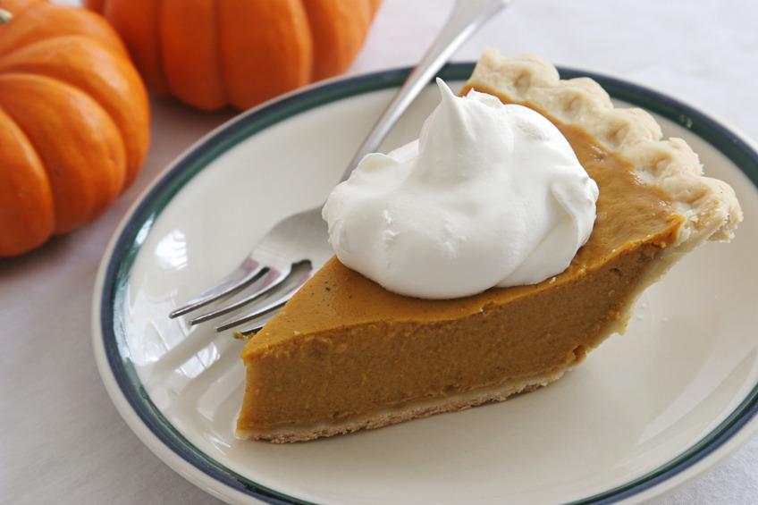
5 Graphics are like pumpkin pie The four C s of critiquing a graphic
6 Content
7 Construction

8 Context


9 Consumption
10 Content What data (variables) does the graph display? What non-data is present? What is pumpkin (essence of the graphic) vs what is spice (useful additional info)?
11 Your turn Identify the data and nondata on Napoleon's march and Building an electoral victory.
12 Results Minard s march: (top) latitude, longitude, number of troops, direction, branch, city name (bottom) latitude, temperature, date Building an electoral victory: state, number of electoral college votes, winner, margin of victory

13 Construction How many layers are on the plot? What data does each layer display? What sort of geometric object does it use? How are variables mapped to aesthetics?
14 Your turn Answer the following questions for Napoleon's march and Flight delays : How many layers are on the plot? What data does the layer display? How does it display it?
15 Results Napoleon s march: (top) (1) path plot with width mapped to number of troops, colour to direction, separate group for each branch (2) labels giving city names (bottom) (1) line plot with longitude on x-axis and temperature on y-axis (2) text labels giving dates Flight delays: (1) white circles showing 100% cancellation, (2) outline of states, (3) points with size proportional to percent cancellations at each airport.
16 Can the explain composition of a graphic in words, but how do we create it?
17 If any number of magnitudes are each the same multiple of the same number of other magnitudes, then the sum is that multiple of the sum. Euclid, ~300 BC
18 If any number of magnitudes are each the same multiple of the same number of other magnitudes, then the sum is that multiple of the sum. Euclid, ~300 BC m(σx) = Σ(mx)
19 The grammar of graphics An abstraction which makes it easier to create, understand and communicate graphics. Developed by Leland Wilkinson, particularly in The Grammar of Graphics 1999/2005 ggplot2 adapts for use within R and builds to create A Layered Grammar of Graphics (in press, Journal of Computational and Graphical Statistics).
20 What is a layer? Data Mappings from variables to aesthetics (aes) A geometric object (geom) A statistical transformation (stat) A position adjustment (position)
21 layer(geom, stat, position, data, mapping,...) layer( data = mpg, mapping = aes(x = displ, y = hwy), geom = "point", stat = "identity", position = "identity" ) layer( data = diamonds, mapping = aes(x = carat), geom = "bar", stat = "bin", position = "stack" )
22 # A lot of typing! layer( data = mpg, mapping = aes(x = displ, y = hwy), geom = "point", stat = "identity", position = "identity" ) # Every geom has an associated default statistic # (and vice versa), and position adjustment. geom_point(aes(displ, hwy), data = mpg) geom_histogram(aes(displ), data = mpg)
23 # To actually create the plot ggplot() + geom_point(aes(displ, hwy), data = mpg) ggplot() + geom_histogram(aes(carat), data = diamonds)
24 # Multiple layers ggplot() + geom_point(aes(displ, hwy), data = mpg) + geom_smooth(aes(displ, hwy), data = mpg) # Avoid redundancy: ggplot(mpg, aes(displ, hwy)) + geom_point() + geom_smooth()
25 # Different layers can have different aesthetics ggplot(mpg, aes(displ, hwy)) + geom_point(aes(colour = class)) + geom_smooth() ggplot(mpg, aes(displ, hwy)) + geom_point(aes(colour = class)) + geom_smooth(aes(group = class), method = "lm", se = F)
26 Your turn Perform the same process for the flight delays data, and try and come up with the ggplot2 code that would create it.
27 usa <- map_data("state") ggplot(feb13, aes(long, lat)) + geom_point(aes(size = 1), colour = "white") + geom_polygon(aes(group = group), data = usa, colour = "grey70", fill = NA) + geom_point(aes(size = ncancelw / ntot), colour = alpha("black", 1/2)) last_plot() + scale_area("% cancelled", to = c(1, 8), breaks = seq(0, 1, by = 0.2), limits = c(0, 1)) scale_x_continuous("", limits = c(-125, -67)), scale_y_continuous("", limits = c(24, 50))
28 Back to Minard
29 troops <- read.csv("minard-troops.csv") cities <- read.csv("minard-cities.csv") ggplot(cities, aes(long, lat)) + geom_path(aes(size = survivors, colour = direction, group = interaction(group, direction)), data = troops) + geom_text(aes(label = city), hjust = 0, vjust = 1, size = 4) # Polish appearance last_plot() + scale_x_continuous("", limits = c(24, 39)) + scale_y_continuous("") + scale_colour_manual(values = c("grey50","red")) + scale_size(to = c(1, 10))
30 Other components Scales. Used to override default perceptual mappings. Mainly useful for polishing plot for communication. Coordinate system. Rarely useful, but when needed are critical. Facetting. Have seen in use already. Only other feature of importance is interaction with scales. Themes: control presentation of non-data elements.
A set of rules describing how to compose a 'vocabulary' into permissible 'sentences'
 Lecture 8: The grammar of graphics STAT598z: Intro. to computing for statistics Vinayak Rao Department of Statistics, Purdue University Grammar? A set of rules describing how to compose a 'vocabulary'
Maps & layers. Hadley Wickham. Assistant Professor / Dobelman Family Junior Chair Department of Statistics / Rice University.
 Maps & layers Hadley Wickham Assistant Professor / Dobelman Family Junior Chair Department of Statistics / Rice University July 2010 1. Introduction to map data 2. Map projections 3. Loading & converting
Statistical transformations
 Statistical transformations Next, let s take a look at a bar chart. Bar charts seem simple, but they are interesting because they reveal something subtle about plots. Consider a basic bar chart, as drawn
Facets and Continuous graphs
 Facets and Continuous graphs One way to add additional variables is with aesthetics. Another way, particularly useful for categorical variables, is to split your plot into facets, subplots that each display
Introduction to R and the tidyverse. Paolo Crosetto
 Introduction to R and the tidyverse Paolo Crosetto Lecture 1: plotting Before we start: Rstudio Interactive console Object explorer Script window Plot window Before we start: R concatenate: c() assign:
Econ 2148, spring 2019 Data visualization
 Econ 2148, spring 2019 Maximilian Kasy Department of Economics, Harvard University 1 / 43 Agenda One way to think about statistics: Mapping data-sets into numerical summaries that are interpretable by
Lecture 4: Data Visualization I
 Lecture 4: Data Visualization I Data Science for Business Analytics Thibault Vatter Department of Statistics, Columbia University and HEC Lausanne, UNIL 11.03.2018 Outline 1 Overview
The following presentation is based on the ggplot2 tutotial written by Prof. Jennifer Bryan.
 Graphics Agenda Grammer of Graphics Using ggplot2 The following presentation is based on the ggplot2 tutotial written by Prof. Jennifer Bryan. ggplot2 (wiki) ggplot2 is a data visualization package Created
Stat405. Displaying distributions. Hadley Wickham. Thursday, August 23, 12
 Stat405 Displaying distributions Hadley Wickham 1. The diamonds data 2. Histograms and bar charts 3. Homework Diamonds Diamonds data ~54,000 round diamonds from http://www.diamondse.info/ Carat, colour,
The diamonds dataset Visualizing data in R with ggplot2
 Lecture 2 STATS/CME 195 Matteo Sesia Stanford University Spring 2018 Contents The diamonds dataset Visualizing data in R with ggplot2 The diamonds dataset The tibble package The tibble package is part
Introduction to Graphics with ggplot2
 Introduction to Graphics with ggplot2 Reaction 2017 Flavio Santi Sept. 6, 2017 Flavio Santi Introduction to Graphics with ggplot2 Sept. 6, 2017 1 / 28 Graphics with ggplot2 ggplot2 [... ] allows you to
03 - Intro to graphics (with ggplot2)
") 3 - Intro to graphics (with ggplot2) ST 597 Spring 217 University of Alabama 3-dataviz.pdf Contents 1 Intro to R Graphics 2 1.1 Graphics Packages................................ 2 1.2 Base Graphics...................................
3 - Intro to graphics (with ggplot2) ST 597 Spring 217 University of Alabama 3-dataviz.pdf Contents 1 Intro to R Graphics 2 1.1 Graphics Packages................................ 2 1.2 Base Graphics...................................
Building visualisations Hadley Wickham
 Building visualisations Hadley Wickham Assistant Professor / Dobelman Family Junior Chair Department of Statistics / Rice University March 2010 Use R and ggplot2 1. Why use a programming language? 2. Why
Getting started with ggplot2
 Getting started with ggplot2 STAT 133 Gaston Sanchez Department of Statistics, UC Berkeley gastonsanchez.com github.com/gastonstat/stat133 Course web: gastonsanchez.com/stat133 ggplot2 2 Resources for
ggplot2 basics Hadley Wickham Assistant Professor / Dobelman Family Junior Chair Department of Statistics / Rice University September 2011
 ggplot2 basics Hadley Wickham Assistant Professor / Dobelman Family Junior Chair Department of Statistics / Rice University September 2011 1. Diving in: scatterplots & aesthetics 2. Facetting 3. Geoms
Large data. Hadley Wickham. Assistant Professor / Dobelman Family Junior Chair Department of Statistics / Rice University.
 Large data Hadley Wickham Assistant Professor / Dobelman Family Junior Chair Department of Statistics / Rice University November 2010 1. The diamonds data 2. Histograms and bar charts 3. Frequency polygons
Plotting with Rcell (Version 1.2-5)
") Plotting with Rcell (Version 1.2-) Alan Bush October 7, 13 1 Introduction Rcell uses the functions of the ggplots2 package to create the plots. This package created by Wickham implements the ideas of Wilkinson
Plotting with Rcell (Version 1.2-) Alan Bush October 7, 13 1 Introduction Rcell uses the functions of the ggplots2 package to create the plots. This package created by Wickham implements the ideas of Wilkinson
1 The ggplot2 workflow
 ggplot2 @ statistics.com Week 2 Dope Sheet Page 1 dope, n. information especially from a reliable source [the inside dope]; v. figure out usually used with out; adj. excellent 1 This week s dope This week
An introduction to ggplot: An implementation of the grammar of graphics in R
 An introduction to ggplot: An implementation of the grammar of graphics in R Hadley Wickham 00-0-7 1 Introduction Currently, R has two major systems for plotting data, base graphics and lattice graphics
Creating elegant graphics in R with ggplot2
 Creating elegant graphics in R with ggplot2 Lauren Steely Bren School of Environmental Science and Management University of California, Santa Barbara What is ggplot2, and why is it so great? ggplot2 is
EXST 7014, Lab 1: Review of R Programming Basics and Simple Linear Regression
 EXST 7014, Lab 1: Review of R Programming Basics and Simple Linear Regression OBJECTIVES 1. Prepare a scatter plot of the dependent variable on the independent variable 2. Do a simple linear regression
An introduction to R Graphics 4. ggplot2
 An introduction to R Graphics 4. ggplot2 Michael Friendly SCS Short Course March, 2017 http://www.datavis.ca/courses/rgraphics/ Resources: Books Hadley Wickham, ggplot2: Elegant graphics for data analysis,
Ggplot2 QMMA. Emanuele Taufer. 2/19/2018 Ggplot2 (1)
") Ggplot2 QMMA Emanuele Taufer file:///c:/users/emanuele.taufer/google%20drive/2%20corsi/5%20qmma%20-%20mim/0%20classes/1-4_ggplot2.html#(1) 1/27 Ggplot2 ggplot2 is a plotting system for R, based on the
Ggplot2 QMMA Emanuele Taufer file:///c:/users/emanuele.taufer/google%20drive/2%20corsi/5%20qmma%20-%20mim/0%20classes/1-4_ggplot2.html#(1) 1/27 Ggplot2 ggplot2 is a plotting system for R, based on the
Introduction to Data Visualization
 Introduction to Data Visualization Author: Nicholas G Reich This material is part of the statsteachr project Made available under the Creative Commons Attribution-ShareAlike 3.0 Unported License: http://creativecommons.org/licenses/by-sa/3.0/deed.en
An Introduction to R Graphics
 An Introduction to R Graphics PnP Group Seminar 25 th April 2012 Why use R for graphics? Fast data exploration Easy automation and reproducibility Create publication quality figures Customisation of almost
social data science Data Visualization Sebastian Barfort August 08, 2016 University of Copenhagen Department of Economics 1/86
 social data science Data Visualization Sebastian Barfort August 08, 2016 University of Copenhagen Department of Economics 1/86 Who s ahead in the polls? 2/86 What values are displayed in this chart? 3/86
Visualizing Data: Customization with ggplot2
 Visualizing Data: Customization with ggplot2 Data Science 1 Stanford University, Department of Statistics ggplot2: Customizing graphics in R ggplot2 by RStudio s Hadley Wickham and Winston Chang offers
We will start at 2:05 pm! Thanks for coming early!
 We will start at 2:05 pm! Thanks for coming early! Yesterday Fundamental 1. Value of visualization 2. Design principles 3. Graphical perception Record Information Support Analytical Reasoning Communicate
Package ggsubplot. February 15, 2013
 Package ggsubplot February 15, 2013 Maintainer Garrett Grolemund License GPL Title Explore complex data by embedding subplots within plots. LazyData true Type Package Author Garrett
LondonR: Introduction to ggplot2. Nick Howlett Data Scientist
 LondonR: Introduction to ggplot2 Nick Howlett Data Scientist Email: nhowlett@mango-solutions.com Agenda Catie Gamble, M&S - Using R to Understand Revenue Opportunities for your Online Business Andrie de
Data Visualization Using R & ggplot2. Karthik Ram October 6, 2013
 Data Visualization Using R & ggplot2 Karthik Ram October 6, 2013 Some housekeeping Install some packages install.packages("ggplot2", dependencies = TRUE) install.packages("plyr") install.packages("ggthemes")
Data Visualization. Module 7
 Data Visualization http://datascience.tntlab.org Module 7 Today s Agenda A Brief Reminder to Update your Software A walkthrough of ggplot2 Big picture New cheatsheet, with some familiar caveats Geometric
Package lvplot. August 29, 2016
 Version 0.2.0 Title Letter Value 'Boxplots' Package lvplot August 29, 2016 Implements the letter value 'boxplot' which extends the standard 'boxplot' to deal with both larger and smaller number of data
Lecture 09. Graphics::ggplot I R Teaching Team. October 1, 2018
 Lecture 09 Graphics::ggplot I 2018 R Teaching Team October 1, 2018 Acknowledgements 1. Mike Fliss & Sara Levintow! 2. stackoverflow (particularly user David for lecture styling - link) 3. R Markdown: The
Graphics in R. There are three plotting systems in R. base Convenient, but hard to adjust after the plot is created
 Graphics in R There are three plotting systems in R base Convenient, but hard to adjust after the plot is created lattice Good for creating conditioning plot ggplot2 Powerful and flexible, many tunable
Advanced Plotting with ggplot2. Algorithm Design & Software Engineering November 13, 2016 Stefan Feuerriegel
 Advanced Plotting with ggplot2 Algorithm Design & Software Engineering November 13, 2016 Stefan Feuerriegel Today s Lecture Objectives 1 Distinguishing different types of plots and their purpose 2 Learning
Plotting with ggplot2: Part 2. Biostatistics
 Plotting with ggplot2: Part 2 Biostatistics 14.776 Building Plots with ggplot2 When building plots in ggplot2 (rather than using qplot) the artist s palette model may be the closest analogy Plots are built
Stat 849: Plotting responses and covariates
 Stat 849: Plotting responses and covariates Douglas Bates 10-09-03 Outline Contents 1 R Graphics Systems Graphics systems in R ˆ R provides three dierent high-level graphics systems base graphics The system
data visualization Show the Data Snow Month skimming deep waters
 data visualization skimming deep waters Show the Data Snow 2 4 6 8 12 Minimize Distraction Minimize Distraction Snow 2 4 6 8 12 2 4 6 8 12 Make Big Data Coherent Reveal Several Levels of Detail 1974 1975
ggplot2 for beginners Maria Novosolov 1 December, 2014
 ggplot2 for beginners Maria Novosolov 1 December, 214 For this tutorial we will use the data of reproductive traits in lizards on different islands (found in the website) First thing is to set the working
You submitted this quiz on Sat 17 May :19 AM CEST. You got a score of out of
 uiz Feedback Coursera 1 of 7 01/06/2014 20:02 Feedback Week 2 Quiz Help You submitted this quiz on Sat 17 May 2014 11:19 AM CEST. You got a score of 10.00 out of 10.00. Question 1 Under the lattice graphics
Data Visualization in R
 Data Visualization in R L. Torgo ltorgo@fc.up.pt Faculdade de Ciências / LIAAD-INESC TEC, LA Universidade do Porto Aug, 2017 Introduction Motivation for Data Visualization Humans are outstanding at detecting
User manual forggsubplot
 User manual forggsubplot Garrett Grolemund September 3, 2012 1 Introduction ggsubplot expands the ggplot2 package to help users create multi-level plots, or embedded plots." Embedded plots embed subplots
Importing and visualizing data in R. Day 3
 Importing and visualizing data in R Day 3 R data.frames Like pandas in python, R uses data frame (data.frame) object to support tabular data. These provide: Data input Row- and column-wise manipulation
Rstudio GGPLOT2. Preparations. The first plot: Hello world! W2018 RENR690 Zihaohan Sang
 Rstudio GGPLOT2 Preparations There are several different systems for creating data visualizations in R. We will introduce ggplot2, which is based on Leland Wilkinson s Grammar of Graphics. The learning
Hadley Wickham. ggplot2. Elegant Graphics for Data Analysis. July 26, Springer
 Hadley Wickham ggplot2 Elegant Graphics for Data Analysis July 26, 2016 Springer To my parents, Alison & Brian Wickham. Without them, and their unconditional love and support, none of this would have
Stat 849: Plotting responses and covariates
 Stat 849: Plotting responses and covariates Douglas Bates Department of Statistics University of Wisconsin, Madison 2010-09-03 Outline R Graphics Systems Brain weight Cathedrals Longshoots Domedata Summary
Package cowplot. March 6, 2016
 Package cowplot March 6, 2016 Title Streamlined Plot Theme and Plot Annotations for 'ggplot2' Version 0.6.1 Some helpful extensions and modifications to the 'ggplot2' library. In particular, this package
Data Visualization in R
 Data Visualization in R L. Torgo ltorgo@fc.up.pt Faculdade de Ciências / LIAAD-INESC TEC, LA Universidade do Porto Oct, 216 Introduction Motivation for Data Visualization Humans are outstanding at detecting
Future in mind Self Assessment Tool User Guide v2
 Future in mind Self Assessment Tool User Guide v2 This Self-Assessment Tool has been developed with support from the East Midlands Strategic Clinical Network Maternity & Children s and Mental Health network
What Type Of Graph Is Best To Use To Show Data That Are Parts Of A Whole
 What Type Of Graph Is Best To Use To Show Data That Are Parts Of A Whole But how do you choose which style of graph to use? This page sets They are generally used for, and best for, quite different things.
Package ggseas. June 12, 2018
 Package ggseas June 12, 2018 Title 'stats' for Seasonal Adjustment on the Fly with 'ggplot2' Version 0.5.4 Maintainer Peter Ellis Provides 'ggplot2' 'stats' that estimate
ggplot2 and maps Marcin Kierczak 11/10/2016
 11/10/2016 The grammar of graphics Hadley Wickham s ggplot2 package implements the grammar of graphics described in Leland Wilkinson s book by the same title. It offers a very flexible and efficient way
Data and Image Models
 CSE 442 - Data Visualization Data and Image Models Jeffrey Heer University of Washington Last Week: Value of Visualization The Value of Visualization Record information Blueprints, photographs, seismographs,
STAT 1291: Data Science
 STAT 1291: Data Science Lecture 20 - Summary Sungkyu Jung Semester recap data visualization data wrangling professional ethics statistical foundation Statistical modeling: Regression Cause and effect:
Last Time: Value of Visualization
 CS448B :: 29 Sep 2011 Data and Image Models Last Time: Value of Visualization Jeffrey Heer Stanford University The Value of Visualization Record information Blueprints, photographs, seismographs, Analyze
Package ggrepel. September 30, 2017
 Version 0.7.0 Package ggrepel September 30, 2017 Title Repulsive Text and Label Geoms for 'ggplot2' Description Provides text and label geoms for 'ggplot2' that help to avoid overlapping text labels. Labels
Properties of Data. Digging into Data: Jordan Boyd-Graber. University of Maryland. February 11, 2013
 Properties of Data Digging into Data: Jordan Boyd-Graber University of Maryland February 11, 2013 Digging into Data: Jordan Boyd-Graber (UMD) Properties of Data February 11, 2013 1 / 43 Roadmap Munging
Data visualization with ggplot2
 Data visualization with ggplot2 Visualizing data in R with the ggplot2 package Authors: Mateusz Kuzak, Diana Marek, Hedi Peterson, Dmytro Fishman Disclaimer We will be using the functions in the ggplot2
Intro to R for Epidemiologists
 Lab 9 (3/19/15) Intro to R for Epidemiologists Part 1. MPG vs. Weight in mtcars dataset The mtcars dataset in the datasets package contains fuel consumption and 10 aspects of automobile design and performance
ggplot2: elegant graphics for data analysis
 ggplot2: elegant graphics for data analysis Hadley Wickham February 24, 2009 Contents 1. Preface 1 1.1. Introduction.................................... 1 1.2. Other resources..................................
Data and Image Models
 CSE 512 - Data Visualization Data and Image Models Jeffrey Heer University of Washington Last Time: Value of Visualization The Value of Visualization Record information Blueprints, photographs, seismographs,
PRESENTING DATA. Overview. Some basic things to remember
 PRESENTING DATA This handout is one of a series that accompanies An Adventure in Statistics: The Reality Enigma by me, Andy Field. These handouts are offered for free (although I hope you will buy the
Data Handling: Import, Cleaning and Visualisation
 Data Handling: Import, Cleaning and Visualisation 1 Data Display Lecture 11: Visualisation and Dynamic Documents Prof. Dr. Ulrich Matter (University of St. Gallen) 13/12/18 In the last part of a data pipeline
DATA VISUALIZATION WITH GGPLOT2. Coordinates
 DATA VISUALIZATION WITH GGPLOT2 Coordinates Coordinates Layer Controls plot dimensions coord_ coord_cartesian() Zooming in scale_x_continuous(limits =...) xlim() coord_cartesian(xlim =...) Original Plot
Package ggextra. April 4, 2018
 Package ggextra April 4, 2018 Title Add Marginal Histograms to 'ggplot2', and More 'ggplot2' Enhancements Version 0.8 Collection of functions and layers to enhance 'ggplot2'. The flagship function is 'ggmarginal()',
ggplot in 3 easy steps (maybe 2 easy steps)
") 1 ggplot in 3 easy steps (maybe 2 easy steps) 1.1 aesthetic: what you want to graph (e.g. x, y, z). 1.2 geom: how you want to graph it. 1.3 options: optional titles, themes, etc. 2 Background R has a number
1 ggplot in 3 easy steps (maybe 2 easy steps) 1.1 aesthetic: what you want to graph (e.g. x, y, z). 1.2 geom: how you want to graph it. 1.3 options: optional titles, themes, etc. 2 Background R has a number
Session 3 Nick Hathaway;
 Session 3 Nick Hathaway; nicholas.hathaway@umassmed.edu Contents Manipulating Data frames and matrices 1 Converting to long vs wide formats.................................... 2 Manipulating data in table........................................
# Call plot plot(gg)
") Most of the requirements related to look and feel can be achieved using the theme() function. It accepts a large number of arguments. Type?theme in the R console and see for yourself. # Setup options(scipen=999)
Most of the requirements related to look and feel can be achieved using the theme() function. It accepts a large number of arguments. Type?theme in the R console and see for yourself. # Setup options(scipen=999)
Bivariate Linear Regression James M. Murray, Ph.D. University of Wisconsin - La Crosse Updated: October 04, 2017
 Bivariate Linear Regression James M. Murray, Ph.D. University of Wisconsin - La Crosse Updated: October 4, 217 PDF file location: http://www.murraylax.org/rtutorials/regression_intro.pdf HTML file location:
grammar statistical graphics Building a in Clojure Kevin Lynagh 2012 November 9 Øredev Keming Labs Malmö, Sweden
 Building a grammar for statistical graphics in Clojure 2012 November 9 Kevin Lynagh Øredev Keming Labs @lynaghk Malmö, Sweden Agenda Agenda Data Visualization 2 A Agenda Grammar of Graphics Agenda Data
Package gggenes. R topics documented: November 7, Title Draw Gene Arrow Maps in 'ggplot2' Version 0.3.2
 Title Draw Gene Arrow Maps in 'ggplot2' Version 0.3.2 Package gggenes November 7, 2018 Provides a 'ggplot2' geom and helper functions for drawing gene arrow maps. Depends R (>= 3.3.0) Imports grid (>=
Adding a corporate identity to reproducible research
 Adding a corporate identity to reproducible research R Belgium, Zavemtem March 7 2017 Thierry Onkelinx Research Institute for Nature and Forest (INBO) Summary 1 Introduction 2 ggplot2 for graphics 3 Short
Visualizing the World
 Visualizing the World An Introduction to Visualization 15.071x The Analytics Edge Why Visualization? The picture-examining eye is the best finder we have of the wholly unanticipated -John Tukey Visualizing
Exploring Maps with ggplot2 1 Draft: Do not Cite
 Exploring Maps with ggplot2 1 Draft: Do not Cite John Kane and William H. Rogers May 12, 2011 1 We thank Josh Ulrich for his helpful comments and corrections. All remaining errors are the those of the
How to Plot With Ggiraph
 How to Plot With Ggiraph **Please note** This tutorial is largely taken from the relevant package github page **Please note** INTRODUCTION The ggiraph is an htmlwidget and a ggplot2 extension. It allows
Resources: Books. Data Visualization in R 4. ggplot2. What is ggplot2? Resources: Cheat sheets
 Resources: Books Hadley Wickham, ggplot2: Elegant graphics for data analysis, 2nd Ed. 1st Ed: Online, http://ggplot2.org/book/ ggplot2 Quick Reference: http://sape.inf.usi.ch/quick-reference/ggplot2/ Complete
Package cowplot. November 16, 2017
 Package cowplot November 16, 2017 Title Streamlined Plot Theme and Plot Annotations for 'ggplot2' Version 0.9.1 Some helpful extensions and modifications to the 'ggplot2' package. In particular, this package
Desktop Studio: Charts. Version: 7.3
 Desktop Studio: Charts Version: 7.3 Copyright 2015 Intellicus Technologies This document and its content is copyrighted material of Intellicus Technologies. The content may not be copied or derived from,
Working with Charts Stratum.Viewer 6
 Working with Charts Stratum.Viewer 6 Getting Started Tasks Additional Information Access to Charts Introduction to Charts Overview of Chart Types Quick Start - Adding a Chart to a View Create a Chart with
DATA VISUALIZATION WITH GGPLOT2. Grid Graphics
 DATA VISUALIZATION WITH GGPLOT2 Grid Graphics ggplot2 internals Explore grid graphics 35 30 Elements of ggplot2 plot 25 How do graphics work in R? 2 plotting systems mpg 20 15 base package grid graphics
Desktop Studio: Charts
 Desktop Studio: Charts Intellicus Enterprise Reporting and BI Platform Intellicus Technologies info@intellicus.com www.intellicus.com Working with Charts i Copyright 2011 Intellicus Technologies This document
Lab5A - Intro to GGPLOT2 Z.Sang Sept 24, 2018
 LabA - Intro to GGPLOT2 Z.Sang Sept 24, 218 In this lab you will learn to visualize raw data by plotting exploratory graphics with ggplot2 package. Unlike final graphs for publication or thesis, exploratory
Introduction to ggvis. Aimee Gott R Consultant
 Introduction to ggvis Overview Recap of the basics of ggplot2 Getting started with ggvis The %>% operator Changing aesthetics Layers Interactivity Resources for the Workshop R (version 3.1.2) RStudio ggvis
Data and Image Models
 CSE 442 - Data Visualization Data and Image Models Jeffrey Heer University of Washington Last Time: Value of Visualization The Value of Visualization Record information Blueprints, photographs, seismographs,
R Workshop 1: Introduction to R
 R Workshop 1: Introduction to R Gavin Simpson Environmental Change Research Centre, Department of Geography UCL April 30, 2013 Gavin Simpson (ECRC, UCL) Introduction to R April 30, 2013 1 / 43 Outline
Package autocogs. September 22, Title Automatic Cognostic Summaries Version 0.1.1
 Title Automatic Cognostic Summaries Version 0.1.1 Package autocogs September 22, 2018 Automatically calculates cognostic groups for plot objects and list column plot objects. Results are returned in a
Package ggmosaic. February 9, 2017
 Title Mosaic Plots in the 'ggplot2' Framework Version 0.1.2 Package ggmosaic February 9, 2017 Mosaic plots in the 'ggplot2' framework. Mosaic plot functionality is provided in a single 'ggplot2' layer
Package ggimage. R topics documented: December 5, Title Use Image in 'ggplot2' Version 0.1.0
 Title Use Image in 'ggplot2' Version 0.1.0 Package ggimage December 5, 2017 Supports image files and graphic objects to be visualized in 'ggplot2' graphic system. Depends R (>= 3.3.0), ggplot2 Imports
Data Visualization for M&E. BRIDGE M&E Colloquium Jerusha Govender 8 August 2017
 Data Visualization for M&E BRIDGE M&E Colloquium Jerusha Govender 8 August 2017 About Us We help organizations tell their story through innovative analysis, data visualization & strategic communication
Package lemon. September 12, 2017
 Type Package Title Freshing Up your 'ggplot2' Plots Package lemon September 12, 2017 URL https://github.com/stefanedwards/lemon BugReports https://github.com/stefanedwards/lemon/issues Version 0.3.1 Date
Name Date Types of Graphs and Creating Graphs Notes
 Name Date Types of Graphs and Creating Graphs Notes Graphs are helpful visual representations of data. Different graphs display data in different ways. Some graphs show individual data, but many do not.
Package ggspectra. May 7, 2018
 Type Package Title Extensions to 'ggplot2' for Radiation Spectra Version 0.2.4-1 Date 2018-05-07 Package ggspectra May 7, 2018 Maintainer Pedro J. Aphalo Additional annotations,
An Introduction to R. Ed D. J. Berry 9th January 2017
 An Introduction to R Ed D. J. Berry 9th January 2017 Overview Why now? Why R? General tips Recommended packages Recommended resources 2/48 Why now? Efficiency Pointandclick software just isn't time efficient
Tufte s Design Principles
 Tufte s Design Principles CS 7450 - Information Visualization January 27, 2004 John Stasko HW 2 - Minivan Data Vis What people did Classes of solutions Data aggregation, transformation Tasks - particular
Introduction to R for Beginners, Level II. Jeon Lee Bio-Informatics Core Facility (BICF), UTSW
, UTSW") Introduction to R for Beginners, Level II Jeon Lee Bio-Informatics Core Facility (BICF), UTSW Basics of R Powerful programming language and environment for statistical computing Useful for very basic analysis
Introduction to R for Beginners, Level II Jeon Lee Bio-Informatics Core Facility (BICF), UTSW Basics of R Powerful programming language and environment for statistical computing Useful for very basic analysis
Package geomnet. December 8, 2016
 Type Package Package geomnet December 8, 2016 Title Network Visualization in the 'ggplot2' Framework Version 0.2.0 Date 2016-11-14 Author Samantha Tyner, Heike Hofmann Maintainer Samantha Tyner
Visualization of large multivariate datasets with the tabplot package
 Visualization of large multivariate datasets with the tabplot package Martijn Tennekes and Edwin de Jonge December 18, 2012 (A later version may be available on CRAN) Abstract The tableplot is a powerful
Data visualization in Python
 Data visualization in Python Martijn Tennekes THE CONTRACTOR IS ACTING UNDER A FRAMEWORK CONTRACT CONCLUDED WITH THE COMMISSION Outline Overview data visualization in Python ggplot2 tmap tabplot 2 Which
Package ggqc. R topics documented: January 30, Type Package Title Quality Control Charts for 'ggplot' Version Author Kenith Grey
 Type Package Title Quality Control Charts for 'ggplot' Version 0.0.2 Author Kenith Grey Package ggqc January 30, 2018 Maintainer Kenith Grey Plot single and faceted type quality