ggplot2 basics Hadley Wickham Assistant Professor / Dobelman Family Junior Chair Department of Statistics / Rice University September 2011
|
|
|
- Lee Barton
- 6 years ago
- Views:
Transcription
1 ggplot2 basics Hadley Wickham Assistant Professor / Dobelman Family Junior Chair Department of Statistics / Rice University September 2011
2 1. Diving in: scatterplots & aesthetics 2. Facetting 3. Geoms 4. Histograms and barcharts 5. Scatterplots for large data

3 Diving in
4 Scatterplot basics install.packages("ggplot2") library(ggplot2)?mpg head(mpg) str(mpg) summary(mpg) qplot(displ, hwy, data = mpg)
5 Scatterplot basics install.packages("ggplot2") library(ggplot2)?mpg head(mpg) str(mpg) summary(mpg) Always explicitly specify the data qplot(displ, hwy, data = mpg)
6 displ hwy qplot(displ, hwy, data = mpg)
7 Additional variables Can display additional variables with aesthetics (like shape, colour, size) or facetting (small multiples displaying different subsets)
8 displ hwy class 2seater compact midsize minivan pickup subcompact suv qplot(displ, hwy, colour = class, data = mpg)
9 displ hwy class 2seater compact midsize minivan pickup subcompact suv Legend chosen and displayed automatically. qplot(displ, hwy, colour = class, data = mpg)
10 Your turn Experiment with colour, size, and shape aesthetics. What s the difference between discrete or continuous variables? What happens when you combine multiple aesthetics?
11 Discrete Continuous Colour Rainbow of colours Gradient from red to blue Size Discrete size steps Linear mapping between radius and value Shape Different shape for each Shouldn t work

12 Facetting
13 Faceting Small multiples displaying different subsets of the data. Useful for exploring conditional relationships. Useful for large data.
14 Your turn qplot(displ, hwy, data = mpg) + facet_grid(. ~ cyl) qplot(displ, hwy, data = mpg) + facet_grid(drv ~.) qplot(displ, hwy, data = mpg) + facet_grid(drv ~ cyl) qplot(displ, hwy, data = mpg) + facet_wrap(~ class)
15 Summary facet_grid(): 2d grid, rows ~ cols,. for no split facet_wrap(): 1d ribbon wrapped into 2d
16 Aside: workflow Keep a copy of the slides open so that you can copy and paste the code.

17 Geoms
18 cty hwy qplot(cty, hwy, data = mpg) What s the problem with this plot?
19 cty hwy qplot(cty, hwy, data = mpg, geom = "jitter")
20 cty hwy qplot(cty, hwy, data = mpg, geom = "jitter") geom controls type of plot
21 class hwy seater compact midsize minivan pickup subcompact suv qplot(class, hwy, data = mpg)
22 class hwy seater compact midsize minivan pickup subcompact suv qplot(class, hwy, data = mpg) How could we improve this plot? Brainstorm for 1 minute.
23 reorder(class, hwy) hwy pickup suv minivan 2seater midsize subcompact compact
24 reorder(class, hwy) hwy pickup suv minivan 2seater midsize subcompact compact qplot(reorder(class, hwy), hwy, data = mpg) Incredibly useful technique!
25 reorder(class, hwy) hwy pickup suv minivan 2seater midsize subcompact compact qplot(reorder(class, hwy), hwy, data = mpg, geom = "jitter")
26 hwy pickup suv minivan 2seater midsize subcompact compact qplot(reorder(class, hwy), hwy, reorder(class, data hwy) = mpg, geom = "boxplot")
27 reorder(class, hwy) hwy pickup suv minivan 2seater midsize subcompact compact qplot(reorder(class, hwy), hwy, data = mpg, geom = c("jitter", "boxplot"))
28 Your turn Read the help for reorder. Redraw the previous plots with class ordered by median hwy. How would you put the jittered points on top of the boxplots?

29 Diamonds


30 Diamonds data ~54,000 round diamonds from Carat, colour, clarity, cut Total depth, table, depth, width, height Price
31 x table width z depth = z / diameter table = table width / x * 100

32 Histogram & bar charts
33 Histograms and barcharts Used to display the distribution of a variable Categorical variable bar chart Continuous variable histogram
34 Examples # With only one variable, qplot guesses that # you want a bar chart or histogram qplot(cut, data = diamonds) qplot(carat, data = diamonds) qplot(carat, data = diamonds, binwidth = 1) qplot(carat, data = diamonds, binwidth = 0.1) qplot(carat, data = diamonds, binwidth = 0.01) resolution(diamonds$carat) last_plot() + xlim(0, 3)
35 Examples # With only one variable, qplot guesses that # you want a bar chart or histogram qplot(cut, data = diamonds) qplot(carat, data = diamonds) qplot(carat, data = diamonds, binwidth = 1) qplot(carat, Common data ggplot2 = diamonds, binwidth = 0.1) qplot(carat, technique: data adding = diamonds, binwidth = 0.01) together plot resolution(diamonds$carat) components last_plot() + xlim(0, 3)
36 Always experiment with the bin width!
37 qplot(table, data = diamonds, binwidth = 1) # To zoom in on a plot region use xlim() and ylim() qplot(table, data = diamonds, binwidth = 1) + xlim(50, 70) qplot(table, data = diamonds, binwidth = 0.1) + xlim(50, 70) qplot(table, data = diamonds, binwidth = 0.1) + xlim(50, 70) + ylim(0, 50) # Note that this type of zooming discards data outside of the plot regions # See coord_cartesian() for an alternative
38 Additional variables As with scatterplots can use aesthetics or faceting. Using aesthetics creates pretty, but ineffective, plots. The following examples show the difference, when investigation the relationship between cut and depth.
39 count qplot(depth, data = diamonds, depth binwidth = 0.2)
40 count 2000 cut Fair Good Very Good Premium Ideal qplot(depth, data = diamonds, binwidth = 0.2, fill = cut) + xlim(55, depth 70)
41 count 2000 cut Fair Good Very Good Premium Ideal 1000 Fill is the aesthetic 0 for fill colour qplot(depth, data = diamonds, binwidth = 0.2, fill = cut) + xlim(55, depth 70)
42 Fair Good Very Good count 0 Premium Ideal qplot(depth, data 64 66= 68diamonds, binwidth = ) xlim(55, 70) + facet_wrap(~ depth cut)
43 Your turn Explore the distribution of price. How does it vary with colour, or cut, and clarity? Practice zooming in on regions of interest.
44 Fair Good Very Good count Premium Ideal qplot(price, data = diamonds, binwidth price = 500) + facet_wrap(~ cut)
45 Fair Good Very Good count Premium Ideal What makes it difficult to compare the shape of the distributions? Brainstorm for 1 minute qplot(price, data = diamonds, binwidth price = 500) + facet_wrap(~ cut)
46 Problems Each histogram far away from the others, but we know stacking is hard to read use another way of displaying densities Varying relative abundance makes comparisons difficult rescale to ensure constant area
47 # Large distances make comparisons hard qplot(price, data = diamonds, binwidth = 500) + facet_wrap(~ cut) # Stacked heights hard to compare qplot(price, data = diamonds, binwidth = 500, fill = cut) # Much better - but still have differing relative abundance qplot(price, data = diamonds, binwidth = 500, geom = "freqpoly", colour = cut) # Instead of displaying count on y-axis, display density #.. indicates that variable isn't in original data qplot(price,..density.., data = diamonds, binwidth = 500, geom = "freqpoly", colour = cut) # To use with histogram, you need to be explicit qplot(price,..density.., data = diamonds, binwidth = 500, geom = "histogram") + facet_wrap(~ cut)

48 Big scatterplots
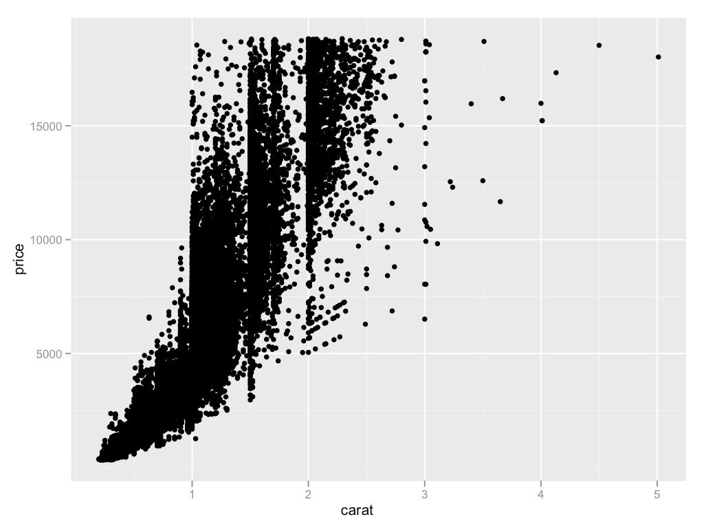
49
50 Your turn Take two minutes to brainstorm possible solutions to the overplotting problem.
51 Idea ggplot Small points shape = I(".") Transparency alpha = I(1/50) Jittering geom = "jitter" Smooth curve 2d bins Density contours geom = "smooth" geom = "bin2d" or geom = "hex" geom = "density2d"
52 # There are two ways to add additional geoms # 1) A vector of geom names: qplot(price, carat, data = diamonds, geom = c("point", "smooth")) # 2) Add on extra geoms qplot(price, carat, data = diamonds) + geom_smooth() # This how you get help about a specific geom: #?geom_smooth
53 # To set aesthetics to a particular value, you need # to wrap that value in I() qplot(price, carat, data = diamonds, colour = "blue") qplot(price, carat, data = diamonds, colour = I("blue")) # Practical application: varying alpha qplot(price, carat, data = diamonds, alpha = I(1/10)) qplot(price, carat, data = diamonds, alpha = I(1/50)) qplot(price, carat, data = diamonds, alpha = I(1/100)) qplot(price, carat, data = diamonds, alpha = I(1/250))
54 Your turn Explore the relationship between carat, price and clarity, using these techniques. (i.e. make this plot more informative: qplot(carat, price, data = diamonds, colour = clarity)) Which did you find most useful?
55 qplot(carat, price, data = diamonds, colour = clarity) qplot(log10(carat), log10(price), data = diamonds, colour = clarity) qplot(log10(carat), log10(carat / price), data = diamonds, colour = clarity) qplot(log10(carat), log10(price), data = diamonds, geom = "hex", bins = 10) + facet_wrap(~ clarity) qplot(log10(carat), log10(price), data = diamonds, colour = clarity, geom = "smooth")

56 Workflow
57 Coding strategy At the end of each interactive session, you want a summary of everything you did. Two options: 1. Save everything you did with savehistory() then remove the unimportant bits. 2. Build up the important bits as you go. (this is how I work)
58 Working directory Set your working directory to specify where files will be loaded from and saved to all paths are relative to the working directory. From the terminal (linux or mac): the working directory is the directory you re in when you start R On windows: File Change dir. On the mac: -D
59 Data (.csv) + Code (.r) + In one directory Graphics (.png,.pdf) + Written report (.tex)
60
61 This work is licensed under the Creative Commons Attribution-Noncommercial 3.0 United States License. To view a copy of this license, visit 3.0/us/ or send a letter to Creative Commons, 171 Second Street, Suite 300, San Francisco, California, 94105, USA.
Large data. Hadley Wickham. Assistant Professor / Dobelman Family Junior Chair Department of Statistics / Rice University.
 Large data Hadley Wickham Assistant Professor / Dobelman Family Junior Chair Department of Statistics / Rice University November 2010 1. The diamonds data 2. Histograms and bar charts 3. Frequency polygons
Stat405. Displaying distributions. Hadley Wickham. Thursday, August 23, 12
 Stat405 Displaying distributions Hadley Wickham 1. The diamonds data 2. Histograms and bar charts 3. Homework Diamonds Diamonds data ~54,000 round diamonds from http://www.diamondse.info/ Carat, colour,
Facets and Continuous graphs
 Facets and Continuous graphs One way to add additional variables is with aesthetics. Another way, particularly useful for categorical variables, is to split your plot into facets, subplots that each display
Lecture 4: Data Visualization I
 Lecture 4: Data Visualization I Data Science for Business Analytics Thibault Vatter Department of Statistics, Columbia University and HEC Lausanne, UNIL 11.03.2018 Outline 1 Overview
Statistical transformations
 Statistical transformations Next, let s take a look at a bar chart. Bar charts seem simple, but they are interesting because they reveal something subtle about plots. Consider a basic bar chart, as drawn
Intoduction to data analysis with R
 1/66 Intoduction to data analysis with R Mark Johnson Macquarie University Sydney, Australia September 17, 2014 2/66 Outline Goals for today: calculate summary statistics for data construct several kinds
The diamonds dataset Visualizing data in R with ggplot2
 Lecture 2 STATS/CME 195 Matteo Sesia Stanford University Spring 2018 Contents The diamonds dataset Visualizing data in R with ggplot2 The diamonds dataset The tibble package The tibble package is part
Introduction to R and the tidyverse. Paolo Crosetto
 Introduction to R and the tidyverse Paolo Crosetto Lecture 1: plotting Before we start: Rstudio Interactive console Object explorer Script window Plot window Before we start: R concatenate: c() assign:
Maps & layers. Hadley Wickham. Assistant Professor / Dobelman Family Junior Chair Department of Statistics / Rice University.
 Maps & layers Hadley Wickham Assistant Professor / Dobelman Family Junior Chair Department of Statistics / Rice University July 2010 1. Introduction to map data 2. Map projections 3. Loading & converting
Ggplot2 QMMA. Emanuele Taufer. 2/19/2018 Ggplot2 (1)
") Ggplot2 QMMA Emanuele Taufer file:///c:/users/emanuele.taufer/google%20drive/2%20corsi/5%20qmma%20-%20mim/0%20classes/1-4_ggplot2.html#(1) 1/27 Ggplot2 ggplot2 is a plotting system for R, based on the
Ggplot2 QMMA Emanuele Taufer file:///c:/users/emanuele.taufer/google%20drive/2%20corsi/5%20qmma%20-%20mim/0%20classes/1-4_ggplot2.html#(1) 1/27 Ggplot2 ggplot2 is a plotting system for R, based on the
03 - Intro to graphics (with ggplot2)
") 3 - Intro to graphics (with ggplot2) ST 597 Spring 217 University of Alabama 3-dataviz.pdf Contents 1 Intro to R Graphics 2 1.1 Graphics Packages................................ 2 1.2 Base Graphics...................................
3 - Intro to graphics (with ggplot2) ST 597 Spring 217 University of Alabama 3-dataviz.pdf Contents 1 Intro to R Graphics 2 1.1 Graphics Packages................................ 2 1.2 Base Graphics...................................
ggplot2: elegant graphics for data analysis
 ggplot2: elegant graphics for data analysis Hadley Wickham February 24, 2009 Contents 1. Preface 1 1.1. Introduction.................................... 1 1.2. Other resources..................................
Plotting with Rcell (Version 1.2-5)
") Plotting with Rcell (Version 1.2-) Alan Bush October 7, 13 1 Introduction Rcell uses the functions of the ggplots2 package to create the plots. This package created by Wickham implements the ideas of Wilkinson
Plotting with Rcell (Version 1.2-) Alan Bush October 7, 13 1 Introduction Rcell uses the functions of the ggplots2 package to create the plots. This package created by Wickham implements the ideas of Wilkinson
The following presentation is based on the ggplot2 tutotial written by Prof. Jennifer Bryan.
 Graphics Agenda Grammer of Graphics Using ggplot2 The following presentation is based on the ggplot2 tutotial written by Prof. Jennifer Bryan. ggplot2 (wiki) ggplot2 is a data visualization package Created
An introduction to ggplot: An implementation of the grammar of graphics in R
 An introduction to ggplot: An implementation of the grammar of graphics in R Hadley Wickham 00-0-7 1 Introduction Currently, R has two major systems for plotting data, base graphics and lattice graphics
Data input & output. Hadley Wickham. Assistant Professor / Dobelman Family Junior Chair Department of Statistics / Rice University.
 Data input & output Hadley Wickham Assistant Professor / Dobelman Family Junior Chair Department of Statistics / Rice University June 2012 1. Working directories 2. Loading data 3. Strings and factors
Pragmatic R for Biologists 10/22/10
 Pragmatic R for Biologists 10/22/10 R An environment for statistical computing Statistics Visualization Strengths and Weaknesses Great for Statistics Graphics Tabular data Reproducible research Not great
Getting started with ggplot2
 Getting started with ggplot2 STAT 133 Gaston Sanchez Department of Statistics, UC Berkeley gastonsanchez.com github.com/gastonstat/stat133 Course web: gastonsanchez.com/stat133 ggplot2 2 Resources for
A set of rules describing how to compose a 'vocabulary' into permissible 'sentences'
 Lecture 8: The grammar of graphics STAT598z: Intro. to computing for statistics Vinayak Rao Department of Statistics, Purdue University Grammar? A set of rules describing how to compose a 'vocabulary'
R Workshop 1: Introduction to R
 R Workshop 1: Introduction to R Gavin Simpson Environmental Change Research Centre, Department of Geography UCL April 30, 2013 Gavin Simpson (ECRC, UCL) Introduction to R April 30, 2013 1 / 43 Outline
Intro to R for Epidemiologists
 Lab 9 (3/19/15) Intro to R for Epidemiologists Part 1. MPG vs. Weight in mtcars dataset The mtcars dataset in the datasets package contains fuel consumption and 10 aspects of automobile design and performance
Creating elegant graphics in R with ggplot2
 Creating elegant graphics in R with ggplot2 Lauren Steely Bren School of Environmental Science and Management University of California, Santa Barbara What is ggplot2, and why is it so great? ggplot2 is
An Introduction to R Graphics
 An Introduction to R Graphics PnP Group Seminar 25 th April 2012 Why use R for graphics? Fast data exploration Easy automation and reproducibility Create publication quality figures Customisation of almost
1 The ggplot2 workflow
 ggplot2 @ statistics.com Week 2 Dope Sheet Page 1 dope, n. information especially from a reliable source [the inside dope]; v. figure out usually used with out; adj. excellent 1 This week s dope This week
CSC 1315! Data Science
 CSC 1315! Data Science Data Visualization Based on: Python for Data Analysis: http://hamelg.blogspot.com/2015/ Learning IPython for Interactive Computation and Visualization by C. Rossant Plotting with
Introduction to Graphics with ggplot2
 Introduction to Graphics with ggplot2 Reaction 2017 Flavio Santi Sept. 6, 2017 Flavio Santi Introduction to Graphics with ggplot2 Sept. 6, 2017 1 / 28 Graphics with ggplot2 ggplot2 [... ] allows you to
User manual forggsubplot
 User manual forggsubplot Garrett Grolemund September 3, 2012 1 Introduction ggsubplot expands the ggplot2 package to help users create multi-level plots, or embedded plots." Embedded plots embed subplots
ggplot2 for beginners Maria Novosolov 1 December, 2014
 ggplot2 for beginners Maria Novosolov 1 December, 214 For this tutorial we will use the data of reproductive traits in lizards on different islands (found in the website) First thing is to set the working
Graphical critique & theory. Hadley Wickham
 Graphical critique & theory Hadley Wickham Exploratory graphics Are for you (not others). Need to be able to create rapidly because your first attempt will never be the most revealing. Iteration is crucial
DATA VISUALIZATION WITH GGPLOT2. Coordinates
 DATA VISUALIZATION WITH GGPLOT2 Coordinates Coordinates Layer Controls plot dimensions coord_ coord_cartesian() Zooming in scale_x_continuous(limits =...) xlim() coord_cartesian(xlim =...) Original Plot
Econ 2148, spring 2019 Data visualization
 Econ 2148, spring 2019 Maximilian Kasy Department of Economics, Harvard University 1 / 43 Agenda One way to think about statistics: Mapping data-sets into numerical summaries that are interpretable by
Data Visualization Using R & ggplot2. Karthik Ram October 6, 2013
 Data Visualization Using R & ggplot2 Karthik Ram October 6, 2013 Some housekeeping Install some packages install.packages("ggplot2", dependencies = TRUE) install.packages("plyr") install.packages("ggthemes")
LondonR: Introduction to ggplot2. Nick Howlett Data Scientist
 LondonR: Introduction to ggplot2 Nick Howlett Data Scientist Email: nhowlett@mango-solutions.com Agenda Catie Gamble, M&S - Using R to Understand Revenue Opportunities for your Online Business Andrie de
Building visualisations Hadley Wickham
 Building visualisations Hadley Wickham Assistant Professor / Dobelman Family Junior Chair Department of Statistics / Rice University March 2010 Use R and ggplot2 1. Why use a programming language? 2. Why
Introductory Tutorial: Part 1 Describing Data
 Introductory Tutorial: Part 1 Describing Data Introduction Welcome to this R-Instat introductory tutorial. R-Instat is a free, menu driven statistics software powered by R. It is designed to exploit the
Visualization of large multivariate datasets with the tabplot package
 Visualization of large multivariate datasets with the tabplot package Martijn Tennekes and Edwin de Jonge December 18, 2012 (A later version may be available on CRAN) Abstract The tableplot is a powerful
Install RStudio from - use the standard installation.
 Session 1: Reading in Data Before you begin: Install RStudio from http://www.rstudio.com/ide/download/ - use the standard installation. Go to the course website; http://faculty.washington.edu/kenrice/rintro/
Data Visualization. Andrew Jaffe Instructor
 Module 9 Data Visualization Andrew Jaffe Instructor Basic Plots We covered some basic plots previously, but we are going to expand the ability to customize these basic graphics first. 2/45 Read in Data
Bar Charts and Frequency Distributions
 Bar Charts and Frequency Distributions Use to display the distribution of categorical (nominal or ordinal) variables. For the continuous (numeric) variables, see the page Histograms, Descriptive Stats
Visualizing Data: Customization with ggplot2
 Visualizing Data: Customization with ggplot2 Data Science 1 Stanford University, Department of Statistics ggplot2: Customizing graphics in R ggplot2 by RStudio s Hadley Wickham and Winston Chang offers
# Call plot plot(gg)
") Most of the requirements related to look and feel can be achieved using the theme() function. It accepts a large number of arguments. Type?theme in the R console and see for yourself. # Setup options(scipen=999)
Most of the requirements related to look and feel can be achieved using the theme() function. It accepts a large number of arguments. Type?theme in the R console and see for yourself. # Setup options(scipen=999)
Introduction to Data Visualization
 Introduction to Data Visualization Author: Nicholas G Reich This material is part of the statsteachr project Made available under the Creative Commons Attribution-ShareAlike 3.0 Unported License: http://creativecommons.org/licenses/by-sa/3.0/deed.en
Package ggsubplot. February 15, 2013
 Package ggsubplot February 15, 2013 Maintainer Garrett Grolemund License GPL Title Explore complex data by embedding subplots within plots. LazyData true Type Package Author Garrett
Advanced Plotting with ggplot2. Algorithm Design & Software Engineering November 13, 2016 Stefan Feuerriegel
 Advanced Plotting with ggplot2 Algorithm Design & Software Engineering November 13, 2016 Stefan Feuerriegel Today s Lecture Objectives 1 Distinguishing different types of plots and their purpose 2 Learning
Introduction to ggvis. Aimee Gott R Consultant
 Introduction to ggvis Overview Recap of the basics of ggplot2 Getting started with ggvis The %>% operator Changing aesthetics Layers Interactivity Resources for the Workshop R (version 3.1.2) RStudio ggvis
Importing and visualizing data in R. Day 3
 Importing and visualizing data in R Day 3 R data.frames Like pandas in python, R uses data frame (data.frame) object to support tabular data. These provide: Data input Row- and column-wise manipulation
Tidy data. Hadley Wickham. Assistant Professor / Dobelman Family Junior Chair Department of Statistics / Rice University.
 Tidy data Hadley Wickham Assistant Professor / Dobelman Family Junior Chair Department of Statistics / Rice University August 2011 1. What is tidy data? 2. Five common causes of messiness 3. Tidying messy
Rstudio GGPLOT2. Preparations. The first plot: Hello world! W2018 RENR690 Zihaohan Sang
 Rstudio GGPLOT2 Preparations There are several different systems for creating data visualizations in R. We will introduce ggplot2, which is based on Leland Wilkinson s Grammar of Graphics. The learning
Hadley Wickham. ggplot2. Elegant Graphics for Data Analysis. July 26, Springer
 Hadley Wickham ggplot2 Elegant Graphics for Data Analysis July 26, 2016 Springer To my parents, Alison & Brian Wickham. Without them, and their unconditional love and support, none of this would have
data visualization Show the Data Snow Month skimming deep waters
 data visualization skimming deep waters Show the Data Snow 2 4 6 8 12 Minimize Distraction Minimize Distraction Snow 2 4 6 8 12 2 4 6 8 12 Make Big Data Coherent Reveal Several Levels of Detail 1974 1975
Data Visualization in R
 Data Visualization in R L. Torgo ltorgo@fc.up.pt Faculdade de Ciências / LIAAD-INESC TEC, LA Universidade do Porto Oct, 216 Introduction Motivation for Data Visualization Humans are outstanding at detecting
Package gggenes. R topics documented: November 7, Title Draw Gene Arrow Maps in 'ggplot2' Version 0.3.2
 Title Draw Gene Arrow Maps in 'ggplot2' Version 0.3.2 Package gggenes November 7, 2018 Provides a 'ggplot2' geom and helper functions for drawing gene arrow maps. Depends R (>= 3.3.0) Imports grid (>=
Visualizing Data: Freq. Tables, Histograms
 Visualizing Data: Freq. Tables, Histograms Engineering Statistics Section 1.2 Josh Engwer TTU 25 January 2016 Josh Engwer (TTU) Visualizing Data: Freq. Tables, Histograms 25 January 2016 1 / 23 Descriptive
Data Visualization in R
 Data Visualization in R L. Torgo ltorgo@fc.up.pt Faculdade de Ciências / LIAAD-INESC TEC, LA Universidade do Porto Aug, 2017 Introduction Motivation for Data Visualization Humans are outstanding at detecting
Plotting with ggplot2: Part 2. Biostatistics
 Plotting with ggplot2: Part 2 Biostatistics 14.776 Building Plots with ggplot2 When building plots in ggplot2 (rather than using qplot) the artist s palette model may be the closest analogy Plots are built
Statistics Lecture 6. Looking at data one variable
 Statistics 111 - Lecture 6 Looking at data one variable Chapter 1.1 Moore, McCabe and Craig Probability vs. Statistics Probability 1. We know the distribution of the random variable (Normal, Binomial)
Package autocogs. September 22, Title Automatic Cognostic Summaries Version 0.1.1
 Title Automatic Cognostic Summaries Version 0.1.1 Package autocogs September 22, 2018 Automatically calculates cognostic groups for plot objects and list column plot objects. Results are returned in a
Stat 849: Plotting responses and covariates
 Stat 849: Plotting responses and covariates Douglas Bates Department of Statistics University of Wisconsin, Madison 2010-09-03 Outline R Graphics Systems Brain weight Cathedrals Longshoots Domedata Summary
Lab 4: Distributions of random variables
 Lab 4: Distributions of random variables In this lab we ll investigate the probability distribution that is most central to statistics: the normal distribution If we are confident that our data are nearly
Stat 849: Plotting responses and covariates
 Stat 849: Plotting responses and covariates Douglas Bates 10-09-03 Outline Contents 1 R Graphics Systems Graphics systems in R ˆ R provides three dierent high-level graphics systems base graphics The system
Visualizing the World
 Visualizing the World An Introduction to Visualization 15.071x The Analytics Edge Why Visualization? The picture-examining eye is the best finder we have of the wholly unanticipated -John Tukey Visualizing
Data Visualization. Module 7
 Data Visualization http://datascience.tntlab.org Module 7 Today s Agenda A Brief Reminder to Update your Software A walkthrough of ggplot2 Big picture New cheatsheet, with some familiar caveats Geometric
Introduction to ggplot2 Graphics
 Introduction to ggplot2 Graphics Leaping over the ggplot2 learning curve file:///c:/users/anicholls/documents/presentations/ggplot2%20workshop/ggplot2.html#(2) 1/71 Welcome to ggplot2 Workshop! aka "Leaping
Package lemon. September 12, 2017
 Type Package Title Freshing Up your 'ggplot2' Plots Package lemon September 12, 2017 URL https://github.com/stefanedwards/lemon BugReports https://github.com/stefanedwards/lemon/issues Version 0.3.1 Date
Testing. Hadley Wickham. Assistant Professor / Dobelman Family Junior Chair Department of Statistics / Rice University. June 2011
 Testing Hadley Wickham Assistant Professor / Dobelman Family Junior Chair Department of Statistics / Rice University June 2011 1. Motivation 2. Overview 3. Expectations 4. Tests 5. Context 6. Running tests
S4C03, HW2: model formulas, contrasts, ggplot2, and basic GLMs
 S4C03, HW2: model formulas, contrasts, ggplot2, and basic GLMs Ben Bolker September 23, 2013 Licensed under the Creative Commons attribution-noncommercial license (http://creativecommons.org/licenses/by-nc/3.0/).
Transformations. Hadley Wickham. October 2009
 Transformations Hadley Wickham October 2009 1. US baby names data 2. Transformations 3. Summaries 4. Doing it by group Baby names Top 1000 male and female baby names in the US, from 1880 to 2008. 258,000
PRESENTING DATA. Overview. Some basic things to remember
 PRESENTING DATA This handout is one of a series that accompanies An Adventure in Statistics: The Reality Enigma by me, Andy Field. These handouts are offered for free (although I hope you will buy the
Visualizing ASH. John Beresniewicz NoCOUG 2018
 Visualizing ASH John Beresniewicz NoCOUG 2018 Agenda What is ASH? Mechanism and properties Usage: ASH Math, Average Active Sessions ASH Visualizations EM Performance: Wait class details, Top Activity,
Package lvplot. August 29, 2016
 Version 0.2.0 Title Letter Value 'Boxplots' Package lvplot August 29, 2016 Implements the letter value 'boxplot' which extends the standard 'boxplot' to deal with both larger and smaller number of data
Statistical Graphs & Charts
 Statistical Graphs & Charts CS 4460 Intro. to Information Visualization August 30, 2017 John Stasko Learning Objectives Learn different statistical data graphs Line graph, Bar Graph, Scatterplot, Trellis,
Package cowplot. March 6, 2016
 Package cowplot March 6, 2016 Title Streamlined Plot Theme and Plot Annotations for 'ggplot2' Version 0.6.1 Some helpful extensions and modifications to the 'ggplot2' library. In particular, this package
Introduction to Minitab 1
 Introduction to Minitab 1 We begin by first starting Minitab. You may choose to either 1. click on the Minitab icon in the corner of your screen 2. go to the lower left and hit Start, then from All Programs,
XYZ Mesh. Product. Gray Technical, LLC Copyright Gray Technical All Rights Reserved
 Product XYZ Mesh Company Copyright License Gray Technical, LLC http://www.graytechnical.com/ XYZ Mesh Copyright Copyright 2015-2017 Gray Technical All Rights Reserved SOFTWARE LICENSE SOFTWARE REPRODUCTION:
Package superheat. February 4, 2017
 Type Package Package superheat February 4, 2017 Title A Graphical Tool for Exploring Complex Datasets Using Heatmaps Version 0.1.0 Description A system for generating extendable and customizable heatmaps
LAB #1: DESCRIPTIVE STATISTICS WITH R
 NAVAL POSTGRADUATE SCHOOL LAB #1: DESCRIPTIVE STATISTICS WITH R Statistics (OA3102) Lab #1: Descriptive Statistics with R Goal: Introduce students to various R commands for descriptive statistics. Lab
Data visualization with ggplot2
 Data visualization with ggplot2 Visualizing data in R with the ggplot2 package Authors: Mateusz Kuzak, Diana Marek, Hedi Peterson, Dmytro Fishman Disclaimer We will be using the functions in the ggplot2
Foundations for statistical inference - Sampling distribu- tions
 Foundations for statistical inference - Sampling distribu- Lab 4: tions In this lab, we investigate the ways in which the statistics from a random sample of data can serve as point estimates for population
Mixed models in R using the lme4 package Part 2: Lattice graphics
 Mixed models in R using the lme4 package Part 2: Lattice graphics Douglas Bates University of Wisconsin - Madison and R Development Core Team University of Lausanne July 1,
Regression III: Advanced Methods
 Lecture 3: Distributions Regression III: Advanced Methods William G. Jacoby Michigan State University Goals of the lecture Examine data in graphical form Graphs for looking at univariate distributions
Components for Xcelsius. Micro Components
 Components for Xcelsius Micro Components Inovista Micro Components for Xcelsius Inovista provides a full range of spark lines, micro charts, icons, text and shape indicators that can be deployed to create
Chuck Cartledge, PhD. 20 January 2018
 Big Data: Data Analysis Boot Camp Visualizing the Iris Dataset Chuck Cartledge, PhD 20 January 2018 1/31 Table of contents (1 of 1) 1 Intro. 2 Histograms Background 3 Scatter plots 4 Box plots 5 Outliers
Package ggrepel. September 30, 2017
 Version 0.7.0 Package ggrepel September 30, 2017 Title Repulsive Text and Label Geoms for 'ggplot2' Description Provides text and label geoms for 'ggplot2' that help to avoid overlapping text labels. Labels
Combo Charts. Chapter 145. Introduction. Data Structure. Procedure Options
 Chapter 145 Introduction When analyzing data, you often need to study the characteristics of a single group of numbers, observations, or measurements. You might want to know the center and the spread about
Name Date Types of Graphs and Creating Graphs Notes
 Name Date Types of Graphs and Creating Graphs Notes Graphs are helpful visual representations of data. Different graphs display data in different ways. Some graphs show individual data, but many do not.
Points Lines Connected points X-Y Scatter. X-Y Matrix Star Plot Histogram Box Plot. Bar Group Bar Stacked H-Bar Grouped H-Bar Stacked
 Plotting Menu: QCExpert Plotting Module graphs offers various tools for visualization of uni- and multivariate data. Settings and options in different types of graphs allow for modifications and customizations
Model visualisation. Hadley Wickham. October 2009
 Model visualisation Hadley Wickham October 2009 1. Model visualisation 2. Extracting data from a single model: butterfly abundance 3. Fitting and visualising multiple models: Texas housing data Butterfly
Statistics 251: Statistical Methods
 Statistics 251: Statistical Methods Summaries and Graphs in R Module R1 2018 file:///u:/documents/classes/lectures/251301/renae/markdown/master%20versions/summary_graphs.html#1 1/14 Summary Statistics
Using Built-in Plotting Functions
 Workshop: Graphics in R Katherine Thompson (katherine.thompson@uky.edu Department of Statistics, University of Kentucky September 15, 2016 Using Built-in Plotting Functions ## Plotting One Quantitative
JMP 12.1 Quick Reference Windows and Macintosh Keyboard Shortcuts
 Data Table Actions JMP 12.1 Quick Reference and Keyboard s Select the left or right cell. If a blinking cursor is inserted in a cell, move one character left or right through the cell contents. Select
Outline. Part 2: Lattice graphics. The formula/data method of specifying graphics. Exploring and presenting data. Presenting data.
 Outline Part 2: Lattice graphics ouglas ates University of Wisconsin - Madison and R evelopment ore Team Sept 08, 2010 Presenting data Scatter plots Histograms and density plots
Intro to R Graphics Center for Social Science Computation and Research, 2010 Stephanie Lee, Dept of Sociology, University of Washington
 Intro to R Graphics Center for Social Science Computation and Research, 2010 Stephanie Lee, Dept of Sociology, University of Washington Class Outline - The R Environment and Graphics Engine - Basic Graphs
Package ggextra. April 4, 2018
 Package ggextra April 4, 2018 Title Add Marginal Histograms to 'ggplot2', and More 'ggplot2' Enhancements Version 0.8 Collection of functions and layers to enhance 'ggplot2'. The flagship function is 'ggmarginal()',
Lab5A - Intro to GGPLOT2 Z.Sang Sept 24, 2018
 LabA - Intro to GGPLOT2 Z.Sang Sept 24, 218 In this lab you will learn to visualize raw data by plotting exploratory graphics with ggplot2 package. Unlike final graphs for publication or thesis, exploratory
EXCEL SKILLS. Selecting Cells: Step 1: Click and drag to select the cells you want.
 Selecting Cells: Step 1: Click and drag to select the cells you want. Naming Cells: Viewlet available Step 2: To select different cells that are not next to each other, hold down as you click and
Stat405. More about data. Hadley Wickham. Tuesday, September 11, 12
 Stat405 More about data Hadley Wickham 1. (Data update + announcement) 2. Motivating problem 3. External data 4. Strings and factors 5. Saving data Slot machines they be sure casinos are honest? CC by-nc-nd:
Animating Objects in Microsoft PowerPoint 2003
 Animating Objects in Microsoft PowerPoint 2003 Introduction Both text and objects can be animated in a similar way on a PowerPoint slide. You should be familiar with text animation before you work through
An introduction to WS 2015/2016
 An introduction to WS 2015/2016 Dr. Noémie Becker (AG Metzler) Dr. Sonja Grath (AG Parsch) Special thanks to: Prof. Dr. Martin Hutzenthaler (previously AG Metzler, now University of Duisburg-Essen) course
NOTES TO CONSIDER BEFORE ATTEMPTING EX 1A TYPES OF DATA
 NOTES TO CONSIDER BEFORE ATTEMPTING EX 1A TYPES OF DATA Statistics is concerned with scientific methods of collecting, recording, organising, summarising, presenting and analysing data from which future
University of Florida CISE department Gator Engineering. Visualization
 Visualization Dr. Sanjay Ranka Professor Computer and Information Science and Engineering University of Florida What is visualization? Visualization is the process of converting data (information) in to