Graphic user interface design for wireless application protocol
|
|
|
- Beryl Hudson
- 5 years ago
- Views:
Transcription

1 Retrospective Theses and Dissertations Iowa State University Capstones, Theses and Dissertations Graphic user interface design for wireless application protocol Sung-Phil Choo Iowa State University Follow this and additional works at: Part of the Art and Design Commons Recommended Citation Choo, Sung-Phil, "Graphic user interface design for wireless application protocol" (2002). Retrospective Theses and Dissertations This Thesis is brought to you for free and open access by the Iowa State University Capstones, Theses and Dissertations at Iowa State University Digital Repository. It has been accepted for inclusion in Retrospective Theses and Dissertations by an authorized administrator of Iowa State University Digital Repository. For more information, please contact
2 Graphic user interface design for wireless application protocol by Sung-Phil Choo A thesis submitted to the graduate faculty in partial fulfillment of the requirements for the degree of MASTER OF FINE ARTS Major: Graphic Design Program of Study Committee: Alan C. Mickelson, Major Professor Sunghyun Ryoo Kang Frederic Malven Iowa State University Ames, Iowa 2002 Copyright Sung-Phil Choo, All rights reserved.
3 ii Graduate College Iowa State University This is to certify that the master's thesis of Sung-Phil Choo has met the thesis requirements of Iowa State University Signatures have been redacted for privacy
4 iii TABLE OF CONTENTS LIST OF FIGURES v LIST OF TABLES Vll ABSTRACT Vlll CHAPTER 1. INTRODUCTION 1 CHAPTER 2. LITERATURE REVIEW A. The Overview of Wireless Application Protocol (W AP) 1. History of W AP 2. The Limitations of W AP Technology B. Characteristics of Good Icons 1. Simplicity of Icon Design Icon Design and Simplicity Simplicity and Memory Retention in Icon Design Simplicity in W AP Technology 2. Scale, Contrast, and Proportion in Icon Design Scale Contrast Proportion 3. Context of Icon Meaning of Icons C. Graphic Representation of Ideas 1. Concrete Images 2. Metaphor 3. Abstract Forms CHAPTER 3. PROCEDURAL DEVELOPMENT OF W AP ICONS A. Identification of WAP Users' Needs B. Analysis of WAP Users' Needs Search 3. News 4. Games
5 IV C. Investigation of Images for WAP Icons (Style) 1. Nine Styles for Icon Development D. Development of WAP Icons 1. Morphology 2. Creating W AP Icons - Method of Research 3. Icon Evaluation 4. Icon Refinement Process 5. Final Icon Design Process 6. Final Prototypical W AP Icons on a Screen CHAPTER 4. SUMMARY AND CONCLUSION A. Summary B. Conclusion APPENDIX - IMAGE INVESTIGATION FOR W AP ICONS 72 BIBLIOGRAPHY 89 ACKNOWLEDGEMENTS 91
6 v LIST OF FIGURES Figure 1. Icon design diagram Figure 2. Three variations of icon sizes: 15x14, 20x20, and 40x40 Figure 3. Signage of a cigarette Figure 4. A symbol of Nazism (left) and Buddhism (right) Figure 5. Sign process, Nadin (1989) Figure 6. Calculator, Palm OS 3.5 Figure 7. Newspaper, Apple Macintosh OS 9.2 Figure 8. Memo pad, Palm OS 3.5 Figure 9. Graffiti, Palm OS 3.5 Figure 10. Preferences, Palm OS 3.5 Figure 11. Drop down menu, Palm OS 3.5 Figure 12. Icons for making phone calls, Audiowox.TM (right) Figure 13. Icon for freedom, Icon Book Figure 14. Icon for freedom, Icon Book Figure 15. Icon for system error, Icon Book Figure piece of trash, Apple Macintosh OS 9.2 Figure piece of trash, Apple Macintosh OS 9. 2 Figure 18. Bandage, Icon Book Figure 19. Smooth, Icon Book Figure 20. Rough, Icon Book Figure 21. Fragile, Icon Book Figure 22. Historic symbols, Icon Book Figure 23. Symbol for prohibited, US Transportation Figure 24. Icon system for VCRs and tape recorders, Icon Book Figure 25. Back and forward in Internet browser, Icon Book Figure 26. Top 10 Wireless Internet activities, Jackson (2001) Figure 27. I-Mode content categories in Japan, 2000 Figure 28. Existing icons, Palm OS 3.5 and Microsoft Internet Explore
7 vi Figure 29. Existing search icons, Palm OS Figure 30. Horton's five ways of drawing icons, Icon Book Figure 31. Development of W AP icons on the walls Figure 32. Selected icons Figure 33. Selected news icons Figure 34. Selected search icons Figure 35. Selected game icons Figure 36. Evaluation graph for selected icons Figure Selected icons Figure Selected news icons Figure Selected search icons Figure Selected game icons Figure 41. Image manipulation process Figure 42. Treo 180, Handspring Figure 43. icons in the screen Figure 44. News icons in the screen Figure 45. Search icons in the screen Figure 46. Game icons in the screen Figure 47. All FUF icons in the screen
8 Vll LIST OF TABLES Table 1. W AP Icon development matrix Table 2. Icon evaluation matrix Table 3. icon evaluation Table 4. News icon evaluation Table 5. Search icon evaluation Table 6. Game icon evaluation Table 7. Icon refinement steps Table 8. Three variations of final icons Table 9. Three variations of final news icons Table 10. Three variations of final search icons Table 11. Three variations of final game icons
9 viii ABSTRACT This research addresses the recognizability of icon design in Wireless Application Protocol (W AP) devices. It deals specifically with graphic user interface (GUI) and the effective functionality of the icons on W AP screens by increasing their recognizability. In order to propose recognizable W AP icons, this research reviews a case study that focuses on the logical approach and creative processes used in graphic design. This study consists of a literature review and the procedural development of specific W AP icons. The literature review identifies performance design criteria for W AP icons, both for evaluation and design purposes. In this case study, the process of W AP icon development is broken down into three parts: realization of WAP users' needs, an investigation of images for WAP icons, and the creation for prototypical icons for W AP screens. To investigate images and develop prototypes, a matrix is used. The prototypical W AP icons are evaluated using the performance criteria developed from the literature review. As a result of this WAP icon design process, this study develops W AP icons that can be more functional, recognizable, and standard for W AP screens. Moreover, this research not only suggests prototypical icons for W AP screens but also produces a framework with a logical process and a creative design process that can be applied to further research on W AP icon design and graphic user interface. This study should be understood as the first step of an exploratory study about W AP icon design in the field of graphic design.


10 1 CHAPTER 1. INTRODUCTION Much of the existing research on icons has focused on recognizability. Some icons are used for the purpose of corporate identity and the enhancement of visual entertainment while others indicate certain functions. This research focuses on icon design for W AP devices. Although icon design for Wireless Application Protocol (W AP) devices has been researched and those results applied in existing W AP design, anecdotal evidence suggests that the existing icons on W AP devices are neither recognizable nor functional because of I ?' _,.. ~...--""""oi~"'"" text-based interfaces, ~an fact rs, small screens, and slow bandwidth. oreover, human interface designers indicate that icon systems on W AP devices must be standardized 'f'.... I'»" l' t and improved. This study involves an analysis of W AP devices and icon design. 1~ ""'... W AP is an Internet s ecification that empowers mobile users with wireless devices to ~-- ~.._.,..... ""'"' C4Q> ~ " ' """" ""' t,..,u~ '?..' --.~:~ ~...,. _,.,..."' -... ':l'.~~>' ,: easily access and interact with information and services instantly. The usability of existing W AP devices is limited by text-based interfaces, poor human factors, small screens, and slow bandwidth. Human interface designers point out that there is a strong need for recognizable and functional W AP icons for current W AP interfaces. Therefore, it is important to fulfill WAP users' emerging need for functional interfaces. The oals of this research are to develop p ototyplcal WA"P i~ons thflt enhance W AP - ~--- ~ effectiveness. The develo _ment of W A.P icons further extends to other fields of icon design ~~Il$ Moreoyer,.. while developing prototypfoal WAP. con,s, this study will """' -- ~ ~ ~ ' ""' create a framework that can be used for further research of W AP icon design and graphic - (\ user interface (GUI). To achieve this goal, issues related to W AP icon design will be explored, aqalyzed, and ev luated..., -----
11 2 The literature review will include a survey of research about 1) Wireless Application Protocol, 2) characteristics of good icons, and 3) the graphic representation of ideas. Because knowledge of W AP technology is a critical factor in the development of icons, an understanding of W AP technology will provide the technical conditions involved in the development of W AP icons. Characteristics of good icons help users recognize and memorize WAP icons easily. A study of the characteristics of good icons will provide criteria for developing recognizable icons. Lastly, an understanding of the graphic representation of ideas helps users interpret the correct meaning of iconic images. The study of graphic representation will suggest methods for visually representing the functions of W AP devices into icons. These factors are interdependent and enhance iconic communication to users. Figure 1 presents the interrelationship of three important factors in the W AP icon design process as well as the basic structure of the literature review. I : Icons C: Characteristics of icon design G: Graphic Representation W: Wireless Application Protocol Figure l. Icon design diagram These three individual features are different aspects but interconnected. This triangular relationship will be used to develop an evaluation matrix for W AP icons. In combination with the study of WAP, characteristics for icon design, and graphic representation in the
12 3 literature review, criteria will be determined for developing and evaluating effective icons for W AP screens. The procedural development for W AP icons includes research about the frequently used functions (FUFs) of WAP users. The features of FUF are refined to identify their characteristics and to create prototypes of icons that represent them. A creative matrix will be used to investigate various visual forms for visualizing FUFs on W AP devices. New alternatives for W AP icons for FUFs will be evaluating by using the criteria developed in the 1 i terature review. This study results in alternative icons for W AP device screens that increase their functionality. By enhancing the recognizability of icons, this study will propose WAP icons that can be standardized. This investigation of images for icons for WAP screens will produce prototypical icons that can be more recognizable, functional, and comprehensive for WAP devices. Finally, the body of this study will be a framework that can be used for further W AP icon design in terms of the logical and creative process in the field of graphic design.
13 4 CHAPTER 2. LITERATURE REVIEW A. The Overview of Wireless Application Protocol (W AP) As the need for important communication and mobility increases, many Internet users require devices that enable them to access information anywhere and everywhere. To accommodate their needs, wireless technologies introduced Wireless Application Protocol (W AP) in the late 1990s. W AP is an application form that utilizes a personal mobile information access device. W AP suggests a standard method to access Internet based content and services from wireless devices such as mobile phones and Personal Digital Assistants (PD As), according to W AP Forum (2000). Although the W AP model is very similar to the traditional desktop computer Internet, it uses embedded browser software that connects to a WAP Gateway-software infrastructure residing in the Operator's Network that optimizes the transmission of content for the wireless network-and makes requests for information from web servers in the normal form of a URL. The content for wireless devices can be stored on any web server on the Internet. Content must be formatted suitably for the mobile phone's small screen and low bandwidth/high latency connection. Content is written in a markup language called Wireless Markup Language (WML). WML Script enables users to access information via their mobile phones or PD As.
14 5 1. History of W AP W AP was invented and is driven by the W AP Forum, a group originally formed by Nokia, Ericsson, Motorola and Phone.com (then Unwired Planet) in The WAP Forum includes 500 member companies who make up 95% of handset manufacturers, carriers equaling 100 million subscribers worldwide, infrastructure providers, software developers and many other companies providing solutions in the wireless space. Japanese I-mode The Japanese Company NTT DoCoMo developed the wireless technology know as I-mode (I stands for information) as a wireless technology in May This system was the first use of wireless communication and the model on which American W AP systems were based. This system is superior to W AP as a current-generation service. I-mode uses the CHTML (Compact HTML) language. WAP uses WML. Although, I-mode users use 'always-on connections' to access a site or , W AP users need to dial up to do so. Based on these two main streams of wireless communication, wireless phone companies have invested other international developments in WAP technology. 2. The Limitations of W AP Technology In the fall of 2000, Nielsen Norman Group (NNG) performed W AP user tests in London. Their tests examined the usability of W AP devices in London. The conclusion of their test suggests that although numerous W AP devices are on the market today, the technology that drives them is not fully developed. Moreover, Ramsay and Nielsen in NNG mention that
15 6 the usability of current W AP services is severely reduced because of a misguided use of design principles from previous media, especially principles of web design. This situation is exactly equivalent to web design problems in 1994 (2000). Through these tests, they found that current W AP technology is clumsy because of the poor use of web design principles, unclear labels, and menu choices written in jargon invented by W AP designers. This research explains the problematic aspect of W AP technology and interface design. Hence, NNG suggests that there is a strong need for standard terms and standard features for W AP icons while they indicate that there is no room to explain nonstandard terminology with rollover effects, icons, or captions. It is true that current W AP devices have a very small screen size. The W AP devices that NNG studied were Nokia 71 loe and Ericsson R320, which were two of the most sophisticated phones available at the time of the trial. The Nokia displays up to 6 x 23 characters on screen and The Ericsson R320 up to 5 x 15 characters on screen. Both screens are significantly bigger than inexpensive models; even though their screen sizes were relatively large, they were not large enough to depict nonstandard terminology. Consequently, the NNG user tests suggest that there is a strong demand for not only technology improvements but also new a graphic interface system for WAP technologies ielsen, Current W AP technology has one major problem that affects all users. Specifically, the WAP screen size is limited by the nature of hand-held devices such as Web phones and Web Personal Digital Assistants. Galitz, Wilbert 0, a graphic user interface (GUI) designer, indicates that screen design is limited by the physical characteristics of the display terminal itself important characteristics include the display screen size, the characteristics of its associated keyboard, and the character generation method and screen resolution (1993, p. 115).
16 7 The resolution of Liquid Crystal Display (LCD) that is currently used for W AP devices is limited to 72 dpi (Dot Per Inch). It can only generate simple, bold images within the limited screen size. Some devices display color. However, color is not yet popular because of the cost of advanced technology necessary for color. Thus, certain forms and colors are still impossible to produce on W AP screens. Since the size of W AP monitors becomes a limitation for screen display, WAP icons have to be designed with limited pixels. Steve Caplin, the author of Icon Design, states that "designers had been limited to icons that would fit within a grid of 32x32 pixels, apart from a single foray into larger sizes (2001, p.54). Although Apple computer expands the pixels sizes up to 128x128 in Mac OS X, the restriction of WAP devices' screens does not allow 128x128 size icon their screens. Moreover, Galitz suggests the minimum sizes for easy selection in The Essential Guide to User Interface Design; minimum sizes for easy for selection: - With stylus or pen: 15 pixels square - With mouse: 20 pixels square - With finger: 40 pixels square (1997, p.528). This indicates that icons cannot be big or complex. Moreover, a pixel is not changeable or reducible with the current technology. Along with the given technology of W AP, appropriately sized icons must be used. William Horton, the author of The Icon Book points out that "icons should be large enough to do the job but no larger. All icons of a related set should be the same [size], but deciding that size may require considering several conflicting requirements" (1994, p.205). Designing an icon on a W AP screen is the same as solving a puzzle in this limited space (Figure 2).
17 8 Figure 2. Three variations of icon sizes: 15xl4, 20x20, and 40x40 The more complex the icons, the less effective they will be. The bigger the icons, the less space available for other information. The last limitation in W AP technology today is the operating time. Battery power defines the amount of time these devices can be used. Even though battery technology is getting better and better, there are still limitations. Consequently, limitations in WAP technology force WAP icons to be simple and clear so they can achieve more effective communication. This study will take this technical aspect into consideration while attempting to solve these iconic puzzles. B. Characteristics of Good Icons To develop a set of prototypical W AP icons, it is necessary to study icon design in detail. The term "icon" refers to a small graphic image that relays complex ideas through rather simple designs. Horton defines icon as the small pictorial symbols used on computer menus, windows, and screens (1994, p. 2). Many WAP companies use text-based interfaces for W AP devices although icons have already been applied for many electronic devices to improve their effectiveness. Horton mentions that "you can use an icon anywhere you would
18 9 use a word label" (1994, p.3). By replacing the text interface of W AP with a recognizable icon interface, this study will enhance the functionality of W AP devices. The icon interfaces that some companies use are not recognizable. To design recognizable icons for W AP screens, this study ought to understand what makes icons recognizable. The characteristics of good icons require an adherence to several design principles in iconic communication such as simplicity, comprehensiveness, context, and scale, contrast, and proportion. Simplicity is one of the important elements. Kevin Mullet, a graphic interface designer, indicates "the benefits of simplicity are functional as well as aesthetic in nature" (1995, p.18). Comprehensiveness and cultural contexts must be considered in icon design processes because icons must convey a particular meaning to W AP users. However, the meaning of an icon can be varied depending on where an icon is applied and who is interpreting it. Additionally, this study considers the electronic context of icons on W AP devices. Scale, contrast, and proportion are interrelated in terms of the effectiveness of clear composition. The combination of these three design principles solves design problems in visual communication. Lastly, icons must not only improve functionality but also stimulate visual interest to users. To convey the characteristics of good icons to the body of the study, this literature review will explore the above design principles in detail. 1. Simplicity of Icon Design Two major factors necessitate the simplicity of icons in this study. The first is that simple icons can provide users precise information without unnecessary information so that users can easily recognize and quickly memorize W AP icons. The second factor is that, as
19 10 stated above, the technical aspects of WAP devices are limited by current electronic technology; this technology requires simplicity. Understanding these two factors can help to create successful iconic communication. Icon Design and Simplicity In order to create recognizable icons, simplicity must be applied to W AP icon design. Simple icons help users to easily recognize iconic information. Because simple icons ~isplay less visual information to W AP users, they are easily learned, understood, and remembered. Mullet points out that "good design is simple, bold, and direct. It ensures that significant design elements will be noticed by removing insignificant elements wherever possible" (1995, p.39). Highly stylized or ornamental elements must be reduced as much as possible to create simple icons. If the icons are too complex and stylized, W AP users may waste time discerning the functions of icons. Simplification of forms should be purposefully carried on throughout the design process to create the effect of simplicity. Mullet mentions that "reduction through successive refinement is the only path to simplicity. To create an elegant solution, anything that is not essential to the communication task must be removed" (1995, p.23). However, it is important for this study to be aware of how to properly reduce forms for icon design. Too much reduction may cause doubt about the meaning of the icons. Regardless of this matter, Mullet further points out that "perfection is finally attained not when there is no longer anything to add, but when there is no longer anything to take away" (1995, p.17). The essence of an icon should be refined accurately for effective communication with icons.
20 11 Formal treatments for icon design require the reduction of contrast, weight, values, and shapes of icons. By employing these elements, this study will take advantage of simplicity to create aesthetic and communicative means of conveying a variety of visual impacts ranging from the most explicit to the most implicit effects. Simplicity and Memory Retention in Icon Design Icons must be memorable so that users not only find information quickly but also remember and recall them effectively. A lack of refinement with icons may result in chaotic and ambiguous icons that cause users difficulty in memory retention and recognition. In other words, complex icons can cause users to make mistakes, perform tasks slowly, and /or forget the icon's function easily. Icons must be refined and simplified to focus the viewer's attention on their essential aspects. The simplicity of icons helps user to memorize and recall information quickly. Much research has proven that simple forms are more effective then complex forms. Users spend approximately 1 to 1.5 seconds recognizing an effective icon in normal conditions. Experiments by human psychologists; R.M. Granovskaya, l.y. Bereznaya and A.N. Grigorieva, indicate the period of time to process visual information "varies from 1.52 to 1.79 seconds" (1987, p.113). Moreover, studies of traffic sign designs by the US Department of Transportation state that people "can make simple decisions once every one half second... A one-half second view is sufficient for [one] to take in all [one] needs to know to guide [one's] action" (1969, p.14). The speed of processing incoming information is conditional on the degree of the simplicity of the form.i~?~- L~YingJ suggests that "people
21 12 can memorize simple forms more easily and quickly than complex forms" in her thesis Testing the effectiveness of icon designs for computer soft ware (1996, p.32). Moreover, Hitch, Graham, psychologist, uses Jong and short words to test people's memory, and shows that "short words are easier to remember than long words. People can recall a word which they can articulate in 1 to 1.5 seconds easily"(bao, 1987, p.125). The more complex, the more fragments of information the users have to go through. This results in Jess effective icons. Therefore, this study will consider the effectiveness of simplicity to facilitate memory retention among W AP users. Simplicity in W AP Technology In addition to the recognizability and memory retention, the simplicity of icons takes a significant role in the effectiveness of iconic communication within the electronic environment of WAP technology. Designing WAP icons is dependent on the current capabilities and limitations of electronic technology. Because of the limitations of WAP devices such as screen size and resolution, the icon design process must be concerned with the integration of simplicity with W AP icons. Moreover, slow and low bandwidth of W AP technology does not allow W AP icons to be complex. The nature of W AP forces icons to be constrained within certain sizes and simple shapes. A simple icon with a small scale can effectively communicate in a limited W AP environment. Therefore, the simplicity of icons needs to be emphasized to create functional icons within the nature of W AP technology.
22 13 2. Scale, Contrast, and Proportion in Icon Design Scale, contrast, and proportion are used in many design practices. W AP icon design cannot be an exception. The successful relationship of scale, contrast, and proportion not only creates solutions of visual communication with significant effects but also lets W AP icons be visually stable and unified yet strong enough to convey recognizable information. Mullet suggests that the subtle interrelationship of scale, contrast, and proportion can be seen in every harmonious design. The effectiveness of a clear composition always depends at least as much (often more) on the relationships among the parts as it does on the parts themselves (1995, p.51). Scale The meaning of scale is identified by several interrelationships of design elements such as point and counterpoint and figure and ground. These interrelationships depend on careful manipulation of the graphic qualities of each element in the display. Accordingly, the scale of an icon is determined by the interrelationship between design elements as well as the whole composition. When icons are designed based on a successful interrelationship between design elements such as line, shape, value, and scale, they can be functional as a whole composition. Therefore, the achievement of this steady interrelationship needs to be considered during the W AP icon design process. Additionally, scale becomes a critical factor by the virtue of this study; W AP is a small handheld device that has many functions and a small-scale screen. To accommodate the many functions of W AP technology, the scale of icons should respect the capabilities and
23 14 limitation of W AP screen size and resolution. The scale of W AP icons should be big enough to carry the intended information and small enough on fit to the small screen. Contrast Icons test the quality of display screens. Unless the icon is clear on the screen, it will not be clear to the eyes of users. Clear icons on screens ensure that users not only perceive contrast easily but also differentiate values. Contrast is often used effectively to create clarity of icons and to enhance visual communication. Mullet points out that "Contrast is always most effective when limited to one or a few dimensions" (1995, p.67). When designing icons for W AP screens, consideration of contrast is important. Lack of contrast causes a lack of readability and legibility on W AP screens. A printed image is more legible than a displayed one because it has higher contrast. Light-dark contrast is critical for reading text and recognizing small images on W AP screens. W AP screens vary considerably in the maximum light-dark contrast they can display. Because icons are affected by the backgrounds against which they appear, icons must be clear and sharp against the background screen. Horton suggests that the primary objects should have the highest degree of contrast with their background (1994, p.85). Otherwise, they are hardly recognizable to users. The lower the contrast, the larger the icon must be to be recognizable. Therefore, the contrast of W AP icons needs to be strong enough to be clear and sharp on light- dark screens.
24 15 Proportion Proportion is an important aspect of managing design elements in W AP icon design. Since icons for W AP screens are designed in pixels by pixels, all design elements should be carefully proportioned to be recognizable. Otherwise, pixilated icons will easily lose visual stabilizations. "It determines the balance and harmony of relation between elements" (Mullet 1995, p.52). The balance and harmony of design elements within an icon control the proportioned relationships among the design elements that consist of horizontal and vertical lines, curves, and angles. By keeping the design elements in balance and harmony, WAP icons in small screens can be recognizable. Moreover, icons can reproduced in small or medium scales with the same effectiveness. The relationship of figure and ground in an icon is another important factor in keeping the design elements proportioned. Users perceive images by virtue of contrast between figure (image themselves) and ground (background). When proportionally integrated, these figure and ground relationships ensure the effective communication of a single unified design. 3. Context of Icon The meaning of an icon depends on the context in which it is viewed. This idea is an important factor in icon design processes because WAP icons cannot be effective unless both the icon designer and the user understand the circumstances or events that form the environment in which W AP devices exist or take place. There are two contexts for icon design: contexts inside W AP devices and those outside W AP devices. Contexts inside W AP
25 16 devices are influenced by the nature of the W AP devices themselves. Contexts outside W AP devices are influenced by users' cultural differences and previous experiences. A W AP device's own context can be limited by the nature of the device itself. On the other hand, cultural contexts can be considered outside influences contributing to environments that humans create. Every day, humans are surrounded by many signs and symbols in the non-electronic and electronic environment. Icons in the non-electronic environment are not as concentrated as they are in electronic environments. Icons on W AP devices not only have limited screen sizes but also limited contexts. Most of the signs in the non-electronic environment exist in environments that naturally provide users with context. For instance, the sign of a cigarette in a car leads people to think "cigarette lighter." However, if the same sign is in a building, it might represent a smoking area in the building. Figure 3 shows this signage. Figure 3. Signage of a cigarette The context in which users see icons in the non-electronic environment helps them determine what the icon represents. However, in the electronic environment, a W AP device does not give users any visual context. An icon can only stand for itself and explain its meaning by its own characteristics. According to Bao, the environments become extensions of the visual characteristics that enhance the features and meanings of the signs... To make an icon work itself, the image must be obvious from the crowd (1996, p.42).
26 17 Therefore, the icons on W AP devices must be exaggerated and enhanced to a certain extent, so that users can distinguish a targeted icon immediately in the crowd of information. Besides the limited context of W AP devices, icon design is also influenced by the cultural context in which icons interpreted. When visualizing an idea to an image, this study should consider various possibilities associated with a given cultural background. Horton mentions that The meaning of an icon depends on the associations it triggers in the mind of the user. The same image can have vastly different associations in different cultures. We must pick symbols that have the same meaning for all users. Not all symbols do (1994, p.244). For instance, when people in Europe or the United State America see one of these symbols (Figure 4), they might think that it represents Nazi and fascism. However, people in China or other countries where many Buddhists live in would mostly be reminded of a religion or philosophy based on the teachings of the Buddha. Figure 4. A symbol of Nazism (left) and Buddhism (right) These two symbols are visually only a little different: one moves clockwise and the other moves counterclockwise. However, the meanings are very different. This is an example of how cultural differences can result in different perceptions of similar images. There can be other differences of interpretation as a result of cultural context. People from different cultures can interpret colors differently as well. The color white often means "dead" in Japan but usually "purity" in the United States. The same color in its own
27 18 environment carries different meanings for two countries. Therefore, W AP icons need to be understood universally. The meaning of icons will be achieved by not only understanding the limited context of W AP devices but also by applying universal contexts. W AP icons can never be effective without knowledge of the ins and outs of the circumstances or environments in which W AP devices are used in the world. Meaning of Icons The previous studies are focused on visual imagery in terms of effective communication with W AP icons. The next step is to understand how users interpret meaning from icons. Mihai Nadin, a psychologist and graphic interface designer, defines the three levels of processing imagery formed by the relationships of object, meaning, and interpreter (users) as syntax, semantic, and pragmatic (1988). In figure 5, below, R stands for representation, 0 stands for sign object, and I stands for interpreter. Syntax Semantic Pragmatic / \ /' /-- ~I Figure 5. Sign process, Nadin (1989) Syntax deals with the internal structure of the meaning within an object itself. Semantics is based on the relationship of an object to its meaning. Lastly, "pragmatics
28 19 considers the effect of the syntactic and semantic aspects in the relation to a particular interpreter in their personal psychological context" (Mullet, 1995, p.73). Further, Mullet points that sign must considered at all three levels to determine their appropriateness for a particular communication problem and to develop visual representations that can be expected to communicate effectively to a particular target audience. The critical process of representation (the focus of analysis at the semantic level) depends on establishing a clear relationship between a representation and its object (1995, p.172). In W AP icon design, the understanding of syntax, semantic, and pragmatic imagery processes that extend the meaning of an icon to W AP users is critical to developing clear communication. C. Graphic Representation of Ideas Icons are a graphic representation of ideas. When icons are well represented graphically, the promise of clear communication can be achieved. Clear graphic representation helps users to interpret the correct meanings of icons. To make the meanings of icons apparent, this study must understand how to visualize ideas. This research responds to the challenge to define visual forms for electronic functions featured on W AP screens. Applying icons to represent W AP functions involves many concepts and forms of representation. According to Horton's method, there are three ways of representing ideas graphically in icon design. Concrete image - show the subject itself or at least physically resemble it if it is possible Metaphor - show a related object Abstract - use abstract symbologies: shape, color, position, and pattern, texture (1994, p.34)
29 20 W AP icons consider the combination of these three methods to refine their appropriateness for a particular communication problem and to develop representations that can be expected to communicate effectively to W AP users. The icons for W AP functions can be assigned by virtue of this likeness to or resemblance of that object. For example, on cell phones, an image of a phone handset is often used to symbolize the effect of making phone calls. A metaphorical representation suggests the functionality of a suite of an icon in GUI. For an example, the image of a key as an icon to represent information that is secure or requires accessibility clearance is an example of a metaphorical representation. Abstract forms symbolize invisible system operations. Mullet defines abstract representation as "the processes of reconstructing the meaning of a sign by identifying the sign object and grasping g the significance of the connection between object and representation" (1995, p.172). To complete communicate through abstract representations in GUI, users must make a connection between the abstract representation and the corresponding systems. For instance, the plus and minus icons often indicate calculator functions to users of W AP devices and other GUI. After investigating the graphic representation of icons based on concrete, metaphoric, and abstract representation, this research will establish an interactive matrix for developing W AP icons. 1. Concrete Images Pictorial images are very effective in representing familiar concrete objects from users' everyday experiences. By showing a subject itself or the physical resemblance of a subject, an icon can deliver a specific message to users. Horton states that
30 21 the physical similarity between the real-world object and its graphical representation ensure that the subject is recognized reliably. Often when symbols mimic the subject, we forget that they are symbols at all and treat them as if they were the objects being discussed (1994, p.34). However, the concrete images can be depicted when functions have physical shapes or resemblances between the objects and their graphic representation. Concrete images in icon design involve many methods. The first is to use illustrations of subjects that have physical forms. For instance, to refer to the functions of 'calculator or news,' the icons can present themselves directly (Figure 6 and 7). Figure 6. Calculator, Palm OS 3.5 Figure 7. Newspaper, Apple Macintosh OS 9.2 The second method is to use visual appearances of the actions performed or to show objects arranged the way they would appear to the user performing or observing the action. Figure 8 and figure 9 show an icon that depicts the action of writing. 0 - Memo Pad Groffiti Figure 8. Memo pad, Palm OS 3.5 Figure 9. Graffiti, Palm OS 3.5 A structural analogy which shows an object with an analogous structure can be used to show the organization of information. This can be extended to portray a pattern of relationships, for instance, the organization of information in Palm system 3.5, figure 10 and figure 11.
31 22 ~ ~, Prefs Figure 10. Preferences, Palm OS 3.5 ~ ~ Figure 11. Drop down menu, Palm OS Metaphor The most W AP functions are invisible. If ideas do not have visual forms, they employ other substitutes that recall these ideas to users' minds. Metaphorical representations are often used to visualize formless ideas indirectly. To clarify the representation of invisible functions in electronic devices, icons can be used to depicted visual equivalents when they cannot show concrete forms of ideas. Use of visual equivalents of incoming ideas leads users to stimulate existing knowledge, and then understand what the visual equivalents actually mean. Earl R. Mac, Cormac, the author of A Cognitive Theory of Metaphor, defines the essence of metaphor as "an unusual juxtaposition of the familiar and the unfamiliar" and suggests that "metaphors allow us to extend our knowledge by juxtaposing normally unrelated referent are similar" (1985, p.17). The use of metaphor is the most appropriate idea because of the invisibility of W AP functions. Therefore, it is important to study metaphor in detail. According to Horton (1994), there are five metaphorical methods: synecdoche, litotes, hyperbole, euphemism and synaesthetic analogy. Synecdoche, the use of a single or familiar part to stand for a whole object, is familiar to most users because of their familiarity with road signs. It can be applied to very complex objects or indistinct objects to represent a concept. For example rather then showing a person making phone call to represent 'making
32 23 a phone call,' by showing a small, recognizable part, the whole concept can be delivered (Figure 12). (I Figure 12. Icons for making phone calls, Audiowox. TM (right) Litotes are another way to represent verbal communication in icon format. Litotes are affirmative statements formed by the negation of the contrary. Double negatives are normally discouraged in verbal communication but work well graphically. For example, to show freedom, the negation of imprisonment (Figure 13) can be used. However, these do not always work because there are several ways of reversing or denying concepts (Figure 14). Figure 13. Icon for freedom, Icon Book Figure 14. Icon for freedom, Icon Book Hyperbole or exaggeration makes icons distinguishable to users. Horton indicates that "this technique is valuable when you must clearly distinguish among otherwise similar objects or concepts" (1994, p. 44). GUI often utilizes hyperbole or exaggeration of objects to make icons prominent. Using the bomb as an icon for system error certainly overstates the severity of the problem (Figure 15).
33 24. : ::-... System error Figure 15. Icon for system error, Icon Book In a Macintosh computer interface, whenever users throw away files into the trashcan, the trashcan becomes swollen (Figure 16). It does not matter how much trash users put into the trashcan; it keeps the same shape until users empty the trashcan (Figure 17). ~ Trash Figure piece of trash, Apple Macintosh OS 9.2 ~ Trash Figure 17. l piece of trash, Apple Macintosh OS 9.2 Both of these examples demonstrate exaggeration or hyperbole by overemphasizing ideas. Euphemism is used for showing indirectly something that is shocking or disturbing. Euphemism linguistically means that a word or phrase used in place of a term that might be considered too direct, harsh, and offensive. It can be an effective way to stimulate users' reactions quickly. For instance, to show bodily injury, a bandage can appear as an icon (Figure 18). When users see the bandage icon, they can immediately assume it is related to physical injury. Figure 18. Bandage, Icon Book
34 25 Synaesthetic analogy is related to human feelings. For example, Figure 19 shows the roundness of sound and Figure 20 shows the sharpness of sound. Sound does not have its own image. However, by connecting human feelings about sensation with images, sound can be represented in a variety of visual formats. Figure 19. Smooth, Icon Book Figure 20. Rough, Icon Book Convention is a way to depict functions in iconic communication. GUI often borrows other sign systems that users are familiar with. The sources of these conventions need to be learned and understood by all users. For instance, icons shown on industrial, historical or public signs around us can communicate well because we are familiar with the conventions of these sign systems. Horton states that most technical and industrial activities have evolved their own system of visual symbols. In designing interfaces for these disciplines, you should use the symbols that are already familiar to the readers (1994, p.46). As an example of an industrial or institutional symbol, the image of a broken glass (Figure 21) usually represents that the contents of a box are fragile. Figure 21 is a widely practiced and well-established icon. Fragile Figure 21. Fragile, Icon Book
35 26 Historical symbols are another way of representing ideas. This study must consider what users think or remember something looks like more than what it actually looks like. Users easily understand the icon of a graduation cap, mailbox, and document (Figure 22) to represent 'education, electronic mail, and word document' because they are the most common symbols of education, electronic mail, and document in our lives. - ~==..,.,;- (!I= I cluc.1l i()l l r l1 ( lro11 il 111<1il I)()( llllh'llt Figure 22. Historic symbols, Icon Book Public signs and symbols provide a broad vocabulary of familiar symbols that many users already know. For instance, Figure 23 means 'prohibited' to ajl users because it is so ubiquitous. 8 Figure 23. Symbol for prohibited, US Transportation Through these metaphoric representations, the functions of W AP can be visualized. There are various other metaphors to represent formless ideas such as metaphorical methods: synecdoche, litotes, hyperbole, euphemism and synaesthetic analogy, etc.
36 27 3. Abstract Forms Abstract icons do not relate directly to concrete objects but express something that can only be appreciated intellectually. Visible forms that characterize the abstract meanings and functions of W AP icons can be formed. Bao indicates that abstract concepts, processes, or situations, because they are less tangible, depend on less direct forms of representation in which even a well-designed image may be difficult to interpret correctly (1996, p.26). WAP users may be able to recognize some abstract forms based on their existing knowledge. Users' existing knowledge is all the information, facts, truths, and principles learned throughout their lifetime. Mullet mentions that "images for abstract processes or conditions are purely conventional - they must be learned before they can become useful" (1995, p.200). Consequently, abstract icons oblige users to learn in the same way that people learn a foreign language. Abstract icons require users' learning processes to be useful. Because of this fact, the use of abstract icons to represent formless functions becomes a challenging task for both graphic designers and users. Uses of abstract forms for icons of electronic devices involve several methods that often stimulate users' existing knowledge. Users spend more time learning new icon systems if an icon system that has been borrowed from a system well known by users does not present the same challenge. For instance, Figure 24 is a well-known abstract icon system for VCRs and tape recorders to show the functions of 'rewind,' 'play,' and 'advance one frame,' and 'fast forward.'
37 28 ~ ~ ~... Rt'\\ ind l'la1 Adl'cllKP Ol1C F;1st i'orn"ud ir,1111c Figure 24. Icon system for VCRs and tape recorders, Icon Book This system is often used for other applications such as web browsers and W AP screens to depict the function of 'go back' and 'go forward' (Figure 25). Figure 25. Back and forward in Internet browser, Icon Book When borrowing a certain system's icons to represent abstract functions of other applications, context becomes an important aspect because the information vehicles are different. Although the icons may be the same, their meanings can be varied in different application systems. Giving users visual cues that enable clear interpretation is very important with abstract icons. Otherwise, users would be puzzled. Bao states that the multiple messages carried by one image lead the users to a guessing game. Users can easily become frustrated since their goal is to complete their tasks and not to engage in a game. The more ineffective the icon design, the longer the guessing process, and the more frustrated the users may become (1996, p.24). Therefore, to define the meanings of abstract icons, this study must consider the interrelationship between syntax and context. As a result of careful icon design, icons can become effective communication vehicles when their graphic representations are achieved. The significant aspects of iconic communication are the quickness and directness of recognition and identification. Mullet
38 29 indicates that iconic communication is dependent on the quality and familiarity of the image and its appropriateness for the concept being represented (1995, p.203). Some functions are well represented with concrete images. Some functions can be well visualized by being represented by metaphor. Abstract icons can signify some invisible functions, while some operation features can be comprehended effectively by concrete and abstract images. The combination of these three ways of representing ideas graphically will be used in this study to design functional W AP icons. However, these three ways cannot always solve all communicative problems in iconic communication. Bao mentions that under certain circumstances, one is more effective than the other. For instance, if an abstract concept or action does not possess any linkage to any concrete images, and it also cannot be communicated through an analogy or metaphor clearly, then perhaps, it may be communicated more effectively with words than images (1996, p.28). In other words, the use of words directly is a primitive way of representing ideas when the three kinds of iconic representations do not lead users directly to the correct meanings. Bao points out that "the choice of one or the other depends on usability" (1996, p.29). It does not matters what graphic representations are applied to communicate effectively. What matter is that the graphic representation of icons is recognizable and that the icon clearly suggests the function it represents. Therefore, the clarity of graphic representation is an essential criteria of icon design.
39 30 CHAPTER 3. PROCEDURAL DEVELOPMENT OF WAP ICONS Creating prototypical icons for W AP screens requires a multi-step solution for the design problems that current W AP devices have. These steps, which can be a framework to create graphic user interface (GUI) for W AP devices, include the following: Identification of the W AP user's needs Analysis of the WAP user's needs Investigation of images for W AP icons (style) Development of W AP icons Presentation of Final prototypical WAP Icons on WAP screen First, an identification and analysis of W AP users' needs will enable this study to consider and develop WAP icon design processes in terms of accommodating users' needs. Also, this procedural development will involve investigation of images for icon development, development of icons, icon evaluation, icon refinement, and finally making sure icons show up on screen the way they have been designed. This research will not only identify W AP users' needs and how to visualize appropriate forms for WAP icons, but also produce a framework and sequence from preliminary ideas to the final icon design. A. Identification of W AP Users' Needs According to emarketer, a private Internet company and e-business statistic provider to more than 140 countries, there are four frequently used WAP functions: , search, news, games (Figure 26).

 These statistics show what users do with their WAPs.")


40 31 Top 10 Wireless Internet Activities tor Wlreless lntemttt Device ownen In the us (H a % of owners). I Ml ii "'" GamH 26% 25,. General en.tertalnment 24'!1. ShopplDJlbuyfns 21% Sports scores.. 20% Travel ananpments,"' Stock quotas - "',"" Paylns bllls soorce: TNS mre~e8fcjj; :xxn Figure 26. Top 10 Wireless Internet activities, Jackson (2001) These statistics show what users do with their WAPs. According these statistics, 69 percent of W AP users use their WAP for , 32 percent of them use it for research, 26 percent for Games, and 25 percent for News. Eddie Cheung reports that I-mode, developed by the Japanese Company NTT DoCoMo as a wireless technology in 1999, is one of the leading pioneers in wireless communication markets in the world. One of the most important factors behind the phenomenal growth of I-mode is the abundance of content relationships between the operators and the content providers. As I-mode is about to be exported to Europe, mobile operators are looking into what content will create the most compelling consumer experience - so gripping that consumers will actively open their wallets and pay for it (Cheung 2001).


41 32 I-Mode content categories In Japan Entertainment l'iew.s/weather /Information Shopping/living Mobi banking. finance [)i;ctionarvtconvenie t tools Town information.to1dmi.n rrave1lttaffic,1ma;ps GourmeVRecipes 1'0tal Percentage of total ttum Jer Of sites 31% 6% 4% 42% 4% 1% Sites accessed via OOCOMO's Official e u 64% 19% soorce. wrr DoCOMo; 2000 w suao t:: <Ol>1 cmilrlrooor. ire www. Mlnlrblr cc111 Figure 27. I-Mode content categories in Japan, % 4% The above two reports indicate what users need from their wireless Internet services. The challenge of this research is to conduct an exploratory study related to W AP icon design. By designing icons for these four functions ( , Search, News, and Games), this research will provide a prototype that can extend to the further study and development of W AP icons. B. Analysis of W AP Users' Needs In order to develop icons for the , Search, News, and Game functions, it is important to analyze what the characteristics and meanings implicated in these frequently used functions (FUFs) are. This enables this research to not only indicate characteristics of these FUFs but also identify appropriate methods that visualize the functionality of W AP icons.
42 Checking is the most common function of wireless communication devices. represents electronic mail. This function allows users to exchange their messages and files electronically. To promote this function, the icon of checking often borrows the actual envelope image (Figure 28). Because checking does not have visual forms, the concrete image, a literal image of a mail envelope, is frequently used in Internet browsers, software, and PDA devices. Typography is often used for icon design and additional information. Borrowing a familiar image that users know is a way of using metaphor or appealing to convention. Therefore, designers can metaphorically and abstractly visualize icons for this function. \?) Mail Mail Figure 28. Existing icons, Palm OS 3.5 and Microsoft Internet Explore 2.Search Search functions are means to find information that users want to access. The search function essentially "asks" the wireless communication tool to examine computer files, disks, databases, or networks in order to find particular information. Icons for the Search function often use the images of magnifiers. This function also uses a conventional metaphor to represent its usage. Because it does not have visual form, the icon for the search function should be represented by metaphorical and abstract images.
43 34 t=mo Figure 29. Existing search icons, Palm OS 3. News News is a means of finding information about current events or international developments publicized in newspapers and broadcast media. Although W AP users frequently use this function, no icons have yet been developed to represent it on W AP devices. This research found that most existing W AP indicators of news are text-based interfaces that can be replaced by icons. Also, the News function does not have any typical visual forms. Therefore, to represent the function of news, metaphor and abstraction will be applied in this study. 4. Games Game icons on W AP devices suggest electronic games accessed by W AP users. Games such as solitaire, Tetris, and Pacman are popular among users of handhold devices for amusement purposes. This research found that most existing W AP indicators of games are text-based interfaces that can be replaced by icons. Even though some icons for game functions have been developed, they are often used for a specific games only. This suggests the need for game icons that can be easily used by W AP users. Moreover, game functions do not have physical resemblances to signify their functions. Therefore, to represent the function of games, metaphor and abstraction will be applied during the icon development process.
44 35 Analysis of the characteristics of FUFs in W AP devices reveals that metaphorical and abstract representations are the only ways to visualize these four formless functions. While there are some icons for and search functions that are borrowed from web browsers or web design, they are metaphorical icons. Since no icons have been developed for news and games in W AP icons, text is often used to indicate news and game functions. The challenge of this study is to visualize these four functions that do not have forms. In order to visualize and find appropriate images for the FUFs' icons, image investigation is necessary. C. Investigation of Images for W AP Icons (Style) Another preliminary task prior to creating the FUF icons for W AP devices is to experiment with various styles of icons. Although icon design focuses on a communication issue, "style" should also be considered a factor when creating W AP icons. The form of presentation for WAP icons could influence users' reactions. Shih-Miao Huang, Shief, Kong- King, and Chai-Fen Chi, computer interface researchers in Taiwan identify factors affecting the design of computer icons. According to their research, one of the most important factors is the style of icons. They indicate that although the essential considerations for icon design are comprehensibility and identifiability, the results of the research demonstrate that "style" should also be considered as a factor when creating a computer icon (Huang, Shieh et al, 2001,.). In iconic communication, the success of communication is dependent on the clear relationship between an icon and its meaning. The same information can be presented in different graphic styles. Horton categorizes five different ways of drawing icons specifically
45 36 for monitor screens (Figure 30): photograph, simple drawing, caricature, outline, and silhouette (1994). Photograph Drawing Caricature Outline Silhouette Figure 30. Horton's five ways of drawing icons, Icon Book These categories are based on the degree of abstraction - from photographic realism to silhouette. The five categories rely on concrete images. Further, he suggests the use of a characteristic viewpoint, the exaggeration of crucial concepts, the use of depth (3D), and dropping shadows to make icons more recognizable and distinctive. In this study, Horton' s five styles and his additional suggestions are taken into consideration for WAP icon development. Additionally, the styles of Swiss, typography, gesture, and line are used to expand more possibilities for W AP icons in this research. These styles are often used in the development of symbol and logo design. Along with these nine styles, various possibilities for icon development for W AP are investigated. Advantageous characteristics of each style can be applied to W AP icon design. 1. Nine Styles for Icon Development Photography style is used in icons to provide representational objects in iconic communication. Photographic icons provide users a high level of detail to make complex
46 37 information recognizable. Showing an object itself can be an effective communication technique if the technology is available to generate detailed icons. Simple drawing style is often used for icon design in computer system screens. "Probably, the most common icon style is a simplified drawing" (Horton, 1994, p. 140). This style requires a clear outline contour and distinctive interior detail that helps users distinguish among objects sharing a common profile such as the rectangular or circular shape of objects. Caricature style drives from simple drawing style. Though sharing the idea of simple drawing, this style exaggerates critical details of objects. The techniques of caricature are to distort or enlarge certain crucial elements that represent the characteristics of the images well. Caricature can be a useful way of drawing complex detail in W AP screens. Outline style creates simpler forms than the caricature style. Objects are illustrated as an outline contour with only the most prominent details shown. This style is selected because it is good for small icons that represent a familiar object having a distinct profile. However, it can be an effective style when the objects are composed of just edges and lines. Silhouette style is the most defined, simplified, and bolded icon style. This style is often used for road signs and package signs. By using a solid color contrasting with an object's background, icon designers can create the essence of information. However, this technique requires objects that do not lack a distinctive profile. Swiss style, which has an international influence, is a style based on functionality and clear communication. It appears very simple visually but results in strong communication. These characteristics led the Swiss style to influence current graphic design in many areas such as poster design and symbol design. To create high quality communication with icon design, Swiss style is selected.
47 38 Typography style can be another way of indicating W AP functions. Designers must make sure to use simple text font and style. Otherwise, typography can be invisible and impossible to depict on LCD screens. Typography can be a useful tool for computer literate users, especially in the case of the FUFs that are well known among World Wide Web users. Gesture style is a way of drawing expressive lines. Along with changes of line quality such as thin, thick, smooth, and rough, gesture style directs viewers' eyes. Moreover, "such characteristics tend to evoke emotional responses in the viewer" (Zelanski, 1996, p.62). Because of these characteristics, W AP icons designed with this style can be more dynamic in conjunction with the mobility of W AP devices. Line style is one of the basic design elements for creating various visual expressions such as line itself, texture, and typography. Lines in icon design can serve as very simple visual expressions to communicate with users. It is an especially suitable style for W AP screens because the screen size is limited. An identification of W AP users' needs suggests that , news, search, and games are FUFs by WAP users. An analysis of the WAP users' needs defines appropriate graphic representation as metaphorical or abstract images representing the four FUFs. Image investigation for W AP icons proposes the use of the nine styles explained above that can enable this study not only to test various visual forms but also to create unique qualities for WAP icons. Based on factors found in above the three processes, this research will create prototypical icons for W AP screens.
48 39 D. Development of W AP Icons Important information was found in the identification and analysis of WAP users' needs. First, the most frequently used functions were suggested by emarketer, a private Internet company and e-business statistic provider. These functions are , news, search, and game functions. Moreover, recognizing the characteristics of FUFs enabled this study to find out appropriate means to visualize FUFs that are formless functions. Therefore, metaphoric and abstract representation will enable users to identify FUFs. Lastly, the image investigation for W AP icons suggested nine styles to develop various icons. The above information indicates that the most important factors in icon design were function and form. This study took these factors into consideration to design prototypes for W AP icons. This research will use a matrix in order to incorporate all of the above design factors. Such a matrix depends on morphology or discovering all possible relationships among design factors. This matrix (morphology) will inform the actual creation of icons to represent W AP FUFs. Once these icons are developed, they will be evaluated, refined, and, finally, realized on a W AP screen. 1. Morphology This study needs to create many possible solutions for W AP icons based on form and function. In order to produce as many ideas as possible, morphology was used in this study. The idea of morphology is to discover all possible relationships through the matrix among design factors in order to solve complicated design problems. A matrix is used not only to establish a clear pattern of relationships but also to identify many possible solutions. Ho
49 40 Chang Lyu defines morphology in A computerized morphological database of safety and health issues in bathroom design. A basic morphological principle is that all forms are built of subparts and can be recombined to create new forms. Therefore, morphological activity has three primary functions: dissecting forms, defining subparts, and combining subparts (1990, p.59). W AP icon development process factors are analyzed and identified functions and forms. The analysis of FUFs and the identification of possible forms in W AP devices become two interrelated factors to create interrelationships in a matrix. By listing four FUFs on the horizontal columns and nine possible visual forms on vertical columns, this research on W AP icons combines various interrelationships between function and form to improve the functionality of W AP devices. Based upon functions and forms of W AP icons, the interactive matrix is structured (Table 1). By concepts crossing on both vertical and horizontal axes, systematically, many W AP icons can be produced by virtue of these morphological arrangements. 2. Creating W AP Icons - Method of Research By using the icon development matrix, thousands of icons are rendered systemically to represent each of the WAP FUFs. They vary in style. For instance, photography, simple drawing, caricature outline, silhouette, Swiss, typography, gesture, and line styles are all used. They are executed with pencils, brushes, markers, and computer applications. The visual forms for the FUFs' icons are depicted using metaphor and abstract design form. Moreover, some icons are a hybrid of styles and metaphor or abstraction.
50 41 W AP Icon Development Matrix T a bl e l. WAPI con d eve opment matnx ~ s Search News Games M A M A M A M A Photography Simple Drawing Caricature Outline Silhouette Swiss Typography Gestures Line FUF= Frequently Used Function, M=Metaphor, A=Abstract
51 42 Preliminary sketches for icon design are mostly done on paper and by hand so that the icon design process would not be restricted by anything but the designers' creativity. Additionally, semantic words related to FUFs are used to extend many ideas. For instance, the word " " can be extended to checking mail, sending, receiving instant message, and stamps. "News" can be extended comprehensively to weather, newspaper, and network, etc. The idea for "Search" can be comprehensive with many other words such as investigator, explorer, or finder, etc. The word "Games" could be replaced with sports, play, and card games, etc. Using semantic words with FUFs can increase more possible and diverse icons for WAP screens. In preliminary icon development, the W AP icon development matrix enables this study to systemically create more than a thousand icons. These more than thousands icon were scanned and digitized for W AP screens. The attached Appendix illustrates a part of this preliminary icon development. I printed and displayed them on the walls of my office so that I could select and evaluate them for the following steps (Figure 31). Among the thousands of icons, 24 icons, 20 news icons, 24 search icons, and 24 game icons were carefully selected for icon evaluation. The selection of these icons was based on the literature review, which suggested characteristics of icons that enhance recognizability. Figures 32, 33, 34, and 35 are selected , news, search, and game icons respectively. All selected icons in each category were numbered for evaluation. Various styles were selected to examine and explore the possibility of icon styles while the selection was based on the design criteria.
\" (J ~<II',.: r 1 1 \"' +,,, I. : ; ~ \I ' a~ DI () ' -to, I, I.~. Ir :!")


52 43..,,,... ; " I '. ' {.... ' V' ~ ~ g ~ ' (!,. " )... I I 0 Cl.% J ~ ' ~, ~ )" (J ~<II',.: r 1 1 "' +,,, I. : ; ~ \I ' a~ DI () ' -to, I, I.~. Ir :!: A, d. ~. : l:;t'... (ii JI....,o.. ~ ~ h ~, ~ ~. ~... : l f! r I ~ ' 1 ~y ~ '... II [ I I ~. : :: ; I;... t 't " QI R ', ~ &J'f ~ J(j 1 '!' ~--.1 :. ~.:. ; -' 0 10" ~. ' t~..., '----' ~II ~.. :: : :.:!".. ' \.(l... '... _ u ' ~.._1 B:l:HC eee e Iii Figure 31. Development of W AP icons on the walls '


53 44 Selected Icons G ~ I 4 // I I mail /~/ Figure 32. Selected icons


54 45 Selected News Icons DJ NEWS (N) v:1... NEWS J Figure 33. Selected news icons
55 46 Selected Search Icons A > \,_) Figure 34. Selected search icons 0 8 O= O= o=q) A@ @ 23 24
56 47 Selected Game Icons 4~ x e ~ e 14~ 18 s I '',- ~ I'' ~ '~--' Figure 35. Selected game icons
57 48 3. Icon Evaluation The next step was to evaluate the selected icons for FUFs by applying the design criteria that was developed in the literature review. They are: simplicity, contrast, proportion, stability, clarity, precise information, universal understanding, appropriate for context, semantic correction, syntactic correction, pragmatic correction, visual interest, high recall, and easy to learn and teach (Table 2). Based on these 15 design criteria, the design criteria matrix was developed to evaluate selected icons. Each category has one point. The total of all categories is 15 points. Throughout the self-evaluation process (Table 3, 4, 5, and 6), the icon group that had highest number of points out of 15 emerged and was selected for the design refinement process. In the refinement process, the final selected icons will be examined on W AP screens in order to determine their ability to withstand the technical limitations previously mentioned. Figure 36 shows the evaluation process for selected icons. The points range from 4 to 14 and are displayed in the graph below to distinguish point ranges for each icon category. The graph displays the point ranges that all FUFs' icons are located in. Each colored dot represents a FUFs' icon. To select the icons to be developed in the refinement process, the icons are grouped in three: low level, from 4 to 7; middle level, from 8 to 11; and top level, from 12 to 15. Then the icons on the top level are averaged. Only three icons on the top level averaged from 12 to 14 points. Therefore, three of each FUF category were chosen to be refined within three size formats; 40x40 (to use fingers to activate functions), 20x20 (to use a stylus pen to activate functions), and 15x15 (to use a mouse to activate functions). The selected icons for this process are illustrated in figure 37, 38, 39, and 40.
58 Total Points: 15 Easy to learn and teach High Recall Visual Interest Pragmatic Correction Syntactic Correction ' Cll = 0 -.::!" ~ < Semantic Correction Appropriate for Context CJ... Universal Understanding ~ - Precise information = -~ Q,j... 5.c >< ~ ~ ii< -... s::.2 ~ Clarity 0 E Not too stylized "" = :::1 ~ "@ > (.) -... = (l) s:: 0 0 =... - = c--i (l)... = ::0 ~ ~ E-< Stability Proportion Contrast Simplicity - N <') '<t' "' ' r-- 00 ' 0 - N <') '<t' N "' ' r-- 00 ' 0 - <') '<t' N N N N
59 50 Evaluation for Icons Table 3. icon evaluation en tt1 '"O en 4'!».., (1) '<!» z (1) "' <:::: > 8 ::l (JQ '< ""'3 (") ;a. "O!» s 8 < 0 en '"O v; 8. v; :::r: 0... <:::: " n.., en... (1) n n'"sl a ~ e; i:: oc; 0 a (1) ::l 0 0 ;:s ;:s "O!» 0 S" a.., - ;:s a ::r ::l!» '"O 'E... 0 g "' < ::l "O q n n ~ 0-3 6:!»... ::l ;;i 0 ~ >< e; 0 (1) 0 "' 5.., Q '< =1 =1 0 (")!» Q !»... (1) =1 ::l ::l N..., (1) (1) a - (1) (1) e; ~ 0. "' (1) (") (JQ O' ~ ~ ~ 5.., 5 g 0 Vt ::l 5!» ::l ::l (") ::l ::r ~ "' ::i. O' s (1) Cb :l. n ::l g l x x x x x x x x 8 2 x x x x x x x x 8 3 x x x x x x x x x x x 11 4 x x x x x x x x x x 10 5 x x x x x x x x x x x 11 6 x x x x x x x x x x x x x 13 7 x x x x x x x x x x x 11 8 x x x x x x x x x x x x x x 14 9 x x x x x x x 7 10 x x x x x x 6 11 x x x x x x x x x x x x x x x x x x 8 13 x x x x x x x x x x x x x x x x x x x x x x 9 15 x x x x x x x x x x x x x x x x x 6 17 x x x x x x x x x x x x x x x x x x x x x x x x x x x x x x x x x x x x x x x x x x x x x x x x x x x x x x x x x x x x x x x x x x x x x x x x x x 6 24 x x x x x x x x 8
60 51 Evaluation for News Icons Table 4. News icon evaluation ti1-0 VJ VJ ~ ~ -0 Cl> ~ '< ~ z Cl> c:: a 3 0 (JQ '< "',_, ~ 8. Pl" 3 s 0 VJ 'i:i -0 ~ 5. c:: g:; 0 n... VJ "'... g (") Cl> [ 3 n ; g. ~ "' s:: (JQ Cl> 0 (=i"!::.. G" -0 ~ 0 j;;" (=i" ::r 'i:i ' 0 0 Cl> q g "' < n n... ::0 0 ;:l.... Cl> (=i " "' O' ~ a.... n 0 O' 3 5 ~ Q' '$. Q "' 0 Cl> ;:::-. ~ ~... ::i ::i ~ (")... 0 N ~ ::i... 0 '< ~ "' ~ n Cl> Cl> Cl> Cl> 0.. Cl> (JQ o. 5 ~ U\ ~ Cl> 0 0 (") 0 ~... ::r >- (") u u ~ - 1 x x x x x 5 2 x x x x x x x x x x x 11 3 x x x x x x x x x x 10 4 x x x x x x 6 5 x x x x x 5 6 x x x x x x x x x 9 7 x x x x x x x x 8 8 x x x x x x 6 9 x x x x x x x x x x x x x x x x x x x 7 11 x x x x x x 6 12 x x x x x x x x x 9 13 x x x x x x x x x x x x x x x x x x x 8 15 x x x x x x x x 8 16 x x x x x x x x x 9 17 x x x x x x x x 8 18 x x x x x x x x x x x x x x x x x x x x x x x x x x x x x x x x x x x
61 52 Evaluation for Search Icons Table 5. Search icon evaluation ;i:.. trl "'O "O C/J C/J :,ti po..., "O (1) '< po '< "' >-1 () 0 z (1) c a 3 ::i O<l < C/J ~ S" :,ti v; 8.. c "O po..., 3 v; ~ 0 n C/J (1) a ~ '.. 9 n ; ~ ~ O<l 0 0 (1) ::i S" ;:s ;:s ~ "O 0 E" :;..., - 0 ;:s e:. :r ::i po "'O ~ 0 s; "' < n n... :::0 0 ;:s q ;:i ::i. "' O' s ~ O' n ::i 3 po... :; Q..., 0 0 (1) ::i "'..., 0 ::i ::i 0 () po ::i (1) (1) :; - ~ ~ n (1) (1) ~ 0. O<l 0 o. ~ 0 - ;:::-. ~ c; Q ~ 0. po N. 3 ::i..., '< ::i (1) () Q. () 0. c; ::i c;... Vl ::i... 0 c; po (1) ::i ::i ::i () ~ :r l x x x x x x x x x x x x 12 2 x x x x x x 6 3 x x x x x x x 7 4 x x x x x x x x x x x x 12 5 x x x x x x x x x x 10 6 x x x x x x x x x x 10 7 x x x x x x 6 8 x x x x x x x x x x x 11 9 x x x x x x x x x x x x x x x x x x x x x x x x x x x x 7 12 x x x x x x x x x 9 13 x x x x x x x x x x x x x x x x 5 15 x x x x x x x x x x x x x x x x x x x x x x x x x x x x x x x x x x x x x 6 19 x x x x x x x x x x x x x x x x x x x x x x x x x x x x x x x x x x x x x x x x x 8 23 x x x x x x x x x x x x x x x x x x 8
62 53 Evaluation for Game Icons Table 6. Game icon evaluation > tr1 "'O "O en en 4' P>..., "O (1) '< P> V> z..., (1) e 3 ::l (JQ '< >-l (') 0 g s en "'O v; 5.e "O P> V> ~ 0... (')..., en..., (1) a ~ P> 9 (') p; r::: (JQ a (1) ::l cs cs... a 0 "O P> 0 p;- 5..., - (» cs ::r ::l P> "'O V> '2. 0 < q..., (') (')... ~ 0 V> ~ O' s (1) (') 3 : P> :4.g_ Q...., ::l ;:;; O' 0 0 ::l (1) 5 ~ 5..., 0 -< =t =t (» (') P> N P> ::l V> '< ::l 5 - (') ~ ~ 0.. (1) (') 0 (') ~... (JQ C'. ~ ::l 5 o. (1) U\ ::l P> (1) ::l ::l ::l (') ~ ::r l x x x x 4 2 x x x x x x x 7 3 x x x x x x x x x x x 11 4 x x x x x x x x x x 9 5 x x x x x x x x x x x x 12 6 x x x x x x x 7 7 x x x x x x x x x x 10 8 x x x x x x 6 9 x x x x x x x x 8 10 x x x x x x x x x x x x x x x x x x x x x x x x x x x x x x x x x x x x x x x x x x x x x x x x x x 8 15 x x x x x x x x x x x x x x x x x x 7 17 x x x x x x x 7 18 x x x x x x x x x x x x x x x x x x x x x 8 20 x x x x x x x x x 9 21 x x x x x x x x x x x x x x x x x x x 9 23 x x x x x x x x x 9 24 x x x x x x x x 8


63 54 Evaluation graph for selected icons '/ S IS 16 1' ~I 21 :Ll El.nail News Se arch Game Ico1is Figure 36. Evaluation graph for selected icons
64 55 Figure Selected icons DJ NEWS Figure Selected news icons Figure Selected search icons Figure Selected game icons
65 56 4. Icon Refinement Process Effective W AP icons must be small because of the limited screen size of W AP devices. The refinement process tested final icons for the technical aspect of fitting easily within W AP screens. The three selected icons that took the highest points in each function were displayed into three icon sizes: 40x40, 20x20, and 15x15. In order to keep the icons recognizable and simplified, some pixels, lines, and shapes were reduced or manipulated as the size of the icons were decreased. For instance, to create a news icon, lines and shapes are simplified in order to keep it recognizable (Figure 41). II 1 '. 15xl5 As figure 41 suggests, icons are bitmap images in which the design is created in a certain grid. In other words, W AP icons use black squares to create dots, lines, and shapes. In icon design, anti-alias is generally not an option within such a small grid because it requires extra pixels to create smoothness between icons and the screen. This becomes a severe restraint in icon design. 5. Final Icon Design Process All refined icons are designed with pixels by pixels. In the first step, the original icons were scanned into digital formats. In the second step, they were resized to three actual


66 57 sizes with 72 dots per inch. Once they were scaled down to smaller sizes, grids were applied in order to measure the number of pixels and manipulate dots, lines, and shapes. For the refinement process, each step was printed on paper and renovated by hand. The manual processes below are two examples that show several refinement steps of the final news and search function (Table 7). Table 7. Icon refinement ste s Original Scanned Icon riginal Scanned Icon Refinement 1 Refinement 1 Refinement 2 Refinement 2 Refinement 3 Refinement 3 Refinement 4 Final Icon Design Final Icon Design
67 58 Throughout this computer and manual drafting process, final FUF icons were reproduced within pixels by pixels (Table 8, 9, 10, and 11). The variations of the icon sizes are based on use by finger, stylus pen, or mouse. By developing three various sizes, each icon on W AP screens can be used for typical input devices such as mouse, stylus, and finger. 6. Final Prototypical W AP Icons on a Screen Icons must be instantly recognizable by W AP users on hard-to-see screens. The final step in W AP icon design process is to apply refined icons to the actual screen because the recognizability of icons differs from paper to screen. Icons on paper are designed using ink. On the other hand, icons on a screen are designed using pixels and lighting. Also, unlike computer monitors, most W AP device screens use gray scale in that they are often bright green or gray to conserve battery lifetime. In order to create various colors on W AP screens, LCD screens must have three sub-pixels with red, green, and blue that shorten the battery life. Therefore, by utilizing the refined W AP icons on a gray screen, this study tests the recognizability of W AP prototypical icons. In order to test the recognizability of the refined WAP icons, this research uses a Treo 180 made by Handspring. The Treo 180 is currently the newest PDA produced by Handspring (Figure 42). This device is both a phone and a PDA and allows users to browse the Web and check messages or .
68 59 Table 8. Three variations of final icons Ori inal Icon 40x40 20x20 15x15 Table 9. Three variations of final news icons Ori inal News Icon 40x40 DJ NEWS [I] NEWS 20x20 tr:l l'ielll5 15x15 D:J Hll:U) lfa.ill...
69 60 Table 10. Three variations of final search icons Ori inal Search Icon 40x40 20x20 15x15 T a bl e 11 Th ree vanatjons o ff ma I game icons Original Game Icon 40x40 20x20 15x15 C1 ~ ~ ~ (3 s s (3 II m m g


70 61 The line drawing on the right side is the actual size of Treo 180. This W AP device is 4.3 x 2.7 x 0.7 inches (11x6.9 x 1.8 cm) and weighs 5.2 ounces (147 g). The Treo 180 has a 160x160 pixel screen. This is a relatively bigger size than other brands. Figure 42. Treo 180, Handspring


71 62 Figure 43. icons in the screen The three icons seem to be visible in the three different sizes (Figure 43). However, among the three refined icons, the middle one, the envelope image maintains the original image well in the three sizes: 40x40 for finger, 20x20 for stylus pen, and 15x15 for mouse curser.


72 63 Figure 44. News icons in the screen The images of the three news icons are visible in the three different sizes (Figure 44). However, once they are refined to thel5xl5 size, they seem to be invisible. The middle one, the newspaper image, maintains the original image well in all three sizes. The first one, the news icon with typography maintains the original image well until it gets smallest size.


73 64 Figure 45. Search icons in the screen Overall, the three search icons are recognizable in the three different sizes (Figure 45). However, when the original images are displayed in 15xl5, they are changed because of the decreased numbers of pixels. The circle with line in the last icon was invisible. So, I inversed the negative and positive space to maintain recognizability. Although the positive and negative space of the last icon was changed, I was able to keep the original information by keeping them proportioned.


74 65 Figure 46. Game icons in the screen Overall, the three game icons are recognizable in the three different sizes (Figure 46). However, the first Ping-Pong icon loses its recognizability in terms of keeping context. The line drawing with 15x15 pixels fades away within the gray screen. The Pacman icon seems to be the strongest one because other icons are not electronic games and they also lose their original shape when displayed in 15xl5 pixels. The chess icon for games is invisible when it scales down to the 15x15 size.


75 66 Figure 47. All FUF icons in the screen Among the defined icons on the screen, the above icons appear to be the most recognizable (Figure 47). All of the above icons use a common method to represent their functions, the use of metaphor. Metaphor is based on the idea that use of visual equivalents of incoming ideas leads users to stimulate existing knowledge and then understand what the visual equivalents actually mean.
76 67 The envelope icon depicts the function for checking well because it is the most common symbol of electronic mail on the World Wide Web. Moreover, by using line style, it accommodates the limitations of W AP technology. Even at the smallest size, it maintains the recognizability. The use of an actual image for the News function is the most recognizable. This icon was developed through the use of Caricature style. Though sharing the idea of simple drawing, critical details of a newspaper are exaggerated to be more recognizable. The magnifying lens icon for the Search function is a well-known icon on the Internet. Because it stimulates users' existing knowledge within the image of a magnifying glass, it is the most recognizable icon for the search function. The Pacman icon seems to be the strongest Game icon because the other icons do not represent electronic games and lose their original shape in 15x15 pixels.
77 68 CHAPTER 4. SUMMARY AND CONCLUSION A. Summary Along with the development of technology, accessibility of information can be accomplished more easily and faster with Wireless Application Protocol (W AP) through mobile communication tools. Mobile communication not only demands lighter, smaller, and handier communication tools but more effective and easy graphic user interfaces (GUI) that allow users easy access to their information. To develop effective and easy GUI within W AP technology, this research was conducted not only to suggest prototypical icons for WAP screens but also to produce a framework for icon development involving the logical and creative design processes of a creative matrix. In the literature review, the interconnected criteria of the study of WAP, characteristics of good icons, and the graphic representation of ideas were identified to develop an evaluation matrix for WAP icons. New alternatives for WAP icons for Frequently Used Functions (FUFs) were evaluated by using the criteria developed in the literature review. The procedural development for W AP icons included the identification and analysis of WAP users' needs, and the investigation of images for WAP icons. The analysis of the FUFs of W AP users was refined to identify their characteristics and to create prototypes of icons that represent these functions. Also, various visual forms were investigated in order to visualize the FUFs on W AP devices. Based on these procedures, a morphologic matrix was structured in order to discover all possible relationships among W AP users' needs and the
78 69 images and functions of W AP icons. The matrix was used not only to establish a clear pattern of relationships but also to identify many possible solutions within the icon development processes. By using this W AP icon development matrix, more than a thousand W AP icons were systemically executed to represent each of the W AP FUFs. They represented nine different styles: photography, simple drawing, caricature outline, silhouette, Swiss, typography, gesture, and line. Moreover, some icons represented a hybrid of these styles. The thousands of developed icons were then self- evaluated for the final icon design process. In the final icon design process, three selected icons for each FUF were transferred to three actual sizes with 72 dots per inch. Once they were scaled down to smaller sizes, grids were applied in order to measure the number of pixels and manipulate dots, lines, and shapes. For the refinement process, each step was printed on paper and renovated by hand. The selected and refined icons were applied to a W AP device screen to test their recognizability. This study resulted in a set of FUFs' prototypical icons for WAP. This study is an inquiry into the basic criteria for effective communication of W AP graphic user interface design. It is a study that evaluates graphic user interface designs based on the criteria of iconic communication in combination with both the application of current technology and an investigation of icon design for W AP devices. Furthermore, this study explores and demonstrates a case study to enhance the effectiveness of GUI for W AP screens. The recommendations of this study are limited to logical creative processes and experimental image investigations for W AP iconic communication. It is an analysis of its immediate and long term needs and suggests a set of criteria for improving the functionality of W AP tools
79 70 through the use of icons. Hence, this study suggests a framework for development of W AP icons - from the research on users' needs to the visualization of final icon designs on a WAP screen. The framework can be extended to other fields of icon design on electronic screens. B. Conclusion This study is only a preliminary step in investigating the criteria and experimental processes for effective iconic communication of WAP devices. While this study develops a set of icons with frequently used functions such as , News, Search, and Game, this systematic approach can be applied to the development of icons for other functions. Further research in the unification of the final W AP icons, color application, formal user tests, and human cognitive process are needed, along with the evolution of WAP technology to enhance the communication of W AP icons. Hence, it is important not only to create effective GUI but also to build reliable and fast services for WAP technology. The goal of W AP GUI design would be achieved in conjunction with further development of W AP services. This study should be understood as the first step of an exploratory study about W AP icon design in the field of graphic design. Finally, for WAP communication to be successful, interdisciplinary collaboration is necessary not only to make progress in the area of iconic communication but also to develop the communicability of WAP icon design into more advanced stages of effectiveness. Graphic designers, industrial designers, psychologists, computer engineers, and linguists
80 71 must work together to create effective WAP icons. Graphic designers are an integral part of this team because they work to enhance the quality of W AP devices for human beings.
81 72 APPENDIX - IMAGE INVESTIGATION FOR WAP ICONS
82 73 - ~ ~ E IE c::i G] D :!
83 74 ~ //,, ' ' 1.. :;;ma1. 1 -," I=: g c e
84 75 6,El -1,0,.'7J


85 76 DD DD D... :,.. ~_.r..;... r-..r.tj"-'" f.j


86 77 x NEWS N.~ ~
87 78 ~ D D-~ L ~ _ - I

88 79

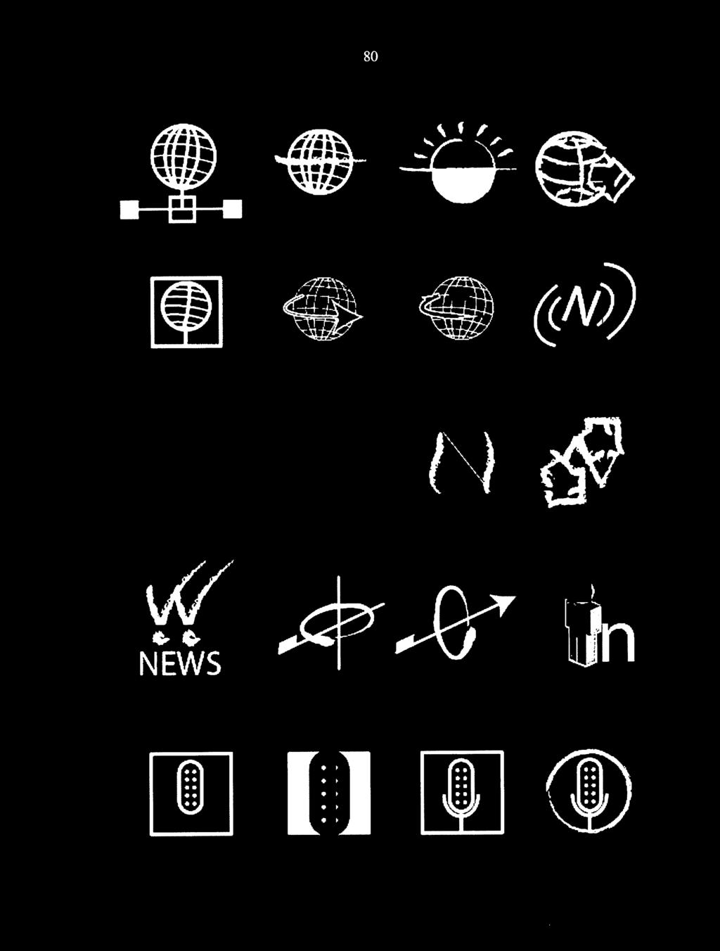
89 80 N... NIEWS.. '
Human-Computer Interaction: An Overview. CS2190 Spring 2010
 Human-Computer Interaction: An Overview CS2190 Spring 2010 There must be a problem because What is HCI? Human-Computer interface Where people meet or come together with machines or computer-based systems
Visual Design. Gestalt Principles Creating Organization and Structure Typography. Visual Design 1
 Visual Design Gestalt Principles Creating Organization and Structure Typography Visual Design 1 UI Visual Design Objectives 1. Information communication - Enforce desired relationships (and avoid undesired
Input part 3: Interaction Techniques
 Input part 3: Interaction Techniques Interaction techniques A method for carrying out a specific interactive task Example: enter a number in a range could use (simulated) slider (simulated) knob type in
Visual Design. Simplicity, Gestalt Principles, Organization/Structure
 Visual Design Simplicity, Gestalt Principles, Organization/Structure Many examples are from Universal Principles of Design, Lidwell, Holden, and Butler Why discuss visual design? You need to present the
Visual Design. Gestalt Principles Creating Organization and Structure Typography. UI Visual Design Objectives
 Gestalt Principles Creating Organization and Structure Typography 1 UI Objectives 1. Information communication - Enforce desired relationships (and avoid undesired relationships) 2. Aesthetics - well designed,
THINGS YOU NEED TO KNOW ABOUT USER DOCUMENTATION DOCUMENTATION BEST PRACTICES
 5 THINGS YOU NEED TO KNOW ABOUT USER DOCUMENTATION DOCUMENTATION BEST PRACTICES THIS E-BOOK IS DIVIDED INTO 5 PARTS: 1. WHY YOU NEED TO KNOW YOUR READER 2. A USER MANUAL OR A USER GUIDE WHAT S THE DIFFERENCE?
Heuristic Evaluation. An Analysis of The Toronto Public Library Website. By: Chris Dacol
 Heuristic Evaluation An Analysis of The Toronto Public Library Website By: Chris Dacol Global High-level Evaluation After evaluating the Toronto Public Library desktop website I have identified several
evision Review Project - Engagement Simon McLean, Head of Web & IT Support Information & Data Services.
 evision Review Project - Engagement Monitoring Simon McLean, Head of Web & IT Support Information & Data Services. What is Usability? Why Bother? Types of usability testing Usability Testing in evision
Based on the slides available at book.com. Graphical Design
 Graphical Design Graphic Design & User Interfaces Information oriented, systematic graphic design is the use of typography, symbols, color and other static and dynamic graphics to convey facts, concepts
STONELAW HIGH GRAPHIC
 GRAPHIC COMMUNICATION Technical Education THE A to Z of DTP Your knowledge of desktop publishing terminology will be expanded as you progress within the subject THE A to Z of DTP ALIGNMENT positions of
Cognitive Walkthrough Evaluation
 Columbia University Libraries / Information Services Digital Library Collections (Beta) Cognitive Walkthrough Evaluation by Michael Benowitz Pratt Institute, School of Library and Information Science Executive
Visual Representation from Semiology of Graphics by J. Bertin
 Visual Representation from Semiology of Graphics by J. Bertin From a communication perspective Communication is too often taken for granted when it should be taken to pieces. (Fiske 91) Two basic schools
User Interface Overview. What is Usability Engineering?
 User Interface Overview Jeff Offutt http://www.ise.gmu.edu/~offutt/ SWE 432 Design and Implementation of Software for the Web What is Usability Engineering? Requires knowledge of some psychology theory
INDEX UNIT 4 PPT SLIDES
 INDEX UNIT 4 PPT SLIDES S.NO. TOPIC 1. 2. Screen designing Screen planning and purpose arganizing screen elements 3. 4. screen navigation and flow Visually pleasing composition 5. 6. 7. 8. focus and emphasis
What is interaction design? What is Interaction Design? Example of bad and good design. Goals of interaction design
 What is interaction design? What is Interaction Design? Designing interactive products to support people in their everyday and working lives Sharp, Rogers and Preece (2002) The design of spaces for human
Mensch-Maschine-Interaktion 1. Chapter 7 (July 15, 2010, 9am-12pm): Implementing Interactive Systems
: Implementing Interactive Systems") Mensch-Maschine-Interaktion 1 Chapter 7 (July 15, 2010, 9am-12pm): Implementing Interactive Systems 1 Implementing Interactive Systems Designing Look-And-Feel Constraints Mapping Implementation Technologies
Mensch-Maschine-Interaktion 1 Chapter 7 (July 15, 2010, 9am-12pm): Implementing Interactive Systems 1 Implementing Interactive Systems Designing Look-And-Feel Constraints Mapping Implementation Technologies
Visual Perception. Visual contrast
 TEXTURE Visual Perception Our perception of the visual shape, size, color, and texture of things is affected by the optical environment in which we see them and the relationships we can discern between
Working with Health IT Systems is available under a Creative Commons Attribution-NonCommercial- ShareAlike 3.0 Unported license.
 Working with Health IT Systems is available under a Creative Commons Attribution-NonCommercial- ShareAlike 3.0 Unported license. Johns Hopkins University. Welcome to the Fundamentals of Health Workflow
Design Principles. The Four Basic Principles That Underlie Good Page Design
 Design Principles The Four Basic Principles That Underlie Good Page Design Some of the information presented in this video will appear on quizzes and exams. Please be sure to pay attention to key points
The Surface Plane. Sensory Design
 The Surface Plane Sensory Design The Surface Plane At the top of the five-plane model, we turn our attention to those aspects of the product our users will notice first: the sensory design. Here, content,
Visual Layout of Graph-Like Models
 Visual Layout of Graph-Like Models Tarek Sharbak MhdTarek.Sharbak@uantwerpen.be Abstract The modeling of complex software systems has been growing significantly in the last years, and it is proving to
Structure of Text. Creating Memory Aids through Typography
 Structure of Text Creating Memory Aids through Typography Edward Rushton MFA Donald Armel PhD Legibility Readability Definitions Legibility Legibility is dependent on the design of the typeface, the letterforms
InDesign CS4 is the sixth version of Adobe s flagship publishing tool,
 What InDesign Can Do for You InDesign CS4 is the sixth version of Adobe s flagship publishing tool, a product that came into its own with the third version (CS, which stands for Creative Suite). Widely
User Interface Design. Slides copyright 1996, 2001, 2005, 2009, 2014 by Roger S. Pressman. For non-profit educational use only
 Chapter 15 User Interface Design Slide Set to accompany Software Engineering: A Practitioner s Approach, 8/e by Roger S. Pressman and Bruce R. Maxim Slides copyright 1996, 2001, 2005, 2009, 2014 by Roger
Input: Interaction Techniques
 Input: Interaction Techniques Administration Questions about homework? 2 Interaction techniques A method for carrying out a specific interactive task Example: enter a number in a range could use (simulated)
HCI and Design SPRING 2016
 HCI and Design SPRING 2016 Topics for today Heuristic Evaluation 10 usability heuristics How to do heuristic evaluation Project planning and proposals Usability Testing Formal usability testing in a lab
Mega International Commercial bank (Canada)
") Mega International Commercial bank (Canada) Policy and Procedures for Clear Language and Presentation Est. Sep. 12, 2013 I. Purposes: The Mega ICB (C) distributes a limited range of retail banking services,
Mega International Commercial bank (Canada) Policy and Procedures for Clear Language and Presentation Est. Sep. 12, 2013 I. Purposes: The Mega ICB (C) distributes a limited range of retail banking services,
20 _. 14 _ Visual Identity. 03 _ Brand Message. 24 _ Brand Consistency 04 _. 10 _ Color Palette. 02 _ Our Mission. Our Logo. Our.
 brand guidelines 02 Our Mission 03 Brand Message 04 Our Logo 06 Construction & Clearspace 07 Using Our Logo 08 Logo Don ts 09 On Photographs 10 Color Palette 12 Primary Colors 13 Complimentary Colors 14
Graphical Screen Design
 1 Graphical Screen Design Grids are an essential tool for graphical design Important graphical design concepts include visual consistency visual relationships visual organization legibility and readability
Text and Lists Use Styles. What Are Styles?
 Creating Accessible Word Documents Using Microsoft Word 2003 Cassandra Tex, MBA Assistive Technology Specialist Student Disability Resource Center Humboldt State University Word documents are inherently
Interaction Design. Task Analysis & Modelling
 Interaction Design Task Analysis & Modelling This Lecture Conducting task analysis Constructing task models Understanding the shortcomings of task analysis Task Analysis for Interaction Design Find out
Human Error Taxonomy
 Human Error Taxonomy The Human Error Taxonomy (HET) provides a structure for requirement errors made during the software development process. The HET can be employed during software inspection to help
Usability and User Interfaces
 Usability and User Interfaces The Importance of User Interface Design A computer system is only as good as the interface it provides to its users. Functionality, easy navigation, elegant design, response
Game keystrokes or Calculates how fast and moves a cartoon Joystick movements how far to move a cartoon figure on screen figure on screen
 Computer Programming Computers can t do anything without being told what to do. To make the computer do something useful, you must give it instructions. You can give a computer instructions in two ways:
Site Design. SWE 432, Fall 2017 Design and Implementation of Software for the Web
 Site Design SWE 432, Fall 2017 Design and Implementation of Software for the Web Today How do you help users understand if it is possible to do what they d like to do? How do you help users find what they
Icons R.I.T SE 444. S. Ludi/R. Kuehl p. 1 R I T. Software Engineering
 Icons SE 444 S. Ludi/R. Kuehl p. 1 Introduction to Icons Human issues concerning icons Using icons in interaction design Technical issues concerning icons What is an icon? A small image representing an
What is interaction design?
 Chapter 1 What is interaction design? 1 Bad designs Elevator controls and labels on the bottom row all look the same, so it is easy to push a label by mistake instead of a control button People do not
Spontaneous Interaction using Mobile Phones and Short Text Messages
 Spontaneous Interaction using Mobile Phones and Short Text Messages Frank Siegemund Distributed Systems Group, Department of Computer Science, Swiss Federal Institute of Technology (ETH) Zurich, 8092 Zurich,
Introduction CHAPTER1. Strongly Recommend: Guidelines that, if not followed, could result in an unusable application.
 sg-midp20.book Page 1 Wednesday, May 14, 2003 1:27 PM CHAPTER1 Introduction MOBILE Information Device Profile (MIDP) defines the Java application environment for mobile information devices (MIDs), such
4. You should provide direct links to the areas of your site that you feel are most in demand.
 Chapter 2: Web Site Design Principles TRUE/FALSE 1. Almost every Web site has at least one flaw. T PTS: 1 REF: 49 2. Not only should you plan for a deliberate look and feel for your Web site, but you must
Interaction Design Guidelines and Rules
 Interaction Design Guidelines and Rules Department of Information Technology Uppsala university Design Design is the planning (process, decisions) that lays the basis for the making of every object or
This session will provide an overview of the research resources and strategies that can be used when conducting business research.
 Welcome! This session will provide an overview of the research resources and strategies that can be used when conducting business research. Many of these research tips will also be applicable to courses
Font Basics. Descender. Serif. With strokes on the extremities of the letters. T Script. Sans-Serif. No strokes on the end of the letters
 Font Basics Ascender Font Size d p x A X-height Cap height Counter The white space within letters Descender Bar A Serif With strokes on the extremities of the letters. T A Sans-Serif No strokes on the
OUTLINE. Advanced Technical Communication & Writing Skills. What is technical communication? Technical communication skills
 Advanced Technical Communication & Writing Skills What is technical communication? Technical communication skills Principles of technical writing Technical writing is interpreting Planning is crucial Technical
This quiz is closed book, closed notes. You have 80 minutes to complete it. Your name:
 6.831 User Interface Design & Implementation Fall 2004 Quiz 2 This quiz is closed book, closed notes. You have 80 minutes to complete it. Your name: 1. (4 points) Programmer convenience is one reason for
LOGO USE GUIDELINES BRAND GUIDELINES PUBLISHED ON FEBRUARY 17,
 LOGO USE GUIDELINES BRAND GUIDELINES PUBLISHED ON FEBRUARY 17, 2014 1 LOGO USE GUIDELINES LOGO USAGE GUIDELINES 13 LOGO USAGE GUIDELINES The Gardner-Webb logo is the centerpiece of the University's visual
What I learned from Assignment 0. This is the first HCI course for most of you. You need practice with core HCI and Design concepts.
 HCI and Design Today s Reading What I learned from Assignment 0 This is the first HCI course for most of you. You need practice with core HCI and Design concepts. Today: Understanding Users Why do we need
Unit 3. Design and the User Interface. Introduction to Multimedia Semester 1
 Unit 3 Design and the User Interface 2018-19 Semester 1 Unit Outline In this unit, we will learn Design Guidelines: Appearance Balanced Layout Movement White Space Unified Piece Metaphor Consistency Template
Web UI Dos and Don ts
 Web UI Dos and Don ts 1. A One Column Layout instead of multi-columns a. A one column layout gives you more control over your narrative. It guides your readers in a more predictable way from top to bottom.
ThinAir Server Platform White Paper June 2000
 ThinAir Server Platform White Paper June 2000 ThinAirApps, Inc. 1999, 2000. All Rights Reserved Copyright Copyright 1999, 2000 ThinAirApps, Inc. all rights reserved. Neither this publication nor any part
Chapter 3. Technology Adopted. 3.1 Introduction
 Chapter 3 Technology Adopted 3.1 Introduction The previous chapter described difference between the propose system and traditional methods and also about the existing similar systems. In this chapter,
Creating Icons for Leopard Buttons
 Creating Icons for Leopard Buttons Introduction Among the new features that C-Max 2.0 brings to the Ocelot and Leopard controllers, one of the more sophisticated ones allows the user to create icons that
> creative résumé. > specifications: save as: Resume_Lastname.ai dimensions: 8.5" x 11" or 11" x 8.5" mode: CMYK
 > creative résumé > objective(s): Students will create an eye-popping, visually impacting résumé using current trends in graphics, color and typography. > curricular focus: This lesson emphasizes the graphic
Brand Identity Standards
 Brand Identity Standards A strong organization identity is an important element in building a positive, globally recognized and respected brand. This identity standards guide will be your key resource
Network protocols and. network systems INTRODUCTION CHAPTER
 CHAPTER Network protocols and 2 network systems INTRODUCTION The technical area of telecommunications and networking is a mature area of engineering that has experienced significant contributions for more
ABCs of Direct Mail. Tips for More Effective Marketing Publications
 ABCs of Direct Mail Tips for More Effective Marketing Publications ABCs of Direct Mail 2 Introduction Direct mail is a growing business and everyone is eager and excited to jump on board. The problem is
6.001 Notes: Section 8.1
 6.001 Notes: Section 8.1 Slide 8.1.1 In this lecture we are going to introduce a new data type, specifically to deal with symbols. This may sound a bit odd, but if you step back, you may realize that everything
The Interaction. Using Norman s model. Donald Norman s model of interaction. Human error - slips and mistakes. Seven stages
 The Interaction Interaction models Ergonomics Interaction styles Donald Norman s model of interaction Seven stages execution user establishes the goal formulates intention specifies actions at interface
SIGGRAPH 2019 BRAND IDENTITY
 SIGGRAPH 2019 BRAND IDENTITY 1 OUR TAGLINE THRIVE CONNECTED SELF-SUSTAINING INFINITE Thrive communicates the idea that SIGGRAPH is never content with just meeting the status quo, and that it strives to
Welcome to Analytics. Welcome to Applause! Table of Contents:
 Welcome to Applause! Your success is our priority and we want to make sure Applause Analytics (ALX) provides you with actionable insight into what your users are thinking and saying about their experiences
User Experience. 10 Principles to Ensure a Great. on your Website. Issue 3. An Appnovation Digital ebook
 Issue 3 10 Principles to Ensure a Great User Experience on your Website An Appnovation Digital ebook 10 Principles to Ensure a Great User Experience on your Website www.appnovation.com P.1 Thank you for
cs465 principles of user interface design, implementation and evaluation
 cs465 principles of user interface design, implementation and evaluation Karrie G. Karahalios 24. September 2008 1. Heuristic Evaluation 2. Cognitive Walkthrough 3. Discuss Homework 3 4. Discuss Projects
Natural Viewing 3D Display
 We will introduce a new category of Collaboration Projects, which will highlight DoCoMo s joint research activities with universities and other companies. DoCoMo carries out R&D to build up mobile communication,
Natural Language Specification
 REQUIREMENTS ENGINEERING LECTURE 2017/2018 Dr. Jörg Dörr Natural Language Specification Most Requirements are Described in Natural Language Free Text (Prose) In Word In Excel (Tabular) In RM-Tools In Sys-ML
Cursor Design Considerations For the Pointer-based Television
 Hillcrest Labs Design Note Cursor Design Considerations For the Pointer-based Television Designing the cursor for a pointing-based television must consider factors that differ from the implementation of
User Experience Research Report: Heuristic Evaluation
 User Experience Research Report: Heuristic Evaluation SI 622 003 Group 3: Yunqi Hu, Diane Pham, Chieh-Lin Wu, Ruofan Zhang Date: March 31, 2016 Word Count: 2,610 Table of Contents Executive Summary...
12/19/2016. Types of Education Media. Print Media. Projected & non-projected media. Audio, Visual & Audiovisual. Media
 Types of Education Media Education Media There are different ways to classify media Print media, non-print media and electronic media Print Media They include: books, journals, magazines, newspapers, workbook,
User Interface Design. Slide Set to accompany. Software Engineering: A Practitioner s Approach, 7/e by Roger S. Pressman
 Chapter 11 User Interface Design Slide Set to accompany Software Engineering: A Practitioner s Approach, 7/e by Roger S. Pressman Slides copyright 1996, 2001, 2005, 2009 by Roger S. Pressman For non-profit
MiPhone Phone Usage Tracking
 MiPhone Phone Usage Tracking Team Scott Strong Designer Shane Miller Designer Sierra Anderson Designer Problem & Solution This project began as an effort to deter people from using their phones in class.
Web Content Accessibility Guidelines (WCAG) 2.0 Statement of Compliance
 2.0 Statement of Compliance") Web Content Accessibility Guidelines (WCAG) 2.0 Statement of Compliance Name of Product: SIRS Knowledge Source (Includes SIRS Issues Researcher, SIRS Government Reporter, and SIRS Renaissance) Product
Web Content Accessibility Guidelines (WCAG) 2.0 Statement of Compliance Name of Product: SIRS Knowledge Source (Includes SIRS Issues Researcher, SIRS Government Reporter, and SIRS Renaissance) Product
MAXQDA and Chapter 9 Coding Schemes
 MAXQDA and Chapter 9 Coding Schemes Chapter 9 discusses how the structures of coding schemes, alternate groupings are key to moving forward with analysis. The nature and structures of the coding scheme
Telecom Italia response. to the BEREC public consultation on
 Telecom Italia response to the BEREC public consultation on Guidelines on Net Neutrality and Transparency: Best practise and recommended approaches - BOR (11) 44 (2 November 2011) Telecom Italia response
Computer Science Honours 2011
 Computer Science Honours 2011 Vannevar Bush envisioned a device with touch screen, keyboard and scanner users could search for knowledge Digital computer not invented yet little l notice paid to ideas
Extreme programming XP 6
 Extreme programming XP 6 Planning Game 3 Planning Game Independent: Stories should be as independent as possible. When thinking of independence it is often easier to think of order independent. In other
Human-Computer Interaction: User Interface Principles. CSCE 315 Programming Studio Fall 2017 Project 3, Lecture 2
 Human-Computer Interaction: User Interface Principles CSCE 315 Programming Studio Fall 2017 Project 3, Lecture 2 Principles of User Interface Design No single definitive list of what makes a good interface
What is interaction design?
 Lecture 1 What is interaction design? Mohammad Smadi 1 Bad designs Elevator controls and labels on the bottom row all look the same, so it is easy to push a label by mistake instead of a control button
INFORMATION RETRIEVAL SYSTEM: CONCEPT AND SCOPE
 15 : CONCEPT AND SCOPE 15.1 INTRODUCTION Information is communicated or received knowledge concerning a particular fact or circumstance. Retrieval refers to searching through stored information to find
Interaction Style Categories. COSC 3461 User Interfaces. What is a Command-line Interface? Command-line Interfaces
 COSC User Interfaces Module 2 Interaction Styles What is a Command-line Interface? An interface where the user types commands in direct response to a prompt Examples Operating systems MS-DOS Unix Applications
The Deerbrook Web Style Guide
 The Deerbrook Web Style Guide Table of Contents Introduction Agency Dashboard 2 Customer Data Window 3 Creative Brief Page Structure Agency Dashboard 5 Customer Data Window 7 Typography Color Photography
User Interface Evaluation
 User Interface Evaluation Heuristic Evaluation Lecture #17 Agenda Evaluation through Expert Analysis Cognitive walkthrough Heuristic evaluation Model-based evaluation Cognitive dimension of notations 2
Making sense of chaos An evaluation of the current state of information architecture for the Web
 Making sense of chaos An evaluation of the current state of information architecture for the Web Anne de Ridder UW 521 Winter Seminar Series, February 3, 2012 What you ll hear about today A bit about me
Web Content Accessibility Guidelines 2.0 Checklist
 ProQuest Ebook Central Web Content Accessibility Guidelines 2.0 Checklist Last updated March 28, 2017 by HT Sun, Senior Product Manager, ht.sun@proquest.com Principle 1: Perceivable information and user
Visual Design + Gestalt Principles. Professor Michael Terry
 Visual Design + Gestalt Principles Professor Michael Terry For Friday A resume and business card design pair The visual design of the resume and business card should match Business card should have a front
Design is not just what it looks like and feels like. Design is how it works. Steve Jobs, Apple 2003
 BEST PRACTICES FOR DESIGNING A GRAPHICAL USER INTERFACE Table of Contents Introduction Collecting User Information Best Practice Guidelines GUI Design Checklist Where to Go for Help About QSI Additional
Based on the slides available at book.com. Graphical Design
 Graphical Design Graphic Design & User Interfaces Information oriented, systematic graphic design is the use of typography, symbols, color and other static and dynamic graphics to convey facts, concepts
Presented by Dr. Mariah Judd February 15, 2013
 Presented by Dr. Mariah Judd juddm@iupui.edu February 15, 2013 » What are the first things you notice? Color Pictures Title Figures Section titles Bullets.text » Brain storm ideas for what you want your
LWML Brand vision. Logo + Usage. Supporting Marks. File Types
 Br and Guidelines 2017 3 LWML Brand vision 4 9 14 19 Logo + Usage Typography + Color Palette Supporting Marks File Types LWML Brand Vision The goal of the LWML brand is to attract a broader audience and
Interaction Techniques. SWE 432, Fall 2016 Design and Implementation of Software for the Web
 Interaction Techniques SWE 432, Fall 2016 Design and Implementation of Software for the Web Today What principles guide the design of usable interaction techniques? How can interaction designs help support
The Interaction. Using Norman s model. Donald Norman s model of interaction. Human error - slips and mistakes
 The Interaction Interaction models Ergonomics Interaction styles Donald Norman s model of interaction Seven stages execution user establishes the goal formulates intention specifies actions at interface
A Step-by-Step Guide to Creating More Accessible Surveys
 A Step-by-Step Guide to Creating More Accessible Surveys In order to be considered accessible, surveys and forms must be designed to assist hearing- or sight-impaired users. If you re planning on sharing
ACCESSIBLE DESIGN THEMES
 WCAG GUIDELINES The Web Content Accessibility Guidelines (WCAG) has been made to guide the Web Content Developers and the Authoring Tools Developers in order to make the Web Content more accessible to
VPAT Web Content Accessibility Guidelines 2.0 level AA
 VPAT Web Content Accessibility Guidelines 2.0 level AA It is strongly recommended Technical Staff who are trained in Accessibility complete this form. The comments portion must be filled in to further
Blackboard Collaborate WCAG 2.0 Support Statement August 2016
 Blackboard Collaborate WCAG 2.0 Support Statement August 2016 Overview The following Support Statement provides an evaluation of accessibility support levels for Blackboard s Collaborate (Ultra) based
YuJa Enterprise Video Platform WCAG 2.0 Checklist
 Platform Accessibility YuJa Enterprise Video Platform WCAG 2.0 Checklist Updated: December 15, 2017 Introduction YuJa Corporation strives to create an equal and consistent media experience for all individuals.
Digital copying involves a process. Developing a raster detector system with the J array processing language SOFTWARE.
 Developing a raster detector system with the J array processing language by Jan Jacobs All digital copying aims to reproduce an original image as faithfully as possible under certain constraints. In the
Design Principles. Advanced Higher Graphic Presentation. Professional Graphic Presentations by kind permission of
 Design Principles Advanced Higher Graphic Presentation Professional Graphic Presentations by kind permission of Design Principles:- Balance Balance in Composition Three different types of balance :- *
Introduction to the Learning Environment v8.3.0
 Introduction to the Learning Environment v8.3.0 User Guide March, 008 Contents My Home Accessing your courses Navigating inside a course Lists Actions Entering Dates Showing and hiding advanced options
Good afternoon and thank you for being at the webinar on accessible PowerPoint presentations. This is Dr. Zayira Jordan web accessibility coordinator
 Good afternoon and thank you for being at the webinar on accessible PowerPoint presentations. This is Dr. Zayira Jordan web accessibility coordinator at Iowa State and this is the topic for this week s
Module1. Getting Started on the Wireless Web. The Goals of This Module
 Module1 Getting Started on the Wireless Web The Goals of This Module Introduce you to the Wireless Web and types of Wireless sites that exist today Download and install one or more phone simulators special
The Information Technology Program (ITS) Contents What is Information Technology?... 2
 Contents What is Information Technology?... 2") The Information Technology Program (ITS) Contents What is Information Technology?... 2 Program Objectives... 2 ITS Program Major... 3 Web Design & Development Sequence... 3 The Senior Sequence... 3 ITS
The Information Technology Program (ITS) Contents What is Information Technology?... 2 Program Objectives... 2 ITS Program Major... 3 Web Design & Development Sequence... 3 The Senior Sequence... 3 ITS