The Surface Plane. Sensory Design
|
|
|
- Calvin Lyons
- 5 years ago
- Views:
Transcription
1 The Surface Plane Sensory Design
2 The Surface Plane At the top of the five-plane model, we turn our attention to those aspects of the product our users will notice first: the sensory design. Here, content, functionality, and aesthetics come together to produce a finished design that pleases the senses while fulfilling all the goals of the other four planes.

3 Defining the Surface Moving up to the surface plane, we are now dealing with the sensory design and presentation of the logical arrangements that make up the skeleton of the product. For example, through attention to information design, we determine how we should group and arrange the information elements of the page; through attention to visual design, we determine how that arrangement should be presented visually.
4 Making Sense of the Senses Every experience we have not just with products and services, but with the world and with each other fundamentally comes to us through our senses. In the design process, this is the last stop on the way to delivering an experience to our users: determining how everything about our design will manifest to people s senses. Which of the five senses (vision, hearing, touch, smell, and taste) we can employ depends on the type of product we are designing.
5 Smell and Taste Except for food, fragrance, or scented products, smell and taste are rarely considerations for user experience designers. It s true that people sometimes develop strong associations with the smell of a product such as new car smell, which has proven so popular that it can be added as a fragrance long after the car has outstripped anyone s definition of new but these smells are typically the result of the choice of materials in the product s construction, not the decisions of experience designers.
6 Touch The touch experience of a physical product lies within the realm of industrial design. Industrial designers are concerned primarily with the user s physical engagement with a product. This entails elements of interface and interaction design the shape of a device (rounded? square?) the textures used (smooth? rough?) the materials employed (plastic? metal?)
7 Hearing Sound plays a role in the experience of many kinds of products. Think of all the different beeps and buzzes in a typical automobile and the messages they send: Your headlights are on. Your seat belt is unfastened. Your door is open, but you left your key in the ignition. Sound can be used not just to inform the user, but to imbue a product with a sense of personality.
8 Vision This is the area where user experience designers have the most sophistication, because visual design plays a role in virtually every kind of product there is.
9 Vision Initially, you might think visual design is a simple matter of aesthetics. Everybody has different taste, everybody does have a different sense of aesthetics, but that doesn t mean design decisions have to be based on what looks cool to everyone involved. Instead of evaluating visual design ideas solely in terms of what seems aesthetically pleasing, you should focus your attention on how well they work
10 Follow the Eye One simple way to evaluate the visual design of a product is to ask: Where does the eye go first? What element of the design initially draws the users attention? Are they drawn to something important to the product s strategic objectives? Or is the first object of their attention a distraction from their goals (or yours)?
11 Follow the Eye If your design is successful, the pattern the user s eye follows will have two important qualities: First, it follows a smooth flow. When people comment that a design is busy or cluttered, they re really reacting to the fact that the design doesn t lead them smoothly around the page. Instead, their eyes bounce back and forth among a variety of elements all clamoring for their attention. Second, it gives users a sort of guided tour of the possibilities available to them without overwhelming them with detail.
12 Contrast and Uniformity In visual design, the primary tool we use to draw the user s attention is contrast. A design without contrast is seen as a gray, featureless mass, causing the user s eyes to drift around without settling on anything in particular. Contrast is vital to drawing the user s attention to essential aspects of the interface, contrast helps the user understand the relationships between the navigational elements on the page, and contrast is the primary means of communicating conceptual groups in information design.

13 Contrast and Uniformity
 or draw their attention to a few key elements (near right, bottom).")
14 Contrast and Uniformity In a visually neutral layout (near right, top), nothing stands out. Contrast can be used to guide the user s eye around the page (far right, top) or draw their attention to a few key elements (near right, bottom). Overuse of contrast leads to a cluttered look (far right, bottom).
15 Contrast and Uniformity For this strategy to work, however, the difference has to be significant enough for the user to clearly tell that the design choice is intended to communicate something. When the design treatment of two elements is similar but not quite the same, users get confused. Why are those different? Are they supposed to be the same? Maybe it was just a mistake. Or am I supposed to notice something here?

16 Contrast and Uniformity Maintaining uniformity in your design is an important part of ensuring that your design communicates effectively without confusing or overwhelming your users. Uniformity comes into play in many different aspects of visual design.
17 Contrast and Uniformity Grid-based layout is one technique from print design that carries over effectively to the Web. This approach ensures uniformity of design through a master layout that is used as a template for creating layout variations. Not every layout will use every part of the grid in fact, most layouts will probably use only a few but every element s placement on the grid should be uniform and consistent.

18 Contrast and Uniformity However, because devices, screen sizes, and screen resolution can vary widely, applying grids to screenbased design isn t always as simple as it is in print design. It s easy to fall into the trap of adhering to a grid system or any standard intended to ensure uniformity even when it clearly isn t working anymore.

19 Contrast and Uniformity
20 Color Palettes and Typography Color can be one of the most effective ways to communicate a brand identity. Some brands are so closely associated with colors that it s difficult to think of the company without the color automatically coming to mind consider Coca-Cola, UPS, or Kodak. These companies have employed specific colors (red, brown, yellow) consistently over the years to create a stronger sense of their identities in the public s mind.

21 Color Palettes and Typography
22 Color Palettes and Typography That doesn t mean they use these colors to the exclusion of all others. The core brand colors are usually part of a broader color palette used in all of a company s materials. The colors in a company s standard palette are selected specifically for how well they work together, complementing each other without competing. A color palette should incorporate colors that lend themselves to a wide range of uses. In most cases, brighter or bolder colors can be used for the foreground of your design elements to which you want to draw attention. More muted colors are better used for background elements that don t need to jump off the page. Having a range of colors to choose from provides us with a toolkit for making effective design choices.

23 Orbitz has used a limited color palette (top) to differentiate features and functionality on the Web site (bottom).
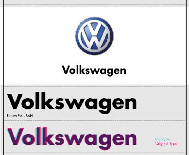
24 Color Palettes and Typography For some companies, typography the use of fonts or typefaces to create a particular visual style is so important to their brand identities that they have commissioned special typefaces to be produced specifically for their use. Organizations ranging from Apple to Volkswagen to the London Underground and even Martha Stewart have used custom typography to create a stronger sense of identity in their communications.


25 Color Palettes and Typography
26 Design Comps and Style Guides The most direct analog to the wireframe for the realm of visual design is the visual mock-up or design comp. Comp is short for composite, because that s exactly what it is: a visualization of the finished product built up from the components that have been chosen. The comp shows how all the pieces work together to form a cohesive whole; or, if they don t, it shows where the breakdown is happening and demonstrates constraints that any solution will have to account for.
27
28 Design Comps and Style Guides The definitive documentation of the design decisions we have made is the style guide. This compendium defines every aspect of the visual design, from the largest scale to the smallest. Global standards affecting every part of the product such as design grids, color palettes, typography standards, or logo treatment guidelines are usually the first things to go into a style guide.


29 The Elements Applied Designing the user experience is really little more than a very large collection of very small problems to be solved. The difference between a successful approach and one doomed to failure really comes down to two basic ideas:
30 The Elements Applied Understand what problem you re trying to solve. So you ve worked out that the big purple button on the home screen is a problem. Is it the bigness and the purpleness of the button that needs to change (surface)? Or is it that the button is in the wrong place on the page (skeleton) or that the function the button represents doesn t do what users expect (structure)?
31 The Elements Applied Understand the consequences of your solution to the problem. Remember that there s a potential ripple effect up and down through the elements from every decision you make. The navigation design that works so well in one part of your product might not quite meet the needs of another section of the architecture. The interaction design for the product selection wizard might well be an innovative approach, but will it meet the needs of your technophobic users?
32 The Elements Applied Only by having someone in your organization think about each of the five planes can you address all the considerations crucial to creating a successful user experience. How these responsibilities are distributed in your organization isn t as important as making sure all the elements of user experience are accounted for.
33 Asking the Right Questions Facing the tangle of small problems to be solved in designing the user experience can sometimes be disheartening. Occasionally a solution to one problem will force you to rethink other problems you thought you had already solved. The right approach is to ground each decision in your understanding of the underlying issues at play. The first question you should ask yourself (and the first question you should be able to answer) about any aspect of the user experience is: Why did you do it that way?
34 Asking the Right Questions Facing the tangle of small problems to be solved in designing the user experience can sometimes be disheartening. Occasionally a solution to one problem will force you to rethink other problems you thought you had already solved. The right approach is to ground each decision in your understanding of the underlying issues at play. The first question you should ask yourself (and the first question you should be able to answer) about any aspect of the user experience is: Why did you do it that way?
35 Gracias!
Presented by Dr. Mariah Judd February 15, 2013
 Presented by Dr. Mariah Judd juddm@iupui.edu February 15, 2013 » What are the first things you notice? Color Pictures Title Figures Section titles Bullets.text » Brain storm ideas for what you want your
Typographic hierarchy: How to prioritize information
 New York City College of Technology, CUNY Department of Communication Design Typographic Design III Instructor: Professor Childers pchilders1@mac.com Typographic hierarchy: How to prioritize information
PLANNING. CAEL Networked Worlds WEEK 2
 PLANNING CAEL5045 - Networked Worlds WEEK 2 WEEK 2 CHOOSING COLOURS CHOOSING FONTS COLLECTING CONTENT PLANNING STRUCTURE WIREFRAMES + MOCKUPS Every colour, including black and white, has implications for
Design Principles. The Four Basic Principles That Underlie Good Page Design
 Design Principles The Four Basic Principles That Underlie Good Page Design Some of the information presented in this video will appear on quizzes and exams. Please be sure to pay attention to key points
 User Interfaces Assignment 3: Heuristic Re-Design of Craigslist (English) Completed by Group 5 November 10, 2015 Phase 1: Analysis of Usability Issues Homepage Error 1: Overall the page is overwhelming
Branding Checklist. Before you start: Our Messaging, pages Our Language, pages 28-40
 Branding Checklist This handy checklist will help you avoid the most common brand pitfalls and align your work to our brand identity standards. If you d like to learn more about any of the elements of
The name of our class will be Yo. Type that in where it says Class Name. Don t hit the OK button yet.
 Mr G s Java Jive #2: Yo! Our First Program With this handout you ll write your first program, which we ll call Yo. Programs, Classes, and Objects, Oh My! People regularly refer to Java as a language that
Design Iteration: From Evidence to Design. Slides originally by: Dick Henneman
 Design Iteration: From Evidence to Design Slides originally by: Dick Henneman Foundations: MS-HCI @ Georgia Tech Context of use Context of development Analyze/ Evaluate Design/B uild Evidence-Based Design
Principles of Design. Alignment
 Principles of Design Alignment Essential Question: How does alignment affect layout design? Can you imagine how difficult it would be to find your car in a crowded parking lot if everyone ignored the parking
BRAND & LOGO GUIDELINES SOCKET MOBILE. - Logos - Social Media - Web
 BRAND & LOGO GUIDELINES - Logos - Social Media - Web SIMPLICITY IS THE ULTIMATE FORM OF SOPHISTICATION. 2 BRAND GUIDELINES THIS IS A GUIDE TO THE BASIC ELEMENTS THAT MAKE UP OUR BRAND. IT WILL LET YOU
Exemplar for Internal Achievement Standard. Technology Level 1
 Exemplar for Internal Achievement Standard Technology Level 1 This exemplar supports assessment against: Achievement Standard 91046 (B) Use design ideas to produce a conceptual design for an outcome to
Pushpay Simple Brand Guide. Volume 1.0
 ushpay Simple Brand Guide Volume 1.0 rimary Logo HORIZONTAL VERTICAL INFO The ushpay logo is the face of the brand. It is the one element that is used on all communication pieces and should always be implemented
Excel Basics Rice Digital Media Commons Guide Written for Microsoft Excel 2010 Windows Edition by Eric Miller
 Excel Basics Rice Digital Media Commons Guide Written for Microsoft Excel 2010 Windows Edition by Eric Miller Table of Contents Introduction!... 1 Part 1: Entering Data!... 2 1.a: Typing!... 2 1.b: Editing
InDesign. your. Resumé. a how-to guide for creating a professional resumé using InDesign
 InDesign your Resumé a how-to guide for creating a professional resumé using InDesign Table of Contents p4. Glossary p5. The Importance of Good Design p6. Setting up the Document p10. Creating a Grid p12.
Excel programmers develop two basic types of spreadsheets: spreadsheets
 Bonus Chapter 1 Creating Excel Applications for Others In This Chapter Developing spreadsheets for yourself and for other people Knowing what makes a good spreadsheet application Using guidelines for developing
1: Introduction to Object (1)
") 1: Introduction to Object (1) 김동원 2003.01.20 Overview (1) The progress of abstraction Smalltalk Class & Object Interface The hidden implementation Reusing the implementation Inheritance: Reusing the interface
1: Introduction to Object (1) 김동원 2003.01.20 Overview (1) The progress of abstraction Smalltalk Class & Object Interface The hidden implementation Reusing the implementation Inheritance: Reusing the interface
THE 18 POINT CHECKLIST TO BUILDING THE PERFECT LANDING PAGE
 THE 18 POINT CHECKLIST TO BUILDING THE PERFECT LANDING PAGE The 18 point checklist to building the Perfect landing page Landing pages come in all shapes and sizes. They re your metaphorical shop front
ONE K CREATIVE. tools for social impact storytelling: CREATING A CONSISTENT BRand
 ONE K CREATIVE tools for social impact storytelling: CREATING A CONSISTENT BRand key elements to define for brand consistency DEFINING THE BASIC ELEMENTS OF YOUR BRAND ALLOWS YOUR TEAM - STAFF, BOARD MEMBERS,
20 _. 14 _ Visual Identity. 03 _ Brand Message. 24 _ Brand Consistency 04 _. 10 _ Color Palette. 02 _ Our Mission. Our Logo. Our.
 brand guidelines 02 Our Mission 03 Brand Message 04 Our Logo 06 Construction & Clearspace 07 Using Our Logo 08 Logo Don ts 09 On Photographs 10 Color Palette 12 Primary Colors 13 Complimentary Colors 14
The 23 Point UX Design Checklist
 The 23 Point UX Design Checklist The 23 Point UX Design Checklist During the design process, some flaws in your product will go unnoticed. Those little (or sometimes big) things can do a lot to hurt the
A Crash Course in Typography: Principles for Combining Typefaces - noupe
 A Crash Course in Typography: Principles for Combining Typefaces Cameron Chapman When combining typefaces, there are a couple of important principles you ll need to keep in mind, namely contrast and mood.
Repetition is not just naturally consistent; it comes from intentional effort to unify all parts of a design.
 1 REPETITION Introduction The Principle of Repetition states, "Repeat some aspect of the design throughout the entire piece." The repetitive element may be a bold font, a thick rule (line), a certain bullet,
SCOTTISH SWIMMING Visual Identity Guidelines 05 February 2015
 SCOTTISH SWIMMING Visual Identity Guidelines 05 February 2015 SCOTTISH SWIMMING VISUAL IDENTITY GUIDELINES This guide is a tool designed to help us project the values and vision behind the Scottish Swimming
BRAND GUIDE L I N E S
 BRAND GUIDE LINES NETWORK OF COMMUNITY MINISTRIES SIMPLICITY IS THE ULTIMATE FORM OF SOPHISTICATION. Leonardo da Vinci 2 BRAND GUIDELINES THIS IS A GUIDE TO THE BASIC ELEMENTS THAT MAKE UP OUR BRAND. IT
ADDENDUM. PRINCIPLES OF DESIGN COURSE Topic YouTube link QR Code
 ADDENDUM PRINCIPLES OF DESIGN COURSE Topic YouTube link QR Code Topic 1 Introduction to Graphic Design https://youtu.be/pacrrojlvui This video discussed on essential skills of a graphic design and its
4. You should provide direct links to the areas of your site that you feel are most in demand.
 Chapter 2: Web Site Design Principles TRUE/FALSE 1. Almost every Web site has at least one flaw. T PTS: 1 REF: 49 2. Not only should you plan for a deliberate look and feel for your Web site, but you must
CRAP (Contrast, Repetition, Alignment, and Proximity) Graphic Design Principles
 Graphic Design Principles") CRAP (Contrast, Repetition, Alignment, and Proximity) Graphic Design Principles Once upon a time in a far away place called Media world There were five royal hero s across the land. So let us take a wonderful
CRAP (Contrast, Repetition, Alignment, and Proximity) Graphic Design Principles Once upon a time in a far away place called Media world There were five royal hero s across the land. So let us take a wonderful
10 TESTED LANDING PAGE ELEMENTS GUARANTEED TO IMPROVE CONVERSIONS
 10 TESTED LANDING PAGE ELEMENTS GUARANTEED TO IMPROVE CONVERSIONS CONTENTS 1. INTRODUCTION 2. WHAT IS A LANDING PAGE? 3. WHY IS A LANDING PAGE IMPORTANT? 5. THE 10 ESSENTIAL PAGE ELEMENTS 12. PUTTING IT
Animator Friendly Rigging Part 1
 Animator Friendly Rigging Part 1 Creating animation rigs which solve problems, are fun to use, and don t cause nervous breakdowns. - http://jasonschleifer.com/ - 1- CONTENTS I. INTRODUCTION... 4 What is
1.7 Limit of a Function
 1.7 Limit of a Function We will discuss the following in this section: 1. Limit Notation 2. Finding a it numerically 3. Right and Left Hand Limits 4. Infinite Limits Consider the following graph Notation:
How we look. Brand Guidelines version 1.1
 How we look. Brand Guidelines version 1.1 TOUCHTUNES Simplicity is the ultimate form of sophistication. Leonardo da Vinci 2 BRAND GUIDELINES This is a guide to the basic elements that make up our brand.
OCA Graphic Design: Core Concepts 1 Assignment 5 - Penguin Books Jane Braybrook Jane511794
 OCA Graphic Design: Core Concepts 1 Assignment 5 - Penguin Books Jane Braybrook Jane511794 Supporting Blog Post: https://jane511794.wordpress.com/category/assignments/assignment-5/ Critical Evaluation
Seema Sirpal Delhi University Computer Centre
 Getting Started on HTML & Web page Design Seema Sirpal Delhi University Computer Centre How to plan a web development project draft a design document convert text to HTML use Frontpage to create web pages
On the Web sun.com/aboutsun/comm_invest STAROFFICE 8 DRAW
 STAROFFICE 8 DRAW Graphics They say a picture is worth a thousand words. Pictures are often used along with our words for good reason. They help communicate our thoughts. They give extra information that
Software Compare and Contrast
 Microsoft Software Compare and Contrast Word Easy to navigate. Compatible with all PC computers. Very versatile. There are lots of templates that can be used to create flyers, calendars, resumes, etc.
Good enough to great: A quick guide for better data visualizations
 Good enough to great: A quick guide for better data visualizations Contents Charts...4 Color... 11 Size... 16 Text...20 Dashboard layout...24 Conclusion...30 Good enough to great In today s world, successful
2013 Association Marketing Benchmark Report
 2013 Association Email Marketing Benchmark Report Part I: Key Metrics 1 TABLE of CONTENTS About Informz.... 3 Introduction.... 4 Key Findings.... 5 Overall Association Metrics... 6 Results by Country of
IDENTITIES ARE THE BEGINNING OF EVERYTHING. THEY ARE HOW SOMETHING IS RECOGNIZED AND UNDERSTOOD. WHAT COULD BE BETTER THAN THAT?
 BRAND GUIDELINES IDENTITIES ARE THE BEGINNING OF EVERYTHING. THEY ARE HOW SOMETHING IS RECOGNIZED AND UNDERSTOOD. WHAT COULD BE BETTER THAN THAT? Paula Scher Paula Scher is an American graphic designer,
Strong signs your website needs a professional redesign
 Strong signs your website needs a professional redesign Think - when was the last time that your business website was updated? Better yet, when was the last time you looked at your website? When the Internet
Quick Reference Design Guide
 Presentation is everything. At one time or another, you have probably heard the phrase a book is judged by its cover. That s still true and probably even more so today because we live in a very distracted,
Accessible Documents & Presentations. By Amy Maes, DNOM
 Accessible Documents & Presentations By Amy Maes, DNOM 1 Overview Accessibility: What am I required to do? Disability Characteristics Creating an Accessible Word Document & PowerPoint Presentation v2010
The Art of Interface Design
 The Art of Interface Design Anne Morgan Spalter Brown University Adapted and by Rich Riesenfeld Inter-related Components of Interface Design Task analysis and user testing Software engineering Functional
> creative résumé. > specifications: save as: Resume_Lastname.ai dimensions: 8.5" x 11" or 11" x 8.5" mode: CMYK
 > creative résumé > objective(s): Students will create an eye-popping, visually impacting résumé using current trends in graphics, color and typography. > curricular focus: This lesson emphasizes the graphic
Visual Design. Simplicity, Gestalt Principles, Organization/Structure
 Visual Design Simplicity, Gestalt Principles, Organization/Structure Many examples are from Universal Principles of Design, Lidwell, Holden, and Butler Why discuss visual design? You need to present the
Web Design for Developers A Programmer s Guide to Design Tools and Techniques
 Extracted from: Web Design for Developers A Programmer s Guide to Design Tools and Techniques This PDF file contains pages extracted from Web Design for Developers, published by the Pragmatic Bookshelf.
John W. Jacobs Technology Center 450 Exton Square Parkway Exton, PA Introduction to
 John W. Jacobs Technology Center 450 Exton Square Parkway Exton, PA 19341 610.280.2666 ccljtc@ccls.org Introduction to Microsoft Access 2007 Introduction to Microsoft Access What is Microsoft Access? Access
The Best Event Marketing Plan. Ever.
 The Best Event Email Marketing Plan. Ever. Introduction: You ve created a kick-ass, awesome event at an amazing location with a beautiful event page - and all within budget! But now what? Your biggest
3.3 Web Graphics. 1. So why are graphics important?
 3.3 Web Graphics In today s module we are going to cover the art of creating graphics for your online campaigns. We will be creating graphics for Facebook & your Mailchimp Newsletter but you will be able
SIGGRAPH 2019 BRAND IDENTITY
 SIGGRAPH 2019 BRAND IDENTITY 1 OUR TAGLINE THRIVE CONNECTED SELF-SUSTAINING INFINITE Thrive communicates the idea that SIGGRAPH is never content with just meeting the status quo, and that it strives to
WEB DESIGN 8 PHASES OF THE DESIGN PROCESS. By da Creative Team
 WEB DESIGN 8 PHASES OF THE DESIGN PROCESS By da Creative Team 1. Project Definition 1.1. Project Summary 1.2. Goals 1.3. Target Audience 1.4. Message 1.5. Competition 1.6. Content Strategy 2. Project Scope
In this lesson: Line height, type size and line width are the three aspects of shaping a perfect paragraph. Lesson 2
 In this lesson: Line height, type size and line width are the three aspects of shaping a perfect paragraph. Lesson 2 The reader should be able to read the message of a text easily and comfortably. This
Outlook is easier to use than you might think; it also does a lot more than. Fundamental Features: How Did You Ever Do without Outlook?
 04 537598 Ch01.qxd 9/2/03 9:46 AM Page 11 Chapter 1 Fundamental Features: How Did You Ever Do without Outlook? In This Chapter Reading e-mail Answering e-mail Creating new e-mail Entering an appointment
Visual Design. Gestalt Principles Creating Organization and Structure Typography. Visual Design 1
 Visual Design Gestalt Principles Creating Organization and Structure Typography Visual Design 1 UI Visual Design Objectives 1. Information communication - Enforce desired relationships (and avoid undesired
Corporate Identity Guidelines
 Corporate Identity Guidelines CONTENTS 1.0 TRADEMARK Watco Companies Logo Logo Clear Space Logo Variations Project Logos Proper Logo Use 03 04 05 06 07 08 2.0 TYPOGRAPHY Type Family 3.0 COLOR Brand Color
Scenarios, Storyboards, Wireframes, Critique. Jon Kolko Professor, Austin Center for Design
 Scenarios, Storyboards, Wireframes, Critique Jon Kolko Professor, Austin Center for Design Scenarios Creating a written story that explains how a person will use a product, service, or system to achieve
3 Steps to a Great Website
 3 Steps to a Great Website How to Bring Your Brand and Site to Life Our clients choose Mission Minded as a partner for developing their web presence because of our expertise in bringing their brands to
COPYRIGHTED MATERIAL. An Introduction to Computers That Will Actually Help You in Life. Chapter 1. Memory: Not Exactly 0s and 1s. Memory Organization
 Chapter 1 An Introduction to Computers That Will Actually Help You in Life Memory: Not Exactly 0s and 1s Memory Organization A Very Simple Computer COPYRIGHTED MATERIAL 2 Chapter 1 An Introduction to Computers
Creating a new form with check boxes, drop-down list boxes, and text box fill-ins. Customizing each of the three form fields.
 In This Chapter Creating a new form with check boxes, drop-down list boxes, and text box fill-ins. Customizing each of the three form fields. Adding help text to any field to assist users as they fill
Interaction Design. Ruben Kruiper
 Interaction Design Ruben Kruiper What do you know? What do you think Interaction Design stands for? 2 What do you expect? Interaction Design will be: Awesome Okay Boring Myself I m not a big fan... This
PowerPoint Basics: Create a Photo Slide Show
 PowerPoint Basics: Create a Photo Slide Show P 570 / 1 Here s an Enjoyable Way to Learn How to Use Microsoft PowerPoint Microsoft PowerPoint is a program included with all versions of Microsoft Office.
Introduction... 3 Introduction... 4
 User Manual Contents Introduction... 3 Introduction... 4 Placing an Order... 5 Overview of the Order Sheet... 6 Ordering Items... 9 Customising your Orders... 11 Previewing and Submitting your Basket...
(Refer Slide Time: 06:01)
") Data Structures and Algorithms Dr. Naveen Garg Department of Computer Science and Engineering Indian Institute of Technology, Delhi Lecture 28 Applications of DFS Today we are going to be talking about
Data Structures and Algorithms Dr. Naveen Garg Department of Computer Science and Engineering Indian Institute of Technology, Delhi Lecture 28 Applications of DFS Today we are going to be talking about
Stop Scope Creep. Double Your Profit & Remove The Stress of Selling Websites
 Stop Scope Creep Double Your Profit & Remove The Stress of Selling Websites Why Do Projects Go Wrong? Imagine this: You ve agreed to do a specific project with a client. You start off well. But as the
Key questions to ask before commissioning any web designer to build your website.
 Key questions to ask before commissioning any web designer to build your website. KEY QUESTIONS TO ASK Before commissioning a web designer to build your website. As both an entrepreneur and business owner,
Using Image Content Correctly
 Using Image Content Correctly Image Is Everything ISSUE #2 An Understated Task One of the most significant elements of any website is its image content, and knowing how and where to use imagery, as well
Rapid Software Testing Guide to Making Good Bug Reports
 Rapid Software Testing Guide to Making Good Bug Reports By James Bach, Satisfice, Inc. v.1.0 Bug reporting is a very important part of testing. The bug report, whether oral or written, is the single most
Library Website Migration and Chat Functionality/Aesthetics Study February 2013
 Library Website Migration and Chat Functionality/Aesthetics Study February 2013 Summary of Study and Results Georgia State University is in the process of migrating its website from RedDot to WordPress
the NXT-G programming environment
 2 the NXT-G programming environment This chapter takes a close look at the NXT-G programming environment and presents a few simple programs. The NXT-G programming environment is fairly complex, with lots
Artificial Intelligence Prof. Deepak Khemani Department of Computer Science and Engineering Indian Institute of Technology, Madras
 Artificial Intelligence Prof. Deepak Khemani Department of Computer Science and Engineering Indian Institute of Technology, Madras (Refer Slide Time: 00:17) Lecture No - 10 Hill Climbing So, we were looking
2/1/2016. Discuss website usability essentials Explain principles of design Critique a website in terms of usability and design
 Due Tuesday, Feb. 9 upload to Blackboard Locate five HTML (not Flash) websites you believe exhibit good web design, usability and accessibility principles. Each website s critique is worth 10 points (50
Printing & Prepress Basics
 Brandi Stanley 18 May 2009 While art and design schools do an impressive job of teaching the importance of form, function, and how to use flashy Photoshop techniques, it's rare that designers have been
Visual Design. Gestalt Principles Creating Organization and Structure Typography. UI Visual Design Objectives
 Gestalt Principles Creating Organization and Structure Typography 1 UI Objectives 1. Information communication - Enforce desired relationships (and avoid undesired relationships) 2. Aesthetics - well designed,
Design Elements. Advanced Higher Graphic Presentation. Professional Graphic Presentations by kind permission of
 Design Elements Advanced Higher Graphic Presentation Professional Graphic Presentations by kind permission of Lines can Design Element:- Line Convey a mood or an emotion. Organise the design. Establish
Conrad Freeman Unit 6
 Graphics Assessment. First graphical product: The first product is a picture of the website for Doritos. This product is probably designed for teenagers and adults, and is not for younger audiences (probably
Creating Word Outlines from Compendium on a Mac
 Creating Word Outlines from Compendium on a Mac Using the Compendium Outline Template and Macro for Microsoft Word for Mac: Background and Tutorial Jeff Conklin & KC Burgess Yakemovic, CogNexus Institute
Digitizer Leapfrogging
 Digitizer Leapfrogging Leapfrogging lets you digitize objects that are larger than your digitizing arm. You start with one section of the object, then leapfrog around by creating leapfrog stations in both
An Introduction to Human Computer Interaction
 The contents of this Supporting Material document have been prepared from the Eight units of study texts for the course M150: Date, Computing and Information, produced by The Open University, UK. Copyright
Note 8: Visual Interface Design
 Computer Science and Software Engineering University of Wisconsin - Platteville Note 8: Visual Interface Design Yan Shi Lecture Notes for SE 3330 UW-Platteville Based on About Face 3: Chapter 14 Visual
every Website Packages
 every every Website Packages So you ve decided you need a new website.. Congratulations! It s a big step venturing into the rabbit hole of the interwebs and you don t want to take a wrong turn. We love
mobile friendly? Google s survey shows there are three key points to a mobile-friendly site:
 1. Is your site mobile friendly? Now more than ever before it is important for your website to be mobile-friendly. According to a July 2012 Google survey of the more than 1,000 smartphone users people
University of Hull Department of Computer Science C4DI Interfacing with Arduinos
 Introduction Welcome to our Arduino hardware sessions. University of Hull Department of Computer Science C4DI Interfacing with Arduinos Vsn. 1.0 Rob Miles 2014 Please follow the instructions carefully.
Principles of Design. Proximity & Alignment
 Principles of Design Proximity & Alignment The Purpose of Web Design The Purpose of Web Design 1. Create a clear visual hierarchy of contrast, so you can see at a glance what is important and what is
Page design and working with frames
 L E S S O N 2 Page design and working with frames Lesson objectives Suggested teaching time To a learn about designing web pages and creating framesets in your web, you will: 35-45 minutes a b c Discuss
Good Publication Design
 Good Publication Design The top ten tips for creating professional print documents How do I create a well-designed print publication? Good publication design is an art form. Attractively presenting written
Landing Page Optimization What is Split Testing?... 13
 Table of Contents Introduction... 4 Types of Landing Pages... 5 Elements of Successful Landing Pages... 8 Creating Stunning Landing Pages... 10 WordPress Themes & Plugins... 10 Templates & Systems... 11
Intro. Scheme Basics. scm> 5 5. scm>
 Intro Let s take some time to talk about LISP. It stands for LISt Processing a way of coding using only lists! It sounds pretty radical, and it is. There are lots of cool things to know about LISP; if
Scenarios, Storyboards, Wireframes, Critique. Jon Kolko Professor, Austin Center for Design
 Scenarios, Storyboards, Wireframes, Critique Jon Kolko Professor, Austin Center for Design Scenarios Creating a written story that explains how a person will use a product, service, or system to achieve
Chapter01.fm Page 1 Monday, August 23, :52 PM. Part I of Change. The Mechanics. of Change
 Chapter01.fm Page 1 Monday, August 23, 2004 1:52 PM Part I The Mechanics of Change The Mechanics of Change Chapter01.fm Page 2 Monday, August 23, 2004 1:52 PM Chapter01.fm Page 3 Monday, August 23, 2004
Heuristic Evaluation of Covalence
 Heuristic Evaluation of Covalence Evaluator #A: Selina Her Evaluator #B: Ben-han Sung Evaluator #C: Giordano Jacuzzi 1. Problem Covalence is a concept-mapping tool that links images, text, and ideas to
Word processing and spreadsheet applications are among the most
 In This Chapter Chapter 1 Starting Out with iwork 09 Leaving the past behind The iwork timesavers: Do it once, do it right, and reuse it Word processing and spreadsheet applications are among the most
Emission Profile Master
 Emission Profile Master Welcome to this guide that will help you understand and maximize your experience using the EPM (Emission Profile Master). The Iray render engine has support for what is known as
MAPLOGIC CORPORATION. GIS Software Solutions. Getting Started. With MapLogic Layout Manager
 MAPLOGIC CORPORATION GIS Software Solutions Getting Started With MapLogic Layout Manager Getting Started with MapLogic Layout Manager 2011 MapLogic Corporation All Rights Reserved 330 West Canton Ave.,
Basic Internet Skills
 The Internet might seem intimidating at first - a vast global communications network with billions of webpages. But in this lesson, we simplify and explain the basics about the Internet using a conversational
Final Project Report. Sharon O Boyle. George Mason University. ENGH 375, Section 001. May 12, 2014
 Final Project Report Sharon O Boyle George Mason University ENGH 375, Section 001 May 12, 2014 ENGH 375, Web Authoring, is a course that teaches the fundamentals of good website design. The class textbooks,
Our Brand THIS BOOK SERVES AS A GUIDE TO THE BASIC ELEMENTS THAT MAKE UP LERO. IT WILL HELP YOU TO GET TO KNOW US BETTER.
 Brand Assets & Guidelines 2015 Our Brand THIS BOOK SERVES AS A GUIDE TO THE BASIC ELEMENTS THAT MAKE UP LERO. IT WILL HELP YOU TO GET TO KNOW US BETTER. These guidelines have been designed to show our
4 KEY FACTORS FOR DATA QUALITY ON A DATA LAKE (OR: HOW TO AVOID THE DATA SWAMP) JOSH HERRITZ MIOSOFT CORPORATION MIOsoft Corporation.
 JOSH HERRITZ MIOSOFT CORPORATION MIOsoft Corporation.") 4 KEY FACTORS FOR DATA QUALITY ON A DATA LAKE (OR: HOW TO AVOID THE DATA SWAMP) JOSH HERRITZ MIOSOFT CORPORATION The trends in digital business promise that the future holds an unprecedented volume, variety,
4 KEY FACTORS FOR DATA QUALITY ON A DATA LAKE (OR: HOW TO AVOID THE DATA SWAMP) JOSH HERRITZ MIOSOFT CORPORATION The trends in digital business promise that the future holds an unprecedented volume, variety,
LeakDAS Version 4 The Complete Guide
 LeakDAS Version 4 The Complete Guide SECTION 4 LEAKDAS MOBILE Second Edition - 2014 Copyright InspectionLogic 2 Table of Contents CONNECTING LEAKDAS MOBILE TO AN ANALYZER VIA BLUETOOTH... 3 Bluetooth Devices...
How To Get Your Word Document. Ready For Your Editor
 How To Get Your Word Document Ready For Your Editor When your document is ready to send to your editor you ll want to have it set out to look as professional as possible. This isn t just to make it look
Elements of User Experience by Jesse James Garrett
 Elements of User Experience by Jesse James Garrett Experience design is the design of anything, independent of medium, or across media, with human experience as an explicit outcome, and human engagement
Brand-identity Guidelines
 Brand-identity Guidelines Kids and Tech Contents: Date: 1.0 2.0 2.1 3.0 4.0 5.0 Introduction (page 1) The Logo Design (page 3) The Logo Usage (page 6) Color Scheme (page 13) Typography (page 16) Contact