Understanding and Comparing Distributions. Chapter 4
|
|
|
- Betty Barrett
- 5 years ago
- Views:
Transcription

1 Understanding and Comparing Distributions Chapter 4
2 Objectives: Boxplot Calculate Outliers Comparing Distributions Timeplot
3 The Big Picture We can answer much more interesting questions about variables when we compare distributions for different groups. Below is a histogram of the Average Wind Speed for every day in 1989.
4 The Big Picture (cont.) The distribution is unimodal and skewed to the right. The high value may be an outlier Comparing distributions can be much more interesting than just describing a single distribution.
5 The Five-Number Summary The five-number summary of a distribution reports its median, quartiles, and extremes (maximum and minimum). Example: The five-number summary for for the daily wind speed is: Max 8.67 Q Median 1.90 Q Min 0.20
6 The Five-Number Summary Consists of the minimum value, Q 1, the median, Q 3, and the maximum value, listed in that order. Offers a reasonably complete description of the center and spread. Calculate on the TI-83/84 using 1-Var Stats. Used to construct the Boxplot. Example: Five-Number Summary 1: 20, 27, 34, 50, 86 2: 5, 10, 18.5, 29, 33
7 Daily Wind Speed: Making Boxplots A boxplot is a graphical display of the fivenumber summary. Boxplots are useful when comparing groups. Boxplots are particularly good at pointing out outliers.
 of the data.")
8 Boxplot A graph of the Five-Number Summary. Can be drawn either horizontally or vertically. The box represents the IQR (middle 50%) of the data. Show less detail than histograms or stemplots, they are best used for side-by-side comparison of more than one distribution.
9 Constructing a Boxplot 1. Draw a scale below the boxplot and label. 2. Draw a vertical line above the value of Q1, this forms the left end of the box. 3. Draw a vertical line above the value of Q3, this forms the right end of the box. 4. Draw a vertical line above the value of the median and complete the box. 5. Extend the left whisker to the minimum value. 6. Extend the right whisker to the maximum value. 7. Give a descriptive title to the graph.
10 Example Boxplot Data: 20, 25, 25, 27, 28, 31, 33, 34, 36, 37, 44, 50, 59, 85, 86 Use TI-83/84
11 What About Outliers? Recall that an outlier is an extremely small or extremely large data value when compared with the rest of the data values. What should we do about outliers? Try to understand them in the context of the data. Data error Special nature to the data
12 OUTLIERS If there are any clear outliers and you are reporting the mean and standard deviation, report them with the outliers present and with the outliers removed. The differences may be quite revealing. Note: The median and IQR are not likely to be affected by the outliers. The following procedure allows us to check whether a data value can be considered as an outlier.
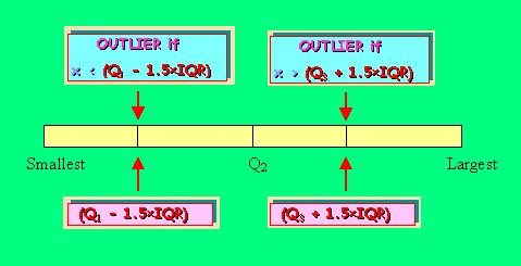
13 Testing for Outliers IQR is used to determine if extreme values are actually outliers An observation is an outlier if it falls more than 1.5 times IQR below Q 1 or above Q 3. To test for outliers 1. Construct an upper and lower fence 2. Upper Fence = Q 3 + (1.5)IQR 3. Lower Fence = Q 1 (1.5)IQR 4. If an observation falls outside the fences (ie. Greater than the upper fence or less than the lower fence) than it is an outlier.
14 More Outliers Far Outlier Data values farther than 3 IQRs from the quartiles.
15 Illustration of Outliers
16 Example 1: Odd number data set Data: 20, 25, 25, 27, 28, 31, 33, 34, 36, 37, 44, 50, 59, 85, 86 Find Q1, M, Q3, IQR and any outliers. Sort data Q 1 Q lower half median upper half IQR = = 23 Upper Fence = Q3 + (1.5)IQR = = 84.5 Lower Fence = Q1 (1.5)IQR = = -7.5 Outliers 85 and 86 (greater than the upper fence)
17 Example 2: Even number data set Data 5, 7, 10, 14, 18, 19, 25, 29, 31, 33 Find Q 1, M, Q 3, IQR and outliers. Q 1 Q lower half upper half median IQR = = 19 Upper Fence = 29 + (1.5)IQR = = 57.5 Lower Fence = 10 (1.5)IQR = = No Outliers
18 Your Turn: Calculate Outliers The data below represent the 20 countries with the largest number of total Olympic medals, including the United States, which had 101 medals for the 1996 Atlanta games. Determine whether the number of medals won by the United States is an outlier relative to the numbers for the other countries. Data values 63, 65, 50, 37, 35, 41, 25, 23, 27, 21, 17, 17, 20, 19, 22, 15, 15, 15, 15, 101.
19 Solution The IQR = = 22. Lower Fence, Q IQR = 17 (1.5 22) = -16. And Upper Fence, Q IQR = 39 + (1.5 22) = 72. Since, 101 > 72, the value of 101 is an outlier relative to the rest of the values in the data set. That is, the number of medals won by the United States is an outlier relative to the numbers won by the other 19 countries for the 1996 Atlanta Olympic Games.
 Pictorial")


20 Solution (cont.) Pictorial Representation for the OUTLIER of the Number of Olympic Medals Won by the United States in 1996 Atlanta Games. 101 OUTLIER Lower Fence -16 Upper Fence +72
21 Modified Boxplot Plots outliers as isolated points, where regular boxplots conceal outliers. From now on when we say boxplot, we mean modified boxplot. The modified boxplot is more useful than the boxplot. Constructing a Modified Boxplot. 1. Same as a boxplot with the exception of the whiskers. 2. Extend the left whisker to the minimum value if there are no outliers or to the last data value less than or equal to the lower fence if there are outliers. 3. Extend the right whisker to the maximum value if there are no outliers or to the last data value less than or equal to the upper fence. 4. Outliers (either low or high) are then represented by a dot or an asterisk.
22 Example: Constructing Boxplots 1. Draw a single vertical axis spanning the range of the data. Draw short horizontal lines at the lower and upper quartiles and at the median. Then connect them with vertical lines to form a box.
23 Example: Constructing Boxplots (cont.) 2. Erect fences around the main part of the data. The upper fence is 1.5 IQRs above the upper quartile. The lower fence is 1.5 IQRs below the lower quartile. Note: the fences only help with constructing the boxplot and should not appear in the final display.
24 Constructing Boxplots (cont.) 3. Use the fences to grow whiskers. Draw lines from the ends of the box up and down to the most extreme data values found within the fences. If a data value falls outside one of the fences, we do not connect it with a whisker.
25 Constructing Boxplots (cont.) 4. Add the outliers by displaying any data values beyond the fences with special symbols. We often use a different symbol for far outliers that are farther than 3 IQRs from the quartiles.
26 Example Modified Boxplot Construct Modified Boxplot using TI-83/84 Data: 20, 25, 25, 27, 28, 31, 33, 34, 36, 37, 44, 50, 59, 85, 86


27 Information That Can Be Obtained From a Box Plot Skewed Left Skewed Right
28 Information That Can Be Obtained From a Box Plot Looking at the Median If the median is close to the center of the box, the distribution of the data values will be approximately symmetrical. If the median is to the left of the center of the box, the distribution of the data values will be Skewed Right. If the median is to the right of the center of the box, the distribution of the data values will be Skewed Left.
29 Information That Can Be Obtained From a Box Plot Looking at the Length of the Whiskers If the whiskers are approximately the same length, the distribution of the data values will be approximately symmetrical. If the right whisker is longer than the left whisker, the distribution of the data values will be Skewed Right. If the left whisker is longer than the right whisker, the distribution of the data values will be Skewed Left.

30 Box Plot Displaying Skewed Right Distribution Skewed Right
31 Box Plot Displaying a Symmetrical Distribution

32 Box Plot Displaying a Skewed Left Distribution Skewed Left

33 Comparing Distributions Compare the histogram and boxplot for daily wind speeds: How does each display represent the distribution? The shape of a distribution is not always evident in a boxplot. Boxplots are particularly good at pointing out outliers.
34 Comparing Groups It is almost always more interesting to compare groups. With histograms, note the shapes, centers, and spreads of the two distributions. When using histograms to compare data sets make sure to use the same scale for both sets of data. What does this graphical display tell you?
35 Comparing Groups The shapes, centers, and spreads of these two distributions are strikingly different. During spring and summer (histogram on the left), the distribution is skewed to the right. A typical day has an average wind speed of only 1 to 2 mph. In the colder months (histogram on the right), the shape is less strongly skewed and more spread out. The typical wind speed is higher, and days with average wind speeds above 3 mph are not unusual.
36 Comparing Groups (cont.) Boxplots offer an ideal balance of information and simplicity, hiding the details while displaying the overall summary information. We often plot them side by side for groups or categories we wish to compare. What do these boxplots tell you?
37 Comparing Groups (cont.) By placing the boxplots side by side, we can easily see which groups have higher medians, which have the greater IQRs, where the middle 50% of the data is located in each group, and which have the greater overall range When the boxes are placed in order, we can get a general idea of patterns in both the centers and the spreads. Equally important, we can see past any outliers in making these comparisons because they ve been displayed separately.

38 Variation of the Stemplot Comparing Distributions Using a StemPlot Back to Back Stemplot Compare 2 related distributions. Common single stem with leaves on each side ordered out from the common stem.
39 Timeplots: Order, Please! For some data sets, we are interested in how the data behave over time. In these cases, we construct timeplots of the data.
40 Time Plots or Line Graphs What is a time plot? A time plot is a plot which displays data that are observed over a given period of time. Note: From a time plot, one can observe and analyze the behavior of the data over time.
41 Time Plot To make a Time Plot 1. Put time on the horizontal scale. 2. Put the variable being measured on the vertical scale. 3. Connect the data points by lines. Interpreting Time Plots look for 1. An overall pattern TREND (upward or downward) 2. Outliers strong deviations from the overall pattern or trend.
42 Time Plots -- Example Example: The following table gives the number of hurricanes for the years 1981 to Display the data with a time series graph.

43 Time Plots Example Continued Graph seem to display an upward trend over the years. Highest number was in 1990.
44 Time Plot May contain outliers, deviations from the pattern. Interpolation to predict a value from the pattern between known values. (within the data) Extrapolation to predict a value by extending the pattern into the future (outside the data). Dangerous, no guarantee the pattern continues.
45 Re-expressing Skewed Data to Improve Symmetry When the data are skewed it can be hard to summarize them simply with a center and spread, and hard to decide whether the most extreme values are outliers or just part of a stretched out tail. How can we say anything useful about such data? The secret is to re-express the data by applying a simple function (logarithms, square roots, and reciprocals) to each value.
46 One way to make a skewed distribution more symmetric is to re-express or transform the data by applying a simple function (e.g., logarithmic function). Note the change in skewness from the raw data (top) to the transformed data (right): Re-expressing Skewed Data to Improve Symmetry (cont.)

47 Avoid inconsistent scales, either within the display or when comparing two displays. Label clearly so a reader knows what the plot displays. When comparing two groups, be sure to compare them on the same scale. What Can Go Wrong?
48 Beware of outliers Be careful when comparing groups that have very different spreads. Consider these side-by-side boxplots of cotinine levels: Re-express... What Can Go Wrong? (cont.)
49 What have we learned? We ve learned the value of comparing data groups and looking for patterns among groups and over time. We ve seen that boxplots are very effective for comparing groups graphically. We ve experienced the value of identifying and investigating outliers. We ve graphed data that has been measured over time against a time axis and looked for long-term trends both by eye and with a data smoother.
50 Assignment Exercises pg : #6-8, 11, 12, 19-26, 28, 29, 31 Read Ch-6, pg
Chapter 5. Understanding and Comparing Distributions. Copyright 2012, 2008, 2005 Pearson Education, Inc.
 Chapter 5 Understanding and Comparing Distributions The Big Picture We can answer much more interesting questions about variables when we compare distributions for different groups. Below is a histogram
Chapter 5. Understanding and Comparing Distributions. Copyright 2010, 2007, 2004 Pearson Education, Inc.
 Chapter 5 Understanding and Comparing Distributions The Big Picture We can answer much more interesting questions about variables when we compare distributions for different groups. Below is a histogram
STA Module 2B Organizing Data and Comparing Distributions (Part II)
") STA 2023 Module 2B Organizing Data and Comparing Distributions (Part II) Learning Objectives Upon completing this module, you should be able to 1 Explain the purpose of a measure of center 2 Obtain and
STA 2023 Module 2B Organizing Data and Comparing Distributions (Part II) Learning Objectives Upon completing this module, you should be able to 1 Explain the purpose of a measure of center 2 Obtain and
STA Learning Objectives. Learning Objectives (cont.) Module 2B Organizing Data and Comparing Distributions (Part II)
 Module 2B Organizing Data and Comparing Distributions (Part II)") STA 2023 Module 2B Organizing Data and Comparing Distributions (Part II) Learning Objectives Upon completing this module, you should be able to 1 Explain the purpose of a measure of center 2 Obtain and
STA 2023 Module 2B Organizing Data and Comparing Distributions (Part II) Learning Objectives Upon completing this module, you should be able to 1 Explain the purpose of a measure of center 2 Obtain and
STA Rev. F Learning Objectives. Learning Objectives (Cont.) Module 3 Descriptive Measures
 Module 3 Descriptive Measures") STA 2023 Module 3 Descriptive Measures Learning Objectives Upon completing this module, you should be able to: 1. Explain the purpose of a measure of center. 2. Obtain and interpret the mean, median, and
STA 2023 Module 3 Descriptive Measures Learning Objectives Upon completing this module, you should be able to: 1. Explain the purpose of a measure of center. 2. Obtain and interpret the mean, median, and
Chapter 3 - Displaying and Summarizing Quantitative Data
 Chapter 3 - Displaying and Summarizing Quantitative Data 3.1 Graphs for Quantitative Data (LABEL GRAPHS) August 25, 2014 Histogram (p. 44) - Graph that uses bars to represent different frequencies or relative
Vocabulary. 5-number summary Rule. Area principle. Bar chart. Boxplot. Categorical data condition. Categorical variable.
 5-number summary 68-95-99.7 Rule Area principle Bar chart Bimodal Boxplot Case Categorical data Categorical variable Center Changing center and spread Conditional distribution Context Contingency table
Math 167 Pre-Statistics. Chapter 4 Summarizing Data Numerically Section 3 Boxplots
 Math 167 Pre-Statistics Chapter 4 Summarizing Data Numerically Section 3 Boxplots Objectives 1. Find quartiles of some data. 2. Find the interquartile range of some data. 3. Construct a boxplot to describe
Chapter 1. Looking at Data-Distribution
 Chapter 1. Looking at Data-Distribution Statistics is the scientific discipline that provides methods to draw right conclusions: 1)Collecting the data 2)Describing the data 3)Drawing the conclusions Raw
Table of Contents (As covered from textbook)
") Table of Contents (As covered from textbook) Ch 1 Data and Decisions Ch 2 Displaying and Describing Categorical Data Ch 3 Displaying and Describing Quantitative Data Ch 4 Correlation and Linear Regression
Table of Contents (As covered from textbook) Ch 1 Data and Decisions Ch 2 Displaying and Describing Categorical Data Ch 3 Displaying and Describing Quantitative Data Ch 4 Correlation and Linear Regression
Math 120 Introduction to Statistics Mr. Toner s Lecture Notes 3.1 Measures of Central Tendency
 Math 1 Introduction to Statistics Mr. Toner s Lecture Notes 3.1 Measures of Central Tendency lowest value + highest value midrange The word average: is very ambiguous and can actually refer to the mean,
STA 570 Spring Lecture 5 Tuesday, Feb 1
 STA 570 Spring 2011 Lecture 5 Tuesday, Feb 1 Descriptive Statistics Summarizing Univariate Data o Standard Deviation, Empirical Rule, IQR o Boxplots Summarizing Bivariate Data o Contingency Tables o Row
Name Date Types of Graphs and Creating Graphs Notes
 Name Date Types of Graphs and Creating Graphs Notes Graphs are helpful visual representations of data. Different graphs display data in different ways. Some graphs show individual data, but many do not.
No. of blue jelly beans No. of bags
 Math 167 Ch5 Review 1 (c) Janice Epstein CHAPTER 5 EXPLORING DATA DISTRIBUTIONS A sample of jelly bean bags is chosen and the number of blue jelly beans in each bag is counted. The results are shown in
To calculate the arithmetic mean, sum all the values and divide by n (equivalently, multiple 1/n): 1 n. = 29 years.
: 1 n. = 29 years.") 3: Summary Statistics Notation Consider these 10 ages (in years): 1 4 5 11 30 50 8 7 4 5 The symbol n represents the sample size (n = 10). The capital letter X denotes the variable. x i represents the
3: Summary Statistics Notation Consider these 10 ages (in years): 1 4 5 11 30 50 8 7 4 5 The symbol n represents the sample size (n = 10). The capital letter X denotes the variable. x i represents the
Chapter 6: DESCRIPTIVE STATISTICS
 Chapter 6: DESCRIPTIVE STATISTICS Random Sampling Numerical Summaries Stem-n-Leaf plots Histograms, and Box plots Time Sequence Plots Normal Probability Plots Sections 6-1 to 6-5, and 6-7 Random Sampling
Chapter 2. Descriptive Statistics: Organizing, Displaying and Summarizing Data
 Chapter 2 Descriptive Statistics: Organizing, Displaying and Summarizing Data Objectives Student should be able to Organize data Tabulate data into frequency/relative frequency tables Display data graphically
MATH& 146 Lesson 10. Section 1.6 Graphing Numerical Data
 MATH& 146 Lesson 10 Section 1.6 Graphing Numerical Data 1 Graphs of Numerical Data One major reason for constructing a graph of numerical data is to display its distribution, or the pattern of variability
Boxplots. Lecture 17 Section Robb T. Koether. Hampden-Sydney College. Wed, Feb 10, 2010
 Boxplots Lecture 17 Section 5.3.3 Robb T. Koether Hampden-Sydney College Wed, Feb 10, 2010 Robb T. Koether (Hampden-Sydney College) Boxplots Wed, Feb 10, 2010 1 / 34 Outline 1 Boxplots TI-83 Boxplots 2
2.1 Objectives. Math Chapter 2. Chapter 2. Variable. Categorical Variable EXPLORING DATA WITH GRAPHS AND NUMERICAL SUMMARIES
 EXPLORING DATA WITH GRAPHS AND NUMERICAL SUMMARIES Chapter 2 2.1 Objectives 2.1 What Are the Types of Data? www.managementscientist.org 1. Know the definitions of a. Variable b. Categorical versus quantitative
Averages and Variation
 Averages and Variation 3 Copyright Cengage Learning. All rights reserved. 3.1-1 Section 3.1 Measures of Central Tendency: Mode, Median, and Mean Copyright Cengage Learning. All rights reserved. 3.1-2 Focus
CHAPTER 3: Data Description
 CHAPTER 3: Data Description You ve tabulated and made pretty pictures. Now what numbers do you use to summarize your data? Ch3: Data Description Santorico Page 68 You ll find a link on our website to a
STP 226 ELEMENTARY STATISTICS NOTES PART 2 - DESCRIPTIVE STATISTICS CHAPTER 3 DESCRIPTIVE MEASURES
 STP 6 ELEMENTARY STATISTICS NOTES PART - DESCRIPTIVE STATISTICS CHAPTER 3 DESCRIPTIVE MEASURES Chapter covered organizing data into tables, and summarizing data with graphical displays. We will now use
TMTH 3360 NOTES ON COMMON GRAPHS AND CHARTS
 To Describe Data, consider: Symmetry Skewness TMTH 3360 NOTES ON COMMON GRAPHS AND CHARTS Unimodal or bimodal or uniform Extreme values Range of Values and mid-range Most frequently occurring values In
AND NUMERICAL SUMMARIES. Chapter 2
 EXPLORING DATA WITH GRAPHS AND NUMERICAL SUMMARIES Chapter 2 2.1 What Are the Types of Data? 2.1 Objectives www.managementscientist.org 1. Know the definitions of a. Variable b. Categorical versus quantitative
Section 1.2. Displaying Quantitative Data with Graphs. Mrs. Daniel AP Stats 8/22/2013. Dotplots. How to Make a Dotplot. Mrs. Daniel AP Statistics
 Section. Displaying Quantitative Data with Graphs Mrs. Daniel AP Statistics Section. Displaying Quantitative Data with Graphs After this section, you should be able to CONSTRUCT and INTERPRET dotplots,
Statistical Methods. Instructor: Lingsong Zhang. Any questions, ask me during the office hour, or me, I will answer promptly.
 Statistical Methods Instructor: Lingsong Zhang 1 Issues before Class Statistical Methods Lingsong Zhang Office: Math 544 Email: lingsong@purdue.edu Phone: 765-494-7913 Office Hour: Monday 1:00 pm - 2:00
CHAPTER 2 DESCRIPTIVE STATISTICS
 CHAPTER 2 DESCRIPTIVE STATISTICS 1. Stem-and-Leaf Graphs, Line Graphs, and Bar Graphs The distribution of data is how the data is spread or distributed over the range of the data values. This is one of
Unit I Supplement OpenIntro Statistics 3rd ed., Ch. 1
 Unit I Supplement OpenIntro Statistics 3rd ed., Ch. 1 KEY SKILLS: Organize a data set into a frequency distribution. Construct a histogram to summarize a data set. Compute the percentile for a particular
Lecture Notes 3: Data summarization
 Lecture Notes 3: Data summarization Highlights: Average Median Quartiles 5-number summary (and relation to boxplots) Outliers Range & IQR Variance and standard deviation Determining shape using mean &
UNIT 1A EXPLORING UNIVARIATE DATA
 A.P. STATISTICS E. Villarreal Lincoln HS Math Department UNIT 1A EXPLORING UNIVARIATE DATA LESSON 1: TYPES OF DATA Here is a list of important terms that we must understand as we begin our study of statistics
Prepare a stem-and-leaf graph for the following data. In your final display, you should arrange the leaves for each stem in increasing order.
 Chapter 2 2.1 Descriptive Statistics A stem-and-leaf graph, also called a stemplot, allows for a nice overview of quantitative data without losing information on individual observations. It can be a good
appstats6.notebook September 27, 2016
 Chapter 6 The Standard Deviation as a Ruler and the Normal Model Objectives: 1.Students will calculate and interpret z scores. 2.Students will compare/contrast values from different distributions using
Chapter 2 Modeling Distributions of Data
 Chapter 2 Modeling Distributions of Data Section 2.1 Describing Location in a Distribution Describing Location in a Distribution Learning Objectives After this section, you should be able to: FIND and
DAY 52 BOX-AND-WHISKER
 DAY 52 BOX-AND-WHISKER VOCABULARY The Median is the middle number of a set of data when the numbers are arranged in numerical order. The Range of a set of data is the difference between the highest and
Section 6.3: Measures of Position
 Section 6.3: Measures of Position Measures of position are numbers showing the location of data values relative to the other values within a data set. They can be used to compare values from different
1.3 Graphical Summaries of Data
 Arkansas Tech University MATH 3513: Applied Statistics I Dr. Marcel B. Finan 1.3 Graphical Summaries of Data In the previous section we discussed numerical summaries of either a sample or a data. In this
The main issue is that the mean and standard deviations are not accurate and should not be used in the analysis. Then what statistics should we use?
 Chapter 4 Analyzing Skewed Quantitative Data Introduction: In chapter 3, we focused on analyzing bell shaped (normal) data, but many data sets are not bell shaped. How do we analyze quantitative data when
CHAPTER 1. Introduction. Statistics: Statistics is the science of collecting, organizing, analyzing, presenting and interpreting data.
 1 CHAPTER 1 Introduction Statistics: Statistics is the science of collecting, organizing, analyzing, presenting and interpreting data. Variable: Any characteristic of a person or thing that can be expressed
Name: Date: Period: Chapter 2. Section 1: Describing Location in a Distribution
 Name: Date: Period: Chapter 2 Section 1: Describing Location in a Distribution Suppose you earned an 86 on a statistics quiz. The question is: should you be satisfied with this score? What if it is the
Measures of Position
 Measures of Position In this section, we will learn to use fractiles. Fractiles are numbers that partition, or divide, an ordered data set into equal parts (each part has the same number of data entries).
Chapter 2 Describing, Exploring, and Comparing Data
 Slide 1 Chapter 2 Describing, Exploring, and Comparing Data Slide 2 2-1 Overview 2-2 Frequency Distributions 2-3 Visualizing Data 2-4 Measures of Center 2-5 Measures of Variation 2-6 Measures of Relative
15 Wyner Statistics Fall 2013
 15 Wyner Statistics Fall 2013 CHAPTER THREE: CENTRAL TENDENCY AND VARIATION Summary, Terms, and Objectives The two most important aspects of a numerical data set are its central tendencies and its variation.
Numerical Summaries of Data Section 14.3
 MATH 11008: Numerical Summaries of Data Section 14.3 MEAN mean: The mean (or average) of a set of numbers is computed by determining the sum of all the numbers and dividing by the total number of observations.
Exploratory Data Analysis
 Chapter 10 Exploratory Data Analysis Definition of Exploratory Data Analysis (page 410) Definition 12.1. Exploratory data analysis (EDA) is a subfield of applied statistics that is concerned with the investigation
CHAPTER 2: DESCRIPTIVE STATISTICS Lecture Notes for Introductory Statistics 1. Daphne Skipper, Augusta University (2016)
") CHAPTER 2: DESCRIPTIVE STATISTICS Lecture Notes for Introductory Statistics 1 Daphne Skipper, Augusta University (2016) 1. Stem-and-Leaf Graphs, Line Graphs, and Bar Graphs The distribution of data is
CHAPTER 2: DESCRIPTIVE STATISTICS Lecture Notes for Introductory Statistics 1 Daphne Skipper, Augusta University (2016) 1. Stem-and-Leaf Graphs, Line Graphs, and Bar Graphs The distribution of data is
Chapter 6: Comparing Two Means Section 6.1: Comparing Two Groups Quantitative Response
 Stat 300: Intro to Probability & Statistics Textbook: Introduction to Statistical Investigations Name: American River College Chapter 6: Comparing Two Means Section 6.1: Comparing Two Groups Quantitative
AP Statistics Summer Assignment:
 AP Statistics Summer Assignment: Read the following and use the information to help answer your summer assignment questions. You will be responsible for knowing all of the information contained in this
NAME: DIRECTIONS FOR THE ROUGH DRAFT OF THE BOX-AND WHISKER PLOT
 NAME: DIRECTIONS FOR THE ROUGH DRAFT OF THE BOX-AND WHISKER PLOT 1.) Put the numbers in numerical order from the least to the greatest on the line segments. 2.) Find the median. Since the data set has
Name: Stat 300: Intro to Probability & Statistics Textbook: Introduction to Statistical Investigations
 Stat 300: Intro to Probability & Statistics Textbook: Introduction to Statistical Investigations Name: Chapter P: Preliminaries Section P.2: Exploring Data Example 1: Think About It! What will it look
Density Curve (p52) Density curve is a curve that - is always on or above the horizontal axis.
 Density curve is a curve that - is always on or above the horizontal axis.") 1.3 Density curves p50 Some times the overall pattern of a large number of observations is so regular that we can describe it by a smooth curve. It is easier to work with a smooth curve, because the histogram
1.3 Density curves p50 Some times the overall pattern of a large number of observations is so regular that we can describe it by a smooth curve. It is easier to work with a smooth curve, because the histogram
Univariate Statistics Summary
 Further Maths Univariate Statistics Summary Types of Data Data can be classified as categorical or numerical. Categorical data are observations or records that are arranged according to category. For example:
Measures of Position. 1. Determine which student did better
 Measures of Position z-score (standard score) = number of standard deviations that a given value is above or below the mean (Round z to two decimal places) Sample z -score x x z = s Population z - score
STA Module 4 The Normal Distribution
 STA 2023 Module 4 The Normal Distribution Learning Objectives Upon completing this module, you should be able to 1. Explain what it means for a variable to be normally distributed or approximately normally
STA /25/12. Module 4 The Normal Distribution. Learning Objectives. Let s Look at Some Examples of Normal Curves
 STA 2023 Module 4 The Normal Distribution Learning Objectives Upon completing this module, you should be able to 1. Explain what it means for a variable to be normally distributed or approximately normally
SLStats.notebook. January 12, Statistics:
 Statistics: 1 2 3 Ways to display data: 4 generic arithmetic mean sample 14A: Opener, #3,4 (Vocabulary, histograms, frequency tables, stem and leaf) 14B.1: #3,5,8,9,11,12,14,15,16 (Mean, median, mode,
Descriptive Statistics
 Chapter 2 Descriptive Statistics 2.1 Descriptive Statistics 1 2.1.1 Student Learning Objectives By the end of this chapter, the student should be able to: Display data graphically and interpret graphs:
Box Plots. OpenStax College
 Connexions module: m46920 1 Box Plots OpenStax College This work is produced by The Connexions Project and licensed under the Creative Commons Attribution License 3.0 Box plots (also called box-and-whisker
M7D1.a: Formulate questions and collect data from a census of at least 30 objects and from samples of varying sizes.
 M7D1.a: Formulate questions and collect data from a census of at least 30 objects and from samples of varying sizes. Population: Census: Biased: Sample: The entire group of objects or individuals considered
Sections 2.3 and 2.4
 Sections 2.3 and 2.4 Shiwen Shen Department of Statistics University of South Carolina Elementary Statistics for the Biological and Life Sciences (STAT 205) 2 / 25 Descriptive statistics For continuous
Lecture 6: Chapter 6 Summary
 1 Lecture 6: Chapter 6 Summary Z-score: Is the distance of each data value from the mean in standard deviation Standardizes data values Standardization changes the mean and the standard deviation: o Z
Your Name: Section: 2. To develop an understanding of the standard deviation as a measure of spread.
 Your Name: Section: 36-201 INTRODUCTION TO STATISTICAL REASONING Computer Lab #3 Interpreting the Standard Deviation and Exploring Transformations Objectives: 1. To review stem-and-leaf plots and their
3 Graphical Displays of Data
 3 Graphical Displays of Data Reading: SW Chapter 2, Sections 1-6 Summarizing and Displaying Qualitative Data The data below are from a study of thyroid cancer, using NMTR data. The investigators looked
Descriptive Statistics: Box Plot
 Connexions module: m16296 1 Descriptive Statistics: Box Plot Susan Dean Barbara Illowsky, Ph.D. This work is produced by The Connexions Project and licensed under the Creative Commons Attribution License
Middle Years Data Analysis Display Methods
 Middle Years Data Analysis Display Methods Double Bar Graph A double bar graph is an extension of a single bar graph. Any bar graph involves categories and counts of the number of people or things (frequency)
Chapter 3 Understanding and Comparing Distributions
 Chapter 3 Understanding and Comparing Distributions In this chapter, we will meet a new statistics plot based on numerical summaries, a plot to track the changes in a data set through time, and ways to
CHAPTER 2: SAMPLING AND DATA
 CHAPTER 2: SAMPLING AND DATA This presentation is based on material and graphs from Open Stax and is copyrighted by Open Stax and Georgia Highlands College. OUTLINE 2.1 Stem-and-Leaf Graphs (Stemplots),
Mean,Median, Mode Teacher Twins 2015
 Mean,Median, Mode Teacher Twins 2015 Warm Up How can you change the non-statistical question below to make it a statistical question? How many pets do you have? Possible answer: What is your favorite type
Chapter 3: Data Description - Part 3. Homework: Exercises 1-21 odd, odd, odd, 107, 109, 118, 119, 120, odd
 Chapter 3: Data Description - Part 3 Read: Sections 1 through 5 pp 92-149 Work the following text examples: Section 3.2, 3-1 through 3-17 Section 3.3, 3-22 through 3.28, 3-42 through 3.82 Section 3.4,
Chapter 2: Descriptive Statistics
 Chapter 2: Descriptive Statistics Student Learning Outcomes By the end of this chapter, you should be able to: Display data graphically and interpret graphs: stemplots, histograms and boxplots. Recognize,
Measures of Dispersion
 Measures of Dispersion 6-3 I Will... Find measures of dispersion of sets of data. Find standard deviation and analyze normal distribution. Day 1: Dispersion Vocabulary Measures of Variation (Dispersion
Measures of Central Tendency. A measure of central tendency is a value used to represent the typical or average value in a data set.
 Measures of Central Tendency A measure of central tendency is a value used to represent the typical or average value in a data set. The Mean the sum of all data values divided by the number of values in
Acquisition Description Exploration Examination Understanding what data is collected. Characterizing properties of data.
 Summary Statistics Acquisition Description Exploration Examination what data is collected Characterizing properties of data. Exploring the data distribution(s). Identifying data quality problems. Selecting
3 Graphical Displays of Data
 3 Graphical Displays of Data Reading: SW Chapter 2, Sections 1-6 Summarizing and Displaying Qualitative Data The data below are from a study of thyroid cancer, using NMTR data. The investigators looked
VCEasy VISUAL FURTHER MATHS. Overview
 VCEasy VISUAL FURTHER MATHS Overview This booklet is a visual overview of the knowledge required for the VCE Year 12 Further Maths examination.! This booklet does not replace any existing resources that
Stat 428 Autumn 2006 Homework 2 Solutions
 Section 6.3 (5, 8) 6.3.5 Here is the Minitab output for the service time data set. Descriptive Statistics: Service Times Service Times 0 69.35 1.24 67.88 17.59 28.00 61.00 66.00 Variable Q3 Maximum Service
AP Statistics Prerequisite Packet
 Types of Data Quantitative (or measurement) Data These are data that take on numerical values that actually represent a measurement such as size, weight, how many, how long, score on a test, etc. For these
a. divided by the. 1) Always round!! a) Even if class width comes out to a, go up one.
 Always round!! a) Even if class width comes out to a, go up one.") Probability and Statistics Chapter 2 Notes I Section 2-1 A Steps to Constructing Frequency Distributions 1 Determine number of (may be given to you) a Should be between and classes 2 Find the Range a The
Probability and Statistics Chapter 2 Notes I Section 2-1 A Steps to Constructing Frequency Distributions 1 Determine number of (may be given to you) a Should be between and classes 2 Find the Range a The
Section 9: One Variable Statistics
 The following Mathematics Florida Standards will be covered in this section: MAFS.912.S-ID.1.1 MAFS.912.S-ID.1.2 MAFS.912.S-ID.1.3 Represent data with plots on the real number line (dot plots, histograms,
Lecture 3 Questions that we should be able to answer by the end of this lecture:
 Lecture 3 Questions that we should be able to answer by the end of this lecture: Which is the better exam score? 67 on an exam with mean 50 and SD 10 or 62 on an exam with mean 40 and SD 12 Is it fair
Chapter 2 Exploring Data with Graphs and Numerical Summaries
 Chapter 2 Exploring Data with Graphs and Numerical Summaries Constructing a Histogram on the TI-83 Suppose we have a small class with the following scores on a quiz: 4.5, 5, 5, 6, 6, 7, 8, 8, 8, 8, 9,
Lecture 3 Questions that we should be able to answer by the end of this lecture:
 Lecture 3 Questions that we should be able to answer by the end of this lecture: Which is the better exam score? 67 on an exam with mean 50 and SD 10 or 62 on an exam with mean 40 and SD 12 Is it fair
MATH NATION SECTION 9 H.M.H. RESOURCES
 MATH NATION SECTION 9 H.M.H. RESOURCES SPECIAL NOTE: These resources were assembled to assist in student readiness for their upcoming Algebra 1 EOC. Although these resources have been compiled for your
Week 4: Describing data and estimation
 Week 4: Describing data and estimation Goals Investigate sampling error; see that larger samples have less sampling error. Visualize confidence intervals. Calculate basic summary statistics using R. Calculate
The first few questions on this worksheet will deal with measures of central tendency. These data types tell us where the center of the data set lies.
 Instructions: You are given the following data below these instructions. Your client (Courtney) wants you to statistically analyze the data to help her reach conclusions about how well she is teaching.
This lesson is designed to improve students
 NATIONAL MATH + SCIENCE INITIATIVE Mathematics g x 8 6 4 2 0 8 6 4 2 y h x k x f x r x 8 6 4 2 0 8 6 4 2 2 2 4 6 8 0 2 4 6 8 4 6 8 0 2 4 6 8 LEVEL Algebra or Math in a unit on function transformations
Bar Graphs and Dot Plots
 CONDENSED LESSON 1.1 Bar Graphs and Dot Plots In this lesson you will interpret and create a variety of graphs find some summary values for a data set draw conclusions about a data set based on graphs
Understanding Statistical Questions
 Unit 6: Statistics Standards, Checklist and Concept Map Common Core Georgia Performance Standards (CCGPS): MCC6.SP.1: Recognize a statistical question as one that anticipates variability in the data related
1.2. Pictorial and Tabular Methods in Descriptive Statistics
 1.2. Pictorial and Tabular Methods in Descriptive Statistics Section Objectives. 1. Stem-and-Leaf displays. 2. Dotplots. 3. Histogram. Types of histogram shapes. Common notation. Sample size n : the number
The basic arrangement of numeric data is called an ARRAY. Array is the derived data from fundamental data Example :- To store marks of 50 student
 Organizing data Learning Outcome 1. make an array 2. divide the array into class intervals 3. describe the characteristics of a table 4. construct a frequency distribution table 5. constructing a composite
10.4 Measures of Central Tendency and Variation
 10.4 Measures of Central Tendency and Variation Mode-->The number that occurs most frequently; there can be more than one mode ; if each number appears equally often, then there is no mode at all. (mode
10.4 Measures of Central Tendency and Variation
 10.4 Measures of Central Tendency and Variation Mode-->The number that occurs most frequently; there can be more than one mode ; if each number appears equally often, then there is no mode at all. (mode
Basic Statistical Terms and Definitions
 I. Basics Basic Statistical Terms and Definitions Statistics is a collection of methods for planning experiments, and obtaining data. The data is then organized and summarized so that professionals can
Displaying Distributions - Quantitative Variables
 Displaying Distributions - Quantitative Variables Lecture 13 Sections 4.4.1-4.4.3 Robb T. Koether Hampden-Sydney College Wed, Feb 8, 2012 Robb T. Koether (Hampden-Sydney College)Displaying Distributions
Chapter 3 Analyzing Normal Quantitative Data
 Chapter 3 Analyzing Normal Quantitative Data Introduction: In chapters 1 and 2, we focused on analyzing categorical data and exploring relationships between categorical data sets. We will now be doing
CHAPTER 2 Modeling Distributions of Data
 CHAPTER 2 Modeling Distributions of Data 2.2 Density Curves and Normal Distributions The Practice of Statistics, 5th Edition Starnes, Tabor, Yates, Moore Bedford Freeman Worth Publishers Density Curves
Measures of Central Tendency
 Page of 6 Measures of Central Tendency A measure of central tendency is a value used to represent the typical or average value in a data set. The Mean The sum of all data values divided by the number of
Unit 7 Statistics. AFM Mrs. Valentine. 7.1 Samples and Surveys
 Unit 7 Statistics AFM Mrs. Valentine 7.1 Samples and Surveys v Obj.: I will understand the different methods of sampling and studying data. I will be able to determine the type used in an example, and
+ Statistical Methods in
 9/4/013 Statistical Methods in Practice STA/MTH 379 Dr. A. B. W. Manage Associate Professor of Mathematics & Statistics Department of Mathematics & Statistics Sam Houston State University Discovering Statistics
Stat Day 6 Graphs in Minitab
 Stat 150 - Day 6 Graphs in Minitab Example 1: Pursuit of Happiness The General Social Survey (GSS) is a large-scale survey conducted in the U.S. every two years. One of the questions asked concerns how