Chapter 2 Descriptive Statistics. Tabular and Graphical Presentations
|
|
|
- Posy Freeman
- 6 years ago
- Views:
Transcription
1 Chapter 2 Descriptive Statistics Tabular and Graphical Presentations
2 Frequency Distributions Frequency distribution tabular summary of data showing the number of items that appear in non-overlapping classes.
3 Frequency Distributions Frequency distribution tabular summary of data showing the number of items that appear in non-overlapping classes. Ex: red, red, blue, red, orange, purple, green, red, blue, red, blue, blue x f Blue 4 Green 1 Orange 1 Purple 1 Red 5
4 Frequency Distributions Frequency distribution tabular summary of data showing the number of items that appear in non-overlapping classes. Ex: red, red, blue, red, orange, purple, green, red, blue, red, blue, blue Ex2: 0, 1, 2, 1, 1, 1, 2, 1, 2, 0, 0, 4, 1, 0, 2, 1, 1, 0, 0, 0, 0, 1, 0, 0, 1 x f Blue 4 Green 1 Orange 1 Purple 1 Red 5 x f
5 Frequency Distributions Frequency distribution tabular summary of data showing the number of items that appear in non-overlapping classes. Ex: red, red, blue, red, orange, purple, green, red, blue, red, blue, blue Ex2: 0, 1, 2, 1, 1, 1, 2, 1, 2, 0, 0, 4, 1, 0, 2, 1, 1, 0, 0, 0, 0, 1, 0, 0, 1 Ex3: 17, 19, 18, 22, 26, 41, 21, 18, 18, 24, 30, 21, 18, 18, 19, 21, 18, 20 x f Blue 4 Green 1 Orange 1 Purple 1 Red 5 x f class f
6 Relative and Percent Frequency Distributions Relative frequency = frequency / number of values Percent frequency = relative frequency expressed as a percent x f Relative frequency Percent frequency x f Relative frequency Percent frequency Blue 4 4/ Green 1 1/ Orange 1 1/ Purple 1 1/ Red 5 5/
7 Graphical Representations for Categorical Data Bar chart bars don t touch (start the vertical axis at 0) x f Blue 4 Green 1 Orange 1 Purple 1 Red 5

8 Graphical Representations for Categorical Data Pie chart x Relative Frequency Blue 33.3% Green 8.3% Orange 8.3% Purple 8.3% Red 41.7%
9 Creating Classes For Quantitative Data Should have 5-20 classes. Each class should be the same width. Class width = difference between lower limits of consecutive classes. To determine what class width to use: (largest value smallest value + 1 ) / number of classes you want Class midpoint = ( upper class limit lower class limit ) / 2
10 Frequency Distributions Ex3: 17, 19, 18, 22, 26, 41, 21, 18, 18, 24, 30, 21, 18, 18, 19, 21, 18, 20 Class width? Class midpoints? class midpoint class f (17+21)/2 =
11 Frequency Distributions Ex4: 1, 1, 3, 5, 7, 7, 10, 15, 16, 16, 17, 21, 25, 31, 46, 47, 53, 62, 68, 77 Class widths? Class midpoints?

12 Graphical Representations for Quantitative Data Histogram like a bar chart, but the bars touch (start the vertical axis at 0) Frequency histogram graphical representation of frequency distribution Relative frequency histogram graphical representation of relative frequency distribution x f Relative frequency
13 Graphical Representations for Quantitative Data Histogram like a bar chart, but the bars touch (start the vertical axis at 0) Frequency histogram graphical representation of frequency distribution Relative frequency histogram graphical representation of relative frequency distribution class midpoint class f

14 Distribution Shapes Uniform, Symmetric, Skewed, more to come

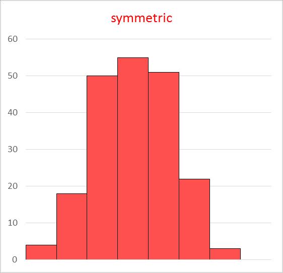
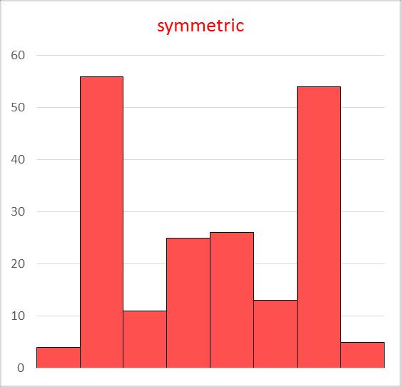
15 Distribution Shapes Uniform, Symmetric, Skewed, more to come


16 Distribution Shapes Uniform, Symmetric, Skewed, more to come
17 Another Graphical Representation Option for Quantitative Data Stem and Leaf Stems are what the values in each class have in common (typically 10s place, 100s place, etc) Leaves are what distinguishes values in a class (typically bottom one or two digits) Ex4: 1, 1, 3, 5, 7, 7, 10, 15, 16, 16, 17, 21, 25, 31, 46, 47, 53, 62, 68, 77
18 Stem and Leaf Ex4: 1, 1, 3, 5, 7, 7, 10, 15, 16, 16, 17, 21, 25, 31, 46, 47, 53, 62, 68,
19 Stem and Leaf How does the shape of the stem and leaf plot compare to the frequency histogram? Class f

20 Stem and Leaf When is using a stem and leaf plot preferable to using a frequency histogram? Why?
21 Stem and Leaf Ex5: 60, 67, 68, 70, 71, 71, 73, 74, 75, 76, 77, 77, 82, 84, 87,
22 When There Are Two Variables Crosstabulation (pivot table) Example from pages in your textbook Restaurant Quality Rating Meal Price ($) 1 Good 18 2 Very Good 22 3 Good 28 4 Excellent 38 5 Very Good 33 6 Good 28 7 Very Good 19 8 Very Good 11 9 Very Good Good Very Good Very Good Excellent Excellent Good 25 Quality Rating Relative Frequency Good 0.28 Very Good 0.50 Excellent 0.22 Quality Rating Total Excellent Very Good Good Total
23 With Cross Tabulations. Beware of Simpson s Paradox example below from p56 in the textbook (when there are more than two variables) Judge Verdict Luckett Kendall Total Upheld 129 (86%) 110 (88%) 239 Reversed 21 (14%) 15 (12%) 36 Total 150 (100%) 125 (100%) 275 Judge Luckett Judge Kendall Verdict Common Pleas Municipal Court Total Verdict Common Pleas Municipal Court Total Upheld 29 (91%) 100 (85%) 129 Upheld 90 (90%) 20 (80%) 110 Reversed 3 (9%) 18 (15%) 21 Reversed 10 (10%) 5 (20%) 15 Total 32 (100%) 118(100%) 150 Total 100 (100%) 25 (100%) 125
24 When There Are Two Variables and both are quantitative Scatter diagram (with trendline) plotting ordered pairs Quantitative Variable Two (variable one value, variable two value) Quantitative Variable One
25 Does there appear to be a relationship between the variables?
26
27 Correlation Correlation co-relation. Variables move together. Strong positive linear correlation Strong negative linear correlation
Chapter 2 Descriptive Statistics I: Tabular and Graphical Presentations. Learning objectives
 Chapter 2 Descriptive Statistics I: Tabular and Graphical Presentations Slide 1 Learning objectives 1. Single variable 1.1. How to use Tables and Graphs to summarize data 1.1.1. Qualitative data 1.1.2.
2.1: Frequency Distributions
 2.1: Frequency Distributions Frequency Distribution: organization of data into groups called. A: Categorical Frequency Distribution used for and level qualitative data that can be put into categories.
Slides Prepared by JOHN S. LOUCKS St. Edward s s University Thomson/South-Western. Slide
 s Prepared by JOHN S. LOUCKS St. Edward s s University 1 Chapter 2 Descriptive Statistics: Tabular and Graphical Presentations Part B Exploratory Data Analysis Crosstabulations and y Scatter Diagrams x
Overview. Frequency Distributions. Chapter 2 Summarizing & Graphing Data. Descriptive Statistics. Inferential Statistics. Frequency Distribution
 Chapter 2 Summarizing & Graphing Data Slide 1 Overview Descriptive Statistics Slide 2 A) Overview B) Frequency Distributions C) Visualizing Data summarize or describe the important characteristics of a
Slides by. John Loucks. St. Edward s University. Slide South-Western, a part of Cengage Learning
 Slides by John Loucks St. Edward s University Slide 1 Chapter 2, Part B Descriptive Statistics: Tabular and Graphical Presentations Exploratory Data Analysis: Stem-and-Leaf Display Crosstabulations and
Section 2-2 Frequency Distributions. Copyright 2010, 2007, 2004 Pearson Education, Inc
 Section 2-2 Frequency Distributions Copyright 2010, 2007, 2004 Pearson Education, Inc. 2.1-1 Frequency Distribution Frequency Distribution (or Frequency Table) It shows how a data set is partitioned among
Organizing and Summarizing Data
 1 Organizing and Summarizing Data Key Definitions Frequency Distribution: This lists each category of data and how often they occur. : The percent of observations within the one of the categories. This
Test Bank for Privitera, Statistics for the Behavioral Sciences
 1. A simple frequency distribution A) can be used to summarize grouped data B) can be used to summarize ungrouped data C) summarizes the frequency of scores in a given category or range 2. To determine
Chapter 2: Graphical Summaries of Data 2.1 Graphical Summaries for Qualitative Data. Frequency: Frequency distribution:
 Chapter 2: Graphical Summaries of Data 2.1 Graphical Summaries for Qualitative Data Frequency: Frequency distribution: Example 2.1 The following are survey results from Fall 2014 Statistics class regarding
Lecture Slides. Elementary Statistics Tenth Edition. by Mario F. Triola. and the Triola Statistics Series. Slide 1
 Lecture Slides Elementary Statistics Tenth Edition and the Triola Statistics Series by Mario F. Triola Slide 1 Chapter 2 Summarizing and Graphing Data 2-1 Overview 2-2 Frequency Distributions 2-3 Histograms
TMTH 3360 NOTES ON COMMON GRAPHS AND CHARTS
 To Describe Data, consider: Symmetry Skewness TMTH 3360 NOTES ON COMMON GRAPHS AND CHARTS Unimodal or bimodal or uniform Extreme values Range of Values and mid-range Most frequently occurring values In
2.3 Organizing Quantitative Data
 2.3 Organizing Quantitative Data This section will focus on ways to organize quantitative data into tables, charts, and graphs. Quantitative data is organized by dividing the observations into classes
Name Date Types of Graphs and Creating Graphs Notes
 Name Date Types of Graphs and Creating Graphs Notes Graphs are helpful visual representations of data. Different graphs display data in different ways. Some graphs show individual data, but many do not.
+ Statistical Methods in
 + Statistical Methods in Practice STA/MTH 3379 + Dr. A. B. W. Manage Associate Professor of Statistics Department of Mathematics & Statistics Sam Houston State University Discovering Statistics 2nd Edition
Lecture Slides. Elementary Statistics Twelfth Edition. by Mario F. Triola. and the Triola Statistics Series. Section 2.1- #
 Lecture Slides Elementary Statistics Twelfth Edition and the Triola Statistics Series by Mario F. Triola Chapter 2 Summarizing and Graphing Data 2-1 Review and Preview 2-2 Frequency Distributions 2-3 Histograms
Chapter 2 - Graphical Summaries of Data
 Chapter 2 - Graphical Summaries of Data Data recorded in the sequence in which they are collected and before they are processed or ranked are called raw data. Raw data is often difficult to make sense
8 Organizing and Displaying
 CHAPTER 8 Organizing and Displaying Data for Comparison Chapter Outline 8.1 BASIC GRAPH TYPES 8.2 DOUBLE LINE GRAPHS 8.3 TWO-SIDED STEM-AND-LEAF PLOTS 8.4 DOUBLE BAR GRAPHS 8.5 DOUBLE BOX-AND-WHISKER PLOTS
Ex.1 constructing tables. a) find the joint relative frequency of males who have a bachelors degree.
 find the joint relative frequency of males who have a bachelors degree.") Two-way Frequency Tables two way frequency table- a table that divides responses into categories. Joint relative frequency- the number of times a specific response is given divided by the sample. Marginal
Two-way Frequency Tables two way frequency table- a table that divides responses into categories. Joint relative frequency- the number of times a specific response is given divided by the sample. Marginal
a. divided by the. 1) Always round!! a) Even if class width comes out to a, go up one.
 Always round!! a) Even if class width comes out to a, go up one.") Probability and Statistics Chapter 2 Notes I Section 2-1 A Steps to Constructing Frequency Distributions 1 Determine number of (may be given to you) a Should be between and classes 2 Find the Range a The
Probability and Statistics Chapter 2 Notes I Section 2-1 A Steps to Constructing Frequency Distributions 1 Determine number of (may be given to you) a Should be between and classes 2 Find the Range a The
Section 1.2. Displaying Quantitative Data with Graphs. Mrs. Daniel AP Stats 8/22/2013. Dotplots. How to Make a Dotplot. Mrs. Daniel AP Statistics
 Section. Displaying Quantitative Data with Graphs Mrs. Daniel AP Statistics Section. Displaying Quantitative Data with Graphs After this section, you should be able to CONSTRUCT and INTERPRET dotplots,
12. A(n) is the number of times an item or number occurs in a data set.
 is the number of times an item or number occurs in a data set.") Chapter 15 Vocabulary Practice Match each definition to its corresponding term. a. data b. statistical question c. population d. sample e. data analysis f. parameter g. statistic h. survey i. experiment
Chapter 15 Vocabulary Practice Match each definition to its corresponding term. a. data b. statistical question c. population d. sample e. data analysis f. parameter g. statistic h. survey i. experiment
Chapter 2. Frequency Distributions and Graphs. Bluman, Chapter 2
 Chapter 2 Frequency Distributions and Graphs 1 Chapter 2 Overview Introduction 2-1 Organizing Data 2-2 Histograms, Frequency Polygons, and Ogives 2-3 Other Types of Graphs 2 Chapter 2 Objectives 1. Organize
MATH 117 Statistical Methods for Management I Chapter Two
 Jubail University College MATH 117 Statistical Methods for Management I Chapter Two There are a wide variety of ways to summarize, organize, and present data: I. Tables 1. Distribution Table (Categorical
STP 226 ELEMENTARY STATISTICS NOTES
 ELEMENTARY STATISTICS NOTES PART 2 - DESCRIPTIVE STATISTICS CHAPTER 2 ORGANIZING DATA Descriptive Statistics - include methods for organizing and summarizing information clearly and effectively. - classify
Lesson 18-1 Lesson Lesson 18-1 Lesson Lesson 18-2 Lesson 18-2
 Topic 18 Set A Words survey data Topic 18 Set A Words Lesson 18-1 Lesson 18-1 sample line plot Lesson 18-1 Lesson 18-1 frequency table bar graph Lesson 18-2 Lesson 18-2 Instead of making 2-sided copies
NOTES TO CONSIDER BEFORE ATTEMPTING EX 1A TYPES OF DATA
 NOTES TO CONSIDER BEFORE ATTEMPTING EX 1A TYPES OF DATA Statistics is concerned with scientific methods of collecting, recording, organising, summarising, presenting and analysing data from which future
Visualizing Data: Freq. Tables, Histograms
 Visualizing Data: Freq. Tables, Histograms Engineering Statistics Section 1.2 Josh Engwer TTU 25 January 2016 Josh Engwer (TTU) Visualizing Data: Freq. Tables, Histograms 25 January 2016 1 / 23 Descriptive
Frequency Distributions
 Displaying Data Frequency Distributions After collecting data, the first task for a researcher is to organize and summarize the data so that it is possible to get a general overview of the results. Remember,
Parents Names Mom Cell/Work # Dad Cell/Work # Parent List the Math Courses you have taken and the grade you received 1 st 2 nd 3 rd 4th
 Full Name Phone # Parents Names Birthday Mom Cell/Work # Dad Cell/Work # Parent email: Extracurricular Activities: List the Math Courses you have taken and the grade you received 1 st 2 nd 3 rd 4th Turn
This chapter will show how to organize data and then construct appropriate graphs to represent the data in a concise, easy-to-understand form.
 CHAPTER 2 Frequency Distributions and Graphs Objectives Organize data using frequency distributions. Represent data in frequency distributions graphically using histograms, frequency polygons, and ogives.
Frequency Distributions and Graphs
 //05 C H A P T E R T W O s and s and Outline CHAPTER - Organizing Data - Histograms, Polygons, and - Other Types of -4 Paired Data and Scatter Plots Learning Objectives Organize data using a frequency
Chapter 2 Describing, Exploring, and Comparing Data
 Slide 1 Chapter 2 Describing, Exploring, and Comparing Data Slide 2 2-1 Overview 2-2 Frequency Distributions 2-3 Visualizing Data 2-4 Measures of Center 2-5 Measures of Variation 2-6 Measures of Relative
Chapter 2: Understanding Data Distributions with Tables and Graphs
 Test Bank Chapter 2: Understanding Data with Tables and Graphs Multiple Choice 1. Which of the following would best depict nominal level data? a. pie chart b. line graph c. histogram d. polygon Ans: A
Chapter 2. Descriptive Statistics: Organizing, Displaying and Summarizing Data
 Chapter 2 Descriptive Statistics: Organizing, Displaying and Summarizing Data Objectives Student should be able to Organize data Tabulate data into frequency/relative frequency tables Display data graphically
Chapter 2 - Frequency Distributions and Graphs
 1. Which of the following does not need to be done when constructing a frequency distribution? A) select the number of classes desired B) find the range C) make the class width an even number D) use classes
Chapter 3 - Displaying and Summarizing Quantitative Data
 Chapter 3 - Displaying and Summarizing Quantitative Data 3.1 Graphs for Quantitative Data (LABEL GRAPHS) August 25, 2014 Histogram (p. 44) - Graph that uses bars to represent different frequencies or relative
MATH1635, Statistics (2)
") MATH1635, Statistics (2) Chapter 2 Histograms and Frequency Distributions I. A Histogram is a form of bar graph in which: A. The width of a bar is designated by an interval or ratio data value and thus
MATH1635, Statistics (2) Chapter 2 Histograms and Frequency Distributions I. A Histogram is a form of bar graph in which: A. The width of a bar is designated by an interval or ratio data value and thus
Table of Contents (As covered from textbook)
") Table of Contents (As covered from textbook) Ch 1 Data and Decisions Ch 2 Displaying and Describing Categorical Data Ch 3 Displaying and Describing Quantitative Data Ch 4 Correlation and Linear Regression
Table of Contents (As covered from textbook) Ch 1 Data and Decisions Ch 2 Displaying and Describing Categorical Data Ch 3 Displaying and Describing Quantitative Data Ch 4 Correlation and Linear Regression
The basic arrangement of numeric data is called an ARRAY. Array is the derived data from fundamental data Example :- To store marks of 50 student
 Organizing data Learning Outcome 1. make an array 2. divide the array into class intervals 3. describe the characteristics of a table 4. construct a frequency distribution table 5. constructing a composite
Chapter 2 Organizing and Graphing Data. 2.1 Organizing and Graphing Qualitative Data
 Chapter 2 Organizing and Graphing Data 2.1 Organizing and Graphing Qualitative Data 2.2 Organizing and Graphing Quantitative Data 2.3 Stem-and-leaf Displays 2.4 Dotplots 2.1 Organizing and Graphing Qualitative
2.1 Objectives. Math Chapter 2. Chapter 2. Variable. Categorical Variable EXPLORING DATA WITH GRAPHS AND NUMERICAL SUMMARIES
 EXPLORING DATA WITH GRAPHS AND NUMERICAL SUMMARIES Chapter 2 2.1 Objectives 2.1 What Are the Types of Data? www.managementscientist.org 1. Know the definitions of a. Variable b. Categorical versus quantitative
MTH 3210: PROBABILITY AND STATISTICS DESCRIPTIVE STATISTICS WORKSHEET
 MTH 3210: PROBABILITY AND STATISTICS DESCRIPTIVE STATISTICS WORKSHEET Before you work on the practice problems (Section 3) please make sure that you read the supplementary notes (Section 1) and work through
Describing Data: Frequency Tables, Frequency Distributions, and Graphic Presentation
 Describing Data: Frequency Tables, Frequency Distributions, and Graphic Presentation Chapter 2 McGraw-Hill/Irwin Copyright 2010 by The McGraw-Hill Companies, Inc. All rights reserved. GOALS 1. Organize
Chapter 2: Frequency Distributions
 Chapter 2: Frequency Distributions It's in the context of frequency distributions that we encounter the importance of communication. The nature of large data sets is difficult to communicate without some
1.2. Pictorial and Tabular Methods in Descriptive Statistics
 1.2. Pictorial and Tabular Methods in Descriptive Statistics Section Objectives. 1. Stem-and-Leaf displays. 2. Dotplots. 3. Histogram. Types of histogram shapes. Common notation. Sample size n : the number
AND NUMERICAL SUMMARIES. Chapter 2
 EXPLORING DATA WITH GRAPHS AND NUMERICAL SUMMARIES Chapter 2 2.1 What Are the Types of Data? 2.1 Objectives www.managementscientist.org 1. Know the definitions of a. Variable b. Categorical versus quantitative
STAT STATISTICAL METHODS. Statistics: The science of using data to make decisions and draw conclusions
 STAT 515 --- STATISTICAL METHODS Statistics: The science of using data to make decisions and draw conclusions Two branches: Descriptive Statistics: The collection and presentation (through graphical and
Displaying Distributions - Quantitative Variables
 Displaying Distributions - Quantitative Variables Lecture 13 Sections 4.4.1-4.4.3 Robb T. Koether Hampden-Sydney College Wed, Feb 8, 2012 Robb T. Koether (Hampden-Sydney College)Displaying Distributions
Basic Statistical Terms and Definitions
 I. Basics Basic Statistical Terms and Definitions Statistics is a collection of methods for planning experiments, and obtaining data. The data is then organized and summarized so that professionals can
Math 227 EXCEL / MEGASTAT Guide
 Math 227 EXCEL / MEGASTAT Guide Introduction Introduction: Ch2: Frequency Distributions and Graphs Construct Frequency Distributions and various types of graphs: Histograms, Polygons, Pie Charts, Stem-and-Leaf
Tabular & Graphical Presentation of data
 Tabular & Graphical Presentation of data bjectives: To know how to make frequency distributions and its importance To know different terminology in frequency distribution table To learn different graphs/diagrams
2.1: Frequency Distributions and Their Graphs
 2.1: Frequency Distributions and Their Graphs Frequency Distribution - way to display data that has many entries - table that shows classes or intervals of data entries and the number of entries in each
Sections Graphical Displays and Measures of Center. Brian Habing Department of Statistics University of South Carolina.
 STAT 515 Statistical Methods I Sections 2.1-2.3 Graphical Displays and Measures of Center Brian Habing Department of Statistics University of South Carolina Redistribution of these slides without permission
3. Data Analysis and Statistics
 3. Data Analysis and Statistics 3.1 Visual Analysis of Data 3.2.1 Basic Statistics Examples 3.2.2 Basic Statistical Theory 3.3 Normal Distributions 3.4 Bivariate Data 3.1 Visual Analysis of Data Visual
Stat 428 Autumn 2006 Homework 2 Solutions
 Section 6.3 (5, 8) 6.3.5 Here is the Minitab output for the service time data set. Descriptive Statistics: Service Times Service Times 0 69.35 1.24 67.88 17.59 28.00 61.00 66.00 Variable Q3 Maximum Service
CHAPTER 2 DESCRIPTIVE STATISTICS
 CHAPTER 2 DESCRIPTIVE STATISTICS 1. Stem-and-Leaf Graphs, Line Graphs, and Bar Graphs The distribution of data is how the data is spread or distributed over the range of the data values. This is one of
Slide Copyright 2005 Pearson Education, Inc. SEVENTH EDITION and EXPANDED SEVENTH EDITION. Chapter 13. Statistics Sampling Techniques
 SEVENTH EDITION and EXPANDED SEVENTH EDITION Slide - Chapter Statistics. Sampling Techniques Statistics Statistics is the art and science of gathering, analyzing, and making inferences from numerical information
Vocabulary. 5-number summary Rule. Area principle. Bar chart. Boxplot. Categorical data condition. Categorical variable.
 5-number summary 68-95-99.7 Rule Area principle Bar chart Bimodal Boxplot Case Categorical data Categorical variable Center Changing center and spread Conditional distribution Context Contingency table
No. of blue jelly beans No. of bags
 Math 167 Ch5 Review 1 (c) Janice Epstein CHAPTER 5 EXPLORING DATA DISTRIBUTIONS A sample of jelly bean bags is chosen and the number of blue jelly beans in each bag is counted. The results are shown in
Further Maths Notes. Common Mistakes. Read the bold words in the exam! Always check data entry. Write equations in terms of variables
 Further Maths Notes Common Mistakes Read the bold words in the exam! Always check data entry Remember to interpret data with the multipliers specified (e.g. in thousands) Write equations in terms of variables
Prepare a stem-and-leaf graph for the following data. In your final display, you should arrange the leaves for each stem in increasing order.
 Chapter 2 2.1 Descriptive Statistics A stem-and-leaf graph, also called a stemplot, allows for a nice overview of quantitative data without losing information on individual observations. It can be a good
Linear Topics Notes and Homework DUE ON EXAM DAY. Name: Class period:
 Linear Topics Notes and Homework DUE ON EXAM DAY Name: Class period: Absolute Value Axis b Coordinate points Continuous graph Constant Correlation Dependent Variable Direct Variation Discrete graph Domain
Create a bar graph that displays the data from the frequency table in Example 1. See the examples on p Does our graph look different?
 A frequency table is a table with two columns, one for the categories and another for the number of times each category occurs. See Example 1 on p. 247. Create a bar graph that displays the data from the
B. Graphing Representation of Data
 B Graphing Representation of Data The second way of displaying data is by use of graphs Although such visual aids are even easier to read than tables, they often do not give the same detail It is essential
Chapter 1. Looking at Data-Distribution
 Chapter 1. Looking at Data-Distribution Statistics is the scientific discipline that provides methods to draw right conclusions: 1)Collecting the data 2)Describing the data 3)Drawing the conclusions Raw
Raw Data. Statistics 1/8/2016. Relative Frequency Distribution. Frequency Distributions for Qualitative Data
 Statistics Raw Data Raw data is random and unranked data. Organizing Data Frequency distributions list all the categories and the numbers of elements that belong to each category Frequency Distributions
Raw Data is data before it has been arranged in a useful manner or analyzed using statistical techniques.
 Section 2.1 - Introduction Graphs are commonly used to organize, summarize, and analyze collections of data. Using a graph to visually present a data set makes it easy to comprehend and to describe the
Data can be in the form of numbers, words, measurements, observations or even just descriptions of things.
 + What is Data? Data is a collection of facts. Data can be in the form of numbers, words, measurements, observations or even just descriptions of things. In most cases, data needs to be interpreted and
Spreadsheet Warm Up for SSAC Geology of National Parks Modules, 2: Elementary Spreadsheet Manipulations and Graphing Tasks
 University of South Florida Scholar Commons Tampa Library Faculty and Staff Publications Tampa Library 2009 Spreadsheet Warm Up for SSAC Geology of National Parks Modules, 2: Elementary Spreadsheet Manipulations
Data organization. So what kind of data did we collect?
 Data organization Suppose we go out and collect some data. What do we do with it? First we need to figure out what kind of data we have. To illustrate, let s do a simple experiment and collect the height
https://testbankreal.com/download/business-statistics-10th-edition-groebnertest-bank/ Business Statistics 10th Edition Groebner SOLUTIONS MANUAL
 Business Statistics 10th Edition Groebner TEST BANK Business Statistics 10th Edition Groebner SOLUTIONS MANUAL Full download at: Full download at: https://testbankreal.com/download/business-statistics-10th-edition-groebnertest-bank/
Ch. 1.4 Histograms & Stem-&-Leaf Plots
 Ch. 1.4 Histograms & Stem-&-Leaf Plots Learning Intentions: Create a histogram & stem-&-leaf plot of a data set. Given a list of data, use a calculator to graph a histogram. Interpret histograms & stem-&-leaf
Introduction to Excel Workshop
 Introduction to Excel Workshop Empirical Reasoning Center June 6, 2016 1 Important Terminology 1. Rows are identified by numbers. 2. Columns are identified by letters. 3. Cells are identified by the row-column
Spell out your full name (first, middle and last)
") Spell out your full name (first, middle and last) Be ready to share the following counts: Number of letters in your full name. Number of vowels Number of consonants Section 2-1 Organizing Data After completing
Spell out your full name (first, middle and last) Be ready to share the following counts: Number of letters in your full name. Number of vowels Number of consonants Section 2-1 Organizing Data After completing
The variable: scores on a 60 question exam for 20 students 50, 46, 58, 49, 50, 57, 49, 48, 53, 45, 50, 55, 43, 49, 46, 48, 44, 56, 57, 44
 Cal State Northridge Ψ Andrew Ainsworth PhD The variable: scores on a question exam for students,, 8, 9,, 7, 9, 8,,,,,, 9,, 8,,, 7, First Step Order the Data,,,,,, 8, 8, 9, 9, 9,,,,,,, 7, 7, 8 1 Valid
STA Module 2B Organizing Data and Comparing Distributions (Part II)
") STA 2023 Module 2B Organizing Data and Comparing Distributions (Part II) Learning Objectives Upon completing this module, you should be able to 1 Explain the purpose of a measure of center 2 Obtain and
STA 2023 Module 2B Organizing Data and Comparing Distributions (Part II) Learning Objectives Upon completing this module, you should be able to 1 Explain the purpose of a measure of center 2 Obtain and
STA Learning Objectives. Learning Objectives (cont.) Module 2B Organizing Data and Comparing Distributions (Part II)
 Module 2B Organizing Data and Comparing Distributions (Part II)") STA 2023 Module 2B Organizing Data and Comparing Distributions (Part II) Learning Objectives Upon completing this module, you should be able to 1 Explain the purpose of a measure of center 2 Obtain and
STA 2023 Module 2B Organizing Data and Comparing Distributions (Part II) Learning Objectives Upon completing this module, you should be able to 1 Explain the purpose of a measure of center 2 Obtain and
CHAPTER 1. Introduction. Statistics: Statistics is the science of collecting, organizing, analyzing, presenting and interpreting data.
 1 CHAPTER 1 Introduction Statistics: Statistics is the science of collecting, organizing, analyzing, presenting and interpreting data. Variable: Any characteristic of a person or thing that can be expressed
Chapter2 Description of samples and populations. 2.1 Introduction.
 Chapter2 Description of samples and populations. 2.1 Introduction. Statistics=science of analyzing data. Information collected (data) is gathered in terms of variables (characteristics of a subject that
Pivot Table Project. Objectives. By the end of this lesson, you will be able to:
 Pivot Table Project Objectives By the end of this lesson, you will be able to: Set up a Worksheet Enter Labels and Values Use Sum and IF functions Format and align cells Change column width Use AutoFill
Select Cases. Select Cases GRAPHS. The Select Cases command excludes from further. selection criteria. Select Use filter variables
 Select Cases GRAPHS The Select Cases command excludes from further analysis all those cases that do not meet specified selection criteria. Select Cases For a subset of the datafile, use Select Cases. In
Statistics Lecture 6. Looking at data one variable
 Statistics 111 - Lecture 6 Looking at data one variable Chapter 1.1 Moore, McCabe and Craig Probability vs. Statistics Probability 1. We know the distribution of the random variable (Normal, Binomial)
CHAPTER 2. Objectives. Frequency Distributions and Graphs. Basic Vocabulary. Introduction. Organise data using frequency distributions.
 CHAPTER 2 Objectives Organise data using frequency distributions. Distributions and Graphs Represent data in frequency distributions graphically using histograms, frequency polygons, and ogives. Represent
University of Florida CISE department Gator Engineering. Visualization
 Visualization Dr. Sanjay Ranka Professor Computer and Information Science and Engineering University of Florida What is visualization? Visualization is the process of converting data (information) in to
1. Data Analysis Yields Numbers & Visualizations. 2. Why Visualize Data? 3. What do Visualizations do? 4. Research on Visualizations
 Data Analysis & Business Intelligence Made Easy with Excel Power Tools Excel Data Analysis Basics = E-DAB Notes for Video: E-DAB-05- Visualizations: Table, Charts, Conditional Formatting & Dashboards Outcomes
4) Discrete data can have an infinite number of values within a specific interval. Answer: FALSE Diff: 2 Keywords: discrete data Reference: Page 24
 Discrete data can have an infinite number of values within a specific interval. Answer: FALSE Diff: 2 Keywords: discrete data Reference: Page 24") Business Statistics 1st Edition Donnelly Test Bank Full Download: http://testbanklive.com/download/business-statistics-1st-edition-donnelly-test-bank/ Business Statistics (Donnelly) Chapter 2 Displaying
Business Statistics 1st Edition Donnelly Test Bank Full Download: http://testbanklive.com/download/business-statistics-1st-edition-donnelly-test-bank/ Business Statistics (Donnelly) Chapter 2 Displaying
Learning Log Title: CHAPTER 7: PROPORTIONS AND PERCENTS. Date: Lesson: Chapter 7: Proportions and Percents
 Chapter 7: Proportions and Percents CHAPTER 7: PROPORTIONS AND PERCENTS Date: Lesson: Learning Log Title: Date: Lesson: Learning Log Title: Chapter 7: Proportions and Percents Date: Lesson: Learning Log
UNIT 1A EXPLORING UNIVARIATE DATA
 A.P. STATISTICS E. Villarreal Lincoln HS Math Department UNIT 1A EXPLORING UNIVARIATE DATA LESSON 1: TYPES OF DATA Here is a list of important terms that we must understand as we begin our study of statistics
Making Science Graphs and Interpreting Data
 Making Science Graphs and Interpreting Data Eye Opener: 5 mins What do you see? What do you think? Look up terms you don t know What do Graphs Tell You? A graph is a way of expressing a relationship between
Maths Revision Worksheet: Algebra I Week 1 Revision 5 Problems per night
 2 nd Year Maths Revision Worksheet: Algebra I Maths Revision Worksheet: Algebra I Week 1 Revision 5 Problems per night 1. I know how to add and subtract positive and negative numbers. 2. I know how to
STA Rev. F Learning Objectives. Learning Objectives (Cont.) Module 3 Descriptive Measures
 Module 3 Descriptive Measures") STA 2023 Module 3 Descriptive Measures Learning Objectives Upon completing this module, you should be able to: 1. Explain the purpose of a measure of center. 2. Obtain and interpret the mean, median, and
STA 2023 Module 3 Descriptive Measures Learning Objectives Upon completing this module, you should be able to: 1. Explain the purpose of a measure of center. 2. Obtain and interpret the mean, median, and
SPSS. (Statistical Packages for the Social Sciences)
") Inger Persson SPSS (Statistical Packages for the Social Sciences) SHORT INSTRUCTIONS This presentation contains only relatively short instructions on how to perform basic statistical calculations in SPSS.
Inger Persson SPSS (Statistical Packages for the Social Sciences) SHORT INSTRUCTIONS This presentation contains only relatively short instructions on how to perform basic statistical calculations in SPSS.
Courtesy :
 STATISTICS The Nature of Statistics Introduction Statistics is the science of data Statistics is the science of conducting studies to collect, organize, summarize, analyze, and draw conclusions from data.
Topic (3) SUMMARIZING DATA - TABLES AND GRAPHICS
 SUMMARIZING DATA - TABLES AND GRAPHICS") Topic (3) SUMMARIZING DATA - TABLES AND GRAPHICS 3- Topic (3) SUMMARIZING DATA - TABLES AND GRAPHICS A) Frequency Distributions For Samples Defn: A FREQUENCY DISTRIBUTION is a tabular or graphical display
Topic (3) SUMMARIZING DATA - TABLES AND GRAPHICS 3- Topic (3) SUMMARIZING DATA - TABLES AND GRAPHICS A) Frequency Distributions For Samples Defn: A FREQUENCY DISTRIBUTION is a tabular or graphical display
Ms Nurazrin Jupri. Frequency Distributions
 Frequency Distributions Frequency Distributions After collecting data, the first task for a researcher is to organize and simplify the data so that it is possible to get a general overview of the results.
Brief Guide on Using SPSS 10.0
 Brief Guide on Using SPSS 10.0 (Use student data, 22 cases, studentp.dat in Dr. Chang s Data Directory Page) (Page address: http://www.cis.ysu.edu/~chang/stat/) I. Processing File and Data To open a new
Data Handling. Moving from A to A* Calculate the numbers to be surveyed for a stratified sample (A)
") Moving from A to A* A* median, quartiles and interquartile range from a histogram (A*) Draw histograms from frequency tables with unequal class intervals (A) Calculate the numbers to be surveyed for a
Moving from A to A* A* median, quartiles and interquartile range from a histogram (A*) Draw histograms from frequency tables with unequal class intervals (A) Calculate the numbers to be surveyed for a
Statistical Methods. Instructor: Lingsong Zhang. Any questions, ask me during the office hour, or me, I will answer promptly.
 Statistical Methods Instructor: Lingsong Zhang 1 Issues before Class Statistical Methods Lingsong Zhang Office: Math 544 Email: lingsong@purdue.edu Phone: 765-494-7913 Office Hour: Monday 1:00 pm - 2:00
Page 1. Graphical and Numerical Statistics
 TOPIC: Description Statistics In this tutorial, we show how to use MINITAB to produce descriptive statistics, both graphical and numerical, for an existing MINITAB dataset. The example data come from Exercise
Summarising Data. Mark Lunt 09/10/2018. Arthritis Research UK Epidemiology Unit University of Manchester
 Summarising Data Mark Lunt Arthritis Research UK Epidemiology Unit University of Manchester 09/10/2018 Summarising Data Today we will consider Different types of data Appropriate ways to summarise these