BRAND BOOK Corporate Guidelines
|
|
|
- Camilla Ball
- 5 years ago
- Views:
Transcription
1 BRAND BOOK Corporate Guidelines
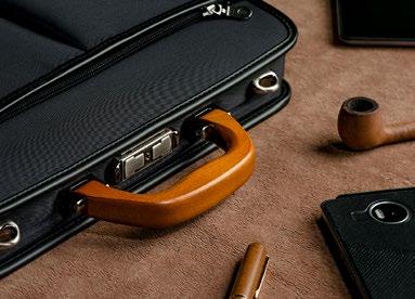
2 Our Brand is a valuable asset and our corporate identity is here to protect it. Fulfilling its official guidelines will ensurea consistent communication to deliver the right message, the right way, on a global scale.. The enclosed guidelines aim at assisting in the implementation of Unofuku corporate identity. They must be followed by all employees and partners for all marketing and communication needs. By respecting this chart, we all contribute to achieving a bold, broad and clear branding. If you have any questions regarding the content of this document, please do not hesitate to contact us at marketing@unofuku.com All resources are available for download on unofuku.me/corporate/brandkit TAKAYA UNO Presisent of Unofuku
3 CONTEXT
4 STORY TELLING. One history. Simple, memorable and carrying our values. 5 seconds pitch Unofuku is a Japanese Bag & Luggage company founded in 1921 by Uno Fukukichi. He gained his reputation designing bags made of a traditional rattan called "Yanagi". Three generations later, its heritage remains pristine, combining tradition & modernity. Under the flagship Unofuku, the brands Baggex and 129 Corp. complement the range of products. Nearly a century later, Unofuku provides quality bags for demanding customers all around the world. Unofuku = bags Experience Quality
5 MOTO & BASELINE. A catchy and distinctive textual signature. Carry [on] your life! Quality bags made for active life since 1921
6 TIMEFRAME. Nearly a century. Stability is the key. In 5 years from now, Unofuku will celebrate its centenary. 100 years of passion and innovation. 95 YEARS The next 5 years should be devoted to establish the new corporate identity, develop public awareness about Unofuku and disseminate the logo to establish the Brand. 2021

7 LOGOTYPE
8 PRIMARY LOGO A new logotype for a new Era. A logo on a bag is statement and gives a value added to our products. The new logotype of Unofuku is to be the sole visual identifier on all brochures, catalogues, signatures, stationery, vehicles, on-line services, application forms, presentations, etc. The Prime logo consists of: The symbol 3 equal squares enclosing the letters U-N-O. The name Written in uppercase-bold, using the UNOFUKU custom-made typeface.
9 Prime Unofuku s logo must be primarily used in this version.
10 PROPORTIONS A finely crafted visual balance Proportions, space and size relations of all blocks have been carefully developed and must not be altered, redrawn, embellished or recreated in any way. Even the letter K was carefully chosen as a reference to a stitch it symbolizes Balance Ratios mentioned here are for your reference only.
11 FIELD OF VISION Protective area of the logo An important way of maintaining consistency is to keep a clear area around the logo, away from any text, graphics or illustrations. The logo must always fit into a protective area, so as to avoid other elements to interfere graphically and alter the visibility of the brand. Protective area Easy to create and remember: Protective area thickness equals the typeface weight () x 2.
12 LOGO VARIATIONS When the Prime logo cannot be read properly. Reduced size. When reduced, the name Unofuku becomes illegible or brings unnecessary visual complexity, despite the excellent scalability used for its design. Under 24 mm (it does not concern products tags), you must use a simplified version of the logo without the name. This version, the Nano, comes in the same color variety as the Prime logo (see hereafter). 24 mm Nano This version of the logo cannot be used without prior approval of head of marketing.
 you must use its simplified version Nano White.")
13 Negative. When the background is not white or not clear enough to offer necessary contrast with the Prime logo, the White version should be used. 24 mm Under 24 mm (it does not concern products tags) you must use its simplified version Nano White. White & Nano White A white color version of the logo.
14 FALLBACK When there is no other choice... Monochromatic. The Grey version is only used when color cannot be used. Under 24 mm (it does not concern products tags) you must use its simplified version Nano Grey. Black and white. The Black version is only used when black and white print is required. Under 24 mm (it does not concern products tags) you must use its simplified version Nano Black. 30 mm 30 mm Grey & Nano Grey A grey and black color version of the logo. Black & Nano Black A black color version of the logo.

15 COLORS
16 LOGO COLORS Glazed chestnut champain is the new Black. The primary color of Unofuku logo is a very specific shade of light brown, between champain and gold, with a dash of gray: we nammed it "glazed chestnut champain". The Unofuku "glazed chestnut champain" is clearly a high end color that embodies excellency and premium quality, with a notion of technology, innovation and dynamism. A pure black, supports and compliments the Unofuku glazed chestnut champain on its Prime version. Bold and powerful, black is also and conservative and high end. This echoes the company's heritage values and creates a visual connexion with previous generations of the logo. The contrast brings a graphic vibrancy.
17 PANTONE Plus series / Solid Uncoated 7532-U PANTONE Plus series / Solid Coated Warm Gray 10 C DIC COLOR GUIDE / DIC503s* (*best approximative value) C 50 M 50 Y 60 K 25 R 114 G 102 B 88 # H 31 S 22% B 44% 90% 80% 70% 60% 50% 40% 30% 20% 10% 90% 80% 70% 60% 50% 40% 30% 20% 10% PANTONE Plus series / Solid Uncoated Process Black U PANTONE Plus series / Solid Coated Process Black C DIC COLOR GUIDE / Black C 70 M 50 Y 30 K 100 R 0 G 0 B 0 #000 H 0 S 0% B 0% 90% 80% 70% 60% 50% 40% 30% 20% 10%
18 COMPLIMENTARY LOGOS & SWATCHES When a twist is needed... TM PANTONE Plus series / Solid Uncoated 433-U* C 0 R 84 PANTONE M 0 G 84 Plus series / Solid Coated 425 C* DIC COLOR GUIDE Y 0 B 86 / DIC2368s* (*best approximative value) K 82 # H 240 S 1% B 33% TM PANTONE Plus series / Solid Uncoated 2747-U* C 100 R 20 PANTONE M 85 G 50 Plus series / Solid Coated 654 C* DIC COLOR GUIDE Y 20 B 104 / DIC255s* (*best approximative value) K 30 # H 217 S 80% B 40%

19 USAGES
20 COL INCORRECT USE OF THE LOGO Dos and Don'ts. Presentation of the Unofuku logo must be carefully monitored and controlled. Incorrect use can undermine the identity system through mixed and unclear messages. The following pages illustrate a number of incorrect presentations of Unofuku logo. They range from reproduction of the logo itself to violations of clear space and additional graphics. This is not a complete list. Examples 1-11 illustrate incorrect reproduction of the Unofuku logo 1. Relation between the height and the width of the logo cannot be changed. 2. The logo should not be rotated. 3. Colors of the logo cannot be changed Even with one solid color... Even Unofuku's main color! 5. No matter the version of the logo, even the white one, cannot be used against complicated and intensive backgrounds. 6. No matter the version of the logo, even the simplified one, it cannot be turned in 3D. 7. The alignments of the logo components cannot be modified. 8. The black and white version should not be used on vivid color. 9. The inner spaces between the logo components cannot be modified (e.g. 1, 7, 10 and 11) 10. Position of the elements cannot be changed nor rotated 11. The inner space between the symbol and the name cannot be enlarged nor reduced.
21
22
23 TYPEFACE
24 COL COMMUNICATION TYPEFACE - LATIN Typography and consistent use of typefaces is a key element to create a cohesive look across all communications and media. The only typeface that may be used for Unofuku* is Lato. Lato is a sans serif typeface which has a precise, technical feel that matches Unofuku values and goals. It is ideal for captions, headings, technical information and signage, as well as for longer texts, such as reports, proposals and publications and user interfaces. Lato is available to download for free on fonts.google.com/specimen/lato and also on the most famous Content Delivery Network (CDN) such as Adobe TypeKit, GitHub, Fontsquirrel, 1001fonts, Fontlibrary, etc... the Lato family was published under the Open Font License by his foundry typoland, with support from Google and created by Warsawbased designer Łukasz Dziedzic. ( Lato means Summer in Polish) Fall-back, Office & Digital & social media. Lato is to be used as the primary sans serif typeface, but if for some reason it cannot be obtained, the substitute typeface is Arial. Close enough to Source Sans Pro, Arial offers a contemporary feel with versatile function.
25 Hairline Hairline Italic Thin Thin Italic Light Light Italic Regular Italic Medium Medium Italic Semibold Semibold Italic Bold Bold Italic Heavy Heavy Italic Black Black Italic Lato
26 COL COMMUNICATION TYPEFACE - JAPANESE Despite the limited choice of Japanese typefaces that comes with your operating system, consistency remains necessary... Non-free typeface that should be used for Unofuku* is A-OTF Gothic BBB Pr6N. A-OTF Gothic BBB Pr6N is a modern and clean typeface which has a precise, technical feel that matches Unofuku values and goals. It is ideal for captions, headings, technical information and signage, as well as for longer texts, such as reports, proposals and publications and user interfaces. A-OTF Gothic BBB Pr6N is available at Adobe on typekit.com/fonts/a-otf-gothic-bbb-pr6n designpocket.jp/dl_font_category/detail.aspx?bid=9227 the A-OTF Gothic BBB Pr6N family was published by Morisawa foundry. They define themself as " a champion of the culture of typography - letters, fonts and typefaces - and the connection that it makes between the past and future", which is exactly Unofuku core value. en.morisawa.co.jp Fall-back, Office & Digital & social media. Thanks to Typekit, Gothic BBB Pr6N is available for all OS, offline & online and therefore should be used as the primary typeface, but if for some reason it cannot be obtained, the substitute typeface is Yu Gothic UI. Close enough to Gothic BBB Pr6N, Yu Gothic UI offers a contemporary feel with versatile function.
27 A-OTF Gothic BBB Pr6N 日本語書体の美しいフォルム
28 PHOTO GRAPHY


29


30


31

32
Primary Logo. Corporate logo - primary. The centered logo is only to be used when the length of the common logo is problematic for an application.
 Primary Logo Corporate logo - primary The elements of the logo may be arranged in two predetermined configurations: the primary logo (which also has a small version and the centered logo. The centered
corporate identity guidelines
 Seilevel Corporate Identity Guidelines Introduction 1 Preferred Signature and Components Logo Space and Minimum Size Signature Variations Color Palette Typography Signature Misuse 2 3 4 5 6 7 corporate
Visual Identity Guidelines
 Visual Identity Guidelines 2017 Building Our Brand The Nasdaq brand is one of our most important assets. It embodies who we are and what we value. Taken together, all the elements of our visual identity
Corporate Identity Guidelines
 Corporate Identity Guidelines CONTENTS 1.0 TRADEMARK Watco Companies Logo Logo Clear Space Logo Variations Project Logos Proper Logo Use 03 04 05 06 07 08 2.0 TYPOGRAPHY Type Family 3.0 COLOR Brand Color
Brand Guidelines. version
 Brand Guidelines version 2017.1 Primary Logo The OPSWAT logo is a universal signature spanning all of our communications. Because it is such a recognizable and highly visible asset, it s important that
Brand Identity Guide. Raise Your Hand Texas Brand Identity Guide Standards and Practices
 Brand Identity Guide Raise Your Hand Texas Brand Identity Guide Standards and Practices August 2016 Primary Logo The Raise Your Hand Texas primary logo uses the letterforms from our name to present an
FLEET LOGO USAGE AND STANDARDS INNOVA BRANDING STANDARDS 2015 GUIDE
 FLEET LOGO USAGE AND STANDARDS INNOVA BRANDING STANDARDS 2015 GUIDE INNOVA BRANDING STANDARDS 2015 GUIDE 2 TABLE OF CONTENTS The Innova Brand 3 Branding Elements Logo Colors Typography 4 8 10 INNOVA BRANDING
IDENTITY STANDARDS VERSION 2.0 / FALL 2014
 IDENTITY STANDARDS VERSION 2.0 / FALL 2014 2 3 IDENTITY STANDARDS VERSION 2.0 / FALL 2014 This manual outlines the standards for the University Union. Please direct any comments or suggestions to the
Graphic Standards Manual. Version 1.3 February 2015
 Graphic Standards Manual Version 1.3 February 2015 2 introduction The Importance of Graphic Standards The way we identify ourselves in all types of communications is the way we tell the world who we are.
Corporate Identity Guidelines
 Corporate Identity Guidelines - CONTENTS 1.0 TRADEMARK Watco Companies Logo Logo Clear Space Logo Variations Project Logos Proper Logo Use 03 04 05 06 07 08 2.0 TYPOGRAPHY Type Family 3.0 COLOR Brand Color
MINI BRAND GUIDELINES
 MINI BRAND GUIDELINES 9.18.17 TABLE OF CONTENTS SECTION 1 Introduction 3 SECTION 4 The Hamline Logo(s) & Seal 5 SECTION 5 Colors 16 SECTION 6 Typography 20 Questions about how to use this brand guide?
Visual Brand Identity Guide. UP_BRND_BK_BrandIDStandards_R8.1_ indd 1
 Visual Brand Identity Guide UP_BRND_BK_BrandIDStandards_R8.1_012916.indd 1 2 Introduction Institutional Logo Description 5 Stacked logo 6 Horizontal logo 7 Clear space 8 Incorrect applications 9 Logo colors
Third Party Identity Guidelines
 Third Party Identity Guidelines Introduction Introduction This document has been developed to provide anyone using The Wolfson Foundation logotype with clear guidelines on how the brand identity can be
Graphic Standards Manual. Version 1.5 May 2017
 Graphic Standards Manual Version 1.5 May 2017 2 introduction The Importance of Graphic Standards The way we identify ourselves in all types of communications is the way we tell the world who we are. Consistency
WCSD Graphic Standards and Logo Use Guide
 SM WCSD Graphic Standards and Logo Use Guide WCSD Logo WCSD logo with slogan SM The WCSD logo should be used on all school district signage and every District-generated publication, website or webpage,
Identity Guidelines: How to use our logo. Version 1.0 April 2014
 Identity Guidelines: How to use our logo Version 1.0 April 2014 Contents 2 3 Introduction and Who to Contact 4 Writing the Company Name 5 The Fortune Brands Logo 6 Approved Logo Color Variations 7 Color
Introduction A global icon needs an iconic logo. Fashion has evolved since 1969, when Gap opened its first store. Our logo has changed with the
 Introduction A global icon needs an iconic logo. Fashion has evolved since 1969, when Gap opened its first store. Our logo has changed with the times, too. One thing that hasn t changed is our mission
Brand Identity Guide
 Brand Identity Guide Logos Preferred Logo The official logo for St. Vrain Valley Schools. Use the full-color version of the logo when possible. Logos can be downloaded at http://www.svvsd.org/logos FULL
Logos. North Dallas Shared Ministries
 Brand Guidelines Logos The NDSM logo stands at the center of the NDSM brand. For this reason it must be reproduced and applied with consistency in all of our brand communications. It is essential that
Visual Identity Guidelines
 Visual Identity Guidelines Contents 1.00 Introduction 2.00 Corporate Master Brand 2.01 Corporate Master Brand 2.03 Corporate Master Brand Logo Placement 2.04 Master Brand with Tagline Horizontal Format
A Graphic Standards Guide for Southlake Regional Health Centre
 Connecting with the Southlake Brand A Graphic Standards Guide for Southlake Regional Health Centre 1.0 A Special Message from the President and CEO 2.0 Logo Overview 2.1 Logo Variations (Standard) 2.2
CORPORATE GRAPHIC STANDARD GUIDELINES. Revision: 07/17/2014
 CORPORATE GRAPHIC STANDARD GUIDELINES Revision: 07/17/2014 Graniterock Corporate Graphic Standard Guidelines 2 INTRODUCTION The Graniterock logo and graphics are an important part of our Company s identity.
01: The Digital Explorer Identity
 Brand Guidelines Brand Guidelines 01: The Digital Explorer Identity 02: Use of the Identity 03: Color Palette 04: Logo Colour Usage 05: Use of the Digital Graphic 06: Typeface 07: File Formats 08: Sample
Quick Reference Guide
 University of Guelph Quick Reference Guide Effective January 2007 Edited September 2016 The University of Guelph is Canada s pioneer in accelerating discoveries about the interdependencies of life systems
VIVO Identity Guidelines
 VIVO Identity Guidelines May 2010 Version 1.0 00 Contents 01 02 03 04 05 06 Introduction About VIVO VIVO Identity Elements Space Size Color System (web and print) Identity Colors Primary Color Palette
Introducing the T-REX Brand
 Brand Identity and Logo Usage Guidelines / May 2001 Introducing the T-REX Brand The Value of the Brand Brand identity is the most valuable asset an organization or company can possess.the T-REX brand will
OUR TYPOGRAPHY APPROVED UNIVERS FONTS. Univers 65 Bold Univers 65 Bold Oblique Univers 75 Black Univers 75 Black Oblique
 BRAND TYPOGRAPHY For Internal Use Only Not For Use With The Public. For help and guidance on our brand standards, contact marketinginbox@firstcommand.com. 63 OUR TYPOGRAPHY Typography is a powerful extension
Graphic Identity Standards Manual
 Graphic Identity Standards Manual Hendrix College Graphic Identity Standards Manual introduction The Hendrix College Graphic Identity Standards Manual was created to provide all Hendrix employees and
Centenary Signature - Usage Guidelines (as of 30 December 2010)
") Centenary Signature - Usage Guidelines (as of 30 December 2010) 1 CENTENARY SIGNATURE 2 VISUAL SYSTEM 1.01 The logotype 1.02 The Centenary Signature 1.03 General Signature 1.04 Minimum Clear Space 1.05
Centenary Signature - Usage Guidelines (as of 30 December 2010) 1 CENTENARY SIGNATURE 2 VISUAL SYSTEM 1.01 The logotype 1.02 The Centenary Signature 1.03 General Signature 1.04 Minimum Clear Space 1.05
Brand Overview COLORS / FONTS / LOGOS rd Street, Suite 210 Denver, CO communityengineeringcorps.org
 Brand Overview COLORS / FONTS / LOGOS 1031 33rd Street, Suite 210 Denver, CO 80205 720 204-3194 Color Palette PRIMARY COLORS PRIMARY PALETTE For most situations, it is important to utilize the two main
BRAND. For Internal Use Only Not For Use With The Public. For help and guidance on our brand standards, contact
 BRAND TYPOGRAPHY. 1 OUR TYPOGRAPHY. Typography is a powerful extension of our brand s personality. It plays an important role in creating a consistent look for First Command across all communications and
DMD DIAMOND, BRAND GUIDE ISSUE 01: DESIGN MANUAL CREATED FOR: DMD DIAMOND DESIGN AND BRAND GUIDELINE BOOK
 DMD DIAMOND, BRAND GUIDE ISSUE 01: DESIGN MANUAL CREATED FOR: DMD DIAMOND DESIGN AND BRAND GUIDELINE BOOK CREATION DATE: FEBRUARY 2018 ISSUE 01: BRAND GUIDELINE CREATED FOR: DMD Diamond www.bit.diamonds
Our identity. Primary logo
 OUR BRAND BOOK. Our identity. Our identity is more than just our logo. It incorporates our fonts, colors, and photography. When they re used all together, we create our own unique look and feel that reflects
Brand Guidelines 2017
 Brand Guidelines 2017 1. INTRO Signifyd was founded to make fraud-free e-commerce available to every business. Signifyd solves the challenges that growing e-commerce businesses persistently face: billions
IDENTITY PROGRAM: STANDARDS AND GUIDELINES. FCA Brand Mark. Key Visual Elements and Usage Guidelines
 IDENTITY PROGRAM: STANDARDS AND GUIDELINES FCA Brand Mark Key Visual Elements and Usage Guidelines March 2015 CONTENTS 3 Introduction 4 Area of Isolation 5 Coloring and Backgrounds 6 Basic Rules of Use
branding standards and guidelines Edition 5.4
 branding standards and guidelines Edition 5.4 1 Introduction This guide is designed to outline the basic elements that make up Hogan s visual branding. Use it to familiarize yourself with our latest requirements,
2 December NCFE Corporate Guidelines. Introduction
 Introduction Introduction How we connect with people through our brand is essential to who we are, and plays a big part in the NCFE experience. We created this document (which is simpler than it looks)
What is zspace Manifesto Brand Asset Usage Brand Voice zspace Name & Usage Brand Marks zspace Wordmark zspace Portal Mark Primary Logo Horizontal
 3 4 6 7 8 9 10 11 12 13 14 15 16 18 20 22 23 What is zspace Manifesto Brand Asset Usage Brand Voice zspace Name & Usage Brand Marks zspace Wordmark zspace Portal Mark Primary Logo Horizontal Version Primary
Delivering Efficiency to Healthcare. Brand Standards Guide
 Delivering Efficiency to Healthcare Brand Standards Guide 2 Delivering Efficiency to Healthcare THE NDC Difference: OUR BRAND PROMISE NDC will enable our supply chain partners to deliver efficiency to
Logo. Logo. Symbol. Wordmark
 1725 Windward Concourse, Suite 300 Alpharetta, Georgia 30005 www.thinmanager.com info@thinmanager.com OFFICE 678-990-0945 FAX 678-990-0951 Introduction... 1 Logo... 2 Clear space and minimum size... 3
DESIGN AND BRAND GUIDELINES
 DESIGN AND BRAND GUIDELINES Address Phone & Fax Online LinkResearchTools GmbH LeonardBernsteinStraße 10/ Floor 7 Saturn Tower 1220, Vienna, Austria, Europe Phone AT: +43 720 116 440 Phone US: +1 866 3473660
Visual Style Guide. February 2014
 Visual Style Guide February 2014 Contents Introduction to the MC&FP Logo 3 Safe Area and Size 4 Incorrect Usage 5 Color Palette 6 Typography 7 Tone and Style of Photography 8 Print Examples 9 Screen Examples
LOGO USE GUIDELINES BRAND GUIDELINES PUBLISHED ON FEBRUARY 17,
 LOGO USE GUIDELINES BRAND GUIDELINES PUBLISHED ON FEBRUARY 17, 2014 1 LOGO USE GUIDELINES LOGO USAGE GUIDELINES 13 LOGO USAGE GUIDELINES The Gardner-Webb logo is the centerpiece of the University's visual
Brand Guidelines 2012
 Brand Guidelines 2012 Contents Introduction 3 General Guidelines 4 Proportions 5 Variations of the SendGrid logo 6 Protected Area 8 Minimum Size 9 Unacceptable Usage 10 Primary Corporate Colors 12 Secondary
LOGO CONFIGURATION. The tag line Because Nutrition Matters TM. shall only be alinged to the right hand size of the logo.
 BRAND USAGE GUIDE LOGO CONFIGURATION The Jaylor word mark is the most visible component of the overall brand identity. The primary lockup consists of two parts: the Jaylor word mark set in the type family
UTILITY TRAILER MANUFACTURING COMPANY IDENTITY STANDARDS GUIDE
 1 TABLE OF CONTENTS LOGO OVERVIEW Corporate Logo General Corporate Logo / Tag line Aftermarket Parts Logo General COLORS Corporate Colors Corporate Logo Color Specifications Corporate Logo / Tag line Color
STYLE GUIDE LIVING INTO THE BELOVED COMMUNITY APRIL 2017
 STYLE GUIDE LIVING INTO THE BELOVED COMMUNITY APRIL 2017 WELCOME The purpose of this document is to provide guidance on use of the Living into the Beloved Community logo by staff and authorized users who
Logo & Brand Identity Guidelines
 Logo & Brand Identity Guidelines Prepared 08/22/17 by 0 Contents 0.1 0.2 0.2.1 0.3 0.4 0.5 Logo Specifics Typeface Details Typography in Use Colour Specifications Logo Styles (lock-ups) Logo Best Practices
Official Lawrence Township Logo and Branding Standards Manual
 Official Lawrence Township Logo and Branding Standards Manual Updated: August 2015 Table of Contents The Lawrence Township Brand...3 Visual Identity Standards...4 Lawrence Township Logo...5 Correct Logo
Identity Standards Guide A guide to consistent use of brand elements
 08.01.04 A guide to consistent use of brand elements Contents 1 Introduction A cohesive identity system increases and strengthens our visibility to all audiences customers, partners, and prospects. Applying
Contents. 3 About These Guidelines. 4 Why is a Brand Important? 5 Overview. 6 Resources. 7 Logo/Signature. 8 Clear Space. 9 Color Variations
 Brand Guidelines Contents 3 About These Guidelines 4 Why is a Brand Important? 5 Overview 6 Resources 7 Logo/Signature 8 Clear Space 9 Color Variations 10 Logo Misuse Examples 11 Background Control 12
1/2 A 1/2 A. ARCAPITA brand GUIDELINES 3
 1/2 A A = cap height of A A 1/2 A A ARCAPITA brand GUIDELINES 3 Minimum size To ensure visibility and legibility, the Arcapita brandmark should never be presented in a size smaller than the minimum shown
OTTER TAIL COUNTY - MINNESOTA LOGO USAGE POLICY
 OTTER TAIL COUNTY - MINNESOTA LOGO USAGE POLICY Prepared By: The Branding Task Force as directed by the Division Directors and the Otter Tail County Board of Commissioners. Manual Version Control Version
Somerston Estate Identity Guidelines
 Somerston Estate Identity Guidelines MARCH 2016 Somerston Estate Introduction Your brand identity is an extremely valuable and important asset. Its use, distribution, and implementation must be carefully
SECTION 1: LOGO USAGE...4-7
 GRAPHIC Standards TABLE OF CONTENTS SECTION 1: LOGO USAGE...4-7 a. Primary Logo Signature... 4 b. Logo Signature Sizes and Proportions... 4 c. Clear Zone... 5 d. Color Options... 5 e. Co-branding... 6
GÉANT CORPORATE IDENTITY GUIDELINES FOR USE. connect communicate collaborate
 GÉANT CORPORATE IDENTITY GUIDELINES FOR USE connect communicate collaborate THE LOGO The GÉANT logo is the core element within the brand. From printed brochures and datasheets through PowerPoint presentations
Brand Identity Guide. September 2017
 Brand Identity Guide September 2017 Welcome At Canada Drives our goal is to be the number one consumer lending company in Canada by making financing simple and accessible to every Canadian while maintaining
The Fresno EOC logo includes the box symbol and wordmarks
 Brand Guidelines box symbol wordmarks The Fresno EOC logo includes the box symbol and wordmarks Introduction The foundation of our graphic identity system, the Fresno EOC logo, represents the most concise
Brand Guidelines FEBRUARY 2018
 Brand Guidelines FEBRUARY 2018 Contents 1. Logo 1.1. Clear Space 1.2. Logo Variations 1.3. Minimum Size 2. Brand Elements 2.1. Tagline 2.2. Message and Separator 2.3. Frame 5. Imagery 5.1. Illustration
Carleton College Identity Guidelines UPDATED: JULY 2015
 Carleton College Identity Guidelines UPDATED: JULY 2015 INTRODUCTION 1 Table of Contents Introduction 1 Brand Identity Elements 2 Wordmark 2 Color 3 Associated Symbols 4 Symbol Colors 5 Wordmark Lockups
Logo & Brand Identity Guidelines. Media Sonar Technologies
 Technologies Logo & Brand Identity Guidelines 0 Contents 1.0 Logo Specifics 2.0 Typeface Details 3.0 Icons 4.0 Colour Specifications 5.0 Logo Styles (lock-ups) 5.1 Logo Best Practices Logo Construction
CORPORATE IDENTITY GUIDELINES
 CORPORATE IDENTITY GUIDELINES Powered by Dining Butler BRAND STORY Dining Butler is defined by our family oriented culture - an environment that rewards creative problem solving. We encourage people to
Corporate Identity Style Guide. April 2014
 Corporate Identity Style Guide April 2014 Table of Contents Our Signature 1.0 Restrictions Legibility 2.0 Color 2.1 Usage with Photos 2.2 Color Palette 3.0 Typography Primary Type 4.0 Websafe / Alternate
brandguidelines v 1.0
 brandguidelines v 1.0 welcome As members, volunteers, staff and partners, each of us plays a key role in expressing our brand. By strongly communicating our brand identity the way we look, what we say
Logo and Visual Standards Guide
 OUR IDENTITY This prescribes how the district s name, logo and logo marks are to be used. San Benito Schools recognizes that the district s name, logo and logo marks, when used as prescribed, are an invaluable
Branding Guidelines - gather, grow, go
 Branding Guidelines - gather, grow, go Heartland Community Church, June 2008 Brand Attributes 1 2 The Heartland gather, grow, go logos are made up of 2 different elements 1. Symbol - Each g logo has a
Brand Standard Guidelines
 1 Brand Standard Guidelines 1 Logo Guidelines As Saladmaster grows in national and global stature, the need to ensure accurate brand presentation becomes critical. The logo and typeface are the foremost
WELCOME TO WESTCONN ATHLETICS BRAND GUIDELINES
 AT H L E T I C S B R A N D G U I D E L I N E S WELCOME TO WESTCONN ATHLETICS This document serves as a resource for understanding and applying the WestConn Athletics brand, identity and creative expression.
BRAND GUIDELINES UPDATED NOVEMBER 2018
 BRAND GUIDELINES UPDATED NOVEMBER 2018 National Industries for the Blind Brand Guidelines i 19nI2-1921 TABLE OF CONTENTS 01. Introduction 02. Logo Alignment 03. NIB Logo Specifications 04. NIB Logo Usage
Brand Guidelines. MAY London-Digital-Security-Centre
 Brand Guidelines MAY 2017 @LondonDSC London-Digital-Security-Centre Introduction The brand guidelines presented in this document have been created to ensure harmonious use of the London Digital Security
Identity Standards Manual for Mississippi Department of Education
 Identity Standards Manual for Mississippi Department of Education Our brand is the distinctive image associated with our department. It is the visual, emotional, and rational impression that we elicit
GRAPHIC S TANDARDS M ANUAL
 GRAPHIC S TANDARDS M ANUAL 9 x12 Folder PENN-HARRIS-MADISON GRAPHIC STANDARDS THE BRAND A BRAND IS MORE THAN JUST A LOGO. It is a consistent look. It is a consistent feel. It is a consistent voice. Founded
Dublin Castle, Co. Dublin DUBLIN BRAND IDENTITY QUICK GUIDE
 B R AN D I D ENTIT Y ES S ENTIALS G U I D E Dublin Castle, Co. Dublin 1 DUBLIN BRAND IDENTITY QUICK GUIDE WELCOME This guide provides you with a quick overview of the Dublin brand identity and its relevant
GRAPHIC STANDARDS MANUAL. Appalachian Trail Conservancy Version 1.0
 GRAPHIC STANDARDS MANUAL Appalachian Trail Conservancy 2011 - Version 1.0 THE BRAND LOGO Brand Identity Our logo incorporates colors, typeface and graphic treatments to help solidify this program s brand
Brand Guidelines. Logo & Identity for Andrew Gelston
 Brand Guidelines Logo & Identity for Andrew Gelston 2 Contents Section 01 Introduction About the brand. 5 Section 02 Section 03 Section 04 The Logo The Logo and usage 7 Black & grayscale 8 Construction
Brand Guidelines March
 Brand Guidelines March 2016 1 Contents Intro Our Mission... 4 Brand Promise... 5 Brand Values... 6 Guide Importance... 7 Identity Logo... 10 Logo Space...11 Logo Colors... 12 Logo Misuses... 13 Color Palettes...
Brand Standards Guide
 Brand Standards Guide THE BRAND What is a brand? It s how you re perceived by others. It s your reputation. For Langston University, it s everything we do and say from the way we treat visitors on campus
L O G O S T A N D A R D S
 LOGO STANDARDS Apex Logo Standards Logo + Colors...-6 Logo Family...7-17 Logo Usage...18-19 Typefaces... 20 Logo Files: Applications & Use...21 Prepared by: 27 CENTRAL PARK BLVD. STE 204 DENVER, CO 8028
Sprint Third Party Agent Guidelines
 4.1 Sprint Third Party Agent Guidelines 4.2 4.3 4.4 4.5 4.6 4.7 4.8 4.9 4.10 4.11 4.12 4.13 Logo Overview Logo Use Logo Clear Space & Minimum Size Logo Color Logo Do Not Nextel Logo Clear Space & Minimum
BRAND STANDARDS GUIDE UPDATED 9/15
 BRAND STANDARDS GUIDE UPDATED 9/15 LOGO USE THE LOGO EXACTLY AS IT IS DESIGNED. The logo and positioning line are the results of research and creative development - as well as a rigorous approval process.
B R A N D GUIDELINES
 BRAND GUIDELINES You never get a second chance to make a first impression. 01 02 03 INTRODUCTION About the City of New Bedford s brand 5 THE LOGO The Logo and usage 7 Color & variations 7 Clearspace &
Our Brand THIS BOOK SERVES AS A GUIDE TO THE BASIC ELEMENTS THAT MAKE UP LERO. IT WILL HELP YOU TO GET TO KNOW US BETTER.
 Brand Assets & Guidelines 2015 Our Brand THIS BOOK SERVES AS A GUIDE TO THE BASIC ELEMENTS THAT MAKE UP LERO. IT WILL HELP YOU TO GET TO KNOW US BETTER. These guidelines have been designed to show our
CLIENT: Pro-Cut International, LLC. DATE: REV
 CLIENT:. DESIGN: Dept. of Shred DESIGNER: KRISTOFER HENRY DATE: 5.31.2006 REV. 2.21.2019 INTENT: The following is to be used as a Logo Usage Guideline when implementing the PRO-CUT LOGO in print, web and
Introduction. ThinManager - A Rockwell Automation Technology
 1220 Old Alpharetta Road, Suite 390 Alpharetta, Georgia 30005 www.thinmanager.com info@thinmanager.com OFFICE 678-990-0945 Introduction... 1 Logo... 2 Clear space and minimum size... 3 Primary color palette...
CANES COMMUNITIES REGIONAL VISUAL IDENTITY MANUAL. March 2015
 CANES COMMUNITIES REGIONAL VISUAL IDENTITY MANUAL March 2015 Table of Contents Identity Introduction................................................. 1.0 Using This Manual... 1.1 Identity Policy.........................................................
BRAND GUIDELINES UPDATED MARCH 2018
 BRAND GUIDELINES UPDATED MARCH 2018 3.0 BRAND ELEMENTS 2 3.1 Overview 3.2 The Nutrien Logo 3.3 The Nutrien Logo with Tagline 3.4 Color System 3.5 Logo & Tagline Colors: Positive 3.6 Logo & Tagline Colors:
STYLE AND USAGE GUIDELINES
 STYLE AND USAGE GUIDELINES Meet. Play. Celebrate. Syracuse Logo OFFICIAL LOGO FOR The Oncenter logo must always be presented as above, with the icon placed at left and with equidistant spacing between
Brand guidelines. KCA Deutag brand guidelines. Section Title Sub title
 Brand guidelines. Section Title Sub title 1 Approved logostyle, name and positioning statement. 7 Logostyle and name The logostyle has been specifically designed as shown. The name (in text form) should
Visual Identity Guidelines. Abbreviated for Constituent Leagues
 Visual Identity Guidelines Abbreviated for Constituent Leagues 1 Constituent League Logo The logo is available in a horizontal and vertical format. Either can be used depending on the best fit for a particular
Brand Standards Guide. Page 1
 Brand Standards Guide Page 1 Page 2 THE BRAND What is a brand? It s how you re perceived by others. It s your reputation. For Langston University, it s everything we do and say from the way we treat visitors
This document describes the basic elements of our identity system and provides guidelines for their correct use.
 STYLE GUIDE CONTENT 3 INTRODUCTION 4 APPROVED PRIMARY LOGO 5 USE OF THE PRIMARY LOGO 10 APPROVED BRAND LOGOS 11 CLEAR SPACE 13 INCORRECT LOGO USAGE 14 FONTS 15 WEBSITE 16 SUMMARY Welcome to the EPIC style
STYLE GUIDE MOUNTAIN SKY LOGO AUGUST 2018
 STYLE GUIDE MOUNTAIN SKY LOGO AUGUST 2018 WELCOME The purpose of this document is to provide guidance on use of the MOUNTAIN SKY logo by staff and authorized users who are developing branded marketing
SUBSURFACE INSTRUMENTS, INC.
 1 BRAND GUIDELINES B R A N D G U I D E L I N E S 01 / 2015 2 BRAND GUIDELINES CONTENTS Intro Our Name & Trademarks Stationery Colors Misuses of Logos File Types & Usage Corporate Fonts What is a Logo?
BRAND GUIDE 2017 Sitael S.p.A.
 BRAND GUIDE 2017 Sitael S.p.A. 01. LOGO 1.1 Our Logo 1.2 Proper Use 1.3 Black & White 1.4 Suggested Color Combinations 5 6 7 8 9 02. TIPOGRAPHY 2.1 Headings font 2.2 Paragraphs and text font 11 12 13
QUICK GUIDE. Graphics Standards & Guidelines University of Nebraska at Kearney
 QUICK GUIDE Graphics Standards & Guidelines University of Nebraska at Kearney 08 2016 Summary The visual identity for the University of Nebraska Kearney is the face the school shows the public. It is representative
THE ORIGINAL HOME IMPROVEMENT SPECIALISTS SM STANDARDS OF USE GUIDELINES
 THE ORIGINAL HOME IMPROVEMENT SPECIALISTS SM STANDARDS OF USE GUIDELINES LOGO INTRODUCTION The Handyman Connection logo is a marketing communication property owned by Handyman Connection. To strengthen
IDENTITY GRAPHIC STANDARDS MANUAL
 IDENTITY GRAPHIC STANDARDS MANUAL TABLE OF CONTENTS Identity Graphic standards manual v1.0 Table of Contents 1 Introduction and Importance of Graphic Standards 2 Logo System 3 Primary Logo and Variations
SCHOOL DISTRICT 308 VISUAL STANDARD GUIDE
 SCHOOL DISTRICT 308 VISUAL STANDARD GUIDE 4175 Route 71 Oswego, IL 60543 (630) 636-3080 WWW.SD308.ORG SCHOOL DISTRICT 308 VISUAL STANDARD GUIDE Table of contents Letter from the Superintendent of Schools...4
BRAND GUIDELINES + UPDATED
 + UPDATED NOVEMBER 2015 Primary Mark Guidelines Vertical Lockup is the primary style and should be used across all applications. Do not change the color unless using one of the alternate logos provided
Graphic Standards Manual
 Graphic Standards Manual Visual Identity Guidelines for U.S. Foodservice Message from the Corporate Marketing Department To all persons producing visual materials for U.S. Foodservice : The purpose of