# Call plot plot(gg)
|
|
|
- Candace Stevenson
- 5 years ago
- Views:
Transcription
1 Most of the requirements related to look and feel can be achieved using the theme() function. It accepts a large number of arguments. Type?theme in the R console and see for yourself. # Setup options(scipen=999) data("midwest", package = "ggplot2") theme_set(theme_bw()) # midwest <- read.csv(" # bkup data source # Add plot components gg <- ggplot(midwest, aes(x=area, y=poptotal)) + geom_point(aes(col=state, size=popdensity)) + geom_smooth(method="loess", se=f) + xlim(c(0, 0.1)) + ylim(c(0, )) + labs(title="area Vs Population", y="population", x="area", caption="source: midwest") # Call plot plot(gg) The arguments passed to theme() components require to be set using special element_type() functions. They are of 4 major types. 1. element_text(): Since the title, subtitle and captions are textual items, element_text() function is used to set it. 2. element_line(): Likewise element_line() is use to modify line based components such as the axis lines, major and minor grid lines, etc.
2 3. element_rect(): Modifies rectangle components such as plot and panel background. 4. element_blank(): Turns off displaying the theme item. More on this follows in upcoming discussion. Let s discuss a number of tasks related to changing the plot output, starting with modifying the title and axis texts. 1. Adding Plot and Axis Titles Plot and axis titles and the axis text are part of the plot s theme. Therefore, it can be modified using the theme() function. The theme() function accepts one of the four element_type() functions mentioned above as arguments. Since the plot and axis titles are textual components, element_text() is used to modify them. Below, I have changed the size, color, face and line-height. The axis text can be rotated by changing the angle. gg <- ggplot(midwest, aes(x=area, y=poptotal)) + geom_point(aes(col=state, size=popdensity)) + geom_smooth(method="loess", se=f) + xlim(c(0, 0.1)) + ylim(c(0, )) + labs(title="area Vs Population", y="population", x="area", caption="source: midwest") # Modify theme components gg + theme(plot.title=element_text(size=20, face="bold", family="american Typewriter", color="tomato", hjust=0.5, lineheight=1.2), # title plot.subtitle=element_text(size=15, family="american Typewriter", face="bold", hjust=0.5), # subtitle plot.caption=element_text(size=15), # caption axis.title.x=element_text(vjust=10, size=15), # X axis title axis.title.y=element_text(size=15), # Y axis title axis.text.x=element_text(size=10, angle = 30, vjust=.5), # X axis text axis.text.y=element_text(size=10)) # Y axis text
3 vjust, controls the vertical spacing between title (or label) and plot. hjust, controls the horizontal spacing. Setting it to 0.5 centers the title. family, is used to set a new font face, sets the font face ( plain, italic, bold, bold.italic ) Above example covers some of the frequently used theme modifications and the actual list is too long. So?theme is the first place you want to look at if you want to change the look and feel of any component. [Back to Top] 2. Modifying Legend Whenever your plot s geom (like points, lines, bars, etc) is set to change the aesthetics (fill, size, col, shape or stroke) based on another column, as in geom_point(aes(col=state, size=popdensity)), a legend is automatically drawn. If you are creating a geom where the aesthetics are static, a legend is not drawn by default. In such cases you might want to create your own legend manually. The below examples are for cases where you have the legend created automatically.
4 How to Change the Legend Title Let s now change the legend title. We have two legends, one each for color and size. The size is based on a continuous variable while the color is based on a categorical(discrete) variable. There are 3 ways to change the legend title. Method 1: Using labs() gg <- ggplot(midwest, aes(x=area, y=poptotal)) + geom_point(aes(col=state, size=popdensity)) + geom_smooth(method="loess", se=f) + xlim(c(0, 0.1)) + ylim(c(0, )) + labs(title="area Vs Population", y="population", x="area", caption="source: midwest") gg + labs(color="state", size="density") # modify legend title Method 2: Using guides() gg <- ggplot(midwest, aes(x=area, y=poptotal)) + geom_point(aes(col=state, size=popdensity)) + geom_smooth(method="loess", se=f) + xlim(c(0, 0.1)) + ylim(c(0, )) + labs(title="area Vs Population", y="population", x="area", caption="source: midwest") gg <- gg + guides(color=guide_legend("state"), size=guide_legend("density")) # modify legend title plot(gg) Method 3: Using scale_aesthetic_vartype() format The format of scale_aestheic_vartype() allows you to turn off legend for one particular aesthetic, leaving the rest in place. This can be done just by setting guide=false. For example, if the legend is for size of points based on a continuous variable, then scale_size_continuous() would be the right function to use. Can you guess what function to use if you have a legend for shape and is based on a categorical variable? gg <- ggplot(midwest, aes(x=area, y=poptotal)) + geom_point(aes(col=state, size=popdensity)) + geom_smooth(method="loess", se=f) + xlim(c(0, 0.1)) + ylim(c(0, )) + labs(title="area Vs Population", y="population", x="area", caption="source: midwest") # Modify Legend
5 gg + scale_color_discrete(name="state") + scale_size_continuous(name = "Density", guide = FALSE) # turn off legend for size [Back to Top] How to Change Legend Labels and Point Colors for Categories This can be done using the respective scale_aesthetic_manual() function. The new legend labels are supplied as a character vector to the labels argument. If you want to change the color of the categories, it can be assigned to the values argument as shown in below example. gg <- ggplot(midwest, aes(x=area, y=poptotal)) + geom_point(aes(col=state, size=popdensity)) + geom_smooth(method="loess", se=f) + xlim(c(0, 0.1)) + ylim(c(0, )) + labs(title="area Vs Population", y="population", x="area", caption="source: midwest") gg + scale_color_manual(name="state", labels = c("illinois", "Indiana", "Michigan", "Ohio", "Wisconsin"), values = c("il"="blue", "IN"="red", "MI"="green",
6 "OH"="brown", "WI"="orange")) [Back to Top] Change the Order of Legend In case you want to show the legend for color (State) before size (Density), it can be done with the guides() function. The order of the legend has to be set as desired. If you want to change the position of the labels inside the legend, set it in the required order as seen in previous example. gg <- ggplot(midwest, aes(x=area, y=poptotal)) + geom_point(aes(col=state, size=popdensity)) + geom_smooth(method="loess", se=f) + xlim(c(0, 0.1)) + ylim(c(0, )) + labs(title="area Vs Population", y="population", x="area", caption="source: midwest") gg + guides(colour = guide_legend(order = 1), size = guide_legend(order = 2))
7 [Back to Top] How to Style the Legend Title, Text and Key The styling of legend title, text, key and the guide can also be adjusted. The legend s key is a figure like element, so it has to be set using element_rect() function. gg <- ggplot(midwest, aes(x=area, y=poptotal)) + geom_point(aes(col=state, size=popdensity)) + geom_smooth(method="loess", se=f) + xlim(c(0, 0.1)) + ylim(c(0, )) + labs(title="area Vs Population", y="population", x="area", caption="source: midwest") gg + theme(legend.title = element_text(size=12, color = "firebrick"), legend.text = element_text(size=10), legend.key=element_rect(fill='springgreen')) + guides(colour = guide_legend(override.aes = list(size=2, stroke=1.5)))
8 [Back to Top] How to Remove the Legend and Change Legend Positions The legend s position inside the plot is an aspect of the theme. So it can be modified using the theme() function. If you want to place the legend inside the plot, you can additionally control the hinge point of the legend using legend.justification. The legend.position is the x and y axis position in chart area, where (0,0) is bottom left of the chart and (1,1) is top right. Likewise, legend.justification refers to the hinge point inside the legend. gg <- ggplot(midwest, aes(x=area, y=poptotal)) + geom_point(aes(col=state, size=popdensity)) + geom_smooth(method="loess", se=f) + xlim(c(0, 0.1)) + ylim(c(0, )) + labs(title="area Vs Population", y="population", x="area", caption="source: midwest") # No legend gg + theme(legend.position="none") + labs(subtitle="no Legend") # Legend to the left gg + theme(legend.position="left") + labs(subtitle="legend on the Left") # legend at the bottom and horizontal
9 gg + theme(legend.position="bottom", legend.box = "horizontal") + labs(subtitle="legend at Bottom") # legend at bottom-right, inside the plot gg + theme(legend.title = element_text(size=12, color = "salmon", face="bold"), legend.justification=c(1,0), legend.position=c(0.95, 0.05), legend.background = element_blank(), legend.key = element_blank()) + labs(subtitle="legend: Bottom-Right Inside the Plot") # legend at top-left, inside the plot gg + theme(legend.title = element_text(size=12, color = "salmon", face="bold"), legend.justification=c(0,1), legend.position=c(0.05, 0.95), legend.background = element_blank(), legend.key = element_blank()) + labs(subtitle="legend: Top-Left Inside the Plot")
10
11
12
13
14 [Back to Top] 3. Adding Text, Label and Annotation How to Add Text and Label around the Points Let s try adding some text. We will add text to only those counties that have population greater than 400K. In order to achieve this, I create another subsetted dataframe (midwest_sub) that contains only the counties that qualifies the said condition. Then, draw the geom_text and geom_label with this new dataframe as the data source. This will ensure that labels (geom_label) are added only for the points contained in the new dataframe. # Filter required rows. midwest_sub <- midwest[midwest$poptotal > , ] midwest_sub$large_county <- ifelse(midwest_sub$poptotal > , midwest_sub$county, "") gg <- ggplot(midwest, aes(x=area, y=poptotal)) + geom_point(aes(col=state, size=popdensity)) + geom_smooth(method="loess", se=f) + xlim(c(0, 0.1)) + ylim(c(0, )) + labs(title="area Vs Population", y="population", x="area", caption="source: midwest")
15 # Plot text and label gg + geom_text(aes(label=large_county), size=2, data=midwest_sub) + labs(subtitle="with ggplot2::geom_text") + theme(legend.position = "None") # text gg + geom_label(aes(label=large_county), size=2, data=midwest_sub, alpha=0.25) + labs(subtitle="with ggplot2::geom_label") + theme(legend.position = "None") # label # Plot text and label that REPELS eachother (using ggrepel pkg) library(ggrepel) gg + geom_text_repel(aes(label=large_county), size=2, data=midwest_sub) + labs(subtitle="with ggrepel::geom_text_repel") + theme(legend.position = "None") # text gg + geom_label_repel(aes(label=large_county), size=2, data=midwest_sub) + labs(subtitle="with ggrepel::geom_label_repel") + theme(legend.position = "None") # label
16
17 Since the label is looked up from a different dataframe, we need to set the data argument. [Back to Top] How to Add Annotations Anywhere inside Plot Let s see how to add annotation to any specific point of the chart. It can be done with the annotation_custom() function which takes in a grob as the argument. So, let s create a grob the holds the text you want to display using the grid package. gg <- ggplot(midwest, aes(x=area, y=poptotal)) + geom_point(aes(col=state, size=popdensity)) + geom_smooth(method="loess", se=f) + xlim(c(0, 0.1)) + ylim(c(0, )) + labs(title="area Vs Population", y="population", x="area", caption="source: midwest") # Define and add annotation library(grid) my_text <- "This text is at x=0.7 and y=0.8!" my_grob = grid.text(my_text, x=0.7, y=0.8, gp=gpar(col="firebrick", fontsize=14, fontface="bold")) gg + annotation_custom(my_grob)
18 [Back to Top] 4. Flipping and Reversing X and Y Axis How to flip the X and Y axis? Just add coord_flip(). gg <- ggplot(midwest, aes(x=area, y=poptotal)) + geom_point(aes(col=state, size=popdensity)) + geom_smooth(method="loess", se=f) + xlim(c(0, 0.1)) + ylim(c(0, )) + labs(title="area Vs Population", y="population", x="area", caption="source: midwest", subtitle="x and Y axis Flipped") + theme(legend.position = "None") # Flip the X and Y axis gg + coord_flip() How to reverse the scale of an axis? This is quite simple. Use scale_x_reverse() for X axis and scale_y_reverse() for Y axis. gg <- ggplot(midwest, aes(x=area, y=poptotal)) +
) + ylim(c(0, 500000)) + labs(title=\"area Vs Population\", y=\"population\", x=\"area\", caption=\"source: midwest\", subtitle=\"axis Scales Reversed\") + theme(legend.")
19 geom_point(aes(col=state, size=popdensity)) + geom_smooth(method="loess", se=f) + xlim(c(0, 0.1)) + ylim(c(0, )) + labs(title="area Vs Population", y="population", x="area", caption="source: midwest", subtitle="axis Scales Reversed") + theme(legend.position = "None") # Reverse the X and Y Axis gg + scale_x_reverse() + scale_y_reverse() [Back to Top] 5. Faceting: Draw multiple plots within one figure Let s use a the mpg dataset for this one. It is available in the ggplot2 package, or you can import it from this link. data(mpg, package="ggplot2") # load data # mpg <- read.csv(" # alt data source g <- ggplot(mpg, aes(x=displ, y=hwy)) + geom_point() + labs(title="hwy vs displ", caption = "Source: mpg") + geom_smooth(method="lm", se=false) + theme_bw() # apply bw theme plot(g)
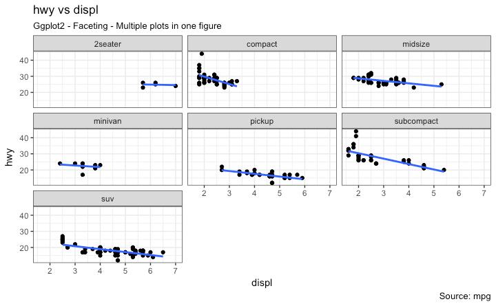
20 We have a simple chart of highway mileage (hwy) against the engine displacement (displ) for the whole dataset. But what if you want to study how this relationship varies for different classes of vehicles? [Back to Top] Facet Wrap The facet_wrap() is used to break down a large plot into multiple small plots for individual categories. It takes a formula as the main argument. The items to the left of ~ forms the rows while those to the right form the columns. By default, all the plots share the same scale in both X and Y axis. You can set them free by setting scales='free' but this way it could be harder to compare between groups. g <- ggplot(mpg, aes(x=displ, y=hwy)) + geom_point() + geom_smooth(method="lm", se=false) + theme_bw() # apply bw theme # Facet wrap with common scales g + facet_wrap( ~ class, nrow=3) + labs(title="hwy vs displ", caption = "Source: mpg", subtitle="ggplot2 - Faceting - Multiple plots in one figure") # Shared scales
21 # Facet wrap with free scales g + facet_wrap( ~ class, scales = "free") + labs(title="hwy vs displ", caption = "Source: mpg", subtitle="ggplot2 - Faceting - Multiple plots in one figure with free scales") # Scales free
22
![[Back to Top] So, What do you infer from this? For one, most 2 seater cars have higher engine displacement while the minivan and compact vehicles are on the lower side.](/docs-images/89/100398131/images/23-0.jpg "This is evident from where the points are placed along the X-axis. Also, the highway mileage drops across all segments as the engine displacement increases.")
23 [Back to Top] So, What do you infer from this? For one, most 2 seater cars have higher engine displacement while the minivan and compact vehicles are on the lower side. This is evident from where the points are placed along the X-axis. Also, the highway mileage drops across all segments as the engine displacement increases. This drop seems more pronounced in compact and subcompact vehicles. Facet Grid The headings of the middle and bottom rows take up significant space. The facet_grid() would get rid of it and give more area to the charts. The main difference with facet_grid is that it is not possible to choose the number of rows and columns in the grid. Alright, Let s create a grid to see how it varies with manufacturer. g <- ggplot(mpg, aes(x=displ, y=hwy)) + geom_point() + labs(title="hwy vs displ", caption = "Source: mpg", subtitle="ggplot2 - Faceting - Multiple plots in one figure") + geom_smooth(method="lm", se=false) + theme_bw() # apply bw theme # Add Facet Grid
![g1 <- g + facet_grid(manufacturer ~ class) # manufacturer in rows and class in columns plot(g1) [Back to Top] Let s make one more to vary by cylinder.](/docs-images/89/100398131/images/24-0.jpg "g <- ggplot(mpg, aes(x=displ, y=hwy)) + geom_point() + geom_smooth(method=\"lm\", se=false) + labs(title=\"hwy vs displ\", caption = \"Source: mpg\", subtitle=\"ggplot2 - Facet Grid - Multiple plots in one")
24 g1 <- g + facet_grid(manufacturer ~ class) # manufacturer in rows and class in columns plot(g1) [Back to Top] Let s make one more to vary by cylinder. g <- ggplot(mpg, aes(x=displ, y=hwy)) + geom_point() + geom_smooth(method="lm", se=false) + labs(title="hwy vs displ", caption = "Source: mpg", subtitle="ggplot2 - Facet Grid - Multiple plots in one figure") + theme_bw() # apply bw theme # Add Facet Grid g2 <- g + facet_grid(cyl ~ class) # cyl in rows and class in columns. plot(g2)
 package for this. # Draw Multiple plots in same figure.")
25 Great!. It is possible to layout both these charts in the sample panel. I prefer the gridextra() package for this. # Draw Multiple plots in same figure. library(gridextra) gridextra::grid.arrange(g1, g2, ncol=2) [Back to Top]
, panel.grid.major = element_line(colour = \"burlywood\", size=1.")
26 6. Modifying Plot Background, Major and Minor Axis How to Change Plot background g <- ggplot(mpg, aes(x=displ, y=hwy)) + geom_point() + geom_smooth(method="lm", se=false) + theme_bw() # apply bw theme # Change Plot Background elements g + theme(panel.background = element_rect(fill = 'khaki'), panel.grid.major = element_line(colour = "burlywood", size=1.5), panel.grid.minor = element_line(colour = "tomato", size=.25, linetype = "dashed"), panel.border = element_blank(), axis.line.x = element_line(colour = "darkorange", size=1.5, lineend = "butt"), axis.line.y = element_line(colour = "darkorange", size=1.5)) + labs(title="modified Background", subtitle="how to Change Major and Minor grid, Axis Lines, No Border") # Change Plot Margins g + theme(plot.background=element_rect(fill="salmon"),
27 plot.margin = unit(c(2, 2, 1, 1), "cm")) + # top, right, bottom, left labs(title="modified Background", subtitle="how to Change Plot Margin")

28
![[Back to Top] How to Remove Major and Minor Grid, Change Border, Axis Title, Text and Ticks g <- ggplot(mpg, aes(x=displ, y=hwy)) + geom_point() + geom_smooth(method="lm", se=false) + theme_bw() #](/docs-images/89/100398131/images/29-0.jpg "apply bw theme g + theme(panel.grid.major = element_blank(), panel.grid.minor = element_blank(), panel.border = element_blank(), axis.title = element_blank(), axis.text = element_blank(), axis.")
29 [Back to Top] How to Remove Major and Minor Grid, Change Border, Axis Title, Text and Ticks g <- ggplot(mpg, aes(x=displ, y=hwy)) + geom_point() + geom_smooth(method="lm", se=false) + theme_bw() # apply bw theme g + theme(panel.grid.major = element_blank(), panel.grid.minor = element_blank(), panel.border = element_blank(), axis.title = element_blank(), axis.text = element_blank(), axis.ticks = element_blank()) + labs(title="modified Background", subtitle="how to remove major and minor axis grid, border, axis title, text and ticks")
30 [Back to Top] Add an Image in Background library(grid) library(png) img <- png::readpng("screenshots/rlogo.png") # source: g_pic <- rastergrob(img, interpolate=true) g <- ggplot(mpg, aes(x=displ, y=hwy)) + geom_point() + geom_smooth(method="lm", se=false) + theme_bw() # apply bw theme g + theme(panel.grid.major = element_blank(), panel.grid.minor = element_blank(), plot.title = element_text(size = rel(1.5), face = "bold"), axis.ticks = element_blank()) + annotation_custom(g_pic, xmin=5, xmax=7, ymin=30, ymax=45)
31 [Back to Top]
32 Inheritance Structure of Theme Components source:
Introduction to R Forecasting Techniques
 Introduction to R zabbeta@fsu.gr katerina@fsu.gr Starting out in R Working with data Plotting & Forecasting 1. Starting Out In R R & RStudio Variables & Basics Data Types Functions R + RStudio Programming
Beautiful plotting in R: A ggplot2cheatsheet
 Technical Tidbits From Spatial Analysis & Data Science Beautiful plotting in R: A ggplot2cheatsheet Posted on August 4, 2014 by zev@zevross.com 9 Comments Even the most experienced R users need help creating
Facets and Continuous graphs
 Facets and Continuous graphs One way to add additional variables is with aesthetics. Another way, particularly useful for categorical variables, is to split your plot into facets, subplots that each display
Scripting Languages Course Information
 Scripting Languages Course Information based off notes from Dan Hood Contact Information Bryan Wilkinson bryan.wilkinson@umbc.edu ITE 373 Of ce Hours: Mondays 10:30 AM - 11:30 AM and Thursdays 3:00 PM
Package cowplot. March 6, 2016
 Package cowplot March 6, 2016 Title Streamlined Plot Theme and Plot Annotations for 'ggplot2' Version 0.6.1 Some helpful extensions and modifications to the 'ggplot2' library. In particular, this package
Package gggenes. R topics documented: November 7, Title Draw Gene Arrow Maps in 'ggplot2' Version 0.3.2
 Title Draw Gene Arrow Maps in 'ggplot2' Version 0.3.2 Package gggenes November 7, 2018 Provides a 'ggplot2' geom and helper functions for drawing gene arrow maps. Depends R (>= 3.3.0) Imports grid (>=
03 - Intro to graphics (with ggplot2)
") 3 - Intro to graphics (with ggplot2) ST 597 Spring 217 University of Alabama 3-dataviz.pdf Contents 1 Intro to R Graphics 2 1.1 Graphics Packages................................ 2 1.2 Base Graphics...................................
3 - Intro to graphics (with ggplot2) ST 597 Spring 217 University of Alabama 3-dataviz.pdf Contents 1 Intro to R Graphics 2 1.1 Graphics Packages................................ 2 1.2 Base Graphics...................................
Introduction to R and the tidyverse. Paolo Crosetto
 Introduction to R and the tidyverse Paolo Crosetto Lecture 1: plotting Before we start: Rstudio Interactive console Object explorer Script window Plot window Before we start: R concatenate: c() assign:
Package dotwhisker. R topics documented: June 28, Type Package
 Type Package Package dotwhisker June 28, 2017 Title Dot-and-Whisker Plots of Regression Results Version 0.3.0 Date 2017-06-28 Maintainer Yue Hu Quick and easy dot-and-whisker plots
ggplot2 basics Hadley Wickham Assistant Professor / Dobelman Family Junior Chair Department of Statistics / Rice University September 2011
 ggplot2 basics Hadley Wickham Assistant Professor / Dobelman Family Junior Chair Department of Statistics / Rice University September 2011 1. Diving in: scatterplots & aesthetics 2. Facetting 3. Geoms
Plotting with ggplot2: Part 2. Biostatistics
 Plotting with ggplot2: Part 2 Biostatistics 14.776 Building Plots with ggplot2 When building plots in ggplot2 (rather than using qplot) the artist s palette model may be the closest analogy Plots are built
Data Visualization. Module 7
 Data Visualization http://datascience.tntlab.org Module 7 Today s Agenda A Brief Reminder to Update your Software A walkthrough of ggplot2 Big picture New cheatsheet, with some familiar caveats Geometric
Getting started with ggplot2
 Getting started with ggplot2 STAT 133 Gaston Sanchez Department of Statistics, UC Berkeley gastonsanchez.com github.com/gastonstat/stat133 Course web: gastonsanchez.com/stat133 ggplot2 2 Resources for
Lecture 4: Data Visualization I
 Lecture 4: Data Visualization I Data Science for Business Analytics Thibault Vatter Department of Statistics, Columbia University and HEC Lausanne, UNIL 11.03.2018 Outline 1 Overview
Creating elegant graphics in R with ggplot2
 Creating elegant graphics in R with ggplot2 Lauren Steely Bren School of Environmental Science and Management University of California, Santa Barbara What is ggplot2, and why is it so great? ggplot2 is
Package lemon. September 12, 2017
 Type Package Title Freshing Up your 'ggplot2' Plots Package lemon September 12, 2017 URL https://github.com/stefanedwards/lemon BugReports https://github.com/stefanedwards/lemon/issues Version 0.3.1 Date
Session 5 Nick Hathaway;
 Session 5 Nick Hathaway; nicholas.hathaway@umassmed.edu Contents Adding Text To Plots 1 Line graph................................................. 1 Bar graph..................................................
Adding a corporate identity to reproducible research
 Adding a corporate identity to reproducible research R Belgium, Zavemtem March 7 2017 Thierry Onkelinx Research Institute for Nature and Forest (INBO) Summary 1 Introduction 2 ggplot2 for graphics 3 Short
DATA VISUALIZATION WITH GGPLOT2. Grid Graphics
 DATA VISUALIZATION WITH GGPLOT2 Grid Graphics ggplot2 internals Explore grid graphics 35 30 Elements of ggplot2 plot 25 How do graphics work in R? 2 plotting systems mpg 20 15 base package grid graphics
social data science Data Visualization Sebastian Barfort August 08, 2016 University of Copenhagen Department of Economics 1/86
 social data science Data Visualization Sebastian Barfort August 08, 2016 University of Copenhagen Department of Economics 1/86 Who s ahead in the polls? 2/86 What values are displayed in this chart? 3/86
Data visualization with ggplot2
 Data visualization with ggplot2 Visualizing data in R with the ggplot2 package Authors: Mateusz Kuzak, Diana Marek, Hedi Peterson, Dmytro Fishman Disclaimer We will be using the functions in the ggplot2
Error-Bar Charts from Summary Data
 Chapter 156 Error-Bar Charts from Summary Data Introduction Error-Bar Charts graphically display tables of means (or medians) and variability. Following are examples of the types of charts produced by
Package ggrepel. September 30, 2017
 Version 0.7.0 Package ggrepel September 30, 2017 Title Repulsive Text and Label Geoms for 'ggplot2' Description Provides text and label geoms for 'ggplot2' that help to avoid overlapping text labels. Labels
Package lemon. January 31, 2018
 Type Package Title Freshing Up your 'ggplot2' Plots Package lemon January 31, 2018 URL https://github.com/stefanedwards/lemon BugReports https://github.com/stefanedwards/lemon/issues Version 0.3.3 Date
The diamonds dataset Visualizing data in R with ggplot2
 Lecture 2 STATS/CME 195 Matteo Sesia Stanford University Spring 2018 Contents The diamonds dataset Visualizing data in R with ggplot2 The diamonds dataset The tibble package The tibble package is part
Package ggraph. January 29, 2018
 Type Package Package ggraph January 29, 2018 Title An Implementation of Grammar of Graphics for Graphs and Networks Version 1.0.1 Date 2018-01-29 Author Thomas Lin Pedersen Maintainer Thomas Lin Pedersen
Package ggraph. July 7, 2018
 Type Package Package ggraph July 7, 2018 Title An Implementation of Grammar of Graphics for Graphs and Networks Version 1.0.2 Date 2018-07-07 Author Thomas Lin Pedersen Maintainer Thomas Lin Pedersen
Advanced Plotting with ggplot2. Algorithm Design & Software Engineering November 13, 2016 Stefan Feuerriegel
 Advanced Plotting with ggplot2 Algorithm Design & Software Engineering November 13, 2016 Stefan Feuerriegel Today s Lecture Objectives 1 Distinguishing different types of plots and their purpose 2 Learning
Book 5. Chapter 1: Slides with SmartArt & Pictures... 1 Working with SmartArt Formatting Pictures Adjust Group Buttons Picture Styles Group Buttons
 Chapter 1: Slides with SmartArt & Pictures... 1 Working with SmartArt Formatting Pictures Adjust Group Buttons Picture Styles Group Buttons Chapter 2: Slides with Charts & Shapes... 12 Working with Charts
Using Built-in Plotting Functions
 Workshop: Graphics in R Katherine Thompson (katherine.thompson@uky.edu Department of Statistics, University of Kentucky September 15, 2016 Using Built-in Plotting Functions ## Plotting One Quantitative
Package ggextra. April 4, 2018
 Package ggextra April 4, 2018 Title Add Marginal Histograms to 'ggplot2', and More 'ggplot2' Enhancements Version 0.8 Collection of functions and layers to enhance 'ggplot2'. The flagship function is 'ggmarginal()',
Stat 849: Plotting responses and covariates
 Stat 849: Plotting responses and covariates Douglas Bates 10-09-03 Outline Contents 1 R Graphics Systems Graphics systems in R ˆ R provides three dierent high-level graphics systems base graphics The system
Package gridextra. September 9, 2017
 License GPL (>= 2) Package gridextra September 9, 2017 Title Miscellaneous Functions for ``Grid'' Graphics Type Package Provides a number of user-level functions to work with ``grid'' graphics, notably
Session 3 Nick Hathaway;
 Session 3 Nick Hathaway; nicholas.hathaway@umassmed.edu Contents Manipulating Data frames and matrices 1 Converting to long vs wide formats.................................... 2 Manipulating data in table........................................
Introduction to ggvis. Aimee Gott R Consultant
 Introduction to ggvis Overview Recap of the basics of ggplot2 Getting started with ggvis The %>% operator Changing aesthetics Layers Interactivity Resources for the Workshop R (version 3.1.2) RStudio ggvis
Rstudio GGPLOT2. Preparations. The first plot: Hello world! W2018 RENR690 Zihaohan Sang
 Rstudio GGPLOT2 Preparations There are several different systems for creating data visualizations in R. We will introduce ggplot2, which is based on Leland Wilkinson s Grammar of Graphics. The learning
An introduction to R Graphics 4. ggplot2
 An introduction to R Graphics 4. ggplot2 Michael Friendly SCS Short Course March, 2017 http://www.datavis.ca/courses/rgraphics/ Resources: Books Hadley Wickham, ggplot2: Elegant graphics for data analysis,
Package cowplot. November 16, 2017
 Package cowplot November 16, 2017 Title Streamlined Plot Theme and Plot Annotations for 'ggplot2' Version 0.9.1 Some helpful extensions and modifications to the 'ggplot2' package. In particular, this package
Intro to R for Epidemiologists
 Lab 9 (3/19/15) Intro to R for Epidemiologists Part 1. MPG vs. Weight in mtcars dataset The mtcars dataset in the datasets package contains fuel consumption and 10 aspects of automobile design and performance
Statistical transformations
 Statistical transformations Next, let s take a look at a bar chart. Bar charts seem simple, but they are interesting because they reveal something subtle about plots. Consider a basic bar chart, as drawn
Package microplot. January 19, 2017
 Type Package Package microplot January 19, 2017 Title R Graphics as Microplots (Sparklines) in 'LaTeX', 'HTML', 'Excel' Version 1.0-16 Date 2017-01-18 Author Richard M. Heiberger, with contributions from
Demo yeast mutant analysis
 Demo yeast mutant analysis Jean-Yves Sgro February 20, 2018 Contents 1 Analysis of yeast growth data 1 1.1 Set working directory........................................ 1 1.2 List all files in directory.......................................
Package lvplot. August 29, 2016
 Version 0.2.0 Title Letter Value 'Boxplots' Package lvplot August 29, 2016 Implements the letter value 'boxplot' which extends the standard 'boxplot' to deal with both larger and smaller number of data
MICROSOFT EXCEL Working with Charts
 MICROSOFT EXCEL 2010 Working with Charts Introduction to charts WORKING WITH CHARTS Charts basically represent your data graphically. The data here refers to numbers. In Excel, you have various types of
User Manual MS Energy Services
 User Manual MS Energy Services Table of content Access 4 Log In 4 Home Page 5 Add pre-visualisations 6 Pre-visualisation with variables 7 Multiple pre-visualisations 8 Pre-visualisation window 8 Design
Package ggsubplot. February 15, 2013
 Package ggsubplot February 15, 2013 Maintainer Garrett Grolemund License GPL Title Explore complex data by embedding subplots within plots. LazyData true Type Package Author Garrett
Stat 849: Plotting responses and covariates
 Stat 849: Plotting responses and covariates Douglas Bates Department of Statistics University of Wisconsin, Madison 2010-09-03 Outline R Graphics Systems Brain weight Cathedrals Longshoots Domedata Summary
WORD Creating Objects: Tables, Charts and More
 WORD 2007 Creating Objects: Tables, Charts and More Microsoft Office 2007 TABLE OF CONTENTS TABLES... 1 TABLE LAYOUT... 1 TABLE DESIGN... 2 CHARTS... 4 PICTURES AND DRAWINGS... 8 USING DRAWINGS... 8 Drawing
Install RStudio from - use the standard installation.
 Session 1: Reading in Data Before you begin: Install RStudio from http://www.rstudio.com/ide/download/ - use the standard installation. Go to the course website; http://faculty.washington.edu/kenrice/rintro/
Years after US Student to Teacher Ratio
 The goal of this assignment is to create a scatter plot of a set of data. You could do this with any two columns of data, but for demonstration purposes we ll work with the data in the table below. The
Total Number of Students in US (millions)
") The goal of this technology assignment is to graph a formula on your calculator and in Excel. This assignment assumes that you have a TI 84 or similar calculator and are using Excel 2007. The formula you
The goal of this technology assignment is to graph a formula on your calculator and in Excel. This assignment assumes that you have a TI 84 or similar calculator and are using Excel 2007. The formula you
Microsoft Excel 2010 Tutorial
 1 Microsoft Excel 2010 Tutorial Excel is a spreadsheet program in the Microsoft Office system. You can use Excel to create and format workbooks (a collection of spreadsheets) in order to analyze data and
Visualizing Data: Customization with ggplot2
 Visualizing Data: Customization with ggplot2 Data Science 1 Stanford University, Department of Statistics ggplot2: Customizing graphics in R ggplot2 by RStudio s Hadley Wickham and Winston Chang offers
Introduction to Plot.ly: Customizing a Stacked Bar Chart
 Introduction to Plot.ly: Customizing a Stacked Bar Chart Plot.ly is a free web data visualization tool that allows you to download and embed your charts on other websites. This tutorial will show you the
Graphical critique & theory. Hadley Wickham
 Graphical critique & theory Hadley Wickham Exploratory graphics Are for you (not others). Need to be able to create rapidly because your first attempt will never be the most revealing. Iteration is crucial
Package ggmosaic. February 9, 2017
 Title Mosaic Plots in the 'ggplot2' Framework Version 0.1.2 Package ggmosaic February 9, 2017 Mosaic plots in the 'ggplot2' framework. Mosaic plot functionality is provided in a single 'ggplot2' layer
Graphing Interface Overview
 Graphing Interface Overview Note: This document is a reference for using JFree Charts. JFree Charts is m-power s legacy graphing solution, and has been deprecated. JFree Charts have been replace with Fusion
Package ggtree. March 1, 2018
 Type Package Package ggtree March 1, 2018 Title an R package for visualization and annotation of phylogenetic trees with their covariates and other associated data Version 1.11.6 Maintainer
R visual in Power BI: with pbiviz and ggplot2
 R visual in Power BI: with pbiviz and ggplot2 Leila Etaati AI MVP, Consultant, Data Science from RADACAD Agenda Data Behavior Analysis Charts (Centre and Distribution Data) More Charts with ggplot2 Package
Formatting Spreadsheets in Microsoft Excel
 Formatting Spreadsheets in Microsoft Excel This document provides information regarding the formatting options available in Microsoft Excel 2010. Overview of Excel Microsoft Excel 2010 is a powerful tool
Microsoft Office PowerPoint 2013 Courses 24 Hours
 Microsoft Office PowerPoint 2013 Courses 24 Hours COURSE OUTLINES FOUNDATION LEVEL COURSE OUTLINE Using PowerPoint 2013 Opening PowerPoint 2013 Opening a Presentation Navigating between Slides Using the
Working with Charts Stratum.Viewer 6
 Working with Charts Stratum.Viewer 6 Getting Started Tasks Additional Information Access to Charts Introduction to Charts Overview of Chart Types Quick Start - Adding a Chart to a View Create a Chart with
Computer Applications Final Exam Study Guide
 Name: Computer Applications Final Exam Study Guide Microsoft Word 1. To use -and-, position the pointer on top of the selected text, and then drag the selected text to the new location. 2. The Clipboard
1 The ggplot2 workflow
 ggplot2 @ statistics.com Week 2 Dope Sheet Page 1 dope, n. information especially from a reliable source [the inside dope]; v. figure out usually used with out; adj. excellent 1 This week s dope This week
Introduction to Graphics with ggplot2
 Introduction to Graphics with ggplot2 Reaction 2017 Flavio Santi Sept. 6, 2017 Flavio Santi Introduction to Graphics with ggplot2 Sept. 6, 2017 1 / 28 Graphics with ggplot2 ggplot2 [... ] allows you to
Package ggdark. R topics documented: January 11, Type Package Title Dark Mode for 'ggplot2' Themes Version Author Neal Grantham
 Type Package Title Dark Mode for 'ggplot2' Themes Version 0.2.1 Author Neal Grantham Package ggdark January 11, 2019 Maintainer Neal Grantham Activate dark mode on your favorite 'ggplot2'
An introduction to ggplot: An implementation of the grammar of graphics in R
 An introduction to ggplot: An implementation of the grammar of graphics in R Hadley Wickham 00-0-7 1 Introduction Currently, R has two major systems for plotting data, base graphics and lattice graphics
Cl-plplot User Manual
 Cl-plplot User Manual February, 2008 Copyright c 2008 Hazen P. Babcock Permission is hereby granted, free of charge, to any person obtaining a copy of this software and associated
DASHBOARDPRO & DASHBOARD
 DASHBOARDPRO & DASHBOARD In a world where text rules the flow of knowledge, how do you expand the content and present it in such a way that the viewer appreciates your hard work and effort to a greater
Package arphit. March 28, 2019
 Type Package Title RBA-style R Plots Version 0.3.1 Author Angus Moore Package arphit March 28, 2019 Maintainer Angus Moore Easily create RBA-style graphs
Package geomnet. December 8, 2016
 Type Package Package geomnet December 8, 2016 Title Network Visualization in the 'ggplot2' Framework Version 0.2.0 Date 2016-11-14 Author Samantha Tyner, Heike Hofmann Maintainer Samantha Tyner
Exercise 1: Introduction to MapInfo
 Geog 578 Exercise 1: Introduction to MapInfo Page: 1/22 Geog 578: GIS Applications Exercise 1: Introduction to MapInfo Assigned on January 25 th, 2006 Due on February 1 st, 2006 Total Points: 10 0. Convention
Package plotluck. November 13, 2016
 Title 'ggplot2' Version of ``I'm Feeling Lucky!'' Version 1.1.0 Package plotluck November 13, 2016 Description Examines the characteristics of a data frame and a formula to automatically choose the most
Arkansas Curriculum Framework for Computer Applications II
 A Correlation of DDC Learning Microsoft Office 2010 Advanced Skills 2011 To the Arkansas Curriculum Framework for Table of Contents Unit 1: Spreadsheet Formatting and Changing the Appearance of a Worksheet
Microsoft Excel 2002 M O D U L E 2
 THE COMPLETE Excel 2002 M O D U L E 2 CompleteVISUAL TM Step-by-step Series Computer Training Manual www.computertrainingmanual.com Copyright Notice Copyright 2002 EBook Publishing. All rights reserved.
Tutorials. Lesson 3 Work with Text
 In this lesson you will learn how to: Add a border and shadow to the title. Add a block of freeform text. Customize freeform text. Tutorials Display dates with symbols. Annotate a symbol using symbol text.
GCSE CCEA GCSE EXCEL 2010 USER GUIDE. Business and Communication Systems
 GCSE CCEA GCSE EXCEL 2010 USER GUIDE Business and Communication Systems For first teaching from September 2017 Contents Page Define the purpose and uses of a spreadsheet... 3 Define a column, row, and
Econ 2148, spring 2019 Data visualization
 Econ 2148, spring 2019 Maximilian Kasy Department of Economics, Harvard University 1 / 43 Agenda One way to think about statistics: Mapping data-sets into numerical summaries that are interpretable by
How This Book Is Organized Which Suites Are Covered? The Office Applications Introducing Microsoft Office 2007 p. 1 What's New in Office 2007? p.
 Introduction p. xi How This Book Is Organized p. xii Which Suites Are Covered? p. xii The Office Applications p. xiii Introducing Microsoft Office 2007 p. 1 What's New in Office 2007? p. 3 The New User
Microsoft Excel 2016 / 2013 Basic & Intermediate
 Microsoft Excel 2016 / 2013 Basic & Intermediate Duration: 2 Days Introduction Basic Level This course covers the very basics of the Excel spreadsheet. It is suitable for complete beginners without prior
Data Visualization Using R & ggplot2. Karthik Ram October 6, 2013
 Data Visualization Using R & ggplot2 Karthik Ram October 6, 2013 Some housekeeping Install some packages install.packages("ggplot2", dependencies = TRUE) install.packages("plyr") install.packages("ggthemes")
The American University in Cairo. Academic Computing Services. Excel prepared by. Maha Amer
 The American University in Cairo Excel 2000 prepared by Maha Amer Spring 2001 Table of Contents: Opening the Excel Program Creating, Opening and Saving Excel Worksheets Sheet Structure Formatting Text
Excel 2010 Worksheet 3. Table of Contents
 Table of Contents Graphs and Charts... 1 Chart Elements... 1 Column Charts:... 2 Pie Charts:... 6 Line graph 1:... 8 Line Graph 2:... 10 Scatter Charts... 12 Functions... 13 Calculate Averages (Mean):...
Graphics in R. There are three plotting systems in R. base Convenient, but hard to adjust after the plot is created
 Graphics in R There are three plotting systems in R base Convenient, but hard to adjust after the plot is created lattice Good for creating conditioning plot ggplot2 Powerful and flexible, many tunable
Creating a Worksheet and an Embedded Chart in Excel 2007
 Objectives: Start and quit Excel Describe the Excel worksheet Enter text and numbers Use the Sum button to sum a range of cells Copy the contents of a cell to a range of cells using the fill handle Save
Class #2 Lab: Basic CAD Skills & Standards. Basic AutoCAD Interface AutoCAD Skills AutoCAD Standards
 Class #2 Lab: Basic CAD Skills & Standards 1230 Building Tech II NYC College of Technology Professor: Daniel Friedman AIA LEED AP Fall 2012 Paperspace/ Layouts Paperspace Paperspace Paperspace Paperspace
GRAPHING IN EXCEL EXCEL LAB #2
 GRAPHING IN EXCEL EXCEL LAB #2 ECON/BUSN 180: Quantitative Methods for Economics and Business Department of Economics and Business Lake Forest College Lake Forest, IL 60045 Copyright, 2011 Overview This
Package panelview. April 24, 2018
 Type Package Package panelview April 24, 2018 Title Visualizing Panel Data with Dichotomous Treatments Version 1.0.1 Date 2018-04-23 Author Licheng Liu, Yiqing Xu Maintainer Yiqing Xu
The Beauty of ggplot2 Jihui Lee February 23, 2017
 The Beauty of ggplot2 Jihui Lee (jl4201@cumc.columbia.edu) February 23, 2017 0. Goal : No more basic plots! 1) plot vs ggplot plot(x =, y =, type =, col, xlab =, ylab =, main = ) ggplot(data =, aes(x =,
User manual forggsubplot
 User manual forggsubplot Garrett Grolemund September 3, 2012 1 Introduction ggsubplot expands the ggplot2 package to help users create multi-level plots, or embedded plots." Embedded plots embed subplots
R Graphics. Paul Murrell. The University of Auckland. R Graphics p.1/47
 R Graphics p.1/47 R Graphics Paul Murrell paul@stat.auckland.ac.nz The University of Auckland R Graphics p.2/47 Overview Standard (base) R graphics grid graphics Graphics Regions and Coordinate Systems
Technology Assignment: Scatter Plots
 The goal of this assignment is to create a scatter plot of a set of data. You could do this with any two columns of data, but for demonstration purposes we ll work with the data in the table below. You
Graphics - Part III: Basic Graphics Continued
 Graphics - Part III: Basic Graphics Continued Statistics 135 Autumn 2005 Copyright c 2005 by Mark E. Irwin Highway MPG 20 25 30 35 40 45 50 y^i e i = y i y^i 2000 2500 3000 3500 4000 Car Weight Copyright
Chapter 10 Working with Graphs and Charts
 Chapter 10: Working with Graphs and Charts 163 Chapter 10 Working with Graphs and Charts Most people understand information better when presented as a graph or chart than when they look at the raw data.
Creating a Box-and-Whisker Graph in Excel: Step One: Step Two:
 Creating a Box-and-Whisker Graph in Excel: It s not as simple as selecting Box and Whisker from the Chart Wizard. But if you ve made a few graphs in Excel before, it s not that complicated to convince
Package rplotengine. R topics documented: August 8, 2018
 Type Package Version 1.0-7 Date 2018-08-08 Title R as a Plotting Engine Depends R (>= 2.6.2), xtable Package rplotengine August 8, 2018 Description Generate basic charts either by custom applications,
Correcting Grammar as You Type
 PROCEDURES LESSON 11: CHECKING SPELLING AND GRAMMAR Selecting Spelling and Grammar Options 2 Click Options 3 In the Word Options dialog box, click Proofing 4 Check options as necessary under the When correcting
Unit 4 Graphs of Trigonometric Functions - Classwork
 Unit Graphs of Trigonometric Functions - Classwork For each of the angles below, calculate the values of sin x and cos x ( decimal places) on the chart and graph the points on the graph below. x 0 o 30
Graphing. ReportMill Graphing User Guide. This document describes ReportMill's graph component. Graphs are the best way to present data visually.
 ReportMill User Guide This document describes ReportMill's graph component. Graphs are the best way to present data visually. Table of Contents 0 Creating a Graph Component 0 Master Graph Inspector 0 Graph
Tree and Data Grid for Micro Charts User Guide
 COMPONENTS FOR XCELSIUS Tree and Data Grid for Micro Charts User Guide Version 1.1 Inovista Copyright 2009 All Rights Reserved Page 1 TABLE OF CONTENTS Components for Xcelsius... 1 Introduction... 4 Data