Ryan Parsons Chad Price Jia Reese Alex Vassallo
|
|
|
- Roland Holland
- 5 years ago
- Views:
Transcription

1 Ryan Parsons - Paper Prototype, Writing Chad Price - Paper Prototype, Digital Mockup Jia Reese - Paper Prototype, Usability Testing Alex Vassallo - Usability Testing, Writing All we have to decide is what to do with the time that is given to us. There are other forces at work in this world Frodo, besides the will of evil. -Gandalf, The Lord of the Rings Deciding what to do with our time is hard, and we don t always make the right choices. This isn t because we are bad decision makers, but because we don t have all of the information we need to make an informed decision. We need to know what our goals are, what we already have planned, and what choices we can make. These things are always changing and difficult to remember. That s why we are designing Balance. It will remember your goals, show you how to reach them, and keep track of your progress. It will automate the most difficult and tedious tasks of personal time management and help you reach the time balance that you want.

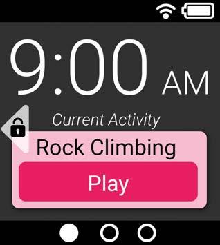
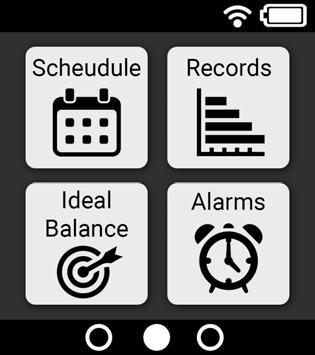
2 Initial Paper Prototype Our paper prototype is based on a smartwatch. Our first design has three main screens: Lock screen, Home screen and Menu screen. After unlocking the Lock screen, it goes to the Home screen. There is a menu bar at the bottom of the Home screen. It includes Home and Menu icons. In the Menu screen, there are four options: Schedule, Report, Ideal Balance and Notification. Overview
3 Activity #1: Categorize Current Activity To interact with the smartwatch, you must first swipe right on the sleep screen to unlock it. When it unlocks, it displays the home screen where you can change the category of your current activity. To change the category from Play to Social, press the Change Category button and select Social.
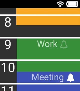
4 Activity #2: Browse Current Schedule To see your current schedule, press the menu button at the bottom of the screen to bring up the main menu. From the main menu, press the Schedule button to go to the schedule screen. The schedule screen is an infinite scroll of your schedule for today. Each item on your schedule is color coded by its category.
5 Activity #3: Check Report To see the report, press the Report button from the main menu. The drop down menu on the left allows you to switch between a report of the past day, the past week, the past month, or the past year. The Pie report displays your time spent in each category as a pie chart. The drop down menu on the right allows you to switch to an Hours view that just lists the number of hours you have spent in each category.
6 Activity #4: Receive and Dismiss Notifications An alarm will go off for each notification that you do not dismiss. Alarms cause the smartwatch to vibrate as a non-intrusive reminder. The alarm screen requires you to swipe right to dismiss the alarm. To prevent a notification from setting off an alarm, you can dismiss it before the set time from the Notifications screen, also accessed from the menu. Activity #5: Check Ideal Balance
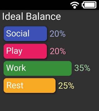
7 To see your ideal time balance, press the Ideal Balance button from the menu screen. The ideal balance screen allows you to see the goal that you have set for yourself.
8 Testing Process Usability Test #1 Our first usability testing participant, Mary, was an undergraduate student in Computer Science major in the University of Washington. We were under a time constraint and it was easier to find someone from our major. Mary has a busy schedule and we think she can represent our target users. The Usability Test was conducted in the HUB cafeteria because that can be a place where our target users would likely take a break and check their schedules. We first explained our design and how paper prototyping works, then we asked her to do the following tests: 1. Check the records of current balance of time for this week. 2. Cancel the notification of lunch at 11 am. Usability Test #2 Our second usability testing participant was Ryan, a data visualization researcher at the University of Washington. As both a student and a researcher, Ryan manages many different responsibilities. We conducted our usability test at Ryan s home where he has the most control over his time management, with team member Chad as the computer and team member Ryan as the facilitator. Our participant Ryan has both classes and meetings with his research group that keep him on campus, but consistently waiting on people. We wanted to focus on how Ryan chose to use his free time, since good use of his free time seemed to be his biggest challenge. We conducted our testing by having Ryan fill in his free time with different activities to try and keep the balance. Usability Test #3 Our third usability testing participant was Jerry. Jerry was chosen because he is not a college student, and because he is trying to balance his time with his family and himself. He also regularly has many unplanned events that interrupt his normal day. The usability test was conducted in his own home after work with team member Ryan as the computer, and Alex as the facilitator. The tasks we mainly focused on during this test involved the schedule shifting. Since Jerry was constantly moving his schedule around to meet the needs of his family, we decided to focus our tests on how our prototype would handle it. Retrospective Review Looking back at our usability testing, our methods remained fairly static throughout. We gave a quick basic overview of the design and then asked participants to engage in particular tasks. What probably changed most were the tasks that we asked participants to do. We iteratively updated our paper prototype after each usability test and so asked participants to complete tasks that would cause them the test the new design. This gave us good feedback on whether the new design worked well and functioned as intended, solving the initial issues we came across.
![Testing Results The main findings that resulted from our usability tests and heuristic evaluations are as follows: Critical Incident #1: No Interactivity in the Schedule Scroll [Severity: Very High]](/docs-images/90/104310991/images/9-0.jpg "Users expected a lot more functionality from our initial schedule screen, which was just a scroll that displayed the user s schedule for the current day.")
9 Testing Results The main findings that resulted from our usability tests and heuristic evaluations are as follows: Critical Incident #1: No Interactivity in the Schedule Scroll [Severity: Very High] Users expected a lot more functionality from our initial schedule screen, which was just a scroll that displayed the user s schedule for the current day. They tried to tap or hold specific schedule items to edit them. At first we were hesitant to allow users to edit their schedule in any way because of the difficulty of inputting text or choosing specific times using the smartwatch s small screen. Then we realized that we could actually add two useful features without any kind of text or time entry. The first was to allow users to change the category of scheduled activities in advance by tapping on them. We actually just reused the existing menu for changing the category of the current activity for future activities. This added a lot of flexibility while keeping the input method consistent. The second new feature was allowing users to add and remove notifications from the schedule by toggling an alarm icon next to each schedule item. These simple icons allowed users to put a notification on any item and to see their notifications in a more visual way. Old: New: Critical Incident #2: Drop Down Menu Targets
![[Severity: High] Users had no trouble using the drop down menus on the records page on the initial prototype because it was unnaturally large.](/docs-images/90/104310991/images/10-2.jpg "However, when we made the prototype a more realistic size, it suddenly became difficult to use the drop down menus.")
10 [Severity: High] Users had no trouble using the drop down menus on the records page on the initial prototype because it was unnaturally large. However, when we made the prototype a more realistic size, it suddenly became difficult to use the drop down menus. We realized this was a problem when users said out loud which part of the drop down menu they had pressed instead of just pressing it. They were doing this because they didn t want to show that they actually couldn t use the tiny drop down menus even though it was something they had the right to vocally complain about. We decided to bypass this problem entirely by replacing the multitude of drop down menus with simple swipe gestures. Changing between records for the past day and week, which used to take two taps on very small targets, became one swipe anywhere on the screen. Old: New:
11 Critical Incident #3: Ease of Changing Category [Severity: Low] In the initial prototype, there was a small Change Category button that allowed users to change the category of the current activity. Besides this small button, there were two other problems that users pointed out. First, there was no way to cancel out of changing the category. Users had no choice but to select a different category once they had pressed the change category button. Second, there was no way for to see what the category already was. In the new paper prototype, we fixed both of these problems with a relatively simple addition. We added the current category to the category selection menu as a sort of back button and we put a small arrow on it to indicate that it is already selected. Old: New:
12 Critical Incident #4: Undo Button After Removing Notification [Severity: Medium] In our initial prototype, notifications could only be dismissed once before they were gone forever. There was no undo button or any way to add a new notification. This was a critical error because users could accidentally dismiss notifications and be unable to recover them. In the new prototype, new notifications can be added, but we also included a undo button for notifications. Instead of disappearing entirely, notification are grayed out and only removed once the activity they are associated with has passed. Any dismissed notification can be re-enabled from the notifications screen. Old: New: Other Major Revisions One of the main revisions that occurred over this entire process was changing how to navigate the design. Initially, we had buttons and dropdown boxes here and there. Because we are dealing with such a small devices, we found that these were often difficult to use. Therefore, when using buttons, we made them very large. Additionally, we decided to get rid of the dropdown menus. Instead, most of the navigation is now down through the use of swiping gestures.
13 Final Paper Prototype Revision #1: Replacing Buttons With Gestures When we made our paper prototype smaller to more accurately illustrate a finished product, we realized that many of the buttons were difficult to hit and even to interpret because of their small size. We decided to fix the problem by removing a lot of the buttons altogether and replacing them with simple hand gestures. Swiping to the right replaced the menu button and allowed the user to go back from any screen. The home and menu screens also became one

14 continuous screen that the user could scroll left and right to explore. We also added a Gestures screen on the far right of the menu that lists and explains the various gestures because, unlike the buttons, these are not immediately visible. However, these gestures become visible whenever the user has a finger on the screen since dragging even slightly to the left, right, up, or down will move the screen, clearly indicating a possible gesture. This sort of tactile exploration is a lot more natural than pressing buttons because we, as humans, are more accustomed to moving objects around to learn about them. Revision #2: Record Presentation The first thing we changed about the records screen was replacing pie charts with bar graphs. While we really liked the aesthetic presentation of pie charts as an indication of balance (an evenly cut pie has a natural symmetry), it became clear that pie charts were not very good at displaying an imbalanced schedule. When slices were small, it became difficult to identify and compare them. We also needed to put text on each slice or place the text around the pie and provide arrows to help identify different slices. Users couldn t tell the exact percentage or number of hours in each category. We chose to replace all of the pie charts in our design with bar graphs to eliminate these problems. After this change, displaying graphs was no longer an issue because each bar had plenty of room to write the name of its category. We could also show the actual percentage as a number next to each bar. Another important change we made when revising the record presentation was to allow users to move directly between their ideal balance and their actual records. In our initial prototype, users had to go through three button presses and the menu screen to get from their ideal balance to their records. This made it difficult to see goals and performance side by side. In order to reduce the time between seeing the ideal balance and records, we made it possible to scroll between them from the ideal balance screen. This made the ideal balance screen much better for actively tracking goals.

15 Revision #3: Changing Categories We modified the current activity screen to be more interactive and allow the users to change the category of the current activity. This is done by touching on the category and selecting the new category from the menu. An arrow provides the user with the currently selected category. This proved to be a common enough task in our testing that it deserved it s own quick menu. Without this feature, users would have to exit back all the way into the schedule to make this simple change. It is important to have our design be as easy as possible to make quick changes.

16 Digital Mockup Overview
17 Task 1: Change the Category of Current Activity Screen 1.1 Screen 1.2
18 Screen 1.3 Screen 1.4 Screen 1.1: The Lock Screen is displaying current time and current activity. The category of current activity is automatically generated according to the history. Users can change the category of current activity manually. Swipe right on the screen to unlock. Screen 1.2: After unlocking the Lock Screen, the user sees the Home Screen. The Home Screen is displaying current time and current activity. There is a triangle with a lock inside on the left side of the screen. It means swipe right to lock or go back to the Lock Screen. The three dots on the bottom of the screen indicates that the user is on the first of the three pages of screens. Tap on the category of current activity to go to the Category Screen. Screen 1.3: The Category Screen is displaying a list of categories with different colors. The category of current activity is indicated with a triangle on the right side. There will be a triangle pointing down at the bottom of the screen if the list is longer than that the screen can display. Swipe up to see the rest of the list. Swipe right to go back to the Home Screen. Tap on a different category to change the category of current activity and it will go back to the Home Screen immediately after tapping. Screen 1.4: Now the Home Screen is displaying the current activity with the updated category. The color of the category is changed as well.


19 Task 2: See the Ideal Balance and Compare with Current Balance Screen 2.1 Screen 2.2 Screen 2.3 Screen 2.4

20 Screen 2.5 Screen 2.1: When the user is on the Home Screen, swipe left once to go to the Menu Screen. Screen 2.2: There are four tasks on the Menu Screen: Schedule, Records, Ideal Balance and Alarms. Tap on the Ideal Balance. Screen 2.3: In the Ideal Balance Screen, it is displaying the user s preset ideal balance. Each category of activities is in a horizontal bar with different colors and different lengths. The length of the bar indicates the percentage of that category along with a percentage in number at the right end of the bar. The user can compare the ideal balance with current balance. Swipe left to see the records of current balance. Screen 2.4: The Records Screen is displaying the balance of today as default. Same as the ideal balance, each category of activities is in a horizontal bar with different colors, different lengths and different percentages. Swipe down to see the record of current week. Screen 2.5: The Records Screen is now displaying the balance of current week. There are + and - signs at the top and bottom of the screen. It means that the user can switch and see the records of day, week, month or year. Swipe down to see the record of current month and swipe up to see or go back to the record of today. The user can switch back to the ideal balance by swipe right on the screen. Task 3: Dismiss and re-enable an alarm

21 Screen 3.1 Screen 3.2 Screen 3.1: When the user is on the Menu Screen, tap on the Alarms. Screen 3.2: The Alarms Screen is displaying a list of activities. There will be a triangle pointing down at the bottom of the screen if the list is longer than that the screen can display. Swipe up to see the rest of the list. On the right side of each activity, there is a symbol x or +. x means the alarm of this activity is enabled. The user can tap on the symbol to dismiss the alarm. After dismissing the alarm, the symbol becomes +. The user can re-enable the alarm by tapping on the symbol again. Then the + symbol becomes x. Decisions and Changes We didn t make many changes from our final version of paper prototype. We only added some arrows to indicate that the user can swipe up or down, left or right to switch between screens. The changes are as the following: 1. Added + and - signs.
22 2. Added lock symbol. 3. Added down arrow.
23 Discussion What did you learn from the process of iterative design? We learned that the process of iterative design was helpful and effective. Even though we tried to make our design perfect the first time, it was not what the users wanted. We can t just design and be done with it. We updated our design each time after getting the feedbacks from usability tests and critiques. We developed the features that the users needed and eliminated the ones that are not, thus we improve our design iteratively. How did the process shape your final design? Our final design is very different from our initial design. Our initial design of the smartwatch was way too big. There were several features that were not possible to do on such a small screen, such as the drop-down menus. After the usability test, we made our smartwatch smaller and eliminated the drop-down menus. We also learned that the menu bar at the bottom of the Home screen was too small to tap on. Therefore, we developed swipe gestures to switch between menus. The users feedbacks shaped our design. Through the iterative process, our design became more and more practical for the users. How have your tasks changed as a result of your usability tests? Initially, the tasks we set for the usability tests gave away too much information. When the users did the tests, they already know what they were going to do. For example, in our first usability test, we asked the user to check the records of current balance of time for this week. The user knew that she could go to the record menu and find the current balance right there. This way, we couldn t test whether or not our system was easy to use. We could instead use a better task such as find out how many hours you have spent on social activities this week. In this way, the user need to figure out that he should go to the record menu and find the current balance of time for this week, then get the number of hours spent on social activities. After the first usability test, we improved our tasks so that the users knew enough information but not too much to do the tasks. Do you think you could have used more, or fewer, iterations upon your design? We think that we could use more iterations for our design. We did three usability tests on our paper prototype. The user feedbacks were really useful for improving our design. If we have more time, we would want to do two more usability tests. For our digital mockup, we only got two feedbacks from critique in class. We think we need to do more iterations so we get more feedbacks.
3d: Usability Testing Review
 Balance Ryan Parsons, Chad Price, Jia Reese, Alex Vassallo 3d: Usability Testing Review Usability Test #1 Our first usability testing participant, Mary, was an undergraduate student in Computer Science
Team : Let s Do This CS147 Assignment 7 (Low-fi Prototype) Report
 Report") Team : Let s Do This CS147 Assignment 7 (Low-fi Prototype) Report 1. Title, each team member s name & role Title: Let s Do This Roles: Divya - Developer. Eric - Developer, manager. Sami - User testing,
Team : Let s Do This CS147 Assignment 7 (Low-fi Prototype) Report 1. Title, each team member s name & role Title: Let s Do This Roles: Divya - Developer. Eric - Developer, manager. Sami - User testing,
MiPhone Phone Usage Tracking
 MiPhone Phone Usage Tracking Team Scott Strong Designer Shane Miller Designer Sierra Anderson Designer Problem & Solution This project began as an effort to deter people from using their phones in class.
Usability Testing Review
 Usability Testing Summary Usability Testing Review Alexis Anand, Katrina Ezis, Ma Shixuan, Cynthia Zhang CSE 440 Section AD All of our usability tests were conducted with students from Computer Science
Problem and Solution Overview: An elegant task management solution, that saves busy people time.
 An elegant task management solution, that saves busy people time. Team: Anne Aoki: Storyboarding, design, user studies, writing Alex Anderson: User studies, design Matt Willden: Ideation, writing, user
During usability tests with our paper prototype, we had our participant complete the following actions:
 Assignment 3d: Usability Testing Review CSE 440 Section AB DASH Overview During usability tests with our paper prototype, we had our participant complete the following actions: Set up hardware and mobile
Cindy Fan, Rick Huang, Maggie Liu, Ethan Zhang November 6, c: Usability Testing Check-In
 Cindy Fan, Rick Huang, Maggie Liu, Ethan Zhang November 6, 2014 3c: Usability Testing Check-In HEURISTIC EVALUATION Our group did two heuristic evaluations. For each issue discovered during evaluation,
Assignment 8 rekindl Local Community (1:30PM) Meet The Team. Ryan C. Amanda L. Sara V. James C.
 Meet The Team. Ryan C. Amanda L. Sara V. James C.") Hi-Fi Prototype Assignment 8 rekindl Local Community (1:30PM) Meet The Team Ryan C. Amanda L. Sara V. James C. Introduction Mission Statement: Reignite faded friendships. Problem Overview: Busy schedules
Hi-Fi Prototype Assignment 8 rekindl Local Community (1:30PM) Meet The Team Ryan C. Amanda L. Sara V. James C. Introduction Mission Statement: Reignite faded friendships. Problem Overview: Busy schedules
Heuristic Evaluation of [Slaptitude]
![Heuristic Evaluation of [Slaptitude]](/thumbs/94/120357226.jpg "Heuristic Evaluation of [Slaptitude]") Heuristic Evaluation of [Slaptitude] 1. Problem I am evaluating Slaptitude, a mobile app that allows you to set a timer and monitor leaderboards to help achieve and improve focus. 2. Violations Found 1.
Heuristic Evaluation of [Slaptitude] 1. Problem I am evaluating Slaptitude, a mobile app that allows you to set a timer and monitor leaderboards to help achieve and improve focus. 2. Violations Found 1.
Usability Tests Descriptions
 Assignment 3b: Usability Check-In (Neat) Yoanna Dosouto, Siddhartha Gorti, Andrew Tat & Doaa Alsharif Usability Tests Descriptions Our first participant was a female student recruited at the HCDE lounge.
Axis labels for graphs could be improved (heuristic violated-visibility of system status):
:") 3c IEP Usability Check-In Lane Felker, Monique Franklin, Kristen Olson, Jessica Wong In Class Evaluation: Lane and Kristen conducted the in class heuristic evaluation. In hindsight we spent too much time
3c IEP Usability Check-In Lane Felker, Monique Franklin, Kristen Olson, Jessica Wong In Class Evaluation: Lane and Kristen conducted the in class heuristic evaluation. In hindsight we spent too much time
Interaction Design: Part II
 Interaction Design: Part II April Yu, Juliana Cook, Tara Balakrishnan Part I Critical Synthesis and Revision New User Profile Our user is a busy, technology savvy person who often uses her microwave to
Usability Test Report: Requesting Library Material 1
 Usability Test Report: Requesting Library Material 1 Summary Emily Daly and Kate Collins conducted usability testing on the processes of requesting library material. The test was conducted at the temporary
Heuristic Evaluation of Covalence
 Heuristic Evaluation of Covalence Evaluator #A: Selina Her Evaluator #B: Ben-han Sung Evaluator #C: Giordano Jacuzzi 1. Problem Covalence is a concept-mapping tool that links images, text, and ideas to
Plants can improve mood and health. Many people want to have plants in their home or workplace, but struggle with properly caring for their plants.
 plantr. Team Jen Jianfen Zhang: project manager; user interface design Jory Rice: interactive prototype Paul Bartell: ideation; writing; prototype integration Whitney Schmidt: ideation; writing; website
interview.io Final Report
 CSE 440 Section D Autumn 2017 interview.io Final Report Track & Manage Job Interviews Contents Contents 1 Team 2 Problem & Solution Overview 2 Initial Paper Prototype 2 Overview 3 Task 1: Tracking Interview
TEAM PROBLEM AND SOLUTION OVERVIEW
 TEAM Cindy Fan (snow) : story and scenario development, writer Rick Huang (ice): usability tester, web developer Maggie Liu (liquid): usability tester, writer Ethan Zhang (steam) : project manager, designer,
Chris Jung, Garrick Li, Luyi Lu, Grant Neubauer CSE Autumn d: Usability Testing Review. Usability Test 1
 Chris Jung, Garrick Li, Luyi Lu, Grant Neubauer CSE 440 - Autumn 2014 3d: Usability Testing Review Usability Test 1 Our first usability test was done with Glenn, a UW student, and took place in the HUB
Perfect Timing. Alejandra Pardo : Manager Andrew Emrazian : Testing Brant Nielsen : Design Eric Budd : Documentation
 Perfect Timing Alejandra Pardo : Manager Andrew Emrazian : Testing Brant Nielsen : Design Eric Budd : Documentation Problem & Solution College students do their best to plan out their daily tasks, but
Midterm Exam, October 24th, 2000 Tuesday, October 24th, Human-Computer Interaction IT 113, 2 credits First trimester, both modules 2000/2001
 257 Midterm Exam, October 24th, 2000 258 257 Midterm Exam, October 24th, 2000 Tuesday, October 24th, 2000 Course Web page: http://www.cs.uni sb.de/users/jameson/hci Human-Computer Interaction IT 113, 2
Part 1: Understanding Windows XP Basics
 542362 Ch01.qxd 9/18/03 9:54 PM Page 1 Part 1: Understanding Windows XP Basics 1: Starting Up and Logging In 2: Logging Off and Shutting Down 3: Activating Windows 4: Enabling Fast Switching between Users
EVALUATION ASSIGNMENT 2
 EVALUATION ASSIGNMENT 2 CS5760 Graduate Human-Computer Interaction Abstract An investigation of the user interface domain, heuristic principles, and critical usability concerns for the current design and
Ink Weaver. Create the perfect story. Pierce Darragh, Aaron Hsu, Charles Khong, Rajul Ramchandani
 Ink Weaver Create the perfect story. Pierce Darragh, Aaron Hsu, Charles Khong, Rajul Ramchandani Table of Contents Team Members and Roles 3 Problem and Solution Overview 3 Paper Prototype 3 Testing Process
CS 160: Evaluation. Outline. Outline. Iterative Design. Preparing for a User Test. User Test
 CS 160: Evaluation Professor John Canny Spring 2006 2/15/2006 1 2/15/2006 2 Iterative Design Prototype low-fi paper, DENIM Design task analysis contextual inquiry scenarios sketching 2/15/2006 3 Evaluate
CS 160: Evaluation. Professor John Canny Spring /15/2006 1
 CS 160: Evaluation Professor John Canny Spring 2006 2/15/2006 1 Outline User testing process Severity and Cost ratings Discount usability methods Heuristic evaluation HE vs. user testing 2/15/2006 2 Outline
Ka-Ching Usability Check-In
 Ka-Ching Usability Check-In Acacio Domar, Wanlin Li, Andrea Martin & Elise Neroutsos Heuristic review 1 Image Issue Severity Change Fixed Image Wanted way to click between years (from 2014 to 2013, etc.),
soneme encouraging the cooperative discovery of lesser known artists
 Jorge Pozas Trevino, Robert Fearon, Emmerich Anklam 4 December 2014 Interactive Prototype Report soneme encouraging the cooperative discovery of lesser known artists Problem and Solution Overview Even
Database Management System Prof. D. Janakiram Department of Computer Science & Engineering Indian Institute of Technology, Madras Lecture No.
 Database Management System Prof. D. Janakiram Department of Computer Science & Engineering Indian Institute of Technology, Madras Lecture No. # 20 Concurrency Control Part -1 Foundations for concurrency
Momental. Adrienne I. (Observer) Juliana C. (Computer) Meredith M. (Greeter/Facilitator) Nhien T. (Observer)
 Juliana C. (Computer) Meredith M. (Greeter/Facilitator) Nhien T. (Observer)") Momental Adrienne I. (Observer) Juliana C. (Computer) Meredith M. (Greeter/Facilitator) Nhien T. (Observer) Introduction Momental Help the moment you need it. We are designing an application to allow Stanford
Momental Adrienne I. (Observer) Juliana C. (Computer) Meredith M. (Greeter/Facilitator) Nhien T. (Observer) Introduction Momental Help the moment you need it. We are designing an application to allow Stanford
Pilltender. Automated Pill Dispenser for Seniors with Memory Loss
 Pilltender Automated Pill Dispenser for Seniors with Memory Loss TEAM MEMBERS Paper prototyping, testing, analytics, and mockup creation were each done in part by four team members: Shadman Abedin, Allison
Our Three Usability Tests
 Alison Wong, Brandyn Bayes, Christopher Chen, Danial Chowdhry BookWurm CSE 440 Section C February 24th, 2017 Assignment 3d: Usability Testing Review Our Three Usability Tests Usability test 1: Our first
balancer high-fidelity prototype dian hartono, grace jang, chris rovillos, catriona scott, brian yin
 balancer high-fidelity prototype dian hartono, grace jang, chris rovillos, catriona scott, brian yin Problem and Solution Overview A healthy work-life balance is vital for both employers and employees.
Team. Problem and Solution Overview
 Team Harrison Kwik (Westie) - designer, writer, tester Kimberly Lum (Boston Terrier) - designer, writer, tester Yujia Liang (Golden Retriever) - designer, writer, tester Problem and Solution Overview Puppies
Interface Metaphors used by Irfanview32
 Interface Metaphors used by Irfanview32 What is Irfanview32 and how did I come to use it? Irfanview32 is a graphics viewer with some image manipulation and conversion features. It is offered as freeware
Usability Test Review Final Revisions to Paper Prototype
 Usability Test Review Final Revisions to Paper Prototype Usability Tests Our first usability test was done with a female UW Student at a computer lab on campus named Rama. We choose this participant because
Eyetracking Study: Kent State University Library. Janie Ralston
 Eyetracking Study: Kent State University Library Janie Ralston Ralston 2 Executive Summary Eyetracking web usability studies allow designers to see where the hot spots are and what information or graphics
Crab Shack Kitchen Web Application
 Crab Shack Kitchen Web Application EVALUATION ASSIGNMENT 2 HEURISTIC EVALUATION Author: Sachin FERNANDES Graduate 8 Undergraduate Team 2 Instructor: Dr. Robert PASTEL February 16, 2016 LIST OF FIGURES
SkillSwap. A community of learners and teachers
 Team: Jacob Yu Villa, Dana Murphy, Tuan Tran SkillSwap A community of learners and teachers Problem During our needfinding process, we found that many people felt discouraged about learning due to the
Heuristic Evaluation of [ Quest ]
![Heuristic Evaluation of [ Quest ]](/thumbs/79/80254087.jpg "Heuristic Evaluation of [ Quest ]") Heuristic Evaluation of [ Quest ] 1. Problem Quest is an app that allows you to stay involved in, participate in, and create local clubs and events happening in your community 2. Violations Found 1. [H10.
Heuristic Evaluation of [ Quest ] 1. Problem Quest is an app that allows you to stay involved in, participate in, and create local clubs and events happening in your community 2. Violations Found 1. [H10.
CS 147 Let s Do This! Assignment 6 Report
 CS 147 Let s Do This! Assignment 6 Report 1. Team Name: Value Proposition Let s Do This: Achieve your goals with friends. 2. Team members names and roles Eric - Developer, manager. Video filming, editing,
 Information Technology Virtual EMS Help https://msum.bookitadmin.minnstate.edu/ For More Information Please contact Information Technology Services at support@mnstate.edu or 218.477.2603 if you have questions
Heuristic Evaluation of igetyou
 Heuristic Evaluation of igetyou 1. Problem i get you is a social platform for people to share their own, or read and respond to others stories, with the goal of creating more understanding about living
Welcome to Maestro. Your Quick Guide for Getting Started and Using Key Features. Maestro. Save time. Easily communicate with colleagues
 Welcome to Your Quick Guide for Getting Started and Using Key Features Save time Easily communicate with colleagues Get need-to-know clinical information How to Download and Get Started with 1. Search
ios Accessibility feature: Assistive Touch
 105 1750 West 75th Avenue, Vancouver, B.C., Canada V6P 6G2 Phone: 604.261.9450 Fax: 604.261.2256 www.setbc.org ios Accessibility feature: Assistive Touch Introduction Assistive Touch provides an onscreen
Tekzenit CRS ipad App
 Tekzenit CRS ipad App Results Table of Contents Methodology / Tasks High Level Results Overview Results by Task Results by UI Screen June 2014 tekzenit research Methogology CRS App Testing CRS App User
Koala is a recurring subscription management tool that lets you finally take control of your recurring services and payments.
 Koala is a recurring subscription management tool that lets you finally take control of your recurring services and payments. Team Jen Kang Brendan Lee Si Liu Vivian Yu For this portion of the project,
Food & Beverage Enhancing the Dining Experience: Floor Management 201
 Food & Beverage Enhancing the Dining Experience: Floor Management 201 Webinar Topics Introduction... 3 Managers Menu... 4 Use This ID and Select Employee Buttons... 5 Quick Transfer... 7 Reporting from
CS Equalizing Society - Assignment 8. Interactive Hi-fi Prototype
 CS 147 - Equalizing Society - Assignment 8 Interactive Hi-fi Prototype Crystal Escolero - Design and Product Management Jessica Guo - Development and User Testing Trevor Rex - Development and User Testing
National Weather Service Weather Forecast Office Norman, OK Website Redesign Proposal Report 12/14/2015
 National Weather Service Weather Forecast Office Norman, OK Website Redesign Proposal Report 12/14/2015 Lindsay Boerman, Brian Creekmore, Myleigh Neill TABLE OF CONTENTS Parts PAGE Abstract... 3 Introduction...
Online Food Ordering Company, Founded 2004, Chicago, IL
 Online Food Ordering Company, Founded 2004, Chicago, IL https://grubhub.com WHO THEY ARE Grubhub is the nation s leading online and mobile food ordering company dedicated to connecting hungry diners with
Guide For Parking Administrators
 Guide For Parking Administrators Parking setup 1 Sign up, enable notifications and choose Create parking Create your account at app.parkalot.io by providing your email and a password, or do it through
Interactive Hi-Fi Prototype
 Interactive Hi-Fi Prototype Chioma Agu Joshua Browder Jasper Kajiru Rena White... Kampus Karma Do Yourself a Favour Students on college campuses are constantly seeking favors and offering help to others.
activated is a platform that allows students to create, organize, and share the steps on their road to college.
 Heuristic Evaluation of [ activated ] 1. Problem activated is a platform that allows students to create, organize, and share the steps on their road to college. 2. Violations Found 1. H7: Flexibility and
Helping Hands Final Report
 Helping Hands Final Report Awet Alazar: paper prototypes, digital mockups, writing Shiv Ahluwalia: paper prototype, digital mockups Problem and Solution Overview People who are newly homeless are vulnerable
Wanderlust Kye Kim - Visual Designer, Developer KiJung Park - UX Designer, Developer Julia Truitt - Developer, Designer
 CS 147 Assignment 8 Local Community Studio Wanderlust Kye Kim - Visual Designer, Developer KiJung Park - UX Designer, Developer Julia Truitt - Developer, Designer Value Proposition: Explore More, Worry
Defrosters: Cyndi Ai, Esther Chen, Ben Schiffler, Sean Yang Assignment 3d: Usability Testing Review May 17, Overview
 Defrosters: Cyndi Ai, Esther Chen, Ben Schiffler, Sean Yang Assignment 3d: Usability Testing Review May 17, 2016 Overview Usability Test #1: Our first test participant was Andy, who is also taking this
Instructions On How To Use Siri On Iphone 4s First Time >>>CLICK HERE<<<
 Instructions On How To Use Siri On Iphone 4s First Time To use Siri when you're connected to the Internet again, turn Siri back. If more than one of your contacts has the same first name, it can help to
1. Title Sherpa: opening your world, one tour at a time
 CSE 440 AA Amanda Loh, Carina Salcedo, Timothy Kwan, Ahmed Awwad 3f Final Report April 26, 2017 1. Title Sherpa: opening your world, one tour at a time 2. Team Roles We don t specifically have defined
PRODUCT PAGE PHASES and EXPERIENCE DESCRIPTION
 PHASES and EXPERIENCE DESCRIPTION This is a table containing the Feature, Phase, Function/Event and User Story for Product Pages. Each section of the page is addressed and each element within that section.
Student Success Guide
 Student Success Guide Contents Like a web page, links in this document can be clicked and they will take you to where you want to go. Using a Mouse 6 The Left Button 6 The Right Button 7 The Scroll Wheel
Heuristic Evaluation of [Pass It On]
![Heuristic Evaluation of [Pass It On]](/thumbs/93/112469320.jpg "Heuristic Evaluation of [Pass It On]") Heuristic Evaluation of [Pass It On] Evaluator #A: Janette Evaluator #B: John Evaluator #C: Pascal Evaluator #D: Eric 1. Problem Pass It On aims to transform some of the numerous negative and stressful
Heuristic Evaluation of [Pass It On] Evaluator #A: Janette Evaluator #B: John Evaluator #C: Pascal Evaluator #D: Eric 1. Problem Pass It On aims to transform some of the numerous negative and stressful
Filter and PivotTables in Excel
 Filter and PivotTables in Excel FILTERING With filters in Excel you can quickly collapse your spreadsheet to find records meeting specific criteria. A lot of reporters use filter to cut their data down
Usability Test Report: Homepage / Search Interface 1
 Usability Test Report: Homepage / Search Interface 1 Summary Emily Daly, Bendte Fagge, and Steph Matthiesen conducted usability testing of the homepage and search interface in the newly redesigned Duke
Sprint Direct Connect Now 3.0
 Sprint Direct Connect Now 3.0 User Guide [UG template version 14c] [Sprint Direct Connect Now 3.0_ug_101914_f1] Table of Contents Introduction to Sprint Direct Connect Now... 1 Before Using Direct Connect...
EXCEL BASICS: MICROSOFT OFFICE 2010
 EXCEL BASICS: MICROSOFT OFFICE 2010 GETTING STARTED PAGE 02 Prerequisites What You Will Learn USING MICROSOFT EXCEL PAGE 03 Opening Microsoft Excel Microsoft Excel Features Keyboard Review Pointer Shapes
This document should only be used with the Apple Macintosh version of Splosh.
 Splosh 1 Introduction Splosh is an easy to use art package that runs under both Microsoft Windows and the Macintosh Mac OS Classic or Mac OS X operating systems. It should however be noted that the Apple
Outlook 2010 Calendar
 Outlook 2010 Calendar Table of Contents The Calendar... 4 The Week View... 5 Day View... 6 Month View... 7 Schedule View... 8 Scheduling Appointments... 9 Appointments... 10 Meetings... 10 Creating Appointments/Meetings...
Outlook is easier to use than you might think; it also does a lot more than. Fundamental Features: How Did You Ever Do without Outlook?
 04 537598 Ch01.qxd 9/2/03 9:46 AM Page 11 Chapter 1 Fundamental Features: How Did You Ever Do without Outlook? In This Chapter Reading e-mail Answering e-mail Creating new e-mail Entering an appointment
One of the fundamental kinds of websites that SharePoint 2010 allows
 Chapter 1 Getting to Know Your Team Site In This Chapter Requesting a new team site and opening it in the browser Participating in a team site Changing your team site s home page One of the fundamental
Memorandum Participants Method
 Memorandum To: Elizabeth Pass, Associate Professor, School of Writing, Rhetoric and Technical Communication From: Andrew Carnes, WRTC 456 Section 1[ADC] Date: February 2, 2016 Re: Project 1 Competitor
EXCEL BASICS: MICROSOFT OFFICE 2007
 EXCEL BASICS: MICROSOFT OFFICE 2007 GETTING STARTED PAGE 02 Prerequisites What You Will Learn USING MICROSOFT EXCEL PAGE 03 Opening Microsoft Excel Microsoft Excel Features Keyboard Review Pointer Shapes
Lastly, in case you don t already know this, and don t have Excel on your computers, you can get it for free through IT s website under software.
 Welcome to Basic Excel, presented by STEM Gateway as part of the Essential Academic Skills Enhancement, or EASE, workshop series. Before we begin, I want to make sure we are clear that this is by no means
Your . A setup guide. Last updated March 7, Kingsford Avenue, Glasgow G44 3EU
 fuzzylime WE KNOW DESIGN WEB DESIGN AND CONTENT MANAGEMENT 19 Kingsford Avenue, Glasgow G44 3EU 0141 416 1040 hello@fuzzylime.co.uk www.fuzzylime.co.uk Your email A setup guide Last updated March 7, 2017
DOING MORE WITH EXCEL: MICROSOFT OFFICE 2013
 DOING MORE WITH EXCEL: MICROSOFT OFFICE 2013 GETTING STARTED PAGE 02 Prerequisites What You Will Learn MORE TASKS IN MICROSOFT EXCEL PAGE 03 Cutting, Copying, and Pasting Data Basic Formulas Filling Data
Version Android User's Guide. May-02-13
 Version 12.5 Android User's Guide May-02-13 Table of Contents Chapter 1 Overview 1 Getting Help 2 Other Resources 3 Documentation and Learning Resources 3 Technical Support 4 Community 4 Blackboard Collaborate
Android (A1000) Y4 Classrooms: User Guide
 Y4 Classrooms: User Guide") Android (A1000) Y4 Classrooms: User Guide Provided by the SDUSD Ed Tech Team i21 2014 Teachers - Version 3.25.2014 Table of Contents Basic Functionality... Navigation Tips... Taking a Screenshot... Finding
Android (A1000) Y4 Classrooms: User Guide Provided by the SDUSD Ed Tech Team i21 2014 Teachers - Version 3.25.2014 Table of Contents Basic Functionality... Navigation Tips... Taking a Screenshot... Finding
Excel Basics Rice Digital Media Commons Guide Written for Microsoft Excel 2010 Windows Edition by Eric Miller
 Excel Basics Rice Digital Media Commons Guide Written for Microsoft Excel 2010 Windows Edition by Eric Miller Table of Contents Introduction!... 1 Part 1: Entering Data!... 2 1.a: Typing!... 2 1.b: Editing
Windows 8.1. Tiles come in four shapes: small, medium, wide, and large. The red outlined tiles are live tiles.
 Windows 8/8.1 was Microsoft s attempt to have one operating system for all devices desktops, laptops, phones, tablets, and everything else. Some like it more than others. Microsoft Windows 10 is supposed
FINAL REPORT 04/25/2015 FINAL REPORT SUNY CANTON MOBILE APPLICATION
 FINAL REPORT SUNY CANTON MOBILE APPLICATION GROUP MEMBERS: Alexander Royce & Luke Harper SUNY CANTON SPRING 2015 Table of Contents List of Figures... 2 Research... 4 Programming Language... 4 Android Studio...
Fractions and their Equivalent Forms
 Fractions Fractions and their Equivalent Forms Little kids use the concept of a fraction long before we ever formalize their knowledge in school. Watching little kids share a candy bar or a bottle of soda
MindTap Math Foundations Instructor s Guide to Communication Tools
 MindTap Math Foundations Instructor s Guide to Communication Tools Contents Introduction 2 Message Center 2 Setting Up Your Profile 3 Contact List 4 1. Adding New Contacts 4 2. Searching Your Contacts
I m going to be introducing you to ergonomics More specifically ergonomics in terms of designing touch interfaces for mobile devices I m going to be
 I m going to be introducing you to ergonomics More specifically ergonomics in terms of designing touch interfaces for mobile devices I m going to be talking about how we hold and interact our mobile devices
Welcome to Introduction to Microsoft Excel 2010
 Welcome to Introduction to Microsoft Excel 2010 2 Introduction to Excel 2010 What is Microsoft Office Excel 2010? Microsoft Office Excel is a powerful and easy-to-use spreadsheet application. If you are
Copyright 2018 MakeUseOf. All Rights Reserved.
 15 Power User Tips for Tabs in Firefox 57 Quantum Written by Lori Kaufman Published March 2018. Read the original article here: https://www.makeuseof.com/tag/firefox-tabs-tips/ This ebook is the intellectual
Outlook Skills Tutor. Open Outlook
 Outlook Skills Tutor Lakewood School District Open Outlook Working with the Inbox Receiving new email Sorting your Inbox Reading email Using the Reading Pane Sending, replying to, and forwarding messages
Julie Rand LIS Fall Usability Study
 Usability Study Plan I chose to examine the Lincolnwood Public Library (LPL) website. I selected this site because I recently applied for a part time job there and in the course of preparing my application
App. May 30 th, Navigating the App. Powered by. Guides provided by
 App May 30 th, 2017 Navigating the App Powered by Navigating the App Below is a basic overview of how to navigate around in the TD app. When you first login to the App you will start on the Agent Dashboard.
25 Hidden ios 7 Features
 25 Hidden ios 7 Features ios 7 is packed with hidden features and tricks that let iphone and ipad users get more out of their device with the newest software. ios 7 brings a collection of amazing new features
The 23 Point UX Design Checklist
 The 23 Point UX Design Checklist The 23 Point UX Design Checklist During the design process, some flaws in your product will go unnoticed. Those little (or sometimes big) things can do a lot to hurt the
CHAPTER 1 COPYRIGHTED MATERIAL. Finding Your Way in the Inventor Interface
 CHAPTER 1 Finding Your Way in the Inventor Interface COPYRIGHTED MATERIAL Understanding Inventor s interface behavior Opening existing files Creating new files Modifying the look and feel of Inventor Managing
Competitive & Comparative k Analysis k
 Table of Content Comparative & Competitive Analysis 2 Personas.. 6 User Flows.... 9 Site Map.... 12 Usability Report.... 14 Annotated Wireframes.. 17 Logo Redesign.. 24 1 Competitive & Comparative k Analysis
Day in the Life of an SAP Consultant using IntelliCorp s LiveCompare Software
 Day in the Life of an SAP Consultant using IntelliCorp s LiveCompare Software Introduction Consultants use LiveCompare on a daily basis to help them deliver results to their clients more effectively and
Heuristic Evaluation of PLATELIST
 1. Problem Heuristic Evaluation of PLATELIST https://platelist.proto.io/share/?id=5793e1ea-5fd2-4f9c-9af9-4f745e2e30f2&v=1 This is an evaluation of Platelist, a mobile application that aims to facilitate
Taskbar: Working with Several Windows at Once
 Taskbar: Working with Several Windows at Once Your Best Friend at the Bottom of the Screen How to Make the Most of Your Taskbar The taskbar is the wide bar that stretches across the bottom of your screen,
How Do I Choose Which Type of Graph to Use?
 How Do I Choose Which Type of Graph to Use? When to Use...... a Line graph. Line graphs are used to track changes over short and long periods of time. When smaller changes exist, line graphs are better
Using apps You interact with ipad using your fingers to tap, double-tap, swipe, and pinch objects on the touchscreen.
 Basics 3 Using apps You interact with ipad using your fingers to tap, double-tap, swipe, and pinch objects on the touchscreen. Opening and switching between apps To go to the Home screen, press the Home
Campus Community Guide October 2012
 Campus Community Guide October 2012 This document is intended for restricted use only. Infinite Campus asserts that this document contains proprietary information that would give our competitors undue
The following pages will detail these changes and allow you to get familiar with the new interface quickly.
 Overview As part of our continued effort to enhance XCM, we are excited for you to experience the New Release! These changes reflect XCM s commitment to continue to expand the software capabilities, embrace
Poster Creator: Create a Poster. Poster Viewer: Add event to calendar. View RSPVs
 1 of 17 5/19/2012 2:01 AM Added by Matthew Falk, last edited by Matthew Falk on May 15, 2012 22:54 Poster Creator: Create a Poster Alice is an administrative assistant in the EECS department at MIT. Alice
Usability Test Report: get Interface 1
 Usability Test Report: get it@duke Interface 1 Summary Emily Daly, Bendte Fagge, and Candy Guevarra conducted usability testing on the functionality of the get it@duke interface. The test was held outside