Responsive Design and Mobile Patterns
|
|
|
- Jacob Price
- 6 years ago
- Views:
Transcription

1 Responsive Design and Mobile Patterns

2 Nina Zayakova Product Liliya Karakoleva UX Designer,
3 Mobile Devices Talking about mobile devices we are not talking about desktop and smartphone. We are talking about different form factors and device specifications.
4 Device Sizes and Resolutions Desktop Tablet Laptop Smart Phone
5 Device Sizes and Resolutions Desktop Tablet Laptop Smart Phone
6 Device Sizes and Resolutions Tablet Smart Phone Small Smart Phones Medium Smart Phones Phablets Small Tablets Large Tablets

7 Steve Jobs introduced the first-generation iphone 9 January 2007 "An ipod, a phone, and an Internet communicator. Are you getting it? These are not three separate devices. This is one device. Steve Jobs
8 Designing Mobile What is our target audience? What kind of device are they using? How do the user and the device interact with each other?
9 Global Smartphone Orientation ScientiaMobile s report on 5.2 billion web requests from the end of 2014

10 Smartphone Posture In 2013, researcher Steven Hoober observe over 1300 people tapping away at their phones on the street.
11 Smartphone Posture 75% of the time people are using a thumb for interaction with a phone


12 Most Common Usage Portrait Orientation One-thumb Use Luke Wroblewski

13 Comfortable zones of interactions

14 Thumb Zone - Phone Thumbs drive 75% of all phone interactions; Only a third of the screen is truly effortless territory; Comfort and accuracy don t perfectly align; Thumbs do the driving no matter how large the screen Combined left and right hand

15 Thumb Zone - Increasing Form Factor
16 Design Patterns Design solutions which worked so well that designers began to use them repeatedly; Users began to expect them because of the familiarity; A common visual language that both designers and end users understand; Reusable solutions to usability problems; Time-savers if you have no time to come with something new
17 Navigation Design Patterns


18 Tab bar (primary navigation)
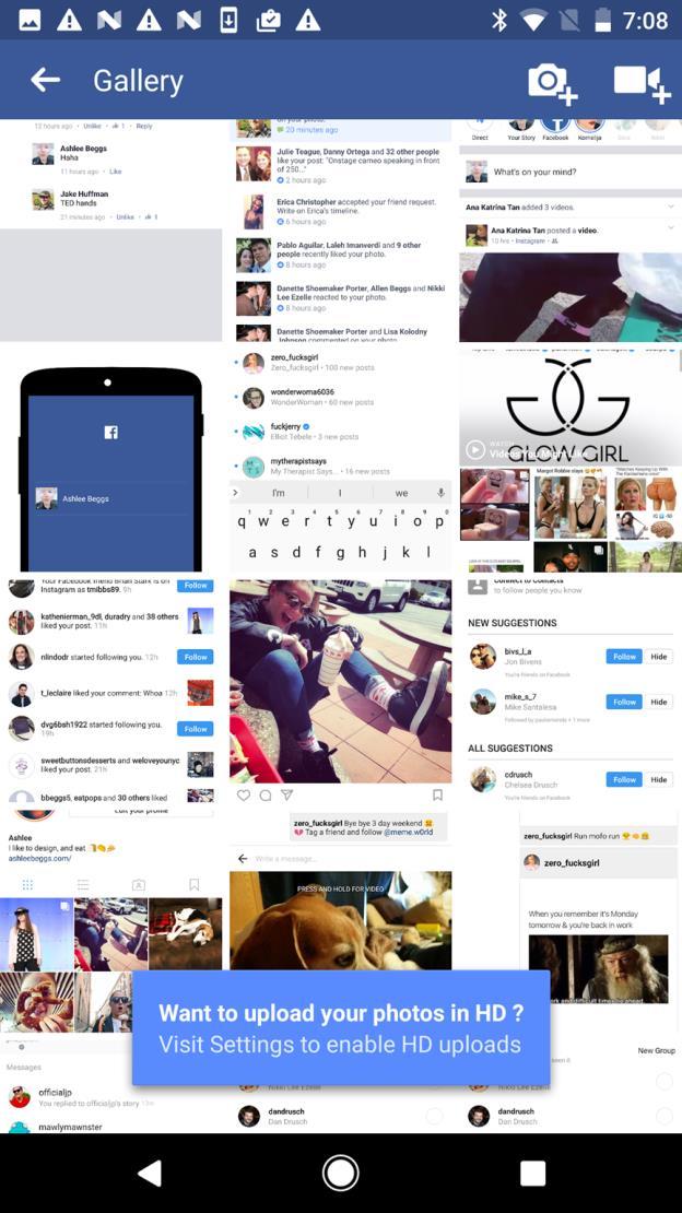
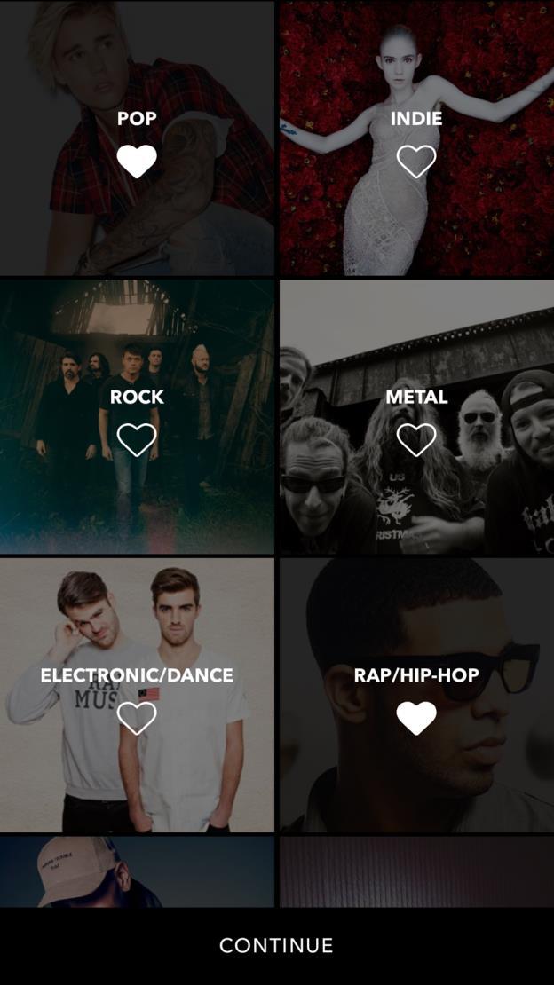
19 Tab bar
20 Tab bar
21 Tab bar (secondary navigation)
")

22 List Menu (primary)
23 List Menu (secondary)


24 Navigation Drawer


25 Navigation Drawer


26 Springboard (dashboard)

27 Gallery

28 Gallery
29 Forms


30 Login and Sign Up


31 Login and Sign Up


32 Login and Sign Up
33 Lists

34 Lists

35 Lists
36 RadEditor Mobile Rendering


37 Word Microsoft Office
38 WYSIWUG
39 Smartphone Optimization

40
41 Tablet Optimization
42
43
44 We are designing for human beings, we are not designing for devices.
45 Touch Target Size Touch targets are the parts of the screen that respond to user input. Graphical User Interface (GUI) precise interaction with keyboard and mouse sense of sight; Touch User Interface (TUI) we are using our hands - sense of touch; Touch targets extend beyond the visual bounds of an element visual targets. Large enough target size adjustment of the touch zone and the size of the controls used in the interface

46 Android ios Windows 48 dp 44 pt 9 mm ty.html#accessibility-style
47 Touchable Controls
48 Touchable Controls

49 Device Form Factors and Resolutions The density-independent pixel is equivalent to one physical pixel on a 160 dpi screen, which is the baseline density assumed by the system for a "medium" density screen.

50 Device Resolutions non-retina


51 Gestures We communicate with users through gestures; Gestures enable us to engage with technology through our sense of touch; Gestures are invisible by default; Avoid using too complicated combinations multi-figures gestures; Be sure target size is large enough to avoid mistakes tap multi-figure tap drag pinch rotate

52 3D Touch Gestures Quick Actions Peek and Pop Pressure Sensitivity
53 Responsive Design Design for All Form Factors

54 Device Resolutions and Breakpoints xlarge screens are at least 960dp x 720dp large screens are at least 640dp x 480dp normal screens are at least 470dp x 320dp small screens are at least 426dp x 320dp
55 Mobile First
56 Start designing for the largest target form factor
57 Start designing for the smallest target form factor
58 Mobile First User-centered design; Filter the essential part and features of a project; Focus on vital elements of the content; We can use it for existing projects asking ourselves How is going to look this design on a small screen? ; Explore and innovate we have more information about the environment (location, sound, movement, etc.)

59 Responsive Design Patterns: Reveal

60 Responsive Design Patterns: Reveal

61 Responsive Design Patterns: Reveal

62 Responsive Design Patterns: Transform

63 Responsive Design Patterns: Transform

64 Responsive Design Patterns: Transform
65 Responsive Design Patterns: Divide

66 Responsive Design Patterns: Divide

67 Responsive Design Patterns: Reflow

68 Responsive Design Patterns: Reflow

69 Responsive Design Patterns: Reflow
70 Responsive Design Patterns: Expand

71 Responsive Design Patterns: Position

72 Responsive Design Patterns: Position

73 Responsive Web Design Design and development are based on user experience, screen resolution, device orientation: It is all about user experience; Optimal use of screen property; Ensuring a flawless interaction; Design with performance in mind Content is like water: You put water into a cup, it becomes the cup. You put it into a bottle, it becomes the bottle, You put it in a teapot, it becomes the teapot.


74 Ingredients Fluid Layouts Flexible Media Media Queries
75 Fluid Grid

76
77
78 Responsive Images
79 One Image: Width = 100%

80 Different Images = srcset
81 Responsive Images Reduce page load; Optimized images; Load only images that user actually needs
82 Media Queries

83 1920px 768px 360px
84 Media Queries We define criteria for device properties e.g. resolution, orientation; We DON T care about the kind of device or screen type; We DO care about the content; We explore the behavior of the layout on different screen resolutions; Make it run on all different devices using breakpoints; We can use it for width, orientation, light level, etc.; Available in all modern browsers
85 RWD RWD is user-centered; Designers need to start with the priority of information rather than the layout. We create one design to cover all devices; We cover even the future viewports size; We have one code, one deployment and one URL; RWD should not cost more, it should save money for the client; RWD shows content on various devices, do not hide content form the user; It does not mean that the design should be simple, it should be fully adaptive
86 Design Systems We re not designing pages, we re designing systems of components. Stephen Hay
87 Atomic Design
88 Atoms
89 Molecules
90 Organisms
91 Templates
92 Pages
93 Native vs Web Apps It is not needed to separate them. Both should follow best mobile design practices. Things in common for native and web apps are: user; web browser
94 Progressive Web Apps A Progressive Web App uses modern web capabilities to deliver an applike user experience. mobile web app; homescreen install support; background worker; faster load time

95 Icon Fonts
96 Icon Fonts SVG images; It is easy to change their size; It is easy to change their color - monochrome based; They are transparent; CSS styling capabilities; Avoid sprite images; Use icon font generator IconMoon


97 Icon Pixel Grid System
98 Scalable Vector Graphics (SVG) Small file sizes that compress well; Scales to any size without losing clarity; Looks great on retina displays; The path element data is animatable
99 Do Prototype Go back to drawing; Make workflow model using flow chart of diagramming tool; Prepare interactive wireframes using prototyping tools: Axure, JustInMind, Framer, InVision, Adobe XD, Sketch (Mac OS X), etc.; Prepare HTML prototypes and test in browser; Divide your project in small steps and test
100 Test Before Launching Test your layout not only with clients and colleagues but with friends and family; Prepare list of steps to follow while testing; Be careful for questions like What does this button do? ; Be sure the workflow is easy to follow; Give the user little tasks to complete; Ask for feedback; Analyze your studies

101 Mobile in the future Luke Wroblewski - Conversions@Google Machine learning; Facial recognition; Microphones; Infrared sensors; Pressure and load sensors
102 Thank you!
Responsive Design for Web Applications R.I.T. S. Ludi/R. Kuehl p. 1 R I T. Software Engineering
 Responsive Design for Web Applications S. Ludi/R. Kuehl p. 1 What is the Problem? S. Ludi/R. Kuehl p. 2 Credit: Matt Griffin What is the Problem? Mobile web access is ubiquitous One interface design does
Responsive Design. Responsive design is it important? But typical is not enough. Some typical screen sizes
 Responsive Design Responsive design is it important? For many years, screen sizes were growing Eventually, settled on fixed-width (e.g. 960px) But now with smart phones, tablets, television and many new
User Interfaces for Web Sites and Mobile Devices. System and Networks
 User Interfaces for Web Sites and Mobile Devices System and Networks Computer Systems and Networks: Device-Aware Interfaces Interfaces must take into account physical constraints of computers and networks:
Web Site Design Small Screen Design Responsive Design R.I.T. S. Ludi/R. Kuehl p. 1 R I T. Software Engineering
 Web Site Design Small Screen Design Responsive Design S. Ludi/R. Kuehl p. 1 Design Principles and Guidelines User Populations (Shared human ability and behavior) (Problem domains) Computing Paradigms (Platform
ORGANIZING MOBILE WEB
 ORGANIZING MOBILE WEB EXPERIENCES @lukew EXTENSION LEARN LUKE WROBLEWSKI 1 378K iphones sold per day 562K ios devices 371K Babies born per day 1M Android devices activated per day 200K Nokia smartphones
The Next Step. DPS Adobe Digital Publishing Suite. Apple cofounder Steve Jobs stated in a 1983 speech
 The Next Step DPS Adobe Digital Publishing Suite Apple cofounder Steve Jobs stated in a 1983 speech that his company s strategy is really simple. What we want to do is we want to put an incredibly great
Brunch & Learn: Design Best Practices for Desktop, Mobile, Tablet & Beyond
 Brunch & Learn: Email Design Best Practices for Desktop, Mobile, Tablet & Beyond November 7, 2013 A special thank you to: Thank you for joining us we will be starting at 12:30 PM ET/9:30 AM PT If you are
_MOBILE UX DESIGNING THE MOBILE USER EXPERIENCE
 _MOBILE UX DESIGNING THE MOBILE USER EXPERIENCE Mark Delaney User Experience Designer / 5 September 2012 Designing the mobile User Experience Why care about mobile? Mobile design considerations Responsive
25 WAYS TO MAKE YOUR MOBILE E-COMMERCE REVENUE SKYROCKET
 25 WAYS TO MAKE YOUR MOBILE E-COMMERCE REVENUE SKYROCKET Did you know that 59% of all time spent on e-commerce sites is on a mobile device? And more than 1/3 of visits to the top 50 e-commerce sites now
I m going to be introducing you to ergonomics More specifically ergonomics in terms of designing touch interfaces for mobile devices I m going to be
 I m going to be introducing you to ergonomics More specifically ergonomics in terms of designing touch interfaces for mobile devices I m going to be talking about how we hold and interact our mobile devices
Mobile Technologies. Types of Apps
 Mobile Technologies Types of Apps What is mobile? Devices and their capabilities It s about people Fundamentally, mobile refers to the user, and not the device or the application. Barbara Ballard, Designing
Responsive web design (RWD) CSS3 Media queries. Mobile vs desktop web sites. Web Development 1 CS1115/CS5002
 CSS3 Media queries. Mobile vs desktop web sites. Web Development 1 CS1115/CS5002") 1 of 13 CS1115/CS5002 Web Development 1 Dr Derek Bridge School of Computer Science & Information Technology University College Cork Mobile vs desktop web sites A few organization have two web sites, one
1 of 13 CS1115/CS5002 Web Development 1 Dr Derek Bridge School of Computer Science & Information Technology University College Cork Mobile vs desktop web sites A few organization have two web sites, one
DESIGNING RESPONSIVE DASHBOARDS. Best Practices for Building Responsive Analytic Applications
 DESIGNING RESPONSIVE DASHBOARDS Best Practices for Building Responsive Analytic Applications CONTENTS Responsive Design and Embedded Analytics...1 6 Principles and Best Practices... 2 Tools of the Trade...
UNIT 1. The App Store was created the next year and its Android rival, Google Play,(2008)
") UNIT 1 Keywords: page 12-15 An app, short for application, is a software program made for mobile devices. It can serve many purposes, including but not limited to: communication buying things online social
UNIT 1 Keywords: page 12-15 An app, short for application, is a software program made for mobile devices. It can serve many purposes, including but not limited to: communication buying things online social
International Conference KNOWLEDGE-BASED ORGANIZATION Vol. XXIII No RESPONSIVE WEB DESIGN TECHNIQUES. Luminita GIURGIU, Ilie GLIGOREA
 International Conference KNOWLEDGE-BASED ORGANIZATION Vol. XXIII No 3 2017 RESPONSIVE WEB DESIGN TECHNIQUES Luminita GIURGIU, Ilie GLIGOREA Nicolae Bălcescu Land Forces Academy, Sibiu, Romania luminita.giurgiu.a@gmail.com,
8/19/2018. Web Development & Design Foundations with HTML5. Learning Objectives (1 of 2) More on Relative Linking. Learning Objectives (2 of 2)
 More on Relative Linking. Learning Objectives (2 of 2)") Web Development & Design Foundations with HTML5 Ninth Edition Chapter 7 More on Links, Layout, and Mobile Slides in this presentation contain hyperlinks. JAWS users should be able to get a list of links
Web Development & Design Foundations with HTML5 Ninth Edition Chapter 7 More on Links, Layout, and Mobile Slides in this presentation contain hyperlinks. JAWS users should be able to get a list of links
Microsoft Office 365 OneNote and Notebooks
 Microsoft Office 365 OneNote and Notebooks With OneNote Online, you can use your web browser to create, open, view, edit, format, and share the OneNote notebooks that you created on OneDrive. If your school
Graphic. August 23 & 24, Design to. Improve. User
 Graphic Design, UI/UX Design, and Visualization for elearningg August 23 & 24, 2012 601 Design Mobile First to Improve User Experience Phil Cowcill, Canadore College August 24, 2012 Email: Phil.Cowcill@canadorecollege.ca
Enterprise - Sales App
 Enterprise - Sales App Mobile App Wireframes March 06 What is a wireframe? A wireframe is an outline of a digital product expressed in simple block layouts and representative text that conveys structure,
ibooks Author Getting Started
 ibooks Author Getting Started Welcome to ibooks Author, a great way to create gorgeous, interactive Multi-Touch books for ipad and Mac. Start with beautiful Apple-designed templates that include a choice
Distributed Systems - Mertz & McCarthy
 Design Issues in Distributed Mobile Applications Association Sensing and Context Awareness Security and Privacy Adaptation Devices Appear and disappear from the space. Do so unpredictably May be totally
Cognos. Active Reports Development. Presented by: Craig Randell
 Cognos Active Reports Development Presented by: Craig Randell Objectives: Understand the purpose and benefits of Active Reports Through theory and demonstration introduce the different Active Report Components
How People Really Hold and Touch Their Mobile Devices. mlearning: Tips and Techniques for Planning, Analysis, and Design. Steven Hoober, 4ourth Mobile
 mlearning: Tips and Techniques for Planning, Analysis, and Design September 19 & 20, 2013 302 How People Really Hold and Touch Their Mobile Devices Steven Hoober, 4ourth Mobile How People Really Hold &
CISC 1600 Lecture 1.4 Design, part 2. Topics: Accessibility Responsive web design Example design review
 CISC 1600 Lecture 1.4 Design, part 2 Topics: Accessibility Responsive web design Example design review Accessibility Design for users with special needs Might include you at some point You still want/need
CS7026 Media Queries. Different Screen Size Different Design
 CS7026 Media Queries Different Screen Size Different Design Introduction Users no longer view web content only on traditional desktop systems, but are increasingly using smartphones, tablets, and other
Quick Start Guide. Microsoft Visio 2013 looks different from previous versions, so we created this guide to help you minimize the learning curve.
 Quick Start Guide Microsoft Visio 2013 looks different from previous versions, so we created this guide to help you minimize the learning curve. Updated templates Templates help you start the drawing type
DB2 Web Query Active Technologies for Mobile Web Apps
 DB2 Web Query Active Technologies for Mobile Web Apps Cactus, EDA, EDA/SQL, FIDEL, FOCUS, Information Builders, the Information Builders logo, iway, iway Software, Parlay, PC/FOCUS, RStat, TableTalk, Web390,
Mobile & More: Preparing for the Latest Design Trends
 February 26, 2015 Mobile & More: Preparing for the Latest Design Trends LATEST TRENDS Responsive Takes Over Material Is the New Flat Hero Images Getting Bigger Interactions Are Micro Video in the Background
Getting Started. Player App Installation. Updated on October 2, 2017
 1 Getting Started Updated on October 2, 2017 Player App Installation If the hardware you are using did not come pre-installed with the Revel Player app you will need to install this first. Windows hardware
Table of contents. Sliding Panels DMXzone.com
 Table of contents Table of contents... 1 About Sliding Panels... 2 Features in Detail... 3 Before you begin... 12 The Basics: Creating Simple Sliding Panels... 13 Advanced: Dynamic Sliding Panels... 20
Flexible and LEAN Ads
 Flexible and LEAN Ads The IAB New Ad Portfolio emphasizes LEAN (Light, Encrypted, AdChoices supported, and Non-invasive) ad experience and flexible size ad specifications. LEAN ad experience for digital
Aware IM Version 8.2 Aware IM for Mobile Devices
 Aware IM Version 8.2 Copyright 2002-2018 Awaresoft Pty Ltd CONTENTS Introduction... 3 General Approach... 3 Login... 4 Using Visual Perspectives... 4 Startup Perspective... 4 Application Menu... 5 Using
Getting Started for Moderators Quick Reference Guide
 Practice before leading your first session. Become familiar with the session content. Open web pages, applications needed for application sharing and screen captures before session begins. Load multimedia
The World In. Advertising specs
 The World In Advertising specs Format Specifications This is a living document that will evolve as we are presented with new formats, and we ll update it periodically to reflect these changes. All media
WHITEPAPER Responsive vs. Mobile Design: What s the Difference?
 WHITEPAPER Responsive vs. Mobile Design: What s the Difference? 3 Media Web WHITEPAPER Responsive vs. Mobile Design: What s the Difference? The rise in mobile devices for business and personal use has
Adobe Dreamweaver CS6 Digital Classroom
 Adobe Dreamweaver CS6 Digital Classroom Osborn, J ISBN-13: 9781118124093 Table of Contents Starting Up About Dreamweaver Digital Classroom 1 Prerequisites 1 System requirements 1 Starting Adobe Dreamweaver
AGENDA :: MULTIMEDIA TOOLS :: CLASS NOTES. INSTALLING FONTS :: Download, Install, & Embed Your Fonts. LECTURE :: Responsive Web Design [RWD]
![AGENDA :: MULTIMEDIA TOOLS :: CLASS NOTES. INSTALLING FONTS :: Download, Install, & Embed Your Fonts. LECTURE :: Responsive Web Design [RWD]](/thumbs/84/90658100.jpg "AGENDA :: MULTIMEDIA TOOLS :: CLASS NOTES. INSTALLING FONTS :: Download, Install, & Embed Your Fonts. LECTURE :: Responsive Web Design [RWD]") CLASS :: 14 05.05 2017 3 Hours AGENDA INSTALLING FONTS :: Download, Install, & Embed Your Fonts LECTURE :: Responsive Web Design [RWD] DOWNLOAD ASSETS [ CSS ] :: Media Query [rwd.css] ADD HTML META TAG
CLASS :: 14 05.05 2017 3 Hours AGENDA INSTALLING FONTS :: Download, Install, & Embed Your Fonts LECTURE :: Responsive Web Design [RWD] DOWNLOAD ASSETS [ CSS ] :: Media Query [rwd.css] ADD HTML META TAG
Adobe CC as Wireframe and Web Design Tool
 Start designing by doing very rough sketches on paper, or lately more often, if not near my office desk, on my ipad or smartphone screen. These sketches focus thoughts regarding the chosen concept and
HTML5 Responsive Notify 2 DMXzone
 Table of contents Table of contents... 1 About HTML5 Responsive Notify 2... 2 Features in Detail... 3 The Basics: Insert HTML5 Responsive Notify 2 on your Page... 10 Advanced: Retrieve your Notifications
Extract from the ARC & RVRC Operational & Administrative Procedures
 2.2 Configuring MASmobile 2.2.1 Configuring MASmobile settings (iphone) 2.2.2 Configuring MASmobile settings (Android) 2.2.3 Main Menu 2.2.4 Logging In 2.2.5 Managing Accounts 2.2.6 Searching for Systems
Fluency with Information Technology, 6e (Snyder) Chapter 2 Exploring the Human-Computer Interface: Face It, It's a Computer
 Chapter 2 Exploring the Human-Computer Interface: Face It, It's a Computer") Fluency with Information Technology, 6e (Snyder) Chapter 2 Exploring the Human-Computer Interface: Face It, It's a Computer 2.1 True/False Questions 1) Feedback is an indication that either the computer
Fluency with Information Technology, 6e (Snyder) Chapter 2 Exploring the Human-Computer Interface: Face It, It's a Computer 2.1 True/False Questions 1) Feedback is an indication that either the computer
Discovering the Mobile Safari Platform
 Introducing the iphone and ipod touch Development Platform The introduction of the iphone and subsequent unveiling of the ipod touch revolutionized the way people interacted with handheld devices. No longer
Produced by. Mobile Application Development. Eamonn de Leastar David Drohan
 Mobile Application Development Produced by Eamonn de Leastar (edeleastar@wit.ie) David Drohan (ddrohan@wit.ie) Department of Computing & Mathematics Waterford Institute of Technology http://www.wit.ie
How to Connect to the CSH Virtual Desktop
 How to Connect to the CSH Virtual Desktop From Home (or anywhere you have an Internet connection) We recommend you print the section that applies to you 1. For Windows, print pages 2-16 2. For IOS Devices
Mobile Devices and Smartphones
 Mobile Devices and Smartphones Smartphone Modern smartphones can do almost as much as a desktop PC could. They are extremely mobile and convenient. With a proper service provider they can access the internet
Release Notes. MindManager 2019 for Windows MindManager Enterprise Version September 25, 2018
 Release Notes MindManager 2019 for Windows MindManager Enterprise 2019 Version 19.0 September 25, 2018 2018 Corel Corporation 1 Table of Contents USABILITY & PERFORMANCE IMPROVEMENTS... 3 User Interface...
Pro ios Design and. Development. HTML5, CSS3, and JavaScript with Safari. Andrea Picchi. Apress*
 Pro ios Design and Development HTML5, CSS3, and JavaScript with Safari Andrea Picchi Apress* Contents Contents at a Glance About the Author About the Technical Reviewer Acknowledgments Preface Introduction
Revision 1.0.0, 5/30/14
 6465 South 3000 East Suite 104 Holladay, Utah 84121 801-268-3088 phone 801-268-2772 fax www.centurysoftware.com Sales@centurysoftware.com Revision 1.0.0, 5/30/14 Table of Contents User s Guide... 1 Gestures...
Center for Faculty Development and Support Creating Powerful and Accessible Presentation
 Creating Powerful and Accessible Presentation PowerPoint 2007 Windows Tutorial Contents Create a New Document... 3 Navigate in the Normal View (default view)... 3 Input and Manipulate Text in a Slide...
KSB Mobile App Style Guide 4. Tablets 1. KSB Mobile App Style Guide
 KSB Mobile App Style Guide 4. Tablets KSB Mobile App Style Guide April 05 KSB Mobile App Style Guide Introduction KSB creates mobile applications for the iphone and ipad as well as for smartphones and
DESIGN MOBILE APPS FOR ANDROID DEVICES
 DESIGN MOBILE APPS FOR ANDROID DEVICES Thank you for participating in a workshop at MicroStrategy World 2019. If you missed or did not finish an exercise and want to complete it after the conference,
Oracle Application Express 5 New Features
 Oracle Application Express 5 New Features 20th HrOUG conference October 16, 2015 Vladislav Uvarov Software Development Manager Database Server Technologies Division Copyright 2015, Oracle and/or its affiliates.
FOCUS: Fusion Experience for ipad. 1 of 10 FOCUS: Fusion Experience for ipad. Class Handout
 1 of 10 FOCUS: Fusion Experience for ipad Class Handout 2 of 10 What is Fusion Experience? Fusion Experience is the ipad app that allows MLS users to access Fusion functionality on their ipad. Important:
ITEC185. Introduction to Digital Media
 ITEC185 Introduction to Digital Media ADOBE ILLUSTRATOR CC 2015 What is Adobe Illustrator? Adobe Illustrator is a program used by both artists and graphic designers to create vector images. These images
Mobile 3.1 ios & Android v2
 Mobile 3.1 ios & Android v2 Bookshelf Mobile 3.1 ios and Android v2 1 Introduction VitalSource Bookshelf lets you download and access books on any of the following devices: Android smartphone or tablet
New frontier of responsive & device-friendly web sites
 New frontier of responsive & device-friendly web sites Dino Esposito JetBrains dino.esposito@jetbrains.com @despos facebook.com/naa4e Responsive Web Design Can I Ask You a Question? Why Do You Do RWD?
An Oracle White Paper April Oracle Application Express 5.0 Overview
 An Oracle White Paper April 2015 Oracle Application Express 5.0 Overview Disclaimer The following is intended to outline our general product direction. It is intended for information purposes only, and
Laboratory 5: Collaborative Text Editing
 COMP3511/9511 Lab, Week 12-13, S2 2004 Laboratory 5: Collaborative Text Editing Time Allocated: 30 minutes As we discussed in lectures, the opportunities for creating new forms of collaboration using networking
Responsive Web Design (RWD)
") Responsive Web Design (RWD) Responsive Web Design: design Web pages, so that it is easy to see on a wide range of of devices phone, tablet, desktop,... Fixed vs Fluid layout Fixed: elements have fixed
Responsive Web Design (RWD) Responsive Web Design: design Web pages, so that it is easy to see on a wide range of of devices phone, tablet, desktop,... Fixed vs Fluid layout Fixed: elements have fixed
JD EDWARDS ENTERPRISEONE USER EXPERIENCE
 JD EDWARDS ENTERPRISEONE USER EXPERIENCE KEY FEATURES AND BENEFITS Highly interactive interface that leverages Dynamic HTML provides immediate feedback to the user. EnterpriseOne Pages provide a single
RESPONSIVE WEB DESIGN IN 24 HOURS, SAMS TEACH YOURSELF BY JENNIFER KYRNIN
 RESPONSIVE WEB DESIGN IN 24 HOURS, SAMS TEACH YOURSELF BY JENNIFER KYRNIN DOWNLOAD EBOOK : RESPONSIVE WEB DESIGN IN 24 HOURS, SAMS TEACH Click link bellow and free register to download ebook: RESPONSIVE
11/5/16 WEB DESIGN. Branding Fall 2016
 designschool.canva.com/blog/print-vs-web/ nngroup.com/articles/differences-between-print-design-and-web-design/ howdesign.com/web-design-resources-technology/top-content-management-systems-designers/ alchemyuk.com/design/74-top-10-web-design-tips
WHAT S NEW IN QLIKVIEW 11
 WHAT S NEW IN QLIKVIEW 11 QlikView 11 takes Business Discovery to a whole new level by enabling users to more easily share information with coworkers, supporting larger enterprise deployments through enhanced
Rethinking Usability for Responsive Web Design
 Rethinking Usability for Responsive Web Design Responsive design is the real deal. It is not a fad. It s a legitimate attempt to address the massive challenge of delivering great experiences to this explosion
Content Author's Reference and Cookbook
 Sitecore CMS 7.0 Content Author's Reference and Cookbook Rev. 130425 Sitecore CMS 7.0 Content Author's Reference and Cookbook A Conceptual Overview and Practical Guide to Using Sitecore Table of Contents
Mastering Responsive Design For Smart Photos. Karl Csoknyay. KEYSTONE Company Profile
 Mastering Responsive Design For Smart Photos Karl Csoknyay KEYSTONE Company Profile Quotes Albert Einstein Everything should be made as simple as possible, but not simpler. Antoine de Saint-Exupery Perfection
Read the Docs Template Documentation
 Read the Docs Template Documentation Release 1.0 Read the Docs Jun 27, 2017 KNOWLEDGE BASE 1 Support 1 2 AdminExtra 3 2.1 Compatibility............................................... 3 2.2 Features..................................................
ADOBE CAPTIVATE 8. Content Planning Guide
 ADOBE CAPTIVATE 8 Content Planning Guide Summer 2014 Table of Contents Using Captivate 8 on Your OnPoint Learning Platform... 2 What are the Advantages and Disadvantages of Captivate?... 2 Use Cases for
The Economist Apps. Advertising Specs
 The Economist Apps Advertising Specs Apps Overview This is a living document that will evolve as we are presented with new formats, and we ll update it periodically to reflect these changes. All media
Responsive Web Design. Sheri German, Instructor Montgomery College
 Responsive Web Design Sheri German, Instructor Montgomery College Responsive Web Design (RWD)! Coined by Ethan Marcotte through his awareness of what was taking place in the discipline of architecture.!
Usability and Small Screens SWEN-444
 Usability and Small Screens SWEN-444 iphone Android Windows Phone 8 The phrase mobile usability is pretty much an oxymoron. It's neither easy nor pleasant to use the Web on mobile devices. designing for
JSN Sun Framework User's Guide
 JSN Sun Framework User's Guide Getting Started Layout Overview & Key concepts To start with layout configuration, Go to Extension Template JSN_template_default The first tab you see will be the Layout
Overview of the Adobe Dreamweaver CS5 workspace
 Adobe Dreamweaver CS5 Activity 2.1 guide Overview of the Adobe Dreamweaver CS5 workspace You can access Adobe Dreamweaver CS5 tools, commands, and features by using menus or by selecting options from one
How to create a prototype
 Adobe Fireworks Guide How to create a prototype In this guide, you learn how to use Fireworks to combine a design comp and a wireframe to create an interactive prototype for a widget. A prototype is a
PRESENTED BY: M.NAVEEN KUMAR 08M31A05A7
 PRESENTED BY: M.NAVEEN KUMAR 08M31A05A7 The computer mouse was invented in 1960s and it went through many revisions regarding its functionality and features since then. According to folks from Celluon
WEB DESIGNER CAREER BLUEPRINT
 WEB DESIGNER CAREER BLUEPRINT HAVE A QUESTION? ASK! Read up on all the ways you can get help. CONFUSION IS GOOD :) Seriously, it s scientific fact. Read all about it! REMEMBER, YOU ARE NOT ALONE! Join
Lesson 1: Dreamweaver CS6 Jumpstart
 Lesson 1: Dreamweaver CS6 Jumpstart Introduction to Adobe Dreamweaver CS6 Adobe Certified Associate: Web Communication using Adobe Dreamweaver CS6 Overview 2013 John Wiley & Sons, Inc. 2 3.1 Elements of
CIT BY: HEIDI SPACKMAN
 CIT230-06 BY: HEIDI SPACKMAN WHAT IS A MEDIA QUERY? A Media Query (Boolean code) written in CSS3 determines the screen display size that needs to be used and adjusts the HTML pages to display correctly
Using the Mobile App for Defense Connect Online
 Using the Mobile App for Defense Connect Online Conduct and Attend Meetings Virtually Anywhere AUTHOR Aaron W Wolf DCO Evangelist Carahsoft Technology Corp. 703.889.9781 aaron.w.wolf@carahsoft.com Defense
VERINT EFM 8.0 Release Overview
 VERINT EFM 8.0 Release Overview In January of 2015 Verint will release version 8.0 of the Enterprise Feedback Management (EFM) solution. Verint hosted SaaS customers will receive this update as part of
UXD. using the elements: structure
 using the elements: structure defining structure you are here structure essentially defines how users get to a given screen and where they can go when they re done. structure also defines categories of
Web App Vs Web Site. Some tricks of the trade. Laurent Technical Director, BlackBerry Web Platform
 Web App Vs Web Site Some tricks of the trade Laurent Hasson @ldhasson, lhasson@rim.com Technical Director, BlackBerry Web Platform 2012-05-09 Web Apps Vs. Web Sites 1 INTRODUCTION 2012-05-09 Web Apps Vs.
AGENDA. :: Add Meta Tag for Viewport (inside of head element): :: Add Script that renders HTML5 elements for older versions of Internet Explorer
: :: Add Script that renders HTML5 elements for older versions of Internet Explorer") CLASS :: 14 12.10 2018 3 Hours AGENDA LECTURE :: Responsive Web Design [RWD] DOWNLOAD ASSETS [ CSS ] :: Media Query [rwd.css] ADD HTML META TAG & IE SCRIPT [ HTML ] :: Add Meta Tag for Viewport (inside
CLASS :: 14 12.10 2018 3 Hours AGENDA LECTURE :: Responsive Web Design [RWD] DOWNLOAD ASSETS [ CSS ] :: Media Query [rwd.css] ADD HTML META TAG & IE SCRIPT [ HTML ] :: Add Meta Tag for Viewport (inside
Deploying VMware Workspace ONE Intelligent Hub. October 2018 VMware Workspace ONE
 Deploying VMware Workspace ONE Intelligent Hub October 2018 VMware Workspace ONE You can find the most up-to-date technical documentation on the VMware website at: https://docs.vmware.com/ If you have
SPECIFICATIONS Insert Client Name
 ESSENTIAL LMS BRANDING SPECIFICATIONS Insert Client Name Creation Date: June 23, 2011 Last Updated: July 11, 2017 Version: 16.5 Page 1 Contents Branding Elements... 3 Theme Management... 3 Header Images...
ESKIMM2 (SQA Unit Code - F9CN 04) Multimedia software
 Multimedia software") Overview This is the ability to use multimedia software designed to combine, manipulate and animate a variety of objects and data types in layouts appropriate for subsequent production to screen. In general,
Overview This is the ability to use multimedia software designed to combine, manipulate and animate a variety of objects and data types in layouts appropriate for subsequent production to screen. In general,
Designing Personalized Experiences For Your Brand
 THE ULTIMATE GUIDE TO: Designing Personalized Experiences For Your Brand Ashton Landry & Amie Levasseur THE PERSONALIZATION SUMMIT 2017 Designing Personalized Experiences For Your Brand Have you ever seen
Your familiar Windows, only better.
 Your familiar Windows, only better. Your quick guide to Windows 8.1 for business For Windows 8.1 Update Discover the Start screen. Your Start screen has all of the information that matters most to you.
Version Android User's Guide. May-02-13
 Version 12.5 Android User's Guide May-02-13 Table of Contents Chapter 1 Overview 1 Getting Help 2 Other Resources 3 Documentation and Learning Resources 3 Technical Support 4 Community 4 Blackboard Collaborate
Parallels Remote Application Server
 Parallels Remote Application Server Parallels Client for Android User's Guide v16.2 Parallels International GmbH Vordergasse 59 8200 Schaffhausen Switzerland Tel: + 41 52 672 20 30 www.parallels.com Copyright
Want to Create Engaging Screencasts? 57 Tips to Create a Great Screencast
 What makes a screencast interesting, good, or engaging? Want to Create Engaging Screencasts? 57 Tips to Create a Great Screencast We thought you would like to see each of the categories that the focus
Responsive Web Design Links
 What is Responsive Design and Why Do We Need It? The go to article: http://alistapart.com/article/responsive-web-design Great slide deck on what responsive design is: http://johnpolacek.github.io/scrolldeck.js/decks/responsive/
COPYRIGHTED MATERIAL. 1Hello ios! A Suitable Mac. ios Developer Essentials
 1Hello ios! Hello and welcome to the exciting world of ios application development. ios is Apple s operating system for mobile devices; the current version as of writing this book is 5.0. It was originally
JSN PageBuilder 3 Configuration Manual Introduction
 JSN PageBuilder 3 Configuration Manual Introduction About JSN PageBuilder 3 JSN PageBuilder 3 is the latest innovation of Joomla! PageBuilder with great improvements in the interface, features, and user
user manual version 12
 MOBILE check-in user manual version 12 Table of Contents MOBILE CHECK IN OVERVIEW Check In / Out Process...4 Check in with an ipad, smart phone or other mobile device...4 Name Tags and Security Tags...5
It doesn t matter what device your contact is using - You can still talk to them on Skype
 It doesn t matter what device your contact is using - You can still talk to them on Skype Also Skype-ready TV s, PlayStations, and ipod Touch Skype to Skype Calls are Free Windows Desktop Mac Android
IBM C IBM Cognos Analytics Author V11.
 IBM C2090-621 IBM Cognos Analytics Author V11 http://killexams.com/exam-detail/c2090-621 QUESTION: 52 A report author would like to reuse a logo across all existing reports. Which object should be used?
AUDIENCE PARTICIPATION PORTION OF PROGRAM
 AUDIENCE PARTICIPATION PORTION OF PROGRAM PLEASE SET YOUR PHONES TO AIRPLANE MODE NOW OR TURN OFF PHONE S WI-FI HANDS-ON DEMO WON T BE POSSIBLE WITHOUT SUFFICIENT BANDWIDTH, WHICH IS VERY LIMITED IN THE
Discover the Start screen.
 Discover the Start screen. Your Start screen has all of the information that matters most to you. Live tiles keep you up to date. Your favorite apps, such as Office apps, People, News, and more are front
Connecting to Telegram
 SOCIAL MEDIA MARKETING Connecting to Telegram POST TO: And many more... What s in this guide? What is Telegram? Creating a Telegram account. What is a Telegram bot? Connecting your Telegram account to