Notes on legibility Compiled by Alexander J. Quinn in 2007
|
|
|
- Gabriella Collins
- 5 years ago
- Views:
Transcription
1 Notes on legibility Compiled by Alexander J. Quinn in 2007 Font size When text is less than 6 points, accuracy declines. [1] No significant difference in reading performance when comparing small differences, such as 10- point to 12-point. However, differences may be found in bigger differences. [1] Almost no effect with children. [2] At 1024x768, you might expect to see a dropoff in reading performance when the type goes below 9.75-point. [2] A significant difference in readability might be evident when comparing 2.0 mm and 3.0 mm x- height fonts, but probably not so much when comparing 2.0 mm and 2.5 mm. [2] Font family Georgia and Verdana were specifically designed for the screen. Times New Roman and Arial were not. [4] Participants slightly preferred Georgia over Verdana and were slightly faster and more accurate when reading with Georgia. [4] Participants rather strongly preferred regular Verdana over Verdana italic, although performance was about the same. [4] Effective reading speed was very slightly higher with Times New Roman than Georgia, but Georgia was preferred and more accurate. [4] Arial preferred to Times. [1] 12-point bitmap Arial was most preferred. 10-point anti-aliased Times was least preferred. [1] Small changes in the font size, family, or display method (bitmap vs. anti-alias) do not significantly affect reading performance, although they may affect preference. [1] Anti-aliasing No significant difference among bitmap, Microsoft anti-aliased, and Adobe anti-aliased, although people generally prefer anti-aliased to bitmap. [4] Slower, especially with serif fonts, or with smaller fonts. [1] Physical dimensions With Huey s enhanced format (1908), you indent every other line by 3 spaces in order to facilitate return sweeps. No difference in reading rate, but 13 out of 18 subjects in a 1991 study preferred Huey s format to standard text. [6] See also Muter and Maurutto (1991). Left-hand margin should be justified. [6] See also Bouma Narrow characters lead to more fixations per line, but fewer fixations overall because your eyes can take in more words per fixation. [6] Assuming a constant line length and character height, 35 wide characters per line is less efficient to read than 70 narrow characters per line. [6] Some have suggested that a smaller type size might yield more accurate reading because the text is closer to the center of your vision where your eyes are most accurate. [6] Regarding physical length of the line of text, small differences make almost no difference, but bigger differences may have a difference. [6] If the type size is kept constant, longer lines are read faster than shorter ones. It was suggested that this may be due to glare, distraction from margins, or less scrolling time. [6] - 1 -
2 In a study that varied characters per line and margin size, the best performance was with maximal long lines and no margins. [6] People perceive multiple columns as easier to read. Actually, two-columns are faster than one column, but one column is more accurate. [6] Double spacing can be faster to read, depending on the experiment design. [6] People prefer medium length lines, saying they are more organized and easier to read. However, longer length lines are actually faster to read. [6] One study found that well-designed (clearly organized) study materials were more effective for teaching than poorly designed materials. However, a different study found no performance difference between well-structured and ill-structured documents, although people preferred the well-structured documents. [6] Dynamic text (e.g. scrolling, rolling, flashing, etc.) Presentation method had a greater effect than screen size. [8] Reading speed was fastest using the RSVP method of displaying one word at a time, as compared to teletype, leading (slide right to left), vertical scrolling, and other methods. [8] Most suitable methods for various devices: [8] PDA, mobile phone vertical scrolling Communicator leading or teletype People read faster with vertical scrolling than with a whole page of text, although this is mediated by the fact that the machine set the pace, which was specified by the user during practice. This is not normal vertical scrolling as we know it. [8] Children Very insensitive to changes in typography. Children s reading strategies, motivation, and reading level are the dominant factors that affect readability. Typical readability experiments have much less value when researching reading by children. [2] Preferences:[2] 14-point better than 12-point Arial or Comic better than Times and Courier sans serif better than serif Comis most attractive, most preferred, probably due to the informal and playful appearance. Recommendations: [2] sans serif medium to large x-height modest amount of letter spacing and character weight - 2 -
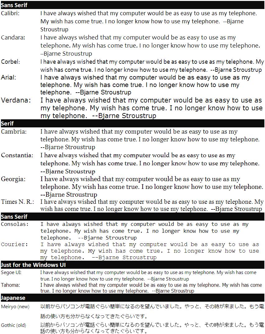
3 Paper vs. Screen Paper may be easier to read, but this is strongly affected by the quality of the screen and the design of the experiment. This is based partly on the assumption that computer screens hold more information than paper. Note that this paper was a review paper published in 1987 about work done prior to [9] If enough variables are constrained, then there is no difference. If you compare a photograph of a screen, and the real screen, there is no difference. The main distinction is the resolution of the screen. A photo of a screen will have roughly the same resolution. However, as screen resolution improves, we expect to see even less of a difference. [12] Eye fatigue is negatively correlated with display resolution. high resolution easy on eyes.[14] Single variable explanations are insufficient to caputure the range of issues involved in reading from screens. [5] Sub-pixel rendering of fonts on LCD displayes ClearType takes advantage of the fact that each pixel is actually 3 stripes for red, green, and blue. Instead of drawing diagonals using blocks of whole pixels, it varies the color of adjacent pixels to get a group of red-green-blue pixels in any order. This effectively gives you higher resolution for text, and potentially any vector graphics. They use some fancy techniques to make sure the color doesn t come out looking strange. [3] Jakob Nielson says ClearType increases reading speed by 10-15% but doesn t specify a source. He also argues that companies can save $2000 per employee by enabling ClearType. [11] Some people claim that Apple did this on the Apple II. This seems doubtful given that sub-pixel rendering is targeted at LCD monitors because of the way the RGB components are arranged. Some There s a slightly different, fee-free, patent-free implementation called SubLCD. It also takes advantage of the difference in luminosity of the red, green, and blue subpixels. [13] According to some web sites ( e.g. ), CoolType and ClearType are the same thing and sub-pixel rendering has been around since the Apple II. Patent status is unclear. ClearType is patented (#6,307,566), but that has not deterred Adobe or the creators of SubLCD. Microsoft s web site as well as [7] say ClearType can improve legibility a little bit on CRT monitors as well, mainly because it incorporates aspects of anti-aliasing. Works best on black and white and only in landscape orientation [7]. Vista Fonts Looking around at Microsoft s web site, and elsewhere, I don t see any evidence that these fonts represent any new research, other than a fresh effort at making attractive fonts to enable more comfortable on-screen reading. Main contributions: Calibri, Cambria, Candara, Consolas, Constantia, Corbel They also created Meiryo {MAY-ree-oh}, a Japanese font, and Segoe UI, a UI font optimized for viewing in the 8 to 10 point range. Meiryo is an alternative to MS Gothic. Segoe is an alternative to Tahoma. A sample of all of these fonts is included later in this document. Screen resolution Screen resolution may be the single biggest factor influencing any differences between reading on screen and reading print. [12] - 3 -
4 Experimental details Choice of reading passages: Sections of Microsoft Encarta were used in [1]. Whootie Owl s Fairytales for [2]. Nelson-Denny Reading Test gives 2 forms of similar difficulty and structure. May be available from the Riverside Publishing Company. [4] News stories were used for [8]. One way to account for inaccurate reading is to take effective_reading_speed = comprehension_questions_right / time [4] Need to control for differences in reading using Snellen near acuity test. [1] Control for glare on screen by placing lights over-head and to the side. [1] Likert scale used for preferences in [1] [2] Account for reading level by using passages with the same Flesch-Kincaid Grade Level Assessment score. [1] For measuring accuracy, [1] used a proofreading task where similar rhyming words were switched such that the new word would be totally inappropriate for the context (e.g. take fake ). This is better than checking spelling because it requires full comprehension. For children, it is more important to measure subjective perceptions than to do adult-style readability experiments. [2] One study mentioned in [6] had the participants scan the text for shape words (e.g. triangle, circle, etc.) and then click a corresponding shape icon at the bottom of the screen. [6] Mediating factors Type size, line length, line spacing, and font should be taken together when making decisions. [4] x-height can be very different, even when the point size is the same. For example, at 12 points, the x-heights of Times and Arial are 2.0 and 2.5 mm, respectively. [1] Typographical variables are extremely interrelated. This cannot be ignored. For example, if you change the font size, then either words-per-line or inches-per-line must change. Either way, you would expect a secondary effect. Thus, the only way to study this is to compare different combinations of dimensions. Miles Tinker, one of the pioneers of readability research, did some such studies, but that is rare. [6] You can t generalize print standards to the screen. [6] See also Grabinger and Amedeo Selected Terminology extenders part of the letterform that rises above the x-height, or sinks below the baseline. [2] serifs extra corners added to fonts like Times New Roman in order to help the reader distinguish letters and words. [2] fixation a tiny pause made by your eye as it scans a line of text. [6] saccade quick movement of the eyes together (e.g. return sweep) [6] x-height the height of a lowercase x in a particular typeface, as measured in either point or millimeters
5 - 5 -
6 References [1] Bernard, M., Chaparro, B.S., Mills, M.M., Halcomb, C.G. Comparing the effects of text size and format on the readibility of computer-displayed Times New Roman and Arial text. International Journal of Human-Computer Studies Volume 59, Issue 6, December 2003, Pages [2] Bernard, M., Chaparro, B., Mills, M., Halcomb, C. Examining chilren s reading performance and preference for different computer-displayed text. Behaviour & Information Technology, 2002, Vol. 21, No. 2, [3] Betrisey, C., Blinn, J.F., Dresevic, B., Hill, B., Hitchcock, G., Keely, B., Mitchell, D.P., Platt, J.C., Whitted, T.. Displaced Filtering for Patterned Displays, Proc. Society for Information Display Symposium, pp , (2000). [4] Boyarski, D., Neuwirth, C., Forzlizzi, J., and Regli, S. H. A Study of Fonts Designed For Screen Display. In Proc. CHI 2002, ACM Press (2002), [5] Dillon, A. Reading from paper versus screens: a critical review of the empirical literature. Ergonomics, 35(10), [6] Dyson, M.C. How physical text layout affects reading from screen. Behaviour & Information Technology, Volume 23, Number 6, November-December Taylor & Francis (2004), [7] Gibson Research Corporation. accessed 3/1/2007. [8] Laarni, J. Searching for optimal methods of presenting dynamic text on different types of screens. Proc. 2nd Nordic Conference on Human-Computer Interaction. ACM Press (2002), [9] Larson, K The Science of Word Recognition: Or How I Learned to Stop Worrying and Love the Bouma. July. Microsoft Typography site. Accessed 3/1/2007. [10] Mills, C.B., Weldon, L.J.. Reading text from computer screens. ACM Computing Surveys Volume 19, Issue 4, December ACM Press (1987), [11] Nielson, J. Avoiding Commodity Status. accessed 3/1/2007. [12] Shneiderman, B., Plaisant, C. Designing the User Interface: Strategies for Effective Human- Computer Interaction (4th Edition). Addison Wesley (2004). [13] SubLCD. [14] Ziefle, M. Effects of display resolution on visual performance. Human Factors. Volume 40, number 4. Human Factors and Ergonomics Society, Santa Monica, CA (1998),
Text Topics. Human reading process Using Text in Interaction Design
 Text SWEN-444 Text Topics Human reading process Using Text in Interaction Design Humans and Text the Reading Process Saccades quick, jerky eye movements forward 8-10 letters at a time plus CR/LF to the
The use of eye-tracker technology to evaluate typefaces, Greek fonts and publication design for screen.
 Typography in Publication Design The use of eye-tracker technology to evaluate typefaces, Greek fonts and publication design for screen. Evripides Zantides, Cyprus University of Technology, Lemesos, Cyprus,
Friendly Fonts for your Design
 Friendly Fonts for your Design Choosing the right typeface for your website copy is important, since it will affect the way your readers perceive your page (serious and formal, or friendly and casual).
Is legibility of typefaces designed for screen use the same for different languages?
 Is legibility of typefaces designed for screen use the same for different languages? Nace Pušnik 1 ; Dorotea Kovačević 2 ; Maja Brozović 2 ; Klementina Možina 1 1 University of Ljubljana, Faculty of Natural
EXAMINING PERCEPTIONS OF ONLINE TEXT SIZE AND TYPEFACE LEGIBILITY FOR OLDER MALES AND FEMALES
 EXAMINING PERCEPTIONS OF ONLINE TEXT SIZE AND TYPEFACE LEGIBILITY FOR OLDER MALES AND FEMALES Michael L. Bernard 1, Chia Hui Liao 2, Barbara S. Chaparro 1, and Alex Chaparro 2 1 Software Usability Research
Investigating the Effects of User Age on Readability
 Investigating the Effects of User Age on Readability Kyung Hoon Hyun, Ji-Hyun Lee, and Hwon Ihm Korea Advanced Institute of Science and Technology, Korea {hellohoon,jihyunl87,raccoon}@kaist.ac.kr Abstract.
Accessible Documents & Presentations. By Amy Maes, DNOM
 Accessible Documents & Presentations By Amy Maes, DNOM 1 Overview Accessibility: What am I required to do? Disability Characteristics Creating an Accessible Word Document & PowerPoint Presentation v2010
Presented by: Mitch Boretz University of California, Riverside. and Colleen Jolly 24 Hour Company
 Presented by: Mitch Boretz University of California, Riverside and Colleen Jolly 24 Hour Company May 2008 Introduction Will font selection determine whether your proposal wins or loses? Almost certainly
Readability of Scanned Books in Digital Libraries
 Readability of Scanned Books in Digital Libraries Alexander J. Quinn 1, Chang Hu 1, Takeshi Arisaka 2, Anne Rose 1, Benjamin B. Bederson 1 1 University of Maryland Department of Computer Science Human-Computer
User-Centered Website Development: A Human- Computer Interaction Approach
 User-Centered Website Development: A Human- Computer Interaction Approach Daniel D. McCracken City College of New York Rosalee J. Wolfe DePaul University With a foreword by: Jared M. Spool, Founding Principal,
Chapter 7 Typography, Style Sheets, and Color. Mrs. Johnson
 Chapter 7 Typography, Style Sheets, and Color Mrs. Johnson Typography Typography refers to the arrangement, shape, size, style, and weight of text. Affects the navigation and usability of a web site and
Font Basics. Descender. Serif. With strokes on the extremities of the letters. T Script. Sans-Serif. No strokes on the end of the letters
 Font Basics Ascender Font Size d p x A X-height Cap height Counter The white space within letters Descender Bar A Serif With strokes on the extremities of the letters. T A Sans-Serif No strokes on the
BDA Dyslexia Style Guide
 BDA Dyslexia Style Guide This Guide is in three parts: 1. Dyslexia Friendly Text 2. Accessible Formats 3. Website design 1. Dyslexia Friendly Text. The aim is to ensure that written material takes into
Putting type on a page without incorporating typographic principles is merely word processing. Terry Rydberg, Author Exploring InDesign 3
 Putting type on a page without incorporating typographic principles is merely word processing. Terry Rydberg, Author Exploring InDesign 3 Typography The study of all elements of type as a means of visual
LOGO & BRAND STANDARDS GUIDE
 LOGO & BRAND STANDARDS GUIDE INTRODUCTION The SparkPost Brand Standards Guide provides key information needed to accurately and consistently produce external and internal documents and communications.
What is Accessibility?
 Email Accessibility What is Accessibility? 1. Extent to which a consumer or user can obtain a good or service at the time it is needed. 2. Ease with which a facility or location can be reached from other
5. Text CHAPTER HIGHLIGHTS 10/12/2016 CHAPTER. Text tradition. Codes for computer text. t. Font technologies. Multimedia text.
 CHAPTER 5. Text CHAPTER HIGHLIGHTS Text tradition. Codes for computer text. t Font technologies. Multimedia text. Guidelines for use of text in multimedia. 2 1 POWERS OF TEXT Multimedia developers value
Typography. is the foundation of good web design
 Typography is the foundation of good web design my name is Samantha Warren I am a web designer for Viget Labs I teach web & graphic design at the Center for Digital Imaging Arts at Boston University &
Content Design. Jason Withrow
 Content Design Overview Reading Online Writing for the Web Guidelines Presenting Text Content Graphical Text Text Links PDF Documents Printer-Friendly Format Reading Online 1. Reading from computer screens
MODULE CM 2004 / STAGE 2 / SEMESTER 2 / SESSION Module title Design Principles and Context
 MODULE CM 2004 / STAGE 2 / SEMESTER 2 / SESSION 06-07 Module title Design Principles and Context Typography Fonts are classified under the following headings. Old Face fonts make use of contrasting wide
Introduction to Multimedia. MMP100 Spring 2016 thiserichagan.com/mmp100
 Introduction to Multimedia MMP100 Spring 2016 profehagan@gmail.com thiserichagan.com/mmp100 Troubleshooting Check your tags! Do you have a start AND end tags? Does everything match? Check your syntax!
Creating Charts and Graphs to Visualize and Trend Your Business Metrics. Richard Iriye, RPh Kathy Costello, RN Kelly Britt, RPh
 Creating Charts and Graphs to Visualize and Trend Your Business Metrics Richard Iriye, RPh Kathy Costello, RN Kelly Britt, RPh Learning to Build an Impressive Business Report using Content, Design, Format,
Creating Charts and Graphs to Visualize and Trend Your Business Metrics
 Creating Charts and Graphs to Visualize and Trend Your Business Metrics Richard Iriye, RPh Kathy Costello, RN Kelly Britt, RPh Learning to Build an Impressive Business Report using Content, Design, Format,
INTRODUCTION TO TYPOGRAPHY DESIGN
 INTRODUCTION TO TYPOGRAPHY DESIGN Goals of typographic design Typography plays an important role in how audiences perceive your document and its information. Good design is about capturing your audience
We assume that occasionally you want to say something on your Web
 Chapter 5 What s Your Type? In This Chapter Creating, editing, and formatting text Using cool text effects We assume that occasionally you want to say something on your Web site, so this chapter covers
Beyond Captioning: Tips and Tricks for Accessible Course Design
 Minnesota elearning Summit 2017 Aug 2nd, 3:00 PM - 4:00 PM Beyond Captioning: Tips and Tricks for Accessible Course Design Jenessa L. Gerling Hennepin Technical College, JGerling@hennepintech.edu Karen
EFFECTS OF VIDEO DISPLAY TERMINAL RESOLUTIONS TO THE LEGIBILITY OF TEXT ON A WEB PAGE Gambang, Pahang, Malaysia ABSTRACT
 EFFECTS OF VIDEO DISPLAY TERMINAL RESOLUTIONS TO THE LEGIBILITY OF TEXT ON A WEB PAGE AHMAD AFFENDI HASHIM 1 and MAZLINA ABDUL MAJID 2 1,2 Faculty of Computer systems & Software Engineering, Universiti
Assessment of Informational Materials (AIM) Tool. Funded by Alberta Enterprise and Education
 Tool. Funded by Alberta Enterprise and Education") Assessment of Informational Materials (AIM) Tool Funded by Alberta Enterprise and Education AIM Tool Factor to be Rated 1. Content a. Purpose b. Scope c. Summary and Review 2. Word and Sentence Complexity
Assessment of Informational Materials (AIM) Tool Funded by Alberta Enterprise and Education AIM Tool Factor to be Rated 1. Content a. Purpose b. Scope c. Summary and Review 2. Word and Sentence Complexity
8/19/2018. Web Development & Design Foundations with HTML5. Learning Objectives (1 of 2) Learning Objectives (2 of 2)
 Learning Objectives (2 of 2)") Web Development & Design Foundations with HTML5 Ninth Edition Chapter 3 Configuring Color and Text with CSS Slides in this presentation contain hyperlinks. JAWS users should be able to get a list of links
Web Development & Design Foundations with HTML5 Ninth Edition Chapter 3 Configuring Color and Text with CSS Slides in this presentation contain hyperlinks. JAWS users should be able to get a list of links
The Effect of Age and Font Size on Reading Text on Handheld Computers
 The Effect of Age and Font Size on Reading Text on Handheld Computers Iain Darroch, Joy Goodman, Stephen Brewster, and Phil Gray Glasgow Interactive Systems Group, Department of Computing Science, University
How to work with text
 How to work with text Adobe Flash Professional lets you add text to a Flash application in two formats: You can add Text Layout Framework (TLF) text. You can add Classic text. Using the Text Layout Framework
Guidelines for Legible and Readable Text, page 2-1 Visual Density Transparent, Translucent, or Opaque?, page 2-3
 CHAPTER 2 Revised: November 15, 2011 Concepts, page 2-1 s, page 2-4 Reference, page 2-25 Concepts Guidelines for Legible and Readable Text, page 2-1 Visual Density Transparent, Translucent, or Opaque?,
Improving Readability by Design toolkit. Questions
 Improving Readability by Design toolkit Questions 1. Most patient education managers do readability assessments that determine the reading level of text as well as a review of the page layout. Usually
OTTER TAIL COUNTY - MINNESOTA LOGO USAGE POLICY
 OTTER TAIL COUNTY - MINNESOTA LOGO USAGE POLICY Prepared By: The Branding Task Force as directed by the Division Directors and the Otter Tail County Board of Commissioners. Manual Version Control Version
GÉANT CORPORATE IDENTITY GUIDELINES FOR USE. connect communicate collaborate
 GÉANT CORPORATE IDENTITY GUIDELINES FOR USE connect communicate collaborate THE LOGO The GÉANT logo is the core element within the brand. From printed brochures and datasheets through PowerPoint presentations
Clear language and design. Joan Acosta
 Clear language and design Joan Acosta What is clear writing? Clear writing involves thinking about your readers and writing for them. It does not mean simply replacing difficult words with easier words
Paging vs. Scrolling: Looking for the Best Way to Present Search Results
 January 2002, Vol. 4 Issue 1 Volume 4 Issue 1 Past Issues A-Z List Usability News is a free web newsletter that is produced by the Software Usability Research Laboratory (SURL) at Wichita State University.
Investigating the Effects of Font Styles on Perceived Visual Aesthetics of Website Interface Design
 Investigating the Effects of Font Styles on Perceived Visual Aesthetics of Website Interface Design Ahamed Altaboli Industrial and Manufacturing Systems Engineering Department, University of Benghazi,
Elements of typographic design
 Type Terminology Serif fonts Sans serif fonts Elements of typographic design Times News Roman Ariel Verdana Calligrapher 24 pt 20 pt 14 pt 10 pt Univers 45 Light Univers 45 condensed light Univers 55 Univers
BETTER LOOKING S
 BETTER LOOKING EMAILS First impressions matter. So if you want a positive response to your email campaign you need to make a positive first impression. Here are some simple design strategies to help you
TYPOGRAPHY. ascender arm (as on the capital T) descender bar (as on the capital H) counter ear (as on the lower case g and r)
 descender bar (as on the capital H) counter ear (as on the lower case g and r)") TYPOGRAPHY Parts of letters: base line x-height ascender arm (as on the capital T) descender bar (as on the capital H) extenders bowl counter ear (as on the lower case g and r) serif stroke tail (as on
TYPOGRAPHY Parts of letters: base line x-height ascender arm (as on the capital T) descender bar (as on the capital H) extenders bowl counter ear (as on the lower case g and r) serif stroke tail (as on
Font, Typeface, Typeface Family. Selected Typographical Variables
 Font, Typeface, Typeface Family Font: A font is a set of printable or displayable text character in a specific style, weight, and size. E.g. Helvetica Italic 10 Point. Typeface: The type design for a set
Static Visual Displays: Flight Deck Documentation
 Static Visual Displays: Flight Deck Documentation Source: Degani, A. (1992). On the Typography of Flight-Deck Documentation, NASA Contractor Report #177605. Moffett Field, CA: NASA Ames Research Center,
Customizing Graphical Reports
 MicroEdge Customizing Graphical Reports Table of Contents EnablingReportLayoutEditingforIndividualUsers 2 EnablingReportLayoutEditingSystemWide 3 OverviewforModifyingTemplatesandThemes 3 AddingaLogototheHeaderofaReport
Creating Large Format Posters Using PowerPoint TIP SHEET. Before you begin working in PowerPoint, sketch out your poster on paper.
 Creating Large Format Posters Using PowerPoint TIP SHEET INTRODUCTION The ideal poster is designed to: o Tell a story o Provide a brief overview of your work o Initiate discussion o Stand alone when you
TYPE BASICS Cartographic Design & Principles Winter 2016
 TYPE BASICS Cartographic Design & Principles Winter 2016 Words on a Map Everything on the Earth has a name Names on a map, make it a map Otherwise it is a picture, photograph or design Assigning names
The Transition Word 2003 to Word 2007
 Transition.qxd 7/3/08 3:27 AM Page 40 The Transition Word 2003 to Word 2007 The Fluent Interface Tab The transition from Word 2003 to Word 2007 will be significantly different for students, instructors,
In this lesson: Line height, type size and line width are the three aspects of shaping a perfect paragraph. Lesson 2
 In this lesson: Line height, type size and line width are the three aspects of shaping a perfect paragraph. Lesson 2 The reader should be able to read the message of a text easily and comfortably. This
VOICE OF TYPE LECTURE 1
 VOICE OF TYPE LECTURE 1 TYPOGRAPHY II COUNTY COLLEGE OF MORRIS PROFESSOR GAYLE REMBOLD FURBERT VOICE OF TYPE As you look at typefaces, analyze their forms, learn their history and learn how to use them
Template Tidbits. Q How do I get the places I can enter copy to show up? (Highlight Fields Bar)
") Template Tidbits This document is not intended to replace the individual guidance documents that accompany each template. Instead, it is a general document that addresses questions frequently asked by
Template Tidbits This document is not intended to replace the individual guidance documents that accompany each template. Instead, it is a general document that addresses questions frequently asked by
Creating an Accessible Microsoft Word document
 Creating an Accessible Microsoft Word document Use Built-in Formatting Styles Using built-in formatting styles could be the single most important step in making documents accessible. Built-in formatting
Making Your PowerPoint Presentations Accessible
 Making Your PowerPoint Presentations Accessible Montclair State University is committed to making our digital content accessible to people with disabilities (required by Section 508). This document will
Graphical Screen Design
 1 Graphical Screen Design Grids are an essential tool for graphical design Important graphical design concepts include visual consistency visual relationships visual organization legibility and readability
DESIGN GUIDELINES. Davis Technical College. DAVIS TECHNICAL COLLEGE 550 East 300 South Kaysville, UT Phone: Web: davistech.
 DESIGN GUIDELINES Davis Technical College DAVIS TECHNICAL COLLEGE 550 East 300 South Kaysville, UT 84037 Phone: 801.593.2500 Web: davistech.edu About this brand This identity guideline is a tool designed
Unit 3--Alignment, Formatting Font--Size, Color, Style [Bold, Italic, and Underline] Block
![Unit 3--Alignment, Formatting Font--Size, Color, Style [Bold, Italic, and Underline] Block](/thumbs/88/117283008.jpg "Unit 3--Alignment, Formatting Font--Size, Color, Style [Bold, Italic, and Underline] Block") Unit 3--Alignment, Formatting Font--Size, Color, Style [Bold, Italic, and Underline] Block Use the mouse pointer to select the text (or put a blue highlight behind it). Then, make the changes you need.
Unit 3--Alignment, Formatting Font--Size, Color, Style [Bold, Italic, and Underline] Block Use the mouse pointer to select the text (or put a blue highlight behind it). Then, make the changes you need.
User-Experience Design: Considerations for Multi-Method, Web-Based Assessment Centers
 + User-Experience Design: Considerations for Multi-Method, Web-Based Assessment Centers Presented by Emily Stehura, Ph.D. Product Manager, Manager Ready Talent Diagnostic Solutions Tami Licht Director,
1. Message. I am Speculative Layout intensifies the message and the identity of the sender
 1. Message 1.1. Layout intensifies the message and the identity of the sender A printed product, for instance a poster, newspaper, magazine or a VDU transmits information, firstly, through the content
Corporate Identity Guidelines
 Corporate Identity Guidelines CONTENTS 1.0 TRADEMARK Watco Companies Logo Logo Clear Space Logo Variations Project Logos Proper Logo Use 03 04 05 06 07 08 2.0 TYPOGRAPHY Type Family 3.0 COLOR Brand Color
Further Investigation of the Effects of Font Styles on Perceived Visual Aesthetics of Website Interface Design
 Further Investigation of the Effects of Font Styles on Perceived Visual Aesthetics of Website Interface Design Ahamed Altaboli Industrial and Manufacturing Systems Engineering Department, University of
The 12 most common newsletter design mistakes
 The 12 most common newsletter design mistakes www.targetmarketingnetwork.com By: Roger C. Parker Your newsletter s success depends on its design. An attractive, easy to read newsletter encourages readers
Gian Maria Greco. Guidelines for an Accessible Presentation
 Gian Maria Greco Guidelines for an Accessible Presentation Version update: version 3.1 Release date: 19 March 2018 Summary Introduction Release versions General Tips Layout Colours Colours: General Layout...
FONT CLARITY: CANDIDATES VIEWS
 FONT CLARITY: CANDIDATES VIEWS FEBRUARY 2017 MATSEC Support Unit University of Malta Table of Contents INTRODUCTION... 1 METHODOLOGICAL NOTES AND RESPONSE OVERVIEW... 1 PART 1... 1 PART 2... 4 RESULTS...
Unit 4. Multimedia Element: Text. Introduction to Multimedia Semester 2
 Unit 4 Multimedia Element: Text 2017-18 Semester 2 Unit Outline In this unit, we will learn Fonts Typography Serif, Sans Serif, Decorative Monospaced vs. Proportional Style Size Spacing Color Alignment
CSS. Text & Font Properties. Copyright DevelopIntelligence LLC
 CSS Text & Font Properties 1 text-indent - sets amount of indentation for first line of text value: length measurement inherit default: 0 applies to: block-level elements and table cells inherits: yes
Step by Step: Scientific Poster Making Using PowerPoint 2010
 Step by Step: Scientific Poster Making Using PowerPoint 2010 Nursing Research Office 1161 21 st Avenue South S-2413 MCN Nashville, TN 37232-2424 Telephone: 615.343.2992 www.vanderbiltnursingebp.com Table
Appendix D CSS Properties and Values
 HTML Appendix D CSS Properties and Values This appendix provides a brief review of Cascading Style Sheets (CSS) concepts and terminology, and lists CSS level 1 and 2 properties and values supported by
ACSC 231 Internet Technologies
 ACSC 231 Internet Technologies Lecture 7 Web Typography Efthyvoulos Kyriacou - Assoc. Prof. Frederick University Resources: C. Markides (Frederick University) Slide 1 ACSC 231: Internet Technologies 23/12/2008
TEMPLATE ORDER GUIDE /
 TEMPLATE ORDER GUIDE / Our template order guide is filled with guidelines to help you complete the template order form. We want this to be a super easy and fun process for you! In order to prevent any
F PROT. Sub-brands FILE SERVER SECURITY
 BRANDING MANUAL Logo The F PROT Circle Icon was designed by Ágúst Gunnarsson and was introduced in 2006. We consider it very strong and it is at the focal point of a lot of our material. The latest update
Windows 7. More Skills 11 Manage Fonts. To complete this project, you will need the following file: You will save your file as: CHAPTER 7
 M07_TOWN5764_01_SE_SM7.QXD 11/17/10 11:55 AM Page 1 CHAPTER 7 Windows 7 More Skills 11 Manage Fonts A font is a design applied to a collection of letters, numbers, and symbols. Each font is assigned a
FLEET LOGO USAGE AND STANDARDS INNOVA BRANDING STANDARDS 2015 GUIDE
 FLEET LOGO USAGE AND STANDARDS INNOVA BRANDING STANDARDS 2015 GUIDE INNOVA BRANDING STANDARDS 2015 GUIDE 2 TABLE OF CONTENTS The Innova Brand 3 Branding Elements Logo Colors Typography 4 8 10 INNOVA BRANDING
BRAND & LOGO GUIDELINES SOCKET MOBILE. - Logos - Social Media - Web
 BRAND & LOGO GUIDELINES - Logos - Social Media - Web SIMPLICITY IS THE ULTIMATE FORM OF SOPHISTICATION. 2 BRAND GUIDELINES THIS IS A GUIDE TO THE BASIC ELEMENTS THAT MAKE UP OUR BRAND. IT WILL LET YOU
The Text group on the Text Box Tools contextual menu contains three options:
 To use these tools you will always need to click on a text box to activate the Text Box Tools contextual menu. Text Group The Text group on the Text Box Tools contextual menu contains three options: Text
Designing Posters TIDI Development Research Week
 Designing Posters TIDI Development Research Week Derina Johnson PhD Candidate, School of Social Work and Social Policy DSAI Steering Committee Postgraduate Representative Date 1 st November 2017 Today
Understanding PowerPoint s Text Capabilities
 Page 1 of 14 Chapter 3: Working with Text In this chapter z Understanding PowerPoint s Text Capabilities z Adding Text z Formatting Text z Using Bullets z Using Numbered Lists z Checking Spelling and Style
Session 3.1 Objectives Review the history and concepts of CSS Explore inline styles, embedded styles, and external style sheets Understand style
 Session 3.1 Objectives Review the history and concepts of CSS Explore inline styles, embedded styles, and external style sheets Understand style precedence and style inheritance Understand the CSS use
Develop great research posters using Microsoft PowerPoint
 www.qps.qut.edu.au Develop great research posters using Microsoft PowerPoint A step-by-step guide QUT PRINTING SERVICES A step-by-step guide This step-by-step guide will assist you to understand the purpose
Chapter 12: FORMATTING TEXT
 Disclaimer: All words, pictures are adopted from Learning Web Design (3 rd eds.) by Jennifer Niederst Robbins, published by O Reilly 2007. PART III: CSS FOR PRESENTATION Chapter 12: FORMATTING TEXT CSc2320
Creating Posters using Powerpoint
 Thinking Matters Symposium Friday, 27 April 2012 Creating Posters using Powerpoint Dr. Karen Wilson Department of Environmental Science kwilson@usm.maine.edu 1 2012 Reminders Abstract due March 12 th (Monday)
Poster Instructions OUHSC College of Allied Health Office of Academic and Student Services AHB 1009 /
 Poster Instructions OUHSC College of Allied Health Office of Academic and Student Services AHB 1009 / 405.271.6588 Please read this document carefully to help save you time and frustration. The College
CMPT 165: More CSS Basics
 CMPT 165: More CSS Basics Tamara Smyth, tamaras@cs.sfu.ca School of Computing Science, Simon Fraser University October 14, 2011 1 The Favorites Icon The favorites icon (favicon) is the small icon you see
TYPE ANATOMY jtittle
 TYPE ANATOMY TYPE ANATOMY TITTLE j Serif Typefaces Tt HUMANIST (a.k.a. Old Style ) - Modeled after the roman typefaces of 15 th & 16 th centuries - Closely related to calligraphy and hand movement CLASSIC
Microsoft Office Word. Part1
 Microsoft Office 2010 - Word Part1 1 Table of Contents What is Microsoft Word?... 4 Creating a document... 5 Toolbar... 6 Typing in MS Word Text Area... 7 Cut, Copy and Paste Text... 9 Paste Preview...
Principles of Visual Design
 Principles of Visual Design Lucia Terrenghi Page 1 Talk about rules in design No fixed rules Just guidelines, principles Where do they come from? How can I apply them? Page 2 Outline Origins of the principles
Loong: General Solution to UI Automation
 TECHNICAL REPORT Yingjun Li, Nagappan Alagappan Abstract We have two different solutions for UI automation. First one is based on accessibility technology, such as LDTP [1]. Second one is based on image
Poster Presenters Accessibility Guidelines for Accessible Presentations
 Poster Presenters Accessibility Guidelines for Accessible Presentations There are many ways to make your poster presentation accessible to attendees. Here are some alternatives to consider: Keep tacks
Type on the Web: Dos, Don ts and Maybes Ilene Strizver
 Type on the Web: Dos, Don ts and Maybes Ilene Strizver What exactly is Type on the Web? How does it differ from print? Type in print Fixed Predictable Controllable Appearance varies depending on: Operating
Adobe Photoshop CS Design Professional PLACING TYPE IN AN IMAGE
 Adobe Photoshop CS Design Professional PLACING TYPE IN AN IMAGE Chapter Lessons Learn about type and how it is created Change spacing and adjust baseline shift Use the Drop Shadow style Apply anti-aliasing
BRAND GUIDE JANUARY 2013 PREPARED BY JULIE ZACK GRAPHIC DESIGNER
 BRAND GUIDE JANUARY 2013 PREPARED BY JULIE ZACK GRAPHIC DESIGNER 716.517.6298 BRIEF AERIS Latin word meaning air, atmosphere, ether, or weather. SPECIFICS Asbestos abatement Lead hazard control Mold mitigation
Admin. Midterm 1 on. Oct. 13 th (2 weeks from today) Coursework:
 Coursework:") Midterm 1 on Admin Oct. 13 th (2 weeks from today) Coursework: E1 grade released: please see Karoon (TA) at his office hours (Tues at 12-1pm) E2 due tomorrow E3 posted yesterday; due this Friday 11:59pm
Midterm 1 on Admin Oct. 13 th (2 weeks from today) Coursework: E1 grade released: please see Karoon (TA) at his office hours (Tues at 12-1pm) E2 due tomorrow E3 posted yesterday; due this Friday 11:59pm
6. RESEARCH POSTERS II
 Geomorphology 6. Research Posters II 6. RESEARCH POSTERS II 100 Points As explained in lab exercise two, communication of scientific experimental results is a critical part of the scientific method. As
STYLE GUIDE. Introduction. Fresh Tradition
 Fresh Tradition The visual identity is simply one element of the brand. Yet, it s your introduction to the community. Use it thoughtfully to epose a long-standing tradition of ecellence, engaging students
How Typography Determines Readability: Serif vs. Sans Serif, and How To Combine Fonts.
 18/03/2018 How Typography Determines Readability: Serif vs. Sans Serif, and How To Combine Fonts. Harshita Arora Follow 16 y/o entrepreneur & programmer. Formerly at Salesforce and MIT Launch. Creator
Introduction to Web Design CSS Reference
 Inline Style Syntax: Introduction to Web Design CSS Reference Example: text Internal Style Sheet Syntax: selector {property: value; Example:
Writing For The Web. Patricia Minacori
 Writing For The Web Patricia Minacori 1 Introduction Scannability Navigation Page Layout Readability Colors Editing Conclusion 2 Introduction Very different way of writing compared to paper 3 Introduction
20 _. 14 _ Visual Identity. 03 _ Brand Message. 24 _ Brand Consistency 04 _. 10 _ Color Palette. 02 _ Our Mission. Our Logo. Our.
 brand guidelines 02 Our Mission 03 Brand Message 04 Our Logo 06 Construction & Clearspace 07 Using Our Logo 08 Logo Don ts 09 On Photographs 10 Color Palette 12 Primary Colors 13 Complimentary Colors 14
Introduction to Web Design CSS Reference
 Inline Style Syntax: Introduction to Web Design CSS Reference Example: text Internal Style Sheet Syntax: selector {property: value; Example:
Before & After. Use the Principles Cheatsheet! From The Non-Designer s Design Book, Robin Williams Non-Designer s Design 8
 Before & After Use the Principles Cheatsheet! From The Non-Designer s Design Book, Robin Williams Non-Designer s Design 8 Before & After From The Non-Designer s Design Book, Robin Williams Non-Designer
Designing Research Posters. College of Art and Design Chris Jackson, Associate Dean Keli DiRisio, Assistant Professor
 Designing Research Posters College of Art and Design Chris Jackson, Associate Dean Keli DiRisio, Assistant Professor Size and Orientation If you are NOT using the poster template: Start is with a 48"
INTRODUCING THE Transition family
 INTRODUCING THE Transition family A TYPFACE DESIGNED BY JAN ERASMUS CIRCA 2006 INFORMATION GUIDE RELEASED AND DISTRIBUTED BY: Cybergraphics.bz ALSO DISTRIBUTED BY: Fonts.com Linotype.com ITC.com Transition