Introduction to SeaGreen
|
|
|
- Cora Wheeler
- 5 years ago
- Views:
Transcription
1 Introduction to SeaGreen Quick and Simple Form Creation SeaGreen lets you create web-based forms that allow you to collect and use data from visitors to a website. SeaGreen is a WYSIWYG application (an acronym for "What You See is What You Get"). This means that you are not writing in code but are designing in a format that looks and feels like the actual end result. Common uses of such online forms might be a contact form, feedback form, request call form, etc. Hassle-Free Data Management Many online forms collect data by sending an to the form administrator, at which point the administrator is forced to sift through potentially thousands of s to glean useful information. SeaGreen allows the administrator to collect this data in a MySQL database. The administrator simply logs into the administration module and uses his or her choice of search options. You'll Be Up and Running in Five Easy Steps SeaGreen has an easy, wizard-like format. After just 5 steps, you'll have a form, a MySQL database (tables are created automatically), and an administration module for searching the database - all without programming a single line of code.
2 System Requirements Windows: Intel Pentium or AMD processor 1.7GHz Windows 2000 or later 512MB of RAM 85MB of available hard-disk space (additional free space required during installation) 1,024x768 monitor resolution with 16-bit video card Internet connection required for product registration Mac OS X: PowerPC or Intel Pentium processor OS X 10.4 or later 512MB of RAM 50MB of available hard-disk space 1,024x768 monitor resolution with 16-bit video card Internet connection required for product registration Web Host Requirements: You will be posting your SeaGreen form to the internet which requires that you have a website hosting provider such as GoDaddy or Hostway. In order to run a SeaGreen form on your website, your host must provide PHP and MySQL. The versions required for each are: PHP or higher MySQL 4.0 or higher If you don't know what your host provides, you can send them an asking for this information.

3 Installing SeaGreen For PCs To install SeaGreen, you will need the installation file you downloaded from SeaGreen's website or the installation CD that came in your SeaGreen retail box. If you download the installation file, save it to a location that you will easily remember later such as your Desktop. To install SeaGreen, double-click on the file called SeaGreen win32.exe. If you have an installation CD, insert the CD into your CD drive and from your Window's start menu click Start > Run > then browse to the CD drive. Search for the file called SeaGreen win32.exe and click OK. SeaGreen will walk you through each step of the installation process as follows: 1. Installation main screen:


4 2. Click Next. Select the name and location of the folder where you want the program stored. If you don't know, just leave it at the default location: 3. Click Next. Choose the start menu location for the program. If you don't know, leave it as the default folder:


5 4. Click Install to install the program. 5. At this screen, you will watch the installation of the files needed for SeaGreen. Do not interrupt this process. 6. Click Next. You will see the following screen when installation is complete. Click Finish to run SeaGreen.

6 For Macs To install SeaGreen on a Mac, you will need the installation file you downloaded from SeaGreen's website or the installation CD that came in your SeaGreen retail box. 1. If you download the installation file, save it to a location that you will easily remember later such as your Desktop. To install SeaGreen, double-click on the file called called SeaGreen macosx.dmg. If you use the installation CD, open the CD drive from your Finder window and double-click the file called SeaGreen macosx. dmg. 2. When you see the installation screen for SeaGreen, drag the SeaGreen icon onto your Applications folder:

7 3. Double-click the file called SeaGreen macosx.dmg and the program files will extract:

 or drag the")
8 4. To open SeaGreen, double-click the file called SeaGreen in your Applications folder: If you have any problems with installation, visit the User Forum. Uninstalling SeaGreen If you need to uninstall SeaGreen for any reason, use the start menu and click Start > All Programs > ECI Software > Uninstall (in Windows) or drag the program to the trash (on a Mac).
9 How Do I Begin Creating a Form? Creating forms in SeaGreen is as easy as following five sequential steps. In fact, SeaGreen's graphical interface, located at the top of the screen, guides you all the way from form layout to form publication. It's as simple as following the arrows from left to right. Before You Begin SeaGreen was designed to do the hardest parts of form and database creation for you. However, before SeaGreen can work its magic, there are two things you should do first: Create Your Website SeaGreen forms can be used as a stand-alone page on your website. However, if you want to use your SeaGreen form in conjunction with a particular website design or template, you should design your website first, then merge your form with your website. Website design is done outside of SeaGreen with a web design program such as Dreamweaver. Create (Name) Your Database How do I create a MySQL database? Ready to Begin? Step 1 - Form Layout Create your form layout and design. Using SeaGreen's design tools, you will create your form's layout and design. Step 2 - Code Editor Edit your form's HTML code. This is an optional step, for more advanced users. The Code Editor allows you to create your own custom HTML code. Step 3 - Form Preview Preview your form. See a preview of the form you create inside SeaGreen's Form Preview step. You can also preview your form in a browser. Step 4 - Admin Module Set up your Administration Module. Your web-based Administration Module allows you to manage your form data. In this step, you create the module you want based on your form's fields. Step 5 - Publish
10 Publish your form. Using SeaGreen's built-in FTP program, you can publish your form (and all of its supporting files) to your website. This step also creates the tables for the database you created earlier. After Publication Once your form has been published to your website, use your web-based Administration Module to search your form's data. First time using SeaGreen? Start by learning about SeaGreen's Start-Up Page.
11 How to Create Your Database Before you publish any files with SeaGreen, it is important to create your MySQL database. This just means that you give your database a name, then create a username and password for the database. This is a simple process which can be done from your website's Control Panel. Creating Your Database This is a very important step to take before publishing your form with SeaGreen. If you do not name your database first, you will not be able to finish the form publication process. Creating Your Database Log into your website's Control Panel at the URL ed to you by your hosting provider when you first signed up for service. If you no longer have this , send an to your web host's customer support center and ask for your "Website Control Panel login information." Once logged into your Control Panel, navigate to the database icon (it may say "databases" or "MySQL") and: 1. Name your database. Usually, the database name you choose will be appended to your website control panel username. 2. Create a username and password for your database. Again, the username may append to your website control panel username. 3. Some hosts require that you add your newly created user to the database you just named. Here are some examples of this process in two common Control Panel interfaces: vdeck cpanel Note: You will want to create a separate database for each form you have on your website. For Help View our Tutorials Visit our User Forums

12 Creating Your MySQL Database - vdeck Creating a MySQL database in vdeck is as easy as giving it a name, username and password. Just take the following steps: 1. Login to your website's Control Panel: 2. Navigate to the Databases icon: 3. Name your database:

13 Note: vdeck will always preface the database name and database username with your main account username and an underscore. If you chose the database name [contact] and the database username [admin] your database will be [mainusername_contact] and your database username will be [mainusername_admin]. vdeck will also restrict the length of your username, so be sure to check that the names you entered were actually assigned to the database. Additionally, you will not need to use phpmyadmin to administer your database. SeaGreen's easy-to-use, custom administration panel will allow you to administrate your database with ease! 4. Create a database username and password: 5. Add your new user to the database (you should give this user full permissions):

14 Once complete - be sure to write down your database name and user login information for later use within SeaGreen. Notes: 1. You do not need to create any database tables. SeaGreen does everything else for you, based on the form you create. 2. You will not need to use the built-in database manager that comes with your host's MySQL database. SeaGreen's web-based Administration Module is all you will need. Ready to create a form? Start by learning about the SeaGreen Start-Up Page.


15 Creating Your MySQL Database - cpanel Creating a MySQL database in cpanel is as easy as giving it a name, username and password. Just take the following steps: 1. Login to your website's Control Panel which may look like one of these interfaces: 2. Navigate to the MySQL Databases icon:

16 3. Name your database: Note: cpanel will always preface the database name and database username with your main account username and an underscore. If you chose the database name [contact] and the database username [admin] your database will be [mainusername_contact] and your database username will be [mainusername_admin]. cpanel will also restrict the length of your username, so be sure to check that the
17 names you entered were actually assigned to the database. 4. Create a database username and password: 5. Add your new user to the database (you should give this user full permissions):
18 Once complete - be sure to write down your database name and user login information for later use within SeaGreen. Notes: 1. You do not need to create any database tables. SeaGreen does everything else for you, based on the form you create. 2. You will not need to use the built-in database manager that comes with your host's MySQL database. SeaGreen's web-based Administration Module is all you will need. Ready to create a form? Start by learning about the SeaGreen Start-Up Page.

19 The Start-Up Page What Does the Start-Up Page Do? The Start-Up Page is the first screen you see when you open the SeaGreen application for the first time. The Start-Up Page allows you to initiate a new SeaGreen document, open recently-used documents, view a quick start movie, link to the official SeaGreen website, and pull up Help files. Start-Up Page Preferences To make the Start-Up Page always appear upon start up Click Edit. Click Preferences. Check the "Show Start-Up page each time SeaGreen starts" box. To make the Start-Up Page permanently not appear upon start up Click Edit. Click Preferences. Uncheck the "Show Start-Up page each time SeaGreen starts" box. Alternatively: Check the box on the Start-Up Page that says "Don't show this start-up page again." If you want to view the Start-Up Page at any time, just click Help > Welcome. The Start-Up Page will open to fill the SeaGreen workarea.
20

21 The SeaGreen Workspace This is a diagram of SeaGreen's graphical user interface, or "GUI." Each element is labeled for you: The Main Menu Bar is your navigation to SeaGreen's core functionality such as opening and closing files, importing PDFs and accessing help files. The Step Tips instruct you on what to do at each step of SeaGreen. You can turn these off with the Show Tips checkbox and turn them back on from the Edit > Preferences menu. SeaGreen's 5-Step Navigation Bar tells you where you are at each step of the way from form design to publication. You can view any step at any time by clicking on these buttons. Design Tools are used to create your form. You will read more about these later. Form Elements are things like text, form fields, images, etc.
22 Design Grid - allows you to layout and align your form's elements. The Properties Panel is where you assign attributes to your form elements. Begin using SeaGreen Now that you are familiar with the SeaGreen workspace, you are ready to begin your form creation with Step 1: Form Layout.
23 Step 1: Form Layout Form layout gives you the opportunity to lay out the look, feel, and functionality of your form. How to Access Form Layout From the Start-Up Page, Click Create a New SeaGreen Document or From the main menu bar, click Form Layout. or From the main menu bar, click File; then New (Ctrl+N). Form Properties Panel The Form Properties panel lets you assign Title, Description, and Keywords to your form. It is located at the bottom of the screen. These assignments are called attributes and they serve as the "META tags" for your SeaGreen form on your website. Search engines will display these META tags in their search results and spider them in queries. It is important to note that the Form Properties panel will not be visible if any form elements are selected on the design grid. If you do not see the Form Properties panel, click anywhere on the grid that does not have a form element. Assigning META Tag Attributes Title: Title is one of the most important methods that search engines use to identify the subject of a web page. In most browsers, such as Microsoft Internet Explorer (IE) and Firefox, the title shows up in the blue title bar at the top of the browser window and also is the main identifier in the SERPs (search engine results pages). Description: The text description found below the title in SERPs. Highly important because this identifies to search engines the content of a web page. It also lets people know if your site might be what they're looking for before they visit it. If you do not add a description, some search engines will just grab a relevant sentence of text from your website page. Try to limit your description to about 20 words. Keywords: These are meta keywords that are not visible to human users but are readable to search engines. For example, here is SeaGreen Software as it shows up as a Google search result: Once your form properties have been entered, you can begin using SeaGreen's Design Tools to design your form.
24 Form Design Tools Overview The Design Tools are represented by a series of icons just below the 5-Step Navigation Bar in the Form Layout step. When you're in the program, you can see the function of each design tool by hovering your cursor over the icons. A text box will appear indicating the button s function. If you have ever used a WYSIWYG editor, the design tools will look familiar to you. View a list of the design tools and a detailed description of what each does. How to Use the Design Tools Click the icon of the tool you want to use. Move your cursor into the design grid. Click once to set the desired element on the grid. Note: Before clicking away from the element, notice that a Properties Panel appears at the bottom of the screen. This panel controls the properties (or "Attributes") for that particular element. It is good practice to get in the habit of assigning these properties at this time. Later, we discuss in depth the process of assigning attributes. Click once again outside of the field to affix the field to the grid.
25 Form Design Tool Details Each form element has a design tool associated with it. To help you decide which tools you need to design your form, we've provided you with a detailed description of each tool's function and notes on how some similar tools differ from each other. Properties Panel and Attributes Each of the tools/elements listed below have a set of attributes associated with them such as Name, Value and Style. Attributes help determine what your users see onscreen as well as what you see in your online Administration Module and database. As you add each element to your form, you will assign attributes to it by using the Properties Panel. Find out more below. List of Design Tools and Description of Their Functions Selection Tool Description: Click the Selection Tool icon, and move your cursor to the design grid; 1. Select the form elements you want to move or delete Click and hold left-hand mouse button to draw dashed line (marquis) around multiple field elements; release. 2. To move form elements: Click anywhere on the selected elements and drag the elements to where you want to move them to. You can also use the arrow keys to move a selection on the grid. 3. To delete form elements: After elements are selected, right click and select delete OR click delete on your keyboard. To undo a delete, right-click and choose Undo Delete OR use the shortcut Ctrl+Z. Properties Panel: N/A Example: You may want to use the selection tool if you need to move or delete more than one form element at a time. Notes: The arrow key will move a selection by one pixel. Holding down the "Shift" key while using the arrow key will move a selection by five pixels at a time. You can undo your actions with Control+Z or right-click Undo. Selection Tool Marquis 1. Select, 2. Move

26 1. 2. Text Field Description: Creates a form field into which a user will be able to enter text. This is a good choice for words that you expect to be relatively short such as a first name, last name, or phone number. The Text Field can be easily resized by selecting the field, then dragging the border area of the field. Here is an example of a Text Field as seen in Form Layout: Text Field and its Properties Panel Properties Panel: Name: This is the name you give your field. If you do not assign a Label to the field, this is what will show up as a search option in your Admin Module. So if you were to keep the default name of "textfield1" your admin module would look like this:
27 Notes: Be sure you do not use any special characters (such as, &,, etc.) or spaces when naming this field. The field names "id" and "date" are reserved by SeaGreen for other uses. If you need such a field, simply choose a similar name such as "request_date." Text: This is a place for you to enter some default text for the field - for example, you could demonstrate the format you want for phone numbers by entering (800) (800) Required: Checking this box will require the user to enter data into this field before the form will allow submission. Password: If you check this box, the content of the field will be displayed as asterisks (***) but will not be encrypted for database storage. Style - Color: This is the color* of the font inside of the text box. See the Notes section for important information regarding Style Color and Style Font conflicts. Style - Background: This is the color of the text box background. If you do not select a Style Color or Background, the selection button will show an X to let you know that the default settings are being used. Note: Not all browsers will recognize this attribute. Style - Font: This is the font type (Arial, Times New Roman, etc.), style (regular, bold, etc.), color* and size for the text box content. Style - Border: The border of the text box - you can change the line color, line width and border style. For your border attributes to "take" you need to select the border you want your changes applied to after choosing a style, width or color. If you make a change and just click "ok" your changes will not be accepted. Not all browsers will recognize this attribute. Max Chars: This is the maximum number of characters someone can enter into the field. The default max is 256 characters. Example of Use: In our example above, we've created a field for a last name and entered some default text. We've made it required and put a length limit of 30 characters. Limiting the number of characters that people can enter helps to prevent long, nonsensical entries and keeps your database clean. Notes: If you are using this field for phone numbers, s, or a number, you may want to validate the field for the correct format. *Important Note: SeaGreen has two ways of adding color to text: the Font button and the Color button. The Font option allows for 16 default color choices. If you need to select Color quickly and easily, this is the preferred option. However, if you wish to have a choice of more colors, select the Color button. The Color option gives you a nearly infinite number of colors. It is important to remember that if you select a color with the Color button and then subsequently change the font type or size, it will overwrite the font color chosen previously with the default black. It is recommended that users should first select their font size and type, then change the color if they want a color other than one of the 16 default colors. Hidden Field Description: Allows you to create text that will be stored in your database, but seen only by you; users cannot see this text.
28 Here is an example of a Hidden Field as seen in Form Layout: Hidden Field and its Properties Panel Properties Panel: Name: The name of your hidden field. Be sure you do not use any special characters (such as, &,, etc.) or spaces when naming this field. Value: The content of your hidden field. This is stored in the database. Example of Use: In our example above, we've used the hidden field to write a note to ourselves so that we can tell when we last updated the form in SeaGreen. If we use the Admin Module to search the database, we can see that some of the "States" fields are blank. However, thanks to our hidden field ("last_updated") we know that this is likely due to the fact that the "State" field was not added until after the dates that those forms were submitted. This field appears in the Admin Module search results as follows: Notes: This is not a field that can be edited by the end user, nor can it be edited via the administration module. Only the person who created the form can edit this field.
29 Textarea Description: Allows for the user to enter a generous amount of visible text - over twice the amount of visible text than Text Field. If you think users will need more than a few words, use a Textarea field rather than a regular Text field. Here is an example of a TextArea as seen in Form Layout: Textarea and its Properties Panel Properties Panel: Name: This is the name you give your field. If you do not assign a Label to the field, this is what will show up as a search option in your Admin Module. Text: This is a place for you to enter some default text for the field. We have entered "please enter your comments here." If the person who fills out the form does not enter any text, whatever you put here will be saved in the database. Required: Checking this box will require the user to enter data into this field before the form will allow submission. Style - Color: This is the color* of the font inside of the textarea. Style - Background: This is the color of the textarea background. Note: Not all browsers will recognize this attribute. Style - Font: This is the font type (Arial, Times New Roman, etc.), style (regular, bold, etc.), color* and size for the textarea content. Style - Border: The border of the textarea - you can change the line color, line width and border style. Not all browsers will recognize this attribute. Example of Use : In our example above, we've created a comments field and entered some default text. Notes: Because this field holds a lot of text, you may want to filter the user-entered content with the Bad Word Filter. Check Box

30 Description: Placing a check box on the grid places one checkbox with default text that can be changed by you. Here is an example of a Check Box as seen in Form Layout: Check Box and its Properties Panel Properties Panel: Name: This is the name you give your field. If you do not assign a Label to the field, this is what will show up as a search option in your Admin Module. Label: This is what users see onscreen next to the Check Box. Value: The content of your Check Box. This is stored in the database. See example below. Required: Checking this box will require the user to enter data into this field before the form will allow submission. Selected: If you want the box to be checked off by default, check this box. Style - Color: This is the color* of the font for the Check Box label. Style - Background: This is the color of the Check Box background. Note: Not all browsers will recognize this attribute. Style - Font: This is the font type (Arial, Times New Roman, etc.), style (regular, bold, etc.), color* and size for the Check Box label. Note: If you have more than one Check Box, users can select as many or as few as they wish. If you want to restrict the users to only one choice, you should use a Radio Group. Example of Use : In our example below, we've done a search against the Check Box we created. You can see that the Name (residential_shipto) appears as our search option. The Label does not appear in our Admin Module - this only appears onscreen. The Value can be used as a search term (if you remember it) or you can leave it blank and see all results. In this example, we searched for "residential_yes" (the Value) and came up with three matching results.

31 Radio Group Description: Adding a Radio Group gives you two Radio Buttons by default, though more can be added. You can change the text and layout of the radio buttons (see below). Radio buttons are used in place of check boxes when you want to restrict the user to ONE choice only. Here is an example of a Radio Group as seen in Form Layout: Radio Group and its Properties Panel Properties Panel: Name: This is the name you give your field. If you do not assign a Label to the field, this is what will show up as a search option in your Admin Module. Required: Checking this box will require the user to enter data into this field before the form will allow submission. Layout Columns : Arrange your radio buttons in one or more columns.
, style (regular, bold, etc.), color* and size for the Radio Button labels.")
32 Style - Color: This is the color* of the font of the Radio Button labels (in this case Radio 1 and Radio 2). Style - Background: This is the color of the background of the whole Radio Group. Note: Not all browsers will recognize this attribute. Style - Font: This is the font type (Arial, Times New Roman, etc.), style (regular, bold, etc.), color* and size for the Radio Button labels. Style - Border: The border of the Radio Group - you can change the line color, line width and border style. Not all browsers will recognize this attribute. Properties Panel > Items... There are two more attributes that need to be accessed via the Items... button in the Properties Panel. Label: This is what users see onscreen next to the Radio Button. Value: The content of your Radio Buttons. This is stored in the database. See explanation below. How to add items to the Radio Group: In the Properties Panel, click Items Click Add In the Label area, enter the name of item you wish for the user to view onscreen. In the Value area, enter the value that you wish to assign to the item. Make sure each item has a unique value. If you want of the choices to be pre-selected, check the box next to that choice in the Items... window. Note: Assigning a label and value is mandatory. Example: You can ask users how they prefer to be contacted and have three choices: By Phone, By or Either Phone or . Notes: You can arrange your radio buttons in one or more columns by changing the number in the Layout Columns field of the Properties Panel:


33 If you use more than one column, the order in which you put your items are read left to right onscreen. For example: List Box Description: Lets you create a List Box of items. This is a useful tool if you want to allow users to select multiple items. If the number of items exceeds space available in the box, the extra items will be represented in published form by a box with a scroll bar. However, note that the List Box is easily resized by hovering the cursor over the border until a double-headed arrow appears. You may choose to resize the List Box until it is large enough to display all items. Here is an example of a List Box as seen in Form Layout: List Box and its Properties Panel
34 Properties Panel: Name: This is the name you give your field. If you do not assign a Label to the field, this is what will show up as a search option in your Admin Module. Required: Checking this box will require the user to enter data into this field before the form will allow submission. Multiple: If you want users to be able to select more than one item from the list, check this box. Style - Color: This is the color* of the font of the text in the list (in this case, the States). Style - Background: This is the color of the background of the whole List Box. Note: Not all browsers will recognize this attribute. Style - Font: This is the font type (Arial, Times New Roman, etc.), style (regular, bold, etc.), color* and size for the text in the list. Properties Panel > Items... There are two more attributes that need to be accessed via the Items... button in the Properties Panel. Label: This is what users see onscreen in the List Box. Value: The content of your List Box. This is stored in the database. See explanation below. This option has a few pre-defined lists that you may want to use such as days of the month, days of the week, months of the year, years (where you can choose how many years before and after the current year you want to display), states of the US, and countries. In our example above, we have chosen the list of States. You can also create your own custom list. How to add custom items to the List Box: In the Properties Panel, click Items Click Add In the Label area, enter the name of item you wish for the user to view onscreen. In the Value area, enter the value that you wish to assign to the item. Make sure each item has a unique value. If you want one of the choices to be pre-selected, check the box next to that choice in the Items... window. Assigning a label and value is mandatory. Note: Again, the "Value" is what is stored in your database and is therefore what will appear as a search result later on when you conduct a search within your online Admin Module. Here are two examples for comparison: List Box Items Admin Module Search and Results


35 Example: List boxes can be used for all kinds of things - they're particularly useful if you want users to see all of their choices at the same time. Notes: See notes above on Value. Combo Box Description: Lets you create a Combo Box of items that will be represented in published form by a box with a drop-down menu. The main quality that distinguishes a Combo Box from a List Box is that the Combo Box is best for used for having users select only one item; the List Box lets users select multiple items. Here is an example of a Combo Box as seen in Form Layout: Combo Box and its Properties Panel

36 Properties Panel: Name: This is the name you give your field. If you do not assign a Label to the field, this is what will show up as a search option in your Admin Module. Required: Checking this box will require the user to enter data into this field before the form will allow submission. Style - Color: This is the color* of the font of the text in the list (in this case, the days of the week). Style - Background: This is the color of the background of the whole Combo Box. Note: Not all browsers will recognize this attribute. Style - Font: This is the font type (Arial, Times New Roman, etc.), style (regular, bold, etc.), color* and size for the text in the list. Properties Panel > Items... There are two more attributes that need to be accessed via the Items... button in the Properties Panel. Label: This is what users see onscreen in the Combo Box. Value: The content of your Combo Box. This is stored in the database. See explanation below. This option has a few pre-defined lists that you may want to use such as days of the month, days of the week, months of the year, years (where you can choose how many years before and after the current year you want to display), states of the US, and countries. In our example above, we have chosen the list of the days of the week. You can also create your own custom list. How to add custom items to the Combo Box: In the Properties Panel, click Items Click Add In the Label area, enter the name of item you wish for the user to view onscreen. In the Value area, enter the value that you wish to assign to the item. Make sure each item has a unique value. If you want of the choices to be pre-selected, check the box next to that choice in the Items... window. Assigning a label and value is mandatory. Example: Combo boxes can be used for all kinds of things - a list of states, countries, days of the week, favorite animals, etc.. They're particularly useful if you have a small amount of space to work with. Notes: Combo boxes appear as drop-down lists in the Admin Module.
37 Jump Menu Description: Creates a list of items that will be represented in published form by a drop-down menu. In appearance, the Jump Menu looks similar to Combo Box except has the option of adding a Go Button. However, in terms of functionality, the Jump Menu is best used for helping the user jump to an external location, such as another page or website. Here is an example of a Jump Menu as seen in Form Layout: Jump Menu and its Properties Panel

38 Properties Panel: Name: This is the name you give your field. If you do not assign a Label to the field, this is what will show up as a search option in your Admin Module. Text: This will show as the default text in the drop-down box. It does not link to anywhere, it merely tells the user the purpose of the menu. Use Go Button: If you check this box, a button that says "Go" will appear to the right of the field. If you use a Go button, users will need to click Go to be taken to the location they select. If you do not, as soon as the user selects the location, they will be taken there. Open In New Window: If you want the page to open in the current window, leave this unchecked. If you want it to open in another, new window, check this box. Style - Color: This is the color* of the font of the text in the list. Style - Background: This is the color of the background of the whole Jump Menu. Note: Not all browsers will recognize this attribute. Style - Font: This is the font type (Arial, Times New Roman, etc.), style (regular, bold, etc.), color* and size for the text in the list. Properties Panel > Items... There are two more attributes that need to be accessed via the Items... button in the Properties Panel. Label: This is what users see onscreen in the drop-down box of the Jump Menu. Value: This is the actual URL of the link you want the user to jump to. See explanation below. Example: Jump Menus are a good choice for website navigation. They're particularly useful if you have a small amount of space to work with. Enter the website URL or page path in the Items... Value field (i.e., or mypage.html).

39 Notes: It is important to remember that even if you use the "Open In New Window" option, this menu will take your user to another location outside of your web-based form. If you do not use the Open In New Window option, your user will be taken to the new location inside the same window that had the Jump Menu. If you had any form fields on this page, any data entered by the user will be lost if they "jump" away then try to come back to your form. To check that your menu works the way you think it will, test your menu in a browser by clicking File > Preview in Browser. Note: If you are using the menu with a local file path (e.g., mypage.html) it will not work until you publish your form to the correct location on your website. Image Description: Provides the option of dropping any image into the form; image may also be resized, and a background and border may be added. If you want to resize while maintaining the original proportions, hold down the Control button when you resize it. If you want to go back to the original proportions, right-click (or Apple-click) and select "Adjust Size." Here is an example of an Image as seen in Form Layout before selection: Image and its Properties Panel


40 Properties Panel: Description: This is your alternate text for the image - in HTML it's known as the ALT tag. In some browsers, users will see this text when they hover their cursor over your image. Search engines read this text as do text readers for the visually impaired. Style - Border: You can give your image a border - you can change the line color, line width and border style. Images and the Web Remember that you are creating a web-based form; therefore, you will want to make sure that your images are the correct size for your form and saved as optimized for the web before you import them into SeaGreen. Larger image sizes make for longer download times for your page. Example: You can use images to brand your web-based form with your company logo. Notes: As mentioned in the Hot Tip, you should take care to size your images as appropriate for your form and use on the web before inserting them into your form. Upload File


41 Description: Allows you to add an option to your form where the user can browse to files on their computer to upload a file. Here is an example of an Upload File field as seen in Form Layout: Upload File and its Properties Panel Properties Panel: Name: This is the name you give your field. If you do not assign a Label to the field, this is what will show up as a search option in your Admin Module. Required: Checking this box will require the user to enter data into this field before the form will allow submission. Example: An example of this would be if you want users to upload their resume or photo. Notes: Any uploaded files will be saved to your MySQL database. We suggest that you monitor these submissions carefully from within your Administration Module. Button Description: Lays down a fully designable (color, font, border, background) button on which command text may be displayed. Here is an example of a Button as seen in Form Layout: Button and its Properties Panel Properties Panel:

42 Name: This is the name you give your button. Label: The label appears on the button itself and lets users know the function of the button. Action: The action is what happens when a user clicks the button. Note that three Actions are possible: None - If this is selected, the button will not take any action when clicked. Reset Form - Clears all user-entered information the form. If it is a reset button, your Label should clearly state "Reset Form" or "Clear All Fields." Submit Form - Submits the form to the database. This is the most common action and is also the default. Image: You can select an image from your local computer files to use for your button. Style - Color: This is the color* of the font on the button. Style - Background: This is the color of the button itself. Style - Font: This is the font type (Arial, Times New Roman, etc.), style (regular, bold, etc.), color* and size for the button. Style - Border: The border of the button - you can change the line color, line width and border style. Example: All forms need at least one button - the submit button - so that the data entered by the user can be submitted to the database. Notes: You should only have one submit button per form. Having a reset button is optional. Creating a button without any action can be used for decorative purposes. Text Description: This is a block of text that allows you to enter text that you want displayed on your form. This text is often instructions or some introductory text for your form, but can be any type of information. This text is not a text area that the user can change. Here is an example of a Text block as seen in Form Layout: Text and its Properties Panel Properties Panel:
, style (regular, bold, etc.), color* and size for the text.")
43 Style - Color: This is the color of the font of the text block. Style - Background: This is the color* of the background of the text block. Style - Font: This is the font type (Arial, Times New Roman, etc.), style (regular, bold, etc.), color* and size for the text. Style - Border: The border of the text block - you can change the line color, line width and border style. Example: If you are not merging your form with an existing web page, you may want to give your users some clue as to the purpose of the form. Notes: Remember that changing an attribute with the Font button will overwrite any custom color you may choose with the Color button. Choose your font type and style before selecting a color with the color button. Label Description: Creates text that you want displayed on your form, such as, "First Name:," "Last Name:," or Enter Address Here. In general appearance it is similar to the Text tool, except this highly important tool lets you tie your text to a specific field. Here is an example of a Label as seen in Form Layout: Label and its Properties Panel Properties Panel: Field: Select the Field you want to tie to your label from the drop-down list. Access Key: The Access Key is a way for you to add a keyboard shortcut to that particular field in your form. This is useful for visitors to your website that use a text reader to view browser content. Style - Color: This is the color of the font of the label. Style - Background: This is the color* of the background of the label. Style - Font: This is the font type (Arial, Times New Roman, etc.), style (regular, bold, etc.), color* and size for the label text. Style - Border: The border of the label - you can change the line color, line width and border style. Example:


44 In our example, we are tying our label "Phone Number:" to a text field named "phone_no" and we have assigned "5" as the access key number. The access key can also be a letter. This pairing will show up in the Admin Module as follows: If you had not given a label to the text field called "phone_no," it would have shown up like this: Notes: As seen in our example above, Label text will be seen as a search option in the Admin Module. If there is no Label, it will default to show the name of the field itself. Label Tool
45 Get into the habit of using the Label tool. It is one of the most important tools in your toolbox because it allows for easier identification of database items after users have submitted information. FieldSet Description: Allows you to assign this standard HTML tag, which draws a box around a set of logically related fields that need to be contained together. Here is an example of a FieldSet as seen in Form Layout: FieldSet and its Properties Panel Here is an example of this FieldSet as seen in Form Preview: Properties Panel:

46 Label: This is the name of your FieldSet - usually some informative text to let users know how the grouped fields are related to one another. Access Key: The Access Key is a way for you to add a keyboard shortcut to that particular field in your form. This is useful for visitors to your website that use a text reader to view browser content. Style - Color: This is the color of the font of the FieldSet label. Style - Background: This is the color* of the background of the FieldSet. Some browsers may not recognize this attribute. Style - Font: This is the font type (Arial, Times New Roman, etc.), style (regular, bold, etc.), color* and size for the FieldSet label text. This does not apply to the fields or labels inside of the FieldSet. Style - Border: The border of the FieldSet - you can change the line color, line width and border style. Some browsers may not recognize this attribute. Example: FieldSets are especially important in making your form accessible to all users. Visually impaired users may be using text-to-speech software, or text readers. Text readers have difficulty following the logical progression of on-screen text. But by making use of the FieldSet function, you can assist text readers in organizing the text for the user. Notes: All elements inside a FieldSet should move as a cohesive unit. If any element does not move, it has not been grabbed by the FieldSet. To correct this, simply click the element, drag it into the FieldSet, and then click once more outside of the FieldSet. Shapes Description: A tool that instantly creates commonly used shapes, such as a line, box with squared edges, box with rounded edges, or a circle. Here is an example of a FieldSet as seen in Form Layout: Shapes and their Properties Panel - each shape has its own unique options. Properties Panel: Each tool has its own set of attributes that can be edited from the Properties Panel. Example: Shapes are a good way to organize your data on the page or add some decorative elements.
47 Field Validation Options SeaGreen allows users even more control over their forms by offering Field Validation options. These options allow you to validate form fields so that you can manage your database as well as limit junk submissions that web spammers may submit to your form. Field validation occurs as follows: 1. If a field is required and empty, then an error message will display saying that input is required. 2. If a field is required and is not empty, the content will only be validated if you select a validation option. 3. If a field is not required and is empty, then nothing happens. 4. If a field is not required and is not empty, the content will only be validated if you select a validation option. To access Field Validation options, right-click the mouse (or Apple-click): How to: Require Field for Submission Toggle Required Field so that a checkmark appears. This will make a field required for successful submission. You can also select the "Required" check box in the field's Properties Panel. Filter Bad Words Toggle Include Text in Bad Word Filter. Text entered in this field will be deleted if found. You must add the words you want filtered as "bad" from within the web-based Admin Module. Validate Formats Click Other Validation Options Under Field Type (either , Number, Phone International, Phone US or Text), add or edit the dialog for the validation scripts in the Alert type area.

48
49 Import PDF Do you already have a form built, but it is in PDF (.pdf) format? SeaGreen allows you to import any.pdf form into the SeaGreen environment, and edit and move fields, change text, and add SeaGreen validation. In the main menu bar, click File. Choose Import. Click PDF Form. Then browse to select the.pdf form you wish to import into SeaGreen. You may need to tweak your form a bit so that it looks just right, but your converted form now works like any other SeaGreen form - from design to publication.

50 Form Merge SeaGreen makes it easy to merge your form with a template or existing webpage. Simply leave yourself an empty <TD> or <DIV> tag in your template. After you use SeaGreen to create the form you want to merge, select File > Merge Form... and select the.htm or.html file you want to merge with: Next, either use 'J' and 'K' on your keyboard to navigate the WYSIWYG view of your template:

51 Or select the "Source" tab and place your cursor between the empty TD or DIV tags:

52 SeaGreen will use the code from your template to create a completely new SeaGreen form. You can preview the results in the Form Preview mode:

53 When you're satisfied with the results, save your new file and continue through the SeaGreen process as you would normally. NOTE: After you merge your form and before you publish, go back to the Form Layout step and check that your field labels are still linked to their respective form f
54 Form Layout Tutorial Create a "Contact Us" Form for a Business Website In this example, we want to create a contact request form. We want the users to submit their name, phone number, address and comments. 1. Click the Form Layout arrow on the graphical interface to view Form Layout mode. 2. Select Text icon: 3. Move cursor to design grid. 4. Click once to drop field on design grid. 5. Write desired text within the text box: 6. Before clicking out of the field, notice that the Properties Panel is at the bottom of the screen. Text color and font may be changed from the default Times New Roman black. Also, colored or shaded backgrounds can be added as well as borders around the field.


55 7. In this case, we have changed the font to Verdana 10, bold, the background color to yellow, and have added a black border. 8. Now we want to add a field so that users can enter their name. Click the Text Field Icon. Remember, this is not the same as the Text icon. The Text Field icon is a live field that allows users to submit data. 9. Drop the Text Field onto the design grid by moving the cursor to the design grid and clicking once. 10. Before clicking outside of the Text Field, it is important to check your Properties Panel and edit the field's attributes. In this case, we need to identify the name of the text field as full_name. If you do not manually name the fields, default names will automatically be added. If you leave a field name blank, you will be prompted to add one. However, you will almost always want to name your own fields because it greatly assists with data management later in the form publication process. Note: You may also enter text which will be displayed within the field, but we are not doing so in this example.


56 11. Now we need to let the user know what they should enter in the Text Field. So we click the Label icon. 12. While we could have clicked the Text icon, the Label icon is preferable because it allows us to tie our on-screen command text to the submission form. This helps us to tie our data together after users start submitting information to us. Go to the Properties Panel at the bottom of the workarea and use the drop-down list to select the field you would like to tie the text command to - in this case, "full_name" is our field of choice: 13. In the layout grid, we write the command (label) to let them know they need to enter their full name: 14. Next, we will follow steps 8 through 13 three more times in order to create fields for a phone number, and comments. We will call these "phone," " " and "comments" respectively. Note: For the comments field we have chosen Textarea rather than Text to allow room for more than one line of text.
57 15. In order to help ensure that our form is filled out by a human being rather than a spam robot, we're going to add validation to our field. While our field is selected, we right-click and select Other Validation Options... Then select the " " option. This will ensure that our users have to enter an in the format name@domain.com or they cannot submit the form. Meaning, they have to enter their name, the "@" sign and a dot something (it doesn't have to be.com specifically).

58 16. Since we want to contact our customers in a time and manner that is convenient to them, we will ask them how they prefer to be contacted - by or by phone. But because we want to give users a choice of only one contact method, and because we want the selection process to be easy, we have chosen the Combo Box. If we wished to give the user an option of choosing multiple methods, we would have used the List Box with the "Multiple" option. Click on the Combo Box icon and drop the Combo Box field onto our design grid above the comments box (after moving our comments field down a few spaces on the grid to make room for it). Note: When someone fills out a SeaGreen form online, the tabbing order will be the same as the order of the fields on the page - right to left and top to bottom (as if you were reading the text on a page). If you insert a new field in between two existing fields, the tabbing order will be reset according to their placement on the page. 17. Before clicking out of the Combo Box field, go to the Properties Panel and name the Combo Box: 18. On the right-hand bottom of the screen, click Items

59 19. Click Items and then Add to open a separate window that allows you to enter items you would like displayed in the Combo Box. We have entered the choices Phone and . Note: If you want a selection to be selected by default, check the box next to that label. Click OK. You will not see items displayed in the Combo Box in Form Layout mode. But if you wish to verify that the items were correctly entered, briefly click into Preview Mode and the items will appear. Be sure to click back to Form Layout mode to continue. 20. Now we label the Combo Box Contact By: so that users know what to do, and link it to our Combo Box field (as seen in step 12). Note: Image below represents the Combo Box in Preview Mode, so that you can see the items in the Combo Box as they will look upon publication. 21. Now we need to give users a way to submit the form. Click the Button icon from the graphical interface and drop the Button onto the design grid. 22. Before clicking out of the Button field, we go to the Properties Panel and type in our Field name. Since this is a name for our own purposes, we are simply calling it submit_button. We then type Submit Form in the Label section (note that the text is duplicated in our Button field, above); and request a certain Action. In this case, when the user presses the Button, we want the form to be submitted. Make sure that you always label this button with a very direct command so that the user does not think that pressing it is an option.


60 24. Last, let's add a picture to make our form more colorful. Select the Picture icon from the tool bar and place it on the design grid: Then click the button with the X and browse to the image you wish to use: Note: Remember, this form will be on the internet - therefore you will want to make sure that your images are the correct size for your form and saved as optimized for the web. Larger image sizes make for longer download times for your page. 25. Now let s take a look at our complete form in Form Layout mode:


61 26. Now, we assign the Title, Description, and Keywords to the file. This can be done at any point in the form creation process, though you should do this as soon as possible. 27. Finally, we click on File and then Save As and save the document. File will save in a special SeaGreen format with the extension.sea. We're saving ours as contact_us.sea. 28. If you wish to edit the code behind the form, you may either press the 2. Code Editor button on top of the graphical interface or press the Next button at the bottom-right of the screen. If you have no need to edit the code, you may skip to 3. Form Preview.
62 Step 2: Code Editor Using Code Editor Code Editor is an optional step, intended to give experienced users even more functionality with SeaGreen. The average user can easily skip Code Editor and still create highly functional, graphically appealing forms. But for users skilled at HTML and XHTML who wish to work with the code behind SeaGreen, Code Editor allows them this flexibility. It is also important to remember that form style is influenced by a cascading style sheet (CSS) page which SeaGreen automatically generates. So if you are manually making in-line code changes via Code Editor, you may be preempting styles dictated by the CSS page. Code Editor You will rarely ever need to "get under the hood" and work directly with the code. It is recommended that any changes you need to make be made through SeaGreen's interface. Nearly every type of change you wish to make can be made through the interface. Important Note: If you add custom code via the code editor, and then go back to make changes to your form in the Form Layout step you will lose your custom code. The HTML code is freshly generated by SeaGreen each time you change the form in Form Layout and will therefore overwrite any custom code that you have added. However, if you continue with Steps 3 through 5, your custom code will remain intact. Similarly, if you open a previously created.sea file for editing and republication and then change the form in Form Layout, you will lose your custom code. If you wish to keep your custom HTML, only make changes in Steps 3 through 5.
63 Step 3: Form Preview How Your Form Will Look When Published Form Preview mode provides you with a flavor for how the form will look when finished and published. Clicking the Form Preview arrow in the graphical interface causes the grid dots, Design Tool icons, and form attributes to disappear, giving you a clean, uninterrupted display. Not only that, but the form elements become partially functional. Drop-down menus can be opened; text fields typed into; buttons pushed; and more. The only difference is that you are still viewing the form within the SeaGreen environment and the form is not truly functional. For instance, pressing Submit Form does not submit the form. Form Preview When in designing in Form Layout mode, get into the habit of frequently flipping over to Form Preview mode. This gives you a more accurate picture of how the form will eventually look, and will save you time in the end. None of your design elements are lost by going to Form Preview. For an even better indication of how the form will look, you can open your form in an Internet browser. How to Preview Your Form in an Internet Browser File Preview in Browser Depending on the browser you use, click either: Internet Explorer; or Mozilla Firefox; or Edit Browser List to add a browser of your choice. Alternately, you can edit your browser list from the Edit > Preferences > Preview in Browser menu.
 to view the form as it would look in a finished")
64 Form Preview Tutorial Let s See How Our "Contact Us" Form Will Look 1. Click Form Preview: 2. View clean, functional form within the SeaGreen environment: 3. Alternatively, we can click File, then Preview in Browser, and then Internet Explorer (or browser of your choice) to view the form as it would look in a finished state.
65 Step 4: Admin Module After a form has been published to your website and data has been entered and submitted by a user, you will be able to access the Admin Module on the web to search, view, and select data that have been collected by the form. You can also edit and delete collected information from within the Admin Module. Admin Page Mock-Up At the center of the Admin Module is a representation of what your Administration Page will look like after it is published. This is a nonfunctioning "mock-up," so don't try to fill in the forms or press the "Submit" button. Things to do at the Admin Module step: 1. Select Your Search Terms Select the search terms you want to use to search your database. Note: The more search terms you allow, the slower your database query will be. The text displayed here is taken from your field's label name. If you did not use a label, you will see the name of the field itself. Here you can view the mock-up of your administration module search form. 2. Enter Login Info Username is any name of your choice that you will wish to use for administrative access to your page Password is any secure password of your choice that you will use to gain access to your Admin Module. If you forget your password, just open the.sea file and republish the form with your new password. Before publishing a form, it is necessary to assign Login Info that will later be used to access Admin Module. It is essential to assign Username and Password because your Admin Page will be published on the web. These allow you to keep the form and related data private. It should be noted that it is statistically improbable that anyone would ever find your Admin Page on the web via search engines. If you are still concerned about search engines indexing your pages, it is possible to add a robots.txt file that will disallow search engine robots from indexing your page. (Read more about robots: 3. Enter Notification Info When new data is collected, you may wish to be notified by . The Notification Info section allows you to assign an subject line and address of your choice. The address can be any address that you choose. Remember, however, that this is also the address which users will see if you need to update the database due to form republication.


66 Admin Module Tutorial Administrator Settings for Our "Contact Us" Form 1. Click the Admin Module icon: 2. First we want to select the fields that we will want to use for our administration module Search Terms. We can select as many as we would like, so in this example we will select all of them. This will allow us to search our database with any of the fields from our form: 3. Then, in the log-in information box, set a Username and Password of your choice. In our example, the Username is administrator and the password is friday321, shown here in security mode. 4. Notification info should be very descriptive, since it will be coming into a web mail address that gets a lot of other mail. So we need to distinguish it from other mail.
67 Step 5: Publish How to Publish Your Form The Publish module allows you to publish your form conveniently within the SeaGreen environment - and to have a window into the file structure of your web host, showing that the form has been published. Publish saves you time because you do not have to separately log into your web host. Remote Info Form Name: Assign a name of your choice for the form. Do not use spaces or special characters. SeaGreen will automatically add the extension.php to your form name. Access: Three access methods are possible: FTP, Passive FTP, and SFTP. FTP is the most common file transfer protocol. FTP Host refers to the actual web space where you will be publishing your form. There are different ways that this is expressed between different web hosts and depending on your own unique file structure. Often, it is your domain name without the www or your domain name with "ftp." in front of it (ftp.domainname.com). Publish Directory: Assign a directory where you wish to publish the form. Consult your web host for advice on where to publish the form, but typically it is the public_html or www directory. Login: This is your own personal login, specific to your web host. Usually this login will be found in the initial sent to you by your web host when you first signed up for service with them. Password: This is your personal login. Again, both the Password and Login are specific to your web host and are unrelated to SeaGreen. However, once you have entered these two items, SeaGreen does let you save these passwords so that you do not have to manually enter them every time you wish to connect to your web host or publish. Toggle the Save box to activate this function. Web Hosts
68 SeaGreen's Publish module works only as well as your web host. It helps to have a web host with cpanel or another interface that is easy to work with. Free web hosts or sitebuilders may not allow you to manipulate the folder structure. Database Info Database Host: The default host is "localhost" - if you don't know your database hostname, leave it as localhost. If you have a hosting service that assigns hostnames (like GoDaddy), use whatever hostname they assign to you when you create your database. Database Name: Choose the name you assigned to your database. You will find it easier if you have given the database a short, descriptive name. Also, no special characters or spaces are allowed. Enter the Username and Password that you assigned to the database. The Username and Password logins are separate from the FTP login or the Admin Module login. Note: The database information should be established via your website control panel before publishing with SeaGreen. Troubleshooting If your database was not set up properly, or if you used the wrong database information when publishing your form, you will see an error that looks like this when you try to view your form on the web: Double-check that your database was set up properly and that you have used the correct database settings in the Database Info publication information. If you are still having problems, visit the user forums. Now What? Once your form has been published, it's time to view your form, test your form, and view your administration page online. Read more about what to do next.
69 Publish Tutorial Publishing the "Contact Us" Form 1. After clicking the Publish icon on the graphical interface or the Next button at the lower-right of the screen, we must fill in the Remote Info section: Form Name: We assign a name of our choosing to the form. SeaGreen will automatically add the.php extension to the name. Access: In this instance, we have selected the most common method of web publication, File Transfer Protocol (FTP). FTP Host: refers to the actual web space where you will be publishing your form. There are different ways that this is expressed between different web hosts. But in this case, we will be publishing to a test domain called seagreensoftware.net, and our web host has specified that seagreensoftware.net is the FTP Host. Publish Directory: We have selected a particular directory (/public_html) within our toohumen.com webspace where we wish to publish the form. If you forget, SeaGreen will add the / to the directory path for you. Login: You will have your own personal login, specific to your web host. In our case, our login is seanet. Password: This is our personal login. Again, this is specific to your web host. 2. Now, we must fill in the Database Info section. Database Info consists of the Database Host, Database Name, Username, and Password that we assigned to our database earlier on. Note: The database Username and Password have nothing to do with the Admin Module login or the FTP Remote Info Login.


70 3. Click Connect and then Publish to publish the form and its related files. 4. Wait until the Progress Information box disappears, meaning that the form has been correctly published. This can take a few minutes, depending on your internet connection: 5. After the form has successfully published, SeaGreen verifies this, and lets you either create a new form or exit the application.

71 6. If you want to check the file structure of your published form, just click any step in the process, and then click on the Publish step again. The right side of the SeaGreen environment, called Browse FTP, gives us a remote view of the file directories at our web host. Our form has been correctly published to our host. There is no need to log directly into your web host, because SeaGreen shows you all the remote files within its interface. View Form Online To see our form, we type in our browser. This takes us to our form page, where we can type in some test data and submit to verify that the form works. Note: SeaGreen forms have the extension.php - they are not.html or.htm files.

72 View Administration Module Next, to view our Administration Page, we type in After logging into the Administration page with the Username administrator and the password "friday321, we see our Admin Page. This allows us to search for the data that we are interested in. Remember, your search criteria will be what you entered as your search field's label:
73 Read more about what you can do with the web-based Admin Module.
74 Post-Publication: So I've published my form... now what? View Your Form Visit your form on the web by typing into your browser. If you published your form to a directory that is under the main publish directory (e.g., public_html), then the path to your form will include that directory in the form's url. For example, if you published to public_html/products then your form will appear at Test Your Form Once your form has been published to your website, visitors to your site can see the form and submit it. It is a good idea to first test your form before linking to it from your website's navigation. View your form at Enter some test data to make sure that it works properly - check your fields, validation selections and submit button. If your form doesn't perform the way you want it to, simply open the.sea file from within SeaGreen, edit the form and republish. View Your Administration Page You can log into your administration module by typing into your browser. Once at the administration page, you can search, sort, or edit the data submitted. As people use your form, their data will be collected here for searching at your leisure. Read more about the web-based Admin Module.
75 Using the Administration Module The web-based Admin Module is where you manage the data that is collected by your form. There are a few things the module allows you to do: 1. Search and filter your data. 2. Edit or delete your data. 3. Add bad words to the Bad Word Filter/Table. 4. Export your search results to a CSV file for use outside of the SeaGreen environment. Each time a form is submitted, the Admin Module logs the day and time of submission. The time is taken from the server's local time. The Admin Module login page looks like this (we have entered the login info from our tutorial): Search and Filter Data Before linking your SeaGreen form to the rest of your website, it is suggested that you enter some test data in your online form. This allows you to ensure that all the data you need is being collected by your database. Then, login at with the Username and Password you selected in the Admin Module step. Once logged in, run a search on your data and see the data you just entered appears in your search results. To see all results, click View All Records. In our example, we only have three form entries thus far:
76 You can sort your results by clicking on any of the column headers. Edit or Delete Data You can edit or delete any data that has been collected by your form. Simply click on the "edit" or "delete" link in the row you wish to change. If you edit a row, you will need to resubmit the form to the database. If you delete a row, you will be asked to confirm deletion since you can not undo this action. Add Bad Words to Filter The Admin Module is where you add words to the Bad Word Filter - before your visitors use them! Simply login to your form's Admin Module and click on the Bad Word Filter/Table link in your Administration Menu: Add the terms you want to exclude and click Submit. Separate your words with a line break (just click Enter between each word), a comma or a space.
77 Note: The filter will only work if you have selected Include Text In Bad Word Filter for a field during Form Layout. If you forget to add words to your bad word filter, even though you may select Include Text In Bad Word Filter, nothing will be filtered until you enter the words into the bad word list. Export Results to CSV File You can export the results of any search - even a search of all records - to a comma separated values, or "CSV" file. This format allows you to use your form data with other applications such as Microsoft Outlook or Salesforce. You can also use it to move data from one database to another.
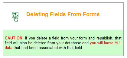
78 How to Revise Your Form after Publication Publication does not mean that the form is fixed in place and unchangeable. On the contrary, one of the benefits of using SeaGreen software is that is easy to make any type of revision to your form - even after Publication. In fact, you may wish to look at Publication as simply another way of viewing your form - just as you did with Form Preview or Preview in Browser modes. By Publishing, you have now seen with complete accuracy what the form will look like to the typical user. To revise any aspect of your form, open the appropriate.sea file and click on Form Layout, Code Editor, or Admin Module modes, as applicable to your situation. Change any aspect of your form, then go into Publish mode and republish. Within seconds, you will be able to see the changed form on the Web! Note: If you add or delete a form field from your form and republish, you will need to update your database before users can use the new form. Don't panic! SeaGreen makes even this easy to do! Updating the Database If you add or delete a field from your form, you will need to update the database with this new information. It is a good idea to get into the habit of doing this immediately after republishing so your online form does not face any down-time. To see if your database needs to be updated, simply visit the form online. If you need to update the form, you will see the following notice where you would normally see your form: If you included an address when setting up your Admin Module, this is the that "Form Administrator" is linked to in this notice. If you forget to update your database after republication, you will eventually receive an from a visitor trying to use it. To update the database, simply login to your Admin Module and click the Start Update button: When the update is complete, click the button which says "Return to Admin." Note: If you made extensive changes to your form, it is wise to backup your database before updating it. You can do this from within your website's control panel.
79

80 Software Updates We are constantly improving SeaGreen software. As a result, we make available to registered users regular software updates which will improve the functionality of your application. To take advantage of software updates: Click Edit. Click Preferences. Click Software Updates. Make sure that Automatically check for updates is selected. Click Apply. When Automatically check for updates is checked, SeaGreen will log into the SeaGreen site on a regular basis, check for updates, and download any application updates. Do not change the update URL unless instructed to do so by SeaGreen Software.
Figure 1 Forms category in the Insert panel. You set up a form by inserting it and configuring options through the Properties panel.
 Adobe Dreamweaver CS6 Project 3 guide How to create forms You can use forms to interact with or gather information from site visitors. With forms, visitors can provide feedback, sign a guest book, take
How to lay out a web page with CSS
 Activity 2.6 guide How to lay out a web page with CSS You can use table design features in Adobe Dreamweaver CS4 to create a simple page layout. However, a more powerful technique is to use Cascading Style
Adobe Dreamweaver CS5 Tutorial
 Adobe Dreamweaver CS5 Tutorial GETTING STARTED This tutorial focuses on the basic steps involved in creating an attractive, functional website. In using this tutorial you will learn to design a site layout,
ADOBE DREAMWEAVER CS4 BASICS
 ADOBE DREAMWEAVER CS4 BASICS Dreamweaver CS4 2 This tutorial focuses on the basic steps involved in creating an attractive, functional website. In using this tutorial you will learn to design a site layout,
File Cabinet Manager
 Tool Box File Cabinet Manager Java File Cabinet Manager Password Protection Website Statistics Image Tool Image Tool - Resize Image Tool - Crop Image Tool - Transparent Form Processor Manager Form Processor
Do It Yourself Website Editing Training Guide
 Do It Yourself Website Editing Training Guide Version 3.0 Copyright 2000-2011 Sesame Communications. All Rights Reserved. Table of Contents DIY Overview 3 What pages are editable using the DIY Editing
Administrative Training Mura CMS Version 5.6
 Administrative Training Mura CMS Version 5.6 Published: March 9, 2012 Table of Contents Mura CMS Overview! 6 Dashboard!... 6 Site Manager!... 6 Drafts!... 6 Components!... 6 Categories!... 6 Content Collections:
How to Edit Your Website
 How to Edit Your Website A guide to using your Content Management System Overview 2 Accessing the CMS 2 Choosing Your Language 2 Resetting Your Password 3 Sites 4 Favorites 4 Pages 5 Creating Pages 5 Managing
GoLive will first ask you if your new site will be for one individual or a work group; select for a Single User, and click Next.
 Getting Started From the Start menu, located the Adobe folder which should contain the Adobe GoLive 6.0 folder. Inside this folder, click Adobe GoLive 6.0. GoLive will open to its initial project selection
How to Edit Your Website
 How to Edit Your Website A guide to using your Content Management System Overview 2 Accessing the CMS 2 Choosing Your Language 2 Resetting Your Password 3 Sites 4 Favorites 4 Pages 5 Creating Pages 5 Managing
This Tutorial is for Word 2007 but 2003 instructions are included in [brackets] after of each step.
![This Tutorial is for Word 2007 but 2003 instructions are included in [brackets] after of each step.](/thumbs/72/67280806.jpg "This Tutorial is for Word 2007 but 2003 instructions are included in [brackets] after of each step.") This Tutorial is for Word 2007 but 2003 instructions are included in [brackets] after of each step. Table of Contents Just so you know: Things You Can t Do with Word... 1 Get Organized... 1 Create the
This Tutorial is for Word 2007 but 2003 instructions are included in [brackets] after of each step. Table of Contents Just so you know: Things You Can t Do with Word... 1 Get Organized... 1 Create the
Adobe Dreamweaver CC 17 Tutorial
 Adobe Dreamweaver CC 17 Tutorial GETTING STARTED This tutorial focuses on the basic steps involved in creating an attractive, functional website. In using this tutorial you will learn to design a site
Dear Candidate, Thank you, Adobe Education
 Dear Candidate, In preparation for the Web Communication certification exam, we ve put together a set of practice materials and example exam items for you to review. What you ll find in this packet are:
Dreamweaver: Web Forms
 Dreamweaver: Web Forms Introduction Web forms allow your users to type information into form fields on a web page and send it to you. Dreamweaver makes it easy to create them. This workshop is a follow-up
In the fourth unit you will learn how to upload and add images and PDF files.
 Introduction Here at SUNY New Paltz, we use the Terminal Four (T4) web content management system (CMS). This puts the power of editing content on our college s webpage in the hands of our authorized users.
Building TPS Web Pages with Dreamweaver
 Building TPS Web Pages with Dreamweaver Title Pages 1. Folder Management 7 2. Defining Your Site 8-11 3. Overview of Design Features 12-22 4. Working with Templates 23-25 5. Publishing Your Site to the
Creating Interactive PDF Forms
 Creating Interactive PDF Forms Using Adobe Acrobat X Pro for the Mac University Information Technology Services Training, Outreach, Learning Technologies and Video Production Copyright 2012 KSU Department
Lava New Media s CMS. Documentation Page 1
 Lava New Media s CMS Documentation 5.12.2010 Page 1 Table of Contents Logging On to the Content Management System 3 Introduction to the CMS 3 What is the page tree? 4 Editing Web Pages 5 How to use the
OU EDUCATE TRAINING MANUAL
 OU EDUCATE TRAINING MANUAL OmniUpdate Web Content Management System El Camino College Staff Development 310-660-3868 Course Topics: Section 1: OU Educate Overview and Login Section 2: The OmniUpdate Interface
Table Basics. The structure of an table
 TABLE -FRAMESET Table Basics A table is a grid of rows and columns that intersect to form cells. Two different types of cells exist: Table cell that contains data, is created with the A cell that
DRAFT. Table of Contents About this manual... ix About CuteSITE Builder... ix. Getting Started... 1
 DRAFT Table of Contents About this manual... ix About CuteSITE Builder... ix Getting Started... 1 Setting up... 1 System Requirements... 1 To install CuteSITE Builder... 1 To register CuteSITE Builder...
Wordpress Training Manual
 The Dashboard... 2 If this is your first time logging in:... 2 How do I change my password or email address?... 3 Search Engine Optimization (SEO)... 4 SEO for Pages... 4 SEO for Images... 5 Managing Pages...
How to set up a local root folder and site structure
 Activity 2.1 guide How to set up a local root folder and site structure The first thing to do when creating a new website with Adobe Dreamweaver CS3 is to define a site and identify a root folder where
Interface. 2. Interface Adobe InDesign CS2 H O T
 2. Interface Adobe InDesign CS2 H O T 2 Interface The Welcome Screen Interface Overview The Toolbox Toolbox Fly-Out Menus InDesign Palettes Collapsing and Grouping Palettes Moving and Resizing Docked or
FileMaker. Mobile 7. User s Guide. For Windows, Mac, Palm OS, and Pocket PC. Companion for Palm OS and Pocket PC
 For Windows, Mac, Palm OS, and Pocket PC FileMaker Mobile 7 Companion for Palm OS and Pocket PC User s Guide 2000-2004 FileMaker, Inc. All Rights Reserved. FileMaker, Inc. 5201 Patrick Henry Drive Santa
CROMWELLSTUDIOS. Content Management System Instruction Manual V1. Content Management System. V1
 Content Management System Instruction Manual V1 www.cromwellstudios.co.uk Cromwell Studios Web Services Content Management System Manual Part 1 Content Management is the system by which you can change
FirmSite Control. Tutorial
 FirmSite Control Tutorial 1 Last Updated June 26, 2007 by Melinda France Contents A. Logging on to the Administrative Control Center... 3 Using the Editor Overview:... 3 Inserting an Image... 7 Inserting
Joomla! 2.5.x Training Manual
 Joomla! 2.5.x Training Manual 1 Joomla is an online content management system that keeps track of all content on your website including text, images, links, and documents. This manual includes several
Microsoft Expression Web Quickstart Guide
 Microsoft Expression Web Quickstart Guide MS-Expression Web Quickstart Guide Page 1 of 24 Expression Web Quickstart Guide (20-Minute Training) Welcome to Expression Web. When you first launch the program,
Beginner Workshop Activity Guide 2012 User Conference
 Beginner Workshop Activity Guide 2012 User Conference TUESDAY, MARCH 6 2:00PM 5:00 PM Beginner Training Workshop Attendees will learn the end user functions of OU Campus TM. They will learn how to log
Dreamweaver MX The Basics
 Chapter 1 Dreamweaver MX 2004 - The Basics COPYRIGHTED MATERIAL Welcome to Dreamweaver MX 2004! Dreamweaver is a powerful Web page creation program created by Macromedia. It s included in the Macromedia
1.0 Overview For content management, Joomla divides into some basic components: the Article
 Joomla! 3.4.x Training Manual Joomla is an online content management system that keeps track of all content on your website including text, images, links, and documents. This manual includes several tutorials
Creating Web Pages with SeaMonkey Composer
 1 of 26 6/13/2011 11:26 PM Creating Web Pages with SeaMonkey Composer SeaMonkey Composer lets you create your own web pages and publish them on the web. You don't have to know HTML to use Composer; it
How to Use Serif WebPlus 10
 How to Use Serif WebPlus 10 Getting started 1. Open Serif WebPlus and select Start New Site from the Startup Screen 2. WebPlus will start a blank website for you. Take a few moments to familiarise yourself
FrontPage 2000 Tutorial -- Advanced
 FrontPage 2000 Tutorial -- Advanced Shared Borders Shared Borders are parts of the web page that share content with the other pages in the web. They are located at the top, bottom, left side, or right
Managing Your Website with Convert Community. My MU Health and My MU Health Nursing
 Managing Your Website with Convert Community My MU Health and My MU Health Nursing Managing Your Website with Convert Community LOGGING IN... 4 LOG IN TO CONVERT COMMUNITY... 4 LOG OFF CORRECTLY... 4 GETTING
AGENT123. Full Q&A and Tutorials Table of Contents. Website IDX Agent Gallery Step-by-Step Tutorials
 AGENT123 Full Q&A and Tutorials Table of Contents Website IDX Agent Gallery Step-by-Step Tutorials WEBSITE General 1. How do I log into my website? 2. How do I change the Meta Tags on my website? 3. How
Dreamweaver Handout. University of Connecticut Prof. Kent Golden
 Dreamweaver Handout University of Connecticut Prof. Kent Golden Kent@GoldenMultimedia.com www.goldenmultimedia.com Main goal of this handout: To give you the steps needed to create a basic personal website
Section 6: Dreamweaver
 Section 6: Dreamweaver 1 Building TPS Web Pages with Dreamweaver Title Pages 1. Dreamweaver Storyboard Pages 3 2. Folder Management 4 3. Defining Your Site 5-8 4. Overview of Design Features 9-19 5. Working
Basic Concepts. Launching MultiAd Creator. To Create an Alias. file://c:\documents and Settings\Gary Horrie\Local Settings\Temp\~hh81F9.
 Page 1 of 71 This section describes several common tasks that you'll need to know in order to use Creator successfully. Examples include launching Creator and opening, saving and closing Creator documents.
This Tutorial is for Word 2007 but 2003 instructions are included in [brackets] after of each step.
![This Tutorial is for Word 2007 but 2003 instructions are included in [brackets] after of each step.](/thumbs/89/98497436.jpg "This Tutorial is for Word 2007 but 2003 instructions are included in [brackets] after of each step.") This Tutorial is for Word 2007 but 2003 instructions are included in [brackets] after of each step. Table of Contents Get Organized... 1 Create the Home Page... 1 Save the Home Page as a Word Document...
This Tutorial is for Word 2007 but 2003 instructions are included in [brackets] after of each step. Table of Contents Get Organized... 1 Create the Home Page... 1 Save the Home Page as a Word Document...
There are four (4) skills every Drupal editor needs to master:
 skills every Drupal editor needs to master:") There are four (4) skills every Drupal editor needs to master: 1. Create a New Page / Edit an existing page. This entails adding text and formatting the content properly. 2. Adding an image to a page.
There are four (4) skills every Drupal editor needs to master: 1. Create a New Page / Edit an existing page. This entails adding text and formatting the content properly. 2. Adding an image to a page.
COPYRIGHTED MATERIAL. Using Adobe Bridge. Lesson 1
 Lesson Using Adobe Bridge What you ll learn in this lesson: Navigating Adobe Bridge Using folders in Bridge Making a Favorite Creating metadata Using automated tools Adobe Bridge is the command center
Microsoft FrontPage 2002 Tutorial. Contents
 Microsoft FrontPage 2002 Tutorial Contents Introduction... 1 Before You Begin... 2 Overview... 2 If you have Web server software installed... 2 FrontPage and Microsoft Internet Explorer... 3 If you are
Drupal Cloud Getting Started Guide Creating a Lab site with the MIT DLC Theme
 Introduction Drupal Cloud Getting Started Guide Creating a Lab site with the MIT DLC Theme In this Getting Started Guide, you can follow along as a website is built using the MIT DLC Theme. Whether you
C1 CMS User Guide Orckestra, Europe Nygårdsvej 16 DK-2100 Copenhagen Phone
 2017-02-13 Orckestra, Europe Nygårdsvej 16 DK-2100 Copenhagen Phone +45 3915 7600 www.orckestra.com Content 1 INTRODUCTION... 4 1.1 Page-based systems versus item-based systems 4 1.2 Browser support 5
Swiiit User Guide 09/11/2016
 Swiiit User Guide 09/11/2016 Contents Getting Started... 4 Overview of Main Tools... 5 Webpages... 6 Main pages (Sections)... 6 Rearrange Sections... 6 Subpages... 7 Change the Title of a Webpage... 8
User Manual. pdoc Forms Designer. Version 3.7 Last Update: May 25, Copyright 2018 Topaz Systems Inc. All rights reserved.
 User Manual pdoc Forms Designer Version 3.7 Last Update: May 25, 2018 Copyright 2018 Topaz Systems Inc. All rights reserved. For Topaz Systems, Inc. trademarks and patents, visit www.topazsystems.com/legal.
Unit 21 - Creating a Navigation Bar in Macromedia Fireworks
 Unit 21 - Creating a Navigation Bar in Macromedia Fireworks Items needed to complete the Navigation Bar: Unit 21 - House Style Unit 21 - Graphics Sketch Diagrams Document ------------------------------------------------------------------------------------------------
build a digital portfolio in WebPlus X4
 How to build a digital portfolio in WebPlus X4 Get started Open Serif WebPlus and select Start New Site from the Startup Wizard. WebPlus will open a blank website for you. Take a few moments to familiarise
FrontPage. Directions & Reference
 FrontPage Directions & Reference August 2006 Table of Contents Page No. Open, Create, Save WebPages Open Webpage... 1 Create and Save a New Page... 1-2 Change the Background Color of Your Web Page...
About Freeway. Freeway s Tools and Palettes
 About Freeway The most important thing to appreciate before you start a site in Freeway is how the process works, especially if you have tried other Web publishing software before. Freeway is not an HTML
Working with the website editor...5. Editing page properties Creating a new page Adding and editing content records...
 About this guide...3 About the structure of web pages in typo3...4 The outer template...4 The page record...4 Page content records...4 Access to editing and publishing records...4 Working with the website
Dreamweaver MX Overview. Maintaining a Web Site
 Dreamweaver MX Overview Maintaining a Web Site... 1 The Process... 1 Filenames... 1 Starting Dreamweaver... 2 Uploading and Downloading Files... 6 Check In and Check Out Files... 6 Editing Pages in Dreamweaver...
Drupal 7 guide CONTENTS. p. 2 Logging In
 Drupal 7 guide Drupal is a widely used, open-source, free platform that has an easy-to-use content management system for updating websites. This guide was created by the Health Communication Core (www.healthcommcore.org)
UNIVERSITY OF CALGARY Information Technologies WEBFORMS DRUPAL 7 WEB CONTENT MANAGEMENT
 UNIVERSITY OF CALGARY Information Technologies WEBFORMS DRUPAL 7 WEB CONTENT MANAGEMENT Table of Contents Creating a Webform First Steps... 1 Form Components... 2 Component Types.....4 Conditionals...
The Domino Designer QuickStart Tutorial
 The Domino Designer QuickStart Tutorial 1. Welcome The Domino Designer QuickStart Tutorial You've installed Domino Designer, you've taken the Designer Guided Tour, and maybe you've even read some of the
Electronic Portfolios in the Classroom
 Electronic Portfolios in the Classroom What are portfolios? Electronic Portfolios are a creative means of organizing, summarizing, and sharing artifacts, information, and ideas about teaching and/or learning,
Excel 2013 Intermediate
 Excel 2013 Intermediate Quick Access Toolbar... 1 Customizing Excel... 2 Keyboard Shortcuts... 2 Navigating the Spreadsheet... 2 Status Bar... 3 Worksheets... 3 Group Column/Row Adjusments... 4 Hiding
MICROSOFT WORD 2010 BASICS
 MICROSOFT WORD 2010 BASICS Word 2010 is a word processing program that allows you to create various types of documents such as letters, papers, flyers, and faxes. The Ribbon contains all of the commands
Word 2013 Quick Start Guide
 Getting Started File Tab: Click to access actions like Print, Save As, and Word Options. Ribbon: Logically organize actions onto Tabs, Groups, and Buttons to facilitate finding commands. Active Document
Editing Drupal 7 Sites. Basic page editing. June To begin editing, log in by clicking Login at the bottom of the homepage. Username.
 Editing Drupal 7 Sites June 2013 Basic page editing To begin editing, log in by clicking Login at the bottom of the homepage Username Password Navigate to the page you want to edit Click the Edit tab at
BASICS OF MOTIONSTUDIO
 EXPERIMENT NO: 1 BASICS OF MOTIONSTUDIO User Interface MotionStudio combines draw, paint and animation in one easy easy-to-use program gram to save time and make work easy. Main Window Main Window is the
Dreamweaver CS 5.5. University Information Technology Services. Training, Outreach, Learning Technologies, and Video Production
 Dreamweaver CS 5.5 Creating Web Pages with a Template University Information Technology Services Training, Outreach, Learning Technologies, and Video Production Copyright 2012 KSU Department of Information
ITEC447 Web Projects CHAPTER 9 FORMS 1
 ITEC447 Web Projects CHAPTER 9 FORMS 1 Getting Interactive with Forms The last few years have seen the emergence of the interactive web or Web 2.0, as people like to call it. The interactive web is an
Title and Modify Page Properties
 Dreamweaver After cropping out all of the pieces from Photoshop we are ready to begin putting the pieces back together in Dreamweaver. If we were to layout all of the pieces on a table we would have graphics
Client Interview. Interview Topics. Goals and Target Audience. Activity 3.1 Worksheet. Client Name:
 Activity 3.1 Worksheet Client Interview Team Name: Date: Client Name: Interview Topics Goals and target audience Content Design requirements Delivery requirements Goals and Target Audience Identify three
Creating Accessible Word Documents
 Creating Accessible Word Documents 1 of 11 Creating Accessible Word Documents Contents 1. General principles... 1 2. Styles/ Headings... 2 3. Table of Contents... 3 Updating a Table of Contents... 5 4.
Dreamweaver is a full-featured Web application
 Create a Dreamweaver Site Dreamweaver is a full-featured Web application development tool. Dreamweaver s features not only assist you with creating and editing Web pages, but also with managing and maintaining
User Guide. FTR Reporter For more information, visit
 FTR Reporter 5.7.1 For more information, visit www.fortherecord.com TABLE OF CONTENTS INTRODUCTION... 5 Overview... 5 About This Document... 5 GETTING STARTED... 6 Installation... 6 Starting Reporter...
Introduction to Moodle
 Introduction to Moodle Preparing for a Moodle Staff Development Session... 2 Logging in to Moodle... 2 Adding an image to your profile... 4 Navigate to and within a course... 6 Content of the basic template
VisualPST 2.4. Visual object report editor for PowerSchool. Copyright Park Bench Software, LLC All Rights Reserved
 VisualPST 2.4 Visual object report editor for PowerSchool Copyright 2004-2015 Park Bench Software, LLC All Rights Reserved www.parkbenchsoftware.com This software is not free - if you use it, you must
Using Dreamweaver. 5 More Page Editing. Bulleted and Numbered Lists
 Using Dreamweaver 5 By now, you should have a functional template, with one simple page based on that template. For the remaining pages, we ll create each page based on the template and then save each
Quick Reference Guide: Genesis 2
 : Genesis 2 TABLE OF CONTENTS REGISTRATION...2 LAUNCH GENESIS 2 WIZARD...4 MANAGE MY PROFILE...33 CONFIGURE MY WEBSITE...34 REPORTS...35 1 REGISTRATION Before you can access the administration section
Swiiit User Guide 03/09/2015
 Swiiit User Guide 03/09/2015 Contents Getting Started... 4 Overview of Main Tools... 5 Webpages... 6 Main pages (Sections)... 6 Rearrange Sections... 6 Subpages... 7 Change the Title of a Webpage... 8
2016 TRTA Content Managers Resource Guide How to update and edit your local unit website. Roy Varney, TRTA Multimedia Specialist
 2016 TRTA Content Managers Resource Guide How to update and edit your local unit website. Roy Varney, TRTA Multimedia Specialist Table of Contents Introduction... 1 Basic information... 1 - How to log
DOING MORE WITH WORD: MICROSOFT OFFICE 2010
 DOING MORE WITH WORD: MICROSOFT OFFICE 2010 GETTING STARTED PAGE 02 Prerequisites What You Will Learn USING MICROSOFT WORD PAGE 03 Viewing Toolbars Adding and Removing Buttons MORE TASKS IN MICROSOFT WORD
OU Campus VERSION 10
 OU Campus VERSION 10 End User Manual Last Update: 9/8/2015 Contact Tish Sailer with comments or questions regarding this Manual. Contents INTRODUCTION...3 HELP DOCUMENTS AND SUPPORT... 3 ACCESSING PAGES
Shape Cluster Photo Written by Steve Patterson
 Shape Cluster Photo Written by Steve Patterson Before After Step 1: Create A New Document Let's begin by creating a new Photoshop document. Go up to the File menu in the Menu Bar along the top of the screen
TABLE OF CONTENTS TABLE OF CONTENTS... 1 INTRODUCTION... 2 USING WORD S MENUS... 3 USING WORD S TOOLBARS... 5 TASK PANE... 9
 TABLE OF CONTENTS TABLE OF CONTENTS... 1 INTRODUCTION... 2 USING WORD S MENUS... 3 DEFINITIONS... 3 WHY WOULD YOU USE THIS?... 3 STEP BY STEP... 3 USING WORD S TOOLBARS... 5 DEFINITIONS... 5 WHY WOULD
Adobe Acrobat Pro DC for Windows
 Adobe Acrobat Pro DC for Windows Creating Interactive PDF Forms University Information Technology Services Learning Technologies, Training & Audiovisual Outreach Copyright 2017 KSU Division of University
Working with Pages... 9 Edit a Page... 9 Add a Page... 9 Delete a Page Approve a Page... 10
 Land Information Access Association Community Center Software Community Center Editor Manual May 10, 2007 - DRAFT This document describes a series of procedures that you will typically use as an Editor
Working with Mailbox Manager
 Working with Mailbox Manager A user guide for Mailbox Manager supporting the Message Storage Server component of the Avaya S3400 Message Server Mailbox Manager Version 5.0 February 2003 Copyright 2003
User s Guide. For Windows, Mac, Palm OS, and Pocket PC. Companion for Palm OS and Pocket PC
 For Windows, Mac, Palm OS, and Pocket PC FileMMobile aker8 Companion for Palm OS and Pocket PC User s Guide 2000-2006 FileMaker, Inc. All Rights Reserved. FileMaker, Inc. 5201 Patrick Henry Drive Santa
Introduction to the MODx Manager
 Introduction to the MODx Manager To login to your site's Manager: Go to your school s website, then add /manager/ ex. http://alamosa.k12.co.us/school/manager/ Enter your username and password, then click
OU Campus VERSION 10
 OU Campus VERSION 10 End User Manual Last Update: 8/15/2017 Contact Tish Sailer with comments or questions regarding this Manual. Contents INTRODUCTION...3 HELP DOCUMENTS AND SUPPORT... 3 ACCESSING PAGES
Using Dreamweaver CC. Logo. 4 Creating a Template. Page Heading. Page content in this area. About Us Gallery Ordering Contact Us Links
 Using Dreamweaver CC 4 Creating a Template Now that the main page of our website is complete, we need to create the rest of the pages. Each of them will have a layout that follows the plan shown below.
Goldfish 4. Quick Start Tutorial
 Goldfish 4 Quick Start Tutorial A Big Thank You to Tobias Schilpp 2018 Fishbeam Software Text, Graphics: Yves Pellot Proofread, Photos: Tobias Schilpp Publish Code: #180926 www.fishbeam.com Get to know
Beginners Guide to Snippet Master PRO
 Beginners Guide to Snippet Master PRO This document assumes that Snippet Master has been installed on your site. If not please contact the Bakas IT web team at webreg@bakasit.com.au. Initial Login Screen...
Using Sitecore 5.3.1
 Using Sitecore 5.3.1 An End-User s Guide to Using and Administrating Sitecore Author: Sitecore Corporation Date: December 12, 2007 Release: Rev. 1.0 Language: English Sitecore is a registered trademark.
Using Dreamweaver CC. 5 More Page Editing. Bulleted and Numbered Lists
 Using Dreamweaver CC 5 By now, you should have a functional template, with one simple page based on that template. For the remaining pages, we ll create each page based on the template and then save each
San Pedro Junior College. WORD PROCESSING (Microsoft Word 2016) Week 4-7
 Week 4-7") WORD PROCESSING (Microsoft Word 2016) Week 4-7 Creating a New Document In Word, there are several ways to create new document, open existing documents, and save documents: Click the File menu tab and then
WORD PROCESSING (Microsoft Word 2016) Week 4-7 Creating a New Document In Word, there are several ways to create new document, open existing documents, and save documents: Click the File menu tab and then
The figure below shows the Dreamweaver Interface.
 Dreamweaver Interface Dreamweaver Interface In this section you will learn about the interface of Dreamweaver. You will also learn about the various panels and properties of Dreamweaver. The Macromedia
SoftChalk 10. Level 1. University Information Technology Services. Learning Technologies, Training, Audiovisual, and Outreach
 SoftChalk 10 Level 1 University Information Technology Services Learning Technologies, Training, Audiovisual, and Outreach Copyright 2018 KSU Division of University Information Technology Services This
Wimba Classroom Version 6.1 Room Administrator Guide
 Wimba Classroom Version 6.1 Room Administrator Guide Wimba Classroom 6.1 Room Administrator Guide 1 Administration Tools 2 Room Management 3 Creating a New Room (RoomCreators Only) 3 Setting up a Room
Creating an with Constant Contact. A step-by-step guide
 Creating an Email with Constant Contact A step-by-step guide About this Manual Once your Constant Contact account is established, use this manual as a guide to help you create your email campaign Here
A new clients guide to: Activating a new Studio 3.0 Account Creating a Photo Album Starting a Project Submitting a Project Publishing Tips
 Getting Started With Heritage Makers A Guide to the Heritage Studio 3.0 Drag and Drop Publishing System presented by Heritage Makers A new clients guide to: Activating a new Studio 3.0 Account Creating
Center for Faculty Development and Support Making Documents Accessible
 Center for Faculty Development and Support Making Documents Accessible in Word 2007 Tutorial CONTENTS Create a New Document and Set Up a Document Map... 3 Apply Styles... 4 Modify Styles... 5 Use Table
Oracle Eloqua s User Guide
 http://docs.oracle.com Oracle Eloqua Emails User Guide 2018 Oracle Corporation. All rights reserved 11-Jan-2018 Contents 1 Emails Overview 6 2 Examples of emails 7 3 Creating emails 19 4 Email authoring
Overview of the Adobe Dreamweaver CS5 workspace
 Adobe Dreamweaver CS5 Activity 2.1 guide Overview of the Adobe Dreamweaver CS5 workspace You can access Adobe Dreamweaver CS5 tools, commands, and features by using menus or by selecting options from one