Table of Contents MicroEdge, LLC. All rights reserved.
|
|
|
- Colin Harvey
- 5 years ago
- Views:
Transcription
1
2 Table of Contents 2
3 DonorCentral Site Setup and User Guide 1 Copyright Information 7 Contacting Support 8 Welcome to DonorCentral 9 Logging into DonorCentral 9 Forget Your Password? 12 Register for DonorCentral 12 The Homepage 13 The Header Area 14 Advisor Selection 15 Research a Fund 15 The Carousel 16 The Main Information Area 17 Page Part: Alerts 17 Page Part: Events 18 Page Part: Fund Information 19 Page Part: Fund Opportunities 19 Page Part: Menu 20 Page Part: My Giving History Chart 20 Page Part: Recent Grantees 21 Page Part: What's New 22 The Footer Area 22 Editing Page Titles 23 Site Configuration Options 23 Admin Home 24 Admin Portal 24 User Management 24 Statistics Dashboard 25 Help Link Header Design Settings 27 Navigation Design Options 29 Design 3
4 Carousel Design Options 31 Transition Setup 32 Carousel Slides 32 The Layout Design Form 33 Footer Design Settings 34 The Preview Settings Page 36 Look and Feel Design Options 36 Restore Defaults Cancel Save: 36 Drop- Down Menus: 37 Size Fields: 37 Selecting Look and Feel Colors 37 Using the Color Picker Tool 38 Page and Links 38 Page and Links Settings 38 Page Style Settings 38 Navigation 39 Link Styles and Widget Styles 41 FAQ Styles 42 Tables 43 Dropdowns Settings 44 Inputs and Buttons Settings 44 Base 44 Inputs 45 Primary Buttons 45 Default Buttons 45 Information Buttons 45 Messages Settings 45 Warning 46 Success 46 Error 46 Info 46 4
5 The Grant Form Designer Editing Field Settings 48 Fund Summary
6 Fund Summary Modification Options 51 The Login Page Designer 53 #1 - Use Custom Layout? 54 #2 The Editor Menu 55 Edit Buttons 58 #3 Layout Editor 59 #4 Bottom Buttons 60 The Login Page Designer 61 #1 - Use Custom Layout? 62 #2 The Editor Menu 63 Edit Buttons 66 Login - Insert Image 67 Login - Insert Link 69 Login - Working with Tables 71 Login - Source Code 75 #3 Layout Editor 77 #4 Bottom Buttons 78 Reset Password 79 Resources 80 Resources: News 80 Resources: My Giving History 81 Resources: Funding Opportunities 82 To Create a New Funding Opportunity: 82 Resources: Contacts 84 To Create a New Contact: 85 To Edit a Contact: 85 To Remove a Contact: 85 Resources: Events 85 Resources: Frequently Asked Questions 87 Adding FAQ Questions 87 Editing an FAQ Question 87 Remove a FAQ Question 88 Resources: Alerts 88 6
7 Adding an Alert Editing an Alert 90 Remove an Alert 90 Resources: Donor Interests 90 To Edit an Interest Code: 91 Resources: Upload Forms 91 Viewing Forms 94 Donor s View of Alerts 94 Adding Optional Pages 95 Viewing/Submitting Recommendations 96 Recommendations 96 Submit List Confirmations 96 Recurring Grants 97 Recurring Grants 97 Research Charities 99 Fund Summary 101 General Ledger Transaction Detail 101 Market Value Detail 102 Asset Allocation 103 Fund Rollup Option 104 Organization Detail 105 Display Proposals in the Funding Opportunities Widget 105 Printing and Exporting Fund Summaries 106 Print Page 106 Export Gifts 107 Export Grants 108 Frequently Asked Questions Page 108 My Profile 111 Resources Menu 112 Other Advisors 112 Forms 113 7
8 The Contact Us Page 114 Appendix 115 DonorCentral and FIMS Fields 115 DonorCentral Fields NOT Assigned to FIMS 115 DonorCentral Fields Assigned to FIMS 116 Index 124 8
9 Copyright Information The information contained in this online help represents the current view of the issues discussed as of the date of publication. Because MicroEdge, LLC. must respond to changing market conditions, it should not be interpreted to be a commitment on the part of MicroEdge, and MicroEdge cannot guarantee the accuracy of any information presented after the date of publication. This document is for informational purposes only. MicroEdge, LLC. MAKES NO WARRANTIES, EXPRESS OR IMPLIED, IN THIS ONLINE HELP. Complying with all applicable copyright laws is the responsibility of the user. Without limiting the rights under copyright, no part of this online help may be reproduced, stored in or introduced into a retrieval system, or transmitted in any form or by any means (electronic, mechanical, photocopying, recording or otherwise) or for any purpose, without the express written permission of MicroEdge, LLC. MicroEdge may have patents, patent applications, trademarks, copyrights or other intellectual property rights covering subject matter in this online help. Except as expressly provided in any written license agreement from MicroEdge, LLC, the furnishing of this online help does not give you any license to these patents, copyrights, or other intellectual property. AngelPoints is a trademark of MicroEdge, LLC in the United States and/or other countries. Microsoft is a registered trademark of Microsoft Corporation in the United States and/or other countries. The names of actual companies and products mentioned herein may be the trademarks of their respective owners. MicroEdge, LLC. 619 West 54th Street New York, NY Contacting Support Blackbaud Customer Support Need Help? If you have questions or need assistance, please contact Support. 9
10 Online: Phone: (800) Visit Case Central at Click the Case tab at the top and click Create New Case. Support Hours: M-F, 8:30 am 8:00 pm ET 10
11 Welcome to DonorCentral DonorCentral provides online access to Fund-specific information for your organization. Donor Advisors and Fund holders can log into DonorCentral from your organization s website to perform any of the following tasks: View Fund activity (summary and detail) View Investment account balances View Gift and Grant History Download pre-formatted Fund Statements in.pdf format. Donors can make online grant suggestions. It allows you to automatically create records in FIMS when Donor Advisors make grant suggestions. The link between your website and DonorCentral (located on MicroEdge s secure server) is transparent to the Donor. You can customize colors, fonts, and logos to match your organization s website. Each Donor is assigned a unique user name and password to ensure his or her security, and yours. This section contains the following topics: Logging into DonorCentral The Homepage Site Configuration Options Viewing Suggestions Research Charities Fund Summary My Profile Resources Menu Logging into DonorCentral Each Donor must log in with a unique user name and password. This login information is used to determine which Funds a Donor can review online and whether a Donor has permission to make Grant Suggestions. NOTE: A Privacy Policy link is available on the login page to adhere to security/privacy compliance for MicroEdge, LLC hosted applications. To log into DonorCentral: 1. Click the link to the DonorCentral site. The login page appears. 11

12 2. In the Username field, enter your assigned user name. 3. In the Password field, enter your password. NOTE: The password appears on the screen as a series of dots for security purposes. 4. Click Sign On. The DonorCentral home page appears. 12

13 The home page is personalized with the Donor's name, a carousel section on top showing slides geared towards donor interests, links to main Donor Central pages, and various page parts such as welcome notes, associated Fund Information, a Giving History chart, and a menu which can be customized with links to other important web pages. 13

14 NOTE: The count of pending Recommendations(X) in the header applies to pending and unsubmitted recommendations. If no unsubmitted recommendations exist, the counter is not visible. Forget Your Password? If you forget your password, you can do the following to have it sent to you via 1. Click Forgot Your Password? on the Login page. The Request My Password page appears. 2. Enter your Address, and then click Send My Password. 3. Please add this information. This utility validates the address that the donor enters here against the address on the Profile 1 tab for this donor and will not send a temporary password if it does not match. Register for DonorCentral To register for DonorCentral: 1. On the login page near the bottom, click on the "Click here to register for DonorCentral" link. 2. When the DonorCentral Online Registration form is displayed, fill in the fields listed and enter the verification text above the Register button. 14

15 3. Click Register to submit the request. An will be generated and sent to a designated staff member to process the request and setup a Donor account. NOTE: It is the responsibility of the staff member to notify the registrant once their account is ready for use. The Homepage The homepage that donors and advisors see in Donor Central consists of several main areas: 15
16 The Header Area Advisor Selection The Carousel The Main Information Area The Footer Area The Header Area The header area is consistent throughout the Donor Central website and can be configured to display an image. It consists of the following main navigation links: Item/Link Logo Site Configuration Recommendations Alerts (#) Description Clicking the logo area at any time will take the user back to the homepage by default. It can be configured to go to an alternative URL. Access options to configure the look and feel of the website. Access the pending Recommendations page. The number of pending recommendations will be displayed in parenthesis. This link alerts donor advisors of any administrative alerts which need to be reviewed. If there are unread alerts available, when a donor advisor logs in the link will flash and show the number of unread alerts in parenthesis. Click this link to go to the Alerts page. NOTE: There is also an Alerts widget which can be placed on donor home pages through the Site Configuration>Design>Layout page. Logged in as Logout Displays the name of the current user. Click to logout of the site and return to the login screen. NOTE: The links below can be modified on the Site Configuration>Design tab>navigation page. Therefore, the visible links and labels may be different for each site. Home Click to return to the home page. Click this link to go to the Research Charities page where donors 16
17 Research Charities can search for potential charities to recommend. Fund Summary My Profile Item/Link FAQ Contact Us Resources Access the Fund Summary page to review details for your related funds. Review your contact information and modify Interests. Description Links to a page with a list of frequently asked questions. Links to the Contact Us page. The options available on this menu can be modified by the site administrator and may include such options as Forms or Other Advisors. (optional) This is an optional page which can be added to your site. It lists all advisors associated with a fund allowing users to Other Advisors contact them by if needed. See Adding Optional Pages for more information. (optional) This is an optional page which can be added to your site if it does not already exist. It lists any forms you may have Forms added through the Administrator s portal for users to access. See Adding Optional Pages for more information. To configure this area, go to Site configuration > Site Design > 1. Header. Advisor Selection The Advisor selection option is located directly below the header area and allows an administrator to see the site from a specific Donor advisor point of view. Simply click on the Select button to be taken to the Research a Fund page. NOTE: If an advisor is already selected, you can click on the Change button Research a Fund Once there, you can look for a specific Donor Advisor by Fund name, Advisor Name, Fund ID or Fund Balance. 17
18 To select an advisor, click the Select button in the Actions column. The page will refresh and display the name of the selected advisor on top of the page with Change and Reset buttons next to it. Clicking Reset will clear the advisor and return you to normal view. The Carousel The carousel feature of Donor Central allows site administrators to create an unlimited amount of slides that can be configured to only appear for specific Donor Advisor interest codes. 18

19 Text can be added to the bottom of each slide to present a specific message or theme. For more information, refer to the Site Design > Carousel Design section. The Main Information Area The main information area below the carousel can display several basic page parts known as widgets. These widgets include: Alerts Events Fund Information Fund Opportunities Menu My Giving History Recent Grantees What s New NOTE: The widgets listed above may be arranged in any order you desire by going to the Site configuration > Site Design > Layout page. Page Part: Alerts This page part displays all existing Alerts for the current user. It displays exactly the same information as the Alerts page which can be accessed by clicking the Alerts link in the header area. In the page part, donor/advisors will be able to see the Date, Subject, read Status, Priority, and click View for more details or click Delete to remove the alert. A Delete All button is also available at the bottom. 19
 will display with each event. Events will be sorted by date in ascending order.")
20 Page Part: Events This page part displays upcoming events on the homepage grouped by month on individual tabs. Within each tab, the primary fields (Title, Description, Date, Time and Location) will display with each event. Events will be sorted by date in ascending order. Each event listed on the homepage widget will have an RSVP button that opens the user s default program and defaults in the event name into the Subject line. The message will be sent to the contact address provided by the admin/event manager when they create the event. 20


21 For more information on Events, see: Site Configuration > Layout Site Configuration > Resources > Events Page Part: Fund Information The Fund Information page part displays the user s related Fund Name, Fund ID, and Balance. In the Actions column, clicking the View button takes the user to the Fund Summary page. NOTE: Clicking the Fund Summary link in the header area will require you to select a Fund and Period. Individual balance amounts are rolled into an aggregate total that is displayed in bold in the upper right-hand corner of the widget. Page Part: Fund Opportunities This page part displays Funding Opportunities. The Funding Opportunities are grouped on different tabs by area of interest. If interested in one of these funding opportunities, 21
22 the Donor Advisor would click the Make a Grant button to begin the grantmaking process. The content for this page part can be updated in Site configuration > Resources > Funding Opportunities. Page Part: Menu The custom Menu page part can be used to provide links to additional websites or resources you want to make available to your users right on their homepage. Administrators can change the title or update this list of links by going to Site Configuration > Site Design > 2. Navigation. Page Part: My Giving History Chart The My Giving History page part will display a visual representation of the user s ten most recent grants from across all of their funds via a pie chart. Charting options for this page part can be updated in Site configuration > Resources > Giving History. The Widget Title for the My Giving History widget can also be edited. 22
23 Page Part: Recent Grantees The Recent Grantees page part will provide a list of the last 10 organizations that were granted money by the donor. The user will be able to show/hide this list using the arrow icon in the top right. A table grid now shows Grantee, Date Paid, Amount and a Make a Grant button is available to take the user to a pre-populated grant form. Columns are also sortable by clicking on the column header. 23


24 Page Part: What's New This page part allows the site administrator to enter information about the organization such as a welcome message, brief history, list of goals, or recent news. The content for this page part can be updated in Site configuration > Resources > News. The Footer Area The bottom area of the screen can be configured to display an image and additional information such as your organization's address, phone, or address. To configure this area, go to Site configuration > Site Design > 5. Footer All rights reserved. Editing Page Titles DonorCentral allows many of the titles on the various pages to be edited easily by a site administrator. If a title can be edited, it will have a pencil (edit) icon next to it. Simply click the pencil icon next to the title and it will turn into a text field you can modify. Click the checkmark icon to save your change. MicroEdge, LLC. 24

25 Site Configuration Options In order to configure the look and feel of many of the features in Donor Central, you will need to access the Site Configuration tools available by clicking the Site configuration link in the header area. The options available in Site configuration include the following: Admin Home Design Look and Feel Grant Form Fund Summary Login Page Resources o News o Giving History o Funding Opportunities o Events o Contacts o Frequently Asked Questions o Alerts o Donor Interests o upload Forms Admin Home The Admin Home tab allows administrators and limited access users to easily access the following: Admin Portal User Management Statistics Dashboard Help 25
26 Admin Portal Previously, the Admin Portal had to be accessed using a separate URL and login. By clicking the Admin Portal link on this tab, the current user can immediately access the Admin Portal without having to log in again. User Management This feature allows Administrator users to control access in the Site Configuration area for 'Limited Access' users. NOTE: Limited Access users are classified as such in FIMS via the Staff Profile module. Administrators can access this feature by clicking the User Management link on the Admin Home tab in Site Configuration. Limited Access users can be granted access to one or more of the different configuration sections. If a Limited Access user tries to access one of the sections shown below but does not have access, an alert message will display and the user will be redirected back to the Admin Home page. 26
27 Statistics Dashboard This link will display the Statistics Dashboard which used to be accessed via the link in the header area or the Statistic tab. Charts are displayed for Total Suggestions by Month and Suggestion Amount Totals by Month. 27

28 Help Link This link will open the DonorCentral Site Setup Guide in PDF form. Design Clicking the Site Configuration link in the header will take you directly to the Header configuration page of the Design tab. The Design tab gives you access to the following configuration pages: Header Navigatio n Carousel Layout 28
29 Footer Preview Notice at the top right of each Site Design page the following buttons will be available: The left & right arrow buttons let you move to the next site design page in sequence. Alternatively, you can just click the links on top. The Cancel button resets all settings on the page to what they were at your last Save. The Save button saves your changes to the page settings. Header Design Settings IMPORTANT: Remember to click the primary Save button after all changes have been made. On the Site Design > Header page, the following options can be configured: Option Description This is the text that is displayed on the browser's tab when view- Site name ing the website. 29
30 Logo URL Logo Image Header Image Header Background Horizontal Pos- itioning This is the site the user will be taken to when the logo is clicked. The default is your homepage. If the New Tab box is checked, the URL listed will open in a new browser window. Click the Choose button to set an image to be displayed in the top left corner of the header as your logo. Recommended size is 230wide x 60high in pixels. Formats supported include: JPG, BMP, & PNG. If a logo already exists, the Choose button will instead display Replace and X buttons. Replace will let you choose a new image file. X will remove the current logo image and leave the area blank. NOTE: Clicking the logo will take the user to the Logo URL that is currently set. Click the Choose button to set an image to be displayed in the header area. Recommended size is 960wide x 90high in pixels. Formats supported include: JPG, BMP, & PNG If a header image already exists, the Choose button will be replaced by Replace and X buttons. Replace will let you choose a new image file. X will remove the current logo image and leave the area blank. NOTE: The height of the Header area is set in the Look and Feel > Page and Links > Navigation section. This setting will move the image to the left, center, or right of the header area. Header Background This setting will move the image to the top, center, or bottom of Vertical Positioning the header area. This setting repeats the image in the selected direction until it Background Repeat fills the header area. The default for this is No Repeat. Background Image Option Default keeps the image at its default width and height. Description Cover stretches the image across the entire page but only displays the part of the image in the header section. Vertical and 30
31 Size Horizontal settings will be ignored. Contain will resize both the width and height of the uploaded image to a size that corresponds with the height of the header section. Remember to click Save when done making changes. Navigation Design Options IMPORTANT: Remember to click the primary Save button after all changes have been made. The Site Design > Navigation page is divided into two sections. The top section controls the links that are displayed on the header. The bottom section controls what is shown in the Menu page part which can be displayed on the main information section of the homepage. 31
32 On the bottom of the Navigation page is located the Menu page part list. You can add additional links in this area and they will be displayed in the Menu page part on the homepage. The Edit button next to the page part title allows you to modify it to anything desired. In the example above, the title has been changed to Research Tools. The table below describes the various features of the navigation page: Order Option Description In the Order column, the up/down arrows allow you to move the links up or down in the display order. The higher the link is in the order the more to the left it will be placed on the homepage header. Option Navigation entry Description This is what the link is displayed as in the header. 32
33 Type URL New Tab Visible Actions Add New There are three types: Primary - these are system links which cannot be removed but can be made invisible by unchecking the Visible box. Secondary - these are links added by you with the ability to set the URL. Secondary links can be removed by clicking the X in the Actions column. Child - child links are displayed below an existing link as a dropdown menu and can be created by clicking the + button in the Actions column for a Primary or Secondary menu item. Displays the URL set for Secondary and Child type links. The URL can be modified by clicking the Edit button Check this box if you want the URL to be opened in a new browser window. Check this box to make the navigation link visible for use. Three buttons can be displayed in the Actions column depending on the Type of the link. Edit: For Primary types, allows you to change the name of the link. For Secondary and Child types, allows you to change the name and URL of the link. +: Available for Primary and Secondary types. Allows you to add child links to the Primary or Secondary link. X: Available only on Secondary and Child links. Removes the link from the header area. This button lets you add more Secondary links to the header area. Simply click Add New, enter a Name, URL, check New Tab if desired, and click Save. Carousel Design Options IMPORTANT: Remember to click the primary Save button after all changes have been made. This page allows the administrator to configure the slides and text which display on the homepage. 33
34 Transition Setup Setting Transition Style Transition Interval Description Defines how the slides transition from one to the next. There are more than 20 options to choose from. Defines the time period in seconds between slide transitions. Options include: 5 sec, 15 sec, 30 sec, 1 min Carousel Slides This section of the page is where you create new slides and modify or remove existing ones. Setting Description Click on a Slide tab to view the settings for that specific slide. Slide tabs NOTE: Clicking the X on the slide tab will delete the slide. A confirmation will pop-up. 34
35 Add slide Click this button to add more slides to the carousel. NOTE: There is no limit to the number of slide which can be added. + However, it is recommended to keep the number low to make maintaining them more manageable. Interest Defines the Interest Code to associate the slide to. You can link to a single Coding interest area or All interest areas. Navigation URL Defines where the user will be taken if they click on the slide. Displays the name of the slide image file and allows you to Choose or Replace the image file. IMPORTANT: If you are planning to use multiple slides, it is recommended Slide to keep them all a uniform height to prevent the homepage text from mov- Image ing up and down when the images change. NOTE: Recommended image size is 920 wide x 310 high in pixels. Image formats supported include: JPG, BMP, and PNG. Slide Content Defines the text which appears at the bottom of the slide. NOTE: Basic HTML code is allowed here however this is field uses rich text editor so that basic HTML is not really needed TIP: For smooth Slide movement from one to another, it is recommended to keep all slides the same size and Slide Content the same number if lines of text and font size. The Layout Design Form IMPORTANT: Remember to click the primary Save button after all changes have been made. This page allows the administrator to arrange the layout of the dashboard page parts using a drag and drop interface. These changes will be applicable for all users. 35
36 Unused page parts are stored on the bar at the top. Page lines can be added using the Add line button at the bottom left of the page. Lines can then be split into up to four columns using the blue plus button next to each line. Clicking the negative button will remove a column from the line. Page parts can then simply be dragged to the desired line and column position. Footer Design Settings This page allows the administrator to define the text and image displayed in the footer area. 36
37 Footer text Setting Footer background Footer background Horizontal Positioning Footer Background Vertical Positioning Footer Background Repeat Footer Background Image Size Description Enter footer text here such as organization contact information or legal notice. Basic HTML code is allowed here. A background image can be defined in this field using the Choose button. NOTE: Recommended size is 960 wide x 90 high in pixels. Unlike the header area, the footer area's height cannot be changed. This setting will move the image to the left, center, or right of the footer area. This setting will move the image to the top, center, or bottom of the footer area. This setting repeats the image in the selected direction until it fills the footer area. Default for this is No Repeat. Default keeps the image at its default width and height. Cover stretches the image across the entire page but only dis - plays the part of the image in the footer section. Vertical and Horizontal settings will be ignored. 37
38 Setting Description Contain will resize both the width and height of the uploaded image to a size that corresponds with the height of the footer section. Will move the footer text to the left, center, or right of the footer Footer Text Alignment area The Preview Settings Page Click this link to preview the modifications made to the site before saving. If the preview looks good, click the blue Save button to finalize the changes. You can also click Cancel here to discard all your changes since the last Save. To return the previous page you were on, click the left arrow next to Cancel. Look and Feel Design Options DonorCentral provides several options for customizing the look and feel of the site to match your organization s needs. You can set the font, colors, table properties, menu properties, text-based menu properties, body (page) properties, frames, and HTML layout. The elements that can be styled include: Page and Links configure the basic font and colors on all the website pages. Tables configure the colors used in displayed tables Dropdowns configure the colors used in drop-down menus. Inputs and Buttons configure the colors of all buttons. Messages configure the colors used in warning, success, error, and information messages. Restore Defaults Cancel Save: At the top right corner of all Look and Feel pages are three buttons: Restore Default click this button to return to the default settings of DonorCentral. Cancel click this button to reset all changes you ve made BEFORE clicking Save. 38
39 Save click this button to apply the changes you ve made to the entire site. Drop-Down Menus: Drop-down menus are available for fields such as Font family and will have down arrow button. Simply click on the arrow button to view the available values and click on one. Size Fields: For fields such as font size or line height, simply type in the field provided. Selecting Look and Feel Colors Many of the Look and Feel options include color settings. If you know the hexadecimal color codes for the colors you want to use, you can just type them in the fields provided. Some standard color codes include the following: Red Blue Yellow Color Hexadecimal Code #FF0000 #0000FF #FFFF00 Green # Aqua #00FFFF Navy # White #FFFFFF Black # If you need help finding the appropriate code, there are several websites that contain coded color palettes. 39

40 Using the Color Picker Tool When you click in a color field or click on the crayon button, the Color Picker tool will open. To select a color, first click in the outer ring to choose a color range. Notice the colors in the square in the middle will change. Now click inside the center square to select a specific shade of the color and click Apply. NOTE: Your new settings will not actually be applied until you click the blue Save button. Page and Links This page allows you to set default Page and Link styles. The four main areas are: Page Style Navigation Link Styles FAQ Styles Page and Links Settings Page Style Settings This section controls the default font and color settings for ALL pages on the site. If you are not currently using the default settings, be sure to write down the current settings before trying new settings in case you wish to revert back. 40
41 Setting Font family Background color Text color Font size Line height Footer Background Carousel Back - ground Description Controls the font used on all pages. Controls the color of the background on all pages. Controls the main text color on all pages ( not including link - s/tabs). Controls the font size. Controls the height of each line of text on pages. Controls the color of the footer background. Controls the background color of the carousel. Navigation This section controls the header area and the links displayed there. Setting Description This setting changes the font type for all of the links displayed in the Header Font header area. There are 16 of the most commonly used fonts avail- Family able on the menu. Setting Description Font Size This setting controls the size of the fonts use in the header links. Height (in pixels) Controls the height of the header area. 41
42 Background color Controls the base background color of the header area. Controls the color of non-link text displayed in the header area such Text (color) as Logged in as. Link (color) Controls the color of link text. Controls the color of link text when the mouse cursor is placed Link hover (color) above it. Link active color Controls the color of link text when it is selected. Link background Controls the background color of a link when the mouse cursor is hover color above it. Link background active color Controls the background color of a link when it is selected. 42
43 Link Styles and Widget Styles This section controls the colors used for links and widgets (page parts) displayed on the main pages of the site. 43

44 The Widget Style settings for Header Background, Header Font Size, and Header Font Family let you control the title text look for all widgets on the various pages of DonorCentral. FAQ Styles This section controls the fonts used on the FAQ page including the Instructional Text, Questions, and Answers. Tables This page controls how tables and table headers are displayed on the main pages. 44

45 Default Setting Modified Settings Table: Background Color = red Table Head: Text Color = red Dropdowns Settings The Dropdown settings control the look of child drop-down link menus such as the one under the Resources link in the header: 45

46 Link color Background color Link color hover Link background hover Inputs and Buttons Settings This page controls the settings for various buttons and data entry fields. Base Option Horizontal rule color Horizontal rule color controls the color of the horizontal line dis - played at the bottom of some pages and also above the footer area. 46

47 Option Inputs Background color Disabled back - ground Border color Primary Buttons Background color Background highlight Default Buttons Background color Background highlight Border color Information But - tons Background color Background highlight Affects text entry and drop- down menus. Affects specific buttons such as Get statement or Save. NOTE: These two settings tend to blend to make the final color dis - played. Affects various buttons such as change/reset, expand/collapse, Edit and Remove buttons. Messages Settings The settings on this page modify the background and text color for the various messages which are displayed on the website. 47
48 Warning Background color Text color Success Background color Text color Error Background color Text color Info Background color Text color The Grant Form Designer IMPORTANT: You must click Apply in the Actions column after you change any fields on the Grant form. If you attempt to edit another field without clicking Apply first, you will lose any changes you made. The Grant Form page allows you to work on two forms: Existing Grantee or New Grantee, depending on which one is chosen using the buttons on top. NOTE: The same options are available for each section in the form for both Existing Grantee and New Grantee. This procedure takes you through the process of configuring one section. Repeat the procedure to configure any additional sections. 48
49 To create a new section to a form, do the following: 1. Click the +Add Section button on the bottom of the page. 2. A new section will be added with the title 'Section title'. Click Edit next to the title to change title. 3. Enter a new title and then click the Save button next to the field. 4. Display instructional text is checked by default. This means the text you enter in the content box below will be displayed as instructional text for the form. If you don't want instructional text displayed, uncheck this box. 5. Enter instructional text if the Display instructional text box above is checked. 6. Select how you want field labels to appear on the form: Horizontally stacked labels - labels will appear to the left of entry fields. Vertically stacked labels - labels will appear on top of the entry fields. 7. On the Form fields floating window, scroll down to locate each field you desire to add to the form. 49
50 8. Once a field is located, drag it down to the 'Drag and drop items here' line and click the Save button in the Actions column. 9. Repeat steps 7-8 until all needed fields are listed on the page. 10. Make adjustments to the fields settings using the check boxes and Edit options as necessary. See Editing Field Settings below. 11. Click Preview to see your finished form. 12. If all is satisfactory, click the primary Save button on the bottom. NOTE: Clicking the Cancel button on the bottom of the page will clear all changes you've made. IMPORTANT: If you intend to export your recommendation form data to FIMS, please note that not all fields on the Form Fields list can be imported into FIMS. For a complete list of DonorCentral fields assigned or not assigned to FIMS, please refer to DonorCentral and FIMS Fields in the Appendix section. Editing Field Settings All of the fields can be modified using the options displayed in the columns as described below: Order Column Label title Cols Description Use the arrows in the Order column to rearrange fields as needed To change the label title for a field, click the Edit button in Actions, change the title, then click Save in Actions. NOTE: There is no place to see what the default label title is but if this item is removed from the form it will return to the floating pick list with its default label and can be chosen again. To change the maximum number of characters for a text field click Edit, change the number in Col, then click Save in Actions. To change the number of rows text allowed in a long notes type field Rows click Edit, change the number in Rows, then click Save in Actions. Stack right Check this box to have this field appear to the right of the previous field. 50
51 Column Read only Required Description Check to make the field Read-only. Check to make the field required for submission. Check this box to display the Help icon next to the field. Clicking the Help icon will display the Help Text in the next column. Help Text Actions This text is displayed if a user clicks the Help icon. Depending on the field and it's status, the Actions columns will display several options: Save - shown if the field is in edit mode. Click to Save the field settings. Cancel - click to abandon any changes and leave edit mode. Edit - click to enter edit mode to change Label title, Cols, Rows, and Help Text. X - click this button to remove the field from the form. Fund Summary IMPORTANT: Remember to Save each field in Actions after editing it and click the primary Save bottom at the bottom once all changes are made. The Site Design > Fund Summary settings page allows you to modify the sections displayed on the Fund Summary page. The following Fund Summary sections can be modified on this page if they are enabled: Asset Allocation Available Grants Fund Balance Fund Statement (Visible or Collapse only) Gifts Grants Grants Paid Grants Pending Grants in Process (Not Available for FIMS users) Non-Gifts Pledges Pending Gifts (Not Available for FIMS users) Recommendations Pending Spendable Balance Total Balance 51
52 Fund Summary Modification Options The first several sections are very similar in terms of modification options which are described below: 52

53 The last five sections only allow you to set whether it is Visible or not and add a footnote if desired. NOTE: The Fund Statement section also lets you also select if it will appear Collapsed by default or not. 53
54 Sections with footnotes will be displayed on the Fund Summary page with a footnote number next to the title. All footnotes text will be listed at the bottom of the Fund Summary page. The Login Page Designer A new Login Page tab is now available when you go to Site Configuration. The purpose of the Admin Login Page is to give foundation staff the opportunity to build a custom, yet simple, layout for their login page. This functionality was developed to allow foundation staff to have more control over the content of this page. When the custom login page is activated, donors who are accessing the login page will be redirected to the custom layout page. If a foundation decides to use a custom layout, it is recommended to have a staff member that has some HTML and CSS knowledge. The admin login page provides a basic layout initially with place markers for where you should add specific sections. The tools can be used to build out the page from there. 54
55 The layout shown above is what all foundations will initially have when they first access the Login page. This layout gives foundations a basic format to follow. Alternatively, a foundation can build a completely new layout. The image below shows what a completed Login Page may look like once the Login Form Elements have been added and modified. 55
56 #1 - Use Custom Layout? This setting at the top of the Login Page controls whether your site uses the default login page or your own custom page. #2 The Editor Menu The Menu shown below contains all the features that are available when making a custom login page layout. The table below provides a breakdown of each menu option: 56
57 57
58 58
59 59
60 Edit Buttons The buttons under the editor menu bar provide the same functionality as those described in the menus above. 60
61 #3 Layout Editor The Layout Editor is where a user can enter text, color settings, and images into their custom layout. The system will convert the entered text, color settings, and images into html and style attributes. NOTE: This layout area is not designed to take HTML and CSS code directly. There is a separate Source Code option in the Tools menu for entering custom HTML and CSS code to be displayed as part of the custom layout. Here's what the form looks like after adding the paragraph section. #4 Bottom Buttons 61
62 This section contains the main buttons that allow for saving, canceling, and viewing tips for developing a custom layout. Save - The Save button will save the current content inside of the Layout Editor and the status of the Use Custom Layout checkbox. To use a custom layout, it is required that the checkbox is checked and the two required sections, Login Form and Term Links, are present. If all conditions are not met, the checkbox will be reset to unchecked but the other changes will be saved. Cancel - The Cancel button will return the layout content to its last saved state. Help - The Help button opens a pop up box that displays some reminders and tips for making a custom layout. The Login Page Designer A new Login Page tab is now available when you go to Site Configuration. The purpose of the Admin Login Page is to give foundation staff the opportunity to build a custom, yet simple, layout for their login page. This functionality was developed to allow foundation staff to have more control over the content of this page. When the custom login page is activated, donors who are accessing the login page will be redirected to the custom layout page. 62

63 If a foundation decides to use a custom layout, it is recommended to have a staff member that has some HTML and CSS knowledge. The admin login page provides a basic layout initially with place markers for where you should add specific sections. The tools can be used to build out the page from there. The layout shown above is what all foundations will initially have when they first access the Login page. This layout gives foundations a basic format to follow. Alternatively, a foundation can build a completely new layout. The image below shows what a completed Login Page may look like once the Login Form Elements have been added and modified. 63

64 #1 - Use Custom Layout? This setting at the top of the Login Page controls whether your site uses the default login page or your own custom page. #2 The Editor Menu The Menu shown below contains all the features that are available when making a custom login page layout. The table below provides a breakdown of each menu option: 64
65 65
66 66
67 67

68 Edit Buttons The buttons under the editor menu bar provide the same functionality as those described in the menus above. 68


69 Login - The Insert Image Insert Image functionality allows you to upload a new image or select and delete an existing image. When clicking on Insert Image, the following pop up box will appear: To the right side of the Source field, clicking on the search icon will open a new window for browsing for uploaded images: To Upload a new image, click on the Upload Image button, and select the image to upload. To Delete an existing image from this list, click on the X button to the right of the desired image. To Select an existing image to place into the layout, simply click on the image. Then the previous pop up box will be populated with information about that image: 69


70 It is possible here to add an Image Description and also update the length and width of the image. Once ready, click Ok, and the image will be inserted into the layout where specified: Insert Link Insert Link functionality allows for a link to be placed on the custom layout. When Insert Link is clicked, the following pop up box will display: 70


71 Login - The The Url is the external or internal document link needed for the link to work. Text to display contains the text that will be displayed in place of the Url. The Title is the text that will display when the mouse cursor is hovering over the link. The Target has two options. When None is used, clicking on the link will direct the current browser window to the new Url. New Window will open a new browser tab or window for the new Url when the link is clicked. From here, it is possible to make two different types of links: 1. External Website Create a link to a website outside of the DonorCentral domain: After clicking Ok, the link will be placed onto the custom layout. 2. Internal Document Create a link to an uploaded document: The main difference for the Internal Document link is that a document must first be uploaded to DonorCentral. To do this, simply click on the Search icon to the right of the Url field. Next upload, or select/delete an existing document. 71
72 The following screenshot shows the results after adding one of each of the above links to a layout: Working with Tables Insert Table function will insert a table with up to ten rows and ten columns. After a table is inserted into the layout, you will need to adjust the size of the table by dragging the corners to a chosen size. The Table Properties becomes accessible after inserting a new table. When selected, a pop up window will display, allowing you to edit the Width, Height, Cell Spacing, Cell Padding, Border, Caption, and Alignment of the selected Table: 72


73 Login - The There is also an Advanced tab that shows the css styles entered from the controls inside of the General tab. This Advanced tab also allows the user to control the border and background color of the table: The Delete Table option becomes available when the current selected item in the layout is a table. When selected, the table will be removed from the layout. The Cell submenu contains three options: Cell Properties Becomes available when a specific cell is selected from a table. o A pop up window will display that allows you to customize the Width, Height, Cell Type (Cell <td> or Header Cell <th>), Scope, Horizontal Align, and Vertical Alignment on the General tab: 73


74 o Inside of the Advanced tab, additional options are available to edit the color of the specified cell s border and background, similar to the Table Properties mentioned above. Merge Cells When selected, a pop up box displays options to combine the selected cell with a number of cells to the right or below. For example, to merge the following cells: o Columns entered is 2. It is two because it includes the selected cell and the cell to be merged. o Rows entered is also 2 because it includes one for the cell selected, and one for the row to be merged. 74


75 As a result, a 2x2 cell will be made from the merged cells: Split Cell When selected, this option will split cells that were previously merged together. Unfortunately after the cells are split, they do not return to uniform height and width. Use this feature with caution. If the selected cell was not previously merged with other cells, the Split Cell feature will do nothing. The Row submenu Insert Row Before Inserts a new row above the selected cell. Insert Row After Inserts a new row below the selected row. Delete Row Deletes the selected row. The remaining rows will increase in size. This is because the table contains specific width and height properties that remain in place. Row Properties When selected, a pop up box will display controls for the Row Type, Alignment, and Height: 75

76 o Row Type There are three options available: Body The main type of row usually used. This makes the row the standard <tr>. Header This makes the row the header row. It will wrap this specific <tr> row inside of a <thead> tag. Footer This makes the row the footer row. It will wrap this specific <tr> row inside of a <tfoot> tag. o Alignment There are four options available None Defaults internal content to left aligned. Left Internal content left aligned. Center Internal content centered. Right Internal content right aligned. o Height User can set the height of a selected row. o Inside of the Advanced tab, a user can set the border and background color for the whole selected row. There is also a field that lists all the currently used css properties from the other controls for the selected row. Cut Row This will copy and remove the selected row from the table. Copy Row This will copy a selected row from a table. Paste Row Before This will insert a copied or cut row into a table above a specified row. This will only work if the pasted row is different from the selected row. Paste Row After This will insert a copied or cut row into a table below a specified row. This will only work if the pasted row is different from the selected row. The Column submenu contains the following options: 76

77 Insert Column Before This will add a new column before a specified column. If there are multiple rows in a table, the new column will keep the height and width properties of each row. Insert Column After - This will add a new column after a specified column. If there are multiple rows in a table, the new column will keep the height and width properties of each row. Delete Column This will delete a specified column from the table. The rest of the columns of a table will adjust accordingly when a column is inserted or deleted. Login - Source Code The Source Code menu option opens a pop up box which displays the html structure of the custom layout: This tool will be useful for admin users who are familiar with Html and CSS. It allows you to build the html structure manually and see the results inside of the editor. If you choose to build an html layout from scratch, you can simply highlight everything in the source code editor and delete it. Then you can paste in your own layout and see the results after clicking Ok. If you include image references in the css file or use <img> tags, you will need to upload the images to DonorCentral for use. Including Google Fonts: It is possible to use Google Fonts on custom style sheets too: 77
78 1. Go to Google Fonts Select the fonts desired and copy the link <link> provided: <link href- =' rel='stylesheet' type='text/css'> 3. Inside the source code window, past the above <link> inside the <head> section, without the http: portion. 4. Finally, insert the font-family chosen into the desired html section inside the <style> css section: 78

79 #3 Layout Editor The Layout Editor is where a user can enter text, color settings, and images into their custom layout. The system will convert the entered text, color settings, and images into html and style attributes. NOTE: This layout area is not designed to take HTML and CSS code directly. There is a separate Source Code option in the Tools menu for entering custom HTML and CSS code to be displayed as part of the custom layout. Here's what the form looks like after adding the paragraph section. #4 Bottom Buttons 79

80 This section contains the main buttons that allow for saving, canceling, and viewing tips for developing a custom layout. Save - The Save button will save the current content inside of the Layout Editor and the status of the Use Custom Layout checkbox. To use a custom layout, it is required that the checkbox is checked and the two required sections, Login Form and Term Links, are present. If all conditions are not met, the checkbox will be reset to unchecked but the other changes will be saved. Cancel - The Cancel button will return the layout content to its last saved state. Help - The Help button opens a pop up box that displays some reminders and tips for making a custom layout. Reset Password This new tab lets an administrator reset a user s password. Simply enter the User ID and a temporary password of your choice. The user will be asked to change the password when they next login. 80


81 Resources This menu provides links to several configuration pages in DonorCentral. News Giving History Funding Opportunities Events Contacts 81

82 Frequently Asked Questions Alerts Donor Interests Upload Forms Many of these were moved over from the Admin Portal with the DonorCentral 4.0 upgrade. Resources: News This page allows you to modify the text which is displayed in the What s New page part. Simple enter the text and click Save when done. Basic text editing controls are available on the toolbar. Resources: My Giving History This page allows you to change the settings for the Chart which appears on the My Giving History page part. 82
83 Setting Description Chart Type Choose between Pie or Bar Group by Choose between Interesting Coding or Grant Amount Widget Title Change the title of the page part in this text field. Chart Title Change the title of the chart in this text field. If checked, hovering the cursor over a chart section will display Show Labels text. Show Legend If checked, the legend for the chart is displayed. Legend Position Top, Right, Bottom, or Left. Resources: Funding Opportunities This page allows you to add, modify, or remove funding opportunities. 83
84 Existing funding opportunities are listed onscreen and show the Name, Status, and Total Amount of Grants. They can be modified using the Edit button in the Actions column. Clicking the X button will remove the funding opportunity. To Create a New Funding Opportunity: 1. Click Create New on the bottom of the page. 2. Fill in the fields as applicable. Please refer to the table on the next page for a description of each field. Title NOTE: There are no required fields, however, the more information you can provide your Donors, the more likely grants will be given to the funding opportunity. 3. Select as many Interests as apply. NOTE: The available list of Interests depend on what has been configured in FIMS or Foundation Power. 4. Click the blue Save button to save your new Funding Opportunity and return to the current list. Field Description Name of the Funding Opportunity. Description A Description of the Funding Opportunity. Default Grant Pur- The main purpose of the grant. pose Organization ID Group The ID number of the Organization from FIMS or Foundation Power. This allows grouping or section labels of the Funding Opportunities. All those opportunities falling within each group would all share the same 84
85 Display Date Range Active group identifier. Select who to display this opportunity to. (Primary, Donor, or Both) Enter the active date range for this opportunity. Sorts the Funding Opportunities and determines where they show on the Sort Value page. There is no maximum number. Below is a sample edit form. 85
86 Resources: Contacts The Contacts administration page was moved from the Admin Portal to the Site Configuration > Resources menu with DonorCentral 4.0. This page allows you to create new contacts, edit contacts, and delete contacts. Existing contacts will be listed according to the order they were created. The Contact Name, Title, Phone number, and Department will be displayed along with and Actions column that contains Edit and Remove options. To Create a New Contact: 1. Click the Create Contact button at the bottom to open a new contact form. 2. Fill in the contact fields as necessary. 3. Click Save. To Edit a Contact: 1. Click the Edit button next to the contact in the Actions column. 2. Edit the contact fields as necessary. 3. Click Save. To Remove a Contact: Click the remove X button next to an existing Contact. In the Confirmation popup, click Delete. NOTE: If you check the box for 'Never show this message', you will not be prompted in the future for a confirmation. Resources: Events To access the events list, go to Site Configuration > Resources > Events. 86


87 You can create a new event, edit an existing one and delete any that are no longer needed. Columns in this view will be sortable by clicking on column header. Clicking Edit will open the event edit form shown on next page. 87
88 88

89 Resources: Frequently Asked Questions This section allows you to set up frequently asked questions that will appear within the "Frequently Asked Questions" menu item on the DonorCentral user s site. To access the configuration page, go to Site Configuration > Resources > Frequently Asked Questions. Adding FAQ Questions To add a new question, do the following: 1. Click the Create FAQ button to open the FAQ Setup form. 2. In the Question field, enter the question to be answered. 3. Enter the appropriate answer in the Answer field. 4. If desired, enter a number in the Sort field to control the placement of your new question in the Questions list. The lower the number, the higher it will appear in the list. If all questions have the same Sort number, then they will be listed according to when they were entered unless you use the Up/Down links to resort them. 5. Check Hide FAQ if you want the question to initially be hidden. 6. Click Save to save your new question. Editing an FAQ Question To edit an existing question, do the following: 1. Access the Frequently Asked Questions page. 2. Click on the Edit button next to the specific question you need to modify to open the FAQ edit form. 3. Make your changes as needed. MicroEdge, LLC. 89
90 2015 All rights reserved. Update the Question Update the Answer Change the Sort value Make the question hidden by checking the Hide FAQ box 4. Click Save to save your changes. Remove a FAQ Question To remove an existing question, do the following: 1. Access the Frequently Asked Questions page. 2. Click on the remove X button next to the specific question you need to remove. 3. In the Confirmation popup, click Delete. NOTE: If you check the box for 'Never show this message', you will not be prompted in the future when deleting FAQ questions. Resources: Alerts This page allows administrators to create targeted alerts/messages to a single advisor, all advisors connected to a fund, all advisors with a selected Interest area, or blast to all advisors affiliated with the client entity. This page can be accessed by going to Site Configuration > Resources menu > Alerts. Adding an Alert To add an Alert, do the following: 1. Click the Create Alert button to open the new Advisor Alerts form. 90
91 2. For the Alert Type field, select Single Advisor, All Advisors, Fund, or Interest. 3. Select an Advisor Name. 4. Select a Fund. 5. Select an Interest Area. 6. Select a Priority level. 7. Enter a Subject. 8. Enter text in the Message area about the alert. 9. Click Save to save your new question. The table below describes each of the fields: Field Description Alert Type All Advisors, Fund, Interest, or Single Advisor. Advisor Select from the list of current advisors. Fund Select from the list of current funds. Field Description Interest Area Select from the list of current interest areas. 91
92 Priority Subject Message Low, Medium, or High. Enter a subject for your alert. Enter your alert message here. Editing an Alert To edit an existing Alert, do the following: 1. Access the Alertss page. 2. Click on the Edit button next to the specific alert you need to modify to open the edit form. 3. Make your changes as needed. 4. Click Save to save your changes. Remove an Alert To remove an alert, do the following: 1. Access the Alerts page. 2. Click on the remove X button next to the specific alert you need to remove. 3. In the Confirmation popup, click Delete. NOTE: If you check the box for 'Never show this message', you will not be prompted in the future when deleting Alerts. Resources: Donor Interests This page allows you to select which interests will be available to advisors to pick for their primary interest areas. Forms, news, projects and targeted proposals that are linked to these interest areas will be available to the advisor on the site home page. 92
93 To Edit an Interest Code: 1. Click the Edit button next to an Interest. 2. You will be allowed to edit the Description, Sort value, Sub-Description, or Display checkbox. 3. Click Apply to save your changes. 4. Click Cancel to return to the main page without saving. Resources: Upload Forms To upload a form to your site: 1. Go to Site Configuration > Resources > Upload Forms to open the Admin Forms page displaying a list of current forms and news items. 93

94 94
95 2. Click New Form to open the edit form. 3. (Optional) In the Form Section field, enter the location where you want the form to appear. NOTE: You should generally leave this field blank. The list of available forms will be displayed when the user clicks Download Forms in the menu. 4. In the Form Name field, enter the text that you want to use to identify the form to the user. 5. In the File Name field, enter the full file name of the file that contains the form, including the appropriate extension (for example, grant_suggestion.pdf). NOTE: Do not include any spaces in the file name. TIP: Recommendation: If you are using a graphic from a network drive, we recommend that you copy it to your local system first. MicroEdge, LLC. 95

96 2015 All rights reserved. 6. In the Form Description field, enter a text description of the form (for example, a summary of the information contained in the article). NOTE: Make sure that you do not include any spaces in the file name. TIP: Recommendation: If you are using a graphic from a network drive, we recommend that you copy it to your local system first. 7. In the Upload File if New/Changed field, enter the full path and file name for the file that contains the form or news item (including the drive letter where it is located). If you are not sure of the full path, click Browse to locate the desired file. 8. Click the Type drop-down list and select Form, News, or Both. 9. Enter a Sort Value, if desired. 10. Click Save. Viewing Forms Once you upload your forms, you can view them at any time. To view your forms: 1. On the Forms Administration page, click View next to the form. Donor s View of Alerts Once alerts are created, Donor advisors will be able to access Alerts in two ways: An Alert widget on the home page An Alert link in the header o If unread alerts are available, a count will be displayed next to the Alerts link. o When a donor logs in and there are new unread alerts in their inbox, the Alerts link will flash briefly. The Alerts page has a table interface like the Alerts widget on the home page shown above. Users will be able to sort on column headers, view detail (via a popup), delete a single alert, delete all alerts, and mark alerts as read. Adding Optional Pages Some pages in DonorCentral, such as Forms or Other Advisors, are optional and must be added to the site manually. 96
97 There are three ways of adding an optional page to your site: As a new secondary navigation tab 1. Go to Site Configuration. 2. Go to Navigation page. 3. Click Add new button at the bottom of the Horizontal Navigation section to add a new Secondary entry. 4. In the Navigation entry field, enter the name of the page. (Other Advisors, Forms, etc.) 5. In the URL field, enter the path to the page s html file. Forms: /new/forms.html Other Advisors: /new/other-advisors.html. 6. Click the entry line s Save button. 7. Click the main blue Save button. 8. Click OK at the Successfully Saved prompt. As a child to a primary or secondary navigation entry 1. Go to Site Configuration. 2. Go to Navigation page. 3. Click on the + button in the Actions column next to the Primary navigation entry. 4. In the Navigation entry field, enter the name of the page. (Other Advisors, Forms, etc.) 5. In the URL field, enter the path to the page s html file. Forms: /new/forms.html Other Advisors: /new/other-advisors.html. 6. Click the entry line s Save button. 7. Click the main blue Save button. 8. Click OK at the Settings successfully saved prompt. As a link in the Menu widget of the home page 97
98 1. Go to Site Configuration. 2. Go to Navigation page. 3. Click on the Add new button in the lower Menu widget area. NOTE: This area may have a custom name as it is editable. 4. In the Navigation entry field, enter the name of the page. (Other Advisors, Forms, etc.) 5. In the URL field, enter the path to the page s html file. Forms: /new/forms.html Other Advisors: /new/other-advisors.html. 6. Click the entry line s Save button. 7. Click the main blue Save button. 8. Click OK at the Settings successfully saved prompt. 9. If the Menu widget is not currently on your homepage, go to the Layout page and drag the Menu widget down to a location in the list below and then Save again. Viewing/Submitting Recommendations The Recommendations page tracks your Grant recommendations in the system based on Organization Name and Amount. The Recommendations link is located on top in the header area and displays next to it in parenthesis the number of pending recommendations waiting to be submitted. Recommendations This area lists the recommendations that are pending submission. To submit a pending recommendation, select it by checking the box next to it and then click the Submit List button. Continue suggesting grants - this button will take you to the Research Charities page where you can look for more charities to make donations to. Recent grants - this button will take you to the Recent grants page where you can view all the grants that have been approved. A separate list will be displayed for each fund associated to you and can be sorted by Grantee, Date Paid, or Amount. Submit List Confirmations When Submit List is used to submit grant recommendations a confirmation is sent automatically to the donor with a CC to staff. A recommendation confirmation similar to below will be displayed. Users will have the option to send a secondary confirmation by entering an address in the field displayed on the Recommendation Confirmation page. Instructions will explain how additional confirmations can be sent out if necessary. Also, if a donor does not have an address on file and the automatic confirmation did not get sent, this field can be used to send a confirmation manually. 98

99 Recurring Grants This section lists current recurring grants for the fund selected. Recurring Grants The recurring grants feature allows the donor to setup a recurring grant suggestion. For example: If a donor sets up a monthly recurring grant to the Red Cross, the system will submit a grant suggestion for them automatically each month, using the criteria that they established when they created the recurring grant. The donor will not need to keep manually submitting the same grant suggestion each month, the system will do it for them. To use the Recurring Grant feature, you will need to do the following: 1. In the Admin Portal, set the recurring grant option in Site Setup>Advanced Grant Settings to Y. 2. On your main DonorCentral site, go to Site Configuration > Grant Form and add the three Recurring Grants fields (Frequency, Start Date - Recurring, End Date Recurring) to the blank and existing grant forms. 99

100 3. Click the Edit List button for Frequency to add desired frequencies for users to select from. NOTE: Monthly, Quarterly, and Annual are currently the only options available. 4. Remember to click the click the blue Save button at the bottom of the form to save all your changes. Recurring Grants will then become available in two places in your DonorCentral site. 1. On the Grant Form. 2. On the Suggestion/Recommendation Page. Some instructional text is displayed at the bottom of the Recurring Grants section as shown above. 100
101 Actions available on the Suggestion/Recommendation page include: Action Edit View X(Cancel) Description Clicking this allows users to change the master grant. For example: A donor may want to increase the recurring grant by $5,000 six months in the future. This button allows the user to see all of the grant suggestions that have been created from the recurring master\parent grant. NOTE: The page that opens will be blank until the first suggestion from the master has been submitted. Click this button to cancel/delete the recurring grant. Research Charities The Research Charities feature allows you to find a prospective charity by Name, Tax ID, City, State/Province, Postal Code, County, Grantee Type, Population, Program, Region. To find a charity organization for suggestion(s): 1. From the Recommendations page, click the Continue suggesting grants button on the bottom of the Recommendations section. 2. When the Research Charities page opens, fill in one or more of the search criteria fields. Interest Code Operator: This field can be used to switch the search between AND or OR to better control the results returned. Using AND will return less results as it is more restrictive. Interest Codes: If you are uploading Interest codes from FIMS, County, Grantee Type, Population, Program and Region will be available. 101
102 3. Click the Search button to run the query. Clicking Clear will reset all the search fields. If a Donor Advisor is selected, clicking New Grant will take you directly to the Grant Recommendation form. 4. The Research Charities search results will be listed at the bottom of the search page. The search results list has several options available: Click on the Organization Name column header to sort by Organization name. Click on the Location column header to sort by Location. Some organizations will have a small GS flag icon after their name. Clicking this flag icon will open the Guidestar page for the organization. Search results will be split into multiple pages depending on current Page size set. The page number button on the bottom of the page can be used to jump from one page to another. If you do not find the charity you are looking for, you can also continue to a blank Grant Recommendation Form by clicking on the link at the bottom of the page. 102
103 Fund Summary The Fund Summary page acts as a report that displays information uploaded from your FIMS or Foundation Power system. If you click on the Fund Summary link on the header, you will first be asked to select a related Fund and Period. Donors will be able to filter the data on the Fund Summary page by Fund and by Period (ie. All time, This Month, This Quarter, This Year, or Last Year). NOTE: The Period selection will affect any historical data displayed on this page. NOTE: If an Advisor is not currently set, there may not be any Fund options on the menu. Once a Fund and Period are selected, its financial data will be displayed below. The amount of data displayed will depend on which sections have been flagged as Visible in your Site Design > Fund Summary page. Donors will be able to expand and collapse each section (ie. Grants Paid, Pending Suggestions, Gifts, etc.) and choose the number of rows per section they would like to see at one time. Additional items include: Fund Statement: Access any uploaded Fund statements to View or by clicking the down arrow, selecting a range, and clicking the Get statement button. Market value as of Spendable balance as of General Ledger Transaction Detail This feature lets users on sites with General Ledger information available on the Fund Summary page to drilldown into individual items to view the transactional details. 103

104 Click the Detail button go to a more detailed page. The Page size drop down in the lower right can be used to control how many items are displayed per page. Market Value Detail NOTE: The features discussed below must be enabled by contacting FIMS Support. Clients can upload quarterly Market Value data to DonorCentral through FIMS. With the information uploaded, the Market Value detail page can be used to show these values by quarter and year. Users can access the Market Value page via the Detail button on the Fund Balance/Market Value line item on the Fund Summary page. 104

105 Asset Allocation In addition, market value data can be uploaded in detail form which is useful to show how a fund is invested across pools. This is represented by the Asset Allocation section. If the user can view this page, the asset detail will display automatically if there is data available for the selected fund. You can configure what is included in the widget on the Site Configuration > Fund Summary page A new Asset Allocation Chart is now displayed under the Asset Allocation widget on the Market Values Detail page. 105
106 Fund Rollup Option This option is available in the Fund Summary page for clients with more than one fund at the foundation. In the Fund Summary drop down there is an 'All Funds' option which will provide a summary balance across all funds. Here is an example with All Funds selected on the Funds field. 106
107 Organization Detail NOTE: The features discussed below must be enabled by contacting FIMS Support. After getting results from a charity search, the user now has the option to click the View Detail button in the Actions columns which will open a new page that displays some basic information about the charity that has been uploaded from FIMS or FoundationPower. Like the Make a Grant button, the View Detail button will only be enabled if the user has permission to make grants. Display Proposals in the Funding Opportunities Widget NOTE: The features discussed below must be enabled by contacting FIMS Support. Clients can upload pending, discretionary proposals from FIMS or Foundation Power to DonorCentral. This a way of sharing other interesting projects with donor advisors that they may not otherwise be aware of. NOTE: This feature will only work if you are using Interest Areas on DonorCentral. If proposal data exists, an additional tab will show in the Funding Opportunities widget called Proposals. It is automatically filtered by interest area so if the donor advisor has not selected any interest preferences of if the client does not have interest codes activated, this tab will not display. Each proposal on the tab will include a title, description, the requested amount, the funded amount (how much has been contributed to funding it from other sources) and the date it is due to expire. A Make a Grant button is also available. 107

108 Printing and Exporting Fund Summaries When the Fund Summary page is accessed, there will now be options under the Fund Summary title for Print Page, Export Gifts, or Export Grants. When a specific fund is selected, the system will collect Gift and Grant data and save the information to Excel spreadsheets on the server. NOTE: An Export is not currently available for clients that are using the G/L drilldown feature. G/L data in DonorCentral is limited to a truncated Account Name, Transaction Date and Amount which can already be seen in the grid on the page. This option may be added in a future release if there is sufficient demand. Print Page Clicking this link will display the current fund summary page in Print Preview mode with Print or Close Print Preview buttons on top. 108
 Save as Presents the user with a Browse window so they can specify where to save the file.")
109 Export Gifts Clicking Export Gifts will display a popup window which contains the gift filename and present the user with three options: Open Opens the file immediately in MS Excel without saving the file first. Save Saves the file to the user s default location. (usually their My Documents folder) Save as Presents the user with a Browse window so they can specify where to save the file. 109


110 Export Grants Clicking Export Grants will display the grant filename and the same options as described above. Frequently Asked Questions Page The Frequently Asked Questions page has been updated to take advantage of the new look and feel available through the current DonorCentral architecture. NOTE: Questions and Answers are now defined in the Site Configuration > Resources menu. When viewing the FAQ page, questions will be displayed in a list. Clicking a question will display the answer as a slide down expansion directly below. 110

111 You can control the color and size of the text in FAQ s by going to Site Configuration > Look and Feel > Page and Links. The FAQ Styles text configuration section is located at the bottom of the page. 111
112 My Profile The My Profile edit form allows Donors to update and maintain information about their account on DonorCentral. This includes contact / address information based on the fields that have been chosen in FIMS or Foundation Power to be uploaded for viewing in DonorCentral and a list of Interests which can be selected. 112
113 To modify the data, simply click the primary Edit button at the bottom of the page. Resources Menu The Resources menu in the header displays any Child links which were set up under the Resources primary type on the Site Design > Navigation configuration page. 113

114 Other Advisors The Other Advisors page lists all advisors assigned to a fund along with their s so users can contact them, if desired. Clicking on the Print Page link will display the webpage in a preview format for easy printing. Simply click the Print Page icon to print or click the X icon to return to the Other Advisors page. If an advisor has an , it will be listed. You can click on the Address to send an to the advisor. Clicking on a column header text will sort the list in ascending or descending order. Each forms section defaults to 10 forms listed. However, the Page size menu can be used to change the list size to 10, 20, 50, or all. NOTE: If you do not currently have the Other Advisors page, it can be added manually to your site. Please refer to the Adding Optional Pages section for more details. Forms The Download Forms page allows you to provide an easy way for your users to access specific forms. 114
115 Clicking on the Print Page link will display the webpage in a preview format for easy printing. Simply click the Print Page icon or click the X icon to return to the Download Forms page. Instead of clicking the form name to open the document as in version 2, there is now a View button to the right. Each forms section defaults to 10 forms listed. However, the Page size menu can be used to change the list size to 10, 20, 50, or all. NOTES: Forms can be managed in the Administrator s Portal. Clients who are currently using the Forms page will automatically be updated to this new page. If you do not currently have the Forms page, it can be added manually to your site. Please refer to the Adding Optional Pages section for more details. The Contact Us Page If configured in the Admin Portal to be visible to donor advisors, the Contact Us page will list organization contacts in three different formats: Format 1 with images Format 2 without pictures and no departments Format 3 grouped by department 115
116 Appendix DonorCentral and FIMS Fields DonorCentral Fields NOT Assigned to FIMS Data from the following Grant Recommendation Form fields cannot be imported into FIMS. addcc1 addcc2 address3 advisor ext advisor phone AnoninAnnRpt awardidentification Beneficiary Addr1 Beneficiary Addr2 Beneficiary City BeneficiaryName Beneficiary State Beneficiaryzip ContactExt contactfax country Country62 DateSubmitted EndDateRecurring FoundationApproved DonorCentral Fields Assigned to FIMS Data from the following Grant Recommendation Form fields can be imported into FIMS. DC Fields Assigned in FIMS DonorCentral Fields NOT Assigned in FIMS FIMS Location Profiles>Profile 1 foundationcomment forproject FrequencyRecurring GrantContact Prefix GrantContact First name GrantContact middle init GrantContact Last name GrantContact suffix Notes lines NotesRecurring OrgExt OrgPhone signoff lines StartDateRecurring statefreeform SupportAmount SupportAreas SupportCmntyGrnt Your FIMS Label FIMS Field profile.address1 (on create profile) application.ctc- 116
117 address1 address2 advisoranon Affil- iatename amount address1 (if system Grant- Address1 option for 'Contact_ s>applications>contact>contact Address Address' set to 'Import') Grant- Address application.payees>app lications>contact>payee address1 (if system option for 'Contact_ Address' set to 'Import') profile.address2 (on create profile) application.ctc- Profiles>Profile 1 address2 (if system Grantoption for 'Contact_ s>applications>contact>contact Address2 Address' set to 'Import') Grantapplication.payees>Applications>Contact>Payee address2 (if system option for 'Contact_ Address' set to 'Import') Grantapplics>Applications>C ontact>advisor Anonymous ation.donad- (Only shows if sys option is vanonymous turned on.) application.ctc-orgname Grant- Contact (overrides value in Org s>applications>contact>contact Name) Grant application.grantamt Grants>Applications>Application Amount applic- Grant- Recomation.recommended-amt s>applications>prerequisites mended Amt applic- Grants>Applications>Application Requested ation.requestedamt Amount Grant- BoardDate Board Date application.boarddate s>ap- 117
118 DC Fields Assigned in FIMS city con - tactperson con - tactphone FIMS Location FIMS Label FIMS Field plication - s>application>additional Detail Profiles>Profile 1 Grant - s>applications>contact>contact Grant - s>applications>contact>payee Grant - s>applications>contact>payee Grant - s>applications>contact>contact Profiles>Profile 1 Profiles>Profile 1 Profiles>Profile 1 Profiles>Profile 1 Profiles>Profile 1 Profiles>Profile 2> Partner Profiles>Profile 2> Partner Profiles>Profile 1 Grant - City, State, Zip City, St Zip City, St Zip Attention Contact Title Code Prefix First Name M.I. Last Name First Last profile.city ( on create profile) application.ctc- city ( if system option for 'Contact_ Address' set to 'Import') application.payee- city ( if system option for 'Contact_ Address' set to 'Import') application.payeeattention ( if system option for 'Contact_ Address' set to 'Import') application.contact ( if system option for 'Contact_ Address' set to 'Import') profile.bus- title ( on cre - ate profile) profile.prefix ( on create profile) profile.fname ( on create profile) profile.minit ( on create profile) profile.lname ( on create profile) profile.sp- fname ( on cre - ate profile if name has '&' or 'and') profile.sp- lname ( on cre - ate profile if name has '&' or 'and') Work Phone profile.workphone ( on Phone create profile) 118
119 DC Fields Assigned in FIMS Location FIMS Label FIMS Field FIMS applics>applications>contact>contact ation.contactphone Grantcontacttitle Bus. Title application.ctc-bus-title s>applications>contact>contact DAFDirect Grants>Applications>Population if DAFDirect starts 'Y' Grants>Applications>Additional then value = system Age Group Detail option value, code = sys- Comm. Grants>Applications>General tem option (default is Code Coding 'Request Type') County Grants>Applications>Population application.pop-age Code Grants>Applications>Population application.comm-code Disability Grants>Applications>General application.countycode Economic Coding application.pop-dis- Group Grants>Applications>Population ability Effect Code Grants>Applications>Population application.pop-ecoethnic Code Grants>Applications>Population nomic Gender Grants>Applications>General application.effcode Population Coding application.pop-ethnic Program Grants>Applications>General application.pop-gender Area Coding application.popcode Project Grants>Applications>General application.progcode1 Code Coding application.projectcode Region Grants>Applications>General application.regcode Request Coding application.reqtype Type Grants>Applications>General application.riskcode Risk Code Coding applic- Strategy 119
120 Grants>Applications>General Dat- etobepaid Coding Grants>Applications>General Coding ation.strategycode Sub Proapplication.progcode2 gram Grants>Applications>Application Status Date application.status-date Grants>Applications>Application Program application.progname donor Grant- Name (field to populate based s>ap- Description on sys option) DC Fields Assigned in FIMS Location FIMS Label FIMS Field FIMS plication- applics>application>description Notes ation.grdescription Grants>Applications>Notes Staff Recom- application.grant-notes Grant- mendation applics>applications>prerequisites ation.grrecommends Donor plication s>applic DonorIDCod- Grant- Donor/Ad- ation>ot e s>applications>contact>advisor visor Id her EINorTaxID Grants>Grantee>Tax Data Tax ID Grants>Applications>Additional EndDate End Date Detail Grants>Applications>Payment fundanon Anonymous Plan fundid Grants>Applications>Application Fund ID Grant- GrantPro- Propoal s>apposalid Grant Num Grants> Applicati ons>ap plication Prog ram Grant- N a m e s > 120
121 Apgrant- Description application.proposal_ grant_num purpcode plications>application>description Notes Grants>Applications>Notes Staff Recom- Grantmendation s>applications>prerequisites Grants>Applications>Application Program Grant- Name s>ap- Description grantpurpose plications>application>description Notes Grants>Applications>Notes Staff Recom- Grantmendation s>applications>prerequisites Used in error message as donor advisor name application.donadvidcode if not l-anon-advsr grantee.tax-id (when new grantee) application.enddate application.l-anonfund application.fundid application.progname (field to populate based on sys option) application.grdescriptio n application.grantnotes application.grrecomme nds application.progname (field to populate based on sys option) application.grdescriptio n application.grantnotes application.grrecomme nds 121
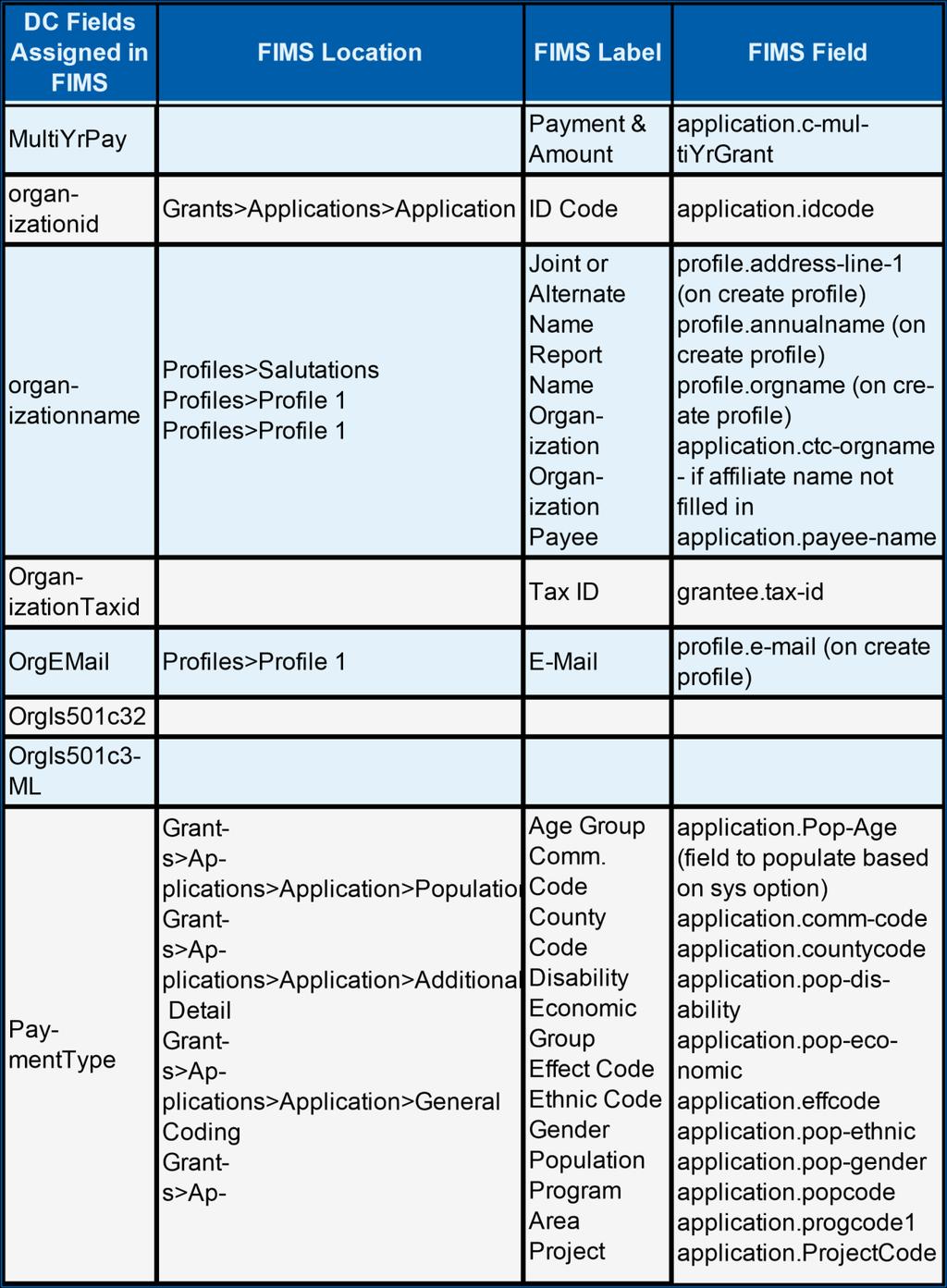
122 122
Table of Contents MicroEdge, LLC. All rights reserved.
 Table of Contents DonorCentral Site Setup and User Guide 1 Copyright Information 7 Contacting Support 8 Welcome to DonorCentral 9 Logging into DonorCentral 9 Forget Your Password? 12 Register for DonorCentral
For DonorCentral 4.0, all client production sites will be upgraded on the weekend of July 18, 2015.
 DonorCentral 4.0 Release Notes Upgrade Overview This release of DonorCentral 4.0 includes the following new features: Stronger Password Requirements New Configurability Updates A New Asset Allocation Chart
Table of Contents MicroEdge, LLC. All rights reserved.
 Table of Contents DonorCentral Admin Portal 1 Copyright Information 3 Contacting Support 4 The Administrator Portal 5 Accessing the Admin Portal 5 The Administrator s Home Page 6 Suggestion Admin 8 Site
If you have questions or need assistance in any way, please contact MicroEdge Technical Support.
 AngelPoints Advanced Reporting Users Guide 2017 Advanced Reporting leverages existing technologies current employed in GIFTS Online to provide AngelPoints users with a new and more robust environment to
Creating Interactive PDF Forms
 Creating Interactive PDF Forms Using Adobe Acrobat X Pro for the Mac University Information Technology Services Training, Outreach, Learning Technologies and Video Production Copyright 2012 KSU Department
Creating Web Pages with SeaMonkey Composer
 1 of 26 6/13/2011 11:26 PM Creating Web Pages with SeaMonkey Composer SeaMonkey Composer lets you create your own web pages and publish them on the web. You don't have to know HTML to use Composer; it
Drupal Cloud Getting Started Guide Creating a Lab site with the MIT DLC Theme
 Introduction Drupal Cloud Getting Started Guide Creating a Lab site with the MIT DLC Theme In this Getting Started Guide, you can follow along as a website is built using the MIT DLC Theme. Whether you
Business Online Banking User Guide
 Business Online Banking User Guide Table of Contents Contents Overview... 2 Logging In... 2 Additional Login Information... 5 Home/Dashboard... 6 Top Line Tool Bar... 6 Bulletins... 7 Dashboard... 8 Accounts...
DRX Platform Manager DRX Platform Manager
 DRX Platform Manager 1 P a g e Table of Contents DRX Platform Manager... 1 Introduction to the DRX Platform Manager... 4 Getting Started... 4 Login... 4 Platform Manager... 4 DRX Application Configuration
Lava New Media s CMS. Documentation Page 1
 Lava New Media s CMS Documentation 5.12.2010 Page 1 Table of Contents Logging On to the Content Management System 3 Introduction to the CMS 3 What is the page tree? 4 Editing Web Pages 5 How to use the
SPECIFICATIONS Insert Client Name
 ESSENTIAL LMS BRANDING SPECIFICATIONS Insert Client Name Creation Date: June 23, 2011 Last Updated: July 11, 2017 Version: 16.5 Page 1 Contents Branding Elements... 3 Theme Management... 3 Header Images...
While editing a page, a menu bar will appear at the top with the following options:
 Page Editor ===> Page Editor How Can I Use the Page Editor? The Page Editor will be your primary way of editing your website. Page Editor Basics While editing a page, you will see that hovering your mouse
Wordpress Training Manual
 The Dashboard... 2 If this is your first time logging in:... 2 How do I change my password or email address?... 3 Search Engine Optimization (SEO)... 4 SEO for Pages... 4 SEO for Images... 5 Managing Pages...
SmartView. User Guide - Analysis. Version 2.0
 SmartView User Guide - Analysis Version 2.0 Table of Contents Page i Table of Contents Table Of Contents I Introduction 1 Dashboard Layouts 2 Dashboard Mode 2 Story Mode 3 Dashboard Controls 4 Dashboards
UTAS CMS. Easy Edit Suite Workshop V3 UNIVERSITY OF TASMANIA. Web Services Service Delivery & Support
 Web Services Service Delivery & Support UNIVERSITY OF TASMANIA UTAS CMS Easy Edit Suite Workshop V3 Web Service, Service Delivery & Support UWCMS Easy Edit Suite Workshop: v3 Contents What is Easy Edit
User Manual. perfectionlearning.com/technical-support
 User Manual perfectionlearning.com/technical-support 1 User Manual Accessing Math X... 3 Login... 3 Forgotten Password... 3 Navigation Menu... 4 Logout... 4 Admin... 5 Creating Classes and Students...
AGENT123. Full Q&A and Tutorials Table of Contents. Website IDX Agent Gallery Step-by-Step Tutorials
 AGENT123 Full Q&A and Tutorials Table of Contents Website IDX Agent Gallery Step-by-Step Tutorials WEBSITE General 1. How do I log into my website? 2. How do I change the Meta Tags on my website? 3. How
Using Sitecore 5.3.1
 Using Sitecore 5.3.1 An End-User s Guide to Using and Administrating Sitecore Author: Sitecore Corporation Date: December 12, 2007 Release: Rev. 1.0 Language: English Sitecore is a registered trademark.
EFM Community 3.1 Portal Administration Guide
 EFM Community 3.1 Portal Administration Guide WHITE PAPER For technical support please call: 1-800-787-8755 Or visit: Hwww.Vovici.comH Please contact Vovici technical support if you believe any of the
2 P age. Pete s Pagebuilder revised: March 2008
 AKA DNN 4 Table of Content Introduction... 3 Admin Tool Bar... 4 Page Management... 6 Advanced Settings:... 7 Modules... 9 Moving Modules... 10 Universal Module Settings... 11 Basic Settings... 11 Advanced
Drupal Basics. for COS and CLASS site maintainers
 Drupal Basics for COS and CLASS site maintainers Introduction This guide is meant as a starting point for site maintainers in the UNT College of Science and College of Liberal Arts and Social Sciences
ALES Wordpress Editor documentation ALES Research websites
 ALES Wordpress Editor documentation ALES Research websites Contents Login... 2 Website Dashboard... 3 Editing menu order or structure... 4 Add a new page... 6 Move a page... 6 Select a page to edit...
Website Creating Content
 CREATING WEBSITE CONTENT As an administrator, you will need to know how to create content pages within your website. This document will help you learn how to: Create Custom Pages Edit Content Areas Creating
Google Chrome 4.0. AccuCMS
 Google Chrome 4.0 AccuCMS Outline Contents Google Chrome 4.0... 4 Thank you for choosing Blue Archer... 4 As an AccuCMS user you can:... 4 Getting Started... 4 AccuCMS allows you to:... 4 Logging in to
Welcome to the Investor Experience
 Welcome to the Investor Experience Welcome to the Black Diamond Investor Experience, a platform that allows advisors to customize how they present information to their clients. This document provides important
Quick Reference Card for Timestamp Hourly View Employees
 Time & Attendance Quick Reference Card for Timestamp Hourly View Employees Navigator Version 7.0 The following instructions describe a typical Navigator configuration. The names and location of widgets
Training Manual and Help File
 Training Manual and Help File 30.06.2011 Update Manage Grow Welcome to your new Juniper Website Management System with CMS Introduction The Juniper Website Management System with CMS (Website Content Management
Goldfish 4. Quick Start Tutorial
 Goldfish 4 Quick Start Tutorial A Big Thank You to Tobias Schilpp 2018 Fishbeam Software Text, Graphics: Yves Pellot Proofread, Photos: Tobias Schilpp Publish Code: #180926 www.fishbeam.com Get to know
Secure Guard Central Management System
 Speco Technologies, Inc. Secure Guard Central Management System Usage Information Contents 1 Overview... 7 2 Installation... 7 2.1 System Requirements... 7 2.2 System Installation... 7 2.3 Command Line
Microsoft Office Word 2016 for Mac
 Microsoft Office Word 2016 for Mac Formatting Your Document University Information Technology Services Learning Technologies, Training & Audiovisual Outreach Copyright 2016 KSU Division of University Information
USER GUIDE MADCAP FLARE Tables
 USER GUIDE MADCAP FLARE 2018 Tables Copyright 2018 MadCap Software. All rights reserved. Information in this document is subject to change without notice. The software described in this document is furnished
ICT IGCSE Practical Revision Presentation Web Authoring
 21.1 Web Development Layers 21.2 Create a Web Page Chapter 21: 21.3 Use Stylesheets 21.4 Test and Publish a Website Web Development Layers Presentation Layer Content layer: Behaviour layer Chapter 21:
AURUM Metro Navigation
 AURUM Metro Navigation End User Document Version 1.0 Oct 2016 Table of Contents 1. Introduction... 3 2. Initialization... 4 2.1 Create Metro Navigation List... 4 2.1.1 Adding the Metro Navigation Web part...
PROFILE DESIGN TUTORIAL KIT
 PROFILE DESIGN TUTORIAL KIT NEW PROFILE With the help of feedback from our users and designers worldwide, we ve given our profiles a new look and feel. The new profile is designed to enhance yet simplify
Administrator Manual. Last Updated: 15 March 2012 Manual Version:
 Administrator Manual Last Updated: 15 March 2012 Manual Version: 1.6 http://www.happyfox.com Copyright Information Under the copyright laws, this manual may not be copied, in whole or in part. Your rights
Creating a Website in Schoolwires Technology Integration Center
 Creating a Website in Schoolwires Technology Integration Center Overview and Terminology... 2 Logging into Schoolwires... 2 Changing a password... 2 Accessing Site Manager... 2 Section Workspace Overview...
WordPress Manual For Massachusetts Academy of Math and Science
 WordPress Manual For Massachusetts Academy of Math and Science September 19, 2017 Table of Contents Who should use this manual... 4 Signing into WordPress... 4 The WordPress Dashboard and Left-Hand Navigation
Website Management with the CMS
 Website Management with the CMS In Class Step-by-Step Guidebook Updated 12/22/2010 Quick Reference Links CMS Login http://staging.montgomerycollege.edu/cmslogin.aspx Sample Department Site URLs (staging
Desktop Studio: Charts. Version: 7.3
 Desktop Studio: Charts Version: 7.3 Copyright 2015 Intellicus Technologies This document and its content is copyrighted material of Intellicus Technologies. The content may not be copied or derived from,
Digication eportfolio Student s Guide (Last update: 8/2017)
") Digication eportfolio Student s Guide (Last update: 8/2017) 2 Table of Contents Introduction... 1 Creating Your eportfolio... 3 Editing Your eportfolio... 4 Area 1: Top Menu Bar... 6 Area 2: The Main Tabs...
Digication eportfolio Student s Guide (Last update: 8/2017) 2 Table of Contents Introduction... 1 Creating Your eportfolio... 3 Editing Your eportfolio... 4 Area 1: Top Menu Bar... 6 Area 2: The Main Tabs...
Administrator Manual. Last Updated: 15 March 2012 Manual Version:
 Administrator Manual Last Updated: 15 March 2012 Manual Version: 1.6 http://www.helpdeskpilot.com Copyright Information Under the copyright laws, this manual may not be copied, in whole or in part. Your
OU EDUCATE TRAINING MANUAL
 OU EDUCATE TRAINING MANUAL OmniUpdate Web Content Management System El Camino College Staff Development 310-660-3868 Course Topics: Section 1: OU Educate Overview and Login Section 2: The OmniUpdate Interface
ICT IGCSE Practical Revision Presentation Web Authoring
 21.1 Web Development Layers 21.2 Create a Web Page Chapter 21: 21.3 Use Stylesheets 21.4 Test and Publish a Website Web Development Layers Presentation Layer Content layer: Behaviour layer Chapter 21:
Creating a Website with Publisher 2016
 Creating a Website with Publisher 2016 Getting Started University Information Technology Services Learning Technologies, Training & Audiovisual Outreach Copyright 2017 KSU Division of University Information
PRESENCE. RadEditor Guide. SchoolMessenger 100 Enterprise Way, Suite A-300 Scotts Valley, CA
 PRESENCE RadEditor Guide SchoolMessenger 100 Enterprise Way, Suite A-300 Scotts Valley, CA 95066 800-920-3897 www.schoolmessenger.com Contents Contents... 2 Introduction... 3 What is RadEditor?... 3 RadEditor
Creating Dashboard. Version: 7.3
 Creating Dashboard Version: 7.3 Copyright 2015 Intellicus Technologies This document and its content is copyrighted material of Intellicus Technologies. The content may not be copied or derived from, through
User Guide. Web Intelligence Rich Client. Business Objects 4.1
 User Guide Web Intelligence Rich Client Business Objects 4.1 2 P a g e Web Intelligence 4.1 User Guide Web Intelligence 4.1 User Guide Contents Getting Started in Web Intelligence 4.1... 5 Log into EDDIE...
Rich Text Editor Quick Reference
 Rich Text Editor Quick Reference Introduction Using the rich text editor is similar to using a word processing application such as Microsoft Word. After data is typed into the editing area it can be formatted
ACADEMIC TECHNOLOGY SUPPORT
 ACADEMIC TECHNOLOGY SUPPORT D2L : Introduction A Guide for Instructors ats@etsu.edu 439-8611 www.etsu.edu/ats Table of Contents Introduction...1 Objectives... 1 Logging In to D2L...1 My Home... 2 The Minibar...
Creating and Managing Your Personal Mines Website on WordPress
 Creating and Managing Your Personal Mines Website on WordPress Table of Contents Creating your site... 2 Managing your site... 2 About WordPress... 2 Logging in... 2 Pages... 2 Editing an Existing Page...
eportfolio GENERAL USER
 eportfolio GENERAL USER Startup Guide [2016-17] Table of Contents Page 2: Introduction Logging in to your Digication account Page 3: Page 4: Steps to create an eportfolio from course template Steps to
FirmSite Control. Tutorial
 FirmSite Control Tutorial 1 Last Updated June 26, 2007 by Melinda France Contents A. Logging on to the Administrative Control Center... 3 Using the Editor Overview:... 3 Inserting an Image... 7 Inserting
PlayerLync Forms User Guide (MachForm)
") PlayerLync Forms User Guide (MachForm) Table of Contents FORM MANAGER... 1 FORM BUILDER... 3 ENTRY MANAGER... 4 THEME EDITOR... 6 NOTIFICATIONS... 8 FORM CODE... 9 FORM MANAGER The form manager is where
PlayerLync Forms User Guide (MachForm) Table of Contents FORM MANAGER... 1 FORM BUILDER... 3 ENTRY MANAGER... 4 THEME EDITOR... 6 NOTIFICATIONS... 8 FORM CODE... 9 FORM MANAGER The form manager is where
Desktop Studio: Charts
 Desktop Studio: Charts Intellicus Enterprise Reporting and BI Platform Intellicus Technologies info@intellicus.com www.intellicus.com Working with Charts i Copyright 2011 Intellicus Technologies This document
Query Studio Training Guide Cognos 8 February 2010 DRAFT. Arkansas Public School Computer Network 101 East Capitol, Suite 101 Little Rock, AR 72201
 Query Studio Training Guide Cognos 8 February 2010 DRAFT Arkansas Public School Computer Network 101 East Capitol, Suite 101 Little Rock, AR 72201 2 Table of Contents Accessing Cognos Query Studio... 5
Introduction. The topics included in this guide are:
 Introduction Caorda Content is a powerful content management tool that allows you to update your web site through a standard Internet web browser. The purpose of this guide is to introduce you to Caorda
Creating a Website in Schoolwires
 Creating a Website in Schoolwires Overview and Terminology... 2 Logging into Schoolwires... 2 Changing a password... 2 Navigating to an assigned section... 2 Accessing Site Manager... 2 Section Workspace
Websites. Version 1.7
 Websites Version 1.7 Last edited 15 Contents MyNetball Information...3 Websites...4 Web packages...4 Setting up the layout...5 Uploading files and images...6 Using Dropbox to Increase your Website Data...7
User Guide Product Design Version 1.7
 User Guide Product Design Version 1.7 1 INTRODUCTION 3 Guide 3 USING THE SYSTEM 4 Accessing the System 5 Logging In Using an Access Email 5 Normal Login 6 Resetting a Password 6 Logging Off 6 Home Page
08/10/2018. Istanbul Now Platform User Interface
 08/10/2018 Contents Contents...5 UI16... 9 Comparison of UI16 and UI15 styles... 11 Activate UI16... 15 Switch between UI16 and UI15...15 UI16 application navigator... 16 System settings for the user
Vetstreet Web Builder Editor Tool User Guide v2.1. Web Builder. User Guide v2.1
 Web Builder User Guide v2.1 Contact your Account Manager at (888) 799-8387 or email support@vetstreet.com with questions. Page 1 Index... 1 The Editor Tool... 7 Forgot Your Username or Password?... 7 How
TYPO3 Editing Guide Contents
 TYPO3 Editing Guide Contents Introduction... 2 Logging in... 2 Selecting your Workspace for editing... 2 Working with Content Elements... 3 Working in the Editing Window... 4 Pasting content from MS Word
User Guide. Version Exago Inc. All rights reserved.
 User Guide Version 2016.2 2016 Exago Inc. All rights reserved. Exago Reporting is a registered trademark of Exago, Inc. Windows is a registered trademark of Microsoft Corporation in the United States and
SchoolDesk University
 SchoolDesk University Forms, Surveys, and Polls Module 101 Guided Walk-through for the basic fields, terminology, and location of tools. What is the NEW SD7 Forms Module? The NEW SchoolDesk Forms Module,
A Guide to Quark Author Web Edition 2015
 A Guide to Quark Author Web Edition 2015 CONTENTS Contents Getting Started...4 About Quark Author - Web Edition...4 Smart documents...4 Introduction to the Quark Author - Web Edition User Guide...4 Quark
Introduction to the MODx Manager
 Introduction to the MODx Manager To login to your site's Manager: Go to your school s website, then add /manager/ ex. http://alamosa.k12.co.us/school/manager/ Enter your username and password, then click
ADOBE DREAMWEAVER CS4 BASICS
 ADOBE DREAMWEAVER CS4 BASICS Dreamweaver CS4 2 This tutorial focuses on the basic steps involved in creating an attractive, functional website. In using this tutorial you will learn to design a site layout,
GoLive will first ask you if your new site will be for one individual or a work group; select for a Single User, and click Next.
 Getting Started From the Start menu, located the Adobe folder which should contain the Adobe GoLive 6.0 folder. Inside this folder, click Adobe GoLive 6.0. GoLive will open to its initial project selection
Sourcing - How to Create a Negotiation
 Martin Baker Secure Source-To-Pay Sourcing - How to Create a Negotiation December 07 Contents To Create a Project... To Create a Negotiation... 5 Attachments... 7 Private File Archive... 7 Creating Lines,
t4 Manual Teachers College, Columbia University
 Teachers College, Columbia University TABLE of CONTENTS I. INTERFACE OVERVIEW II. SECTION A. Add Section B. Modify Section C. Delete Section III. DEPARTMENT SECTION OVERVIEW A. Primary Slideshow or Carousel
Requirements Document
 GROUP 9 Requirements Document Create-A-Page Matthew Currier, John Campbell, and Dan Martin 5/1/2009 This document is an outline of what was originally desired in the application in the Project Abstract,
How to lay out a web page with CSS
 Activity 2.6 guide How to lay out a web page with CSS You can use table design features in Adobe Dreamweaver CS4 to create a simple page layout. However, a more powerful technique is to use Cascading Style
Creating a Website with Wordpress
 Creating a Website with Wordpress Wordpress Fundamentals Version 1.6 Fayette County Public Schools June 28, 2013 Sow-Foong Hedman Technology Web Team Contents What is Wordpress?... 4 Overview... 4 Key
AvePoint Online Services for Partners 2
 AvePoint Online Services for Partners 2 User Guide Service Pack 1 Issued June 2017 Table of Contents What s New in this Guide...4 About...5 Submitting Documentation Feedback to AvePoint...6 Browser Support
Documentation > Product Info > Site Manager > 7.3 & 7.4 > Content > Add Content
 Add Content Site Manager Community Extranet - TERMIN... Documentation > Product Info > Site Manager > 7.3 & 7.4 > Content > Add Content Add Content Site Manager Version: 7.3: +. Minimum User Level: Contributor
Using Dreamweaver CC. Logo. 4 Creating a Template. Page Heading. Page content in this area. About Us Gallery Ordering Contact Us Links
 Using Dreamweaver CC 4 Creating a Template Now that the main page of our website is complete, we need to create the rest of the pages. Each of them will have a layout that follows the plan shown below.
Administrative Training Mura CMS Version 5.6
 Administrative Training Mura CMS Version 5.6 Published: March 9, 2012 Table of Contents Mura CMS Overview! 6 Dashboard!... 6 Site Manager!... 6 Drafts!... 6 Components!... 6 Categories!... 6 Content Collections:
A PRACTICAL GUIDE TO USING WIX TO BUILD A WEBSITE
 A PRACTICAL GUIDE TO USING WIX TO BUILD A WEBSITE AN AID TO ENABLE STUDENTS TO UNDERSTAND THE FUNDAMENTELS OF WEBSITE DESIGN WITHIN THE FRAMEWORK OF A WEBSITE PROJECT USING WEB DESIGN TOOLS YANNIS STEPHANOU
HOW TO USE THE CONTENT MANAGEMENT SYSTEM (CMS) TABLE OF CONTENTS
 TABLE OF CONTENTS") HOW TO USE THE CONTENT MANAGEMENT SYSTEM (CMS) TABLE OF CONTENTS GETTING STARTED (LOGIN) 2 SITE MAP (ORGANIZE WEBPAGES) 2 CREATE NEW PAGE 3 REMOVE PAGE 6 SORT PAGES IN CHANNEL 7 MOVE PAGE 8 PAGE PROPERTIES
HOW TO USE THE CONTENT MANAGEMENT SYSTEM (CMS) TABLE OF CONTENTS GETTING STARTED (LOGIN) 2 SITE MAP (ORGANIZE WEBPAGES) 2 CREATE NEW PAGE 3 REMOVE PAGE 6 SORT PAGES IN CHANNEL 7 MOVE PAGE 8 PAGE PROPERTIES
Forms Builder Module v Create, administer, and complete electronic forms in the Passageways portal.
 Forms Builder Module v4.11.1 Create, administer, and complete electronic forms in the Passageways portal. Contents Section 1. Overview... 1 Section 2. Module Properties... 1 Section 3. The Form Building
Release Notes. MindManager 2019 for Windows MindManager Enterprise Version September 25, 2018
 Release Notes MindManager 2019 for Windows MindManager Enterprise 2019 Version 19.0 September 25, 2018 2018 Corel Corporation 1 Table of Contents USABILITY & PERFORMANCE IMPROVEMENTS... 3 User Interface...
SPARK. User Manual Ver ITLAQ Technologies
 SPARK Forms Builder for Office 365 User Manual Ver. 3.5.50.102 0 ITLAQ Technologies www.itlaq.com Table of Contents 1 The Form Designer Workspace... 3 1.1 Form Toolbox... 3 1.1.1 Hiding/ Unhiding/ Minimizing
Tree and Data Grid for Micro Charts User Guide
 COMPONENTS FOR XCELSIUS Tree and Data Grid for Micro Charts User Guide Version 1.1 Inovista Copyright 2009 All Rights Reserved Page 1 TABLE OF CONTENTS Components for Xcelsius... 1 Introduction... 4 Data
In the fourth unit you will learn how to upload and add images and PDF files.
 Introduction Here at SUNY New Paltz, we use the Terminal Four (T4) web content management system (CMS). This puts the power of editing content on our college s webpage in the hands of our authorized users.
Connecture Platform Manager
 Connecture Platform Manager 1 P a g e Table of Contents Connecture Platform Manager... 1 Introduction to the Connecture Platform Manager... 3 Getting Started... 3 Login... 3 Dashboard... 3 Connecture Application
eschoolplus+ Cognos Query Studio Training Guide Version 2.4
 + Training Guide Version 2.4 May 2015 Arkansas Public School Computer Network This page was intentionally left blank Page 2 of 68 Table of Contents... 5 Accessing... 5 Working in Query Studio... 8 Query
Frequently Asked Questions Contents
 Frequently Asked Questions Contents How do I open a saved application?... 2 How do I print my application?... 3 Is there a time limit on how long my session lasts?... 5 Is it alright to use my Web browser
Installation and Activation of Foody pro theme
 Installation and Activation of Foody pro theme Installation 1. Install Word Press from http://codex.wordpress.org/installing_wordpress. 2. Upload via Word press Admin: - Go to your WordPress admin panel,
BeetleEye Application User Documentation
 BeetleEye Application User Documentation BeetleEye User Documentation 1 Table of Contents Welcome to the BeetleEye Application... 6 Overview... 6 Navigation... 6 Access BeetleEye... 6 Update account information...
This Tutorial is for Word 2007 but 2003 instructions are included in [brackets] after of each step.
![This Tutorial is for Word 2007 but 2003 instructions are included in [brackets] after of each step.](/thumbs/72/67280806.jpg "This Tutorial is for Word 2007 but 2003 instructions are included in [brackets] after of each step.") This Tutorial is for Word 2007 but 2003 instructions are included in [brackets] after of each step. Table of Contents Just so you know: Things You Can t Do with Word... 1 Get Organized... 1 Create the
This Tutorial is for Word 2007 but 2003 instructions are included in [brackets] after of each step. Table of Contents Just so you know: Things You Can t Do with Word... 1 Get Organized... 1 Create the
Site Owners: Cascade Basics. May 2017
 Site Owners: Cascade Basics May 2017 Page 2 Logging In & Your Site Logging In Open a browser and enter the following URL (or click this link): http://mordac.itcs.northwestern.edu/ OR http://www.northwestern.edu/cms/
Self-Service Portal Implementation Guide
 Self-Service Portal Implementation Guide Salesforce, Spring 6 @salesforcedocs Last updated: April 7, 06 Copyright 000 06 salesforce.com, inc. All rights reserved. Salesforce is a registered trademark of
PowerSchool Student and Parent Portal User Guide. PowerSchool Student Information System
 PowerSchool Student and Parent Portal User Guide PowerSchool Student Information System Released December 2016 Document Owner: Documentation Services This edition applies to Release 10.1 of the PowerSchool
GURUBoards Setup User Guide v
 GURUBoards Setup User Guide v. 5.7.1 Copyright 2014-2018 eschooldata, LLC All rights reserved. TABLE OF CONTENTS Overview... 3 District Setup... 4 eschooldata Main Application...4 GURU Analytics Setup
Microsoft Word 2010 Basics
 1 Starting Word 2010 with XP Click the Start Button, All Programs, Microsoft Office, Microsoft Word 2010 Starting Word 2010 with 07 Click the Microsoft Office Button with the Windows flag logo Start Button,
PowerSchool Student and Parent Portal User Guide. https://powerschool.gpcsd.ca/public
 PowerSchool Student and Parent Portal User Guide https://powerschool.gpcsd.ca/public Released June 2017 Document Owner: Documentation Services This edition applies to Release 11.x of the PowerSchool software
esd Portal: Parent View User Guide v
 esd Portal: Parent View User Guide v. 5.0.0 Copyright 2002-2016 eschooldata, LLC All rights reserved. TABLE OF CONTENTS Overview... 3 Parent Portal Registration... 3 Logging In... 5 Getting Help... 7 Navigating
Ektron Advanced. Learning Objectives. Getting Started
 Ektron Advanced 1 Learning Objectives This workshop introduces you beyond the basics of Ektron, the USF web content management system that is being used to modify department web pages. This workshop focuses
Dreamweaver Basics. Planning your website Organize site structure Plan site design & navigation Gather your assets
 Dreamweaver Basics Planning your website Organize site structure Plan site design & navigation Gather your assets Creating your website Dreamweaver workspace Define a site Create a web page Linking Manually
Production Assistance for Cellular Therapies (PACT) PACT Application System User s Guide
 PACT Application System User s Guide") Production Assistance for Cellular Therapies (PACT) PACT Application System User s Guide Version 1.0 February 9, 2017 Version 1.0 TABLE OF CONTENTS 1.0 Getting Started... 1 1.1 Access to the Internet...
Production Assistance for Cellular Therapies (PACT) PACT Application System User s Guide Version 1.0 February 9, 2017 Version 1.0 TABLE OF CONTENTS 1.0 Getting Started... 1 1.1 Access to the Internet...