WYSIWYG Editor. OU Campus v10. OmniUpdate, Inc Flynn Road, Suite 100 Camarillo, CA 93012
|
|
|
- Brice Jordan
- 6 years ago
- Views:
Transcription
1 WYSIWYG Editor v10 OmniUpdate, Inc Flynn Road, Suite 100 Camarillo, CA 93012
2 OmniUpdate, Inc Flynn Road, Suite 100 Camarillo, CA (fax) Copyright 2014 OmniUpdate, Inc. All rights reserved. Document Number: b-003 Publish Date: 12/6/2016 OmniUpdate and are trademarks or registered trademarks of OmniUpdate, Inc. Any other company and product names, and trademarks mentioned within are property of their respective owners. Content is subject to change without notice. About OmniUpdate, Inc. OmniUpdate is the leading web content management system (CMS) provider for higher education. The company focuses on providing an exceptional product and customer experience to its CMS users who manage more than 700 web and mobile sites in the U.S. and around the world. is secure and scalable, server and platform independent, and seamlessly integrates with other enterprise campus systems. It provides college and university web developers, administrators, and marketers with the userfriendly tools and deployment flexibility they need to achieve excellence. For more information, visit. About This Guide The WYSIWYG Editor document provides a PDF version of the Support Site topics regarding the usage of the WYSIWYG Editor and the tools available for it. Support The Support site is available to everyone and users are encouraged to visit and browse the site for information. An institution's administrators are also available if the answer cannot be found on the Support site or further explanation and clarification is needed. Administrators may contact the OmniUpdate Support Team. Ways to access the support documentation include: Support site: The help link in the main interface of The WYSIWYG Help link Help links embedded in the system Text instructions are provide onscreen for specific fields and functionality OmniUpdate Community Network (OCN): Conventions Shorthand for navigation through the CMS is indicated with a greater-than sign and bolded: > For example, Setup > Sites. Code snippets use Courier New and a shaded background. Page 2 of 89
3 Contents WYSIWYG Editors... 5 Overview...5 Toolbar Options... 7 Overview...7 Toolbar Row Toolbar Row Toolbar Row File Tools (Save, Save As, Revert, Restore)... 8 Cut, Copy, Paste, Find, Replace... 8 Undo Redo Functions Spell Check...10 Remove Formatting Font Formatting Lists, Indents...12 Text Placement (Vertical) Align, Justify (Horizontal) Link Tools, WYSIWYG Help Documentation Font Properties (Family, Size, Format, Styles) Text Color, Text Background Images/Media...20 Miscellaneous Functionality Table Tools (Classic Only) Form Tools (Classic Only) Using Auto Draft Overview...27 Restore Latest Draft WYSIWYG Spell Check...28 Overview...28 Correcting Misspelled Words Adding Words...30 Browser Specific Spell Check vs. Spell Check Insert/Edit Image Overview...31 Inserting an Image Editing an Inserted Image Additional Information and Reminders Decorative Images...37 Using Decorative Images...37 Appearance Tab Advanced Tab Swap Image...39 Miscellaneous Image Map...41 How to Add a Mapped Image...41 Long Description Format Drop-Down...43 Overview...43 Selecting from the Format Drop-Down Removing or Changing the Applied Format...44 Image Editor Overview...45 Accessing the Image Editor Image Editor Tools Resize Crop Rotate...49 Zoom Undo/Redo Final Notes Show/Hide Block Elements...52 Overview...52 Using Show/Hide Block Elements CodeProtect Overview...55 Limitations...56 Adding Tables in the WYSIWYG Editor...57 Overview...57 Inserting a Table in the Classic Editor...58 General Properties (Classic Editor) Advanced Tab (Classic Editor) Inserting a Table in JustEdit...64 Table Properties General Properties...66 Advanced Properties...67 Applying a Class to a Table Applying a Class to a Table...68 Forms (WYSIWYG) Page 3 of 89
4 Overview...69 Insert/Edit Form General Tab...69 Advanced Tab...71 Hidden Fields Tab Deleting a Form Input Element Insert/Edit Input Element: General Tab...73 Inserting an Input Element: Advanced Tab Select Element Insert/Edit Select Element: General Tab...75 Insert/Edit Select Element: Advanced Tab...76 Textarea Element Insert/Edit Textarea: General Tab Insert/Edit Textarea: Advanced Tab Form Tutorial Overview...80 Creating a Form Insert a Form...80 Add Text Fields Add a Drop-Down List Add Radio Buttons Add a Checkbox...86 Create a Submit Button...88 Process Form Data Page 4 of 89

5 WYSIWYG Editors Overview utilizes two styles of editing interface, the Classic Editor and JustEdit. They contain more or less the same functionality, with the Classic Editor having some additional advanced configuration options, but the JustEdit interface providing a more streamlined, easy-to-navigate user experience. Your implementation will default to one or the other; however, both can be accessed in any implementation. By using Shift + Click to open an editable region, you can switch the editing interface used to the nondefault option. When editing in the WYSIWYG, modifications should be saved by clicking the Save icon before navigating away from the page. If an attempt is made to navigate away from the page without first saving it, the user is shown a reminder to save the page. Note: The WYSIWYG editor only accepts HTML tags and will strip out server-side or client-side code. If users need to add server-side or client-side code, they should do so by creating a source code asset or inserting it directly in the source code for a page. Classic Editor The Classic interface provides a standard editing experience, based on the TinyMCE 3 toolbar. It contains much the same functionality that a standard word processor would, including text formatting, inserting links, images, media, and reusable content, and creating rudimentary tables and forms. It also provides multiple advanced configuration parameters when inserting links, images, and media. For more information, visit the Classic Editor page. WYSIWYG Editors Page 5 of 89

6 JustEdit The JustEdit interface contains most of the same functionality as the Classic one, but with a more modern interface based off of TinyMCE 4. Some of the more esoteric configuration options for links, images, and media have been removed, and creating tables is a much more intuitive process. The forms option is replaced by inserting LDP Form Assets. JustEdit also utilizes in-context editing, which means that you view the changes you're making in the page as it appears on the live website. For more information, visit the JustEdit page. In addition to the default toolbar options, custom toolbars can be configured by Level 10 Administrators under Setup > Toolbars. For more information, visit the Toolbars Setup page. WYSIWYG Editors Page 6 of 89
7 Toolbar Options Overview The toolbar of the WYSIWYG editor provides much the same functionality as a standard word processor, as well as some additional web development and -specific options. The Classic Editor and JustEdit toolbars are almost identical in terms of functionality. Classic Editor JustEdit Toolbar Row 1 Most of the tools available on the first row of a toolbar for the WYSIWYG are basic text formatting and linking. The descriptions of the functionality available for each tool is provided on this page. A few of the features have a more in-depth description; links are provided to those pages. File Tools Cut, Copy, Paste, Find, Replace Undo/Redo Spell Check Remove Formatting Font Formatting List, Indents Text Placement (Vertical) Align, Justify (Horizontal) Link Tools, WYSIWYG Help Documentation Toolbar Row 2 A brief description of the functionality available with each tool on row 2 of the toolbar is provided in the tables below. Several of the features require a more in-depth description and links to those pages are provided also. Content on this page includes: Font Properties (Family, Size, Format, Styles) Text Color, Text Background Images/Media Miscellaneous Functionality Toolbar Row 3 The third toolbar is available only in the Classic Editor. It contains two functions, tables and forms. In JustEdit tables are available in Row 2 under Miscellaneous Functionality, and forms have been phased out in favor of LDP Forms. Toolbar Options Page 7 of 89
8 In Classic Editor for tables and forms, the additional features are available after the initial table or form has been inserted on the page. Place the cursor within the element and the editing tools will become available. Tables Forms File Tools (Save, Save As, Revert, Restore) Classic Icon JustEdit Icon Tool Description Save Click to save the current file on the staging server and exit the WYSIWYG Editor. Remember, it will not be live on the production server until it is published. To use save-in-place, use the keyboard shortcut CTRL+S for Windows or CMD+S for Mac. Not available in JustEdit Save As Not available in JustEdit Not available in Classic Click to save the current file with a new file name and exit the WYSIWYG Editor. Revert to Last Saved Click to undo all changes and revert the content in the editable region to its original state. Exit Without Saving Click to exit the editable region without saving your changes. Auto Draft Click to restore the content to its last autosaved point. For more information, visit the Auto Draft page. Cut, Copy, Paste, Find, Replace Many browsers (specifically Firefox, Chrome, and Safari) disable the use of the cut, copy, and paste commands via the WYSIWYG toolbar for security purposes. This is not a function of ; this is a browser behavior. The alternative workaround is to use keyboard shortcuts. Toolbar Options Page 8 of 89
9 Classic Icon JustEdit Icon Tool Description Cut To remove content from the document in order move it somewhere else, highlight the content and click the icon. The keyboard shortcut is CTRL+X for Windows or CMD-X for Mac. Copy To copy a content from the page, highlight the content and click the icon. The keyboard shortcut is CTRL+C for Windows or CMD-C for Mac. Paste To paste content on to a page, click the location the content should be placed on the page and click the icon. The keyboard shortcut is CTRL+V for Windows or CMD-V for Mac. This pastes only valid content, code, and styling. The paste automatically switches between a traditional paste (e.g., pasting the code when text is copied from a page in a web browser), and pasting from Word, where it removes any MSO formatting that is not appropriate for a web site. The Paste function always cleans up the content to be pasted to remove any formatting or code that is not compliant with the requirements of the WYSIWYG Editor. Toolbar Options Page 9 of 89
10 Classic Icon JustEdit Icon Included under the Find/ Replace Icon Tool Description Paste as Plain Text Clicking the icon keeps it selected until clicked again, and all pastes going forward until exiting the WYSIWYG Editor will be plain text. This removes all formatting. Find Click to search for text on the current page. Find/Replace Click to search for text on the current page and then replace that text with other text. Tool Description Undo Click to undo the last changes made in this session one by one. Redo Click to redo changes that were previously undone and should be restored. Tool Description Toggle Spell Checker Click to spell check the region that is being edited. Misspelled words are underlined with a red, squiggly line. Change the incorrectly spelled word with the suggested words provided or choose one of the other options provided: Undo Redo Functions Classic Icon JustEdit Icon Spell Check Classic Icon JustEdit Icon Ignore the incorrectly spelled word (e.g., not make any changes to it). Toolbar Options Page 10 of 89
11 Classic Icon JustEdit Icon Tool Description Add to the word to the dictionary: Level 9 and 10 administrators can add marked words to a sitewide dictionary, and administrators can give users Levels 1 through Level 9 the ability to add words to the dictionary as well. In JustEdit, the drop-down menu on this icon lists the available languages for which to run the spellcheck. For more information about adding words to the custom dictionary, visit the Custom Dictionaries page. Remove Formatting Classic Icon JustEdit Icon Tool Description Remove Formatting To remove all formatting for a selection, highlight the text to be updated and click the icon. This returns the selected text back to the default settings. Tool Description Bold Applies bold formatting to selected text. Italic Applies italicized formatting to selected text. Font Formatting Classic Icon JustEdit Icon Toolbar Options Page 11 of 89
12 Classic Icon JustEdit Icon Tool Description Underline Applies underlined formatting to selected text. Please note that underlined text often means that a word or phrase is a link to another web page. In this case, however, the underline formatting does not create a link (to create a link, click Insert/Edit Link). Strikethrough Applies strikethrough formatting to selected text. Lists, Indents Classic Icon JustEdit Icon Tool Description Unordered list Turns the selected text into an bulleted list. Example: Apples Oranges Bananas Ordered list Turns the selected text into a numbered list. Example: 1. Click the Go button. 2. Enter the text to search on. 3. Click Start. Decrease Indent Toolbar Options Decreases the indent of a paragraph. Each consecutive click moves text further to the left. Page 12 of 89
13 Classic Icon JustEdit Icon Tool Description Increase Indent Increases the indent of a paragraph. Each consecutive click moves text further to the right. Blockquote Blockquote is a blocklevel element in HTML that can be used to setoff quotations or to cite material. Tool Description Superscript Formats the selected text as superscript text Text Placement (Vertical) Classic Icon JustEdit Icon. Subscript Formats the selected text as subscript text. Tool Description Align Left Aligns a block-level element such as a paragraph or a heading to the left margin. Align Center Center aligns a blocklevel element such as a paragraph or a heading within the left and right margin. Align Right Aligns a block-level element such as a paragraph or a heading to the right margin. Align Full Justifies text making it flush on both the left and right side Align, Justify (Horizontal) Classic Icon JustEdit Icon Toolbar Options Page 13 of 89
14 Link Tools, WYSIWYG Help Documentation Classic Icon JustEdit Icon Tool Description Insert/Edit Link To create a hyperlink: 1. Select the text or image for the link. 2. Click the Insert/ Edit Link icon. If applicable, the modal contains existing link information. 3. Click the Browse icon to select an internal page to which to link. 4. After locating the file, click Select Link. 5. Click Insert. For links to pages internally, a page should generally be chosen from a production server, publish target, or an auxiliary server. An unpublished file on the staging server or publish target can also be chosen by choosing the staging server or publish target from the drop-down, navigating to the file, and selecting the HTML version that is available. Links can also be made across sites within an account with the file browser by clicking Sites in the breadcrumb and choosing the appropriate site. If Dependency Manager has been enabled for the account, Toolbar Options Page 14 of 89
15 Classic Icon JustEdit Icon Tool Description dependency tags instead of URLs are inserted into the source of the page when inserting a link. For links external to the site, the complete URL for the resource can be typed (or pasted) into the URL field. Optionally, a target window type and an anchor name can also be entered. For more information about links and linking, visit the Insert/Edit Link page. Create or Modify a Mailto Link To create a mailto link, select the text or image for the link, then click the icon. If applicable, the resulting modal contains existing mailto information. Properties for the mailto link can be defined including the address that is provided when the link is clicked. For more information, visit the Mailto Link page. Unlink/Remove Link Click within the hyperlink and click the Unlink icon to remove a hyperlink. Note : For unlinking anchors, the Unlink icon works with anchors in Internet Explorer. It will not work Toolbar Options Page 15 of 89
16 Classic Icon JustEdit Icon Tool Description on anchors in Firefox, Safari, or Chrome. Insert/Edit Anchor To create an anchor: 1. Position the cursor where the anchor should be placed or select the text or image. 2. Click the Insert/Edit Anchor icon. 3. In the Anchor Name field, enter the name for the anchor. It is not necessary to enter a # (hash tag). 4. Click Insert. To modify an existing anchor: 1. Click the existing anchor shown in the editing area. 2. Click the Anchor icon on the toolbar. 3. The Insert/Edit Anchor modal shows the existing text for the anchor. 4. Make the modification to the text and click Update. The specifics of valid anchor names can be found in the HTML 4.01 and HTML 5 pages. Help Icon Toolbar Options The Help icon displays the help text for the WYSIWYG Editor. It shows help text for all available functions, not only those limited to the toolbar being used. Page 16 of 89
17 Font Properties (Family, Size, Format, Styles) Classic Icon JustEdit Icon Tool Description Font Family This Font Family dropdown displays a list of the standard fonts recognized by most web browsers. To change the font of existing text, select the text and choose a font from the drop-down list. To start typing new text with a specific font, position the cursor where text where the text should be inserted and select a font from the dropdown list, then begin typing. Text can also be selected and the formatting applied. Note that the appearance in the WYSIWYG Editor may not reflect the newly applied styling. From the drop-down deselect the font size to stop applying it in the WYSIWYG by clicking on it again. The markup is added as a span, i.e.: <span style="fontfamily: 'book antiqua', palatino;">on the bright plume</ span> Font Size Toolbar Options This Font Size dropdown changes the size of selected text. Font size properties are configured by an administrator and labeled 1 through 7. To start typing new text with a specific Page 17 of 89
18 Classic Icon JustEdit Icon Tool Description font size, position the cursor where text is to be inserted, select a size from the drop-down list, then begin typing. From the drop-down deselect the font size to stop applying it in the WYSIWYG by clicking on it again. The markup is added as a span, i.e.: <span style="fontsize: xlarge;"> This is a font size application.</ span> Format The Format drop-down lists built-in styles that can be applied to a selected paragraph. To apply an element from the Format dropdown, click within the paragraph (or select text), and then click the element from the dropdown. For more information, visit the Format DropDown page. Styles Toolbar Options This drop-down sets the style of any selected text. The styles available are configured by the system administrator. Note that when applying a class from a Styles dropdown and then selecting another class from the Styles drop-down, both styles are applied to the text, i.e.: Page 18 of 89
19 Classic Icon JustEdit Icon Tool Description <span class="compare note">this paragraph has two classes applied.</span> Text Color, Text Background Classic Icon JustEdit Icon Tool Description Select Text Color The color for selected text may be selected by using a picker, using a hexadecimal, chosen from a palette, or by color name. Alternatively, if a custom color has already been selected, click the icon to apply the text color. There are 216 color choices on the palette. To start typing new text with a specific font color, position the cursor at the location where new text is to be inserted, choose a color, and then begin typing. To color existing text, highlight the text to be colored and choose the desired hue. Select Background Color The color for the background of the selected text may be selected in the same way that text color is selected. To start typing new text with a specific background color, click the cursor at the location where new text is to be inserted, choose a color, and then begin typing. To Toolbar Options Page 19 of 89
20 Classic Icon JustEdit Icon Tool Description color the background of existing text, highlight the text to have its background colored and choose the desired hue. Images/Media Classic Icon JustEdit Icon Tool Description Insert/Edit Image The Insert/Edit Image tool provides the functionality for linking to an image by browsing or by uploading, and allows for access to the Image Editor. Additional tabs and fields provide advanced options for images such as including styling and JavaScript. It also includes a preview. For more information, visit the Image Editor and Insert/Edit Image pages. Insert/Edit Embedded Media/Video The Insert/Edit Embedded Media tool provides the functionality for embedding media specific to several format types to an image by browsing or by uploading. Additional tabs and fields provide advanced options for embedded media such as specifying dimensions, setting audio quality options and Flash options, and previewing the source. For more information, visit the Toolbar Options Page 20 of 89
21 Classic Icon JustEdit Icon Tool Description Insert/Edit Embedded Media page. Miscellaneous Functionality Classic Icon JustEdit Icon Tool Description Insert Horizontal Line Adds a horizontal rule. <hr /> Insert line break To insert a line break, click the Line break icon. This is the same as entering <br /> into the source. Insert Special Character To insert a special character such as an copyright symbol, registered trademark, or other symbol, click the Insert Special Character icon. The Select Special Character modal provides a selection of 200 special character from which to choose. Hover or use left and right keyboard arrows to navigate the selection. During the selection process, a preview of the character is shown with its name, HTML character reference, and numerical character entity reference. Click on the icon of the character to insert into the page. Right click the symbol and choose Copy Link from the shortcut menu to copy it Toolbar Options Page 21 of 89


22 Classic Icon JustEdit Icon Tool Description to the clipboard, which allows the symbol to be repeatedly pasted on a page. Not available in JustEdit Cleanup Messy Code The Cleanup Messy Code icon removes extraneous tags and adds appropriate ending tags where necessary. This helps with crossbrowser functionality as well as being a best practice. Show/Hide Block Elements Toggles the WYSWISYG view to show or hide block-level element labeling. Each element such as <p> or <article> is displayed encapsulated with a thin border and labeled with a small tag. For more information, visit the Show/Hide Block Elements page. Not available in JustEdit Show/Hide Guidelines/ Invisible Elements The Toggle Guidelines/ Invisible Elements icon adds/removes the outlines of tables and other elements, for visual purposes only. Edit HTML Source/ Source Code The Edit HTML Source icon opens a code view Toolbar Options Page 22 of 89
23 Classic Icon JustEdit Icon Tool Description of the HTML source. If a user has been granted access, there is also an HTML Source Editor available for the source code editing. For more information, visit the HTML Source Editor page. Not available in JustEdit CodeProtect Displays the position of server-side code within the WYSIWYG Editor represented within the editing area with the PHP Symbols icon: This allows for easy editing of server side code (PHP only). For more information, visit the CodeProtect page. Snippets Click the Snippets icon in order to select preexisting snippets of HTML or text to be inserted into the page. The Snippets available are set by the system administrator. For more information, visit the Snippets page. Assets Click the Assets icon in order to select a preconfigured asset to insert into the page. For more information, visit the Assets page. Found on Toolbar Row 3 Table Toolbar Options This icon will bring up a drop-down menu where all table properties are now found, from Page 23 of 89
24 Classic Icon JustEdit Icon Tool Description inserting a new table to merging cells and editing properties. To insert a new table, hover over Insert Table and then use the mouse to hover over the correct amount of rows and columns. Clicking will create the table. For more information, visit the Tables page. Not available in Classic Editor Maximize Content Region This icon, when clicked, will expand the JustEdit editable region to fill the width of the frame window. This is particularly useful when editing table transformations, where the table is extremely wide in the Editor but the transformed content fits more nicely into the editable region on the page. Table Tools (Classic Only) Icon Tool Description Insert/Edit Table To insert a table, position the cursor, then click the icon. The Insert/Edit Table modal includes several fields that can be used to define the table including: Columns: Number of columns in table Rows: Number of rows in table Cell Padding: Padding around cells Cell Spacing: Spacing between cells Toolbar Options Page 24 of 89
25 Icon Tool Description Alignment: The alignment of the content within the cells Border: Thickness of the border around the cells Width: Width of table Height: Height of the table Class: A class defining the styling of the table Table Caption: Choose whether or not to have a caption above the table Fill in table details, then click OK to insert table, or click Cancel to return to the editor. For more information about tables, visit the Insert/Edit page. Table Row Properties Edits the alignment, background color and several other properties of the rows of the table. Table Cell Properties Edits the alignment, background color and several other properties of the cells of the table. Insert Row Before To insert a row above another row, click inside the row cell the new row is to precede, then click the icon. Insert Row After To insert a row below another row, click inside the row cell the new row is to follow, then click the icon. Delete Row To delete a row, click inside the row to be removed, then click the icon. Insert Column Before To insert a column before another column, click inside the column cell the new column is to precede, then click the icon. Insert Column After To insert a column after another column, click inside the column cell the new column is to follow, then click the icon. Toolbar Options Page 25 of 89
26 Icon Tool Description Delete Column To delete a column, click inside the column to be removed, then click the icon. Split Merged Table Cells To split cells that have previously been merged, select the cell, then click the icon. Merge Table Cells To merge cells, highlight the cells to be merged, then click the icon. Form Tools (Classic Only) The Form tools build the client interface for the form. The site developer will need to provide the server side form processing code. The form tools available from within the Classic Editor are not the same as the Live Delivery Platform Forms. Icon Tool Description Insert/Edit Form Creates or edits the form. When creating a new form, set all attributes needed for the form to function properly. Delete Form Highlight the form for deletion and click the icon. Insert/Edit Input Element Inserts or modifies input fields such as checkboxes, icons, or events. Insert/Edit Select Element Inserts or modifies selection drop down elements. Insert/Edit Textarea Element Inserts or modifies textarea elements. For more information, visit the Forms page. Toolbar Options Page 26 of 89
27 Using Auto Draft Overview The Auto Draft feature in the WYSIWYG editor will automatically save pages approximately every minute, while a user is editing. The last save stored by Auto Draft can be recovered up to 20 minutes later. If for any reason the browser window is closed or lost, this feature will allow a user to recover the last edit saved with Auto Draft by clicking the icon. To restore the content saved with Auto Draft, a user must open with the same browser that was previously being used during the the last saved content. NOTE: The Auto Draft icon is only shown in browsers that support this feature. Classic Editor JustEdit Restore Latest Draft If for any reason the browser window is closed or lost, the user can come back into the WYSIWYG editor for the page and click the Auto Draft button to restore the latest auto-saved content. Remember that auto-saved drafts are stored locally on the user s workstation, and the latest draft can be recovered up to 20 minutes later (unless other saves are performed before content recovery). To restore auto-saved content: 1. Open the same browser on the same workstation that was being used to edit the page. For example, if the page was being edited in Mozilla Firefox when the connection was lost, the Auto Draft retrieval must be completed in Firefox and on the same local system. 2. Navigate to the page that was being edited. 3. Access via the DirectEdit link and log in. 4. Click into the editable region that was being edited prior to the loss of connection. 5. Before entering any content into the page, click the Auto Draft icon. 6. Click OK. 7. The saved content is restored. Using Auto Draft Page 27 of 89

28 WYSIWYG Spell Check Overview Within the WYSIWYG Editor there is a built-in spell checker. Provided that this feature is available in the selected toolbar being used, utilizing the spell checker before publishing a page helps increase the professionalism and accuracy of the site. Currently the spell checker supports five languages, each with its own custom dictionary. The current languages supported are: English, Spanish, French, Italian, and Portuguese. These are the same custom dictionaries that are used during Page Check and/or Final Check. The WYSIWYG Spell Check feature checks the spelling only for the editable region that is open in the WYSIWYG. This differs from the Page Check/Final Check spell check, which performs the spell check on the complete page prior to being published. Classic Editor JustEdit New and custom words can be added to the spell check dictionary on a per site basis. This is a useful tool for organizations with a set of custom words they do not want to appear marked as misspelled when using spell check in the WYSIWYG Editor. Custom words that have been added to a site s dictionary are omitted by the spell checker tool in the WYSIWYG Editor for any page within that site. Keep in mind that it is possible that the spell checker in an individual#s browser may still mark the word as misspelled. If a word has been added to the dictionary, and it is still being marked as misspelled, check the browser's spell check settings. The default language is a configuration option, which allows various pages or users to be able to be able to use by default different language options. The different custom dictionaries can be selected from the dropdown menu. WYSIWYG Spell Check Page 28 of 89


29 Once the WYSIWYG Spell Check is toggled on, misspelled words stay highlighted until an action is performed that corrects the issue. If new words are typed and misspelled, the spell check should be run again to catch more words. Correcting Misspelled Words 1. Click the Spell Check icon from the WYSIWYG Editor toolbar. The default language will be used to spell check the page. However, if the page should be edited in another language click the downward facing arrow portion of the split button and select another language. Misspelled words are identified with a red underline. 2. Click on a word identified as misspelled. This displays a list of words that may be selected to replace the misspelled word and other options. 3. Select one of the suggested words to replace it. Other options are: WYSIWYG Spell Check Page 29 of 89
30 Add to dictionary (if access has been granted) Ignore word: Allows just the current instance of the word to not be marked as misspelled Ignore all: Allows all current instance of the word to not be marked as misspelled Note : Keep in mind that the browser s spell checker may be active and marking words as misspelled while the page is being edited. However, only spell checker references the custom dictionary. To help verify that a word is being marked as misspelled by the dictionary, look to see if the spell check icon is highlighted. This indicates that the spell checker is being used. Adding Words Adding custom words to the spell check dictionary is available dependent upon authority level. It is included automatically for Level 9 and 10 and it can be made available to Level 1 and above users by a Level 10 administrator. 1. Click the Spell Check icon from the WYSIWYG Editor toolbar. 2. Click the misspelled word that should be added. 3. From the shortcut menu, choose Add to dictionary. When adding new words to the custom dictionary, they will get added to the dictionary of the language that is set for the spell checker tool. Unless set differently by an administrator, the default language is English. An additional custom dictionary may exist at the account level. Browser Specific Spell Check vs. Spell Check In the WYSIWYG Editor, misspelled words can still appear underlined in red (indicating a misspelled word), even after they ve been added to the dictionary. The reason for this is that many modern browsers have spell-as-you-type or automatic spell-checking capabilities built-in. This can lead to some confusion as to whether or not a word has in fact been added to the dictionary. To eliminate this problem, it can be helpful to turn off the browser#s spell-as-you-type functionality. Refer to the specific browser help documentation on spell check for Firefox, Google Chrome, and Safari. Internet Explorer requires an add-on. Keep in mind that this is not all-inclusive of all available browsers, platforms, add-ons, or applications for spell checker options. Should the information needed not be listed in this help document, please see the help documentation for the browser, add-on, or application being used. WYSIWYG Spell Check Page 30 of 89
31 Insert/Edit Image Overview The Insert/Edit Image tool is available on the default toolbar for the WYSIWYG Editor. The Images Gadget may also be used to drop an image on a page and will automatically spawn the Insert/Edit Image modal. Classic Editor JustEdit The Insert/Edit Image tool provides access to multiple functions related to images, image management, and code markup for images. At the very simplest, it can be used to link to an image and provide a description for it, which is usually required. On the other hand, Insert/Edit Image can also be used to: Upload an image and edit it with the Image Editor Manually enter a URL of an image to insert on the page Browse to an image that was previously uploaded in order to link to it, including the ability to choose from an auxiliary site Provide metadata about an image in the form of an Image Description (alt tag) and Title (title tag) Preview an image Align an image Add space or a border around an image Assign a CSS class or styling to an image Create an image swap with JavaScript Specify an image map When using the Insert/Edit Image tool, once an image has been selected for insertion on a page, the WYSIWYG Editor provides the HTML mark-up and the dependency tag for the link behind the scenes. A dependency tag can also be inserted from within the Source Editor. In addition to adding an image to a page, the Insert/Edit Image tool includes the Appearance and (for Classic Editor) Advanced tabs, which provide users with the ability to further manipulate images. The Appearance tab provides the ability to modify the alignment, size, and CSS styling of the image. The Advanced tab provides miscellaneous functionality for image manipulation with JavaScript and HTML, including the ability to swap images on mouse over, designate an image map, and add an ID to the IMG tag. Inserting an Image 1. To insert an image, position the cursor where the image should be inserted and click the Insert/Edit Image icon. This shows the Insert/Edit Image modal. Insert/Edit Image Page 31 of 89
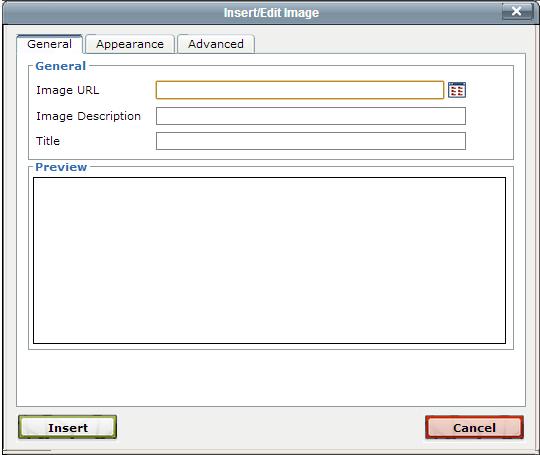
32 Insert/Edit Image Page 32 of 89

33 2. The location of the image can be manually entered in the Image URL field, but to take full advantage of link management, click the Browse icon to browse to the image as in this manner the image will be assigned a dependency tag. 3. The Select Image modal is shown. Note that the view of the images can be toggled between a list and thumbnail view by clicking the icons to the right of the Filter field. 4. An image can be selected by doing one of the following: Navigating the folder structure via the breadcrumb links. This includes being able to navigate to another site within the account. Uploading an image. Insert/Edit Image Page 33 of 89
34 Uploading and editing an image. Selecting a different environment from the drop-down; such as the production server or publish target. Staging is the default when Binary Management is in effect. Selecting an auxiliary site from the drop-down. Filtering by entering one or more characters. The filter is relevant to the file name, including extension. Filtering by adding tags. Switching between list view and thumbnail view. Previewing in the preview pane by single-clicking. Double-clicking to immediately select and insert. Viewing the preview pane content details Clicking through the Edit Image link to edit an image. After editing, click save to return to the Select Image dialog. This edits the physical file and can be useful for quick resizing of an image. 5. Once the image has been selected, click Insert. Alternatively, double-click an image in the list or thumbnail view. 6. From the Insert/Edit Image modal, enter a value for the Image Description field. 7. Click Insert. The image is shown in the context of the page within the WYSIWYG Editor. Note: When linking to an image or other binary file from staging the file must be published to production. This can be accomplished by making sure that the Include Unpublished Dependencies checkbox is selected. Editing an Inserted Image The details of the image can be modified after insertion on a page by clicking the same Insert/Edit Image icon, making the necessary edits, and clicking Update. Dragging a File to Upload 1. As described above, click the Insert/Edit Image tool, and the Browse icon. 2. From the Insert Image modal, click Upload. 3. Drag the file or files to upload from the local computer to the modal. (Multiple files may be selected and uploaded at one time. On a PC, use Control+Click, Shift+Click, or click and drag to select multiple files. For a Mac, use the Command key to select multiple files.) Insert/Edit Image Page 34 of 89

35 4. Alternatively, click the Add Files button to browse and select local files. 5. If necessary and available, chose an access group for the files. This will limit the ability to access the image to insert it on a page from within the WYSIWYG to members of the group. 6. The ability to overwrite files may be enabled and available by clicking the Overwrite Existing checkbox. 7. Files may be renamed at this point by clicking Rename, entering the new file name, and pressing the Enter key or clicking out of the field. Insert/Edit Image Page 35 of 89
36 Note that if there are invalid filenames or the file exists already and Overwrite Existing has not been checked, the modal will not allow the upload to be initiated. 8. Click Start Upload to upload the files. When completed, the green success message is displayed. Click Close and select and insert the image from the Select Image modal. Insert/Edit Image Page 36 of 89
 can be granted the rights to upload via the user s settings.")
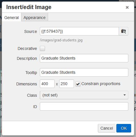
37 Additional Information and Reminders Adding an image description is important for accessibility, as it provides text for screen-readers or other instances where the image is unable to be viewed The ability to upload files is inherently available for user levels 6 or above. Lower level users (1 5) can be granted the rights to upload via the user s settings. The permission to overwrite files to which they have access can be granted to user levels 1 through 8, and is inherently available to user levels 9 and 10. To import multiple files using only one selection and containing subfolders, use the Zip Import feature. Zip Import is available to users Levels 6 8 through the user s settings. Note: All binary files including images are uploaded to the staging server and must be published to the public-facing web server. Image files can be manually published with any publish action, or if having been inserted on a page without publishing, the Dependency Manager will provide a checkbox on the Publish modal so that any unpublished dependencies are also published. Decorative Images Decorative images are images for which no <alt> descriptive image tag is required. Inserting decorative images must be enabled for each site by an administrator. This can be accomplished from Setup > Sites > WYSIWYG Editor > Decorative Images. The default, Disabled, means that the Decorative Image checkbox is not available and that an Image Description must be added. For more information, visit the Setup Sites > WYSIWYG Editor Panel page. Using Decorative Images Once enabled, the Insert/Edit Image modal in the WYSIWYG editor allows users to select a checkbox indicating that the image to be inserted is a decorative image and to omit the image description. Appearance Tab The Appearance tab allows for configuring the alignment, size, and styling of the image. Insert/Edit Image Page 37 of 89

38 The following Appearance settings can be configured: Alignment: Sets the alignment of the image against the text. Options include: Baseline: Aligns the baseline of the image with the baseline of the parent Middle: The image is placed in the middle of the line of text Top: The top of the image is aligned with the top of the tallest element in the line Bottom: The bottom of the image is aligned with the bottom of the lowest element in the line Text Top: The top of the image is aligned with the top of the parent element Text Bottom: The bottom of the image is aligned with the bottom of the parent element's font Left: The image is set to the left of the text with wrap-around Right: The image is set to the right of the text with wrap-around Dimensions: Sets the height and width of the image. The Constrain Proportions checkbox can be selected in order to keep the same proportions of the original image In JustEdit, the dimensions are listed under the General tab Vertical Space: Sets the amount of space between the top and bottom sides of the content area and the image Horizontal Space: Sets the amount of space between the left and right sides of the content area and the image Border: Sets the width of the image border. The border width will be the same on all sides of the image Class: Allows for a class attribute value to be selected from the drop-down, which can be configured Insert/Edit Image Page 38 of 89

39 Style: Based upon the options selected from the Alignment drop-down, the styling will auto-complete. Optionally, styling may be manually added to define the alignment and other features for the image. Advanced Tab If you are using the Classic Editor, the Insert/Edit Image modal also contains an Advanced tab. It provides easy access to JavaScript and HTML with the ability to swap images on mouse over, designate an image map, and add an ID to the IMG tag. Swap Image The Swap Image area includes a checkbox that, when selected, allows for adding a second image that replaces the original image when a user hovers over the image. The two options for this feature are to specify the alternate image on mouse over or on mouse out. For either option, the alternative file can be browsed to with the file chooser While editing a page in the WYSIWYG Editor, click Insert/Edit Image. Click the Browse icon and select the image to appear on the page when it is initially loaded. Click the Advanced tab. Select the Alternative Image checkbox. From either the For Mouse Over or For Mouse Out, browse to the alternative image. Insert the image, and save and publish the page. Insert/Edit Image Page 39 of 89


40 Initial Image Image Swap After Hover Miscellaneous This area includes the ability to add the HTML id tag to the img tag. It also includes: Add the HTML id tag to the img tag Select the language direction with a drop-down Designate the language code Specify an image map The long description link field ID Specifies the value of the id attribute for the image. In previous incarnations of HTML, the name attribute on an <a> element was used to create an anchor and target it. For conformance with HTML5, the id attribute is preferred over the name attribute. For pages the id should at least be unique to a page. The id attribute is flexible in implementation and can provide a specific target for an element, including for on-page linking within a document. An id can also be used as a target by scripts. Another usage of ids is to style an element with CSS, or to bookmark or footnote a document. An id attribute: Is a global attribute in HTML5 Must be a unique value relative to the "element's home subtree" Must contain at least one character Must not contain any space characters Language Direction Specifies the text direction (dir attribute) for the image. The HTML specification suggests that the use of dir is preferred over specifying text direction with CSS. It also allows for the value of the attribute to Insert/Edit Image Page 40 of 89
41 be "auto" but does not prefer it, even though the auto value allows for the direction to be determined programatically. The HTML specification provides an example of tagging that uses the value of auto for the dir on a paragraph. The first word of the paragraph is tagged with <bdi>, meaning that this particular word can go in either direction. An example would be differentiating between English, a left-to-right language, and Arabic, a right-to-left language. When rendered, the English language text is left aligned to the starting edge of the paragraph and the Arabic to the right. This includes the changing of the order of the <bdi> tagged words. Language Code Specifies the primary language (lang attribute) for content of the element, in this case a hyperlink and for any element attributes that contain text. The lang attribute is considered a global attribute in HTML5. "Its value must be a valid BCP 47 tag, or empty string. Setting the attribute to the empty string indicates that the primary language is unknown... If these attributes are omitted from an element, then the language of this element is the same as the language of its parent element, if any." See this specification for specifics when using with XML or for using xml:lang: attr-lang. Image Map In HTML and XHTML, an image map is a list of coordinates relating to a specific image, created in order to hyperlink areas of the image to different destinations (as opposed to a normal image link, in which the entire area of the image links to a single destination). For example, a map of the world may have each country hyperlinked to further information about that country. The intention of an image map is to provide an easy way of linking various parts of an image without dividing the image into separate image files. To use the image map feature in the advanced properties of the WYSIWYG image insert tool, the web developer must have first created a properly coded image map with the appropriately defined hotspots in the HTML of the target web page. The image map must be named (e.g., name="navmap"). Once this is done a user can, in the WYSIWYG Editor, click the Insert/Edit Image tool, choose the appropriate image, go to the Advanced tab, and type in the name of the image map. This name must be preceded by a # character (e.g., #navmap). Now the image is associated with the image map. Due to the nature of image maps (dimensions are hard set for the hot-linked areas of an image), an image must be of the proper dimensions to support the map, as well as have the image content that maps to the areas that are defined in the image map (e.g., an image of Canada would be useless for an image map defined for the United States). How to Add a Mapped Image 1. To add a image map to the page, use the WYSIWYG Insert/Edit Image tool. 2. From the Insert/Edit Image dialog box, click the Advanced Tab. Insert/Edit Image Page 41 of 89

42 3. In the Image Map field type in the name of the image map. It is very important to keep in mind that a hash tag (#) must be placed at the beginning of the image map name in this field. For example if the developer used the name navmap, the user would type in: #navmap. 4. Once the correct name has been inserted for the image map click Insert and the new mapped image will appear in the WYSIWYG Editor. Long Description The long description field specifies a hyperlink to a detailed description of an image. Insert/Edit Image Page 42 of 89


43 Format Drop-Down Overview The Format drop-down allows for an element to be applied to text by selecting the element from the list. This allows for the styling for an element to be defined in a CSS file, while the user only needs to select the proper element. For example, heading levels H1 through H6 can be applied to a text selection in the WYSIWYG. The formatting for the heading levels are defined in CSS for the page, which is what will be used to created the output files. This is also usually reflected in the view that the user sees while editing within the WYSIWYG Editor. Classic Editor JustEdit Format Drop-Down Page 43 of 89
44 Depending upon the WYSIWYG schema selection for a site, the Format drop-down displays different elements. The default is XHTML (not strict) and the following elements are displayed on the list: Paragraph Address Preformatted Heading 1 through Heading 6 With the use of the HTML5 schema, added elements are available in the WYSIWYG. The HTML5 schema can be enabled for a site by an administrator (Setup > Site). When selected, the WYSIWYG Editor expects to utilize HTML5-compliant HTML, which includes the addition of HTML5 elements and the removal of invalid elements. This also affects page validation during Page Check and Final Check as page validation is for the HTML5 specification. The elements available when using the HTML5 schema are: Paragraph Address Preformatted Heading 1 through Heading 6 Block Quote Section Article DIV Aside Figure Selecting from the Format Drop-Down The application of the format can be toggled; clicking from the menu applies or removes the application of the Format element. To apply an element from the Format drop-down: 1. Place the cursor within an existing block of text, on a blank line, or select the text. 2. Click the Format drop-down or the arrow for it. 3. Scroll to find the element and click it. This applies the choice. Removing or Changing the Applied Format 1. Place the cursor within an existing block of text, on a blank line, or select the text. 2. The applied format is shown. 3. Click the currently applied format to deselect it or choose a different element. Format Drop-Down Page 44 of 89

45 Image Editor Overview The Image Editor allows images to be resized, cropped, rotated, and zoomed directly within. Images can be uploaded and edited all in one operation. The ability to edit an image helps ensure large images are properly resized before being published to the production server. Additionally, images can be saved and renamed. Access to the Image Editor is dependent on user level. Those who can upload files can use the Image Editor to upload images and edit existing images, but cannot overwrite any existing image with the same file name. Those with overwrite permissions are able to replace existing images. The Image Editor can be accessed using the following methods: Clicking on a linked image name within the Pages list view Clicking Upload and Edit from the Upload modal when uploading an image in the Pages list view When inserting images into an editable region from the Insert/Edit Image filechooser while in the WYSIWYG Editor When inserting images into a mini-wysiwyg editor from the Insert/Edit Image filechooser while editing or creating a new Web Content Asset When inserting images on a page using the Source Editor For more information about the Upload and Edit process, visit the Upload and Edit page. LDP Image Galleries are another way users can add images to a site in the system. However, this function is not related to the standard Upload and Edit Image feature and requires that Live Delivery Platform (LDP) be enabled. For information about creating LDP Image Galleries, visit the Image Galleries page. Image file types support by the Image Editor is browser dependent. The following file types commonly used for web pages can be edited and saved with the Image Editor with the most commonly used browsers: JPG/JPEG PNG GIF Image Editor Page 45 of 89

46 BMP For a complete reference of browser support for image formats, see: Accessing the Image Editor The Image Editor can be accessed in three main ways: Click the hyperlinked image name in the Pages list view When uploading an image, click Upload and Edit from the Upload modal When adding an image to an editable region, the source of a page, or in a mini-wysiwyg Editor and uploading from the Select Image filechooser Image Editor Page 46 of 89

47 Image Editor Tools From the Edit Image screen inside the Image Editor, the following functionality is available in the Tools menu: Resize Crop Rotate Zoom Undo Redo As the image is edited, an estimated file size is shown underneath the image panel. This size will change as the image is resized and cropped. Resize The Resize tool includes the ability to specify a new width and height for the image. The original ratio for the image dimensions can be kept intact by selecting the Preserve Ratio checkbox. Image Editor Page 47 of 89

48 Crop The Crop tool can be used to crop the image, either by selecting a predefined aspect ratio or by determining a custom crop size. When Custom or any of the predefined ratios are selected, a crop box will appear. Users can then adjust the crop for the image by dragging the crop handles located on the edges of the crop box. Clicking the Swap width & height checkbox will swap the dimensions of the crop box width and height (e.g., a crop box with dimensions of 150x300 pixels would swap to 300x150 pixels). Image Editor Page 48 of 89
49 Rotate The Rotate tool rotates the image 90 degrees in a clockwise direction with each click. Image Editor Page 49 of 89

50 Zoom The Zoom tool can be used to manually enter a percentage of the original image size to be displayed in the Edit Image panel for editing. The plus and minus magnifying glass buttons may also be used to increase or decrease the viewing size. Zoom does not alter the size of the image on the staging server; it is only to aid users in the Image Editor. The Original button reverts the image to the original size. The Zoom to Fit button resizes the image to fit into the panel for viewing. Image Editor Page 50 of 89
. Final Notes The edited image must be republished in order to appear correctly on the rendered webpage.")
51 Undo/Redo The Undo and Redo functionality is available after performing another editing function. Undo reverts the last function performed (one level back). The Redo function reapplies the last function removed by the Undo tool (one level forward). Final Notes The edited image must be republished in order to appear correctly on the rendered webpage. This may be initiated with a page publish by selecting the checkbox to publish unpublished dependencies. Or it may be necessary to manually publish the image. If the image does not appear correctly, refresh the browser and/ or clear the browser cache as the previous iteration of the image may have been saved by the browser. This action can be found in various places in browsers' settings and for some browsers/platforms, this can be accomplished by pressing CTRL+F5 (Chrome), CTRL+R (Firefox and IE), or CMD+Option+E (Safari). Otherwise the edited image may not appear as expected. When an image is edited through The Image Editor in, it will be recompressed once it is saved. When using lossy file formats such as JPG, this can cause a visible degradation in image quality, especially when an image is edited multiple times in. As a best practice, crop or resize images to the exact size needed on the page before importing them into. Furthermore, using images saved in a lossless file format (such as PNG) in the Image Editor will avoid losses of quality due to recompression. The image size is dependent on two factors: the browser and the amount of memory allocated to the browser by the parent machine. In testing a fairly large image, x 3955 pixel (27 MB), was used and rendered in 198 ms. Performance of image rendering is dependent upon each individual user's machine and Internet connection. In short, every time a user tries to load an image, large or small, jpeg or any other extension, the image editor relies on the browser to provide the pixel information. If working with an image that cannot be edited, log out of, quit and relaunch the browser. This will free up browser-allocated RAM and may resolve the issue. Image Editor Page 51 of 89
52 Show/Hide Block Elements Overview The Show/Hide Block Elements icon on the WYSIWYG Toolbar enables the ability to toggle the view of the WYSIWYG Editor. Click the icon to show the view or to hide it. Toggling displays block elements encapsulated within rectangles defined with thin, dashed lines and identifies them with the label of the HTML element being used. Classic Editor JustEdit Using Show/Hide Block Elements The encapsulation rectangles show the applied format element. For example, a "P" label identifies the paragraph element, <p></p>, and "HGROUP" represents the application of a Heading Group. Styling can be applied by using the Format or the Styles drop-down; however, only elements listed on the Format drop-down are shown in the block element view. The Styles drop-down applies classes. Elements listed on the Format drop-down are built-in; elements listed on the Styles drop-down can be added to reflect what has been defined in a style sheet. The list available on the Format drop-down also depends upon the schema used. For example, when enabling HTML5 Schema for a site, the following are available on the Format drop-down: Paragraph Address Pre H1 H6 Block Quote Section Article Heading Group DIV Aside Figure When HTML5 Schema is not enabled, the WYSIWYG defaults to XHTML. The following are available on the Format drop-down: Paragraph Address Preformatted Show/Hide Block Elements Page 52 of 89

53 H1 H6 In both cases, when the Show/Hide view is toggled to show, the corresponding block elements are shown in the encapsulated and labeled view. For more information about the Format drop-down and the usage for HTML5 Schema, visit the Format Drop-Down page. Example of Show/Hide Block Elements Show/Hide Block Elements Page 53 of 89

54 Show/Hide Block Elements Page 54 of 89


55 CodeProtect Overview Note: This feature is available in the Classic Editor only. Script code blocks may be safely inserted into an editable region using CodeProtect. These script code blocks are represented in the editor interface by a red question mark icon, as shown below: CodeProtect regions may be inserted or edited by clicking on the CodeProtect button in the toolbar. This opens the CodeProtect editor window. Whether creating a new CodeProtect region or editing a new one, code blocks are entered into the CodeProtect window, as shown in the following figure: Click the Update button to insert the code block as a red CodeProtect icon in the editor. New CodeProtect regions are inserted at the current cursor location in the editor. CodeProtect Page 55 of 89
56 Limitations The purpose of CodeProtect is to allow users the ability to insert PHP, ASP, or JSP code into an editable region. ASP and JSP code must use the <% %> processing instruction notation. PHP must use the <? php?> or <??> notation. If the page is a publish control file (PCF) or any other type of XML implementation, then only PHP code blocks are allowed. This is because the ASP and JSP <% %> tagging is invalid XML. PHP blocks, on the other hand, are valid XML preprocessing instructions. XSL transformation of PHP code blocks is successful, but it will fail for ASP and JSP. CodeProtect Page 56 of 89

57 Adding Tables in the WYSIWYG Editor Overview The default toolbar of the WYSIWYG Editor includes the standard tools for editing tables such as the ability to insert, delete, and define rows and columns, as well as merge or split table cells. Classic Editor JustEdit Various table elements and attributes can be added and defined both when adding a new table or after. These attributes include the number of columns and rows, table width and height, and a table border, for example. In Classic Editor, both a General tab and an Advanced tab are available for defining the table elements. If a Level 10 administrator has configured access settings to allow for source access, the Edit HTML Source icon can be used to view and edit the HTML source code for the table elements. Additionally, the class selector can be used to assign a class to a table to define the styling for the table as has been defined within a CSS style sheet. The Insert/Edit Table modal may vary slightly depending upon the schema in use for the WYSIWYG, which is an option that can be set by an administrator. For example, when HTML5 schema is selected for a site, certain invalid HTML attributes are removed. Additionally, the markup for HTML5 schema differs from previous HTML markup iterations as many elements and attributes have become changed, obsolete, or invalid. If HTML5 schema has not been enabled, the XHTML/HTML schema that is used by the WYSIWYG Editor does not delete the HTML5 elements, such as section and article, but there is not an easy way for users to add these elements to the page without going into the source code or using a snippet or asset. The XHTML schema also allows for attributes that have been identified as invalid in HTML5 but not in XHTML. When the HTML5 schema is enabled, invalid attributes are removed. This page contains the following sections: Adding Tables in the WYSIWYG Editor Page 57 of 89

58 Inserting a Table (Classic Editor) Table Properties (Classic Editor) Inserting a Table (JustEdit) Table Properties (JustEdit) Applying a Class Inserting a Table in the Classic Editor 1. Select the Insert/Edit Table icon and fill out the fields in the Insert/Edit Table modal. 2. Once the form is on the page, begin typing in the fields. 3. You can also edit the form by either right-clicking in the table and selecting an option from the menu that appears, or by left-clicking in the table and selecting an option from the WYSIWYG menu. The table formatting tools are available after a table is inserted and when the cursor is within the table. Icon Description Table Row Properties: Defines the row properties such as alignment, height, and background color. The drop-down can then be used to apply the updates to the current row, all odd rows, all even rows, or all rows. Adding Tables in the WYSIWYG Editor Page 58 of 89
59 Icon Description Table Cell Properties: Defines the cell properties such as alignment, width, height, and background color. The drop-down can then be used to apply the updates to the current row, all odd rows, all even rows, or all rows. Insert Row Before and Insert Row After: Use the first icon to insert a row above the clicked row, and use the second icon to insert a row below the clicked row. Delete Row: Deletes the clicked row. Insert Column Before and Insert Column After: Use the first icon to insert a column to the left of the clicked column, and use the second icon to insert a column to the right of the clicked column. Delete Column: Deletes the clicked column. Split Merged Table Cells: To split cells that have previously been merged, select the cell, then click the Split Merged Table Cells icon. If within a merged cell (contains a colspan and/ or rowspan), this will remove the colspan and/ or rowspan attributes to result in individual cells matching the table s non-merged configuration. Merge Table Cells: To merge cells, highlight the cells to be merged, then click the Merge Table Cells button. Merges the selected table cells into one cell by adding the necessary colspan and/or rowspan attributes. It is also possibly to place the cursor in the upper, left most cell, and then click the Merge Table Cells icon. A prompt will appear in which the desired number of columns and/or rows to be merged needs to be entered. When merging cells, all of the content currently within the cells remains. Adding Tables in the WYSIWYG Editor Page 59 of 89
60 General Properties (Classic Editor) Field XHTML/HTML 4.01 HTML5 Schema Columns: Defines the number of columns for the table Adds the corresponding number of <td></td> elements. Adds the corresponding number of <td></td> elements. Rows: Defines the number of rows for the table Adds the corresponding number of <tr></tr> elements. Adds the corresponding number of <tr></tr> elements. Cell Padding: Defines padding within the cell between the border and the text cellpadding="8" Obsolete attribute on table. CSS should be used instead. For example: td { padding:5px; } Cell Spacing: Defines spacing between cells cellspacing="5" Obsolete attribute on table. CSS should be used instead. For example: border-spacing. Border: Defines the thickness of cell border border="5" Can be written as an attribute only with a value of 0 or 1. When defined with other border attributes written with inline CSS; e.g., <table style="border: 12px solid #f15b0d;" border="12"> WHATWG suggest border-width can be used instead. Width: Defines the width of table, defaults to pixels, but percent can also be used style="width: 220px; backgroundcolor: #ee4510;" Adding Tables in the WYSIWYG Editor <table style="width: 220px;"> Page 60 of 89
61 Field XHTML/HTML 4.01 HTML5 Schema Height: Defines the height of the table, defaults to pixels, but percent can also be used style="height: 500px; background-color: #ee4510;" <table style="height: 220px;"> Class: Defines a class to be applied to the table; a class that has been added to the styles menu can be selected from the drop-down, or value can be selected and a class can be entered manually, and if the class has been defined in the CSS that is being called the styling will be applied. <table class="green"> <table class="green"> Table Caption: Adds the caption element above the table <table><caption>table CAPTION</caption> <tbody> <tr> <td>cell data</td> <td>cell data</td> </tr> <tr> <td>cell data</td> <td>cell data</td> </tr> </tbody> </table> <table><caption>table CAPTION</caption> <tbody> <tr> <td>cell data</td> <td>cell data</td> </tr> <tr> <td>cell data</td> <td>cell data</td> </tr> </tbody> </table> Advanced Tab (Classic Editor) The Advanced tab includes the Advanced Properties, which includes fields based on the schema employed. Adding Tables in the WYSIWYG Editor Page 61 of 89


62 As shown below, Advanced Properties for HTML5 do not include: Summary Frame Rules Field XHTML/HTML 4.01 HTML5 Schema ID: Adds the id attribute to the <table> start tag with the value defined in the field <table id="t-id-21"> "The id global attribute is now allowed to have any value, as long as it is unique, is not the empty string, and does not contain space characters." For example, <table id="t-id-21"> Adding Tables in the WYSIWYG Editor Page 62 of 89
63 Field XHTML/HTML 4.01 HTML5 Schema Summary: Adds the summary attribute to the <table> start tag with the value defined in the field summary="added value" Obsolete attribute on table. Style Displays inline CSS written with the style attribute as defined by other fields. Displays inline CSS written with the style attribute as defined by other fields. For example, when border, border color, and background color are defined: border-color: #5ca366; borderwidth: 1px; background-color: #828e71; Language Code <table lang="sl"> Specifies the primary language for the element's contents and for any of the element's attributes that contain text. Its value must be a valid BCP 47 language tag, or the empty string. This attribute specifies the base language of an element s attribute values and text content. RFC1766 defines and explains the language codes that must be used in HTML documents. The lang attribute in the XML namespace is defined in XML. Background Image background-image: url('/images/ purple.png'); background-image: url('/images/ purple.png'); Frame Could be used to identify which parts of a border around a table are shown. For example, selecting lhs in the Frame dropdown identifies that the left-hand side of the table border is visible: Obsolete attribute on table. CSS can be used instead; for example: border-color:black and border-style. frame="lhs" Rules Could previously be used to identify the borders of a table cell to be shown, similarly to frame. For example, Obsolete attribute on table. CSS can be used: border-color:black and border-style on the table's appropriate elements rules="rows"; provides cell border style with the appearance of horizontal rules. Language Direction For purposes of internationalization, language direction can be specified as right-to-left or left-to-right with the dir attribute: dir="rtl" Adding Tables in the WYSIWYG Editor <table id="id" style="borderwidth: 10px; border-color: #f0f40a; background-color: #6e918c;" summary="summary" border="10" cellspacing="5" cellpadding="125"> Page 63 of 89

64 Field XHTML/HTML 4.01 HTML5 Schema <caption> </caption> Border Color: Launches the color picker to define the table border Defined by a style attribute; e.g., border-color: #f0f40a). Written as inline CSS: style="border-color: #6e918c;" Background Color: Launches the color picker to define the table background, In this schema, background color is not added as bgcolor, but rather as defined by a style attribute: e.g., style="background-color: #6e918c;" Obsolete as an attribute (bgcolor). Written as inline CSS: style="background-color: #6e918c;" Inserting a Table in JustEdit 1. When editing a page, select the Insert/EditTable icon from the toolbar. 2. Select "Insert Table" from the drop-down and drag your cursor over the grid to choose the size of your table. Select the grid to insert your table. 3. Once your table is on the page, you can edit it either from the Insert/Edit Table icon on the toolbar, or from the menu that appears when you right-click the table. Adding Tables in the WYSIWYG Editor Page 64 of 89

65 4. The Cell, Row, and Column menus contain various options: Cell: Cell Properties, Merge Cells, and Split Cells Row: Insert Row Before, Insert Row After, Delete Row, Row Properties, Cut Row, Copy Row, Paste Row Before, and Paste Row After Column: Insert Column Before, Insert Column After, Delete Column The properties options for cells, rows, and columns contain similar options to the table properties below. Table Properties The Table Properties available in JustEdit are similar to those in Classic, just more streamlined. Adding Tables in the WYSIWYG Editor Page 65 of 89
 Height Used to scale the height of the table, defined in percentage (e.g. use 50% to reduce the height of the table by half) Cell Spacing")
66 General Properties Field Purpose Width Used to scale the width of the table, defined in percentage (e.g. use 50% to reduce the width of the table by half) Height Used to scale the height of the table, defined in percentage (e.g. use 50% to reduce the height of the table by half) Cell Spacing Defines spacing between cells Cell Padding Defines padding within the cell between the border and the text Border Defines the thickness of cell border Caption Adds a caption field above the table Alignment Aligns the page on the table; options are Left, Center, and Right Class Applies CSS from the Styles drop-down to the table Adding Tables in the WYSIWYG Editor Page 66 of 89
 to color the borders of your table Background Color Enter a hex code (e.")
67 Advanced Properties Field Purpose Style Is populated by what you enter in the Border Color and Background Color Fields, and styles the table accordingly. Be aware that if you have existing CSS styling your tables, it may overwrite what you define in this tab. Border Color Enter a hex code (e.g. #000EEE) to color the borders of your table Background Color Enter a hex code (e.g. #000EEE) to color the background of your table Applying a Class to a Table Any number of tables can be defined in CSS as a class. When inserting a table in the WYSIWYG, the class can be selected or entered from the Class drop-down. The class needs to be added to the Styles dropdown file in order for it to be listed on the Class drop-down on the Insert/Edit Table dialog. A class that has been defined in CSS, but not added to the Styles drop-down, can be entered manually by clicking value and typing the name of the class. If a user has source code access, the class and its value can be added in a source view. Adding Tables in the WYSIWYG Editor Page 67 of 89
68 Applying a Class to a Table 1. Define the class in the CSS file. The location for the file is dependent upon the implementation; for example, _resources/css/main.css. Download the ZIP file below for an example of CSS that creates a table centered on the page with centered text that has a gradient background and a box shadow: Download Centered Table CSS (ZIP) 2. Add the class in the styles.txt file. Typically, _resources/ou/editor/styles.txt. For the class defined above, add:.centered TableNice. The space between the two words must be created by using the Tab key. For more information, visit the Customizing the Styles Drop-Down page. 3. Click the Insert/Edit Table icon on the WYSIWYG Toolbar. 4. From the Class drop-down, select TableNice (the friendly name that was added to label the class). Alternatively, if the class was defined, but not added to the Styles drop-down, from the Class drop-down, click (value) and enter the name of the class (without the period). Adding Tables in the WYSIWYG Editor Page 68 of 89
69 Forms (WYSIWYG) Overview Note: This feature is available in the Classic Editor only. The Insert/Edit Form tool inserts a form that allows visitors to the page to input information, and that information to be collected and viewed by site users. It should be noted that these forms are not the same as those provided with LDP Forms, and are implemented in a very different way. For ease of access and more streamlined use, it is recommended that LDP Forms be used instead. Visit the LDP Forms page for more information. Once a form has been initially created and added to a page, the other form tools on the toolbar become available. These tools areinsert/edit Input Element, Insert/Edit Select Element, and Insert/Edit Textarea Element. Clicking these will allow the user to input certain elements into their form. Insert/Edit Form For a full tutorial on how to add a form to a webpage, visit the Forms Tutorial page. General Tab The General tab is displayed by default after clicking on the Insert/Edit Form tool within the WYSIWYG Editor. Forms (WYSIWYG) Page 69 of 89
70 Auto-validate : Checks to make sure that the information is input correctly Name : Input a name for the form Action : Where the data in the form will be submitted Method : POST: The form data will be sent as an HTTP post transaction GET: The form data will be sent in the URL of the resulting page Target: Specifies where the resulting page will be opened Encoding type: None: No encryption multipart/form-data: A form only needs to be set to form-data if a file input (i.e., uploading a file by a web visitor) is being inserted Class: Applies a defined CSS class to the form Forms (WYSIWYG) Page 70 of 89

71 Advanced Tab The Advanced tab presents further options for editing forms with the Insert/Edit Form tool within the WYSIWYG Editor. Id: A unique id for the form onsubmit: Sets a script to execute when the form is submitted onreset: Sets a script to execute when the form is reset Summary: Summarize the content of the form Style: Sets any inline styling for the form Hidden Fields Tab The Hidden Fields tab presents a way for users to add a hidden filed for a form with the Insert/Edit Form tool within the WYSIWYG Editor. Forms (WYSIWYG) Page 71 of 89

72 Hidden Fields: Inserts an input that can neither be seen nor edited by the user Name: Identifies the input for processing after submission Value: Specifies the value that is submitted Deleting a Form Position the cursor within the form to be deleted and click the Delete Form tool on the WYSIWYG toolbar. This will delete the content within the form as well. Input Element Once a form is created, an input element for a form can be added. As many as needed can be added. Forms (WYSIWYG) Page 72 of 89
73 Insert/Edit Input Element: General Tab Name: Identifies the input for processing after submission Value: Varies with the type of input For text input, defines the default value For checkboxes and radio buttons, defines the value that will be submitted For buttons, defines the test that is shown on the button Type: text: Gives a text field checkbox: Gives a checkbox radio: Gives a radio button button: Gives a normal button file: Gives a file upload field masked password: Gives a text field where the characters will be represented by bullets submit button: Inserts the button to submit the form reset button: Inserts a button that will empty/reset all of the form elements Size: Specifies the size of the element. Only affects text, file, and password types Height: Specifies the height of the element Forms (WYSIWYG) Page 73 of 89
74 Width: Specifies the width of the element Background image: Inserts a background image for the element Border color: Gives the element a border of the specified color Background color: Gives the element a solid background of the specified color Class: Gives the element a class for use in CSS or JavaScript Inserting an Input Element: Advanced Tab Once a form is created an input element for a form can be added. As many as needed can be added. The Advanced tab provides additional fields for defining a form element. Id: Gives the element a unique id onfocus: Executes a script when the element comes into focus onblur: Executes a script when the element goes out of focus onchange: Executes a script when the element is changed onselect: Executes a script when the element is selected onclick: Executes a script when the element is clicked onkeyup: Executes a script when a key is pressed onkeydown: Executes a script when a key is released Maxlength: Specifies the maximum number of characters that can be input. Only for text and password types Forms (WYSIWYG) Page 74 of 89
75 Required: Specifies whether the element is required for the form to be submitted Checked: Specifies whether a checkbox or radio button will be checked when the form loads Disabled: Specifies whether the element is disabled Source: Specifies an image to display as the submit button Summary: Summarizes the element Style: Specifies any styling that is applied to the element Select Element In addition to input elements, select elements can also be added to a form. Insert/Edit Select Element: General Tab Forms (WYSIWYG) Page 75 of 89
76 Name: Gives the select element a name Name or ID: The input that is submitted for the selected option Value: The value that is displayed for the selected option Default Selected Value: The value that will be displayed by default Multiple Selections Allowed: If checked, allows a user to select multiple options at once Number of Option Rows: Specifies the number of options that are visible at any one time Width: Specifies the width of the select element Height: Specifies the height of the select element Background image: Specifies an image to be shown in the background of the select element Border color: Specifies the color for the border of the element Background color: Specifies the color of the background of the element Class: Specifies the class of the element for use in CSS and JavaScript Insert/Edit Select Element: Advanced Tab Forms (WYSIWYG) Page 76 of 89
77 Id: Gives the element a unique ID onfocus: Specifies a script which will run when the element is in focus onblur: Specifies a script which will run when the element looses focus onchange: Specifies a script which will run when the element is changed onselect: Specifies a script which will run when the element is selected onclick: Specifies a script which will run when the element is clicked Required: Specifies whether this element is required to complete the form Disabled: Specifies whether this element is disabled Summary: Summarizes the content of the element Style: Specifies any styling of the element Textarea Element Another type of form element that can be added is a textarea, where users filling out the form can type in text themselves. Insert/Edit Textarea: General Tab Name: Gives the element a name Forms (WYSIWYG) Page 77 of 89
78 Value: Specifies the default text for the element Rows: Specifies the number of visible rows in the text area Columns: Specifies the number of visible columns in the text area Background Image: Specifies a background image for the text area Border color: Specifies the color of the border of the text area Background color: Specifies the color of the background of the text area Class: Gives the element a class for use in CSS and JavaScript Insert/Edit Textarea: Advanced Tab Id: Gives the element a unique Id onfocus: Specifies a script to run when the element is in focus onblur: Specifies a script to run when the element looses focus onchange: Specifies a script to run when the element is changed onselect: Specifies a script to run when the element is selected onclick: Specifies a script to run when the element is clicked onkeyup: Specifies a script to run when a key is released onkeydown: Specifies a script to run when a key is pressed Maxlength: Specifies the maximum number of characters allowed in this text area Required: Specifies whether this element is required to complete the form Forms (WYSIWYG) Page 78 of 89
79 Disabled: Specifies whether this element is disabled Summary: Summarizes the content of this text area Style: Specifies any styling for this element Forms (WYSIWYG) Page 79 of 89
80 Form Tutorial Overview Note: This feature is available in the Classic Editor only. If you are looking for LDP forms, click here. Building a form in OmniUpdate is a simple process using the WYSIWYG editor. Follow the Form Tutorial outlined below to get started on building form elements. Form elements are elements that allow the user to enter information into a form (like text fields, textarea fields, drop-down menus, radio buttons, checkboxes, etc.). Creating a Form The functionality for creating WYSIWYG forms can be enabled by a Level 10 administrator. A set of toolbar icons similar to the ones below will show up in the Classic Editor's toolbar: These toolbar buttons allow for the creation of an HTML form and the ability to add elements to it. A few of the most common elements are text input boxes, radio buttons, check boxes, and submit buttons. To edit a currently existing form field, first click anywhere inside the form to allow the cursor to recognize the form itself, then double-click the form field to which to make changes. Then there is the ability to click the form editor buttons in the toolbar above. Just remember, the forms toolbar does not create the backend functionality that processes the information once the form is submitted. Some sort of script or program must be installed on the server for the form to process and interpret the information. This tutorial shows you how to build a simple survey form that contains text fields, a drop-down list, radio button, checkboxes and a button. Insert a Form To insert a form into a page: 1. Click on the Insert/Edit Form button in the WYSIWYG toolbar. 2. This will bring up the Insert/Edit Form modal box. Name the form and set up other properties. For the purposes of this tutorial, the focus is on the General Tab for this form initially. Properties include: Name: A name for the form (example: testform1) Action: The form#s action attribute defines the name of the file to send the content to the server (example: html_form_submit.asp) Method: Select the method for the action (example: POST) Target: The Target field indicates which frame in a set of frames to send the results to. This attribute can be used so that the form is always visible even as the form results are displayed and redisplayed (example: TargetFrame) Form Tutorial Page 80 of 89


81 Encryption Type: Type of encryption for the target (example: None) 3. Once the form is named and parameters added, click Insert. Note that there is now a dotted outline of the form on the page. 4. Click inside the form and notice the form action buttons in the WYSIWYG toolbar are now active. 5. Insert form elements such as: Text fields Drop-Down lists Radio buttons Checkboxes Buttons Form Tutorial Page 81 of 89

82 For more information and tutorials about forms, see Forms Tutorial and W3Schools Forms. Add Text Fields Once a form has been inserted onto the page, a variety of form elements can be added. To add a text field: 1. Click the Insert/ Edit Form Input Element icon to add text fields. 2. This will open the Insert/Edit Form Input Element modal. From the Type drop-down, select the Text element. 3. Give it a descriptive name such as firstname. 4. Set up the first text field with the desired parameters, such as: Name: firstname Value: firstname Size: 200 Width: 200 Height: 20 Border: #de2051 Note: All Values must be one word only with no spaces. Form Tutorial Page 82 of 89

83 5. To select colors for border or background color, click inside the color box to see a hex color picker tool. 6. Click Insert and notice that a new text field has been inserted into the new form on the page. 7. To create a simple survey form, use the directions above to create three text fields: First name Last Name Address. Form Tutorial Page 83 of 89

84 Add a Drop-Down List To create a drop-down list: 1. Click the Insert/Edit Select Element icon. The following modal is displayed. 2. Click the green add button to enter selection options. As an example, use the following data for list: pizza, ice cream, hamburgers, and twinkies. 3. nclude the additional parameters, for example: Number of option rows: 1 Form Tutorial Page 84 of 89
85 Width: 200 Height: 20 Border color: #1759e8 4. After filling out the dialog box with data, click Insert to place the new drop down list into the form. 5. Click Save. Notice the drop down list for favorite foods. It should look similar to the image below. Add Radio Buttons To create a radio button: 1. Click the Insert/Edit Form Input Element icon 2. This will open the Insert/Edit Form Input Element modal. From the Type drop-down, select radio button. 3. As an example, set it up with the following parameters: Name: Yes Value: Yes Type: radio Size: 20 Width: 20 Form Tutorial Page 85 of 89

86 4. Click Insert and then add a sentence next to the radio button. For example: Yes - Please send more information regarding desserts. Note: Multiple radio buttons only work if they all have the same name attribute. If creating more than one radio button, please use the same name attribute for each button. Add a Checkbox The next form element that can be created is a checkbox. To create a checkbox: 1. Click the Insert/Edit Form Input Element icon. 2. This will open the Insert/Edit Form Input Element modal. From the Type drop-down, select checkbox. 3. As an example, set it up with the following parameters: Name: bbq Value: bbq Type: checkbox Size: 20 Width: 20 Form Tutorial Page 86 of 89
87 Note: Always remember to keep names and values lowercase and all one word. Below is an example of what the modal will look like with the data filled out for a checkbox. 4. Click Insert to preview how the checkbox will look in the form. 5. Repeat the above steps to create more checkboxes until the form looks similar to the screenshot below. Note: It is very important to keep in mind that when using checkboxes, the user may select more than one checkbox, but when using radio buttons the user may only select one. Additionally radio buttons only work if they all have the same name attribute. Form Tutorial Page 87 of 89

88 Create a Submit Button To create a submit button: 1. Click the Insert/Edit Form Input Element icon. 2. This will open the Insert/Edit Form Input Element modal. From the Type drop-down, select submit button. 3. As an example, set it up with the following parameters: Name: submit Value: submit Type: submit button Size: 40 Width: 100 Height: Click Insert. Process Form Data Now that the basic form is completed, the next step is to process the form data. For some external site pages discussing form processing, visit Net Mechanic and Web Cheat Sheet. For more information and tutorials on forms, visit HTML Code Tutorial: Forms. Form Tutorial Page 88 of 89
Insert/Edit Image. Overview
 Overview The tool is available on the default toolbar for the WYSIWYG Editor. The Images Gadget may also be used to drop an image on a page and will automatically spawn the Insert/Edit Image modal. Classic
End-User Reference Guide for OU Campus v10
 End-User Reference Guide for OU Campus v10 Long Support Site Version OmniUpdate, Inc. 1320 Flynn Road, Suite 100 Camarillo, CA 93012 OmniUpdate, Inc. 1320 Flynn Road, Suite 100 Camarillo, CA 93012 800.362.2605
APPENDIX THE TOOLBAR. File Functions
 APPENDIX THE TOOLBAR Within the WYSIWYG editor, there are a variety of functions available to the user to properly update the page. Below is a list of all the functions available. Keep in mind that the
page 1 OU Campus User Guide
 page 1 OU Campus User Guide Logging Into OU Campus page page 2 1. Navigate to a page on your site that you wish to edit. 2. Scroll down to the footer and click the symbol. 3. Enter your OU Campus username
End-User Reference Guide
 End-User Reference Guide v10 OmniUpdate, Inc. 1320 Flynn Road, Suite 100 Camarillo, CA 93012 OmniUpdate, Inc. 1320 Flynn Road, Suite 100 Camarillo, CA 93012 800.362.2605 805.484.9428 (fax) www.omniupdate.com
The SBCC Web Publishing Process The process of creating new web pages or editing existing pages within the OmniUpdate system is straightforward.
 Table of Contents Introduction 2 The SBCC Web Publishing Process 2 Staging Server vs. Production Server 2 Roles, Permissions, Levels and Authority 2 Logging In 3 Workflow 3 Dashboard Tab, Content Tab,
Upload. OU Campus v10. OmniUpdate, Inc Flynn Road, Suite 100 Camarillo, CA 93012
 Upload v10 OmniUpdate, Inc. 1320 Flynn Road, Suite 100 Camarillo, CA 93012 OmniUpdate, Inc. 1320 Flynn Road, Suite 100 Camarillo, CA 93012 800.362.2605 805.484.9428 (fax) www.omniupdate.com Copyright 2014
OU EDUCATE TRAINING MANUAL
 OU EDUCATE TRAINING MANUAL OmniUpdate Web Content Management System El Camino College Staff Development 310-660-3868 Course Topics: Section 1: OU Educate Overview and Login Section 2: The OmniUpdate Interface
Quick Reference Guide
 Quick Reference Guide OmniUpdate, Inc. 1320 Flynn Road, Suite 100 Camarillo, CA 93012 Table of Contents Table of Contents... 2 WYSIWYG Toolbar Editor... 3 Page Actions Toolbar... 4 Getting Started... 4
Table of Contents. Look for more information at
 OmniUpd ate @ De Anza Qui ck Guide Table of Contents Login... 2 Logout... 2 OmniUpdate Help Center... 2 Editing and Saving a Page... 3 Publishing... 5 View and Revert to Previously Published Page... 5
PRESENCE. RadEditor Guide. SchoolMessenger 100 Enterprise Way, Suite A-300 Scotts Valley, CA
 PRESENCE RadEditor Guide SchoolMessenger 100 Enterprise Way, Suite A-300 Scotts Valley, CA 95066 800-920-3897 www.schoolmessenger.com Contents Contents... 2 Introduction... 3 What is RadEditor?... 3 RadEditor
Quick Reference Guide OU Campus
 Quick Reference Guide OU Campus omniupdate.com Logging In... 2 Page Actions Toolbar... 2 Editing Content... 3 WYSIWYG Toolbar Editor... 4 Commonly Used Functions... 5 Publishing Pages... 5 Creating Folders
User s guide to using the ForeTees TinyMCE online editor. Getting started with TinyMCE and basic things you need to know!
 User s guide to using the ForeTees TinyMCE online editor TinyMCE is a WYSIWYG (what you see is what you get) editor that allows users a familiar word-processing interface to use when editing the announcement
Beginner Workshop Activity Guide 2012 User Conference
 Beginner Workshop Activity Guide 2012 User Conference TUESDAY, MARCH 6 2:00PM 5:00 PM Beginner Training Workshop Attendees will learn the end user functions of OU Campus TM. They will learn how to log
TinyMCE Users Guide. This user manual will show you all the basics of the TinyMCE editor.
 Introduction TinyMCE is a platform independent web based Javascript HTML WYSIWYG editor. What this means is that it will let you create html content on your web site. TinyMCE supports a lot of Operation
Web Content. Overview. Web Content Mini WYSIWYG Editor
 Web Content Overview Web Content Assets are used for entering HTML-formatted text or media items. They are created and edited via a mini-wysiwyg Editor. Web Content Assets support Dependency Manager tags
QUICK REFERENCE GUIDE
 QUICK REFERENCE GUIDE WYSIWYG Toolbar Editor provides page editing commands with the What-You-See-Is-What-You-Get (WYSIWYG) Editor Toolbar. (User toolbar may vary.) File Functions: Save or revert changes
End-User Reference Guide El Camino College Compton Center
 End-User Reference Guide El Camino College Compton Center OU Campus Version 10 OmniUpdate, Inc. 1320 Flynn Road, Suite 100 Camarillo, CA 93012 OmniUpdate, Inc. 1320 Flynn Road, Suite 100 Camarillo, CA
Asset Management. for OU Campus v10. OmniUpdate, Inc Flynn Road, Suite 100 Camarillo, CA 93012
 Asset Management for v10 OmniUpdate, Inc. 1320 Flynn Road, Suite 100 Camarillo, CA 93012 OmniUpdate, Inc. 1320 Flynn Road, Suite 100 Camarillo, CA 93012 800.362.2605 805.484.9428 (fax) www.omniupdate.com
JustEdit. Overview. Path Status Bar
 JustEdit Overview JustEdit is a new way to edit content in OU Campus that allows users to edit pages without leaving the "Preview" view of the content. Editing a page using JustEdit works the same as using
FirmSite Control. Tutorial
 FirmSite Control Tutorial 1 Last Updated June 26, 2007 by Melinda France Contents A. Logging on to the Administrative Control Center... 3 Using the Editor Overview:... 3 Inserting an Image... 7 Inserting
WYSIWYG Editor: Users Manual
 WYSIWYG Editor: Users Manual Table of Contents WYSIWYG Editor Overview.... 3 Adding Text... 4 Inserting an Image.... 7 Inserting a File.... 15 Embedding Media.... 21 Inserting an Email Link.... 25 Captiva
Nauticom NetEditor: A How-to Guide
 Nauticom NetEditor: A How-to Guide Table of Contents 1. Getting Started 2. The Editor Full Screen Preview Search Check Spelling Clipboard: Cut, Copy, and Paste Undo / Redo Foreground Color Background Color
Do It Yourself Website Editing Training Guide
 Do It Yourself Website Editing Training Guide Version 3.0 Copyright 2000-2011 Sesame Communications. All Rights Reserved. Table of Contents DIY Overview 3 What pages are editable using the DIY Editing
OU CAMPUS TRAINING MANUAL
 OU CAMPUS TRAINING MANUAL OmniUpdate Web Content Management System v8.1 El Camino College Staff Development 310-660-3868 Course Topics: Section 1: OU Campus Overview and Login Section 2: Using OU Campus
Rich Text Editor Quick Reference
 Rich Text Editor Quick Reference Introduction Using the rich text editor is similar to using a word processing application such as Microsoft Word. After data is typed into the editing area it can be formatted
End-User Reference Guide Troy University OU Campus Version 10
 End-User Reference Guide Troy University OU Campus Version 10 omniupdate.com Table of Contents Table of Contents... 2 Introduction... 3 Logging In... 4 Navigating in OU Campus... 6 Dashboard... 6 Content...
What is OU Campus? Log into OU Campus
 OU Campus v10 Content Providers User Guide This document is designed to provide (level 5) Content Providers with basic information needed to do most tasks. Those needing additional information are encouraged
EDITOR GUIDE. Button Functions:...2 Inserting Text...4 Inserting Pictures...4 Inserting Tables...8 Inserting Styles...9
 EDITOR GUIDE Button Functions:...2 Inserting Text...4 Inserting Pictures...4 Inserting Tables...8 Inserting Styles...9 1 Button Functions: Button Function Display the page content as HTML. Save Preview
How to Edit Your Website
 How to Edit Your Website A guide to using your Content Management System Overview 2 Accessing the CMS 2 Choosing Your Language 2 Resetting Your Password 3 Sites 4 Favorites 4 Pages 5 Creating Pages 5 Managing
Zeppelin Website Content Manager User Manual
 Zeppelin Website Content Manager User Manual 1. Introduction Zeppelin Website Content Manager is made for maintaining and editing the content of the website easily. Most of the contents inside the website
How to Edit Your Website
 How to Edit Your Website A guide to using your Content Management System Overview 2 Accessing the CMS 2 Choosing Your Language 2 Resetting Your Password 3 Sites 4 Favorites 4 Pages 5 Creating Pages 5 Managing
Administrator Guide for OU Campus v10
 Administrator Guide for v10 Short Version OmniUpdate, Inc. 1320 Flynn Road, Suite 100 Camarillo, CA 93012 OmniUpdate, Inc. 1320 Flynn Road, Suite 100 Camarillo, CA 93012 800.362.2605 805.484.9428 (fax)
Best Practices for Using the Rich Text Editor
 Best Practices for Using the Rich Text Editor Overview Many pages in ilearn contain large text entry boxes along with many icons and pull down lists (located above the actual text entry area). These icons
Version 7.0. End-user manual. Last revision: February 13,
 Version 7.0 End-user manual Last revision: February 13, 2007-1 - 1. ABOUT THIS GUIDE... 3 1.1. PURPOSE... 3 1.2. WHO SHOULD USE THIS GUIDE... 4 2. ABOUT R.A.D.EDITOR... 4 3. SETTING R.A.D.EDITOR IN EDIT
The PlainHTML Content Editor
 #2a 1445 McGill Rd Kamloops, BC, V2C 6K7 Ph. (250) 374-0906 Fax (250) 374-0915 Toll Free: 1-888-374-0906 #2065 555 W. Hastings. PO Box 12138 Vancouver, BC, V6B 4N6 Ph. (604) 738-0906 Fax. (604) 738-3334
Best Practices for Using the Rich Text Editor
 Best Practices for Using the Rich Text Editor Overview Many pages in Sakai contain large text-entry boxes along with many icons and pull-down lists (located above the actual text entry area). These icons
A Guide to Quark Author Web Edition 2015
 A Guide to Quark Author Web Edition 2015 CONTENTS Contents Getting Started...4 About Quark Author - Web Edition...4 Smart documents...4 Introduction to the Quark Author - Web Edition User Guide...4 Quark
Word Select New in the left pane. 3. Select Blank document in the Available Templates pane. 4. Click the Create button.
 Microsoft QUICK Word 2010 Source Getting Started The Word Window u v w x z Opening a Document 2. Select Open in the left pane. 3. In the Open dialog box, locate and select the file you want to open. 4.
Other Editing. OU Campus v10. OmniUpdate, Inc Flynn Road, Suite 100 Camarillo, CA 93012
 Other Editing v10 OmniUpdate, Inc. 1320 Flynn Road, Suite 100 Camarillo, CA 93012 OmniUpdate, Inc. 1320 Flynn Road, Suite 100 Camarillo, CA 93012 800.362.2605 805.484.9428 (fax) www.omniupdate.com Copyright
Reusable Content. OU Campus v10. OmniUpdate, Inc Flynn Road, Suite 100 Camarillo, CA 93012
 Reusable Content v10 OmniUpdate, Inc. 1320 Flynn Road, Suite 100 Camarillo, CA 93012 OmniUpdate, Inc. 1320 Flynn Road, Suite 100 Camarillo, CA 93012 800.362.2605 805.484.9428 (fax) www.omniupdate.com Copyright
END USER DOCUMENTATION
 Version 2011.3.1115 End-user manual Last revision: November 09, 2011 1 1 ABOUT THIS GUIDE... 6 1.1 PURPOSE... 6 1.2 WHO SHOULD USE THIS GUIDE... 6 2 ABOUT RADEDITOR... 6 3 AUTHORING TOOL ACCESSIBILITY
Creating Web Pages with SeaMonkey Composer
 1 of 26 6/13/2011 11:26 PM Creating Web Pages with SeaMonkey Composer SeaMonkey Composer lets you create your own web pages and publish them on the web. You don't have to know HTML to use Composer; it
Enterprise Application Systems
 INFORMATION TECHNOLOGY Enterprise Application Systems Mt. San Antonio College Information Technology 1100 North Grand Avenue Building 23 Walnut, CA 91789 Help Desk 909.274.4357 Contents Accessing OmniUpdate
C1 CMS User Guide Orckestra, Europe Nygårdsvej 16 DK-2100 Copenhagen Phone
 2017-02-13 Orckestra, Europe Nygårdsvej 16 DK-2100 Copenhagen Phone +45 3915 7600 www.orckestra.com Content 1 INTRODUCTION... 4 1.1 Page-based systems versus item-based systems 4 1.2 Browser support 5
(Pixelsilk Training Manual) Your Guide to Pixelsilk Site Updates
 Your Guide to Pixelsilk Site Updates") 2525 NE Twin Knolls Drive, Suite 1 Bend, OR 97701 tel 541.388.4398 fax 541.385.4798 website www.smartz.com (Pixelsilk Training Manual) Your Guide to Pixelsilk Site Updates Thank you for choosing Pixelsilk
2525 NE Twin Knolls Drive, Suite 1 Bend, OR 97701 tel 541.388.4398 fax 541.385.4798 website www.smartz.com (Pixelsilk Training Manual) Your Guide to Pixelsilk Site Updates Thank you for choosing Pixelsilk
EPiServer Content Editor s Guide
 EPiServer Content Editor s Guide Contents Getting Started with EPiServer... 19 Logging In... 19 Navigating from the Global Menu... 19 Generic Functions, Toolbar and Panes... 20 Generic Functions... 20
San Pedro Junior College. WORD PROCESSING (Microsoft Word 2016) Week 4-7
 Week 4-7") WORD PROCESSING (Microsoft Word 2016) Week 4-7 Creating a New Document In Word, there are several ways to create new document, open existing documents, and save documents: Click the File menu tab and then
WORD PROCESSING (Microsoft Word 2016) Week 4-7 Creating a New Document In Word, there are several ways to create new document, open existing documents, and save documents: Click the File menu tab and then
Computer Nashua Public Library Introduction to Microsoft Word 2010
 Microsoft Word is a word processing program you can use to write letters, resumes, reports, and more. Anything you can create with a typewriter, you can create with Word. You can make your documents more
Lava New Media s CMS. Documentation Page 1
 Lava New Media s CMS Documentation 5.12.2010 Page 1 Table of Contents Logging On to the Content Management System 3 Introduction to the CMS 3 What is the page tree? 4 Editing Web Pages 5 How to use the
Faculty Web. Editors Guide. University Information Technology Services. Training, Outreach, Learning Technologies, & Video Production
 Faculty Web Editors Guide University Information Technology Services Training, Outreach, Learning Technologies, & Video Production Copyright 2016 University Information Technology Services Kennesaw State
OU Campus. Web Editors Guide. University Information Technology Services. Training, Outreach, Learning Technologies, & Video Production
 OU Campus Web Editors Guide University Information Technology Services Training, Outreach, Learning Technologies, & Video Production Copyright 2015 University Information Technology Services Kennesaw State
Introduction to Microsoft Word 2010
 Introduction to Microsoft Word 2010 Microsoft Word is a word processing program you can use to write letters, resumes, reports, and more. Anything you can create with a typewriter, you can create with
The content editor has two view modes: simple mode and advanced mode. Change the view in the upper-right corner of the content editor.
 Content Editor The content editor allows you to add and format text, insert equations and hyperlinks, tables, and attach different types of files to content. The editor appears throughout the system as
FCKEditor v1.0 Basic Formatting Create Links Insert Tables
 FCKEditor v1.0 This document goes over the functionality and features of FCKEditor. This editor allows you to easily create XHTML compliant code for your web pages in Site Builder Toolkit v2.3 and higher.
OmniUpdate. Web Contributors Guide. University Information Technology Services. Training, Outreach, Learning Technologies, & Video Production
 OmniUpdate Web Contributors Guide University Information Technology Services Training, Outreach, Learning Technologies, & Video Production Copyright 2015 University Information Technology Services Kennesaw
ProSystem fx Site Builder. enewsletters
 ProSystem fx Site Builder enewsletters December 2011 Copyright 2010-2011, CCH INCORPORATED. A Wolters Kluwer business. All Rights Reserved. Material in this publication may not be reproduced or transmitted,
Requirements Document
 GROUP 9 Requirements Document Create-A-Page Matthew Currier, John Campbell, and Dan Martin 5/1/2009 This document is an outline of what was originally desired in the application in the Project Abstract,
Managing Your Schoolwires Web Site
 Managing Your Schoolwires Web Site 1. Sign in at the district web site. 2. Select the school where your teacher or organization s web site is located as shown below. 3. Select the Teacher or Departments
CMS Training. Web Address for Training Common Tasks in the CMS Guide
 CMS Training Web Address for Training http://mirror.frostburg.edu/training Common Tasks in the CMS Guide 1 Getting Help Quick Test Script Documentation that takes you quickly through a set of common tasks.
Microsoft Word 2011 Tutorial
 Microsoft Word 2011 Tutorial GETTING STARTED Microsoft Word is one of the most popular word processing programs supported by both Mac and PC platforms. Microsoft Word can be used to create documents, brochures,
Using Sitecore 5.3.1
 Using Sitecore 5.3.1 An End-User s Guide to Using and Administrating Sitecore Author: Sitecore Corporation Date: December 12, 2007 Release: Rev. 1.0 Language: English Sitecore is a registered trademark.
Beginners Guide to Snippet Master PRO
 Beginners Guide to Snippet Master PRO This document assumes that Snippet Master has been installed on your site. If not please contact the Bakas IT web team at webreg@bakasit.com.au. Initial Login Screen...
Dreamweaver Basics Outline
 Dreamweaver Basics Outline The Interface Toolbar Status Bar Property Inspector Insert Toolbar Right Palette Modify Page Properties File Structure Define Site Building Our Webpage Working with Tables Working
User Guide. Chapter 6. Teacher Pages
 User Guide Chapter 6 s Table of Contents Introduction... 5 Tips for s... 6 Pitfalls... 7 Key Information... 8 I. How to add a... 8 II. How to Edit... 10 SharpSchool s WYSIWYG Editor... 11 Publish a...
PBwiki Basics Website:
 Website: http://etc.usf.edu/te/ A wiki is a website that allows visitors to edit or add their own content to the pages on the site. The word wiki is Hawaiian for fast and this refers to how easy it is
Word Getting Started The Word Window u vw. Microsoft QUICK Source. Creating a New Blank Document. Creating a New Document from a Template
 Microsoft QUICK Source Word 2007 Getting Started The Word Window u vw x y z u Quick Access Toolbar contains shortcuts for the most commonly used tools. v Microsoft Office Button contains common file and
NETZONE CMS User Guide Copyright Tomahawk
 NETZONE CMS User Guide Copyright 2015. Tomahawk 1 Phone: + 64 9 522 2333 Email: getintouch@tomahawk.co.nz Tomahawk 2015 www.tomahawk.co.nz 2 NETZONE CMS USER GUIDE WHAT YOU LL FIND INSIDE LOGGING IN 4
WCMS Designing Content
 WCMS Designing Content WCMS Redesign Series: Part II FINAL California State University, Bakersfield Last modified 7/15/2014 Page 2 REVISION CONTROL Document Title: Author: File Reference: CT055 WCMS -
OU Campus VERSION 10
 OU Campus VERSION 10 End User Manual Last Update: 9/8/2015 Contact Tish Sailer with comments or questions regarding this Manual. Contents INTRODUCTION...3 HELP DOCUMENTS AND SUPPORT... 3 ACCESSING PAGES
Microsoft Excel Keyboard Shortcuts
 Microsoft Excel Keyboard Shortcuts Here is a complete list of keyboard shortcuts for Microsoft Excel. Most of the shortcuts will work on all Excel versions on Windows based computer. Data Processing Shortcuts
Introduction to Web Content Management with Echo CI Table of Contents
 Introduction to Web Content Management with Echo CI Table of Contents Introduction to Web Content Management with Echo CI... 1 Table of Contents... 1 Login to EchoCI... 2 The Dashboard... 4 Creating a
Comp. Manual for U.N.
 Comp. Manual for U.N. This Manual drafted : 27/06/2014 Text editing * Archiving articles * Uploading pdfs * Using Adobe Photoshop * Calendar * You Tube Videos 1 To Login for simple Front end editing (publisher)
Introduction to Microsoft Word 2010
 Introduction to Microsoft Word 2010 Microsoft Word is a word processing program you can use to write letters, resumes, reports, and more. Anything you can create with a typewriter, you can create with
JustEdit. Overview. Differences Between JustEdit Toolbar and WYSIWYG Toolbar
 JustEdit Overview JustEdit is a new way to edit content in OU Campus that allows users to edit pages without leaving the "Preview" view of the content. Editing a page using JustEdit works the same as using
4D Write. User Reference Mac OS and Windows Versions. 4D Write D SA/4D, Inc. All Rights reserved.
 4D Write User Reference Mac OS and Windows Versions 4D Write 1999-2002 4D SA/4D, Inc. All Rights reserved. 4D Write User Reference Version 6.8 for Mac OS and Windows Copyright 1999 2002 4D SA/4D, Inc.
Using the Text Editor Tutorial
 Using the Text Editor Tutorial The Text Editor in Blackboard allows you to create and edit text. Whether you are adding an Item, posting to the Discussion Board, or writing a blog post, the text box for
Dreamweaver Basics. Planning your website Organize site structure Plan site design & navigation Gather your assets
 Dreamweaver Basics Planning your website Organize site structure Plan site design & navigation Gather your assets Creating your website Dreamweaver workspace Define a site Create a web page Linking Manually
Quick Access Toolbar. You click on it to see these options: New, Open, Save, Save As, Print, Prepare, Send, Publish and Close.
 Opening Microsoft Word 2007 in the practical room UNIT-III 1 KNREDDY 1. Nyelvi beállítások az Office 2007-hez (Language settings for Office 2007 (not 2003)) English. 2. Double click on the Word 2007 icon
Microsoft Word 2007 on Windows
 1 Microsoft Word 2007 on Windows Word is a very popular text formatting and editing program. It is the standard for writing papers and other documents. This tutorial and quick start guide will help you
OU Campus - Getting Started
 OU Campus - Getting Started I. How to Login 1. To edit any page, log in to OU Campus by clicking the Direct Edit link (the Date Stamp at the bottom of the page, underneath the social media icons). 2. Enter
The Telerik Rad Editor might not be available if you are using a browser other than Internet Explorer or Firefox.
 TELERIK RAD EDITOR The Telerik Rad Editor is another project that DNN makes use of for creating formatted content. The editor includes a toolbar with buttons similar to those you'd find in a word processor
DREAMWEAVER QUICK START TABLE OF CONTENT
 DREAMWEAVER QUICK START TABLE OF CONTENT Web Design Review 2 Understanding the World Wide Web... 2 Web Browsers... 2 How Browsers Display Web pages... 3 The Web Process at Sacramento State... 4 Web Server
Save Forum Messages will be sent and Pages will be completed by pressing this Save button.
 I. TEXT EDITOR DIAGRAM 1 2 3 4 5 6 7 8 9 0 - = q w 1 Source Embed source code for YouTube videos, Smileboxes, etc. This button acts as a toggle switch. Click Source to open the screen on which to paste
OU Campus VERSION 10
 OU Campus VERSION 10 End User Manual Last Update: 8/15/2017 Contact Tish Sailer with comments or questions regarding this Manual. Contents INTRODUCTION...3 HELP DOCUMENTS AND SUPPORT... 3 ACCESSING PAGES
Creating a Website in Schoolwires Technology Integration Center
 Creating a Website in Schoolwires Technology Integration Center Overview and Terminology... 2 Logging into Schoolwires... 2 Changing a password... 2 Accessing Site Manager... 2 Section Workspace Overview...
Microsoft Word Part I Reference Manual
 Microsoft Word 2002 Part I Reference Manual Instructor: Angela Sanderson Computer Training Coordinator Updated by: Angela Sanderson January 11, 2003 Prepared by: Vi Johnson November 20, 2002 THE WORD SCREEN
Cascade User Guide. Introduction. Key System Features. User Interface
 Cascade User Guide Introduction Key System Features User Interface Menus and Moving Through the System Files and Pages Working with Existing Pages File Action Menu Version Control Deleting files Restoring
COPYRIGHT: Copyright 2015 Word-Tech, Inc. All rights reserved. U.S. Patent No: 8,365,080 and additional patents pending.
 COPYRIGHT: Copyright 2015 Word-Tech, Inc. All rights reserved. U.S. Patent No: 8,365,080 and additional patents pending. Complying with all applicable copyright laws is the responsibility of the user.
CROMWELLSTUDIOS. Content Management System Instruction Manual V1. Content Management System. V1
 Content Management System Instruction Manual V1 www.cromwellstudios.co.uk Cromwell Studios Web Services Content Management System Manual Part 1 Content Management is the system by which you can change
Table of Contents. MySource Matrix Content Types Manual
 Table of Contents Chapter 1 Introduction... 5 Chapter 2 WYSIWYG Editor... 6 Replace Text... 6 Select Snippet Keyword... 7 Insert Table and Table Properties... 8 Editing the Table...10 Editing a Cell...12
Excel Select a template category in the Office.com Templates section. 5. Click the Download button.
 Microsoft QUICK Excel 2010 Source Getting Started The Excel Window u v w z Creating a New Blank Workbook 2. Select New in the left pane. 3. Select the Blank workbook template in the Available Templates
CKEditor. CKEditor Examples. CKEditor 2018
 CKEditor CKEditor Examples List Line Horizontal line Table Block Quote CKEditor is a WYSIWYG (What You See Is What You Get) text editor that allows the text to look as similar as possible to the results
Site Owners: Cascade Basics. May 2017
 Site Owners: Cascade Basics May 2017 Page 2 Logging In & Your Site Logging In Open a browser and enter the following URL (or click this link): http://mordac.itcs.northwestern.edu/ OR http://www.northwestern.edu/cms/
What can Word 2013 do?
 Mary Ann Wallner What can Word 2013 do? Provide the right tool for: Every aspect of document creation Desktop publishing Web publishing 2 Windows 7: Click Start Choose Microsoft Office > Microsoft Word
The Gardens Trust WordPress Manual. thegardenstrust.org. Page: 1
 The Gardens Trust WordPress Manual thegardenstrust.org Page: 1 Login Before you can make any changes to the site, you will need to log in. The login of the site is found at the following URL - http://thegardenstrust.org/wp-admin.
Chapter 1 Getting Started with HTML 5 1. Chapter 2 Introduction to New Elements in HTML 5 21
 Table of Contents Chapter 1 Getting Started with HTML 5 1 Introduction to HTML 5... 2 New API... 2 New Structure... 3 New Markup Elements and Attributes... 3 New Form Elements and Attributes... 4 Geolocation...
Section Editor Quick Start. Schoolwires Academic Portal Version 4.0
 Schoolwires Academic Portal Version 4.0 TABLE OF CONTENTS The Basics about Your Schoolwires Website...1 Website Navigation Elements...1 Prior to Signing In...1 After Signing In...2 Channel bar...2 Site
USING JOOMLA LEVEL 3 (BACK END) OVERVIEW AUDIENCE LEVEL 3 USERS
 OVERVIEW AUDIENCE LEVEL 3 USERS") USING JOOMLA LEVEL 3 (BACK END) OVERVIEW This document is designed to provide guidance and training for incorporating your department s content into to the Joomla Content Management System (CMS). Each
USING JOOMLA LEVEL 3 (BACK END) OVERVIEW This document is designed to provide guidance and training for incorporating your department s content into to the Joomla Content Management System (CMS). Each
Workflow Best Practices and Reference
 Workflow Best Practices and Reference v10 OmniUpdate, Inc. 1320 Flynn Road, Suite 100 Camarillo, CA 93012 OmniUpdate, Inc. 1320 Flynn Road, Suite 100 Camarillo, CA 93012 800.362.2605 805.484.9428 (fax)