PLANNING. CAEL Networked Worlds WEEK 2
|
|
|
- Kelly Nicholson
- 5 years ago
- Views:
Transcription
1 PLANNING CAEL Networked Worlds WEEK 2
2 WEEK 2 CHOOSING COLOURS CHOOSING FONTS COLLECTING CONTENT PLANNING STRUCTURE WIREFRAMES + MOCKUPS
3 Every colour, including black and white, has implications for logo design. As a designers you need to pick your colours carefully to enhance specific elements of the logo and bring nuance to your message with the use of shade and tone. Martin Christie Creative Bloq, How to choose a colour scheme for your logo design

4 WHAT COLOURS MEAN The use of colour can bring multiple layers of meaning, from primitive responses based on millions of years of evolved instinct to the complex associations we make based on learned assumptions.

5 Every colour, including black and white, has implications for design. In general terms, bright and bold colours are attention-grabbing but can appear brash. Muted tones convey a more sophisticated image, but run the risk of being overlooked.
6 COLOUR THEORY Colour Theory actually covers a number of things, but at the most basic level it is the interaction of colours in a design through complementation, contrast, and vibrancy. Complementation - refers to the way we see colours in terms of their relationships with each other. e.g. - when colours occupy opposite ends of the colour spectrum, they establishing a happy medium the eye can reside in. Contrast - reduces eyestrain and focuses user attention by clearly dividing elements on a page. The most apparent example of contrast is an effective selection of background vs text colour. e.g. - Using a variety of contrasting colors can help focus the viewer's attention on specific page elements. Vibrancy - dictates the emotion of your design. Brighter colors lead the user to feel more energetic as a result of your design, which is particularly effective when you are trying to advertise a product or invoke an emotional response. Darker shades relax the user, allowing their mind to focus on other things.
7 SELECTING COLOURS These are 3 of the commonly accepted structures for selecting a good colour scheme: triadic, compound, and analogous.

8 TRIADIC Composed of 3 colours on separate ends of the colour spectrum. There is a very easy way to create a Triadic colour scheme: Take a colour wheel, and choose your base colour. Draw an Equilateral Triangle from this point. The three points of the triangle will form your tri-colour scheme. Using an Equilateral Triangle, you can ensure the colours have equal vibrancy and compliment each other properly.

9 COMPOUND The Compound colour scheme is based on providing a range of Complementary Colours. Two colours are chosen from opposite ends of the colour spectrum. This allows freedom in their design while also benefiting from the visual appeal of complementary colours.
10 ANALOGOUS An Analogous colour scheme is based on a careful selection of colours in the same area of the colour spectrum. Usually the colours are differentiated by their vibrancy, and their contrast when compared to each other. Two examples of an Analogous colour scheme are: Shades Yellow and Orange A Monochromatic Selection (Shades of a base colour)
11 Go to color.adobe.com and use the this great tool to create a potential colour scheme for your project. Think about what your selected colours mean and how they will add to the conceptual understanding of your publication. REFERENCES: An Introduction to Colour Theory for Web Designers, Thomas Cannon, TutsPlus How to choose a colour scheme for your logo design, Martin Christie, Creative Bloq
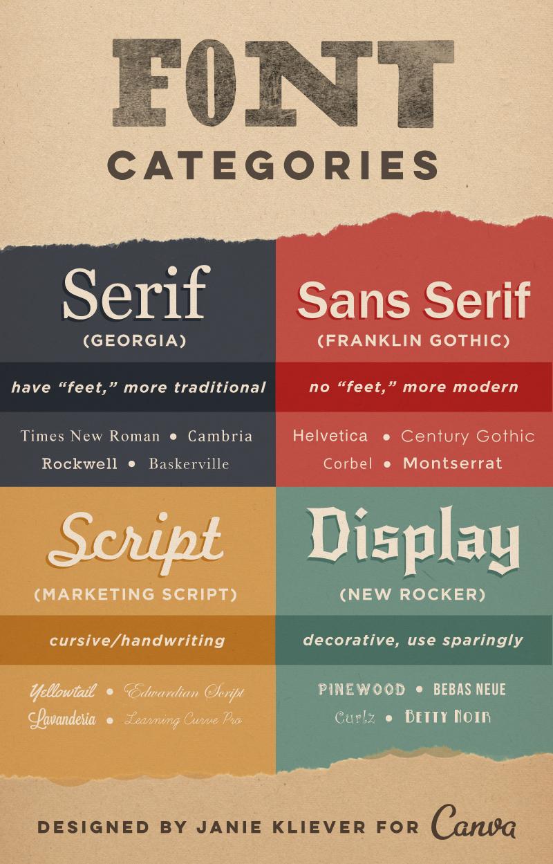
12 CHOOSING FONTS There are four basic font categories that are useful to understand when choosing a suitable fonts for your design projects. Serif fonts - have little feet or lines attached the ends of their letters. They re generally thought to look more serious or traditional. Sans-serif - these fonts don t have the extra lines on the ends of letters. For that reason, they re generally thought to look more modern and streamlined. Scripts are what we might think of as cursive- or handwriting-style fonts. Decorative or Display - fonts that are meant to get your attention. They re often more unusual than practical and should only be used in small doses and for a specific effect or purpose.
13
14 WHY FONTS MATTER Font choices often set the tone for the whole design and can influence viewers feelings toward and interactions with your design Bad typographic choices always distract from your design s message and intentions. Do the elements of your font clash, or do they complement each other? Are they effectively communicating the qualities you want to project? These considerations are part of what makes choosing fonts such an important part of the design process, one that should be approached thoughtfully.
15 CHOOSING A FONT Your first concern when choosing a font for a project should be that it matches the message or purpose of your design. Brainstorm some of the qualities or characteristics that you want your design to communicate. You ll need to determine what a particular font is saying to you, and whether that fits with your design. Where and how your design will be viewed should also figure into your font choices.
16 COMBINING FONTS Choosing two or more fonts to use together can be tricky. You want the fonts to complement each other, but not be too similar. Fonts that look significantly different but share something in common are more likely to work well together. Things like; general proportions, letter height or width etc. Even if the similarity is subtle, it will help give your font combination a basic cohesiveness. Your chosen fonts will need to be different enough that they create a clear visual hierarchy showing viewers where to look and what s important. One sans-serif and one serif font are often enough to do this effectively.
17 WHAT ABOUT TYPOGRAPHY? Typography is how text looks, which is the cumulative result of many small decisions like the font in use, the font size, the line length (for example, the width of a paragraph), and the line spacing. Typography encompasses every element in a composition, from paragraphs to headings, lists, navigation, forms, and more, as well as the spaces between and around those elements. Negative space, or white space, also plays an important role in typography. The amount of white space in and around glyphs (characters), and its proportional relationship to the positive shapes of glyphs, gives us an idea of whether the typeface feels balanced. The same goes for the composition in its entirety the white spaces in and around text blocks, like margins and gutters, give us an idea of compositional balance when we compare them to the positive shapes of text blocks.
18 REFERENCES: Font Design - How Designers Choose Which Fonts To Use, Janie Kliever, Canva Design School Typography is how text looks, Typekit Practice
19 PLANNING CONTENT The first thing you should start to do when you're working on a new project is plan! When you have a project that is well planned, it's much more likely that the project will run smoothly.
20 COLLECTING CONTENT In the development stage, working with real content means that you can see how this content interacts with the other design elements on a page so the sooner you get some real content and stop using dummy text etc, the sooner you see your project take shape. Once you have collected content, the first thing you want to do is analyse it and see if you can spot anything that needs changing or removing. When you're sorting content, you also want to try and think about the relationships between all of the content look to see if you can spot any modular or common patterns to the content and keep these in mind.
21 Content Hierarchy Hierarchy is "a system in which things are ranked one above the other". In ideal terms, we are trying create a system that displays our content in a meaningful and useful way. When you are sorting through content, ensure that you are always thinking about how the content relates - you really want to think about making the content as easy to digest as possible. Think about using headings, lists, quotes, imagery and more to break up the content and make it easier to communicate more focused messages to the users. Once you're happy with the state of your content, you need to start looking at how it will work in the finished publication.
22 SITE MAPS

23 FLOW CHART
24 REFERENCES: Planning a Design Project, Rachel Shillcock, Tuts Plus How to Flow Chart, Liza Mock, Gliffy Blog
25 MOCKUPS + PROTOTYPES Once you've finished working with your content - great news! You get to start thinking about the actual design. Sketching out initial ideas can be a great way to visually play you don't have to draw really pretty pictures or make sure the sketches you do are neat - the idea is to visually note down as many ideas as possible, as quickly as possible. The best thing you can do with sketching is to experiment. It doesn't matter if you make a mistake, or something doesn't look right to you, as you can easily just move on to the next sketch.
26 WIREFRAMES After sketching, there is one final thing you should work on before starting to design (although, admittedly, this is all part of designing). Wireframing is essentially a visual guide to a website which helps you to look at layout without thinking about the aesthetics of the project. The idea of a wireframe is to be able to display the visual layout and flow of a project, without the distractions of design details such as colour, typography etc. The main focus of wire-framing is understanding the viewers experience of a project. You want to make sure all of the essential elements are present e.g. headings, page numbers, links, navigation etc.
27 Good Wireframes A well-designed wireframe is one that keeps in mind that the content is the most important thing on the page and is sympathetic to displaying that content in a manner that is suitable for the project and its end users. When you're designing your wireframes, one thing you should think about is the flow of the page - look at the way the content sits on the page and how it flows from one section of content to another. The aim here is to make sure that the content reads correctly and that you the eye moves fluidly from one section to the next.
28 EXAMPLE:
29 REFERENCES: Sketching and Your Design Workflow Introducing Wireframes to Your Design Process, Rachel Shillcock, Tuts Plus
30 EXERCISE Working in groups of 3-4 students you are asked to develop a sitemap and wireframe for a hypothetical website based on one of the printed publications distributed in class. Consider the design decisions that went into what you see the colour choices, the font selection, the small details, the spaces etc. What is the purpose of this publication? What are the major categories that you will employ to group information? Is there a natural taxonomy that you can apply to this information? Does the information itself suggest a certain grouping approach? What relationships exist between the categories of information? The results will be presented to the rest of the class.
UNT 2: Elements of Design
 You need to keep in mind that when you are creating your website it should: suit your target audience have a good quality color blending image support friendly fonts The basic principles you need to follow
1. Kuler 2. Usability 3. Audience 4. Vibrancy 5. complementation 6. Contrast 7. Flow 8. Whitespace 9. Alignment 10. Navigation
 Your Name:.... Grade 9 - SECTION 1 Matching :Match the terms with its explanations. Write the matching letter in the correct box. The first one has been done for you. (1 mark each) Term Explanation 1.
C L A S S 2 T Y P O G R A P H Y. FOUNDATIONS OF GRAPHIC DESIGN MW 8 a.m.
 C L A S S 2 T Y P O G R A P H Y FOUNDATIONS OF GRAPHIC DESIGN MW 8 a.m. Typography Typography separates graphic design from visual art. In every piece of type you see, somebody has considered how the letters,
Format and Layout 8/31/2012. Using Visuals to Inform and Persuade
 ENG112 Prof. Katherine Delhagen *No sound read every slide of the presentation carefully Using Visuals to Inform and Persuade Effective technical communication integrates textual and visual elements: o
OCA Graphic Design: Core Concepts 1 Assignment 5 - Penguin Books Jane Braybrook Jane511794
 OCA Graphic Design: Core Concepts 1 Assignment 5 - Penguin Books Jane Braybrook Jane511794 Supporting Blog Post: https://jane511794.wordpress.com/category/assignments/assignment-5/ Critical Evaluation
Typographic hierarchy: How to prioritize information
 New York City College of Technology, CUNY Department of Communication Design Typographic Design III Instructor: Professor Childers pchilders1@mac.com Typographic hierarchy: How to prioritize information
Good Publication Design
 Good Publication Design The top ten tips for creating professional print documents How do I create a well-designed print publication? Good publication design is an art form. Attractively presenting written
CSS gives great power. But requires great responsibility.
 CSS gives great power. But requires great responsibility. You can do almost anything with CSS. You can do almost anything with CSS. Change colors You can do almost anything with CSS. Change colors, opacity
Typographic. Alphabet. Book. Interactive PDF of typographic rules & terms YOU NEED TO KNOW. Home. Table of Contents
 Typographic Alphabet Table of Contents > Rules That Every Typographer Should Know... 2-3 Book Interactive PDF of typographic rules & terms YOU NEED TO KNOW > Baseline... > Gutter... > Hierarchy... > Kerning...
ABOUT RESEARCH POSTERS
 ABOUT RESEARCH POSTERS Research posters summarize information or research concisely and attractively to help publicize it and generate discussion. The poster is usually a mixture of a brief text mixed
InDesign. your. Resumé. a how-to guide for creating a professional resumé using InDesign
 InDesign your Resumé a how-to guide for creating a professional resumé using InDesign Table of Contents p4. Glossary p5. The Importance of Good Design p6. Setting up the Document p10. Creating a Grid p12.
UNIVERSITY HOUSING COMMU- NICATION GUIDE TO DESIGN
 UNIVERSITY HOUSING COMMU- NICATION GUIDE TO DESIGN INTRODUCTION Hello and welcome to the University Housing Communication Guide to Design! In this book, you will find various guides to help you enhance
ONE K CREATIVE. tools for social impact storytelling: CREATING A CONSISTENT BRand
 ONE K CREATIVE tools for social impact storytelling: CREATING A CONSISTENT BRand key elements to define for brand consistency DEFINING THE BASIC ELEMENTS OF YOUR BRAND ALLOWS YOUR TEAM - STAFF, BOARD MEMBERS,
Exemplar for Internal Achievement Standard. Technology Level 1
 Exemplar for Internal Achievement Standard Technology Level 1 This exemplar supports assessment against: Achievement Standard 91046 (B) Use design ideas to produce a conceptual design for an outcome to
The Surface Plane. Sensory Design
 The Surface Plane Sensory Design The Surface Plane At the top of the five-plane model, we turn our attention to those aspects of the product our users will notice first: the sensory design. Here, content,
> creative résumé. > specifications: save as: Resume_Lastname.ai dimensions: 8.5" x 11" or 11" x 8.5" mode: CMYK
 > creative résumé > objective(s): Students will create an eye-popping, visually impacting résumé using current trends in graphics, color and typography. > curricular focus: This lesson emphasizes the graphic
Typography in Design The principles of design describe the ways that artists use the elements of art in a work of art.
 Typography in Design The principles of design describe the ways that artists use the elements of art in a work of art. Aims & Outcomes: Aims: to understand typeface categories and how they are used in
 Page 1 of 11 Units: - All - Teacher: WebPageDesignI, CORE Course: WebPageDesignI Year: 2012-13 Introduction to the World of Web Standards Why do web development standards play a key role in the proliferation
The Deerbrook Web Style Guide
 The Deerbrook Web Style Guide Table of Contents Introduction Agency Dashboard 2 Customer Data Window 3 Creative Brief Page Structure Agency Dashboard 5 Customer Data Window 7 Typography Color Photography
DESIGNING THE PAGE FOUNDATIONS OF DIGITAL DESIGN. Layout composition, the grid and typography. Prof. Eva Machauf
 DESIGNING THE PAGE Layout composition, the grid and typography FOUNDATIONS OF DIGITAL DESIGN Prof. Eva Machauf prof.machauf@gmail.com THE GRID The grid is the foundation of all design. Creating and working
A Crash Course in Typography: Principles for Combining Typefaces - noupe
 A Crash Course in Typography: Principles for Combining Typefaces Cameron Chapman When combining typefaces, there are a couple of important principles you ll need to keep in mind, namely contrast and mood.
Presented by Dr. Mariah Judd February 15, 2013
 Presented by Dr. Mariah Judd juddm@iupui.edu February 15, 2013 » What are the first things you notice? Color Pictures Title Figures Section titles Bullets.text » Brain storm ideas for what you want your
Preview from Notesale.co.uk Page 2 of 61
 Modify a table Applying styles to tables; banding rows and columns; inserting total rows; removing styles from tables Filter and sort a table Filtering records; sorting data on multiple columns; changing
Graphic design. Tips for non-designers! Anne-Marie Miller carbonorange.com
 Graphic design Tips for non-designers! Anne-Marie Miller carbonorange.com Typography White space Contrast Balance Images Colour Layout Shape Line! !?The goal to good design is firstly and most importantly
STONELAW HIGH GRAPHIC
 GRAPHIC COMMUNICATION Technical Education THE A to Z of DTP Your knowledge of desktop publishing terminology will be expanded as you progress within the subject THE A to Z of DTP ALIGNMENT positions of
Typesetting Tips. Put your best type forward.
 Typesetting Tips Put your best type forward. Do you want your audience to read your document? Improve your chances by making your article easy to read. Make the document difficult to read and To learn
Digital Design: How to disseminate ideas, research and good practice in a visually stimulating way. Dawne Bell December 2015
 Digital Design: How to disseminate ideas, research and good practice in a visually stimulating way. Dawne Bell December 2015 This workshop has been devised as a direct result of feedback by colleagues
LOGO & BRAND STANDARDS GUIDE
 LOGO & BRAND STANDARDS GUIDE INTRODUCTION The SparkPost Brand Standards Guide provides key information needed to accurately and consistently produce external and internal documents and communications.
Document Design Chunking Similar Information Together
 Document Design Dieter Rams, a famous German designer whose work has influenced Apple s design aesthetic, is noted for his formula: Good design is as little design as possible (Rams). As a document designer,
In this lesson: Line height, type size and line width are the three aspects of shaping a perfect paragraph. Lesson 2
 In this lesson: Line height, type size and line width are the three aspects of shaping a perfect paragraph. Lesson 2 The reader should be able to read the message of a text easily and comfortably. This
8/19/2018. Web Development & Design Foundations with HTML5. Learning Objectives. Overall Design Is Related to the Site Purpose. Website Organization
 Web Development & Design Foundations with HTML5 Ninth Edition Chapter 5 Web Design Slides in this presentation contain hyperlinks. JAWS users should be able to get a list of links by using INSERT+F7 Learning
Brand Identity Guide. September 2017
 Brand Identity Guide September 2017 Welcome At Canada Drives our goal is to be the number one consumer lending company in Canada by making financing simple and accessible to every Canadian while maintaining
Topic 0b Graphics for Science & Engineering
 Course Instructor Dr. Raymond C. Rumpf Office: A 337 Phone: (915) 747 6958 E Mail: rcrumpf@utep.edu Topic 0b Graphics for Science & Engineering EE 4386/5301 Computational Methods in EE Outline What are
> objective(s): Students will create a text-only design in either Adobe Illustrator or Photoshop
: Students will create a text-only design in either Adobe Illustrator or Photoshop") > word art > objective(s): Students will create a text-only design in either Adobe Illustrator or Photoshop > curricular focus: This lesson emphasizes the creative use of typography as the dominant artistic
> word art > objective(s): Students will create a text-only design in either Adobe Illustrator or Photoshop > curricular focus: This lesson emphasizes the creative use of typography as the dominant artistic
In your lifetime you ve seen billions of letters and millions of words, yet you might never have consciously noticed the typefaces you read.
 In your lifetime you ve seen billions of letters and millions of words, yet you might never have consciously noticed the typefaces you read. Type is important because it is an unconscious persuader. It
TYPO GRA PHY THE ANATOMY OF TYPE A BRIEF HISTORY OF TYPOGRAPHY WHAT IS YOUR TYPE ACTUALLY SAYING? OPEN FONT DISCUSSION
 THE ANATOMY OF TYPE A BRIEF HISTORY OF TYPO WHAT IS YOUR TYPE ACTUALLY SAYING? OPEN FONT DISCUSSION THE ANATOMY OF TYPE Typeface Anatomy The upward vertical stem on some lowercase letters, such as h and
TRINET INTERNET SOLUTIONS, INC.
 TRINET INTERNET SOLUTIONS, INC. 1. Headquartered in Orange County, California with Offices in Washington D.C. and Dallas 2. Industry leading, full-service digital agency for 22 years 3. Expert capabilities
Graphic Design Starter Pack
 Graphic Design Starter Pack Graphic Design Contact Us// E-mail: graphic.design@shawacademy.com www.shawacademy.com Hello This Starter Pack aims to give you a better understanding of what Graphic Design
The following slides present guidelines and suggestions for the use of fonts, colors, and graphics when preparing PowerPoint presentations.
 PowerPoint Presentation Guidelines The following slides present guidelines and suggestions for the use of fonts, colors, and graphics when preparing PowerPoint presentations. This media (PPT) is designed
Essentials for Text and Graphic Layout
 5. Essentials for Text and Graphic Layout This section provides specific text and graphic guidelines that will help create a unified series of interpretive signs around Humboldt Bay. Text refers to the
PRESENTATION BOARD LAYOUT
 NEW YORK CITY COLLEGE OF TECHNOLOGY THE CITY UNIVERSITY OF NEW YORK ARCHITECTURAL TECHNOLOGY DEPARTMENT written by annie boccella spring 2010 1. BEFORE YOU BEGIN... Organize yourself. What is your argument
Typography 2! HCC 710 2/1 /13. Human&Centered,Compu/ng,at,University,of,Maryland,,Bal/more,County
 Typography 2! HCC 710 2/1 /13 1, Human&Centered,Compu/ng,at,University,of,Maryland,,Bal/more,County Letterform Critiques! 25-30 minutes 2, Wordpress Questions / " Graphic Design Inspirations! 3, Human&Centered,Compu/ng,at,University,of,Maryland,,Bal/more,County
Designing Research Posters. College of Art and Design Chris Jackson, Associate Dean Keli DiRisio, Assistant Professor
 Designing Research Posters College of Art and Design Chris Jackson, Associate Dean Keli DiRisio, Assistant Professor Size and Orientation If you are NOT using the poster template: Start is with a 48"
recruitment Logo Typography Colourways Mechanism Usage Pip Recruitment Brand Toolkit
 Logo Typography Colourways Mechanism Usage Primary; Secondary; Silhouette; Favicon; Additional Notes; Where possible, use the logo with the striped mechanism behind. Only when it is required to be stripped
On the Web sun.com/aboutsun/comm_invest STAROFFICE 8 DRAW
 STAROFFICE 8 DRAW Graphics They say a picture is worth a thousand words. Pictures are often used along with our words for good reason. They help communicate our thoughts. They give extra information that
ADDENDUM. PRINCIPLES OF DESIGN COURSE Topic YouTube link QR Code
 ADDENDUM PRINCIPLES OF DESIGN COURSE Topic YouTube link QR Code Topic 1 Introduction to Graphic Design https://youtu.be/pacrrojlvui This video discussed on essential skills of a graphic design and its
Web Development & Design Foundations with HTML5
 1 Web Development & Design Foundations with HTML5 CHAPTER 5 WEB DESIGN Copyright Terry Felke-Morris 2 Learning Outcomes In this chapter, you will learn how to... Describe the most common types of website
 User Interfaces Assignment 3: Heuristic Re-Design of Craigslist (English) Completed by Group 5 November 10, 2015 Phase 1: Analysis of Usability Issues Homepage Error 1: Overall the page is overwhelming
TOOLKIT for Making Written Material Clear and Effective. SECTION 2: Detailed guidelines for writing and design
 TOOLKIT for Making Written Material Clear and Effective SECTION 2: Detailed guidelines for writing and design PART 5 Understanding and using the Toolkit Guidelines for Graphic Design Chapter 4 Guidelines
Part 1 The Elements of Design. Lines
 Part 1 The Elements of Design There are seven elements of graphic design that are the starting point of your design ideas: Line, Shape, Texture, Space, Size, Value and Color. Each of these elements is
BRAND & LOGO GUIDELINES SOCKET MOBILE. - Logos - Social Media - Web
 BRAND & LOGO GUIDELINES - Logos - Social Media - Web SIMPLICITY IS THE ULTIMATE FORM OF SOPHISTICATION. 2 BRAND GUIDELINES THIS IS A GUIDE TO THE BASIC ELEMENTS THAT MAKE UP OUR BRAND. IT WILL LET YOU
Fast Company Homepage This ad is very distracting and grabs the viewer attention more than the logo and navigation. It could cause the user to overloo
 Competitive Review Fast Company Homepage Doing well: It has a bold and modern feel that appeals to the internet audience. Doing poorly: The layout is confusing as to which elements match up and it's unclear
Teaching with Primary Sources
 Teaching with Primary Sources Joining Educators and Students with Library of Congress Resources Creating a Presentation with PowerPoint 2007 Benefits of using PowerPoint in lectures: PowerPoint encourages
FOUNDATION IN GRAPHIC DESIGN. with ADOBE APPLICATIONS
 FOUNDATION IN GRAPHIC DESIGN with ADOBE APPLICATIONS CAN YOU ALL HEAR ME? LESSON 8 Graphic Design for Web ELEMENTS LINE SHAPE (FORM) COLOUR TEXTURE MASS (SIZE) SPACE PRINCIPLES ALIGNMENT BALANCE CONTRAST
Font classification review
 Font classification review Taken from Lettering & Type by Bruce Willen Nolen Strals Old Style Transitional Modern Slab Serif Garamond ag Baskerville ag Bodoni ag Cowboys ab Sans Serif Gill Sans ag Decorative
Introduction to Digital Communications
 Directions: Fill in the blanks. Defining Digital Communication Segment 1. Digital Communication Is the ability to create and a message using different technological devices, including: radio television
GÉANT CORPORATE IDENTITY GUIDELINES FOR USE. connect communicate collaborate
 GÉANT CORPORATE IDENTITY GUIDELINES FOR USE connect communicate collaborate THE LOGO The GÉANT logo is the core element within the brand. From printed brochures and datasheets through PowerPoint presentations
DIGITAL BANNER ADVERTISING GUIDELINES
 1 DIGITAL BANNER ADVERTISING GUIDELINES Version 1.0 March 2017 This document is subject to periodic revision. Please check www.leeds.ac.uk/comms to make sure you have the most recent version. Contents
Unit 4. Multimedia Element: Text. Introduction to Multimedia Semester 2
 Unit 4 Multimedia Element: Text 2017-18 Semester 2 Unit Outline In this unit, we will learn Fonts Typography Serif, Sans Serif, Decorative Monospaced vs. Proportional Style Size Spacing Color Alignment
2/1/2016. Discuss website usability essentials Explain principles of design Critique a website in terms of usability and design
 Due Tuesday, Feb. 9 upload to Blackboard Locate five HTML (not Flash) websites you believe exhibit good web design, usability and accessibility principles. Each website s critique is worth 10 points (50
Font Basics. Descender. Serif. With strokes on the extremities of the letters. T Script. Sans-Serif. No strokes on the end of the letters
 Font Basics Ascender Font Size d p x A X-height Cap height Counter The white space within letters Descender Bar A Serif With strokes on the extremities of the letters. T A Sans-Serif No strokes on the
DESIGN AND BRAND GUIDELINES
 DESIGN AND BRAND GUIDELINES Address Phone & Fax Online LinkResearchTools GmbH LeonardBernsteinStraße 10/ Floor 7 Saturn Tower 1220, Vienna, Austria, Europe Phone AT: +43 720 116 440 Phone US: +1 866 3473660
UNC Eshelman School of Pharmacy
 UNC Eshelman School of Pharmacy Brand Guide FINAL Typography The primary typeface is Fira Sans (Hair, Extra Light, Book, Bold, Extra Bold as well as matching italic equivalents). This has been carefully
INTRODUCTION TO TYPOGRAPHY DESIGN
 INTRODUCTION TO TYPOGRAPHY DESIGN Goals of typographic design Typography plays an important role in how audiences perceive your document and its information. Good design is about capturing your audience
เพ มภาพตามเน อหาของแต ละบท. Basic of Web Design by Assoc. Prof. Churee Techawut and Dr. Ratsameetip Wita adapted into English by Dr.
 เพ มภาพตามเน อหาของแต ละบท http://highlevelstudios.com/images/basic_design.jpg Basic of Web Design by Assoc. Prof. Churee Techawut and Dr. Ratsameetip Wita adapted into English by Dr. Prakarn Unachak 1.
Contents. 3 About These Guidelines. 4 Why is a Brand Important? 5 Overview. 6 Resources. 7 Logo/Signature. 8 Clear Space. 9 Color Variations
 Brand Guidelines Contents 3 About These Guidelines 4 Why is a Brand Important? 5 Overview 6 Resources 7 Logo/Signature 8 Clear Space 9 Color Variations 10 Logo Misuse Examples 11 Background Control 12
CONCEIVING YOUR WEBSITE & ONLINE COMMUNICATIONS STRATEGY: A Helpful Guide Written by Amy Lenzo, under Creative Commons Licensing
 CONCEIVING YOUR WEBSITE & ONLINE COMMUNICATIONS STRATEGY: A Helpful Guide Written by Amy Lenzo, under Creative Commons Licensing For most of us, an effective web site is an essential tool in today s world,
VOICE OF TYPE LECTURE 1
 VOICE OF TYPE LECTURE 1 TYPOGRAPHY II COUNTY COLLEGE OF MORRIS PROFESSOR GAYLE REMBOLD FURBERT VOICE OF TYPE As you look at typefaces, analyze their forms, learn their history and learn how to use them
Helvetica Type Specimen Process book
 Helvetica Type Specimen Process book Project Goal Using the history and typeface of Helvetica to inspire my design, the goal of this project was to create a booklet that would essentially sell the type
Brand Overview COLORS / FONTS / LOGOS rd Street, Suite 210 Denver, CO communityengineeringcorps.org
 Brand Overview COLORS / FONTS / LOGOS 1031 33rd Street, Suite 210 Denver, CO 80205 720 204-3194 Color Palette PRIMARY COLORS PRIMARY PALETTE For most situations, it is important to utilize the two main
logo 101 A solid logo design intake ensures that no time is wasted, and that you receive targeted logo options as soon as possible. Getting results.
 logo logo 101 2 logo 101 A solid logo design intake ensures that no time is wasted, and that you receive targeted logo options as soon as possible. Getting results. Our goal is to help you communicate
Neon Carrot Prototype I Evaluation. Dan Cody, Logan Dethrow, Ben Fisher, Jeff Stanton April 6, Preamble
 Neon Carrot Prototype I Evaluation Dan Cody, Logan Dethrow, Ben Fisher, Jeff Stanton April 6, 2009 Preamble Overall, we were impressed with the prototype's visual style, although some interface elements
BRAND GUIDE L I N E S
 BRAND GUIDE LINES NETWORK OF COMMUNITY MINISTRIES SIMPLICITY IS THE ULTIMATE FORM OF SOPHISTICATION. Leonardo da Vinci 2 BRAND GUIDELINES THIS IS A GUIDE TO THE BASIC ELEMENTS THAT MAKE UP OUR BRAND. IT
Module 9 Kelsie Donaldson Casey Boland Nitish Pahwa. IMDb, August 13th, 2002
 Module 9 Kelsie Donaldson Casey Boland Nitish Pahwa IMDb, August 13th, 2002 IMDb.com Sitemap Landing Page Navigation bar News Forums Awards Movies TV Box office Search bar Header Site title logo Footer
Publisher 2007 Creating Flyers and Brochures
 MS Publisher 2007 User Guide Publisher 2007 Creating Flyers and Brochures THE NATURE OF DESKTOP PUBLISHING - INTRODUCTION Publisher is a desktop publishing program. You can create publications that
Publisher 2007 Creating Flyers and Brochures
 MS Publisher 2007 User Guide Publisher 2007 Creating Flyers and Brochures THE NATURE OF DESKTOP PUBLISHING - INTRODUCTION Publisher is a desktop publishing program. You can create publications that use
WEB TYPOGRAPHY FOR WEB DEVELOPERS. Matej Latin Lead UX/UI Designer at Autotrader.co.uk
 WEB TYPOGRAPHY FOR WEB DEVELOPERS Matej Latin Lead UX/UI Designer at Autotrader.co.uk 1 A MEANINGFUL WEB TYPOGRAPHY STARTER KIT 2 Most people think typography is about fonts. Most designers think typography
Visual Design and Imaging Alignment
 Visual Design and Imaging Alignment This document contains information about four Career-Technical Articulation Numbers (CTANs) for the Visual Design and Imaging Alignment Career-Technical Assurance Guide
Maxis brand guide. OOH guidelines. Version 1.0
 Maxis brand guide OOH guidelines Version 1.0 Core elements Colours Colour palette - print Squiggle exists only in one colour. Maxis Shock Green. This is the primary, go-to colour and should be the most
Natural Building Technologies. Redesign Proposal
 Natural Building Technologies Redesign Proposal Structure Notes A Familiar Site Map Home Our initial thoughts for structuring Natural Building Technologies new site is largely to keep things the same,
How we look. Brand Guidelines version 1.1
 How we look. Brand Guidelines version 1.1 TOUCHTUNES Simplicity is the ultimate form of sophistication. Leonardo da Vinci 2 BRAND GUIDELINES This is a guide to the basic elements that make up our brand.
PAGE LAYOUT IN GRAPHIC DESIGN Where do you start when you want to create an attractive and effective design?
 PAGE LAYOUT IN GRAPHIC DESIGN Where do you start when you want to create an attractive and effective design? Aims & Outcomes for this week: Aims: To understand the three main page layout conventions used
Brand Guidelines Solano County Transit (SolTrans)
") Brand Guidelines Solano County Transit (SolTrans) May 2018 Table of Contents The SolTrans Story... 1 Brand Elements... 2 Logo Usage... 3 Color Palette... 7 Typography.... 8 Photography.... 9 The SolTrans
Brand Guidelines Solano County Transit (SolTrans) May 2018 Table of Contents The SolTrans Story... 1 Brand Elements... 2 Logo Usage... 3 Color Palette... 7 Typography.... 8 Photography.... 9 The SolTrans
15 NEUROMARKETING. Mind Hacks. You Need To Be Using
 15 NEUROMARKETING Mind Hacks You Need To Be Using Research suggests that there are definite behavioral patterns that most people follow almost automatically, and understanding those patterns gives you
Cartographic Principles: Map design
 MSc GIS: GIS Algorithms and Data Structures Cartographic Principles: Map design Martin Dodge (m.dodge@ucl.ac.uk) With Changes by Dan Ryan http://www.casa.ucl.ac.uk/martin/msc_gis/ some (scientific) rules
Adobe CC as Wireframe and Web Design Tool
 Start designing by doing very rough sketches on paper, or lately more often, if not near my office desk, on my ipad or smartphone screen. These sketches focus thoughts regarding the chosen concept and
Dreamweaver Tutorial #2
 Dreamweaver Tutorial #2 My web page II In this tutorial you will learn: how to use more advanced features for your web pages in Dreamweaver what Cascading Style Sheets (CSS) are and how to use these in
TOP 10 DESIGN MISTAKES
 TOP 10 DESIGN MISTAKES 1. Sizing Issues: This part is too big, that part is too small 2. Lack of Sharing Buttons: We want to share but how or where? 3. Mismatched Purpose: Site doesn't fit your goals 4.
Slide 1. Slide 2. Slide 3. Consistency. Consistency
 Slide 1 Designing Effective Poster Presentations Reid Sczerba Center for Educational Resources, JHU This presentation will discuss how to Design Effective Poster Presentations with an understanding of
Total Responses 13. Please list and explain every single design decision you made in presenting this work.
 Initial Report Total Responses 13 Please write an explanation for the layout of the page -- or email -- that you are turning in today: Why did you choose the typeface(s) you did? Why did you choose the
Brand Guidelines. version
 Brand Guidelines version 2017.1 Primary Logo The OPSWAT logo is a universal signature spanning all of our communications. Because it is such a recognizable and highly visible asset, it s important that
O M. O M logo specs. O M O M O M O M
 overview. The useum of odern Art, or oa, is an art museum in anhattan that holds and displays a wide range of modern and contemporary art. oa is considrered to be one of the most influential museums in
OUTLINE. Advanced Technical Communication & Writing Skills. What is technical communication? Technical communication skills
 Advanced Technical Communication & Writing Skills What is technical communication? Technical communication skills Principles of technical writing Technical writing is interpreting Planning is crucial Technical
MARKING RUBRIC / FICHE DE NOTATION GRAPHIC DESIGN INFOGRAPHIE POST-SECONDARY AND SECONDARY / NIVEAU POSTSECONDAIRE ET SECONDAIRE
 MARKING RUBRIC / FICHE DE NOTATION GRAPHIC DESIGN INFOGRAPHIE POST-SECONDARY AND SECONDARY / NIVEAU POSTSECONDAIRE ET SECONDAIRE Creative Aesthetic (Subjective Marking Rubric) Appropriate to the Target
COMP 388/441 HCI: 09 - Balancing Function and Fashion Balancing Function and Fashion
 09 - Balancing Function and Fashion Lecture 09 - Overview This lecture deals with five design matters that are functional issues [...] but also leave room for varying styles to suite a variety of users.
INTERNAL COMMUNICATION HOW TO DESIGN A NEWSLETTER
 1. Subject of the workshop. INTERNAL COMMUNICATION HOW TO DESIGN A NEWSLETTER 2. Goal of the workshop. Be able to point out the typical design mistakes en know how to improve the design by using the tips
Accessible Documents & Presentations. By Amy Maes, DNOM
 Accessible Documents & Presentations By Amy Maes, DNOM 1 Overview Accessibility: What am I required to do? Disability Characteristics Creating an Accessible Word Document & PowerPoint Presentation v2010
IDENTITIES ARE THE BEGINNING OF EVERYTHING. THEY ARE HOW SOMETHING IS RECOGNIZED AND UNDERSTOOD. WHAT COULD BE BETTER THAN THAT?
 BRAND GUIDELINES IDENTITIES ARE THE BEGINNING OF EVERYTHING. THEY ARE HOW SOMETHING IS RECOGNIZED AND UNDERSTOOD. WHAT COULD BE BETTER THAN THAT? Paula Scher Paula Scher is an American graphic designer,
15-Minute Fix: A Step-by-Step Guide to Designing Beautiful Dashboards
 15-Minute Fix: A Step-by-Step Guide to Designing Beautiful Dashboards With a dashboard, every unnecessary piece of information results in time wasted trying to filter out what s important. Stephen Few,
USE OF THIS GUIDE. Sally Mapley England Hockey Player Pathway Manager
 BRAND GUIDELINES USE OF THIS GUIDE The England Hockey Player Pathway uses a wide range of communications to interact with its stakeholder and users. As a Volunteer, Administrator or Coach, every piece