An Investigation into the Applicability of Usability Guidelines for Small Screen Interfaces. David Russell BSc in Computer Science 2003/2004
|
|
|
- Lesley Webster
- 5 years ago
- Views:
Transcription
1 An Investigation into the Applicability of Usability Guidelines for Small Screen Interfaces David Russell BSc in Computer Science 2003/2004
2 An Investigation into the Applicability of Usability Guidelines for Small Screen Interfaces submitted by David Russell COPYRIGHT Attention is drawn to the fact that copyright of this thesis rests with its author. The Intellectual Property Rights of the products produced as part of this project belong to the University of Bath (see This copy of the thesis has been supplied on condition that anyone who consults it is understood to recognise that its copyright rests with its author and that no quotation from the thesis and no information derived from it may be published without the prior written consent of the author. DECLARATION This dissertation is submitted to the University of Bath in accordance with the requirements of the degree of Batchelor of Science in the Department of Computer Science. No portion of the work in this dissertation has been submitted in support of an application for any other degree or qualification of this or any other university or institution of learning. Except where specifically acknowledged, it is the work of the author. Signed: Date: This thesis may be made available for consultation within the University Library and may be photocopied or lent to other libraries for the purpose of consultation. Signed: Date:. II
3 Abstract This dissertation investigates the applicability of Nielsen s usability guidelines in the context of small screen devices. Usability guidelines, such as those produced by Nielsen et al (2001) and Shneiderman (1998), provide a framework for interface designers to follow, to aid in the production of a usable interface. Although useful for interface design in general, none of them have been produced specifically for small screen devices. Using a user centred design approach, a prototype interface will be produced to evaluate against an existing interface of a small screen device, to examine the applicability of these guidelines. It is concluded that Nielsen s usability guidelines cannot be directly applied to small screen interfaces, and require modification to be considered applicable. It also produces new specific usability guidelines for small screen devices. III
4 Acknowledgements I would like to start by expressing my thanks towards my project supervisor, Dr Hilary Johnson, whose guidance throughout this dissertation has been much appreciated. I would also like to thank everyone who spared some of his or her time to help with this project. I would like to say a special thank you to Andrew Warr, who continually took the time to provide insights and suggestions throughout the duration of this dissertation. Lastly I would like to say thank you to my girlfriend, Hanna, for providing loving support throughout my time at University, especially this year. IV
5 Contents Page 1 INTRODUCTION THE PROBLEM AIMS OBJECTIVES DOCUMENT STRUCTURE LITERATURE SURVEY INTRODUCTION REPRESENTATIVE DEVICE AND APPLICATION PREVIOUS WORK Existing Solutions Summary DESIGNING INTERFACES ON SMALL SCREEN DEVICES The User Types of User Users Cognitive and Perceptual Abilities User s Personalities Users Cultural Differences Physical and Software Attributes Modification Input Mechanisms The Display User Interaction Widgets Labels Text Colours USABILITY GUIDELINES Nielsen s Guidelines Shneiderman s Guidelines INTERACTION DESIGN LIFE CYCLE FOR SMALL SCREEN DEVICES Requirements Analysis Design Prototyping Evaluation CONCLUSION REQUIREMENTS ANALYSIS INTRODUCTION REQUIREMENTS CAPTURE Gathering Data for Requirements Task Evaluation Technique Task Evaluation Findings The Survey The Tasks V
6 3.2.4 Heuristic Evaluation Technique Heuristic Evaluation Findings REQUIREMENTS List of Requirements Interface Requirements User Requirements CONCLUSION UI DESIGN & PROTOTYPING INTRODUCTION DESIGN TECHNIQUE USER CENTRED DESIGN Interviews User Interview Technique User Interview Findings User Focus Groups User Focus Group Technique User Focus Group Findings PROTOTYPE Producing the Prototype CONCLUSION Interface Requirements User Requirements Summary EVALUATION INTRODUCTION EVALUATION TECHNIQUE EVALUATING THE INTERFACE Usability Testing Technique Usability Testing Findings User Interview Technique User Interview Findings User Interface Preference Applicability of Usability Guidelines Other Usability Guidelines CONCLUSION CONCLUSION INTRODUCTION A PROJECT OVERVIEW Chapter 1 Introduction Chapter 2 Literature Survey Chapter 3 Requirements Analysis Chapter 4 UI Design & Prototyping Chapter 5 Evaluation USABILITY GUIDELINES Applicable Existing Guidelines Un-applicable Existing Guidelines VI
7 6.3.3 New Guidelines FUTURE WORK Extension of current work Accelerators for small screen devices Gesture Recognition Marking Menus Optimal point for screen clutter Experimentation of window switching CRITICAL APPRAISAL CONCLUSION BIBLIOGRAPHY APPENDICES...I APPENDIX A...II User Survey...II Sample User Survey... III APPENDIX B... IV Task Evaluation Findings...IV User 1... IV User 2...V User 3...VII APPENDIX C... IX User Interview Questions...IX Toolbar Layout... IX Which actions to display as Icons...X Design of Icons... XI User Interview Design Mock-ups... XII User 1...XII User 2...XIII User 3 Choice 1... XIV User 3 Choice 2...XV User 4... XVI APPENDIX D...XVII User Focus Group Findings...XVII Screenshots of the Prototype Interface... XIX Screenshots of the Original Interface... XXI APPENDIX E...XXIII Usability Testing Findings...XXIII VII
8 1 Introduction 1.1 The Problem There has been extensive research carried out into the field of usability of interfaces [Nielsen 1990 & 2001, Shneiderman 1998]. The outputs of this research include a series of design guidelines whereby if they are adhered to, the interface may be deemed usable. In recent years, there has been a significant increase in the development of small screen devices and associated software launched into the marketplace. This software should be designed with the users in mind to try to maximise its degree of usability. The question that arises is, do the developers of software for small screen devices follow existing usability guidelines, such as those mentioned above, or do they follow an alternative design approach. In general, researchers into the field of usability carried out their research and studies on normal size screen interfaces, and as a result there is a lack of research into the field of small screen devices. Even if the software developers designed their systems using the usability guidelines, they still may not be considered usable because they were based around normal sized screens. In order for these usability guidelines to be considered applicable to small screen devices, research needs to be carried out using existing usability guidelines on small screen devices to see if they are applicable. This is the problem that this project will investigate: how to design for small screens and the role of guidelines. 1.2 Aims The aim of this project is to pick a representative application on a small screen device and evaluate it to see if it is complies with existing usability guidelines, and to assess the utility of these guidelines. The applications usability will be determined by a set of users, and then a new version of the interface will be designed to try and improve the usability of the current interface. Using these results, a set of usability guidelines will be produced that are specific to small screen devices. Due to time limitation the new interface will not be implemented but instead a prototype will be produced to allow for user evaluation. 1.3 Objectives The objectives of this project are: 1) Research existing small screen devices and their applications 2) Pick a representative small screen device and application 3) Evaluate this application to generate requirements for the new interface and to see if it complies with existing usability guidelines 4) Redesign the interface using a user centred design 5) Produce a prototype in order to evaluate whether usability has improved 6) Produce new usability guidelines specific to small screen devices 1
9 1.4 Document Structure This project will present the reader with: 1) the research into existing solutions, 2) the derivation of requirements for the new interface, 3) the design options chosen when developing the prototype, 4) the evaluations carried out on both the original interface and the new design, 5) a conclusion and a critical appraisal of the work carried out. In order to do this the report has been broken down into five sections, which reflect the stages of the project. The sections are described below: Literature Review This chapter will investigate a number of existing interfaces of applications on small screen devices to examine interface usability. It will also look at research carried out into the fields of usability and interaction design. Requirements Analysis The Requirements Analysis chapter will look at how the requirements for the new interface were gathered and what techniques were used. It will conclude by giving a list of all the derived requirements for the new interface. UI Design & Prototyping In this chapter the requirements gathered in the last chapter will be used along with a user centred design to create designs that will evolve into a final prototype of an interface for an application on a small screen device. Evaluation This chapter will document the techniques used and the findings of the evaluation of the current interface and the prototype interface. Conclusion Finally, the conclusion chapter will take the results of the evaluations and look at how applicable the existing usability guidelines are for small screen interfaces. If it is found that current usability guidelines are not applicable, the results of the evaluations will be examined to produce new usability guidelines that are specific to small screen devices. 2
10 2 Literature Survey 2.1 Introduction The area of usability of interfaces is the subject of ongoing research. Many researchers have looked into the factors that affect usability and have produced guidelines from this to enable successful design and evaluation. However, the topic of usability of interfaces on small screen devices is a relatively new research area, and as such hasn t had the same in depth level of investigation. There are many aspects that make a small screen device different from a normal size screen device, e.g. amount of memory available and structure of navigation. For an interface to be considered usable in terms of a small screen device these aspects need to be investigated and examined, to see whether they impact the design of the interface. The end goal of this project is to produce guidelines for use in future design of small screen interfaces. In order to get to that stage, a sample application will be chosen, that can be evaluated in order to test the applicability of the usability guidelines that currently exist. The aim of this project is to evaluate a sample interface for a small screen device to assess the usability, redesign the interface to improve the usability and consequently produce guidelines for future design of small screen device interfaces. There are several key questions that arise in addressing this aim: 1. What current small screen devices and applications are there, and how were they evaluated? 2. In what ways do small screen devices differ from normal size? What are their constraints? 3. What do we mean by saying a device is usable? 4. Do existing usability guidelines/principles work for small screen devices? 5. Is the interaction design life cycle model different for small screen devices? When talking about small screen devices it is important to remember that it would be practically impossible to design an interface, which would be deemed usable on all small screen devices. This is due to the fact that although they all have common attributes such as being compact and portable, their individual characteristics such as screen size and input methods vary considerably. However, there are limits on the variability of these devices, so it is possible to generalise a large proportion of their attributes. In the next section, a representative device and application will be chosen which try to generalise as many small screen devices as possible. Usability is another concept that needs to be examined within this Literature Survey. Although there are Usability guidelines that exist and are used by designers of interfaces to make them usable, these guidelines need to be looked at in the context of Small Screen Devices to make sure they are both interpretable and applicable. A significant proportion of this literature review will be concerned with researching the existing usability guidelines in the context of designing for a small screen device. However, first of all we will make a decision on selecting a representative device and application for use in this project. 3
11 2.2 Representative Device and Application One of the objectives of this project is to choose both a sample small screen device and a sample application that runs on that device, so that it can be used to evaluate existing usability guidelines. In order to choose a small screen device to use as a representative, the range of devices available was investigated. A search of the phrase small screen devices on the Internet identified two main devices, namely mobile phones and personal digital assistants (PDAs). Looking at the current products available it was found that mobile phones ranged the most in terms of varying input techniques and screen size. Most PDAs however had roughly a standard screen size of about 240x320 pixels, and all had similar input techniques in the form of a stylus. Although PDAs varied between different models, the differences were much less than with mobile phones. Also it was found that the size of new mobile phones varied significantly, whereas new PDAs were being designed to roughly the same size. As a result of this these findings, the chosen small screen device for this project was a PDA. Using a PDA as the representative device would also enable the results to be generalised across a large number of devices. The next step was to decide upon a sample application to redesign. From an initial examination of the applications available, one application stood out above the rest in providing usability issues. This was a web browser. A web browser asks design questions such as when and where to use icons effectively, and what functions should be put in menus. Also its wide spread use, both in the commercial and business world, and its varying complexity of use, are other factors that make a web browser a relevant and informed choice for investigation. For this project a Compaq ipaq PDA, running Windows CE Pocket Internet Explorer, was chosen as the representative device due to its availability for use and it being a standard model, both for screen size and input technique. Following the decision to choose a web browser based on a PDA for the evaluation and redesign, it seemed appropriate to look at existing web browsers to see how they try to overcome usability issues. 4
12 2.3 Previous Work Existing Solutions The introduction chapter identified a couple of the factors that affect the design of small screen devices. This chapter will take a more comprehensive look at these, and other factors, and will investigate them in more detail. However, before we look at exactly what makes designing for small screens different, we will look at two existing web browser interfaces designed to run on small screen devices, and interrogate the design approach used. There are a number of solutions to web browsing on a small screen device. Probably the most common of these is Microsoft s Pocket Internet Explorer. This web browser is designed to run on Windows compatible small screen devices, such as Compaq s ipaq. The first part of this section will give a description of the web browser and will be followed by a review of the design issues encountered. Pocket IE uses a graphical user interface (GUI), in a similar fashion to desktop PCs, to try to aid users in navigation around the World Wide Web. It uses similar techniques, such as the use of the back button, to help users with navigation problems. Figure 2.1 is a screenshot taken of Pocket IE, and shows the interface layout used. Figure 2.1 : The IE Pocket Web Browser interface As can be seen from the above, the interface is divided into three separate areas. Most web browsers on large screens use a similar format, however the positioning of each area varies between browsers. A possible explanation of this is that designers are striving for consistency of area, but not spatial layout, across different sized devices. In Figure 2.1: 5
13 Area 1. The top horizontal bar consists of: The Windows logo. Clicking on this logo brings up the main menu, which enables the user to select another application such as calendar, contacts, etc. It is the equivalent of clicking on the Start button on a normal version of Microsoft Windows. The name of the application. In this case it is Internet Explorer. An icon displaying a speaker. Clicking on this speaker icon brings up a volume adjustment screen. This gives the user the option to adjust the volume, or switch it on or off. The time. This is represented in a 12-hour clock format and when pressed brings up another screen. The new screen gives details of the time and date and also details of the users next appointment. A cross. This icon when pressed exits the application. Area 2.The main viewing area contains the information on the current web page. Area 3.The bottom horizontal bar consists of: A View button. When this button is pressed a menu pops up allowing the user to select more advanced options, such as displaying the address bar and allowing the user to change their Internet dial up properties. A Tools button. When this button is pressed a menu pops up allowing the user to perform options such as cut, copy and paste. This menu also contains the options button, which allows users to adjust their home page and history settings. A Back button. When this button is pressed it navigates the user to the previous page. A Refresh button. When this button is pressed the current web page is refreshed. A Stop button. This button is visible whilst a web page is loading and replaces the page refresh button. If the user presses this button the web page stops loading. A Home button. When this button is pressed the user is navigated back to the home page. A Favourites button. When this button is pressed a new screen appears. It gives the user the option to open a favourite web page, or gives the option to add/delete a favourite. A Display Images button. When this button is pressed the pictures on the screen are no longer visible and are shown as empty white boxes instead. A keyboard icon. When this icon is pressed an on screen keyboard appears on the bottom third of the screen and allows the user to enter text. 6
 to those found in the Internet Explorer web browser used on normal size screen machines.")
14 A small upwards arrow. When this arrow is pressed it allows the user to edit the type of input being used. They are given the options of block recogniser, keyboard, letter recogniser, and transcribe. In this design the icons used are the same (or very similar) to those found in the Internet Explorer web browser used on normal size screen machines. By clicking on the View and Tools buttons, the user is presented with menus, which give them more advanced options (See Figures 2.2 and 2.3). These advanced options have been integrated into a menu system as a design decision was made that they didn t need to be permanently visible. When designing the interface for Pocket IE the designers have had to make numerous design decisions due to the limitations of small screen devices. For each of the three areas identified above, designers would have to weigh up options such as, what functions to make visible, navigation versus presentation, and the names to associate with the menus. Figure 2.2 : The View button menu Figure 2.3 : The Tools button menu There are other web browsers for small screen devices, which use a different interface layout to Pocket IE. The RSVP web browser is an alternative design to that of Pocket IE. According to de Bruijn et al. (2002), the questions that users are asking during Web navigation may be usefully answered by using RSVP. By this statement, the author is referring to the questions such as How do I navigate through links effectively on a small screen? The RSVP browser was designed to overcome problems posed by the small screen area proffered by handheld devices [de Bruijn et al. 2002]. The browsing model for this web browser revolves around Rapid Serial Visual Presentation (RSVP) of information. This is a method of visualisation, that when used on small screen devices, allows users to view 7
![substantial amounts of graphical information without introducing the need to scroll spatially [de Bruijn & Spence 2000].](/docs-images/89/99816137/images/15-0.jpg "RSVP can be compared to the activity of flicking through the pages of a book or magazine to gain a feeling of what is there.")
15 substantial amounts of graphical information without introducing the need to scroll spatially [de Bruijn & Spence 2000]. RSVP can be compared to the activity of flicking through the pages of a book or magazine to gain a feeling of what is there. This way the presentation capacity of small screens can be enhanced as only one link or piece of information is presented on each page and the user can easily scroll to the next piece within a fraction of a second. The way that the RSVP browser is designed using links to flick through quickly is an aspect of design that need not be considered for this project. This is because we are concerned with the actual interface of the browser and not the way that it deals with the content of web pages. The web browser however is still worth looking at, so that the alternative interface design can be studied. Figure 2.4 : The RSVP browser as it may appear while browsing a web site. Numbers are used to indicate the parts of the browser. As can be seen from Figure 2.4, the RSVP Browser is laid out into four areas. Graphical representations of links and the content of the web page are displayed in the viewing area (Square number 2). The grey bar on the left (Square number 1) is the History Bar The grey bar on the right (Square number 3) is the RSVP bar The bar at the top of Figure 2.4 is the Title bar (no number). The RSVP bar contains a button to stop and start the serial presentation of preview images for the links from the current page (round number 1), square buttons representing the current page (round number 2), and each of the links from that page (round number 3). The number of square buttons corresponds, therefore, with the number of links embedded in the currently accessed page. Whilst this sounds useful, displaying all the links available, it is not an appropriate solution when there may be hundreds of links. This 8

16 functionality then seems to become unusable, however so does the use of hundreds of links within a website. Figure 2.5 : The RSVP browser during RSVP of the preview images for all the links from a page. The black and grey silhouettes behind the top preview image are used to indicate that the browser is in RSVP mode. When the user taps the RSVP button, the viewing area changes to show a deck view of the current page (Figure 2.5), meaning that the preview images for all the links are stacked up into a deck, and each one is presented briefly. This way the user can rifle through all the links of a page quickly, thereby answering the question of what is available to me. The square buttons each representing a link change colour when their link is displayed in the viewing area. This represents a version of a map or overview. Once again this could be deemed useful for a small number of links, but as the number grows the usefulness and usability becomes less and less. The user is then able to stop RSVP by simply tapping the RSVP button again, or by tapping either the preview image in the viewing area or one of the square buttons. The History bar contains round buttons that each represent one page in the browsing history. The top button represents the page where the user started browsing, which is always the home page of the provider of the RSVP service (this loads when the browser is started). Every time the user accesses another page a button is added to the browsing history. Users can move backwards and forwards in the browsing history by tapping the triangular buttons at the top and bottom of the history bar respectively. The circle button that corresponds to the page that is selected is highlighted to indicate to the user where they are in the link hierarchy. When the user selects a new link from a page in the browsing history, all the pages that occur later in the sequence are lost from the history and the bottom button in the history bar represents the new page. This can have an implication on the usability of the system by causing confusion amongst some users. Novice users may not realise how this function works and still expect to see all the previous links there. 9
17 The RSVP Browser was designed for use on a small screen device such as a PDA. It was designed with a screen size of 8 x 8cm, a maximum number of lines of text per page of 17, a display resolution of 32 pixels/cm and to be used on a colour screen. An evaluation is deemed useful to compare the RSVP browser with the WAP browser to investigate the benefit offered by the application of RSVP browsing [de Bruijn et al. 2002]. However the evaluation carried out was in the form of asking users to try and find information on a particular web site. This evaluation may have been useful for the RSVP browser but does not provide any evidence for this project as we are not concerned with the content of the web pages and how they are laid out, but in the interface design itself. Therefore a different style of evaluation would need to be used. The evaluation techniques available will be looked at later on in this chapter Summary Microsoft s Pocket IE and the RSVP browser were selected as two examples of previous work. As stated previously, Pocket IE was chosen because it is the most common web browser on the market. For it to become so widely popular, there must be some features that make it so popular. Its popularity probably stems from the popularity of Internet Explorer for large screen devices, such as desktops. Microsoft has kept consistency between the two interfaces to try and increase the usability of the small screen interface. It uses a mixture of icons and menus to provide an efficient tool for web browsing. On the other hand RSVP has been designed especially for small screen devices and therefore has no parallel application on a large screen device. However it was chosen as an example because it tries to improve usability by providing a fast and efficient way of browsing through links. Although it improves usability by allowing more visual information to be displayed, it seems to lack usability in the general appearance of the interface. Icons that represent actions are confusing and unintuitive, and there are no menu options for advanced functions. As we can see here there are many differences between the two interfaces. There are also many features, which make both these interfaces different to those interfaces designed for normal size screen devices. In order to redesign a small screen device to try and improve usability, we first need to understand what makes small screen devices different. 2.4 Designing Interfaces on Small Screen Devices In the introduction to this chapter, we stated that there were several questions that needed to be answered. Having already looked at two existing solutions, we now need to find out in what ways small screen devices differ from normal size screens. Design is a practical and creative activity, the ultimate intent of which is to develop a product that helps its users achieve their goals [Preece et al. 2002]. This principle is applicable no matter what type of device is being designed for. However designing an interface for a small screen device will vary considerably, Forcing consistency across radically different products results in unusable products [Miller, 1999]. Although Miller states that forcing consistency can result in unusable products, this is not always the case. 10
18 Certain aspects of interfaces can remain consistent, however other aspects need to adapt to the context of the interface. Therefore what and who is being designed for needs to be considered. When the term what is referred to, it is meant as what hardware and software limitations are there. Also the term who is referring to the users of the system. The first principle in Hansen s (1971) list of user engineering principles is Know thy user. It is a simple idea, but a difficult and often under-valued one. Understanding the different types of users is a key factor when designing a user interface and their tasks The User The biggest problem in considering users when designing an interface is that they vary considerably. The world we live in is such a mix of people and users, and it would be very short sighted to assume that only one type of user would use an interface as widely available as a web browser, so commonalities and differences in usage and needs must be looked at. One of the key principles of small screen devices is that they are portable and have more users and uses, and therefore user needs are paramount Types of User When developing a product, it is important to keep in mind both the experience and expectations of the target user [Miller, 1999]. Users vary considerably when it comes to their levels of experience with computers and interfaces. Users can be split up into three generic classes of type; novice, intermittent and expert [Shneiderman, 1998]. Each of these users has different needs and expectations when it comes to using the interface. Although these categories of user were generic, they are also relevant for small-screen devices. Although the user base is not as large for small screen devices as it is for normal screen devices, it is just as diverse. When the prototype of the web browser interface is being developed, each of these types of user need to be considered. A novice user of a system is one who has little or no knowledge of the task or interface concepts. Being a novice they will require lots of feedback on any actions they may take. They may also be afraid to try out new or advanced functionality, as they feel uncomfortable using the system. An intermittent user is a user who uses the system occasionally or for short periods of time. They may go through phases where they use the system constantly but then may not use it again for several months. They will share characteristics with both novice and expert users. They have stable task concepts and broad knowledge of interface concepts, but they will have difficulty retaining the structure of menus or the location of features, so they have declarative knowledge but lack a specific procedural knowledge. An expert user is one who uses the system all the time and can be considered thoroughly familiar with the task and interface concepts, and seeks to get their work done quickly [Shneiderman, 1998]. They will not require help or feedback for a majority of the time, and will not be afraid to try out new functionality the system has to offer. For a small screen device such as a web browser, the interface must cater for all these 11
19 types of user. Therefore it is necessary to provide a level-structured approach [Shneiderman, 1998] to learning. Novices are able to clearly identify the basic tasks without any required searching. More complex or advanced tasks then become available by using menu systems to access them. However this becomes more complex for small screen devices due to the lack of space for menus Users Cognitive and Perceptual Abilities A vital foundation for interactive-systems designers is an understanding of the cognitive and perceptual abilities of users [Kantowitz and Sorkin, 1983; Wickens, 1992]. The journal Ergonomics Abstracts offers this classification of human cognitive processes [Shneiderman, 1998]: Short-term memory Long-term memory and learning Problem Solving Decision Making Attention and set Search and scanning Time perception The journal also suggests this set of factors affecting perceptual and motor performance: Arousal and vigilance Fatigue Perceptual load Knowledge of results Monotony and boredom Sensory deprivation Anxiety and fear Isolation Aging Drugs and alcohol Circadian rhythms Shneiderman(1998), says that these vital issues have a profound influence on the quality of the design of most interactive systems. By using the usability guidelines set out by Nielsen (2001) and Shneiderman(1998), and developing them to adapt to a small screen device, the above factors will be taken into account when designing the interface User s Personalities There is no simple taxonomy of user personality types [Shneiderman, 1998]. However a popular technique is to use the Myers-Briggs Type Indicator (MBTI) which says that there are four dichotomies of types; Extroversion versus introversion, Sensing versus intuition, Perceptive versus judging and Feeling versus thinking. When designing an interface, the designer has to find the right balance for each of these types in order to design a usable system. The ability for an interface to adapt, in order for each of these types to be able to use it, is an important factor when it comes to designing the interface. 12
20 Users Cultural Differences Little is known about computer users from different cultures [Shneiderman, 1998] but an interface designer still needs to take them into consideration when designing an interface. An interface such as a web browser on a small screen device will bring up user interface design concerns such as date and time formats (American and English standards for date and time are different), and icons and buttons (an image may have one meaning in one country and another in a different one). To promote effective designs, companies should run usability studies with users from each country, culture, and language community [Nielsen, 1990]. In theory this is a good idea but in practice, limited resources such as time and money mean that this is not always feasible Physical and Software Attributes There has been a lot of research undertaken in the field of usability and designing interfaces that are deemed usable. However there has been only limited research into the specific field of usable interfaces on small screen devices. Small screen devices share a common problem: attempting to give users access to powerful computing services and resources through small interfaces, which typically have tiny visual displays, poor audio interaction facilities and limited input techniques [Dunlop & Brewster. 2002] so input and output problems are above and beyond desktop devices. This section will look at the different physical and software attributes that need to be considered in the design of a usable interface on a small screen device: Modification Modification is the level of integration between the hardware and the software. Therefore when designing an application for a small screen device, the look and feel of the actual hardware itself needs to be considered. The colour of the physical components (e.g. plastics, buttons, bezels, etc.) must be coordinated with the colours on the display [Miller. 1999]. So he was saying that the shape of the physical buttons on the plastic should be integrated with the shape of the buttons on the screen. Keeping this level of consistency between the hardware and the software enables the application to feel more familiar to the user, and in turn results in a more usable application Input Mechanisms Small screen devices such as PDAs and mobile phones have a limited range of input mechanisms. The main input mechanism is direct manipulation via a touch screen. This would be either by using a stylus or the user using their finger. This touch screen interface is used to provide the user with a graphical representation so they can interact with components on the screen. However it is not commonplace to find a mouse or cursor on small screen devices. Miller (1999) highlighted that a cursor/pointer is not necessary on small screen devices for two reasons: (1) the touch screen hardware allows a user to directly manipulate an object on the display (2) a mouse adds bulk and complexity to the system. 13
21 For some small screen devices, such as PDAs, keyboards are also available. These enable users to enter large volumes of text more rapidly than via a stylus. However most users tend not to have them or don t always carry them with them. This may be due to the fact that one of the main advantages of small screen devices is that they are small and easily portable. As you add more peripherals such as keyboards you reduce portability. As only a relatively small number of users have other input methods such as keyboards, the interfaces for small screen devices need to be designed in such a way that they don t rely on them and make the system unusable if they are not present. In normal size screen interfaces, a standard way of selecting an option is to double click it with a mouse or pointer. Keeping this method of selection consistent across actions and applications can be considered to improve the usability. However with small screen devices, this method of interaction may not be possible. User s hands are not always stable enough to be able to tap twice with a stylus or their finger in the same place. As a result it is commonplace in small screen devices for a single tap to be used as the method of interaction instead. This works using the principle of finger-down and finger-up. Upon finger-up, the operation associated with the component is executed. For example, upon finger-down a choice menu button will be highlighted and upon finger-up, the choice menu will be displayed [Miller. 1999]. If the user moves their finger or stylus across the screen while in the finger-down position then the action will not be executed. Having these input mechanisms has implications on the design process; no pointer or cursor is shown on the screen, no focus highlight, single tap interaction is common, components execute on finger-up rather than finger-down, and components must be large enough for finger input [Miller, 1999]. Therefore the design of the new interface has to ensure that it complies with these small screen device constraints. It must also consider the display of the device The Display The display of screens can vary considerably in terms of their resolution and colour use. For example on a standard 17 inch monitor the resolution options range from 640 by 480 pixels up to 1280 by 1024 pixels. Also the colours range from 16 colours up to True Colour (32 bit). When designing an interface it should be designed for the resolution and colour that will be most widely used. With small screen devices the use of colour and resolution differ greatly. The current typical resolution of a PDA is 240 by 320 pixels. With standard size screens the use of font is also a factor that needs to be taken into account when designing for interfaces. Some fonts can become illegible when used with some colours, so the font needs to be designed alongside the colour so that they are legible to the user. Once again with small screen devices this problem is exacerbated as some fonts become illegible as the size of them reduces. Therefore even more careful consideration needs to be taken when deciding on the font to be used for the design. Every device has its own type of physical constraints, and these contribute heavily to the design of the interface for that device User Interaction Users interact with devices in different ways as discussed above. Just as physical attributes of small screen devices need to be considered when designing an interface so 14
22 do software attributes. The software attributes are directly affected by the hardware attributes and hence in turn affect the presentational and navigational aspects of the UIs. For example the screen size will directly affect the use of text, colour and icons on the screen Widgets Widgets are the components of the screen in which the user interacts with. When designing components for an interface the designer has to be aware of the device it is being designed for. This is because it directly affects the choices that the designer has available to him. Icons The central notion in computing is that an icon is an image, picture, or symbol representing a concept [Rogers, 1989; Marcus, 1992]. Research into the use of icons has resulted in Shneiderman (1998) producing some guidelines for the general design and use of icons. Although these aren t specific to small screen devices, they may still be applicable and their relevance will be discussed: - Represent the object or action in a familiar and recognisable manner. Although this is for the use of icons in general this can still be applied to small screen devices. In fact when designing icons for small screen devices the representation needs to be considered even more carefully. When designing for a small screen device the designer also needs to consider points such as, the object has to be clearly distinguishable as poor resolution and small screens result in users finding it increasingly more difficult to clarify what an icon or object actually is. - Limit the number of different icons. Shneiderman is trying to ensure that the users memory load is not over loaded by trying to remember what lots of different icons mean. Once again this is even more applicable to small screen devices. As the number of different icons is increased, the screen becomes increasingly cluttered and reduces the usability of the interface. - Make the icon stand out from its background. This is an important point in any interface design and particularly so in small screen device design. If an icon doesn t stand out from the background, then the user will struggle to find it, resulting in a loss of usability of the interface. With small screen devices this problem is exacerbated by the fact that the screen resolution is very poor (compared to normal size screens) and the size of the screen is small. - Consider three-dimensional icons. In normal size screens this is a factor that needs to be considered to improve the usability of the interface. However with the current range of small screen devices available, the use of a three-dimensional icon may result in a loss of usability rather than improve it. Once again this can be attributed to the relatively poor resolution and small screen size. - Ensure that a single selected icon is clearly visible when surrounded by unselected icons. We can see here that Shneiderman was trying to get the user to think about the use of colours for selected icons. For example the designer should not choose blue as the selected colour if the background is blue as well, as the icon may no longer appear visible. For small screen devices this is just as important. The number of colours available 15
23 on a small screen device is far less than to that found on a normal size screen device, so the choice of colours needs to be considered carefully. - Make each icon distinctive from every other icon. In normal size screen devices this is easier to achieve than in small screen devices. They have a large resolution and screen size so the human eye can easily pick up subtle changes in an icon. However with small screen devices, the screen size and resolution are smaller, and therefore the icons need to be much more distinctive from each other. In summary, all these guidelines were produced for icon design in general but have varied applicability when it comes to small screen devices. Many of these problems are exacerbated by the limitations of small screen devices, however not all of these guidelines will improve usability on small screen devices. As discussed above, the use of threedimensional icons with shading may not be apparent to the human eye, and therefore may not produce the desired effect. An aspect, which Shneiderman does not mention in his guidelines, is the size of icons. The size of an icon will vary depending on the physical limitation of the system it is being designed for. For a small screen device, icons should be big enough for the user to interact with, and therefore be big enough for the user to touch with their finger. Icons should also be spaced out effectively to avoid component selection. Sun Microsystems (2001) recommends two sizes for icons, where the size of the icon is dependent on the task it represents: 16 x 16 pixels and 32 x 32 pixels. The first of these should be used on icons that are deemed not to be as important, while the latter size should be used on those deemed with greater importance. However deciding which icons are more important than others is a task that needs to be assessed in the design section. Menus Menus are present to allow users to access various actions through a menu structure. On normal size screen devices, menus can have multiple menus nested inside them. However these types of menus may not be applicable for small screen devices. Due to the size of the screen on a small screen device you cannot have nested menus. This is because all the information cannot be displayed effectively and it would result in a loss of usability of the interface. Menus are very dynamic as they can change size, depending on the number of items they hold, the menu may be scrollable if it holds a lot of information and the position where a menu is displayed alters. For small screen devices it may be unpractical for a menu to scroll so they should be kept simple and relevant to suit the user s needs. The way in which these menus will suit the user s needs is a task that needs to be looked at in the design section as there are various ways for displaying the items in a menu, on frequency of use, relevance of tasks, etc. Miller (1999) conducted a study to find out what problems users found when using menus on small screen devices. Miller found that the user can be confused over which menu is related to which menu button. It was advised that menu buttons and its menu should be visibly tied together. This was then found to alleviate most of the confusion. Miller also found that users are often confused whether a menu is scrollable or not. It was found that clipping the text at the top and bottom of the menu, indicating that the user can scroll up or down the menu respectively, could solve this. Alternatively it was found that 16
24 introducing scrolling arrows at the side of the menu, a solid colour if you could scroll in the relevant direction or greyed out if you are at the top or bottom of the menu, also alleviated the problem. From the research carried out by Miller, we can see that menus on small screen devices should be considered simple and easy to use. Therefore if possible it seems beneficial to try to avoid using scrolling menus to avoid confusion Labels Labels are text associated with components on the interface. They are designed to provide an additional understanding of what the component does. As a result the user does not always have to work out what a particular icon means. Miller (1999) noticed that users tried to interact with the labels associated with components in interfaces. Therefore when designing interfaces, designers should consider making the label clickable as well so that it performs the same function as clicking on the icon or component. However with small screen devices, the use of labels may be different. Having a label associated with an icon or component provides additional usability in the sense of greater understanding, but it may also reduce usability due to the physical limitation of small screen devices. They have a small screen size and resolution and therefore having labels increases the amount of clutter on the screen Text There is a wide variety of choice when choosing fonts and sizes for text used in interfaces. They need to be considered in the terms of readability for the particular device they are being designed for. For instance one font may be very clear and readable on a normal size screen display. But when reduced in size to go on a small screen display, the font may become illegible, and therefore reduce the usability of the system Colours All interactive systems support colour displays and user interfaces make use of colour in different ways [Sommerville, 2001]. Colour can improve user interfaces by helping users understand and manage complexity. However it is easy to misuse colour and to create user interfaces that are visually unattractive and error-prone, especially when it comes to small screen devices. In general, user interface designers should be conservative in their use of colour in user displays. Shneiderman (1998) outlined 14 key principles for the effective use of colour in user interfaces. Sommerville (2001) identified the following as being the most important: - Limit the number of colours used and be conservative how these are used. - Use colour change to show a change in system status. - Use colour coding to support the task, which users are trying to perform. - User colour coding in a thoughtful and consistent way. - Be careful about colour pairings. 17
25 These guidelines were produced for interfaces in general and are just as applicable for small screen devices. However another set of guidelines, which have been produced for interfaces in general, are the usability guidelines produced by Nielsen (2001) and Shneiderman (1998). These guidelines need to be examined to see how they apply to small screen devices. 2.5 Usability Guidelines In order to redesign an interface for a web browser on a small screen device, the interface should be deemed usable by the users of it. Researchers have produced usability guidelines to aid the design of interfaces so that the interface can be deemed usable. However these guidelines are just that, guidelines, and can therefore not always be applied to every interface with the same amount of success. Two main researchers in this area are Jakob Nielsen and Ben Shneiderman. The guidelines they have produced are not specific to small screen devices, but provide a good starting point in considering what makes a system usable. Each of these guidelines will now be considered in the context of small screen device applicability Nielsen s Guidelines Jakob Nielsen (2001) and his colleagues developed ten main usability guidelines, for the design of an interface: Visibility of system status, Match between system and the real world, User control and freedom, Consistency and standards, Help users recognise, diagnose, and recover from errors, Error prevention, Recognition rather than recall, Flexibility and efficiency of use, Aesthetic and minimalist design and Help and documentation. Visibility of system status refers to always keeping users informed about what is happening, by providing feedback within an acceptable length of time. As in this case we are designing an interface for a small screen device, the feedback message would need to appear quickly to prevent the user thinking the web browser may have locked up. Also we need to make sure that by being there the feedback message wasn t preventing the user from doing another task. This is particularly important, as due to the small screen size, the feedback message is likely to fill a large proportion of the screen. Match between system and the real world refers to speaking the users language, using words, phrases and concepts, which the user is already familiar with, as opposed to using technical system related terms. This is a concept that can be applied to a small screen device but there should be careful consideration as to the words and phrases to use. The decision to use words, which are commonplace in existing web browsers for normal size screens, versus using terms that are readily used in small screen devices, is one that requires careful consideration. User control, and freedom provides ways of allowing users to escape from places they may have inadvertently found themselves in. This guideline appears fairly crucial for the design of a web browser interface for a small screen device, because if users are stuck in web pages, it may result in them abandoning their initial task. As a result the interface could be deemed unusable. 18
26 Consistency and standards refers to avoiding users having to decide whether different icons, words or actions mean the same thing. Once again this is a guideline, which will apply to small screen devices as well but maybe needs to be looked at more carefully. As small screen devices have a small screen size and a poorer graphical resolution, icons need to be designed so that they cannot be easily confused with other icons. Also as the screen size is smaller, it is not possible to display as much text as on normal size screens. Therefore words need to be selected which make it clear what task is being performed. Help users recognise, diagnose, and recover from errors means providing a plain language description of the problem and also suggesting a suitable way to solve it. As we design for a small screen device any messages providing help or displaying errors should make sure that they are designed in a way that they do not become a hindrance to the user. For instance if an error message was in the form of a large paragraph of text then it may not be feasible for the user to read it due to screen size limitations. Error prevention is saying that if possible; avoid the errors from happening in the first place. In the context of a small screen device this can be considered an applicable guideline as if an error occurs then it may be more difficult to correct this error than on a normal size screen. Recognition rather than recall means that you should make icons, options or actions visible where possible. This is a guideline that may be hard to fulfil for small screen devices as the screen size is small and it would be practically impossible to fit all icons on the screen at the same time whilst still allowing the user to use the browser in a usable fashion. However what it does mean is that more crucial, or frequently used icons or actions, should be made visible to the user. On another note recognition is still an important factor to consider. The web browser interface should be designed so that it has a high information scent. By this we mean that the user can easily remember how to do tasks with the web browser itself. Flexibility and efficiency of use refers to allowing for different levels of users of the interface. It means that where possible provide accelerators so that more experienced users of the system can perform tasks quicker. However these accelerators should be invisible to the novice user and should not act as a hindrance to the overall usability of the interface. In the case for a small screen device the usability of the interface should increase as users become familiar with the system and are able to use the accelerators to complete tasks more quickly. Aesthetic and minimalist design is implying that the interface should avoid displaying or using information that is considered to be irrelevant or is rarely used. This guideline can be considered ambiguous, as different users have different needs from an interface and some functions may be used more often than others. Therefore you have to consider what information or actions need to be displayed and which don t. For a small screen device it is probably more crucial as screen space is more of an issue than with normal size screens. Therefore the choice of which action to hide and which to keep visible is very important. Help and documentation means that information should be provided to the user that is easily searchable and enables the user to find an answer that can be easily followed step by step. For a web browser on a small screen device the layout of the help section must be considered more carefully due to the lack of screen space available. On a normal size screen the help section and working area can often be seen as a split screen so that the 19
27 user is able to carry on working whilst reading the help section. With a small screen device, the screen size is a lot smaller and it would probably not be possible to do this Shneiderman s Guidelines Ben Shneiderman (1998) put forward eight guidelines for usability of an application; Strive for consistency, Enable frequent users to use shortcuts, Offer informative feedback, Design dialogs to yield closure, Offer error prevention and simple error handling, Permit easy reversal of actions, Support internal locus of control and Reduce short-term memory load. Strive for consistency. This is the most frequently violated guideline, mainly because following it can be difficult as there are many forms of consistency. Shneiderman identifies that there should be consistent sequences of actions in similar situation, identical terminology should be used, and consistent colours and fonts should be used throughout. Although this is for interfaces in general, it is just as applicable for a small screen device. All these issues will ensure that a small screen device is designed so that it is usable. Enable frequent users to use shortcuts. As the frequency of use increases, so do the user s desires to reduce the number of interactions and to increase the pace of interaction. With a small screen device this is no different. Frequent users appreciate abbreviation, special keys, and hidden commands as it allows them to increase the pace of their interaction. Offer informative feedback. Just like with Nielsen s (2001) guideline, this means that the system should provide feedback on user actions. With small screen devices this again is particularly important. Without informative feedback a delay in completion of a task could result in a user aborting that task. Design dialogs to yield closure. This refers to sequences of action being organised into groups with a beginning, middle, and an end. The informative feedback at the completion of a group of actions gives operators the satisfaction of accomplishment and an indication that the way is clear to prepare for the next group of actions. For small screen devices this guideline doesn t change, as it is still applicable. Offer error prevention and simple error handling. This means that as much as it is possible, design the system such that users are prevented from making serious errors. If the user does make an error, the system should detect the error and offer simple, constructive and specific instructions for recovery. In a small screen device, a new dimension is brought into the equation. If an error is made then how should the error recovery instructions be displayed? It should be in such a way that the user can carry out the instructions whilst reading them. Permit easy reversal of actions. This basically means that as much as possible, actions should be reversible. This feature puts users at ease, as they know that actions can be undone, hence allowing users to explore the system without worrying of possible consequences. This can be considered particularly important in small screen devices due to their physical constraints. With a normal size screen device, actions are often more visible and therefore operated more easily. However with small screen devices, advanced features are often hidden via menus and users feel that use of them could result in errors. 20
28 However if they know they can reverse actions easily then the fear of exploring will be reduced. Support internal locus of control. This guideline refers to making users feel like they are in control of a system, and that the system responds to their actions. Therefore surprising system actions and difficulty in obtaining information should be avoided. This will result in user confidence and will increase the overall usability of the system. Once again this is important for small screen devices for giving users the confidence to feel free to use the system and not be hesitant in taking actions. Reduce short-term memory load. The limitation of human information processing in short-term memory requires that displays be kept simple. Humans are unable to remember large sequences of steps easily and therefore, users should be able to access information without having to go through too many steps. This can also be considered just as important for small screen devices. Their limited screen size means that more information has to be accessed through menu systems. These should be kept simple so that the user does not get lost. In summary these underlying guidelines must be interpreted, refined, and extended for each environment [Shneiderman. 1998]. Also there may be other guidelines, which are applicable to small screen devices that aren t mentioned in these current guidelines. This project will aim to uncover any of these undocumented guidelines, which are specific to small screen devices, during the requirements analysis, design and evaluation chapters. However before this process can be carried out, we need to look to see if the interaction design life cycle model varies for small screen devices. 2.6 Interaction Design Life Cycle for Small Screen Devices The term life cycle model is used to represent a model that captures a set of activities and how they are related [Preece 2002]. Preece goes on to discuss a simple lifecycle model for interaction design being made up of: Identify needs/establish requirements (Re)Design Build an interactive version Evaluate Each of these processes needs to be looked at in the context of small screen devices to identify which techniques they offer are most useful for this project Requirements Analysis Data gathering is an important part of the requirements activity and there are a small number of basic techniques, which can be combined to try to capture all requirements. The basic techniques available to use are: questionnaires, interviews, focus groups and workshops, naturalistic observation, and studying documentation. Each of these will be looked at and their relevance for gathering data within this project will be discussed. Questionnaires A questionnaire is a series of questions designed to obtain specific information. Different question can require a different type of response; some ask for a simple YES/NO response, some ask to choose from a given set of answers, and others ask to provide a comment. 21
29 Usually a questionnaire is given to the user to complete at a distance. By this we mean that the user is left to fill out the questionnaire on his or her own with no assistance or pressure from anyone else. The advantages of well-designed questionnaires are that they are good at getting answers to specific and precise questions from a large number of people. This would be advantageous for this project, as it would provide a way of obtaining large quantities of data about certain tasks in a quick and cheap manner. Interviews Interviews involve asking a set of questions about an activity or task. Often they are faceto-face, however they don t have to be, and can come in the form of telephone interviews. Interviews are often carried out in the context of the users environment in which the task takes place. Interviews are beneficial in the requirements process as they get people to explore issues as opposed to giving answers to simple standard questions. However carrying out multiple interviews is time consuming and it may not be cost effective or feasible to interview every person relevant to the requirements capture. Focus Groups and Workshops A focus group or workshop is a way of gathering stakeholders into a group to allow discussion of issues and requirements of a system. Whereas interviews tend to be one-onone and only obtain one person s perspective, focus groups elicit the opinions of multiple stakeholders. These workshops can either be structured where the stakeholders are given set topics to discuss or unstructured. If the workshop is unstructured then a facilitator is needed to keep the discussion heading in the right direction. Focus groups and workshops are good at gaining a wider view or opinion, and highlighting areas of concern or disagreement. However, like interviews they can be time consuming and costly as they involve arranging for a number of people to be available to participate in the discussion. They can also result in a bias view of requirements if a dominant user takes control of the workshop. Naturalistic Observation Naturalistic observation involves spending time with stakeholders of the system as they go about their day-to-day tasks and activities. A member of the design team will spend time with the user asking them questions occasionally about tasks they are doing and keeping detailed notes of the processes. Observation in this way is a key role in the requirements activity as it gives insights into tasks that stakeholders will perform in their day-to-day roles. However once again this process is very time consuming as it involves shadowing one or more stakeholders for potentially long periods of time. 22
30 Studying Documentation In many cases, procedures and rules about tasks or systems are often written down in manuals or guidelines. These can provide a basis for understanding the basic steps in a system and what it needs to do. In this project it would be useful to study usability guidelines already set out by previous authors to understand what makes a system usable. This technique is advantageous as it is not time dependent on stakeholders of the system. Therefore it can be arranged around the designers own work schedule. However, when using existing guidelines, the designer has to make sure they are correct, up to date, and applicable to the system being designed Design Now that the techniques for gathering data to produce requirements have been looked at, we need to examine the choices for design open to us. There are two types of design; conceptual and physical. In this section we will look at each one in detail and see how they could be applied to this project. Conceptual Design Conceptual design is concerned with developing a conceptual model that captures what the product will do and how it will behave [Preece 2002]. It involves transforming the needs and user requirements into a conceptual model that will be understandable by users. Preece (2002) lists four guiding principles for conceptual design: Keep an open mind but never forget the users and their context. Discuss ideas with other stakeholders as much as possible. Use low-fidelity prototyping to get rapid feedback. Iterate, iterate, and iterate. Remember Fudd s first law of creativity: To get a good idea, get lots of ideas [Rettig, 1994]. Although this technique is for interfaces in general, it is still applicable to small screen interfaces and should be considered when the design of the new interface is undertaken. Physical design Physical design is concerned with details such as screen and menu structures, icons, and graphics [Preece 2002]. It involves considering more detailed issues of designing the interface. Preece (2002) says that the way we design the physical interface of the interactive product must not conflict with the user s cognitive processes involved in achieving the task. Summary Design is about making choices and decisions, and the designer must strive to balance environmental, user, data and usability requirements with functional requirements [Preece 2002]. There is no concrete border between conceptual and physical design, and they must be used in partnership to produce a usable interface. 23
31 2.6.3 Prototyping It is often said that users can t tell you what they want, but when they see something and get to use it, they soon know what they don t want [Preece 2002]. Therefore a prototype needs to be produced in order to allow users to evaluate the design. There are two types of prototype available for use during this project: a low-fidelity prototype and a high-fidelity prototype. A low-fidelity prototype is one that doesn t look much like the final product. Although its appearance may be similar, the materials used to make it may differ considerably. Lowfidelity prototypes are useful, as they tend to be cheap, quick to produce and simple. They are never intended to be kept and used within the final product, and are often used within evolutionary design. A high-fidelity prototype is one that produces a prototype that is similar to the final product and often uses the same materials. High-fidelity prototypes offer complete functionality, are fully interactive, and give the look and feel of the final product. In this project a prototype is needed in order to evaluate the usability of the interface. The scope of this project does not cover investigating the system response times and input techniques. Marc Rettig (1994) argues that low-fidelity prototypes should be used on more projects due to the inherent problems with high-fidelity prototyping. These problems are identified as: They take too long to build. Reviewers and testers tend to comment on superficial aspects rather than content. Developers are reluctant to change something they have crafted for hours. A software prototype can set expectations too high. Just one bug in a high-fidelity prototype can bring the testing to a halt. In particular the problem of testers commenting on superficial aspects rather than content is of particular interest to this project. In order to evaluate the new interface appropriately, it must be evaluated in a manner whereby the same tests can be carried out on the existing interface as well as the prototype. If the new interface was created as an interactive interface, testers may pick up on the fact that the two interfaces behaved slightly differently, as they were created on different platforms and in different languages, and this may in turn affect their opinions and comments. Therefore it is crucial that the two interfaces are kept as controlled as possible. This can be achieved by either producing low- fidelity prototypes or high-fidelity prototypes for both the old interface and the new interface. However producing two high-fidelity interfaces will involve much higher development time. No matter which of these is selected, the required outcome is still the same: two interfaces which can be evaluated to determine the degree of usability of each Evaluation One of the main objectives of this project is to evaluate an existing web browser and a newly designed prototype web browser interface for a small screen device. However before this can be done, the meaning of the term evaluate needs to be considered. Evaluation is the process of determining the usability and acceptability of the product or design [Preece et al. 2002]. There are many different ways of evaluating something, and each one has particular strengths and weaknesses associated with them. Hence there is a need to use more than one complementary technique. 24
32 Jeffries et al (1991) conducted a study whereby they performed a comparison of four techniques for user interface evaluation in the real world. Their findings along with that of other researchers are discussed in the next section. The purpose of this review is to identify which techniques to use within the evaluation chapter of this project. Heuristic Evaluation In heuristic evaluation, UI specialists study the interface in depth and look for properties that they know, from experience, will lead to usability problems [Jeffries et al.1991]. They use a set of heuristics or guidelines to effectively judge an interface. Jeffries et al. (1991) identified other factors, which limit the use of heuristic evaluation. They found that people with enough UI experience to be considered specialists were limited. Also they found that if you are performing this evaluation as part of an on-going development process, it is often hard to perform heuristic evaluation before an interface exists. Therefore by the time the interface does exists any comments or suggestions come at a late stage in development, and are often too late for substantive changes to be made. In the tests carried out by Jeffries et al (1991) it was found that heuristic evaluation produced the best results, however they did not carry out a good comparative study as the time taken ranged from 2 hours to 2 weeks. Also it has to be noted that this is not a claim that heuristic evaluation is always the best technique to use, but instead that it performed best in this case. It found the most problems, including a majority of the most serious ones, at the lowest cost. Another important factor that must be noted is that in this scenario the evaluation was not of a small screen interface, but of a normal size screen device, and none of the guidelines relate to small screen devices specifically. It seems that this type of evaluation could be considered beneficial if the guidelines or principles used can be considered an appropriate definition of usability for the particular scenario you are dealing with. However as we have mentioned in the previous section, not all these guidelines are appropriate for small screen devices. In the tests carried out by Jeffries et al (1991) they have relied on the heuristics being applicable to the particular type of interface being evaluated. So therefore a limitation of this type of evaluation is having guidelines or heuristics in place that you can rely on. Also their interpretation and application can be problematic as they can be non consistent between different individuals. Software Guidelines This technique works on the basis of giving users or testers software guidelines, based on established human factors, principles and sources. Jeffries et al (1991) found that using software guidelines, testers found problems from a range of areas in the interface rather than just one. This may indicate that part of the value of a guidelines based approach lies in its forcing a careful examination of the interface as in the particular guidelines used. It was found that a well-designed set of guidelines serves as a focusing device, forcing evaluators to take a broad look at the interface, rather than limiting their evaluation to a subset of the interface s properties [Jeffries et al, 1991]. Another analytical technique is cognitive walkthrough, however it differs from software guidelines in developers being used to carry out tasks normally undertaken by users. 25
33 Using software guidelines, users or testers carry out their tasks and match it against software guidelines. Cognitive Walkthrough The cognitive walkthrough method combines software walkthroughs with a cognitive model of learning by exploration [Lewis & Polson. 1990]. In this method, the interface developers walk through the interface carrying out core tasks that typical users will need to be able to accomplish. The actions taken and feedback of the interface are compared to the user s goals and knowledge, and any discrepancies are noted down. It was found that the cognitive walkthrough technique was roughly comparable in performance to software guidelines and is therefore useful for evaluating small screen devices, as it doesn t require an existing set of guidelines to be used which may not be applicable to small screens. Usability Testing Usability testing involves measuring typical users performance on carefully prepared tasks that are typical of those for which the system was designed. Users performance is generally measured in terms of numbers of errors and time to complete the task. [Preece et al, 2002]. The defining characteristic of usability testing is that it is strongly controlled by the evaluator [Mayhew, 1999]. Using this technique, changes to the design can then be agreed and engineered. Jeffries et al (1991) found that usability testing performed well in finding serious problems, and recurring general problems. However it was found that it failed to find many of the problems. Summary of Evaluation Techniques As we have mentioned before, each evaluation technique has benefits associated with it and is suitable for different scenarios. Within this project, evaluation of interfaces will need to be carried out at different stages. The first of these will be in the data capture section of the requirements chapter. The original web browser interface needs to be examined to assess how usable it is and what aspects of its usability need improving. Once requirements for the new system have been derived, and the new design has been prototyped, the original interface and the prototype interface need to be evaluated. 2.7 Conclusion Within this chapter we have looked at two existing solutions to designing for small screen devices, examined the problems presented to designers of small screen devices, briefly explored the applicability of usability guidelines for small screen devices, and discussed the most appropriate technique to evaluate small screen devices. Although neither of the existing solutions that were looked at could be considered completely usable, they both provided ways of allowing users to overcome the problem 26
34 of navigating the World Wide Web on small screen devices. After examining the problems of small screen interface design it can be seen that any problems that exist on normal size screens are exacerbated and a whole new set of problems exist specific to small screen devices. Looking at the current usability guidelines by Nielsen (2001) and Shneiderman (1998), it can be seen that there are guidelines that both apply and don t apply to small screen devices. The next chapter will be the requirements analysis chapter and will look at the different techniques available for data gathering, report on the findings, and list the requirements for the new interface. 27
35 3 Requirements Analysis 3.1 Introduction An interaction design project may aim to replace or update an established system, or it may aim to develop a totally innovative product with no obvious precedent Whatever the initial situation and whatever the aim of the project, the users needs, requirements, aspirations, and expectations have to be discussed, refined, clarified, and probably rescoped. This requires and understanding of, among other things, the users and their capabilities, their current tasks and goals, the conditions under which the product will be used, and constraints on the product s performance. [Preece et al, 2002] Carrying out a requirements analysis has two main aims. The first is to try to understand as much as possible about the users, the work they are carrying out, and the environment in which this work is being undertaken. Preece (2002) refers to this as identifying needs. From this information, the second aim is to produce a set of requirements that form a basis for thinking about design. As can be seen in Figure 3.1, requirements can be generated from a variety of sources. This chapter will use all of these sources to produce a set of requirements that will provide a framework for designing the interface. Requirements Literature Review Empirical Studies Frequency of use survey Task Evaluation Heuristic Evaluation Figure 3.1 : Sources where the requirements can be derived from Ensuring that the requirements process is carried out correctly is vital as the requirements of an application can determine the success of a project. This chapter describes the requirements capture process, looks at techniques chosen, lists the requirements which arise and then concludes with an overview of the process that has taken place. 28
36 3.2 Requirements Capture Data gathering is an important part of the requirements activity The purpose of data gathering is to collect sufficient, relevant, and appropriate data so that a set of stable requirements can be produced. [Preece et al, 2002] The process of capturing requirements needs to be able to cover a wide spectrum of issues, because the different types of requirements vary considerably. Different aspects such as tasks users currently perform and associated goals, context in which they are performed, and the reasoning for why things are the way they are, all need to be explored within the requirements capture process. As you would expect as the data to be collected varies considerably, there isn t one technique that best suits all types of requirements capture. There are a small number of basic techniques for capturing requirements which are flexible and can be combined and extended to fit different situations. This leaves us in a position to better understand the variety of requirements we seek Gathering Data for Requirements As we have seen in the literature review, there are a small number of basic techniques for gathering data for requirements. Each one has advantages that make it a more appropriate choice in different scenarios. After looking at each of the techniques available in the literature review, and also considering the evaluation techniques looked at in the same section, the following were chosen for the data gathering process: Frequency of Use Survey This survey will ask users of web browsers to comment on how often they use different features. These results will allow tasks to be chosen for the task evaluation and will also help provide a basis as to what tasks should be represented in the new interface. Task Evaluation The task evaluation will ask users trained in HCI techniques to perform a variation of a cognitive walkthrough of the existing interface, and provide feedback on the positive and negative aspects of the interface. Heuristic Evaluation Once a task evaluation has been carried out to gain users opinions of the interface, the interface will be evaluated using usability guidelines to see if the existing interface complies with them Task Evaluation Technique The process of getting users to carry out set tasks and write feedback on each one has been chosen as the main technique for gathering data on the usability of the current web browser interface. This technique will be a variation of a cognitive walkthrough. As we mentioned in the previous chapter, in a cognitive walkthrough, the developers of the particular interface walk through the interface carrying out core tasks that typical users will need to be able to accomplish. The actions taken and feedback of the interface are compared to the user s goals and knowledge, and any discrepancies are noted down. However in this technique, users trained in HCI will carry out the tasks and their feedback will be used to generate requirements. 29
37 Three users have been chosen for this process, and these users are all members of the University of Bath and are carrying out work in the field of HCI. These users were chosen as they all had existing knowledge of usability guidelines and had varied experience when it came to working with small screen devices. The users were asked to complete the tasks and comment on how they found the experience, whether they are positive or negative. As previously mentioned the small screen device chosen was a Compaq ipaq PDA. This device was chosen as it was seen as a good representative of small screen devices in general, and the device was available for use throughout this project. To decide which tasks were to be evaluated, a comprehensive survey was undertaken to identify which tasks were most commonly used. The survey was given to 30 users and it asked them to indicate which tasks they used most frequently. From this information a set of tasks were put together which covered different areas of usage of the interface. These tasks were then given to the chosen users to evaluate the interface, taking into consideration usability issues. The survey that was given to the users can be found in Appendix A. Figure 3.2 is a list of the tasks given to the HCI experts to evaluate. Task Number 1 Access a web page Add the web page to Favourites Access the Home Page Task Number 2 Get back to the web page by selecting it in History Access another page WindowsMedia.com in Favourites Note down the current Home Page name and address Change the Home Page to this web page WindowsMedia.com Task Number 3 Go backwards to the previous page accessed Delete web page from Favourites Set the Home Page back to what is was originally Figure 3.2 : Tasks the HCI experts were asked to evaluate 30
38 3.2.3 Task Evaluation Findings The Survey The survey was chosen as the method of task analysis to decide which tasks to have evaluated by the HCI experts chosen as walkthrough evaluators. Users of both web browsers on normal sized screens, such as desktops, and on small sized screens, such as PDAs, were chosen as subjects for this survey. The survey comprised of asking 30 users to answer 3 questions, namely, what their primary usage of web browsers was, in what context they used web browsers, and to give a frequency of use rating for different functions found within a web browser. Within this last question, frequency was rated on 1 = Never use 2 = Used once or twice 3 = Sometimes use 4 = Use often 5 = Use nearly always It was decided that users of both normal sized screen web browsers and small screen web browsers would be chosen so that functions, which are not currently supported on small screen devices, could be evaluated for usage to see if they need to be incorporated in the new system. Figure 3.3 is a chart showing the main usage of web browsers and the percentage of people who selected each one as their primary usage. Figure 3.4 is a chart showing in what context web browsers are used, and the percentage of people who selected each. Figure 3.5 is a table showing the everyday features of a web browser, and the number of people who selected each frequency rating. 10% 23% 27% Surfing random Web Pages Checking regular pages Checking Other 40% Figure 3.3 : What is your main usage of Web Browsers? (please tick one box only) 31
39 0% 18% 46% Moving Stationary (PDA on desk) Stationary (PDA in hand) Other 36% Figure 3.4 : In what context do you use Web Browsers? (As many as apply) New Window Open Properties Cut Copy Paste Select All Find View Toolbars Text Size Add to Favourites Organise Favourites Internet options Help - Contents and Index URL Address Bar Back Forward Stop Refresh Home Search Media History Mail Print Figure 3.5 : Here is a list of various everyday features of web browsers; please tick the box that you think describes your usage of each feature accurately. (1=Never use, 2=Used once or twice, 3=Sometimes use, 4=Use often, 5=Use nearly always) 32
40 The Tasks After gaining feedback from users via the survey, a task evaluation was developed using a range of tasks. These included both frequently used functions and rarely used options. The task evaluation was then given to 3 users who performed the tasks and gave feedback on the interface. Their feedback was based on their opinions of the interface. They were not asked to use specific heuristics but instead to use their experience of HCI topics and interfaces in general to provide feedback on the interface. A summary of their findings can be found below and their full feedback can be found in Appendix B. Summary User 1: User 1 said that completing the first part of task 1 was not a problem and they managed this ok. However when they came to adding a web page to Favourites they said that they found this horrible and they weren t sure how they managed to do it. The icons used to access Favourites were meaningless and the words used were uninformative. When the user moved onto task 2 they said that accessing the History function was difficult as they were not sure where to look. When they went on to access a page in Favourites they again found it confusing, as it wasn t obvious what to do. Finally when they got to task 3, they found that the page they added to Favourites was not actually there indicating they never managed to achieve the first task successfully. In general the user found that the interface was a horrible mix of icons and command names, with no clear format/structure. They reported that the layout was appalling and icons uninformative. Summary User 2: User 2 managed to complete the first part of task 1 without a problem, but soon got stuck when it came to adding a web page to Favourites. They commented on the fact that a Favourite was something hard to define. They did not think that the view and tools menus were obvious as menus and could just be buttons. When the user got to task 2 they had already explored most of the icons, as they were unsure as to what some of them did. To start with they tried the rest of the icons but nothing seemed to happen. They then tried the menus and found the History option they were looking for. When the user was asked to access a page in Favourites they did so without a problem but were, however, unsure as to whether the page was loading or not. The user then managed to complete task 3 as they had seen the menu they needed to get to when exploring the interface. In general, the user is unsure of what icons mean and not sure where to find certain functions. The user often just clicked on different menus/icons, exploring the interface to try and find what they were looking for. User noted that there were too many steps to perform actions. User was often unsure when pages were loading, as there is no change on screen. User didn t like not being able to enter in a home page manually. They found the favourites section confusing and over complicated. Summary User 3: User 3 started off task 1 by commenting on the fact that the initial view they saw was without the toolbar. They said this was confusing and would prefer it to be in the default view. The user managed to complete task 1 but said that it took too many steps to complete tasks and could have been done in a lot less steps. The user started task 2 by managing to access the History option and said it was where they expected to find it. The user then managed to access a page in Favourites and commented on the fact that the icon next to the page name was useful. When setting the home page, the user commented on the fact that the interface didn t give the user the ability to enter a home page in manually. 33
41 The user then managed to complete task 3 easily as everything was where they expected to find it. In general the user didn t like the initial view as they found it confusing with the lack of an address bar. They reported that the toolbar located at the bottom of the screen could be confusing to novice users. They liked some of the icons but found others inconsistent and unintuitive. User found performing actions within favourites too complicated and laborious. User found it strange that there isn t an option to type in a home page address. Once the task evaluation had been completed, a heuristic evaluation was carried out on the original interface Heuristic Evaluation Technique Throughout this project, it has been stated that the main aim is to determine whether or not usability guidelines are appropriate to use for small screen devices, or whether there needs to be more specialised guidelines. We have already determined that some usability guidelines have been used when designing this small screen interface, at this stage in the project we will look at how usable the current interface is using these guidelines. This will be achieved by evaluating the interface using the ten usability guidelines produced by Jakob Nielsen and his colleagues in The ten guidelines that the interface will be matched against are: 1) Visibility of system status 2) Match between system and the real world 3) User control and freedom 4) Consistency and standards 5) Help users recognise, diagnose, and recover from errors 6) Error prevention 7) Recognition rather than recall 8) Flexibility and efficiency of use 9) Aesthetic and minimalist design 10) Help and documentation Heuristic Evaluation Findings After going through the interface and examining each aspect of the menus and icons to see if they comply with the usability guidelines, the following inconsistencies were found: Guideline(s) Violated: Match between system and the real world Screen: Main Screen Reasoning: The names used for the menus do not match between what the user would expect to find and what they actually find. E.g. in the View menu, the Properties action is found. 34
42 Guideline(s) Violated: Match between system and the real world Screen: Main Screen Reasoning: Some of the icons used for functions are not representative of what they do. Both the Favourites icon and the Display Images icons are unintuitive and give no clue of what the function does. Guideline(s) Violated: Consistency and standards Screen: Main Screen and Within Functions Reasoning: On the main screen in the top right hand corner there is an X button, that when pressed exits the application back to the Windows main screen. However if you go into a function such as Favourites, this button becomes an OK button. However it is still located in the same place and when pressed takes you back to the previous screen. There is a lack of consistency, as the user may not notice the change between the buttons. Even if they do notice the change, they may be confused as to what clicking on the OK button will do. Guideline(s) Violated: Consistency and standards Screen: Main Screen upon entry Reasoning: When the user first opens up Pocket IE, the view they see is the view that was last used. However suppose that they are a new user, the default view doesn t display the URL Address Bar by default. Also there is no icon for it on the interface. It has to be activated by going into the view menu and clicking on Address Bar. If the user is a novice user, they may not think to look in the menu as they are less likely to want to explore the interface. Guideline(s) Violated: Consistency and standards Screen: Main Screen Reasoning: The main toolbar is located at the bottom of the screen as opposed to at the top on other devices. This could be confusing to users, as they would automatically look to the top. Guideline(s) Violated: Flexibility and efficiency of use Screen: Favourites Menu Reasoning: When the user enters into the Favourites menu, they are presented with a hierarchy of their stored favourites, and are given the options to either Open or Add/Delete. To add or delete a favourite they then have to go onto a second page whereby they select the favourite they wish to delete or click on add, to add a new one. This action is taking extra steps than it needs to and is not an efficient minimalist design. Guideline(s) Violated: Consistency and standards Screen: In the Tools, Options Menu Reasoning: When the user enters into the Tools menu and then clicks on Options they are presented with an option for their Home Page, to either Use Current or Use Default. However there is no option to enter any address they wish too. However in other web browsers this is possible, so it is a breach of consistency. In summary the existing interface violates quite a few of the usability guidelines produced by Nielsen et al (2001). However although it violates these guidelines, we don t know whether these guidelines can be applied to small screen devices. Although this is case, they are still useful for generating requirements to which the new interface must adhere. 35
43 3.3 Requirements Now that the requirements capture process has been carried out, a definitive list of the requirements of the interface needs to be documented. This list will combine all the research carried out in the literature review, the results of the empirical study and the evaluation of the existing solution, and will be used as a checklist for the design process to ensure at all times that the users requirements are being met. As the aim of this project is to produce a prototype that is deemed to have a higher degree of usability over the original interface, we only need to specify requirements for the user interface (as opposed to more technical system requirements). These user interface requirements will be expressed using natural language so as to avoid the use of technical details. The user interface requirements will be structured in the following format: Description: This will be a brief description of the requirement. Motivation: This will show how the requirement was derived and why it is needed List of Requirements Below is a list of requirements that the designer must use in order to design the new interface for the web browser. As a user centred design approach is being taken, there are no real system requirements that the interface must adhere to. The design decisions will be left completely up to the users. Although we have stated previously that the current usability guidelines may not be applicable for small screens, including them during the user centred design process, may enable new guidelines to be produced. Therefore although they will not be listed as a requirement, the current usability guidelines should be applied to the design of the new prototype interface. The list of requirements has been split up into Interface requirements and User requirements Interface Requirements Description: The User Interface must be designed to try and optimally support the users' activities. Motivation: There are currently usability guidelines that exist for the design of interfaces. As the aim of this project is to investigate how applicable these are, it would be wrong to design the new interface according to these guidelines. Therefore the requirements should be to optimally support the users activities, whether that is through using existing usability guidelines or not. Description: The User Interface should be deemed more usable than the original interface. Motivation: The initial aim of this project is to investigate the applicability of current usability guidelines for small screen interfaces. In the data gathering section of this chapter, the users discovered the weaknesses with the current interface, and then in the next chapter they will be asked to choose a new design that they feel solves some or all of these problems. Therefore the new interface should be deemed more usable than the existing one. 36
44 Description: There must be privileged access to commonly used functions. Motivation: It has been discussed throughout the whole document, especially in the literature survey, at how small screens exacerbate the problems found on normal sized screens. One of the main problems is how to give access to functions to users in the most efficient manner. This requirement will solve this problem. Description: The user interface design should not incorporate technologies that are currently unavailable on small screen devices. Motivation: It has been seen in the literature survey that although there are many common characteristics between the different small screen devices, there are also many varying characteristics, such as input technique. The new interface should be designed around the technology that is currently available to these small screen devices. Description: The user interface must have the ability to be evaluated for the purpose of this project. Motivation: One of the aims of this project is to evaluate both the existing interface and the newly designed interface so that their usability can be compared. Therefore the new interface must be designed or produced in a way that will allow an evaluation to take place User Requirements Description: The User Interface must support use by different types of users. Motivation: It was discussed in the Literature Review chapter, how there can be considered three different types of user: novice, intermittent and advanced. In order for the interface to be deemed usable, it must cater for all three types of user. Description: The User Interface must support users with cultural differences. Motivation: In the Literature Review chapter, it was discussed how it was important for users from different cultures to be taken into consideration. Therefore this interface shouldn t have any cultural boundaries. 3.4 Conclusion In this chapter we have looked at the techniques available to gather requirements and what each of their relative merits are in relation to this project. It was found that carrying out a task evaluation and a heuristic evaluation on the existing interface, provided us with gaps in the interfaces functionality and usability. These in turn have enabled the author to produce a requirements document that can be used in the design chapter of this project. The next chapter will use this requirements document to discuss the design of the new user interface, and look at criteria it must meet. 37
45 4 UI Design & Prototyping 4.1 Introduction In the previous section we established a set of requirements for the new interface. Now these have been identified, we can move onto designing the interface for the web browser. It is important to remember that this interface is being designed to work as a prototype as opposed to a fully working system that would actually run on a small screen device. Therefore the design process needs to reflect this. The design should concentrate on the interface as opposed to the workings of the system This chapter will be split up into different sections as follows. First the different design techniques available will be examined and the advantages and benefits from using each will be explained. Then the user interview technique and findings will be discussed, followed by the user focus group technique and findings. At each stage the ideas and thoughts of the users will be detailed to show how the initial ideas evolved into a final chosen design. 4.2 Design Technique Following the establishing of the user requirements, we are able to move on to choosing a design technique to carry out the user interface design. In the literature review we were presented with two types of design to choose from: conceptual and physical. As the purpose of this project is to redesign the interface to examine existing usability guidelines, it would seem intuitive to use a mainly physical design approach. However as we have seen in the literature review these two techniques need to be used in partnership so as to prevent creativity being inhibited. As one of the objectives of this project is to produce a usable interface, an iterative user centred design approach will be used. This will involve interviewing users to find out what they want from an interface to make it usable, receiving constant feedback and redesigning to reflect these changes. For a user centred design approach, an appropriate number of users had to be chosen in order to carry out the design process. Due to limited resources it was decided that four users would be chosen as the representatives for the user centred design. Each of these users had varied experience with HCI issues and small screen device usage. 38
46 4.3 User Centred Design Interviews After deciding upon the approach of User Centred Design, the next stage was to decide how to go about acquiring information from the users. Different techniques for gathering data have already been looked at in the previous chapter and it was decided for this scenario that the users would be interviewed individually first, and then to be brought together afterwards for a focus group User Interview Technique It was decided that for the first phase of user centred design individual interviews would be used. This would allow users to speak freely about their design options without the fear of criticism from other users. Each user was interviewed individually but they were all asked the same set of questions. The interviews consisted of questions such as: 1) Where would you like the toolbar positioned on the screen and why? (The users were shown examples with the toolbar located in four different positions) 2) What functions would you like to be found in a menu and what ones would you like found as icons? (The users were given a list of all the functions) 3) What names would you like for the menus, and what should go in them? 4) For the functions you have chosen as icons, what pictures/icons would you like to represent these? (The users were given some options for example icons) A full list of the questions asked along with examples given can be found in Appendix C. At each stage the users thoughts and ideas were noted down. A low fidelity prototype would then be created for that users ideas and would be presented later at the focus group User Interview Findings The four users were given their questions individually and asked to give their responses. The findings can be found below: User 1 Position of Toolbar: The user selected to have the toolbar positioned at the top of the screen. The user chooses this option as it is consistent with what he is used to, and it seems natural as it seems the obvious place to look, top left hand corner. Functions as menus or icons: The user selected the following functions to be represented as icons on the toolbar: Back, Home, Address Bar. The user then selects the following functions should be found in menus: Favourites, Display Images, Properties, History, Text Size, Fit to Screen, Options, Select all text, Cut, Copy, Paste, Send link via . The user also mentions he would like properties and options incorporated into one function. 39
47 Names for Menus: The user said they would like to see Edit and Actions as to the two menu names. They said they would like to see the following functions in each of these menus. Edit Select all Text, Cut, Copy, Paste, Fit to Screen, Text Size Actions Display Images, Favourites, Options, History, Send Link via Images for Icons: The user chose to have Back, Home and Address Bar as the functions to be represented by icons. They then chose the following images for the Back and home icons: Back Home User 2 Position of Toolbar: The user selected to have the toolbar positioned at the top of the screen. The user chose this option, as it is consistent with what he is used to on a desktop machine. Functions as menus or icons: The user selected the following functions to be represented as icons on the toolbar: Back, Refresh, Text Size, Address Bar, Fit to Screen. The user then selects the following functions should be found in menus: Home, Favourites, Display Images, Properties, History, Options, Select all text, Cut, Copy, Paste, Send link via . Names for Menus: The user said they would like to see File and Tools as to the two menu names. They said they would like to see the following functions in each of these menus. File Home, Favourites, Display Images, History Tools Cut, Copy, Paste, Options, Send Link via , Select all Text, Properties Images for Icons: The user chose to have Back, Refresh, Text Size, Address Bar and Fit to Screen as the functions to be represented by icons. They then chose the following images for the Back and Refresh icons: Back Refresh 40
48 User 3 Position of Toolbar: The user said he liked how the toolbar was currently positioned at the bottom of the screen but would also like to see it at the top as well due to consistency. Functions as menus or icons: The user selected the following functions to be represented as icons on the toolbar: Back, Refresh, Home, Address Bar, Send Link via . The user then selects the following functions should be found in menus: Favourites, Display Images, Properties, History, Text Size, Fit to screen, Options, Select all text, Cut, Copy, Paste. Names for Menus: The user said they would like to see View and Tools as to the two menu names. They said they would like to see the following functions in each of these menus. View Display Images, History, Text Size, Fit to screen Tools Cut, Copy, Paste, Options, Select all Text, Properties, Favourites Images for Icons: The user chose to have Back, Refresh, Home, Address Bar and Send Link via as the functions to be represented by icons. They then chose the following images for the Back, Refresh and Home icons: Back Refresh Home User 4 Position of Toolbar: The user said he liked how the toolbar was currently positioned at the bottom of the screen as it complies with the model of how he expects it to look. Functions as menus or icons: The user selected the following functions to be represented as icons on the toolbar: Back, Refresh, Home, Address Bar, Fit to Screen. The user then selects the following functions should be found in menus: Favourites, Display Images, Properties, History, Text Size, Options, Select all text, Cut, Copy, Paste. Names for Menus: The user said they would like to see Edit, Favourites and Tools as to the three menu names. They said they would like to see the following functions in each of these menus. Edit Display Images, Cut, Copy, Paste, Properties, Select all Text, Text Size Favourites Add, Delete, Open Tools Options, History, Send Link via 41
49 Images for Icons: The user chose to have Back, Refresh, Home, Address Bar and Fit to Screen as the functions to be represented by icons. They then chose the following images for the Back, Refresh and Home icons: Back Refresh Home Summary Position of Toolbar: Out of the four users, half wanted to see the toolbar at the top of the screen, and half wanted to see the toolbar at the bottom of the screen. Their reasons for their choices also differed. One user commented on the fact that they were used to working with other small screen applications, and that they would expect to see the toolbar at the bottom. However the other user who wanted the toolbar at the bottom, said it was because it provided a frame around the main screen, with the main application bar at the top of the screen. Functions as menus or icons: Once again, there was no general consensus for the functions to be used as icons. All the users insisted on having the back button and the address button on the toolbar as icons, and three out of the four users wanted the home button. However after that their opinions differed strongly as to what they would like to see. One of the users didn t want any more icons than those three, whereas another user wanted to see another three icons including refresh and text size. Other functions that only one user suggested included, send link via and fit to screen. Names for Menus: In three out of the four users, it was stated that they only wanted to see two menus as any more and the toolbar would feel cluttered. It was interesting to see that out of the four users, not one of them came up with an identical match to another user. This shows that the idea of usability is a very individual concept, and that what one user may deem usable, another may not. Therefore the guidelines produced at the end of this project must reflect this. Images for Icons: Once again it was found that users differed on their opinions of what icons should represent functions on the toolbar. Out of the four users who chose to have the back function on the toolbar, only two of them chose the same icon to represent it. Also out of the three users who chose the home and refresh functions, only two of them chose the same icon for each of these. 42
50 4.3.2 User Focus Groups User Focus Group Technique After carrying out individual interviews with users, their results were taken away and screen mock-ups were designed of all the different users designs. These designs were then presented to the users as a group. They were then asked the same questions again as before and asked to discuss their opinions amongst themselves. The screen mock-ups for all the different user designs can be found in Appendix C User Focus Group Findings During the focus group, details of what the four users said and discussed were taken down and reported. Below is a summary of what was found. The full report can be found in Appendix D. Summary: When the users were asked where they wanted the toolbar positioned on the screen, half the group wanted it at the top and half at the bottom. They reasoned that at the top it seemed the most natural place to start looking and was consistent with previous versions of Internet Explorer. At the bottom, it was said to give a frame for the web page, and that it seemed intuitive that, that is where it would be found. After some discussion they all agreed that the toolbar should be customisable to where you want it, as it played such a big part in the interface. As in the first stage of interviews, the users were then asked what functions they wanted represented as icons. After much debating the group decided that Stop, Back, Forward, URL Address Bar and Favourites. Their reasons for these choices can be found in Appendix D. After they had decided which functions to have as icons they were asked what titles to use for the menus. In their individual interviews none of them had come up with the same combination of titles. They decided as a group that any more than 2 menus and the toolbar would look cluttered. They then decided that they would like them to be titled Edit and Tools. In the Edit menu they wanted anything that would be deemed to be editing so that it seemed intuitive. They were: Cut, Copy, Paste, Display Images, Text Size, Fit to screen, Select all text. In the Tools Menu they wanted any action, which wasn t directly editing something. They were: Refresh, Home, Properties, History, Options, Send link via After deciding what should go in menus and what should go as icons, they were asked what icons they would like to use. Stop They said they would like a red circle with a white cross in it. It was deemed important to use red as this signified stop (as in traffic lights). Back They agreed that they would like to see a circle with a white arrow in it, like the icon used in Windows XP Internet Explorer. However they would like to change the circle colour from green to blue as green and red can be confused by colour blind users and think of it as stop or danger. Forward They agreed for consistency that they would like it the same as the Back icon, except the arrow pointing in the opposite direction. URL Address Bar They decided that they wanted it to show a white address bar with the address starting to be typed into it. 43
51 Favourites None of the users had found an icon that they really liked but agreed to use the Star taken from Windows XP as it was deemed the best. It should be noted that in the user interviews users had come up with radically different choices as to what was the most usable interface for them. However by the end of the user focus group, they had been able to agree upon a chosen design in which they all liked and felt was usable. The process they used for this technique was general discussion, with no one person taking control of the group and swaying peoples decisions with their own. Most of the comments made by the users when an idea had been chosen were about not having thought of that. However there were instances where the users were not able to agree upon a decision. In this scenario they used a voting system to determine which idea to use. This system seemed to work as once a majority vote had been determined the other users were more than happy to accept that decision. At the end of the focus group the users were all keen to see their chosen design created and produced in the form of a prototype. 4.4 Prototype A prototype is a limited representation of a design that allows users to interact with it and explore its suitability [Preece, 2002]. It can be anything from a paper-based version of an interface through to a complicated piece of interactive software. At this point in the project, a new design has been chosen for the interface based on a process of user centred design. The next stage is to produce a prototype that will allow the interface to be evaluated, in order to determine its usability. We are now presented with two choices for the prototype; low-fidelity and high-fidelity. Using the research carried out in the literature review on low-fidelity and high-fidelity prototypes it is deemed that only a low-fidelity prototype will be needed. Using a lowfidelity prototype will offer everything that is needed for the evaluation process, and will significantly reduce development time and cost Producing the Prototype Now that a decision has been made on which prototyping technique to use, a decision needs to be made on which type of low-fidelity prototype to produce. There are many techniques available such as storyboarding, sketching, prototyping with index cards and wizard of Oz [Preece, 2002]. Each of these has their own individual benefits, and will be more suited to particular scenarios. For this project a prototype using index cards is an appropriate choice as it allows the evaluators to step through the cards, pretending to perform the task whilst interacting with the cards. Using the design chosen by the users in the user centred design process, a set of index cards will be produced detailing each screen that could be encountered using the interface. A set of all the interfaces that the user may encounter can be found in Appendix D. A set of all the interfaces from the existing solution can also be found in Appendix D. 44
52 Figure 4.1 is a screenshot of the first screen that the user would encounter in the new interface. Figure 4.1: A screenshot of the new interface 4.5 Conclusion The aim of this chapter was to design and produce a prototype for a new web browser interface, using a user centred approach. Through the use of user interviews and a focus group, a design was chosen by the users that they felt satisfied the requirements guidelines, and was more usable than the existing solution they were shown. Before we can move on to evaluating this prototype interface, we need to match up the requirements produced in the previous chapter with the prototype design to show how they have been matched, and if they haven t, what are the reasons. These requirements will be split up into two types as in the previous chapter, interface requirements and user requirements Interface Requirements Description: The User Interface must be designed to try and optimally support the users' activities. Satisfied: The process of design on the prototype interface was carried out using a user centred design approach. Using this approach ensured that the prototype interface was designed to meet the users needs and in turn optimally support the users activities. From this information it can be seen that this requirement has been satisfied. Description: The User Interface should be deemed more usable than the original interface. Satisfied: It was stated at the beginning of this report that an objective of this project was to design a prototype interface that is more usable than the original solution the users were given. At this stage the original interface has been evaluated and heuristics that it 45
53 has violated have been noted. The users then used these violations during the user centred design to create a new prototype interface. Although these violations have been taken into account, this doesn t tell us if the prototype interface is more usable. This question will be answered in the next chapter, when the two interfaces are evaluated against one another. So currently we cannot say whether this requirements has been satisfied. Description: There must be privileged access to commonly used functions. Satisfied: The design of this prototype used icons and menus to aid users in navigation around the World Wide Web. The selection of icons and menus was based on decisions made by users during the user centred design process. Using these icons and menus allowed users to quickly access commonly used functions. It can be seen from this evidence that this requirement has been satisfied. Description: The user interface design should not incorporate technologies that are not currently available on small screen devices. Satisfied: When the user centred design approach was being carried out, the users were only given options on the design of the interface. They were not given the option to present ideas involving innovative ideas for new techniques, such as input methods. They were restricted from doing so as it was felt that this would be outside the scope of the project and would detract the users from their aim of producing a new interface. Therefore it can be stated that this requirement has been satisfied, as all technologies used are those found on small screen devices. Description: The user interface must have the ability to be evaluated for the purpose of this project. Satisfied: The overall aim of this project is to investigate the applicability of current usability guidelines on small screen devices, not to produce a new design for a web browser for small screen devices. Using this as a basis, the new design only had to be produced as a prototype in a format that would allow an evaluation to be carried out between the existing solution and the new prototype interface. Therefore it was decided that the interface would be produced as a low-fidelity prototype in order for an evaluation to be carried out. It can be seen from this statement that the requirement was satisfied User Requirements Description: The User Interface must support use by different types of users. Satisfied: It was stated in the literature review that there are many different types of user, and an interface has to be deemed usable by all these different types. To ensure that the prototype interface was designed in such a way that it could be deemed usable by different types of user, a range of users were selected to be part of the user centred design process. Users with varying knowledge of both computers in general, and more specifically small screen devices, were chosen as users. Using these different types of user has ensured that differing opinions have been considered, and therefore resulted in the prototype being usable by different types of users. This statement will be backed up further in the evaluation chapter, where different types of user will be chosen to evaluate the two interfaces. Description: The User Interface must support users with cultural differences. Satisfied: As we have mentioned in the previous requirement, differing types of user were selected to be part of the user centred design team. Although a diverse selection of users was used, due to limited resources, only a small number of cultures were represented in the design team. Although this is the case it does not mean that the 46
54 prototype interface does not support users with cultural differences. It simply means that we are unable to claim that it does. Therefore this requirement can be considered to be unsatisfied Summary In summary there are a number of important differences between the new prototype interface and the original interface, that make the prototype more usable. The choice of icons used on the toolbar has been modified to better reflect the users decisions during the user centred design process. Also the menu names and structure have been redesigned in the same way to assist the users in achieving tasks. Although these comments currently cannot be supported with any evidence, the evaluation techniques being carried out in the next chapter will attempt to support these claims. 47
55 5 Evaluation 5.1 Introduction In the previous chapter, a user centred design approach has been applied to produce a prototype of the new web browser interface. The next step is to evaluate this prototype, and determine if it can be deemed more usable than the existing web browser we looked at initially. Once this has been accomplished, we can examine what makes the new interface more usable. Before any of this can be done, we need to refresh our memory of what exactly an evaluation is. Preece et al (2002), says that, evaluation is the process of determining the usability and acceptability of the product or design. 5.2 Evaluation Technique At this stage in the project, we really want to get feedback from real users as to which interface they deem to be the most usable. As discussed in the literature review an appropriate approach for this would be to use a technique such as Usability Testing. This would involve the users being given a set of tasks to complete on each interface and the number of errors being noted down. Once an evaluation involving Usability Testing has been completed, we should have a set of results, which indicate that one interface is more usable than the other. If the previous experiments and research on the existing interface have been successful then the newly designed web browser should perform better. This is because aspects of the original interface that were considered to have poor usability should have been picked up on, and the new design should have accounted for these. Assuming that the newly designed interface does perform better, it then needs to be examined to identify what makes the new interface more usable and whether the reasons can be extended to produce new usability guidelines. An appropriate technique for this would be to interview the users after completion of the Usability Evaluation, and ask them which they feel is best and why. 5.3 Evaluating the Interface Usability Testing Technique In order to carry out an appropriate evaluation on the original interface and the prototype interface, they need to be evaluated in a manner whereby they can be compared against each other. The aim of this evaluation is to find out which interface performs the best in the evaluation, and can therefore be deemed the most usable. The evaluation will involve asking different users to carry out a set of tasks on each interface. The number of clicks on the interface will be recorded, and will be compared to the optimal number of clicks it takes to perform a task. When we refer to the term optimal, we are referring to the minimum number of clicks it takes to complete a task. This minimum number of clicks involves making no errors and going straight to the 48
56 function required. In the evaluation, when a user has made a mistake it will be recorded as another click, and all the clicks taken to recover from this error will also be recorded. The number of clicks will stop being recorded as soon as the user has successfully completed the task asked of them. The evaluation will follow the lines of a controlled experiment, whereby all the users carry out the evaluation under the same conditions. One variable that may affect the results is the order in which the users evaluate the interfaces. For instance if the user evaluates the original interface first, it may affect their choices on the second interface. Therefore the evaluation will be designed such that one half of the evaluators carry out the evaluation on the original interface first, and the other half carry out the evaluation on the prototype interface first. Another varying factor is the level of experience of the evaluators. The evaluation will make sure there are equal numbers of novice, intermittent and advanced users. This will see how all levels of user find the interface. Any prior knowledge of either of the interfaces will affect the choices that the evaluators make, and therefore anyone who has seen or used either of the interfaces before will be excluded from the evaluation. For the evaluation 12 users were chosen to compare the two interfaces. Four of these were identified as being novice users, four of them intermittent users and four of them advanced users. Half of each of these groups of users were given the original interface to evaluate first, and the other half were given the prototype interface to evaluate Usability Testing Findings During the usability testing, each click a user made in completing a task is noted. These clicks are recorded in the table shown below in Figure 5.1. The results were recorded and the average number of clicks taken to record a task was calculated. Old Interface Old Interface New Interface New Interface Function Optimal Average Optimal Average History Home Refresh Back URL Address Bar Edit Home Page Add a Favourite Cut Display Images Properties Figure 5.1 : A table showing the functions that the users were asked to access, the optimal number of clicks to do so in each interface, and also the average number of clicks taken to do so in each interface. 49
57 From these results it can be seen that in 5 out of the 9 tasks the average number of clicks on the new interface was less than the average number of tasks on the old interface and only 2 had a higher average. Also the range in which the average deviated away from the optimal is less in the new interface than the old interface. A full report of all the results from the usability testing can be found in Appendix E User Interview Technique After each of the users had completed the evaluation of both of the interfaces, they were asked questions about them and small screen interfaces in general. They were firstly asked to comment on which interface they felt was more usable and why. After that they were given a list of Nielsen s (2001) usability guidelines, and asked if they felt that they could be applied to small screen interfaces. These questions were for the purpose of evaluation to gain feedback from real users as to whether they felt current usability guidelines could be applied to small screen devices. After each answer they were asked to expand on any points or comments they had made User Interview Findings There follows a summary of some of the general points that were made about which interface the users preferred and also about whether they feel current usability guidelines are applicable to small screen devices: User Interface Preference All 12 of the users who were evaluators said that they preferred the new prototype interface to the old interface. Their reasons for this were: It was clearer what the icons represented The menu names used matched up to what they expected to find in them It was easier to find a function They liked the fact it took less steps to perform functions They liked the choice of functions as icons better Applicability of Usability Guidelines Visibility of System Status All of the users agreed that this guideline was just as important and maybe even more so on a small screen device. However they felt that it needed to be dealt with carefully. They wouldn t want to sacrifice a large amount of screen space for it. Match between system and the real world Once again all of the users were in agreement that just like in normal sized screens, terms used should match the real world. However it was also felt those terms, icons, etc should only be used if they take up a small amount of screen space. Users said they would sacrifice a term for another with less of a match to the real world if it was still obvious what it meant and it took up less screen space. 50
58 User control and freedom The users all stated that this was an important issue and that emergency exits should be clearly marked and found in obvious places. They felt that this was an integral part of the interface. Consistency and standards They felt that there should be consistency between terms and icons used within a particular application, and would ideally like consistency between applications. However they commented on the fact that they would rather have a more usable interface that used conflicting icons or terms, rather than have an interface which used terms and icons that had been used before even if they weren t deemed usable. Help users recognise, diagnose, & recover from errors This was a guideline that caused some differing opinions amongst the users. Although all the users felt that this was an important guideline, they didn t all feel that it was possible for small screen devices. They argued that providing instructions to users wouldn t be that useful as the window which displayed the instructions would cover up the window they were working in. Error prevention The opinion of the users was that this was almost too obvious to be a guideline. They were of the opinion that all interfaces should be designed to prevent errors happening in the first place. They felt that it should be applied to small screen interfaces as well. Recognition rather than recall This was a guideline where opinions varied depending on how they viewed the usability guideline. Some users viewed recognition as being any function whereby they would be able to directly see it and access it with one click. However other users regarded recognition as including menus, whereby if they recognised a menu name and then a function within it and were able to access it. They were all of the same opinion that icons were not as important as menus. This was because using obvious menu names gave the user the ability to easily access large numbers of functions quickly, whereas an icon only allowed access to one function quickly. Flexibility and efficiency of use All of the users were in agreement that this guideline would not be that useful for small screen devices with current technology. They felt that using keyboard shortcuts, like Ctrl + C, would not work, as it took longer than manually selecting copy from a menu. However they felt there was a scope for it, if there were technology changes to make it more viable on a small screen device. Aesthetic and minimalist design All 12 of the users agreed that this guideline was of particular importance, because including any unnecessary functions would increase screen clutter and result in an unusable interface. Help and documentation The users agreed that like the guideline of Help users recognise, diagnose, and recover from errors, this currently would not work on small screen interfaces, as any help menu would cover up the window the user was working in. A few of the users mentioned that maybe a help function that could be installed onto a desktop PC would be useful so that 51
59 users would have the ability to get help without the interface being blocked, This is obviously dependent on them being by their PC with the software installed on it and is therefore unlikely to be of much use. Summary It can be seen that it is felt by users that some of the usability guidelines are applicable to small screen devices, and some or not. These guidelines will be looked at in more detail in the conclusion chapter, and a decisive list of usability guidelines for small screen device will be produced Other Usability Guidelines The last part of the user interview asked them if they felt there was any other guidelines they would like to see applied to small screen devices. Some of the suggestions they made included: Customisation Unobtrusive Help Function Distinctiveness of object from background Switching between Windows without closing behind Reduce screen clutter Ability to always change Input technique These suggestions will be looked at in more detail in the next chapter. 5.4 Conclusion From the results of the usability testing and the user interviews, the prototype interface can be deemed to be more usable than the original interface. This statement can be made because in the usability tests carried out, the new interface as a whole performed better than the original by requiring less clicks to access functions. Also all 12 of the users who carried out the tests preferred the prototype interface to the old interface. In the user interviews, the users were asked to elaborate on why they preferred the prototype interface to the old interface. As discussed in the user interview findings section, these reasons included more obvious and intuitive icons, better correlation between menu names and the functions found in them, and the fewer number of steps it took to perform the majority of the tasks. In the next chapter these results and findings will be looked at in more detail to see if current usability guidelines are applicable to small screen devices. They will also be used to produce new more specific guidelines if appropriate. 52
60 6 Conclusion 6.1 Introduction The aim of this project was to investigate the applicability of usability guidelines for small screen devices. Although there are a number of usability guidelines that exist by different authors, Jakob Nielsen s ten usability guidelines (2001) were chosen as the set that would be investigated. In order to investigate the applicability of these guidelines, it was decided that a web browser interface for a small screen device would be designed using a user centred design approach, and produced in the form of a prototype. This interface would then be evaluated against an existing solution to see which interface was deemed more usable. From these results and the other data obtained during the project, a conclusion would be made on the applicability of Nielsen s usability guidelines for small screen interface design, and new guidelines produced if appropriate. We are now at the stage in the project were we have to consider; have the aims and objectives of this project been achieved? In order to answer this question, this chapter will take a look back at the project, including a project overview, looking at the usability of both the original and the prototype interface, and finally examining the applicability of usability guidelines for small screen interfaces. This chapter will then look at the future work that could be carried out in this field. This will involve areas such as any aspects that were not fully completed, and possible extensions to the investigation. To conclude this project, a critical appraisal will be performed. This will detail the conclusions drawn and give a summary of the highlights and difficulties experienced during this project. 6.2 A Project Overview This report has been sub-divided into chapters, which document the various stages of the project that were undertaken. They are: Introduction, Literature Survey, Requirements Analysis, UI Design & Prototyping and Evaluation. Each of these sections will now be examined, demonstrating an overview of what was planned and what was achieved Chapter 1 Introduction This chapter started by looking at the problem the project was faced with and what the aim of the project was. This consisted of investigating the applicability of current usability guidelines for small screen interfaces. It went on to look at the objectives that had been identified in order to complete this investigation. They involved researching existing solutions, designing a new interface with improved usability and finally evaluating this interface to assess its usability. The chapter then gave a brief overview of the document structure, introducing the reader to the other chapters of the report. 53
61 6.2.2 Chapter 2 Literature Survey From the initial problem description in the Introduction chapter, this chapter went on to explore the existing solutions, and look at any related work that would be undertaken within this project. It started by choosing a representative device and application for small screen devices, for the purpose of this project. It then went on to look at two existing solutions in the form of Microsoft s Pocket IE and the RSVP web browser. It looked at the usability issues concerned with both of these and then compared their approaches to the problem of usability. The chapter went on to look at different techniques for evaluation and compared the relative advantages of each. The next section of the chapter went on to explore factors, which affect the design of interfaces for any size device. It looked at different types of users, and their differing abilities, and then went on to look at the physical and software attributes of small screen devices. Finally this chapter examined current usability guidelines to see whether they are applicable to small screen devices Chapter 3 Requirements Analysis The Requirements chapter was split up into two main sections, the requirements capture and the final list of requirements. The first of these, the requirements capture, detailed the different techniques that were undertaken. Users were then surveyed to find out frequency of usage of tasks. Expert users performing a task evaluation, and a heuristic evaluation being carried out on the interface followed this. All the techniques used were useroriented techniques as one of the aims of this project is to produce an interface, which fulfils the users needs in terms of usability. After the requirements capture process had been carried out, a list of requirements was compiled using the feedback from these experiments. These requirements detailed aspects that had to be complied with in the design section of the project. These requirements were categorised into two different sub-sections, interface requirements and user requirements Chapter 4 UI Design & Prototyping Once the list of requirements in the previous chapter had been compiled, they could be used along with a user centred design approach to produce a prototype of a new interface. The user centred design approach involved initially interviewing four users and asking them to make design decisions. From this data, mock-ups of their chosen interfaces were created. The next stage was to bring all these users together in the form of a focus group. At this point, the users were presented with their chosen designs and asked to make the same design decisions again, this time discussing it as a group before giving an answer. Once the users had settled on what they deemed to be an accepted design, a mock-up was designed which was then once again presented to the users individually. They were asked to give their opinions on it and to see if they were happy with the chosen design. At this stage a prototype was produced which was capable of being evaluated in the next chapter. 54
62 6.2.5 Chapter 5 Evaluation The evaluation chapter used a user-based evaluation in the form of Usability Testing. The original interface and the prototype interface were compared, by employing a series of representative tasks to measure how easy tasks are to complete. In addition each user who performed the test was then interviewed afterwards to find out their preference and why. They were also asked to comment on the use of current guidelines in small screen devices. Now that the reader has been given a brief overview of the project, we need to move on to discuss the main aim of the project: the applicability of usability guidelines for small screen devices. 6.3 Usability Guidelines It was stated in the Introduction chapter of this project that the aim was to investigate the applicability of current usability guidelines to small screen devices. Throughout this project, data has been gathered which indicates the degree of usability of both the original and prototype interface. However this still doesn t tell us whether the current usability guidelines are applicable or whether if applied they result in a more usable system. This section will now look at what the author believes to be, a more applicable set of usability guidelines for small screen devices, on the basis of the extensive studies and evaluations conducted during this project. It will start off by discussing usability guidelines that are already in use, but are applicable to small screen devices as well. It will then discuss guidelines, which are currently used but aren t applicable to small screen interfaces, and will then finish with introducing new guidelines that are applicable to small screen devices Applicable Existing Guidelines After consultation with the users during both the requirements analysis stage and the evaluation stage the following existing usability guidelines were found to be applicable to small screen devices as well as normal size screen devices: Visibility of System Status This was described as always keeping users informed about what is happening in the application, through providing appropriate feedback within a reasonable time. From the initial data capturing process during the requirements chapter, this guideline was seen as being important for small screens. During the task evaluation carried out by the users trained in HCI, the issue was raised whereby the users were waiting and not sure if something was happening. They felt that with small screens it was just as important to have some method of displaying to users what is happening within the system. However although they felt it was important, they felt that the method used should be considered very carefully. They wouldn t want to sacrifice large amounts of screen space for a method to show what is happening, such as a loading bar. So after weighing up the advantages and disadvantages of visibility of system status, it was decided that this guideline would also apply to small screen devices, and would be included in the final list. 55
63 Match between system and the real world When the original usability guidelines were produced, this guideline referred to speaking the users language, using words, phrases and concepts familiar to the user, rather than system-oriented terms. From initial analysis this guideline seemed as if it would apply to small screen interfaces as well, however before a decision could be made, some investigation would need to be carried out. In the task evaluation, all three evaluators commented on the fact that they didn t think that some of the icons represented their actions very well, and what could be found within the menus was not always obvious from the menu names chosen. Therefore they felt that this guideline was just as important, if not more so. On a normal size screen, interaction works via a double click of the mouse. Therefore clicking once selects the item and hovering over it displays the name of the item. Therefore if a user was unsure of an icon s actions, they could simply hover over it to find out, without having to actually perform the action. However in small screen devices, interaction is carried out via a single click. Therefore if users want to know what an icon does, they have to actually select it and perform the action to find out. So it was deemed that a match between the system and the real world was very important for small screen devices, and has therefore been included in the new list of guidelines specific for small screen devices. User control and freedom This guideline was described as; provide ways of allowing users to easily escape from places they unexpectedly find themselves, by using clearly marked emergency exits. From the task evaluation and the heuristic evaluation carried out in the requirements chapter of this project, it was seen that that the original interface faltered in this area. Not only did it falter but also it provided users with confusion, as they felt trapped in a section and didn t know how to escape. From this analysis, it was felt that the new interface should try and overcome this to see if the users still experienced the same sort of confusion. The results of the evaluation of the two interfaces showed that providing clearly marked exits made the web browsing experience a much more enjoyable one. As such, it was decided that this guidelines was important for small screen devices as well and was therefore included in the new guidelines. Consistency and standards The aim of this guideline was, to avoid making users wonder whether different instantiations of words, situations, or actions mean the same thing. As in the previous guideline, it was found in the requirements capture process, that the original interface failed on this guideline. In different situations, pressing the X and the Ok buttons had the same action of taking the user back to the previous interface. In the experiments carried out, users wondered why sometimes it was an X and why it was sometimes it was an Ok. They were confused, as they thought they might have different meanings or actions. As a result of the user centred approach the new interface was designed with this in mind, and the evaluation of the two interfaces showed that users preferred when there was no confusion between actions. Due to this, it was decided that Consistency and Standards would be included in a list of guidelines that were applicable to small screen devices. 56
64 Error prevention This guideline was described as where possible preventing errors occurring in the first place. When the users were interviewed, both in the requirements and evaluation chapters, the general consensus was that this guideline was almost too obvious. They felt that all interfaces should be designed to minimise errors by preventing them from happening in the first place if possible. However it is believed that when Nielsen et al (2001) produced these guidelines they were inferring that the designer of an interface take extra steps to prevent any errors happening, by minimising the ability of users to get into situations where errors occur. For a small screen device this guideline is just as important as users are likely to create errors if they are uncertain or lost. Therefore the chance of this happening should be reduced by the guideline Error prevention be included in the guidelines for small screen devices as well. Aesthetic and minimalist design The aim of this guideline was to avoid using information that is irrelevant or rarely needed. In small screen interfaces this is important as too many items or actions can make the interface harder to understand as the user has to search for an item they want from the irrelevant ones. However with small screen devices this problem is exacerbated. During the user centred design, users decided that they didn t want to have any more than two menus as they felt all the actions they needed could be located either on the toolbar or in one of the two menus. By using three menus they felt that the user had to look harder for an item, than if they were using two menus. Also during this process, it was decided that some of the icons used were rarely needed and therefore should not be located as an icon on the toolbar. In their place, icons for more frequently used actions were included. From this information it was decided that this guideline would also be included in the list of guidelines for small screen devices. In conclusion, to try and design an interface for a small screen device should involve using all of these usability guidelines, as they are all applicable to small screen devices. However the interpretation of each of these will vary to that of normal size screen devices. This is because although the guideline is the same, the way in which it is applied will vary depending on the exact specification of the device. Now that the usability guidelines that are applicable have been looked at, the ones that aren t must also be considered Un-applicable Existing Guidelines As mentioned in the previous section users found that some of the existing usability guidelines were applicable to small screen devices as well. However it was also found that for a variety of reasons, some of the usability guidelines were not applicable to small screen interfaces. These guidelines are discussed below: Help users recognise, diagnose, and recover from errors In the original guidelines, this guideline suggested that designers use plain language to describe the nature of the problem and suggest a way of solving it. Although this is obviously a useful way of allowing users to see what they have done wrong and how to correct it, whether it could be applied to small screens was debatable. In the existing interface there didn t seem to be any evidence of this. During the user centred design stage the users never mentioned this option, and in the evaluation interviews users agreed that they did not feel it was viable. 57
65 Their decision stemmed from the fact that they felt it would be more of a hindrance than an increase in usability. In order to display the error they had encountered and display a method for recovering from it, users felt that their ability to interact with the interface would be hindered. They felt, as they didn t have the ability to minimise a window they would have to try and remember all the steps in order to recover, which they didn t think they would be able to do. Although there is the possibility that the steps could be displayed one by one, users felt that their ability to interact with the interface would still be hindered by the help window. Therefore they were in agreement that with current technology, this guideline wouldn t be applicable to small screen devices. Recognition rather than recall When the existing usability guidelines were produced from testing on normal sized screen devices, this guideline said designers should make objects, actions, and options visible. This meant that users should be able to see any action they wish to take. However as small screen devices have a vastly reduced screen size, this was not going to be possible. During the user centred design stage, users agreed that any more than about five objects would make the toolbar too cluttered and reduce the ability to interact with it. Therefore the users decided that it was more important to have meaningful menu names that led users to actions rather than have more actions visible as icons. This then allowed users to access more actions quickly, rather than trying to fit lots of icons around the screen. Although this is the case, the original guidelines also refer to making icons visible in the sense that the user recognises the icon and its associated meaning as opposed to having to guess. Therefore this guideline is useful, as all object representations, whether they be in the form of an icon or a menu, should be easily recognised. Due to the mixed interpretation of this guideline, it was decided that this guideline would not be included in the list of guidelines for small screen devices, however two new guidelines would be included which reflect this mixed interpretation: Recall rather than recognition, and Distinctiveness. These two guidelines will be discussed in the next section. Flexibility and efficiency of use This guideline suggested that designers should provide accelerators that are invisible to novice users, but allow more experienced users to carry out tasks more quickly. From the analysis of the original interface it was found that there weren t any methods at present for providing accelerated use to expert users. During the evaluation of the two interfaces it was found that with the technology currently available, users felt this guideline was not appropriate for small screen devices. However with some of the new technologies being developed, it could be applicable for small screen devices in the future. Due to this it was decided that this guideline would not be included in the list of guidelines for small screen interfaces. However the inclusion of this guideline with new technologies will be looked at in more detail in the future work section of this chapter. Help and documentation When this guideline was produced, it suggested that the interface should provide information that can be easily searched and provide help in a set of steps that can easily be followed. From the requirements capture process it was found that the current interface did not support this guideline and had no help function. Although this is a violation of this guideline, users during the evaluation of the two interfaces felt that a help function on a small screen device was not appropriate. They stated that the aim of the help function was to provide you with steps that easily allowed you to follow them in order to achieve a task. 58
66 However in small screen devices, the help function would need to take up the entire screen in order to display these tasks. As there is no way of minimising the help window, it would have to be closed down to get back to the window they were working in. They didn t think this was viable, as the user would have to remember all of the steps in order to make the help function useful. As a consequence of this, it was decided that this guideline would not be included in the list of new guidelines for small screen devices. However after the users comments it was decided that there should be a way of providing help to the users. A new guideline has been included in the list of usability guidelines for small screen devices and will be discussed in the next section. In the past two sections we have looked at the guidelines that will be both included and excluded in the list of usability guidelines for small screen devices. The decision of including and excluding these guidelines was made by the author using the feedback from users during the evaluation stage, and from his conclusions reached during the duration of this project. Now that the existing guidelines have been examined, the new guidelines that have arisen as a result of this project need to be looked at New Guidelines Along with the existing guidelines that were found to be applicable to small screen interfaces, and the ones that weren t, users also came up with some ideas for guidelines, which are more specific to small screens. Along with these suggestions and the research carried out within this project, the following are new guidelines, which are more specific to small screen devices: Customisation After the requirements chapter had been completed and a set of requirements for the new interface had been produced, the user centred design process was undertaken. The first stage of this process was interviews with the chosen users. From the very first question asked the users opinions were divided. The question they were asked was where they wanted the toolbar located on the screen. Half of the users decided they wanted the toolbar at the bottom and the other half decided they wanted it at the top of the screen. Their reasons for this varied from that was where they expected to see it from experience with other small screen devices and web browsers, to it provided a frame around the web page. Whatever their reasons, they were all in agreement that the toolbar position should be customisable to the users preferences. Not only did they disagree in positioning of the toolbar, but also in the choice of functions to be represented by icons. Once again they were all in agreement that these should be customisable. The ability to be able to customise parts of the interface was brought to attention again within the evaluation of the two interfaces. Although users were all in agreement that the new prototype interface was more usable, there were certain aspects of the old interface that were preferred. These were aspects such as the use of some functions as icons. These users said that they would like some of the icons used in the old interface, in place of some of the icons used in the new interface. This once again was a customisation issue, and users agreed they should be able to select whichever icons they preferred on their toolbar. Not only does the ability to customise result in increased usability, but it also results in more functionality required and the potential of increased screen clutter. However whatever screen clutter is introduced will be the users own configured screen 59
67 clutter. Using this and the other evidence, customisation has been included as a guideline in the new usability guidelines for small screen devices. Unobtrusive Help Function In the previous section, the guideline of help and documentation was regarded as impractical for small screen devices. This decision was based on their opinion that the help function would not be able to be used effectively due to the size of the window required to display the help. However during the user interview section of the evaluation, users said they would like some sort of help function. They felt that although the way current small screen devices work, a help function would still be needed. A couple of the users said they thought it would be useful if there were a help function that could be installed on a desktop PC. This way if users were stuck on a problem when they were mobile, they would only have to wait until they got back to the PC, they would then have the ability to find out the solution to the problem and carry out the action whilst reading the steps. However with this solution, there is reliance on normal size screen devices and so the device no longer becomes truly mobile. Although this is not the only solution to the problem, this leads us onto the new guideline to be included in the set of usability guidelines for small screen devices. The guideline is to include a help function that doesn t impede the workings of the user in any way. Another method of allowing this kind of help function is discussed in the Window Switching guideline. Distinctiveness In the very first task evaluation carried out, one of the comments made was that the user was unsure whether the view and tools menus were actually menus or just buttons which brought up a new screen. A similar issue arose during the evaluation of the two interfaces, whereby a user thought that the view and tools menus was one menu called view tools and therefore never actually managed to see what options were in the view menu. From these points the issue of distinctiveness arose. By distinctiveness, we are not only referring to menus, but to every aspect of the screen. All of the following should be distinctive from the background in which they are placed: Icons Menus Labels Text To make sure that these are distinctive the designer of the interface may want to consider Shneiderman s (1998) work on icons and colours: Make sure each one is clearly different to one another to prevent the user getting confused between actions. Limit the number of different icons, menus, labels used. Represent the action or object in a familiar recognisable manner. Limit the number of colours used and be conservative how these are used. Use colour change to show a change in system status. Use colour coding to support the task, which users are trying to perform. User colour coding in a thoughtful and consistent way. Be careful about colour pairings (maximise figure ground). Minimisation of screen clutter Throughout this project, the subject of icons and menus has been one of the main research issues. The nature of a small screen device is such that normal choices of objects to display do not always apply. With a normal size screen device, designers often choose to 60
68 provide icons for as many functions as possible. However if the same number of icons were used in small screen devices, the whole screen would be filled. Therefore designers of an interface need to try and provide the user with an optimum number of icons, menus, etc without making the screen size left too small. Although we already have a guideline called aesthetic and minimalist design, this is different in nature. It is more concerned with creating an appropriate combination of objects and actions with a significant amount of viewable space left. This guideline came to light when during the user centred design stage, different users wanted different icons displayed on the toolbar. One of these users then suggested having a second toolbar with more icons on to enable them to quickly access functions. The rest of the group however felt that the screen would then feel too cluttered by the toolbars, and would not provide a big enough viewing area for the web pages. As we can see here there is no real specification as to what percentage of the screen should be consumed by toolbars. It will vary depending on each application and the main usage of the application is for. This is also consistent for normal size screen devices and should be used when designing interfaces in general. However it is felt that minimisation of screen clutter should be a guideline for small screen devices to try and improve usability. Window switching During the task evaluation stage of the requirements analysis, users complained that they weren t able to switch between the web browser window they were in and another program without first closing down the application. In the current small screen devices that were looked at, neither provided the user with a way of accessing another program or function without first exiting the program they were currently in. Later on in the project, in the evaluation chapter, it was found that having the ability to switch between windows would allow users to interact with a help function much better than without it. During the user interview stage of the evaluation chapter, users suggested that an icon could be placed on a toolbar, where when selected, displayed a list of all the open applications, allowing the user to switch between them. This would then allow users to easily interact with the interface and use the device to its full potential. Therefore the guideline of allowing window switching was included in the new list of usability guidelines for small screen devices. Recall rather than recognition As was mentioned in the previous section, recognition rather than recall was felt by users to be inappropriate for small screen devices. Their decision stemmed from the way they interpreted this guideline and believed having such a small screen to work with, severely limited the number of icons that could be displayed. Although a designer could display lots of icons all over the screen, there would be no room left for the program running to be displayed. This also coincides with the new guideline of minimising screen clutter. However users felt that the ability to tell where a function is going to be by looking at a menu name was very important. They agreed that if it were obvious how to find a function they would be able to find it almost straight away, even if it was deeply buried within a menu. They also mentioned that after using the interface for a limited period of time, they thought they would probably get to know where functions were and wouldn t need to look at the menu name anymore. This was because there would be smaller numbers of menus to remember, and they could therefore distinguish between them a lot 61
69 quicker. The ability to no longer require menu names could result in the possibility of using marking menus being used as a way of allowing users to have menus without taking up screen space. The topic of marking menus will be looked at further in the future research section within this chapter. Due to these findings, it was felt that the guideline of recall rather than recognition should be included in the usability guidelines for small screen devices. In summary, all these new guidelines need to be used in conjunction with the included existing usability guidelines, to produce a usable interface on a small screen device. Now that the main aim of investigating the applicability of usability guidelines for small screen devices has been completed, we need to, if resources permitted, look at the future work that would be undertaken. 6.4 Future Work This section will examine the future work that would be carried out if the resources were available to do so. Each area of future work will be divided into a different sub-section Extension of current work During this project there were several experiments undertaken. Also a low fidelity prototype was produced for evaluation purposes. The following sections would be extended if the resources were available. Frequency of task use survey Task evaluation Usability testing and interviews Implementation of interactive prototype Frequency of task use survey This survey was given to 30 users to complete and return. If more time and resources were available for this task then a greater number of users would be selected. Not only would a larger audience be targeted but also a more varied one. The users that were asked were all from the University of Bath and ranged between 19 and 24. To try and ensure that different samples of users were selected the survey would be given to people from both sexes, users with varying levels of experience with web browsers, people from different cultures and also users with different personalities. Choosing the widest possible cross section would help to ensure that the results cover the widest range of people, and as such would hopefully lead to the most appropriate guidelines for design of small screen devices. Task evaluation Within this project a set of 3 tasks were given to 3 users to carry out and report back on. The 3 tasks were put together using the results of the frequency of use survey. These tasks were then given to 3 users from the University of Bath s Computer Science department. If more resources were available then ideally this task evaluation would be given to a larger range of people in order to maximise the chance of finding all the problems. Usability testing Once the prototype of the new interface had been designed, 12 users carried out usability testing on the new and existing interfaces. If more resources were available this number of users would be extended to try and cover a greater range of people. Like the frequency 62
70 of use survey, it would cover the following different groups of people; people from both sexes, users with varying levels of experience with web browsers, people from different cultures and also users with different personalities. This would ensure that guidelines that were produced covered all the different types of users. Implementation of interactive prototype During this project it was decided that a low fidelity prototype would be produced for an evaluation to be carried out between the old interface and the new interface. Although this provided everything that was needed to compare the two interfaces, if more resources were available, a high fidelity interactive interface would be produced. Also the old interface would be developed into a high fidelity interactive interface. These two interfaces would then allow us to evaluate user response times as well as the number of clicks Accelerators for small screen devices As mentioned in section 6.3.2, users felt that with current technology accelerators for small screen devices were not really an appropriate option. However with more resources available, the use of accelerators for small screen devices ought to be investigated. At present on large screen devices, keyboard combinations and the use of the right mouse button enable advanced users to quickly access functions. However with small screen devices both these options are unavailable. Therefore different techniques for small screen devices need to be looked at. An extension of this project would be to investigate whether these different techniques could be implemented to work on small screen devices. If they could then Nielsen s (2001) guideline of flexibility and efficiency of use, could be included into the new set of guidelines for small screen devices. Two possible techniques for use as accelerators for small screen devices that would be investigated are gesture recognition and marking menus. Below is a brief look at how these techniques work and how they would be applied to small screens: Gesture Recognition As we have mentioned before, users felt that with current technology accelerators for advanced users were unrealistic on small screen devices. However with developing technology there is a strong possibility that this ideal could become a reality. A method that would support this is gesture recognition. The investigation of the use of gesture recognition would involve looking at the possibility of users being able to use hand gestures to carry out a function as opposed to having to select it from a menu using current input techniques. Currently, work has been carried out by Brewster et al (2003), and Pirhonen et al (2002) into the use of gesture recognition for wearable devices. This work would be extended to look at the use of gesture recognition for small screen devices in general, as a way of providing accelerators for advanced users Marking Menus A marking menu is designed to allow a user to perform a menu selection by either popping-up a radial (or pie) menu, or by making a straight mark in the direction of the desired menu item without popping-up the menu [Kurtenbach & Buxton 1994]. Currently research has been undertaken into the use of marking menus for normal size screen displays. Kamba et al (1996) say that marking menus combine the strengths of a gestural interface and a menu or icon driven interface, as it hides widgets until they are needed, and allows the content to fill the screen. If resources were available, the use of 63
71 marking menus on small screen devices would be investigated as a way of allowing accelerated use for expert users Optimal point for screen clutter Within this project we have discussed how the minimisation of screen clutter should be included as a usability guideline for small screen devices. Although we have included this as a guideline, there was no specific measurement as to how much of the screen should be taken up by toolbars and functions. Therefore if more resources were available, a further investigation into whether there was an optimal point for screen clutter would be conducted. This investigation would look at different interfaces, with toolbars covering different amounts of screen space, at different stages of the task, goal, etc. These interfaces would then be evaluated by a set of users to assess how usable each of them is. These results would then be used to see if there was an optimal point of screen clutter whereby the usability seemed to be maximised. The results of this experiment could then be used to extend the minimise screen clutter guideline to include specific measurements as to how much of the screen should be taken up by menus Experimentation of window switching It was stated in the new guidelines that the ability to switch between windows without closing them, should be a usability guideline for small screen devices. However if more resources were available then an investigation would actually be carried out to show that having the ability to switch between windows increased the usability. The investigation would involve developing two interfaces that were identical apart from that one would have the ability to minimise windows or programs and the other wouldn t. Users would then carry out usability testing on the two interfaces, and their findings would be reported. These results would then be used to show whether having the ability to minimise windows improved usability. 6.5 Critical Appraisal The aim of this project was to investigate the applicability of usability guidelines for small screen devices. The current usability guidelines produced by Jakob Nielsen (2001) and his colleagues had all been produced using results from tests and experiments carried out on normal size screen devices. This project aimed to extend this research to see if the same guidelines applied to small screen devices, and if there were any other guidelines that were more specific to small screen devices. Investigating the existing guidelines was not straightforward, as many decisions about the process had to be made. The first of these was to choose both a device and an application that could be considered a representative of small screen devices in general. For this decision, Microsoft s Pocket Internet explorer running on the Compaq ipaq personal digital assistant was chosen. Although this was a good choice of device, as it was a popular product on the market and had specifications that were common among many small screen devices, there were still small screen devices that had little resemblance to this product. Also although pocket IE asks design questions such as when and where to use icons effectively, and what functions should be put in menus, there was still other applications that could have been selected instead. Therefore although the choice of 64
72 representative device and application gave a good basis for this project, there is still room for investigation using other small screen devices and applications. The next decision was to decide which techniques to use to gather data about the original interface. For this project it was decided that a task evaluation carried out by users trained in HCI and a heuristic evaluation, would provide a sufficient basis for the design stage. Both of these processes provided data that was used in the design stage to help produce a prototype that could be evaluated in the evaluation chapter. However due to limited resources only a small number of users were selected to carry out the task evaluation. Therefore although the results give us data for the design chapter, they are limited as they only cover the opinions of 3 users. After the requirements had been gathered, a design approach had to be selected. For this, a user centred design was chosen. This decision was very important as it ensured that the new prototype interface was one that the users wanted. If a different technique had been chosen then the prototype may not have fitted the users needs and requirements. It was also important that the interface was designed with the developer present as well so that the requirements gathered in the data capture process could be considered at all times. Within the evaluation chapter, a technique to evaluate the original and prototype interfaces had to be selected. For this project the technique of usability testing was chosen as an appropriate method of evaluation. This technique was chosen as it was strongly controlled by the evaluator. Therefore at each stage of the process the evaluator was able to control what conditions were to be varied. However, although this provided us with data in order to compare the two interfaces, the number of users and number of tasks to be completed was limited. The evaluation ensured that equal numbers of males and females, and users with varying experience were all used. It also ensured that different users attempted the evaluation with different interfaces first so as not to affect the results. Although the process of investigating usability guidelines on small screen devices was not a simple one, the requirements analysis and the user centred design ensured that a prototype capable of being evaluated was produced. This prototype then provided a good basis for evaluation to produce a new set of usability guidelines specific for small screen devices. 6.6 Conclusion At the beginning of this project, our initial objectives were: 1) Research existing small screen devices and applications designed for them 2) Pick a representative small screen device and application 3) Evaluate this application to generate requirements for the new interface and to see if it complies with existing usability guidelines 4) Redesign the interface using a user centred design 5) Produce a prototype that will be evaluated to see whether usability has improved 6) Produce new usability guidelines that are specific to small screen devices Throughout the literature review, requirements analysis, UI design and prototyping, and evaluation chapters, each of these objectives have been investigated and achieved, with 65
73 the end result being a new set of usability guidelines which are specific to small screen devices: Visibility of System Status Match between system and the real world User control and freedom Consistency and standards Error prevention Aesthetic and minimalist design Customisation Unobtrusive Help Function Distinctiveness Minimisation of screen clutter Window switching Recall rather than recognition 66
74 7 Bibliography Brewster. S, Lumsden. J, Bell. M, Hall. M & Tasker. S (2003). Multimodal Eyes-Free Interaction Techniques for Wearable Devices. CHI 2003: New Horizons. de Bruijn. O & Spence. R (2000). Rapid Serial Visual Presentation: A Space-Time Tradeoff in Information Presentation. Proceedings of the Conference on Advanced Visual Interface (AVI2000). de Bruijn. O, Spence. R, Chong. M (2002). RSVP Browser: Web Browsing on Small Screen Devices. Personal and Ubiquitous Computing. 6: de Bruijn. O & Hao Tong. C (2002). M-RSVP: Mobile Web Browsing on a PDA. Personal and Ubiquitous Computing. Dunlop. M & Brewster. S (2002). The Challenge of Mobile Devices for Human Computer Interaction. Personal and Ubiquitous Computing. Hansen. W (1971). User Engineering Principles for Interactive Systems. Proc. Fall Joint Computer Conference, 39, AFIPS Press, Jeffries. R, Miller. J, Wharton. C, Uyeda. K (1991). User Interface Evaluation in the Real World: A Comparison of Four Techniques. ACM Kamba. T, Elson. S, Harpold. T, Stamper. T, Sukaviriya. P (1996). Using Small Screen Space more Efficiently. CHI Kantowitz. B & Sorkin. R (1983). Human Factors: Understanding People-System Relationships. John Wiley and Sons. Kurtenbach. G & Buxton. W (1994). User Learning and Performance with Marking Menus. CHI 1994: Celebrating Independence. Lewis, C & Polson, P. Theory-based design for easily learned interfaces. Human- Computer Interaction. 1990, 5, 2-3, Marcus. A (1992). Graphic Design for Electronic Documents and User Interfaces. New York: ACM Press. 67
75 Mayhew. D (1999). The Usability Engineering Lifecycle. San Francisco: Morgan Kaufmann. Miller. D (1999). The Touchable Look and Feel Design Overview. [WWW] (02/12/2003) Nielsen. J (1990). Designing User Interfaces for International Use. Amsterdam: Elsevier Publishing. Nielsen. J (2001). Ten Usability Heuristics. [WWW] (25/10/2003) Pirhonen. A, Brewster. S & Holguin. C (2002). Gestural and Audio Metaphors as a Means of Control for Mobile Devices. CHI 2002: changing the world, changing ourselves. Preece. J, Rogers. Y, Sharp. H (2002). Interaction Design. Wiley. Rettig. M (1994). Prototyping for tiny fingers. Communications of the ACM, 37(4), Rogers. Y (1989). Icons at the Interface: Their Usefulness. Interacting with Computers. Shneiderman. B (1998). Designing the User Interface. Third Edition. Addison-Wesley. Sommerville. I (2001). Software Engineering. Sixth Edition. Addison-Wesley. Sun Microsystems (2001). Designing Icons. [WWW] (30/10/2003) Wickens. C (1992). Engineering Psychology and human Performance. Second Edition. HarperCollins. 68
76 Appendices I
77 Appendix A User Survey What is your main usage of Web Browsers? (please tick one box only) Surfing random Web Pages Checking regular pages Checking Other Where do you use Web Browsers? (As many as apply) Moving Stationary (PDA on desk) Stationary (PDA in hand) Other Here is a list of various everyday features of web browsers; please tick the box that you think describes your usage of each feature accurately. (1=Never use, 2=Used once or twice, 3=Sometimes use, 4=Use often, 5=Use nearly always) New Window Open Properties Cut Copy Paste Select All Find View Toolbars Text Size Add to Favourites Organise Favourites Internet options Help - Contents and Index Back Forward Stop Refresh Home Search Media History Mail Print Please write down any other features of Microsoft Word that you use frequently that we have failed to mention above. II
78 Sample User Survey What is your main usage of Web Browsers? (please tick one box only) Surfing random Web Pages Checking regular pages Checking Other Where do you use Web Browsers? (As many as apply) Moving Stationary (PDA on desk) Stationary (PDA in hand) Other Here is a list of various everyday features of web browsers; please tick the box that you think describes your usage of each feature accurately. (1=Never use, 2=Used once or twice, 3=Sometimes use, 4=Use often, 5=Use nearly always) New Window Open Properties Cut Copy Paste Select All Find View Toolbars Text Size Add to Favourites Organise Favourites Internet options Help - Contents and Index Back Forward Stop Refresh Home Search Media History Mail Print Please write down any other features of Microsoft Word that you use frequently that we have failed to mention above. III
79 Appendix B Task Evaluation Findings User 1 Evaluation Tasks for Microsoft Pocket IE on a Compaq ipaq The aim of this project is to redesign a usable web browser interface. Please could you go through each of these tasks, performing them and writing down any usability issues or interface issues which you encounter along the way. Task Number 1 Access a web page This was OK. Add the web page to Favourites Horrible. Don t know how I did it. Icons meaningless, words given were uninformative. Access the Home Page Again horrible. No icons to click on. Nothing obvious. Task Number 2 Get back to the web page by selecting it in History Eventually found this in View not obvious to me at all. Access another page WindowsMedia.com in Favourites Not obvious, but finally found it. Note down the current Home Page name and address Easy because I saw the option to do this earlier when I was lost in the interface!!! Change the Home Page to this web page WindowsMedia.com OK. Task Number 3 Go backwards to the previous page accessed Done Delete web page from Favourites It wasn t there. Don t know why!!! Set the Home Page back to what is was originally No problem. Overall comments: Interface is horrible mix of icons and command names, no clear format/structure. Layout was appalling, icons uninformative, etc. Hated it. Anything you can do will be better. Good luck!!! IV
80 User 2 Evaluation Tasks for Microsoft Pocket IE on a Compaq ipaq The aim of this project is to redesign a usable web browser interface. Please could you go through each of these tasks, performing them and writing down any usability issues or interface issues which you encounter along the way. Task Number 1 Access a web page Was straightforward Add the web page to Favourites Really no clear where favourites is going to be, indeed what is a favourite Tapping on view and tools menu gives no clue, but a number of options that I may try if I get increasingly desperate. But juts noticed the icons to the right of menus. BTW view and tools are not immediately understandable as menus, they could jus be text of buttons. Try pressing the icons one by one. The reload, acts as expected, home seems to do nothing, folder icon leads me to another screen. Clicking add seems more complex than I.E. 6, 3 steps, rather than 2. But it is listed at the bottom of the favourites list. Access the Home Page I have already done this before, someone has set the page already set to google. Task Number 2 Get back to the web page by selecting it in History Need to find history, tried the fourth icon, but that does nothing try the first menu. See history as an option, click on google, which is already set Access another page WindowsMedia.com in Favourites Click on favourites icon Click on windows media, is this going to go to a web page? Find myself staring at the google screen and initially not sure whether it is loading something else. Notice a moving icon, just before is changes to windows media home. Note down the current Home Page name and address Change the Home Page to this web page WindowsMedia.com Not initially sure where this is, look at menu one, then menu two. See options, recall that this is the same on I.E. 6, click on that see Home page at top of screen, click on use current, not sure what is going to happen, text below shifts to URL Can I enter one in manually??? Task Number 3 Go backwards to the previous page accessed have no idea what this means? Wonder what to do, normal I.E., has an okay button on bottom of screen see ok at top of screen click that. V
81 Delete web page from Favourites click on Favourites icon, and then tap and hold down above on google hoping to hold down and delete the page, takes me to google, have to click on Favourites icon again, notice the add delete button and press that, despite previous problem tap and hold down again, then press the delete button, click yes, then ok then exit Set the Home Page back to what is was originally But it was google originally VI
82 User 3 Evaluation Tasks for Microsoft Pocket IE on a Compaq ipaq The aim of this project is to redesign a usable web browser interface. Please could you go through each of these tasks, performing them and writing down any usability issues or interface issues which you encounter along the way. Task Number 1 Access a web page Initially the user is not presented with a URL address textbox. This could be confusing if you were a novice user. Selecting the view option from the menu and then selecting the Address Bar option can display the URL address textbox. The menu for Pocket IE is found at the bottom of the screen, which is inconsistent with other applications on other devices, just as a standard desktop, which could therefore lead to confusion with novice users. Typing text into the URL textbox causes a drop down list to open from the textbox showing previous entries of web address. This is useful for fast access to previously visited sites. It is intuitive that the green curved arrow next to the URL address textbox causes the browser to open the selected page. However, this arrow is inconsistent with other versions of IE. Add the web page to Favourites To add to my Favourites, you had to select the Favourites icon from the toolbar found at the bottom of the page. This caused some surprise, as I believed such an option would be found in the menu. I recognized the icon from previous experience, but was still unsure if it would provide the correct functionality. There is no way of seeing if the icon was the correct one without selecting it, because mobile device work on single-click interaction (unlike our common desktop environment. Upon selecting the favourites icon, the user is presented with a tree list of their current favourites. The option to add/delete a favourite is found at the bottom of the screen in the form of a tab. This means you have to scan the whole screen before coming to the option you want. Once selecting the add/delete tab, the user is presented with an almost identical tree, but the options to add, delete, or create a new folder. This interface really makes the first you are presented with redundant (You would have to select a view button however). From this interface, you then select the Add button, I was wondering why the add button had, as there seems no reason for it. A new interface is presented, allowing the user to fill in a name for the favourite, the address of the URL (which is set to the current page you are viewing) and which folder you wish to assign the favourite to. The user then has the option to add the favourite or cancel it. This seems a fairly simple form, but could be reached in fewer steps. Access the Home Page This is achieved by selecting the home icon located within the toolbar at the bottom of the screen. While this is intuitive, in other implementation of browsers, the home button is found within the toolbar at the top of the screen. The interface, also, does not explicitly tell the user that the icon of a house is the home button; it is assumed the user has previous experience and recognizes it. VII
83 Task Number 2 Get back to the web page by selecting it in History To access from history, I went to the view option found in the menu at the bottom of the screen, and then selected history from the menu. This is where I expected to find the history option. Access another page WindowsMedia.com in Favourites It is simple to select the WindowsMedia.com link from the tree list, and I think the logo next to the link is also useful. Note down the current Home Page name and address Done Change the Home Page to this web page WindowsMedia.com This was an easy task to perform. Once at the page (WindowsMedia.com) you selected the Tools option from the menu and then selected options. From the interface presented, you can set the homepage. The interface shows the current home page and has 2 buttons allowing you to set the home page to current or default. As we are already viewing WindowsMedia.com, the user just has to select the Use Current option. This changes the home page address shown, giving feedback to the user that the homepage has changed. The user however does not have the option to type a home page address, this is a usability problem as it means the users has to view the page first with the browser and then complete the following tasks. Task Number 3 Go backwards to the previous page accessed To view the previous page the user has to press the blue back arrow button found within the toolbar. I would expect to find the back icon here, but once again, the browser relies on the user previous experience to know what action is associated with the button. Delete web page from Favourites This task is achieved by selecting the favourites icon from the toolbar, selecting the add/delete tab, selecting the favourite you wish to delete and pressing the delete button which is activated once you select a favourite. The browser asks you to confirm if you wish to delete the favourite, which is, consist with many usability principles, and prevents mistakes from being made. An updates tree of favourites is displayed to the user, providing them with feedback to indicate the deleted favourite is no longer present. Once again, this process, took too many steps, the first interface displayed from selecting the favourite is redundant. Set the Home Page back to what is was originally To change the home page back to what it was, the user has to view the page they wish to be the home page and then use the Use Current button within the options interfaces to set the home page to that. In this case it would be better to have a textbox, allowing the user to set the home page via text input. However, if the default home page for the browser was original set, the user could just go to the options interface and select the Use Default option. VIII
84 Appendix C User Interview Questions Toolbar Layout Comment Comment Comment Comment IX
85 Which actions to display as Icons Which should have icons on screen and which should be accessible via menu? List of Possible Actions Icon Menu Back Refresh Home Favourites Display images Properties History Text Size Address Bar Fit to screen Options Select all text Cut Copy Paste Send link via Choice of input device Input device selector What should be the names of the menus? X
86 Design of Icons Icon Comment Back Favourites Home Images Refresh XI


87 User Interview Design Mock-ups User 1 XII


88 User 2 XIII

89 User 3 Choice 1 XIV

90 User 3 Choice 2 XV


91 User 4 XVI
92 Appendix D User Focus Group Findings For the layout of the toolbar, half of the group wanted the toolbar to be found at the bottom of the screen and the other half wanted it to be at the top. Reasons were: Top: The most natural place to start looking in most cultures. It was consistent with previous version of IE on desktop machines. Bottom: Gives a frame for the web page (toolbar at the bottom, application bar at the top). Seems intuitive that is where it would be found. They came to the conclusion that it should be customisable where it can be located. They were then asked what functions should be represented as icons. After much debating it was decided that, Stop, Back, forward, URL Address Bar and Favourites should be found as icons. Reasons for this were: Stop With most small screen devices, you pay for the amount of info you download so it was deemed important to be able to cancel a download to save money. It also gave the users a sense of security as they had the ability to cancel an action to request a web page. Back They felt it was important to be able to navigate backwards to previous pages if for instance they were exploring links on a site. Forward It was felt that if you had a back button as an icon it would be unintuitive to have a forward action anywhere else than as an icon. URL Address Button Everyone of the group thought it was important to be able to make the URL Address Bar appear and disappear quickly and easily so that it wasn t always visible and taking up screen space. Favourites At first the users were reluctant to have a favourites button icon on the toolbar. However as they discussed the issue they were it would be important to quickly be able to gain access to web pages, as it was slower having to use one of the input techniques on the PDA to enter in an address. After they had decided which icons function to have as icons they were asked what titles to use for the menus. In their individual interviews none of them had come up with the same combination of titles. One user had wanted 3 menus and the rest had wanted 2. They decided as a group that any more than 2 menus and the toolbar would look clustered. They then decided that they would like them to be titled Edit and Tools. In the Edit menu they wanted anything that would be deemed to be editing so that it seemed intuitive. They were: Cut, Copy, Paste, Display Images, Text Size, Ft to screen, Select all text, In the Tools Menu they wanted anything action which wasn t directly editing anything. They were: Refresh, Home, Properties, History, Options, Send link via After deciding what should go in menus and what should go as icons, they were asked what icons they would like to use. Stop They all decided that this be consistent with other stop buttons used in application such as web browsers. They said they would like a red circle with a white cross in it. It was deemed important to use red as this signified stop (traffic lights) XVII
93 Back From the initial choices shown to the users, there was not a common agreement. However after discussing it amongst themselves, they found that they liked the idea of the arrow being located in a circle. This would also be remaining consistent with the stop button being in a circle. The icon taken from Win XP was not chosen as it used a green circle. The green was not liked as if a user was colour blind they can green and red confused and think it of as stop or danger. So it was decided to change that to a blue circle. Forward Same as back, accept arrow opposite direction. URL Address Bar As there had not been any sample icons for this the users had to think of icons themselves. They wanted it to show a white address bar with the address starting to be typed into it. Favourites Out of all the icons this has proved the most controversial. None of the icons shown were really liked the users. Nothing was deemed to seem intuitive. It was decided to use the Star from Windows XP to try and remain consistent. XVIII


94 Screenshots of the Prototype Interface XIX


95 XX

96 Screenshots of the Original Interface XXI

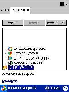


97 XXII
Unit 3. Design and the User Interface. Introduction to Multimedia Semester 1
 Unit 3 Design and the User Interface 2018-19 Semester 1 Unit Outline In this unit, we will learn Design Guidelines: Appearance Balanced Layout Movement White Space Unified Piece Metaphor Consistency Template
Single Menus No other menus will follow necessitating additional user choices
 57 UNIT-III STRUCTURES OF MENUS Single Menus No other menus will follow necessitating additional user choices Sequential Linear Menus Simultaneous Menus 58 Hierarchical Menus When many relationships exist
Lecture 6. Design (3) CENG 412-Human Factors in Engineering May
 CENG 412-Human Factors in Engineering May") Lecture 6. Design (3) CENG 412-Human Factors in Engineering May 28 2009 1 Outline Prototyping techniques: - Paper prototype - Computer prototype - Wizard of Oz Reading: Wickens pp. 50-57 Marc Rettig: Prototyping
Lecture 6. Design (3) CENG 412-Human Factors in Engineering May 28 2009 1 Outline Prototyping techniques: - Paper prototype - Computer prototype - Wizard of Oz Reading: Wickens pp. 50-57 Marc Rettig: Prototyping
BCS THE CHARTERED INSTITUTE FOR IT. BCS HIGHER EDUCATION QUALIFICATIONS BCS Level 6 Professional Graduate Diploma in IT REALISING THE USER INTERFACE
 BCS THE CHARTERED INSTITUTE FOR IT BCS HIGHER EDUCATION QUALIFICATIONS BCS Level 6 Professional Graduate Diploma in IT REALISING THE USER INTERFACE Friday 1 st April 2016 - Morning Answer any THREE questions
Seng310 Lecture 8. Prototyping
 Seng310 Lecture 8. Prototyping Course announcements Deadlines Individual assignment (extended) deadline: today (June 7) 8:00 am by email User testing summary for paper prototype testing- Thursday June
Hyper Mesh Code analyzer
 Hyper Mesh Code analyzer ABSTRACT Hyper Mesh Code Analyzer (HMCA) is a text based programming environment, designed for programmers to write their source code in a more organized and manageable fashion.
Interaction Design. Task Analysis & Modelling
 Interaction Design Task Analysis & Modelling This Lecture Conducting task analysis Constructing task models Understanding the shortcomings of task analysis Task Analysis for Interaction Design Find out
Midterm Exam, October 24th, 2000 Tuesday, October 24th, Human-Computer Interaction IT 113, 2 credits First trimester, both modules 2000/2001
 257 Midterm Exam, October 24th, 2000 258 257 Midterm Exam, October 24th, 2000 Tuesday, October 24th, 2000 Course Web page: http://www.cs.uni sb.de/users/jameson/hci Human-Computer Interaction IT 113, 2
MAXQDA and Chapter 9 Coding Schemes
 MAXQDA and Chapter 9 Coding Schemes Chapter 9 discusses how the structures of coding schemes, alternate groupings are key to moving forward with analysis. The nature and structures of the coding scheme
Publisher 2007 Creating Flyers and Brochures
 MS Publisher 2007 User Guide Publisher 2007 Creating Flyers and Brochures THE NATURE OF DESKTOP PUBLISHING - INTRODUCTION Publisher is a desktop publishing program. You can create publications that
Publisher 2007 Creating Flyers and Brochures
 MS Publisher 2007 User Guide Publisher 2007 Creating Flyers and Brochures THE NATURE OF DESKTOP PUBLISHING - INTRODUCTION Publisher is a desktop publishing program. You can create publications that use
For many people, learning any new computer software can be an anxietyproducing
 1 Getting to Know Stata 12 For many people, learning any new computer software can be an anxietyproducing task. When that computer program involves statistics, the stress level generally increases exponentially.
INDEX UNIT 4 PPT SLIDES
 INDEX UNIT 4 PPT SLIDES S.NO. TOPIC 1. 2. Screen designing Screen planning and purpose arganizing screen elements 3. 4. screen navigation and flow Visually pleasing composition 5. 6. 7. 8. focus and emphasis
The 23 Point UX Design Checklist
 The 23 Point UX Design Checklist The 23 Point UX Design Checklist During the design process, some flaws in your product will go unnoticed. Those little (or sometimes big) things can do a lot to hurt the
Perfect Timing. Alejandra Pardo : Manager Andrew Emrazian : Testing Brant Nielsen : Design Eric Budd : Documentation
 Perfect Timing Alejandra Pardo : Manager Andrew Emrazian : Testing Brant Nielsen : Design Eric Budd : Documentation Problem & Solution College students do their best to plan out their daily tasks, but
 User Interfaces Assignment 3: Heuristic Re-Design of Craigslist (English) Completed by Group 5 November 10, 2015 Phase 1: Analysis of Usability Issues Homepage Error 1: Overall the page is overwhelming
Heuristic Evaluation of Covalence
 Heuristic Evaluation of Covalence Evaluator #A: Selina Her Evaluator #B: Ben-han Sung Evaluator #C: Giordano Jacuzzi 1. Problem Covalence is a concept-mapping tool that links images, text, and ideas to
EVALUATION ASSIGNMENT 2
 EVALUATION ASSIGNMENT 2 CS5760 Graduate Human-Computer Interaction Abstract An investigation of the user interface domain, heuristic principles, and critical usability concerns for the current design and
Interaction Design. Ruben Kruiper
 Interaction Design Ruben Kruiper What do you know? What do you think Interaction Design stands for? 2 What do you expect? Interaction Design will be: Awesome Okay Boring Myself I m not a big fan... This
Interaction Style Categories. COSC 3461 User Interfaces. What is a Command-line Interface? Command-line Interfaces
 COSC User Interfaces Module 2 Interaction Styles What is a Command-line Interface? An interface where the user types commands in direct response to a prompt Examples Operating systems MS-DOS Unix Applications
Unit 21 - Creating a Navigation Bar in Macromedia Fireworks
 Unit 21 - Creating a Navigation Bar in Macromedia Fireworks Items needed to complete the Navigation Bar: Unit 21 - House Style Unit 21 - Graphics Sketch Diagrams Document ------------------------------------------------------------------------------------------------
Interfaces. The only means of interaction
 Interfaces The only means of interaction Two components - Action language - Presentation language These are not interfaces, but components of each interface Types of interfaces - Natural language - Question
Prototyping. Readings: Dix et al: Chapter 5.8 Marc Rettig: Prototyping for tiny fingers, Communications of the ACM, April 1994.
 Prototyping Readings: Dix et al: Chapter 5.8 Marc Rettig: Prototyping for tiny fingers, Communications of the ACM, April 1994. 1 What is prototyping? producing cheaper, less accurate renditions of your
UNIVERSITY OF BOLTON WEB PUBLISHER GUIDE JUNE 2016 / VERSION 1.0
 UNIVERSITY OF BOLTON WEB PUBLISHER GUIDE WWW.BOLTON.AC.UK/DIA JUNE 2016 / VERSION 1.0 This guide is for staff who have responsibility for webpages on the university website. All Web Publishers must adhere
Interface Design Issues Lecture 8
 IMS5302 Human factors and usability Interface Design Issues Lecture 8 Overview Quality, need to reduce Response time Interaction styles Direct manipulation Interaction devices Function versus look Field
the Hick Hyman Law Pearson Addison-Wesley. All rights reserved. 6-1
 the Hick Hyman Law describes the time it takes for a person to make a decision as a result of the possible choices he or she has; that is, increasing the number of choices will increase the decision time
Chapter 2: Android Device Basics
 Chapter 2: Android Device Basics 1 Chapter 2: Android Device Basics Android devices have a ton of cool features and are really fun to play with, but they have a very practical side as well. We ll touch
Karlen Communications Word 2007 Settings. Karen McCall, M.Ed.
 Karlen Communications Word 2007 Settings Karen McCall, M.Ed. Table of Contents Change the Application Colour Scheme... 4 Split Page Breaks from Paragraph Marks... 4 Turn off Click and Type... 5 Turning
Template Tidbits. Q How do I get the places I can enter copy to show up? (Highlight Fields Bar)
") Template Tidbits This document is not intended to replace the individual guidance documents that accompany each template. Instead, it is a general document that addresses questions frequently asked by
Template Tidbits This document is not intended to replace the individual guidance documents that accompany each template. Instead, it is a general document that addresses questions frequently asked by
Rethinking Usability for Responsive Web Design
 Rethinking Usability for Responsive Web Design Responsive design is the real deal. It is not a fad. It s a legitimate attempt to address the massive challenge of delivering great experiences to this explosion
The Ultimate Web Accessibility Checklist
 The Ultimate Web Accessibility Checklist Introduction Web Accessibility guidelines accepted through most of the world are based on the World Wide Web Consortium s (W3C) Web Content Accessibility Guidelines
EBM Review Pocket PC and Desktop version
 EBM Review Pocket PC and Desktop version By Dr. Christine Hubert and Claude Hubert Introduction EBM Guidelines is a very extensive collection of guidelines used for primary care having the purpose of summarizing
The Interaction. Dr. Karim Bouzoubaa
 The Interaction Dr. Karim Bouzoubaa UI Hall of Fame or Shame? The buttons are limited to text labels: à pi instead of (scientific mode) à sqrt rather than à * instead of X Why only one line of display?
ibooks Author: An Instructional Guide for Educators
 USING IBOOKS AUTHOR ibooks Author: An Instructional Guide for Educators ETEC533 - MANNY LOYLA SECTION 1 Before you Begin This section provides information on how to download and install the ibooks Author
Usability. CSE 331 Spring Slides originally from Robert Miller
 Usability CSE 331 Spring 2010 Slides originally from Robert Miller 1 User Interface Hall of Shame Source: Interface Hall of Shame 2 User Interface Hall of Shame Source: Interface Hall of Shame 3 Redesigning
TekTalk Word 2007 Notes
 TekTalk Word 2007 Notes Karen McCall i, M.Ed. Karlen Communications ii February 1, 2008 Table of Contents Change the Application Colour Scheme... 2 Split Page Breaks from Paragraph Marks... 2 Turn off
Funasset Limited Foundry House Foundry Road Taunton Somerset TA1 1JJ. Tel: +44 (0) Fax: +44 (0) mailmarkup.com funasset.
 Fax: +44 (0) mailmarkup.com funasset.") Funasset Limited Foundry House Foundry Road Taunton Somerset TA1 1JJ Tel: +44 (0)1823 365864 Fax: +44 (0)1823 277266 mailmarkup.com funasset.com Copyright 2012 Funasset Limited. All rights reserved. Products
Funasset Limited Foundry House Foundry Road Taunton Somerset TA1 1JJ Tel: +44 (0)1823 365864 Fax: +44 (0)1823 277266 mailmarkup.com funasset.com Copyright 2012 Funasset Limited. All rights reserved. Products
balancer high-fidelity prototype dian hartono, grace jang, chris rovillos, catriona scott, brian yin
 balancer high-fidelity prototype dian hartono, grace jang, chris rovillos, catriona scott, brian yin Problem and Solution Overview A healthy work-life balance is vital for both employers and employees.
Usability of interactive systems. Usability requirements
 Usability of interactive systems 91.527 Human-Computer Interaction Fall 2009 I VP R 1 Usability requirements Synonyms for user-friendly (Microsoft Word 2002) easy to use Accessible Comprehensible Intelligible
MiPhone Phone Usage Tracking
 MiPhone Phone Usage Tracking Team Scott Strong Designer Shane Miller Designer Sierra Anderson Designer Problem & Solution This project began as an effort to deter people from using their phones in class.
Human-Computer Interaction: An Overview. CS2190 Spring 2010
 Human-Computer Interaction: An Overview CS2190 Spring 2010 There must be a problem because What is HCI? Human-Computer interface Where people meet or come together with machines or computer-based systems
Chapter 6. Design Guides
 Chapter 6. Design Guides Context Table of Contents Context... 1 Objectives... 1 Introduction... 2 Standards vs Guidelines... 2 Design Guides... 2 Design Principles... 3 Learnability... 3 Flexibility...
A Step-by-step guide to creating a Professional PowerPoint Presentation
 Quick introduction to Microsoft PowerPoint A Step-by-step guide to creating a Professional PowerPoint Presentation Created by Cruse Control creative services Tel +44 (0) 1923 842 295 training@crusecontrol.com
Cognitive Disability and Technology: Universal Design Considerations
 Cognitive Disability and Technology: Universal Design Considerations Clayton Lewis Coleman Institute for Cognitive Disabilities RERC-ACT clayton.lewis@colorado.edu Prepared for AUCD Training Symposium,
Karlen Communications Track Changes and Comments in Word. Karen McCall, M.Ed.
 Karlen Communications Track Changes and Comments in Word Karen McCall, M.Ed. Table of Contents Introduction... 3 Track Changes... 3 Track Changes Options... 4 The Revisions Pane... 10 Accepting and Rejecting
iscreen Usability INTRODUCTION
 INTRODUCTION Context and motivation The College of IST recently installed an interactive kiosk called iscreen, designed to serve as an information resource for student/visitors to the College of IST. The
Designing the User Interface
 Designing the User Interface Strategies for Effective Human-Computer Interaction Second Edition Ben Shneiderman The University of Maryland Addison-Wesley Publishing Company Reading, Massachusetts Menlo
Basic features. Adding audio files and tracks
 Audio in Pictures to Exe Introduction In the past the conventional wisdom was that you needed a separate audio editing program to produce the soundtrack for an AV sequence. However I believe that PTE (Pictures
CHAPTER 1 COPYRIGHTED MATERIAL. Finding Your Way in the Inventor Interface
 CHAPTER 1 Finding Your Way in the Inventor Interface COPYRIGHTED MATERIAL Understanding Inventor s interface behavior Opening existing files Creating new files Modifying the look and feel of Inventor Managing
STUDENT WORKBOOK. Teach Yourself: Computer Basics Expert. In 24 Hours or less
 STUDENT WORKBOOK Teach Yourself: Computer Basics Expert In 24 Hours or less Student Workbook Table of Contents Section 1: Understanding Applications... 1 Lesson 1.1: Application Basics... 2 Step-By-Step...
SuperNova. Magnifier & Screen Reader. Version 15.0
 SuperNova Magnifier & Screen Reader Version 15.0 Dolphin Computer Access Publication Date: 19 August 2015 Copyright 1998-2015 Dolphin Computer Access Ltd. Technology House Blackpole Estate West Worcester
R EIN V E N TIN G B U S I N E S S I L E M A. MARK5 Basic guide. - All rights reserved
 R EIN V E N TIN G B U S I N E S S I L E M A MARK5 Basic guide 0.0 Welcome In this brief guide we will cover the basics of MARK5 such as starting up, understanding the MARK5 interface basics and sending
Input: Interaction Techniques
 Input: Interaction Techniques Administration Questions about homework? 2 Interaction techniques A method for carrying out a specific interactive task Example: enter a number in a range could use (simulated)
Interaction design. The process of interaction design. Requirements. Data gathering. Interpretation and data analysis. Conceptual design.
 Interaction design The process of interaction design Requirements Data gathering Interpretation and data analysis Conceptual design Prototyping Physical design Conceptual design Introduction It aims to
What is interaction? communication user system. communication between the user and the system
 What is interaction? communication user system communication between the user and the system 2 terms of interaction The purpose of interactive system is to help user in accomplishing goals from some domain.
4. You should provide direct links to the areas of your site that you feel are most in demand.
 Chapter 2: Web Site Design Principles TRUE/FALSE 1. Almost every Web site has at least one flaw. T PTS: 1 REF: 49 2. Not only should you plan for a deliberate look and feel for your Web site, but you must
Hello everyone, how are you enjoying the conference so far? Excellent!
 1 Hello everyone, how are you enjoying the conference so far? Excellent! I m Andy Sutton, the e-builder User Experience Lead, and I m here to talk to you about User Experience. In this session, we re going
Chapter 15. User Interface Design. Ian Sommerville 2000 Software Engineering, 6th edition. Chapter 15 Slide 1
 Chapter 15 User Interface Design Ian Sommerville 2000 Software Engineering, 6th edition. Chapter 15 Slide 1 Topics covered User interface design principles User interaction Information presentation User
Tutor Handbook for WebCT
 Tutor Handbook for WebCT Contents Introduction...4 Getting started...5 Getting a course set up...5 Logging onto WebCT...5 The Homepage...6 Formatting and designing the Homepage...8 Changing text on the
SAP BEX ANALYZER AND QUERY DESIGNER
 SAP BEX ANALYZER AND QUERY DESIGNER THE COMPLETE GUIDE A COMPREHENSIVE STEP BY STEP GUIDE TO CREATING AND RUNNING REPORTS USING THE SAP BW BEX ANALYZER AND QUERY DESIGNER TOOLS PETER MOXON PUBLISHED BY:
Objectives. Object-Oriented Analysis and Design with the Unified Process 2
 Objectives Understand the differences between user interfaces and system interfaces Explain why the user interface is the system to the users Discuss the importance of the three principles of user-centered
Using Inspiration 7 I. How Inspiration Looks SYMBOL PALETTE
 Using Inspiration 7 Inspiration is a graphic organizer application for grades 6 through adult providing visual thinking tools used to brainstorm, plan, organize, outline, diagram, and write. I. How Inspiration
InfoRecall in 20 Minutes Phantech Software
 2 Table of Contents Part I Introduction 3 Part II Create a File 3 Part III Create and Save Documents 4 Part IV Import Files 6 Part V Create a Hypertext Link 7 Part VI Create a Link to a Web Site 9 Part
Cognitive Walkthrough Evaluation
 Columbia University Libraries / Information Services Digital Library Collections (Beta) Cognitive Walkthrough Evaluation by Michael Benowitz Pratt Institute, School of Library and Information Science Executive
chapter 3 the interaction
 chapter 3 the interaction ergonomics physical aspects of interfaces industrial interfaces Ergonomics Study of the physical characteristics of interaction Also known as human factors but this can also be
BCS THE CHARTERED INSTITUTE FOR IT. BCS HIGHER EDUCATION QUALIFICATIONS BCS Level 5 Diploma in IT. March 2017 PRINCIPLES OF USER INTERFACE DESIGN
 BCS THE CHARTERED INSTITUTE FOR IT BCS HIGHER EDUCATION QUALIFICATIONS BCS Level 5 Diploma in IT March 2017 PRINCIPLES OF USER INTERFACE DESIGN EXAMINERS REPORT General Comments Candidates should focus
COMP 388/441 HCI: 07 - Menu Selection, Forms, and Dialog Boxes Menu Selection, Forms, and Dialog Boxes
 07 - Menu Selection, Forms, and Dialog Boxes Menus Overview Offer cues, users can categorize actions easier (no syntax recall required) Especially effective when users have little training, use the UI
Due on: May 12, Team Members: Arpan Bhattacharya. Collin Breslin. Thkeya Smith. INFO (Spring 2013): Human-Computer Interaction
: Human-Computer Interaction") Week 6 Assignment: Heuristic Evaluation of Due on: May 12 2013 Team Members: Arpan Bhattacharya Collin Breslin Thkeya Smith INFO 608-902 (Spring 2013): Human-Computer Interaction Group 1 HE Process Overview
Week 6 Assignment: Heuristic Evaluation of Due on: May 12 2013 Team Members: Arpan Bhattacharya Collin Breslin Thkeya Smith INFO 608-902 (Spring 2013): Human-Computer Interaction Group 1 HE Process Overview
INTERNET BASICS. GETTING STARTED PAGE 02 Prerequisites What You Will Learn
 INTERNET BASICS GETTING STARTED PAGE 02 Prerequisites What You Will Learn BASIC WEB SKILLS/USING A WEB BROWSER PAGE 03 Locate and Open a Web Browser Using a Browser s Menu Options Using the Browser s Navigation
ABOUT THIS COURSE... 3 ABOUT THIS MANUAL... 4 LESSON 1: MANAGING LISTS... 5
 Table of Contents ABOUT THIS COURSE... 3 ABOUT THIS MANUAL... 4 LESSON 1: MANAGING LISTS... 5 TOPIC 1A: SORT A LIST... 6 Sort a list in A-Z or Z-A Order... 6 TOPIC 1B: RENUMBER A LIST... 7 Renumber a List
Dissertation Formatting Rules. Basic Format
 All doctoral students will follow APA (6 th edition) formatting for the narrative portion of the dissertation. Refer to this guide for rules specific to Missouri Baptist University dissertations. *Instructions
Publisher I-Introduction-2013 Version
 Publisher I-Introduction-2013 Version I. About Publisher A. What is it? Publisher is a desktop publishing program that assists you in designing and producing professional documents that combine text, graphics,
GUIDELINES FOR WEB SITE DESIGN CHAPTER 10
 GUIDELINES FOR WEB SITE DESIGN CHAPTER 10 What makes a Web site good? Who defines good? From whose perspective is it good the site visitor or the sponsoring organization? The following questions and tips
User manual website
 User manual website http://www.velleman.eu To enable you to make optimal use of our website we have written this user manual. This manual will offer guidance during your visit of our renewed website. First
Input part 3: Interaction Techniques
 Input part 3: Interaction Techniques Interaction techniques A method for carrying out a specific interactive task Example: enter a number in a range could use (simulated) slider (simulated) knob type in
Crab Shack Kitchen Web Application
 Crab Shack Kitchen Web Application EVALUATION ASSIGNMENT 2 HEURISTIC EVALUATION Author: Sachin FERNANDES Graduate 8 Undergraduate Team 2 Instructor: Dr. Robert PASTEL February 16, 2016 LIST OF FIGURES
Lo-Fidelity Prototype Report
 Lo-Fidelity Prototype Report Introduction A room scheduling system, at the core, is very simple. However, features and expansions that make it more appealing to users greatly increase the possibility for
With ClaroIdeas you can quickly and easily create idea maps using a combination of words, symbols and pictures.
 Welcome to ClaroIdeas ClaroIdeas is a fresh tool to support the creation and editing of concept maps or idea maps using visual and audio components. It has been specifically developed to support people
Usability Test Report: Bento results interface 1
 Usability Test Report: Bento results interface 1 Summary Emily Daly and Ian Sloat conducted usability testing on the functionality of the Bento results interface. The test was conducted at the temporary
Introduction to the Learning Environment v8.3.0
 Introduction to the Learning Environment v8.3.0 User Guide March, 008 Contents My Home Accessing your courses Navigating inside a course Lists Actions Entering Dates Showing and hiding advanced options
Buddhist Symbols Style Guide
 Formative evaluation of the V&A s Buddhist Symbols Style Guide Prepared by Yvonne Harris Consulting Yvonne Harris Consulting 44 Grovelands Way Grays, Essex, RM17 5YG Tel: 07766 256532 email: yvonneharris_consulting@hotmail.co.uk
Wills Eye Manual Pocket PC and Desktop versions By Dr. Christine Hubert and Claude Hubert
 Wills Eye Manual Pocket PC and Desktop versions By Dr. Christine Hubert and Claude Hubert Introduction This is my second review of Wills Eye Manual for Pocket PC. Since then Skyscape has added a great
Mobile Technologies. Mobile Design
 Mobile Technologies Mobile Design 4 Steps: 1. App Idea 2. Users Profile Designing an App 3. App Definition Statement Include 3-5 key features 4. UI Design Paper prototyping Wireframing Prototypes 2 Idea
Activity 1.1.1: A Mysterious Death
 Activity 1.1.1: A Mysterious Death Part II: Processing a Crime Scene Concept Map Although every crime scene is unique, five basic tasks need to be completed in order to properly process a crime scene.
Text Topics. Human reading process Using Text in Interaction Design
 Text SWEN-444 Text Topics Human reading process Using Text in Interaction Design Humans and Text the Reading Process Saccades quick, jerky eye movements forward 8-10 letters at a time plus CR/LF to the
Vision Impairment and Computing
 These notes are intended to introduce the major approaches to computing for people with impaired vision. These approaches can be used singly or in combination to enable a visually impaired person to use
MS Publisher County of Henrico Public Libraries
 MS Publisher 2013 I. About Publisher A. What is it? Publisher is a desktop publishing program that assists you in designing and producing professional documents that combine text, graphics, illustrations,
Module 9: Audience Analysis, Usability, and Information Architecture COM 420
 Module 9: Audience Analysis, Usability, and Information Architecture COM 420 Audience Analysis Needs Capabilities Without addressing these end user factors, time and money can be wasted building a site
Chapter 9 Getting Started with Impress
 Getting Started Guide Chapter 9 Getting Started with Impress OpenOffice.org's Presentations OpenOffice.org Copyright This document is Copyright 2005 2007 by its contributors as listed in the section titled
Here is the design that I created in response to the user feedback.
 Mobile Creative Application Development Assignment 2 Report Design When designing my application, I used my original proposal as a rough guide as to how to arrange each element. The original idea was to
Creating accessible forms
 Creating accessible forms Introduction Creating an accessible form can seem tricky. Some of the questions people commonly ask include: Can I use protected forms? How do I lay out my prompts and questions?
CS 160: Evaluation. Professor John Canny Spring /15/2006 1
 CS 160: Evaluation Professor John Canny Spring 2006 2/15/2006 1 Outline User testing process Severity and Cost ratings Discount usability methods Heuristic evaluation HE vs. user testing 2/15/2006 2 Outline
Content Author's Reference and Cookbook
 Sitecore CMS 6 Content Author's Reference and Cookbook Rev. 080627 Sitecore CMS 6 Content Author's Reference and Cookbook A Conceptual Overview and Practical Guide to Using Sitecore Table of Contents Chapter
CS 160: Evaluation. Outline. Outline. Iterative Design. Preparing for a User Test. User Test
 CS 160: Evaluation Professor John Canny Spring 2006 2/15/2006 1 2/15/2006 2 Iterative Design Prototype low-fi paper, DENIM Design task analysis contextual inquiry scenarios sketching 2/15/2006 3 Evaluate
Intro to Microsoft Word
 Intro to Microsoft Word A word processor is a computer program used to create and print text documents that might otherwise be prepared on a typewriter. The key advantage of a word processor is its ability
There are four (4) skills every Drupal editor needs to master:
 skills every Drupal editor needs to master:") There are four (4) skills every Drupal editor needs to master: 1. Create a New Page / Edit an existing page. This entails adding text and formatting the content properly. 2. Adding an image to a page.
There are four (4) skills every Drupal editor needs to master: 1. Create a New Page / Edit an existing page. This entails adding text and formatting the content properly. 2. Adding an image to a page.
The Interaction. notion of interaction interaction frameworks ergonomics interaction styles context of interaction
 The Interaction notion of interaction interaction frameworks ergonomics interaction styles context of interaction Interaction Frameworks Interaction: communication between the user and the system Why have
Interactive Powerpoint. Jessica Stenzel Hunter Singleton
 Interactive Powerpoint Jessica Stenzel Hunter Singleton Table of Contents iii Table of Contents Table of Contents... iii Introduction... 1 Basics of Powerpoint... 3 How to Insert Shapes... 3 How to Insert
Cognitive Walkthrough Evaluation Yale University School of Art
 www.campusconnections.us Cognitive Walkthrough Evaluation Yale University School of Art Allison Hall LIS 644 - Usability Theory & Practice Pratt SILS 1 Executive Summary Yale University is one of the most
What is interaction design? What is Interaction Design? Example of bad and good design. Goals of interaction design
 What is interaction design? What is Interaction Design? Designing interactive products to support people in their everyday and working lives Sharp, Rogers and Preece (2002) The design of spaces for human