3/20/16. International Typographic Style. International Typographic Style. International Typographic Style ARTH 4573 HISTORY OF GRAPHIC DESIGN
|
|
|
- Jasmin Amelia Foster
- 6 years ago
- Views:
Transcription
 } American Modernism } 1913 } 1930s } The Depression } World War 2 } After the War")


1 ARTH 4573 HISTORY OF GRAPHIC DESIGN Section 9a international typographic style (swiss style) } American Modernism } 1913 } 1930s } The Depression } World War 2 } After the War } } Basel and Zurich, Switzerland Emil Ruder, posters Josep Müller-Brockmann, Auto Club of Switzerland Poster, 1955 } or Swiss style } Also known as the Swiss Style, it does not simply describe a style of graphic design made in Switzerland. } It became famous through the art of very talented Swiss graphic designers, but it emerged in Russia, Germany and Netherlands in the 1920 s. } This style in art, architecture and culture became an international style after 1950 s and it was produced by artists all around the globe. } Despite that, people still refer to it as the Swiss Style or the Swiss Legacy. Joseph Müller-Brockmann and 1


2 } Emerging from the modernist and constructivist ideals, the Swiss Style can be defined as an authentic pursuit for simplicity. } The principle form follows function became a battle-cry of Modernist architects after the 1930s. As a consequence of this principle, most of the Swiss Style craft is devoted to the minimal elements of style. } The Swiss attitude toward design to make it socially useful, universal, and scientific. } Achieving objective clarity and order is the ideal. The visual result was abstraction, often based on pure geometry. } or Swiss style } Sans Serif } Flush Left, Ragged Right } Asymmetrical organization on mathematically constructed GRID } Objective photography } Clear, minimal verbal message delivery } = Unified design of progressive age via structure and } (+ others) Josep Müller-Brockmann, Zurich Town Hall Poster (1 of series), 1955 Joseph Müller-Brockman, Poster for Swiss Automobile Club Protect the child!, 1953 Joseph Müller-Brockman, poster for the Basel Civic Theater production of Giselle, 1959 Joseph Müller-Brockman, Musica Viva concert poster, 1959 Joseph Müller-Brockman, Poster for Swiss Automobile Club The considerate hand signal protects from accidents,


.")


3 } (+ others) Joseph Müller-Brockman, Less noise, public awareness poster, 1960 } See the rest of this 1995 interview at (link online). REQUIRED Emil Ruder, posters Emil Ruder, posters Emil Ruder, posters } (+ others) Emil Ruder, Typographie: A Manual of Design,1967 Emil Ruder, Typographie: A Manual of Design,1967 3


 Ernst Keller, posters, 1927 and 1928 4")
4 Armin Hoffman, poster for the Basel Civic Theater production of Giselle, 1959 Armin Hofmann, Die Gute Form (Good Form), 1958 Armin Hofmann, Municipal Theater Basel, 1963 } Pioneers who influenced ^^^ } Ernst Keller } Keller joined Zurich's School of Applied Art in 1918 } Taught for next 4 decades } father of Swiss graphics Armin Hofmann, logotype for the Basel Civic Theater, 1954 Ernst Keller, poster for Rietberg Museum, 1952 } Pioneers who influenced ^^^ } Ernst Keller } Keller believed the solution to the design problem should emerge from its content rather than a style (remember these words when you hear from Paul Rand) Ernst Keller, posters, 1927 and


5 } Pioneers who influenced ^^^ } Theo Ballmer } studied briefly at Dessau Bauhaus under Klee, Gropius, Meyer in late 1920s } Applied De Stijl principles to graphic design in an original way > he used the arithmetic grid of horizontal and vertical even more than others at the time Theo Ballmer, posters, 1928; office professions exhibition Theo Ballmer, posters, 1928; traveling exhibition of industrial standards } SPREADING THE WORD: } Carlo Vivarelli } SPREADING THE WORD: } Carlo Vivarelli } Neue Grafik (New Graphic Design) spread the ideals and aesthetics of the style to the world. } Founded in 1958 with Josef Müller-Brockmann, Richard Paul Lohse, Hans. } SPREADING THE WORD: } Carlo Vivarelli } Neue Grafik (New Graphic Design) spread the ideals and aesthetics of the style to the world. } Founded in 1958 with Josef Müller-Brockmann, Richard Paul Lohse, Hans. } The publications would go on for 18 issues from September 1958 until February ITS summarized } Design is a socially useful and important activity } Personal expression rejected al and scientific solutions } Clarity and Order! } Designers: } Objective conduits for spreading important information between components of society 5


 } Akzidenz Grotesk } Helvetica Typefaces }")

6 ITS summarized } The overall impression was simple and rational, tightly structured and serious, clear and objective, and harmonious. } PRO: Those in favor argue that its purity has given the designer the means to achieve a perfection of form. } CON: Critics have complained that it is based on formula and results in the same solution. Swiss style used (appropriated) in 1970s-80s Typefaces (highlighted by Meggs) } Akzidenz Grotesk } Helvetica Typefaces } Akzidenz Grotesk } Helvetica = Neue Haas Grotesk GROTESK: the German name for sans serif Adrian Frutiger, schematic drawing of the 21 Univers typefaces, 1954 Typefaces (highlighted by Meggs) } Akzidenz Grotesk } Helvetica 6


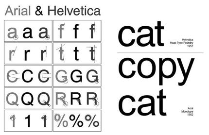
7 Edouard Hoffman and Max Miedinger, Helvetica typeface, (based on Helvetica) Typefaces } Helvetica Arial Typefaces (highlighted by Meggs) } Akzidenz Grotesk } Helvetica 7

; Melior (1952); Optima (1958) Herman Zapf, Manuale Typographicum, 1968 LEGACY } Designers take lessons from the Swiss")


8 Herman Zapf } On the other end of the spectrum } German typeface } Inspiration of calligraphy and Renaissance typography } Apprenticed under Rudolf Koch } Freelance book and typographic designer } By 21, had first typeface designed and cut for the Stempel foundry. } FIRST of more than 50 typefaces designed throughout his career. Herman Zapf, typefaces: Palatino (1950); Melior (1952); Optima (1958) Herman Zapf, Manuale Typographicum, 1968 LEGACY } Designers take lessons from the Swiss styles applying the norms on simple yet artistically and clearly delivered messages by: } Preservation of uniformity and geometry } Allowance of wider spacing } Grid systems } Structure information } Minimalism } Sans serif fonts } Different font sizes } Effective photography LEGACY } The popular belief is that a work would be perfect if there is nothing to add to it is clearly not the ways of the Swiss design. } For Swiss designers, removing unnecessary elements makes it perfect. } They believe that a work will be perfect if there is nothing to remove in it. } So, instead of adding elements, they do the opposite. Herman Zapf, Manuale Typographicum,
Chapter 18: The International Typographic Style
 Chapter 18: The International Typographic Style International Typographic Style A graphic design style emphasizing cleanliness, readability and objectivity developed in Switzerland in the 1950s. Specifics
The International Typographic Style
 The International Typographic Style Ernst Keller was one of the pioneers of Swiss design. His work used symbolic imagery, simplified geometric forms and vibrant contrasting color. Poster for the Rietberg
Wednesday, April 6, 16
 During the 1950s, an important design movement began in Switzerland and Germany. It was known as the SWISS STYLE or INTERNATIONAL STYLE. Wednesday, April 6, 16 The characteristics of this style are: -
The characteristics of this style are:
 The characteristics of this style are: - Sans serif type - Asymmetrical organization of elements - Underlying grid used to structure page - Objective photography and copy used to present information in
The Ohio State University, Paul Nini, Instructor
 Typeface Poster: Shaina Meyers (undergraduate) The Ohio State University, Paul Nini, Instructor I always have students prepare a written rationale statement for their projects, along with a process document
HEL HEL HEL HEL VETIC HEL VETIC HEL HEL VETICA HEL HEL ETICA ETIC VETIC HEL VETIC HEL HEL C VETICA ETI- HEL HEL VETI HEL VETICA VETIC HEL HEL VETICA
 CA C C CA C C CA Max Miedinger with Eduard Hoffmann C C CA C CA ETI- ETI- L istory elvetica was developed in 1957 by Max Miedinger with Eduard Hoffmann at the Haas sche Schriftgiesserei of Münchenstein,
The typography. of order EMIL RUDER
 The typography of order EMIL RUDER 1914-1970 Swiss typographer, born in Zurich He was professor in basel school of design He founded the international center for the typographic arts in New York in 1962
David Glen Smith. Fonts of Influence
 David Glen Smith Fonts of Influence Charlesworth {Charlemagne}. (THERE ARE NO LOWERCASE CHARACTERS) Poster Bodini Helvetica Neue Gill Sans My intentions are to merge a thick poster font with a thinner
art 118: intro to communication design // FALL 2011
 t y p e specimen Due: Wednesday, November 30 ov e r v i e w A type specimen is a publication, that shows the range of a particular typeface in use. Printers and typographers have produced type specimens
SUCCESSFUL TYPE? Interface Aesthetics
 TYPO GR AP HY SUCCESSFUL TYPE? SUCCESSFUL TYPE? TYPOGRAPHY 1 2 TYPOGRAPHY /t 'p gr fi/ n. The art or process of setting and arranging types and printing from them. The style and appearance of printed
the streamlining of typography rene koszerowski
 the streamlining of typography 1920 1929 rene koszerowski poster for sixtieth-birthday exhibition of kandinsky herbert bayer 1926 the streamlining of typography 1920 1929 contents pages 1900 1909 1
Pre-Venetian or Ancient Humanist or Venetian Transitional Didone Slab Serifs
 Pre-Venetian or Ancient Humanist or Venetian Transitional Didone Slab Serifs 1400 1500 1700 1800 Humanist Sans Serif Transitional Sans Serif Geometric Sans Serif Display Typefaces 1900 2000 Pre-Venetian
Download Typographic Specimens: The Great Typefaces Kindle
 Download Typographic Specimens: The Great Typefaces Kindle Specimens of 38 of the finest type families in the world are brought together in Typographic Specimens: The Great Typefaces, making it an invaluable
DESIGNING THE PAGE FOUNDATIONS OF DIGITAL DESIGN. Layout composition, the grid and typography. Prof. Eva Machauf
 DESIGNING THE PAGE Layout composition, the grid and typography FOUNDATIONS OF DIGITAL DESIGN Prof. Eva Machauf prof.machauf@gmail.com THE GRID The grid is the foundation of all design. Creating and working
GD I // SPRING
 GD I // SPRING 2018 1 PROJECT I : TYPOGRAPHIC COLOR Timothy Samara, author of Typography Workbook, defines typographic color as the visual texture of language. It is similar to chromatic color (like green,
THINGS YOU NEED TO KNOW
 TYPOGRAPHY THINGS YOU NEED TO KNOW to prevent your work from appearing amateurish. (p. 151) Only one space after punctuation (p. 152) What is monospaced type? (p. 152) Correct Quotation Marks (as soon
Linotype Univers CD for Mac and PC - containing 63 font weights
 presented in: Eurostile Roman Find further Font Features in our Font Feature Archive. The Univers family of fonts designed by Adrian Frutiger more than forty years ago is one of the most innovative type
Designing Research Posters. College of Art and Design Chris Jackson, Associate Dean Keli DiRisio, Assistant Professor
 Designing Research Posters College of Art and Design Chris Jackson, Associate Dean Keli DiRisio, Assistant Professor Size and Orientation If you are NOT using the poster template: Start is with a 48"
Manuale Typographicum By Hermann Zapf
 Manuale Typographicum By Hermann Zapf If you are searched for the ebook by Hermann Zapf Manuale Typographicum in pdf format, then you have come on to correct website. We presented the utter variant of
TYPE ANATOMY jtittle
 TYPE ANATOMY TYPE ANATOMY TITTLE j Serif Typefaces Tt HUMANIST (a.k.a. Old Style ) - Modeled after the roman typefaces of 15 th & 16 th centuries - Closely related to calligraphy and hand movement CLASSIC
Be very aware of dates! A lot of what we are - and have been - talking about is happening consecutively. Hence, your Timeline Project J
 ARTH 4573 HISTORY OF GRAPHIC DESIGN Section 8b the new typography, intro to american modernism } Bauhaus } } Intro to American Modernism Be very aware of dates! A lot of what we are - and have been - talking
The Evolution of Type. Movable Type: Johannes Gutenberg Early 15th Century
 The Evolution of Type Movable Type: Johannes Gutenberg Early 15th Century Studio on Fire: Minneapolis Anatomy of Type cap height cross bar Anatomy n bowl describes g counter ascender finial stem type eye
Typography Controlling Visual Hierarchy Introduction to Grid Theory Design Consistency
 Typography Controlling Visual Hierarchy Introduction to Grid Theory Design Consistency ART-2413 Fall 2017 Typography Controlling Visual Hierarchy Introduction to Grid Theory Design Consistency ART-2413
Trends for DECEMBER 14, 2017
 D e s i g n Trends for 2018. DECEMBER 14, 2017 COLOR TRANSITIONS We ve seen this style emerge with the Instagram redesign and it s quickly making it s way around major brands. It is very possible for
corporate identity guidelines
 Seilevel Corporate Identity Guidelines Introduction 1 Preferred Signature and Components Logo Space and Minimum Size Signature Variations Color Palette Typography Signature Misuse 2 3 4 5 6 7 corporate
section four typography contents introduction...44 helvetica neue...45 bodoni...46 examples of type usage...47 body text examples...
 section four typography 43 contents introduction...44 helvetica neue...45 bodoni...46 examples of type usage...47 body text examples...48 introduction Consistent application of type fonts and styles allows
TYPOGRAPHY. The art of type
 Typography TYPOGRAPHY The art of type TYPE All the letters (abc), Numbers (123) & characters (;? @) of the alphabet. MONOTYPE Trade name for hot metal composition system Monotype Corporation Machine Shop
HURME GEOMETRIC SANS
 No.1 SHARP No.2 ALTERNATIVE HURME TYPEFACE SPECIMEN PRINT SAMPLES No.3 BLUNT No.4 SWASH Hurme Geometric Sans Typeface Specimen 03/20/2013 2 Page heading: Black. 30pt/30pt. Byline: Regular/Bold SmallCaps.
Products At Home for Skin, Hair & Body Care: A Step by Step Guide & 70 Simple Recipes for Any Skin Type and Hair Type Designing Type Lettering &
 Designing Type PDF One of the most essential tools of graphic design, typography influences the appearance of visual print materials perhaps more than any other component. This essential book explains
Course Introduction. Objectives and Class Structure. Expectations and Course Policy. Professor Rebecca Leffell Koren rebeccaleffellkoren.
 Course Introduction Graphic Design is a practice of input and output keen observation feeds thoughtful creation. Design begins with sensitive, broad seeing, training the eye for informed making. Building
SCOTTISH SWIMMING Visual Identity Guidelines 05 February 2015
 SCOTTISH SWIMMING Visual Identity Guidelines 05 February 2015 SCOTTISH SWIMMING VISUAL IDENTITY GUIDELINES This guide is a tool designed to help us project the values and vision behind the Scottish Swimming
New Vintage Type: Classic Fonts For The Digital Age By Gail Anderson, Steven Heller READ ONLINE
 New Vintage Type: Classic Fonts For The Digital Age By Gail Anderson, Steven Heller READ ONLINE Vintage style typography is classic and remains popular still today. Fonts You have to put in the time to
Identity Standards Guide A guide to consistent use of brand elements
 08.01.04 A guide to consistent use of brand elements Contents 1 Introduction A cohesive identity system increases and strengthens our visibility to all audiences customers, partners, and prospects. Applying
Linotype Matrix 4.2 the legend continues.
 Mergenthaler Edition releases second issue of the new Linotype Matrix Linotype Matrix 4.2 the legend continues. Bad Homburg, 16 May 2006. Following its highly successful relaunch of Linotype Matrix in
B R A N D GUIDELINES
 BRAND GUIDELINES You never get a second chance to make a first impression. 01 02 03 INTRODUCTION About the City of New Bedford s brand 5 THE LOGO The Logo and usage 7 Color & variations 7 Clearspace &
GRAPHIC STANDARDS MANUAL
 GRAPHIC STANDARDS MANUAL INTRODUCTION AND GENERAL STANDARDS The purpose of this Graphic Standards Manual is to set forth guidelines that will assist in applying the Active Aerogels Logo to all communications.
typography Typography is what language looks like.
 typography Typography is what language looks like. typography Typography is what language looks like. One thing absolutely necessary for working with type is knowing its history: what came after what and,
Essentials for Text and Graphic Layout
 5. Essentials for Text and Graphic Layout This section provides specific text and graphic guidelines that will help create a unified series of interpretive signs around Humboldt Bay. Text refers to the
DESIGNING FOR THE WEB
 DESIGNING FOR THE WEB The workflow of building a (static) site in four stages: 1. User Experience and Information Architecture 2. Design 3. Structure (HTML) 4. Style (CSS) What is a Design Document? Parts
АБВГДЕЖЗИЙКЛМНОПРСТУФХЦЧШЩЪЫЬЭЮЯ ёґѓђіїјќѕўџћєљњ ЁҐЃЂІЇЈЌЅЎЏЋЄЉЊ АБВГДЕЖЗИЙКЛМНОПРСТУФХЦЧШЩЪЫЬЭЮЯ. абвгдежзийклмнопрстуфхцчшщъыьэюя
 condensed Aurora Tilde Localized Cyrillic Fonts light extra name/no. address sub-cap listing light medium Balloon n ЁҐЃЂІЇЈЌЅЎЏЋЄЉЊ 1234567890 n ЁҐЃЂІЇЈЌЅЎЏЋЄЉЊ 1234567890 Bell Centennial Belwe condensed
Part 01: Logo, Typography & Colours. Brand Identity Guidelines 2015
 Part 01: Logo, Typography & Colours Brand Identity Guidelines 2015 At a glance Logo Typography ITC Caslon No. 224 Univers Georgia Arial The core elements of the Arts Council identity makes our brand instantly
Chapter 8: Rococo Graphic Design 18 th century
 Chapter 8: Rococo Graphic Design 18 th century Romain du Roi (French for King s Roman) The first printing of the Romain du Roi at the beginning of the eighteenth century signified a shift to transitional
Logo Style Guide. February 20, 2008
 Logo Style Guide February 20, 2008 Table of Contents Communicating the Plexera Brand. 1 The Plexera Logo. 2 Using the Plexera Logo. 3 Color Palette. 4 Logo Don ts. 5 Typefaces. 6 Product Naming Typography.
In your lifetime you ve seen billions of letters and millions of words, yet you might never have consciously noticed the typefaces you read.
 In your lifetime you ve seen billions of letters and millions of words, yet you might never have consciously noticed the typefaces you read. Type is important because it is an unconscious persuader. It
> creative résumé. > specifications: save as: Resume_Lastname.ai dimensions: 8.5" x 11" or 11" x 8.5" mode: CMYK
 > creative résumé > objective(s): Students will create an eye-popping, visually impacting résumé using current trends in graphics, color and typography. > curricular focus: This lesson emphasizes the graphic
Georgia Competency-Based Curriculum Frameworks, Career & Technical Education Technology Education, Graphic Arts Technology, Course 21.
 Georgia Competency-Based Curriculum Frameworks, Career & Technical Education, Technology Education, Graphic Arts Technology (Grades 9-12) Georgia Competency-Based Curriculum Frameworks, Career & Technical
Beyond the Euler Trail. Mathematics is often thought of as formulas, ratios, and the number Pi. The history of
 Patino 1 Prof. Petersen Sierra Patino Math 101 Section 4939 6 April 2016 Beyond the Euler Trail Mathematics is often thought of as formulas, ratios, and the number Pi. The history of math and its roots
Style Guide v1.0 - Valid until August 1, 2017
 Style Guide v1.0 - Valid until August 1, 2017 Our Guidelines Our name and reputation are known across the globe, and three letters UAB carry the weight of the institution with them wherever they go. A
AA226 Typographical Design II
 Syllabus Instructor: Lewis Franklin Lecture / Lab # : RM.SSH-116 & 116D Tuesday & Thursday 1:00-4:00 Course Description: Continues the study, use and design of letter forms. Emphasizes creating original
The Typographic Grid. Grid - Marieannalee.com grid skeletal framework to organize information making it clear and. space when typographic
 We have made it easy for you to find a PDF Ebooks without any digging. And by having access to our ebooks online or by storing it on your computer, you have convenient answers with the typographic grid.
VOICE OF TYPE LECTURE 1
 VOICE OF TYPE LECTURE 1 TYPOGRAPHY II COUNTY COLLEGE OF MORRIS PROFESSOR GAYLE REMBOLD FURBERT VOICE OF TYPE As you look at typefaces, analyze their forms, learn their history and learn how to use them
OUR TYPOGRAPHY APPROVED UNIVERS FONTS. Univers 65 Bold Univers 65 Bold Oblique Univers 75 Black Univers 75 Black Oblique
 BRAND TYPOGRAPHY For Internal Use Only Not For Use With The Public. For help and guidance on our brand standards, contact marketinginbox@firstcommand.com. 63 OUR TYPOGRAPHY Typography is a powerful extension
Styles, Weights, Widths. It s All in the (Type) Family
 Family") Styles, Weights, Widths - r Introduction A quick note before we start when we talk about typographic terms there is the official, correct terminology, and then there is the commonly accepted terminology.
Styles, Weights, Widths - r Introduction A quick note before we start when we talk about typographic terms there is the official, correct terminology, and then there is the commonly accepted terminology.
BRAND. For Internal Use Only Not For Use With The Public. For help and guidance on our brand standards, contact
 BRAND TYPOGRAPHY. 1 OUR TYPOGRAPHY. Typography is a powerful extension of our brand s personality. It plays an important role in creating a consistent look for First Command across all communications and
FontForum. FontForum Designer Profile: Hellmut G. Bomm URW++ DESIGN & DEVELOPMENT GMBH. Poppenbütteler Bogen Hamburg Germany
 FontForum FontForum Designer Profile: Hellmut G. Bomm URW++ DESIGN & DEVELOPMENT GMBH Poppenbütteler Bogen 36 22399 Hamburg Germany TEL +49 (0) 40 60605 0 FAX +49 (0) 40 60605 111 info@urwpp.de www.urwpp.com
The making of Beautiful A method for designing type for Jordanian students
 Beauty, Form and Function in Typography http://www.typoday.in The making of Beautiful A method for designing type for Jordanian students Rejan, Ashour, School of Architecture and Built Environment, German
Document Design Chunking Similar Information Together
 Document Design Dieter Rams, a famous German designer whose work has influenced Apple s design aesthetic, is noted for his formula: Good design is as little design as possible (Rams). As a document designer,
Typography One typeface classification
 Typography One typeface classification Why classify? Classification helps us describe and navigate type choices Typeface classification helps to: 1. sort type (scholars, historians, type manufacturers),
Sorenson Media, Inc. Style Guide
 Sorenson Media, Inc. Style Guide Table of Content Logo Treatments Definitions 1 Sorenson Media 2 Sorenson Media - reversed 3 Sorenson Squeeze 4 Sorenson 360 5 Sorenson Squish 6 Sorenson SparkSDK 7 Sorenson
DMD DIAMOND, BRAND GUIDE ISSUE 01: DESIGN MANUAL CREATED FOR: DMD DIAMOND DESIGN AND BRAND GUIDELINE BOOK
 DMD DIAMOND, BRAND GUIDE ISSUE 01: DESIGN MANUAL CREATED FOR: DMD DIAMOND DESIGN AND BRAND GUIDELINE BOOK CREATION DATE: FEBRUARY 2018 ISSUE 01: BRAND GUIDELINE CREATED FOR: DMD Diamond www.bit.diamonds
WEB TYPOGRAPHY FOR WEB DEVELOPERS. Matej Latin Lead UX/UI Designer at Autotrader.co.uk
 WEB TYPOGRAPHY FOR WEB DEVELOPERS Matej Latin Lead UX/UI Designer at Autotrader.co.uk 1 A MEANINGFUL WEB TYPOGRAPHY STARTER KIT 2 Most people think typography is about fonts. Most designers think typography
LIBBY BERRIE GRAPHIC DESIGN ASSIGNMENT TERM TWO, SEMESTER ONE, 2012 LITERARY RESEARCH ESSAY - ICONIC FONTS CASLON FF DIN HELVETICA COURIER FUTURA
 LIBBY BERRIE GRAPHIC DESIGN ASSIGNMENT CASLON FF DIN HELVETICA COURIER FUTURA TERM TWO, SEMESTER ONE, 2012 LITERARY RESEARCH ESSAY - ICONIC FONTS Courier LIBBY BERRIE 2012 GRAPHIC DESIGN RESEARCH ASSIGNMENT
INTERNAL COMMUNICATION HOW TO DESIGN A NEWSLETTER
 1. Subject of the workshop. INTERNAL COMMUNICATION HOW TO DESIGN A NEWSLETTER 2. Goal of the workshop. Be able to point out the typical design mistakes en know how to improve the design by using the tips
Good Typefaces. 680pt Adobe Garamond. Humanist/ Old Style Serif Adobe Garamond Garamond Goudy Hoefler
 30 Good Typefaces 680pt Adobe Garamond Franklin Gothic Demi Humanist/ Old Style Serif Adobe Garamond Garamond Goudy Hoefler Transitional Serif Baskerville Caslon Minion Mrs.Eaves Perpetua Times New Roman
The New Climate Economy - Brand Guidelines. Brand Guidelines. 1
 Brand Guidelines www.newclimateconomy.net 1 Introduction The Global Commission on the Economy and Climate is a major new international initiative to analyse and communicate the economic benefits and costs
Principles of Visual Design
 Principles of Visual Design Lucia Terrenghi Page 1 Talk about rules in design No fixed rules Just guidelines, principles Where do they come from? How can I apply them? Page 2 Outline Origins of the principles
STATEWIDE CAREER/TECHNICAL EDUCATION COURSE ARTICULATION REVIEW DOCUMENT
 STATEWIDE CAREER/TECHNICAL EDUCATION COURSE ARTICULATION REVIEW DOCUMENT Articulation Agreement Identifier: _GRD 101 (2009-1) Identifier is the postsecondary course prefix followed by Plan-of-Instruction
jasonjuwono twentyfifteen TYPEDIA _ Typography Encyclopedia
 TYPEDIA _ Typography Encyclopedia ANATOMY_ Anatomy of a typeface Anatomy of a typeface What is a Font & Typeface? A design for a set of characters. A font is the combination of typeface and other qualities,
Our Look Book. BRAND GUIDELINES VERSION 1.0
 Our Look Book. BRAND GUIDELINES VERSION 1.0 SIMPLICITY IS THE ULTIMATE FORM OF SOPHISTICATION. Leonardo da Vinci 2 BRAND GUIDELINES THIS IS A GUIDE TO THE BASIC ELEMENTS THAT MAKE UP OUR BRAND. IT WILL
The Visual Scientist Presents Poster Design
 The Visual Scientist Presents Poster Design layout fonts science! Hailpern & Danilevsky www.thevisualscientist.com Topics Covered This is a how-to-guide for effectively presenting scientific work in the
MINI BRAND GUIDELINES
 MINI BRAND GUIDELINES 9.18.17 TABLE OF CONTENTS SECTION 1 Introduction 3 SECTION 4 The Hamline Logo(s) & Seal 5 SECTION 5 Colors 16 SECTION 6 Typography 20 Questions about how to use this brand guide?
AW Conqueror. PRO STD FREE Sans Light Didot Light Inline Regular Slab Regular Carved Regular Carved One Carved Two Carved Three Carved Four
 PRO STD FREE Sans Light Didot Light Inline Regular Slab Regular Carved Regular Carved One Carved Two Carved Three Carved Four available on this format not available on this format aa Sans Light Didot Light
Brand Guidelines. Version 1 / May 2016
 Brand Guidelines Brand Guidelines 02 Contents 01 Introduction 03 02 Identity 04 02.1 The Hadrian s Wall World Heritage Site logo 04 02.2 Exclusion zone 05 02.3 Separated logo 06 02.4 Non UNESCO logo 07
A Crash Course in Typography: Principles for Combining Typefaces - noupe
 A Crash Course in Typography: Principles for Combining Typefaces Cameron Chapman When combining typefaces, there are a couple of important principles you ll need to keep in mind, namely contrast and mood.
DESIGN AND BRAND GUIDELINES
 2N TELEKOMUNIKACE a.s. DESIGN AND BRAND GUIDELINES CONTACT Address Phone & Fax Online 2N TELEKOMUNIKACE a.s. Modřanská 621/72 143 01 Prague 4 Czech Republic Phone: (+420) 225 271 111 Fax: (+420) 225 271
Arabic For Designers By Mourad Boutros
 Arabic For Designers By Mourad Boutros Arabic for Designers: Amazon.es: Mourad Boutros: - Arabic for Designers, Second Edition builds on the success of Mourad Boutross first book with MBP. Considered one
Brand Overview COLORS / FONTS / LOGOS rd Street, Suite 210 Denver, CO communityengineeringcorps.org
 Brand Overview COLORS / FONTS / LOGOS 1031 33rd Street, Suite 210 Denver, CO 80205 720 204-3194 Color Palette PRIMARY COLORS PRIMARY PALETTE For most situations, it is important to utilize the two main
7.0 INTERACTION DESIGN USER INTERFACE
 7.0 INTERACTION DESIGN USER INTERFACE PRINCIPLES OF INTERACTION DESIGN SUMMER 2014 DESIGNISM #18 A PICTURE IS WORTH A THOUSAND WORDS. AN INTERFACE IS WORTH A THOUSAND PICTURES. BEN SHNEIDERMAN USER INTERFACE
arth 4573 history of graphic design spg18 The project is broken into three progressive parts:
 arth 4573 history of graphic design spg18 timeline project problem objectives note What is the overall history of graphic design? Art is influenced by its predecessors, as well as its cultural context.
BRANDING. Styleguide
 BRANDING Styleguide 1 2 Welcome to Daugherty. We are a passionate group of individuals who believe in providing exceptional value to our clients, an incredible work environment for each other, and unwavering
Document and Web design has five goals:
 Document and Web design has five goals: to make a good impression on readers to help readers understand the structure and hierarchy of the information to help readers find the information they need to
sav me Passion Life The
 WWW.AD-REPUBLIC.COM AD REPUBLIC BRANDING PROFILE 2018 WE CHANGE THE WORLD ONE CLIENT AT A TIME The Importance of Logo Design and Online Branding Your logo is a visual corner stone of a company s brand.
FLEET LOGO USAGE AND STANDARDS INNOVA BRANDING STANDARDS 2015 GUIDE
 FLEET LOGO USAGE AND STANDARDS INNOVA BRANDING STANDARDS 2015 GUIDE INNOVA BRANDING STANDARDS 2015 GUIDE 2 TABLE OF CONTENTS The Innova Brand 3 Branding Elements Logo Colors Typography 4 8 10 INNOVA BRANDING
Project 2 reminders: Hand in your typed book summary/response at end of class today. Make sure to include your name and section.
 Project 2 reminders: Hand in your typed book summary/response at end of class today. Make sure to include your name and section. Project 2 reminders: First book cover critique this Friday. Bring 3 book
Graphic Design. shawacademy LESSON 5. summarynotes INTRODUCTION TO TYPOGRAPHY. For further questions visit us online at:
 shawacademy Graphic Design LESSON 5 INTRODUCTION TO TYPOGRAPHY summarynotes The Diploma in Graphic Design Toolkit For further questions visit us online at: www.shawacademy.com Lesson 5 S shawacademy Lesson
Typography in Design The principles of design describe the ways that artists use the elements of art in a work of art.
 Typography in Design The principles of design describe the ways that artists use the elements of art in a work of art. Aims & Outcomes: Aims: to understand typeface categories and how they are used in
How we look. Brand Guidelines version 1.1
 How we look. Brand Guidelines version 1.1 TOUCHTUNES Simplicity is the ultimate form of sophistication. Leonardo da Vinci 2 BRAND GUIDELINES This is a guide to the basic elements that make up our brand.
Quick Reference Guide
 University of Guelph Quick Reference Guide Effective January 2007 Edited September 2016 The University of Guelph is Canada s pioneer in accelerating discoveries about the interdependencies of life systems
understanding typography
 understanding typography What is typography?! it is what language looks like! it is the art and technique of modifying type and arranging it on a page What does the arrangement of type mean? the arrangement
BRAND GUIDE L I N E S
 BRAND GUIDE LINES NETWORK OF COMMUNITY MINISTRIES SIMPLICITY IS THE ULTIMATE FORM OF SOPHISTICATION. Leonardo da Vinci 2 BRAND GUIDELINES THIS IS A GUIDE TO THE BASIC ELEMENTS THAT MAKE UP OUR BRAND. IT
2018 Community College Facility Coalition Professional Design Awards Submittal Guidelines
 2018 Community College Facility Coalition Professional Design Awards Submittal Guidelines Declaration of Intent and Payment Deadline: Friday May 18, 2018 Project Submittal Deadline: Friday, June 15, 2018*
Section 2 Notetaking Study Guide Renaissance READ ONLINE
 Section 2 Notetaking Study Guide Renaissance READ ONLINE Get information of study guide section 2 Section 2 Notetaking Study Guide Note Taking Study Guide Name Class Date 120 Section Summary THE RENAISSANCE
Corporate Identity Style Guide. April 2014
 Corporate Identity Style Guide April 2014 Table of Contents Our Signature 1.0 Restrictions Legibility 2.0 Color 2.1 Usage with Photos 2.2 Color Palette 3.0 Typography Primary Type 4.0 Websafe / Alternate
TYPOGRAPHY 1. letter-form mechanics. letter-form MECHANICS
 letter-form MECHANICS The Anatomy of Letter-forms The letters of all alphabets, whether classical or modern, display the same basic structural characteristics and adhere to similar conventions in drawing
Brand Standards Guide
 Brand Standards Guide 2 contents TABLE OF CONTENTS 3 Logo 4 Correct Logo Usage 5 Incorrect Logo Usage 6 Color 7 Product Logo s 8 Proper Spelling 9 Typography 11 Typography Samples 12 Email Signature 13
O M. O M logo specs. O M O M O M O M
 overview. The useum of odern Art, or oa, is an art museum in anhattan that holds and displays a wide range of modern and contemporary art. oa is considrered to be one of the most influential museums in
20 _. 14 _ Visual Identity. 03 _ Brand Message. 24 _ Brand Consistency 04 _. 10 _ Color Palette. 02 _ Our Mission. Our Logo. Our.
 brand guidelines 02 Our Mission 03 Brand Message 04 Our Logo 06 Construction & Clearspace 07 Using Our Logo 08 Logo Don ts 09 On Photographs 10 Color Palette 12 Primary Colors 13 Complimentary Colors 14
Typefaces are character sets based on distinct design characteristics.
 Level 3 WGHS VISUAL ARTS 2011 ART DESIGN Typography An Introduction to Type Type Design Since the first recordings of letterforms the concept of the typographic form has evolved into a seemingly endless
INTRODUCTION TO TYPOGRAPHY DESIGN
 INTRODUCTION TO TYPOGRAPHY DESIGN Goals of typographic design Typography plays an important role in how audiences perceive your document and its information. Good design is about capturing your audience
In your lifetime you ve seen billions of letters and millions of words, yet you might never have consciously noticed the typefaces you read.
 In your lifetime you ve seen billions of letters and millions of words, yet you might never have consciously noticed the typefaces you read. Type is important because it is an unconscious persuader. It