MoviePlex Graphic Standards 02.06
|
|
|
- Candice Gilmore
- 6 years ago
- Views:
Transcription
1 MoviePlex Graphic Standards 02.06
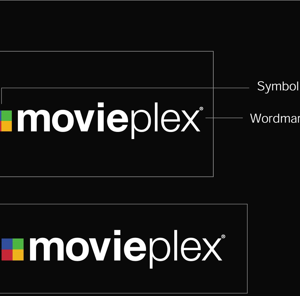
2 Contents Logo Elements Unnacceptable Logo Usage Clear Space & Sizing Color Variations Background Control File Structure Color Specifications Typography


3
4 Unacceptable Logo Usage All logo versions have been precisely designed for maximum legibility and impact. Do not alter the elements or their proportion or position. Do not change the size or position of the cube symbol in relation to the wordmark Do not change the typeface of the wordmark Do not alter symbol elements Do not change the size or the position of the registration mark in relation to the wordmark Do not alter the typeface of the channel descriptor 4
5 Logo Clear Space and Sizing Clear Space Clear space is the area around the logo that must be kept clear of competing graphic elements. The minimum required clear space is defined by the measurement x, as shown. This measurement is equal to the height of the e in our wordmark. Horizontal Keep in mind that x represents the minimum amount of space you must give the logo. Increasing the clear space surrounding the logo can result in a greater impact. Vertical To help our logo stand out we ve established a minimum size, as shown in the exhibits to the right. Minimum Sizing The minimum size shown here should accommodate most applications. Whatever reproduction technique is used, our logo should always be clearly executed. Applications such as the Web, signage or merchandise may require larger sizes for legibility. Horizontal Vertical 5
6 Logo Color Variations Color variations of our logo have been created for a variety of applications and reproduction techniques. These logo variations are available for all three channel logos. Two-color versions For use on a photographic or a color background. The cube symbol appears with its representative colors. The wordmark appears in white in the reverse version and in black in the positive version. Two-color reverse Two-color positive White reverse version The cube symbol appears in shades of grey and the wordmark appears in white. This variation can be used either on a photographic or color background. White reverse Black version The cube symbol appears in shades of grey and the wordmark appears in black. This variation can be used either on a photographic or color background. Black 6
7 Logo Background Control Care must be taken when applying our logos to various backgrounds. It s extremely important to ensure the visibility of all Two-color reverse logo on black The two-color reverse logo can be used on any dark color that provides sufficient contrast for all Do not place logos on colors that provide insufficient contrast for the cube symbol. Always choose a logo based on the color of the background to ensure enough contrast with all Two-color positive logo on white The two-color positive logo can be used on any light color that provides sufficient contrast for all Do not place logos on colors that provide insufficient contrast for the cube symbol. White reverse logo on black The white reverse logo can be used on any dark color that provides sufficient contrast for all Do not place logos on colors that provide insufficient contrast. Black positive logo on white The black logo can be used on any light color that provides sufficient contrast for all logo elements. Do not place logos on colors that provide insufficient contrast. 7


8 Logo Background Control - Continued Two-color reverse logo on black The two-color reverse logo can be used on dark imagery that provides sufficient contrast for all Do not place logos on backgrounds that provide insufficient contrast for the cube symbol. Two-color positive logo on white The two-color positive logo can be used on light imagery that provides sufficient contrast for all Do not place logos on backgrounds that obscure White reverse logo on black The white reverse logo can be used on dark imagery that provides sufficient contrast for all logo elements. Do not place logos on backgrounds that provide insufficient contrast for the Black positive logo on white The black logo can be used on light imagery that provides sufficient contrast for all logo elements. Do not place logos on backgrounds that provide insufficient contrast for the Care must be taken when applying our logo to various backgrounds. It s extremely important to ensure the visibility of all Because of color and value variations in photography, abstract graphics and illustrative images, always choose a logo that provides enough contrast. You may find that adjusting the position of a photograph or retouching the area where the logo resides helps to achieve that goal. The exhibits here demonstrate acceptable and unacceptable applications of the different logo color variations. 8 Do not place logos on backgrounds that provide insufficient contrast for the wordmark.
9 Logo File Structure File-naming Legend File-naming Example Files/Folder Hierarchy Example (MoviePlex ) 1. Channel Descriptor mplx = MoviePlex iplx = IndiePlex rplx = RetroPlex pod = MoviePlex On Demand 2. Configuration hor = horizontal ver = vertical 3. Appearance pos = positive rev = reverse 4. Color Version 2c = two-color bk = black wh = white mplx_hor_pos_2c_cmyk.eps mplx_hor_pos_2c_rgb.eps MoviePlex_cmyk-spot mplx_2-color mplx_ver_pos_2c_cmyk.eps mplx_ver_rev_2c_cmyk.eps mplx_hor_pos_2c_cmyk.eps mplx_hor_rev_2c_cmyk.eps mplx_black mplx_ver_pos_bk_cmyk.eps mplx_hor_rev_wh_cmyk.eps mplx_white mplx_ver_rev_wh_cmyk.eps mplx_hor_rev_wh_cmyk.eps MoviePlex_rgb mplx_2-color mplx_ver_pos_2c_rgb.eps mplx_ver_rev_2c_rgb.eps mplx_hor_pos_2c_rgb.eps mplx_hor_rev_2c_rgb.eps mplx_black mplx_ver_pos_bk_rgb.eps mplx_hor_pos_bk_rgb.eps mplx_white mplx_ver_rev_wh_rgb.eps mplx_hor_rev_wh_rgb.eps 5. Color Mode rgb = rgb color mode cmyk = cmyk color mode 6. File type extension.eps = encapsulated postscript.jpg = jpeg raster graphic 9
10 Color Specifications Accurate representation of the color palette is important for clear and consistent communication of the MoviePlex brand. The color specifications are listed to the right for your reference. These colors are already built into the logo files provided. In lieu of the color(s) listed on this page, you may use the PANTONE Colors cited, the standards for which can be found in the current edition of the PANTONE formula guide. The colors shown throughout these guidelines have not been evaluated by Pantone, Inc. for accuracy and may not match the PANTONE Color Standards. Consult current PANTONE Publications for accurate color. PANTONE is the property of Pantone, Inc. 10
11 Typography When used correctly, typography can unite all MoviePlex channels, applications and brand communications. We ve chosen the Helvetica Neue font family to represent the MoviePlex brand. There are four weights available to give you design flexibility. Italic versions of these fonts may be used to highlight statements or words, but no other fonts should be used. ABCDEFGHIJKLMNOPQRSTUVWXYZ abcdefghijklmnopqrstuvwxyz Helvetica Neue 45 Light ABCDEFGHIJKLMNOPQRSTUVWXYZ abcdefghijklmnopqrstuvwxyz Helvetica Neue 55 Roman ABCDEFGHIJKLMNOPQRSTUVWXYZ abcdefghijklmnopqrstuvwxyz Helvetica Neue 75 Bold ABCDEFGHIJKLMNOPQRSTUVWXYZ abcdefghijklmnopqrstuvwxyz Helvetica Neue 95 Black 11
INTRODUCTION. Please respect the integrity of the brand and the careful thought and craft that has gone into it.
 BRAND STANDARDS MAY 2017 INTRODUCTION The Intelligent Office brand is more than a name. It is a complete system of color, typography and artwork that reflects the true spirit of the organization. Using
Introduction. ThinManager - A Rockwell Automation Technology
 1220 Old Alpharetta Road, Suite 390 Alpharetta, Georgia 30005 www.thinmanager.com info@thinmanager.com OFFICE 678-990-0945 Introduction... 1 Logo... 2 Clear space and minimum size... 3 Primary color palette...
Logo. Logo. Symbol. Wordmark
 1725 Windward Concourse, Suite 300 Alpharetta, Georgia 30005 www.thinmanager.com info@thinmanager.com OFFICE 678-990-0945 FAX 678-990-0951 Introduction... 1 Logo... 2 Clear space and minimum size... 3
Brand Guidelines. version
 Brand Guidelines version 2017.1 Primary Logo The OPSWAT logo is a universal signature spanning all of our communications. Because it is such a recognizable and highly visible asset, it s important that
MARMOL BRAND GUIDELINES APRIL Powered by TECKpert.com
 MARMOL BRAND GUIDELINES Powered by TECKpert.com 2 3 4 5 6 7 8 9 10 11 CONTENTS LOGO ICON CLEAR SPACE PROPORTION MINIMUM SIZE DON TS BACKGROUND COLOR COLOR TYPOGRAPHY 2 LOGO This is the primary Marmol logo.
corporate identity guidelines
 Seilevel Corporate Identity Guidelines Introduction 1 Preferred Signature and Components Logo Space and Minimum Size Signature Variations Color Palette Typography Signature Misuse 2 3 4 5 6 7 corporate
Scottish Mountain Rescue 2018 Brand Guide
 Scottish Mountain Rescue 2018 Brand Guide A route map for branding V6 - October 2018 Contents The purpose of this document is to provide guidance for the use of the Scottish Mountain Rescue (SMR) logo
GÉANT CORPORATE IDENTITY GUIDELINES FOR USE. connect communicate collaborate
 GÉANT CORPORATE IDENTITY GUIDELINES FOR USE connect communicate collaborate THE LOGO The GÉANT logo is the core element within the brand. From printed brochures and datasheets through PowerPoint presentations
Third Party Identity Guidelines
 Third Party Identity Guidelines Introduction Introduction This document has been developed to provide anyone using The Wolfson Foundation logotype with clear guidelines on how the brand identity can be
Corporate Identity Guidelines
 Corporate Identity Guidelines CONTENTS 1.0 TRADEMARK Watco Companies Logo Logo Clear Space Logo Variations Project Logos Proper Logo Use 03 04 05 06 07 08 2.0 TYPOGRAPHY Type Family 3.0 COLOR Brand Color
WarnerMedia Lockup Usage
 Brand Guidelines WarnerMedia Lockup Usage The WarnerMedia lockup is used to improve awareness and recognition of our brand in marketing and advertising. It s a clean, elegant, typographic presentation
Somerston Estate Identity Guidelines
 Somerston Estate Identity Guidelines MARCH 2016 Somerston Estate Introduction Your brand identity is an extremely valuable and important asset. Its use, distribution, and implementation must be carefully
BRAND IDENTITY GUIDELINES
 BRAND IDENTITY GUIDELINES table of contents Mechanics of the Logo 3 Correct Usage - Full Color Logo 4 Correct Usage - Grayscale Logo 5 Correct Usage - Black Only Logo 6 Reversed Identity 7 Clear Zone Requirements
GRAPHIC STANDARDS BOOK
 BOOK PURPOSE A uniformly applied visual identity program is essential to building a strong brand. It helps to immediately establish recognition for The Innevation Center University of Nevada, Reno, expresses
Brand Overview COLORS / FONTS / LOGOS rd Street, Suite 210 Denver, CO communityengineeringcorps.org
 Brand Overview COLORS / FONTS / LOGOS 1031 33rd Street, Suite 210 Denver, CO 80205 720 204-3194 Color Palette PRIMARY COLORS PRIMARY PALETTE For most situations, it is important to utilize the two main
CANES COMMUNITIES REGIONAL VISUAL IDENTITY MANUAL. March 2015
 CANES COMMUNITIES REGIONAL VISUAL IDENTITY MANUAL March 2015 Table of Contents Identity Introduction................................................. 1.0 Using This Manual... 1.1 Identity Policy.........................................................
FLEET LOGO USAGE AND STANDARDS INNOVA BRANDING STANDARDS 2015 GUIDE
 FLEET LOGO USAGE AND STANDARDS INNOVA BRANDING STANDARDS 2015 GUIDE INNOVA BRANDING STANDARDS 2015 GUIDE 2 TABLE OF CONTENTS The Innova Brand 3 Branding Elements Logo Colors Typography 4 8 10 INNOVA BRANDING
The Fresno EOC logo includes the box symbol and wordmarks
 Brand Guidelines box symbol wordmarks The Fresno EOC logo includes the box symbol and wordmarks Introduction The foundation of our graphic identity system, the Fresno EOC logo, represents the most concise
Corporate Identity At-A-Glance. Abbreviated Version
 Corporate Identity At-A-Glance Abbreviated Version Corporate Signature The Corporate Signature is the key component of s visual identity. It s the primary expression that graphically represents across
Brand Identity Guide. Raise Your Hand Texas Brand Identity Guide Standards and Practices
 Brand Identity Guide Raise Your Hand Texas Brand Identity Guide Standards and Practices August 2016 Primary Logo The Raise Your Hand Texas primary logo uses the letterforms from our name to present an
BRAND IDENTITY STANDARDS GUIDE
 BRAND IDENTITY STANDARDS GUIDE JANUARY 2015 TABLE OF CONTENTS This brand identity standards guide was created to help establish the BCIU s visual brand image and bring consistency to all visual representations
Logos. North Dallas Shared Ministries
 Brand Guidelines Logos The NDSM logo stands at the center of the NDSM brand. For this reason it must be reproduced and applied with consistency in all of our brand communications. It is essential that
Graphic Standards Guide JACOB PARENT PHOTOGRAPHY
 Graphic Standards Guide Contents 3 4 5 6 7 8 9 10 11 12 13 Introduction Color Values Fonts Used Logo Arrangements and Guidlines Proper Usage Improper Usage Staging Minimum Size Business Card Apparel Links
Corporate Identity Guidelines
 Corporate Identity Guidelines - CONTENTS 1.0 TRADEMARK Watco Companies Logo Logo Clear Space Logo Variations Project Logos Proper Logo Use 03 04 05 06 07 08 2.0 TYPOGRAPHY Type Family 3.0 COLOR Brand Color
CORPORATE LICENSING SPECIALISTS
 CORPORATE LICENSING SPECIALISTS Logo Application and Style Guide Revision: V1 13-02-2014 All contents are copyright 2014 Inde 2 The Logo Design Application 3 Anatomy 4 Clear Space 5-7 Sizing 8 Colour Application
Fort Edmonton Park Logo Guidelines 1
 Fort Edmonton Park Logo Guidelines 1 Visual Identity Fort Edmonton Park (FEP) is represented by a logo that incorporates distinctive typography combined with stylized illustration of the fort. The colour
Identity Guidelines: How to use our logo. Version 1.0 April 2014
 Identity Guidelines: How to use our logo Version 1.0 April 2014 Contents 2 3 Introduction and Who to Contact 4 Writing the Company Name 5 The Fortune Brands Logo 6 Approved Logo Color Variations 7 Color
Iowa Corn Brand Identity Guide
 Brand Identity Guide January 2014 Logo Usage: The Iowa Corn Growers Association (ICGA) is a membership organization lobbying for agricultural issues on behalf of its members. The Iowa Corn Promotion Board
Brand Standards & Style Guide
 Brand Standards & Style Guide Table of Contents 3 About This Guide 4 Color Palette Specifications 5 Logo - Correct Usage 7 Logo - Surrounding Space 8 Logo - Size Restrictions 9 Logo - Incorrect Usage 10
Visual Style Guide. April 2016
 Visual Style Guide April 2016 Page 2 Contents Introduction to the Logo 3 Safe Area and Size 4 Incorrect Usage 5 Color Palette 6 Typography 7 Tone and Style of Photography 9 Print Examples 10 Screen Examples
IDENTITY GRAPHIC STANDARDS MANUAL
 IDENTITY GRAPHIC STANDARDS MANUAL TABLE OF CONTENTS Identity Graphic standards manual v1.0 Table of Contents 1 Introduction and Importance of Graphic Standards 2 Logo System 3 Primary Logo and Variations
Brand Guidelines Solano County Transit (SolTrans)
") Brand Guidelines Solano County Transit (SolTrans) May 2018 Table of Contents The SolTrans Story... 1 Brand Elements... 2 Logo Usage... 3 Color Palette... 7 Typography.... 8 Photography.... 9 The SolTrans
Brand Guidelines Solano County Transit (SolTrans) May 2018 Table of Contents The SolTrans Story... 1 Brand Elements... 2 Logo Usage... 3 Color Palette... 7 Typography.... 8 Photography.... 9 The SolTrans
L O G O S T A N D A R D S
 LOGO STANDARDS Apex Logo Standards Logo + Colors...-6 Logo Family...7-17 Logo Usage...18-19 Typefaces... 20 Logo Files: Applications & Use...21 Prepared by: 27 CENTRAL PARK BLVD. STE 204 DENVER, CO 8028
GRAPHIC STANDARDS MANUAL
 GRAPHIC STANDARDS MANUAL INTRODUCTION AND GENERAL STANDARDS The purpose of this Graphic Standards Manual is to set forth guidelines that will assist in applying the Active Aerogels Logo to all communications.
MESSAGE FROM TRUSTED CHOICE
 Logo Rules MESSAGE FROM TRUSTED CHOICE Trusted Choice Logo Rules We are pleased that you decided to participate in Trusted Choice. We have invested substantial resources in developing the Trusted Choice
Brand Guidelines 2012
 Brand Guidelines 2012 Contents Introduction 3 General Guidelines 4 Proportions 5 Variations of the SendGrid logo 6 Protected Area 8 Minimum Size 9 Unacceptable Usage 10 Primary Corporate Colors 12 Secondary
Brand Guidelines
 Brand Guidelines 2017 11.22 Logo Logo Our company logo is the core of our identity and should be used on all communication materials. When used consistently and thoughtfully it will strengthen recognition
PART 1 BRAND VISUAL IDENTITY
 PART 1 BRAND VISUAL IDENTITY Colored version «hei» corporate mark has two components: Symbol -«hei» symbol; -«hei» wordmark. The two elements always have to be used together without interventions of any
HarvestMaster Logo LOGO COLORS: STANDARD COLOR & SPACING LOGO COLORS: SIMPLIFIED
 HarvestMaster COLOR & SPACING LOGO COLORS: STANDARD LOGO COLORS: SIMPLIFIED To ensure the prominence, clarity, and visual impact of the HarvestMaster logo, please adhere to the following guidelines regarding
LOGO & BRAND STANDARDS GUIDE
 LOGO & BRAND STANDARDS GUIDE INTRODUCTION The SparkPost Brand Standards Guide provides key information needed to accurately and consistently produce external and internal documents and communications.
DESIGN GUIDELINES. Davis Technical College. DAVIS TECHNICAL COLLEGE 550 East 300 South Kaysville, UT Phone: Web: davistech.
 DESIGN GUIDELINES Davis Technical College DAVIS TECHNICAL COLLEGE 550 East 300 South Kaysville, UT 84037 Phone: 801.593.2500 Web: davistech.edu About this brand This identity guideline is a tool designed
Logo Guidelines. Welcome to the Capgemini logo guidelines
 Logo Guidelines Welcome to the Capgemini logo guidelines This document provides guidance on how to use our logo with a series of simply defined rules. Logo Our logo is the most vital and visible element
STYLE GUIDE. CONTENTS: Logo Usage...2 Logo Placement...4 Color Palette...5 Typography...6 Additional Logos...7 Logo Reference Library...
 STYLE GUIDE The Mended Hearts and Mended Little Hearts style guide is a tool to ensure that all communications materials, both internal and external, adhere to a cohesive style and brand standard. The
ETSI Brand Guidelines
 ETSI Brand Guidelines January 2011 ETSI LEGAL The ETSI logo is a trademark of ETSI. The ETSI logo shall only be used in accordance with the ETSI Brand Guidelines. In case of any questions with regards
Styleguide Stage One - Brand Identity Brand Logo, Colour, Font and Pattern JUNE 2017
 Styleguide 2017 Stage One - Brand Identity Brand Logo, Colour, Font and Pattern JUNE 2017 Contents 2 Capital Chemist Introduction 2 Contents 3 Introduction Brand Logo and Guidelines 4 Brand Logo 5 Coloured
Style guide.
 Style guide www.nam.org Logo Orientation The orientation of the Manufacturing Institute logo is shown below. The base line of the logo mark and typography should be aligned. The logo mark and typography
Part 01: Logo, Typography & Colours. Brand Identity Guidelines 2015
 Part 01: Logo, Typography & Colours Brand Identity Guidelines 2015 At a glance Logo Typography ITC Caslon No. 224 Univers Georgia Arial The core elements of the Arts Council identity makes our brand instantly
Brand Guidelines Powerplus Brand Guidelines Document 2014 Edition
 Brand Guidelines Contents 01. Introduction 02. Master brand 03. Orientation 04. Clear space 05. Minimum size 06. Colour palette 07. Unacceptable usage 08. Typeface 09. Category variations 10. Contact Introduction
This document describes the basic elements of our identity system and provides guidelines for their correct use.
 STYLE GUIDE CONTENT 3 INTRODUCTION 4 APPROVED PRIMARY LOGO 5 USE OF THE PRIMARY LOGO 10 APPROVED BRAND LOGOS 11 CLEAR SPACE 13 INCORRECT LOGO USAGE 14 FONTS 15 WEBSITE 16 SUMMARY Welcome to the EPIC style
Visual Identity for ASLA
 Visual Identity for ASLA Our Mission The Society s mission is to lead, to educate, and to participate in the careful stewardship, wise planning, and artful design of our cultural and natural environments.
Table of Contents. Logo. Colour
 Brand Guidelines (Eternal) June 2018 Table of Contents Logo 1.0 Logo 1.1 Logo Versions 1.2 Tagline Lockup 1.3 Clear Space and Minimum Size 1.4 Relation to Other Logos 1.5 Logo Don ts Colour 2.0 Brand Palette
Ferrysavers Brand Guidelines
 2 Contents 3 4 5 6 7 8 9 10 11 12 13 Introduction The Ferrysavers Logo Protecting Our Master Logo Incorrect Master Logo Application Ferrysavers Family Logos Typography Print Typography Digital Typography
Last modified November Visual Identity Guidelines
 Last modified November 2012 Visual Identity Guidelines INTRODUCTION The City of Brandon s logo is one that recognizes the importance of community and family, while paying homage to its strong ties to agriculture
B R A N D I N G G U I D E L I N E S
 BRANDING GUIDELINES TABLE OF CONTENTS Logo.... 3 Symbol... 4 Color Palette.... 5 Clear Space....................................................................................................... 6 Minimum
01: The Digital Explorer Identity
 Brand Guidelines Brand Guidelines 01: The Digital Explorer Identity 02: Use of the Identity 03: Color Palette 04: Logo Colour Usage 05: Use of the Digital Graphic 06: Typeface 07: File Formats 08: Sample
Visual Identity Guidelines
 Guidelines VERSION 1: APRIL 2017 One City One Team Guidelines Table of Contents Introduction to logo 4 Safe Area / Minimum Size 5 Logo Usage 6 Incorrect Uses 7 Typography 8 Logo Colour Palette 9 Graphic
Graphic Standards Manual. Version 1.3 February 2015
 Graphic Standards Manual Version 1.3 February 2015 2 introduction The Importance of Graphic Standards The way we identify ourselves in all types of communications is the way we tell the world who we are.
Branding Guidelines - gather, grow, go
 Branding Guidelines - gather, grow, go Heartland Community Church, June 2008 Brand Attributes 1 2 The Heartland gather, grow, go logos are made up of 2 different elements 1. Symbol - Each g logo has a
Styleguide Stage One - Brand Identity Brand Logo, Colour, Font and Pattern
 Styleguide 2016 Stage One - Brand Identity Brand Logo, Colour, Font and Pattern Contents 2 Capital Chemist Introduction 2 Contents 3 Introduction Brand Logo and Guidelines 4 Brand Logo 5 Coloured Brand
TABLE OF CONTENTS. About OASIS. Branding. Typography. Colors. Brand Guidelines for OASIS Inc., First Edition 2015 OASIS Inc. All rights reserved.
 Brand Guidelines TABLE OF CONTENTS About OASIS 3 Mission, work and structure Branding 4 Primary logo 6 Alternate logos 8 Logo clear space & minimum size 10 Incorrect use of the logo Typography 12 Preferred
Brand Identity Guide
 Brand Identity Guide Logos Preferred Logo The official logo for St. Vrain Valley Schools. Use the full-color version of the logo when possible. Logos can be downloaded at http://www.svvsd.org/logos FULL
QUICK GUIDE. Graphics Standards & Guidelines University of Nebraska at Kearney
 QUICK GUIDE Graphics Standards & Guidelines University of Nebraska at Kearney 08 2016 Summary The visual identity for the University of Nebraska Kearney is the face the school shows the public. It is representative
The MMA master logo. The MMA master logo consists of two elements: the MMA graphic and the company name.
 Logo guidelines The MMA master logo The MMA master logo consists of two elements: the MMA graphic and the company name. The MMA graphic Each of these elements have been specially spaced and positioned,
Brand Standards 2014
 Logo The logomark consists of the Texas state seal and the logotype. There is a vertical and horizontal version both utilize a two-color palette and a black and white palette. The horizontal format is
Introduction A global icon needs an iconic logo. Fashion has evolved since 1969, when Gap opened its first store. Our logo has changed with the
 Introduction A global icon needs an iconic logo. Fashion has evolved since 1969, when Gap opened its first store. Our logo has changed with the times, too. One thing that hasn t changed is our mission
Visual Identity Guideline
 Visual Identity Guideline Primary Logo logomark Wordmark Logo Overview The MSBSD logo consists of a logomark seal that sits alongside or on top of a wordmark. These elements have been carefully designed
Marketing Guidelines. Parallels International GmbH. All rights reserved. Terms of Use Privacy Policy
 Marketing Guidelines Parallels International GmbH. All rights reserved. Terms of Use Privacy Policy Parallels Story Parallels Inc., a global leader in cross-platform solutions, makes it simple for customers
Brand Guidelines Overview
 Brand Guidelines Overview May 2012 1.2 The Signature Colour version Black Colour reverse Shield alone Reverse Colour reverse on red Our signature system is comprised of two elements; the MUHC wordmark
Contents. 3 About These Guidelines. 4 Why is a Brand Important? 5 Overview. 6 Resources. 7 Logo/Signature. 8 Clear Space. 9 Color Variations
 Brand Guidelines Contents 3 About These Guidelines 4 Why is a Brand Important? 5 Overview 6 Resources 7 Logo/Signature 8 Clear Space 9 Color Variations 10 Logo Misuse Examples 11 Background Control 12
Our brand guidelines. Our photography
 1 brand guidelines photography Hello. We re the Motor Ombudsman. Please give this document your full attention. It should help you get to know more about us and our corporate guidelines. 2 This section
National CyberWatch Center Brand Guidelines (truncated) January 2015
 January 2015") Brand Guidelines (truncated) January 2015 Introduction This book is meant to guide all internal, external, partner, alliance and member usage of the brand, logo, name and/or identity. It should guide all
Brand Guidelines (truncated) January 2015 Introduction This book is meant to guide all internal, external, partner, alliance and member usage of the brand, logo, name and/or identity. It should guide all
Visual Identity Guidelines
 Visual Identity Guidelines 2017 Building Our Brand The Nasdaq brand is one of our most important assets. It embodies who we are and what we value. Taken together, all the elements of our visual identity
Corporate Identity Style Guide. April 2014
 Corporate Identity Style Guide April 2014 Table of Contents Our Signature 1.0 Restrictions Legibility 2.0 Color 2.1 Usage with Photos 2.2 Color Palette 3.0 Typography Primary Type 4.0 Websafe / Alternate
Brand Style Guide. updated
 Brand Style Guide updated 12.19.18 Why Brand Identity Matters Effective January 1, 2019, KHA will begin using a new logo. We can all take pride in what it signifies: The well-known hospital H emblem in
Symbol and Wordmark. Symbol. Wordmark
 Symbol and Wordmark Symbol Wordmark The Symbol was developed with KCPC s vision and mission in mind. A simple, clean, and dynamic image was created using Vision-1-2-3 and Vision BLESSING. Vision-1-2-3
Brand Identity Guide. September 2017
 Brand Identity Guide September 2017 Welcome At Canada Drives our goal is to be the number one consumer lending company in Canada by making financing simple and accessible to every Canadian while maintaining
Oracle Certification Program LOGO GUIDELINES
 Oracle Certification Program LOGO GUIDELINES TABLE OF CONTENTS INTRODUCTION 3 OFFICIAL TYPEFACES 4 COLOR PALETTE 5 CLEAR SPACE 6 MINIMUM SIZE 7 COLOR AND BACKGROUND USAGE 8 UNACCEPTABLE USAGE 9 Copyright
Brand Guidelines 2016
 Brand Guidelines 2016 Introduction to the Guide The purpose of this guide is to provide Food Bank representatives and network member organizations an outline to the proper use of Northern Illinois Food
MINI BRAND GUIDELINES
 MINI BRAND GUIDELINES 9.18.17 TABLE OF CONTENTS SECTION 1 Introduction 3 SECTION 4 The Hamline Logo(s) & Seal 5 SECTION 5 Colors 16 SECTION 6 Typography 20 Questions about how to use this brand guide?
Logo. Primary. Secondary
 Logo The logomark consists of the Texas state seal and the logotype. There is a vertical and horizontal version both utilize a two-color palette and a black and white palette. The horizontal format is
BRAND GUIDELINES
 BRND GUIDELINES 07.07.2016 TBLE OF CONTENTS Brand Promise...02 The llegany College of Maryland Logo...03 Logo Options...04 Logo Colors...05-07 CM Logo...08 Reversed Logos...09 Dark Backgrounds... 10 Logo
San Jose Office of Economic Development Brand Guidelines
 Brand Guidelines Section 1: Brand Institutions, like individuals, care about, cultivate and maintain their identities because these are nothing less than their character and their reputation. Identity,
Identity Guidelines. December 2012
 Identity Guidelines December 2012 Identity Guidelines Contents 1.0 Our Logo Our logo Our wordmark Colour treatments Clear space, large and small sizes Correct logo placement Incorrect logo usage 2.0 Colour
Graphic Identity Standards and Guidelines. Gilman School
 Graphic Identity Standards and Guidelines Gilman School P August 21, 2009 Why We have Guidelines The graphic identity for Gilman School is summarized in these Graphic Identity Standards and Guidelines.
Marketing Guidelines. Parallels International GmbH. All rights reserved. Terms of Use Privacy Policy
 Marketing Guidelines Parallels International GmbH. All rights reserved. Terms of Use Privacy Policy Master Brand Components The Parallels logo is the cornerstone of the Parallels brand. Please use it correctly
onem2m Standards Certification Logo Usage Guidelines
 Logo Usage Guidelines December 2016 Logo Design Explanation Requirements of Use onem2m Logo shall only be used in relation to products that have undergone and completed the onem2m certification process
SIGNATURE GUIDE YOUR REFERENCE BOOK TO THE TRUSTED CHOICE
 SIGNATURE GUIDE YOUR REFERENCE BOOK TO THE TRUSTED CHOICE LOGO www. TrustedChoice. com/ logo MESSAGE WELCOME TO TRUSTED CHOICE Welcome Message from Trusted Choice We are pleased that you decided to participate
Workplace Safety Certificate of Recognition
 Brand Standards Guide TABLE OF CONTENTS Logo Guidelines...... 1 Logo and Safety Seal Rationale...... 2 Logo and Wordmark...... 3 Brand Colours......4 Brand Fonts... 6 Logo Space Requirements...... 7. Positioning
GRAPHIC STANDARDS MANUAL. Appalachian Trail Conservancy Version 1.0
 GRAPHIC STANDARDS MANUAL Appalachian Trail Conservancy 2011 - Version 1.0 THE BRAND LOGO Brand Identity Our logo incorporates colors, typeface and graphic treatments to help solidify this program s brand
STYLE GUIDE UPDATED AUGUST 2017
 STYLE GUIDE UPDATED AUGUST 2017 GENERAL GUIDELINES Purpose of the guide.... 3 Brenau University logo usage guidelines.... 4 Typography guidelines.... 12 Color palette and usage guidelines.... 13 Stationery
LOGO USE GUIDELINES BRAND GUIDELINES PUBLISHED ON FEBRUARY 17,
 LOGO USE GUIDELINES BRAND GUIDELINES PUBLISHED ON FEBRUARY 17, 2014 1 LOGO USE GUIDELINES LOGO USAGE GUIDELINES 13 LOGO USAGE GUIDELINES The Gardner-Webb logo is the centerpiece of the University's visual
QUALCOMM INCORPORATED COMPANY NAME AND LOGO GUIDELINES FOR THIRD-PARTY USAGE
 QUALCOMM INCORPORATED COMPANY NAME AND LOGO GUIDELINES FOR THIRD-PARTY USAGE Qualcomm Incorporated Company Name and Logo Guidelines for Third-Party Usage INTRODUCTION In addition to receiving Qualcomm
2016 Marketing Guidelines Parallels International GmbH. All rights reserved. Terms of Use Privacy Policy
 2016 Marketing Guidelines 2016 Parallels International GmbH. All rights reserved. Terms of Use Privacy Policy Master Brand Components The Parallels logo is the cornerstone of the Parallels brand. Please
BRAND IDENTITY GUIDELINES. downtownlangley.com
 BRAND IDENTITY GUIDELINES downtownlangley.com TABLE OF CONTENTS DLBA Corporate brand 3 The preferred logo version p4 Logo variations p5 The logo with tagline Black & White version Single colour versions
Carleton College Identity Guidelines UPDATED: JULY 2015
 Carleton College Identity Guidelines UPDATED: JULY 2015 INTRODUCTION 1 Table of Contents Introduction 1 Brand Identity Elements 2 Wordmark 2 Color 3 Associated Symbols 4 Symbol Colors 5 Wordmark Lockups
Graphic Elements Style Guide
 Graphic Elements Style Guide 1.26.2012 In partnership with Thermo Scientific Brand Specifications 1/2012 Table of Contents 1 Logo Usage and Standards 2 Typography 3 Color Palette 4 Messaging Hierarchy
Motorcraft Logo Usage Guidelines
 Primary Logo 13FordMotorcraft_Clear_4C_R01.eps Motorcraft is a registered trademark of Ford Motor Company. The primary logo is to be used whenever possible. Every effort should be made to use this logo
OTTER TAIL COUNTY - MINNESOTA LOGO USAGE POLICY
 OTTER TAIL COUNTY - MINNESOTA LOGO USAGE POLICY Prepared By: The Branding Task Force as directed by the Division Directors and the Otter Tail County Board of Commissioners. Manual Version Control Version
Visual Identity. Style Guide MINI VERSION:2 JAN 2016
 Visual Identity Style Guide MINI VERSION:2 JAN 2016 Carnegie Science Visual Identity Style Guide These guidelines represent the building blocks that define the Carnegie Science brand. We want to make our
MEDIA KIT. MARCH 2019 / v. 1
 MEDIA KIT MARCH 2019 / v. 1 BRAND CONSTRUCTION three elements: the Symbol, the (HOLDINGS). To maintain its impact and immediate visual recognition, no text, graphic element, or edge should interfere with