TODAY S AGENDA. An introduction for Libraries UW-SLIS CES Webinar April 6, 2015 What is Responsive Web Design? Definition & History
|
|
|
- Irene Gilmore
- 6 years ago
- Views:
Transcription


1 TODAY S AGENDA An introduction for Libraries UW-SLIS CES Webinar April 6, 2015 What is Responsive Web Design? Definition & History How do I DO Responsive Web Design? Tips & Tricks & Jargon Where do I go to learn more about Responsive Web Design? Resources, Bibliography, SLIS/CES web course 1 2
2 WHAT IS RESPONSIVE WEB DESIGN? WHAT IS RESPONSIVE WEB DESIGN? Responsive web design (RWD) is an approach to web design aimed at crafting sites to provide an optimal viewing experience easy reading and navigation with a minimum of resizing, panning, and scrolling across a wide range of devices (from desktop computer monitors to mobile phones). [Wikipedia, the free encyclopedia] Responsive web design (RWD) is an approach to web design aimed at crafting sites to provide an optimal viewing experience easy reading and navigation with a minimum of resizing, panning, and scrolling across a wide range of devices (from desktop computer monitors to mobile phones). [Wikipedia, the free encyclopedia] adapts the layout to the viewing environment by using fluid, proportion-based grids 3 3
3 WHAT IS RESPONSIVE WEB DESIGN? WHAT IS RESPONSIVE WEB DESIGN? Responsive web design (RWD) is an approach to web design aimed at crafting sites to provide an optimal viewing experience easy reading and navigation with a minimum of resizing, panning, and scrolling across a wide range of devices (from desktop computer monitors to mobile phones). [Wikipedia, the free encyclopedia] adapts the layout to the viewing environment by using fluid, proportion-based grids flexible images Responsive web design (RWD) is an approach to web design aimed at crafting sites to provide an optimal viewing experience easy reading and navigation with a minimum of resizing, panning, and scrolling across a wide range of devices (from desktop computer monitors to mobile phones). [Wikipedia, the free encyclopedia] adapts the layout to the viewing environment by using fluid, proportion-based grids flexible images CSS3 Media Queries 3 3
 is an approach to web design aimed at crafting sites to provide an optimal viewing experience easy reading and navigation with a minimum of resizing, panning, and")
4 WHAT IS RESPONSIVE WEB DESIGN? Responsive web design (RWD) is an approach to web design aimed at crafting sites to provide an optimal viewing experience easy reading and navigation with a minimum of resizing, panning, and scrolling across a wide range of devices (from desktop computer monitors to mobile phones). [Wikipedia, the free encyclopedia] adapts the layout to the viewing environment by using fluid, proportion-based grids flexible images CSS3 Media Queries <meta name= viewport" content="width=device-width"> 3
5 HOW WE GOT TO RESPONSIVE HOW WE GOT TO RESPONSIVE Choices: Mobile site App Responsive Choices: Mobile site App Responsive
6 HOW WE GOT TO RESPONSIVE HOW WE GOT TO RESPONSIVE Choices: Mobile site App Responsive Choices: Mobile site App Responsive


7 HOW WE GOT TO RESPONSIVE Choices: Mobile site App Responsive
8 VIEWPORT META TAG Magic! Sort of Tells browser to adjust to size of device <meta name="viewport" content="width=device width />
9 VIEWPORT META TAG Magic! Sort of Tells browser to adjust to size of device <meta name="viewport" content="width=device width /> VIEWPORT META TAG Magic! Sort of Tells browser to adjust to size of device <meta name="viewport" content="width=device width />

10 VIEWPORT META TAG Magic! Sort of Tells browser to adjust to size of device <meta name="viewport" content="width=device width />
11 FLUID LAYOUTS Escaping the CSS box model! <div id= outerwrap"> Grid <div id="header"> <div id= bodycontent > <div id="footer"> Makes content columns swing below each other to fit on smaller, narrower, screen

12

13 SECRET OF COLUMNS SECRET OF COLUMNS New HTML5 element <section> Defines a section in the document Sizing done in CSS Col and span aren t only for tables anymore Table is a display property in CSS3 that says, Let the element behave like a <table> element New HTML5 element <section> Defines a section in the document Sizing done in CSS Col and span aren t only for tables anymore Table is a display property in CSS3 that says, Let the element behave like a <table> element

14 SECRET OF COLUMNS SECRET OF COLUMNS New HTML5 element <section> Defines a section in the document Sizing done in CSS Col and span aren t only for tables anymore Table is a display property in CSS3 that says, Let the element behave like a <table> element New HTML5 element <section> Defines a section in the document Sizing done in CSS Col and span aren t only for tables anymore Table is a display property in CSS3 that says, Let the element behave like a <table> element
15

16 CSS3 MEDIA QUERIES Used to mostly be screen or print Hide nav when print { #navigation { display: none; } }. [W3Schools] Media queries look at the capability of the device, and can be used to check many things, such as: width and height of the browser window width and height of the device orientation (is the tablet/phone in landscape or portrait mode?) Resolution You can also have different stylesheets for different media

17
18
19
20
21


22 TOOLS Bootstrap Word Press Responsive themes All sorts of code generators & downloads Responsive Grid System GitHub - %93&q=responsive+web+design
23 TOOLS Bootstrap Word Press Responsive themes All sorts of code generators & downloads Responsive Grid System GitHub - %93&q=responsive+web+design
24


25

26
27 RESOURCES, BOOKS: RESOURCES, BOOKS:

28 RESOURCES, BOOKS: RESOURCES, BOOKS:
29 RESOURCES, WEBSITES W3Schools Responsive html/html_responsive.asp RESOURCES, WEBSITES W3Schools Responsive html/html_responsive.asp

30 RESOURCES, WEBSITES W3Schools Responsive html/html_responsive.asp EVEN MORE - A List Apart - Content Strategy for the Web 2 nd ed book, Kristina Halvorson usability.gov content-strategy.html CES web course "Designing Mobile & Responsive Experiences starts June 1 continueed-designmobile.htm
31 But that kind of design thinking doesn t need to be our default. Now more than ever, we re designing work meant to be viewed along a gradient of different experiences. Responsive web design offers us a way forward, finally allowing us to design for the ebb and flow of things. Ethan Marcotte THANK YOU! QUESTIONS?
Responsive Web Design (RWD)
") Responsive Web Design (RWD) Responsive Web Design: design Web pages, so that it is easy to see on a wide range of of devices phone, tablet, desktop,... Fixed vs Fluid layout Fixed: elements have fixed
Responsive Web Design (RWD) Responsive Web Design: design Web pages, so that it is easy to see on a wide range of of devices phone, tablet, desktop,... Fixed vs Fluid layout Fixed: elements have fixed
Responsive Web Design and Bootstrap MIS Konstantin Bauman. Department of MIS Fox School of Business Temple University
 Responsive Web Design and Bootstrap MIS 2402 Konstantin Bauman Department of MIS Fox School of Business Temple University Exam 3 (FINAL) Date: 12/06/18 four weeks from now! JavaScript, jquery, Bootstrap,
How to deploy for multiple screens
 How to deploy for multiple screens Ethan Marcotte, a developer in Boston, coined the phrase responsive design to describe a website that adapts to the size of the viewer s screen. A demonstration site
CISC 1600 Lecture 1.4 Design, part 2. Topics: Accessibility Responsive web design Example design review
 CISC 1600 Lecture 1.4 Design, part 2 Topics: Accessibility Responsive web design Example design review Accessibility Design for users with special needs Might include you at some point You still want/need
International Conference KNOWLEDGE-BASED ORGANIZATION Vol. XXIII No RESPONSIVE WEB DESIGN TECHNIQUES. Luminita GIURGIU, Ilie GLIGOREA
 International Conference KNOWLEDGE-BASED ORGANIZATION Vol. XXIII No 3 2017 RESPONSIVE WEB DESIGN TECHNIQUES Luminita GIURGIU, Ilie GLIGOREA Nicolae Bălcescu Land Forces Academy, Sibiu, Romania luminita.giurgiu.a@gmail.com,
AGENDA. :: Add Meta Tag for Viewport (inside of head element): :: Add Script that renders HTML5 elements for older versions of Internet Explorer
: :: Add Script that renders HTML5 elements for older versions of Internet Explorer") CLASS :: 14 12.10 2018 3 Hours AGENDA LECTURE :: Responsive Web Design [RWD] DOWNLOAD ASSETS [ CSS ] :: Media Query [rwd.css] ADD HTML META TAG & IE SCRIPT [ HTML ] :: Add Meta Tag for Viewport (inside
CLASS :: 14 12.10 2018 3 Hours AGENDA LECTURE :: Responsive Web Design [RWD] DOWNLOAD ASSETS [ CSS ] :: Media Query [rwd.css] ADD HTML META TAG & IE SCRIPT [ HTML ] :: Add Meta Tag for Viewport (inside
Chapter 7 BMIS335 Web Design & Development
 Chapter 7 BMIS335 Web Design & Development Site Organization Use relative links to navigate between folders within your own site o Sometimes dividing your site into folders makes maintenance and updating
Responsive Web Design. Sheri German, Instructor Montgomery College
 Responsive Web Design Sheri German, Instructor Montgomery College Responsive Web Design (RWD)! Coined by Ethan Marcotte through his awareness of what was taking place in the discipline of architecture.!
AGENDA :: MULTIMEDIA TOOLS :: CLASS NOTES. INSTALLING FONTS :: Download, Install, & Embed Your Fonts. LECTURE :: Responsive Web Design [RWD]
![AGENDA :: MULTIMEDIA TOOLS :: CLASS NOTES. INSTALLING FONTS :: Download, Install, & Embed Your Fonts. LECTURE :: Responsive Web Design [RWD]](/thumbs/84/90658100.jpg "AGENDA :: MULTIMEDIA TOOLS :: CLASS NOTES. INSTALLING FONTS :: Download, Install, & Embed Your Fonts. LECTURE :: Responsive Web Design [RWD]") CLASS :: 14 05.05 2017 3 Hours AGENDA INSTALLING FONTS :: Download, Install, & Embed Your Fonts LECTURE :: Responsive Web Design [RWD] DOWNLOAD ASSETS [ CSS ] :: Media Query [rwd.css] ADD HTML META TAG
CLASS :: 14 05.05 2017 3 Hours AGENDA INSTALLING FONTS :: Download, Install, & Embed Your Fonts LECTURE :: Responsive Web Design [RWD] DOWNLOAD ASSETS [ CSS ] :: Media Query [rwd.css] ADD HTML META TAG
EXPLORE MODERN RESPONSIVE WEB DESIGN TECHNIQUES
 20-21 September 2018, BULGARIA 1 Proceedings of the International Conference on Information Technologies (InfoTech-2018) 20-21 September 2018, Bulgaria EXPLORE MODERN RESPONSIVE WEB DESIGN TECHNIQUES Elena
Responsive Design. Responsive Design Approach. Technique for building webpages
 Responsive Design Responsive Design Technique for building webpages Allows you to present the same content in different ways to different devices Create conditions for applying specific CSS styles Ex:
Responsive Design for Web Applications R.I.T. S. Ludi/R. Kuehl p. 1 R I T. Software Engineering
 Responsive Design for Web Applications S. Ludi/R. Kuehl p. 1 What is the Problem? S. Ludi/R. Kuehl p. 2 Credit: Matt Griffin What is the Problem? Mobile web access is ubiquitous One interface design does
BA. (Hons) Graphics Design
 Graphics Design") BA. (Hons) Graphics Design Cohort: BGD/16A/FT Examinations for 2018 / Semester 1 Resit Examinations for BGD/15B/FT MODULE: Advanced Web Design MODULE CODE: WAT3110C Duration: 2 Hours Instructions to Candidates:
BA. (Hons) Graphics Design Cohort: BGD/16A/FT Examinations for 2018 / Semester 1 Resit Examinations for BGD/15B/FT MODULE: Advanced Web Design MODULE CODE: WAT3110C Duration: 2 Hours Instructions to Candidates:
Introduce Bootstrap 3 to develop RESPONSIVE. design application. Copyright 2014 exo Platform
 Introduce Bootstrap 3 to develop RESPONSIVE design application A presentation by exo UI Team When UI was not a concern Many UI innovation since And some company success to create wonderful design for web
CSC309 Programming on the Web week 3: css, rwd
 CSC309 Programming on the Web week 3: css, rwd Amir H. Chinaei, Spring 2017 Office Hours: M 3:45-5:45 BA4222 ahchinaei@cs.toronto.edu http://www.cs.toronto.edu/~ahchinaei/ survey 1 in survey 1, you provide
A pixel is not a pixel. Peter-Paul Koch SF HTML5, 6 April 2012
 A pixel is not a pixel Peter-Paul Koch http://quirksmode.org http://twitter.com/ppk SF HTML5, 6 April 2012 Example site http://mobilism.nl/2012/ A proper responsive site that you can use on any device
Introduction to Computer Science Web Development
 Introduction to Computer Science Web Development Flavio Esposito http://cs.slu.edu/~esposito/teaching/1080/ Lecture 14 Lecture outline Discuss HW Intro to Responsive Design Media Queries Responsive Layout
A pixel is not a pixel. Peter-Paul Koch MoBeers, 10 April 2012
 A pixel is not a pixel Peter-Paul Koch http://quirksmode.org http://twitter.com/ppk MoBeers, 10 April 2012 Example site http://mobilism.nl/2012/ A proper responsive site that you can use on any device
Designing for diverse devices. Dr. Andres Baravalle
 Designing for diverse devices Dr. Andres Baravalle 1 Outline Web 2.0 Designing for diverse devices 2 Web 2.0 Web 2.0 Web 2.0 is one of neologisms commonly in use in the Web community According to Tim O
Want to read more? You can buy this book at oreilly.com in print and ebook format. Buy 2 books, get the 3rd FREE!
 Want to read more? You can buy this book at oreilly.com in print and ebook format. Buy 2 books, get the 3rd FREE! Use discount code: OPC10 All orders over $29.95 qualify for free shipping within the US.
the missing manual0 O'REILLY Third Edition David Sawyer McFarland Beijing Cambridge The book that should have been in the box Farnham
 Farnham Third Edition the missing manual0 The book that should have been in the box David Sawyer McFarland Beijing Cambridge O'REILLY Koln Sebastopol Tokyo Contents The Missing Credits vii Introduction
AGENDA. EMBEDDING FONTS [ Font Files & CSS font-family ] :: Online Font Converter :: ADD font-family css code to style.css
![AGENDA. EMBEDDING FONTS [ Font Files & CSS font-family ] :: Online Font Converter :: ADD font-family css code to style.css](/thumbs/83/88078174.jpg "AGENDA. EMBEDDING FONTS [ Font Files & CSS font-family ] :: Online Font Converter :: ADD font-family css code to style.css") CLASS :: 12 05.04 2018 3 Hours AGENDA CREATE A WORKS PAGE [ HTML ] :: Open index.html :: Save As works.html :: Edit works.html to modify header, 3 divisions for works, then add your content :: Edit index.html
CLASS :: 12 05.04 2018 3 Hours AGENDA CREATE A WORKS PAGE [ HTML ] :: Open index.html :: Save As works.html :: Edit works.html to modify header, 3 divisions for works, then add your content :: Edit index.html
Responsive Web Design. From: Ethan Marcotte - Responsive Web Design 2011
 Responsive Web Design From: Ethan Marcotte - Responsive Web Design 2011 Motivation Browser windows have their inconsistencies and imperfections Once web pages are published online, the designs are immediately
CIT BY: HEIDI SPACKMAN
 CIT230-06 BY: HEIDI SPACKMAN WHAT IS A MEDIA QUERY? A Media Query (Boolean code) written in CSS3 determines the screen display size that needs to be used and adjusts the HTML pages to display correctly
HTML Organizing Page Content
 HTML Organizing Page Content CSS for layout Examples http://www.shinybytes.com/newcss.html Generic Elements Used to create a logical grouping of content or elements on the page Can be customized to describe
WEB DEVELOPMENT & DESIGN FOUNDATIONS WITH HTML5
 WEB DEVELOPMENT & DESIGN FOUNDATIONS WITH HTML5 Chapter 7 Key Concepts 1 In this chapter, you will learn how to... LEARNING OUTCOMES Code relative hyperlinks to web pages in folders within a website Configure
Viewports. Peter-Paul Koch CSS Day, 4 June 2014
 Viewports Peter-Paul Koch http://quirksmode.org http://twitter.com/ppk CSS Day, 4 June 2014 or: Why responsive design works Peter-Paul Koch http://quirksmode.org http://twitter.com/ppk CSS Day, 4 June
CSS3, Media Queries, & Responsive Design. May 23, 2012 STC Summit Zoe Mickley
 CSS3, Media Queries, & Responsive Design May 23, 2012 STC Summit Zoe Mickley Gillenwater @zomigi What I do Books Stunning CSS3: A Project-based Guide to the Latest in CSS www.stunningcss3.com Flexible
Styles, Style Sheets, the Box Model and Liquid Layout
 Styles, Style Sheets, the Box Model and Liquid Layout This session will guide you through examples of how styles and Cascading Style Sheets (CSS) may be used in your Web pages to simplify maintenance of
Responsive web design (RWD) CSS3 Media queries. Mobile vs desktop web sites. Web Development 1 CS1115/CS5002
 CSS3 Media queries. Mobile vs desktop web sites. Web Development 1 CS1115/CS5002") 1 of 13 CS1115/CS5002 Web Development 1 Dr Derek Bridge School of Computer Science & Information Technology University College Cork Mobile vs desktop web sites A few organization have two web sites, one
1 of 13 CS1115/CS5002 Web Development 1 Dr Derek Bridge School of Computer Science & Information Technology University College Cork Mobile vs desktop web sites A few organization have two web sites, one
Front-End UI: Bootstrap
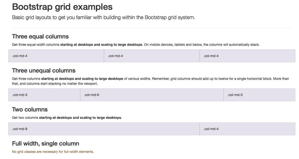
 Responsive Web Design BootStrap Front-End UI: Bootstrap Responsive Design and Grid System Imran Ihsan Assistant Professor, Department of Computer Science Air University, Islamabad, Pakistan www.imranihsan.com
Programming web design MICHAEL BERNSTEIN CS 247
 Programming web design MICHAEL BERNSTEIN CS 247 Today: how do I make it?! All designers need a medium. Napkin sketches aren t enough.! This week: core concepts for implementing designs on the web! Grids!
Web Site Design Small Screen Design Responsive Design R.I.T. S. Ludi/R. Kuehl p. 1 R I T. Software Engineering
 Web Site Design Small Screen Design Responsive Design S. Ludi/R. Kuehl p. 1 Design Principles and Guidelines User Populations (Shared human ability and behavior) (Problem domains) Computing Paradigms (Platform
8/19/2018. Web Development & Design Foundations with HTML5. Learning Objectives (1 of 2) More on Relative Linking. Learning Objectives (2 of 2)
 More on Relative Linking. Learning Objectives (2 of 2)") Web Development & Design Foundations with HTML5 Ninth Edition Chapter 7 More on Links, Layout, and Mobile Slides in this presentation contain hyperlinks. JAWS users should be able to get a list of links
Web Development & Design Foundations with HTML5 Ninth Edition Chapter 7 More on Links, Layout, and Mobile Slides in this presentation contain hyperlinks. JAWS users should be able to get a list of links
Building Responsive Layouts
 Building Responsive Layouts by Zoe Mickley Gillenwater @zomigi zomigi.com December 5, 2012 CSS Dev Conf hello nice to meet you 2 I don t use a mobile phone I have a process for eating these why responsive
A pixel is not a pixel. Peter-Paul Koch BlackBerry Jam, 6 February 2012
 A pixel is not a pixel Peter-Paul Koch http://quirksmode.org http://twitter.com/ppk BlackBerry Jam, 6 February 2012 I. Pixels Pixels according to W3C The reference pixel is the visual angle of one pixel
Web App Vs Web Site. Some tricks of the trade. Laurent Technical Director, BlackBerry Web Platform
 Web App Vs Web Site Some tricks of the trade Laurent Hasson @ldhasson, lhasson@rim.com Technical Director, BlackBerry Web Platform 2012-05-09 Web Apps Vs. Web Sites 1 INTRODUCTION 2012-05-09 Web Apps Vs.
FRONT END DEVELOPER CAREER BLUEPRINT
 FRONT END DEVELOPER CAREER BLUEPRINT HAVE A QUESTION? ASK! Read up on all the ways you can get help. CONFUSION IS GOOD :) Seriously, it s scientific fact. Read all about it! REMEMBER, YOU ARE NOT ALONE!
Designing with CSS3 Effectively & Efficiently. October 2010 Adobe MAX Zoe Mickley
 Designing with CSS3 Effectively & Efficiently October 2010 Adobe MAX Zoe Mickley Gillenwater @zomigi 1 What I do out now out Dec 10 Books Web Flexible Web Design: Creating Liquid and Elastic Layouts with
Block & Inline Elements
 Block & Inline Elements Every tag in HTML can classified as a block or inline element. > Block elements always start on a new line (Paragraph, List items, Blockquotes, Tables) > Inline elements do not
YouTube Break. https://www.youtube.com/watch?v=lvtfd_rj2he
 Layout Jeff Avery YouTube Break https://www.youtube.com/watch?v=lvtfd_rj2he Positioning Visual Components Previously, we learned about event handling and model-view-control architecture. Next, we need
WCMS Responsive Design Template Upgrade Training
 WCMS Responsive Design Template Upgrade Training The purpose of this training session is to provide training to site owners, who are upgrading their WCMS content to the new Responsive Design (RD) template.
Session 5. Web Page Generation. Reading & Reference
 Session 5 Web Page Generation 1 Reading Reading & Reference https://en.wikipedia.org/wiki/responsive_web_design https://www.w3schools.com/css/css_rwd_viewport.asp https://en.wikipedia.org/wiki/web_template_system
Lab 1: Introducing HTML5 and CSS3
 CS220 Human- Computer Interaction Spring 2015 Lab 1: Introducing HTML5 and CSS3 In this lab we will cover some basic HTML5 and CSS, as well as ways to make your web app look and feel like a native app.
Responsive Web Design. Design for web content
 Responsive Web Design Design for web content Overview A short history of web design for media One Web and Mobile First Adding flexibility to your layout Flexible images? Media queries Fixed/Fluid/Adaptive/Responsive
Make a Website. A complex guide to building a website through continuing the fundamentals of HTML & CSS. Created by Michael Parekh 1
 Make a Website A complex guide to building a website through continuing the fundamentals of HTML & CSS. Created by Michael Parekh 1 Overview Course outcome: You'll build four simple websites using web
Original publication Please cite as
 Original publication Please cite as Speicher, Maximilian (2014). Paving the Path to Content-Centric and Device-Agnostic Web Design. In: Web Engineering. Ed. by Sven Casteleyn, Gustavo Rossi, and Marco
HTML Organizing Page Content
 HTML Organizing Page Content HTML 5 Elements Well supported by current desktop and mobile browsers (known issues with IE 8 and earlier) May be used to divide pages into major sections
Responsive Design. Responsive design is it important? But typical is not enough. Some typical screen sizes
 Responsive Design Responsive design is it important? For many years, screen sizes were growing Eventually, settled on fixed-width (e.g. 960px) But now with smart phones, tablets, television and many new
Learning Adobe DreamWeaver CC. Module 1 Contents. Chapter 1: Introduction to DreamWeaver CC
 Module 1 Contents Chapter 1: Introduction to DreamWeaver CC Design Considerations...1-1 Types of Graphics...1-2 Backgrounds and Text...1-2 Planning the Navigation...1-2 The DreamWeaver Screen...1-3 Workspaces...
COMP519 Web Programming Lecture 8: Cascading Style Sheets: Part 4 Handouts
 COMP519 Web Programming Lecture 8: Cascading Style Sheets: Part 4 Handouts Ullrich Hustadt Department of Computer Science School of Electrical Engineering, Electronics, and Computer Science University
Advanced Dreamweaver CS6
 Advanced Dreamweaver CS6 Overview This advanced Dreamweaver CS6 training class teaches you to become more efficient with Dreamweaver by taking advantage of Dreamweaver's more advanced features. After this
Content First! Jeffrey Zeldman
 Content First! Jeffrey Zeldman Think about what your users want and the content they need before thinking about tools and features. Remember content is often separated from your design so it shouldn t
Introduction to WEB PROGRAMMING
 Introduction to WEB PROGRAMMING Web Languages: Overview HTML CSS JavaScript content structure look & feel transitions/animation s (CSS3) interaction animation server communication Full-Stack Web Frameworks
Web Design and Implementation
 Study Guide 3 - HTML and CSS - Chap. 13-15 Name: Alexia Bernardo Due: Start of class - first day of week 5 Your HTML files must be zipped and handed in to the Study Guide 3 dropbox. Chapter 13 - Boxes
Designing for the Mobile Web
 Objectives Session 5.1 Create a media query Work with the browser viewport Apply a responsive design Create a pulldown menu with CSS Session 5.2 Create a flexbox Work with flex sizes Explore flexbox layouts
VEGA Version /27/2017
 Version 2.2.1 01/27/2017 Vega Pro Check out the pro version at https://www.lyrathemes.com/vega-pro INSTALLING WORDPRESS INSTALLING THE THEME Using the Administration Panel Using cpanel Manually Using FTP
Web Programming BootStrap Unit Exercises
 Web Programming BootStrap Unit Exercises Start with the Notes packet. That packet will tell you which problems to do when. 1. Which line(s) are green? 2. Which line(s) are in italics? 3. In the space below
Responsive Web Design Links
 What is Responsive Design and Why Do We Need It? The go to article: http://alistapart.com/article/responsive-web-design Great slide deck on what responsive design is: http://johnpolacek.github.io/scrolldeck.js/decks/responsive/
CS7026 Media Queries. Different Screen Size Different Design
 CS7026 Media Queries Different Screen Size Different Design Introduction Users no longer view web content only on traditional desktop systems, but are increasingly using smartphones, tablets, and other
Positioning in CSS: There are 5 different ways we can set our position:
 Positioning in CSS: So you know now how to change the color and style of the elements on your webpage but how do we get them exactly where we want them to be placed? There are 5 different ways we can set
Adaptations by PVII responsive and then creates your page instantly Al Sparber & Gerry Jacobsen PVII
 Adaptations by PVII is a Dreamweaver extension that allows you to select from 5 unique responsive layouts and then creates your page instantly. We hope you enjoy using this product as much as we did making
INFS 2150 Introduction to Web Development
 Objectives INFS 2150 Introduction to Web Development Create a media query Work with the browser viewport Apply a responsive design Create a pulldown menu with CSS Create a flexbox 5. Mobile Web INFS 2150
INFS 2150 Introduction to Web Development
 INFS 2150 Introduction to Web Development 5. Mobile Web Objectives Create a media query Work with the browser viewport Apply a responsive design Create a pulldown menu with CSS Create a flexbox INFS 2150
Write a Touch-friendly HTML5 App. Hongbo Min, Intel Junmin Zhu, Intel Yongsheng Zhu, Intel
 Write a Touch-friendly HTML5 App Hongbo Min, Intel Junmin Zhu, Intel Yongsheng Zhu, Intel Agenda Background Touch vs. Mouse Part I: UI Layout Part II: Event Handling Touch in HTML5 Framework Q/A 2 Background
Frontend guide. Everything you need to know about HTML, CSS, JavaScript and DOM. Dejan V Čančarević
 Frontend guide Everything you need to know about HTML, CSS, JavaScript and DOM Dejan V Čančarević Today frontend is treated as a separate part of Web development and therefore frontend developer jobs are
CS7026 Media Queries II. Different Screen Size Different Design
 CS7026 Media Queries II Different Screen Size Different Design What You ll Learn We ll be restyling an entire page layout to work with different screen sizes and devices using Media queries to apply styles
Markup Language. Made up of elements Elements create a document tree
 Patrick Behr Markup Language HTML is a markup language HTML markup instructs browsers how to display the content Provides structure and meaning to the content Does not (should not) describe how
HTML5 and Mobile: New Markup & Styles for the Mobile Web. Jason Clark Head of Digital Access & Web Services Montana State University Libraries
 HTML5 and Mobile: New Markup & Styles for the Mobile Web Jason Clark Head of Digital Access & Web Services Montana State University Libraries Overview Demos View some code bits New Features and Functions
Chapter 1 Introduction to Dreamweaver CS3 1. About Dreamweaver CS3 Interface...4. Creating New Webpages...10
 CONTENTS Chapter 1 Introduction to Dreamweaver CS3 1 About Dreamweaver CS3 Interface...4 Title Bar... 4 Menu Bar... 4 Insert Bar... 5 Document Toolbar... 5 Coding Toolbar... 6 Document Window... 7 Properties
Using CSS for page layout
 Using CSS for page layout Advantages: Greater typographic control Style is separate from structure Potentially smaller documents Easier site maintenance Increased page layout control Increased accessibility
CSS3: Using media queries to improve the web site experience. November 19, 2011 indieconf Zoe Mickley
 CSS3: Using media queries to improve the web site experience November 19, 2011 indieconf Zoe Mickley Gillenwater @zomigi What I do Books Web Stunning CSS3: A Project-based Guide to the Latest in CSS Accessibility
References for DHW Website
 References for DHW Website Ahmed, A. (2018) Smooth CSS Fade in on Page Load Animation. Codepad. Ashfaq Ahmed. Available at: https://codepad.co/snippet/pye0krxf. [Last Accessed 17th July 2018], Bootstrap
CSS for Page Layout Robert K. Moniot 1
 CSS for Page Layout 2015 Robert K. Moniot 1 OBJECTIVES In this unit, you will learn: How to use style sheets for layout Controlling text flow, margins, borders, and padding Controlling visibility of elements
/
 HTML5 Audio & Video HTML5 introduced the element to include audio files in your pages. The element has a number of attributes which allow you to control audio playback: src This
WEB DESIGNER CAREER BLUEPRINT
 WEB DESIGNER CAREER BLUEPRINT HAVE A QUESTION? ASK! Read up on all the ways you can get help. CONFUSION IS GOOD :) Seriously, it s scientific fact. Read all about it! REMEMBER, YOU ARE NOT ALONE! Join
Adobe Dreamweaver CS6 Digital Classroom
 Adobe Dreamweaver CS6 Digital Classroom Osborn, J ISBN-13: 9781118124093 Table of Contents Starting Up About Dreamweaver Digital Classroom 1 Prerequisites 1 System requirements 1 Starting Adobe Dreamweaver
Here are some links to get you started in learning more about CSS3 media queries and responsive web design:
 of 8 The HTML5 CSS Starter Page Series - Part 13: CSS3 Media Queries and the Mobile Web By: Sheri German In the last installment of the HTML5 CSS Starter Page series, we completed the Stringendo Studios
CSS: Responsive Design, CSS3 and Fallbacks
 CSS: Responsive Design, CSS3 and Fallbacks CISC 282 October 4, 2017 What is a Mobile Browser? Browser designed for a not-desktop display Phones/PDAs, tablets, anything handheld Challenges and constraints
All India Council For Research & Training
 WEB DEVELOPMENT & DESIGNING Are you looking for a master program in web that covers everything related to web? Then yes! You have landed up on the right page. Web Master Course is an advanced web designing,
Basic Design for Developers. Ma. Andrea Drei R. Alquiros Design Team Lead, Lendsoft Solutions, Inc.
 Basic Design for Developers Ma. Andrea Drei R. Alquiros Design Team Lead, Lendsoft Solutions, Inc. What is a Designer? A designer is a person who designs. Designs for what?! Graphics Designer UX Designer
IMY 110 Theme 11 HTML Frames
 IMY 110 Theme 11 HTML Frames 1. Frames in HTML 1.1. Introduction Frames divide up the web browser window in much the same way that a table divides up part of a page, but a different HTML document is loaded
Media Types & Media Features
 Media Types & Media Features Same HTML, Different CSS R. Scott Granneman r Jans Carton 1.6 2008 R. Scott Granneman Last updated 2018-08-21 You are free to use this work, with certain restrictions. For
Brunch & Learn: Design Best Practices for Desktop, Mobile, Tablet & Beyond
 Brunch & Learn: Email Design Best Practices for Desktop, Mobile, Tablet & Beyond November 7, 2013 A special thank you to: Thank you for joining us we will be starting at 12:30 PM ET/9:30 AM PT If you are
Mobile Applications 2013/2014
 Mobile Applications 2013/2014 Mike Taylor Product Manager February 6, 2015 Advanced Development Technology Agenda Devices App Types Test/Deploy Summary Devices Mobile (Feature) Phones Windows version 5/6
New frontier of responsive & device-friendly web sites
 New frontier of responsive & device-friendly web sites Dino Esposito JetBrains dino.esposito@jetbrains.com @despos facebook.com/naa4e Responsive Web Design Can I Ask You a Question? Why Do You Do RWD?
Web Site Design and Development Lecture 13
 Web Site Design and Development Lecture 13 CS 0134 Fall 2018 Tues and Thurs 1:00 2:15PM Normalize.css Normalize.css is a useful project to incorporate into your web pages In their own words, Normalize.css
Developing Web Applications for Smartphones with IBM WebSphere Portlet Factory 7.0
 Developing Web Applications for Smartphones with IBM WebSphere Portlet Factory 7.0 WebSphere Portlet Factory Development Team 6 September 2010 Copyright International Business Machines Corporation 2010.
How to set up a local root folder and site structure
 Activity 2.1 guide How to set up a local root folder and site structure The first thing to do when creating a new website with Adobe Dreamweaver CS3 is to define a site and identify a root folder where
CREATIVE & TECHNICAL SPECIFICATIONS
 CREATIVE & TECHNICAL SPECIFICATIONS CREATIVE SPECIFICATIONS EXPECTED ASSETS LANDSCAPE: 96Ox424px ipad: 768x928px 1O24x672px SAME SIZE FOR INTERSCROLLER SMARTFOOTER MPU INCONTENT INTERSTITIAL 64Ox2OOpx
CSS Layout Part I. Web Development
 CSS Layout Part I Web Development CSS Selector Examples Choosing and applying Class and ID names requires careful attention Strive to use clear meaningful names as far as possible. CSS Selectors Summary
Meta Tag. Add metadata to your web pages by placing <meta> tags inside the header of the document which is represented by <head> and </head> tags.
 Meta Tag Description: The tag provides metadata (Metadata is data that describes other data which is there in the webpage or website) about the HTML document. Metadata will not be displayed on the
A Pragmatist s Guide to InDesign CS6 + EPUB
 A Pragmatist s Guide to InDesign CS6 + EPUB Kiyo Toma Senior Product Manager, Design & Creative Cloud Incubation June 5, 2012 3 questions I get asked a lot What do I need to know if I m new to the world
Class 9 / Instructor: Ira Epstein
 Fashion Institute of Technology http://www.iraworks.com/fit Introduction to Web Design / CT244 Instructor: Ira Epstein iraepst@gmail.com Class 9 / 4-3-18 1) Attendance and Announcements... 2:10-2:20 a)
HTML and CSS a further introduction
 HTML and CSS a further introduction By now you should be familiar with HTML and CSS and what they are, HTML dictates the structure of a page, CSS dictates how it looks. This tutorial will teach you a few
Web Development and HTML. Shan-Hung Wu CS, NTHU
 Web Development and HTML Shan-Hung Wu CS, NTHU Outline How does Internet Work? Web Development HTML Block vs. Inline elements Lists Links and Attributes Tables Forms 2 Outline How does Internet Work? Web
[PACKT] HTML5, CSS3, and jquery. Dreamweaver CS5.5 Mobile. and Web Development with
![[PACKT] HTML5, CSS3, and jquery. Dreamweaver CS5.5 Mobile. and Web Development with](/thumbs/93/112647246.jpg "[PACKT] HTML5, CSS3, and jquery. Dreamweaver CS5.5 Mobile. and Web Development with") Dreamweaver CS5.5 Mobile and Web Development with HTML5, CSS3, and jquery Harness the cutting edge features of Dreamweaver for mobile and web development David Karl ins [PACKT] PUBLISHING BIRMINGHAM -
Dreamweaver CS5.5 Mobile and Web Development with HTML5, CSS3, and jquery Harness the cutting edge features of Dreamweaver for mobile and web development David Karl ins [PACKT] PUBLISHING BIRMINGHAM -
AP CS P. Unit 2. Introduction to HTML and CSS
 AP CS P. Unit 2. Introduction to HTML and CSS HTML (Hyper-Text Markup Language) uses a special set of instructions to define the structure and layout of a web document and specify how the document should
COMSC-031 Web Site Development- Part 2
 COMSC-031 Web Site Development- Part 2 Part-Time Instructor: Joenil Mistal December 5, 2013 Chapter 13 13 Designing a Web Site with CSS In addition to creating styles for text, you can use CSS to create
Adobe InDesign CC Tips and Tricks
 Adobe InDesign CC Tips and Tricks 5 Ways to reduce the size of your InDesign files 1. Don t copy and paste image content from Photoshop or a web browser. 2. Don t leave unused page items in your files