Viewports. Peter-Paul Koch CSS Day, 4 June 2014
|
|
|
- Amice Paul
- 6 years ago
- Views:
Transcription
1 Viewports Peter-Paul Koch CSS Day, 4 June 2014
2 or: Why responsive design works Peter-Paul Koch CSS Day, 4 June 2014
3 1 Pixels
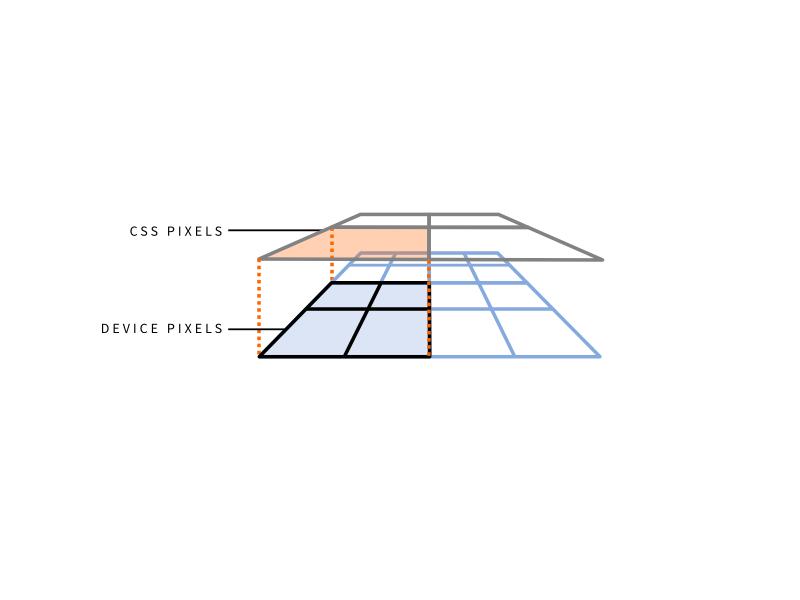
4 A pixel is not a pixel CSS pixels Device pixels You already know what they are. You just don t realise it.
5 CSS pixels CSS pixels are the ones we use in declarations such as width: 190px or padding-left: 20px They are an abstract construct Their size increases or decreases when the user zooms
6
7
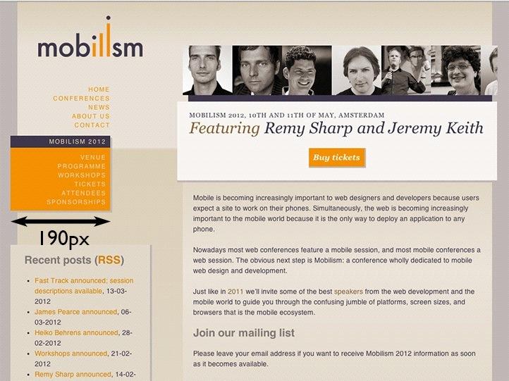
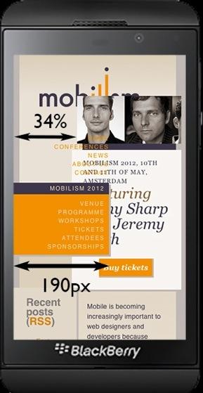
8 Device pixels Device pixels are the physical pixels on the device There s a fixed amount of them that depends on the device
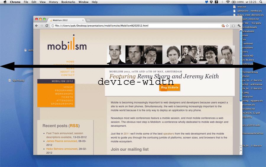
9 Device pixels
10 Device pixels
11
12
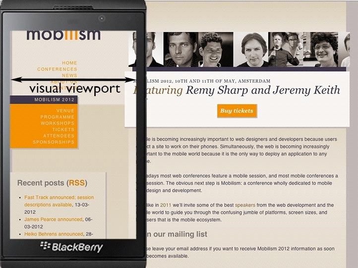
13 What kind of pixels? In general, almost all pixels you use in your code will be CSS pixels. The only exception is screen.width but screen.width is a serious problem that we ll study later
14 2 Viewports
15
16 Viewports The 34% is calculated relative to its container: the <body>. Every block-level element, including <html> and <body>, has an implicit width: 100%. So we get 34% of the <body> width of 100%. 100% of what? Of the <html> width, which is again 100%.
17 Viewports The <html> element s width is calculated relative to the viewport. Also called the initial containing block. On desktop it s equal to the browser window width. On mobile it s more complicated.
18 Viewports When you zoom in, you enlarge the CSS pixels and as a result less of them fit on the browser screen Thus the viewport becomes smaller
19
20
21 Viewports On mobile it s quite a bit more complicated Mobile browsers must render all sites correctly, even if they haven t been mobileoptimized If the (narrow) browser window were to be the viewport, many sites would be squeezed to death
22
23
24 Viewports That s why the mobile browser vendors changed the rules: By default, the viewport is px wide (depending on the browser), with 980px the most common size We call this the layout viewport Responsive design is the art of overriding the default width of the layout viewport
25
26 Viewports But this layout viewport is now much wider than the mobile screen Therefore we need a separate viewport for the actual window width We call this the visual viewport
27
28 JavaScript - layout viewport document.documentelement.clientwidth document.documentelement.clientheight Works (almost) everywhere.
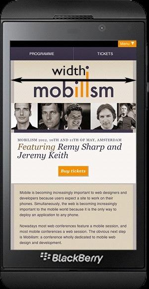
29 JavaScript - visual viewport window.innerwidth window.innerheight Doesn t work in Android 2, Opera Mini, and UC 8.
30 Viewports So the desktop viewport has been split into two: layout viewport visual viewport
31 Viewports So the desktop viewport has been split into two: layout viewport! visual viewport! But! there s a third mobile viewport that has no equivalent on the desktop:! ideal viewport
32
33 Ideal viewport What mobile browser vendors want is to give the site the perfect width for the device so that zooming and panning are not necessary and the user can read the text Enter the ideal viewport, which has the ideal size for the device Essentially a width and a height
34
35
36 Ideal viewport There are no wrong dimensions for the ideal viewport. They re what they need to be for the device they run on. (Admittedly, there are weird values. But they re not wrong.)

37 Ideal viewport: 320px

38 Ideal viewport: 320px
39 JavaScript - ideal viewport screen.width screen.height UNRELIABLE! Some browsers define screen.width and screen.height as the dimensions of the ideal viewport while others define them as the number of device pixels
40 3 Meta viewport
41 Meta viewport In order to create a responsive design we must set the layout viewport dimensions to the ideal viewport dimensions. How?
42 Meta viewport <meta name= viewport content= width=device-width >
43 Meta viewport <meta name= viewport content= width = device-width > By default, the layout viewport is between 768 and 1024 pixels wide. The meta viewport tag sets the width of the layout viewport to a value of your choice. You can use a pixel value (width=400) or you can use the device-width keyword to set it to the ideal viewport
44 Meta viewport <meta name= viewport content= width = device-width > I m assuming this does not come as a surprise But did you know that the following does exactly the same?
45 Meta viewport <meta name= viewport content= initial-scale = 1 > In theory, initial-scale gives the initial zoom level (where 1 = 100%) 100% of WHAT? Of the ideal viewport In practice, it also sets the layout viewport dimensions to the ideal viewport
46 Meta viewport <meta name= viewport content= initial-scale = 2 > In theory, initial-scale = 2 tells the browser to zoom in to 200%. It does so, but many browsers set the layout viewport to half the ideal viewport. Why half? Because zooming to 200% means that only half as many CSS pixels fit the visual viewport
47 Meta viewport <meta name= viewport content= initial-scale = 1 > And yes, this is weird. I wonder what Apple was smoking when it set these rules. I want some.
48 Let s mess things up
49 Meta viewport <meta name= viewport content= width = 400,initial-scale = 1 > Now the browser gets conflicting orders. Set the layout viewport width to 400px. No, wait, set it to the ideal viewport width (and also set the zoom to 100%). Browsers react by taking the highest value
50 Min-width viewport <meta name= viewport content= width = 400,initial-scale = 1 > Set the layout viewport width to either 400px, or the ideal viewport width, whichever is larger If the device orientation changes, this is recalculated. As a result, the layout viewport now has a minimum width of 400. Is this useful? Dunno.
51 Safari workaround <meta name= viewport content= width = device-width > Safari always takes the portrait width (320 on iphone, 768 on ipad). Sometimes this is what you want; at other times it isn t. How to solve this?
52 Safari workaround <meta name= viewport content= initial-scale = 1 > Now Safari does it right. In portrait mode it s the ideal portrait width; in landscape mode it s the ideal landscape width. All other browsers do the same. Except for IE10, which has exactly the opposite bug.
53 Safari workaround <meta name= viewport content= width=device-width,initial-scale=1 > Use both device-width and initial-scale. initial-scale works in Safari device-width works in IE10 and both work in all other browsers
54 Perfect meta viewport <meta name= viewport content= width = device-width, initial-scale = 1 >
55 { width: device-width; } Opera s idea initially Only IE for now, and prefixed at that.
56 { width: device-width; } Gives you the true ideal viewport. The tag gives you 320px (because overrides tag
57 Even perfecter { width: device-width; } <meta name= viewport content= width = device-width, initial-scale = 1 >
58 4 Media queries
59 Media all and (max-width: 600px) {.sidebar { float: none; } }
60 Media queries There are two important media queries: width (min-width and max-width) device-width (min-device-width and maxdevice-width) width is the one you want
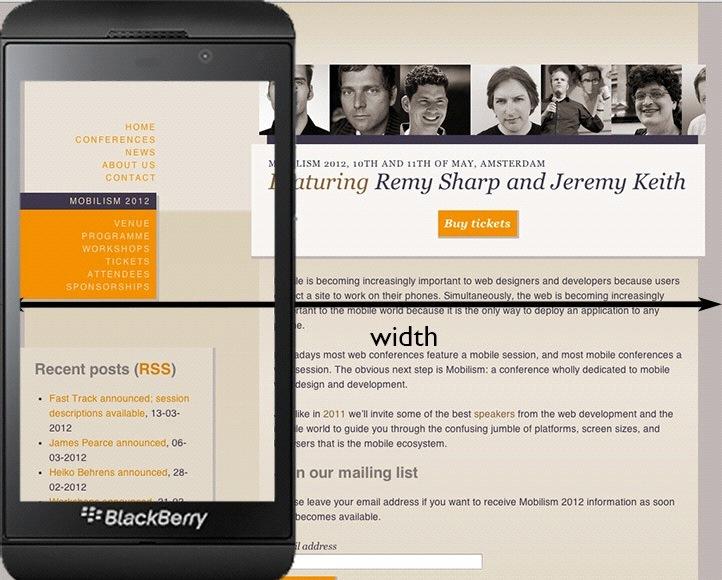
61
62
63 Media queries - device-width device-width media query is always equal to screen.width but the problem is screen.width may have two meanings, depending on the browser: 1) ideal viewport 2) number of device pixels
64
65
66 Media queries - width width gives the width of the layout viewport This is what you want to know Works always and everywhere
67
68 Responsive design Set the layout viewport width to the ideal viewport width (or, rarely, another value) Use the width media query to figure out how wide the layout viewport is Adjust your CSS to the width you found That s how responsive design works. You already knew that, but now you understand why it works.
69 Media queries Always use min- or max-width. Thus you define a breakpoint: these styles are valid for all widths equal to or less/ greater than X Exact widths, such as 320, are going to misfire in a lot of browsers. (Remember the 342px of the Z10.) There s more than just the iphone.
70 Responsive design < m e t a n a m e = v i e w p o r t c o n t e n t = w i d t h = d e v i c e - w i d t h, i n i t i a l - s c a l e = 1 all and (max-width: 600px) {! }
71 Responsive design But we d like to make our design respond to the physical width of the device, too. For instance, by setting a min-width: 25mm on our navigation items Tough luck You can t
72 5 CSS units
73 CSS units width: 25mm does not mean the element is 25 real-life millimeters wide Instead, it means pixels cm, mm, and in are in a sense fake units, because they do not correspond to the real world
74 CSS units 1 inch is defined as 96 CSS pixels If you zoom, the CSS pixels become larger, and your inches become larger, too. It has nothing to do with the real world.
75 CSS units 1 inch is defined as 96 CSS pixels 1 inch is defined as 2.54 cm 1 cm is defined as 10 mm 1 inch is defined as 72 points 1 pica is defined as 12 points
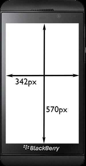
76 CSS units I used to think this is a bad idea But I changed my mind If an element would have a width of 25 real-world millimeters the browser would have to recalculate its width every single time the user zooms Eats too much battery life and processor time
77 CSS units But surely resolution tells us something useful. doesn t it?
78 6 Resolution
79 Resolution if (window.devicepixelratio >= all and ( ( - w e b k i t - m i n d e v i c e - p i x e l - r a t i o : 2 ), ( m i n - r e s o l u t i o n : d p i ) )
80 Resolution What is device pixel ratio? It s the ratio of screen size in device pixels and ideal viewport size
81 iphone 3G device pixels: 320 ideal viewport: 320 Therefore the devicepixelratio is 1
82 iphone 4S device pixels: 640 ideal viewport: 320 Therefore the devicepixelratio is 2
83 Samsung Galaxy Pocket device pixels: 240 ideal viewport: 320 Therefore the devicepixelratio is 0.75
84 BlackBerry Z10 device pixels: 768 ideal viewport: 342 Therefore the devicepixelratio is (Weird, but not wrong)
85 7 More information

86 The Mobile Web Handbook by me Published by Smashing Magazine For sale online Ships late June or July
87 Thank you I ll put these slides online Questions? Peter-Paul Koch CSS Day, 4 June 2014
Viewports. Peter-Paul Koch DevReach, 13 November 2017
 Viewports Peter-Paul Koch http://quirksmode.org http://twitter.com/ppk DevReach, 13 November 2017 or: Why responsive design works Peter-Paul Koch http://quirksmode.org http://twitter.com/ppk DevReach,
A pixel is not a pixel. Peter-Paul Koch BlackBerry Jam, 6 February 2012
 A pixel is not a pixel Peter-Paul Koch http://quirksmode.org http://twitter.com/ppk BlackBerry Jam, 6 February 2012 I. Pixels Pixels according to W3C The reference pixel is the visual angle of one pixel
A pixel is not a pixel. Peter-Paul Koch SF HTML5, 6 April 2012
 A pixel is not a pixel Peter-Paul Koch http://quirksmode.org http://twitter.com/ppk SF HTML5, 6 April 2012 Example site http://mobilism.nl/2012/ A proper responsive site that you can use on any device
A pixel is not a pixel. Peter-Paul Koch MoBeers, 10 April 2012
 A pixel is not a pixel Peter-Paul Koch http://quirksmode.org http://twitter.com/ppk MoBeers, 10 April 2012 Example site http://mobilism.nl/2012/ A proper responsive site that you can use on any device
Responsive Design. Responsive Design Approach. Technique for building webpages
 Responsive Design Responsive Design Technique for building webpages Allows you to present the same content in different ways to different devices Create conditions for applying specific CSS styles Ex:
Responsive Design. Responsive design is it important? But typical is not enough. Some typical screen sizes
 Responsive Design Responsive design is it important? For many years, screen sizes were growing Eventually, settled on fixed-width (e.g. 960px) But now with smart phones, tablets, television and many new
The plural of Chromium is Chromia. Peter-Paul Koch Mobilism, 27 March 2015
 The plural of Chromium is Chromia Peter-Paul Koch http://quirksmode.org http://twitter.com/ppk Mobilism, 27 March 2015 First of all Chrome on ios is not Chrome Chrome on ios Apple doesn t allow the installation
CS7026 Media Queries. Different Screen Size Different Design
 CS7026 Media Queries Different Screen Size Different Design Introduction Users no longer view web content only on traditional desktop systems, but are increasingly using smartphones, tablets, and other
8/19/2018. Web Development & Design Foundations with HTML5. Learning Objectives (1 of 2) More on Relative Linking. Learning Objectives (2 of 2)
 More on Relative Linking. Learning Objectives (2 of 2)") Web Development & Design Foundations with HTML5 Ninth Edition Chapter 7 More on Links, Layout, and Mobile Slides in this presentation contain hyperlinks. JAWS users should be able to get a list of links
Web Development & Design Foundations with HTML5 Ninth Edition Chapter 7 More on Links, Layout, and Mobile Slides in this presentation contain hyperlinks. JAWS users should be able to get a list of links
The Benefits of CSS. Less work: Change look of the whole site with one edit
 11 INTRODUCING CSS OVERVIEW The benefits of CSS Inheritance Understanding document structure Writing style rules Attaching styles to the HTML document The cascade The box model CSS units of measurement
Building Responsive Layouts
 Building Responsive Layouts by Zoe Mickley Gillenwater @zomigi zomigi.com December 5, 2012 CSS Dev Conf hello nice to meet you 2 I don t use a mobile phone I have a process for eating these why responsive
Responsive Web Design. From: Ethan Marcotte - Responsive Web Design 2011
 Responsive Web Design From: Ethan Marcotte - Responsive Web Design 2011 Motivation Browser windows have their inconsistencies and imperfections Once web pages are published online, the designs are immediately
Responsive web design (RWD) CSS3 Media queries. Mobile vs desktop web sites. Web Development 1 CS1115/CS5002
 CSS3 Media queries. Mobile vs desktop web sites. Web Development 1 CS1115/CS5002") 1 of 13 CS1115/CS5002 Web Development 1 Dr Derek Bridge School of Computer Science & Information Technology University College Cork Mobile vs desktop web sites A few organization have two web sites, one
1 of 13 CS1115/CS5002 Web Development 1 Dr Derek Bridge School of Computer Science & Information Technology University College Cork Mobile vs desktop web sites A few organization have two web sites, one
The plural of Chromium is Chromia. Peter-Paul Koch NLHTML5 Rotterdam, 19 February 2015
 The plural of Chromium is Chromia Peter-Paul Koch http://quirksmode.org http://twitter.com/ppk NLHTML5 Rotterdam, 19 February 2015 to do Chrome on ios is not Chrome Switch stats and thing with Android
CSS3, Media Queries, & Responsive Design. May 23, 2012 STC Summit Zoe Mickley
 CSS3, Media Queries, & Responsive Design May 23, 2012 STC Summit Zoe Mickley Gillenwater @zomigi What I do Books Stunning CSS3: A Project-based Guide to the Latest in CSS www.stunningcss3.com Flexible
Adaptations by PVII responsive and then creates your page instantly Al Sparber & Gerry Jacobsen PVII
 Adaptations by PVII is a Dreamweaver extension that allows you to select from 5 unique responsive layouts and then creates your page instantly. We hope you enjoy using this product as much as we did making
Responsive Design for Web Applications R.I.T. S. Ludi/R. Kuehl p. 1 R I T. Software Engineering
 Responsive Design for Web Applications S. Ludi/R. Kuehl p. 1 What is the Problem? S. Ludi/R. Kuehl p. 2 Credit: Matt Griffin What is the Problem? Mobile web access is ubiquitous One interface design does
Class 3 Page 1. Using DW tools to learn CSS. Intro to Web Design using Dreamweaver (VBUS 010) Instructor: Robert Lee
 Instructor: Robert Lee") Class 3 Page 1 Using DW tools to learn CSS Dreaweaver provides a way for beginners to learn CSS. Here s how: After a page is set up, you might want to style the . Like setting up font-family, or
Class 3 Page 1 Using DW tools to learn CSS Dreaweaver provides a way for beginners to learn CSS. Here s how: After a page is set up, you might want to style the . Like setting up font-family, or
ORB Education Quality Teaching Resources
 These basic resources aim to keep things simple and avoid HTML and CSS completely, whilst helping familiarise students with what can be a daunting interface. The final websites will not demonstrate best
International Conference KNOWLEDGE-BASED ORGANIZATION Vol. XXIII No RESPONSIVE WEB DESIGN TECHNIQUES. Luminita GIURGIU, Ilie GLIGOREA
 International Conference KNOWLEDGE-BASED ORGANIZATION Vol. XXIII No 3 2017 RESPONSIVE WEB DESIGN TECHNIQUES Luminita GIURGIU, Ilie GLIGOREA Nicolae Bălcescu Land Forces Academy, Sibiu, Romania luminita.giurgiu.a@gmail.com,
Designing for the Mobile Web
 Objectives Session 5.1 Create a media query Work with the browser viewport Apply a responsive design Create a pulldown menu with CSS Session 5.2 Create a flexbox Work with flex sizes Explore flexbox layouts
<layer> or the ingrained habits of web development. Peter-Paul Koch HTML Special, 16 June 2016
 or the ingrained habits of web development Peter-Paul Koch http://quirksmode.org http://twitter.com/ppk HTML Special, 16 June 2016 Who here remembers the tag? Essentially what we
door to my garden Simple CSS resulting in impressive, sophisticated visual effects
 Patrick H. Lauke, Designer www.csszengarden.com/041 door to my garden Simple CSS resulting in impressive, sophisticated visual effects AN AVID PHOTOGRAPHER, Patrick Lauke prefers to take his own photographs
The Marketer s Guide to. Responsive Design
 The Email Marketer s Guide to Responsive Design A new design trend is in town You ve heard of it. You ve seen it in action. But how do you actually do it? You probably have a few questions about responsive
CSS3: Using media queries to improve the web site experience. November 19, 2011 indieconf Zoe Mickley
 CSS3: Using media queries to improve the web site experience November 19, 2011 indieconf Zoe Mickley Gillenwater @zomigi What I do Books Web Stunning CSS3: A Project-based Guide to the Latest in CSS Accessibility
Introduction to Computer Science Web Development
 Introduction to Computer Science Web Development Flavio Esposito http://cs.slu.edu/~esposito/teaching/1080/ Lecture 14 Lecture outline Discuss HW Intro to Responsive Design Media Queries Responsive Layout
Web App Vs Web Site. Some tricks of the trade. Laurent Technical Director, BlackBerry Web Platform
 Web App Vs Web Site Some tricks of the trade Laurent Hasson @ldhasson, lhasson@rim.com Technical Director, BlackBerry Web Platform 2012-05-09 Web Apps Vs. Web Sites 1 INTRODUCTION 2012-05-09 Web Apps Vs.
The Importance of the CSS Box Model
 The Importance of the CSS Box Model Block Element, Border, Padding and Margin Margin is on the outside of block elements and padding is on the inside. Use margin to separate the block from things outside
Styles, Style Sheets, the Box Model and Liquid Layout
 Styles, Style Sheets, the Box Model and Liquid Layout This session will guide you through examples of how styles and Cascading Style Sheets (CSS) may be used in your Web pages to simplify maintenance of
Reading 2.2 Cascading Style Sheets
 Reading 2.2 Cascading Style Sheets By Multiple authors, see citation after each section What is Cascading Style Sheets (CSS)? Cascading Style Sheets (CSS) is a style sheet language used for describing
Chapter 7 BMIS335 Web Design & Development
 Chapter 7 BMIS335 Web Design & Development Site Organization Use relative links to navigate between folders within your own site o Sometimes dividing your site into folders makes maintenance and updating
Perfect Student Midterm Exam March 20, 2007 Student ID: 9999 Exam: 7434 CS-081/Vickery Page 1 of 5
 Perfect Student Midterm Exam March 20, 2007 Student ID: 9999 Exam: 7434 CS-081/Vickery Page 1 of 5 NOTE: It is my policy to give a failing grade in the course to any student who either gives or receives
TODAY S AGENDA. An introduction for Libraries UW-SLIS CES Webinar April 6, 2015 What is Responsive Web Design? Definition & History
 TODAY S AGENDA An introduction for Libraries UW-SLIS CES Webinar April 6, 2015 What is Responsive Web Design? Definition & History How do I DO Responsive Web Design? Tips & Tricks & Jargon Where do I go
CS7026 CSS3. CSS3 Graphics Effects
 CS7026 CSS3 CSS3 Graphics Effects What You ll Learn We ll create the appearance of speech bubbles without using any images, just these pieces of pure CSS: The word-wrap property to contain overflowing
CIT BY: HEIDI SPACKMAN
 CIT230-06 BY: HEIDI SPACKMAN WHAT IS A MEDIA QUERY? A Media Query (Boolean code) written in CSS3 determines the screen display size that needs to be used and adjusts the HTML pages to display correctly
Contents FORMAT 3. Specifications STATIC ADVERTISING 4. Interstitial HTML5 ADVERTISING 5-12
 Advertising specs Contents FORMAT 3 Specifications STATIC ADVERTISING 4 Interstitial HTML5 ADVERTISING 5-12 Interstitial Responsive Technical info Testing Environment Quality assurance Best practice DESIGN
Web Site Design and Development Lecture 13
 Web Site Design and Development Lecture 13 CS 0134 Fall 2018 Tues and Thurs 1:00 2:15PM Normalize.css Normalize.css is a useful project to incorporate into your web pages In their own words, Normalize.css
Positioning in CSS: There are 5 different ways we can set our position:
 Positioning in CSS: So you know now how to change the color and style of the elements on your webpage but how do we get them exactly where we want them to be placed? There are 5 different ways we can set
Developing Web Applications for Smartphones with IBM WebSphere Portlet Factory 7.0
 Developing Web Applications for Smartphones with IBM WebSphere Portlet Factory 7.0 WebSphere Portlet Factory Development Team 6 September 2010 Copyright International Business Machines Corporation 2010.
Magazine-style websites often have lots of small items on a page. First you re going to create a heading and background for your magazine.
 Magazine Introduction In this project, you ll learn how to use HTML and CSS to create a multi-page magazine website with a two page layout. You ll also revisit lots of HTML and CSS techiques from other
Welcome Back! Without further delay, let s get started! First Things First. If you haven t done it already, download Turbo Lister from ebay.
 Welcome Back! Now that we ve covered the basics on how to use templates and how to customise them, it s time to learn some more advanced techniques that will help you create outstanding ebay listings!
Designing with CSS3 Effectively & Efficiently. October 2010 Adobe MAX Zoe Mickley
 Designing with CSS3 Effectively & Efficiently October 2010 Adobe MAX Zoe Mickley Gillenwater @zomigi 1 What I do out now out Dec 10 Books Web Flexible Web Design: Creating Liquid and Elastic Layouts with
PAGE LAYOUT CHAPTER X. In this session you will:
 CHAPTER X INFOCUS PAGE LAYOUT Page layout refers to the overall layout and appearance of your document such as how much text you will include on each page, the size of the paper on which you will print
1.7 Limit of a Function
 1.7 Limit of a Function We will discuss the following in this section: 1. Limit Notation 2. Finding a it numerically 3. Right and Left Hand Limits 4. Infinite Limits Consider the following graph Notation:
Development Training. For Developer. 4 th May, AOT Intranet Web Portal
 Development Training AOT Intranet Web Portal For Developer 4 th May, 2017 Agenda Overview Intranet Web Portal Project Development Implementation With SharePoint Designer Tool Branding Master page Page
Web Design and Implementation
 Study Guide 3 - HTML and CSS - Chap. 13-15 Name: Alexia Bernardo Due: Start of class - first day of week 5 Your HTML files must be zipped and handed in to the Study Guide 3 dropbox. Chapter 13 - Boxes
AGENDA. :: Add Meta Tag for Viewport (inside of head element): :: Add Script that renders HTML5 elements for older versions of Internet Explorer
: :: Add Script that renders HTML5 elements for older versions of Internet Explorer") CLASS :: 14 12.10 2018 3 Hours AGENDA LECTURE :: Responsive Web Design [RWD] DOWNLOAD ASSETS [ CSS ] :: Media Query [rwd.css] ADD HTML META TAG & IE SCRIPT [ HTML ] :: Add Meta Tag for Viewport (inside
CLASS :: 14 12.10 2018 3 Hours AGENDA LECTURE :: Responsive Web Design [RWD] DOWNLOAD ASSETS [ CSS ] :: Media Query [rwd.css] ADD HTML META TAG & IE SCRIPT [ HTML ] :: Add Meta Tag for Viewport (inside
Cascading Style Sheets for layout II CS7026
 Cascading Style Sheets for layout II CS7026 Understanding CSS float The CSS float property is also a very important property for layout. It allows you to position your Web page designs exactly as you want
TAG STYLE SELECTORS. div Think of this as a box that contains things, such as text or images. It can also just be a
 > > > > CSS Box Model Think of this as a box that contains things, such as text or images. It can also just be a box, that has a border or not. You don't have to use a, you can apply the box model to any
What do we mean by layouts?
 What do we mean by layouts? A layout is how you position the elements of your page You can have columns Move paragraphs and sections around And you can do this all without changing the content of your
Session 3.1 Objectives Review the history and concepts of CSS Explore inline styles, embedded styles, and external style sheets Understand style
 Session 3.1 Objectives Review the history and concepts of CSS Explore inline styles, embedded styles, and external style sheets Understand style precedence and style inheritance Understand the CSS use
B r o w s e r s u p p o r t
 A Browser Support Since writing this book, much has changed in the browser market. The Chromium project, which the Chrome browser is based on, stopped using WebKit and created their own fork, called Blink.
FRONT END DEVELOPER CAREER BLUEPRINT
 FRONT END DEVELOPER CAREER BLUEPRINT HAVE A QUESTION? ASK! Read up on all the ways you can get help. CONFUSION IS GOOD :) Seriously, it s scientific fact. Read all about it! REMEMBER, YOU ARE NOT ALONE!
epromo Guidelines DUE DATES NOT ALLOWED PLAIN TEXT VERSION
 epromo Guidelines HTML Maximum width 700px (length = N/A) Image resolution should be 72dpi Maximum total file size, including all images = 200KB Only use inline CSS, no stylesheets Use tables, rather than
The mobile browser world. Peter-Paul Koch Front-end Day workshop, 26 April 2011
 The mobile browser world Peter-Paul Koch http://quirksmode.org http://twitter.com/ppk Front-end Day workshop, 26 April 2011 1 Mobile First! Luke Wroblewski invented it Design your sites for mobile first.
Responsive Web Design (RWD)
") Responsive Web Design (RWD) Responsive Web Design: design Web pages, so that it is easy to see on a wide range of of devices phone, tablet, desktop,... Fixed vs Fluid layout Fixed: elements have fixed
Responsive Web Design (RWD) Responsive Web Design: design Web pages, so that it is easy to see on a wide range of of devices phone, tablet, desktop,... Fixed vs Fluid layout Fixed: elements have fixed
CS7026 Media Queries II. Different Screen Size Different Design
 CS7026 Media Queries II Different Screen Size Different Design What You ll Learn We ll be restyling an entire page layout to work with different screen sizes and devices using Media queries to apply styles
Internet Programming 1 ITG 212 / A
 Internet Programming 1 ITG 212 / A Lecture 10: Cascading Style Sheets Page Layout Part 2 1 1 The CSS Box Model top margin top border top padding left margin left border left padding Content right padding
Here are some links to get you started in learning more about CSS3 media queries and responsive web design:
 of 8 The HTML5 CSS Starter Page Series - Part 13: CSS3 Media Queries and the Mobile Web By: Sheri German In the last installment of the HTML5 CSS Starter Page series, we completed the Stringendo Studios
BORDER IMAGES THE BACKGROUND IMAGE PROPERTIES. Learning Web Design, 5e
 BORDER IMAGES For use with: Learning Web Design, 5e by Jennifer Robbins Copyright O Reilly Media 2018 In this article, I ll give you a quick overview of the border-image properties for filling the sides
Reader Release Notes. January 7, Release version: 3.1
 Reader Release Notes January 7, 2019 Release version: 3.1 MindManager Reader Version 3.1... 2 General Information... 2 New in Version 3.1... 2 Supported Features... 2 Elements... 2 Text... 3 Navigation...
Table Basics. The structure of an table
 TABLE -FRAMESET Table Basics A table is a grid of rows and columns that intersect to form cells. Two different types of cells exist: Table cell that contains data, is created with the A cell that
16A CSS LAYOUT WITH FLEXBOX
 16A CSS LAYOUT WITH FLEXBOX OVERVIEW Flexbox terminology Flexbox containers Flow: Flow direction and text wrap Alignment on main and cross axes Specifying how items in a flexbox "flex" Changing the order
Touring the Mac S e s s i o n 4 : S A V E, P R I N T, C L O S E & Q U I T
 Touring the Mac S e s s i o n 4 : S A V E, P R I N T, C L O S E & Q U I T Touring_the_Mac_Session-4_Feb-22-2011 1 To store your document for later retrieval, you must save an electronic file in your computer.
Content Author's Reference and Cookbook
 Sitecore CMS 7.0 Content Author's Reference and Cookbook Rev. 130425 Sitecore CMS 7.0 Content Author's Reference and Cookbook A Conceptual Overview and Practical Guide to Using Sitecore Table of Contents
How to lay out a web page with CSS
 How to lay out a web page with CSS A CSS page layout uses the Cascading Style Sheets format, rather than traditional HTML tables or frames, to organize the content on a web page. The basic building block
Guidelines for doing the short exercises
 1 Short exercises for Murach s HTML5 and CSS Guidelines for doing the short exercises Do the exercise steps in sequence. That way, you will work from the most important tasks to the least important. Feel
Understanding Browsers
 Understanding Browsers What Causes Browser Display Differences? Different Browsers Different Browser Versions Different Computer Types Different Screen Sizes Different Font Sizes HTML Errors Browser Bugs
CSS worksheet. JMC 105 Drake University
 CSS worksheet JMC 105 Drake University 1. Download the css-site.zip file from the class blog and expand the files. You ll notice that you have an images folder with three images inside and an index.html
Mobile & More: Preparing for the Latest Design Trends
 February 26, 2015 Mobile & More: Preparing for the Latest Design Trends LATEST TRENDS Responsive Takes Over Material Is the New Flat Hero Images Getting Bigger Interactions Are Micro Video in the Background
Developing for touch. Peter-Paul Koch Mobilism, 16 and 17 May 2013
 Developing for touch Peter-Paul Koch http://quirksmode.org http://twitter.com/ppk Mobilism, 16 and 17 May 2013 Examples Please open the following page on your phone: http://quirksmode.org/touchevents It
Cognos. Active Reports Development. Presented by: Craig Randell
 Cognos Active Reports Development Presented by: Craig Randell Objectives: Understand the purpose and benefits of Active Reports Through theory and demonstration introduce the different Active Report Components
How to deploy for multiple screens
 How to deploy for multiple screens Ethan Marcotte, a developer in Boston, coined the phrase responsive design to describe a website that adapts to the size of the viewer s screen. A demonstration site
AGENDA :: MULTIMEDIA TOOLS :: CLASS NOTES. INSTALLING FONTS :: Download, Install, & Embed Your Fonts. LECTURE :: Responsive Web Design [RWD]
![AGENDA :: MULTIMEDIA TOOLS :: CLASS NOTES. INSTALLING FONTS :: Download, Install, & Embed Your Fonts. LECTURE :: Responsive Web Design [RWD]](/thumbs/84/90658100.jpg "AGENDA :: MULTIMEDIA TOOLS :: CLASS NOTES. INSTALLING FONTS :: Download, Install, & Embed Your Fonts. LECTURE :: Responsive Web Design [RWD]") CLASS :: 14 05.05 2017 3 Hours AGENDA INSTALLING FONTS :: Download, Install, & Embed Your Fonts LECTURE :: Responsive Web Design [RWD] DOWNLOAD ASSETS [ CSS ] :: Media Query [rwd.css] ADD HTML META TAG
CLASS :: 14 05.05 2017 3 Hours AGENDA INSTALLING FONTS :: Download, Install, & Embed Your Fonts LECTURE :: Responsive Web Design [RWD] DOWNLOAD ASSETS [ CSS ] :: Media Query [rwd.css] ADD HTML META TAG
WEB DEVELOPMENT & DESIGN FOUNDATIONS WITH HTML5
 WEB DEVELOPMENT & DESIGN FOUNDATIONS WITH HTML5 Chapter 7 Key Concepts 1 In this chapter, you will learn how to... LEARNING OUTCOMES Code relative hyperlinks to web pages in folders within a website Configure
Responsive Web Design and Bootstrap MIS Konstantin Bauman. Department of MIS Fox School of Business Temple University
 Responsive Web Design and Bootstrap MIS 2402 Konstantin Bauman Department of MIS Fox School of Business Temple University Exam 3 (FINAL) Date: 12/06/18 four weeks from now! JavaScript, jquery, Bootstrap,
Advanced Dreamweaver CS6
 Advanced Dreamweaver CS6 Overview This advanced Dreamweaver CS6 training class teaches you to become more efficient with Dreamweaver by taking advantage of Dreamweaver's more advanced features. After this
Visualforce & Lightning Experience
 Visualforce & Lightning Experience Learn how to use Visualforce to customize your Lightning Experience. UNIT I Using Visualforce in Lightning Experience Using Visualforce in Lightning Experience. Lightning
Header. Article. Footer
 Styling your Interface There have been various versions of HTML since its first inception. HTML 5 being the latest has benefited from being able to look back on these previous versions and make some very
Web Site Design Small Screen Design Responsive Design R.I.T. S. Ludi/R. Kuehl p. 1 R I T. Software Engineering
 Web Site Design Small Screen Design Responsive Design S. Ludi/R. Kuehl p. 1 Design Principles and Guidelines User Populations (Shared human ability and behavior) (Problem domains) Computing Paradigms (Platform
Navigation. Websites need a formalized system of links to allow users to navigate the site
 Comm 244 Week 3 Navigation Navigation Websites need a formalized system of links to allow users to navigate the site Navigation Many larger websites have multiple forms of navigation For example, look
Standard Design Reference
 Standard Design Reference Version 4 Document ID SDR Revision 4 Effective Date March 2017 Standard ISO 9001-2015 / ISO 27001 Title STANDARD DESIGN REFERENCE Prepared By Alex McCreath / Director Reviewed
The purpose of Veco Mobile is to give remote workers, such as negotiators and property management/maintenance staff real-time access to Veco data.
 VECO MOBILE INTRODUCTION Veco Mobile (formerly Veco2Go) is a mobile web application ( Web App ) designed to run on a mobile phone or tablet device running either the Android or Apple ios operating systems.
Comm 244 Week 3. Navigation. Navigation. Websites need a formalized system of links to allow users to navigate the site
 Comm 244 Week 3 Navigation Navigation Websites need a formalized system of links to allow users to navigate the site Navigation Many larger websites have multiple forms of navigation For example, look
AGENT123. Full Q&A and Tutorials Table of Contents. Website IDX Agent Gallery Step-by-Step Tutorials
 AGENT123 Full Q&A and Tutorials Table of Contents Website IDX Agent Gallery Step-by-Step Tutorials WEBSITE General 1. How do I log into my website? 2. How do I change the Meta Tags on my website? 3. How
RC Justified Gallery User guide for version 3.2.X. Last modified: 06/09/2016
 RC Justified Gallery User guide for version 3.2.X. Last modified: 06/09/2016 This document may not be reproduced or redistributed without the permission of the copyright holder. It may not be posted on
Using Dreamweaver CC. Logo. 4 Creating a Template. Page Heading. Page content in this area. About Us Gallery Ordering Contact Us Links
 Using Dreamweaver CC 4 Creating a Template Now that the main page of our website is complete, we need to create the rest of the pages. Each of them will have a layout that follows the plan shown below.
AGENDA. EMBEDDING FONTS [ Font Files & CSS font-family ] :: Online Font Converter :: ADD font-family css code to style.css
![AGENDA. EMBEDDING FONTS [ Font Files & CSS font-family ] :: Online Font Converter :: ADD font-family css code to style.css](/thumbs/83/88078174.jpg "AGENDA. EMBEDDING FONTS [ Font Files & CSS font-family ] :: Online Font Converter :: ADD font-family css code to style.css") CLASS :: 12 05.04 2018 3 Hours AGENDA CREATE A WORKS PAGE [ HTML ] :: Open index.html :: Save As works.html :: Edit works.html to modify header, 3 divisions for works, then add your content :: Edit index.html
CLASS :: 12 05.04 2018 3 Hours AGENDA CREATE A WORKS PAGE [ HTML ] :: Open index.html :: Save As works.html :: Edit works.html to modify header, 3 divisions for works, then add your content :: Edit index.html
WEBSITE STYLE GUIDE JULY 31, 2015 VERSION 1.0 PREPARED BY
 WEBSITE STYLE GUIDE JULY 31, 2015 VERSION 1.0 PREPARED BY Northeast State Community College Style Guide Welcome to the Northeast State Community College Website Styleguide, the following document outlines
Assignments (4) Assessment as per Schedule (2)
 Assessment as per Schedule (2)") Specification (6) Readability (4) Assignments (4) Assessment as per Schedule (2) Oral (4) Total (20) Sign of Faculty Assignment No. 02 Date of Performance:. Title: To apply various CSS properties like
Specification (6) Readability (4) Assignments (4) Assessment as per Schedule (2) Oral (4) Total (20) Sign of Faculty Assignment No. 02 Date of Performance:. Title: To apply various CSS properties like
HTML5: Adding Style. Styling Differences. HTML5: Adding Style Nancy Gill
 HTML5: Adding Style In part 2 of a look at HTML5, Nancy will show you how to add CSS to the previously unstyled document from part 1 and why there are some differences you need to watch out for. In this
Dreamweaver CS4. Introduction. References :
 Dreamweaver CS4 Introduction References : http://help.adobe.com 1 What s new in Dreamweaver CS4 Live view Dreamweaver CS4 lets you design your web pages under realworld browser conditions with new Live
CSS. Selectors & Measurments. Copyright DevelopIntelligence LLC
 CSS Selectors & Measurments 1 Back to descendants remember walking down the document tree structure and see how parents and children interact not only is it important to know about inheritance walking
How mobile is changing and what publishers need to do about it
 How mobile is changing email and what publishers need to do about it BY ADESTRA The mobile channel has produced a culture of information on-demand. We can now view our emails as and when they come through
MindManager HTML5 Export Release Notes
 MindManager HTML5 Export Release Notes April 7, 2017 Release version: 1.3 MindManager HTML5 Export Version 1.3... 2 General Information... 2 New In This Version... 2 Supported Features... 3 Elements...
HTML/XML. HTML Continued Introduction to CSS
 HTML/XML HTML Continued Introduction to CSS Entities Special Characters Symbols such as +, -, %, and & are used frequently. Not all Web browsers display these symbols correctly. HTML uses a little computer
HTML and CSS a further introduction
 HTML and CSS a further introduction By now you should be familiar with HTML and CSS and what they are, HTML dictates the structure of a page, CSS dictates how it looks. This tutorial will teach you a few
What is the Box Model?
 CSS Box Model What is the Box Model? The box model is a tool we use to understand how our content will be displayed on a web page. Each HTML element appearing on our page takes up a "box" or "container"
Responsive Web Design Discover, Consider, Decide
 Responsive Web Design Discover, Consider, Decide Responsive Web Design. Discover, Consider, Decide Q. What is Responsive Design? A. Responsive design is a general mindset where you are designing a website,
CSS: Responsive Design, CSS3 and Fallbacks
 CSS: Responsive Design, CSS3 and Fallbacks CISC 282 October 4, 2017 What is a Mobile Browser? Browser designed for a not-desktop display Phones/PDAs, tablets, anything handheld Challenges and constraints