A pixel is not a pixel. Peter-Paul Koch SF HTML5, 6 April 2012
|
|
|
- Magnus Hensley
- 6 years ago
- Views:
Transcription
1 A pixel is not a pixel Peter-Paul Koch SF HTML5, 6 April 2012
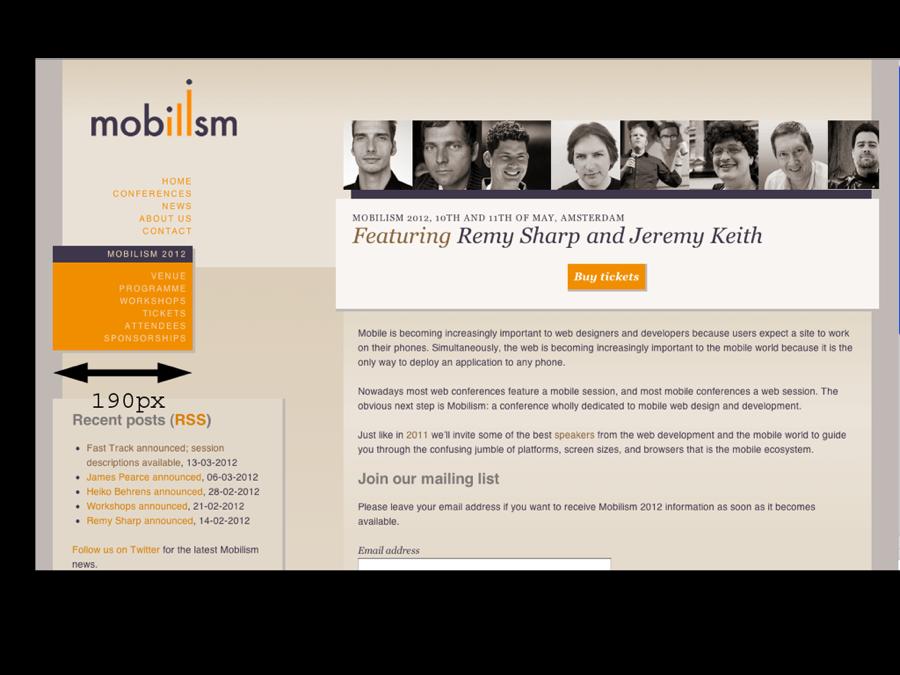
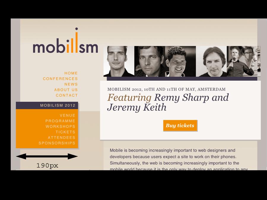
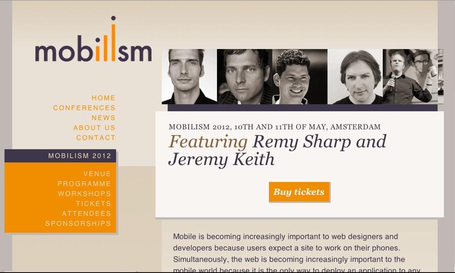
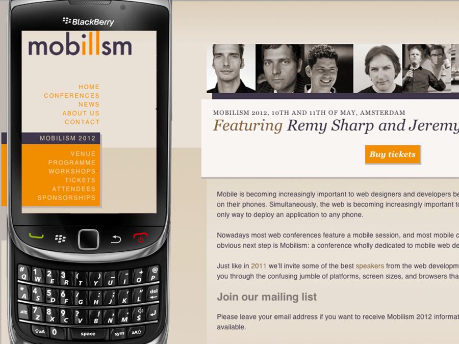
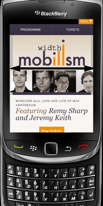
2 Example site A proper responsive site that you can use on any device For most of the presentation I m going to pretend it s not mobile-optimised
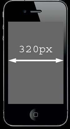
3 A pixel is not a pixel Three kinds of pixels Two viewports Zooming How to access all this with JavaScript Media queries width and device-width Meta viewport
4 Pixels
5 A pixel is not a pixel CSS pixels Density-independent pixels Device pixels
6 CSS pixels CSS pixels are the ones we use in declarations such as width: 190px or padding-left: 20px They are what we want Their size may be increased or decreased, though
7
8
9 Device pixels Device pixels are the physical pixels on the device They have a fixed size that depends on the device

10 Device pixels
11 Device pixels <meta name= viewport content= width = device-width > What is the device width? The number of device pixels So on the iphone, your site is restricted to 320px
12 Device pixels But... Devices get higher and higher pixel densities In theory this would mean that the meta viewport width also goes up But that would break sites
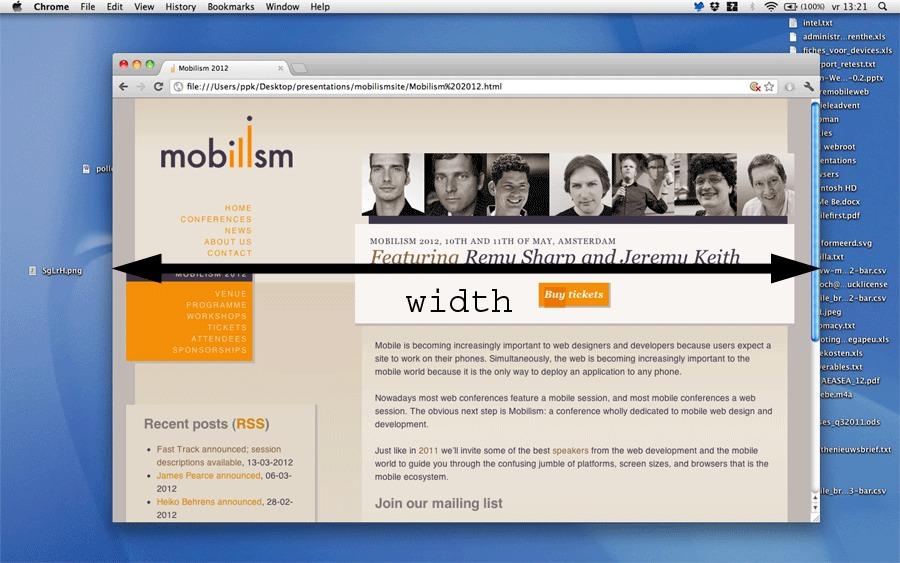
13 Device pixels
14 Density-independent pixels
15 Density-independent pixels Thus device vendors created densityindependent pixels (dips) They are another abstraction layer The number of dips is equal to the number of CSS pixels that is optimal for viewing a website on the device at 100% zoom For the iphone that s 320px
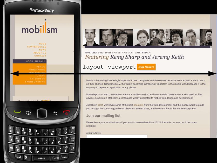
16 Density-independent pixels <meta name= viewport content= width = device-width > What is the device width? The number of dips So on the iphone, your site is still restricted to 320px even on a Retina display
17 What do we need? CSS pixels Density-independent pixels Device pixels
18 What do we need? CSS pixels Density-independent pixels Device pixels
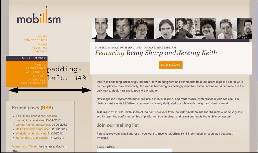
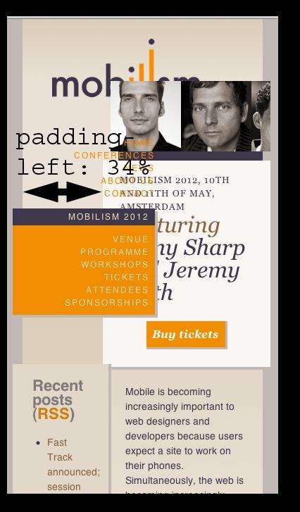
19 What kind of pixels? If a certain JavaScript property is expressed in pixels always ask yourself what kind of pixels. Usually it s CSS pixels, especially for anything related to CSS Sometimes it s device pixels or dips, for anything related to screen size
20 Viewports
21 Viewports The viewport is the total amount of space available for CSS layouts On the desktop it s equal to the browser window The <html> element has an implicit width: 100% and spans the entire viewport
22
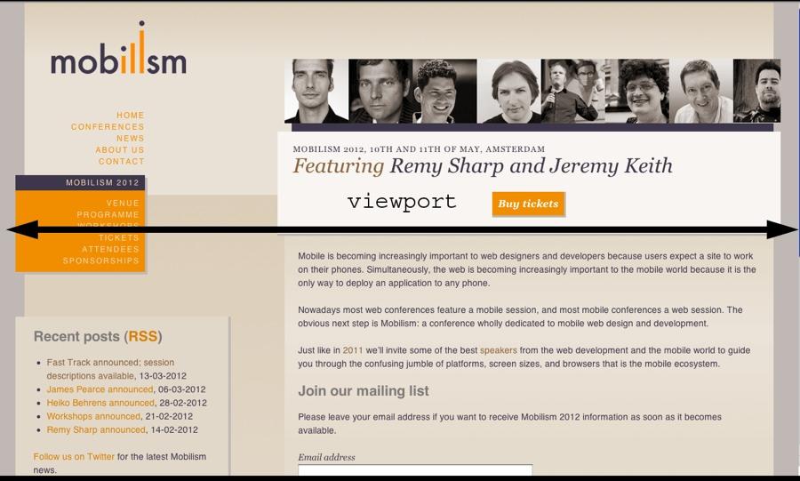
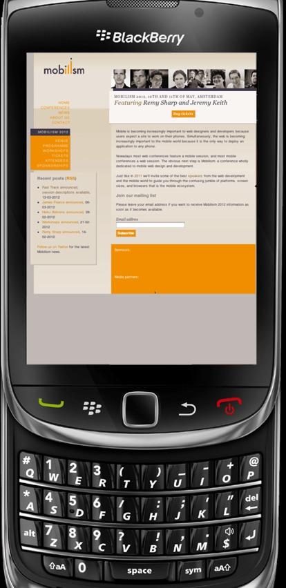
23
24 Viewports On mobile it s quite a bit more complicated If the (narrow) browser window were to be the viewport, many sites would be squeezed to death And mobile browsers must render all sites correctly, even if they haven t been mobileoptimized
25
26
27 Viewports That s why the mobile browser vendors have split the viewport into two: The layout viewport, the viewport that CSS declarations such as padding-left: 34% use,
28
29 Viewports That s why the mobile browser vendors have split the viewport into two: The layout viewport, the viewport that CSS declarations such as padding-left: 34% use, and the visual viewport, which is the part of the page the user is currently seeing Both are measured in CSS pixels
30
31 Viewports Initially most browsers make the visual viewport equal to the layout viewport by zooming the page out as much as possible
32
33 Viewports Initially most browsers make the visual viewport equal to the layout viewport by zooming the page out as much as possible Although the page is unreadable, the user can at least decide which part he d like to concentrate on and zoom in on that part
34 Zooming
35 Zooming Zooming on desktop and mobile are totally different On desktop the viewport is narrowed, which causes elements with padding-left: 34% to be recalculated (though they should still take up the same ratio) and elements with a width: 190px to become relatively wider
36
37
38 Zooming On mobile the visual viewport is decreased, so that the user sees less of the complete site
39
40
41 Zooming On the desktop the viewport becomes less wide and the CSS pixels become larger. The same amount of device pixels now contain less CSS pixels, after all.
42 Zooming On mobile the visual viewport becomes less wide, but the layout viewport remains static. Thus CSS declarations are not recomputed. The visual viewport now contains less CSS pixels.
43 JavaScript properties
44 JavaScript properties screen.width and screen.height The width and height of the screen In device pixels (or dips) Totally useless. Don t bother reading it out
45 JavaScript properties document.documentelement.clientwidth and document.documentelement.clientheight The width and height of the layout viewport In CSS pixels Useful, though mostly because of media queries
46 JavaScript properties window.innerwidth and window.innerheight The width and height of the visual viewport In CSS pixels Extremely important. It tells you how much the user is currently seeing
47 JavaScript properties document.documentelement.offsetwidth and document.documentelement.offsetheight The width and height of the <html> element In CSS pixels Very occasionally useful
48 JavaScript properties window.pagexoffset and window.pageyoffset The current scrolling offset In CSS pixels Useful. Works just as on desktop
49 JavaScript properties System pioneered by Nokia and BlackBerry Picked up by Apple Android supports it only from 3 on IE9 on Windows Phone does not support it But otherwise browser compatibility is quite decent
50 JavaScript properties document.documentelement.clientwidth / window.innerwidth This gives the current zoom level You re not interested in the zoom level, though You want to know how much the user is currently seeing The visual viewport, in other words
51 Media queries
52 Media queries There are two important media queries: width device-width width is the one you want
53 Media queries device-width gives the width of the device screen in device pixels Equal to screen.width
54
55 Media queries width gives the width of the viewport in CSS pixels (There are a few zooming problems on desktop, though) Equal to document.documentelement.clientwidth
56
57 Media queries device-width gives the width of the device screen in device pixels or dips Equal to screen.width On mobile the screen is far smaller than on desktop, but that doesn t matter
58
59 Media queries width gives the width of the viewport in CSS pixels Equal to document.documentelement.clientwidth On mobile this means the layout viewport
60
61 Media queries width is the media query you want but at first sight it seems to be totally useless on mobile Usually we don t care about the width of the layout viewport We need to treat one more element, though.
62 Meta viewport
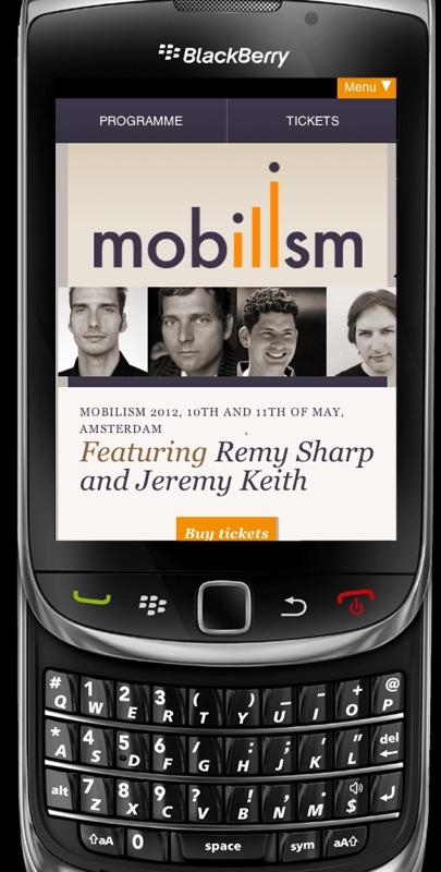
63 Meta viewport <meta name= viewport content= width=device-width >
64 Meta { width: device-width; } Only Opera for now
65 Meta viewport <meta name= viewport content= width = device-width > The meta viewport tag tells the browser to set the size of the layout viewport You can give a pixel value or device-width, which means the screen size in dips
66
67
68 Meta viewport <meta name= viewport content= width = device-width > There is little reason to use other values than device-width And because you tell the layout viewport to become as wide as the device the width media query now contains useful data
69
70 Media queries In theory the device-width and width media queries would now return the same values but only when the zoom level is 100% This is a frighteningly complicated area Don t go there Use width
71 Mobile versions So the trick for creating a mobile version of a site is using <meta name= viewport content= width=device-width /> in combination with width media queries You probably already knew that but now you also understand why
72 Thank you I ll put these slides online Questions? Peter-Paul Koch SF HTML5, 6 April 2012
A pixel is not a pixel. Peter-Paul Koch MoBeers, 10 April 2012
 A pixel is not a pixel Peter-Paul Koch http://quirksmode.org http://twitter.com/ppk MoBeers, 10 April 2012 Example site http://mobilism.nl/2012/ A proper responsive site that you can use on any device
A pixel is not a pixel. Peter-Paul Koch BlackBerry Jam, 6 February 2012
 A pixel is not a pixel Peter-Paul Koch http://quirksmode.org http://twitter.com/ppk BlackBerry Jam, 6 February 2012 I. Pixels Pixels according to W3C The reference pixel is the visual angle of one pixel
Viewports. Peter-Paul Koch CSS Day, 4 June 2014
 Viewports Peter-Paul Koch http://quirksmode.org http://twitter.com/ppk CSS Day, 4 June 2014 or: Why responsive design works Peter-Paul Koch http://quirksmode.org http://twitter.com/ppk CSS Day, 4 June
Viewports. Peter-Paul Koch DevReach, 13 November 2017
 Viewports Peter-Paul Koch http://quirksmode.org http://twitter.com/ppk DevReach, 13 November 2017 or: Why responsive design works Peter-Paul Koch http://quirksmode.org http://twitter.com/ppk DevReach,
8/19/2018. Web Development & Design Foundations with HTML5. Learning Objectives (1 of 2) More on Relative Linking. Learning Objectives (2 of 2)
 More on Relative Linking. Learning Objectives (2 of 2)") Web Development & Design Foundations with HTML5 Ninth Edition Chapter 7 More on Links, Layout, and Mobile Slides in this presentation contain hyperlinks. JAWS users should be able to get a list of links
Web Development & Design Foundations with HTML5 Ninth Edition Chapter 7 More on Links, Layout, and Mobile Slides in this presentation contain hyperlinks. JAWS users should be able to get a list of links
Responsive Design. Responsive design is it important? But typical is not enough. Some typical screen sizes
 Responsive Design Responsive design is it important? For many years, screen sizes were growing Eventually, settled on fixed-width (e.g. 960px) But now with smart phones, tablets, television and many new
Responsive Design. Responsive Design Approach. Technique for building webpages
 Responsive Design Responsive Design Technique for building webpages Allows you to present the same content in different ways to different devices Create conditions for applying specific CSS styles Ex:
The plural of Chromium is Chromia. Peter-Paul Koch NLHTML5 Rotterdam, 19 February 2015
 The plural of Chromium is Chromia Peter-Paul Koch http://quirksmode.org http://twitter.com/ppk NLHTML5 Rotterdam, 19 February 2015 to do Chrome on ios is not Chrome Switch stats and thing with Android
Contents FORMAT 3. Specifications STATIC ADVERTISING 4. Interstitial HTML5 ADVERTISING 5-12
 Advertising specs Contents FORMAT 3 Specifications STATIC ADVERTISING 4 Interstitial HTML5 ADVERTISING 5-12 Interstitial Responsive Technical info Testing Environment Quality assurance Best practice DESIGN
Web Design and Implementation
 Study Guide 3 - HTML and CSS - Chap. 13-15 Name: Alexia Bernardo Due: Start of class - first day of week 5 Your HTML files must be zipped and handed in to the Study Guide 3 dropbox. Chapter 13 - Boxes
CS7026 Media Queries. Different Screen Size Different Design
 CS7026 Media Queries Different Screen Size Different Design Introduction Users no longer view web content only on traditional desktop systems, but are increasingly using smartphones, tablets, and other
Chapter 7 BMIS335 Web Design & Development
 Chapter 7 BMIS335 Web Design & Development Site Organization Use relative links to navigate between folders within your own site o Sometimes dividing your site into folders makes maintenance and updating
TODAY S AGENDA. An introduction for Libraries UW-SLIS CES Webinar April 6, 2015 What is Responsive Web Design? Definition & History
 TODAY S AGENDA An introduction for Libraries UW-SLIS CES Webinar April 6, 2015 What is Responsive Web Design? Definition & History How do I DO Responsive Web Design? Tips & Tricks & Jargon Where do I go
The plural of Chromium is Chromia. Peter-Paul Koch Mobilism, 27 March 2015
 The plural of Chromium is Chromia Peter-Paul Koch http://quirksmode.org http://twitter.com/ppk Mobilism, 27 March 2015 First of all Chrome on ios is not Chrome Chrome on ios Apple doesn t allow the installation
ORB Education Quality Teaching Resources
 These basic resources aim to keep things simple and avoid HTML and CSS completely, whilst helping familiarise students with what can be a daunting interface. The final websites will not demonstrate best
How to deploy for multiple screens
 How to deploy for multiple screens Ethan Marcotte, a developer in Boston, coined the phrase responsive design to describe a website that adapts to the size of the viewer s screen. A demonstration site
Responsive Web Design and Bootstrap MIS Konstantin Bauman. Department of MIS Fox School of Business Temple University
 Responsive Web Design and Bootstrap MIS 2402 Konstantin Bauman Department of MIS Fox School of Business Temple University Exam 3 (FINAL) Date: 12/06/18 four weeks from now! JavaScript, jquery, Bootstrap,
HTML and CSS a further introduction
 HTML and CSS a further introduction By now you should be familiar with HTML and CSS and what they are, HTML dictates the structure of a page, CSS dictates how it looks. This tutorial will teach you a few
Web Site Design and Development Lecture 13
 Web Site Design and Development Lecture 13 CS 0134 Fall 2018 Tues and Thurs 1:00 2:15PM Normalize.css Normalize.css is a useful project to incorporate into your web pages In their own words, Normalize.css
Responsive Web Design. From: Ethan Marcotte - Responsive Web Design 2011
 Responsive Web Design From: Ethan Marcotte - Responsive Web Design 2011 Motivation Browser windows have their inconsistencies and imperfections Once web pages are published online, the designs are immediately
Web App Vs Web Site. Some tricks of the trade. Laurent Technical Director, BlackBerry Web Platform
 Web App Vs Web Site Some tricks of the trade Laurent Hasson @ldhasson, lhasson@rim.com Technical Director, BlackBerry Web Platform 2012-05-09 Web Apps Vs. Web Sites 1 INTRODUCTION 2012-05-09 Web Apps Vs.
Building Responsive Layouts
 Building Responsive Layouts by Zoe Mickley Gillenwater @zomigi zomigi.com December 5, 2012 CSS Dev Conf hello nice to meet you 2 I don t use a mobile phone I have a process for eating these why responsive
CSS3: Using media queries to improve the web site experience. November 19, 2011 indieconf Zoe Mickley
 CSS3: Using media queries to improve the web site experience November 19, 2011 indieconf Zoe Mickley Gillenwater @zomigi What I do Books Web Stunning CSS3: A Project-based Guide to the Latest in CSS Accessibility
The mobile browser world. Peter-Paul Koch Front-end Day workshop, 26 April 2011
 The mobile browser world Peter-Paul Koch http://quirksmode.org http://twitter.com/ppk Front-end Day workshop, 26 April 2011 1 Mobile First! Luke Wroblewski invented it Design your sites for mobile first.
Introduction to WEB PROGRAMMING
 Introduction to WEB PROGRAMMING Web Languages: Overview HTML CSS JavaScript content structure look & feel transitions/animation s (CSS3) interaction animation server communication Full-Stack Web Frameworks
Mobile & More: Preparing for the Latest Design Trends
 February 26, 2015 Mobile & More: Preparing for the Latest Design Trends LATEST TRENDS Responsive Takes Over Material Is the New Flat Hero Images Getting Bigger Interactions Are Micro Video in the Background
Perfect Student Midterm Exam March 20, 2007 Student ID: 9999 Exam: 7434 CS-081/Vickery Page 1 of 5
 Perfect Student Midterm Exam March 20, 2007 Student ID: 9999 Exam: 7434 CS-081/Vickery Page 1 of 5 NOTE: It is my policy to give a failing grade in the course to any student who either gives or receives
Styles, Style Sheets, the Box Model and Liquid Layout
 Styles, Style Sheets, the Box Model and Liquid Layout This session will guide you through examples of how styles and Cascading Style Sheets (CSS) may be used in your Web pages to simplify maintenance of
Hell is other browsers - Sartre. The touch events. Peter-Paul Koch (ppk) WebExpo, 24 September 2010
 WebExpo, 24 September 2010") Hell is other browsers - Sartre The touch events Peter-Paul Koch (ppk) http://quirksmode.org http://twitter.com/ppk WebExpo, 24 September 2010 The desktop web Boring! - Only five browsers with only one
Hell is other browsers - Sartre The touch events Peter-Paul Koch (ppk) http://quirksmode.org http://twitter.com/ppk WebExpo, 24 September 2010 The desktop web Boring! - Only five browsers with only one
door to my garden Simple CSS resulting in impressive, sophisticated visual effects
 Patrick H. Lauke, Designer www.csszengarden.com/041 door to my garden Simple CSS resulting in impressive, sophisticated visual effects AN AVID PHOTOGRAPHER, Patrick Lauke prefers to take his own photographs
CISC 1600 Lecture 1.4 Design, part 2. Topics: Accessibility Responsive web design Example design review
 CISC 1600 Lecture 1.4 Design, part 2 Topics: Accessibility Responsive web design Example design review Accessibility Design for users with special needs Might include you at some point You still want/need
Adaptations by PVII responsive and then creates your page instantly Al Sparber & Gerry Jacobsen PVII
 Adaptations by PVII is a Dreamweaver extension that allows you to select from 5 unique responsive layouts and then creates your page instantly. We hope you enjoy using this product as much as we did making
CSS3, Media Queries, & Responsive Design. May 23, 2012 STC Summit Zoe Mickley
 CSS3, Media Queries, & Responsive Design May 23, 2012 STC Summit Zoe Mickley Gillenwater @zomigi What I do Books Stunning CSS3: A Project-based Guide to the Latest in CSS www.stunningcss3.com Flexible
International Conference KNOWLEDGE-BASED ORGANIZATION Vol. XXIII No RESPONSIVE WEB DESIGN TECHNIQUES. Luminita GIURGIU, Ilie GLIGOREA
 International Conference KNOWLEDGE-BASED ORGANIZATION Vol. XXIII No 3 2017 RESPONSIVE WEB DESIGN TECHNIQUES Luminita GIURGIU, Ilie GLIGOREA Nicolae Bălcescu Land Forces Academy, Sibiu, Romania luminita.giurgiu.a@gmail.com,
Designing for the Mobile Web
 Objectives Session 5.1 Create a media query Work with the browser viewport Apply a responsive design Create a pulldown menu with CSS Session 5.2 Create a flexbox Work with flex sizes Explore flexbox layouts
Responsive Design for Web Applications R.I.T. S. Ludi/R. Kuehl p. 1 R I T. Software Engineering
 Responsive Design for Web Applications S. Ludi/R. Kuehl p. 1 What is the Problem? S. Ludi/R. Kuehl p. 2 Credit: Matt Griffin What is the Problem? Mobile web access is ubiquitous One interface design does
FLOATING AND POSITIONING
 15 FLOATING AND POSITIONING OVERVIEW Understanding normal flow Floating elements to the left and right Clearing and containing floated elements Text wrap shapes Positioning: Absolute, relative, fixed Normal
Responsive web design (RWD) CSS3 Media queries. Mobile vs desktop web sites. Web Development 1 CS1115/CS5002
 CSS3 Media queries. Mobile vs desktop web sites. Web Development 1 CS1115/CS5002") 1 of 13 CS1115/CS5002 Web Development 1 Dr Derek Bridge School of Computer Science & Information Technology University College Cork Mobile vs desktop web sites A few organization have two web sites, one
1 of 13 CS1115/CS5002 Web Development 1 Dr Derek Bridge School of Computer Science & Information Technology University College Cork Mobile vs desktop web sites A few organization have two web sites, one
The Importance of the CSS Box Model
 The Importance of the CSS Box Model Block Element, Border, Padding and Margin Margin is on the outside of block elements and padding is on the inside. Use margin to separate the block from things outside
1.7 Limit of a Function
 1.7 Limit of a Function We will discuss the following in this section: 1. Limit Notation 2. Finding a it numerically 3. Right and Left Hand Limits 4. Infinite Limits Consider the following graph Notation:
The Economist Apps. Advertising specs
 The Economist Apps Advertising specs Contents APPS AND FORMATS 3-4 Overview Specifications STATIC ADVERTISING 5-6 Sponsor logo Interstitial HTML5 ADVERTISING 7-14 Interstitial Responsive Technical info
Positioning in CSS: There are 5 different ways we can set our position:
 Positioning in CSS: So you know now how to change the color and style of the elements on your webpage but how do we get them exactly where we want them to be placed? There are 5 different ways we can set
The Benefits of CSS. Less work: Change look of the whole site with one edit
 11 INTRODUCING CSS OVERVIEW The benefits of CSS Inheritance Understanding document structure Writing style rules Attaching styles to the HTML document The cascade The box model CSS units of measurement
Header. Article. Footer
 Styling your Interface There have been various versions of HTML since its first inception. HTML 5 being the latest has benefited from being able to look back on these previous versions and make some very
Class 3 Page 1. Using DW tools to learn CSS. Intro to Web Design using Dreamweaver (VBUS 010) Instructor: Robert Lee
 Instructor: Robert Lee") Class 3 Page 1 Using DW tools to learn CSS Dreaweaver provides a way for beginners to learn CSS. Here s how: After a page is set up, you might want to style the . Like setting up font-family, or
Class 3 Page 1 Using DW tools to learn CSS Dreaweaver provides a way for beginners to learn CSS. Here s how: After a page is set up, you might want to style the . Like setting up font-family, or
Introduction to Computer Science Web Development
 Introduction to Computer Science Web Development Flavio Esposito http://cs.slu.edu/~esposito/teaching/1080/ Lecture 14 Lecture outline Discuss HW Intro to Responsive Design Media Queries Responsive Layout
Responsive Web Design Discover, Consider, Decide
 Responsive Web Design Discover, Consider, Decide Responsive Web Design. Discover, Consider, Decide Q. What is Responsive Design? A. Responsive design is a general mindset where you are designing a website,
Responsive Web Design (RWD)
") Responsive Web Design (RWD) Responsive Web Design: design Web pages, so that it is easy to see on a wide range of of devices phone, tablet, desktop,... Fixed vs Fluid layout Fixed: elements have fixed
Responsive Web Design (RWD) Responsive Web Design: design Web pages, so that it is easy to see on a wide range of of devices phone, tablet, desktop,... Fixed vs Fluid layout Fixed: elements have fixed
B r o w s e r s u p p o r t
 A Browser Support Since writing this book, much has changed in the browser market. The Chromium project, which the Chrome browser is based on, stopped using WebKit and created their own fork, called Blink.
Eng 110, Spring Week 03 Lab02- Dreamwaver Session
 Eng 110, Spring 2008 Week 03 Lab02- Dreamwaver Session Assignment Recreate the 3-page website you did last week by using Dreamweaver. You should use tables to control your layout. You should modify fonts,
Advertising specifications. Version 1.1
 Advertising specifications Version 1.1 Please read this document before producing creatives for campaigns on The Economist - Digital Editions This is a living document that will evolve as we are presented
AGENDA. :: Add Meta Tag for Viewport (inside of head element): :: Add Script that renders HTML5 elements for older versions of Internet Explorer
: :: Add Script that renders HTML5 elements for older versions of Internet Explorer") CLASS :: 14 12.10 2018 3 Hours AGENDA LECTURE :: Responsive Web Design [RWD] DOWNLOAD ASSETS [ CSS ] :: Media Query [rwd.css] ADD HTML META TAG & IE SCRIPT [ HTML ] :: Add Meta Tag for Viewport (inside
CLASS :: 14 12.10 2018 3 Hours AGENDA LECTURE :: Responsive Web Design [RWD] DOWNLOAD ASSETS [ CSS ] :: Media Query [rwd.css] ADD HTML META TAG & IE SCRIPT [ HTML ] :: Add Meta Tag for Viewport (inside
HTML Organizing Page Content
 HTML Organizing Page Content CSS for layout Examples http://www.shinybytes.com/newcss.html Generic Elements Used to create a logical grouping of content or elements on the page Can be customized to describe
QCon - Mobile Maps HTML5 Team Andrea
 QCon London @Nokia - Mobile Maps HTML5 Team Andrea Giammarchi @WebReflection the what the whole story, in 8 words the whole story, in 8 words one does not simply create an HTML5 Application Nokia Mobile
CSS worksheet. JMC 105 Drake University
 CSS worksheet JMC 105 Drake University 1. Download the css-site.zip file from the class blog and expand the files. You ll notice that you have an images folder with three images inside and an index.html
CIT BY: HEIDI SPACKMAN
 CIT230-06 BY: HEIDI SPACKMAN WHAT IS A MEDIA QUERY? A Media Query (Boolean code) written in CSS3 determines the screen display size that needs to be used and adjusts the HTML pages to display correctly
Designing with CSS3 Effectively & Efficiently. October 2010 Adobe MAX Zoe Mickley
 Designing with CSS3 Effectively & Efficiently October 2010 Adobe MAX Zoe Mickley Gillenwater @zomigi 1 What I do out now out Dec 10 Books Web Flexible Web Design: Creating Liquid and Elastic Layouts with
Mobile Applications 2013/2014
 Mobile Applications 2013/2014 Mike Taylor Product Manager February 6, 2015 Advanced Development Technology Agenda Devices App Types Test/Deploy Summary Devices Mobile (Feature) Phones Windows version 5/6
BORDER IMAGES THE BACKGROUND IMAGE PROPERTIES. Learning Web Design, 5e
 BORDER IMAGES For use with: Learning Web Design, 5e by Jennifer Robbins Copyright O Reilly Media 2018 In this article, I ll give you a quick overview of the border-image properties for filling the sides
Microsoft Expression Web Quickstart Guide
 Microsoft Expression Web Quickstart Guide MS-Expression Web Quickstart Guide Page 1 of 24 Expression Web Quickstart Guide (20-Minute Training) Welcome to Expression Web. When you first launch the program,
Student, Perfect CS-081 Final Exam May 21, 2010 Student ID: 9999 Exam ID: 3122 Page 1 of 6 Instructions:
 Student ID: 9999 Exam ID: 3122 Page 1 of 6 Instructions: Use pencil. Answer all questions: there is no penalty for guessing. Unless otherwise directed, circle the letter of the one best answer for multiplechoice
Hands on with EPUB (workshop)
") Hands on with EPUB (workshop) tcworld conference 2017 - Stuttgart, Germany Scott Prentice, Leximation, Inc. Introduction Scott Prentice, President of Leximation, Inc. Specializing in FrameMaker plugin
Hands on with EPUB (workshop) tcworld conference 2017 - Stuttgart, Germany Scott Prentice, Leximation, Inc. Introduction Scott Prentice, President of Leximation, Inc. Specializing in FrameMaker plugin
HTML Organizing Page Content
 HTML Organizing Page Content HTML 5 Elements Well supported by current desktop and mobile browsers (known issues with IE 8 and earlier) May be used to divide pages into major sections
Graduating to Grid. An Event Apart Orlando
 Graduating to Grid An Event Apart Orlando 2018 And there was great rejoicing. https://wpdev.uservoice.com/forums/257854-microsoft-edge-developer/suggestions/6514853-update-css-grid https://caniuse.com/#search=grid
Block & Inline Elements
 Block & Inline Elements Every tag in HTML can classified as a block or inline element. > Block elements always start on a new line (Paragraph, List items, Blockquotes, Tables) > Inline elements do not
Using Dreamweaver CC. Logo. 4 Creating a Template. Page Heading. Page content in this area. About Us Gallery Ordering Contact Us Links
 Using Dreamweaver CC 4 Creating a Template Now that the main page of our website is complete, we need to create the rest of the pages. Each of them will have a layout that follows the plan shown below.
Designing the Home Page and Creating Additional Pages
 Designing the Home Page and Creating Additional Pages Creating a Webpage Template In Notepad++, create a basic HTML webpage with html documentation, head, title, and body starting and ending tags. From
CS7026 Media Queries II. Different Screen Size Different Design
 CS7026 Media Queries II Different Screen Size Different Design What You ll Learn We ll be restyling an entire page layout to work with different screen sizes and devices using Media queries to apply styles
epromo Guidelines DUE DATES NOT ALLOWED PLAIN TEXT VERSION
 epromo Guidelines HTML Maximum width 700px (length = N/A) Image resolution should be 72dpi Maximum total file size, including all images = 200KB Only use inline CSS, no stylesheets Use tables, rather than
RC Justified Gallery User guide for version 3.2.X. Last modified: 06/09/2016
 RC Justified Gallery User guide for version 3.2.X. Last modified: 06/09/2016 This document may not be reproduced or redistributed without the permission of the copyright holder. It may not be posted on
Assignments (4) Assessment as per Schedule (2)
 Assessment as per Schedule (2)") Specification (6) Readability (4) Assignments (4) Assessment as per Schedule (2) Oral (4) Total (20) Sign of Faculty Assignment No. 02 Date of Performance:. Title: To apply various CSS properties like
Specification (6) Readability (4) Assignments (4) Assessment as per Schedule (2) Oral (4) Total (20) Sign of Faculty Assignment No. 02 Date of Performance:. Title: To apply various CSS properties like
Create First Web Page With Bootstrap
 Bootstrap : Responsive Design Create First Web Page With Bootstrap 1. Add the HTML5 doctype Bootstrap uses HTML elements and CSS properties that require the HTML5 doctype. 2. Bootstrap 3 is mobile-first
What do we mean by layouts?
 What do we mean by layouts? A layout is how you position the elements of your page You can have columns Move paragraphs and sections around And you can do this all without changing the content of your
How to lay out a web page with CSS
 How to lay out a web page with CSS A CSS page layout uses the Cascading Style Sheets format, rather than traditional HTML tables or frames, to organize the content on a web page. The basic building block
Manually Zoom Out Mac Screen Size
 Manually Zoom Out Mac Screen Size Mar 13, 2015. Apple Store Mac ipad iphone Watch Music Support Reading it in landscape, that means I must manually zoom in every time I turn the page just to be able to
Table of contents. Sliding Panels DMXzone.com
 Table of contents Table of contents... 1 About Sliding Panels... 2 Features in Detail... 3 Before you begin... 12 The Basics: Creating Simple Sliding Panels... 13 Advanced: Dynamic Sliding Panels... 20
Week 8 Google Maps. This week you ll learn how to embed a Google Map into a web page and add custom markers with custom labels.
 Introduction Hopefully by now you ll have seen the possibilities that jquery provides for rich content on web sites in the form of interaction and media playback. This week we ll be extending this into
Chapter 8: Using Toolbars
 Chapter 8: Using Toolbars As a GIS web application developer you want to focus on building functionality specific to the application you are constructing. Spending valuable time and effort adding basic
How mobile is changing and what publishers need to do about it
 How mobile is changing email and what publishers need to do about it BY ADESTRA The mobile channel has produced a culture of information on-demand. We can now view our emails as and when they come through
New frontier of responsive & device-friendly web sites
 New frontier of responsive & device-friendly web sites Dino Esposito JetBrains dino.esposito@jetbrains.com @despos facebook.com/naa4e Responsive Web Design Can I Ask You a Question? Why Do You Do RWD?
Website Design (Weekday) By Alabian Solutions Ltd , 2016
 By Alabian Solutions Ltd , 2016") Website Design (Weekday) By Alabian Solutions Ltd 08034265103, info@alabiansolutions.com www.alabiansolutions.com 2016 TECHNOLOGIES DATE TIME Day 1 HTML Part 1 Intro to the web The web Clients Servers
Website Design (Weekday) By Alabian Solutions Ltd 08034265103, info@alabiansolutions.com www.alabiansolutions.com 2016 TECHNOLOGIES DATE TIME Day 1 HTML Part 1 Intro to the web The web Clients Servers
11/5/16 WEB DESIGN. Branding Fall 2016
 designschool.canva.com/blog/print-vs-web/ nngroup.com/articles/differences-between-print-design-and-web-design/ howdesign.com/web-design-resources-technology/top-content-management-systems-designers/ alchemyuk.com/design/74-top-10-web-design-tips
AGENDA :: MULTIMEDIA TOOLS :: CLASS NOTES. INSTALLING FONTS :: Download, Install, & Embed Your Fonts. LECTURE :: Responsive Web Design [RWD]
![AGENDA :: MULTIMEDIA TOOLS :: CLASS NOTES. INSTALLING FONTS :: Download, Install, & Embed Your Fonts. LECTURE :: Responsive Web Design [RWD]](/thumbs/84/90658100.jpg "AGENDA :: MULTIMEDIA TOOLS :: CLASS NOTES. INSTALLING FONTS :: Download, Install, & Embed Your Fonts. LECTURE :: Responsive Web Design [RWD]") CLASS :: 14 05.05 2017 3 Hours AGENDA INSTALLING FONTS :: Download, Install, & Embed Your Fonts LECTURE :: Responsive Web Design [RWD] DOWNLOAD ASSETS [ CSS ] :: Media Query [rwd.css] ADD HTML META TAG
CLASS :: 14 05.05 2017 3 Hours AGENDA INSTALLING FONTS :: Download, Install, & Embed Your Fonts LECTURE :: Responsive Web Design [RWD] DOWNLOAD ASSETS [ CSS ] :: Media Query [rwd.css] ADD HTML META TAG
What if we want the child elements to calculate the offset from the boundaries of the document? CSS LAYOUT. The position Property.
 What if we want the child elements to calculate the offset from the boundaries of the document? CSS LAYOUT The position Property Manesh Jhawar According to W3Schools, The position property specifies the
INFS 2150 Introduction to Web Development
 INFS 2150 Introduction to Web Development 6. Tables and Columns Objectives Explore the structure of a web table Create table heading and data cells Apply CSS styles to a table Create cells that span multiple
Welcome. Web Authoring: HTML - Advanced Topics & Photo Optimisation (Level 3) Richard Hey & Barny Baggs
 Richard Hey & Barny Baggs") Welcome Web Authoring: HTML - Advanced Topics & Photo Optimisation (Level 3) Richard Hey & Barny Baggs Health and Safety Course Information General Information Objectives To understand the need for photo
Welcome Web Authoring: HTML - Advanced Topics & Photo Optimisation (Level 3) Richard Hey & Barny Baggs Health and Safety Course Information General Information Objectives To understand the need for photo
INFS 2150 Introduction to Web Development
 INFS 2150 Introduction to Web Development 6. Tables and Columns Objectives Explore the structure of a web table Create table heading and data cells Apply CSS styles to a table Create cells that span multiple
Brunch & Learn: Design Best Practices for Desktop, Mobile, Tablet & Beyond
 Brunch & Learn: Email Design Best Practices for Desktop, Mobile, Tablet & Beyond November 7, 2013 A special thank you to: Thank you for joining us we will be starting at 12:30 PM ET/9:30 AM PT If you are
COMP519 Web Programming Lecture 8: Cascading Style Sheets: Part 4 Handouts
 COMP519 Web Programming Lecture 8: Cascading Style Sheets: Part 4 Handouts Ullrich Hustadt Department of Computer Science School of Electrical Engineering, Electronics, and Computer Science University
CREATIVE & TECHNICAL SPECIFICATIONS
 CREATIVE & TECHNICAL SPECIFICATIONS CREATIVE SPECIFICATIONS EXPECTED ASSETS LANDSCAPE: 96Ox424px ipad: 768x928px 1O24x672px SAME SIZE FOR INTERSCROLLER SMARTFOOTER MPU INCONTENT INTERSTITIAL 64Ox2OOpx
The World In. Advertising specs
 The World In Advertising specs Format Specifications This is a living document that will evolve as we are presented with new formats, and we ll update it periodically to reflect these changes. All media
[AVWSQ-ADWCS6]: WSQ ICDL Adobe Dreamweaver CS6
![[AVWSQ-ADWCS6]: WSQ ICDL Adobe Dreamweaver CS6](/thumbs/95/125112557.jpg "[AVWSQ-ADWCS6]: WSQ ICDL Adobe Dreamweaver CS6") [AVWSQ-ADWCS6]: WSQ ICDL Adobe Dreamweaver CS6 Length : 2 Days Audience(s) : New or existing users Level : 3 Technology : Adobe Dreamweaver CS6 program Delivery Method : Instructor-Led (Classroom) Course
[AVWSQ-ADWCS6]: WSQ ICDL Adobe Dreamweaver CS6 Length : 2 Days Audience(s) : New or existing users Level : 3 Technology : Adobe Dreamweaver CS6 program Delivery Method : Instructor-Led (Classroom) Course
CS7026 CSS3. CSS3 Graphics Effects
 CS7026 CSS3 CSS3 Graphics Effects What You ll Learn We ll create the appearance of speech bubbles without using any images, just these pieces of pure CSS: The word-wrap property to contain overflowing
Using Dreamweaver CS6
 6 So far we have used CSS to arrange the elements on our web page. We have also used CSS for some limited formatting. In this section we will take full advantage of using CSS to format our web site. Just
Write a Touch-friendly HTML5 App. Hongbo Min, Intel Junmin Zhu, Intel Yongsheng Zhu, Intel
 Write a Touch-friendly HTML5 App Hongbo Min, Intel Junmin Zhu, Intel Yongsheng Zhu, Intel Agenda Background Touch vs. Mouse Part I: UI Layout Part II: Event Handling Touch in HTML5 Framework Q/A 2 Background
Page Layout. 4.1 Styling Page Sections 4.2 Introduction to Layout 4.3 Floating Elements 4.4 Sizing and Positioning
 Page Layout contents of this presentation are Copyright 2009 Marty Stepp and Jessica Miller 4.1 Styling Page Sections 4.2 Introduction to Layout 4.3 Floating Elements 4.4 Sizing and Positioning 2 1 4.1
16A CSS LAYOUT WITH FLEXBOX
 16A CSS LAYOUT WITH FLEXBOX OVERVIEW Flexbox terminology Flexbox containers Flow: Flow direction and text wrap Alignment on main and cross axes Specifying how items in a flexbox "flex" Changing the order
ITEC447 Web Projects CHAPTER 10 FLASH & SILVERLIGHT 1
 ITEC447 Web Projects CHAPTER 10 FLASH & SILVERLIGHT 1 Working with Flash and Other Embeddable Content One of the major turning points in the evolution of web design was the introduction of Flash. By designing
Fish Eye Menu DMXzone.com Fish Eye Menu Manual
 Fish Eye Menu Manual Page 1 of 33 Index Fish Eye Menu Manual... 1 Index... 2 About Fish Eye Menu... 3 Features in Detail... 4 Integrated in Dreamweaver... 6 Before you begin... 7 Installing the extension...
Website Design (Weekend) By Alabian Solutions Ltd , 2016
 By Alabian Solutions Ltd , 2016") Website Design (Weekend) By Alabian Solutions Ltd 08034265103, info@alabiansolutions.com www.alabiansolutions.com 2016 TECHNOLOGIES DATE TIME Day1 Section 1 HTML Part 1 12am 5pm Intro to the web The web
Website Design (Weekend) By Alabian Solutions Ltd 08034265103, info@alabiansolutions.com www.alabiansolutions.com 2016 TECHNOLOGIES DATE TIME Day1 Section 1 HTML Part 1 12am 5pm Intro to the web The web