ICI-WaRM Regional Analysis of Frequency Tool (ICI-RAFT)
|
|
|
- Bridget Greer
- 6 years ago
- Views:
Transcription
 United States Army Corps of Engineers (USACE) Updated February")
1 ICI-WaRM Regional Analysis of Frequency Tool (ICI-RAFT) by Jason Giovannettone & Michael Wright Institute for Water Resources (IWR) United States Army Corps of Engineers (USACE) Updated February 19, 2013
2 Table of Contents I. INTRODUCTION... 1 Input Data Entry... 2 Descriptions of the Indices... 4 License & Disclaimer... 8 Loading the Data... 9 Displaying and Screening the Raw Data II. SITE ANALYSIS Site Details Site Plots At-Site Frequency Distribution III. REGIONAL ANALYSIS Regionalization Region Details Regional Plots Regional Frequency Distribution Onsite Regional Frequency Analysis Offsite Regional Frequency Analysis IV. CONTACT INFORMATION... 48
3 I. INTRODUCTION Welcome to the International Center for Integrated Water Resources, ICIWaRM s Regional Analysis of Frequency Tool (ICI-RAFT). The tool walks the user through the methodology outlined by Hosking and Wallis in their 1997 book Regional Frequency Analysis: An Approach Based on L-Moments through the medium of a free, stand-alone Visual Basic executable file; in addition, there are some other added features throughout the program. Mapping techniques and other advances made in the field since 1997 will be included in future versions of the program, along with other enhancements in response to user requests. In addition to writing the aforementioned book, Hosking and Wallis have provided a repository of Fortran-77 source code in order to enable regional frequency calculations using L-moments, including regionalization algorithms and distribution fitting routines, at We thank the authors, Carnegie Mellon University and the IBM Research Division for providing this code, which served as a source of validation and inspiration as the code was written for this program. 1
, both with simple, but specific, formats. An example of a text input file is shown in Fig. 1.")
4 Input Data Entry The first step is to enter your quality-controlled data into the input file template, which can be either a text file (.txt) or an Excel spreadsheet (.xls or.xlsx), both with simple, but specific, formats. An example of a text input file is shown in Fig. 1. There are two sections of input, one for the Rainfall Data itself followed by a section where known Site Characteristics are given, e.g. mean annual precipitation, elevation, longitude and latitude. The two-row headers seen above each of the two sections in Fig. 1 must be maintained for the program to read the file. All data values in both sections are separated by commas and must be given in the order as indicated in the second header line of each section. The form (and the program in general) does not consider units of precipitation (mm, in, etc.) in the Rainfall Data section, only the numbers entered by the user, meaning that users must ensure that all sites data are entered in the same units. Similarly, the user is not required to provide unit information in Site Characteristics, but all values in a column are assumed to have the same units. The Excel input file contains two sheets: Rainfall Data (Fig. 2a) contains the monthly precipitation values to be analyzed, and Site Characteristics (Fig. 2b) holds the site characteristics. A one-row header must be maintained on the top row of each sheet for the program to read the file. As in the text file, the form (and the program in general) does not consider units of precipitation (mm, in, etc.), only the numbers entered by the user, meaning that users must ensure that all sites data are entered in the same units. Similarly, the user is not required to provide unit information in Site Characteristics, but all values in a column are assumed to have the same units. In both types of input files, the Rainfall Data sections (Figs. 1 & 2a) contain each Site ID as the first value/column, whereas the second value/column contains each year for each site. As the user moves along a single row for a particular site and year, monthly values of total precipitation are entered. If a particular monthly total is not known or is known to be incorrect, then -999 is entered. If any value or cell is left blank, an error will occur when running ICI-RAFT. Figure 1: Example of a text input file. 2


5 (a) Figure 2: Example an Excel input file, showing the (a) Data and (b) Site Characteristics worksheets. (b) 3
6 In Site Characteristics (Figs. 1 & 2b), each value/column represents a particular site characteristic that can be used when creating homogenous regions if such data are available. Only variables that are known for all sites and years will be used during regionalization; therefore not all values/columns are required to be filled in. It should be noted that each row in the text file must contain the same number of commas, regardless of the amount of data provided, or ICI-RAFT will give an error when run. The user should remember that the more data that are available, the more efficient the regionalization process will be. In addition to the site characteristics shown in Fig. 1 & 2b, the user is welcomed to add up to three of their own site characteristics in the Other Site Characteristics columns. A name for each of these Other characteristics can be given after running the program. An alternative to regionalization is to use Eco-regions, as defined by the World Wildlife Federation, the U.S. Environmental Protection Agency, or other groups, or to choose to manually set your own region for each site; this can be done using Column P. The final column will be discussed later in the manual. Descriptions of the Indices There is contained within the software a database of various climate indices that may help the user to identify modes of climate variability that affect a particular region of interest. Short descriptions of each index are given below, while general ranges are provided in Table 1. Antarctic Oscillation (AAO) The AAO is estimated based on mean height anomalies at 700 mb from latitude 20 o S to 90 o S. Positive values appear to drive cooling in East Antarctica and warming on the Antarctic Peninsula; a trend toward extreme values of this index has been linked to stratospheric cooling driven by ozone loss. Arctic Oscillation (AO) The AO is estimated based on mean height anomalies at 1000 mb from latitude 20 o N to 90 o N. Positive values indicate cold, wet weather at higher latitudes and warm/dry conditions at lower latitudes, with the reverse holding true for negative values. East Atlantic Index (EA) The EA is estimated based on the analysis of monthly height anomalies at 500 mb from latitude 20 o N to 90 o N. The EA s anomaly centers are displaced southeastward compared to the NAO pattern; positive index values are associated with warmer temperatures in Europe and colder temperatures in the USA. Eastern Atlantic/Western Russian Index (EA/WR) The EA/WR is estimated based on the analysis of monthly height anomalies at 500 mb from latitude 20 o N to 90 o N. Positive height anomalies in Europe and China counterbalance lows in the Atlantic and north of the Caspian Sea. The effects of a positive cycle are warmer/wetter weather in East Asia and colder/dryer weather in Europe and surrounding regions. East Pacific/North Pacific Index (EP/NP) The EP/NP is estimated based on the analysis of monthly height anomalies at 500 mb from latitude 20 N to 90 N. Positive values feature a high anomaly over Alaska and low anomalies over the north Pacific and the eastern USA, pushing the jet stream southward. Temperatures drop on the American east coast in this scenario, while Canada s Pacific coast is dry. 4
7 Madden-Julian Oscillation (MJO) Unlike other indices, the MJO is characterized by convective rainfall anomalies that are in motion during the course of its cycle, propagating from the Indian Ocean east into the Pacific Ocean. The anomalies are modeled using ten separate indices centered on lines of longitude around the globe, with seven in the eastern hemisphere and three in the western. Indices 1-4 and 10 model the zone through which MJO events move; each of the other five strongly anti-correlate with one of the first set and indicate the worldwide effects of MJO, from facilitating El Niño dynamics to influencing high-latitude rainfall. The longitudes each index represents are given: (1)80E, (2)100E, (3)120E, (4)140E, (5)160E, (6)120W, (7)40W, (8)10W, (9)20E, (10)70E. North Atlantic Oscillation (NAO) Key features of the NAO are centers of low pressure near Iceland and high pressure near the Azores, both of which are strong for positive values of the NAO. One important effect of a positive NAO is a wetter and stormier winter season in the eastern USA, with negative values corresponding to a dry, cold winter. Northern Oscillation Index (NOI) The NOI represents the surface-level pressure difference between the North Pacific High near North America and Darwin (in Australia s Northern Territory), normalized by the long-term average and standard deviation. Built as a rough north Pacific equivalent of the SOI, it represents the influence of a wide variety of global-scale climatic forces on the North Pacific and North America. A 14-year cycle in the value of this index has been noted. North Pacific Index (NP) According to NASA's website, the NP Index is the area-weighted sea level pressure (SLP) over the region 30N-65N, 160E-140W and is used to measure decadal variations linked to El Nino (ENSO) and La Nina events. Oceanic Niño Index (ONI) According to the website of NOAA's Climate Prediction Center, the ONI represents the 3-month running mean of ERSST.v3b sea-surface temperature (SST) anomalies in the Niño 3.4 region (5 o N-5 o S, 120 o o W), based on centered 30-year base periods updated every 5 years. Warm (El Niño) and cold (La Niña) episodes are based on a threshold of +/- 0.5 o C ONI; for historical purposes cold and warm episodes are defined when the threshold is met for a minimum of 5 consecutive over-lapping seasons. Pacific Decadal Oscillation (PDO) The PDO is a major cycle sometimes compared to El Niño, but of a longer time period (20-30 years) and with stronger effects in the North Pacific than in the tropics. The index is based on North Pacific monthly sea surface temperature variability. Warm PDO regimes tend to increase coastal ocean biological productivity off Alaska and decrease it further south, while cold PDO regimes have the reverse effect. Pacific/North American Index (PNA) The PNA is estimated based on the analysis of monthly height anomalies at 500 mb from latitude 20 N to 90 N. Key features of the PNA are a low center near the Rockies and a high center near the Aleutian Islands, both of which are strong for positive values; high positive values correlate with warm/dry weather in the west USA and wet/cold weather in the east USA, with negative values corresponding to the opposite effects. 5
8 Polar/Eurasia Index (POL) The POL is estimated based on the analysis of monthly height anomalies at 500 mb from latitude 20 N to 90 N. Its main temperature effects are in Siberia (hotter) and China (colder). An oscillation in this index has been noted on the half-decadal scale. Scandinavian Index (SCA) The SCA is estimated based on the analysis of monthly height anomalies at 500 mb from latitude 20 N to 90 N. A positive value drives positive height anomalies over western Russia and Scandinavia, with cooling effects in central Russia and western Europe and increased precipitation for central and southern Europe. Southern Oscillation Index (SOI) The SOI represents the normalized surface-level pressure difference between Tahiti and Darwin (in Australia s Northern Territory). Negative values of the SOI during the southern hemisphere s summer season indicate an El Niño event; positive values indicate a strong Walker Circulation pattern. West Pacific Index (WP) The WP is estimated based on the analysis of monthly height anomalies at 500 mb from latitude 20 N to 90 N. The WP has anomaly centers over the Kamchatka Peninsula and a broad swath of ocean adjacent to Southeast Asia, which are associated with the entrance region of the Pacific jet stream, as well as another center over the southwest USA. Positive values correlate with cooler/wetter weather in the North Pacific and eastern Siberia and drier weather further south. 6
9 Table 1: List of indices and their abbreviations and ranges since Abbreviation Full Name Range since 1948 AAO Antarctic Oscillation to 2.69 AO Arctic Oscillation to 3.50 EA East Atlantic Index to 2.68 EA/WR Eastern Atlantic/Western Russia Index to 3.68 EP/NP East Pacific/North Pacific Index to 3.88 MJO Madden-Julian Oscillation to 2.01 NAO North Atlantic Oscillation to 3.06 NOI Northern Oscillation Index to 8.68 NP North Pacific Index to ONI Oceanic Nino Index to 2.50 PDO Pacific Decadal Oscillation to 3.51 PNA Pacific/North American Index to 2.87 POL Polar/Eurasia Index to 3.53 SCA Scandinavian Index to 3.15 SOI Southern Oscillation Index to 2.90 WP West Pacific Index to

10 License & Disclaimer Upon first running ICI-RAFT, the opening screen (Fig. 3) displays the license and disclaimer for the software. Read through the disclaimer and if you accept the conditions, choose Accept and click the OK button; the program will continue on to the next screen. If you do not accept the conditions of the disclaimer, choose Do Not Accept and click the OK button; this will close the program. Figure 3: ICI-RAFT License and Disclaimer. 8
.")

11 Loading the Data Upon accepting the license and disclaimer, the title screen will appear with two menu items, File and Help, enabled. Selecting File and choosing Exit will close the program; the other options include Load Data, Open File, and Save File (Fig. 4). Selecting Load Data opens another window that allows the user to browse their computer files and choose an input file (Fig. 5). The Save File and Open File options are used to save and later retrieve work performed during the user s current analysis. Figure 4: Title Screen with the File menu opened and Load Data option selected. Figure 5: Load Input File window. 9
12 Displaying and Screening the Raw Data Once the input file has been loaded, the remainder of the menu items become active (white) and a table appears (Fig. 6) that displays all of the monthly precipitation data that was entered into the Data tab of the input file. The data can be edited within this screen. The user can view any of the data within the Display Data window by using the horizontal and vertical scroll bars. Click the Close button when finished. Under the Data menu, the user s options are to Display Data or Screen Data. Upon selection of Display Data, the same window appears as described above. Upon selection of Screen Data, a window appears (Fig. 7) that allows the user to determine the time period over which analysis is to be performed and to specify the units of the data. Initially all labels and boxes under Data Units and Other Characteristics are disabled. A Beginning Month and Duration in Months must be entered to define the time frame; individual monthly values within the period chosen are totaled in order to obtain one value for each period, whether it is three months or five years (60 months), which is the maximum period length that can be analyzed. If there are any missing or bad data during a particular year (represented by a -999 in the input file), that year is not used in the analysis for that particular data site. Fewer years of data available for a particular site means that that particular site will contribute less to the overall regionalization process. A threshold for the number of valid years for a particular site can be set in the Screen Data window next to the caption Minimum Number of Records. Any sites having fewer than the specified number of annual records with good data will not be used in the regionalization process. This threshold must be greater than four so that all of the program s statistics are calculable for all sites. A final (optional) piece of information that can be given is a Lag time between values of the various global climate indices and the monthly rainfall measurements. The value entered here (in months) will be used whenever an index limit is applied by the user; there are many locations within ICI-RAFT where this can be done. Additional information concerning Index Limits is provided later in this document where applicable. After specifying these three pieces of information the Filter button will become active; pressing this button will commence the filtering process. Once this process is finished, certain items within the Data Units and Other Characteristics sections of the window will become active, depending on the types of data included in the Characteristics worksheet of the input file. If desired, the user should enter the appropriate units; if any items within the Other Characteristics section of the window become active, the user can enter the name of the data type in addition to the units. Pressing the OK button, which becomes active after pressing the filter button, will proceed with the L-moment computations for all sites meeting the conditions specified earlier. 10


13 Figure 6: Display Data window. Figure 7: Initial Screening window. 11
14 II. SITE ANALYSIS Site Details Upon completion of the Initial Screening form, the Site Details form appears (Fig. 8); this window can also be accessed through the Sites menu on the title screen. The Site Details form contains two lists of sites, one each for accepted and rejected sites based on the number of years of data they contain with no missing or bad data (-999 s) compared to the minimum numbers of years specified by the user in the Initial Screening window. Sites listed in the Sites Accepted column may be selected, which causes their L-moment statistics to be displayed in the left column of the form along with the Site ID and the Discordancy of that site. In this case, the discordancy is a measure of how a particular site s L-moment ratios compare to the site L-moment ratios of the entire data set. High discordancy could indicate that a site s data may contain some type of measurement error, which may include, for example, an error related to data entry. Accepted sites with a discordancy greater than a critical threshold, which is dependent on the number of accepted sites and is indicated below the list of accepted sites, are considered discordant and are followed by an asterisk. The right side of the Site Details window contains a graph of L-Coefficient of Variation vs. L-Skewness (Fig. 8a). Discordant sites are shown on the graph as red dots, whereas the blue dots represent nondiscordant site. The site that has been selected in the Sites Accepted column to the left is identified in the graph by a large dot, which is either light blue or red depending whether it is discordant or nondiscordant. Drop-down menus (as shown in Fig. 8a) allow the user to display L 1, t 1, t 3, t 4, t 5, or any of the at-site information from the Other Site Characteristics input sheet on either axis. Figure 7b shows the same graph when Latitude and Longitude are selected for the y- and x-axes, respectively. Graphing the various L-moments and site characteristics against each other may help to identify why some sites are discordant compared to others. For example, as can be seen in Fig. 8b, many of the discordant sites seem to be located on the West Coast of South America on the windward side of the Andes Mountains. Any site in the Accepted list may be eliminated from the analysis by clicking the Delete Site button. A confirmation box (not shown) will appear; clicking OK will remove the site from your analysis. The site can only be added back to the analysis by repeating the initial screening procedure from the previous step. The Save/Export Chart button opens the window shown in Fig. 9. Here the user can either save the graph as an image or export the chart data as a table. As an image, the graph can be saved in one of five formats:.jpg (JPeg image),.bmp (Bitmap image),.gif (Gif image),.tiff (TIFF), or.png (Png image). The user is allowed to change the height and width of the graph (given in units of pixels) or can use the default settings that are given. As a table, all data in the graph are exported to a.csv (comma-separated values) file. Click Close when finished viewing the Site Details window. 12


15 (a) (b) Figure 8: Site Details form showing (a) L-Skewness vs. L-CV and the drop-down x/y axis menu and (b) Longitude vs. Latitude. Blue dots represent non-discordant sites while red dots represent discordant sites. 13
.")
16 Figure 9: Save chart as an image or export chart data to as a table to a.csv file. Site Plots Choosing Plots from the Sites menu within the title screen causes a menu with two options to drop down: General and Index Analysis (Fig. 10). Clicking General opens a window allowing the user to view graphs of the data for any individual site. Any site can be chosen using the drop-down box at the top of the window. Radio buttons below the chart window allow the user to view Raw Data, Rescaled Data, or a t 4 /t 3 (L-Kurtosis vs. L-Skewness) plot. Selecting Raw Data will allow the user to see a graph of the raw data for the selected site (Fig. 11a), whereas selecting the Rescaled Data option produces a graph of the raw data divided by the mean of that dataset (not shown). The value of rescaling the data will be seen in the regionalization portion of the analysis. The graph of L-Kurtosis vs. L-Skewness (Fig. 11b) illustrates how each individual site s L-moments compare to the other sites (represented by the gray circles) and to the possible L-skew and L-kurtosis values representative of various frequency distributions. The black dot represents the L-Kurtosis and L- Skew for the site selected in the drop-down box. The colored stars represent the L-Kurtosis and L-Skew for the two-parameter frequency distributions that are available within this program, while the curves represent the range of possible values of L-Kurtosis vs. L-Skew for each of the three-parameter distributions, as indicated in the legend on the graph. This graph provides an initial indication of which frequency distribution may best represent the data for a particular site based on the proximity of the sites value of t4/t3 compared to each distribution. It should be noted that this provides only one clue as to which distribution to use and should never be used alone when making a final decision. 14

17 Figure 10: Site Plots menu accessed from the Title Screen. There is also the option of further restricting the graphed data and the data used to compute L-Kurtosis and L-Skew by either specifying an interval length and then choosing an interval period, which can only be used on the t4/t3 graph (Figs. 11b c), or by specifying an upper or lower limit for a particular climate variability index (Table 1), which can be used on any graph (Figs. 11a c). In order to create a series of intervals of a particular time length, click the circle corresponding to the t4/t3 graph; the Interval option becomes enabled. Selecting interval causes the interval step textbox and the drop-down box to become enabled. Once an interval step is entered, the Set interval button becomes enabled; clicking Set will split the time period associated with the precipitation data into the corresponding intervals. Selecting an interval will restrict the data used to calculate L-Kurtosis and L-Skew to only those data measured within the interval; the result will be a graph similar to the one shown in Fig. 11b. In order to restrict the data displayed and used to compute L-Kurtosis and L-Skew by specifying an upper or lower limit for a particular climate variability index, select Index while any of the graph types are displayed; the index drop-down box and the upper and lower limit textboxes become enabled. Select an index type from the drop-down box and specify an upper or lower limit or both. Once this is done, the Set index button becomes enabled; clicking Set will restrict the data to only those time periods when the selected index meets the restriction imposed; an example of the t4/t3 graph is shown in Fig. 11c using only rainfall measurements taken during periods when the ONI index was less than 0. There are three buttons at the bottom of the window: Reset Chart, Save/Export Chart, and Close. Clicking the Reset Chart button will reset any time interval or index limitations that were placed on the data; associated textboxes and drop-down menus are cleared and the original graphs are displayed. The Save/Export Chart button opens the window shown earlier in Fig. 9. Here the user can either save the graph as an image or export the chart data as a table. As an image, the graph can be saved in one of five formats:.jpg (JPeg image),.bmp (Bitmap image),.gif (Gif image),.tiff (TIFF), or.png (Png image). The user is allowed to change the height and width of the graph (given in units of pixels) or can use the default settings that are given. As a table, all data in the graph are exported to a.csv (comma-separated values) file. Click Close when finished viewing the Site Plots window. 15


18 (a) (b) 16
19 (c) Figure 11: Site Plots window, showing (a) the raw data for a particular site in light blue and the raw data meeting the ONI index criteria of < 0 in blue; (b) the t4/t3 graph, which includes all acceptable sites within the indicated time interval shown as gray dots, the selected site as a black dot, two-parameter distributions as colored stars, and the three-parameter distributions as colored curves; and (c) the same graph as in (b) except showing the data that meet the ONI index criteria of < 0 as gray dots. All distributions in (b) and (c) are shown in the legends and given in Table 2. 17

20 The other option in Fig. 10 under the Site Plots menu is Index Analysis. Clicking on Index Analysis opens a window similar to the one shown in Fig. 12. ICI-RAFT calculates how well each global climate index correlates with rainfall using the R 2 statistic, taking into account the lag entered in Fig. 7. The top five indices with the highest R 2 values compared to the selected site s precipitation data are displayed and clicking one of the buttons on the right side of the list displays a graph of the selected site s precipitation on the y-axis against the corresponding index value on the x-axis. The equation for the plotted trendline is given below the graph. The Save/Export Chart button opens the window shown earlier in Fig. 9. Here the user can either save the graph as an image or export the chart data as a table. As an image, the graph can be saved in one of five formats:.jpg (JPeg image),.bmp (Bitmap image),.gif (Gif image),.tiff (TIFF), or.png (Png image). The user is allowed to change the height and width of the graph (given in units of pixels) or can use the default settings that are given. As a table, all data in the graph are exported to a.csv (comma-separated values) file. Click Close when finished viewing the Index Analysis window. At-Site Frequency Distribution The final option in the Sites menu on the Title Screen is Frequency Distribution. Once clicked, a window opens that displays the first site s data probability density function (PDF) as vertical blue bars (Fig. 13a). Any of the accepted sites for analysis can be viewed using the drop-down box below the graph. In addition, fits of any of the fourteen different standard frequency distribution functions (see Table 2) to the L-moments of the site s data can be displayed on the graph by clicking the box next to the desired distribution; the EXP, GLO, and LP3 are compared in Fig. 13a. Distributions are divided based on the number of parameters required. This graph provides a way to visually determine how well each standard frequency distribution fits the site s sample data and offers another clue in determining which distribution may be best for a particular site. In addition, a site s cumulative distribution function or CDF (not shown), non-exceedance curve (Fig. 13b) and exceedance curve (Fig. 13c) can be displayed. Figure 12: Index Analysis window showing a list of the top 5 global climate indices in terms of their correlation to rainfall at a particular site, one of which is plotted on the right. 18
21 The CDF is the integral of the probability density function, summing up the total probability of rainfall at or below a given value, and is used when computing the non-exceedance and exceedance curves. The non-exceedance graph is shown on a logarithmic scale and provides the user with information regarding the frequency at which a particular rainfall amount is not exceeded; this is useful for users concerned with drought events. The non-exceedance curve for the sample data along with the best fits of the EXP, GLO, and LP3 distributions are shown in Fig. 13b. The exceedance graph is also shown on a logarithmic scale and provides the user with information regarding the frequency at which a particular rainfall amount is exceeded; this is useful for users more concerned with flood events. The exceedance curve for the sample data along with a best fit comparison between the GEV, LP3, and GLO distributions for a different site are shown in Fig. 13c. The estimated non-exceedance and exceedance curves of the sample data are represented by the light blue lines, and the distributions are represented as in previous graphs. Each of these graphs can be used to make a visual comparison between how well each standard distribution fits the data of a site. As in the previous screen, these graphs should not be used alone in finally determining which distribution to use to characterize a particular site s distribution curve. A special note needs to be made regarding two of the distributions: the KP3 and KAP. The KP3 distribution is similar to the KAP distribution except that the fourth parameter (h) is fixed by the user, resulting in a 3-parameter version of KAP. The current h-value that is being used to solve the KP3 is shown near the bottom of the window on the right side (default is h = 0); pushing the adjacent unlabeled button allows the user to set the h-value. The KAP distribution is the parent distribution of the KP3 Distribution and several of the other 3-parameter distributions, and setting h to particular standard values will result in one of these child distributions: h = -1 results in the Generalized Logistic distribution (GLO); h = 0 results in the Generalized Extreme Variable (GEV) distribution; and h = 1 results in the Generalized Pareto (GPA) distribution. Non-standard values of h may be of use if inspection of the t4/t3 graph (Fig. 12b, c) reveals that sites or regions cluster between the curves of the three child distributions; a strong theoretical backing should be developed in order to defend the h-value that was used. In addition, the small unlabelled button next to the KAP distribution allows the user to change the number of iterations used in the four-parameter fitting process; this option should not be used unless the Kappa function is not producing a satisfactory fit to the sample data. There is also the option of displaying individual data values on the graph by either specifying an interval length and then choosing an interval period or by specifying an upper or lower limit for a particular climate variability index (Table 1). In order to create a series of intervals of a particular time length, click the circle corresponding to the Interval option; the interval step textbox and the drop-down box become enabled. Once an interval step is entered, the Set interval button becomes enabled; clicking Set will split the time period associated with the precipitation data into the corresponding intervals. Selecting an interval will display the data within the interval as blue squares and the mean of that data as a larger black square; on the PDF the squares will appear on the x-axis, whereas on the CDF and the non-exceedance (Fig. 13b) and exceedance curves, the squares will appear along the light blue line that represents the original data. 19
22 Table 2: Standard frequency distribution abbreviations. Distribution Abbreviation Exponential EXP Gumbel GUM Uniform UNI Normal NOR Generalized Extreme Value GEV Generalized Logistic GLO Generalized Pareto GPA Log-normal LNO Pearson Type III PE3 Log-Pearson Type III LP3 Gamma GAM Kappa (3-parameter) KP3 Kappa (4-parameter) KAP Wakeby WAK 20

23 (a) 21

24 (b) 22
 and light blue lines (non-exceedance and exceedance curves).")
25 (c) Figure 13: At-Site Distribution Plots screen, showing (a) the probability density function (PDF), (b) the non-exceedance curve, and (c) the exceedance curve for the sample data of the selected region as blue bars (PDF) and light blue lines (non-exceedance and exceedance curves). Also included are the estimations for each curve using various standard frequency distributions; the line color for each is shown in the legend. Also shown in the graph are the rain events that (a) & (c) meet a set climate variability index limit or are (b) within a specified interval as blue squares and the mean as a larger black square. 23
26 In order to display individual data values corresponding to limits set for a particular climate variability index, select the Index option; the index drop-down box and the upper- and lower-limit textboxes become enabled. Select an index type from the drop-down box and specify an upper- or lower-limit or both. Once this is done, the Set index button becomes enabled; clicking Set displays the data meeting the limit criteria as blue squares and the mean of that data as a larger black square; on the PDF (Fig. 13a) these squares will appear on the x-axis, whereas on the CDF and the non-exceedance and exceedance (Fig. 13c) curves, the squares will appear along the light blue line that represents the original data. There are four buttons at the bottom of the At-site Distribution Plots window. The first button is titled Parameters, and when selected a window appears (Fig. 14) that displays the parameters for a particular standard frequency distribution estimated from the L-moments of the site selected in the previous screen. Any frequency distribution can be selected from the drop-down box. It should be noted here that the number of parameters displayed will depend on the frequency distribution chosen. Click the Close button to close the Site Parameters window. The second button at the bottom of the At-site Distribution Plots window labeled Analysis is described in more detail in the next section. The third button, Save/Export Chart, opens the window shown earlier in Fig. 9. Here the user can either save the graph as an image or export the chart data as a table. As an image, the graph can be saved in one of five formats:.jpg (JPeg image),.bmp (Bitmap image),.gif (Gif image),.tiff (TIFF), or.png (Png image). The user is allowed to change the height and width of the graph (given in units of pixels) or can use the default settings that are given. As a table, all data in the graph are exported to a.csv (comma-separated values) file. Click the last button, Close, to close the At-site Distribution Plots window. Site Frequency Analysis The second button at the bottom of the At-Site Distribution Plots window is titled Analysis, and once clicked, the screen shown in Fig. 15 appears. The Analysis window is used to make a quantitative estimate of the intensity of an event for a particular non-exceedance or exceedance frequency for the site selected in the drop-down box at the top of the window. In order to change the site being analyzed, click the drop-down box and select the desired site. Frequency analysis can be performed using any of the fourteen standard frequency distributions mentioned earlier; initially the GEV frequency distribution is selected. The table on the right side of the window displays intensities for a range of exceedance and non-exceedance frequencies. Selecting a different frequency distribution will cause the values in this table to change. Also shown in this window are the Pearson s R values and Z-Scores for each distribution, which give an indication of the closeness of fit of each standard distribution to the sample data of the site being analyzed. The Pearson s R is determined by computing the square root of the means of the difference squared between the sample data and the standard distribution. The z-score is computed based on the distance between a site s t4/t3 value on the graph shown in Fig. 11b and that of each 3-parameter distribution; the z-score is only applicable for 3-parameter distributions. A Pearson s R close to 1 and a z-score close to 0 indicate a good fit. These statistics, along with the graph in Fig. 9b and the visual fits of the PDF, CDF, non-exceedance, and exceedance curves, should be used together to determine the preferable standard frequency distribution to use for a particular site. 24


27 Figure 14: This window displays the parameters for a given distribution estimated from the L-moments of the site selected in Fig. 13. Figure 15: This screen estimates the storm intensity for an event of a particular frequency using one of 14 standard frequency distributions. Closeness-of-fit statistics (Pearson s R and Z-score) are shown for each distribution compared to the sample data of the site selected in the site drop-down box. 25
28 There is also the option of computing the intensities for each frequency in the table based on either specifying an interval length and then choosing an interval period in years or by specifying an upper or lower limit for a particular climate variability index (Table 1). The default selection is None. In order to create a series of intervals of a particular time length, click the Set Interval option; the button and drop-down box to the right become enabled. Pressing the button brings up a screen asking the user to specify a time interval; enter an interval and select OK. The user is returned to the Analysis window within which the Intervals drop-down box has now been filled with intervals corresponding to the interval just specified. Selecting the desired interval within the drop-down box limits the computation of intensity to only non-zero sample data within that interval (the number of years of data used is shown); the resulting intensities are displayed within the table to the right for each corresponding frequency (see Fig. 16). In order to display the individual data values corresponding to limits set for a particular climate variability index, click the Index option; the button to the right becomes enabled. Pressing the button brings up the screen shown in Fig. 17. Selecting any index enables the lower and upper limit textboxes associated with that index. There are also Information buttons associated with each index that provide the user with a brief description of that index. For example, pressing the? button associated with the ONI index brings up the screen shown in Fig. 18. Press Close to close the information window. Select an index type within the window shown in Fig. 17 and specify the lower and/or upper limits and press OK. The program recomputes the intensities for each frequency shown in the table in the Analysis window using only non-zero data that meets the index limits that have been set; the resulting intensities are shown in the table. After computing intensities for interval analysis or using the index limits, the user should re-select None when desiring to analyze the entire data set without any index limits. In the case that the user would like to find the intensity for a recurrence frequency not listed in the table, the button titled Other Frequencies at the bottom of the window should be selected; this will bring up the window shown in Fig. 19. The user should choose the type of extreme event they are interested in, whether it is a drought or a flood, and enter the desired frequency; the Compute button will then be enabled. Pressing the Compute button will give the resulting intensity using the frequency distribution that was chosen in the previous window. This feature can be used with or without using the interval and index limit options. Click Close to close this window. 26


29 Figure 16: As in Fig. 15 except for using data within the years 1960 to Figure 17: Window in which a multi-decadal index can be chosen and limits on the data used in the analysis can be set. More information is provided on each index by pressing the corresponding? button. In this example, a lower limit of 0 has been set for the ONI index. 27
.")

30 Figure 18: Information window for the Oceanic Niño Index (ONI). Figure 19: Window for estimating drought and flood frequencies other than those shown in the table in Fig
31 The second button titled Plots, when clicked, displays a window similar to the one shown in Fig. 20. For the site selected in Fig. 15, this window plots the intensity for a rainfall event of a particular frequency over the site s period of record. If the Set Interval button is selected and an interval was defined in the previous window (as shown in Fig. 16), then the resulting plot will appear as shown in Fig. 20. The rainfall intensity for each interval will be plotted for the site selected in Fig. 15 over the site s period of record. The event frequency can be selected using the frequency drop-down box on the left below the plot. The light blue dot on the graph indicates the resulting rainfall intensity for the interval selected in the interval drop-down box. The interval can be changed by selecting a different interval from the interval drop-down box or by clicking one of the arrows on either side of the interval dropdown box. If an interval was not set in the previous window, then the resulting graph will appear as a site exceedance curve (not shown). This curve will either use all of the data available at the site or, if Index Limits have been set, only the data that meet these limits. The Save/Export Chart button, which is the left button at the bottom of the window, opens the window shown earlier in Fig. 9. Here the user can either save the graph as an image or export the chart data as a table. As an image, the graph can be saved in one of five formats:.jpg (JPeg image),.bmp (Bitmap image),.gif (Gif image),.tiff (TIFF), or.png (Png image). The user is allowed to change the height and width of the graph (given in units of pixels) or can use the default settings that are given. As a table, all data in the graph are exported to a.csv (comma-separated values) file. Click the right button, Close, to close the Frequency Plots window. Click Close to close the Frequency Analysis window. Figure 20: Frequency Plots window showing intensities of 20-year rainfall events (selected frequency = 0.050) for the entire period of record for a particular site. The light blue dot represents the 20-year event for the selected interval. 29
32 III. REGIONAL ANALYSIS Regionalization The final option on the Title Screen s toolbar is Regions. The first item of the Regions menu, Regionalization, should be the only item highlighted when you first open the menu; the other items will become available after the user completes regionalization. Clicking Regionalization brings up the window shown in Fig. 21. The first choice the user needs to make is whether they would like to use the site characteristics in an attempt to create homogenous regions or whether they would like to use the eco-regions (as described earlier in the input data section) or specify their own regions. Prior to choosing the Eco-regions/Own regions option, the user needs to enter the eco-region or specify their own region number for each site in the final column of the Other Site Characteristics worksheet of the input file. The program will then create the regions based on this information. If the final column of the Other Site Characteristics worksheet is not complete for all sites, the user will be unable to use this option and will be required to use site characteristics to create regions. After the Use Site Characteristics button is selected, all site characteristics that are completely filled in the Other Site Characteristics worksheet of the input file are enabled in the Regionalization window. Prior to entering the weights for each site characteristic, the user will need to specify the number of regions (or clusters) that they would like to create in the box below the regionalization method selection. Finally the user will enter weights between 0 and 1 for all site characteristics that are enabled. If the user entered data in the Other columns of the Other Site Characteristics worksheet of the input file, these will be shown in the bottom three rows in the Regionalization window. If the user desires to give equal weights to some of the site characteristics, the checkboxes next to the appropriate site characteristics can be checked after which the Equal Weights button can be selected. Weights for all site characteristics selected will be divided equally to add up to The Select All option may be selected if equal weights are desired for all site characteristics, whereas the Unselect All option may be selected to clear all checkboxes and enter each weight manually. It is also possible to set all weights back to zero by clicking the Reset Weights button. All weights that are entered must total to one (shown in the bottom left corner of Fig. 21), otherwise the OK button will not be enabled. Once all of the desired weights are entered, the user can click the OK button, which will begin the computation of the regions. 30

33 Figure 21: The Regionalization window. 31
34 Region Details After regionalization is completed, the Regional Details window (Fig. 22) appears; this window can also be accessed through the Region menu on the Title Screen. There are two drop-down boxes near the top of the window by which the user can select a desired region and site within the selected region. The regional L-moments and homogeneity for the selected region are shown in the first column, while the L- moment statistics and discordancy of the selected site are shown in the second column. In this case, the site discordancy is a measure of how a particular site s L-moment ratios compare to the site L- moment ratios of the other sites within the selected region. High discordancy could indicate that a site s data may contain some type of measurement error, which may include, for example, an error related to data entry. The homogeneity statistic gives an idea of how close the frequency distributions of all sites within the region are to each other. The right side of the Regional Details window contains a graph of L-Coefficient of Variation vs. L- Skewness (Fig. 22a). All sites not included in the selected region are shown as gray dots, whereas discordant sites within the selected region are shown as red dots and non-discordant sites are shown as blue dots. Discordant sites are also identified with an asterisk after their site-id within the Site ID # drop-down box. The site that has been selected is identified in the graph by a large dot, which is either light blue or red depending whether it is discordant or non-discordant compared to other sites within the region. Drop-down menus (as were shown in Fig. 8a) allow the user to display L 1, t 1, t 3, t 4, t 5, or any of the at-site information from the Other Site Characteristics input sheet on either axis. Figure 22b shows the same graph when Latitude and Longitude are selected for the y- and x-axes, respectively. Graphing the various L-moments and site characteristics against each other may help to identify why some sites are discordant compared to others within the selected region, which may lead to moving a particular site to a different region. When the Move to Region box is clicked, a list of the other region numbers is shown, from which a new region can be selected. The selected region appears in light green as illustrated in Fig. 22b. Upon clicking Move Site, the selected site will be relocated from its current region to the designated new region, a recalculation will occur, and the regional statistics, graphs, and site discordancy values will be updated to reflect the new grouping. The Save/Export Chart button opens the window shown earlier in Fig. 9. Here the user can either save the graph as an image or export the chart data as a table. As an image, the graph can be saved in one of five formats:.jpg (JPeg image),.bmp (Bitmap image),.gif (Gif image),.tiff (TIFF), or.png (Png image). The user is allowed to change the height and width of the graph (given in units of pixels) or can use the default settings that are given. As a table, all data in the graph are exported to a.csv (comma-separated values) file. Click Close when finished viewing the Regional Details window. 32
 L-Coefficient of Variation vs. L-Skewness and (b) Latitude vs. Longitude.")

35 (a) (b) Figure 22: Images of the Region Details window with the graph showing (a) L-Coefficient of Variation vs. L-Skewness and (b) Latitude vs. Longitude. Blue dots represent non-discordant sites, red dots represent discordant sites, and light green sites represent the receiving region chosen for a site move. 33
36 Regional Plots Choosing Plots in the Regions menu within the title screen opens a window allowing the user to view graphs of the data for any individual region. Any region can be chosen using the drop-down box at the top of the window. Radio buttons below the chart window allow the user to view Raw Data, Rescaled Data, or a t4/t3 (L-Kurtosis vs. L-Skew) plot. Selecting Raw Data will allow the user to see a graph of the raw data for all sites within the selected region (Fig. 23a), whereas selecting the Rescaled Data option produces a graph of the raw site data for all sites divided by each sites respective mean (not shown). This rescaling according to each site s mean allows all of the site data within a region to be analyzed as one large pool of data, which is the purpose of Regional Frequency Analysis. The frequency distribution that is fitted in the next step will be applied to all sites with that region, even sites with very little data compared to other sites. The graph of L-Kurtosis vs. L-Skew (Figs. 23b and 23c) gives an initial idea of how well each individual site s L-moments (represented by the gray circles) compare to the possible L-Skew and L-Kurtosis values representative of various frequency distributions. The colored stars represent the L-Kurtosis and L-Skew for the two-parameter frequency distributions that are available within this program, while the curves represent the range of possible values of L-Kurtosis vs. L-Skew for each of the three-parameter distributions, as indicated in the legend on the graph. The black dot shows the location of t4/t3 for the site selected in the site drop-down box near the top of the window. This graph provides an initial indication of which frequency distribution may best represent the data for a particular region based on the proximity of the sites value of t4/t3 compared to each distribution. It should be noted that this provides only one clue as to which distribution to use and should never be used alone when making a final decision. As shown in Fig. 23b, it can be difficult to determine a good frequency distribution to use when only looking at the t4/t3 graph. There is also the option of further restricting the graphed data and the data used to calculate the L- Kurtosis and L-Skew by either specifying an interval length and then choosing an interval period, which can only be used on the t4/t3 graph (Fig. 23c), or by specifying an upper or lower limit for a particular climate variability index (refer to Table 1), which can be used on any graph (see Fig. 23a for an example). In order to create a series of intervals of a particular time length, click the circle corresponding to the t4/t3 graph; the Interval option becomes enabled. Selecting interval causes the interval step textbox and the drop-down box to become enabled. Once an interval step is entered, the Set interval button becomes enabled; clicking Set will split the time period associated with the precipitation data measured within the selected region from the drop-down box near the top of the window into the corresponding intervals. Selecting an interval will restrict the data used to calculate L-Kurtosis and L-Skew to only those data measured within that interval; the result will be a graph similar to the one shown in Fig. 23c. In contrast to Fig. 23b, when only using rainfall measurements made between 1970 and 1989, the Generalized Pareto distribution seems to be a good fit for much of the data. In order to restrict the data displayed by specifying an upper or lower limit for a particular climate variability index, select Index while any of the graph types are displayed; the index drop-down box and the upper and lower limit textboxes become enabled. Select an index type from the drop-down box and specify an upper or lower limit or both. Once this is done, the Set index button becomes enabled; clicking Set will restrict the data shown in the graphs and the measurements used to calculate L-Kurtosis and L-Skew to only those time periods when the selected index meets the restriction imposed. An example of the graph displaying the raw data measured during periods when the ONI index was less than 0 is shown in Fig. 23a. 34

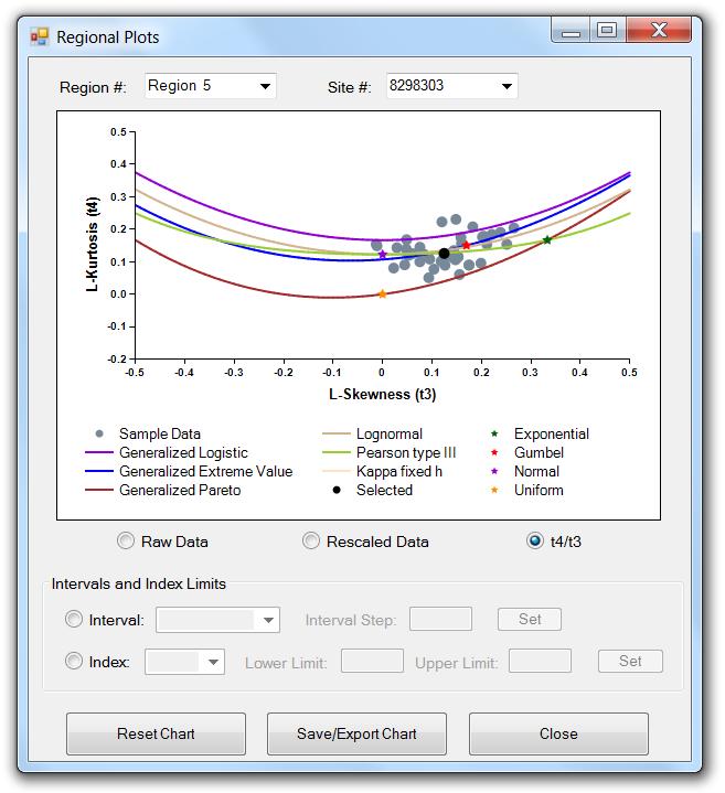
37 (a) (b) 35
 the t4/t3")
38 (c) Figure 23: Regional Plots window, showing (a) the Raw Data measured during periods for ONI < 0; (b) the t4/t3 graph for a selected region, which includes all sites within the selected region as gray dots, the selected region as a black dot, two-parameter distributions as colored stars, and the three-parameter distributions as colored curves, with no restrictions imposed; and (c) the t4/t3 graph for the same region except where L-Kurtosis and L-Skew have been calculated using only rainfall measurements taken between 1970 and All standard distributions are shown in the legend. There are three buttons at the bottom of the window in Fig. 23: Reset Chart, Save/Export Chart, and Close. Clicking the Reset Chart button will reset any limitations that were placed on the data based on time intervals or index limits; all associated textboxes and drop-down menus will be cleared and the original graphs will be displayed. The Save/Export Chart button opens the window shown earlier in Fig. 9. Here the user can either save the graph as an image or export the chart data as a table. As an image, the graph can be saved in one of five formats:.jpg (JPeg image),.bmp (Bitmap image),.gif (Gif image),.tiff (TIFF), or.png (Png image). The user is allowed to change the height and width of the graph (given in units of pixels) or can use the default settings that are given. As a table, all data in the graph are exported to a.csv (comma-separated values) file. Click Close when finished viewing the Regional Plots window. 36
39 Regional Frequency Distribution The final option in the Regions menu on the Title Screen is Frequency Distribution. Once clicked, a window opens that displays the first region s data probability density function (PDF) as vertical blue bars. Any of the regions can be viewed using the drop-down box below the graph; for example, the PDF of Region #1 is shown in Fig. 24a. In addition, fits of any of the fourteen different standard frequency distribution functions (see Table 2) to the L-moments of the region s data can be displayed on the graph by clicking the box next to the desired distribution; the GEV, GLO, and LP3 are compared in Fig. 24a. Distributions are divided based on the number of parameters required. This graph provides a way to visually determine how well each standard frequency distribution fits the region s sample data and offers another clue in determining which distribution may be best for a particular region. In addition, a region s cumulative distribution function or CDF (not shown), non-exceedance curve (Fig. 24b), and exceedance curve (Fig. 24c) can be displayed. The CDF is the integral of the probability density function, summing up the total probability of rainfall at or below a given value, and is used when computing the non-exceedance and exceedance curves. The non-exceedance graph is shown on a logarithmic scale and provides the user with information regarding the frequency at which a particular rainfall amount is not exceeded; this is useful for users concerned with drought events. The non-exceedance curve for the sample data along with the best fits of the GEV, GLO, and LP3 distributions are shown in Fig. 24b. The exceedance graph is also shown on a logarithmic scale and provides the user with information regarding the frequency at which a particular rainfall amount is exceeded; this is useful for users more concerned with flood events. The exceedance curve for the sample data along with best fits of the GEV, GLO, and LP3 distributions for Region #1 are shown in Fig. 24c. The estimated non-exceedance and exceedance curves of the sample data are represented by the light blue lines, and the distributions are represented as in previous graphs. Each of these graphs can be used to make a visual comparison between how well each standard distribution fits the data of a site. As in the previous screen, these graphs should not be used alone in finally determining which distribution to use to characterize a particular region s distribution curve. A special note needs to be made regarding two of the distributions: the KP3 and KAP. The KP3 distribution is similar to the KAP distribution except that the fourth parameter (h) is fixed by the user, resulting in a 3-parameter version of KAP. The current h-value that is being used to solve the KP3 is shown near the bottom of the window on the right side (default is h = 0); pushing the adjacent... button allows the user to set the h-value. The KAP distribution is the parent distribution of the KP3 distribution and several of the other 3-parameter distributions, and setting h to particular standard values will result in one of these child distributions: h = -1 results in the Generalized Logistic distribution (GLO); h = 0 results in the Generalized Extreme Variable (GEV) distribution; and h = 1 results in the Generalized Pareto (GPA) distribution. Non-standard values of h may be of use if inspection of the t4/t3 graph (Fig. 23) reveals that sites or regions cluster between the curves of the three child distributions; a strong theoretical backing should be developed in order to defend the h-value that was used. In addition, the small unlabelled button next to the KAP distribution allows the user to change the number of iterations used in the four-parameter fitting process; this option should not be used unless the Kappa function is not producing a satisfactory fit to the sample data. There is also the option of displaying individual data values on the graph by either specifying an interval length and then choosing an interval period or by specifying an upper or lower limit for a particular climate variability index (refer to Table 1). In order to create a series of intervals of a particular time length, click the circle corresponding to the Interval option; the interval step textbox and the drop-down box become enabled. Once an interval step is entered, the Set interval button becomes enabled; 37
40 clicking Set will split the time period associated with the precipitation data for the region into the corresponding intervals. Selecting an interval will display the data within the interval as blue squares and the mean for that data as a larger black square; on the PDF these squares will appear on the x-axis, whereas on the CDF and the non-exceedance (Fig. 24b) and exceedance curves, the squares will appear along the light blue line that represents the original data. In order to display the individual data values corresponding to limits set for a particular climate variability index, select the Index option; the index drop-down box and the upper and lower limit textboxes become enabled. Select an index type from the drop-down box and specify an upper or lower limit or both. Once this is done, the Set index button becomes enabled; clicking Set will display the selected region s data meeting the limit criteria as blue squares and the mean of that data as a larger black square; on the PDF (Fig. 24a) these squares will appear on the x-axis, whereas on the CDF and the non-exceedance and exceedance (Fig. 24c) curves, the squares will appear along the light blue line that represents the original data. There are four buttons at the bottom of the Regional Distribution Plots window. The first button is titled Parameters, and when selected a window similar to that shown in Fig. 14 appears that displays the parameters for a particular standard frequency distribution estimated from the L-moments of the region selected in the previous screen. Any frequency distribution can be selected from the drop-down box. It should be noted here that the number of parameters displayed will depend on the frequency distribution chosen. Click the Close button to close the Regional Parameters window. The second button at the bottom of the Regional Distribution Plots window labeled Analysis is described in more detail in the next section. The third button is the Save/Export Chart button, which opens the window shown earlier in Fig. 9. Here the user can either save the graph as an image or export the chart data as a table. As an image, the graph can be saved in one of five formats:.jpg (JPeg image),.bmp (Bitmap image),.gif (Gif image),.tiff (TIFF), or.png (Png image). The user is allowed to change the height and width of the graph (given in units of pixels) or can use the default settings that are given. As a table, all data in the graph are exported to a.csv (comma-separated values) file. Click the Close button on the Regional Distribution Plots window when finished. 38

41 (a) 39

42 (b) 40
 and light blue lines (non-exceedance and exceedance curves).")
43 (c) Figure 24: Regional Distribution Plots screen, showing (a) the probability density function (PDF), (b) the non-exceedance curve, and (c) the exceedance curve for the sample data of the selected region as blue bars (PDF) and light blue lines (non-exceedance and exceedance curves). Also included are the estimations for each curve using three different standard frequency distributions: GEV, GLO, and LP3; the line color for each is shown in the legend. Also shown in the graph are the rain events that (a) & (c) meet a set climate variability index limit or are (b) within a specified interval as blue squares and the means as a larger black square. 41
44 Onsite Regional Frequency Analysis The second button at the bottom of the Regional Distribution Plots window is titled Analysis, and once clicked, the screen shown in Fig. 25a appears. The Regional Frequency Analysis window is divided into two tabs titled Onsite Analysis and Offsite Analysis. Onsite analysis refers to estimating the magnitude of a storm event of a particular frequency for a particular site where data is available. This is similar to what was done in the Site Frequency Analysis window described earlier. A desired region and a site within that region can be selected from the two drop-down boxes at the top of the window. As was also done in the Site Frequency Analysis window, any of the fourteen standard frequency distributions mentioned earlier can be used to estimate the event intensity for a particular site; initially the Generalized Extreme Value (GEV) frequency distribution is selected. The table on the right side of the window displays intensities for a range of exceedance and non-exceedance frequencies computed from the selected distribution; selecting a different frequency distribution will cause the values in this table to change. Once the desired distribution has been selected, the user needs to choose which site averaging method to use to estimate the storm intensity for a particular site using the regional frequency distribution. Because the regional distribution was fit to scaled or normalized site data, the resulting regional exceedance curve needs to be multiplied by a mean value representative of the selected site. Two options are available: using the L-Mean (L1) computed from the selected sites rainfall data provided in the input file or using an Index Flood value for that site. The Index Flood method uses the Mean Precipitation for the period entered in the Initial Screening window; the mean precipitation for this period needs to be entered by the user in the final column of the Other Site Characteristics worksheet at the data entry phase, if available. An external source, such as a Mean Annual Precipitation map or database, is needed to use this option. If this information is not available, then the user must use the L1 option. This method of computing the at-site estimate of the X-year storm event should be an improvement over direct at-site estimates as was done earlier. Also shown in this window are the Pearson s R-values and z-scores for each distribution, which give an indication of the closeness of fit of each standard distribution to the sample data of the region being analyzed. The Pearson s R-value is determined by computing the square root of the means of the difference squared between the sample data and the standard distribution. The z-score is computed based on the distance between a region s t4/t3 value and that of each 3-parameter distribution; the z- score is only applicable for 3-parameter distributions. A Pearson R-value close to 1 and a z-score close to 0 indicate a good fit. These statistics, along with the graphs similar to the one in Fig. 23 and the visual fits of the curves shown in Fig. 24 should be used together to determine the preferable standard frequency distribution to use for a particular region. There is also the option of computing the intensities for each frequency in the table for a particular site based on either specifying an interval length and then choosing an interval period or by specifying an upper or lower limit for a particular climate variability index (Table 1). The default option is None. In order to create a series of intervals of a particular time length, click the Interval option; the button and drop-down box to the right become enabled. Pressing the button brings up a screen asking the user to specify a time interval; enter an interval and select OK. The user is returned to the Analysis window within which the Intervals drop-down box has now been filled with intervals corresponding to the interval just specified and the range of the site data (this does not include all years within the region). Selecting the desired interval within the drop-down box limits the computation of intensity to only nonzero sample data within that interval (the number of sites and total years used in the computation of the regional L-moments are shown); the resulting intensities are displayed within the table to the right for each corresponding frequency (see Fig. 25b). 42

45 (a) 43
 using data only within a specified interval to compute intensities for the frequencies in the table is illustrated.")
46 (b) Figure 25: Shown are the input screens for regional Onsite Analysis; the difference between (a) using the entire data set and (b) using data only within a specified interval to compute intensities for the frequencies in the table is illustrated. 44
47 In order to display the individual data values corresponding to limits set for a particular climate variability index, click the Set Index Limit(s) option; the button to the right becomes enabled. Pressing the button brings up the screen shown earlier in Fig. 17. Selecting any index enables the lower and upper limit textboxes associated with that index. There are also Information buttons labeled with a? associated with each index that provide the user with a brief description of that index. For example, pressing? button next to the ONI index option brings up the screen previously shown in Fig. 18. Press Close to close the information window. Select an index type and specify the lower and/or upper limits and press OK. The program recomputes the intensities for each frequency shown in the table in the Analysis window using only non-zero data from the selected region that meet the specified index limits; the resulting intensities are shown in the table. After computing intensities for interval analysis or using the index limits, the user should re-select None when desiring to analyze the entire data set without any index limits. In the case that the user would like to find the intensity for a recurrence frequency not listed in the table, the button titled Other Frequencies at the bottom of the window should be selected; this will bring up the window previously shown in Fig. 19. The user should choose the type of extreme event they are interested in, whether it is a drought or a flood, and enter the desired frequency; the Compute button will then be enabled. Pressing the Compute button will give the resulting intensity based on the frequency distribution chosen in the previous screen. This feature can be used with or without using the interval and index limit options. Click Close to close this window. The third button titled Plots, when clicked, displays a window similar to the one shown in Fig. 26. For the site selected in Fig. 25, this window plots the intensity for a rainfall event of a particular frequency over the site s period of record. If the Set Interval button is selected and an interval was defined in the previous window (Fig. 25), then the resulting plot will appear as shown in Fig. 26. The rainfall intensity for each interval will be plotted for the site selected in Fig. 25 over that site s period of record. The event frequency can be selected using the frequency drop-down box on the left below the plot. The light blue dot on the graph indicates the resulting rainfall intensity for the interval selected in the interval drop-down box. The interval can be changed by selecting a different interval from the interval drop-down box or by clicking one of the arrows on either side of the interval drop-down box. If an interval was not set in the previous window, then the resulting graph will appear as a site exceedance curve (not shown). This curve will either use all of the data available at the site or, if Index Limits have been set, only the data that meet these limits. The left button at the bottom of the screen is the Save/Export Chart button, which opens the window shown earlier in Fig. 9. Here the user can either save the graph as an image or export the chart data as a table. As an image, the graph can be saved in one of five formats:.jpg (JPeg image),.bmp (Bitmap image),.gif (Gif image),.tiff (TIFF), or.png (Png image). The user is allowed to change the height and width of the graph (given in units of pixels) or can use the default settings that are given. As a table, all data in the graph are exported to a.csv (commaseparated values) file. Click the right button, Close, to close the Frequency Plots window. 45

48 Figure 26: Frequency Plots window showing intensities of 20-year rainfall events (selected frequency = 0.050) for the entire period of record for a particular site in Region 4. The light blue dot represents the 20-year event for the selected interval. Offsite Regional Frequency Analysis When the user clicks the Offsite Analysis tab of the Regional Frequency Analysis window, the screen in Fig. 27 appears. Offsite analysis is performed when attempting to estimate the intensity of storms of a particular frequency at sites where there are no data. This is accomplished using the sites that do contain data and an interpolation scheme, such as linear interpolation or inverse distance weighting, to estimate the values between these sites. The first step in this process is to identify the region over which the user would like to estimate storm intensities. This is accomplished by entering the range of latitudes (northern and southern limits) and longitudes (eastern and western limits) that the region is to cover. In addition the user needs to enter a Resolution in units of degrees; the resolution entered must be less than the lesser of the latitude and longitude ranges. Next, and as was done in the Onsite Analysis, the user must select a standard frequency distribution and a site averaging method and also enter the desired rainfall frequency. After all of the required information is obtained, the Export button will become enabled. Clicking the Export button will bring up a dialog box prompting the user to select where they would like the output file saved; the user also needs to provide a name for the file. Clicking the OK button creates a text output file similar to the one shown in Fig. 28. The Information provided in the output file include the 46

49 Figure 27: Shown is the input screen for regional Offsite Frequency Analysis. number of rows and columns of the output data, the x- and y-coordinates of the lower left corner of the desired region, the resolution in degrees, and the actual offsite data organized into rows and columns. The method currently used to interpolate between onsite observations and create the resulting export file is Inverse Data Weighting (IDW). The program has determined the number of cells in the region by the ranges of latitude and longitude divided by the desired resolution. For example, in Fig. 28 the region has been divided up into a 4 x 4 grid containing a total of 16 cells (20 degrees longitude / 5 degrees resolution = 4 longitude cells; 20 degrees latitude / 5 degrees resolution = 4 latitude cells). If the latitude and/or longitude range does not divide evenly by the resolution, the program always round the number of cells up and adjusts the borders of the region accordingly. Click the Close button to close the Regional Frequency Analysis window. Click Close to close the Regional Distribution Plots window. As already mentioned, the program can be closed by either selecting File and Exit from the Title Screen or by clicking the X in the upper-right corner of the window. 47

50 Figure 28: Example output file when performing offsite analysis. IV. CONTACT INFORMATION This tool is being designed by ICIWaRM staff with the use of our collaborators specifically in mind. Please feel free to contribute your thoughts on the program and the ways in which this program could better help you conduct your frequency analysis to ICIWaRM. Staff members responsible for the continuing development of the program can be reached at the following addresses: Jason Giovannettone Michael Wright 48
SES 123 Global and Regional Energy Lab Worksheet
 SES 123 Global and Regional Energy Lab Worksheet Introduction An important aspect to understand about our planet is global temperatures, including spatial variations, such as between oceans and continents
On the Relation Between North American Winter Precipitation and Storm Tracks
 On the Relation Between North American Winter Precipitation and Storm Tracks Katherine E. Lukens Advisor: E. Hugo Berbery at ESSIC/CICS-MD Acknowledgement: Kevin I. Hodges at University of Reading, Reading,
SES 123 Global and Regional Energy Lab Procedures
 SES 123 Global and Regional Energy Lab Procedures Introduction An important aspect to understand about our planet is global temperatures, including spatial variations, such as between oceans and continents
Using Excel for Graphical Analysis of Data
 Using Excel for Graphical Analysis of Data Introduction In several upcoming labs, a primary goal will be to determine the mathematical relationship between two variable physical parameters. Graphs are
Chapter 3: Rate Laws Excel Tutorial on Fitting logarithmic data
 Chapter 3: Rate Laws Excel Tutorial on Fitting logarithmic data The following table shows the raw data which you need to fit to an appropriate equation k (s -1 ) T (K) 0.00043 312.5 0.00103 318.47 0.0018
Graphical Analysis of Data using Microsoft Excel [2016 Version]
![Graphical Analysis of Data using Microsoft Excel [2016 Version]](/thumbs/72/67574169.jpg "Graphical Analysis of Data using Microsoft Excel [2016 Version]") Graphical Analysis of Data using Microsoft Excel [2016 Version] Introduction In several upcoming labs, a primary goal will be to determine the mathematical relationship between two variable physical parameters.
Graphical Analysis of Data using Microsoft Excel [2016 Version] Introduction In several upcoming labs, a primary goal will be to determine the mathematical relationship between two variable physical parameters.
Spreadsheet Warm Up for SSAC Geology of National Parks Modules, 2: Elementary Spreadsheet Manipulations and Graphing Tasks
 University of South Florida Scholar Commons Tampa Library Faculty and Staff Publications Tampa Library 2009 Spreadsheet Warm Up for SSAC Geology of National Parks Modules, 2: Elementary Spreadsheet Manipulations
Using Excel for Graphical Analysis of Data
 EXERCISE Using Excel for Graphical Analysis of Data Introduction In several upcoming experiments, a primary goal will be to determine the mathematical relationship between two variable physical parameters.
Pre-Lab Excel Problem
 Pre-Lab Excel Problem Read and follow the instructions carefully! Below you are given a problem which you are to solve using Excel. If you have not used the Excel spreadsheet a limited tutorial is given
Charts in Excel 2003
 Charts in Excel 2003 Contents Introduction Charts in Excel 2003...1 Part 1: Generating a Basic Chart...1 Part 2: Adding Another Data Series...3 Part 3: Other Handy Options...5 Introduction Charts in Excel
Tips and Guidance for Analyzing Data. Executive Summary
 Tips and Guidance for Analyzing Data Executive Summary This document has information and suggestions about three things: 1) how to quickly do a preliminary analysis of time-series data; 2) key things to
Chemistry Excel. Microsoft 2007
 Chemistry Excel Microsoft 2007 This workshop is designed to show you several functionalities of Microsoft Excel 2007 and particularly how it applies to your chemistry course. In this workshop, you will
Excel Spreadsheets and Graphs
 Excel Spreadsheets and Graphs Spreadsheets are useful for making tables and graphs and for doing repeated calculations on a set of data. A blank spreadsheet consists of a number of cells (just blank spaces
Lastly, in case you don t already know this, and don t have Excel on your computers, you can get it for free through IT s website under software.
 Welcome to Basic Excel, presented by STEM Gateway as part of the Essential Academic Skills Enhancement, or EASE, workshop series. Before we begin, I want to make sure we are clear that this is by no means
Excel Core Certification
 Microsoft Office Specialist 2010 Microsoft Excel Core Certification 2010 Lesson 6: Working with Charts Lesson Objectives This lesson introduces you to working with charts. You will look at how to create
EXCEL 2003 DISCLAIMER:
 EXCEL 2003 DISCLAIMER: This reference guide is meant for experienced Microsoft Excel users. It provides a list of quick tips and shortcuts for familiar features. This guide does NOT replace training or
Working with Charts Stratum.Viewer 6
 Working with Charts Stratum.Viewer 6 Getting Started Tasks Additional Information Access to Charts Introduction to Charts Overview of Chart Types Quick Start - Adding a Chart to a View Create a Chart with
Error Analysis, Statistics and Graphing
 Error Analysis, Statistics and Graphing This semester, most of labs we require us to calculate a numerical answer based on the data we obtain. A hard question to answer in most cases is how good is your
Further Maths Notes. Common Mistakes. Read the bold words in the exam! Always check data entry. Write equations in terms of variables
 Further Maths Notes Common Mistakes Read the bold words in the exam! Always check data entry Remember to interpret data with the multipliers specified (e.g. in thousands) Write equations in terms of variables
SES123 Computer Methods Lab Procedures
 SES123 Computer Methods Lab Procedures Introduction Science and engineering commonly involve numerical calculations, graphs, photographic images, and various types of figures. In this lab, you will use
BioFuel Graphing instructions using Microsoft Excel 2003 (Microsoft Excel 2007 instructions start on page mei-7)
") BioFuel Graphing instructions using Microsoft Excel 2003 (Microsoft Excel 2007 instructions start on page mei-7) Graph as a XY Scatter Chart, add titles for chart and axes, remove gridlines. A. Select
BioFuel Graphing instructions using Microsoft Excel 2003 (Microsoft Excel 2007 instructions start on page mei-7) Graph as a XY Scatter Chart, add titles for chart and axes, remove gridlines. A. Select
Excel 2010 Worksheet 3. Table of Contents
 Table of Contents Graphs and Charts... 1 Chart Elements... 1 Column Charts:... 2 Pie Charts:... 6 Line graph 1:... 8 Line Graph 2:... 10 Scatter Charts... 12 Functions... 13 Calculate Averages (Mean):...
RClimTool USER MANUAL
 RClimTool USER MANUAL By Lizeth Llanos Herrera, student Statistics This tool is designed to support, process automation and analysis of climatic series within the agreement of CIAT-MADR. It is not intended
Introduction to the workbook and spreadsheet
 Excel Tutorial To make the most of this tutorial I suggest you follow through it while sitting in front of a computer with Microsoft Excel running. This will allow you to try things out as you follow along.
STORMS 2010 v
 JFSA Ref. No.: 0008-10 / Jan 2011 STORMS 2010 v. 3.0.0 January, 2011 J.F. Sabourin and Associates Inc. STORMS 2010 V. 3.0.0 HELP MANUAL Page i DISCLAIMER J.F. Sabourin and Associates Inc. makes no warranty
v Observations SMS Tutorials Prerequisites Requirements Time Objectives
 v. 13.0 SMS 13.0 Tutorial Objectives This tutorial will give an overview of using the observation coverage in SMS. Observation points will be created to measure the numerical analysis with measured field
To move cells, the pointer should be a north-south-eastwest facing arrow
 Appendix B Microsoft Excel Primer Oftentimes in physics, we collect lots of data and have to analyze it. Doing this analysis (which consists mostly of performing the same operations on lots of different
Lab Activity #2- Statistics and Graphing
 Lab Activity #2- Statistics and Graphing Graphical Representation of Data and the Use of Google Sheets : Scientists answer posed questions by performing experiments which provide information about a given
Microsoft Excel Using Excel in the Science Classroom
 Microsoft Excel Using Excel in the Science Classroom OBJECTIVE Students will take data and use an Excel spreadsheet to manipulate the information. This will include creating graphs, manipulating data,
Lab1: Use of Word and Excel
 Dr. Fritz Wilhelm; physics 230 Lab1: Use of Word and Excel Page 1 of 9 Lab partners: Download this page onto your computer. Also download the template file which you can use whenever you start your lab
v SMS 12.2 Tutorial Observation Prerequisites Requirements Time minutes
 v. 12.2 SMS 12.2 Tutorial Observation Objectives This tutorial will give an overview of using the observation coverage in SMS. Observation points will be created to measure the numerical analysis with
Budget Exercise for Intermediate Excel
 Budget Exercise for Intermediate Excel Follow the directions below to create a 12 month budget exercise. Read through each individual direction before performing it, like you are following recipe instructions.
SUM - This says to add together cells F28 through F35. Notice that it will show your result is
 COUNTA - The COUNTA function will examine a set of cells and tell you how many cells are not empty. In this example, Excel analyzed 19 cells and found that only 18 were not empty. COUNTBLANK - The COUNTBLANK
You are to turn in the following three graphs at the beginning of class on Wednesday, January 21.
 Computer Tools for Data Analysis & Presentation Graphs All public machines on campus are now equipped with Word 2010 and Excel 2010. Although fancier graphical and statistical analysis programs exist,
TABLE OF CONTENTS INTRODUCTION...2
 WINGARD PE 6.0 August 2010 TABLE OF CONTENTS TABLE OF CONTENTS...1 1. INTRODUCTION...2 2. PROGRAM OVERVIEW...3 2.1. PROGRAM MENUS... 4 2.2. MAIN TOOLBAR... 5 2.3. ANALYSIS... 7 2.4. OUTPUT... 10 2.5. DISPLAY
Math 227 EXCEL / MEGASTAT Guide
 Math 227 EXCEL / MEGASTAT Guide Introduction Introduction: Ch2: Frequency Distributions and Graphs Construct Frequency Distributions and various types of graphs: Histograms, Polygons, Pie Charts, Stem-and-Leaf
Observation Coverage SURFACE WATER MODELING SYSTEM. 1 Introduction. 2 Opening the Data
 SURFACE WATER MODELING SYSTEM Observation Coverage 1 Introduction An important part of any computer model is the verification of results. Surface water modeling is no exception. Before using a surface
Scottish Improvement Skills
 Scottish Improvement Skills Creating a run chart on MS Excel 2007 Create and save a new Excel worksheet. Some of the details of steps given below may vary slightly depending on how Excel has been used
SeisVolE Teaching Modules Preliminary, Draft Instructions (L. Braile and S. Braile, 5/28/01,
 SeisVolE Teaching Modules Preliminary, Draft Instructions (L. Braile and S. Braile, 5/28/01, www.eas.purdue.edu/~braile) 1. Make Your Own Map a. Open the view with that contains your area of interest (for
Creating a Basic Chart in Excel 2007
 Creating a Basic Chart in Excel 2007 A chart is a pictorial representation of the data you enter in a worksheet. Often, a chart can be a more descriptive way of representing your data. As a result, those
Excel 2010 Charts and Graphs
 Excel 2010 Charts and Graphs In older versions of Excel the chart engine looked tired and old. Little had changed in 15 years in charting. The popular chart wizard has been replaced in Excel 2010 by a
LTER Schoolyard Ecology Program
 LTER Schoolyard Ecology Program Title: How to Make Awesome Graphs Teacher/Author: Nora Murphy School: Concord Carslisle High School Date: March 30, 2017 1 Name Block Date How to Make Awesome Graphs Note,
Charting Progress with a Spreadsheet
 Charting Progress - 1 Charting Progress with a Spreadsheet We shall use Microsoft Excel to demonstrate how to chart using a spreadsheet. Other spreadsheet programs (e.g., Quattro Pro, Lotus) are similarly
Scientific Graphing in Excel 2013
 Scientific Graphing in Excel 2013 When you start Excel, you will see the screen below. Various parts of the display are labelled in red, with arrows, to define the terms used in the remainder of this overview.
State Water Survey Division
 THE CLIMATE OF ILLINOIS Lying midway between the Continental Divide and the Atlantic Ocean, and 500 miles north of the Gulf of Mexico, Illinois has a climate labeled as continental. Cold winters, and warm,
IDS 101 Introduction to Spreadsheets
 IDS 101 Introduction to Spreadsheets A spreadsheet will be a valuable tool in our analysis of the climate data we will examine this year. The specific goals of this module are to help you learn: how to
2. create the workbook file
 2. create the workbook file Excel documents are called workbook files. A workbook can include multiple sheets of information. Excel supports two kinds of sheets for working with data: Worksheets, which
Ecography. Supplementary material
 Ecography ECOG-03031 Fordham, D. A., Saltré, F., Haythorne, S., Wigley, T. M. L., Otto-Bliesner, B. L., Chan, K. C. and Brooks, B. W. 2017. PaleoView: a tool for generating continuous climate projections
Installation 3. PerTrac Reporting Studio Overview 4. The Report Design Window Overview 8. Designing the Report (an example) 13
 13") Contents Installation 3 PerTrac Reporting Studio Overview 4 The Report Design Window Overview 8 Designing the Report (an example) 13 PerTrac Reporting Studio Charts 14 Chart Editing/Formatting 17 PerTrac
Contents Installation 3 PerTrac Reporting Studio Overview 4 The Report Design Window Overview 8 Designing the Report (an example) 13 PerTrac Reporting Studio Charts 14 Chart Editing/Formatting 17 PerTrac
Technical Documentation Version 7.3 Output
 Technical Documentation Version 7.3 Output These documents are copyrighted by the Regents of the University of Colorado. No part of this document may be reproduced, stored in a retrieval system, or transmitted
PERSIANN-CONNECT: A Database of Precipitation Systems for Climate Research
 PERSIANN-CONNECT: A Database of Precipitation Systems for Climate Research Scott Sellars, Phu Nguyen, Wei Chu, Xiaogang Gao, Kuolin Hsu, Dmitry Kunisky and Soroosh Sorooshian University of California,
Managing Trends. About Trends CHAPTER. Send documentation comments to
 CHAPTER 11 Trends provides historical data of a node in the network over a period of time. When the value of a node in the specified trend changes, the changes are recorded in the trend logs and displayed
Points Lines Connected points X-Y Scatter. X-Y Matrix Star Plot Histogram Box Plot. Bar Group Bar Stacked H-Bar Grouped H-Bar Stacked
 Plotting Menu: QCExpert Plotting Module graphs offers various tools for visualization of uni- and multivariate data. Settings and options in different types of graphs allow for modifications and customizations
Working with Data and Charts
 PART 9 Working with Data and Charts In Excel, a formula calculates a value based on the values in other cells of the workbook. Excel displays the result of a formula in a cell as a numeric value. A function
Microsoft Excel 2007
 Microsoft Excel 2007 1 Excel is Microsoft s Spreadsheet program. Spreadsheets are often used as a method of displaying and manipulating groups of data in an effective manner. It was originally created
Using Charts in a Presentation 6
 Using Charts in a Presentation 6 LESSON SKILL MATRIX Skill Exam Objective Objective Number Building Charts Create a chart. Import a chart. Modifying the Chart Type and Data Change the Chart Type. 3.2.3
3 Selecting the standard map and area of interest
 Anomalies, EOF/PCA Mati Kahru 2005-2008 1 Anomalies, EOF/PC analysis with WAM 1 Introduction Calculating anomalies is a method of change detection in time series. Empirical Orthogonal Function (EOF) analysis
Spreadsheet Concepts: Creating Charts in Microsoft Excel
 Spreadsheet Concepts: Creating Charts in Microsoft Excel lab 6 Objectives: Upon successful completion of Lab 6, you will be able to Create a simple chart on a separate chart sheet and embed it in the worksheet
Office Excel. Charts
 Office 2007 Excel Charts October 2007 CONTENTS INTRODUCTION... 1 Bold text... 2 CHART TYPES... 3 CHOOSING A CHART... 4 CREATING A COLUMN CHART... 5 FORMATTING A COLUMN CHART... 8 Changing the chart style...
Three-Dimensional (Surface) Plots
 Plots") Three-Dimensional (Surface) Plots Creating a Data Array 3-Dimensional plots (surface plots) are often useful for visualizing the behavior of functions and identifying important mathematical/physical features
Three-Dimensional (Surface) Plots Creating a Data Array 3-Dimensional plots (surface plots) are often useful for visualizing the behavior of functions and identifying important mathematical/physical features
Dealing with Data in Excel 2013/2016
 Dealing with Data in Excel 2013/2016 Excel provides the ability to do computations and graphing of data. Here we provide the basics and some advanced capabilities available in Excel that are useful for
Excel 2013 Charts and Graphs
 Excel 2013 Charts and Graphs Copyright 2016 Faculty and Staff Training, West Chester University. A member of the Pennsylvania State System of Higher Education. No portion of this document may be reproduced
Rotated earth or when your fantasy world goes up side down
 Rotated earth or when your fantasy world goes up side down A couple of weeks ago there was a discussion started if Fractal Terrain 3 (FT3) can rotate our earth. http://forum.profantasy.com/comments.php?discussionid=4709&page=1
Handling Your Data in SPSS. Columns, and Labels, and Values... Oh My! The Structure of SPSS. You should think about SPSS as having three major parts.
 Handling Your Data in SPSS Columns, and Labels, and Values... Oh My! You might think that simple intuition will guide you to a useful organization of your data. If you follow that path, you might find
This user guide covers select features of the desktop site. These include:
 User Guide myobservatory Topics Covered: Desktop Site, Select Features Date: January 27, 2014 Overview This user guide covers select features of the desktop site. These include: 1. Data Uploads... 2 1.1
Rockefeller College MPA Excel Workshop: Clinton Impeachment Data Example
 Rockefeller College MPA Excel Workshop: Clinton Impeachment Data Example This exercise is a follow-up to the MPA admissions example used in the Excel Workshop. This document contains detailed solutions
Introduction to the Kinematics Tool
 Introduction to the Kinematics Tool Author: Samantha Ross EarthByte Group, University of Sydney Introduction to the Kinematics Tool Aim Included Files Background Exercise 1 - Using the Kinematics Tool
1 Introduction to Using Excel Spreadsheets
 Survey of Math: Excel Spreadsheet Guide (for Excel 2007) Page 1 of 6 1 Introduction to Using Excel Spreadsheets This section of the guide is based on the file (a faux grade sheet created for messing with)
Map Viewer User Guide
 Map Viewer User Guide Sea Level Scenario Sketch Planning Tool Version 2, 2017 University of Florida GeoPlan Center Introduction The purpose of this document is to guide users on how to use the Sea Level
Excel 2013 Intermediate
 Excel 2013 Intermediate Quick Access Toolbar... 1 Customizing Excel... 2 Keyboard Shortcuts... 2 Navigating the Spreadsheet... 2 Status Bar... 3 Worksheets... 3 Group Column/Row Adjusments... 4 Hiding
Troubleshooting in Microsoft Excel 2002
 Page 1 of 8 Troubleshooting in Microsoft Excel 2002 Result: To understand how to work with the Excel software to enter data, navigate the page, and print materials. Tabs Look at the tabs at the bottom
Working with Census Data Excel 2013
 Working with Census Data Excel 2013 Preparing the File If you see a lot of little green triangles next to the numbers, there is an error or warning that Excel is trying to call to your attention. In my
 www.insightsoftware.com for JD Edwards World and EnterpriseOne Version: 2.1 Last Updated: August 31, 2011 Contents 1. Introduction... 4 Welcome... 4 Using this Guide... 4 2. The Console Interface... 5
Project Guide - Time location with PLANER ET PROFESSIONAL 2011
 Project Guide - Time location with PLANER ET PROFESSIONAL 2011 Description This Guide summarizes operational way, the steps and most important functions to carry out a complete cycle of management of programming
Excel Tips and FAQs - MS 2010
 BIOL 211D Excel Tips and FAQs - MS 2010 Remember to save frequently! Part I. Managing and Summarizing Data NOTE IN EXCEL 2010, THERE ARE A NUMBER OF WAYS TO DO THE CORRECT THING! FAQ1: How do I sort my
v TUFLOW-2D Hydrodynamics SMS Tutorials Time minutes Prerequisites Overview Tutorial
 v. 12.2 SMS 12.2 Tutorial TUFLOW-2D Hydrodynamics Objectives This tutorial describes the generation of a TUFLOW project using the SMS interface. This project utilizes only the two dimensional flow calculation
INTRODUCTION... 1 UNDERSTANDING CELLS... 2 CELL CONTENT... 4
 Introduction to Microsoft Excel 2016 INTRODUCTION... 1 The Excel 2016 Environment... 1 Worksheet Views... 2 UNDERSTANDING CELLS... 2 Select a Cell Range... 3 CELL CONTENT... 4 Enter and Edit Data... 4
InterAct User. InterAct User (01/2011) Page 1
 Page 1") InterAct's Energy & Cost Analysis module provides users with a set of analytical reporting tools: Load Analysis Usage and Variance Analysis Trending Baseline Analysis Energy & Cost Benchmark What If Analysis
InterAct's Energy & Cost Analysis module provides users with a set of analytical reporting tools: Load Analysis Usage and Variance Analysis Trending Baseline Analysis Energy & Cost Benchmark What If Analysis
Microsoft Excel 2000 Charts
 You see graphs everywhere, in textbooks, in newspapers, magazines, and on television. The ability to create, read, and analyze graphs are essential parts of a student s education. Creating graphs by hand
NCSS Statistical Software
 Chapter 245 Introduction This procedure generates R control charts for variables. The format of the control charts is fully customizable. The data for the subgroups can be in a single column or in multiple
Math 121 Project 4: Graphs
 Math 121 Project 4: Graphs Purpose: To review the types of graphs, and use MS Excel to create them from a dataset. Outline: You will be provided with several datasets and will use MS Excel to create graphs.
Microsoft Excel. Charts
 Microsoft Excel Charts Chart Wizard To create a chart in Microsoft Excel, select the data you wish to graph or place yourself with in the conjoining data set and choose Chart from the Insert menu, or click
Information Technology and Media Services. Office Excel. Charts
 Information Technology and Media Services Office 2010 Excel Charts August 2014 Information Technology and Media Services CONTENTS INTRODUCTION... 1 CHART TYPES... 3 CHOOSING A CHART... 4 CREATING A COLUMN
Lesson 1: Routine ITC Data Analysis and Fitting. Routine ITC Data Analysis. Lesson 1:Routine ITC Data Analysis and Fitting
 Lesson 1:Routine ITC Data Analysis and Fitting Lesson 1: Routine ITC Data Analysis and Fitting In this lesson you will learn to perform routine analysis of ITC data. For reasonably good data, Origin makes
USER GUIDE. ReSAKSS-Asia. Map Tool. Creative Commons BY-SA 3.0
 USER GUIDE ReSAKSS-Asia Map Tool Creative Commons BY-SA 3.0 TABLE OF CONTENTS 1. About... 3 2. Features and options... 4 2.1 Thematic map... 4 2.2 Indicators panel... 6 2.3 Graph panel... 6 2.4 Options
Watershed Modeling HEC-HMS Interface
 v. 10.1 WMS 10.1 Tutorial Learn how to set up a basic HEC-HMS model using WMS Objectives Build a basic HEC-HMS model from scratch using a DEM, land use, and soil data. Compute the geometric and hydrologic
Rich Text Editor Quick Reference
 Rich Text Editor Quick Reference Introduction Using the rich text editor is similar to using a word processing application such as Microsoft Word. After data is typed into the editing area it can be formatted
1. What specialist uses information obtained from bones to help police solve crimes?
 Mathematics: Modeling Our World Unit 4: PREDICTION HANDOUT VIDEO VIEWING GUIDE H4.1 1. What specialist uses information obtained from bones to help police solve crimes? 2.What are some things that can
Chemistry 30 Tips for Creating Graphs using Microsoft Excel
 Chemistry 30 Tips for Creating Graphs using Microsoft Excel Graphing is an important skill to learn in the science classroom. Students should be encouraged to use spreadsheet programs to create graphs.
Introduction to Spreadsheets
 Introduction to Spreadsheets Spreadsheets are computer programs that were designed for use in business. However, scientists quickly saw how useful they could be for analyzing data. As the programs have
How to use the SATURN Observation Network: Endurance Stations Site: Table of Contents
 How to use the SATURN Observation Network: Endurance Stations Site: Table of Contents Preface... 2 Introduction to the SATURN Interface... 3 Fixed station user interface... 5 The Recent Tab... 6 Reading
FrontPage 2000 Tutorial -- Advanced
 FrontPage 2000 Tutorial -- Advanced Shared Borders Shared Borders are parts of the web page that share content with the other pages in the web. They are located at the top, bottom, left side, or right
Digital Image Processing. Prof. P.K. Biswas. Department of Electronics & Electrical Communication Engineering
 Digital Image Processing Prof. P.K. Biswas Department of Electronics & Electrical Communication Engineering Indian Institute of Technology, Kharagpur Image Segmentation - III Lecture - 31 Hello, welcome
v Water Distribution System Modeling Working with WMS Tutorials Building a Hydraulic Model Using Shapefiles Prerequisite Tutorials None
 v. 10.1 WMS 10.1 Tutorial Water Distribution System Modeling Working with EPANET Building a Hydraulic Model Using Shapefiles Objectives Open shapefiles containing the geometry and attributes of EPANET
Lab 2: Your first web page
 Lab 2: Your first web page Due date DUE DATE: 3/3/2017, by 5pm. Demo in lab section/ta office hours. Overview In this lab we will walk through the usage of Microsoft Excel to create bar charts, pie charts,
How to use Excel Spreadsheets for Graphing
 How to use Excel Spreadsheets for Graphing 1. Click on the Excel Program on the Desktop 2. You will notice that a screen similar to the above screen comes up. A spreadsheet is divided into Columns (A,
Introduction to CS graphs and plots in Excel Jacek Wiślicki, Laurent Babout,
 MS Excel 2010 offers a large set of graphs and plots for data visualization. For those who are familiar with older version of Excel, the layout is completely different. The following exercises demonstrate
Statistics with a Hemacytometer
 Statistics with a Hemacytometer Overview This exercise incorporates several different statistical analyses. Data gathered from cell counts with a hemacytometer is used to explore frequency distributions
ITACS : Interactive Tool for Analysis of the Climate System
 Contents 1 2 3 4 ITACS : Interactive Tool for Analysis of the Climate System Features of the ITACS Atmospheric Analysis Data, Outgoing Longwave Radiation (by NOAA), SST, Ocean Analysis Data, etc. Plain
Microarray Excel Hands-on Workshop Handout
 Microarray Excel Hands-on Workshop Handout Piali Mukherjee (pim2001@med.cornell.edu; http://icb.med.cornell.edu/) Importing Data Excel allows you to import data in tab, comma or space delimited text formats.