MadCap Software. What's New Guide. Flare 11
|
|
|
- Claud Dickerson
- 6 years ago
- Views:
Transcription

1 MadCap Software What's New Guide Flare 11
2 Copyright 2015 MadCap Software. All rights reserved. Information in this document is subject to change without notice. The software described in this document is furnished under a license agreement or nondisclosure agreement. The software may be used or copied only in accordance with the terms of those agreements. No part of this publication may be reproduced, stored in a retrieval system, or transmitted in any form or any means electronic or mechanical, including photocopying and recording for any purpose other than the purchaser's personal use without the written permission of MadCap Software. MadCap Software 7777 Fay Avenue La Jolla, California THIS GUIDE WAS CREATED USING MADCAP FLARE.
3 CONTENTS CHAPTER 1 Introduction 7 Summary of Major New Features 8 Summary of Additional New Features 10 CHAPTER 2 Absolute Positioning 17 Common Properties and Options for Absolute Positioning 18 How To Create Absolute Positioning 30 CHAPTER 3 Build Targets in Background 59 Maximum Concurrent Builds 60 Builds Window Pane 61 CHAPTER 4 Doc-To-Help Import 73 CHAPTER 5 Top Navigation and Skin Enhancements 79 HTML5 Top Navigation Skin 80 Skin Components and Proxies 81 Skin Set to None for Target 94 Home Topic 95 Stylesheets 97 Responsive Output Device Width Media Queries 99 Producing Top Navigation Output 105 Simple Conversion to Top Navigation Output 137 Advanced Conversion to Top Navigation Output 146 CHAPTER 6 Multimedia 3D, YouTube, Vimeo 167 U3D Object Support 168 YouTube and Vimeo Support 170
4 CHAPTER 7 PDF Stitching 173 Steps 174 PDF Targets 175 Online Targets 180 CHAPTER 8 Additional New Features 181 Accept Contribution Wizard Enhancements 183 Augmented Reality 189 Batch Target Editor Enhancements 195 Cross-Reference Enhancements 196 Dictionaries (Global) and Spell Check Enhancements 199 EPUB Enhancements 211 File List Window Pane Drag Files 215 Float Tabs by Dragging Them Down 216 Font Properties Enhancements 218 Global Project Linking Delete Unreferenced Files 228 Glossary Term Duplicates Identified 232 Image Enhancements 233 Macros 245 Print-based Enhancements 250 Publishing Destinations FTP Active and Passive Modes 259 Quick Launch Bar 260 Search Enhancements 261 Shortcuts Customizable Keys 276 Slideshow Enhancements 279 Snippets Insert Snippet Link Dialog Modified 284 Source Control Git Integration and More 286 Start Page Pinning Project Files 301 Style Enhancements 304 Tables Cell Content Style Default 310 TOC and Mini-TOC Enhancements 316 Variables Date/Time Enhancements 321 Word Import Enhancements 324 XML Editor Enhancements 334 iv
5 APPENDIX PDF Guides 341 CONTENTS What's New Guide v
6 vi
7 CHAPTER 1 Introduction This version of Flare contains several new features and enhancements. For more information about each feature discussed in this manual, open the online Help and refer to the "What's New in this Version" topic. Links are provided in each new feature description, taking you to topics that contain additional information and steps. This chapter discusses the following: Summary of Major New Features 8 Summary of Additional New Features 10
8 Summary of Major New Features Following are the major new features introduced in this version of Flare. MAJOR NEW FEATURES Feature What's New? For More Information Absolute Positioning Build Targets in Background Doc-To-Help Import Float and move most kinds of content Wrap content all around element in print output Place text behind or in front of element Allows you to continue working while the output compiles Build one or multiple targets, even if not in project Builds window pane shows targets compiling Build logs automatically created and placed in output folder Import Doc-To-Help projects (files with.d2h extension) Features converted to nearest equivalents in Flare See "Absolute Positioning" on page 17. See "Build Targets in Background" on page 59. See "Doc-To-Help Import" on page 73. 8
9 MAJOR NEW FEATURES Feature What's New? For More Information HTML5 Top Navigation and Skin Enhancements Multimedia 3D, YouTube, Vimeo PDF Stitching Create website-like output without the traditional tripane structure New Top Navigation skin with built-in search bar and menu, as well as responsive output Building blocks include master pages, stylesheets, proxies, and unique skin components Ability to produce HTML5 output without a full skin 3D model (U3D file) support Embedded YouTube and Vimeo support Stitch existing PDFs into output by placing them in TOC Supported in PDF and online outputs In PDF output, good solution for manual in multiple languages See "Top Navigation and Skin Enhancements" on page 79. See "Multimedia 3D, YouTube, Vimeo" on page 167. See "PDF Stitching" on page 173. CHAPTER 1 What's New Guide 9
10 Summary of Additional New Features Following are several additional new features and enhancements introduced this version of Flare. ADDITIONAL NEW FEATURES Feature What's New? For More Information Accept Contribution Wizard Enhancements Augmented Reality Batch Target Editor Enhancements Cross-Reference Enhancements Dictionaries (Global) and Spell Check Enhancements Wizard enhanced, listing all conflicts in grid on a single page Export images from a project to augmented reality projects Export all images, or use conditions, file tags, or manual selection to export selected images Open augmented reality projects using Metaio Creator View augmented reality scenarios in Flare output using augmented reality browser Select all and deselect all options New icons Cross-references created when dragging topic files Default cross-reference format changed Global dictionaries, including ability to choose location Redesigned Spell Check window pane, with more options and results shown at bottom See "Accept Contribution Wizard Enhancements" on page 183. See "Augmented Reality" on page 189. See "Batch Target Editor Enhancements" on page 195. See "Cross-Reference Enhancements" on page 196. See "Dictionaries (Global) and Spell Check Enhancements" on page
11 ADDITIONAL NEW FEATURES Feature What's New? For More Information EPUB Enhancements File List Window Pane Drag Files Float Tabs by Dragging Them Down Font Properties Enhancements Global Project Linking Delete Unreferenced Files Glossary Term Duplicates Identified EPUB3, better support Embed fonts Enable dynamic content Click anywhere on row to drag file Click on the tab of a UI element and drag down to float it; then drag and drop it Pin fonts, displaying them at the top of the font list Collapsible font groups (Pinned, Recently Used, Defined Font Sets, All) Font Sets button in the Font Properties dialog Create, edit, and delete font sets from the Font Set Manager dialog Automatically remove previously imported files that are no longer set to be included Duplicate terms identified by red icons See "EPUB Enhancements" on page 211. See "File List Window Pane Drag Files" on page 215. See "Float Tabs by Dragging Them Down" on page 216. See "Font Properties Enhancements" on page 218. See "Global Project Linking Delete Unreferenced Files" on page 228. See "Glossary Term Duplicates Identified" on page 232. CHAPTER 1 What's New Guide 11
12 ADDITIONAL NEW FEATURES Feature What's New? For More Information Image Enhancements Macros Print-based Enhancements Publishing Destinations Quick Launch Bar Edit Image dialog changed to Image Properties dialog Image map changes Insert PDF files as images Preview thumbnail images in editor Resolution and dimensions displayed in user interface Record and playback frequently used processes and commands Image map support in PDF output Multimedia support in PDF output Reverse direction of page layout frames Addition of FTP Active and Passive modes Located in upper-right corner of Flare Quickly find any Flare file or command See "Image Enhancements" on page 233. See "Macros" on page 245. See "Print-based Enhancements" on page 250. See "Publishing Destinations FTP Active and Passive Modes" on page 259. See "Quick Launch Bar" on page
13 ADDITIONAL NEW FEATURES Feature What's New? For More Information Search Enhancements Shortcuts Customizable Keys Slideshow Enhancements Snippet Enhancements Search ranking improvements Customizable search filter ordering Improved memory footprint and performance Relevance and importance options for adjusting search rankings in HTML5 search Pagination added to HTML5 search results Search syntax changes and improvements for HTML5 search Ability to create your own shortcuts Multiple slides can be displayed at once Transparent backgrounds Insert Snippet Link dialog modified, allowing more ways to find snippets See "Search Enhancements" on page 261. See "Shortcuts Customizable Keys" on page 276. See "Slideshow Enhancements" on page 279. See "Snippets Insert Snippet Link Dialog Modified" on page 284. CHAPTER 1 What's New Guide 13
14 ADDITIONAL NEW FEATURES Feature What's New? For More Information Source Control Git Integration and More Start Page Pinning Project Files Style Enhancements Tables Cell Content Style Default TOC and Mini-TOC Enhancements Built-in Git integration Dynamic user interface only displays source control options if your project is bound to source control Icons and verbiage that match each source control tool and display based on the tool you are using Source Control Explorer to manage and organize source control files and tasks Updates to existing source control functions to better match native provider functionality Pin your favorite project files so they remain at top of list in Start Page Pin your favorite styles Inherited styles identified Set a style to use as default in cells when creating tables Set one style globally or set multiple in a table stylesheet Locate in TOC option highlights all entries for selected file, not just the first one TOC and Mini-TOC alignment for individual levels See "Source Control Git Integration and More" on page 286. See "Start Page Pinning Project Files" on page 301. See "Style Enhancements" on page 304. See "Tables Cell Content Style Default" on page 310. See "TOC and Mini-TOC Enhancements" on page
15 ADDITIONAL NEW FEATURES Feature What's New? For More Information Variables Date/Time Enhancements Word Import Enhancements XML Editor Enhancements New options to more precisely control date/time shown (e.g., at moment of file creation, upon file or project save) Add date/time variables to master pages Image alt text and description imported Image file names preserved on import Linked images imported Set first table row as header on import Caret tag neighborhood off by default Context menu with flyout Insert menu Enhancements for selecting structure bars Tab key creates a 0.5-inch tab Zoom features added See "Variables Date/Time Enhancements" on page 321. See "Word Import Enhancements" on page 324. See "XML Editor Enhancements" on page 334. CHAPTER 1 What's New Guide 15
16 16
17 CHAPTER 2 Absolute Positioning You can use absolute positioning for elements in a topic for PDF or XPS output, as well as for online outputs. When you position an element absolutely, it is removed from the normal flow of text and positioned relative to its first parent that is not static; if it does not have a non-static parent, it is positioned relative to the <html> tag in the document. In other words, when an element has an absolute setting in Flare, it is freed from the main text so you can click and drag it anywhere in the topic to reposition it. Absolute positioning can be accomplished via styles or locally by selecting text wrap options in a context (right-click) menu of the XML Editor. You can set absolute positioning on just about any kind of element, including images, div tags, paragraphs, lists, QR codes, and more. When doing this, you can also specify the element's location and resize it. In addition, you can determine if text should flow around it, and how. This chapter discusses the following: Common Properties and Options for Absolute Positioning 18 How To Create Absolute Positioning 30
18 Common Properties and Options for Absolute Positioning When you have an element with absolute positioning, you can control its look and behavior as you normally would, using any number of available properties (e.g., border, font, background), depending on the type of element. However, you will find that there are a handful of properties and options that are related to and particularly important for absolute positioning, whether they are set on styles or locally. ABSOLUTE POSITION, Z-INDEX, AND TEXT WRAP OPTIONS The most important property for this feature is "position" with a value of "absolute." As already mentioned, this property removes the element from the main flow of the document content. If you are using a style to control absolute positioning, you can set this property in your stylesheet. In conjunction with the absolute position setting, the z-index property is used to control the stacking order of elements. When you use absolute positioning, you will find that there are three primary ways that absolutely positioned elements are displayed with the other content: Square, Behind Text, and In Front of Text. If you are using a stylesheet, you can set the z-index property in the Positioning property group. If you are editing a topic locally, you can right-click on the element (in the case of objects such as images or QR codes) or right-click on the structure bar (in the case of paragraphs, lists, and other content), and from the context menu select Text Wrap. Then from the submenu, select one of the three options: Square, Behind Text, or In Front of Text. After you select an option, the absolute and z-index settings are automatically placed on the element locally. 18

19 CHAPTER 2 What's New Guide 19
20 Square Wraps text around the absolutely positioned element on any or all sides. By default, this effect uses a z-index of 0. 20
21 Note: You can select this option when you are working in either Web Layout mode or Print Layout mode in the XML Editor. However, online output does not support content wrapping all around the element. Therefore, when you select this option in Web Layout mode, it actually floats the element to the left of content. And that is how it is displayed in the online output. So if you are generating both print and online output from the same topic where you've used this feature, the PDF or XPS output will display the element with content wrapping all around it, while the same topic in online output will display the element on the left side of content. CHAPTER 2 What's New Guide 21
22 Behind Text Places the absolutely positioned element behind text. By default, this effect uses a z-index of -1. The tricky thing about this setting is that you might need a way to select the object, but it's behind text. You can try hovering the mouse over the object until the cursor changes to an arrow, then click it. But perhaps an easier method is to triple click on the content where the absolutely positioned object exists. This selects that block of content. Then click on the object twice slowly to select it. 22

23 In Front of Text Places the absolutely positioned element in front of text. By default, this effect uses a z-index of 1. CHAPTER 2 What's New Guide 23

24 In addition, you might have situations where absolutely positioned elements overlap. You can adjust the z- index values to determine which element appears on top, in the middle, and on the bottom. A simple way to think about the z-index is that the higher number a style has on the z-index, the closer to the top it will appear in the order. E X A M P L E Let's say you have four different images, and you're using the "In Front of Text" text wrap option on each of them. Therefore, each one has a z-index of 1 by default. However, because they are overlapping, the one that appears first in the code (Washington) is in back, and the one that appears last in the code (Roosevelt) appears on top. 24
.")
25 Suppose you want Washington to be on top, then Jefferson, then Lincoln, and finally Roosevelt on the bottom. To do this, you could either change the order that they occur in the code (Roosevelt first, followed in order by Lincoln, Jefferson, and Washington). Alternatively, you can change the z- index value in the HTML code (or in custom style classes) for the images (Washington=4, Jefferson=3, Lincoln=2, Roosevelt=1). This changes the order in which the images are stacked on one another. However, there are other facets to the z-index that can make things a bit more complicated than that. For more information about this property, see CHAPTER 2 What's New Guide 25

26 You might have noticed that there is a fourth option available from the Text Wrap submenu when working locally in a topic. In Line with Text This integrates the element into the text so that it becomes part of the line where it was inserted. If the element is taller than the line of text, this results in extra space between that line of text and the one above it. This option is actually the default method used when inserting an image. It does not have absolute positioning or a specific z-index setting applied to it. The option is included in the context submenu simply so that you can change from one of the absolute position options back to the default inline setting. 26
27 LEFT AND TOP These properties control where the element is displayed in the document (i.e., distance from the left and top). You can set these on a style. Alternatively, if you drag an element around in a topic or snippet, these settings are automatically placed on the element locally. CHAPTER 2 What's New Guide 27
28 MARGINS OR PADDING If you plan to use absolute positioning to wrap text around elements, you will likely want to adjust the margins or padding around the element in order to create space between it and the text. 28


29 CHAPTER 2 What's New Guide 29
30 How To Create Absolute Positioning Styles are almost always recommended over local formatting when controlling the look of content. In the case of absolute positioning for elements, there may be times when you will actually find local formatting preferable. Styles If you place absolute position settings on style classes, you can easily control the look of those kinds of elements from one place, your stylesheet. It might be a good idea to use this method if you plan to have many elements throughout your project with absolute positioning. In most cases, you'll want to create one or more style classes to meet your needs (e.g., classes of the img style for images) and adjust the settings for those classes (usually in the Positioning and Box property groups). Local Formatting If absolute positioning is a rare occurrence in your project, you might just want to use local settings. It's often faster and easier. You might even end up using a hybrid of the two methods. For example, you might want to apply the absolute position, z-index, and margin in the style, but drag the inserted element in the topic to determine its final location. 30
31 HOW TO CREATE ABSOLUTE POSITIONING USING STYLES 1. From the Content Explorer, open the stylesheet that you want to modify. 2. Make sure the proper medium is selected in the Stylesheet Editor before you begin (you can do this from the Medium drop-down list). If you are not using stylesheet mediums for your different outputs or if you want all mediums to have the same settings, just leave the medium set to "default" and continue. Mediums can be used if you want to use one group of settings for online output types and another group of settings for print-based output types. For example, you might use the "default" medium for your online outputs and you might use the "print" medium for your print outputs. Please note that Flare remembers the last medium that you used when working in the stylesheet, so it may or may not be the one that you want to use the next time around. 3. In the local toolbar, make sure the first button displays. If the button displays instead, then click it. 4. In the upper-left of the editor, make sure the Show Styles field is set to. 5. From the area below, select the appropriate style. If you want to use a class of the style, select it instead. For example: For images, select the img style or a class below it. For paragraphs, select the p style or a class below it. For QR codes, select the MadCap qrcode style or a class below it. 6. From the Show drop-down list on the upper-right side of the editor, select. 7. In the Properties section, expand the Positioning group. The property name is shown in the left column. The right column is used for selecting and entering values for the property. 8. Click in the cell to the right of the position property and select absolute. CHAPTER 2 What's New Guide 31
32 9. Click in the cell to the right of the z-index property and type one of the following values, depending on the kind of effect you want: 0 Wraps text around the absolutely positioned element on any or all sides. Note: This option is supported only in PDF and XPS outputs. In online outputs the element will float to the left of content. 32
33 -1 Places the absolutely positioned element behind text. 1 Places the absolutely positioned element in front of text. CHAPTER 2 What's New Guide 33
34 10. (Optional) You can click in the cell to the right of the left and top properties and use the small popup to enter the amount of distance the element should be placed from the left and top. You might complete this step if you know you always want absolutely positioned elements to be positioned in the same spot in each topic. Otherwise, you can leave these fields blank and manually drag the element in the topic when you insert it, changing its location at that point. Note: If you use these settings and apply the style to an element, that element will be positioned accordingly. If you then manually drag the element somewhere else, that will overrule the location set on the style. The easiest way to revert back to the style location is to select the element, then in the Home ribbon click to remove the local formatting. 11. (Optional) If you want to provide extra space between the edges of the absolutely positioned element and the content around it, expand the Box property group. Then locate the margin or padding property that you want to change. Each side (bottom, left, right, top) has separate properties that you can set (e.g., margin-top, padding-bottom). If you plan to have the same settings for all four sides, you can simply use the margin or padding property. 12. Click to save your work. Whenever you apply the style to an element, it is absolutely positioned as you have specified. If you are working with an element such as an image or QR code, it is temporarily repositioned until you make further changes to it. Other elements, such as paragraphs, are placed into a container that has handles around the edges. 34

35 E X A M P L E Let's say you want to apply absolute positioning to the italicized paragraph in this topic. First, you apply your special paragraph style class to it. As a result, the paragraph changes, displaying inside a container with handles around the edges. That container can be resized and/or dragged where you want to place it. CHAPTER 2 What's New Guide 35
36 HOW TO CREATE ABSOLUTE POSITIONING USING LOCAL FORMATTING 1. In a topic, right-click on the structure bar associated with the element. For elements such as images and QR codes, you can right-click directly on the element. 2. From the context menu, select Text Wrap. Then choose one of the following three options: Square Wraps text around the absolutely positioned element on any or all sides. Note: This option is supported only in PDF and XPS outputs. In online outputs the element will float to the left of content. 36
37 Behind Text Places the absolutely positioned element behind text. In Front of Text Places the absolutely positioned element in front of text. CHAPTER 2 What's New Guide 37
38 If you are working with an element such as an image or QR code, it is temporarily repositioned until you make further changes to it. Other elements, such as paragraphs, are placed into a container that has handles around the edges. E X A M P L E Let's say you want to apply absolute positioning to the italicized paragraph in this topic. Rather than right-clicking on the paragraph itself, you need to right-click on the paragraph structure bar associated with it. 38

39 From the context menu, you can select Text Wrap and then one of the options in the submenu. CHAPTER 2 What's New Guide 39
40 As a result, the paragraph changes, displaying inside a container with handles around the edges. That container can be resized and/or dragged where you want to place it. Note: The option "In Line with Text" shown in the menu does not apply absolute positioning to the element. Rather, it is available if you want to return an element from one of the other options back to the standard inline mode that is used by default for inserting images and other objects into text. 3. (Optional) You can perform any of the following common tasks to adjust the element: Move You can move an element where you want it in the topic. For elements such as images, you can click in the middle of the element, then drag and drop it. For absolutely positioned elements that are placed into containers (such as paragraphs), you need to hover over the edge of the container until you see a "move" cursor. Then click and drag the container. 40


41 Resize You can use the standard methods to resize images that have absolute positioning. For other elements, such as paragraphs, that are placed into containers, you can click and drag the handles on the edges to resize it. Margins or Padding You can add margins or padding around the element to create extra space between it and the main flow of text. This is particularly useful if you've selected the "Square" text wrap option. 4. Click to save your work. CHAPTER 2 What's New Guide 41
42 Following is an example where styles were used for most steps, but local formatting was also used to complete the process: E X A M P L E Let's say you want to use absolute positioning for many images throughout your project. What should you set on a style, and what should you set locally? First, you ask yourself, Do I always want the same kind of effect on these images (i.e., Square, In Front of Text, Behind Text)? You decide that you usually want images to use the "Square" (text wraparound) effect, where text can flow around it on any side. In most situations, you decide you don't want to put images behind or in front of text. Therefore, you open your stylesheet and create a class of the img style. Maybe you name this class "AbsoluteTextFlowAround." In the stylesheet you set the position property to absolute, and you set the z-index to 0. 42
43 Next, you ask yourself, Do I want margins or padding around those images? You decide that you want to use some margins so that there is space around each of those images, separating it from the wraparound text. So you set the margin property to 10 px (you only need to set margin; the same value is automatically used for margin-bottom, margin-left, margin-right, and margin-top, unless you override one of those). Finally, you ask yourself, Do I want the image to be placed at the same location everywhere it's used? If you wanted each image to be placed in the exact same location of each topic, you might decide to set the left and top properties on that style class. But in this case, you decide that the location of each image is going to be different in each topic. Therefore, you decide to set the location for each image locally after it is inserted in the topic, rather than setting it ahead of time in the stylesheet. CHAPTER 2 What's New Guide 43

44 In the topic, you make sure the Print Layout mode is selected (because the Square wraparound effect is displayed only in print-based output). You click anywhere in the topic and insert the image. Then you apply the img.absolutetextflowaround style class to it. As soon as this style class is applied to the image, it is immediately separated from the main flow of content (because it has the absolute position setting), and it has a margin around it. Initially, the image is displayed in the upperleft corner of the topic (because you have not told Flare in the stylesheet where to locate this absolutely positioned image). 44

45 So you click in the middle of the image and drag it to the location in the topic where you want it. When you do this, the top and left values are automatically set locally on the image in the HTML code. CHAPTER 2 What's New Guide 45

46 ONLINE VERSUS PRINT-BASED OUTPUT Absolute positioning is supported in PDF, XPS, and all online outputs. But due to some differences between these outputs and the viewing modes in the XML editor, there are some important things to consider. No Square Text Wrap in Web Layout Mode and Online Outputs The Square wraparound text option is available only in PDF and XPS outputs. For online output, absolute positioning is limited to placing elements either in front of or behind content. Browsers require floats in order to position elements next to text, but you cannot wrap text all around the element like you can in print-based outputs. So if you select the Square wraparound text option in Web Layout mode, it will float the element to the left text and that's how it will be shown in the online output as well. E X A M P L E In Web Layout mode, you can do this: 46


47 But you can't do this: If you use the Square wraparound option to position an image, in print output it might look like this: CHAPTER 2 What's New Guide 47

48 But when you generate online output, it would automatically be adjusted to look something like this: Content May Shift in Output Third, you will notice that content can shift in output, but absolutely positioned elements do not move along with that content because they are not anchored to it. Rather, elements with absolute positioning are simply freed from the main flow of content, so if the main content shifts, the absolutely positioned element stays in place as the rest of the content is adjusted. This is especially noticeable in online outputs, where end users can resize the browser window. 48


49 E X A M P L E Also, an absolutely positioned element in Print Layout mode will usually display in a different location than in Web Layout mode. That's because Print Layout mode is based on specific page sizes that do not change, so the positioned element doesn't shift when you resize the XML Editor in Flare, CHAPTER 2 What's New Guide 49

50 unlike Web Layout mode. However, if you use conditions to exclude some content, you might see content shifting in print output while absolutely positioned elements stay in place. E X A M P L E Let's say you have a topic with absolutely positioned images in three successive paragraphs. 50

51 If you decide to condition the second image so that it is excluded from the output, the text below shifts up to compensate for the space no longer used by that picture. But the image in the third paragraph does not move up with that text. Use Conditions to Separate Online Elements from Print Elements If you want to position an element and have it look a certain way in online output and a different way in print-based outputs, we suggest you insert the element twice (one for online output and one for print output) and use conditions to separate them accordingly. In the XML Editor you can use the condition preview button in the upper-left corner to display only the appropriate one while you are editing, depending on the layout mode (Web or Print). CHAPTER 2 What's New Guide 51

52 E X A M P L E Let's say you want to position an image so that text flows all around it in PDF output. You realize that this same image will automatically be floated to the left of content in HTML5 output. But suppose you would prefer the image to be floated to the right in the HTML5 output. Therefore, you decide to have a second copy of the picture positioned to the right, with content flowing to the left of it. So you insert both images, using absolute positioning for the PDF version and a float for the HTML5 version. 52

53 Next, you apply an online condition tag to the image using the float and a print condition tag to the image using absolute positioning. CHAPTER 2 What's New Guide 53

54 Because the topic is currently being displayed in Print Layout mode, you only want to see the image to be used for print outputs while you are editing. So on the left side of the top local toolbar, you click the condition preview button. This opens the Conditional Text dialog. In this dialog, you can select which conditions to include or exclude from view while you are editing. The quickest way to do this is to click the Target Expressions drop-down and select a target that already has these conditions properly set for inclusion and exclusion. 54

55 After clicking OK in the dialog, the correct image is shown in the XML Editor while the other one is hidden. CHAPTER 2 What's New Guide 55

56 Now you click the toggle button to switch to Web Layout mode with the default style medium. But the preview conditions are still as you last set them, so the image for print is still shown. Also, because that image is set with the "Square" wraparound option, it is automatically floated left because that is the default behavior when that option is viewed for online outputs (and therefore in Web Layout mode). 56

57 So once again you click the condition preview button. This time in the Conditional Text dialog, you select a target designed for online output. CHAPTER 2 What's New Guide 57

58 After clicking OK in the dialog, the image for online output is shown in the XML Editor, correctly floated to the right, while the image for print output is hidden. Note: You can use absolute positioning across multiple columns of content. For example, if you have two columns of text and want an image to be placed in the middle with text in each column wrapping around it, you can do that. However, you cannot use absolute positioning across multiple frames in a page layout. 58
59 CHAPTER 3 Build Targets in Background In previous versions, you could build output (1) in the foreground via the user interface or (2) in the background via Madbuild (Flare's compilation engine) in the command line. The command line option is still available, but the first option has been replaced. Now when you generate a target in the interface, it builds the output in the background via Madbuild. The most noticeable aspect of this change is that, when you generate a target, the Build Progress dialog no longer opens. Instead, the Builds window pane opens at the bottom of the workspace. One of the greatest benefits of this change is that you can continue working in your project while you generate one or more targets behind the scenes. This chapter discusses the following: Maximum Concurrent Builds 60 Builds Window Pane 61

60 Maximum Concurrent Builds On the Build tab of the Options dialog, you can limit the number of targets that can be generated at the same time. This can be done by changing the number in the Maximum Concurrent Builds field. If you are concerned about Flare slowing down during builds, you may want to make sure this number is not too high. E X A M P L E Let's say you have three targets in your project and you have the Maximum Concurrent Builds field set at 2. You generate Target 1, and then shortly after, you also generate Target 2. These targets compile simultaneously. Then you tell Flare to generate Target 3. But because your maximum number is 2, Target 3 is queued for the moment. Let's say Target 2 finishes building. At that point, Target 3 begins its build process while Target 1 also continues its generation. 60

61 Builds Window Pane When you generate a target from Flare's user interface, the Builds window pane opens at the bottom of the interface. You can also open the Builds window pane manually by selecting View>Builds or Project>Builds if using Ribbon view, or you can select Build>Builds if using Tool Strip view. As you will see below, one of the impacts of this change is that build logs are automatically generated and placed in the output folder. They can no longer be saved to the Reports folder in the Project Organizer. CHAPTER 3 What's New Guide 61

, Queued, or Terminated (Cancelled). Warnings and Errors The last three columns display the number of warnings and errors for the target.")
62 CHARACTERISTICS Following are some important characteristics of the Builds window pane: Rows in the Grid Each row in the grid represents a target for which you have initiated a build. By default the top row is the most recent build. Status/State The Status and State columns in the grid may display any of the following, depending on the progress of the target build: Running (Building), Finished (Build Complete/Build Failed), Queued, or Terminated (Cancelled). Warnings and Errors The last three columns display the number of warnings and errors for the target. You can open the build log to see details for the warnings or errors. In addition, if you have set Flare to ignore certain warnings (in the Options dialog or Target Editor), that number is also given. 62
, the background turns dark green. If an error prevents the build from finishing, the background is red.")

63 Background Colors The Progress cells display colored backgrounds, depending on what happens with the build. When a build is in progress, the background is light green. If the build finishes with no errors (although there may be warnings), the background turns dark green. If an error prevents the build from finishing, the background is red. If you manually stop the build, the background is yellow. Following are descriptions of the three progress columns: Build Progress This column indicates the progress of the entire build for a target. Compile Progress This column indicates the progress of individual parts of a target's build. Publish Progress This column indicates the progress of a target that is being published to a destination you have set up. CHAPTER 3 What's New Guide 63


64 Warning for Changed Files Because this feature allows you to continue working while targets are generated, it's possible that you might change a file that is included in a target while it is still compiling. If that happens, the target continues to build without those changes, but you will see a warning in the build log to let you know. If this happens, will your changes make it into the output? That depends on the file(s) that you changed. Flare processes your source files in the order that it finds them. So if the generation process already passed the point where it would have grabbed a particular source file, your changes from that file will not make it into the output. However, if Flare's build process has not yet reach the 64


65 file in question, then the changes might make it into the output. You can refer to the warnings you receive in the build log and then look at the files in the output to see if your changes made it. Build Logs Anytime you build a target, a build log is automatically created and stored at the root level of the output folder. It has an.mclog file extension. The next time you generate the target, the old log file is replaced with a new one. In the local toolbar of the Builds window pane, you can click Open Build Log to see it in Flare. You can then see more details of any warnings or errors you may have gotten when building the target. Batch Targets In addition to single targets, if you build a batch target, the process for each one is shown in the Builds window pane. CHAPTER 3 What's New Guide 65
66 TOOLBAR AND CONTEXT MENU OPTIONS Following are actions you can take in the Builds window pane by clicking a button in the local toolbar. In most cases you can also right-click on a row and select one of these options from the context menu. Clear Finished This clears all rows from the Builds window pane. View Output This opens the output for the selected row if the target finished compiling without errors. You may need to click on the row (to first give the grid focus) in order to see this option in an enabled state. You can also double-click a row to open the output for a successful build. Depending on the type of output, you can select the device or browser you want to use to view the output from a drop-down menu. Open Build Log This opens the log file of the selected row so you can see more information about any issues with the build. You can also double-click a row to open the log file for a target that failed to build. Stop Build This cancels generation of the target. You will see yellow cells as a result. Rebuild Target This rebuilds the target for the selected row. Build Targets This lets you build multiple targets. Following are the primary benefits of this feature: You do not need to have a Flare project open at all in order to use this feature. You can select targets for any Flare project, even if that project is different from one you happen to have open at the moment. This feature functions sort of like a batch target, in that you can choose to build and/or publish multiple targets. The difference is that, with this feature, you do not need to first create a batch target file in Flare. Note: Batch targets have their own advantages over this feature. For example, they allow you to retain your build and publish settings for each target, so that you can easily reuse them in the future. Also, you can schedule batch targets to run any time in the future, even if you're not at your computer. 66

67 HOW TO USE THE BUILD TARGETS FEATURE 1. In the local toolbar of the Builds window pane, click Build Targets. The Select Targets to Build dialog opens. 2. On the left side of the dialog, navigate to the Flare project whose targets you want to build. When you find the project, select the FLPRJ file. Any targets in the selected project are automatically listed on the right side of the dialog. 3. Click the Build and/or Publish check boxes for each target you want to compile or publish. Note: You must make sure a target is already associated with a destination in order to use the Publish option. If you do not have a destination set for the target, you cannot click that check box. CHAPTER 3 What's New Guide 67
68 4. Click OK. In the Builds window pane, rows are added for each target you select and they begin to compile and/or publish. Open Output Folder This opens the output folder in Windows for the selected row. Clean Target This lets you clean (i.e., remove) the content from the output folder for the selected target. 68

69 ORGANIZING COLUMNS You can reorder or hide columns in the Builds window pane. There are a few ways to do this. First, you can click on a column header and drag it to the right or left, dropping it in a new location. CHAPTER 3 What's New Guide 69
 to show or hide those columns")
70 Second, you can right-click any column header, which displays a menu. Click next to the column titles (adding or removing check marks) to show or hide those columns in the Builds window pane. 70


71 Third, from the right-click menu, you can select Columns. This opens the Manage Columns dialog. Again, you can show or hide columns by adding or removing check marks next to the column titles. You can also click and drag the rows up or down to change the order of the columns in the Builds window pane. Finally, you can click Reset to Factory Settings if you want to undo all of your changes and return to how everything was initially set. CHAPTER 3 What's New Guide 71
72 72
73 CHAPTER 4 Doc-To-Help Import You can create new projects by importing Doc-To-Help (files with a.d2h extension). To do this you can begin by doing one of the following, depending on whether you are using the Ribbon or Tool Strip view: Ribbon Select File>New Project>Doc-To-Help Project. Tool Strip Select File>Import Project>Doc-To-Help Project. In the wizard that opens, you can provide various information for how you want to import the project.
74 Here are some important things to keep in mind when importing Doc-To-Help projects: You will need to build a target in your Doc-To-Help project before importing to Flare to ensure that all links have been updated. Flare's import process uses the Doc-To-Help database, which only updates links when Doc-To-Help projects are built. Flare will only convert HTML5 source documents from Doc-To-Help. Therefore, you will need to use the Doc-To-Help converter to convert all Word source documents. This includes any rich text variables authored in Word. If a Doc-To-Help source document is a multiple topic type, upon import it will be split into Flare topics by heading levels h1 through h5. All documents converted from Word to HTML5 are multiple topic types. The splitting is used to preserve the look of the online output with each heading level showing as a new page in the online TOC. To avoid this behavior, you can convert your multiple topics into single topics in Doc-To-Help before importing into Flare. 74
75 The following table shows many of the Doc-To-Help features and their equivalents in Flare. For a few of these features, the settings are not imported from Doc-To-Help to Flare. Doc-To-Help Feature Flare Feature Notes/Limitations Attributes Conditions Doc-To-Help allows conditions on platforms (e.g., all Word targets). However, Flare does not support that feature; therefore conditions on platforms are not imported. Bookmarks Carousel Widgets CodeHighlighter Widgets Collapsible Sections Comments CSS Gallery Widgets Glossaries Bookmarks Slideshows Div Tags Togglers Annotations Stylesheet Slideshows Glossaries and Proxies Glossary terms are added to a Flare glossary file. Glossary topics are changed to include Flare's Glossary proxy. Flare does not support images and text formatting in glossaries, so those elements are not included in the import. CHAPTER 4 What's New Guide 75
76 Doc-To-Help Feature Groups Inline Text: Expanded, Drop down, Pop Up Flare Feature Concepts and Concept Links (Alinks) Expanding Text Drop-Down Text Text Popups Notes/Limitations Groups are similar to Flare's concepts, which can be used for a couple of things, including the creation of concept links (also called "See Also links" or "A-links"). When you import a Doc-To-Help project, groups are converted to concepts in a couple of different ways, depending on how they are created in Doc-To-Help: If you insert a group in Doc-To-Help by dragging the topic from the Topics pane to the Groups pane, Flare converts the group to a concept and adds it at the very top of the topic. If you insert a group in Doc-To-Help from the ribbon, you are adding it inline, as well as adding it to the Groups pane. Flare converts the group to a concept and adds it inline as well as at the very top of the topic. This means that when you have an A-link, that group might be listed twice in the output. Therefore, you may need to clean up your topics, removing the excess concepts. If you already have a group link in Doc-To-Help, it is imported as a concept link in Flare. 76
77 Doc-To-Help Feature Keywords Lightbox Widgets Link Tags Note Widgets Plain Text Variables Related Topics Flare Feature Index Keywords Slideshows Bookmarks Div Tags Variables Related Topics Links Notes/Limitations Keywords are similar to Flare's index keywords, which can be used for a couple of things, including the creation of keyword links (also called "K-links"). When you import a Doc-To-Help project, keywords are converted to index keywords in a couple of different ways, depending on how they are created in Doc-To-Help: If you insert a keyword in Doc-To-Help by dragging the topic from the Topics pane to the Index pane, Flare converts the keyword to an index keyword and adds it at the very top of the topic. If you insert a keyword in Doc-To-Help from the ribbon, you are adding it inline, as well as adding it to the Index pane. Flare converts the keyword to an index keyword and adds it inline as well as at the very top of the topic. This means that when you have a K-link, that index keyword might be listed twice in the output. Therefore, you may need to clean up your topics, removing the excess index keywords. If you already have an index link in Doc-To-Help, it is imported as a keyword link in Flare. Flare does not support conditioned multiple variable definitions. Those definitions are imported as multiple variable definitions. CHAPTER 4 What's New Guide 77
78 Doc-To-Help Feature Rich Content Variables Tabs Widgets Flare Feature Snippets Div Tags Notes/Limitations Targets Targets Flare does not import any target settings. Themes Skins Flare does not import any theme settings to skins. TOCs TOCs If a TOC is not customized, it is not imported. An auto-generated TOC is not in the database when you import, so it is not considered customized. However, you can make a simple change in a TOC (e.g., move a TOC topic up and then down, not actually changing it). The TOC will then be considered customized and will import correctly. Topic Contents Widgets Mini-TOC Proxies Although topic contents widgets in Doc-To-Help are similar to Flare's mini-toc proxies, they are not identical. Therefore, you may see some discrepancies after the import conversion. 78
79 CHAPTER 5 Top Navigation and Skin Enhancements If you generate an HTML5 target, you can create output with top navigation like a modern website. This is possible thanks to a new Top Navigation skin type and other related features. You can even set your target not to use any skin at all, relying on smaller skin components to provide menus, search, and toolbar features. This is in contrast to the more traditional Tripane output, which includes a toolbar pane at the top, navigation panels on the left, and a main content pane. This chapter discusses the following: HTML5 Top Navigation Skin 80 Skin Components and Proxies 81 Skin Set to None for Target 94 Home Topic 95 Stylesheets 97 Responsive Output Device Width Media Queries 99 Producing Top Navigation Output 105 Simple Conversion to Top Navigation Output 137 Advanced Conversion to Top Navigation Output 146
80 HTML5 Top Navigation Skin A Top Navigation skin is the primary element involved in creating HTML5 output with navigation (i.e., menu and search bar) at the top of topic pages. Aside from the obvious structural characteristics, a Top Navigation skin is different from an HTML5 Tripane skin in the following ways: Fewer Tabs in the Skin Editor When you open a Top Navigation skin, you will notice that it does not have the General, Size, or Toolbar tabs. Those tabs contain fields and features that are pertinent only to Tripane output. For example, with Top Navigation output you do not select navigation elements to include (e.g., TOC, glossary, index), because those types of elements are more prominent in Tripane output. Instead, Top Navigation output puts a premium on search and menu items instead. Responsive Output Always Enabled You do not need to turn responsive output on or off, because it is always enabled for Top Navigation skins. However, there are some settings you can provide for responsive output on the Skin tab of the Target Editor. For more details, see "Responsive Output Device Width Media Queries" on page 99. Fewer and Different Styles Because the Top Navigation skin has fewer elements in it, there are fewer fields in the Styles tab of the Skin Editor. Also, there are some styles for menus that are unique to the Top Navigation skin. Fewer UI Text Fields Again, with fewer elements involved, there are fewer fields to be concerned about in the UI Text tab. You can add a Top Navigation skin in the same way that you add other kinds of skins to a project. Note: Flare's HTML5 Top Navigation skin does not support project merging. Note: Pulse is not supported in HTML5 Top Navigation output. However, it is supported in HTML5 Tripane output. 80
81 Skin Components and Proxies Even if you use a full HTML5 skin to create either Top Navigation or Tripane output, you can also use smaller skin components and related proxies for them. Depending on the type of skin, this allows you to include and design additional search elements, menus, and toolbars in various locations in your output. A proxy is the element that actually generates the search element, menu, or toolbar when you build output. The related skin component is used to provide a look for it. The proxy is always necessary to generate the desired element, but a skin component is optional. If you do not add a particular type of skin component to your project, Flare provides a default design. Skin components can be added to a project in the same way that you would add full skins. In the Project Organizer, right-click on the Skins folder and from the context menu select Add Skin. Then choose the kind of skin component you want to add (Menu, Search Bar, Search Results, or Topic Toolbar). CHAPTER 5 What's New Guide 81
![You can add a proxy by clicking in the content file where you want it to be placed. Then from the Insert ribbon, select Proxy>Insert [Name of Proxy].](/docs-images/76/73455663/images/82-0.jpg "The following skin components and related proxies are commonly used for HTML5 Top Navigation output, but some of them can also be used in Tripane output.")
82 You can add a proxy by clicking in the content file where you want it to be placed. Then from the Insert ribbon, select Proxy>Insert [Name of Proxy]. The following skin components and related proxies are commonly used for HTML5 Top Navigation output, but some of them can also be used in Tripane output. 82

83 MENU When you insert a Menu proxy, the Menu Proxy dialog opens. You can select the following options: Linked TOC or Browse Sequence If you have more than one TOC file in your project, you can select the one that the Menu proxy should use. It is most common to base a menu on a TOC, but you can also select a browse sequence. Context sensitive Select this check box if you want the menu to show only closely related entries in the TOC. In Flare's Top Navigation project templates, this kind of proxy was inserted into a master page to create a side menu for most of the topics in the output. CHAPTER 5 What's New Guide 83


84 If you do not make the menu context-sensitive, it displays everything in the TOC (depending on the depth level you select). 84


85 Include parent If you have selected the Context sensitive option, you can select this check box to include the parent TOC item in the menu. CHAPTER 5 What's New Guide 85


86 Include siblings If you have selected the Context sensitive option, you can select this check box to include TOC items in the menu that are on the same level as the open topic. 86


87 Include children If you have selected the Context sensitive option, you can select this check box to include TOC items in the menu that are children of the topic that is open. CHAPTER 5 What's New Guide 87
88 Levels to Show (Depth) This lets you choose how many levels of items deep in the TOC to include in the menu. If the Context sensitive option is disabled, this refers to the depth level overall for the TOC. If both the Context sensitive and the Include children options are enabled, it refers to the number of levels under the topic that is open. Skin File If you have added a Menu skin component to your project and want to use it to control the look of the menu, you can select it from this field. If you do not select a Menu skin component in this field, Flare uses the first one it finds in your project (if one exists). Otherwise, Flare provides a default design. Note: For HTML5 Tripane output, the Menu proxy and skin component will not work for merged projects or linking to external Help systems. Merging projects is not supported in Top Navigation output at all. 88

89 SEARCH BAR When you insert a Search Bar proxy, the Search Bar Proxy dialog opens. You can select the following: Skin File If you have added a search bar skin component to your project and want to use it to control the look of the search bar, you can select it from this field. If you do not select a Search Bar skin component in this field, Flare uses the first one it finds in your project (if one exists). Otherwise, Flare provides a default design. Note: The Search Bar proxy and skin component are not supported in HTML5 Tripane output. CHAPTER 5 What's New Guide 89


90 SEARCH RESULTS The Search Results proxy works with a Search Results skin component to provide a place to display results of an end user's search. When you insert this kind of proxy, the Search Results Proxy dialog opens. 90
91 You can select the following: Skin File A skin component lets you control the look of generated search results. If you have added multiple skin components to your project, you can use this field to select the one to associate with this proxy. You can then edit that skin component to change its appearance. Warning: Do not insert a Search Results proxy into a master page. Insert it only into topics. Note: The Search Results proxy and skin component are not supported in HTML5 Tripane output. CHAPTER 5 What's New Guide 91

92 TOPIC TOOLBAR When you insert a Topic Toolbar proxy, the Topic Toolbar Proxy dialog opens. Topic toolbars can be inserted into outputs other than HTML5. However, the Topic Toolbar skin component is supported in HTML5 only. Therefore, the Topic Toolbar Proxy dialog is split into two sections. The HTML5 Settings area pertains only to HTML5 output. The General Settings area pertains to all of the outputs that support topic toolbars, including HTML5. Anything that is set in the HTML5 Settings area overrides what is set in the General Settings area, including the buttons that are selected for the toolbar. You can select the following options: Skin File If you have added an HTML5 Topic Toolbar skin component to your project and want to use it to control the look of the toolbar, you can select it from this field. From the Skin Editor, you can select the buttons to be included in the toolbar. Alternatively, you can select buttons from the Buttons field below. If you do not select a Topic Toolbar component in this field, Flare uses the first one it finds in your project (if one exists). Otherwise, Flare provides a default design. 92
93 Stylesheet class for proxy You can select a class to affect the look of the entire toolbar. This is an alternative, or supplement, to editing the skin component in the Skin Editor. However, for HTML5 output, using a skin component is the most common method for designing the look of the toolbar. You might create and use a proxy style class, for example, if you want to add a border around the toolbar. If you do not select a class from this field, the generated toolbar will use the style settings from the parent MadCap topictoolbarproxy style. You have the option of creating a class for this proxy style in the Stylesheet Editor. To do this, select the MadCap topictoolbarproxy style and click Add Class to create a class. The class will then be available from this field. Buttons You have the option of selecting buttons for a toolbar in the Skin Editor or by using this field. You can click Select buttons to open a dialog, then select the buttons to include in the toolbar. For HTML5 outputs, the Topic Toolbar proxy will use whatever settings are specified in a Topic Toolbar skin component (if you have added one to your project), overriding any buttons you may have selected directly in the proxy. If you have not associated a Topic Toolbar skin component with the proxy, Flare will just use the first one it finds in your project. However, for outputs using Standard and Mobile skins, the settings in the proxy take precedence over anything you may have set on the Toolbar tab in the Skin Editor. Note: HTML5 Top Navigation output does not support the Next Topic, Previous Topic, and Current Topic Index buttons. Otherwise, it supports the same buttons as HTML5 Tripane output. Note: You are not limited to one skin component of each type, although that is the most common situation. If you want, you can use multiple skin components of any type. If this is the case, you can associate a "master" skin component with a target. When you do this, the skin component you choose will always be used for any proxy of that same type that you insert for that target, unless you override it by associating a different skin component with a specific proxy that you've inserted. CHAPTER 5 What's New Guide 93
94 Skin Set to None for Target With HTML5 output, you have another choice besides Tripane and Top Navigation output. You can also tell Flare not to use a full skin at all. To do this, open the Target Editor, select the Skin tab, and in the Skin field select none. To provide navigation and search for that kind of output, you can simply insert proxies (Menu, Search Bar, Topic Toolbar) and add their related skin components to format them. Theoretically, you could have HTML5 output without either a full skin or components, but that would be rare. In most cases, you will want to include skin elements of some kind so that end users can more easily find information in your output. 94

95 Home Topic A Home topic is the first page an end user sees when opening your Top Navigation output. However, unlike Tripane output, you usually do not add this topic to your TOC, although you certainly can if you want. Instead, it is standard practice to link to this page from the logo you provide in your Top Navigation skin. See "How to Produce Top Navigation Output" on page 117. A Home topic is the one that you specify as the startup topic in the Target Editor. CHAPTER 5 What's New Guide 95
96 The Home page is just a regular topic, but because a Top Navigation skin is designed to resemble a modern website, you may want this topic to stand out with a different appearance. You might accomplish this in the following ways, all of which are optional: Unique Search Bar The Top Navigation skin is designed to show a search bar at the top of all topics. However, you might want to emphasize the search bar on your Home page, especially since search is the most popular and effective way to find specific information. First, you can open your stylesheet in the Internal Text Editor and enter the following to hide the top search bar that is included with the skin:.row.nav-search { display: none; } Then you can insert your own Search Bar proxy in a more prominent place in the Home topic. See "Skin Components and Proxies" on page 81. Unique Stylesheet It is not mandatory that you use multiple stylesheets for your Top Navigation output. However, you may find it easier to make your Home page unique if it has its own styles in its own stylesheet. See "Stylesheets" on the next page. Unique Background Image One easy way to make a Home page stand out from the other topics is to place a background image (or watermark) on it. In the world of web design, this is often referred to as a "hero image." You can set a background image in a stylesheet. Unique Master Page By using one master page for your Home topic and another for the rest of your topics, it is easier to give them different looks, as well as different headers and footers. For an example of how you might make a Home page unique in these ways, see "Advanced Conversion to Top Navigation Output" on page

97 Stylesheets Stylesheets are central to any type of output you generate from Flare, and Top Navigation is no exception. In fact, they may be even more important in Top Navigation output in order to achieve the type of modern website look that you want. If you look at Flare's Top Navigation project templates, you will notice that multiple stylesheets are used one for the Home page and another for the rest of the topics. This was done because the Home page has such a unique look compared with the rest of the output, and therefore it required some unique style settings. In particular, several settings are in place to make the content responsive, adapting to the different size screens on which it might be displayed. It would take too long to try to describe each style and property used in the Top Navigation project templates, but here are a few points to consider: Multiple Stylesheets Not Mandatory Just because Flare's Top Navigation templates use multiple stylesheets, this does not mean that you need to. You can follow a relatively simple process, performing a few tasks to turn your existing project into one that has Top Navigation output. Then you can simply use your existing stylesheet and styles to make your content (including the Home page) look the way you want, just as you would for any other type of output. For an example of how this might work, see "Simple Conversion to Top Navigation Output" on page 137. CHAPTER 5 What's New Guide 97
98 Application Stylesheets Another thing to keep in mind if you look at Flare's Top Navigation project templates is that they rely heavily on some application stylesheets. By this we mean that there are several stylesheets that can be found within the application folder where you installed Flare. The stylesheets that you add to your projects inherit the style definitions that are written in those external application stylesheets. But anything you set in your project stylesheet takes precedence over the same styles that might be found in an application stylesheet. In order to create the kind of look that you see in the Top Navigation templates, certain styles were written in those stylesheets, in particular many having to do with responsive output. So if you look in the topics and master pages found in Flare's Top Navigation templates and you aren't sure where a style is coming from, there's a good chance it is being inherited from an application stylesheet. Borrow Styles from the Flare Templates Chances are probably pretty good that you want to spend more of your time doing actual writing and less time trying to figure out how to style everything, especially complex designs. One solution is to borrow the styles that are used in Flare's Top Navigation templates by importing certain files into your existing project. For an example of how this might work, see "Advanced Conversion to Top Navigation Output" on page 146. For more information see the online Help or the Flare Styles Guide. 98

99 Responsive Output Device Width Media Queries Responsive output works by automatically changing the display once the viewer reaches a certain width. You can change the maximum width at which the display changes from one medium to the next. With Tripane skins, you can enable or disable responsive output on the Setup tab in the Skin Editor. But for Top Navigation skins, you will notice that the responsive output section is not included in the Skin Editor. That's because responsive output is always enabled for Top Navigation output. In addition to the fields in the Skin Editor, there are additional responsive output settings in the Target Editor that are available for both Top Navigation and Tripane outputs. One setting lets you enable device width media queries for responsive output. CHAPTER 5 What's New Guide 99

100 This means that the responsive nature of the output depends on the device being used to view the output (browser, tablet, or mobile phone), rather than on merely the width of the screen. Similar to the fields in the Skin Editor, you can set values to tell Flare at which sizes to change the display. Tablet Breakpoint Enter the number of pixels for the maximum width of a Tablet view. Mobile Breakpoint Enter the number of pixels for the maximum width of a Mobile (or phone) view. E X A M P L E Let's say you disable Use device width media queries. When you view the output maximized in a browser, you will see the top menu. 100

101 When you drag the browser window, making it smaller so that its resolution is lower than the number you provided in the Tablet Breakpoint field, the display changes. Now you won't see the top menu anymore. Instead, you will see the side flyout menu. That's because the responsiveness is based on the width of the output in the browser, rather than on the width of the output in the device itself. CHAPTER 5 What's New Guide 101

102 Now suppose you enable Use device width media queries. When you view the output maximized in a browser, it will look just like it did before, with the top menu visible. But now when you make the browser window smaller, the display stays the same, even if you reduce it all the way down to the mobile width settings. 102


103 But if you view that same output on an actual tablet or mobile phone, it will display with the side flyout menu. CHAPTER 5 What's New Guide 103
104 Tip: Even if you want to base your responsive output on the device width, you might find it most useful to leave the "Use device width media queries" option disabled while you are still editing content. This lets you test your responsive output more easily by dragging the browser to different sizes. Then when you're ready to generate and publish your final output, enable the check box. Tip: If you want to disable the top menu when viewed on a browser, and use only the side flyout menu that is usually reserved for tablets and mobile devices, you can set the tablet width value to a very high number. Note: If you have a Tripane skin in your project and you enter responsive output settings in both the Skin Editor and Target Editor, the settings in the target take precedence. However, this is not true if you have not yet made a change to the tablet or mobile breakpoint fields in the Target Editor, but you have made changes to them in the Skin Editor. In that case, the numbers from the changed Skin Editor will be used. 104

105 Producing Top Navigation Output There can be just a few steps or many steps when producing Top Navigation output. It all depends on how much or how little you want to do. Notice that most of the steps described below are optional. You might decide to follow just a few of the steps, or you might complete all of them for the maximum amount of customization. OPTIONS FOR CREATING TOP NAVIGATION OUTPUT You can approach Top Navigation output in three basic ways: Create New Project Using Flare Top Navigation Template The easiest way to create this kind of output is to use one of Flare's HTML5 Top Navigation templates when you create a new project, making adjustments as necessary and replacing the content with your own. If you go this route, you may find yourself following few, if any, of the steps below. CHAPTER 5 What's New Guide 105
106 Note: Notice that the templates for the more traditional online outputs have also been renamed to "Tripane." Convert Existing Project A second option is to create this kind of output in an existing project all by yourself, adding and modifying the elements described below. This option gives you the most flexibility, and it can be quite simple. On the other hand, if you want to create elaborate topic pages that work really well with responsive design, this approach can require more skill and knowledge of CSS. If you elect this option, follow the steps below, completing as many or as few of the optional tasks as you want. For an example of how this might work, see "Simple Conversion to Top Navigation Output" on page 137. Convert Existing Project by Incorporating Pieces from a Flare Template Finally, you can use a combination of the first two methods. You can create a small project from one of Flare's templates and then import or copy various pieces from it into your existing Flare project as necessary. For instance, from the template you might want to import the Home page, as well as the stylesheet and master page that go with it, but otherwise you plan to do much of the work using the pieces that are already inside your existing project. For an example of how this might work, see "Advanced Conversion to Top Navigation Output" on page
107 BEFORE YOU BEGIN Before you start creating Top Navigation output for an HTML5 target, consider the following information and tips. Much of the work and time involved with Top Navigation output actually has to do with planning and preparation, especially if you are working with existing content. Limit the Number of Menu Items For Top Navigation output, the menu at the top of pages is based on the structure and contents of your TOC file in the Project Organizer. But this menu has a design that emulates a modern website, not a traditional Help system. Therefore, you should try to limit the number of TOC books and entries under them. Following are a few ways to deal with this issue. Keep First-Level Items Few and the Text Short When your first-level TOC items are more in number than the width of your content can handle, they wrap around to the next line. This will work, but it looks cleaner to have a single row of menu items at the top. So you can limit the number of first-level books and items in your TOC file. Also, if you keep the text for those items relatively short, you can fit more of them in a single row. We recommend keeping the number of first-level menu items to five or fewer. This may require some reorganization of your TOC file. CHAPTER 5 What's New Guide 107

108 Set the Menu Depth Level It is a best practice to try to have no more than three levels of menus (the root menu and two submenus) at the top. This is the default setting on the Setup tab of the Skin Editor. Having too many submenus extending from the top menu can be overwhelming. 108
109 Restructure the TOC Restructuring your TOC might be where you spend most of your time in preparing for Top Navigation output. It is a good idea to reorganize longer lists of books and entries in your TOC file, limiting the number of items under a book to around 10 or fewer. E X A M P L E Let's say you have a section of your TOC that contains lots of books and entries at the same level, like this: CHAPTER 5 What's New Guide 109
110 For a better result in Top Navigation output, you might restructure it so that it looks more like this: 110

111 Of course, by using smaller fonts, more items can fit on the screen, but you should still try to limit the number of items in order to prevent them from disappearing off the edge of a smaller monitor. This is true at least for items that are displayed in the top menu. For books that are at deeper levels of the TOC (e.g., level 4 and beyond), it is somewhat more acceptable to allow longer lists of TOC items because a context-sensitive side menu is better able to display long lists. CHAPTER 5 What's New Guide 111

112 Remove Items from the TOC When looking at your TOC file, you might find that you have several topics that do not need to be included in it. Perhaps you decide to keep only the most important topics in the TOC, removing the others. When you generate your output, the most important items will be accessible in the top menu and context-sensitive menus (if you include them). As for the lesser topics you removed, end users can still find those by using search or from links found in other topics, which is what they will most likely do anyway. Turn Off Top Navigation Although this kind of output is called "Top Navigation," it is designed to work responsively, changing its layout if it is being viewed on smaller device such as a tablet or smart phone. When this occurs, the top menu is replaced with a flyout menu on the side. 112

113 This kind of layout is better able to display longer lists of TOC items that would not look as good in a top menu. CHAPTER 5 What's New Guide 113

114 If you would like this kind of layout for larger browser windows as well as for smaller tablets and mobile devices you can turn off the top navigation altogether via the responsive output settings. To do this, set the tablet width maximum to a very high number on the Skin tab of the Target Editor. Doing this displays the output on extremely large monitors the same way that it looks on small tablets (i.e., with the side flyout menu instead of the top navigation menu). This workaround is probably the easiest way to deal with a long TOC without having to make changes to it. For more information about responsive output for Top Navigation, see "Responsive Output Device Width Media Queries" on page
115 Stylesheets at Which Level? Do you have a master stylesheet set at the project or target level? If so, you might want to rethink that for Top Navigation output. It is not mandatory that you use multiple stylesheets for Top Navigation output, but it can make certain tasks easier. In Flare's Top Navigation templates, you will notice that two stylesheets are used one for the Home page and another for the rest of the topics. If you decide to use multiple stylesheets as well, you might need to remove any links to master stylesheets that you have in the Project Properties dialog or in the Target Editor. If you have a master stylesheet specified, you cannot link individual topics and master pages to different stylesheets, and that's what you will probably need to do if you elect to use more than one stylesheet for the output. Note: It actually is possible to use multiple stylesheets and have one set at the project or target level as a master stylesheet. To do this, open that master stylesheet and use the Options drop-down button in the local toolbar to link it to other stylesheets that you plan to use as well. This means you would not have to associate stylesheets with files individually. However, please be aware that you must be careful when linking stylesheets because there may be certain settings from one stylesheet that you may not want to use for all of your topics. For more information and an example on linking stylesheets, see the online Help. Avoid Duplicate File Names When Importing You might decide to create a new project from one of Flare's Top Navigation templates and then import some of the files from it to your existing project. If so, you should first make sure that you do not have files with the same name in your existing project. You probably don't want a file from the template to overwrite existing files in your project. For an example of this process, see "Advanced Conversion to Top Navigation Output" on page 146. CHAPTER 5 What's New Guide 115
116 Consider the Width of Content If you decide to use Flare's project templates as a basis for your new Top Navigation output, you will notice that we've made the content area somewhat narrow on the left side of the context-sensitive menu, with content wrapping under the menu. It's a nice look, but it also means that you might experience issues if you have extra wide content, such as big tables. You probably won't have an issue if the wide content in question wraps under the topic menu. But if you have a long topic menu on a particular page due to the number of related links in the TOC, you could have a challenge displaying the wide content properly. If this is the case, consider either changing your content so it does not require so much horizontal space or making the content area wider. In Flare's Top Navigation project templates, you will notice several div tags in the "Other- Topics.flmsp" master page. These styles are coming from one of Flare's application stylesheets, and they are used to control, among other things, the size of the content display. So you might add the div.content style class to your stylesheet and make changes to it in order to override the settings from the application stylesheet. 116

117 HOW TO PRODUCE TOP NAVIGATION OUTPUT 1. Add a Top Navigation skin to your project (Project>New>Add Skin). For more details about this kind of skin, see "HTML5 Top Navigation Skin" on page (Optional) You can edit the Top Navigation skin and its styles, just like you can edit other types of skins. CHAPTER 5 What's New Guide 117


118 Following are a few of the more common adjustments that are made in skins: LOGO On the Styles tab of the Skin Editor, you can replace the generic logo with your own. Whatever image you use for your logo, it is automatically set to link to the topic that you've set as the Startup Topic on the General tab of the Target Editor. However, you can select a different topic or even enter the URL to your company's website instead (remember to include at the beginning of the path if you link to a website). This can be done on the Setup tab of the Skin Editor. 118

119 PANE POSITION On the Setup tab of the Skin Editor, you can position the pane either on the Left or Right. This is the flyout menu pane that is seen on the side of the output when it is being viewed on a tablet or mobile device, replacing the top menu. TOP MENU DEPTH On the Setup tab of the Skin Editor, you can specify how many levels of your TOC items are included in the top menu navigation. The default is 3. It is recommended that you avoid including too many depth levels in the top navigation. CHAPTER 5 What's New Guide 119

120 MENU ALIGNMENT On the Styles tab of the Skin Editor, you can align the top root menu items to the right or to the left. 120

121 3. Open your HTML5 target and on the Skin tab, associate the Top Navigation skin with it. CHAPTER 5 What's New Guide 121

122 4. (Optional) The Top Navigation skin includes a menu and search bar at the top of topics, but if you want to add elements such as these directly in topics or master pages, you can add small HTML5 skin components to your project to include special menus, search elements, and toolbars. This is the same process as adding a regular skin (Project>New>Add Skin), except you are adding an individual component. E X A M P L E In Flare's advanced Top Navigation project templates, we've added Search Bar, Menu, and Topic Toolbar components. The Search Bar skin component is used for a prominent search bar within the Home topic. The Menu skin component is used for a context-sensitive side menu that displays to the right of topics, showing links to other topics that are next to them in the TOC. And the Topic Toolbar skin component is used to display toolbar buttons above the context-sensitive menu, allowing end users to expand or collapse content in the topic, as well as send it to a printer. 122

123 Actually, you can add features such as these in your output without adding skin components. You can do this by inserting the appropriate proxies (see step 11). The skin components are used to create a custom look for the elements, while their related proxies are used to perform the actual generation of the elements. For more details about these elements, see "Skin Components and Proxies" on page (Optional) In the same way that you can edit a regular skin, you can edit individual skin components. When you open a component to edit it, you will notice that the Skin Editor is slimmed down to show only the properties and fields related to that component. 6. Create a Home topic. This is the first topic shown when users open the output. It is just a regular topic, but you might decide to design it to stand out from the rest of the topics. Make sure to set this topic as your startup topic. You can do this by opening the Target Editor, selecting the General tab, and selecting the topic in the Startup Topic field. For more details, see "Home Topic" on page 95. CHAPTER 5 What's New Guide 123
124 7. (Optional) You can create other topics, including regular topics that contain the bulk of your content. You can also create a special topic to hold generated search results. A Top Navigation skin already includes a search bar, and you do not need to do anything else to incorporate search into your output. When an end user searches for text, Flare displays the results in its default format. However, if you want to be able to customize your own search results page, you can create a topic specifically for that purpose and insert a Search Results proxy into it (Insert>Proxy>Insert Search Results Proxy). This works with the Search Results skin component that you can add to a project (see step 4). 8. Add topics to a TOC file. The Top Navigation skin uses the structure and contents of your TOC to populate the menu that appears at the top of topics. In addition, Flare's Top Navigation templates include a master page with a special Menu proxy inserted into it. This proxy creates context-sensitive menus that are displayed on the side of content, displaying links for topics that are located in the same TOC book (as well as the parent and child TOC topics). 124

125 CHAPTER 5 What's New Guide 125

126 Tip: Although Flare lets you create books in the TOC file that do not link to anything (i.e., merely using the book to organize the TOC), it is a best practice for Top Navigation output to make sure that all TOC books and items are linked to something. Tip: It is standard practice in web design to not include your Home page as a menu text link. The default behavior in Top Navigation output is to link the logo to the Home page, so it is not necessary to add this topic to your TOC. 9. (Optional) It is not mandatory to create any master pages in order to have Top Navigation output. However, master pages can be particularly useful, especially if you want the same content to automatically show up at the bottom or top of topics. They can also useful if you want your Home page's design to be much different from that of the rest of your topics. So if you would like to incorporate one or more master pages, create them. E X A M P L E In Flare's advanced Top Navigation templates, we wanted to show footer content at the bottom of the Home page, so we created a master page just for that topic, and we added footer content under the Topic Body proxy. 126

127 CHAPTER 5 What's New Guide 127


128 Then on the rest of the topics we wanted breadcrumbs to be displayed above the topic content. So we created a second master page for all of those topics and inserted a Topic Toolbar proxy, a context-sensitive Menu proxy, and a Breadcrumbs proxy above the Topic Body proxy. Even though the Menu proxy was added above the Topic Body proxy, it was styled to display to the right of the topic content, with content wrapping under it. 128
 in a stylesheet.")
129 10. (Optional) You can select a master page on the Advanced tab of your HTML5 target. This tells Flare that, unless otherwise directed, all topics will use the master page you selected. But if you want to use a second master page, you can point to it from the html style (or a class of it) in a stylesheet. In that case, the master page set in the target is typically the one that the majority of your topics will use. But for the other topic(s) using a different master page, you can override the target setting by pointing to the stylesheet and the html class you created. E X A M P L E In this example, the master page that we want to use for most of our pages in the output is named "OtherTopics." So on the Advanced tab of the Target Editor, we selected it. CHAPTER 5 What's New Guide 129

130 In the stylesheet used for our Home page topic, we created a class of the html style and named it HomePage. We then navigated to the mc-master-page property and associated it with the second master page. 130

131 Finally, we opened the Properties dialog for the Home topic (open the topic, then select File>Properties). On the Topic Properties tab, we selected the HomePage style class that we created. Now this topic will use the "HomePage" master page instead of the other one for the rest of the topics. 11. (Optional) You have the option of inserting a variety of proxies (Insert>Proxy>[Name of Proxy]) into your master page(s) and topics. This includes proxies that correspond to the different kinds of skin components you can add to your project (Menu, Search Bar, Search Results, Topic Toolbar). For more details, see "Skin Components and Proxies" on page 81. CHAPTER 5 What's New Guide 131

132 12. (Optional) If you have added skin components to your project, you can associate them with an entire target or with individual proxies. If one skin component is associated with the target and a different one is associated with a proxy, the one associated with the proxy has precedence. Target To associate a skin component with an HTML5 target, open the Skin tab in the Target Editor, then make your selection in the Component Default Skins section It is not necessary to select anything in these fields, especially if you have only one type of a particular skin component (e.g., one Menu component, one Topic Toolbar component). But if you have more than one type of a skin component (e.g., two Menu components), you can choose one of them as the default for all of the topics in the target. Then for the other component(s) of that same type, you can override the target setting by pointing to it in the relevant proxy (see below). 132

133 Proxies To associate a skin component with a proxy, open the master page or topic where you've inserted the proxy. Then right-click the proxy and use the dialog to choose the skin component. Some proxies have additional settings, such as TOC depth for Menu proxies. CHAPTER 5 What's New Guide 133
134 For more information about associating skin components with proxies, see "Skin Components and Proxies" on page 81. Note: It's possible that you will not need skin components in your project at all. If you have not added a skin component (e.g., a Menu component) but you insert a proxy related to it (e.g., a Menu proxy), Flare will just use the default design from the application. 134


135 13. Create and edit stylesheets. For more information about using stylesheets for Top Navigation output, see "Stylesheets" on page If you are using a single master stylesheet, you can associate it with a project or a target so that it is automatically used by all topics. Alternatively, you can associate stylesheets with individual topics and master pages. Use this option if you have multiple stylesheets for your output. One way to do this for topics is to open the File List window pane, select all the topics that you want to associate with a particular stylesheet, and in the Home ribbon click Properties. Then on the Topic Properties tab, select the stylesheet. For master pages (and snippets too), you cannot use the File List window pane approach. Instead, you need to open the file, then on the Home ribbon click Stylesheet Links. You can then associate the file with one or more stylesheets. CHAPTER 5 What's New Guide 135
136 Note: If you set a master stylesheet at the project or target level, you cannot also set a stylesheet on individual topics or master pages. You should choose one method or the other. Note: It is most important to link topics and master pages to stylesheets. It is less important to link snippets to stylesheets. That's because snippets will inherit the styles of the topic where they are inserted. However, if you are used to a master stylesheet being linked at the project level, you are also used to seeing snippets with the appropriate styles already shown when you open the snippets. But if you then switch to a workflow where stylesheets are linked to individual files, your snippets are not automatically linked to the stylesheet just because the topic is. Again, it is not vital that you do this, but you probably want to associate snippets with stylesheets as you edit them so that you can more clearly see what you're doing. 15. (Optional) Responsive output is automatically enabled for Top Navigation skins. But you can set a few additional options on the Skin tab of the Target Editor. Tablet Breakpoint Enter the number of pixels for the maximum width of a Tablet view. Mobile Breakpoint Enter the number of pixels for the maximum width of a Mobile (or phone) view. Use device with media queries Select this option if you want to base the responsive output not merely on the width of the output display, but on its width in the actual device (browser, tablet, or mobile). In other words, if you do not have this option selected and you view the output on a full browser, you can see the tablet and mobile layouts simply by reducing the size of the browser window. But if you select this option and you reduce the width of the browser, the layout will not change to the tablet or mobile formats. For more details, see "Responsive Output Device Width Media Queries" on page

137 Simple Conversion to Top Navigation Output Following is an example of a simple conversion of a Flare project from Tripane to Top Navigation output. We show how you can create and add just a few pieces to achieve a similar look that is seen in Flare's Top Navigation Advanced template project. The biggest difference is that we are not attempting to create an elaborate Home page similar to the one found in the template. Also, while we are adding a context-sensitive menu, it is not as fancy as the one in the template. E X A M P L E Let's say you have a Flare project with a Tripane format that looks something like this in the output: You want to convert to HTML5 Top Navigation output using as few steps as possible. For this example, let's say you want to accomplish the following: Add the navigation elements (search and menu) at the top of pages. Use your company logo. Add a context-sensitive menu on the same page as each topic. Use only the single stylesheet you already have in your project. CHAPTER 5 What's New Guide 137

138 Let's say you've already completed some of the preliminary tasks to make sure your output will work well with the new format (see "Before You Begin" on page 107). You've restructured your TOC to avoid very long vertical lists of items, and you've even removed some TOC items that you decide are not necessary. First, you select Project>New>Add Skin. In the Add File dialog you select the HTML5 - Top Navigation factory template, give it a name, and add it. 138
139 In the Skin Editor that opens as a result, you look at the fields on the Setup tab and decide to keep all of the settings. The flyout pane (for responsive output) will be positioned on the right, the depth of menu items from the top menu will be limited to the first three, and the logo will be linked to your Home (startup) topic (the default setting). However, you need to change the logo image. So you select the Styles tab and expand Logo>Background. You click and select the logo image. CHAPTER 5 What's New Guide 139
140 You also decide to align your new top menu to the right. So in the Styles tab you expand Menu>Alignment and set the Horizontal field to right. 140

141 Next, you repeat the steps to add a new skin (Project>New>Add Skin), but this time you select HTML5 Component - Menu. This is the special skin component that will display a context-sensitive menu, depending on the topic that is open. CHAPTER 5 What's New Guide 141
142 In the Skin Editor that opens as a result, you can modify the look of the menu and its individual items in many ways. However, for the purpose of this example, let's say you just keep the plain default look. Now you need to tell Flare to use your new HTML5 Top Navigation skin. So you open your HTML5 target and select the Skin tab. In the Skin field you select your new Top Navigation skin. 142


143 For this example, we'll assume that you've already been using a master page for your online output, perhaps to include breadcrumbs above all topics. You want your new context-sensitive menu to appear on all topics, so you open the master page. You navigate to an empty paragraph above or below the Topic Body proxy and select Insert>Proxy>Insert Menu Proxy. In the dialog that opens, you select the TOC you want to base the menu on. You also keep all of the check boxes selected, as well as the default depth level. Finally, you select the new Menu skin component that you added to your project. CHAPTER 5 What's New Guide 143

144 Because you're working with an existing project, we are going to assume you've already completed the other necessary steps for tying everything together. This includes associating your stylesheet with the project, target, or appropriate files; associating your master page with the target; and setting your intended Home page as the startup topic in the target. So now you just build the target. In the end, your output might look something like this: 144

145 You might be thinking, It looks good, but I really want the context-sensitive menu to appear on the side of topics, not below them. Like this: That is certainly possible, but that type of configuration requires some extra work in your regular stylesheet and master page. You will need to create some styles and apply them to the area where you've inserted the Menu proxy in the master page. See "Stylesheets" on page 97. If this kind of advanced styling is beyond your ability, you can either find someone who is very knowledgeable in CSS to help you, or you can follow the other scenario where you borrow some files and styles from one of Flare's Top Navigation templates, where this look has already been achieved. See "Advanced Conversion to Top Navigation Output" on the next page. CHAPTER 5 What's New Guide 145

146 Advanced Conversion to Top Navigation Output Following are examples of how HTML5 Top Navigation was incorporated into an existing project by borrowing some files and styles from a Flare Top Navigation project template. Specifically, these examples show how we modified Flare's actual online Help project, converting it from Tripane to Top Navigation output. S T E P 1 : C H O O S I N G A N A P P R O A C H Because Flare's Top Navigation project templates contain some elements that we wanted to use (e.g., the look and feel of the Home page and the side context-sensitive menus), we decided to borrow those pieces and make changes to them in our existing project. So we first selected File>New Project and created a small Flare project based on the Top Navigation Advanced template. 146
147 Once we had that small project, we had to make a decision. Do we bring all of the files from our existing project into the new small project, or do we bring the necessary files from the small project into our big one? Importing fewer files is always easier than importing many of them, so we decided to bring the few files from the small project into the big one. The next decision was how to bring the files into the big project. One option was to simply open the project folders in Windows and manually copy the files from one project to the other. Another option was to use Flare's interface to import different types of files separately. The third option was to use Global Project Linking to create an import file in the big project and import only the files we wanted all at once. There isn't really a wrong answer, and regardless of the method, we would have to do a little bit of cleanup in the big project, so we decided to go with the third option Global Project Linking which seemed like the easiest, most streamlined way to do it. S T E P 2 : P R E P A R I N G F O R T O P N A V I G A T I O N I N T E G R A T I O N With Flare's online Help project, we had been creating traditional Tripane output since the first version of the software. So we knew there would need to be some preparation work before switching to a different output model. First up was the issue of limiting our menu items. Taking an initial look at our TOC, we knew something would have to change. Some books contained lots of other books and TOC entries. CHAPTER 5 What's New Guide 147


148 For Tripane output, you can do something like that because there is more real estate to work with and a scroll bar lets end users find items that are not immediately in view. But we knew it would probably be an issue in Top Navigation output. So we had to decide what to do about it. We could have turned off the top menu by increasing the responsive output tablet width on the Skin tab in the Target Editor. This would force the output to use the side flyout menu only, even if the output was being viewed in a regular browser. But we wanted to keep the top menu, so we decided against that. In the end, we decided to restructure much of the TOC, placing items into different categories to keep books shorter. This was especially the case for the first couple of levels of the TOC, because 148
149 we decided to use a default depth of 2 for the top menu (the root menu at the top and one submenu under it). Any levels deeper than that would show up in a side context-sensitive menu, where the number of items is less important than it is in the top menu. We also removed some TOC items that we felt did not need to be in a menu; instead, they would be accessible through search and links from higher profile topics. This turned out to take more time than any of the other steps. But it was a good exercise because some TOC books had grown a great deal over the years, and it was time for some reorganization anyway. Once this was done, we were ready to proceed with importing files from the template project. S T E P 3 : I M P O R T I N G F I L E S V I A G L O B A L P R O J E C T L I N K I N G Next, we had to decide which of the files from the small Top Navigation project we wanted to import. Obviously we wanted the Top Navigation skin and its related files that give the Top Navigation project template its look and feel. We also knew we wanted to emulate the Home page in our project, including some images. But we didn't need most of the topics and many of the images, as well as most of the project files. So after taking a closer look at the files in the small project, we decided to import the following (your list of files might be different): Home.htm This is the only topic file we imported. It is the unique topic used for the Home page in the template. We would replace the startup topic in our existing project with this one. BackgroundImage.png This is the large "hero" background image seen on the Home page. We had our own background image in mind, but we thought it was best to bring this one over because there were references to it elsewhere in the template project. Once we had imported the image, we would replace it with our own image, which we would give the same file name. That way, we wouldn't have to "re-hook" it where other files referenced it. BasicSteps.png This is one of the circular images used in the slideshow on the Home page. We wanted to use the same image in the same kind of slideshow, so this was an easy decision. FacebookIcon.png This is the small Facebook image seen in the footer of the Home page. CHAPTER 5 What's New Guide 149
150 KeyFeatures.png This is another slideshow image we wanted to use. TwitterIcon.png This is the small Twitter image seen in the footer of the Home page. WhatsNew.png This is the third slideshow image we wanted to use. HomePage.flmsp This is the master page that is associated with the Home topic. It contains a unique configuration and references to styles we needed, so we definitely wanted this file, even though we already had a master page (which we would no longer use). OtherTopics.flmsp This is a second master page in the template project that is used for all of the topics except the Home page. Again, it has a unique configuration, especially with its inclusion of a Topic Toolbar proxy and the context-sensitive Menu proxy, which we wanted to add to our output. StylesForHomePage.css This is the stylesheet created specifically for use by the Home page. This is where a lot of the hard work exists to get the Home page to look the way it does, so it was one of the most important files we wanted to import. However, we decided not to import the other stylesheet in the template project because we already had our own stylesheet for the rest of our topics. However, there was one style in the template's main stylesheet that we wanted to use, because it affected the look of the context-sensitive menu. But because it was just one style, we just decided to copy it over manually into the main stylesheet in our big Flare project. HomeSearchBar.flskn This is a special skin component that the template project uses for the central search bar on the Home page. It's already designed the way we want, so we brought it into our project. HTML5 - TopNavigation.flskn This is the main HTML5 Top Navigation skin that gives the output the top menu and search bar, as well as the side flyout menu when the output is displayed on smaller devices. SideMenu.flskn This is a special skin component used for the context-sensitive menu that appears next to each topic when it is opened. It was already modified with the look we wanted, so we imported this too. 150

151 TopicToolBar.flskn This is a special skin component used for the topic toolbar that appears above each topic. It was already modified with the look and alignment we wanted, so we chose this file as well. To bring the desired files into our project, we first created a project import file. We did this by opening the Project Organizer, right-clicking the Imports folder, and selecting Add Flare Project Import File. CHAPTER 5 What's New Guide 151

152 After naming the import file, the Project Import Editor opened. In this editor, we pointed to our small Top Navigation project that we created from the template, and we told Flare to import all of the files, even though we really didn't want all of them. We'll explain in a moment why we did this. 152

153 We saved the import file. Next, in the local toolbar we clicked Import. This opened the Accept Imported Documents dialog, which listed and automatically selected all of the files in the small project. However, we didn't want to import all of the files, but rather only a few of them. So we clicked Clear All to remove all of the check marks. Then we clicked in the check boxes for the files that we wanted to bring into our big project. Also, we wanted to avoid importing files that were already in our project with the same name, so we were careful not to select any of the files with green text next to them. After clicking Accept, all of the selected files were imported into our big project. The imported files were placed in the same locations where they existed in the small project, ensuring that any links to and from each other were not broken. That would save us some work. CHAPTER 5 What's New Guide 153

154 Finally, after all of the files were imported, we closed the Project Import Editor, opened the Project Organizer, and deleted the import file. We did this for a few reasons. First, we wouldn't need it anymore. Second, Global Project Linking creates a link from the files in the source project to those in the child project, so anytime we tried to edit one of these files in our big project, Flare would give us a warning. And third, there is an option in the Project Import Editor that, if not deselected, would automatically import all of the files from the source project (not just the ones we want) if we begin to generate output. But we did not plan to use the import file the way you might normally use it for Global Project Linking, and we were all done with it. So by deleting the file, it removed any links between the small source project and our big one. Therefore, we wouldn't see any warnings when we tried to edit a file, and we wouldn't accidentally import files we didn't want. One final note. After importing the files, we also placed condition tags on all of them. This isn't something that you must necessarily do with your own project, but our workflow is to always have a condition tag on every file in our project, so we made sure to put the correct condition on each file we imported. 154
155 S T E P 4 : R E P L A C I N G C O N T E N T A N D L I N K S Now that the borrowed files were in our big project, we could make some adjustments to them. This meant replacing some content and links. First, we opened the Home.htm topic, where most of our work would be done. Initially the file didn't look much like the output from the template project, but that was okay, because we knew it needed to receive some information from us, including which stylesheet it should use. In this topic, we did the following: We replaced the few variables in it with our own, and we also entered different text in some places. There were also some missing links to images for PDF guides. We just right-clicked on each "Missing file" bar, selected Image Properties, and selected the images we wanted to use. (We also resized our images to the same size as those in the template project so they would look good.) We replaced the cross-references, as well as the image links on the slideshow and PDF guides so they would point to our own files. We removed the fourth slide of the slideshow, because we weren't going to use it. Then we added two new slides with different images. And finally, we wanted to include videos, but we needed them to have different YouTube links, so we changed those too. Also, remember the big hero background image that we imported? We created our own hero image, named it the same thing ("BackgroundImage.png"), and in Windows we simply replaced the image we imported with our new one. Next, we opened the HomePage.flmsp master page file. In this file, we did the following: We replaced the missing logo file with our own. We replaced the text and links to topics with different ones. We replaced the broken variable with our own. CHAPTER 5 What's New Guide 155

156 We also would have changed the links on the Twitter and Facebook images, but the template projects already point to our Documentation Team pages, so we didn't have to do anything with them. We didn't need to replace content or links in any other files, so we were ready to move on to the next step. S T E P 5 : I N C O R P O R A T I N G T H E T O P N A V I G A T I O N S K I N We imported the Top Navigation skin from the template project, so we didn't need to add one. Also, we decided to keep the look of the skin, with a few small exceptions. First, we opened the Top Navigation skin in the Skin Editor, and we replaced the generic logo with our own. To do this, we selected the Styles tab and expanded Logo>Background. Then we clicked selected our logo image. and 156

157 We also decided to align our new top menu to the right. Therefore, in the Styles tab we expanded Menu>Alignment and set the Horizontal field to right. CHAPTER 5 What's New Guide 157
158 Next, we told Flare to use our new HTML5 Top Navigation skin. We opened our HTML5 target and selected the Skin tab. In the Skin field we selected the Top Navigation skin that we imported. 158

159 S T E P 6 : I N C O R P O R A T I N G T O P I C S The only topic we imported was the Home.htm topic. We already made some text, link, and image changes to it in a previous step. And we didn't add that topic to our TOC, because the best practice is not to include the Home topic in the top menu, but rather to link it from the logo. To make sure this happens, we just needed to tell Flare to use it as the startup topic. So on the General tab of the Target Editor, we selected it in the Startup Topic field. The default setting in the Skin Editor is to link the startup topic to the logo, so we didn't need to make any changes in the skin. CHAPTER 5 What's New Guide 159

160 S T E P 7 : I N C O R P O R A T I N G M A S T E R P A G E S We imported two master pages one to be used for the Home page and the other to be used with the rest of the topics. The good news is that we didn't need to do anything else to the master page for the Home topic, other than the few changes we made in a previous step. The Home topic is already tied to its master page via a style. The only thing we needed to do was associate the other master page with the rest of the topics. So we opened our HTML5 target and selected the Advanced tab. From the Master Page field we selected the file that we imported. 160
161 S T E P 8 : I N C O R P O R A T I N G S T Y L E S H E E T S Remember when we initially opened the imported Home topic and it didn't look right? By incorporating the stylesheets we fixed that. In our large project, we had one stylesheet set at the project level so that all content files would use it automatically. But then we imported another stylesheet from the template project that is designed to work solely with the Home topic. This meant we had to change the way we work with styles, associating stylesheets to individual files rather than to the entire project. First, we selected Project>Project Properties, and in the dialog we selected the Defaults tab. We set the Master Stylesheet field to (default). Next, we opened the File List window pane (View>File List). We set the filter to show all topic files, and in the grid we selected all of the files except for the Home.htm file. CHAPTER 5 What's New Guide 161


162 With those files highlighted, we selected Home>Properties (or F4). In the Properties dialog, we selected the Topic Properties tab and in the Stylesheet field we chose styles (the name of our existing stylesheet that we planned to use for all of our topics except Home.htm). After clicking OK, Flare applied that stylesheet to all of the selected topics. The only other file that needed to be associated with a stylesheet was the "OtherTopics" master page. So we opened that file. When we did this, we saw a message telling us that the stylesheet linked to the master page was missing. That's because it was associated with a stylesheet in the small template project that we didn't import into our big project. 162


163 With the master page opened, we selected the Home ribbon and clicked Stylesheet Links. In the dialog, we saw the old stylesheet still linked to the master page. We used the arrow buttons to remove the old stylesheet and add the one we wanted. CHAPTER 5 What's New Guide 163
164 There is one final thing we did related to styles. Although we didn't want to use the "MainStyles.css" stylesheet from the small template project, there was one style that we wanted. It's a style that positions the context-sensitive menu in topics just the way we want it, and allowing content to flow under it. In the small template project, we right-clicked on this file and selected Open with>internal Text Editor. We scrolled all the way to the bottom of the file and copied this style and its definitions: div.sidecontent { float: right; margin-left: 10px; margin-bottom: 10px; width: 33.33%; } Then in our big Flare project, we opened our primary stylesheet (in our case, it's named "styles.css") and we pasted this style into it. 164

165 S T E P 9 : S E T T I N G R E S P O N S I V E O U T P U T HTML5 Top Navigation output is automatically set to use responsive output. But we wanted to set one last option to make the responsive output based on the width of specific devices, rather than based on the width in the browser. That way, the top menu would always be shown when the output is viewed in a browser, regardless of how small the output display gets. But the side flyout menu would be used when the output is viewed on a tablet or mobile phone. So we opened the target, and on the Skin tab we selected Use device width media queries. And that's it. The next time we generated our target, it displayed in the new HTML5 Top Navigation format. CHAPTER 5 What's New Guide 165
166 166
167 CHAPTER 6 Multimedia 3D, YouTube, Vimeo A few important multimedia enhancements have been made in this version of Flare. This chapter discusses the following: U3D Object Support 168 YouTube and Vimeo Support 170
.")
168 U3D Object Support Supported In: Flare now supports Universal 3D (U3D) files in PDF and web outputs. With 3D modeling, you can create outputs with realistic, interactive images. You can add 3D models to your Flare outputs using the same workflow you would use to add other multimedia types (Insert>Multimedia>3D Model). You can embed a 3D model in a topic or snippet, or you can link to the model using a hyperlink. 168

169 E X A M P L E Below is an example of an embedded 3D model. Click the model and drag your mouse to manipulate it. (Depending on your browser, you may need to first right-click on the object and enable the plug-in.) When you insert a 3D model in your topic, you can specify how you want the model to appear in the output. You can set options for activation state, toolbar visibility, rendering mode, rendering lighting, and background color. When viewing the model in the output, you can use the model toolbar or context menu to view the model with different rendering mode or rendering lighting settings. For more details about these features, see "Inserting 3D Models" in the online Help. CHAPTER 6 What's New Guide 169
170 YouTube and Vimeo Support Supported In: If you store movies on YouTube or Vimeo, or if you use third-party movies from these providers in your content, you can now add these videos to web-based outputs. There are two ways to insert YouTube and Vimeo movies: Embedded You can use the Insert>Multimedia option. When you use this option, the movie is embedded into the topic or snippet. In addition, you can specify advanced settings, such as whether to automatically start the movie when it displays, and what kind of information to display on the movie (e.g., movie title, player branding). The options available depend on the type of movie you are inserting. Linked You can use the Insert>Hyperlink option. When you use this option, the user must click the text link in order to open the movie. When you insert a YouTube or Vimeo link in your output, it will send you to the host's website to play the movie. 170

171 When you insert an embedded YouTube or Vimeo video from the Insert Multimedia dialog, you now have the option to add the video from the Web, as opposed to adding it from the project as you would do with other multimedia types. Just enter the URL for the video in the Multimedia from Web field. CHAPTER 6 What's New Guide 171


172 YouTube and Vimeo videos also have unique options on the Advanced tab of the Insert Multimedia dialog. For example, you can choose to show the YouTube branding or the Vimeo video owner's name when playing the video. For more details about these features, see "Inserting Movies" in the online Help. 172
173 CHAPTER 7 PDF Stitching Supported In: You can stitch existing PDFs into your output by adding links to them in a table of contents (TOC). This is supported in PDF output and all of the online targets. This chapter discusses the following: Steps 174 PDF Targets 175 Online Targets 180
174 Steps Following are the basic steps to stitch PDFs into your output. HOW TO STITCH PDFS INTO FLARE OUTPUT 1. Add the finished PDF(s) to the Content Explorer in your project. The easiest way to do this is to open Windows, copy the PDFs, and paste them into the into the Content subfolder of your project. 2. In Flare open a TOC file. 3. In the Content Explorer or File List window pane, click the PDF file and drag it to the TOC. 4. Generate the target. Note: A stitched PDF cannot link to any of the other content generated by the target, and vice versa. This is one reason the feature is called "stitching" instead of "merging." Note: It is not necessary to have project content within the TOC at all. You could simply add links to existing PDFs in a TOC, stitching them together in the output. 174

175 PDF Targets If you generate a PDF target, the stitched PDF pages will be inserted at the location represented by the entry in the TOC. If you insert a finished PDF in the middle of topic entries in the TOC, the topics after the inserted PDF will increment page numbers accordingly. E X A M P L E Let's say you have a TOC like this, with a finished PDF inserted between two topic entries: In the output, the stitched PDF is sandwiched after the first topic and before the second one. CHAPTER 7 What's New Guide 175
.")
176 If the existing PDF had not been included in the TOC, the second topic would normally have shown page 3 (page 1=generated TOC, page 2=first topic, page 3=second topic). But because the stitched 176

177 PDF has been included, the second topic starts on page 6 (page 1=generated TOC, page 2=first topic, pages 3-5=stitched PDF, page 6=second topic). The PDF stitching feature can be especially useful if you have created multiple PDF versions of your documentation in different languages. Each existing PDF could be a version of the content in a unique language. E X A M P L E Let's say you have an English project, which you send away to be translated into Arabic, French, and Spanish. At the end of the translation process, you've got three PDF files, one for each of those languages. In Windows, you copy those three PDFs into the Content subfolder where your project is located. CHAPTER 7 What's New Guide 177

178 In Flare you open the TOC that you are using to generate the PDF output for your English content. Then you drag and drop the three PDFs to the bottom of that TOC. You don't necessarily need to put the PDFs at the end of the TOC; they can actually be placed anywhere. But we put them at the bottom because we want the final stitched PDF to move in order from English to Arabic to French to Spanish. 178

179 After generating the final PDF target, the other PDFs are stitched into the output along with the English content. CHAPTER 7 What's New Guide 179

180 Online Targets If you generate online targets, the linked PDF appears in the TOC like other items. When the end user clicks that TOC item, the linked PDF file opens in a browser. 180
181 CHAPTER 8 Additional New Features In addition to the major features already discussed, some additional new features are being introduced in this version. This chapter discusses the following: Accept Contribution Wizard Enhancements 183 Augmented Reality 189 Batch Target Editor Enhancements 195 Cross-Reference Enhancements 196 Dictionaries (Global) and Spell Check Enhancements 199 EPUB Enhancements 211 File List Window Pane Drag Files 215 Float Tabs by Dragging Them Down 216 Font Properties Enhancements 218 Global Project Linking Delete Unreferenced Files 228 Glossary Term Duplicates Identified 232 Image Enhancements 233 Macros 245 Print-based Enhancements 250 Publishing Destinations FTP Active and Passive Modes 259 Quick Launch Bar 260 Search Enhancements 261 Shortcuts Customizable Keys 276 Slideshow Enhancements 279
182 182 Snippets Insert Snippet Link Dialog Modified 284 Source Control Git Integration and More 286 Start Page Pinning Project Files 301 Style Enhancements 304 Tables Cell Content Style Default 310 TOC and Mini-TOC Enhancements 316 Variables Date/Time Enhancements 321 Word Import Enhancements 324 XML Editor Enhancements 334
.")
183 Accept Contribution Wizard Enhancements If you accept a contribution file from another individual and attempt to accept it into your Flare project, there may be times when conflicts occur with your resource files (e.g., the contribution topic has an image with the same file name as a different image in the Flare project). When that occurs, the Accept Contribution Wizard lets you resolve those conflicts. In previous versions, this meant looking at a different page in the wizard for each conflict. In this version, the user interface has been streamlined so that all conflicts are now shown and can be resolved from a single page. ALL CONFLICTS LISTED IN GRID If conflicts are found, they are all listed in a grid. By default, check marks appear in the Project column for all files. If you leave the check marks in this column, the files that are already in the project will be used while the contribution files will be ignored. You can sort the columns by clicking on the heading. Also, you can readjust the width of a column to display all of its content by double-clicking the header. CHAPTER 8 What's New Guide 183


184 SELECT PROJECT OR CONTRIBUTION FILE IN GRID For any contribution files that you prefer to keep over the existing project file, you can click the appropriate check box in the Contribution column. The contribution file will then overwrite the project file. If you want to use all of the files in the Project or Contribution column, you can click the check box in the appropriate column heading. 184

185 COMPARE PROJECT AND CONTRIBUTION FILES If you're not sure which file you want to use, you can compare the project and contribution files. To do this, either double-click the row in the grid or select the row and click. When you do this, a comparison dialog opens, showing the existing project file on the left and the new contribution file on the right. Within this dialog, you can select options to choose which file to keep. You can also select an option to view the source code. CHAPTER 8 What's New Guide 185
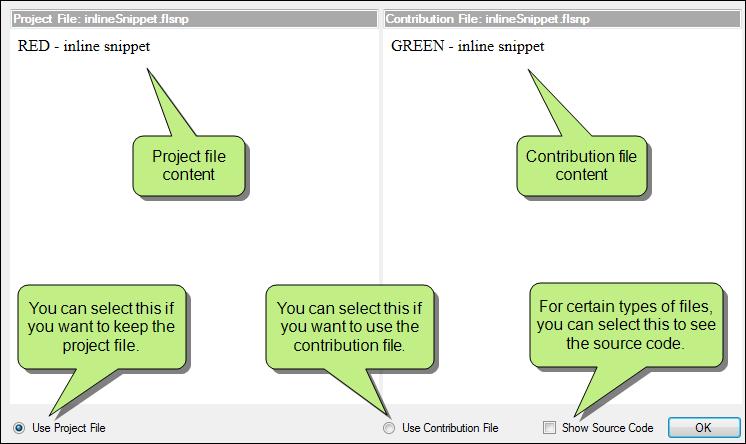
186 186

187 RENAME AND RELOCATE CONTRIBUTION FILES As in previous versions, you can accept a contribution file but give it a new name and/or location. This brings the contribution file into your project but does not overwrite the project file that it conflicts with. HOW TO RENAME OR RELOCATE A CONTRIBUTION FILE 1. In the grid, select the check box in the Contribution column for the file you want to rename. The final two columns in the grid become populated. 2. If you want to give the file a new name, click in the Rename Contribution cell and type a new name. CHAPTER 8 What's New Guide 187

188 3. If you want to change the location of the contribution file so that it does not conflict with the project file, click. Then in the dialog that opens, select a new location in the project and click OK. 188
189 Augmented Reality Supported In: Flare works with Metaio Creator to provide support for augmented reality (AR) scenarios in Flare projects. You can include AR scenarios in both print and web outputs. When you include an AR scenario in your output, users can interact with your content by scanning an image in the output with a mobile device. By scanning an AR scenario, users can view 3D models, watch videos, or listen to audio in your content, even if they are reading a printed manual. AR scenarios give you a unique, effective way to provide information and enhance learning. CHAPTER 8 What's New Guide 189

190 STEPS FOR CREATING AN AUGMENTED REALITY PROJECT To create an AR project, you will need to work with both Flare and Metaio Creator. Following are the general steps for creating an AR project: 1. Add the images you want to use in your AR trackables to your Flare project. 2. Export the images to an AR project using Flare. This creates a package of image files, or trackables, that you can use with Metaio Creator. You can export images to Metaio Creator in four ways: Entire Project Exports all images in the Flare project s content folder (this option is not recommended) Using Conditions Exports all images tagged with the chosen conditions Using File Tags Exports all images tagged with the chosen file tags Select Files Exports any manually selected images 190
191 When exported, the package is saved as an augmented reality project file with an.arp file extension. Note: Metaio Creator only supports PNG, BMP, JPG, JPEG, and GIF image formats. Note: To open an augmented reality package created with Flare, you need Metaio Creator V6.0 or later. 3. Give the Metaio package file to your marketing department or creative team. They can use Metaio Creator to build AR scenarios based on your Flare images and publish the scenarios in Metaio Creator. This establishes a link between the Flare images and their corresponding AR scenarios. For more information on how to use Metaio Creator, please see the Metaio Creator Help. BASIC STEPS FOR CREATING AN AR SCENARIO USING 3D MODELS You can create AR scenarios using a variety of resources, such as 3D models, videos, buttons, sounds, and images. The steps below describe how your marketing team might create an AR scenario using 3D models. a. Open the AR file (exported from Flare) in Metaio. b. Select the trackable on which you want to build the AR scenario. c. Create 3D models using a program such as Cinema4D or Blender, then save them as.obj files. d. Import the.obj files into to Metaio and add them to the trackable. Tip: You may want to design the trackable image so end users know they can scan it with Metaio's Junaio browser. e. Upload the finished Metaio project to Metaio Cloud. CHAPTER 8 What's New Guide 191
192 Note: Metaio Creator makes a copy of the image you have in Flare. If you modify the image in Flare, you also need to update the image in Metaio Creator, or the link between the images will break and users will no longer be able to view your AR scenarios. 4. Use the images in your Flare output just like any other images, then build your output. If you already have published output that uses the images, you do not need to republish. 5. When users read your content, they can download Metaio's Junaio browser from their mobile device's app store and scan the images in your content. They can scan images on a computer screen or from a printed page. If an image is associated with an AR scenario, the scenario opens in the Junaio browser. In the browser, they can look at any of the resources you added to your trackable, such as videos, images, models, or sounds. 192
 to a mobile device, then scan the images below.")
193 EXAMPLE You can view AR scenarios using Metaio Creator's AR browser. To view these sample AR scenarios, download the Junaio browser (available from your mobile phone's app store) to a mobile device, then scan the images below. (Please be patient, as these are large files that may take some time to load.) The following scenario shows an application of 3D models on a trackable. For best results with this scenario, you may want to print the image. CHAPTER 8 What's New Guide 193

194 The following scenario shows an application of a video and clickable buttons on a trackable. You can scan this image on your screen, or print it. 194

195 Batch Target Editor Enhancements A few enhancements have been made to batch targets. First, check boxes for selecting or deselecting all targets have been added to the Batch Target Editor. Second, icons have been added to the left of each row to indicate the type of output format for the targets. And third, when you click the Publish Only option, Flare now makes sure that each selected target already has generated output files. If so, those targets are published. If output has not yet been generated, Flare builds the target and then publishes its output files. CHAPTER 8 What's New Guide 195

, because the link text is static and does not change dynamically. 196")
196 Cross-Reference Enhancements A few changes have been made regarding cross-references. CROSS-REFERENCES CREATED WHEN DRAGGING TOPIC FILES In previous versions, when you dragged a topic file from the Content Explorer, File List window pane, or TOC Editor to the XML Editor, a text hyperlink was created as a result. This feature has been changed so that a cross-reference is created as a result instead. The reason for this is that the best practice for internal links (i.e., those from one file to another within the same project) is to create cross-references, which are updated dynamically if the target information changes. On the other hand, text hyperlinks are preferred for external links (e.g., a link from a topic to a website), because the link text is static and does not change dynamically. 196
197 DEFAULT CROSS-REFERENCE FORMATS CHANGED In previous versions, the default formats for new cross-references (on the MadCap xref style) were as follows for the different mediums: Default Medium See "{paratext}" Print Medium See "{paratext}" on page {page} Starting with this version, the default cross-reference formats are now as follows for the different mediums: Default Medium {paratext} Print Medium "{paratext}" {pageref} Why were these changes made? Two words can be used to answer that: flexibility and intelligence. First, notice that the older formats include the word "See" at the beginning. This means that word will always be shown in your cross-references, whether you want it or not. By not including the word "See" in the cross-reference, you have more flexibility to simply type the text you want next to the inserted cross-reference. E X A M P L E There may be times when you want to have "See [Cross-Reference Link]," but there may be other times when you want to say "For more information, see [Cross-Reference Link]." Or perhaps you do not want any extra words next to the cross-reference link; you want it to stand alone. By removing the word "See," the new formats give you this flexibility. Also, notice that the quotation marks were removed from the old format in the default medium. That's because the default medium is typically used for online outputs, and cross-references in online formats usually display with a colored link, so quotation marks are unnecessary. But in print-based outputs, the quotation marks can be useful to set apart the topic name (or location) to which the cross-reference points; therefore, we kept the quotation marks around {paratext} in the print medium. Now about intelligence. The old format for the print medium included this: on page {page}. It is perfectly acceptable to have that in the format. However, by replacing it with the simple {pageref} command, the cross-reference becomes more intelligent. The {pageref} command adds context-sensitivity to the link, which comes into play if the link and the target are only one page away or even on the same page. CHAPTER 8 What's New Guide 197
198 E X A M P L E Let's say you use the old format for print outputs: See "{paratext}" on page {page} When you generate the output, this cross-reference will be converted to something like the following, regardless of where the link falls in relation to its destination: See "My Information" on page 42 However, let's say that you use the new cross-reference format: "{paratext}" {pageref} When you generate the output, what you see in place of {pageref} depends on the relative closeness of the link and the destination. It might be translated as any of the following: See "My Information" below See "My Information" above See "My Information" on previous page See "My Information" on page 42 Note: The default format for the primary cross-reference style (MadCap xref) is already set up to create context-sensitive cross-references. If you have been using the old default cross-reference formats (before Flare V11) and want to continue using them, you can edit the MadCap xref style and replace the new formats with the older ones. The old cross-reference format for the default style medium is See "{paratext}". The old format for the print medium is See "{paratext}" on page {page}. If you have already edited the MadCap xref style in a stylesheet before upgrading to Flare V11, your custom format will not be affected. You will only see a change if you have never changed the default format from versions of Flare prior to V


199 Dictionaries (Global) and Spell Check Enhancements The following enhancements have been made to dictionaries and the spell checking feature they support: DICTIONARIES GLOBAL OR PROJECT In previous versions, Flare supported only project-level custom dictionaries for spell checking purposes. By "project-level," we mean that the dictionaries you created were tied to specific projects and located in the Advanced folder of the Project Organizer. These types of dictionaries are still supported. But now you also have the option of creating global dictionaries. A global dictionary means that any Flare project you open on your computer can use it for spell checking. This is a convenient way to ensure that all of your projects are using the same spellings for terms. By default, a new global dictionary is stored in your AppData folder, like all of your built-in dictionaries. CHAPTER 8 What's New Guide 199

200 However, you can use the Options dialog to choose another location for your global dictionary. For example, you might be working with a team of writers and want to make sure you are all using the same spellings for certain terms. By choosing a network directory, your entire team can use the same global dictionary. 200

201 You can even use a global dictionary as well a project dictionary. If this is the case, the Spell Check window pane combines and displays suggested spellings from both dictionaries, as well as from the built-in dictionary for that language. CHAPTER 8 What's New Guide 201
202 SPELL CHECK CHANGES The Spell Check window pane has been redesigned, and several new options have been added to it. This includes the following: Look in more locations (e.g., content folder, pick a folder, whole package). Look in more file types than just topics (e.g., snippets, TOCs, glossaries, index keywords). Add spellings to global or project dictionaries. Open the Options dialog to set global dictionary settings, as well as to tell Flare to ignore certain types of words or circumstances during spell check. The process has also changed somewhat. Previously, you used the Spell Check window pane to move from file to file to see each questionable spelling. Starting with this version, the questionable spellings are listed in a grid at the bottom of the window pane after you start the spell check process. Click on a row to deal with a specific misspelling, then select the following row to move to the next one, and so on. This is desirable because you can perform all of your spell check work in one place, without having to open a bunch of different files. However, you always have the option to open a particular file where a questionable spelling occurs. 202


203 Also, if you press F7, the Spell Check window pane opens and automatically displays the first questionable spelling it finds in the current file. CHAPTER 8 What's New Guide 203
204 Following are the main sections in the redesigned Spell Check window pane. Many of the fields and options in these sections are new or changed. SPELL CHECK In the first drop-down,select the location where you want to perform the spell check (if you have a Flare project open): current document Flare checks the spelling in the active file only. documents in the same folder Flare checks the spelling in all files located in the same folder as the current one. content folder Flare checks the spelling for all files located in the Content Explorer. pick a folder A dialog opens that lets you choose any folder in your project. Flare will then spell check the files within that folder. whole project Flare checks the spelling in every file in the project. If you have a Flare review package (FLTREV file) open, none of the above options are shown. Instead this field displays (review package). This option is not shown if you have a Flare project open; it is available only when you open a review package. In the next drop-down, select which kind of files you want to spell check (if you have selected something other than "current document" in the previous field): All Files Select this option to spell check all file types, including (but not limited to) those listed in this drop-down field. Topics Select this option to spell check only topic files. Snippets Select this option to spell check only snippet files. Table of Contents Select this option to spell check only TOC files. Glossaries Select this option to spell check only glossary files. Index Keywords Select this option to spell check only index keywords. Note: In addition to selecting a file type from the list, you can type the file type extension in the field directly. This can be especially useful for file types not included in the drop-down. For example, if you want to look in all target files in the project, you can type *.fltar in the field. 204

205 You can use the buttons to the right to initiate or stop the spell check process, as well as open the file where a questionable spelling occurs: Start/Cancel Click this to display all occurrences of questionable spellings in a grid at the bottom of the window pane. Each time you select a row in the grid, the "Not In Dictionary" and "Suggestions" fields are populated with the results. If the process is in progress, the label changes to "Cancel," which you can click to stop the process. View In File Click this to open the file where the current questionable spelling occurs, and highlight it. CHAPTER 8 What's New Guide 205

206 NOT IN DICTIONARY This field displays each questionable spelling in its context with red, underlined font. You can use the buttons and drop-down field to the right in order to take action on the questionable spelling. Ignore Flare ignores the spelling of the word for the current session. Ignore All Flare ignores the spelling of the word and adds the spelling of this word to the Ignored Words Editor (which can be opened from the Tools ribbon). This means that if other occurrences of the word are found in any other files in future sessions, they will not be flagged as questionable spellings. This is similar to adding words to a dictionary. The difference is that this feature simply ignores questionable spellings of certain words, whereas a dictionary also lists spellings as suggestions. Add To Dictionary Flare adds the word to the dictionary so that it is not flagged as a questionable spelling in the future. The word will also be displayed as a suggestion for future questionable spellings that are very similar. The kind of dictionary (Global or Project) to which it is added is determined by the selection in the next field. 206
207 Global/Project If you select Global, spellings of words are added to a dictionary that can be used by any projects pointing to it. If you select Project, spellings of words are added to a dictionary that can be used only by the current project. CHAPTER 8 What's New Guide 207

208 SUGGESTIONS This field displays alternative suggestions for each questionable spelling. You can use the buttons to the right in order to replace the current spelling with a suggestion, or to set other options. Change Flare changes only the current instance of the misspelled word with the alternative word selected in the Suggestions field. Change All Flare changes all instances of the misspelled word with the alternative word selected in the Suggestions field. 208

209 Options This opens the Spelling tab of the Options dialog. If using a global dictionary, you can use fields at the top of the dialog to choose a location for it. You can also use fields at the bottom to ignore any of the following when spell checking files: Ignore repeated words Ignore mixed case words Ignore uppercase words Ignore URLs Ignore addresses Ignore words with numbers Ignored styles If there are certain styles or classes in your stylesheet that you want to ignore when spell checking, you can enter them in this grid. For example, you might have styles containing code text that you do not want to be affected by a spell check. CHAPTER 8 What's New Guide 209
. For example, you might have a condition that you use for content that is not yet ready for release.")
210 Ignored conditions If there are certain chunks of content that are conditioned and you want to ignore them when spell checking, you can enter them in this grid (type the condition tag set, followed by a period and then the name of the condition). For example, you might have a condition that you use for content that is not yet ready for release. Content with this condition might have your notes and characters that you don't feel the need to spell check. Warning: When you use a spell check suggestion to change the spelling in a file, the edit is made on disk, not in the editor. Therefore, you cannot undo the action if you change your mind. Instead, you will need to open the affected file and change the text manually. 210
211 EPUB Enhancements Enhancements have been added to EPUB functionality support to provide better support for the EPUB 3 standard. In previous versions, if you had dynamic content in a topic and you created EPUB output, the dynamic content would display as static content, such as a footnote or a box. In Flare 11, this content is now rendered correctly. Additional support has been added for the following dynamic content types: Togglers Drop-downs Text Popups Expanding Text Help Controls (e.g., concept links, keyword links, related topic controls) Slideshows You can also enable or disable dynamic content in your EPUB outputs. Dynamic content makes your content look more interesting, but it is not supported on all e-readers. You may want to create one version of your EPUB content with dynamic content enabled, and another version with dynamic content disabled to accommodate users with different e-readers. You can access EPUB options, including the ability to enable and disable dynamic content, from the Target Editor. Open a target that is using the EPUB format, then select the EPUB Options tab. You can make changes on this tab. CHAPTER 8 What's New Guide 211


212 E X A M P L E Let's say you have an EPUB output that uses a lot of dynamic content. You decide to create two versions of the content so readers can view it no matter what kind of e-reader they are using. After you create your content, you build one version of the EPUB output with the dynamic content disabled. This version is for users who have older e-readers or are using e-readers that do not support all dynamic content. Because they have older e-readers, they might not be able to see all of your content, like slide shows. Other content might be displayed as footnotes or as expanded text. To create this output, you open the Target Editor, select the EPUB Options tab, and make sure the Enable Dynamic Content check box is deselected. Then you build the output. 212
213 When you view the output, it looks like this. Next, you create a version of the EPUB content with the dynamic content enabled. This version is for users with newer e-readers that fully support EPUB 3, so they can take advantage of all of the features of the output, like drop-downs and slideshows. To create this output, you open the Target Editor, select the EPUB Options tab, and make sure the Enable Dynamic Content check box is selected. Then you build the output. CHAPTER 8 What's New Guide 213
214 When you view the output, it looks like this. You can now provide both outputs to your users, and they can pick the best one for their needs. 214


215 File List Window Pane Drag Files Previously, you were able to drag files from the File List window pane into the XML Editor, but you needed to click on the icon in the row you wanted to drag. Starting with this version, you can drag a file by clicking anywhere on the row. Following are tasks can be accomplished by dragging files from the File List window pane: Creating Browse Sequences Creating Tables of Contents Inserting 3D Models Inserting Audio Files Inserting Cross-References Inserting Images Inserting Movies Inserting Related Topics Links Inserting Snippets CHAPTER 8 What's New Guide 215

216 Float Tabs by Dragging Them Down There is a new way to float an element (such as a topic) that displays with a tab. You can now click the tab and drag it down until it floats. 216

217 CHAPTER 8 What's New Guide 217

218 Font Properties Enhancements Several additions and changes have been made that enhance the way you work with fonts. REARRANGED FONT PROPERTIES DIALOG The Font Properties dialog has been rearranged to allow more space for a larger Font selection list box. In this box, we have also added expandable groups for pinned fonts, recently used fonts, defined font sets, and all system fonts. You can expand and collapse these groups as a way to limit the list of fonts to those that you use the most and hide from view those that you do not use. In the Font selection list box, you can also pin your favorite fonts and font sets to move them to the top of the font list for quick access at any time. In the rearranged Font Properties dialog, the Pick button from previous versions has been replaced by the new Font Sets button. This button opens a dialog where you can create, edit, and delete font sets. 218

219 You can access the Font Properties dialog by highlighting text and pressing CTRL+SHIFT+B on your keyboard, selecting the Format>Font menu, or by clicking in the Fonts section of the Home ribbon. FONT GROUPS Font groups organize fonts and font sets. These groups are available in both the Font Properties dialog and the Font Family field. Font groups are available for pinned fonts, recently used fonts, defined font sets, and all system fonts. You can collapse or expand any font group. This is a way to limit the list of fonts to those that you use the most and hide from view those that you do not use. E X A M P L E Let's say that you have pinned Arial, Tahoma, and Garamond. You have also created three font sets and recently used several other random fonts. In the font list in the Font Properties dialog, you will see the Pinned Fonts, Recently Used Fonts, Defined Font Sets, and All Fonts groups. CHAPTER 8 What's New Guide 219

220 In the Font Family field on the Home ribbon or Text Format toolbar, you will see the same groups. 220
 font family in the set is not found on the user's computer, the second font family in the set is used.")
221 FONT SETS A font set is just what it sounds like a collection of fonts or font families. You can create a font set in order to designate the substitute fonts to use when the preferred font is not available on the user's computer. If the first (i.e., preferred) font family in the set is not found on the user's computer, the second font family in the set is used. If the second font family is not found, the third font family is used, and so on. Editing font sets is new to this version. In previous versions, you had to create a new font set based on your existing font set, but you could not modify the existing set. Now, you can update a font set you already have without having to make a new font set. E X A M P L E Let's say your original font set used Arial as its primary font. However, your company has decided to redesign its documentation, so you need to change your primary font to Calibri. The other fonts in the set should remain the same. Instead of creating an entirely new font set, you can edit the existing font set. You open the Font Properties dialog and click Font Sets to open the Font Set Manager. CHAPTER 8 What's New Guide 221

222 In the Font Set Manager, select your original font set, then click to open the Define Font Set dialog. Here, you can make changes to the font set to change Arial to Calibri. 222


223 In the Define Font Set dialog, edit the fonts in the set. On the right side of the dialog, select Arial and click to move it out of the font set. Then select Calibri from the font list on the left side of the dialog and click to add it to the set. CHAPTER 8 What's New Guide 223


224 Use the and buttons under the list on the right side of the dialog to rearrange the fonts. Since Calibri is going to be the new primary font, that should be first in the list. 224

225 Click OK when you are finished, and close the other dialogs. You will notice that your original font set with Arial in the primary position now shows Calibri in the primary spot. When you use the font set in the future, it will now use the new fonts. CHAPTER 8 What's New Guide 225


226 PINNING FONTS You can pin your favorite fonts and font sets so they will appear at the top of the list. This makes them easier to find later. Pinned fonts and font sets appear in a group that you can expand or collapse. This is a way to limit the list of fonts to those that you use the most and hide from view those that you do not use. To pin a font, open the Font Properties dialog or expand the Font Family field in the Home ribbon or Text Format toolbar. Hover over the font you want to pin row and click the little pin. It will then be moved to the Pinned Fonts group at top of the list. 226


227 To unpin a font, just click the pin again and it will be moved back to the All Fonts group at the bottom of the list. The pinned fonts are sorted alphabetically. CHAPTER 8 What's New Guide 227


228 Global Project Linking Delete Unreferenced Files When you use Global Project Linking to import files from a Flare project, you now have the option to delete unreferenced files. This can be done in the Import Flare Project Wizard or the Project Import Editor. 228

229 This means that any files that were previously imported but are not specified to be included (either under the Include Files or Import Conditions filters) in the re-import will be marked for deletion in the Accept Imported Documents dialog and removed from the child project upon confirmation. E X A M P L E Let's say that previously you had the Project Import Editor set up like this, where you are importing three topic files from a parent project: Later, after you've made lots of changes to the parent project, you open the child project again to import the latest files into it. However, you decide you no longer want to import the Welcome.htm topic into the child project (although it still exists in the parent project). So in the Project Import Editor, you remove it from the Include Files field. You also click Delete unreferenced files. CHAPTER 8 What's New Guide 229


230 When you tell Flare to re-import, the Accept Imported Documents dialog opens, showing the following: After you click Accept in that dialog, the changed files are replaced and Welcome.htm is removed from the child project. If you had not selected the "Delete unreferenced files" check box, the two changed files would still have been imported, but the old Welcome.htm topic would still remain in the child project. 230
231 This feature is slightly different from "Delete stale files." When you tell Flare to delete stale files, you automatically sync the parent project with the child project when you've removed files in the parent. So in the example above, the Welcome.htm file would automatically be removed from the child project if you had also removed it from the parent project. CHAPTER 8 What's New Guide 231


232 Glossary Term Duplicates Identified Duplicate terms in a glossary file are identified by red icons. Green icons represent glossary terms that are unique. Also, the number of duplicates in the glossary file is shown in the local toolbar. This feature is not case-sensitive. For example, if you have "Condition tag" and "condition tag" as terms, they are considered duplicates. 232

233 Image Enhancements The following enhancements related to images have been made in this version. EDIT IMAGE DIALOG RENAMED The Edit Image dialog has been renamed Image Properties dialog. CHAPTER 8 What's New Guide 233

234 Also, when you right-click an image file in the XML Editor, the context menu option for opening this dialog is now Image Properties instead of Edit Image. 234

235 IMAGE MAP CHANGES Image maps are now supported in PDF output. For more about this change, see the section on Print-based Enhancements. In addition, the Image Map Editor has been modified with a new streamlined look. Following are the changes you might notice in the Image Map Editor: The three link property fields have been moved to the bottom of the editor and renamed. The File and View menus have been removed, leaving only the Edit menu. The OK and Cancel buttons have been moved to the bottom of the editor. The arrow buttons for positioning objects have been removed from the toolbar. CHAPTER 8 What's New Guide 235

236 INSERT PDF FILES AS IMAGES You can insert pages from PDFs as images. When you select a PDF file, you can choose the specific page from it to be inserted as an image. 236

237 PDF images are supported in all outputs. However, the way these files are treated depends on the output format: PDF If you generate PDF output, the page you inserted is kept as a PDF. So it's sort of like a onepage PDF within a big PDF. You'll find that you can select text in that PDF image, just like you can in the larger PDF. CHAPTER 8 What's New Guide 237

238 Also, any vector-based information is retained, therefore retaining the quality and clarity you expect. This is especially useful if you inserted a PDF that contains Microsoft Visio diagrams or vector drawings from CAD (computer-aided design) software. 238

239 All Other Outputs If you generate any output other than PDF, the PDF page you inserted is converted to a PNG file, even if it contains vector-based drawings. That's largely due to the fact that browser-based output types do not support vector images. Because the image displays in a raster format, you will find that it is not as crisp as its vector counterpart in PDF output. PREVIEW THUMBNAIL IMAGES IN EDITOR In the XML Editor, when you are viewing a topic or snippet that contains a thumbnail image, you can rightclick on that thumbnail and select Preview Image from the context menu. This enlarges the thumbnail image within the editor so that you can more easily see it and read any callouts within it. You can then click on the full-size image to return it to a thumbnail. Previously, if you wanted to see the image in its full size while editing, you had to open it in a separate window (e.g., right-click on the thumbnail and select Open Link). This feature can be used when you are authoring in the XML Editor, as well as when you are reviewing files sent from others. CHAPTER 8 What's New Guide 239

240 E X A M P L E Let's say you receive a topic for review from another author. The topic includes a thumbnail image with a text callout. Without enlarging the image you cannot see the details of the image, let alone read the callout. 240

241 Therefore, you right-click on the thumbnail and select Preview Image. CHAPTER 8 What's New Guide 241

242 You can now see all of the image details and read the callout. To return the image to the thumbnail size, you click on it. 242

243 RESOLUTION AND DIMENSIONS When you click on an image file in the user interface (e.g., Content Explorer or File List window pane), its resolution and dimensions are displayed at the bottom. CHAPTER 8 What's New Guide 243

244 If you have set the online or print DPI for an image using MadCap Capture, these values are also shown. 244


245 Macros You can use macros in Flare to automate frequently used commands or processes. After you record a macro, you can play it back to perform all of the steps in the macro with a single action. You can also assign a shortcut to the macro, add it to the Quick Access Toolbar, or access it from the Quick Launch bar. Macros save you time by streamlining the repetitive tasks you do every day, freeing you up for other tasks. Following are the primary tasks that you can perform when using macros: Record Macros For most tasks that apply to the XML Editor, you can record macros to use in your Flare files. Play Back Macros You can use, or play back, macros you have recorded. This applies them to content in your Flare files. Manage Macros You can rename macros and delete those that you no longer need. E X A M P L E Let's say you frequently create drop-down text in your topics. Every time you create a drop-down, you must select content to be included in it and then perform the following four steps: 1. Select the Insert ribbon. 2. Select Drop-Down Text. 3. In the Insert Drop-Down dialog, select the drop-down heading. 4. Click OK. Instead of doing this every time you want to make a drop-down, you decide to record a macro to combine the four steps into a single step. CHAPTER 8 What's New Guide 245

.")
246 So after selecting some content to be part of the drop-down, you select the Tools ribbon. Then you select Record. You name the macro and click Start to begin the recording. Then you perform the four steps to create a drop-down. Flare captures each of the steps to create the macro. During the recording process, the Record button in the Tools ribbon changes to Stop. Click it after you are finished creating the drop-down. Your macro is ready to use, so you can play it back from the Tools ribbon. Another option is to assign a keyboard shortcut to the macro so you can play it using a single keystroke. To do this, open the options dialog (File>Options). Select the Keyboard Shortcuts tab, and in the Command section, select XML Editor (because the macro is related to the editor, not to 246

247 other parts of Flare). Then in the section below, find the macro you created, which starts with the word "Playback," followed by the name you gave it (in this case, "Drop-Down"). You can click the Option or Shortcut column headings to sort the columns alphabetically. For example, you might first click Option to find and select the Playback: Drop-Down macro. Then you might click Shortcut to more easily see which shortcut keys are free to use. In the following example, we discovered that the F2 key was unused so we selected it in the Key Assignment area to apply it to the macro. The next time you want to create a drop-down, you select the text you want to format and play the macro back. CHAPTER 8 What's New Guide 247


248 Alternatively, we could just press F2 on our keyboard, because we applied that shortcut to our dropdown macro. This applies the macro to the text you selected. 248

249 Tip: Macros are stored in the AppData folder on your computer, which can be accessed in various ways, depending on your operating system (e.g., in Windows 7, click Start, enter %appdata% in the search field, and press Enter). The file is named "Macros" and is stored in the MadCap Software/Flare/Macros subfolder. If you work with a team of writers and want everyone to use the same macros, you can copy this file and send it to the rest of your team, having them replace the same file in their AppData folders. CHAPTER 8 What's New Guide 249

250 Print-based Enhancements The following enhancements have been made related to print-based outputs. IMAGE MAP SUPPORT IN PDF OUTPUT Image maps are now supported in PDF output. However, PDFs are limited to rectangular-shaped image map objects. Therefore, if you have an image map with circle or polygon objects, those will be redrawn as rectangles in the PDF output. If this occurs, Flare will include a compile warning. Also, keep in mind that if objects overlap one another, the one on the top layer (usually the last one drawn) takes precedence. E X A M P L E Let's say you have an image of the Olympic circles inserted into a topic: You create an image map, drawing round objects around each of the five circles, and you link each of these objects to a different website. For the purposes of this example, we're showing dark green circles to represent each image map object: 250

251 Notice that the circles overlap in some places. In those locations, the circle object that is on the top layer will win. Therefore, if the user clicks in that area, the website linked to the object on top will be opened. Now, if you generate online output, such as HTML5, the circle shapes on the image map will be retained, just as you see them above. But if you generate PDF output, each of the circle objects will be converted to a rectangle, like this: Therefore, the link areas (as well as the overlapping areas) are adjusted accordingly. CHAPTER 8 What's New Guide 251
252 MULTIMEDIA IN PDF OUTPUT Numerous multimedia files are supported in PDF output. This means that those files play when viewing the PDF in electronic format. If you print the PDF, those files are simply displayed as static images. Following are the multimedia file types that are supported in PDF output at this time: AVI M4V MID MIDI MP3 MP4 MPA MPE MPEG MPG SWF U3D WAV When a PDF is opened, there is initially a blank area where the multimedia item was inserted. Also, a security message is shown, prompting the user to allow the video to load once or always. 252


253 After clicking one of these options, the video loads. CHAPTER 8 What's New Guide 253

254 PAGE LAYOUT FRAMES REVERSE DIRECTION When you have multiple frames of the same type in a page layout, a line with an arrow shows how text will flow from one frame to the other. If you want to change the direction of the text flow, you can click the arrow between the frames. E X A M P L E When you draw frames in a page layout, the first one you draw begins the flow of content, leading to the next frame of the same type that you draw, and so on. So let's say you draw a large body frame and get it positioned just the way you want. 254

255 But then you remember you want to draw a smaller body frame above the big one so that the chapter title is positioned with some separation from the main content flow. After doing all of this, you realize that the flow is going the wrong way. CHAPTER 8 What's New Guide 255

256 If you were to generate the output, you might see something odd like this, especially with the topic title having a frame break after it: 256

257 To solve this, you could undo your changes in the page layout and begin again, drawing the smaller frame first. But an easier solution is to simply click the arrow so that the direction of the flow changes from the small frame on top to the larger one below. CHAPTER 8 What's New Guide 257

258 As a result, the generated output looks correct, like this: TOC AND MINI-TOC ALIGNMENT FOR INDIVIDUAL LEVELS You can now set the alignment for individual levels in a generated TOC or mini-toc. For details, see "TOC and Mini-TOC Alignment for Individual Levels" on page

259 Publishing Destinations FTP Active and Passive Modes When setting up a publishing destination, you can now choose between Active and Passive modes for File Transfer Protocol (FTP) connections. To do this, open the Destination Editor and make a selection from the new Connection Mode field. Passive is the default selection. These two modes have to do with security firewalls and how FTP connections are made between the server and the client. With Active mode, the client initiates the connection for the command channel, and the server initiates the connection for the data channel. With Passive mode, the client initiates the connection for both channels. From a security standpoint, Active mode is more beneficial for the server side, and Passive mode is more beneficial for the client side. CHAPTER 8 What's New Guide 259


260 Quick Launch Bar The Quick Launch bar allows you to search for any Flare file or command. It is located in the upper-right corner of the interface. You can press CTRL+Q on your keyboard to move focus to the Quick Launch bar so you can begin typing. To search using the Quick Launch bar, type a few letters of the file or command you want to find. Any available results appear in a drop-down list. Click the Commands or Files links in the list to filter the results. 260
261 Search Enhancements In all web outputs, Flare's search engine has been updated with a new search algorithm that gives more accurate search rankings. New search filter customization features have been added to make search more useful for your users. The search system's memory footprint has also been improved. New features in HTML5 output add additional search options and flexibility in this common output type. With the new features introduced in this release, our HTML5 client-based search speed and merging has caught up with HTML5 server-based search. Because it is much easier to set up and maintain, we recommend you use HTML5 client-based search instead of server-based search unless you need full-text search in other documents (e.g., PDF), which is still only available in server-based output. SEARCH RESULT RANKINGS We have updated our search result algorithm to provide more accurate and intuitive search results in our web-based outputs. We have also updated the way search results are ranked, so you can optimize your content based on where keywords are located in a topic. Flare ranks topics based on where keywords appear in a topic. These rankings are as follows: 1. Title tags 2. Heading 1 3. Heading 2 OR abstract text (i.e., meta description) 4. Heading 3 5. Heading 4 OR index keywords 6. Heading 5 OR glossary terms 7. Heading 6 OR keywords in body text The search engine looks at how many times the search term appears in each location. Topics with frequent keywords are ranked higher than topics with fewer keywords. However, topics with more frequent keywords will never outrank a topic with a higher weighting. CHAPTER 8 What's New Guide 261
262 E X A M P L E Let's say you have two topics that are almost identical. However, the search term appears in a Heading 2 three times in the first topic and only two times in the second topic. Because the search engine accounts for frequency, the first topic will appear higher in the search results than the second topic. E X A M P L E Let's say you have two topics. The first has many keywords, all in Heading 4s. The second has one keyword, in a Heading 3. The second topic will appear higher in the search results because even though the search engine accounts for frequency, keywords in a Heading 3 still take priority over keywords in a Heading 4, regardless of how many keywords appear in the topic. Note: If you do not have a <title> tag in your topic, the first line of your topic is used as the <title> tag, and is given the same ranking as a <title> tag, even if it is paragraph text or a lower heading level. Note: In HTML5 outputs, the Flare search engine uses one additional factor to rank search results: relevance versus importance. See "Importance Rankings in Search results" on page
.")

263 SEARCH FILTER ORDERING You can now customize the ordering of the search filter set for web outputs. Previously, filters displayed in alphabetical order (this is still the default). In the Search Filter Set Editor, the Order column now represents the displayed order in the output. To manipulate the order of the filters, click or in the local toolbar or select the Move Up or Move Down commands from the context menu. You can also click order. to reset the E X A M P L E In this example, the search filter's previous behavior order would be First, Last, Second. With customized ordering, we can now make the order First, Second, Last. In the output it would look like this: CHAPTER 8 What's New Guide 263
264 IMPROVED MEMORY FOOTPRINT AND PERFORMANCE When Flare builds your output files, it also automatically generates a search index. The search database is split into a series of chunk files. These "chunks" are very important to your project, because they help to improve the performance of the search feature. In this release, we have added JSON files to the search index. By reducing the number of XML search chunks needed by the search index and replacing them with JSON search chunks, we were able to lower the memory footprint needed by the search index. Additionally, the new file type breaks search chunks into more specific types of chunks, so the files remain small. This also helps with search performance. 264
265 HTML5 SEARCH The following search features are new in HTML5 output. IMPORTANCE RANKINGS IN SEARCH RESULTS The Flare search engine now considers link frequency and keyword hits when ranking HTML5 search results to generate more accurate search rankings. In HTML5 output, the Flare search engine uses a combination of factors to rank search results. When you search, the search engine considers the number of links to a topic (Importance) as well as the number of times a search term appears in a topic. This gives you the most accurate results. You can choose to turn off Importance and search using only the number of search term hits in each topic. This is not recommended unless you have one topic that is linked to so many times that it would skew your search results. 1. Open an HTML5 target. 2. On the Advanced tab of the Target Editor, select Include Importance. 3. Click to save your work. Note: Links that occur in a master page are not considered when calculating Importance. For example, suppose you have a link in the master page footer that appears on every page in your output. Because you can access the page it links to from every other page, it should be the most important page in the output, but it is excluded from Importance rankings so it does not skew results. CHAPTER 8 What's New Guide 265

266 E X A M P L E Here is an example of a search with Importance turned on. 266

267 Here is an example of a search in the same content with Importance turned off. CHAPTER 8 What's New Guide 267
268 Notice how the search results are different. This is because in the first example, with Importance turned on, the search engine considers the number of links to that topic when ranking the search results. In the second example, the results are ranked only using the location of the search term in the topic (e.g., in a heading, in an index keyword, in the body text). If you want your users to be able to find a topic that you refer to and link to often in your content, you should turn on the Importance setting so the topic appears higher in the search rankings. 268

269 PAGINATION Flare's search results now include pagination options to optimize search results for users. This makes it easier to navigate between pages of search results and improves loading times, especially for users who access your output from a mobile device. Setting a reasonable number of results per page also makes it easier for search indexing services (i.e., spiders, crawlers, or bots) to locate pages in your output, improving search results. To change the pagination settings for your search results, open a target that is using the HTML5 format, select the Advanced tab, and edit the Results Per Page field. You can also change the appearance of pagination options (e.g., font, size, or color of page numbers) in the skin. CHAPTER 8 What's New Guide 269


270 SEARCH ABSTRACT CHARACTER LIMITS You can now set a character limit for automatically generated abstracts that appear in your search results. This allows your users to see a brief summary of each topic in the search results, while keeping the search results page easy to scan. You can set the character limit as long or as short as you like. When creating an automatic abstract, Flare scans all text elements in the topic, including headings and paragraphs, and includes them in the abstract until the character limit is met. To change the abstract character limit settings for your search results, open a target that is using the HTML5 format, select the Advanced tab, and edit the Abstract Character Limit field. Note: Setting the abstract character limit to 0 will remove the abstract completely. Note: If a word is too long and would push the abstract past its character limit, it is not included in the abstract. Flare will not leave incomplete words at the end of the abstract. 270


271 Note: If you need to provide a longer or shorter search abstract, or if you do not like the default text that appears in the abstract, you can manually enter a meta description for the topic in the topic's Properties dialog. CHAPTER 8 What's New Guide 271

272 SYNTAX CHANGES Some changes have been made to the syntax rules used by the HTML5 search engine so they are more consistent with rules used by major search engines. This applies to both Boolean and regular expression rules. Previously, typing a space between words was equivalent to typing OR. This has been changed to always be equivalent to typing AND. E X A M P L E Previously, you could search for feeding dogs and return any topic that included the words "feeding" or "dogs." 272

273 Now, searching for feeding dogs returns topics that include both of these words, making your search much more useful. CHAPTER 8 What's New Guide 273

274 Previously, you could search for any topic in the entire output that did not include a specified word. This often returned an undesirable number of results. This has been changed so you must specify an additional word that you do want to include. This will return topics that contain one word, but not the other. E X A M P L E Previously, you could search for NOT dogs and return all of the topics in the output that did not include the word "dogs." Now, searching for NOT dogs in HTML5 output returns an error. 274

275 Instead, search for cats NOT dogs to return a smaller, more useful subset of topics. CHAPTER 8 What's New Guide 275

276 Shortcuts Customizable Keys In the Options dialog, you can configure keyboard shortcuts to quickly access frequently used features. You can modify existing keyboard shortcuts or create new shortcuts for features that do not have a factory default hot key. 276
277 HOW TO CHANGE KEYBOARD SHORTCUTS 1. Do one of the following, depending on the part of the user interface you are using: Ribbon Select File>Options. Tool Strip Select Tools>Options. The Options dialog opens. 2. Click the Keyboard Shortcuts tab. 3. In the Command drop-down, select one of the following: Global Select this to make the keyboard shortcut available throughout the project user interface. XML Editor Select this to make the keyboard shortcut available only in the XML Editor. You must select this option if you are assigning a shortcut to a macro you have created. Note: If you set one shortcut with XML Editor selected and another with Global selected, the XML Editor shortcut has precedence. 4. (Optional) You can click the Option or Shortcut column headings to sort the columns alphabetically. This can help you more easily find a command or see which shortcut keys are free to use. 5. In the grid below, select the option whose hot keys you want to change. 6. Select the option whose hot keys you want to change. 7. In the Key Assignment section, select the hot key that you want to assign to the option. 8. (Optional) In the Modifier Key Assignment section, you can select the Control Key, Shift Key, and/or Alt Key check boxes if you want to use a combination for the shortcut. For example, if you select D from the list to the right and add check marks to the Shift Key and Alt Key boxes, the new shortcut for the option will be SHIFT+ALT+D. 9. (Optional) In the Options section, you can assign a hot key to a command that does not appear in the grid above by clicking Unlisted Commands. In the Other Commands dialog, select a command, then click OK. The unlisted command appears in the grid. 10. (Optional) In the Options section, you can return to the factory default keyboard shortcuts by clicking Reset to Factory Defaults. 11. Click OK. CHAPTER 8 What's New Guide 277
. The file is named \"Commands_3.")
278 Tip: Custom shortcuts are stored in the AppData folder on your computer, which can be accessed in various ways, depending on your operating system (e.g., in Windows 7, click Start, enter %appdata% in the search field, and press Enter). The file is named "Commands_3.mccmds" and is stored in the MadCap Software/Flare subfolder. If you work with a team of writers and want everyone to use the same shortcuts, you can copy this file and send it to the rest of your team, having them replace the same file in their AppData folders. Note: If you make a selection and the resulting shortcut combination is already used for another command, it is displayed in the field labeled "Other commands using shortcut." In that case, you should make another selection to ensure your shortcut is unique. 278

279 Slideshow Enhancements A couple of enhancements have been made to the slideshow feature in Flare. MULTIPLE SLIDES DISPLAYED IN OUTPUT You can tell Flare to display more than one slide in a slideshow at the same time. Previously, only one slide could be shown in the output at a time. This new option is available in the General tab of the Edit Slideshow dialog. E X A M P L E Let's say you want three slides to be shown at once whenever someone views the slideshow. Therefore, you open the Edit Slideshow dialog, select the General tab and in the Slides displayed field you enter 3. CHAPTER 8 What's New Guide 279

280 In the output, three slides are always shown side-by-side. 280

281 TRANSPARENT BACKGROUNDS You can have transparent backgrounds in slideshows. This can be applied to the MadCap Slide and MadCap SlideShow styles by choosing "default" as the background color. CHAPTER 8 What's New Guide 281

282 E X A M P L E Let's say you've put a yellow background color on the body style in your stylesheet. This causes all topics to have a yellow background. If your slideshow tags are not set to use a transparent background, but rather, say, a solid white background, this is what you would see in the output: 282
283 But with the slideshow tags set to use a transparent background, your slideshows will blend into the background color on the topics, like this: CHAPTER 8 What's New Guide 283

284 Snippets Insert Snippet Link Dialog Modified Previously, when you inserted a snippet, the Insert Snippet Link dialog displayed available snippets in a grid view only. This dialog has been modified to behave like many other dialogs in Flare, giving you multiple options to find and display snippets. In addition, the preview area is shown on the right, instead of at the bottom of the dialog. 284
285 Shows all of the files in the project in a list in the area below. If you click the button again, it switches to a folder tree view. In the list, you can click the File, Type, or Path column headers to sort the list alphabetically by that column data. Shows or hides the folders that the files are stored in. Shows or hides the files. If you click this button when the Show Folders button is selected, the area splits into two halves. The folder is shown on the left side, and the files and subfolders within it are shown on the right. If the Show Files button one folder level. is the only one selected, you can click this button to move up Lets you filter the kinds of files shown below. Depending on the task you are performing, this field may already be populated with the most appropriate file type(s). CHAPTER 8 What's New Guide 285


286 Source Control Git Integration and More Flare now includes built-in integration with Git, as well as TFS integration with Visual Studio Online. In addition, Flare's source control system has been enhanced to include a dynamic source control interface and a new Source Control Explorer to manage source control-related files and tasks. Flare's existing source control functionality has also been modified to better align with the functionality offered by each integrated source control provider. GIT INTEGRATION Flare now includes integrated support for Git. When binding your project to Git, you can select whether you want to bind to a remote repository, whether you want to push to the remote when you bind it, and whether to save your files to your user account or to the project. 286
287 Flare's Git integration allows you to work locally and then push your changes to a remote repository. You can also create branches so you can work on multiple iterations of a file (e.g., if you are documenting a new feature or making other major changes in your output, or if you are working with multiple authors), and then select the version you like best. Flare's integration with Git includes the following new functionality: Pull Files If you need to update the files in your local database, you can pull the most current files from the remote repository. You will see the Flare Resolve Version Conflict dialog if conflicts exist. Push Files After you make changes in your project, you can commit them to your local database. When you are ready to add your local commits to the remote repository, you can push these files to the remote. Synchronize Synchronizing files updates the local database with files from the remote repository (pull) and then pushes any local commits to the remote repository. If you have not committed your local project files, you will need to commit them before you can synchronize your files with the remote. You will see the Flare Resolve Version Conflict dialog if conflicts exist. Create Branches When you are working in Git, you can create branches. Branches create a new development area for a file that is separate from the original. You can use branches so multiple authors can work in individual authoring spaces, and or you can use them as a space to make major changes in your document without affecting the original (e.g., when documenting a new feature, rewriting large sections of a topic, or making layout changes). Even if others will not be working on a file, you can still create branches if you want to edit your file and then refer back to its previous versions. Select Branch If you have created more than one branch, you can select the branch you want to work with. You will see the files associated with the selected branch, and new commits with be sent to the selected branch. By default, the master branch is selected. Publish Branch If you want to push to, pull from, or synchronize using a branch you have created, you must publish the branch. You can still commit to an unpublished branch, but until you publish, you will not be able to send your commits to source control for backup. It is a good idea to publish branches unless you are only using a branch for a short period of time. Delete Branch If you no longer need a branch, you can delete it. This also deletes any commits on that branch. For more information about Git, see the online Help. CHAPTER 8 What's New Guide 287

288 TFS SUPPORT FOR MICROSOFT VISUAL STUDIO ONLINE Flare now includes Microsoft Team Foundation Server support for Microsoft Visual Studio Online. If you manage your source control projects with Microsoft's online version of Visual Studio, you can now bind your projects to Flare and perform check-ins and check-outs of files. To bind a project from Visual Studio Online, enter the URL of the project's "Default Collection" in the Server field. Next to the Project Path field, click Browse... to select a location for the project folder. After you click OK to bind the project, working with bound files in Flare is the same as working with any other TFS file. For more information about using Microsoft Visual Studio Online with Flare, see the online Help. For general information about working with Microsoft Visual Studio Online, see the Microsoft Visual Studio Online Help. 288
289 DYNAMIC SOURCE CONTROL INTERFACE Flare's source control tool now changes based on whether or not your project is bound to source control. If your project is not bound to source control, source control options (i.e., the Source Control ribbon, menu, and context menus) will not appear in the Flare interface. If your project is bound to source control, Flare will show icons and labels that match those used by the source control provider you are using. If you change source control providers, the icons and labels displayed in the Flare interface will change, too. TERMINOLOGY CHANGES With the addition of the dynamic source control interface and Flare's Git integration, the following source control provider terminology has been added, updated, or removed to better reflect the language used by each provider. CHANGES TO SUBVERSION Added Lock/Unlock You can lock a file at any time. Other users can steal your lock if they need to check in your locked file while you are working on it. When you lock a file, the Lock dialog opens, where you can add a comment to the lock or steal the lock from another user. Renamed Check In The existing check in functionality has been renamed Commit for projects bound to Subversion. Get Latest The existing get latest functionality has been renamed Update for projects bound to Subversion. Undo Check Out The existing undo check out functionality has been renamed Revert for projects bound to Subversion. Removed Check Out Subversion does not support check out functionality, so this has been removed. Read-Only Status Subversion does not support read-only status, so this has been removed. Read-only status will be removed from projects currently bound to Subversion, and not supported for new projects. CHAPTER 8 What's New Guide 289
290 CHANGES TO PERFORCE Added Lock/Unlock You can lock files after you edit them. Renamed Check In The existing check in functionality has been renamed Submit for projects bound to Perforce. Undo Check Out The existing undo check out functionality has been renamed Revert for projects bound to Perforce. NEW FOR GIT Added Pull If you need to update the files in your local database, you can pull the most current files from the remote repository. You will see the Flare Resolve Version Conflict dialog if conflicts exist. Push After you make changes in your project, you can commit them to your local database. When you are ready to add your local commits to the remote repository, you can push these files to the remote. Synchronize Synchronizing files updates the local database with files from the remote repository (pull) and then pushes any local commits to the remote repository. If you have not committed your local project files, you will need to commit them before you can synchronize your files with the remote. You will see the Flare Resolve Version Conflict dialog if conflicts exist. Branch Create, select, publish, and delete branches. Branches create a new development area for a file that is separate from the original. You can use branches so multiple authors can work in individual authoring spaces, and or you can use them as a space to make major changes in your document without affecting the original (e.g., when documenting a new feature, rewriting large sections of a topic, or making layout changes). Even if others will not be working on a file, you can still create branches if you want to edit your file and then refer back to its previous versions. 290
291 Renamed Check In The existing check in functionality has been renamed Commit for projects bound to Git. Undo Check Out The existing undo check out functionality has been renamed Revert for projects bound to Git. Removed Get Latest Branches are automatically moved to the latest when they are selected, so this has been removed. Check Out Git shows files as modified, so this has been removed. OTHER CHANGES The Pending Check-Ins window pane is now called the Pending Changes window pane to reflect functionality for used by all source control providers. CHAPTER 8 What's New Guide 291


292 EXAMPLES The following images show what the source control ribbon looks like when a project is bound using each of Flare's integrated source control tools. 292

293 CHAPTER 8 What's New Guide 293

294 SOURCE CONTROL EXPLORER The Source Control Explorer is used to view and manage source control-related files and settings for your project. The Source Control Explorer collects all source control information in one place so you do not need to open multiple windows or tabs when working with projects that are bound to source control. It does not replace the Source Control ribbon or Pending Changes window; instead, it gathers all of this information in one place. Here, you can bind and unbind a project, see pending changes, import a project from source control, and manage branches (when using Git). Following is an example of the Source Control Explorer. 294
295 WHAT YOU CAN DO IN THE SOURCE CONTROL EXPLORER Following are the primary tasks that you can perform in the Source Control Explorer: IF USING APACHE SUBVERSION Bind This means to connect your project to Apache Subversion. After doing this, you can then take advantage of all the automated source control tasks (such as commit, revert, update, and so on). Unbind If you no longer need your project connected to Subversion, you can remove the connection by "unbinding" the project. Import Project from Source Control If you have a project in Subversion, you can import it to Flare so you can edit it. View Pending Changes When you make changes to your project in Flare, you can see the files you have changed in the Pending Changes pane. You can also include or exclude changes if you do not want to commit all of your files at once. Commit When you are finished editing files, you can commit them to source control. Committing a file overwrites the old copy of the file in the source control database with the new one from your local machine. So even if others will not be working on that file, it is a good idea to periodically commit files so that you have a backup in source control. Revert If you have modified files from source control but do not want to keep your modifications, you can use the "Revert" option instead of committing the files. While committing the file would save your changes to source control, reverting a file returns it to its previously committed state and does not commit any of your new changes to source control. Lock If you want to prevent other users from committing your files, you can lock the file. Unlock If you are finished working on a file and want to allow other users to commit it, you can unlock the file. CHAPTER 8 What's New Guide 295
296 IF USING GIT Bind This means to connect your project to Git. After doing this, you can then take advantage of all the automated source control tasks (such as commit, revert, pull, push, and so on). Unbind If you no longer need your project connected to source control, you can remove the connection by "unbinding" the project. Import Project from Source Control If you have a project in Git, you can import it to Flare so you can edit it. View Pending Changes When you make changes to your project in Flare, you can see the files you have changed in the Pending Changes pane. You can also include or exclude changes if you do not want to check in all of your files at once. Commit When you are finished editing files, you can commit them to source control. Committing a file adds your changes to the local Git database. It is a good idea to periodically commit files so that you have a backup in source control. When you are ready to add your local commits to the remote repository, you can push these files to the remote. Revert If you have modified files from source control but do not want to keep your modifications, you can use the "Revert" option instead of committing the files. While committing the file would save your changes to source control, reverting a file returns it to its previously committed state and does not commit any of your new changes to source control. Create Branches When you are working in Git, you can create branches. Branches create a new development area for a file that is separate from the original. You can use branches so multiple authors can work in individual authoring spaces, and or you can use them as a space to make major changes in your document without affecting the original (e.g., when documenting a new feature, rewriting large sections of a topic, or making layout changes). Even if others will not be working on a file, you can still create branches if you want to edit your file and then refer back to its previous versions. Switch Branches If you have created more than one branch, you can switch to the branch you want to work with. You will see the files associated with the selected branch, and new commits with be sent to the selected branch. By default, the master branch is selected. Publish Branches If you have created a branch, you can publish it. This allows you to push to and pull from that branch. 296
297 Delete Branches If you no longer need a branch, you can delete it. This also deletes any commits on that branch. CHAPTER 8 What's New Guide 297
298 IF USING MICROSOFT TEAM FOUNDATION SERVER Bind If you want to add your project to source control so other users can access it, you need to connect the project to your source control tool. This process is called "binding" the project to source control. Unbind If you no longer need your project connected to source control, you can remove the connection by "unbinding" the project. Import Project from Source Control If you have a project in Team Foundation Server, you can import it to Flare so you can edit it. View Pending Changes When you make changes to your project in Flare, you can see the files you have changed in the Pending Changes pane. You can also include or exclude changes if you do not want to check in all of your files at once. Check In When you are finished working on a file, you can check it in it to source control. This overwrites the existing copy in source control and creates a backup of the file in the source control tool. Undo Check Out If you do not want to keep changes to a file, you can undo the check out. and restore the file to the state it was in the last time it was checked into source control. 298
299 IF USING MICROSOFT VISUAL SOURCESAFE Bind If you want to add your project to source control so other users can access it, you need to connect the project to your source control tool. This process is called "binding" the project to source control. Unbind If you no longer need your project connected to source control, you can remove the connection by "unbinding" the project. Import Project from Source Control If you have a project in Visual SourceSafe, you can import it to Flare so you can edit it. View Pending Changes When you make changes to your project in Flare, you can see the files you have changed in the Pending Changes pane. You can also include or exclude changes if you do not want to check in all of your files at once. Check In When you are finished working on a file, you can return it to source control. This overwrites the existing copy in source control and creates a backup of the file in the source control tool. Undo Check Out If you do not want to keep changes to a file, you can return it to source control and restore the file to the state it was in the last time it was checked into source control. CHAPTER 8 What's New Guide 299
300 IF USING PERFORCE Bind If you want to add your project to source control so other users can access it, you need to connect the project to your source control tool. This process is called "binding" the project to source control. Unbind If you no longer need your project connected to source control, you can remove the connection by "unbinding" the project. Import Project from Source Control If you have a project in Perforce, you can import it to Flare so you can edit it. View Pending Changes When you make changes to your project in Flare, you can see the files you have changed in the Pending Changes pane. You can also include or exclude changes if you do not want to submit all of your files at once. Submit When you are finished working on a file, you can return it to source control. This overwrites the existing copy in source control and creates a backup of the file in the source control tool. Revert If you do not want to keep changes to a file, you can return it to source control and restore the file to the state it was in the last time it was submitted source control. 300

301 Start Page Pinning Project Files In the Start Page, you can pin your favorite projects to keep them displayed at the top of the list. CHAPTER 8 What's New Guide 301


302 To pin a project, hover over any recent project and click the little pin. It will then be moved to the top of the list. 302

303 To unpin a project, just click the pin again and it will be moved back to the bottom section of the list. The pinned projects are sorted in order, with the top being the most recently used. If you manage your recent projects, removing them from the Start Page, those that are pinned are not removed. If you want to remove a pinned project from the Start Page, you need to unpin it in order for it to be removed. CHAPTER 8 What's New Guide 303

304 Style Enhancements The following enhancements have been made regarding styles in Flare: PINNING STYLES You can pin your favorite styles to keep them displayed at the top of the list. This can be done in the following places in Flare: Styles Window Pane (F12) Styles Drop-Down Field (Home Ribbon) Floating Style Picker (CTRL+SHIFT+H) 304

305 To pin a style, hover over the style row and click the little pin. It will then be moved to the top of the list. CHAPTER 8 What's New Guide 305

306 To unpin a style, just click the pin again and it will be moved back to the bottom section of the list. 306

307 INHERITED STYLES IDENTIFIED When making changes to styles in the Advanced view of the Stylesheet Editor, you may notice that some styles are gray. These are called "inherited" styles. That's because they do not yet have explicit settings on them, so they are inheriting default values from somewhere else. As soon as you make a change to one of these styles, it ceases to be an inherited style (or at least the property you set is no longer inheriting from the default value), and the style name turns from gray to a darker font. CHAPTER 8 What's New Guide 307


308 Also, if you hover over an inherited style, the path is shown to the stylesheet from which the style is inherited. 308


309 ADVANCED/SIMPLIFIED VIEW BUTTONS CHANGED In previous versions, the button that let you toggle from Advanced View to Simplified View, and vice versa, displayed text for the opposite mode. For example, if you were working in Simplified View, the toggle button would say "Advanced View." And when you clicked that button, you would switch to Advanced View. Starting with this version, the opposite is true; the text displays the current mode. For example, if you are working in Simplified View, the toggle button says "View: Simplified." If you click View: Simplified, the mode changes to Advanced View, and the button label changes accordingly to View: Advanced. CHAPTER 8 What's New Guide 309

310 Tables Cell Content Style Default When you insert a table, it is set up by default to use standard table tags in the individual cells (e.g., <th> for table headers, <td> for regular table text). However, if you press Enter at the end of a line, a <p> tag is added within the standard tag. Therefore, in order to keep all of the content in your table cells looking consistent, you may want to create a special style class of the p style to be used for table content (e.g., p.tabletext) and apply that style to all of your cells when you first create a table. You can manually apply specific styles to tables by selecting the table cells, clicking Table>Cell Content Style, and choosing the style to be used for those cells. E X A M P L E If you keep the default table styles, you will see something like this: 310

311 CHAPTER 8 What's New Guide 311

312 If you select all of the regular body rows in a table, open the Table Cell Content Style dialog, and select a p style class, those cells will have that p style within a td style, like this: 312

313 However, rather than repeating all these steps each time you create a table, the easiest way to accomplish this is to set a default cell content style. You can do this in a couple of ways: globally or using a table stylesheet. GLOBAL METHOD When you select Table>Cell Content Style, you can select the style you want and click the Set as default check box. Then when you insert a new table, the cells will already have the default style that you set, so you don't need to select that style each time you create a table. This is a very quick and easy solution. However, keep in mind that it is a global setting for all types of rows and all columns in every new table that you insert in that project. For example, if you choose p.tabletext as the default in this dialog, that style will automatically be initially set for all table header, body, and footer cells when you create a table. So if you want different styles for the different parts of the table, you will need to manually replace the default style in those table cells afterward. If you use this method, none of the existing tables that you've already created and formatted in your project are affected by the default setting. The default style is applied automatically only to new tables and new table cells that are created in the project. CHAPTER 8 What's New Guide 313
. Then in the Class field, either select a style class from the drop-down or type it directly in the field (e.g., TableRowText).")
314 TABLE STYLESHEET METHOD (RECOMMENDED) You can also set multiple defaults in your table stylesheets in the Cell Content Style section of the Table Style Editor. In the Tag field, select the parent style (p). Then in the Class field, either select a style class from the drop-down or type it directly in the field (e.g., TableRowText). Default table cell styles can be set for any of the following: headers, rows, columns, and footers. In addition, you can have different defaults for each table stylesheet in your project. 314
 that are associated with the table stylesheet.")
315 Then when you insert a new table using a particular table stylesheet, the various parts of the table (e.g., header, row, footer) will automatically start out with the appropriate styles so that you don't have to set any of them manually. This feature automatically applies the selected style class only in new tables (and in new cells within existing tables) that are associated with the table stylesheet. It does not affect existing tables. If you also have a style set in the Table ribbon using the global method, your settings in a table stylesheet override that style. CHAPTER 8 What's New Guide 315
316 TOC and Mini-TOC Enhancements The following enhancements have been made related to TOCs: LOCATE ALL ENTRIES LINKED TO A TOPIC In previous versions, you could right-click a topic in the Content Explorer or File List window pane and select Locate in TOC. This let you open any TOCs where the topic was linked, automatically expanding the book where the first entry was found and highlighting it. The feature has been enhanced in this version. Now Flare highlights all of the entries in the TOC where the topic is linked, not just the first one. This can be very helpful when you want to add a similar topic to all of the same places in the TOC. 316

317 E X A M P L E Let's say you have a topic called "Image 1." In different places in the TOC, you've created three entries linking to this topic. Now suppose you want to create a similar topic called "Image 2," and you want to add it to the TOC in the same locations where Image 1 has been placed. Therefore, you right-click the Image 1 topic in the Content Explorer and from the context menu select Locate in TOC. CHAPTER 8 What's New Guide 317

318 All necessary books are expanded and all three entries are highlighted. Now it's easy to see where you need to add the new Image 2 links to the TOC. 318

 styles for mini- TOCs. Starting with this version you can adjust the text-align property for any of those styles.")
319 TOC AND MINI-TOC ALIGNMENT FOR INDIVIDUAL LEVELS If you are generating a table of content (TOC) or a mini-toc, you can now control the alignment of individual levels within it. Previously, you could only set the alignment on the MadCap tocproxy or MadCap minitocproxy styles, which are used for the entire container of generated TOCs and mini-tocs, respectively. The individual levels within a generated TOC or mini-toc are controlled by the p.toc1, p.toc2, p.toc3 (and so on) styles for TOCs, and the p.minitoc1, p.minitoc2, p.minitoc3 (and so on) styles for mini- TOCs. Starting with this version you can adjust the text-align property for any of those styles. Generated TOCs and mini-tocs from proxies are supported in both online and print-based output. E X A M P L E Let's say you have a generated TOC for a PDF document, and it includes three different levels in it. The look of the first level is controlled by the p.toc1 style, the second level by the p.toc2 style, and the third level by the p.toc3 style. CHAPTER 8 What's New Guide 319


320 Suppose you want the first level only to be aligned right. To accomplish this, you select the p.toc1 style in your stylesheet, expand the Block property group, and set text-align to right. After you generate the PDF again, it would look like this: 320

321 Variables Date/Time Enhancements In Flare 10, date/time variables were added to allow you to customize the format of the date and time displayed in a project. The date and time shown represented the project s build date and time. In Flare 11, there are now five options for updating custom date/time variables. You can choose these options from the Update field in the Edit Format dialog. The options for updating date/time variables are as follows: Manually The variable displays the date and time when the variable was created. You can update the variable manually, and it will display the date and time when it was most recently updated. On File Creation The variable displays the date and time that you created the file. On File Save The variable displays the date and time that you last saved the file. On Project Save The variable displays the date and time that you last saved all the files in the project. On Build The variable displays the date and time of the most recent project build. This is the default date/time variable type. If you include manual date/time variables in your project, you can update these variables at any time. You can either update a single manual variable or all of the manual variables in your project at one time. To do this, right-click a manual date/time variable. From the context menu, choose which variables you want to update. CHAPTER 8 What's New Guide 321


322 In addition to any type of regular content (e.g., text, images) and page numbers, you can also insert custom date/time variables into master pages. This allows you to display the date and time on each page of your output. These variables update as if they are part of the topic, so you do not need to add a variable to each individual topic in your output. E X A M P L E Let's say you want each topic in your online output to display the time the file was saved so your users know exactly when your Help topics were updated. You create a custom date/time variable that updates each time a file is saved. 322


323 Then add it to the footer area of the master page. When you build your online output, each topic shows the date and time that it was last saved at the bottom of the output. CHAPTER 8 What's New Guide 323

324 Word Import Enhancements The following enhancements have been made regarding the import of Microsoft Word documents: IMAGE ALT TEXT AND DESCRIPTION IMPORTED If you have an image in a Word document that contains alt text or a description, both are brought in to Flare. After the Word document is imported, you can open the topic containing the image, right-click on the image, and select Image Properties. In the Image Properties dialog, the description for the image is shown in the Screen Tip field, and the alt text is shown in the Alternate Text field. 324
325 IMAGE FILE NAME IMPORT IMPROVEMENTS Image file names are treated in the following ways for linked and embedded images: Linked Images If you have inserted a picture as a linked image in a Word document, the file name for the image is preserved when imported into Flare. The image file is stored by default at the root of the Resources/Images subfolder in the Content Explorer. Embedded Images If you have inserted a picture as an embedded image in a Word document, the file name for the image is based on the topic name when imported into Flare. The image file is stored by default in the Resources/Images/[Word Document Name] subfolder in the Content Explorer. This is an improvement over how embedded images were handled before. In previous versions, imported images that were embedded were assigned a random number as the file name after the import. This is due to the fact that Word does not pass along the image file name when converting the Word document to an XML file. Because Word does not tell Flare the image file name, it cannot preserve it. Therefore, Flare does the next best thing in naming the image after the topic, so that it at least has more context than a random number. CHAPTER 8 What's New Guide 325
. You have also embedded a picture of West Highland White Terriers (file name: WestHighlandWhiteTerriers.")
326 E X A M P L E Let's say you have a Word document called "Doggies." Within this document you have an h1 called "Dog Breeds." Under this heading, you have inserted a linked picture of Beagles (file name: beagles.png). You have also embedded a picture of West Highland White Terriers (file name: WestHighlandWhiteTerriers.jpg). After you import the document into Flare, you see that the following has occurred: First, notice that the beagles.png file name has been preserved, and this file is stored in the root of the Images subfolder. 326

327 Second, notice that the image for the West Highland White Terriers was simply named "Dog Breeds.jpg," after the name of the topic that was created as a result of the h1 text. Also, a subfolder called "Doggies" has been created, based on the name of the Word document. That's where this image file is stored. CHAPTER 8 What's New Guide 327

328 LINKED IMAGES IMPORTED When you insert an image in Word, one of the options is to insert it as a linked image. In previous versions of Flare, these types of images were not imported. But starting with this version, they are supported. Note: If you received a Word document with linked images from another person rather than creating the document yourself you need to also get the images themselves from that individual. Then you need to re-link the images in the document. Otherwise, Word (and therefore also Flare) will not be able to find them. 328

329 SET FIRST TABLE ROW AS HEADER ON IMPORT A new option in the Import Microsoft Word Documents Wizard lets you convert the first row of every table into a header row. This makes styling tables more efficient. If you do not select this option, only tables that already have header rows in the Word document will become header rows in Flare. Tables without header rows will be imported just as they are. CHAPTER 8 What's New Guide 329

330 E X A M P L E Let's say you have a Word document with two tables. In the first table, the first row has been set to repeat as a header row. In the second table, the first row has not been set to repeat as a header row. 330

331 First, you import the Word document but you do not enable the option to set the first row of each table as a header row. As a result, the first row in the first table continues to be a header row, just as it was in the Word document. And the first row in the second table continues to be a regular row, just as it was in the Word document. CHAPTER 8 What's New Guide 331

332 Next, you import the Word document but you do enable the option to set the first row of each table as a header row. As a result, the first row of each table is now a header row. 332

333 VIDEOS IMPORTED If you import a Word document that contains a direct link to a video, it is now brought into the Flare project. Previously, Flare did not support videos in Word documents. This only works for direct video links. For example, if you have Word 2013, you can look for and insert videos from Bing or YouTube. These are direct link videos that are supported. But those from video embed codes are not supported. CHAPTER 8 What's New Guide 333
, floating tag bars display above it.")
334 XML Editor Enhancements Numerous enhancements have been made to different areas of the user interface. CARET TAG NEIGHBORHOOD OFF BY DEFAULT Flare's XML Editor has long included a feature called the "caret tag neighborhood." If you click on a line that contains inline tags (e.g., bold font, cross-reference), floating tag bars display above it. You can click on a bar to open the context menu and take action on the content. E X A M P L E In previous versions, this feature was on by default. Starting with this version, it is off by default. If you want to turn it on, simply click the down arrow in the XML Editor's Show Tags button and select Show Caret Tag Neighborhood. 334
, you")

335 CONTEXT MENU WITH FLYOUT INSERT MENU If you right-click on text in the XML Editor (not within dynamic HTML elements such as drop-downs), you will notice a new flyout Insert menu. This opens a submenu with options for many of the types of elements you can insert. CHAPTER 8 What's New Guide 335


336 STRUCTURE BARS ENHANCED The following enhancements have been made to structure bars: You can SHIFT-click on structure bars to extend the current selection to that content block. E X A M P L E Let's say you have several paragraphs in a row, and you click halfway into the first paragraph. While holding down the SHIFT key, you click on the paragraph structure bar for the third paragraph. As a result, the content from the point of the cursor to the end of the third paragraph is selected. 336


337 If you select multiple blocks of content, all of the structure bars involved in that selection are highlighted in blue. If an entire block is included in the selection, the structure bar is shaded in darker blue. If blocks are partially selected, those structure bars are shaded in lighter blue. E X A M P L E CHAPTER 8 What's New Guide 337

.")
338 TAB KEY CREATES 0.5-INCH TAB In previous versions, when you pressed the Tab key anywhere on a paragraph, the Create Group dialog opened, allowing you to select one of the available block tags (blockquote, div, fieldset, form). These tags let you create block-level content in a unique "container" for different purposes. This feature is still available, but now you must place your cursor anywhere in the paragraph except at the very beginning (or you can select part of the paragraph or multiple paragraphs). On the other hand, if you place your cursor at the very beginning of a paragraph and press the Tab key, a traditional "tab" is created. In the world of HTML, this actually means that the text-indent of the paragraph will increase by 0.5 inch. Note: Indenting in this way will apply local formatting to your tag. It is recommended that you instead modify the style for this content, setting the first line indent (i.e., text-indent) property in the Stylesheet Editor. Using a style means the setting will automatically be applied to any content using that style throughout the project, whereas local formatting affects only the particular content that you are working on. 338

339 ZOOM FEATURES The following zoom features have been added to the XML Editor: Options in Print Layout Mode If you are working in Print Layout mode, options at the bottom of the XML Editor let you zoom in and out on content. These are the same options that are already available in Web Layout mode; they have simply been added to Print Layout mode. CHAPTER 8 What's New Guide 339

340 Mouse Wheel Zoom You can now hold down the CTRL key on your keyboard and move your mouse wheel (or scroll wheel) to zoom in and out on content. CTRL+0 If you have zoomed in or out on content, you can press CTRL+0 on your keyboard to return the view to 100%. Note: When you zoom in or out on content, the font is scaled only so that you can more easily see it in the editor. The actual font size is not adjusted for the output. Also, objects such as images remain at their original scale; only the font increases or decreases in scale. 340
USER GUIDE. MADCAP FLARE 2017 r3. QR Codes
 USER GUIDE MADCAP FLARE 2017 r3 QR Codes Copyright 2018 MadCap Software. All rights reserved. Information in this document is subject to change without notice. The software described in this document is
USER GUIDE. MADCAP FLARE 2018 r2. Images
 USER GUIDE MADCAP FLARE 2018 r2 Images Copyright 2018 MadCap Software. All rights reserved. Information in this document is subject to change without notice. The software described in this document is
Analyzer and Reports Guide
 MadCap Software Analyzer and Reports Guide Flare 2017 r2 Copyright 2017 MadCap Software. All rights reserved. Information in this document is subject to change without notice. The software described in
USER GUIDE MADCAP FLARE Tables
 USER GUIDE MADCAP FLARE 2018 Tables Copyright 2018 MadCap Software. All rights reserved. Information in this document is subject to change without notice. The software described in this document is furnished
USER GUIDE MADCAP FLARE Accessibility
 USER GUIDE MADCAP FLARE 2018 Accessibility Copyright 2018 MadCap Software. All rights reserved. Information in this document is subject to change without notice. The software described in this document
MadCap Software. Index Guide. Flare 2017 r2
 MadCap Software Index Guide Flare 2017 r2 Copyright 2017 MadCap Software. All rights reserved. Information in this document is subject to change without notice. The software described in this document
USER GUIDE. MADCAP FLARE 2017 r3. Import
 USER GUIDE MADCAP FLARE 2017 r3 Import Copyright 2018 MadCap Software. All rights reserved. Information in this document is subject to change without notice. The software described in this document is
USER GUIDE MADCAP FLARE Topics
 USER GUIDE MADCAP FLARE 2018 Topics Copyright 2018 MadCap Software. All rights reserved. Information in this document is subject to change without notice. The software described in this document is furnished
TUTORIAL MADCAP FLARE Top Navigation
 TUTORIAL MADCAP FLARE 2018 Top Navigation Copyright 2018 MadCap Software. All rights reserved. Information in this document is subject to change without notice. The software described in this document
USER GUIDE MADCAP FLARE SharePoint
 USER GUIDE MADCAP FLARE 2018 SharePoint Copyright 2018 MadCap Software. All rights reserved. Information in this document is subject to change without notice. The software described in this document is
USER GUIDE MADCAP DOC-TO-HELP 5. Getting Started
 USER GUIDE MADCAP DOC-TO-HELP 5 Getting Started Copyright 2018 MadCap Software. All rights reserved. Information in this document is subject to change without notice. The software described in this document
TUTORIAL MADCAP FLARE Tripane and PDF
 TUTORIAL MADCAP FLARE 2018 Tripane and PDF Copyright 2018 MadCap Software. All rights reserved. Information in this document is subject to change without notice. The software described in this document
MadCap Software. What's New Guide. Doc-To-Help 5
 MadCap Software What's New Guide Doc-To-Help 5 Copyright 2017 MadCap Software. All rights reserved. Information in this document is subject to change without notice. The software described in this document
Documents, Templates, and Content Guide
 MadCap Software Documents, Templates, and Content Guide Doc-To-Help 5 Copyright 2017 MadCap Software. All rights reserved. Information in this document is subject to change without notice. The software
TUTORIAL. MADCAP FLARE 2018 r2. Side Navigation
 TUTORIAL MADCAP FLARE 2018 r2 Side Navigation Copyright 2018 MadCap Software. All rights reserved. Information in this document is subject to change without notice. The software described in this document
USER GUIDE MADCAP CAPTURE 7. Getting Started
 USER GUIDE MADCAP CAPTURE 7 Getting Started Copyright 2018 MadCap Software. All rights reserved. Information in this document is subject to change without notice. The software described in this document
USER GUIDE. MADCAP FLARE 2017 r3. Accessibility
 USER GUIDE MADCAP FLARE 2017 r3 Accessibility Copyright 2018 MadCap Software. All rights reserved. Information in this document is subject to change without notice. The software described in this document
MadCap Mimic. Movie Creation Guide. Version 7
 MadCap Mimic Movie Creation Guide Version 7 Copyright 2013 MadCap Software. All rights reserved. Information in this document is subject to change without notice. The software described in this document
USER GUIDE MADCAP CAPTURE 7. Key Features
 USER GUIDE MADCAP CAPTURE 7 Key Features Copyright 2018 MadCap Software. All rights reserved. Information in this document is subject to change without notice. The software described in this document is
USER GUIDE MADCAP CONTRIBUTOR 8. Getting Started
 USER GUIDE MADCAP CONTRIBUTOR 8 Getting Started Copyright 2018 MadCap Software. All rights reserved. Information in this document is subject to change without notice. The software described in this document
USER GUIDE MADCAP FLARE Language Support
 USER GUIDE MADCAP FLARE 2018 Language Support Copyright 2018 MadCap Software. All rights reserved. Information in this document is subject to change without notice. The software described in this document
MadCap Software. Movies Guide. Flare 2017 r2
 MadCap Software Movies Guide Flare 2017 r2 Copyright 2017 MadCap Software. All rights reserved. Information in this document is subject to change without notice. The software described in this document
MadCap Flare Training
 MadCap Flare Training Course Overview Welcome Audience Course Overview Preparing Your Computer for the Course Flare Overview What Is Flare? Getting Around in Flare User Interface Ribbon or Toolbars Projects
Touring the Workspace Guide
 MadCap Flare Touring the Workspace Guide Version 9.0 THIS USER GUIDE WAS CREATED USING MADCAP FLARE Copyright 2013 MadCap Software. All rights reserved. Information in this document is subject to change
Contribution Workflow
 USER GUIDE MADCAP CONTRIBUTOR 8 Contribution Workflow Copyright 2018 MadCap Software. All rights reserved. Information in this document is subject to change without notice. The software described in this
TUTORIAL MADCAP DOC-TO-HELP 5. New User
 TUTORIAL MADCAP DOC-TO-HELP 5 New User Copyright 2018 MadCap Software. All rights reserved. Information in this document is subject to change without notice. The software described in this document is
USER GUIDE MADCAP FLARE Project Creation
 USER GUIDE MADCAP FLARE 2018 Project Creation Copyright 2018 MadCap Software. All rights reserved. Information in this document is subject to change without notice. The software described in this document
USER GUIDE. MADCAP FLARE 2018 r2. What's New
 USER GUIDE MADCAP FLARE 2018 r2 What's New Copyright 2018 MadCap Software. All rights reserved. Information in this document is subject to change without notice. The software described in this document
New User Tutorial Guide
 MadCap Software New User Tutorial Guide Doc-To-Help 5 Copyright 2017 MadCap Software. All rights reserved. Information in this document is subject to change without notice. The software described in this
USER GUIDE. MADCAP FLARE 2018 r2. Getting Started
 USER GUIDE MADCAP FLARE 2018 r2 Getting Started Copyright 2018 MadCap Software. All rights reserved. Information in this document is subject to change without notice. The software described in this document
TUTORIAL MADCAP FLARE Getting Started
 TUTORIAL MADCAP FLARE 2018 Getting Started Copyright 2018 MadCap Software. All rights reserved. Information in this document is subject to change without notice. The software described in this document
USER GUIDE MADCAP FLARE WebHelp
 USER GUIDE MADCAP FLARE 2018 WebHelp Copyright 2018 MadCap Software. All rights reserved. Information in this document is subject to change without notice. The software described in this document is furnished
Word 2013 Quick Start Guide
 Getting Started File Tab: Click to access actions like Print, Save As, and Word Options. Ribbon: Logically organize actions onto Tabs, Groups, and Buttons to facilitate finding commands. Active Document
MadCap Software. WebHelp Guide. Flare 2017 r2
 MadCap Software WebHelp Guide Flare 2017 r2 Copyright 2017 MadCap Software. All rights reserved. Information in this document is subject to change without notice. The software described in this document
USER GUIDE. MADCAP FLARE 2017 r3. Getting Started
 USER GUIDE MADCAP FLARE 2017 r3 Getting Started Copyright 2018 MadCap Software. All rights reserved. Information in this document is subject to change without notice. The software described in this document
FirmSite Control. Tutorial
 FirmSite Control Tutorial 1 Last Updated June 26, 2007 by Melinda France Contents A. Logging on to the Administrative Control Center... 3 Using the Editor Overview:... 3 Inserting an Image... 7 Inserting
MadCap Software. Key Features Guide. Lingo 10.1
 MadCap Software Key Features Guide Lingo 10.1 Copyright 2017 MadCap Software. All rights reserved. Information in this document is subject to change without notice. The software described in this document
PRESENCE. RadEditor Guide. SchoolMessenger 100 Enterprise Way, Suite A-300 Scotts Valley, CA
 PRESENCE RadEditor Guide SchoolMessenger 100 Enterprise Way, Suite A-300 Scotts Valley, CA 95066 800-920-3897 www.schoolmessenger.com Contents Contents... 2 Introduction... 3 What is RadEditor?... 3 RadEditor
Rich Text Editor Quick Reference
 Rich Text Editor Quick Reference Introduction Using the rich text editor is similar to using a word processing application such as Microsoft Word. After data is typed into the editing area it can be formatted
Center for Faculty Development and Support Making Documents Accessible
 Center for Faculty Development and Support Making Documents Accessible in Word 2007 Tutorial CONTENTS Create a New Document and Set Up a Document Map... 3 Apply Styles... 4 Modify Styles... 5 Use Table
MadCap Lingo. Translation Guide. Version 7.0 THIS USER GUIDE WAS CREATED USING MADCAP FLARE
 MadCap Lingo Translation Guide Version 7.0 THIS USER GUIDE WAS CREATED USING MADCAP FLARE Copyright 2013 MadCap Software. All rights reserved. Information in this document is subject to change without
USER GUIDE MADCAP MIMIC 8. Key Features
 USER GUIDE MADCAP MIMIC 8 Key Features Copyright 2018 MadCap Software. All rights reserved. Information in this document is subject to change without notice. The software described in this document is
USER GUIDE MADCAP DOC-TO-HELP 5. Making It Look Good
 USER GUIDE MADCAP DOC-TO-HELP 5 Making It Look Good Copyright 2018 MadCap Software. All rights reserved. Information in this document is subject to change without notice. The software described in this
Source Control: Perforce
 USER GUIDE MADCAP FLARE 2018 Source Control: Perforce Copyright 2018 MadCap Software. All rights reserved. Information in this document is subject to change without notice. The software described in this
DRAFT. Table of Contents About this manual... ix About CuteSITE Builder... ix. Getting Started... 1
 DRAFT Table of Contents About this manual... ix About CuteSITE Builder... ix Getting Started... 1 Setting up... 1 System Requirements... 1 To install CuteSITE Builder... 1 To register CuteSITE Builder...
Context-sensitive Help
 USER GUIDE MADCAP DOC-TO-HELP 5 Context-sensitive Help Copyright 2018 MadCap Software. All rights reserved. Information in this document is subject to change without notice. The software described in this
Source Control: Subversion
 USER GUIDE MADCAP FLARE 2018 Source Control: Subversion Copyright 2018 MadCap Software. All rights reserved. Information in this document is subject to change without notice. The software described in
Folders and Files. Folder
 C H E A T S H E E T / / F L A R E 2 0 1 8 Folders and Files Folders You will always see Content and Project folders (which hold content and project files, respectively). In addition to those, you might
What can Word 2013 do?
 Mary Ann Wallner What can Word 2013 do? Provide the right tool for: Every aspect of document creation Desktop publishing Web publishing 2 Windows 7: Click Start Choose Microsoft Office > Microsoft Word
Creating Reports in Access 2007 Table of Contents GUIDE TO DESIGNING REPORTS... 3 DECIDE HOW TO LAY OUT YOUR REPORT... 3 MAKE A SKETCH OF YOUR
 Creating Reports in Access 2007 Table of Contents GUIDE TO DESIGNING REPORTS... 3 DECIDE HOW TO LAY OUT YOUR REPORT... 3 MAKE A SKETCH OF YOUR REPORT... 3 DECIDE WHICH DATA TO PUT IN EACH REPORT SECTION...
Microsoft Word 2007 on Windows
 1 Microsoft Word 2007 on Windows Word is a very popular text formatting and editing program. It is the standard for writing papers and other documents. This tutorial and quick start guide will help you
MICROSOFT WORD 2010 Quick Reference Guide
 MICROSOFT WORD 2010 Quick Reference Guide Word Processing What is Word Processing? How is Word 2010 different from previous versions? Using a computer program, such as Microsoft Word, to create and edit
Microsoft Word 2010 Basics
 1 Starting Word 2010 with XP Click the Start Button, All Programs, Microsoft Office, Microsoft Word 2010 Starting Word 2010 with 07 Click the Microsoft Office Button with the Windows flag logo Start Button,
Getting Started with Access
 MS Access Chapter 2 Getting Started with Access Course Guide 2 Getting Started with Access The Ribbon The strip across the top of the program window that contains groups of commands is a component of the
OU EDUCATE TRAINING MANUAL
 OU EDUCATE TRAINING MANUAL OmniUpdate Web Content Management System El Camino College Staff Development 310-660-3868 Course Topics: Section 1: OU Educate Overview and Login Section 2: The OmniUpdate Interface
Source Control: Perforce
 USER GUIDE MADCAP LINGO 10.1 Source Control: Perforce Copyright 2018 MadCap Software. All rights reserved. Information in this document is subject to change without notice. The software described in this
PowerPoint 2016 Basics for Mac
 1 PowerPoint 2016 Basics for Mac PowerPoint 2016 Basics for Mac Training Objective To learn the tools and features to get started using PowerPoint more efficiently and effectively. What you can expect
Computer Nashua Public Library Introduction to Microsoft Word 2010
 Microsoft Word is a word processing program you can use to write letters, resumes, reports, and more. Anything you can create with a typewriter, you can create with Word. You can make your documents more
Creating Web Pages with SeaMonkey Composer
 1 of 26 6/13/2011 11:26 PM Creating Web Pages with SeaMonkey Composer SeaMonkey Composer lets you create your own web pages and publish them on the web. You don't have to know HTML to use Composer; it
Word 2013 Beginning. Technology Integration Center
 Word 2013 Beginning Getting Started... 2 Quick Access Toolbar... 3 The Ribbon... 3 Help... 4 Compatibility Mode... 4 Document Views... 4 Navigating the Document... 5 Moving Around in the Document... 5
Source Control: Subversion
 USER GUIDE MADCAP LINGO 10.1 Source Control: Subversion Copyright 2018 MadCap Software. All rights reserved. Information in this document is subject to change without notice. The software described in
Introduction to Microsoft Office 2007
 Introduction to Microsoft Office 2007 What s New follows: TABS Tabs denote general activity area. There are 7 basic tabs that run across the top. They include: Home, Insert, Page Layout, Review, and View
USER GUIDE MADCAP LINGO Termbases
 USER GUIDE MADCAP LINGO 10.2 Termbases Copyright 2018 MadCap Software. All rights reserved. Information in this document is subject to change without notice. The software described in this document is
MICROSOFT WORD 2010 BASICS
 MICROSOFT WORD 2010 BASICS Word 2010 is a word processing program that allows you to create various types of documents such as letters, papers, flyers, and faxes. The Ribbon contains all of the commands
USER GUIDE. MADCAP FLARE 2017 r3. Source Control: Git
 USER GUIDE MADCAP FLARE 2017 r3 Source Control: Git Copyright 2018 MadCap Software. All rights reserved. Information in this document is subject to change without notice. The software described in this
USER GUIDE. MADCAP FLARE 2018 r2. Eclipse Help
 USER GUIDE MADCAP FLARE 2018 r2 Eclipse Help Copyright 2018 MadCap Software. All rights reserved. Information in this document is subject to change without notice. The software described in this document
Corel Ventura 8 Introduction
 Corel Ventura 8 Introduction Training Manual A! ANZAI 1998 Anzai! Inc. Corel Ventura 8 Introduction Table of Contents Section 1, Introduction...1 What Is Corel Ventura?...2 Course Objectives...3 How to
Word - Basics. Course Description. Getting Started. Objectives. Editing a Document. Proofing a Document. Formatting Characters. Formatting Paragraphs
 Course Description Word - Basics Word is a powerful word processing software package that will increase the productivity of any individual or corporation. It is ranked as one of the best word processors.
USER GUIDE MADCAP FLARE Search
 USER GUIDE MADCAP FLARE 2018 Search Copyright 2018 MadCap Software. All rights reserved. Information in this document is subject to change without notice. The software described in this document is furnished
A Guide to Quark Author Web Edition 2015
 A Guide to Quark Author Web Edition 2015 CONTENTS Contents Getting Started...4 About Quark Author - Web Edition...4 Smart documents...4 Introduction to the Quark Author - Web Edition User Guide...4 Quark
SPARK. User Manual Ver ITLAQ Technologies
 SPARK Forms Builder for Office 365 User Manual Ver. 3.5.50.102 0 ITLAQ Technologies www.itlaq.com Table of Contents 1 The Form Designer Workspace... 3 1.1 Form Toolbox... 3 1.1.1 Hiding/ Unhiding/ Minimizing
Microsoft Office Training Skills 2010
 Microsoft Office Training Skills 2010 Lesson 5 Working with pages, Tables, Shapes and Securing Documents Adding Page color Add color to the background of one or several pages in the document. 1. Click
PowerPoint Instructions
 PowerPoint Instructions Exercise 1: Type and Format Text and Fix a List 1. Open the PowerPoint Practice file. To add a company name to slide 1, click the slide 1 thumbnail if it's not selected. On the
Dreamweaver Basics. Planning your website Organize site structure Plan site design & navigation Gather your assets
 Dreamweaver Basics Planning your website Organize site structure Plan site design & navigation Gather your assets Creating your website Dreamweaver workspace Define a site Create a web page Linking Manually
How to set up a local root folder and site structure
 Activity 2.1 guide How to set up a local root folder and site structure The first thing to do when creating a new website with Adobe Dreamweaver CS3 is to define a site and identify a root folder where
Introduction to Microsoft Word 2010
 Introduction to Microsoft Word 2010 Microsoft Word is a word processing program you can use to write letters, resumes, reports, and more. Anything you can create with a typewriter, you can create with
Using Windows 7 Explorer By Len Nasman, Bristol Village Computer Club
 By Len Nasman, Bristol Village Computer Club Understanding Windows 7 Explorer is key to taking control of your computer. If you have ever created a file and later had a hard time finding it, or if you
Exploring Microsoft Office Word 2007
 Exploring Microsoft Office Word 2007 Chapter 3: Enhancing a Document Robert Grauer, Keith Mulbery, Michelle Hulett Objectives Insert a table Format a table Sort and apply formulas to table data Convert
AutoCAD 2009 User InterfaceChapter1:
 AutoCAD 2009 User InterfaceChapter1: Chapter 1 The AutoCAD 2009 interface has been enhanced to make AutoCAD even easier to use, while making as much screen space available as possible. In this chapter,
Microsoft Expression Web Quickstart Guide
 Microsoft Expression Web Quickstart Guide MS-Expression Web Quickstart Guide Page 1 of 24 Expression Web Quickstart Guide (20-Minute Training) Welcome to Expression Web. When you first launch the program,
Word 2010 Beginning. Technology Integration Center
 Word 2010 Beginning File Tab... 2 Quick Access Toolbar... 2 The Ribbon... 3 Help... 3 Opening a Document... 3 Documents from Older Versions... 4 Document Views... 4 Navigating the Document... 5 Moving
11.1 Create Speaker Notes Print a Presentation Package a Presentation PowerPoint Tips... 44
 Contents 1 Getting Started... 1 1.1 Presentations... 1 1.2 Microsoft Office Button... 1 1.3 Ribbon... 2 1.4 Mini Toolbar... 2 1.5 Navigation... 3 1.6 Slide Views... 4 2 Customize PowerPoint... 5 2.1 Popular...
Chapter 4 Printing and Viewing a Presentation Using Proofing Tools I. Spell Check II. The Thesaurus... 23
 PowerPoint Level 1 Table of Contents Chapter 1 Getting Started... 7 Interacting with PowerPoint... 7 Slides... 7 I. Adding Slides... 8 II. Deleting Slides... 8 III. Cutting, Copying and Pasting Slides...
FrontPage Help Center. Topic: FrontPage Basics
 FrontPage Help Center Topic: FrontPage Basics by Karey Cummins http://www.rtbwizards.com http://www.myartsdesire.com 2004 Getting Started... FrontPage is a "What You See Is What You Get" editor or WYSIWYG
BASIC MICROSOFT POWERPOINT
 BASIC MICROSOFT POWERPOINT PART ONE PHONE: 504-838-1144 IT Training Team Jefferson Parish Library EMAIL: jpltrain@jplibrary.net In this class you will learn to: Launch, close, and interact with Microsoft
Table Basics. The structure of an table
 TABLE -FRAMESET Table Basics A table is a grid of rows and columns that intersect to form cells. Two different types of cells exist: Table cell that contains data, is created with the A cell that
Microsoft PowerPoint 2013 Beginning
 Microsoft PowerPoint 2013 Beginning PowerPoint Presentations on the Web... 2 Starting PowerPoint... 2 Opening a Presentation... 2 File Tab... 3 Quick Access Toolbar... 3 The Ribbon... 4 Keyboard Shortcuts...
Introduction to Microsoft Word 2008
 1. Launch Microsoft Word icon in Applications > Microsoft Office 2008 (or on the Dock). 2. When the Project Gallery opens, view some of the available Word templates by clicking to expand the Groups, and
Microsoft Office Word 2010
 Microsoft Office Word 2010 Content Microsoft Office... 0 A. Word Basics... 4 1.Getting Started with Word... 4 Introduction... 4 Getting to know Word 2010... 4 The Ribbon... 4 Backstage view... 7 The Quick
Wolf. Responsive Website Designer. Mac Edition User Guide
 Wolf Responsive Website Designer Mac Edition User Guide Version 2.10.3 Table of Contents What is Wolf Website Designer? Editor overview Save and open website Create responsive layout How to create responsive
Specification Manager
 Enterprise Architect User Guide Series Specification Manager How to define model elements simply? In Sparx Systems Enterprise Architect, use the document-based Specification Manager to create elements
WORD 2010 TIP SHEET GLOSSARY
 GLOSSARY Clipart this term refers to art that is actually a part of the Word package. Clipart does not usually refer to photographs. It is thematic graphic content that is used to spice up Word documents
Introduction to Word 2010
 Introduction to Word 2010 Screen Elements 4 1 2 3 5 10 6 7 8 9 1. File Tab: The File tab will bring you into the Backstage View. The Backstage View is where you manage your files and the data about them
Microsoft PowerPoint 2007 Tutorial
 Microsoft PowerPoint 2007 Tutorial Prepared By:- Mohammad Murtaza Khan I. T. Expert Sindh Judicial Academy Contents Getting Started... 5 Presentations... 5 Microsoft Office Button... 5 Ribbon... 6 Quick
VisualPST 2.4. Visual object report editor for PowerSchool. Copyright Park Bench Software, LLC All Rights Reserved
 VisualPST 2.4 Visual object report editor for PowerSchool Copyright 2004-2015 Park Bench Software, LLC All Rights Reserved www.parkbenchsoftware.com This software is not free - if you use it, you must
Microsoft Word 2011 Tutorial
 Microsoft Word 2011 Tutorial GETTING STARTED Microsoft Word is one of the most popular word processing programs supported by both Mac and PC platforms. Microsoft Word can be used to create documents, brochures,
Word Select New in the left pane. 3. Select Blank document in the Available Templates pane. 4. Click the Create button.
 Microsoft QUICK Word 2010 Source Getting Started The Word Window u v w x z Opening a Document 2. Select Open in the left pane. 3. In the Open dialog box, locate and select the file you want to open. 4.
InDesign Part II. Create a Library by selecting File, New, Library. Save the library with a unique file name.
 InDesign Part II Library A library is a file and holds a collection of commonly used objects. A library is a file (extension.indl) and it is stored on disk. A library file can be open at any time while
Introduction to Microsoft Word 2010
 Introduction to Microsoft Word 2010 Microsoft Word is a word processing program you can use to write letters, resumes, reports, and more. Anything you can create with a typewriter, you can create with
Chapter 2 Using Slide Masters, Styles, and Templates
 Impress Guide Chapter 2 Using Slide Masters, Styles, and Templates OpenOffice.org Copyright This document is Copyright 2007 by its contributors as listed in the section titled Authors. You can distribute