The Cabbagetown series of fonts are 2014 by bobistheowl for Metaphase Brothel Graphix. They are free to download, and free for personal use.
|
|
|
- Martin Hoover
- 6 years ago
- Views:
Transcription
1 The Cabbagetown series of fonts are 2014 by bobistheowl for Metaphase Brothel Graphix. They are free to download, and free for personal use. Unauthorized commercial use of the Cabbagetown font series is prohibited. For commercial use and licensing, please contact us by e- mail at: The fee for commercial use and licensing is variable, depending on how the font(s) is/ are to be used. The fonts themselves and the designs will enter the public domain on January 1, 2027, at which date they will become free to use for any purpose. Thanks to Claude Pelletier for the use of his capital E glyph from the font Les Etoiles as the basis for the ampersand in Cabbagetown. Thanks to Toto for technical assistance, and his tutorial on changing vertical metrics with Studio5. Thanks to Lisa for design improvement suggestions and encouragement. Thanks to Sandy for technical assistance, and for the creation of the Open Type supplemental glyphs, (M Dash, N Dash, ellipsis, etc.). Thanks to Luc Devroye for his ongoing support, and for hosting my home page. Thanks to Pablo Impallari for locating the Light Shade patent document. The Cabbagetown series was made with MS Paint, MS Word, ScanFont 3 and FontLab Studio5. WinSnap was used for screen captures of vector images. MS Paint was used to create the monochrome bitmap source graphics, and to edit screen captures. MS Word was used in the early editing stage, where large point size versions of glyphs being edited were copy/ pasted to MS Paint to create bitmap versions of the edited vectors. The fonts were created and edited with ScanFont 3. FontLab Studio5 was used to change the UPM size and vertical metrics for the Std, Micro, and Nano versions. Cabbagetown was rendered in four sizes, and four styles:
2 Original size: These fonts have an x-height of 1710 units, approximately 240% larger than standard size. I would recommend that the original sized fonts be used for large scale text display, above 72 standard points, (equivalent to 30 point size for these fonts). Standard size, (Std): The Std fonts have an x-height of 712 units. These fonts are best used for text at or below 72 points, or for text which uses more than one font. Micro size: The Micro size has an x-height of 171 units, (10% as large as the Original size). Nano size: The Nano size has an x-height of 119 units, (1/6 as large as the Std size). The Micro and Nano sized fonts are included in the download on my home page: but are generally not included in the download.zip available on other sites. I made them to test a theory regarding degradation of text when vectors are reduced in size. Using the Nano size as an example, since the Nano version is 1/6 as large as the Std version, text at 72 points in Nano will be the same size as text in Std at 12 points. In theory, the 72 point size of Nano should look better than the 12 point size in Std, because I expect that any degradation caused by reducing the size of a vector through a change in the vertical metrics/ UPM size will be less than the degradation caused by reducing the vector size by selection text display at less than 72 points. The Std size looks great in text at 14 points* and larger, so the Micro and Nano versions are only useful for text display below 14 standard points. *Please note: The Cabbagetown fonts look much better in print than they do in electronic display on a computer monitor, particularly the smaller point sizes. Regular Style: The regular style includes both the glyph and the visible side edge. The observer s point of view is below the glyph in two dimensions, and above the glyph and right of center in three dimensions, or the same point of view that one would have, if looking up at a store sign from the sidewalk. Each glyph is surrounded by a white
, in the three dimensional")
3 border. The shadow represents the visible portion of the side edge of a three dimensional glyph, in perspective. Although the width of the white border and the side edges are roughly equivalent in the glyphs, (the side edges are aproximately 4-8% wider than the white border, by design), in the three dimensional model, the side edges are significantly taller than the white border widths, but they are foreshortened by the obsever s position. At least, that s the effect I was trying to convey. Stone Style: The Stone style shows the side edges only. It can be used as a stand-alone font, or in conjunction with the SmCaps style to create composite images, where perhaps a different colour, texture, or effect is used for each of the main glyph and the side edge. The Regular, Stone, and SmCaps versions have identical spacing between glyphs. Typing the Stone style on top of the SmCaps style will reproduce the Regular style in text, Or embossing the Stone style on top of SmCaps can create actual three dimensional glyphs. SmCaps Style: This version is really only useful in combination with the Stone style. Book Style: This is a stand-alone font of the main glyphs, without the side edges. The spacing on the right side of each glyph is different from that used in the other three styles. In addition, three glyphs are slightly different from the SmCaps version, W, % and $. This graphic shows the differences in the dollar sign glyph, for the four styles: Left to right: Regular, Stone, SmCaps, Book. For the W, the upper left interior serif is wider in the Book version than in the Regular or SmCaps styles, and for percent, the two O s are closer to the forward slash. History of the design:
4 The original design for Cabbagetown dates from 1874, and an alphabet patent named Light Shade, by Richard Smith: %20Richard%20Smith%20Patent.png It later appeared in Dan X. Solo s The Solotype Catalog of 4,147 Display Typefaces on page 17 as Night Shade. The first know digital version of this typeface was Nigel SadeSH, by Soft Horizons, (1993). Other versions include Shadowed Serif by James Fordyce, (1994), Cameo Antique by Character, (2009), and my version, Outstanding, from Shadowed Serif appears to have been made from poor quality source graphics. Cameo Antique uses the same vectors as Nigel SadeSH, and adds an outline version of the alphabet glyphs, as well as correcting several encoding errors present in Nigel SadeSH. Outstanding was created from the large sized.jpeg images available under the title Vintage Letter at bigletters.org: After completing Outstanding, I was dissatisfied with the results. I liked the concept of this alphabet, but not the rendering of the design. I thought the letters were too wide, too rough, and inconsistent with each other to be of any practical use, so I decided to redesign this alphabet, and add additional glyphs, (Outstanding had no numbers, symbols, nor punctuation). The first design change I made was to reduce the width of each glyph by 20%, without changing the height. This was done using Stretch/ Skew in MS Paint, using the monochrome bitmap source graphics I had prepared for Outstanding, (essentially the.jpeg images from bigletters.org, cropped and resized, then manually traced to two colours, composed for monochrome, then saved as monochrome bitmaps, for importing into ScanFont 3). After importing the reduced width monochrome bitmaps, my first editing stage, as with Outstanding, was to remove all nodes from the contour outlines that were not necessary to hold the contours in place. Each vector in the Cabbagetown font series uses the minimum number of nodes, (nodes are points located on intersections of editing units in a font editor).
5 A contour, (black section in text), can be created from two or more nodes, connected to each other. In ScanFont 3, there are three types of nodes, (red green, and blue), which behave differently: A line between two red nodes, or between a red and a blue node, will be straight, with no control handles attached to either node. A line between a red and green or a blue and a green node will have one control handle attached to each node. A line between two green nodes will have two control handles attached to each node. In addition, the blue node, if converted to green, allows for an additional node to be created, if the node s position is moved. Control handles are also located on e horizontal and vertical editing unit intersections. Their positions, relative to the positions of the nodes to which they are attached, determine the degree and location of curvature in a line that isn t straight). Wherever a node appears on a curved line, some flat spot will necessarily appear. By using as few nodes as possible, the number of flat spots is reduced, resulting in smoother curves. The flat spots can also be de-emphasized by placing the nodes on curved lines in places where they are least noticed. Conventional wisdom in typography states the nodes should be placed on the extreme points of curvature, (ie: at North, South, East and West, when making a circle or an ellipse). This guarantees a noticeable flat spot at each of those locations, when the text is viewed at very large point sizes. I found that a smoother circle or ellipse can be created using three nodes instead of four, with the curve on top created by the control handles being placed on very specific horizontal planes. The proper planes on which the handles should be placed required a lot of trial and error. For the original sized fonts, the x-height of 1710 units was determined by the size of my monochrome bitmap source graphics, which have an equivalent height of 171 pixels, not including the side edge below the glyph, which is placed below the base line. Rounded top glyphs are 1736 units high, (about 1.5% taller). If the round topped glyphs were 1735 or 1737 units high, a flat spot would appear in word processing text at large point sizes. I have no doubt that round top display could be created at heights other than
6 1736 units, but that would have created a discrepancy in the size of the glyphs. If all glyphs in the Original size were 1710 units high, the round topped glyphs would appear, to the eye, to be shorter than those with flat tops. I began working on Cabbagetown in February, In March of that year, I moved to the Cabbagetown neighbourhood in Toronto, Canada, which, according to Wikipedia, has the largest number of Victorian Era homes in North America. Since the original design of Light Shade is Victorian, and since most of the font was made after my move, Cabbagetown was a logical choice for the font name. After removing the unnecessary nodes from each vector, I spent a few weeks designing and drawing source graphics for numbers, symbols and punctuation, as well as experimenting with a sans serif version of the font, which I ultimately chose to not complete. At the beginning of June, 2013, I started to use large scale bitmap image versions of semi-edited glyphs as an editing tool. My procedure was as follows: 1) I created and installed a beta version of the font, after the most recent positive changes. 2) I opened MS Word 2007, selected the most current beta font version, and displayed text at 288 points, (about 690 standard points, because I was using the Original fonts, with 1710 unit x- height). To do this, I had to first change the paper size to maximum, (22 by 22 inches), but I had no intention of printing the glyph on paper. I generally edited only one glyph at a time, to completion, unless I was making a similar change to several different glyphs at the same time). 3) I selected and copied the glyph from MS Word, and pasted it into a blank document of MS Paint. This procedure reduces the size of the image to 75%, so the image in Paint is at 216 points, but at this size, it is monochromatic, (smaller sized text will usually produce a multicoloured image that contains various shades of grey and beige, when the image is enlarged). I generally edited the bitmap images at eight times enlargement, (where individual pixels are easily discerned), with grid lines enabled.
7 This large scale pixel representation of the vector allowed me to see the actual line slopes of diagonal straight lines, and also allowed me to make quantitative measurements of distances, and to make comparisons between one glyph and another. It also allowed me to create diagonal lines that are parallel to each other. I could also measure the widths of the white borders, side edges, cross stems, serif lengths, etc., to ensure that they were consistent from one glyph to the next. For diagonal lines, I wanted the line slopes to be equivalent to simple fractional numbers like 3/1, 7/4. Or 8/3, rather than approximating them by eye. Through trial and error, I found that there was almost a 4:1* correlation between the size of my vectors at maximum enlargement, and the size of the bitmap, at eight times enlargement, meaning that if I moved a node four units in one direction in the vector, it would result in a pixel moving one unit in the same direction in a subsequent bitmap. Because the bitmap was of larger scale, however, moving a node 1-5 units might move the pixel in a subsequent bitmap. If I wanted a diagonal line to have a slope of 8/3, that would appear in the bitmap as a series of square steps with a recurring period of 3,3,2. By drawing the 3,3,2 line in a different colour onto the bitmap. And comparing the actual line in black to the desired line slope, I got a rough idea of how many editing units I should move a node in the vector, to achieve the desired line slope. * The correlation was almost exactly 3.94 editing units in the vector per pixel in the bitmap. I divided the x-height of 1710 units by the equivalent height in the 216 point bitmap, (434 pixels). 4) After making one or more positive changes, I generated a new beta font, and repeated steps 1-3, until I could make no further improvements. After editing all of the alphabet glyphs with this procedure, I found that, by holding the left mouse button down in ScanFont 3 while pointing at a node, handle, or the intersection of a horizontal and vertical editing unit plane, (with perpendicular guidelines enabled), the X/Y co-ordinates of that location were displayed in the glyph window, at lower right. These were measured from the left side bearing for vertical, and from the baseline for horizontal. This information allowed me to refine the line slopes more precisely that I could with the large scale bitmaps, as I could now measure, exactly, the horizontal and vertical distances between the nodes at the beginning and end of the line. If I wanted a line to have a slope of 7/4, the height of the top node minus the height of the bottom node would need be be exactly divisible by 7, and the

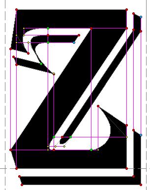
8 distance left or right would be exactly 4/7 of the change in height, divided by 7. After refining my vectors further through precise calculation of the line slopes, I noticed that many of the nodes and control handles appeared to be exactly or almost exactly aligned on specific horizontal or vertical planes. This was completely unexpected, and I began to attempt to align points, while maintaining the same line slopes. These horizontal and vertical alignments appeared in nearly every glyph, except glyphs like the comma/ single quote, which were composed entirely of curved lines, with few nodes and handles. The horizontal and vertical alignments of nodes and handles appeared just as frequently in glyphs that had mostly curved lines, in addition to glyphs like M or A where almost all of the lines are straight. Here are a few examples, from screen captures of the vectors from the Original fonts, at 50% size. Nodes are blue, red, or green. Handles are small yellow + signs. The purple lines drawn on top represent the horizontal or vertical alignment planes. All of these alignments are exact, not approximations based on the scale of the screen captures. At maximum enlargement in ScanFont 3, A glyph can appear apprimately 14 feet tall, (about 4.2 meters tall), with only a small portion visible on my computer monitor:

9

10 The grid lines in the background represent 100 editing units horizontally and vertically, so within each grid square, there are 10,000 possible X/Y intersection points.

11

12 In the lower portion of the 2, there are six nodes aligned diagonally, with a 3/2 slope. For the most part, every alignment of point had either a neutral or beneficial effect on the appearance of each glyph. The alignments were also helpful, when I changed the UPM size and vertical metrics, as most of them were automatically incorportated into the Standard sized version.

13 Here s a mashup of the letter M glyph, before I started the bitmap editing stage, versus the fully edited glyph. Black repesents portions of the contours that were solid, before and after. Light blue and black is what the glyph looked like after I had removed unnecessary nodes, but had made no design changes, other than reducing the width of the source images by 20%. Red and black is the final version:
14 Here s the 216 point bitmap of the M, prior to a couple of minor last minute changes: The red arrow indicates a line that is slightly off, because I chose to vertically align the node at the bottom of the contour. The blue arrow at top center has the same explanation The blue arrow in mid center represents an error I can t correct. The line slope on the left side of the central V portion is 3/1. And on the right, it s 8/3. The horizontal distance between the nodes on the top of the points, and on the bottom, (baseline), does not divide exactly by 24, the lowest common deninator between 3 and 8, so the line slope on the left deviates from exactly 8/3 by about 1/1330.
Using Microsoft Excel
 Using Microsoft Excel Formatting a spreadsheet means changing the way it looks to make it neater and more attractive. Formatting changes can include modifying number styles, text size and colours. Many
Paint/Draw Tools. Foreground color. Free-form select. Select. Eraser/Color Eraser. Fill Color. Color Picker. Magnify. Pencil. Brush.
 Paint/Draw Tools There are two types of draw programs. Bitmap (Paint) Uses pixels mapped to a grid More suitable for photo-realistic images Not easily scalable loses sharpness if resized File sizes are
Learning to use the drawing tools
 Create a blank slide This module was developed for Office 2000 and 2001, but although there are cosmetic changes in the appearance of some of the tools, the basic functionality is the same in Powerpoint
anatomy cap height x-height baseline descender ligature finial terminal ascender spine small capital uppercase counter cross bar lowercase
 Type Anatomy anatomy cap height x-height baseline stem bowl serif descender ligature ascender finial terminal ascender spine uppercase small capital cross bar counter lowercase 36 thinking with type cap
A Step-by-step guide to creating a Professional PowerPoint Presentation
 Quick introduction to Microsoft PowerPoint A Step-by-step guide to creating a Professional PowerPoint Presentation Created by Cruse Control creative services Tel +44 (0) 1923 842 295 training@crusecontrol.com
Unit 21 - Creating a Navigation Bar in Macromedia Fireworks
 Unit 21 - Creating a Navigation Bar in Macromedia Fireworks Items needed to complete the Navigation Bar: Unit 21 - House Style Unit 21 - Graphics Sketch Diagrams Document ------------------------------------------------------------------------------------------------
Computer Graphics Fundamentals. Jon Macey
 Computer Graphics Fundamentals Jon Macey jmacey@bournemouth.ac.uk http://nccastaff.bournemouth.ac.uk/jmacey/ 1 1 What is CG Fundamentals Looking at how Images (and Animations) are actually produced in
How to...create a Video VBOX Gauge in Inkscape. So you want to create your own gauge? How about a transparent background for those text elements?
 BASIC GAUGE CREATION The Video VBox setup software is capable of using many different image formats for gauge backgrounds, static images, or logos, including Bitmaps, JPEGs, or PNG s. When the software
L E S S O N 2 Background
 Flight, Naperville Central High School, Naperville, Ill. No hard hat needed in the InDesign work area Once you learn the concepts of good page design, and you learn how to use InDesign, you are limited
Corel Draw 11. What is Vector Graphics?
 Corel Draw 11 Corel Draw is a vector based drawing that program that makes it easy to create professional artwork from logos to intricate technical illustrations. Corel Draw 11's enhanced text handling
Putting type on a page without incorporating typographic principles is merely word processing. Terry Rydberg, Author Exploring InDesign 3
 Putting type on a page without incorporating typographic principles is merely word processing. Terry Rydberg, Author Exploring InDesign 3 Typography The study of all elements of type as a means of visual
Design Development Documentation
 Design Development Documentation Preliminary Logo One For the first logo design in which I created I started off with a clipart image of a clenched fist in which I traced within Photoshop. I chose this
Reading 2.2 Cascading Style Sheets
 Reading 2.2 Cascading Style Sheets By Multiple authors, see citation after each section What is Cascading Style Sheets (CSS)? Cascading Style Sheets (CSS) is a style sheet language used for describing
Copyright 2004, Mighty Computer Services
 EZ-GRAPH DATABASE PROGRAM MANUAL Copyright 2004, Mighty Computer Services The Table of Contents is located at the end of this document. I. Purpose EZ-Graph Database makes it easy to draw and maintain basic
SketchUp. SketchUp. Google SketchUp. Using SketchUp. The Tool Set
 Google Google is a 3D Modelling program which specialises in making computer generated representations of real-world objects, especially architectural, mechanical and building components, such as windows,
Font Basics. Descender. Serif. With strokes on the extremities of the letters. T Script. Sans-Serif. No strokes on the end of the letters
 Font Basics Ascender Font Size d p x A X-height Cap height Counter The white space within letters Descender Bar A Serif With strokes on the extremities of the letters. T A Sans-Serif No strokes on the
LECTURE 4 THE USES OF TEXT IN MULTIMEDIA
 LECTURE 4 THE USES OF TEXT IN MULTIMEDIA 1 Objective Media Types What text is How text is created and stored in the computer How text is used in Multimedia Systems Advantages and Disadvantages of using
Fig. A. Fig. B. Fig. 1. Fig. 2. Fig. 3 Fig. 4
 Create A Spinning Logo Tutorial. Bob Taylor 2009 To do this you will need two programs from Xara: Xara Xtreme (or Xtreme Pro) and Xara 3D They are available from: http://www.xara.com. Xtreme is available
Drawing shapes and lines
 Fine F Fi i Handmade H d d Ch Chocolates l Hours Mon Sat 10am 6pm In this demonstration of Adobe Illustrator CS6, you will be introduced to new and exciting application features, like gradients on a stroke
Screen Designer. The Power of Ultimate Design. 43-TV GLO Issue 2 01/01 UK
 Screen Designer The Power of Ultimate Design 43-TV-25-13 GLO Issue 2 01/01 UK 43-TV-25-13 GLO Issue 2 01/01 UK Table of Contents Table of Contents Honeywell Screen Designer - The Power of Ultimate Design
EXAMINATIONS 2016 TRIMESTER 2
 EXAMINATIONS 2016 TRIMESTER 2 CGRA 151 INTRODUCTION TO COMPUTER GRAPHICS Time Allowed: TWO HOURS CLOSED BOOK Permitted materials: Silent non-programmable calculators or silent programmable calculators
Creating a Title Block & Border Using Chief Architect. Architectural Design & Residential Construction Penncrest High School
 Creating a Title Block & Border Using Chief Architect Architectural Design & Residential Construction Penncrest High School 2017-2018 Select New Layout to begin designing your Title Block. Note: Once the
How to draw and create shapes
 Adobe Flash Professional Guide How to draw and create shapes You can add artwork to your Adobe Flash Professional documents in two ways: You can import images or draw original artwork in Flash by using
Anima-LP. Version 2.1alpha. User's Manual. August 10, 1992
 Anima-LP Version 2.1alpha User's Manual August 10, 1992 Christopher V. Jones Faculty of Business Administration Simon Fraser University Burnaby, BC V5A 1S6 CANADA chris_jones@sfu.ca 1992 Christopher V.
Introduction To Inkscape Creating Custom Graphics For Websites, Displays & Lessons
 Introduction To Inkscape Creating Custom Graphics For Websites, Displays & Lessons The Inkscape Program Inkscape is a free, but very powerful vector graphics program. Available for all computer formats
Interactive Tourist Map
 Adobe Edge Animate Tutorial Mouse Events Interactive Tourist Map Lesson 1 Set up your project This lesson aims to teach you how to: Import images Set up the stage Place and size images Draw shapes Make
Document Editor Basics
 Document Editor Basics When you use the Document Editor option, either from ZP Toolbox or from the Output option drop-down box, you will be taken to the Report Designer Screen. While in this window, you
Lesson 1 Introduction to PowerPoint
 Lesson 1 Introduction to PowerPoint What It Is-- Presentation tool that allows you to view slides Can include text, graphics, animation, sound, video, charts, and transitions Can create handouts, speaker
Let s Make a Front Panel using FrontCAD
 Let s Make a Front Panel using FrontCAD By Jim Patchell FrontCad is meant to be a simple, easy to use CAD program for creating front panel designs and artwork. It is a free, open source program, with the
To build shapes from scratch, use the tools are the far right of the top tool bar. These
 3D GAME STUDIO TUTORIAL EXERCISE #5 USE MED TO SKIN AND ANIMATE A CUBE REVISED 11/21/06 This tutorial covers basic model skinning and animation in MED the 3DGS model editor. This exercise was prepared
Developing successful posters using Microsoft PowerPoint
 Developing successful posters using Microsoft PowerPoint PRESENTED BY ACADEMIC TECHNOLOGY SERVICES University of San Diego Goals of a successful poster A poster is a visual presentation of your research,
Einführung in Visual Computing
 Einführung in Visual Computing 186.822 Rasterization Werner Purgathofer Rasterization in the Rendering Pipeline scene objects in object space transformed vertices in clip space scene in normalized device
A cell is highlighted when a thick black border appears around it. Use TAB to move to the next cell to the LEFT. Use SHIFT-TAB to move to the RIGHT.
 Instructional Center for Educational Technologies EXCEL 2010 BASICS Things to Know Before You Start The cursor in Excel looks like a plus sign. When you click in a cell, the column and row headings will
Designer Reference 1
 Designer Reference 1 Table of Contents USE OF THE DESIGNER...4 KEYBOARD SHORTCUTS...5 Shortcuts...5 Keyboard Hints...5 MENUS...7 File Menu...7 Edit Menu...8 Favorites Menu...9 Document Menu...10 Item Menu...12
Firstly, I would like to thank ProFantasy for hosting this tutorial on the RPGMaps Blog. Thank you!
 Firstly, I would like to thank ProFantasy for hosting this tutorial on the RPGMaps Blog. Thank you! Before we start, it is important that you fully understand what a shaded polygon is, and what it does.
Word Tutorial 4 Enhancing Page Layout and Design
 Word Tutorial 4 Enhancing Page Layout and Design Microsoft Office 2013 Objectives Use continuous section break for page layout Format text in columns Insert symbols and special characters Distinguish between
Adobe Illustrator CS5 Part 2: Vector Graphic Effects
 CALIFORNIA STATE UNIVERSITY, LOS ANGELES INFORMATION TECHNOLOGY SERVICES Adobe Illustrator CS5 Part 2: Vector Graphic Effects Summer 2011, Version 1.0 Table of Contents Introduction...2 Downloading the
2 December NCFE Corporate Guidelines. Introduction
 Introduction Introduction How we connect with people through our brand is essential to who we are, and plays a big part in the NCFE experience. We created this document (which is simpler than it looks)
INKSCAPE BASICS. 125 S. Prospect Avenue, Elmhurst, IL (630) elmhurstpubliclibrary.org. Create, Make, and Build
 elmhurstpubliclibrary.org. Create, Make, and Build") INKSCAPE BASICS Inkscape is a free, open-source vector graphics editor. It can be used to create or edit vector graphics like illustrations, diagrams, line arts, charts, logos and more. Inkscape uses Scalable
INKSCAPE BASICS Inkscape is a free, open-source vector graphics editor. It can be used to create or edit vector graphics like illustrations, diagrams, line arts, charts, logos and more. Inkscape uses Scalable
Name: Tutor s
 Name: Tutor s Email: Bring a couple, just in case! Necessary Equipment: Black Pen Pencil Rubber Pencil Sharpener Scientific Calculator Ruler Protractor (Pair of) Compasses 018 AQA Exam Dates Paper 1 4
Creating Digital Illustrations for Your Research Workshop III Basic Illustration Demo
 Creating Digital Illustrations for Your Research Workshop III Basic Illustration Demo Final Figure Size exclusion chromatography (SEC) is used primarily for the analysis of large molecules such as proteins
Text. Text metrics. There are some important metrics that we must consider when working with text. Figure 4-1 shows the basics.
 Text Drawing text has some special properties and thus is treated in a separate chapter. We first need to talk about the sizing of text. Then we discuss fonts and how text is actually drawn. There is then
HOUR 12. Adding a Chart
 HOUR 12 Adding a Chart The highlights of this hour are as follows: Reasons for using a chart The chart elements The chart types How to create charts with the Chart Wizard How to work with charts How to
SciGraphica. Tutorial Manual - Tutorials 1and 2 Version 0.8.0
 SciGraphica Tutorial Manual - Tutorials 1and 2 Version 0.8.0 Copyright (c) 2001 the SciGraphica documentation group Permission is granted to copy, distribute and/or modify this document under the terms
LESSON A. The Splash Screen Application
 The Splash Screen Application LESSON A LESSON A After studying Lesson A, you should be able to: Start and customize Visual Studio 2010 or Visual Basic 2010 Express Create a Visual Basic 2010 Windows application
Paint Tutorial (Project #14a)
") Paint Tutorial (Project #14a) In order to learn all there is to know about this drawing program, go through the Microsoft Tutorial (below). (Do not save this to your folder.) Practice using the different
Paint Tutorial (Project #14a) In order to learn all there is to know about this drawing program, go through the Microsoft Tutorial (below). (Do not save this to your folder.) Practice using the different
Chapter 6 Formatting Graphic Objects
 Impress Guide Chapter 6 OpenOffice.org Copyright This document is Copyright 2007 by its contributors as listed in the section titled Authors. You can distribute it and/or modify it under the terms of either
S206E Lecture 3, 5/15/2017, Rhino 2D drawing an overview
 Copyright 2017, Chiu-Shui Chan. All Rights Reserved. S206E057 Spring 2017 Rhino 2D drawing is very much the same as it is developed in AutoCAD. There are a lot of similarities in interface and in executing
Chapter 2 Surfer Tutorial
 Chapter 2 Surfer Tutorial Overview This tutorial introduces you to some of Surfer s features and shows you the steps to take to produce maps. In addition, the tutorial will help previous Surfer users learn
Scalable Vector Graphics (SVG) vector image World Wide Web Consortium (W3C) defined with XML searched indexed scripted compressed Mozilla Firefox
 vector image World Wide Web Consortium (W3C) defined with XML searched indexed scripted compressed Mozilla Firefox") SVG SVG Scalable Vector Graphics (SVG) is an XML-based vector image format for twodimensional graphics with support for interactivity and animation. The SVG specification is an open standard developed
SVG SVG Scalable Vector Graphics (SVG) is an XML-based vector image format for twodimensional graphics with support for interactivity and animation. The SVG specification is an open standard developed
ENV Laboratory 2: Graphing
 Name: Date: Introduction It is often said that a picture is worth 1,000 words, or for scientists we might rephrase it to say that a graph is worth 1,000 words. Graphs are most often used to express data
WIRE BASICS ESTIMATED TIME REQUIRED. This tutorial will teach you the basics of sketching wires and using them as contours for solid objects.
 WIRE BASICS This tutorial will teach you the basics of sketching wires and using them as contours for solid objects. ESTIMATED TIME REQUIRED 30 Minutes LEARNING GOALS In this tutorial you will learn how
An innovative 3D typeface. 4 weights & 2 shading styles
 An innovative 3D typeface IG V.1 SHADED SPECIMEN 4 weights & 2 shading styles ABOUT IG SHADED ig Shaded is a chromatic 3D type family with a geometric sans serif at its heart. As its name suggests, ig
Graffiti Wallpaper Photoshop Tutorial
 Graffiti Wallpaper Photoshop Tutorial Adapted from http://photoshoptutorials.ws/photoshop-tutorials/drawing/create-your-own-graffiti-wallpaper-inphotoshop.html Step 1 - Create a New Document Choose File
Excel 2016: Part 1. Updated January 2017 Copy cost: $1.50
 Excel 2016: Part 1 Updated January 2017 Copy cost: $1.50 Getting Started Please note that you are required to have some basic computer skills for this class. Also, any experience with Microsoft Word is
form are graphed in Cartesian coordinates, and are graphed in Cartesian coordinates.
 Plot 3D Introduction Plot 3D graphs objects in three dimensions. It has five basic modes: 1. Cartesian mode, where surfaces defined by equations of the form are graphed in Cartesian coordinates, 2. cylindrical
VHSE - COMPUTERISED OFFICE MANAGEMENT MODULE III - Communication and Publishing Art - PageMaker
 INTRODUCTION : It is one Adobe PageMaker 7.0 software is the ideal page layout program for business, education, and small- and home-office professionals who want to create high-quality publications such
Chapter One Modifying Your Fonts
 Chapter One Modifying Your Fonts Steps to Modifying Fonts Opening Fonts Changing Character Weight About Font Piracy Creating Oblique Fonts Creating Fractions Creating Ligatures Creating Condensed Characters
Boardmaker 5.0 (Macintosh) Creating a Story Response Board. Introduction. Case Study. Learning Objectives
 Creating a Story Response Board. Introduction. Case Study. Learning Objectives") Boardmaker 5.0 (Macintosh) Creating a Story Response Board Introduction Boardmaker is an excellent program to use for creating resources to support students as they develop literacy skills. Its large electronic
Boardmaker 5.0 (Macintosh) Creating a Story Response Board Introduction Boardmaker is an excellent program to use for creating resources to support students as they develop literacy skills. Its large electronic
Guide to Editing Map Legends
 Guide to Editing Map Legends Map legends explain map symbols and are crucial to the communication of a map s message. Effective legends are created with careful consideration of labels and text, classes,
4.0 - ENGRAVING TEXT AND A BARCODE ON ALUMILAZ
 4.0 - ENGRAVING TEXT AND A BARCODE ON ALUMILAZ Material Required: 2 ¼ x 3 ⅞ Alumilaz Difficulty Level: Intermediate In this engraving job, we will produce a small nameplate on a small piece of Alumilaz.
ENVIRONMENTALLY RESPONSIBLE PRINTING ARTWORK GUIDE BOOK ALL YOU NEED TO KNOW ABOUT CREATING ARTWORK FOR PRINT TOGETHER.
 ENVIRONMENTALLY RESPONSIBLE PRINTING ARTWORK GUIDE BOOK ALL YOU NEED TO KNOW ABOUT CREATING ARTWORK FOR PRINT TOGETHER. contents pg3. Choose a Design application pg4. Artwork requirements pg5. Creating
Introduction to Computer Graphics
 Introduction to 1.1 What is computer graphics? it would be difficult to overstate the importance of computer and communication technologies in our lives. Activities as wide-ranging as film making, publishing,
Create a Cool Vector Robot Character in Illustrator
 Create a Cool Vector Robot Character in Illustrator In this tutorial, we will use various tools and techniques to create a simple vector robot character and learn the basic of Adobe Illustrated. With this
June InSight Graphical User Interface Design Guidelines
 June 2001 InSight Graphical User Interface Design Guidelines Index 1.0 Introduction 1 1.1 - Dimension Information 1 2.0 General Guidelines 1 2.1 - The Display Grid 1 3.0 - Color 2 3.1 - Primary Colors
Creating and Modifying Charts
 Creating and Modifying Charts Introduction When you re ready to share data with others, a worksheet might not be the most effective way to present the information. A page full of numbers, even if formatted
Insight: Measurement Tool. User Guide
 OMERO Beta v2.2: Measurement Tool User Guide - 1 - October 2007 Insight: Measurement Tool User Guide Open Microscopy Environment: http://www.openmicroscopy.org OMERO Beta v2.2: Measurement Tool User Guide
New Perspectives on Microsoft Word Module 4: Enhancing Page Layout and Design
 New Perspectives on Microsoft Word 2016 Module 4: Enhancing Page Layout and Design Objectives, Part 1 Use continuous section break for page layout Format text in columns Insert symbols and special characters
ADOBE ILLUSTRATOR CS3
 ADOBE ILLUSTRATOR CS3 Chapter 2 Creating Text and Gradients Chapter 2 1 Creating type Create and Format Text Create text anywhere Select the Type Tool Click the artboard and start typing or click and drag
WATER (No kerning) WATER (Automatic Kerning) WATER (Manual Kerning).
 WATER (Automatic Kerning) WATER (Manual Kerning).") Styles Learning to use styles is a very effective way to save time and improve the consistency of publications. A style is a group of attributes that can be applied at once, to one or more paragraphs,
Styles Learning to use styles is a very effective way to save time and improve the consistency of publications. A style is a group of attributes that can be applied at once, to one or more paragraphs,
Franklin Gothic. Seniors: Use larger text that is clear and legible. (Souvenir, Times, Garamond, Helvetica)
") one TYPOGRAPHY LECTURE: Do s and Don t s in Typography Do Build a basic library first. Find out who your audience is. Use appropriate type sizes. Celebrate white space. Use correct alignment. Use correct
one TYPOGRAPHY LECTURE: Do s and Don t s in Typography Do Build a basic library first. Find out who your audience is. Use appropriate type sizes. Celebrate white space. Use correct alignment. Use correct
LOGO & BRAND STANDARDS GUIDE
 LOGO & BRAND STANDARDS GUIDE INTRODUCTION The SparkPost Brand Standards Guide provides key information needed to accurately and consistently produce external and internal documents and communications.
Visual C# Program: Simple Game 3
 C h a p t e r 6C Visual C# Program: Simple Game 3 In this chapter, you will learn how to use the following Visual C# Application functions to World Class standards: Opening Visual C# Editor Beginning a
Knightswood Secondary School. Graphic Communication. Desktop Publishing otes. Auto Tracing
 Auto Tracing The process of converting a bit mapped image into a vector image. In a bit-mapped image, each object is represented by a pattern of dots, while in a vector image every object is defined geometrically.
ArtCAM Pro 5.5. Double click the ArtCAM Pro icon on the screen with the Left mouse button.
 ArtCAM Pro 5.5 Introduction. ArtCAM Pro allows complex 3D reliefs to be created quickly and easily from 2D images. The 2D images can be scanned images, imported from other drawing packages or created within
Poster-making 101 for 1 PowerPoint slide
 Poster-making 101 for 1 PowerPoint slide Essential information for preparing a poster for the poster printer 1. Poster size: You will be creating a single large slide in PowerPoint. 2. Before adding any
The Ultimate Maths Vocabulary List
 The Ultimate Maths Vocabulary List The 96 Words Every Pupil Needs to Know by the End of Year 6 KS1 & KS2 How to Use This Resource An essential building block in pupil s understanding of maths is their
Gmax Terrain Tutorial
 Gmax Terrain Tutorial by Kobbe Farwick http://realscenes.proboards81.com You will need the following - Global Mapper Mesh data (GeoTIFF) Aerial/Satellite Imagery (GeoTIFF) FSX/FS2004 Gmax Gamepack Image
European Year 2012 for Active Ageing and Solidarity between Generations. Graphic guidelines
 European Year 2012 for Active Ageing and Solidarity between Generations Graphic guidelines Contents Publishing information Published by European Commission Designed by Directorate General Employment, Social
Chartered Professional Accountants of British Columbia. Guidelines for the Licensed Use of the CPA Logo (Mark)
") Chartered Professional Accountants of British Columbia Guidelines for the Licensed Use of the CPA Logo (Mark) The CPA Logo is available for download and use by Members and Firms in professional practice
Chartered Professional Accountants of British Columbia Guidelines for the Licensed Use of the CPA Logo (Mark) The CPA Logo is available for download and use by Members and Firms in professional practice
FRONTPAGE STEP BY STEP GUIDE
 IGCSE ICT SECTION 15 WEB AUTHORING FRONTPAGE STEP BY STEP GUIDE Mark Nicholls ICT lounge P a g e 1 Contents Introduction to this unit.... Page 4 How to open FrontPage..... Page 4 The FrontPage Menu Bar...Page
Create and edit text. Create the title text First you ll create the title text for the car rental ad.
 8 Choose the Pointer tool and click the mask thumbnail in the Layers panel. The Property inspector shows that the mask was applied using its grayscale appearance. The darker pixels in the mask knock out
AVAL 6.6. User Manual Maps
 AVAL 6.6 User Manual Maps AVAL 6.6 User Manual Maps January 2008 All rights reserved Swedish Defence Research Agency (FOI, Sweden) www.foi.se/aval aval@foi.se 1 AVAL 6.6 User Manual Maps www.foi.se/aval
Data Representation From 0s and 1s to images CPSC 101
 Data Representation From 0s and 1s to images CPSC 101 Learning Goals After the Data Representation: Images unit, you will be able to: Recognize and translate between binary and decimal numbers Define bit,
Module 1: Basics of Solids Modeling with SolidWorks
 Module 1: Basics of Solids Modeling with SolidWorks Introduction SolidWorks is the state of the art in computer-aided design (CAD). SolidWorks represents an object in a virtual environment just as it exists
In this section you will learn some simple data entry, editing, formatting techniques and some simple formulae. Contents
 In this section you will learn some simple data entry, editing, formatting techniques and some simple formulae. Contents Section Topic Sub-topic Pages Section 2 Spreadsheets Layout and Design S2: 2 3 Formulae
COPY/PASTE: Allows any item within a document to be copied and pasted within the same document or within compatible software applications.
 You will need to understand basic terms and techniques used in DTP, as well as file types used within DTP and their advantages and disadvantages. This is separate from Elements and Principles of DTP which
GÉANT CORPORATE IDENTITY GUIDELINES FOR USE. connect communicate collaborate
 GÉANT CORPORATE IDENTITY GUIDELINES FOR USE connect communicate collaborate THE LOGO The GÉANT logo is the core element within the brand. From printed brochures and datasheets through PowerPoint presentations
Overview: Printing MFworks Documents
 Overview: Printing MFworks Documents The Layout Window Printing Printing to Disk Overview: Printing MFworks Documents MFworks is designed to print to any standard Windows compatible printer this includes
How to use text. Adding a text frame
 How to use text Because Adobe InDesign CS6 is a page layout tool, working with text is an important skill. With InDesign, you add all text (and all content) into frames. Frames are shapes (called paths)
Unit 1, Lesson 1: Moving in the Plane
 Unit 1, Lesson 1: Moving in the Plane Let s describe ways figures can move in the plane. 1.1: Which One Doesn t Belong: Diagrams Which one doesn t belong? 1.2: Triangle Square Dance m.openup.org/1/8-1-1-2
Graphic Design & Digital Photography. Photoshop Basics: Working With Selection.
 1 Graphic Design & Digital Photography Photoshop Basics: Working With Selection. What You ll Learn: Make specific areas of an image active using selection tools, reposition a selection marquee, move and
Creating a Basic Chart in Excel 2007
 Creating a Basic Chart in Excel 2007 A chart is a pictorial representation of the data you enter in a worksheet. Often, a chart can be a more descriptive way of representing your data. As a result, those
If you have been using CorelDRAW, you may have turned off this opening screen. If so, skip to step 5.
 Opening CorelDRAW If you have been using CorelDRAW, you may have turned off this opening screen. If so, skip to step 5. 1. When CorelDRAW is loaded, a new section is created on the Start Menu. To open
2. If a window pops up that asks if you want to customize your color settings, click No.
 Practice Activity: Adobe Photoshop 7.0 ATTENTION! Before doing this practice activity you must have all of the following materials saved to your USB: runningshoe.gif basketballshoe.gif soccershoe.gif baseballshoe.gif
Adobe Photoshop CS Design Professional PLACING TYPE IN AN IMAGE
 Adobe Photoshop CS Design Professional PLACING TYPE IN AN IMAGE Chapter Lessons Learn about type and how it is created Change spacing and adjust baseline shift Use the Drop Shadow style Apply anti-aliasing
Representing Graphical Data
 Representing Graphical Data Chapman & Chapman, chapters 3,4,5 Richardson 1 Graphics in IT82 What does computer graphics cover? IT82 Input, output, and representation of graphical data Creation of graphics
Graphic Standards Guidelines Updated November 13, 2008
 Graphic Standards Guidelines Updated November 13, 2008 Centreville Presbyterian Church Graphic Standards 2 Brand Communications How To Use This Manual This manual provides an easy-to-use reference to our
DESIGNING THE PAGE FOUNDATIONS OF DIGITAL DESIGN. Layout composition, the grid and typography. Prof. Eva Machauf
 DESIGNING THE PAGE Layout composition, the grid and typography FOUNDATIONS OF DIGITAL DESIGN Prof. Eva Machauf prof.machauf@gmail.com THE GRID The grid is the foundation of all design. Creating and working
JASCO CANVAS PROGRAM OPERATION MANUAL
 JASCO CANVAS PROGRAM OPERATION MANUAL P/N: 0302-1840A April 1999 Contents 1. What is JASCO Canvas?...1 1.1 Features...1 1.2 About this Manual...1 2. Installation...1 3. Operating Procedure - Tutorial...2