Week 4: Describing data and estimation
|
|
|
- Aldous Chase
- 6 years ago
- Views:
Transcription
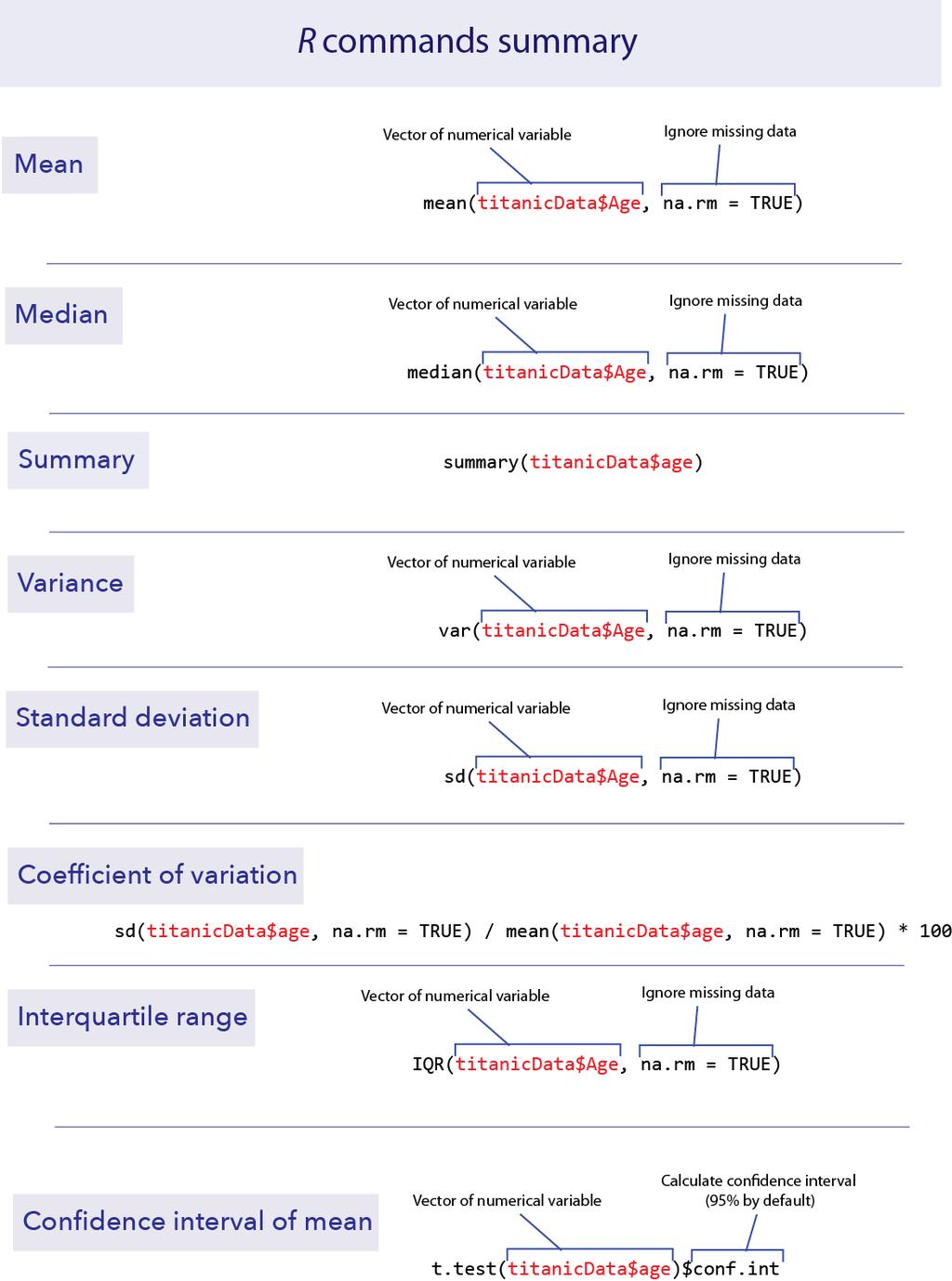
1 Week 4: Describing data and estimation Goals Investigate sampling error; see that larger samples have less sampling error. Visualize confidence intervals. Calculate basic summary statistics using R. Calculate confidence intervals for the mean with R. Learning the Tools Missing data Sometimes we do not have all variables measured on all individuals in the data set. When this happens, we need a space holder in our data files so that R knows that the data is missing. The standard way of doing this in R is to put NA (without the quotes) in the location that the data would have gone. NA is short for not available. For example, in the Titanic data set, we do not know the age of several passengers. Let s look at it. Load the Titanic data set: > titanicdata <- read.csv("data/titanic.csv" ) Have R print out the list of the age variable, which you can do easily by just typing its name: > titanicdata$age If you look through the results, you will see that most individuals have numbers in this list, but some have NA. These NAs are the people for which we do not have age information. By the way, the titanic.csv file simply has nothing in the places where there is missing data. When R loaded it, it replaced the empty spots with NA automatically. Measures of location mean() This week we want to use R to give some basic descriptive statistics for numerical data. We have already seen in Week 1 how to calculate the mean of a 1
2 vector of data using mean(). Unfortunately, if there are missing data we need to tell R how to deal with it. A (somewhat annoying) quirk of R is that if we try to take the mean of a list of numbers that include missing data, we get an NA for the result! > mean(titanicdata$age) [1] NA na.rm=true To get the mean of all the numbers that we do have, we have to add an option to the mean() function. This option is na.rm = TRUE. > mean(titanicdata$age, na.rm = TRUE) [1] This tells R to remove ( rm ) the NAs before taking the mean. It turns out that the mean age of passengers that we have information for was about na.rm = TRUE can be added to many functions in R, including median(), as we shall see next. median() The median of a series of numbers is the middle number half of the numbers in the list are greater the median and half are below it. It can be calculated in R by using median(). > median(titanicdata$age, na.rm = TRUE) [1] 30 summary() A handy function that will return both the mean and median at the same time (along with other information such as the first and third quartiles) is summary(). > summary(titanicdata$age) Min. 1st Qu. Median Mean 3rd Qu. Max. NA's
3 From left to right, this output gives us the smallest (minimum) value in the list ( Min. ), the first quartile ( 1st Qu. ), the median, the mean, the third quartile ( 3rd Qu. ), the largest (maximum) value ( Max. ), and finally, the number of individuals with missing values ( NA s ). The first quartile is the value in the data that is larger than a quarter of the data points. The third quartile is larger than ¾ of the data. These are also called the 25 th percentile and the 75 th percentile, respectively. (You may remember these from boxplots, where the top and bottom of the box mark the 75 th and 25 th percentiles, respectively.) Measures of variability var() R can also calculate measures of the variability of a sample. In this section we ll learn how to calculate the variance, standard deviation, coefficient of variation and interquartile range of a set of data. To calculate the variance of a list of numbers, use var(). > var(titanicdata$age, na.rm = TRUE) [1] Note that var(), as well as sd() below, have the same need for na.rm = TRUE when analyzing data that include missing values. sd() The standard deviation can be calculated by sd(). > sd(titanicdata$age, na.rm = TRUE) [1] Of course, the standard deviation is the same as the square root of the variance. > sqrt(var(titanicdata$age, na.rm = TRUE)) [1] Coefficient of variation Surprisingly, there is no standard function in R to calculate the coefficient of variation. You can do this yourself, though, directly from the definition: 3
4 > 100 * sd(titanicdata$age, na.rm = TRUE) / mean(titanicdata$age, na.rm = TRUE) [1] IQR() The interquartile range (or IQR) is the difference between the third quartile and the first quartile; in other words the range covered by the middle half of the data. It can be calculated easily with IQR(). > IQR(titanicData$age, na.rm = TRUE) [1] 20 Note that this is the same as we could calculate by the results from summary() above. The third quartile is 41 and the first quartile is 21, so the difference is = 20. Confidence intervals of the mean The confidence interval for an estimate tells us a range of values that is likely to contain the true value of the parameter. For example, in 95% of random samples the 95% confidence interval of the mean will contain the true value of the mean. R does not have a simple built-in function to calculate only the confidence interval of the mean, but the function that calculates t-tests will give us this information. (See chapters 11 and 12 in the text or Week 7 and 8 of these labs for more on t-tests.) The function t.test() has many results in its output. By adding $conf.int to this function we only get back the confidence interval for the mean. By default it gives us the 95% confidence interval. > t.test(titanicdata$age)$conf.int [1] attr(,"conf.level") [1] 0.95 As the result above shows, the 95% confidence interval of the mean of age in the titanicdata data set is from about 30.0 to R also tells us that it used a 95% confidence level for its calculation. (The confidence interval is not so useful in this case, because we actually have information for nearly all the individuals on the Titanic.) 4
5 To calculate confidence intervals with a different level of confidence, we can add the option conf.level to the t.test function. For example, for a 99% confidence interval we can use the following. > t.test(titanicdata$age, conf.level = 0.99)$conf.int [1] attr(,"conf.level") [1]
6 6

7 Activities Distribution of sample means Go to the web and open the page at This page contains some interactive visualizations that let you play around with sampling to see the distribution of sampling means. Click the button that says Tutorial near the bottom of the page and follow along with the instructions. Confidence intervals Go back to the web, and open the page at This applet draws confidence intervals for the mean of a known population. Click Tutorial again, and follow along. Questions 1. The data file "students.csv" should include data that your classmates collected on themselves during the first week of lab, in chapter 1. Open that file in R. a. Use R to calculate the mean height of all students in the class. b. Plot the distribution of heights in the class. Describe the shape of the distribution. Is it symmetric or skewed? Is it unimodal or bimodal? Key point: A distribution is skewed if it is asymmetric. A distribution is skewed right if there is a long tail to the right, and skewed left if there is a long tail to the left. c. Are there any large outliers that look as though a student used the wrong units for their height measurement. (I.e., are there any that are more plausibly a height given in inches rather than the requested centimeters?) If so, and if this is not likely to be an accurate description of an individual in your class, use filter() from the package dplyr to create a new data set without those rows. 7
8 d. Use sd() to calculate the standard deviation of height. 2. The file "caffeine.csv" contains data on the amount of caffeine in a 16 oz. cup of coffee obtained from various vendors. For context, doses of caffeine over 25 mg are enough to increase anxiety in some people, and doses over 300 to 360 mg are enough to significantly increase heart rate in most people. A can of Red Bull contains 80mg of caffeine. a. What is the mean amount of caffeine in 16 oz. coffees? b. What is the 95% confidence interval for the mean? c. Plot the frequency distribution of caffeine levels for these data in a histogram. Is the amount of caffeine in a cup of coffee relatively consistent from one vendor to another? What is the standard deviation of caffeine level? What is the coefficient of variation? d. The file "caffeinestarbucks.csv" has data on six 16 oz. cups of Breakfast Blend coffee sampled on six different days from a Starbucks location. Calculate the mean (and the 95% confidence interval for the mean) for these data. Compare these results to the data taken on the broader sample of vendors in the first file. Describe the difference. 3. A confidence interval is a range of values that are likely to contain the true value of a parameter. Consider the "caffeine.csv" data again. a. Calculate the 99% confidence interval for the mean caffeine level. b. Compare this 99% confidence interval to the 95% confidence interval you calculate in question 2b. Which confidence interval is wider (i.e., spans a broader range)? Why should this one be wider? c. Let s compare the quantiles of the distribution of caffeine to this confidence interval. Approximately 95% of the data values should fall between the 2.5% and 97.5% quantiles of the distribution of caffeine. (Explain why this is true.) We can use R to calculate the 2.5% and 97.5% quantiles with a command like the following. (Replace datavector with the name of the vector of your caffeine data.) > quantile(datavector, c(0.025, 0.975), na.rm =TRUE) Are these the same as the boundaries of the 95% confidence interval? If not, why not? Which should bound a smaller region, the quantile or the confidence interval of the mean? 8
9 4. Return to the class data set "students.csv." Find the mean value of "number of siblings." Add one to this to find the mean number of children per family in the class. a. The mean number of offspring per family twenty years ago was about 2. Is the value for this class similar, greater, or smaller? If different, think of reasons for the difference. b. Are the families represented in this class systematically different from the population at large? Is there a potential sampling bias? c. Consider the way in which the data were collected. How many families with zero children are represented? Why? What effect does this have on the estimated mean family size of all couples? 5. Return to the data on countries of the world, in "countries.csv" and the data from the class in "students.csv." Plot the distributions for ecological_footprint_2000, cell_phone_subscriptions_per_100_people_2012, and life_expectancy_at_birth_female. a. For each variable, plot a histogram of the distribution. Is the variable skewed? If so, in which direction? b. For each variable, calculate the mean and median. Are they similar? Match the difference in mean and median to the direction of skew on the histogram. Do you see a pattern? 9
Chapter 1. Looking at Data-Distribution
 Chapter 1. Looking at Data-Distribution Statistics is the scientific discipline that provides methods to draw right conclusions: 1)Collecting the data 2)Describing the data 3)Drawing the conclusions Raw
Week 7: The normal distribution and sample means
 Week 7: The normal distribution and sample means Goals Visualize properties of the normal distribution. Learning the Tools Understand the Central Limit Theorem. Calculate sampling properties of sample
Chapter 3 - Displaying and Summarizing Quantitative Data
 Chapter 3 - Displaying and Summarizing Quantitative Data 3.1 Graphs for Quantitative Data (LABEL GRAPHS) August 25, 2014 Histogram (p. 44) - Graph that uses bars to represent different frequencies or relative
STA Module 2B Organizing Data and Comparing Distributions (Part II)
") STA 2023 Module 2B Organizing Data and Comparing Distributions (Part II) Learning Objectives Upon completing this module, you should be able to 1 Explain the purpose of a measure of center 2 Obtain and
STA 2023 Module 2B Organizing Data and Comparing Distributions (Part II) Learning Objectives Upon completing this module, you should be able to 1 Explain the purpose of a measure of center 2 Obtain and
STA Learning Objectives. Learning Objectives (cont.) Module 2B Organizing Data and Comparing Distributions (Part II)
 Module 2B Organizing Data and Comparing Distributions (Part II)") STA 2023 Module 2B Organizing Data and Comparing Distributions (Part II) Learning Objectives Upon completing this module, you should be able to 1 Explain the purpose of a measure of center 2 Obtain and
STA 2023 Module 2B Organizing Data and Comparing Distributions (Part II) Learning Objectives Upon completing this module, you should be able to 1 Explain the purpose of a measure of center 2 Obtain and
DAY 52 BOX-AND-WHISKER
 DAY 52 BOX-AND-WHISKER VOCABULARY The Median is the middle number of a set of data when the numbers are arranged in numerical order. The Range of a set of data is the difference between the highest and
Vocabulary. 5-number summary Rule. Area principle. Bar chart. Boxplot. Categorical data condition. Categorical variable.
 5-number summary 68-95-99.7 Rule Area principle Bar chart Bimodal Boxplot Case Categorical data Categorical variable Center Changing center and spread Conditional distribution Context Contingency table
Chapter 6: DESCRIPTIVE STATISTICS
 Chapter 6: DESCRIPTIVE STATISTICS Random Sampling Numerical Summaries Stem-n-Leaf plots Histograms, and Box plots Time Sequence Plots Normal Probability Plots Sections 6-1 to 6-5, and 6-7 Random Sampling
Measures of Central Tendency. A measure of central tendency is a value used to represent the typical or average value in a data set.
 Measures of Central Tendency A measure of central tendency is a value used to represent the typical or average value in a data set. The Mean the sum of all data values divided by the number of values in
Prepare a stem-and-leaf graph for the following data. In your final display, you should arrange the leaves for each stem in increasing order.
 Chapter 2 2.1 Descriptive Statistics A stem-and-leaf graph, also called a stemplot, allows for a nice overview of quantitative data without losing information on individual observations. It can be a good
Measures of Position
 Measures of Position In this section, we will learn to use fractiles. Fractiles are numbers that partition, or divide, an ordered data set into equal parts (each part has the same number of data entries).
STA Rev. F Learning Objectives. Learning Objectives (Cont.) Module 3 Descriptive Measures
 Module 3 Descriptive Measures") STA 2023 Module 3 Descriptive Measures Learning Objectives Upon completing this module, you should be able to: 1. Explain the purpose of a measure of center. 2. Obtain and interpret the mean, median, and
STA 2023 Module 3 Descriptive Measures Learning Objectives Upon completing this module, you should be able to: 1. Explain the purpose of a measure of center. 2. Obtain and interpret the mean, median, and
10.4 Measures of Central Tendency and Variation
 10.4 Measures of Central Tendency and Variation Mode-->The number that occurs most frequently; there can be more than one mode ; if each number appears equally often, then there is no mode at all. (mode
10.4 Measures of Central Tendency and Variation
 10.4 Measures of Central Tendency and Variation Mode-->The number that occurs most frequently; there can be more than one mode ; if each number appears equally often, then there is no mode at all. (mode
Measures of Central Tendency
 Page of 6 Measures of Central Tendency A measure of central tendency is a value used to represent the typical or average value in a data set. The Mean The sum of all data values divided by the number of
STA 570 Spring Lecture 5 Tuesday, Feb 1
 STA 570 Spring 2011 Lecture 5 Tuesday, Feb 1 Descriptive Statistics Summarizing Univariate Data o Standard Deviation, Empirical Rule, IQR o Boxplots Summarizing Bivariate Data o Contingency Tables o Row
15 Wyner Statistics Fall 2013
 15 Wyner Statistics Fall 2013 CHAPTER THREE: CENTRAL TENDENCY AND VARIATION Summary, Terms, and Objectives The two most important aspects of a numerical data set are its central tendencies and its variation.
MATH& 146 Lesson 10. Section 1.6 Graphing Numerical Data
 MATH& 146 Lesson 10 Section 1.6 Graphing Numerical Data 1 Graphs of Numerical Data One major reason for constructing a graph of numerical data is to display its distribution, or the pattern of variability
2.1: Frequency Distributions and Their Graphs
 2.1: Frequency Distributions and Their Graphs Frequency Distribution - way to display data that has many entries - table that shows classes or intervals of data entries and the number of entries in each
Table of Contents (As covered from textbook)
") Table of Contents (As covered from textbook) Ch 1 Data and Decisions Ch 2 Displaying and Describing Categorical Data Ch 3 Displaying and Describing Quantitative Data Ch 4 Correlation and Linear Regression
Table of Contents (As covered from textbook) Ch 1 Data and Decisions Ch 2 Displaying and Describing Categorical Data Ch 3 Displaying and Describing Quantitative Data Ch 4 Correlation and Linear Regression
CHAPTER 3: Data Description
 CHAPTER 3: Data Description You ve tabulated and made pretty pictures. Now what numbers do you use to summarize your data? Ch3: Data Description Santorico Page 68 You ll find a link on our website to a
IT 403 Practice Problems (1-2) Answers
 Answers") IT 403 Practice Problems (1-2) Answers #1. Using Tukey's Hinges method ('Inclusionary'), what is Q3 for this dataset? 2 3 5 7 11 13 17 a. 7 b. 11 c. 12 d. 15 c (12) #2. How do quartiles and percentiles
IT 403 Practice Problems (1-2) Answers #1. Using Tukey's Hinges method ('Inclusionary'), what is Q3 for this dataset? 2 3 5 7 11 13 17 a. 7 b. 11 c. 12 d. 15 c (12) #2. How do quartiles and percentiles
1.3 Graphical Summaries of Data
 Arkansas Tech University MATH 3513: Applied Statistics I Dr. Marcel B. Finan 1.3 Graphical Summaries of Data In the previous section we discussed numerical summaries of either a sample or a data. In this
appstats6.notebook September 27, 2016
 Chapter 6 The Standard Deviation as a Ruler and the Normal Model Objectives: 1.Students will calculate and interpret z scores. 2.Students will compare/contrast values from different distributions using
Math 120 Introduction to Statistics Mr. Toner s Lecture Notes 3.1 Measures of Central Tendency
 Math 1 Introduction to Statistics Mr. Toner s Lecture Notes 3.1 Measures of Central Tendency lowest value + highest value midrange The word average: is very ambiguous and can actually refer to the mean,
Understanding and Comparing Distributions. Chapter 4
 Understanding and Comparing Distributions Chapter 4 Objectives: Boxplot Calculate Outliers Comparing Distributions Timeplot The Big Picture We can answer much more interesting questions about variables
Averages and Variation
 Averages and Variation 3 Copyright Cengage Learning. All rights reserved. 3.1-1 Section 3.1 Measures of Central Tendency: Mode, Median, and Mean Copyright Cengage Learning. All rights reserved. 3.1-2 Focus
Center, Shape, & Spread Center, shape, and spread are all words that describe what a particular graph looks like.
 Center, Shape, & Spread Center, shape, and spread are all words that describe what a particular graph looks like. Center When we talk about center, shape, or spread, we are talking about the distribution
2.1 Objectives. Math Chapter 2. Chapter 2. Variable. Categorical Variable EXPLORING DATA WITH GRAPHS AND NUMERICAL SUMMARIES
 EXPLORING DATA WITH GRAPHS AND NUMERICAL SUMMARIES Chapter 2 2.1 Objectives 2.1 What Are the Types of Data? www.managementscientist.org 1. Know the definitions of a. Variable b. Categorical versus quantitative
Box Plots. OpenStax College
 Connexions module: m46920 1 Box Plots OpenStax College This work is produced by The Connexions Project and licensed under the Creative Commons Attribution License 3.0 Box plots (also called box-and-whisker
Chapter 2 Describing, Exploring, and Comparing Data
 Slide 1 Chapter 2 Describing, Exploring, and Comparing Data Slide 2 2-1 Overview 2-2 Frequency Distributions 2-3 Visualizing Data 2-4 Measures of Center 2-5 Measures of Variation 2-6 Measures of Relative
Things you ll know (or know better to watch out for!) when you leave in December: 1. What you can and cannot infer from graphs.
 when you leave in December: 1. What you can and cannot infer from graphs.") 1 2 Things you ll know (or know better to watch out for!) when you leave in December: 1. What you can and cannot infer from graphs. 2. How to construct (in your head!) and interpret confidence intervals.
1 2 Things you ll know (or know better to watch out for!) when you leave in December: 1. What you can and cannot infer from graphs. 2. How to construct (in your head!) and interpret confidence intervals.
AND NUMERICAL SUMMARIES. Chapter 2
 EXPLORING DATA WITH GRAPHS AND NUMERICAL SUMMARIES Chapter 2 2.1 What Are the Types of Data? 2.1 Objectives www.managementscientist.org 1. Know the definitions of a. Variable b. Categorical versus quantitative
CHAPTER 1. Introduction. Statistics: Statistics is the science of collecting, organizing, analyzing, presenting and interpreting data.
 1 CHAPTER 1 Introduction Statistics: Statistics is the science of collecting, organizing, analyzing, presenting and interpreting data. Variable: Any characteristic of a person or thing that can be expressed
Lecture 3 Questions that we should be able to answer by the end of this lecture:
 Lecture 3 Questions that we should be able to answer by the end of this lecture: Which is the better exam score? 67 on an exam with mean 50 and SD 10 or 62 on an exam with mean 40 and SD 12 Is it fair
CHAPTER 2 DESCRIPTIVE STATISTICS
 CHAPTER 2 DESCRIPTIVE STATISTICS 1. Stem-and-Leaf Graphs, Line Graphs, and Bar Graphs The distribution of data is how the data is spread or distributed over the range of the data values. This is one of
STA Module 4 The Normal Distribution
 STA 2023 Module 4 The Normal Distribution Learning Objectives Upon completing this module, you should be able to 1. Explain what it means for a variable to be normally distributed or approximately normally
STA /25/12. Module 4 The Normal Distribution. Learning Objectives. Let s Look at Some Examples of Normal Curves
 STA 2023 Module 4 The Normal Distribution Learning Objectives Upon completing this module, you should be able to 1. Explain what it means for a variable to be normally distributed or approximately normally
No. of blue jelly beans No. of bags
 Math 167 Ch5 Review 1 (c) Janice Epstein CHAPTER 5 EXPLORING DATA DISTRIBUTIONS A sample of jelly bean bags is chosen and the number of blue jelly beans in each bag is counted. The results are shown in
MATH NATION SECTION 9 H.M.H. RESOURCES
 MATH NATION SECTION 9 H.M.H. RESOURCES SPECIAL NOTE: These resources were assembled to assist in student readiness for their upcoming Algebra 1 EOC. Although these resources have been compiled for your
Lecture 3 Questions that we should be able to answer by the end of this lecture:
 Lecture 3 Questions that we should be able to answer by the end of this lecture: Which is the better exam score? 67 on an exam with mean 50 and SD 10 or 62 on an exam with mean 40 and SD 12 Is it fair
Measures of Dispersion
 Measures of Dispersion 6-3 I Will... Find measures of dispersion of sets of data. Find standard deviation and analyze normal distribution. Day 1: Dispersion Vocabulary Measures of Variation (Dispersion
IQR = number. summary: largest. = 2. Upper half: Q3 =
 Step by step box plot Height in centimeters of players on the 003 Women s Worldd Cup soccer team. 157 1611 163 163 164 165 165 165 168 168 168 170 170 170 171 173 173 175 180 180 Determine the 5 number
Learner Expectations UNIT 1: GRAPICAL AND NUMERIC REPRESENTATIONS OF DATA. Sept. Fathom Lab: Distributions and Best Methods of Display
 CURRICULUM MAP TEMPLATE Priority Standards = Approximately 70% Supporting Standards = Approximately 20% Additional Standards = Approximately 10% HONORS PROBABILITY AND STATISTICS Essential Questions &
Chapter 5. Understanding and Comparing Distributions. Copyright 2012, 2008, 2005 Pearson Education, Inc.
 Chapter 5 Understanding and Comparing Distributions The Big Picture We can answer much more interesting questions about variables when we compare distributions for different groups. Below is a histogram
Chapter 3 Analyzing Normal Quantitative Data
 Chapter 3 Analyzing Normal Quantitative Data Introduction: In chapters 1 and 2, we focused on analyzing categorical data and exploring relationships between categorical data sets. We will now be doing
Lecture Notes 3: Data summarization
 Lecture Notes 3: Data summarization Highlights: Average Median Quartiles 5-number summary (and relation to boxplots) Outliers Range & IQR Variance and standard deviation Determining shape using mean &
Math 167 Pre-Statistics. Chapter 4 Summarizing Data Numerically Section 3 Boxplots
 Math 167 Pre-Statistics Chapter 4 Summarizing Data Numerically Section 3 Boxplots Objectives 1. Find quartiles of some data. 2. Find the interquartile range of some data. 3. Construct a boxplot to describe
The main issue is that the mean and standard deviations are not accurate and should not be used in the analysis. Then what statistics should we use?
 Chapter 4 Analyzing Skewed Quantitative Data Introduction: In chapter 3, we focused on analyzing bell shaped (normal) data, but many data sets are not bell shaped. How do we analyze quantitative data when
Chapter 2. Descriptive Statistics: Organizing, Displaying and Summarizing Data
 Chapter 2 Descriptive Statistics: Organizing, Displaying and Summarizing Data Objectives Student should be able to Organize data Tabulate data into frequency/relative frequency tables Display data graphically
STP 226 ELEMENTARY STATISTICS NOTES PART 2 - DESCRIPTIVE STATISTICS CHAPTER 3 DESCRIPTIVE MEASURES
 STP 6 ELEMENTARY STATISTICS NOTES PART - DESCRIPTIVE STATISTICS CHAPTER 3 DESCRIPTIVE MEASURES Chapter covered organizing data into tables, and summarizing data with graphical displays. We will now use
Chapter 3: Describing, Exploring & Comparing Data
 Chapter 3: Describing, Exploring & Comparing Data Section Title Notes Pages 1 Overview 1 2 Measures of Center 2 5 3 Measures of Variation 6 12 4 Measures of Relative Standing & Boxplots 13 16 3.1 Overview
Chapter 5: The standard deviation as a ruler and the normal model p131
 Chapter 5: The standard deviation as a ruler and the normal model p131 Which is the better exam score? 67 on an exam with mean 50 and SD 10 62 on an exam with mean 40 and SD 12? Is it fair to say: 67 is
Chapter 3. Descriptive Measures. Slide 3-2. Copyright 2012, 2008, 2005 Pearson Education, Inc.
 Chapter 3 Descriptive Measures Slide 3-2 Section 3.1 Measures of Center Slide 3-3 Definition 3.1 Mean of a Data Set The mean of a data set is the sum of the observations divided by the number of observations.
To calculate the arithmetic mean, sum all the values and divide by n (equivalently, multiple 1/n): 1 n. = 29 years.
: 1 n. = 29 years.") 3: Summary Statistics Notation Consider these 10 ages (in years): 1 4 5 11 30 50 8 7 4 5 The symbol n represents the sample size (n = 10). The capital letter X denotes the variable. x i represents the
3: Summary Statistics Notation Consider these 10 ages (in years): 1 4 5 11 30 50 8 7 4 5 The symbol n represents the sample size (n = 10). The capital letter X denotes the variable. x i represents the
AP Statistics Prerequisite Packet
 Types of Data Quantitative (or measurement) Data These are data that take on numerical values that actually represent a measurement such as size, weight, how many, how long, score on a test, etc. For these
More Numerical and Graphical Summaries using Percentiles. David Gerard
 More Numerical and Graphical Summaries using Percentiles David Gerard 2017-09-18 1 Learning Objectives Percentiles Five Number Summary Boxplots to compare distributions. Sections 1.6.5 and 1.6.6 in DBC.
CHAPTER 2: SAMPLING AND DATA
 CHAPTER 2: SAMPLING AND DATA This presentation is based on material and graphs from Open Stax and is copyrighted by Open Stax and Georgia Highlands College. OUTLINE 2.1 Stem-and-Leaf Graphs (Stemplots),
+ Statistical Methods in
 9/4/013 Statistical Methods in Practice STA/MTH 379 Dr. A. B. W. Manage Associate Professor of Mathematics & Statistics Department of Mathematics & Statistics Sam Houston State University Discovering Statistics
Density Curve (p52) Density curve is a curve that - is always on or above the horizontal axis.
 Density curve is a curve that - is always on or above the horizontal axis.") 1.3 Density curves p50 Some times the overall pattern of a large number of observations is so regular that we can describe it by a smooth curve. It is easier to work with a smooth curve, because the histogram
1.3 Density curves p50 Some times the overall pattern of a large number of observations is so regular that we can describe it by a smooth curve. It is easier to work with a smooth curve, because the histogram
Week 2: Frequency distributions
 Types of data Health Sciences M.Sc. Programme Applied Biostatistics Week 2: distributions Data can be summarised to help to reveal information they contain. We do this by calculating numbers from the data
Further Maths Notes. Common Mistakes. Read the bold words in the exam! Always check data entry. Write equations in terms of variables
 Further Maths Notes Common Mistakes Read the bold words in the exam! Always check data entry Remember to interpret data with the multipliers specified (e.g. in thousands) Write equations in terms of variables
Univariate Statistics Summary
 Further Maths Univariate Statistics Summary Types of Data Data can be classified as categorical or numerical. Categorical data are observations or records that are arranged according to category. For example:
How individual data points are positioned within a data set.
 Section 3.4 Measures of Position Percentiles How individual data points are positioned within a data set. P k is the value such that k% of a data set is less than or equal to P k. For example if we said
Bar Graphs and Dot Plots
 CONDENSED LESSON 1.1 Bar Graphs and Dot Plots In this lesson you will interpret and create a variety of graphs find some summary values for a data set draw conclusions about a data set based on graphs
Mean,Median, Mode Teacher Twins 2015
 Mean,Median, Mode Teacher Twins 2015 Warm Up How can you change the non-statistical question below to make it a statistical question? How many pets do you have? Possible answer: What is your favorite type
Chapter 2 Modeling Distributions of Data
 Chapter 2 Modeling Distributions of Data Section 2.1 Describing Location in a Distribution Describing Location in a Distribution Learning Objectives After this section, you should be able to: FIND and
Page 1. Graphical and Numerical Statistics
 TOPIC: Description Statistics In this tutorial, we show how to use MINITAB to produce descriptive statistics, both graphical and numerical, for an existing MINITAB dataset. The example data come from Exercise
MATH& 146 Lesson 8. Section 1.6 Averages and Variation
 MATH& 146 Lesson 8 Section 1.6 Averages and Variation 1 Summarizing Data The distribution of a variable is the overall pattern of how often the possible values occur. For numerical variables, three summary
TMTH 3360 NOTES ON COMMON GRAPHS AND CHARTS
 To Describe Data, consider: Symmetry Skewness TMTH 3360 NOTES ON COMMON GRAPHS AND CHARTS Unimodal or bimodal or uniform Extreme values Range of Values and mid-range Most frequently occurring values In
Descriptive Statistics
 Chapter 2 Descriptive Statistics 2.1 Descriptive Statistics 1 2.1.1 Student Learning Objectives By the end of this chapter, the student should be able to: Display data graphically and interpret graphs:
Understanding Statistical Questions
 Unit 6: Statistics Standards, Checklist and Concept Map Common Core Georgia Performance Standards (CCGPS): MCC6.SP.1: Recognize a statistical question as one that anticipates variability in the data related
Section 6.3: Measures of Position
 Section 6.3: Measures of Position Measures of position are numbers showing the location of data values relative to the other values within a data set. They can be used to compare values from different
Chapter2 Description of samples and populations. 2.1 Introduction.
 Chapter2 Description of samples and populations. 2.1 Introduction. Statistics=science of analyzing data. Information collected (data) is gathered in terms of variables (characteristics of a subject that
Day 4 Percentiles and Box and Whisker.notebook. April 20, 2018
 Day 4 Box & Whisker Plots and Percentiles In a previous lesson, we learned that the median divides a set a data into 2 equal parts. Sometimes it is necessary to divide the data into smaller more precise
MATH11400 Statistics Homepage
 MATH11400 Statistics 1 2010 11 Homepage http://www.stats.bris.ac.uk/%7emapjg/teach/stats1/ 1.1 A Framework for Statistical Problems Many statistical problems can be described by a simple framework in which
Sections 2.3 and 2.4
 Sections 2.3 and 2.4 Shiwen Shen Department of Statistics University of South Carolina Elementary Statistics for the Biological and Life Sciences (STAT 205) 2 / 25 Descriptive statistics For continuous
CHAPTER 2: DESCRIPTIVE STATISTICS Lecture Notes for Introductory Statistics 1. Daphne Skipper, Augusta University (2016)
") CHAPTER 2: DESCRIPTIVE STATISTICS Lecture Notes for Introductory Statistics 1 Daphne Skipper, Augusta University (2016) 1. Stem-and-Leaf Graphs, Line Graphs, and Bar Graphs The distribution of data is
CHAPTER 2: DESCRIPTIVE STATISTICS Lecture Notes for Introductory Statistics 1 Daphne Skipper, Augusta University (2016) 1. Stem-and-Leaf Graphs, Line Graphs, and Bar Graphs The distribution of data is
Lecture 1: Exploratory data analysis
 Lecture 1: Exploratory data analysis Statistics 101 Mine Çetinkaya-Rundel January 17, 2012 Announcements Announcements Any questions about the syllabus? If you sent me your gmail address your RStudio account
Homework Packet Week #3
 Lesson 8.1 Choose the term that best completes statements # 1-12. 10. A data distribution is if the peak of the data is in the middle of the graph. The left and right sides of the graph are nearly mirror
Lecture 3: Chapter 3
 Lecture 3: Chapter 3 C C Moxley UAB Mathematics 12 September 16 3.2 Measurements of Center Statistics involves describing data sets and inferring things about them. The first step in understanding a set
Unit 7 Statistics. AFM Mrs. Valentine. 7.1 Samples and Surveys
 Unit 7 Statistics AFM Mrs. Valentine 7.1 Samples and Surveys v Obj.: I will understand the different methods of sampling and studying data. I will be able to determine the type used in an example, and
UNIT 1A EXPLORING UNIVARIATE DATA
 A.P. STATISTICS E. Villarreal Lincoln HS Math Department UNIT 1A EXPLORING UNIVARIATE DATA LESSON 1: TYPES OF DATA Here is a list of important terms that we must understand as we begin our study of statistics
Chapter 5. Understanding and Comparing Distributions. Copyright 2010, 2007, 2004 Pearson Education, Inc.
 Chapter 5 Understanding and Comparing Distributions The Big Picture We can answer much more interesting questions about variables when we compare distributions for different groups. Below is a histogram
Assignments. Math 338 Lab 1: Introduction to R. Atoms, Vectors and Matrices
 Assignments Math 338 Lab 1: Introduction to R. Generally speaking, there are three basic forms of assigning data. Case one is the single atom or a single number. Assigning a number to an object in this
WHOLE NUMBER AND DECIMAL OPERATIONS
 WHOLE NUMBER AND DECIMAL OPERATIONS Whole Number Place Value : 5,854,902 = Ten thousands thousands millions Hundred thousands Ten thousands Adding & Subtracting Decimals : Line up the decimals vertically.
1.2. Pictorial and Tabular Methods in Descriptive Statistics
 1.2. Pictorial and Tabular Methods in Descriptive Statistics Section Objectives. 1. Stem-and-Leaf displays. 2. Dotplots. 3. Histogram. Types of histogram shapes. Common notation. Sample size n : the number
MAT 110 WORKSHOP. Updated Fall 2018
 MAT 110 WORKSHOP Updated Fall 2018 UNIT 3: STATISTICS Introduction Choosing a Sample Simple Random Sample: a set of individuals from the population chosen in a way that every individual has an equal chance
Summarising Data. Mark Lunt 09/10/2018. Arthritis Research UK Epidemiology Unit University of Manchester
 Summarising Data Mark Lunt Arthritis Research UK Epidemiology Unit University of Manchester 09/10/2018 Summarising Data Today we will consider Different types of data Appropriate ways to summarise these
Exam Review: Ch. 1-3 Answer Section
 Exam Review: Ch. 1-3 Answer Section MDM 4U0 MULTIPLE CHOICE 1. ANS: A Section 1.6 2. ANS: A Section 1.6 3. ANS: A Section 1.7 4. ANS: A Section 1.7 5. ANS: C Section 2.3 6. ANS: B Section 2.3 7. ANS: D
Learning Log Title: CHAPTER 7: PROPORTIONS AND PERCENTS. Date: Lesson: Chapter 7: Proportions and Percents
 Chapter 7: Proportions and Percents CHAPTER 7: PROPORTIONS AND PERCENTS Date: Lesson: Learning Log Title: Date: Lesson: Learning Log Title: Chapter 7: Proportions and Percents Date: Lesson: Learning Log
Boxplots. Lecture 17 Section Robb T. Koether. Hampden-Sydney College. Wed, Feb 10, 2010
 Boxplots Lecture 17 Section 5.3.3 Robb T. Koether Hampden-Sydney College Wed, Feb 10, 2010 Robb T. Koether (Hampden-Sydney College) Boxplots Wed, Feb 10, 2010 1 / 34 Outline 1 Boxplots TI-83 Boxplots 2
Section 1.2. Displaying Quantitative Data with Graphs. Mrs. Daniel AP Stats 8/22/2013. Dotplots. How to Make a Dotplot. Mrs. Daniel AP Statistics
 Section. Displaying Quantitative Data with Graphs Mrs. Daniel AP Statistics Section. Displaying Quantitative Data with Graphs After this section, you should be able to CONSTRUCT and INTERPRET dotplots,
Descriptive Statistics: Box Plot
 Connexions module: m16296 1 Descriptive Statistics: Box Plot Susan Dean Barbara Illowsky, Ph.D. This work is produced by The Connexions Project and licensed under the Creative Commons Attribution License
Your Name: Section: 2. To develop an understanding of the standard deviation as a measure of spread.
 Your Name: Section: 36-201 INTRODUCTION TO STATISTICAL REASONING Computer Lab #3 Interpreting the Standard Deviation and Exploring Transformations Objectives: 1. To review stem-and-leaf plots and their
Section 3.1 Shapes of Distributions MDM4U Jensen
 Section 3.1 Shapes of Distributions MDM4U Jensen Part 1: Histogram Review Example 1: Earthquakes are measured on a scale known as the Richter Scale. There data are a sample of earthquake magnitudes in
Descriptive Statistics and Graphing
 Anatomy and Physiology Page 1 of 9 Measures of Central Tendency Descriptive Statistics and Graphing Measures of central tendency are used to find typical numbers in a data set. There are different ways
MATH 112 Section 7.2: Measuring Distribution, Center, and Spread
 MATH 112 Section 7.2: Measuring Distribution, Center, and Spread Prof. Jonathan Duncan Walla Walla College Fall Quarter, 2006 Outline 1 Measures of Center The Arithmetic Mean The Geometric Mean The Median
Create a bar graph that displays the data from the frequency table in Example 1. See the examples on p Does our graph look different?
 A frequency table is a table with two columns, one for the categories and another for the number of times each category occurs. See Example 1 on p. 247. Create a bar graph that displays the data from the
The first few questions on this worksheet will deal with measures of central tendency. These data types tell us where the center of the data set lies.
 Instructions: You are given the following data below these instructions. Your client (Courtney) wants you to statistically analyze the data to help her reach conclusions about how well she is teaching.