Beautifying GIS: A Refresher on Cartography. Christopher Morgan
|
|
|
- Prosper Williamson
- 5 years ago
- Views:
Transcription
1 Beautifying GIS: A Refresher on Cartography Christopher Morgan
2 Outline Message Audience Medium THEN Labels Symbology Colors Visual Hierarchy
3 Your Message Reflect on what you re trying to convey Consider yourself a GIS person? You re probably biased A map isn t always the best messenger in some instances, a graph, drawing, or photo can be more effective Some information might be sensitive in a geographic context

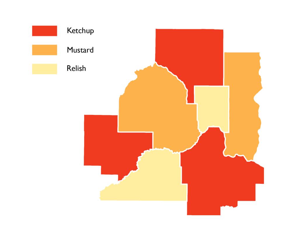
4 Cheese Production by State - Map
5 Cheese Production by State - Graph

6 Cheese Production by State - Drawing

7 Cheese Production by State - Image
8 Your Audience Who are they? Are they a child or an adult? Are they familiar with the area being depicted? What level of expertise do they have? Are they a member of the public? Are they an expert in your field? Are they someone in your agency, but maybe not as much of a subject expert as you?
9 Simplicity As a general rule, include only the bare minimum amount of information needed to successfully convey your message This applies more to members of the general public Need just enough reference info to recognize area depicted Include only pertinent info on your message s topic
10 General Public More supporting info on periphery of map explaining content and symbols Less information, fewer variables, less detail Follow conventions to increase comprehension
11 Experts Less supporting info on periphery of map explaining content and symbols More information, more variables, more detail Follow conventions of experts in your field Elevation generally goes green brown grey as you go low to high

12 Digital Elevation Model Conventional Elevation Gradient Conventional Temperature Gradient
13 How are you going to show it? The medium of your final product is also very important! Your map could end up on: a single sheet of paper a poster a cell phone screen a computer screen a projected slide like this maybe even a protest sign or yard sign
14 Medium You might not have total control of how your map ends up being used, but You at least know what you re designing it for (hopefully) You can speculate as to how your map might be used once it s out of your hands, and then design accordingly
15 How do I design accordingly?

16 CMYK vs. RGB Print Screen Credit: The Paper Mill Store
17 CMYK vs. RGB If there s any chance your map will end up being printed, design it in CMYK

18 CMYK vs. RGB You can always save a copy of your project in RGB in the Export for web function Or if you know it will only ever be on the web, feel free to design in RGB
19 Font Size Minimums Print Screen - 10 pt font - 14 pt font Absolute Minimum Example Example Example - 6 pt font (for fine print) (but keep in mind that two typefaces at the same font size can be quite different in actual size)
20 moving past parameters
21 but keeping with typography
22 Typeface vs. Font Typeface unique style of characters Font the embodiment of that style in individual characters The Roman (or "Regular"), Italic, Bold, Semibold, Regular Display/Subhead/Text/Caption, Extended, Condensed, etc., of a typeface are all fonts within the same typeface.
23 Typeface Font Times New Roman Regular Italic Bold Bold Italic
24 Typeface vs. Font Analogy Use "typeface" when you d use "song" (e.g. "I love that song/typeface "), and "font" when you d use "track" (" so I m going to buy the track/font for it"). -FontFeed.com
25 Map Lettering Conventions Prioritize the position of point feature labels: 1) above and to the right, then 2) below and to the right, then 3) above and to the left, then 4) below and to the left. Positioning directly above, below, or to the sides is not preferred. Visually center and increase the letter-spacing of labels within area features to reinforce their size/shape. Use uppercase to label area features. Categorize cultural and physical features using sans serif and serif fonts. Label water features blue and in an italic font. Distinguish ranked categories by at least two points when label sizes are small. Don t rotate labels upside-down. If necessary, use one serif and one sans serif font, but don t use more than one sans serif font on the map. Credit: Axis Maps
26 Map Lettering Conventions Prioritize the position of point feature labels: 1) above and to the right, then 2) below and to the right, then 3) above and to the left, then 4) below and to the left. Positioning directly above, below, or to the sides is not preferred. City City City City
27 Map Lettering Conventions Visually center and increase the letter-spacing of labels within area features to reinforce their size/shape. Use uppercase to label area features. D A N E C O U N T Y
28 Map Lettering Conventions General rule of thumb: Cultural features: Natural features: Sans-Serif Serif The idea is that the serifs have an added level of complexity or irregularity, like nature Sans-serif typefaces are neater, like the straight lines of buildings and the built-world
29 Map Lettering Conventions Label water features blue and in an italic font
30 Map Lettering Conventions Label water features blue and in an italic font
31 Map Lettering Conventions Label water features blue and in an italic font
32 Map Lettering Conventions Label water features blue and in an italic font

33 Map Lettering Conventions Label water features blue and in an italic font
34 Map Lettering Conventions Label water features blue and in an italic font
35 Map Lettering Conventions Distinguish ranked categories by at least two points when label sizes are small. Minneapolis Bemidji Northome
36 Map Lettering Conventions Don t rotate labels upside-down.
37 Map Lettering Conventions If necessary, use one serif and one sans serif font, but don t use more than one sans serif font on the map. Minneapolis Bemidji Northome
38 Data Types Nominal Ordinal Interval Ratio
39 Data Types Nominal Ordinal Qualitative Interval Ratio Quantitative
40 Data Types Nominal Ordinal Qualitative Interval Ratio Quantitative
 No numbers attached to them, not rankable Merely different kinds of things Credit:")
41 Data Types Nominal (also known as categorical or qualitative data) Categories that are inherently unorderable (dominant religion, soil types, or land-use categories) No numbers attached to them, not rankable Merely different kinds of things Credit: Axis Maps
 or age (young / middle aged / old) Key Intermediate Landing Strip Credit: Axis")
42 Data Types Ordinal inherently orderable categorical data Shirt sizes (S / M / L / XL), flood risk (low risk / medium risk / high risk) or age (young / middle aged / old) Key Intermediate Landing Strip Credit: Axis Maps

43 Data Types Interval Distinctions of order with measurable differences among the ordered data, but no absolute zero (e.g. temperature F, ph) Arbitrary scale


44 Data Types Ratio Distinctions of order with measurable differences between the ordered data and an absolute zero (e.g. age, distance, weight, and volume)
45 Visual Variables Credit: John Krygier and Denis Wood

46 Cartogram Credit: University of Michigan

47 Hexagonal Cartogram Credit: University Consortium for GIS


48 Non-contiguous Cartogram Credit: University Consortium for GIS

49 Visual Variables Credit: John Krygier and Denis Wood

50 Visual Variables, cont. Credit: A.M. MacEachren, R. E. Roth, et al.
51 Life imitates Art far more than Art imitates Life -Oscar Wilde
52 Regardless of which one imitates the other more Imitate the learned world whenever possible Graphical User Interfaces (GUIs) try to do the same thing Initially designed to resemble a list now ingrained in us thanks to mobile apps Resemblance and Conventions matter your map should be as intuitive as possible Symbols should invoke the feature or phenomena that they represent = airport = battle
53 Resemblance You might have some sort of design constraints that limit you to basic shapes and black ink Oak Pine Maple


54 Spectrum of Abstraction Credit: John Krygier and Denis Wood
55 Resemblance


56 Symbolization ESRI has a large enough symbol library that your needs will probably be met, but don t rule out looking elsewhere or designing your own
57 Colors in Western culture Blue: water, cool, positive numbers, serenity, purity, depth Green: vegetation, lowlands, forests, youth, spring, nature, peace Red: warm, important, negative numbers, action, anger, danger, power, warning Yellow/tan: dry, lack of vegetation, intermediate elevation, heat Orange: harvest, fall, abundance, fire, attention, action, warning Brown: landforms (mountains, hills), contours, earthy, dirty, warm Purple: dignity, royalty, sorrow, despair, richness, elegant, White: purity, clean, faith, illness, life, charity, absence, light Black: mystery, strength, heaviness, death, nighttime, presence Gray: quiet, reserved, sophisticated, controlled, light, bland, dull Credit: John Krygier and Denis Wood

58 Color-blindness
59 Color Palettes It s ideal to have colors match the mood or aesthetic that your map is trying to reflect But contrast and accessibility is also important C O L O R B R E W E R 2.0 is your friend <colorbrewer2.org>
60 Visual Arrangement Not so good
61 Visual Arrangement AUTHORITY!!! The visual center of a map is slightly above the actual center (so like just about here) Balance and symmetry is good Since our language reads top to bottom, left to right, assume that s the same way your user will move across the map. If there are pieces of your map that should be digested first, put them in the upper left corner Better!

62 Figure-Ground What stands out to you if you look to the side of your map and view it with your peripheral vision? Credit: John Krygier and Denis Wood
63 Visual Hierarchy Cartographic Problematic idea that there s only so much that you can depict on a given medium (where interactive maps become handy) Only include pertinent information Make your message the part that POPS Information that s necessary, but not the focus of the map should be noticed, not announced The most important feature of your map should be observed first, next most important feature second, and so on
64 Visual Hierarchy - examples Great Lakes Transit Minnesota Aviation Navigational Aids A Cultural Tour of Ireland Commercial Air Service in Minnesota

65
Designing Maps to Maximize Impact
 Designing Maps to Maximize Impact Kim Sowder Indiana Geological Survey Workshop Indiana GIS Conference March 7, 2006 Topics to be Covered Designing for purpose and medium Layout planning and linking to
Format and Layout 8/31/2012. Using Visuals to Inform and Persuade
 ENG112 Prof. Katherine Delhagen *No sound read every slide of the presentation carefully Using Visuals to Inform and Persuade Effective technical communication integrates textual and visual elements: o
Contents. 3 About These Guidelines. 4 Why is a Brand Important? 5 Overview. 6 Resources. 7 Logo/Signature. 8 Clear Space. 9 Color Variations
 Brand Guidelines Contents 3 About These Guidelines 4 Why is a Brand Important? 5 Overview 6 Resources 7 Logo/Signature 8 Clear Space 9 Color Variations 10 Logo Misuse Examples 11 Background Control 12
20 _. 14 _ Visual Identity. 03 _ Brand Message. 24 _ Brand Consistency 04 _. 10 _ Color Palette. 02 _ Our Mission. Our Logo. Our.
 brand guidelines 02 Our Mission 03 Brand Message 04 Our Logo 06 Construction & Clearspace 07 Using Our Logo 08 Logo Don ts 09 On Photographs 10 Color Palette 12 Primary Colors 13 Complimentary Colors 14
Cartographic symbolization
 Symbology Cartographic symbolization Cartographic symbolization is based on a systematic approach for selecting the graphic symbols to use on a map Symbolization is the process of creating graphic symbols
C L A S S 2 T Y P O G R A P H Y. FOUNDATIONS OF GRAPHIC DESIGN MW 8 a.m.
 C L A S S 2 T Y P O G R A P H Y FOUNDATIONS OF GRAPHIC DESIGN MW 8 a.m. Typography Typography separates graphic design from visual art. In every piece of type you see, somebody has considered how the letters,
QUICK GUIDE. Graphics Standards & Guidelines University of Nebraska at Kearney
 QUICK GUIDE Graphics Standards & Guidelines University of Nebraska at Kearney 08 2016 Summary The visual identity for the University of Nebraska Kearney is the face the school shows the public. It is representative
ONE K CREATIVE. tools for social impact storytelling: CREATING A CONSISTENT BRand
 ONE K CREATIVE tools for social impact storytelling: CREATING A CONSISTENT BRand key elements to define for brand consistency DEFINING THE BASIC ELEMENTS OF YOUR BRAND ALLOWS YOUR TEAM - STAFF, BOARD MEMBERS,
Training and Evaluation Center of Hutchinson, Inc. Brand Guidelines APRIL 2015
 Brand Guidelines APRIL 2015 What is a brand? The TECH brand is who we are. It s the set of ideas, emotions and associations that come to mind whenever anyone thinks about us. Our brand comes to life in
Multimedia Design Principles. Darnell Chance August 2005
 Multimedia Design Principles Darnell Chance August 2005 Home Page Things To Consider Organization Story Board Organization The 3 C s Alignment Proximity Tips/ Techs White Space Contrast Rule of Thumb Typography
Multimedia Design Principles
 Multimedia By Tansa Ayazgok February 2018 Multimedia Things To Your Audience Time Cost Skill level Equipment Click here to view a link to the Best Portable Projectors for Presentations Click the image
Designing Research Posters. College of Art and Design Chris Jackson, Associate Dean Keli DiRisio, Assistant Professor
 Designing Research Posters College of Art and Design Chris Jackson, Associate Dean Keli DiRisio, Assistant Professor Size and Orientation If you are NOT using the poster template: Start is with a 48"
Brand Guidelines HOAR PROGRAM MANAGEMENT. All rights reserved. Copyright 2014.
 Brand Guidelines 2014 0.1 Table of Contents Table of Contents 0.1 Contact Information Hoar Program Management Andi Sims Marketing Director asims@ (205) 423-2395 (office) (205) 213-7955 (cell) 1.0 Introduction
BRANDING AND STYLE GUIDE MAY 2017
 BRANDING AND STYLE GUIDE MAY 2017 INTRODUCTION This branding and style guide is intended to provide staff with tools they need to represent the CAPSLO brand consistently across all types of visual communication.
Brandbook. Wright State University Institutional Identity Standards Manual JUNE 2017 WRIGHT STATE UNIVERSITY ATHLETICS BRANDBOOK
 Brandbook Wright State University Institutional Identity Standards Manual JUNE 2017 WRIGHT STATE UNIVERSITY ATHLETICS BRANDBOOK Visual Identity Assets ATHLETICS MARKS All university athletics marks are
Brand Identity Guide
 Brand Identity Guide Logos Preferred Logo The official logo for St. Vrain Valley Schools. Use the full-color version of the logo when possible. Logos can be downloaded at http://www.svvsd.org/logos FULL
Elements of typographic design
 Type Terminology Serif fonts Sans serif fonts Elements of typographic design Times News Roman Ariel Verdana Calligrapher 24 pt 20 pt 14 pt 10 pt Univers 45 Light Univers 45 condensed light Univers 55 Univers
SYMBOLISATION. Generalisation: which / how many features we display.. Symbolisation: how to display them?
 Generalisation: which / how many features we display.. Symbolisation: how to display them? SYMBOLISATION General Goal: easy and effective communication based on design principles and common sense as much
Multimedia Design Principles
 By: Chelsea East Things to Consider Organization Form & Content Basic Design Principles Design Rules of Thumb Things to Consider Time/Cost Skills Audience Equipment Things to Consider Time/Cost How much
Creating an Accessible Microsoft Word document
 Creating an Accessible Microsoft Word document Use Built-in Formatting Styles Using built-in formatting styles could be the single most important step in making documents accessible. Built-in formatting
Brand Overview COLORS / FONTS / LOGOS rd Street, Suite 210 Denver, CO communityengineeringcorps.org
 Brand Overview COLORS / FONTS / LOGOS 1031 33rd Street, Suite 210 Denver, CO 80205 720 204-3194 Color Palette PRIMARY COLORS PRIMARY PALETTE For most situations, it is important to utilize the two main
Brand Guidelines Solano County Transit (SolTrans)
") Brand Guidelines Solano County Transit (SolTrans) May 2018 Table of Contents The SolTrans Story... 1 Brand Elements... 2 Logo Usage... 3 Color Palette... 7 Typography.... 8 Photography.... 9 The SolTrans
Brand Guidelines Solano County Transit (SolTrans) May 2018 Table of Contents The SolTrans Story... 1 Brand Elements... 2 Logo Usage... 3 Color Palette... 7 Typography.... 8 Photography.... 9 The SolTrans
BRAND GUIDELINES January 2017 leanconstruction.org
 BRAND GUIDELINES January 2017 leanconstruction.org The Lean Construction Institute (LCI) is a non-profit organization, founded in 1997. The Institute operates as a catalyst to transform the industry through
SYMBOLISATION. Generalisation: which / how many features we display.. Symbolisation: how to display them?
 Generalisation: which / how many features we display.. Symbolisation: how to display them? SYMBOLISATION General Goal: easy and effective communication based on design principles and common sense as much
BRAND & LOGO GUIDELINES SOCKET MOBILE. - Logos - Social Media - Web
 BRAND & LOGO GUIDELINES - Logos - Social Media - Web SIMPLICITY IS THE ULTIMATE FORM OF SOPHISTICATION. 2 BRAND GUIDELINES THIS IS A GUIDE TO THE BASIC ELEMENTS THAT MAKE UP OUR BRAND. IT WILL LET YOU
LOGO USE GUIDELINES BRAND GUIDELINES PUBLISHED ON FEBRUARY 17,
 LOGO USE GUIDELINES BRAND GUIDELINES PUBLISHED ON FEBRUARY 17, 2014 1 LOGO USE GUIDELINES LOGO USAGE GUIDELINES 13 LOGO USAGE GUIDELINES The Gardner-Webb logo is the centerpiece of the University's visual
BRAND GUIDE JANUARY 2013 PREPARED BY JULIE ZACK GRAPHIC DESIGNER
 BRAND GUIDE JANUARY 2013 PREPARED BY JULIE ZACK GRAPHIC DESIGNER 716.517.6298 BRIEF AERIS Latin word meaning air, atmosphere, ether, or weather. SPECIFICS Asbestos abatement Lead hazard control Mold mitigation
Brand Guidelines FEBRUARY 2018
 Brand Guidelines FEBRUARY 2018 Contents 1. Logo 1.1. Clear Space 1.2. Logo Variations 1.3. Minimum Size 2. Brand Elements 2.1. Tagline 2.2. Message and Separator 2.3. Frame 5. Imagery 5.1. Illustration
LOGO & BRAND STANDARDS GUIDE
 LOGO & BRAND STANDARDS GUIDE INTRODUCTION The SparkPost Brand Standards Guide provides key information needed to accurately and consistently produce external and internal documents and communications.
INTRODUCTION. Please respect the integrity of the brand and the careful thought and craft that has gone into it.
 BRAND STANDARDS MAY 2017 INTRODUCTION The Intelligent Office brand is more than a name. It is a complete system of color, typography and artwork that reflects the true spirit of the organization. Using
MINNESOTA STATE BRAND STYLE GUIDE
 MINNESOTA STATE BRAND STYLE GUIDE 2016 VISUAL IDENTITY By working together to strengthen our shared identity as the State of Minnesota, we have the opportunity to consistently engage with citizens and
Corporate Identity Guidelines
 Corporate Identity Guidelines CONTENTS 1.0 TRADEMARK Watco Companies Logo Logo Clear Space Logo Variations Project Logos Proper Logo Use 03 04 05 06 07 08 2.0 TYPOGRAPHY Type Family 3.0 COLOR Brand Color
Accessible Documents & Presentations. By Amy Maes, DNOM
 Accessible Documents & Presentations By Amy Maes, DNOM 1 Overview Accessibility: What am I required to do? Disability Characteristics Creating an Accessible Word Document & PowerPoint Presentation v2010
Brand Identity Guide. September 2017
 Brand Identity Guide September 2017 Welcome At Canada Drives our goal is to be the number one consumer lending company in Canada by making financing simple and accessible to every Canadian while maintaining
BRAND BOOK. for Chapters PREPARED BY NOVEMBER 2016
 BRAND BOOK for Chapters PREPARED BY NOVEMBER 2016 WWW.MISSION-MINDED.COM OUR NAME INTRODUCTION This is an exciting time for AALL. Our new brand the entirety of the Think logo, of visuals, brand as messaging
MEDIA KIT. MARCH 2019 / v. 1
 MEDIA KIT MARCH 2019 / v. 1 BRAND CONSTRUCTION three elements: the Symbol, the (HOLDINGS). To maintain its impact and immediate visual recognition, no text, graphic element, or edge should interfere with
REIF. Presentation Guidelines
 REIF Presentation Guidelines INTRODUCTION These guidelines were established to maximize consistency and legibility in all future REIF presentations. Important aspects to consider when building your presentation
Text Topics. Human reading process Using Text in Interaction Design
 Text SWEN-444 Text Topics Human reading process Using Text in Interaction Design Humans and Text the Reading Process Saccades quick, jerky eye movements forward 8-10 letters at a time plus CR/LF to the
EnvSci360 Computer and Analytical Cartography
 EnvSci360 Computer and Analytical Cartography Lecture 5 Working with Type and Labels Key Points Labels are text that locate and identify features on a map Important for readability & communication EnvSci
Introduction A global icon needs an iconic logo. Fashion has evolved since 1969, when Gap opened its first store. Our logo has changed with the
 Introduction A global icon needs an iconic logo. Fashion has evolved since 1969, when Gap opened its first store. Our logo has changed with the times, too. One thing that hasn t changed is our mission
UNC Eshelman School of Pharmacy
 UNC Eshelman School of Pharmacy Brand Guide FINAL Typography The primary typeface is Fira Sans (Hair, Extra Light, Book, Bold, Extra Bold as well as matching italic equivalents). This has been carefully
MobileIron visual communication standards
 MobileIron visual communication standards 2018 update v0.2 Default logos Horizontal logo The default representation Vertical logo Useful for tighter spaces Stand alone logomark aka Planet M Logo Use the
communication design and the web John Zimmerman HCI Institute and the School of Design, Carnegie Mellon University 17 November 2010
 communication design and the web John Zimmerman HCI Institute and the School of Design, Carnegie Mellon University 17 November 2010 goals for today explore communication design familiar with basic principles
BRAND BURNER DESIGN AND CONTROL GUIDELINES
 BRAND BURNER DESIGN AND CONTROL GUIDELINES prepared by gobrandgo! Oct. 2016 version 1.0 CONTENTS LOGO IDENTITY All Allowed Logo Versions BRAND COLORS Primary & Secondary Color Variations 03 05 BRAND TYPE
MINI BRAND GUIDELINES
 MINI BRAND GUIDELINES 9.18.17 TABLE OF CONTENTS SECTION 1 Introduction 3 SECTION 4 The Hamline Logo(s) & Seal 5 SECTION 5 Colors 16 SECTION 6 Typography 20 Questions about how to use this brand guide?
ABOUT RESEARCH POSTERS
 ABOUT RESEARCH POSTERS Research posters summarize information or research concisely and attractively to help publicize it and generate discussion. The poster is usually a mixture of a brief text mixed
Chapter 7 Typography, Style Sheets, and Color. Mrs. Johnson
 Chapter 7 Typography, Style Sheets, and Color Mrs. Johnson Typography Typography refers to the arrangement, shape, size, style, and weight of text. Affects the navigation and usability of a web site and
UNIVERSITY HOUSING COMMU- NICATION GUIDE TO DESIGN
 UNIVERSITY HOUSING COMMU- NICATION GUIDE TO DESIGN INTRODUCTION Hello and welcome to the University Housing Communication Guide to Design! In this book, you will find various guides to help you enhance
Project Justification
 Project Justification This unit of instruction is based on typography and the creative use of letterforms to visually communicate a message through images rather than just the printed word. Type manipulation
PLANNING. CAEL Networked Worlds WEEK 2
 PLANNING CAEL5045 - Networked Worlds WEEK 2 WEEK 2 CHOOSING COLOURS CHOOSING FONTS COLLECTING CONTENT PLANNING STRUCTURE WIREFRAMES + MOCKUPS Every colour, including black and white, has implications for
THE ORIGINAL HOME IMPROVEMENT SPECIALISTS SM STANDARDS OF USE GUIDELINES
 THE ORIGINAL HOME IMPROVEMENT SPECIALISTS SM STANDARDS OF USE GUIDELINES LOGO INTRODUCTION The Handyman Connection logo is a marketing communication property owned by Handyman Connection. To strengthen
Design Principles. The Four Basic Principles That Underlie Good Page Design
 Design Principles The Four Basic Principles That Underlie Good Page Design Some of the information presented in this video will appear on quizzes and exams. Please be sure to pay attention to key points
Introduction. ThinManager - A Rockwell Automation Technology
 1220 Old Alpharetta Road, Suite 390 Alpharetta, Georgia 30005 www.thinmanager.com info@thinmanager.com OFFICE 678-990-0945 Introduction... 1 Logo... 2 Clear space and minimum size... 3 Primary color palette...
BRAND IDENTITY STANDARDS GUIDE
 BRAND IDENTITY STANDARDS GUIDE JANUARY 2015 TABLE OF CONTENTS This brand identity standards guide was created to help establish the BCIU s visual brand image and bring consistency to all visual representations
STYLE AND USAGE GUIDELINES
 STYLE AND USAGE GUIDELINES Meet. Play. Celebrate. Syracuse Logo OFFICIAL LOGO FOR The Oncenter logo must always be presented as above, with the icon placed at left and with equidistant spacing between
Touro University California Brand Standards
 Touro University California Brand Standards 7.2010 version 2 1 Introduction Touro University California Brand Attributes Interdisciplinary Unique and important, this approach crosses traditional boundaries.
INTRODUCTION TO TYPOGRAPHY DESIGN
 INTRODUCTION TO TYPOGRAPHY DESIGN Goals of typographic design Typography plays an important role in how audiences perceive your document and its information. Good design is about capturing your audience
FOR VISIT TUCSON PARTNERS
 FOR VISIT TUCSON PARTNERS CONTENTS updated August 2015 1 Brand 2 The Logo 3 Logo Versions 4 Logo Colors 5 Logo Size Restrictions 6 Logo Usage Standards 7 Division Logos 8 Free Yourself Mark 9 Free Yourself
Logo. Logo. Symbol. Wordmark
 1725 Windward Concourse, Suite 300 Alpharetta, Georgia 30005 www.thinmanager.com info@thinmanager.com OFFICE 678-990-0945 FAX 678-990-0951 Introduction... 1 Logo... 2 Clear space and minimum size... 3
Corporate Identity Guidelines
 Corporate Identity Guidelines - CONTENTS 1.0 TRADEMARK Watco Companies Logo Logo Clear Space Logo Variations Project Logos Proper Logo Use 03 04 05 06 07 08 2.0 TYPOGRAPHY Type Family 3.0 COLOR Brand Color
Preview from Notesale.co.uk Page 2 of 61
 Modify a table Applying styles to tables; banding rows and columns; inserting total rows; removing styles from tables Filter and sort a table Filtering records; sorting data on multiple columns; changing
2/28/2011. Web Surveys. Introduction to Web Surveys. Basic Advantages of Web Surveys
 Web Surveys Introduction to Web Surveys Timothy Johnson Survey Research Laboratory University of Illinois at Chicago March 2011 First reported use in early 1990 s Dramatic increase in use over the past
Graphic Design Starter Pack
 Graphic Design Starter Pack Graphic Design Contact Us// E-mail: graphic.design@shawacademy.com www.shawacademy.com Hello This Starter Pack aims to give you a better understanding of what Graphic Design
CALM BRAND BIBLE / CONTENTS
 BRAND BIBLE 1 03 / LOGO & USAGE 11 / COLOUR PALETTE 23 / LOCKUPS 27 / PLACING THE LOGO ON A BACKGROUND 31 / TYPEFACE & TYPOGRAPHY 39 / WRITING CONSIDERATIONS 41 / APPLICATIONS CALM BRAND BIBLE / CONTENTS
> album art. > objective(s): Students will create a album art design for an existing artist's "next" release that utilizes imagery and text
: Students will create a album art design for an existing artist's next release that utilizes imagery and text") > album art > objective(s): Students will create a album art design for an existing artist's "next" release that utilizes imagery and text > curricular focus: This lesson emphasizes thematic design (design
> album art > objective(s): Students will create a album art design for an existing artist's "next" release that utilizes imagery and text > curricular focus: This lesson emphasizes thematic design (design
Logo Style Guide. February 20, 2008
 Logo Style Guide February 20, 2008 Table of Contents Communicating the Plexera Brand. 1 The Plexera Logo. 2 Using the Plexera Logo. 3 Color Palette. 4 Logo Don ts. 5 Typefaces. 6 Product Naming Typography.
DESIGN & BRAND GUIDELINES
 VINGA DESIGN & BRAND GUIDELINES CREATING MEMORIES The Design Guidelines These guidelines describe the visual and verbal elements that represent Vinga s corporate identitiy. This includes our name, logo
INSIDE THE BRAND. Our Mission. Our Vision. Brand Essence. Brand Personality. Trademarks & Licensing. Graphic Standards
 BRAND GUIDELINES INSIDE THE BRAND WELCOME! About Us Our Mission Our Vision Brand Essence Brand Personality Trademarks & Licensing Graphic Standards Visual Identity Logo Typography Color Palette Guide to
LoremTM. Identity Guidelines (Date)
") Identity Guidelines (Date) This example was created to help inspire your conservation advocacy / nature organization to develop identity guidelines and use them consistently across outreach campaigns.
Identity Guidelines (Date) This example was created to help inspire your conservation advocacy / nature organization to develop identity guidelines and use them consistently across outreach campaigns.
BRAND ASSETS AND GUIDELINES
 BRAND ASSETS AND GUIDELINES PAS Brand Guidelines 2 The PAS Brand The PAS visual style uses a bold, energetic aesthetic. The focus is on personality and good vibes allowing for a deeper connection with
General Reproduction and Usage Guidelines Bizrate Insights Updated 23 Oct, 2017
 General Reproduction and Usage Guidelines Bizrate Insights Updated 23 Oct, 2017 Table of Contents Introduction Logo Fonts Color Geometry Web -Responsive -Navigation -Buttons -Contact Forms -Footer 3 4
Brand vision. Logo + usage. Typography + color palette. Supporting marks. File types
 Brand Guidelines 2017 3 4 9 14 19 Brand vision Logo + usage Typography + color palette Supporting marks File types LWML Brand Vision The goal of the LWML brand was to attract a broader audience and convey
Contents. About this Book...1 Audience... 1 Prerequisites... 1 Conventions... 2
 Contents About this Book...1 Audience... 1 Prerequisites... 1 Conventions... 2 1 About SAS Sentiment Analysis Workbench...3 1.1 What Is SAS Sentiment Analysis Workbench?... 3 1.2 Benefits of Using SAS
BRAND BOOK BRANDING DOCUMENT
 BRAND BOOK BRANDING VERSION 1.0 DOCUMENT / 2018 Brand Manual OTM Capital (OTM Ventures Inc) WE LOVE OUR BRAND. BE MINDFUL WHEN APPLYING IT. ABOUT THIS GUIDE This brand book is a guide that streamlines
Pushpay Simple Brand Guide. Volume 1.0
 ushpay Simple Brand Guide Volume 1.0 rimary Logo HORIZONTAL VERTICAL INFO The ushpay logo is the face of the brand. It is the one element that is used on all communication pieces and should always be implemented
MUŻA BRAND GUIDELINES BRAND GUIDELINES
 BRAND GUIDELINES Contents INTRODUCTION 3 THE MUŻA NAME 4 THE MUSEUM 5 THE MUŻA VALUES 6 THE LOGO / Logo Construction 8 / The Logo 9 / Logo Variations 10 / What to Avoid 11 / Colour Palette 12 TYPOGRAPHY
On the Web sun.com/aboutsun/comm_invest STAROFFICE 8 DRAW
 STAROFFICE 8 DRAW Graphics They say a picture is worth a thousand words. Pictures are often used along with our words for good reason. They help communicate our thoughts. They give extra information that
Full file at
 Matching Terms 1. e 2. g 3. i 4. f 5. b 6. c 7. a 8. h 9. l 10. j 11. d 12. k Short Answer Web Design, Third Edition End of Chapter Solutions CHAPTER TWO WEB PUBLISHING FUNDAMENTALS Instructions: Write
Digital Media, UX-UI Design > Website Principles
 Contents At a glance: Page layout header To ensure the correct appearance of our brands in a broad spectrum of applications with a web front end, uniform treatment of design elements is an absolute necessity.
VOICE OF TYPE LECTURE 1
 VOICE OF TYPE LECTURE 1 TYPOGRAPHY II COUNTY COLLEGE OF MORRIS PROFESSOR GAYLE REMBOLD FURBERT VOICE OF TYPE As you look at typefaces, analyze their forms, learn their history and learn how to use them
Cartographic Principles: Map design
 MSc GIS: GIS Algorithms and Data Structures Cartographic Principles: Map design Martin Dodge (m.dodge@ucl.ac.uk) With Changes by Dan Ryan http://www.casa.ucl.ac.uk/martin/msc_gis/ some (scientific) rules
General Reproduction and Usage Guidelines Bizrate Insights Updated 13 Aug, 2018
 General Reproduction and Usage Guidelines Bizrate Insights Updated 13 Aug, 2018 Table of Contents Introduction Logo Fonts Color Geometry Web -Responsive -Navigation -Buttons -Contact Forms -Footer 3 4
Visual Identity Guidelines
 Visual Identity Guidelines 2017 Building Our Brand The Nasdaq brand is one of our most important assets. It embodies who we are and what we value. Taken together, all the elements of our visual identity
Typographic hierarchy: How to prioritize information
 New York City College of Technology, CUNY Department of Communication Design Typographic Design III Instructor: Professor Childers pchilders1@mac.com Typographic hierarchy: How to prioritize information
WELCOME TO WESTCONN ATHLETICS BRAND GUIDELINES
 AT H L E T I C S B R A N D G U I D E L I N E S WELCOME TO WESTCONN ATHLETICS This document serves as a resource for understanding and applying the WestConn Athletics brand, identity and creative expression.
A Crash Course in Typography: Principles for Combining Typefaces - noupe
 A Crash Course in Typography: Principles for Combining Typefaces Cameron Chapman When combining typefaces, there are a couple of important principles you ll need to keep in mind, namely contrast and mood.
Typography in Design The principles of design describe the ways that artists use the elements of art in a work of art.
 Typography in Design The principles of design describe the ways that artists use the elements of art in a work of art. Aims & Outcomes: Aims: to understand typeface categories and how they are used in
Unit 4. Multimedia Element: Text. Introduction to Multimedia Semester 2
 Unit 4 Multimedia Element: Text 2017-18 Semester 2 Unit Outline In this unit, we will learn Fonts Typography Serif, Sans Serif, Decorative Monospaced vs. Proportional Style Size Spacing Color Alignment
Graphic Identity Standards and Guidelines. Gilman School
 Graphic Identity Standards and Guidelines Gilman School P August 21, 2009 Why We have Guidelines The graphic identity for Gilman School is summarized in these Graphic Identity Standards and Guidelines.
JEFFERSON PARISH PUBLIC SCHOOL SYSTEM STYLE GUIDE. (Last updated December 6, 2012)
") JEFFERSON PARISH PUBLIC SCHOOL SYSTEM STYLE GUIDE (Last updated December 6, 2012) Introduction As employees of a school district, all staff members of the Jefferson Parish Public School System (JPPSS)
JEFFERSON PARISH PUBLIC SCHOOL SYSTEM STYLE GUIDE (Last updated December 6, 2012) Introduction As employees of a school district, all staff members of the Jefferson Parish Public School System (JPPSS)
proj 3B intro to multi-page layout & interactive pdf
 art 2413 typography fall 17 proj 3B intro to multi-page layout & interactive pdf objectives Students introduced to pre-made layered mockups that utilized smart art by placing vector artwork into the Photoshop
Five Ingredient DESIGN RECIPES. Inspiration for your marketing materials BIG BRAND SYSTEM. BigBrandSystem.com
 Five Ingredient DESIGN RECIPES Inspiration for your marketing materials BIG BRAND SYSTEM Five Ingredient Design Recipes Inspiration for your marketing materials This guide is a resource that draws from
Graphical Screen Design
 1 Graphical Screen Design Grids are an essential tool for graphical design Important graphical design concepts include visual consistency visual relationships visual organization legibility and readability
LWML Brand vision. Logo + Usage. Supporting Marks. File Types
 Br and Guidelines 2017 3 LWML Brand vision 4 9 14 19 Logo + Usage Typography + Color Palette Supporting Marks File Types LWML Brand Vision The goal of the LWML brand is to attract a broader audience and
GENERAL STYLE GUIDE A guideline for applying the JustServe brand to promotional materials
 GENERAL STYLE GUIDE A guideline for applying the JustServe brand to promotional materials JustServe Logo Logo Versions The JustServe logo can be used in two different color versions. For most materials,
laurengregory laurengregorydesign.com
 THSPA November 25, 2013 Topic: Basic Design Tips and Photoshop Helps 1. Layout Page layout is one of the most important graphic design disciplines. laurengregory lauren@briererows.com laurengregorydesign.com
Corporate Identity Guide
 Corporate Identity Guide Prepared by Primary logo elements The primary logo is designed to be bright, colourful, clean and contemporary. It is horizontal or landscape in format. It consists of four interlocking
Understanding Geospatial Data Models
 Understanding Geospatial Data Models 1 A geospatial data model is a formal means of representing spatially referenced information. It is a simplified view of physical entities and a conceptualization of
Graphic Standards Manual
 Graphic Standards Manual Visual Identity Guidelines for U.S. Foodservice Message from the Corporate Marketing Department To all persons producing visual materials for U.S. Foodservice : The purpose of
BRAND STANDARDS PAGE 1
 2018 BRAND STANDARDS PAGE 1 LOGO PRIMARY PRIMARY / FULL-COLOR Use the primary, full-color logo whenever possible when production allows. This version of the logo should always be on white or 10% gray.