Overview... 4 JavaScript Charting and Metric Insights... 5
|
|
|
- Arthur Hood
- 5 years ago
- Views:
Transcription
1 JAVASCRIPT CHARTING
2 Table of Contents Overview... 4 and Metric Insights... 5 Chart Types...11 Overview of JavaScript chart types...12 d Highcharts...16 Highstock...18 Google...19 nvd Dynamic Pivot Table...23 dc (dimensional charting)...24 Extending...25 Overview of Customizing and Extending...26 Customize a JavaScript Chart Type...27 Add new Library...33 Add new JavaScript Chart Type...42 Custom Charting Variables...60 Substitution Variables...63 Troubleshooting...66 External Hosting...69 Overview of Hosting JavaScript charts externally...70 How to Host your own JavaScript charts...74 Examples...83 Overview of creating JavaScript charts...84 Create d3 Line Chart - Time Series...85 Create d3 Brush Chart - Time Series...92 Create d3 Collapsible Tree Chart...98 Create d3 Line Chart from Pivot Table Create d3 Brush Chart from Pivot Table Create Dynamic Pivot Table Chart (Version 4)...121
3 Create Google Geo Chart Create Google Line Chart - Time Series Create Google Geo Chart from Pivot Table Create Google Line Chart from Pivot Table Create Google Line Multi Series Chart from Pivot Table Create Highcharts Line Chart - Time Series Create Highcharts Range Chart Create Highcharts Line Chart from Pivot Table Create Highcharts Multi Series Line Chart from Pivot Table...168
4 Overview Page 4
5 and Metric Insights This article gives general overview of JavaScript charting. Metric Insights enables you to chart your data using any available JavaScript charting libraries by one of the following methods: Using the JavaScript charting feature within Metric Insights itself Hosting your favorite JavaScript charts on your servers and access the data remotely from your Metric Insights instance All JavaScript Libraries are supported. Metric Insights comes preloaded with JavaScript libraries for d3, Highcharts, Google, nvd3 and others. If the one you want is not included, then you can add any JavaScript library to Metric Insights. Each of the approaches that you can use are described below. Video Tutorial 1. Use JavaScript Charts already included in Metric Insights Metric Insights includes d3, Highcharts, google, nvd3 and several other JavaScript libraries. For each of these, Metric Insights includes chart types to use such as Line, Time series, Geographic, Pie, Bar, and others. Below is a picture of several in action. Page 5

6 2. Use JavaScript Charts already included in Metric Insights Page 6

7 3. Extend existing JavaScript Charts The JavaScript charts included in Metric Insights are there for you to use. If you find that you'd like to extend them, add different colors or change how they behave, then you can make changes to the JavaScript chart yourself. We offer the Javascript Chart Template Editor where you can modify the JavaScript code or add your own CSS for styling. We also allow parametrization of the chart, so you can add or use variables for substituting in parameters. 4. Create your own JavaScript Chart types in Metric Insights We provide a basic set of JavaScript charting libraries with several existing chart types. To expand your options easily by inserting your JavaScript code and including some some CSS styling. You are then ready to use the modified approach. Page 7

8 5. Create your own JavaScript Chart types in Metric Insights from whole new libraries If your favorite charting library is not included, you can add it to Metric Insights. All JavaScript libraries are supported. For example, add Rickshaw charting that is based on d3. Just add the JavaScript library files including.js and.css files and create the chart types you want. You are then ready to start charting with your favorite JavaScript charts. Page 8
9 6. Use your JavaScript Charts outside of Metrics Insights You can run your JavaScript charts outside of Metric Insights on your own servers and also leverage all the benefits of having your data in Metric Insights. We have an example web site that hosts JavaScript charting on its own, but then grabs the data to chart from your Metric Insights instance. We use a secure method for accessing the data. Page 9
10 Page 10
11 Chart Types Page 11
12 Overview of JavaScript chart types This section shows the JavaScript chart types that already exist in Metric Insights. This includes d3, Google, Highcharts, nvd3 and other JavaScript charts. Page 12
13 d3 Metric Insights includes the d3 charting library and provides several d3 chart types. These types are shown here. You can modify these charts to behave the way you want, and you can extend this library by adding other types of d3 charts. You can view more examples of d3 JavaScript charts at wiki/gallery d3 Line d3 Line example d3 Brush d3 Brush example Page 13

14 d3 Collapsible Tree d3 Collapsible Tree example Page 14

15 d3 Pie d3 Pie example Page 15
16 Highcharts Metric Insights includes the Highcharts charting library and provides several Highcharts chart types. These types are shown here. You can modify these charts to behave the way you want, and you can extend this library by adding other types of Highchart charts. You can view more examples of Highcharts at Highcharts Line Highcharts Line example Highcharts Range Highcharts Range example Page 16
17 Page 17

18 Highstock Metric Insights includes the Highstock charting library and provides the ability to create any Highstock chart type. Below is one example. You can modify this chart to behave the way you want, and you can extend this library by adding other types of Highstock charts. You can view more examples of Highstock Charts at demo/ Highstock compare multiple series Highstock compare multiple series example Page 18

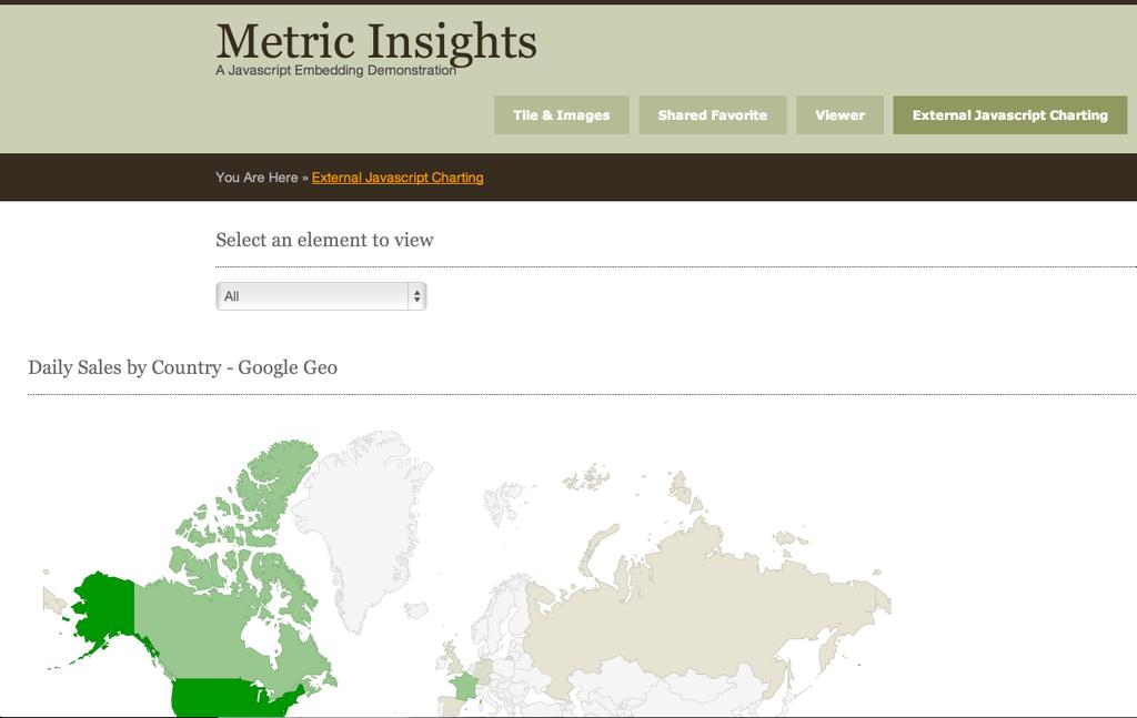
19 Google Metric Insights includes the Google charting library and provides several Google chart types that are shown below. You can modify these charts to behave the way you want, and you can extend this library by adding other types of Google charts. You can view more examples of Google JavaScript charts at chart/interactive/docs/gallery Google GeoChart Google GeoChart example Google Line Google Line example Page 19
20 Page 20

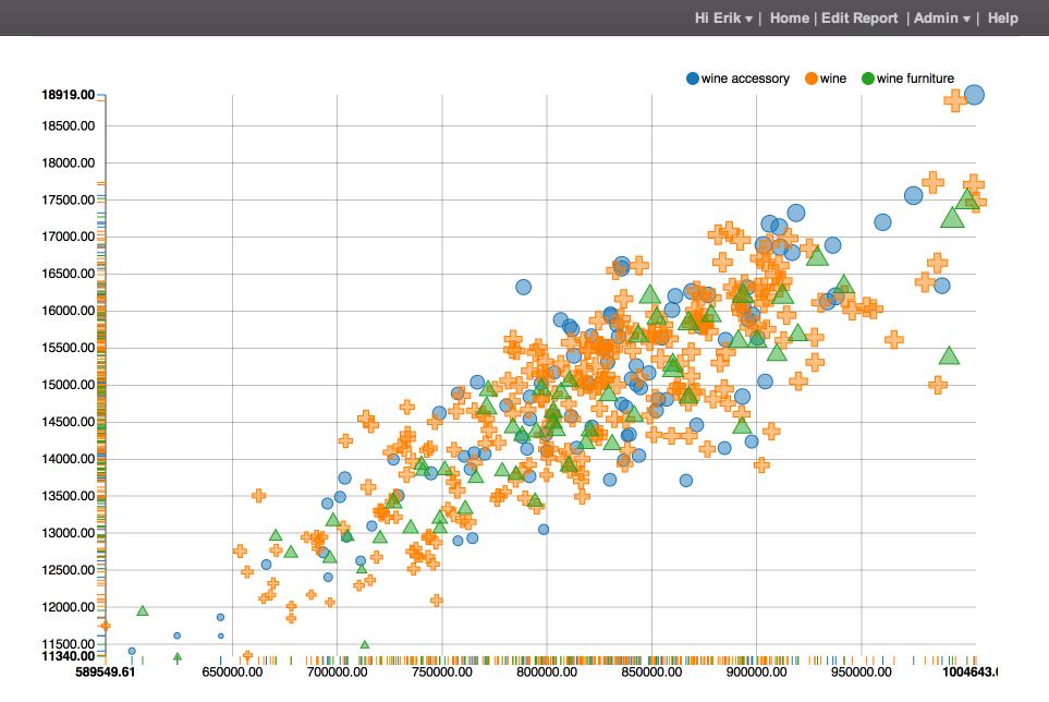
21 nvd3 Metric Insights includes the nvd3 charting library and provides the ability to create any nvd3 chart type. Below are some examples. You can modify these charts to behave the way you want, and you can extend this library by adding other types of nvd3 charts. You can view more examples of nvd3 JavaScript charts at examples.html nvd3 Pie nvd3 Pie example nvd3 Scatter/Bubble nvd3 Scatter/Bubble example Page 21
22 Page 22

23 Dynamic Pivot Table Metric Insights includes the dynamic pivot table chart. Below is an example. You can view documentation and an example of dynamic pivot table chart at Dynamic Pivot Table Dynamic Pivot Table example Page 23

24 dc (dimensional charting) Metric Insights includes the dc library with an example. Although this is not a chart type that is configured to immediately plug and play into your reports, it is included to show you the complexity that can be achieved in JavaScript charting. With some modifications to this chart type you should be able to apply it to any of your data results. You can view documentation and an example of dc (dimensional charting) at dc Page 24
25 Extending Page 25
26 Overview of Customizing and Extending This section outlines several ways you can customize and extend JavaScript charting. This includes modifying existing JavaScript chart types, creating new JavaScript chart types, and creating whole new charting libraries to work from. Page 26
27 Customize a JavaScript Chart Type You have several JavaScript Chart Templates to use for JavaScript charting. However, if you find one that you would like to customize for your needs you can adjust the JavaScript chart. This article walks you through the process with an example. Video Tutorial Administration Menu At the Administration Menu click on JavaScript Chart Templates under the section Page 27
28 JavaScript Chart Templates On the JavaScript Chart Templates screen find the Javascript template that you want to customize and click on it. In this example we click on the Highcharts Line chart Page 28

29 JavaScript Chart Template Editor In the JavaScript Chart Template Editor make your customized changes in the JavaScript Code section Page 29

30 JavaScript Code Find the section of the JavaScript code to customize. In this example we will make changes to the JavaScript code so that series data will show multiple series instead of just one. Page 30

31 JavaScript Code - customized In this example we changed the JavaScript code so that the series data now expects an exact multiple number of series Page 31
32 JavaScript Code - save changes Click Save button to save your changes. Now you can create JavaScript charts from this template, using your customizations. Page 32
33 Add new Library Once you get going with JavaScript charting, you will probably want to start creating some of your own. In some cases you will want to use charting libraries that are not yet loaded in Metric Insights. This article shows how to load new JavaScript charting libraries. You do that by creating a new Engine and then upload the js and css files for the charting library. That process is documented in this article. Of course, once you add a new JavaScript charting library, you will want to create different chart types to use it. E.g., Line, Bar, Pie, and any more complex ones you want. All you do is supply the JavaScript code. But that step is documented in the next article. In this example, we create a nvd3 charting library for use. 1. Administration Menu At the Administration Menu click on JavaScript Chart Library Files under the section Page 33

34 2. Javascript Chart Library Files Click Add New File to upload js and css files for use in JavaScript charting 3. Add JavaScript charting library files Choose file to add. In this example nv.d3.css. Select the Type of file. In this example css. Click Save Page 34


35 4. Javascript Chart Library Files Click Add New File to add more 5. Add JavaScript charting library files Page 35


36 Choose file to add. In this example nv.d3.js. Select the Type of file. In this example javascript. Click Save 6. Javascript Chart Library Files 7. Javascript Chart Library Files All files have been uploaded Page 36

37 8. Administration Menu At the Administration Menu click on Engines under the section 9. Javascript Chart Engines Page 37

38 Click Add New Chart Engine. In this example we will add the nvd3 JavaScript charting code 10. Add the JavaScript Chart Engine Enter the name and internal name for this JavaScript charting engine. In this example nvd3. Click Save. Page 38

39 11. Javascript Chart Engines Engine added. Now select the entry you just added. 12. JavaScript Chart Engine Editor Page 39
40 Enter the HTML code for this charting engine. You can use other charting engines as a guide. 13. HTML Code <html> <head> <meta http-equiv="content-type" content="text/html; charset=utf-8"> <link rel="stylesheet" href="${host_name}css/libs/custom/nv.d3.css"></link> <style>${css_code}</style> <script type="text/javascript" src="${host_name}js/jquery/jquery min. js?ver=${project_version}"></script> <script type="text/javascript" src="${host_name}js/libs/custom/d3.v2.js"></script> <script type="text/javascript" src="${host_name}js/libs/custom/nv.d3.js"></script> <script type="text/javascript" src="${host_name}js/api/mi. js?ver=${project_version}"></script> </head> <body> <div id="chart_div"><svg></svg></div> <script type="text/javascript"> ${CHART_INIT} </script> <script type="text/javascript"> ${JAVASCRIPT_CODE} </script> </body> </html> Page 40

41 14. JavaScript Chart Engine Editor - add HTML Enter the HTML code for this charting engine. In this example you see how the js and css charting files are referenced. A few of the js and css files were uploaded in a previous step. You can use other charting engines as a guide. Click Save to save your changes. Now you are ready to create different chart types to use this charting library. That is documented in the next article. Page 41
42 Add new JavaScript Chart Type Once you get going with JavaScript charting, you will probably want to start creating some of your own. In some cases you will want to create a new chart type by adding a JavaScript chart template. E.g., Line, Bar, Pie, and any more complex ones you want. All you really have to do is provide the JavaScript code. In this example, we create a nvd3 Pie chart. 1. Administration Menu At the Administration Menu click on JavaScript Chart Templates under the section Page 42
43 2. Javascript Chart Templates On the JavaScript Chart Templates screen click Add New Chart Template Page 43

44 3. Javascript Chart Templates Enter a name for the new template and choose an existing Charting Engine. In this example we are building a nvd3 Pie template using the newly added nvd3 charting Page 44
; var data3 = []; data3.push({\"values\":data}); nv.addgraph(function () { var chart = nv.models.piechart().x(function (d) { return d[chartproperties.column1]; }).")
45 4. JavaScript Template Editor Enter JavaScript code 5. JavaScript Code // chartproperties = insightchart.getcustomvars(); var data = insightchart.getdatasetford3(); var data3 = []; data3.push({"values":data}); nv.addgraph(function () { var chart = nv.models.piechart().x(function (d) { return d[chartproperties.column1]; }).y(function (d) { return d[chartproperties.column2]; }).donut(false).showlegend(true).showlabels(true); d3.select("#chart_div svg").datum(data3).transition().duration(100).call(chart); }); return chart; Page 45

46 6. JavaScript Template Editor Enter JavaScript code Page 46

47 7. Add Custom Charting Variable If your JavaScript uses custom variables then add them. Click Add New Custom Charting Variable and enter then name of the variable used in the JavaScript code. In this example, "column1" is the name of a custom variable in the JavaScript code. And supply a Default Value for the column name that reports typically return for this value. This can be easily overridden by the chart at charting time, which you will see later in this example. Page 47

48 8. Add Custom Charting Variable In this example, "column2" is the name of a custom variable in the JavaScript code. And supply a Default Value for the column name that reports typically return for this value. This can be easily overridden by the chart at charting time, which you will see later in this example. Page 48

49 9. CSS Code Enter styling code for the JavaScript chart in the CSS Code section Page 49
50 10. Enable the JavaScript Chart Template and Save Click check box to enable the JavaScript Chart Template, and click the Save button 11. Use the Chart Type in a report This section shows how to apply the chart type to a report. This is just provided here for completeness. If you already know how to apply a JavaScript chart to a report then you can skip this section. Page 50

51 11.1. Choose a Report that contains category data Choose a report that contains category data. Category data could be time values that are discrete values. In this example the country column contains the category data. Also limit the data collected to two columns. If you have a report with more than two columns, you can add a pivot (Add Pivot button) to limit the data to two columns. Page 51

52 11.2. Add the Chart Click on Add Chart button Page 52

53 11.3. Choose the Chart Type you created Choose the chart type you just created in the JavaScript Chart Template screen. In this example, Select nvd3 Pie for Chart Type Page 53

54 11.4. Give chart a name Enter name for the chart Page 54

55 11.5. Adjust Custom Charting Variables Click to edit each of the Custom Charting Variables to match the names of your columns Page 55
56 11.6. Adjust Custom Charting Variables In this example change the Custom Charting Variable for column1 to match the column name country Page 56

57 11.7. Adjust Custom Charting Variables In this example change the Custom Charting Variable for column2 to match the column name total units Page 57
58 11.8. Adjust Custom Charting Variables The Custom Charting Variables for column1 and column2 match the column names "country" and "total units" Page 58

59 11.9. Save and Preview the Chart Click Save and Preview to see the chart Page 59
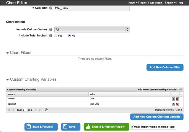
60 Custom Charting Variables Custom Charting Variables enable you to dynamically connect the result set from your reports to the variable names in the JavaScript code for charting. This article describes how this is done. 1. The Problem For some JavaScript charting libraries, your JavaScript code references specific field names for charting. I.e., the property field of a JavaScript object that contains your dataset for charting. This occurs in d3 charting and other libraries based on d3, such as nvd3, rickshaw. However, the result set from your reports are returned in a specific column order with specific column names. To ensure that the correct result set columns are applied to the correct field names in your JavaScript chart, use Custom Charting Variables JavaScript code references specific field names In the example for d3 Line chart below, the JavaScript code references the field name of "column1" and "column2". var line = d3.svg.line().x(function(d) { return x(d.column1); }).y(function(d) { return y(d.column2); }); 1.2. Reports return a result set with specific field names In the example below, the report returns a data result set with field names "Date" and "total_units" Page 60

61 2. Solution Apply Custom Charting Variables to your chart 2.1. JavaScript charting code uses Custom Charting Variables The example snippet shows how the JavaScript code uses the Custom Charting Variables to connect the fields in the result set of the report to the fields in the JavaScript code for charting var chartproperties = insightchart.getcustomvars(); // column 1 will be treated as a date // column 2 will be treated as a value data.foreach(function(d) { d.column1 = parsedate(d[chartproperties.column1]); d.column2 = +d[chartproperties.column2]; }); 2.2. Custom Charting Variables applied to report Then for each report, the designer configures Custom Charting Variables to connect the report result set fields to the JavaScript charting fields. In this example, the "Date" field is configured for the "column1" field in the JavaScript chart, and the "total_units" field is used in the "column2" field in the chart. Page 61
62 Page 62
63 Substitution Variables In some cases you will have a JavaScript charting library with more than one configuration of include files, such as.js and.css. Instead of having to create a Engine for each situation, you can use Substitution Variables 1. Engine The following Engine has additional.js and.css files to include, depending on which JavaScript Chart type is applied. These additional scripts will be placed in a Substitution Variable named "${ADDITIONAL_SCRIPTS}". 2. Configure Substitution Variable In the HTML for this Engine, provide a Substitution Variable named "${ADDITIONAL_SCRIPTS}" to create a placeholder for pulling in additional scripts to the HTML template. <head> <link rel="stylesheet" type="text/css" href="${host_name}css/libs/dynamicpivot/pivot. css?ver=${project_version}"> Page 63

64 <style>${css_code}</style> <script type="text/javascript" src="${host_name}js/jquery/jquery min. js?ver=${project_version}"></script> <script type="text/javascript" src="${host_name}js/jquery/jquery-ui custom.min. js?ver=${project_version}"></script> <script type="text/javascript" src="${host_name}js/libs/dynamicpivot/pivot. js?ver=${project_version}"></script> <script type="text/javascript" src="${host_name}js/api/mi. js?ver=${project_version}"></script> ${ADDITIONAL_SCRIPTS} </head> 3. Apply Substitution Variable Then for each Template, apply the Substitution Variable. Click the Add New Substitution button to add, or edit gear to edit the Substitution Variable. Page 64

65 4. Apply Substitution Variable Page 65

66 Troubleshooting As you start using JavaScript charts and creating your own, you will find that you will need a few tools or techniques for troubleshooting issues. This article offers a few tips. 1. View JavaScript Source code in web browser One handy tip is to view the web browser source that contains your JavaScript code. This way you know if your version is actually running, what variable names are used in the result set returned from the Metric Insights report, what data is being returned, View Source from web browser When viewing your report where JavaScript chart displays, click View Source. In many cases you will want to choose View Frame Source or something similar depending on the web browser you are using. Page 66
67 1.2. View Source from web browser Then you should see the JavaScript source code that is actually running in your web browser. In the example snippet below you can confirm the names of the result set returned from the report (e.g., "Total Units") and the data returned for that field (e.g.,..., 20485, 21612, 23113). You can also confirm the Custom Charting Variables, if any are being used. In this example, "rowfield": "Sales Channel", "colfield": "Product Subcategory", JavaScript debugger You can also run your JavaScript code through a debugger. One way to do that is to use your favorite web browser, set a few break points in your code, and run it when you point your web browser at the report that has the chart you are interested in Debug via standalone HTML Sometimes it is difficult to debug a web page that is dynamically created on the server and running in your web browser. One way to simplify this is to make a copy of the web page returned from the server, save it in a standalone HTML file, and then run that file in your web browser and debug it. 1. To do this, just do View Source as shown in above example. 2. Then save the HTML source (with everything in it including the JavaScript code) to a file on your local computer. Page 67
68 3. Then point your web browser at the file, set breakpoints, and run it. 4. You can then inspect the logic flow, and the data in any of your JavaScript objects. Page 68
69 External Hosting Page 69

70 Overview of Hosting JavaScript charts externally Here is an overview on hosting your own JavaScript charts on your own website. You can run your JavaScript charts outside of Metric Insights on your own servers, but then leverage all the benefits of having your data in Metric Insights. Example of external hosting Metric Insights has an example web site that hosts JavaScript charting on its own, but then grabs the data to chart from your Metric Insights instance. embedded_samples/adam-javascript_chart_demo.php How it's done Metric Insights has an API that allows remote access to data. The method is securely controlled by token management. You control access to which external sites can access your data. Then from the external site you pass a username and shared secret information, and the Metric Insights application returns a short lived token. Your website then uses that token to access data from your Metric Insights instance. Page 70

71 Secure access control From your Metric Insights application you can choose which websites are allowed to have access. You also manage username and shared secret information from here. Page 71
72 Example of your External Chart Here's an example of your source code hosted on your external website. It makes a call to Metric Insights to get the data using the short lived token that was returned from the previous access call using username and shared secret Your externally hosted chart Here is the final result of your JavaScript chart hosted on an external website, but accessing your Metric Insights data remotely. Page 72
73 Page 73
74 How to Host your own JavaScript charts This article describes how to host your JavaScript charts on your own website and pull data from Metric Insights. 1. Architecture Overview Below is a diagram that shows the sequence of events used in accessing data in Metric Insights from your website. First, you make a "gettoken" API call (Step 1, 2) to Metric Insights from your website. In this call you supply a username and shared secret information such as "application_id" and "application_key". This call returns a short lived token (3, 4). Your website then uses that token to access data from Metric Insights in a "report_data" API call (5, 6). You typically do that directly from your JavaScript chart. 2. Configure Metric Insights for access To enable access to your website you must first configure Metric Insights with the certain security measures such as shared secret information and a whitelist of external hosts that are cleared for access. Page 74

75 2.1. External Applications From the Admin Menu, choose External Applications 2.2. Add External Application Choose Add New External Application button. Page 75

76 2.3. Add External Application Give your external application a name Add Cross Domain Access To give your external website access to Metric Insights, you need to select Cross Domain Access. Click "Yes" for Cross Domain Access radio button. Once you do that, the screen will show you a Cross Domain Origin section with a button to Add New Cross Domain Origin. Click this button to add Cross Domain Origin. Page 76


77 2.5. Add Cross Domain Origin Add the name of your website. This is the fully qualified domain name (FQDN) including the protocol. I.e., include the http(s):// for your website domain. Click Save when done. Page 77

78 2.6. Save External Application access configuration Back on the External Application Editor, enable the external application by clicking on the Enabled radio button at the top of the screen. Then click the Save button at the bottom of the screen to save Get Credentials On the External Application Editor click on the Show Credentials button to get the shared secret information that will be used by your website to securely get data from Metric Insights. Once you click on that button, the button label toggles to say Hide Credentials. The shared secret information that displays includes the Application Id and the Application Key. When done, click the same button which is now labeled Hide Credentials. Page 78

79 3. External website Now you are ready to access Metric Insights data from your website. You just need to add the code to your website to fetch the data from Metric Insights. In general, fetching the data is a two step process. 1. First you make a "get token" API call to get a token that gives you secure access to the data. 2. Then you make a "get data" API call using this token to get the data. Once complete, you can then chart your data, or do anything else you want with the data Get Token API call Get the secure token from Metric Insights. To get the secure token, you make a "get token" API call to Metric Insights. You supply the "application_id" and "application_key" generated in the above steps when configuring external access for Metric Insights. You also supply an existing User via "user". The token value is then returned. You typically make this call from your server and not your client (web browser). Your server will then embed the returned value of the token in the HTML/JavaScript it sends to the web browser. Below is an example of the API call using curl at unix command line. Page 79
80 Request: curl --data "application_id=abc&application_key=xyz&user=admin" metricinsights.com/api/get_token Response: <?xml version="1.0" encoding="utf-8"?> <response><token>cjisz2zykxqfsxvxsgdk6a0jse5e5hvydxs4rdzfybucjvjf1c</token><expires> :37:15</expires></response> Below is an example of the API call using curl at unix command line. Request: curl --header "Accept:application/json" --data "application_id=abc&application_key=xyz& user=admin" Response: {"token":"uclcuukxulkdbhe1chlz3kyjbizyvh9eb34a5q21y3fpqkgsjs","expires":" :46:08"} 3.2. Get Report Data API call Get the report data from Metric Insights. In your JavaScript code make a "get report data" API call to Metric Insights, using the token you obtained in the previous step. Typically, your server will embed the value of the token in the HTML/JavaScript it sends to the web browser. This is the token value the server obtained in the previous step. The API call is done within the instantiation of the MI.Chart JavaScript object. An example is listed here. var insightcharts = new MI.Chart({ "url":" "token":"uclcuukxulkdbhe1chlz3kyjbizyvh9eb34a5q21y3fpqkgsjs" }); Other variations of invoking the API call to fetch report data from Metric Insights are listed here. This includes specifying the pivot table, the Dimension value and/or the specific chart. /api/report_data?report=6&pivot=10 /api/report_data?report=7&chart=12 Page 80
81 /api/report_data?report=8&dimension_value=3&chart= Chart your data Once your code gets the data from Metric Insights, then within the render function of the Metric Insights JavaScript object you can chart your data. insightchart.render = function() { // chart your data }; Your JavaScript code can access the Metric Insights data via several JavaScript function calls, as listed here. var chartproperties = insightchart.getcustomvars(); var xlabels = insightchart.getxlabels(); var ylabels = insightchart.getylabels(); var xtitle = insightchart.getxtitle(); var ytitle = insightchart.getytitle(); var data = insightchart..getdataset(); var datad3 = insightchart.getdatasetford3(); var datagoogle = insightchart.getdatasetforgoogle() var reportname = insightchart.getreportname(); var chartname = insightchart.getchartname(); An alternate approach to rendering your JavaScript chart within the render callback method of the MI.Chart function, is to do repeated retries on isdataready call. This is shown here. insightchart.render = function() {}; if (!insightchart.isdataready) { settimeout(function() { mychartingfunction(); // Contains your charting code }, 500); return false; } 3.4. Example of External hosting of JavaScript chart Here is an example of your source code hosted on your external website. It makes a call to Metric Insights to get the data using the short lived token, and then charts the data. Page 81
82 3.5. Another Example of External hosting of JavaScript chart Here is another example of your source code hosted on your external website. It makes a call to Metric Insights to get the data using the short lived token, and then charts the data. It uses the alternate approach of the JavaScript isdataready call to chart. Page 82
83 Examples Page 83
84 Overview of creating JavaScript charts Metric Insights comes loaded with several JavaScript chart types. This includes d3, Google, Highcharts, Highstock, nvd3, a Dynamic Pivot Table and others. This section provides examples of creating JavaScript charts using the JavaScript chart types that already exist in Metric Insights. When you are ready to use these JavaScript chart types, just come back to this section, find the one you are using, and walk through the steps. Page 84

85 Create d3 Line Chart - Time Series This article provides a step by step example of how to create a d3 Line chart. d3 documentation on Line Chart API can be viewed at 1. Choose a Report that contains a Time Series Choose a report that contains a time series. In this example the calendar_date column contains the time series data. In addition, limit the data collected to two columns. If you have a report with more than two columns, you can add a pivot (Add Pivot button) to limit the data to two columns OR remove the column from the SQL statement if not needed in the report. Page 85

86 2. Adjust Display Name for chart columns Display Names may be changed by clicking on the name in the Display Name column Ensure that the Display Name for the columns that you will be charting do not contain spaces Save Page 86
87 3. Add the Chart 1. Navigate to the Charts and Pivots tab 2. Click the Add Chart button 3.1. Set Chart type 1. Select d3 Line Save Page 87

88 4. Full Chart Editor Displays 1. Set Chart NameSelect Region data column as X-axis values 2. Set X-axis title 3. Set Y-axis title Save & preview Page 88

89 5. Adjust Custom Charting Variables 1. Click the gear to edit each of the Custom Charting Variable Values to match the names of your columns 2. Set the Value to the Display Name used in Step 2 above Save More information about Custom Charting Variables can be found here Page 89

90 6. Preview Chart If the chart meets expectations: 1. Close preview 2. Update live report Page 90
91 7. Chart displays in Report Viewer Page 91
92 Create d3 Brush Chart - Time Series This article provides a step by step example of creating a d3 Brush chart. d3 documentation on Brush (Area) Chart API: 1. Choose a Report that contains a Time Series Choose a report that contains a time series. In this example the calendar_date column contains the time series data. In addition, limit the data collected to two columns. If you have a report with more than two columns, you can add a pivot (Add Pivot button) to limit the data to two columns OR remove the column from the SQL statement if not needed in the report. Page 92

93 2. Adjust Display Name for chart columns Display Names may be changed by clicking on the name in the Display Name column Ensure that the Display Name for the columns that you will be charting do not contain spaces Save Page 93
94 3. Add the Chart 1. Navigate to the Charts and Pivots tab 2. Click the Add Chart button 4. Set Chart type 1. Select d3 Brush for Chart Type Save Page 94
95 5. Name the Chart 6. Adjust Custom Charting Variables Page 95

96 1. Click the gear to edit each of the Custom Charting Variable Values to match the names of your columns 2. Set the Value to the Display Name used in Step 2 above Save More information about Custom Charting Variables can be found here 7. Save and Publish Page 96

97 8. Chart displays in Report Viewer Page 97

98 Create d3 Collapsible Tree Chart This article provides a step by step example of creating a d3 Collapsible Tree chart. This type of JavaScript Chart is best suited for use with a report that contains data associated with a tree hierarchy. See example tree.html 1. Select Report In this example the Product Category (e.g., wine, wine furniture, wine accessory) is the parent of the Product Subcategory (e.g., champagne, wine rack, bottle opener). Also, the Product Subcategory (e.g., wine rack) is the parent of the specific product (e.g., Bottle Wrought Iron Wine Jail). The first two columns describe this hierarchy using "parent" vs "child" terminology. In addition, note that the top level parent (root) of this hierarchy is signified by an empty value ("") in both the parent and child columns. The name of the Product Category, Subcategory and Product will be displayed in the chart ("displayname") along with the total units sold ("displayvalue") pertaining to that category, subcategory or product. Page 98

99 2. Adjust Display Name for chart columns Display Names may be changed by clicking on the name in the Display Name column Ensure that the Display Name for the columns that you will be charting do not contain spaces Save Page 99
100 3. Add the Chart 1. Navigate to the Charts and Pivots tab 2. Click the Add Chart button 4. Set Chart type 1. Select d3 Collapsible Tree for Chart Type Save Page 100

101 5. Full Chart Editor Displays Accept defaults or optionally change values for: 1. Chart Name 2. X-axis title 3. Y-axis title Save Page 101
102 6. Adjust Custom Charting Variables 1. Click the gear to edit each of the Custom Charting Variable Values to match the names of your columns 2. Set the Value to the Display Name used in Step 2 above Save NOTE: In this example, the query is written to return column names that match the Custom Charting Variable names exactly, therefore, the variables do not require any modification. (Refer to the first screen shot). In addition, the value returned for the top most "root" is the empty string ("") so the value for "rootvalue" above is correct. More information about Custom Charting Variables can be found here Page 102
103 7. Preview Chart 7.1. Review Chart Page 103
104 Upon successful review, 1. Close Preview 2. Update Live Report to complete the chart 8. Chart Displays in Report Viewer Page 104

105 Create d3 Line Chart from Pivot Table In many cases your reports return multiple columns of data. If you want to create simple two axis reporting on this data with a JavaScript chart, you can create a Pivot Table on the report and then associate a chart with that Pivot Table. This article provides a step by step example of creating a d3 Line chart using the results from a pivot table. d3 documentation on Line Chart API can be found at 1. Select or Create Report In this example, we use an existing report that returns multiple columns of data Page 105

106 2. Add Pivot 1. Navigate to Charts and Pivots tab 2. Click Add Pivot button 3. Define Pivot Parametersameters In this example, we pivot on the calendar_date for a time series and will display just the totals of the sale dollars. Page 106
107 4. Full Pivot Editor Displays Adjust any values on the Pivot Editor as needed NOTE: In this example, the defaults are left as is. The two columns for this Pivot are "calendar date" and "total amount" Page 107

108 5. Associate a Chart with the Pivot Table 1. Navigate to the Pivot Charts tab 2. Click New Chart button Page 108
109 5.1. Select Chart type 1. Select d3 Line (d3) Save Page 109
110 6. Full Chart Editor Displays 1. Input a meaningful name for your chart 2. Optionally edit X-axis title 3. Optionally edit Y-axis title Save Page 110

111 7. Adjust Custom Charting Variables 1. Navigate to the Custom Charting Variables tab 2. Click the Edit icon for each of the variables 3. Adjust the Value to match the names of the columns in the pivot Save Page 111

112 8. Preview the Chart 8.1. Review the Chart Page 112
113 If the chart meets expectations 1. Close preview 2. Enable & publish report 9. Completed Chart Displayed in Report Viewer Page 113

114 Create d3 Brush Chart from Pivot Table In many cases your reports return multiple columns of data. If you want to create simple two axis reporting on this data using a JavaScript chart, you can create a Pivot Table on the report and then associate a chart with that Pivot Table. This article provides a step by step example of creating a d3 Brush chart using the results from a Pivot Table. d3 documentation on Brush (Area) Chart API can be found at Select or Create Report In this example, we use an existing report that returns multiple columns of data Page 114

115 2. Add Pivot 1. Navigate to Charts & Pivots tab 2. Click Add Pivot 3. Define Pivot Parametersameters In this example, we pivot on the date and display just the totals of the sale Units Page 115

116 4. Full Pivot Editor Displays 1. Input a meaningful Name 2. Adjust any values on the Pivot Editor Save 5. Associate a Chart with the Pivot Table 1. Navigate to the Pivot Charts tab 2. Click New chart Page 116

117 5.1. Choose a Chart type 1. Select d3 Brush as Chart type Save 6. Full Chart Editor Displays Accept defaults or optionally change values for: 1. Chart Name 2. X-axis title 3. Y-axis title Save Page 117

118 7. Adjust Custom Charting Variables 1. Navigate to the Custom Charting Variables tab 2. Click the Edit icon for each of the variables 3. Adjust the Value to match the names of the columns in the pivot Save Page 118

119 8. Preview the Chart 8.1. Review the Chart Page 119

120 If the chart meets expectations: 1. Close preview 2. Enable & publish report 9. Completed Chart Displays in Report Viewer Page 120
121 Create Dynamic Pivot Table Chart (Version 4) In many cases your reports will return multiple columns of data that you will want to scrutinize at different category levels on the fly. Dynamic Pivot Table Charts allow you to quickly sort, filter and re-arrange chart data to meet your everyday requirements. This article provides a step by step example of the process used to create a Dynamic Pivot Table Chart. Additional documentation can be found at 1. Choose an existing Report or create a new one 1. In the report editor, select Report Content tab. 2. Add a new Chart. Page 121
122 2. Enter Chart Definitions 1. Select Report Result Set as the data to be charted. 2. Choose Dynamic Pivot Table as the Chart type. 3. Select Use Column Header Values as the X-axis value. Save Page 122

123 3. Full Chart Editor Displays 1. Enter a meaningful Name. 2. Set X-axis definitions. Specify Use Column Header Values to return all columns. 3. Set Y-axis definitions. 4. Set Chart Content options. 4. Add any desired Chart Filters 1. Navigate to the Chart Filters tab. 2. Add New column filter. Page 123
124 4.1. Set any Filter selections 1. Select Column. 2. Choose Filter. 3. Input Value. Save Note that this step is optional since the Dynamic Pivot Table Chart provides filtering capabilities. Page 124

125 5. Save and Publish 6. Chart is displayed in Report Viewer 7. Customize your Chart Page 125


126 7.1. Drag and drop columns to analyze data 7.2. Filter Results Page 126

127 7.3. Change the Chart type Page 127

128 Create Google Geo Chart This article provides a step by step example of how to create a Google GeoChart. A Geochart is a map of a country, continent, or region. In the region mode, it colorizes whole regions such as countries, provinces, or states. Google documentation on GeoChart API can be found at chart/interactive/docs/gallery/geochart 1. Choose a Report that contains region data Choose a report that includes region data. In this example the country column contains the region data. Page 128


129 2. Adjust Display Name for chart columns Ensure that the Display Name for the columns that you will be charting do not contain spaces 3. Add the Chart 1. Navigate to the Charts and Pivots tab 2. Click + Chart button Page 129

130 3.1. Select Chart type 1. Select Google Geo for Chart type Save 4. Full Chart Editor Displays 1. Set Chart Name Page 130

131 2. Select Region data column as X-axis values 3. Set X-axis title 4. Set Y-axis title Save & preview 5. Review Chart If the chart meets expectations: 1. Close preview 2. Update live report Page 131

132 6. Completed Chart Displays in Report Viewer Page 132

133 Create Google Line Chart - Time Series This article provides a step by step example of how to create a Google Line chart. For this type of Chart, choose a report that contains a time series and limit the data collected to two columns. If your report contains more than two columns, you can add a pivot to limit the data to two columns. Google documentation on Line Chart API can be found at 1. Choose a Report for the Chart NOTE: In this example the calendar_date column contains the time series data Page 133

134 2. Adjust Display Name for chart columns Display Names may be changed by clicking on the name in the Display Name column Ensure that the Display Name for the columns that you will be charting do not contain spaces Save Page 134

135 3. Add the Chart 1. Navigate to the Charts and Pivots tab 2. Click the Add Chart button 3.1. Set Chart type 1. Select Google Line Save Page 135
136 4. Full Chart Editor Displays 1. Set Chart NameSelect Region data column as X-axis values 2. Set X-axis title 3. Set Y-axis title Save & preview Page 136

137 5. Preview Chart If the chart meets expectations: 1. Close preview 2. Update live report Page 137
138 6. Chart displays in Report Viewer Page 138

139 Create Google Geo Chart from Pivot Table This article provides a step by step example of creating a Google Geo chart, using the results from a pivot table. In many cases your reports return multiple columns of data. If you want to perform simple two axis reporting on this data using a JavaScript chart, create a Pivot table on the report and then associate a chart with the Pivot. Google documentation on the GeoChart API can be found at 1. Select a Report Page 139
140 2. Add Pivot Table 1. Navigate to Charts and Pivots tab 2. Click Add Pivot button 3. Define Pivot Parametersameters 1. Select Row Values 2. Choose Column to Aggregate Page 140
141 Save 4. Full Pivot Editor Displays 1. Adjust any settings on the Pivot Editor 2. Save NOTE: In this example, the defaults are left as they are. The two columns for this Pivot are "country" and "Amount" 5. Associate a Chart with the Pivot Table 1. Navigate to the Pivot Charts tab 2. Click New Chart button Page 141
142 5.1. Select Chart Type 1. Select "Google Geo (Google Charts)" as Chart type Save 6. Full Chart Editor Displays 1. Input a meaningful name for your chart 2. Optionally edit X-axis title 3. Optionally edit Y-axis title Save & publish Page 142

143 7. Chart Displays in Report Viewer Page 143

144 Create Google Line Chart from Pivot Table In many cases your reports return multiple columns of data. If you want to create simple two axis reporting on this data with a JavaScript chart, you can create a Pivot Table on the report and then associate a chart with that Pivot Table. This article provides a step by step example of creating a Google Line chart using the results from a pivot table. Google documentation on the Line Chart API can be found at 1. Select a Report Page 144

145 2. Add Pivot 1. Navigate to Charts and Pivots tab 2. Click Add Pivot button 3. Define Pivot Parametersameters 1. Select Row Values 2. Choose Column to Aggregate Page 145

146 Save 4. Full Pivot Editor Displays 1. Input a meaningful Name 2. Adjust any values on the Pivot Editor Save 5. Associate a Chart with the Pivot Table 1. Navigate to the Pivot Charts tab 2. Click New Chart button Page 146

147 5.1. Select Chart Type 1. Select Google Line as Chart type Save 6. Full Chart Editor Displays 1. Input a meaningful name for your chart 2. Optionally edit X-axis title 3. Optionally edit Y-axis title Save & publish Page 147
148 7. Chart Displays in Report Viewer Page 148
149 Create Google Line Multi Series Chart from Pivot Table In many cases your reports return multiple columns of data. If you want to perform multi series reporting on this data with a JavaScript chart, you can create a Pivot Table on the report and then associate a chart with that Pivot Table. This article provides a step by step example of creating a Google Line Multi Series chart using the results from a pivot table. Google documentation on Line Chart API can be found at 1. Choose a Report that contains a Time Series of multiple items In this example, the calendar_date column contains the time series data Page 149

150 2. Add Pivot 1. Navigate to Charts and Pivots tab 2. Click Add Pivot button Page 150
151 3. Define Pivot Parametersameters 1. Set Row values 2. Choose Column values 3. Select Aggregation method 4. Choose Column to aggregate Save Page 151
152 4. Full Pivot Editor Displays 1. Input a meaningful Name 2. Adjust any values on the Pivot Editor Save 5. Associate a Chart with the Pivot Table 1. Navigate to the Pivot Charts tab 2. Click New Chart button Page 152

153 5.1. Select Chart Type 1. Select Google Line as Chart type Save 6. Full Chart Editor Displays 1. Input a meaningful name for your chart 2. Optionally edit X-axis title 3. Optionally edit Y-axis title Page 153
154 Save & publish 7. Chart Displays in Report Viewer Page 154

155 Create Highcharts Line Chart - Time Series This article provides a step y step example of creating a Highcharts Time Series Line chart. Documentation on HighCharts Line Chart API can be found via the following links: Note: Report & Chart Editor formats are slightly different for Version 3 1. Choose a Report that contains a Time Series In this example, the calendar_date column contains the time series data. Data collected should e limited to two columns. If you have a report with more than two columns, you can create a Pivot Table to limit the data to two columns. Page 155

156 2. Add the Chart From the Report Content tab, click the "+ Chart" button. 3. Choose Highcharts Line Select Highcharts Line for Chart type. Save Page 156
157 4. Full Chart Editor displays 1. Enter a unique Name for the chart Save & Publish Page 157
158 5. Chart is Published and displayed in Report Viewer Page 158

159 Create Highcharts Range Chart This article provides a step by step example of creating a Highcharts Range chart. Highcharts Range Chart API Documentation Note: The format of the Report & Chart Editors is slightly different in Version Choose a Report that contains range data Choose a report that contains a range of values for each category of data. Category data could be time values that are discrete values. In this example, the month column contains the category data and the max and min number of units sold are the range. Also, limit the data to just these columns. If you have a report with more than these columns, you can add a Pivot to limit the data. Page 159

160 2. Add the Chart Click the "+ Chart" button. 3. Define the Chart 1. Select the data to be charted 2. Choose Highcharts Range as the Chart type 3. Select the category as the X-axis values Save Page 160

161 4. Full Chart Editor displays 1. Input a meaningful Name 2. Enter a Y-axis title Save & Publish Page 161
162 5. Chart displays in Report Viewer Page 162

163 Create Highcharts Line Chart from Pivot Table In many cases your reports return multiple columns of data. If you want to create simple two axis reporting on this data with a JavaScript chart, you can create a Pivot Table on the report and then associate a chart with that Pivot Table. This article provides a step by step example of creating a Highcharts Line Chart using the results from a Pivot Table. Highcharts documentation on Line Chart API: Note: The format of the Report and Chart editors is slightly different in Version Select or Create a Report In this example, we use an existing report that returns multiple columns of data Page 163

164 2. Add Pivot 1. Navigate to Charts and Pivots tab 2. Click "+ Pivot" button 3. Define Pivot Parametersameters In this example, we pivot on the calendar_date for a time series and will display just the totals of the sale dollars. Page 164


165 4. Full Pivot Editor Displays Input a meaningful Name and adjust any values on the Pivot Editor as needed NOTE: In this example, the defaults are left as is. The two columns for this Pivot are "calendar date" and "total amount" 5. Associate a Chart with the Pivot Table 1. Navigate to the Pivot Charts tab 2. Click "+ Chart" button Page 165
166 5.1. Select Chart type Select Highcharts Line for Chart Type. Save 6. Full Chart Editor Displays Page 166
167 1. Input a meaningful Name for your chart 2. Optionally edit X-axis title 3. Optionally edit Y-axis title Save & Publish 7. Published Chart Displays in Report Viewer Page 167
168 Create Highcharts Multi Series Line Chart from Pivot Table In many cases your reports return multiple columns of data. If you want to perform multi series reporting on this data with a JavaScript chart, you can create a Pivot Table on the report and then associate a chart with that Pivot Table. This article provides a step by step example of creating a Highcharts Multi Series Line chart using the results from a Pivot Table. Highcharts documentation on Line Chart API: Note: The format of the Report and Chart Editors are slightly different in Version Choose or create a Report that contains a time series of multiple items In this example, the calendar_date column contains the time series data. Page 168

169 2. Add Pivot 1. Navigate to Charts and Pivots tab 2. Click "+ Pivot" button Page 169
170 3. Define Pivot Parametersameters 1. Set Row values 2. Choose Column values 3. Select Aggregation method 4. Choose Column to aggregate Save Page 170
171 4. Full Pivot Editor Displays 1. Input a meaningful Name 2. Adjust any values on the Pivot Editor Save 5. Associate a Chart with the Pivot Table Click "+ New Chart" button. Page 171

172 5.1. Select Chart Type 1. Select Highcharts Line as Chart type Save 6. Full Chart Editor displays 1. Input a meaningful name for your chart 2. Optionally edit X-axis title 3. Optionally edit Y-axis title Page 172
Intellicus Enterprise Reporting and BI Platform
 Designing Adhoc Reports Intellicus Enterprise Reporting and BI Platform Intellicus Technologies info@intellicus.com www.intellicus.com Designing Adhoc Reports i Copyright 2012 Intellicus Technologies This
SQL Deluxe 2.0 User Guide
 Page 1 Introduction... 3 Installation... 3 Upgrading an existing installation... 3 Licensing... 3 Standard Edition... 3 Enterprise Edition... 3 Enterprise Edition w/ Source... 4 Module Settings... 4 Force
Data Explorer: User Guide 1. Data Explorer User Guide
 Data Explorer: User Guide 1 Data Explorer User Guide Data Explorer: User Guide 2 Contents About this User Guide.. 4 System Requirements. 4 Browser Requirements... 4 Important Terminology.. 5 Getting Started
A Quick Introduction to the Genesis Framework for WordPress. How to Install the Genesis Framework (and a Child Theme)
") Table of Contents A Quick Introduction to the Genesis Framework for WordPress Introduction to the Genesis Framework... 5 1.1 What's a Framework?... 5 1.2 What's a Child Theme?... 5 1.3 Theme Files... 5
Table of Contents A Quick Introduction to the Genesis Framework for WordPress Introduction to the Genesis Framework... 5 1.1 What's a Framework?... 5 1.2 What's a Child Theme?... 5 1.3 Theme Files... 5
Hands-On Lab. Lab: Developing BI Applications. Lab version: Last updated: 2/23/2011
 Hands-On Lab Lab: Developing BI Applications Lab version: 1.0.0 Last updated: 2/23/2011 CONTENTS OVERVIEW... 3 EXERCISE 1: USING THE CHARTING WEB PARTS... 5 EXERCISE 2: PERFORMING ANALYSIS WITH EXCEL AND
Table of Contents Chapter 1: Getting Started System requirements and specifications Setting up an IBM Cognos portal Chapter 2: Roambi Publisher
 Table of Contents Chapter 1: Getting Started 7 Roambi workflow 7 System requirements and specifications 8 Supported versions of IBM Cognos 8 Single sign-on support 8 Setting up an IBM Cognos portal 8 Chapter
USING JOOMLA LEVEL 3 (BACK END) OVERVIEW AUDIENCE LEVEL 3 USERS
 OVERVIEW AUDIENCE LEVEL 3 USERS") USING JOOMLA LEVEL 3 (BACK END) OVERVIEW This document is designed to provide guidance and training for incorporating your department s content into to the Joomla Content Management System (CMS). Each
USING JOOMLA LEVEL 3 (BACK END) OVERVIEW This document is designed to provide guidance and training for incorporating your department s content into to the Joomla Content Management System (CMS). Each
Kendo UI. Builder by Progress : Using Kendo UI Designer
 Kendo UI Builder by Progress : Using Kendo UI Designer Copyright 2017 Telerik AD. All rights reserved. December 2017 Last updated with new content: Version 2.1 Updated: 2017/12/22 3 Copyright 4 Contents
Rich Web UI made simple Building Data Dashboards without Code
 Rich Web UI made simple Building Data Dashboards without Code Dana Singleterry http://blogs.oracle.com/dana Product Manager Oracle JDeveloper and Oracle ADF 2 Copyright 2012, Oracle and/or its affiliates.
I, J, K. Eclipse, 156
 Index A, B Android PhoneGap app, 158 deploying and running, 172 New Eclipse project, 158 Activity dialog, 162 application properties, 160 AVD, 170 configuration, 167 Launcher Icon dialog, 161 PhoneGap
Table of Contents. Table of Contents
 Powered by 1 Table of Contents Table of Contents Dashboard for Windows... 4 Dashboard Designer... 5 Creating Dashboards... 5 Printing and Exporting... 5 Dashboard Items... 5 UI Elements... 5 Providing
CREATING DIMENSIONED METRICS AND REPORTS
 CREATING DIMENSIONED METRICS AND REPORTS Table of Contents Understanding Dimensioned Elements... 3 Use a Naming Template to Specify Dimensioned Elements Name Format... 4 Create a Dimensioned Element that
TABLEAU AND METRIC INSIGHTS - ALL YOU NEED TO KNOW
 TABLEAU AND METRIC INSIGHTS - ALL YOU NEED TO KNOW Table of Contents Overview... 3 Tableau Overview... 4 Best practices for Tableau...11 Set-up Considerations...16 Download Instructions for PoC...17 Sending
Vector Issue Tracker and License Manager - Administrator s Guide. Configuring and Maintaining Vector Issue Tracker and License Manager
 Vector Issue Tracker and License Manager - Administrator s Guide Configuring and Maintaining Vector Issue Tracker and License Manager Copyright Vector Networks Limited, MetaQuest Software Inc. and NetSupport
End User s Guide Release 5.0
 [1]Oracle Application Express End User s Guide Release 5.0 E39146-04 August 2015 Oracle Application Express End User's Guide, Release 5.0 E39146-04 Copyright 2012, 2015, Oracle and/or its affiliates. All
PHPRad. PHPRad At a Glance. This tutorial will show you basic functionalities in PHPRad and
 PHPRad PHPRad At a Glance. This tutorial will show you basic functionalities in PHPRad and Getting Started Creating New Project To create new Project. Just click on the button. Fill In Project properties
Xerte. Guide to making responsive webpages with Bootstrap
 Xerte Guide to making responsive webpages with Bootstrap Introduction The Xerte Bootstrap Template provides a quick way to create dynamic, responsive webpages that will work well on any device. Tip: Webpages
Perceptive Intelligent Capture Visibility
 Perceptive Intelligent Capture Visibility User Guide Version: 3.1.x Written by: Product Knowledge, R&D Date: February 2016 2015 Lexmark International Technology, S.A. All rights reserved. Lexmark is a
Configuring Ad hoc Reporting. Version: 16.0
 Configuring Ad hoc Reporting Version: 16.0 Copyright 2018 Intellicus Technologies This document and its content is copyrighted material of Intellicus Technologies. The content may not be copied or derived
Overview. Principal Product Manager Oracle JDeveloper & Oracle ADF
 Rich Web UI made simple an ADF Faces Overview Dana Singleterry Dana Singleterry Principal Product Manager Oracle JDeveloper & Oracle ADF Agenda Comparison: New vs. Old JDeveloper Provides JSF Overview
VUEWorks Report Generation Training Packet
 VUEWorks Report Generation Training Packet Thursday, June 21, 2018 Copyright 2017 VUEWorks, LLC. All rights reserved. Page 1 of 53 Table of Contents VUEWorks Reporting Course Description... 3 Generating
Nintex Reporting 2008 Help
 Nintex Reporting 2008 Help Last updated: Thursday, 24 December 2009 1 Using Nintex Reporting 2008 1.1 Chart Viewer Web Part 1.2 Importing and Exporting Reports 1.3 Import Nintex report page 1.4 Item Level
Oracle Application Express 5 New Features
 Oracle Application Express 5 New Features 20th HrOUG conference October 16, 2015 Vladislav Uvarov Software Development Manager Database Server Technologies Division Copyright 2015, Oracle and/or its affiliates.
WORDPRESS 101 A PRIMER JOHN WIEGAND
 WORDPRESS 101 A PRIMER JOHN WIEGAND CONTENTS Starters... 2 Users... 2 Settings... 3 Media... 6 Pages... 7 Posts... 7 Comments... 7 Design... 8 Themes... 8 Menus... 9 Posts... 11 Plugins... 11 To find a
Oracle APEX 18.1 New Features
 Oracle APEX 18.1 New Features May, 2018 Safe Harbor Statement The following is intended to outline our general product direction. It is intended for information purposes only, and may not be incorporated
SpagoBI Worksheet Engine. Alessandra Toninelli 2013/11/13 11:58
 SpagoBI Worksheet Engine Alessandra Toninelli 2013/11/13 11:58 Table of Contents 1 Worksheet overview... 3 2 Engine configuration... 3 3 Worksheet design... 3 3.1 Starting the designer... 4 3.2 Defining
ATTACHMENT MANAGEMENT USING AZURE BLOB STORAGE
 MICROSOFT LABS FEBRUARY 28, 2018 ATTACHMENT MANAGEMENT USING AZURE BLOB STORAGE A Solution to help optimize Dynamics 365 CRM storage by automatically saving file attachments to Azure Blob Storage Contents
Elixir Ambience Evaluators Guide Table of Contents
 Elixir Ambience Evaluators Guide Table of Contents About Elixir Ambience...2 Ambience Features...2 Open Architecture...2 Open Interoperability...2 Platform Independence...3 Scalability And Extensibility...3
AngularJS Intro Homework
 AngularJS Intro Homework Contents 1. Overview... 2 2. Database Requirements... 2 3. Navigation Requirements... 3 4. Styling Requirements... 4 5. Project Organization Specs (for the Routing Part of this
Day 1 Agenda. Brio 101 Training. Course Presentation and Reference Material
 Data Warehouse www.rpi.edu/datawarehouse Brio 101 Training Course Presentation and Reference Material Day 1 Agenda Training Overview Data Warehouse and Business Intelligence Basics The Brio Environment
Designing Ad hoc Report. Version: 7.3
 Designing Ad hoc Report Version: 7.3 Copyright 2015 Intellicus Technologies This document and its content is copyrighted material of Intellicus Technologies. The content may not be copied or derived from,
The main differences with other open source reporting solutions such as JasperReports or mondrian are:
 WYSIWYG Reporting Including Introduction: Content at a glance. Create A New Report: Steps to start the creation of a new report. Manage Data Blocks: Add, edit or remove data blocks in a report. General
Virto SharePoint Forms Designer for Office 365. Installation and User Guide
 Virto SharePoint Forms Designer for Office 365 Installation and User Guide 2 Table of Contents KEY FEATURES... 3 SYSTEM REQUIREMENTS... 3 INSTALLING VIRTO SHAREPOINT FORMS FOR OFFICE 365...3 LICENSE ACTIVATION...4
ATTACHMENT MANAGEMENT USING AZURE BLOB STORAGE
 MICROSOFT LABS JUNE 27, 2018 ATTACHMENT MANAGEMENT USING AZURE BLOB STORAGE A Solution to help optimize Dynamics 365 CRM storage by automatically saving file attachments to Azure Blob Storage Contents
Lab 1: Getting Started with IBM Worklight Lab Exercise
 Lab 1: Getting Started with IBM Worklight Lab Exercise Table of Contents 1. Getting Started with IBM Worklight... 3 1.1 Start Worklight Studio... 5 1.1.1 Start Worklight Studio... 6 1.2 Create new MyMemories
Zend Studio 3.0. Quick Start Guide
 Zend Studio 3.0 This walks you through the Zend Studio 3.0 major features, helping you to get a general knowledge on the most important capabilities of the application. A more complete Information Center
Kendo UI. Builder by Progress : What's New
 Kendo UI Builder by Progress : What's New Copyright 2017 Telerik AD. All rights reserved. July 2017 Last updated with new content: Version 2.0 Updated: 2017/07/13 3 Copyright 4 Contents Table of Contents
Quality Gates User guide
 Quality Gates 3.3.5 User guide 06/2013 1 Table of Content 1 - Introduction... 4 2 - Navigation... 5 2.1 Navigation tool bar... 5 2.2 Navigation tree... 5 2.3 Folder Tree... 6 2.4 Test history... 7 3 -
Siteforce Pilot: Best Practices
 Siteforce Pilot: Best Practices Getting Started with Siteforce Setup your users as Publishers and Contributors. Siteforce has two distinct types of users First, is your Web Publishers. These are the front
User Manual instantolap
 User Manual instantolap Version 2.7.0 15.12.2010 Page 2 / 213 instantolap User Manual 2.7.0 instantolap User Manual 2.7.0 Page 3 / 213 Copyright Copyright (C) 2002-2010 Thomas Behrends Softwareentwicklung
Oracle Application Express
 Oracle Application Express End User s Guide Release 4.2 E35124-03 January 2013 Oracle Application Express End User's Guide, Release 4.2 E35124-03 Copyright 2012, 2013, Oracle and/or its affiliates. All
Azon Master Class. By Ryan Stevenson Guidebook #9 Amazon Advertising
 Azon Master Class By Ryan Stevenson https://ryanstevensonplugins.com/ Guidebook #9 Amazon Advertising Table of Contents 1. Joining Amazon Associates Program 2. Product Style Joining Amazon Associates Program
MicroStrategy Desktop
 MicroStrategy Desktop Quick Start Guide MicroStrategy Desktop is designed to enable business professionals like you to explore data, simply and without needing direct support from IT. 1 Import data from
TABLEAU AND METRIC INSIGHTS - ALL YOU NEED TO KNOW
 TABLEAU AND METRIC INSIGHTS - ALL YOU NEED TO KNOW Table of Contents Overview... 3 Tableau Overview... 4 Best practices for Tableau...10 Set-up Considerations...15 Download Instructions for PoC...16 Sending
PUSHING INFORMATION TO USERS
 PUSHING INFORMATION TO USERS Table of Contents Sharing Elements... 3 The Share function... 4 Sharing elements with users not registered in Metric Insights...11 Understanding Folders (new in Release 5.2)...14
UP L11 Using IT Analytics as an Alternative Reporting Platform Hands-On Lab
 UP L11 Using IT Analytics as an Alternative Reporting Platform Hands-On Lab Description IT Analytics has a diverse and powerful way of displaying data to your users. In this lab, you will learn how to
User Guide Product Design Version 1.7
 User Guide Product Design Version 1.7 1 INTRODUCTION 3 Guide 3 USING THE SYSTEM 4 Accessing the System 5 Logging In Using an Access Email 5 Normal Login 6 Resetting a Password 6 Logging Off 6 Home Page
Telerik Corp. Test Studio Standalone & Visual Studio Plug-In Quick-Start Guide
 Test Studio Standalone & Visual Studio Plug-In Quick-Start Guide Contents Create your First Test... 3 Standalone Web Test... 3 Standalone WPF Test... 6 Standalone Silverlight Test... 8 Visual Studio Plug-In
PlayerLync Forms User Guide (MachForm)
") PlayerLync Forms User Guide (MachForm) Table of Contents FORM MANAGER... 1 FORM BUILDER... 3 ENTRY MANAGER... 4 THEME EDITOR... 6 NOTIFICATIONS... 8 FORM CODE... 9 FORM MANAGER The form manager is where
PlayerLync Forms User Guide (MachForm) Table of Contents FORM MANAGER... 1 FORM BUILDER... 3 ENTRY MANAGER... 4 THEME EDITOR... 6 NOTIFICATIONS... 8 FORM CODE... 9 FORM MANAGER The form manager is where
OU EDUCATE TRAINING MANUAL
 OU EDUCATE TRAINING MANUAL OmniUpdate Web Content Management System El Camino College Staff Development 310-660-3868 Course Topics: Section 1: OU Educate Overview and Login Section 2: The OmniUpdate Interface
SAS Web Report Studio 3.1
 SAS Web Report Studio 3.1 User s Guide SAS Documentation The correct bibliographic citation for this manual is as follows: SAS Institute Inc. 2006. SAS Web Report Studio 3.1: User s Guide. Cary, NC: SAS
IBM DB2 Web Query for IBM i. Version 2 Release 2
 IBM DB2 Web Query for IBM i Version 2 Release 2 Active Technologies, EDA, EDA/SQL, FIDEL, FOCUS, Information Builders, the Information Builders logo, iway, iway Software, Parlay, PC/FOCUS, RStat, Table
Eloqua Insight Intro Analyzer User Guide
 Eloqua Insight Intro Analyzer User Guide Table of Contents About the Course Materials... 4 Introduction to Eloqua Insight for Analyzer Users... 13 Introduction to Eloqua Insight... 13 Eloqua Insight Home
SAS Event Stream Processing 5.2: Visualizing Event Streams with Streamviewer
 SAS Event Stream Processing 5.2: Visualizing Event Streams with Streamviewer Overview Streamviewer is a graphical user interface that visualizes events streaming through event stream processing models.
KWizCom Corporation. List Aggregator App. User Guide
 KWizCom Corporation List Aggregator App User Guide Copyright 2005-2017 KWizCom Corporation. All rights reserved. Company Headquarters KWizCom 95 Mural Street, Suite 600 Richmond Hill, ON L4B 3G2 Canada
Frooition Implementation guide
 Frooition Implementation guide Version: 2.0 Updated: 14/12/2016 Contents Account Setup: 1. Software Checklist 2. Accessing the Frooition Software 3. Completing your Account Profile 4. Updating your Frooition
Creating dependent menus with Moodle Database activity. William Lu
 Creating dependent menus with Moodle Database activity William Lu Hello, everyone My name is William. In this session, I will show you how to create a dependent menu with Moodle Database activity. 2 Sometimes,
Release Notes (Build )
") Release Notes (Build 6.0.4660) New to this build (6.0.4660) New in build 6.0.4490 New in build 6.0.4434 OneWeb CMS 6 features Additional enhancements Changes Fixed Known Issues New to this build (6.0.4660)
Release Notes (Build 6.0.4660) New to this build (6.0.4660) New in build 6.0.4490 New in build 6.0.4434 OneWeb CMS 6 features Additional enhancements Changes Fixed Known Issues New to this build (6.0.4660)
Creating Organization Charts for IBM Connections using JavaScript and Google Charts
 Creating Organization Charts for IBM Connections using JavaScript and Google Charts As we all know, IBM Connections has a great report-to-chain widget which shows current user reporting structure. However,
Intellicus Enterprise Reporting and BI Platform
 Configuring Ad hoc Reporting Intellicus Enterprise Reporting and BI Platform Intellicus Technologies info@intellicus.com www.intellicus.com Copyright 2012 Intellicus Technologies This document and its
Pixelsilk Training Manual 8/25/2011. Pixelsilk Training. Copyright Pixelsilk
 Pixelsilk Training Copyright Pixelsilk 2009 1 Pixelsilk Training Guide Copyright 2009, Pixelsilk All rights reserved. No part of this book or accompanying class may be reproduced or transmitted in any
The Etomite Manual for website editors.
 The Etomite Manual for website editors. (Version: 1.1) Etomite is a web tool that allows your website to be user-editable. This means that you can add, edit, and delete pages and whole website sections
Using Xcelsius 2008 with SAP NetWeaver BW
 Using Xcelsius 2008 with SAP NetWeaver BW Applies to: Xcelsius 2008 Enterprise Service Pack 02 (and higher) SAP NetWeaver BW 7.0 Enhancement package 01 Service Pack 05 (and higher) Summary In this short
Exploring SharePoint Designer
 Exploring SharePoint Designer Microsoft Windows SharePoint Services 3.0 and Microsoft Office SharePoint Server 2007 are large and sophisticated web applications. It should come as no surprise, therefore,
Detects Potential Problems. Customizable Data Columns. Support for International Characters
 Home Buy Download Support Company Blog Features Home Features HttpWatch Home Overview Features Compare Editions New in Version 9.x Awards and Reviews Download Pricing Our Customers Who is using it? What
A Closer Look at XPages in IBM Lotus Domino Designer 8.5 Ray Chan Advisory I/T Specialist Lotus, IBM Software Group
 A Closer Look at XPages in IBM Lotus Domino Designer 8.5 Ray Chan Advisory I/T Specialist Lotus, IBM Software Group 2008 IBM Corporation Agenda XPage overview From palette to properties: Controls, Ajax
A designers guide to creating & editing templates in EzPz
 A designers guide to creating & editing templates in EzPz Introduction...2 Getting started...2 Actions...2 File Upload...3 Tokens...3 Menu...3 Head Tokens...4 CSS and JavaScript included files...4 Page
Sitecore Experience Platform 8.0 Rev: September 13, Sitecore Experience Platform 8.0
 Sitecore Experience Platform 8.0 Rev: September 13, 2018 Sitecore Experience Platform 8.0 All the official Sitecore documentation. Page 1 of 455 Experience Analytics glossary This topic contains a glossary
Logging Into Your Site
 This training document is meant as a step-by-step guide to creating and delivering a UW-Madison site in the current UW-Madison theme. In this training class, you will learn how to log in to access your
SAP Roambi SAP Roambi Cloud SAP BusinessObjects Enterprise Plugin Guide
 SAP Roambi 2017-10-31 SAP Roambi Cloud SAP BusinessObjects Enterprise Plugin Guide 1 Table of Contents I. Overview Introduction How it Works II. Setup Requirements Roambi Requirements Created a Roambi
CMSnipcart Documentation
 CMSnipcart Documentation Release 1.0.0 CMExtension January 07, 2016 Contents 1 Overview 3 1.1 Technical Requirements......................................... 3 1.2 Features..................................................
Adobe Experience Manager (AEM) Author Training
 Author Training") Adobe Experience Manager (AEM) Author Training McGladrey.com 11/6/2014 Foster, Ken Table of Contents AEM Training Agenda... 3 Overview... 4 Author and Publish Instances for AEM... 4 QA and Production Websites...
Adobe Experience Manager (AEM) Author Training McGladrey.com 11/6/2014 Foster, Ken Table of Contents AEM Training Agenda... 3 Overview... 4 Author and Publish Instances for AEM... 4 QA and Production Websites...
Quick Start Guide. Version R94. English
 Custom Reports Quick Start Guide Version R94 English December 12, 2016 Copyright Agreement The purchase and use of all Software and Services is subject to the Agreement as defined in Kaseya s Click-Accept
Creating a Presentation
 Creating a Presentation You will need to create a basic presentation before you can work with the advanced features of PowerPoint. 1 Exercise #1 Creating the Basic Presentation (1) Open Microsoft PowerPoint
Web Development. With PHP. Web Development With PHP
 Web Development With PHP Web Development With PHP We deliver all our courses as Corporate Training as well if you are a group interested in the course, this option may be more advantageous for you. 8983002500/8149046285
Release notes for version 3.7.2
 Release notes for version 3.7.2 Important! Create a backup copy of your projects before updating to the new version. Projects saved in the new version can t be opened in versions earlier than 3.7. Breaking
Enable API Access... 3 Set up API Access... 4
 API ACCESS Table of Contents Enable... 3 Set up... 4 Test... 8 Test / Get API Token via MI API Test Tool... 9 API Test Tool...14 Get Token API via curl...17 API via curl...19 Chrome browser REST client...20
1 Dashboards Administrator's Guide
 1 Dashboards Administrator's Guide Page 1 2 Dashboards Administrator's Guide Table of Contents FAQs... 4 Q: Why does my browser tell me Microsoft Silverlight is required when I am trying to view a Visualization?
ver Wfl Adobe lif Sams Teach Yourself Betsy Bruce Robyn Ness SAMS 800 East 96th Street, Indianapolis, Indiana, USA WlM John Ray ^lg^
 Betsy Bruce John Ray Robyn Ness Sams Teach Yourself Adobe Wfl lif ver W ^msssi^ mm WlM ^lg^ SAMS 800 East 96th Street, Indianapolis, Indiana, 46240 USA Table of Contents Introduction What Is Dreamweaver
ActiveReports 12 Server 1
 ActiveReports 12 Server 1 Table of Contents Table of Contents 1-2 ActiveReports 12 Server Designer User Guide 3 Report Portal 3-7 Mobile Report Portal 7-11 Get Started with ActiveReports Web Designer 11-12
SAS Mobile BI 8.15 for Android: Help
 SAS Mobile BI 8.15 for Android: Help Welcome Getting Started How Do I Use the App? Check out the new features. View the videos: SAS Mobile BI for Android playlist on YouTube Use TalkBack? Learn the specialized
ICS Tutorials: Basic Operations
 ICS Tutorials: Basic Operations This tutorial introduces the basic components of Builder Xcessory. For more detailed information, see the Builder Xcessory Reference Manual. This book is directly accessible
No Programming Required Create web apps rapidly with Web AppBuilder for ArcGIS
 No Programming Required Create web apps rapidly with Web AppBuilder for ArcGIS By Derek Law, Esri Product Manager, ArcGIS for Server Do you want to build web mapping applications you can run on desktop,
Using an ArcGIS Server.Net version 10
 Using an ArcGIS Server.Net version 10 Created by Vince DiNoto Vince.dinoto@kctcs.edu Contents Concept... 2 Prerequisites... 2 Data... 2 Process... 3 Creating a Service... 3 Down Loading Shapefiles... 3
Kaltura Video Building Block 4.0 for Blackboard 9.x Quick Start Guide. Version: 4.0 for Blackboard 9.x
 Kaltura Video Building Block 4.0 for Blackboard 9.x Quick Start Guide Version: 4.0 for Blackboard 9.x Kaltura Business Headquarters 5 Union Square West, Suite 602, New York, NY, 10003, USA Tel.: +1 800
Manipulating Database Objects
 Manipulating Database Objects Purpose This tutorial shows you how to manipulate database objects using Oracle Application Express. Time to Complete Approximately 30 minutes. Topics This tutorial covers
Report Designer Report Types Table Report Multi-Column Report Label Report Parameterized Report Cross-Tab Report Drill-Down Report Chart with Static
 Table of Contents Report Designer Report Types Table Report Multi-Column Report Label Report Parameterized Report Cross-Tab Report Drill-Down Report Chart with Static Series Chart with Dynamic Series Master-Detail
Designing Ad hoc Reports. Version: 16.0
 Designing Ad hoc Reports Version: 16.0 Copyright 2017 Intellicus Technologies This document and its content is copyrighted material of Intellicus Technologies. The content may not be copied or derived
Adobe Dreamweaver CS6 Digital Classroom
 Adobe Dreamweaver CS6 Digital Classroom Osborn, J ISBN-13: 9781118124093 Table of Contents Starting Up About Dreamweaver Digital Classroom 1 Prerequisites 1 System requirements 1 Starting Adobe Dreamweaver
Manual Html A Href Onclick Submit Form
 Manual Html A Href Onclick Submit Form JS HTML DOM. DOM Intro DOM Methods HTML form validation can be done by a JavaScript. If a form field _input type="submit" value="submit" /form_. As shown in a previous
2013, Active Commerce 1
 2013, Active Commerce 1 2013, Active Commerce 2 Active Commerce User Guide Terminology / Interface Login Adding Media to the Media Library Uploading an Item to the Media Library Editing the Media Meta
WPI Project Center WordPress Manual For Editors
 WPI Project Center WordPress Manual For Editors April 17, 2015 Table of Contents Who should use this manual... 3 Signing into WordPress... 3 The WordPress Dashboard and Left-Hand Navigation Menu... 4 Adding
Client Configuration Cookbook
 Sitecore CMS 6.4 or later Client Configuration Cookbook Rev: 2013-10-01 Sitecore CMS 6.4 or later Client Configuration Cookbook Features, Tips and Techniques for CMS Architects and Developers Table of
Welcome to the JReport Tutorial
 Next Page Welcome to the JReport Tutorial Thank you for your interest in JReport, the leading Embedded Reporting Solution for Java Applications. With JReport, intuitive and sophisticated reporting can
F5 BIG-IQ Centralized Management: Licensing and Initial Setup. Version 5.2
 F5 BIG-IQ Centralized Management: Licensing and Initial Setup Version 5.2 Table of Contents Table of Contents BIG-IQ System Introduction...5 About BIG-IQ Centralized Management... 5 How do I navigate
KWizCom Corporation. Data View Plus App. User Guide
 KWizCom Corporation Data View Plus App User Guide Copyright 2005-2018 KWizCom Corporation. All rights reserved. Company Headquarters KWizCom 95 Mural Street, Suite 600 Richmond Hill, ON L4B 3G2 Canada
BMC Remedy Action Request System Using a BIRT Editor to Create or Modify Web Reports
 White Paper BMC Remedy Action Request System 7.6.04 Using a BIRT Editor to Create or Modify Web Reports September 2012 www.bmc.com Contacting BMC Software You can access the BMC Software website at http://www.bmc.com.
HOW TO USE WORDPRESS TO BUILD A WEBSITE A STEP-BY-STEP GUIDE
 HOW TO USE WORDPRESS TO BUILD A WEBSITE A STEP-BY-STEP GUIDE YOUR WEBSITE How to login Go to your website and add /wp-admin: www.palondoncourse.co.uk/xxxxxxxxx/wp-admin This will bring up the login screen.
Worldox GX Cheat Sheet
 Version Control Once a document has been initially saved, you can also save it as a different version. Select File Save As, and the following screen appears: Worldox GX Cheat Sheet Basic Worldox Screen
Administrative Training Mura CMS Version 5.6
 Administrative Training Mura CMS Version 5.6 Published: March 9, 2012 Table of Contents Mura CMS Overview! 6 Dashboard!... 6 Site Manager!... 6 Drafts!... 6 Components!... 6 Categories!... 6 Content Collections: