16A CSS LAYOUT WITH FLEXBOX
|
|
|
- Dennis Townsend
- 5 years ago
- Views:
Transcription
1 16A CSS LAYOUT WITH FLEXBOX
2 OVERVIEW Flexbox terminology Flexbox containers Flow: Flow direction and text wrap Alignment on main and cross axes Specifying how items in a flexbox "flex" Changing the order of flex items
3 About Flexbox Flexbox is a display mode that lays out elements along one axis (horizontal or vertical). Useful for menu options, galleries, product listings, etc. Items in a flexbox can expand, shrink, and/or wrap onto multiple lines, making it a great tool for responsive layouts. Items can be reordered, so they aren't tied to the source order. Flexbox can be used for individual components on a page or the whole page layout.
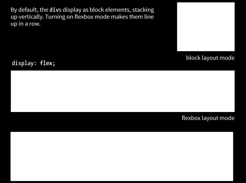
4 Flexbox Container display: flex To turn on Flexbox mode, set the element s display to flex. This makes the element a flexbox container. All of its direct children become flex items in that container. By default, items line up in the writing direction of the document (left to right rows in left-to-right reading languages).

5 Flexbox Container (cont d)
, but you can change the direction so items flow in columns or in reverse")
6 Rows and Columns (Direction) flex-direction Values: row, column, row-reverse, column-reverse The default value is row (for L-to-R languages), but you can change the direction so items flow in columns or in reverse order:


7 Wrapping Flex Lines flex-wrap Values: wrap, nowrap, wrap-reverse Flex items line up on one axis, but you can allow that axis to wrap onto multiple lines with the flex-wrap property:
8 Flex Flow (Direction + Wrap) Values: Flex-direction flex-flow flex-flow The shorthand flex-flow property specifies both direction and wrap in one declaration. Example #container { display: flex; height: 350px; flex-flow: column wrap; }
9 Flexbox Alignment Terminology Flexbox is direction-agnostic, so we talk in terms of main axis and cross axis instead of rows and columns. The main axis runs in whatever direction the flow has been set. The cross axis runs perpendicular to the main axis. Both axes have a start, end, and size.

10 ROW: Main and Cross Axes

11 COLUMN: Main and Cross Axes
12 Aligning on the Main Axis justify-content Values: flex-start, flex-end, center, space-between, space-around When there is space left over on the main axis, you can specify how the items align with the justify-content property (notice we say start and end instead of left/right or top/bottom). The justify-content property applies to the flex container. Example: #container { display: flex; justify-content: flex-start; }

13 Aligning on the Main Axis (cont d) When the direction is row, and the main axis is horizontal
 When the direction is column, and the main axis is vertical NOTE: I needed to specify a height on the container to")
14 Aligning on the Main Axis (cont d.) When the direction is column, and the main axis is vertical NOTE: I needed to specify a height on the container to create extra space on the main axis. By default, it s just high enough to contain the content.
15 A WORD FROM THE AUTHOR Keeping the main and cross axes straight in your mind when changing between rows and columns is one of the trickiest parts of using Flexbox. Once you master that, you ve got it! Jennifer Robbins
16 Aligning on the Cross Axis align-items Values: flex-start, flex-end, center, baseline, stretch When there is space left over on the cross axis, you can specify how the items align with the align-items property. The align-items property applies to the flex container. Example: #container { display: flex; flex-direction: row; height: 200px; align-items: flex-start; }


17 Aligning on the Cross Axis (cont d) When the direction is row, the main axis is horizontal, and the cross axis is vertical. NOTE: I needed to specify a height on the container to create extra space on the cross axis. By default, it s just high enough to contain the content.

18 Aligning on the CROSS Axis (cont d) align-self Values: flex-start, flex-end, center, baseline, stretch Aligns an individual item on the cross axis. This is useful if one or more items should override the align-items setting for the container. The align-self property applies to the flex item. Example:.box4 { align-self: flex-end; }


19 Aligning on the CROSS Axis (cont d) align-content Values: flex-start, flex-end, center, space-around, space-between, stretch When lines are set to wrap and there is extra space on the cross axis, use align-content to align the lines of content. The align-content property applies to the flex container.
20 Aligning with Margins Use a margin (set to auto) to put extra space on the side of particular flex items. Example: Adding an auto margin to the right of the first flex item (the li with the logo) pushes the remaining li to the right: ul { display: flex; align-items: center;... } li.logo { margin-right: auto; }
21 Specifying How Items Flex flex Values: none, 'flex-grow flex-shrink flex-basis' Items can resize (flex) to fill the available space on the main axis in the container. The flex property identifies how much an item can grow and shrink and identifies a starting size It distributes extra space in the container within items (compared to justify-content that distributes space between and around items).
22 flex Property Example flex is a shorthand for separate flex-grow, flex-shrink, and flex-basis properties. The values 1 and 0 work like on/off switches. li { flex: px; } In this example, list items in the flex container start at 200 pixels wide, are permitted to expand wider (flex-grow: 1), and are not permitted to shrink (flex-shrink: 0). NOTE: The spec recommends always using the flex property and using individual properties only for overrides.


23 Values: Number Expanding Items (flex-grow) flex-grow Specifies whether and in what proportion an item may stretch larger. 1 allows expansion; 0 prevents it. flex-grow is applied to the flex item element.
.")
24 Expanding Items (cont d) Relative Flex When the flex-basis has a value other than 0, higher integer values act as a ratio that applies more space within that item. Example: A value of 3 assigns three times more space to box4 than items with a flex-grow value of 1. (Note that it isn't necessarily 3x as wide as the other items.).box4 { flex: 3 1 auto; }
 Absolute Flex When the flex-basis is 0, items get")

25 Expanding Items (cont d.) Absolute Flex When the flex-basis is 0, items get sized proportionally according to the flex ratio. Example: A value of 3 makes box4 3x as wide as the others when flex-basis: 0..box4 { flex: 3 1 0%; }
26 Shortcut flex Values flex: initial (same as flex: 0 1 auto;) Prevents the item from growing, but allows it to shrink to fit the container flex: auto (same as flex: 1 1 auto;) Allows items to be fully flexible as needed. Size is based on the width/height properties. flex: none (same as flex: 0 0 auto;) Creates a completely inflexible item while sizing it to the width/height properties. flex: integer (same as flex: integer 1 0px;) Creates a flexible item with absolute flex (so flex-grow integer values are applied proportionally)
27 Changing Item Order Values: Number order Specifies the order in which a particular item should appear in the flow (independent of the HTML source order): order is applied to the flex item element. The default is 0. Items with the same order value are placed according to their order in the source. Items with different order values are arranged from lowest to highest. The specific number value doesn t matter; only how it relates to other values (like z-index) matters.

28 Changing Item Order (cont d) Example: box3 has a higher order value (1) than the others with default order of 0. It appears last in the line even though it s third in the markup:.box3 { order: 1; }


29 Changing Item Order (cont d) Ordinal groups Items that share the same order value are called an ordinal group. Ordinal groups stick together and are arranged from lowest value to highest:.box2,.box3 { order: 1; }
30 Browser Support for Flexbox The Flexbox spec changed over the years and was implemented by browsers along the way: Current version (2012): display: flex; Supported by all current desktop and mobile browser versions Tweener version (2011): display: flexbox; Supported by IE10 only Old version (2009): display: box; Supported by Chrome <21, Safari 3.1 6, Firefox 2 21; ios , Android

31 Browser Support (cont d) To ensure that Flexbox works across all supporting browsers, you need a lot of vendor prefixes and redundant declarations. Use a tool like Autoprefixer to generate all that code for you (autoprefixer.github.io).
32 Flexbox Property Review Flex container properties display flex-flow flex-direction flex-wrap justify-content align-items align-content Flex item properties align-self flex flex-grow flex-shrink flex-basis order
CSC Website Design, Spring CSS Flexible Box
 CSC 122 - Website Design, Spring 2017 CSS Flexible Box CSS Flexible Box Layout Module The CSS flexbox can be used to ensure that elements behave predictably when the page layout must accommodate different
INFS 2150 Introduction to Web Development
 Objectives INFS 2150 Introduction to Web Development Create a media query Work with the browser viewport Apply a responsive design Create a pulldown menu with CSS Create a flexbox 5. Mobile Web INFS 2150
INFS 2150 Introduction to Web Development
 INFS 2150 Introduction to Web Development 5. Mobile Web Objectives Create a media query Work with the browser viewport Apply a responsive design Create a pulldown menu with CSS Create a flexbox INFS 2150
Introducing CSS Flexbox Layout
 Introducing CSS Flexbox Layout PRESENTED BY Matthew Ellison, UA Europe MATTHEW ELLISON Consultant and trainer for User Assistance tools and technologies since 1993 User of MadCap products since 2006 Certified
Notes - CSS - Flexbox
 Notes - CSS - Flexbox Dr Nick Hayward A general intro and outline for using flexbox with HTML5 compatible apps. Contents intro basic usage axes flex direction flex item wrapping flex-flow shorthand sizing
subject to an additional IP rights grant found at polymer.github.io/patents.txt -->

In this tutorial, we are going to learn how to use the various features available in Flexbox.
 About the Tutorial Flexbox (flexible box) is a layout mode of CSS3. Using this mode, you can easily create layouts for complex applications and web pages. Flexbox layout gives complete control over the
CSS Selectors. element selectors. .class selectors. #id selectors
 CSS Selectors Patterns used to select elements to style. CSS selectors refer either to a class, an id, an HTML element, or some combination thereof, followed by a list of styling declarations. Selectors
PUTTING FLEXBOX INTO PRACTICE. Blend Conference September Zoe Mickley
 PUTTING FLEXBOX INTO PRACTICE Blend Conference September 2013 Zoe Mickley Gillenwater @zomigi I m a web designer/front-end dev and I wrote these books on CSS: Stunning CSS3: A Project-based Guide to the
Enhancing Responsiveness. Flexbox WITH. SmashingConf March Zoe Mickley
 Enhancing Responsiveness Flexbox WITH SmashingConf March 2015 Zoe Mickley Gillenwater @zomigi 2 I used to make fixed-width sites 3 with tables 4 Then I got into CSS liquid layout I even wrote a book about
FLEXBOX FOR RESPONSIVES WEBDESIGN
 FLEXBOX FOR RESPONSIVES WEBDESIGN ABOUT ME Robert Mittl mittl medien Stuttgart, Germany JUG Stuttgart self employed since 2012 Joomla and Web Development CONTACT ME Twitter: @mittlmedien Twitter: @parkplace_de
COMP519 Web Programming Lecture 8: Cascading Style Sheets: Part 4 Handouts
 COMP519 Web Programming Lecture 8: Cascading Style Sheets: Part 4 Handouts Ullrich Hustadt Department of Computer Science School of Electrical Engineering, Electronics, and Computer Science University
BORDER IMAGES THE BACKGROUND IMAGE PROPERTIES. Learning Web Design, 5e
 BORDER IMAGES For use with: Learning Web Design, 5e by Jennifer Robbins Copyright O Reilly Media 2018 In this article, I ll give you a quick overview of the border-image properties for filling the sides
Fixed-width. Liquid. Web Development 1 CS1115/CS5002. Types of layout. relative, fixed), CSS Flexbox layout or CSS Grid Layout
, CSS Flexbox layout or CSS Grid Layout") 1 of 9 CS1115/CS5002 Web Development 1 Dr Derek Bridge School of Computer Science & Information Technology University College Cork Types of layout Fixed-width or liquid Set the width in pixels for fixed-width
1 of 9 CS1115/CS5002 Web Development 1 Dr Derek Bridge School of Computer Science & Information Technology University College Cork Types of layout Fixed-width or liquid Set the width in pixels for fixed-width
Responsive web design (RWD) CSS3 Media queries. Mobile vs desktop web sites. Web Development 1 CS1115/CS5002
 CSS3 Media queries. Mobile vs desktop web sites. Web Development 1 CS1115/CS5002") 1 of 13 CS1115/CS5002 Web Development 1 Dr Derek Bridge School of Computer Science & Information Technology University College Cork Mobile vs desktop web sites A few organization have two web sites, one
1 of 13 CS1115/CS5002 Web Development 1 Dr Derek Bridge School of Computer Science & Information Technology University College Cork Mobile vs desktop web sites A few organization have two web sites, one
IDM 222. Web Design II. IDM 222: Web Authoring II 1
 IDM 222 Web Design II IDM 222: Web Authoring II 1 Week 6 CSS Grid IDM 222: Web Authoring II 2 CSS Grid Layout (aka "Grid"), is a two-dimensional grid-based layout system that aims to do nothing less than
Advanced CSS. Slava Kim
 Advanced CSS Slava Kim CSS is simple! But is it? You have some boxes on the screen Boxes have text Use CSS to change colors and move boxes slightly away from each other are we done yet? Web in 1994 Most
CHRIS SAUVE 2
 FLEXBOX 1 CHRIS SAUVE 2 LAYOUT STRATEGIES 3 TABLES 4 JUST DON T. 5 ABSOLUTE POSITIONING 6 INLINE BLOCK 7 FLOATS 8 THINK DIFFERENT 9 CONTENT-OUT LAYOUT 10 parent child 1 child 2 child 3 11 parent child
Client-Side Web Technologies. CSS Part II
 Client-Side Web Technologies CSS Part II Topics Box model and related properties Visual formatting model and related properties The CSS Box Model Describes the rectangular boxes generated for elements
Graduating to Grid. An Event Apart Orlando
 Graduating to Grid An Event Apart Orlando 2018 And there was great rejoicing. https://wpdev.uservoice.com/forums/257854-microsoft-edge-developer/suggestions/6514853-update-css-grid https://caniuse.com/#search=grid
CS193X: Web Programming Fundamentals
 CS193X: Web Programming Fundamentals Spring 2017 Victoria Kirst (vrk@stanford.edu) Today's schedule Today: - Wrap up box model - Debugging with Chrome Inspector - Case study: Squarespace Layout - Flex
8/19/2018. Web Development & Design Foundations with HTML5. Learning Objectives (1 of 2) More on Relative Linking. Learning Objectives (2 of 2)
 More on Relative Linking. Learning Objectives (2 of 2)") Web Development & Design Foundations with HTML5 Ninth Edition Chapter 7 More on Links, Layout, and Mobile Slides in this presentation contain hyperlinks. JAWS users should be able to get a list of links
Web Development & Design Foundations with HTML5 Ninth Edition Chapter 7 More on Links, Layout, and Mobile Slides in this presentation contain hyperlinks. JAWS users should be able to get a list of links
FEWD START SCREENCAST!!!!
 FEWD START SCREENCAST!!!! LET'S GET EVERYTHING SET UP! 1. Navigate to the FEWD 51 Dashboard (saraheholden.com/fewd51) and download the Lesson 5 starter code and slides. You'll want to keep the dashboard
The Importance of the CSS Box Model
 The Importance of the CSS Box Model Block Element, Border, Padding and Margin Margin is on the outside of block elements and padding is on the inside. Use margin to separate the block from things outside
ORB Education Quality Teaching Resources
 These basic resources aim to keep things simple and avoid HTML and CSS completely, whilst helping familiarise students with what can be a daunting interface. The final websites will not demonstrate best
Using Dreamweaver CC. Logo. 4 Creating a Template. Page Heading. Page content in this area. About Us Gallery Ordering Contact Us Links
 Using Dreamweaver CC 4 Creating a Template Now that the main page of our website is complete, we need to create the rest of the pages. Each of them will have a layout that follows the plan shown below.
Chapter 16: PAGE LAYOUT WITH CSS
 Disclaimer: All words, pictures are adopted from Learning Web Design (3 rd eds.) by Jennifer Niederst Robbins, published by O Reilly 2007. PART III: CSS FOR PRESENTATION Chapter 16: PAGE LAYOUT WITH CSS
Cascading Style Sheets CSCI 311
 Cascading Style Sheets CSCI 311 Learning Objectives Learn how to use CSS to style the page Learn to separate style from structure Styling with CSS Structure is separated from style in HTML5 CSS (Cascading
Class 3 Page 1. Using DW tools to learn CSS. Intro to Web Design using Dreamweaver (VBUS 010) Instructor: Robert Lee
 Instructor: Robert Lee") Class 3 Page 1 Using DW tools to learn CSS Dreaweaver provides a way for beginners to learn CSS. Here s how: After a page is set up, you might want to style the . Like setting up font-family, or
Class 3 Page 1 Using DW tools to learn CSS Dreaweaver provides a way for beginners to learn CSS. Here s how: After a page is set up, you might want to style the . Like setting up font-family, or
EXPLORE MODERN RESPONSIVE WEB DESIGN TECHNIQUES
 20-21 September 2018, BULGARIA 1 Proceedings of the International Conference on Information Technologies (InfoTech-2018) 20-21 September 2018, Bulgaria EXPLORE MODERN RESPONSIVE WEB DESIGN TECHNIQUES Elena
Table of Contents. Getting Started. Introduction. Flex-container properties. Flex-item Properties. Absolute and Relative Flex. Auto-margin alignment
 1 Table of Contents Getting Started Introduction Flex-container properties Flex-item Properties Absolute and Relative Flex Auto-margin alignment Switching Flex Direction Flexbox Solved That Building a
Zen Garden. CSS Zen Garden
 CSS Patrick Behr CSS HTML = content CSS = display It s important to keep them separated Less code in your HTML Easy maintenance Allows for different mediums Desktop Mobile Print Braille Zen Garden CSS
Introduction to HTML & CSS. Instructor: Beck Johnson Week 5
 Introduction to HTML & CSS Instructor: Beck Johnson Week 5 SESSION OVERVIEW Review float, flex, media queries CSS positioning Fun CSS tricks Introduction to JavaScript Evaluations REVIEW! CSS Floats The
Responsive Web Design (RWD)
") Responsive Web Design (RWD) Responsive Web Design: design Web pages, so that it is easy to see on a wide range of of devices phone, tablet, desktop,... Fixed vs Fluid layout Fixed: elements have fixed
Responsive Web Design (RWD) Responsive Web Design: design Web pages, so that it is easy to see on a wide range of of devices phone, tablet, desktop,... Fixed vs Fluid layout Fixed: elements have fixed
Welcome Please sit on alternating rows. powered by lucid & no.dots.nl/student
 Welcome Please sit on alternating rows powered by lucid & no.dots.nl/student HTML && CSS Workshop Day Day two, November January 276 powered by lucid & no.dots.nl/student About the Workshop Day two: CSS
CS7026 CSS3. CSS3 Graphics Effects
 CS7026 CSS3 CSS3 Graphics Effects What You ll Learn We ll create the appearance of speech bubbles without using any images, just these pieces of pure CSS: The word-wrap property to contain overflowing
Parashar Technologies HTML Lecture Notes-4
 CSS Links Links can be styled in different ways. HTML Lecture Notes-4 Styling Links Links can be styled with any CSS property (e.g. color, font-family, background, etc.). a { color: #FF0000; In addition,
CSS Futures. Web Development
 CSS Futures Web Development CSS Futures CSS3 CSS Preprocessors: SASS & LESS CSS Frameworks CSS3 CSS3 is the latest standard for CSS Combined with HTML5, CSS3 makes it possible to create highly interactive
JSN PageBuilder 3 Configuration Manual Introduction
 JSN PageBuilder 3 Configuration Manual Introduction About JSN PageBuilder 3 JSN PageBuilder 3 is the latest innovation of Joomla! PageBuilder with great improvements in the interface, features, and user
TAG STYLE SELECTORS. div Think of this as a box that contains things, such as text or images. It can also just be a
 > > > > CSS Box Model Think of this as a box that contains things, such as text or images. It can also just be a box, that has a border or not. You don't have to use a, you can apply the box model to any
Front-End UI: Bootstrap
 Responsive Web Design BootStrap Front-End UI: Bootstrap Responsive Design and Grid System Imran Ihsan Assistant Professor, Department of Computer Science Air University, Islamabad, Pakistan www.imranihsan.com
What can Word 2013 do?
 Mary Ann Wallner What can Word 2013 do? Provide the right tool for: Every aspect of document creation Desktop publishing Web publishing 2 Windows 7: Click Start Choose Microsoft Office > Microsoft Word
Table Basics. The structure of an table
 TABLE -FRAMESET Table Basics A table is a grid of rows and columns that intersect to form cells. Two different types of cells exist: Table cell that contains data, is created with the A cell that
IDM 221. Web Design I. IDM 221: Web Authoring I 1
 IDM 221 Web Design I IDM 221: Web Authoring I 1 Week 6 IDM 221: Web Authoring I 2 The Box Model IDM 221: Web Authoring I 3 When a browser displays a web page, it places each HTML block element in a box.
CSS: The Basics CISC 282 September 20, 2014
 CSS: The Basics CISC 282 September 20, 2014 Style Sheets System for defining a document's style Used in many contexts Desktop publishing Markup languages Cascading Style Sheets (CSS) Style sheets for HTML
FLOATING AND POSITIONING
 15 FLOATING AND POSITIONING OVERVIEW Understanding normal flow Floating elements to the left and right Clearing and containing floated elements Text wrap shapes Positioning: Absolute, relative, fixed Normal
LEVELING UP WITH FLEXBOX. SmashingConf March Zoe Mickley
 LEVELING UP WITH FLEXBOX SmashingConf March 2014 Zoe Mickley Gillenwater @zomigi UX Designer Author Stunning CSS3: A Project-based Guide to the Latest in CSS www.stunningcss3.com Flexible Web Design: Creating
CSS for the Next Billion Users. CSSDay.NL 2018
 CSS for the Next Billion Users CSSDay.NL 2018 Ire Aderinokun E + Rey ! Who are the Next Billion Users? Until now, developing for the web = developing for users like you Until now, developing for the
INFORMATICA GENERALE 2014/2015 LINGUAGGI DI MARKUP CSS
 INFORMATICA GENERALE 2014/2015 LINGUAGGI DI MARKUP CSS cristina gena dipartimento di informatica cgena@di.unito.it http://www.di.unito.it/~cgena/ materiale e info sul corso http://www.di.unito.it/~cgena/teaching.html
door to my garden Simple CSS resulting in impressive, sophisticated visual effects
 Patrick H. Lauke, Designer www.csszengarden.com/041 door to my garden Simple CSS resulting in impressive, sophisticated visual effects AN AVID PHOTOGRAPHER, Patrick Lauke prefers to take his own photographs
Managing Your Schoolwires Web Site
 Managing Your Schoolwires Web Site 1. Sign in at the district web site. 2. Select the school where your teacher or organization s web site is located as shown below. 3. Select the Teacher or Departments
CSS. Shan-Hung Wu CS, NTHU
 CSS Shan-Hung Wu CS, NTHU CSS Zen Garden 2 Outline The Basics Selectors Layout Stacking Order 3 Outline The Basics Selectors Layout Stacking Order 4 Grammar selector { property: value; 5 Example /* for
Web Design and Implementation
 Study Guide 3 - HTML and CSS - Chap. 13-15 Name: Alexia Bernardo Due: Start of class - first day of week 5 Your HTML files must be zipped and handed in to the Study Guide 3 dropbox. Chapter 13 - Boxes
Viewports. Peter-Paul Koch CSS Day, 4 June 2014
 Viewports Peter-Paul Koch http://quirksmode.org http://twitter.com/ppk CSS Day, 4 June 2014 or: Why responsive design works Peter-Paul Koch http://quirksmode.org http://twitter.com/ppk CSS Day, 4 June
Friday, January 18, 13. : Now & in the Future
 : Now & in the Future CSS3 is Modular Can we use it now? * Use it for non-critical things on the experience layer. * Check sites that maintain tables showing browser support like http://www.findmebyip.com/litmus
Viewports. Peter-Paul Koch DevReach, 13 November 2017
 Viewports Peter-Paul Koch http://quirksmode.org http://twitter.com/ppk DevReach, 13 November 2017 or: Why responsive design works Peter-Paul Koch http://quirksmode.org http://twitter.com/ppk DevReach,
Block & Inline Elements
 Block & Inline Elements Every tag in HTML can classified as a block or inline element. > Block elements always start on a new line (Paragraph, List items, Blockquotes, Tables) > Inline elements do not
RC Justified Gallery User guide for version 3.2.X. Last modified: 06/09/2016
 RC Justified Gallery User guide for version 3.2.X. Last modified: 06/09/2016 This document may not be reproduced or redistributed without the permission of the copyright holder. It may not be posted on
HTML-5.com itemscopehttp://data-vocabulary.org/breadcrumb<span itemprop="title">html 5</span> itemscopehttp://data-vocabulary.
 HTML-5.com HTML-5.com is an HTML User's Guide and quick reference of HTML elements and attributes for web developers who code HTML web pages, not only for HTML 5 but for HTML coding in general, with demos
CSS: Layout, Floats, and More
 CSS: Layout, Floats, and More CISC 282 September 27, 2017 Pseudo Selectors CSS selectors are typically document-related Reflect an element's context in the page Nesting, containing block, tag, class(es)...
STATUS OF CSS GRID LAYOUT IMPLEMENTATION
 STATUS OF CSS GRID LAYOUT IMPLEMENTATION MANUEL REGO CASASNOVAS (@regocas) BlinkOn 6 / 16-17 June 2016 (Munich) ABOUT ME CSS Grid Layout implementor (Chromium/Blink & Safari/WebKit) Member of Igalia Web
INFS 2150 Introduction to Web Development
 INFS 2150 Introduction to Web Development 3. Page Layout Design Objectives Create a reset style sheet Explore page layout designs Center a block element Create a floating element Clear a floating layout
INFS 2150 Introduction to Web Development
 Objectives INFS 2150 Introduction to Web Development 3. Page Layout Design Create a reset style sheet Explore page layout designs Center a block element Create a floating element Clear a floating layout
IMY 110 Theme 7 HTML Tables
 IMY 110 Theme 7 HTML Tables 1. HTML Tables 1.1. Tables The HTML table model allows authors to arrange data into rows and columns of cells, just as in word processing software such as Microsoft Word. It
Timo Korinth MAXIMAGO. Flexbox CSS Layouting der Zukunft
 Timo Korinth MAXIMAGO Flexbox CSS Layouting der Zukunft Special Day Modern Business Applications Thema Sprecher Datum, Uhrzeit Raum TypeScript für.net-entwickler Christian Wenz DI, 20. September 2016,
Tutorial 5 Working with Tables and Columns. HTML and CSS 6 TH EDITION
 Tutorial 5 Working with Tables and Columns HTML and CSS 6 TH EDITION Objectives Explore the structure of a Web table Create headings and cells in a table Create cells that span multiple rows and columns
CS7026 Media Queries II. Different Screen Size Different Design
 CS7026 Media Queries II Different Screen Size Different Design What You ll Learn We ll be restyling an entire page layout to work with different screen sizes and devices using Media queries to apply styles
Cascading Style Sheets for layout II CS7026
 Cascading Style Sheets for layout II CS7026 Understanding CSS float The CSS float property is also a very important property for layout. It allows you to position your Web page designs exactly as you want
GIMP WEB 2.0 MENUS. Web 2.0 Menus: Horizontal Navigation Bar
 GIMP WEB 2.0 MENUS Web 2.0 Menus: Horizontal Navigation Bar WEB 2.0 MENUS: HORIZONTAL NAVIGATION BAR Hover effect: You may create your button in GIMP. Mine is 122 pixels by 48 pixels. You can use whatever
Responsive Web Design. From: Ethan Marcotte - Responsive Web Design 2011
 Responsive Web Design From: Ethan Marcotte - Responsive Web Design 2011 Motivation Browser windows have their inconsistencies and imperfections Once web pages are published online, the designs are immediately
THE ULTIMATE GUIDE TO CREATING RESPONSIVE ELEARNING WITH ADOBE CAPTIVATE 2017
 THE ULTIMATE GUIDE TO CREATING RESPONSIVE ELEARNING WITH ADOBE CAPTIVATE 2017 ADOBE ELEARNING CONFERENCE The next generation of responsive elearning authoring embrace an intelligent authoring platform,
Let s take a display of HTC Desire smartphone as an example. Screen size = 3.7 inches, resolution = 800x480 pixels.
 Screens To begin with, here is some theory about screens. A screen has such physical properties as size and resolution. Screen size - a distance between two opposite corners of the screens, usually measured
The Benefits of CSS. Less work: Change look of the whole site with one edit
 11 INTRODUCING CSS OVERVIEW The benefits of CSS Inheritance Understanding document structure Writing style rules Attaching styles to the HTML document The cascade The box model CSS units of measurement
A pixel is not a pixel. Peter-Paul Koch BlackBerry Jam, 6 February 2012
 A pixel is not a pixel Peter-Paul Koch http://quirksmode.org http://twitter.com/ppk BlackBerry Jam, 6 February 2012 I. Pixels Pixels according to W3C The reference pixel is the visual angle of one pixel
INFS 2150 Introduction to Web Development
 INFS 2150 Introduction to Web Development 6. Tables and Columns Objectives Explore the structure of a web table Create table heading and data cells Apply CSS styles to a table Create cells that span multiple
INFS 2150 Introduction to Web Development
 INFS 2150 Introduction to Web Development 6. Tables and Columns Objectives Explore the structure of a web table Create table heading and data cells Apply CSS styles to a table Create cells that span multiple
HTML Organizing Page Content
 HTML Organizing Page Content HTML 5 Elements Well supported by current desktop and mobile browsers (known issues with IE 8 and earlier) May be used to divide pages into major sections
Microsoft Word 2007 on Windows
 1 Microsoft Word 2007 on Windows Word is a very popular text formatting and editing program. It is the standard for writing papers and other documents. This tutorial and quick start guide will help you
INFS 2150 / 7150 Introduction to Web Development & HTML Programming
 Objectives INFS 2150 / 7150 Introduction to Web Development & HTML Programming Using Frames in a Web Site Create s for a Web site Control the appearance and placement of s Control the behavior of hyperlinks
How to make labels in Word By Kathleen K. Koch 26 April Introduction
 How to make labels in Word By Kathleen K. Koch 26 April 2003 Introduction This tutorial is set up in small steps to help you make your own cigar band labels using Microsoft s Word program. Included in
Form into function. Getting prepared. Tutorial. Paul Jasper
 Tutorial Paul Jasper TABLE OF CONTENTS 1 Getting prepared 2 Adding a button to the form design 2 Making the button add tasks 3 Sending the XML data 4 Tidying up 5 Next time In the first episode, I showed
The Scope of This Book... xxii A Quick Note About Browsers and Platforms... xxii The Appendices and Further Resources...xxiii
 CONTENTS IN DETAIL FOREWORD by Joost de Valk PREFACE xvii xix INTRODUCTION xxi The Scope of This Book... xxii A Quick Note About Browsers and Platforms... xxii The Appendices and Further Resources...xxiii
Creating a Website in Schoolwires Technology Integration Center
 Creating a Website in Schoolwires Technology Integration Center Overview and Terminology... 2 Logging into Schoolwires... 2 Changing a password... 2 Accessing Site Manager... 2 Section Workspace Overview...
Working with Tables in Microsoft Word
 Working with Tables in Microsoft Word Microsoft Word offers a number of ways to make a table. The best way depends on how you like to work, and on how simple or complex the table needs to be. 1. Click
Specification proposal for resizing replacement in R3 GUI framework
 Author: Richard Smolak Revision History Version 0.7 ARS Table of Contents 1. Purpose... 1 2. Overview... 1 3. Specification... 1 3.1. Resizing algorithms... 1 3.2. Box model... 3 3.3. GOB addtional attributes...
HTML + CSS. ScottyLabs WDW. Overview HTML Tags CSS Properties Resources
 HTML + CSS ScottyLabs WDW OVERVIEW What are HTML and CSS? How can I use them? WHAT ARE HTML AND CSS? HTML - HyperText Markup Language Specifies webpage content hierarchy Describes rough layout of content
Web Site Design and Development Lecture 9. CS 0134 Fall 2018 Tues and Thurs 1:00 2:15PM
 Web Site Design and Development Lecture 9 CS 0134 Fall 2018 Tues and Thurs 1:00 2:15PM Floating elements on a web page By default block elements fll the page from top to bottom and inline elements fll
Web Design and Development ACS Chapter 12. Using Tables 11/23/2017 1
 Web Design and Development ACS-1809 Chapter 12 Using Tables 11/23/2017 1 Using Tables Understand the concept and uses of tables in web pages Create a basic table structure Format tables within web pages
B r o w s e r s u p p o r t
 A Browser Support Since writing this book, much has changed in the browser market. The Chromium project, which the Chrome browser is based on, stopped using WebKit and created their own fork, called Blink.
HTML Organizing Page Content
 HTML Organizing Page Content CSS for layout Examples http://www.shinybytes.com/newcss.html Generic Elements Used to create a logical grouping of content or elements on the page Can be customized to describe
Make a Website. A complex guide to building a website through continuing the fundamentals of HTML & CSS. Created by Michael Parekh 1
 Make a Website A complex guide to building a website through continuing the fundamentals of HTML & CSS. Created by Michael Parekh 1 Overview Course outcome: You'll build four simple websites using web
Fish Eye Menu DMXzone.com Fish Eye Menu Manual
 Fish Eye Menu Manual Page 1 of 33 Index Fish Eye Menu Manual... 1 Index... 2 About Fish Eye Menu... 3 Features in Detail... 4 Integrated in Dreamweaver... 6 Before you begin... 7 Installing the extension...
N/A. JSN PageBuilder 2 Configuration Manual Introduction. System Requirements. Product Usage. Joomla Requirements. Server Requirement
 JSN PageBuilder 2 Configuration Manual Introduction About JSN PageBuilder 3 JSN PageBuilder 3 is the latest innovation from Joomla! PageBuilder, with great improvements to the interface, features, and
Eng 110, Spring Week 03 Lab02- Dreamwaver Session
 Eng 110, Spring 2008 Week 03 Lab02- Dreamwaver Session Assignment Recreate the 3-page website you did last week by using Dreamweaver. You should use tables to control your layout. You should modify fonts,
BIM222 Internet Programming
 BIM222 Internet Programming Week 7 Cascading Style Sheets (CSS) Adding Style to your Pages Part II March 20, 2018 Review: What is CSS? CSS stands for Cascading Style Sheets CSS describes how HTML elements
Unveiling the Basics of CSS and how it relates to the DataFlex Web Framework
 Unveiling the Basics of CSS and how it relates to the DataFlex Web Framework Presented by Roel Fermont 1 Today more than ever, Cascading Style Sheets (CSS) have a dominant place in online business. CSS
CROMWELLSTUDIOS. Content Management System Instruction Manual V1. Content Management System. V1
 Content Management System Instruction Manual V1 www.cromwellstudios.co.uk Cromwell Studios Web Services Content Management System Manual Part 1 Content Management is the system by which you can change
Responsive Design. Responsive Design Approach. Technique for building webpages
 Responsive Design Responsive Design Technique for building webpages Allows you to present the same content in different ways to different devices Create conditions for applying specific CSS styles Ex:
When you complete this chapter, you will be able to:
 Page Layouts CHAPTER 7 When you complete this chapter, you will be able to: Understand the normal fl ow of elements Use the division element to create content containers Create fl oating layouts Build
COMSC-031 Web Site Development- Part 2
 COMSC-031 Web Site Development- Part 2 Part-Time Instructor: Joenil Mistal December 5, 2013 Chapter 13 13 Designing a Web Site with CSS In addition to creating styles for text, you can use CSS to create