Viewports. Peter-Paul Koch DevReach, 13 November 2017
|
|
|
- Nora Johnson
- 6 years ago
- Views:
Transcription
1 Viewports Peter-Paul Koch DevReach, 13 November 2017
2 or: Why responsive design works Peter-Paul Koch DevReach, 13 November 2017
3 I made something for you
4 Viewport visualisation
5 Pixels
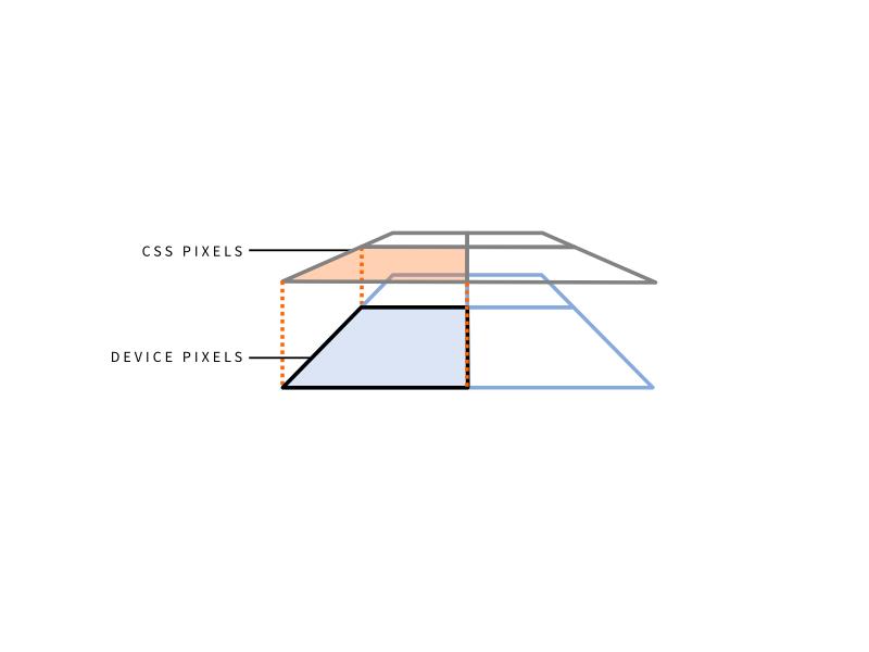
6 A pixel is not a pixel CSS pixels Device pixels You already know what they are. You just don t realise it.
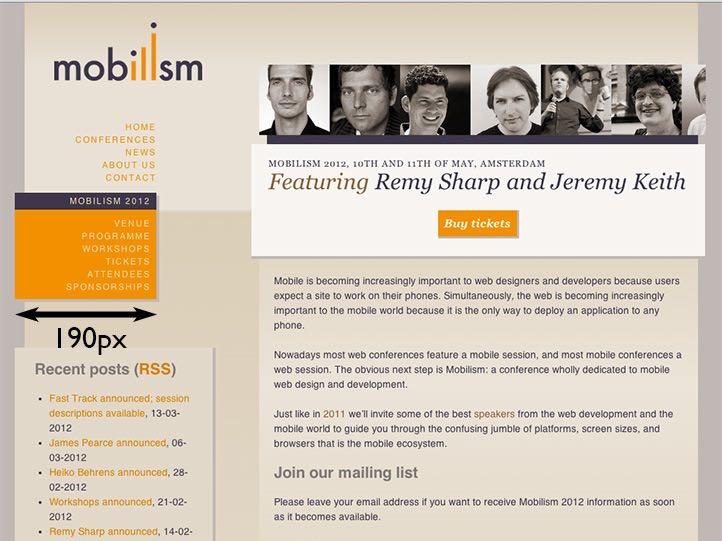
7 CSS pixels CSS pixels are the ones we use in declarations such as width: 190px or padding-left: 20px They are an abstract construct Their size increases or decreases when the user zooms
8
9
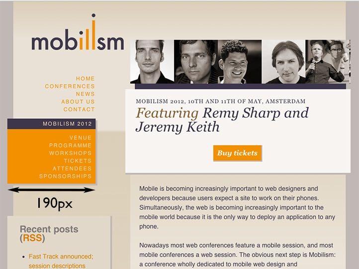
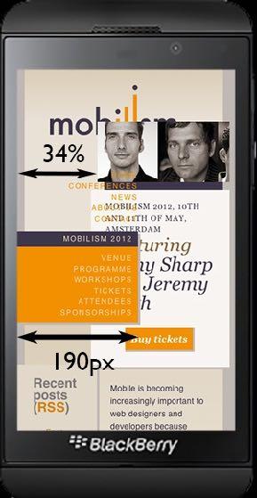
10 Device pixels Device pixels are the physical pixels on the device There s a fixed amount of them that depends on the device

11 Device pixels
12

13 Device pixels
14
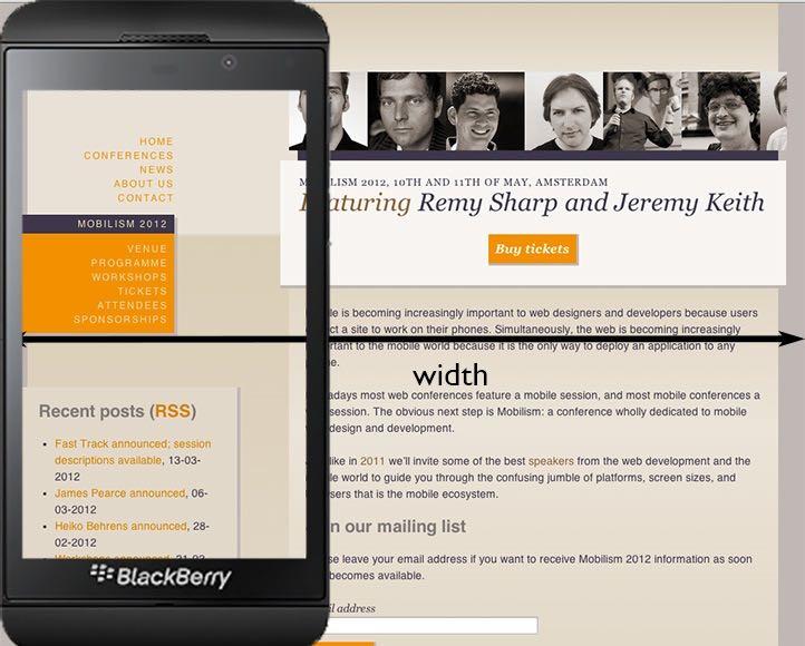
15 What kind of pixels? In general, almost all pixels you use in your code will be CSS pixels. The only exception is screen.width but screen.width is a serious problem that we ll study later
16 Viewports
17
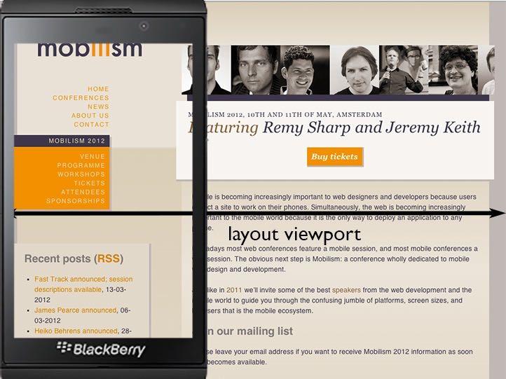
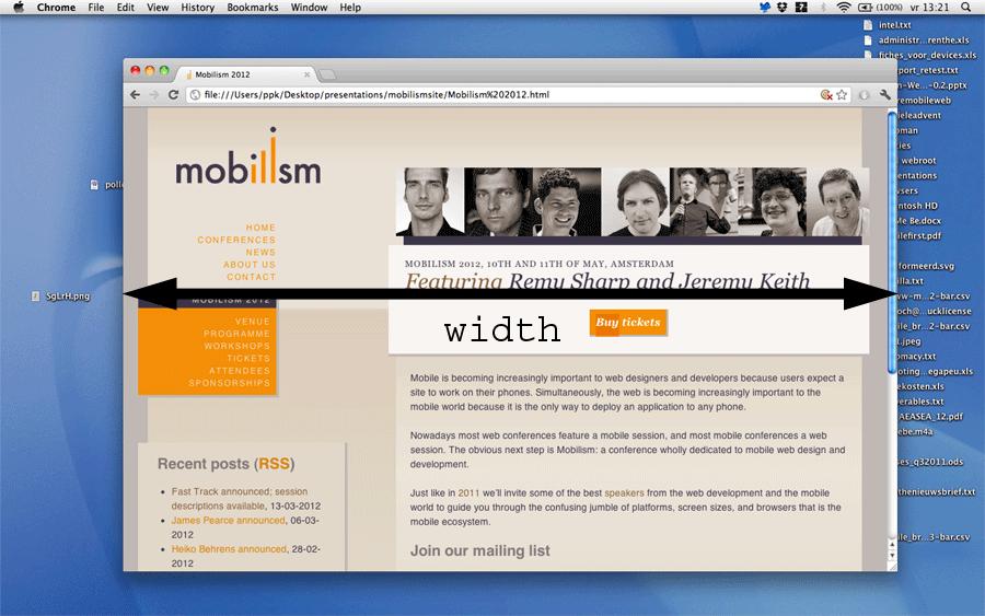
18 Viewports The 34% is calculated relative to its container: the <body>. Every block-level element, including <html> and <body>, has an implicit width: 100%. So we get 34% of the <body> width of 100%. 100% of what? Of the <html> width, which is again 100%.
19 Viewports The <html> element s width is calculated relative to the viewport. Also called the initial containing block. On desktop it s equal to the browser window width. On mobile it s more complicated.
20 Viewports When you page-zoom in with Ctrl/Cmd +, you enlarge the CSS pixels and as a result fewer of them fit on the browser screen Thus the viewport becomes smaller
21
22
23 Viewports On mobile it s quite a bit more complicated Mobile browsers must render all sites correctly, even if they haven t been mobileoptimized If the (narrow) browser window were to be the viewport, many sites would be squeezed to death
24
25
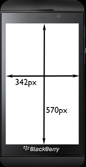
26 Viewports That s why the mobile browser vendors changed the rules: By default, the viewport is px wide (depending on the browser), with 980px the most common size We call this the layout viewport Responsive design is the art of overriding the default width of the layout viewport
27
28 Viewports But this layout viewport is now much wider than the mobile screen Therefore we need a separate viewport for the actual window width We call this the visual viewport
29

30
31 Viewports By default, the layout viewport is px wide (depending on the browser), with 980px the most common size This is the default layout viewport But for a proper mobile experience that s not what we want. Enter the ideal layout viewport.

32
33
34 Ideal layout viewport There are no wrong dimensions for the ideal layout viewport. They re what they need to be for the device they run on. (Admittedly, there are weird values. But they re not wrong.)

35 Ideal layout viewport: 375px 320px 414px
36 Viewports So the desktop viewport has been split into two: layout viewport visual viewport
37 Viewports So the desktop viewport has been split into two: layout viewport visual viewport Fun game: whenever you see viewport in a W3C spec, ask Which viewport?
38 Viewports So the desktop viewport has been split into two: layout viewport visual viewport Fun game: whenever you see viewport in a W3C spec, ask Which viewport? The spec never answers that question, because the viewports haven t been officially specified.
39 Viewports So the desktop viewport has been split into two: layout viewport visual viewport But there s a third construct: the document

40 Visualisation
41 Document and viewports The visual viewport moves inside the layout viewport. But the layout viewport may also move inside the document. Usually you don t notice, except when you use position: fixed
42 position: fixed For a fixed positioned box, the containing block is established by the viewport." Great! But WHICH viewport? Browsers were first all over the place, but recently standardised on the layout viewport. Note that this is not officially specified anywhere; W3C is still in state of denial.
43 position position: absolute means the element is positioned relative to the document position: fixed means the element is positioned relative to the layout viewport and what about the visual viewport?
44 position Ages ago I proposed position: device-fixed, that would position an element relative to the visual viewport, and also would take it out of the pinch zoom. So far only IE/Edge has implemented it.
45 Meta viewport
46 Meta viewport In order to create a responsive design we must set the layout viewport dimensions to the ideal layout viewport dimensions. How?
47 Meta viewport <meta name= viewport content= width=device-width >
48 Meta viewport <meta name= viewport content= width = device-width > By default, the layout viewport is between 768 and 1024 pixels wide. The meta viewport tag sets the width of the layout viewport to a value of your choice. You can use a pixel value (width=400) or you can use the device-width keyword to set it to the ideal layout viewport
49 Meta viewport <meta name= viewport content= width = device-width > I m assuming this does not come as a surprise But did you know that the following does exactly the same?
50 Meta viewport <meta name= viewport content= initial-scale = 1 > In theory, initial-scale gives the initial zoom level (where 1 = 100%) 100% of WHAT? Of the ideal layout viewport In practice, it also sets the layout viewport dimensions to the ideal layout viewport
51 Meta viewport <meta name= viewport content= initial-scale = 2 > In theory, initial-scale = 2 tells the browser to zoom in to 200%. It does so, but many browsers set the layout viewport to half the ideal layout viewport. Why half? Because zooming to 200% means that only half as many CSS pixels fit the visual viewport
52 Meta viewport <meta name= viewport content= initial-scale = 1 > And yes, this is weird. I wonder what Apple was smoking when it set these rules. I want some.
53 Let s mess things up
54 Meta viewport <meta name= viewport content= width = 400,initial-scale = 1 > Now the browser gets conflicting orders. Set the layout viewport width to 400px. No, wait, set it to the ideal layout viewport width (and also set the zoom to 100%). Browsers react by taking the highest value
55 Min-width viewport <meta name= viewport content= width = 400,initial-scale = 1 > Set the layout viewport width to either 400px, or the ideal layout viewport width, whichever is larger If the device orientation changes, this is recalculated. As a result, the layout viewport now has a minimum width of 400px. Is this useful? Dunno.
56 Safari problem <meta name= viewport content= width = device-width > Safari always takes the portrait width (320 on iphone 5-, 768 on ipad). Sometimes this is what you want; at other times it isn t. How to solve this?
57 Safari problem <meta name= viewport content= initial-scale = 1 > Now Safari does it right. In portrait mode it s the ideal portrait width; in landscape mode it s the ideal landscape width. All other browsers do the same.
58 Safari problem <meta name= viewport content= width=device-width,initial-scale=1 > Use both device-width and initial-scale. initial-scale works in Safari (device-width was needed for IE10, if you re still interested) and both work in all other browsers
59 Perfect meta viewport <meta name= viewport content= width = device-width, initial-scale = 1 >
60 Media queries
61 Media all and (max-width: 600px) {.sidebar { float: none; } }
62 Media queries There are two important media queries: width (min-width and max-width) device-width (min-device-width and maxdevice-width) width is the one you want
63
64
65 Media queries - device-width device-width media query is always equal to screen.width but the problem is screen.width may have two meanings, depending on the browser: 1) ideal layout viewport 2) number of device pixels
66
67
68 Media queries - width width gives the width of the layout viewport This is what you want to know Works always and everywhere
69
70 Responsive design <meta name= viewport content= width=device-width,initial-scale=1 all and (max-width: 600px) { }
71 Responsive design Set the layout viewport width to the ideal layout viewport width (or, rarely, another value) Use the width media query to figure out how wide the layout viewport is Adjust your CSS to the width you found That s how responsive design works. You already knew that, but now you understand why it works.
72 Media queries Always use min- or max-width. Thus you define a breakpoint: these styles are valid for all widths equal to or less/ greater than X Exact widths, such as 320, are going to misfire in a lot of browsers. (Even modern iphones need different values.)
73 JavaScript properties
74 Layout viewport dimensions document.documentelement.clientwidth document.documentelement.clientheight Works (almost) everywhere.
75 Layout viewport offset -document. documentelement. getboundingclientrect().left/top
76 JavaScript - visual viewport window.innerwidth window.innerheight Doesn t work in Android 2, Opera Mini, and UC 8. Or in Chrome 61+.
77 Visual viewport offset window.pagex/yoffset Relative to the document.
78 Visual viewport offset window.pagex/yoffset Relative to the document. And what if you want the offset relative to the layout viewport? Not available. But you can calculate it.

79 Properties
80 JavaScript properties Confusing! Is there method to this madness? Nope. Back 10 years ago, mobile browser vendors needed new properties for new viewports. The Browser Wars had left behind some IEand Netscape-specific debris, and mobile browser vendors just took it and shaped it.
81 JavaScript properties Meanwhile, W3C has still not specified any of this. I mean, it s been only 10 years, so what s the rush? Google, however, took action recently.
82 Visual viewport window.visualviewport width and height pageleft and pagetop offsetleft and offsettop scale the width and height (surprise!) Offset relative to the document Offset relative to layout viewport Zoom level relative to layout viewport
83 JavaScript properties Sounds good, right?
84 JavaScript properties Sounds good, right? Unfortunately, Google also decided that all old properties should refer to the layout viewport.
85 JavaScript properties Sounds good, right? Unfortunately, Google also decided that all old properties should refer to the layout viewport. window.pagex/yoffset - Visual viewport offset in all browsers - Except for Chrome 61+, where it s the layout viewport offset
86 JavaScript properties Sounds good, right? Unfortunately, Google also decided that all old properties should refer to the layout viewport. window.innerwidth/height - Visual viewport dimensions - Except for Chrome 61+, where it s the layout viewport dimensions
87 JavaScript properties But Google wouldn t be Google if it didn t make things needlessly complicated. So here we are now The theoretical solution is simple, but Google is not going to implement it because Important Reasons
88 Layout viewport window.layoutviewport width and height pageleft and pagetop offsetleft and offsettop scale? the width and height (surprise!) Offset relative to the document Offset relative to layout viewport Zoom level relative to something?
89 JavaScript properties So we re stuck right now. And there s something else
90 screen.width screen.width screen.height UNRELIABLE! Some browsers define screen.width and screen.height as the dimensions of the ideal layout viewport while others define them as the number of device pixels

91 screen.width Situation as of October 2016: not too bad, but some browsers have problems. Note: Safari stuck in portrait mode. Source:
92 screen.width Not reliable right now. And there s something else All analytics scripts that give you screen sizes? They re unreliable as well because they use screen.width. Check your logs: did you EVER see an ios device in landscape mode? You see?
93 Depressed? I hope you don t feel too depressed after this presentation. Some things DO work well. Still, having a minor depression is the proper reaction to these examples. But you ll survive. And the really important stuff DOES work.
94 Thank you I ll put these slides online Questions? Peter-Paul Koch DevReach, 13 November 2017
Viewports. Peter-Paul Koch CSS Day, 4 June 2014
 Viewports Peter-Paul Koch http://quirksmode.org http://twitter.com/ppk CSS Day, 4 June 2014 or: Why responsive design works Peter-Paul Koch http://quirksmode.org http://twitter.com/ppk CSS Day, 4 June
A pixel is not a pixel. Peter-Paul Koch BlackBerry Jam, 6 February 2012
 A pixel is not a pixel Peter-Paul Koch http://quirksmode.org http://twitter.com/ppk BlackBerry Jam, 6 February 2012 I. Pixels Pixels according to W3C The reference pixel is the visual angle of one pixel
A pixel is not a pixel. Peter-Paul Koch MoBeers, 10 April 2012
 A pixel is not a pixel Peter-Paul Koch http://quirksmode.org http://twitter.com/ppk MoBeers, 10 April 2012 Example site http://mobilism.nl/2012/ A proper responsive site that you can use on any device
A pixel is not a pixel. Peter-Paul Koch SF HTML5, 6 April 2012
 A pixel is not a pixel Peter-Paul Koch http://quirksmode.org http://twitter.com/ppk SF HTML5, 6 April 2012 Example site http://mobilism.nl/2012/ A proper responsive site that you can use on any device
<layer> or the ingrained habits of web development. Peter-Paul Koch HTML Special, 16 June 2016
 or the ingrained habits of web development Peter-Paul Koch http://quirksmode.org http://twitter.com/ppk HTML Special, 16 June 2016 Who here remembers the tag? Essentially what we
Responsive Design. Responsive Design Approach. Technique for building webpages
 Responsive Design Responsive Design Technique for building webpages Allows you to present the same content in different ways to different devices Create conditions for applying specific CSS styles Ex:
8/19/2018. Web Development & Design Foundations with HTML5. Learning Objectives (1 of 2) More on Relative Linking. Learning Objectives (2 of 2)
 More on Relative Linking. Learning Objectives (2 of 2)") Web Development & Design Foundations with HTML5 Ninth Edition Chapter 7 More on Links, Layout, and Mobile Slides in this presentation contain hyperlinks. JAWS users should be able to get a list of links
Web Development & Design Foundations with HTML5 Ninth Edition Chapter 7 More on Links, Layout, and Mobile Slides in this presentation contain hyperlinks. JAWS users should be able to get a list of links
CS7026 Media Queries. Different Screen Size Different Design
 CS7026 Media Queries Different Screen Size Different Design Introduction Users no longer view web content only on traditional desktop systems, but are increasingly using smartphones, tablets, and other
Responsive Design. Responsive design is it important? But typical is not enough. Some typical screen sizes
 Responsive Design Responsive design is it important? For many years, screen sizes were growing Eventually, settled on fixed-width (e.g. 960px) But now with smart phones, tablets, television and many new
The plural of Chromium is Chromia. Peter-Paul Koch Mobilism, 27 March 2015
 The plural of Chromium is Chromia Peter-Paul Koch http://quirksmode.org http://twitter.com/ppk Mobilism, 27 March 2015 First of all Chrome on ios is not Chrome Chrome on ios Apple doesn t allow the installation
The plural of Chromium is Chromia. Peter-Paul Koch NLHTML5 Rotterdam, 19 February 2015
 The plural of Chromium is Chromia Peter-Paul Koch http://quirksmode.org http://twitter.com/ppk NLHTML5 Rotterdam, 19 February 2015 to do Chrome on ios is not Chrome Switch stats and thing with Android
CS7026 CSS3. CSS3 Graphics Effects
 CS7026 CSS3 CSS3 Graphics Effects What You ll Learn We ll create the appearance of speech bubbles without using any images, just these pieces of pure CSS: The word-wrap property to contain overflowing
Understanding Browsers
 Understanding Browsers What Causes Browser Display Differences? Different Browsers Different Browser Versions Different Computer Types Different Screen Sizes Different Font Sizes HTML Errors Browser Bugs
Responsive Web Design. From: Ethan Marcotte - Responsive Web Design 2011
 Responsive Web Design From: Ethan Marcotte - Responsive Web Design 2011 Motivation Browser windows have their inconsistencies and imperfections Once web pages are published online, the designs are immediately
ORB Education Quality Teaching Resources
 These basic resources aim to keep things simple and avoid HTML and CSS completely, whilst helping familiarise students with what can be a daunting interface. The final websites will not demonstrate best
The Benefits of CSS. Less work: Change look of the whole site with one edit
 11 INTRODUCING CSS OVERVIEW The benefits of CSS Inheritance Understanding document structure Writing style rules Attaching styles to the HTML document The cascade The box model CSS units of measurement
door to my garden Simple CSS resulting in impressive, sophisticated visual effects
 Patrick H. Lauke, Designer www.csszengarden.com/041 door to my garden Simple CSS resulting in impressive, sophisticated visual effects AN AVID PHOTOGRAPHER, Patrick Lauke prefers to take his own photographs
Adaptations by PVII responsive and then creates your page instantly Al Sparber & Gerry Jacobsen PVII
 Adaptations by PVII is a Dreamweaver extension that allows you to select from 5 unique responsive layouts and then creates your page instantly. We hope you enjoy using this product as much as we did making
Class 3 Page 1. Using DW tools to learn CSS. Intro to Web Design using Dreamweaver (VBUS 010) Instructor: Robert Lee
 Instructor: Robert Lee") Class 3 Page 1 Using DW tools to learn CSS Dreaweaver provides a way for beginners to learn CSS. Here s how: After a page is set up, you might want to style the . Like setting up font-family, or
Class 3 Page 1 Using DW tools to learn CSS Dreaweaver provides a way for beginners to learn CSS. Here s how: After a page is set up, you might want to style the . Like setting up font-family, or
Web standards and IE8
 Hell is other browsers - Sartre Web standards and IE8 Peter-Paul Koch (ppk) http://twitter.com/ppk http://quirksmode.org MS Dev Days, 29 mei 2009 http://quirksmode.org Web standards W3C specifications
Responsive Design for Web Applications R.I.T. S. Ludi/R. Kuehl p. 1 R I T. Software Engineering
 Responsive Design for Web Applications S. Ludi/R. Kuehl p. 1 What is the Problem? S. Ludi/R. Kuehl p. 2 Credit: Matt Griffin What is the Problem? Mobile web access is ubiquitous One interface design does
Welcome Back! Without further delay, let s get started! First Things First. If you haven t done it already, download Turbo Lister from ebay.
 Welcome Back! Now that we ve covered the basics on how to use templates and how to customise them, it s time to learn some more advanced techniques that will help you create outstanding ebay listings!
Graduating to Grid. An Event Apart Orlando
 Graduating to Grid An Event Apart Orlando 2018 And there was great rejoicing. https://wpdev.uservoice.com/forums/257854-microsoft-edge-developer/suggestions/6514853-update-css-grid https://caniuse.com/#search=grid
1.7 Limit of a Function
 1.7 Limit of a Function We will discuss the following in this section: 1. Limit Notation 2. Finding a it numerically 3. Right and Left Hand Limits 4. Infinite Limits Consider the following graph Notation:
BORDER IMAGES THE BACKGROUND IMAGE PROPERTIES. Learning Web Design, 5e
 BORDER IMAGES For use with: Learning Web Design, 5e by Jennifer Robbins Copyright O Reilly Media 2018 In this article, I ll give you a quick overview of the border-image properties for filling the sides
Building Responsive Layouts
 Building Responsive Layouts by Zoe Mickley Gillenwater @zomigi zomigi.com December 5, 2012 CSS Dev Conf hello nice to meet you 2 I don t use a mobile phone I have a process for eating these why responsive
State of the Browsers
 Hell is other browsers - Sartre State of the Browsers Peter-Paul Koch (ppk) http://quirksmode.org http://twitter.com/ppk The Ajax Experience, Sept. 30, 2008 quirksmode.org Today's topics I'm not going
Web App Vs Web Site. Some tricks of the trade. Laurent Technical Director, BlackBerry Web Platform
 Web App Vs Web Site Some tricks of the trade Laurent Hasson @ldhasson, lhasson@rim.com Technical Director, BlackBerry Web Platform 2012-05-09 Web Apps Vs. Web Sites 1 INTRODUCTION 2012-05-09 Web Apps Vs.
Responsive web design (RWD) CSS3 Media queries. Mobile vs desktop web sites. Web Development 1 CS1115/CS5002
 CSS3 Media queries. Mobile vs desktop web sites. Web Development 1 CS1115/CS5002") 1 of 13 CS1115/CS5002 Web Development 1 Dr Derek Bridge School of Computer Science & Information Technology University College Cork Mobile vs desktop web sites A few organization have two web sites, one
1 of 13 CS1115/CS5002 Web Development 1 Dr Derek Bridge School of Computer Science & Information Technology University College Cork Mobile vs desktop web sites A few organization have two web sites, one
CS7026 Media Queries II. Different Screen Size Different Design
 CS7026 Media Queries II Different Screen Size Different Design What You ll Learn We ll be restyling an entire page layout to work with different screen sizes and devices using Media queries to apply styles
What do we mean by layouts?
 What do we mean by layouts? A layout is how you position the elements of your page You can have columns Move paragraphs and sections around And you can do this all without changing the content of your
CIT BY: HEIDI SPACKMAN
 CIT230-06 BY: HEIDI SPACKMAN WHAT IS A MEDIA QUERY? A Media Query (Boolean code) written in CSS3 determines the screen display size that needs to be used and adjusts the HTML pages to display correctly
Web Design and Implementation
 Study Guide 3 - HTML and CSS - Chap. 13-15 Name: Alexia Bernardo Due: Start of class - first day of week 5 Your HTML files must be zipped and handed in to the Study Guide 3 dropbox. Chapter 13 - Boxes
Positioning in CSS: There are 5 different ways we can set our position:
 Positioning in CSS: So you know now how to change the color and style of the elements on your webpage but how do we get them exactly where we want them to be placed? There are 5 different ways we can set
Designing for the Mobile Web
 Objectives Session 5.1 Create a media query Work with the browser viewport Apply a responsive design Create a pulldown menu with CSS Session 5.2 Create a flexbox Work with flex sizes Explore flexbox layouts
Web Site Design and Development Lecture 13
 Web Site Design and Development Lecture 13 CS 0134 Fall 2018 Tues and Thurs 1:00 2:15PM Normalize.css Normalize.css is a useful project to incorporate into your web pages In their own words, Normalize.css
CSS3: Using media queries to improve the web site experience. November 19, 2011 indieconf Zoe Mickley
 CSS3: Using media queries to improve the web site experience November 19, 2011 indieconf Zoe Mickley Gillenwater @zomigi What I do Books Web Stunning CSS3: A Project-based Guide to the Latest in CSS Accessibility
Mobile & More: Preparing for the Latest Design Trends
 February 26, 2015 Mobile & More: Preparing for the Latest Design Trends LATEST TRENDS Responsive Takes Over Material Is the New Flat Hero Images Getting Bigger Interactions Are Micro Video in the Background
Reader Release Notes. January 7, Release version: 3.1
 Reader Release Notes January 7, 2019 Release version: 3.1 MindManager Reader Version 3.1... 2 General Information... 2 New in Version 3.1... 2 Supported Features... 2 Elements... 2 Text... 3 Navigation...
Developing for touch. Peter-Paul Koch Mobilism, 16 and 17 May 2013
 Developing for touch Peter-Paul Koch http://quirksmode.org http://twitter.com/ppk Mobilism, 16 and 17 May 2013 Examples Please open the following page on your phone: http://quirksmode.org/touchevents It
CSS worksheet. JMC 105 Drake University
 CSS worksheet JMC 105 Drake University 1. Download the css-site.zip file from the class blog and expand the files. You ll notice that you have an images folder with three images inside and an index.html
16A CSS LAYOUT WITH FLEXBOX
 16A CSS LAYOUT WITH FLEXBOX OVERVIEW Flexbox terminology Flexbox containers Flow: Flow direction and text wrap Alignment on main and cross axes Specifying how items in a flexbox "flex" Changing the order
Designing with CSS3 Effectively & Efficiently. October 2010 Adobe MAX Zoe Mickley
 Designing with CSS3 Effectively & Efficiently October 2010 Adobe MAX Zoe Mickley Gillenwater @zomigi 1 What I do out now out Dec 10 Books Web Flexible Web Design: Creating Liquid and Elastic Layouts with
Cross Browser Coding WUC 2007
 Cross Browser Coding WUC 2007 A Plethora of Browsers So many browsers... Lynx Internet Explorer 7 Internet Explorer 6 Netscape Web TV Firefox 2.x Safari Konqueror icab Opera Firefox 1.x AOL AND MORE!!!
FLOATING AND POSITIONING
 15 FLOATING AND POSITIONING OVERVIEW Understanding normal flow Floating elements to the left and right Clearing and containing floated elements Text wrap shapes Positioning: Absolute, relative, fixed Normal
Responsive Web Design Discover, Consider, Decide
 Responsive Web Design Discover, Consider, Decide Responsive Web Design. Discover, Consider, Decide Q. What is Responsive Design? A. Responsive design is a general mindset where you are designing a website,
Contents FORMAT 3. Specifications STATIC ADVERTISING 4. Interstitial HTML5 ADVERTISING 5-12
 Advertising specs Contents FORMAT 3 Specifications STATIC ADVERTISING 4 Interstitial HTML5 ADVERTISING 5-12 Interstitial Responsive Technical info Testing Environment Quality assurance Best practice DESIGN
Cascading Style Sheets for layout II CS7026
 Cascading Style Sheets for layout II CS7026 Understanding CSS float The CSS float property is also a very important property for layout. It allows you to position your Web page designs exactly as you want
Introduction to Computer Science Web Development
 Introduction to Computer Science Web Development Flavio Esposito http://cs.slu.edu/~esposito/teaching/1080/ Lecture 14 Lecture outline Discuss HW Intro to Responsive Design Media Queries Responsive Layout
International Conference KNOWLEDGE-BASED ORGANIZATION Vol. XXIII No RESPONSIVE WEB DESIGN TECHNIQUES. Luminita GIURGIU, Ilie GLIGOREA
 International Conference KNOWLEDGE-BASED ORGANIZATION Vol. XXIII No 3 2017 RESPONSIVE WEB DESIGN TECHNIQUES Luminita GIURGIU, Ilie GLIGOREA Nicolae Bălcescu Land Forces Academy, Sibiu, Romania luminita.giurgiu.a@gmail.com,
Here are some links to get you started in learning more about CSS3 media queries and responsive web design:
 of 8 The HTML5 CSS Starter Page Series - Part 13: CSS3 Media Queries and the Mobile Web By: Sheri German In the last installment of the HTML5 CSS Starter Page series, we completed the Stringendo Studios
Styles, Style Sheets, the Box Model and Liquid Layout
 Styles, Style Sheets, the Box Model and Liquid Layout This session will guide you through examples of how styles and Cascading Style Sheets (CSS) may be used in your Web pages to simplify maintenance of
Designing the Home Page and Creating Additional Pages
 Designing the Home Page and Creating Additional Pages Creating a Webpage Template In Notepad++, create a basic HTML webpage with html documentation, head, title, and body starting and ending tags. From
Software Compare and Contrast
 Microsoft Software Compare and Contrast Word Easy to navigate. Compatible with all PC computers. Very versatile. There are lots of templates that can be used to create flyers, calendars, resumes, etc.
CSS3, Media Queries, & Responsive Design. May 23, 2012 STC Summit Zoe Mickley
 CSS3, Media Queries, & Responsive Design May 23, 2012 STC Summit Zoe Mickley Gillenwater @zomigi What I do Books Stunning CSS3: A Project-based Guide to the Latest in CSS www.stunningcss3.com Flexible
Table Basics. The structure of an table
 TABLE -FRAMESET Table Basics A table is a grid of rows and columns that intersect to form cells. Two different types of cells exist: Table cell that contains data, is created with the A cell that
Touring the Mac S e s s i o n 4 : S A V E, P R I N T, C L O S E & Q U I T
 Touring the Mac S e s s i o n 4 : S A V E, P R I N T, C L O S E & Q U I T Touring_the_Mac_Session-4_Feb-22-2011 1 To store your document for later retrieval, you must save an electronic file in your computer.
Choosing the web s future. Peter-Paul Koch Van Lanschot, 9 February 2017
 Choosing the web s future Peter-Paul Koch http://quirksmode.org http://twitter.com/ppk Van Lanschot, 9 February 2017 Four problems 1. Web developers want to emulate native apps, which I think is not possible
Scripting. Web Architecture and Information Management [./] Spring 2009 INFO (CCN 42509) Contents
![Scripting. Web Architecture and Information Management [./] Spring 2009 INFO (CCN 42509) Contents](/thumbs/81/84719184.jpg "Scripting. Web Architecture and Information Management [./] Spring 2009 INFO (CCN 42509) Contents") Contents Scripting Contents Web Architecture and Information Management [./] Spring 2009 INFO 190-02 (CCN 42509) Erik Wilde, UC Berkeley School of Information [http://creativecommons.org/licenses/by/3.0/]
Contents Scripting Contents Web Architecture and Information Management [./] Spring 2009 INFO 190-02 (CCN 42509) Erik Wilde, UC Berkeley School of Information [http://creativecommons.org/licenses/by/3.0/]
When Chrome Isn t Chrome
 WHITE PAPER When Chrome Isn t Chrome How to set up browser detection: mobile browsers are complicated INTRODUCTION Your website should be tested in as many mobile browsers as possible so that you catch
Using Dreamweaver CC. Logo. 4 Creating a Template. Page Heading. Page content in this area. About Us Gallery Ordering Contact Us Links
 Using Dreamweaver CC 4 Creating a Template Now that the main page of our website is complete, we need to create the rest of the pages. Each of them will have a layout that follows the plan shown below.
MindManager Browser Application Release Notes
 MindManager Browser Application Release Notes September 22, 2017 Release version: 2.0 MindManager Browser Application Version 2.0... 2 General Information... 2 New in Version 2.0... 2 Supported Features...
Dreamweaver Basics Workshop
 Dreamweaver Basics Workshop Robert Rector idesign Lab - Fall 2013 What is Dreamweaver? o Dreamweaver is a web development tool o Dreamweaver is an HTML and CSS editor o Dreamweaver features a WYSIWIG (What
Write a Touch-friendly HTML5 App. Hongbo Min, Intel Junmin Zhu, Intel Yongsheng Zhu, Intel
 Write a Touch-friendly HTML5 App Hongbo Min, Intel Junmin Zhu, Intel Yongsheng Zhu, Intel Agenda Background Touch vs. Mouse Part I: UI Layout Part II: Event Handling Touch in HTML5 Framework Q/A 2 Background
Introduction to WEB PROGRAMMING
 Introduction to WEB PROGRAMMING Web Languages: Overview HTML CSS JavaScript content structure look & feel transitions/animation s (CSS3) interaction animation server communication Full-Stack Web Frameworks
HTML is a mark-up language, in that it specifies the roles the different parts of the document are to play.
 Introduction to HTML (5) HTML is a mark-up language, in that it specifies the roles the different parts of the document are to play. For example you may specify which section of a document is a top level
epromo Guidelines DUE DATES NOT ALLOWED PLAIN TEXT VERSION
 epromo Guidelines HTML Maximum width 700px (length = N/A) Image resolution should be 72dpi Maximum total file size, including all images = 200KB Only use inline CSS, no stylesheets Use tables, rather than
AGENDA. :: Add Meta Tag for Viewport (inside of head element): :: Add Script that renders HTML5 elements for older versions of Internet Explorer
: :: Add Script that renders HTML5 elements for older versions of Internet Explorer") CLASS :: 14 12.10 2018 3 Hours AGENDA LECTURE :: Responsive Web Design [RWD] DOWNLOAD ASSETS [ CSS ] :: Media Query [rwd.css] ADD HTML META TAG & IE SCRIPT [ HTML ] :: Add Meta Tag for Viewport (inside
CLASS :: 14 12.10 2018 3 Hours AGENDA LECTURE :: Responsive Web Design [RWD] DOWNLOAD ASSETS [ CSS ] :: Media Query [rwd.css] ADD HTML META TAG & IE SCRIPT [ HTML ] :: Add Meta Tag for Viewport (inside
What Are CSS and DHTML?
 6/14/01 10:31 AM Page 1 1 What Are CSS and DHTML? c h a p t e r ch01.qxd IN THIS CHAPTER What Is CSS? What Is DHTML? DHTML vs. Flash Browser Hell What You Need to Know Already Welcome to the world of CSS
Responsive Web Design and Bootstrap MIS Konstantin Bauman. Department of MIS Fox School of Business Temple University
 Responsive Web Design and Bootstrap MIS 2402 Konstantin Bauman Department of MIS Fox School of Business Temple University Exam 3 (FINAL) Date: 12/06/18 four weeks from now! JavaScript, jquery, Bootstrap,
B r o w s e r s u p p o r t
 A Browser Support Since writing this book, much has changed in the browser market. The Chromium project, which the Chrome browser is based on, stopped using WebKit and created their own fork, called Blink.
The mobile browser world. Peter-Paul Koch Front-end Day workshop, 26 April 2011
 The mobile browser world Peter-Paul Koch http://quirksmode.org http://twitter.com/ppk Front-end Day workshop, 26 April 2011 1 Mobile First! Luke Wroblewski invented it Design your sites for mobile first.
AGENDA. EMBEDDING FONTS [ Font Files & CSS font-family ] :: Online Font Converter :: ADD font-family css code to style.css
![AGENDA. EMBEDDING FONTS [ Font Files & CSS font-family ] :: Online Font Converter :: ADD font-family css code to style.css](/thumbs/83/88078174.jpg "AGENDA. EMBEDDING FONTS [ Font Files & CSS font-family ] :: Online Font Converter :: ADD font-family css code to style.css") CLASS :: 12 05.04 2018 3 Hours AGENDA CREATE A WORKS PAGE [ HTML ] :: Open index.html :: Save As works.html :: Edit works.html to modify header, 3 divisions for works, then add your content :: Edit index.html
CLASS :: 12 05.04 2018 3 Hours AGENDA CREATE A WORKS PAGE [ HTML ] :: Open index.html :: Save As works.html :: Edit works.html to modify header, 3 divisions for works, then add your content :: Edit index.html
A Pragmatist s Guide to InDesign CS6 + EPUB
 A Pragmatist s Guide to InDesign CS6 + EPUB Kiyo Toma Senior Product Manager, Design & Creative Cloud Incubation June 5, 2012 3 questions I get asked a lot What do I need to know if I m new to the world
Create and edit word processing. Pages.
 Create and edit word processing documents with Pages. In this chapter, we begin to get work done on the ipad by using Pages to create and format documents. Creating a New Document Styling and Formatting
MindManager Browser Application Release Notes
 MindManager Browser Application Release Notes May 29, 2018 Release version: 2.1 MindManager Browser Application Version 2.1... 2 General Information... 2 New in Version 2.1... 2 New in Version 2.0... 3
RC Justified Gallery User guide for version 3.2.X. Last modified: 06/09/2016
 RC Justified Gallery User guide for version 3.2.X. Last modified: 06/09/2016 This document may not be reproduced or redistributed without the permission of the copyright holder. It may not be posted on
Chapter 7 BMIS335 Web Design & Development
 Chapter 7 BMIS335 Web Design & Development Site Organization Use relative links to navigate between folders within your own site o Sometimes dividing your site into folders makes maintenance and updating
Web Site Design Small Screen Design Responsive Design R.I.T. S. Ludi/R. Kuehl p. 1 R I T. Software Engineering
 Web Site Design Small Screen Design Responsive Design S. Ludi/R. Kuehl p. 1 Design Principles and Guidelines User Populations (Shared human ability and behavior) (Problem domains) Computing Paradigms (Platform
Payne s Dreamweaver CS5 Tutorials
 Payne s Dreamweaver CS5 Tutorials CONTENTS Lesson I: Making simple pages and links 4 20+ minutes. Introduction to Dreamweaver and how it works. Making simple pages. Lesson 2: Structure, images, and text,
Developing Web Applications for Smartphones with IBM WebSphere Portlet Factory 7.0
 Developing Web Applications for Smartphones with IBM WebSphere Portlet Factory 7.0 WebSphere Portlet Factory Development Team 6 September 2010 Copyright International Business Machines Corporation 2010.
Advanced Dreamweaver CS6
 Advanced Dreamweaver CS6 Overview This advanced Dreamweaver CS6 training class teaches you to become more efficient with Dreamweaver by taking advantage of Dreamweaver's more advanced features. After this
DELIZIOSO RESTAURANT WORDPRESS THEME
 DELIZIOSO RESTAURANT WORDPRESS THEME Created: 06/08/2013 Last Update: 25/10/2013 By: Alexandr Sochirca Author Profile: http://themeforest.net/user/crik0va Contact Email: alexandr.sochirca@gmail.com v.
View Frustum Culling with Octree
 View Frustum Culling with Octree Raka Mahesa 13508074 Program Studi Teknik Informatika Sekolah Teknik Elektro dan Informatika Institut Teknologi Bandung, Jl. Ganesha 10 Bandung 40132, Indonesia if18074@itb.ac.id
Header. Article. Footer
 Styling your Interface There have been various versions of HTML since its first inception. HTML 5 being the latest has benefited from being able to look back on these previous versions and make some very
Case study on PhoneGap / Apache Cordova
 Chapter 1 Case study on PhoneGap / Apache Cordova 1.1 Introduction to PhoneGap / Apache Cordova PhoneGap is a free and open source framework that allows you to create mobile applications in a cross platform
HTML5 HTML & Fut ure o Web M edi dia Streami a est Work h op, ov 2010 Michael Dale Zohar Babin eve oper o Dev R l e t a i tions & C
 HTML5 &F Future of fweb bmedia Streaming Media West Workshop, Nov. 2010 Michael Dale Zohar Babin Senior Developer Head of Dev Relations & Community michael.dale@kaltura.com zohar.babin@kaltura.com @michael_dale
Working with Images and Multimedia
 CHAPTER Working with Images and Multimedia You can make your web page more interesting by adding multimedia elements. You can download the files featured in this chapter from www.digitalfamily.com/tyv.
INTRODUCTION TO HTML5! CSS Styles!
 INTRODUCTION TO HTML5! CSS Styles! Understanding Style Sheets HTML5 enables you to define many different types of content on a web page, including headings, paragraphs, lists, images, input fields, canvases,
HOST A GET CODING! CLUB TAKEOVER
 HOST A GET CODING! CLUB TAKEOVER www.getcodingkids.com #GetCoding @WalkerBooksUK GETTING STARTED THE LUCKY CAT CLUB We re The Lucky Cat Club! Welcome to our club takeover. Join us for a top-secret mission
Browser Bugs & Validation
 Browser Bugs & Validation SIPB Introduction to Web Design Wednesday, January 20th Jonté Craighead & Cathy Zhang 1 Lecture Overview A Brief Review: Layout Design Browser Bugs Validation Accessibility Site
How to lay out a web page with CSS
 How to lay out a web page with CSS A CSS page layout uses the Cascading Style Sheets format, rather than traditional HTML tables or frames, to organize the content on a web page. The basic building block
Development Training. For Developer. 4 th May, AOT Intranet Web Portal
 Development Training AOT Intranet Web Portal For Developer 4 th May, 2017 Agenda Overview Intranet Web Portal Project Development Implementation With SharePoint Designer Tool Branding Master page Page
MindManager HTML5 Export Release Notes
 MindManager HTML5 Export Release Notes April 7, 2017 Release version: 1.3 MindManager HTML5 Export Version 1.3... 2 General Information... 2 New In This Version... 2 Supported Features... 3 Elements...
Quick.JS Documentation
 Quick.JS Documentation Release v0.6.1-beta Michael Krause Jul 22, 2017 Contents 1 Installing and Setting Up 1 1.1 Installation................................................ 1 1.2 Setup...................................................
Perfect Student Midterm Exam March 20, 2007 Student ID: 9999 Exam: 7434 CS-081/Vickery Page 1 of 5
 Perfect Student Midterm Exam March 20, 2007 Student ID: 9999 Exam: 7434 CS-081/Vickery Page 1 of 5 NOTE: It is my policy to give a failing grade in the course to any student who either gives or receives
Full Website Audit. Conducted by Mathew McCorry. Digimush.co.uk
 Full Website Audit Conducted by Mathew McCorry Digimush.co.uk 1 Table of Contents Full Website Audit 1 Conducted by Mathew McCorry... 1 1. Overview... 3 2. Technical Issues... 4 2.1 URL Structure... 4
ORB Education Quality Teaching Resources
 JavaScript is one of the programming languages that make things happen in a web page. It is a fantastic way for students to get to grips with some of the basics of programming, whilst opening the door
EmberJS A Fitting Face for a D8 Backend. Taylor Solomon
 EmberJS A Fitting Face for a D8 Backend Taylor Solomon taylor.solomon @jtsolomon http://interactivestrategies.com 2 Years Ago 2 Years Ago URL Ember Data assumes a few things. - Your API format is JSON
Guidelines for doing the short exercises
 1 Short exercises for Murach s HTML5 and CSS Guidelines for doing the short exercises Do the exercise steps in sequence. That way, you will work from the most important tasks to the least important. Feel