Graduating to Grid. An Event Apart Orlando
|
|
|
- Barrie Goodman
- 5 years ago
- Views:
Transcription
1 Graduating to Grid An Event Apart Orlando 2018
2 And there was great rejoicing.
3
4
5 What s it like being in the middle of a launch of a big new CSS feature?
6 It involved a lot of .
7 Grid is: Exciting - a real game changer Confusing - it doesn t seem to do what I thought it would Scary - there are so many new properties to learn!
8 Q. How do you feel when you see a new CSS feature announced? Me, in a survey question
9 Excited but also worried about falling behind. Survey response
10 Excited, until I share it with colleagues and they pick it apart Survey response
11 Oh no, a new way to have inconsistencies between web browsers. Survey response
12 Tired. Survey response
13 I can t tell you what to do.
14 I can help you develop the skills to make those decisions yourself.
15 I want you to be the amazing CSS layout person on your team.
16 You need to understand CSS.
17 Understanding CSS is not about learning every property and value by heart. (my main skill is can use a search engine )
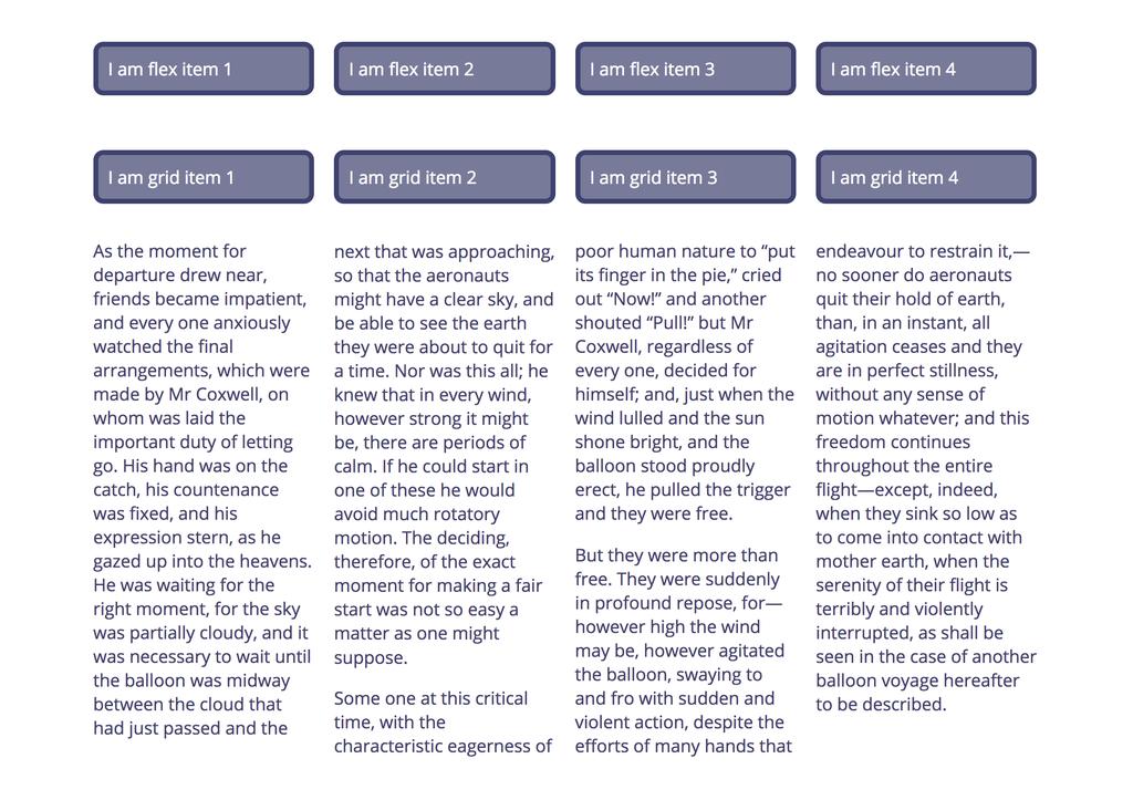
18 Core ideas that help CSS layout make sense.
19 Cascading Style Sheets
20 Inheritance - which properties will inherit values from their parent.
21 Specificity - which rule wins when two things could apply to the same element.
22
23 Block and inline dimensions

24 Horizontal Writing Mode Inline dimension or axis Block dimension or axis

25 Vertical Writing Mode Block dimension or axis Inline dimension or axis

26 Grid Layout in Horizontal Writing Mode Inline axis Block axis
27 Flex Layout in Horizontal Writing Mode flex-direction: column Cross axis flex-direction: row Main axis Cross axis Main axis
28 Sizing Matters
29
30 row wrapper 6.20% (6.20%*4) + ( %*3)
31 { margin-bottom: 1em; margin-left: %; width: 6.20%; float: left; }.row::after { content: ""; display: block; clear: both; }.col.span2 { width: calc((6.20%*2) %); }.col.span3 { width: calc((6.20%*3) + ( %*2)); }.col.span4 { width: calc((6.20%*4) + ( %*3)); }
32 Percentages Ugly Easy to understand If they total more than 100% bad things happen. Can be converted from an ideal pixel size using a straightforward calculation.
33
34 Row wrapper as flex container 6.20% (6.20%*4) + ( %*3)
35 { display: flex; flex-wrap: wrap; }.col { padding: 10px; margin-bottom: 1em; margin-left: %; width: 6.20%; flex: 0 0 auto; }.col.span2 { width: calc((6.20%*2) %); }.col.span3 { width: calc((6.20%*3) + ( %*2)); }.col.span4 { width: calc((6.20%*4) + ( %*3)); }
36 Past layout methods create the appearance of a grid, by lining things up.
37 CSS Intrinsic and Extrinsic Sizing
38 /* html */ <div class="box"> I am a string of text. </div> /* css */.box { padding: 10px; border: 5px dotted rgba(255,255,255,.7); margin-bottom: 2em; }
39 available width
40 { } width: 500px;
41 available width 500px
42 max content min content
43 { } width: min-content;
44 available width min-content
45 { } width: max-content;
46 available width max-content
47 <div class="fixed-width"> <div class="box"> I am a longer string of text and max-content will cause me to overflow. </div> </div>
48 { width: 20em; border: 5px solid rgb(255,255,255); margin-bottom: 2em; }.box { } width: max-content;
49 max-content 20em
50 <div class="box"> <div>item 1</div> <div>item 2</div> <div>item 3</div> <div>item 4</div> </div>

51 Items start by trying to display at max-content size. Space is reduced according to the flexbasis. In this case the size of the content.

52 flex: 1 1 auto; Items can grow and shrink so stretch to fill the container. With no extra space, items shrink as before.

53 flex: 1 1 0; Items can grow and shrink so stretch to fill the container. With a flex-basis of 0 space is distributed from 0, making equal columns.

54 Flex items at min-content size Grid items at max-content size
55 Flexbox is starting from max-content and taking space away. Grid starting at min-content and adding space.
56 { display: grid; grid-template-columns: repeat(4, min-content); }

57 min-content
58 { display: grid; grid-template-columns: repeat(4, max-content); }

59 max-content
60 { display: grid; grid-template-columns: repeat(4, fit-content(15ch)); }

61 fit-content(15ch)
62
63 grid-template-columns: repeat(12, minmax(0,1fr)); grid-column: auto / span 4;
64 { display: grid; grid-template-columns: repeat(12, minmax(0,1fr)); grid-gap: 20px; }.col.span2 { grid-column: auto / span 2; }.col.span3 { grid-column: auto / span 3; }.col.span4 { grid-column: auto / span 4; }
65 { display: grid; grid-template-columns: repeat(12, minmax(0,1fr)); grid-column-gap: %; grid-row-gap: 20px; }.col.span2 { grid-column: auto / span 2; }.col.span3 { grid-column: auto / span 3; }.col.span4 { grid-column: auto / span 4; }
66 In the end, we discovered that a column-based grid wasn t actually needed. Since Grid allows you to create a custom grid to match whatever layout you have, we didn t need to force it into 12 columns. Instead, we created CSS Grid objects for some of the common layout patterns in the designs. Rebuilding Slack.com
67
68 300px 120px
69 { display: grid; grid-template-columns: fit-content(300px) 1fr; grid-gap: 20px; }
70
71 { display: grid; grid-gap: 1px; grid-template-columns: 1fr 1fr 3fr; grid-template-rows: minmax(100px, auto) minmax(50px, auto) minmax(250px, auto) minmax(50px, auto) minmax(150px, auto); }
72 Min 50px Max auto
73 Min 50px Max auto Min 50px Max auto
74 This is not exciting. But it will let you do exciting things.
75 Why so complicated?
76 More capability & flexibility means more to learn
77 It is all just lines.
78
79
80 { display: grid; grid-template-columns: 1fr 1fr 1fr 1fr 1fr; grid-template-rows: 100px 100px 100px 100px; }.item { grid-column: 2 / 5; grid-row: 2 / 4; }
81 1 1 content-start 3 4 content-end 6 content-start 3 content-end 5
82 { display: grid; grid-template-columns: 1fr [content-start] 1fr 1fr 1fr [content-end] 1fr; grid-template-rows: 100px [content-start] 100px 100px [content-end] 100px; }.item { grid-column: content-start / content-end; grid-row: content-start / content-end; }
83 1 1 content-start 3 4 content-end 6 content-start 3 content-end 5
84 1 1 content-start 3 4 content-end 6 content-start 3 content content-end 5
85 { display: grid; grid-template-columns: 1fr [content-start] 1fr 1fr 1fr [content-end] 1fr; grid-template-rows: 100px [content-start] 100px 100px [content-end] 100px; }.item { } grid-area: content;
86 { display: grid; grid-template-columns: 1fr [content-start] 1fr 1fr 1fr [content-end] 1fr; grid-template-rows: 100px [content-start] 100px 100px [content-end] 100px; }.item { } grid-area: content / content / content / content;
87 grid-area: content / content / content / content; grid-row-start grid-column-start grid-row-end grid-column-end
88 1 1 content-start content 3 4 content-end content 6 content-start content 3 content content-end content 5
89 grid-area: content / content / content / content; grid-row-start grid-column-start grid-row-end grid-column-end
90 grid-area: content / content / content ; grid-row-start grid-column-start grid-row-end grid-column-end is set to the value used for grid-column-start, which is content.
91 grid-area: content / content ; grid-row-start grid-column-start grid-row-end is set to the value used for grid-column-start, which is content. grid-column-end is set to the value used for grid-column-start, which is content.
92 grid-area: content ; grid-row-start The other three values are set to the same as grid-row-start, so all are set to content
93 { display: grid; grid-template-columns: 1fr 1fr 1fr 1fr 1fr; grid-template-rows: 100px 100px 100px 100px; grid-template-areas: "....." ". content content content." ". content content content." "....." }.item { } grid-area: content ;
94 1 1 content 3 4 content 6 content 3 content content content content content content content 5
95 1 1 content 3 4 content 6 content 3 content content content content content content content 5
96 1 1 content content-start 3 4 content content-end 6 content content-start content content content 3 content content-end content content content 5
97 { display: grid; grid-template-columns: 1fr 1fr 1fr 1fr 1fr; grid-template-rows: 100px 100px 100px 100px; grid-template-areas: "....." ". content content content." ". content content content." "....." }.item { grid-area: content ; }.item2 { grid-row-start: content-start; grid-column-start: content-end; }
98
99 You have real choice for the first time.
100 What would be the best method to achieve this design pattern?
101 Could we solve this problem with a new design pattern?
102 Instead of which patterns does our framework give us to use?
103 How old is the oldest CSS in your project?
104 368 people working on existing projects 29 had CSS in their codebase written 10 years or more ago.
105 Old CSS in your project doesn t mean you can t use new CSS.
106 This is where understanding CSS comes in really useful.
107

108
109 img { max-width: 100%; }.gallery { display: grid; grid-template-columns: repeat(auto-fill,minmax(200px,1fr)); grid-gap: 10px 20px; grid-auto-flow: dense; }.portrait { } grid-row-end: span 2; figcaption { text-align: center; font-size: 1.5em; }
110 Creating systems with new layout.
111 Other layout methods still exist.

112 Floating the image means the text wraps round. Defining a grid on the container means we don t get the wrapping behaviour.
113 Multi-column layout splits content into equal width columns. Using column-width of 200px means we get more columns if there is room, fewer with less available width.

114 Flex items with the value of justify-content set to space-between. I also use flexbox to centre the word in the circle.
115 You don t need a grid-shaped hammer for every layout task.
116 Off-the-shelf frameworks are designed to solve generic problems.
117 Do you want your project to inherit the CSS issues of the rest of the world?
118 Build your own framework* * framework doesn t mean all-encompassing behemoth
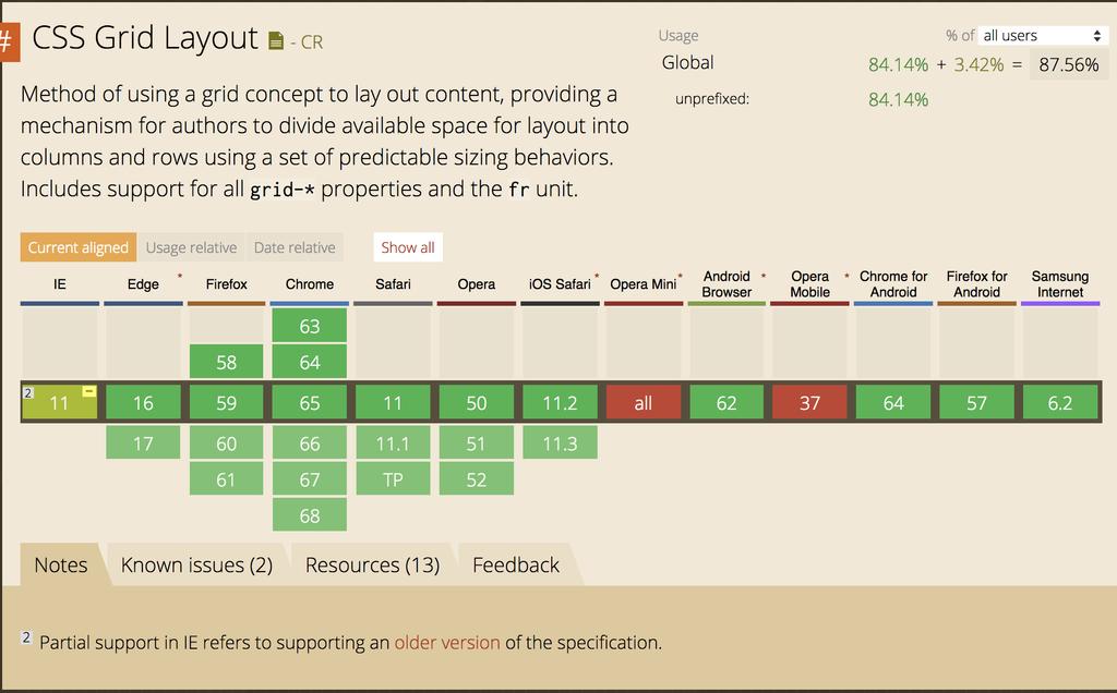
119 Solving your specific problems only will result in lighter, easier to understand code
120 gridded($type: grid, $col: 20em, $gap: 20px) ($type == 'flex') { display: flex; flex-wrap: wrap; margin-left: -#{$gap} ; > * { flex: 1 1 $col; margin: 0 0 $gap $gap; } ($type == 'grid') { display: grid; grid-template-columns: repeat(auto-fill, minmax($col,1fr)); grid-gap: $gap; } ($type == 'multicol') { column-gap: $gap; column-width: $col; }
121 { gridded('multicol',200px,20px);.grid{ gridded('grid',200px,20px);.flex { gridded('flex',200px,20px);
122
123 Working with less capable browsers. These may not always be old browsers.
124 A lack of understanding on one side. A lack of confidence on the other.

125
126 Building confidence in your CSS skills will help you to make your case to use newer methods. (Although quite often asking permission is optional)
127 Old browser versions of survey respondents cited IE11 as oldest IE supported.
128 Old browser versions of survey respondents support IE10+
129 IE10 & 11 have the -ms prefixed older version of grid layout.
130 For other desktop browsers supporting the last 2 versions is common.

131
132
133 .grid { display: grid; grid-template-columns: 1fr 1fr 1fr 1fr 1fr; grid-template-rows: 100px 100px 100px 100px; }.item { grid-column: 2 / 5; grid-row: 2 / 4; }
134 .grid { display: grid; grid-template-columns: 1fr 1fr 1fr 1fr 1fr; grid-template-rows: 100px 100px 100px 100px; }.item { grid-column: 2 / 5; grid-row: 2 / 4; display: grid; grid-template-columns: subgrid; grid-template-rows: subgrid; }
135
136 .item { grid-column: 2 / 5; grid-row: 2 / 4; display: grid; grid-template-columns: subgrid; grid-template-rows: subgrid; }.item > div { grid-column: 2 / 4; grid-row: 1; }

137 (December 2017)

138 (December 2017)

139
140 Many browsers without support for Grid and other new CSS at this point are mobile browsers.
141 Many of the browsers without support are most popular in areas where data is expensive or devices less powerful.
142 Grid too young and would need a ton of polyfills. Lack of a good css grid polyfill that works with postcss and supports not so old browsers Survey responses
143 Stop looking for polyfills and shims. They will make the experience worse for less capable browsers and devices.
144 The time it takes your customer to get the information she came for. Jeffrey Zeldman
145 Using Grid rather than loading a big framework can help create a better experience even for browsers that don t support Grid.
146 Feature Queries - use CSS to ask if the browser supports a feature before using it.
147
148
149 Create complex layouts for browsers that support them with a few lines of CSS.
150 Making the web available to everyone. That s exciting.
151 Q. How do you feel when you see a new CSS feature announced? Me, in a survey question
152 Excited!

153 Thank you!
CSC Website Design, Spring CSS Flexible Box
 CSC 122 - Website Design, Spring 2017 CSS Flexible Box CSS Flexible Box Layout Module The CSS flexbox can be used to ensure that elements behave predictably when the page layout must accommodate different
INFS 2150 Introduction to Web Development
 INFS 2150 Introduction to Web Development 3. Page Layout Design Objectives Create a reset style sheet Explore page layout designs Center a block element Create a floating element Clear a floating layout
INFS 2150 Introduction to Web Development
 Objectives INFS 2150 Introduction to Web Development 3. Page Layout Design Create a reset style sheet Explore page layout designs Center a block element Create a floating element Clear a floating layout
Styles, Style Sheets, the Box Model and Liquid Layout
 Styles, Style Sheets, the Box Model and Liquid Layout This session will guide you through examples of how styles and Cascading Style Sheets (CSS) may be used in your Web pages to simplify maintenance of
In this tutorial, we are going to learn how to use the various features available in Flexbox.
 About the Tutorial Flexbox (flexible box) is a layout mode of CSS3. Using this mode, you can easily create layouts for complex applications and web pages. Flexbox layout gives complete control over the
COMP519 Web Programming Lecture 8: Cascading Style Sheets: Part 4 Handouts
 COMP519 Web Programming Lecture 8: Cascading Style Sheets: Part 4 Handouts Ullrich Hustadt Department of Computer Science School of Electrical Engineering, Electronics, and Computer Science University
Web Design and Implementation
 Study Guide 3 - HTML and CSS - Chap. 13-15 Name: Alexia Bernardo Due: Start of class - first day of week 5 Your HTML files must be zipped and handed in to the Study Guide 3 dropbox. Chapter 13 - Boxes
CSS Selectors. element selectors. .class selectors. #id selectors
 CSS Selectors Patterns used to select elements to style. CSS selectors refer either to a class, an id, an HTML element, or some combination thereof, followed by a list of styling declarations. Selectors
ORB Education Quality Teaching Resources
 These basic resources aim to keep things simple and avoid HTML and CSS completely, whilst helping familiarise students with what can be a daunting interface. The final websites will not demonstrate best
Responsive Web Design (RWD)
") Responsive Web Design (RWD) Responsive Web Design: design Web pages, so that it is easy to see on a wide range of of devices phone, tablet, desktop,... Fixed vs Fluid layout Fixed: elements have fixed
Responsive Web Design (RWD) Responsive Web Design: design Web pages, so that it is easy to see on a wide range of of devices phone, tablet, desktop,... Fixed vs Fluid layout Fixed: elements have fixed
Introducing CSS Flexbox Layout
 Introducing CSS Flexbox Layout PRESENTED BY Matthew Ellison, UA Europe MATTHEW ELLISON Consultant and trainer for User Assistance tools and technologies since 1993 User of MadCap products since 2006 Certified
Block & Inline Elements
 Block & Inline Elements Every tag in HTML can classified as a block or inline element. > Block elements always start on a new line (Paragraph, List items, Blockquotes, Tables) > Inline elements do not
16A CSS LAYOUT WITH FLEXBOX
 16A CSS LAYOUT WITH FLEXBOX OVERVIEW Flexbox terminology Flexbox containers Flow: Flow direction and text wrap Alignment on main and cross axes Specifying how items in a flexbox "flex" Changing the order
HTML and CSS a further introduction
 HTML and CSS a further introduction By now you should be familiar with HTML and CSS and what they are, HTML dictates the structure of a page, CSS dictates how it looks. This tutorial will teach you a few
Cascading Style Sheets for layout II CS7026
 Cascading Style Sheets for layout II CS7026 Understanding CSS float The CSS float property is also a very important property for layout. It allows you to position your Web page designs exactly as you want
The Importance of the CSS Box Model
 The Importance of the CSS Box Model Block Element, Border, Padding and Margin Margin is on the outside of block elements and padding is on the inside. Use margin to separate the block from things outside
Assignments (4) Assessment as per Schedule (2)
 Assessment as per Schedule (2)") Specification (6) Readability (4) Assignments (4) Assessment as per Schedule (2) Oral (4) Total (20) Sign of Faculty Assignment No. 02 Date of Performance:. Title: To apply various CSS properties like
Specification (6) Readability (4) Assignments (4) Assessment as per Schedule (2) Oral (4) Total (20) Sign of Faculty Assignment No. 02 Date of Performance:. Title: To apply various CSS properties like
Make a Website. A complex guide to building a website through continuing the fundamentals of HTML & CSS. Created by Michael Parekh 1
 Make a Website A complex guide to building a website through continuing the fundamentals of HTML & CSS. Created by Michael Parekh 1 Overview Course outcome: You'll build four simple websites using web
INFS 2150 Introduction to Web Development
 INFS 2150 Introduction to Web Development 5. Mobile Web Objectives Create a media query Work with the browser viewport Apply a responsive design Create a pulldown menu with CSS Create a flexbox INFS 2150
INFS 2150 Introduction to Web Development
 Objectives INFS 2150 Introduction to Web Development Create a media query Work with the browser viewport Apply a responsive design Create a pulldown menu with CSS Create a flexbox 5. Mobile Web INFS 2150
8/19/2018. Web Development & Design Foundations with HTML5. Learning Objectives (1 of 2) More on Relative Linking. Learning Objectives (2 of 2)
 More on Relative Linking. Learning Objectives (2 of 2)") Web Development & Design Foundations with HTML5 Ninth Edition Chapter 7 More on Links, Layout, and Mobile Slides in this presentation contain hyperlinks. JAWS users should be able to get a list of links
Web Development & Design Foundations with HTML5 Ninth Edition Chapter 7 More on Links, Layout, and Mobile Slides in this presentation contain hyperlinks. JAWS users should be able to get a list of links
Zen Garden. CSS Zen Garden
 CSS Patrick Behr CSS HTML = content CSS = display It s important to keep them separated Less code in your HTML Easy maintenance Allows for different mediums Desktop Mobile Print Braille Zen Garden CSS
Responsive web design (RWD) CSS3 Media queries. Mobile vs desktop web sites. Web Development 1 CS1115/CS5002
 CSS3 Media queries. Mobile vs desktop web sites. Web Development 1 CS1115/CS5002") 1 of 13 CS1115/CS5002 Web Development 1 Dr Derek Bridge School of Computer Science & Information Technology University College Cork Mobile vs desktop web sites A few organization have two web sites, one
1 of 13 CS1115/CS5002 Web Development 1 Dr Derek Bridge School of Computer Science & Information Technology University College Cork Mobile vs desktop web sites A few organization have two web sites, one
Using Dreamweaver CC. Logo. 4 Creating a Template. Page Heading. Page content in this area. About Us Gallery Ordering Contact Us Links
 Using Dreamweaver CC 4 Creating a Template Now that the main page of our website is complete, we need to create the rest of the pages. Each of them will have a layout that follows the plan shown below.
Building Page Layouts
 Building Page Layouts HTML & CSS From Scratch Slides 3.1 Topics Display Box Model Box Aesthetics Float Positioning Element Display working example at: h9ps://;nker.io/3a2bf Source: unknown. Please contact
EXPLORE MODERN RESPONSIVE WEB DESIGN TECHNIQUES
 20-21 September 2018, BULGARIA 1 Proceedings of the International Conference on Information Technologies (InfoTech-2018) 20-21 September 2018, Bulgaria EXPLORE MODERN RESPONSIVE WEB DESIGN TECHNIQUES Elena
FLOATING AND POSITIONING
 15 FLOATING AND POSITIONING OVERVIEW Understanding normal flow Floating elements to the left and right Clearing and containing floated elements Text wrap shapes Positioning: Absolute, relative, fixed Normal
Advanced CSS. Slava Kim
 Advanced CSS Slava Kim CSS is simple! But is it? You have some boxes on the screen Boxes have text Use CSS to change colors and move boxes slightly away from each other are we done yet? Web in 1994 Most
Welcome Please sit on alternating rows. powered by lucid & no.dots.nl/student
 Welcome Please sit on alternating rows powered by lucid & no.dots.nl/student HTML && CSS Workshop Day Day two, November January 276 powered by lucid & no.dots.nl/student About the Workshop Day two: CSS
COMSC-031 Web Site Development- Part 2
 COMSC-031 Web Site Development- Part 2 Part-Time Instructor: Joenil Mistal December 5, 2013 Chapter 13 13 Designing a Web Site with CSS In addition to creating styles for text, you can use CSS to create
Building Responsive Layouts
 Building Responsive Layouts by Zoe Mickley Gillenwater @zomigi zomigi.com December 5, 2012 CSS Dev Conf hello nice to meet you 2 I don t use a mobile phone I have a process for eating these why responsive
c122sep2214.notebook September 22, 2014
 This is using the border attribute next we will look at doing the same thing with CSS. 1 Validating the page we just saw. 2 This is a warning that recommends I use CSS. 3 This caused a warning. 4 Now I
subject to an additional IP rights grant found at polymer.github.io/patents.txt -->

CS7026 Media Queries II. Different Screen Size Different Design
 CS7026 Media Queries II Different Screen Size Different Design What You ll Learn We ll be restyling an entire page layout to work with different screen sizes and devices using Media queries to apply styles
Introduction to Multimedia. MMP100 Spring 2016 thiserichagan.com/mmp100
 Introduction to Multimedia MMP100 Spring 2016 profehagan@gmail.com thiserichagan.com/mmp100 Troubleshooting Check your tags! Do you have a start AND end tags? Does everything match? Check your syntax!
CSS (CASCADING STYLE SHEETS) LAYOUT: INTRODUCTION ON PAGE BACKGROUNDS. By Ted Mitchell
 LAYOUT: INTRODUCTION ON PAGE BACKGROUNDS. By Ted Mitchell") CSS (CASCADING STYLE SHEETS) LAYOUT: INTRODUCTION ON PAGE BACKGROUNDS By Ted Mitchell CSS IS USED TO CREATE BOXES ON/IN THE PAGE THAT ARE POSITIONED IN CERTAIN PLACES AND GIVEN STYLES OR CHARACTERISTICS
CSS (CASCADING STYLE SHEETS) LAYOUT: INTRODUCTION ON PAGE BACKGROUNDS By Ted Mitchell CSS IS USED TO CREATE BOXES ON/IN THE PAGE THAT ARE POSITIONED IN CERTAIN PLACES AND GIVEN STYLES OR CHARACTERISTICS
When you complete this chapter, you will be able to:
 Page Layouts CHAPTER 7 When you complete this chapter, you will be able to: Understand the normal fl ow of elements Use the division element to create content containers Create fl oating layouts Build
Client-Side Web Technologies. CSS Part II
 Client-Side Web Technologies CSS Part II Topics Box model and related properties Visual formatting model and related properties The CSS Box Model Describes the rectangular boxes generated for elements
Web Site Design and Development Lecture 9. CS 0134 Fall 2018 Tues and Thurs 1:00 2:15PM
 Web Site Design and Development Lecture 9 CS 0134 Fall 2018 Tues and Thurs 1:00 2:15PM Floating elements on a web page By default block elements fll the page from top to bottom and inline elements fll
Adding CSS to your HTML
 Adding CSS to your HTML Lecture 3 CGS 3066 Fall 2016 September 27, 2016 Making your document pretty CSS is used to add presentation to the HTML document. We have seen 3 ways of adding CSS. In this lecture,
Cascading Style Sheets Level 2
 Cascading Style Sheets Level 2 Course Objectives, Session 1 Level 1 Quick Review Chapter 6 Revisit: Web Fonts Chapter 8: Adding Graphics to Web Pages Chapter 9: Sprucing Up Your Site s Navigation Begin
Using Dreamweaver CS6
 Using Dreamweaver CS6 4 Creating a Template Now that the main page of our website is complete, we need to create the rest of the pages. Each of them will have a layout that follows the plan shown below.
Page Layout Using Tables
 This section describes various options for page layout using tables. Page Layout Using Tables Introduction HTML was originally designed to layout basic office documents such as memos and business reports,
Internet Programming 1 ITG 212 / A
 Internet Programming 1 ITG 212 / A Lecture 10: Cascading Style Sheets Page Layout Part 2 1 1 The CSS Box Model top margin top border top padding left margin left border left padding Content right padding
HTML + CSS. ScottyLabs WDW. Overview HTML Tags CSS Properties Resources
 HTML + CSS ScottyLabs WDW OVERVIEW What are HTML and CSS? How can I use them? WHAT ARE HTML AND CSS? HTML - HyperText Markup Language Specifies webpage content hierarchy Describes rough layout of content
FEWD START SCREENCAST!!!!
 FEWD START SCREENCAST!!!! LET'S GET EVERYTHING SET UP! 1. Navigate to the FEWD 51 Dashboard (saraheholden.com/fewd51) and download the Lesson 5 starter code and slides. You'll want to keep the dashboard
Microsoft Expression Web Quickstart Guide
 Microsoft Expression Web Quickstart Guide MS-Expression Web Quickstart Guide Page 1 of 24 Expression Web Quickstart Guide (20-Minute Training) Welcome to Expression Web. When you first launch the program,
Session 3.1 Objectives Review the history and concepts of CSS Explore inline styles, embedded styles, and external style sheets Understand style
 Session 3.1 Objectives Review the history and concepts of CSS Explore inline styles, embedded styles, and external style sheets Understand style precedence and style inheritance Understand the CSS use
Table Basics. The structure of an table
 TABLE -FRAMESET Table Basics A table is a grid of rows and columns that intersect to form cells. Two different types of cells exist: Table cell that contains data, is created with the A cell that
INFS 2150 Introduction to Web Development
 INFS 2150 Introduction to Web Development 6. Tables and Columns Objectives Explore the structure of a web table Create table heading and data cells Apply CSS styles to a table Create cells that span multiple
INFS 2150 Introduction to Web Development
 INFS 2150 Introduction to Web Development 6. Tables and Columns Objectives Explore the structure of a web table Create table heading and data cells Apply CSS styles to a table Create cells that span multiple
FLEXBOX FOR RESPONSIVES WEBDESIGN
 FLEXBOX FOR RESPONSIVES WEBDESIGN ABOUT ME Robert Mittl mittl medien Stuttgart, Germany JUG Stuttgart self employed since 2012 Joomla and Web Development CONTACT ME Twitter: @mittlmedien Twitter: @parkplace_de
Introduction to HTML & CSS. Instructor: Beck Johnson Week 5
 Introduction to HTML & CSS Instructor: Beck Johnson Week 5 SESSION OVERVIEW Review float, flex, media queries CSS positioning Fun CSS tricks Introduction to JavaScript Evaluations REVIEW! CSS Floats The
CS193X: Web Programming Fundamentals
 CS193X: Web Programming Fundamentals Spring 2017 Victoria Kirst (vrk@stanford.edu) Today's schedule Today: - Wrap up box model - Debugging with Chrome Inspector - Case study: Squarespace Layout - Flex
Fixed-width. Liquid. Web Development 1 CS1115/CS5002. Types of layout. relative, fixed), CSS Flexbox layout or CSS Grid Layout
, CSS Flexbox layout or CSS Grid Layout") 1 of 9 CS1115/CS5002 Web Development 1 Dr Derek Bridge School of Computer Science & Information Technology University College Cork Types of layout Fixed-width or liquid Set the width in pixels for fixed-width
1 of 9 CS1115/CS5002 Web Development 1 Dr Derek Bridge School of Computer Science & Information Technology University College Cork Types of layout Fixed-width or liquid Set the width in pixels for fixed-width
2. Write style rules for how you d like certain elements to look.
 CSS for presentation Cascading Style Sheet Orientation CSS Cascading Style Sheet is a language that allows the user to change the appearance or presentation of elements on the page: the size, style, and
CSC309 Winter Lecture 2. Larry Zhang
 CSC309 Winter 2016 Lecture 2 Larry Zhang 1 Announcements Assignment 1 is out, due Jan 25, 10pm. Start Early! Work in groups of 2, make groups on MarkUs. Make sure you can login to MarkUs, if not let me
CSC309 Programming on the Web week 3: css, rwd
 CSC309 Programming on the Web week 3: css, rwd Amir H. Chinaei, Spring 2017 Office Hours: M 3:45-5:45 BA4222 ahchinaei@cs.toronto.edu http://www.cs.toronto.edu/~ahchinaei/ survey 1 in survey 1, you provide
STATUS OF CSS GRID LAYOUT IMPLEMENTATION
 STATUS OF CSS GRID LAYOUT IMPLEMENTATION MANUEL REGO CASASNOVAS (@regocas) BlinkOn 6 / 16-17 June 2016 (Munich) ABOUT ME CSS Grid Layout implementor (Chromium/Blink & Safari/WebKit) Member of Igalia Web
Header. Article. Footer
 Styling your Interface There have been various versions of HTML since its first inception. HTML 5 being the latest has benefited from being able to look back on these previous versions and make some very
TAG STYLE SELECTORS. div Think of this as a box that contains things, such as text or images. It can also just be a
 > > > > CSS Box Model Think of this as a box that contains things, such as text or images. It can also just be a box, that has a border or not. You don't have to use a, you can apply the box model to any
CHRIS SAUVE 2
 FLEXBOX 1 CHRIS SAUVE 2 LAYOUT STRATEGIES 3 TABLES 4 JUST DON T. 5 ABSOLUTE POSITIONING 6 INLINE BLOCK 7 FLOATS 8 THINK DIFFERENT 9 CONTENT-OUT LAYOUT 10 parent child 1 child 2 child 3 11 parent child
Notes - CSS - Flexbox
 Notes - CSS - Flexbox Dr Nick Hayward A general intro and outline for using flexbox with HTML5 compatible apps. Contents intro basic usage axes flex direction flex item wrapping flex-flow shorthand sizing
IDM 222. Web Design II. IDM 222: Web Authoring II 1
 IDM 222 Web Design II IDM 222: Web Authoring II 1 Week 6 CSS Grid IDM 222: Web Authoring II 2 CSS Grid Layout (aka "Grid"), is a two-dimensional grid-based layout system that aims to do nothing less than
CSS THE M\SS1NG MANUAL. David Sawyer McFarland. POGUE PRESS" O'REILLr Beijing Cambridge Farnham Köln Paris Sebastopol Taipei Tokyo
 CSS THE M\SS1NG MANUAL David Sawyer McFarland POGUE PRESS" O'REILLr Beijing Cambridge Farnham Köln Paris Sebastopol Taipei Tokyo Table of Contents The Missing Credits Introduction xiii I Part One: CSS
Class 3 Page 1. Using DW tools to learn CSS. Intro to Web Design using Dreamweaver (VBUS 010) Instructor: Robert Lee
 Instructor: Robert Lee") Class 3 Page 1 Using DW tools to learn CSS Dreaweaver provides a way for beginners to learn CSS. Here s how: After a page is set up, you might want to style the . Like setting up font-family, or
Class 3 Page 1 Using DW tools to learn CSS Dreaweaver provides a way for beginners to learn CSS. Here s how: After a page is set up, you might want to style the . Like setting up font-family, or
APPLIED COMPUTING 1P01 Fluency with Technology
 APPLIED COMPUTING 1P01 Fluency with Technology Cascading Style Sheets (CSS) APCO/IASC 1P01 Brock University Brock University (APCO/IASC 1P01) Cascading Style Sheets (CSS) 1 / 39 HTML Remember web pages?
What do we mean by layouts?
 What do we mean by layouts? A layout is how you position the elements of your page You can have columns Move paragraphs and sections around And you can do this all without changing the content of your
FORMS. The Exciting World of Creating RSVPs and Gathering Information with Forms in ClickDimensions. Presented by: John Reamer
 FORMS The Exciting World of Creating RSVPs and Gathering Information with Forms in ClickDimensions Presented by: John Reamer Creating Forms Forms and Surveys: When and What to Use them For Both Allow you
CS7026 CSS3. CSS3 Graphics Effects
 CS7026 CSS3 CSS3 Graphics Effects What You ll Learn We ll create the appearance of speech bubbles without using any images, just these pieces of pure CSS: The word-wrap property to contain overflowing
Content First! Jeffrey Zeldman
 Content First! Jeffrey Zeldman Think about what your users want and the content they need before thinking about tools and features. Remember content is often separated from your design so it shouldn t
Create a three column layout using CSS, divs and floating
 GRC 275 A6 Create a three column layout using CSS, divs and floating Tasks: 1. Create a 3 column style layout 2. Must be encoded using HTML5 and use the HTML5 semantic tags 3. Must se an internal CSS 4.
Chapter 16: PAGE LAYOUT WITH CSS
 Disclaimer: All words, pictures are adopted from Learning Web Design (3 rd eds.) by Jennifer Niederst Robbins, published by O Reilly 2007. PART III: CSS FOR PRESENTATION Chapter 16: PAGE LAYOUT WITH CSS
Html basics Course Outline
 Html basics Course Outline Description Learn the essential skills you will need to create your web pages with HTML. Topics include: adding text any hyperlinks, images and backgrounds, lists, tables, and
CSS Layout Part I. Web Development
 CSS Layout Part I Web Development CSS Selector Examples Choosing and applying Class and ID names requires careful attention Strive to use clear meaningful names as far as possible. CSS Selectors Summary
Responsive Web Design. From: Ethan Marcotte - Responsive Web Design 2011
 Responsive Web Design From: Ethan Marcotte - Responsive Web Design 2011 Motivation Browser windows have their inconsistencies and imperfections Once web pages are published online, the designs are immediately
the missing manual0 O'REILLY Third Edition David Sawyer McFarland Beijing Cambridge The book that should have been in the box Farnham
 Farnham Third Edition the missing manual0 The book that should have been in the box David Sawyer McFarland Beijing Cambridge O'REILLY Koln Sebastopol Tokyo Contents The Missing Credits vii Introduction
Before you begin, make sure you have the images for these exercises saved in the location where you intend to create the Nuklear Family Website.
 9 Now it s time to challenge the serious web developers among you. In this section we will create a website that will bring together skills learned in all of the previous exercises. In many sections, rather
Tutorial 5 Working with Tables and Columns. HTML and CSS 6 TH EDITION
 Tutorial 5 Working with Tables and Columns HTML and CSS 6 TH EDITION Objectives Explore the structure of a Web table Create headings and cells in a table Create cells that span multiple rows and columns
COMSC-030 Web Site Development- Part 1. Part-Time Instructor: Joenil Mistal
 COMSC-030 Web Site Development- Part 1 Part-Time Instructor: Joenil Mistal Chapter 9 9 Working with Tables Are you looking for a method to organize data on a page? Need a way to control our page layout?
Parashar Technologies HTML Lecture Notes-4
 CSS Links Links can be styled in different ways. HTML Lecture Notes-4 Styling Links Links can be styled with any CSS property (e.g. color, font-family, background, etc.). a { color: #FF0000; In addition,
Cascading Style Sheets (CSS)
") Cascading Style Sheets (CSS) Mendel Rosenblum 1 Driving problem behind CSS What font type and size does introduction generate? Answer: Some default from the browser (HTML tells what browser how)
Cascading Style Sheets (CSS) Mendel Rosenblum 1 Driving problem behind CSS What font type and size does introduction generate? Answer: Some default from the browser (HTML tells what browser how)
Viewports. Peter-Paul Koch DevReach, 13 November 2017
 Viewports Peter-Paul Koch http://quirksmode.org http://twitter.com/ppk DevReach, 13 November 2017 or: Why responsive design works Peter-Paul Koch http://quirksmode.org http://twitter.com/ppk DevReach,
From Scrolls to Flows: Books and the New CSS
 From Scrolls to Flows: Books and the New CSS Dave Cramer / Hachette Book Group / Books in Browsers 2014 a few of Our demands Most of us want to make pages We want to move stuff around We want to control
PUTTING FLEXBOX INTO PRACTICE. Blend Conference September Zoe Mickley
 PUTTING FLEXBOX INTO PRACTICE Blend Conference September 2013 Zoe Mickley Gillenwater @zomigi I m a web designer/front-end dev and I wrote these books on CSS: Stunning CSS3: A Project-based Guide to the
Table of Contents. MySource Matrix Content Types Manual
 Table of Contents Chapter 1 Introduction... 5 Chapter 2 WYSIWYG Editor... 6 Replace Text... 6 Select Snippet Keyword... 7 Insert Table and Table Properties... 8 Editing the Table...10 Editing a Cell...12
BIM222 Internet Programming
 BIM222 Internet Programming Week 7 Cascading Style Sheets (CSS) Adding Style to your Pages Part II March 20, 2018 Review: What is CSS? CSS stands for Cascading Style Sheets CSS describes how HTML elements
Chapter 3 Style Sheets: CSS
 WEB TECHNOLOGIES A COMPUTER SCIENCE PERSPECTIVE JEFFREY C. JACKSON Chapter 3 Style Sheets: CSS 1 Motivation HTML markup can be used to represent Semantics: h1 means that an element is a top-level heading
IMY 110 Theme 11 HTML Frames
 IMY 110 Theme 11 HTML Frames 1. Frames in HTML 1.1. Introduction Frames divide up the web browser window in much the same way that a table divides up part of a page, but a different HTML document is loaded
Designing the Home Page and Creating Additional Pages
 Designing the Home Page and Creating Additional Pages Creating a Webpage Template In Notepad++, create a basic HTML webpage with html documentation, head, title, and body starting and ending tags. From
CSS. Shan-Hung Wu CS, NTHU
 CSS Shan-Hung Wu CS, NTHU CSS Zen Garden 2 Outline The Basics Selectors Layout Stacking Order 3 Outline The Basics Selectors Layout Stacking Order 4 Grammar selector { property: value; 5 Example /* for
Using CSS for page layout
 Using CSS for page layout Advantages: Greater typographic control Style is separate from structure Potentially smaller documents Easier site maintenance Increased page layout control Increased accessibility
CSS for Page Layout Robert K. Moniot 1
 CSS for Page Layout 2015 Robert K. Moniot 1 OBJECTIVES In this unit, you will learn: How to use style sheets for layout Controlling text flow, margins, borders, and padding Controlling visibility of elements
Appendix D CSS Properties and Values
 HTML Appendix D CSS Properties and Values This appendix provides a brief review of Cascading Style Sheets (CSS) concepts and terminology, and lists CSS level 1 and 2 properties and values supported by
N/A. JSN PageBuilder 2 Configuration Manual Introduction. System Requirements. Product Usage. Joomla Requirements. Server Requirement
 JSN PageBuilder 2 Configuration Manual Introduction About JSN PageBuilder 3 JSN PageBuilder 3 is the latest innovation from Joomla! PageBuilder, with great improvements to the interface, features, and
ADOBE 9A Adobe Dreamweaver CS4 ACE.
 ADOBE 9A0-090 Adobe Dreamweaver CS4 ACE http://killexams.com/exam-detail/9a0-090 ,D QUESTION: 74 You use an image throughout your Web site. You want to be able to add this image to various Web pages without
Introduction to WEB PROGRAMMING
 Introduction to WEB PROGRAMMING Web Languages: Overview HTML CSS JavaScript content structure look & feel transitions/animation s (CSS3) interaction animation server communication Full-Stack Web Frameworks
CSS Cascading Style Sheets
 CSS Cascading Style Sheets site root index.html about.html services.html stylesheet.css images boris.jpg Types of CSS External Internal Inline External CSS An external style sheet is a text document with
Fundamentals of Web Technologies. Agenda: CSS Layout (Box Model) CSS Layout: Box Model. All HTML elements can be considered as a box or a container
 CSS Layout: Box Model. All HTML elements can be considered as a box or a container") ITU 07204: Fundamentals of Web Technologies Lecture 6: CSS Layouts (Intro) Dr. Lupiana, D FCIM, Institute of Finance Management Semester 2 Agenda: CSS Layout (Box Model) 2 CSS Layout: Box Model All HTML
ITU 07204: Fundamentals of Web Technologies Lecture 6: CSS Layouts (Intro) Dr. Lupiana, D FCIM, Institute of Finance Management Semester 2 Agenda: CSS Layout (Box Model) 2 CSS Layout: Box Model All HTML
Responsive Design for Web Applications R.I.T. S. Ludi/R. Kuehl p. 1 R I T. Software Engineering
 Responsive Design for Web Applications S. Ludi/R. Kuehl p. 1 What is the Problem? S. Ludi/R. Kuehl p. 2 Credit: Matt Griffin What is the Problem? Mobile web access is ubiquitous One interface design does