Select Cases. Select Cases GRAPHS. The Select Cases command excludes from further. selection criteria. Select Use filter variables
|
|
|
- Coral Holmes
- 5 years ago
- Views:
Transcription
1 Select Cases GRAPHS The Select Cases command excludes from further analysis all those cases that do not meet specified selection criteria. Select Cases For a subset of the datafile, use Select Cases. In the menu, click Data. Click Select Cases... Select Use filter variables and move the variable you want to select cases from it to the empty box To select only those cases which meet certain criteria, choose the If option.


2 Calculator pad operators Enter the expression that will determine which cases will be selected. Click Continue. Select Cases - The systolic blood pressure for non smokers only From Unselected Cases Are,select Deleted. click OK. Non smoker persons are the only persons who selected While others are deleted Transform to Variable View Change the variable Label to Non smoker Systolic blood pressure
 systolic blood pressure only Repeat the previous steps with smokers and save the new file")

3 Save the new file as 3 nonsmokers selected cases Select Cases - Smoker with normal (Less than 130) systolic blood pressure only Repeat the previous steps with smokers and save the new file as 3 smokers selected cases Enter the expression that will determine which variables will be selected. Click Continue. Don t forget to Change the variable Label to Smoker Systolic blood pressure


4 To select Random sample of cases Note that the selected cases will be approximately cases of the total 100 cases were selected


5 This time only 15 cases of the total 100 cases were selected Repeat the previous steps with both nonsmokers and smokers But use the filtered command instead of Deleted When filtered, the cases that do not meet the selection criteria remain in the data file, but are turned off, much like missing values, so that they are not counted in further analysis. If we want to continue analysis using the whole data set rather than the sub-set we have isolated, we need to go back into the Select Cases dialog box and click on the radio button next to All cases Steps for Analyzing Data Enter the data Select the procedure and options Select the variables Run the procedure Examine the output Frequencies Frequencies gives frequency distributions for all types of data (nominal, ordinal, and interval)

6 Open the 3-smokers selected cases spss file Or Open the original file (1-Entering Data) with smokers as selected and filtered cases. Choose Descriptive Statistics Click Frequencies In the menu, click Analyze This type of dialog box is used for many procedures. Select the Variable/s. Click the arrow to move them to the appropriate box on the right.

7 Output Wait for the output... Click OK to run the Frequencies procedure. Chart button For histograms or other charts, click Charts. Choose the type of chart and click Continue Click Ok Bar chart and Frequencies

8 Click Ok Bar chart and percentage


9 The histogram has gaps for 170 and 200, which are non existent. Positively skewed


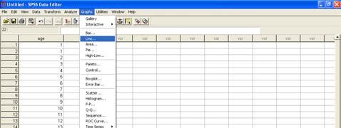
10 The Graphical Description of Data Histogram A Histogram is a graphical representation of a frequency distribution for continuous data. The height is proportional to the frequency of that class How to make histogram? From the menus, choose: Graphs and Histogram Select a numeric variable for Variable in the Histogram dialog.
11 Double click on the Graph to go to Chart Editor SPSS allows you to rescale and change quantitative axes in a variety of ways. Changing This can be done the by selecting axes Chart > Axis click the Interval button to edit the horizontal axis and click on OK. Click the Labels... button to change the way the labels are displayed. The interval axis

12 Select Custom to activate the Define button, then click on it to open the Interval Axis: Define Custom Intervals box. Changing the intervals Leave the Decimal Places: 1. Change the interval type to Range. Click the Continue button to get back to the original Interval Axis box. Select Interval width: rather than # of intervals (number of intervals) and type 20 in the Definition section. Change Minimum to 89.5 and Maximum under the Range section. Click on Continue to get back to the Interval Axis box. Click OK to make the changes to the chart.


13 click the Scale button to edit the vertical axis and click on OK. The options in the dialogue box include these: Display axis line box switches the scale axis line on or off. Axis Title: box for typing in a title for the axis. Title Justification: menu changes the place of the title relative to the axis. Scale changes between the ordinary Linear scale to a Log scale, which is not really appropriate for this kind of graph, but may be useful later on. Range changes overall range of the axis by entering new values in the Displayed: Minimum and Maximum boxes. Click Grid as well as Ticks under Major Divisions to draw a grid from the interval axis to help in comparing the count across intervals. Change increments under Major Divisions and to Minor Divisions 5 Click OK to make the change.


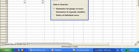
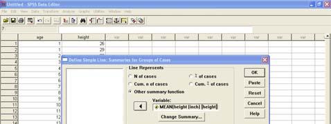
14 This histogram is a graphical representation of the distribution of Systolic blood pressure for nonsmokers. The curve represents the normal distribution. Bar charts Bar Charts are used for graphical representation of Nominal and Ordinal data Height of the bar is proportional to the number of values in the category. Summaries for Groups of Cases Categories of a single variable are summarized. Bar height is determined by the Bars Represent option. Example: To see number of males and females from the Gender variable How to? From the menus, choose: Graphs, Bar Select the icon for Simple and select Summaries for groups of cases. Select Define.

.")
15 Select a variable and move it into the Category Axis box. Select % of cases Click Ok A clustered bar graph Two or more variables are summarized within categories of another variable. Two or more Bars Represent variables (Var 1, Var 2). From the menus, choose: Graphs, Bar Select the icon for Clutered and select Summaries for groups of cases. Select Define.


16 Select education level as variable for the category axis and move it into the Category Axis box. Select gender and move it into Define Clusters by box. By clicking on Title You can add title, subtitle and footnotes Select % of cases Click Ok From the menus, choose: Graphs and Bar Select the icon for Clustered and select Summaries of separate variables. Select Define. Select at least two variables and move them into the Bars Represent box. These variables must be numeric.


17 Select a category variable and move it into the Category Axis box. This variable may be numeric, string or long string. A stacked bar graph Each bar is divided into layers, with the area of each layer proportional to the frequency of the category it represents. Pie Diagram The Pie Chart is used to graphically display either The Pie Chart is used to graphically display either qualitative or quantitative data, i.e., can be constructed for all levels of measurement..


18 From the menus choose: Graphs Pie Select Summaries for groups of cases and then Select Define. Select education level as the variable that defines slices and move it into Define Slices by box. This variable may be numeric, string, or long string. Click OK to create the pie chart. The pie chart reveals that most respondents primary school educated. Glancing at the chart, it would appear that only about a quarter of the respondents are not educated at all. You can edit charts in a variety of ways. For this sample pie chart, we will: Add a title. Remove the small category of "missing" data. Display percentages for the remaining categories in the chart. The first thing we'll do is add a title: Double-click the pie chart to open it in the Chart Editor.


19 From the Chart Editor menus choose: Chart Title For Title 1, enter Education level and then click OK. A descriptive title is now displayed above the pie chart. Sometimes you need to remove some category such as none data. To do that: From the Chart Editor menus choose: Series Displayed

 Percents While we're here, let's move the category labels from the outside to")
20 The category of none data has been removed from the pie chart, leaving only four categories. Move none from the Display list to the Omit list and click OK. Double-click on one of the category labels. Now It might be useful to see the exact percentages. Select (check) Percents While we're here, let's move the category labels from the outside to the inside of the pie. Click Format

.")
21 Select Inside from the drop-down list. Deselect (uncheck) Inside labels to suppress the display frame. Click Continue and then Click OK. Now percentages are displayed along with the category labels -- and both are displayed inside the pie slices. Stem and Leaves Display The percentages are based on the categories displayed ( = 100). If you put the category containing none values back into the pie, the percentages would change. Open 3 Non-smokers selected cases file Select Analyze


. Both: to display both")
22 Transfer the Non smokers Systolic blood pressure variable into the dependent list Plots: to display the variable (s) graphically. Statistics: to display the statistics of the variable (s). Both: to display both plots and statistics.


23 Time Plot Import your data from Excel file Choose the file type Select the Excel file to be opened Mark and delete unnecessary Rows Select the appropriate worksheet


24 Mark and delete unnecessary columns Switch to the variable view Rename the variables Change the type to Numeric Label the variables And change the Measure to Scale

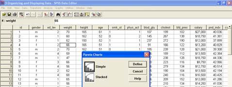
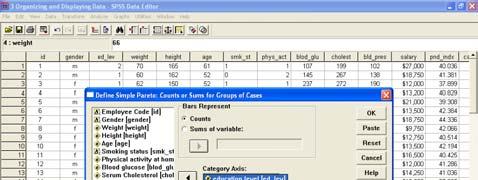
25 Pareto
26
LAB 1 INSTRUCTIONS DESCRIBING AND DISPLAYING DATA
 LAB 1 INSTRUCTIONS DESCRIBING AND DISPLAYING DATA This lab will assist you in learning how to summarize and display categorical and quantitative data in StatCrunch. In particular, you will learn how to
B. Graphing Representation of Data
 B Graphing Representation of Data The second way of displaying data is by use of graphs Although such visual aids are even easier to read than tables, they often do not give the same detail It is essential
MATH 117 Statistical Methods for Management I Chapter Two
 Jubail University College MATH 117 Statistical Methods for Management I Chapter Two There are a wide variety of ways to summarize, organize, and present data: I. Tables 1. Distribution Table (Categorical
Section 2-2 Frequency Distributions. Copyright 2010, 2007, 2004 Pearson Education, Inc
 Section 2-2 Frequency Distributions Copyright 2010, 2007, 2004 Pearson Education, Inc. 2.1-1 Frequency Distribution Frequency Distribution (or Frequency Table) It shows how a data set is partitioned among
The basic arrangement of numeric data is called an ARRAY. Array is the derived data from fundamental data Example :- To store marks of 50 student
 Organizing data Learning Outcome 1. make an array 2. divide the array into class intervals 3. describe the characteristics of a table 4. construct a frequency distribution table 5. constructing a composite
SPSS. (Statistical Packages for the Social Sciences)
") Inger Persson SPSS (Statistical Packages for the Social Sciences) SHORT INSTRUCTIONS This presentation contains only relatively short instructions on how to perform basic statistical calculations in SPSS.
Inger Persson SPSS (Statistical Packages for the Social Sciences) SHORT INSTRUCTIONS This presentation contains only relatively short instructions on how to perform basic statistical calculations in SPSS.
1. Basic Steps for Data Analysis Data Editor. 2.4.To create a new SPSS file
 1 SPSS Guide 2009 Content 1. Basic Steps for Data Analysis. 3 2. Data Editor. 2.4.To create a new SPSS file 3 4 3. Data Analysis/ Frequencies. 5 4. Recoding the variable into classes.. 5 5. Data Analysis/
2.1: Frequency Distributions
 2.1: Frequency Distributions Frequency Distribution: organization of data into groups called. A: Categorical Frequency Distribution used for and level qualitative data that can be put into categories.
QDA Miner. Addendum v2.0
 QDA Miner Addendum v2.0 QDA Miner is an easy-to-use qualitative analysis software for coding, annotating, retrieving and reviewing coded data and documents such as open-ended responses, customer comments,
Data to Story Project: SPSS Cheat Sheet for Analyzing General Social Survey Data
 Data to Story Project: SPSS Cheat Sheet for Analyzing General Social Survey Data This guide is intended to help you explore and analyze the variables you have selected for your group project. Conducting
HOUR 12. Adding a Chart
 HOUR 12 Adding a Chart The highlights of this hour are as follows: Reasons for using a chart The chart elements The chart types How to create charts with the Chart Wizard How to work with charts How to
Name Date Types of Graphs and Creating Graphs Notes
 Name Date Types of Graphs and Creating Graphs Notes Graphs are helpful visual representations of data. Different graphs display data in different ways. Some graphs show individual data, but many do not.
Make sure to keep all graphs in same excel file as your measures.
 Project Part 2 Graphs. I. Use Excel to make bar graph for questions 1, and 5. II. Use Excel to make histograms for questions 2, and 3. III. Use Excel to make pie graphs for questions 4, and 6. IV. Use
At the end of the chapter, you will learn to: Present data in textual form. Construct different types of table and graphs
 DATA PRESENTATION At the end of the chapter, you will learn to: Present data in textual form Construct different types of table and graphs Identify the characteristics of a good table and graph Identify
Getting Started With Excel
 Chapter 1 Getting Started With Excel This chapter will familiarize you with various basic features of Excel. Specific features which you need to solve a problem will be introduced as the need arises. When
Excel 2. Module 3 Advanced Charts
 Excel 2 Module 3 Advanced Charts Revised 1/1/17 People s Resource Center Module Overview This module is part of the Excel 2 course which is for advancing your knowledge of Excel. During this lesson we
Illustrator Charts. Advanced options
 Illustrator Charts Advanced options Setting up labels Labels are words or numbers that describe two things: the sets of data you want to compare, and the categories across which you want to compare them.
Lecture Slides. Elementary Statistics Twelfth Edition. by Mario F. Triola. and the Triola Statistics Series. Section 2.1- #
 Lecture Slides Elementary Statistics Twelfth Edition and the Triola Statistics Series by Mario F. Triola Chapter 2 Summarizing and Graphing Data 2-1 Review and Preview 2-2 Frequency Distributions 2-3 Histograms
Bar Charts and Frequency Distributions
 Bar Charts and Frequency Distributions Use to display the distribution of categorical (nominal or ordinal) variables. For the continuous (numeric) variables, see the page Histograms, Descriptive Stats
Chapter 2 - Graphical Summaries of Data
 Chapter 2 - Graphical Summaries of Data Data recorded in the sequence in which they are collected and before they are processed or ranked are called raw data. Raw data is often difficult to make sense
STAT STATISTICAL METHODS. Statistics: The science of using data to make decisions and draw conclusions
 STAT 515 --- STATISTICAL METHODS Statistics: The science of using data to make decisions and draw conclusions Two branches: Descriptive Statistics: The collection and presentation (through graphical and
4. Descriptive Statistics: Measures of Variability and Central Tendency
 4. Descriptive Statistics: Measures of Variability and Central Tendency Objectives Calculate descriptive for continuous and categorical data Edit output tables Although measures of central tendency and
IENG484 Quality Engineering Lab 1 RESEARCH ASSISTANT SHADI BOLOUKIFAR
 IENG484 Quality Engineering Lab 1 RESEARCH ASSISTANT SHADI BOLOUKIFAR SPSS (Statistical package for social science) Originally is acronym of Statistical Package for the Social Science but, now it stands
IBM SPSS Statistics 22 Brief Guide
 IBM SPSS Statistics 22 Brief Guide Note Before using this information and the product it supports, read the information in Notices on page 77. Product Information This edition applies to version 22, release
A Simple Guide to Using SPSS (Statistical Package for the. Introduction. Steps for Analyzing Data. Social Sciences) for Windows
 for Windows") A Simple Guide to Using SPSS (Statistical Package for the Social Sciences) for Windows Introduction ٢ Steps for Analyzing Data Enter the data Select the procedure and options Select the variables Run the
A Simple Guide to Using SPSS (Statistical Package for the Social Sciences) for Windows Introduction ٢ Steps for Analyzing Data Enter the data Select the procedure and options Select the variables Run the
Chapter 2: Understanding Data Distributions with Tables and Graphs
 Test Bank Chapter 2: Understanding Data with Tables and Graphs Multiple Choice 1. Which of the following would best depict nominal level data? a. pie chart b. line graph c. histogram d. polygon Ans: A
Chapter 2 Assignment (due Thursday, April 19)
") (due Thursday, April 19) Introduction: The purpose of this assignment is to analyze data sets by creating histograms and scatterplots. You will use the STATDISK program for both. Therefore, you should
(due Thursday, April 19) Introduction: The purpose of this assignment is to analyze data sets by creating histograms and scatterplots. You will use the STATDISK program for both. Therefore, you should
Working with Charts Stratum.Viewer 6
 Working with Charts Stratum.Viewer 6 Getting Started Tasks Additional Information Access to Charts Introduction to Charts Overview of Chart Types Quick Start - Adding a Chart to a View Create a Chart with
Overview. Frequency Distributions. Chapter 2 Summarizing & Graphing Data. Descriptive Statistics. Inferential Statistics. Frequency Distribution
 Chapter 2 Summarizing & Graphing Data Slide 1 Overview Descriptive Statistics Slide 2 A) Overview B) Frequency Distributions C) Visualizing Data summarize or describe the important characteristics of a
8. MINITAB COMMANDS WEEK-BY-WEEK
 8. MINITAB COMMANDS WEEK-BY-WEEK In this section of the Study Guide, we give brief information about the Minitab commands that are needed to apply the statistical methods in each week s study. They are
Data Visualization via Conditional Formatting
 Data Visualization Data visualization - the process of displaying data (often in large quantities) in a meaningful fashion to provide insights that will support better decisions. Data visualization improves
Minitab 17 commands Prepared by Jeffrey S. Simonoff
 Minitab 17 commands Prepared by Jeffrey S. Simonoff Data entry and manipulation To enter data by hand, click on the Worksheet window, and enter the values in as you would in any spreadsheet. To then save
Better Histograms Using Excel. Michael R. Middleton School of Business and Management, University of San Francisco
 Better s Using Excel Michael R. Middleton School of Business and Management, University of San Francisco A histogram is usually shown in Excel as a Column chart type (vertical bars). The labels of a Column
Chapter 4 Dealing with Data SPSS Tutorial
 Chapter 4 Dealing with Data SPSS Tutorial 1. Visit the student website at for this textbook at www.clowjames.net/students. 2. Download the following file: Chapter 04 Dealing with Data.sav (SPSS file) 3.
Data Resource Centre, University of Guelph CREATING AND EDITING CHARTS. From the menus choose: Graphs Chart Builder... 20/11/ :06:00 PM Page 1
 From the menus choose: Graphs Chart Builder... 20/11/2009 12:06:00 PM Page 1 The Chart Builder dialog box is an interactive window that allows you to preview how a chart will look while you build it. 20/11/2009
Brief Guide on Using SPSS 10.0
 Brief Guide on Using SPSS 10.0 (Use student data, 22 cases, studentp.dat in Dr. Chang s Data Directory Page) (Page address: http://www.cis.ysu.edu/~chang/stat/) I. Processing File and Data To open a new
Research Methods for Business and Management. Session 8a- Analyzing Quantitative Data- using SPSS 16 Andre Samuel
 Research Methods for Business and Management Session 8a- Analyzing Quantitative Data- using SPSS 16 Andre Samuel A Simple Example- Gym Purpose of Questionnaire- to determine the participants involvement
Your Name: Section: INTRODUCTION TO STATISTICAL REASONING Computer Lab #4 Scatterplots and Regression
 Your Name: Section: 36-201 INTRODUCTION TO STATISTICAL REASONING Computer Lab #4 Scatterplots and Regression Objectives: 1. To learn how to interpret scatterplots. Specifically you will investigate, using
IBMSPSSSTATL1P: IBM SPSS Statistics Level 1
 SPSS IBMSPSSSTATL1P IBMSPSSSTATL1P: IBM SPSS Statistics Level 1 Version: 4.4 QUESTION NO: 1 Which statement concerning IBM SPSS Statistics application windows is correct? A. At least one Data Editor window
Chpt 2. Frequency Distributions and Graphs. 2-4 Pareto chart, time series graph, Pie chart / 35
 Chpt 2 Frequency Distributions and Graphs 2-4 Pareto chart, time series graph, Pie chart 1 Chpt 2 2-4 Read pages 63-77 p76 Applying the Concepts p77 1, 7, 9, 11, 13, 14, 15 Homework 2 Chpt 2 Objectives
Using Charts in a Presentation 6
 Using Charts in a Presentation 6 LESSON SKILL MATRIX Skill Exam Objective Objective Number Building Charts Create a chart. Import a chart. Modifying the Chart Type and Data Change the Chart Type. 3.2.3
Course Code: SPSS19 Introduction to IBM SPSS Statistics
 Centre for Learning and Academic Development (CLAD) Technology Skills Development Team Course Code: SPSS19 Introduction to IBM SPSS Statistics www.intranet.birmingham.ac.uk/itskills An Introduction to
2.3 Organizing Quantitative Data
 2.3 Organizing Quantitative Data This section will focus on ways to organize quantitative data into tables, charts, and graphs. Quantitative data is organized by dividing the observations into classes
Opening a Data File in SPSS. Defining Variables in SPSS
 Opening a Data File in SPSS To open an existing SPSS file: 1. Click File Open Data. Go to the appropriate directory and find the name of the appropriate file. SPSS defaults to opening SPSS data files with
Elementary Statistics
 1 Elementary Statistics Introduction Statistics is the collection of methods for planning experiments, obtaining data, and then organizing, summarizing, presenting, analyzing, interpreting, and drawing
Math 227 EXCEL / MEGASTAT Guide
 Math 227 EXCEL / MEGASTAT Guide Introduction Introduction: Ch2: Frequency Distributions and Graphs Construct Frequency Distributions and various types of graphs: Histograms, Polygons, Pie Charts, Stem-and-Leaf
Introduction (SPSS) Opening SPSS Start All Programs SPSS Inc SPSS 21. SPSS Menus
 Opening SPSS Start All Programs SPSS Inc SPSS 21. SPSS Menus") Introduction (SPSS) SPSS is the acronym of Statistical Package for the Social Sciences. SPSS is one of the most popular statistical packages which can perform highly complex data manipulation and analysis
Introduction (SPSS) SPSS is the acronym of Statistical Package for the Social Sciences. SPSS is one of the most popular statistical packages which can perform highly complex data manipulation and analysis
Statistical Tables and Graphs
 Unit 5C Statistical Tables and Graphs Ms. Young Slide 5-1 Frequency Tables A basic frequency table has two columns: The first column lists the categories of data. The second column lists the frequency
2.1 Objectives. Math Chapter 2. Chapter 2. Variable. Categorical Variable EXPLORING DATA WITH GRAPHS AND NUMERICAL SUMMARIES
 EXPLORING DATA WITH GRAPHS AND NUMERICAL SUMMARIES Chapter 2 2.1 Objectives 2.1 What Are the Types of Data? www.managementscientist.org 1. Know the definitions of a. Variable b. Categorical versus quantitative
+ Statistical Methods in
 + Statistical Methods in Practice STA/MTH 3379 + Dr. A. B. W. Manage Associate Professor of Statistics Department of Mathematics & Statistics Sam Houston State University Discovering Statistics 2nd Edition
Introduction to CS graphs and plots in Excel Jacek Wiślicki, Laurent Babout,
 MS Excel 2010 offers a large set of graphs and plots for data visualization. For those who are familiar with older version of Excel, the layout is completely different. The following exercises demonstrate
Courtesy :
 STATISTICS The Nature of Statistics Introduction Statistics is the science of data Statistics is the science of conducting studies to collect, organize, summarize, analyze, and draw conclusions from data.
12. A(n) is the number of times an item or number occurs in a data set.
 is the number of times an item or number occurs in a data set.") Chapter 15 Vocabulary Practice Match each definition to its corresponding term. a. data b. statistical question c. population d. sample e. data analysis f. parameter g. statistic h. survey i. experiment
Chapter 15 Vocabulary Practice Match each definition to its corresponding term. a. data b. statistical question c. population d. sample e. data analysis f. parameter g. statistic h. survey i. experiment
Stat 528 (Autumn 2008) Density Curves and the Normal Distribution. Measures of center and spread. Features of the normal distribution
 Density Curves and the Normal Distribution. Measures of center and spread. Features of the normal distribution") Stat 528 (Autumn 2008) Density Curves and the Normal Distribution Reading: Section 1.3 Density curves An example: GRE scores Measures of center and spread The normal distribution Features of the normal
Stat 528 (Autumn 2008) Density Curves and the Normal Distribution Reading: Section 1.3 Density curves An example: GRE scores Measures of center and spread The normal distribution Features of the normal
Chapter 2. Frequency Distributions and Graphs. Bluman, Chapter 2
 Chapter 2 Frequency Distributions and Graphs 1 Chapter 2 Overview Introduction 2-1 Organizing Data 2-2 Histograms, Frequency Polygons, and Ogives 2-3 Other Types of Graphs 2 Chapter 2 Objectives 1. Organize
Organizing and Summarizing Data
 1 Organizing and Summarizing Data Key Definitions Frequency Distribution: This lists each category of data and how often they occur. : The percent of observations within the one of the categories. This
Graphical Presentation for Statistical Data (Relevant to AAT Examination Paper 4: Business Economics and Financial Mathematics) Introduction
 Introduction") Graphical Presentation for Statistical Data (Relevant to AAT Examination Paper 4: Business Economics and Financial Mathematics) Y O Lam, SCOPE, City University of Hong Kong Introduction The most convenient
Graphical Presentation for Statistical Data (Relevant to AAT Examination Paper 4: Business Economics and Financial Mathematics) Y O Lam, SCOPE, City University of Hong Kong Introduction The most convenient
8 Organizing and Displaying
 CHAPTER 8 Organizing and Displaying Data for Comparison Chapter Outline 8.1 BASIC GRAPH TYPES 8.2 DOUBLE LINE GRAPHS 8.3 TWO-SIDED STEM-AND-LEAF PLOTS 8.4 DOUBLE BAR GRAPHS 8.5 DOUBLE BOX-AND-WHISKER PLOTS
Statistical Package for the Social Sciences INTRODUCTION TO SPSS SPSS for Windows Version 16.0: Its first version in 1968 In 1975.
 Statistical Package for the Social Sciences INTRODUCTION TO SPSS SPSS for Windows Version 16.0: Its first version in 1968 In 1975. SPSS Statistics were designed INTRODUCTION TO SPSS Objective About the
To make sense of data, you can start by answering the following questions:
 Taken from the Introductory Biology 1, 181 lab manual, Biological Sciences, Copyright NCSU (with appreciation to Dr. Miriam Ferzli--author of this appendix of the lab manual). Appendix : Understanding
AND NUMERICAL SUMMARIES. Chapter 2
 EXPLORING DATA WITH GRAPHS AND NUMERICAL SUMMARIES Chapter 2 2.1 What Are the Types of Data? 2.1 Objectives www.managementscientist.org 1. Know the definitions of a. Variable b. Categorical versus quantitative
1. Data Analysis Yields Numbers & Visualizations. 2. Why Visualize Data? 3. What do Visualizations do? 4. Research on Visualizations
 Data Analysis & Business Intelligence Made Easy with Excel Power Tools Excel Data Analysis Basics = E-DAB Notes for Video: E-DAB-05- Visualizations: Table, Charts, Conditional Formatting & Dashboards Outcomes
PowerPlay Studio. User Documentation
 PowerPlay Studio User Documentation June 2013 POWERPLAY STUDIO PowerPlay Studio... 1 Supported browsers... 1 Logging On... 2 The Cognos Table of Contents... 3 Working in PowerPlay Studio... 5 Open a Cube...
Lab 2: Your first web page
 Lab 2: Your first web page Due date DUE DATE: 3/3/2017, by 5pm. Demo in lab section/ta office hours. Overview In this lab we will walk through the usage of Microsoft Excel to create bar charts, pie charts,
An Introduction to Minitab Statistics 529
 An Introduction to Minitab Statistics 529 1 Introduction MINITAB is a computing package for performing simple statistical analyses. The current version on the PC is 15. MINITAB is no longer made for the
Spell out your full name (first, middle and last)
") Spell out your full name (first, middle and last) Be ready to share the following counts: Number of letters in your full name. Number of vowels Number of consonants Section 2-1 Organizing Data After completing
Spell out your full name (first, middle and last) Be ready to share the following counts: Number of letters in your full name. Number of vowels Number of consonants Section 2-1 Organizing Data After completing
Making Science Graphs and Interpreting Data
 Making Science Graphs and Interpreting Data Eye Opener: 5 mins What do you see? What do you think? Look up terms you don t know What do Graphs Tell You? A graph is a way of expressing a relationship between
Pivot Tables and Pivot Charts Activities
 PMI Online Education Pivot Tables and Pivot Charts Activities Microcomputer Applications Updated 12.16.2011 Table of Contents Objective 1: Create and Modify PivotTable Reports... 3 Organizing Data to Display
To be able to create charts that graphically represent your worksheet data, you will: Create column charts on chart sheets by using the F11 key.
 L E S S O N 1 Creating charts Suggested teaching time 55-65 minutes Lesson objectives To be able to create charts that graphically represent your worksheet data, you will: a b c Create column charts on
STP 226 ELEMENTARY STATISTICS NOTES
 ELEMENTARY STATISTICS NOTES PART 2 - DESCRIPTIVE STATISTICS CHAPTER 2 ORGANIZING DATA Descriptive Statistics - include methods for organizing and summarizing information clearly and effectively. - classify
Data Analysis Guidelines
 Data Analysis Guidelines DESCRIPTIVE STATISTICS Standard Deviation Standard deviation is a calculated value that describes the variation (or spread) of values in a data set. It is calculated using a formula
Applied Regression Modeling: A Business Approach
 i Applied Regression Modeling: A Business Approach Computer software help: SAS SAS (originally Statistical Analysis Software ) is a commercial statistical software package based on a powerful programming
SUM - This says to add together cells F28 through F35. Notice that it will show your result is
 COUNTA - The COUNTA function will examine a set of cells and tell you how many cells are not empty. In this example, Excel analyzed 19 cells and found that only 18 were not empty. COUNTBLANK - The COUNTBLANK
Master Reports Guide. Table of Contents
 Table of Contents Welcome to Master Reports... 2 Report Basics... 2 Access Reports... 2 Download or Print a Report... 2 Report Help... 2 Save or Share a Report... 2 Master Report Formulas... 3 Filter a
74 Wyner Math Academy I Spring 2016
 74 Wyner Math Academy I Spring 2016 CHAPTER EIGHT: SPREADSHEETS Review April 18 Test April 25 Spreadsheets are an extremely useful and versatile tool. Some basic knowledge allows many basic tasks to be
INTRODUCTION TO SPSS OUTLINE 6/17/2013. Assoc. Prof. Dr. Md. Mujibur Rahman Room No. BN Phone:
 INTRODUCTION TO SPSS Assoc. Prof. Dr. Md. Mujibur Rahman Room No. BN-0-024 Phone: 89287269 E-mail: mujibur@uniten.edu.my OUTLINE About the four-windows in SPSS The basics of managing data files The basic
Introduction to Minitab 1
 Introduction to Minitab 1 We begin by first starting Minitab. You may choose to either 1. click on the Minitab icon in the corner of your screen 2. go to the lower left and hit Start, then from All Programs,
D&B Market Insight Release Notes. November, 2015
 D&B Market Insight Release Notes November, 2015 Table of Contents Table of Contents... 2 Charting Tool: Add multiple measures to charts... 3 Charting Tool: Additional enhancements to charts... 6 Data Grids:
Creating a data file and entering data
 4 Creating a data file and entering data There are a number of stages in the process of setting up a data file and analysing the data. The flow chart shown on the next page outlines the main steps that
Mr. Kongmany Chaleunvong. GFMER - WHO - UNFPA - LAO PDR Training Course in Reproductive Health Research Vientiane, 22 October 2009
 Mr. Kongmany Chaleunvong GFMER - WHO - UNFPA - LAO PDR Training Course in Reproductive Health Research Vientiane, 22 October 2009 1 Object of the Course Introduction to SPSS The basics of managing data
Raw Data. Statistics 1/8/2016. Relative Frequency Distribution. Frequency Distributions for Qualitative Data
 Statistics Raw Data Raw data is random and unranked data. Organizing Data Frequency distributions list all the categories and the numbers of elements that belong to each category Frequency Distributions
ABOUT PIVOTTABLES TABLE OF CONTENTS
 University of Southern California Academic Information Services Excel 2007 - PivotTables ABOUT PIVOTTABLES PivotTables provide an excellent means of analyzing data stored in database format by rearranging
Use of GeoGebra in teaching about central tendency and spread variability
 CREAT. MATH. INFORM. 21 (2012), No. 1, 57-64 Online version at http://creative-mathematics.ubm.ro/ Print Edition: ISSN 1584-286X Online Edition: ISSN 1843-441X Use of GeoGebra in teaching about central
Applied Regression Modeling: A Business Approach
 i Applied Regression Modeling: A Business Approach Computer software help: SPSS SPSS (originally Statistical Package for the Social Sciences ) is a commercial statistical software package with an easy-to-use
Microsoft Excel 2000 Charts
 You see graphs everywhere, in textbooks, in newspapers, magazines, and on television. The ability to create, read, and analyze graphs are essential parts of a student s education. Creating graphs by hand
Effective Use of Column Charts
 Effective Use of Column Charts Purpose Format This tool provides guidelines and tips on how to effectively use column charts to communicate research findings. This tool provides guidance on column charts
Bluman & Mayer, Elementary Statistics, A Step by Step Approach, Canadian Edition
 Bluman & Mayer, Elementary Statistics, A Step by Step Approach, Canadian Edition Online Learning Centre Technology Step-by-Step - Minitab Minitab is a statistical software application originally created
Stamina Software Pty Ltd. TRAINING MANUAL Viságe BIT VIEWER
 Stamina Software Pty Ltd TRAINING MANUAL Viságe BIT VIEWER Version: 3 31 st October 2011 Viságe BIT Viewer TABLE OF CONTENTS VISÁGE BIT VIEWER... 2 ELEMENTS OF THE VISÁGE BIT VIEWER SCREEN... 3 TITLE...
28 CHAPTER 2 Summarizing and Graphing Data
 8 CHAPTER Summarizing and Graphing Data. The two requested histograms are given below. They give very different visual images of the shape of the distribution. An outlier can have a significant effect
Microsoft. Creating Custom Visual Elements
 Excel Microsoft Creating Custom Visual Elements 2015 The Continuing Education Center, Inc., d/b/a National Seminars Training. All rights reserved, including the right to reproduce this material or any
Chapter 1. Looking at Data-Distribution
 Chapter 1. Looking at Data-Distribution Statistics is the scientific discipline that provides methods to draw right conclusions: 1)Collecting the data 2)Describing the data 3)Drawing the conclusions Raw
SPSS for Survey Analysis
 STC: SPSS for Survey Analysis 1 SPSS for Survey Analysis STC: SPSS for Survey Analysis 2 SPSS for Surveys: Contents Background Information... 4 Opening and creating new documents... 5 Starting SPSS...
Navigating in SPSS. C h a p t e r 2 OBJECTIVES
 C h a p t e r 2 Navigating in SPSS 2.1 Introduction and Objectives As with any new software program you may use, it is important that you are able to move around the screen with the mouse and that you
WORKSHOP: Using the Health Survey for England, 2014
 WORKSHOP: Using the Health Survey for England, 2014 There are three sections to this workshop, each with a separate worksheet. The worksheets are designed to be accessible to those who have no prior experience
Section 33: Advanced Charts
 Section 33 Advanced Charts By the end of this Section you should be able to: Use Chart Options Add Moving Averages to Charts Change a 3D Chart View Use Data Labels and Markers Create Stacked Bar Charts
Basic Medical Statistics Course
 Basic Medical Statistics Course S0 SPSS Intro November 2013 Wilma Heemsbergen w.heemsbergen@nki.nl 1 13.00 ~ 15.30 Database (20 min) SPSS (40 min) Short break Exercise (60 min) This Afternoon During the
Chapter 2: Graphical Summaries of Data 2.1 Graphical Summaries for Qualitative Data. Frequency: Frequency distribution:
 Chapter 2: Graphical Summaries of Data 2.1 Graphical Summaries for Qualitative Data Frequency: Frequency distribution: Example 2.1 The following are survey results from Fall 2014 Statistics class regarding
INTRODUCTORY LAB INTRODUCTION TO STATCRUNCH 5.0
 INTRODUCTORY LAB INTRODUCTION TO STATCRUNCH 5.0 StatCrunch is a free web-based statistical software package containing all statistical features covered in introductory statistics courses. It is very easy
Table of Contents (As covered from textbook)
") Table of Contents (As covered from textbook) Ch 1 Data and Decisions Ch 2 Displaying and Describing Categorical Data Ch 3 Displaying and Describing Quantitative Data Ch 4 Correlation and Linear Regression
Table of Contents (As covered from textbook) Ch 1 Data and Decisions Ch 2 Displaying and Describing Categorical Data Ch 3 Displaying and Describing Quantitative Data Ch 4 Correlation and Linear Regression
4. In the Change Chart Type dialog box, click the type of chart to which you want to change. 5. Click the chart style. 6. Click OK.
 PROCEDURES LESSON 21: BUILDING BASIC CHARTS Creating a Chart 1 Select the range of data you want to chart 2 Click the INSERT tab Charts Group 3 Click the desired chart category button 4 In the gallery,