Fast Company Homepage This ad is very distracting and grabs the viewer attention more than the logo and navigation. It could cause the user to overloo
|
|
|
- Melina Austin
- 5 years ago
- Views:
Transcription
1 Competitive Review Fast Company Homepage Doing well: It has a bold and modern feel that appeals to the internet audience. Doing poorly: The layout is confusing as to which elements match up and it's unclear what to look at. The heavy imagery is not good for mobile viewing. Opportunities: We'll explore a balance between imagery and content for creating impact. Fast Company Article Fast Company Responsive Mashable Article Mashable Homepage Doing well: The article pages have good elements like large headlines, author image, and images in the text. Doing poorly: It has ads that are interspersed throughout the page and disrupt the flow for the user. It has a lot of decoration that creates visual noise. Opportunities: We'll explore creating a rich content experience without being cluttered. Mashable Responsive Vox Homepage Doing well: It has bold and engaging article pages with pull quotes and images within the copy. Doing poorly: It lacks consistency and organization on the homepage. Opportunities: We'll explore ways to keep articles engaging and easy to scan (not just big chunks of text) and carry that through to social media. Vox Article Vox Responsive

2 Fast Company Homepage This ad is very distracting and grabs the viewer attention more than the logo and navigation. It could cause the user to overlook the navigation. The main navigation is a bit small, gets lost, and is hard to see. This large visual does a good job capturing the viewer's attention. It's hard to tell this link and description is associated with the image above. The all caps here is not friendly and inviting to read, users will be less likely to stop and view it. 6 These quick links are a good way to help users navigate into the site. okay By Brady Pierzchalski 7 These simple links to social media 6 show how many people have already emerged with the article encourages views to also participate. 8 I'm unsure as to whether these links 7 belong to the article above, or below. By 8

3 Fast Company Homepage Some area By 0 By By empty By

4 Fast Company Article The typography here is hard to read, it could use some more letter spacing. By The subheads are small. It would be more helpful if subheads divided the text better so readers can scan the article easier. The right sidebar has stronger visual presence. It draws and distracts the reader from the main content. Yikes!! By

5 Fast Company Article Clear and concise call to action are a good size and give readers a few options to share the article after reading. Compact yet visually engaging suggested articles help users continue to navigate the site.

6 Fast Company Article Really? I wasn't aware of this... By really...? By

7 Fast Company Responsive Clear icon for more navigation, tells the users to tap for more links. That arrow is a bit unclear to me. By Responsive functionality allows users to to view the site of multiple sized devices. cool! By Okay, this makes sense... but I didn't see a text box appear for annotation. Weird. By hmmm... two s? By back on track with #! By

8 Mashable Article 9 8 Very clear headline helps users know exactly what page they're on. It's interesting to see the number of followers they have, it signals to reader the popularity of the site and encourages them to also follow. Large number showing off the amount of shares this article has tells 0 the user how popular and worth reading the article is. This graph that shows how quickly 7 people are sharing this article. It quickly informs the reader and encourages the reader to also share. Picture and name of writer helps make the article more personable and makes it easy for readers to find more 6 6 articles by the same writer. Images that break up the article makes it easier to scan and not as dense with copy. 7 So many ads on the side cause readers to just ignore this section even though there might be useful content here. 8 ghghghgj By 9 wow By 0 flood everywhere By

9 Mashable Article

10 Mashable Homepage This colored element emphasizes this column and draws the users attention here. Small links to the side are easy to miss especially since the large articles links and ads on the right require the user to scroll down a lot. Hierarchy and spacing of the layout is confusing making it hard to know what's to look at first. This ad is very tall causing user to scroll a lot to skip it and it takes a lot of space in the middle of the page. This ad shape takes up and wastes a lot of space on the sides.

11 Mashable Homepage

12 Mashable Responsive Responsive functionality allows users to to view the site of multiple sized devices. The navigation link "More" makes it very clear and tells the users to tap for more links. Ads take up a lot of the page which will most likely annoy and confuse readers.

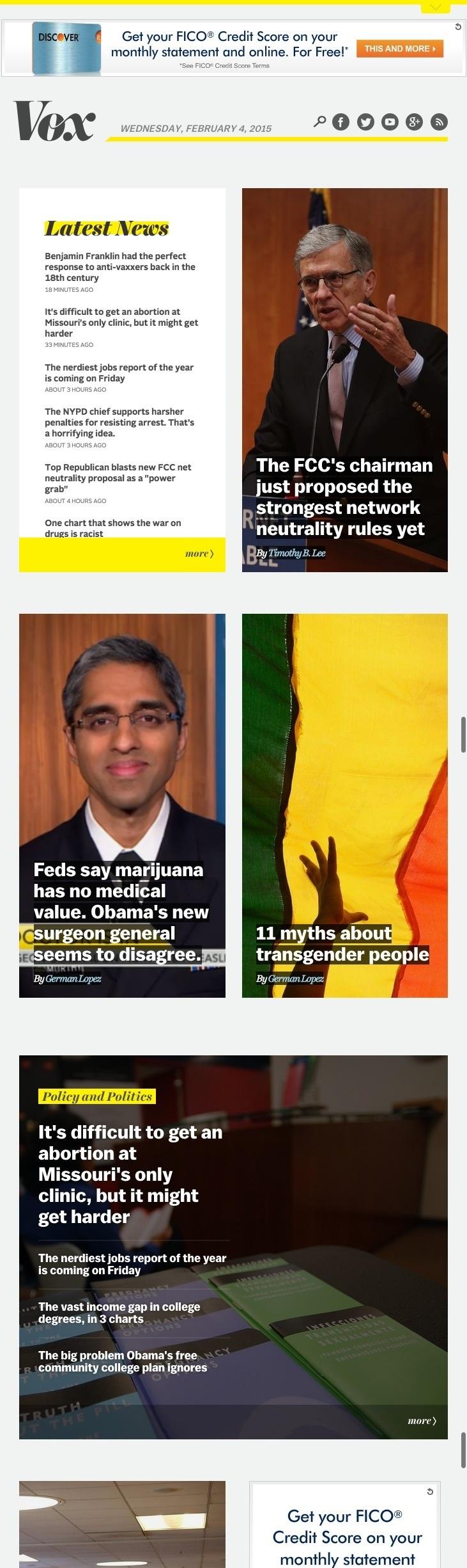
13 Vox Homepage This only calls up a login CTA, which is underwhelming. This site is one long page without any navigation makes it hard to jump to sections of the site. Inviting and bold features section make users want to click on articles. Using brand-like fonts creates continuity. The text itself is confusing, feels like they're trying too hard. Variety of block styles keep users intrigued and scrolling down the page. At some point the styles get a bit too disparate and users may lose sense 6 of what the styles mean. I like this part thing By me too! By 6

14 Vox Homepage The organization is very confusing. Though these items appear to be under the Videos section, they are not all actually videos.

15 Vox Homepage
16 Vox Homepage

17 Vox Article Very clear headline helps users know exactly what page they're on. Unified social sharing buttons look really clean and don't distract from the main focus. Pull quotes from the article work well to help readers skim the text and capture their attention. Type size and line length are easy to stay with for a long time. Images within the article help break up the text and give readers something visual to look at.

18 Vox Article Suggested articles help give users more options to read. It could be more engaging if there were thumbnail images. Repeating the social sharing at the bottom reminds users to share and helps make it easy for them.
19 Vox Responsive Bold headline works really well, it's clear and legible. The two column layout works well for the responsive tablet sized view. These feature boxes seem to be too tall and takes up more space than it needs to. This makes the user need to swipe a lot to see the content. By aaaaaa By a By
20
21 Vox Responsive
 User Interfaces Assignment 3: Heuristic Re-Design of Craigslist (English) Completed by Group 5 November 10, 2015 Phase 1: Analysis of Usability Issues Homepage Error 1: Overall the page is overwhelming
Good Publication Design
 Good Publication Design The top ten tips for creating professional print documents How do I create a well-designed print publication? Good publication design is an art form. Attractively presenting written
Typographic hierarchy: How to prioritize information
 New York City College of Technology, CUNY Department of Communication Design Typographic Design III Instructor: Professor Childers pchilders1@mac.com Typographic hierarchy: How to prioritize information
Strong signs your website needs a professional redesign
 Strong signs your website needs a professional redesign Think - when was the last time that your business website was updated? Better yet, when was the last time you looked at your website? When the Internet
Design 101: Dress for the Job You Want
 Design 101: Dress for the Job You Want by RAFAL TOMAL Themes Choosing a WordPress theme can be a little overwhelming at the beginning. Especially if you don t really know what you want your final website
THE 18 POINT CHECKLIST TO BUILDING THE PERFECT LANDING PAGE
 THE 18 POINT CHECKLIST TO BUILDING THE PERFECT LANDING PAGE The 18 point checklist to building the Perfect landing page Landing pages come in all shapes and sizes. They re your metaphorical shop front
2/1/2016. Discuss website usability essentials Explain principles of design Critique a website in terms of usability and design
 Due Tuesday, Feb. 9 upload to Blackboard Locate five HTML (not Flash) websites you believe exhibit good web design, usability and accessibility principles. Each website s critique is worth 10 points (50
The Path to a Successful Website
 CREATIVE DESIGN STUDIO Website Checklist: The Path to a Successful Website Get Traffic to Your Website Organic search Keyword optimization Target only one keyword per page Use keywords in: URL Meta title
Designing Research Posters. College of Art and Design Chris Jackson, Associate Dean Keli DiRisio, Assistant Professor
 Designing Research Posters College of Art and Design Chris Jackson, Associate Dean Keli DiRisio, Assistant Professor Size and Orientation If you are NOT using the poster template: Start is with a 48"
The 10 Biggest Mistakes
 The 10 Biggest Mistakes Start-up Copywriters Make The Blackford Centre for Copywriting The Blackford Centre for Copywriting www.inst.org/copy 10 Biggest Mistakes Page 2 Contents 1. Not Writing Good Headlines...
UNC Eshelman School of Pharmacy
 UNC Eshelman School of Pharmacy Brand Guide FINAL Typography The primary typeface is Fira Sans (Hair, Extra Light, Book, Bold, Extra Bold as well as matching italic equivalents). This has been carefully
There are four (4) skills every Drupal editor needs to master:
 skills every Drupal editor needs to master:") There are four (4) skills every Drupal editor needs to master: 1. Create a New Page / Edit an existing page. This entails adding text and formatting the content properly. 2. Adding an image to a page.
There are four (4) skills every Drupal editor needs to master: 1. Create a New Page / Edit an existing page. This entails adding text and formatting the content properly. 2. Adding an image to a page.
1. You re boring your audience
 1. You re boring your audience OK, so you ve convinced your users to visit your landing page. Or even better they ve signed up for your mailing list. That s great! Now that you have their attention, the
Creating Universally Designed Word 2010 Documents - Quick Start Guide
 Creating Universally Designed Word 2010 Documents - Quick Start Guide Overview Creating accessible documents ones that work well with all sorts of technology can be a daunting task. The purpose of this
Creating Universally Designed Word 2013 Documents - Quick Start Guide
 Creating Universally Designed Word 2013 Documents - Quick Start Guide Overview Creating accessible documents ones that work well with all sorts of technology can be a daunting task. The purpose of this
Appendix A Design. User-Friendly Web Pages
 Appendix A Design User-Friendly Web Pages 2 How to Do Everything with FrontPage 2002 If you have surfed the Web for any significant period of time, you know that there are plenty of Web sites out there
Before & After. Use the Principles Cheatsheet! From The Non-Designer s Design Book, Robin Williams Non-Designer s Design 8
 Before & After Use the Principles Cheatsheet! From The Non-Designer s Design Book, Robin Williams Non-Designer s Design 8 Before & After From The Non-Designer s Design Book, Robin Williams Non-Designer
Workshop with ROCKWOOL editors. Helle Jensen, Senior ux consultant
 Workshop with ROCKWOOL editors Helle Jensen, Senior ux consultant Agenda 1. Intro to UX and customer journeys 2. Intro to web content 3. Intro to blocks in EpiServer 4. Content guidelines 5. Exercise:
User Experience. 10 Principles to Ensure a Great. on your Website. Issue 3. An Appnovation Digital ebook
 Issue 3 10 Principles to Ensure a Great User Experience on your Website An Appnovation Digital ebook 10 Principles to Ensure a Great User Experience on your Website www.appnovation.com P.1 Thank you for
Marketing Best Practices
 Email Marketing Best Practices Email Best Practices Email Marketing Metrics Churn Metrics - How to reduce unsubscribes? Why segmentation matters? Increase Open Rates & Click-through Rates Beware of SPAM
Design that Enhances Readability
 Working to ensure that all Americans get enrolled and stay enrolled in our nation s health care system Design that Enhances Readability By Eva Anderson Nicole Donnelly Joan Winchester Penny Lane MAXIMUS
Using Image Content Correctly
 Using Image Content Correctly Image Is Everything ISSUE #2 An Understated Task One of the most significant elements of any website is its image content, and knowing how and where to use imagery, as well
Professor: Angela Hicks
 CLASS 02 Building a World-Class Email Template Professor: Angela Hicks HubSpot Design Certification Brought to you by HubSpot Academy Angela Hicks @angela_9 inbound.org/group/ hubspot-designer-forum Before
balancer high-fidelity prototype dian hartono, grace jang, chris rovillos, catriona scott, brian yin
 balancer high-fidelity prototype dian hartono, grace jang, chris rovillos, catriona scott, brian yin Problem and Solution Overview A healthy work-life balance is vital for both employers and employees.
WEBSITE BEST PRACTICES
 WEBSITE BEST PRACTICES BISHOP S LEADERSHIP CONFERENCE OCTOBER 2018 Congregational Web Sites: Our New Front Door Your web site is often the first contact for those looking to make a connection to your community
The Four Biggest Mistakes B2B Companies Make With Their Website That Drives Visitors Away To The Competition And How To Keep Them From Leaving.
 The Four Biggest Mistakes B2B Companies Make With Their Website That Drives Visitors Away To The Competition And How To Keep Them From Leaving. Includes A Website Effectiveness Solution Checklist By Keith
Q&A for The Washington Times New Website
 Q&A for The Washington Times New Website Q.) How do I log in and what are the benefits? A.) Registering for a Washington Times account opens up a whole new world of opportunity for you, from being able
It is written in plain language: no jargon, nor formality. Information gets across faster when it s written in words that our users actually use.
 Web Style Guide A style guide for use for writing on Tufts Library Websites and LibGuides. Contents: 1. Web style guides for online content 2. LibGuides 2-specific style guide 3. Tisch s website-specific
Design Principles. The Four Basic Principles That Underlie Good Page Design
 Design Principles The Four Basic Principles That Underlie Good Page Design Some of the information presented in this video will appear on quizzes and exams. Please be sure to pay attention to key points
How to Create and Submit a Press Release
 How to Create and Submit a Press Release January 30, 2017 by Crystal Lee Butler Advisor Perspectives welcomes guest contributions. The views presented here do not necessarily represent those of Advisor
BETTER LOOKING S
 BETTER LOOKING EMAILS First impressions matter. So if you want a positive response to your email campaign you need to make a positive first impression. Here are some simple design strategies to help you
MARKETING VOL. 1
 EMAIL MARKETING VOL. 1 TITLE: Email Promoting: What You Need To Do Author: Iris Carter-Collins Table Of Contents 1 Email Promoting: What You Need To Do 4 Building Your Business Through Successful Marketing
University of Wisconsin - Stout
 University of Wisconsin - Stout http://www.uwstout.edu/soe/profdev/pptrubric.html This rubric may be used for self-assessment and peer feedback. project grade will be based upon the following evaluation
Writing For The Web. Patricia Minacori
 Writing For The Web Patricia Minacori 1 Introduction Scannability Navigation Page Layout Readability Colors Editing Conclusion 2 Introduction Very different way of writing compared to paper 3 Introduction
Design Development Documentation
 Design Development Documentation Preliminary Logo One For the first logo design in which I created I started off with a clipart image of a clenched fist in which I traced within Photoshop. I chose this
Documentation:Blogzine WordPress Theme
 Documentation:Blogzine WordPress Theme Install Blogzine WordPress Theme within a few minutes:- Blogzine is a minimalistic WordPress theme dedicated to blogs. Blog In provides a responsive layout with unlimited
EXCELLENCE IN ALL WE DO
 EXCELLENCE IN ALL WE DO STEVENS INSTITUTE OF TECHNOLOGY PowerPoint Presentation Guide Instructions & Standards March 2015 CONTENTS POWERPOINT PRESENTATIONS... 3 GETTING STARTED... 4 FONTS... 5 SLIDE OPTIONS...
Anatomy of a Marketing
 Anatomy of a Marketing Email Your Guide to Email Design and How it Can Work for You After all, Isn t Email Dead? The first email was sent in 1971. In digital marketing terms that s like a million years
Below are 7 Steps for Building an Effective Landing Page
 A Landing Page is most often a single page website useful for: Validating a startup idea Selling a product or service Growing your email list through an email opt-in The goal of Page in a Day is to provide
Creating accessible forms
 Creating accessible forms Introduction Creating an accessible form can seem tricky. Some of the questions people commonly ask include: Can I use protected forms? How do I lay out my prompts and questions?
15 NEUROMARKETING. Mind Hacks. You Need To Be Using
 15 NEUROMARKETING Mind Hacks You Need To Be Using Research suggests that there are definite behavioral patterns that most people follow almost automatically, and understanding those patterns gives you
Esri Story Maps let you combine authoritative maps with narrative text, images, and multimedia
 Geoinformation and Sectoral Statistics Section (GiSS) Story Maps Esri Story Maps let you combine authoritative maps with narrative text, images, and multimedia content. They make it easy to harness the
AMERICAN EAGLE. Usability Testing. Page 1 Cover Page 2 Survey Pages 3-4 Sonja Pages 5-6 Danijela. Group 2 12/5/13
 AMERICAN EAGLE Usability Testing Page 1 Cover Page 2 Survey Pages 3-4 Sonja Pages 5-6 Danijela Group 2 12/5/13 Rachel Powell, Sarah Wheeler, Tasha Mowery, William McDowell Survey: (Results after 10 people
STONELAW HIGH GRAPHIC
 GRAPHIC COMMUNICATION Technical Education THE A to Z of DTP Your knowledge of desktop publishing terminology will be expanded as you progress within the subject THE A to Z of DTP ALIGNMENT positions of
On the Web sun.com/aboutsun/comm_invest STAROFFICE 8 DRAW
 STAROFFICE 8 DRAW Graphics They say a picture is worth a thousand words. Pictures are often used along with our words for good reason. They help communicate our thoughts. They give extra information that
PLANNING. CAEL Networked Worlds WEEK 2
 PLANNING CAEL5045 - Networked Worlds WEEK 2 WEEK 2 CHOOSING COLOURS CHOOSING FONTS COLLECTING CONTENT PLANNING STRUCTURE WIREFRAMES + MOCKUPS Every colour, including black and white, has implications for
WEBSITE USER GUIDE.
 WEBSITE USER GUIDE www.thegrangekent.co.uk Crafted by Burning Leaf Creatives burningleaf.co.uk May 2018 Fundraising for the children of Five Acre Wood School ABOUT THIS GUIDE This guide has been crafted
TLMC SHORT CLASS: THESIS FORMATTING
 Table of Contents Introduction... 2 Getting Help... 2 Tips... 2 Working with Styles... 3 Applying a Style... 3 Creating A New Style... 3 Setting Margins... 4 Adding Page Numbers... 5 Step 1: Using Sections
Page Layout Design min
 1 of 8 09/11/2011 19:26 Home > Design Tips > Page Layout Design Page Layout Design 15-25 min In this tutorial, we ll explore the design phase of document creation. With the grid as our layout guide, we
Web UI Dos and Don ts
 Web UI Dos and Don ts 1. A One Column Layout instead of multi-columns a. A one column layout gives you more control over your narrative. It guides your readers in a more predictable way from top to bottom.
A guide to simple, clean and minimalist design
 A guide to simple, clean and minimalist design In a world full of fuzz, it s refreshing to see design that gets messages across clearly and quickly. That s the driving force behind our design approach.
Creating Universally Designed PowerPoint 2010 Documents - Quick Start Guide
 Creating Universally Designed PowerPoint 2010 Documents - Quick Start Guide Overview A universally designed PowerPoint presentation takes into account the various needs of the audience, whether they are
TOP 10 DESIGN MISTAKES
 TOP 10 DESIGN MISTAKES 1. Sizing Issues: This part is too big, that part is too small 2. Lack of Sharing Buttons: We want to share but how or where? 3. Mismatched Purpose: Site doesn't fit your goals 4.
TRINET INTERNET SOLUTIONS, INC.
 TRINET INTERNET SOLUTIONS, INC. 1. Headquartered in Orange County, California with Offices in Washington D.C. and Dallas 2. Industry leading, full-service digital agency for 22 years 3. Expert capabilities
Advanced Webpage Design
 Advanced Webpage Design Webmaster Career Skills Webpage Careers Web designer: Responsible for creating the look and feel of a webpage. Average Utah Salary: $81,000 Most work for small businesses or freelance.
WEB PAGE ARCHITECTURE
 The goals of webpage architecture: 1. Bring order to many types of information: text, images, links, navigation. 2. Create movement through the page. 3. Provide centers of visual interest that serve as
Typesetting Tips. Put your best type forward.
 Typesetting Tips Put your best type forward. Do you want your audience to read your document? Improve your chances by making your article easy to read. Make the document difficult to read and To learn
Layout of a Desktop Publishing Document
 Layout of a Desktop Publishing Document 1.03A Demonstrate desktop publishing. Margin Guides Margin guides are lines that indicate the space between the edge of the page and the document contents Margin
Hershey Park. By: Alicia Danenhower. English 3880 Section 10. Deborah Welsh.
 Hershey Park http://www.themeparkpage.com/images/hershey-web/dsc00263000.jpg By: Alicia Danenhower English 3880 Section 10 Deborah Welsh 11/8/2011 Hershey Park 1 Introduction This report analyzes the ways
Heuristic Evaluation of Mango
 Heuristic Evaluation of Mango 1. Problem Mango is an application that makes it easier to plan group travel and collaborate on group itineraries by providing an interface to invite friends to a group trip,
Multimedia Design Principles. Darnell Chance August 2005
 Multimedia Design Principles Darnell Chance August 2005 Home Page Things To Consider Organization Story Board Organization The 3 C s Alignment Proximity Tips/ Techs White Space Contrast Rule of Thumb Typography
ABCs of Direct Mail. Tips for More Effective Marketing Publications
 ABCs of Direct Mail Tips for More Effective Marketing Publications ABCs of Direct Mail 2 Introduction Direct mail is a growing business and everyone is eager and excited to jump on board. The problem is
Page Title is one of the most important ranking factor. Every page on our site should have unique title preferably relevant to keyword.
 SEO can split into two categories as On-page SEO and Off-page SEO. On-Page SEO refers to all the things that we can do ON our website to rank higher, such as page titles, meta description, keyword, content,
UNIVERSITY OF BOLTON WEB PUBLISHER GUIDE JUNE 2016 / VERSION 1.0
 UNIVERSITY OF BOLTON WEB PUBLISHER GUIDE WWW.BOLTON.AC.UK/DIA JUNE 2016 / VERSION 1.0 This guide is for staff who have responsibility for webpages on the university website. All Web Publishers must adhere
INTRODUCTION TO TYPOGRAPHY DESIGN
 INTRODUCTION TO TYPOGRAPHY DESIGN Goals of typographic design Typography plays an important role in how audiences perceive your document and its information. Good design is about capturing your audience
Reviewing and Evaluating your Website
 Reviewing and Evaluating your Website Introduction In the following review, I will be evaluating the website that I have produced for my client. I will make sure I have made the website appropriate for
2013 Association Marketing Benchmark Report
 2013 Association Email Marketing Benchmark Report Part I: Key Metrics 1 TABLE of CONTENTS About Informz.... 3 Introduction.... 4 Key Findings.... 5 Overall Association Metrics... 6 Results by Country of
Usability Test Report: Bento results interface 1
 Usability Test Report: Bento results interface 1 Summary Emily Daly and Ian Sloat conducted usability testing on the functionality of the Bento results interface. The test was conducted at the temporary
Format and Layout 8/31/2012. Using Visuals to Inform and Persuade
 ENG112 Prof. Katherine Delhagen *No sound read every slide of the presentation carefully Using Visuals to Inform and Persuade Effective technical communication integrates textual and visual elements: o
OCA Graphic Design: Core Concepts 1 Assignment 5 - Penguin Books Jane Braybrook Jane511794
 OCA Graphic Design: Core Concepts 1 Assignment 5 - Penguin Books Jane Braybrook Jane511794 Supporting Blog Post: https://jane511794.wordpress.com/category/assignments/assignment-5/ Critical Evaluation
Reading books on an ipad or other electronic device is a
 In This Chapter Chapter 1 What ibooks Author Can Do for You Comparing types of e-books Understanding what sets ibooks Author apart Reading books on an ipad or other electronic device is a wonderful thing.
Developed by: Beth Gibbs
 Developed by: Beth Gibbs Steps in Organizing Newsletter Plan layout and content Write and format the copy Design the layout Add graphics Produce the newsletter Introduction Keep in touch with parents Inform
Marketing Guide to Increase Sales
 A STEP BY STEP Email Marketing Guide to Increase Sales Reach your target prospects and convert them into customers Email Marketing and Importance of Data Quality Email marketing is a type of direct marketing
Design Principles. Advanced Higher Graphic Presentation. Professional Graphic Presentations by kind permission of
 Design Principles Advanced Higher Graphic Presentation Professional Graphic Presentations by kind permission of Design Principles:- Balance Balance in Composition Three different types of balance :- *
Sitefinity Manual. Webmasters. University of Vermont College of Medicine. Medical Communications
 Sitefinity Manual Webmasters University of Vermont College of Medicine Medical Communications Table of Contents Basics... 2 Navigating to the Website... 3 Actions.. 4 Titles & Properties. 5 Creating a
Creating a Website Using Weebly.com (July 2012 Update)
") Creating a Website Using Weebly.com (July 2012 Update) Weebly.com is a website where anyone with basic word processing skills can create a website at no cost. No special software is required and there
Creating a Website Using Weebly.com (July 2012 Update) Weebly.com is a website where anyone with basic word processing skills can create a website at no cost. No special software is required and there
Wordpress Section Types RAINBOW DISTRICT SCHOOL BOARD WORDPRESS GUIDELINES
 Wordpress Section Types RAINBOW DISTRICT SCHOOL BOARD WORDPRESS GUIDELINES OCTOBER 2016 Table of Contents Summary...1 Menu Structure & Pages...2 Navigating Pages...3 Text Block...4 Resource Listings...7
Creating a Presentation
 Creating a Presentation You will need to create a basic presentation before you can work with the advanced features of PowerPoint. 1 Exercise #1 Creating the Basic Presentation (1) Open Microsoft PowerPoint
CONCEIVING YOUR WEBSITE & ONLINE COMMUNICATIONS STRATEGY: A Helpful Guide Written by Amy Lenzo, under Creative Commons Licensing
 CONCEIVING YOUR WEBSITE & ONLINE COMMUNICATIONS STRATEGY: A Helpful Guide Written by Amy Lenzo, under Creative Commons Licensing For most of us, an effective web site is an essential tool in today s world,
Microsoft Office Word 2010
 Microsoft Office Word 2010 Content Microsoft Office... 0 A. Word Basics... 4 1.Getting Started with Word... 4 Introduction... 4 Getting to know Word 2010... 4 The Ribbon... 4 Backstage view... 7 The Quick
DESIGN & BRAND GUIDELINES
 VINGA DESIGN & BRAND GUIDELINES CREATING MEMORIES The Design Guidelines These guidelines describe the visual and verbal elements that represent Vinga s corporate identitiy. This includes our name, logo
11/5/16 WEB DESIGN. Branding Fall 2016
 designschool.canva.com/blog/print-vs-web/ nngroup.com/articles/differences-between-print-design-and-web-design/ howdesign.com/web-design-resources-technology/top-content-management-systems-designers/ alchemyuk.com/design/74-top-10-web-design-tips
Repetition is not just naturally consistent; it comes from intentional effort to unify all parts of a design.
 1 REPETITION Introduction The Principle of Repetition states, "Repeat some aspect of the design throughout the entire piece." The repetitive element may be a bold font, a thick rule (line), a certain bullet,
Introduction. Watch the video below to learn more about getting started with PowerPoint. Getting to know PowerPoint
 PowerPoint 2016 Getting Started With PowerPoint Introduction PowerPoint is a presentation program that allows you to create dynamic slide presentations. These presentations can include animation, narration,
All-Ways Accessible. People experience the world in different ways. User Friendly Anyone can understand it. Versatile Easy to update.
 All-Ways Accessible Accessible content is: User Friendly Anyone can understand it. Versatile Easy to update. Convertible Can be adapted to other formats. Legal Reduce your risk! People experience the world
Why Use a Style Guide?
 This guide brought to you by University Human Resources, Stanford University Contact Kate Junco for more information (juncok@stanford.edu) Why Use a Style Guide? Purpose The purpose of this guide is to
Essential Component 2:
 Essential Component 2: Apply Course Design Methods EC 2: Apply Course Design Methods After the course settings are selected, it is time to develop the course based on student-engagement strategies using
InDesign. your. Resumé. a how-to guide for creating a professional resumé using InDesign
 InDesign your Resumé a how-to guide for creating a professional resumé using InDesign Table of Contents p4. Glossary p5. The Importance of Good Design p6. Setting up the Document p10. Creating a Grid p12.
TOOLKIT for Making Written Material Clear and Effective. SECTION 2: Detailed guidelines for writing and design
 TOOLKIT for Making Written Material Clear and Effective SECTION 2: Detailed guidelines for writing and design PART 5 Understanding and using the Toolkit Guidelines for Graphic Design Chapter 4 Guidelines
Document and Web design has five goals:
 Document and Web design has five goals: to make a good impression on readers to help readers understand the structure and hierarchy of the information to help readers find the information they need to
How to get the most out of your website and the importance of a user friendly booking system.
 How to get the most out of your website and the importance of a user friendly booking system. The Online Flow Public Relations Email Marketing Advertising Traditional Marketing SEO/SEM Social Media Website
How to Access Your Digital Member Magazine
 How to Access Your Digital Member Magazine GETTING STARTED WHERE TO GO: Point your browser to daytonartinstitute.org/magazine to find the latest issue of the Member Magazine. WHERE TO GO: You may also
How to Write Engaging s
 How to Write Engaging Emails Discover how to craft great subject lines, write engaging body copy and compelling calls to action (CTAs) Contents Introduction How to Craft Great Email Subject Lines How to
EFFECTIVE WEB CONTENT
 EFFECTIVE WEB CONTENT A computer monitor is different in many ways from printed material. The type can be difficult to read because it is displayed differently depending on the computer screen, operating
Cognitive Disability and Technology: Universal Design Considerations
 Cognitive Disability and Technology: Universal Design Considerations Clayton Lewis Coleman Institute for Cognitive Disabilities RERC-ACT clayton.lewis@colorado.edu Prepared for AUCD Training Symposium,
How to Make Your RooFolio
 How to Make Your RooFolio Table of Contents Contents Bar.1 Pages..3 Text Box 4 Slides. 4 Uploads... 5 Backgrounds...7 Publish & Share.8 Group Work.8 Publish 9 Contents bar The contents bar allows you to
ways to present and organize the content to provide your students with an intuitive and easy-to-navigate experience.
 In Blackboard Learn, as you create your course, you can add a variety of content types, including text, file attachments, and tools. You can experiment with ways to present and organize the content to
Marketing Lens Marketing Lens Fast Track Implementation Plan Marketing
 Fast Track Implementation Plan Email Marketing Grow a community of qualified prospects through effective and targeted email campaigns POWERED BY www.tooliers.com -1- Copyright 2015 Bridge Europe Consulting.
Heuristic Evaluation. An Analysis of The Toronto Public Library Website. By: Chris Dacol
 Heuristic Evaluation An Analysis of The Toronto Public Library Website By: Chris Dacol Global High-level Evaluation After evaluating the Toronto Public Library desktop website I have identified several
Process Book - Project 2 Cause Social Networking Site
 Process Book - Project 2 Cause Social Networking Site brittany Hampton art 341 Process Book - Project 2 Cause Social Networking Site section 1 competitive research Competitive Research - 1.1 Cause Social