The Basics of Plotting in R
|
|
|
- Arabella Holmes
- 6 years ago
- Views:
Transcription
1 The Basics of Plotting in R
2 R has a built-in Datasets Package: iris mtcars precip faithful state.x77 USArrests presidents ToothGrowth USJudgeRatings You can call built-in functions like hist() or plot() on a built-in data set to quickly produce a chart
3 Basic plotting in R hist(nhtemp) plot(nhtemp)
4 Basic plotting in R attach(iris) plot(petal.length ~ Petal.Width)
5 Basic plotting in R attach(iris) plot(petal.length ~ Petal.Width, col = Species)
6 Basic plotting in R plot(petal.length ~ Petal.Width, col = Species, main = Iris: Petal width vs. length )
7 Legends legend("topleft", legend = unique(species), fill = unique(species))
8 Basic plotting in R attach(faithful) duration = eruptions plot(duration, waiting, xlab = "Eruption duration in minutes", ylab = "Time waited in minutes") plot(duration, waiting, xlab = "Eruption duration in minutes", ylab = "Time waited in minutes", col = "seagreen")
9 Histograms hist(waiting) hist(eruptions)
10 Histograms hist(waiting, breaks = 5) hist(waiting, breaks = 20)
11 Histograms hist(waiting, main = "Old Faithful", cex.main = 1.75, xlab = "Waiting Time in Minutes", ylab = "Frequency", cex.lab = 1.25)

12 Histograms hist(waiting, main = "Old Faithful", cex.main = 1.75, xlab = "Waiting Time in Minutes", ylab = "Frequency", cex.lab = 1.25 col = "blue", border = "orange")
13 Stem and leaf plot > stem(waiting) The decimal point is 1 digit(s) to the right of the
14 > stem(eruptions) The decimal point is 1 digit(s) to the left of the
![Bar charts > races_younger [1] "Black" "Hispanic" "Other" "White" > population_in_millions_younger [1] 10.76 19.03 7.76 40.](/docs-images/80/81222210/images/15-0.jpg "50 > barplot(population_in_millions_younger, names.")
15 Bar charts > races_younger [1] "Black" "Hispanic" "Other" "White" > population_in_millions_younger [1] > barplot(population_in_millions_younger, names.arg = races_younger, main = "Younger than 18, 2014", ylab = "Population in Millions")
16 Bar charts > races_all [1] "Native" "Asian" "Black" "Hispanic" "Two" "White" > population_in_millions_all [1] barplot(population_in_millions_all, names.arg = races_all, main = "All ages, 2014", ylab = "Population in Millions")
![Bar charts > races_all_other [1] "Black" "Hispanic" "White" "Other" > population_in_millions_all_other [1] 38.60 55.61 195.35 25.](/docs-images/80/81222210/images/17-0.jpg "19 barplot(population_in_millions_all_other, names.")
17 Bar charts > races_all_other [1] "Black" "Hispanic" "White" "Other" > population_in_millions_all_other [1] barplot(population_in_millions_all_other, names.arg = races_all_other, main = "All ages, 2014", ylab = "Population in Millions")

18 Stacked and grouped bar charts
19 Pie charts pie_labels_younger <- paste(races_younger, population_in_millions_younger, sep = "\n") pie(population_in_millions_younger, main = "Younger than 18\nPopulation in Millions", labels = pie_labels_younger)
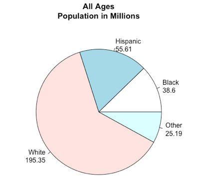
20 Pie charts pie_labels_all_other <- paste(races_all_other, population_in_millions_all_other, sep = "\n") pie(population_in_millions_all_other, main = "All Ages\nPopulation in Millions", labels = pie_labels_all_other)

21 Pie charts
22 Dot plots states <- data.frame(state.x77) sorted_states <- states[order(states$income), ] dotchart(sorted_states$income, rownames(sorted_states), cex.lab =.25, main = "Income per capita")
23 Box plots boxplot(petal.length ~ Species, main = "Iris Petal Length by Species", xlab = "Species", ylab = "Petal Length")
24 Notched Box plots attach(toothgrowth) boxplot(len ~ supp * dose, data = Toothgrowth, notch = TRUE, col = (c("gold", "darkgreen")), main = "Tooth Growth", xlab = "Supplement and Dose") If the notches do not overlap, then the medians of the groups are different (because their confidence intervals do not overlap).
25 Simple Scatterplots plot(usjudgeratings$rten ~ USJudgeRatings$FAMI, xlab = "Familiarity with Law", ylab = "Worthy of Retention", main = "Law Familiarity vs. Worthy of Retention", pch = "+")
26 Scatterplot Matrices CONT Number of contacts of lawyer with judge. INTG Judicial integrity. DMNR Demeanor. DILG Diligence. pairs(~usjudgeratings$cont + USJudgeRatings$INTG + USJudgeRatings$DMNR + USJudgeRatings$DILG, main = "US Judge Ratings")
27 Scatterplot Matrices features <- c("contacts", "Integrity", "Demeanor", "Diligence") pairs(~usjudgeratings$cont + USJudgeRatings$INTG + USJudgeRatings$DMNR + USJudgeRatings$DILG, labels = features, main = "US Judge Ratings")
28 3D Scatterplots library(scatterplot3d) scatterplot3d(mtcars$wt, mtcars$disp, mtcars$mpg, main = "3D Scatterplot")
29 Graphical parameters Text and symbol size (cex:.axis,.lab,.main) Fonts (font:.axis,.lab,.main): 1=plain, 2=bold, 3=italic, 4=bold italic, 5=symbol Colors (col): colors, and more colors
30 Graphical parameters (cont d) Plotting symbols (pch) Line type (lty)
Intro to R Graphics Center for Social Science Computation and Research, 2010 Stephanie Lee, Dept of Sociology, University of Washington
 Intro to R Graphics Center for Social Science Computation and Research, 2010 Stephanie Lee, Dept of Sociology, University of Washington Class Outline - The R Environment and Graphics Engine - Basic Graphs
Statistics 251: Statistical Methods
 Statistics 251: Statistical Methods Summaries and Graphs in R Module R1 2018 file:///u:/documents/classes/lectures/251301/renae/markdown/master%20versions/summary_graphs.html#1 1/14 Summary Statistics
An Introduction to R Graphics
 An Introduction to R Graphics PnP Group Seminar 25 th April 2012 Why use R for graphics? Fast data exploration Easy automation and reproducibility Create publication quality figures Customisation of almost
MATH11400 Statistics Homepage
 MATH11400 Statistics 1 2010 11 Homepage http://www.stats.bris.ac.uk/%7emapjg/teach/stats1/ 1.1 A Framework for Statistical Problems Many statistical problems can be described by a simple framework in which
CMPSC 390 Visual Computing Spring 2014 Bob Roos Notes on R Graphs, Part 2
 Notes on R Graphs, Part 2 1 CMPSC 390 Visual Computing Spring 2014 Bob Roos http://cs.allegheny.edu/~rroos/cs390s2014 Notes on R Graphs, Part 2 Bar Graphs in R So far we have looked at basic (x, y) plots
DSCI 325: Handout 18 Introduction to Graphics in R
 DSCI 325: Handout 18 Introduction to Graphics in R Spring 2016 This handout will provide an introduction to creating graphics in R. One big advantage that R has over SAS (and over several other statistical
Intro to R for Epidemiologists
 Lab 9 (3/19/15) Intro to R for Epidemiologists Part 1. MPG vs. Weight in mtcars dataset The mtcars dataset in the datasets package contains fuel consumption and 10 aspects of automobile design and performance
An Introduction to R 2.2 Statistical graphics
 An Introduction to R 2.2 Statistical graphics Dan Navarro (daniel.navarro@adelaide.edu.au) School of Psychology, University of Adelaide ua.edu.au/ccs/people/dan DSTO R Workshop, 29-Apr-2015 Scatter plots
Using Built-in Plotting Functions
 Workshop: Graphics in R Katherine Thompson (katherine.thompson@uky.edu Department of Statistics, University of Kentucky September 15, 2016 Using Built-in Plotting Functions ## Plotting One Quantitative
R Visualizing Data. Fall Fall 2016 CS130 - Intro to R 1
 R Visualizing Data Fall 2016 Fall 2016 CS130 - Intro to R 1 mtcars Data Frame R has a built-in data frame called mtcars Useful R functions length(object) # number of variables str(object) # structure of
Introduction to R: Day 2 September 20, 2017
 Introduction to R: Day 2 September 20, 2017 Outline RStudio projects Base R graphics plotting one or two continuous variables customizable elements of plots saving plots to a file Create a new project
Statistical Programming with R
 Statistical Programming with R Lecture 9: Basic graphics in R Part 2 Bisher M. Iqelan biqelan@iugaza.edu.ps Department of Mathematics, Faculty of Science, The Islamic University of Gaza 2017-2018, Semester
Introduction to R for Epidemiologists
 Introduction to R for Epidemiologists Jenna Krall, PhD Thursday, January 29, 2015 Final project Epidemiological analysis of real data Must include: Summary statistics T-tests or chi-squared tests Regression
Interactive Scatterplots
 Interactive Scatterplots Elizabeth Whalen October 7, 2004 1 Overview In the package isplot, the goal is to create interactive, linked scatterplots. The two required packages for isplot are RGtk and gtkdevice.
INTRODUCTION TO R. Basic Graphics
 INTRODUCTION TO R Basic Graphics Graphics in R Create plots with code Replication and modification easy Reproducibility! graphics package ggplot2, ggvis, lattice graphics package Many functions plot()
Spring 2017 CS130 - Intro to R 1 R VISUALIZING DATA. Spring 2017 CS130 - Intro to R 2
 Spring 2017 CS130 - Intro to R 1 R VISUALIZING DATA Spring 2017 Spring 2017 CS130 - Intro to R 2 Goals for this lecture: Review constructing Data Frame, Categorizing variables Construct basic graph, learn
Advanced Statistics 1. Lab 11 - Charts for three or more variables. Systems modelling and data analysis 2016/2017
 Advanced Statistics 1 Lab 11 - Charts for three or more variables 1 Preparing the data 1. Run RStudio Systems modelling and data analysis 2016/2017 2. Set your Working Directory using the setwd() command.
Package beanplot. R topics documented: February 19, Type Package
 Type Package Package beanplot February 19, 2015 Title Visualization via Beanplots (like Boxplot/Stripchart/Violin Plot) Version 1.2 Date 2014-09-15 Author Peter Kampstra Maintainer Peter Kampstra
R Workshop Module 3: Plotting Data Katherine Thompson Department of Statistics, University of Kentucky
 R Workshop Module 3: Plotting Data Katherine Thompson (katherine.thompson@uky.edu Department of Statistics, University of Kentucky October 15, 2013 Reading in Data Start by reading the dataset practicedata.txt
Bar Charts and Frequency Distributions
 Bar Charts and Frequency Distributions Use to display the distribution of categorical (nominal or ordinal) variables. For the continuous (numeric) variables, see the page Histograms, Descriptive Stats
12. A(n) is the number of times an item or number occurs in a data set.
 is the number of times an item or number occurs in a data set.") Chapter 15 Vocabulary Practice Match each definition to its corresponding term. a. data b. statistical question c. population d. sample e. data analysis f. parameter g. statistic h. survey i. experiment
Chapter 15 Vocabulary Practice Match each definition to its corresponding term. a. data b. statistical question c. population d. sample e. data analysis f. parameter g. statistic h. survey i. experiment
Name Date Types of Graphs and Creating Graphs Notes
 Name Date Types of Graphs and Creating Graphs Notes Graphs are helpful visual representations of data. Different graphs display data in different ways. Some graphs show individual data, but many do not.
CIND123 Module 6.2 Screen Capture
 CIND123 Module 6.2 Screen Capture Hello, everyone. In this segment, we will discuss the basic plottings in R. Mainly; we will see line charts, bar charts, histograms, pie charts, and dot charts. Here is
Chapter 2 Descriptive Statistics. Tabular and Graphical Presentations
 Chapter 2 Descriptive Statistics Tabular and Graphical Presentations Frequency Distributions Frequency distribution tabular summary of data showing the number of items that appear in non-overlapping classes.
Dr. Junchao Xia Center of Biophysics and Computational Biology. Fall /6/ /13
 BIO5312 Biostatistics R Session 02: Graph Plots in R Dr. Junchao Xia Center of Biophysics and Computational Biology Fall 2016 9/6/2016 1 /13 Graphic Methods Graphic methods of displaying data give a quick
Introduction to R and Statistical Data Analysis
 Microarray Center Introduction to R and Statistical Data Analysis PART II Petr Nazarov petr.nazarov@crp-sante.lu 22-11-2010 OUTLINE PART II Descriptive statistics in R (8) sum, mean, median, sd, var, cor,
Package FCGR. October 13, 2015
 Type Package Title Fatigue Crack Growth in Reliability Version 1.0-0 Date 2015-09-29 Package FCGR October 13, 2015 Author Antonio Meneses , Salvador Naya ,
Organizing and Summarizing Data
 1 Organizing and Summarizing Data Key Definitions Frequency Distribution: This lists each category of data and how often they occur. : The percent of observations within the one of the categories. This
Rstudio GGPLOT2. Preparations. The first plot: Hello world! W2018 RENR690 Zihaohan Sang
 Rstudio GGPLOT2 Preparations There are several different systems for creating data visualizations in R. We will introduce ggplot2, which is based on Leland Wilkinson s Grammar of Graphics. The learning
Plotting Complex Figures Using R. Simon Andrews v
 Plotting Complex Figures Using R Simon Andrews simon.andrews@babraham.ac.uk v2017-11 The R Painters Model Plot area Base plot Overlays Core Graph Types Local options to change a specific plot Global options
AA BB CC DD EE. Introduction to Graphics in R
 Introduction to Graphics in R Cori Mar 7/10/18 ### Reading in the data dat
Exploratory Data Analysis September 8, 2010
 Exploratory Data Analysis p. 1/2 Exploratory Data Analysis September 8, 2010 Exploratory Data Analysis p. 2/2 Scatter Plots plot(x,y) plot(y x) Note use of model formula Today: how to add lines/smoothed
Combo Charts. Chapter 145. Introduction. Data Structure. Procedure Options
 Chapter 145 Introduction When analyzing data, you often need to study the characteristics of a single group of numbers, observations, or measurements. You might want to know the center and the spread about
Ch. 1.4 Histograms & Stem-&-Leaf Plots
 Ch. 1.4 Histograms & Stem-&-Leaf Plots Learning Intentions: Create a histogram & stem-&-leaf plot of a data set. Given a list of data, use a calculator to graph a histogram. Interpret histograms & stem-&-leaf
Error-Bar Charts from Summary Data
 Chapter 156 Error-Bar Charts from Summary Data Introduction Error-Bar Charts graphically display tables of means (or medians) and variability. Following are examples of the types of charts produced by
Package sciplot. February 15, 2013
 Package sciplot February 15, 2013 Version 1.1-0 Title Scientific Graphing Functions for Factorial Designs Author Manuel Morales , with code developed by the R Development Core Team
Graphics in R Ira Sharenow January 2, 2019
 Graphics in R Ira Sharenow January 2, 2019 library(ggplot2) # graphing library library(rcolorbrewer) # nice colors R Markdown This is an R Markdown document. The purpose of this document is to show R users
Week 2 Basic Statistical Concepts, Part II
 Week 2 Basic Statistical Concepts, Part II Week 2 Objectives 1 Data presentation through numerical and graphical summaries using R: sample mean, variance and percentiles; the box plot, histogram, stem
NCSS Statistical Software
 Chapter 152 Introduction When analyzing data, you often need to study the characteristics of a single group of numbers, observations, or measurements. You might want to know the center and the spread about
A Populous Place State Pie Chart
 A Populous Place State Pie Chart Step 1 Start Microsoft Excel and a blank workbook will open. Step 2 Click in cell C1 once to highlight the cell and change the font to 24- point. You can use the pull-down
r2excel: Read, write and format easily Excel files using R software
 r2excel: Read, write and format easily Excel files using R software Many solutions to read and write Excel files using R software Excel files are used by many people to save and analyze their data. There
Data Visualization. Andrew Jaffe Instructor
 Module 9 Data Visualization Andrew Jaffe Instructor Basic Plots We covered some basic plots previously, but we are going to expand the ability to customize these basic graphics first. 2/45 Read in Data
Basic Statistical Graphics in R. Stem and leaf plots 100,100,100,99,98,97,96,94,94,87,83,82,77,75,75,73,71,66,63,55,55,55,51,19
 Basic Statistical Graphics in R. Stem and leaf plots Example. Create a vector of data titled exam containing the following scores: 100,100,100,99,98,97,96,94,94,87,83,82,77,75,75,73,71,66,63,55,55,55,51,19
Graphics in R STAT 133. Gaston Sanchez. Department of Statistics, UC Berkeley
 Graphics in R STAT 133 Gaston Sanchez Department of Statistics, UC Berkeley gastonsanchez.com github.com/gastonstat/stat133 Course web: gastonsanchez.com/stat133 Base Graphics 2 Graphics in R Traditional
MICROSOFT EXCEL BUILDING GRAPHS
 MICROSOFT EXCEL BUILDING GRAPHS Basic steps for creating graph in Microsoft Excel: 1. Input your data in an Excel file. 2. Choose a type of graph to create. 3. Switch axes if necessary. 4. Adjust your
Section 2-2 Frequency Distributions. Copyright 2010, 2007, 2004 Pearson Education, Inc
 Section 2-2 Frequency Distributions Copyright 2010, 2007, 2004 Pearson Education, Inc. 2.1-1 Frequency Distribution Frequency Distribution (or Frequency Table) It shows how a data set is partitioned among
IST 3108 Data Analysis and Graphics Using R Week 9
 IST 3108 Data Analysis and Graphics Using R Week 9 Engin YILDIZTEPE, Ph.D 2017-Spring Introduction to Graphics >y plot (y) In R, pictures are presented in the active graphical device or window.
Section Frequency Distribution and Statistical Graphs. Copyright 2013, 2010, 2007, Pearson, Education, Inc.
 Section 13.3 Frequency Distribution and Statistical Graphs INB Table of Contents Date Topic Page # July 7, 2014 Section 12.1 & 12.2 Worksheet 58 July 7, 2014 Shoe Probability Project 59 July 7, 2014 Conditional
Module 10. Data Visualization. Andrew Jaffe Instructor
 Module 10 Data Visualization Andrew Jaffe Instructor Basic Plots We covered some basic plots on Wednesday, but we are going to expand the ability to customize these basic graphics first. 2/37 But first...
STAT STATISTICAL METHODS. Statistics: The science of using data to make decisions and draw conclusions
 STAT 515 --- STATISTICAL METHODS Statistics: The science of using data to make decisions and draw conclusions Two branches: Descriptive Statistics: The collection and presentation (through graphical and
Chapter 2 - Graphical Summaries of Data
 Chapter 2 - Graphical Summaries of Data Data recorded in the sequence in which they are collected and before they are processed or ranked are called raw data. Raw data is often difficult to make sense
8. MINITAB COMMANDS WEEK-BY-WEEK
 8. MINITAB COMMANDS WEEK-BY-WEEK In this section of the Study Guide, we give brief information about the Minitab commands that are needed to apply the statistical methods in each week s study. They are
[POLS 8500] Stochastic Gradient Descent, Linear Model Selection and Regularization
![[POLS 8500] Stochastic Gradient Descent, Linear Model Selection and Regularization](/thumbs/83/87984552.jpg "[POLS 8500] Stochastic Gradient Descent, Linear Model Selection and Regularization") [POLS 8500] Stochastic Gradient Descent, Linear Model Selection and Regularization L. Jason Anastasopoulos ljanastas@uga.edu February 2, 2017 Gradient descent Let s begin with our simple problem of estimating
[POLS 8500] Stochastic Gradient Descent, Linear Model Selection and Regularization L. Jason Anastasopoulos ljanastas@uga.edu February 2, 2017 Gradient descent Let s begin with our simple problem of estimating
7/18/16. Review. Review of Homework. Lecture 3: Programming Statistics in R. Questions from last lecture? Problems with Stata? Problems with Excel?
 Lecture 3: Programming Statistics in R Christopher S. Hollenbeak, PhD Jane R. Schubart, PhD The Outcomes Research Toolbox Review Questions from last lecture? Problems with Stata? Problems with Excel? 2
Graph tool instructions and R code
 Graph tool instructions and R code 1) Prepare data: tab-delimited format Data need to be inputted in a tab-delimited format. This can be easily achieved by preparing the data in a spread sheet program
LESSON 14: Box plots questions
 LESSON 14: Box plots questions FOCUS QUESTION: How can I compare the distributions for data sets that have outliers? Contents EXAMPLE 1: Load the Fisher iris data (comes with MATLAB) EXAMPLE 2: Compare
Chapter 1, TUFTE STYLE GRIDDING FOR READABILITY. Chapter 5, SLICE (CROSS-SECTIONAL VIEWS)
") Chapter, TUFTE STYLE GRIDDING FOR READABILITY Chapter 5, SLICE (CROSS-SECTIONAL VIEWS) Number of responses 8 7 6 5 4 3 2 9 8 7 6 5 4 3 2 Distribution of ethnicities in each income group of SF bay area
Chapter, TUFTE STYLE GRIDDING FOR READABILITY Chapter 5, SLICE (CROSS-SECTIONAL VIEWS) Number of responses 8 7 6 5 4 3 2 9 8 7 6 5 4 3 2 Distribution of ethnicities in each income group of SF bay area
Math 227 EXCEL / MEGASTAT Guide
 Math 227 EXCEL / MEGASTAT Guide Introduction Introduction: Ch2: Frequency Distributions and Graphs Construct Frequency Distributions and various types of graphs: Histograms, Polygons, Pie Charts, Stem-and-Leaf
Elementary Statistics. Chapter 2 Review: Summarizing & Graphing Data
 Name Elementary Statistics Date Period Chapter 2 Review: Summarizing & Graphing Data Quick Quiz p.74 #1-10 Use the following information to answer questions 1-3: When one is constructing a table representing
MATH1635, Statistics (2)
") MATH1635, Statistics (2) Chapter 2 Histograms and Frequency Distributions I. A Histogram is a form of bar graph in which: A. The width of a bar is designated by an interval or ratio data value and thus
MATH1635, Statistics (2) Chapter 2 Histograms and Frequency Distributions I. A Histogram is a form of bar graph in which: A. The width of a bar is designated by an interval or ratio data value and thus
Chapter 2: Descriptive Statistics
 Chapter 2: Descriptive Statistics Student Learning Outcomes By the end of this chapter, you should be able to: Display data graphically and interpret graphs: stemplots, histograms and boxplots. Recognize,
Chapter 1: Overview and Descriptive Statistics
 Chapter 1: Overview and Descriptive Statistics Curtis Miller 2018-05-13 Introduction This chapter is devoted to basic statistical ideas and statistical summaries. We start with describing what statistics
Practical 2: Plotting
 Practical 2: Plotting Complete this sheet as you work through it. If you run into problems, then ask for help - don t skip sections! Open Rstudio and store any files you download or create in a directory
SPSS. (Statistical Packages for the Social Sciences)
") Inger Persson SPSS (Statistical Packages for the Social Sciences) SHORT INSTRUCTIONS This presentation contains only relatively short instructions on how to perform basic statistical calculations in SPSS.
Inger Persson SPSS (Statistical Packages for the Social Sciences) SHORT INSTRUCTIONS This presentation contains only relatively short instructions on how to perform basic statistical calculations in SPSS.
Az R adatelemzési nyelv
 Az R adatelemzési nyelv alapjai II. Egészségügyi informatika és biostatisztika Gézsi András gezsi@mit.bme.hu Functions Functions Functions do things with data Input : function arguments (0,1,2, ) Output
Exploratory Data Analysis - Part 2 September 8, 2005
 Exploratory Data Analysis - Part 2 September 8, 2005 Exploratory Data Analysis - Part 2 p. 1/20 Trellis Plots Trellis plots (S-Plus) and Lattice plots in R also create layouts for multiple plots. A trellis
1.2. Pictorial and Tabular Methods in Descriptive Statistics
 1.2. Pictorial and Tabular Methods in Descriptive Statistics Section Objectives. 1. Stem-and-Leaf displays. 2. Dotplots. 3. Histogram. Types of histogram shapes. Common notation. Sample size n : the number
Brief Guide on Using SPSS 10.0
 Brief Guide on Using SPSS 10.0 (Use student data, 22 cases, studentp.dat in Dr. Chang s Data Directory Page) (Page address: http://www.cis.ysu.edu/~chang/stat/) I. Processing File and Data To open a new
Creating a Basic Chart in Excel 2007
 Creating a Basic Chart in Excel 2007 A chart is a pictorial representation of the data you enter in a worksheet. Often, a chart can be a more descriptive way of representing your data. As a result, those
Visualizing Data: Freq. Tables, Histograms
 Visualizing Data: Freq. Tables, Histograms Engineering Statistics Section 1.2 Josh Engwer TTU 25 January 2016 Josh Engwer (TTU) Visualizing Data: Freq. Tables, Histograms 25 January 2016 1 / 23 Descriptive
Lesson 18-1 Lesson Lesson 18-1 Lesson Lesson 18-2 Lesson 18-2
 Topic 18 Set A Words survey data Topic 18 Set A Words Lesson 18-1 Lesson 18-1 sample line plot Lesson 18-1 Lesson 18-1 frequency table bar graph Lesson 18-2 Lesson 18-2 Instead of making 2-sided copies
Overview. Frequency Distributions. Chapter 2 Summarizing & Graphing Data. Descriptive Statistics. Inferential Statistics. Frequency Distribution
 Chapter 2 Summarizing & Graphing Data Slide 1 Overview Descriptive Statistics Slide 2 A) Overview B) Frequency Distributions C) Visualizing Data summarize or describe the important characteristics of a
Statistical Programming Camp: An Introduction to R
 Statistical Programming Camp: An Introduction to R Handout 3: Data Manipulation and Summarizing Univariate Data Fox Chapters 1-3, 7-8 In this handout, we cover the following new materials: ˆ Using logical
Add to the ArcMap layout the Census dataset which are located in your Census folder.
 Building Your Map To begin building your map, open ArcMap. Add to the ArcMap layout the Census dataset which are located in your Census folder. Right Click on the Labour_Occupation_Education shapefile
Statistical Graphs & Charts
 Statistical Graphs & Charts CS 4460 Intro. to Information Visualization August 30, 2017 John Stasko Learning Objectives Learn different statistical data graphs Line graph, Bar Graph, Scatterplot, Trellis,
Data Handling. Moving from A to A* Calculate the numbers to be surveyed for a stratified sample (A)
") Moving from A to A* A* median, quartiles and interquartile range from a histogram (A*) Draw histograms from frequency tables with unequal class intervals (A) Calculate the numbers to be surveyed for a
Moving from A to A* A* median, quartiles and interquartile range from a histogram (A*) Draw histograms from frequency tables with unequal class intervals (A) Calculate the numbers to be surveyed for a
Univariate Data - 2. Numeric Summaries
 Univariate Data - 2. Numeric Summaries Young W. Lim 2018-08-01 Mon Young W. Lim Univariate Data - 2. Numeric Summaries 2018-08-01 Mon 1 / 36 Outline 1 Univariate Data Based on Numerical Summaries R Numeric
Test Bank for Privitera, Statistics for the Behavioral Sciences
 1. A simple frequency distribution A) can be used to summarize grouped data B) can be used to summarize ungrouped data C) summarizes the frequency of scores in a given category or range 2. To determine
2.4-Statistical Graphs
 2.4-Statistical Graphs Frequency Polygon: A frequency polygon uses line segments connected to points directly above class midpoint values. Example: Given the following frequency table for the pulse rate
The foundations of building Tableau visualizations and Dashboards
 The foundations of building Tableau visualizations and Dashboards 1 Learning Objective: Text table How has net migration changed by region over time (years)? NetMigrationByStateByYear Year Region SUM(Net
Key Terms. Symbology. Categorical attributes. Style. Layer file
 Key Terms Symbology Categorical attributes Style Layer file Review Questions POP-RANGE is a string field of the Cities feature class with the following entries: 0-9,999, 10,000-49,999, 50,000-99,000 This
CREATE AN EFFECTIVE POSTER
 CREATE AN EFFECTIVE POSTER Will G. Hopkins 1997 [This document was created originally as a multi-panel poster. The text under each heading and the figures were on separate panels, as illustrated in this
Middle Years Data Analysis Display Methods
 Middle Years Data Analysis Display Methods Double Bar Graph A double bar graph is an extension of a single bar graph. Any bar graph involves categories and counts of the number of people or things (frequency)
Topic (3) SUMMARIZING DATA - TABLES AND GRAPHICS
 SUMMARIZING DATA - TABLES AND GRAPHICS") Topic (3) SUMMARIZING DATA - TABLES AND GRAPHICS 3- Topic (3) SUMMARIZING DATA - TABLES AND GRAPHICS A) Frequency Distributions For Samples Defn: A FREQUENCY DISTRIBUTION is a tabular or graphical display
Topic (3) SUMMARIZING DATA - TABLES AND GRAPHICS 3- Topic (3) SUMMARIZING DATA - TABLES AND GRAPHICS A) Frequency Distributions For Samples Defn: A FREQUENCY DISTRIBUTION is a tabular or graphical display
Chuck Cartledge, PhD. 20 January 2018
 Big Data: Data Analysis Boot Camp Visualizing the Iris Dataset Chuck Cartledge, PhD 20 January 2018 1/31 Table of contents (1 of 1) 1 Intro. 2 Histograms Background 3 Scatter plots 4 Box plots 5 Outliers
Boxplot
 Boxplot By: Meaghan Petix, Samia Porto & Franco Porto A boxplot is a convenient way of graphically depicting groups of numerical data through their five number summaries: the smallest observation (sample
PRACTICE EXERCISES. Family Utility Expenses
 PRACTICE EXERCISES Family Utility Expenses Your cousin, Rita Dansie, wants to analyze her family's utility expenses for 2012. She wants to save money during months when utility expenses are lower so that
CHAPTER 2 Information processing (Units 3 and 4)
") CHAPTER 2 Information processing (Units 3 and 4) Information-processing steps (page 54) a For each of the following information-processing steps, state its purpose and provide two examples of technology
CHAPTER 2 Information processing (Units 3 and 4) Information-processing steps (page 54) a For each of the following information-processing steps, state its purpose and provide two examples of technology
4 Displaying Multiway Tables
 4 Displaying Multiway Tables An important subset of statistical data comes in the form of tables. Tables usually record the frequency or proportion of observations that fall into a particular category
Parents Names Mom Cell/Work # Dad Cell/Work # Parent List the Math Courses you have taken and the grade you received 1 st 2 nd 3 rd 4th
 Full Name Phone # Parents Names Birthday Mom Cell/Work # Dad Cell/Work # Parent email: Extracurricular Activities: List the Math Courses you have taken and the grade you received 1 st 2 nd 3 rd 4th Turn
DATA VISUALIZATION WITH GGPLOT2. Grid Graphics
 DATA VISUALIZATION WITH GGPLOT2 Grid Graphics ggplot2 internals Explore grid graphics 35 30 Elements of ggplot2 plot 25 How do graphics work in R? 2 plotting systems mpg 20 15 base package grid graphics
Chapter 2: Descriptive Statistics: Tabular and Graphical Methods
 Chapter 2: Descriptive Statistics: Tabular and Graphical Methods Example 1 C2_1
Basics of Plotting Data
 Basics of Plotting Data Luke Chang Last Revised July 16, 2010 One of the strengths of R over other statistical analysis packages is its ability to easily render high quality graphs. R uses vector based
Install RStudio from - use the standard installation.
 Session 1: Reading in Data Before you begin: Install RStudio from http://www.rstudio.com/ide/download/ - use the standard installation. Go to the course website; http://faculty.washington.edu/kenrice/rintro/
Data Mining - Data. Dr. Jean-Michel RICHER Dr. Jean-Michel RICHER Data Mining - Data 1 / 47
 Data Mining - Data Dr. Jean-Michel RICHER 2018 jean-michel.richer@univ-angers.fr Dr. Jean-Michel RICHER Data Mining - Data 1 / 47 Outline 1. Introduction 2. Data preprocessing 3. CPA with R 4. Exercise
LAB 1: Graphical Descriptions of Data
 LAB 1: Graphical Descriptions of Data Part I: Before Class 1) Read this assignment all the way through; 2) Know the terms and understand the concepts of: - scatterplots - stemplots - distributions - histograms
> glucose = c(81, 85, 93, 93, 99, 76, 75, 84, 78, 84, 81, 82, 89, + 81, 96, 82, 74, 70, 84, 86, 80, 70, 131, 75, 88, 102, 115, + 89, 82, 79, 106)
") This document describes how to use a number of R commands for plotting one variable and for calculating one variable summary statistics Specifically, it describes how to use R to create dotplots, histograms,
This document describes how to use a number of R commands for plotting one variable and for calculating one variable summary statistics Specifically, it describes how to use R to create dotplots, histograms,
Mathematics 47: Lecture 2
 Mathematics 47: Lecture 2 Displaying Data Dan Sloughter Furman University March 7, 2006 Dan Sloughter (Furman University) Mathematics 47: Lecture 2 March 7, 2006 1 / 13 Entering data into R Example Dan
Package areaplot. October 18, 2017
 Version 1.2-0 Date 2017-10-18 Package areaplot October 18, 2017 Title Plot Stacked Areas and Confidence Bands as Filled Polygons Imports graphics, grdevices, stats Suggests MASS Description Plot stacked
Abbreviated Title of Report. Table of Contents USING THIS DOCUMENT...2 SDWP REPORT FORMATTING...2 Charts...3 Tables...9 APPENDIX A...
 Table of Contents USING THIS DOCUMENT...2 SDWP REPORT FORMATTING...2 Charts...3 Tables...9 APPENDIX A...12 1 USING THIS DOCUMENT When you open this document, your first move should be to save as something