R Workshop Module 3: Plotting Data Katherine Thompson Department of Statistics, University of Kentucky
|
|
|
- Tracy Cross
- 6 years ago
- Views:
Transcription
1 R Workshop Module 3: Plotting Data Katherine Thompson Department of Statistics, University of Kentucky October 15, 2013 Reading in Data Start by reading the dataset practicedata.txt into R. (Having trouble? See the instructions in Module 2. Plotting One Quantitative Variable For this example, we will plot the variable respvar from the data set, practicedata. Remember than by using a $, we can refer to the variable as practicedata$respvar in the following code. Histograms: One way to plot quantitative data is using a histogram. hist(practicedata$respvar, # what the histogram is plotting main='histogram of Response Variable', # change the main axis title xlab='response Variable', # change the x-axis label # freq=true # histogram is of counts # breaks="sturges", # this can be changed to specify a series of points # for the breaks in the histogram # xlim=c(20,70, # sets the limits of the x-axis # ylim=c(0,25, # sets the limits of the y-axis 1
2 2
3 Boxplots: Another way to plot quantitative data is using a boxplot. boxplot(practicedata$respvar, # what the boxplot is plotting main='default R Boxplot' # change the main title Default R Boxplot boxplot(practicedata$respvar, # what the boxplot is plotting main='nicer R Boxplot', # change the main title ylab='response Variable', # change the y-axis label names='all Data', # change the name under the boxplot outline=true # Draw outliers if there are any in the data Nicer R Boxplot Response Variable
4 Plotting One Categorical Variable To practice plotting one variable at a time, we will plot groupvar from practicedata. We ll see what values this variable takes and then plot the data. (You ll notice that the variable has equal numbers of controls and treatments, so it s not very interesting, but here are the code to make a bar chart and a pie chart for you to use in other situations. practicedata$groupvar Bar Chart: If you have a categorical variable in one column in your data set (as we do here with groupvar, R requires a table of the counts for that variable to create a bar chart. plot.group<-table(practicedata$groupvar # Create table of counts plot.group # Look at the table ## ## Control Treatment ## barplot(plot.group, # Bar chart of the variable main='bar Chart of Groups', # change main title col=c('green','blue' # change color of each bar Bar Chart of Groups Control Treatment 4
5 Pie Chart: As in the case of bar charts, if you have a categorical variable in one column in your data set (as we do here with groupvar, R can use a table of the counts for that variable to create a pie chart. plot.group<-table(practicedata$groupvar # Create table of counts plot.group # Look at the table ## ## Control Treatment ## pie(plot.group, # Pie chart of the variable main='pie Chart of Grouping Variable', # change main title col=c('green','blue' # change the color of each slice of the pie Pie Chart of Grouping Variable Control Treatment 5
6 Plotting Two Variables Plotting One Quantitative and One Categorical Variable: If you have one quantitative variable that you want to compare across two (or many groups, you can use two boxplots or two histograms. boxplot(practicedata$respvar ~ practicedata$groupvar, main = "Default R Boxplots" Default R Boxplots Control Treatment boxplot(practicedata$respvar~practicedata$groupvar, main='nicer R Boxplots', names=c('control Group', 'Treatment Group', col=c('green','blue', # change color of boxes ylab='response Variable' # change y-axis label # horizontal=true # change boxplots to horizontal 6
7 Nicer R Boxplots Response Variable Control Group Treatment Group To create two histograms, we need to separate the observations for control and treatment individuals. These two variables are sometimes called dummy variables. We are lucky that the control individuals are the first 50 in the data set, but there are other ways to separate data that will keep you from sorting data in another program. #### Create a two data subsets for control and treatment individuals n.controls=50 n.treatments=50 # Extract the first n.controls rows from the data controldata=practicedata[1:n.controls,] # Extract everything except the first n.controls rows from the data treatmentdata=practicedata[-(1:n.controls,] #### Histograms for each group hist(controldata$respvar, main='control Group', # change the main title xlab='response Variable' 7
8 Control Group Frequency Response Variable hist(treatmentdata$respvar, main='treatment Group', # change the main title xlab='response Variable' Treatment Group Frequency Response Variable 8
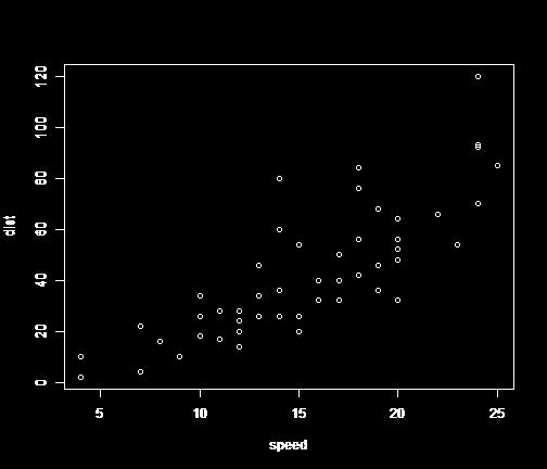
9 Scatterplots: If you have two quantitative variables that you want to compare, a scatterplot is a good way to explore the relationship. Here, we will investigate the relationship between practicedata$respvar and practicedata$toyvar. plot(practicedata$toyvar,practicedata$respvar, # x variable, y variable main="default R Scatterplot" plot(practicedata$toyvar,practicedata$respvar, # x variable, y variable main="plot of Response Variable vs. Toy Variable", # change main label ylab='response Variable', # change y-axis label xlab='toy Variable', # change x-axis label pch=20, # change the plotting symbol 9
10 # type='l', # instead of pch, you can create a line plot # (make sure your x's are ordered if you do this. # col='black' # change color of plotting symbol Plots Showing More than Two Variables What if we are interested in the relationship between the response variable and both the grouping variable and toy variable? We can add this information into our plot using different plotting symbols and/or colors, along with a legend. We can start with the same plot as before, but only plotting the data from the control group. To make sure the plot shows all of our data, we will find the range of the variables we are plotting in the original data 10

11 set using the range( function. Now, we can add the observations from the treatment group onto the plot using the points( function. 11
12 It would be good to add a legend to this plot. We can do so using the legend( function as follows. 12


13 ## Find the range of the variables we are plotting for BOTH groups ydatarange=range(practicedata$respvar,na.rm=true xdatarange=range(practicedata$toyvar,na.rm=true ## Creating the plot and adding points for the control group plot(controldata$toyvar,controldata$respvar, # x variable, y variable main="plot of Response Variable vs. Toy Variable", # change main label ylab='response Variable', # change y-axis label xlab='toy Variable', # change x-axis label pch=20, # change the plotting symbol col='green', # change color of plotting symbol xlim=xdatarange, # change the x-axis to cover the range 13
14 # of both the treatment and control groups ylim=ydatarange # change the y-axis to cover the range # of both the treatment and control groups ## Add observations for the treatment data to the plot points(treatmentdata$toyvar,treatmentdata$respvar, # x variable, y variable pch=20, # change the plotting symbol col='blue', # change color of plotting symbol ## Adding a Legend to the Plot legend('topleft', # location of legend legend=c('control Group','Treatment Group', # lines of text in the legend pch=20, # symbol used in the legend col=c('green','blue' # colors of the symbol in the same # order as the lines of text in 'legend' # lty=1, lwd=1 # change the line type and width if lines are on the plot Using par( In addition to changing parameters within each plotting function (for instance, within boxplot(, hist(, barplot(, pie(, or plot(, you can also change other features of the plotting area. We will look at two such features here, and many, many more are described at this website: One thing that is often helpful is creating more than one plot simultaneously. The option, mfrow(, inside par( does this. Take the histograms we made earlier. We can plot these simultaneously so that they are easier to compare. Once we set a value in par(, we either need to reset it or close the plotting window to return it to its default. #Using the par function par(mfrow=c(1,2 #mfrow=c(1,2 creates a plotting window with 2 rows and 1 column of plots #mfrow=c(2,1 creates a plotting window with 1 row and 2 columns of plots #### Histograms for each group hist(controldata$respvar, main='control Group', # change the main title xlab='response Variable' hist(treatmentdata$respvar, main='treatment Group', # change the main title xlab='response Variable' 14
15 15
Using Built-in Plotting Functions
 Workshop: Graphics in R Katherine Thompson (katherine.thompson@uky.edu Department of Statistics, University of Kentucky September 15, 2016 Using Built-in Plotting Functions ## Plotting One Quantitative
CIND123 Module 6.2 Screen Capture
 CIND123 Module 6.2 Screen Capture Hello, everyone. In this segment, we will discuss the basic plottings in R. Mainly; we will see line charts, bar charts, histograms, pie charts, and dot charts. Here is
Intro to R Graphics Center for Social Science Computation and Research, 2010 Stephanie Lee, Dept of Sociology, University of Washington
 Intro to R Graphics Center for Social Science Computation and Research, 2010 Stephanie Lee, Dept of Sociology, University of Washington Class Outline - The R Environment and Graphics Engine - Basic Graphs
Statistics Lecture 6. Looking at data one variable
 Statistics 111 - Lecture 6 Looking at data one variable Chapter 1.1 Moore, McCabe and Craig Probability vs. Statistics Probability 1. We know the distribution of the random variable (Normal, Binomial)
Statistical Programming with R
 Statistical Programming with R Lecture 9: Basic graphics in R Part 2 Bisher M. Iqelan biqelan@iugaza.edu.ps Department of Mathematics, Faculty of Science, The Islamic University of Gaza 2017-2018, Semester
IST 3108 Data Analysis and Graphics Using R Week 9
 IST 3108 Data Analysis and Graphics Using R Week 9 Engin YILDIZTEPE, Ph.D 2017-Spring Introduction to Graphics >y plot (y) In R, pictures are presented in the active graphical device or window.
INTRODUCTION TO R. Basic Graphics
 INTRODUCTION TO R Basic Graphics Graphics in R Create plots with code Replication and modification easy Reproducibility! graphics package ggplot2, ggvis, lattice graphics package Many functions plot()
STAT STATISTICAL METHODS. Statistics: The science of using data to make decisions and draw conclusions
 STAT 515 --- STATISTICAL METHODS Statistics: The science of using data to make decisions and draw conclusions Two branches: Descriptive Statistics: The collection and presentation (through graphical and
8 Organizing and Displaying
 CHAPTER 8 Organizing and Displaying Data for Comparison Chapter Outline 8.1 BASIC GRAPH TYPES 8.2 DOUBLE LINE GRAPHS 8.3 TWO-SIDED STEM-AND-LEAF PLOTS 8.4 DOUBLE BAR GRAPHS 8.5 DOUBLE BOX-AND-WHISKER PLOTS
Statistics 251: Statistical Methods
 Statistics 251: Statistical Methods Summaries and Graphs in R Module R1 2018 file:///u:/documents/classes/lectures/251301/renae/markdown/master%20versions/summary_graphs.html#1 1/14 Summary Statistics
plots Chris Parrish August 20, 2015
 plots Chris Parrish August 20, 2015 plots We construct some of the most commonly used types of plots for numerical data. dotplot A stripchart is most suitable for displaying small data sets. data
Make sure to keep all graphs in same excel file as your measures.
 Project Part 2 Graphs. I. Use Excel to make bar graph for questions 1, and 5. II. Use Excel to make histograms for questions 2, and 3. III. Use Excel to make pie graphs for questions 4, and 6. IV. Use
Basics of Plotting Data
 Basics of Plotting Data Luke Chang Last Revised July 16, 2010 One of the strengths of R over other statistical analysis packages is its ability to easily render high quality graphs. R uses vector based
DSCI 325: Handout 18 Introduction to Graphics in R
 DSCI 325: Handout 18 Introduction to Graphics in R Spring 2016 This handout will provide an introduction to creating graphics in R. One big advantage that R has over SAS (and over several other statistical
Combo Charts. Chapter 145. Introduction. Data Structure. Procedure Options
 Chapter 145 Introduction When analyzing data, you often need to study the characteristics of a single group of numbers, observations, or measurements. You might want to know the center and the spread about
LAB #1: DESCRIPTIVE STATISTICS WITH R
 NAVAL POSTGRADUATE SCHOOL LAB #1: DESCRIPTIVE STATISTICS WITH R Statistics (OA3102) Lab #1: Descriptive Statistics with R Goal: Introduce students to various R commands for descriptive statistics. Lab
Error-Bar Charts from Summary Data
 Chapter 156 Error-Bar Charts from Summary Data Introduction Error-Bar Charts graphically display tables of means (or medians) and variability. Following are examples of the types of charts produced by
Types of Plotting Functions. Managing graphics devices. Further High-level Plotting Functions. The plot() Function
 Function") 3 / 23 5 / 23 Outline The R Statistical Environment R Graphics Peter Dalgaard Department of Biostatistics University of Copenhagen January 16, 29 1 / 23 2 / 23 Overview Standard R Graphics The standard
3 / 23 5 / 23 Outline The R Statistical Environment R Graphics Peter Dalgaard Department of Biostatistics University of Copenhagen January 16, 29 1 / 23 2 / 23 Overview Standard R Graphics The standard
Making Science Graphs and Interpreting Data
 Making Science Graphs and Interpreting Data Eye Opener: 5 mins What do you see? What do you think? Look up terms you don t know What do Graphs Tell You? A graph is a way of expressing a relationship between
MGMT 3125 Introduction to Data Visualization
 MGMT 3125 Introduction to Data Visualization John Sokol, MS Week 2 1/30/2019 Chapter 2: Choose an effective visual Agenda Chapter 2: Choose an effective visual Introduction to Tableau Week 2 action items
Welcome to Workshop: Making Graphs
 Welcome to Workshop: Making Graphs I. Please sign in on the sign in sheet (so I can send you slides & follow up for feedback). II. Download materials you ll need from my website (http://faculty.washington.edu/jhrl/teaching.html
Applied Regression Modeling: A Business Approach
 i Applied Regression Modeling: A Business Approach Computer software help: SAS SAS (originally Statistical Analysis Software ) is a commercial statistical software package based on a powerful programming
LAB 1 INSTRUCTIONS DESCRIBING AND DISPLAYING DATA
 LAB 1 INSTRUCTIONS DESCRIBING AND DISPLAYING DATA This lab will assist you in learning how to summarize and display categorical and quantitative data in StatCrunch. In particular, you will learn how to
Az R adatelemzési nyelv
 Az R adatelemzési nyelv alapjai II. Egészségügyi informatika és biostatisztika Gézsi András gezsi@mit.bme.hu Functions Functions Functions do things with data Input : function arguments (0,1,2, ) Output
plot(seq(0,10,1), seq(0,10,1), main = "the Title", xlim=c(1,20), ylim=c(1,20), col="darkblue");
, seq(0,10,1), main = the Title, xlim=c(1,20), ylim=c(1,20), col=darkblue);") R for Biologists Day 3 Graphing and Making Maps with Your Data Graphing is a pretty convenient use for R, especially in Rstudio. plot() is the most generalized graphing function. If you give it all numeric
R for Biologists Day 3 Graphing and Making Maps with Your Data Graphing is a pretty convenient use for R, especially in Rstudio. plot() is the most generalized graphing function. If you give it all numeric
AA BB CC DD EE. Introduction to Graphics in R
 Introduction to Graphics in R Cori Mar 7/10/18 ### Reading in the data dat
Graphics - Part III: Basic Graphics Continued
 Graphics - Part III: Basic Graphics Continued Statistics 135 Autumn 2005 Copyright c 2005 by Mark E. Irwin Highway MPG 20 25 30 35 40 45 50 y^i e i = y i y^i 2000 2500 3000 3500 4000 Car Weight Copyright
Tableau Advanced Training. Student Guide April x. For Evaluation Only
 Tableau Advanced Training Student Guide www.datarevelations.com 914.945.0567 April 2017 10.x Contents A. Warm Up 1 Bar Chart Colored by Profit 1 Salary Curve 2 2015 v s. 2014 Sales 3 VII. Programmatic
Chapter 3 - Displaying and Summarizing Quantitative Data
 Chapter 3 - Displaying and Summarizing Quantitative Data 3.1 Graphs for Quantitative Data (LABEL GRAPHS) August 25, 2014 Histogram (p. 44) - Graph that uses bars to represent different frequencies or relative
MATH11400 Statistics Homepage
 MATH11400 Statistics 1 2010 11 Homepage http://www.stats.bris.ac.uk/%7emapjg/teach/stats1/ 1.1 A Framework for Statistical Problems Many statistical problems can be described by a simple framework in which
Assignments. Math 338 Lab 1: Introduction to R. Atoms, Vectors and Matrices
 Assignments Math 338 Lab 1: Introduction to R. Generally speaking, there are three basic forms of assigning data. Case one is the single atom or a single number. Assigning a number to an object in this
Stat 290: Lab 2. Introduction to R/S-Plus
 Stat 290: Lab 2 Introduction to R/S-Plus Lab Objectives 1. To introduce basic R/S commands 2. Exploratory Data Tools Assignment Work through the example on your own and fill in numerical answers and graphs.
Fertilizer Dry Moist Wet Fertilizer Dry Moist Wet Control Control N N P P NP NP 9 8 7
 Part 6 Bar Plots & Dot Plots Bar and dot plots are used in two ways: (1) to display proportions of categories, and (2) to compare class means, i.e. experimental treatments or sampling sites. In either
Introduction to R: Day 2 September 20, 2017
 Introduction to R: Day 2 September 20, 2017 Outline RStudio projects Base R graphics plotting one or two continuous variables customizable elements of plots saving plots to a file Create a new project
Advanced Econometric Methods EMET3011/8014
 Advanced Econometric Methods EMET3011/8014 Lecture 2 John Stachurski Semester 1, 2011 Announcements Missed first lecture? See www.johnstachurski.net/emet Weekly download of course notes First computer
Bar Charts and Frequency Distributions
 Bar Charts and Frequency Distributions Use to display the distribution of categorical (nominal or ordinal) variables. For the continuous (numeric) variables, see the page Histograms, Descriptive Stats
Data Visualization. Andrew Jaffe Instructor
 Module 9 Data Visualization Andrew Jaffe Instructor Basic Plots We covered some basic plots previously, but we are going to expand the ability to customize these basic graphics first. 2/45 Read in Data
Homework 1 Excel Basics
 Homework 1 Excel Basics Excel is a software program that is used to organize information, perform calculations, and create visual displays of the information. When you start up Excel, you will see the
Unit 1 Lesson 4 Representing Data. Copyright Houghton Mifflin Harcourt Publishing Company
 Florida Benchmarks SC.6.N.1.1 Define a problem from the sixth grade curriculum, use appropriate reference materials to support scientific understanding, plan and carry out scientific investigation of various
Statistical Tables and Graphs
 Unit 5C Statistical Tables and Graphs Ms. Young Slide 5-1 Frequency Tables A basic frequency table has two columns: The first column lists the categories of data. The second column lists the frequency
Can You Make A Box And Whisker Plot In Excel 2007
 Can You Make A Box And Whisker Plot In Excel 2007 The sheet is protected so that you can't accidentally change a formula, but Boxplots are quite difficult to do in Excel, see for example Box Plot and Whisker
Making plots in R [things I wish someone told me when I started grad school]
![Making plots in R [things I wish someone told me when I started grad school]](/thumbs/94/119886540.jpg "Making plots in R [things I wish someone told me when I started grad school]") Making plots in R [things I wish someone told me when I started grad school] Kirk Lohmueller Department of Ecology and Evolutionary Biology UCLA September 22, 2017 In honor of Talk Like a Pirate Day...
Making plots in R [things I wish someone told me when I started grad school] Kirk Lohmueller Department of Ecology and Evolutionary Biology UCLA September 22, 2017 In honor of Talk Like a Pirate Day...
MICROSOFT EXCEL BUILDING GRAPHS
 MICROSOFT EXCEL BUILDING GRAPHS Basic steps for creating graph in Microsoft Excel: 1. Input your data in an Excel file. 2. Choose a type of graph to create. 3. Switch axes if necessary. 4. Adjust your
Select Cases. Select Cases GRAPHS. The Select Cases command excludes from further. selection criteria. Select Use filter variables
 Select Cases GRAPHS The Select Cases command excludes from further analysis all those cases that do not meet specified selection criteria. Select Cases For a subset of the datafile, use Select Cases. In
IBMSPSSSTATL1P: IBM SPSS Statistics Level 1
 SPSS IBMSPSSSTATL1P IBMSPSSSTATL1P: IBM SPSS Statistics Level 1 Version: 4.4 QUESTION NO: 1 Which statement concerning IBM SPSS Statistics application windows is correct? A. At least one Data Editor window
Brief Guide on Using SPSS 10.0
 Brief Guide on Using SPSS 10.0 (Use student data, 22 cases, studentp.dat in Dr. Chang s Data Directory Page) (Page address: http://www.cis.ysu.edu/~chang/stat/) I. Processing File and Data To open a new
CS Introduction to Computational and Data Science. Instructor: Renzhi Cao Computer Science Department Pacific Lutheran University Spring 2017
 CS 133 - Introduction to Computational and Data Science Instructor: Renzhi Cao Computer Science Department Pacific Lutheran University Spring 2017 Announcement Read book for R control structure and function.
Graph tool instructions and R code
 Graph tool instructions and R code 1) Prepare data: tab-delimited format Data need to be inputted in a tab-delimited format. This can be easily achieved by preparing the data in a spread sheet program
The Basics of Plotting in R
 The Basics of Plotting in R R has a built-in Datasets Package: iris mtcars precip faithful state.x77 USArrests presidents ToothGrowth USJudgeRatings You can call built-in functions like hist() or plot()
R Bootcamp Part I (B)
") R Bootcamp Part I (B) An R Script is available to make it easy for you to copy/paste all the tutorial commands into RStudio: http://statistics.uchicago.edu/~collins/rbootcamp/rbootcamp1b_rcode.r Preliminaries:
R Bootcamp Part I (B) An R Script is available to make it easy for you to copy/paste all the tutorial commands into RStudio: http://statistics.uchicago.edu/~collins/rbootcamp/rbootcamp1b_rcode.r Preliminaries:
Table of Contents (As covered from textbook)
") Table of Contents (As covered from textbook) Ch 1 Data and Decisions Ch 2 Displaying and Describing Categorical Data Ch 3 Displaying and Describing Quantitative Data Ch 4 Correlation and Linear Regression
Table of Contents (As covered from textbook) Ch 1 Data and Decisions Ch 2 Displaying and Describing Categorical Data Ch 3 Displaying and Describing Quantitative Data Ch 4 Correlation and Linear Regression
An Introduction to R 2.2 Statistical graphics
 An Introduction to R 2.2 Statistical graphics Dan Navarro (daniel.navarro@adelaide.edu.au) School of Psychology, University of Adelaide ua.edu.au/ccs/people/dan DSTO R Workshop, 29-Apr-2015 Scatter plots
The basic arrangement of numeric data is called an ARRAY. Array is the derived data from fundamental data Example :- To store marks of 50 student
 Organizing data Learning Outcome 1. make an array 2. divide the array into class intervals 3. describe the characteristics of a table 4. construct a frequency distribution table 5. constructing a composite
SPSS. (Statistical Packages for the Social Sciences)
") Inger Persson SPSS (Statistical Packages for the Social Sciences) SHORT INSTRUCTIONS This presentation contains only relatively short instructions on how to perform basic statistical calculations in SPSS.
Inger Persson SPSS (Statistical Packages for the Social Sciences) SHORT INSTRUCTIONS This presentation contains only relatively short instructions on how to perform basic statistical calculations in SPSS.
NCSS Statistical Software
 Chapter 152 Introduction When analyzing data, you often need to study the characteristics of a single group of numbers, observations, or measurements. You might want to know the center and the spread about
An Introduction to R Graphics
 An Introduction to R Graphics PnP Group Seminar 25 th April 2012 Why use R for graphics? Fast data exploration Easy automation and reproducibility Create publication quality figures Customisation of almost
Facets and Continuous graphs
 Facets and Continuous graphs One way to add additional variables is with aesthetics. Another way, particularly useful for categorical variables, is to split your plot into facets, subplots that each display
Solution to Tumor growth in mice
 Solution to Tumor growth in mice Exercise 1 1. Import the data to R Data is in the file tumorvols.csv which can be read with the read.csv2 function. For a succesful import you need to tell R where exactly
Linkage analysis with paramlink Appendix: Running MERLIN from paramlink
 Linkage analysis with paramlink Appendix: Running MERLIN from paramlink Magnus Dehli Vigeland 1 Introduction While multipoint analysis is not implemented in paramlink, a convenient wrapper for MERLIN (arguably
2.1 Objectives. Math Chapter 2. Chapter 2. Variable. Categorical Variable EXPLORING DATA WITH GRAPHS AND NUMERICAL SUMMARIES
 EXPLORING DATA WITH GRAPHS AND NUMERICAL SUMMARIES Chapter 2 2.1 Objectives 2.1 What Are the Types of Data? www.managementscientist.org 1. Know the definitions of a. Variable b. Categorical versus quantitative
Chapters 1.5 and 2.5 Statistics: Collecting and Displaying Data
 Chapters 1.5 and 2.5 Statistics: Collecting and Displaying Data Chapter Objectives: Decide which data is relevant, know methods to collect and organize data ; Design and use a data collection sheet or
separate representations of data.
 1 It s been said that there are two kinds of people in the world: those who divide everything into two groups, and those who don t. To taxonomists, these folks are commonly known as lumpers and splitters.
Anatomy of Tables and Graphs. Matthew Wettergreen, PhD
 Anatomy of Tables and Graphs Matthew Wettergreen, PhD What You Will Learn Tables: Data in a Tabular Form Anatomy of a Table Types of Tables Graphs: Data in a Visual Form Anatomy of a Graph Commonly used
An Introduction to Data Analysis, Statistics, and Graphing
 An Introduction to Data Analysis, Statistics, and Graphing What is a Graph? Present processes, relationships, and changes in a visual format that is easily understandable Attempts to engage viewers by
Overview. Frequency Distributions. Chapter 2 Summarizing & Graphing Data. Descriptive Statistics. Inferential Statistics. Frequency Distribution
 Chapter 2 Summarizing & Graphing Data Slide 1 Overview Descriptive Statistics Slide 2 A) Overview B) Frequency Distributions C) Visualizing Data summarize or describe the important characteristics of a
Applied Regression Modeling: A Business Approach
 i Applied Regression Modeling: A Business Approach Computer software help: SPSS SPSS (originally Statistical Package for the Social Sciences ) is a commercial statistical software package with an easy-to-use
Practical 2: Plotting
 Practical 2: Plotting Complete this sheet as you work through it. If you run into problems, then ask for help - don t skip sections! Open Rstudio and store any files you download or create in a directory
AND NUMERICAL SUMMARIES. Chapter 2
 EXPLORING DATA WITH GRAPHS AND NUMERICAL SUMMARIES Chapter 2 2.1 What Are the Types of Data? 2.1 Objectives www.managementscientist.org 1. Know the definitions of a. Variable b. Categorical versus quantitative
Excel 2010 with XLSTAT
 Excel 2010 with XLSTAT J E N N I F E R LE W I S PR I E S T L E Y, PH.D. Introduction to Excel 2010 with XLSTAT The layout for Excel 2010 is slightly different from the layout for Excel 2007. However, with
TMTH 3360 NOTES ON COMMON GRAPHS AND CHARTS
 To Describe Data, consider: Symmetry Skewness TMTH 3360 NOTES ON COMMON GRAPHS AND CHARTS Unimodal or bimodal or uniform Extreme values Range of Values and mid-range Most frequently occurring values In
Statistical Graphics
 Idea: Instant impression Statistical Graphics Bad graphics abound: From newspapers, magazines, Excel defaults, other software. 1 Color helpful: if used effectively. Avoid "chartjunk." Keep level/interests
STATISTICS: AN INTRODUCTION USING R. By M.J. Crawley. Exercises 1. PLOTS: GRAPHICAL METHODS OF DATA EXPLORATION
 STATISTICS: AN INTRODUCTION USING R By M.J. Crawley Exercises 1. PLOTS: GRAPHICAL METHODS OF DATA EXPLORATION Producing high quality graphs is one of the main reasons for doing statistical computing. There
Chapter 2 - Graphical Summaries of Data
 Chapter 2 - Graphical Summaries of Data Data recorded in the sequence in which they are collected and before they are processed or ranked are called raw data. Raw data is often difficult to make sense
2.4-Statistical Graphs
 2.4-Statistical Graphs Frequency Polygon: A frequency polygon uses line segments connected to points directly above class midpoint values. Example: Given the following frequency table for the pulse rate
An Introduction to Minitab Statistics 529
 An Introduction to Minitab Statistics 529 1 Introduction MINITAB is a computing package for performing simple statistical analyses. The current version on the PC is 15. MINITAB is no longer made for the
Part 1. SAS AppDev Studio. Chapter 1 Getting Started with SAS AppDev Studio 3
 Part 1 SAS AppDev Studio Chapter 1 Getting Started with SAS AppDev Studio 3 Chapter 2 SAS AppDev Studio Custom Tags and Attributes for Basic Graphics 13 Chapter 3 SAS AppDev Studio 3 Graph Model Tags 39
Chapter 2: Understanding Data Distributions with Tables and Graphs
 Test Bank Chapter 2: Understanding Data with Tables and Graphs Multiple Choice 1. Which of the following would best depict nominal level data? a. pie chart b. line graph c. histogram d. polygon Ans: A
QDA Miner. Addendum v2.0
 QDA Miner Addendum v2.0 QDA Miner is an easy-to-use qualitative analysis software for coding, annotating, retrieving and reviewing coded data and documents such as open-ended responses, customer comments,
Introduction to Graphics with ggplot2
 Introduction to Graphics with ggplot2 Reaction 2017 Flavio Santi Sept. 6, 2017 Flavio Santi Introduction to Graphics with ggplot2 Sept. 6, 2017 1 / 28 Graphics with ggplot2 ggplot2 [... ] allows you to
Making Tables and Graphs with Excel. The Basics
 Making Tables and Graphs with Excel The Basics Where do my IV and DV go? Just like you would create a data table on paper, your IV goes in the leftmost column and your DV goes to the right of the IV Enter
Chapter 2: Graphical Summaries of Data 2.1 Graphical Summaries for Qualitative Data. Frequency: Frequency distribution:
 Chapter 2: Graphical Summaries of Data 2.1 Graphical Summaries for Qualitative Data Frequency: Frequency distribution: Example 2.1 The following are survey results from Fall 2014 Statistics class regarding
Introduction to Statistical Analyses in SAS
 Introduction to Statistical Analyses in SAS Programming Workshop Presented by the Applied Statistics Lab Sarah Janse April 5, 2017 1 Introduction Today we will go over some basic statistical analyses in
BIMM-143: INTRODUCTION TO BIOINFORMATICS (Lecture 5)
") BIMM-143: INTRODUCTION TO BIOINFORMATICS (Lecture 5) Data exploration and visualization in R https://bioboot.github.io/bimm143_w18/lectures/#5 Dr. Barry Grant Overview: One of the biggest attractions to
BIMM-143: INTRODUCTION TO BIOINFORMATICS (Lecture 5) Data exploration and visualization in R https://bioboot.github.io/bimm143_w18/lectures/#5 Dr. Barry Grant Overview: One of the biggest attractions to
STAT 540: R: Sections Arithmetic in R. Will perform these on vectors, matrices, arrays as well as on ordinary numbers
 Arithmetic in R R can be viewed as a very fancy calculator Can perform the ordinary mathematical operations: + - * / ˆ Will perform these on vectors, matrices, arrays as well as on ordinary numbers With
Graphics. Chapter Overview CHAPTER 4
 47 CHAPTER 4 Graphics Chapter Overview 47 Additional Information 48 Producing a Bar Chart 48 Instructions 48 Adding Titles 50 Running the Graph 50 Printing the Graph 51 Exiting This Task 51 Producing a
28 CHAPTER 2 Summarizing and Graphing Data
 8 CHAPTER Summarizing and Graphing Data. The two requested histograms are given below. They give very different visual images of the shape of the distribution. An outlier can have a significant effect
Spreadsheet Warm Up for SSAC Geology of National Parks Modules, 2: Elementary Spreadsheet Manipulations and Graphing Tasks
 University of South Florida Scholar Commons Tampa Library Faculty and Staff Publications Tampa Library 2009 Spreadsheet Warm Up for SSAC Geology of National Parks Modules, 2: Elementary Spreadsheet Manipulations
SAVI Advanced The Basics
 SAVI Advanced The Basics Help Topics The Basics Getting Started System Requirements Getting Started Using SAVI Advanced Exploring the Data in SAVI Advanced Viewing Change Over Time Identifying Target Geographies
DAY 52 BOX-AND-WHISKER
 DAY 52 BOX-AND-WHISKER VOCABULARY The Median is the middle number of a set of data when the numbers are arranged in numerical order. The Range of a set of data is the difference between the highest and
Exploratory Data Analysis - Part 2 September 8, 2005
 Exploratory Data Analysis - Part 2 September 8, 2005 Exploratory Data Analysis - Part 2 p. 1/20 Trellis Plots Trellis plots (S-Plus) and Lattice plots in R also create layouts for multiple plots. A trellis
GO! with Microsoft PowerPoint 2016 Comprehensive
 GO! with Microsoft PowerPoint 2016 Comprehensive First Edition Chapter 3 Enhancing a Presentation with Animation, Video, Tables, and Charts Learning Objectives Customize Slide Backgrounds and Themes Animate
Technology Assignment: Scatter Plots
 The goal of this assignment is to create a scatter plot of a set of data. You could do this with any two columns of data, but for demonstration purposes we ll work with the data in the table below. You
CHAPTER-13. Mining Class Comparisons: Discrimination between DifferentClasses: 13.4 Class Description: Presentation of Both Characterization and
 CHAPTER-13 Mining Class Comparisons: Discrimination between DifferentClasses: 13.1 Introduction 13.2 Class Comparison Methods and Implementation 13.3 Presentation of Class Comparison Descriptions 13.4
Math 227 EXCEL / MEGASTAT Guide
 Math 227 EXCEL / MEGASTAT Guide Introduction Introduction: Ch2: Frequency Distributions and Graphs Construct Frequency Distributions and various types of graphs: Histograms, Polygons, Pie Charts, Stem-and-Leaf
8. MINITAB COMMANDS WEEK-BY-WEEK
 8. MINITAB COMMANDS WEEK-BY-WEEK In this section of the Study Guide, we give brief information about the Minitab commands that are needed to apply the statistical methods in each week s study. They are
Graphics #1. R Graphics Fundamentals & Scatter Plots
 Graphics #1. R Graphics Fundamentals & Scatter Plots In this lab, you will learn how to generate customized publication-quality graphs in R. Working with R graphics can be done as a stepwise process. Rather
Survey of Math: Excel Spreadsheet Guide (for Excel 2016) Page 1 of 9
 Page 1 of 9") Survey of Math: Excel Spreadsheet Guide (for Excel 2016) Page 1 of 9 Contents 1 Introduction to Using Excel Spreadsheets 2 1.1 A Serious Note About Data Security.................................... 2 1.2
Survey of Math: Excel Spreadsheet Guide (for Excel 2016) Page 1 of 9 Contents 1 Introduction to Using Excel Spreadsheets 2 1.1 A Serious Note About Data Security.................................... 2 1.2
a. divided by the. 1) Always round!! a) Even if class width comes out to a, go up one.
 Always round!! a) Even if class width comes out to a, go up one.") Probability and Statistics Chapter 2 Notes I Section 2-1 A Steps to Constructing Frequency Distributions 1 Determine number of (may be given to you) a Should be between and classes 2 Find the Range a The
Probability and Statistics Chapter 2 Notes I Section 2-1 A Steps to Constructing Frequency Distributions 1 Determine number of (may be given to you) a Should be between and classes 2 Find the Range a The
 1 of 9 8/27/2014 10:53 AM Units: Teacher: MOExcel/Access, CORE Course: MOExcel/Access Year: 2012-13 Excel Unit A What is spreadsheet software? What are the parts of the Excel window? What are labels and
2.3 Organizing Quantitative Data
 2.3 Organizing Quantitative Data This section will focus on ways to organize quantitative data into tables, charts, and graphs. Quantitative data is organized by dividing the observations into classes